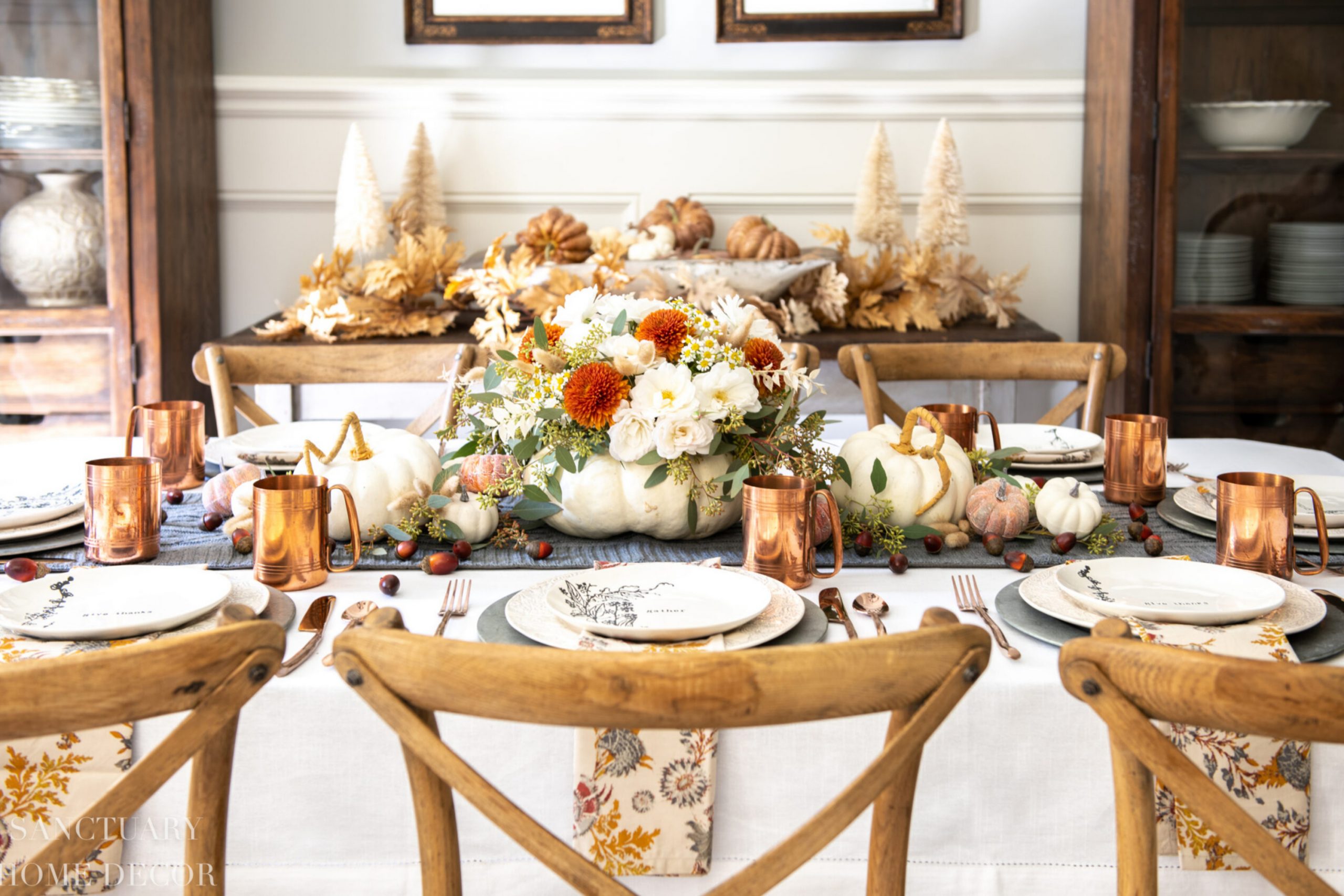
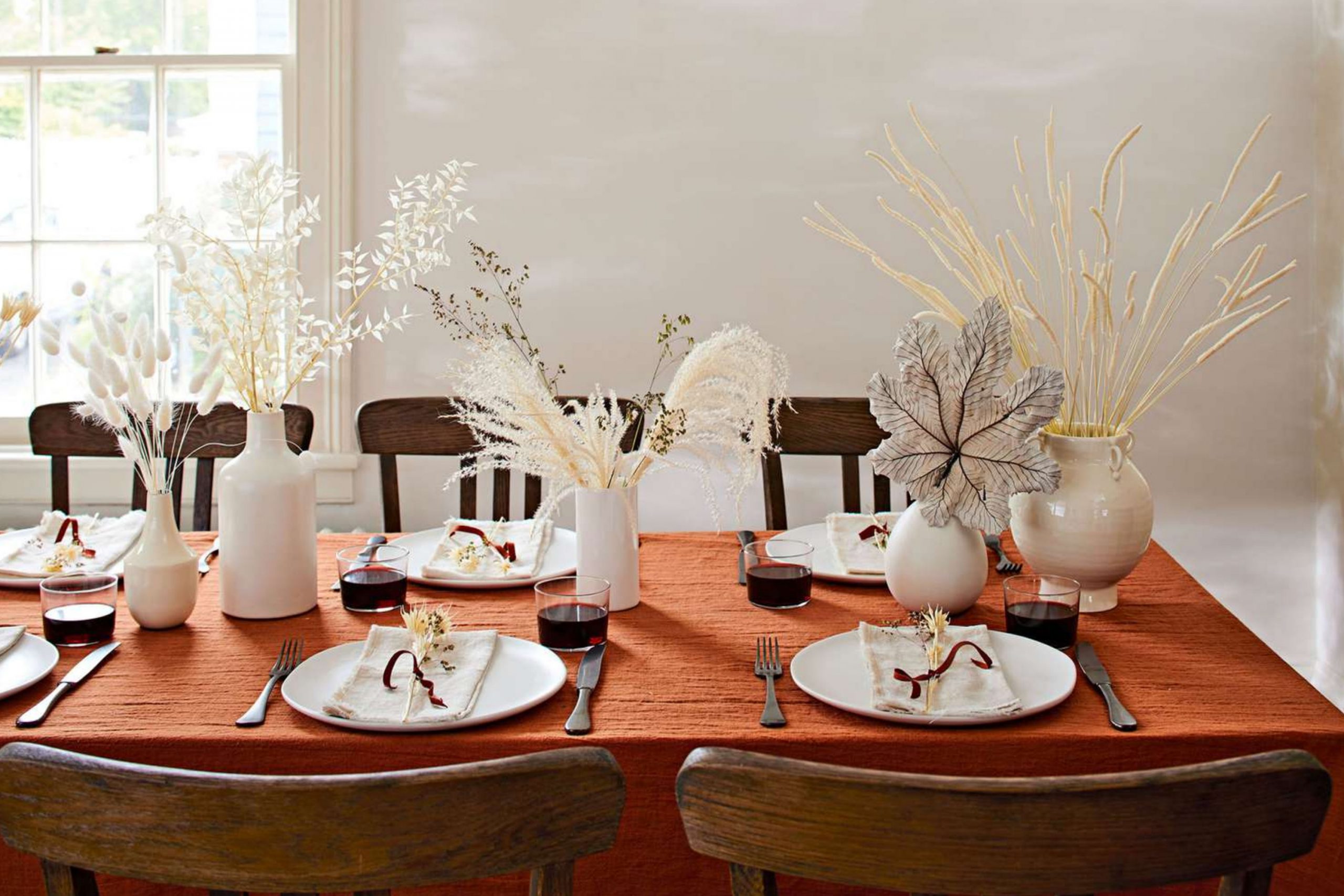
Thanksgiving has always been about more than food; it is about warmth, family, and the sense of belonging that fills a home. I believe that the colors we choose for our walls can shape this feeling even before the table is set. A golden wall can glow like candlelight, while deep reds bring to mind cranberries and wine.
Browns and beiges remind us of grounding traditions, steady and comforting. This year, the paint colors that feel most right are those that carry the heart of fall—warm, earthy, and welcoming.
With the right shades, a home doesn’t just look seasonal, it feels like it is wrapped in gratitude.
Why I Believe Thanksgiving Colors Can Change the Mood of a Home
Every room has a mood, and paint is the very first thing that shapes it. When I walk into a dining room painted in warm red or golden tones, it feels as though the celebration has already begun. Soft beiges and warm taupes give balance when a house is full of voices and laughter. Deep earthy tones make a home feel steady, like the roots of a family tree. I’ve seen guests relax the moment they step into a space that feels thoughtfully painted.
These colors are not only for style—they quietly tell our loved ones that they are welcome. For Thanksgiving, they set the perfect stage for connection and gratitude.
How I Pick the Perfect Thanksgiving Shades for Every Room
When I select Thanksgiving shades, I start by thinking about how the room will be used. Dining rooms are where we gather, so I lean toward richer colors that give meals a sense of importance. Kitchens often need golden or beige tones to make food and light feel more inviting. Living rooms should feel cozy, so I choose colors that hold warmth but still leave space for decorations.
Bedrooms for guests work best with soft neutrals that help them rest after long evenings of celebration. Lighting is also a guide—candlelight, daylight, and warm lamps all change how colors feel.
For me, the right Thanksgiving palette creates a home that feels generous and full of heart.
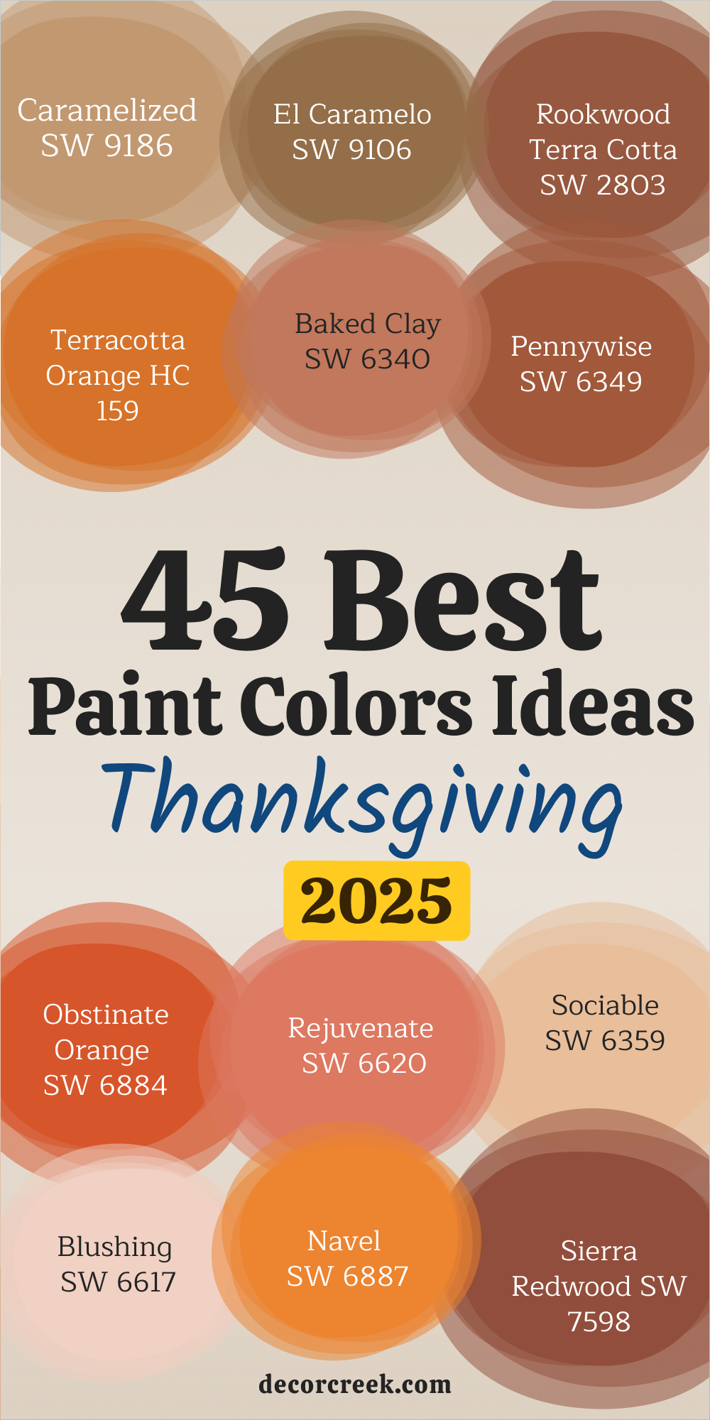
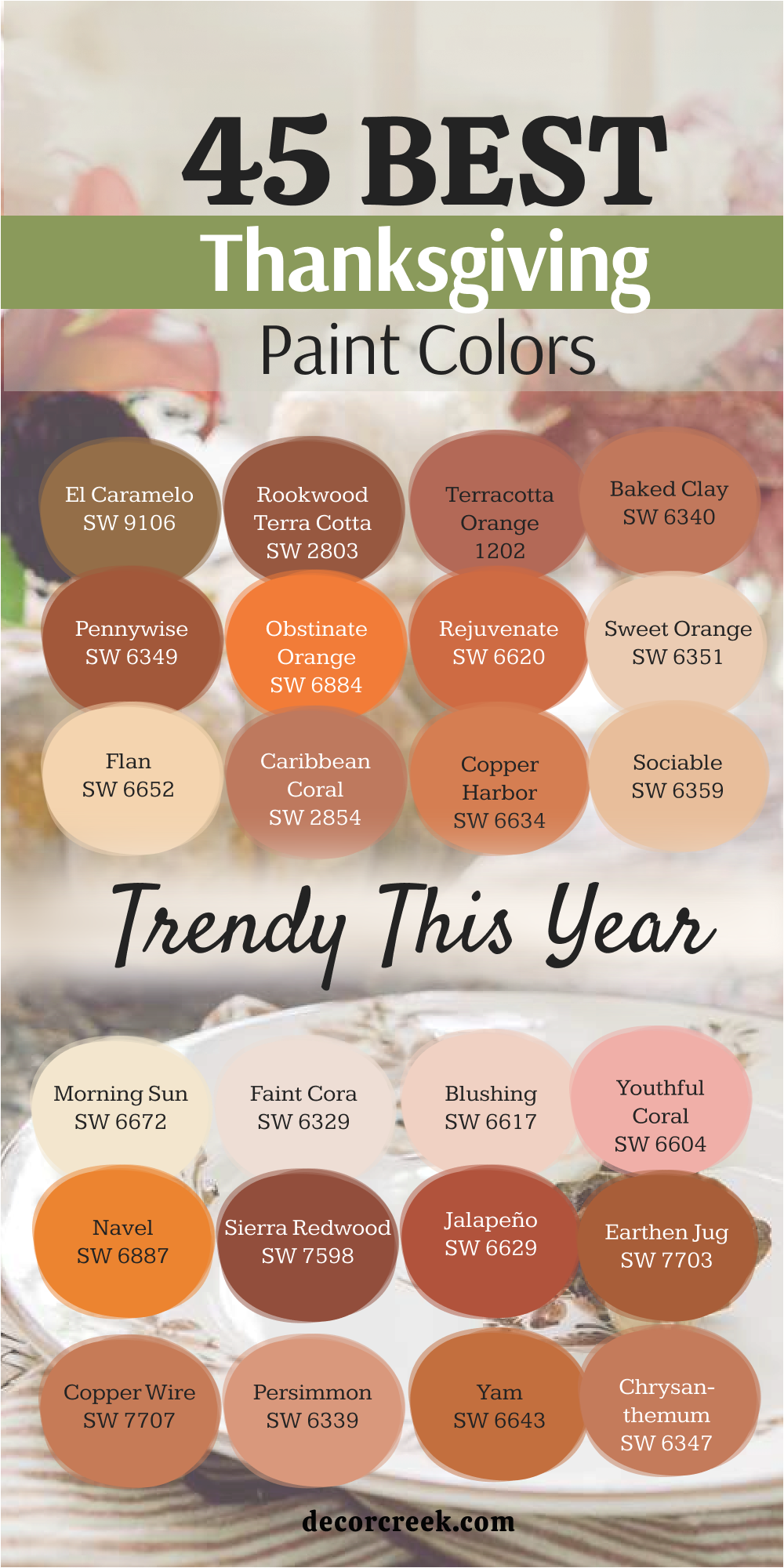
45 Best Thanksgiving Paint Color Trends This Year
Caramelized SW 9186
Caramelized SW 9186 carries the richness of golden sugar warmed in the oven. The shade feels inviting and steady, making it a wonderful choice for dining rooms or kitchens where warmth matters most. Caramelized pairs beautifully with creamy whites, rustic woods, and deep greens, creating a palette that feels balanced and natural.
I love how it shifts during the day, glowing with light in the morning and deepening into a cozy caramel glow in the evening. It highlights fall décor like baskets, pottery, and candles in a way that feels rich yet comforting.
For Thanksgiving, Caramelized sets the mood for gratitude, filling the home with a sense of sweetness and tradition.
El Caramelo SW 9106
El Caramelo SW 9106 carries the depth of burnt sugar with a touch of amber light.
The shade feels grounded yet welcoming, making it ideal for living rooms or dining areas where people gather
Rookwood Terra Cotta SW 2803
Rookwood Terra Cotta SW 2803 carries the depth of natural clay touched by sunlight. The shade feels earthy and warm, making it a perfect fit for dining rooms, patios, or cozy gathering spots. Rookwood Terra Cotta pairs beautifully with cream, beige, and dark wood accents, creating a palette that feels strong and welcoming.
I love how it glows in the afternoon, casting a natural richness that feels rooted in tradition. It highlights holiday décor like terracotta pots, woven baskets, and rustic linens with ease.
For Thanksgiving, Rookwood Terra Cotta brings a feeling of heritage and warmth, surrounding the home in grounded comfort.
Terracotta Orange HC 159
Terracotta Orange HC 159 carries the brightness of sunbaked earth mixed with lively orange tones. The shade feels cheerful and bold, perfect for kitchens, breakfast nooks, or entryways where you want energy to flow. Terracotta Orange pairs beautifully with creamy whites, leafy greens, and golden accents, creating a palette that feels joyful.
I love how it sparkles in daylight, while at night it softens into a warm, glowing presence. It highlights autumn wreaths, copper décor, and seasonal fabrics with an easy charm.
For Thanksgiving, Terracotta Orange wraps the home in brightness and cheer, making every gathering feel festive.
Baked Clay SW 6340
Baked Clay SW 6340 carries the strength of earthy minerals shaped by time. The shade feels solid yet welcoming, making it perfect for walls, accents, or even cabinetry. Baked Clay pairs beautifully with ivory trim, woven textures, and soft wood tones, creating a look that feels rich and balanced. I love how it glows warmly in the late afternoon light, then deepens into an earthy richness by nightfall.
It highlights autumn garlands, pottery, and festive candles in a way that feels natural.
For Thanksgiving, Baked Clay gives the home a steady sense of comfort, reminding everyone of grounded traditions.

Pennywise SW 6349
Pennywise SW 6349 carries the sweetness of pumpkin cream with a gentle golden touch. The shade feels cheerful and cozy, making it perfect for kitchens, dining rooms, or family gathering spaces. Pennywise pairs beautifully with warm neutrals, golden metals, and dark wood, creating a palette that feels inviting and balanced.
I love how it shines brightly during the day and glows softly under evening lighting. It highlights fall décor like pumpkins, amber glass, and woven linens with charm.
For Thanksgiving, Pennywise fills the home with joy and warmth, making every meal feel festive and special.
Obstinate Orange SW 6884
Obstinate Orange SW 6884 carries the energy of bright autumn leaves swirling in the wind. The shade feels bold yet friendly, making it perfect for accent walls, kitchens, or creative spaces. Obstinate Orange pairs beautifully with crisp whites, muted browns, and golden accents, creating a playful but balanced palette.
I love how it beams in daylight, then softens slightly in evening shadows. It highlights seasonal decorations like pumpkins, copper pans, and wreaths in a way that feels lively.
For Thanksgiving, Obstinate Orange brings fun and brightness, turning any room into a place filled with energy and laughter.
Rejuvenate SW 6620
Rejuvenate SW 6620 carries the spirit of fresh autumn harvest with its bright orange glow. The shade feels lively yet warm, perfect for kitchens, entryways, or breakfast nooks where cheerfulness matters most. Rejuvenate pairs beautifully with creamy whites, golden yellows, and natural woods, creating a palette that feels joyful and balanced.
I love how it looks sunlit during the day and softens into a cozy radiance in the evening. It highlights festive details like pumpkins, floral centerpieces, and candles with ease.
For Thanksgiving, Rejuvenate brings energy and comfort, filling the home with a sense of celebration.
Sweet Orange SW 6351
Sweet Orange SW 6351 carries the brightness of ripe citrus with a hint of warmth. The shade feels cheerful and inviting, making it perfect for children’s rooms, kitchens, or accent walls. Sweet Orange pairs beautifully with ivory whites, soft beiges, and rustic woods, creating a lively and balanced palette. I love how it glows under natural light, then turns into a soft golden-orange hue in evening lamps.
It highlights autumn décor like garlands, table runners, and copper details with natural charm.
For Thanksgiving, Sweet Orange fills the home with lighthearted joy and warmth that makes gatherings memorable.
Flan SW 6652
Flan SW 6652 carries the sweetness of baked desserts and the warmth of soft caramel. The shade feels comforting and cozy, perfect for dining rooms, kitchens, or family spaces. Flan pairs beautifully with creamy neutrals, rich browns, and golden metals, creating a palette that feels balanced and festive.
I love how it shines softly in the morning and glows warmly at night. It highlights fall decorations like amber glassware, tablecloths, and golden accents in a natural way.
For Thanksgiving, Flan brings sweetness and warmth, wrapping the home in comfort.
Caribbean Coral SW 2854
Caribbean Coral SW 2854 carries the brightness of coral reefs mixed with a gentle orange undertone. The shade feels playful yet elegant, making it a wonderful choice for living rooms or accent walls. Caribbean Coral pairs beautifully with creams, sandy neutrals, and leafy greens, creating a palette that feels both fresh and warm.
I love how it glows brightly in natural light and softens under warm lamps. It highlights autumn florals, candles, and textiles with a cheerful charm.
For Thanksgiving, Caribbean Coral adds vibrancy and joy, reminding everyone of the beauty of seasonal gatherings.
Copper Harbor SW 6634
Copper Harbor SW 6634 carries the glow of aged copper touched by golden light. The shade feels strong yet inviting, perfect for dining rooms, entryways, or rustic living spaces. Copper Harbor pairs beautifully with creamy whites, natural woods, and golden accents, creating a palette that feels grounded and festive.
I love how it changes throughout the day, glowing richly in the morning and deepening into a warm copper tone at night. It highlights seasonal décor like copper pots, candleholders, and autumn wreaths with ease.
For Thanksgiving, Copper Harbor brings depth and charm, filling the home with a sense of tradition and celebration.
Sociable SW 6359
Sociable SW 6359 carries the warmth of a glowing sunset with an inviting coral tone. The shade feels open and friendly, making it perfect for dining rooms, kitchens, or family spaces where people gather. Sociable pairs beautifully with creamy whites, natural woods, and muted greens, creating a palette that feels cheerful and balanced. I love how it glows during the day, then softens into a cozy coral warmth under evening lighting.
It highlights seasonal accents like garlands, copper décor, and woven linens with charm. For Thanksgiving, Sociable brings togetherness, giving the home a mood of welcome and joy.

Faint Coral SW 6329
Faint Coral SW 6329 carries the brightness of the first light that streams through windows. The shade feels radiant yet gentle, making it perfect for kitchens, entryways, or children’s rooms. Faint Coral pairs beautifully with soft neutrals, sandy tones, and golden accents, creating a palette that feels light and uplifting.
I love how it brings energy in the morning while softening into a mellow glow by night. It highlights Thanksgiving details like golden candles, warm tablecloths, and fresh florals naturally.
For Thanksgiving, Faint Coral sets a cheerful stage, filling the home with brightness and gratitude.

Blushing SW 6617
Blushing SW 6617 carries the charm of soft roses kissed by sunlight. The shade feels light and cheerful, making it ideal for bedrooms, dining spaces, or accent walls where warmth matters. Blushing pairs beautifully with whites, soft taupes, and natural woods, creating a palette that feels playful and cozy. I love how it shines softly during the day and deepens into a warm rosy coral under evening light.
It highlights festive details like napkins, florals, and glassware with a sweet touch. For Thanksgiving, Blushing adds a cheerful softness, wrapping the home in gentle warmth.
Youthful Coral SW 6604
Youthful Coral SW 6604 carries the freshness of bright coral blossoms in bloom. The shade feels energetic and warm, making it perfect for dining rooms, kitchens, or playful accent walls. Youthful Coral pairs beautifully with soft creams, sandy tones, and dark woods, creating a palette that feels vibrant yet grounded. I love how it sparkles in natural light, then softens into a glowing coral hue at night.
It highlights fall decorations like candles, flowers, and table linens with charm. For Thanksgiving, Youthful Coral brings brightness and warmth, creating a joyful mood.

Navel SW 6887
Navel SW 6887 carries the depth of bold orange mixed with golden richness. The shade feels strong yet festive, making it perfect for dining rooms, accent walls, or front doors. Navel pairs beautifully with creams, deep browns, and natural stone, creating a palette that feels welcoming and powerful. I love how it glows in the sunlight and deepens under evening lights, adding dimension to any room.
It highlights Thanksgiving décor like pumpkins, copper accents, and rustic baskets naturally. For Thanksgiving, Navel gives the home a rich, glowing character that feels both joyful and celebratory.

Sierra Redwood SW 7598
Sierra Redwood carries the depth of forest bark touched by autumn sunlight. The shade feels grounded and bold, making it perfect for accent walls, entryways, or rustic dining rooms. Sierra Redwood pairs beautifully with creamy whites, golden tones, and natural stone, creating a palette that feels strong and warm.
I love how it looks earthy in daylight, then deepens into a rich reddish-brown at night. It highlights Thanksgiving décor like wooden bowls, autumn wreaths, and copper accents with ease. For Thanksgiving, Sierra Redwood fills the home with tradition and natural beauty.

Jalapeño SW 6629
Jalapeño SW 6629 carries the brightness of spicy peppers with a touch of fiery warmth. The shade feels bold yet playful, making it ideal for kitchens, dining areas, or accent walls. Jalapeño pairs beautifully with creamy whites, warm woods, and golden metallics, creating a palette that feels lively and festive.
I love how it energizes a room in the morning and glows warmly in evening light. It highlights holiday decorations like candles, ceramics, and autumn garlands naturally.
For Thanksgiving, Jalapeño adds a spark of energy, making gatherings feel joyful and full of flavor.
Earthen Jug SW 7703
Earthen Jug SW 7703 carries the richness of clay pottery shaped by hand. The shade feels warm and grounding, making it perfect for living rooms, dining rooms, or rustic kitchens. Earthen Jug pairs beautifully with soft neutrals, woven textures, and natural woods, creating a palette that feels welcoming.
I love how it glows softly during the day and deepens into an earthy warmth at night. It highlights seasonal décor like terracotta pots, woven baskets, and candles beautifully.
For Thanksgiving, Earthen Jug brings depth and comfort, making the home feel steady and inviting.
Copper Wire SW 7707
Copper Wire SW 7707 carries the shimmer of polished copper touched by warm light. The shade feels rich and festive, perfect for kitchens, accent walls, or dining areas where gatherings happen. Copper Wire pairs beautifully with creams, taupes, and golden accents, creating a palette that feels elegant yet warm. I love how it shines brightly in daylight and glows richly in the evening.
It highlights holiday touches like copper pans, glassware, and candles naturally. For Thanksgiving, Copper Wire adds sparkle and tradition, giving the home a celebratory glow.

Persimmon SW 6339
Persimmon SW 6339 carries the juiciness of ripe fruit with a glowing orange-red tone. The shade feels playful and bold, making it perfect for kitchens, dining areas, or lively living rooms. Persimmon pairs beautifully with warm whites, golden yellows, and rustic woods, creating a palette that feels bright and festive.
I love how it shines in the morning and deepens into a rich fruity warmth at night. It highlights autumn décor like centerpieces, florals, and candles beautifully.
For Thanksgiving, Persimmon fills the home with energy and cheer, creating a lively gathering atmosphere.
Yam SW 6643
Yam SW 6643 carries the richness of roasted sweet potatoes with a cozy orange-brown glow. The shade feels warm and earthy, making it perfect for kitchens, dining rooms, or rustic living spaces. Yam pairs beautifully with creamy whites, deep browns, and muted greens, creating a palette that feels grounded and festive. I love how it shines warmly in the afternoon and deepens into a rich harvest tone in the evening.
It highlights Thanksgiving décor like woven baskets, candles, and seasonal wreaths with ease. For Thanksgiving, Yam adds comfort and tradition, filling the home with a sense of abundance.
Chrysanthemum SW 6347
Chrysanthemum SW 6347 carries the brightness of autumn blooms with a golden-orange vibrancy. The shade feels cheerful yet rich, making it perfect for dining rooms, entryways, or family spaces. Chrysanthemum pairs beautifully with creams, taupes, and natural wood, creating a palette that feels festive and inviting. I love how it glows in daylight and softens into a mellow warmth at night.
It highlights seasonal touches like florals, candles, and table linens naturally. For Thanksgiving, Chrysanthemum brings brightness and cheer, lifting the spirit of every gathering.
Determined Orange SW 6635
Determined Orange SW 6635 carries the boldness of fiery sunsets with a lively, energetic feel. The shade feels strong yet joyful, making it perfect for kitchens, living rooms, or creative spaces. Determined Orange pairs beautifully with creamy whites, golden accents, and rustic wood, creating a palette that feels bright and balanced. I love how it bursts with energy in the morning and glows warmly in the evening.
It highlights seasonal accents like pumpkins, lanterns, and copper bowls with charm. For Thanksgiving, Determined Orange fills the home with excitement and joy, making gatherings unforgettable.

Emotional SW 6621
Emotional SW 6621 carries the softness of coral with a touch of playful warmth. The shade feels lighthearted and cheerful, perfect for bedrooms, dining rooms, or accent walls. Emotional pairs beautifully with creamy whites, sandy neutrals, and golden tones, creating a palette that feels balanced and welcoming.
I love how it glows gently in the morning and deepens into a cozy coral at night. It highlights Thanksgiving decorations like tableware, candles, and florals with ease.
For Thanksgiving, Emotional brings joy and charm, filling the home with a sense of warmth.
Lei Flower SW 6613
Lei Flower SW 6613 carries the beauty of tropical blossoms with a soft coral-red glow. The shade feels lively yet inviting, making it perfect for kitchens, living rooms, or playful accent walls. Lei Flower pairs beautifully with creamy whites, sandy tones, and muted greens, creating a palette that feels vibrant and balanced.
I love how it looks bright in daylight and takes on a warmer richness under evening lights. It highlights festive touches like florals, candles, and autumn garlands naturally.
For Thanksgiving, Lei Flower adds color and cheer, wrapping the home in joyful warmth.

Real Red SW 6868
Real Red SW 6868 carries the pure brightness of classic red, bold and full of life. The shade feels strong yet cheerful, making it perfect for dining rooms, entryways, or accent walls. Real Red pairs beautifully with crisp whites, warm woods, and golden accents, creating a palette that feels festive and striking.
I love how it looks vibrant in natural daylight and glows warmly under evening lighting. It highlights Thanksgiving décor like candles, wreaths, and table settings with charm.
For Thanksgiving, Real Red adds a sense of tradition and joy, giving gatherings a bold, celebratory touch.

Poinsettia SW 6594
Poinsettia SW 6594 carries the richness of holiday flowers with a deep red glow. The shade feels warm and inviting, making it perfect for dining rooms, kitchens, or cozy gathering spaces. Poinsettia pairs beautifully with creamy whites, soft beiges, and dark woods, creating a palette that feels festive and balanced.
I love how it radiates during the day and deepens into a rich, velvety red at night. It highlights seasonal décor like garlands, candles, and florals naturally.
For Thanksgiving, Poinsettia brings warmth and celebration, filling the home with holiday spirit.
Toile Red SW 0006
Toile Red SW 0006 carries the depth of traditional red fabrics with a heritage-inspired tone. The shade feels strong yet timeless, perfect for dining rooms, libraries, or accent walls. Toile Red pairs beautifully with creams, taupes, and dark woods, creating a palette that feels elegant and grounded. I love how it glows richly in the afternoon sun and softens beautifully in evening light.
It highlights Thanksgiving décor like vintage pottery, copper accents, and tableware with charm. For Thanksgiving, Toile Red brings richness and tradition, giving gatherings a warm, historic feel.

Pressed Flower SW 6304
Pressed Flower SW 6304 carries the softness of dried petals with a rosy undertone. The shade feels gentle yet warm, making it perfect for bedrooms, dining areas, or accent walls. Pressed Flower pairs beautifully with creamy whites, soft greys, and warm woods, creating a palette that feels comforting. I love how it shines gently during the day and deepens into a richer rose in the evening.
It highlights Thanksgiving accents like napkins, florals, and soft textiles in a natural way. For Thanksgiving, Pressed Flower adds a gentle, welcoming glow, filling the home with charm.
Wild Poppy SW 6879
Wild Poppy SW 6879 carries the vibrancy of blooming fields with a fiery red-orange tone. The shade feels energetic yet warm, making it perfect for kitchens, dining spaces, or entryways. Wild Poppy pairs beautifully with creams, sandy tones, and golden accents, creating a palette that feels festive and joyful. I love how it beams in natural sunlight and glows richly in the evening.
It highlights seasonal décor like autumn florals, candles, and table settings with ease. For Thanksgiving, Wild Poppy brings cheer and brightness, turning gatherings into lively celebrations.
Foxy SW 6333
Foxy SW 6333 carries the warmth of russet tones with a soft reddish-brown glow. The shade feels rich yet approachable, making it perfect for dining rooms, kitchens, or cozy living areas. Foxy pairs beautifully with creamy whites, muted golds, and natural woods, creating a palette that feels balanced and festive. I love how it shifts from a lively warmth in the morning to a deeper, grounded tone at night. I
t highlights Thanksgiving décor like woven baskets, candles, and rustic tableware naturally. For Thanksgiving, Foxy adds charm and depth, giving the home a comforting and celebratory mood.
Coral Reef SW 6606
Coral Reef SW 6606 carries the playfulness of fresh coral with a lively orange-pink hue. The shade feels bright yet warm, making it perfect for accent walls, kitchens, or creative spaces. Coral Reef pairs beautifully with soft creams, sandy neutrals, and dark wood, creating a palette that feels inviting and fun. I love how it sparkles in natural daylight and glows warmly in the evening.
It highlights autumn décor like table linens, candles, and florals in a cheerful way. For Thanksgiving, Coral Reef adds joy and brightness, filling the home with energy and celebration.

Rojo Dust SW 0070
Rojo Dust SW 0070 carries the muted depth of clay with a soft red undertone. The shade feels earthy and grounded, perfect for dining rooms, hallways, or rustic spaces. Rojo Dust pairs beautifully with creamy whites, natural stone, and golden accents, creating a palette that feels warm and steady.
I love how it looks soft during the day and deepens into a rich, earthy tone by night. It highlights Thanksgiving décor like terracotta pots, wooden accents, and candles naturally.
For Thanksgiving, Rojo Dust adds heritage and charm, making the home feel rooted and welcoming.
Chinese Red SW 0057
Chinese Red SW 0057 carries the boldness of lacquered red with a strong, celebratory glow. The shade feels powerful yet festive, perfect for dining rooms, front doors, or statement walls. Chinese Red pairs beautifully with creamy whites, black accents, and warm metals, creating a palette that feels striking. I love how it beams under sunlight and radiates richly in the evening.
It highlights Thanksgiving décor like bold table settings, copper pans, and garlands with ease. For Thanksgiving, Chinese Red brings a festive energy, filling the home with bold tradition.
Dishy Coral SW 6598
Dishy Coral SW 6598 carries the brightness of soft coral with a playful pink-orange tone. The shade feels cheerful yet gentle, making it perfect for bedrooms, kitchens, or family gathering spaces. Dishy Coral pairs beautifully with whites, sandy tones, and golden accents, creating a palette that feels fresh and welcoming. I love how it glows in natural light and softens into a cozy coral in the evening.
It highlights seasonal touches like napkins, candles, and autumn flowers in a natural way. For Thanksgiving, Dishy Coral adds charm and warmth, giving the home a cheerful glow.

Insightful Rose SW 6023
Insightful Rose SW 6023 carries the softness of blooming petals with a gentle pinkish-red glow. The shade feels delicate yet inviting, making it perfect for dining rooms, bedrooms, or accent walls. Insightful Rose pairs beautifully with creamy whites, sandy neutrals, and warm woods, creating a palette that feels balanced and warm.
I love how it shines lightly in the morning and deepens into a tender glow by night. It highlights Thanksgiving décor like table linens, florals, and candles naturally.
For Thanksgiving, Insightful Rose brings charm and comfort, filling the home with a heartfelt glow.

Appleblossom SW 0076
Appleblossom SW 0076 carries the freshness of orchard blooms with a soft reddish-pink tone. The shade feels cheerful and warm, making it perfect for kitchens, entryways, or cozy gathering spots. Appleblossom pairs beautifully with creamy whites, soft taupes, and wooden textures, creating a palette that feels welcoming.
I love how it shines gently under daylight and glows warmly in the evening. It highlights Thanksgiving touches like garlands, floral centerpieces, and rustic accents in a natural way.
For Thanksgiving, Appleblossom adds gentle color and warmth, making gatherings feel joyful and inviting.
Red Tomato SW 6607
Red Tomato SW 6607 carries the brightness of ripe fruit with a bold red-orange energy. The shade feels lively yet warm, perfect for kitchens, dining rooms, or accent walls. Red Tomato pairs beautifully with crisp whites, golden tones, and rustic woods, creating a palette that feels cheerful and balanced. I love how it beams during the day and deepens into a strong glow at night.
It highlights Thanksgiving décor like pumpkins, candles, and tableware with festive charm. For Thanksgiving, Red Tomato fills the home with vibrant energy and celebration.
Golden Rule SW 6383
Golden Rule SW 6383 carries the warmth of autumn light with a glowing golden-orange tone. The shade feels welcoming and cheerful, perfect for dining rooms, entryways, or family rooms. Golden Rule pairs beautifully with creamy whites, taupes, and deep greens, creating a palette that feels festive and cozy. I love how it brightens a room in the morning and glows warmly at night.
It highlights seasonal décor like candles, tablecloths, and copper details naturally. For Thanksgiving, Golden Rule brings abundance and joy, filling the home with light.

Gingery SW 6363
Gingery SW 6363 carries the warmth of fresh spices with a soft orange-brown glow. The shade feels comforting and grounded, perfect for kitchens, dining spaces, or rustic living rooms. Gingery pairs beautifully with creamy whites, warm neutrals, and natural woods, creating a palette that feels balanced. I love how it glows softly in daylight and deepens into a rich, spiced tone at night.
It highlights autumn accents like pottery, baskets, and candles naturally. For Thanksgiving, Gingery gives the home a sense of tradition and cozy warmth, making gatherings memorable.

Cavern Clay SW 7701
Cavern Clay carries the warmth of sunbaked earth mixed with a touch of copper glow. The shade feels rich yet grounded, making it an ideal choice for dining rooms, entryways, or living spaces where family gathers. Cavern Clay pairs beautifully with natural wood, golden accents, and creamy whites, creating a look that feels inviting and full of seasonal charm. I love how this color shifts through the day, glowing softly in the morning light and deepening into a richer tone by evening.
It highlights fall décor like woven baskets, terracotta vases, or autumn garlands in a way that feels natural and festive. Guests often remark on its earthy comfort, saying it feels both stylish and welcoming.
For Thanksgiving, Cavern Clay brings the richness of tradition and the glow of celebration, wrapping the home in warmth that lasts long after the holiday meal.

Spiced Cider SW 7702
Spiced Cider feels like holding a steaming cup of cider on a chilly November afternoon. The shade carries warmth with just enough richness to make kitchens and dining rooms feel full of life. Spiced Cider pairs beautifully with rustic wood furniture, creamy trim, and golden accents, pulling everything together into a welcoming setting. I love how it adapts to different lighting—bright and energetic in the day, glowing softly in the evening.
It has a comforting quality that invites guests to settle in and enjoy the atmosphere. Seasonal decorations like pumpkins, candles, and copper dishes look even more appealing against this backdrop.
For Thanksgiving, Spiced Cider feels like the flavor of the season captured on the walls, cozy and full of joy.

Olive Grove SW 7734
Olive Grove carries the calm richness of autumn foliage, earthy and grounded. The shade feels natural and welcoming, perfect for kitchens, dining rooms, or cozy living areas. Olive Grove pairs beautifully with golden tones, creamy trim, and rustic wood, creating harmony with seasonal décor. I love how it feels connected to nature, making rooms feel fresh yet warm.
During the day, it feels lively and organic, while in the evening it deepens into a cozy, earthy green.
Guests often say it feels grounding and full of character. For Thanksgiving, Olive Grove brings the outdoors inside, reminding us of harvest and the beauty of the season.
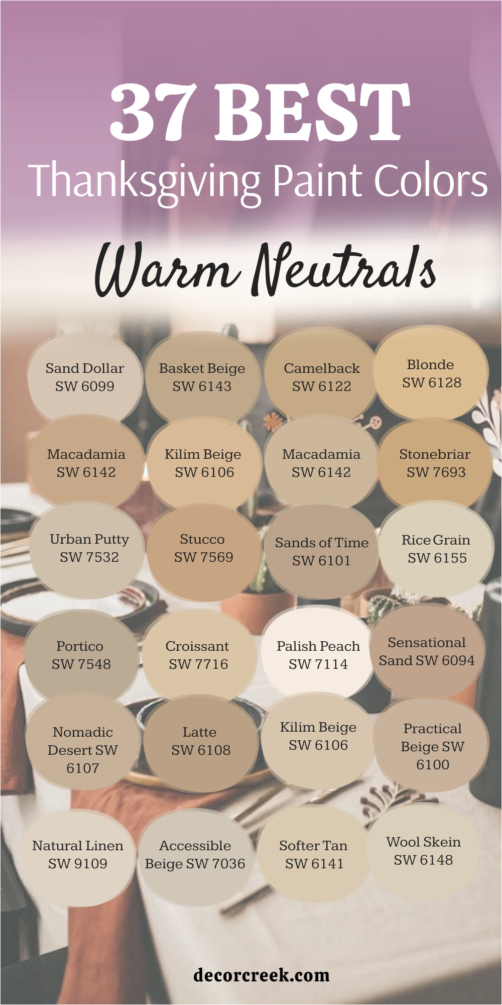
37 Best Thanksgiving Paint Color Warm Neutrals
Sand Dollar SW 6099
Sand Dollar SW 6099 carries the softness of sunlit beaches with a warm, sandy glow. The shade feels steady yet welcoming, making it perfect for living rooms, dining rooms, or cozy bedrooms. Sand Dollar pairs beautifully with warm whites, natural wood, and muted greens, creating a palette that feels both balanced and inviting.
I love how it shines gently in the morning light, then turns into a warm golden-beige in the evening. It highlights Thanksgiving décor like candles, woven baskets, and autumn wreaths naturally.
For Thanksgiving, Sand Dollar sets the stage for gatherings filled with warmth, gratitude, and comfort.
Basket Beige SW 6143
Basket Beige SW 6143 carries the natural tone of woven fibers with a warm and earthy presence. The shade feels calm yet friendly, perfect for family rooms, kitchens, or entryways. Basket Beige pairs beautifully with deep browns, creamy whites, and golden accents, creating a palette that feels harmonious.
I love how it looks light during the day and then takes on a richer tone at night. It highlights autumn decorations like rustic bowls, wooden trays, and soft linens in a graceful way.
For Thanksgiving, Basket Beige brings the comfort of tradition, making every corner feel welcoming.
Camelback SW 6122
Camelback SW 6122 carries the warmth of golden sand mixed with earthy undertones. The shade feels grounded yet bright, making it ideal for dining rooms, kitchens, or gathering spaces. Camelback pairs beautifully with warm creams, natural stone, and dark woods, creating a palette that feels festive and cozy. I love how it glows softly in daylight and deepens into a golden-brown in the evening.
It highlights fall décor like garlands, copper pans, and tablecloths with charm. For Thanksgiving, Camelback adds a golden backdrop that makes every gathering shine.
Blonde SW 6128
Blonde SW 6128 carries the radiance of harvest wheat with a cheerful golden touch. The shade feels light yet steady, making it perfect for bedrooms, hallways, or family spaces. Blonde pairs beautifully with creamy whites, soft grays, and rustic woods, creating a palette that feels balanced and warm. I love how it brightens a room in the morning and glows softly at night.
It highlights seasonal details like golden candles, wreaths, and festive fabrics with ease. For Thanksgiving, Blonde adds a touch of sunshine, wrapping the home in warmth and joy.
Macadamia SW 6142
Macadamia SW 6142 carries the richness of roasted nuts with a golden-beige glow. The shade feels steady yet comforting, making it perfect for kitchens, dining areas, or entryways. Macadamia pairs beautifully with soft creams, deep browns, and muted greens, creating a palette that feels natural and inviting. I love how it looks warm in the afternoon sun and deepens into a cozy tone at night.
It highlights holiday décor like baskets, pottery, and candles naturally. For Thanksgiving, Macadamia adds comfort and tradition, filling the home with gratitude.
Stonebriar SW 7693
Stonebriar SW 7693 carries the strength of natural stone with a warm beige undertone. The shade feels grounded yet soft, perfect for dining rooms, living spaces, or rustic kitchens. Stonebriar pairs beautifully with golden accents, dark woods, and creamy whites, creating a palette that feels steady and warm. I love how it shines with natural light in the morning and takes on a richer depth in the evening.
It highlights autumn touches like terracotta, wood bowls, and linens with ease. For Thanksgiving, Stonebriar sets a grounded backdrop that feels full of comfort.
Urban Putty SW 7532
Urban Putty SW 7532 carries the softness of clay with a touch of golden beige. The shade feels quiet yet welcoming, making it ideal for bedrooms, dining areas, or family spaces. Urban Putty pairs beautifully with creams, browns, and muted greens, creating a palette that feels relaxed and festive. I love how it glows gently under natural light and turns richer in the evening.
It highlights seasonal décor like garlands, candles, and copper details in a natural way. For Thanksgiving, Urban Putty brings warmth and familiarity, making gatherings more intimate.
Stucco SW 7569
Stucco SW 7569 carries the charm of sun-baked walls with a warm beige tone. The shade feels rustic yet inviting, making it perfect for kitchens, hallways, or cozy dining rooms. Stucco pairs beautifully with creams, deep browns, and terracotta accents, creating a palette that feels balanced and festive. I love how it shines during the day and deepens beautifully by evening.
It highlights Thanksgiving details like earthenware, tablecloths, and golden accents naturally. For Thanksgiving, Stucco adds rustic charm, giving the home a sense of warmth and tradition.
Sands of Time SW 6101
Sands of Time SW 6101 carries the richness of golden sand layered with warmth. The shade feels soft yet steady, making it ideal for living rooms, dining areas, or kitchens. Sands of Time pairs beautifully with creamy whites, golden metals, and rustic woods, creating a palette that feels balanced and inviting. I love how it glows in natural daylight and deepens into a mellow golden tone at night. I
t highlights autumn décor like garlands, candles, and woven fabrics with ease. For Thanksgiving, Sands of Time creates a mood of gratitude and warmth.
Rice Grain SW 6155
Rice Grain SW 6155 carries the gentleness of warm grains with a creamy undertone. The shade feels light yet grounded, perfect for bedrooms, kitchens, or cozy dining spaces. Rice Grain pairs beautifully with sandy neutrals, creams, and natural woods, creating a palette that feels simple and welcoming. I love how it shines with natural daylight and softens under warm lamps.
It highlights seasonal accents like wreaths, pottery, and candles with charm. For Thanksgiving, Rice Grain adds an easy comfort, making gatherings feel relaxed and joyful.
Portico SW 7548
Portico SW 7548 carries the warmth of aged plaster with a soft golden-beige tone. The shade feels rustic yet elegant, making it ideal for dining rooms, kitchens, or entryways. Portico pairs beautifully with deep woods, creamy whites, and golden accents, creating a palette that feels inviting. I love how it glows warmly during the day and deepens into a cozy richness at night.
It highlights holiday décor like garlands, candles, and copper details with ease. For Thanksgiving, Portico sets a backdrop of warmth and hospitality.
Croissant SW 7716
Croissant carries the sweetness of baked treats with a warm creamy tone. The shade feels light yet cozy, making it perfect for bedrooms, dining rooms, or family spaces. Croissant pairs beautifully with golden accents, soft woods, and creamy whites, creating a palette that feels balanced. I love how it brightens a room in daylight and turns soft and golden under evening light.
It highlights autumn décor like tablecloths, candles, and floral arrangements naturally. For Thanksgiving, Macaroon Cream adds comfort and charm, filling the home with warmth.
Palish Peach SW 7114
Palish Peach SW 7114 carries the delicacy of fine fabric with a creamy beige tone. The shade feels soft yet graceful, making it perfect for bedrooms, dining areas, or cozy kitchens. Palish Peachpairs beautifully with creamy whites, soft greys, and warm woods, creating a palette that feels elegant and warm. I love how it glows gently during the day and deepens into a soft beige at night.
It highlights Thanksgiving decorations like candles, linens, and rustic pottery with ease. For Thanksgiving, Palish Peach adds a gentle warmth that feels graceful and inviting.
Half-Caff SW 9091
Half-Caff SW 9091 carries the richness of desert landscapes with a warm golden undertone. The shade feels earthy yet welcoming, making it ideal for living rooms, dining rooms, or family spaces. Half-Caff pairs beautifully with soft whites, muted greens, and rustic woods, creating a palette that feels grounded and natural. I love how it shines brightly in daylight and deepens into an earthy glow in the evening.
It highlights seasonal décor like garlands, copper accents, and candles with charm. For Thanksgiving, Half-Caff gives the home a touch of tradition and steady warmth.
Sensational Sand SW 6094
Sensational Sand SW 6094 carries the sweetness of roasted nuts with a golden beige presence. The shade feels warm yet light, making it perfect for kitchens, dining rooms, or cozy living spaces. Sensational Sand SW 6094 pairs beautifully with golden accents, creams, and dark woods, creating a palette that feels welcoming and festive. I love how it glows warmly during the day and softens into a cozy beige at night.
It highlights Thanksgiving touches like pottery, woven baskets, and autumn fabrics with ease. For Thanksgiving, Sensational Sand adds sweetness and warmth, giving the home a comforting glow.

Nomadic Desert SW 6107
Nomadic Desert feels earthy and grounded, like walking across sun-warmed soil. The shade carries a warmth that makes large living rooms, dining rooms, or open kitchens feel more connected and inviting. Nomadic Desert pairs beautifully with creamy whites, rustic wood tones, and golden accents, creating a palette that feels steady and warm. I love how it brings depth without overwhelming the room, leaving space for décor to stand out.
In natural light, it feels soft and balanced, while under evening lamps it takes on a cozy richness. Guests often say it feels welcoming and solid, a shade that makes gatherings feel more grounded.
For Thanksgiving, Nomadic Desert offers the perfect earthy base for holiday traditions.

Latte SW 6108
Latte feels like a warm cup of coffee enjoyed slowly on a crisp autumn morning. The shade carries sweetness and comfort, bringing a relaxed atmosphere to kitchens, dining spaces, or even bedrooms. Latte pairs wonderfully with soft creams, golden yellows, and deeper browns, making it easy to create a balanced palette. I love how it works equally well in modern homes and rustic settings, adapting to both styles with ease.
During the day, it feels light and uplifting, while in the evening it glows warmly under soft lighting. Guests often describe it as cozy and familiar, a color that makes them feel instantly at home.
For Thanksgiving, Latte wraps a room in comfort, setting the stage for connection and joy.

Kilim Beige SW 6106
Kilim Beige feels warm and steady, like woven fabrics that carry history and comfort. The shade has a golden undertone that makes rooms feel cheerful without being too bright. Kilim Beige pairs beautifully with rustic wood, golden accents, and creamy trim, creating harmony in both modern and traditional homes. I love how it works equally well in dining rooms and living areas, adding depth while still keeping a soft balance.
In daylight, it glows with warmth, while in the evening it deepens to a cozy richness that feels perfect for gatherings. Guests often describe it as inviting and timeless in the best way, a color that never feels out of place.
For Thanksgiving, Kilim Beige offers a steady warmth that supports both décor and family traditions.

Practical Beige SW 6100
Practical Beige feels balanced and steady, a shade that adapts beautifully to any setting. It has just enough warmth to keep a room cozy without losing freshness. Practical Beige pairs wonderfully with golden yellows, rustic browns, and creamy whites, making it a versatile choice for both large and small spaces. I love using it in living rooms where family gathers, as it gives a soft background that lets décor and furniture shine.
In the morning, it feels bright and open, while in the evening it becomes warmer, almost glowing under soft lamps. Guests often comment on how natural and inviting it feels, the kind of color that makes them instantly comfortable.
For Thanksgiving, Practical Beige is the dependable backdrop that holds food, family, and memories together.

Natural Linen SW 9109
Natural Linen feels soft and airy, like woven fabric stretched across a sunlit window. The shade carries a gentle warmth that works beautifully in living rooms, dining rooms, or bedrooms. Natural Linen pairs best with rustic wood, soft taupes, and muted greens, giving a home a relaxed but welcoming feel. I love how it allows decorations to stand out, from bright pumpkins to golden candles, without stealing attention.
In daylight, it feels fresh and light, while in the evening it deepens to a comforting warmth. Guests often describe it as clean yet cozy, a balance that feels easy and inviting.
For Thanksgiving, Natural Linen creates a setting that feels simple, graceful, and full of warmth.

Accessible Beige SW 7036
Accessible Beige feels gentle and steady, a neutral that leans warm enough to bring comfort. The shade adapts beautifully to different rooms, whether in a bright kitchen or a softly lit dining room. Accessible Beige pairs wonderfully with golden accents, ivory trim, and deep browns, creating harmony in a festive palette. I love how it creates balance, allowing both seasonal décor and family heirlooms to shine.
In natural light, it feels fresh and open, while under candlelight it becomes soft and inviting. Guests often describe it as soothing and familiar, the kind of shade that makes them feel welcome without effort.
For Thanksgiving, Accessible Beige quietly supports the season’s richness, grounding the joy of celebration.

Softer Tan SW 6141
Softer Tan feels like a sandy path warmed by the sun, gentle and approachable. The shade has a natural warmth that makes any room feel open yet grounded. Softer Tan pairs beautifully with golden yellows, rustic oranges, and creamy whites, creating a seasonal palette that feels balanced and inviting. I love how it works equally well in dining rooms and living areas, offering a comfortable background for gatherings.
In daylight, it shines with freshness, while in the evening it turns into a cozy and grounding tone. Guests often describe it as relaxed and welcoming, the kind of color that feels easy to live with.
For Thanksgiving, Softer Tan brings a simple charm that blends seamlessly with family traditions.

Wool Skein SW 6148
Wool Skein feels soft and comforting, like wrapping yourself in a favorite blanket. The shade carries a warmth that works perfectly in living rooms, kitchens, or guest bedrooms. Wool Skein pairs best with golden accents, muted greens, and rustic browns, fitting beautifully into an autumn palette. I love how it makes a space feel cared for, encouraging guests to settle in and stay longer.
During the day, it feels fresh and bright, while at night it glows softly under warm lighting. Guests often say it feels cozy and reassuring, the kind of shade that instantly makes a house feel like home
For Thanksgiving, Wool Skein wraps walls in warmth and gratitude, creating the perfect setting for togetherness.

Neutral Ground SW 7568
Neutral Ground feels balanced and steady, like the quiet pause before family gathers around the table. The shade carries just enough warmth to make a room feel comfortable while keeping the look clean and open. Neutral Ground pairs beautifully with golden tones, rustic wood, and creamy whites, blending seamlessly into both modern and traditional homes. I love how it works as a background that doesn’t compete with decorations but instead highlights them
In natural daylight, it feels airy and light, while in the evening it glows softly under warm lamps. Guests often describe it as calm and grounding, a shade that makes them feel at ease.
For Thanksgiving, Neutral Ground offers a steady canvas that lets food, laughter, and traditions take center stage.

Navajo White SW 6126
Navajo White feels warm and soft, like candlelight flickering against a wall. The shade carries a creamy undertone that instantly makes any room feel more welcoming. Navajo White pairs beautifully with rustic wood, muted greens, and golden accents, giving a home a festive and balanced look. I love how it adapts to different spaces—it can brighten kitchens, soften dining rooms, or add comfort to bedrooms.
During the day, it feels light and fresh, while in the evening it turns into a cozy glow that encourages relaxation. Guests often say it feels inviting and timeless, the kind of color that makes them feel instantly at home.
For Thanksgiving, Navajo White is the perfect gentle backdrop for family gatherings.

Believable Buff SW 6120
Believable Buff feels grounded and warm, like soil after a fall rain. The shade has a soft richness that makes dining rooms and living spaces feel full of character. Believable Buff pairs best with golden accents, creamy whites, and rustic browns, blending beautifully with Thanksgiving décor. I love how it creates depth without darkening a space, always leaving the room feeling balanced.
In sunlight, it feels cheerful and warm, while in evening light it takes on a richer, more comforting tone. Guests often describe it as earthy and welcoming, a color that makes gatherings feel natural.
For Thanksgiving, Believable Buff offers the perfect foundation for food, laughter, and gratitude.

Pavilion Beige SW 7512
Pavilion Beige feels elegant and warm, like stone touched by sunlight. The shade carries a subtle golden undertone that makes dining rooms, living areas, and hallways feel inviting. Pavilion Beige pairs beautifully with rustic wood, golden accents, and creamy whites, giving rooms a grounded but festive look. I love how it works in both traditional and modern settings, adapting effortlessly to furniture and décor.
During the day, it feels light and balanced, while in the evening it turns into a cozy, glowing backdrop. Guests often describe it as graceful and steady, a color that feels welcoming without being loud.
For Thanksgiving, Pavilion Beige offers a refined warmth that supports family gatherings and celebrations.

Canvas Tan SW 7531
Canvas Tan feels soft and natural, like a fresh canvas ready to hold family memories. The shade carries a warm undertone that makes living rooms, kitchens, and dining rooms feel cozy but still open. Canvas Tan pairs beautifully with golden yellows, rustic browns, and creamy whites, blending easily with seasonal décor. I love how it provides a balanced backdrop for everything from pumpkins to candles, letting each detail shine without competition.
In daylight it feels airy and light, while in the evening it glows warmly under soft lamps. Guests often describe it as relaxed and welcoming, a shade that feels easy to live with.
For Thanksgiving, Canvas Tan is the perfect neutral base that holds laughter, tradition, and celebration together.

Sandbar SW 7547
Sandbar feels warm and steady, like walking barefoot across soft sand. The shade has a golden undertone that makes any space feel inviting and balanced. Sandbar pairs beautifully with ivory trim, deep browns, and muted greens, creating a palette that feels seasonal yet timeless. I love how it brings depth to dining rooms without darkening the space too much.
During the day, it feels fresh and grounded, while at night it glows softly under candlelight. Guests often describe it as calming and comforting, the kind of color that makes them feel instantly at ease.
For Thanksgiving, Sandbar provides a strong but gentle backdrop that lets food and family moments take the spotlight.

Antique White SW 6119
Antique White feels graceful and timeless, like linens passed down through generations. The shade has a creamy undertone that makes living rooms, dining spaces, and bedrooms feel cozy and bright. Antique White pairs beautifully with rustic wood, golden accents, and muted greens, giving a home both warmth and elegance.
I love how it adapts easily, serving as a soft backdrop for colorful seasonal décor. In daylight it feels fresh and airy, while under candlelight it turns into a warm, glowing presence.
Guests often say it feels refined yet comfortable, a color that makes them feel cared for.
For Thanksgiving, Antique White offers a gentle glow that elevates gatherings into something truly memorable.

Oyster Bar SW 7565
Oyster Bar feels earthy and natural, like stone touched by sunlight. The shade has a warm undertone that makes living rooms and dining areas feel grounded yet cheerful. Oyster Bar pairs beautifully with creamy whites, rustic browns, and golden tones, blending seamlessly with seasonal decorations.
I love how it creates harmony in a room, balancing warmth with brightness. In daylight, it feels fresh and open, while in the evening it deepens into a cozy, glowing tone.
Guests often say it feels comfortable and familiar, a shade that makes gatherings feel effortless.
For Thanksgiving, Oyster Bar provides a strong but gentle warmth that supports the heart of the holiday.

Natural Choice SW 7011
Natural Choice feels soft and balanced, like a neutral chosen with care. The shade carries a warm undertone that makes it versatile for kitchens, living rooms, and bedrooms. Natural Choice pairs beautifully with golden accents, muted greens, and rustic wood, creating a palette that feels festive yet calm.
I love how it supports seasonal décor, allowing pumpkins, candles, and garlands to take center stage. In the morning it feels light and airy, while at night it turns into a cozy glow that wraps the room in warmth. Guests often describe it as soothing and approachable, a color that makes them feel at home.
For Thanksgiving, Natural Choice provides a welcoming canvas for family and tradition.

Creamy SW 7012
Creamy feels soft and sweet, like whipped topping on a holiday dessert. The shade carries a gentle glow that makes kitchens, dining rooms, and bedrooms feel bright yet warm. Creamy pairs beautifully with golden tones, rustic wood, and earthy greens, fitting naturally into autumn décor.
I love how it brightens spaces without being too stark, keeping everything soft and inviting. During the day, it feels cheerful and open, while in the evening it glows warmly under candlelight. Guests often describe it as cozy and charming, a shade that makes any home feel instantly welcoming.
For Thanksgiving, Creamy brings a gentle brightness that feels like a smile across the walls.

Dover White SW 6385
Dover White feels graceful and warm, like a favorite linen laid across a holiday table. The shade carries a creamy undertone that adds softness to living rooms, kitchens, or dining rooms. Dover White pairs beautifully with golden accents, rustic furniture, and earthy tones, blending easily with Thanksgiving décor.
I love how it feels clean but never cold, offering warmth without losing freshness. In natural light, it shines softly, while in the evening it glows under candles and lamps.
Guests often describe it as inviting and elegant, a color that feels both fresh and cozy. For Thanksgiving, Dover White is the perfect backdrop for food, family, and tradition.

Divine White SW 6105
Divine White feels gentle and graceful, like soft light spilling through a window at the end of the day. The shade carries a creamy undertone that makes kitchens, dining rooms, and bedrooms glow with comfort. Divine White pairs beautifully with rustic wood, golden accents, and muted greens, creating a palette that feels both festive and refined.
I love how it adapts easily to different lighting—bright and airy during the day, then warm and glowing at night. This flexibility makes it a wonderful backdrop for Thanksgiving décor, from pumpkins to candles. Guests often describe it as soothing and approachable, a shade that feels kind and welcoming.
For Thanksgiving, Divine White offers quiet beauty that holds the season’s joy.

Oyster White SW 7637
Oyster White feels soft and natural, like shells washed smooth by the tide but kissed with warmth. The shade carries a creamy undertone that makes it perfect for living areas and guest rooms. Oyster White pairs best with golden accents, warm browns, and natural textures, creating harmony with autumn décor.
I love how it works as a flexible neutral, supporting both bright and dark accents with ease. In natural light it feels fresh and calm, while at night it becomes warmer and cozier. Guests often describe it as easy to live with, a shade that feels effortless.
For Thanksgiving, Oyster White is the kind of quiet background that allows traditions to shine.

Shoji White SW 7042
Shoji White feels refined and warm, like light filtering through rice paper. The shade carries a subtle creaminess that makes dining rooms, kitchens, and bedrooms feel inviting. Shoji White pairs beautifully with earthy browns, golden yellows, and muted greens, blending seamlessly into seasonal décor.
I love how it adapts well to different styles, whether rustic, modern, or traditional. In bright daylight it feels fresh and clean, while in the evening it glows warmly under candles and soft lamps.
Guests often say it feels elegant yet comforting, a color that offers both brightness and warmth. For Thanksgiving, Shoji White provides a gentle glow that supports the heart of the holiday.

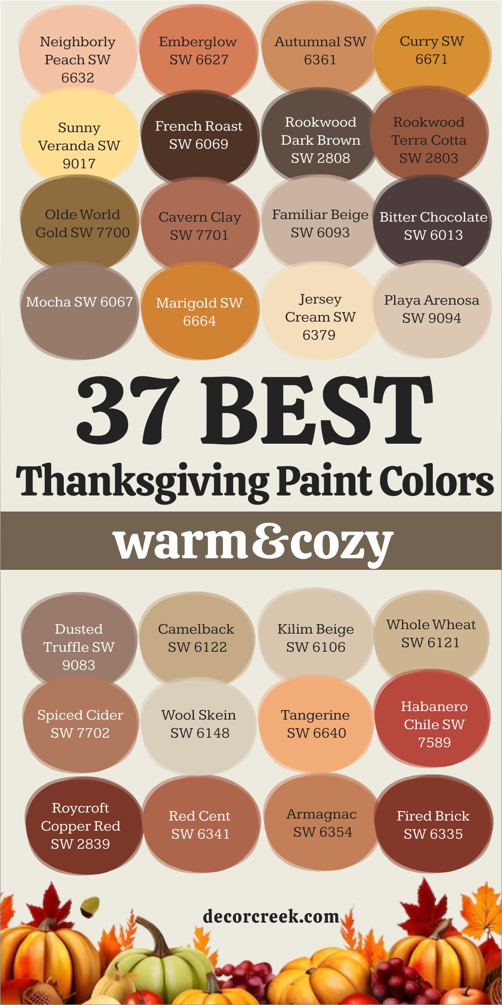
37 Best Thanksgiving Paint Color Warm & Cozy
Neighborly Peach SW 6632
Neighborly Peach carries the glow of the late-day sky when the horizon is painted with golden orange. The shade feels radiant yet steady, making it perfect for living rooms, dining areas, or cozy entryways. Neighborly Peach pairs beautifully with creamy whites, dark wood, and soft taupes, creating a palette that feels warm and inviting.
I love how it beams in daylight and deepens into a rich, sunset-inspired glow at night. It highlights Thanksgiving décor like pumpkins, candles, and copper accents naturally.
For Thanksgiving, Neighborly Peach sets the mood with its golden-orange glow, making every gathering feel festive and joyful.
Pumpkin Spice (Emberglow) SW 6627
Pumpkin Spice SW 6627 carries the richness of autumn harvest with a vibrant orange-red touch. The shade feels cheerful and cozy, perfect for kitchens, dining rooms, or family gathering spaces. Pumpkin Spice pairs beautifully with golden accents, creamy whites, and rustic woods, creating a palette that feels festive and balanced.
I love how it shines brightly in natural light and glows warmly in the evening. It highlights fall décor like wreaths, centerpieces, and copper pans with charm.
For Thanksgiving, Pumpkin Spice brings playful energy and warmth, filling the home with cheer.
Autumnal SW 6361
Autumnal SW 6361 carries the warmth of roasted vegetables with a soft golden-orange tone. The shade feels rich yet comforting, making it perfect for dining rooms, kitchens, or accent walls. Autumnal pairs beautifully with warm neutrals, deep greens, and rustic wood, creating a palette that feels balanced and inviting.
I love how it glows gently in daylight and deepens into a golden harvest hue at night. It highlights seasonal décor like candles, baskets, and linens naturally.
For Thanksgiving, Autumnal brings comfort and charm, making the home feel abundant.

Curry SW 6671
Curry SW 6671 carries the sweetness of desserts with the richness of amber tones. The shade feels warm and inviting, making it perfect for kitchens, dining areas, or cozy living spaces. Curry pairs beautifully with creamy whites, dark browns, and golden metallics, creating a palette that feels festive. I love how it brightens rooms during the day and glows with depth at night.
It highlights Thanksgiving accents like candleholders, copper pots, and seasonal fabrics with ease. For Thanksgiving, Curry fills the home with warmth and joy, reminding everyone of celebration.
Sunny Veranda SW 9017
Sunny Veranda SW 9017 carries the richness of golden harvest fields with a warm glow. The shade feels soft yet abundant, making it perfect for living rooms, dining rooms, or entryways. Sunny Veranda pairs beautifully with creams, taupes, and deep woods, creating a palette that feels natural and balanced. I love how it shines in the afternoon light and softens into a mellow warmth at night.
It highlights holiday decorations like woven baskets, candles, and rustic fabrics in a graceful way. For Thanksgiving, Sunny Veranda brings abundance and comfort, surrounding the home with festive energy.

French Roast SW 6069
French Roast SW 6069 carries the depth of spiced wine with a dark, velvety undertone. The shade feels rich and comforting, perfect for dining rooms, living rooms, or accent walls. Mulled Wine pairs beautifully with creamy whites, golden accents, and deep woods, creating a palette that feels festive and cozy. I love how it looks bold in the morning light and softens into a warm glow at night.
It highlights Thanksgiving décor like candles, table runners, and rustic pottery naturally. For Thanksgiving, French Roast adds elegance and warmth, making gatherings feel more intimate.
Rookwood Dark Brown SW 2808
Rookwood Dark Brown SW 2808 carries the richness of polished wood with a glowing red-brown tone. The shade feels bold yet inviting, making it perfect for dining rooms, libraries, or rustic kitchens. Rookwood Dark Brown pairs beautifully with creamy whites, muted golds, and natural stone, creating a palette that feels balanced. I love how it shines in daylight and deepens into a warm, glowing mahogany by evening.
It highlights seasonal décor like wooden trays, copper pots, and candles naturally. For Thanksgiving, Rookwood Dark Brown gives the home a sense of tradition and lasting comfort.
Rookwood Terra Cotta SW 2803
Rookwood Terra Cotta SW 2803 carries the glow of sun-baked clay with earthy strength. The shade feels warm and grounded, making it perfect for dining rooms, kitchens, or entryways. Rookwood Terra Cotta pairs beautifully with creamy whites, natural stone, and wooden textures, creating a palette that feels balanced and festive. I love how it looks sunlit during the day and deepens into a rich clay tone at night.
It highlights autumn décor like terracotta pots, rustic linens, and candles beautifully. For Thanksgiving, Rookwood Terra Cotta adds an earthy charm, filling the home with heritage.
Olde World Gold SW 7700
Olde World Gold SW 7700 carries the patina of aged copper touched by warm light. The shade feels bold yet festive, making it perfect for dining areas, accent walls, or kitchens. Olde World Gold pairs beautifully with creamy whites, golden accents, and rustic wood, creating a palette that feels grounded. I love how it glows with energy in daylight and takes on a rich metallic warmth at night.
It highlights seasonal accents like candleholders, copper pans, and garlands naturally. For Thanksgiving, Olde World Gold adds sparkle and tradition, making the home shine with celebration.
Cavern Clay SW 7701
Cavern Clay SW 7701 carries the brightness of polished metal touched by firelight. The shade feels bold yet warm, making it perfect for dining rooms or living spaces where people gather. Cavern Clay pairs beautifully with golden lighting, rustic wood, and soft creams, creating a palette that feels festive. I love how it shifts with the light, glowing softly in the morning and radiating deeply in the evening.
It highlights seasonal décor like candles, copper pots, and fall wreaths with ease. For Thanksgiving, Cavern Clay gives the home the sparkle of celebration and the comfort of tradition in one shade.
Familiar Beige SW 6093
Familiar Beige SW 6093 carries the depth of warm spices with a rich earthy tone. The shade feels grounded yet inviting, making it perfect for dining rooms, kitchens, or rustic living rooms. Familiar Beige pairs beautifully with creamy whites, muted golds, and natural wood, creating a palette that feels steady and festive. I love how it glows warmly under sunlight and deepens into a spiced richness at night.
It highlights seasonal décor like pottery, candles, and baskets naturally. For Thanksgiving, Familiar Beige adds spice and comfort, giving the home a warm and traditional touch.
Bitter Chocolate SW 6013
Bitter Chocolate SW 6013 carries the richness of roasted beans with a dark, grounding tone. The shade feels bold yet cozy, perfect for dining rooms, kitchens, or accent walls. Bitter Chocolate beautifully with creamy whites, golden accents, and rustic wood, creating a palette that feels balanced and strong. I love how it looks bold in daylight and softens into a deep, velvety brown at night.
It highlights holiday décor like mugs, wooden bowls, and autumn garlands naturally. For Thanksgiving, Bitter Chocolate S adds depth and strength, filling the home with comfort.
Mocha SW 6067
Mocha SW 6067 carries the sweetness of milk coffee with a soft beige undertone. The shade feels light yet cozy, making it perfect for kitchens, dining rooms, or bedrooms. Mocha pairs beautifully with creamy whites, sandy neutrals, and golden accents, creating a palette that feels balanced and warm. I love how it shines softly during the day and deepens into a mellow glow at night.
It highlights seasonal décor like candles, linens, and rustic accents naturally. For Thanksgiving, Mocha adds sweetness and warmth, making the home feel cheerful.
Marigold SW 6664
Marigold SW 6664 carries the richness of golden sunsets with a glowing orange-brown tone. The shade feels festive yet cozy, making it perfect for dining areas, entryways, or family spaces. Marigold pairs beautifully with creamy whites, deep browns, and golden accents, creating a palette that feels abundant. I love how it glows warmly in daylight and deepens beautifully at night.
It highlights Thanksgiving décor like garlands, copper details, and candles naturally. For Thanksgiving, Marigold brings golden charm, making gatherings glow with joy.
Jersey Cream SW 6379
Jersey Cream SW 6379 carries the sweetness of candy mixed with a golden hue. The shade feels cheerful and cozy, making it perfect for kitchens, dining rooms, or playful accent walls.
Jersey Cream pairs beautifully with creamy whites, golden accents, and rustic woods, creating a palette that feels fun and festive. I love how it beams in daylight and turns into a rich golden glow by evening.
It highlights holiday décor like table runners, garlands, and candles with ease. For Thanksgiving, Jersey Cream adds sweetness and joy, making gatherings feel warm and lively.
Playa Arenosa SW 9094
Playa Arenosa SW 9094 carries the comfort of worn pottery with a hint of peachy warmth. The shade feels gentle and grounding, perfect for living rooms, hallways, or family dining spaces. Soft Clay Beige pairs beautifully with warm whites, rich woods, and earthy reds, creating a palette that feels casual yet festive. I love how it picks up the warmth of candlelight and glows softly through the evening.
It brings out the best in autumn wreaths, handmade pottery, and rustic baskets. For Thanksgiving, Soft Clay Beige adds a handmade feel that makes a house feel like home.
Dusted Truffle SW 9083
Dusted Truffle SW 9083 carries the depth of dry earth touched by soft light. The shade feels sturdy and calming, making it perfect for bedrooms, kitchens, or any spot where people gather. Dusted Truffle pairs beautifully with creamy whites, weathered wood, and dried floral tones, creating a palette that’s warm and familiar. I love how it changes with the light, offering a steady warmth in every corner.
It’s a great backdrop for Thanksgiving centerpieces, harvest textures, and golden accents. Dusted Truffle fills the home with a quiet joy that’s steady and real.
Camelback SW 6122
Camelback SW 6122 carries the soft glow of desert sand with a gentle golden undertone. The shade feels grounded and warm, perfect for entryways, bedrooms, or open-concept rooms. Camelback pairs beautifully with soft whites, deep browns, and muted reds, making it easy to build a cozy holiday setting. I love how it welcomes natural textures like baskets, clay pottery, and wood tones.
It shines brightest when the sunlight moves through the room, wrapping everything in comfort. For Thanksgiving, Camelback offers a gentle foundation that brings the whole home together.
Kilim Beige SW 6106
Kilim Beige SW 6106 carries the warmth of sunbaked earth with a soft golden tint. The shade feels relaxed and lived-in, perfect for bedrooms, dining rooms, or living spaces. Kilim Beige pairs beautifully with deep reds, dusty greens, and creamy neutrals, creating a holiday palette that feels balanced and festive. I love how it makes the room feel instantly grounded without being too dark.
It lets Thanksgiving accents like wreaths, candles, and wood furniture shine. Kilim Beige adds comfort and familiarity to any gathering.
Whole Wheat SW 6121
Whole Wheat SW 6121 carries the heartiness of baked bread with a deep golden beige tone. The shade feels warm and wholesome, perfect for kitchens, breakfast nooks, and cozy dens. Whole Wheat pairs beautifully with soft creams, warm reds, and bronze accents, giving the home a gentle autumn rhythm. I love how it deepens with candlelight and brings warmth to even the quietest corners.
It’s perfect for Thanksgiving when you want every detail to feel homey and welcoming. Whole Wheat wraps the room in comfort from morning coffee to evening dessert.
Spiced Cider SW 7702
Spiced Cider feels like holding a warm mug on a crisp November evening, full of richness and cheer. The shade carries depth that makes kitchens and dining rooms glow with warmth. Spiced Cider pairs beautifully with golden yellows, creamy whites, and rustic wood, creating a palette that feels joyful and balanced.
I love how it adapts throughout the day—bright and lively in the morning, then glowing softly at night. The color highlights seasonal decorations perfectly, from pumpkins to candles, giving them an extra touch of charm. Guests often describe it as cozy and inviting, a shade that makes them want to gather closer.
For Thanksgiving, Spiced Cider feels like comfort poured directly onto the walls.
Wool Skein SW 6148
Wool Skein feels soft and comforting, like wrapping up in a warm blanket on a chilly night. The shade has a gentle warmth that makes kitchens, dining rooms, and living areas feel cozy. Wool Skein pairs beautifully with golden yellows, rustic wood, and creamy whites, creating a palette that feels welcoming and festive.
I love how it adds subtle depth without ever overwhelming a room, letting seasonal décor shine. In daylight, it feels light and open, while in the evening it becomes warmer and more intimate. Guests often describe it as cozy and reassuring, the kind of color that makes them feel cared for.
For Thanksgiving, Wool Skein surrounds gatherings with comfort and gratitude.
Tangerine SW 6640
Tangerine SW 6640 brings the glow of ripe citrus to any room where people gather. Tangerine SW 6640 feels bright yet friendly, perfect for a breakfast nook or a lively kitchen wall. Tangerine SW 6640 pairs beautifully with creamy trim, light oak, and brushed brass for a sunny, welcoming look.
Tangerine SW 6640 shifts from fresh and zesty in morning light to a cozy orange in the evening. Tangerine SW 6640 makes pumpkins, patterned linens, and warm candlelight stand out on Thanksgiving.
Tangerine SW 6640 helps guests feel cheerful, talkative, and ready to share stories around the table.

Habanero Chile SW 7589
Habanero Chile SW 7589 brings a spicy, red-orange spark that feels lively without being too strong. Habanero Chile SW 7589 works well on an accent wall in a dining room or around a fireplace where warmth matters. Habanero Chile SW 7589 pairs with dark walnut, matte black hardware, and soft ivory to balance its heat. Habanero Chile SW 7589 glows in daylight and settles into a deep ember tone by night.
Habanero Chile SW 7589 sets off copper pans, woven chargers, and berry garlands beautifully. Habanero Chile SW 7589 gives Thanksgiving dinner a bold backdrop that still feels welcoming.
Roycroft Copper Red SW 2839
Roycroft Copper Red SW 2839 brings old-world charm with a grounded, clay-red heart. Roycroft Copper Red SW 2839 looks wonderful in dining rooms, mudrooms, and cozy hallways that need warmth. Roycroft Copper Red SW 2839 pairs with cream beadboard, oil-rubbed bronze, and aged leather for depth. Roycroft Copper Red SW 2839 shifts from brick-like in morning light to a richer copper glow at dusk.
Roycroft Copper Red SW 2839 makes dried florals, terracotta, and candleholders feel extra special. Roycroft Copper Red SW 2839 turns Thanksgiving into a scene filled with comfort and gentle tradition.
Red Cent SW 6341
Red Cent SW 6341 brings a russet glow that reminds me of polished autumn leaves. Red Cent SW 6341 works as a feature wall behind a table or a cozy reading corner by the window. Red Cent SW 6341 pairs with warm white trim, cane textures, and antique brass for easy harmony. Red Cent SW 6341 brightens gently at noon and deepens to a mellow, nutty tone at night. Red Cent SW 6341 makes gourds, plaid napkins, and wooden boards look rich and inviting.
Red Cent SW 6341 helps the whole home feel ready for long talks and second helpings.

Armagnac SW 6354
Armagnac SW 6354 brings an amber warmth that feels like a soft glow after sunset. Armagnac SW 6354 suits dining rooms, butler’s pantries, and cozy sitting areas that ask for comfort. Armagnac SW 6354 pairs with linen curtains, honey oak, and aged brass to keep things balanced. Armagnac SW 6354 looks golden by day and turns deeper and smoother under lamplight. Armagnac SW 6354 flatters centerpieces with dried wheat, copper cups, and amber glass.
Armagnac SW 6354 makes Thanksgiving feel slow, sweet, and full of easy conversation.

Fired Brick SW 6335
Fired Brick SW 6335 brings sturdy character with a rich red-brown tone. Fired Brick SW 6335 is lovely around fireplaces, built-ins, and a dining wall that frames family photos. Fired Brick SW 6335 pairs with cream trim, iron hardware, and natural stone for down-to-earth style. Fired Brick SW 6335 reads brighter in sunlight and settles into a calm ember by evening. Fired Brick SW 6335 highlights wood bowls, iron lanterns, and plaid throws beautifully.
Fired Brick SW 6335 makes Thanksgiving feel grounded, warm, and full of homey comfort.
Humble Gold SW 6380
Humble Gold SW 6380 brings soft golden light that lifts a room with gentle cheer. Humble Gold SW 6380 is great for kitchens, breakfast corners, and entry halls that welcome guests. Humble Gold SW 6380 pairs with creamy trim, rattan textures, and brushed gold accents for glow. Humble Gold SW 6380 looks sunny in the daytime and turns honey-warm after dark. Humble Gold SW 6380 makes candlesticks, wheat bundles, and copper chargers shine.
Humble Gold SW 6380 sets a thankful mood that feels bright, friendly, and easy to love.

Sumptuous Peach SW 6345
Sumptuous Peach SW 6345 brings a soft peach tone that flatters skin and smiles. Sumptuous Peach SW 6345 suits dining nooks, powder rooms, and a cozy wall behind open shelving. Sumptuous Peach SW 6345 pairs with warm white, sand-colored linens, and light oak for balance. Sumptuous Peach SW 6345 reads fresh by day and turns to a gentle glow at dinner. Sumptuous Peach SW 6345 lets floral napkins, apricot roses, and brass flatware shine.
Sumptuous Peach SW 6345 gives Thanksgiving a sweet, welcoming feeling that lasts through dessert.
Ravishing Coral SW 6612
Ravishing Coral SW 6612 brings playful coral energy that still feels warm and friendly. Ravishing Coral SW 6612 works on an accent wall, a pantry door, or a cheerful dining backdrop. Ravishing Coral SW 6612 pairs with ivory trim, bamboo textures, and burnished gold for balance. Ravishing Coral SW 6612 looks lively in morning light and mellows to a soft blush by night. Ravishing Coral SW 6612 makes citrus, ranunculus, and copper flatware pop.
Ravishing Coral SW 6612 turns Thanksgiving into a bright, happy moment everyone remembers.
Papaya SW 6661
Papaya SW 6661 brings a golden-peach tone that feels cozy and light at once. Papaya SW 6661 suits breakfast rooms, small dining corners, and kitchens that need gentle warmth. Papaya SW 6661 pairs with vanilla trim, woven shades, and warm wood counters for harmony. Papaya SW 6661 glows like afternoon sun and softens into a mellow haze at night. Papaya SW 6661 flatters linen runners, baked pies, and amber glass bottles.
Papaya SW 6661 makes Thanksgiving feel sunny, relaxed, and full of easy comfort.
Hearty Orange SW 6622
Hearty Orange SW 6622 brings a rich pumpkin note that feels joyful and bold. Hearty Orange SW 6622 is perfect for a dining feature wall or a lively kitchen island. Hearty Orange SW 6622 pairs with cream tile, walnut stools, and aged brass pulls for balance. Hearty Orange SW 6622 is bright at noon and turns to a toasty glow with candles. Hearty Orange SW 6622 makes wreaths, copper pans, and patterned napkins stand out.
Hearty Orange SW 6622 creates a thankful, lively setting where everyone wants to linger.
Copper Mountain SW 6356
Copper Mountain SW 6356 brings a burnished orange-brown that feels sturdy and warm. Copper Mountain SW 6356 shines on built-ins, bar carts, and a statement dining wall. Copper Mountain SW 6356 pairs with canvas-white trim, leather chairs, and hammered metal. Copper Mountain SW 6356 shifts from bright copper by day to a deeper tone by night. Copper Mountain SW 6356 flatters wood boards, candlelight, and woven chargers.
Copper Mountain SW 6356 sets a grounded Thanksgiving mood filled with glow and comfort.

Red Barn SW 7591
Red Barn SW 7591 brings classic barn-red warmth with a friendly country spirit. Red Barn SW 7591 looks great on a front door, a dining accent wall, or shiplap around a nook. Red Barn SW 7591 pairs with creamy white, black iron, and honey wood for balance. Red Barn SW 7591 brightens in sunlight and turns cozy and deep after dusk. Red Barn SW 7591 sets off plaid throws, pine cones, and copper accents.
Red Barn SW 7591 gives Thanksgiving a hearty, welcoming feel that suits family style meals.

Nearly Peach SW 6336
Nearly Peach SW 6336 brings a pale peach wash that feels fresh and gentle. Nearly Peach SW 6336 is lovely in small dining areas, hallways, and guest rooms that need light. Nearly Peach SW 6336 pairs with white trim, natural rattan, and pale oak for an easy look. Nearly Peach SW 6336 glows softly in the afternoon and warms under lamps at dinner. Nearly Peach SW 6336 lets flowers, linen napkins, and polished cutlery shine.
Nearly Peach SW 6336 makes Thanksgiving feel soft, bright, and welcoming for every guest.
Jazz Age Coral SW 0058
Jazz Age Coral SW 0058 brings a vintage coral note that feels joyful and chic. Jazz Age Coral SW 0058 looks great on a dining accent wall, a bar hutch, or a pantry door. Jazz Age Coral SW 0058 pairs with warm white trim, brass knobs, and mid-tone wood for balance. Jazz Age Coral SW 0058 is lively by day and turns smooth and glowing by candlelight. Jazz Age Coral SW 0058 flatters glassware, citrus, and rose bouquets on the table.
Jazz Age Coral SW 0058 gives Thanksgiving a happy, spirited mood that keeps conversations flowing.

Final Thoughts on Thanksgiving Paint Color Ideas in 2026
When I think about Thanksgiving, I always come back to the feeling of warmth that color brings into a home. The right shades turn walls into part of the celebration, wrapping guests in comfort before the first plate is even served. Deep browns steady the room like strong roots, golden tones glow with abundance, and earthy reds remind us of the richness of tradition.
Neutrals balance everything, giving space for decorations, food, and laughter to shine. I believe that painting with intention is one of the simplest ways to make gatherings feel more meaningful.
This year’s Thanksgiving palette proves that warmth never goes out of style—it simply shifts into new shades of joy.