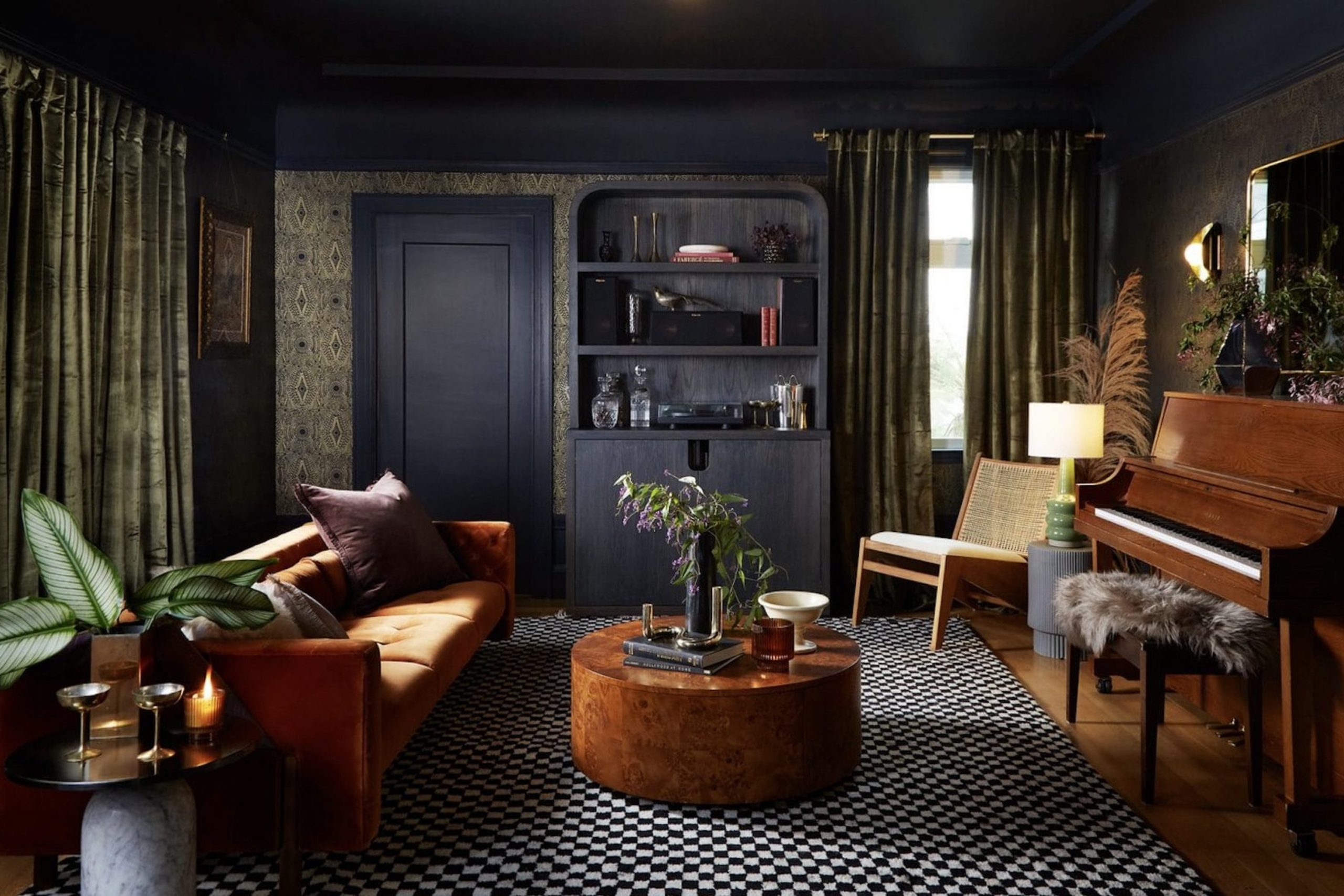
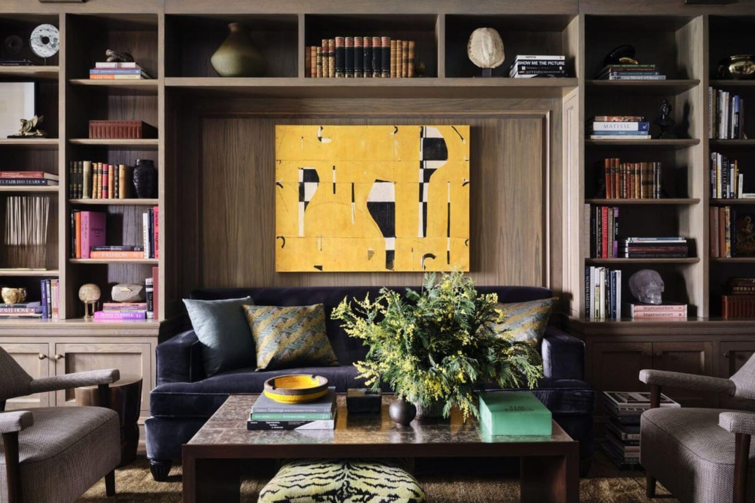
Building a dark academia home is like living permanently inside the hallowed halls of an ancient library, a place where every corner is filled with the scent of aged leather books, the weight of centuries-old knowledge, and the allure of hidden secrets. I am constantly inspired by how these specific colors make a room feel physically substantial, intellectually sharp, and vibrating with the echoes of history.
You certainly do not need to be a tenured professor or a lifelong scholar to fall in love with this aesthetic; you simply need to have a deep appreciation for a bit of mystery and the quiet gravity of a well-designed space.
Dark walls serve as a powerful, dramatic stage that makes your artwork pop with newfound intensity and makes your soft lamplight feel significantly brighter and more intentional.
Why I Trust Sherwin-Williams and Benjamin Moore for Rich, Moody Shades
I have spent many years professionally painting rooms for a diverse range of clients and staging high-end houses to ensure they sell for the best possible price. In my experience, Sherwin-Williams and Benjamin Moore are the only paint brands I will ever use when I want a finished color to look genuinely expensive, rich, and sophisticated.
Their dark pigments are incredibly thick and high-quality, allowing them to cover the walls evenly and thoroughly without ever looking patchy, thin, or cheap.
When you are searching for a deep, soulful forest green or a velvety, absolute black, these brands provide the exceptional saturation and depth that ensure the final result on your wall matches exactly what you saw on the professional paint chip.
How I Choose Deep, Dramatic Paint Colors for a True Scholarly Interior
I make it a point to meticulously analyze the natural and artificial light in a room before I ever commit to a specific dark shade. If a room is blessed with large windows and plenty of sunlight, a dark color will look incredibly rich and vibrant, proudly showing off its complex green, blue, or red undertones throughout the day.
Conversely, in a room with limited light, these colors will deepen until they look almost black, which is absolutely perfect for creating a cozy, secluded study meant for deep focus.
I also carefully consider the specific wood furniture, antique textures, and gold-leaf frames that will be placed against the wall to ensure the color creates a harmonious, authentic feeling of timelessness.
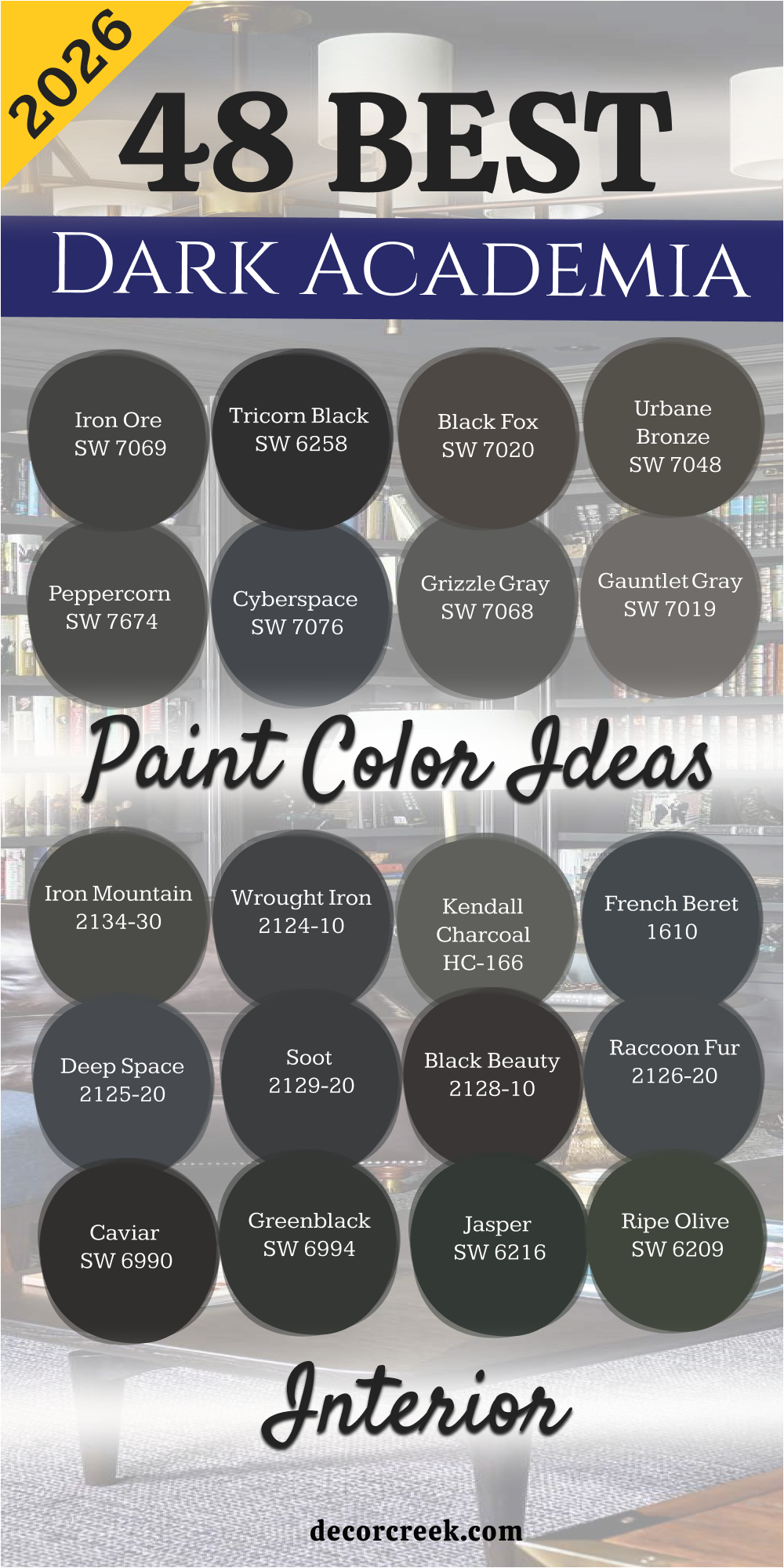
48 Dark Academia Interior Paint Color Ideas For 2026
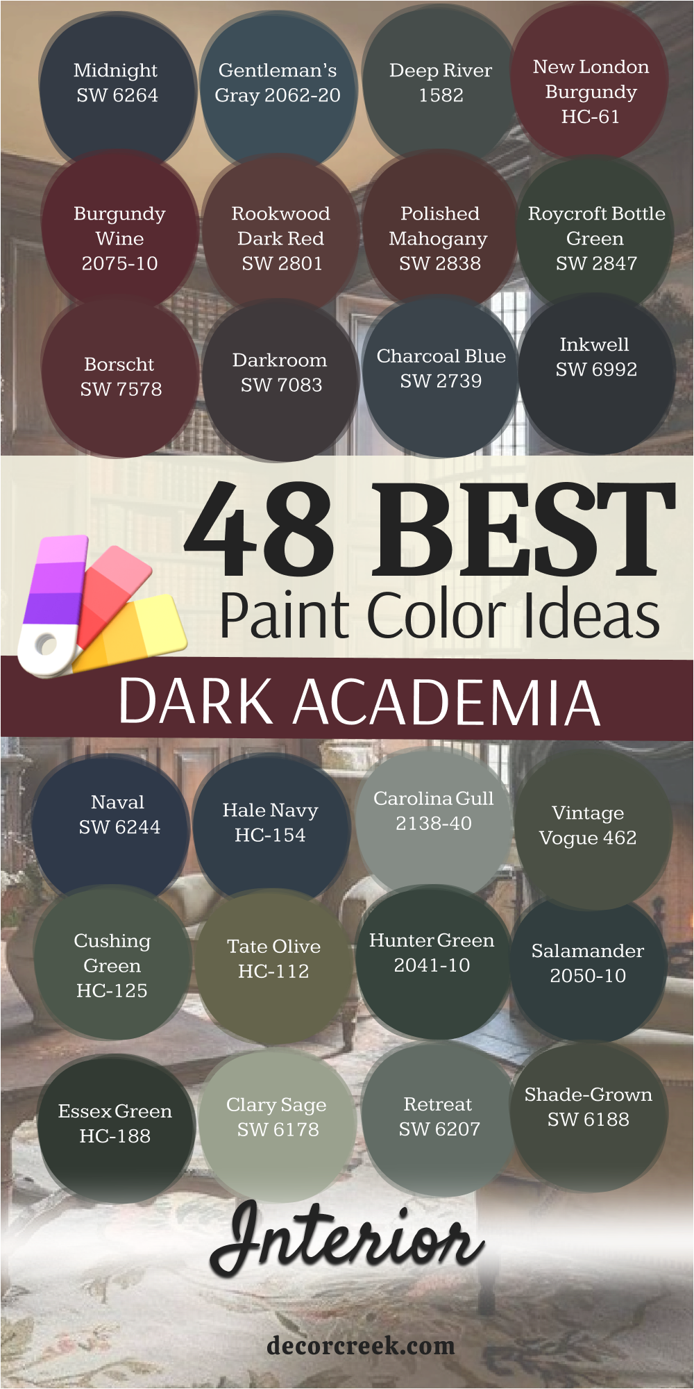
Iron Ore SW 7069
Iron Ore SW 7069 is a soft black that feels like a charcoal drawing. It has a velvet look that makes walls seem very expensive. I love how it sits behind a bookshelf full of old novels. This shade is not too harsh for people who are scared of pure black.
It catches the light just enough to show some gray depth. You can use it to create a focal point in a large room. It works wonders when you want a moody vibe without feeling cold.
The color reminds me of a stormy night in an old stone mansion. It is a great pick for a modern library or a cozy bedroom. I always suggest this for anyone starting their dark academia journey.
Best used in: living rooms, home libraries, bedrooms, and media rooms
Pairs well with: Alabaster SW 7008, Classic Gray OC-23, Cognac leather, brass accents The key rule of this color for dark academia style is to use it on all four walls to create a snug, enclosed feeling.

Tricorn Black SW 6258
Tricorn Black SW 6258 is the most honest black paint you will ever find. It does not have any sneaky blue or brown tones hidden inside it. I use it when I want a room to look sharp and very defined. It looks amazing on window frames or built-in cabinets.
This color makes gold picture frames look like they belong in a museum. It provides a high-contrast look that feels very bold and brave. The finish stays looking crisp even as the sun moves across the room.
I think it is the perfect backdrop for a collection of white marble statues. It brings a sense of order to a cluttered, book-filled room. Many people find it to be the ultimate anchor for a dramatic home design.
Best used in: doors, trim, accent walls, and home theaters
Pairs well with: Pure White SW 7005, Carrara marble, gold leaf, dark oak floors The key rule of this color for dark academia style is to use a satin finish on trim to make the black look polished and intentional.

Black Fox SW 7020
Black Fox SW 7020 is a warm black that has a lot of chocolate brown in it. It feels like a cup of dark coffee or an old leather chair. I like it because it feels more organic and grounded than a true black.
It works perfectly in a room with lots of plants and wooden desks. This shade creates a sense of comfort that is hard to find with cooler grays. It makes a bedroom feel like a safe cave where you can sleep for hours.
The brown undertones help it blend with autumn colors like orange and gold. I see this as a very sophisticated choice for a dining room. It adds a layer of warmth that keeps the dark academia look from feeling too spooky. This color is a favorite for those who love traditional, earthy palettes.
Best used in: dining rooms, bedrooms, kitchen islands, and exterior accents
Pairs well with: Shoji White SW 7042, terracotta, aged brass, walnut furniture The key rule of this color for dark academia style is to pair it with warm lighting to bring out the rich brown base.
Urbane Bronze SW 7048
Urbane Bronze SW 7048 is a mix of gray, brown, and green that looks like weathered metal. It is a very smart color that feels both old and new at the same time. I often use it for cabinets because it hides fingerprints and looks very sturdy.
This color has a natural feel that reminds me of forest soil. It provides a great middle ground for people who want dark walls but not black ones. The way it shifts in the light makes the room feel alive and interesting.
It looks very high-end when paired with light linen fabrics and heavy rugs. I think it is the best color for a home office where you need to focus. It creates a serious mood that helps you get your work done. This shade is a staple for any designer looking to add some gravity to a house.
Best used in: home offices, kitchen cabinets, living rooms, and doors
Pairs well with: Modern Gray SW 7632, silver accents, light oak, linen textures The key rule of this color for dark academia style is to use it in rooms with natural wood to highlight the earthy bronze tones.

Peppercorn SW 7674
Peppercorn SW 7674 is a balanced dark gray that sits right in the middle of the spectrum. It does not lean too far toward blue or too far toward brown. I find it very helpful when I need a color that works with both silver and gold.
It makes white trim look incredibly bright and clean by comparison. This color gives a room a sense of mystery without being too heavy. It reminds me of chalkboard dust or a rainy afternoon in a city.
The depth of this gray is perfect for a hall filled with family photos. It makes every piece of furniture in the room look more important. I love how it provides a cool background for colorful book spines. It is a safe but very stylish choice for a moody interior.
Best used in: hallways, living rooms, bedrooms, and cabinets
Pairs well with: Extra White SW 7006, navy blue, cherry wood, pewter The key rule of this color for dark academia style is to use it as a neutral base that allows your colorful collections to shine.
Cyberspace SW 7076
Cyberspace SW 7076 is a deep navy blue that is so dark it almost looks black. It feels like the sky right before a big thunderstorm rolls in. I love using this in bedrooms because blue is a very relaxing color.
It has enough gray in it to keep it from looking like a child’s room. This shade looks amazing with dark velvet curtains and wool blankets. It creates a very scholarly look that fits perfectly with the academia theme.
The color stays very consistent even when the lights are turned down low. It makes a great statement wall behind a big wooden bed frame. I think it adds a touch of royalty to a regular home. This is a top pick for anyone who loves the ocean at night.
Best used in: master bedrooms, accent walls, studies, and powder rooms
Pairs well with: Sea Salt SW 6204, copper, cream, dark mahogany The key rule of this color for dark academia style is to use it where you want a sense of deep quiet and reflection.

Grizzle Gray SW 7068
Grizzle Gray SW 7068 is a moody dark gray with a hint of forest green. It looks like the coat of an old wolf or a foggy mountainside. I like it because it feels more interesting than a standard charcoal.
It pairs beautifully with dark green plants and leather furniture. This color brings a sense of the outdoors inside the house. It makes a small room feel like a cozy hiding spot. The green undertone gives it a very scholarly, old-world feeling.
I often recommend it for a library or a reading nook. It feels very grounded and does not distract you from your books. This shade is perfect for creating a look that is both rugged and refined.
Best used in: reading nooks, libraries, mudrooms, and basement dens
Pairs well with: Ethereal White SW 6182, sage green, pine wood, iron fixtures The key rule of this color for dark academia style is to use it in areas where you want to feel connected to nature and study.
Gauntlet Gray SW 7019
Gauntlet Gray SW 7019 is a warm, stone-colored gray that feels very solid. It reminds me of the walls of a medieval castle or an old university. I love how it makes a room feel safe and very sturdy.
It has enough warmth to keep a large room from feeling drafty. This color looks great with stone fireplaces and heavy woven rugs. It provides a sophisticated look that never goes out of style. The color is deep enough to be moody but light enough to show shadows.
I use it when I want a room to feel established and historic. It is a great background for black-and-white photography. This shade is a reliable choice for a masculine or gender-neutral space.
Best used in: living rooms, hallways, exteriors, and fireplace surrounds
Pairs well with: Repose Gray SW 7015, black metal, cognac leather, white oak The key rule of this color for dark academia style is to use it on textured walls to mimic the look of old stone.
Iron Mountain 2134-30
Iron Mountain 2134-30 is a Benjamin Moore favorite that has a soft, smokey look. It is a dark gray that feels a bit softer than the Sherwin-Williams version. I like the way it flows between rooms in a house.
It has a slightly blue-purple undertone that makes it feel very regal. This color looks wonderful in a dining room with a big chandelier. It creates a sense of drama that is perfect for hosting dinner parties.
The paint has a depth that makes the walls look like they are made of silk. I find that it works well with both light and dark wood floors. It is a great color for someone who wants a high-fashion look. This shade brings a lot of personality to a plain room.
Best used in: dining rooms, master suites, cabinets, and front doors
Pairs well with: Cloud White OC-130, lavender, silver, ebony wood The key rule of this color for dark academia style is to use it with metallic accents to highlight the cool undertones.

Wrought Iron 2124-10
Wrought Iron 2124-10 is a very popular dark gray that acts like a chameleon. Sometimes it looks like a soft black, and other times it looks like a deep navy. I love this flexibility because it changes as the day goes on.
It feels very heavy and expensive on a wall. This color is perfect for a library with floor-to-ceiling shelves. It makes a room feel like a sanctuary away from the rest of the world. The color is dark enough to be bold but soft enough to be inviting.
I think it is the best dark gray for people who love antique furniture. It makes old wood look rich and very well-cared for. This shade is a classic that I use over and over again.
Best used in: libraries, accent walls, kitchen cabinets, and shutters
Pairs well with: White Dove OC-17, gold, navy, light gray fabrics The key rule of this color for dark academia style is to use it on built-in shelving to create a seamless, dramatic look.

Kendall Charcoal HC-166
Kendall Charcoal HC-166 is a versatile dark gray that acts as a perfect neutral for any scholarly home. It has a rich quality that makes it look like expensive slate or high-end suit fabric. I love how it balances warm and cool tones so it never feels too clinical or too muddy.
This shade provides a deep background that makes colorful book spines and gold leaf frames really stand out. It works beautifully in rooms where you want a sense of serious focus and quiet study.
The color stays true throughout the day and does not shift wildly under artificial light. I often use it to ground a room that has very high ceilings and lots of windows. It creates a sophisticated atmosphere that feels established and full of quiet wisdom. Many homeowners choose this as their first step into the world of moody, dark interiors. It is a reliable choice that brings a touch of class to a modern or traditional house.
Best used in: home offices, dining rooms, kitchen islands, and exterior siding
Pairs well with: White Dove OC-17, Revere Pewter HC-172, navy accents, light oak floors The key rule of this color for dark academia style is to use it where you want a professional yet cozy feeling that encourages deep thinking.

French Beret 1610
French Beret 1610 is a stunningly dark gray with a very strong lean toward a navy blue base. It reminds me of the ink used in old fountain pens or a deep twilight sky over a city. I find that this color adds a layer of mystery to a room that a standard gray simply cannot match.
It feels very plush and soft on the walls when you use a flat or matte finish. This shade is perfect for a bedroom where you want to feel tucked away from the busy world. It looks incredible when paired with dark wood furniture and brass reading lamps for a classic look.
The blue undertone keeps the room feeling cool and refreshed even though the color is quite heavy. I think it is one of the most stylish colors in the Benjamin Moore collection for a moody home. It brings a sense of high-fashion and artistic flair to any wall it touches in your house.
Best used in: bedrooms, library nooks, powder rooms, and accent walls
Pairs well with: Paper White OC-55, silver accents, cool marble, velvet fabrics The key rule of this color for dark academia style is to pair it with cool-toned metals like silver or pewter to highlight the blue depth.
Deep Space 2125-20
Deep Space 2125-20 is a very dark charcoal that has a misty, blue-gray quality to its appearance. It feels like standing in the middle of a thick fog in a forest at night. I love how this color can make the corners of a room seem to disappear into the shadows.
It is a great choice for a media room or a place where you want to get lost in a movie. The color has a muted quality that prevents it from feeling too bright or overwhelming to the eye. It works well as a backdrop for a large collection of vintage maps or botanical prints.
This shade makes white furniture look very modern and sharp against its deep, dark background. I find it to be a very calming color that helps to lower the energy in a high-traffic room. It provides a solid foundation for a room filled with heavy textiles and thick wool rugs.
Best used in: media rooms, basements, master bedrooms, and cabinetry
Pairs well with: Chantilly Lace OC-65, light gray, black iron, industrial light fixtures The key rule of this color for dark academia style is to use it in rooms with minimal decor to create a focused and moody atmosphere.
Soot 2129-20
Soot 2129-20 is a smoky black that feels like the inside of an old chimney or a burnt piece of wood. It is a very deep color but it has a softness that keeps it from being too harsh. I like to use this when I want a room to feel very old-fashioned and full of character.
It looks amazing on wood paneling or on the walls of a small, cramped reading room. This color creates a sense of intimacy that makes people want to sit down and talk for hours. It acts as a wonderful contrast to bright white trim or a light-colored stone fireplace.
The depth of the color is very impressive and it gives the walls a heavy, structural feeling. I think it is the perfect shade for a house that wants to feel like a historic manor. It is a bold choice that rewards you with a very unique and personal living area.
Best used in: fireplaces, studies, small hallways, and built-in bookshelves
Pairs well with: Simply White OC-117, warm wood tones, leather books, brick The key rule of this color for dark academia style is to use it in small doses or small rooms to maximize the cozy and protected feeling.
Black Beauty 2128-10
Black Beauty 2128-10 is a rich and warm black that feels like a piece of high-quality dark chocolate. It has a slight reddish undertone that makes it feel much more inviting than a cold, blue black. I love using this color in a dining room to create a very dramatic and upscale environment.
It makes the light from a chandelier look warm and sparkly against the dark background of the walls. This shade is very luxurious and it makes any room feel like it belongs in a five-star hotel. It provides a perfect canvas for gold-framed mirrors and antique wooden sideboards in a traditional home.
The warmth of the color helps to keep a large room from feeling too empty or lonely. I find that it works very well with traditional rugs that have lots of red and orange patterns. It is a timeless color that adds a lot of value and style to your interior design.
Best used in: dining rooms, entryways, front doors, and accent furniture
Pairs well with: Cloud White OC-130, gold, deep red, walnut wood The key rule of this color for dark academia style is to use it where you want to create a sense of luxury and old-world elegance.
Raccoon Fur 2126-20
Raccoon Fur 2126-20 is a unique dark gray that has a very interesting balance of blue and violet tones. It reminds me of the sky during a cold winter evening or a piece of heavy iron. I like this color because it feels very thick and substantial on the walls of a house.
It changes its look quite a bit depending on the type of light bulbs you use in the room. This shade is very popular with people who want a dark room that still has a lot of personality. It looks great with natural textures like jute rugs, linen curtains, and raw wood furniture pieces.
The color brings a sense of the natural world inside while still looking very sophisticated and clean. I often recommend it for a bedroom where you want a bit of color without it being too bright. It is a very cool and modern take on the dark academia aesthetic for 2026.
Best used in: bedrooms, mudrooms, laundry rooms, and kitchen cabinets
Pairs well with: Gray Owl OC-52, natural wood, green plants, black accents The key rule of this color for dark academia style is to use it with plenty of natural textures to keep the room feeling organic and grounded.
Caviar SW 6990
Caviar SW 6990 is a deep and dark black that feels as smooth as the name suggests for your walls. It is almost a true black but it has a very tiny hint of warmth that keeps it from being flat. I use this when I want a room to have a very strong and powerful presence in the house.
It looks best in rooms with high ceilings where the dark walls can really stretch out and breathe. This color makes every other color in the room look much more vibrant and full of life. It is a favorite for staging homes because it looks very expensive and custom-made on the walls.
The finish looks like silk when you use the right type of paint from Sherwin-Williams in the room. I think it is the ultimate choice for a high-end library or a very fancy home office space. It creates a mood of success and serious study that is perfect for the academia theme.
Best used in: home libraries, offices, formal living rooms, and ceilings
Pairs well with: Alabaster SW 7008, emerald green, gold, dark cherry wood The key rule of this color for dark academia style is to use it on the ceiling as well as the walls for a total immersive experience.
Greenblack SW 6994
Greenblack SW 6994 is a fascinating color that looks like a deep forest at the very end of the day. It is a black paint that has a very strong and visible green undertone hidden deep inside. I love how it reveals its green side when the sun hits the wall directly in the morning.
It feels very scholarly and reminds me of old university buildings covered in thick green ivy. This shade is a great way to use green without it feeling too bright or like a kid’s room. It works perfectly with leather chairs and old wooden desks in a quiet home study area.
The green adds a level of comfort and peace that you do not always get with a pure black. I think it is one of the most beautiful colors for a room that is filled with indoor plants. It makes a house feel like a secret garden hidden away from the rest of the world.
Best used in: studies, dens, kitchen cabinets, and exterior doors
Pairs well with: Sea Salt SW 6204, warm brass, terra cotta, light wood The key rule of this color for dark academia style is to use it in rooms with large windows to let the green undertones show through.
Jasper SW 6216
Jasper SW 6216 is a very dark and moody forest green that feels extremely solid and grounded for a room. It is much more green than black, which makes it feel very lush and alive on your walls. I love how it creates a sense of history and tradition in a room that is otherwise very plain.
This color reminds me of the felt on an old billiard table or a heavy wool coat. It provides a wonderful background for light-colored artwork and white marble statues in a hall. The shade is very deep and it helps to hide any imperfections on the surface of your walls.
It makes a room feel very quiet and private, which is exactly what a dark academia home needs. I find that it pairs beautifully with dark brown leathers and very old, antique furniture pieces. This is a top choice for a room where you want to spend hours reading or writing.
Best used in: dining rooms, living rooms, libraries, and accent walls
Pairs well with: Shoji White SW 7042, gold leaf, dark oak, cream fabrics The key rule of this color for dark academia style is to use it in rooms where you want to feel a strong connection to tradition and history.

Ripe Olive SW 6209
Ripe Olive SW 6209 is a deep and dusty green that looks like the leaves of an old olive tree. It has a bit of gray in it that makes it feel very sophisticated and not too bright or grassy. I use this color when I want a room to feel very calm and settled for my clients’ homes.
It looks amazing with natural wood floors and light-colored rugs that have a bit of texture to them. This shade of green is very popular right now because it feels both modern and very classic at once. It makes a bedroom feel like a peaceful retreat where you can relax and clear your mind.
The color is dark enough to be moody but it still brings a lot of warmth and life into the house. I think it is a great alternative to gray or blue for people who want something a bit different. It is a very smart color that works in almost any room of a dark academia house.
Best used in: bedrooms, living rooms, kitchens, and home offices
Pairs well with: Natural Linen SW 9109, black metal, warm wood, white trim The key rule of this color for dark academia style is to use it with warm, natural accents to create a balanced and peaceful look.

Oakmoss SW 6180
Oakmoss SW 6180 is a deep forest green that feels like walking through a thick woods on a cloudy day. It has a dusty quality that makes the walls look like they have been there for a hundred years.
I love how this shade brings a natural and earthy vibe to a home without being too bright or loud. This color looks very smart when paired with old leather books and dark wood desks in a study. It creates a sense of steady calm that is perfect for someone who needs to focus on their work.
The green is heavy enough to feel moody but soft enough to be very comfortable for daily living. I think it provides a perfect backdrop for gold-framed art or botanical drawings on a gallery wall. It makes a room feel like a secret hiding spot where you can hide away from the world. This is a top pick for a house that wants to feel grounded and full of life at once.
Best used in: home offices, dens, bedrooms, and kitchen cabinets
Pairs well with: Alabaster SW 7008, warm wood tones, brass, and deep brown leather The key rule of this color for dark academia style is to use it in rooms where you want to feel a strong connection to nature and history.
Dried Thyme SW 6186
Dried Thyme SW 6186 is a muted sage green that has a lot of gray and blue hidden inside its base. It reminds me of the color of old herbs hanging in a kitchen or a vintage school chalkboard. I like how this color feels very scholarly and a bit old-fashioned in a very good way.
It is a great choice for a hallway or a mudroom because it hides dust and looks very clean. This shade gives a room a sense of peace that makes it very easy to spend a long time there. It looks wonderful when you use it with light linen curtains and soft woven rugs on the floor.
The color is dark enough to be part of a moody palette but light enough to not feel heavy. I find it to be a very refreshing color that still fits perfectly into the dark academia theme. It brings a touch of the countryside into an academic and serious interior design plan.
Best used in: hallways, laundry rooms, bedrooms, and kitchen walls
Pairs well with: Oyster White SW 7637, silver accents, light oak, and soft grays The key rule of this color for dark academia style is to use it as a bridge between your darkest rooms and your lighter spaces.

Pewter Green SW 6208
Pewter Green SW 6208 is a dark and cool green that has a very strong gray undertone for a rich look. It feels like the color of a stormy sea or a piece of old metal found in a museum. I use this color when I want a room to look very expensive and custom-designed for a client.
It has a velvet-like finish on the walls that catches the light in a very interesting way. This shade is perfect for a dining room where you want to host dinner parties with a lot of drama. It makes white plates and silver cutlery look very bright and shiny against the dark green background.
The color is very sophisticated and it never feels like it is trying too hard to be trendy. I think it is one of the best colors for creating a room that feels both quiet and powerful. It adds a level of maturity to a home that is hard to find with other green paints.
Best used in: dining rooms, master bedrooms, cabinetry, and accent walls
Pairs well with: Drift of Mist SW 9166, black iron, white marble, and cool wood tones The key rule of this color for dark academia style is to use it with cool lighting to bring out the beautiful pewter gray tones.

Rosemary SW 6187
Rosemary SW 6187 is a deep and herb-like green that is full of warmth and organic character for your home. It feels like a very traditional color that you might see in an old library in England. I love how it makes a room feel very cozy and safe like a big green hug from the walls.
This color works beautifully with dark walnut furniture and heavy wool blankets in a bedroom. It has enough depth to be moody but it stays very friendly and inviting for guests to see. The shade looks amazing in the evening when you have small lamps turned on around the room.
It creates a very scholarly atmosphere that makes you want to sit and write letters all night long. I find that it is a very popular choice for people who want a dark room that still feels very alive. It is a classic green that will stay in style for many years to come in any house.
Best used in: bedrooms, cozy dens, reading nooks, and kitchen islands
Pairs well with: Shoji White SW 7042, copper, cognac leather, and warm wood The key rule of this color for dark academia style is to pair it with warm metals like copper or gold to highlight its richness.

Shade-Grown SW 6188
Shade-Grown SW 6188 is a very dark green that has a lot of brown in it for a muddy look. It looks like the color of deep shadows under a big tree or a cup of very dark green tea. I like this color because it feels very grounded and serious for a home office or a study area.
It is one of the darkest greens you can find and it looks almost black in low light. This shade provides a very dramatic background for a collection of old globes and antique scientific tools. It makes a room feel very private and quiet which is great for a person who works from home.
The brown undertone keeps the color from feeling too cold or like a forest in the winter. I think it is a very smart choice for a house that has a lot of old wooden floors and doors. It adds a sense of gravity and weight to the walls that feels very high-end and custom.
Best used in: home offices, libraries, basements, and media rooms
Pairs well with: Greek Villa SW 7551, dark leather, aged brass, and deep brown wood The key rule of this color for dark academia style is to use it where you want the walls to feel solid and permanent like an old stone building.
Retreat SW 6207
Retreat SW 6207 is a mid-to-dark green that has a very strong blue and gray influence in its base. It reminds me of the color of a lake on a very foggy morning or an old wool sweater. I love how this color feels very peaceful and helpful for a room where you need to relax.
It is a very soft color that does not demand too much attention from the person in the room. This shade looks great with silver accents and light-colored wood furniture for a more modern look. It is a good choice for someone who wants a dark academia vibe but also likes a clean and airy feeling.
The color stays very consistent and does not change too much when the sun goes down at night. I find that it works very well in guest bedrooms because it feels very welcoming and calm for visitors. It is a very safe and stylish way to add a bit of moody color to your home.
Best used in: guest bedrooms, bathrooms, laundry rooms, and entryways
Pairs well with: Extra White SW 7006, light gray, silver, and pine wood The key rule of this color for dark academia style is to use it in rooms where you want a sense of airy mystery and quiet peace.

Clary Sage SW 6178
Clary Sage SW 6178 is a light-to-medium green that feels very soft and dusty like a dried leaf. It is the lightest green in this collection and it works well as a neutral for the house. I like how it brings a bit of color to a room without making it feel small or too dark.
It reminds me of the pages of an old book or a vintage map of the world. This shade is perfect for a kitchen or a breakfast nook where you want a bit of a scholarly feel. It looks wonderful with white cabinets and dark stone countertops for a high-contrast look in the home.
The color has a bit of yellow in it which makes it feel very warm and sunny even on a cloudy day. I think it is a great choice for a house that has a lot of natural light coming in the windows. It provides a very gentle and smart background for a busy family home that still wants a classic style.
Best used in: kitchens, bathrooms, hallways, and sunny bedrooms
Pairs well with: Pure White SW 7005, dark wood, black accents, and terracotta The key rule of this color for dark academia style is to use it where you want natural light to feel kind and inviting throughout the day.

Essex Green HC-188
Essex Green HC-188 is a classic and very deep green that feels like the ultimate academic color. It is a Benjamin Moore favorite that has been used in grand libraries and offices for many years. I love how it looks like a black paint until the light hits it and shows the rich green base.
It is a very heavy and formal color that makes a statement as soon as you walk into the room. This shade is perfect for a room with a lot of built-in bookshelves and a big wooden desk. It makes a room feel like it belongs to a very important person or a famous professor.
The color is very rich and it gives the walls a look of high-quality silk or velvet. I find that it pairs perfectly with gold leaf and red accents for a very traditional and royal look. It is a timeless choice that will always look sophisticated in a dark academia home.
Best used in: formal studies, libraries, front doors, and dining rooms
Pairs well with: Simply White OC-117, gold, deep red, and dark mahogany The key rule of this color for dark academia style is to use it on all walls and the trim to create a very formal and grand appearance.

Salamander 2050-10
Salamander 2050-10 is a very dark and mysterious color that sits right between green, blue, and black. It is a very deep teal that looks like the water in a very deep well at night. I love using this color because it is very hard to pin down and it keeps the room looking interesting.
It feels very modern and very old at the same time which is perfect for this design style. This shade looks incredible in a powder room or a small bathroom where you want to surprise your guests. It makes a big impact even in a small space and it feels very luxurious on the walls.
The color has a lot of depth and it makes a room feel very quiet and tucked away from the world. I think it is a great choice for someone who wants a dark color that is not just a plain gray or black. It adds a touch of artistic flair to a house that is full of books and art.
Best used in: powder rooms, accent walls, bedrooms, and kitchen cabinets
Pairs well with: Classic Gray OC-23, silver, light blue, and ebony wood The key rule of this color for dark academia style is to use it with high-gloss finishes to make the dark teal tones really pop.

Hunter Green 2041-10
Hunter Green 2041-10 is a traditional and strong green that feels very bold and very established. It is the kind of color you would see in a classic hunt club or a very old country manor. I like how it brings a sense of power and history to a room without being too dark to see.
It looks amazing with dark leather chairs and brass floor lamps for a very masculine look. This shade is a great way to make a room feel like it has its own story to tell the people inside. It provides a very rich background for wooden furniture that has been polished to a high shine.
The color is very vibrant but it stays very serious and smart for an academic home design. I find that it works well in rooms where you want to host meetings or do serious work at a desk. It is a reliable and very handsome green that never goes out of fashion.
Best used in: home offices, dens, entryways, and exterior trim
Pairs well with: White Dove OC-17, burgundy, gold, and dark walnut The key rule of this color for dark academia style is to use it with traditional patterns like plaid or stripes to complete the old-world look.
Tate Olive HC-112
Tate Olive HC-112 is a historical green that feels like it was taken straight from an 18th-century oil painting. It has a beautiful yellow and brown base that makes it feel very warm and aged for a room. I love how this color looks in a room with old floorboards and antique rugs.
It provides a scholarly look that reminds me of botanical gardens and old science labs. This shade is perfect for people who want a dark color that still feels very natural and approachable. It catches the afternoon sun in a way that makes the whole room glow with a golden light.
I think it is the best olive green for a house that wants to feel like a cozy cottage or a professor’s den. The color is very sophisticated and hides the wear and tear of a busy house perfectly. It makes a library feel much more inviting and less stiff than a pure black or gray would.
Best used in: libraries, dining rooms, kitchens, and exterior shutters
Pairs well with: Swiss Coffee OC-45, terracotta, dark oak, and brass hardware The key rule of this color for dark academia style is to use it in rooms with plenty of natural wood to highlight its earthy, historical roots.
Cushing Green HC-125
Cushing Green HC-125 is a deep and reliable green that brings a sense of stability to any room it covers. It sits right in the middle of the dark green family and feels very much like a classic ivy leaf. I find that this color is very helpful for making a large room feel more connected and small.
It creates a very serious atmosphere that is great for a place where you want to read for hours. This shade looks amazing when you paint the trim and the walls the same color for a seamless look. It provides a rich background for white plaster statues and black-and-white art prints.
The color is very traditional and it gives a house a sense of being very well-cared for over time. I often suggest it for a dining room where you want to have long and smart conversations. It is a very handsome choice that adds a lot of weight to your interior design.
Best used in: dining rooms, home offices, hallways, and front doors
Pairs well with: Cloud White OC-130, black accents, cherry wood, and gold frames The key rule of this color for dark academia style is to use a flat finish to give the walls a soft and historical appearance.
Vintage Vogue 462
Vintage Vogue 462 is a very dark and smoky green that feels like the ultimate fashion statement for your walls. It has a touch of gray that makes it look very soft and mysterious in different lighting. I love using this color in bedrooms because it creates a very deep and quiet mood for sleeping.
It looks like a velvet curtain draped over the walls when the light is low in the evening. This shade is a favorite for designers who want a moody look that still feels very high-end and modern. It makes a great statement wall behind a bed or a large wooden desk in a study area.
The color is very deep but it never feels cold or unfriendly to the people in the room. I think it is the perfect green for someone who loves the look of old universities and secret societies. It adds a layer of drama that makes every piece of furniture look much more important.
Best used in: bedrooms, living rooms, accent walls, and cabinetry
Pairs well with: Edgecomb Gray HC-173, warm brass, cognac leather, and cream linens The key rule of this color for dark academia style is to pair it with warm textiles to balance out its deep and smoky character.
Carolina Gull 2138-40
Carolina Gull 2138-40 is a medium-to-dark gray-green that feels like a foggy morning at the coast. It is much lighter than some of the other colors on this list but it still has a very moody soul. I like how this color brings a sense of lightness to a dark academia home without breaking the theme.
It reminds me of the color of stones in an old church or a very old stone wall. This shade is perfect for a room where you want to feel refreshed and smart at the same time. It looks wonderful with black accents and very dark wood furniture for a classic contrast.
The color is very calming and it helps to make a small room feel a bit larger and more open. I find that it works very well in bathrooms or laundry rooms to keep them feeling clean but still very stylish. It is a very versatile color that bridges the gap between light and dark beautifully.
Best used in: bathrooms, bedrooms, hallways, and mudrooms
Pairs well with: Chantilly Lace OC-65, dark charcoal, silver, and light wood The key rule of this color for dark academia style is to use it in smaller spaces to keep them from feeling too enclosed while maintaining a moody vibe.
Hale Navy HC-154
Hale Navy HC-154 is one of the most famous navy blues because it is perfectly balanced and very deep. It feels like the color of the deep ocean or a very expensive wool suit for your walls. I love how this color brings a sense of order and strength to a home library or a den.
It has a tiny bit of gray in it which keeps it from looking too much like a primary color. This shade is a classic for a reason and it makes any room look like it was designed by a professional. It provides a very smart background for gold lamps and colorful book collections in a study.
The color is very bold but it is also very safe because it never goes out of style for any house. I think it is the best choice for someone who wants a dark room but prefers blue over green or black. It adds a touch of royalty and history to your dark academia interior design.
Best used in: libraries, bedrooms, kitchen islands, and home offices
Pairs well with: White Dove OC-17, gold, warm wood, and light gray fabrics The key rule of this color for dark academia style is to use it with gold or brass hardware to create a very classic and scholarly look.

Naval SW 6244
Naval SW 6244 is a very deep and confident navy blue that feels very crisp and very clean for a room. It is a bold color that makes a big statement as soon as you walk through the door of a house. I like how it creates a very serious and focused mood that is perfect for a workspace or a study.
This color looks amazing with bright white trim to create a very high-contrast and sharp appearance. It reminds me of old nautical maps and the uniforms of scholars from a long time ago. This shade is very popular for accent walls because it adds so much depth and personality to a room.
It makes a room feel very secure and solid which is a great feeling for a home library. The color is very dark but it still has a lot of energy and life hidden inside its blue base. I think it is a great pick for a house that wants a look that is both traditional and very powerful.
Best used in: accent walls, dining rooms, master bedrooms, and home theaters
Pairs well with: Snowbound SW 7004, gold, leather, and light oak floors The key rule of this color for dark academia style is to use it in rooms with high contrast to make the deep blue look very sharp and intentional.

Inkwell SW 6992
Inkwell SW 6992 is a very dark color that is a mix of black and a very deep navy blue for a moody look. It looks like the ink in a jar that has been sitting on a desk for many years in a study. I love how this color hides its blue side until you turn on a bright light or look at it closely.
It feels very heavy and very expensive on the walls of a house that loves history. This shade is perfect for a room where you want to get lost in your thoughts or a good book. It provides a very dramatic background for white marble and silver accents in a modern or old home.
The color is very sophisticated and it gives a room a sense of being very quiet and very private. I find that it works very well on built-in cabinets to make them look like they are part of the wall. It is a very bold and smart choice for a true dark academia fan.
Best used in: libraries, built-in shelving, powder rooms, and master suites
Pairs well with: Pure White SW 7005, silver, light gray, and ebony wood The key rule of this color for dark academia style is to use it in areas where you want to create a feeling of deep focus and intellectual mystery.
Charcoal Blue SW 2739
Charcoal Blue SW 2739 is a dark and smoky blue that has a lot of gray in its base for a muted look. It feels like the color of a stormy sky or a piece of old slate found in a garden. I like this color because it is very soft and it does not feel as harsh as a true black or a bright navy.
It provides a very calming and scholarly atmosphere that is perfect for a bedroom or a quiet study area. This shade looks wonderful with natural wood furniture and soft woven rugs on the floor. It has a bit of a vintage feel that makes a room look like it has been there for a long time.
The color is dark enough to be moody but it stays very light and airy compared to other dark blues. I think it is a great choice for someone who wants a dark academia look that is very easy to live with every day. It adds a touch of mystery and class to any room in your house.
Best used in: bedrooms, living rooms, hallways, and kitchen cabinets
Pairs well with: Repose Gray SW 7015, silver, light oak, and white trim The key rule of this color for dark academia style is to use it where you want a sense of soft, intellectual calm and quiet reflection.
Darkroom SW 7083
Darkroom SW 7083 is a very deep and moody color that is a mix of black and a dark purple or red. It looks like the color of a shadow in an old theater or a very dark piece of fruit. I love using this color because it is very unexpected and it adds a lot of character to a room.
It feels very artistic and a bit mysterious which is exactly what a dark academia home needs. This shade is perfect for a media room or a cozy den where you want to relax and feel tucked away. It provides a very rich background for gold frames and warm wooden furniture in a traditional house.
The color is very deep and it makes a room feel very small and safe like a warm hug. I find that it works very well in rooms with small windows where the light can create deep shadows. It is a very sophisticated and unique color for someone who wants to stand out.
Best used in: media rooms, dens, accent walls, and powder rooms
Pairs well with: Alabaster SW 7008, gold leaf, deep wood tones, and velvet The key rule of this color for dark academia style is to use it with low, warm lighting to bring out the hidden purple and red undertones.
Borscht SW 7578
Borscht SW 7578 is a deep and earthy red that looks like a bowl of dark soup or a piece of old velvet. It is a very warm and inviting color that brings a sense of history and comfort to a home. I like how it makes a room feel very established and full of life without being too bright or loud.
This shade is perfect for a dining room where you want to host long and interesting dinners with friends. It looks amazing with dark wood furniture and gold accents for a very royal and traditional look.
The color has a bit of brown in it which keeps it from looking like a bright fire engine red. It reminds me of the leather covers on old books and the walls of a grand manor. I think it is a great choice for a room that needs a lot of warmth and personality. It adds a layer of depth and smart style to your dark academia house.
Best used in: dining rooms, libraries, entryways, and accent walls
Pairs well with: Creamy SW 7012, gold, dark walnut, and dark green accents The key rule of this color for dark academia style is to pair it with other dark, traditional colors to create a very rich and historical palette.
Roycroft Bottle Green SW 2847
Roycroft Bottle Green SW 2847 is a historic color that feels like the heavy glass of an antique medicine bottle. It is part of the Arts and Crafts collection and brings a sense of handcrafted quality to any room it touches.
I love how this green has a hidden depth that makes a house feel like it has many untold stories. It looks very smart in a home office where you need to do a lot of deep thinking and writing. This shade provides a wonderful backdrop for wooden desks and gold reading lamps that sparkle in the evening.
The color is very serious but it has enough life to keep a room from feeling like a museum. I find that it pairs perfectly with other natural colors and heavy fabrics like wool or tweed. It makes a room feel very established and sturdy as if it has stood the test of time. This is a top choice for a dark academia look that needs to feel authentic and very old.
Best used in: home offices, libraries, front doors, and kitchen cabinets
Pairs well with: Greek Villa SW 7551, warm wood tones, leather books, and brass The key rule of this color for dark academia style is to use it on all walls to create a focused and historical atmosphere.
Polished Mahogany SW 2838
Polished Mahogany SW 2838 is a rich and soulful red that looks like the wood of a grand piano or an old library ladder. It has a very deep brown base that makes it feel much more grounded than a typical red paint.
I use this when I want a room to feel very expensive and full of old-world charm for my clients. It creates a sense of warmth that makes a large dining room feel very close and friendly for guests. This shade looks incredible with gold-framed mirrors and dark walnut furniture in a traditional house.
It reminds me of the leather-bound books and the red wine colors found in a classic study. The color is very bold but it is also very welcoming and makes people want to stay for a long time. I think it is the perfect choice for a house that wants to feel like a historic manor. It adds a layer of maturity and high-fashion style to any interior design project.
Best used in: dining rooms, libraries, entryways, and accent walls
Pairs well with: Alabaster SW 7008, gold, dark green, and walnut wood The key rule of this color for dark academia style is to use it in rooms where you want to host smart and long conversations.
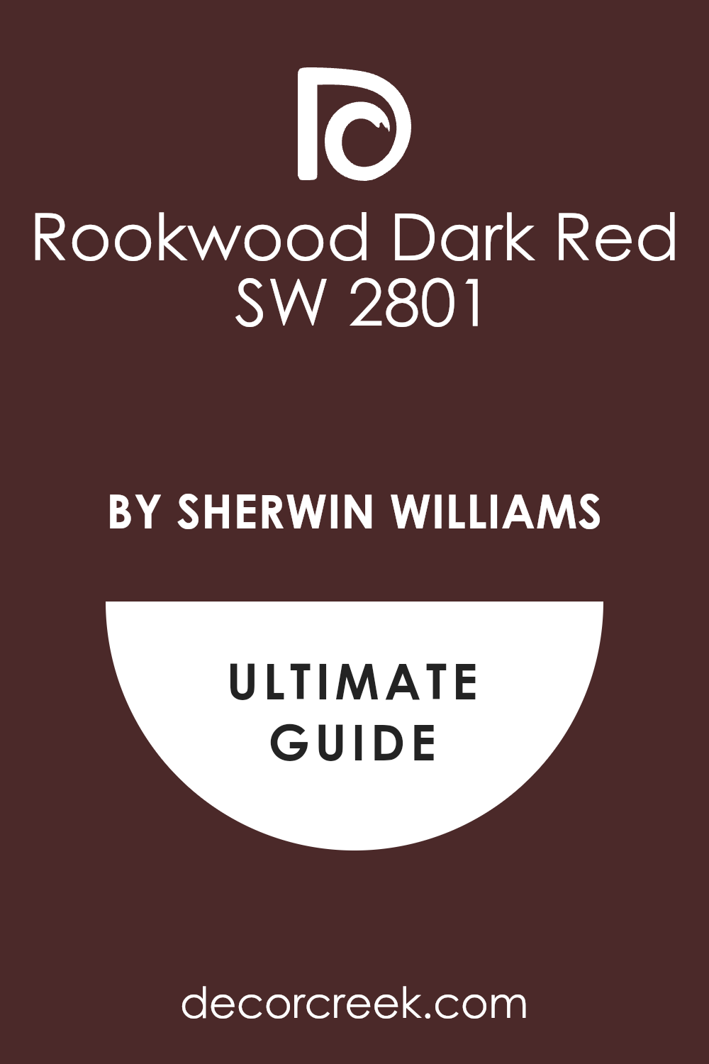
Rookwood Dark Red SW 2801
Rookwood Dark Red SW 2801 is a deep and earthy red that feels like a piece of old pottery or a dried autumn leaf. It is part of a historical collection and it brings a lot of weight and gravity to the walls of a house. I love how this color feels very serious and scholarly without being too bright or loud to the eye.
It looks amazing in a library or a study where you want to surround yourself with a sense of history. This shade provides a very rich background for black-and-white art and old wooden bookshelves. The color has a muted quality that makes it feel very settled and not at all trendy or cheap.
It makes a room feel very safe and private like a secret room in a university building. I find that it works very well with traditional rugs and heavy curtains that have a bit of texture. It is a very smart and reliable red that adds a lot of character to a dark academia home.
Best used in: libraries, dens, hallways, and fireplace surrounds
Pairs well with: Creamy SW 7012, black metal, warm wood, and dark gray The key rule of this color for dark academia style is to pair it with warm lighting to highlight its deep and historic red tones.
Burgundy Wine 2075-10
Burgundy Wine 2075-10 is a very dark and royal red that looks like the color of a velvet cloak or a glass of fine wine. It is a Benjamin Moore favorite that adds a sense of luxury and drama to any room it covers. I like how this color makes a statement as soon as you walk in and it feels very high-end for a house.
It looks best in formal rooms where you want to impress people with your style and your books. This shade provides a perfect canvas for gold accents and white marble details in a modern or traditional home. It makes the wood furniture in the room look much darker and richer than it really is.
The color is very deep and it creates a sense of being in a very exclusive and private club. I think it is a great choice for someone who loves the classic look of old manors and grand houses. It adds a touch of mystery and royalty to your dark academia interior design plan.
Best used in: dining rooms, master bedrooms, accent walls, and powder rooms
Pairs well with: Cloud White OC-130, gold leaf, silver, and ebony wood The key rule of this color for dark academia style is to use it with high-contrast trim to make the rich red look very sharp.
New London Burgundy HC-61
New London Burgundy HC-61 is a classic and very deep red that feels like it belongs in a famous university hall. It is a very traditional color that has a lot of history and power hidden in its base. I love using this color in home offices because it makes the person inside feel very focused and important.
It looks amazing with dark leather chairs and brass floor lamps for a very old-world look. This shade is a great way to make a room feel like it has its own long story to tell. It provides a very rich background for wooden furniture that has been polished to a high shine over many years.
The color is very vibrant but it stays very serious and smart for an academic home design. I find that it works well in rooms where you want to do serious research or write a book. It is a reliable and very handsome red that never goes out of fashion for any house.
Best used in: home offices, dens, dining rooms, and exterior trim
Pairs well with: White Dove OC-17, gold, dark walnut, and navy blue The key rule of this color for dark academia style is to use it with traditional patterns like plaid to complete the scholarly look.
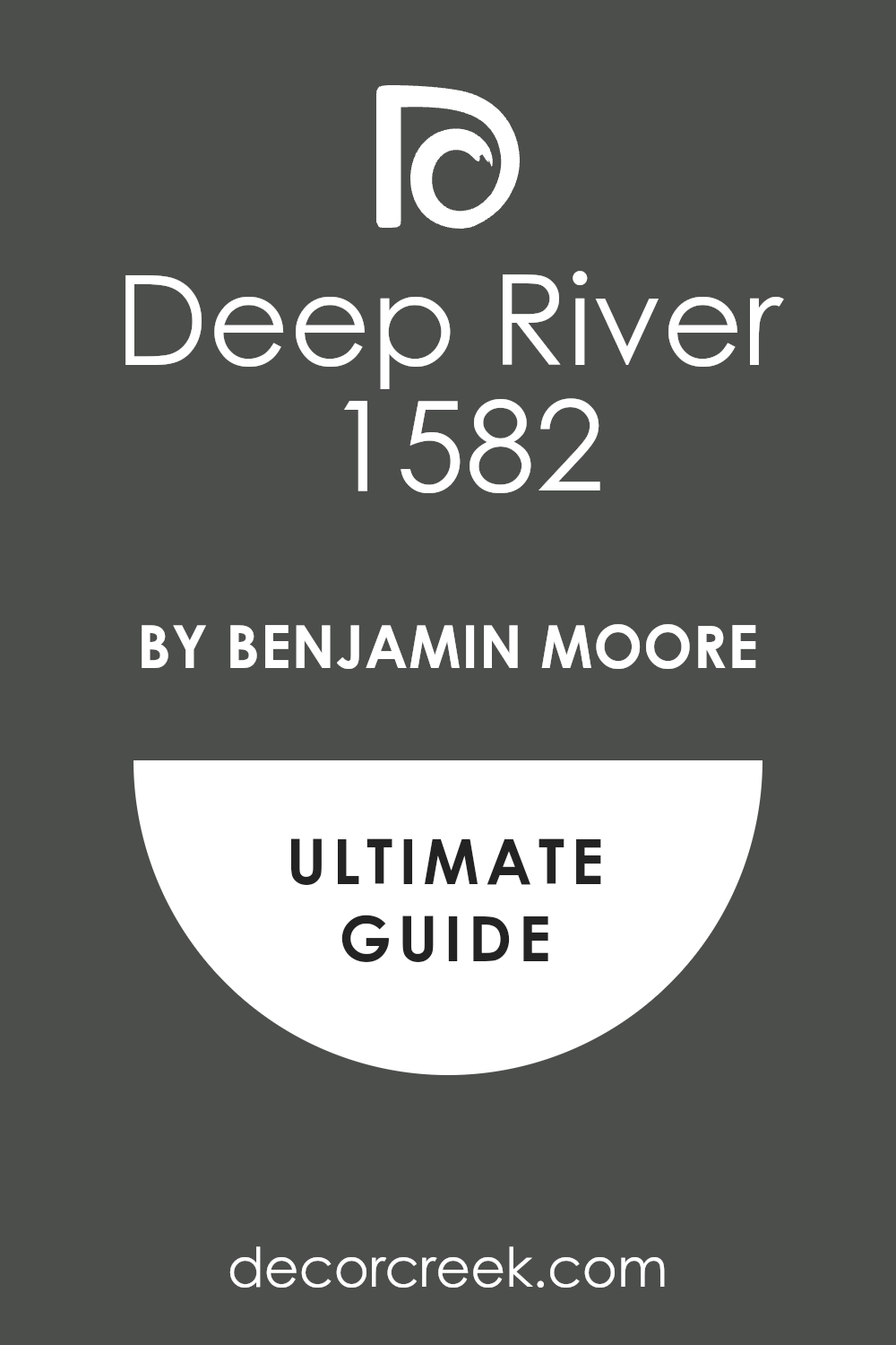
Deep River 1582
Deep River 1582 is a very dark and misty gray that has a strong lean toward green and blue for a complex look. It looks like the water in a forest stream during a very heavy rainstorm. I like this color because it is very hard to pin down and it keeps the room looking very interesting to the eye.
It feels very modern and very old at the same time which is perfect for the academia design style. This shade looks incredible in a bedroom where you want to feel very calm and tucked away from the world.
It makes a big impact even in a small space and it feels very expensive on the walls of a house. The color has a lot of depth and it makes a room feel very quiet and private for reading. I think it is a great choice for someone who wants a dark color that is not just a plain charcoal or black. It adds a touch of artistic flair to a house that is full of vintage maps and old art.
Best used in: bedrooms, accent walls, powder rooms, and kitchen cabinets
Pairs well with: White Dove OC-17, silver, light blue, and dark wood The key rule of this color for dark academia style is to use it with silver or cool-toned metals to highlight its deep blue-green base.
Gentleman’s Gray 2062-20
Gentleman’s Gray 2062-20 is a very deep and sophisticated blue that feels like a tailored suit for your walls. It is a very smart color that brings a sense of order and class to a home library or a den. I love how this color looks with gold reading lamps and dark leather chairs for a very masculine look.
It has a lot of gray in its base which keeps it from looking too bright or like a kid’s room. This shade is perfect for a room where you want to host meetings or do serious intellectual work. It provides a very rich background for white marble statues and colorful book collections in a study.
The color is very bold but it is also very safe because it always looks high-end and custom-made. I think it is the best choice for a house that wants to feel very established and full of quiet wisdom. It adds a layer of depth and smart style to any dark academia house.
Best used in: home offices, libraries, living rooms, and cabinetry
Pairs well with: Balboa Mist OC-27, gold, cognac leather, and warm wood The key rule of this color for dark academia style is to use it in rooms with plenty of light to show off its deep blue character.

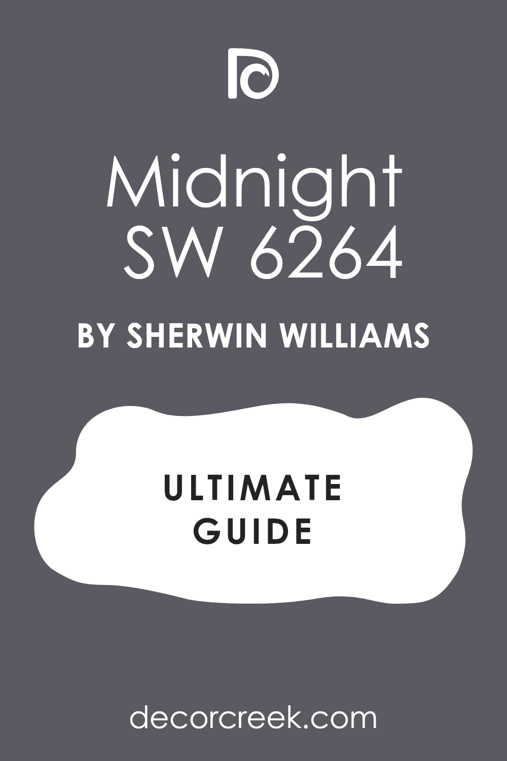
Midnight SW 6264
Midnight SW 6264 is a very dark and mysterious navy blue that feels as deep as the night sky. It is a very strong color that makes a big impact as soon as you walk into the room of a house. I like how it creates a very serious and focused mood that is perfect for a workspace or a bedroom.
This color looks amazing with light-colored trim to create a very high-contrast and sharp appearance. It reminds me of the uniforms of old university students and the sky right before a storm. This shade is very popular for home theaters because it makes the room feel very enclosed and private.
It makes a room feel very secure and solid which is a great feeling for a house that loves history. The color is very dark but it still has a lot of energy and life hidden inside its blue base for a smart look. I think it is a great pick for a house that wants a look that is both traditional and very powerful.
Best used in: bedrooms, home theaters, accent walls, and libraries
Pairs well with: Alabaster SW 7008, silver, dark wood, and light gray The key rule of this color for dark academia style is to use it where you want a sense of deep quiet and intellectual mystery.
39 Dark Academia Interior Paint Colors From Sherwin Williams
Iron Ore SW 7069
Iron Ore SW 7069 is a soft black that feels like a charcoal drawing. It has a velvet look that makes walls seem very expensive. I love how it sits behind a bookshelf full of old novels. This shade is not too harsh for people who are scared of pure black.
It catches the light just enough to show some gray depth. You can use it to create a focal point in a large room. It works wonders when you want a moody vibe without feeling cold.
The color reminds me of a stormy night in an old stone mansion. It is a great pick for a modern library or a cozy bedroom. I always suggest this for anyone starting their dark academia journey.
Best used in: living rooms, home libraries, bedrooms, and media rooms
Pairs well with: Alabaster SW 7008, Classic Gray OC-23, Cognac leather, brass accents The key rule of this color for dark academia style is to use it on all four walls to create a snug, enclosed feeling.
Tricorn Black SW 6258
Tricorn Black SW 6258 is the most honest black paint you will ever find. It does not have any sneaky blue or brown tones hidden inside it. I use it when I want a room to look sharp and very defined. It looks amazing on window frames or built-in cabinets.
This color makes gold picture frames look like they belong in a museum. It provides a high-contrast look that feels very bold and brave. The finish stays looking crisp even as the sun moves across the room.
I think it is the perfect backdrop for a collection of white marble statues. It brings a sense of order to a cluttered, book-filled room. Many people find it to be the ultimate anchor for a dramatic home design.
Best used in: doors, trim, accent walls, and home theaters
Pairs well with: Pure White SW 7005, Carrara marble, gold leaf, dark oak floors The key rule of this color for dark academia style is to use a satin finish on trim to make the black look polished and intentional.
Caviar SW 6990
Caviar SW 6990 is a deep and dark black that feels as smooth as the name suggests for your walls. It is almost a true black but it has a very tiny hint of warmth that keeps it from being flat. I use this when I want a room to have a very strong and powerful presence in the house.
It looks best in rooms with high ceilings where the dark walls can really stretch out and breathe. This color makes every other color in the room look much more vibrant and full of life. It is a favorite for staging homes because it looks very expensive and custom-made on the walls.
The finish looks like silk when you use the right type of paint from Sherwin-Williams in the room. I think it is the ultimate choice for a high-end library or a very fancy home office space. It creates a mood of success and serious study that is perfect for the academia theme.
Best used in: home libraries, offices, formal living rooms, and ceilings
Pairs well with: Alabaster SW 7008, emerald green, gold, dark cherry wood The key rule of this color for dark academia style is to use it on the ceiling as well as the walls for a total immersive experience.
Black Magic SW 6991
Black Magic SW 6991 is a deep and true black that feels like a heavy curtain closing at the end of a play. It has a warm undertone that keeps the walls from looking too cold or like a piece of plastic. I love using this color in a room with a lot of old wooden furniture and brass lamps.
It provides a very smart and scholarly background for a large collection of vintage books. This shade makes white marble statues and gold frames look very bright and important in the room. The color is very thick and it gives the walls a look of high-quality silk or velvet.
I find that it works very well in a study where you want to feel tucked away from the rest of the world. It is a very bold choice that adds a lot of value and style to your interior design. Many people find it to be the ultimate anchor for a dramatic and moody home. This is a timeless color that will always look sophisticated in any house.
Best used in: libraries, accent walls, front doors, and media rooms
Pairs well with: Alabaster SW 7008, gold leaf, dark walnut, and cognac leather The key rule of this color for dark academia style is to use a flat finish to make the black look soft and historical.
Greenblack SW 6994
Greenblack SW 6994 is a fascinating color that looks like a deep forest at the very end of the day. It is a black paint that has a very strong and visible green undertone hidden deep inside. I love how it reveals its green side when the sun hits the wall directly in the morning.
It feels very scholarly and reminds me of old university buildings covered in thick green ivy. This shade is a great way to use green without it feeling too bright or like a kid’s room. It works perfectly with leather chairs and old wooden desks in a quiet home study area.
The green adds a level of comfort and peace that you do not always get with a pure black. I think it is one of the most beautiful colors for a room that is filled with indoor plants. It makes a house feel like a secret garden hidden away from the rest of the world.
Best used in: studies, dens, kitchen cabinets, and exterior doors
Pairs well with: Sea Salt SW 6204, warm brass, terra cotta, light wood The key rule of this color for dark academia style is to use it in rooms with large windows to let the green undertones show through.
Inkwell SW 6992
Inkwell SW 6992 is a very dark color that is a mix of black and a very deep navy blue for a moody look. It looks like the ink in a jar that has been sitting on a desk for many years in a study. I love how this color hides its blue side until you turn on a bright light or look at it closely.
It feels very heavy and very expensive on the walls of a house that loves history. This shade is perfect for a room where you want to get lost in your thoughts or a good book. It provides a very dramatic background for white marble and silver accents in a modern or old home.
The color is very sophisticated and it gives a room a sense of being very quiet and very private. I find that it works very well on built-in cabinets to make them look like they are part of the wall. It is a very bold and smart choice for a true dark academia fan.
Best used in: libraries, built-in shelving, powder rooms, and master suites
Pairs well with: Pure White SW 7005, silver, light gray, and ebony wood The key rule of this color for dark academia style is to use it in areas where you want to create a feeling of deep focus and intellectual mystery.
Black Fox SW 7020
Black Fox SW 7020 is a warm black that has a lot of chocolate brown in it. It feels like a cup of dark coffee or an old leather chair. I like it because it feels more organic and grounded than a true black. It works perfectly in a room with lots of plants and wooden desks.
This shade creates a sense of comfort that is hard to find with cooler grays. It makes a bedroom feel like a safe cave where you can sleep for hours. The brown undertones help it blend with autumn colors like orange and gold.
I see this as a very sophisticated choice for a dining room. It adds a layer of warmth that keeps the dark academia look from feeling too spooky. This color is a favorite for those who love traditional, earthy palettes.
Best used in: dining rooms, bedrooms, kitchen islands, and exterior accents
Pairs well with: Shoji White SW 7042, terracotta, aged brass, walnut furniture The key rule of this color for dark academia style is to pair it with warm lighting to bring out the rich brown base.
Urbane Bronze SW 7048
Urbane Bronze SW 7048 is a mix of gray, brown, and green that looks like weathered metal. It is a very smart color that feels both old and new at the same time. I often use it for cabinets because it hides fingerprints and looks very sturdy. This color has a natural feel that reminds me of forest soil.
It provides a great middle ground for people who want dark walls but not black ones. The way it shifts in the light makes the room feel alive and interesting. It looks very high-end when paired with light linen fabrics and heavy rugs.
I think it is the best color for a home office where you need to focus. It creates a serious mood that helps you get your work done. This shade is a staple for any designer looking to add some gravity to a house.
Best used in: home offices, kitchen cabinets, living rooms, and doors
Pairs well with: Modern Gray SW 7632, silver accents, light oak, linen textures The key rule of this color for dark academia style is to use it in rooms with natural wood to highlight the earthy bronze tones.
Peppercorn SW 7674
Peppercorn SW 7674 is a balanced dark gray that sits right in the middle of the spectrum. It does not lean too far toward blue or too far toward brown. I find it very helpful when I need a color that works with both silver and gold.
It makes white trim look incredibly bright and clean by comparison. This color gives a room a sense of mystery without being too heavy. It reminds me of chalkboard dust or a rainy afternoon in a city.
The depth of this gray is perfect for a hall filled with family photos. It makes every piece of furniture in the room look more important. I love how it provides a cool background for colorful book spines. It is a safe but very stylish choice for a moody interior.
Best used in: hallways, living rooms, bedrooms, and cabinets
Pairs well with: Extra White SW 7006, navy blue, cherry wood, pewter The key rule of this color for dark academia style is to use it as a neutral base that allows your colorful collections to shine.
Cyberspace SW 7076
Cyberspace SW 7076 is a deep navy blue that is so dark it almost looks black. It feels like the sky right before a big thunderstorm rolls in. I love using this in bedrooms because blue is a very relaxing color. It has enough gray in it to keep it from looking like a child’s room.
This shade looks amazing with dark velvet curtains and wool blankets. It creates a very scholarly look that fits perfectly with the academia theme. The color stays very consistent even when the lights are turned down low.
It makes a great statement wall behind a big wooden bed frame. I think it adds a touch of royalty to a regular home. This is a top pick for anyone who loves the ocean at night.
Best used in: master bedrooms, accent walls, studies, and powder rooms
Pairs well with: Sea Salt SW 6204, copper, cream, dark mahogany The key rule of this color for dark academia style is to use it where you want a sense of deep quiet and reflection.
Grizzle Gray SW 7068
Grizzle Gray SW 7068 is a moody dark gray with a hint of forest green. It looks like the coat of an old wolf or a foggy mountainside. I like it because it feels more interesting than a standard charcoal. It pairs beautifully with dark green plants and leather furniture.
This color brings a sense of the outdoors inside the house. It makes a small room feel like a cozy hiding spot. The green undertone gives it a very scholarly, old-world feeling.
I often recommend it for a library or a reading nook. It feels very grounded and does not distract you from your books. This shade is perfect for creating a look that is both rugged and refined.
Best used in: reading nooks, libraries, mudrooms, and basement dens
Pairs well with: Ethereal White SW 6182, sage green, pine wood, iron fixtures The key rule of this color for dark academia style is to use it in areas where you want to feel connected to nature and study.
Gauntlet Gray SW 7019
Gauntlet Gray SW 7019 is a warm, stone-colored gray that feels very solid. It reminds me of the walls of a medieval castle or an old university. I love how it makes a room feel safe and very sturdy. It has enough warmth to keep a large room from feeling drafty.
This color looks great with stone fireplaces and heavy woven rugs. It provides a sophisticated look that never goes out of style. The color is deep enough to be moody but light enough to show shadows.
I use it when I want a room to feel established and historic. It is a great background for black-and-white photography. This shade is a reliable choice for a masculine or gender-neutral space.
Best used in: living rooms, hallways, exteriors, and fireplace surrounds
Pairs well with: Repose Gray SW 7015, black metal, cognac leather, white oak The key rule of this color for dark academia style is to use it on textured walls to mimic the look of old stone.
Porpoise SW 7047
Porpoise SW 7047 is a warm and earthy dark gray that has a lot of brown hidden inside its base. It reminds me of the color of wet stones or a piece of old felt. I like how this color feels very grounded and serious for a home office or a quiet study area.
It provides a very sophisticated look that never goes out of style for a traditional house. This shade looks amazing when paired with light oak floors and heavy woven rugs on the floor. It has enough warmth to keep a large room from feeling too empty or lonely in the evening.
The color is deep enough to be moody but it stays very natural and easy to live with every day. I think it is the best dark gray for people who love antique furniture and natural textures.
Best used in: home offices, living rooms, exteriors, and cabinetry
Pairs well with: Shoji White SW 7042, black iron, warm wood, and linen The key rule of this color for dark academia style is to pair it with natural textures like jute or wool to keep the room feeling organic.

Anonymous SW 7046
Anonymous SW 7046 is a medium-to-dark gray that has a very strong brown and olive influence for a complex look. It feels like the color of an old university building or a foggy afternoon in the city. I love how this color changes its look quite a bit depending on the type of light in the room.
It provides a very scholarly and quiet atmosphere that is perfect for a bedroom or a library. This shade looks wonderful with dark wood furniture and gold accents for a classic and traditional contrast.
The color is very calming and it helps to make a room feel very established and full of history. I find that it works very well as a neutral that still has a lot of personality and soul. It makes every piece of art on the wall look much more professional and well-cared for in the house.
Best used in: bedrooms, hallways, libraries, and dining rooms
Pairs well with: Pure White SW 7005, dark oak, brass, and deep green accents The key rule of this color for dark academia style is to use it where you want a sense of soft, intellectual calm and quiet reflection.

Dovetail SW 7018
Dovetail SW 7018 is a warm and solid gray that feels very sturdy and very safe for a room. It reminds me of the color of lead or a piece of heavy stone found in a garden. I like how this color brings a sense of order and strength to a home office or a hallway.
It is a very smart color that acts as a perfect background for any type of decor you choose. This shade looks amazing with black metal accents and very dark wood furniture for a high-contrast look.
It provides a sophisticated look that never goes out of style and works in any room of the house. The color is deep enough to show shadows but light enough to not feel overwhelming to the eye. I use it when I want a room to feel established and very serious without being too dark.
Best used in: living rooms, hallways, kitchen cabinets, and exteriors
Pairs well with: Repose Gray SW 7015, black accents, white oak, and silver The key rule of this color for dark academia style is to use it as a neutral base that allows your colorful collections to shine

Jasper SW 6216
Jasper SW 6216 is a very dark and moody forest green that feels extremely solid and grounded for a room. It is much more green than black, which makes it feel very lush and alive on your walls.
I love how it creates a sense of history and tradition in a room that is otherwise very plain. This color reminds me of the felt on an old billiard table or a heavy wool coat. It provides a wonderful background for light-colored artwork and white marble statues in a hall.
The shade is very deep and it helps to hide any imperfections on the surface of your walls. It makes a room feel very quiet and private, which is exactly what a dark academia home needs.
Best used in: dining rooms, living rooms, libraries, and accent walls
Pairs well with: Shoji White SW 7042, gold leaf, dark oak, cream fabrics The key rule of this color for dark academia style is to use it in rooms where you want to feel a strong connection to tradition and history.
Ripe Olive SW 6209
Ripe Olive SW 6209 is a deep and dusty green that looks like the leaves of an old olive tree. It has a bit of gray in it that makes it feel very sophisticated and not too bright or grassy. I use this color when I want a room to feel very calm and settled for my clients’ homes.
It looks amazing with natural wood floors and light-colored rugs that have a bit of texture to them. This shade of green is very popular right now because it feels both modern and very classic at once.
It makes a bedroom feel like a peaceful retreat where you can relax and clear your mind. The color is dark enough to be moody but it still brings a lot of warmth and life into the house.
Best used in: bedrooms, living rooms, kitchens, and home offices
Pairs well with: Natural Linen SW 9109, black metal, warm wood, white trim The key rule of this color for dark academia style is to use it with warm, natural accents to create a balanced and peaceful look.
Oakmoss SW 6180
Oakmoss SW 6180 is a deep forest green that feels like walking through a thick woods on a cloudy day. It has a dusty quality that makes the walls look like they have been there for a hundred years.
I love how this shade brings a natural and earthy vibe to a home without being too bright or loud. This color looks very smart when paired with old leather books and dark wood desks in a study. It creates a sense of steady calm that is perfect for someone who needs to focus on their work.
The green is heavy enough to feel moody but soft enough to be very comfortable for daily living. I think it provides a perfect backdrop for gold-framed art or botanical drawings on a gallery wall.
Best used in: home offices, dens, bedrooms, and kitchen cabinets
Pairs well with: Alabaster SW 7008, warm wood tones, brass, and deep brown leather The key rule of this color for dark academia style is to use it in rooms where you want to feel a strong connection to nature and history.
Dried Thyme SW 6186
Dried Thyme SW 6186 is a muted sage green that has a lot of gray and blue hidden inside its base. It reminds me of the color of old herbs hanging in a kitchen or a vintage school chalkboard. I like how this color feels very scholarly and a bit old-fashioned in a very good way.
It is a great choice for a hallway or a mudroom because it hides dust and looks very clean. This shade gives a room a sense of peace that makes it very easy to spend a long time there.
It looks wonderful when you use it with light linen curtains and soft woven rugs on the floor. The color is dark enough to be part of a moody palette but light enough to not feel heavy.
Best used in: hallways, laundry rooms, bedrooms, and kitchen walls
Pairs well with: Oyster White SW 7637, silver accents, light oak, and soft grays The key rule of this color for dark academia style is to use it as a bridge between your darkest rooms and your lighter spaces.
Pewter Green SW 6208
Pewter Green SW 6208 is a dark and cool green that has a very strong gray undertone for a rich look. It feels like the color of a stormy sea or a piece of old metal found in a museum.
I use this color when I want a room to look very expensive and custom-designed for a client. It has a velvet-like finish on the walls that catches the light in a very interesting way.
This shade is perfect for a dining room where you want to host dinner parties with a lot of drama. It makes white plates and silver cutlery look very bright and shiny against the dark green background. The color is very sophisticated and it never feels like it is trying too hard to be trendy.
Best used in: dining rooms, master bedrooms, cabinetry, and accent walls
Pairs well with: Drift of Mist SW 9166, black iron, white marble, and cool wood tones The key rule of this color for dark academia style is to use it with cool lighting to bring out the beautiful pewter gray tones.
Rosemary SW 6187
Rosemary SW 6187 is a deep and herb-like green that is full of warmth and organic character for your home. It feels like a very traditional color that you might see in an old library in England.
I love how it makes a room feel very cozy and safe like a big green hug from the walls. This color works beautifully with dark walnut furniture and heavy wool blankets in a bedroom. It has enough depth to be moody but it stays very friendly and inviting for guests to see.
The shade looks amazing in the evening when you have small lamps turned on around the room. It creates a very scholarly atmosphere that makes you want to sit and write letters all night long. I find that it is a very popular choice for people who want a dark room that still feels very alive.
Best used in: bedrooms, cozy dens, reading nooks, and kitchen islands
Pairs well with: Shoji White SW 7042, copper, cognac leather, and warm wood The key rule of this color for dark academia style is to pair it with warm metals like copper or gold to highlight its richness.
Shade-Grown SW 6188
Shade-Grown SW 6188 is a very dark green that has a lot of brown in it for a muddy look. It looks like the color of deep shadows under a big tree or a cup of very dark green tea. I like this color because it feels very grounded and serious for a home office or a study area.
It is one of the darkest greens you can find and it looks almost black in low light. This shade provides a very dramatic background for a collection of old globes and antique scientific tools. It makes a room feel very private and quiet which is great for a person who works from home.
The brown undertone keeps the color from feeling too cold or like a forest in the winter. I think it is a very smart choice for a house that has a lot of old wooden floors and doors.
Best used in: home offices, libraries, basements, and media rooms
Pairs well with: Greek Villa SW 7551, dark leather, aged brass, and deep brown wood The key rule of this color for dark academia style is to use it where you want the walls to feel solid and permanent like an old stone building.
Retreat SW 6207
Retreat SW 6207 is a mid-to-dark green that has a very strong blue and gray influence in its base. It reminds me of the color of a lake on a very foggy morning or an old wool sweater. I love how this color feels very peaceful and helpful for a room where you need to relax.
It is a very soft color that does not demand too much attention from the person in the room. This shade looks great with silver accents and light-colored wood furniture for a more modern look.
It is a good choice for someone who wants a dark academia vibe but also likes a clean and airy feeling. The color stays very consistent and does not change too much when the sun goes down at night. I find that it works very well in guest bedrooms because it feels very welcoming and calm.
Best used in: guest bedrooms, bathrooms, laundry rooms, and entryways
Pairs well with: Extra White SW 7006, light gray, silver, and pine wood The key rule of this color for dark academia style is to use it in rooms where you want a sense of airy mystery and quiet peace.

Clary Sage SW 6178
Clary Sage SW 6178 is a light-to-medium green that feels very soft and dusty like a dried leaf. It is the lightest green in this collection and it works well as a neutral for the house. I like how it brings a bit of color to a room without making it feel small or too dark.
It reminds me of the pages of an old book or a vintage map of the world. This shade is perfect for a kitchen or a breakfast nook where you want a bit of a scholarly feel. It looks wonderful with white cabinets and dark stone countertops for a high-contrast look.
The color has a bit of yellow in it which makes it feel very warm and sunny even on a cloudy day. I think it is a great choice for a house that has a lot of natural light coming in the windows.
Best used in: kitchens, bathrooms, hallways, and sunny bedrooms
Pairs well with: Pure White SW 7005, dark wood, black accents, and terracotta The key rule of this color for dark academia style is to use it where you want natural light to feel kind and inviting throughout the day.
Roycroft Bottle Green SW 2847
Roycroft Bottle Green SW 2847 is a historic color that feels like the heavy glass of an antique medicine bottle. It is part of the Arts and Crafts collection and brings a sense of handcrafted quality to any room it touches.
I love how this green has a hidden depth that makes a house feel like it has many untold stories. It looks very smart in a home office where you need to do a lot of deep thinking and writing. This shade provides a wonderful backdrop for wooden desks and gold reading lamps that sparkle in the evening.
The color is very serious but it has enough life to keep a room from feeling like a museum. I find that it pairs perfectly with other natural colors and heavy fabrics like wool or tweed. It makes a room feel very established and sturdy as if it has stood the test of time.
Best used in: home offices, libraries, front doors, and kitchen cabinets
Pairs well with: Greek Villa SW 7551, warm wood tones, leather books, and brass The key rule of this color for dark academia style is to use it on all walls to create a focused and historical atmosphere.
Hunt Club SW 6468
Hunt Club SW 6468 is a traditional and very deep green that feels like the ultimate scholarly color for a room. It is a very rich shade that looks like the felt on an old desk or a heavy wool coat. I love how it brings a sense of power and history to a study or a library without being too black.
It looks amazing with dark leather chairs and brass floor lamps for a very old-world and royal look. This shade is a great way to make a room feel like it has its own long and interesting story. It provides a very rich background for wooden furniture that has been polished to a high shine over many years.
The color is very vibrant but it stays very serious and smart for a professional home design. I find that it works well in rooms where you want to do serious work or host smart meetings.
Best used in: home offices, dens, libraries, and front doors
Pairs well with: Alabaster SW 7008, gold, dark walnut, and burgundy accents The key rule of this color for dark academia style is to use it with traditional patterns like plaid to complete the old-world look.
Naval SW 6244
Naval SW 6244 is a very deep and confident navy blue that feels very crisp and very clean for a room. It is a bold color that makes a big statement as soon as you walk through the door of a house. I like how it creates a very serious and focused mood that is perfect for a workspace or a study.
This color looks amazing with bright white trim to create a very high-contrast and sharp appearance. It reminds me of old nautical maps and the uniforms of scholars from a long time ago. This shade is very popular for accent walls because it adds so much depth and personality to a room.
It makes a room feel very secure and solid which is a great feeling for a home library. The color is very dark but it still has a lot of energy and life hidden inside its blue base.
Best used in: accent walls, dining rooms, master bedrooms, and home theaters
Pairs well with: Snowbound SW 7004, gold, leather, and light oak floors The key rule of this color for dark academia style is to use it in rooms with high contrast to make the deep blue look very sharp and intentional.
Charcoal Blue SW 2739
Charcoal Blue SW 2739 is a dark and smoky blue that has a lot of gray in its base for a muted look. It feels like the color of a stormy sky or a piece of old slate found in a garden. I like this color because it is very soft and it does not feel as harsh as a true black or a bright navy.
It provides a very calming and scholarly atmosphere that is perfect for a bedroom or a quiet study area. This shade looks wonderful with natural wood furniture and soft woven rugs on the floor. It has a bit of a vintage feel that makes a room look like it has been there for a long time.
The color is dark enough to be moody but it stays very light and airy compared to other dark blues. I think it is a great choice for someone who wants a dark academia look that is easy to live with every day.
Best used in: bedrooms, living rooms, hallways, and kitchen cabinets
Pairs well with: Repose Gray SW 7015, silver, light oak, and white trim The key rule of this color for dark academia style is to use it where you want a sense of soft, intellectual calm and quiet reflection.
Darkroom SW 7083
Darkroom SW 7083 is a very deep and moody color that is a mix of black and a dark purple or red. It looks like the color of a shadow in an old theater or a very dark piece of fruit. I love using this color because it is very unexpected and it adds a lot of character to a room.
It feels very artistic and a bit mysterious which is exactly what a dark academia home needs. This shade is perfect for a media room or a cozy den where you want to relax and feel tucked away. It provides a very rich background for gold frames and warm wooden furniture in a traditional house.
The color is very deep and it makes a room feel very small and safe like a warm hug from the walls. I find that it works very well in rooms with small windows where the light can create deep shadows.
Best used in: media rooms, dens, accent walls, and powder rooms
Pairs well with: Alabaster SW 7008, gold leaf, deep wood tones, and velvet The key rule of this color for dark academia style is to use it with low, warm lighting to bring out the hidden purple and red undertones.
Midnight SW 6264
Midnight SW 6264 is a very dark and mysterious navy blue that feels as deep as the night sky. It is a very strong color that makes a big impact as soon as you walk into the room. I like how it creates a very serious and focused mood that is perfect for a workspace or a bedroom.
This color looks amazing with light-colored trim to create a very high-contrast and sharp appearance. It reminds me of the uniforms of old university students and the sky right before a storm.
This shade is very popular for home theaters because it makes the room feel very enclosed and private. It makes a room feel very secure and solid which is a great feeling for a house that loves history. The color is very dark but it still has a lot of energy and life hidden inside its blue base.
Best used in: bedrooms, home theaters, accent walls, and libraries
Pairs well with: Alabaster SW 7008, silver, dark wood, and light gray The key rule of this color for dark academia style is to use it where you want a sense of deep quiet and intellectual mystery.
Burgundy SW 6300
Burgundy SW 6300 is a deep and royal red that looks like the color of a velvet cloak or an old book cover. It is a very warm and inviting color that brings a sense of luxury and comfort to a home. I like how it makes a room feel very established and full of life without being too bright or loud.
This shade is perfect for a dining room where you want to host long and interesting dinners with your friends. It looks amazing with dark wood furniture and gold accents for a very royal and traditional appearance.
The color has a bit of brown in it which keeps it from looking like a primary red or a kid’s room. It reminds me of the leather covers on old novels and the walls of a grand university hall. I think it is a great choice for a room that needs a lot of warmth and a very smart personality.
Best used in: dining rooms, entryways, libraries, and accent walls
Pairs well with: Creamy SW 7012, gold, dark walnut, and dark green The key rule of this color for dark academia style is to pair it with other dark, traditional colors to create a very rich palette.
Borscht SW 7578
Borscht SW 7578 is a deep and earthy red that looks like a bowl of dark soup or a piece of old velvet. It is a very warm and inviting color that brings a sense of history and comfort to a home.
I like how it makes a room feel very established and full of life without being too bright or loud. This shade is perfect for a dining room where you want to host long and interesting dinners with friends.
It looks amazing with dark wood furniture and gold accents for a very royal and traditional look. The color has a bit of brown in it which keeps it from looking like a bright fire engine red. It reminds me of the leather covers on old books and the walls of a grand manor. I think it is a great choice for a room that needs a lot of warmth and personality.
Best used in: dining rooms, libraries, entryways, and accent walls
Pairs well with: Creamy SW 7012, gold, dark walnut, and dark green accents The key rule of this color for dark academia style is to pair it with other dark, traditional colors to create a very rich and historical palette.
Polished Mahogany SW 2838
Polished Mahogany SW 2838 is a rich and soulful red that looks like the wood of a grand piano or an old library ladder. It has a very deep brown base that makes it feel much more grounded than a typical red paint.
I use this when I want a room to feel very expensive and full of old-world charm for my clients. It creates a sense of warmth that makes a large dining room feel very close and friendly for guests.
This shade looks incredible with gold-framed mirrors and dark walnut furniture in a traditional house. It reminds me of the leather-bound books and the red wine colors found in a classic study. The color is very bold but it is also very welcoming and makes people want to stay for a long time.
Best used in: dining rooms, libraries, entryways, and accent walls
Pairs well with: Alabaster SW 7008, gold, dark green, and walnut wood The key rule of this color for dark academia style is to use it in rooms where you want to host smart and long conversations.
Rookwood Dark Red SW 2801
Rookwood Dark Red SW 2801 is a deep and earthy red that feels like a piece of old pottery or a dried autumn leaf. It is part of a historical collection and it brings a lot of weight and gravity to the walls of a house.
I love how this color feels very serious and scholarly without being too bright or loud to the eye. It looks amazing in a library or a study where you want to surround yourself with a sense of history.
This shade provides a very rich background for black-and-white art and old wooden bookshelves. The color has a muted quality that makes it feel very settled and not at all trendy or cheap. It makes a room feel very safe and private like a secret room in a university building.
Best used in: libraries, dens, hallways, and fireplace surrounds
Pairs well with: Creamy SW 7012, black metal, warm wood, and dark gray The key rule of this color for dark academia style is to pair it with warm lighting to highlight its deep and historic red tones.
Rookwood Sash Green SW 2811
Rookwood Sash Green SW 2811 is a historical and dusty green that feels like it was taken from an old forest. It is part of a special collection and it brings a lot of weight and gravity to the walls of a house.
I love how this color feels very serious and scholarly without being too dark to see in the evening. It looks amazing in a library or a study where you want to surround yourself with a sense of history.
This shade provides a very rich background for black-and-white art and old wooden bookshelves in a room. The color has a muted quality that makes it feel very settled and not at all trendy or cheap to the eye. It makes a room feel very safe and private like a secret room in a grand stone mansion.
Best used in: libraries, dens, bedrooms, and exterior trim
Pairs well with: Shoji White SW 7042, warm brass, cognac leather, and dark wood The key rule of this color for dark academia style is to use it in rooms where you want to feel a strong connection to history.
Sealskin SW 7675
Sealskin SW 7675 is a very dark and warm gray that looks almost like a piece of dark chocolate or wet earth. It is a very deep color but it has a softness that keeps it from being too harsh or cold on the walls.
I like to use this when I want a room to feel very old-fashioned and full of character. It looks amazing on wood paneling or on the walls of a small and cozy reading room. This color creates a sense of intimacy that makes people want to sit down and read for many hours.
It acts as a wonderful contrast to bright white trim or a light-colored stone fireplace. The depth of the color is very impressive and it gives the walls a heavy and structural feeling for a room.
Best used in: fireplaces, studies, bedrooms, and kitchen islands
Pairs well with: Alabaster SW 7008, warm wood, leather books, and brass hardware The key rule of this color for dark academia style is to use it in small doses or small rooms to maximize the cozy feeling.
Andiron SW 6174
Andiron SW 6174 is a very dark olive green that has a lot of brown and black hidden inside its base for a muddy look. It looks like the color of deep shadows in a forest or a piece of old metal found in a university.
I love how this color feels very grounded and serious for a home office or a quiet study area. It is one of the darkest greens you can find and it looks almost black in low light. This shade provides a very dramatic background for a collection of old globes and antique scientific tools.
It makes a room feel very private and quiet which is great for a person who needs to do deep research. The brown undertone keeps the color from feeling too cold or like a forest in the middle of winter.
Best used in: home offices, libraries, basements, and accent walls
Pairs well with: Greek Villa SW 7551, dark leather, aged brass, and deep brown wood The key rule of this color for dark academia style is to use it where you want the walls to feel solid and permanent.
Deep Forest Brown SW 9175
Deep Forest Brown SW 9175 is a rich and soulful brown that looks like the bark of an old tree or a leather chair. It is a very warm and inviting color that brings a sense of history and comfort to a home office or library.
I like how it makes a room feel very established and full of life without being too bright or distracting for work. This shade is perfect for a room where you want to surround yourself with books and old wooden furniture.
It looks amazing with gold accents and green plants for a very natural and traditional appearance. The color has a lot of depth and it makes a room feel very small and safe like a warm hug from the walls.
Best used in: libraries, dens, home offices, and cabinetry
Pairs well with: Alabaster SW 7008, gold, forest green, and dark walnut The key rule of this color for dark academia style is to use it to create a sense of being inside a cozy and protective cocoon of history.
Black Bean SW 6006
Black Bean SW 6006 is a very dark and warm black that has a lot of brown and purple hidden inside its base. It feels like a cup of very dark coffee or a piece of old mahogany wood for your walls. I love using this color in a dining room to create a very dramatic and upscale environment.
It makes the light from a chandelier look warm and sparkly against the dark background of the walls in the evening. This shade is very luxurious and it makes any room feel like it belongs in a five-star hotel or a grand manor.
It provides a perfect canvas for gold-framed mirrors and antique wooden sideboards in a traditional home. The warmth of the color helps to keep a large room from feeling too empty or lonely during the day.
Best used in: dining rooms, entryways, master bedrooms, and accent furniture
Pairs well with: Shoji White SW 7042, gold, deep red, and dark walnut wood The key rule of this color for dark academia style is to use it where you want to create a sense of luxury and old-world elegance.
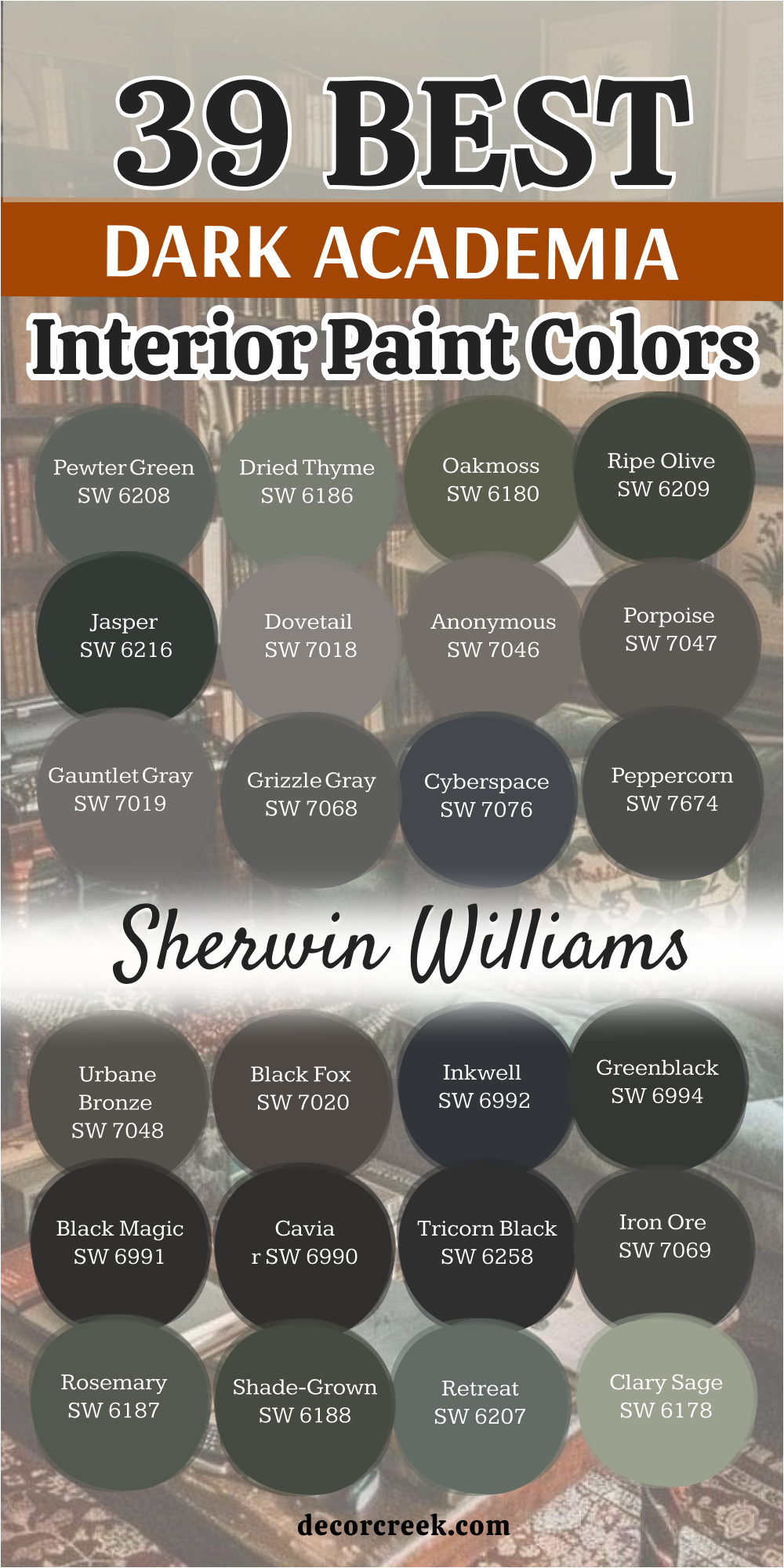
27 Dark Academia Interior Paint Colors From Benjamin Moore
Wrought Iron 2124-10
Wrought Iron 2124-10 is a beloved dark gray that acts as a softer alternative to a true black. It has a beautiful, muted quality that reminds me of old iron gates or the slate roofs of historic universities.
I love how this color feels heavy and substantial on the walls without being overwhelming. It has a slight blue-navy undertone that becomes visible in certain lights, adding a layer of mystery to the room.
This shade is perfect for a home office where you want to feel grounded and focused. It provides a stunning backdrop for gold-framed vintage maps and antique wooden desks. In my experience, it is one of the most versatile dark colors for creating a “moody” atmosphere that still feels welcoming.
Best used in: home offices, kitchen cabinets, front doors, and accent walls
Pairs well with: Gray Owl OC-52, brass hardware, light oak, and creamy whites The key rule of this color for dark academia style is to use it in rooms with natural light to allow the subtle blue-gray undertones to breathe.
Kendall Charcoal HC-166
Kendall Charcoal HC-166 is a rich, luxurious gray that leans toward the warmer side. It reminds me of high-end wool suits or the stone walls of an old library.
I find this color to be incredibly sophisticated because it doesn’t shift wildly in different lighting—it stays deep and dependable. It creates a sense of “quiet wealth” and established history in a house.
This shade works beautifully in a dining room, making candlelight and silver accents sparkle against the dark walls. It is a fantastic choice for those who want a dark academia vibe but prefer a neutral that feels cozy rather than cool.
Best used in: dining rooms, living rooms, master bedrooms, and exterior siding
Pairs well with: White Dove OC-17, Revere Pewter HC-172, navy accents, and dark wood The key rule of this color for dark academia style is to pair it with warm wood tones to maximize the “cozy study” feeling.
Iron Mountain 2134-30
Iron Mountain 2134-30 is a “warm” dark gray that has a very earthy, natural feel. It’s slightly lighter than Wrought Iron, making it a great middle-ground for a moody interior.
I love how it mimics the color of a mountain range at twilight. It feels very soft and approachable, which is perfect for a bedroom or a cozy reading nook. This color has a way of making a room feel “tucked away” from the rest of the world.
It looks incredible when paired with leather chairs and thick, woven textiles. If you are looking for a scholarly look that isn’t too aggressive, this is a perfect pick.
Best used in: bedrooms, reading nooks, hallways, and cabinetry
Pairs well with: Classic Gray OC-23, cognac leather, black metal, and warm linen The key rule of this color for dark academia style is to use it in smaller spaces to create a “cocoon” effect.
French Beret 1610
French Beret 1610 is a stunningly dark gray with a very strong lean toward a navy blue base. It reminds me of the ink used in old fountain pens or a deep twilight sky over a city.
I find that this color adds a layer of mystery to a room that a standard gray simply cannot match. It feels very plush and soft on the walls when you use a flat or matte finish.
This shade is perfect for a bedroom where you want to feel tucked away from the busy world. It looks incredible when paired with dark wood furniture and brass reading lamps for a classic look. The blue undertone keeps the room feeling cool and refreshed even though the color is quite heavy.
Best used in: bedrooms, library nooks, powder rooms, and accent walls
Pairs well with: Paper White OC-55, silver accents, cool marble, and velvet fabrics The key rule of this color for dark academia style is to pair it with cool-toned metals like silver or pewter to highlight the blue depth.
Deep Space 2125-20
Deep Space 2125-20 is a very dark charcoal that has a misty, blue-gray quality. It feels like standing in the middle of a thick fog in a forest at night. I love how this color can make the corners of a room seem to disappear into the shadows.
It is a great choice for a media room or a place where you want to get lost in a movie or a book. The color has a muted quality that prevents it from feeling too bright or overwhelming.
It works well as a backdrop for a large collection of vintage maps or botanical prints. This shade makes white furniture look very modern and sharp against its deep, dark background.
Best used in: media rooms, basements, master bedrooms, and cabinetry
Pairs well with: Chantilly Lace OC-65, light gray, black iron, and industrial fixtures The key rule of this color for dark academia style is to use it in rooms with minimal decor to create a focused and moody atmosphere.
Soot 2129-20
Soot 2129-20 is a smoky black that feels like the inside of an old chimney or a burnt piece of wood. It is a very deep color, but it has a softness that keeps it from being too harsh.
I like to use this when I want a room to feel very old-fashioned and full of character. It looks amazing on wood paneling or on the walls of a small reading room.
This color creates a sense of intimacy that makes people want to sit down and talk for hours. It acts as a wonderful contrast to bright white trim or a light-colored stone fireplace.
Best used in: fireplaces, studies, small hallways, and built-in bookshelves
Pairs well with: Simply White OC-117, warm wood tones, leather books, and brick The key rule of this color for dark academia style is to use it in small doses or small rooms to maximize the cozy and protected feeling.
Black Beauty 2128-10
Black Beauty 2128-10 is a rich and warm black that feels like a piece of high-quality dark chocolate. It has a slight reddish undertone that makes it feel much more inviting than a cold, blue-black.
I love using this color in a dining room to create a very dramatic and upscale environment. It makes the light from a chandelier look warm and sparkly against the dark walls.
This shade is very luxurious and it makes any room feel like it belongs in a grand manor. It provides a perfect canvas for gold-framed mirrors and antique wooden sideboards.
Best used in: dining rooms, entryways, front doors, and accent furniture
Pairs well with: Cloud White OC-130, gold, deep red, and walnut wood The key rule of this color for dark academia style is to use it where you want to create a sense of luxury and old-world elegance.
Raccoon Fur 2126-20
Raccoon Fur 2126-20 is a unique dark gray that has a very interesting balance of blue and violet tones. It reminds me of the sky during a cold winter evening or a piece of heavy iron.
I like this color because it feels very thick and substantial on the walls. It changes its look quite a bit depending on the type of light bulbs you use in the room.
This shade is popular with people who want a dark room that still has a lot of personality. It looks great with natural textures like jute rugs, linen curtains, and raw wood furniture.
Best used in: bedrooms, mudrooms, laundry rooms, and kitchen cabinets
Pairs well with: Gray Owl OC-52, natural wood, green plants, and black accents The key rule of this color for dark academia style is to use it with plenty of natural textures to keep the room feeling organic and grounded.
Onyx 2133-10
Onyx 2133-10 is a classic, deep black that feels incredibly grounded. It lacks the harshness of a blue-black, leaning instead toward a neutral warmth that makes a room feel expensive.
I love using this for high-contrast moments, like a dark library wall against light oak floors. It provides a crisp, clear backdrop for gold leaf frames and vintage scientific illustrations.
This shade is the ultimate “little black dress” for your walls—it never goes out of style and makes everything else look more curated.
Best used in: libraries, built-in bookshelves, front doors, and window trim
Pairs well with: Chantilly Lace OC-65, cognac leather, brass, and emerald green The key rule of this color for dark academia style is to use it on architectural details like molding to create sharp, intellectual lines.
Essex Green HC-188
Essex Green HC-188 is a classic and very deep green that feels like the ultimate academic color. It is a Benjamin Moore favorite that has been used in grand libraries for many years.
I love how it looks like a black paint until the light hits it and shows the rich green base. It is a very heavy and formal color that makes a statement.
This shade is perfect for a room with a lot of built-in bookshelves and a big wooden desk. It makes a room feel like it belongs to a famous professor.
Best used in: formal studies, libraries, front doors, and dining rooms
Pairs well with: Simply White OC-117, gold, deep red, and dark mahogany The key rule of this color for dark academia style is to use it on all walls and the trim to create a formal and grand appearance.
Salamander 2050-10
Salamander 2050-10 is a mysterious and complex shade that sits right between deep green, navy blue, and black. It reminds me of the ink on a centuries-old manuscript or the deep, still water of a hidden lake.
I love using this color because it adds an incredible amount of drama and depth to a house without being a flat black. It feels very artistic and sophisticated, making it a perfect choice for a moody library or a cozy study.
Under low light, it looks almost black, but when the sun hits it, the rich teal-green undertones truly shine. This is a top-tier choice for someone who wants a dark academia home that feels both high-end and deeply private.
Best used in: powder rooms, accent walls, bedrooms, and kitchen cabinets
Pairs well with: Classic Gray OC-23, silver hardware, light blue textiles, and ebony wood The key rule of this color for dark academia style is to use high-gloss finishes on cabinetry to let the dark teal tones reflect the light.
Hunter Green 2041-10
Hunter Green 2041-10 is a traditional and strong green that feels very established and full of authority. It is the kind of color you would find in an old university club or a historic country manor.
I find that this shade brings a sense of power and academic history to a room. It looks incredible with dark leather chairs, brass floor lamps, and vintage oil paintings.
This color creates a very serious and smart atmosphere that is perfect for a home office where you need to focus on complex tasks. It acts as a beautiful foundation for a room filled with wooden furniture and thick, textured rugs. It is a timeless green that never feels out of place in a scholarly home.
Best used in: home offices, dens, entryways, and exterior trim
Pairs well with: White Dove OC-17, burgundy accents, gold, and dark walnut wood The key rule of this color for dark academia style is to pair it with traditional patterns like plaid or stripes to complete the vintage look.
Tate Olive HC-112
Tate Olive HC-112 is a historical green that feels like it was taken straight from an 18th-century oil painting. It has a beautiful yellow and brown base that makes it feel very warm and aged for a room.
I love how this color looks in a room with old floorboards and antique rugs. It provides a scholarly look that reminds me of botanical gardens and old science labs. This shade is perfect for people who want a dark color that still feels very natural and approachable.
It catches the afternoon sun in a way that makes the whole room glow with a golden light. I think it is the best olive green for a house that wants to feel like a cozy professor’s den.
Best used in: libraries, dining rooms, kitchens, and exterior shutters
Pairs well with: Swiss Coffee OC-45, terracotta, dark oak, and brass hardware The key rule of this color for dark academia style is to use it in rooms with plenty of natural wood to highlight its earthy, historical roots.
Cushing Green HC-125
Cushing Green HC-125 is a deep and reliable green that brings a sense of stability and tradition to any room. It sits right in the middle of the dark green family and feels very much like classic forest ivy.
I find that this color is very helpful for making a large room feel more connected and intimate. It creates a very serious atmosphere that is great for a place where you want to read for hours.
This shade looks amazing when you paint the trim and the walls the same color for a seamless, immersive look. It provides a rich background for white plaster statues and black-and-white art prints.
Best used in: dining rooms, home offices, hallways, and front doors
Pairs well with: Cloud White OC-130, black accents, cherry wood, and gold frames The key rule of this color for dark academia style is to use a flat finish to give the walls a soft and historical appearance.
Vintage Vogue 462
Vintage Vogue 462 is a very dark and smoky green that feels like the ultimate fashion statement for your walls. It has a touch of gray that makes it look very soft and mysterious in different lighting conditions.
I love using this color in bedrooms because it creates a very deep and quiet mood for sleeping. It looks like a velvet curtain draped over the walls when the light is low in the evening.
This shade is a favorite for designers who want a moody look that still feels very high-end and modern. It makes a great statement wall behind a bed or a large wooden desk in a study area.
Best used in: bedrooms, living rooms, accent walls, and cabinetry
Pairs well with: Edgecomb Gray HC-173, warm brass, cognac leather, and cream linens The key rule of this color for dark academia style is to pair it with warm textiles to balance out its deep and smoky character.
Carolina Gull 2138-40
Carolina Gull 2138-40 is a medium-to-dark gray-green that feels like a foggy morning at the coast. It is much lighter than some of the other colors on this list, but it still has a very moody soul.
I like how this color brings a sense of lightness to a dark academia home without breaking the theme. It reminds me of the color of stones in an old church or a very old stone wall.
This shade is perfect for a room where you want to feel refreshed and smart at the same time. It looks wonderful with black accents and very dark wood furniture for a classic contrast.
Best used in: bathrooms, bedrooms, hallways, and mudrooms
Pairs well with: Chantilly Lace OC-65, dark charcoal, silver, and light wood The key rule of this color for dark academia style is to use it in smaller spaces to keep them from feeling too enclosed while maintaining a moody vibe.
Dark Olive 2140-30
Dark Olive 2140-30 is a sophisticated, muddy green that feels like it was pulled from an old botanical textbook. It has a heavy dose of gray and brown, which prevents it from feeling too “grassy.”
I find this color to be exceptionally calming in a home office or a room filled with plants. It looks stunning when paired with aged wood and parchment-colored accents.
It’s a color that feels wise and established, perfect for a space dedicated to study and reflection. It creates a very grounded look that feels very authentic to the academia aesthetic.
Best used in: home offices, dens, kitchen cabinets, and mudrooms
Pairs well with: Pale Oak OC-20, aged brass, dark walnut, and terracotta The key rule of this color for dark academia style is to use it in rooms with natural light to let the complex green and brown undertones shift throughout the day.
Hale Navy HC-154
Hale Navy HC-154 is one of the most famous navy blues because it is perfectly balanced and very deep. It feels like the color of the deep ocean or a very expensive wool suit for your walls.
I love how this color brings a sense of order and strength to a home library or a den. It has a tiny bit of gray in it, which keeps it from looking too much like a primary color.
This shade is a classic for a reason and it makes any room look like it was designed by a professional. It provides a very smart background for gold lamps and colorful book collections in a study.
Best used in: libraries, bedrooms, kitchen islands, and home offices
Pairs well with: White Dove OC-17, gold, warm wood, and light gray fabrics The key rule of this color for dark academia style is to use it with gold or brass hardware to create a very classic and scholarly look.
Gentleman’s Gray 2062-20
Gentleman’s Gray 2062-20 is a very deep and sophisticated blue that feels like a tailored suit for your walls. It is a very smart color that brings a sense of order and class to a home library or a den.
I love how this color looks with gold reading lamps and dark leather chairs for a very masculine, traditional look. It has a lot of gray in its base, which keeps it from looking too bright.
This shade is perfect for a room where you want to host meetings or do serious intellectual work. It provides a very rich background for white marble statues and colorful book collections.
Best used in: home offices, libraries, living rooms, and cabinetry
Pairs well with: Balboa Mist OC-27, gold, cognac leather, and warm wood The key rule of this color for dark academia style is to use it in rooms with plenty of light to show off its deep blue character.
Newburyport Blue HC-155
Newburyport Blue HC-155 is a timeless, seafaring navy that carries a lot of history. Part of the Historical Collection, it feels much more “scholarly” than a standard navy.
It has a slightly dusty quality that reminds me of old nautical maps or university blazers. I love how it creates a sense of order and tradition in a room.
It’s a very safe but impactful choice for a master bedroom where you want a moody but serene atmosphere. This color stays true to its roots and provides a very established feeling to any house.
Best used in: bedrooms, dining rooms, library nooks, and exterior shutters
Pairs well with: Cloud White OC-130, silver accents, light gray, and mahogany wood The key rule of this color for dark academia style is to pair it with crisp white trim to keep the scholarly look clean and focused.

Midnight Blue 1638
Midnight Blue 1638 is a deep, blackened blue that feels like the sky at the very edge of night. It’s much darker than a standard navy and carries a heavy sense of mystery.
I find that this shade acts almost as a neutral, allowing colorful book spines and antique gold frames to pop. It feels very plush and soft on the walls, especially in a matte finish.
This is a great choice for a media room or a cozy den where you want to feel completely immersed in the space. It creates a quiet, focused environment that is perfect for late-night research or deep thought.
Best used in: media rooms, master suites, powder rooms, and accent walls
Pairs well with: Paper White OC-55, gold leaf, velvet textures, and dark espresso wood The key rule of this color for dark academia style is to use it in rooms where you want the corners to disappear, creating a sense of infinite, quiet space.
Dark Burgundy 2075-10
Dark Burgundy 2075-10 is a very dark and royal red that looks like the color of a velvet cloak or a glass of fine wine. It is a Benjamin Moore favorite that adds a sense of luxury and drama to any room it covers.
I like how this color makes a statement as soon as you walk in; it feels very high-end for a house. It looks best in formal rooms where you want to emphasize a sophisticated and historical atmosphere.
This shade provides a perfect canvas for gold accents and white marble details. It makes the wood furniture in the room look much darker and richer than it really is.
Best used in: dining rooms, master bedrooms, accent walls, and powder rooms
Pairs well with: Cloud White OC-130, gold leaf, silver, and ebony wood The key rule of this color for dark academia style is to use it with high-contrast trim to make the rich red look very sharp and intentional.
New London Burgundy HC-61
New London Burgundy HC-61 is a classic and very deep red that feels like it belongs in a famous university hall. It is a traditional color that carries a lot of history and power in its base.
I love using this color in home offices because it makes the person inside feel very focused and grounded. It looks amazing with dark leather chairs and brass floor lamps for a very old-world look.
This shade is a great way to make a room feel like it has its own long story to tell. It provides a very rich background for wooden furniture that has been polished to a high shine.
Best used in: home offices, dens, dining rooms, and exterior trim
Pairs well with: White Dove OC-17, gold, dark walnut, and navy blue The key rule of this color for dark academia style is to use it with traditional patterns like plaid or dark wood paneling to complete the scholarly look.
Deep River 1582
Deep River 1582 is a very dark and misty gray that has a strong lean toward green and blue, creating a complex, muddy look. It looks like the water in a forest stream during a very heavy rainstorm.
I like this color because it is very hard to pin down—it shifts between gray, green, and blue depending on the light. It feels very modern and very old at the same time, which is perfect for the academia design style.
This shade looks incredible in a bedroom where you want to feel very calm and tucked away from the world. It adds a touch of artistic flair to a house that is full of vintage maps and old art.
Best used in: bedrooms, accent walls, powder rooms, and kitchen cabinets
Pairs well with: White Dove OC-17, silver, light blue, and dark wood The key rule of this color for dark academia style is to use it with silver or cool-toned metals to highlight its deep, complex base.
Shadow 2117-30
Shadow 2117-30 is a masterclass in moodiness—a deep, rich purple with heavy gray undertones. It looks like a dark amethyst or a bruised sky just after sunset.
I love using this in rooms where you want to feel a sense of artistic drama and intellectual depth. It’s a very sophisticated color that pairs beautifully with old leather and gold-toned metals.
It’s unexpected and unique, perfect for someone who wants a dark academia vibe that moves away from the traditional greens and blues. It makes a room feel very private and exclusive.
Best used in: dining rooms, master bedrooms, music rooms, and small studies
Pairs well with: Classic Gray OC-23, brass lamps, deep plum fabrics, and black wood The key rule of this color for dark academia style is to use low-level, warm lighting to bring out the royal purple depth of the shadows.
Black Horizon 2132-30
Black Horizon 2132-30 is a cool, deep gray that leans heavily into blue and violet. It’s an atmospheric dark color that feels like a thick fog rolling over an old city.
I find this color works exceptionally well in homes that want to lean into the dark academia aesthetic with a slightly more modern, clean edge.
It is very calming and works beautifully with silver and cool-toned marbles. It reminds me of the cold stone walls of a gothic cathedral or a rain-slicked street at night.
Best used in: bathrooms, bedrooms, hallways, and modern offices
Pairs well with: Decorator’s White CC-20, silver accents, cool marble, and light ash wood The key rule of this color for dark academia style is to use it in rooms where you want a cleaner moody look that still feels intellectual and calm.
Jet Black 2120-10
Jet Black 2120-10 is one of the deepest, truest blacks in the Benjamin Moore collection. It is bold, unapologetic, and incredibly sharp.
I love using this on a single feature wall or on all the trim in a house to create a sense of high-fashion structure. It makes any color placed in front of it look twice as vibrant and intentional.
This is for the person who wants a high-contrast, dramatic academic space that feels like a modern interpretation of a classic gothic library. It creates a sense of absolute finality and elegance.
Best used in: accent walls, window frames, doors, and contemporary libraries
Pairs well with: Simply White OC-117, bright gold, vibrant oil paintings, and light oak The key rule of this color for dark academia style is to use it in high-gloss on doors or trim to create a look of polished, historic importance.
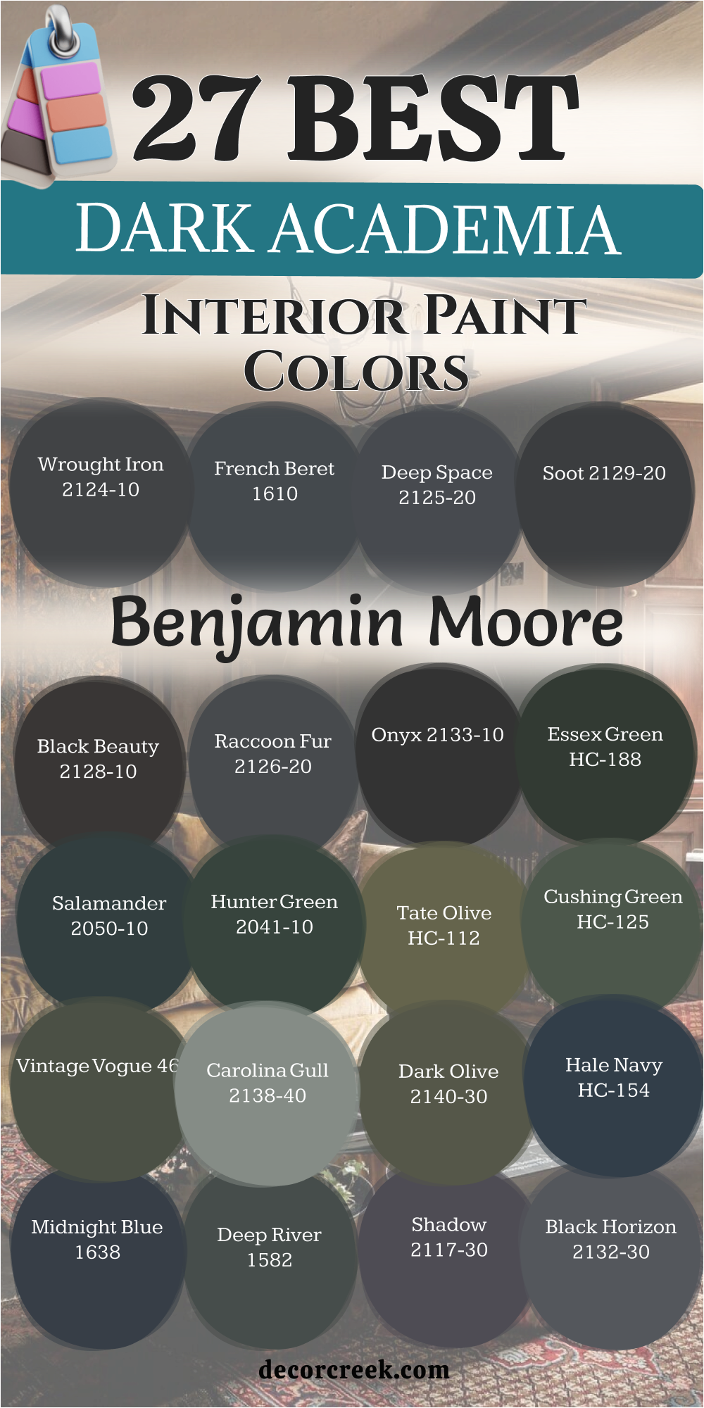
18 Dark Academia Whole House Color Palette For The Interior
Iron Ore SW 7069 + Alabaster SW 7008
Iron Ore SW 7069 is a masterclass in the “high-contrast” academic look, offering a sophisticated balance between shadow and light. This deep, charcoal black possesses a soft, velvet-like finish, making it feel far more approachable and residential than a stark, cold black.
It functions as a dramatic anchor for grand spaces, providing a sense of permanence and architectural weight that suggests a home with deep roots and many stories. To keep the interior from feeling like a dark cave, Alabaster is utilized as the perfect counter-point on trim and ceilings. This creamy, off-white has just enough warmth to bridge the gap between the dark walls and the natural light, creating a scholarly atmosphere that feels both expansive and cozy.
In the evening, the walls seem to recede into the distance under warm lamplight, allowing your furniture, antique globes, and leather-bound collections to take center stage in a very theatrical, immersive way. It is a timeless choice for those who want a home that feels like a protective, intellectual sanctuary.
Best used in: Open-concept living areas, grand master suites, and formal entryways where first impressions matter.
Pairs well with: Cognac leather chairs, matte black iron fixtures, natural wool textiles, and oversized gold-framed oil paintings.

Kendall Charcoal HC-166 + White Dove OC-17
Kendall Charcoal HC-166 is the premier choice for a home that aims to project an image of established history and sturdy reliability. This rich, luxurious gray leans toward a warmer base, beautifully mimicking the appearance of high-end flannel suits or the weathered stone blocks of an old Ivy League library.
It brings a sense of “quiet wealth” to a space, feeling expensive and curated without being flashy or trendy. White Dove acts as the essential softening agent in this palette; it is a clean but soft white that avoids looking yellow or sterile, ensuring the home feels lived-in and comfortable.
Together, they create an atmosphere that suggests the home has been meticulously cared for over many decades. This palette is particularly effective at making silver, pewter, and chrome accents sparkle with a refined, understated elegance against the moody, neutral background. It is a dependable foundation for any dark academia interior that prioritizes classic, masculine style.
Best used in: Formal dining rooms designed for long conversations, home theaters, and exterior trim on historic residences.
Pairs well with: Polished silver accents, navy blue velvet upholstery, dark cherry wood furniture, and crystal glassware.

Essex Green HC-188 + Simply White OC-117
Essex Green HC-188 is the quintessential dark academia paint color, directly inspired by the forest-green walls of historic university halls and private gentlemen’s clubs. This deep, nearly-black green exudes authority, tradition, and intellectual depth, providing a serious backdrop that demands respect and focus.
It is the favorite for those who want a true “old world” aesthetic that feels heavy with history. Simply White is its perfect companion, providing a crisp, bright, and professional contrast that prevents the green from feeling too “muddy” or overwhelming in smaller rooms.
This combination highlights architectural details like crown molding, wainscoting, and built-in shelving with incredible precision, turning the room into a sharp, scholarly masterpiece. It is the ideal environment for a dedicated researcher who surrounds themselves with mahogany desks, green felt-topped tables, and thousands of books.
Best used in: Dedicated home libraries, executive home offices, and statement front doors.
Pairs well with: Brass floor lamps, heavy mahogany furniture, emerald green velvet curtains, and vintage globes.

Jasper SW 6216 + Shoji White SW 7042
Jasper SW 6216 represents the most sophisticated edge of the green family, leaning so heavily into black that it creates an aura of deep mystery and organic strength. It is a “living” color that feels incredibly lush and substantial on the walls, providing a sense of natural gravity that grounds the entire house.
When paired with Shoji White—a warm, greige-based white—the result is a palette that feels grounded in nature and history rather than artifice. Shoji White softens the intensity of the Jasper, creating a soft, transitionary feel that is much more welcoming than a standard, cool white.
This duo is particularly successful in homes that feature a lot of natural wood elements, indoor plants, and organic materials like stone or linen. It creates a “modern conservatory” vibe that fits perfectly within the academic theme while staying deeply connected to the earth and the seasons.
Best used in: Sunrooms, living rooms with high vaulted ceilings, and large kitchens with wooden cabinetry.
Pairs well with: Terracotta pots, light oak flooring, botanical art prints, and linen-wrapped books.

Salamander 2050-10 + Classic Gray OC-23
Salamander 2050-10 is the answer for those looking to introduce a touch of moody mystery and artistic flair. This complex, shapeshifting color moves between deep navy, forest green, and charcoal depending on the time of day and the angle of the light.
It provides a dramatic, high-fashion backdrop that feels both intellectual and slightly rebellious, as if it belongs to a poet or an artist. Classic Gray serves as the sophisticated, barely-there neutral that ties the house together. It is a very light, clean gray with just a hint of warmth that makes it a perfect choice for hallways and smaller secondary rooms.
This combination allows the main “Salamander” rooms to feel like exclusive, hidden gems within a larger, cohesive home design. It is a palette that rewards curiosity, as the walls reveal different undertones every time you walk into the room.
Best used in: Dramatic powder rooms, master bedroom accent walls, and cozy music rooms.
Pairs well with: Pewter hardware, charcoal gray linens, moody still-life oil paintings, and ebony-stained wood.

Naval SW 6244 + Snowbound SW 7004
Naval SW 6244 leans into the “nautical scholar” or “British naval officer” aesthetic, projecting a sense of power, order, and absolute confidence. This deep, iconic navy blue doesn’t shy away from its identity; it is bold, unwavering, and creates a space that feels structured and secure.
It is the perfect color for a room dedicated to deep focus, strategy, and decision-making. Snowbound is a clean white with a very slight cool undertone, which keeps the transition between the dark blue walls and the trim looking incredibly sharp and high-definition.
This is a very clean and powerful combination that avoids looking “dusty” or “dated,” making it a great bridge between traditional dark academia and modern luxury design. It feels like a space where important work is done and legacy is built.
Best used in: Large kitchen islands, academic bedrooms, and master bathrooms with white tile.
Pairs well with: Polished chrome or nickel, crisp white high-thread-count bedding, and light ash or pine wood.

French Beret 1610 + Pale Oak OC-20
French Beret 1610 is an exceptionally elegant, smoky blue-gray that feels as soft as the fabric it is named after. It has a plush, immersive quality that makes the walls feel like they are covered in expensive wool or felt.
This is a softer, more feminine approach to dark academia that emphasizes comfort and “hygge” alongside intellectualism. Pale Oak is one of the most popular “greige” neutrals because it carries a gentle hint of warmth that makes a room feel sunny and open, even on a cloudy day.
When used together, they create a perfectly balanced environment where the dark spaces feel luxurious and the light spaces feel airy and restorative. This palette is perfect for those who want a moody, scholarly home that still feels bright enough for daily family activities and social gatherings.
Best used in: Guest bedrooms, music rooms, and transitional hallways that link darker living spaces.
Pairs well with: Silver-leaf frames, lavender or dusty rose accents, and silk or cashmere fabrics.

Pewter Green SW 6208 + Drift of Mist SW 9166
Pewter Green SW 6208 is the definition of cool, intellectual calm. This color possesses a silvery, metallic-green undertone that gives the walls an expensive, custom-designed appearance that is hard to replicate.
It feels very contemporary and sharp, making it a favorite for modern dark academia interiors that value clean lines and a professional atmosphere. Drift of Mist is a light, airy gray that perfectly complements the cool tones of the green without ever leaning toward beige or yellow.
This palette creates a very serene, “gallery-like” environment where the shadows are clean and the highlights are crisp. It is a highly professional color scheme that works exceptionally well in homes with a lot of industrial, mid-century modern, or minimalist furniture, offering a moody vibe without any of the clutter.
Best used in: Modern home offices, sleek kitchen cabinetry, and master suites with a minimal aesthetic.
Pairs well with: Black stainless steel appliances, cool white marble, and slate or concrete flooring.

Carolina Gull 2138-40 + Chantilly Lace OC-65
Carolina Gull 2138-40 is unmatched for a lighter, “misty” academic feel that emphasizes the beauty of the natural world. This mid-tone gray-green perfectly captures the color of a foggy morning on the coast or the weathered stones in an ancient cathedral garden.
It is moody enough to be interesting and intellectual but light enough to be used in almost any room of the house without fear of it being too dark. Chantilly Lace is a pure, bright white—often called the “truest white”—which makes the subtle green and gray tones of the walls pop with absolute clarity and vibrance.
This palette feels very fresh, clean, and scholarly, reminding one of the quiet corridors of a historic university in the early morning before the students arrive.
Best used in: Bathrooms with traditional fixtures, laundry rooms, and nursery spaces for a “calm scholar” vibe.
Pairs well with: Light birch or maple wood, silver hardware, and fresh eucalyptus branches.

Ripe Olive SW 6209 + Natural Linen SW 9109
Ripe Olive SW 6209 is an incredibly warm and inviting color that leans into the “rustic scholar” or “English cottage” style. It brings a sense of ancient history and deep nature into the home, feeling like a color that has existed for centuries.
It is earthy, grounded, and intensely comforting. Natural Linen provides a soft, sandy, and textured neutral that makes the room feel unpretentious and relaxed. This duo avoids the “stiffness” of some academic styles, focusing instead on the joys of comfort, reading by the fire, and a quiet connection to the outdoors.
It is a perfect choice for homes with a lot of character, mismatched antique furniture, and a general sense of lived-in, cozy charm.
Best used in: Breakfast nooks, cozy living rooms with stone fireplaces, and mudrooms.
Pairs well with: Jute or sisal rugs, unfinished or distressed wood, and warm copper accents.

Gentleman’s Gray 2062-20 + Balboa Mist OC-27
Gentleman’s Gray 2062-20 is a tailored, deep blue-gray that feels like a bespoke suit for your walls. It is smart, sharp, and carries a sense of traditional masculine elegance and high-level decorum.
Balboa Mist is a highly versatile, warm-toned gray that softens the bold, authoritative nature of the blue, making it an excellent choice for shared family spaces that still want to maintain a touch of drama and intellectual flair.
This combination is very “put together” and works well in rooms where you want to impress guests while keeping the atmosphere relaxed enough for long evenings of drinks and conversation. It balances the “cool” blue with a “warm” gray for a perfectly neutralized palette that never feels one-sided.
Best used in: Shared family living rooms, home offices used for client meetings, and built-in shelving units.
Pairs well with: Cognac leather, warm brass reading lamps, and navy blue textiles with traditional patterns like plaid.

Roycroft Bottle Green SW 2847 + Greek Villa SW 7551
Roycroft Bottle Green SW 2847, as part of the historic Arts and Crafts collection, offers a level of authenticity that few other greens can match. It feels hand-crafted, substantial, and rooted in the philosophy of quality over quantity, making it a favorite for lovers of fine craftsmanship.
Greek Villa is a rich, sunny, and slightly off-white that balances the heavy weight of the green with a cheerful, open glow that mimics natural sunlight. This combination creates a look that is both historic and surprisingly fresh, making the home feel like a well-preserved piece of architectural history.
It is a very sturdy and reliable palette that works beautifully with heavy woodwork, stained-glass details, and the antique textures typical of traditional “academic” homes.
Best used in: Craftsman-style homes, primary libraries, and fireplace focal walls.
Pairs well with: Stained glass, heavy oak furniture, and aged bronze or iron hardware.

Vintage Vogue 462 + Edgecomb Gray HC-173
Vintage Vogue 462 is a smoky, high-fashion green that acts as a sophisticated alternative to charcoal or navy. It has a mysterious, “chic” quality that makes it a favorite for master bedrooms and formal entertaining spaces where you want to feel your best.
Edgecomb Gray is a “stony” neutral that expertly bridges the gap between gray and beige (often called a “warm greige”). It provides a calm, sophisticated backdrop for the home’s transition areas, ensuring that the move from a dark room to a light hallway feels intentional, high-end, and seamless.
This palette is for the person who wants their dark academia home to feel like a spread in a luxury design magazine—moody, expensive, and perfectly balanced in every corner.
Best used in: Bedrooms, formal dining rooms, and art gallery walls with focused gold lighting.
Pairs well with: Velvet curtains, gold leaf frames, and cream-colored upholstered furniture.

Midnight SW 6264 + Alabaster SW 7008
Midnight SW 6264 is the color of the deep night sky, designed for a room that is intended to be a true sanctuary of thought. It offers a level of deep, quiet focus that is hard to achieve with other colors, encouraging reflection, meditation, and calm.
Using Alabaster for the trim and ceiling ensures that the dark blue stays the absolute star of the show while adding enough creamy warmth to keep the space from feeling cold, commercial, or too much like a retail store.
This palette is designed for the “night owl” scholar—it feels at its most beautiful when the sun goes down and the warm glow of floor lamps interacts with the deep blue walls to create a sense of absolute safety and enclosure from the outside world.
Best used in: Bedrooms, dedicated home theaters, and formal dens.
Pairs well with: Brushed gold hardware, white marble accents, and rich walnut wood furniture.
Tate Olive HC-112 + Swiss Coffee OC-45
Tate Olive HC-112 is a direct nod to “Old World” Europe and traditional academic institutions. This historical olive green has a dusty, aged quality that feels like it was taken from a 19th-century study or an old science lab.
Swiss Coffee is one of the most beloved whites in design history because of its soft, creamy, and parchment-like glow that feels warm and inviting. Together, they create a space that feels like it is filled with history, old paper, and quiet wisdom.
This palette doesn’t feel “new” or “remodelled”—it feels like it has always been there, which is a key goal of the dark academia aesthetic. It is incredibly cozy and works well with a wide variety of antique wood tones and vintage textures.
Best used in: Kitchens with open shelving, historic libraries, and period-accurate home renovations.
Pairs well with: Antique Persian rugs, aged brass hardware, and terracotta floor tiles.

Deep River 1582 + White Dove OC-17
Deep River 1582 is a fascinating, complex color that defies easy categorization; it is a muddy, atmospheric mix of gray, green, and blue that seems to change its mind every time you look at it. It is an “artist’s color” that feels very creative, slightly melancholic, and deeply intellectual.
Pairing it with the soft, reliable nature of White Dove creates a balanced environment where the complex wall color can really shine without feeling overwhelming or too dense.
This is a brilliant choice for a home that houses an eclectic collection of modern art, vintage finds, and diverse book collections. It creates a “curated gallery” vibe that feels intellectual and uniquely personal to the owner, celebrating a life of varied interests.
Best used in: Creative studios, bedrooms, and eclectic living spaces with high-contrast decor.
Pairs well with: Raw wood, silver or chrome accents, and colorful abstract or modern art.
Dried Thyme SW 6186 + Oyster White SW 7637
Dried Thyme SW 6186 is a muted, herb-like green that carries a heavy gray undertone, giving it a very calm and scholarly presence.
It feels like the color of dried specimens in a university lab or a vintage map. Oyster White is a cool-toned, pearly white that adds a touch of modern sophistication and “crispness” to the earthy green walls.
This duo is particularly effective in functional spaces like kitchens or laundry rooms where you want the dark academia mood without losing a sense of cleanliness, organization, and efficiency. It feels very smart and capable while remaining firmly within the moody, traditional theme of the rest of the house. It is the perfect blend of natural beauty and academic order.
Best used in: Laundry rooms, kitchens, and bathrooms with black or silver fixtures.
Pairs well with: Black plumbing fixtures, light gray stone tile, and woven storage baskets.
Rookwood Dark Red SW 2801 + Creamy SW 7012
Rookwood Dark Red SW 2801 is a historical, earthy red that feels grand and formal rather than bright or trendy. It is designed for a dramatic, library-style entrance that makes a powerful statement of tradition and legacy.
This color brings a sense of traditional “gravity” to the home. Creamy is a rich, warm white that avoids looking stark or cold, providing a soft and elegant contrast that makes the red feel even deeper and more substantial.
This palette is designed to impress, creating a rich sense of history and academic importance from the moment someone steps through the front door. It is the color of old leather books, port wine, and centuries of scholarly achievement.
Best used in: Grand foyers, formal dining rooms, and fireplace surrounds in a grand library.
Pairs well with: Gold-framed mirrors, dark walnut or ebony wood, and crystal or brass chandeliers.

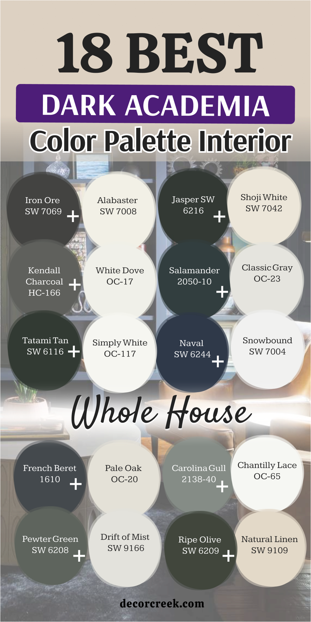
Choosing a dark color is a transformative and bold step, but it is a design decision that pays off immensely by providing you with a truly sophisticated and cool home. You should never be afraid of leaning into the shadows, because these deep tones do not just fill a space—they embrace it, making your rooms feel like a permanent, warm hug that protects you from the outside world.
The most rewarding part of embracing the dark academia aesthetic is that it creates the perfect, moody stage for you to proudly show off your unique personality, your curated collections, and your growing library of books.
I truly hope that these specific colors and palettes provide the inspiration you need to build a home that feels exactly like stepping into the pages of your favorite, most cherished story.