I know exactly how overwhelming and difficult it can be to select the perfect paint for your home. It’s a big decision because you want your house to feel like a warm, protective hug the moment you walk through the door after a stressful day. Earth tones are truly the best way to make that feeling a reality because they instinctively remind us of the beauty of nature and the solid, reliable ground beneath our feet.
These organic colors provide a sense of authenticity, making a house feel real, steady, and safe for your family to grow in. I have spent many years of my life helping people transform cold, empty houses into living homes by carefully selecting the right shades of rich brown, sandy tan, and leafy green.
When you choose a color pulled directly from the earth, you are choosing a timeless look that transcends trends and will always feel right.
Why I Always Trust Sherwin-Williams and Benjamin Moore for the Best Earth Tone Paint Colors
When I am working on someone’s home, I refuse to use anything but the highest quality paint brands available. Sherwin-Williams and Benjamin Moore are consistently my top choices because their pigments are incredibly accurate; the color looks exactly the same on your large wall as it did on the tiny paper chips you looked at in the store.
These companies have spent decades perfecting their formulas to ensure that their earth tones are “stable,” meaning they won’t shift into strange, unwanted undertones like muddy pink or sickly purple when the afternoon sun hits them.
I need the absolute certainty that a tan color will stay a true tan once the paint has fully cured. Beyond the color itself, their paint is remarkably thick and offers superior coverage, which significantly reduces the labor required and saves you money in the long run. Using cheap, low-quality paint usually ends up being a frustrating and expensive mistake because the coverage is so poor that you have to buy twice as many cans to get the job done.
How I Choose the Perfect Earth Tone Shade for Any Room
Finding the perfect shade is a journey that starts with a deep dive into the unique light of your specific room. I always make it a point to study how the sunlight enters through the windows at various times of the day—from the bright morning glow to the long shadows of the evening. A deep, chocolate brown might look absolutely stunning in a large, bright sunroom, but that same color could easily turn a small, windowless hallway into a dark, cramped cave.
I also carefully examine the existing elements of the space, such as the wood grain of the floors and the fabric of the furniture that will remain in the room. You want your new wall color to “shake hands” and get along harmoniously with the wood, stone, or carpet you already have. My most important piece of advice to clients is to never skip the sampling phase: paint a large square of the color on at least two different walls before committing to the entire project.
This allows you to live with the color for a few days and see if you truly love how it looks while you are relaxing on your couch. It is much easier, cheaper, and less stressful to change your mind about a small sample square than it is to repaint an entire room.
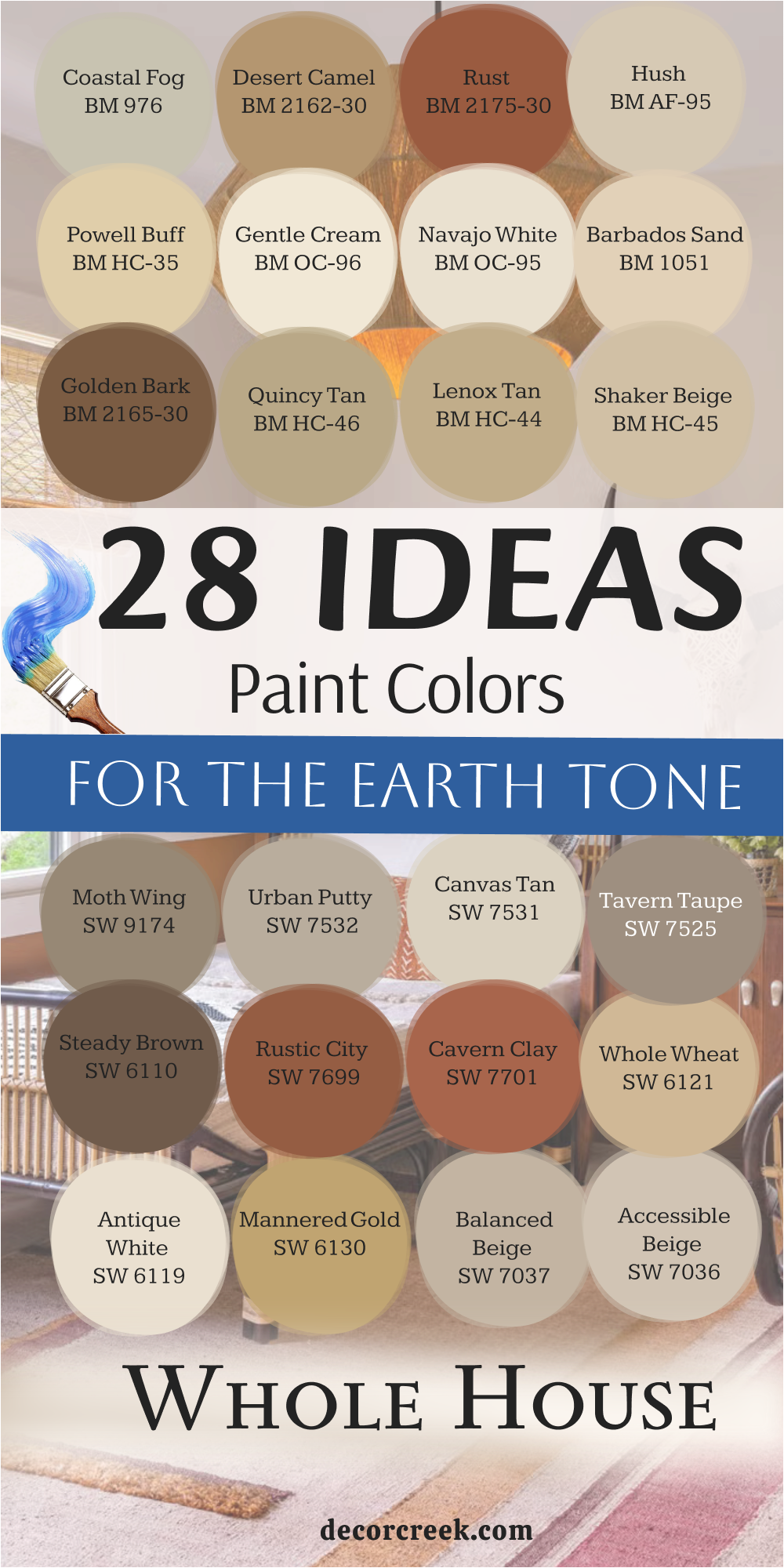
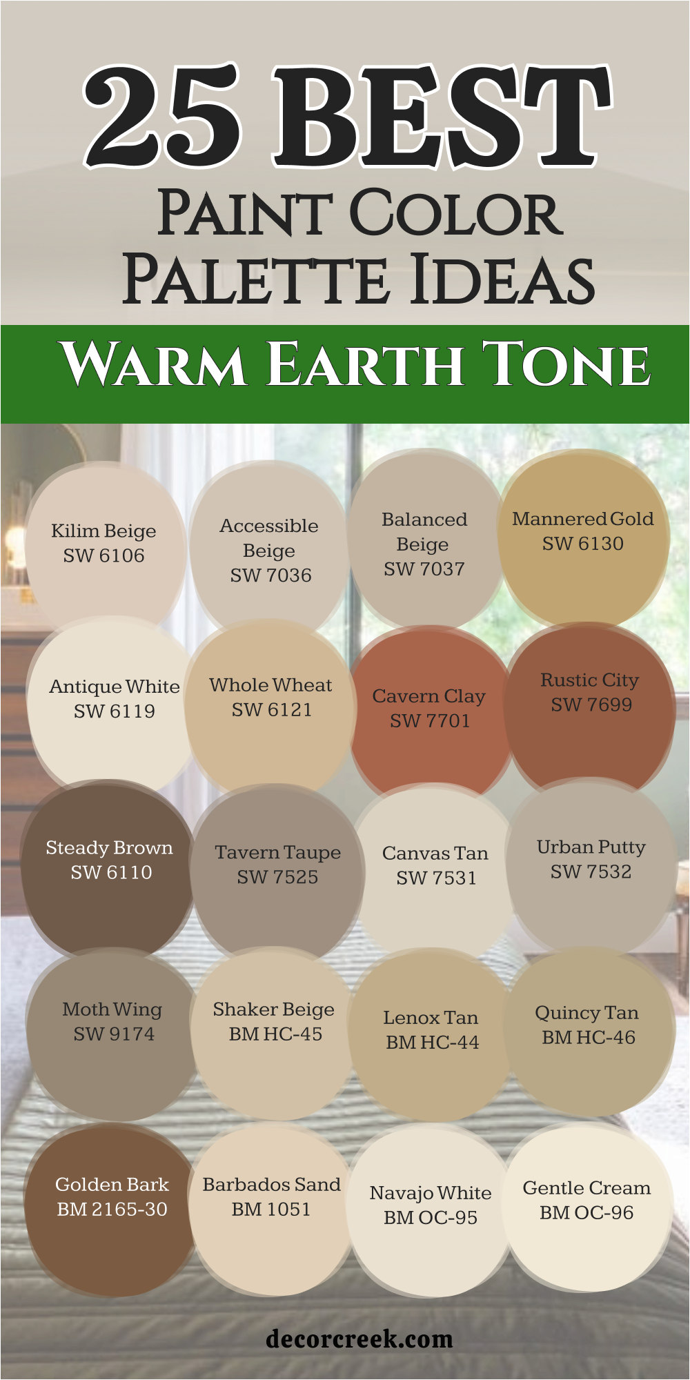
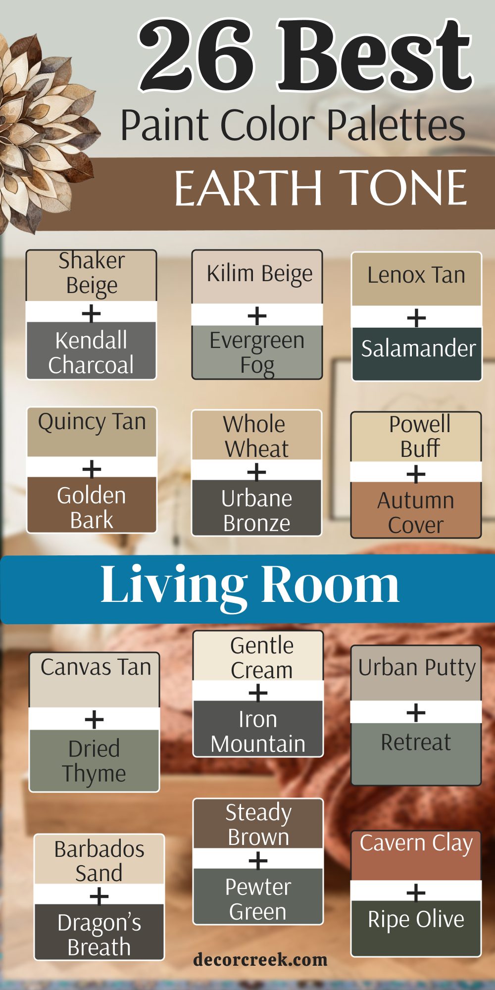
25 Warm Earth Tone Paint Color Palette Ideas
Kilim Beige SW 6106
Kilim Beige SW 6106 is a very popular choice for people who want a warm feeling in their main living areas. This color has a bit of orange and red deep inside it which makes it feel like a sunny day. It looks great in entryways because it welcomes guests with a friendly glow.
I like to use it when the house has a lot of dark wood furniture. The color stays bright enough to keep the room from feeling heavy. It works well with many different styles of rugs and pillows. You will find that it hides small fingerprints or dirt better than a bright white.
Families with kids and pets often choose this shade because it is very forgiving. It makes a room feel finished without being too loud or bright. Many people find it to be the most comfortable tan they have ever used in their homes.
Best used in: living rooms, entryways, kitchens, and bedrooms
Pairs well with: Latte SW 6108, Hopsack SW 6120, Van Dyke Brown SW 7041, dark wood floors The key rule of this color for farmhouse style is to use it where you want natural light to feel kind, soft, and inviting throughout the day.
👉 Read the full guide for this color HERE 👈
Accessible Beige SW 7036
Accessible Beige SW 7036 is a favorite for open floor plans because it goes with almost everything you own. This shade is unique because it has a tiny bit of gray mixed with the warm tan. It does not look too yellow even when the light is very bright outside. I often pick this for kitchens where there are many different cabinet colors.
It acts as a bridge between the floor and the ceiling. The color feels very fresh and clean without being cold like a blue or a stark white. It makes small rooms feel bigger because it reflects light so well. You can use it in a basement to make the area feel less like a cellar. It is a smart choice for someone who wants a safe color that still has a lot of personality. Most homeowners say this color makes their furniture look brand new again.
Best used in: kitchens, bathrooms, whole house walls, and hallways
Pairs well with: Urbane Bronze SW 7048, Aesthetic White SW 7035, Cadet SW 9143, black metal accents The key rule of this color for farmhouse style is to use it where you want natural light to feel kind, soft, and inviting throughout the day.
👉 Read the full guide for this color HERE 👈

Balanced Beige SW 7037
Balanced Beige SW 7037 is a deeper version of a tan that brings a lot of richness to a room. This color feels very solid and helps a large room feel more tucked in and cozy. It has enough brown in it to stand out against white trim and baseboards. I love using this in a home office where you need to feel focused and grounded. It does not change much when the lamps are turned on in the evening.
The warmth of the color makes a bedroom feel like a safe place to sleep. It works beautifully with stone fireplaces or brick walls. You will notice that it creates a nice shadow in the corners of the room which adds depth. It is a great middle-ground color for someone who thinks light tan is too boring. This shade makes a house feel like it has been there for a long time in a good way.
Best used in: home offices, bedrooms, dining rooms, and dens
Pairs well with: Virtual Taupe SW 7039, Alabaster SW 7008, Pewter Green SW 6208, navy blue accents The key rule of this color for farmhouse style is to use it where you want natural light to feel kind, soft, and inviting throughout the day.
👉 Read the full guide for this color HERE 👈

Mannered Gold SW 6130
Mannered Gold SW 6130 is a bold choice that looks like the color of autumn leaves or harvest wheat. This color brings a lot of energy into a room without being as bright as a school bus. It feels very expensive and high-end when used in a dining room. I like to pair it with white crown molding to make the gold pop. It reminds me of old sunlit hills and warm summer afternoons.
The color can make a cold room facing north feel much warmer than it actually is.
It is a great way to add a splash of fun to a laundry room or a small bathroom. You will find that gold tones like this make blue or green decorations look amazing.
It is a happy color that makes people want to stay and talk for a while. Using this shade is a great way to show off your unique style.
Best used in: dining rooms, accent walls, powder rooms, and cozy nooks
Pairs well with: Dover White SW 6385, Clary Sage SW 6178, Turkish Coffee SW 6076, brass fixtures The key rule of this color for farmhouse style is to use it where you want natural light to feel kind, soft, and inviting throughout the day.
Antique White SW 6119
Antique White SW 6119 is a classic choice that is much warmer than a standard ceiling white. This color looks like heavy cream or a soft vanilla bean. It is perfect for people who want their walls to be light but hate the feeling of a doctor’s office. I use this a lot on kitchen cabinets to give them a vintage look.
It makes a room feel very bright and airy while still being part of the earth tone family. The color has a yellow undertone that makes it feel very friendly. It is an excellent choice for a ceiling if you want to avoid a harsh contrast with tan walls. You can paint a whole house in this color and it will feel very cohesive. It makes colorful artwork on the walls really stand out. It is a very soft color that treats the eyes gently.
Best used in: kitchens, bedrooms, trim, and ceilings
Pairs well with: Whole Wheat SW 6121, Svelte Sage SW 6164, Cordovan SW 6027, oak furniture The key rule of this color for farmhouse style is to use it where you want natural light to feel kind, soft, and inviting throughout the day.
👉 Read the full guide for this color HERE 👈
Whole Wheat SW 6121
Whole Wheat SW 6121 is a medium tan that looks exactly like a field of grain ready for harvest. This color is very warm and makes a large room feel much more intimate. It has a bit of a golden glow that shows up when the sun goes down. I think it is one of the best colors for a living room with high ceilings.
It fills the wall with a rich color that does not feel too dark. The shade works very well with leather furniture and woven baskets. It makes a home feel like a rustic cabin in the woods. You can use it to make a brand new house feel like it has a lot of history. It is a very sturdy color that does not go out of style. Many people love how it makes their wood floors look deeper and shinier.
Best used in: living rooms, grand rooms, master bedrooms, and hallways
Pairs well with: Believable Buff SW 6120, Bagel SW 6114, Urbane Bronze SW 7048, cream fabrics The key rule of this color for farmhouse style is to use it where you want natural light to feel kind, soft, and inviting throughout the day.
👉 Read the full guide for this color HERE 👈
Cavern Clay SW 7701
Cavern Clay SW 7701 is a deep terracotta color that brings the spirit of the desert into your home. This color is very earthy and reminds me of red rocks and clay pots. It is a bold choice for an accent wall or a small library. I love how it looks when the light hits it because it seems to glow from inside.
It makes a room feel very warm and grounded. You can use it in a dining room to make dinner parties feel more special. The color pairs beautifully with green plants and wooden shelves. It is a great way to add a lot of color without using something that looks fake. This shade has a lot of soul and makes a statement about your love for nature. It is a very brave color that pays off with a lot of style.
Best used in: accent walls, dining rooms, libraries, and front doors
Pairs well with: Origami White SW 7636, Moth Wing SW 9174, Slate Tile SW 7624, natural wood The key rule of this color for farmhouse style is to use it where you want natural light to feel kind, soft, and inviting throughout the day.
👉 Read the full guide for this color HERE 👈

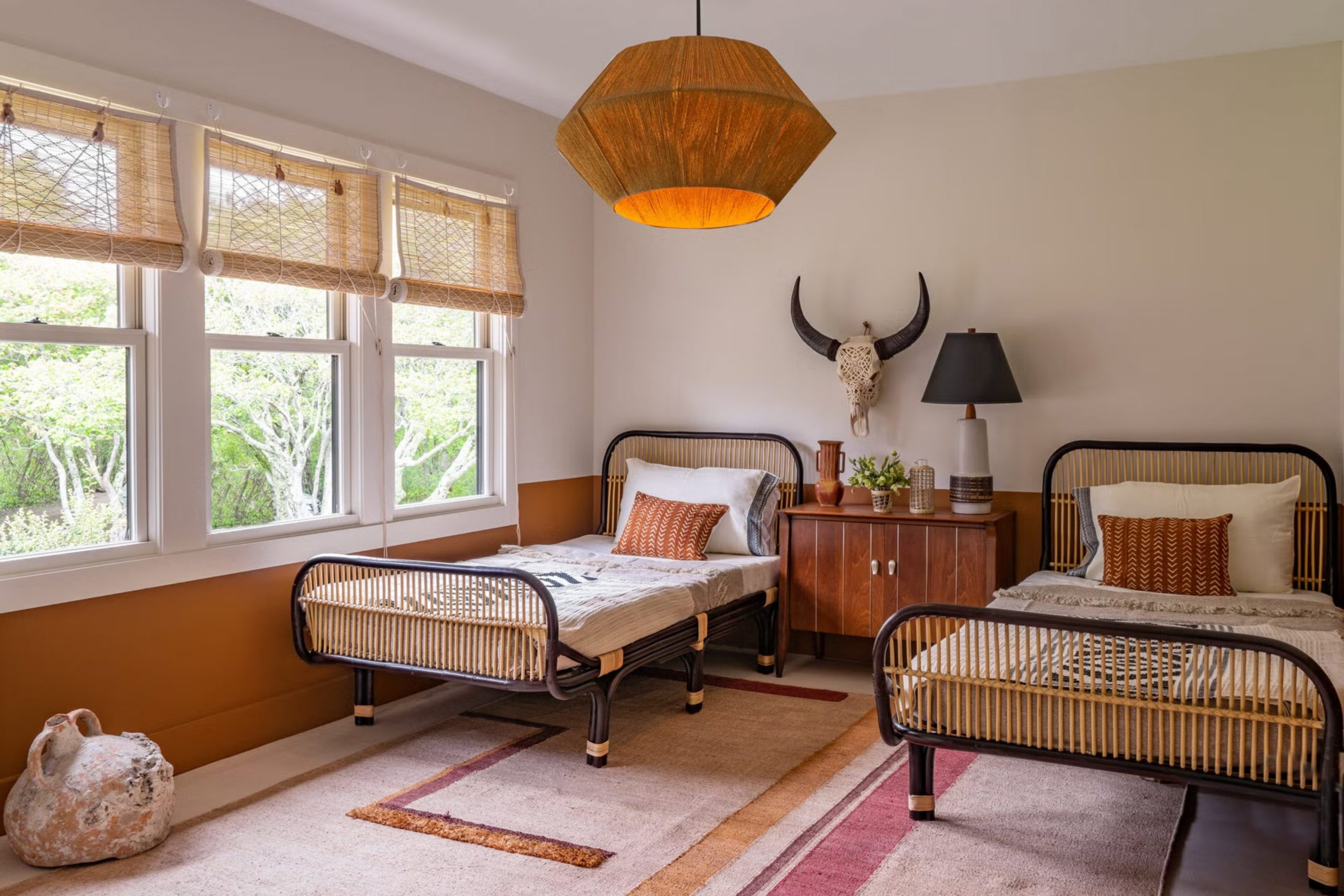
Rustic City SW 7699
Rustic City SW 7699 is a burnt orange color that feels very cozy and traditional. This color looks like the bricks on an old building or a sunset in the autumn. I like to use it in rooms where families gather to watch movies or play games. It creates a very snug feeling that makes you want to wrap up in a blanket.
The color is strong but it still feels like it belongs to the earth. It works well with dark brown furniture and iron decorations. You can use it to make a large room feel much smaller and more private. It is a very rich shade that adds a lot of heat to a room’s design. Many people use this in their kitchens to make the area feel like a warm bakery. It is a color that feels very hearty and full of life.
Best used in: dens, kitchens, mudrooms, and accent walls
Pairs well with: Iron Ore SW 7069, Dover White SW 6385, Kilim Beige SW 6106, copper accents The key rule of this color for farmhouse style is to use it where you want natural light to feel kind, soft, and inviting throughout the day.
Steady Brown SW 6110
Steady Brown SW 6110 is a dark and chocolatey color that brings a sense of strength to any room. This color is very deep and looks like rich soil from a garden. I often use it for an office or a man cave to give the room a serious and solid feel. It makes white furniture or light-colored rugs really pop against the walls.
The color is very sophisticated and makes a room look like it belongs in a fancy magazine. It is great for hiding imperfections on old walls because it is so dark. You will find that it creates a very quiet and peaceful mood in a bedroom. It works well when you have a lot of natural light to balance the darkness. This shade is perfect for someone who wants to feel protected and safe in their home. It is a very classic brown that never feels trendy or cheap.
Best used in: home offices, master bedrooms, basements, and accent walls
Pairs well with: Divine White SW 6105, Kilim Beige SW 6106, Ryegrass SW 6423, light oak The key rule of this color for farmhouse style is to use it where you want natural light to feel kind, soft, and inviting throughout the day.
Tavern Taupe SW 7508
Tavern Taupe SW 7508 is a mid-tone brown that has a very stony and natural look. This color feels like a smooth pebble you would find in a creek. It is not too red and not too yellow, which makes it very easy to live with. I like to use this in hallways because it connects different rooms very smoothly.
It provides a nice background for family photos and colorful art. The color feels very stable and does not get boring after a few years. It looks wonderful with stone tile floors or gray carpets. You can use it in a laundry room to make the chore feel a little more pleasant. It is a very practical color that looks high-end without being flashy. Many homeowners find that this is the perfect “grown-up” color for their first house.
Best used in: hallways, laundry rooms, living rooms, and exteriors
Pairs well with: Shoji White SW 7042, Sandbar SW 7547, Laurel Woods SW 7749, silver hardware The key rule of this color for farmhouse style is to use it where you want natural light to feel kind, soft, and inviting throughout the day.
👉 Read the full guide for this color HERE 👈
Canvas Tan SW 7531
Canvas Tan SW 7531 is a light and sandy color that reminds me of a clean beach in the morning. This shade is very light but it has enough warmth to keep it from looking like a cold gray. I often use it in small bathrooms or narrow hallways to make them feel much bigger.
It provides a very crisp look when you pair it with bright white trim and doors. The color reflects a lot of light which makes it perfect for rooms with small windows. It acts as a perfect background for any type of colorful rugs or curtains you have.
You will notice that it has a tiny bit of green hidden inside which makes it feel very natural. It is a very safe choice for someone who is afraid of picking a color that is too dark. Most people say it makes their home feel very clean and orderly. This tan is a great way to start your journey into earth tones.
Best used in: bathrooms, hallways, small bedrooms, and laundry rooms
Pairs well with: Dried Thyme SW 6186, Urban Putty SW 7532, Alabaster SW 7008, light wood The key rule of this color for farmhouse style is to use it where you want natural light to feel kind, soft, and inviting throughout the day.
👉 Read the full guide for this color HERE 👈

Urban Putty SW 7532
Urban Putty SW 7532 is a unique color that sits right between a warm tan and a cool gray. This color looks like the wet clay you would find near a river bank. I like to use it in kitchens because it looks very high-end with stainless steel appliances. It has a very solid feeling that makes a room look more expensive than it is.
The shade changes a little bit depending on if the sun is out or if it is cloudy. It is dark enough to show off white cabinets but light enough to keep the room bright. You can use it in a living room to create a very modern and natural look. It works very well with black metal accents and industrial light fixtures. This is a very smart color for people who want a home that looks like a designer lived there. It feels very grounded and never looks like a cheap plastic color.
Best used in: kitchens, living rooms, mudrooms, and home offices
Pairs well with: Retreat SW 6207, Shoji White SW 7042, Worldly Gray SW 7043, black metal The key rule of this color for farmhouse style is to use it where you want natural light to feel kind, soft, and inviting throughout the day.
Moth Wing SW 9174
Moth Wing SW 9174 is a medium brown color that feels very organic and woodsy. This color reminds me of the bark on an old oak tree or a dried leaf. I love to use it in bedrooms where you want to feel very tucked in and safe at night. It is a very rich color that brings a sense of the forest inside your house.
The shade has a bit of gray in it which keeps it from looking too orange or red. It looks amazing when you have large windows that show the trees outside. You will find that it makes light-colored bedding and pillows look very bright and clean. It is a great choice for a basement that you want to feel like a cozy den. Many homeowners pick this color because it feels very sturdy and real. It is a color that gives a room a lot of weight and importance.
Best used in: bedrooms, basements, dens, and accent walls
Pairs well with: Origami White SW 7636, Cavern Clay SW 7701, Svelte Sage SW 6164, linen fabrics The key rule of this color for farmhouse style is to use it where you want natural light to feel kind, soft, and inviting throughout the day.
👉 Read the full guide for this color HERE 👈
Shaker Beige HC-45
Shaker Beige HC-45 is a classic tan from Benjamin Moore that people have loved for a very long time. This color is very warm and looks like a toasted piece of bread. I think it is the perfect choice for a family room where everyone gathers to talk. It has a lot of gold and orange in it which makes the room feel very sunny.
The color makes people feel happy and relaxed as soon as they sit down. It works very well with traditional furniture and heavy wooden tables. You can use it to make a house with a lot of white walls feel much more like a home. It is very easy to match with different types of wood floors and stone work. Most people find that this color makes their home feel very classic and timeless. It is a very friendly shade that welcomes everyone who enters.
Best used in: family rooms, dining rooms, entryways, and kitchens
Pairs well with: Kendall Charcoal HC-166, Simply White OC-117, Revere Pewter HC-172, warm wood The key rule of this color for farmhouse style is to use it where you want natural light to feel kind, soft, and inviting throughout the day.
👉 Read the full guide for this color HERE 👈

Lenox Tan HC-44
Lenox Tan HC-44 is a rich and deep tan that makes a room feel very elegant. This color is a bit darker than most beiges and has a lot of depth to it. I like to use it in master bedrooms to make the space feel like a fancy hotel room. It has a golden undertone that glows beautifully under warm lamp light in the evening.
The color is very sophisticated and makes any room look very polished. It works great in houses that have a lot of white trim to create a sharp look. You will notice that it makes dark wood furniture look very rich and expensive. It is a great way to add a lot of warmth to a room that gets a lot of cold light. This color feels very solid and gives a room a very steady mood. Many people say it is the best tan they have ever put on their walls.
Best used in: master bedrooms, living rooms, formal dining rooms, and libraries
Pairs well with: Salamander 2050-10, White Dove OC-17, Swiss Coffee OC-45, brass accents The key rule of this color for farmhouse style is to use it where you want natural light to feel kind, soft, and inviting throughout the day.
👉 Read the full guide for this color HERE 👈
Quincy Tan HC-25
Quincy Tan HC-25 is a medium tan that has a very natural and earthy feel. This color looks like the sand on a river bank or a piece of worn leather. I often use it in hallways or staircases because it is very durable and hides marks well. It has a tiny bit of a green tint that makes it look very organic and fresh.
The color is not too bright and not too dark which makes it very easy to live with. It works well with both light and dark furniture which makes it very flexible. You can use it in a home office to create a place that feels very focused and calm. It makes a great background for plants and other natural decorations.
This shade is a very honest color that does not try to be something it is not. Many people love how it makes their home feel very connected to the outdoors.
Best used in: hallways, staircases, home offices, and mudrooms
Pairs well with: Golden Bark 2165-30, Chantilly Lace OC-65, Hale Navy HC-154, stone accents The key rule of this color for farmhouse style is to use it where you want natural light to feel kind, soft, and inviting throughout the day.
Golden Retriever 2165-30
Golden Retriever 2165-30 is a deep brown color with a lot of red and orange mixed in. This color looks like the skin of a dark potato or a piece of mahogany wood. I love to use it for an accent wall in a room that needs a big splash of warmth. It is a very powerful color that makes a room feel very cozy and small.
The shade is perfect for a dining room where you want to have long and happy dinners. It creates a very dramatic look when you pair it with light-colored curtains or rugs. You will find that it makes the room feel very warm even in the middle of winter. It is a great way to show off your love for rich and earthy colors. This color has a lot of personality and makes your home feel very unique. It is a very brave choice that makes a house feel very much like a home.
Best used in: accent walls, dining rooms, libraries, and entryways
Pairs well with: Quincy Tan HC-46, Navajo White OC-95, Dark Olive 2140-30, cream furniture The key rule of this color for farmhouse style is to use it where you want natural light to feel kind, soft, and inviting throughout the day.
👉 Read the full guide for this color HERE 👈

Barbados Sand 1094
Barbados Sand 1094 is a soft and light tan that feels very airy and light. This color looks like the very fine sand you find at the edge of the water. I like to use it in kitchens and breakfast nooks to make the mornings feel bright. It has a very gentle look that does not grab too much attention for itself.
The color makes a room feel very open and gives your eyes a place to rest. It works beautifully with white cabinets and light marble countertops. You can use it in a nursery to create a very soft and sweet environment for a baby. It is a very flexible color that gets along with almost any other shade of green or blue. This color feels very fresh and makes the air in the room feel lighter. Many homeowners find that it is the perfect light tan for a whole house.
Best used in: kitchens, breakfast nooks, nurseries, and bedrooms
Pairs well with: Dragon’s Breath 1547, White Heron OC-57, Gray Owl OC-52, natural fabrics The key rule of this color for farmhouse style is to use it where you want natural light to feel kind, soft, and inviting throughout the day.
👉 Read the full guide for this color HERE 👈

Navajo White OC-95
Navajo White OC-95 is one of the most famous warm whites in the world of paint. This color is much deeper than a standard white and has a lot of cream and yellow in it. I use it when a client wants a white house that does not feel cold or empty. It makes a room feel very sun-drenched and happy all day long.
The color is very soft on the eyes and makes a great background for colorful pillows. It is a very classic choice for trim if you want a look that is very traditional. You can paint a whole living room in this color and it will feel very full and cozy. It works well with dark wood floors to create a high-contrast look that is very pretty. This is a very safe and reliable color that has been used in homes for decades. It is a very kind color that makes everyone feel at home.
Best used in: whole house walls, trim, kitchens, and living rooms
Pairs well with: Knoxville Gray HC-160, Van Courtland Blue HC-145, Wrought Iron 2124-10, oak trim The key rule of this color for farmhouse style is to use it where you want natural light to feel kind, soft, and inviting throughout the day.
👉 Read the full guide for this color HERE 👈
Gentle Cream OC-96
Gentle Cream OC-96 is a very soft and buttery color that brings a lot of light into a room. This color looks like a bowl of vanilla ice cream or a fresh flower. I love to use it in bedrooms to make the mornings feel very soft and easy. It has a very warm glow that makes the room feel like it is always catching the sun.
The color is very light but it still feels like a real color on the walls. It works wonderfully in a bathroom to make the space feel clean and bright. You will notice that it makes green plants look very vibrant and healthy. It is a great choice for a ceiling if you want to make a room feel very warm from top to bottom. This shade is very peaceful and makes a house feel very well-loved. Many people choose this when they want a very light look that is not boring.
Best used in: bedrooms, bathrooms, ceilings, and sunrooms
Pairs well with: Iron Mountain 2134-30, Smoked Oyster 2109-40, Hale Navy HC-154, white linen The key rule of this color for farmhouse style is to use it where you want natural light to feel kind, soft, and inviting throughout the day.
Powell Buff HC-35
Powell Buff HC-35 is a deep and sun-filled tan that makes any room feel like it is glowing. This color has a lot of yellow and gold in it which reminds me of a warm afternoon in a garden. I like to use it in rooms that do not get much natural light to help them feel much brighter.
It looks very rich and expensive when you pair it with heavy white trim and dark floors. The color is very traditional and gives a house a very sturdy and established feeling. It works beautifully in a kitchen with wood cabinets because it pulls out the warmth in the grain.
You will find that it makes blue or green furniture look very vibrant and pretty against the walls. It is a very happy color that makes people want to sit down and stay for a while. Many homeowners love how it makes their house feel like a sunny cottage in the country. This shade is a great way to bring a permanent sense of sunshine into your daily life.
Best used in: kitchens, dining rooms, hallways, and living rooms
Pairs well with: Autumn Cover 2170-30, Desert Twilight 2137-40, Hale Navy HC-154, dark wood The key rule of this color for farmhouse style is to use it where you want natural light to feel kind, soft, and inviting throughout the day.
👉 Read the full guide for this color HERE 👈
Hush AF-95
Hush AF-95 is a very soft and quiet tan that feels like a gentle breath of air. This color is part of the Affinity collection which means it looks good in almost any light you have. I often pick this for bedrooms because it does not demand any attention and lets you rest well.
It has a very balanced look that is not too yellow or too gray which makes it easy to live with. The color works very well as a backdrop for a gallery wall full of family photos. It makes a room feel very clean and tidy without being cold or sharp like a pure white.
You can use it in a nursery to create a very soft environment for a sleeping baby. It is a very sophisticated shade that makes a small room feel much more open and light. Most people find that this color makes their home feel very organized and professional. It is a very polite color that gets along with all your furniture.
Best used in: bedrooms, nurseries, home offices, and small living areas
Pairs well with: Vintage Vogue 462, Kendall Charcoal HC-166, Simply White OC-117, light fabrics The key rule of this color for farmhouse style is to use it where you want natural light to feel kind, soft, and inviting throughout the day.
👉 Read the full guide for this color HERE 👈
Rust 2175-30
Rust 2175-30 is a deep and earthy orange that brings a lot of heat and soul to a room. This color looks like the red clay found in the hills or a piece of old copper metal. I love to use it for an accent wall in a den or a library to make it feel very snug. It is a very bold choice that makes a statement about your love for the colors of the earth.
The shade feels very grounded and solid which helps a large room feel more private and tucked in.
It works amazingly well with leather chairs and wooden bookshelves to create a very classic look. You will notice that it creates a very warm and inviting mood for evening gatherings with friends. It is a great way to add a lot of character to a house that feels too plain or new. This color has a lot of history in its look and feels very authentic and real. Many people find it to be the perfect color for a cozy corner meant for reading.
Best used in: accent walls, dens, libraries, and dining rooms
Pairs well with: Mannequin Cream 2152-60, Flint AF-560, Wood Grain Brown 2109-30, iron accents The key rule of this color for farmhouse style is to use it where you want natural light to feel kind, soft, and inviting throughout the day.
Desert Camel 2162-20
Desert Camel 2162-20 is a rich and warm brown that feels like a piece of fine suede. This color has a lot of depth and makes a room feel very expensive and well-designed. I like to use it in a living room where there is a lot of natural light to show off its golden tones.
It looks very handsome when paired with black accents and cream-colored furniture. The color is very sturdy and provides a great sense of shelter and comfort for your family. It reminds me of the desert sands at sunset when the light turns everything into a warm glow.
You can use it to make a large room feel much more intimate and friendly for guests. It is a very reliable color that does not change much when you turn on the lamps at night. This shade gives a house a very mature and polished look that many homeowners really love. It is a very strong choice for someone who wants a home that feels solid.
Best used in: living rooms, entryways, master bedrooms, and home offices
Pairs well with: Black Forest Green 2130-10, White Dove OC-17, Cloud Cover OC-25, brass fixtures The key rule of this color for farmhouse style is to use it where you want natural light to feel kind, soft, and inviting throughout the day.
Coastal Fog 976
Coastal Fog 976 is a beautiful light brown that has a lot of gray and green hidden inside it. This color looks like the misty air at the beach on a cloudy afternoon. I often use it for whole house painting because it is very easy on the eyes and goes with everything.
It changes its look slightly throughout the day which makes the walls feel very alive and interesting. The color is very light but it has enough body to make white trim look very sharp and clean. It works wonderfully in a kitchen with light wood floors and stone countertops.
You will find that it makes a room feel very fresh and open while still feeling very much like an earth tone. It is a very smart choice for a laundry room or a bathroom to make the space feel bigger. Many people say this is the most relaxing color they have ever used in their homes. It is a very gentle shade that brings a lot of peace to a busy house.
Best used in: whole house walls, kitchens, bathrooms, and laundry rooms
Pairs well with: Smoked Oyster 2109-40, Revere Pewter HC-172, White Heron OC-57, natural wood The key rule of this color for farmhouse style is to use it where you want natural light to feel kind, soft, and inviting throughout the day.
26 Best Earth Tone Paint Color Palettes For The Living Room
Accessible Beige SW 7036 + Cavern Clay SW 7701
Accessible Beige SW 7036 and Cavern Clay SW 7701 make a perfect pair for a room that needs both light and energy. This combination uses a light tan on most walls and a deep clay color for a focal point like a fireplace. I love how the warm beige makes the red-orange tone look even richer and more grounded.
It creates a very welcoming feeling that makes guests want to come in and sit down for a while. The light walls keep the room feeling big while the dark wall adds a lot of soul and warmth. This duo works very well in a living room with lots of plants and wooden furniture.
You will notice that the clay color brings out the tiny bit of warmth hidden in the beige walls. It is a very balanced look that feels very much like a sun-baked landscape in the desert. Most people find this mix to be very exciting but also very comfortable for everyday living.
Best used in: living rooms, open floor plans, and entryways
Pairs well with: Urbane Bronze SW 7048, Alabaster SW 7008, leather furniture, green plants The key rule of this color for farmhouse style is to use it where you want natural light to feel kind, soft, and inviting throughout the day.
Shaker Beige HC-45 + Kendall Charcoal HC-166
Shaker Beige HC-45 and Kendall Charcoal HC-166 provide a very high-end look that feels very modern and classic at the same time. This pairing uses a very warm tan with a deep and smoky dark gray that has brown undertones. I like to use the charcoal on a feature wall or on built-in bookshelves to create a lot of depth.
The warm beige keeps the dark gray from feeling too cold or like a piece of cold stone. It creates a very sharp contrast that makes all your furniture and art look very expensive. This combination is great for a living room where you want to have a very cozy and movie-like feeling.
You will find that the dark gray makes the warm tan look like a golden glow on the other walls. It is a very sturdy look that gives a room a lot of weight and importance for your family. Many homeowners choose this when they want their home to look like a designer planned every inch.
Best used in: living rooms, home theaters, and dens
Pairs well with: Simply White OC-117, brass lamps, black metal, wool rugs The key rule of this color for farmhouse style is to use it where you want natural light to feel kind, soft, and inviting throughout the day.

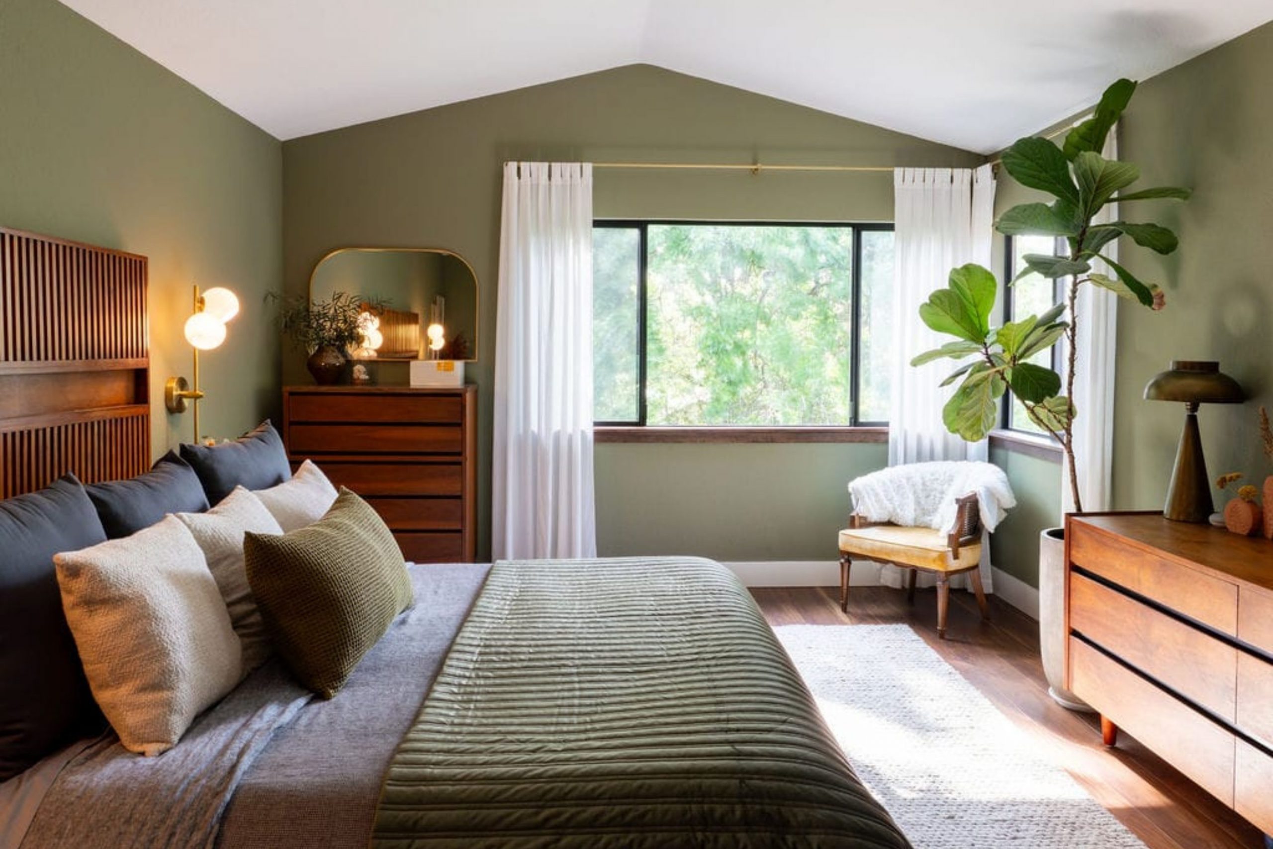
Kilim Beige SW 6106 + Evergreen Fog SW 9130
Kilim Beige SW 6106 and Evergreen Fog SW 9130 bring the colors of a forest and a sandy path right into your home. This mix uses a very popular warm tan with a soft and muted green that feels very natural. I love to use the green on the walls and the tan for the trim or the other way around for a fresh look.
It makes a room feel very peaceful and connected to the trees and grass outside your windows. The warmth of the beige keeps the green from feeling too chilly in the winter months.
This pair works very well with light wood floors and woven baskets or linen curtains. You will notice that the green looks very soft and easy on the eyes when it is next to such a warm tan. It is a very friendly combination that makes a house feel very well-loved and lived-in. Most people say this mix makes their living room feel like a quiet place to breathe.
Best used in: living rooms, sunrooms, and master bedrooms
Pairs well with: Urban Putty SW 7532, bronze hardware, cream fabrics, oak wood The key rule of this color for farmhouse style is to use it where you want natural light to feel kind, soft, and inviting throughout the day.

Lenox Tan HC-44 + Salamander 2050-10
Lenox Tan HC-44 and Salamander 2050-10 create a very deep and moody look that is full of mystery and beauty. This pairing matches a rich and golden tan with a very dark teal-green that looks almost black in the shadows. I think this is a brave choice that makes a living room look very sophisticated and old-fashioned in a good way.
The golden tan provides a lot of light to balance out the very dark and heavy green color. It looks amazing in a room with a lot of books and soft lamps for reading at night. This combination feels very safe and protective like a warm blanket on a cold night. You will find that the dark green makes the tan walls look like they are glowing with light.
It is a great way to show off a large fireplace or a beautiful piece of dark wood furniture. Many people find this look to be very elegant and perfect for a home where people love to talk.
Best used in: living rooms, libraries, and formal dining rooms
Pairs well with: White Dove OC-17, gold accents, velvet fabrics, mahogany wood The key rule of this color for farmhouse style is to use it where you want natural light to feel kind, soft, and inviting throughout the day.

Balanced Beige SW 7037 + Redend Point SW 9081
Balanced Beige SW 7037 and Redend Point SW 9081 are a very soft and trendy pair that feels like a warm sunset. This mix uses a solid and neutral tan with a soft pinkish-clay color that is very popular right now. I like to use this combination because it feels very fleshy and organic like the colors of a canyon.
The beige keeps the room feeling grounded while the clay color adds a lot of soft energy and life. It makes a living room feel very cozy and modern without using any colors that feel fake. This pair works very well with light-colored woods and soft white fabrics on the couch.
You will notice that the two colors are very close in weight so they flow into each other very smoothly. It is a very kind look that makes the light in the room feel very soft and pretty all day. Most homeowners love how this mix makes their home feel very updated and stylish.
Best used in: living rooms, bedrooms, and nurseries
Pairs well with: Snowbound SW 7004, terracotta pots, woven rugs, light oak The key rule of this color for farmhouse style is to use it where you want natural light to feel kind, soft, and inviting throughout the day.
Quincy Tan HC-25 + Golden Bark 2153-10
Quincy Tan HC-25 and Golden Bark 2153-10 bring the feeling of a sturdy forest cabin into your home. This combination matches a medium tan that has a hint of green with a very deep and rich reddish-brown. I like to use the darker bark color on a single wall to create a sense of strength and focus in the room.
The lighter tan on the other walls keeps the space from feeling too closed in or dark. It looks very handsome when you have leather chairs or big wooden tables in the living room. This pair reminds me of the ground in a deep woods where the soil is rich and the paths are dry.
You will find that these colors hide dust and wear very well which is great for busy families. It is a very mature look that makes a house feel like it has many stories to tell. Most people say this mix makes their living area feel very solid and safe for their children. It is a very honest set of colors that never goes out of style.
Best used in: living rooms, dens, and mudrooms
Pairs well with: Mascarpone AF-20, iron fixtures, dark walnut wood, wool blankets The key rule of this color for farmhouse style is to use it where you want natural light to feel kind, soft, and inviting throughout the day.
Whole Wheat SW 6121 + Urbane Bronze SW 7048
Whole Wheat SW 6121 and Urbane Bronze SW 7048 create a very powerful and modern look for a family space. This mix uses a warm and golden grain color with a very dark and earthy bronze that looks almost like metal. I love how the dark bronze makes the golden walls look much brighter and more cheerful by comparison.
It is a great way to make a large living room feel very high-end and well-planned. The bronze works perfectly on window frames or a fireplace to give the room a lot of structure.
This pair feels very grounded and reminds me of the dark earth beneath a field of golden wheat. You will notice that it makes light-colored furniture stand out like a piece of art against the dark accents. It is a very sophisticated choice for someone who wants a home that feels both cozy and very brave. Many homeowners find this to be their favorite way to add a bit of drama without using bright colors.
Best used in: living rooms, grand rooms, and home offices
Pairs well with: Alabaster SW 7008, brass hardware, cream rugs, stone accents The key rule of this color for farmhouse style is to use it where you want natural light to feel kind, soft, and inviting throughout the day.

Powell Buff HC-35 + Autumn Cover 2170-30
Powell Buff HC-35 and Autumn Cover 2170-30 are like a warm hug for your living room walls. This pairing combines a sunny and deep tan with a soft and muted orange that looks like falling leaves. I often use this mix in houses that feel a bit cold to bring in a permanent sense of warmth.
The gold in the buff color makes the orange tones feel very natural and not too bright or loud. It creates a very happy and friendly mood that is perfect for hosting parties or family dinners. This duo works very well with traditional rugs that have red or brown patterns in them.
You will find that the room feels very glowing even on days when it is raining or cloudy outside. It is a very traditional look that makes a house feel very much like a home from a storybook. Most people love how these colors make their wood furniture look extra shiny and clean.
Best used in: living rooms, kitchens, and sunrooms
Pairs well with: Cloud White OC-130, dark oak, copper pots, green plants The key rule of this color for farmhouse style is to use it where you want natural light to feel kind, soft, and inviting throughout the day.
Canvas Tan SW 7531 + Dried Thyme SW 6186
Canvas Tan SW 7531 and Dried Thyme SW 6186 bring a very fresh and herbal feeling into your main living area. This combination matches a very light and sandy tan with a muted green that looks like garden herbs. I like to use the green on an accent wall to bring the beauty of the outdoors inside the house.
The light tan keeps the room feeling very airy and large while the green adds a nice touch of color. It is a very peaceful pair that makes a room feel very quiet and easy to be in. This mix looks wonderful with light wood floors and white linen curtains that let the light through.
You will notice that the green is very soft and does not overwhelm the other decorations in the room. It is a very smart choice for a house that has a lot of windows looking out at a backyard. Many homeowners find that this look makes their home feel very clean and very natural.
Best used in: living rooms, laundry rooms, and guest bedrooms
Pairs well with: Shoji White SW 7042, wicker furniture, light pine, cotton fabrics The key rule of this color for farmhouse style is to use it where you want natural light to feel kind, soft, and inviting throughout the day.

Gentle Cream OC-96 + Iron Mountain 2134-30
Gentle Cream OC-96 and Iron Mountain 2134-30 create a very sharp and beautiful look that is very easy to love. This pairing uses a very soft and buttery white with a deep and stony dark gray. I love using the dark gray on the lower part of the walls or on doors to give the room some weight.
The cream color on the top makes the ceiling feel very high and the whole room feel very bright. It is a very classic look that reminds me of an old farmhouse that has been made new again. This combination makes any colorful art or pillows you have look very bright and important.
You will find that the dark gray has a bit of warmth that keeps it from looking like a cold sidewalk. It is a very elegant choice for a living room where you want to feel both fancy and very comfortable. Most people say this mix makes their home look very tidy and very expensive.
Best used in: living rooms, entryways, and dining areas
Pairs well with: White Heron OC-57, silver accents, navy blue, dark wood floors The key rule of this color for farmhouse style is to use it where you want natural light to feel kind, soft, and inviting throughout the day.

Urban Putty SW 7532 + Retreat SW 6207
Urban Putty SW 7532 and Retreat SW 6207 are a very cool and natural pair that feels like a trip to the mountains. This mix uses a stony tan-gray with a soft and misty green that has a lot of gray in it. I often use this for people who want a living room that feels very calm and steady for their family.
The putty color is very neutral and lets the green-gray color act as a soft splash of life. It looks amazing with stone fireplaces and big windows that let in a lot of natural light. This duo makes a room feel very modern but also very much like it belongs in nature.
You will notice that the colors do not change much throughout the day which makes them very reliable. It is a great way to add color to a house without making it look too bright or like a rainbow. Many homeowners find this to be a very sophisticated way to use earth tones in a new house.
Best used in: living rooms, home offices, and master suites
Pairs well with: Pure White SW 7005, slate tile, gray fabrics, black metal The key rule of this color for farmhouse style is to use it where you want natural light to feel kind, soft, and inviting throughout the day.

Barbados Sand 1094 + Dragon’s Breath 1547
Barbados Sand 1094 and Dragon’s Breath 1547 create a very high-contrast look that is full of drama and style. This pairing matches a very light and airy sand color with a very dark and smoky brown that is almost black.
I love using the dark brown on a fireplace or an accent wall to make a very big statement.
The light sand color on the other walls keeps the room from feeling too small or like a cave. It is a very bold look that makes a living room feel very high-end and professionally designed. This combination works very well with light-colored rugs and modern furniture with clean lines.
You will find that the dark brown brings out the warmth in the sand color and makes it look very creamy. It is a great choice for a home where you want to impress your guests with your style. Most people say this mix makes their home feel very bold and very cozy at the same time.
Best used in: living rooms, entryways, and libraries
Pairs well with: Chantilly Lace OC-65, gold fixtures, white marble, leather accents The key rule of this color for farmhouse style is to use it where you want natural light to feel kind, soft, and inviting throughout the day.

Steady Brown SW 6110 + Pewter Green SW 6208
Steady Brown SW 6110 and Pewter Green SW 6208 are a very rich and deep pair that feels like a quiet forest floor. This mix uses a chocolatey dark brown with a muted and earthy green that has a lot of gray in it. I like to use these colors together in a living room that is meant for resting and being quiet with your family.
The brown gives the room a very solid feeling while the green adds a sense of life and freshness. It looks wonderful with dark wood floors and heavy curtains that block out the cold. This duo makes a room feel very private and like a secret place away from the rest of the world.
You will notice that the green and brown work together to make any plants in the room look very green and healthy. It is a very traditional look that feels very sturdy and real for a long-time home. Many homeowners find this to be the most comforting set of colors for a large room.
Best used in: living rooms, dens, and basements
Pairs well with: Alabaster SW 7008, brass hardware, wool rugs, walnut wood The key rule of this color for farmhouse style is to use it where you want natural light to feel kind, soft, and inviting throughout the day.

Coastal Fog 976 + Smoked Oyster 2109-40
Coastal Fog 976 and Smoked Oyster 2109-40 create a very soft and misty look that is very easy to live with every day. This pairing matches a light tan-gray with a soft and muted purple-brown that looks very much like a sea shell. I often use this mix for people who want a home that feels very soft and very clean.
The fog color is very light and makes the room feel very open and full of fresh air. The oyster color adds a tiny bit of unique color that makes the room feel special and not like every other house. This duo works very well with silver accents and light-colored furniture like white or gray couches.
You will find that the colors are very gentle on the eyes and make a great background for resting. It is a very modern way to use earth tones that feels very fresh and updated. Most people love how this mix makes their living room feel very peaceful and very light.
Best used in: living rooms, bedrooms, and bathrooms
Pairs well with: White Dove OC-17, silver fixtures, linen fabrics, light oak The key rule of this color for farmhouse style is to use it where you want natural light to feel kind, soft, and inviting throughout the day.

Cavern Clay SW 7701 + Ripe Olive SW 6209
Cavern Clay SW 7701 and Ripe Olive SW 6209 are a very bold and earthy pair that brings the spirit of nature indoors. This mix uses a deep terracotta red with a very dark and rich olive green. I think this is a wonderful choice for a home where you want a lot of personality and strong colors.
The red and green are opposites which makes them look very bright and interesting when they are near each other. It reminds me of the red earth and the dark trees you see in some of the most beautiful places in the world.
This pair works very well with natural wood furniture and woven rugs made of jute or sisal. You will find that the room feels very warm and full of life even when it is very quiet. It is a very brave look that makes a living room feel very much like a work of art. Many homeowners choose this when they want their home to feel very unique and full of soul.
Best used in: living rooms, dining rooms, and accent walls
Pairs well with: Origami White SW 7636, black metal, wood beams, terracotta pots The key rule of this color for farmhouse style is to use it where you want natural light to feel kind, soft, and inviting throughout the day.

Desert Camel 2162-20 + Black Forest Green HC-187
Desert Camel 2162-20 and Black Forest Green HC-187 create a very deep and rich look that feels like a cozy forest cottage. This pairing matches a warm and golden brown with a green that is so dark it looks like the shadows under tall trees. I love to use the dark green on the walls of a room that has a lot of big windows to show off the color.
The golden camel color works perfectly on the ceiling or as an accent to keep the room feeling very warm. It looks very handsome with dark leather chairs and heavy wooden tables that have a lot of history. This duo makes a living room feel very solid and like a place where you can hide away from the world.
You will find that the green makes the warm brown look like a splash of golden sunshine. It is a very mature choice for someone who wants their home to feel very sturdy and very real. Most people say this mix makes their house feel like a safe and warm shelter for their family.
Best used in: living rooms, libraries, and home offices
Pairs well with: White Dove OC-17, brass lamps, dark oak, leather furniture The key rule of this color for farmhouse style is to use it where you want natural light to feel kind, soft, and inviting throughout the day.
Mannered Gold SW 6130 + Clary Sage SW 6178
Mannered Gold SW 6130 and Clary Sage SW 6178 are a very happy and natural pair that brings the garden inside. This mix uses a bright and sunny gold with a soft and muted green that looks like a fuzzy herb leaf. I like to use these colors together because they make a living room feel very cheerful and full of light.
The gold adds a lot of energy to the space while the sage green keeps everything feeling very grounded and soft. It looks wonderful with white furniture and light-colored wood floors that reflect the sun. This pair reminds me of a field of wildflowers growing under a bright summer sky.
You will notice that the green helps the gold look very sophisticated and not too loud or bright. It is a great way to add color to a house that feels a bit too gray or plain. Many homeowners find that this look makes their family feel very relaxed and very happy.
Best used in: living rooms, sunrooms, and kitchens
Pairs well with: Dover White SW 6385, wicker baskets, light pine, cotton fabrics The key rule of this color for farmhouse style is to use it where you want natural light to feel kind, soft, and inviting throughout the day.

Hush AF-95 + Vintage Vogue 462
Hush AF-95 and Vintage Vogue 462 provide a very modern and clean look that is full of style and grace. This combination matches a very soft and quiet tan with a deep and smoky green that looks very high-end. I often use the dark green on a feature wall to give the living room a lot of depth and character.
The light tan on the other walls keeps the room feeling very open and fresh for the whole family. It is a very smart choice for a house with a lot of modern furniture and black metal accents. This duo makes a room feel very polished and like it belongs in a beautiful home magazine.
You will find that the soft tan makes the dark green look very rich and full of life. It is a great way to use a dark color without making your house feel too small or dark. Most people love how this mix makes their living area feel very tidy and very elegant.
Best used in: living rooms, bedrooms, and entryways
Pairs well with: Simply White OC-117, black metal, gray rugs, modern art The key rule of this color for farmhouse style is to use it where you want natural light to feel kind, soft, and inviting throughout the day.

Rustic City SW 7699 + Iron Ore SW 7069
Rustic City SW 7699 and Iron Ore SW 7069 create a very bold and warm look that is full of strength. This pairing uses a burnt orange color with a very dark charcoal that is almost black but has a lot of warmth. I love using the dark iron color on doors or window frames to make a very sharp and pretty contrast.
The orange walls bring a lot of heat and energy to the room which makes it feel very cozy. It looks amazing with stone floors and big rugs that have a lot of texture. This combination reminds me of a warm fire burning in a stone fireplace on a cold winter night.
You will notice that the dark charcoal makes the orange look very rich and like it is glowing. It is a very brave choice that makes a house feel very unique and very full of soul. Many homeowners find this to be the perfect look for a room where people gather to talk.
Best used in: living rooms, dens, and mudrooms
Pairs well with: Kilim Beige SW 6106, copper accents, dark wood, wool blankets The key rule of this color for farmhouse style is to use it where you want natural light to feel kind, soft, and inviting throughout the day.

Golden Retriever 2165-30 + Dark Olive 2140-30
Golden Retriever 2165-30 and Dark Olive 2140-30 are a very rich and earthy pair that feels like a deep forest. This mix matches a dark reddish-brown with a very deep and traditional green that looks like old moss. I think this is a wonderful choice for a room where you want to feel very tucked in and very safe.
The brown adds a lot of warmth to the space while the green adds a sense of history and strength. It works beautifully with dark wood furniture and gold accents that catch the light from your lamps. This duo makes a living room feel very private and like a special place for your family.
You will find that the colors are very steady and do not change much even when it is dark outside. It is a very classic look that makes a house feel very sturdy and very well-loved over many years. Most people say this mix makes their home feel very grand and very comfortable.
Best used in: living rooms, dining rooms, and libraries
Pairs well with: Navajo White OC-95, brass fixtures, leather books, walnut wood The key rule of this color for farmhouse style is to use it where you want natural light to feel kind, soft, and inviting throughout the day.
Tavern Taupe SW 7508 + Laurel Woods SW 7749
Tavern Taupe SW 7508 and Laurel Woods SW 7749 create a very natural and stony look that is very easy to love. This pairing matches a medium brown-gray with a very dark and foresty green that has a lot of soul. I often use the dark green on the lower part of the walls to give the room a very solid and grounded feeling.
The taupe color on the top makes the room feel very balanced and very connected to nature. It looks wonderful with stone accents and light-colored fabrics that keep the room from feeling too heavy. This combination reminds me of a path through the woods that leads to a beautiful and quiet place.
You will notice that the green brings out the soft and natural tones in the taupe walls. It is a very sophisticated choice for a house where you want to feel both modern and very natural. Many homeowners love how this mix makes their living room feel very quiet and very steady.
Best used in: living rooms, hallways, and entryways
Pairs well with: Shoji White SW 7042, silver hardware, gray stone, linen pillows The key rule of this color for farmhouse style is to use it where you want natural light to feel kind, soft, and inviting throughout the day.
Navajo White OC-95 + Knoxville Gray HC-160
Navajo White OC-95 and Knoxville Gray HC-160 provide a very classic and high-contrast look that is very pretty. This pairing uses a deep and creamy white with a dark blue-gray that looks like a stormy sky over the sea. I love to use the dark gray on the cabinets or an accent wall to make the creamy white pop.
The white walls keep the room feeling very large and full of sunshine all through the day. It is a very traditional choice for a living room that needs to feel both bright and very sophisticated. This duo works very well with dark wood floors and brass light fixtures that add a touch of sparkle.
You will find that the blue-gray has enough warmth to get along perfectly with the yellow tones in the white. It is a very safe and beautiful way to add a lot of style to a main living area. Most people say this mix makes their home feel very clean and very well-planned.
Best used in: living rooms, kitchens, and master bedrooms
Pairs well with: Wrought Iron 2124-10, brass accents, oak wood, navy blue fabrics The key rule of this color for farmhouse style is to use it where you want natural light to feel kind, soft, and inviting throughout the day.

Redend Point SW 9081 + Jasper SW 6216
Redend Point SW 9081 and Jasper SW 6216 are a very trendy and beautiful pair that feels like a sunset in a forest. This mix matches a soft clay-pink with a very dark and moody green that is full of life. I like to use the dark green on the walls to create a very cozy and small feeling in a large living room.

The soft clay color works wonderfully on furniture or as an accent to add a touch of soft light. It is a very modern way to use earth tones that feels very updated and very special for your home. This pair looks amazing with light wood furniture and lots of soft white blankets and pillows.
You will notice that the green makes the clay color look very warm and very pretty like a flower. It is a great way to show off your unique style while still keeping your home feeling very natural. Many homeowners find that this look makes their family feel very relaxed and very modern.
Best used in: living rooms, bedrooms, and accent walls
Pairs well with: Snowbound SW 7004, light oak, woven rugs, terracotta pots The key rule of this color for farmhouse style is to use it where you want natural light to feel kind, soft, and inviting throughout the day.

Brandon Beige 977 + Deep River 1582
Brandon Beige 977 and Deep River 1582 create a very rich and stony look that is full of character and strength. This pairing matches a warm and solid tan with a dark gray-green that looks like a deep pool of water. I often use these colors in a living room where you want to have a very quiet and serious mood.
The tan color provides a lot of warmth and keeps the room from feeling too cold or like a piece of metal. The dark green-gray adds a lot of depth and makes the walls look very expensive and thick. It looks wonderful with stone fireplaces and dark wood beams on the ceiling.
This duo makes a house feel very sturdy and like it has been built to last for a very long time. You will find that the colors are very easy on the eyes and make a great background for your family life. Most people say this mix makes their home feel very grounded and very high-end.
Best used in: living rooms, dens, and home offices
Pairs well with: White Dove OC-17, slate stone, iron fixtures, leather furniture The key rule of this color for farmhouse style is to use it where you want natural light to feel kind, soft, and inviting throughout the day.

Dover White SW 6385 + Turkish Coffee SW 6076
Dover White SW 6385 and Turkish Coffee SW 6076 are a very classic and high-contrast pair that is full of warmth. This combination matches a soft and creamy white with a very dark and chocolatey brown. I love using the dark brown on a built-in bookshelf or a fireplace to make a very big and pretty statement.
The creamy white on the walls keeps the living room feeling very bright and welcoming for your guests. It is a very traditional look that reminds me of a warm cup of coffee with a lot of cream in it. This duo works very well with light-colored rugs and gold accents that add a touch of fancy style.
You will notice that the dark brown makes the white walls look very fresh and very clean. It is a very safe and beautiful choice for someone who wants a home that feels both cozy and very bright. Many homeowners find this to be their favorite look for a large and busy living room.
Best used in: living rooms, kitchens, and entryways
Pairs well with: Mannered Gold SW 6130, gold fixtures, cream fabrics, dark wood floors The key rule of this color for farmhouse style is to use it where you want natural light to feel kind, soft, and inviting throughout the day.
Edgecomb Gray HC-173 + Appalachian Brown 2115-10
Edgecomb Gray HC-173 and Appalachian Brown 2115-10 provide a very soft and natural look that is full of light. This pairing matches a very light tan-gray with a deep and earthy brown that looks like dark soil. I like to use the dark brown on the trim or as an accent to give the room some weight and focus.

The light gray-tan on the walls makes the living room feel very airy and large for your family. It is a very modern choice that feels very fresh and updated for a new house. This combination works beautifully with light wood floors and white linen curtains that let the sun shine in.
You will find that the dark brown brings out the soft and warm tones hidden in the light walls. It is a great way to add a lot of style to a room without making it feel too busy or loud. Most people say this mix makes their home feel very peaceful and very well-designed.
Best used in: living rooms, hallways, and bedrooms
Pairs well with: White Dove OC-17, natural wood, silver accents, soft gray rugs The key rule of this color for farmhouse style is to use it where you want natural light to feel kind, soft, and inviting throughout the day.

25 Neutral Earth Tone Paint Color Palettes
Accessible Beige SW 7036 + Urbane Bronze SW 7048
Accessible Beige SW 7036 and Urbane Bronze SW 7048 create a very clean and professional look for a modern home. This pairing uses a light and friendly tan for the main walls and a very dark bronze for the doors or trim. I love how the dark color makes the light beige look even more crisp and tidy.
It is a great way to add a bit of drama without making a room feel too small or dark. The bronze has a lot of brown in it so it feels much warmer than a standard black paint. This duo works very well in a kitchen where you want a very sharp and updated style.
You will find that it makes silver or gold handles on your cabinets look very pretty and expensive. It is a very smart choice for a family that wants a house that looks both new and very steady. Most people say this mix makes their home feel very organized and very high-end for many years.
Best used in: kitchens, entryways, and modern living rooms
Pairs well with: Aesthetic White SW 7035, black metal, light oak, stone tiles The key rule of this color for farmhouse style is to use it where you want natural light to feel kind, soft, and inviting throughout the day.
Shaker Beige HC-45 + Kendall Charcoal HC-166
Shaker Beige HC-45 and Kendall Charcoal HC-166 bring a very solid and earthy feeling to any large room. This combination matches a very warm and golden tan with a deep smoky gray that has a touch of brown. I like to use the dark charcoal on a fireplace or a bookshelf to give the room a lot of strength.
The warm beige on the walls keeps the space feeling very sunny and welcoming for your guests. It is a very traditional look that reminds me of old stone houses with warm wooden floors inside. This pair works beautifully with leather furniture and big soft rugs that have a lot of texture.
You will notice that the dark gray makes the tan walls look like they have a lot of depth. It is a very sturdy choice for a house where you want to feel very protected and very comfortable. Many homeowners find that this mix makes their living area feel very grand and very well-loved.
Best used in: family rooms, dens, and large basements
Pairs well with: Simply White OC-117, brass lamps, dark walnut, wool blankets The key rule of this color for farmhouse style is to use it where you want natural light to feel kind, soft, and inviting throughout the day.
Edgecomb Gray HC-173 + Kingsport Gray HC-86
Edgecomb Gray HC-173 and Kingsport Gray HC-86 are a very soft and neutral pair that feels very light and airy. This mix matches a very light tan-gray with a medium stony gray that looks like a river rock. I often use these colors for a whole house because they flow from one room to another very smoothly.
The light walls make every room feel very big and full of fresh air during the day. The darker gray adds just enough color to keep the house from looking too plain or empty. It looks wonderful with white trim and light-colored wood floors that reflect the natural light.
This duo makes a home feel very modern and very clean without being cold like a blue or a bright white. You will find that it is a very easy background for any kind of colorful art or photos you want to hang. Most people love how this mix makes their house feel very peaceful and very well-organized.
Best used in: whole house walls, hallways, and open floor plans
Pairs well with: White Dove OC-17, silver hardware, navy blue accents, linen fabrics The key rule of this color for farmhouse style is to use it where you want natural light to feel kind, soft, and inviting throughout the day.
Natural Linen SW 9109 + Retreat SW 6207
Natural Linen SW 9109 and Retreat SW 6207 create a very fresh and organic look that feels like a garden. This pairing combines a very light and creamy tan with a soft and misty green that has a lot of gray in it. I love using the green on an accent wall to bring a sense of nature inside your home walls.

The light linen color on the other walls keeps the room feeling very bright and very soft for your family. It is a very polite combination that does not scream for attention but makes everyone feel relaxed. This pair works very well with light wood furniture and woven baskets made of natural fibers.
You will notice that the green looks very soft and easy on the eyes when it is next to a warm tan. It is a great way to add color to a bedroom or a laundry room to make it feel very special. Many homeowners find this look to be the most relaxing set of colors in their entire house.
Best used in: bedrooms, laundry rooms, and guest suites
Pairs well with: Pure White SW 7005, wicker furniture, cotton rugs, light pine The key rule of this color for farmhouse style is to use it where you want natural light to feel kind, soft, and inviting throughout the day.
Pale Oak OC-20 + Iron Mountain 2134-30
Pale Oak OC-20 and Iron Mountain 2134-30 provide a very high-contrast and beautiful look that is very easy to live with. This pairing matches a very light and warm gray with a deep and stony dark charcoal. I like to use the dark color on doors or a small bathroom to make a very bold statement.

The light oak color on the main walls makes the house feel very large and very full of sunshine. It is a very classic look that reminds me of an old farmhouse that has been updated with new style. This combination makes all your furniture and decorations look very sharp and very important against the walls.
You will find that the dark charcoal has enough warmth to feel very cozy even though it is a dark color. It is a very sophisticated choice for someone who wants a home that feels both bright and very brave. Most people say this mix makes their home look very tidy and professionally designed.
Best used in: living rooms, entryways, and master bedrooms
Pairs well with: Chantilly Lace OC-65, black metal, gray fabrics, dark wood floors The key rule of this color for farmhouse style is to use it where you want natural light to feel kind, soft, and inviting throughout the day.
Balanced Beige SW 7037 + Pewter Green SW 6208
Balanced Beige SW 7037 and Pewter Green SW 6208 create a very rich and earthy look that feels like a quiet forest. This mix matches a solid and warm tan with a muted and deep green that has a lot of soul. I often use these colors together in a room where you want to feel very tucked in and safe.
The tan provides a lot of warmth and keeps the room from feeling too dark or heavy for your family. The green adds a sense of history and makes the walls look very expensive and real. It looks wonderful with dark wood furniture and brass accents that catch the light from your lamps at night.
This duo makes a house feel very sturdy and like it has been built to last for many years. You will notice that the green brings out the soft and natural tones in the beige walls. It is a very traditional look that feels very sturdy and very well-loved.
Best used in: home offices, dens, and formal dining rooms
Pairs well with: Alabaster SW 7008, brass fixtures, leather furniture, walnut wood The key rule of this color for farmhouse style is to use it where you want natural light to feel kind, soft, and inviting throughout the day.
Manchester Tan HC-81 + Smokey Taupe 983
Manchester Tan HC-81 and Smokey Taupe 983 are a very soft and gentle pair that is perfect for a whole house. This combination matches a light and sandy tan with a medium brown-gray that feels very natural. I like to use these colors because they stay looking very clean even in rooms that get a lot of use.

The light tan makes every room feel very open and gives your eyes a nice place to rest. The taupe color adds a touch of warmth and keeps the house from feeling too bright or cold. It works beautifully with white trim and different types of wood floors like oak or maple.
This pair is very flexible and gets along with almost any color of furniture or curtains you already own. You will find that the house feels very cohesive and flows nicely from one room to the next. Most people find that this color mix makes their home feel very peaceful and very steady for their kids.
Best used in: whole house walls, hallways, and living areas
Pairs well with: White Dove OC-17, silver hardware, soft blue, light wood The key rule of this color for farmhouse style is to use it where you want natural light to feel kind, soft, and inviting throughout the day.
Canvas Tan SW 7531 + Dried Thyme SW 6186
Canvas Tan SW 7531 and Dried Thyme SW 6186 bring a very fresh and herbal feeling to any room in your home. This pairing matches a very light and sandy tan with a muted green that looks like garden herbs. I like to use the green on a feature wall or on a piece of furniture to add a touch of color.
The light tan keeps the room feeling very airy and large while the green adds a sense of life. It is a very peaceful pair that makes a room feel very quiet and very easy to be in for a long time. This mix looks wonderful with light wood floors and white linen curtains that let the light shine through.
You will notice that the green is very soft and does not overwhelm the other decorations in your room. It is a very smart choice for a house that has a lot of windows looking out at trees. Many homeowners find that this look makes their home feel very clean and very natural.
Best used in: kitchens, laundry rooms, and guest bedrooms
Pairs well with: Shoji White SW 7042, wicker furniture, light pine, cotton fabrics The key rule of this color for farmhouse style is to use it where you want natural light to feel kind, soft, and inviting throughout the day.
Classic Gray OC-23 + Dragon’s Breath 1547
Classic Gray OC-23 and Dragon’s Breath 1547 create a very high-end and modern look that is full of drama. This combination matches a very light and warm gray with a very dark and smoky brown that is almost black. I love using the dark color on an accent wall or a fireplace to make a very big statement for guests.

The light gray on the other walls keeps the room from feeling too small or like a dark cave. It is a very bold look that makes a home feel very professionally designed and very stylish. This combination works very well with modern furniture and silver or black metal light fixtures.
You will find that the dark brown makes the light walls look very fresh and very clean. It is a great choice for a home where you want to show off your unique and brave style. Most people say this mix makes their living area feel very bold and very cozy.
Best used in: living rooms, entryways, and modern offices
Pairs well with: Chantilly Lace OC-65, silver accents, gray stone, modern art The key rule of this color for farmhouse style is to use it where you want natural light to feel kind, soft, and inviting throughout the day.
Aesthetic White SW 7035 + Tony Taupe SW 7038
Aesthetic White SW 7035 and Tony Taupe SW 7038 are a very soft and beautiful pair that feels very updated and fresh. This mix matches a very light and warm white with a solid and neutral medium brown-gray. I often use these colors together to create a very clean and tidy look in a family home.

The light white walls make the house feel very large and full of sunshine all day long. The taupe color adds a lot of warmth and gives the room some weight so it does not feel empty. It works wonderfully with white trim and dark wood floors to create a very pretty contrast.
This pair is very easy on the eyes and makes a great background for any type of colorful pillows or rugs. You will notice that the colors are very steady and stay looking the same in different kinds of light. Most homeowners love how this mix makes their home feel very organized and very well-planned.
Best used in: living rooms, kitchens, and whole house walls
Pairs well with: Pure White SW 7005, black metal, navy blue, light oak The key rule of this color for farmhouse style is to use it where you want natural light to feel kind, soft, and inviting throughout the day.
Grant Beige HC-83 + Black Forest Green HC-187
Grant Beige HC-83 and Black Forest Green HC-187 create a very deep and rich look that feels like a quiet forest retreat. This pairing matches a warm and neutral tan with a green that is so dark it looks like the shadows of trees. I love to use the dark green in a home office or a library to make the space feel very serious and focused.

The warm tan on the other walls keeps the room from feeling too dark or like a small closet. It looks very handsome with dark wood furniture and brass lamps that add a touch of warmth and light. This duo makes a room feel very solid and like a safe place away from the rest of the world.
You will find that the green makes the warm tan look very rich and like it has a lot of soul. It is a very mature choice for someone who wants their home to feel very sturdy and very real. Most people say this mix makes their house feel like a very warm and safe shelter.
Best used in: home offices, libraries, and master bedrooms
Pairs well with: White Dove OC-17, brass fixtures, dark walnut, leather accents The key rule of this color for farmhouse style is to use it where you want natural light to feel kind, soft, and inviting throughout the day.
Shiitake SW 9173 + Laurel Woods SW 7749
Shiitake SW 9173 and Laurel Woods SW 7749 are a very natural and stony pair that brings the beauty of nature inside. This mix matches a medium tan-gray with a very dark and foresty green that has a lot of depth. I like to use these colors because they make a house feel very grounded and very much like a part of the earth.

The shiitake color is very neutral and works well as a background for any kind of furniture or art. The dark green adds a lot of personality and makes a room feel very special and very private. It looks wonderful with stone accents and big windows that look out at a backyard with many trees.
This combination reminds me of a mountain cabin that is full of warmth and soft light. You will notice that the colors do not change much throughout the day which makes them very easy to live with. Many homeowners find this look to be a very sophisticated way to use neutral colors.
Best used in: living rooms, dens, and entryways
Pairs well with: Alabaster SW 7008, gray stone, iron hardware, linen fabrics The key rule of this color for farmhouse style is to use it where you want natural light to feel kind, soft, and inviting throughout the day.
Muslin OC-12 + Smoked Oyster 2109-40
Muslin OC-12 and Smoked Oyster 2109-40 create a very soft and unique look that is full of gentle color and light. This pairing matches a very light and creamy tan with a soft and muted purple-brown that looks like a sea shell. I often use this mix for people who want a home that feels very soft and very clean for their family.

The muslin color is very light and makes every room feel very open and full of sunshine. The oyster color adds a tiny bit of special color that makes the house feel like a designer helped you pick it. This duo works very well with silver accents and light-colored furniture like white or gray sofas.
You will find that the colors are very kind to the eyes and provide a great background for resting after a long day. It is a very modern way to use neutral tones that feels very fresh and updated for a new house. Most people love how this mix makes their home feel very peaceful.
Best used in: bedrooms, bathrooms, and nurseries
Pairs well with: White Heron OC-57, silver fixtures, soft lavender, light wood The key rule of this color for farmhouse style is to use it where you want natural light to feel kind, soft, and inviting throughout the day.
Natural Choice SW 7011 + Sable SW 6083
Natural Choice SW 7011 and Sable SW 6083 provide a very classic and high-contrast look that is full of warmth and strength. This combination matches a very soft and warm white with a deep and chocolatey brown that looks like rich soil. I love using the dark brown on a feature wall or a fireplace to make a very big and pretty statement for guests.
The creamy white on the main walls keeps the whole house feeling very bright and welcoming for your family. It is a very traditional look that reminds me of an old cottage with dark wooden beams on the ceiling. This pair works very well with light-colored rugs and brass accents that add a touch of style.
You will notice that the dark brown makes the white walls look very fresh and very clean during the day. It is a very safe and beautiful choice for someone who wants a home that feels both cozy and very bright. Many homeowners find this to be their favorite look.
Best used in: living rooms, dining rooms, and whole house walls
Pairs well with: Pure White SW 7005, brass fixtures, cream fabrics, dark wood The key rule of this color for farmhouse style is to use it where you want natural light to feel kind, soft, and inviting throughout the day.
Stone Hearth 984 + Vintage Vogue 462
Stone Hearth 984 and Vintage Vogue 462 create a very modern and earthy look that is full of character and style. This pairing matches a medium tan-gray with a deep and smoky green that looks very high-end and special. I often use the dark green on a single wall to give the room a lot of depth and a focal point.
The stone color on the other walls keeps the room feeling very balanced and very connected to the ground. It is a very smart choice for a house with a lot of modern furniture and black metal light fixtures. This duo makes a room feel very polished and like it belongs in a magazine about beautiful interior design.
You will find that the neutral tan makes the dark green look very rich and full of life for your family. It is a great way to use a bold color without making your house feel too dark or small. Most people love how this mix makes their home feel very tidy.
Best used in: living rooms, master suites, and entryways
Pairs well with: Simply White OC-117, black metal, gray stone, modern art The key rule of this color for farmhouse style is to use it where you want natural light to feel kind, soft, and inviting throughout the day.
Urban Putty SW 7532 + Ripe Olive SW 6209
Urban Putty SW 7532 and Ripe Olive SW 6209 are a very bold and natural pair that brings the forest inside your home walls. This mix uses a stony tan-gray with a very dark and rich olive green that has a lot of soul. I think this is a wonderful choice for a home where you want a lot of personality and very strong colors.
The neutral putty color provides a lot of balance and keeps the room from feeling too dark or heavy for your kids. The green adds a sense of life and makes the space feel very private and like a secret retreat. It looks amazing with natural wood furniture and woven rugs made of jute or other fibers.
This pair reminds me of the dark trees and the stony ground you see in the mountains. You will find that the colors make any green plants in the room look very vibrant and healthy. It is a very brave look that makes a house feel very unique.
Best used in: dens, living rooms, and mudrooms
Pairs well with: Alabaster SW 7008, wood beams, iron hardware, terracotta pots The key rule of this color for farmhouse style is to use it where you want natural light to feel kind, soft, and inviting throughout the day.
Creamy SW 7012 + Foothills SW 7514
Creamy SW 7012 and Foothills SW 7514 provide a very soft and traditional look that is full of warmth and light. This pairing matches a buttery and warm white with a medium-dark brown that looks like a piece of chocolate. I like to use the dark brown on the trim or on a piece of furniture to give the room some weight.

The creamy white on the walls makes the house feel very large and full of sunshine all day long. It is a very classic choice for a family home that needs to feel both bright and very cozy for the kids. This combination works beautifully with dark wood floors and brass light fixtures that add a touch of style.
You will find that the brown has enough warmth to get along perfectly with the yellow tones in the white paint. It is a very safe and beautiful way to add a lot of personality to a main living area. Most people say this mix makes their home feel very clean.
Best used in: whole house walls, kitchens, and bedrooms
Pairs well with: Pure White SW 7005, brass accents, oak furniture, cream rugs The key rule of this color for farmhouse style is to use it where you want natural light to feel kind, soft, and inviting throughout the day.
Brandon Beige 977 + Deep River 1582
Brandon Beige 977 and Deep River 1582 create a very rich and stony look that is full of character and strength. This pairing matches a warm and solid tan with a dark gray-green that looks like a deep pool of water. I often use these colors in a room where you want to have a very quiet and serious mood for your family.
The tan color provides a lot of warmth and keeps the room from feeling too cold or like a piece of metal. The dark green-gray adds a lot of depth and makes the walls look very expensive and very thick. It looks wonderful with stone fireplaces and dark wood beams on the ceiling of a large room.
This duo makes a house feel very sturdy and like it has been built to last for a very long time. You will find that the colors are very easy on the eyes and make a great background for your daily life. Most people say this mix makes their home feel very grounded.
Best used in: living rooms, home offices, and dens
Pairs well with: White Dove OC-17, slate stone, iron fixtures, leather furniture The key rule of this color for farmhouse style is to use it where you want natural light to feel kind, soft, and inviting throughout the day.
Kilim Beige SW 6106 + Clary Sage SW 6178
Kilim Beige SW 6106 and Clary Sage SW 6178 bring a very happy and natural feeling to any room in your home. This mix matches a very popular and warm tan with a soft and muted green that looks like an herb. I like to use these colors together because they make a house feel very cheerful and full of light for your kids.
The tan adds a lot of warmth to the space while the sage green keeps everything feeling very soft and very natural. It looks wonderful with light-colored furniture and wood floors that reflect the sun through the windows. This pair reminds me of a field of grass growing under a bright and warm summer sky.
You will notice that the green helps the tan look very fresh and not too yellow or orange. It is a great way to add color to a house that feels a bit too gray or plain for your style. Many homeowners find that this look makes their family feel very relaxed.
Best used in: kitchens, sunrooms, and family rooms
Pairs well with: Dover White SW 6385, wicker baskets, light pine, cotton fabrics The key rule of this color for farmhouse style is to use it where you want natural light to feel kind, soft, and inviting throughout the day.
Hush AF-95 + Kendall Charcoal HC-166
Hush AF-95 and Kendall Charcoal HC-166 provide a very modern and clean look that is full of style and grace. This combination matches a very soft and quiet tan with a deep and smoky gray that looks very high-end. I often use the dark gray on a single wall to give the room a lot of depth and a very nice focal point.
The light tan on the other walls keeps the room feeling very open and fresh for the whole family. It is a very smart choice for a house with a lot of modern furniture and silver metal accents on the light fixtures. This duo makes a room feel very polished and like it belongs in a beautiful home design magazine.
You will find that the soft tan makes the dark gray look very rich and full of life for your guests. It is a great way to use a dark color without making your house feel too small. Most people love how this mix makes their living area feel very tidy.
Best used in: living rooms, bedrooms, and home offices
Pairs well with: Simply White OC-117, silver accents, gray rugs, modern art The key rule of this color for farmhouse style is to use it where you want natural light to feel kind, soft, and inviting throughout the day.
Tavern Taupe SW 7508 + Jasper SW 6216
Tavern Taupe SW 7508 and Jasper SW 6216 create a very deep and moody look that is full of mystery and beauty. This pairing matches a medium brown-gray with a very dark and foresty green that looks almost black in the shadows. I think this is a brave choice that makes a house look very sophisticated and very old-fashioned in a good way.
The neutral taupe provides a lot of light to balance out the very dark and heavy green color on the walls. It looks amazing in a room with a lot of books and soft lamps for reading at night with your kids. This combination feels very safe and protective like a warm blanket on a cold night in the winter.
You will find that the dark green makes the taupe walls look like they are glowing with a soft light. It is a great way to show off a large fireplace or a beautiful piece of dark wood furniture. Many people find this look to be very elegant.
Best used in: libraries, dens, and accent walls
Pairs well with: Alabaster SW 7008, brass hardware, leather books, walnut wood The key rule of this color for farmhouse style is to use it where you want natural light to feel kind, soft, and inviting throughout the day.
Navajo White OC-95 + Knoxville Gray HC-160
Navajo White OC-95 and Knoxville Gray HC-160 provide a very classic and high-contrast look that is very pretty for a family home. This pairing uses a deep and creamy white with a dark blue-gray that looks like a stormy sky. I love to use the dark gray on the cabinets or an accent wall to make the creamy white paint pop.
The white walls keep the house feeling very large and full of sunshine all through the day for your children. It is a very traditional choice for a house that needs to feel both bright and very sophisticated for guests. This duo works very well with dark wood floors and brass light fixtures that add a touch of fancy style to the room.
You will find that the blue-gray has enough warmth to get along perfectly with the yellow tones in the white. It is a very safe and beautiful way to add style to a main living area. Most people say this mix makes their home feel clean.
Best used in: kitchens, living rooms, and master bedrooms
Pairs well with: Wrought Iron 2124-10, brass accents, oak wood, navy blue fabrics The key rule of this color for farmhouse style is to use it where you want natural light to feel kind, soft, and inviting throughout the day.
Lenox Tan HC-44 + Salamander 2050-10
Lenox Tan HC-44 and Salamander 2050-10 create a very deep and rich look that feels like a fancy hotel room. This combination matches a golden and deep tan with a dark teal-green that is full of depth and life. I like to use the dark green in a bedroom to make the space feel very quiet and very special at night.
The golden tan on the other walls provides a lot of warmth and keeps the room from feeling too dark or heavy. It looks wonderful with white trim and dark wood furniture that has a lot of history in its design. This pair is very sophisticated and makes any room look very polished and very expensive for your guests.
You will notice that the dark green makes the tan walls look like they are full of soft light from your lamps. It is a great way to add a lot of character to a house that feels too new or plain. Most homeowners find this to be a very beautiful mix.
Best used in: master bedrooms, dining rooms, and formal living areas
Pairs well with: White Dove OC-17, gold accents, velvet fabrics, mahogany wood The key rule of this color for farmhouse style is to use it where you want natural light to feel kind, soft, and inviting throughout the day.
Whole Wheat SW 6121 + Iron Ore SW 7069
Whole Wheat SW 6121 and Iron Ore SW 7069 create a very powerful and warm look that is full of strength and style. This pairing uses a warm and golden grain color with a very dark charcoal that looks like a piece of iron. I love using the dark color on window frames or a fireplace to make a very sharp and pretty contrast.
The golden walls bring a lot of heat and energy to the room which makes it feel very cozy for your family. It looks amazing with stone floors and big rugs that have a lot of soft texture for the kids to play on. This combination reminds me of a warm fire burning in a house made of stone and wood.
You will notice that the dark charcoal makes the golden walls look very rich and like they are glowing with light. It is a very brave choice that makes a house feel very unique and very full of soul. Many homeowners find this to be the perfect look for a big family room.
Best used in: living rooms, dens, and mudrooms
Pairs well with: Alabaster SW 7008, copper accents, dark wood, wool blankets The key rule of this color for farmhouse style is to use it where you want natural light to feel kind, soft, and inviting throughout the day.
Powell Buff HC-35 + Desert Twilight 2137-40
Powell Buff HC-35 and Desert Twilight 2137-40 are a very soft and natural pair that feels like a garden in the evening. This mix matches a deep and sunny tan with a medium green-gray that looks like a misty leaf. I often use these colors for people who want a home that feels very soft and very easy to live in.
The buff color provides a lot of warmth and makes every room feel very bright even on cloudy days. The green-gray color adds a sense of nature and keeps the house from looking too yellow or too bright for your family. It works beautifully with white trim and different types of wood floors like oak or maple.
This duo is very polite and gets along with all kinds of furniture and curtains you might have. You will find that the house feels very steady and very well-loved. Most people love how this mix makes their living area feel very peaceful.
Best used in: whole house walls, kitchens, and sunrooms
Pairs well with: Cloud White OC-130, natural wood, silver accents, green plants The key rule of this color for farmhouse style is to use it where you want natural light to feel kind, soft, and inviting throughout the day.
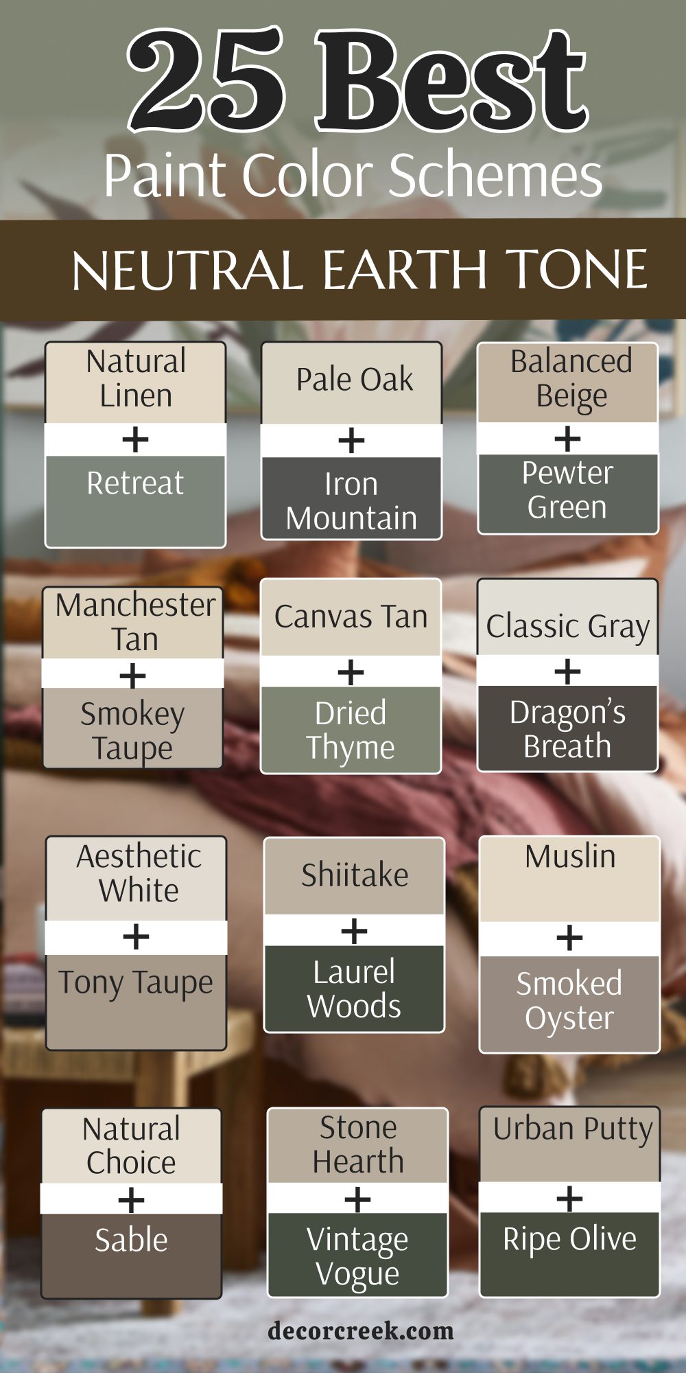
25 Muted Earth Tone Paint Color Palettes
Evergreen Fog SW 9130 + Accessible Beige SW 7036
Evergreen Fog SW 9130 and Accessible Beige SW 7036 create a very soft look that feels like a quiet forest path. This pairing matches a muted green-gray with a light and friendly tan that goes with everything. I like to use the green on the walls of a bedroom to make it feel like a secret hiding place.
The light beige works perfectly on the trim to keep the room from looking too dark for your family. It is a very smart choice for a house where you want to bring the colors of the trees inside. This duo makes a room feel very steady and very much like a part of nature.
You will find that the soft green makes the tan look very fresh and very clean during the day. It is a great way to add color without making your house look too bright or loud. Most people say this mix makes their home feel very peaceful and very well-designed.
Best used in: bedrooms, living rooms, and master suites
Pairs well with: Urbane Bronze SW 7048, light oak, linen fabrics, black metal The key rule of this color for farmhouse style is to use it where you want natural light to feel kind, soft, and inviting throughout the day.
Retreat SW 6207 + Natural Linen SW 9109
Retreat SW 6207 and Natural Linen SW 9109 are a very gentle pair that feels like a misty morning at a lake. This combination uses a soft and dusty green with a very light and creamy tan that looks like raw fabric. I love using the green in a home office because it helps people feel very focused and quiet.
The light linen color on the other walls keeps the room feeling very large and full of soft light. It is a very polite combination that does not demand attention but makes everyone feel very relaxed. This pair works very well with light wood furniture and woven baskets made of natural fibers.
You will notice that the green looks very soft and easy on the eyes when it is next to a warm tan. It is a great way to add a touch of color to a house that feels too plain or white. Many homeowners find this look to be the most relaxing set of colors for their kids.
Best used in: home offices, bedrooms, and laundry rooms
Pairs well with: Pure White SW 7005, wicker furniture, cotton rugs, light pine The key rule of this color for farmhouse style is to use it where you want natural light to feel kind, soft, and inviting throughout the day.
Pewter Green SW 6208 + Aesthetic White SW 7035
Pewter Green SW 6208 and Aesthetic White SW 7035 create a very sharp and beautiful look that is full of character. This pairing matches a deep and smoky green with a very light and warm white that feels very soft. I like to use the dark green on kitchen cabinets or an accent wall to make a very big statement.
The warm white on the walls keeps the room feeling very bright and welcoming for your family all day. It is a very classic look that reminds me of an old garden with white stone walls and green plants. This duo works very well with silver or black metal hardware that adds a touch of modern style.
You will find that the dark green makes the white paint look very fresh and very clean during the day. It is a very sophisticated choice for someone who wants a home that feels both bright and very brave. Most people say this mix makes their kitchen feel very expensive.
Best used in: kitchens, living rooms, and entryways
Pairs well with: Iron Ore SW 7069, silver fixtures, gray stone, navy blue The key rule of this color for farmhouse style is to use it where you want natural light to feel kind, soft, and inviting throughout the day.
Clary Sage SW 6178 + Canvas Tan SW 7531
Clary Sage SW 6178 and Canvas Tan SW 7531 bring a very happy and natural feeling to any room in your home. This mix matches a soft and muted green with a very light and sandy tan that feels very airy. I often use these colors together because they make a house feel very cheerful and full of light for your kids.
The sage green adds a sense of life to the space while the tan keeps everything feeling very soft and very grounded. It looks wonderful with light-colored furniture and wood floors that reflect the sun through the windows. This pair reminds me of a field of soft herbs growing under a bright and warm summer sky.
You will notice that the green helps the tan look very fresh and not too yellow or orange at night. It is a great way to add color to a house that feels a bit too plain or empty for your style. Many homeowners find that this look makes their family feel very relaxed.
Best used in: sunrooms, kitchens, and guest bedrooms
Pairs well with: Dover White SW 6385, wicker baskets, light pine, cotton fabrics The key rule of this color for farmhouse style is to use it where you want natural light to feel kind, soft, and inviting throughout the day.
Dried Thyme SW 6186 + Shiitake SW 9173
Dried Thyme SW 6186 and Shiitake SW 9173 create a very rich and earthy look that feels like a walk in the woods. This pairing matches a muted and deep green with a medium tan-gray that looks like a mushroom. I like to use these colors because they make a house feel very sturdy and very much like a part of the earth.
The green adds a lot of personality and makes a room feel very special and very private for your family. The shiitake color is very neutral and works well as a background for any kind of furniture or art you have. It looks wonderful with stone accents and big windows that look out at a backyard with many trees and plants.
This combination reminds me of a mountain cabin that is full of warmth and soft light during the winter. You will find that the colors are very steady and stay looking the same in different kinds of light. Many homeowners find this look to be very sophisticated.
Best used in: living rooms, dens, and mudrooms
Pairs well with: Alabaster SW 7008, gray stone, iron hardware, linen fabrics The key rule of this color for farmhouse style is to use it where you want natural light to feel kind, soft, and inviting throughout the day.
Laurel Woods SW 7749 + Natural Choice SW 7011
Laurel Woods SW 7749 and Natural Choice SW 7011 provide a very classic and high-contrast look that is full of strength. This combination matches a very dark and foresty green with a soft and warm white that feels very buttery. I love using the dark green on the lower part of the walls to give the room a very solid and grounded feeling.
The creamy white on the top makes the room feel very balanced and very full of sunshine all through the day. It is a very traditional look that reminds me of an old farmhouse that has been made new again for a family. This pair works very well with dark wood floors and brass light fixtures that add a touch of fancy style.
You will find that the dark green makes the white walls look very fresh and very clean for your guests. It is a very safe and beautiful way to add a lot of personality to a main living area. Most people say this mix makes their home feel tidy.
Best used in: entryways, dining rooms, and hallways
Pairs well with: Pure White SW 7005, brass fixtures, leather furniture, dark wood The key rule of this color for farmhouse style is to use it where you want natural light to feel kind, soft, and inviting throughout the day.
Redend Point SW 9081 + Balanced Beige SW 7037
Redend Point SW 9081 and Balanced Beige SW 7037 are a very soft and trendy pair that feels like a warm sunset. This mix matches a soft clay-pink color with a solid and neutral tan that is very easy to live with. I like to use this combination because it feels very organic like the colors of a desert canyon at the end of the day.
The beige keeps the room feeling grounded while the clay color adds a lot of soft energy and life for your kids. It makes a living room feel very cozy and modern without using any colors that feel fake or too bright. This pair works very well with light-colored woods and soft white fabrics on the couch or the chairs.
You will notice that the two colors are very close in weight so they flow into each other very smoothly. It is a very kind look that makes the light in the room feel very soft and pretty all day long. Most homeowners love how this mix makes their home feel updated.
Best used in: living rooms, bedrooms, and nurseries
Pairs well with: Snowbound SW 7004, terracotta pots, woven rugs, light oak The key rule of this color for farmhouse style is to use it where you want natural light to feel kind, soft, and inviting throughout the day.
Foothills SW 7514 + Creamy SW 7012
Foothills SW 7514 and Creamy SW 7012 provide a very soft and traditional look that is full of warmth and light. This pairing matches a medium-dark brown with a buttery and warm white that feels very soft and kind. I like to use the dark brown on the trim or on a piece of furniture to give the room some weight.
The creamy white on the walls makes the house feel very large and full of sunshine all through the day. It is a very classic choice for a family home that needs to feel both bright and very cozy for the children. This combination works beautifully with dark wood floors and brass light fixtures that add a touch of style to the room.
You will find that the brown has enough warmth to get along perfectly with the yellow tones in the white paint. It is a very safe and beautiful way to add a lot of personality to a main living area. Most people say this mix makes their home feel clean.
Best used in: whole house walls, kitchens, and bedrooms
Pairs well with: Pure White SW 7005, brass accents, oak furniture, cream rugs The key rule of this color for farmhouse style is to use it where you want natural light to feel kind, soft, and inviting throughout the day.
Urbane Bronze SW 7048 + Shoji White SW 7042
Urbane Bronze SW 7048 and Shoji White SW 7042 create a very clean and professional look for a modern and earthy home. This pairing uses a very dark bronze for the trim or an accent wall and a very light and warm white for the main walls.
I love how the dark color makes the light white look even more crisp and tidy for your family life. It is a great way to add a bit of drama without making a room feel too small or dark for your kids. The bronze has a lot of brown in it so it feels much warmer than a standard black paint you might find.
This duo works very well in a living room where you want a very sharp and updated style that is still cozy. You will find that it makes silver or gold handles on your lamps look very pretty and expensive. It is a very smart choice for a family that wants a house that looks both new and very steady. Most people say this mix makes their home feel organized.
Best used in: living rooms, entryways, and modern kitchens
Pairs well with: Accessible Beige SW 7036, black metal, light oak, stone tiles The key rule of this color for farmhouse style is to use it where you want natural light to feel kind, soft, and inviting throughout the day.

Tony Taupe SW 7038 + Accessible Beige SW 7036
Tony Taupe SW 7038 and Accessible Beige SW 7036 are a very soft and beautiful pair that is perfect for a whole house. This combination matches a solid and neutral medium brown-gray with a light and friendly tan that goes with everything.
I often use these colors together because they stay looking very clean even in rooms that get a lot of use by kids. The light tan makes every room feel very open and gives your eyes a nice place to rest during the day. The taupe color adds a touch of warmth and keeps the house from looking too bright or cold for your family.
It works beautifully with white trim and different types of wood floors like oak or maple wood. This pair is very flexible and gets along with almost any color of furniture or curtains you already own. You will find that the house feels very cohesive and flows nicely from one room to the next. Most people find that this color mix makes their home feel peaceful.
Best used in: whole house walls, hallways, and living areas
Pairs well with: Pure White SW 7005, silver hardware, navy blue, light wood The key rule of this color for farmhouse style is to use it where you want natural light to feel kind, soft, and inviting throughout the day.
Pale Oak OC-20 + Kingsport Gray HC-86
Pale Oak OC-20 and Kingsport Gray HC-86 are a very soft and neutral pair that feels very light and airy. This mix matches a very light and warm gray with a medium stony gray that looks like a river rock. I often use these colors for a whole house because they flow from one room to another very smoothly for a family.
The light walls make every room feel very big and full of fresh air during the sunshine of the day. The darker gray adds just enough color to keep the house from looking too plain or empty for your guests. It looks wonderful with white trim and light-colored wood floors that reflect the natural light from the windows.
This duo makes a home feel very modern and very clean without being cold like a blue or a bright white. You will find that it is a very easy background for any kind of colorful art or photos you want to hang. Most people love how this mix makes their house feel peaceful.
Best used in: living rooms, hallways, and open floor plans
Pairs well with: White Dove OC-17, silver hardware, navy blue accents, linen fabrics The key rule of this color for farmhouse style is to use it where you want natural light to feel kind, soft, and inviting throughout the day.
Smokey Taupe 983 + Classic Gray OC-23
Smokey Taupe 983 and Classic Gray OC-23 provide a very soft and gentle look that is perfect for a cozy bedroom or a den. This combination matches a medium brown-gray with a very light and warm gray that feels very natural. I like to use these colors because they create a very quiet and steady mood for your family and friends.
The light gray makes the room feel very open and gives your eyes a nice place to rest after a busy day. The taupe color adds a touch of warmth and keeps the room from looking too bright or empty for your style. It works beautifully with white trim and different types of wood furniture like oak or maple wood.
This pair is very flexible and gets along with almost any color of blankets or pillows you already own. You will find that the room feels very cohesive and flows nicely with the rest of your home. Most people find that this color mix makes their home feel steady.
Best used in: bedrooms, dens, and hallways
Pairs well with: White Dove OC-17, silver hardware, soft blue, light wood The key rule of this color for farmhouse style is to use it where you want natural light to feel kind, soft, and inviting throughout the day.
Vintage Vogue 462 + Edgecomb Gray HC-173
Vintage Vogue 462 and Edgecomb Gray HC-173 create a very modern and earthy look that is full of character and style. This pairing matches a deep and smoky green with a very light tan-gray that looks very high-end and special. I often use the dark green on a single wall to give the room a lot of depth and a focal point for your guests.
The light gray on the other walls keeps the room from feeling too small or like a dark cave for your family. It is a very smart choice for a house with a lot of modern furniture and black metal light fixtures. This duo makes a room feel very polished and like it belongs in a magazine about beautiful interior design for homes.
You will find that the neutral gray makes the dark green look very rich and full of life for your children. It is a great way to use a bold color without making your house feel too dark. Most people love how this mix makes their home feel tidy.
Best used in: living rooms, master suites, and entryways
Pairs well with: Simply White OC-117, black metal, gray stone, modern art The key rule of this color for farmhouse style is to use it where you want natural light to feel kind, soft, and inviting throughout the day.
Dragon’s Breath 1547 + Muslin OC-12
Dragon’s Breath 1547 and Muslin OC-12 provide a very high-contrast and beautiful look that is very easy to live with. This pairing matches a very dark and smoky brown with a very light and creamy tan that feels very soft. I like to use the dark color on an accent wall or a fireplace to make a very bold statement for your guests.
The light tan on the main walls makes the house feel very large and very full of sunshine for your children. It is a very classic look that reminds me of an old farmhouse that has been updated with a very modern style. This combination makes all your furniture and decorations look very sharp and very important against the walls of the house.
You will find that the dark brown has enough warmth to feel very cozy even though it is a very dark color. It is a very sophisticated choice for someone who wants a home that feels both bright and very brave. Most people say this mix makes their home look tidy.
Best used in: living rooms, libraries, and entryways
Pairs well with: Chantilly Lace OC-65, gold fixtures, white marble, leather accents The key rule of this color for farmhouse style is to use it where you want natural light to feel kind, soft, and inviting throughout the day.
Stone Hearth 984 + White Dove OC-17
Stone Hearth 984 and White Dove OC-17 are a very soft and natural pair that is perfect for a whole house for a family. This combination matches a medium tan-gray with a very soft and clean white that feels very light and airy. I often use these colors for people who want a home that feels very soft and very easy to live in for their kids.
The stone color provides a lot of warmth and makes every room feel very grounded and very steady for your family. The light white color on the trim or the cabinets makes the room feel very fresh and very full of sunshine. It works beautifully with different types of wood floors like oak or maple and silver light fixtures.
This duo is very polite and gets along with all kinds of furniture and curtains you might have in your home. You will find that the house feels very steady and very well-loved by everyone who lives there. Most people love how this mix makes their living area feel peaceful.
Best used in: whole house walls, kitchens, and living rooms
Pairs well with: Revere Pewter HC-172, silver hardware, gray rugs, light wood The key rule of this color for farmhouse style is to use it where you want natural light to feel kind, soft, and inviting throughout the day.

Desert Twilight 2137-40 + Manchester Tan HC-81
Desert Twilight 2137-40 and Manchester Tan HC-81 create a very fresh and organic look that feels like a quiet garden in the rain. This pairing combines a soft and dusty green-gray with a light and sandy tan that feels very natural. I love using the green on an accent wall to bring a sense of the outdoors inside your home walls for your family.
The light tan color on the other walls keeps the room feeling very bright and very soft for your children. It is a very polite combination that does not scream for attention but makes everyone who visits feel relaxed. This pair works very well with light wood furniture and woven baskets made of natural fibers like jute or sisal.
You will notice that the green looks very soft and easy on the eyes when it is next to a warm tan. It is a great way to add color to a house that feels too plain or white for your style. Many homeowners find this look to be very relaxing.
Best used in: bedrooms, living rooms, and guest suites
Pairs well with: White Dove OC-17, wicker furniture, cotton rugs, light pine The key rule of this color for farmhouse style is to use it where you want natural light to feel kind, soft, and inviting throughout the day.
Kendall Charcoal HC-166 + Shaker Beige HC-45
Kendall Charcoal HC-166 and Shaker Beige HC-45 bring a very solid and earthy feeling to any large room in your home. This combination matches a deep smoky gray with a very warm and golden tan that feels like toasted bread. I like to use the dark charcoal on a fireplace or a bookshelf to give the room a lot of strength and focus.
The warm beige on the walls keeps the space feeling very sunny and welcoming for your guests and your kids. It is a very traditional look that reminds me of old stone houses with warm wooden floors and soft light inside. This pair works beautifully with leather furniture and big soft rugs that have a lot of texture for the kids to play on.
You will notice that the dark gray makes the tan walls look like they have a lot of depth and soul. It is a very sturdy choice for a house where you want to feel very protected and very comfortable. Many homeowners find that this mix makes their living area feel grand.
Best used in: family rooms, dens, and large basements
Pairs well with: Simply White OC-117, brass lamps, dark walnut, wool blankets The key rule of this color for farmhouse style is to use it where you want natural light to feel kind, soft, and inviting throughout the day.
Deep River 1582 + Brandon Beige 977
Deep River 1582 and Brandon Beige 977 create a very rich and stony look that is full of character and strength for a house. This pairing matches a dark gray-green with a warm and solid tan that looks like rich earth. I often use these colors in a room where you want to have a very quiet and serious mood for your family and guests.
The tan color provides a lot of warmth and keeps the room from feeling too cold or like a piece of metal. The dark green-gray adds a lot of depth and makes the walls look very expensive and very thick for your style. It looks wonderful with stone fireplaces and dark wood beams on the ceiling of a large and cozy room.
This duo makes a house feel very sturdy and like it has been built to last for a very long time for your kids. You will find that the colors are very easy on the eyes and make a great background for your daily life. Most people say this mix makes their home feel grounded.
Best used in: living rooms, home offices, and dens
Pairs well with: White Dove OC-17, slate stone, iron fixtures, leather furniture The key rule of this color for farmhouse style is to use it where you want natural light to feel kind, soft, and inviting throughout the day.
Knoxville Gray HC-160 + Navajo White OC-95
Knoxville Gray HC-160 and Navajo White OC-95 provide a very classic and high-contrast look for a family home. This pairing uses a dark blue-gray with a deep and creamy white that feels very soft and kind for your style. I love to use the dark gray on the cabinets or an accent wall to make the creamy white paint pop and look fresh.
The white walls keep the house feeling very large and full of sunshine all through the day for your children and guests. It is a very traditional choice for a house that needs to feel both bright and very sophisticated for a long time.
This duo works very well with dark wood floors and brass light fixtures that add a touch of fancy style to the room. You will find that the blue-gray has enough warmth to get along perfectly with the yellow tones in the white paint. It is a very safe and beautiful way to add style to a main living area. Most people say this mix makes their home feel clean.
Best used in: kitchens, living rooms, and master bedrooms
Pairs well with: Wrought Iron 2124-10, brass accents, oak wood, navy blue fabrics The key rule of this color for farmhouse style is to use it where you want natural light to feel kind, soft, and inviting throughout the day.
Salamander 2050-10 + Lenox Tan HC-44
Salamander 2050-10 and Lenox Tan HC-44 create a very deep and rich look that feels like a fancy and cozy hotel room. This combination matches a dark teal-green with a golden and deep tan that is full of depth and life for your style.
I like to use the dark green in a bedroom to make the space feel very quiet and very special at night for resting. The golden tan on the other walls provides a lot of warmth and keeps the room from feeling too dark or heavy for your family. It looks wonderful with white trim and dark wood furniture that has a lot of history in its design for your home.
This pair is very sophisticated and makes any room look very polished and very expensive for your guests who visit you. You will notice that the dark green makes the tan walls look like they are full of soft light from your lamps at night. It is a great way to add a lot of character to a house that feels too new. Most homeowners find this to be a beautiful mix.
Best used in: master bedrooms, dining rooms, and formal living areas
Pairs well with: White Dove OC-17, gold accents, velvet fabrics, mahogany wood The key rule of this color for farmhouse style is to use it where you want natural light to feel kind, soft, and inviting throughout the day.
Iron Mountain 2134-30 + Grant Beige HC-83
Iron Mountain 2134-30 and Grant Beige HC-83 create a very sharp and beautiful look that is full of character and style for a house. This pairing matches a deep and stony dark charcoal with a warm and neutral tan that feels very soft and kind.
I like to use the dark color on doors or a small bathroom to make a very bold and pretty statement for your guests. The light tan color on the main walls makes the house feel very large and very full of sunshine for your children. It is a very classic look that reminds me of an old farmhouse that has been updated with a very modern and earthy style.
This combination makes all your furniture and decorations look very sharp and very important against the walls of the room. You will find that the dark charcoal has enough warmth to feel very cozy even though it is a dark color. It is a very sophisticated choice for someone who wants a home that feels both bright and brave. Most people say this mix makes their home look tidy.
Best used in: living rooms, entryways, and master bedrooms
Pairs well with: Chantilly Lace OC-65, black metal, gray fabrics, dark wood floors The key rule of this color for farmhouse style is to use it where you want natural light to feel kind, soft, and inviting throughout the day.
Smoked Oyster 2109-40 + Gentle Cream OC-96
Smoked Oyster 2109-40 and Gentle Cream OC-96 create a very soft and unique look that is full of gentle color and light for your home. This pairing matches a soft and muted purple-brown with a very soft and buttery white that feels very kind for a family.
I often use this mix for people who want a home that feels very soft and very clean for their children and their guests. The creamy white color is very light and makes every room feel very open and full of sunshine all through the day.
The oyster color adds a tiny bit of special color that makes the house feel like a designer helped you pick every shade. This duo works very well with silver accents and light-colored furniture like white or gray sofas and chairs. You will find that the colors are very kind to the eyes and provide a great background for resting after a long day of work. It is a very modern way to use earth tones that feels fresh. Most people love how this mix makes their home feel peaceful.
Best used in: bedrooms, bathrooms, and nurseries
Pairs well with: White Heron OC-57, silver fixtures, soft lavender, light wood The key rule of this color for farmhouse style is to use it where you want natural light to feel kind, soft, and inviting throughout the day.
Jasper SW 6216 + Kilim Beige SW 6106
Jasper SW 6216 and Kilim Beige SW 6106 are a very rich and deep pair that feels like a quiet forest retreat for a family. This mix matches a very dark and foresty green with a very popular and warm tan that feels like a sunny day. I think this is a wonderful choice for a room where you want to feel very tucked in and very safe at night.
The green adds a sense of history and makes the walls look very expensive and very real for your guests and your kids. The warm tan on the other walls provides a lot of light to balance out the very dark and heavy green color on the walls.
It looks amazing in a room with a lot of books and soft lamps for reading at night during the cold winter months. This combination feels very safe and protective like a warm blanket on a cold night for your children. You will find that the dark green makes the tan walls look like they are glowing with light. Most people find this look to be elegant.
Best used in: living rooms, dens, and accent walls
Pairs well with: Alabaster SW 7008, brass hardware, leather books, walnut wood The key rule of this color for farmhouse style is to use it where you want natural light to feel kind, soft, and inviting throughout the day.
Ripe Olive SW 6209 + Whole Wheat SW 6121
Ripe Olive SW 6209 and Whole Wheat SW 6121 are a very bold and natural pair that brings the forest inside your home for your family. This mix uses a very dark and rich olive green with a warm and golden grain color that looks like a field.
I think this is a wonderful choice for a home where you want a lot of personality and very strong and earthy colors. The golden walls bring a lot of heat and energy to the room which makes it feel very cozy for your children. The dark green adds a sense of life and makes the space feel very private and like a secret retreat from the busy world.
It looks amazing with natural wood furniture and woven rugs made of jute or other natural fibers for the room. This pair reminds me of the dark trees and the golden fields you see in the mountains during the fall season. You will find that the colors make any plants in the room look very healthy. It is a very brave look that makes a house feel unique.
Best used in: living rooms, dining rooms, and mudrooms
Pairs well with: Alabaster SW 7008, wood beams, iron hardware, terracotta pots The key rule of this color for farmhouse style is to use it where you want natural light to feel kind, soft, and inviting throughout the day.
Iron Ore SW 7069 + Natural Choice SW 7011
Iron Ore SW 7069 and Natural Choice SW 7011 create a very powerful and warm look that is full of strength and style for a house. This pairing uses a very dark charcoal with a very soft and warm white that feels very buttery and kind. I love using the dark color on window frames or a fireplace to make a very sharp and pretty contrast for your guests.
The creamy white on the main walls keeps the whole house feeling very bright and welcoming for your family and your kids. It is a very traditional look that reminds me of an old stone cottage with dark wooden beams on the ceiling of the room. This pair works very well with light-colored rugs and brass accents that add a touch of fancy style to your home design.
You will notice that the dark charcoal makes the white walls look very fresh and very clean during the sunshine of the day. It is a very safe and beautiful choice for someone who wants a home that feels both cozy and bright. Most people say this mix makes their home look tidy.
Best used in: living rooms, kitchens, and whole house walls
Pairs well with: Pure White SW 7005, brass fixtures, cream fabrics, dark wood The key rule of this color for farmhouse style is to use it where you want natural light to feel kind, soft, and inviting throughout the day.
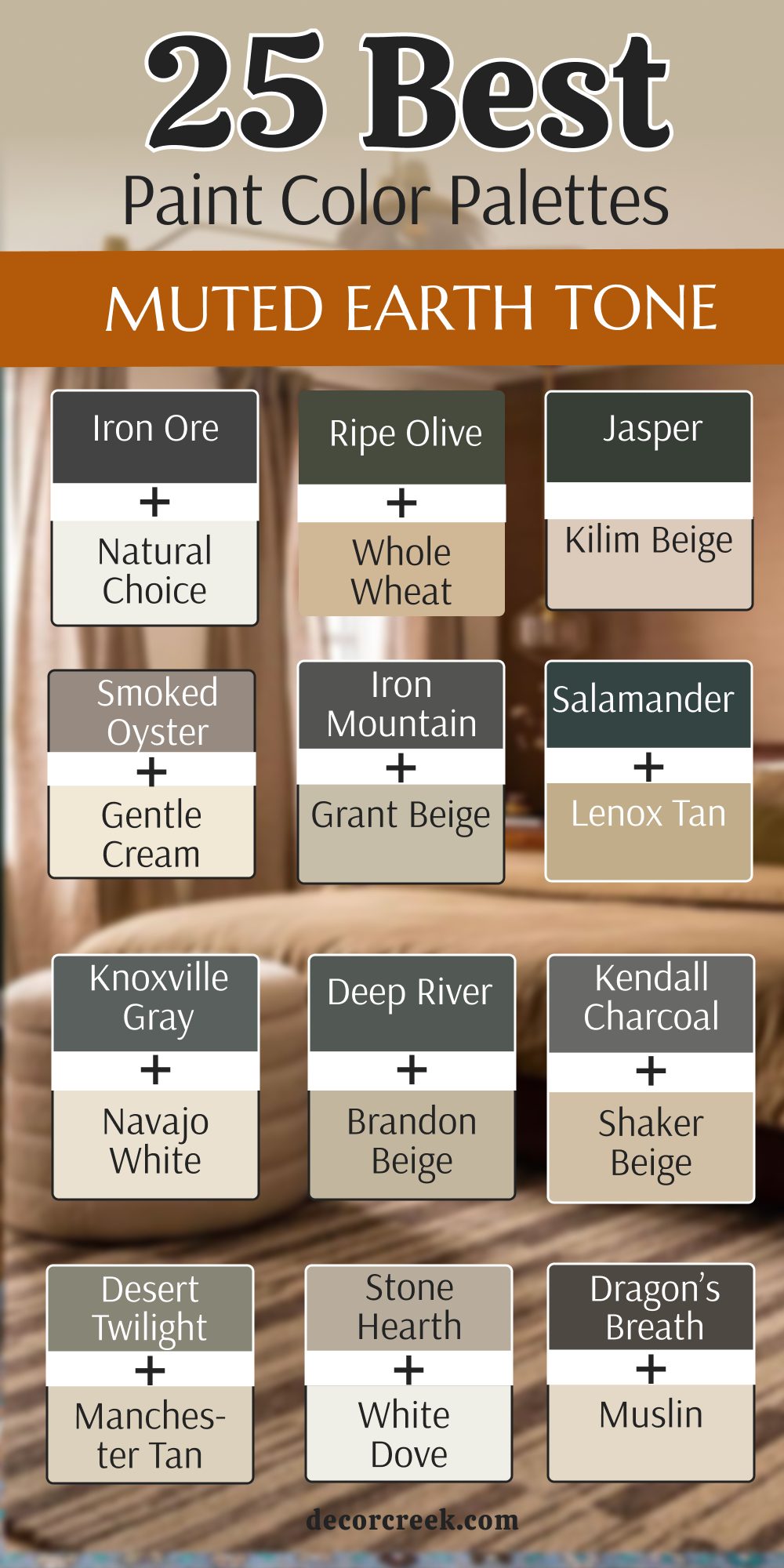
My Final Thoughts about 28 Ideas For The Earth Tone Color Palette For The Whole House
I truly hope these detailed ideas and combinations help you see how beautiful and harmonious your home can become with the right choice of colors. Choosing paint is about much more than just following a trend; it is deeply connected to how you want to feel the very moment you step through the door and come home after a long, busy day.
Earth tones give you a special way to bring the timeless beauty and steady soul of the outdoors right inside your own walls. These colors act as an anchor, creating a space that feels grounded, authentic, and connected to the natural world that surrounds us all.
You do not need to be a professional designer or an expert in color theory to pick a shade that makes you feel happy and at peace. Simply trust your gut instinct, listen to your heart, and take a moment to watch how the natural light moves through your rooms, shifting and dancing across the walls from morning until sunset.
Your house is more than just a building; it is a sacred place for your family to grow together, share laughter, and build beautiful memories that will last a lifetime. Using these organic, nature-inspired colors will make sure your home remains a warm, welcoming, and deeply comforting sanctuary for you and your loved ones for many, many years to come.