Creating a private corner for reading is one of the most rewarding projects I handle for my clients because it focuses entirely on personal comfort. I have spent years as a staging expert and designer, and I know that the right paint makes you want to pick up a book and stay for hours without any distractions. Your library is a sanctuary where your mind can relax after a long day of work, providing a mental break from the busy outside world.
If the walls look bare or the color feels cold, it ruins the feeling of being in a special hideaway and makes the room feel unfinished. I want to help you pick a shade that feels welcoming and warm so that you can truly enjoy your quiet time. Choosing a color does not have to be hard if you follow a few simple rules about lighting and the mood you want to create.
Let’s look at how to make your bookshelves and reading nooks look their absolute best with the right pigments. A library should feel like a hug for your brain, and the right wall tone is the first step in achieving that goal. When the color is perfect, the room becomes the favorite part of your home for every family member.
Investing in this area means you are prioritizing your own rest and intellectual growth in a beautiful environment.
Why I Trust Sherwin-Williams and Benjamin Moore for Rich and Lasting Library Paint Colors
I only use the best brands because I want your paint to last as long as your favorite hardcovers and maintain its beauty for decades. Sherwin-Williams and Benjamin Moore are the two names I suggest to every single client I meet because their reputation for excellence is unmatched. Their paint covers the walls smoothly and stays looking fresh even when you are pulling heavy books on and off the shelves frequently.
I find that their color swatches actually match what ends up on the wall, which saves us from bad surprises and expensive mistakes. These companies have perfected the way they mix pigments so the tones stay rich and true for years without fading from sun exposure. Cheap paint often looks thin or streaky, but these brands provide a thick and durable finish that feels luxurious to the touch.
I trust their quality because I have seen it work in hundreds of homes under many different types of lighting conditions. You deserve a professional look without having to repaint your reading room every single year due to scuffs or poor coverage. Their products offer a level of depth and saturation that makes any library look like it was designed by a high-end architectural firm.
Choosing these paints means you are getting a reliable product that protects your walls while making them look stunning.
How I Choose the Perfect Paint Shade to Create a Cozy and Thoughtful Home Library
When I look at a library, I first check how much natural light comes through the windows at various points throughout the afternoon. Lighting changes how a color looks at different times of the day, especially in rooms filled with wood shelving and paper. I always tell my clients to paint a large sample on the wall before making a final choice so they can see the color in person. A small room might need a bright white to help it feel larger and less crowded when the shelves are completely full.
A large library with high ceilings can handle a deep green or a dark navy to create a sense of grandeur and focus. I think about the flooring and the specific wood finish of your shelves too, ensuring the wall color complements the grain. Everything needs to work together like a team to make the room feel right and balanced for a reader.
I want your guests to feel happy and invited the second they see your collection and the beautiful walls behind it. Picking the right shade is the easiest way to give your books a beautiful home and create a mood of deep thought. Your library should reflect your style, whether you prefer a bright and airy look or a dark and moody study.
By focusing on the details of the room, we can find a color that highlights your favorite books and makes the furniture look perfect.
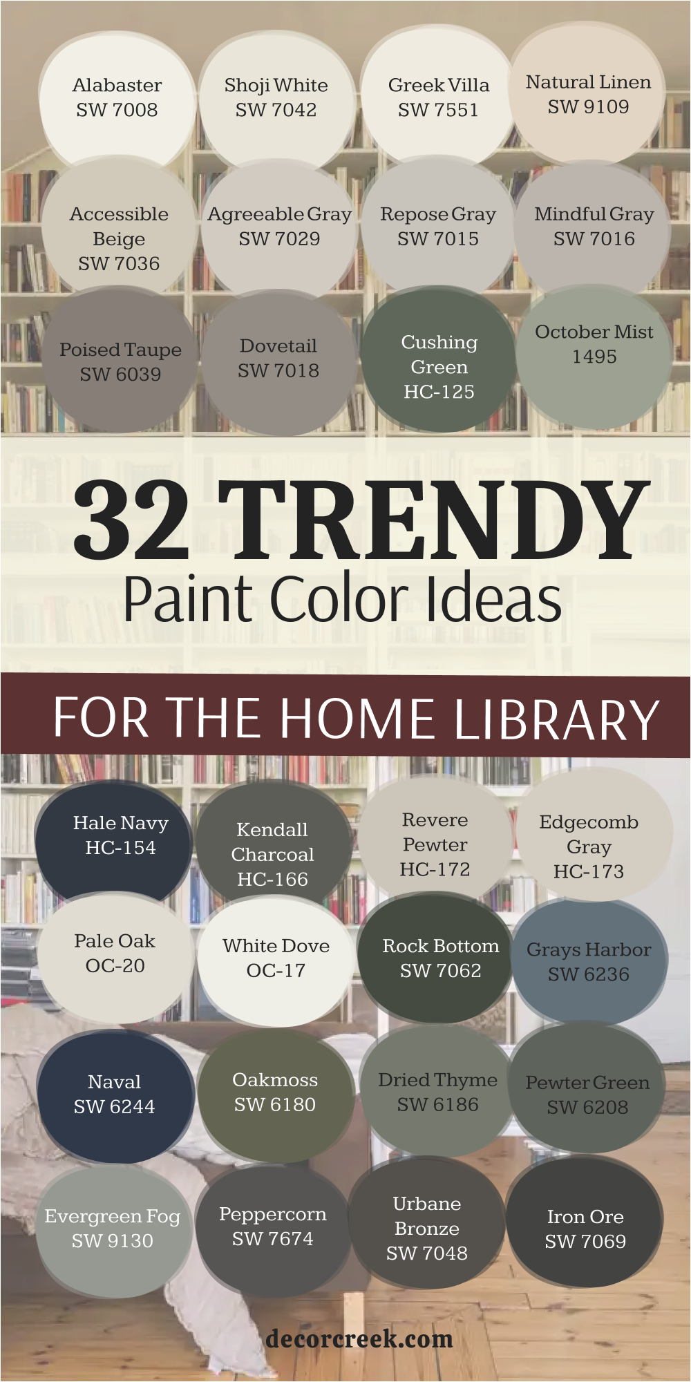
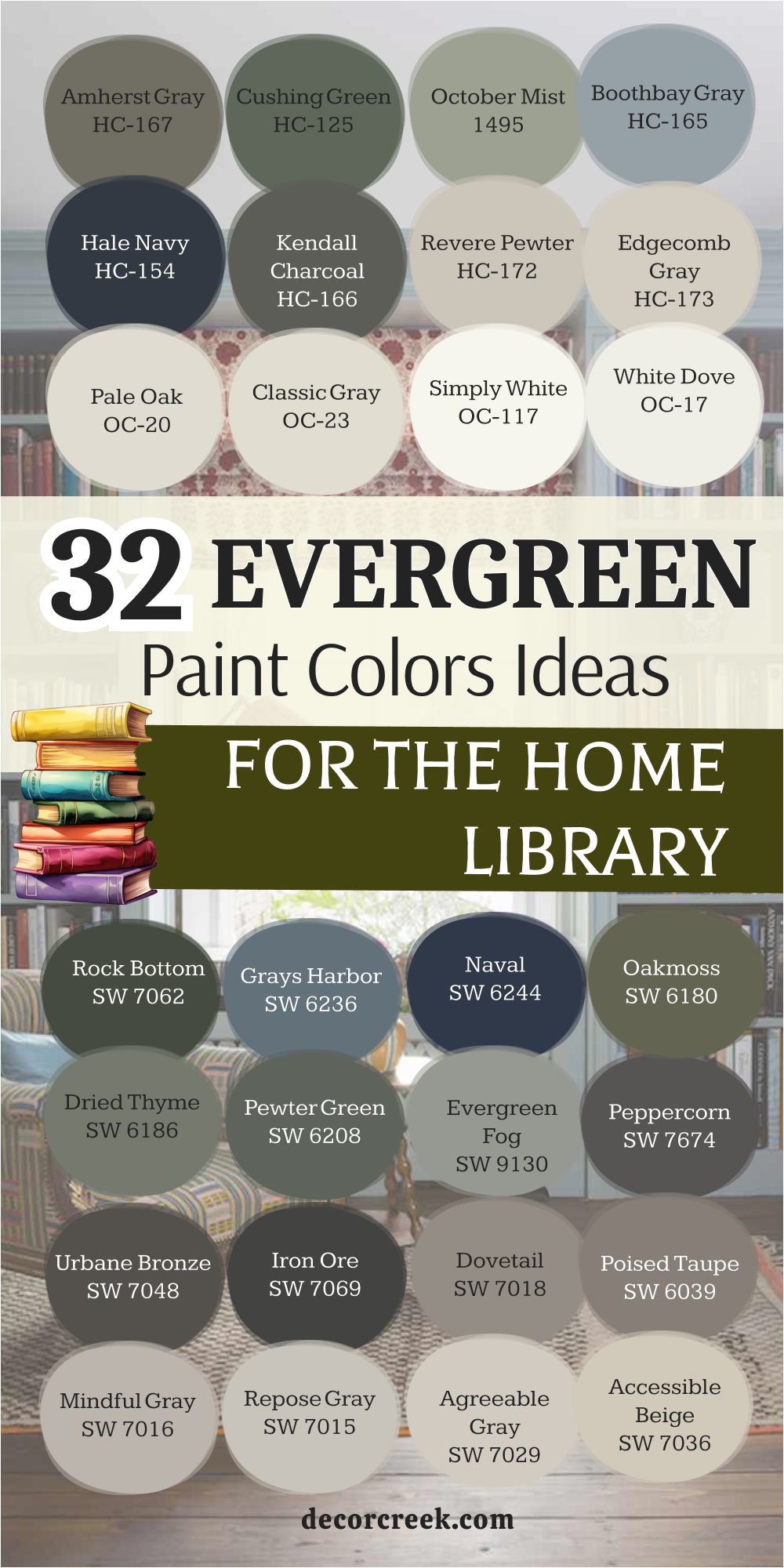
32 Evergreen Paint Color Ideas for the Home Library
Alabaster SW 7008
Alabaster SW 7008 is a creamy white that makes every book shelf look clean and bright. This shade works well with dark wood because it has a tiny bit of warmth. Many people choose this when they want a clean look that does not feel cold.
This paint brightens up dark corners where the sun does not reach easily. The tone appears often in modern homes because it looks very inviting. It provides a perfect backdrop for colorful book spines or old leather covers. This white hides small marks better than a very bright, stark white would.
The color stays a favorite for me because it never clashes with furniture. It makes your library feel much larger than it actually is. This choice helps readers feel a sense of peace the moment they walk inside.
🎨 Check out the complete guide to this color right HERE 👈

Shoji White SW 7042
Shoji White SW 7042 is a creamy blend that sits right between white and beige. This paint adds a lot of comfort to a library without being too dark. It is a shade I recommend for rooms that have a lot of natural stone or wood. The color feels very soft on the eyes when the afternoon sun hits the walls.
It creates a cozy feeling that welcomes guests into your reading area. This white works perfectly in traditional homes that need a little update. You will find it pairs nicely with both warm and cool wood tones on shelves. It is a smart choice for busy families because it is very forgiving with dust.
Many of my clients love this because it makes their home feel stable. The paint is a reliable color that looks expensive and high-end.
🎨 Check out the complete guide to this color right HERE 👈

Greek Villa SW 7551
Greek Villa SW 7551 is a rich and sunny white that brings a lot of life to a room. This pigment has a golden undertone that makes the library feel like it is glowing. It is a color I use often in rooms that do not get a lot of sunlight. The shade makes a small library feel much more cheerful and friendly.
It looks stunning when paired with dark wood trim or bronze hardware. This white is bright enough to look fresh but warm enough to feel like a hug. It will smooth out the look of your walls and hide tiny imperfections.
The paint is a popular choice for staging because almost everyone likes how it feels. It helps bridge the gap between different styles of furniture. This color makes your library feel like a sunny getaway every single day.
🎨 Check out the complete guide to this color right HERE 👈

Natural Linen SW 9109
Natural Linen SW 9109 is a light tan that feels very organic and grounded. This paint brings a bit of nature into your home library right away. It is a shade I suggest for people who think white is too boring. The color looks wonderful with indoor plants and woven baskets.
It creates a very soft transition from the hallway to the library. This tan makes your reading room feel sturdy and very well put together. It adds a layer of warmth that makes you want to stay for hours. The paint is a great middle-ground color that fits almost any style of architecture.
Many homeowners choose this when they want a homey and relaxed vibe. It is a very safe and smart pick for a welcoming library.
🎨 Check out the complete guide to this color right HERE 👈

Accessible Beige SW 7036
Accessible Beige SW 7036 is one of the most famous colors for a very good reason. This shade is the perfect mix of gray and beige that fits every house. It is the tone I use when I want a library to feel high-end. The color works with both warm wood floors and cool gray tiles.
It creates a very balanced look that does not lean too far one way. This paint makes your books look much more expensive than they were. It is a great choice if you are planning to sell your home soon.
Most people find this color very pleasing and easy to live with every day. The pigment provides a solid foundation for any style of decoration. It is a winner for anyone who wants a beautiful and invited room.
🎨 Check out the complete guide to this color right HERE 👈

Agreeable Gray SW 7029
Agreeable Gray SW 7029 is the most popular gray color for a home today. This paint has a warm base that keeps it from looking like cold concrete. It works in any lighting situation you might have in your library. The color makes small reading rooms look much more open and clean.
This is a shade that buyers look for when they walk into a house. It goes well with white trim and dark wood shelves alike. The choice is very safe for people who are not sure which gray to pick. It helps your home look modern while still feeling very cozy.
This is a selection I recommend for almost every staging project I do. The paint will make your library look professionally designed without much effort.
🎨 Check out the complete guide to this color right HERE 👈

Repose Gray SW 7015
Repose Gray SW 7015 is a slightly cooler gray that looks very sophisticated. This tone has a tiny hint of blue or green depending on your light. It makes a home library feel very trendy and up to date. The color is dark enough to show contrast against white baseboards.
It works beautifully with marble accents or light gray furniture. This paint is a shade that looks high-end in a large and open room. It stays looking fresh even when the sun goes down and lamps come on. The choice is a tool that helps your library feel very organized.
It is a great pick if you have navy or black accents in the room. This selection gives your home a very polished look everyone will notice.
🎨 Check out the complete guide to this color right HERE 👈

Mindful Gray SW 7016
Mindful Gray SW 7016 is an ideal mid-tone for a clear color on your walls. This paint looks very solid and dependable in a large library. It has enough depth to make white bookshelves stand out and pop. The color works well with dark floors to create a high-quality finish.
This choice does not feel too dark if you have a window nearby. It helps hide fingerprints and small marks in high-traffic areas. The shade gives the room a very modern and expensive look. It stays neutral and does not turn purple in normal indoor light.
This selection is liked by home buyers because it looks very professional. The pigment is a great base for a welcoming and thoughtful library.
🎨 Check out the complete guide to this color right HERE 👈

Poised Taupe SW 6039
Poised Taupe SW 6039 is a complex blend of gray and brown with a purple hint. This selection makes a library feel very balanced and neutral. It works well with both warm wood and cool metal accents. The color provides a very versatile backdrop for any style of furniture.
It hides scuffs and dirt very well in a busy family home. This paint gives the room a very professional and clean appearance. It looks very high-end and designer-made on any wall surface.
The shade is a tool that helps people feel a sense of order. It pairs perfectly with white trim and gray-toned rugs. This choice ensures your library is a very polished and invited area.
🎨 Check out the complete guide to this color right HERE 👈
Dovetail SW 7018
Dovetail SW 7018 is a rich gray that immediately draws attention to the walls. This paint gives the library a serious and very stylish character. It looks best in rooms with good artificial light or large windows.
The shade creates a great background for bright paintings or gold frames. It makes the reading area very expressive and memorable for your guests. This selection is often used by me to create an expensive hotel effect. The pigment hides any bumps on the surface of old walls perfectly.
It feels like a very stable and strong color for a study. This gray emphasizes the whiteness of the ceiling and makes it look taller. It is a bold and right decision for updating your library.
🎨 Check out the complete guide to this color right HERE 👈

Iron Ore SW 7069
Iron Ore SW 7069 is a very deep and nearly black shade that looks trendy. This pigment creates a stunning contrast if you have light-colored shelves. It makes a small library feel very characteristic and unusual.
The color absorbs extra light and creates a very intimate mood. This choice is often applied for accent walls behind book collections. It looks very rich in combination with brass light fixtures or handles. The shade helps hide all wall defects due to its dark base.
It is picked by those who want to add drama to their home. This dark paint feels like a very reliable and protective color. It turns an ordinary room into an example of designer art.
🎨 Check out the complete guide to this color right HERE 👈

Urbane Bronze SW 7048
Urbane Bronze SW 7048 is a complex brown-gray that reminds me of metal. This paint gives the library a sense of stability and weight. It harmonizes perfectly with brickwork or stone floors in a room. The color makes the room very warm despite its dark nature.
This selection often becomes a favorite color due to its natural softness. It works well on both the walls and the built-in shelves. The shade looks very effective under the light of evening lamps.
It helps guests immediately feel in a cozy and protected environment. This is a color that never goes out of fashion for staging. The pigment gives your home the look of a very high-quality area.
🎨 Check out the complete guide to this color right HERE 👈

Peppercorn SW 7674
Peppercorn SW 7674 is a balanced dark gray without any extra undertones. This paint looks very neat and strict in any modern interior style. It helps make the library zone more distinct and structured.
The color perfectly offsets bright rugs or green indoor plants. This choice creates a sense of luxury in a small house. It is a great selection for those afraid of pure black color. The shade keeps its true tone under any type of light bulb.
It makes the interior deeper and more interesting to the eye. This pigment causes a feeling of trust and order for visitors. It is a proven way to make your library stylish for years.
🎨 Check out the complete guide to this color right HERE 👈
Evergreen Fog SW 9130
Evergreen Fog SW 9130 is a soft green color with gray and blue inside. This pigment brings a sense of living nature right to your library. It looks very modern and is often chosen for updated interiors. The shade helps create a very soft transition from the hallway.
It perfectly combines with natural materials like linen or leather chairs. This selection makes the reading zone very fresh and clean. The paint is a great choice for those looking for an unusual neutral.
It causes a smile and pleasant thoughts in every guest. This choice works well in both small and spacious library rooms. The color will be an ideal start for a cozy and stylish home.
🎨 Check out the complete guide to this color right HERE 👈

Pewter Green SW 6208
Pewter Green SW 6208 is a deep forest green color with a noble character. This heavy tone makes the library very solid and trustworthy. It looks great next to furniture made of natural dark wood. The shade helps create the atmosphere of an old mansion.
It looks very saturated and does not fade in the sun. This paint is often used by me to create focus points. It makes the walls very smooth and pleasant for perception.
The selection is an ideal color for homes surrounded by trees. It helps guests immediately tune into a serious and quiet mood. This choice turns an ordinary room into a high-level library.
🎨 Check out the complete guide to this color right HERE 👈

Dried Thyme SW 6186
Dried Thyme SW 6186 reminds me of the color of dried herbs and nature. This paint creates a very homey and warm environment in the room. It is perfectly suited for homes in a rustic or classic style. The shade hides dust well which is important for bookshelves.
It looks very soft under the light of table lamps. This selection helps people feel in safety and comfort immediately. It perfectly harmonizes with ceramic tiles or gray wood tones.
The pigment is a very harmonious color that does not irritate. It makes your library more individual and interesting to guests. This choice is a wonderful way to create a durable interior.
🎨 Check out the complete guide to this color right HERE 👈

Oakmoss SW 6180
Oakmoss SW 6180 is a deep green that feels very rich and earthy. This paint gives your library a very grounded and strong feeling. It works wonderfully in rooms with stone floors or wood beams. The color provides a rich look that makes white trim stand out.
This pigment is deep enough to hide the wear of a busy room. It creates a moody and executive atmosphere that feels high-end. You will notice it changes its look depending on the light.
This is a choice I make when I want to add character. It pairs nicely with leather furniture or brass light fixtures. This paint ensures your library looks like a solid and stylish place.
🎨 Check out the complete guide to this color right HERE 👈
Naval SW 6244
Naval SW 6244 is a classic navy blue that always looks very elegant. This paint reminds me of the night sky bringing depth to your library. It creates a very welcoming and smart atmosphere in the room. This blue ideally combines with white shelves and gold decor.
The shade makes the library look very neat and traditionally handsome. It is often used by me to create a sophisticated look. This selection helps guests feel important and wanted in your home.
It is a very deep color that does not tire the eyes. The pigment hides small wall defects and hand marks perfectly. This is a great way to add color to a neutral home.
🎨 Check out the complete guide to this color right HERE 👈

Grays Harbor SW 6236
Grays Harbor SW 6236 is a smoky dark blue with a noticeable gray tint. This paint looks very mysterious and attractive on the library walls. It is well suited for homes with plenty of natural light.
The shade creates a very relaxed and pleasant mood for readers. It perfectly complements floors made of light oak or pine wood. This blue looks less formal than a regular dark navy color. It helps to keep the room boundaries feeling soft and wide.
This choice is a very practical and non-staining solution for walls. The pigment emphasizes the taste of the homeowners and their style. This color will make your library truly unique and fresh.
🎨 Check out the complete guide to this color right HERE 👈

Rock Bottom SW 7062
Rock Bottom SW 7062 is a very dark green that looks nearly black. This pigment creates a stunning contrast if you have light wood. It makes a small library feel very characteristic and special.
The color absorbs extra light and creates a very intimate mood. This choice is often used for creating a library that feels ancient. It looks very rich in combination with metallic accents or gold. The shade helps hide all wall defects due to its dark base.
It is picked by those who want to add mystery to their home. This dark paint feels like a very reliable and protective color. It turns an ordinary room into a masterpiece of design.
🎨 Check out the complete guide to this color right HERE 👈
White Dove OC-17
White Dove OC-17 is a soft and creamy white that designers love. This shade makes every library look clean and very bright. It works well with all types of wood floors and rugs. The color has a tiny bit of warmth that keeps it friendly.
It brightens up dark corners where the sun does not reach. This paint provides a perfect backdrop for colorful book collections. It hides small marks better than a very bright white would.
The selection stays a favorite for me because it never clashes. It makes your hallway and library feel much larger than before. This classic choice helps readers feel a sense of ease.
🎨 Check out the complete guide to this color right HERE 👈

Simply White OC-117
Simply White OC-117 is a very crisp choice for a modern home library. This paint has no heavy yellow or blue tones hidden inside. It is a color I like to use on trim and shelves. The shade makes your reading room look sharp and well maintained.
It reflects light beautifully and helps a small room feel airier. This selection is what you should use for a brand new look. It is a great pick if you have black metal furniture nearby.
The pigment creates a very fresh feeling that makes books stand out. You can count on this paint to stay looking bright for years. It provides a professional finish that makes your library look high-quality.
🎨 Check out the complete guide to this color right HERE 👈

Classic Gray OC-23
Classic Gray OC-23 is a very light gray that looks soft and airy. This paint is a fantastic alternative to white for your walls. It makes white bookshelves really stand out in the library.
The shade feels very modern without being too cold or harsh. It works well in small rooms because it feels very open. This choice pairs with almost any color of rug on the floor. The pigment is very popular for people who like a simple look.
It hides small scuffs better than a pure white paint would. This selection is a color many of my staging clients choose. It makes your library look updated and very stylish for years.
🎨 Check out the complete guide to this color right HERE 👈

Pale Oak OC-20
Pale Oak OC-20 is a warm and gentle greige that feels very organic. This paint brings a bit of nature into your reading room. It is a shade I suggest for people who find gray too cold. The color looks wonderful with indoor plants and light wood decor.
It creates a very soft transition between different rooms. This choice makes your library feel sturdy and very well put together. It adds a layer of warmth that makes you want to read.
The pigment is a great middle-ground color for any home style. Many homeowners choose this when they want a homey vibe. It is a very safe and smart pick for a welcoming room.
🎨 Check out the complete guide to this color right HERE 👈

Edgecomb Gray HC-173
Edgecomb Gray HC-173 is a rich and creamy gray that fits every house. This shade is the perfect mix of gray and beige for a foyer. It is the tone I use when I want a room to feel high-end.
The color works with both warm wood and cool gray furniture. It creates a very balanced look that does not lean too far. This paint makes your bookshelves look much more expensive than before.
It is a great choice if you are planning to sell soon. Most people find this color very pleasing and easy to live with. The pigment provides a solid foundation for any style of decoration. It is a winner for anyone who wants a beautiful library.
🎨 Check out the complete guide to this color right HERE 👈

Revere Pewter HC-172
Revere Pewter HC-172 is a classic light gray that has a warm heart. This paint makes a library feel very stable and traditionally handsome. It works perfectly in rooms with a lot of natural light coming in.
The color provides a very clean and professional look for your walls. It hides small marks and scuffs from daily use very effectively. This selection makes the reading area feel much more open than before. It looks very expensive and custom-made on the library walls. This is a color I use for creating a very fresh home environment.
It pairs nicely with white trim and colorful book collections. The pigment ensures your library is a very welcoming and stylish space.
🎨 Check out the complete guide to this color right HERE 👈

Kendall Charcoal HC-166
Kendall Charcoal HC-166 is a deep gray that brings a lot of class. This dark paint makes a library feel very established and smart. It works best in rooms with high ceilings and big windows.
The shade provides a very dramatic and moody look for visitors. It hides all the messes of a busy room area perfectly. This choice gives the library a very sleek and tailored appearance. It looks stunning next to bright white shelves and door frames.
The pigment is a color I choose for a luxury staging look. It pairs perfectly with modern art and black iron fixtures. This selection ensures your library is a very bold and stylish area.
🎨 Check out the complete guide to this color right HERE 👈

Hale Navy HC-154
Hale Navy HC-154 is a powerful navy blue that looks very high-end. This paint gives your library a very sophisticated and smart character. It works wonderfully with brass lamps and leather reading chairs. The color provides a rich look that makes white trim stand out.
This pigment is deep enough to hide the wear of a family room. It creates a moody and executive atmosphere that feels very expensive. You will notice it looks almost black in low evening light.
This is a choice I make when I want a room to look grand. It pairs nicely with dark wood floors or colorful oriental rugs. This paint ensures your library looks like a solid and stylish place.
🎨 Check out the complete guide to this color right HERE 👈

Boothbay Gray HC-165
Boothbay Gray HC-165 is a soft blue-gray that feels very refreshing. This paint makes a library look bright and very updated for guests. It works perfectly in rooms that lead into open living spaces.
The color provides a clean look that is not as sharp as white. It reflects light well and helps a small room feel more open. This choice hides light dust and small marks on the walls.
It stays a favorite for me because it looks good in any light. The shade makes your library feel very calm and well maintained. It helps readers feel a sense of ease as they sit down. This is a reliable color that gives your walls a designer finish.
🎨 Check out the complete guide to this color right HERE 👈

October Mist 1495
October Mist 1495 is a gentle sage green that feels very organic. This paint brings a bit of nature into your reading room today. It is a shade I suggest for people who love garden colors.
The color looks wonderful with light wood and natural fabrics. It creates a very soft transition from the outdoors to inside. This choice makes your library feel sturdy and very well together.
It adds a layer of warmth that makes you want to read books. The pigment is a great middle-ground color for any home style. Many homeowners choose this when they want a homey feeling. It is a very safe and smart pick for a welcoming room.
🎨 Check out the complete guide to this color right HERE 👈

Cushing Green HC-125
Cushing Green HC-125 is a deep green that feels very rich and bold. This paint gives your library a very grounded and strong character. It works wonderfully in rooms with stone floors or wood shelves.
The color provides a rich look that makes gold frames stand out. This pigment is deep enough to hide marks in high-traffic rooms. It creates a moody atmosphere that feels like an old study. You will notice it looks very saturated in the afternoon light.
This is a choice I make when I want a room to look unique. It pairs nicely with leather chairs or dark wood furniture. This paint ensures your library looks like a solid and stylish place.
🎨 Check out the complete guide to this color right HERE 👈
Amherst Gray HC-167
Amherst Gray HC-167 is a dark and serious gray that brings class. This paint makes an entrance or library feel very established. It works best in rooms with high ceilings and large windows.
The shade provides a very dramatic and moody look for visitors. It hides all the messes of a busy doorway area perfectly. This choice gives the library a very sleek and tailored appearance.
It looks stunning next to bright white baseboards and trim. The pigment is a color I choose for a luxury staging look. It pairs perfectly with modern art and dark wood shelves. This selection ensures your library is a very bold and stylish area.
🎨 Check out the complete guide to this color right HERE 👈

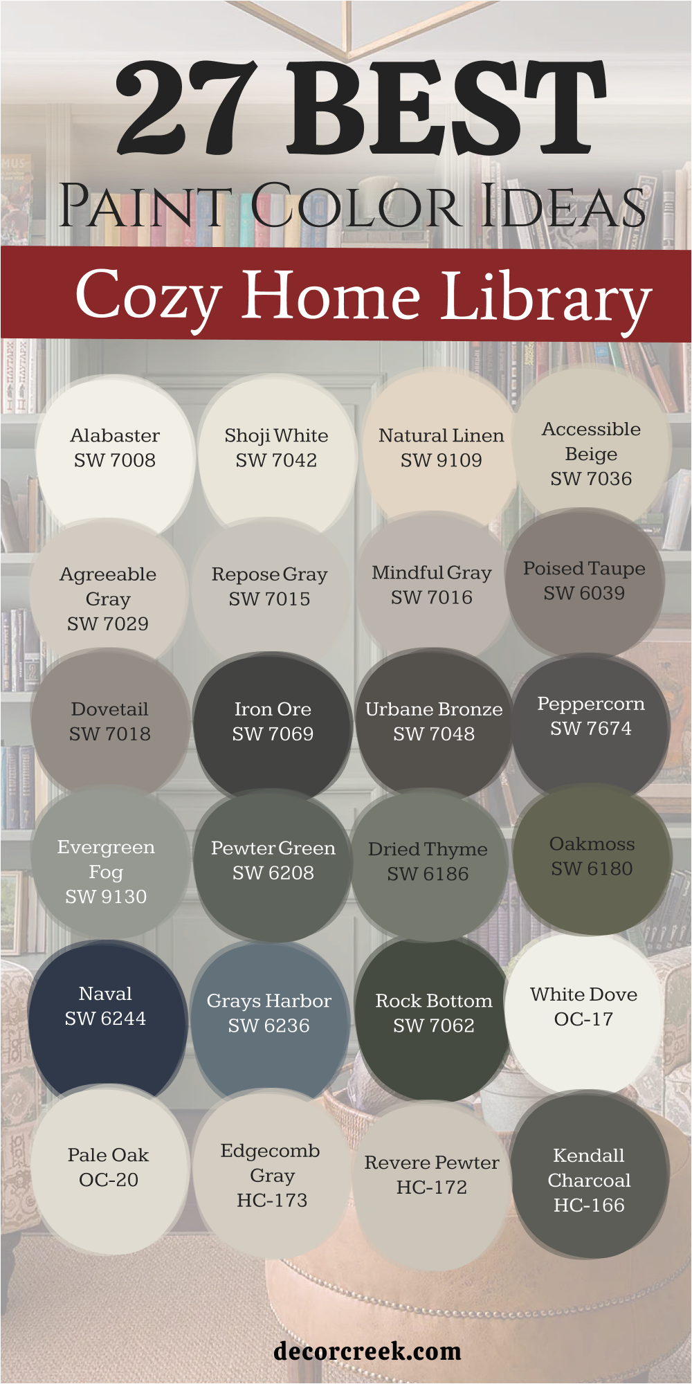
27 Paint Color Ideas for the Cozy Home Library
Alabaster SW 7008
Alabaster SW 7008 is a creamy white that feels very soft on walls. This shade makes every library look clean and very bright today. It works well with dark wood because it has some warmth.
Many people choose this when they want a very homey look. This paint brightens up dark corners where the sun is low. The tone appears often in cottage homes because it looks inviting.
It provides a perfect backdrop for family photos or old books. This white hides small marks better than a stark white paint. The color stays a favorite because it never feels too cold. It makes your library feel much larger and more welcoming.
🎨 Check out the complete guide to this color right HERE 👈
Shoji White SW 7042
Shoji White SW 7042 is a creamy blend that feels very natural and soft. This paint adds a lot of comfort to a library walls. It is a shade I recommend for rooms with wood floors.
The color feels very soft on the eyes in the evening. It creates a cozy feeling that welcomes you to sit down. This white works perfectly in homes that need a soft touch. You will find it pairs nicely with warm wood on shelves.
It is a smart choice because it hides dust very well. Many of my clients love this because it feels very stable. The paint is a reliable color that looks expensive and high-end.
🎨 Check out the complete guide to this color right HERE 👈
Natural Linen SW 9109
Natural Linen SW 9109 is a light tan that feels very organic today. This paint brings a bit of nature into your home library. It is a shade I suggest for a very cozy look.
The color looks wonderful with woven rugs and soft chairs. It creates a very soft transition between the different rooms. This tan makes your reading room feel sturdy and well together.
It adds a layer of warmth that makes you want to stay. The paint is a great color that fits almost any furniture. Many homeowners choose this when they want a homey feeling. It is a very safe and smart pick for a library.
🎨 Check out the complete guide to this color right HERE 👈
Accessible Beige SW 7036
Accessible Beige SW 7036 is a famous color for a very good reason. This shade is the perfect mix of gray and beige now. It is the tone I use when I want comfort. The color works with both warm wood and soft fabrics.
It creates a very balanced look that feels very right. This paint makes your books look much more expensive than before. It is a great choice if you want a cozy room.
Most people find this color very pleasing to live with daily. The pigment provides a solid foundation for any style of home. It is a winner for anyone who wants an invited room.
🎨 Check out the complete guide to this color right HERE 👈
Agreeable Gray SW 7029
Agreeable Gray SW 7029 is a popular gray for a home library. This paint has a warm base that keeps it feeling cozy. It works in any lighting situation you have in your house.
The color makes small reading rooms look much more open. This is a shade that buyers love when they visit homes. It goes well with white trim and dark wood shelves.
The choice is very safe if you want a warm gray. It helps your home look modern while still feeling very homey. This is a selection I recommend for a welcoming reading area. The paint will make your library look professionally designed and nice.
🎨 Check out the complete guide to this color right HERE 👈
Repose Gray SW 7015
Repose Gray SW 7015 is a cool gray that looks very sophisticated today. This tone has a tiny hint of blue that looks nice. It makes a home library feel very trendy and up to date.
The color is dark enough to show off white shelves. It works beautifully with light furniture and soft blue rugs. This paint is a shade that looks high-end in a room.
It stays looking fresh even when the evening lamps are on. The choice is a tool that helps your library feel clean. It is a great pick for rooms with black accents nearby. This selection gives your home a very polished and cozy look.
🎨 Check out the complete guide to this color right HERE 👈
Mindful Gray SW 7016
Mindful Gray SW 7016 is an ideal mid-tone for your library walls. This paint looks very solid and dependable in a reading room. It has enough depth to make white bookshelves stand out well.
The color works well with dark floors for a rich look. This choice does not feel too dark for a small room. It helps hide fingerprints in areas where you touch books.
The shade gives the room a very modern and nice look. It stays neutral and does not turn purple under light bulbs. This selection is liked because it looks very professional and warm. The pigment is a great base for a thoughtful home library.
🎨 Check out the complete guide to this color right HERE 👈
Poised Taupe SW 6039
Poised Taupe SW 6039 is a blend of gray and brown today. This selection makes a library feel very balanced and very neutral. It works well with both warm wood and cool metal lamps.
The color provides a very versatile backdrop for any furniture style. It hides scuffs and dirt well in a family home area. This paint gives the room a very clean and nice appearance.
It looks very high-end on any wall surface in the house. The shade is a tool that helps people feel very organized. It pairs perfectly with white trim and gray-toned rugs on floors. This choice ensures your library is a very polished and invited room.
🎨 Check out the complete guide to this color right HERE 👈
Dovetail SW 7018
Dovetail SW 7018 is a rich gray that draws attention to bookshelves. This paint gives the library a serious and very stylish look. It looks best in rooms with good lamps or large windows.
The shade creates a great background for bright book covers today. It makes the reading area very expressive for your guests and family. This selection is often used to create a cozy hotel feel.
The pigment hides any bumps on the wall surface very perfectly. It feels like a very stable and strong color for reading. This gray emphasizes the ceiling and makes it look very tall. It is a bold and right decision for your library.
🎨 Check out the complete guide to this color right HERE 👈
Iron Ore SW 7069
Iron Ore SW 7069 is a very deep shade that looks very trendy. This pigment creates a stunning contrast with light-colored reading chairs. It makes a small library feel very characteristic and very special.
The color absorbs light and creates a very intimate mood for you. This choice is often applied for walls behind large book collections. It looks very rich with brass light fixtures or gold handles.
The shade helps hide all wall defects due to its dark base. It is picked by those who want a cozy and moody room. This dark paint feels like a very reliable and protective color. It turns an ordinary room into a piece of designer art.
🎨 Check out the complete guide to this color right HERE 👈
Urbane Bronze SW 7048
Urbane Bronze SW 7048 is a brown-gray that reminds me of nature. This paint gives the library a sense of stability and strength. It harmonizes perfectly with stone floors or brick walls today.
The color makes the room very warm despite its dark base. This selection often becomes a favorite color for many of my clients. It works well on both the walls and the built-in shelves.
The shade looks very effective under the light of warm lamps. It helps guests feel in a cozy and protected environment immediately. This is a color that never goes out of fashion for a library. The pigment gives your home the look of a high-quality area.
🎨 Check out the complete guide to this color right HERE 👈
Peppercorn SW 7674
Peppercorn SW 7674 is a dark gray without any extra hidden tones. This paint looks very neat and strict in a modern library. It helps make the reading zone more distinct and very structured.
The color perfectly offsets bright rugs or green indoor plants today. This choice creates a sense of luxury in a small house library. It is a great selection if you want a dark but soft color.
The shade keeps its true tone under any type of light bulb. It makes the interior deeper and more interesting for readers to see. This pigment causes a feeling of trust and order for guests. It is a proven way to make your library stylish.
🎨 Check out the complete guide to this color right HERE 👈
Evergreen Fog SW 9130
Evergreen Fog SW 9130 is a soft green with gray and blue. This pigment brings a sense of living nature to your library. It looks very modern and is chosen for new home designs.
The shade helps create a very soft transition from other rooms. It perfectly combines with natural materials like linen or leather chairs. This selection makes the reading zone very fresh and very clean.
The paint is a great choice for those looking for a soft color. It causes a smile and pleasant thoughts in every reader who visits. This choice works well in both small and large library rooms. The color will be an ideal start for a cozy home.
🎨 Check out the complete guide to this color right HERE 👈
Pewter Green SW 6208
Pewter Green SW 6208 is a deep forest green with a noble look. This heavy tone makes the library very solid and very trustworthy. It looks great next to furniture made of natural dark wood.
The shade helps create the atmosphere of an old study room. It looks very saturated and does not fade in the sun. This paint is often used to create a cozy focus point. It makes the walls very smooth and pleasant for guests to see.
The selection is an ideal color for homes with lots of trees. It helps readers immediately tune into a serious and quiet mood. This choice turns an ordinary room into a high-level library.
🎨 Check out the complete guide to this color right HERE 👈
Dried Thyme SW 6186
Dried Thyme SW 6186 reminds me of the color of nature today. This paint creates a homey and warm environment in the room. It is perfectly suited for homes in a rustic or classic style.
The shade hides dust well which is important for book shelves. It looks very soft under the light of table lamps at night. This selection helps people feel in safety and comfort in the home.
It perfectly harmonizes with wood or gray furniture in the room. The pigment is a very harmonious color that does not bother you. It makes your library more individual and interesting for guests to visit. This choice is a wonderful way to create a durable interior.
🎨 Check out the complete guide to this color right HERE 👈
Oakmoss SW 6180
Oakmoss SW 6180 is a deep green that feels very rich and earthy. This paint gives your library a very grounded and strong feeling. It works wonderfully in rooms with stone floors or wood beams.
The color provides a rich look that makes white trim stand out. This pigment is deep enough to hide the wear of a busy room. It creates a moody and executive atmosphere that feels high-end.
You will notice it changes its look depending on the light. This is a choice I make when I want to add character. It pairs nicely with leather furniture or brass light fixtures. This paint ensures your library looks like a solid and stylish place.
🎨 Check out the complete guide to this color right HERE 👈
Naval SW 6244
Naval SW 6244 is a powerful navy blue that looks very smart. This paint gives your library a very sophisticated and rich character. It works wonderfully with brass lamps and leather reading chairs.
The color provides a rich look that makes white trim stand out. This pigment is deep enough to hide the wear of a family room. It creates a moody and executive atmosphere that feels very expensive.
You will notice it looks almost black in low evening light. This is a choice I make when I want a room to look grand. It pairs nicely with dark wood floors or colorful oriental rugs. This paint ensures your library looks like a solid and stylish place.
🎨 Check out the complete guide to this color right HERE 👈
Grays Harbor SW 6236
Grays Harbor SW 6236 is a smoky dark blue with a gray tint. This paint looks very mysterious and attractive on library walls. It is well suited for homes with plenty of natural light today.
The shade creates a very relaxed and pleasant mood for reading books. It perfectly complements floors made of light oak or pine wood. This blue looks less formal than a regular dark navy color choice.
It helps to keep the room boundaries feeling soft and wide for you. This choice is a very practical and non-staining solution for home walls. The pigment emphasizes the taste of the homeowners and their style. This color will make your library truly unique and fresh.
🎨 Check out the complete guide to this color right HERE 👈
Rock Bottom SW 7062
Rock Bottom SW 7062 is a very dark green that looks nearly black. This pigment creates a stunning contrast if you have light wood. It makes a small library feel very characteristic and special.
The color absorbs extra light and creates a very intimate mood. This choice is often used for creating a library that feels ancient. It looks very rich in combination with metallic accents or gold.
The shade helps hide all wall defects due to its dark base. It is picked by those who want to add mystery to their home. This dark paint feels like a very reliable and protective color. It turns an ordinary room into a masterpiece of design.
🎨 Check out the complete guide to this color right HERE 👈
White Dove OC-17
White Dove OC-17 is a soft white that feels very cozy today. This shade makes every library look clean and very bright for readers. It works well with all types of wood floors and traditional rugs.
The color has a tiny bit of warmth that keeps it friendly. It brightens up dark corners where the sun does not reach now. This paint provides a perfect backdrop for colorful book collections at home.
It hides small marks better than a very bright white paint would. The selection stays a favorite because it never clashes with furniture. It makes your library feel much larger than it actually is. This classic choice helps readers feel a sense of ease.
🎨 Check out the complete guide to this color right HERE 👈
Pale Oak OC-20
Pale Oak OC-20 is a warm greige that feels very organic today. This paint brings a bit of nature into your reading room walls. It is a shade I suggest for people who find gray too cold.
The color looks wonderful with indoor plants and light wood decor. It creates a very soft transition between the different home rooms. This choice makes your library feel sturdy and very well put together.
It adds a layer of warmth that makes you want to read books. The pigment is a great middle-ground color for any house style. Many homeowners choose this when they want a homey feeling. It is a very safe and smart pick for a library.
🎨 Check out the complete guide to this color right HERE 👈
Edgecomb Gray HC-173
Edgecomb Gray HC-173 is a rich and creamy gray for the home. This shade is the perfect mix of gray and beige now. It is the tone I use when I want a room to feel high-end.
The color works with both warm wood and cool gray furniture. It creates a very balanced look that does not lean too far. This paint makes your bookshelves look much more expensive than before.
It is a great choice if you are planning to sell soon. Most people find this color very pleasing and easy to live with. The pigment provides a solid foundation for any style of decoration. It is a winner for anyone who wants a beautiful library.
🎨 Check out the complete guide to this color right HERE 👈
Revere Pewter HC-172
Revere Pewter HC-172 is a light gray that has a warm heart today. This paint makes a library feel very stable and traditionally handsome. It works perfectly in rooms with a lot of light coming in.
The color provides a very clean and professional look for your walls. It hides small marks and scuffs from daily use very effectively. This selection makes the reading area feel much more open than before.
It looks very expensive and custom-made on the library walls. This is a color I use for creating a very fresh home environment. It pairs nicely with white trim and colorful book collections. The pigment ensures your library is a very welcoming and stylish space.
🎨 Check out the complete guide to this color right HERE 👈
Kendall Charcoal HC-166
Kendall Charcoal HC-166 is a deep gray that brings a lot of class. This dark paint makes a library feel very established and smart. It works best in rooms with high ceilings and big windows.
The shade provides a very dramatic and moody look for visitors. It hides all the messes of a busy room area perfectly. This choice gives the library a very sleek and tailored appearance.
It looks stunning next to bright white shelves and door frames. The pigment is a color I choose for a luxury staging look. It pairs perfectly with modern art and black iron fixtures. This selection ensures your library is a very bold and stylish area.
🎨 Check out the complete guide to this color right HERE 👈
Hale Navy HC-154
Hale Navy HC-154 is a powerful navy blue that looks very smart. This paint gives your library a very sophisticated and rich character. It works wonderfully with brass lamps and leather reading chairs.
The color provides a rich look that makes white trim stand out. This pigment is deep enough to hide the wear of a family room. It creates a moody and executive atmosphere that feels very expensive.
You will notice it looks almost black in low evening light. This is a choice I make when I want a room to look grand. It pairs nicely with dark wood floors or colorful oriental rugs. This paint ensures your library looks like a solid and stylish place.
🎨 Check out the complete guide to this color right HERE 👈
October Mist 1495
October Mist 1495 is a gentle sage green that feels very organic. This paint brings a bit of nature into your reading room today. It is a shade I suggest for people who love garden colors.
The color looks wonderful with light wood and natural fabrics. It creates a very soft transition from the outdoors to inside. This choice makes your library feel sturdy and very well together.
It adds a layer of warmth that makes you want to read books. The pigment is a great middle-ground color for any home style. Many homeowners choose this when they want a homey feeling. It is a very safe and smart pick for a welcoming room.
🎨 Check out the complete guide to this color right HERE 👈
Cushing Green HC-125
Cushing Green HC-125 is a deep green that feels very rich and bold. This paint gives your library a very grounded and strong character. It works wonderfully in rooms with stone floors or wood shelves.
The color provides a rich look that makes gold frames stand out. This pigment is deep enough to hide marks in high-traffic rooms. It creates a moody atmosphere that feels like an old study.
You will notice it looks very saturated in the afternoon light. This is a choice I make when I want a room to look unique. It pairs nicely with leather chairs or dark wood furniture. This paint ensures your library looks like a solid and stylish place.
🎨 Check out the complete guide to this color right HERE 👈
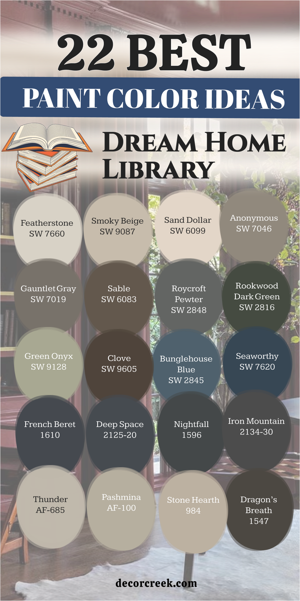
22 Paint Color Ideas for the Dream Home Library
Featherstone SW 9518
Featherstone SW 9518 is a light gray that feels very sophisticated today. This shade makes your dream library look clean and very updated. It works well with white shelves because it has a soft tone.
Many people choose this when they want a very modern look. This paint brightens up the room even when the lights are low. The color appears often in new homes because it looks so inviting.
It provides a perfect backdrop for minimalist art or new books. This gray hides small marks better than a stark white paint. The color stays a favorite because it never feels too heavy. It makes your library feel much larger and very well designed.
🎨 Check out the complete guide to this color right HERE 👈
Smoky Beige SW 9087
Smoky Beige SW 9087 is a warm neutral that feels very elegant today. This paint adds a lot of depth to your dream library walls. It is a shade I recommend for rooms with velvet chairs.
The color feels very rich on the eyes in the evening light. It creates a dream feeling that makes you want to read. This beige works perfectly in homes that need a luxury touch.
You will find it pairs nicely with gold accents on bookshelves. It is a smart choice because it looks very clean and polished. Many of my clients love this because it feels very high-end. The paint is a reliable color that looks expensive and rich.
🎨 Check out the complete guide to this color right HERE 👈
Sand Dollar SW 6099
Sand Dollar SW 6099 is a light tan that feels very airy and soft. This paint brings a touch of the beach to your library. It is a shade I suggest for a very bright dream room.
The color looks wonderful with white furniture and light rugs. It creates a very soft feeling between the different home areas. This tan makes your reading room feel open and very well together.
It adds a layer of light that makes you want to stay. The paint is a great color that fits almost any light decor. Many homeowners choose this when they want a fresh feeling. It is a very safe and smart pick for a dream library.
🎨 Check out the complete guide to this color right HERE 👈
Anonymous SW 7046
Anonymous SW 7046 is a sophisticated mid-tone that blends gray and brown. This shade gives your dream library a very grounded and sturdy feeling. It works wonderfully in rooms with stone floors or rustic beams.
The color provides a rich look that makes white trim stand out. This pigment is deep enough to hide the wear of a busy room. It creates a moody and executive atmosphere that feels high-end.
You will notice it changes its look depending on the time of day. This is a choice I make when I want to add character. It pairs nicely with leather furniture or brass light fixtures. This paint ensures your library looks like a solid and stylish place.
🎨 Check out the complete guide to this color right HERE 👈

Gauntlet Gray SW 7019
Gauntlet Gray SW 7019 is a dark gray that brings drama to a library. This deep tone makes a big statement the second you walk in. It works best in larger rooms with plenty of bright overhead lighting.
The color provides a cool and modern backdrop for colorful art. This shade hides scuffs and marks better than any lighter paint. It gives the room a very sleek and professional appearance for visitors. You can make it look stunning when used on both walls and trim.
The pigment stays very consistent and does not lean toward yellow. It is a favorite of mine for staging modern homes with high ceilings. This choice makes your dream library feel very updated and sharp.
🎨 Check out the complete guide to this color right HERE 👈
Sable SW 6083
Sable SW 6083 is a warm and dark brown that feels like a hug. This paint makes a large library feel much more invited and soft. It works perfectly with cream-colored rugs and light-colored furniture.
The tone provides a very earthy look that brings nature inside. It hides marks and stains very well in homes with children. This choice gives your walls a very thick and velvety texture.
It is a shade I suggest for creating a very snug dream room. The color looks best in the evening under the glow of lamps. It pairs nicely with bronze hardware and natural wood decor pieces. This rich brown makes every guest feel a sense of warmth.
Roycroft Pewter SW 2848
Roycroft Pewter SW 2848 is a deep blue-gray with a lot of soul. This selection gives your dream library a very classic feeling. It works beautifully in older homes with a lot of character.
The color adds a layer of richness that feels very intentional. It looks amazing when paired with dark wood floors and gold. This dark paint provides a moody vibe for a private study.
It is a shade that tells guests your home is high quality. The thick pigment hides small wall imperfections very well for you. I often use this color to create a memorable first impression. It ensures your library looks both traditional and very trendy today.
🎨 Check out the complete guide to this color right HERE 👈
Rookwood Dark Green SW 2816
Rookwood Dark Green SW 2816 is a very dark green for a grand library. This historic shade gives your room a sense of history today. It works well in homes that have high-quality wood shelves.
The color adds a lot of weight and importance to the walls. This thick paint hides every mark and fingerprint with its pigment. It looks very expensive when used on the walls of a study.
The tone creates a very formal and impressive welcome for guests. It stays looking very rich and dark throughout the entire day. This is a top pick for a luxury dream staging look. The paint ensures your library looks very well cared for.
Green Onyx SW 9128
Green Onyx SW 9128 is a muted green that feels very organic today. This light shade brings the garden into your dream library. It works wonders for homes that have natural wood trim nearby.
The color provides a very fresh look that is not too loud. It makes a room feel very peaceful and well together for guests. This paint is a great choice for a relaxed and casual style.
It looks very clean and bright when the morning sun hits. The pigment hides dust and light marks very effectively for you. It is a color that makes people feel happy and welcomed. This selection ensures your library feels like a natural part of home.
🎨 Check out the complete guide to this color right HERE 👈
Clove SW 9605
Clove SW 9605 is a deep and spicy brown that feels very rich. This paint gives your library a very grounded and strong feeling today. It works wonderfully in rooms with stone floors or wood beams.
The color provides a rich look that makes white trim look crisp. This pigment is deep enough to hide the wear of a busy room. It creates a moody and executive atmosphere that feels high-end.
You will notice it changes its look depending on the light bulbs. This is a choice I make when I want to add character. It pairs nicely with leather furniture or brass light fixtures. This paint ensures your library looks like a solid and stylish place.
🎨 Check out the complete guide to this color right HERE 👈
Bunglehouse Blue SW 0048
Bunglehouse Blue SW 0048 is a traditional blue with a lot of depth. This paint makes your dream library feel very smart and classic. It works well with dark wood shelves and white ceiling trim.
The color provides a very stable look for a professional study. It hides small marks and scuffs from daily use very effectively. This selection makes the room feel much more substantial than before.
It looks very expensive and custom-made on the library walls today. This is a color I use for creating a very serious environment. It pairs nicely with brass lamps and old book collections now. The pigment ensures your library is a very welcoming and stylish space.
🎨 Check out the complete guide to this color right HERE 👈
Seaworthy SW 7620
Seaworthy SW 7620 is a deep navy blue that feels very aquatic. This paint gives your dream library a very sophisticated character. It works wonderfully with brass lamps and leather reading chairs.
The color provides a rich look that makes white trim stand out. This pigment is deep enough to hide the wear of a family room. It creates a moody and executive atmosphere that feels very expensive.
You will notice it looks almost black in low evening light. This is a choice I make when I want a room to look grand. It pairs nicely with dark wood floors or colorful oriental rugs. This paint ensures your library looks like a solid and stylish place.
🎨 Check out the complete guide to this color right HERE 👈
French Beret 1610
French Beret 1610 is a very dark charcoal with a blue undertone. This paint makes your dream library feel incredibly smart and sharp. It works best in rooms with high ceilings and large windows today.
The shade provides a very dramatic and moody look for visitors. It hides all the messes of a busy room area perfectly for you. This choice gives the hallway or library a tailored appearance.
It looks stunning next to bright white baseboards and trim now. The pigment is a color I choose for a high-end luxury look. It pairs perfectly with modern art and black iron fixtures. This selection ensures your home entrance is a very bold area.
🎨 Check out the complete guide to this color right HERE 👈
Deep Space 2125-20
Deep Space 2125-20 is a dark and moody gray that feels like night. This paint makes your dream library feel very private and quiet. It works wonderfully in rooms with dark wood or metal shelves.
The color provides a rich look that makes colorful books stand out. This pigment is deep enough to hide marks from daily reading life. It creates a moody atmosphere that feels very high-end for guests.
You will notice it looks almost black in the low afternoon light. This is a choice I make when I want a room with depth. It pairs nicely with gray furniture or bright white wall art. This paint ensures your library looks like a solid and stylish place.
🎨 Check out the complete guide to this color right HERE 👈
Nightfall 1596
Nightfall 1596 is a dark gray that brings a lot of class to walls. This paint makes your dream library feel very established and smart. It works best in rooms with high ceilings and big windows today.
The shade provides a very dramatic and moody look for visitors. It hides all the messes of a busy doorway area perfectly for you. This choice gives the library a very sleek and tailored appearance.
It looks stunning next to bright white shelves and door frames. The pigment is a color I choose for a luxury staging look. It pairs perfectly with modern art and black iron fixtures. This selection ensures your library is a very bold and stylish area.
🎨 Check out the complete guide to this color right HERE 👈
Iron Mountain 2134-30
Iron Mountain 2134-30 is a deep charcoal that looks like natural stone. This paint makes your dream library feel very strong and protective. It works beautifully as an accent color for a foyer or library.
The color provides a very moody and high-contrast look for guests. It hides every mark and stain from pets and children easily. This choice gives the room a very custom and designer appearance.
It looks amazing under the bright light of a modern lamp today. This is a shade I suggest for a truly unique and bold room. It pairs nicely with light wood and metallic gold details. The pigment ensures your home library is a very grand and special space.
🎨 Check out the complete guide to this color right HERE 👈

Thunder AF-685
Thunder AF-685 is a light gray with a lot of warmth inside. This choice makes a small dream library look much larger today. It works perfectly for people who want a very clean look.
The color provides a soft contrast against white shelves and trim. It hides light dust and keeps the room looking very fresh. This paint gives the walls a very smooth and well-maintained look.
It looks great in both the morning and the soft evening light. This is a shade I use for a minimalist and updated style. It pairs beautifully with silver light fixtures and large mirrors. The color ensures your library feels very bright and full of energy.
🎨 Check out the complete guide to this color right HERE 👈

Pashmina AF-100
Pashmina AF-100 is a rich greige that looks like soft wool today. This shade gives your dream library a very cozy and high-quality feel. It works wonders in rooms that have limited natural light nearby.
The color provides a very warm and neutral base for your design. It hides wall imperfections and marks from books very effectively. This paint makes the room feel much more substantial and well decorated.
It looks very expensive and custom-made on the library walls. This is a color I use for creating a very stable home feeling. It pairs nicely with dark wood and colorful art pieces today. The pigment ensures your library is a very welcoming and sturdy space.
🎨 Check out the complete guide to this color right HERE 👈

Stone Hearth 984
Stone Hearth 984 is a warm neutral that feels very grounded today. This paint adds a lot of depth to your dream library walls. It is a shade I recommend for rooms with large bookshelves.
The color feels very rich on the eyes in the natural light. It creates a dream feeling that makes you want to sit and read. This beige works perfectly in homes that need a soft luxury touch.
You will find it pairs nicely with cream accents in the room. It is a smart choice because it looks very clean and polished. Many of my clients love this because it feels very high-end. The paint is a reliable color that looks expensive and rich.
🎨 Check out the complete guide to this color right HERE 👈
Dragon’s Breath 1547
Dragon’s Breath 1547 is a dark brown-gray that feels very powerful. This paint makes your dream library feel very private and smart today. It works wonderfully in rooms with dark wood or stone details.
The color provides a rich look that makes colorful books stand out. This pigment is deep enough to hide marks from daily reading life. It creates a moody atmosphere that feels very high-end for guests. You will notice it looks almost black in the low afternoon light.
This is a choice I make when I want a room with depth. It pairs nicely with gold furniture or bright white wall art. This paint ensures your library looks like a solid and stylish place.
🎨 Check out the complete guide to this color right HERE 👈
Van Deusen Blue HC-156
Van Deusen Blue HC-156 is a classic blue with a lot of depth today. This paint makes your dream library feel very smart and classic. It works well with dark wood shelves and white ceiling trim.
The color provides a very stable look for a professional study. It hides small marks and scuffs from daily use very effectively. This selection makes the room feel much more substantial than before.
It looks very expensive and custom-made on the library walls today. This is a color I use for creating a very serious environment. It pairs nicely with brass lamps and old book collections now. The pigment ensures your library is a very welcoming and stylish space.
🎨 Check out the complete guide to this color right HERE 👈

Newburg Green HC-158
Newburg Green HC-158 is a deep teal-green that feels very high-end today. This paint gives your dream library a very sophisticated character. It works wonderfully with brass lamps and leather reading chairs.
The color provides a rich look that makes white trim stand out. This pigment is deep enough to hide the wear of a family room. It creates a moody and executive atmosphere that feels very expensive.
You will notice it looks almost black in low evening light. This is a choice I make when I want a room to look grand. It pairs nicely with dark wood floors or colorful oriental rugs. This paint ensures your library looks like a solid and stylish place.
🎨 Check out the complete guide to this color right HERE 👈
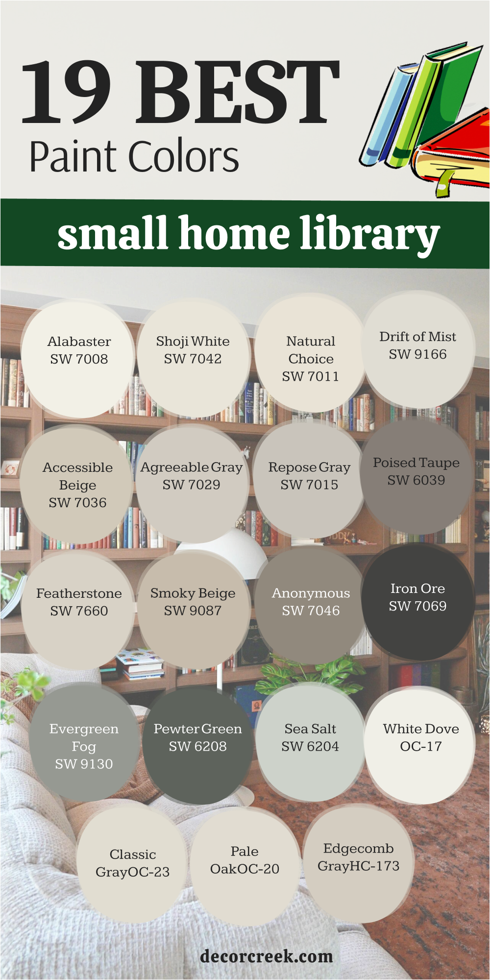
19 Best Paint Colors for the Small Home Library
Alabaster SW 7008
Alabaster SW 7008 is a creamy white that feels very soft on walls. This shade makes every small library look clean and very bright. It works well with dark wood because it has some warmth.
Many people choose this when they want a very homey look. This paint brightens up dark corners where the sun is low. The tone appears often in cozy homes because it looks so inviting.
It provides a perfect backdrop for family photos or old books. This white hides small marks better than a stark white paint. The color stays a favorite because it never feels too cold. It makes your library feel much larger and more welcoming today.
🎨 Check out the complete guide to this color right HERE 👈
Shoji White SW 7042
Shoji White SW 7042 is a creamy blend that feels very natural and soft. This paint adds a lot of comfort to a small library walls. It is a shade I recommend for rooms with wood floors.
The color feels very soft on the eyes in the evening. It creates a cozy feeling that welcomes you to sit down. This white works perfectly in homes that need a soft touch.
You will find it pairs nicely with warm wood on shelves. It is a smart choice because it hides dust very well. Many of my clients love this because it feels very stable. The paint is a reliable color that looks expensive and high-end.
🎨 Check out the complete guide to this color right HERE 👈
Natural Choice SW 7011
Natural Choice SW 7011 is a light tan that feels very organic today. This paint brings a bit of nature into your small home library. It is a shade I suggest for a very cozy look now.
The color looks wonderful with woven rugs and soft chairs. It creates a very soft transition between the different home rooms. This tan makes your reading room feel sturdy and well together.
It adds a layer of warmth that makes you want to stay. The paint is a great color that fits almost any furniture. Many homeowners choose this when they want a homey feeling. It is a very safe and smart pick for a library.
🎨 Check out the complete guide to this color right HERE 👈

Drift of Mist SW 9166
Drift of Mist SW 9166 is a very light gray that feels airy today. This selection is a fantastic alternative to white for a hallway. It makes white trim and door frames really stand out now.
The shade feels very modern without being too cold for a home. It works well in small rooms because it is not heavy. This choice pairs with almost any color of rug on the floor.
The pigment is very popular for people who like a clean look. It hides small scuffs better than a pure white paint would. This selection is a color many of my clients choose today. It makes your library look updated and very stylish for years.
🎨 Check out the complete guide to this color right HERE 👈

Accessible Beige SW 7036
Accessible Beige SW 7036 is a famous color for a very good reason. This shade is the perfect mix of gray and beige now. It is the tone I use when I want comfort in a room.
The color works with both warm wood and soft fabrics. It creates a very balanced look that feels very right. This paint makes your books look much more expensive than before.
It is a great choice if you want a cozy small room. Most people find this color very pleasing to live with daily. The pigment provides a solid foundation for any style of home. It is a winner for anyone who wants an invited room.
🎨 Check out the complete guide to this color right HERE 👈
Agreeable Gray SW 7029
Agreeable Gray SW 7029 is a popular gray for a home library today. This paint has a warm base that keeps it feeling cozy. It works in any lighting situation you have in your house.
The color makes small reading rooms look much more open now. This is a shade that buyers love when they visit homes. It goes well with white trim and dark wood shelves in a hall.
The choice is very safe if you want a warm gray. It helps your home look modern while still feeling very homey. This is a selection I recommend for a welcoming reading area. The paint will make your library look professionally designed and nice.
🎨 Check out the complete guide to this color right HERE 👈
Repose Gray SW 7015
Repose Gray SW 7015 is a cool gray that looks very sophisticated today. This tone has a tiny hint of blue that looks nice. It makes a home library feel very trendy and up to date.
The color is dark enough to show off white shelves. It works beautifully with light furniture and soft blue rugs. This paint is a shade that looks high-end in a room.
It stays looking fresh even when the evening lamps are on. The choice is a tool that helps your library feel clean. It is a great pick for rooms with black accents nearby. This selection gives your home a very polished and cozy look.
🎨 Check out the complete guide to this color right HERE 👈
Poised Taupe SW 6039
Poised Taupe SW 6039 is a blend of gray and brown today for a foyer. This selection makes a library feel very balanced and neutral. It works well with both warm wood and cool metal lamps.
The color provides a very versatile backdrop for any furniture style. It hides scuffs and dirt well in a family home area. This paint gives the room a very clean and nice appearance.
It looks very high-end on any wall surface in the house. The shade is a tool that helps people feel very organized. It pairs perfectly with white trim and gray-toned rugs on floors. This choice ensures your library is a very polished and invited room.
🎨 Check out the complete guide to this color right HERE 👈
Featherstone SW 9518
Featherstone SW 9518 is a light gray that feels very sophisticated today. This shade makes your small library look clean and very updated. It works well with white shelves because it has a soft tone.
Many people choose this when they want a very modern look. This paint brightens up the room even when the lights are low. The color appears often in new homes because it looks so inviting.
It provides a perfect backdrop for minimalist art or new books. This gray hides small marks better than a stark white paint. The color stays a favorite because it never feels too heavy. It makes your library feel much larger and very well designed.
🎨 Check out the complete guide to this color right HERE 👈
Smoky Beige SW 9087
Smoky Beige SW 9087 is a warm neutral that feels very elegant today. This paint adds a lot of depth to your small library walls. It is a shade I recommend for rooms with velvet chairs.
The color feels very rich on the eyes in the evening light. It creates a dream feeling that makes you want to read. This beige works perfectly in homes that need a luxury touch.
You will find it pairs nicely with gold accents on bookshelves. It is a smart choice because it looks very clean and polished. Many of my clients love this because it feels very high-end. The paint is a reliable color that looks expensive and rich.
🎨 Check out the complete guide to this color right HERE 👈
Anonymous SW 7046
Anonymous SW 7046 is a sophisticated mid-tone that blends gray and brown. This shade gives your small library a very grounded and sturdy feeling. It works wonderfully in rooms with stone floors or rustic beams.
The color provides a rich look that makes white trim stand out. This pigment is deep enough to hide the wear of a busy room. It creates a moody and executive atmosphere that feels high-end.
You will notice it changes its look depending on the time of day. This is a choice I make when I want to add character. It pairs nicely with leather furniture or brass light fixtures. This paint ensures your library looks like a solid and stylish place.
🎨 Check out the complete guide to this color right HERE 👈
Iron Ore SW 7069
Iron Ore SW 7069 is a very deep shade that looks very trendy today. This pigment creates a stunning contrast with light-colored reading chairs. It makes a small library feel very characteristic and special.
The color absorbs light and creates a very intimate mood for you. This choice is often applied for walls behind large book collections. It looks very rich with brass light fixtures or gold handles.
The shade helps hide all wall defects due to its dark base. It is picked by those who want a cozy and moody room. This dark paint feels like a very reliable and protective color. It turns an ordinary room into a piece of designer art.
🎨 Check out the complete guide to this color right HERE 👈
Evergreen Fog SW 9130
Evergreen Fog SW 9130 is a soft green with gray and blue now. This pigment brings a sense of living nature to your library. It looks very modern and is chosen for new home designs.
The shade helps create a very soft transition from other rooms. It perfectly combines with natural materials like linen or leather chairs. This selection makes the reading zone very fresh and very clean.
The paint is a great choice for those looking for a soft color. It causes a smile and pleasant thoughts in every reader who visits. This choice works well in both small and large library rooms. The color will be an ideal start for a cozy home.
🎨 Check out the complete guide to this color right HERE 👈
Pewter Green SW 6208
Pewter Green SW 6208 is a deep forest green with a noble character. This heavy tone makes the small library very solid and trustworthy. It looks great next to furniture made of natural dark wood.
The shade helps create the atmosphere of an old study room. It looks very saturated and does not fade in the sun. This paint is often used to create a cozy focus point.
It makes the walls very smooth and pleasant for guests to see. The selection is an ideal color for homes with lots of trees. It helps readers immediately tune into a serious and quiet mood. This choice turns an ordinary room into a high-level library.
🎨 Check out the complete guide to this color right HERE 👈
Sea Salt SW 6204
Sea Salt SW 6204 is a very light and airy color that changes tones. This paint makes a small library look bright and filled with air. It is ideally suited for very narrow and dark corridors or rooms.
The color creates a sense of cleanliness and order right away. It looks very gentle and pleasant under any type of indoor light. This selection is often chosen by me to create a light style.
It helps to visually push the walls apart and make the ceiling tall. The shade causes a feeling of joy and lightness in guests. It combines very well with white frames for photos on the walls. This choice turns your library into a bright and very pleasant place.
🎨 Check out the complete guide to this color right HERE 👈

White Dove OC-17
White Dove OC-17 is a soft white that feels very cozy today. This shade makes every library look clean and very bright for readers. It works well with all types of wood floors and traditional rugs.
The color has a tiny bit of warmth that keeps it friendly. It brightens up dark corners where the sun does not reach now. This paint provides a perfect backdrop for colorful book collections at home.
It hides small marks better than a very bright white paint would. The selection stays a favorite because it never clashes with furniture. It makes your library feel much larger than it actually is. This classic choice helps readers feel a sense of ease.
🎨 Check out the complete guide to this color right HERE 👈
Classic Gray OC-23
Classic Gray OC-23 is a very light gray that looks soft today. This paint is a fantastic alternative to white for your small library. It makes white bookshelves really stand out in the room.
The shade feels very modern without being too cold or harsh. It works well in small rooms because it feels very open. This choice pairs with almost any color of rug on the floor.
The pigment is very popular for people who like a simple look. It hides small scuffs better than a pure white paint would. This selection is a color many of my staging clients choose. It makes your library look updated and very stylish for years.
🎨 Check out the complete guide to this color right HERE 👈
Pale Oak OC-20
Pale Oak OC-20 is a warm greige that feels very organic today. This paint brings a bit of nature into your reading room walls. It is a shade I suggest for people who find gray too cold.
The color looks wonderful with indoor plants and light wood decor. It creates a very soft transition between the different home rooms. This choice makes your library feel sturdy and very well put together.
It adds a layer of warmth that makes you want to read books. The pigment is a great middle-ground color for any house style. Many homeowners choose this when they want a homey feeling. It is a very safe and smart pick for a library.
🎨 Check out the complete guide to this color right HERE 👈
Edgecomb Gray HC-173
Edgecomb Gray HC-173 is a rich and creamy gray that fits every house. This shade is the perfect mix of gray and beige for a foyer. It is the tone I use when I want a room to feel high-end.
The color works with both warm wood and cool gray furniture. It creates a very balanced look that does not lean too far. This paint makes your bookshelves look much more expensive than before.
It is a great choice if you are planning to sell soon. Most people find this color very pleasing and easy to live with. The pigment provides a solid foundation for any style of decoration. It is a winner for anyone who wants a beautiful library.
🎨 Check out the complete guide to this color right HERE 👈
My Final Thoughts About 32 Paint Color Ideas For The Home library
Painting your library is the fastest way to make your books look like a real collection and give them the respect they deserve. I always tell people that color is a powerful tool you can use to change how a house feels and how your family enjoys the living area. You do not need a huge budget or expensive renovations to make a big impact on your guests and your own daily happiness. A fresh coat of paint makes everything look cared for, clean, and intentional, which is exactly what a reading room needs to feel professional.
I hope these color choices help you find the specific shade that fits your personality and the unique architecture of your home. Remember to look at your paint samples in the morning light and under your lamps at night to see how the tone shifts. Once you pick the right shade, you will love walking through your door and seeing your private sanctuary waiting for you every single day. Your home is your special place for rest and thought, so make sure the library reflects that feeling of warmth and intelligence.
Investing in your reading room is a gift to yourself because it creates a zone where you can truly get away from the noise of the world. The right pigment on the walls helps your brain switch from work mode to relaxation mode as soon as you sit down with a story.
Choosing a high-quality paint ensures that your bookshelves remain the star of the show while the walls provide a sturdy and beautiful background.
I have seen how a simple change in hue can make an old room feel brand new and full of fresh energy for the homeowners.
You should feel a sense of pride every time you show your library to a visitor or settle in for a long night of reading. These evergreen colors are designed to stay in style so you do not have to worry about your home looking dated in a few years. Take your time with the decision, trust your gut, and enjoy the process of turning a plain room into a masterpiece. A library is more than just a place for books; it is a reflection of your dreams and your personal journey.
By picking the perfect color, you are making sure that journey happens in a space that is as beautiful as the stories on your shelves.