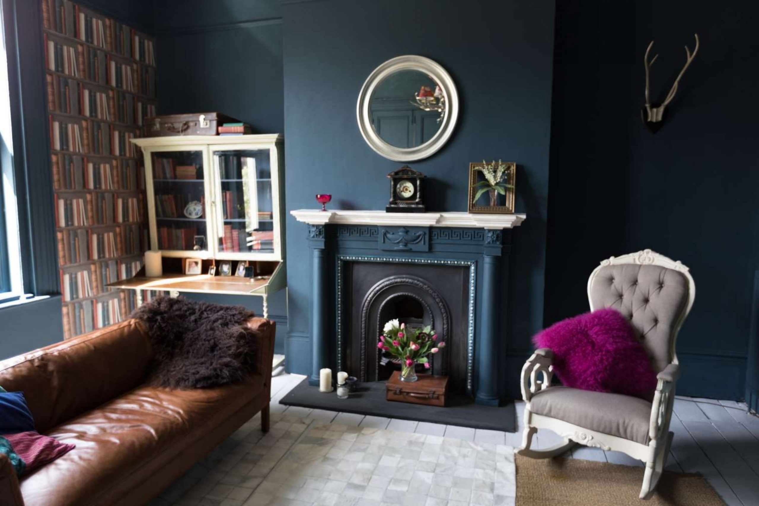
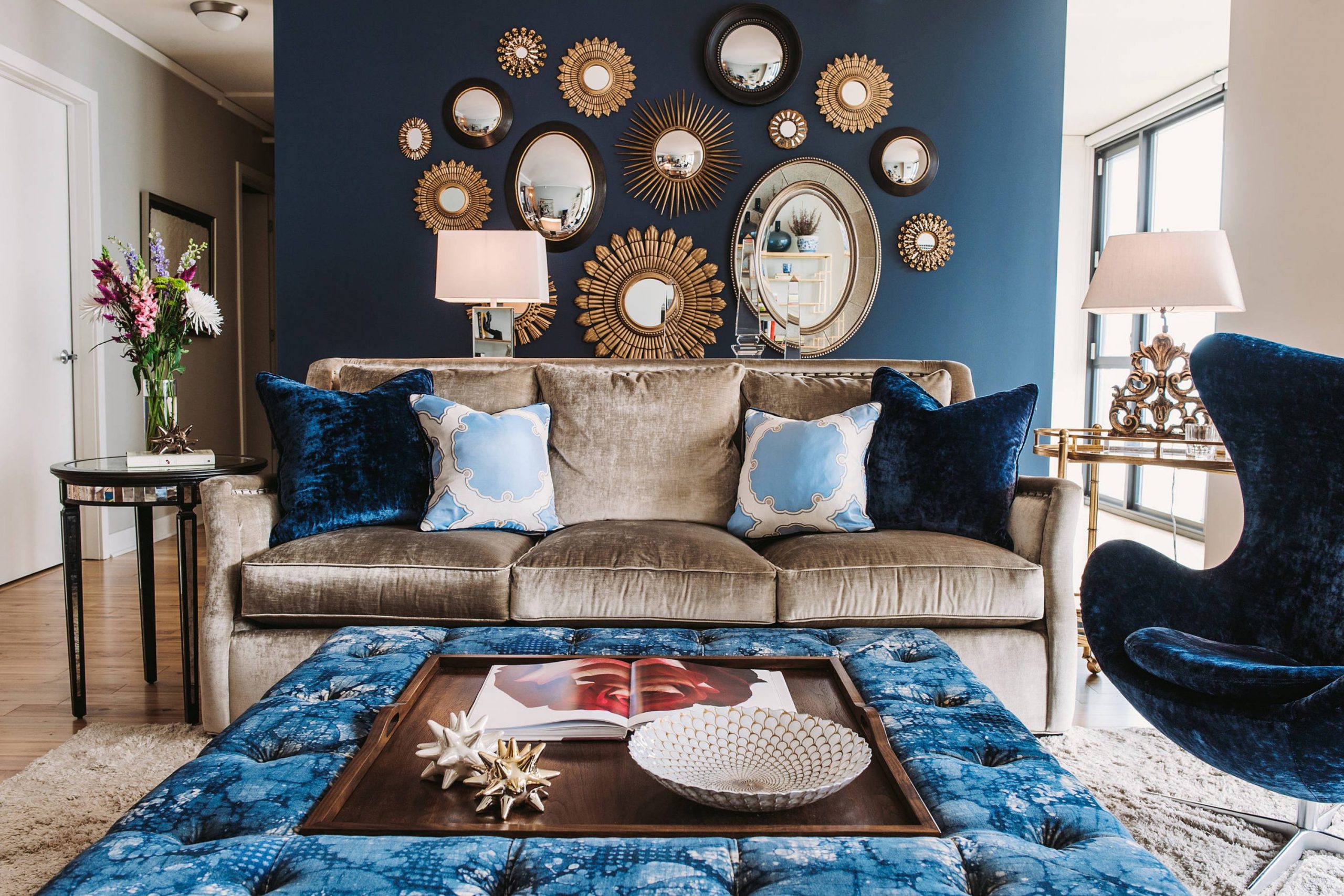
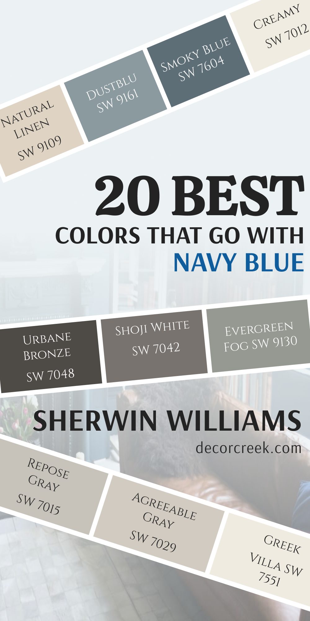
Navy blue is one of the paint colors I use again and again when I want a home to feel rich, stylish, and welcoming. It has a deep look that works beautifully with soft whites, warm neutrals, earthy greens, and even muted pink shades. I love how it can feel classic in one room and bold in another without looking too dark or heavy. The right paint color beside navy blue can completely change the feeling of a room and help every detail stand out in a better way.
I often use navy blue in living rooms, bedrooms, kitchens, bathrooms, and entryways because it gives furniture and decor a more finished look. It also works with many design styles, from farmhouse homes to modern interiors. Some colors make navy blue feel lighter and brighter, while others create a richer and moodier feeling.
Choosing the right match is what makes the whole room feel balanced and comfortable. In this article, I am sharing the paint colors I trust most when working with navy blue walls, cabinets, furniture, or decor.
These are the shades that always look beautiful in real homes and make rooms feel warm, layered, and inviting every day.
Why I Always Trust Sherwin-Williams and Benjamin Moore for the Best Paint Colors That Go With Navy Blue
I always trust Sherwin-Williams and Benjamin Moore because their paint colors have depth and richness that look beautiful beside navy blue. Their shades feel carefully made, and I notice that they stay beautiful in different lighting during the day. Some colors can look flat or dull next to navy blue, but these brands create shades with enough warmth or softness to keep the room feeling balanced.
I also love how easy it is to mix their paint colors with many decorating styles. Whether I am working on a cozy farmhouse home, a modern apartment, or a coastal bedroom, I can always find colors that work naturally with navy blue. Their whites feel soft instead of harsh, their grays feel warm instead of cold, and their greens add just enough earthy character without feeling too strong.
Another reason I trust these brands is because the finishes look rich on walls, cabinets, trim, and furniture. The paint coverage is smooth, and the colors stay consistent from room to room. That makes decorating easier and helps the whole home feel connected without trying too hard.
How I Choose the Perfect Paint Color to Pair With Navy Blue
I always start by thinking about the feeling I want the room to have before choosing a color beside navy blue. Some homes need lighter shades to help the room feel open and bright, while others need deeper tones for a richer and cozier look. Navy blue can work in many ways, so the supporting color matters a lot.
Lighting is another thing I always pay attention to when pairing colors with navy blue. Rooms with little sunlight usually look better with warm whites, creamy shades, or soft beige tones. Bright rooms can handle darker grays, earthy greens, and richer accent colors without feeling too heavy.
I also like to think about furniture, flooring, and wood tones before picking paint colors. Navy blue looks beautiful beside warm oak floors, black metal details, brass lighting, and natural fabrics. The paint color should help all those details feel connected instead of making the room feel busy or disconnected.
Testing paint samples is something I never skip. Colors can change a lot during the day, especially next to navy blue walls or cabinets. I always paint large sample areas and watch them in morning light, afternoon light, and evening light before making the final choice.
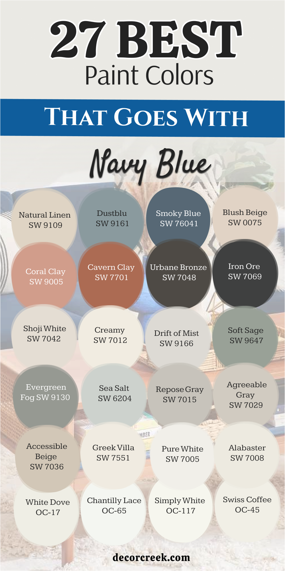
20 Top Paint Colors that go With Navy Blue From Sherwin Williams
Alabaster SW 7008
Alabaster SW 7008 is a soft creamy white that stops deep blues from looking too harsh or cold. This hue brings a gentle warmth to the walls without ever turning yellow.
I love using this shade on trim and ceilings to create a clean frame around a dark accent wall. It reflects just enough light to keep your room feeling bright and open. Many families choose this option because it feels cozy and welcoming the moment you step inside.
It works well in bright sunlit spaces and darker hallways alike. This balance makes it a safe choice for almost any layout. You will love how it softens the edges of your favorite dark blue furniture pieces.
Best used in: living rooms, kitchens, hallways, bedrooms, and farmhouse exteriors
Pairs well with: Iron Ore SW 7069, Agreeable Gray SW 7029, Natural Linen SW 9109, warm wood tones
The key rule of this color for farmhouse style is to use it where you want natural light to feel kind, soft, and inviting throughout the day.
🎨 Check out the complete guide to this color right HERE 👈

Pure White SW 7005
Pure White SW 7005 has a tiny drop of black in the formula to stop it from blinding your eyes. This slight tint creates a crisp contrast against deep blue without feeling like a cold hospital room.
I use this shade on kitchen cabinets when the island is painted a dark nautical hue. It gives a very clean look that makes everyday homes feel expensive and organized. It behaves well under both yellow lightbulbs and bright morning sunshine.
You do not have to worry about this shade clashing with your existing furniture or rugs. It acts like a clean slate that lets your accent colors do the talking.
Best used in: kitchens, bathrooms, modern living rooms, trim, and doors
Pairs well with: Black Magic SW 6991, Repose Gray SW 7015, Sea Salt SW 6204, dark metals
The key rule of this color for modern style is to use it on trim and doors to make your deep blue walls pop with sharp lines.
🎨 Check out the complete guide to this color right HERE 👈

Greek Villa SW 7551
Greek Villa SW 7551 is a rich white with a strong yellow and beige undertone. This paint makes cold rooms feel instantly warmer when paired with a deep navy accent wall.
I recommend this option for north-facing rooms that receive chilly, blue-toned natural light during the afternoon. It adds a sense of comfort that keeps dark walls from looking gloomy or depressing.
Your guests will notice how bright and cheerful the room feels when they visit. It mimics the look of sunny vacation homes by the sea. This shade bridges the gap between traditional style and modern design.
Best used in: bedrooms, living rooms, dining rooms, and entryways
Pairs well with: Urbane Bronze SW 7048, Accessible Beige SW 7036, Coastal Plain SW 6192, light oak
The key rule of this color for coastal style is to pair it with warm woods to keep your deep blue accents looking sunny and bright.
🎨 Check out the complete guide to this color right HERE 👈

Accessible Beige SW 7036
Accessible Beige SW 7036 is a true neutral that avoids looking like muddy brown or yellow cardboard. This shade provides a sandy backdrop that reminds people of a beautiful day at the beach.
I often paint main living areas this color to ground the sightlines against a dark blue fireplace. It hides dirt and fingerprints from kids and pets remarkably well. The gray undertone inside this beige keeps it looking modern instead of outdated.
It coordinates beautifully with linen curtains and woven baskets. This choice helps create a relaxed environment where your family can unwind after school.
Best used in: open concept family rooms, hallways, entryways, and traditional kitchens
Pairs well with: Alabaster SW 7008, Aesthetic White SW 7035, Urbane Bronze SW 7048, brass fixtures
The key rule of this color for traditional style is to use it on all four walls to let your navy blue furniture stand out.
🎨 Check out the complete guide to this color right HERE 👈

Agreeable Gray SW 7029
Agreeable Gray SW 7029 is the most popular neutral paint because it adapts to its surroundings instantly. This color has a perfect blend of brown and gray that balances out dark blue tones.
I use this hue to soften the transition between a bright hallway and a moody dark bedroom. It looks warm when the sun shines and cool when the sky turns cloudy outside. You will find that it matches almost any type of flooring from carpet to dark hardwood.
It keeps your home looking updated and fresh for buyers if you plan to sell. This paint makes decorating easy because it never fights with your accent pieces.
Best used in: living rooms, laundry rooms, dark basements, and rental properties
Pairs well with: Pure White SW 7005, Charcoal Blue SW 2739, Mega Greige SW 7031, silver hardware
The key rule of this color for transitional style is to apply it in large open areas to tie your blue accents together smoothly.
🎨 Check out the complete guide to this color right HERE 👈

Repose Gray SW 7015
Repose Gray SW 7015 contains slight hints of blue and purple hidden deep within its gray base. These cool undertones make it a natural best friend for dark navy blue accent pieces.
I like using this shade in bright bedrooms where you want a cool and restful atmosphere. It looks very sophisticated and high-end when paired with white baseboards and dark doors. The color changes gently throughout the day as the sun moves across the sky.
It provides a crisp backdrop that makes colorful artwork stand out on the wall. This hue is perfect for anyone who dislikes warm yellow tones in their paint.
Best used in: bedrooms, home offices, modern living areas, and bathrooms
Pairs well with: Eider White SW 7014, Iron Ore SW 7069, Naval SW 6244, polished chrome
The key rule of this color for contemporary style is to pair it with cool lighting to emphasize the crisp look of your blue walls.
🎨 Check out the complete guide to this color right HERE 👈

Sea Salt SW 6204
Sea Salt SW 6204 is a magical blend of green, gray, and a tiny splash of blue. This hue changes its look constantly depending on the windows and trees outside your home.
I love pairing this soft color with navy blue to create a coastal beach house feeling. It brightens up small bathrooms and makes laundry chores feel a little less boring. The gray base stops the green from looking too bright or like a kid’s playroom.
It brings a breath of fresh air into stuffy, dark corners of the house. This choice makes a great background for white furniture and light wood shelves.
Best used in: bathrooms, laundry rooms, sunrooms, and primary bedrooms
Pairs well with: High Reflective White SW 7757, Summit Gray SW 7669, Extra White SW 7006, wicker accents
The key rule of this color for spa-like style is to use it in rooms with lots of windows to maximize the fresh green tones.
🎨 Check out the complete guide to this color right HERE 👈

Evergreen Fog SW 9130
Evergreen Fog SW 9130 is a deep, chalky green that has a lot of gray mixed inside. This mid-tone shade creates a rich, organic look when placed next to a dark blue wall.
I suggest this combination for home offices where you want to feel focused and smart. It brings the colors of nature indoors without looking like a bright Christmas tree. The color feels very grounded, serious, and expensive when used on built-in bookshelves.
It works best in rooms that have enough lamps or natural light to keep things bright. This shade is perfect for creating a cozy, moody library feeling in your home.
Best used in: home offices, dining rooms, accent walls, and mudrooms
Pairs well with: Shoji White SW 7042, Bronze Accent SW 9642, Accessible Beige SW 7036, leather furniture
The key rule of this color for organic modern style is to mix it with real leather and dark blue textiles for a rich look.
🎨 Check out the complete guide to this color right HERE 👈

Soft Sage SW 9647
Soft Sage SW 9647 is a gentle muted green that feels quiet and down to earth. This color tones down the intense drama of dark blue and makes it feel friendlier.
I use this shade in guest bedrooms to make visitors feel welcome and comfortable during their stay. It reminds people of garden leaves and plants, which helps everyone feel more relaxed. The color stays soft even when bright afternoon sunlight hits the wall directly.
It pairs wonderfully with light linen curtains and light oak bedroom furniture sets. This is an excellent choice if you want to experiment with color instead of using plain gray.
Best used in: guest bedrooms, reading nooks, powder rooms, and cozy kitchens
Pairs well with: Alabaster SW 7008, Mindful Gray SW 7016, Naval SW 6244, natural wood tones
The key rule of this color for garden-inspired style is to combine it with botanical prints and dark blue throw pillows.
🎨 Check out the complete guide to this color right HERE 👈
Drift of Mist SW 9166
Drift of Mist SW 9166 is a very light, airy gray that carries no heavy yellow or blue undertones. This neutral shade keeps your walls looking bright without the stark look of regular white.
I paint this color in long hallways that lead into dark blue living rooms for contrast. It provides a soft transition that does not shock your eyes as you walk through the house. The paint has enough depth to stand out against bright white trim boards.
It hides small wall imperfections and plaster bumps better than shinier colors do. This hue makes a fantastic backdrop for displaying family photos in black frames.
Best used in: hallways, staircases, open floor plans, and small bedrooms
Pairs well with: Pure White SW 7005, Urbane Bronze SW 7048, In the Navy SW 9178, matte black fixtures
The key rule of this color for minimalist style is to use it as a soft backdrop that lets your navy blue furniture pieces shine.
🎨 Check out the complete guide to this color right HERE 👈

Creamy SW 7012
Creamy SW 7012 is a warm, velvety white that feels like vanilla ice cream on the wall. This color prevents dark blue accents from looking too cold or uninviting in the winter.
I recommend this shade for traditional living rooms with high ceilings and large rugs. It wraps the room in a gentle glow that makes people want to sit down and talk. The yellow base is soft enough that it never looks like bright neon gold.
It coordinates beautifully with antique furniture and oil-rubbed bronze door handles. This paint makes older homes look well-cared for and historic in a good way.
Best used in: traditional living rooms, dining rooms, historic homes, and ceilings
Pairs well with: Studio Rouge SW 7572, Balanced Beige SW 7037, Naval SW 6244, antique brass
The key rule of this color for traditional charm is to use it in rooms with warm lightbulbs to enhance the cozy feeling.
🎨 Check out the complete guide to this color right HERE 👈

Shoji White SW 7042
Shoji White SW 7042 sits right on the border between a warm white and a very light beige. This color gives your walls a soft look that changes depending on the time of day.
I use this shade when a client wants a clean look that still feels soft and cozy. It pairs beautifully with dark blue because it absorbs some of the dark contrast. The color looks rich and intentional instead of looking like cheap apartment paint.
It works wonderfully on both exterior siding and interior plaster walls. This paint makes your baseboards look bright white without buying extra trim paint.
Best used in: exterior siding, large living areas, entryways, and master suites
Pairs well with: Iron Ore SW 7069, Accessible Beige SW 7036, Naval SW 6244, dark walnut woods
The key rule of this color for warm modern style is to paint large walls with it to balance out a bold navy blue island.
🎨 Check out the complete guide to this color right HERE👈

Iron Ore SW 7069
Iron Ore SW 7069 is a dark charcoal black that stops just short of being pure ink. This moody shade creates an incredibly rich look when paired with deep navy blue walls.
I use this color on interior doors to make a plain hallway look like a luxury hotel. It creates a striking contrast that feels very high-end and designer-made. You need plenty of lamps or large windows to keep this dark mix from feeling heavy.
It grounds the room and makes light-colored furniture look like expensive artwork. This selection is perfect for anyone who loves dramatic, cozy spaces at night.
Best used in: interior doors, accent walls, theater rooms, and modern fireplaces
Pairs well with: Extra White SW 7006, Repose Gray SW 7015, Captivating SW 6583, gold metallic trim
The key rule of this color for dramatic modern style is to use it on window frames to frame your view against blue walls.
🎨 Check out the complete guide to this color right HERE 👈

Urbane Bronze SW 7048
Urbane Bronze SW 7048 is a warm dark gray infused with deep brown and green undertones. This color brings an earthy, grounded feeling when matched with a dark blue accent.
I love using this shade on cabinets or accent walls in homes with large wooden beams. It feels like a warm hug from nature because of the rich bronze look. The color hides scuffs and kitchen messes easily, making it great for busy families.
It looks best when mixed with natural textures like wool, linen, and stone. This paint adds a layer of sophistication that standard grays simply cannot match.
Best used in: accent walls, kitchen islands, home exteriors, and cozy dens
Pairs well with: Shoji White SW 7042, Agreeable Gray SW 7029, Naval SW 6244, warm brass accents
The key rule of this color for rustic modern style is to pair it with light stone to contrast your deep blue decorations.
🎨 Check out the complete guide to this color right HERE 👈

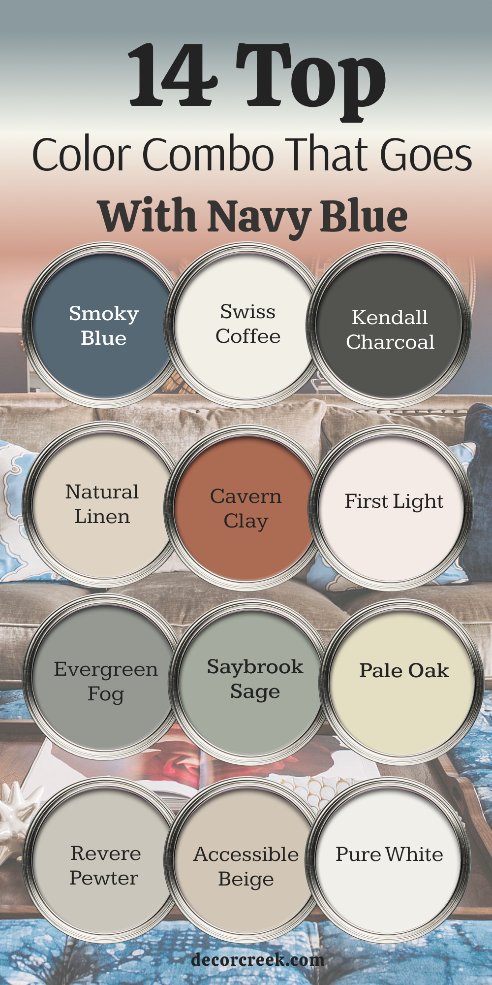
Cavern Clay SW 7701
Cavern Clay SW 7701 is a bright earthy terracotta that brings the warmth of the desert inside. This rusty orange shade is the direct opposite of blue on the color wheel.
I use this bold combination to create a vibrant look that feels energized and fun. It turns a boring dining room into an exciting conversation starter for dinner guests. The warm clay tones balance the cool nature of dark blue perfectly.
It looks amazing next to green house plants and natural leather chairs. This choice is wonderful for people who are not afraid of using bright colors.
Best used in: dining rooms, accent walls, creative offices, and front doors
Pairs well with: Origami White SW 7636, Distance SW 6243, Balanced Beige SW 7037, matte black iron
The key rule of this color for southwestern style is to use it as a statement wall behind a dark blue sofa or bed.
🎨 Check out the complete guide to this color right HERE 👈

Coral Clay SW 9005
Coral Clay SW 9005 is a softer pinkish orange that feels cheerful and lighthearted. This friendly shade takes away the serious look of dark blue and adds a playful touch.
I find this color works wonderfully in girls’ bedrooms or creative craft spaces. It brings a bright energy that makes you feel happy as soon as you walk in.
The color avoids looking like cheap bubblegum because of its earthy clay undertones. It coordinates nicely with white furniture and gold picture frames. This paint choice shows off your unique personality and design flair.
Best used in: girls’ bedrooms, craft rooms, powder bathrooms, and playful entryways
Pairs well with: Pure White SW 7005, Repose Gray SW 7015, In the Navy SW 9178, light gold accents
The key rule of this color for playful modern style is to use it on accent pieces to brighten up dark blue walls.
🎨 Check out the complete guide to this color right HERE 👈
Blush Beige SW 0075
Blush Beige SW 0075 is a very soft tan color with a noticeable pink undertone. This shade looks incredibly elegant when paired with a deep navy blue velvet sofa.
I use this color to create a chic look that feels upscale and modern. It gives the walls a warm glow that makes skin tones look great in bathroom mirrors.
The pink tint is gentle enough that your husband will still like the room. It acts like a warm neutral that is much more interesting than plain beige. This color makes small rooms feel open while keeping them very cozy.
Best used in: primary bathrooms, walk-in closets, bedrooms, and chic boutiques
Pairs well with: Alabaster SW 7008, Urban Bronze SW 7048, Naval SW 6244, brushed gold hardware
The key rule of this color for elegant style is to use it in rooms with gold mirrors to highlight the warm pink tones.
Smoky Blue SW 7604
Smoky Blue SW 7604 is a medium-dark blue that has a heavy dose of gray mixed inside. This shade allows you to create a beautiful look by layering different blues in one room.
I use this color on the walls when the room features dark navy blue curtains and rugs. It creates a rich look that feels cohesive without looking like a single flat color block.
The gray undertone prevents the room from looking like a bright blue sky or a boy’s nursery. It works best in rooms with large windows that let in plenty of daylight. This choice creates a very handsome look in home libraries and studies.
Best used in: home libraries, dining rooms, accent walls, and boys’ bedrooms
Pairs well with: Extra White SW 7006, Drift of Mist SW 9166, Iron Ore SW 7069, rich walnut wood
The key rule of this color for monochromatic style is to use lighter gray rugs to break up the different blue shades.
🎨 Check out the complete guide to this color right HERE 👈

Dustblu SW 9161
Dustblu SW 9161 is a soft pastel blue-gray that feels very historical and classic. This muted shade offers a softer option for people who love blue but want a lighter wall color.
I paint this color in guest bathrooms to create a clean look that feels fresh and tidy. It coordinates wonderfully with dark blue floor tiles or a navy blue vanity cabinet. The gray base stops the color from looking too bright or overwhelming on large walls.
It brings a quiet dignity to older homes with historic architectural details. This paint looks beautiful next to crisp white towels and silver faucets.
Best used in: bathrooms, laundry rooms, entryways, and traditional bedrooms
Pairs well with: High Reflective White SW 7757, Agreeable Gray SW 7029, Naval SW 6244, polished nickel
The key rule of this color for classic style is to pair it with bright white trim to make the blue-gray pop.
🎨 Check out the complete guide to this color right HERE 👈
Natural Linen SW 9109
Natural Linen SW 9109 is a warm sandy neutral that mimics the look of real flax fabric. This color adds a wonderful texture feeling to the walls when paired with dark blue accents.
I use this shade in open living rooms to create a relaxed backdrop for blue pillows and chairs. It feels down-to-earth and comfortable, making guests feel right at home immediately. The yellow undertone is very mild, so it never looks like yellow mustard on your walls.
It hides dust and wear from busy family life better than bright white paint does. This selection makes your home feel cozy and grounded throughout the year.
Best used in: family rooms, breakfast nooks, hallways, and casual dining areas
Pairs well with: Pure White SW 7005, Accessible Beige SW 7036, Naval SW 6244, woven wood shades
The key rule of this color for casual style is to use it on your main walls to let your navy blue accents feel cozy.
🎨 Check out the complete guide to this color right HERE 👈

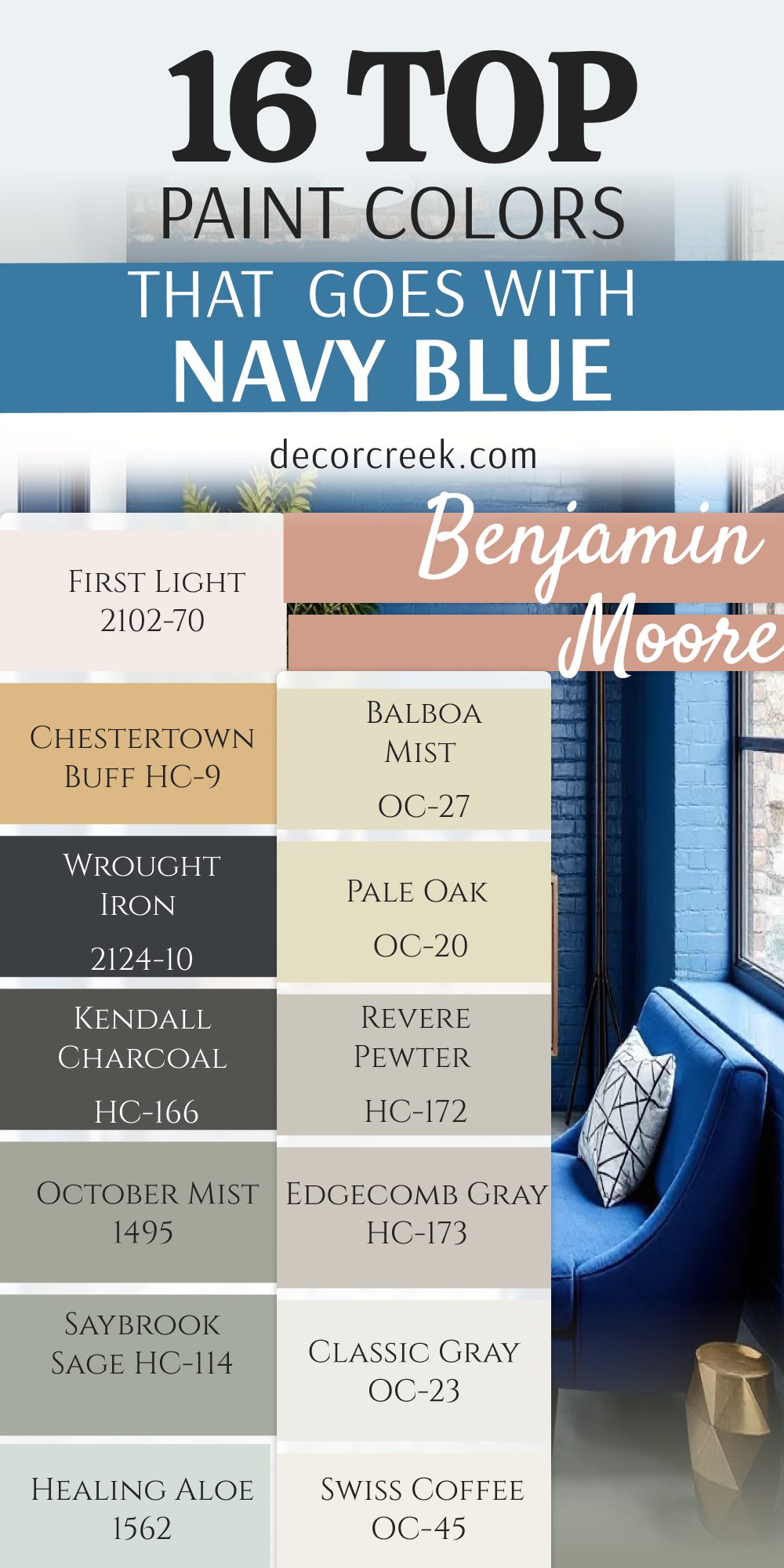
16 Top Paint Colors that go With Navy Blue from Benjamin Moore
White Dove OC-17
White Dove OC-17 is a famous white paint that features a tiny hint of gray and yellow. This balanced formula makes it look soft and welcoming next to dark navy blue trim boards.
I choose this color for open living areas because it never looks harsh under bright sun. It creates a clean look that softens the sharp contrast of dark accent pieces.
The paint has just enough depth to stand out against bright white window frames. It makes small spaces feel larger while keeping a very cozy feeling inside the home. This color is a safe bet for any room in your house.
Best used in: open concept spaces, kitchens, trim, ceilings, and traditional exteriors
Pairs well with: Revere Pewter HC-172, Hale Navy HC-154, Kendall Charcoal HC-166, dark stained wood
The key rule of this color for classic design is to paint your walls and trim the same shade to let blue accents pop.
🎨 Check out the complete guide to this color right HERE 👈

Chantilly Lace OC-65
Chantilly Lace OC-65 is the cleanest, brightest white paint you can buy from this brand. This shade has no secret undertones of yellow, green, or blue hiding inside it.
I use this color when I want a sharp look that feels like a modern art gallery. It creates the ultimate contrast against dark navy blue walls or custom cabinets. The color makes your rooms feel incredibly bright, clean, and completely updated.
It works best in homes with large windows and lots of natural sunshine. You will love how it makes your blue furniture look crisp and brand new.
Best used in: modern kitchens, contemporary living rooms, baseboards, and dark hallways
Pairs well with: Black Beauty 2128-10, Hale Navy HC-154, Gray Owl OC-52, stainless steel accents
The key rule of this color for modern style is to use it on trim to create a crisp border against blue walls.
🎨 Check out the complete guide to this color right HERE 👈

Simply White OC-117
Simply White OC-117 is a bright white paint that has a tiny touch of warm yellow inside. This small warmth keeps the bright color from looking like cold winter snow or ice.
I love using this shade on kitchen cabinets when the kitchen island features a navy color. It makes the entire kitchen feel happy, bright, and ready for family breakfast times. The paint glows beautifully when you turn on your warm evening lamps.
It provides a clean background that lets your colorful dishware show off on open shelves. This color makes any dark corner feel instantly bigger and friendlier.
Best used in: kitchens, dark basements, small bathrooms, and window trim
Pairs well with: Silver Half Dollar 2121-40, Hale Navy HC-154, Edgecomb Gray HC-173, warm brass
The key rule of this color for cheerful style is to use it in dark rooms to reflect light back onto blue furniture.
🎨 Check out the complete guide to this color right HERE 👈

Swiss Coffee OC-45
Swiss Coffee OC-45 is a rich creamy white that feels soft, warm, and very traditional. This color takes away the cold edge from dark blue walls and adds instant comfort.
I recommend this shade for cozy living rooms where your family gathers to watch movies. It looks like heavy cream and makes the room feel expensive and high-quality. The color behaves beautifully in rooms that do not get much natural afternoon sunshine.
It coordinates wonderfully with large wool rugs and oil-rubbed bronze floor lamps. This paint creates a classic look that will never go out of style.
Best used in: traditional bedrooms, cozy living rooms, dining spaces, and entryways
Pairs well with: Chelsea Gray HC-168, Shaker Beige HC-45, Hale Navy HC-154, antique bronze
The key rule of this color for cozy traditional style is to use it in rooms with lots of fabric and blue textures.
🎨 Check out the complete guide to this color right HERE 👈

Classic Gray OC-23
Classic Gray OC-23 is a very light gray that almost looks like white in bright rooms. This soft shade provides just enough color to make white baseboards stand out clearly.
I use this hue on living room walls to balance out a dark navy blue fireplace mantle. It feels clean and modern without looking like a cold industrial factory or garage. The paint has a tiny warm undertone that keeps it looking friendly in winter weather.
It coordinates nicely with both silver light fixtures and warm gold picture frames. This choice makes your home feel open, airy, and very well coordinated.
Best used in: open floor plans, master bedrooms, bright kitchens, and long hallways
Pairs well with: Simply White OC-117, Kendall Charcoal HC-166, Hale Navy HC-154, light maple floors
The key rule of this color for soft modern style is to use it as a main wall color to connect blue accent rooms.
🎨 Check out the complete guide to this color right HERE 👈

Edgecomb Gray HC-173
Edgecomb Gray HC-173 is a beautiful blend of gray and beige that designers call greige. This mid-tone color adds a rich backdrop that makes dark blue sofas look amazing.
I paint this color in master bedrooms to create a relaxing environment for sleeping. It feels grounded and reliable, changing from warm to cool depending on your lightbulbs. The color hides minor wall scuffs from children and pets extremely well over time.
It pairs perfectly with natural wood elements like oak tables and wicker baskets. This shade makes your home feel cozy without looking dark or small.
Best used in: master bedrooms, family rooms, dining areas, and transitional spaces
Pairs well with: White Dove OC-17, Revere Pewter HC-172, Hale Navy HC-154, natural white oak
The key rule of this color for transitional style is to pair it with light oak wood to balance blue decor.
🎨 Check out the complete guide to this color right HERE 👈

Revere Pewter HC-172
Revere Pewter HC-172 is a historic gray paint that features strong warm beige undertones. This color is a classic choice that has been popular with homeowners for decades.
I use this shade to ground large living spaces that feature bold dark blue accent walls. It has enough color depth to make a statement without taking attention away from your blue. The paint looks rich and sophisticated in traditional homes with large crown molding boards.
It creates a warm environment that makes people want to sit down and chat. This hue works wonderfully with antique decorations and brass hardware pieces.
Best used in: traditional living rooms, open entryways, large kitchens, and home exteriors
Pairs well with: Chantilly Lace OC-65, Chelsea Gray HC-168, Hale Navy HC-154, dark cherry wood
The key rule of this color for historic style is to use it on all walls to create a warm frame for blue art.
🎨 Check out the complete guide to this color right HERE 👈

Pale Oak OC-20
Pale Oak OC-20 is a delicate, light greige paint that reminds people of white oak trees. This soft color brings a quiet elegance that matches beautifully with dark blue accents.
I love using this shade in small nurseries or bedrooms to keep the space bright. It acts like a warm blanket on the walls, making the room feel soft and protected. The color does not turn yellow or purple when the sun goes down in the evening.
It makes a beautiful background for displaying white pottery and dark blue linen pillows. This choice is perfect for a clean, organic look in your home.
Best used in: nurseries, small bedrooms, home offices, and modern bathrooms
Pairs well with: White Dove OC-17, Wrought Iron 2124-10, Hale Navy HC-154, linen fabrics
The key rule of this color for organic style is to use it where you want a clean look that still feels warm next to blue.
🎨 Check out the complete guide to this color right HERE 👈

Balboa Mist OC-27
Balboa Mist OC-27 is a light, clean gray that carries a very slight purple undertone inside. This cool tint makes it pair naturally with dark navy blue curtains and furniture pieces.
I paint this color in bright south-facing rooms to balance out strong yellow afternoon sunshine. It looks fresh and modern, giving your walls a neat appearance that buyers love. The paint provides a beautiful contrast against bright white baseboards and window trim.
It helps small spaces feel open and windy like a fresh coastal morning breeze. This color keeps your home looking updated, sleek, and high-end.
Best used in: bright living rooms, modern kitchens, guest bathrooms, and entryways
Pairs well with: Chantilly Lace OC-65, Revere Pewter HC-172, Hale Navy HC-154, polished chrome
The key rule of this color for sleek modern style is to use it in bright rooms to emphasize the cool blue tones.
🎨 Check out the complete guide to this color right HERE 👈

Healing Aloe 1562
Healing Aloe 1562 is a soft light green paint mixed with plenty of gray and blue. This refreshing color makes your home feel like a quiet garden morning after a rainy night.
I use this shade in guest bathrooms to make the space feel clean and welcoming for visitors. It coordinates perfectly with dark blue floor tiles and white porcelain sink basins. The color stays soft on the wall and never looks like a bright green lime or apple.
It brings an outdoor freshness into dark rooms that lack big windows or sunshine. This choice makes daily chores feel a little lighter and more pleasant.
Best used in: bathrooms, laundry rooms, bedrooms, and sunny reading nooks
Pairs well with: Simply White OC-117, Boothbay Gray HC-165, Hale Navy HC-154, silver plumbing fixtures
The key rule of this color for fresh style is to pair it with white towels to make your blue accent tiles pop.
🎨 Check out the complete guide to this color right HERE 👈

Saybrook Sage HC-114
Saybrook Sage HC-114 is a traditional mid-tone green that carries a lot of silver gray inside. This historic shade creates a handsome look when matched with a dark navy blue accent wall.
I recommend this color for formal dining rooms where you want a serious, elegant feeling. It brings the colors of nature indoors in a way that feels rich and very mature. The paint looks beautiful next to dark mahogany furniture and large gold-framed mirrors.
It holds its deep color well in both bright sun and dim evening lamplight. This selection adds a layer of classic design history to any room.
Best used in: formal dining rooms, front doors, historic living rooms, and home exteriors
Pairs well with: White Dove OC-17, Revere Pewter HC-172, Hale Navy HC-154, rich gold accents
The key rule of this color for historic elegance is to use it with rich gold frames and blue seat cushions.
🎨 Check out the complete guide to this color right HERE 👈

October Mist 1495
October Mist 1495 is a soft earthy sage green that serves as a gentle neutral backdrop. This color mimics the look of wild moss growing on a tree trunk in the forest.
I use this shade to soften the look of a bold navy blue kitchen island or cabinet set. It creates a relaxed look that makes your family feel comfortable while cooking dinner together. The color coordinates beautifully with natural stone countertops and gold cabinet handles.
It keeps your walls looking interesting without using standard gray or beige paint colors. This choice brings a nice organic touch into a modern suburban home.
Best used in: kitchens, mudrooms, family rooms, and casual entryways
Pairs well with: Steam AF-15, Kendall Charcoal HC-166, Hale Navy HC-154, natural wood elements
The key rule of this color for organic style is to pair it with real plants and dark blue pottery items.
🎨 Check out the complete guide to this color right HERE 👈

Kendall Charcoal HC-166
Kendall Charcoal HC-166 is a deep dark gray that feels rich, moody, and very luxurious. This heavy shade creates a dramatic look when paired with deep navy blue built-in shelves.
I like using this color in small media rooms to create a cozy theater feeling for movie nights. It makes the walls recede into the shadows, letting your television or artwork stand out. You need to use bright white trim to keep this dark color mix looking intentional and sharp.
It feels very high-end and modern when mixed with bright gold light fixtures. This choice is perfect for creating a special destination room in your house.
Best used in: theater rooms, home offices, accent walls, and powder bathrooms
Pairs well with: Simply White OC-117, Classic Gray OC-23, Hale Navy HC-154, brass lighting
The key rule of this color for moody modern style is to use bright lamps to create beautiful wall shadows.
🎨 Check out the complete guide to this color right HERE 👈

Wrought Iron 2124-10
Wrought Iron 2124-10 is a soft black paint that features heavy blue and gray undertones. This color looks like old metalwork and brings a lot of weight to a room.
I paint this color on accent walls behind dark blue beds to create a rich layered look. It feels softer than pure black paint, making it friendlier for standard residential homes. The color looks amazing on exterior front doors to give your house a great first impression.
It requires plenty of natural light or white rugs to balance the deep dark tones. This paint choice makes your home feel instantly updated, bold, and designer-styled.
Best used in: front doors, accent walls, fireplaces, and modern window frames
Pairs well with: Chantilly Lace OC-65, Pale Oak OC-20, Hale Navy HC-154, light natural woods
The key rule of this color for bold modern style is to use it on your fireplace to anchor a blue living room.
🎨 Check out the complete guide to this color right HERE 👈

Chestertown Buff HC-9
Chestertown Buff HC-9 is a warm historic yellow that looks like rich honey or spun gold. This traditional color provides a bright contrast against deep navy blue accents.
I use this combination in dark dining rooms to create a warm, sunny feeling for meals. The gold tones bring out the beautiful depth of dark blue furniture and decorations. It avoids looking like bright caution-sign yellow because of its warm brown base undertones.
This paint looks fantastic when paired with old oil paintings and dark wood dining tables. It makes your home feel historic, proud, and very welcoming to guests.
Best used in: traditional dining rooms, historic entryways, kitchens, and cozy libraries
Pairs well with: White Dove OC-17, Edgecomb Gray HC-173, Hale Navy HC-154, antique furniture
The key rule of this color for traditional warmth is to use it with dark blue rugs to create a classic look.
🎨 Check out the complete guide to this color right HERE 👈
First Light 2102-70
First Light 2102-70 is a very light pastel pink that feels fresh, airy, and modern. This clean shade updates the look of dark blue and makes it feel trendy and young.
I use this color in girls’ nurseries or chic home offices for a bright look. It provides a soft wash of color that is much more exciting than standard white walls. The pink stays clean and does not look like cheap candy because of its cool undertones.
It coordinates beautifully with white fluffy rugs and modern gold desk accessories. This paint choice brings a happy smile to your face whenever you see it.
Best used in: nurseries, female home offices, walk-in closets, and modern bedrooms
Pairs well with: Simply White OC-117, Classic Gray OC-23, Hale Navy HC-154, modern gold hardware
The key rule of this color for chic modern style is to use it on all four walls with a dark blue accent chair.
🎨 Check out the complete guide to this color right HERE 👈

14 Top Paint Color Combo that Goes With Navy Blue
Navy Blue SW 6244 + Alabaster SW 7008
Navy Blue SW 6244 and Alabaster SW 7008 combine to make a classic farmhouse look that feels warm and family-friendly.
The creamy white walls soften the dark blue island in a bright kitchen space. I use this mix to create a comfortable home environment that never feels cold or too stiff.
Best used in: kitchens, living rooms, and open family areas
Pairs well with: warm oak flooring, black iron lights, and woven storage baskets
The key rule of this color combo is to use the white on large walls and the blue on a single accent piece.
Navy Blue SW 6244 + Pure White SW 7005
Navy Blue SW 6244 and Pure White SW 7005 create a sharp contrast that looks very clean and tailored.
This pairing works perfectly for modern coastal homes that want a bright beach house feeling. I recommend this combo for trim boards and baseboards to frame your deep accent colors sharply.
Best used in: bathrooms, modern entryways, and exterior trim work
Pairs well with: polished chrome faucets, gray tile floors, and bright natural sunshine
The key rule of this color combo is to use crisp lighting to highlight the clean lines between the shades.
Navy Blue SW 6244 + Accessible Beige SW 7036
Navy Blue SW 6244 and Accessible Beige SW 7036 bring a sandy beach look into your traditional living room.
The warm beige walls ground the dark blue curtains and furniture pieces beautifully. I select this mix for families who want a cozy home that hides daily dirt and footprints easily.
Best used in: open concept family rooms, traditional dens, and main hallways
Pairs well with: linen sofa fabrics, dark walnut tables, and oil-rubbed bronze hardware
The key rule of this color combo is to use warm wood furniture to connect the beige walls with the blue decor.
Navy Blue SW 6244 + Revere Pewter HC-172
Navy Blue SW 6244 and Revere Pewter HC-172 offer a rich historic look that feels very mature and stable.
The deep greige wall color provides a substantial background for dark blue accent pieces and art frames. I love this combination in older homes with traditional architectural details like crown molding.
Best used in: formal dining rooms, historic entryways, and traditional living areas
Pairs well with: brass candle holders, antique oriental rugs, and dark stained wood doors
The key rule of this color combo is to use large gold frames on the walls to tie the rich colors together.
Navy Blue SW 6244 + Pale Oak OC-20
Navy Blue SW 6244 and Pale Oak OC-20 create a soft look that feels very high-end and elegant.
The light oak-toned walls keep small bedrooms looking bright while balancing a dark accent wall behind the bed headboard. I choose this mix when a client wants a clean look that still feels warm.
Best used in: primary bedrooms, home offices, and modern nurseries
Pairs well with: white bedding sheets, light oak dressers, and brushed gold lamps
The key rule of this color combo is to use light-colored fabrics to keep the bedroom feeling bright and open.
Navy Blue SW 6244 + Saybrook Sage HC-114
Navy Blue SW 6244 and Saybrook Sage HC-114 bring a traditional garden look inside your dining space.
The muted green walls soften the deep blue furniture fabrics for a handsome appearance. I recommend this combination for homeowners who love classic design and outdoor plant themes.
Best used in: formal dining rooms, front porches, and historic home libraries
Pairs well with: botanical artwork prints, mahogany tables, and bright white window trim
The key rule of this color combo is to use bright white trim to separate the green and blue colors cleanly.
Navy Blue SW 6244 + Evergreen Fog SW 9130
Navy Blue SW 6244 and Evergreen Fog SW 9130 make a dark organic look that feels very modern and thoughtful.
The chalky green-gray walls create a rich environment when placed next to dark blue built-in shelves. I use this combo to design cozy rooms where you can read books or study.
Best used in: home offices, cozy dens, and modern accent walls
Pairs well with: brown leather chairs, natural stone coasters, and warm matte black iron
The key rule of this color combo is to add plenty of warm lamps to keep the dark walls looking rich at night.
Navy Blue SW 6244 + First Light 2102-70
Navy Blue SW 6244 and First Light 2102-70 create a trendy look that feels fun, bright, and very stylish.
The pale pink background makes the dark blue furniture pieces look interesting and fresh instead of boring. I find this combination works beautifully for young professionals or teenage girls’ bedrooms.
Best used in: girls’ bedrooms, creative home offices, and chic walk-in closets
Pairs well with: modern white desks, gold picture frames, and fluffy white area rugs
The key rule of this color combo is to use the pink as a soft background wall color for blue furniture.
Navy Blue SW 6244 + Cavern Clay SW 7701
Navy Blue SW 6244 and Cavern Clay SW 7701 offer a bold contrast based on opposite sides of the color wheel.
The rusty terracotta walls bring an amazing warmth that balances out the cool dark blue paint. I use this exciting mix to create a statement room that feels alive and full of creative energy.
Best used in: dining rooms, creative workspaces, and bold accent walls
Pairs well with: green tropical houseplants, natural leather cushions, and black iron fixtures
The key rule of this color combo is to use neutral white ceilings to give your eyes a break from the bold hues.
Navy Blue SW 6244 + Natural Linen SW 9109
Navy Blue SW 6244 and Natural Linen SW 9109 create a casual look that feels like a relaxed weekend getaway.
The warm linen walls provide a down-to-earth backdrop for dark blue throw pillows and striped rugs. I use this combination to make large open family spaces feel comfortable and welcoming.
Best used in: family rooms, breakfast nooks, and casual country entryways
Pairs well with: woven wood window shades, white slipcovered sofas, and light pine flooring
The key rule of this color combo is to use textured fabrics to enhance the casual beach house feeling.
Navy Blue SW 6244 + Kendall Charcoal HC-166
Navy Blue SW 6244 and Kendall Charcoal HC-166 create a rich look that feels incredibly high-end and designer-made.
The dark charcoal walls blend with the deep blue accents to make a dark environment for sleeping or watching movies. I suggest this moody mix for people who love dramatic and cozy rooms.
Best used in: home theater rooms, small dark bedrooms, and modern powder bathrooms
Pairs well with: bright white ceiling paint, polished silver handles, and modern track lighting
The key rule of this color combo is to use a bright white ceiling to keep the dark room from looking short.
Navy Blue SW 6244 + Brass Gold
Navy Blue SW 6244 and Brass Gold combine to create a beautiful look that feels like expensive jewelry.
The shiny metallic gold accents make the dark blue walls look incredibly rich and sophisticated. I always use gold light fixtures and mirror frames when staging a dark blue bathroom space.
Best used in: powder rooms, master bathrooms, and elegant dining spaces
Pairs well with: white marble countertops, large glass mirrors, and clean white towels
The key rule of this color combo is to use real metal pieces instead of gold paint to get the best shine.
Navy Blue SW 6244 + Swiss Coffee OC-45
Navy Blue SW 6244 and Swiss Coffee OC-45 create a traditional look that wraps your family in comfort.
The rich creamy white walls stop the dark blue accent features from looking too cold or harsh during cloudy days. I recommend this safe combination for traditional living rooms and master suites.
Best used in: traditional living rooms, cozy master suites, and welcoming entryways
Pairs well with: thick wool rugs, antique bronze lamps, and comfortable family sofas
The key rule of this color combo is to use warm yellow lightbulbs to make the creamy white walls glow softly.
Navy Blue SW 6244 + Smoky Blue SW 7604
Navy Blue SW 6244 and Smoky Blue SW 7604 create a handsome look using different shades of the same base color.
The medium blue-gray walls layer beautifully with dark blue curtains and rugs for a cohesive design. I use this professional mix to create quiet study rooms that feel serious and organized.
Best used in: home libraries, men’s studies, and boys’ bedrooms
Pairs well with: light gray carpets, dark walnut desks, and silver desk lamps
The key rule of this color combo is to use a light gray rug to separate the blue walls from your flooring.
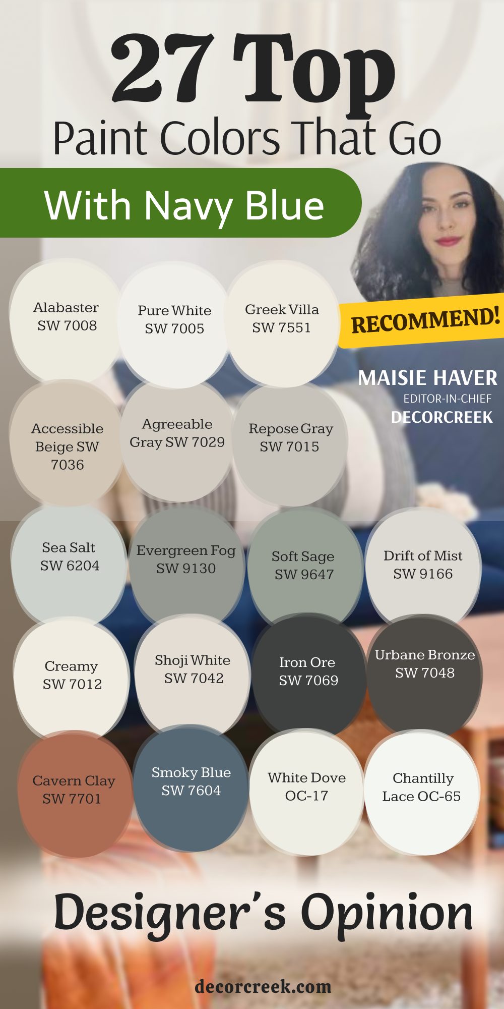
27 Top Paint Colors that go With Navy Blue | Designer’s Opinion
Alabaster SW 7008
Alabaster SW 7008 is my favorite choice for creating a warm farmhouse look next to dark blue accents.
This color gives a soft look that makes people feel comfortable as soon as they step inside. I always recommend it for main living areas because it never turns cold or harsh under bright sun.
Best used in: living rooms, kitchens, hallways, bedrooms, and farmhouse exteriors
Pairs well with: Iron Ore SW 7069, Agreeable Gray SW 7029, Natural Linen SW 9109, warm wood tones
The key rule of this color for farmhouse style is to use it where you want natural light to feel kind, soft, and inviting throughout the day.
🎨 Check out the complete guide to this color right HERE 👈
Pure White SW 7005
Pure White SW 7005 is the best option when you want a clean look without blinding your family with bright paint.
This shade features a tiny drop of black that stops it from looking like a cold hospital room. I use it on kitchen trim to frame dark blue lower cabinets perfectly.
Best used in: kitchens, bathrooms, modern living rooms, trim, and doors
Pairs well with: Black Magic SW 6991, Repose Gray SW 7015, Sea Salt SW 6204, dark metals
The key rule of this color for modern style is to use it on trim and doors to make your deep blue walls pop with sharp lines.
🎨 Check out the complete guide to this color right HERE 👈
Greek Villa SW 7551
Greek Villa SW 7551 works wonders in dark rooms that need an extra boost of warmth and light.
This rich white paint carries yellow undertones that balance the cool nature of dark blue walls. I suggest this choice for north-facing bedrooms that get cold afternoon shadows.
Best used in: bedrooms, living rooms, dining rooms, and entryways
Pairs well with: Urbane Bronze SW 7048, Accessible Beige SW 7036, Coastal Plain SW 6192, light oak
The key rule of this color for coastal style is to pair it with warm woods to keep your deep blue accents looking sunny and bright.
🎨 Check out the complete guide to this color right HERE 👈
Accessible Beige SW 7036
Accessible Beige SW 7036 provides a reliable sandy background that reminds people of a beach vacation home.
This neutral color grounds large living areas and matches beautifully with dark blue accent walls. I love how it hides daily dirt and fingerprints from kids and pets.
Best used in: open concept family rooms, hallways, entryways, and traditional kitchens
Pairs well with: Alabaster SW 7008, Aesthetic White SW 7035, Urbane Bronze SW 7048, brass fixtures
The key rule of this color for traditional style is to use it on all four walls to let your navy blue furniture stand out.
🎨 Check out the complete guide to this color right HERE 👈
Agreeable Gray SW 7029
Agreeable Gray SW 7029 is a fantastic neutral paint that helps connect different colored rooms in your house.
This tone has a perfect blend of beige and gray that handles dark blue accents with ease. I use it to keep homes looking updated and clean for potential buyers.
Best used in: living rooms, laundry rooms, dark basements, and rental properties
Pairs well with: Pure White SW 7005, Charcoal Blue SW 2739, Mega Greige SW 7031, silver hardware
The key rule of this color for transitional style is to apply it in large open areas to tie your blue accents together smoothly.
🎨 Check out the complete guide to this color right HERE 👈
Repose Gray SW 7015
Repose Gray SW 7015 contains cool purple undertones that make it a natural fit for dark navy blue furniture.
This light gray shade looks very professional and high-end when paired with crisp white baseboard trim. I recommend it for bright bedrooms where you want a restful environment.
Best used in: bedrooms, home offices, modern living areas, and bathrooms
Pairs well with: Eider White SW 7014, Iron Ore SW 7069, Naval SW 6244, polished chrome
The key rule of this color for contemporary style is to pair it with cool lighting to emphasize the crisp look of your blue walls.
🎨 Check out the complete guide to this color right HERE 👈
Sea Salt SW 6204
Sea Salt SW 6204 is a beautiful mix of green and gray that brings a fresh coastal look indoors.
This soft color keeps dark blue from looking too serious or heavy in small bathroom spaces. I love using it to create a relaxed environment that feels like a beach spa.
Best used in: bathrooms, laundry rooms, sunrooms, and primary bedrooms
Pairs well with: High Reflective White SW 7757, Summit Gray SW 7669, Extra White SW 7006, wicker accents
The key rule of this color for spa-like style is to use it in rooms with lots of windows to maximize the fresh green tones.
🎨 Check out the complete guide to this color right HERE 👈
Evergreen Fog SW 9130
Evergreen Fog SW 9130 is a deep green-gray paint that creates a rich organic look in your home.
This mid-tone shade pairs wonderfully with dark blue to make home libraries feel serious and smart. I suggest using it on built-in shelves next to a comfortable leather reading chair.
Best used in: home offices, dining rooms, accent walls, and mudrooms
Pairs well with: Shoji White SW 7042, Bronze Accent SW 9642, Accessible Beige SW 7036, leather furniture
The key rule of this color for organic modern style is to mix it with real leather and dark blue textiles for a rich look.
🎨 Check out the complete guide to this color right HERE 👈
Soft Sage SW 9647
Soft Sage SW 9647 is a gentle muted green that reminds people of wild garden leaves and plants.
This friendly color takes away the heavy drama of dark blue and makes the room feel comfortable. I paint this shade in guest bedrooms to make visitors feel welcome right away.
Best used in: guest bedrooms, reading nooks, powder rooms, and cozy kitchens
Pairs well with: Alabaster SW 7008, Mindful Gray SW 7016, Naval SW 6244, natural wood tones
The key rule of this color for garden-inspired style is to combine it with botanical prints and dark blue throw pillows.
🎨 Check out the complete guide to this color right HERE 👈
Drift of Mist SW 9166
Drift of Mist SW 9166 is an airy light gray that provides a clean background for your colorful art pieces.
This neutral color offers a soft look that keeps long hallways from looking dark or gloomy. I use it to create a smooth transition into dark blue accent rooms.
Best used in: hallways, staircases, open floor plans, and small bedrooms
Pairs well with: Pure White SW 7005, Urbane Bronze SW 7048, In the Navy SW 9178, matte black fixtures
The key rule of this color for minimalist style is to use it as a soft backdrop that lets your navy blue furniture pieces shine.
🎨 Check out the complete guide to this color right HERE 👈
Creamy SW 7012
Creamy SW 7012 is a rich velvety white that keeps dark blue accents from looking cold in winter light.
This traditional color wraps your living room in a soft glow that makes people want to talk. I recommend it for historic homes filled with antique wooden furniture pieces.
Best used in: traditional living rooms, dining rooms, historic homes, and ceilings
Pairs well with: Studio Rouge SW 7572, Balanced Beige SW 7037, Naval SW 6244, antique brass
The key rule of this color for traditional charm is to use it in rooms with warm lightbulbs to enhance the cozy feeling.
🎨 Check out the complete guide to this color right HERE 👈
Shoji White SW 7042
Shoji White SW 7042 sits perfectly between warm white and light beige to give you a soft look.
This color absorbs the heavy contrast of dark blue islands and keeps the kitchen feeling cozy. I paint this shade on exterior siding to create an expensive modern look.
Best used in: exterior siding, large living areas, entryways, and master suites
Pairs well with: Iron Ore SW 7069, Accessible Beige SW 7036, Naval SW 6244, dark walnut woods
The key rule of this color for warm modern style is to paint large walls with it to balance out a bold navy blue island.
🎨 Check out the complete guide to this color right HERE 👈
Iron Ore SW 7069
Iron Ore SW 7069 is a dark charcoal black that creates a rich dramatic look in modern homes.
This deep shade looks amazing on interior doors when paired with deep navy blue wall paint. I use this mix to make plain hallways look like a high-end designer boutique hotel.
Best used in: interior doors, accent walls, theater rooms, and modern fireplaces
Pairs well with: Extra White SW 7006, Repose Gray SW 7015, Captivating SW 6583, gold metallic trim
The key rule of this color for dramatic modern style is to use it on window frames to frame your view against blue walls.
🎨 Check out the complete guide to this color right HERE 👈
Urbane Bronze SW 7048
Urbane Bronze SW 7048 is an earthy gray-brown that makes dark blue accents feel grounded and natural.
This rich color hides kitchen messes easily and works wonderfully in homes with wooden beams. I always pair it with natural textures like wool rugs and woven baskets.
Best used in: accent walls, kitchen islands, home exteriors, and cozy dens
Pairs well with: Shoji White SW 7042, Agreeable Gray SW 7029, Naval SW 6244, warm brass accents
The key rule of this color for rustic modern style is to pair it with light stone to contrast your deep blue decorations.
🎨 Check out the complete guide to this color right HERE 👈
Cavern Clay SW 7701
Cavern Clay SW 7701 is a bright terracotta orange that creates an exciting look in dining spaces.
This warm shade is the direct opposite of blue, making both colors look vibrant and fun. I suggest this bold combination for anyone who loves hosting lively dinner parties.
Best used in: dining rooms, accent walls, creative offices, and front doors
Pairs well with: Origami White SW 7636, Distance SW 6243, Balanced Beige SW 7037, matte black iron
The key rule of this color for southwestern style is to use it as a statement wall behind a dark blue sofa or bed.
🎨 Check out the complete guide to this color right HERE 👈
Smoky Blue SW 7604
Smoky Blue SW 7604 allows you to layer different shades of blue for a handsome cohesive look.
This medium blue-gray shade prevents your room from looking like a flat block of single color. I like using this option on study walls when the room features dark blue curtains.
Best used in: home libraries, dining rooms, accent walls, and boys’ bedrooms
Pairs well with: Extra White SW 7006, Drift of Mist SW 9166, Iron Ore SW 7069, rich walnut wood
The key rule of this color for monochromatic style is to use lighter gray rugs to break up the different blue shades.
🎨 Check out the complete guide to this color right HERE 👈
White Dove OC-17
White Dove OC-17 is a legendary white paint that features soft gray and yellow undertones inside.
This formula creates a clean look that softens the sharp edge of dark blue accent walls. I always suggest this safe choice for open living rooms and traditional home spaces.
Best used in: open concept spaces, kitchens, trim, ceilings, and traditional exteriors
Pairs well with: Revere Pewter HC-172, Hale Navy HC-154, Kendall Charcoal HC-166, dark stained wood
The key rule of this color for classic design is to paint your walls and trim the same shade to let blue accents pop.
🎨 Check out the complete guide to this color right HERE 👈
Chantilly Lace OC-65
Chantilly Lace OC-65 is the cleanest white paint available with zero hidden color undertones inside.
This bright color creates the ultimate modern contrast against dark navy blue kitchen cabinets. I use it when I want a sharp look that makes old homes feel completely updated.
Best used in: modern kitchens, contemporary living rooms, baseboards, and dark hallways
Pairs well with: Black Beauty 2128-10, Hale Navy HC-154, Gray Owl OC-52, stainless steel accents
The key rule of this color for modern style is to use it on trim to create a crisp border against blue walls.
🎨 Check out the complete guide to this color right HERE 👈
Simply White OC-117
Simply White OC-117 features a tiny touch of yellow that keeps the bright white from looking cold.
This cheerful color makes kitchen spaces feel bright, happy, and ready for family breakfast times. I love how it reflects morning light back onto dark blue kitchen islands.
Best used in: kitchens, dark basements, small bathrooms, and window trim
Pairs well with: Silver Half Dollar 2121-40, Hale Navy HC-154, Edgecomb Gray HC-173, warm brass
The key rule of this color for cheerful style is to use it in dark rooms to reflect light back onto blue furniture.
🎨 Check out the complete guide to this color right HERE 👈
Swiss Coffee OC-45
Swiss Coffee OC-45 is a rich creamy white that brings instant traditional comfort into a room.
This soft shade pairs beautifully with dark blue to create an expensive high-quality environment. I recommend it for cozy family rooms where you want people to sit down and relax.
Best used in: traditional bedrooms, cozy living rooms, dining spaces, and entryways
Pairs well with: Chelsea Gray HC-168, Shaker Beige HC-45, Hale Navy HC-154, antique bronze
The key rule of this color for cozy traditional style is to use it in rooms with lots of fabric and blue textures.
🎨 Check out the complete guide to this color right HERE 👈
Classic Gray OC-23
Classic Gray OC-23 is a very light gray that provides just enough color to make trim stand out.
This neutral shade keeps your living room looking modern without the cold feel of industrial paint. I use it on open walls to connect different rooms that feature dark blue furniture.
Best used in: open floor plans, master bedrooms, bright kitchens, and long hallways
Pairs well with: Simply White OC-117, Kendall Charcoal HC-166, Hale Navy HC-154, light maple floors
The key rule of this color for soft modern style is to use it as a main wall color to connect blue accent rooms.
🎨 Check out the complete guide to this color right HERE 👈
Edgecomb Gray HC-173
Edgecomb Gray HC-173 is a beautiful greige paint that makes dark blue velvet sofas look amazing.
This mid-tone color grounds master bedrooms and creates a relaxing environment for sleeping. I love how it coordinates naturally with white oak furniture and woven baskets.
Best used in: master bedrooms, family rooms, dining areas, and transitional spaces
Pairs well with: White Dove OC-17, Revere Pewter HC-172, Hale Navy HC-154, natural white oak
The key rule of this color for transitional style is to pair it with light oak wood to balance blue decor.
🎨 Check out the complete guide to this color right HERE 👈
Revere Pewter HC-172
Revere Pewter HC-172 is a historic warm gray that has been popular with families for decades.
This reliable color has enough depth to stand out clearly against a dark blue fireplace mantle. I use it to build a warm traditional environment that feels very stable and rich.
Best used in: traditional living rooms, open entryways, large kitchens, and home exteriors
Pairs well with: Chantilly Lace OC-65, Chelsea Gray HC-168, Hale Navy HC-154, dark cherry wood
The key rule of this color for historic style is to use it on all walls to create a warm frame for blue art.
🎨 Check out the complete guide to this color right HERE 👈
Pale Oak OC-20
Pale Oak OC-20 is a delicate light greige paint that acts like a warm blanket on your walls.
This soft color keeps small home offices looking bright while balancing dark blue built-in shelving. I recommend it for clean organic looks that require a gentle wash of color.
Best used in: nurseries, small bedrooms, home offices, and modern bathrooms
Pairs well with: White Dove OC-17, Wrought Iron 2124-10, Hale Navy HC-154, linen fabrics
The key rule of this color for organic style is to use it where you want a clean look that still feels warm next to blue.
🎨 Check out the complete guide to this color right HERE 👈
Healing Aloe 1562
Healing Aloe 1562 is a refreshing green-gray paint that feels like a quiet morning in the garden.
This light shade coordinates perfectly with dark blue floor tiles in a guest bathroom layout. I paint this color to bring outdoor freshness into stuffy corners of the house.
Best used in: bathrooms, laundry rooms, bedrooms, and sunny reading nooks
Pairs well with: Simply White OC-117, Boothbay Gray HC-165, Hale Navy HC-154, silver plumbing fixtures
The key rule of this color for fresh style is to pair it with white towels to make your blue accent tiles pop.
🎨 Check out the complete guide to this color right HERE 👈
October Mist 1495
October Mist 1495 is an earthy moss green that provides a soft organic backdrop for your family.
This neutral shade softens the look of dark blue kitchen cabinets and makes cooking feel relaxed. I choose this option when clients want an interesting color that avoids plain gray.
Best used in: kitchens, mudrooms, family rooms, and casual entryways
Pairs well with: Steam AF-15, Kendall Charcoal HC-166, Hale Navy HC-154, natural wood elements
The key rule of this color for organic style is to pair it with real plants and dark blue pottery items.
🎨 Check out the complete guide to this color right HERE 👈
Wrought Iron 2124-10
Wrought Iron 2124-10 is a soft black paint infused with heavy blue and gray undertones.
This moody shade looks incredibly rich when painted on a fireplace mantle in a blue living room. I use this bold selection to give standard suburban houses a custom designer appearance.
Best used in: front doors, accent walls, fireplaces, and modern window frames
Pairs well with: Chantilly Lace OC-65, Pale Oak OC-20, Hale Navy HC-154, light natural woods
The key rule of this color for bold modern style is to use it on your fireplace to anchor a blue living room.
🎨 Check out the complete guide to this color right HERE 👈
Picking the right companion paint can feel tricky at first, but tracking your undertones makes the whole process simple. You can easily build a beautiful home by balancing dark blue with the right warm or cool neutrals from these trusted brands. Do not be afraid to paint a large, bold sample patch directly on your wall to see how it looks under your home lamps at night.
Seeing the color stretch across your actual wall helps your mind picture the finished project clearly before you buy an entire gallon. It gives you the confidence you need to make a final choice without any lingering stress or worry.
Every house has different windows and unique angles, so testing the paint in real life is your best safety net against making an expensive mistake. The morning sun will bring out hidden shades in your paint that look completely different once the evening shadows fill the room. These trusted shades from top brands will help you create a coordinated look that your whole family loves coming home to every single day. Taking your time to test samples ensures that your dark walls feel intentional, cozy, and perfectly balanced.
Trust your own eyes, plan your layout carefully step by step, and enjoy your beautiful new room design.