I understand the profound sense of overwhelm that comes from standing in a hardware store, staring at an endless wall of a thousand microscopic paint chips, and feeling the weight of indecision settle in.
It is an exhausting process because you aren’t just picking a pigment; you are making a high-stakes decision that will dictate the atmosphere of your home for years to come.
Choosing the right shade is a monumental task because it fundamentally reshapes your psychological state—it is the difference between coming home to a space that feels like a chaotic storage unit and one that feels like a curated, soulful sanctuary.
Every time you turn the key and walk through your front door, the color on your walls is the first thing that greets your subconscious, setting the tone for your entire evening.
Why I Trust Sherwin-Williams and Benjamin Moore for Dream Home Paint Colors
I maintain a strict policy of utilizing only Sherwin-Williams and Benjamin Moore because my clients deserve an uncompromising standard of excellence and architectural-grade durability. These industry titans have engineered chemical formulas that offer superior “hide” and coverage, ensuring that the vibrancy and depth of the pigment remain pristine for a decade or more.
Through years of field experience, I have discovered the “Cheap Paint Paradox”: low-quality alternatives invariably become more expensive because they require three to four coats to achieve the saturation that premium brands reach in two. When I specify a precise shade from these companies, I am not guessing—I am relying on a predictable science of how those molecules will react under your specific LED, halogen, or incandescent light bulbs.
Furthermore, these finishes are designed for the reality of modern life; they are engineered to be scrubbable and resilient, effortlessly handling the inevitable fingerprints, scuffs, and impact marks from active children or household pets. They are, quite simply, the global gold standard for achieving a flawless, professional-grade finish.
How I Choose Paint Colors That Make a Home Feel Personal and Complete
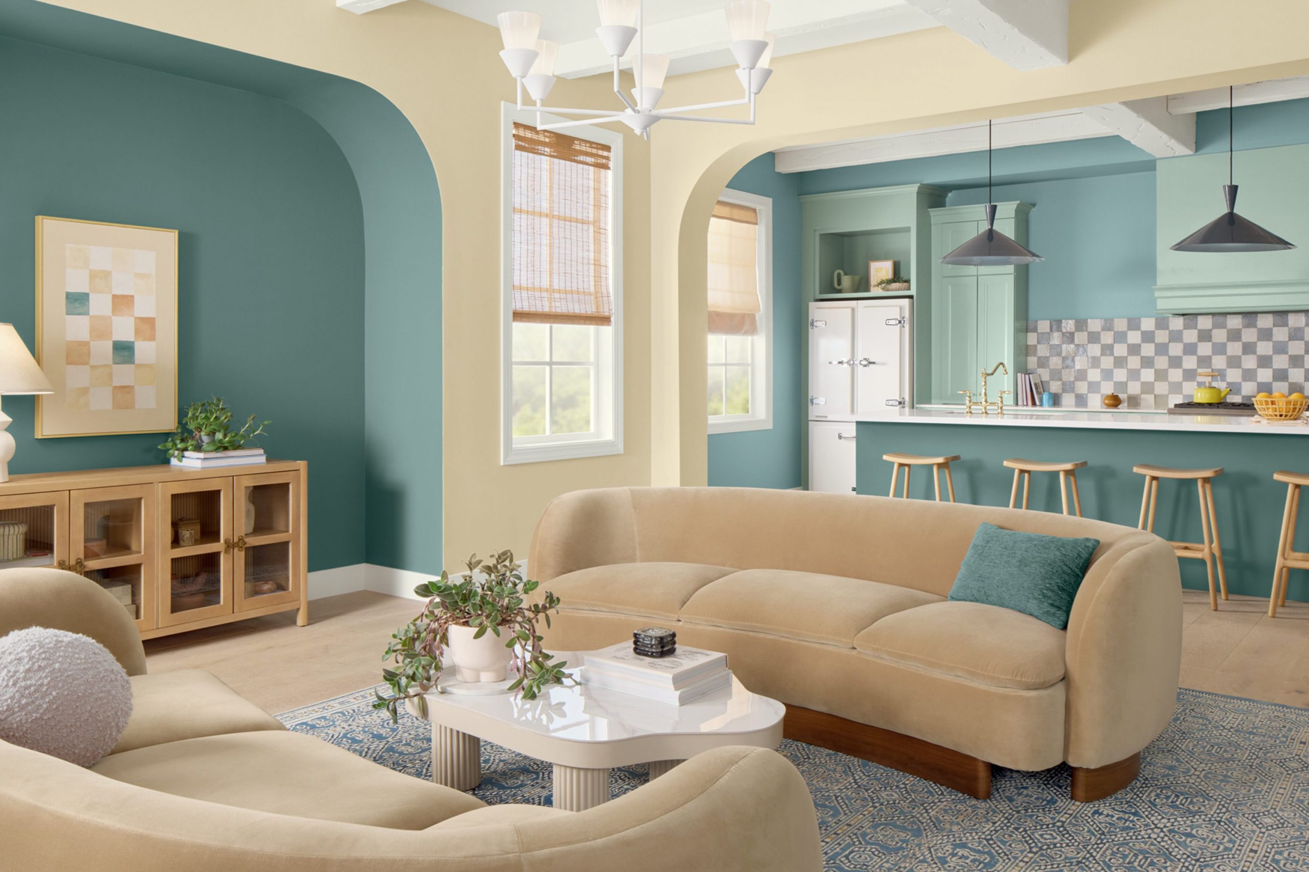
I always look at the sunlight in a room before I ever suggest a single bucket of paint. I want the colors to flow from one room to the next so the whole house feels like it belongs together. My secret is choosing shades that have a little bit of gray or tan to keep them from looking like a crayon. I think about what you will be doing in each room, like resting in a bedroom or cooking for friends. A house feels finished when the walls match the mood of the person living inside. I choose colors that make you want to stay home and relax instead of going out.
My process begins with a rigorous analysis of the “Light Orientation” of a room—observing the direction and intensity of the sun—long before I ever recommend a single gallon of paint. I believe a home should possess a “Visual Narrative,” where colors transition seamlessly from one space to the next, ensuring the entire floor plan feels like a unified, intentional masterpiece rather than a collection of disconnected rooms.
The secret to my signature look is the “Muted Underlay”: I prioritize sophisticated shades that contain strategic drops of gray, charcoal, or warm tan to prevent the color from appearing “neon” or like a primary crayon color once it hits the wall. I meticulously consider the human utility of every square foot—designing for deep, restorative rest in the master suite or vibrant, social energy in a kitchen meant for hosting friends.
A residence only feels truly finished when the walls are in perfect resonance with the personality and lifestyle of the occupant. I curate palettes that don’t just look good on a screen; I choose colors that create a magnetic pull, making you want to cancel your plans, stay home, and immerse yourself in the comfort of your own space.
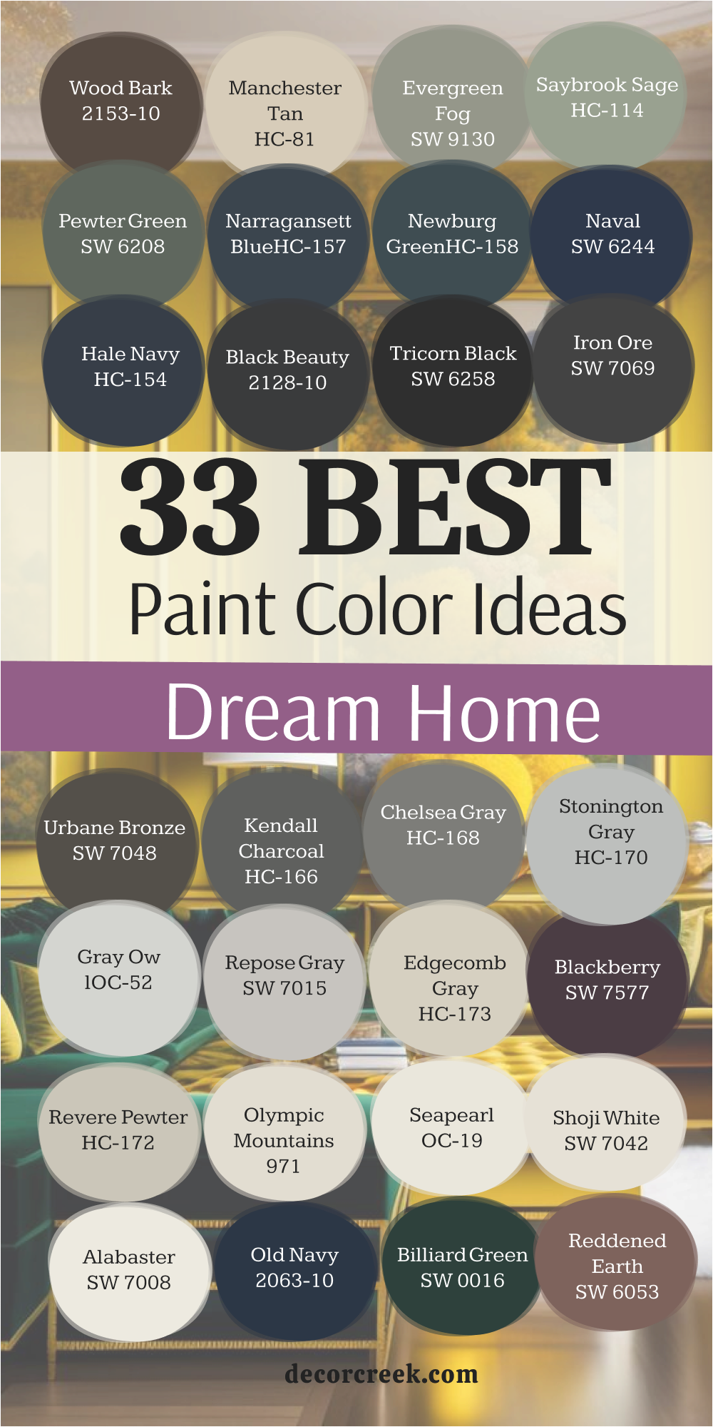
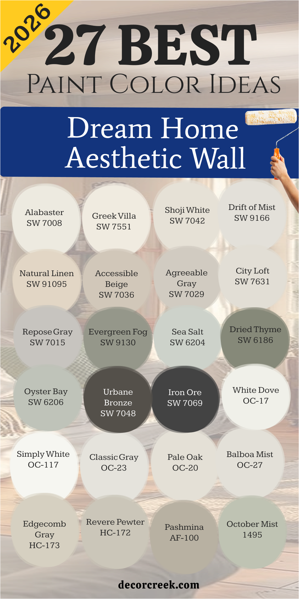
27 Dream Home Aesthetic Wall Paint Ideas in 2026
Alabaster SW 7008
Alabaster SW 7008 is a creamy white that feels very cozy and never looks like a cold hospital room. This color is my favorite for living rooms because it makes everyone feel welcome right away. It has just enough warmth to look great with light wood floors and soft blankets.
Many people choose this for their walls and trim to make the room feel much larger. This paint reflects the sun in a way that makes the whole house feel bright and happy. It works perfectly in kitchens with dark hardware to create a clean look.
You can use it in every room if you want a house that feels very simple and organized. It is a top choice for people who love the farmhouse look but want it to feel modern. The shade stays looking clean even if you have a busy house with lots of traffic. It is a reliable pick that makes your furniture the star of the show.
Best used in: living rooms, kitchens, hallways, bedrooms, and farmhouse exteriors
Pairs well with: Iron Ore SW 7069, Agreeable Gray SW 7029, Natural Linen SW 9109, warm wood tones The key rule of this color for farmhouse style is to use it where you want natural light to feel kind, soft, and inviting throughout the day.

Greek Villa SW 7551
Greek Villa SW 7551 provides a rich and sunny white that feels very fancy on your walls. This color is a bit brighter than other off-whites which makes it feel very fresh and clean. It is a great choice for bathrooms where you want to feel energized in the morning.
I like how it looks against gold mirrors and light blue towels in a guest suite. The shade has a tiny bit of yellow that keeps it from ever feeling blue or chilly. It makes small hallways feel twice as wide as they actually are.
Many homeowners love this for their exterior because it looks crisp against green grass and trees. It gives the whole house a very high-end and polished look without being boring. This paint is very easy to live with and goes with any style of rug or art. You will love how it makes your home feel like a sunny vacation spot every single day.
Best used in: kitchens, bathrooms, entryways, and trim
Pairs well with: Urbane Bronze SW 7048, Wood tones, Navy blues The key rule of this color for farmhouse style is to use it where you want natural light to feel kind, soft, and inviting throughout the day.

Shoji White SW 7042
Shoji White SW 7042 is a very soft mix of white and beige that feels very solid and grounded. This color is perfect for open floor plans where you need one shade to cover everything. It is dark enough to show a contrast against white trim but light enough to stay bright.
I use this when a client wants a house that feels warm but still very modern and clean. The paint looks beautiful in the evening when you have your lamps turned on low. It hides small marks and dust much better than a pure white paint would.
This shade works well with stone fireplaces and leather sofas in a large family room. Many people find it to be the most comfortable color to live with for many years. It makes the house feel very quiet and puts your mind at ease after a long day. It is a smart choice for anyone who wants a house that feels like a safe retreat.
Best used in: open concepts, bedrooms, and exteriors
Pairs well with: Accessible Beige SW 7036, Urbane Bronze SW 7048, Greige tones The key rule of this color for farmhouse style is to use it where you want natural light to feel kind, soft, and inviting throughout the day.

Drift of Mist SW 9166
Drift of Mist SW 9166 is a very light gray that feels as light as a cloud on your walls. This color stays very neutral which means it will not change to a weird blue or green later. It is a fantastic choice for bedrooms where you want to wake up feeling very refreshed.
I like to use it in laundry rooms to make a boring chore feel a little bit better. The shade is light enough that you can even use it on the ceiling for a custom look. It makes white doors and molding look very sharp and expensive.
This paint is a great alternative to white if you want a little more depth in your room. It works well with silver light fixtures and modern black frames. Many people choose this for their main living area because it feels very airy and open. You will find that this color makes your house feel very balanced and ready for guests.
Best used in: laundry rooms, living rooms, and bedrooms
Pairs well with: Iron Ore SW 7069, Pure White SW 7005, Dark grays The key rule of this color for farmhouse style is to use it where you want natural light to feel kind, soft, and inviting throughout the day.

Natural Linen SW 9109
Natural Linen SW 9109 brings the feeling of real fabric to your walls with its sandy tone. This color is a deeper beige that makes a large room feel much more intimate and snug. It is a great pick for dining rooms where you want to sit and talk for hours.
I love how it looks with dark wood tables and large green plants in the corner. The shade has an organic look that reminds me of nature and the outdoors. It provides a strong background for colorful paintings or bright family photos.
This paint handles bright light very well without losing its beautiful tan color. It makes a house feel very sturdy and well-made as soon as you see it. Many homeowners love this for their master suite to create a very cozy environment. It is a classic shade that will stay in style even as your furniture changes.
Best used in: dining rooms, bedrooms, and kitchens
Pairs well with: Alabaster SW 7008, Shoji White SW 7042, Bronze accents The key rule of this color for farmhouse style is to use it where you want natural light to feel kind, soft, and inviting throughout the day.

Accessible Beige SW 7036
Accessible Beige SW 7036 is the most popular beige because it works in almost every house. This color has a gray undertone that keeps it from looking like a dated yellow tan. It makes any room look high-quality and very well-designed without much effort.
I suggest this for entryways to give your home a very warm and friendly feeling. The shade is dark enough to make white trim really pop and look very clean. It is a great choice for basement rooms that do not get much sunlight from windows.
This paint makes the house feel finished and ready for a magazine photo shoot. It goes perfectly with both modern furniture and older antique pieces you might have. Many people use this as a whole-house color because it is so easy to live with. You can trust this color to make your home feel very expensive and comfortable.
Best used in: family rooms, basements, and hallways
Pairs well with: Alabaster SW 7008, Cadet SW 9143, Dark browns The key rule of this color for farmhouse style is to use it where you want natural light to feel kind, soft, and inviting throughout the day.

Agreeable Gray SW 7029
Agreeable Gray SW 7029 is a perfect blend of gray and beige that many designers call a grage. This color is the king of neutrals because it looks good with every type of floor. It feels very fresh in the morning and very warm when you turn on the lights at night.
I recommend this for people who are scared of picking a color that is too dark. The shade makes your rooms feel very open and full of life. It is a top choice for selling a house because it makes every visitor feel at home.
This paint works well in kitchens with white cabinets and gray stone counters. It is a very safe pick that never feels like a mistake once it is on the walls. You will love how it ties all your different rooms together into one look. It is the best way to get a modern look that still feels very soft and kind.
Best used in: whole house color, bedrooms, and living areas
Pairs well with: Alabaster SW 7008, Sea Salt SW 6204, Iron Ore SW 7069 The key rule of this color for farmhouse style is to use it where you want natural light to feel kind, soft, and inviting throughout the day.

City Loft SW 7631
City Loft SW 7631 is a very pale greige that feels soft and almost like a light shadow. This color is perfect for small apartments or rooms that feel a little bit crowded. It helps push the walls back so you feel like you have more room to move.
I like to use it in bathrooms to create a clean and simple look every morning. The shade has a tiny bit of red in it which prevents it from ever looking cold. It looks very sophisticated when you pair it with black metal and simple white rugs.
This paint is light enough to be a neutral but has enough color to be noticed. It works well in kitchens where you have marble or very light stone surfaces. Many people love how this color stays in the background and lets the furniture shine. It is a smart choice for anyone who likes a clean and very tidy lifestyle.
Best used in: small rooms, bathrooms, and modern kitchens
Pairs well with: Snowbound SW 7004, Urbane Bronze SW 7048, Muted blues The key rule of this color for farmhouse style is to use it where you want natural light to feel kind, soft, and inviting throughout the day.

Repose Gray SW 7015
Repose Gray SW 7015 is a true gray that still manages to feel very friendly and warm. This color is a bit cooler than a beige but it never feels like a chilly office. It is the best choice for a home office where you need to stay focused on your work.
I love how it looks with dark navy blue accents and rich brown wooden desks. The shade gives a very professional and clean look to any room in the house. It is deep enough to provide a nice contrast against white doors and baseboards.
This paint is very popular for house exteriors because it looks great in the bright sun. It hides small marks and scuffs better than the very light white shades do. You will find that it creates a very steady and stable feeling in your living environment. It is a classic choice for a modern home that wants to look trendy and new.
Best used in: offices, living rooms, and exteriors
Pairs well with: Eider White SW 7014, Naval SW 6244, Silver accents The key rule of this color for farmhouse style is to use it where you want natural light to feel kind, soft, and inviting throughout the day.

Evergreen Fog SW 9130
Evergreen Fog SW 9130 is a muted green that brings a little bit of the woods inside. This color was a color of the year because it feels so natural and very grounded. It is a fantastic pick for a bedroom where you want to feel safe and tucked in.
I like using it on one wall or in a small powder room for a big change. The shade has a gray base which makes it very easy to look at every single day. It looks stunning when you pair it with gold handles and warm leather chairs.
This paint makes a home feel more connected to trees and the natural world outside. It is a very fancy choice that does not feel too loud or too bright for a house. Many homeowners love this for their front doors to make a great first impression. It provides a unique look that still feels very classic and high-end for years.
Best used in: bedrooms, accent walls, and front doors
Pairs well with: Shoji White SW 7042, Urbane Bronze SW 7048, Wood tones The key rule of this color for farmhouse style is to use it where you want natural light to feel kind, soft, and inviting throughout the day.

Sea Salt SW 6204
Sea Salt SW 6204 is a light green-blue that reminds me of a day spent at the beach. This color changes a lot depending on how the sun shines through your windows. It can look a little more gray in the morning and more green in the late afternoon.
I love to put this in master bathrooms to make them feel like a private getaway. The shade makes you feel like you can take a deep breath and finally relax. It works well with white wood on the walls or light-colored floors for a coastal look.
This paint is a favorite for rooms with lots of big windows and sunlight. It is light enough to stay bright but it has plenty of personality and style. You will find that visitors always ask what this color is because it looks so pretty. It is a beautiful way to bring a little bit of color into a neutral home.
Best used in: bathrooms, sunrooms, and laundry rooms
Pairs well with: Alabaster SW 7008, Agreeable Gray SW 7029, Summit Gray SW 7622 The key rule of this color for farmhouse style is to use it where you want natural light to feel kind, soft, and inviting throughout the day.

Dried Thyme SW 6186
Dried Thyme SW 6186 is a deep and dusty green that looks very rich on your walls. This color works well for a study or a den where you like to sit and read. It has a lot of gray in it which keeps it from looking too bright or like a jungle.
I recommend this for kitchen islands to give the room a very cool focal point. The shade looks amazing with copper pans or shiny brass handles on the cabinets. It creates a mood that is very popular in new home designs right now.
This paint feels very old-fashioned but can work in a modern house too. It is dark enough to be a bold choice but quiet enough to stay in the background. Many people use this on their outside shutters to give the house a classic look. It is a strong color that makes a new house feel like it has some history.
Best used in: studies, kitchen islands, and exteriors
Pairs well with: Shoji White SW 7042, Creamy SW 7012, Dark woods The key rule of this color for farmhouse style is to use it where you want natural light to feel kind, soft, and inviting throughout the day.

Oyster Bay SW 6206
Oyster Bay SW 6206 is a cool slate green that feels very crisp and very organized. This color is a darker version of the beachy tones that so many people love. It is a great choice for a guest bedroom to make it feel like a fancy hotel.
I like how it looks with very clean white sheets and dark gray blankets. The shade feels very balanced and does not lean too far into blue or green. It is a smart choice for a dining room that needs just a little bit of drama.
This paint holds its own in rooms that have big pieces of furniture in them. It gives the house a custom look that makes it feel like a designer lived there. You will enjoy how it brings a sense of order to your main living areas. It stays looking good in both the bright summer and the dark winter light.
Best used in: bedrooms, dining rooms, and cabinetry
Pairs well with: Sea Salt SW 6204, Pure White SW 7005, Iron Ore SW 7069 The key rule of this color for farmhouse style is to use it where you want natural light to feel kind, soft, and inviting throughout the day.

Urbane Bronze SW 7048
Urbane Bronze SW 7048 is a very dark brown-gray that feels like a warm hug for your walls. This color is perfect for a media room where you watch movies with your family. It makes the walls seem to disappear so you can focus on the movie or the fire.
I love to use it on the front door or window trim for a very modern look. The shade has a bit of a metallic feel even though it is a normal paint. It looks beautiful with warm wood floors and large green plants in the house.
This paint is a top pick for the outside of a modern farmhouse right now. It is a bold choice that makes the house look very expensive and well-planned. Many people love how it makes a room with very high ceilings feel much more cozy. It is a color that feels very safe and strong for a busy family home.
Best used in: media rooms, exteriors, and accent doors
Pairs well with: Shoji White SW 7042, Agreeable Gray SW 7029, Bone White The key rule of this color for farmhouse style is to use it where you want natural light to feel kind, soft, and inviting throughout the day.

Iron Ore SW 7069
Iron Ore SW 7069 is a deep charcoal that is almost black but much softer on the eyes. This color adds a lot of strength and mystery to any room where you use it. I suggest using it on a fireplace wall to make it the most important part of the room.
It looks incredible when paired with light gray floors or white marble surfaces. The shade is very popular for kitchen cabinets in modern house designs lately. It gives a sharp and clean look that will never go out of style.
This paint is great at hiding small bumps or marks on older walls. It makes the house look very solid and well-built from the street. Many designers use this for window frames to get that black-window look everyone wants. You will find it is a very powerful tool for making a room feel finished.
Best used in: accent walls, cabinets, and window trim
Pairs well with: Alabaster SW 7008, Revere Pewter HC-172, Extra White SW 7006 The key rule of this color for farmhouse style is to use it where you want natural light to feel kind, soft, and inviting throughout the day.

White Dove OC-17
White Dove OC-17 is a very soft white that almost every designer keeps in their kit. This color is the perfect white because it is not too yellow and not too blue. It makes a room feel very bright and full of air without being harsh.
I use it for trim and doors in almost every house I work on. The shade looks amazing on kitchen cabinets with a light gray backsplash. It gives the walls a creamy look that feels very high-quality and expensive.
This paint is great for making a small dark room feel much more open. It is a favorite for people who want a clean house that still feels very warm. You can use it on the outside of a house for a classic look that never fails. It is a reliable shade that makes every other color in the room look better.
Best used in: trim, cabinets, and whole-house walls
Pairs well with: Revere Pewter HC-172, Balboa Mist OC-27, Hale Navy HC-154 The key rule of this color for farmhouse style is to use it where you want natural light to feel kind, soft, and inviting throughout the day.

Simply White OC-117
Simply White OC-117 is a crisp and happy white that feels very fresh on your walls. This color was a color of the year because it is so clean and very bright. It is the best choice for a dark room that does not get any natural sunlight.
I love to use it in kitchens to make the cooking area feel very tidy. The shade has a tiny hint of yellow that keeps it feeling very cheerful all day long. It makes your colorful art and furniture look like they are in a gallery.
This paint is a top pick for ceilings to make the room feel much taller. It works well in modern homes that have a lot of glass and open areas. Many homeowners choose this for their bathrooms to get a very clean start to the day. You will enjoy how this color makes your house feel very energetic and full of light.
Best used in: ceilings, kitchens, and dark rooms
Pairs well with: Kendall Charcoal HC-166, Hale Navy HC-154, Silver accents The key rule of this color for farmhouse style is to use it where you want natural light to feel kind, soft, and inviting throughout the day.

Classic Gray OC-23
Classic Gray OC-23 is a very light gray that often looks like a warm white on the walls. This color is perfect for people who want a tiny bit of color but are afraid of gray. It feels very sophisticated and expensive without being too bold or dark.
I like to use it in open living areas to create a soft background for life. The shade changes slightly as the sun moves but it always stays very pretty. It makes white trim look very bright and very clean in every room.
This paint is a great choice for bedrooms where you want to feel very peaceful. It works well with light wood floors and soft blue or green pillows. Many designers love this color because it is so easy to use in any house. You can count on it to make your home feel very high-end and very well-planned.
Best used in: living rooms, bedrooms, and open floor plans
Pairs well with: White Dove OC-17, Stone Harbor 2111-50, Dark blues The key rule of this color for farmhouse style is to use it where you want natural light to feel kind, soft, and inviting throughout the day.

Pale Oak OC-20
Pale Oak OC-20 is a beautiful greige that feels as soft as a piece of old wood. This color is a bit warmer than a normal gray which makes it very cozy. It is a fantastic choice for a master bedroom where you want to feel relaxed.
I love how it looks with white bedding and light oak furniture pieces in the room. The shade has a very natural look that goes well with stone and tile. It makes a room feel very airy but also very solid and grounded at the same time.
This paint is a top choice for kitchens with white or light gray cabinets. It gives the walls a soft look that is very easy on the eyes all day long. Many homeowners use this for their main hallways to tie the house together. You will find that it makes your home feel very expensive and very well-designed.
Best used in: bedrooms, kitchens, and hallways
Pairs well with: Chantilly Lace OC-65, Revere Pewter HC-172, Wrought Iron 2124-10 The key rule of this color for farmhouse style is to use it where you want natural light to feel kind, soft, and inviting throughout the day.

Balboa Mist OC-27
Balboa Mist OC-27 is a light gray that has a tiny bit of purple in it to make it feel warm. This color is great for rooms that get a lot of bright afternoon sunlight. It keeps the room from looking too yellow or washed out when it is hot outside.
I like to use it in dining rooms to create a very elegant and fancy feeling. The shade looks beautiful with dark wood floors and white linen curtains. It provides a soft and pretty background for your favorite family pictures.
This paint makes the house feel very clean and very updated for 2026. It works well in bathrooms with white marble and shiny silver faucets. Many people love how this color feels very light but still has plenty of style. It is a smart pick for a house that wants to feel very soft and very welcoming.
Best used in: dining rooms, living rooms, and bathrooms
Pairs well with: White Dove OC-17, Gray Owl OC-52, Dark wood tones The key rule of this color for farmhouse style is to use it where you want natural light to feel kind, soft, and inviting throughout the day.

Edgecomb Gray HC-173
Edgecomb Gray HC-173 is a classic greige that feels very earthy and very natural. This color is darker than a white but lighter than a tan which is perfect. It is a great pick for an entryway to make the house feel very solid.
I love how it looks against dark wood doors and black metal light fixtures. The shade has a very steady and reliable feeling that many people love. It makes white trim pop just enough to look very sharp and clean.
This paint is a favorite for living rooms where families hang out every night. It hides a bit of wear and tear better than the very light colors do. Many homeowners choose this for their whole house because it is so easy. You can trust it to make your home feel very warm and very well-put-together.
Best used in: entryways, living rooms, and whole-house walls
Pairs well with: Revere Pewter HC-172, White Dove OC-17, Hale Navy HC-154 The key rule of this color for farmhouse style is to use it where you want natural light to feel kind, soft, and inviting throughout the day.

Revere Pewter HC-172
Revere Pewter HC-172 is the most famous greige in the world for a very good reason. This color looks good in almost every lighting situation you can imagine. It has a bit of green and gray in it which makes it feel very organic.
I suggest this for kitchens with wood cabinets to make them look more modern. The shade is deep enough to make a large room feel very cozy and safe. It provides a beautiful background for navy blue or dark green accents.
This paint makes the house feel very traditional but also very updated at once. It is a very sturdy color that looks great on walls and kitchen cabinets alike. Many designers use this as their go-to color when they are stuck on a choice. You will love how it makes your house feel like a high-end designer home.
Best used in: kitchens, living rooms, and cabinets
Pairs well with: White Dove OC-17, Chelsea Gray HC-168, Wood tones The key rule of this color for farmhouse style is to use it where you want natural light to feel kind, soft, and inviting throughout the day.

Pashmina AF-100
Pashmina AF-100 is a rich and mid-tone greige that feels very muddy and expensive. This color is darker than a standard neutral which makes it feel very sophisticated. It is a great choice for a cozy den or a master bedroom suite.
I like to use it to make a large room feel much smaller and more intimate. The shade has a bit of a green base that keeps it looking very natural. It looks amazing with white trim and dark brown leather furniture pieces.
This paint gives your walls a lot of depth and makes the room feel finished. It is a top pick for people who want their house to feel very warm and snug. Many homeowners love this for their dining rooms to create a very elegant look. You will enjoy how this color makes your house feel very solid and very well-made.
Best used in: bedrooms, dens, and dining rooms
Pairs well with: Cloud White OC-130, Shaker Beige HC-45, Bronze accents The key rule of this color for farmhouse style is to use it where you want natural light to feel kind, soft, and inviting throughout the day.

October Mist 1495
October Mist 1495 is a soft and silvery green that feels like a quiet morning. This color was a color of the year because it is so easy to look at. It is a fantastic choice for a guest room where you want people to feel relaxed.
I love how it looks with white sheets and light wood bedside tables. The shade has a lot of gray in it which keeps it looking very mature and smart. It brings a bit of nature inside without being too bright or distracting.
This paint works well in bathrooms with white tile and silver towel racks. It gives the house a very soft and gentle look that many families love. Many people choose this for their kitchen walls to match with white cabinets. You will find that this color makes your house feel very peaceful and very quiet.
Best used in: guest rooms, kitchens, and bathrooms
Pairs well with: Steam AF-15, Gloucester Sage HC-100, Natural wood The key rule of this color for farmhouse style is to use it where you want natural light to feel kind, soft, and inviting throughout the day.

Boothbay Gray HC-165
Boothbay Gray HC-165 is a beautiful blue-gray that reminds me of the ocean on a cloudy day. This color is very elegant and looks amazing in a traditional style home. It is a great pick for a laundry room or a mudroom to add a little fun.
I like to use it on kitchen islands to create a very cool and custom look. The shade has enough blue to be pretty but enough gray to be very smart. It looks stunning with white quartz counters and shiny chrome handles.
This paint makes a home feel very fresh and very well-organized for guests. It works well on the outside of a house for a classic and coastal feeling. Many homeowners love this for their master bathroom to get that spa look. You will enjoy how this color makes your house feel very clean and very high-end.
Best used in: laundry rooms, kitchen islands, and exteriors
Pairs well with: White Dove OC-17, Hale Navy HC-154, Silver accents The key rule of this color for farmhouse style is to use it where you want natural light to feel kind, soft, and inviting throughout the day.

Hale Navy HC-154
Hale Navy HC-154 is the perfect navy blue that everyone loves for a very good reason. This color is dark and moody but it still feels very warm and friendly. I recommend it for an accent wall in a bedroom or a cozy home office.
It looks incredible with white trim and gold light fixtures on the wall. The shade is very deep and makes a room feel very fancy and expensive. It is a top choice for kitchen cabinets if you want a bold and modern look.
This paint is also great for the outside of a house to make it stand out. It hides dirt and marks very well because it is so dark and rich. Many people find that this color makes their furniture look much better than before. You can count on it to make your house feel very strong and very well-designed.
Best used in: accent walls, offices, and cabinets
Pairs well with: Revere Pewter HC-172, White Dove OC-17, Gold accents The key rule of this color for farmhouse style is to use it where you want natural light to feel kind, soft, and inviting throughout the day.

Kendall Charcoal HC-166
Kendall Charcoal HC-166 is a deep and rich gray that feels very solid on your walls. This color is perfect for a media room or a den where you want to be cozy. It makes the room feel very tight and safe like a warm blanket around you.
I love to use it on fireplace mantels to make them look very modern and sharp. The shade has a bit of warmth so it never feels like a cold piece of metal. It looks beautiful with light gray rugs and bright white molding on the floor.
This paint gives the house a very custom and high-end look for 2026 designs. It is a great choice for hiding imperfections on old walls in a renovation. Many homeowners love this for their exterior to give the house a strong look. You will find that it makes your home feel very sophisticated and very well-planned.
Best used in: media rooms, exteriors, and accent walls
Pairs well with: Simply White OC-117, Revere Pewter HC-172, Wood tones The key rule of this color for farmhouse style is to use it where you want natural light to feel kind, soft, and inviting throughout the day.

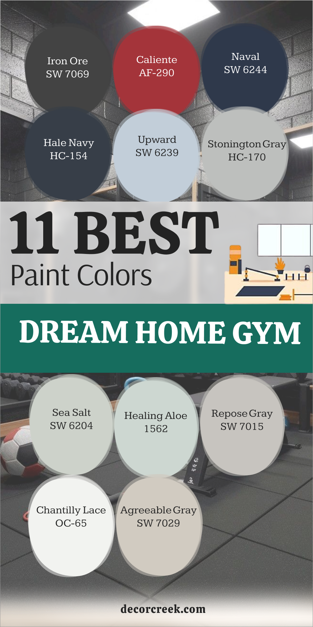
11 Best Dream Home Gym Paint Colors
Iron Ore — SW 7069
Iron Ore — SW 7069 is a fantastic choice for a home gym because it helps you focus. This color makes the walls feel very solid and keeps the room from being distracting. I like to use it in weight rooms to create a very professional and tough look.
The shade is a very dark charcoal that looks great with rubber flooring. It makes your gym equipment look like it belongs in a high-end health club. This paint hides the scuffs from weights and shoes better than any light color.
It gives the room a very cool and modern vibe that makes you want to work hard. Many people find that dark walls help them concentrate on their workout more. You will love how this color makes your gym feel like a serious place to train. It is a bold pick that makes the whole house feel more complete and functional.
Best used in: weight rooms, garage gyms, and accent walls
Pairs well with: Extra White SW 7006, Silver equipment, LED lighting The key rule of this color for farmhouse style is to use it where you want natural light to feel kind, soft, and inviting throughout the day.

Caliente — AF-290
Caliente AF-290 is a bright and happy red that gives you tons of energy. This color is perfect for a cardio room where you need a little push to keep going. I suggest using it on one wall to make the room feel very exciting and fun.
The shade is very bold and makes a big statement as soon as you walk in. It looks great with black mats and silver machines in a modern home gym. This paint is for people who want their house to feel full of life and power.
It makes the gym feel like a separate world from the rest of the house. Many athletes love red because it helps them feel more aggressive and ready to move. You will find that this color makes your workouts feel a lot more intense and fast. It is a fun way to bring some heat into your daily routine at home.
Best used in: cardio rooms, boxing areas, and accent walls
Pairs well with: Black, White, and Chrome accents The key rule of this color for farmhouse style is to use it where you want natural light to feel kind, soft, and inviting throughout the day.
Naval — SW 6244
Naval SW 6244 is a classic dark blue that feels very strong and very steady. This color is great for a gym where you do a mix of weights and stretching. It makes the room feel very grounded and helps you keep your balance while moving.
I like to use it to create a gym that feels very high-quality and well-designed. The shade looks amazing with white trim and light gray equipment in the room. This paint is a favorite for people who want a gym that still looks like part of the house.
It gives the room a very smart and professional look that visitors will admire. Many homeowners find that blue helps them feel more confident during a hard workout. You will enjoy how this color makes your exercise space feel very clean and focused. It is a reliable choice for a room that you use every single morning.
Best used in: main gym walls, cabinetry, and doors
Pairs well with: Alabaster SW 7008, Light gray mats, Natural wood The key rule of this color for farmhouse style is to use it where you want natural light to feel kind, soft, and inviting throughout the day.

Hale Navy — HC-154
Hale Navy HC-154 provides a very rich and deep blue that feels very sophisticated. This color is perfect for a gym that is also used as a place to relax after a workout. I love how it looks with warm wood floors and bright white towels on a rack.
The shade is very dark but it still has a lot of heart and warmth to it. It makes the walls feel like they are wrapping around you while you train hard. This paint is a great choice for hiding any dirt or marks from your gym sessions.
It gives the room a very high-end look that matches the rest of a nice home. Many people find that this blue helps them stay on track with their fitness goals. You will find that it makes your home gym feel like a very special and private place. It is a classic shade that makes even a simple workout feel like a big event.
Best used in: home gyms, bedrooms, and basements
Pairs well with: White Dove OC-17, Gold hardware, Gray flooring The key rule of this color for farmhouse style is to use it where you want natural light to feel kind, soft, and inviting throughout the day.
Upward — SW 6239
Upward SW 6239 is a light and airy blue that feels like a fresh breath of air. This color is perfect for yoga or stretching rooms where you want to feel very light. I recommend it for small gyms that do not have any windows to the outside.
The shade makes the ceiling feel much higher and the walls feel much further away. It creates a very clean and happy feeling that makes you want to stay and move. This paint is for people who want a gym that feels very soft and very welcoming.
It looks beautiful with light wood floors and white equipment in a sunny room. Many people find that light blue helps them feel more flexible and ready to stretch. You will love how this color makes your gym feel like an open sky above you. It is a great way to make a hard workout feel a little bit more gentle.
Best used in: yoga studios, stretching areas, and small gyms
Pairs well with: Pure White SW 7005, Light oak, Silver accents The key rule of this color for farmhouse style is to use it where you want natural light to feel kind, soft, and inviting throughout the day.

Stonington Gray — HC-170
Stonington Gray HC-170 is a very clean and cool gray that feels like a professional gym. This color is perfect for a room with lots of mirrors and silver workout machines. It makes the room look very modern and very well-organized for a busy person.
I like to use it to create a gym that feels very sharp and ready for action. The shade has no weird undertones so it stays looking gray in any light. This paint gives the walls a very steady look that helps you stay in the zone.
Many athletes like this color because it feels very solid and doesn’t distract them. It works well with black rubber floors and white baseboards in a basement. You will find that this color makes your gym feel very high-tech and very efficient. It is a smart pick for anyone who wants a gym that looks as good as it works.
Best used in: weight rooms, basements, and modern gyms
Pairs well with: Chantilly Lace OC-65, Black mats, Chrome equipment The key rule of this color for farmhouse style is to use it where you want natural light to feel kind, soft, and inviting throughout the day.

Sea Salt — SW 6204
Sea Salt SW 6204 is a light green-blue that makes your gym feel like a spa. This color is a top choice for rooms where you do pilates or light stretching. I love how it makes the room feel very cool and very fresh even when you are sweating.
The shade changes with the light which makes the room feel more alive and natural. It looks great with white shiplap walls and natural bamboo flooring in the house. This paint is for people who want a gym that feels very light and very peaceful.
It helps you keep your breath steady and your mind very clear while you move. Many homeowners love how this color makes their home gym feel like a private resort. You will enjoy how it makes your exercise time feel like a treat for yourself. It is a beautiful shade that makes any workout feel a little bit more luxurious.
Best used in: yoga rooms, pilates studios, and light gyms
Pairs well with: Alabaster SW 7008, White trim, Natural textures The key rule of this color for farmhouse style is to use it where you want natural light to feel kind, soft, and inviting throughout the day.

Healing Aloe — 1562
Healing Aloe 1562 is a very soft and pale green that feels very kind on the eyes. This color is perfect for a gym where you go to get away from the noisy world. I suggest it for rooms with a lot of natural light to make them feel very airy.
The shade has a bit of gray in it which keeps it looking very smart and updated. It makes you feel very relaxed and ready to focus on your health and wellness. This paint is a great choice for a gym that is inside a bedroom or a quiet suite.
It looks beautiful with white linen curtains and light gray exercise mats on the floor. Many people find that this color helps them recover faster after a very hard workout session. You will love how it makes your home gym feel like a very soft and safe place. It is a wonderful way to make exercise feel like a part of your self-care routine.
Best used in: meditation areas, yoga rooms, and guest gyms
Pairs well with: White Dove OC-17, Light wood, Muted grays The key rule of this color for farmhouse style is to use it where you want natural light to feel kind, soft, and inviting throughout the day.

Repose Gray — SW 7015
Repose Gray SW 7015 is a very balanced gray that makes a gym feel very steady. This color is great for a large family gym where everyone works out together. It makes the room feel very organized and keeps things from looking messy or cluttered.
I like to use it to create a gym that is both modern and very comfortable. The shade is dark enough to show off white trim but light enough to stay bright. This paint gives the walls a very clean look that never feels too cold or harsh.
Many families like this color because it works for both kids and adults in the house. It looks great with any color of weights or equipment you might have in the room. You will find that it makes your gym feel like a very high-end part of your home. It is a reliable choice that stays looking good for many years of training.
Best used in: family gyms, garage workouts, and large gyms
Pairs well with: Eider White SW 7014, Navy accents, Silver machines The key rule of this color for farmhouse style is to use it where you want natural light to feel kind, soft, and inviting throughout the day.
Chantilly Lace — OC-65
Chantilly Lace OC-65 is the brightest and cleanest white you can find for a gym. This color is perfect for a room that needs to feel very energized and very light. I recommend it for gyms with high ceilings to make them feel even bigger and wider.
The shade has no yellow or blue in it so it stays looking very pure white. It makes your colorful weights and machines look like they are in a nice store. This paint is for people who want a gym that feels very fresh and very brand new.
It reflects every bit of light so the room is always easy to see and work in. Many athletes love a white gym because it feels very clean and helps them focus. You will love how this color makes your exercise room feel like a professional studio. It is the best choice for a modern and very fast-paced workout environment.
Best used in: modern gyms, dark basements, and ceiling paint
Pairs well with: Black, Gray, and Bold primary colors The key rule of this color for farmhouse style is to use it where you want natural light to feel kind, soft, and inviting throughout the day.

Agreeable Gray — SW 7029
Agreeable Gray SW 7029 is a warm gray that makes a home gym feel very inviting. This color is perfect if your gym is in a room that you use for other things too. It makes the space feel very finished and part of the rest of the house design.
I suggest this for people who want a gym that feels cozy instead of like a hard garage. The shade looks great with warm wood floors and white baseboards in the room. This paint is very easy to live with and makes the walls feel very soft and friendly.
Many homeowners like how it hides a little bit of dust from their workout gear. It gives the room a very balanced feeling that works for any kind of exercise. You will enjoy how it makes your home gym feel like a very high-quality living space. It is a smart pick for a house that values both health and very good style.
Best used in: multi-purpose gyms, guest room gyms, and hallways
Pairs well with: Alabaster SW 7008, Sea Salt SW 6204, Dark wood The key rule of this color for farmhouse style is to use it where you want natural light to feel kind, soft, and inviting throughout the day.
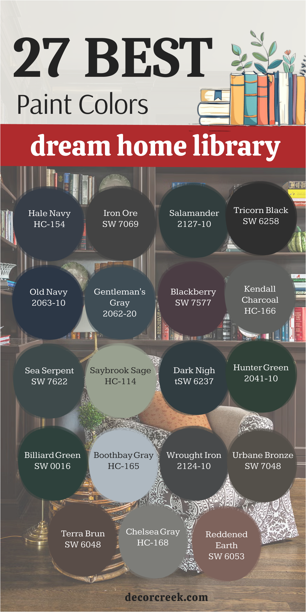
27 Dream home Library Paint Colors
Hale Navy — HC-154
Hale Navy HC-154 is a deep and rich blue that makes a library feel very smart. This color is perfect for walls filled with old books and gold picture frames. I love to use it to create a room that feels very private and very expensive.
The shade is dark enough to make the room feel like a cozy cave for reading. It looks amazing with leather chairs and a warm rug on the floor in the house. This paint gives your library a very high-end and traditional look that visitors will love.
Many people find that dark blue helps them focus on their books for many hours. You will find that this color makes your library feel like the most special room in the house. It is a classic choice that makes every book on the shelf look more important.
Best used in: traditional libraries, home offices, and dens
Pairs well with: White Dove OC-17, Gold hardware, Warm wood tones The key rule of this color for farmhouse style is to use it where you want natural light to feel kind, soft, and inviting throughout the day.
Iron Ore — SW 7069
Iron Ore SW 7069 is a charcoal gray that brings a very modern look to a library. This color makes the bookshelves stand out if they are painted the same dark shade. I recommend it for a library that you want to feel very moody and very quiet.
The shade is almost black which makes the room feel very small and very safe. It looks great with a big fireplace and soft velvet pillows on a reading bench. This paint hides any marks on the shelves from moving books in and out.
It gives the room a very strong and stable feeling that is perfect for study. Many homeowners love how it makes their library look like a secret room for learning. You will enjoy how it makes your books look very bright against the dark background. It is a bold pick that makes your home feel very sophisticated and very well-planned.
Best used in: modern libraries, media rooms, and built-in shelving
Pairs well with: Extra White SW 7006, Brass accents, Light gray rugs The key rule of this color for farmhouse style is to use it where you want natural light to feel kind, soft, and inviting throughout the day.
Salamander 2050-10
Salamander 2050-10 is a very dark green that feels like a deep forest in a room. This color is a top choice for a library where you want to feel totally tucked away. I love how it looks with dark walnut wood and shiny brass lamps on the desk.
The shade is so deep it can look black until the sun hits it in the afternoon. It creates a very mysterious and fancy feeling that guests will talk about later. This paint is perfect for a room that is used for late-night reading and thinking.
It gives the walls a very rich look that makes the whole house feel older and better. Many people find that this green helps them feel very grounded and very peaceful while they read. You will love how it makes your library feel like a very private and high-end retreat.
Best used in: dark libraries, studies, and accent walls
Pairs well with: Pale Oak OC-20, Gold frames, Dark wood furniture The key rule of this color for farmhouse style is to use it where you want natural light to feel kind, soft, and inviting throughout the day.

Tricorn Black — SW 6258
Tricorn Black SW 6258 is a true black that makes a library feel very bold and very cool. This color has no other tones in it so it stays looking very dark and very pure. I suggest using it on the walls and the shelves to create a very seamless look.
The shade makes your books the only source of color in the entire room. It looks incredible with white marble floors or very light wood details in the house. This paint gives the room a very sharp and modern look that is very popular in 2026.
It makes a small library feel like a very important and serious place to be. Many designers love this color because it makes everything else in the room look more bright. You will find that this color makes your library feel very high-end and very well-designed.
Best used in: modern libraries, cabinetry, and doors
Pairs well with: Pure White SW 7005, Gold accents, Vibrant book spines The key rule of this color for farmhouse style is to use it where you want natural light to feel kind, soft, and inviting throughout the day.

Old Navy — 2063-10
Old Navy 2063-10 is a classic and bright navy blue that feels very full of life. This color is great for a library that you use during the day with the windows open. I love to use it to create a space that feels very traditional and very well-loved.
The shade is dark but it has a lot of blue color that stays visible in low light. It looks amazing with white trim and blue and white pillows on a reading chair. This paint gives the room a very clean and nautical look that feels very fresh.
Many homeowners like how it makes their library feel like a very high-quality part of the house. You will find that it makes your book collection look very organized and very pretty. It is a reliable choice for a room that you want to feel both smart and very welcoming.
Best used in: libraries, bedrooms, and dining rooms
Pairs well with: Simply White OC-117, Tan leather, Silver hardware The key rule of this color for farmhouse style is to use it where you want natural light to feel kind, soft, and inviting throughout the day.

Gentleman’s Gray — 2062-20
Gentleman’s Gray 2062-20 is a deep blue-green that feels very formal and very tailored. This color is perfect for a room with high ceilings and tall shelves of old books. I recommend it for creating a library that feels like a very old and fancy club.
The shade has a lot of depth that makes the walls look like they have a texture. It looks beautiful with dark mahogany wood and heavy green curtains in the room. This paint gives the house a very custom and designer look that is hard to get.
Many people find that this color helps them feel more focused and more productive. You will enjoy how it makes your library feel like a very smart and private place to work. It is a sophisticated shade that makes your home feel very expensive and very well-made.
Best used in: libraries, formal offices, and dens
Pairs well with: Classic Gray OC-23, Brass lamps, Dark wood The key rule of this color for farmhouse style is to use it where you want natural light to feel kind, soft, and inviting throughout the day.

Blackberry — SW 7577
Blackberry SW 7577 is a deep and moody purple that feels very cozy and very unique. This color is perfect for a small library where you want to create a very snug feeling. I suggest it for people who want a color that is different from the usual blues and grays.
The shade is very dark but it feels very warm and very soft on the walls. It looks great with dark wood shelves and a cozy fireplace in the corner. This paint gives the room a very magical and quiet feeling that is great for stories.
Many homeowners love how it makes their library feel like a very special and hidden part of the house. You will find that it makes your reading time feel like a very special treat for yourself. It is a bold pick that makes your home feel very personal and very well-designed for you.
Best used in: small libraries, cozy dens, and accent walls
Pairs well with: Alabaster SW 7008, Gold hardware, Velvet textures The key rule of this color for farmhouse style is to use it where you want natural light to feel kind, soft, and inviting throughout the day.
Kendall Charcoal — HC-166
Kendall Charcoal HC-166 is a mid-to-dark gray that makes a library feel very solid and steady. This color is great for built-in shelves because it provides a very neutral and smart background. I love how it makes colorful book covers stand out without being too bright itself.
The shade has a bit of warmth which keeps it from looking like cold stone or metal. It looks amazing with white trim and a large colorful rug on the library floor. This paint gives the room a very modern and very updated look for 2026 designs.
Many people find that this gray helps them feel more relaxed while they are reading at night. You will enjoy how it makes your library feel like a very professional and high-quality room. It is a classic choice that makes every part of your book collection look better and more organized.
Best used in: built-ins, modern libraries, and dens
Pairs well with: Simply White OC-117, Wood tones, Navy accents The key rule of this color for farmhouse style is to use it where you want natural light to feel kind, soft, and inviting throughout the day.
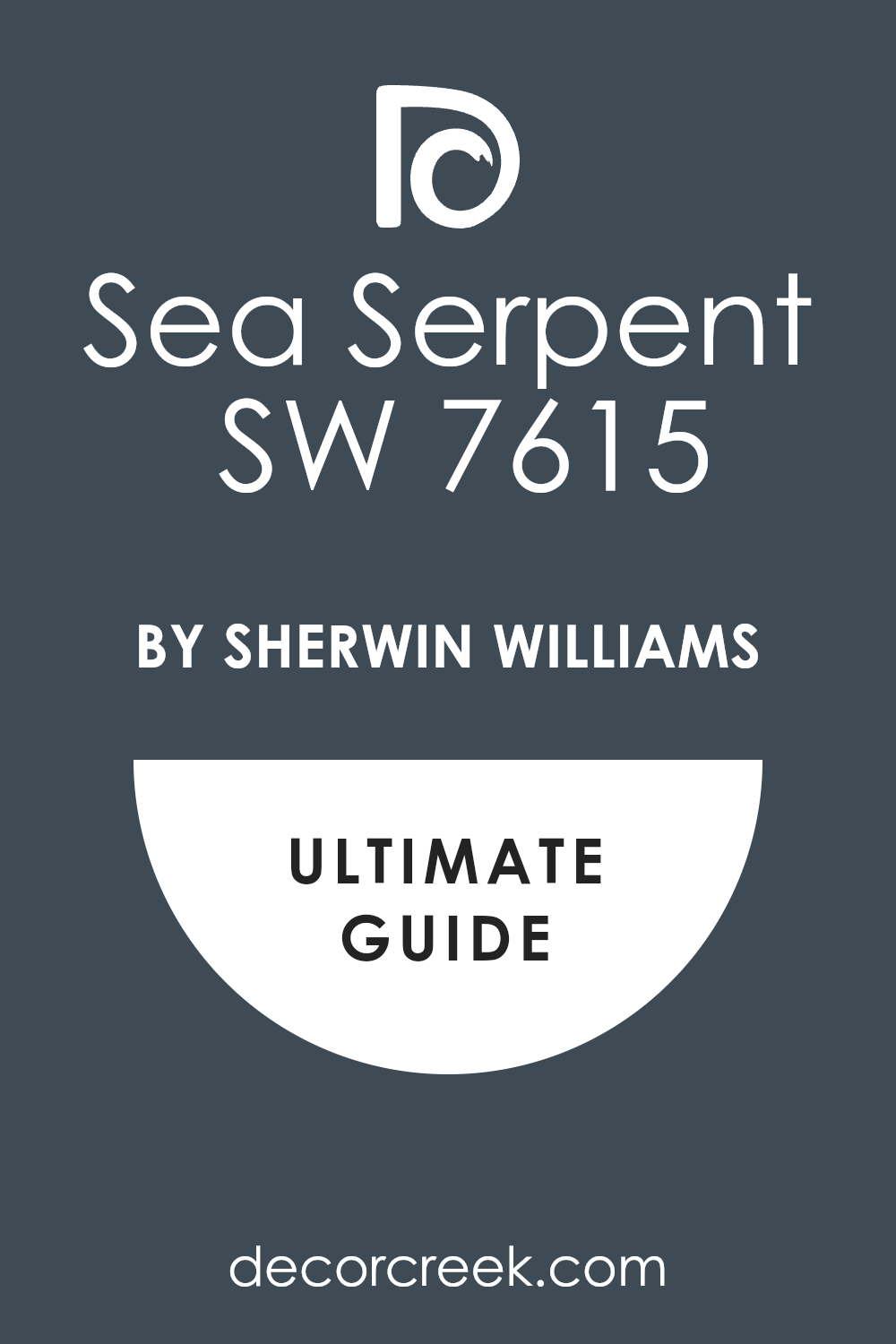
Sea Serpent — SW 7615
Sea Serpent SW 7622 is a deep and dark blue-green that feels like the bottom of the sea. This color is a top choice for a library that you want to feel very deep and very cool. I like how it looks with light wood desks and shiny silver lamps on the bookshelves.
The shade is very moody and creates a lot of drama in a small or large room. It makes the walls feel very far away which helps a small library feel bigger. This paint gives the house a very custom and high-end look that is very popular right now.
Many homeowners love how it makes their library look like a very modern and very smart place. You will enjoy how it makes your reading sessions feel like a very private and special escape. It is a sophisticated pick that makes your home feel very expensive and very well-planned.
Best used in: libraries, accent walls, and cabinetry
Pairs well with: Shoji White SW 7042, Light oak, Silver hardware The key rule of this color for farmhouse style is to use it where you want natural light to feel kind, soft, and inviting throughout the day.
Saybrook Sage — HC-114
Saybrook Sage HC-114 is a soft and earthy green that feels very traditional and very quiet. This color is perfect for a library with lots of windows and a view of the garden. I suggest it for people who want a room that feels very natural and very light and airy.
The shade has a bit of gray in it which keeps it looking very smart and never too bright. It looks beautiful with light wood shelves and white reading chairs in the room. This paint gives the library a very gentle and kind look that makes you want to stay all day.
Many people find that this green helps them feel more creative and more relaxed while they read. You will find that it makes your library feel like a very peaceful and very safe place in the house. It is a wonderful way to bring a little bit of the outdoors into your reading room.
Best used in: libraries, sunrooms, and guest rooms
Pairs well with: White Dove OC-17, Dark wood, Tan leather The key rule of this color for farmhouse style is to use it where you want natural light to feel kind, soft, and inviting throughout the day.

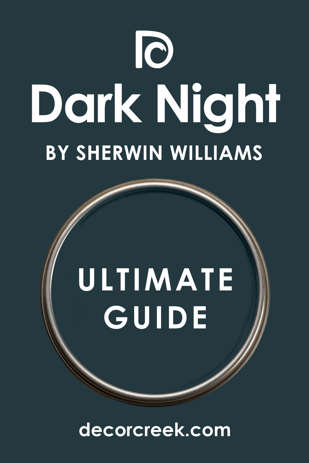
Dark Night — SW 6237
Dark Night SW 6237 is a very deep and moody teal that feels very rich and very fancy. This color is perfect for a library where you want to make a big impression on your guests. I love to use it on the walls and the ceiling for a very high-end and cozy look.
The shade is very dark but it has a beautiful green-blue tone that glows in the light. It looks incredible with gold picture frames and warm leather chairs in the library. This paint gives the room a very custom and designer look that makes the house feel better.
Many homeowners love how it makes their books look like a work of art on the dark shelves. You will enjoy how it makes your reading time feel like a very special and luxury experience. It is a bold pick that makes your home feel very sophisticated and very well-designed.
Best used in: libraries, media rooms, and powder rooms
Pairs well with: Greek Villa SW 7551, Gold hardware, Wood accents The key rule of this color for farmhouse style is to use it where you want natural light to feel kind, soft, and inviting throughout the day.
Hunter Green — 2041-10
Hunter Green 2041-10 is a classic and deep green that feels very traditional and very smart. This color is perfect for a library that feels like it has been there for a hundred years. I recommend it for a room with big leather sofas and a dark wood fireplace in the house.
The shade is very strong and makes the room feel very solid and very safe to be in. It looks amazing with white trim and gold lamps on the desks and bookshelves. This paint gives the room a very high-end and formal look that visitors will always admire.
Many people find that this green helps them feel more focused and more grounded while they work. You will enjoy how it makes your library feel like a very important and very private place for you. It is a timeless shade that makes every book in your collection look more valuable.
Best used in: traditional libraries, studies, and dining rooms
Pairs well with: Cloud White OC-130, Tan leather, Brass accents The key rule of this color for farmhouse style is to use it where you want natural light to feel kind, soft, and inviting throughout the day.

Billard Green — SW 0016
Billard Green SW 0016 is a very rich and deep forest green that feels very lush and very fancy. This color is a top choice for a library where you want to create a very cozy and snug feeling. I love how it looks with light wood shelves and white reading lamps on the desks.
The shade is very dark but it has a lot of heart and warmth to it that you will love. It makes the walls feel like they are wrapping around you while you sit and read your books. This paint gives the house a very custom and high-end look that matches a nice interior design.
Many homeowners find that this green helps them feel more relaxed after a long day at work. You will find that it makes your library feel like a very special and private retreat for your family. It is a sophisticated pick that makes your home feel very expensive and very well-planned.
Best used in: libraries, accent walls, and cabinetry
Pairs well with: Alabaster SW 7008, Gold hardware, Warm wood tones The key rule of this color for farmhouse style is to use it where you want natural light to feel kind, soft, and inviting throughout the day.
Boothbay Gray — HC-165
Boothbay Gray HC-165 is a beautiful blue-gray that makes a library feel very fresh and very airy. This color is perfect for a library that you use as a home office during the day. I like to use it to create a room that feels very smart and very well-organized for work.
The shade has enough blue to be pretty but enough gray to stay very professional and clean. It looks stunning with white shelves and shiny silver hardware on the desks and doors. This paint gives the room a very high-quality look that feels very light and very open.
Many people find that this color helps them feel more energetic and more happy while they read. You will enjoy how it makes your library feel like a very clean and very high-end place to be. It is a smart choice for anyone who wants a library that looks as good as it works.
Best used in: libraries, home offices, and laundry rooms
Pairs well with: White Dove OC-17, Hale Navy HC-154, Silver hardware The key rule of this color for farmhouse style is to use it where you want natural light to feel kind, soft, and inviting throughout the day.
Wrought Iron — 2124-10
Wrought Iron 2124-10 is a very dark gray that is almost black but feels a little bit softer. This color is perfect for a modern library where you want to make a very bold statement. I suggest using it on the walls and the ceiling for a very cozy and very cool feeling.
The shade makes your books look like they are floating against a very dark and solid background. It looks incredible with light wood floors and white furniture pieces in the library room. This paint gives the room a very custom and designer look that is very popular for 2026 homes.
Many homeowners love how it makes their library look like a very secret and very special place. You will find that this color makes your reading time feel like a very private and luxury experience. It is a powerful pick that makes your home feel very sophisticated and very well-planned.
Best used in: modern libraries, accent walls, and doors
Pairs well with: Simply White OC-117, Revere Pewter HC-172, Wood tones The key rule of this color for farmhouse style is to use it where you want natural light to feel kind, soft, and inviting throughout the day.

Urbane Bronze — SW 7048
Urbane Bronze SW 7048 is a warm and dark brown-gray that feels very grounded and very safe. This color is perfect for a library where you want to feel very tucked in and very comfortable. I love how it looks with warm wood floors and large green plants on the shelves or floor.
The shade has an organic feel that reminds me of nature and the solid earth under us. It makes the room feel very cozy and helps you focus on your books for a long time. This paint gives the house a very high-end look that is very popular for modern farmhouses.
Many people find that this color helps them feel more relaxed after a busy and noisy day. You will find that it makes your library feel like a very special and very private retreat for you. It is a sophisticated shade that makes your home feel very expensive and very well-made.
Best used in: libraries, exteriors, and media rooms
Pairs well with: Shoji White SW 7042, Agreeable Gray SW 7029, Bone White The key rule of this color for farmhouse style is to use it where you want natural light to feel kind, soft, and inviting throughout the day.
Terra Brun — SW 6048
Terra Brun SW 6048 is a deep and rich brown that feels very earthy and very traditional. This color is perfect for a library where you want to create a very old-fashioned and smart look. I recommend it for a room with built-in wood shelves and a large leather chair for reading.
The shade is very warm and makes the room feel very snug and very safe to be in. It looks amazing with gold lamps and white trim on the doors and window frames. This paint gives the room a very high-end and formal look that visitors will always love to see.
Many people find that this brown helps them feel more focused and more grounded while they read. You will enjoy how it makes your library feel like a very important and very private place. It is a timeless shade that makes every book in your collection look more pretty and more valuable.
Best used in: libraries, dining rooms, and cozy dens
Pairs well with: Alabaster SW 7008, Creamy whites, Dark wood The key rule of this color for farmhouse style is to use it where you want natural light to feel kind, soft, and inviting throughout the day.
Chelsea Gray — HC-168
Chelsea Gray HC-168 is a mid-tone gray that feels very steady and very professional on the walls. This color is great for a library that you also use for business meetings or as a home office. I like to use it to create a room that is both modern and very comfortable for everyone.
The shade is dark enough to show off white shelves but light enough to stay bright in the day. This paint gives the walls a very clean look that never feels too cold or too harsh for guests. Many families like this color because it works for both kids and adults in the house.
It looks great with any color of book covers or art you might have on your shelves. You will find that it makes your library feel like a very high-end and well-planned part of your home. It is a reliable choice that stays looking good for many years of reading and study.
Best used in: libraries, home offices, and cabinetry
Pairs well with: White Dove OC-17, Revere Pewter HC-172, Navy accents The key rule of this color for farmhouse style is to use it where you want natural light to feel kind, soft, and inviting throughout the day.

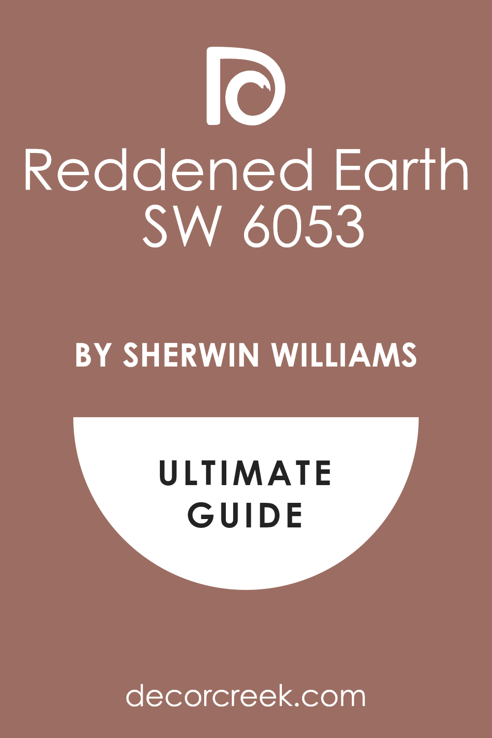
Reddened Earth — SW 6053
Reddened Earth SW 6053 is a warm and dusty terracotta that feels very unique and very cozy. This color is perfect for a library where you want to bring in some warmth and some color. I suggest it for people who want a room that feels very personal and very different from others.
The shade has a bit of a clay look that goes well with natural wood and leather in the house. It makes the room feel very snug and helps you feel very creative while you are reading or writing. This paint gives the room a very custom and designer look that is very popular for 2026.
Many homeowners love how it makes their library feel like a very special and warm place to be. You will enjoy how it makes your reading sessions feel like a very cozy and happy experience. It is a bold pick that makes your home feel very sophisticated and very well-planned.
Best used in: libraries, dining rooms, and accent walls
Pairs well with: Shoji White SW 7042, Dark wood tones, Bronze accents The key rule of this color for farmhouse style is to use it where you want natural light to feel kind, soft, and inviting throughout the day.
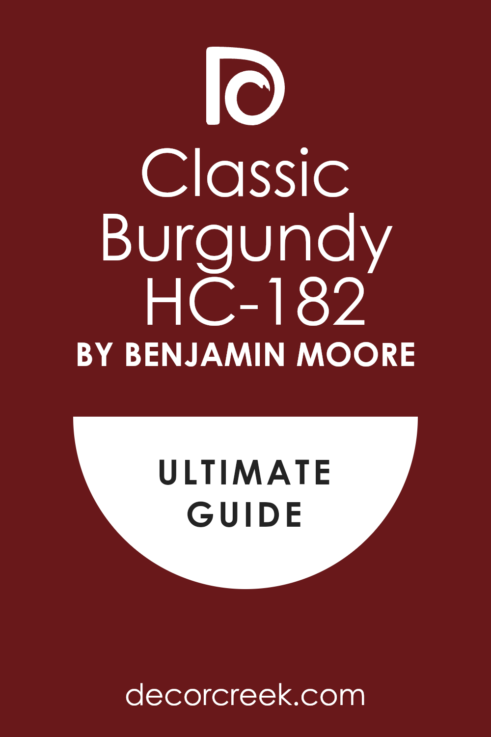
Classic Burgundy — HC-182
Classic Burgundy HC-182 is a deep and rich red that feels very formal and very traditional. This color is perfect for a library where you want to create a very high-end and smart look. I recommend it for a room with old books and a large wood fireplace in the house.
The shade is very strong and makes the room feel very solid and very safe to be in. It looks amazing with white trim and gold lamps on the desks and bookshelves. This paint gives the room a very high-quality and fancy look that guests will always admire.
Many people find that this red helps them feel more focused and more energetic while they read. You will enjoy how it makes your library feel like a very important and very private place for you. It is a classic shade that makes every book in your collection look more expensive and more pretty.
Best used in: traditional libraries, dining rooms, and formal dens
Pairs well with: Swiss Coffee OC-45, Tan leather, Gold accents The key rule of this color for farmhouse style is to use it where you want natural light to feel kind, soft, and inviting throughout the day.
Swiss Coffee — OC-45
Swiss Coffee OC-45 is a creamy white that feels very soft and very inviting in a library. This color is perfect for people who want a light library that still feels very warm and cozy. I love to use it to create a room that is very bright but still very comfortable for reading.
The shade has a tiny bit of yellow that keeps it from ever looking cold or harsh on the eyes. It looks amazing with dark wood shelves and a colorful rug on the floor in the room. This paint gives the library a very clean and classic look that will never go out of style.
Many homeowners like how it makes their books look very bright and very pretty on the wall. You will find that this color makes your library feel like a very happy and very welcoming place. It is a reliable choice for a room that you want to feel both smart and very cozy.
Best used in: libraries, kitchens, and whole-house walls
Pairs well with: Hale Navy HC-154, Revere Pewter HC-172, Wood tones The key rule of this color for farmhouse style is to use it where you want natural light to feel kind, soft, and inviting throughout the day.

Alabaster — SW 7008
Alabaster SW 7008 is a beautiful off-white that makes a library feel very fresh and very airy. This color is perfect for a library that you want to feel very modern and very clean. I like to use it to create a room that is very light but still has a lot of heart and warmth.
The shade has a bit of beige in it which keeps it from looking like a cold hospital room. It looks stunning with white shelves and light wood floors in the library room. This paint gives the room a very high-end look that feels very open and very large.
Many people find that this color helps them feel more relaxed and more happy while they read. You will enjoy how it makes your library feel like a very clean and very high-quality place to be. It is a smart choice for anyone who wants a library that looks very new and very updated.
Best used in: libraries, living rooms, and farmhouse exteriors
Pairs well with: Iron Ore SW 7069, Agreeable Gray SW 7029, Natural wood The key rule of this color for farmhouse style is to use it where you want natural light to feel kind, soft, and inviting throughout the day.
Pale Oak — OC-20
Pale Oak OC-20 is a soft greige that feels very natural and very quiet on the library walls. This color is perfect for people who want a light room that still feels very cozy and safe. I love how it looks with white bedding and light oak furniture pieces in a guest library.
The shade has a very gentle look that goes well with stone and tile in the house. It makes the room feel very airy but also very solid and grounded at the same time. This paint is a top choice for a library that you want to feel very high-end and professional.
It gives the walls a soft look that is very easy on your eyes while you read for hours. Many homeowners use this for their main library to make the whole house feel very updated. You will find that it makes your home feel very expensive and very well-designed for your family.
Best used in: libraries, bedrooms, and hallways
Pairs well with: Chantilly Lace OC-65, Revere Pewter HC-172, Wrought Iron 2124-10 The key rule of this color for farmhouse style is to use it where you want natural light to feel kind, soft, and inviting throughout the day.
Greek Villa — SW 7551
Greek Villa SW 7551 is a bright and happy white that makes a library feel very fresh and new. This color is a bit more sunny than other whites which makes the room feel very energetic. I recommend it for a library that does not get much natural light to make it feel brighter.
The shade has a tiny bit of yellow that keeps it from ever feeling cold or blue on the walls. It looks amazing with dark wood furniture and colorful books on the shelves in the room. This paint gives the library a very clean and fancy look that guests will always admire.
Many homeowners love how it makes their library feel like a very happy and very welcoming place. You will enjoy how this color makes your house feel very bright and very full of life every day. It is a reliable shade that makes every other color in the library look much better.
Best used in: libraries, kitchens, and trim
Pairs well with: Urbane Bronze SW 7048, Navy blue, Warm wood tones The key rule of this color for farmhouse style is to use it where you want natural light to feel kind, soft, and inviting throughout the day.
White Dove — OC-17
White Dove OC-17 is a very soft white that everyone in the design world loves to use in libraries. This color is the perfect white because it is not too yellow and not too blue for the eyes. It makes a room feel very bright and full of air without being harsh or cold at all.
I use it for the shelves and the walls to create a very clean and expensive look. The shade looks amazing with colorful books and dark wood floors in the library room. It gives the walls a creamy look that feels very high-quality and very well-made for a house.
This paint is great for making a small dark library feel much more open and large. It is a favorite for people who want a clean house that still feels very warm and friendly. You will enjoy how it makes your library feel like a very special and very professional place.
Best used in: libraries, trim, and whole-house walls
Pairs well with: Revere Pewter HC-172, Hale Navy HC-154, Dark wood The key rule of this color for farmhouse style is to use it where you want natural light to feel kind, soft, and inviting throughout the day.
Revere Pewter — HC-172
Revere Pewter HC-172 is a classic greige that makes a library feel very solid and very steady. This color looks good in almost every lighting situation that you can imagine for a room. It has a bit of green and gray in it which makes it feel very organic and natural.
I suggest this for libraries with wood shelves to make them look more updated and modern. The shade is deep enough to make a large library feel very cozy and very safe to be in. It provides a beautiful background for navy blue or dark green reading chairs in the room.
This paint makes the house feel very traditional but also very new and updated at once. It is a very sturdy color that looks great on walls and bookshelves alike in the house. You will love how it makes your library feel like a very high-end and well-planned place.
Best used in: libraries, living rooms, and cabinetry
Pairs well with: White Dove OC-17, Chelsea Gray HC-168, Wood tones The key rule of this color for farmhouse style is to use it where you want natural light to feel kind, soft, and inviting throughout the day.
Shoji White — SW 7042
Shoji White SW 7042 is a soft mix of white and beige that feels very grounded in a library. This color is perfect for large libraries where you want the walls to stay very simple and quiet. It is dark enough to show a contrast against white trim but light enough to stay very bright.
I use this when a client wants a library that feels warm but still very clean and new. The paint looks beautiful in the evening when you have your reading lamps turned on low. It hides small marks and dust on the shelves much better than a pure white paint would.
This shade works well with stone fireplaces and leather books in a large library room. Many people find it to be the most comfortable color to live with for many years. It is a smart choice for anyone who wants a library that feels like a very safe retreat.
Best used in: open libraries, bedrooms, and exteriors
Pairs well with: Accessible Beige SW 7036, Urbane Bronze SW 7048, Greige tones The key rule of this color for farmhouse style is to use it where you want natural light to feel kind, soft, and inviting throughout the day.
27 Best Dream Home Exterior Colors
White Dove — OC-17
White Dove OC-17 is a very soft white that makes the outside of a house look very elegant. This color is the perfect white because it is not too bright and it never looks too yellow. It makes a house feel very clean and full of light without being harsh in the sun.
I use it for the main body of a house to create a very classic and expensive look. The shade looks amazing with black window frames and dark green plants around the house. It gives the walls a creamy look that feels very high-quality and very well-made for a home.
This paint is great for making a small house feel much larger from the street. It is a favorite for people who want a clean house that still feels very warm and friendly. You will enjoy how it makes your home look like a very special and professional place.
Best used in: house siding, trim, and front porches
Pairs well with: Revere Pewter HC-172, Hale Navy HC-154, Black accents The key rule of this color for farmhouse style is to use it where you want natural light to feel kind, soft, and inviting throughout the day.
Swiss Coffee — OC-45
Swiss Coffee OC-45 is a creamy white that feels very soft and very inviting on a house exterior. This color is perfect for people who want a light house that still feels very warm and cozy. I love to use it to create a look that is very bright but still very comfortable to see.
The shade has a tiny bit of yellow that keeps it from ever looking cold or blue outside. It looks amazing with dark wood front doors and a colorful garden around the house. This paint gives the exterior a very clean and classic look that will never go out of style.
Many homeowners like how it makes their house look very happy and very pretty from the road. You will find that this color makes your home feel like a very welcoming and safe place. It is a reliable choice for a house that you want to feel both smart and very cozy.
Best used in: exteriors, kitchens, and whole-house walls
Pairs well with: Hale Navy HC-154, Iron Ore SW 7069, Wood accents The key rule of this color for farmhouse style is to use it where you want natural light to feel kind, soft, and inviting throughout the day.
Alabaster — SW 7008
Alabaster SW 7008 is a beautiful off-white that makes a house exterior feel very fresh and new. This color is perfect for a home that you want to feel very modern and very clean. I like to use it to create a look that is very light but still has heart and warmth.
The shade has a bit of beige in it which keeps it from looking like a cold white wall. It looks stunning with black metal details and light wood beams on the house. This paint gives the exterior a very high-end look that feels very open and very large.
Many people find that this color helps their house stand out in a very nice and quiet way. You will enjoy how it makes your home feel like a very clean and high-quality place to live. It is a smart choice for anyone who wants a house that looks very new and updated.
Best used in: farmhouse exteriors, siding, and trim
Pairs well with: Urban Bronze SW 7048, Agreeable Gray SW 7029, Black metal The key rule of this color for farmhouse style is to use it where you want natural light to feel kind, soft, and inviting throughout the day.
Shoji White — SW 7042
Shoji White SW 7042 is a soft mix of white and beige that feels very grounded on a house. This color is perfect for large exteriors where you want the walls to stay simple and quiet. It is dark enough to show a contrast against white trim but light enough to stay very bright.
I use this when a client wants a house that feels warm but still very clean and new. The paint looks beautiful in the afternoon when the sun hits the side of the building. It hides dust and dirt from the yard much better than a pure white paint would.
This shade works well with stone details and dark wood doors on a large family home. Many people find it to be the most comfortable color to live with for many years. It is a smart choice for anyone who wants an exterior that feels like a very safe retreat.
Best used in: exteriors, open interiors, and bedrooms
Pairs well with: Accessible Beige SW 7036, Urbane Bronze SW 7048, Wood tones The key rule of this color for farmhouse style is to use it where you want natural light to feel kind, soft, and inviting throughout the day.
Seapearl — OC-19
Seapearl OC-19 is a very light gray-white that feels as fresh as the ocean air. This color is perfect for a house by the water or a home in a very sunny place. I like to use it to create a look that is very clean and very sophisticated for a house.
The shade has a bit of a cool tone that keeps the house looking fresh on hot days. It looks amazing with navy blue shutters and white trim on the window frames. This paint gives the exterior a very high-end look that is very popular for modern homes.
Many homeowners love how it makes their house look very bright and very well-organized. You will find that it makes your home feel like a very special and professional place to be. It is a reliable shade that makes every other color on the house look much better.
Best used in: coastal exteriors, trim, and modern siding
Pairs well with: Hale Navy HC-154, Gray Owl OC-52, Silver accents The key rule of this color for farmhouse style is to use it where you want natural light to feel kind, soft, and inviting throughout the day.

Olympic Mountains — 971
Olympic Mountains 971 is a beautiful and soft greige that feels very natural on a house. This color is a bit warmer than a normal gray which makes the exterior feel very cozy. It is a great choice for a home in the mountains or a house with many trees.
I love how it looks with dark brown trim and stone details on the front of the house. The shade has a very gentle look that goes well with the natural world around it. It makes the house feel very solid and grounded while staying very light and airy.
This paint is a top choice for a house that you want to feel very high-end and professional. It gives the exterior a soft look that is very easy on your eyes in the bright sun. You will find that it makes your home feel very expensive and very well-designed.
Best used in: exteriors, siding, and traditional homes
Pairs well with: White Dove OC-17, Wrought Iron 2124-10, Dark wood The key rule of this color for farmhouse style is to use it where you want natural light to feel kind, soft, and inviting throughout the day.

Revere Pewter — HC-172
Revere Pewter HC-172 is a classic greige that makes a house exterior feel very solid and steady. This color looks good in almost every type of weather that you can imagine for a home. It has a bit of green and gray in it which makes it feel very organic and natural.
I suggest this for houses with stone or brick details to make them look more updated. The shade is deep enough to make a large house feel very cozy and very safe to see. It provides a beautiful background for black or dark navy blue front doors on the house.
This paint makes the home feel very traditional but also very new and updated at once. It is a very sturdy color that looks great on siding and trim alike in the house. You will love how it makes your home look like a very high-end and well-planned place.
Best used in: exteriors, kitchens, and cabinetry
Pairs well with: White Dove OC-17, Chelsea Gray HC-168, Black accents The key rule of this color for farmhouse style is to use it where you want natural light to feel kind, soft, and inviting throughout the day.
Agreeable Gray — SW 7029
Agreeable Gray SW 7029 is a perfect blend of gray and beige that many people love for a house. This color is the king of neutrals because it looks good with every type of roof color. It feels very fresh in the morning and very warm when the sun goes down at night.
I recommend this for people who want a house that looks modern but still very friendly. The shade makes your home feel very open and full of life from the street. It is a top choice for selling a house because every person who sees it will like it.
This paint works well with white trim and dark gray accents on the window frames. It is a very safe pick that never feels like a mistake once it is on the house. You will love how it makes your home feel very high-end and very soft and kind.
Best used in: whole-house exteriors, living areas, and bedrooms
Pairs well with: Alabaster SW 7008, Sea Salt SW 6204, Iron Ore SW 7069 The key rule of this color for farmhouse style is to use it where you want natural light to feel kind, soft, and inviting throughout the day.
Edgecomb Gray — HC-173
Edgecomb Gray HC-173 is a classic greige that feels very earthy and very natural on a house. This color is darker than a white but lighter than a tan which is just perfect. It is a great pick for an exterior to make the home feel very solid and well-built.
I love how it looks against dark wood doors and black metal lights on the porch. The shade has a very steady and reliable feeling that many homeowners love to see. It makes white trim pop just enough to look very sharp and very clean on the house.
This paint is a favorite for families who want a house that looks very welcoming. It hides a bit of dirt from the wind and rain better than the very light colors. You can trust it to make your home feel very warm and very well-put-together.
Best used in: house siding, entryways, and living rooms
Pairs well with: Revere Pewter HC-172, White Dove OC-17, Hale Navy HC-154 The key rule of this color for farmhouse style is to use it where you want natural light to feel kind, soft, and inviting throughout the day.
Repose Gray — SW 7015
Repose Gray SW 7015 is a true gray that still manages to feel very friendly and very warm. This color is a bit cooler than a beige but it never feels like a cold piece of metal. It is a great choice for a modern house that wants to look very clean and very updated.
I love how it looks with dark navy blue doors and silver light fixtures on the porch. The shade gives a very professional and clean look to the outside of any home. It is deep enough to provide a nice contrast against white doors and white window trim.
This paint is very popular for house exteriors because it looks fantastic in the bright sun. It hides small marks and dust better than the very light white shades do. You will find that it creates a very steady and stable feeling for your home exterior.
Best used in: exteriors, living rooms, and offices
Pairs well with: Eider White SW 7014, Naval SW 6244, Silver accents The key rule of this color for farmhouse style is to use it where you want natural light to feel kind, soft, and inviting throughout the day.
Gray Owl — OC-52
Gray Owl OC-52 is a light and cool gray that feels very fresh and very crisp on a house. This color has a tiny bit of blue in it that makes it look like the morning sky. It is a perfect choice for a modern home that wants to feel very light and very airy.
I like to use it on houses with a lot of glass to create a very clean look. The shade makes white trim look very bright and very clean in the daylight. This paint gives the exterior a very high-end look that visitors will admire from the road.
It works well with dark gray roofs and black metal details on the windows. Many people love how this color feels very light but still has plenty of style and heart. It is a smart pick for a house that wants to feel very soft and very welcoming.
Best used in: modern exteriors, living rooms, and kitchens
Pairs well with: White Dove OC-17, Hale Navy HC-154, Black accents The key rule of this color for farmhouse style is to use it where you want natural light to feel kind, soft, and inviting throughout the day.

Stonington Gray — HC-170
Stonington Gray HC-170 is a very clean and cool gray that feels like a professional design choice. This color is perfect for a house with a lot of stone work and silver metal details. It makes the exterior look very modern and very well-organized for a busy family.
I like to use it to create a look that feels very sharp and ready for the world. The shade has no weird tones so it stays looking gray even in the bright afternoon sun. This paint gives the house a very steady look that helps it stand out in the neighborhood.
Many people like this color because it feels very solid and it doesn’t look like any other house. It works well with white trim and dark gray shutters on the windows. You will find that this color makes your house feel very high-tech and very efficient.
Best used in: modern exteriors, weight rooms, and basements
Pairs well with: Chantilly Lace OC-65, Black accents, Chrome hardware The key rule of this color for farmhouse style is to use it where you want natural light to feel kind, soft, and inviting throughout the day.
Chelsea Gray HC-168
Chelsea Gray — HC-168 is a mid-tone gray that feels very steady and very professional on an exterior. This color is great for a house that you want to feel both modern and very strong. I like to use it to create a look that is very high-end and very well-designed for a family.
The shade is dark enough to show off white trim but light enough to stay bright in the day. This paint gives the house a very clean look that never feels too cold or too harsh. Many families like this color because it makes the house look very sturdy and very safe.
It looks great with any color of flowers or plants you have in the yard. You will find that it makes your home feel like a very high-quality and well-planned part of the street. It is a reliable choice that stays looking good for many years.
Best used in: house siding, cabinetry, and libraries
Pairs well with: White Dove OC-17, Revere Pewter HC-172, Black accents The key rule of this color for farmhouse style is to use it where you want natural light to feel kind, soft, and inviting throughout the day.
Kendall Charcoal — HC-166
Kendall Charcoal HC-166 is a deep and rich gray that feels very solid on the outside of a house. This color is perfect for a home that wants to make a very bold and modern statement. It makes the house look very strong and very safe like it will stand there forever.
I love to use it on the main siding to make the house look very expensive and sharp. The shade has a bit of warmth so it never feels like a cold piece of hard metal. It looks beautiful with light wood details and bright white trim on the window frames.
This paint gives the house a very custom and high-end look for a 2026 home design. It is a great choice for hiding any dirt or marks from the wind and rain outside. Many homeowners love this for their exterior to give the house a very strong and private look.
Best used in: house siding, accent walls, and media rooms
Pairs well with: Simply White OC-117, Revere Pewter HC-172, Wood tones The key rule of this color for farmhouse style is to use it where you want natural light to feel kind, soft, and inviting throughout the day.
Urbane Bronze — SW 7048
Urbane Bronze SW 7048 is a warm and dark brown-gray that feels very grounded on a house exterior. This color is perfect for a modern farmhouse where you want to feel very close to nature. I love how it looks with warm wood doors and large green trees around the house.
The shade has an organic feel that reminds me of the dark earth and the strong trees. It makes the house look very cozy and helps it blend into the beautiful yard around it. This paint gives the exterior a very high-end look that is very popular for new homes right now.
Many people find that this color helps their home feel more relaxed and more private from the street. You will find that it makes your house feel like a very special and very safe retreat. It is a sophisticated shade that makes your home feel very expensive and well-made.
Best used in: exteriors, libraries, and accent doors
Pairs well with: Shoji White SW 7042, Agreeable Gray SW 7029, Bone White The key rule of this color for farmhouse style is to use it where you want natural light to feel kind, soft, and inviting throughout the day.
Iron Ore — SW 7069
Iron Ore SW 7069 is a deep charcoal that is almost black but feels a bit softer on the outside. This color adds a lot of strength and mystery to the house as soon as you see it. I suggest using it on the main siding to create a very modern and very cool look for a home.
It looks incredible when paired with light wood trim and white stone details on the front. The shade is very popular for high-end house designs because it looks so sharp and clean. It gives the house a look that will never go out of style even after many years pass.
This paint is great at hiding any scuffs or marks from the weather and daily life. It makes the house look very solid and well-built as people drive past it on the road. Many designers use this for the whole house to create a very powerful and fancy look.
Best used in: modern exteriors, accent walls, and cabinetry
Pairs well with: Alabaster SW 7008, Revere Pewter HC-172, Wood tones The key rule of this color for farmhouse style is to use it where you want natural light to feel kind, soft, and inviting throughout the day.
Tricorn Black — SW 6258
Tricorn Black SW 6258 is a true black that makes a house look very bold and very cool from the street. This color has no other tones in it so it stays looking very dark and very pure in the sun. I suggest using it on the doors and window trim to create a very sharp and clean look.
The shade makes the rest of your house colors look much brighter and much more pretty. It looks incredible with white stone walls or very light wood details on the house. This paint gives the exterior a very high-end and modern look that is very popular for 2026.
It makes a house feel like a very important and serious place to be for a family. Many designers love this color because it makes every other feature of the house stand out. You will find that this color makes your home feel very expensive and very well-designed.
Best used in: front doors, shutters, and modern siding
Pairs well with: Pure White SW 7005, Gold hardware, Light stone The key rule of this color for farmhouse style is to use it where you want natural light to feel kind, soft, and inviting throughout the day.
Black Beauty — 2128-10
Black Beauty 2128-10 is a rich and warm black that feels very soft on a house exterior. This color is perfect for people who want a dark house that still feels very welcoming and kind. I like to use it to create a look that is very sophisticated and very high-end for a family home.
The shade has a bit of a brown tone in it that keeps it from looking like a cold piece of coal. It looks amazing with white trim and dark wood doors on the front of the house. This paint gives the exterior a very fancy and expensive look that guests will always admire.
Many homeowners love how it makes their house feel like a very special and very private retreat. You will find that it makes your home look very well-made and very well-cared for from the road. It is a bold pick that makes your home feel very personal and very well-designed.
Best used in: exteriors, accent walls, and front doors
Pairs well with: Classic Gray OC-23, Wood tones, Bronze hardware The key rule of this color for farmhouse style is to use it where you want natural light to feel kind, soft, and inviting throughout the day.
Hale Navy — HC-154
Hale Navy HC-154 is a deep and rich blue that makes a house exterior look very smart and traditional. This color is perfect for a home with white trim and a big green lawn around it. I love to use it to create a look that feels very professional and very high-quality for a family.
The shade is dark and moody but it still feels very warm and very friendly in the sun. It looks amazing with gold light fixtures and a warm wood front door on the house. This paint gives the exterior a very fancy and expensive look that will never go out of style.
Many people find that dark blue helps their house look more sturdy and more well-built. You will find that this color makes your home feel like the most special house on the whole street. It is a classic choice that makes every other detail on the house look much better.
Best used in: house siding, shutters, and home gyms
Pairs well with: White Dove OC-17, Revere Pewter HC-172, Gold accents The key rule of this color for farmhouse style is to use it where you want natural light to feel kind, soft, and inviting throughout the day.
Naval — SW 6244
Naval SW 6244 is a classic dark blue that feels very strong and very steady on a house. This color is great for an exterior where you want a very clean and very nautical look. I like to use it to create a home that feels very high-quality and very well-designed from the road.
The shade looks amazing with white trim and light gray details on the window frames and doors. This paint is a favorite for people who want a house that looks both modern and very traditional. It gives the home a very smart and professional look that visitors will always admire as they arrive.
Many homeowners find that this blue helps them feel more confident and happy with their house. You will enjoy how this color makes your home exterior feel very clean and very well-organized. It is a reliable choice for a house that you want to look great in every season.
Best used in: exteriors, kitchen cabinets, and front doors
Pairs well with: Alabaster SW 7008, Silver hardware, Light gray stone The key rule of this color for farmhouse style is to use it where you want natural light to feel kind, soft, and inviting throughout the day.
Newburg Green — HC-158
Newburg Green HC-158 is a deep and moody teal-green that feels very rich on a house exterior. This color is perfect for someone who wants a unique house that still looks very high-end and smart. I love how it looks with light gray trim and shiny copper lights on the front of the house.
The shade is very dark but it has a beautiful blue-green color that glows in the afternoon sun. It creates a very mysterious and fancy feeling that your neighbors will talk about in a good way. This paint is perfect for a house that wants to feel very private and very well-cared for by a family.
It gives the walls a very rich look that makes the whole house feel older and much better. Many people find that this color helps their home feel more connected to the garden and the trees. You will love how it makes your house feel like a very special and very private retreat.
Best used in: exteriors, cabinetry, and accent walls
Pairs well with: Stonington Gray HC-170, Copper accents, White trim The key rule of this color for farmhouse style is to use it where you want natural light to feel kind, soft, and inviting throughout the day.
Narragansett Green — HC-157
Narragansett Green HC-157 is a very dark and moody blue-gray that feels very sophisticated on a house. This color is perfect for a modern home that wants to have a very bold and strong look. I suggest using it on the siding and the trim to create a very seamless and high-end feeling.
The shade is almost black in the shadows but shows a beautiful blue color when the sun hits it. It looks incredible with light wood floors on the porch and white stone details on the house. This paint gives the exterior a very custom and designer look that is very popular for 2026.
Many homeowners love how it makes their house look like a very secret and very special place to live. You will find that this color makes your home feel very high-quality and very well-planned for your family. It is a powerful pick that makes the whole house feel more complete and very fancy.
Best used in: modern exteriors, accent walls, and libraries
Pairs well with: Simply White OC-117, Revere Pewter HC-172, Wood tones The key rule of this color for farmhouse style is to use it where you want natural light to feel kind, soft, and inviting throughout the day.
Pewter Green — SW 6208
Pewter Green SW 6208 is a soft and earthy green that feels very traditional and very smart on a house. This color is perfect for a home with lots of trees and a big garden around it. I recommend it for people who want a house that feels very natural and very quiet from the road.
The shade has a lot of gray in it which keeps it looking very mature and never too bright in the sun. It looks beautiful with light wood trim and dark brown doors on the front of the house. This paint gives the exterior a very gentle and kind look that makes you want to stay at home all day.
Many people find that this green helps their house look more grounded and more safe for their family. You will find that it makes your home feel like a very peaceful and very safe place in the neighborhood. It is a wonderful way to bring a little bit of nature onto your house walls.
Best used in: exteriors, kitchen islands, and bedrooms
Pairs well with: Shoji White SW 7042, Dark wood, Tan leather The key rule of this color for farmhouse style is to use it where you want natural light to feel kind, soft, and inviting throughout the day.

Saybrook Sage — HC-114
Saybrook Sage HC-114 is a beautiful and light green that feels very fresh and very airy on a house. This color is perfect for a traditional home that wants to feel very light and very happy in the sun. I like to use it to create a look that is very clean and very well-organized for a family.
The shade has enough green to be pretty but enough gray to stay very professional and very smart. It looks stunning with white trim and dark gray roofs on a large or small house. This paint gives the exterior a very high-quality look that feels very light and very open from the street.
Many people find that this color helps their home feel more energetic and more happy in the morning. You will enjoy how it makes your house feel like a very clean and very high-end place to live for years. It is a smart choice for anyone who wants an exterior that looks as good as new.
Best used in: traditional exteriors, libraries, and sunrooms
Pairs well with: White Dove OC-17, Dark wood, Silver hardware The key rule of this color for farmhouse style is to use it where you want natural light to feel kind, soft, and inviting throughout the day.
Evergreen Fog — SW 9130
Evergreen Fog SW 9130 is a muted green that brings a little bit of the forest onto your house. This color was a color of the year because it feels so natural and very grounded for a home. It is a fantastic pick for a house where you want to feel safe and tucked in from the world.
I like using it on the main siding or the front door for a very big and nice change. The shade has a gray base which makes it very easy to look at every single day in the sun. It looks stunning when you pair it with gold light fixtures and warm wood beams on the house.
This paint makes a home feel more connected to the trees and the natural world outside. It is a very fancy choice that does not feel too loud or too bright for a quiet street. Many homeowners love this for their house to make a very great first impression on guests.
Best used in: exteriors, accent walls, and bedrooms
Pairs well with: Shoji White SW 7042, Urbane Bronze SW 7048, Wood tones The key rule of this color for farmhouse style is to use it where you want natural light to feel kind, soft, and inviting throughout the day.
Manchester Tan — HC-81
Manchester Tan HC-81 is a warm and sandy beige that feels very classic and very steady on a house. This color is perfect for people who want a traditional home that feels very warm and very welcoming. I love how it looks with white trim and dark brown shutters on the windows of the house.
The shade has a very natural look that goes well with stone and brick details on the front. It makes the house feel very solid and well-built while staying very light and happy. This paint is a top choice for a house that you want to feel very high-end and professional.
It gives the exterior a soft look that is very easy on your eyes in the bright morning sunlight. Many homeowners use this for their main house color to make the whole property feel very updated. You will find that it makes your home feel very expensive and very well-designed for your family.
Best used in: traditional exteriors, living rooms, and hallways
Pairs well with: White Dove OC-17, Revere Pewter HC-172, Dark wood The key rule of this color for farmhouse style is to use it where you want natural light to feel kind, soft, and inviting throughout the day.

Golden Bark 2153-10
Golden Bark 2153-10 is a deep and rich brown that feels very earthy and very traditional on a house. This color is perfect for an exterior where you want to create a very old-fashioned and smart look. I recommend it for a home with stone details and a large front porch in the neighborhood.
The shade is very warm and makes the house feel very snug and very safe for a family to live in. It looks amazing with white trim and gold lamps on the front door and window frames. This paint gives the exterior a very high-end and formal look that visitors will always admire as they pass.
Many people find that this brown helps their house look more focused and more grounded in the yard. You will enjoy how it makes your home feel like a very important and very private place. It is a timeless shade that makes every part of your house look more pretty and more valuable.
Best used in: exteriors, libraries, and dining rooms
Pairs well with: Alabaster SW 7008, Creamy whites, Dark stone The key rule of this color for farmhouse style is to use it where you want natural light to feel kind, soft, and inviting throughout the day.
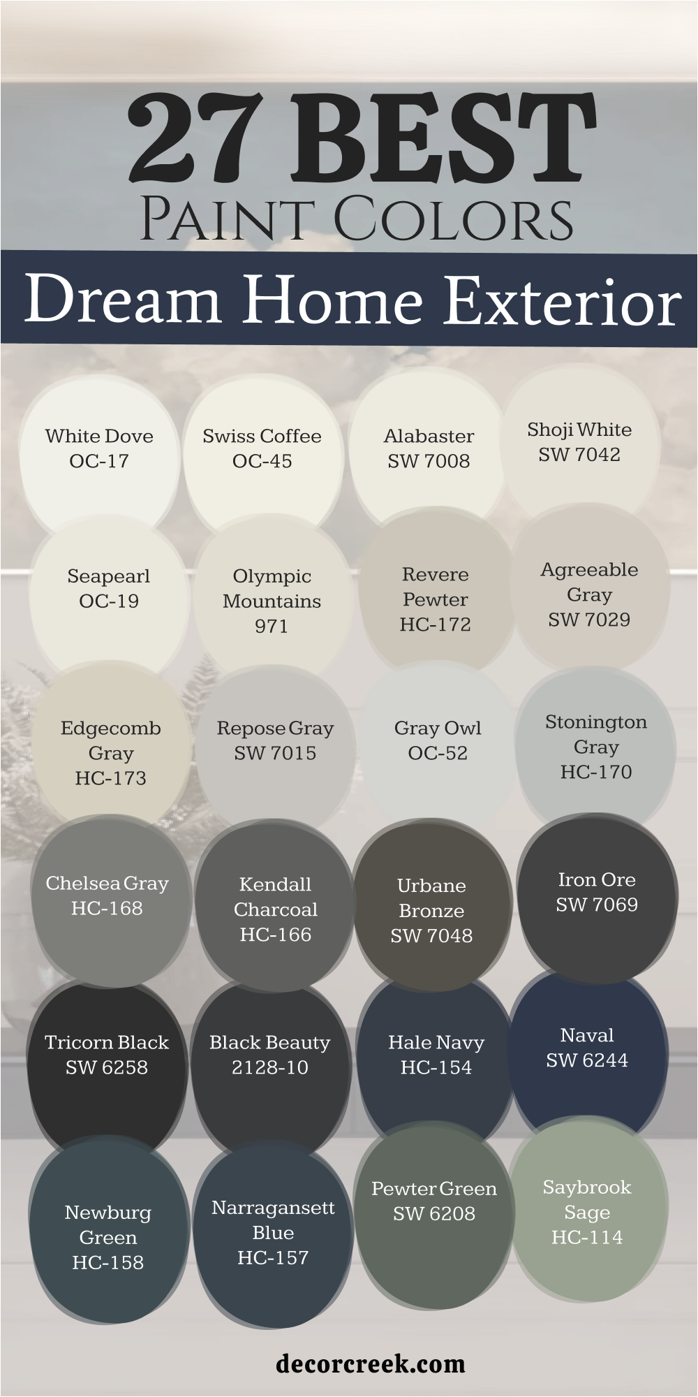
My Final Thoughts about 33 Best Dream Home Paint Color Ideas
Selecting the perfect palette is the foundational step in transforming a simple structure into a curated dream home that reflects your soul. These carefully selected lists from industry leaders like Sherwin-Williams and Benjamin Moore are designed to provide you with the professional clarity and creative confidence needed to master your environment. It is vital to remember that paint is never just a chemical coating on a surface; it is the emotional architecture of your daily existence, defining the boundary between the chaos of the world and the peace of your private life.
Whether you are designing a private library intended to feel like a sophisticated, cozy sanctuary for deep thought, or a high-energy home gym engineered to trigger peak physical performance, the perfect frequency of color is waiting to be discovered. I encourage you to move through this process with intentionality, observing with a keen eye how the shifting angles of the sun and the transition from dawn to dusk completely redefine the character of your chosen shades.
Your home should be a profound reflection of your achievements and a space where you feel an overwhelming sense of pride and joy every time you turn the key in the lock. There is a unique, transformative magic in seeing how a fresh coat of paint can instantly revitalize a family’s collective energy and spark a new chapter of domestic happiness.
Ultimately, you are the director of your own space—trust your intuition, listen to your instincts, and commit to the colors that bring a genuine, lasting smile to your face.