Gray paint might look simple, but choosing the right one can be tricky. Some grays feel warm and cozy. Others feel fresh and cool. I’ve tried more shades of gray than I can count, and I’ve seen how they change depending on the light, the furniture, and even the season.
This list includes the ones that truly work in real homes. These aren’t just pretty on a paint chip — they actually look good on the wall. If you’re thinking about repainting a room, your kitchen, or even your whole house, you’ll find something that fits.
I made this list to help you skip the stress and feel more sure about your choice. These grays won’t leave you second-guessing.
Why I Always Rely on Sherwin-Williams for Gray Paints
I trust Sherwin-Williams because their grays never let me down. The colors are rich, but still soft enough to live with every day. Their paints go on smoothly and cover so well that I don’t need tons of coats. They make it easy for me to match the feeling I want for each room. Whether I’m working in a modern home or something older, there’s always a gray that works.
What really makes a difference is how their colors stay true. I’ve used other brands before, but sometimes the gray turns blue or even purple on the wall. With Sherwin-Williams, I don’t get those surprises.
How I Pick the Right Gray Shade for Each Room
I always think about how the light hits the room first. If the room is dark or faces north, I usually go with a warm gray so it doesn’t feel cold. If it’s bright and sunny, a cool gray can feel just right. I also look at the floors, furniture, and even the fabric on the sofa. Some grays look green or brown depending on what’s around them. I hold paint samples up to everything in the room — not just the wall. And I always test a sample first.
That little step saves so many headaches. Gray looks different at 9 a.m. and at 9 p.m., so I check it all day long before choosing.
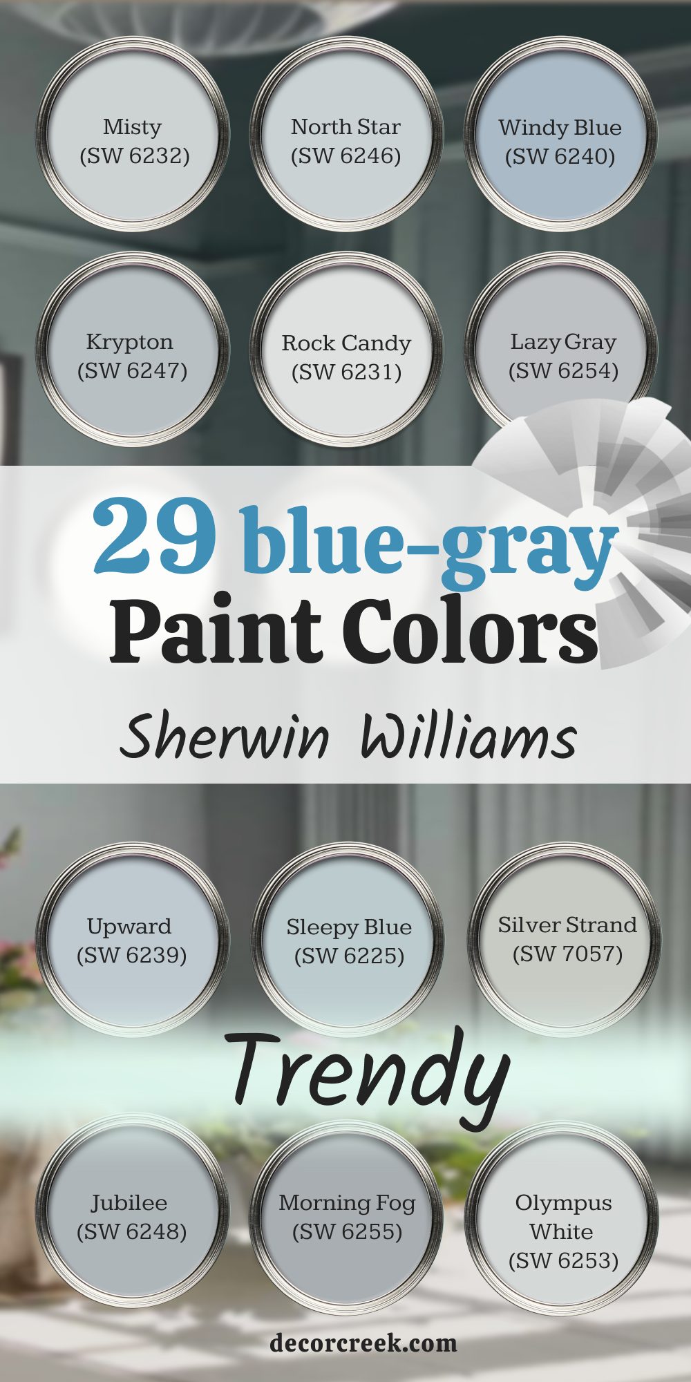
29 Best Blue Gray Paint Colors from Sherwin-Williams
Misty (SW 6232)
Misty looks soft, like the color of clouds right before it rains. Misty has just enough blue to feel clean but still feels warm on the wall. Misty works really well in bedrooms, especially if you want something restful but not dull. Misty also looks pretty in bathrooms, paired with white tile or soft wood tones. Misty stays steady in natural or artificial light, which helps it look consistent.
The key rule of this color for room walls: keep the lighting warm for that soft, cozy feel.

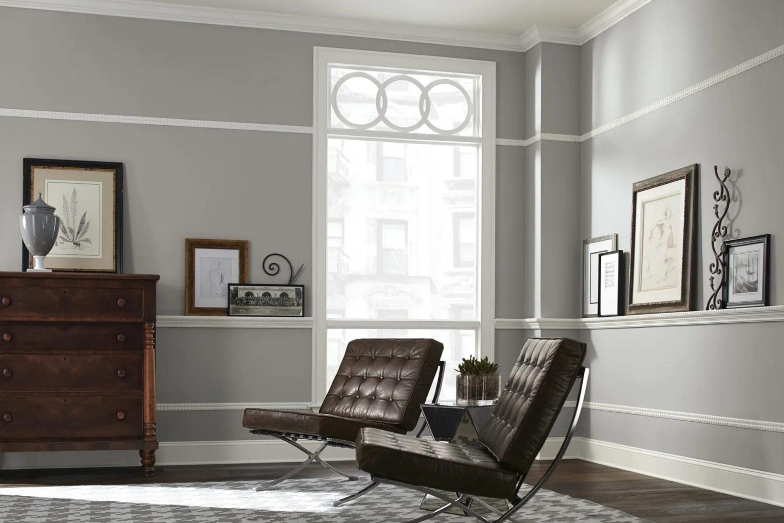
North Star (SW 6246)
North Star has a quiet energy that works great in family rooms. North Star leans cool, but never feels cold. North Star sits between gray and blue just enough to go with both warm and cool furniture. North Star also pairs beautifully with brass or matte black fixtures. North Star changes slightly with the light, but in a good way — always gentle.
The key rule of this color: keep your fabrics light or white to make this shade shine.
Windy Blue (SW 6240)
Windy Blue feels like an open window on a spring morning. Windy Blue leans more blue than gray but never looks too bright. Windy Blue works well in kitchens, especially near white cabinets or marble counters. Windy Blue also brings calm to laundry rooms or hallways. Windy Blue is one of those shades that makes everything around it feel a little fresher.
The key rule here: use it where you want a breath of air without going full blue.

Evening Shadow (SW 7662)
Evening Shadow has that soft, smoky look that works so well in bedrooms. Evening Shadow leans cooler and can almost feel silver in bright light. Evening Shadow looks amazing next to light wood furniture or black metal details. Evening Shadow is great in rooms where you want gray with a little edge. Evening Shadow also balances out bold colors like navy or forest green.
The key rule of this shade: test it in both morning and afternoon light to see its full range.

Krypton (SW 6247)
Krypton sits right in the middle of gray and blue. Krypton works beautifully in home offices or guest rooms where you want a bit of mood without too much color. Krypton feels modern but never too sharp. Krypton looks great with clean white trim or warm wood tones. Krypton also works in open-concept spaces where the light changes often.
The key rule of this color: avoid pairing it with bright yellow or red — it looks best with cool tones or neutrals.
Rock Candy (SW 6231)
Rock Candy is like the softest touch of gray-blue you can imagine. Rock Candy looks barely there on the wall, which makes it great for ceilings or full-room color. Rock Candy is perfect for nurseries or bathrooms with lots of white. Rock Candy also helps small rooms feel more open. Rock Candy doesn’t fight with other colors, so you can layer in brighter decor.
The key rule: use this when you want something quiet but still polished.
Lazy Gray (SW 6254)
Lazy Gray is anything but lazy when it comes to style. Lazy Gray leans cool and has a clear blue undertone. Lazy Gray fits beautifully in dens, dining rooms, or even front doors. Lazy Gray looks great with white trim and rich textures like velvet or leather. Lazy Gray has a steady tone that doesn’t shift too much in daylight.
The key rule of this color: bring in warm lighting so it doesn’t feel flat at night.
Upward (SW 6239)
Upward feels light, fresh, and easy. Upward looks almost like a blue sky with a touch of gray mixed in. Upward is perfect for bedrooms, bathrooms, or any room that needs a peaceful base. Upward works best with simple furniture and natural fabrics. Upward also pairs well with pale wood floors or whitewashed furniture.
The key rule: it’s a great color to keep a home feeling light without going full white.

Sleepy Blue (SW 6225)
Sleepy Blue feels like a soft morning right before the sun rises. Sleepy Blue has more gray in it than you’d expect from a blue, and that helps it feel gentle. Sleepy Blue works well in nurseries, reading corners, or any room that needs a quiet touch. Sleepy Blue also pairs nicely with creams, warm whites, and natural wood. Sleepy Blue looks especially pretty when the light hits just right in the afternoon.
The key rule: don’t overmatch it with navy — this one needs breathing room.
Silver Strand (SW 7057)
Silver Strand brings a touch of quiet and polish into any space. Silver Strand leans toward green-gray but still holds onto a soft blue base. Silver Strand looks beautiful in bathrooms, especially next to brushed nickel or soft marble. Silver Strand has just enough gray to help it feel grown-up but not too serious. Silver Strand is one of those colors I use when someone wants soft color without picking a “real” color.
The key rule: make sure your room doesn’t get too much shadow or it might turn murky.

Jubilee (SW 6248)
Jubilee has a medium gray base with a bold blue undertone. Jubilee brings a bit more energy than most of the other grays on this list. Jubilee works great in offices, living rooms, or exterior accents like shutters. Jubilee also looks beautiful with white trim and brass hardware. Jubilee gives you color without going bold — it always feels balanced.
The key rule: use this when you want a gray that makes a quiet statement.
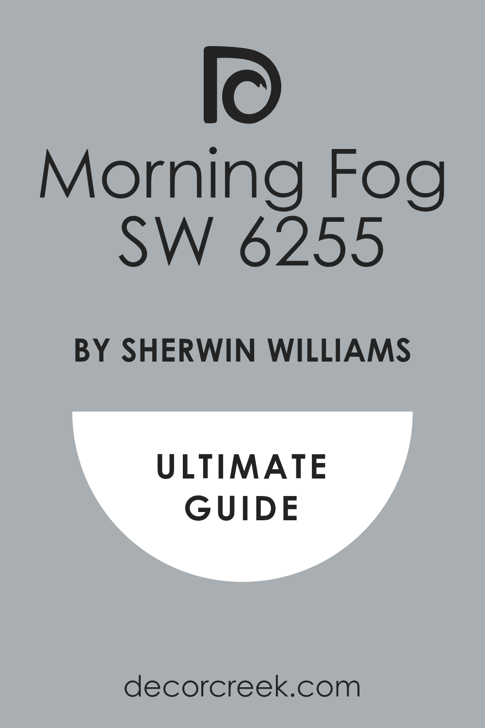
Morning Fog (SW 6255)
Morning Fog is cozy and grounded, like the sky on a rainy day. Morning Fog is definitely a cool gray with clear blue undertones. Morning Fog works beautifully in bedrooms with soft bedding and light flooring. Morning Fog also brings a calm feeling to living rooms or staircases. Morning Fog doesn’t shift too much with the light, which helps it feel steady.
The key rule of this color: pair it with simple decor so the paint can carry the mood.
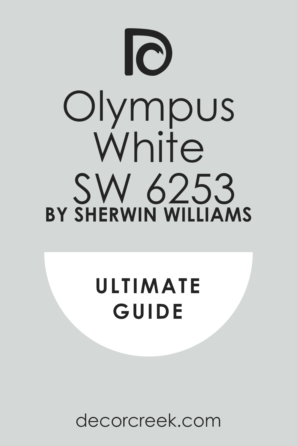
Olympus White (SW 6253)
Olympus White is barely blue, barely gray — and that’s what makes it special. Olympus White works best in spaces with lots of natural light, where its color can softly show. Olympus White feels clean and light without being bright white. Olympus White is a favorite of mine for ceilings, trim, or soft modern kitchens. Olympus White also works well in small rooms that need a color without adding weight.
The key rule: don’t expect bold contrast — this one works best when you want a gentle backdrop.
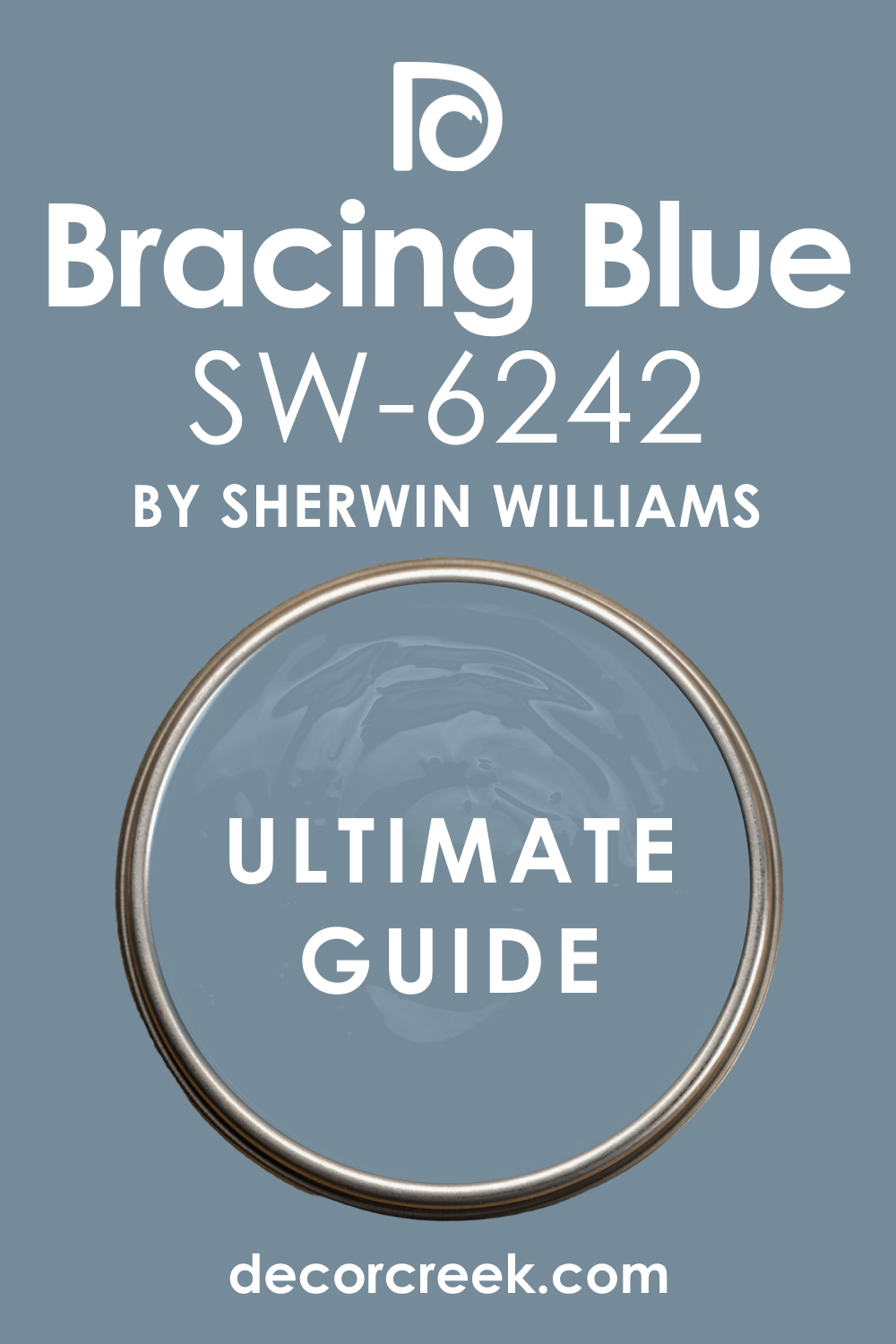
Bracing Blue (SW 6242)
Bracing Blue has more richness than a classic blue gray. Bracing Blue feels strong but not heavy, which makes it great for front doors or accent walls. Bracing Blue pairs nicely with aged brass, black, or warm whites. Bracing Blue also works well in moody bedrooms or cozy dens. Bracing Blue holds its own next to deep woods and natural leather.
The key rule: don’t overuse — one wall is often just right.
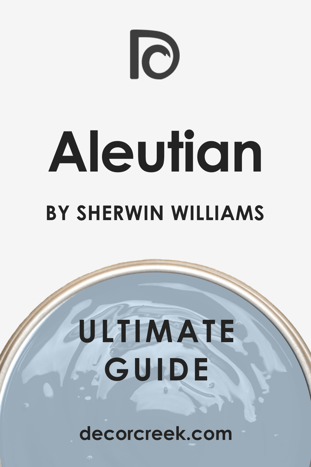
Aleutian (SW 6241)
Aleutian walks the line between a deep dusty blue and a smoky gray. Aleutian feels grounded, which is why I love it for dining rooms or library spaces. Aleutian looks great with layered fabrics like linen, velvet, or knits. Aleutian also works well with warm woods and soft whites. Aleutian gives you color, comfort, and style all at once.
The key rule: don’t pair it with other strong colors — it likes to be the star.
Reflection (SW 7661)
Reflection has a silvery lightness that shifts depending on the light. Reflection leans blue in shadow and gray in bright sunlight. Reflection is great for bathrooms, closets, or guest rooms. Reflection makes a space feel pulled together without being bold. Reflection is one of those grays that always feels polite.
The key rule: keep surrounding decor light and airy for best results.
Storm Cloud (SW 6249)
Storm Cloud feels deep and strong without being too dark. Storm Cloud works beautifully in dining rooms, offices, or accent walls. Storm Cloud has a true balance of gray and blue, making it feel both bold and calm. Storm Cloud pairs nicely with white trim and natural woods. Storm Cloud also adds drama in the best way when paired with gold fixtures or soft textures.
The key rule: use it in rooms with good lighting so it doesn’t feel too heavy.
Distance (SW 6243)
Distance has a cool confidence that feels modern and sharp. Distance leans more into blue than gray, but still has that moody softness. Distance is beautiful in bedrooms, powder rooms, or even kitchen islands. Distance pairs well with soft whites and brushed metal details. Distance brings a feeling of quiet and strength when used in just the right spot.
The key rule: try it in a smaller room to create a cozy, cocoon-like feel.

Daphne (SW 9151)
Daphne looks like a faded denim shirt — soft, worn-in, and full of character. Daphne is one of my favorite picks for laundry rooms or casual family spaces. Daphne carries more blue than most grays but keeps that smoky edge. Daphne pairs well with light oak, white cabinets, or soft gold hardware. Daphne also holds its tone well even in tricky lighting.
The key rule: layer in creamy whites or sandy beige to keep things grounded.
Moody Blue (SW 6221)
Moody Blue brings exactly what the name says — a little depth, a little drama. Moody Blue has rich undertones but still fits in as a neutral. Moody Blue works beautifully in bedrooms or living rooms with warm lighting. Moody Blue also looks sharp next to crisp white or even dark navy. Moody Blue has presence, but not in a loud way.
The key rule: don’t pair it with bright pops — soft neutrals work best here.
Blustery Sky (SW 9140)
Blustery Sky feels like a storm rolling in — strong, cool, and a little mysterious. Blustery Sky is deeper than most blue-grays, making it great for accent walls or cabinets. Blustery Sky pairs perfectly with white oak, matte black, or unlacquered brass. Blustery Sky can also make a big room feel more grounded. Blustery Sky is one of those shades that people always ask about.
The key rule: use in rooms with big windows or open lighting.
Granite Peak (SW 6250)
Granite Peak is bold but elegant. Granite Peak leans deep gray with a strong blue core. Granite Peak looks best in studies, dining rooms, or anywhere you want a little drama. Granite Peak pairs beautifully with warm wood floors and off-white trim. Granite Peak also makes artwork and decor pop against its darker backdrop.
The key rule: try it behind built-ins or shelving for a high-end feel.

Dustblu (SW 9161)
Dustblu feels quiet, like the color of faded jeans or worn linen. Dustblu leans cool but still feels soft enough for cozy spaces. Dustblu works well in bedrooms, entryways, or laundry rooms. Dustblu pairs beautifully with brushed nickel and white oak. Dustblu is one of those shades that feels familiar, like something you’ve always liked.
The key rule: keep surrounding tones muted for a seamless feel.
Rain (SW 6219)
Rain is gentle, light, and fresh — just like the name. Rain has more blue than gray, but it still feels soft and easy to live with. Rain is perfect for bathrooms, nurseries, or sunrooms. Rain also looks sweet in small bedrooms with white trim and soft lighting. Rain has a playful side but still feels grown-up.
The key rule: use it when you want just a hint of cheer without going too colorful.
Icicle (SW 6238)
Icicle is cool and crisp — like a whisper of blue over a gray base. Icicle works beautifully in bright rooms where you want just a little tone. Icicle also helps small spaces feel fresh and open. Icicle pairs well with white furniture and silver or chrome fixtures. Icicle doesn’t shout for attention, but it makes everything feel a bit cleaner.
The key rule: try this one where you want light, not color.
Lullaby (SW 9136)
Lullaby is soft and dreamy, with a good balance of blue and gray. Lullaby works beautifully in children’s rooms or peaceful bedrooms. Lullaby also fits into modern spaces with pale wood and cotton fabrics. Lullaby brings comfort and ease, without being too sweet. Lullaby stays cool, but never too icy.
The key rule: use warm lighting to bring out the softness in this shade.
Poolhouse (SW 7603)
Poolhouse has a stronger presence, leaning deeper into gray with a splash of blue. Poolhouse is one of those shades that works well on exterior doors or kitchen cabinets. Poolhouse gives just enough mood to feel interesting without being too dark. Poolhouse also works beautifully in bathrooms with brushed nickel and crisp white trim. Poolhouse feels collected and smart.
The key rule: pair with natural wood and black accents for a modern combo.
Let It Rain (SW 9152)
Let It Rain feels gentle, like a light storm that rolls through. Let It Rain leans into a cooler tone, almost misty in certain lights. Let It Rain works beautifully in entryways, bedrooms, or as a feature wall. Let It Rain pairs nicely with light oak floors and soft white trim. Let It Rain doesn’t demand attention — it settles in quietly.
The key rule: use this where you want a soft, cool anchor.
Mineral Deposit (SW 7652)
Mineral Deposit is a mid-tone gray with a clear blue undertone. Mineral Deposit feels grounded and steady, great for larger spaces. Mineral Deposit works well in living rooms or dining rooms with mixed finishes. Mineral Deposit also pairs with warm metals, black, or even natural leather. Mineral Deposit holds its color throughout the day, no big shifts.
The key rule: match it with creamy whites for the best look.
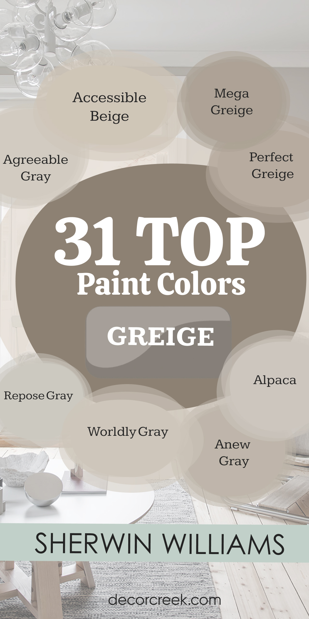
31 Best Greige Paint Colors from Sherwin-Williams
Agreeable Gray (SW 7029)
Agreeable Gray is the shade I use when I want something that works with everything. Agreeable Gray has just the right mix of warm beige and soft gray. Agreeable Gray looks good in bright rooms and even better in ones with less light. Agreeable Gray makes a room feel welcoming without stealing attention. Agreeable Gray pairs well with both warm wood and crisp white trim.
The key rule: this one’s safe, easy, and always looks pulled together.
Accessible Beige (SW 7036)
Accessible Beige might sound boring, but it’s one of my secret weapons. Accessible Beige has a warm, soft look that feels inviting. Accessible Beige leans more beige than gray, but it still reads modern. Accessible Beige works great in open floor plans or family rooms. Accessible Beige pairs well with browns, creams, or warm grays.
The key rule: don’t let the word beige scare you — this one always works.

Repose Gray (SW 7015)
Repose Gray is a bit cooler than some greiges, but it still feels calm and balanced. Repose Gray works in just about every room — I’ve used it in kitchens, bedrooms, and hallways. Repose Gray has a softness that works with all styles, from farmhouse to modern. Repose Gray also pairs well with bold colors like navy or even black. Repose Gray doesn’t change much with light, which makes it feel stable.
The key rule: use this when you want a hint of gray without going full cool.
Anew Gray (SW 7030)
Anew Gray feels richer than a lot of greiges. Anew Gray leans warm, with a taupe-like depth that brings comfort. Anew Gray works great in dining rooms, entryways, or anywhere you want warmth. Anew Gray also makes dark wood furniture look amazing. Anew Gray pairs well with creamy whites and muted blues.
The key rule: use this shade when beige feels too yellow and gray feels too flat.
Alpaca (SW 7022)
Alpaca feels soft, warm, and gentle. Alpaca works beautifully in bedrooms and small living rooms. Alpaca has just enough gray to feel updated but keeps a natural warmth. Alpaca pairs nicely with tan, cream, or warm white. Alpaca also does well in spaces with both artificial and natural light.
The key rule: this color brings comfort — don’t over-style the room around it.
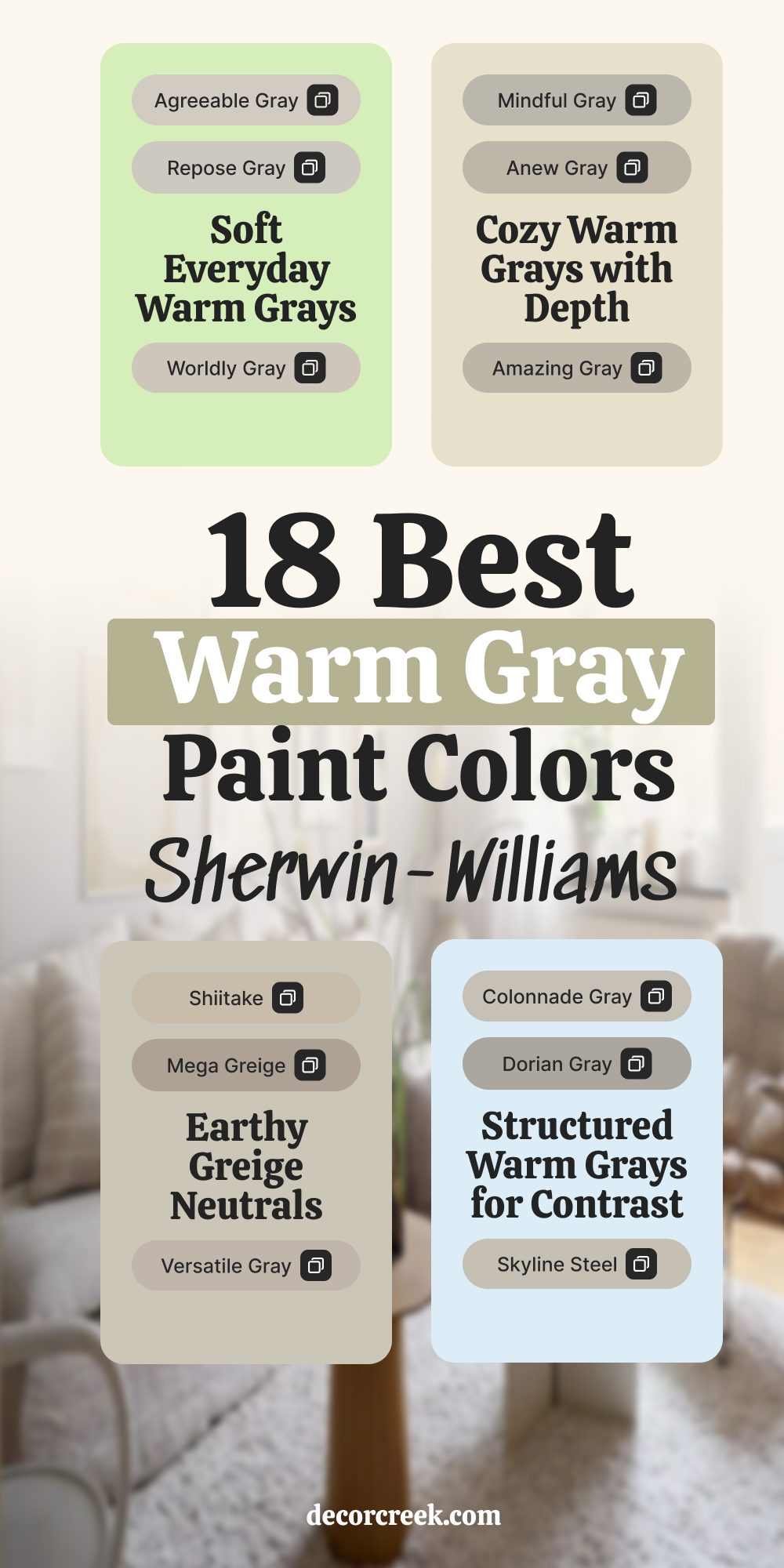
Colonnade Gray (SW 7641)
Colonnade Gray has strength without being too heavy. Colonnade Gray leans neutral, making it a great base color for open layouts. Colonnade Gray pairs well with stone, brick, and natural materials. Colonnade Gray also holds its tone no matter what direction the room faces. Colonnade Gray works beautifully in kitchens, halls, or even full exteriors.
The key rule: layer with textures, not bold patterns — this one’s best when kept simple.
Mega Greige (SW 7031)
Mega Greige is warm, deep, and grounding. Mega Greige works best in larger rooms or as an accent on one wall. Mega Greige has strong beige notes but enough gray to feel balanced. Mega Greige looks beautiful with warm whites, olive green, or navy. Mega Greige also pairs nicely with natural leather and warm metal.
The key rule: use this when you want the walls to feel like a hug.
Mindful Gray (SW 7016)
Mindful Gray is smart, steady, and always looks finished. Mindful Gray works in bedrooms, kitchens, and even on cabinetry. Mindful Gray leans neutral but has warmth that shows in the right light. Mindful Gray pairs well with soft blues, whites, or even wood tones. Mindful Gray doesn’t feel trendy — it feels just right.
The key rule: this is the gray you reach for when others feel too cool or too beige.

Worldly Gray (SW 7043)
Worldly Gray has a soft taupe feel that adds warmth without feeling dark. Worldly Gray works well in homes with beige carpet or tile. Worldly Gray pairs beautifully with wood, especially walnut or cherry. Worldly Gray feels more welcoming than a flat gray but more refined than beige. Worldly Gray is great for hallways, dens, or living rooms.
The key rule: add some creamy white to keep it fresh.
Modern Gray (SW 7632)
Modern Gray is light, easy, and goes with everything. Modern Gray works especially well in homes with soft, warm lighting. Modern Gray feels gentle, like a whisper of beige with a drop of gray. Modern Gray is perfect for bedrooms or even bathrooms. Modern Gray also blends well with whites, browns, and muted blues.
The key rule: this one’s perfect when you want a color that doesn’t feel like a color.

Perfect Greige (SW 6073)
Perfect Greige is deeper and a little more dramatic than the name suggests. Perfect Greige walks the line between brown and gray. Perfect Greige works well in dining rooms or any place you want a cozier feel. Perfect Greige pairs best with creamy whites and deep greens. Perfect Greige feels strong, yet soft.
The key rule: add warm lighting to bring out its richness.
Versatile Gray (SW 6072)
Versatile Gray lives up to its name. Versatile Gray works in bedrooms, living rooms, and even on trim. Versatile Gray has a soft brown undertone that warms up cooler spaces. Versatile Gray plays nicely with whites, navy, and dusty pinks. Versatile Gray also works well in homes with beige or gray flooring.
The key rule: this one’s a safe choice when nothing else feels quite right.
Dorian Gray (SW 7017)
Dorian Gray is rich, bold, and has presence. Dorian Gray leans darker, which makes it great for contrast. Dorian Gray is perfect for kitchen islands, built-ins, or cozy offices. Dorian Gray pairs beautifully with crisp white trim and black accents. Dorian Gray makes a space feel finished and well thought out.
The key rule: use it where you want structure and depth.

Dovetail (SW 7018)
Dovetail is deeper than most greiges and adds strong character to a room. Dovetail has a rich gray base with just enough warmth to keep it from feeling flat. Dovetail works beautifully on cabinetry, accent walls, or even full rooms with good lighting. Dovetail pairs well with creamy whites, soft black, and brass fixtures. Dovetail makes any room feel more grounded and pulled together.
The key rule: this one shines in spaces where contrast is welcome.

Useful Gray (SW 7050)
Useful Gray is gentle, warm, and true to its name. Useful Gray works great in family rooms, hallways, or bedrooms. Useful Gray has more beige than gray, but still reads modern. Useful Gray is perfect for spaces that need softness without going yellow. Useful Gray pairs well with white trim, rattan, or neutral fabrics.
The key rule: let it support the room — it doesn’t need to be the star.
Drift of Mist (SW 9166)
Drift of Mist is airy and bright, but still warm enough to feel lived-in. Drift of Mist works well in entryways, kitchens, or even ceilings. Drift of Mist is close to white, but with a soft greige tone that makes it interesting. Drift of Mist pairs beautifully with natural wood, white tile, or pale stone. Drift of Mist is easy to match with furniture and art.
The key rule: use it when you want a barely-there backdrop that still feels homey.

Gossamer Veil (SW 9165)
Gossamer Veil has a quiet confidence that fits almost anywhere. Gossamer Veil is soft, light, and has a hint of warmth that keeps it from being stark. Gossamer Veil looks lovely in kitchens, bedrooms, and even offices. Gossamer Veil pairs well with whites, dusty blues, or warm gold accents. Gossamer Veil doesn’t fight with other colors — it lets everything else shine.
The key rule: perfect for open spaces where you want a smooth, simple flow.
City Loft (SW 7631)
City Loft is light, warm, and a little creamy. City Loft has a touch of beige and just a whisper of gray. City Loft looks amazing in rooms with lots of sunlight. City Loft also helps smaller rooms feel brighter and cleaner. City Loft pairs nicely with white trim, light floors, and woven textures.
The key rule: avoid pairing it with cool grays — it looks best with warmth around it.

Shiitake (SW 9173)
Shiitake brings earthy softness into any room. Shiitake leans brown but has a nice gray tint that keeps it feeling fresh. Shiitake works well in bedrooms, reading nooks, or kitchens. Shiitake pairs beautifully with wood, especially light or medium tones. Shiitake gives a room comfort without being boring.
The key rule: pair it with textures like linen or jute for a natural look.

Amazing Gray (SW 7044)
Amazing Gray is a solid middle greige — not too light, not too dark. Amazing Gray has just enough warmth to keep it cozy. Amazing Gray is great in rooms that get a mix of daylight and shadow. Amazing Gray pairs well with crisp trim, stone, and even navy. Amazing Gray also looks great in homes with transitional style.
The key rule: try this if you’re stuck between warm and cool.
Skyline Steel (SW 1015)
Skyline Steel is smooth, steady, and quietly modern. Skyline Steel leans gray but has enough beige to keep it soft. Skyline Steel works beautifully in open floor plans, hallways, and kitchens. Skyline Steel blends easily with grays, taupes, and white trim. Skyline Steel won’t overpower, but it adds just enough depth.
The key rule: works best in rooms with consistent lighting.
Balanced Beige (SW 7037)
Balanced Beige does exactly what it says — it balances warmth and softness. Balanced Beige has more beige than gray but never feels yellow. Balanced Beige looks beautiful with brown leather, wood, and cream. Balanced Beige is great for cozy living rooms or formal dining areas. Balanced Beige also holds up well with both natural and artificial light.
The key rule: avoid pairing with cool metals — stick to warmth.

Malabar (SW 9110)
Malabar brings a sandy, sun-washed look that still feels grounded. Malabar leans more toward beige but holds a gray tone underneath. Malabar is perfect for bedrooms, casual living rooms, or even hallways. Malabar pairs well with whitewashed woods and simple linen curtains. Malabar has a softness that keeps things easy on the eyes.
The key rule: keep your decor light and earthy for the best match.
Ethereal White (SW 6182)
Ethereal White is light, peaceful, and fresh. Ethereal White has more color than a white, but it still feels clean. Ethereal White leans slightly warm with a whisper of beige-gray. Ethereal White works beautifully in bathrooms, ceilings, and trim. Ethereal White also pairs with nearly every other color on this list.
The key rule: use when white feels too plain, but you don’t want full color.
Loggia (SW 7506)
Loggia feels rich, earthy, and full of character. Loggia leans more beige but has a smoky softness that gives it interest. Loggia looks beautiful with brick, tile, or natural stone. Loggia is perfect for living rooms, dining rooms, or covered patios. Loggia also makes wood furniture stand out.
The key rule: warm lighting brings out its best.

Canvas Tan (SW 7531)
Canvas Tan is clean, warm, and never feels fussy. Canvas Tan works well in homes with lots of beige or tan finishes. Canvas Tan leans more toward beige but stays soft and even. Canvas Tan blends beautifully with white, brown, or soft blues. Canvas Tan is great for bedrooms, offices, or long hallways.
The key rule: this one works best when you want a simple, classic base.

Eider White (SW 7014)
Eider White is a soft off-white with a gentle gray tint. Eider White is great for walls, trim, or even ceilings. Eider White adds a clean look without feeling too cool. Eider White also works well in bathrooms or kitchens with natural light. Eider White pairs nicely with warm metals and creamy tones.
The key rule: test this one in your light — it can look pinkish in shadow.

Popular Gray (SW 6071)
Popular Gray is warm, friendly, and works in almost any room. Popular Gray leans beige with just enough gray to feel current. Popular Gray works especially well in homes with both warm and cool finishes. Popular Gray looks great with white trim and soft fabrics. Popular Gray doesn’t change too much in different lighting.
The key rule: great for someone who wants a color that plays well with others.
Pavestone (SW 7642)
Pavestone is darker and stronger than many greiges. Pavestone leans gray but with a warm, taupe feel underneath. Pavestone works well in studies, dining rooms, or on cabinets. Pavestone pairs beautifully with lighter walls and white trim. Pavestone adds structure without being too bold.
The key rule: works best in rooms where contrast is needed.
Big Chill (SW 7648)
Big Chill is soft and cool with just a bit of beige mixed in. Big Chill works beautifully in bedrooms and open layouts. Big Chill feels calm but not cold, which makes it very livable. Big Chill looks great with wood accents, woven materials, or matte black. Big Chill is easy to match with flooring and trim.
The key rule: use warm bulbs so the room feels balanced.
On the Rocks (SW 7671)
On the Rocks is a light, modern gray with the tiniest hint of warmth. On the Rocks works in almost any room, especially with lots of natural light. On the Rocks stays consistent without weird undertones popping up. On the Rocks pairs well with both cool and warm finishes. On the Rocks is clean, soft, and always looks polished.
The key rule: this color is your no-fuss option for a whole-house look.
18 Best Warm Gray Paint Colors from Sherwin-Williams
Agreeable Gray (SW 7029)
Agreeable Gray is one of my most-used warm grays because it just works. Agreeable Gray has soft beige mixed into the gray, so it never feels cold. Agreeable Gray is perfect for living rooms, bedrooms, or any place you want to feel cozy. Agreeable Gray pairs beautifully with wood tones, creams, and soft blues. Agreeable Gray also looks great in homes with both warm and cool decor.
The key rule: use this when you want a warm gray that blends with everything.

Anew Gray (SW 7030)
Anew Gray brings warmth and comfort without being too beige. Anew Gray works well in dining rooms, hallways, or cozy living rooms. Anew Gray has a bit more depth than some others, so it feels grounded. Anew Gray pairs nicely with white trim, natural wood, or warm gold accents. Anew Gray has a solid look, even in evening light.
The key rule: choose this if your room needs warmth but you still want a gray base.
Mindful Gray (SW 7016)
Mindful Gray feels peaceful and steady in any room. Mindful Gray leans slightly warm, which keeps it from feeling too sharp. Mindful Gray works beautifully in bedrooms, kitchens, or entryways. Mindful Gray holds its tone well throughout the day, which makes it easy to live with. Mindful Gray pairs nicely with soft colors and white trim.
The key rule: use this if you want gray with a gentle, homey feel.
Repose Gray (SW 7015)
Repose Gray is soft and easygoing, with a touch of warmth underneath. Repose Gray works in all kinds of rooms — bedrooms, hallways, even bathrooms. Repose Gray has just enough beige to keep it from being too cool. Repose Gray pairs beautifully with warm wood, soft whites, and muted blues. Repose Gray stays even in all kinds of lighting.
The key rule: great for when you want a gray that still feels welcoming.
Amazing Gray (SW 7044)
Amazing Gray is warm and smooth, with a slightly deeper tone. Amazing Gray works great in larger spaces like family rooms or open kitchens. Amazing Gray pairs well with light floors and off-white trim. Amazing Gray has a richness that helps anchor a room. Amazing Gray also plays well with wood tones and neutral fabrics.
The key rule: pick this one if your space feels too light or flat.
Worldly Gray (SW 7043)
Worldly Gray is one of those shades that makes a room feel finished. Worldly Gray leans warm but stays soft and flexible. Worldly Gray works well in homes with lots of beige or tan elements. Worldly Gray pairs beautifully with wood furniture and white trim. Worldly Gray has enough depth to feel like a real color but stays neutral.
The key rule: use it in places that need balance between warm and cool.
Colonnade Gray (SW 7641)
Colonnade Gray is steady and strong, with a warm base that feels grounded. Colonnade Gray works beautifully in living rooms, kitchens, or hallways. Colonnade Gray pairs nicely with stone, wood, and soft fabrics. Colonnade Gray holds its color well, even in rooms that get less light. Colonnade Gray has a quiet beauty that doesn’t try too hard.
The key rule: let the rest of the room stay simple so this gray can shine.
Alpaca (SW 7022)
Alpaca is gentle and warm with a soft, dusty feel. Alpaca works well in bedrooms, family rooms, or nurseries. Alpaca leans beige, but the gray keeps it modern. Alpaca pairs beautifully with off-whites, creams, and warm metals. Alpaca makes any space feel softer and more comfortable.
The key rule: use it where you want a little warmth without going brown.
Versatile Gray (SW 6072)
Versatile Gray lives up to its name — it fits in anywhere. Versatile Gray leans slightly warm, which keeps it from feeling dull. Versatile Gray looks great in bedrooms, hallways, or offices. Versatile Gray works with light or dark wood, which makes it easy to decorate around. Versatile Gray also blends nicely with other colors, like blue or green.
The key rule: this is a go-to when nothing else feels quite right.
Mega Greige (SW 7031)
Mega Greige is deep, bold, and warm. Mega Greige leans brown-gray, so it brings a sense of comfort. Mega Greige looks great in dining rooms or on accent walls. Mega Greige pairs beautifully with white trim and rich wood tones. Mega Greige adds structure to a room without being too strong.
The key rule: try this one where you want the walls to feel grounded and cozy.
Useful Gray (SW 7050)
Useful Gray is soft and light, with a warm beige base. Useful Gray works well in bedrooms, offices, or small living spaces. Useful Gray looks fresh without being stark, and warm without being yellow. Useful Gray pairs beautifully with white trim and natural textures. Useful Gray helps bring everything together in a calm, quiet way.
The key rule: great for a relaxed, comfortable feeling throughout the home.
Modern Gray (SW 7632)
Modern Gray feels clean, gentle, and always in style. Modern Gray works beautifully in bedrooms, entryways, and even kitchens. Modern Gray has a warm undertone that helps it feel lived-in. Modern Gray pairs well with creams, soft blues, and pale woods. Modern Gray doesn’t compete with other colors — it supports them.
The key rule: use it to give your home a soft but finished look.
Shiitake (SW 9173)
Shiitake is earthy and smooth, with just the right warmth. Shiitake works great in dining rooms, home offices, or cozy living spaces. Shiitake has more beige than gray, but still keeps a soft, smoky feel. Shiitake looks great with wood furniture, natural fabrics, and warm lighting. Shiitake brings comfort without feeling plain.
The key rule: keep the tones warm and neutral for the best look.
Popular Gray (SW 6071)
Popular Gray is easygoing, warm, and feels like home. Popular Gray works in almost any room — it’s that flexible. Popular Gray has a beige base that’s soft but not boring. Popular Gray pairs well with white trim, soft woods, and warm metals. Popular Gray always looks pulled together, even with different kinds of decor.
The key rule: this is a solid go-to when you need a reliable neutral.
Dorian Gray (SW 7017)
Dorian Gray is bold and warm, with a little extra depth. Dorian Gray works best in rooms that get good light or need some contrast. Dorian Gray looks beautiful on cabinets, feature walls, or larger rooms. Dorian Gray pairs well with white trim and black accents. Dorian Gray has a strong presence but still feels welcoming.
The key rule: try it where you want something with strength but not darkness.
Balanced Beige (SW 7037)
Balanced Beige feels full and warm, with a solid gray base underneath. Balanced Beige works beautifully in family rooms, dining rooms, or entryways. Balanced Beige blends well with wood tones and white trim. Balanced Beige has more depth than you expect, which makes it feel rich. Balanced Beige also does well in homes with beige tile or stone.
The key rule: let this color tie together your warm finishes.
Gossamer Veil (SW 9165)
Gossamer Veil is soft and warm without being beige. Gossamer Veil feels peaceful in bedrooms, hallways, and open living spaces. Gossamer Veil pairs beautifully with soft whites, light blues, and warm metals. Gossamer Veil helps everything around it feel more relaxed. Gossamer Veil holds its tone well in all kinds of light.
The key rule: use this one when you want a gray that leans gentle, not strong.
Skyline Steel (SW 1015)
Skyline Steel is modern and warm, with a smooth gray tone. Skyline Steel works beautifully in kitchens, bedrooms, and even whole-house color schemes. Skyline Steel has just enough beige to make it easy to live with. Skyline Steel pairs well with matte black, wood, and soft fabrics. Skyline Steel gives a clean look that never feels cold.
The key rule: use it when you want a fresh feel with warmth built in.
Here’s What I Always Remember
When I think about gray paint, I remember how personal it really is. Some people want a soft feeling, others want something that feels strong. But what matters most is how it feels when you’re in the room. I always test colors on the wall first — not just one tiny square, but a big patch. I look at it in the morning, afternoon, and evening. Light changes everything.
What looks perfect at 10 a.m. might feel off at night. I also try to think about how the color will feel a year from now, not just today.
I want something that won’t get old or feel too trendy. In the end, I trust my eyes, not the screen or the chip.
Paint is more than just color — it’s how a room feels when you walk into it.
