Creating a professional work area at home is a complex puzzle that involves much more than simply placing a desk and a chair in an empty corner. Over the past several years, I have dedicated my career to helping clients audit and transform their living spaces into environments that truly facilitate deep work and creative flow.
The color on your walls serves as the silent foundation of your entire workday; it is the first sensory input you encounter when you sit down to start your morning. This visual backdrop does more than just look nice—it actively sets the emotional tone for every high-stakes meeting and every demanding task on your to-do list.
My mission is to help you navigate the vast world of color theory to find a specific shade that makes you feel energized and “ready to go,” yet provides a soft landing for your eyes so you don’t end the day with a digital-induced headache.
Every recommendation I make is rooted in the physiological impact of color, ensuring you feel as good at 5:00 PM as you did at 9:00 AM.
Why I Rely on Proven Paint Brands When Designing a Home Office
In my design practice, I am uncompromising about the products I use. I consistently rely on industry leaders like Sherwin-Williams and Benjamin Moore because they provide a level of color consistency that budget brands simply cannot match.
The risk with smaller, off-brand paints is their unpredictable chemical composition; a color that looks like a soft “Greige” in the store can often dry into a distracting “Muddy Purple” once it hits your walls. High-quality brands invest in premium pigments and binders, resulting in a finish that looks rich, thick, and sophisticated.
Furthermore, I have to account for metamerism—the way a color shifts under different light sources. I need the peace of mind that the shade we select will maintain its integrity whether it is bathed in the bright, blue-toned light of the morning sun or the warm, yellow glow of a desk lamp in the evening.
How I Choose Paint Colors That Support Focus, Comfort, and Productivity
When selecting a palette for a workspace, my primary rule is to seek out colors that do not compete for your attention. In a high-performance environment, the walls should act as a silent supporter, not a visual distraction.
If a wall color is too saturated or aggressive, it creates “visual noise” that forces your brain to work harder just to filter it out. This sensory overload can leave your mind feeling too cluttered or “busy” to engage in deep, strategic thinking. By choosing muted, sophisticated tones, I ensure that your cognitive energy is reserved entirely for your professional tasks rather than being drained by your surroundings.
I intentionally curate shades that enhance the spatial perception of a room, favoring light and airy pigments that make the walls feel as though they are receding. This is a vital psychological tool; in a home office, where you might spend eight to ten hours a day, it is essential to prevent that heavy, claustrophobic feeling of being trapped inside a small box. A well-chosen light shade can transform a cramped spare room into an expansive sanctuary that breathes, allowing your thoughts to flow more freely.
Furthermore, I conduct a careful analysis of how natural light interacts with the space throughout the day.
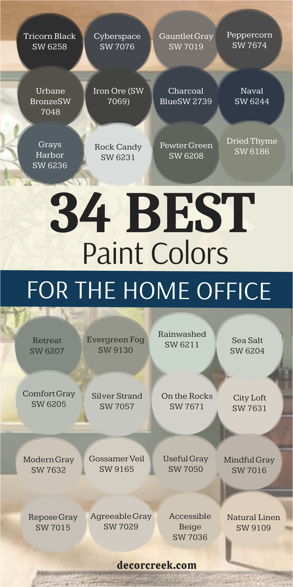
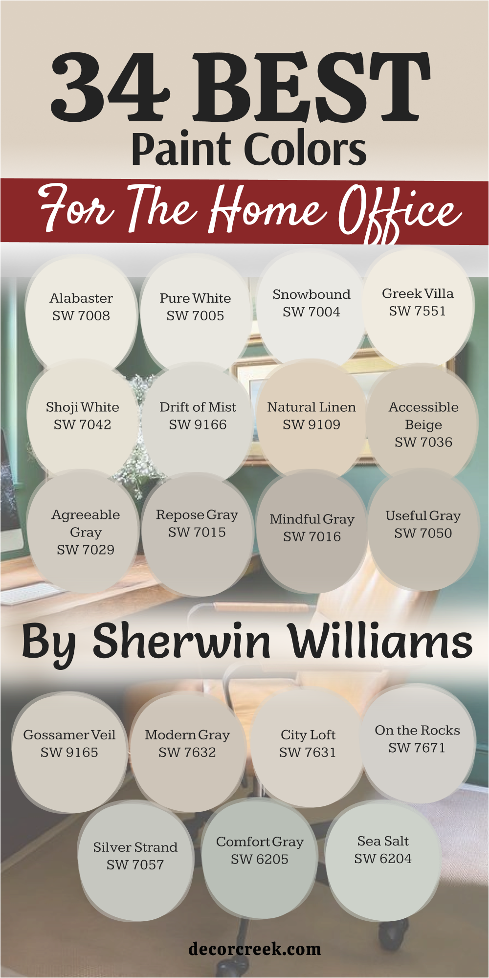
34 Best Paint Colors For The Home Office By Sherwin Williams
Alabaster SW 7008
Alabaster SW 7008 provides a soft look that stays away from being too yellow or too blue. This shade works well because it reflects light without making the room feel like a cold hospital. I like how it makes a small office feel much larger than it actually is.
You can use it on both the walls and the trim to keep things simple. It acts as a clean backdrop for colorful art or dark wood furniture. Many of my clients choose this when they want a fresh start in their work area.
It feels like a clean sheet of paper ready for your big ideas. This white is famous for being friendly to any kind of lighting you have. It makes the air in the room feel light and easy to breathe. You will find that it matches almost any floor color you already have in your house.
Best used in: living rooms, kitchens, hallways, bedrooms, and farmhouse exteriors
Pairs well with: Iron Ore SW 7069, Agreeable Gray SW 7029, Natural Linen SW 9109, warm wood tones The key rule of this color for farmhouse style is to use it where you want natural light to feel kind, soft, and inviting throughout the day.

Pure White SW 7005
Pure White SW 7005 has a tiny bit of black and yellow in it to keep it from looking like a harsh light bulb. This color is my favorite for doors and window frames in a home office. It creates a crisp line that makes the whole room look very neat and organized.
You will notice that it looks very clean even when the sun is not shining directly on it. It helps your brain stay sharp because it removes distractions from the walls. I often suggest this for people who have a lot of books and want them to stand out.
It stays bright even if you have a lot of shadows in the corners of your room. Your office will feel professional and ready for important video calls with this shade. It is a safe pick if you are worried about colors changing too much during the day. This paint makes every other object in the room look its best.
Best used in: trim, ceilings, kitchen cabinets, and modern home offices
Pairs well with: Black Magic SW 6991, Sea Salt SW 6204, March Wind SW 7668, dark metal accents The key rule of this color for modern style is to use it as a crisp border that makes your wall colors look more intentional and sharp.

Snowbound SW 7004
Snowbound SW 7004 is a cool white that has a very slight gray undertone to it. This shade is perfect if your office has a lot of blue or gray decorations. It keeps the room feeling chilly and fresh which is great for staying awake during long tasks.
I see this color used a lot in homes that want to look very modern and updated. It does not turn yellow over time which is a big plus for many homeowners. You can pair it with silver lamps or metal desks for a very sleek look.
It makes the ceiling feel high so you do not feel boxed in while you work. I think it looks best when you have big windows that let in a lot of natural light. This color helps you feel like you have plenty of room to think and create. It is a very polite color that does not demand you look at it.
Best used in: bedrooms, modern offices, bathrooms, and trim
Pairs well with: Colonnade Gray SW 7641, Naval SW 6244, Peppercorn SW 7674, cool blue accents The key rule of this color for modern style is to use it in rooms with lots of natural light to prevent the gray undertones from looking too heavy.

Greek Villa SW 7551
Greek Villa SW 7551 is a rich white that feels very sun-washed and cozy for a work area. This color reminds me of old stones and warm sandy beaches which helps me stay relaxed. It has a creamier feel than a standard white but it never looks too heavy or dark.
I use this when a client wants their office to feel like a part of a comfortable home. It looks amazing next to light wood floors or soft rugs. You will find that it makes your skin look good on camera during meetings.
It fills the room with a glow that feels like a warm hug on a rainy day. This is a great choice if you spend many hours at your desk every single day. It keeps the room feeling bright but prevents it from feeling too sterile or cold. Many people find it very easy to live with for many years.
Best used in: living areas, entryways, home offices, and cabinets
Pairs well with: Urbane Bronze SW 7048, Illusive Green SW 9164, In the Navy SW 9175, honey oak furniture The key rule of this color for cozy style is to use it on both walls and ceilings to create a seamless glow that warms up the entire room.

Shoji White SW 7042
Shoji White SW 7042 sits right between a white and a very light beige color. This shade is wonderful because it changes its look depending on what you put next to it. It can look like a soft cream or a very light tan depending on your furniture.
I recommend this for offices that need to feel a bit more formal and serious. It provides a steady background that helps you focus on your computer screen. You will like how it hides small marks or dust better than a very bright white.
It makes the walls feel solid and dependable while you work on hard projects. This color works well with both gold and silver hardware on your desk. I often use it in homes where the rooms flow into each other. It creates a smooth path for your eyes as you walk through the house.
Best used in: open floor plans, hallways, master bedrooms, and home offices
Pairs well with: Fawn Brindle SW 7618, Perle Noir SW 9154, Worldly Gray SW 7043, natural textures The key rule of this color for neutral style is to use it when you want a warm background that still feels light enough to be called white.

Drift of Mist SW 9166
Drift of Mist SW 9166 is a very light gray that feels as airy as its name suggests. This color is great for an office because it does not feel heavy or dark at all. I pick this when a room has a lot of sunlight that might make other colors look too bright.
It keeps the room feeling balanced and steady throughout the entire day. You will notice that it makes your furniture look very sharp and well-defined. It is a great choice for people who want a gray but are afraid of it looking too gloomy.
I love how it looks with white trim around the doors and the floor. It creates a professional look that is still very inviting for guests. You can add pops of green or blue to the room to make it feel more alive. This shade is a top pick for a clean and organized workspace.
Best used in: offices, living rooms, bedrooms, and kitchens
Pairs well with: Quicksilver SW 6245, Iron Ore SW 7069, Extra White SW 7006, navy blue accents The key rule of this color for professional style is to pair it with white trim to make the light gray tones pop without looking muddy.

Natural Linen SW 9109
Natural Linen SW 9109 brings a sense of the outdoors inside with its earthy and sandy tone. This color makes a home office feel grounded and very comfortable for long hours. I find that it works perfectly with green plants and woven baskets on your shelves.
It has enough color to stand out against white trim but stays very light overall. You will feel a sense of peace when you walk into a room painted this way. It reminds me of a comfortable summer house where you can think clearly.
This shade is excellent for rooms that do not get a lot of natural sun. It adds a bit of warmth that helps the room feel less like a dark cave. I often suggest this for people who work in creative jobs like writing or drawing. It feels like a natural extension of the world outside your window.
Best used in: home offices, sunrooms, bedrooms, and laundry rooms
Pairs well with: Alabaster SW 7008, Black Fox SW 7020, Evergreen Fog SW 9130, light wood tones The key rule of this color for organic style is to use it in rooms with natural materials like wood and linen to create a soft, earthy feel.

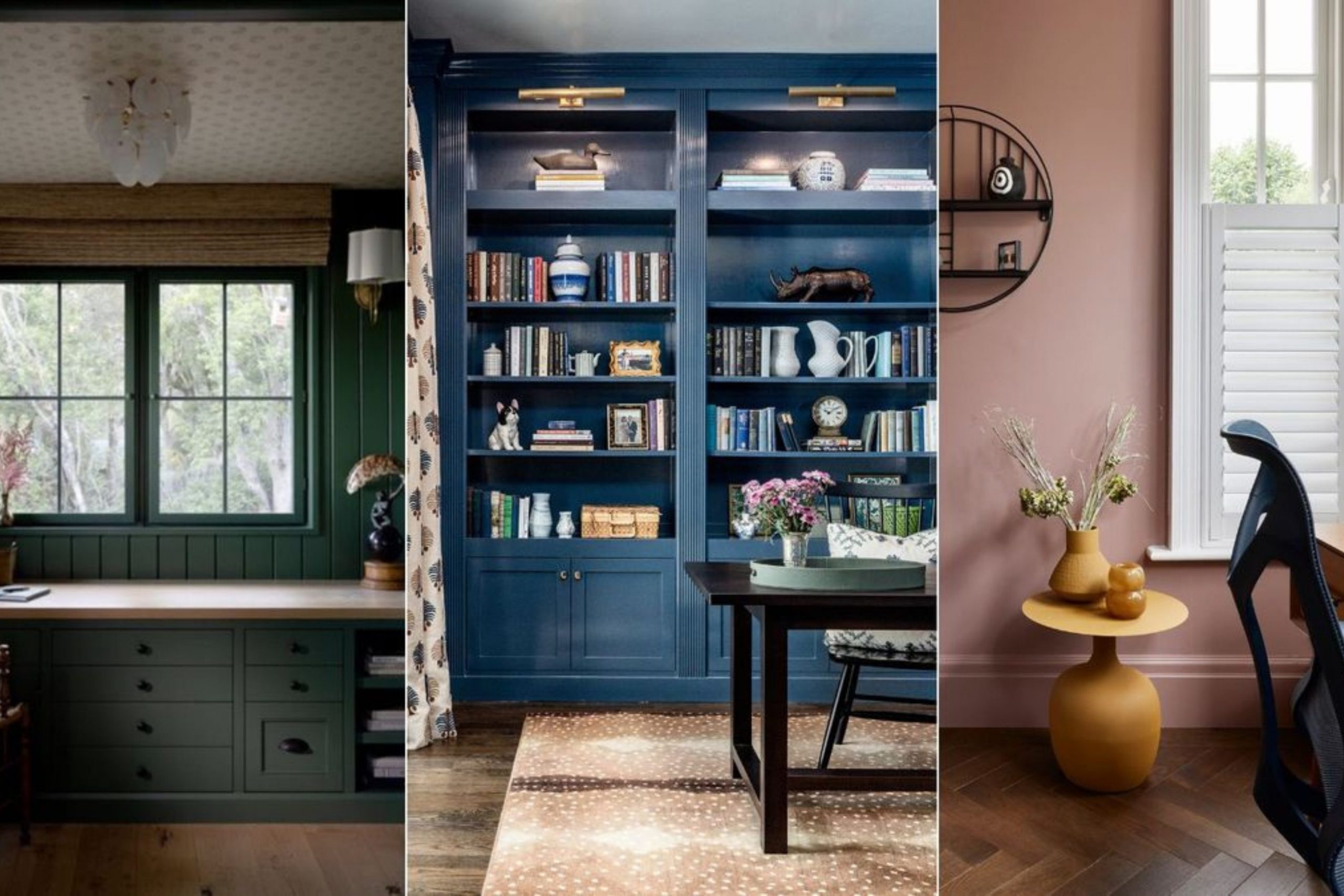
Accessible Beige SW 7036
Accessible Beige SW 7036 is a very popular choice because it is not too yellow and not too gray. I like to call it a bridge color because it connects different styles together perfectly. This color makes an office feel reliable and very easy to work in for many hours.
It does not change much when you turn on different types of lights. You can use it in a basement office to make it feel much more like an upstairs room. It provides a soft look that is very easy on the eyes when you look up from your work.
I find that most people feel very comfortable with this color right away. It makes your home office feel like a professional place of business. You can use dark brown or black furniture to make the room look very expensive. It is a smart choice for anyone who wants a color that everyone will like.
Best used in: entire homes, offices, kitchens, and hallways
Pairs well with: Aesthetic White SW 7035, Urban Bronze SW 7048, Cadet SW 9143, dark wood furniture The key rule of this color for traditional style is to use it as a neutral base that allows your furniture and art to be the stars of the room.

Agreeable Gray SW 7029
Agreeable Gray SW 7029 is a famous color because it looks good in almost every single house. This shade has a little bit of beige in it which makes the gray feel much warmer. I use this in offices where people want a modern look without it feeling cold.
It acts like a chameleon and picks up the colors of the things around it. You will see that it makes your white ceilings look very bright and clean. It is a great background for a gallery wall of your favorite photos or degrees.
I recommend this if you are not sure which color to pick because it is very hard to get wrong. It keeps your office feeling open and full of light even on cloudy days. Many people find that it helps them feel organized and ready to start their tasks. It is a very steady and helpful color for a busy person.
Best used in: open concept areas, home offices, bedrooms, and hallways
Pairs well with: Extra White SW 7006, Mega Greige SW 7031, Brainstorm Bronze SW 7033, blue-green accents The key rule of this color for versatile style is to use it when you want a gray that won’t feel too blue or too cold in north-facing light.

Repose Gray SW 7015
Repose Gray SW 7015 is a slightly cooler gray that still has a hint of warmth tucked away inside. This color is perfect for an office where you need to stay alert and focused on your screen. I like how it looks with dark blue or green accents in the room decorations.
It feels very crisp and tidy which helps your mind stay clear while you work. You will notice that it makes a room feel a bit more formal than a beige color would. It is a great choice for people who have a lot of white furniture or white shelves.
I find that it looks very expensive when it is painted on all the walls of a room. It provides a nice contrast if you have light-colored wood floors or carpets. This shade is a top pick for making a small room look very sharp and neat. It is a very trustworthy color for a professional workspace.
Best used in: modern offices, living rooms, kitchens, and entryways
Pairs well with: Eider White SW 7014, Pavestone SW 7642, Dorian Gray SW 7017, silver hardware The key rule of this color for crisp style is to use it with bright white trim to highlight the sophisticated gray tones without it looking dull.

Mindful Gray SW 7016
Mindful Gray SW 7016 has a bit more depth and weight than the lighter grays. This color works well in a large office that has very high ceilings and plenty of light. It makes the room feel substantial and anchored so you feel ready for big projects.
I like to use this when a client has light-colored wood furniture to create a nice balance. It does not feel too dark but it definitely lets you know that it is a gray wall. You will find that it looks very handsome in a room with black or dark metal lamps.
It helps hide shadows in the corners so the room feels evenly colored all over. I think it is a great choice for a serious person who likes a clean and neat look. It feels like a very solid background for a productive and busy work life. This shade is one of my go-to picks for a professional home library or study.
Best used in: offices, living rooms, exteriors, and kitchens
Pairs well with: Homburg Gray SW 7622, Pearly White SW 7009, Eider White SW 7014, leather furniture The key rule of this color for balanced style is to use it when you want a gray that has enough body to stand out against white trim without being too dark.

Useful Gray SW 7050
Useful Gray SW 7050 is a unique gray that has a very soft green undertone hidden inside. This color makes an office feel very natural and earthy while still looking very modern. I enjoy how it brings a bit of the garden feeling into a workspace without being a bright green.
It looks wonderful when you have a lot of indoor plants sitting on your office shelves. You will notice that it changes quite a bit depending on the time of the day. It provides a soft and kind look that helps reduce stress during a hard work week.
I recommend this for people who want a neutral color that has a bit of a special personality. It makes your home office feel like a very peaceful part of the house to spend time in. This paint shade is very forgiving and looks good even in rooms with less natural sun. It helps you stay grounded and steady while you finish your daily chores.
Best used in: bedrooms, offices, bathrooms, and laundry rooms
Pairs well with: Sea Salt SW 6204, Alabaster SW 7008, Urbane Bronze SW 7048, light wood accents The key rule of this color for organic style is to let its green undertones play off of natural materials like wood and stone for a soft look.
Gossamer Veil SW 9165
Gossamer Veil SW 9165 is a light and airy gray that feels very soft against the eyes. This color is a wonderful choice for an office where you spend many hours on a computer screen. It does not reflect too much light so it helps keep your eyes from getting tired.
I find that it looks very clean when paired with a bright white ceiling and white doors. It gives the room a very gentle feel that helps you stay steady and on task. You can use it in a small office to make the walls feel like they are moving further away.
It creates a very open feeling that keeps you from feeling cramped while you are working. Many of my clients like this because it feels very fresh and updated for a modern home. It is a very polite color that stays in the background where it belongs. This shade is perfect for a room that needs to feel light but not completely white.
Best used in: bedrooms, offices, living areas, and hallways
Pairs well with: Tricorn Black SW 6258, Pure White SW 7005, Iron Ore SW 7069, blue accents The key rule of this color for soft style is to use it in rooms with a mix of artificial and natural light to maintain its neutral balance.
Modern Gray SW 7632
Modern Gray SW 7632 is a warm gray that feels very sophisticated and high-end for an office. This color has a bit of a tan feel to it which keeps it from ever looking too cold or blue. I like to use this in homes that have a lot of traditional furniture mixed with modern pieces.
It acts as a bridge that makes everything in the room look like it belongs together. You will see that it makes your wooden desk look very rich and beautiful. It creates a very steady atmosphere that is great for focusing on important documents.
I think it looks best when you use it on all four walls to create a cozy box of color. This shade helps your home office feel like a separate and special part of the house. It is a very reliable choice for someone who wants a color that will never go out of style. You will find that it is very easy to match with different types of rugs.
Best used in: living rooms, bedrooms, offices, and entryways
Pairs well with: Snowbound SW 7004, Black Magic SW 6991, Peppercorn SW 7674, warm metal accents The key rule of this color for polished style is to pair it with warm lighting to bring out the cozy tan notes hidden in the gray base.

City Loft SW 7631
City Loft SW 7631 is a very pale gray that almost feels like a warm white in bright light. This color is perfect for an office that needs to feel very bright and full of energy. I suggest this for people who start their work very early in the morning when the sun is rising.
It catches the early light and makes the room feel very hopeful and ready for the day. You can use it to make a dark room feel much more cheerful and open to the rest of the house. It has a tiny bit of red in it which gives it a very soft and friendly glow.
I find that it makes people feel very welcome when they step into the room for a talk. It is a great choice if you have a lot of white furniture and want a tiny bit of contrast. This paint makes the room feel very soft and easy to spend a whole day in. It is a very light and happy choice for a busy office.
Best used in: bedrooms, nurseries, offices, and small rooms
Pairs well with: Gauntlet Gray SW 7019, Alabaster SW 7008, Sea Salt SW 6204, soft pink or blue accents The key rule of this color for light style is to use it in south-facing rooms where the bright sun can bring out its warm, glowing personality.

On the Rocks SW 7671
On the Rocks SW 7671 is a clean and simple gray that does not have many hidden colors in it. This makes it a very steady choice for an office where you want everything to look very neat. I like how it looks against dark wood floors because it creates a very sharp and clean contrast.
It feels very professional and reminds me of a high-end office in a big city building. You will find that it makes your white trim look very bright and very clean. It is a great choice for people who want a gray that stays looking like gray all day long.
I often use this for clients who like a very minimalist look with not many decorations. It helps the room feel organized and makes it easy to keep your mind on your work. This shade is very modern and looks great with black metal desk lamps. It provides a very solid background for a productive and successful work day.
Best used in: offices, kitchens, bathrooms, and laundry rooms
Pairs well with: Tricorn Black SW 6258, Extra White SW 7006, Naval SW 6244, silver accents The key rule of this color for clean style is to use it with cool-toned lighting to maintain its crisp, pure gray appearance throughout the evening.
Silver Strand SW 7057
Silver Strand SW 7057 is a beautiful mix of gray, green, and a tiny bit of blue. This color makes a home office feel very light and like it is near the ocean. I recommend this for people who have a very high-stress job and need a room that feels soft.
It has a very quiet look that helps your brain stay steady while you are working. You will notice that it looks different as the sun moves across the sky during the day. Sometimes it looks more gray and sometimes the green and blue parts come out to play.
It looks wonderful with light wood furniture and white shelves for your books. I find that it makes a room feel very fresh and like it has a lot of clean air inside. This shade is a great way to add a little bit of color without it being too loud. It is a very soft and helpful choice for a peaceful workspace.
Best used in: bathrooms, bedrooms, offices, and laundry rooms
Pairs well with: Pure White SW 7005, Iron Ore SW 7069, Sea Salt SW 6204, light gray textures The key rule of this color for soft style is to use it in rooms with lots of natural light to let the blue and green notes shine clearly.

Comfort Gray SW 6205
Comfort Gray SW 6205 is a medium-toned green-gray that feels very solid and dependable. This color is much deeper than a simple white but it still feels very light and easy to live with. I like to use this in an office that has a lot of natural light coming from big windows.
It makes the walls feel very cozy and helps the room feel like a safe place to think. You will feel a sense of strength when you sit in a room painted with this lovely shade. It works perfectly with dark wood desks and leather chairs for a very professional look.
I find that it helps people feel more connected to nature even while they are working inside. It is a great choice for a home office that you use every single day for many hours. This paint makes the room feel very complete and well-designed without much effort. It is a very steady and reliable color for a hard-working person.
Best used in: bedrooms, offices, bathrooms, and living areas
Pairs well with: Alabaster SW 7008, Sea Salt SW 6204, Rainwashed SW 6211, dark wood furniture The key rule of this color for grounded style is to pair it with creamy whites rather than stark whites to keep the room feeling warm.

Sea Salt SW 6204
Sea Salt SW 6204 is one of the most famous colors for creating a soft and light feeling in any room. This shade is a very light green-gray that feels as fresh as a breeze from the ocean. I use this in offices where people want to feel a sense of lightness and ease while they work.
It is a very happy color that makes the room feel like it is full of soft morning light. You will notice that it looks very clean and tidy when you have white trim and white doors. It helps your mind stay fresh even when you have been working for a long time on a project.
I like to pair it with natural wood and white fabrics to keep the room feeling very open. It is a great choice if you want your office to feel like a getaway from the rest of the house. Many people find that this color helps them feel less tired at the end of the day. It is a very soft and kind color for your home workspace.
Best used in: bathrooms, bedrooms, offices, and kitchens
Pairs well with: Summit Gray SW 7669, Alabaster SW 7008, Fleur de Sel SW 7666, light wood tones The key rule of this color for light style is to use it in rooms with plenty of windows to prevent the green tones from looking too muddy.

Rainwashed SW 6211
Rainwashed SW 6211 is a soft and light blue-green that feels very clean and very updated. This color brings a bit of the sky and the water into your home office which is very nice for thinking. I suggest this for people who want a room that feels very alive and full of fresh energy.
It is a bit more colorful than a gray but it still feels very professional and tidy. You will find that it makes white furniture look very bright and very sharp against the walls. It helps a small office feel like it has much more room and much more air inside of it.
I like how it looks with light-colored rugs and silver desk accessories for a modern feel. It is a very cheerful choice that helps you stay in a good mood while you work. This shade is perfect for a creative office where you need to come up with new ideas. It feels like a breath of fresh air every time you walk into the room.
Best used in: bedrooms, bathrooms, offices, and sunrooms
Pairs well with: Pure White SW 7005, Sea Salt SW 6204, Comfort Gray SW 6205, light wood accents The key rule of this color for fresh style is to use it in rooms with white ceilings to keep the blue-green tones feeling bright and airy.

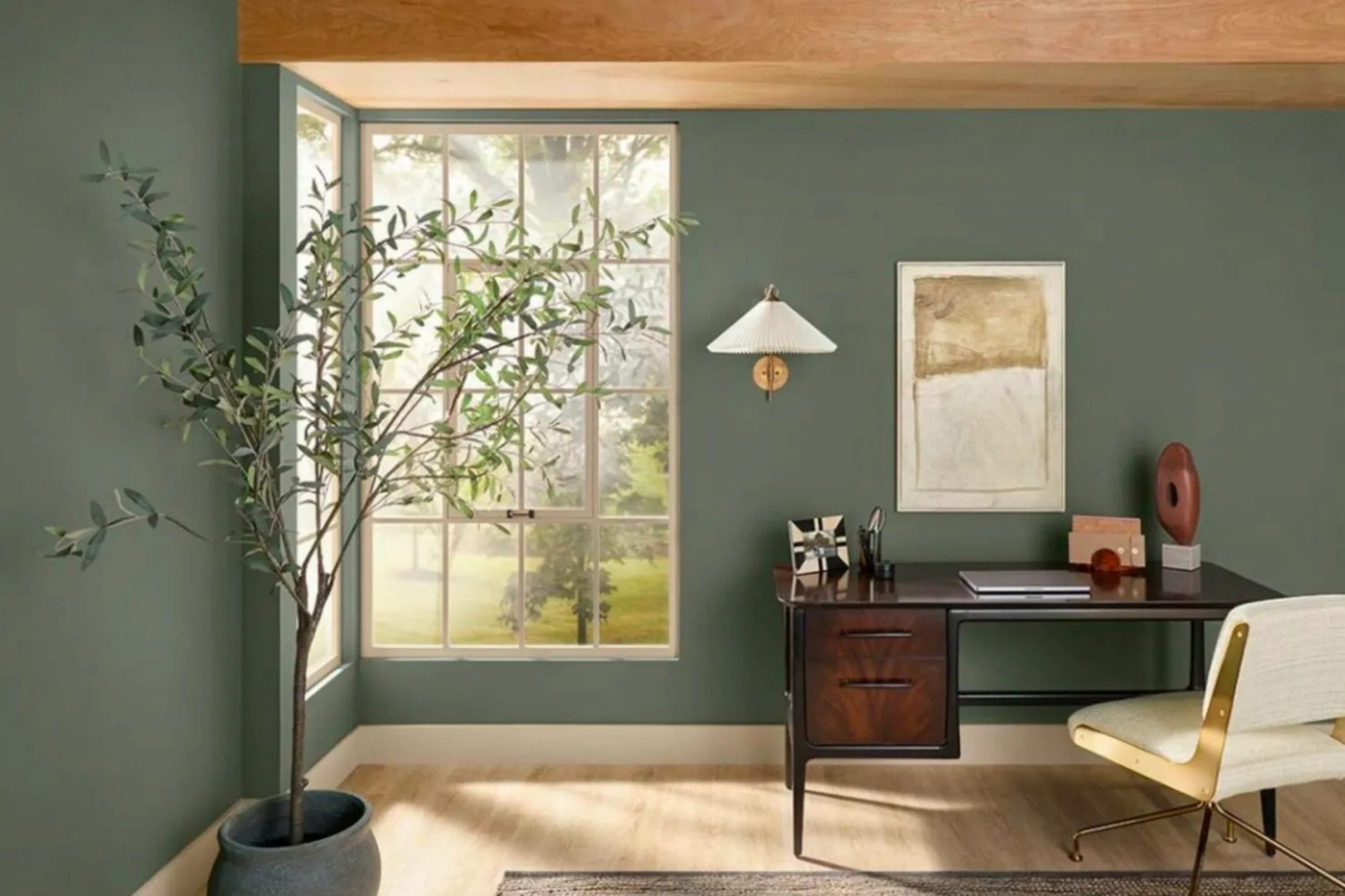
Evergreen Fog SW 9130
Evergreen Fog SW 9130 is a beautiful and deep green-gray that feels very high-end and very cozy. This color was a color of the year because it looks so good in almost any room of the house. I like to use this in an office to make it feel like a very important and serious place to work.
It has enough depth to make the walls look rich but it is not so dark that it feels heavy. You will notice that it makes gold and brass lamps look very shiny and very expensive. It is a great choice for a room with a lot of wooden shelves and big stacks of books.
I find that it helps people feel very focused and very steady while they are doing their jobs. This shade brings a sense of the forest into your home which helps you feel grounded. It is a very sophisticated choice for someone who wants a home office that looks professional. This color makes the room feel very solid and very well-thought-out for your work life.
Best used in: offices, bedrooms, living rooms, and kitchen cabinets
Pairs well with: Shoji White SW 7042, Urbane Bronze SW 7048, Uberberry SW 9132, gold hardware The key rule of this color for sophisticated style is to use it in a room with a lot of texture like wool rugs and leather chairs.

Retreat SW 6207
Retreat SW 6207 is a medium-to-dark green that has a lot of gray mixed into it to keep it soft. This color is perfect for an office where you want to feel tucked away and very safe from distractions. I use this to create a room that feels like a private library or a very special study area.
It makes the walls feel like they are giving you a soft hug while you sit at your desk. You will find that it looks very handsome with dark wood furniture and black metal accents. It helps your brain settle down and get to work because it does not have any bright or loud notes.
I like to use this on all the walls and even the trim for a very modern and solid look. It is a great choice for people who have a lot of natural light to balance out the deeper tone. This shade makes your home office feel like a very professional and very quiet place to be. It is a very steady and reliable color for a busy person.
Best used in: offices, bedrooms, bathrooms, and accent walls
Pairs well with: Alabaster SW 7008, Sea Salt SW 6204, Spare White SW 6203, dark wood tones The key rule of this color for moody style is to use it in rooms with large windows so the dark green doesn’t feel too small or heavy.

Dried Thyme SW 6186
Dried Thyme SW 6186 is a rich and earthy green that feels very natural and very grounded for a workspace. This color reminds me of herbs growing in a garden and it brings that sense of life into your room.
I recommend this for an office where you want to feel steady and very connected to your tasks. It has a soft look that does not feel too bright or too much for the eyes during the day. You will see that it makes light wood furniture look very bright and very clean against the walls.
It is a great choice for a room that needs a bit of personality without being too loud or busy. I find that it helps people feel very calm and very ready to focus on their important work. This shade looks wonderful with botanical art and green plants sitting on the desk. It makes your home office feel like a very peaceful and very productive part of your home. This is a very smart choice for a modern and natural look.
Best used in: offices, kitchens, bedrooms, and entryways
Pairs well with: Shoji White SW 7042, Accessible Beige SW 7036, Prairie Grass SW 7546, natural wood The key rule of this color for organic style is to pair it with warm beige tones to keep the green looking soft and very natural.

Pewter Green SW 6208
Pewter Green SW 6208 is a dark and very cool green that feels very sophisticated and very high-end. This color is a great choice for an office where you want to make a big statement with your style. I like to use this on a main wall or even in the whole room to create a very moody feel.
It makes white trim and white ceilings look very bright and very sharp by comparison. You will notice that it creates a very professional background for your video calls and meetings. It helps you feel like you are in a very important and very serious workspace.
I find that it looks amazing with gold hardware and light-colored leather chairs for a rich look. This shade is very popular for people who want a home office that feels like a separate part of the house. It is a very bold choice that pays off by making the room feel very special and very well-designed. This color helps you stay focused and ready for any big task.
Best used in: offices, kitchen cabinets, bedrooms, and exteriors
Pairs well with: Pure White SW 7005, Silver Strand SW 7057, Sea Salt SW 6204, brass accents The key rule of this color for bold style is to use high-quality lighting to ensure the dark green tones don’t look black in the evening.

Rock Candy SW 6231
Rock Candy SW 6231 is a very light gray that has a tiny hint of blue hidden deep inside of it. This color is perfect for an office that needs to feel very cool and very fresh all day long. I suggest this for people who live in hot places and want their room to feel a bit more chilly.
It is a very light shade that works well in even the smallest of home offices or closets. You will find that it makes the room feel very airy and like there is plenty of space to think. It looks very clean and very tidy when paired with white furniture and silver desk lamps.
I like how it helps the room feel very bright without using a color that is too white or too plain. It is a great choice for a modern home that wants a very clean and very updated look for work. This shade is very polite and stays in the background to let you focus on your tasks. It is a very soft and helpful choice for a busy office.
Best used in: bathrooms, bedrooms, offices, and nurseries
Pairs well with: Tricorn Black SW 6258, Extra White SW 7006, Cadet SW 9143, cool blue accents The key rule of this color for airy style is to use it with blue or silver decorations to highlight the cool undertones of the gray paint.

Grays Harbor SW 6236
Grays Harbor SW 6236 is a deep and very moody blue-gray that feels very strong and very steady. This color is a wonderful pick for an office where you need to do a lot of deep thinking and hard work. I use this to create a room that feels very anchored and very professional for a business person.
It has a lot of weight to it which makes the room feel very private and very quiet for your tasks. You will see that it makes wood furniture look very rich and very beautiful against the dark walls. It is a great choice for a room that has a lot of natural light to keep it from feeling too dark.
I find that it helps people feel very serious and very ready to tackle their big projects for the day. This shade looks very expensive when it is used on all the walls of a small home office. It creates a very solid and very handsome look that will impress anyone who sees it. This color is a top choice for a high-end study.
Best used in: offices, master bedrooms, accent walls, and exteriors
Pairs well with: Alabaster SW 7008, On the Rocks SW 7671, Passive SW 7064, dark wood tones The key rule of this color for moody style is to use it in a room with white trim to create a sharp and professional contrast.

Naval SW 6244
Naval SW 6244 is a classic and very dark navy blue that feels very traditional and very powerful. This color is one of the most popular choices for a home office because it looks so professional. I like to use this to create a space that feels very formal and very ready for important work meetings.
It makes gold or brass desk accessories look very bright and very shiny against the dark blue walls. You will notice that it creates a very steady and very focused feeling in the room while you work. It is a great choice for a room with white built-in shelves and a lot of colorful books on display.
I find that it helps people feel very confident and very sure of themselves during their workday. This shade is very bold but it also feels very safe because it is such a classic and loved color. It makes your home office feel like a very special and very important part of your house.
Best used in: offices, dining rooms, kitchen islands, and front doors
Pairs well with: Pure White SW 7005, Agreeable Gray SW 7029, Roycroft Copper SW 2839, gold hardware The key rule of this color for classic style is to use it as an accent or in a well-lit room to keep the blue from looking too black.

Charcoal Blue SW 2739
Charcoal Blue SW 2739 is a very dark and very smoky blue that has a lot of gray mixed into it. This color feels very modern and very sophisticated for a high-end home office or a study room. I suggest this for people who want a blue that is very dark but does not look like a bright primary color.
It has a very quiet and very serious look that helps you stay on task for many hours at a time. You will find that it makes white trim look very crisp and very clean in your workspace. It works perfectly with leather chairs and metal desks for a very updated and professional look for work.
I like how it creates a very moody and very cozy feeling in a room that is meant for deep work. This shade is a great way to make a big statement in your home without using a color that is too loud. It is a very steady and very handsome choice for a productive office.
Best used in: offices, accent walls, bedrooms, and media rooms
Pairs well with: Snowbound SW 7004, Repose Gray SW 7015, Silver Strand SW 7057, light wood accents The key rule of this color for moody style is to use it on all walls to create a cozy, library-like feel that aids deep concentration.
Iron Ore SW 7069
Iron Ore SW 7069 is a very dark charcoal gray that is almost black but feels much softer and kinder. This color is perfect for a very modern office where you want a lot of drama and a lot of style. I like to use this to create a very sharp and very professional look for a creative person.
It makes every other color in the room look very bright and very colorful by comparison to the dark walls. You will notice that it provides a very steady and very quiet background for your computer work. It is a great choice for a room with big windows that let in a lot of light to balance the dark tone.
I find that it helps people feel very focused and very serious about their daily tasks and projects. This shade looks amazing with light wood floors and white rugs to keep the room feeling balanced and tidy. It is a very bold and very smart choice for a modern home workspace.
Best used in: accent walls, offices, doors, and exteriors
Pairs well with: Alabaster SW 7008, Extra White SW 7006, Agreeable Gray SW 7029, warm wood tones The key rule of this color for modern style is to use it as a backdrop for light-colored furniture to create a high-contrast, professional look.

Urbane Bronze SW 7048
Urbane Bronze SW 7048 is a deep and earthy gray-brown that feels very natural and very grounded. This color was a color of the year because it makes rooms feel very cozy and very high-end at the same time. I like to use this in an office to create a sense of peace and a sense of history in the room.
It looks wonderful with natural materials like stone, wood, and leather for a very rich and full look. You will feel very steady and very ready to work when you are surrounded by this warm and dark shade. It helps the room feel very quiet and very separate from the rest of the busy house during the day.
I find that it makes gold and copper accents look very beautiful and very expensive on your office desk. This shade is a great choice for someone who wants a home office that feels like a very special retreat. It is a very sophisticated and very reliable color for a professional workspace.
Best used in: offices, living rooms, bedrooms, and exteriors
Pairs well with: Shoji White SW 7042, Modern Gray SW 7632, Messenger Bag SW 7740, natural textures The key rule of this color for organic style is to use it in rooms with natural light to highlight the warm brown tones in the paint.

Peppercorn SW 7674
Peppercorn SW 7674 is a true and very dark gray that does not have many blue or brown notes in it. This color is a very steady and very professional choice for a modern home office or a study. I suggest this for people who want a very dark wall that looks very clean and very tidy all day long.
It provides a great contrast against white doors and white trim in your workspace for a sharp look. You will find that it makes your colorful art and books look very bright and very exciting on the walls. It creates a very focused and very serious atmosphere that is perfect for a busy work life at home.
I like to use this to make a large room feel more cozy and more manageable for a single person. This shade is very popular for people who want a high-end look without using a color that is too trendy. It is a very reliable and very handsome choice for a productive office.
Best used in: offices, accent walls, dining rooms, and theater rooms
Pairs well with: Willow Tree SW 7741, Pure White SW 7005, Repose Gray SW 7015, silver hardware The key rule of this color for modern style is to use it in rooms with white ceilings to prevent the dark gray from feeling too heavy or low.
Gauntlet Gray SW 7019
Gauntlet Gray SW 7019 is a medium-to-dark gray that feels very solid and very dependable for a workspace. This color has a lot of warmth to it which keeps it from feeling like cold metal or cold stone on the walls. I like to use this in an office where you want a lot of color but still want the room to feel very professional.
It works perfectly with medium-toned wood furniture and black desk accessories for a very neat look. You will notice that it makes the room feel very steady and very ready for a full day of work and meetings. It is a great choice for a room that needs to feel like a real office instead of just a corner of a house.
I find that it helps people feel more organized and more in control of their busy schedules and tasks. This shade is a very smart choice for a home office that is used by both men and women. It is a very balanced and very helpful color for a productive workspace.
Best used in: offices, exteriors, living rooms, and bedrooms
Pairs well with: Repose Gray SW 7015, Eider White SW 7014, Black Magic SW 6991, wood accents The key rule of this color for professional style is to pair it with warm lighting to bring out the cozy and inviting side of the gray.
Cyberspace SW 7076
Cyberspace SW 7076 is a very dark and very deep blue-gray that feels very modern and very high-tech. This color is perfect for an office where you do a lot of computer work or video editing on big screens. I suggest this for people who want a room that feels very dark and very focused for their daily tasks.
It makes the light from your computer screen feel very bright and very clear against the dark walls of the room. You will find that it creates a very professional and very serious background for your video calls with coworkers. It helps the room feel very quiet and very separate from the noise of the rest of your home life.
I like how it looks with light gray furniture and silver metal accents for a very updated and sleek look. This shade is a very bold choice that makes your home office feel like a very special place to work. It is a very steady and very handsome color for a modern office.
Best used in: offices, accent walls, bedrooms, and kitchen cabinets
Pairs well with: High Reflective White SW 7757, Passive SW 7064, Gray Screen SW 7071, modern furniture The key rule of this color for modern style is to use it with very bright white trim to create a sharp and high-contrast look that feels expensive.

Tricorn Black SW 6258
Tricorn Black SW 6258 is a true and very deep black that does not have any other colors hidden inside of it. This is the boldest choice you can make for a home office and it looks very high-end and very professional. I like to use this to create a very sharp and very modern room that feels very steady and very solid.
It makes white furniture and white art look like they are popping right off the walls of the room. You will see that it creates a very quiet and very focused atmosphere that is great for deep thinking. It is a great choice for a room with a lot of light to keep it from feeling like a dark box or a dark cave.
I find that it helps people feel very powerful and very ready to handle any hard task that comes their way. This shade is very sophisticated and makes your home office feel like a very important part of your professional life. It is a very bold and very smart choice for a stylish workspace.
Best used in: trim, doors, accent walls, and modern offices
Pairs well with: Pure White SW 7005, Classic French Gray SW 0077, Agreeable Gray SW 7029, gold accents The key rule of this color for high-end style is to use it as a backdrop for high-quality furniture to create a professional and expensive feel.

32 Paint Colors For The The Home Therapy Office
Softened Green SW 6177
Softened Green SW 6177 is a very gentle and very light green that feels like a quiet walk in a park. This color is perfect for a therapy office where people need to feel safe and very relaxed for their talks. I suggest this for a room that needs to feel very kind and very welcoming to anyone who walks inside.
It has a very soft look that helps lower stress and makes the air feel very light and very fresh. You will notice that it looks wonderful with light wood furniture and soft white fabrics for a cozy feel. It helps the room feel like a separate and very peaceful place away from the busy world outside.
I like how it brings a sense of nature and life into a workspace without being too bright or loud. This shade is very popular for creating a sense of growth and a sense of hope in a room. It is a very soft and helpful choice for a kind and caring therapy workspace.
Best used in: therapy offices, bedrooms, bathrooms, and nurseries
Pairs well with: Alabaster SW 7008, Clary Sage SW 6178, Dover White SW 6385, natural textures The key rule of this color for peaceful style is to use it with plenty of soft lighting to keep the green feeling light and very inviting.

Clary Sage SW 6178
Clary Sage SW 6178 is a medium-toned green that feels very herbal and very natural on the walls of a room. This color is a great pick for a therapy office because it feels very steady and very grounded for a session. I like to use this to create a room that feels very solid and very safe for deep and important conversations.
It has a soft gray undertone that keeps the green from ever looking too bright or too much for the eyes. You will find that it makes white trim look very clean and very bright in your professional workspace. It works perfectly with natural wood desks and green plants for a very earthy and very quiet look.
I find that it helps people feel more connected to themselves and more ready to talk about their feelings. This shade is a very sophisticated choice that makes your therapy office feel like a very special and quiet retreat. It is a very reliable and very kind color for a professional space.
Best used in: offices, living rooms, bedrooms, and exteriors
Pairs well with: Shoji White SW 7042, Dover White SW 6385, Sagey SW 6175, warm wood tones The key rule of this color for organic style is to pair it with warm white trim to highlight the soft and natural green tones in the paint.

Quietude SW 6212
Quietude SW 6212 is a soft and light blue-green that feels as peaceful as its name suggests for a room. This color is a wonderful choice for a therapy office where you want to feel light and very fresh. I recommend this for people who want a room that feels very open and very full of clean morning air.
It is a very happy color that helps people feel more positive and more ready to start their day of work. You will notice that it makes a small room feel much larger and much more inviting for guests and clients. It looks very tidy and very sharp when paired with white furniture and light-colored rugs for a modern look.
I like how it brings a bit of the ocean and the sky into your workspace to help you think clearly. This shade is a very popular choice for creating a sense of peace and a sense of lightness in a room. It is a very soft and helpful color for a therapy office.
Best used in: therapy offices, bathrooms, bedrooms, and sunrooms
Pairs well with: Pure White SW 7005, Rainwashed SW 6211, Sea Salt SW 6204, light wood accents The key rule of this color for fresh style is to use it in rooms with natural light to let the blue and green notes feel very bright.
Austere Gray SW 6184
Austere Gray SW 6184 is a very soft and very light gray that has a tiny hint of green hidden inside. This color is perfect for an office where you want a neutral look that still feels very natural and very soft. I suggest this for people who want a room that feels very steady and very quiet for their important sessions.
It provides a very gentle background that does not distract you or your clients from the work you are doing. You will find that it looks very clean and very updated when paired with white trim and white doors. It helps the room feel very balanced and very organized throughout the entire day of work.
I like to use this to make a room feel very professional without it looking cold or like a hospital room. This shade is a very smart choice for a therapy office that needs to feel very safe and very kind. It is a very reliable and very steady color for a professional workspace.
Best used in: offices, bedrooms, living areas, and hallways
Pairs well with: Alabaster SW 7008, Sea Salt SW 6204, Aloof Gray SW 6197, natural wood textures The key rule of this color for neutral style is to use it with warm lighting to prevent the green-gray tones from looking too cool or chilly.
Sensible Hue SW 6198
Sensible Hue SW 6198 is a medium gray with a soft green-blue look that feels very professional and very smart. This color is a great choice for a therapy office because it feels very balanced and very easy to live with. I like to use this to create a room that feels very solid and very ready for a full day of meetings.
It has enough depth to make the walls look rich but it stays light enough to keep the room feeling open. You will notice that it works perfectly with gray or wood furniture for a very neat and very tidy look. It helps people feel very focused and very steady while they are talking about important things in the room.
I find that it makes a room feel very complete and very well-designed for a professional person of business. This shade is a very trustworthy choice for a therapy office that needs to feel very safe and very quiet. It is a very steady and helpful color for a busy workspace.
Best used in: offices, living rooms, bedrooms, and kitchens
Pairs well with: Eider White SW 7014, Sea Salt SW 6204, Passive SW 7064, silver metal accents The key rule of this color for balanced style is to pair it with soft gray textiles to create a layered and very professional look in the room.
Ancient Marble SW 6162
Ancient Marble SW 6162 is a very light and creamy green-beige that feels very soft and very old-fashioned in a good way. This color reminds me of old stones and quiet gardens which is very nice for a therapy office room. I recommend this for people who want their workspace to feel very warm and very inviting for their clients and guests.
It has a very soft look that helps people feel more at ease and more ready to share their thoughts. You will see that it makes light wood furniture and white trim look very bright and very clean in the room. It helps the room feel very steady and very grounded throughout the morning and the afternoon as well.
I like how it brings a bit of warmth into a room that might otherwise feel cold or too plain and empty. This shade is a very popular choice for creating a sense of history and a sense of peace in a room. It is a very soft and kind color for a therapy workspace.
Best used in: bedrooms, therapy offices, hallways, and living areas
Pairs well with: Alabaster SW 7008, Svelte Sage SW 6164, Accessible Beige SW 7036, warm wood tones The key rule of this color for cozy style is to use it with soft yellow lighting to bring out the warm and creamy green tones in the paint.
Filmy Green SW 6190
Filmy Green SW 6190 is a very pale and very light green that feels as light as a soft leaf in the springtime. This color is perfect for a therapy office because it feels very fresh and very full of life and hope for people. I suggest this for a room that needs to feel very airy and very open to new ideas and new thoughts during sessions.
It has a very quiet look that does not grab too much attention while you are working with your clients today. You will find that it makes the walls feel very light and helps the room feel much more spacious than it really is. It works wonderful with white furniture and green plants for a very natural and very clean look in your office.
I find that it helps people feel more relaxed and more ready to talk about their day and their feelings. This shade is a very sweet and very kind choice for a therapy workspace that needs to feel very safe. It is a very soft and helpful color for any professional room.
Best used in: nurseries, bathrooms, therapy offices, and bedrooms
Pairs well with: Pure White SW 7005, Sea Salt SW 6204, Clary Sage SW 6178, light wood accents The key rule of this color for fresh style is to use it in rooms with white ceilings to keep the very light green tones feeling bright and airy.
Sea Serpent SW 7615
Sea Serpent SW 7615 is a dark and very moody blue-green that feels very strong and very steady for an office. This color is a bold pick for a therapy office but it works well to create a sense of safety and privacy. I like to use this to make a room feel very anchored and very professional for a serious person of business.
It has a lot of depth which makes the walls look very rich and very beautiful against the white trim of the doors. You will notice that it creates a very quiet and very focused atmosphere that is great for deep talks and work. It is a great choice for a room with a lot of natural light to keep the dark blue from feeling too heavy.
I find that it helps people feel very secure and very ready to handle any hard feelings that might come up. This shade is a very sophisticated choice that makes your therapy office feel like a very special place to be. It is a very solid and very handsome color for a professional workspace.
Best used in: accent walls, offices, master bedrooms, and exteriors
Pairs well with: Alabaster SW 7008, Drift of Mist SW 9166, Silvermist SW 7621, dark wood furniture The key rule of this color for moody style is to pair it with warm wood accents to keep the dark blue-green tones from looking too cold or too dark.
Silvermist SW 7621
Silvermist SW 7621 is a medium-toned gray-blue with a tiny hint of green that feels very professional and very cool. This color is a great choice for a therapy office because it feels very steady and very easy on the eyes today. I recommend this for people who want a blue look that still feels very neutral and very grown-up for their workspace.
It has a very quiet look that helps people stay focused and ready for their important tasks and meetings. You will find that it makes white furniture and silver lamps look very bright and very sharp against the walls. It helps the room feel very clean and very updated for a modern home or a modern professional office space.
I like how it brings a sense of the sky and the water into the room to help people feel more relaxed. This shade is a very smart and very reliable choice for a therapy office that needs to feel very safe. It is a very balanced and very helpful color for any busy person.
Best used in: bedrooms, bathrooms, offices, and laundry rooms
Pairs well with: Pure White SW 7005, Passive SW 7064, Sea Serpent SW 7615, silver metal accents The key rule of this color for balanced style is to use it in south-facing rooms to prevent the cool blue tones from looking too gray or too dull.
Tradewind SW 6218
Tradewind SW 6218 is a soft and light blue that feels very fresh and very full of clean air for a professional room. This color is a wonderful choice for a therapy office where you want to create a sense of lightness and a sense of ease. I suggest this for people who want a room that feels very happy and very welcoming for their clients and guests today.
It is a bit more blue than a gray but it still feels very professional and very tidy for a place of work. You will notice that it makes a small office feel much larger and much more inviting for everyone who walks inside. It looks very clean and very sharp when paired with white trim and light-colored furniture for a modern look.
I find that it helps people feel more positive and more ready to share their thoughts during a long session. This shade is a very popular choice for creating a sense of peace and a sense of lightness in a room. It is a very soft and kind color for a therapy workspace.
Best used in: therapy offices, nurseries, bathrooms, and bedrooms
Pairs well with: Alabaster SW 7008, Sea Salt SW 6204, Rainwashed SW 6211, light wood tones The key rule of this color for fresh style is to use it in rooms with plenty of natural light to keep the blue tones feeling bright and airy all day.

Reflection SW 7661
Reflection SW 7661 is a very light and very cool gray that has a tiny hint of blue hidden deep inside. This color is perfect for a therapy office where you want a very clean and very fresh look for your workspace today. I like to use this to make a room feel very open and very full of light even on a cloudy day of work.
It provides a very steady and very quiet background that does not distract you from your important talks and tasks. You will see that it makes white trim look very bright and very clean against the soft gray walls of the room. It helps the room feel very professional and very organized for a busy person who has many meetings in a row.
I find that it makes people feel more alert and more ready to focus on the work they are doing together. This shade is a very smart and very polite choice for a therapy office that needs to feel very safe. It is a very reliable and very steady color for a professional room.
Best used in: bathrooms, offices, bedrooms, and kitchens
Pairs well with: Pure White SW 7005, Passive SW 7064, Charcoal Blue SW 2739, silver hardware The key rule of this color for crisp style is to use it with blue or white decorations to highlight the cool and fresh tones in the gray paint.
Passive SW 7064
Passive SW 7064 is a true and very steady gray that feels very professional and very tidy for a workspace or office. This color is a great choice for a therapy office because it does not have any hidden colors that might be too much. I recommend this for people who want a very clean and very modern look for their professional place of work today.
It has a very quiet look that helps everyone in the room stay focused and ready for their important sessions. You will find that it makes colorful art and books look very bright and very exciting on the walls of the room. It works perfectly with black metal desks and gray furniture for a very neat and very updated look for work.
I find that it helps people feel more objective and more ready to look at things in a new and clear way. This shade is a very popular choice for a home office that needs to feel like a real place of business. It is a very reliable and very handsome color for any person.
Best used in: offices, living rooms, hallways, and kitchens
Pairs well with: Extra White SW 7006, Reflection SW 7661, Iron Ore SW 7069, modern furniture The key rule of this color for clean style is to use it with bright white trim to create a sharp and professional look that stays fresh.
First Star SW 7646
First Star SW 7646 is a very pale and very light gray that almost feels like a cool white in the bright sun. This color is perfect for a therapy office that needs to feel very bright and very full of fresh energy today. I suggest this for people who want their workspace to feel very open and very airy for their daily work sessions.
It catches the light from the windows and makes the room feel very hopeful and very ready for the new day. You can use it to make a small or dark room feel much larger and much more inviting for guests and clients. It provides a very soft and very friendly look that helps people feel more comfortable as soon as they walk inside.
I find that it makes white furniture look very bright and very clean against the soft walls of the room. This shade is a very light and happy choice for a therapy office that needs to feel very safe. It is a very soft and kind color for a professional workspace.
Best used in: bathrooms, bedrooms, offices, and small rooms
Pairs well with: Pure White SW 7005, Passive SW 7064, Charcoal Blue SW 2739, silver accents The key rule of this color for light style is to use it in south-facing rooms where the bright sun can keep the very light gray tones looking fresh.
Crushed Ice SW 7647
Crushed Ice SW 7647 is a very light gray with a tiny bit of warmth that keeps it from looking too chilly or blue. This color is a wonderful choice for a therapy office because it feels very balanced and very easy on the eyes. I like to use this to create a room that feels very steady and very ready for a full day of meetings and tasks.
It has a very quiet look that helps you stay on track and focus on your important conversations with clients. You will notice that it works perfectly with both light and dark wood furniture for a very neat and tidy look. It helps the room feel very clean and very updated for a modern professional home office space today.
I find that it makes people feel very comfortable and very ready to share their thoughts in a quiet room. This shade is a very smart and very reliable choice for a therapy office that needs to feel very safe. It is a very balanced and helpful color for a busy person.
Best used in: offices, living areas, bedrooms, and kitchens
Pairs well with: Alabaster SW 7008, Agreeable Gray SW 7029, Iron Ore SW 7069, warm wood accents The key rule of this color for balanced style is to use it when you want a gray that stays neutral in different types of light throughout the day.

Eider White SW 7014
Eider White SW 7014 is a very light gray-white that has a tiny hint of red hidden deep inside of its base. This color is perfect for a therapy office because it feels very soft and very friendly for everyone who walks inside. I suggest this for people who want a white room that still feels very cozy and very warm for their sessions.
It provides a very gentle background that helps people feel more at ease and more ready to talk about their day. You will see that it makes white trim look very bright and very clean in your professional workspace today. It helps the room feel very steady and very grounded throughout the entire morning and the afternoon as well.
I like how it brings a tiny bit of warmth into a room without it ever looking too pink or too yellow. This shade is a very popular choice for creating a sense of peace and a sense of safety in a room. It is a very soft and kind color for a therapy office.
Best used in: bedrooms, offices, living areas, and hallways
Pairs well with: Repose Gray SW 7015, Dorian Gray SW 7017, Pure White SW 7005, soft textures The key rule of this color for soft style is to pair it with other grays to create a layered look that feels very professional and very cozy.
Ivory Lace SW 7013
Ivory Lace SW 7013 is a very warm and very creamy white that feels very soft and very inviting for an office. This color is a great pick for a therapy office where you want to create a sense of comfort and a sense of ease. I recommend this for people who want their workspace to feel like a very friendly and very cozy part of their home.
It has a very soft look that helps lower stress and makes the room feel very light and very fresh today. You will find that it makes light wood furniture and soft rugs look very bright and very clean in the room. It helps the room feel very steady and very ready for a long session or a long day of important work.
I like how it brings a sense of light and a sense of warmth into a room that might feel too cold or empty. This shade is a very sweet and very kind choice for a therapy office that needs to feel very safe. It is a very soft and helpful color for a professional room.
Best used in: bedrooms, offices, living areas, and kitchens
Pairs well with: Alabaster SW 7008, Shoji White SW 7042, Accessible Beige SW 7036, warm wood tones The key rule of this color for cozy style is to use it in rooms with warm light bulbs to bring out the creamy and soft tones in the paint.
Oyster Bar SW 7565
Oyster Bar SW 7565 is a medium-toned beige that feels very sandy and very natural on the walls of a room today. This color is a wonderful choice for a therapy office because it feels very grounded and very steady for sessions. I like to use this to create a room that feels very solid and very safe for deep and important conversations.
It has enough color to stand out against white trim but it stays very soft and very easy on the eyes. You will notice that it works perfectly with green plants and wooden desks for a very earthy and quiet look. It helps people feel more connected to the earth and more ready to talk about their feelings in a safe space.
I find that it makes a room feel very complete and very well-designed for a professional person of business. This shade is a very trustworthy choice for a therapy office that needs to feel very quiet and very calm. It is a very reliable and very kind color for a busy workspace.
Best used in: offices, living rooms, bedrooms, and hallways
Pairs well with: Alabaster SW 7008, Urban Putty SW 7532, Balanced Beige SW 7037, natural wood The key rule of this color for grounded style is to pair it with other earthy tones like green and brown to keep the room feeling very natural.
Natural Choice SW 7011
Natural Choice SW 7011 is a very soft and very creamy white that has a tiny hint of green and gray inside. This color is perfect for a therapy office where you want a neutral look that still feels very fresh and very airy. I suggest this for people who want a room that feels very steady and very quiet for their important sessions.
It provides a very gentle background that does not distract you or your clients from the work you are doing today. You will find that it looks very clean and very updated when paired with white trim and white doors in the room. It helps the room feel very balanced and very organized throughout the entire day of work and meetings.
I like to use this to make a room feel very professional without it looking cold or like a plain hospital room. This shade is a very smart and very polite choice for a therapy office that needs to feel very safe. It is a very reliable and very steady color for a professional workspace.
Best used in: entire homes, offices, kitchens, and bedrooms
Pairs well with: Alabaster SW 7008, Pure White SW 7005, Agreeable Gray SW 7029, warm wood tones The key rule of this color for neutral style is to use it as a soft alternative to a stark white for a more inviting and professional feeling.

White Duck SW 7010
White Duck SW 7010 is a very light and very warm gray-white that feels very soft and very professional for an office. This color is a great pick for a therapy office because it feels very balanced and very easy to live with today. I recommend this for people who want a white look that still feels very cozy and very warm for their workspace.
It has a very quiet look that helps everyone in the room stay focused and ready for their important sessions. You will notice that it works perfectly with both light and dark furniture for a very neat and very tidy look. It helps the room feel very clean and very updated for a modern professional home office space in your house.
I find that it makes people feel very comfortable and very ready to share their thoughts in a quiet room. This shade is a very smart and very reliable choice for a therapy office that needs to feel very safe. It is a very balanced and helpful color for a busy person.
Best used in: living rooms, bedrooms, offices, and kitchens
Pairs well with: Alabaster SW 7008, Gray Area SW 7052, Urbane Bronze SW 7048, natural wood textures The key rule of this color for soft style is to use it in rooms with natural light to highlight the creamy and warm tones in the paint.
Canvas Tan SW 7531
Canvas Tan SW 7531 is a light and very warm beige that feels like a clean cloth on the walls of your room. This color is a wonderful choice for a therapy office because it feels very natural and very grounded for a session. I like to use this to create a room that feels very steady and very safe for deep and important conversations.
It provides a very gentle background that helps people feel more at ease and more ready to talk today. You will find that it makes white trim look very bright and very clean in your professional workspace at home. It works perfectly with green plants and wooden furniture for a very earthy and very quiet look for work.
I find that it helps people feel more connected to nature and more ready to share their feelings. This shade is a very sophisticated choice that makes your therapy office feel like a very special retreat. It is a very reliable and very kind color for a professional space.
Best used in: offices, living rooms, bedrooms, and hallways
Pairs well with: Alabaster SW 7008, Shoji White SW 7042, Balanced Beige SW 7037, natural wood The key rule of this color for organic style is to pair it with warm white trim to highlight the soft and natural tan tones in the paint.

Balanced Beige SW 7037
Balanced Beige SW 7037 is a medium-toned beige that is not too warm and not too cool for a workspace. This color is perfect for a therapy office because it feels very solid and very dependable for your sessions today. I suggest this for people who want a room that feels very steady and very professional for their daily work life.
It has enough depth to make the walls look rich but it stays light enough to keep the room feeling open. You will notice that it works perfectly with dark wood desks and leather chairs for a very neat look. It helps people feel very focused and very steady while they are talking about important things in the room.
I find that it makes a room feel very complete and very well-designed for a professional person of business. This shade is a very trustworthy choice for a therapy office that needs to feel very quiet and very safe. It is a very steady and helpful color for a busy workspace.
Best used in: living rooms, offices, hallways, and bedrooms
Pairs well with: Alabaster SW 7008, Accessible Beige SW 7036, Urbane Bronze SW 7048, dark wood tones The key rule of this color for traditional style is to use it with warm lighting to create a very inviting and very professional atmosphere in the room.

Nomadic Desert SW 6107
Nomadic Desert SW 6107 is a warm and very sandy beige that feels very cozy and very inviting for an office. This color is a great pick for a therapy office where you want to create a sense of comfort and ease. I recommend this for people who want their workspace to feel like a very friendly and very warm part of their home.
It has a very soft look that helps lower stress and makes the room feel very steady and grounded today. You will find that it makes dark wood furniture and soft rugs look very bright and very clean in the room. It helps the room feel very ready for a long session or a long day of important work for your clients.
I like how it brings a sense of warmth into a room that might otherwise feel cold or empty. This shade is a very sweet and very kind choice for a therapy office that needs to feel very safe. It is a very soft and helpful color for a professional room.
Best used in: living rooms, offices, bedrooms, and kitchens
Pairs well with: Kilim Beige SW 6106, Latte SW 6108, Divine White SW 6105, warm wood tones The key rule of this color for cozy style is to use it in rooms with plenty of light to keep the warm beige tones looking fresh.

Kilim Beige SW 6106
Kilim Beige SW 6106 is a very famous and very popular warm beige that looks good in almost any room today. This color is a wonderful choice for a therapy office because it feels very balanced and very easy to live with. I like to use this to create a room that feels very steady and very ready for a full day of meetings.
It has a very quiet look that helps you stay on track and focus on your important conversations with your clients. You will notice that it works perfectly with both light and dark furniture for a very neat and tidy look. It helps the room feel very clean and very updated for a modern professional home office space in your house.
I find that it makes people feel very comfortable and very ready to share their thoughts in a quiet room. This shade is a very smart and very reliable choice for a therapy office that needs to feel very safe. It is a very balanced and helpful color for a busy person.
Best used in: entire homes, offices, living rooms, and bedrooms
Pairs well with: Alabaster SW 7008, Nomadic Desert SW 6107, Latte SW 6108, warm wood accents The key rule of this color for traditional style is to use it as a warm neutral base that makes the entire room feel very inviting.

Wool Skein SW 6148
Wool Skein SW 6148 is a light and very soft beige with a tiny hint of green hidden deep inside the paint. This color is perfect for a therapy office where you want a neutral look that still feels very natural and soft. I suggest this for people who want a room that feels very steady and very quiet for their sessions today.
It provides a very gentle background that does not distract you or your clients from the work you are doing. You will find that it looks very clean and very updated when paired with white trim and white doors. It helps the room feel very balanced and very organized throughout the entire day of work and meetings as well.
I like to use this to make a room feel very professional without it looking cold or like a hospital room. This shade is a very smart and very polite choice for a therapy office that needs to feel very safe. It is a very reliable and very steady color for a professional workspace.
Best used in: offices, living areas, bedrooms, and hallways
Pairs well with: Alabaster SW 7008, Universal Khaki SW 6150, Ancient Marble SW 6162, natural wood The key rule of this color for neutral style is to use it with warm lighting to prevent the soft green-beige tones from looking too cool.

Accessible Beige SW 7036
Accessible Beige SW 7036 is a very popular choice for an office because it is not too yellow and not too gray. I like to call it a bridge color because it connects different styles together perfectly in your workspace. This color makes a therapy office feel reliable and very easy to work in for many hours during the day.
It does not change much when you turn on different types of lights in your professional room today. You can use it to make a small room feel much more like an open and professional area for sessions. It provides a soft look that is very easy on the eyes when you look up from your work.
I find that most people feel very comfortable with this color right away when they walk inside. It makes your therapy office feel like a professional place of business for your clients and guests. You can use dark wood furniture to make the room look very expensive and nice. It is a smart choice for any person.
Best used in: entire homes, offices, kitchens, and hallways
Pairs well with: Aesthetic White SW 7035, Urban Bronze SW 7048, Cadet SW 9143, dark wood furniture The key rule of this color for traditional style is to use it as a neutral base that allows your furniture and art to be the stars of the room.
Urban Putty SW 7532
Urban Putty SW 7532 is a medium-toned gray-beige that feels very sophisticated and very steady on the walls today. This color is a great choice for a therapy office because it feels very professional and very balanced for work. I recommend this for people who want a neutral look that still feels very grounded and very solid for sessions.
It has enough depth to make the walls look rich but it stays light enough to keep the room open. You will find that it makes white trim and dark furniture look very bright and clean in the room. It helps the room feel very steady and very ready for a full day of important meetings and talks.
I find that it makes a room feel very complete and very well-designed for a busy professional person of business. This shade is a very trustworthy choice for a therapy office that needs to feel very quiet and very safe. It is a very steady and helpful color for a busy workspace in your home.
Best used in: offices, living rooms, bedrooms, and hallways
Pairs well with: Alabaster SW 7008, Oyster Bar SW 7565, Balanced Beige SW 7037, natural wood The key rule of this color for professional style is to pair it with warm wood accents to keep the gray-beige tones feeling very inviting.
Pale Oak OC-20
Pale Oak OC-20 is a very light and very soft gray-beige that feels like a gentle shadow on the walls. This color is perfect for a therapy office because it is very quiet and does not demand any attention today. I suggest this for people who want their workspace to feel very open and very full of soft light.
It provides a very gentle background that helps people feel more at ease and more ready to share their thoughts. You will notice that it looks very clean and very updated when paired with white trim and white doors. It helps the room feel very steady and very organized throughout the entire morning and the afternoon as well.
I like how it brings a tiny bit of warmth into a room without it ever looking too pink or yellow. This shade is a very popular choice for creating a sense of peace and a sense of safety in a room. It is a very soft and kind color for a therapy office workspace.
Best used in: bedrooms, living areas, offices, and kitchens
Pairs well with: White Dove OC-17, Revere Pewter HC-172, Chantilly Lace OC-65, soft textiles The key rule of this color for neutral style is to use it in rooms with natural light to let the soft gray-beige tones feel very fresh.

Balboa Mist OC-27
Balboa Mist OC-27 is a very light gray that has a tiny bit of warmth tucked away deep inside the base. This color is a wonderful choice for a therapy office because it feels very fresh and very easy on the eyes. I like to use this to create a room that feels very steady and very ready for a full day of meetings.
It has a very quiet look that helps you stay on track and focus on your important conversations today. You will find that it works perfectly with light wood furniture and soft rugs for a very neat and tidy look. It helps the room feel very clean and very updated for a modern professional home office space in your house.
I find that it makes people feel very comfortable and very ready to share their thoughts in a quiet room. This shade is a very smart and very reliable choice for a therapy office that needs to feel very safe. It is a very balanced and helpful color for a busy person of work.
Best used in: living rooms, bedrooms, offices, and kitchens
Pairs well with: Simply White OC-117, Gray Owl OC-52, Hale Navy HC-154, light wood accents The key rule of this color for fresh style is to use it with bright white trim to highlight the soft and light gray tones in the paint.

Classic Gray OC-23
Classic Gray OC-23 is a very light and very soft gray that almost feels like a warm white in bright light. This color is perfect for a therapy office that needs to feel very bright and very full of light today. I suggest this for people who want their workspace to feel very open and very airy for their daily work sessions.
It provides a very gentle background that does not distract you or your clients from the work you are doing. You will find that it looks very clean and very updated when paired with white trim and white doors. It helps the room feel very balanced and very organized throughout the entire day of work and meetings as well.
I like to use this to make a room feel very professional without it looking cold or like a hospital room. This shade is a very smart and very polite choice for a therapy office that needs to feel very safe. It is a very reliable and very steady color for a professional workspace today.
Best used in: entire homes, offices, living areas, and bedrooms
Pairs well with: White Dove OC-17, Simply White OC-117, Hale Navy HC-154, modern furniture The key rule of this color for clean style is to use it as a soft alternative to a stark white for a more inviting professional feeling.

Edgecomb Gray HC-173
Edgecomb Gray HC-173 is a medium-toned gray-beige that feels very steady and very grounded on the walls of a room. This color is a great pick for a therapy office because it feels very professional and very balanced for work today. I recommend this for people who want a neutral look that still feels very warm and very solid for sessions.
It has enough depth to make the walls look rich but it stays light enough to keep the room open. You will notice that it works perfectly with both light and dark furniture for a very neat and tidy look. It helps the room feel very clean and very updated for a modern professional home office space in your house.
I find that it makes people feel very comfortable and very ready to share their thoughts in a quiet room. This shade is a very smart and very reliable choice for a therapy office that needs to feel very safe. It is a very balanced and helpful color for a busy person.
Best used in: living rooms, bedrooms, offices, and hallways
Pairs well with: White Dove OC-17, Revere Pewter HC-172, Hale Navy HC-154, natural wood The key rule of this color for traditional style is to use it with warm lighting to create a very inviting and very professional atmosphere.

Healing Aloe 1562
Healing Aloe 1562 is a very soft and light green-blue that feels very fresh and very full of hope for a room. This color is a wonderful choice for a therapy office where you want to create a sense of lightness and ease. I suggest this for people who want a room that feels very happy and very welcoming for their clients today.
It is a very quiet color that helps people feel more relaxed and more ready to share their thoughts during a session. You will notice that it makes a small office feel much larger and much more inviting for everyone who walks inside. It looks very clean and very sharp when paired with white trim and light-colored furniture for a modern look.
I find that it helps people feel more positive and more ready to start their work in a peaceful place. This shade is a very popular choice for creating a sense of peace and a sense of lightness in a room. It is a very soft and kind color for a therapy workspace.
Best used in: therapy offices, bedrooms, bathrooms, and nurseries
Pairs well with: Simply White OC-117, Quiet Moments 1563, White Dove OC-17, light wood tones The key rule of this color for fresh style is to use it in rooms with plenty of natural light to let the blue-green notes feel very bright.

Quiet Moments 1563
Quiet Moments 1563 is a medium-toned blue-green-gray that feels very steady and very quiet on the walls of a room today. This color is perfect for a therapy office because it feels very professional and very balanced for your important work. I like to use this to create a room that feels very solid and very safe for deep and important conversations.
It has a very quiet look that helps you stay on track and focus on your conversations with your clients. You will find that it works perfectly with white trim and dark wood furniture for a very neat and tidy look. It helps the room feel very clean and very updated for a modern professional home office space in your house.
I find that it makes people feel more relaxed and more ready to talk about their feelings in a safe space. This shade is a very smart and very reliable choice for a therapy office that needs to feel very safe. It is a very balanced and helpful color for a busy person of work.
Best used in: bedrooms, bathrooms, therapy offices, and living rooms
Pairs well with: Simply White OC-117, Healing Aloe 1562, Hale Navy HC-154, silver metal accents The key rule of this color for peaceful style is to use it with soft lighting to highlight the gray and green tones in the paint.

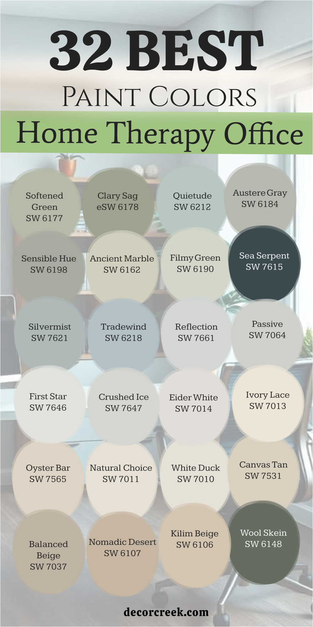
31 Paint Colors For The Home Study Room
Alabaster SW 7008
Alabaster SW 7008 provides a soft look that stays away from being too yellow or too blue in your study room. This shade works well because it reflects light without making the room feel like a cold hospital today. I like how it makes a small study feel much larger than it actually is for your books.
You can use it on both the walls and the trim to keep things simple and tidy. It acts as a clean backdrop for colorful art or dark wood furniture in your workspace. Many of my clients choose this when they want a fresh start in their study area today. It feels like a clean sheet of paper ready for your big ideas and long tasks.
This white is famous for being friendly to any kind of lighting you have in your house. It makes the air in the room feel light and easy to breathe while you work. You will find that it matches almost any floor color you already have.
Best used in: living rooms, kitchens, hallways, bedrooms, and farmhouse exteriors
Pairs well with: Iron Ore SW 7069, Agreeable Gray SW 7029, Natural Linen SW 9109, warm wood tones The key rule of this color for farmhouse style is to use it where you want natural light to feel kind, soft, and inviting throughout the day.
Shoji White SW 7042
Shoji White SW 7042 sits right between a white and a very light beige color for your home study. This shade is wonderful because it changes its look depending on what you put next to it today. It can look like a soft cream or a very light tan depending on your bookshelves. I recommend this for a study that needs to feel a bit more formal and serious for work.
It provides a steady background that helps you focus on your computer screen or your notebooks. You will like how it hides small marks or dust better than a very bright white color. It makes the walls feel solid and dependable while you work on hard projects for many hours.
This color works well with both gold and silver hardware on your study desk today. I often use it in homes where the rooms flow into each other very smoothly. It creates a path for your eyes as you walk through the house.
Best used in: open floor plans, hallways, master bedrooms, and home offices
Pairs well with: Fawn Brindle SW 7618, Perle Noir SW 9154, Worldly Gray SW 7043, natural textures The key rule of this color for neutral style is to use it when you want a warm background that still feels light enough to be called white.
Natural Choice SW 7011
Natural Choice SW 7011 is a very soft and very creamy white that feels very fresh for a study room. This color is perfect for a home study where you want a neutral look that still feels airy. I suggest this for people who want a room that feels very steady and very quiet for reading today. It provides a very gentle background that does not distract you from the work you are doing in the room.
You will find that it looks very clean and very updated when paired with white trim and doors. It helps the room feel very balanced and very organized throughout the entire day of study and work. I like to use this to make a room feel very professional without it looking cold or plain.
This shade is a very smart and very polite choice for a study that needs to feel very safe. It is a very reliable and very steady color for a professional workspace in your house.
Best used in: entire homes, offices, kitchens, and bedrooms
Pairs well with: Alabaster SW 7008, Pure White SW 7005, Agreeable Gray SW 7029, warm wood tones The key rule of this color for neutral style is to use it as a soft alternative to a stark white for a more inviting and professional feeling.
White Duck SW 7010
White Duck SW 7010 is a very light and very warm gray-white that feels very soft for a study. This color is a great pick for a home study room because it feels very balanced today. I recommend this for people who want a white look that still feels very cozy and warm.
It has a very quiet look that helps you stay focused and ready for your reading and writing. You will notice that it works perfectly with both light and dark furniture for a very neat look. It helps the room feel very clean and very updated for a modern study space in your house.
I find that it makes people feel very comfortable and very ready to think in a quiet room. This shade is a very smart and very reliable choice for a study that needs to feel safe. It is a very balanced and helpful color for a busy person who loves to read.
Best used in: living rooms, bedrooms, offices, and kitchens
Pairs well with: Alabaster SW 7008, Gray Area SW 7052, Urbane Bronze SW 7048, natural wood textures The key rule of this color for soft style is to use it in rooms with natural light to highlight the creamy and warm tones in the paint.
Drift of Mist SW 9166
Drift of Mist SW 9166 is a very light gray that feels as airy as its name suggests today. This color is great for a study room because it does not feel heavy or dark at all. I pick this when a room has a lot of sunlight that might make other colors look bright. It keeps the room feeling balanced and steady throughout the entire day of reading and work sessions.
You will notice that it makes your bookshelves look very sharp and well-defined against the light walls. It is a great choice for people who want a gray but are afraid of it looking gloomy. I love how it looks with white trim around the doors and the floor in your study.
It creates a professional look that is still very inviting for anyone who wants to read today. You can add pops of green or blue to the room to make it feel alive. This shade is a top pick for a clean workspace.
Best used in: offices, living rooms, bedrooms, and kitchens
Pairs well with: Quicksilver SW 6245, Iron Ore SW 7069, Extra White SW 7006, navy blue accents The key rule of this color for professional style is to pair it with white trim to make the light gray tones pop without looking muddy.
Crushed Ice SW 7647
Crushed Ice SW 7647 is a very light gray with a tiny bit of warmth for your home study. This color is a wonderful choice because it feels very balanced and very easy on the eyes today. I like to use this to create a room that feels very steady and very ready for reading. It has a very quiet look that helps you stay on track and focus on your writing tasks.
You will notice that it works perfectly with both light and dark wood furniture in the study. It helps the room feel very clean and very updated for a modern home study space today.
I find that it makes people feel very comfortable and very ready to think in a quiet room. This shade is a very smart and very reliable choice for a study that needs to feel safe. It is a very balanced and helpful color for a busy person who needs focus.
Best used in: offices, living areas, bedrooms, and kitchens
Pairs well with: Alabaster SW 7008, Agreeable Gray SW 7029, Iron Ore SW 7069, warm wood accents The key rule of this color for balanced style is to use it when you want a gray that stays neutral in different types of light throughout the day.
First Star SW 7646
First Star SW 7646 is a very pale and very light gray that feels like a cool white today. This color is perfect for a study room that needs to feel very bright and full of energy. I suggest this for people who want their workspace to feel very open and very airy for reading.
It catches the light from the windows and makes the room feel very hopeful for your work tasks. You can use it to make a small study feel much larger and much more inviting today. It provides a very soft and very friendly look that helps you feel more comfortable at your desk.
I find that it makes white furniture look very bright and very clean against the walls. This shade is a very light and happy choice for a study that needs to feel safe. It is a very soft and kind color for a professional study room in your home.
Best used in: bathrooms, bedrooms, offices, and small rooms
Pairs well with: Pure White SW 7005, Passive SW 7064, Charcoal Blue SW 2739, silver accents The key rule of this color for light style is to use it in south-facing rooms where the bright sun can keep the very light gray tones looking fresh.
Passive SW 7064
Passive SW 7064 is a true and very steady gray that feels very professional for a study room. This color is a great choice because it does not have any hidden colors that distract you today. I recommend this for people who want a very clean and very modern look for their study.
It has a very quiet look that helps you stay focused and ready for your reading and writing. You will find that it makes colorful art and books look very bright on the walls. It works perfectly with black metal desks and gray furniture for a very neat and updated look.
I find that it helps people feel more objective and more ready to think in a clear way. This shade is a very popular choice for a study that needs to feel like a real workplace. It is a very reliable and very handsome color for any person who needs to work today.
Best used in: offices, living rooms, hallways, and kitchens
Pairs well with: Extra White SW 7006, Reflection SW 7661, Iron Ore SW 7069, modern furniture The key rule of this color for clean style is to use it with bright white trim to create a sharp and professional look that stays fresh.
Agreeable Gray SW 7029
Agreeable Gray SW 7029 is a famous color because it looks good in almost every home study room. This shade has a little bit of beige in it which makes the gray feel much warmer today. I use this in a study where people want a modern look without it feeling cold. It acts like a chameleon and picks up the colors of the books and rugs around it.
You will see that it makes your white ceilings look very bright and very clean today. It is a great background for a gallery wall of your favorite study photos or diplomas. I recommend this if you are not sure which color to pick for your room today.
It keeps your study feeling open and full of light even on cloudy days in the house. Many people find that it helps them feel organized and ready to start their reading. It is a very steady and helpful color for a busy person.
Best used in: open concept areas, home offices, bedrooms, and hallways
Pairs well with: Extra White SW 7006, Mega Greige SW 7031, Brainstorm Bronze SW 7033, blue-green accents The key rule of this color for versatile style is to use it when you want a gray that won’t feel too blue or too cold in north-facing light.
Repose Gray SW 7015
Repose Gray SW 7015 is a slightly cooler gray that still has a hint of warmth inside today. This color is perfect for a study where you need to stay alert and focused on your work. I like how it looks with dark blue or green accents in the study room decorations.
It feels very crisp and tidy which helps your mind stay clear while you read or write. You will notice that it makes a room feel a bit more formal than a beige color. It is a great choice for people who have a lot of white furniture or shelves.
I find that it looks very expensive when it is painted on all the walls today. It provides a nice contrast if you have light-colored wood floors or carpets in your room. This shade is a top pick for making a small study look very sharp and neat. It is a very trustworthy color for a professional workspace.
Best used in: modern offices, living rooms, kitchens, and entryways
Pairs well with: Eider White SW 7014, Pavestone SW 7642, Dorian Gray SW 7017, silver hardware The key rule of this color for crisp style is to use it with bright white trim to highlight the sophisticated gray tones without it looking dull.
Mindful Gray SW 7016
Mindful Gray SW 7016 has more depth and weight than the lighter grays for a study room. This color works well in a large study that has high ceilings and plenty of light. It makes the room feel substantial and anchored so you feel ready for big tasks today.
I like to use this when a client has light-colored wood furniture to create a balance. It does not feel too dark but it lets you know that it is a gray wall. You will find that it looks very handsome in a room with black or dark metal lamps.
It helps hide shadows in the corners so the room feels evenly colored all over today. I think it is a great choice for a serious person who likes a clean look. It feels like a very solid background for a productive and busy study life at home. This shade is one of my go-to picks for a professional home library or study room.
Best used in: offices, living rooms, exteriors, and kitchens
Pairs well with: Homburg Gray SW 7622, Pearly White SW 7009, Eider White SW 7014, leather furniture The key rule of this color for balanced style is to use it when you want a gray that has enough body to stand out against white trim without being too dark.
Accessible Beige SW 7036
Accessible Beige SW 7036 is a very popular choice for a study because it is not too yellow. I like to call it a bridge color because it connects different styles together perfectly today. This color makes a study feel reliable and very easy to work in for many hours. It does not change much when you turn on different types of lights in your room.
You can use it to make a small study feel much more like a real and professional room. It provides a soft look that is very easy on the eyes when you look up today. I find that most people feel very comfortable with this color right away in the house.
It makes your study room feel like a professional place of business for your work. You can use dark wood furniture to make the room look very expensive and very nice. It is a smart choice for any person who wants a color everyone likes.
Best used in: entire homes, offices, kitchens, and hallways
Pairs well with: Aesthetic White SW 7035, Urban Bronze SW 7048, Cadet SW 9143, dark wood furniture The key rule of this color for traditional style is to use it as a neutral base that allows your furniture and art to be the stars of the room.
Balanced Beige SW 7037
Balanced Beige SW 7037 is a medium-toned beige that is not too warm for your study room today. This color is perfect because it feels very solid and very dependable for your reading tasks. I suggest this for people who want a room that feels very steady and professional.
It has enough depth to make the walls look rich but it stays light enough today. You will notice that it works perfectly with dark wood desks and leather chairs in the study. It helps people feel very focused and very steady while they are thinking about things.
I find that it makes a room feel very complete and well-designed for a professional person. This shade is a very trustworthy choice for a study that needs to feel very quiet. It is a very steady and helpful color for a busy workspace in your house today.
Best used in: living rooms, offices, hallways, and bedrooms
Pairs well with: Alabaster SW 7008, Accessible Beige SW 7036, Urbane Bronze SW 7048, dark wood tones The key rule of this color for traditional style is to use it with warm lighting to create a very inviting and very professional atmosphere in the room.
Canvas Tan SW 7531
Canvas Tan SW 7531 is a light and warm beige that feels like a clean cloth for your study walls. This color is a wonderful choice because it feels very natural and grounded today. I like to use this to create a room that feels very steady and safe for your work.
It provides a very gentle background that helps you feel more at ease while you read today. You will find that it makes white trim look very bright and very clean in your study. It works perfectly with green plants and wooden furniture for a very earthy look today.
I find that it helps people feel more connected to nature while they are inside the house. This shade is a very sophisticated choice that makes your study room feel very special. It is a very reliable and very kind color for a professional study room in your home.
Best used in: offices, living rooms, bedrooms, and hallways
Pairs well with: Alabaster SW 7008, Shoji White SW 7042, Balanced Beige SW 7037, natural wood The key rule of this color for organic style is to pair it with warm white trim to highlight the soft and natural tan tones in the paint.
Wool Skein SW 6148
Wool Skein SW 6148 is a light and soft beige with a hint of green for your home study today. This color is perfect because you want a neutral look that still feels very soft. I suggest this for people who want a room that feels very steady and quiet today.
It provides a very gentle background that does not distract you from the reading tasks you are doing. You will find that it looks very clean and very updated when paired with white trim. It helps the room feel very balanced and very organized throughout the entire day of work today.
I like to use this to make a room feel very professional without it looking cold. This shade is a very smart and very polite choice for a study that needs to feel safe. It is a very reliable and very steady color for a professional workspace in your house.
Best used in: offices, living areas, bedrooms, and hallways
Pairs well with: Alabaster SW 7008, Universal Khaki SW 6150, Ancient Marble SW 6162, natural wood The key rule of this color for neutral style is to use it with warm lighting to prevent the soft green-beige tones from looking too cool.
Kilim Beige SW 6106
Kilim Beige SW 6106 is a very famous and popular warm beige for a home study room today. This color is a wonderful choice because it feels very balanced and easy to live with. I like to use this to create a room that feels very steady and ready for work.
It has a very quiet look that helps you stay on track and focus on your writing today. You will notice that it works perfectly with both light and dark furniture for a neat look. It helps the room feel very clean and very updated for a modern home study today.
I find that it makes people feel very comfortable and very ready to think in a quiet room. This shade is a very smart and very reliable choice for a study that needs to feel safe. It is a very balanced and helpful color for a busy person in their own home.
Best used in: entire homes, offices, living rooms, and bedrooms
Pairs well with: Alabaster SW 7008, Nomadic Desert SW 6107, Latte SW 6108, warm wood accents The key rule of this color for traditional style is to use it as a warm neutral base that makes the entire room feel very inviting.
Softened Green SW 6177
Softened Green SW 6177 is a very gentle and light green that feels like a walk today. This color is perfect for a study room where you need to feel very relaxed for your reading. I suggest this for a room that needs to feel very kind and welcoming for your work today.
It has a very soft look that helps lower stress and makes the air feel fresh. You will notice that it looks wonderful with light wood furniture and soft white fabrics. It helps the study feel like a separate and very peaceful place in your house.
I like how it brings a sense of nature and life into a study without being loud. This shade is very popular for creating a sense of growth and hope for your work today. It is a very soft and helpful choice for a kind and caring study workspace in your home.
Best used in: therapy offices, bedrooms, bathrooms, and nurseries
Pairs well with: Alabaster SW 7008, Clary Sage SW 6178, Dover White SW 6385, natural textures The key rule of this color for peaceful style is to use it with plenty of soft lighting to keep the green feeling light and very inviting.
Clary Sage SW 6178
Clary Sage SW 6178 is a medium-toned green that feels very herbal for your home study room. This color is a great pick because it feels very steady and grounded for your work today. I like to use this to create a room that feels very solid and safe for reading.
It has a soft gray undertone that keeps the green from ever looking too bright today. You will find that it makes white trim look very clean and very bright in your study. It works perfectly with natural wood desks and green plants for a very quiet look.
I find that it helps people feel more connected to themselves and ready for work today. This shade is a very sophisticated choice that makes your study feel like a special retreat. It is a very reliable and very kind color for a professional study room in your home.
Best used in: offices, living rooms, bedrooms, and exteriors
Pairs well with: Shoji White SW 7042, Dover White SW 6385, Sagey SW 6175, warm wood tones The key rule of this color for organic style is to pair it with warm white trim to highlight the soft and natural green tones in the paint.
Evergreen Fog SW 9130
Evergreen Fog SW 9130 is a beautiful and deep green-gray for your home study room today. This color was a color of the year because it looks so good in almost any room. I like to use this in a study to make it feel like an important place for work.
It has enough depth to make the walls look rich but it is not heavy today. You will notice that it makes gold and brass lamps look very shiny in the room. It is a great choice for a room with wooden shelves and big stacks of books today.
I find that it helps people feel very focused and very steady while they work. This shade brings a sense of the forest into your house which helps you feel grounded today. It is a very sophisticated choice for someone who wants a study that looks professional. This color makes the room feel very solid for your busy work life.
Best used in: offices, bedrooms, living rooms, and kitchen cabinets
Pairs well with: Shoji White SW 7042, Urbane Bronze SW 7048, Uberberry SW 9132, gold hardware The key rule of this color for sophisticated style is to use it in a room with a lot of texture like wool rugs and leather chairs.
Dried Thyme SW 6186
Dried Thyme SW 6186 is a rich and earthy green that feels very natural for a study today. This color reminds me of herbs growing and it brings that life into your room. I recommend this for a study where you want to feel steady and connected to your reading.
It has a soft look that does not feel too bright for your eyes today. You will see that it makes light wood furniture look very bright and very clean. It is a great choice for a room that needs personality without being loud today.
I find that it helps people feel very calm and very ready to focus on their study. This shade looks wonderful with botanical art and green plants on the desk today. It makes your home study feel like a very peaceful and productive part of your home. This is a very smart choice for a modern and natural look today.
Best used in: offices, kitchens, bedrooms, and entryways
Pairs well with: Shoji White SW 7042, Accessible Beige SW 7036, Prairie Grass SW 7546, natural wood The key rule of this color for organic style is to pair it with warm beige tones to keep the green looking soft and very natural.
Silvermist SW 7621
Silvermist SW 7621 is a medium-toned gray-blue with a hint of green for your study room today. This color is a great choice because it feels very steady and easy on the eyes. I recommend this for people who want a blue look that still feels neutral today.
It has a very quiet look that helps you stay focused and ready for your reading. You will find that it makes white furniture and silver lamps look very bright and sharp. It helps the room feel very clean and updated for a modern home study today.
I like how it brings a sense of the sky into the room to help you feel relaxed. This shade is a very smart and very reliable choice for a study that needs focus. It is a very balanced and helpful color for any busy person who needs to read today.
Best used in: bedrooms, bathrooms, offices, and laundry rooms
Pairs well with: Pure White SW 7005, Passive SW 7064, Sea Serpent SW 7615, silver metal accents The key rule of this color for balanced style is to use it in south-facing rooms to prevent the cool blue tones from looking too gray or too dull.
Tradewind SW 6218
Tradewind SW 6218 is a soft and light blue that feels very fresh for a home study today. This color is a wonderful choice where you want to create a sense of lightness. I suggest this for people who want a room that feels very happy for their work today.
It is a bit more blue than a gray but it still feels very tidy for work. You will notice that it makes a small study feel much larger and more inviting today. It looks very clean and very sharp when paired with white trim and light furniture.
I find that it helps people feel more positive and more ready to read in the house. This shade is a very popular choice for creating a sense of peace and lightness today. It is a very soft and kind color for a home study workspace in your house.
Best used in: therapy offices, nurseries, bathrooms, and bedrooms
Pairs well with: Alabaster SW 7008, Sea Salt SW 6204, Rainwashed SW 6211, light wood tones The key rule of this color for fresh style is to use it in rooms with plenty of natural light to let the blue tones feel very bright all day.
Sea Salt SW 6204
Sea Salt SW 6204 is a famous color for creating a soft and light feeling in any study room. This shade is a light green-gray that feels very fresh for your work today. I use this where people want to feel a sense of lightness and ease today.
It is a very happy color that makes the room feel full of soft morning light. You will notice that it looks very clean and tidy when you have white trim today. It helps your mind stay fresh even when you have been reading for a long time.
I like to pair it with natural wood and white fabrics to keep it open. It is a great choice if you want your study to feel like a getaway today. Many people find that this color helps them feel less tired at the end of the day. It is a very soft and kind color for your home study room.
Best used in: bathrooms, bedrooms, offices, and kitchens
Pairs well with: Summit Gray SW 7669, Alabaster SW 7008, Fleur de Sel SW 7666, light wood tones The key rule of this color for light style is to use it in rooms with plenty of windows to prevent the green tones from looking too muddy.
White Dove OC-17
White Dove OC-17 is a very popular and soft creamy white for a home study room today. This color is perfect because it is not too bright and not too yellow for work. I suggest this for a study that needs to feel very warm and very clean today.
It provides a very gentle background that helps you stay focused on your reading and writing. You will find that it makes white trim look very bright and very sharp against the walls. It helps the room feel very balanced and very organized throughout the entire day of work today.
I like to use this to make a study feel very professional without it looking cold today. This shade is a very smart and very polite choice for a study in your home. It is a very reliable and very steady color for a professional study room today.
Best used in: entire homes, trim, cabinets, and bedrooms
Pairs well with: Balboa Mist OC-27, Revere Pewter HC-172, Hale Navy HC-154, warm wood tones The key rule of this color for classic style is to use it as a soft and inviting white that warms up any room with natural light.

Simply White OC-117
Simply White OC-117 is a crisp and very bright white that feels very fresh for a study room. This color is perfect where you want a very clean and modern look today. I suggest this for people who want their workspace to feel very open and full of light.
It catches the sun from the windows and makes the room feel very hopeful for work. You can use it to make a small study feel much larger and much more inviting today. It provides a very sharp and very clean look that helps you stay on task today.
I find that it makes colorful books and art look very bright on the walls today. This shade is a very light and happy choice for a study in your house. It is a very soft and kind color for a professional study room at home.
Best used in: trim, ceilings, kitchens, and modern offices
Pairs well with: Balboa Mist OC-27, Gray Owl OC-52, Hale Navy HC-154, dark metal accents The key rule of this color for modern style is to use it when you want a white that feels very bright but still has a tiny bit of warmth.

Classic Gray OC-23
Classic Gray OC-23 is a very light and soft gray that almost feels like a warm white today. This color is perfect for a study room that needs to feel very bright today. I suggest this for people who want their workspace to feel very open for their reading.
It provides a very gentle background that does not distract you from your work today. You will find that it looks very clean and very updated when paired with white trim. It helps the room feel very balanced and very organized throughout the day today.
I like to use this to make a room feel very professional without it looking cold today. This shade is a very smart and very polite choice for a study in your home. It is a very reliable and very steady color for a professional study room today.
Best used in: entire homes, offices, living areas, and bedrooms
Pairs well with: White Dove OC-17, Simply White OC-117, Hale Navy HC-154, modern furniture The key rule of this color for clean style is to use it as a soft alternative to a stark white for a more inviting professional feeling.
Pale Oak OC-20
Pale Oak OC-20 is a very light and soft gray-beige that feels like a shadow today. This color is perfect for a study room because it is very quiet for your work. I suggest this for people who want their workspace to feel very open and full of light.
It provides a very gentle background that helps you feel more at ease today. You will notice that it looks very clean and very updated when paired with white trim. It helps the room feel very steady and very organized throughout the morning today.
I like how it brings a tiny bit of warmth into a room without it looking pink. This shade is a very popular choice for creating a sense of peace in a study. It is a very soft and kind color for a home study workspace today.
Best used in: bedrooms, living areas, offices, and kitchens
Pairs well with: White Dove OC-17, Revere Pewter HC-172, Chantilly Lace OC-65, soft textiles The key rule of this color for neutral style is to use it in rooms with natural light to let the soft gray-beige tones feel very fresh.
Balboa Mist OC-27
Balboa Mist OC-27 is a very light gray that has a tiny bit of warmth for your study room. This color is a wonderful choice because it feels very fresh today. I like to use this to create a room that feels very steady and ready for work.
It has a very quiet look that helps you stay on track for your reading today. You will find that it works perfectly with light wood furniture and soft rugs today. It helps the room feel very clean and very updated for a modern home study today.
I find that it makes people feel very comfortable and ready to think in the room. This shade is a very smart and very reliable choice for a study today. It is a very balanced and helpful color for a busy person who reads.
Best used in: living rooms, bedrooms, offices, and kitchens
Pairs well with: Simply White OC-117, Gray Owl OC-52, Hale Navy HC-154, light wood accents The key rule of this color for fresh style is to use it with bright white trim to highlight the soft and light gray tones in the paint.
Edgecomb Gray HC-173
Edgecomb Gray HC-173 is a medium-toned gray-beige that feels very steady for your study room. This color is a great pick because it feels very professional for work today. I recommend this for people who want a neutral look that still feels very warm today.
It has enough depth to make the walls look rich but it stays light today. You will notice that it works perfectly with both light and dark furniture today. It helps the room feel very clean and very updated for a modern home study today.
I find that it makes people feel very comfortable and ready to think in the room. This shade is a very smart and very reliable choice for a study today. It is a very balanced and helpful color for a busy person in their house.
Best used in: living rooms, bedrooms, offices, and hallways
Pairs well with: White Dove OC-17, Revere Pewter HC-172, Hale Navy HC-154, natural wood The key rule of this color for traditional style is to use it with warm lighting to create a very inviting and very professional atmosphere.
Healing Aloe 1562
Healing Aloe 1562 is a very soft and light green-blue that feels very fresh for a study room. This color is a wonderful choice where you want a sense of lightness today. I suggest this for people who want a room that feels very happy for their work today.
It is a very quiet color that helps you feel more relaxed for your reading today. You will notice that it makes a small study feel much larger and more inviting today. It looks very clean and very sharp when paired with white trim and furniture.
I find that it helps people feel more positive and ready to start their work today. This shade is a very popular choice for creating a sense of peace today. It is a very soft and kind color for a home study room today.
Best used in: therapy offices, bedrooms, bathrooms, and nurserie
Pairs well with: Simply White OC-117, Quiet Moments 1563, White Dove OC-17, light wood tones The key rule of this color for fresh style is to use it in rooms with plenty of natural light to let the blue-green notes feel very bright.
Quiet Moments 1563
Quiet Moments 1563 is a medium-toned blue-green-gray that feels very steady for a study room. This color is perfect because it feels very professional for your work today. I like to use this to create a room that feels very solid and safe today.
It has a very quiet look that helps you stay on track for your reading today. You will find that it works perfectly with white trim and dark wood furniture today. It helps the room feel very clean and very updated for a modern home study today.
I find that it makes people feel more relaxed and ready to think today. This shade is a very smart and very reliable choice for a study in your house. It is a very balanced and helpful color for a busy person of work.
Best used in: bedrooms, bathrooms, therapy offices, and living rooms
Pairs well with: Simply White OC-117, Healing Aloe 1562, Hale Navy HC-154, silver metal accents The key rule of this color for peaceful style is to use it with soft lighting to highlight the gray and green tones in the paint.
33 Paint Colors For The Cozy Home Office
Alabaster SW 7008
Alabaster SW 7008 provides a soft look that stays away from being too yellow or too blue in your cozy office. This shade works well because it reflects light without making the room feel like a cold hospital today. I like how it makes a small office feel much larger than it actually is for your work.
You can use it on both the walls and the trim to keep things simple and tidy. It acts as a clean backdrop for colorful art or dark wood furniture in your workspace. Many of my clients choose this when they want a fresh start in their office area today.
It feels like a clean sheet of paper ready for your big ideas and long tasks. This white is famous for being friendly to any kind of lighting you have in your house. It makes the air in the room feel light and easy to breathe while you work. You will find that it matches almost any floor color you already have.
Best used in: living rooms, kitchens, hallways, bedrooms, and farmhouse exteriors
Pairs well with: Iron Ore SW 7069, Agreeable Gray SW 7029, Natural Linen SW 9109, warm wood tones The key rule of this color for farmhouse style is to use it where you want natural light to feel kind, soft, and inviting throughout the day.
Shoji White SW 7042
Shoji White SW 7042 sits right between a white and a very light beige color for your cozy home office. This shade is wonderful because it changes its look depending on what you put next to it today. It can look like a soft cream or a very light tan depending on your furniture.
I recommend this for an office that needs to feel a bit more formal and serious for work. It provides a steady background that helps you focus on your computer screen or your notebooks. You will like how it hides small marks or dust better than a very bright white color.
It makes the walls feel solid and dependable while you work on hard projects for many hours. This color works well with both gold and silver hardware on your office desk today. I often use it in homes where the rooms flow into each other very smoothly. It creates a path for your eyes as you walk through the house.
Best used in: open floor plans, hallways, master bedrooms, and home offices
Pairs well with: Fawn Brindle SW 7618, Perle Noir SW 9154, Worldly Gray SW 7043, natural textures The key rule of this color for neutral style is to use it when you want a warm background that still feels light enough to be called white.
White Duck SW 7010
White Duck SW 7010 is a very light and very warm gray-white that feels very soft for a cozy office. This color is a great pick for a home office room because it feels very balanced today. I recommend this for people who want a white look that still feels very cozy and warm.
It has a very quiet look that helps you stay focused and ready for your reading and writing. You will notice that it works perfectly with both light and dark furniture for a very neat look. It helps the room feel very clean and very updated for a modern office space in your house.
I find that it makes people feel very comfortable and very ready to think in a quiet room. This shade is a very smart and very reliable choice for an office that needs to feel safe. It is a very balanced and helpful color for a busy person who loves to work.
Best used in: living rooms, bedrooms, offices, and kitchens
Pairs well with: Alabaster SW 7008, Gray Area SW 7052, Urbane Bronze SW 7048, natural wood textures The key rule of this color for soft style is to use it in rooms with natural light to highlight the creamy and warm tones in the paint.
Natural Choice SW 7011
Natural Choice SW 7011 is a very soft and very creamy white that feels very fresh for a cozy office room. This color is perfect for a home office where you want a neutral look that still feels airy. I suggest this for people who want a room that feels very steady and very quiet for working today.
It provides a very gentle background that does not distract you from the tasks you are doing in the room. You will find that it looks very clean and very updated when paired with white trim and doors. It helps the room feel very balanced and very organized throughout the entire day of study and work.
I like to use this to make a room feel very professional without it looking cold or plain. This shade is a very smart and very polite choice for an office that needs to feel very safe. It is a very reliable and very steady color for a professional workspace in your house.
Best used in: entire homes, offices, kitchens, and bedrooms
Pairs well with: Alabaster SW 7008, Pure White SW 7005, Agreeable Gray SW 7029, warm wood tones The key rule of this color for neutral style is to use it as a soft alternative to a stark white for a more inviting and professional feeling.
Drift of Mist SW 9166
Drift of Mist SW 9166 is a very light gray that feels as airy as its name suggests today. This color is great for a cozy office room because it does not feel heavy or dark at all. I pick this when a room has a lot of sunlight that might make other colors look bright.
It keeps the room feeling balanced and steady throughout the entire day of work sessions. You will notice that it makes your furniture look very sharp and well-defined against the light walls. It is a great choice for people who want a gray but are afraid of it looking gloomy.
I love how it looks with white trim around the doors and the floor in your office. It creates a professional look that is still very inviting for anyone who wants to work today. You can add pops of green or blue to the room to make it feel alive. This shade is a top pick for a clean workspace.
Best used in: offices, living rooms, bedrooms, and kitchens
Pairs well with: Quicksilver SW 6245, Iron Ore SW 7069, Extra White SW 7006, navy blue accents The key rule of this color for professional style is to pair it with white trim to make the light gray tones pop without looking muddy.
Crushed Ice SW 7647
Crushed Ice SW 7647 is a very light gray with a tiny bit of warmth for your cozy home office. This color is a wonderful choice because it feels very balanced and very easy on the eyes today. I like to use this to create a room that feels very steady and very ready for work.
It has a very quiet look that helps you stay on track and focus on your writing tasks. You will notice that it works perfectly with both light and dark wood furniture in the office. It helps the room feel very clean and very updated for a modern home office space today.
I find that it makes people feel very comfortable and very ready to think in a quiet room. This shade is a very smart and very reliable choice for an office that needs to feel safe. It is a very balanced and helpful color for a busy person who needs focus.
Best used in: offices, living areas, bedrooms, and kitchens
Pairs well with: Alabaster SW 7008, Agreeable Gray SW 7029, Iron Ore SW 7069, warm wood accents The key rule of this color for balanced style is to use it when you want a gray that stays neutral in different types of light throughout the day.
First Star SW 7646
First Star SW 7646 is a very pale and very light gray that feels like a cool white today. This color is perfect for a cozy office room that needs to feel very bright and full of energy. I suggest this for people who want their workspace to feel very open and very airy for work.
It catches the light from the windows and makes the room feel very hopeful for your work tasks. You can use it to make a small office feel much larger and much more inviting today. It provides a very soft and very friendly look that helps you feel more comfortable at your desk.
I find that it makes white furniture look very bright and very clean against the walls. This shade is a very light and happy choice for an office that needs to feel safe. It is a very soft and kind color for a professional office room in your home.
Best used in: bathrooms, bedrooms, offices, and small rooms
Pairs well with: Pure White SW 7005, Passive SW 7064, Charcoal Blue SW 2739, silver accents The key rule of this color for light style is to use it in south-facing rooms where the bright sun can keep the very light gray tones looking fresh.
Agreeable Gray SW 7029
Agreeable Gray SW 7029 is a famous color because it looks good in almost every cozy office room. This shade has a little bit of beige in it which makes the gray feel much warmer today. I use this in an office where people want a modern look without it feeling cold.
It acts like a chameleon and picks up the colors of the rugs around it. You will see that it makes your white ceilings look very bright and very clean today. It is a great background for a gallery wall of your favorite office photos or diplomas.
I recommend this if you are not sure which color to pick for your room today. It keeps your office feeling open and full of light even on cloudy days in the house. Many people find that it helps them feel organized and ready to start their work. It is a very steady and helpful color for a busy person.
Best used in: open concept areas, home offices, bedrooms, and hallways
Pairs well with: Extra White SW 7006, Mega Greige SW 7031, Brainstorm Bronze SW 7033, blue-green accents The key rule of this color for versatile style is to use it when you want a gray that won’t feel too blue or too cold in north-facing light.
Repose Gray SW 7015
Repose Gray SW 7015 is a slightly cooler gray that still has a hint of warmth inside today. This color is perfect for a cozy office where you need to stay alert and focused on your work. I like how it looks with dark blue or green accents in the office room decorations.
It feels very crisp and tidy which helps your mind stay clear while you work or write. You will notice that it makes a room feel a bit more formal than a beige color. It is a great choice for people who have a lot of white furniture or shelves.
I find that it looks very expensive when it is painted on all the walls today. It provides a nice contrast if you have light-colored wood floors or carpets in your room. This shade is a top pick for making a small office look very sharp and neat. It is a very trustworthy color for a professional workspace.
Best used in: modern offices, living rooms, kitchens, and entryways
Pairs well with: Eider White SW 7014, Pavestone SW 7642, Dorian Gray SW 7017, silver hardware The key rule of this color for crisp style is to use it with bright white trim to highlight the sophisticated gray tones without it looking dull.
Mindful Gray SW 7016
Mindful Gray SW 7016 has more depth and weight than the lighter grays for a cozy office room. This color works well in a large office that has high ceilings and plenty of light. It makes the room feel substantial and anchored so you feel ready for big tasks today.
I like to use this when a client has light-colored wood furniture to create a balance. It does not feel too dark but it lets you know that it is a gray wall. You will find that it looks very handsome in a room with black or dark metal lamps.
It helps hide shadows in the corners so the room feels evenly colored all over today. I think it is a great choice for a serious person who likes a clean look. It feels like a very solid background for a productive and busy office life at home. This shade is one of my go-to picks for a professional home office room.
Best used in: offices, living rooms, exteriors, and kitchens
Pairs well with: Homburg Gray SW 7622, Pearly White SW 7009, Eider White SW 7014, leather furniture The key rule of this color for balanced style is to use it when you want a gray that has enough body to stand out against white trim without being too dark.
Accessible Beige SW 7036
Accessible Beige SW 7036 is a very popular choice for a cozy office because it is not too yellow. I like to call it a bridge color because it connects different styles together perfectly today. This color makes an office feel reliable and very easy to work in for many hours.
It does not change much when you turn on different types of lights in your room. You can use it to make a small office feel much more like a real and professional room. It provides a soft look that is very easy on the eyes when you look up today.
I find that most people feel very comfortable with this color right away in the house. It makes your office room feel like a professional place of business for your work. You can use dark wood furniture to make the room look very expensive and very nice. It is a smart choice for any person who wants a color everyone likes.
Best used in: entire homes, offices, kitchens, and hallways
Pairs well with: Aesthetic White SW 7035, Urban Bronze SW 7048, Cadet SW 9143, dark wood furniture The key rule of this color for traditional style is to use it as a neutral base that allows your furniture and art to be the stars of the room.
Balanced Beige SW 7037
Balanced Beige SW 7037 is a medium-toned beige that is not too warm for your cozy office room today. This color is perfect because it feels very solid and very dependable for your work tasks. I suggest this for people who want a room that feels very steady and professional.
It has enough depth to make the walls look rich but it stays light today. You will notice that it works perfectly with dark wood desks and leather chairs in the office. It helps people feel very focused and very steady while they are thinking about things.
I find that it makes a room feel very complete and well-designed for a professional person. This shade is a very trustworthy choice for an office that needs to feel very quiet. It is a very steady and helpful color for a busy workspace in your house today.
Best used in: living rooms, offices, hallways, and bedrooms
Pairs well with: Alabaster SW 7008, Accessible Beige SW 7036, Urbane Bronze SW 7048, dark wood tones The key rule of this color for traditional style is to use it with warm lighting to create a very inviting and very professional atmosphere in the room.
Canvas Tan SW 7531
Canvas Tan SW 7531 is a light and warm beige that feels like a clean cloth for your cozy office walls. This color is a wonderful choice because it feels very natural and grounded today. I like to use this to create a room that feels very steady and safe for your work.
It provides a very gentle background that helps you feel more at ease while you work today. You will find that it makes white trim look very bright and very clean in your office. It works perfectly with green plants and wooden furniture for a very earthy look today.
I find that it helps people feel more connected to nature while they are inside the house. This shade is a very sophisticated choice that makes your office room feel very special. It is a very reliable and very kind color for a professional office room in your home.
Best used in: offices, living rooms, bedrooms, and hallways
Pairs well with: Alabaster SW 7008, Shoji White SW 7042, Balanced Beige SW 7037, natural wood The key rule of this color for organic style is to pair it with warm white trim to highlight the soft and natural tan tones in the paint.
Wool Skein SW 6148
Wool Skein SW 6148 is a light and soft beige with a hint of green for your cozy office today. This color is perfect because you want a neutral look that still feels very soft. I suggest this for people who want a room that feels very steady and quiet today.
It provides a very gentle background that does not distract you from the work tasks you are doing. You will find that it looks very clean and very updated when paired with white trim. It helps the room feel very balanced and very organized throughout the entire day of work today.
I like to use this to make a room feel very professional without it looking cold. This shade is a very smart and very polite choice for an office that needs to feel safe. It is a very reliable and very steady color for a professional workspace in your house.
Best used in: offices, living areas, bedrooms, and hallways
Pairs well with: Alabaster SW 7008, Universal Khaki SW 6150, Ancient Marble SW 6162, natural wood The key rule of this color for neutral style is to use it with warm lighting to prevent the soft green-beige tones from looking too cool.
Kilim Beige SW 6106
Kilim Beige SW 6106 is a very famous and popular warm beige for a cozy office room today. This color is a wonderful choice because it feels very balanced and easy to live with. I like to use this to create a room that feels very steady and ready for work.
It has a very quiet look that helps you stay on track and focus on your tasks today. You will notice that it works perfectly with both light and dark furniture for a neat look. It helps the room feel very clean and very updated for a modern office today.
I find that it makes people feel very comfortable and very ready to think in a quiet room. This shade is a very smart and very reliable choice for an office that needs to feel safe. It is a very balanced and helpful color for a busy person in their own home.
Best used in: entire homes, offices, living rooms, and bedrooms
Pairs well with: Alabaster SW 7008, Nomadic Desert SW 6107, Latte SW 6108, warm wood accents The key rule of this color for traditional style is to use it as a warm neutral base that makes the entire room feel very inviting.
Softened Green SW 6177
Softened Green SW 6177 is a very gentle and light green that feels like a walk today. This color is perfect for a cozy office room where you need to feel very relaxed for your work. I suggest this for a room that needs to feel very kind and welcoming for your work today.
It has a very soft look that helps lower stress and makes the air feel fresh. You will notice that it looks wonderful with light wood furniture and soft white fabrics. It helps the office feel like a separate and very peaceful place in your house.
I like how it brings a sense of nature and life into an office without being loud. This shade is very popular for creating a sense of growth and hope for your work today. It is a very soft and helpful choice for a kind and caring office workspace in your home.
Best used in: therapy offices, bedrooms, bathrooms, and nurseries
Pairs well with: Alabaster SW 7008, Clary Sage SW 6178, Dover White SW 6385, natural textures The key rule of this color for peaceful style is to use it with plenty of soft lighting to keep the green feeling light and very inviting.
Clary Sage SW 6178
Clary Sage SW 6178 is a medium-toned green that feels very herbal for your cozy home office room. This color is a great pick because it feels very steady and grounded for your work today. I like to use this to create a room that feels very solid and safe for work.
It has a soft gray undertone that keeps the green from ever looking too bright today. You will find that it makes white trim look very clean and very bright in your office. It works perfectly with natural wood desks and green plants for a very quiet look.
I find that it helps people feel more connected to themselves and ready for work today. This shade is a very sophisticated choice that makes your office feel like a special retreat. It is a very reliable and very kind color for a professional office room in your home.
Best used in: offices, living rooms, bedrooms, and exteriors
Pairs well with: Shoji White SW 7042, Dover White SW 6385, Sagey SW 6175, warm wood tones The key rule of this color for organic style is to pair it with warm white trim to highlight the soft and natural green tones in the paint.
Evergreen Fog SW 9130
Evergreen Fog SW 9130 is a beautiful and deep green-gray for your cozy home office room today. This color was a color of the year because it looks so good in almost any room. I like to use this in an office to make it feel like an important place for work.
It has enough depth to make the walls look rich but it is not heavy today. You will notice that it makes gold and brass lamps look very shiny in the room. It is a great choice for a room with wooden shelves and big stacks of books today.
I find that it helps people feel very focused and very steady while they work. This shade brings a sense of the forest into your house which helps you feel grounded today. It is a very sophisticated choice for someone who wants an office that looks professional. This color makes the room feel very solid for your busy work life.
Best used in: offices, bedrooms, living rooms, and kitchen cabinets
Pairs well with: Shoji White SW 7042, Urbane Bronze SW 7048, Uberberry SW 9132, gold hardware The key rule of this color for sophisticated style is to use it in a room with a lot of texture like wool rugs and leather chairs.
Dried Thyme SW 6186
Dried Thyme SW 6186 is a rich and earthy green that feels very natural for a cozy office today. This color reminds me of herbs growing and it brings that life into your room. I recommend this for an office where you want to feel steady and connected to your work.
It has a soft look that does not feel too bright for your eyes today. You will see that it makes light wood furniture look very bright and very clean. It is a great choice for a room that needs personality without being loud today.
I find that it helps people feel very calm and very ready to focus on their office tasks. This shade looks wonderful with botanical art and green plants on the desk today. It makes your home office feel like a very peaceful and productive part of your home. This is a very smart choice for a modern and natural look today.
Best used in: offices, kitchens, bedrooms, and entryways
Pairs well with: Shoji White SW 7042, Accessible Beige SW 7036, Prairie Grass SW 7546, natural wood The key rule of this color for organic style is to pair it with warm beige tones to keep the green looking soft and very natural.
Silvermist SW 7621
Silvermist SW 7621 is a medium-toned gray-blue with a hint of green for your cozy office room today. This color is a great choice because it feels very steady and easy on the eyes. I recommend this for people who want a blue look that still feels neutral today.
It has a very quiet look that helps you stay focused and ready for your work. You will find that it makes white furniture and silver lamps look very bright and sharp. It helps the room feel very clean and updated for a modern home office today.
I like how it brings a sense of the sky into the room to help you feel relaxed. This shade is a very smart and very reliable choice for an office that needs focus. It is a very balanced and helpful color for any busy person who needs to work today.
Best used in: bedrooms, bathrooms, offices, and laundry rooms
Pairs well with: Pure White SW 7005, Passive SW 7064, Sea Serpent SW 7615, silver metal accents The key rule of this color for balanced style is to use it in south-facing rooms to prevent the cool blue tones from looking too gray or too dull.
Tradewind SW 6218
Tradewind SW 6218 is a soft and light blue that feels very fresh for a cozy office today. This color is a wonderful choice where you want to create a sense of lightness. I suggest this for people who want a room that feels very happy for their work today.
It is a bit more blue than a gray but it still feels very tidy for work. You will notice that it makes a small office feel much larger and more inviting today. It looks very clean and very sharp when paired with white trim and light furniture.
I find that it helps people feel more positive and more ready to work in the house. This shade is a very popular choice for creating a sense of peace and lightness today. It is a very soft and kind color for a cozy office workspace in your house.
Best used in: therapy offices, nurseries, bathrooms, and bedrooms
Pairs well with: Alabaster SW 7008, Sea Salt SW 6204, Rainwashed SW 6211, light wood tones The key rule of this color for fresh style is to use it in rooms with plenty of natural light to let the blue tones feel very bright all day.
Sea Salt SW 6204
Sea Salt SW 6204 is a famous color for creating a soft and light feeling in any cozy office room. This shade is a light green-gray that feels very fresh for your work today. I use this where people want to feel a sense of lightness and ease today.
It is a very happy color that makes the room feel full of soft morning light. You will notice that it looks very clean and tidy when you have white trim today. It helps your mind stay fresh even when you have been working for a long time.
I like to pair it with natural wood and white fabrics to keep it open. It is a great choice if you want your office to feel like a getaway today. Many people find that this color helps them feel less tired at the end of the day. It is a very soft and kind color for your cozy office room.
Best used in: bathrooms, bedrooms, offices, and kitchens
Pairs well with: Summit Gray SW 7669, Alabaster SW 7008, Fleur de Sel SW 7666, light wood tones The key rule of this color for light style is to use it in rooms with plenty of windows to prevent the green tones from looking too muddy.
Comfort Gray SW 6205
Comfort Gray SW 6205 is a medium-toned green-gray that feels very solid for a cozy office room. This color is much deeper than a simple white but it still feels very light today. I like to use this in an office that has a lot of natural light coming from windows today.
It makes the walls feel very cozy and helps the room feel like a safe place for your work. You will feel a sense of strength when you sit in a room painted with this shade today. It works perfectly with dark wood desks and leather chairs for a very professional look.
I find that it helps people feel more connected to nature while they are working today. It is a great choice for a home office that you use every single day today. This paint makes the room feel very complete and well-designed for your work life. It is a very steady and reliable color for a hard-working person.
Best used in: bedrooms, offices, bathrooms, and living areas
Pairs well with: Alabaster SW 7008, Sea Salt SW 6204, Rainwashed SW 6211, dark wood furniture The key rule of this color for grounded style is to pair it with creamy whites rather than stark whites to keep the room feeling warm.
White Dove OC-17
White Dove OC-17 is a very popular and soft creamy white for a cozy home office room today. This color is perfect because it is not too bright and not too yellow for work. I suggest this for an office that needs to feel very warm and very clean today.
It provides a very gentle background that helps you stay focused on your work today. You will find that it makes white trim look very bright and very sharp against the walls. It helps the room feel very balanced and very organized throughout the entire day of work today.
I like to use this to make an office feel very professional without it looking cold today. This shade is a very smart and very polite choice for an office in your home. It is a very reliable and very steady color for a professional office room today.
Best used in: entire homes, trim, cabinets, and bedrooms
Pairs well with: Balboa Mist OC-27, Revere Pewter HC-172, Hale Navy HC-154, warm wood tones The key rule of this color for classic style is to use it as a soft and inviting white that warms up any room with natural light.
Simply White OC-117
Simply White OC-117 is a crisp and very bright white that feels very fresh for a cozy office room. This color is perfect where you want a very clean and modern look today. I suggest this for people who want their workspace to feel very open and full of light.
It catches the sun from the windows and makes the room feel very hopeful for work. You can use it to make a small office feel much larger and much more inviting today. It provides a very sharp and very clean look that helps you stay on task today.
I find that it makes colorful books and art look very bright on the walls today. This shade is a very light and happy choice for an office in your house. It is a very soft and kind color for a professional office room at home.
Best used in: trim, ceilings, kitchens, and modern offices
Pairs well with: Balboa Mist OC-27, Gray Owl OC-52, Hale Navy HC-154, dark metal accents The key rule of this color for modern style is to use it when you want a white that feels very bright but still has a tiny bit of warmth.
Classic Gray OC-23
Classic Gray OC-23 is a very light and soft gray that almost feels like a warm white today. This color is perfect for a cozy office room that needs to feel very bright today. I suggest this for people who want their workspace to feel very open for their work.
It provides a very gentle background that does not distract you from your work today. You will find that it looks very clean and very updated when paired with white trim. It helps the room feel very balanced and very organized throughout the day today.
I like to use this to make a room feel very professional without it looking cold today. This shade is a very smart and very polite choice for an office in your home. It is a very reliable and very steady color for a professional office room today.
Best used in: entire homes, offices, living areas, and bedrooms
Pairs well with: White Dove OC-17, Simply White OC-117, Hale Navy HC-154, modern furniture The key rule of this color for clean style is to use it as a soft alternative to a stark white for a more inviting professional feeling.
Pale Oak OC-20
Pale Oak OC-20 is a very light and soft gray-beige that feels like a shadow today. This color is perfect for a cozy office room because it is very quiet for your work. I suggest this for people who want their workspace to feel very open and full of light.
It provides a very gentle background that helps you feel more at ease today. You will notice that it looks very clean and very updated when paired with white trim. It helps the room feel very steady and very organized throughout the morning today.
I like how it brings a tiny bit of warmth into a room without it looking pink. This shade is a very popular choice for creating a sense of peace in an office. It is a very soft and kind color for a cozy office workspace today.
Best used in: bedrooms, living areas, offices, and kitchens
Pairs well with: White Dove OC-17, Revere Pewter HC-172, Chantilly Lace OC-65, soft textiles The key rule of this color for neutral style is to use it in rooms with natural light to let the soft gray-beige tones feel very fresh.
Balboa Mist OC-27
Balboa Mist OC-27 is a very light gray that has a tiny bit of warmth for your cozy office room. This color is a wonderful choice because it feels very fresh today. I like to use this to create a room that feels very steady and ready for work.
It has a very quiet look that helps you stay on track for your work today. You will find that it works perfectly with light wood furniture and soft rugs today. It helps the room feel very clean and very updated for a modern home office today.
I find that it makes people feel very comfortable and ready to think in the room. This shade is a very smart and very reliable choice for an office today. It is a very balanced and helpful color for a busy person who works at home.
Best used in: living rooms, bedrooms, offices, and kitchens
Pairs well with: Simply White OC-117, Gray Owl OC-52, Hale Navy HC-154, light wood accents The key rule of this color for fresh style is to use it with bright white trim to highlight the soft and light gray tones in the paint.
Edgecomb Gray HC-173
Edgecomb Gray HC-173 is a medium-toned gray-beige that feels very steady for your cozy home office room. This color is a great pick because it feels very professional for work today. I recommend this for people who want a neutral look that still feels very warm today.
It has enough depth to make the walls look rich but it stays light today. You will notice that it works perfectly with both light and dark furniture today. It helps the room feel very clean and very updated for a modern home office today.
I find that it makes people feel very comfortable and ready to think in the room. This shade is a very smart and very reliable choice for an office today. It is a very balanced and helpful color for a busy person in their house.
Best used in: living rooms, bedrooms, offices, and hallways
Pairs well with: White Dove OC-17, Revere Pewter HC-172, Hale Navy HC-154, natural wood The key rule of this color for traditional style is to use it with warm lighting to create a very inviting and very professional atmosphere.
Healing Aloe 1562
Healing Aloe 1562 is a very soft and light green-blue that feels very fresh for a cozy office room. This color is a wonderful choice where you want a sense of lightness today. I suggest this for people who want a room that feels very happy for their work today.
It is a very quiet color that helps you feel more relaxed for your tasks today. You will notice that it makes a small office feel much larger and more inviting today. It looks very clean and very sharp when paired with white trim and furniture.
I find that it helps people feel more positive and ready to start their work today. This shade is a very popular choice for creating a sense of peace today. It is a very soft and kind color for a cozy office room today.
Best used in: therapy offices, bedrooms, bathrooms, and nurseries
Pairs well with: Simply White OC-117, Quiet Moments 1563, White Dove OC-17, light wood tones The key rule of this color for fresh style is to use it in rooms with plenty of natural light to let the blue-green notes feel very bright.
Quiet Moments 1563
Quiet Moments 1563 is a medium-toned blue-green-gray that feels very steady for a cozy home office room. This color is perfect because it feels very professional for your work today. I like to use this to create a room that feels very solid and safe today.
It has a very quiet look that helps you stay on track for your work today. You will find that it works perfectly with white trim and dark wood furniture today. It helps the room feel very clean and very updated for a modern home office today.
I find that it makes people feel more relaxed and ready to think today. This shade is a very smart and very reliable choice for an office in your house. It is a very balanced and helpful color for a busy person of work.
Best used in: bedrooms, bathrooms, therapy offices, and living rooms
Pairs well with: Simply White OC-117, Healing Aloe 1562, Hale Navy HC-154, silver metal accents The key rule of this color for peaceful style is to use it with soft lighting to highlight the gray and green tones in the paint.
October Mist 1495
October Mist 1495 is a soft and earthy green that feels very natural for a cozy home office room today. This color was a color of the year because it feels very grounded for work. I suggest this for a study where you want to feel very steady and ready today.
It has a very quiet look that helps you focus on your reading and writing. You will notice that it looks wonderful with light wood furniture and green plants today. It helps the office feel like a very peaceful and very safe place in your home.
I like how it brings a sense of the garden into your workspace today. This shade is very popular for creating a sense of growth and hope for your work. It is a very soft and kind color for a cozy office workspace in your house.
Best used in: offices, living rooms, bedrooms, and kitchens
Pairs well with: Steam AF-15, Gloucester Sage HC-100, Hint of Violet 2114-60, natural wood The key rule of this color for organic style is to pair it with soft white trim to keep the green looking very natural and fresh.

Boothbay Gray HC-165
Boothbay Gray HC-165 is a medium-toned blue-gray that feels very professional for a cozy home office room. This color is perfect because it feels very solid and very steady for your work today. I like to use this to create a room that feels very professional and very updated.
It has a very quiet look that helps you stay on track for your daily tasks today. You will find that it works perfectly with white trim and silver metal accents today. It helps the room feel very clean and very organized for a busy person of work.
I find that it makes people feel more alert and ready to focus on their work today. This shade is a very smart and very reliable choice for an office today. It is a very balanced and helpful color for a professional office in your house.
Best used in: offices, exteriors, bedrooms, and laundry rooms
Pairs well with: Simply White OC-117, Revere Pewter HC-172, Hale Navy HC-154, silver hardware The key rule of this color for classic style is to use it with bright white trim to highlight the sophisticated blue-gray tones.

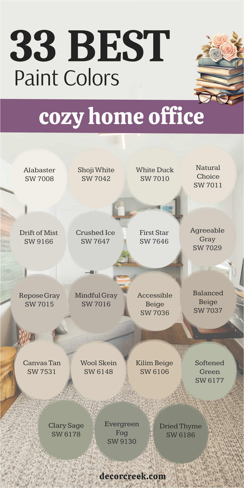
My Final Thoughts About 34 Best Paint Colors For The Home Office
Selecting the perfect paint palette for your home office is far more than a simple aesthetic upgrade; it is a foundational step in optimizing your professional life and enhancing your daily well-being. Throughout my years of consulting on interior design, I have witnessed firsthand how a thoughtful change in wall color can completely shift a person’s mindset, turning a space that felt stagnant into one that makes you feel genuinely excited and motivated to dive into your tasks each morning. The right environment acts as a catalyst for momentum, removing the mental friction that often comes with working from home.
The ultimate goal of a workspace palette is to provide a “visual hum” that stays quietly in the background, serving as a clean canvas that allows your own ideas and creative energy to take center stage.
You don’t want your walls to compete for your attention or cause unnecessary eye strain during long hours of screen time. Whether you find your focus in the crisp, expansive feel of a bright white or the grounding, sophisticated embrace of a deep charcoal gray, the objective remains the same: to foster an environment where you feel physically comfortable and mentally prepared for deep, uninterrupted thought.