Picking a color for a small bedroom is a significant decision because the right paint acts as a visual tool, making the walls feel like they are pushing back to provide you with much-needed breathing room. I see many homeowners feel frustrated and stuck when their sleeping area feels like a tiny, restrictive box, but I know from experience that a single bucket of high-quality paint is the most effective tool to fix that heavy, closed-in feeling.
My primary goal is to guide you toward a specific shade that makes you feel genuinely happy, calm, and relaxed every single time you walk through the door after a long day. I want your bed to feel like it is sitting in a wide, open sanctuary instead of being shoved into a cramped, dark corner.
Throughout this process, we are going to explore specialized colors that are designed to catch every drop of light and keep your mind feeling free and unburdened. Choosing a color should be an exciting and fun part of the journey of turning your house into a personal home, and I am here to show you exactly which paints perform best in those challenging, tight spots.
By focusing on the right tones, we can maximize your square footage and turn a small footprint into a place of rest and rejuvenation.
Why I Trust Sherwin-Williams and Benjamin Moore for Small Bedroom Paint Colors
I always recommend Sherwin-Williams and Benjamin Moore because their paint formulas stay remarkably true to the small paper sample cards you see in the store, which is vital for accuracy. I have personally painted hundreds of walls, and I have learned the hard way that cheap, low-grade paint often shifts its appearance dramatically once it dries, which can be a very disappointing surprise in a small room where every detail is magnified. These two premium brands use high-quality pigments and resins that help the color remain strong, consistent, and even for many years.
When you are painting a small area, you absolutely need the finish to be flawless because you are physically standing much closer to the walls than you would in a large hall. I trust these specific paints to completely cover up old marks, stains, and scuffs, resulting in a smooth, professional look with just a couple of easy coats.
They offer an incredible variety of light shades and whites that are engineered perfectly for making a tiny room feel significantly larger and more expensive. I feel confident knowing these paints will not fade or turn yellow when the harsh sun shines on them through your windows every day.
Choosing these brands ensures you get a beautiful, professional result without any of the extra stress or wasted money that comes with lower-quality products.
How I Choose the Right Paint Color to Make a Small Bedroom Feel Bigger and Brighter
When I begin the process of selecting a color, I look at the windows first to understand exactly how much natural sun comes inside during the morning hours versus the late afternoon. Light, reflective colors are usually the most effective choice because they function like a mirror, bouncing the available light into the dark corners and around the entire room.
I carefully consider how the paint will interact with the existing colors of your bed frame, your rug, and your curtains to ensure the entire palette feels balanced and intentional.
I always advise testing a large spot on the wall to see how the tone changes when your bedside lamps are turned on in the evening. My personal trick for small spaces is to prioritize colors that do not have heavy yellow or muddy brown undertones, ensuring the walls stay crisp, clean, and bright.
I want to make sure the ceiling color and the wall color work together in harmony to create a vertical flow that makes the room feel much taller than it actually is.
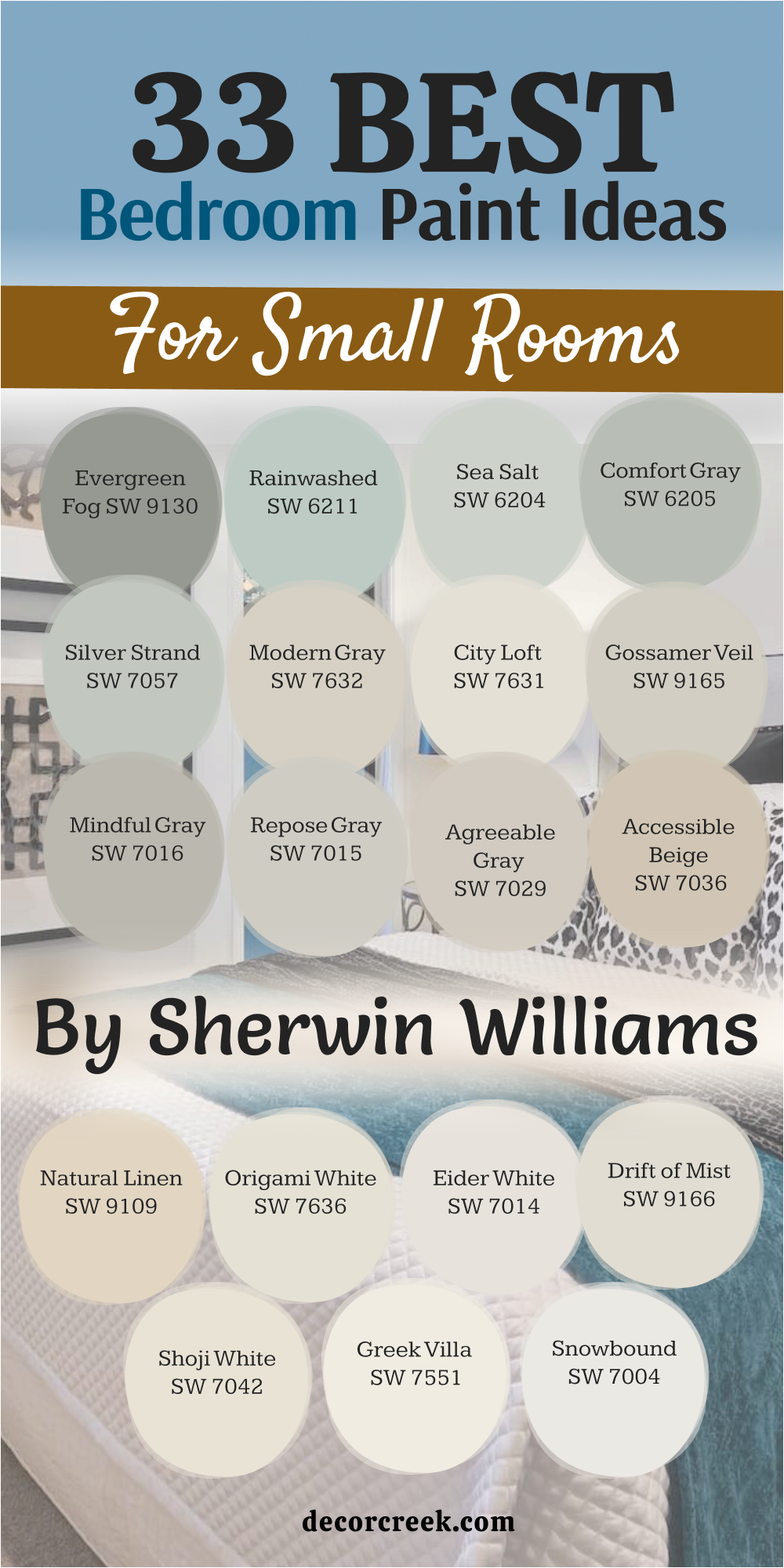
33 Bedroom Paint Ideas For Small Rooms by Sherwin Williams
Alabaster SW 7008
Alabaster SW 7008 is a warm white that makes a small room feel very cozy without being too bright or cold. This color acts like a soft hug for your walls because it has a tiny bit of yellow that keeps it feeling friendly. I like how it looks when the sun hits it because it glows like a candle. You can use it on the walls and the ceiling to make the whole room feel like one big open cloud.
It is a great choice if you have wooden furniture because the white makes the wood look rich and dark. This shade stays looking clean for a long time and does not show dust easily. Many people love it because it feels like a classic choice that never feels boring.
It makes a tiny bedroom feel like a peaceful place to take a long nap. You will find that this paint makes your colorful pillows and blankets really stand out. It is one of the most popular whites for a reason.
Best used in: living rooms, kitchens, hallways, bedrooms, and farmhouse exteriors
Pairs well with: Iron Ore SW 7069, Agreeable Gray SW 7029, Natural Linen SW 9109, warm wood tones The key rule of this color for farmhouse style is to use it where you want natural light to feel kind, soft, and inviting throughout the day.
👉 Read the full guide for this color HERE 👈

Pure White SW 7005
Pure White SW 7005 is a very bright and crisp color that helps a small bedroom look much larger than it really is. This paint does not have any strong blue or yellow tones so it looks like real white in almost any light.
I suggest this for rooms that do not have many windows because it creates its own brightness. It makes the trim around your doors and windows look sharp and very tidy. You will notice that your room feels much airier the moment the second coat dries on the wall.
It is a smart choice for a modern look that feels fresh and very new. Your bed will look like it is in a fancy hotel when the walls are this clean and bright. It works well with any accent color like blue, green, or even bright pink. This shade helps you wake up feeling alert and ready to start your day. It is a dependable color that makes a small area feel very organized.
Best used in: modern bedrooms, trim, ceilings, bathrooms, and kitchen cabinets
Pairs well with: Black Magic SW 6991, Sea Salt SW 6204, Agreeable Gray SW 7029, dark metal accents The key rule of this color for modern style is to use it on all surfaces to keep the edges of the room feeling hidden and open.
👉 Read the full guide for this color HERE 👈

Snowbound SW 7004
Snowbound SW 7004 is a cool white that has a tiny hint of gray to keep it from looking like a plain sheet of paper. This color is perfect for a small bedroom because it makes the walls feel far away and very light.
I love using this shade when you have a lot of gray or blue decorations in your room. It feels very crisp and cool like a fresh winter morning outside. This paint helps to hide any shadows in the corners of a tiny room.
You will feel like you have a lot more breathing room once this color is on your walls. It is a great pick for people who want a clean look that is not too yellow or warm. This shade looks very high quality and makes small bedrooms feel like a professional designed them. It stays looking very bright even when the weather is cloudy or dark outside. Your room will feel like a quiet and fresh spot to relax every single night.
Best used in: contemporary bedrooms, trim, cabinetry, and entryways
Pairs well with: Naval SW 6244, Repose Gray SW 7015, Tricorn Black SW 6258, cool marble tones The key rule of this color for contemporary style is to pair it with cool grays to create a crisp and very clean environment.
👉 Read the full guide for this color HERE 👈

Greek Villa SW 7551
Greek Villa SW 7551 is a rich and creamy white that makes a small room feel very fancy and expensive. This color has a sunny feeling that makes even a basement bedroom feel like it is above ground.
I think it is the best choice for making a room feel soft and very welcoming for guests. The paint catches the light and spreads it into every dark corner of your room. It makes old furniture look like it belongs in a beautiful vacation house.
You will love how the walls feel smooth and warm when the evening lamps are turned on. This shade is not too bright so it will not hurt your eyes when you wake up in the morning. It gives a small room a very steady and solid feeling that makes you feel safe. It is a wonderful background for family photos or bright art pieces. Many homeowners pick this because it feels both traditional and very fresh at the same time.
Best used in: master bedrooms, sunrooms, hallways, and living areas
Pairs well with: Urbane Bronze SW 7048, Dried Thyme SW 6186, Pointly SW 7536, natural wood floors The key rule of this color for traditional style is to use it with warm textures like wool and wood to make the room feel solid and lived-in.
👉 Read the full guide for this color HERE 👈

Shoji White SW 7042
Shoji White SW 7042 is a very special white that sits right between a cream color and a light beige. This shade makes a small bedroom feel very soft and keeps the walls from looking too sharp or cold.
I use this when I want a room to feel like a quiet library where you can just sit and think. It hides fingerprints and small marks better than a very bright white paint would. This color makes your bed linens look very white and very crisp by comparison.
It is a great choice for rooms that get a lot of bright afternoon sun because it does not glow too much. You will find that this paint makes your small room feel very grounded and very peaceful. It works beautifully with natural materials like wicker baskets and cotton rugs. This shade is very easy to live with for many years without getting tired of it. It makes a tiny area feel like a very intentional and well-planned part of your home.
Best used in: cozy bedrooms, reading nooks, laundry rooms, and home offices
Pairs well with: Worldly Gray SW 7043, Iron Ore SW 7069, Pewter Green SW 6208, brass hardware The key rule of this color for organic style is to pair it with natural greens and browns to bring a forest feeling into your tiny room.
👉 Read the full guide for this color HERE 👈

Drift of Mist SW 9166
Drift of Mist SW 9166 is a very light gray that almost looks like a soft white when the sun is shining. This color is a top pick for small bedrooms because it adds just a little bit of depth without making the walls feel heavy.
I like how it changes its look throughout the day as the light moves around your room. It feels very professional and smart which makes your bedroom look like a modern suite. This paint helps to make small windows feel larger by reflecting the light outside. You will notice that your room feels very steady and very organized with this shade on the walls.
It is a great background for black frames or colorful posters. This color stays looking fresh and does not turn yellow over time. It gives your small room a very light and airy feel that helps you relax at night. Many people choose this when they want a neutral look that is not just a plain white.
Best used in: modern bedrooms, open living spaces, kitchens, and hallways
Pairs well with: Iron Ore SW 7069, Alabaster SW 7008, Naval SW 6244, silver or black accents The key rule of this color for transitional style is to use it as a bridge between white trim and darker furniture to create a layered look.
👉 Read the full guide for this color HERE 👈

Eider White SW 7014
Eider White SW 7014 is a cool white with a gray base that makes a small room feel very steady and calm. This color is great for hiding the fact that a room is small because it blurs the lines between the walls and the ceiling.
I suggest this paint for rooms that have a lot of bright artificial light from lamps or overhead fixtures. It does not feel too warm so it keeps your bedroom feeling very crisp and clean. You can put this on every wall to make the whole room feel like one large open area.
It works very well with silver lamps and glass tables. This shade feels very quiet and does not demand too much attention from your eyes. It is a smart choice for a small room that needs to stay focused and tidy. Your room will look very neat and well-kept when you use this shade. It is a dependable pick for making a tiny bedroom feel like a modern retreat.
Best used in: bathrooms, bedrooms, trim, and modern kitchens
Pairs well with: Repose Gray SW 7015, Tricorn Black SW 6258, Sea Salt SW 6204, cool light bulbs The key rule of this color for minimalist style is to use it to create a background that lets your simple furniture be the star of the room.
👉 Read the full guide for this color HERE 👈
Origami White SW 7636
Origami White SW 7636 is a light and airy white that has a very soft gray-beige feeling to it. This color makes a small bedroom feel very comfortable and light like a fluffy marshmallow. I like this shade because it feels a bit more interesting than a basic white but still keeps the room feeling very big.
It spreads the light very evenly so you do not get any dark or scary corners in your room. This paint makes your colorful rugs and blankets look very bright and happy. You will find that this color is very easy to match with any kind of curtains or furniture.
It gives a small room a very clean and simple look that is perfect for sleeping well. This shade does not feel cold so it keeps your bedroom feeling very cozy in the winter time. It is a great choice for a child’s small room because it feels very playful and light. Your walls will look soft and very inviting every single time you walk inside.
Best used in: nurseries, guest bedrooms, hallways, and living rooms
Pairs well with: Agreeable Gray SW 7029, Urbane Bronze SW 7048, Natural Linen SW 9109, soft blue accents The key rule of this color for soft style is to use it where you want a gentle feeling that is not too harsh or too bright.
👉 Read the full guide for this color HERE 👈
Natural Linen SW 9109
Natural Linen SW 9109 is a warm and sandy color that brings a very natural feeling into a small bedroom. This shade makes your walls look like they are covered in a soft fabric which adds a lot of comfort to the room.
I like to use this color when I want a small room to feel like a cozy nest. It is dark enough to show up against white trim but light enough to keep the room feeling big. This paint makes a tiny room feel very solid and very well-made.
You will love how it looks with wooden bed frames and green plants. It feels very earthy and helps you feel more connected to nature while you are inside. This shade is a great pick for making a small room feel very relaxed and slow. It does not reflect too much light so it is very easy on your eyes when you are reading in bed. Many people find this color to be very comforting after a long and busy day.
Best used in: master bedrooms, living rooms, rustic kitchens, and hallways
Pairs well with: Alabaster SW 7008, Urbane Bronze SW 7048, Dried Thyme SW 6186, leather textures The key rule of this color for rustic style is to pair it with heavy woods and rough fabrics to make the room feel very cozy and strong.
👉 Read the full guide for this color HERE 👈

Accessible Beige SW 7036
Accessible Beige SW 7036 is a very famous color because it is the perfect mix of gray and beige. This paint makes a small bedroom feel very high-end and very professional. I choose this shade when I want a room to feel warm but still very modern and clean.
It makes your white trim look very bright and makes your room feel very tidy. This color works in both bright sun and dark shade so it is a very safe choice for any room. You will notice that your small bedroom feels much more grown-up and stylish with this paint.
It is a great background for any color of furniture you already have in your house. This shade stays looking good even as the styles change every year. It gives a small room a very steady and welcoming feel that is great for resting. Many designers use this color because it is very easy to work with and always looks great.
Best used in: entire homes, bedrooms, living rooms, and office spaces
Pairs well with: Alabaster SW 7008, Sea Salt SW 6204, Urbane Bronze SW 7048, gold accents The key rule of this color for neutral style is to use it on all four walls to create a warm and continuous feeling throughout the room.
👉 Read the full guide for this color HERE 👈

Agreeable Gray SW 7029
Agreeable Gray SW 7029 is a famous paint because it is the most popular gray for making small rooms look huge. This color has a tiny bit of warmth that keeps the room from looking like a cold garage or a basement. I use this shade when I want the walls to disappear so the room feels like it has no limits.
It reflects just enough light to keep the bedroom bright even on a rainy or dark day. You will find that this paint makes your wooden furniture and white bedding look very sharp and clean. It is a very safe choice if you are not sure which gray will look best in your light.
This color helps to hide small bumps or marks on your walls very well. Your small room will feel very fresh and like a brand new house once you finish. It is a great background for any bright pictures or posters you want to hang. Many people pick this because it looks good in every single room of the house.
Best used in: living rooms, bedrooms, hallways, and open floor plans
Pairs well with: Alabaster SW 7008, Sea Salt SW 6204, Anew Gray SW 7030, dark wood floors The key rule of this color for neutral style is to use it when you want a gray that feels friendly and works with both warm and cool furniture.
👉 Read the full guide for this color HERE 👈

Repose Gray SW 7015
Repose Gray SW 7015 is a cool gray that makes a small bedroom feel very steady and very quiet. This color is perfect if you want to make a room feel like a professional hotel suite. I like how it looks with silver lamps and glass tables because it feels very modern and smart.
It does not have any yellow in it so it stays looking very crisp under your light bulbs. This paint helps to make the walls look solid and very well-kept in a tiny area. You will notice that your bedroom feels much more organized and tidy with this shade on the walls.
It is a great choice for rooms that get a lot of bright sun because it keeps the room feeling cool. This color makes your white trim look like it is popping off the wall. It is a dependable pick for people who want a clean look that is not too bright or distracting. Your small room will feel like a very peaceful place to sleep every night.
Best used in: bedrooms, bathrooms, modern kitchens, and trim
Pairs well with: Eider White SW 7014, Naval SW 6244, Tricorn Black SW 6258, cool blue tones The key rule of this color for modern style is to pair it with white and black accents to keep the room looking sharp and very tidy.
👉 Read the full guide for this color HERE 👈

Mindful Gray SW 7016
Mindful Gray SW 7016 is a slightly darker gray that adds a lot of character to a small bedroom. This color is great for making the room feel like it has strong, solid walls that protect you. I suggest this shade if you want your small room to feel very cozy and very safe.
It is light enough to keep the room from feeling like a cave but dark enough to show off your white furniture. This paint makes a great background for colorful art or bright green plants. You will find that it makes the room feel very balanced and very easy on your eyes.
It is a smart pick for a bedroom that also has a small desk or a place to work. This shade stays looking rich and high quality even after many years on the wall. It gives your tiny room a very intentional look that shows you put thought into your home. Many homeowners love this because it feels very sturdy and very professional.
Best used in: bedrooms, home offices, living rooms, and kitchen islands
Pairs well with: Repose Gray SW 7015, Alabaster SW 7008, Inchyra Blue, light oak wood The key rule of this color for balanced style is to use it as a mid-tone that connects your dark floors to your light ceiling.
👉 Read the full guide for this color HERE 👈

Gossamer Veil SW 9165
Gossamer Veil SW 9165 is a very light and airy gray that has a tiny bit of a warm, sandy feeling. This color is perfect for a small bedroom because it makes the walls look soft and very far away. I like to use this shade when a room feels too tight or boxed in by dark shadows.
It catches the morning light and spreads it around the room like a soft blanket. This paint makes your room feel very fresh and very new without being too cold or bright. You can use it on all the walls to make the room feel like a wide open area.
It works very well with light wood floors and white curtains. This color stays looking very clean and does not turn yellow or blue in different lights. It gives a small room a very gentle and kind feeling that is great for relaxing. Many people choose this when they want a very light neutral that is a bit warmer than a basic gray.
Best used in: small bedrooms, nurseries, entryways, and master suites
Pairs well with: Urbane Bronze SW 7048, Drift of Mist SW 9166, Pure White SW 7005, linen fabrics The key rule of this color for airy style is to use it in rooms with large windows to maximize the bright and open feeling of the paint.
👉 Read the full guide for this color HERE 👈
City Loft SW 7631
City Loft SW 7631 is a very soft and pretty neutral that looks like a mix of gray and a tiny drop of pink. This color makes a small bedroom feel very soft and very inviting for anyone who walks inside. I choose this shade when I want a room to feel a bit more romantic and gentle.
It makes your skin look good and creates a very warm feeling when the sun sets. This paint hides small marks on the wall while still keeping the room feeling very bright. You will love how it looks with white fluffy blankets and soft rugs.
It gives a small room a very light and happy feel that is perfect for a guest bedroom. This shade does not demand a lot of attention so it lets your favorite things be the stars of the room. It is a wonderful pick for a room that needs to feel a bit more special than a basic tan. Your walls will look like they are glowing with a soft, natural light.
Best used in: bedrooms, bathrooms, hallways, and living areas
Pairs well with: Snowbound SW 7004, Agreeable Gray SW 7029, soft pastel accents, silver hardware The key rule of this color for gentle style is to use it where you want a warm glow that is more interesting than a plain white paint.
👉 Read the full guide for this color HERE 👈

Modern Gray SW 7632
Modern Gray SW 7632 is a warm and steady neutral that makes a small room feel very solid and high-end. This color is a bit deeper than a white but it still reflects a lot of light to keep the room big. I like to use this shade for bedrooms that have a lot of different wood colors in them.
It acts like a bridge that makes everything in the room look like it belongs together. This paint makes your bed look very cozy and very important in a small area. You will notice that the room feels very quiet and very relaxed once the walls are painted.
It is a great choice for a master bedroom that needs to feel like a private retreat. This shade stays looking very professional and does not fade in the sun. It gives a small room a very tailored and well-dressed look that is very smart. Many people love this because it feels very modern but also very comfortable for everyday living.
Best used in: master bedrooms, living rooms, kitchens, and exteriors
Pairs well with: Alabaster SW 7008, Black Fox SW 7020, Agreeable Gray SW 7029, brass accents The key rule of this color for tailored style is to pair it with dark wood and gold to create a very rich and expensive look.
👉 Read the full guide for this color HERE 👈

Silver Strand SW 7057
Silver Strand SW 7057 is a beautiful light blue-gray that brings a very fresh feeling to a tiny bedroom. This color makes the walls look like they are receding, which gives you much more visual breathing room. I use this when I want a room to feel like a spa or a quiet place by the sea.
It changes from a light gray to a soft blue depending on how the sun shines inside. This paint makes your room feel very clean and very alert, which is great for waking up. You will find that it makes your white furniture look very bright and very tidy.
It works perfectly with silver lamps and white cotton curtains to create an airy look. This shade is very light on the eyes and helps to lower the energy of a busy day. It is a smart pick for a bedroom that gets a lot of afternoon heat because the color feels cool. Your tiny room will feel like a fresh and breezy getaway.
Best used in: bathrooms, bedrooms, laundry rooms, and coastal cottages
Pairs well with: Pure White SW 7005, Iron Ore SW 7069, Sea Salt SW 6204, light oak floors The key rule of this color for coastal style is to use it with white trim to make the blue tones feel crisp and very refreshing.
👉 Read the full guide for this color HERE 👈

Comfort Gray SW 6205
Comfort Gray SW 6205 is a soft green-blue-gray that makes a small room feel very lush and very cozy. This color is a bit deeper than a basic neutral, so it adds a lot of personality to the walls. I suggest this shade if you want your bedroom to feel like a secret garden or a forest retreat.
It is light enough to keep the room feeling open but dark enough to hide any messy spots. This paint makes a small room feel very intentional and like a designer chose the palette. You will love how it looks with green plants and warm wooden bed frames.
It gives a small bedroom a very rich and high-quality feel that is very relaxing. This shade helps you feel more connected to nature even when you are staying inside. It is a very popular choice for people who want a little bit of color that is still very easy to live with. Your walls will look soft and very interesting every single time you walk in.
Best used in: bedrooms, bathrooms, living rooms, and kitchen cabinets
Pairs well with: Alabaster SW 7008, Sea Salt SW 6204, Rainwashed SW 6211, warm metal accents The key rule of this color for organic style is to pair it with natural textures and light woods to make the room feel like a quiet escape.
👉 Read the full guide for this color HERE 👈

Sea Salt SW 6204
Sea Salt SW 6204 is one of the most famous colors for creating a soft and airy feeling in a small area. This color is a very light mix of green and gray that looks like the foam on a wave. I use this when I want to make a tiny bedroom feel like it is floating in a bright and happy place.
It catches the light in a very gentle way and makes the walls feel almost invisible. This paint makes your white bedding and furniture look incredibly clean and very crisp. You will notice that your small room feels much larger and much less crowded with this shade.
It is a perfect choice for making a dark room feel like it has its own source of light. This color stays looking fresh and does not feel heavy or dark even at night. It is a wonderful pick for a room where you want to feel totally relaxed and free. Many homeowners pick this because it is very pretty and works with almost anything.
Best used in: bathrooms, bedrooms, sunrooms, and entryways
Pairs well with: Alabaster SW 7008, Comfort Gray SW 6205, Agreeable Gray SW 7029, white linen The key rule of this color for airy style is to use it in rooms with plenty of light to see the beautiful shifts between green and gray.
👉 Read the full guide for this color HERE 👈

Rainwashed SW 6211
Rainwashed SW 6211 is a soft blue-green that brings a very watery and peaceful feeling into a small bedroom. This color makes your walls look very fresh and like they have been cleaned by a summer rain. I like to use this shade when I want a small room to feel very happy and full of positive energy.
It is a bit more blue than Sea Salt, so it feels very alert and very bright. This paint helps to make a tiny bedroom look like a professional designed the whole house. You will love how it makes your white wood trim look very sharp and very organized.
It works beautifully with light pine furniture and bright white blankets. This shade gives a small room a very light and breezy feel that helps you wake up with a smile. It is a great choice for a child’s room or a guest room because it feels so welcoming. Your walls will look like a clear sky on a perfect day.
Best used in: bedrooms, bathrooms, nurseries, and laundry rooms
Pairs well with: Pure White SW 7005, Sea Salt SW 6204, Accessible Beige SW 7036, dark wood furniture The key rule of this color for vibrant style is to pair it with bright whites to keep the blue-green pigment looking fresh and never muddy.
👉 Read the full guide for this color HERE 👈

Silver Strand SW 7057
Silver Strand SW 7057 is a beautiful light blue-gray that brings a very fresh and simple feeling to a tiny bedroom. This color makes the walls look like they are receding which gives you much more breathing room to relax. I use this when I want a room to feel like a spa or a quiet place for a minimalist life.
It changes from a light gray to a soft blue depending on how the sun shines through your window. This paint makes your room feel very clean and very alert which is great for waking up early. You will find that it makes your white furniture look very bright and very tidy in a small space.
It works perfectly with silver lamps and white cotton curtains to create a very airy and light look. This shade is very light on the eyes and helps to lower the energy of a busy work day. It is a smart pick for a bedroom that gets a lot of afternoon heat because the color feels cool. Your tiny room will feel like a fresh and breezy getaway every single day.
Best used in: bathrooms, bedrooms, laundry rooms, and coastal cottages
Pairs well with: Pure White SW 7005, Iron Ore SW 7069, Sea Salt SW 6204, light oak floors The key rule of this color for coastal style is to use it with white trim to make the blue tones feel crisp and very refreshing.
👉 Read the full guide for this color HERE 👈
Silvermist SW 7621
Silvermist SW 7621 is a cool, misty green-blue that makes a tiny bedroom feel very deep and very quiet. This color has enough gray in it to keep the room from looking like a bright crayon box. I suggest this shade when you want a small room to feel like a steady and professional retreat from the world.
It makes the walls feel very solid and hides any marks or bumps very well. This paint catches the light in a soft way that makes the room feel cool and fresh during the summer. You will love how it looks with dark wood furniture and silver picture frames. It gives a tiny room a very intentional and designer look that stays popular for many years.
This shade helps you feel very focused and ready to rest your mind at the end of the day. It is a wonderful pick for a room where you want to feel protected and very calm. Your walls will look like they are part of a high-end hotel suite once you finish painting.
Best used in: master bedrooms, bathrooms, home offices, and cabinets
Pairs well with: Pure White SW 7005, Iron Ore SW 7069, Drift of Mist SW 9166, cool metal hardware
The key rule of this color for professional style is to pair it with very crisp white trim to keep the blue tones looking sharp and clean.
Rainwashed SW 6211
Rainwashed SW 6211 is a soft blue-green that brings a very watery and peaceful feeling into a tiny bedroom. This color makes your walls look very fresh and like they have been cleaned by a summer rain. I like to use this shade when I want a small room to feel very happy and full of positive energy.
It is a bit more blue than Sea Salt, so it feels very alert and very bright. This paint helps to make a tiny bedroom look like a professional designed the whole house. You will love how it makes your white wood trim look very sharp and very organized.
It works beautifully with light pine furniture and bright white blankets. This shade gives a small room a very light and breezy feel that helps you wake up with a smile. It is a great choice for a child’s room or a guest room because it feels so welcoming. Your walls will look like a clear sky on a perfect day.
Best used in: bedrooms, bathrooms, nurseries, and laundry rooms
Pairs well with: Pure White SW 7005, Sea Salt SW 6204, Accessible Beige SW 7036, dark wood furniture The key rule of this color for vibrant style is to pair it with bright whites to keep the blue-green pigment looking fresh and never muddy.
👉 Read the full guide for this color HERE 👈
Sea Salt SW 6204
Sea Salt SW 6204 is a very special and light mix of green and gray that makes a tiny room feel very airy. This color is one of my favorites for making a tiny bedroom feel like it is part of a quiet beach. I use this when I want to make a room feel like it has much more space than it really does.
It catches the light in a very gentle way and makes the walls feel soft and almost invisible to the eye. This paint makes your white bedding and furniture look incredibly clean and very crisp in a simple way. You will notice that your tiny room feels much larger and much less crowded with this shade on the walls.
It is a perfect choice for making a dark room feel like it has its own source of light. This color stays looking fresh and does not feel heavy or dark even when it is night time. It is a wonderful pick for a room where you want to feel totally relaxed and very free. Many homeowners pick this because it is very pretty and works with almost any simple wood.
Best used in: bathrooms, bedrooms, sunrooms, and entryways
Pairs well with: Alabaster SW 7008, Comfort Gray SW 6205, Agreeable Gray SW 7029, white linen The key rule of this color for airy style is to use it in rooms with plenty of light to see the beautiful shifts between green and gray.
👉 Read the full guide for this color HERE 👈
Comfort Gray SW 6205
Comfort Gray SW 6205 is a soft green-blue-gray that makes a tiny room feel very lush and very cozy for a rest. This color is a bit deeper than a basic white so it adds a lot of personality to a simple room. I suggest this shade if you want your bedroom to feel like a quiet garden retreat where you can hide.
It is light enough to keep the room feeling open but dark enough to hide any small messy spots. This paint makes a tiny room feel very intentional and like a professional designed the whole simple space. You will love how it looks with green plants and warm wooden bed frames that have no extra frills. It gives a tiny bedroom a very rich and high-quality feel that is very relaxing and very steady.
This shade helps you feel more connected to nature even when you are staying inside your small home. It is a very popular choice for people who want a little bit of color that stays very simple. Your walls will look soft and very interesting every single time you walk into the room.
Best used in: bedrooms, bathrooms, living rooms, and kitchen cabinets
Pairs well with: Alabaster SW 7008, Sea Salt SW 6204, Rainwashed SW 6211, warm metal accents The key rule of this color for organic style is to pair it with natural textures and light woods to make the room feel like a quiet escape.
👉 Read the full guide for this color HERE 👈
Tradewind SW 6218
Tradewind SW 6218 is a breezy and light blue that makes a tiny bedroom feel very open to the sky. This color is a wonderful pick for making walls feel like they are not even there. I use this shade when I want a room to feel fresh and full of cool air.
It reflects light very well which helps a small space look much larger and brighter. This paint makes your white furniture and trim look very sharp and very clean. You will find that it creates a very happy and positive feeling every time you enter the room.
It works perfectly with coastal themes and light wood floors in a tiny layout. This shade stays looking very pretty and does not turn dark or scary at night. It is a great choice for a bedroom where you want to wake up feeling full of energy. Your walls will look like a clear morning sky that never ends.
Best used in: bedrooms, bathrooms, nurseries, and laundry rooms
Pairs well with: Pure White SW 7005, Sea Salt SW 6204, Naval SW 6244, silver hardware The key rule of this color for coastal style is to use it in rooms with natural light to keep the blue looking crisp and very refreshing.
👉 Read the full guide for this color HERE 👈

Clary Sage SW 6178
Clary Sage SW 6178 is a soft and herbal green that brings a very quiet and natural energy to a tiny bedroom. This color has enough yellow in it to feel warm and inviting instead of cold and sharp. I choose this shade when I want a small room to feel like a cozy cottage in a green field.
It makes the walls look very soft and creates a very peaceful background for your sleep. This paint reflects a good amount of light but keeps a very steady and solid feeling. You will notice that it makes your wooden furniture look very rich and very high-quality.
It works perfectly with natural textures like cotton blankets and wicker baskets. This shade stays looking very professional and does not fade over time. It gives a tiny area a very intentional look that makes your house feel more special. Many homeowners pick this because it is very easy to live with and feels very healthy.
Best used in: bedrooms, kitchens, living rooms, and home offices
Pairs well with: Alabaster SW 7008, Accessible Beige SW 7036, Urbane Bronze SW 7048, warm wood tones The key rule of this color for cottage style is to pair it with warm whites to make the green tones feel very cozy and lived-in.
👉 Read the full guide for this color HERE 👈

Austere Gray SW 6184
Austere Gray SW 6184 is a unique green-gray that brings a very smart and tailored look to a tiny bedroom. This color has a cool feeling that helps to lower the energy of a room for better sleep. I like how it looks against white trim because it creates a very sharp and clean contrast.
It is a bit deeper than a basic white so it adds a sense of strength to your walls. This paint makes your room feel very organized and very tidy which is great for small spaces. You will find that it hides any small marks or dust very well as the months go by.
It works beautifully with silver hardware and modern furniture in a simple room. This shade gives a tiny area a very high-end look that shows you have great style. It stays looking very fresh and does not turn yellow or brown in the sun. Your walls will look like they belong in a professional designer magazine.
Best used in: bedrooms, home offices, bathrooms, and kitchens
Pairs well with: Pure White SW 7005, Iron Ore SW 7069, Sea Salt SW 6204, cool light bulbs The key rule of this color for modern style is to use it as a steady neutral that adds a bit of natural green color to the room.
👉 Read the full guide for this color HERE 👈
Pale Moss SW 9027
Pale Moss SW 9027 is a light and happy green that brings a lot of life to a tiny bedroom. This color has a sunny base that makes the walls feel like they are glowing with natural light. I suggest this shade for rooms that need more energy and a fresh feeling.
It is a wonderful choice for making a tiny bedroom feel wider and more cheerful today. This paint helps to bounce light into the corners so you do not have any dark spots. You will notice that your bed looks very cozy and bright against this soft green background.
It works perfectly with white furniture and light wood floors to create a fresh look. This shade gives a tiny area a very friendly and welcoming feel that everyone loves. Your room will look very tidy and very professional with this shade on the walls. It is a dependable pick for making any tiny room feel much larger and more positive.
Best used in: nurseries, bedrooms, kitchens, and sunrooms
Pairs well with: Alabaster SW 7008, Shoji White SW 7042, Urbane Bronze SW 7048, green plants The key rule of this color for vibrant style is to use it in rooms with lots of sun to keep the green looking bright and very fresh.
Evergreen Fog SW 9130
Evergreen Fog SW 9130 is a sophisticated green-gray that brings a natural and organic feeling to a small bedroom. This color is a top choice for 2026 because it feels very grounded and sturdy without being too dark for a tiny area.
I like how it makes a small room feel like a private forest hideaway where you can truly get away from the world. It has a tiny bit of blue in the base which keeps the green from looking too yellow or muddy under your light bulbs. This paint makes your wooden bed frame and white pillows look very professional and expensive.
You will notice that your room feels very calm and very intentional with this shade on the walls. It is a great background for brass lamps or gold picture frames because the metal really shines against the green. This color stays looking high-quality for a long time and does not show scuffs easily. Many people love this because it adds a lot of personality while still being easy to live with every day. Your small bedroom will feel very special and very grown-up once you finish painting.
Best used in: bedrooms, living rooms, kitchen cabinets, and exterior doors
Pairs well with: Alabaster SW 7008, Urbane Bronze SW 7048, Shoji White SW 7042, warm wood tones
The key rule of this color for nature style is to use it when you want to bring the feeling of the outdoors into a small, enclosed room.
👉 Read the full guide for this color HERE 👈

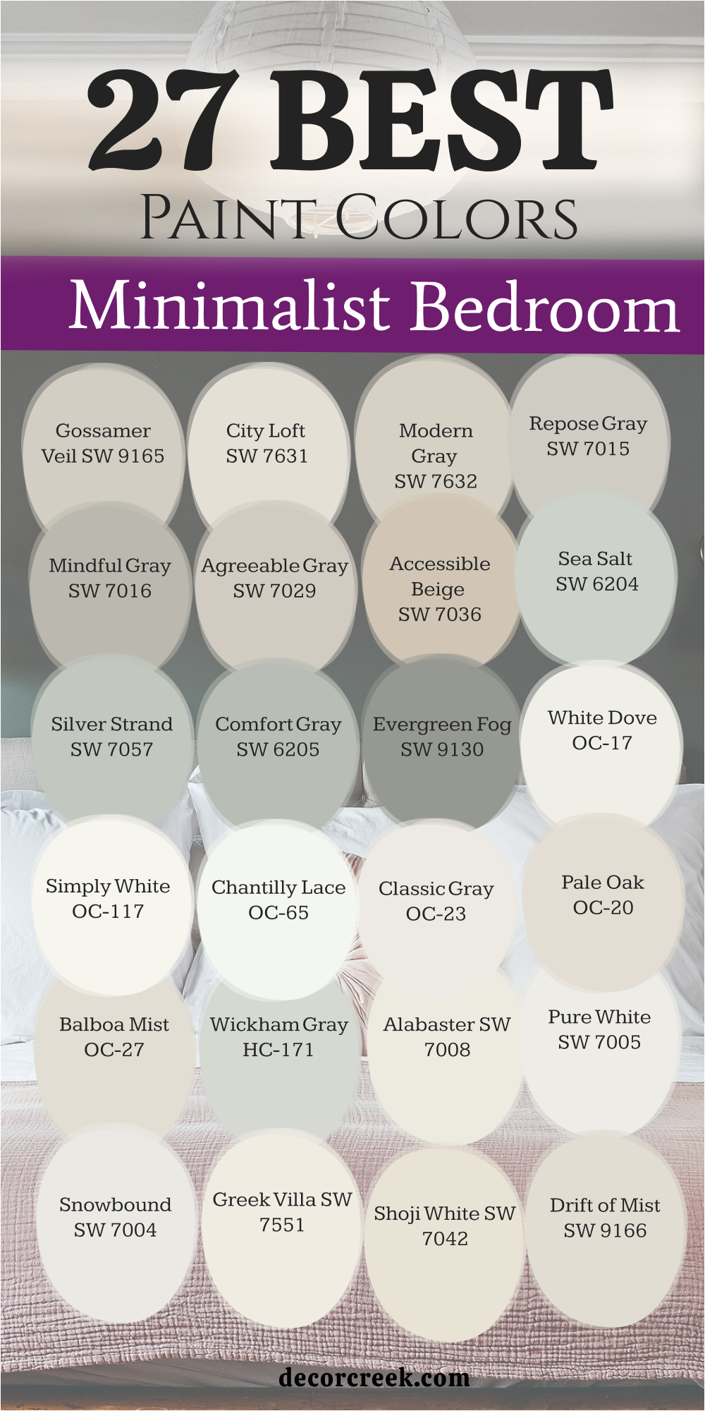
27 Best Paint Colors For Minimalist Bedroom
Gossamer Veil SW 9165
Gossamer Veil SW 9165 is a light and airy gray that has a tiny bit of a warm, sandy feeling to keep it from being cold. This color is perfect for a minimalist bedroom because it makes the walls look soft and very far away without adding clutter.
I like to use this shade when a room feels too tight or boxed in by dark shadows and heavy furniture. It catches the morning light and spreads it around the room like a soft blanket to keep things bright. This paint makes your room feel very fresh and very new without being too bright or distracting to your eyes. You can use it on all the walls to make the room feel like one wide and open area for resting.
It works very well with light wood floors and simple white curtains to keep the look very clean. This color stays looking very clean and does not turn yellow or blue in different lights over time. It gives a small room a very gentle and kind feeling that is great for relaxing your mind. Many people choose this when they want a very light neutral that feels a bit warmer than a basic gray.
Best used in: small bedrooms, nurseries, entryways, and master suites
Pairs well with: Urbane Bronze SW 7048, Drift of Mist SW 9166, Pure White SW 7005, linen fabrics The key rule of this color for airy style is to use it in rooms with large windows to maximize the bright and open feeling of the paint.
👉 Read the full guide for this color HERE 👈
City Loft SW 7631
City Loft SW 7631 is a very soft and pretty neutral that looks like a mix of gray and a tiny drop of soft pink. This color makes a small bedroom feel very soft and very inviting for anyone who wants a simple life. I choose this shade when I want a room to feel a bit more romantic and gentle while staying very tidy.
It makes your skin look good and creates a very warm feeling when the sun sets in the evening. This paint hides small marks on the wall while still keeping the room feeling very bright and big. You will love how it looks with white fluffy blankets and soft rugs that have no busy patterns.
It gives a small room a very light and happy feel that is perfect for a simple and clean guest bedroom. This shade does not demand a lot of attention so it lets your few favorite things be the stars. It is a wonderful pick for a room that needs to feel a bit more special than a basic tan. Your walls will look like they are glowing with a soft and very natural light.
Best used in: bedrooms, bathrooms, hallways, and living areas
Pairs well with: Snowbound SW 7004, Agreeable Gray SW 7029, soft pastel accents, silver hardware The key rule of this color for gentle style is to use it where you want a warm glow that is more interesting than a plain white paint.
👉 Read the full guide for this color HERE 👈
Modern Gray SW 7632
Modern Gray SW 7632 is a warm and steady neutral that makes a small room feel very solid and very high-end. This color is a bit deeper than a white but it still reflects a lot of light to keep the bedroom big. I like to use this shade for bedrooms that have a lot of different wood colors or a very simple bed.
It acts like a bridge that makes everything in the room look like it belongs together in a tidy way. This paint makes your bed look very cozy and very important in a small area that has no mess. You will notice that the room feels very quiet and very relaxed once the walls are painted with this shade.
It is a great choice for a master bedroom that needs to feel like a private and very simple retreat. This shade stays looking very professional and does not fade in the sun throughout the year. It gives a small room a very tailored and well-dressed look that is very smart and clean. Many people love this because it feels very modern but also very comfortable for everyday living.
Best used in: master bedrooms, living rooms, kitchens, and exteriors
Pairs well with: Alabaster SW 7008, Black Fox SW 7020, Agreeable Gray SW 7029, brass accents The key rule of this color for tailored style is to pair it with dark wood and gold to create a very rich and expensive look.
👉 Read the full guide for this color HERE 👈
Repose Gray SW 7015
Repose Gray SW 7015 is a cool gray that makes a small bedroom feel very steady and very quiet for sleeping. This color is perfect if you want to make a room feel like a professional and very tidy hotel suite. I like how it looks with silver lamps and glass tables because it feels very modern and very smart.
It does not have any yellow in it so it stays looking very crisp under your light bulbs at night. This paint helps to make the walls look solid and very well-kept in a tiny area with few things. You will notice that your bedroom feels much more organized and tidy with this shade on the walls.
It is a great choice for rooms that get a lot of bright sun because it keeps the room feeling cool. This color makes your white trim look like it is popping off the wall in a sharp way. It is a dependable pick for people who want a clean look that is not too bright or distracting. Your small room will feel like a very peaceful place to sleep every single night.
Best used in: bedrooms, bathrooms, modern kitchens, and trim
Pairs well with: Eider White SW 7014, Naval SW 6244, Tricorn Black SW 6258, cool blue tones The key rule of this color for modern style is to pair it with white and black accents to keep the room looking sharp and very tidy.
👉 Read the full guide for this color HERE 👈
Mindful Gray SW 7016
Mindful Gray SW 7016 is a slightly darker gray that adds a lot of character and strength to a small bedroom. This color is great for making the room feel like it has strong and solid walls that protect your peace. I suggest this shade if you want your small room to feel very cozy and very safe for a long rest.
It is light enough to keep the room from feeling like a cave but dark enough to show off your white bed. This paint makes a great background for a single piece of colorful art or a bright green plant. You will find that it makes the room feel very balanced and very easy on your eyes throughout the day.
It is a smart pick for a bedroom that also has a small desk or a place to sit quietly. This shade stays looking rich and high quality even after many years of living on the wall. It gives your tiny room a very intentional look that shows you put thought into your home. Many homeowners love this because it feels very sturdy and very professional.
Best used in: bedrooms, home offices, living rooms, and kitchen islands
Pairs well with: Repose Gray SW 7015, Alabaster SW 7008, Inchyra Blue, light oak wood The key rule of this color for balanced style is to use it as a mid-tone that connects your dark floors to your light ceiling.
👉 Read the full guide for this color HERE 👈
Agreeable Gray SW 7029
Agreeable Gray SW 7029 is a very famous paint because it is a top choice for making small rooms look much bigger. This color has a tiny bit of warmth that keeps the room from looking like a cold garage or a box.
I use this shade when I want the walls to disappear so the room feels like it has no real limits. It reflects just enough light to keep the bedroom bright even on a rainy or very dark day outside. You will find that this paint makes your wooden furniture and white bedding look very sharp and very clean.
It is a very safe choice if you are not sure which gray will look best in your natural light. This color helps to hide small bumps or marks on your walls very well over a long time. Your small room will feel very fresh and like a brand new house once you finish your work. It is a great background for any bright pictures or simple posters you want to hang. Many people pick this because it looks good in every single room of the house.
Best used in: living rooms, bedrooms, hallways, and open floor plans
Pairs well with: Alabaster SW 7008, Sea Salt SW 6204, Anew Gray SW 7030, dark wood floors The key rule of this color for neutral style is to use it when you want a gray that feels friendly and works with both warm and cool furniture.
👉 Read the full guide for this color HERE 👈
Accessible Beige SW 7036
Accessible Beige SW 7036 is a very famous color because it is the perfect mix of gray and warm beige tones. This paint makes a small bedroom feel very high-end and very professional without being too dark for the walls. I choose this shade when I want a room to feel warm but still very modern and very clean for a rest.
It makes your white trim look very bright and makes your room feel very tidy and well-organized. This color works in both bright sun and dark shade so it is a very safe choice for any small area. You will notice that your small bedroom feels much more grown-up and stylish with this paint on the walls. It is a great background for any color of furniture you already have in your bedroom right now.
This shade stays looking good even as the styles change every year in the design world. It gives a small room a very steady and welcoming feel that is great for a deep sleep. Many designers use this color because it is very easy to work with and always looks great.
Best used in: entire homes, bedrooms, living rooms, and office spaces
Pairs well with: Alabaster SW 7008, Sea Salt SW 6204, Urbane Bronze SW 7048, gold accents The key rule of this color for neutral style is to use it on all four walls to create a warm and continuous feeling throughout the room.
👉 Read the full guide for this color HERE 👈
Sea Salt SW 6204
Sea Salt SW 6204 is a very special and light mix of green and gray that makes a small room feel very airy. This color is one of my favorites for making a tiny bedroom feel like it is part of a quiet beach. I use this when I want to make a room feel like it has much more space than it really does.
It catches the light in a very gentle way and makes the walls feel soft and almost invisible to the eye. This paint makes your white bedding and furniture look incredibly clean and very crisp in a simple way. You will notice that your small room feels much larger and much less crowded with this shade on the walls. It is a perfect choice for making a dark room feel like it has its own source of light.
This color stays looking fresh and does not feel heavy or dark even when it is night time. It is a wonderful pick for a room where you want to feel totally relaxed and very free. Many homeowners pick this because it is very pretty and works with almost any simple wood.
Best used in: bathrooms, bedrooms, sunrooms, and entryways
Pairs well with: Alabaster SW 7008, Comfort Gray SW 6205, Agreeable Gray SW 7029, white linen The key rule of this color for airy style is to use it in rooms with plenty of light to see the beautiful shifts between green and gray.
👉 Read the full guide for this color HERE 👈
Silver Strand SW 7057
Silver Strand SW 7057 is a beautiful light blue-gray that brings a very fresh and simple feeling to a tiny bedroom. This color makes the walls look like they are receding which gives you much more breathing room to relax. I use this when I want a room to feel like a spa or a quiet place for a minimalist life.
It changes from a light gray to a soft blue depending on how the sun shines through your window. This paint makes your room feel very clean and very alert which is great for waking up early. You will find that it makes your white furniture look very bright and very tidy in a small space.
It works perfectly with silver lamps and white cotton curtains to create a very airy and light look. This shade is very light on the eyes and helps to lower the energy of a busy work day. It is a smart pick for a bedroom that gets a lot of afternoon heat because the color feels cool. Your tiny room will feel like a fresh and breezy getaway every single day.
Best used in: bathrooms, bedrooms, laundry rooms, and coastal cottages
Pairs well with: Pure White SW 7005, Iron Ore SW 7069, Sea Salt SW 6204, light oak floors The key rule of this color for coastal style is to use it with white trim to make the blue tones feel crisp and very refreshing.
👉 Read the full guide for this color HERE 👈
Comfort Gray SW 6205
Comfort Gray SW 6205 is a soft green-blue-gray that makes a small room feel very lush and very cozy for a rest. This color is a bit deeper than a basic white so it adds a lot of personality to a simple room. I suggest this shade if you want your bedroom to feel like a quiet garden retreat where you can hide.
It is light enough to keep the room feeling open but dark enough to hide any small messy spots. This paint makes a small room feel very intentional and like a professional designed the whole simple space. You will love how it looks with green plants and warm wooden bed frames that have no extra frills.
It gives a small bedroom a very rich and high-quality feel that is very relaxing and very steady. This shade helps you feel more connected to nature even when you are staying inside your small home. It is a very popular choice for people who want a little bit of color that stays very simple. Your walls will look soft and very interesting every single time you walk into the room.
Best used in: bedrooms, bathrooms, living rooms, and kitchen cabinets
Pairs well with: Alabaster SW 7008, Sea Salt SW 6204, Rainwashed SW 6211, warm metal accents The key rule of this color for organic style is to pair it with natural textures and light woods to make the room feel like a quiet escape.
👉 Read the full guide for this color HERE 👈
Evergreen Fog SW 9130
Evergreen Fog SW 9130 is a chameleon color that brings a natural, herbal feeling into a minimalist bedroom. This shade acts as a perfect mid-tone that adds life to a small room without needing a lot of extra decor. I suggest using this if you want your bedroom to feel grounded and connected to the forest while keeping the layout very simple.
It has a dusty quality that makes it look soft instead of bright or flashy on the walls. This paint makes your bed feel like a safe island in a wide, quiet sea of green. You will notice that it creates a very high-end look even if you only have one or two pieces of furniture.
It works beautifully with natural materials like clay, stone, and raw wood. This color helps to hide shadows in the corners of a tiny room, making the whole area feel more solid. It is a wonderful choice for people who want a color that feels mature and very steady. Your small room will feel like a professional designer curated every inch of the space.
Best used in: bedrooms, living rooms, kitchen cabinets, and exterior doors
Pairs well with: Alabaster SW 7008, Urbane Bronze SW 7048, Shoji White SW 7042, warm wood tones The key rule of this color for nature style is to use it when you want to bring the feeling of the outdoors into a small, enclosed room.
👉 Read the full guide for this color HERE 👈
White Dove OC-17
White Dove OC-17 is a soft and creamy white that is a top pick for making walls in a small bedroom feel light. This color does not have any cold blue tones, so it feels very kind and welcoming for a long night of sleep. I like this shade for a minimalist look because it is warm enough to feel cozy without being too yellow.
It makes your bedroom look very clean and very tidy even when you have your books and lamps out. You will find that this paint reflects light into the darkest parts of your tiny room very easily. It is a smart choice for a small bedroom because it keeps the space feeling big and very open.
This paint works well with any wood floor or rug you already have in your house. It gives your room a very steady look that stays popular for a very long time. You will love how it makes your small windows feel larger by drawing your eye to the light outside. It is a dependable pick for people who want a bright room that still feels like a home.
Best used in: bedrooms, trim, cabinetry, living rooms, and entire homes
Pairs well with: Balboa Mist OC-27, Revere Pewter HC-172, Hale Navy HC-154, dark wood floors The key rule of this color for classic style is to use it as a soft background that allows your colorful furniture to take center stage.
👉 Read the full guide for this color HERE 👈

Simply White OC-117
Simply White OC-117 is a very crisp and energetic white that helps a small room feel very fresh and new. This color has just a tiny hint of yellow warmth which keeps it from looking like a cold laboratory. I use this when I want to make a dark bedroom feel like it is full of sun and happy vibes.
It makes your white trim look sharp and helps to define the lines of your small room in a tidy way. This paint acts like a powerful mirror that bounces every bit of light around your sleeping area. You will notice that your bedroom feels much wider and much more cheerful once the paint is dry.
It is a great choice for modern minimalist bedrooms that want to feel very clean and very light. This shade helps you feel alert and ready to go which is great for starting your morning. Your room will look very neat and well-kept with this shade on every wall of the house. It is a wonderful pick for anyone who loves a very bright and very simple look.
Best used in: kitchens, bedrooms, ceilings, trim, and small dark spaces
Pairs well with: Hale Navy HC-154, Gray Owl OC-52, silver hardware, bright colorful accents The key rule of this color for bright style is to use it on the ceiling as well to make a low room feel much taller and more open.
👉 Read the full guide for this color HERE 👈

Chantilly Lace OC-65
Chantilly Lace OC-65 is the cleanest and purest white you can find for a tiny bedroom wall. This color has no strong undertones so it looks very professional in any kind of lamp light or sun. I choose this shade when I want to create a minimalist look that feels totally free of any extra mess.
It makes your room feel very airy and like a wide open box where you can breathe. This paint helps to make a small bedroom look like a fancy gallery or a very expensive apartment. You will find that this color stays looking bright and white for years without changing or looking old.
It works beautifully with black metal bed frames and glass tables for a very sleek feeling. This shade gives a small room a very sharp feel that is very smart and very organized. It is a great choice for people who want their bedroom to feel very quiet and very tidy. Your walls will look like they are glowing with a very pure and very natural light.
Best used in: modern bedrooms, galleries, trim, kitchens, and bathrooms
Pairs well with: Wrought Iron 2124-10, Revere Pewter HC-172, chrome hardware, bold black accents The key rule of this color for minimalist style is to use it when you want the most light reflection possible to maximize your square footage.
👉 Read the full guide for this color HERE 👈

Classic Gray OC-23
Classic Gray OC-23 is a very light and smart gray that looks almost like a soft white once it is on the wall. This color is a favorite for small bedrooms because it adds just a little bit of class without being loud.
I like how it creates a soft contrast against your white trim which makes the room look expensive. It feels very quiet and very steady which helps you to relax after a long day at work. This paint makes your small room feel very professional and like you hired a designer to help.
You will notice that it hides dust better than a pure white paint while still being very bright. It is a great choice for a master bedroom that needs to feel like a private and stylish getaway. This shade stays looking fresh and does not turn blue or green in the afternoon sun. It gives your tiny room a very tailored look that is very easy for anyone to love. Many homeowners pick this because it is very easy to match with any color of rug.
Best used in: master suites, living rooms, hallways, and open concept spaces
Pairs well with: Hale Navy HC-154, White Dove OC-17, Wrought Iron 2124-10, light wood tones The key rule of this color for sophisticated style is to pair it with high-contrast dark colors to create a room that looks professionally staged.
👉 Read the full guide for this color HERE 👈

Pale Oak OC-20
Pale Oak OC-20 is a warm and graceful neutral that sits right between a light gray and a soft beige. This color makes a small bedroom feel very comfortable and like a high-end place to rest your head. I use this shade when I want to add a sense of luxury to a small room that feels a bit cold.
It has a soft glow that makes the walls look rich and very smooth under your bedroom lamps. This paint makes your room feel very solid and very quiet which is great for a good night of sleep. You will love how it looks with soft linen curtains and white rugs that have no busy patterns.
It gives a small room a very grown-up feel that is very inviting for you and your guests. This shade is very light so it keeps the walls feeling far back and the room feeling quite big. It is a wonderful pick for a room that gets a mix of sun and light from light bulbs. Your walls will look soft and very beautiful every time you walk into the room.
Best used in: bedrooms, living rooms, entryways, and traditional homes
Pairs well with: Chantilly Lace OC-65, Hale Navy HC-154, Revere Pewter HC-172, warm gold accents The key rule of this color for luxury style is to use it with layered textures like velvet and silk to make a small room feel grand.
👉 Read the full guide for this color HERE 👈

Balboa Mist OC-27
Balboa Mist OC-27 is a soft gray that has a tiny drop of warmth to keep it feeling very cozy for you. This color is perfect for a small bedroom because it makes the walls feel very light and very far away. I like to use this shade when I want a room to feel very peaceful and totally free of any stress.
It catches the afternoon sun and makes the room feel like it is glowing with a soft heat. This paint makes your room feel very fresh and very new without being too cold for your eyes. You can use it on all the walls to make the room feel like a wide and open place to relax.
It works very well with light wood floors and soft gray blankets that have no patterns. This color stays looking very clean and does not turn blue or green when the light changes. It gives a small room a very gentle feeling that is wonderful for resting and reading. Many people choose this when they want a light neutral that feels a bit more special than a basic gray.
Best used in: bedrooms, living rooms, hallways, and modern nurseries
Pairs well with: White Dove OC-17, Kendall Charcoal HC-166, soft blue accents, silver hardware The key rule of this color for serene style is to use it in rooms where you want to create a soft and misty atmosphere for resting.
👉 Read the full guide for this color HERE 👈

Wickham Gray HC-171
Wickham Gray HC-171 is a cool and refreshing light gray that has a tiny hint of blue in the base. This color makes a small bedroom feel very crisp and like a breath of fresh air every morning. I suggest this paint for rooms that get a lot of bright sun because the cool tones help you feel relaxed.
It makes your white trim and furniture look very sharp and very tidy in a small space. You will find that this shade reflects light very well and helps to open up any tiny area. It is a smart choice for a small bedroom because it keeps the walls feeling light and very airy.
This paint gives your room a very professional look that feels very smart and well-organized. It works very well with silver lamps and white cotton curtains for a very clean look. You will love how it makes your bedroom feel like a quiet place to start your day with energy. It is a dependable pick for people who love a cool and very clean environment.
Best used in: bathrooms, bedrooms, laundry rooms, and traditional homes
Pairs well with: Hale Navy HC-154, Stonington Gray HC-170, Simply White OC-117, cool blue accents The key rule of this color for traditional style is to pair it with dark furniture to create a sharp contrast that makes the room look bigger.
👉 Read the full guide for this color HERE 👈

Alabaster SW 7008
Alabaster SW 7008 is a warm white that makes a small room feel very cozy without being too bright or cold. This color acts like a soft hug for your walls because it has a tiny bit of yellow that keeps it friendly. I like how it looks when the sun hits it because it glows like a candle at night.
You can use it on the walls and the ceiling to make the whole room feel like one big open area. It is a great choice if you have wooden furniture because the white makes the wood look rich and dark. This shade stays looking clean for a long time and does not show dust easily on the walls.
Many people love it because it feels like a classic choice that never feels boring or old. It makes a tiny bedroom feel like a peaceful place to take a long nap during the day. You will find that this paint makes your colorful pillows and blankets really stand out. It is one of the most popular whites for a reason.
Best used in: living rooms, kitchens, hallways, bedrooms, and farmhouse exteriors
Pairs well with: Iron Ore SW 7069, Agreeable Gray SW 7029, Natural Linen SW 9109, warm wood tones The key rule of this color for farmhouse style is to use it where you want natural light to feel kind, soft, and inviting throughout the day.
👉 Read the full guide for this color HERE 👈
Pure White SW 7005
Pure White SW 7005 is a very bright and crisp color that helps a small bedroom look much larger than it is. This paint does not have any strong blue or yellow tones so it looks like real white in almost any light. I suggest this for rooms that do not have many windows because it creates its own brightness on the walls.
It makes the trim around your doors and windows look sharp and very tidy for a minimalist look. You will notice that your room feels much airier the moment the second coat of paint dries. It is a smart choice for a modern look that feels fresh and very new to the eye.
Your bed will look like it is in a fancy hotel when the walls are this clean and bright. It works well with any accent color like blue, green, or even a soft pink blanket. This shade helps you wake up feeling alert and ready to start your morning. It is a dependable color that makes a small area feel very organized.
Best used in: modern bedrooms, trim, ceilings, bathrooms, and kitchen cabinets
Pairs well with: Black Magic SW 6991, Sea Salt SW 6204, Agreeable Gray SW 7029, dark metal accents The key rule of this color for modern style is to use it on all surfaces to keep the edges of the room feeling hidden and open.
👉 Read the full guide for this color HERE 👈
Snowbound SW 7004
Snowbound SW 7004 is a cool white that has a tiny hint of gray to keep it from looking like a plain sheet of paper. This color is perfect for a minimalist bedroom because it makes the walls feel far away and very light. I love using this shade when you have a lot of gray or blue decorations in your room.
It feels very crisp and cool like a fresh winter morning outside your window. This paint helps to hide any shadows in the corners of a tiny room to keep it open. You will feel like you have a lot more breathing room once this color is on your walls. It is a great pick for people who want a clean look that is not too yellow.
This shade looks very high quality and makes small bedrooms feel like a professional designed them. It stays looking very bright even when the weather is cloudy or dark outside today. Your room will feel like a quiet and fresh spot to relax every single night.
Best used in: contemporary bedrooms, trim, cabinetry, and entryways
Pairs well with: Naval SW 6244, Repose Gray SW 7015, Tricorn Black SW 6258, cool marble tones The key rule of this color for contemporary style is to pair it with cool grays to create a crisp and very clean environment.
👉 Read the full guide for this color HERE 👈
Greek Villa SW 7551
Greek Villa SW 7551 is a rich and creamy white that makes a small room feel very fancy and expensive. This color has a sunny feeling that makes even a bedroom with one window feel bright. I think it is the best choice for making a room feel soft and very welcoming for you.
The paint catches the light and spreads it into every dark corner of your sleeping room. It makes old furniture look like it belongs in a beautiful vacation house by the water. You will love how the walls feel smooth and warm when the evening lamps are turned on.
This shade is not too bright so it will not hurt your eyes in the morning. It gives a small room a very steady and solid feeling that makes you feel safe. It is a wonderful background for family photos or simple art pieces on the wall. Many homeowners pick this because it feels both traditional and very fresh at the same time.
Best used in: master bedrooms, sunrooms, hallways, and living areas
Pairs well with: Urbane Bronze SW 7048, Dried Thyme SW 6186, Pointly SW 7536, natural wood floors The key rule of this color for traditional style is to use it with warm textures like wool and wood to make the room feel solid and lived-in.
👉 Read the full guide for this color HERE 👈
Shoji White SW 7042
Shoji White SW 7042 is a very special white that sits right between a cream color and a light beige. This shade makes a small bedroom feel very soft and keeps the walls from looking too sharp. I use this when I want a room to feel like a quiet spot where you can think.
It hides fingerprints and small marks better than a very bright white paint would on the wall. This color makes your bed linens look very white and very crisp by comparison to the paint. It is a great choice for rooms that get a lot of bright afternoon sun daily.
You will find that this paint makes your small room feel very grounded and very peaceful. It works beautifully with natural materials like wicker baskets and cotton rugs in a simple layout. This shade is very easy to live with for many years without getting tired of it. It makes a tiny area feel like a very intentional and well-planned part of your home.
Best used in: cozy bedrooms, reading nooks, laundry rooms, and home offices
Pairs well with: Worldly Gray SW 7043, Iron Ore SW 7069, Pewter Green SW 6208, brass hardware The key rule of this color for organic style is to pair it with natural greens and browns to bring a forest feeling into your tiny room.
👉 Read the full guide for this color HERE 👈
Drift of Mist SW 9166
Drift of Mist SW 9166 is a very light gray that almost looks like a soft white in the sun. This color is a top pick for small bedrooms because it adds depth without making walls feel heavy. I like how it changes its look throughout the day as the light moves around.
It feels very professional and smart which makes your bedroom look like a modern hotel suite. This paint helps to make small windows feel larger by reflecting the natural light from outside. You will notice that your room feels very steady and very organized with this shade.
It is a great background for black frames or colorful posters you want to show. This color stays looking fresh and does not turn yellow as the years go by. It gives your small room a very light and airy feel that helps you relax. Many people choose this when they want a neutral look that is not just plain white.
Best used in: modern bedrooms, open living spaces, kitchens, and hallways
Pairs well with: Iron Ore SW 7069, Alabaster SW 7008, Naval SW 6244, silver or black accents The key rule of this color for transitional style is to use it as a bridge between white trim and darker furniture to create a layered look.
👉 Read the full guide for this color HERE 👈
Eider White SW 7014
Eider White SW 7014 is a cool white with a gray base that makes a small room feel calm. This color is great for hiding the fact that a room is small on the inside. I suggest this paint for rooms that have a lot of artificial light from lamps or bulbs.
It does not feel too warm so it keeps your bedroom feeling very crisp and clean. You can put this on every wall to make the whole room feel like one area. It works very well with silver lamps and glass tables for a minimalist home look. This shade feels very quiet and does not demand too much attention from your tired eyes.
It is a smart choice for a small room that needs to stay focused and tidy. Your room will look very neat and well-kept when you use this shade on walls. It is a dependable pick for making a tiny bedroom feel like a modern retreat today.
Best used in: bathrooms, bedrooms, trim, and modern kitchens
Pairs well with: Repose Gray SW 7015, Tricorn Black SW 6258, Sea Salt SW 6204, cool light bulbs The key rule of this color for minimalist style is to use it to create a background that lets your simple furniture be the star of the room.
👉 Read the full guide for this color HERE 👈
Origami White SW 7636
Origami White SW 7636 is a light and airy white that has a very soft gray-beige feeling. This color makes a small bedroom feel very comfortable and light like a big soft cloud. I like this shade because it feels more interesting than basic white but keeps the room big.
It spreads the light very evenly so you do not get any dark corners in your room. This paint makes your colorful rugs and blankets look very bright and happy to the eye. You will find that this color is very easy to match with any kind of curtains.
It gives a small room a very clean and simple look that is perfect for sleeping. This shade does not feel cold so it keeps your bedroom feeling very cozy in winter. It is a great choice for a child’s small room because it feels very light. Your walls will look soft and very inviting every single time you walk through the door.
Best used in: nurseries, guest bedrooms, hallways, and living rooms
Pairs well with: Agreeable Gray SW 7029, Urbane Bronze SW 7048, Natural Linen SW 9109, soft blue accents The key rule of this color for soft style is to use it where you want a gentle feeling that is not too harsh or too bright.
👉 Read the full guide for this color HERE 👈
Natural Choice SW 7011
Natural Choice SW 7011 is a soft and creamy white that feels very organic and very easy on the eyes. This color is a wonderful pick for a minimalist bedroom that needs a touch of warmth. I like how it makes a tiny room feel like it is part of the natural world.
It has a tiny bit of tan in the base which stops it from looking like cold plastic. This paint makes your bedroom feel very quiet and very relaxed for a long night of sleep. You will notice that the walls seem to glow when you turn on your soft yellow lamps.
It is a smart choice for people who want a clean look that still feels like a home. This shade works perfectly with light wood furniture and linen blankets in a simple room. It gives your small area a very steady and very friendly feeling that everyone likes. Your room will look very tidy and very professional with this shade on the walls today.
Best used in: bedrooms, kitchens, hallways, and entire home interiors
Pairs well with: Alabaster SW 7008, Urbane Bronze SW 7048, Accessible Beige SW 7036, woven textures The key rule of this color for organic style is to use it with other natural tones to create a room that feels like a quiet nest.
👉 Read the full guide for this color HERE 👈

33 Paint Color Ideas For The Tiny Bedroom By Sherwin Williams
Alabaster SW 7008
Alabaster SW 7008 is a warm white that makes a tiny room feel cozy without being too bright. This color acts like a soft hug for your walls because of its friendly yellow base. I like how it looks when the sun hits it because it glows like a candle.
You can use it on the walls and ceiling to make the whole room feel open. It is a great choice for wooden furniture because the white makes the wood look dark. This shade stays looking clean for a long time and does not show dust easily.
Many people love it because it is a classic choice that never feels old or boring. It makes a tiny bedroom feel like a peaceful place to take a long nap. You will find that this paint makes your colorful pillows and blankets really stand out. It is one of the most popular whites for a reason in small homes.
Best used in: living rooms, kitchens, hallways, bedrooms, and farmhouse exteriors
Pairs well with: Iron Ore SW 7069, Agreeable Gray SW 7029, Natural Linen SW 9109, warm wood tones The key rule of this color for farmhouse style is to use it where you want natural light to feel kind, soft, and inviting throughout the day.
👉 Read the full guide for this color HERE 👈
Pure White SW 7005
Pure White SW 7005 is a very bright and crisp color that helps a tiny bedroom look larger. This paint does not have strong blue or yellow tones so it looks like real white. I suggest this for rooms without many windows because it creates its own light on walls.
It makes the trim around your doors and windows look sharp and very tidy today. You will notice that your room feels airier the moment the second coat dries on the wall. It is a smart choice for a modern look that feels fresh and very new.
Your bed will look like it is in a fancy hotel with such clean walls. It works well with any accent color like blue, green, or even a soft pink. This shade helps you wake up feeling alert and ready to start your busy day. It is a dependable color that makes a small area feel very organized and clean.
Best used in: modern bedrooms, trim, ceilings, bathrooms, and kitchen cabinets
Pairs well with: Black Magic SW 6991, Sea Salt SW 6204, Agreeable Gray SW 7029, dark metal accents The key rule of this color for modern style is to use it on all surfaces to keep the edges of the room feeling hidden and open.
👉 Read the full guide for this color HERE 👈

Snowbound SW 7004
Snowbound SW 7004 is a cool white with a tiny hint of gray to keep it interesting. This color is perfect for a tiny bedroom because it makes the walls feel very light. I love using this shade when you have gray or blue decorations in your small room. It feels very crisp and cool like a fresh morning outside in the winter.
This paint helps to hide any shadows in the corners of a tiny sleeping room. You will feel like you have more breathing room once this color is on your walls. It is a great pick for people who want a clean look that is not yellow.
This shade looks high quality and makes small bedrooms feel like a designer helped you. It stays looking bright even when the weather is cloudy or dark outside today. Your room will feel like a quiet and fresh spot to relax every night.
Best used in: contemporary bedrooms, trim, cabinetry, and entryways
Pairs well with: Naval SW 6244, Repose Gray SW 7015, Tricorn Black SW 6258, cool marble tones The key rule of this color for contemporary style is to pair it with cool grays to create a crisp and very clean environment.
👉 Read the full guide for this color HERE 👈
Greek Villa SW 7551
Greek Villa SW 7551 is a rich and creamy white that makes a tiny room feel very fancy and expensive. This color has a sunny feeling that makes even a bedroom with one window feel bright all day. I think it is the best choice for making a room feel soft and very welcoming for you.
The paint catches the light and spreads it into every dark corner of your sleeping room. It makes old furniture look like it belongs in a beautiful vacation house by the water. You will love how the walls feel smooth and warm when the evening lamps are turned on.
This shade is not too bright so it will not hurt your eyes in the morning. It gives a tiny room a very steady and solid feeling that makes you feel safe. It is a wonderful background for family photos or simple art pieces on the wall. Many homeowners pick this because it feels both traditional and very fresh at the same time.
Best used in: master bedrooms, sunrooms, hallways, and living areas
Pairs well with: Urbane Bronze SW 7048, Dried Thyme SW 6186, Pointly SW 7536, natural wood floors The key rule of this color for traditional style is to use it with warm textures like wool and wood to make the room feel solid and lived-in.
👉 Read the full guide for this color HERE 👈
Shoji White SW 7042
Shoji White SW 7042 is a very special white that sits right between a cream color and a light beige. This shade makes a tiny bedroom feel very soft and keeps the walls from looking too sharp. I use this when I want a room to feel like a quiet spot where you can think.
It hides fingerprints and small marks better than a very bright white paint would on the wall. This color makes your bed linens look very white and very crisp by comparison to the paint. It is a great choice for rooms that get a lot of bright afternoon sun daily.
You will find that this paint makes your tiny room feel very grounded and very peaceful. It works beautifully with natural materials like wicker baskets and cotton rugs in a simple layout. This shade is very easy to live with for many years without getting tired of it. It makes a tiny area feel like a very intentional and well-planned part of your home.
Best used in: cozy bedrooms, reading nooks, laundry rooms, and home offices
Pairs well with: Worldly Gray SW 7043, Iron Ore SW 7069, Pewter Green SW 6208, brass hardware The key rule of this color for organic style is to pair it with natural greens and browns to bring a forest feeling into your tiny room.
👉 Read the full guide for this color HERE 👈
Eider White SW 7014
Eider White SW 7014 is a cool white with a gray base that makes a tiny room feel very calm. This color is great for hiding the fact that a room is small on the inside. I suggest this paint for rooms that have a lot of artificial light from lamps or bulbs.
It does not feel too warm so it keeps your bedroom feeling very crisp and clean. You can put this on every wall to make the whole room feel like one big area. It works very well with silver lamps and glass tables for a very modern home look.
This shade feels very quiet and does not demand too much attention from your tired eyes. It is a smart choice for a tiny room that needs to stay focused and tidy. Your room will look very neat and well-kept when you use this shade on your walls. It is a dependable pick for making a tiny bedroom feel like a modern retreat today.
Best used in: bathrooms, bedrooms, trim, and modern kitchens
Pairs well with: Repose Gray SW 7015, Tricorn Black SW 6258, Sea Salt SW 6204, cool light bulbs The key rule of this color for minimalist style is to use it to create a background that lets your simple furniture be the star of the room.
👉 Read the full guide for this color HERE 👈
Origami White SW 7636
Origami White SW 7636 is a light and airy white that has a very soft gray-beige feeling to it. This color makes a tiny bedroom feel very comfortable and light like a big soft cloud. I like this shade because it feels more interesting than basic white but keeps the room feeling big.
It spreads the light very evenly so you do not get any dark corners in your tiny room. This paint makes your colorful rugs and blankets look very bright and happy to the eye. You will find that this color is very easy to match with any kind of curtains.
It gives a tiny room a very clean and simple look that is perfect for sleeping. This shade does not feel cold so it keeps your bedroom feeling very cozy in the winter time. It is a great choice for a child’s small room because it feels very light. Your walls will look soft and very inviting every single time you walk through the door.
Best used in: nurseries, guest bedrooms, hallways, and living rooms
Pairs well with: Agreeable Gray SW 7029, Urbane Bronze SW 7048, Natural Linen SW 9109, soft blue accents The key rule of this color for soft style is to use it where you want a gentle feeling that is not too harsh or too bright.
👉 Read the full guide for this color HERE 👈
Ivory Lace SW 7013
Ivory Lace SW 7013 is a delicate and creamy white that brings a lot of elegance to a tiny bedroom. This color has a soft yellow undertone that makes the walls feel like they are glowing with morning light. I use this when I want to make a small room feel warm and friendly without being too dark.
It is a great choice for traditional homes because it looks like a color that has been loved for a long time. This paint helps to make your white ceilings look very tall and your room look very wide. You will notice that it makes your bed look very cozy and ready for a good rest.
It works perfectly with floral patterns and wooden furniture that has a bit of history. This shade gives a tiny area a very polished and well-kept look that is very smart. Your room will feel like a soft sanctuary where the world outside just slows down. It is a dependable pick for making any tiny bedroom feel much more special and unique.
Best used in: traditional bedrooms, dining rooms, hallways, and living spaces
Pairs well with: Alabaster SW 7008, Urbane Bronze SW 7048, Agreeable Gray SW 7029, warm metal accents The key rule of this color for traditional style is to use it in rooms with warm light to create a golden and inviting feeling.
👉 Read the full guide for this color HERE 👈
Natural Choice SW 7011
Natural Choice SW 7011 is a soft and creamy white that feels very organic and very easy on the eyes. This color is a wonderful pick for a tiny bedroom that needs a touch of warmth on the walls. I like how it makes a small room feel like it is part of the natural world.
It has a tiny bit of tan in the base which stops it from looking like cold plastic. This paint makes your bedroom feel very quiet and very relaxed for a long night of sleep. You will notice that the walls seem to glow when you turn on your soft yellow lamps.
It is a smart choice for people who want a clean look that still feels like a home. This shade works perfectly with light wood furniture and linen blankets in a simple room. It gives your tiny area a very steady and very friendly feeling that everyone likes. Your room will look very tidy and very professional with this shade on the walls today.
Best used in: bedrooms, kitchens, hallways, and entire home interiors
Pairs well with: Alabaster SW 7008, Urbane Bronze SW 7048, Accessible Beige SW 7036, woven textures The key rule of this color for organic style is to use it with other natural tones to create a room that feels like a quiet nest.
👉 Read the full guide for this color HERE 👈
Nebulous White SW 7063
Nebulous White SW 7063 is a very light gray with a cool blue base that makes a tiny room feel fresh. This color is amazing for making the walls feel like they are receding away from your bed. I choose this when I want a tiny bedroom to feel like it is floating in a bright sky.
It helps to bounce light into the dark corners of the room so you always feel alert. This paint makes your room feel very clean and very new without being too bright for your eyes. You can use it on all the walls to make the room feel like one wide and open sanctuary.
It works very well with silver lamps and white cotton curtains for a very light look. This color stays looking very clean and does not turn yellow when the sun moves across the sky. It gives a tiny room a very gentle and kind feeling that is wonderful for resting. Many people choose this when they want a cool white that feels a bit more modern.
Best used in: modern bedrooms, bathrooms, laundry rooms, and trim
Pairs well with: Pure White SW 7005, Iron Ore SW 7069, Sea Salt SW 6204, cool blue accents The key rule of this color for airy style is to use it in rooms with limited windows to create a sense of artificial brightness.
👉 Read the full guide for this color HERE 👈
Drift of Mist SW 9166
Drift of Mist SW 9166 is a very light gray that acts like a soft white once you put it on the wall. This color is a top pick for tiny bedrooms because it adds depth without making the walls feel heavy. I like how it changes its look throughout the day as the light moves around your room.
It feels very professional and smart which makes your bedroom look like a modern hotel suite. This paint helps to make small windows feel larger by reflecting the natural light from outside. You will notice that your room feels very steady and very organized with this shade on the walls.
It is a great background for black frames or colorful posters you want to show off. This color stays looking fresh and does not turn yellow as the years go by. It gives your tiny room a very light and airy feel that helps you relax. Many people choose this when they want a neutral look that is more than just plain white.
Best used in: modern bedrooms, open living spaces, kitchens, and hallways
Pairs well with: Iron Ore SW 7069, Alabaster SW 7008, Naval SW 6244, silver or black accents The key rule of this color for transitional style is to use it as a bridge between white trim and darker furniture to create a layered look.
👉 Read the full guide for this color HERE 👈
Gossamer Veil SW 9165
Gossamer Veil SW 9165 is a light and airy gray that has a tiny bit of a warm, sandy feeling to it. This color is perfect for a tiny bedroom because it makes the walls look soft and very far away. I like to use this shade when a room feels too tight or boxed in by dark shadows.
It catches the morning light and spreads it around the room like a soft blanket to keep things bright. This paint makes your room feel very fresh and very new without being too bright or distracting. You can use it on all the walls to make the room feel like one wide and open area.
It works very well with light wood floors and simple white curtains to keep the look very clean. This color stays looking very clean and does not turn yellow or blue in different lights. It gives a tiny room a very gentle and kind feeling that is great for relaxing. Many people choose this when they want a very light neutral that feels a bit warmer.
Best used in: small bedrooms, nurseries, entryways, and master suites
Pairs well with: Urbane Bronze SW 7048, Drift of Mist SW 9166, Pure White SW 7005, linen fabrics The key rule of this color for airy style is to use it in rooms with large windows to maximize the bright and open feeling of the paint.
👉 Read the full guide for this color HERE 👈
City Loft SW 7631
City Loft SW 7631 is a very soft and pretty neutral that looks like a mix of gray and a tiny drop of pink. This color makes a tiny bedroom feel very soft and very inviting for anyone who walks inside. I choose this shade when I want a room to feel a bit more romantic and gentle while staying tidy.
It makes your skin look good and creates a very warm feeling when the sun sets in the evening. This paint hides small marks on the wall while still keeping the room feeling very bright and big. You will love how it looks with white fluffy blankets and soft rugs that have no busy patterns.
It gives a tiny room a very light and happy feel that is perfect for a guest bedroom. This shade does not demand a lot of attention so it lets your few favorite things be the stars. It is a wonderful pick for a room that needs to feel a bit more special than a basic tan. Your walls will look like they are glowing with a soft, natural light.
Best used in: bedrooms, bathrooms, hallways, and living areas
Pairs well with: Snowbound SW 7004, Agreeable Gray SW 7029, soft pastel accents, silver hardware The key rule of this color for gentle style is to use it where you want a warm glow that is more interesting than a plain white paint.
👉 Read the full guide for this color HERE 👈
Modern Gray SW 7632
Modern Gray SW 7632 is a warm and steady neutral that makes a tiny bedroom feel very solid and high-end. This color is a bit deeper than a white but it still reflects a lot of light to keep the room big. I like to use this shade for bedrooms that have a lot of different wood colors or a very simple bed.
It acts like a bridge that makes everything in the room look like it belongs together in a tidy way. This paint makes your bed look very cozy and very important in a small area that has no mess. You will notice that the room feels very quiet and very relaxed once the walls are painted with this shade.
It is a great choice for a master bedroom that needs to feel like a private and very simple retreat. This shade stays looking very professional and does not fade in the sun throughout the year. It gives a small room a very tailored and well-dressed look that is very smart and clean. Many people love this because it feels very modern but also very comfortable for everyday living.
Best used in: master bedrooms, living rooms, kitchens, and exteriors
Pairs well with: Alabaster SW 7008, Black Fox SW 7020, Agreeable Gray SW 7029, brass accents The key rule of this color for tailored style is to pair it with dark wood and gold to create a very rich and expensive look.
👉 Read the full guide for this color HERE 👈
Repose Gray SW 7015
Repose Gray SW 7015 is a cool gray that makes a tiny bedroom feel very steady and very quiet for sleeping. This color is perfect if you want to make a room feel like a professional and very tidy hotel suite. I like how it looks with silver lamps and glass tables because it feels very modern and very smart.
It does not have any yellow in it so it stays looking very crisp under your light bulbs at night. This paint helps to make the walls look solid and very well-kept in a tiny area with few things. You will notice that your bedroom feels much more organized and tidy with this shade on the walls.
It is a great choice for rooms that get a lot of bright sun because it keeps the room feeling cool. This color makes your white trim look like it is popping off the wall in a sharp way. It is a dependable pick for people who want a clean look that is not too bright or distracting. Your small room will feel like a very peaceful place to sleep every single night.
Best used in: bedrooms, bathrooms, modern kitchens, and trim
Pairs well with: Eider White SW 7014, Naval SW 6244, Tricorn Black SW 6258, cool blue tones The key rule of this color for modern style is to pair it with white and black accents to keep the room looking sharp and very tidy.
👉 Read the full guide for this color HERE 👈
Mindful Gray SW 7016
Mindful Gray SW 7016 is a slightly darker gray that adds a lot of character and strength to a tiny bedroom. This color is great for making the room feel like it has strong and solid walls that protect your peace. I suggest this shade if you want your small room to feel very cozy and very safe for a long rest.
It is light enough to keep the room from feeling like a cave but dark enough to show off your white bed. This paint makes a great background for a single piece of colorful art or a bright green plant. You will find that it makes the room feel very balanced and very easy on your eyes throughout the day.
It is a smart pick for a bedroom that also has a small desk or a place to sit quietly. This shade stays looking rich and high quality even after many years of living on the wall. It gives your tiny room a very intentional look that shows you put thought into your home. Many homeowners love this because it feels very sturdy and very professional.
Best used in: bedrooms, home offices, living rooms, and kitchen islands
Pairs well with: Repose Gray SW 7015, Alabaster SW 7008, Inchyra Blue, light oak wood The key rule of this color for balanced style is to use it as a mid-tone that connects your dark floors to your light ceiling.
👉 Read the full guide for this color HERE 👈
Agreeable Gray SW 7029
Agreeable Gray SW 7029 is a very famous paint because it is a top choice for making tiny rooms look much bigger. This color has a tiny bit of warmth that keeps the room from looking like a cold garage or a box. I use this shade when I want the walls to disappear so the room feels like it has no real limits.
It reflects just enough light to keep the bedroom bright even on a rainy or very dark day outside. You will find that this paint makes your wooden furniture and white bedding look very sharp and very clean. It is a very safe choice if you are not sure which gray will look best in your natural light.
This color helps to hide small bumps or marks on your walls very well over a long time. Your small room will feel very fresh and like a brand new house once you finish your work. It is a great background for any bright pictures or simple posters you want to hang. Many people pick this because it looks good in every single room of the house.
Best used in: living rooms, bedrooms, hallways, and open floor plans
Pairs well with: Alabaster SW 7008, Sea Salt SW 6204, Anew Gray SW 7030, dark wood floors The key rule of this color for neutral style is to use it when you want a gray that feels friendly and works with both warm and cool furniture.
👉 Read the full guide for this color HERE 👈

Accessible Beige SW 7036
Accessible Beige SW 7036 is a very famous color because it is the perfect mix of gray and warm beige tones. This paint makes a tiny bedroom feel very high-end and very professional without being too dark for the walls. I choose this shade when I want a room to feel warm but still very modern and very clean for a rest.
It makes your white trim look very bright and makes your room feel very tidy and well-organized. This color works in both bright sun and dark shade so it is a very safe choice for any small area. You will notice that your small bedroom feels much more grown-up and stylish with this paint on the walls.
It is a great background for any color of furniture you already have in your bedroom right now. This shade stays looking good even as the styles change every year in the design world. It gives a small room a very steady and welcoming feel that is great for a deep sleep. Many designers use this color because it is very easy to work with and always looks great.
Best used in: entire homes, bedrooms, living rooms, and office spaces
Pairs well with: Alabaster SW 7008, Sea Salt SW 6204, Urbane Bronze SW 7048, gold accents The key rule of this color for neutral style is to use it on all four walls to create a warm and continuous feeling throughout the room.
👉 Read the full guide for this color HERE 👈
Canvas Tan SW 7531
Canvas Tan SW 7531 is a soft and sandy neutral that brings a warm, beachy feeling to a tiny bedroom. This color is perfect for walls because it makes the room feel very cozy without using heavy brown tones. I like how it looks with white curtains because it creates a very light and airy contrast.
It has enough pigment to show up against white trim, making the room look very neat and finished. This paint spreads the light very evenly so you do not have to worry about dark corners in a tight room. You will notice that your bed feels like a safe and warm nest when the walls are this shade.
It is a great choice for traditional or coastal styles because it feels very natural. This color stays looking clean and fresh throughout the day and into the night. It gives a tiny area a very professional look that makes your house feel more special. Many homeowners pick this because it is very easy to live with and very welcoming.
Best used in: bedrooms, living rooms, entryways, and coastal homes
Pairs well with: Alabaster SW 7008, Urbane Bronze SW 7048, Sea Salt SW 6204, woven textures The key rule of this color for warm style is to use it as a light neutral that adds warmth without making the room feel closed in.
👉 Read the full guide for this color HERE 👈

Natural Linen SW 9109
Natural Linen SW 9109 is a rich and warm color that makes a tiny bedroom feel very solid and well-made. This shade makes your walls look like they are covered in a soft fabric which adds a lot of comfort to the room. I like to use this color when I want a small room to feel like a very cozy and quiet hideaway.
It is dark enough to show up against white trim but light enough to keep the room feeling big and open. This paint makes a tiny room feel very grounded and very intentional. You will love how it looks with wooden bed frames and bright green plants on the nightstand.
It feels very earthy and helps you feel more connected to a slow way of life. This shade is a great pick for making a small room feel very relaxed and very quiet. It does not reflect too much light so it is very easy on your eyes in the evening. Many people find this color to be very comforting after a long and busy day.
Best used in: master bedrooms, living rooms, rustic kitchens, and hallways
Pairs well with: Alabaster SW 7008, Urbane Bronze SW 7048, Dried Thyme SW 6186, leather textures The key rule of this color for rustic style is to pair it with heavy woods and rough fabrics to make the room feel very cozy and strong.
👉 Read the full guide for this color HERE 👈
Pediment SW 7634
Pediment SW 7634 is a very soft and sophisticated neutral that has a tiny drop of pink and gray mixed together. This color makes a tiny bedroom feel very gentle and like a high-end designer suite. I choose this shade when I want a room to feel a bit more romantic while staying very tidy and simple.
It makes your skin look good and creates a very soft glow when the sun sets in the afternoon. This paint hides small marks on the wall while still keeping the tiny room feeling very bright. You will love how it looks with white fluffy blankets and soft rugs that have no busy patterns.
It gives a small room a very light and happy feel that is perfect for a master bedroom or a guest room. This shade does not demand a lot of attention so it lets your few favorite things be the stars. It is a wonderful pick for a room that needs to feel a bit more special than a basic tan. Your walls will look like they are glowing with a soft, natural light.
Best used in: bedrooms, living rooms, hallways, and traditional homes
Pairs well with: Snowbound SW 7004, Urbane Bronze SW 7048, Agreeable Gray SW 7029, silver hardware The key rule of this color for gentle style is to use it where you want a warm glow that is more interesting than a plain white paint.
👉 Read the full guide for this color HERE 👈
Skyline Steel SW 1015
Skyline Steel SW 1015 is a cool and smart gray that makes a tiny bedroom feel very modern and very well-kept. This color has a steady feel that makes the walls look very professional and clean. I suggest this shade for rooms that have a lot of metal or glass furniture to create a sleek look.
It reflects enough light to keep the room from feeling small while adding a nice amount of depth. This paint helps to define the corners of the room in a very tidy way that looks great. You will find that your room feels much more organized and quiet once the paint is dry.
It is a smart pick for a bedroom that gets a lot of natural light because the cool tones stay crisp. This shade stays looking high quality for a long time and does not turn yellow. It gives your tiny room a very polished look that shows you have great style. Your walls will look sharp and very fresh every single time you walk inside.
Best used in: modern bedrooms, home offices, bathrooms, and kitchens
Pairs well with: Pure White SW 7005, Iron Ore SW 7069, Naval SW 6244, cool metal accents The key rule of this color for modern style is to use it with high-contrast furniture to make a tiny room look like a professional apartment.
👉 Read the full guide for this color HERE 👈

Rock Candy SW 6231
Rock Candy SW 6231 is a very light and icy gray that brings a fresh, cool energy to a tiny bedroom. This color acts like a soft white with a blue-gray base that makes walls feel like they are moving back. I like to use this shade when I want to make a small room feel very light and totally free of heavy shadows.
It catches the morning light and spreads a very crisp feeling throughout the entire room. This paint makes your room feel very new and very clean without being too bright for your eyes. You can use it on every wall to make the tiny room feel like one wide and open area.
It works very well with silver lamps and white cotton curtains for a very airy look. This color stays looking very clean and does not turn yellow even when the sun is very strong. It gives a tiny room a very gentle and kind feeling that is great for waking up. Many people choose this when they want a cool white that feels a bit more modern.
Best used in: nurseries, bathrooms, bedrooms, and kitchens
Pairs well with: Pure White SW 7005, Silver Strand SW 7057, Naval SW 6244, cool light bulbs The key rule of this color for airy style is to use it with white trim to make the cool gray tones feel very refreshing and clean.
👉 Read the full guide for this color HERE 👈

Silver Strand SW 7057
Silver Strand SW 7057 is a beautiful light blue-gray that brings a very fresh and simple feeling to a tiny bedroom. This color makes the walls look like they are receding which gives you much more breathing room to relax. I use this when I want a room to feel like a spa or a quiet place for a minimalist life.
It changes from a light gray to a soft blue depending on how the sun shines through your window. This paint makes your room feel very clean and very alert which is great for waking up early. You will find that it makes your white furniture look very bright and very tidy in a small space.
It works perfectly with silver lamps and white cotton curtains to create a very airy and light look. This shade is very light on the eyes and helps to lower the energy of a busy work day. It is a smart pick for a bedroom that gets a lot of afternoon heat because the color feels cool. Your tiny room will feel like a fresh and breezy getaway every single day.
Best used in: bathrooms, bedrooms, laundry rooms, and coastal cottages
Pairs well with: Pure White SW 7005, Iron Ore SW 7069, Sea Salt SW 6204, light oak floors The key rule of this color for coastal style is to use it with white trim to make the blue tones feel crisp and very refreshing.
👉 Read the full guide for this color HERE 👈
Silvermist SW 7621
Silvermist SW 7621 is a cool, misty green-blue that makes a tiny bedroom feel very deep and very quiet. This color has enough gray in it to keep the room from looking like a bright crayon box. I suggest this shade when you want a small room to feel like a steady and professional retreat from the world.
It makes the walls feel very solid and hides any marks or bumps very well. This paint catches the light in a soft way that makes the room feel cool and fresh during the summer. You will love how it looks with dark wood furniture and silver picture frames. It gives a tiny room a very intentional and designer look that stays popular for many years.
This shade helps you feel very focused and ready to rest your mind at the end of the day. It is a wonderful pick for a room where you want to feel protected and very calm. Your walls will look like they are part of a high-end hotel suite once you finish painting.
Best used in: master bedrooms, bathrooms, home offices, and cabinets
Pairs well with: Pure White SW 7005, Iron Ore SW 7069, Drift of Mist SW 9166, cool metal hardware
The key rule of this color for professional style is to pair it with very crisp white trim to keep the blue tones looking sharp and clean.
Rainwashed SW 6211
Rainwashed SW 6211 is a soft blue-green that brings a very watery and peaceful feeling into a tiny bedroom. This color makes your walls look very fresh and like they have been cleaned by a summer rain. I like to use this shade when I want a small room to feel very happy and full of positive energy.
It is a bit more blue than Sea Salt, so it feels very alert and very bright. This paint helps to make a tiny bedroom look like a professional designed the whole house. You will love how it makes your white wood trim look very sharp and very organized.
It works beautifully with light pine furniture and bright white blankets. This shade gives a small room a very light and breezy feel that helps you wake up with a smile. It is a great choice for a child’s room or a guest room because it feels so welcoming. Your walls will look like a clear sky on a perfect day.
Best used in: bedrooms, bathrooms, nurseries, and laundry rooms
Pairs well with: Pure White SW 7005, Sea Salt SW 6204, Accessible Beige SW 7036, dark wood furniture The key rule of this color for vibrant style is to pair it with bright whites to keep the blue-green pigment looking fresh and never muddy.
👉 Read the full guide for this color HERE 👈
Sea Salt SW 6204
Sea Salt SW 6204 is a very special and light mix of green and gray that makes a tiny room feel very airy. This color is one of my favorites for making a tiny bedroom feel like it is part of a quiet beach. I use this when I want to make a room feel like it has much more space than it really does.
It catches the light in a very gentle way and makes the walls feel soft and almost invisible to the eye. This paint makes your white bedding and furniture look incredibly clean and very crisp in a simple way. You will notice that your tiny room feels much larger and much less crowded with this shade on the walls.
It is a perfect choice for making a dark room feel like it has its own source of light. This color stays looking fresh and does not feel heavy or dark even when it is night time. It is a wonderful pick for a room where you want to feel totally relaxed and very free. Many homeowners pick this because it is very pretty and works with almost any simple wood.
Best used in: bathrooms, bedrooms, sunrooms, and entryways
Pairs well with: Alabaster SW 7008, Comfort Gray SW 6205, Agreeable Gray SW 7029, white linen The key rule of this color for airy style is to use it in rooms with plenty of light to see the beautiful shifts between green and gray.
👉 Read the full guide for this color HERE 👈
Comfort Gray SW 6205
Comfort Gray SW 6205 is a soft green-blue-gray that makes a tiny room feel very lush and very cozy for a rest. This color is a bit deeper than a basic white so it adds a lot of personality to a simple room. I suggest this shade if you want your bedroom to feel like a quiet garden retreat where you can hide.
It is light enough to keep the room feeling open but dark enough to hide any small messy spots. This paint makes a tiny room feel very intentional and like a professional designed the whole simple space. You will love how it looks with green plants and warm wooden bed frames that have no extra frills. It gives a tiny bedroom a very rich and high-quality feel that is very relaxing and very steady.
This shade helps you feel more connected to nature even when you are staying inside your small home. It is a very popular choice for people who want a little bit of color that stays very simple. Your walls will look soft and very interesting every single time you walk into the room.
Best used in: bedrooms, bathrooms, living rooms, and kitchen cabinets
Pairs well with: Alabaster SW 7008, Sea Salt SW 6204, Rainwashed SW 6211, warm metal accents The key rule of this color for organic style is to pair it with natural textures and light woods to make the room feel like a quiet escape.
👉 Read the full guide for this color HERE 👈
Tradewind SW 6218
Tradewind SW 6218 is a breezy and light blue that makes a tiny bedroom feel very open to the sky. This color is a wonderful pick for making walls feel like they are not even there. I use this shade when I want a room to feel fresh and full of cool air.
It reflects light very well which helps a small space look much larger and brighter. This paint makes your white furniture and trim look very sharp and very clean. You will find that it creates a very happy and positive feeling every time you enter the room.
It works perfectly with coastal themes and light wood floors in a tiny layout. This shade stays looking very pretty and does not turn dark or scary at night. It is a great choice for a bedroom where you want to wake up feeling full of energy. Your walls will look like a clear morning sky that never ends.
Best used in: bedrooms, bathrooms, nurseries, and laundry rooms
Pairs well with: Pure White SW 7005, Sea Salt SW 6204, Naval SW 6244, silver hardware The key rule of this color for coastal style is to use it in rooms with natural light to keep the blue looking crisp and very refreshing.
👉 Read the full guide for this color HERE 👈
Evergreen Fog SW 9130
Evergreen Fog SW 9130 is a chameleon color that brings a natural, herbal feeling into a tiny bedroom. This shade acts as a perfect mid-tone that adds life to a small room without needing a lot of extra decor. I suggest using this if you want your bedroom to feel grounded and connected to the forest while keeping the layout very simple.
It has a dusty quality that makes it look soft instead of bright or flashy on the walls. This paint makes your bed feel like a safe island in a wide, quiet sea of green. You will notice that it creates a very high-end look even if you only have one or two pieces of furniture.
It works beautifully with natural materials like clay, stone, and raw wood. This color helps to hide shadows in the corners of a tiny room, making the whole area feel more solid. It is a wonderful choice for people who want a color that feels mature and very steady. Your tiny room will feel like a professional designer curated every inch of the space.
Best used in: bedrooms, living rooms, kitchen cabinets, and exterior doors
Pairs well with: Alabaster SW 7008, Urbane Bronze SW 7048, Shoji White SW 7042, warm wood tones The key rule of this color for nature style is to use it when you want to bring the feeling of the outdoors into a small, enclosed room.
👉 Read the full guide for this color HERE 👈
Clary Sage SW 6178
Clary Sage SW 6178 is a soft and herbal green that brings a very quiet and natural energy to a tiny bedroom. This color has enough yellow in it to feel warm and inviting instead of cold and sharp. I choose this shade when I want a small room to feel like a cozy cottage in a green field.
It makes the walls look very soft and creates a very peaceful background for your sleep. This paint reflects a good amount of light but keeps a very steady and solid feeling. You will notice that it makes your wooden furniture look very rich and very high-quality.
It works perfectly with natural textures like cotton blankets and wicker baskets. This shade stays looking very professional and does not fade over time. It gives a tiny area a very intentional look that makes your house feel more special. Many homeowners pick this because it is very easy to live with and feels very healthy.
Best used in: bedrooms, kitchens, living rooms, and home offices
Pairs well with: Alabaster SW 7008, Accessible Beige SW 7036, Urbane Bronze SW 7048, warm wood tones The key rule of this color for cottage style is to pair it with warm whites to make the green tones feel very cozy and lived-in.
👉 Read the full guide for this color HERE 👈
Austere Gray SW 6184
Austere Gray SW 6184 is a unique green-gray that brings a very smart and tailored look to a tiny bedroom. This color has a cool feeling that helps to lower the energy of a room for better sleep. I like how it looks against white trim because it creates a very sharp and clean contrast.
It is a bit deeper than a basic white so it adds a sense of strength to your walls. This paint makes your room feel very organized and very tidy which is great for small spaces. You will find that it hides any small marks or dust very well as the months go by.
It works beautifully with silver hardware and modern furniture in a simple room. This shade gives a tiny area a very high-end look that shows you have great style. It stays looking very fresh and does not turn yellow or brown in the sun. Your walls will look like they belong in a professional designer magazine.
Best used in: bedrooms, home offices, bathrooms, and kitchens
Pairs well with: Pure White SW 7005, Iron Ore SW 7069, Sea Salt SW 6204, cool light bulbs The key rule of this color for modern style is to use it as a steady neutral that adds a bit of natural green color to the room.
👉 Read the full guide for this color HERE 👈
Pale Moss SW 9027
Pale Moss SW 9027 is a light and happy green that brings a lot of life to a tiny bedroom. This color has a sunny base that makes the walls feel like they are glowing with natural light. I suggest this shade for rooms that need more energy and a fresh feeling.
It is a wonderful choice for making a tiny bedroom feel wider and more cheerful today. This paint helps to bounce light into the corners so you do not have any dark spots. You will notice that your bed looks very cozy and bright against this soft green background.
It works perfectly with white furniture and light wood floors to create a fresh look. This shade gives a tiny area a very friendly and welcoming feel that everyone loves. Your room will look very tidy and very professional with this shade on the walls. It is a dependable pick for making any tiny room feel much larger and more positive.
Best used in: nurseries, bedrooms, kitchens, and sunrooms
Pairs well with: Alabaster SW 7008, Shoji White SW 7042, Urbane Bronze SW 7048, green plants The key rule of this color for vibrant style is to use it in rooms with lots of sun to keep the green looking bright and very fresh.
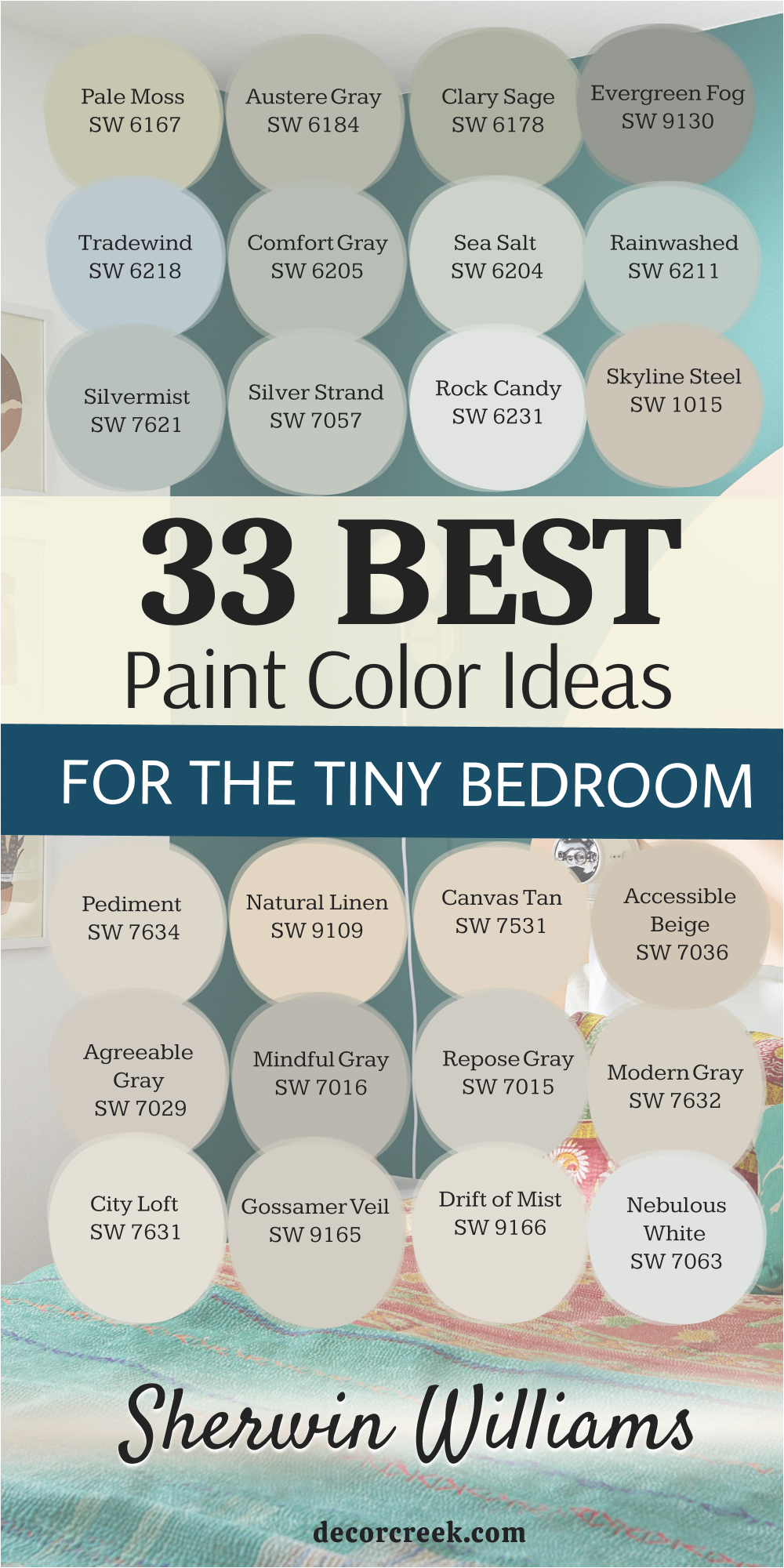
33 Trendy Bedroom Paint Ideas For Small Rooms in 2026
Creamy SW 7012
Creamy SW 7012 is a soft and rich white that is a huge trend for 2026 because it feels very luxurious. This color has a warm heart that makes a tiny bedroom feel like a cozy sanctuary for resting. I like how it creates a very smooth and high-end look on the walls without being too yellow.
It reflects light in a very gentle way that makes the whole room feel like it is glowing. This paint makes your white trim look very bright and helps to make the room feel tidy. You will notice that your bed looks very inviting and ready for a good sleep with this shade.
It is a great choice for modern or traditional bedrooms that want to feel very special. This color stays looking very clean and does not show dust as easily as a pure white. It gives a tiny area a very polished and well-kept look that is very smart. Many designers are using this color this year because it makes a small room feel very grand.
Best used in: master bedrooms, living rooms, hallways, and kitchen cabinets
Pairs well with: Urbane Bronze SW 7048, Agreeable Gray SW 7029, Shoji White SW 7042, gold accents The key rule of this color for luxury style is to use it on all walls to create a warm and continuous glow throughout the room.
👉 Read the full guide for this color HERE 👈

Westhighland White SW 7566
Westhighland White SW 7566 is a clean and bright white that feels very fresh for a small bedroom in 2026. This color has a tiny bit of warmth that keeps it from looking like a cold hospital room. I like using this shade when I want to make a dark room feel like it is full of morning sun.
It makes your white trim look sharp and helps to define the lines of your tiny room. This paint acts like a mirror that bounces light into every corner to keep the area open. You will notice that your bedroom feels much wider and much more cheerful once the paint is dry.
It is a smart choice for a modern look that feels very new and very tidy for your home. This shade helps you feel alert and organized which is great for starting your busy day. Your room will look very neat and well-kept with this shade on every wall. It is a wonderful pick for anyone who loves a bright and very simple style.
Best used in: kitchens, bedrooms, ceilings, trim, and small dark spaces
Pairs well with: Hale Navy HC-154, Gray Owl OC-52, silver hardware, bright colorful accents The key rule of this color for bright style is to use it on the ceiling as well to make a low room feel much taller and more open.
👉 Read the full guide for this color HERE 👈
Whitetail SW 7103
Whitetail SW 7103 is a soft and creamy white that brings a lot of elegance to a tiny bedroom wall. This color has a gentle yellow undertone that makes the walls feel like they are glowing with natural light. I use this when I want to make a small room feel warm and friendly without being too dark.
It is a great choice for traditional homes because it looks like a color that has been loved for years. This paint helps to make your white ceilings look very tall and your room look very wide today. You will notice that it makes your bed look very cozy and ready for a good night of rest.
It works perfectly with floral patterns and wooden furniture that has a bit of history in it. This shade gives a tiny area a very polished and well-kept look that is very smart. Your room will feel like a soft sanctuary where the world outside just slows down for a while. It is a dependable pick for making any tiny bedroom feel much more special and unique.
Best used in: traditional bedrooms, dining rooms, hallways, and living spaces
Pairs well with: Alabaster SW 7008, Urbane Bronze SW 7048, Agreeable Gray SW 7029, warm metal accents The key rule of this color for traditional style is to use it in rooms with warm light to create a golden and inviting feeling.
👉 Read the full guide for this color HERE 👈
Cotton White SW 7104
Cotton White SW 7104 is a very light and airy white that feels as soft as a fresh t-shirt on your walls. This color is a top choice for 2026 because people want rooms that feel healthy and very clean. I like how it makes a tiny bedroom feel like a wide open box where you can breathe easily.
It has just enough warmth to stop it from feeling cold but it stays very bright all day. This paint helps to hide any shadows in the corners of a tiny sleeping room to keep it open. You will feel like you have more room to move around once this color is on your walls.
It is a great pick for people who want a clean look that is not yellow or gray. This shade looks high quality and makes small bedrooms feel like a professional designer helped you. It stays looking bright even when the weather is cloudy or dark outside right now. Your room will feel like a quiet and fresh spot to relax every single night.
Best used in: nurseries, master bedrooms, kitchens, and laundry rooms
Pairs well with: Sea Salt SW 6204, Rainwashed SW 6211, Natural Linen SW 9109, light wood floors The key rule of this color for healthy style is to pair it with natural fabrics like cotton and wool to make the room feel very fresh.
👉 Read the full guide for this color HERE 👈
White Snow SW 9541
White Snow SW 9541 is a very crisp and pure white from the designer collection that looks amazing in small rooms. This color has almost no undertones which makes it look very sharp and very modern on your walls. I choose this shade when I want to create a look that feels totally free of any extra mess or clutter.
It makes your room feel very airy and like a blank canvas where you can be creative today. This paint helps to make a tiny bedroom look like a fancy gallery or a very expensive city apartment. You will find that this color stays looking bright and white for years without turning yellow or old.
It works beautifully with black metal bed frames and glass tables for a very sleek and tidy feeling. This shade gives a small room a very sharp feel that is very smart and very organized. It is a great choice for people who want their bedroom to feel very quiet and very tidy. Your walls will look like they are glowing with a very pure and very natural light.
Best used in: modern bedrooms, galleries, trim, kitchens, and bathrooms
Pairs well with: Tricorn Black SW 6258, Iron Ore SW 7069, silver hardware, bold black accents The key rule of this color for minimalist style is to use it when you want the most light reflection possible to maximize your square footage.
👉 Read the full guide for this color HERE 👈
Oyster White SW 7637
Oyster White SW 7637 is a very popular light neutral that feels like a mix of soft gray and warm cream. This color is a huge trend for 2026 because it makes a tiny bedroom feel very expensive and solid. I like how it adds a bit of depth to the walls without making the room feel small or dark.
It acts as a perfect background for any color of furniture or art you have in your house. This paint makes your white trim look very bright and helps to make the room feel tidy today. You will notice that your bed looks very inviting and ready for a good sleep with this shade.
It is a great choice for modern or traditional bedrooms that want to feel very special and high-end. This color stays looking very clean and does not show marks as easily as a pure white. It gives a tiny area a very polished and well-kept look that is very smart for a designer. Many people love this because it makes a small room feel very grand and stable.
Best used in: whole house interiors, bedrooms, living rooms, and exteriors
Pairs well with: Sea Salt SW 6204, Urbane Bronze SW 7048, Agreeable Gray SW 7029, dark wood accents The key rule of this color for balanced style is to use it as a soft neutral that brings together different wood and metal tones in the room.
👉 Read the full guide for this color HERE 👈

Egret White SW 7570
Egret White SW 7570 is a soft and misty white that has a tiny bit of gray and beige in the base. This color makes a tiny bedroom feel very gentle and like a high-end sanctuary for your mind. I choose this shade when I want a room to feel a bit more romantic while staying very tidy.
It makes your skin look good and creates a very soft glow when the sun sets in the afternoon. This paint hides small marks on the wall while still keeping the tiny room feeling very bright today. You will love how it looks with white fluffy blankets and soft rugs that have no busy patterns.
It gives a small room a very light and happy feel that is perfect for a master bedroom. This shade does not demand a lot of attention so it lets your few favorite things be the stars. It is a wonderful pick for a room that needs to feel a bit more special than a basic tan. Your walls will look like they are glowing with a soft, natural light.
Best used in: bedrooms, living rooms, hallways, and traditional homes
Pairs well with: Snowbound SW 7004, Urbane Bronze SW 7048, Agreeable Gray SW 7029, silver hardware The key rule of this color for gentle style is to use it where you want a warm glow that is more interesting than a plain white paint.
👉 Read the full guide for this color HERE 👈
Toque White SW 7003
Toque White SW 7003 is a warm and creamy white that feels very steady and very reliable for a small room. This color is a top choice for 2026 because it adds a sense of comfort to the walls without being heavy. I like how it makes a tiny bedroom feel like a cozy nest where you can hide from the world.
It has a soft heart that makes the walls look rich and very smooth under your bedroom lamps. This paint makes your room feel very solid and very quiet which is great for a good night of sleep. You will love how it looks with soft linen curtains and white rugs that have no busy patterns today.
It gives a small room a very grown-up feel that is very inviting for you and your guests. This shade is very light so it keeps the walls feeling far back and the room feeling quite big. It is a wonderful pick for a room that gets a mix of sun and light from light bulbs. Your walls will look soft and very beautiful every time you walk into the room.
Best used in: bedrooms, kitchens, hallways, and entire home interiors
Pairs well with: Alabaster SW 7008, Urbane Bronze SW 7048, Accessible Beige SW 7036, woven textures The key rule of this color for organic style is to use it with other natural tones to create a room that feels like a quiet nest.
👉 Read the full guide for this color HERE 👈
Aesthetic White SW 7035
Aesthetic White SW 7035 is a very light and smart gray-white that behaves perfectly in a tiny bedroom. This color is a favorite for making small areas look much larger because it has a very soft reflection. I like how it creates a soft contrast against your white trim which makes the room look expensive today.
It feels very quiet and very steady which helps you to relax after a long day at work. This paint makes your small room feel very professional and like you hired a designer to help you out. You will notice that it hides dust better than a pure white paint while still being very bright on the walls.
It is a great choice for a master bedroom that needs to feel like a private and stylish getaway. This shade stays looking fresh and does not turn blue or green in the afternoon sun in the house. It gives your tiny room a very tailored look that is very easy for anyone to love. Many homeowners pick this because it is very easy to match with any color of rug.
Best used in: master suites, living rooms, hallways, and open concept spaces
Pairs well with: Pure White SW 7005, Naval SW 6244, Iron Ore SW 7069, light wood tones The key rule of this color for sophisticated style is to pair it with high-contrast dark colors to create a room that looks professionally staged.
👉 Read the full guide for this color HERE 👈

Neutral Ground SW 7568
Neutral Ground SW 7568 is a warm and sandy beige that makes a tiny bedroom feel very solid and friendly. This color is a big trend for 2026 because it brings a natural feeling back into the home walls. I like how it makes a tiny room feel like it is part of the earth and the natural world outside.
It has enough pigment to show up against white trim, making the room look very neat and finished today. This paint spreads the light very evenly so you do not have to worry about dark corners in a tight room. You will notice that your bed feels like a safe and warm nest when the walls are this shade for sleep.
It is a great choice for traditional or rustic styles because it feels very natural and steady. This color stays looking clean and fresh throughout the day and into the night in your bedroom. It gives a tiny area a very professional look that makes your house feel more special. Many homeowners pick this because it is very easy to live with and very welcoming.
Best used in: whole house interiors, bedrooms, living rooms, and entryways
Pairs well with: Alabaster SW 7008, Urbane Bronze SW 7048, Sea Salt SW 6204, woven textures The key rule of this color for warm style is to use it as a light neutral that adds warmth without making the room feel closed in.
👉 Read the full guide for this color HERE 👈

Balanced Beige SW 7037
Balanced Beige SW 7037 is a deeper and more solid neutral that brings a lot of character to a tiny bedroom. This color is great for making the room feel like it has strong and sturdy walls that protect your peace today. I suggest this shade if you want your small room to feel very cozy and very safe for a long rest.
It is light enough to keep the room from feeling like a cave but dark enough to show off your white bed frame. This paint makes a great background for a single piece of colorful art or a bright green plant on the floor. You will find that it makes the room feel very balanced and very easy on your eyes throughout the day.
It is a smart pick for a bedroom that also has a small desk or a place to sit quietly in the house. This shade stays looking rich and high quality even after many years of living on the wall. It gives your tiny room a very intentional look that shows you put thought into your home. Many homeowners love this because it feels very sturdy and very professional.
Best used in: bedrooms, living rooms, kitchens, and home offices
Pairs well with: Alabaster SW 7008, Accessible Beige SW 7036, Urbane Bronze SW 7048, warm wood tones The key rule of this color for balanced style is to use it as a mid-tone that connects your dark floors to your light ceiling.
👉 Read the full guide for this color HERE 👈

Perfect Greige SW 6073
Perfect Greige SW 6073 is a beautiful mix of gray and beige that adds a lot of elegance to a tiny bedroom. This color is a top choice for 2026 because it looks very high-end and very professional on any wall today. I like how it makes a tiny room feel like a designer suite in a fancy city hotel.
It has enough warmth to feel cozy but stays cool enough to look very modern and smart for your eyes. This paint helps to hide any small bumps or marks on the wall while keeping the room bright. You will notice that your bedroom feels much more organized and tidy with this shade on the walls for rest.
It is a great choice for rooms that get a lot of bright sun because it keeps the room feeling steady. This color makes your white trim look like it is popping off the wall in a sharp and clean way. It is a dependable pick for people who want a rich look that is not too dark or distracting. Your small room will feel like a very peaceful place to sleep every single night.
Best used in: master bedrooms, living rooms, hallways, and exteriors
Pairs well with: Alabaster SW 7008, Naval SW 6244, Agreeable Gray SW 7029, silver hardware The key rule of this color for sophisticated style is to use it with white and black accents to keep the room looking sharp and very tidy.
👉 Read the full guide for this color HERE 👈
Pavilion Beige SW 7512
Pavilion Beige SW 7512 is a soft and sophisticated neutral that brings a lot of warmth to a tiny bedroom wall. This color is a big trend for 2026 because people want rooms that feel very solid and very safe. I like how it makes a tiny room feel like a quiet and high-end library where you can just sit.
It has a soft glow that makes the walls look rich and very smooth under your bedroom lamps at night. This paint makes your room feel very steady and very quiet which is great for a good night of sleep. You will love how it looks with soft linen curtains and white rugs that have no busy patterns today.
It gives a small room a very grown-up feel that is very inviting for you and your family members. This shade is light enough to keep the walls feeling far back and the room feeling quite big. It is a wonderful pick for a room that gets a mix of natural and artificial light bulbs. Your walls will look soft and very beautiful every time you walk into the room.
Best used in: bedrooms, living rooms, entryways, and traditional homes
Pairs well with: Alabaster SW 7008, Urbane Bronze SW 7048, Accessible Beige SW 7036, warm wood floors The key rule of this color for traditional style is to use it with warm textures like wool and wood to make the room feel solid and lived-in.
👉 Read the full guide for this color HERE 👈
Sand Dollar SW 6099
Sand Dollar SW 6099 is a light and happy tan that brings a lot of beachy energy into a tiny bedroom. This color has a sunny base that makes the walls feel like they are glowing with natural light today. I suggest this shade for rooms that need more energy and a fresh feeling to look larger.
It is a wonderful choice for making a tiny bedroom feel wider and more cheerful for your morning routine. This paint helps to bounce light into the corners so you do not have any dark spots in the house. You will notice that your bed looks very cozy and bright against this soft sandy background for sleep.
It works perfectly with white furniture and light wood floors to create a fresh and airy look. This shade gives a tiny area a very friendly and welcoming feel that everyone loves in a home. Your room will look very tidy and very professional with this shade on the walls every day. It is a dependable pick for making any tiny room feel much larger and more positive.
Best used in: bedrooms, sunrooms, kitchens, and laundry rooms
Pairs well with: Alabaster SW 7008, Sea Salt SW 6204, Rainwashed SW 6211, woven textures The key rule of this color for coastal style is to use it with blue and green accents to make the room feel like a beach getaway.
👉 Read the full guide for this color HERE 👈
Kilim Beige SW 6106
Kilim Beige SW 6106 is a legendary Sherwin-Williams neutral that is seeing a major comeback in 2026. This color is perfect for a tiny bedroom because it provides a “sun-kissed” warmth that prevents small spaces from feeling sterile. I recommend this shade if you want your room to feel like a cozy, Mediterranean retreat.
It has a beautiful depth that masks imperfections on old walls while still reflecting enough light to keep the ceiling feeling high. You will notice that this paint makes cream-colored bedding and tan rugs look incredibly rich and layered.
It is a fantastic choice for rooms that don’t get much natural sunlight, as it creates its own warmth. Your bedroom will feel very stable, quiet, and timeless with this classic shade. It is a favorite for those who want a “no-fail” beige that feels substantial and high-quality.
Best used in: bedrooms, living rooms, hallways, and open floor plans
Pairs well with: Alabaster SW 7008, Latte SW 6108, Van Dyke Brown SW 7041, terracotta accents The key rule of this color for warm style is to use it with traditional wood furniture to create a room that feels established and very comfortable.
👉 Read the full guide for this color HERE 👈

Nomadic Desert SW 6107
Nomadic Desert SW 6107 is a step darker than Kilim Beige, offering a more “enveloping” feel for a tiny bedroom. In 2026, the trend is moving toward these mid-tone neutrals that make a small room feel intentional rather than just “painted white.”
I love how this color creates a clear boundary for the room, making it feel like a secure and private sanctuary. It works as a beautiful backdrop for white picture frames and bright white lamps. This paint makes your room feel very grounded and professional, especially if you have high ceilings.
You will find that it creates a very soothing environment for sleeping because it absorbs the harsh glare of morning sun. It is a great pick for a master bedroom where you want to feel completely relaxed. Your tiny room will look very sophisticated and well-dressed with this desert-inspired tone.
Best used in: master bedrooms, dining rooms, home offices, and accent walls
Pairs well with: Kilim Beige SW 6106, Divine White SW 6105, Coffee Allure, navy blue accents The key rule of this color for grounded style is to pair it with lighter trim to define the space and make the room’s architecture pop.
👉 Read the full guide for this color HERE 👈

Accessible Beige SW 7036
Accessible Beige SW 7036 remains a top trend for 2026 because it is the ultimate “greige”—a perfect balance of gray and beige. For a tiny bedroom, this color is a miracle worker because it looks expensive in every lighting condition.
I choose this shade when I want to make a small room look like a high-end designer space without much effort. It makes your white trim look incredibly crisp and keeps the room feeling organized and tidy. This color is very versatile; it looks warm when the sun is out and cool during the evening.
You will notice that your bedroom feels much more modern and stylish with this paint on the walls. It is a safe and smart choice for anyone who wants a neutral that isn’t boring. Many designers call this the “perfect” color because it bridges the gap between old-school warmth and modern coolness.
Best used in: entire homes, bedrooms, living rooms, and office spaces
Pairs well with: Alabaster SW 7008, Sea Salt SW 6204, Urbane Bronze SW 7048, gold accents The key rule of this color for neutral style is to use it on all four walls to create a warm and continuous feeling throughout the room.
👉 Read the full guide for this color HERE 👈
Worldly Gray SW 7043
Worldly Gray SW 7043 is a slightly cooler version of a greige that brings a very professional and steady energy to a tiny bedroom. This color is gaining popularity in 2026 for its ability to look “clean” without feeling cold like a pure gray. I suggest this shade for rooms that have a lot of electronics or modern furniture.
It helps the walls recede, making a small space feel less cluttered and more open. This paint makes your bed look like the center of attention in a very neat way. You will find that it hides dust and small marks very well, which is great for a busy life.
It gives your tiny room a very sharp and well-defined look that feels very contemporary. Your bedroom will look like a quiet, high-tech retreat where everything has its own place. It is a dependable pick for people who want a “smart” color that stays fresh for years.
Best used in: bedrooms, kitchens, entryways, and modern apartments
Pairs well with: Shoji White SW 7042, Anew Gray SW 7030, silver hardware, cool blue tones The key rule of this color for smart style is to use it in rooms with modern lighting to highlight the sophisticated gray-beige balance.
👉 Read the full guide for this color HERE 👈
Anew Gray SW 7030
Anew Gray SW 7030 is a mid-tone gray with warm undertones that makes a tiny bedroom feel very solid and high-quality. In 2026, this color is favored for “moody minimalist” designs. I like how it adds enough weight to the walls to make the room feel expensive, but it doesn’t “shrink” the space.
This paint is great for making your white linens and pillows look very bright and clean. It provides a beautiful contrast against light oak or pine wood floors. You will notice that your bedroom feels very quiet and very focused with this shade on the walls.
It is a wonderful pick for a room that doubles as an office because it feels very professional. This color stays looking rich even in low light, making it perfect for cozy evening reading. Your tiny room will feel like a well-planned, high-end hotel room every single day.
Best used in: bedrooms, living rooms, exteriors, and cabinetry
Pairs well with: Agreeable Gray SW 7029, Alabaster SW 7008, Black Magic SW 6991, dark wood accents The key rule of this color for moody style is to use it as a primary wall color paired with very large mirrors to keep the light bouncing.
👉 Read the full guide for this color HERE 👈
Requisite Gray SW 7023
Requisite Gray SW 7023 is a soft, elegant gray that has a slight violet undertone, making it feel very high-end and unique for 2026. This color is perfect for a tiny bedroom that needs a touch of “personality” without being too loud. I choose this shade when I want a room to feel a bit more formal and very tidy.
It catches the afternoon light and takes on a very soft, sophisticated glow. This paint makes your room feel very fresh and like it belongs to someone who loves art and style. You will find that it works beautifully with silver lamps and glass furniture.
It gives a tiny room a very polished feel that is great for a guest bedroom or a master suite. This shade doesn’t demand attention, but it makes everyone feel like the room is very well-kept. Your walls will look like they are made of soft stone, giving the room a permanent, quality feeling.
Best used in: master bedrooms, bathrooms, hallways, and formal sitting rooms
Pairs well with: Snowbound SW 7004, Repose Gray SW 7015, Mindful Gray SW 7016, silver hardware The key rule of this color for elegant style is to use it with white trim to make the soft gray tones look very crisp and clean.
👉 Read the full guide for this color HERE 👈
Mindful Gray SW 7016
Mindful Gray SW 7016 is a deeper gray that adds a sense of “protection” and strength to a tiny bedroom. While it is darker, it is a 2026 trend because people want rooms that feel like a “hug.” I recommend this shade if you want your small room to feel very cozy and very safe.
It is light enough to keep from feeling dark, but heavy enough to show off your light-colored furniture. This paint makes a great background for green plants or bright white art. You will find that it makes the room feel very balanced and easy on your eyes.
It is a smart pick for a bedroom where you spend a lot of time resting or relaxing. This shade stays looking rich and high-quality for many years. It gives your tiny room a very intentional and designer-approved look. Many homeowners love it because it feels very sturdy and very professional.
Best used in: bedrooms, home offices, living rooms, and kitchen islands
Pairs well with: Repose Gray SW 7015, Alabaster SW 7008, Inchyra Blue, light oak wood The key rule of this color for balanced style is to use it as a mid-tone that connects your dark floors to your light ceiling.
👉 Read the full guide for this color HERE 👈
Dovetail SW 7018
Dovetail SW 7018 is a mid-to-dark gray that is becoming a major trend for 2026 “cocooning” bedrooms. While it is darker than a standard neutral, it is perfect for a tiny bedroom where you want the walls to feel like a warm, secure hug.
I love using this shade to create a dramatic, high-end look in a small space because it hides the corners of the room, making the boundaries feel soft. This paint makes a white bed frame or light wood furniture look incredibly sharp and expensive.
You will notice that your room feels much quieter and more focused with this color on the walls. It is a fantastic choice for people who have trouble sleeping, as the darker tone helps the mind settle down. Your tiny room will feel like a private, luxury lounge where you can truly hide from the world.
Best used in: master bedrooms, media rooms, cabinetry, and accent walls
Pairs well with: Repose Gray SW 7015, Eider White SW 7014, Black Magic SW 6991, brass accents The key rule of this color for moody style is to use high-quality lighting and mirrors to ensure the room feels “cozy” rather than “cramped.”
👉 Read the full guide for this color HERE 👈

Dorian Gray SW 7017
Dorian Gray SW 7017 is a sophisticated, true gray that offers a very steady and professional feeling for a 2026 bedroom. This color is popular because it has a “weight” to it that makes a tiny room feel much more permanent and well-built. I suggest this shade if you want a room that feels modern but still very comfortable.
It reflects just enough light to show off the texture of your bedding and curtains. This paint makes your room feel very organized and tidy, which is essential when living in a small space. You will find that it works perfectly with both silver and gold metals, giving you freedom with your lamps and handles.
It gives your tiny room a very tailored, “suit-and-tie” look that is always in style. Your walls will look solid and dependable, creating a very calm environment for resting.
Best used in: bedrooms, home offices, exteriors, and kitchens
Pairs well with: Classic Light Buff SW 0050, Alabaster SW 7008, Naval SW 6244, mid-century modern furniture The key rule of this color for tailored style is to use it as a mid-tone backdrop that highlights the clean lines of your furniture.
👉 Read the full guide for this color HERE 👈

Mega Greige SW 7031
Mega Greige SW 7031 is a rich, warm gray that is slightly darker than the famous greiges of the past. In 2026, it is a favorite for creating “earthy” minimalist rooms that feel connected to nature. I like how this color provides a warm foundation for a tiny bedroom, making it feel solid and safe.
It has a beautiful way of changing with the light, looking more gray in the morning and more beige in the evening. This paint makes your room feel very high-end and intentional, as if a designer chose the color just for you.
You will love how it looks with leather accents or woven rugs. It is a great pick for a room that needs a little more “soul” and warmth than a light white. Your tiny room will feel like a warm, modern sanctuary where you can relax after a busy day.
Best used in: master suites, living rooms, hallways, and exteriors
Pairs well with: Agreeable Gray SW 7029, Alabaster SW 7008, Urbane Bronze SW 7048, leather textures The key rule of this color for organic style is to pair it with natural materials like stone and wood to emphasize its earthy undertones.
👉 Read the full guide for this color HERE 👈
Warm Stone SW 7032
Warm Stone SW 7032 is a deep, comforting neutral that feels exactly like its name—a smooth, sun-warmed stone. This color is trending for 2026 as people move away from “all-white” rooms toward spaces with more depth. I recommend this for a tiny bedroom where you want to feel completely wrapped in comfort.
It makes the walls feel very thick and protective, which is wonderful for a deep sleep. This paint looks incredible with white trim, which creates a very clean and professional border around the room.
You will notice that it makes your bedroom feel very quiet and private, even if you live in a busy city. It is a smart choice for a room that doubles as a cozy reading spot. Your tiny room will look very sophisticated and “moody” in a way that feels intentional and expensive.
Best used in: bedrooms, cozy dens, kitchen islands, and accent walls
Pairs well with: Accessible Beige SW 7036, Alabaster SW 7008, black metal hardware, forest green accents The key rule of this color for cozy style is to use soft, warm-toned light bulbs to bring out the rich, “stony” warmth of the paint.
👉 Read the full guide for this color HERE 👈

Functional Gray SW 7024
Functional Gray SW 7024 is a dependable, balanced gray with a hint of warmth that makes it very easy to live with. In 2026, it is a top choice for small rooms because it is exactly what it says: functional. It creates a very clean, professional background that works with any style of furniture you own.
I like using this shade when a tiny bedroom feels a bit “messy” because the steady color helps everything look more organized. It reflects a decent amount of light while still giving the walls a solid, high-quality appearance.
This paint makes your room feel very fresh and like it has a clear purpose. You will find that it is a very safe choice if you want a “real” gray that doesn’t feel cold. It gives your tiny room a very smart and tidy look that stays looking great for years.
Best used in: bedrooms, laundry rooms, home offices, and hallways
Pairs well with: Snowbound SW 7004, Repose Gray SW 7015, dark navy accents, silver hardware The key rule of this color for smart style is to use it as a consistent wall color throughout small spaces to create a sense of flow and order.
👉 Read the full guide for this color HERE 👈
Dustblu SW 9161
Dustblu is a soft, airy gray that feels very contemporary and clean for 2026. This color is designed to keep a tiny bedroom feeling open and light without being a plain white. I choose this shade when I want a room to feel “fresh” and “modern” for a young professional.
It catches the natural light beautifully and makes the room feel much larger than its actual square footage. This paint makes your white furniture look like it is floating in a bright, clean space.
You will notice that your bedroom feels very alert and positive, which is great for waking up in the morning. It works perfectly with minimalist furniture and simple black or white lamps. This shade stays looking crisp and does not turn yellow or blue in different lights. It gives a tiny room a very light-hearted and free feeling that everyone loves.
Best used in: modern bedrooms, bathrooms, studio apartments, and entryways
Pairs well with: Pure White SW 7005, Iron Ore SW 7069, cool blue textiles, minimalist decor The key rule of this color for airy style is to keep the room clutter-free to allow the light gray tone to maximize the sense of space.
👉 Read the full guide for this color HERE 👈
Colonnade Gray SW 7641
Colonnade Gray SW 7641 is a beautiful, warm gray that is often compared to a “stone” color found in classic European cities. This color is a trend for 2026 because it feels very timeless and expensive. I suggest this shade for a tiny bedroom that you want to feel “established” and high-quality.
It has a soft, creamy quality that keeps the gray from ever feeling cold or industrial. This paint makes your room feel very stable and quiet, providing a perfect backdrop for a good rest. You will find that it hides small wall imperfections very well while still keeping the room bright.
It gives your tiny room a very “designed” look that makes it feel much larger than a standard bedroom. Your walls will look sophisticated and very smooth, like they were painted by a professional team.
Best used in: bedrooms, living rooms, kitchens, and open floor plans
Pairs well with: Alabaster SW 7008, Agreeable Gray SW 7029, dark wood floors, brass accents The key rule of this color for timeless style is to use it with white trim and warm wood to create a room that never goes out of fashion.
👉 Read the full guide for this color HERE 👈
Pavestone SW 7642
Pavestone SW 7642 is a medium-depth gray with a soft, warm undertone that makes a tiny bedroom feel very anchored. In 2026, we are seeing a shift where people use darker neutrals on all four walls of a small room to create a “jewel box” effect.
I like this shade because it makes the walls feel solid and expensive, like a high-end hotel. It provides a stunning contrast against a white headboard or light-colored bedding.
This paint helps to absorb excess light in very sunny rooms, making the space feel cool and relaxing for a nap. You will find that your room feels much more private and tucked away with this color. It gives a tiny area a very deliberate, designer look that feels sophisticated and calm.
Best used in: bedrooms, home offices, and kitchen islands
Pairs well with: Alabaster SW 7008, Urban Bronze SW 7048, light oak wood The key rule of this color for sophisticated style is to use it as a backdrop for bright art pieces to make the colors really pop.
👉 Read the full guide for this color HERE 👈
Silverpointe SW 7653
Silverpointe SW 7653 is a very light, cool gray with a tiny hint of green and blue. This color is a top trend for 2026 because it feels incredibly “clean” and therapeutic. For a tiny bedroom, it works like a breath of fresh air, making the walls feel light and breezy.
I suggest this shade if you want your room to feel more like a spa than a typical bedroom. It reflects natural light beautifully, which helps a cramped space feel much more open. This paint makes your silver lamps and glass furniture look very sleek and modern.
You will wake up feeling refreshed because the color is so calm and quiet. It is a dependable pick for someone who wants a neutral that isn’t white but still wants a very bright room.
Best used in: bathrooms, tiny bedrooms, and laundry rooms
Pairs well with: Extra White SW 7006, Naval SW 6244, cool marble surfaces The key rule of this color for serene style is to pair it with cool-toned lighting to emphasize its fresh, airy qualities.
👉 Read the full guide for this color HERE 👈
On the Rocks SW 7671
On the Rocks SW 7671 is a crisp, light gray that has no strong yellow or blue undertones. It is a very “honest” gray that stays looking clean in almost any light. In 2026, it is popular for minimalist apartments because it looks very high-tech and organized.
I love using this in a tiny bedroom to create a sense of order and simplicity. It makes your white trim look like a sharp border, giving the room a very “framed” and tidy appearance. This paint is excellent at bouncing light around, so even a small window will make the room feel bright.
You will notice that your bedroom feels much less “busy” once this color is on the walls. It is a smart choice for a modern, clutter-free lifestyle.
Best used in: modern bedrooms, kitchens, and hallways
Pairs well with: Tricorn Black SW 6258, Ammonite, silver accents The key rule of this color for modern style is to use it with black and white furniture to maintain a sharp, high-contrast look.
👉 Read the full guide for this color HERE 👈
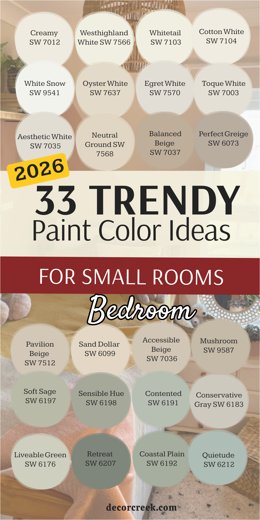
My Final Thoughts: 33 Bedroom Paint Ideas For Small Rooms
Choosing the right paint for a small bedroom is about much more than just picking a favorite shade; it is a strategic decision to manipulate the physics of your space and the psychology of your rest. After exploring these thirty-three curated options, it becomes clear that the secret to a successful tiny room lies in how you handle light and boundaries.
We are seeing a significant shift away from the traditional idea that small rooms must be painted a stark, sterile white to feel larger. Instead, the most effective designs in 2026 use complex neutrals and soft “chameleon” colors that possess enough depth to create subtle shadows and highlights. This added dimension prevents the walls from feeling like a flat box and instead makes the room feel intentionally designed and high-end.
For those dealing with rooms that have very little natural light, it is often better to embrace the small scale rather than fight it. Leaning into the “cocoon” effect with deeper, moodier shades can transform a cramped area into a sophisticated, private sanctuary where the walls seem to disappear into the shadows.
Conversely, if you prefer a bright and airy atmosphere, using high-reflectance whites across both the walls and the ceiling can erase the visual breaks in the room, tricking the eye into seeing a much more expansive area.