When people walk up to a restaurant, the color on the outside is the very first thing they notice, often before the sign or the smell of food even reaches them. It sets the mood in an instant, shaping whether someone feels drawn in or passes by. A warm white door can quietly say “welcome,” while a deep navy wall can signal strength and style.
Soft neutrals can suggest comfort and friendliness, while bold shades can stir energy and excitement. I’ve always believed that the right paint is more than decoration—it’s storytelling on a wall.
It tells guests what kind of meal, mood, and memory they’ll find inside. People want to feel comfortable, curious, and hungry, and color can spark those feelings in just seconds.
That’s why I spend time matching shades to the food style, the setting, and the guests a restaurant hopes to serve. It’s a choice that goes beyond looks—it’s about shaping an experience before the door even opens.
Why I Rely on Sherwin-Williams and Benjamin Moore for Restaurant Exteriors
I put my trust in Sherwin-Williams and Benjamin Moore because I’ve seen how their paints perform on real streets. I need shades that keep their beauty through rain, bright sun, or city dust, and these brands deliver that durability. Both offer formulas that resist fading and keep color true, even with heavy foot traffic brushing by every day.
Their coverage is strong too, so a bold red or black looks solid and not patchy, even on tricky surfaces. Touch-ups are easy, which matters when doors and trims get scuffed—fresh paint blends in seamlessly instead of sticking out.
Beyond the practical side, the palettes are broad enough to fit every mood: gentle creams for a bakery, bold charcoals for a steakhouse, or vibrant blues for a coastal café.
I’ve tested plenty of paints, but these two brands are the ones I can count on to give restaurants both beauty and staying power. That reliability is worth everything when the building itself is part of the brand.
How I Choose the Right Exterior Color for a Restaurant
Choosing a restaurant’s exterior shade is never random—it’s a careful process shaped by many small details. I start with the building material: brick, wood, stucco, or metal, because each holds color differently. Then I study the way light moves across the facade, checking the shade in the bright morning sun, late afternoon glow, and under night lamps.
I think about how guests will view the building—not just up close, but from down the street or through a car window. The brand story matters too: a family diner might shine in a creamy neutral that feels warm, while a seafood restaurant can thrive in crisp blues that suggest freshness.
I also look around at nearby buildings; the color should make the restaurant stand out while still feeling like it belongs in the block.
The right choice is always the one that makes guests pause, feel drawn in, and want to step through the door. In the end, paint isn’t just a finish—it’s the first invitation.
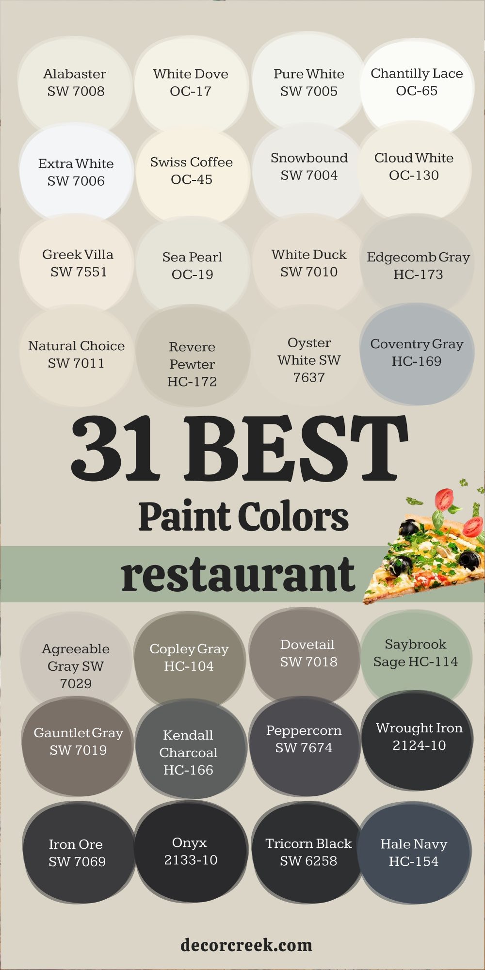
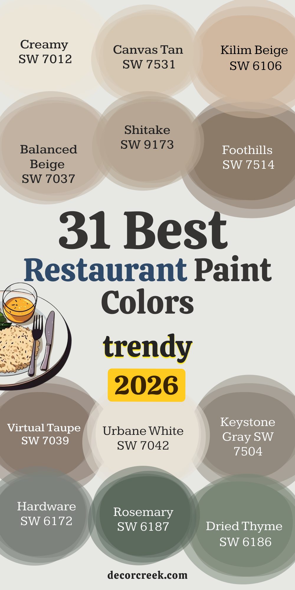
31 Best Restaurant Paint Colors
Alabaster SW 7008
Alabaster SW 7008 feels warm and gentle, making it perfect for restaurants that want to look bright yet inviting. I’ve used it on exteriors where natural wood beams add character, and the soft white backdrop lets them shine. This color reflects light beautifully without being harsh. Guests often say it feels clean and welcoming, which is exactly the reaction I hope for.
On a busy street, it still holds its brightness against dust and shadows. Alabaster works well with dark trims for contrast and pairs easily with brick or stone details.

White Dove OC-17
White Dove OC-17 has a quiet strength that I often use when I want a restaurant to look polished but not cold. Its creamy tone softens sharp lines of modern buildings. I notice that guests feel at ease before even opening the door. Paired with black doors, it becomes chic, and with wood, it turns cozy. In daylight, it looks fresh; under evening lights, it glows softly.
This balance is what makes White Dove a favorite for many restaurants, from cafes to upscale dining.

Pure White SW 7005
Pure White SW 7005 brings a fresh, clean look that works beautifully for restaurants aiming for a modern edge. It stands strong against dark accents like iron railings or navy doors. On sunny days, it feels bright but not blinding, which makes it comfortable to look at. I’ve seen it give a storefront a crisp, professional style that draws attention without shouting. When paired with greenery in planters or vines, it makes natural colors pop.
Guests often sense order and care when they see Pure White on an exterior.

Chantilly Lace OC-65
Chantilly Lace OC-65 has a clear, bright tone that reminds me of fresh linens. Restaurants that want a sharp, modern look benefit from this color because it feels pure and neat. It pairs perfectly with glass windows and metal trims. I find it especially striking on minimal-style buildings where clean lines matter. Under streetlights, it still holds its brightness, which helps the restaurant stay visible at night.
Guests often connect this color with freshness and precision, a smart choice for a café or modern eatery.

Extra White SW 7006
Extra White SW 7006 is one of my go-to shades for bold contrast. It looks stunning with deep blacks, grays, or navy trims. This color makes signage stand out clearly, which is key for restaurants that need to catch eyes fast. It stays bright even when the building is shaded. On busy corners, Extra White helps a restaurant look sharp and professional.
Guests often feel they’re walking into a place that is organized and cared for. It’s especially strong for contemporary exteriors.
Swiss Coffee OC-45
Swiss Coffee OC-45 is warm and soft, with just enough cream to feel friendly. I like using it on restaurants that want to feel approachable yet refined. Paired with bronze or wood doors, it gives a timeless appeal. In daylight, it feels gentle, while at night it reflects warmth from lantern lights. Guests often connect it with comfort and home, which makes them more likely to come inside.
This shade is perfect for bakeries, brunch spots, or family-friendly eateries.

Snowbound SW 7004
Snowbound SW 7004 has a smooth, fresh quality that gives restaurants a clean yet approachable face. I’ve seen it brighten up older buildings without covering their character. With dark metal railings or navy accents, it turns stylish quickly. Its brightness holds well in both shade and sun. Guests often say it feels welcoming but not too formal.
It’s a safe pick when you want a restaurant to look modern and approachable at the same time.

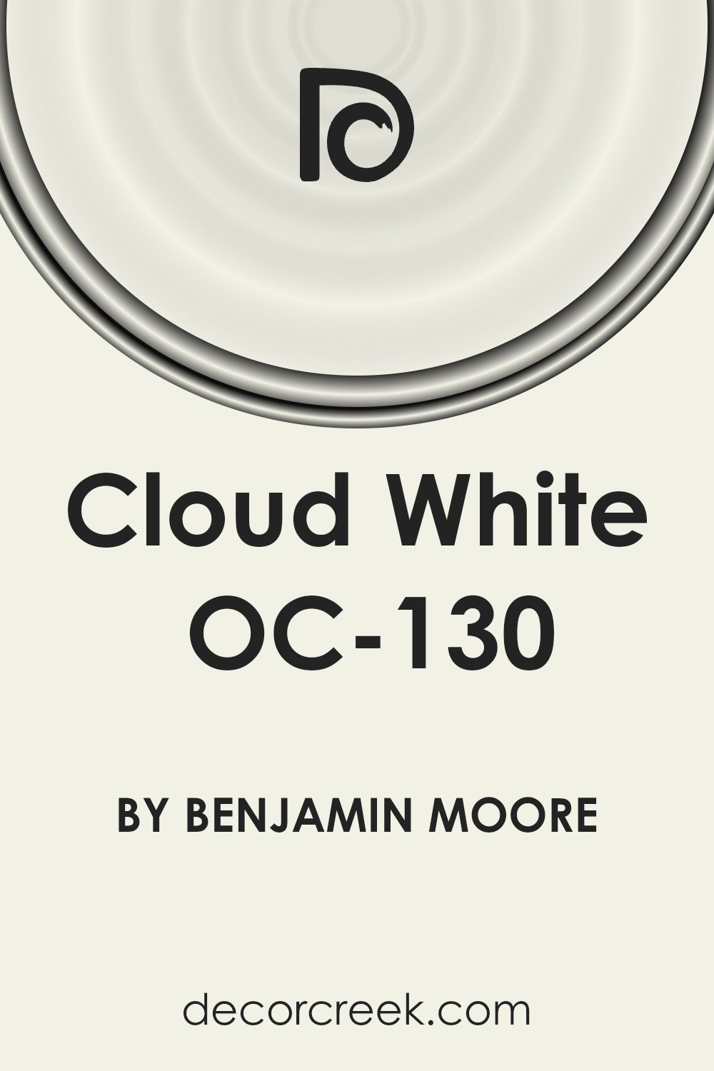
Cloud White OC-130
Cloud White OC-130 feels balanced and adaptable, perfect for restaurants that want a soft yet refined exterior. It works equally well with modern glass or rustic wood trims. This color never feels harsh, which makes it easy on the eyes for passersby. I often recommend it when the goal is to look fresh but still warm.
Guests connect it with comfort and trust, two feelings that encourage them to step in. Under streetlights, it stays visible and attractive.
Greek Villa SW 7551
Greek Villa SW 7551 has a creamy glow that feels both soft and bright. Restaurants with patios benefit from its warmth because it pairs beautifully with greenery and flowers. It looks strong against dark windows and trims, adding contrast without effort. During the day, it feels cheerful, while at night it holds a soft glow.
Guests often describe it as welcoming and easy to like. This shade works well for cafes, casual restaurants, or wine bars.

Sea Pearl OC-19
Sea Pearl OC-19 is a graceful off-white with a gentle gray undertone. It gives restaurants a polished look that feels natural. I like it on exteriors where stone or brick details need a soft partner. It reflects daylight without looking stark. Under softer lights, it feels elegant. Guests often see it as clean and reliable, which is ideal for higher-end restaurants.
Sea Pearl also pairs nicely with navy or deep green doors.

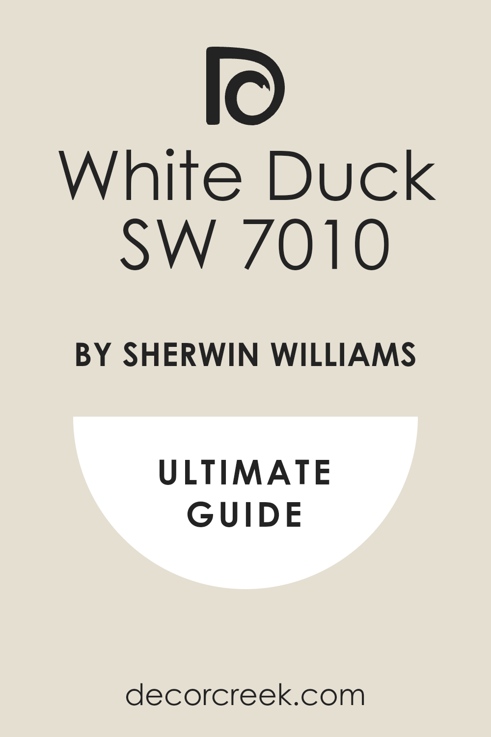
White Duck SW 7010
White Duck SW 7010 has a warm base that works well for restaurants aiming for a cozy but stylish appearance. It looks especially good with wood trims and brick paths. I find it feels natural and grounded in both city and suburban settings. Guests walking by often see it as approachable, making them more likely to stop in.
It pairs beautifully with darker grays or soft greens. This shade balances warmth with professionalism.
Edgecomb Gray HC-173
Edgecomb Gray HC-173 is soft and neutral, a favorite for buildings that need to blend elegance with friendliness. I like how it shifts between warm and cool depending on the light. Restaurants with both day and evening crowds benefit from this balance. Guests often describe it as steady and welcoming.
It works well with crisp whites for trim or deep navy doors. Edgecomb Gray helps a restaurant look classic without feeling too formal.

Natural Choice SW 7011
Natural Choice SW 7011 feels earthy and calm, perfect for restaurants with outdoor dining areas. I’ve used it on stucco exteriors where its warm tone fits naturally. It pairs well with stone accents and wood doors. Guests often say it feels wholesome, which is wonderful for health-focused or family restaurants.
In bright sun, it keeps its warmth, and under streetlights, it glows softly. This is a steady choice for many styles of dining spots.

Revere Pewter HC-172
Revere Pewter HC-172 is one of those shades that always works. It’s warm gray with just enough depth to feel classy. I’ve used it on restaurants that wanted to look established and trustworthy. Paired with crisp white trims, it stands out beautifully. Guests often connect it with steadiness and care.
This makes it a smart option for bistros or wine bars. In evening light, it deepens slightly, giving the restaurant a rich, grounded look.

Oyster White SW 7637
Oyster White SW 7637 feels gentle and warm, a soft backdrop that doesn’t compete with signs or logos. I like using it when a restaurant needs a clean but not stark exterior. It matches nicely with deep greens or earthy trims. Guests often sense friendliness and comfort from this color.
It looks polished without being stiff. On a busy street, Oyster White helps a restaurant feel approachable.

Coventry Gray HC-169
Coventry Gray HC-169 has a classic tone that works well for modern exteriors. It pairs perfectly with black doors or white trims. I’ve used it for restaurants aiming to look steady and stylish. Guests often describe it as strong and reliable. In daylight, it feels crisp, while at night it reads darker and more dramatic
. Coventry Gray is great for places that want to show both professionalism and charm.

Agreeable Gray SW 7029
Agreeable Gray SW 7029 feels balanced and easy to like. I often suggest it for restaurants that want a middle ground between light and dark. It looks modern but not cold. Guests connect it with comfort, which helps create a welcoming first impression. It pairs beautifully with navy, black, or warm wood trims.
This is a flexible color that works across many types of restaurants.

Copley Gray HC-104
Copley Gray HC-104 carries depth and character. It suits restaurants that want a grounded, earthy look. With brick or stone, it blends naturally, and with white trims, it sharpens into elegance. Guests often sense stability and tradition when they see this shade.
In evening lighting, it deepens, adding richness. Copley Gray is excellent for steakhouses or classic diners.
Dovetail SW 7018
Dovetail SW 7018 is a medium gray that feels stylish yet welcoming. I’ve used it on restaurants that wanted to stand out without being too bold. It pairs well with black or white trims. Guests often describe it as steady and dependable.
On cloudy days, it keeps its tone clear, and at night, it turns deeper and more dramatic. This makes it versatile for different restaurant styles.

Saybrook Sage HC-114
Saybrook Sage HC-114 has a fresh, natural feeling that reminds me of gardens. I love using it on restaurants focused on healthy food or farm-to-table menus. It pairs beautifully with white trims and wood doors. Guests often feel comforted and inspired by this color.
In sunlight, it looks cheerful, and at night, it feels rich and grounded. Saybrook Sage is a color that signals freshness and care.

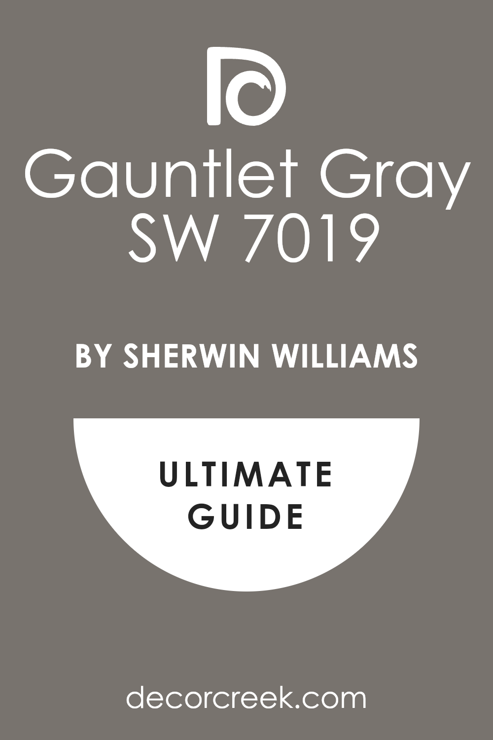
Gauntlet Gray SW 7019
Gauntlet Gray SW 7019 is strong and bold, perfect for restaurants that want presence. It works beautifully with stone or metal accents. Guests often describe it as powerful and modern. In daylight, it feels steady, while at night it becomes striking and sleek.
Paired with white signage or bright door colors, Gauntlet Gray makes everything stand out. This is a confident choice for high-traffic locations.
Kendall Charcoal HC-166
Kendall Charcoal HC-166 is deep and classic, a shade that always looks refined. I’ve used it on restaurants wanting to project confidence and tradition. It pairs well with white trims or bold red doors. Guests often connect it with quality and care. At night, it feels dramatic and striking.
Kendall Charcoal works especially well for upscale restaurants and wine bars.

Peppercorn SW 7674
Peppercorn SW 7674 is a dark gray that leans dramatic. It suits restaurants that want to make a statement. Guests often stop and look twice at buildings painted in this shade. Paired with light trims, it pops, and with wood, it feels rich.
In daylight, it holds depth, and at night it turns sleek and bold. Peppercorn is an excellent choice for trendy, stylish eateries.

Wrought Iron 2124-10
Wrought Iron 2124-10 feels strong and dramatic. It’s nearly black but still soft enough to read as deep gray in certain lights. Restaurants painted in Wrought Iron look modern and confident. Guests often connect it with style and care.
Paired with bright signs or bold doors, it makes those details shine. At night, it looks elegant and sharp.

Iron Ore SW 7069
Iron Ore SW 7069 is a favorite for its deep, rich look. It works perfectly for restaurants wanting drama and style. Guests often say it feels striking and polished. Paired with white trims or gold signage, it looks especially powerful. In bright sun, it stays bold; at night, it feels sleek.
Iron Ore gives a restaurant undeniable presence on a busy street.

Onyx 2133-10
Onyx 2133-10 is deep and dramatic, a true black that feels sharp and elegant. Restaurants with modern branding often look great in this shade. Guests see it as strong and stylish. Paired with metallic accents or bright signage, Onyx makes a statement.
It holds its depth in any light. This is a confident choice for high-end dining spots.
Tricorn Black SW 6258
Tricorn Black SW 6258 has a rich, bold presence. I use it when I want a restaurant to stand out as modern and sleek. Guests often describe it as striking and memorable. Paired with white trims, it becomes crisp; with wood, it turns dramatic and earthy. At night, Tricorn Black holds its power under streetlights.
This shade is excellent for restaurants that want bold identity.

Hale Navy HC-154
Hale Navy HC-154 is a classic deep blue that feels refined and strong. I love pairing it with white trims for sharp contrast. Guests often connect it with trust and tradition. In daylight, it feels rich, and at night, it looks dramatic and stylish.
Hale Navy works especially well for seafood restaurants or classic bistros.

Urbane Bronze SW 7048
Urbane Bronze SW 7048 feels grounded and rich, perfect for restaurants with modern or industrial styles. It pairs well with stone and metal accents. Guests often see it as strong and refined. In daylight, it holds warmth, while at night it looks sleek.
Urbane Bronze gives a restaurant exterior a sense of confidence and character.

Newburyport Blue HC-155
Newburyport Blue HC-155 feels fresh and bold, a perfect choice for coastal or nautical-themed restaurants. It pairs beautifully with crisp whites and natural wood. Guests often say it feels steady and welcoming. During the day, it’s lively; at night, it turns deeper and richer.
Newburyport Blue brings both energy and trust.

Naval SW 6244
Naval SW 6244 is deep and striking, one of my favorite blues for restaurants. It works beautifully with white trims and brass details. Guests connect it with confidence and quality. In daylight, it feels bold; under evening lights, it turns dramatic.
Naval is a powerful choice for restaurants that want to look stylish and memorable.

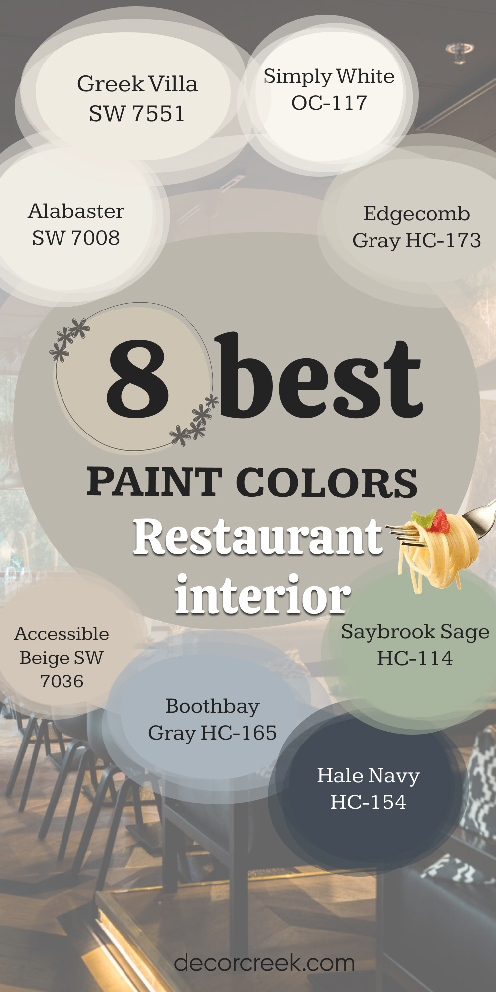
8 Best Restaurant Interior Paint Colors
Alabaster SW 7008
Alabaster SW 7008 brings warmth and brightness indoors. I love it for dining rooms where natural light pours in. Guests feel comfortable and at ease surrounded by this shade. It makes wooden tables and chairs shine against the backdrop. At night, it reflects soft lighting beautifully.
This is a reliable choice for interiors that aim for friendliness and style.
Greek Villa SW 7551
Greek Villa SW 7551 has a creamy tone that makes interiors feel inviting. I often use it in entryways or hallways where guests first walk in. It pairs well with natural textures like brick or rattan. Guests sense comfort when they see this shade indoors.
It looks warm in both daylight and under pendant lights. Greek Villa works well for casual restaurants.
Simply White OC-117
Simply White OC-117 feels crisp and clean, perfect for modern restaurant interiors. It sharpens lines of furniture and lets decor stand out. Guests often see it as fresh and neat, which builds trust in food quality. It pairs well with bold accent walls or colorful art.
Under soft lights, it glows gently. Simply White gives an interior a polished look.

Edgecomb Gray HC-173
Edgecomb Gray HC-173 works well inside restaurants that want a calm yet steady feel. It balances warm and cool undertones, so it adapts to different lighting. Guests often feel at ease in rooms painted with this shade. It pairs with creamy whites or deep blues for trim.
This color fits both upscale and casual settings.
Accessible Beige SW 7036
Accessible Beige SW 7036 feels warm and cozy indoors. It works beautifully in dining areas where you want guests to relax. I love how it pairs with wood furniture and warm lighting. Guests often describe it as welcoming. It doesn’t overpower but still adds character.
This is a solid choice for family-friendly restaurants.

Boothbay Gray HC-165
Boothbay Gray HC-165 has a soft blue-gray tone that feels fresh inside. It’s excellent for coastal or modern interiors. Guests often connect it with clarity and trust. It pairs nicely with white trims and warm wood finishes. In daylight, it looks lively; at night, it turns richer.
Boothbay Gray creates a steady dining atmosphere.

Saybrook Sage HC-114
Saybrook Sage HC-114 works indoors as well as outdoors. I like it in dining rooms where plants or natural textures are part of the decor. Guests sense freshness and comfort. It pairs beautifully with creamy whites or natural wood. Under evening lights, it feels cozy.
This shade signals care and a wholesome dining experience.
Hale Navy HC-154
Hale Navy HC-154 adds depth and strength indoors. It works well on accent walls or in private dining areas. Guests often describe it as bold and stylish. Paired with white trims, it becomes classic; with wood, it feels rich. In evening lighting, it becomes dramatic.
Hale Navy is perfect for interiors aiming for sophistication.
31 best Restaurant Paint Colors trendy in 2026
Creamy SW 7012
Creamy SW 7012 helps a front door feel kind the second people walk up, and I love that gentle first hello. Creamy SW 7012 looks warm on brick and stucco, so the building feels friendly in sun or shade. Creamy SW 7012 pairs with black rails, wood benches, and brass lights that glow like honey at dusk. Creamy SW 7012 keeps menus and decals easy to read because it is light without glare.
Creamy SW 7012 makes planters and herbs pop, which hints at fresh food inside. Creamy SW 7012 tells guests this will be a nice visit with steady service and care.

Canvas Tan SW 7531
Canvas Tan SW 7531 brings a grounded mood that fits busy streets and steady foot traffic. Canvas Tan SW 7531 works with stone walks, clay pots, and wood doors, so I don’t need to redo finishes. Canvas Tan SW 7531 holds color in hard sun, which keeps photos and maps looking true. Canvas Tan SW 7531 loves a deep green or red door that points guests to the entry fast.
Canvas Tan SW 7531 feels honest and warm, the way a good meal should feel. Canvas Tan SW 7531 sets up trust before the host even says hello.

Kilim Beige SW 6106
Kilim Beige SW 6106 reminds me of fresh bread, and that mood makes people smile. Kilim Beige SW 6106 softens sharp lines on newer fronts, so the facade looks cared for, not cold. Kilim Beige SW 6106 pairs with creamy trim and oil-rubbed bronze lights that read rich at night. Kilim Beige SW 6106 hides dust near the kick plate better than bright white, which helps staff.
Kilim Beige SW 6106 supports chalkboard art and simple logos without fighting the text. Kilim Beige SW 6106 welcomes families, neighbors, and date nights with the same warm tone.

Balanced Beige SW 7037
Balanced Beige SW 7037 sits in a sweet middle, so the front feels steady and easy to like. Balanced Beige SW 7037 links stone, siding, and metal into one clean story. Balanced Beige SW 7037 lets a bold door color carry the brand while the walls stay calm and tidy. Balanced Beige SW 7037 keeps outdoor lights from casting odd tints, so plates near windows look great.
Balanced Beige SW 7037 gives crisp contrast to white trim and ADA marks for clear wayfinding. Balanced Beige SW 7037 tells guests the team is organized and the night will run smoothly.

Shitake SW 9173
Shitake SW 9173 brings earthy comfort that fits farm stories and bakeries with real butter. Shitake SW 9173 loves cedar planters, herb boxes, and woven chairs that hint at fresh greens. Shitake SW 9173 takes painted logos and hand letters well, which adds charm without mess. Shitake SW 9173 hides small smudges near the pull, so the door stays tidy between wipes.
Shitake SW 9173 pairs with soft white soffits and dark gutters for clean lines from the street. Shitake SW 9173 tells people the food is made with patience and care.

Foothills SW 7514
Foothills SW 7514 gives depth to flat fronts, adding shape where siding is simple. Foothills SW 7514 looks strong with stacked stone, black sconces, and a heavy wood door that feels solid. Foothills SW 7514 keeps menu cases readable because the wall behind is calm and even. Foothills SW 7514 wears well through rain and dust, so cleaning days are fewer.
Foothills SW 7514 pairs with copper logos and warm lanterns that glow like embers. Foothills SW 7514 sets a hearty tone that fits big flavor and steady service.
Virtual Taupe SW 7039
Virtual Taupe SW 7039 brings a city mood that fits wine bars, bistros, and coffee spots. Virtual Taupe SW 7039 makes white awnings and trim punchy, so windows frame the scene like a photo. Virtual Taupe SW 7039 pairs with herringbone walks and olive shrubs that feel tidy, not stiff. Virtual Taupe SW 7039 keeps glare off glass, which lets indoor light look warm from the sidewalk.
Virtual Taupe SW 7039 takes a mustard or cherry door that acts like a beacon. Virtual Taupe SW 7039 tells me this is character and flavor without noise.
Urbane White SW 7042
Urbane White SW 7042 gives soft light without the sting of pure white, and guests relax at once. Urbane White SW 7042 clicks with black frames for a crisp edge and with stone for gentle contrast. Urbane White SW 7042 makes sign panels and QR codes clear from the far lane. Urbane White SW 7042 photographs well at brunch and after dark, which helps posts stay on brand.
Urbane White SW 7042 keeps the front bright without feeling clinical or cold. Urbane White SW 7042 promises neat plates, clean lines, and an easy visit.
Keystone Gray SW 7504
Keystone Gray SW 7504 brings a steady mid tone that unites old trim and new upgrades. Keystone Gray SW 7504 pairs with white headers, dark gutters, and bronze numbers for a classic face. Keystone Gray SW 7504 supports green doors and striped awnings when a hint of play is needed. Keystone Gray SW 7504 holds up in strong sun and reads clear in shaded alleys.
Keystone Gray SW 7504 lets printed menus and decals pop without visual noise. Keystone Gray SW 7504 tells guests the kitchen is tidy and the plan is tight.
Hardware SW 6172
Hardware SW 6172 leans cool and modern, flattering concrete, steel, and pale brick. Hardware SW 6172 keeps big glass panes from harsh glare, so diners look natural from outside. Hardware SW 6172 pairs with warm wood doors to balance the cool edge with a friendly hello. Hardware SW 6172 makes white logotypes and QR decals razor clear for quick scans.
Hardware SW 6172 shrugs off dust, which keeps staff on welcome duties, not nonstop wiping. Hardware SW 6172 signals crisp flavors and a team that runs a tight line.
Rosemary SW 6187
Rosemary SW 6187 sets a deep garden note that hints at fresh herbs and real care. Rosemary SW 6187 pairs with creamy trim, wood doors, and brass numbers for a crafted entry. Rosemary SW 6187 holds color in bright sun and turns richer under lanterns, which helps night traffic. Rosemary SW 6187 lets gold letters and menu frames look special without fuss.
Rosemary SW 6187 links brick planters and cedar benches so the front reads as one idea. Rosemary SW 6187 tells walkers from half a block away that warmth lives here.

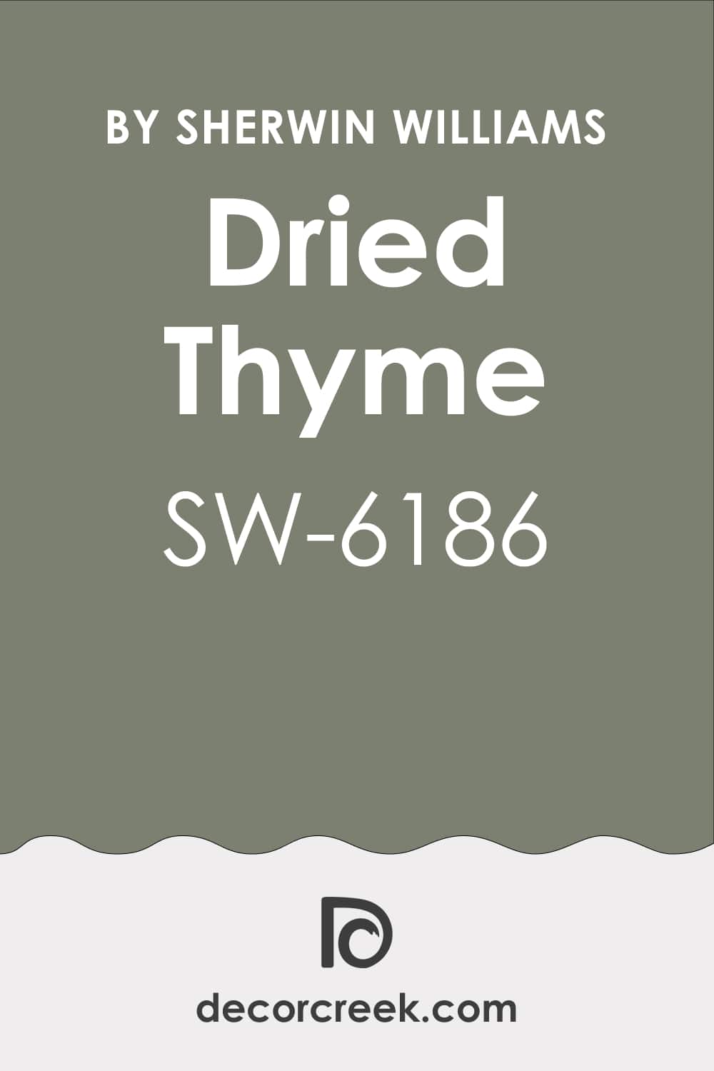
Dried Thyme SW 6186
Dried Thyme SW 6186 brings grounded green that fits bakeries, bistros, and farm-forward menus. Dried Thyme SW 6186 lays evenly on stucco, wood, and boards, which keeps mixed parts united. Dried Thyme SW 6186 loves soft white headers, black hinges, and wicker chairs on a slim patio. Dried Thyme SW 6186 calms glass bounce so indoor light looks tasty from the curb.
Dried Thyme SW 6186 takes hand-painted logos and line art with clean edges. Dried Thyme SW 6186 invites a warm door pop so first-time guests find the entry fast.
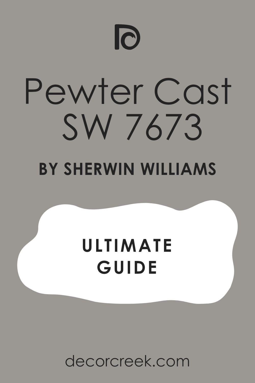
Pewter Cast SW 7673
Pewter Cast SW 7673 brings modern gray that reads clean and organized. Pewter Cast SW 7673 teams with black frames and white signs so the name is easy to catch from a car. Pewter Cast SW 7673 flatters steel rails, poured concrete, and light stone for a polished city face. Pewter Cast SW 7673 keeps tone on cloudy days, so photos stay steady for posts and maps.
Pewter Cast SW 7673 invites a saffron or teal door that acts like a beacon. Pewter Cast SW 7673 makes guests expect neat counters and sharp plating.
Grizzle Gray SW 7068
Grizzle Gray SW 7068 adds shape and shadow to flat fronts, giving simple lines real presence. Grizzle Gray SW 7068 lifts white trim and brass numbers so wayfinding is quick. Grizzle Gray SW 7068 hides scuffs near the pull, which lowers upkeep stress on busy nights. Grizzle Gray SW 7068 turns lively under warm sconces, drawing eyes from down the block.
Grizzle Gray SW 7068 pairs with cedar planters and charcoal awnings for a grown-up look. Grizzle Gray SW 7068 signals a focused kitchen and flavors with confidence.

Granite Peak SW 6250
Granite Peak SW 6250 is a cool deep blue that speaks with steady strength. Granite Peak SW 6250 frames crisp white signs and brushed steel lamps for a clean outline. Granite Peak SW 6250 holds rich color after rain and along dusty streets, which keeps photos sharp. Granite Peak SW 6250 pairs with light stone walks and striped awnings for a coastal nod.
Granite Peak SW 6250 sets brass pulls and teak benches glowing like jewelry. Granite Peak SW 6250 tells guests this house knows its craft.

Cyberspace SW 7076
Cyberspace SW 7076 lands in near-black navy that cameras love. Cyberspace SW 7076 makes white logos and QR codes read in a blink, which speeds the line. Cyberspace SW 7076 teams with smoked glass, matte rails, and a walnut door for a tight modern set. Cyberspace SW 7076 stays bold under streetlights so the front never vanishes at night.
Cyberspace SW 7076 shows less dust than pure black and saves time on wipes. Cyberspace SW 7076 promises sharp service and a night worth sharing.

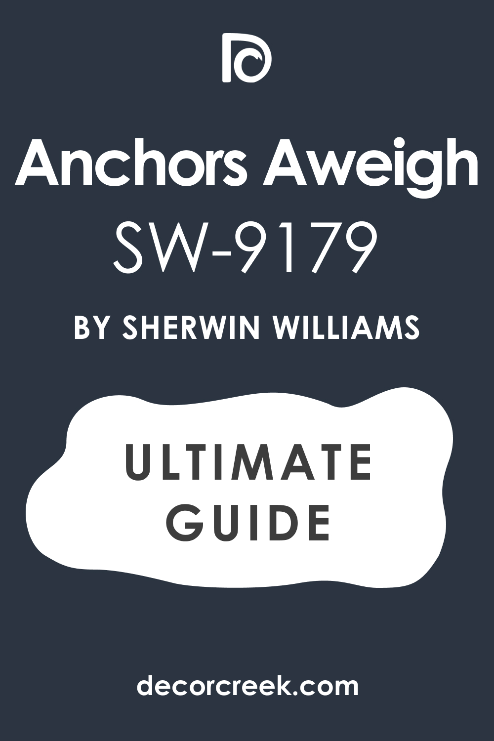
Anchors Aweigh SW 9179
Anchors Aweigh SW 9179 brings classic navy that suits seafood bars, pubs, and corners with buzz. Anchors Aweigh SW 9179 pairs with white trim, rope notes, and a teak door that adds warmth. Anchors Aweigh SW 9179 keeps menus crisp behind glass so the name reads fast. Anchors Aweigh SW 9179 lets brass lights glow at dusk and pull in foot traffic.
Anchors Aweigh SW 9179 holds steady in every light, which helps brand shots stay true. Anchors Aweigh SW 9179 tells a story of craft and care.
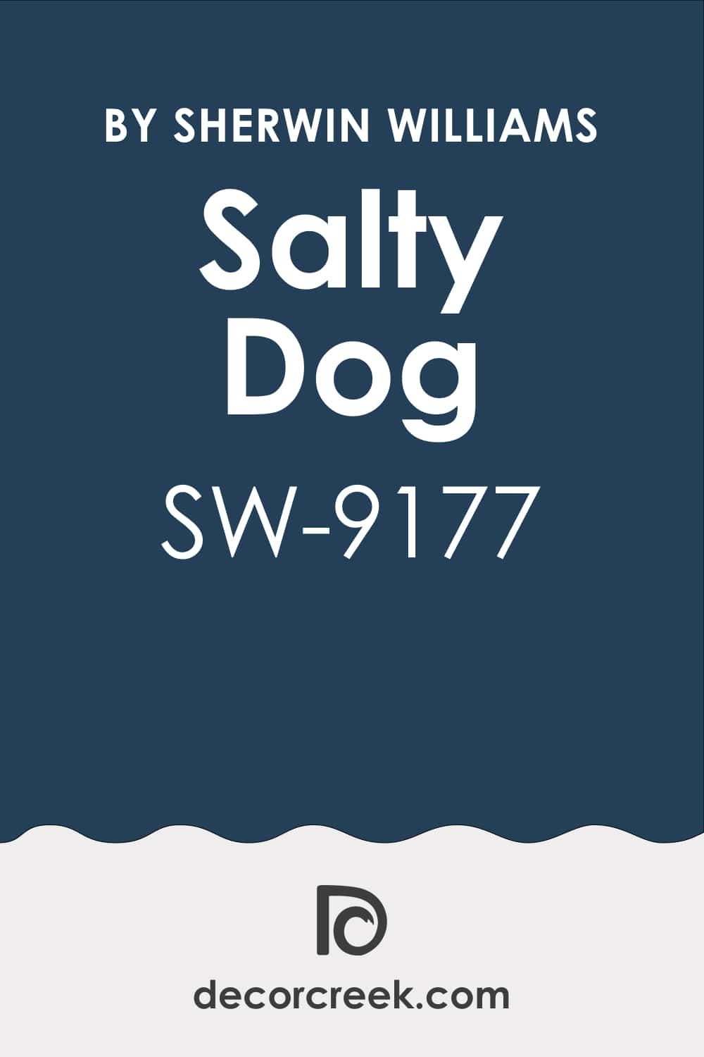
Salty Dog SW 9177
Salty Dog SW 9177 brings lively blue energy to narrow fronts and small lots. Salty Dog SW 9177 makes white logos pop and turns a simple awning into a clear sign. Salty Dog SW 9177 loves striped cushions, potted palms, and a glossy door with cheer. Salty Dog SW 9177 stays punchy in sun and turns rich under warm lamps at night.
Salty Dog SW 9177 keeps photos upbeat for posts and delivery tiles. Salty Dog SW 9177 says friendly, fast, and full of flavor.
Rock Bottom SW 7062
Rock Bottom SW 7062 lays down deep earth that plays well with stone, brick, and black metal. Rock Bottom SW 7062 hides wear near the kick plate, so the entry keeps its poise. Rock Bottom SW 7062 lets cream letters and copper logos read without glare at noon. Rock Bottom SW 7062 pairs with timber beams and gravel beds for a rugged, real feel.
Rock Bottom SW 7062 makes warm lantern light look rich on winter evenings. Rock Bottom SW 7062 sets up hearty plates and steady hands.
Black Fox SW 7020
Black Fox SW 7020 mixes brown and black for a tailored, warm finish. Black Fox SW 7020 flatters walnut doors, woven chairs, and aged brass pulls that welcome a linger. Black Fox SW 7020 gives strong contrast to white type, so the name reads from the far lane. Black Fox SW 7020 hides dust better than true black, which eases upkeep.
Black Fox SW 7020 leans moody in rain and glows under string lights for late service. Black Fox SW 7020 promises cozy confidence from hello to check.

Black Magic SW 6991
Black Magic SW 6991 sets a dramatic tone that feels chic from the curb. Black Magic SW 6991 makes metallic letters and warm brass sconces look extra sharp. Black Magic SW 6991 masks scuffs around handles, which keeps the door looking fresh. Black Magic SW 6991 pairs with deep wood for balance and with crisp white for snap.
Black Magic SW 6991 turns sleek under night lights and holds power in sun. Black Magic SW 6991 tells guests they’re in for style and energy.
Caviar SW 6990
Caviar SW 6990 offers rich black with a gentle edge that avoids harsh glare. Caviar SW 6990 works with creamy trim or a bold red door that guides the eye. Caviar SW 6990 refreshes old brick while keeping history, which I value. Caviar SW 6990 shrugs off soot and rain marks better than many dark tones.
Caviar SW 6990 feels strong by day and velvety by night for a luxe read. Caviar SW 6990 whispers quality that people trust.
Deep Royal 2061-10
Deep Royal 2061-10 brings an upbeat blue that reads modern and alive. Deep Royal 2061-10 loves stainless details, clear glass, and bold sign panels. Deep Royal 2061-10 gleams in sun and turns dramatic after dark, which boosts curb pull. Deep Royal 2061-10 balances with copper fixtures and wood planters for warmth.
Deep Royal 2061-10 suits kitchens that lean bold and creative on the plate. Deep Royal 2061-10 signals energy guests can taste.
Kensington Blue 840
Kensington Blue 840 gives classic navy with a lively twist that feels current. Kensington Blue 840 looks crisp with white trim and balanced with pale stone. Kensington Blue 840 makes greenery pop, so patios feel fresh and photo-ready. Kensington Blue 840 shifts from friendly by day to elegant by night with ease.
Kensington Blue 840 fits cafés and family spots that want polish, not stiffness. Kensington Blue 840 draws walks-ins with quiet confidence.
Hudson Bay 1680
Hudson Bay 1680 carries deep navy weight that reads strong and dependable. Hudson Bay 1680 pairs with wood doors, rope notes, and clean white letters that slice through. Hudson Bay 1680 keeps tone steady for menus, maps, and posts that must match. Hudson Bay 1680 adapts from upscale pub to seafood house without fuss.
Hudson Bay 1680 glows under warm lamps like a night harbor. Hudson Bay 1680 tells people this kitchen is solid.
Gentleman’s Gray 2062-20
Gentleman’s Gray 2062-20 blends navy with a teal hint for layered depth. Gentleman’s Gray 2062-20 takes brass lights and warm woods like they were made together. Gentleman’s Gray 2062-20 steadies the front on cloudy days and turns rich at dusk. Gentleman’s Gray 2062-20 fits lunch crowds and date nights with equal grace.
Gentleman’s Gray 2062-20 reads stylish without any chill I try to avoid. Gentleman’s Gray 2062-20 sets a table for thoughtful plates.

Salamander 2050-10
Salamander 2050-10 is green so deep it nears black and feels intriguing. Salamander 2050-10 makes brass pulls and gold letters sparkle like jewelry. Salamander 2050-10 shifts gently through the day, adding depth without fuss. Salamander 2050-10 turns a door into a focal point even on narrow fronts.
Salamander 2050-10 suits modern bistros and cocktail bars that want mood and grit. Salamander 2050-10 hints at richness in both flavor and time.

Essex Green HC-188
Essex Green HC-188 carries earthy weight that feels rooted and honest. Essex Green HC-188 blends with red brick, fieldstone, and wood like old friends. Essex Green HC-188 pairs with creamy trim or bold signs for a clear read. Essex Green HC-188 stays handsome through weather and rush hours, which matters.
Essex Green HC-188 fits spots that value craft, farms, and family recipes. Essex Green HC-188 invites trust before the host greets.

Raspberry Truffle 2080-10
Raspberry Truffle 2080-10 brings lively berry energy that wakes a small front. Raspberry Truffle 2080-10 snaps with white trim and looks smart with dark rails. Raspberry Truffle 2080-10 glows under warm bulbs, which pulls the evening crowd. Raspberry Truffle 2080-10 suits cafés, brunch rooms, and playful menus that like a grin.
Raspberry Truffle 2080-10 keeps photos vivid for posts that need spark. Raspberry Truffle 2080-10 sets joy right at the door.
Dinner Party AF-300
Dinner Party AF-300 pours like fine wine, rich and inviting from the curb. Dinner Party AF-300 loves brass, wood, and creamy trim for a dramatic hello. Dinner Party AF-300 reads bold by day and turns soft and glowing at night. Dinner Party AF-300 makes logos and menus stand clear without shouting.
Dinner Party AF-300 fits bistros, date spots, and rooms that feel special. Dinner Party AF-300 promises passion on the plate and warmth in the greeting.
Wild Flower 2090-40
Wild Flower 2090-40 brings bright charm that makes a small facade sing. Wild Flower 2090-40 pairs with white trim for playful snap and clean edges. Wild Flower 2090-40 stays cheerful in sun and keeps warmth under evening lamps. Wild Flower 2090-40 lifts planters, signs, and chairs into a happy scene.
Wild Flower 2090-40 suits cafés, bakeries, and brunch homes that thrive on smiles. Wild Flower 2090-40 invites people to pause, laugh, and come in.
Closing Thoughts on Restaurant Colors
Choosing paint for a restaurant is more than just finding a nice shade—it’s shaping the very first story guests will hear without a single word. The color on the walls and doors sets a mood that guests pick up before the host smiles or the menu opens. I’ve learned again and again that the right paint can welcome, excite, and even guide people toward the entry without effort.
A soft white can calm a noisy street and make a cafe look fresh and cared for. Bold blues can catch eyes from across the block, making a small restaurant stand out against taller neighbors. Deep, rich tones like charcoal or green can whisper confidence and promise quality, which is exactly what a fine dining spot needs.
When the exterior tells the same story as the food inside, everything feels connected and believable. Guests notice if the look outside matches the taste and care inside—it builds trust.
That’s why I always test colors on large boards, watch them through daylight and under lamps, and even take photos from across the street. A color that feels steady in every setting is the one worth choosing.
My advice is simple: don’t rush, trust the feeling a color gives you, and see it in the same light your guests will. The best restaurant colors do more than look good on a paint strip—they reach out, invite people to pause, and make them want to stay.
That is the real power of paint.