White is the foundation of brilliant design, and I’ve seen it all as a home interior designer and staging expert. For many of my clients, white is the perfect starting point—it’s crisp, clean, and acts like a blank canvas waiting for a stunning splash of color. But choosing a color to go with white can sometimes feel tricky.
You want a pairing that feels special, something that makes your heart sing when you walk into the room, not just a bland or jarring contrast.
This guide is all about sharing my absolute favorite color combinations that I use again and again to create truly beautiful and welcoming homes.
I’ve narrowed down the field to the most trusted, beautiful colors from the paint brands I rely on most. Get ready to find the perfect partner for your white walls, trim, or furnishings!
Why I Always Trust Sherwin-Williams and Benjamin Moore for Perfect Color Pairings
When it comes to paint, there are two names that stand head and shoulders above the rest: Sherwin-Williamsand Benjamin Moore. As a professional, I rely on their paint collections because of their unparalleled quality and, most importantly, their incredible color consistency.
Their formulas are complex, meaning the colors look true no matter the light, which is crucial for a successful design.
You don’t want a beautiful swatch to turn out dull on your wall, and these brands give me the confidence that the finished look will be exactly as I planned.
Many of their most popular shades are masterpieces in balancing warmth and coolness, which is essential when pairing them with white.
A great paint color acts like a mood ring for your room, changing its feeling ever so slightly throughout the day. By using these trusted brands, I can promise my clients a gorgeous result every single time, making the choice easier and the final result breathtaking.
How I Choose the Right Colors to Complement White
Choosing the perfect partner for white isn’t just a simple toss-up; it’s a careful balance that creates the whole feeling of a home. My method always starts with understanding the undertone of the white you’re using.
Is it a cool, blue-leaning white? Or is it a warm, creamy white?
A color that looks amazing with a stark, cold white might look muddy next to a creamy white, so paying attention to those hidden colors is my first step.
Next, I think about the light in the room—is it north-facing (cooler light) or south-facing (warmer light)?
The light will alter the color’s appearance drastically, and I choose accordingly to make the room feel bright and happy. Finally, I consider the mood we want to create. Do you want a cozy living room or a fresh, crisp kitchen? Lighter colors recede and make a room feel airy, while darker colors come forward and make a room feel intimate.
By focusing on the white’s undertone, the available light, and the desired atmosphere, I can pinpoint a complementary color that makes the whole room sing with beauty and balance.
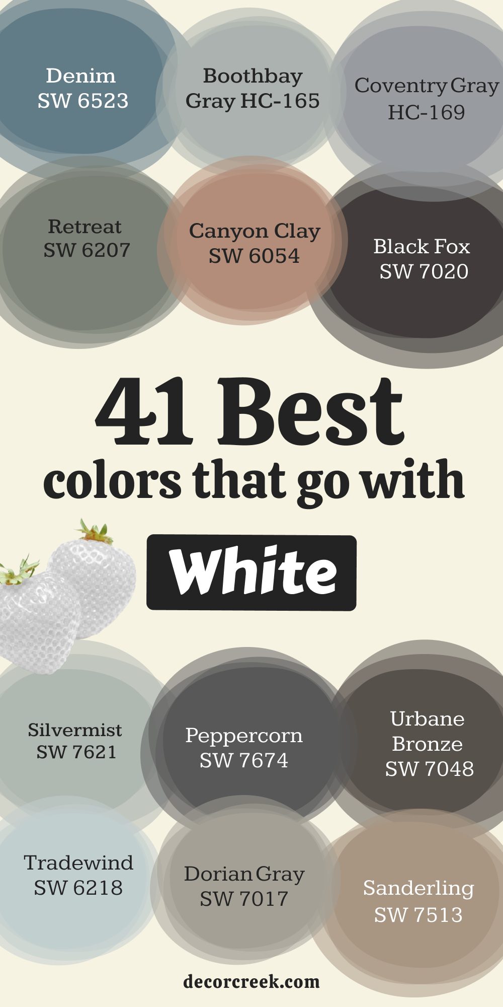
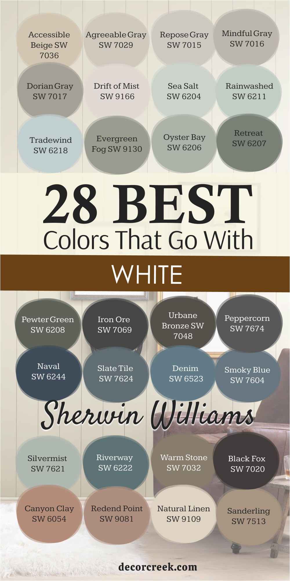
28 Best Colors That Go With White by Sherwin-Williams
Accessible Beige SW 7036
Accessible Beige is a wonderful warm neutral that is incredibly popular for a good reason. Accessible Beige sits perfectly between gray and beige, making it the ideal greige that feels neither too cold nor too yellow. This color works beautifully with white trim because the pairing feels soft and sophisticated, creating a gentle contrast that’s easy on the eyes.
It’s a fantastic choice for open-concept living areas where you want consistency and a color that feels grounding and welcoming.
I recommend it often for clients who want a warm tone without the risk of their walls looking muddy or dingy in different lights. It is a reliable, comforting color that gives a home a feeling of quiet luxury and pairs particularly well with white that has a slight warmth to it.
🎨 Check out the complete guide to this color right HERE 👈

Agreeable Gray SW 7029
Agreeable Gray is one of my personal go-to colors for creating a stunning look next to white paint. Agreeable Gray is a perfect, light greige that has just enough warmth to feel inviting but still looks fresh and modern. It pairs flawlessly with white trim and cabinetry, offering a light-filled feel without making the room look sterile or empty.
This shade is famous for its versatility and how well it reads in various types of natural and artificial lighting, making it a safe yet beautiful bet for almost any room in the house.
I find it works wonders in bedrooms and main living areas where you want a light and airy foundation to build upon with furnishings and art. It truly is one of the most balanced neutrals that makes white look even crisper and cleaner by contrast.
🎨 Check out the complete guide to this color right HERE 👈

Repose Gray SW 7015
Repose Gray is a sophisticated gray that has a slight hint of warmth, keeping it from feeling too stark or industrial against white. Repose Gray offers a beautiful depth of color, making white look incredibly clean and bright by comparison.
It has a beautiful blend of violet and brown undertones, which gives it a richness that many plain grays lack, making the whole room feel considered and curated.
I use it often in kitchens and bathrooms, as it provides a gorgeous, classic backdrop for white subway tile and cabinetry. This shade is a little cooler than Agreeable Gray, so it’s a great choice if you prefer a look that leans slightly more toward the crisp side of the spectrum. It’s a gorgeous and dependable option for creating a feeling of modern elegance in your home.
🎨 Check out the complete guide to this color right HERE 👈

Mindful Gray SW 7016
Mindful Gray is a richer, more saturated medium gray that gives a more substantial and grounded feeling when paired with white. Mindful Gray is a beautiful neutral that stands out more than lighter grays, providing a strong contrast that adds real visual interest to a room.
It has a lovely warmth to it, ensuring that the final look is inviting and never cold, even though it’s a noticeable shade of gray.
This color is perfect for accent walls, dining rooms, or lower cabinets where you want the white elements to truly pop and command attention. I often recommend it for more traditional or craftsman-style homes where the architectural details benefit from a bolder backdrop color. It’s an easy way to achieve a cozy, handsome, and anchored feel next to sharp white trim.
Thank you. I will continue generating the content for the “28 best colors that go with white by Sherwin-Williams” section, maintaining the required voice, structure, and length (700-1000 characters per H3).
🎨 Check out the complete guide to this color right HERE 👈

Dorian Gray SW 7017
Dorian Gray is a richer, mid-toned gray that provides a substantial, architectural contrast to crisp white elements. Dorian Gray is fantastic for creating drama without making a room feel dark or heavy, as it has a beautiful, grounding presence.
It’s a wonderful choice for creating a handsome, tailored look in a study, a mudroom, or on a beautiful set of built-in cabinets.
The depth of this color really makes white trim, crown molding, and wainscoting stand out with sharp definition, highlighting the room’s best features. I find that this shade carries just enough warmth to ensure the pairing with white always feels intentional and inviting rather than cold or aloof. It’s a reliable, classic color that anchors a room and gives it a feeling of maturity and sophisticated style.
🎨 Check out the complete guide to this color right HERE 👈

Drift of Mist SW 9166
Drift of Mist is a very light, soft greige that is nearly a white itself but has just enough pigment to offer a subtle, barely-there contrast. Drift of Mist is a quiet, ethereal neutral that works well for clients who want a slight warmth on their walls but still want the room to feel overwhelmingly light and airy.
It is one of those colors that gently shifts between a faint gray and a muted off-white depending on the light, making it wonderfully dynamic.
I often use this color in homes that have abundant natural light, as it prevents the walls from washing out completely while maintaining a featherlight feel. This gorgeous shade makes white woodwork look incredibly clean without the high-contrast intensity of a darker color, creating a peaceful and harmonious backdrop.
🎨 Check out the complete guide to this color right HERE 👈

Sea Salt SW 6204
Sea Salt is a delightful, gentle color that brings the soothing feel of the coast right into your home, especially when paired with white. Sea Salt is a gorgeous blend of gray, blue, and green, which gives it a complex, mutable quality that changes throughout the day.
It’s a fantastic choice for a bathroom, laundry room, or sunroom where you want a playful, refreshing hint of color that feels bright and welcoming.
The best part about this color is its ability to look different in every home, sometimes reading more green and other times more blue-gray, but always remaining cheerful. When using this, I rely on clean white trim to contain the color and give the room a crisp structure that stops the airy color from feeling messy.
🎨 Check out the complete guide to this color right HERE 👈

Rainwashed SW 6211
Rainwashed is a slightly deeper, more saturated version of the blue-green family than Sea Salt, offering a richer, spa-like feeling. Rainwashed is a beautifully restorative color that feels instantly tranquil and works exceptionally well in bedrooms or any area meant for unwinding and quiet contemplation.
This shade has a noticeable presence but maintains a soft, muted quality, allowing it to pair beautifully with white without creating a jarring contrast.
I’ve found it is particularly lovely when used on cabinets in a kitchen or on the walls of a nursery where you want a color that feels both natural and comforting. The pairing with pure white creates a classic, fresh look that feels clean and uplifting, reminiscent of fresh spring air.
🎨 Check out the complete guide to this color right HERE 👈

Tradewind SW 6218
Tradewind is a beautiful, clear blue that carries a distinct touch of green, creating a bright and captivating coastal look against white. Tradewind offers more saturation than Rainwashed or Sea Salt, making it a wonderful choice if you want the wall color to be a definite statement in the room.
This vibrant yet soothing shade works perfectly in a boy’s room, a coastal-themed living area, or on an exterior patio ceiling (a classic southern tradition).
The key to using this color is providing plenty of sharp, bright white trim and ceiling paint to balance its strength and keep the room feeling fresh and organized. It’s a joyful color that makes a room feel instantly happy and energized, always drawing the eye and welcoming you in.
🎨 Check out the complete guide to this color right HERE 👈

Evergreen Fog SW 9130
Evergreen Fog is a beautiful, grounding color that offers a sophisticated blend of gray and green, providing a rich, earthy contrast to white. Evergreen Fog is a wonderful choice for creating a deeply satisfying and quiet mood in a home office, a dining room, or a cozy bedroom.
This shade has incredible depth and works beautifully with natural wood tones, making the white trim and ceiling truly stand out with sharp, clean relief.
I love how it can act as a neutral because of its gray base, but the green brings a much-needed connection to the outdoors, adding a restful quality. It’s a truly versatile and gorgeous color that brings a thoughtful, layered richness to any interior that uses white as its accent.
🎨 Check out the complete guide to this color right HERE 👈

Oyster Bay SW 6206
Oyster Bay is a muted, earthy green-gray that evokes a feeling of quiet nature and pairs wonderfully with bright white trim and moldings. Oyster Bay has a depth to it that adds visual weight to the walls, making the room feel cozy and beautifully enclosed without feeling dark or heavy.
It’s an excellent choice for a master bedroom or a reading nook where you want to promote a feeling of quiet relaxation and restfulness.
This particular shade of green is very grayed out, which makes it feel incredibly sophisticated and ensures it won’t ever look too bright or juvenile. I often use Oyster Bay to create an instant sense of permanence and history, as it feels like a color that has been beautiful for generations when contrasted with simple, white details.
🎨 Check out the complete guide to this color right HERE 👈

Retreat SW 6207
Retreat is a deep, gorgeous gray-green that is moody and saturated, offering a stunning, dramatic counterpoint to white paint. Retreat is a fantastic option for creating a deeply atmospheric room, such as a cozy study, a moody powder bath, or as an accent color on built-ins.
Because it’s a stronger color, it really makes standard white trim look incredibly bright and custom, emphasizing the architectural details of the room.
I recommend this shade for clients who are ready to make a bold color statement but still want a sophisticated and nature-inspired hue that feels connected to the outside. It’s a grounding, solid color that gives the room a feeling of being well-established and beautifully decorated, and it’s a favorite for creating an instantly intimate feel.
🎨 Check out the complete guide to this color right HERE 👈

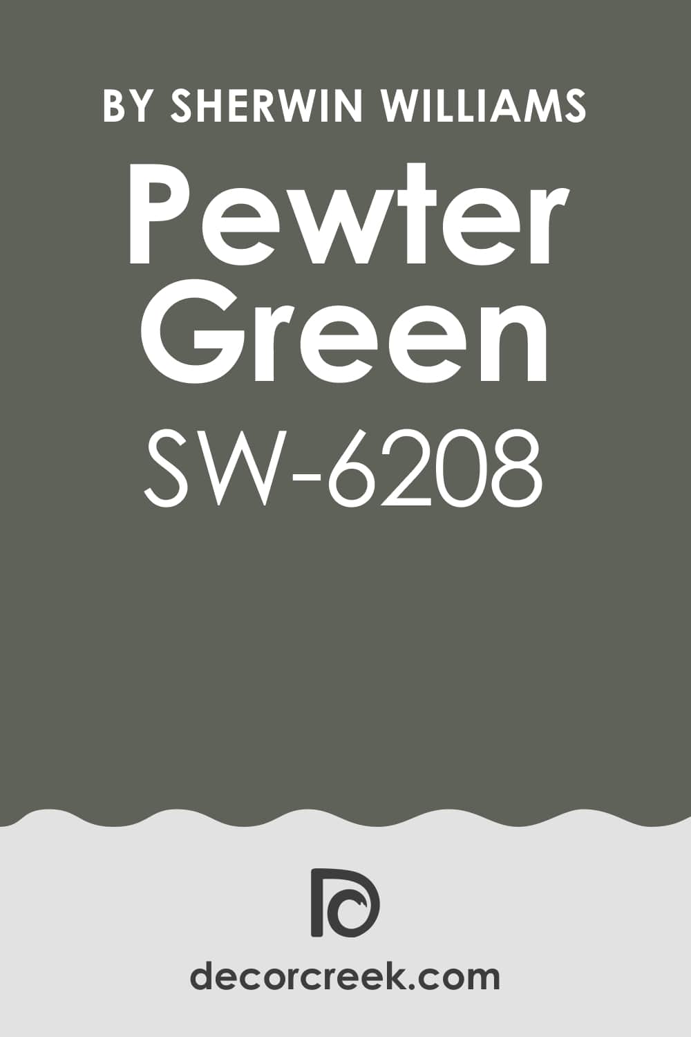
Pewter Green SW 6208
Pewter Green is a deep, historical gray-green that is rich, saturated, and absolutely magnificent when used against crisp white. Pewter Green offers a strong, striking contrast that is wonderful for creating an old-world feel that still looks completely fresh and modern.
It’s a color with great presence, making it perfect for an entire room, a bold cabinet color, or a distinguished accent wall behind a fireplace mantel.
This shade is one of the darkest in the green family, so using plenty of white on the ceiling, trim, and doors is essential to keep the room feeling balanced and lively. I often use it to create a handsome, sophisticated atmosphere that feels instantly tailored and expensive, making the white accents pop with impressive clarity.
🎨 Check out the complete guide to this color right HERE 👈
Iron Ore SW 7069
Iron Ore is a deep, charcoal color that leans almost black but carries a slight softness thanks to its brown-gray undertones, making it less harsh than a true black against white. Iron Ore is a powerful color choice that works wonders as a dramatic accent on doors, window frames, or as a strong, anchoring color on an exterior facade.
When paired with bright white, it creates a striking, modern, and high-contrast look that is sleek and very architectural.
I love using this color on kitchen islands or lower cabinets with bright white upper cabinets to give the kitchen an immediate sense of contemporary sophistication. This dark shade is perfect for giving a room immediate depth and a feeling of grounded elegance, making the white elements look even cleaner and brighter.
🎨 Check out the complete guide to this color right HERE 👈

Urbane Bronze SW 7048
Urbane Bronze is a deep, warm bronze-brown that carries an incredible depth and complexity, providing a luxurious, earthen contrast to white. Urbane Bronze has rich, dark undertones that make it look sophisticated and velvety, earning it much praise as an incredibly warm and handsome neutral.
It is the perfect color for creating a feeling of cozy intimacy in a study, a bedroom, or as a stunning paint color for all the interior doors in a home.
The contrast it provides with white is softer than a stark black, offering a beautifully organic and inviting high-contrast look that feels connected to nature. This stunning, grounding color gives a room instant weight and character, making white trim and ceilings look spectacularly bright and well-defined.
🎨 Check out the complete guide to this color right HERE 👈

Peppercorn SW 7674
Peppercorn is a rich, true charcoal gray that sits perfectly between a mid-tone gray and a stark black, providing excellent contrast with white. Peppercorn is a versatile and deep color that gives a room a handsome, tailored feel, perfect for a dining room or a sophisticated accent wall.
It’s a wonderful choice for homeowners who love the dramatic look of black but want something that is slightly softer and more forgiving in various light conditions.
The clarity of this shade makes white trim and furnishings appear instantly brighter and more defined, giving the entire room a crisp, modern edge. I often recommend it for clients looking to create a sharp, graphic contrast that feels clean and polished without appearing too severe or heavy.
🎨 Check out the complete guide to this color right HERE 👈

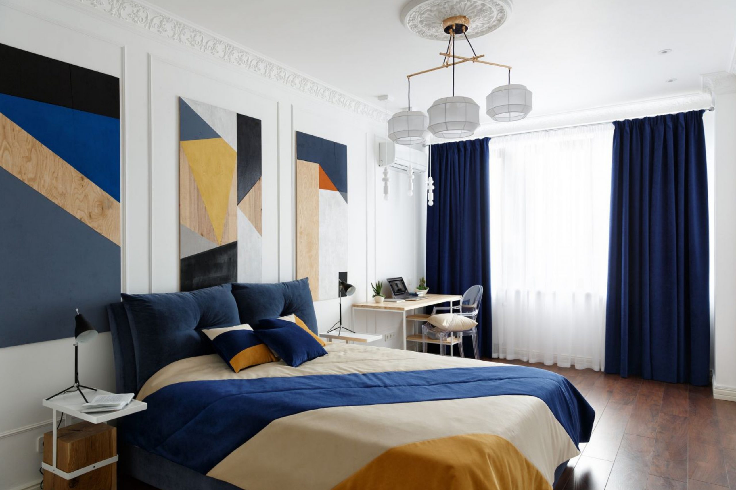
Naval SW 6244
Naval is a deep, rich indigo blue that is saturated, powerful, and utterly captivating, especially when set against a brilliant white. Naval is the perfect color for creating a bold, traditional look, ideal for a formal dining room, a library, or a dramatic accent wall behind a headboard.
This shade of blue is so dark and deep that it almost reads as a neutral, but the depth of its color brings a wonderful energy to the room.
When paired with white, the contrast is nautical, classic, and incredibly sharp, making the white accents leap forward with beautiful definition. It’s a luxurious color that gives a room instant depth and a feeling of distinguished elegance, making a striking and unforgettable statement.
🎨 Check out the complete guide to this color right HERE 👈

Slate Tile SW 7624
Slate Tile is a handsome, mature blue-gray that is wonderfully grounding and provides a sophisticated, moody contrast to white. Slate Tile has a definite blue undertone, making it a cooler shade, but it is grayed enough that it feels calm and restful rather than bright or juvenile.
It’s an excellent choice for a bedroom or a cozy reading room where you want a color that feels enveloping and quiet, encouraging you to relax and settle in.
This shade pairs beautifully with white, creating a classic combination that feels collected and perfectly balanced between cool and crisp. I often use this color to add a feeling of depth and gravity to a room, making the white elements look instantly lighter and more refined.
🎨 Check out the complete guide to this color right HERE 👈

Denim SW 6523
Denim is a rich, mid-tone blue that is lively and saturated, offering a spirited, classic contrast to white paint. Denim is a wonderful color choice for a boy’s room, a playful guest bath, or anywhere you want a cheerful and energetic wash of color.
The name fits perfectly because it is a familiar, comfortable blue that feels instantly welcoming and universally appealing without being boring.
When paired with bright white, the look is crisp and fresh, reminiscent of clean linens and sunny mornings. I often recommend this shade because it’s a happy color that feels less formal than deep navy but still provides enough contrast to make the white trim truly stand out and define the edges of the room.
🎨 Check out the complete guide to this color right HERE 👈

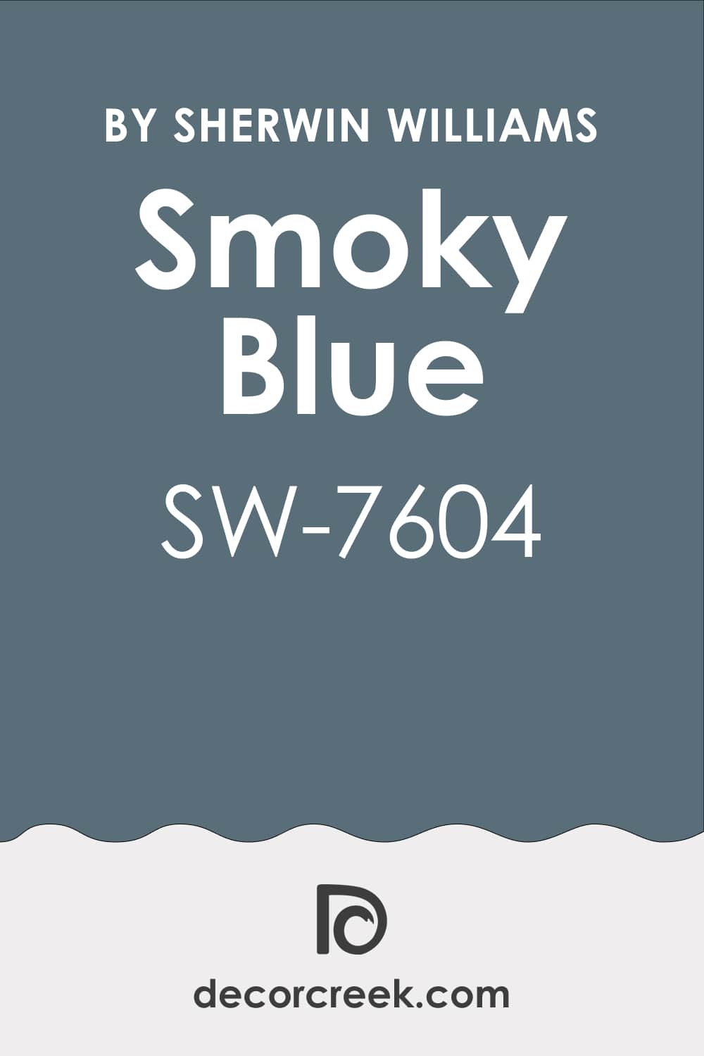
Smoky Blue SW 7604
Smoky Blue is a beautifully muted blue that carries definite gray undertones, making it look sophisticated and historic against a backdrop of white. Smoky Blue is a wonderful choice for creating a gentle, coastal feeling that isn’t overly bright or theme-driven, perfect for a master bath or a quiet hallway.
The gray base ensures this color feels soft and restrained, preventing it from overwhelming the room, even though it’s a distinct color.
When used with white, it creates a pairing that feels incredibly classic and beautifully balanced, often reminding me of historical homes and painted furniture. I often use this shade to introduce a gentle, watery color that feels very restful and gives a home an immediate sense of peacefulness.
🎨 Check out the complete guide to this color right HERE 👈
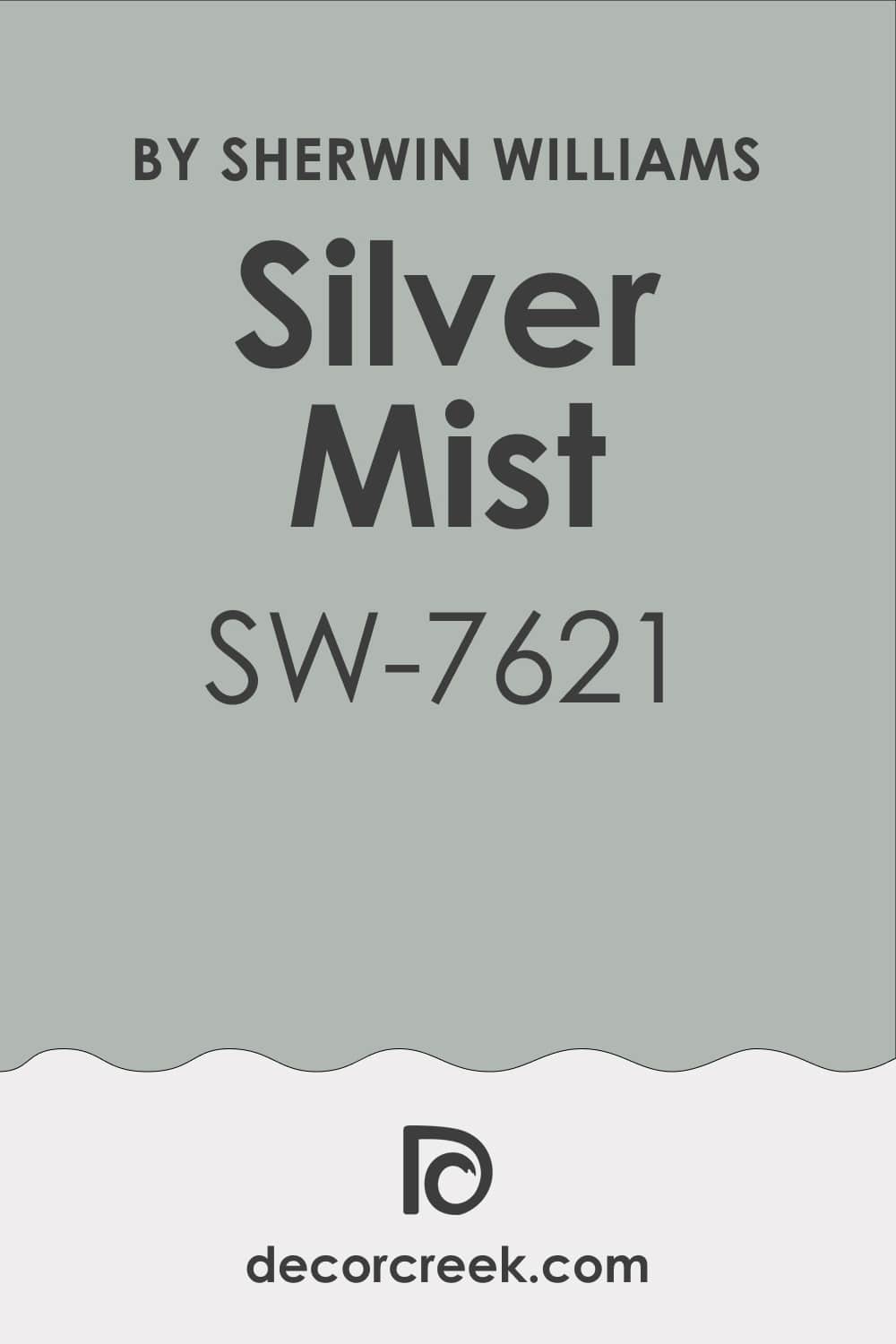
Silvermist SW 7621
Silvermist is a soft, airy blend of gray, blue, and a hint of green that is wonderfully light and acts as a delicate foil to white. Silvermist is a versatile shade that works beautifully in many types of light, always maintaining its soft, slightly washed-out appearance that feels effortless and pretty.
It’s a great option for a sunroom or a kitchen where you want to introduce a touch of color without sacrificing the light, bright feeling of the room.
The contrast it provides with white is gentle, making the walls feel like they’re receding and contributing to an overall sense of openness and airiness. I often recommend it for clients who want just a whisper of color that still feels incredibly clean and classic next to their white trim.
🎨 Check out the complete guide to this color right HERE 👈
Riverway SW 6222
Riverway is a deep, saturated teal-blue that is both intense and inviting, offering a strong, aquatic contrast to bright white. Riverway is a bold color that works beautifully for creating an impactful accent wall or for painting a piece of furniture that you want to stand out as a focal point.
This shade has a wonderful complexity, appearing deeply blue in some lights and showing off a rich green undertone in others, making it very dynamic.
When paired with generous amounts of white, the look is incredibly striking and clean, creating a powerful, classic pairing that feels tailored and intentional. It’s a gorgeous, jewel-toned color that gives a room instant energy and a feeling of luxurious depth and beautiful sophistication.
🎨 Check out the complete guide to this color right HERE 👈

Warm Stone SW 7032
Warm Stone is a sophisticated, mid-toned taupe that has rich brown and gray undertones, making it a handsome and earthy partner for white. Warm Stone is a fantastic color choice for creating a cozy, grounded feeling in a living room, dining area, or a long hallway where you want visual continuity.
It leans heavily toward the brown side of the spectrum, providing a comforting, organic contrast to the starkness of white trim and ceilings.
I use this shade frequently when designing rooms that feature natural elements like wood, brick, or leather, as it beautifully complements those textures. This truly warm neutral gives a home an immediate feeling of stability and comfort, making the white accents pop with an impressive, clean definition.
🎨 Check out the complete guide to this color right HERE 👈

Black Fox SW 7020
Black Fox is a very deep, near-black that carries subtle warm brown and charcoal undertones, making it a luxurious and softer alternative to pure black against white. Black Fox is a powerful, dramatic color that is wonderful for creating depth and weight in a room, perfect for a study or a dramatic accent in a powder room.
This color is incredible when paired with white, as the high contrast is sharp and modern, yet the warmth in the undertone keeps the look from feeling too cold or severe.
I often recommend it for painting all the interior doors in a home for a high-end, bespoke feel, allowing the white trim to truly frame the doorways. It’s a gorgeous color that creates an instant sense of tailored drama and sophisticated depth in a well-designed room.
🎨 Check out the complete guide to this color right HERE 👈

Canyon Clay SW 6054
Canyon Clay is a rich, warm terracotta color that evokes the beautiful, sun-baked earth of the American Southwest, offering a bold, organic contrast to white. Canyon Clay is a fantastic choice for creating a vibrant, yet grounded feeling, perfect for a dining area or an accent wall that needs to feel warm and energetic.
This shade is one of the more expressive colors, bringing a wonderful, earthy energy to the walls, which is beautifully tempered by clean white.
I love using this color in homes that feature natural materials like woven textures, rattan, and light wood, as it creates an instantly cozy and layered look. It’s a joyful, adventurous color that makes the white trim feel sharp and fresh while adding a stunning warmth to the overall atmosphere.
Redend Point SW 9081
Redend Point is a captivating, dusty blush-meets-terracotta that is sophisticated and deeply comforting, providing a gentle, warm contrast to white. Redend Point is a beautiful, muted color that feels both ancient and modern, perfect for creating a cozy and distinctly design-forward look in a bedroom or reading corner.
It’s an incredibly soft tone that, despite being a shade of red, feels completely neutral and surprisingly easy to live with day-to-day.
When used with white, the contrast is subtle and gentle, yet the color has enough presence to make the white details appear crisp and clean. I recommend this stunning shade for clients who want a unique, warm neutral that feels feminine and grounded, providing a quiet hush to the room.
🎨 Check out the complete guide to this color right HERE 👈

Natural Linen SW 9109
Natural Linen is a very light, delicate, warm beige that has just enough depth to contrast gently with bright white trim and ceilings. Natural Linen is a fantastic, non-committal color for creating a feeling of classic, old-world elegance that feels inviting and beautifully understated.
This shade is perfect for giving the walls a soft, creamy warmth without ever looking yellow or dingy, even in low light conditions.
I often use it throughout entire homes, as it’s a wonderful foundation for building a cohesive and layered interior design that feels effortlessly sophisticated. It’s a quiet, dependable color that makes a room feel light and open while still allowing the white architectural details to stand out with soft, clean definition.
🎨 Check out the complete guide to this color right HERE 👈

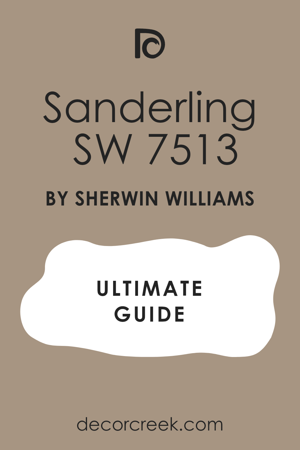
Sanderling SW 7513
Sanderling is a beautiful, mid-toned, sandy beige that carries rich brown and golden undertones, providing a warm, coastal contrast to white. Sanderling is a wonderful choice for creating a feeling of sunny warmth and approachable elegance, perfect for a kitchen or a cozy breakfast nook.
This shade is definitely on the warmer side of the neutral spectrum, which makes it feel incredibly inviting and prevents the pairing with white from looking cold or too harsh.
I use it often in homes near the water, as it mimics the beautiful color of wet sand and driftwood, giving the home a grounded, organic feel. It’s a reliable, comforting color that gives a home an immediate sense of warmth and makes the white trim feel incredibly sharp and clean.
🎨 Check out the complete guide to this color right HERE 👈
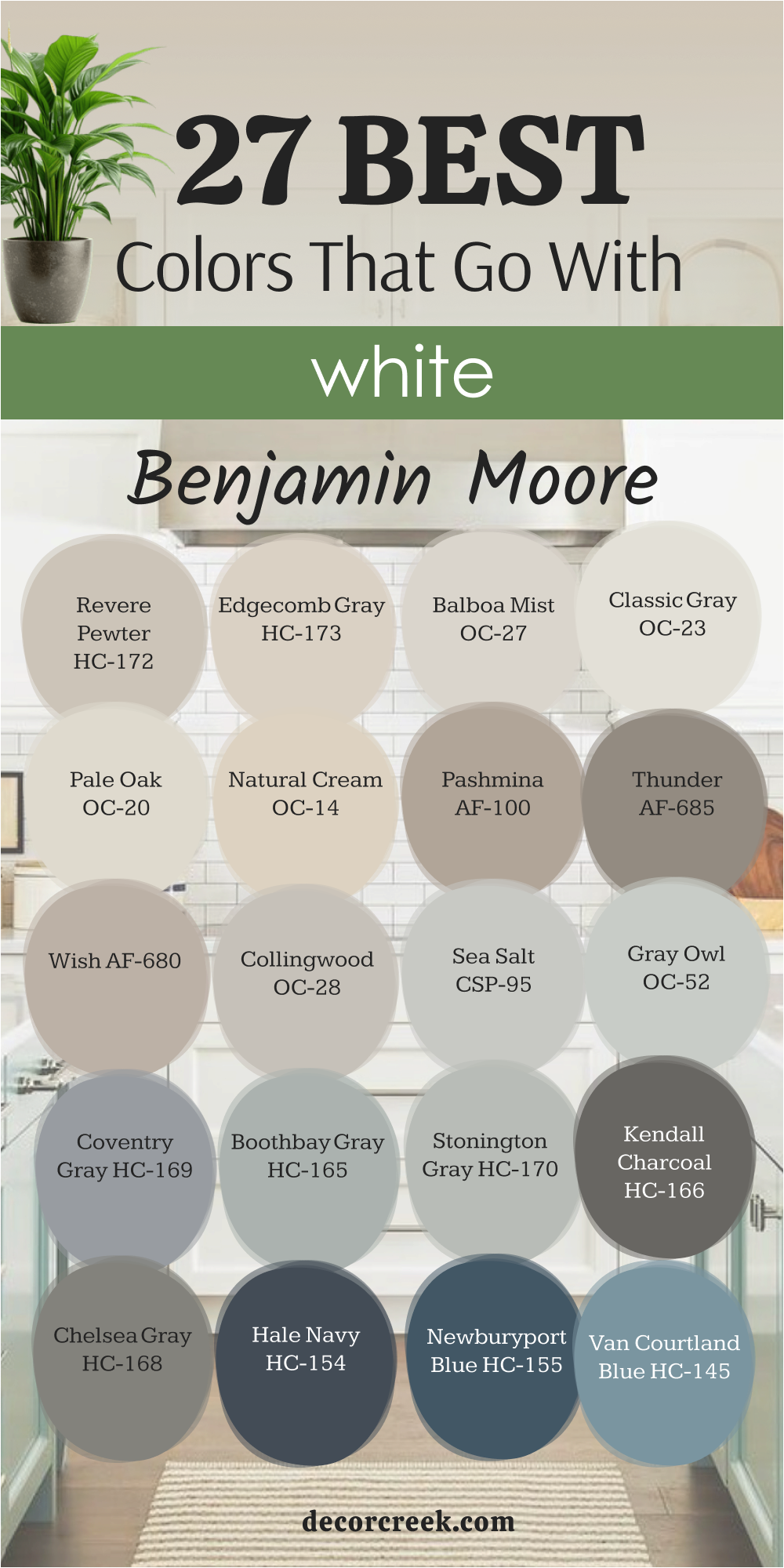
27 Best Colors That Go With White by Benjamin Moore
Revere Pewter HC-172
Revere Pewter is a famous, perfectly balanced light gray that has a remarkable amount of warmth, making it one of the best neutrals to pair with white. Revere Pewter is an absolute classic for its ability to look consistently beautiful in almost any lighting condition, maintaining its sophisticated greige quality.
It’s a wonderful choice for open-concept areas, as it defines the walls without making the area feel choppy or weighed down, keeping things feeling expansive.
The pairing with white trim is instantly classic and provides a soft, elegant contrast that highlights the woodwork beautifully without being overly dramatic. I rely on this color frequently for clients who want a dependable, light neutral that is guaranteed to give their home a feeling of quiet refinement.
🎨 Check out the complete guide to this color right HERE 👈

Edgecomb Gray HC-173
Edgecomb Gray is a supremely light, delicate greige that is softer and slightly warmer than Revere Pewter, offering a gentle, barely-there contrast to white. Edgecomb Gray is a beautiful, versatile color that creates an airy foundation for any room, reflecting light and making the space feel open and light-filled.
It’s a fantastic choice for bedrooms, ceilings, and hallways where you want a wash of color that feels more dimensional than simple white but doesn’t feel like a bold statement.
I love how it makes white trim and doors look instantly cleaner and brighter by providing a warm, soft backdrop that is never yellow or muddy. This shade is perfect for homeowners who want a warm, effortless neutral that feels incredibly comforting and always works well with other colors in the decor.
🎨 Check out the complete guide to this color right HERE 👈

Balboa Mist OC-27
Balboa Mist is an extremely pale, ethereal gray that often reads as a beautiful, slightly warmer off-white, providing a very subtle, soft contrast. Balboa Mist is a dreamy, delicate shade that is ideal for creating a sophisticated, monochromatic look where the color difference is just a whisper on the walls
It’s a gorgeous choice for rooms that need to feel incredibly light and reflective, such as a formal living room or a south-facing room with strong sunlight.
I often use this color to create a layered, custom look that feels intentional and high-end, as the subtlety of the color adds incredible depth without shouting. This beautiful shade ensures that the white trim and ceiling paint look crisp and clean while the walls feel soft and gently colored.
🎨 Check out the complete guide to this color right HERE 👈

Classic Gray OC-23
Classic Gray is another wonderfully subtle gray that carries a slight green or yellow undertone, giving it a gentle warmth that prevents it from feeling cold against white. Classic Gray is an airy and sophisticated neutral that is beautiful in almost any space, earning its title for its versatility and timeless appeal.
It’s a reliable shade for a client who wants a true gray but is worried about the color feeling too blue or too icy in their home’s lighting.
The pairing with bright white is sharp and fresh, creating a crisp boundary that highlights the architectural details of the room with a clean, light touch. I often recommend this shade because it works beautifully with natural materials and feels consistently soft and welcoming throughout the day.
🎨 Check out the complete guide to this color right HERE 👈

Pale Oak OC-20
Pale Oak is a gorgeous, light taupe that leans very heavily into the beige category while maintaining enough gray to keep it looking fresh and modern against white. Pale Oak is a sophisticated, warm neutral that is ideal for creating a comforting and grounded atmosphere in a bedroom or a formal dining area.
It’s a wonderful color for homeowners who prefer a warmer palette but want a shade that still feels refined and perfectly balanced between light and depth.
The contrast with white is soft and gentle, ensuring that the room feels airy and bright but still boasts a lovely wash of color on the walls. I rely on this beautiful color often to create a feeling of quiet luxury and warmth, making white details look clean without harsh contrast.
🎨 Check out the complete guide to this color right HERE 👈

Natural Cream OC-14
Natural Cream is a beautiful, creamy beige-off-white that has a definite warmth to it, giving it a rich, buttery feel that works beautifully with a cleaner white trim. Natural Cream is perfect for creating a cozy, enveloping atmosphere, especially in rooms where you want the walls to feel like a warm hug, such as a study or a nursery.
It’s a fantastic color choice for achieving that historic or old-world feel, as the warmth prevents it from looking stark or brand-new against antique furnishings.
The contrast it provides with pure white is subtle, ensuring that the room feels light-filled but also richly colored and incredibly inviting. I often use this shade to give walls a warm depth that feels organic and connected to natural materials, making the white accents pop with gentle clarity.
🎨 Check out the complete guide to this color right HERE 👈

Pashmina AF-100
Pashmina is a rich, substantial taupe-greige that carries a beautiful depth and warmth, offering a significant, grounded contrast to white trim. Pashmina is a handsome, versatile color that is wonderful for creating a distinguished and layered feel in a dining room, a library, or on kitchen cabinets.
This shade has incredible versatility, reading as a rich beige in some lights and a warm gray in others, making it a dynamic and engaging color.
When paired with bright white, the contrast is strong and clear, making the white elements truly stand out and defining the room’s architecture with precision. I often recommend this deeper shade for clients who want a sophisticated neutral that feels well-established and gives the entire home a feeling of high-end quality.
🎨 Check out the complete guide to this color right HERE 👈

Thunder AF-685
Thunder is a moody, deep gray that carries a wonderful warmth and richness, providing a handsome, sophisticated contrast to crisp white. Thunder is a grounding, architectural color that is perfect for accent walls, cabinets, or an entire room where you want to create an atmosphere of cozy drama and intimacy.
It’s a fantastic choice for a study, a powder room, or a bedroom, where the depth of color encourages a feeling of quiet contemplation and restfulness.
The contrast with white is sharp and tailored, giving the room an instant sense of refined elegance and making the white trim appear brilliantly clean. I rely on this shade for creating a look that is both modern and classic, providing a solid, anchoring backdrop for lighter furnishings and accessories.
🎨 Check out the complete guide to this color right HERE 👈

Wish AF-680
Wish is a quiet, mid-toned gray-greige that is wonderfully soft and muted, providing a gentle, inviting contrast to white elements. Wish is a versatile shade that works beautifully in many different rooms, often reading as a true neutral that feels neither too cold nor too warm.
It’s a great choice for clients who want a color that is noticeably darker than an off-white but still light enough to keep the room feeling airy and bright throughout the day.
The pairing with white is clean and straightforward, creating a lovely definition between the walls and the trim without a harsh visual break. I often recommend this shade because it is a reliable, sophisticated neutral that brings a feeling of quiet maturity and consistency to any home interior.
Collingwood OC-28
Collingwood is a subtle, light gray that has a slight violet or mauve undertone, giving it a soft, gentle warmth and complexity against bright white. Collingwood is a wonderful, sophisticated color that provides a soft wash of color that is distinctly gray but never feels cold or sterile.
It’s a beautiful choice for bedrooms and formal living areas where you want a touch of color that feels very refined and works well with rich fabrics and textures.
The subtlety of the shade ensures that the white trim truly stands out, creating a clean, crisp line that defines the room’s edges with precision. I often use this shade to create an ethereal feeling, as its soft undertones give it a unique and quiet beauty that is both complex and easy to live with.
🎨 Check out the complete guide to this color right HERE 👈

Sea Salt CSP-95
Sea Salt (Benjamin Moore’s version) is a beautifully gentle, pale gray that has a lovely softness and lightness, providing a very delicate contrast to white. Sea Salt is a perfect light neutral for clients who want to paint a room gray but prefer a shade that feels particularly airy, restful, and bright.
It’s a wonderful choice for homes where there is a lot of natural light, as it prevents the walls from washing out while still maximizing the feeling of openness.
The pairing with bright white is incredibly clean, subtle, and fresh, creating a soft definition that is incredibly pleasing to the eye. I rely on this gentle shade to create a foundational color that is sophisticated and versatile, allowing other colors in the decor to take center stage.
🎨 Check out the complete guide to this color right HERE 👈
Gray Owl OC-52
Gray Owl is a light, clean gray that carries a clear, slight blue-green undertone, making it a distinctly cooler, yet fresh, contrast to white. Gray Owl is a very popular color for its ability to look bright and clean in almost any light, bringing a refreshing, airy quality to any space.
It’s an excellent choice for kitchens and bathrooms where you want a crisp, modern look that feels light and hygienic against white tile and cabinets.
The contrast with white is sharp and clear, providing a distinctly contemporary and tailored edge to the room’s design. I often recommend this shade for clients who prefer cooler tones and want a gray that is reliably light, bright, and perfectly balanced, making the white accents pop with impressive clarity.
🎨 Check out the complete guide to this color right HERE 👈

Coventry Gray HC-169
Coventry Gray is a fantastic, rich mid-toned blue-gray that offers a handsome, grounding contrast to clean white. Coventry Gray is a beautiful, saturated color that has a strong presence, making it a wonderful choice for an accent wall, a dining room, or a set of painted built-ins.
It’s a sophisticated shade that works well in traditional and modern settings alike, providing a depth of color that feels architectural and intentional.
The pairing with bright white is classic and tailored, creating a sharp definition that makes the white trim and ceiling appear exceptionally crisp. I often use this shade to give a room an immediate sense of gravity and history, making the white details look instantly refined and beautifully highlighted.
🎨 Check out the complete guide to this color right HERE 👈

Boothbay Gray HC-165
Boothbay Gray is a beautiful, medium blue-gray that has a distinct softness and coastal feel, providing a muted, yet refreshing, contrast to white. Boothbay Gray is a wonderful choice for creating a feeling of seaside tranquility in a bedroom, a bathroom, or a sun-drenched living area.
It’s a relaxed and casual color that is not too dark but has enough pigment to stand out against white trim and molding without overwhelming the room.
The contrast it provides with white is harmonious and natural, creating a balance that feels instantly soothing and easy on the eyes. I often recommend this shade for clients who want a cool-toned gray that brings a whisper of color and a feeling of quiet restfulness into their home.
🎨 Check out the complete guide to this color right HERE 👈

Stonington Gray HC-170
Stonington Gray is a reliable, mid-toned gray that carries a distinct blue undertone, offering a handsome, cool, and crisp contrast to white. Stonington Gray is a classic gray that reads as a true, sophisticated neutral without becoming muddy or dull, making it highly dependable in many settings.
It’s a great choice for clients who want a noticeable gray that still feels airy and modern, perfect for a kitchen, hallway, or living room.
The pairing with white is sharp, clean, and beautifully architectural, ensuring that the white trim and doors truly stand out and define the edges of the space. I often use this shade to create a contemporary, polished look that feels incredibly put-together and provides a fantastic backdrop for colorful artwork.
🎨 Check out the complete guide to this color right HERE 👈

Kendall Charcoal HC-166
Kendall Charcoal is a deep, rich, handsome charcoal gray that has an earthy, subtle green-brown undertone, providing a substantial, sophisticated contrast to white. Kendall Charcoal is a powerful, grounding color that is fantastic for creating drama, perfect for a media room, a moody powder bath, or on kitchen lower cabinets.
It’s a beautiful, saturated shade that gives a room instant weight and a feeling of tailored elegance, making the white trim and doors truly pop.
The contrast with white is sharp and modern, yet the warmth in the color prevents the look from feeling too cold or severe in different lighting. I often recommend this bold shade for clients who want to make a strong design statement that feels classic, yet incredibly current and refined.
🎨 Check out the complete guide to this color right HERE 👈

Chelsea Gray HC-168
Chelsea Gray is a rich, warm, mid-to-dark gray that carries deep brown and subtle green undertones, making it a beautiful, sophisticated partner for white. Chelsea Gray is a classic and versatile shade that works wonderfully for creating a cozy, yet refined atmosphere in a living room, dining room, or on exterior siding.
It’s a perfect color for clients who want a darker gray but need one that feels inviting and grounded rather than cold or stark in the interior.
The contrast it provides with white is strong and architectural, giving the room an instant feeling of maturity and high-quality design. I rely on this shade for creating a handsome, tailored look that feels both established and beautifully contemporary in any home setting.
🎨 Check out the complete guide to this color right HERE 👈

Hale Navy HC-154
Hale Navy is a classic, deep, iconic navy blue that is saturated and powerful, offering a dramatic, sophisticated contrast to bright white. Hale Navy is one of the most beloved colors for creating an instant sense of traditional elegance, perfect for a library, a front door, or a beautiful set of built-ins.
It’s a deep, complex shade of blue that is so dark it almost reads as a neutral, which gives it wonderful versatility and broad appeal.
When paired with white, the look is crisp, nautical, and incredibly sharp, making the white trim and wainscoting shine with impressive clarity. I often recommend this gorgeous shade for creating a bold, statement-making room that feels rich, tailored, and undeniably classic in its presentation.
🎨 Check out the complete guide to this color right HERE 👈

Newburyport Blue HC-155
Newburyport Blue is a historic, deep, mid-toned blue that carries a hint of gray, making it a beautifully restrained and handsome contrast to white. Newburyport Blue is a wonderful choice for creating a sophisticated, traditional feel that is slightly less intense than Hale Navy but still provides excellent depth.
It’s a fantastic color for a dining room or a bedroom where you want a rich color that feels calming and established, encouraging a feeling of quiet restfulness.
The contrast with white is clean and sharp, creating a beautiful frame for the blue and highlighting the architecture of the room with elegance. I often use this shade to give a home a feeling of coastal elegance and historical authenticity, making the white accents appear immediately brighter and cleaner.
🎨 Check out the complete guide to this color right HERE 👈

Van Courtland Blue HC-145
Van Courtland Blue is a beautiful, muted, mid-toned blue that has a distinct gray undertone, giving it a sophisticated, historical quality against white. Van Courtland Blue is a classic, versatile color that is perfect for creating a feeling of collected elegance in a living room, kitchen, or a long, bright hallway.
It’s a lovely shade that is colorful without being bright or overwhelming, maintaining a gentle, historical feel that works well in older homes.
The contrast with white is clean and soft, creating a beautiful definition that feels quiet and restful rather than harsh or overly dramatic. I often recommend this shade for clients who want a genuine blue that feels timeless and sophisticated, making the white details look instantly refined.
🎨 Check out the complete guide to this color right HERE 👈
Wythe Blue HC-143
Wythe Blue is a historic, striking, deep coastal blue-green that is highly saturated and utterly captivating when set against bright white. Wythe Blue is a fantastic choice for creating a stunning, high-impact room, perfect for a dining room, a powder bath, or a set of focal-point cabinets.
This shade has incredible depth and a wonderful ability to shift its appearance based on the light, sometimes looking more blue and sometimes more green-teal.
When paired with generous amounts of clean white, the contrast is sharp, energetic, and incredibly sophisticated, giving the room instant vitality. I often use this gorgeous color to infuse a space with a feeling of luxurious color and refined energy, making the white accents leap forward with beautiful clarity.
🎨 Check out the complete guide to this color right HERE 👈

Aegean Teal 2136-40
Aegean Teal is a deep, rich, saturated teal that beautifully blends blue and green, offering a dramatic, jewel-toned contrast to white. Aegean Teal is a stunning, sophisticated color that is perfect for creating a cozy, moody atmosphere in a den, a bedroom, or on kitchen lower cabinets.
It’s a gorgeous shade that feels both luxurious and earthy, making it a wonderful choice for homes that feature lots of natural wood and woven textures.
The contrast with white is sharp and striking, creating a polished, tailored look that feels incredibly high-end and intentional. I often recommend this bold shade for clients who want a color that is deeply satisfying and feels like a beautiful, grounding hug for the walls.
🎨 Check out the complete guide to this color right HERE 👈
November Skies 2128-50
November Skies is a muted, sophisticated blue-gray that has a gentle depth and feels beautifully anchored, offering a handsome, restful contrast to white. November Skies is a wonderful color choice for creating a cozy, enveloping atmosphere in a bedroom or a quiet reading nook where you want a true sense of peacefulnes.
It’s a soft shade of blue that has enough gray in it to keep it from feeling too cold or too bright, making it a very easy color to live with day-to-day.
The pairing with bright white is clean and tailored, providing a lovely, defined border that makes the white trim appear instantly fresh and well-maintained. I often use this shade to bring a feeling of thoughtful, quiet sophistication to a room’s design.
🎨 Check out the complete guide to this color right HERE 👈

Beach Glass 1564
Beach Glass is a light, airy blue-green that carries a hint of gray, creating a delicate, refreshing, and beautifully muted contrast to white. Beach Glass is a perfect color for creating a subtle coastal feel, ideal for a bright sunroom, a guest bedroom, or a quiet, restful bathroom.
It’s a wonderful choice for homeowners who want a genuine color on their walls but one that feels soft and light, ensuring the room remains airy and reflective.
The contrast with white is gentle and harmonious, allowing the white trim and ceiling to frame the walls without harshness or visual aggression. I often recommend this gentle shade because it is universally pleasing and brings a soft, watery element of nature into the home.
🎨 Check out the complete guide to this color right HERE 👈

Cushing Green HC-125
Cushing Green is a gorgeous, deep, traditional green that is grounded and saturated, offering a handsome, historical contrast to crisp white. Cushing Green is a perfect color for creating a distinguished look, wonderful for a study, a dining room, or a dramatic set of built-in shelving units.
It’s a classic shade that feels rich and well-established, making it a fantastic choice for creating an old-money aesthetic that is both luxurious and enduring.
The contrast with white is sharp and tailored, making the white architectural details of the room truly stand out and defining the space with precision. I often use this shade to give a room instant character and a feeling of grounded warmth that feels effortlessly refined and truly custom.
🎨 Check out the complete guide to this color right HERE 👈
Saybrook Sage HC-114
Saybrook Sage is a beautifully balanced, muted sage green that has gray undertones, providing a soft, earthy, and restful contrast to white. Saybrook Sage is a classic neutral green that is wonderful for creating a peaceful, organic atmosphere in a kitchen, a living room, or a bedroom.
It’s a versatile color that is popular for its ability to feel light and airy while still providing a definite wash of sophisticated color on the walls.
The pairing with white is clean and fresh, creating a classic, welcoming look that feels both traditional and completely current. I rely on this gentle shade to bring a feeling of nature and quiet sophistication into a home, making the white details appear clean and perfectly defined.
🎨 Check out the complete guide to this color right HERE 👈

Wrought Iron 2124-10
Wrought Iron is an incredibly deep, near-black charcoal that carries a definite warmth, making it a handsome, striking, and architectural contrast to white. Wrought Iron is a powerful color choice that is wonderful for creating high-impact drama on doors, cabinets, or as a strong accent on an exterior facade.
It’s a fantastic alternative to pure black, as its slight softness keeps the pairing with white from feeling too stark or harsh in various lights.
The contrast is immediate, sharp, and tailored, giving the room an instant sense of depth and a very modern, polished edge. I often recommend this bold shade for clients who want to create a tailored, unforgettable look that feels grounded, confident, and beautifully defined by the bright white accents.
🎨 Check out the complete guide to this color right HERE 👈

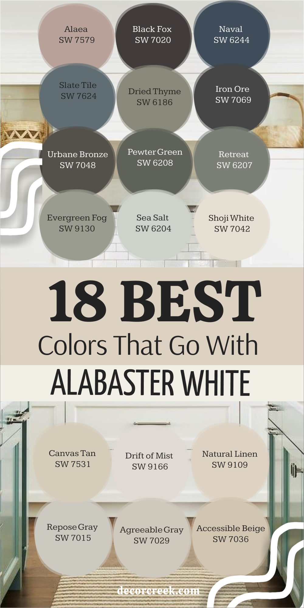
18 Colors That Go With Alabaster White by Sherwin-Williams
Alabaster White (SW 7008) is a slightly creamy white with a soft, warm undertone, which makes choosing a companion color different than choosing a color for a stark white. The best colors for Alabaster need to either complement its warmth or provide a clear, beautiful contrast that doesn’t make the Alabaster look yellow or dirty.
Accessible Beige SW 7036
Accessible Beige is a perfect greige partner for Alabaster White because its slight warmth complements Alabaster’s creaminess beautifully.
Accessible Beige sits wonderfully in the middle of gray and beige, ensuring it never makes the warmer white look dingy or overly yellow by comparison.
It’s an ideal choice for creating a soft, subtle contrast that maintains a feeling of warmth and openness throughout a living area or a bedroom. I often use this combination when a client wants a light, low-contrast look that feels deeply comforting and incredibly welcoming. The pairing is quiet and refined, providing just enough depth on the walls to make the Alabaster trim appear perfectly clean and intentional.
🎨 Check out the complete guide to this color right HERE 👈
Agreeable Gray SW 7029
Agreeable Gray works well with Alabaster White by providing a light, slightly cooler neutral that keeps the warmer white from feeling too buttery. Agreeable Gray is a balanced greige that offers a clean, gentle contrast, making it a versatile choice for almost any room in the house.
It’s a fantastic option for kitchens or main living areas where you want a neutral that feels current and light-filled against Alabaster cabinets or trim.
I rely on this combination to create a fresh, airy feeling that is grounded by the subtle depth of the gray, which prevents the room from feeling washed out. This pairing is one of my go-to combinations for a home that needs to feel instantly updated, bright, and universally appealing.
🎨 Check out the complete guide to this color right HERE 👈
Repose Gray SW 7015
Repose Gray offers a clean, cooler gray contrast to Alabaster White, which is wonderful for making the warmer white look clean and bright rather than creamy. Repose Gray is a sophisticated neutral that has enough depth to clearly define the walls against the Alabaster trim, creating a tailored, classic look.
It’s a great choice for a study or a hallway where you want a color that feels grounding and handsome, providing a strong visual backdrop.
I often use this combination when clients want to push their warm Alabaster to read a little cleaner, as the slight coolness of the gray accomplishes that beautifully. This pairing creates a refined and polished atmosphere, ensuring the Alabaster white trim stands out with excellent definition.
🎨 Check out the complete guide to this color right HERE 👈
Natural Linen SW 9109
Natural Linen is a soft, delicate, warm beige that works harmoniously with Alabaster White by maintaining the overall warm tone of the room. Natural Linen is an incredibly light neutral that provides a whisper of color, creating a layered, subtle contrast that feels sophisticated and gentle.
It’s a wonderful choice for achieving a monochromatic look where the wall color is distinct from the trim but the feeling remains unified and soft.
I often use this combination in formal living areas or bedrooms where the goal is quiet luxury and a light-filled, harmonious atmosphere. This pairing is ideal for clients who want a warm, effortless look that ensures their Alabaster trim feels intentional and perfectly nestled into the wall color.
🎨 Check out the complete guide to this color right HERE 👈
Drift of Mist SW 9166
Drift of Mist is a very pale, light greige that is nearly a white itself, providing an extremely soft, barely-there contrast that complements Alabaster White. Drift of Mist works beautifully with Alabaster by maintaining a bright, airy feeling while offering just enough difference in tone to separate the walls from the trim.
It’s a great choice for clients who are hesitant to use a strong color but want a little more depth than pure white on their walls.
I often recommend this combination when the home has lower light, as it helps reflect light while keeping the room feeling incredibly soft and beautifully textured. This subtle pairing creates an ethereal atmosphere that feels sophisticated and effortless, with the Alabaster trim standing out gently.
🎨 Check out the complete guide to this color right HERE 👈
Canvas Tan SW 7531
Canvas Tan is a warm, mid-toned beige that has a lovely golden undertone, which beautifully reinforces and complements the warmth of Alabaster White. Canvas Tan is a wonderful choice for creating a cozy, inviting atmosphere in a living room, dining room, or a kitchen with Alabaster cabinets.
It’s a dependable, rich color that feels very organic and grounded, making the pairing with the creamy white feel natural and harmonious.
I often use this color to create a classic, comforting look that feels well-established and perfectly tailored to a home that values traditional warmth. This pairing is all about embracing warmth, ensuring the Alabaster trim is highlighted as a beautiful, creamy counterpoint to the richer beige wall color.
🎨 Check out the complete guide to this color right HERE 👈

Shoji White SW 7042
Shoji White is a warm, creamy off-white with gray and taupe undertones that creates a beautiful, layered look when paired with Alabaster White trim. Shoji White works wonderfully because it’s darker and more pigmented than Alabaster, allowing it to act as the wall color with the Alabaster as the trim.
It’s a fantastic choice for creating a very soft, sophisticated, tonal look that feels incredibly high-end and custom, perfect for living rooms and bedrooms.
I often use this pairing to create a sense of quiet luxury, where the contrast is gentle but intentional, giving the room a feeling of depth and dimension. This combination is ideal for clients who want a warm, subtle look that is more complex than a simple white-on-white pairing.
🎨 Check out the complete guide to this color right HERE 👈

Sea Salt SW 6204
Sea Salt is a gentle, mutable blue-green-gray that offers a soft, refreshing, and distinctly cool contrast to the warmth of Alabaster White. Sea Salt works well with Alabaster because the cool undertones prevent the Alabaster trim from feeling overly yellow, giving the overall room a balanced look.
It’s a wonderful choice for a bathroom, laundry room, or sunroom where you want a hint of color that feels watery, clean, and incredibly restful.
I often use this combination when a client wants to introduce a light color that feels bright and welcoming without overwhelming the natural light in the room. This pairing is cheerful and classic, making the warm Alabaster trim stand out as a crisp, bright border against the colorful walls.
🎨 Check out the complete guide to this color right HERE 👈
Evergreen Fog SW 9130
Evergreen Fog is a beautiful, sophisticated blend of gray and green that provides a rich, earthy, and grounded contrast to the warmth of Alabaster White. Evergreen Fog works wonderfully by offering a deep, natural color that beautifully complements Alabaster’s creamy softness without competing with it.
It’s a fantastic choice for creating a cozy, moody atmosphere in a den, a home office, or a bedroom where you want a strong sense of comfort and quiet.
I often use this combination when the room has natural wood elements, as the earthy color and the warm white work together to create an organic, layered look. This pairing creates a handsome, thoughtful design, ensuring the Alabaster trim shines as a bright, clean break against the deep wall color.
🎨 Check out the complete guide to this color right HERE 👈
Retreat SW 6207
Retreat is a deep, gorgeous gray-green that is moody and saturated, offering a stunning, dramatic, and earthy contrast to Alabaster White. Retreat works beautifully with Alabaster because the depth of the color makes the warm white look incredibly clean and bright by comparison, enhancing its subtle creaminess.
It’s an ideal option for creating a deeply atmospheric space, such as a cozy study, a moody powder bath, or as an accent color on built-ins.
I often use this combination when clients are ready to make a bold color statement that still feels connected to nature and provides a feeling of quiet luxury. This strong pairing gives the room instant weight and character, making the Alabaster trim pop with impressive, tailored clarity.
🎨 Check out the complete guide to this color right HERE 👈
Pewter Green SW 6208
Pewter Green is a deep, historical gray-green that is rich and highly saturated, offering a handsome, distinguished contrast to the soft warmth of Alabaster White. Pewter Green works well with Alabaster by providing a strong, rich backdrop that instantly gives the room a feeling of age and established elegance.
It’s a fantastic choice for creating a traditional, tailored look in a formal living room, a cabinet color, or an entire bedroom that needs to feel enveloping.
I often use this combination when a client wants to embrace a darker palette, ensuring that the Alabaster trim keeps the room feeling structured and prevents the dark color from feeling heavy. This beautiful pairing creates a highly sophisticated and tailored look that is both dramatic and wonderfully classic.
🎨 Check out the complete guide to this color right HERE 👈
Urbane Bronze SW 7048
Urbane Bronze is a deep, warm bronze-brown that provides a luxurious, earthen, and highly contrasting backdrop to the creamy texture of Alabaster White. Urbane Bronze works beautifully with Alabaster because its deep, organic warmth complements the white’s softness, creating a rich, natural contrast.
It’s a wonderful choice for creating a cozy, intimate feel in a study, a bedroom, or as a strong accent color on all the interior doors in a home.
I often use this combination to achieve a soft, organic high-contrast look that feels grounded, handsome, and connected to natural materials. This bold pairing is perfect for a strong design statement, allowing the Alabaster trim to stand out with brilliant, creamy clarity and definition.
🎨 Check out the complete guide to this color right HERE 👈
Iron Ore SW 7069
Iron Ore is a deep, charcoal color that leans almost black but maintains a subtle brown-gray softness, creating a striking, architectural contrast to Alabaster White. Iron Ore works well with Alabaster by providing a dramatic, graphic backdrop that makes the warmer white look incredibly crisp and intentionally placed.
It’s an ideal choice for a modern home, for use on an accent wall, or on kitchen lower cabinets with Alabaster uppers for a chic, contemporary look.
I often use this combination when the design needs a strong anchor, ensuring that the white elements of the room truly pop and grab attention. This pairing creates a sleek, sophisticated, and polished atmosphere that feels both modern and grounded.
🎨 Check out the complete guide to this color right HERE 👈
Dried Thyme SW 6186
Dried Thyme is a muted, earthy olive green that is wonderfully quiet and sophisticated, offering a subtle, organic contrast to Alabaster White. Dried Thyme works well with Alabaster by bringing a quiet, natural element into the room, creating a soothing and very restful atmosphere.
It’s a beautiful choice for a kitchen, a breakfast nook, or a master bedroom where you want a color that feels both grounding and naturally inviting.
I often use this combination when clients want a gentle color that feels traditional and enduring, ensuring the warm white trim feels instantly clean and refined. This pairing is soft, classic, and incredibly easy to live with, providing a lovely, comforting depth to the walls.
🎨 Check out the complete guide to this color right HERE 👈
Slate Tile SW 7624
Slate Tile is a handsome, mature blue-gray that is wonderfully grounding and provides a sophisticated, moody contrast to the warmth of Alabaster White. Slate Tile works well with Alabaster because the coolness of the gray-blue balances the creaminess of the white, creating a beautifully poised color palette.
It’s a fantastic choice for a bedroom or a cozy reading room where you want a color that feels enveloping and quiet, encouraging a sense of restfulness.
I often use this combination to introduce a beautiful, deep color that feels traditional and well-established, making the Alabaster trim look effortlessly bright and clean. This pairing creates a feeling of depth and gravity, with the white elements standing out as clear, refined borders.
🎨 Check out the complete guide to this color right HERE 👈
Naval SW 6244
Naval is a deep, rich indigo blue that is saturated and powerful, offering a dramatic, sophisticated, and classic contrast to creamy Alabaster White. Naval works beautifully with Alabaster because the depth of the blue creates an immediate, sharp definition that makes the warm white look clean and bright.
It’s a perfect color for creating a formal, traditional look, ideal for a library, a dining room, or a dramatic accent wall that needs to anchor the room.
I often use this combination when a client wants a bold, high-impact color that still feels timeless and elegant in its presentation. This pairing is striking and luxurious, ensuring the Alabaster trim and ceiling are highlighted with impressive, clean clarity against the deep blue.
🎨 Check out the complete guide to this color right HERE 👈
Black Fox SW 7020
Black Fox is a very deep, near-black that carries subtle warm brown and charcoal undertones, providing a dramatic, tailored, and soft contrast to Alabaster White. Black Fox works beautifully with Alabaster because its inherent warmth prevents the black from feeling too harsh or stark against the creamy white trim.
It’s a wonderful choice for creating a highly sophisticated, high-contrast look on doors, cabinetry, or a dramatic accent wall.
I often use this combination to add an immediate feeling of tailored elegance and expensive detail to a room, especially when used on interior doors. This pairing is powerful and grounding, making the Alabaster trim pop with stunning definition and a luxurious, clean texture.
🎨 Check out the complete guide to this color right HERE 👈
Alaea SW 7579
Alaea is a rich, warm, dusty cranberry-red that offers a surprisingly sophisticated, earthy, and gentle contrast to Alabaster White. Alaea works wonderfully with Alabaster because the creamy white beautifully tempers the richness of the red, creating a harmonious and very inviting atmosphere.
It’s a fantastic choice for a dining room, a bold powder room, or an accent wall where you want a color that feels warm, unexpected, and historically rich.
I often use this combination when the home design needs a touch of bold, emotional color that still feels grounded and mature rather than juvenile. This beautiful pairing is unique and gives a room instant personality, making the Alabaster trim stand out as a clean, bright frame.
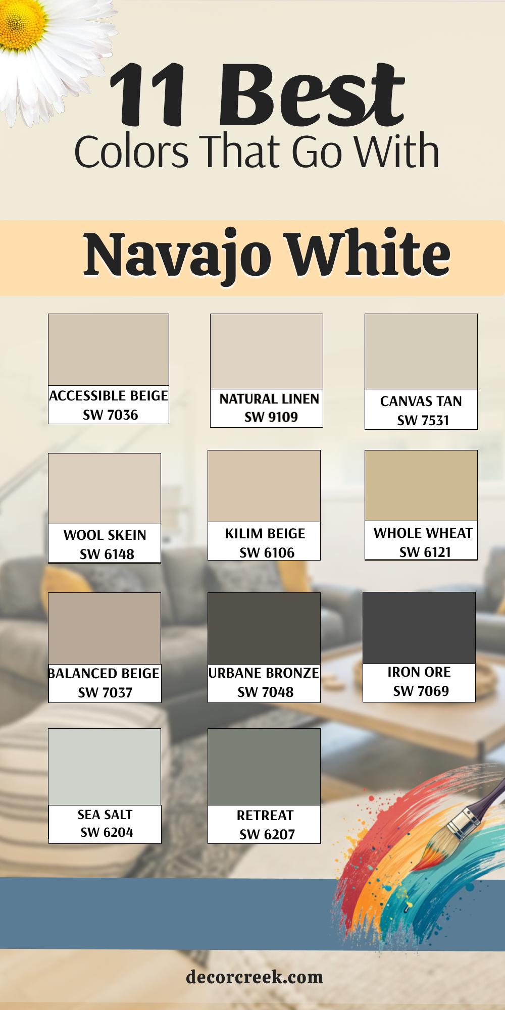
11 Colors That Go With Navajo White
Navajo White (a color historically associated with a slightly buttery, warm off-white, often with yellow undertones) is a challenging color because its strong warmth can make many grays look cold and many whites look stark. The best partners are warm neutrals and deep, grounding colors that offer a clear contrast.
Accessible Beige SW 7036
Accessible Beige is a perfect neutral partner for Navajo White because its balanced greige tone provides a slight, clean contrast that doesn’t clash with the yellow undertone. Accessible Beige works by providing a soft wash of color on the walls that feels fresh and modern, preventing the Navajo White from appearing overly yellow
. It’s a fantastic choice for creating a continuous, gentle flow throughout the home, where the subtle contrast feels refined and intentional.
I often use this combination to update a space painted with Navajo White, as the greige helps to moderate the creaminess of the white. This pairing is quiet, sophisticated, and ensures the Navajo White trim feels clean and perfectly set against the light, soft wall color.
🎨 Check out the complete guide to this color right HERE 👈
Natural Linen SW 9109
Natural Linen is a very light, delicate, warm beige that works beautifully with Navajo White by reinforcing the overall warm tone of the room. Natural Linen is an incredibly light neutral that provides a whisper of color, creating a layered, subtle contrast that feels sophisticated and gentle.
It’s a wonderful choice for achieving a refined, tonal look where the color difference is just barely perceptible, adding depth without a stark visual break.
I often use this combination in bedrooms or living areas where the goal is a warm, harmonious, and light-filled atmosphere that feels effortlessly comfortable. This pairing is ideal for clients who want an updated neutral that doesn’t fight the warmth of their existing Navajo White trim or cabinets.
🎨 Check out the complete guide to this color right HERE 👈
Canvas Tan SW 7531
Canvas Tan is a warm, mid-toned beige that has lovely golden undertones, working in perfect harmony with the warmth and yellow tones found in Navajo White. Canvas Tan provides a clear, warm contrast that complements the Navajo White beautifully, making the creamy white trim feel intentional and rich rather than dingy.
It’s a wonderful choice for creating a cozy, inviting atmosphere in a living room, dining room, or an entryway that needs to feel instantly welcoming.
I often use this color to create a classic, comforting look that feels well-established and perfectly tailored to a home that values traditional warmth and depth. This pairing is rich and comforting, ensuring the Navajo White is highlighted as a soft, creamy counterpoint to the deeper wall color.
🎨 Check out the complete guide to this color right HERE 👈
Wool Skein SW 6148
Wool Skein is a mid-toned, rich beige that carries green-gray undertones, providing a beautiful, grounding contrast that works surprisingly well with Navajo White’s yellow. Wool Skein works by offering a substantial, earthy color that balances the strong yellow warmth of the white, giving the overall palette a sophisticated anchor.
It’s a fantastic choice for creating a cozy, intimate feel in a study or a formal living room where you want the color to feel deep and enveloping.
I often use this combination to introduce a more complex neutral that ensures the Navajo White trim is seen as a clean, intentional border rather than just a very warm white. This pairing is handsome and tailored, giving the room a feeling of depth and quiet elegance.
🎨 Check out the complete guide to this color right HERE 👈

Kilim Beige SW 6106
Kilim Beige is a classic, mid-toned, rich beige with noticeable orange-pink undertones, which beautifully complements the warmth of Navajo White. Kilim Beige works wonderfully with Navajo White by providing a clear, saturated contrast that feels instantly warm, inviting, and traditionally appealing.
It’s an ideal choice for creating a cozy, sun-baked feeling in a kitchen, a breakfast nook, or a bright living area that needs grounding color.
I often use this color to create a palette that feels rich and connected to the earth, ensuring the Navajo White trim feels creamy and perfectly placed. This pairing is warm, traditional, and welcoming, with the beige walls offering a substantial backdrop for the softer white trim.
🎨 Check out the complete guide to this color right HERE 👈

Whole Wheat SW 6121
Whole Wheat is a rich, saturated, golden tan that is wonderfully warm and deep, offering a definite, striking contrast to Navajo White. Whole Wheat works beautifully with Navajo White by embracing the warmth in the white and amplifying the sunny, inviting feeling of the room.
It’s a fantastic choice for a dining room or a kitchen where you want a color that feels energetic, established, and distinctly earthy.
I often use this combination when the goal is to create a vibrant, cozy atmosphere that feels connected to natural wood and woven textures. This pairing is bold in its warmth, ensuring the Navajo White trim stands out as a clean, creamy border against the richly colored walls.
🎨 Check out the complete guide to this color right HERE 👈
Balanced Beige SW 7037
Balanced Beige is a true mid-toned greige that has a strong beige base, making it an excellent neutral partner for the warmth of Navajo White. Balanced Beige works by providing a clear contrast that is still warm enough not to make the Navajo White look yellow, striking a perfect equilibrium between the two shades.
It’s a wonderful choice for creating a continuous, sophisticated flow in a main living area where you need a color that feels both modern and deeply comforting.
I often use this combination to achieve a grounded, refined look that is easy to live with and ensures the Navajo White trim feels clean and well-defined. This pairing is reliable and handsome, giving the room a feeling of quiet maturity and consistency.
🎨 Check out the complete guide to this color right HERE 👈

Urbane Bronze SW 7048
Urbane Bronze is a deep, warm bronze-brown that provides a luxurious, earthen, and highly contrasting backdrop to the creamy texture of Navajo White. Urbane Bronze works beautifully with Navajo White because its depth of color is a strong counterpoint, making the warm white look clean and bright by comparison.
It’s a wonderful choice for creating a cozy, intimate feel in a study, a bedroom, or as a strong accent on interior doors for a high-end feel.
I often use this combination to achieve a soft, organic high-contrast look that feels grounded, handsome, and incredibly sophisticated. This bold pairing is dramatic and anchoring, allowing the Navajo White trim to stand out with brilliant, creamy clarity and definition.
🎨 Check out the complete guide to this color right HERE 👈
Iron Ore SW 7069
Iron Ore is a deep, charcoal color that leans almost black but maintains a subtle brown-gray softness, creating a striking, architectural contrast to Navajo White. Iron Ore works well with Navajo White by providing a dramatic, graphic backdrop that makes the warmer white look incredibly crisp and intentionally placed.
It’s an ideal choice for a modern home, for use on an accent wall, or on kitchen lower cabinets for a chic, contemporary look.
I often use this combination when the design needs a strong anchor, ensuring that the warm white elements of the room truly pop and grab attention. This pairing creates a sleek, sophisticated, and polished atmosphere that feels both modern and dramatically defined.
🎨 Check out the complete guide to this color right HERE 👈
Sea Salt SW 6204
Sea Salt is a gentle, mutable blue-green-gray that offers a soft, refreshing, and distinctly cool contrast to the warmth of Navajo White. Sea Salt works well with Navajo White because the cool undertones prevent the white from looking overly yellow, creating a beautifully poised and balanced palette.
It’s a wonderful choice for a bathroom, laundry room, or sunroom where you want a hint of color that feels watery, clean, and incredibly restful.
I often use this combination when a client wants to introduce a light, cheerful color that feels bright and welcoming without overwhelming the natural light in the room. This pairing is cheerful and classic, making the warm Navajo White trim stand out as a crisp, bright border against the colorful walls.
🎨 Check out the complete guide to this color right HERE 👈
Retreat SW 6207
Retreat is a deep, gorgeous gray-green that is moody and saturated, offering a stunning, dramatic, and earthy contrast to Navajo White. Retreat works beautifully with Navajo White because the depth of the color makes the warm white look incredibly clean and bright by comparison, enhancing its subtle creaminess.
It’s an ideal option for creating a deeply atmospheric space, such as a cozy study, a moody powder bath, or as an accent color on built-ins.
I often use this combination when clients are ready to make a bold color statement that still feels connected to nature and provides a feeling of quiet luxury. This strong pairing gives the room instant weight and character, making the Navajo White trim pop with impressive, tailored clarity.
🎨 Check out the complete guide to this color right HERE 👈
My Final Thoughts on Choosing Colors That Go With White
If there’s one thing I’ve learned from years of designing and staging homes, it’s that white is never just white—it’s the start of every great color conversation. Choosing the right companion color is truly the most important decision you’ll make in defining the feeling of your home. Don’t let the sheer number of options stress you out!
Focus on the mood you want to create and the light you already have. Do you want a cozy, soft feeling?
Lean into the warm beiges and greiges like Accessible Beige or Pale Oak.
Do you crave a fresh, sharp, and tailored look? Use deep, powerful colors like Hale Navy or Urbane Bronze to let your white trim really shine.
Remember that paint is just paint; it’s an easy thing to change, so don’t be afraid to try a few samples directly on your walls.
The perfect color for your white will be the one that feels most true to you and makes your heart happy every time you walk into the room.
Trust your gut, focus on quality brands, and know that a beautiful color pairing is the simplest way to add instant, gorgeous character to your home.