Green is the best choice when you want your bathroom to feel like a fresh garden full of life and health. I see so many people struggle with picking a shade because they worry it might look too dark or too bright for their home. My job is to help you find a look that makes you feel happy and proud every time you brush your teeth in the morning.
Green works well because it reminds us of nature and helps us relax and feel good after a very long day at work. You do not need a huge budget or a team of workers to make your room look brand new and very expensive. A simple can of paint can change everything about how you feel if you pick the right one for your walls.
I have spent years looking at how light hits different surfaces to bring you this list of the very best options.
These picks will help you create a room that feels clean and quiet without needing a full and costly remodel.
You can make your home feel much more like a high-end spa just by choosing a color that fits your style. I want to make sure you feel confident when you walk into the paint store to start your project.
Every bathroom deserves to be a place where you can breathe deeply and enjoy a bit of peace and beauty.
Why I Always Trust Sherwin-Williams and Benjamin Moore for the Best Green Bathroom Paint Colors
I always stick with these two brands because their quality is much better than the cheap stuff you find in big box stores. When I work on a project for a client, I need to know the color on the chip will match the color on the wall exactly. Sherwin-Williams has amazing options that cover walls easily without needing five coats of paint to look smooth and solid.
Benjamin Moore is famous for having very rich pigments that look great under bathroom lights no matter the time of day. These brands also make paint that stands up to steam and water splashes very well so the walls stay pretty. I want your hard work and your money to last for a long time without the paint peeling or fading away from the heat. Using high-quality paint saves you money and stress in the long run because you do not have to fix it later.
I trust these companies because they have proven themselves in my professional life over and over again through many years. You deserve a finish that looks professional and expensive even if you are doing the work all by yourself this weekend. A cheap paint often looks thin and can change its look in a way that makes the room feel messy or unfinished. These two brands spend a lot of time making sure their greens are the most natural and beautiful colors on the market today.
I have seen how these paints stay bright and clean even after years of use in a busy family home.
How I Choose the Perfect Green Shade for a Bathroom That Feels Fresh and Relaxing
Choosing a color starts with looking at your windows and the type of light bulbs you use in your ceiling. I check if the room gets bright morning sun or if it stays shadowy and a bit dark for most of the day. If your bathroom is small, I usually suggest a lighter mint or a soft sage to keep it feeling open and very big. Darker greens are wonderful for a moody look if you have white tile or light floors to balance things out and add light.
I also look at the color of your floor and the metal on your faucets and your towel racks before I pick a paint. Gold accents look stunning with deep forest greens, while silver goes well with cool seafoam tones for a very crisp and clean look. I always tell my clients to paint a large sample board before they commit to putting the color on the whole wall. Colors change as the sun moves across the sky, so you need to see how it looks in the morning and at night.
My goal is to make sure the green you pick makes you smile and feel happy every single time you walk inside. You should think about how you want to feel when you are getting ready for a big day or winding down for sleep. A good green should feel like a part of your home that has always been there and fits your personality perfectly. I help you avoid the mistake of picking a color that looks too much like a hospital or a bright neon sign. Finding the right balance is the key to making a small room feel like a grand and beautiful sanctuary for you and your family.
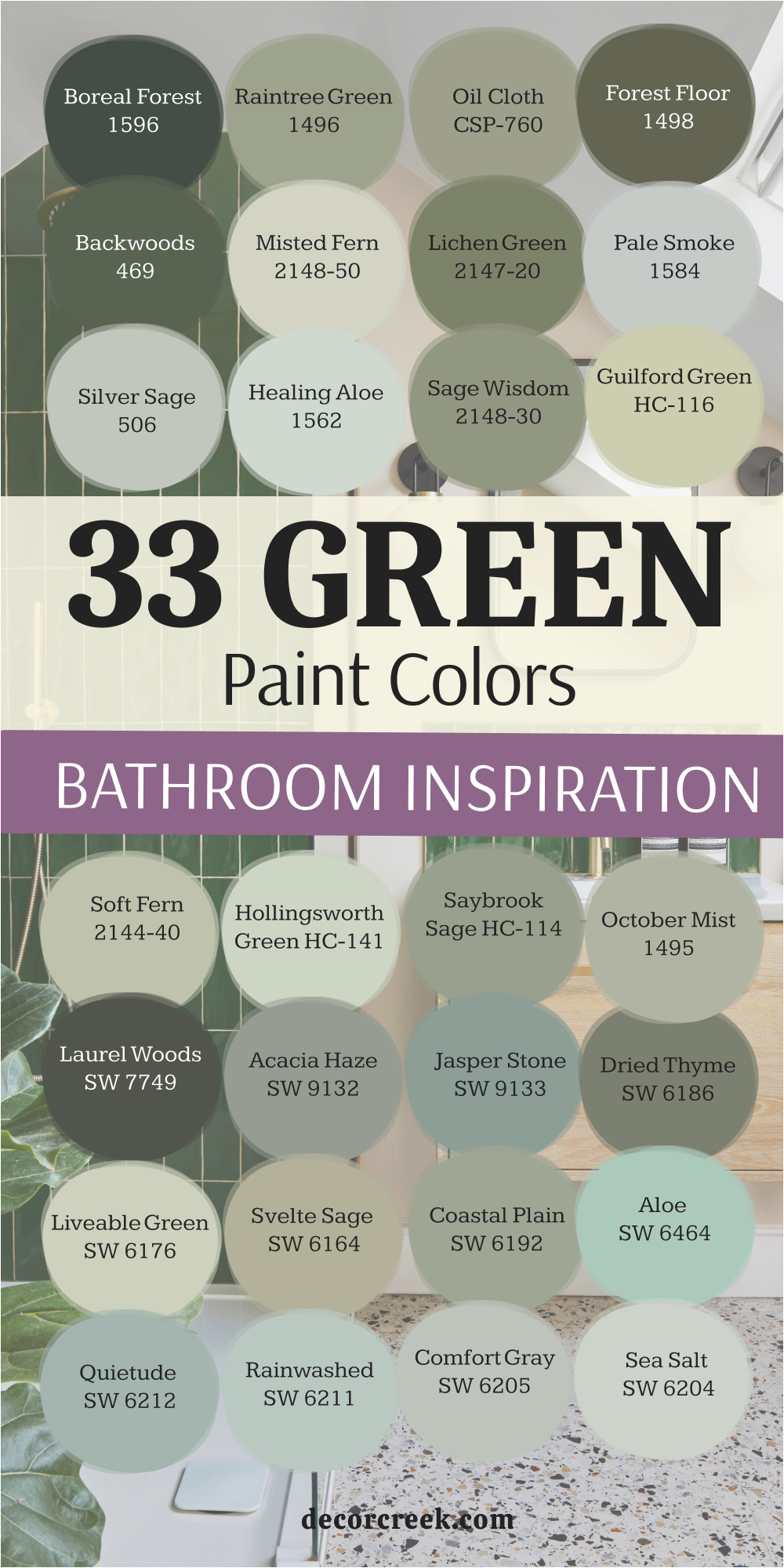
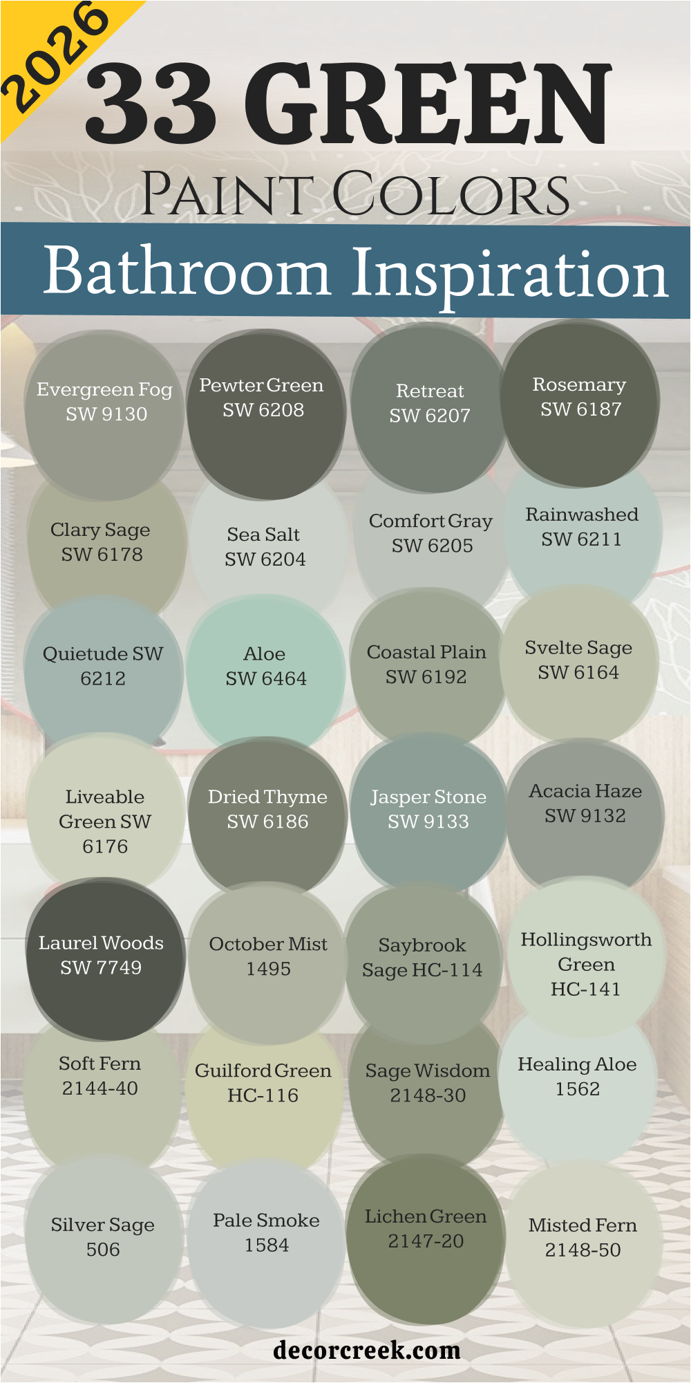
33 Green Bathroom Inspiration Paint Colors In 2026
Evergreen Fog SW 9130
Evergreen Fog SW 9130 brings a soft mix of green and gray into your private sanctuary. This shade feels very grounded and works perfectly with light oak wood floors or cabinets. I love how it looks when the morning sun hits the walls because it feels organic.
You will notice that it hides small imperfections on your drywall quite well. Many people choose this for a modern look that still feels very cozy and warm. It is a medium tone that does not make a small room feel tiny.
The gray undertone keeps it from looking like a bright crayon color. I think it is one of the most flexible options for any home style today. It makes a great backdrop for white towels and black hardware accents. This choice is a safe bet for anyone who wants a sophisticated vibe.
Best used in: bathrooms, bedrooms, mudrooms, and accent walls
Pairs well with: Shoji White SW 7042, Urban Bronze SW 7048, Accessible Beige SW 7036, light wood tones The key rule of this color for farmhouse style is to use it where you want natural light to feel kind, soft, and inviting throughout the day.

Pewter Green SW 6208
Pewter Green SW 6208 is a dark and cool shade that adds a lot of drama to your walls. This color looks very expensive when paired with brass mirrors and marble countertops. I find that it works best in rooms that have a good amount of natural light.
It has a dusty quality that makes it feel like an old library or a forest at dusk. You can use it on just the vanity if you are afraid of dark walls. It provides a beautiful contrast against bright white subway tile in a shower.
This tone is very popular right now for people who want a bold look. It feels sturdy and strong without being too harsh on your eyes. Your bathroom will feel like a high-end spa once this paint dries. It is a classic choice that will stay stylish for many years.
Best used in: vanities, accent walls, exterior doors, and cabinets
Pairs well with: Sea Salt SW 6204, Spare White SW 6203, Alabaster SW 7008, gold hardware The key rule of this color for farmhouse style is to use it where you want natural light to feel kind, soft, and inviting throughout the day.

Retreat SW 6207
Retreat SW 6207 offers a medium-dark green that feels like a quiet walk in the woods. This shade has a lot of gray in it which makes it feel very peaceful for a bath. I suggest using this if you have a lot of white trim to break up the color.
It creates a very relaxing mood that helps you unwind at the end of the day. The color looks very different depending on whether you use warm or cool light bulbs. It is deep enough to have character but light enough to not feel like black.
Many of my clients love how it coordinates with slate floors or gray stone. It is a very dependable color that looks great in photos and in person. You will enjoy how it makes your white porcelain tub pop against the wall. This is a top pick for a guest bathroom upgrade.
Best used in: master bathrooms, bedrooms, home offices, and cabinetry
Pairs well with: Pure White SW 7005, Window Pane SW 6210, Crushed Ice SW 7647, slate tile The key rule of this color for farmhouse style is to use it where you want natural light to feel kind, soft, and inviting throughout the day.

Rosemary SW 6187
Rosemary SW 6187 is a deep leafy green that feels very lush and full of life. This color has a bit of a yellow base which makes it feel warmer than other greens. I think it looks spectacular in bathrooms with a lot of plants and natural textures.
It creates a very cozy feeling that wraps around you like a warm blanket. You should use this if you want your bathroom to have a lot of personality. It pairs beautifully with copper fixtures or warm wood floating shelves.
The richness of the pigment makes the walls look like velvet under the right light. It is a bold choice that pays off because it feels so unique and custom. Most people find that it makes their bathroom feel much more high-end than before. This is a great way to add a touch of nature to your indoor life.
Best used in: accent walls, bathroom vanities, kitchen islands, and entryways
Pairs well with: Dover White SW 6385, Greige tones, Kayak Green SW 6473, warm wood accents The key rule of this color for farmhouse style is to use it where you want natural light to feel kind, soft, and inviting throughout the day.

Clary Sage SW 6178
Clary Sage SW 6178 is a soft and herbal green that feels very light and airy. This color is perfect for a bathroom where you want to feel energized in the morning. It has a slight yellow undertone that makes the room feel sunny even on cloudy days.
I love using this in smaller bathrooms because it keeps the walls feeling far apart. It reminds me of dried herbs and garden paths in the early springtime. This shade is very easy to live with and does not feel too trendy or loud.
It works well with traditional furniture and modern fixtures alike. You can pair it with cream colors for a very soft and gentle look. It is a very friendly color that makes guests feel welcome in your home. This is one of my favorite shades for a classic cottage style.
Best used in: small bathrooms, laundry rooms, kitchens, and bedrooms
Pairs well with: Alabaster SW 7008, Sagey SW 6175, Creamy SW 7012, light oak The key rule of this color for farmhouse style is to use it where you want natural light to feel kind, soft, and inviting throughout the day.

Sea Salt SW 6204
Sea Salt SW 6204 is a very famous color because it changes between green and blue. This light shade makes any bathroom feel like a beach house near the ocean. I find that it works in almost any lighting situation because it is so pale.
It feels very clean and helps the room look tidy and bright. You will love how it makes your white towels look even whiter and fresher. It is a very popular choice for people who want just a hint of color.
The gray tones inside it keep it from looking like a baby’s nursery. It is a very sophisticated way to bring a watery feel to your washroom. Most people find this color very easy to coordinate with their existing tile. This is a safe and beautiful choice for any home renovation project.
Best used in: bathrooms, bedrooms, sunrooms, and ceilings
Pairs well with: Fleur de Sel SW 7666, Summit Gray SW 7622, Heron Plume SW 6070, white trim The key rule of this color for farmhouse style is to use it where you want natural light to feel kind, soft, and inviting throughout the day.

Comfort Gray SW 6205
Comfort Gray SW 6205 is the slightly darker sister to the very popular Sea Salt shade. This color has a bit more weight and presence on the wall for a bigger impact. It is a perfect mix of green, blue, and gray that feels very balanced and soft.
I like to use this when a room has too much light and needs a bit of cooling. It feels very refreshing and reminds me of a misty morning by a lake. You can use this on all four walls without feeling like the room is getting smaller.
It looks wonderful with dark wood floors or medium-toned vanity cabinets. This shade is very good at hiding dust and fingerprints on the walls. It creates a very steady and peaceful mood for your daily routine. Many designers pick this when they want a color that everyone will like.
Best used in: master suites, guest baths, living areas, and cabinets
Pairs well with: Extra White SW 7006, Sea Salt SW 6204, Toque White SW 7003, brushed nickel The key rule of this color for farmhouse style is to use it where you want natural light to feel kind, soft, and inviting throughout the day.

Rainwashed SW 6211
Rainwashed SW 6211 is a light and watery green that has a very cheerful spirit. This color makes me think of a garden right after a spring rain shower. It has enough blue in it to feel very cool and crisp on a hot summer day.
I often recommend this for bathrooms that do not have any windows at all. It helps brighten up dark corners and makes the air feel lighter in the room. You can pair it with white beadboard for a very cute and classic look.
It is a great choice for a kids’ bathroom because it feels fun but still grown-up. The color is saturated enough to be noticed but light enough to be soft. It looks beautiful with chrome fixtures that sparkle against the green tint. This is a very happy color that improves your mood every morning.
Best used in: kid’s bathrooms, powder rooms, kitchens, and laundry rooms
Pairs well with: Window Pane SW 6210, Pure White SW 7005, In the Navy SW 9178, silver accents The key rule of this color for farmhouse style is to use it where you want natural light to feel kind, soft, and inviting throughout the day.

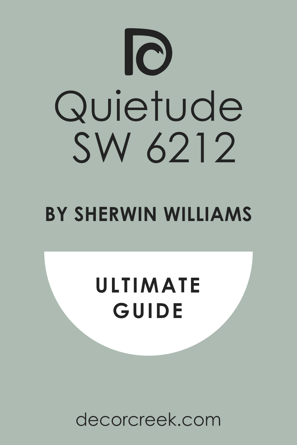
Quietude SW 6212
Quietude SW 6212 is a medium-light shade that feels very substantial and elegant. This color is a bit deeper than Rainwashed and brings more green to the party. I love how it creates a very stable and relaxing environment for a long soak.
It works very well in larger bathrooms where you have plenty of wall area to cover. The blue undertones make it feel very modern and fresh for a 2026 home. You will find that it coordinates well with both light and dark tile options.
It is a very versatile choice that bridges the gap between fun and formal styles. This paint makes a statement without shouting at anyone who walks in. It is a very popular pick for those who want a spa-like feeling at home. Your bathroom will feel very updated and stylish with this choice.
Best used in: main bathrooms, bedrooms, dining rooms, and accent pieces
Pairs well with: Rainwashed SW 6211, Greek Villa SW 7551, Underseas SW 6214, dark wood The key rule of this color for farmhouse style is to use it where you want natural light to feel kind, soft, and inviting throughout the day.
Aloe SW 6464
Aloe SW 6464 is a very pale and minty green that feels incredibly clean. This color is great if you want your bathroom to feel like a breath of fresh air. It is very light, so it acts almost like a neutral color in most lighting.
I suggest this for people who are nervous about using too much color in their home. It has a very cooling effect that is perfect for a room where you get ready. The hint of green is just enough to distinguish it from a plain white wall.
It looks amazing with white marble and light gray stone textures. You can use it to make a small, cramped bathroom feel much larger than it is. It is a very soft and gentle shade that works well for all ages. This is a wonderful pick for a bright and sunny look.
Best used in: small bathrooms, nurseries, kitchens, and ceilings
Pairs well with: High Reflective White SW 7757, Dewy SW 6469, Sea Salt SW 6204, light marble The key rule of this color for farmhouse style is to use it where you want natural light to feel kind, soft, and inviting throughout the day.

Coastal Plain SW 6192
Coastal Plain SW 6192 is a medium-toned green that feels like a walk through a grassy meadow. This color has a balanced mix of gray and green that makes it look very high-end on bathroom walls. I find that it works perfectly for people who want a noticeable color that is not too loud.
You will see that it provides a lovely backdrop for natural wood shelving and woven baskets. It is a very earthy shade that brings the feeling of the outdoors into your home. The depth of this paint helps create a very cozy and stable environment for your morning routine.
Many of my clients pick this because it looks great with both black and gold metal finishes. It is a very dependable choice that does not change its look too much when the sun goes down. Your bathroom will feel much more intentional and designed with this specific shade on the walls. This is a great middle-ground option for any home renovation project this year.
Best used in: main bathrooms, mudrooms, laundry rooms, and bedroom walls
Pairs well with: Svelte Sage SW 6164, Greek Villa SW 7551, Shoji White SW 7042, warm oak The key rule of this color for farmhouse style is to use it where you want natural light to feel kind, soft, and inviting throughout the day.

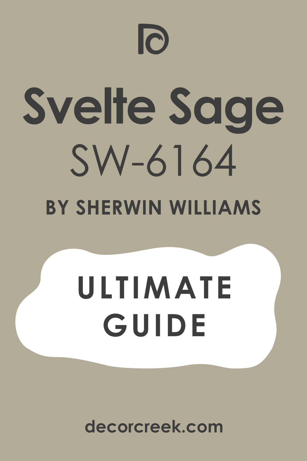
Svelte Sage SW 6164
Svelte Sage SW 6164 is a warm and golden green that feels very traditional and comfortable. This color reminds me of dried sage leaves sitting in a sunny kitchen window. I love how it adds a sense of history and softness to a room without feeling old-fashioned.
You should consider this shade if you have a lot of beige or cream tile in your bathroom. It flows very well with warmer color palettes and helps everything feel very connected. The yellow undertone makes the room feel glowing and happy even when it is raining outside.
It is a very soft choice that works well on all four walls of a large bathroom. You will enjoy how it makes white trim stand out in a very crisp and clean way. This paint is a wonderful way to make a cold room feel much warmer and more inviting. It is a classic green that has stood the test of time for a good reason.
Best used in: traditional bathrooms, kitchens, dining rooms, and hallways
Pairs well with: Grassland SW 6163, Antique White SW 6119, Universal Khaki SW 6150, bronze hardware The key rule of this color for farmhouse style is to use it where you want natural light to feel kind, soft, and inviting throughout the day.
Liveable Green SW 6176
Liveable Green SW 6176 is a very light and airy green that stays true to its simple name. This color is so soft that it almost acts as a neutral background for your bathroom decor. I recommend this for small powder rooms where you want a hint of nature without any heaviness.
It has a very fresh quality that makes the air in the room feel lighter and cleaner. You can pair it with dark floors to create a very nice contrast that looks very professional. The green in this paint is very gentle and does not feel minty or overwhelming at all.
It looks beautiful when paired with white marble or light gray stone countertops. Many people love how it provides a very quiet and soft look for their daily guest bathroom. It is a very easy color to decorate around because it matches almost any style of furniture. This is a top pick for a bright and open feeling in any small area.
Best used in: powder rooms, small baths, nurseries, and sunlit kitchens
Pairs well with: Softened Green SW 6177, Alabaster SW 7008, Clary Sage SW 6178, light wood The key rule of this color for farmhouse style is to use it where you want natural light to feel kind, soft, and inviting throughout the day.

Dried Thyme SW 6186
Dried Thyme SW 6186 is a heavy and saturated green that brings a lot of organic character. This color is deep and dusty, which makes it look very sophisticated and expensive on cabinetry. I like to use this when a client wants a bold look that still feels very natural and grounded.
It has a strong presence that works well in bathrooms with high ceilings or lots of light. You will find that it makes a wonderful accent wall behind a white freestanding soaking tub. The gray tones inside this green keep it from looking too bright or like a piece of fruit.
It pairs exceptionally well with copper or antique brass fixtures for a vintage look. This shade is perfect for creating a moody and relaxing vibe that feels like a forest retreat. It is a very popular choice for people who want to make a statement with their paint. Your home will feel very unique and stylish with this rich and deep green tone.
Best used in: accent walls, vanities, home offices, and exterior shutters
Pairs well with: Ethereal White SW 6182, Rosemary SW 6187, Prairie Grass SW 7546, dark metals The key rule of this color for farmhouse style is to use it where you want natural light to feel kind, soft, and inviting throughout the day.

Jasper Stone SW 9133
Jasper Stone SW 9133 is a beautiful blue-green that feels like a smooth rock found in a river. This color is very refreshing and brings a cool energy to any bathroom it is painted in. I love how it bridges the gap between a forest green and a deep ocean blue.
You will see that it looks very crisp when paired with bright white trim and dark hardware. It is a medium-dark shade that feels very sturdy and adds a lot of depth to the room. This paint is great for a master bathroom where you want a look that is both bold and calm.
It works very well with light gray tiles and modern plumbing fixtures like matte black. The color is rich enough to hide small scuffs and marks on the walls over time. Most people find that this shade makes their bathroom feel like a high-end designer space. It is a very trendy and attractive choice for a modern home update.
Best used in: master baths, accent walls, kitchen islands, and front doors
Pairs well with: Pure White SW 7005, Sea Salt SW 6204, Granite Peak SW 6250, silver accents The key rule of this color for farmhouse style is to use it where you want natural light to feel kind, soft, and inviting throughout the day.
Acacia Haze SW 9132
Acacia Haze SW 9132 is a medium green with a heavy slate-blue undertone that feels very cool. This color is perfect for a bathroom that gets a lot of warm afternoon sun to balance the heat. I find that it looks very elegant and quiet on walls that have a lot of white artwork.
It reminds me of the sky right before a storm or a foggy mountain forest in the morning. You can use this to create a very peaceful and focused mood for your guest bathroom. The blue in this paint makes it feel very clean and keeps it from looking too earthy or brown.
It looks fantastic with light-colored woods like birch or maple for a very modern look. Many designers love this shade because it feels very fresh and updated for the current year. It is a very smart choice for anyone who wants a color that feels both natural and cool. Your guests will definitely ask you for the name of this beautiful and unique paint.
Best used in: guest bathrooms, bedrooms, laundry rooms, and cabinets
Pairs well with: Origami White SW 7636, Pewter Cast SW 7673, Jasper Stone SW 9133, chrome hardware The key rule of this color for farmhouse style is to use it where you want natural light to feel kind, soft, and inviting throughout the day.

Laurel Woods SW 7749
Laurel Woods SW 7749 is a very dark and moody green that almost looks black in low light. This color is the ultimate choice for a high-drama bathroom that feels very luxurious and private. I love to use this on vanities or as a bold accent wall behind a gold-framed mirror.
It creates a very deep and rich feeling that makes everything else in the room pop. You should pair it with bright lights and light floors so the room does not feel too dark. The green in this paint is very sophisticated and reminds me of deep pine needles in the shade.
It works wonderfully for a small powder room where you want to surprise your visitors with style. This shade is very good at creating a feeling of luxury and high-end design on a budget. You will love how the deep color makes your white porcelain fixtures look bright and clean. This is a bold and brave choice that results in a stunning and beautiful room.
Best used in: accent walls, vanities, library rooms, and exterior trim
Pairs well with: Alabaster SW 7008, Shoji White SW 7042, Creamy SW 7012, gold accents The key rule of this color for farmhouse style is to use it where you want natural light to feel kind, soft, and inviting throughout the day.

October Mist 1495
October Mist 1495 is a soft and silvery green that feels very gentle on the eyes. This color was a color of the year for a reason because it is so easy to love. I find that it works in almost any bathroom regardless of the size or the lighting.
It has a dusty quality that makes it feel very expensive and carefully chosen for the home. You will notice that it shifts slightly between green and gray throughout the day’s light. It is a very organic shade that makes you feel more connected to the natural world outside.
I love pairing it with white linens and light oak furniture for a very clean look. This paint is light enough to be used in a room without windows without feeling heavy. It is a very popular choice for people who want a soft and pretty bathroom environment. Your morning routine will feel much more peaceful with this lovely shade on your walls.
Best used in: bathrooms, bedrooms, kitchens, and whole-house colors
Pairs well with: Steam AF-15, Morning Dew 1493, Collector’s Item AF-45, light wood The key rule of this color for farmhouse style is to use it where you want natural light to feel kind, soft, and inviting throughout the day.

Saybrook Sage HC-114
Saybrook Sage HC-114 is a classic and true sage green that feels very balanced and sturdy. This color has been a favorite for many years because it never seems to go out of style. I like to use this in traditional bathrooms that have a lot of white crown molding and trim.
It has enough saturation to be a real color but stays soft enough to be very relaxing. You will see that it works well with both beige and gray tiles, which is a rare feature. This shade reminds me of an old garden or a quiet country house in the summer.
It is a very reliable color that looks good under almost any type of bathroom light bulb. You can pair it with dark bronze hardware for a very grounded and classic look. Most people feel very comfortable with this shade because it feels familiar and very natural. It is a great way to add a bit of color that still feels very safe and pretty.
Best used in: traditional baths, exterior siding, kitchens, and dining rooms
Pairs well with: Simply White OC-117, Revere Pewter HC-172, Shaker Beige HC-45, dark bronze The key rule of this color for farmhouse style is to use it where you want natural light to feel kind, soft, and inviting throughout the day.

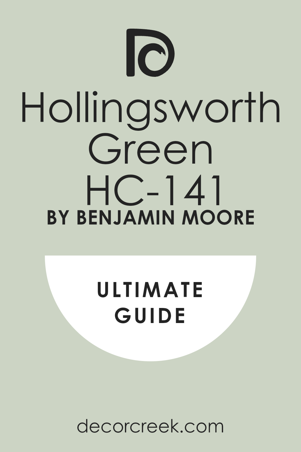
Hollingsworth Green HC-141
Hollingsworth Green HC-141 is a light and minty green that has a lot of gray to keep it soft. This color feels very vintage and charming in a bathroom with a clawfoot tub. I find that it makes any room feel much brighter and more cheerful as soon as it dries.
It has a watery quality that is perfect for a space where you want to feel very clean. You can pair it with silver or chrome fixtures for a very classic and sparkling look. The color is light enough to use on the ceiling if you want a very immersive feel. It works wonderfully in small guest bathrooms that need a little bit of extra light and life.
This shade is very soft and does not feel too bold or aggressive for a small area. Many of my clients love how it reminds them of old-fashioned spa retreats or beach houses. It is a very pretty and lighthearted choice for a fresh bathroom update.
Best used in: guest baths, kitchens, bedrooms, and powder rooms
Pairs well with: Chantilly Lace OC-65, Stonington Gray HC-170, Cloud White OC-130, silver metals The key rule of this color for farmhouse style is to use it where you want natural light to feel kind, soft, and inviting throughout the day.
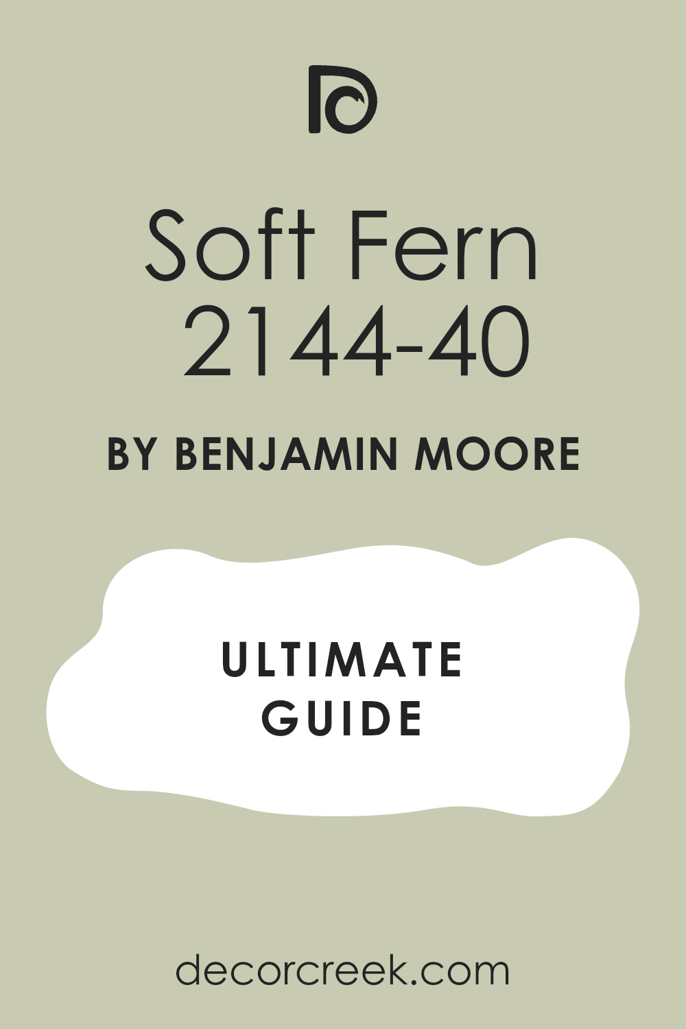
Soft Fern 2144-40
Soft Fern 2144-40 is a light and leafy green that feels like a gentle breeze in a spring garden. This color is a wonderful choice for bathrooms that need a little bit of warmth and natural light. I love how it makes a room feel very open and friendly without being too bright or yellow.
You will find that it works perfectly with white trim and light-colored stone floors. It is a very organic shade that helps you feel more connected to nature while you get ready. The pigment is soft enough to cover all four walls without making the room feel small.
It looks beautiful when paired with light wood accents and fluffy white towels. Many people choose this for a guest bathroom because it is very welcoming and pretty. This paint has a way of making the air in the room feel fresher and cleaner. It is a very reliable choice for anyone who wants a soft and natural look in their home.
Best used in: guest bathrooms, laundry rooms, kitchens, and bedrooms
Pairs well with: Cloud White OC-130, Gray Owl OC-52, Swiss Coffee OC-45, light wood tones The key rule of this color for farmhouse style is to use it where you want natural light to feel kind, soft, and inviting throughout the day.
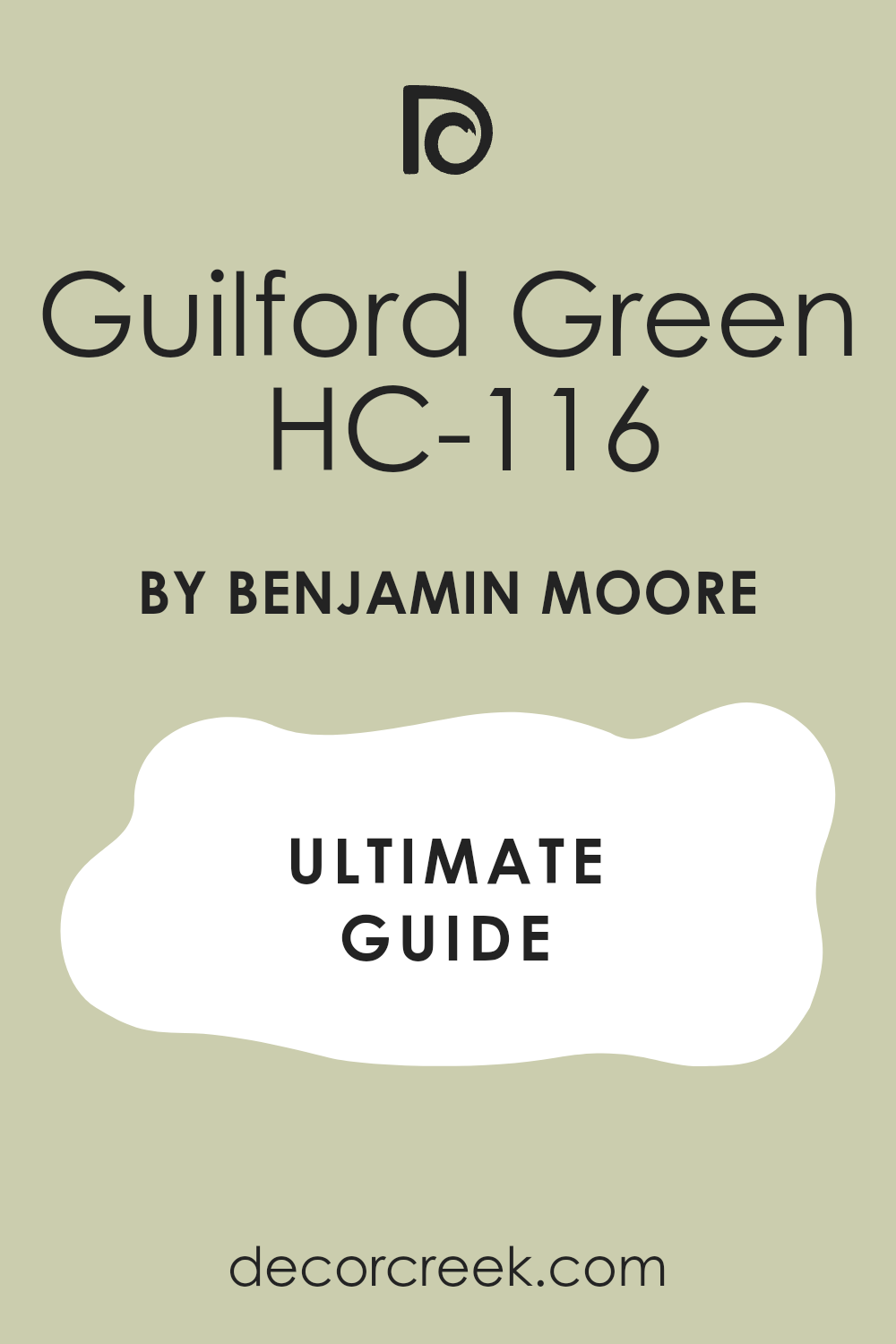
Guilford Green HC-116
Guilford Green HC-116 is a silvery green that acts as a bridge between a neutral and a real color. This shade was a very famous color of the year because it looks so good in so many different lights. I find that it works very well in bathrooms that have a lot of different textures like tile and wood.
It has a very natural and earthy feel that reminds me of a quiet forest floor. You will enjoy how it changes slightly from a warm green to a cool gray as the sun moves. It is a very sophisticated choice for a master bathroom where you want a high-end look.
This paint makes a great backdrop for black metal mirrors or dark bronze faucets. It is light enough to keep the room feeling big but has enough color to be interesting. Most people find this shade very easy to live with for a long time. Your bathroom will feel very updated and classy with this specific choice on the walls.
Best used in: master bathrooms, living rooms, hallways, and kitchen cabinets
Pairs well with: Simply White OC-117, Revere Pewter HC-172, Stonington Gray HC-170, dark metals The key rule of this color for farmhouse style is to use it where you want natural light to feel kind, soft, and inviting throughout the day.
Sage Wisdom CSP-775
Sage Wisdom CSP-775 is a medium green that has a very strong and confident personality. This color is perfect for someone who wants their bathroom to have a real sense of style and depth. I love how it looks when paired with crisp white subway tiles and a dark vanity.
It has a bit of a cool undertone that keeps the room feeling very fresh and clean. You can use this to create a very focused and grounded mood in a large bathroom. The color is deep enough to make a statement but light enough to not feel like a cave.
It works wonderfully with silver or chrome fixtures that sparkle against the green background. Many designers pick this shade when they want a look that is both modern and traditional. It provides a very rich and full look to the walls that makes the whole room feel expensive. This is a great pick for a bold but very pretty bathroom makeover.
Best used in: main bathrooms, accent walls, dining rooms, and home offices
Pairs well with: White Heron OC-57, Gray Cloud 2126-60, Black Abyss 1613, silver accents The key rule of this color for farmhouse style is to use it where you want natural light to feel kind, soft, and inviting throughout the day.

Healing Aloe 1562
Healing Aloe 1562 is a very light and watery green that feels like a quiet spa on a tropical island. This color is one of my favorite picks for small bathrooms that do not have any windows. I find that it brings a sense of light and air into dark corners very effectively.
It has a hint of blue and gray that keeps it from looking like a bright mint or candy color. You will love how it makes your white porcelain tub and sink look very bright and clean. It is a very soft and gentle shade that works well for a relaxing soak in the tub.
You can pair it with light gray tiles or white marble for a very high-end look. This paint is very popular because it makes people feel very peaceful as soon as they walk in. It is a very safe and beautiful choice for any home renovation project this year. Your bathroom will feel like a fresh breath of air with this lovely shade.
Best used in: small bathrooms, nurseries, bedrooms, and ceilings
Pairs well with: Chantilly Lace OC-65, Fog Mist OC-31, Beach Glass 1564, light marble The key rule of this color for farmhouse style is to use it where you want natural light to feel kind, soft, and inviting throughout the day.

Silver Sage 506
Silver Sage 506 is a beautiful mix of green, gray, and blue that feels very cool and refreshing. This color is a classic choice for bathrooms because it looks like the surface of a quiet lake. I love how it changes its look depending on whether you have warm or cool light bulbs.
It is a very sophisticated shade that makes any room feel much more designed and intentional. You will notice that it provides a very soft backdrop for white towels and silver fixtures. It is light enough to keep the room feeling open but has enough gray to feel very grounded.
Many people use this color to create a very quiet and steady mood in their home. It works very well with medium-toned wood floors or light gray stone tiles. This paint is a very dependable option for a master suite where you want to feel relaxed. Your home will feel very stylish and updated with this very popular green shade.
Best used in: master suites, guest baths, living areas, and kitchens
Pairs well with: White Dove OC-17, Sea Haze 1563, Swiss Coffee OC-45, brushed nickel The key rule of this color for farmhouse style is to use it where you want natural light to feel kind, soft, and inviting throughout the day.
Pale Smoke 1584
Pale Smoke 1584 is a very light gray-green that has a strong blue undertone to keep it cool. This color is perfect for a bathroom where you want to feel very clean and energized. I find that it acts almost like a neutral because it is so soft and light on the walls.
It reminds me of the sky on a misty morning or a piece of sea glass found on the beach. You can use this to make a tiny bathroom feel much larger and more open than it really is. It looks stunning when paired with dark wood vanities or black hardware for a bit of contrast.
The color is very gentle and does not feel too bold for someone who likes a simple look. Many of my clients love how it makes their bathroom feel like a high-end hotel room. This is a very smart choice for a bright and airy feeling in your daily washroom. It is a very pretty and versatile color that works with many different styles.
Best used in: small bathrooms, bedrooms, laundry rooms, and ceilings
Pairs well with: Simply White OC-117, Gray Huskie 1473, Midnight 2131-10, silver accents The key rule of this color for farmhouse style is to use it where you want natural light to feel kind, soft, and inviting throughout the day.
Lichen Green 2150-20
Lichen Green 2150-20 is a deep and earthy green that feels very rich and full of life. This color is a bold choice that brings a lot of organic character to your bathroom walls. I love to use this in rooms that have a lot of natural light to show off the pigment.
It reminds me of the deep moss that grows on old trees in a very quiet forest. You will find that it makes a wonderful statement when paired with gold or brass mirrors. It is a very sturdy shade that feels very grounded and strong in a large bathroom.
You should pair it with light-colored tiles to keep the room from feeling too dark or heavy. Many people love how it creates a very cozy and private feeling for their morning routine. This paint is perfect for an accent wall or a full room if you want a lot of drama. Your bathroom will feel very unique and custom with this beautiful forest shade.
Best used in: accent walls, vanities, powder rooms, and exterior doors
Pairs well with: Alabaster SW 7008, Creamy SW 7012, Wickham Gray HC-171, gold hardware The key rule of this color for farmhouse style is to use it where you want natural light to feel kind, soft, and inviting throughout the day.
Misted Fern 482
Misted Fern 482 is a medium-light green that feels very fresh and full of energy. This color has a bit of a silvery quality that makes it look very soft on the walls. I find that it works very well in bathrooms with a lot of white trim and bright lights.
It has a very natural feel that makes the room feel like a small indoor garden. You will enjoy how it provides a lovely contrast against dark wood floors or cabinets. It is a very flexible shade that works with both traditional and modern home styles.
The green in this paint is very clear and does not feel too muddy or gray. It looks beautiful when paired with fresh flowers and woven baskets for a natural look. Many of my clients pick this because it makes them feel very happy and awake. This is a wonderful pick for a main bathroom that the whole family uses every day. It is a very friendly and attractive color for any home.
Best used in: main bathrooms, kitchens, kids’ rooms, and laundry rooms
Pairs well with: Decorator’s White CC-20, Moonshine OC-56, Shaded Fern 2148-40, light oak The key rule of this color for farmhouse style is to use it where you want natural light to feel kind, soft, and inviting throughout the day.
Backwoods 469
Backwoods 469 is a very dark forest green that brings a massive amount of drama and style. This color is the perfect choice for a moody bathroom that feels very private and expensive. I like to use this on a vanity cabinet to make it the star of the whole room.
It has a very deep and rich tone that looks like velvet under the right bathroom lighting. You will find that it makes white tile and porcelain fixtures look incredibly bright and clean. It is a very bold shade that reminds me of deep pine trees in the middle of winter.
You should pair it with warm wood accents and gold metals for a very high-end look. This paint is great for creating a very cozy and small feel in a large and open room. Many people love how it makes their bathroom feel like a secret hideaway in the woods. It is a very popular choice for people who want a lot of color and character.
Best used in: vanities, accent walls, library rooms, and front doors
Pairs well with: Swiss Coffee OC-45, Revere Pewter HC-172, Pale Oak OC-20, gold accents The key rule of this color for farmhouse style is to use it where you want natural light to feel kind, soft, and inviting throughout the day.
Forest Floor 1498
Forest Floor 1498 is a medium-dark green with a lot of brown and gray in it for an earthy look. This color feels very grounded and natural, like the dirt and leaves in a deep woodland. I love how it creates a very stable and quiet environment for a long soak in the tub.
It is a very sophisticated shade that works well with traditional furniture and old-fashioned tiles. You will see that it pairs beautifully with warm metals like copper or antique brass. The depth of this paint helps hide small marks and makes the walls look very solid.
It is a great choice for a bathroom where you want a lot of character without too much brightness. Many of my clients love how it feels very traditional and never goes out of style. This paint makes a great backdrop for a wooden vanity or a stone countertop. Your bathroom will feel very warm and inviting with this very organic and deep green shade.
Best used in: master bathrooms, home offices, dining rooms, and cabinetry
Pairs well with: Cloud White OC-130, Edgecomb Gray HC-173, Manchester Tan HC-81, warm woods The key rule of this color for farmhouse style is to use it where you want natural light to feel kind, soft, and inviting throughout the day.
Oil Cloth CSP-760
Oil Cloth CSP-760 is a medium-toned green that feels very old-fashioned and charming. This color has a heavy dose of gray and tan which makes it look very organic. I love how it adds a sense of history to a new bathroom without looking dusty.
You will notice that it works perfectly with off-white tiles and vintage light fixtures. It is a very sturdy shade that reminds me of an old farmhouse kitchen or a garden shed. The warmth in this paint helps the room feel very cozy and lived-in for your family.
It looks wonderful when paired with dark wood floors and brass drawer pulls. Many people choose this color because it is very unique and does not look like every other green. It is a very smart choice for a bathroom that needs a bit of personality and warmth. This paint is a favorite for those who love a rustic or country look in their home.
Best used in: guest bathrooms, kitchens, mudrooms, and cabinets
Pairs well with: Mascarpone AF-20, Copley Gray HC-104, Black Beauty 2128-10, warm wood tones The key rule of this color for farmhouse style is to use it where you want natural light to feel kind, soft, and inviting throughout the day.
Raintree Green 1496
Raintree Green 1496 is a soft and balanced green that feels very fresh and natural. This color is deep enough to be noticed but light enough to keep the room feeling open. I find that it works very well in bathrooms that have a lot of white marble or quartz.
It has a very cooling effect that helps you start your morning with a clear head. You will enjoy how it looks with silver or nickel faucets because they look very crisp. This shade reminds me of the leaves on a tree right after a big summer rain.
It is a very popular pick for main bathrooms because everyone in the family usually likes it. You can use it on all four walls to create a very steady and pretty environment. This paint is very good at hiding small water spots on the wall from the sink. It is a very attractive and reliable choice for a fresh and updated look this year.
Best used in: main bathrooms, laundry rooms, bedrooms, and kitchens
Pairs well with: White Dove OC-17, Gray Owl OC-52, Hale Navy HC-154, brushed nickel The key rule of this color for farmhouse style is to use it where you want natural light to feel kind, soft, and inviting throughout the day.
Boreal Forest AF-480
Boreal Forest AF-480 is a very dark and rich green that feels very royal and deep. This color is the ultimate choice for a high-end look that makes a big statement. I love to use this on a vanity to make the white sink really stand out and shine.
It has a very cool undertone that makes the room feel very private and focused. You should pair it with bright lights so the room feels very intentional and not just dark. The green in this paint is very sophisticated and reminds me of a deep forest in the north.
It works beautifully with gold mirrors and marble floors for a very expensive feeling. This shade is very good at creating a moody vibe that feels very modern and cool. Many of my clients love how it makes their bathroom feel like a secret and fancy room. This is a bold choice that will make your home look very stylish and custom.
Best used in: vanities, accent walls, powder rooms, and exterior doors
Pairs well with: Chantilly Lace OC-65, Stonington Gray HC-170, Simply White OC-117, gold hardware The key rule of this color for farmhouse style is to use it where you want natural light to feel kind, soft, and inviting throughout the day.
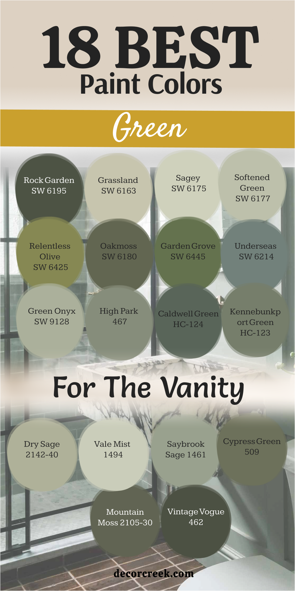
18 Best Green Paint Colors For The Vanity
Rock Garden SW 6195
Rock Garden SW 6195 is a deep and mossy green that looks very heavy and expensive on wood. This color is my top pick for a bathroom vanity that needs to feel very solid. I love how it looks when you put a white marble top on a cabinet painted this shade.
It has a lot of dark pigment which makes it look very rich under your bathroom lights. You will find that it hides fingerprints and soap splashes better than most other colors. It is a very organic shade that brings a lot of the outdoors into your bathroom.
You can pair it with brass knobs for a very classic and high-end look. This paint is very popular for people who want a bold furniture piece in a white room. It creates a very grounded feeling that makes your bathroom feel very well-designed. Your vanity will look like a custom piece of art with this beautiful forest green color.
Best used in: vanities, kitchen islands, accent walls, and front doors
Pairs well with: Alabaster SW 7008, Sea Salt SW 6204, Urban Bronze SW 7048, marble tops The key rule of this color for farmhouse style is to use it where you want natural light to feel kind, soft, and inviting throughout the day.
Grassland SW 6163
Grassland SW 6163 is a light and warm sage green that feels very soft on a vanity. This color is a great choice if you want a green cabinet that does not feel too dark. I find that it works perfectly in bathrooms that have a lot of beige or tan tile work.
It has a golden undertone that makes the furniture feel very sunny and friendly. You will enjoy how it looks with warm wood floors and cream-colored towels. This shade is very gentle and helps the bathroom feel very open and bright.
It is a very safe choice for a guest bathroom where you want a bit of color. The paint covers wood very well and gives it a very smooth and clean finish. Many people love how it reminds them of a quiet field in the middle of summer. This is a wonderful pick for a soft and natural bathroom vanity makeover.
Best used in: vanities, small cabinets, bedroom walls, and kitchens
Pairs well with: Svelte Sage SW 6164, Antique White SW 6119, Dover White SW 6385, warm wood The key rule of this color for farmhouse style is to use it where you want natural light to feel kind, soft, and inviting throughout the day.
Sagey SW 6175
Sagey SW 6175 is a very light and minty green that feels incredibly fresh on bathroom cabinets. This color is perfect for a small vanity in a room that needs to feel much larger. I love how it adds a tiny bit of color that still looks very clean and crisp.
You can pair it with white walls to make the vanity the main focus of the room. It has a very cooling effect that is wonderful for a room where you get ready. The green in this paint is very soft and does not feel too loud or bright for a home.
It looks amazing with silver hardware and white porcelain sinks for a classic look. Many of my clients pick this for their kids’ bathrooms because it feels very happy. This paint is very easy to clean and keeps its color very well over many years. Your bathroom will feel very updated and light with this pretty shade on the vanity.
Best used in: vanities, kids’ bathrooms, laundry rooms, and powder rooms
Pairs well with: Pure White SW 7005, Liveable Green SW 6176, Rainwashed SW 6211, silver accents The key rule of this color for farmhouse style is to use it where you want natural light to feel kind, soft, and inviting throughout the day.
Softened Green SW 6177
Softened Green SW 6177 is a medium-light shade that feels very balanced and very natural. This color is a great middle-ground choice for a vanity that needs some real presence. I find that it looks very elegant when paired with a light gray stone countertop.
It has a very quiet quality that helps the whole bathroom feel very focused and steady. You will find that it coordinates well with many different styles of tile and flooring. This shade is deep enough to hide a bit of dirt but light enough to feel very fresh.
It is a very popular choice for master bathrooms because it feels very sophisticated. The color looks very organic and reminds me of a garden in the early morning. You can use it to add a bit of luxury to a standard bathroom cabinet. This is a very smart and beautiful choice for any vanity project in your home.
Best used in: vanities, bathroom walls, kitchens, and mudrooms
Pairs well with: Clary Sage SW 6178, Alabaster SW 7008, Extra White SW 7006, gray stone The key rule of this color for farmhouse style is to use it where you want natural light to feel kind, soft, and inviting throughout the day.

Relentless Olive SW 6425
Relentless Olive SW 6425 is a very bright and bold green that has a lot of yellow in it. This color is the perfect pick for a vanity that you want everyone to notice right away. I love to use this in a small powder room to give it a big punch of personality.
It has a very vintage feel that reminds me of mid-century modern design and style. You should pair it with black hardware to keep it looking very modern and sharp. The color is very high-energy and makes the whole bathroom feel very fun and alive.
It is a great choice if you are tired of boring white and gray bathrooms. This paint looks very rich on wood and provides a very thick and solid coat of color. Many people love how it makes their bathroom feel very custom and very unique. Your home will feel much more exciting with this bold olive green on the vanity.
Best used in: vanities, accent furniture, powder rooms, and front doors
Pairs well with: High Reflective White SW 7757, Tricorn Black SW 6258, Accessible Beige SW 7036, black hardware The key rule of this color for farmhouse style is to use it where you want natural light to feel kind, soft, and inviting throughout the day.
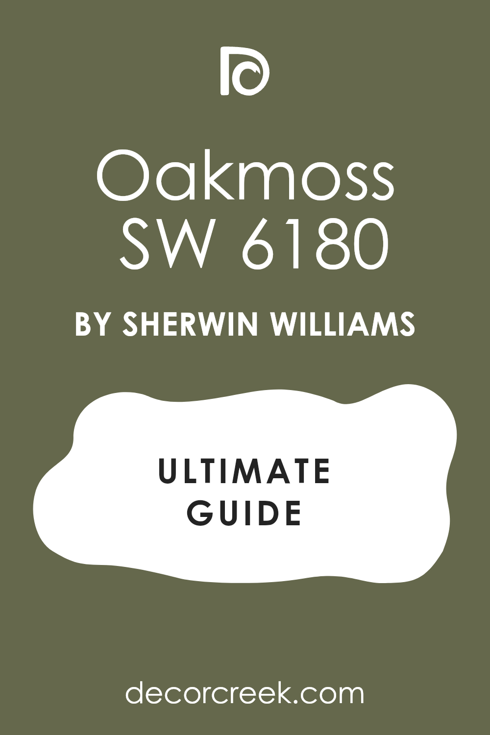
Oakmoss SW 6180
Oakmoss SW 6180 is a dark and earthy green that feels very traditional and very strong. This color is one of my favorite choices for a large vanity in a master bathroom. I find that it looks very expensive when paired with gold faucets and white marble.
It has a very deep and mossy feel that reminds me of an old forest at night. You will enjoy how it makes the vanity feel like a very sturdy and high-end piece of furniture. The color is dark enough to hide fingerprints and water marks from daily use.
It provides a very rich backdrop for light-colored walls and bright white towels. Many designers pick this shade for a very grounded and classic look in a home. It is a very dependable color that makes any bathroom feel much more finished and quiet. This is a top pick for a bathroom vanity that needs a bit of drama.
Best used in: vanities, kitchen islands, accent walls, and exterior trim
Pairs well with: Greek Villa SW 7551, Svelte Sage SW 6164, Dover White SW 6385, gold accents The key rule of this color for farmhouse style is to use it where you want natural light to feel kind, soft, and inviting throughout the day.
Garden Grove SW 6445
Garden Grove SW 6445 is a medium-dark green that has a very leafy and natural spirit. This color is perfect for a vanity in a bathroom that has a lot of plants and light. I love how it makes the wood grain look very rich and full of life when painted. It is a very cheerful shade that still feels very grown-up and very sophisticated.
You will notice that it looks very crisp when paired with white sinks and silver hardware. This shade reminds me of a thick hedge in a beautiful garden during the summer. It is a very good choice for a bathroom that needs a splash of real color.
The paint is very durable and holds up well to the moisture in a busy washroom. Many people find that this color makes their morning routine feel more connected to nature. Your bathroom will feel very fresh and updated with this lovely green on the cabinet.
Best used in: vanities, laundry rooms, accent walls, and garden sheds
Pairs well with: Pure White SW 7005, Sea Salt SW 6204, Rainwashed SW 6211, silver hardware The key rule of this color for farmhouse style is to use it where you want natural light to feel kind, soft, and inviting throughout the day.
Underseas SW 6214
Underseas SW 6214 is a deep and watery green that has a lot of gray and blue inside it. This color is one of my top choices for a bathroom vanity because it feels very sturdy. I love how it changes its look depending on how much light is in the room.
It has a very cool feeling that reminds me of the ocean floor on a quiet day. You will find that it makes a wonderful contrast when paired with bright white walls. The dark pigment is very good at hiding the daily wear and tear that happens in a bathroom.
It looks very expensive when you add brushed nickel or silver handles to the drawers. This shade is perfect for a master bathroom where you want a very professional look. Many of my clients love how it makes their vanity look like a custom piece of furniture. Your home will feel much more modern and stylish with this rich color choice.
Best used in: vanities, kitchen islands, accent walls, and mudroom lockers
Pairs well with: Sea Salt SW 6204, Pure White SW 7005, North Star SW 6246, silver hardware The key rule of this color for farmhouse style is to use it where you want natural light to feel kind, soft, and inviting throughout the day.
Green Onyx SW 9128
Green Onyx SW 9128 is a medium-light green that feels very soft and very organic on wood. This color is a great choice for a vanity if you want a look that is light but not white. I find that it brings a very quiet and natural energy to a small bathroom area.
It has a slightly warm undertone that makes the wood feel very friendly and inviting. You will notice that it works perfectly with light beige tiles and warm wood floors. This shade reminds me of a smooth stone you might find in a very clear river.
It is a very safe choice for a guest bathroom where you want people to feel relaxed. The paint goes on very smooth and gives the cabinet a very clean and updated finish. Many people love how it provides a hint of color without being too bold or loud. This is a wonderful pick for a vanity that needs a fresh and natural touch.
Best used in: vanities, bathroom walls, laundry rooms, and bedroom furniture
Pairs well with: Alabaster SW 7008, Svelte Sage SW 6164, Oyster White SW 7637, warm wood The key rule of this color for farmhouse style is to use it where you want natural light to feel kind, soft, and inviting throughout the day.

High Park 467
High Park 467 is a medium-dark green that has a lot of gray to keep it very sophisticated. This color is a favorite for vanities because it feels very high-end and very carefully chosen. I love how it provides a rich backdrop for a white ceramic sink and a chrome faucet.
It has a very steady and grounded feel that makes the whole room feel more permanent. You will enjoy how it looks against light gray tile or a white marble countertop. This shade reminds me of a well-kept park in the city during the middle of summer.
It is a very flexible color that works well in both modern and traditional home styles. Many designers pick this shade when they want a green that feels very adult and quiet. It is very good at hiding dust and fingerprints which is great for a busy bathroom. Your vanity will look very elegant and professional with this beautiful and deep shade.
Best used in: vanities, kitchen cabinets, home offices, and accent walls
Pairs well with: White Dove OC-17, Stonington Gray HC-170, Revere Pewter HC-172, chrome hardware The key rule of this color for farmhouse style is to use it where you want natural light to feel kind, soft, and inviting throughout the day.
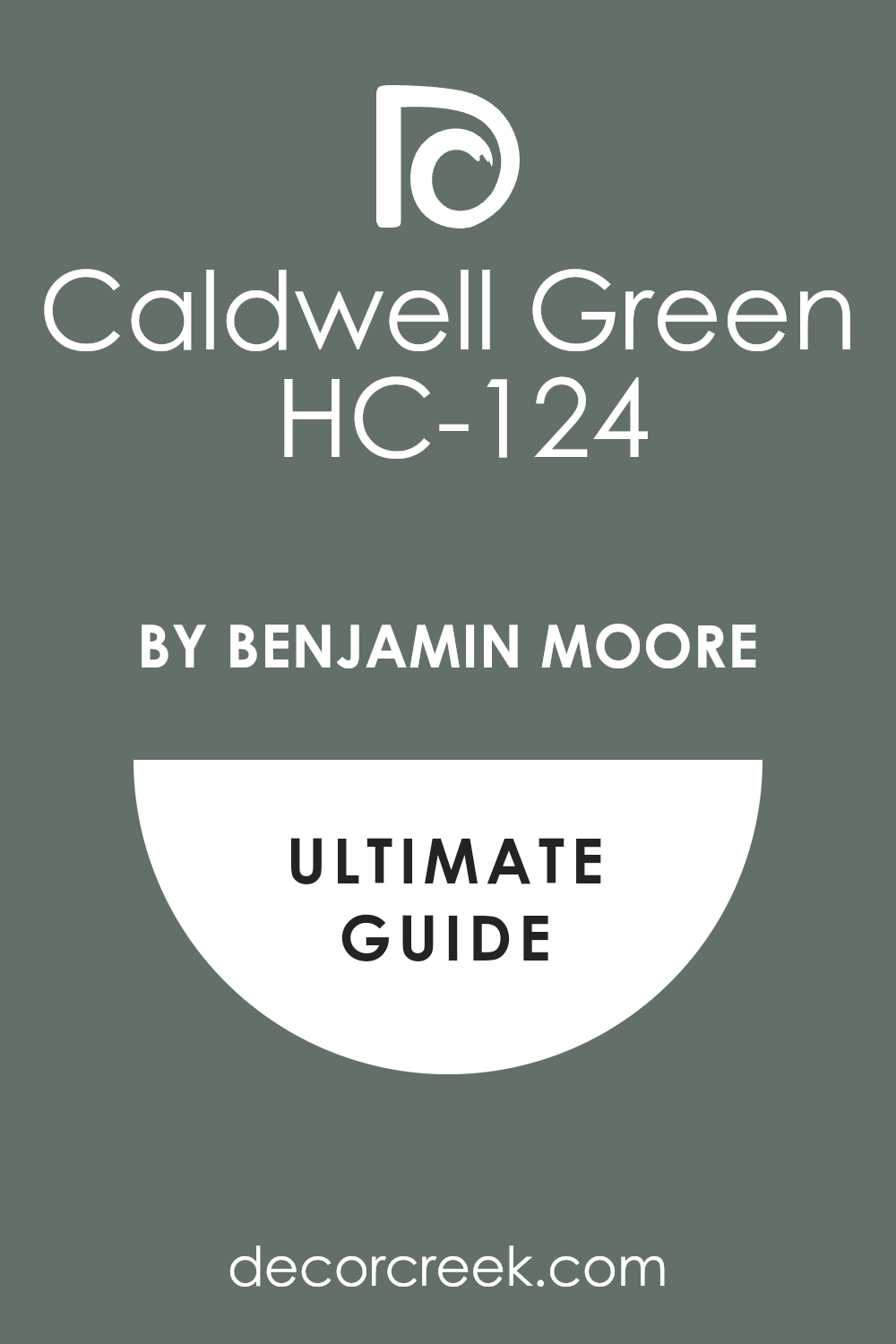
Caldwell Green HC-124
Caldwell Green HC-124 is a deep and traditional green that feels very historic and very strong. This color is part of a special collection because it has such a classic and pretty look. I find that it looks best on a vanity that has a lot of detail or decorative trim.
It has a very rich and full look that makes any piece of furniture feel very expensive. You will see that it pairs beautifully with gold or brass hardware for a vintage vibe. This shade reminds me of the shutters on a very old and beautiful country house.
It is a very sturdy color that makes the bathroom feel very private and very cozy. Many people love how it adds a sense of history to a brand-new bathroom renovation. This paint is very durable and will keep its deep color for a very long time. Your home will feel much more custom and unique with this classic green vanity.
Best used in: vanities, exterior doors, library shelves, and kitchen islands
Pairs well with: Simply White OC-117, Shaker Beige HC-45, Edgecomb Gray HC-173, gold hardware The key rule of this color for farmhouse style is to use it where you want natural light to feel kind, soft, and inviting throughout the day.
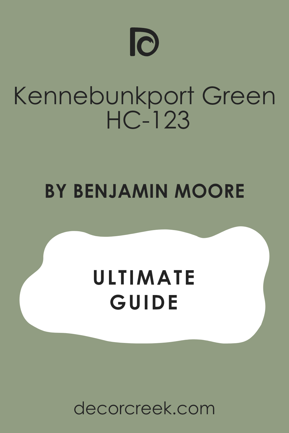
Kennebunkport Green HC-123
Kennebunkport Green HC-123 is a medium-dark green that has a very warm and earthy spirit. This color is a wonderful choice for a vanity in a bathroom with a lot of natural wood. I love how it makes the room feel very cozy and very grounded as soon as it is applied.
It has a bit of a yellow base which makes it feel like a sunny day in the woods. You will find that it looks very crisp when you use bright white towels nearby. This shade is very popular for people who want a look that feels very natural and organic.
It works very well with bronze or black fixtures for a very sturdy and strong appearance. Many of my clients choose this because it feels very traditional and never goes out of style. The paint is very thick and provides a very nice finish on old wood cabinets. Your vanity will feel very warm and inviting with this lovely and rich green shade.
Best used in: vanities, kitchen cabinets, front doors, and mudrooms
Pairs well with: Cloud White OC-130, Tan tones, Woodmont Cream 1047, bronze hardware The key rule of this color for farmhouse style is to use it where you want natural light to feel kind, soft, and inviting throughout the day.
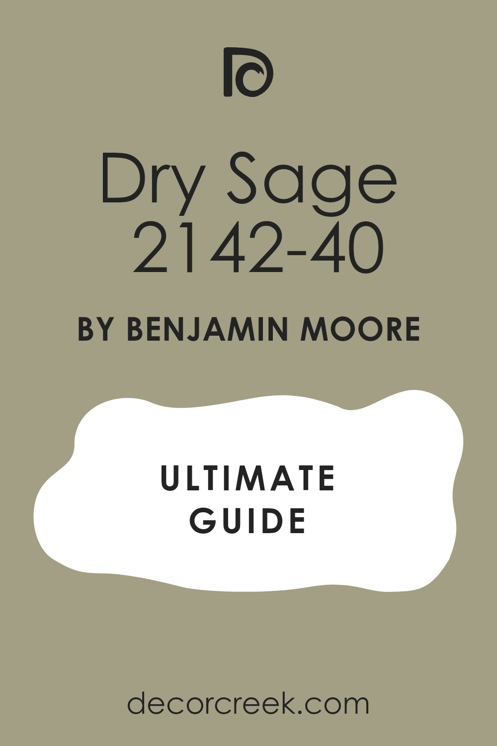
Dry Sage 2142-40
Dry Sage 2142-40 is a soft and muted green that feels very quiet and very relaxed on wood. This color is a great middle-ground for a vanity that needs to be noticed but not loud. I find that it works perfectly in bathrooms that have a lot of white and gray textures.
It has a very natural feel that reminds me of dried herbs hanging in a bright kitchen. You will enjoy how it provides a soft contrast against a dark floor or a light wall. This shade is very easy to live with and helps the whole room feel very focused.
It is a very popular choice for master bathrooms because it feels very high-end and spa-like. The color is deep enough to hide a little bit of dirt but light enough to feel fresh. Many people love how it makes their bathroom feel much more peaceful and steady. This is a very smart and beautiful choice for any vanity project in your home.
Best used in: vanities, bathroom walls, bedroom furniture, and kitchens
Pairs well with: Swiss Coffee OC-45, Gray Owl OC-52, Pashmina AF-100, light wood The key rule of this color for farmhouse style is to use it where you want natural light to feel kind, soft, and inviting throughout the day.
Vale Mist 1494
Vale Mist 1494 is a light and silvery green that has a very airy and fresh feeling on a vanity. This color is perfect if you want your bathroom furniture to feel very light and very clean. I love how it adds a tiny bit of color that still looks like a soft neutral in most light.
You can pair it with white marble tops to make the whole room feel very bright and open. It has a very cooling effect that is wonderful for a small guest bathroom or a powder room. The green in this paint is very gentle and does not feel too bold for someone who likes simple things. It looks amazing with silver hardware and white porcelain sinks for a classic and pretty look.
Many of my clients pick this because it makes the room feel much larger than it really is. This paint is very easy to clean and keeps its light color very well over time. Your bathroom will feel very updated and fresh with this pretty shade.
Best used in: vanities, small bathrooms, laundry rooms, and ceilings
Pairs well with: Chantilly Lace OC-65, Morning Dew 1493, Silver Satin OC-26, silver accents The key rule of this color for farmhouse style is to use it where you want natural light to feel kind, soft, and inviting throughout the day.
Saybrook Sage HC-114
Saybrook Sage HC-114 is a very popular and classic green that feels very balanced on a vanity cabinet. This color has been a favorite for a long time because it looks good in almost every bathroom. I find that it provides a very rich and organic look that makes the furniture stand out.
It has enough gray in it to keep it from looking like a bright grass color or a crayon. You will notice that it works well with both warm and cool metal finishes like gold or silver. This shade reminds me of a quiet garden path on a very soft and cloudy afternoon.
It is a very reliable color that helps the bathroom feel very steady and very grounded. Many designers choose this for a traditional look that still feels very fresh and very updated. The paint provides a very smooth finish that makes your vanity look like a high-end piece. Your home will feel very stylish and pretty with this classic green on the cabinets.
Best used in: vanities, kitchen islands, accent walls, and exterior shutters
Pairs well with: Simply White OC-117, Revere Pewter HC-172, Edgecomb Gray HC-173, any metal The key rule of this color for farmhouse style is to use it where you want natural light to feel kind, soft, and inviting throughout the day.
Cypress Green 509
Cypress Green 509 is a deep and earthy green that has a lot of brown undertones for a natural look. This color is the perfect choice for a vanity if you want a look that feels very organic. I love how it makes a bathroom feel very cozy and very private as soon as the paint dries.
It has a very rich and full look that pairs beautifully with natural wood and stone. You will find that it makes white sinks and towels look incredibly bright and very clean. This shade reminds me of the deep needles on an old cypress tree in the middle of a forest.
It is a very bold choice that brings a lot of character and style to your bathroom project. You should pair it with warm metals like copper for a very high-end and custom look. Many people love how it makes their vanity look very sturdy and very expensive. This is a great pick for someone who wants a bold and natural bathroom vanity.
Best used in: vanities, accent furniture, exterior trim, and library walls
Pairs well with: White Dove OC-17, Manchester Tan HC-81, Woodmont Cream 1047, warm metals The key rule of this color for farmhouse style is to use it where you want natural light to feel kind, soft, and inviting throughout the day.
Mountain Moss 2142-30
Mountain Moss 2142-30 is a very dark and moody green that feels very sophisticated on a vanity. This color is one of my favorite picks for a high-drama bathroom that needs some deep color. I find that it looks very expensive when you pair it with a bright white marble countertop.
It has a very cool and quiet feeling that makes the room feel very private and focused. You will enjoy how it hides water spots and daily mess better than lighter paint colors. This shade reminds me of the dark moss that grows on cold rocks high up in the mountains.
It is a very bold choice that makes your bathroom look like it was designed by a professional. You can use it to create a very grounded and strong look in a large master suite. Many people love how it makes their white porcelain fixtures pop in a very clean way. Your vanity will feel like a secret and fancy piece of art with this beautiful color.
Best used in: vanities, kitchen islands, accent walls, and front doors
Pairs well with: Simply White OC-117, Stonington Gray HC-170, Gray Owl OC-52, silver accents The key rule of this color for farmhouse style is to use it where you want natural light to feel kind, soft, and inviting throughout the day.
Vintage Vogue 462
Vintage Vogue 462 is a very deep and dark green that almost feels like a neutral black. This color is the ultimate choice for a vanity that needs to look very modern and very chic. I love how it creates a very rich and velvet-like finish on wood cabinets in a bathroom.
It has a very high-end feeling that makes the whole room look much more expensive than it is. You should pair it with bright gold hardware to create a very stunning and beautiful contrast. This shade is very good at creating a moody vibe that feels very private and very cozy.
Many of my clients choose this because it makes a big statement in a small powder room. It works wonderfully with light gray tile and bright white towels for a very clean look. Your bathroom will feel very updated and stylish with this very deep and attractive green. This is a bold and brave choice that results in a very beautiful and custom vanity.
Best used in: vanities, accent walls, library rooms, and kitchen cabinets
Pairs well with: Chantilly Lace OC-65, Revere Pewter HC-172, Classic Gray OC-23, gold hardware The key rule of this color for farmhouse style is to use it where you want natural light to feel kind, soft, and inviting throughout the day.

19 Trendy Paint Colors For The Green Bathroom Cabinets
Basil SW 6194
Basil SW 6194 is a deep and earthy green that brings a natural and sturdy look to your bathroom cabinets. This color has a dusty quality that keeps it from looking too bright or flashy in a small room. I love how it looks when you pair it with warm wood floors and cream-colored walls.
It is a very sophisticated shade that makes your cabinetry look like a custom piece of furniture. You will notice that it hides small water spots and fingerprints quite well during your daily use. This paint feels very organic and reminds me of a quiet herb garden in the late afternoon. It works beautifully with brass or gold hardware to create a very high-end and warm feeling.
Many people choose this for a master bathroom to create a very grounded and relaxing mood. It is a very dependable choice that feels both modern and traditional at the same time. Your home will feel much more intentional and designed with this rich green on your cabinets.
Best used in: bathroom cabinets, kitchen islands, mudrooms, and front doors
Pairs well with: Alabaster SW 7008, Sea Salt SW 6204, Kilim Beige SW 6106, gold hardware The key rule of this color for farmhouse style is to use it where you want natural light to feel kind, soft, and inviting throughout the day.
Ripe Olive SW 6209
Ripe Olive SW 6209 is a very dark and moody green that adds a massive amount of drama to any bathroom. This color is one of my top picks for cabinets because it looks very expensive and very bold. I find that it works best when you have bright white tiles or walls to provide a sharp contrast.
It has a very deep and forest-like quality that makes the room feel very private and cozy. You will see that it makes silver or chrome handles sparkle like jewelry against the dark paint. This shade is very good at creating a high-end look on a budget for a quick renovation.
It reminds me of the deep leaves on an olive tree in the middle of a thick woods. Many designers use this to make a small powder room feel very fancy and very unique. This paint is thick and provides a very smooth finish that feels very professional on wood. Your cabinets will become the star of the room with this beautiful and deep green color.
Best used in: bathroom cabinets, accent walls, exterior trim, and library shelves
Pairs well with: Pure White SW 7005, Spare White SW 6203, Grayish SW 6001, silver hardware The key rule of this color for farmhouse style is to use it where you want natural light to feel kind, soft, and inviting throughout the day.

Privilege Green SW 6193
Privilege Green SW 6193 is a medium-toned green that has a very clear and classic personality for cabinets. This color is a wonderful middle ground for someone who wants color without it being too dark. I love how it brings a fresh and energized feeling to the bathroom every single morning.
It has a bit of a gray undertone that keeps the green feeling soft and very easy to live with. You can pair it with white quartz countertops for a very clean and modern look in your home. This shade reminds me of the lush grass in a well-kept park during the early summertime.
It is a very flexible color that works well with both silver and gold metal fixtures. Many of my clients pick this because it feels very updated and stays stylish for many years. It covers wood surfaces very well and gives a very solid look to your bathroom storage. This is a great pick for a bright and happy bathroom cabinet update.
Best used in: bathroom cabinets, laundry rooms, kitchen walls, and shutters
Pairs well with: Shoji White SW 7042, Sea Salt SW 6204, Basil SW 6194, any metal finish The key rule of this color for farmhouse style is to use it where you want natural light to feel kind, soft, and inviting throughout the day.

Cucuzza Verde SW 9038
Cucuzza Verde SW 9038 is a warm and olive-toned green that brings a lot of personality to your cabinets. This color has a vintage spirit that makes a bathroom feel very charming and very cozy. I find that it works perfectly with off-white tiles and bronze hardware for a traditional look.
It is a very earthy shade that makes the room feel very grounded and very natural. You will enjoy how it looks under warm bathroom lights because it glows in a very soft way. This shade reminds me of old-fashioned kitchens in a country house near the Mediterranean sea.
It is a very sturdy color that helps hide the mess of a busy family bathroom easily. Many people love how it adds a sense of history and character to a brand-new house. This paint provides a very rich and full look that makes your cabinets feel very high-quality. Your home will feel very warm and inviting with this unique and pretty green shade.
Best used in: bathroom cabinets, kitchen islands, mudrooms, and accent furniture
Pairs well with: Creamy SW 7012, Ancient Marble SW 6162, Svelte Sage SW 6164, bronze hardware The key rule of this color for farmhouse style is to use it where you want natural light to feel kind, soft, and inviting throughout the day.
Olympic Range SW 7750
Olympic Range SW 7750 is an incredibly dark green that almost looks black in many types of light. This color is the ultimate choice for a high-drama cabinet that feels very modern and very chic. I love to use this on a large vanity to create a very strong focal point in a white room.
It has a very cool and deep feeling that makes the whole bathroom feel more private. You should pair it with bright white marble and gold mirrors for a very stunning look. This shade reminds me of the deep pine forests on a dark mountain in the middle of winter.
It is very good at creating a moody vibe that feels very expensive and very custom. Many of my clients choose this because it makes a big statement and looks very professional. The paint is very durable and holds its deep color beautifully against the steam of a shower. Your bathroom will feel very updated and stylish with this very deep and bold green.
Best used in: bathroom cabinets, accent walls, front doors, and library rooms
Pairs well with: Alabaster SW 7008, Greek Villa SW 7551, High Reflective White SW 7757, gold accents The key rule of this color for farmhouse style is to use it where you want natural light to feel kind, soft, and inviting throughout the day.
Isle of Pines SW 6461
Isle of Pines SW 6461 is a rich and jewel-toned green that feels very lush on bathroom cabinets. This color is perfect for someone who wants a real forest green that feels very alive and bold. I find that it looks amazing when paired with white subway tile and black hardware for a sharp look.
It has a very traditional feel but still works well in a modern and clean bathroom design. You will notice that it brings a lot of depth and character to the wood surfaces of your cabinets. This shade reminds me of deep evergreen trees in a thick forest during a bright day.
It is a very sturdy color that makes the whole room feel much more established and strong. Many people love how it adds a touch of nature to their indoor life in a very big way. This paint provides a very smooth and high-end finish that looks great for a long time. Your home will feel very unique and very stylish with this beautiful leafy green.
Best used in: bathroom cabinets, kitchen islands, front doors, and shutters
Pairs well with: Extra White SW 7006, Sea Salt SW 6204, Rainwashed SW 6211, black hardware The key rule of this color for farmhouse style is to use it where you want natural light to feel kind, soft, and inviting throughout the day.

Green Earth SW 7748
Green Earth SW 7748 is a light and muted green that has a lot of gray and tan mixed inside. This color is a great choice for cabinets if you want a look that is very soft and quiet. I find that it brings a very peaceful and natural energy to a small bathroom vanity.
It has a slightly warm undertone that makes the wood feel very friendly and very inviting. You will see that it works perfectly with light beige tiles and warm wood flooring. This shade reminds me of dry clay or a smooth stone found in a quiet garden path.
It is a very safe choice for a guest bathroom where you want people to feel very relaxed. The paint goes on very smooth and gives the cabinet a very clean and updated appearance. Many people love how it provides a hint of color without being too loud or too bright. This is a wonderful pick for a cabinet that needs a fresh and natural touch.
Best used in: bathroom cabinets, laundry rooms, bedroom walls, and kitchens
Pairs well with: Alabaster SW 7008, Svelte Sage SW 6164, Oyster White SW 7637, warm wood The key rule of this color for farmhouse style is to use it where you want natural light to feel kind, soft, and inviting throughout the day.
Inverness SW 6433
Inverness SW 6433 is a medium-dark green that has a lot of energy and a very fresh spirit. This color is a wonderful choice for a bathroom cabinet that needs to look very updated and fun. I love how it looks when paired with light gray stone and silver or chrome fixtures.
It has a very clear green tone that reminds me of a grassy hill in the early springtime. You will find that it makes the whole bathroom feel much more cheerful as soon as it dries. This shade is very popular for families who want a bathroom that feels bright and very clean.
It is a very flexible color that works with many different styles of tile and flooring. Many designers pick this shade when they want a green that feels very natural and very bold. The paint is very durable and holds up well to the moisture of a busy master bathroom. Your cabinets will feel very fresh and very attractive with this lovely green shade.
Best used in: bathroom cabinets, laundry rooms, accent furniture, and kitchens
Pairs well with: Pure White SW 7005, Rainwashed SW 6211, Sea Salt SW 6204, silver hardware The key rule of this color for farmhouse style is to use it where you want natural light to feel kind, soft, and inviting throughout the day.
Pewter Green SW 6208
Pewter Green SW 6208 is a dark and cool green that brings a lot of sophistication to your cabinets. This color is a favorite for many interior designers because it looks very high-end and very calm. I find that it looks best when you have a lot of white trim and light floors to balance it.
It has a dusty quality that makes the cabinetry feel very sturdy and very established in the room. You will enjoy how it looks with gold or brass hardware for a very classic and pretty look. This shade reminds me of an old metal gate or a forest on a very foggy morning.
It is a very reliable color that helps hide fingerprints and water spots on your bathroom storage. Many people love how it adds a sense of luxury to their home without being too bright. This paint provides a very rich and smooth finish that looks professional on old or new wood. Your bathroom will feel very updated and classy with this specific green on the cabinets.
Best used in: bathroom cabinets, kitchen islands, accent walls, and exterior doors
Pairs well with: Spare White SW 6203, Sea Salt SW 6204, Alabaster SW 7008, gold hardware The key rule of this color for farmhouse style is to use it where you want natural light to feel kind, soft, and inviting throughout the day.
Essex Green HC-188
Essex Green HC-188 is a very deep and traditional forest green that feels very royal and rich. This color is part of a historic collection because it has such a classic and pretty look. I find that it looks amazing on large cabinets that have a lot of decorative details or trim.
It has a very full and dark appearance that makes any bathroom feel much more expensive. You will see that it pairs beautifully with gold or brass hardware for a very vintage vibe. This shade reminds me of the deep velvet curtains in a very old and fancy hotel room.
It is a very sturdy color that makes the whole bathroom feel very private and very cozy. Many people love how it adds a sense of history and style to a modern bathroom renovation. This paint is very thick and will keep its beautiful deep color for many years to come. Your cabinets will look very custom and very unique with this classic and dark green.
Best used in: bathroom cabinets, front doors, library shelves, and kitchen islands
Pairs well with: Simply White OC-117, Shaker Beige HC-45, Revere Pewter HC-172, gold hardware The key rule of this color for farmhouse style is to use it where you want natural light to feel kind, soft, and inviting throughout the day.

Tarrytown Green HC-134
Tarrytown Green HC-134 is a deep and regal shade that feels very expensive on bathroom cabinets. This color has a strong presence that makes even a simple vanity look like a high-end piece of custom furniture. I love how it sits between a forest green and a navy blue in some lighting situations.
You will find that it provides a very sturdy and grounded look to the lower half of your bathroom. It is a very sophisticated choice for people who want a dark color that still feels very full of life. This shade reminds me of a quiet mountain lake surrounded by very old and thick pine trees. It looks stunning when paired with bright white quartz tops and sparkling silver or chrome hardware.
Many designers choose this for a traditional home that needs a touch of modern drama and style. The paint is very thick and gives a beautiful finish that hides the wood grain very well. Your bathroom will feel very professional and very polished with this rich and deep green.
Best used in: bathroom cabinets, kitchen islands, front doors, and accent walls
Pairs well with: Simply White OC-117, Revere Pewter HC-172, Gray Owl OC-52, silver hardware The key rule of this color for farmhouse style is to use it where you want natural light to feel kind, soft, and inviting throughout the day.
Salamander 2050-10
Salamander 2050-10 is an incredibly dark green that looks almost like a deep black at first glance. This color is the ultimate choice for a moody and chic bathroom cabinet project. I find that it brings a lot of luxury to a small room by creating a very deep and focused look.
It has a cool undertone that makes the wood surfaces look very sleek and very modern. You should pair it with bright gold or brass knobs to make the hardware stand out like jewelry. This shade reminds me of the deep shadows in a thick forest during a moonlit night.
It is a very bold pick for someone who wants their home to look like it belongs in a magazine. Many people love how it creates a very private and cozy feeling in a large master bathroom. This paint is very durable and holds its rich color very well against soap and water splashes. Your home will feel much more stylish and unique with this very dark and beautiful green.
Best used in: bathroom cabinets, accent walls, library rooms, and front doors
Pairs well with: Cloud White OC-130, Stonington Gray HC-170, Pale Oak OC-20, gold accents The key rule of this color for farmhouse style is to use it where you want natural light to feel kind, soft, and inviting throughout the day.

Hunter Green 2041-10
Hunter Green 2041-10 is a classic and true forest green that feels very traditional and very strong. This color has been a favorite for many years because it brings a sense of the outdoors inside. I love how it looks on bathroom cabinets when paired with warm wood floors and white walls.
It is a very rich shade that makes the room feel very established and very high-quality. You will see that it works beautifully with brass hardware to create a very warm and vintage look. This shade reminds me of the thick leaves on an old tree in a very quiet and peaceful woods.
It is a very sturdy color that helps hide any mess from a busy morning routine. Many of my clients pick this for a guest bathroom because it feels very welcoming and very sturdy. This paint provides a very smooth and deep finish that makes any cabinet look brand new. Your bathroom will feel very classic and very handsome with this deep leafy green.
Best used in: bathroom cabinets, kitchen islands, exterior trim, and front doors
Pairs well with: White Dove OC-17, Manchester Tan HC-81, Revere Pewter HC-172, brass hardware The key rule of this color for farmhouse style is to use it where you want natural light to feel kind, soft, and inviting throughout the day.

Dark Olive 2140-30
Dark Olive 2140-30 is a warm and earthy green that has a lot of brown and yellow in it. This color is a wonderful choice for cabinets if you want a look that feels very organic. I find that it makes a bathroom feel very cozy and very private as soon as the paint dries.
It has a very rich and full look that pairs beautifully with natural wood and stone floors. You will find that it makes white sinks and towels look incredibly bright and very clean. This shade reminds me of the deep colors found in a Mediterranean garden during the summer.
It is a very bold choice that brings a lot of character and style to your cabinetry project. You should pair it with warm metals like copper for a very high-end and custom look. Many people love how it makes their storage look very sturdy and very expensive. This is a great pick for someone who wants a bold and natural bathroom update.
Best used in: bathroom cabinets, accent furniture, exterior siding, and home offices
Pairs well with: Creamy SW 7012, Edgecomb Gray HC-173, Pashmina AF-100, warm metals The key rule of this color for farmhouse style is to use it where you want natural light to feel kind, soft, and inviting throughout the day.
Cushing Green HC-125
Cushing Green HC-125 is a medium-dark green that has a very soft and dusty quality on cabinets. This color is part of a historic collection and brings a sense of old-world charm to your home. I love how it looks when paired with off-white tile and vintage-style light fixtures.
It is a very sophisticated shade that makes your cabinetry look like a piece of history. You will enjoy how it provides a rich look that is not too dark or too aggressive for a room. This shade reminds me of a quiet garden in a very old and beautiful country estate. It works wonderfully with gold hardware to create a very soft and high-end feeling for your guests.
Many designers pick this shade when they want a green that feels very adult and very quiet. This paint is very good at hiding dust and fingerprints which is great for a busy washroom. Your bathroom will feel very elegant and professional with this beautiful and deep shade.
Best used in: bathroom cabinets, kitchen islands, library shelves, and accent walls
Pairs well with: Simply White OC-117, Shaker Beige HC-45, Revere Pewter HC-172, gold hardware The key rule of this color for farmhouse style is to use it where you want natural light to feel kind, soft, and inviting throughout the day.
Vintage Vogue 462
Vintage Vogue 462 is a very bright and bold green that brings a lot of fun to your cabinets. This color is the perfect pick for a room that you want to feel very energetic and alive. I love to use this in a small powder room to give it a big punch of personality and style.
It has a very clear and saturated tone that reminds me of fresh mint or bright spring grass. You should pair it with white walls to keep the room feeling very clean and very open. The color is very high-energy and makes the whole bathroom feel very cheerful every morning.
It is a great choice if you want to move away from boring neutral colors in your house. This paint looks very rich on wood and provides a very thick and solid coat of color. Many people love how it makes their bathroom feel very custom and very unique to their taste. Your home will feel much more exciting with this bright and pretty green on the cabinets.
Best used in: bathroom cabinets, kids’ bathrooms, laundry rooms, and front doors
Pairs well with: Chantilly Lace OC-65, Black Beauty 2128-10, Silver Satin OC-26, white trim The key rule of this color for farmhouse style is to use it where you want natural light to feel kind, soft, and inviting throughout the day.
Narragansett Green HC-157
Narragansett Green HC-157 is a very dark green that has a lot of blue and gray mixed inside it. This color is a favorite for bathroom cabinets because it feels very sturdy and very serious. I find that it looks very expensive when paired with bright white sinks and marble tops.
It has a very cool and quiet feeling that makes the whole room feel more private and focused. You will enjoy how it hides water spots and daily mess better than many lighter paint colors. This shade reminds me of the deep ocean water on a very cold and stormy day.
It is a very bold choice that makes your bathroom look like it was designed by a pro. You can use it to create a very grounded and strong look in a large master bathroom suite. Many people love how it makes their white porcelain fixtures pop in a very clean way. Your cabinets will feel like a secret and fancy piece of art with this color.
Best used in: bathroom cabinets, accent walls, exterior trim, and library rooms
Pairs well with: Simply White OC-117, Gray Owl OC-52, Stonington Gray HC-170, silver hardware The key rule of this color for farmhouse style is to use it where you want natural light to feel kind, soft, and inviting throughout the day.
Saybrook Sage HC-114
Saybrook Sage HC-114 appears again as a top choice for cabinets because of its perfect balance. This color has been a staple in my design work because it always looks very natural. I find that it provides a very organic look that makes your bathroom furniture feel very light.
It has enough gray in it to keep it from looking like a bright grass color or a toy. You will notice that it works well with both warm and cool metal finishes like gold or silver. This shade reminds me of a quiet garden path on a very soft and cloudy afternoon.
It is a very reliable color that helps the room feel very steady and very grounded. Many designers choose this for a traditional look that still feels very fresh and very updated. The paint provides a very smooth finish that makes your cabinets look very high-end. Your home will feel very stylish and pretty with this classic green on the wood.
Best used in: bathroom cabinets, kitchen islands, accent walls, and exterior doors
Pairs well with: Simply White OC-117, Revere Pewter HC-172, Edgecomb Gray HC-173, any metal The key rule of this color for farmhouse style is to use it where you want natural light to feel kind, soft, and inviting throughout the day.
Boreal Forest AF-480
Boreal Forest AF-480 is a deep and cool forest green that brings a lot of class to your cabinets. This color is the perfect choice for a high-drama piece that feels very private and very expensive. I like to use this to make a bathroom vanity the star of the whole entire room.
It has a very rich and velvet-like tone that looks wonderful under modern bathroom lighting. You will find that it makes white tile and porcelain sinks look incredibly bright and very clean. It is a very bold shade that reminds me of deep pine trees in the middle of a cold winter.
You should pair it with warm wood accents and gold metals for a very high-end look in your home. This paint is great for creating a very cozy and small feel in a large and open bathroom area. Many people love how it makes their cabinets look very custom and very professional. Your bathroom will feel like a fancy hotel room with this beautiful forest green.
Best used in: bathroom cabinets, accent walls, powder rooms, and front doors
Pairs well with: Chantilly Lace OC-65, Stonington Gray HC-170, Simply White OC-117, gold accents The key rule of this color for farmhouse style is to use it where you want natural light to feel kind, soft, and inviting throughout the day.
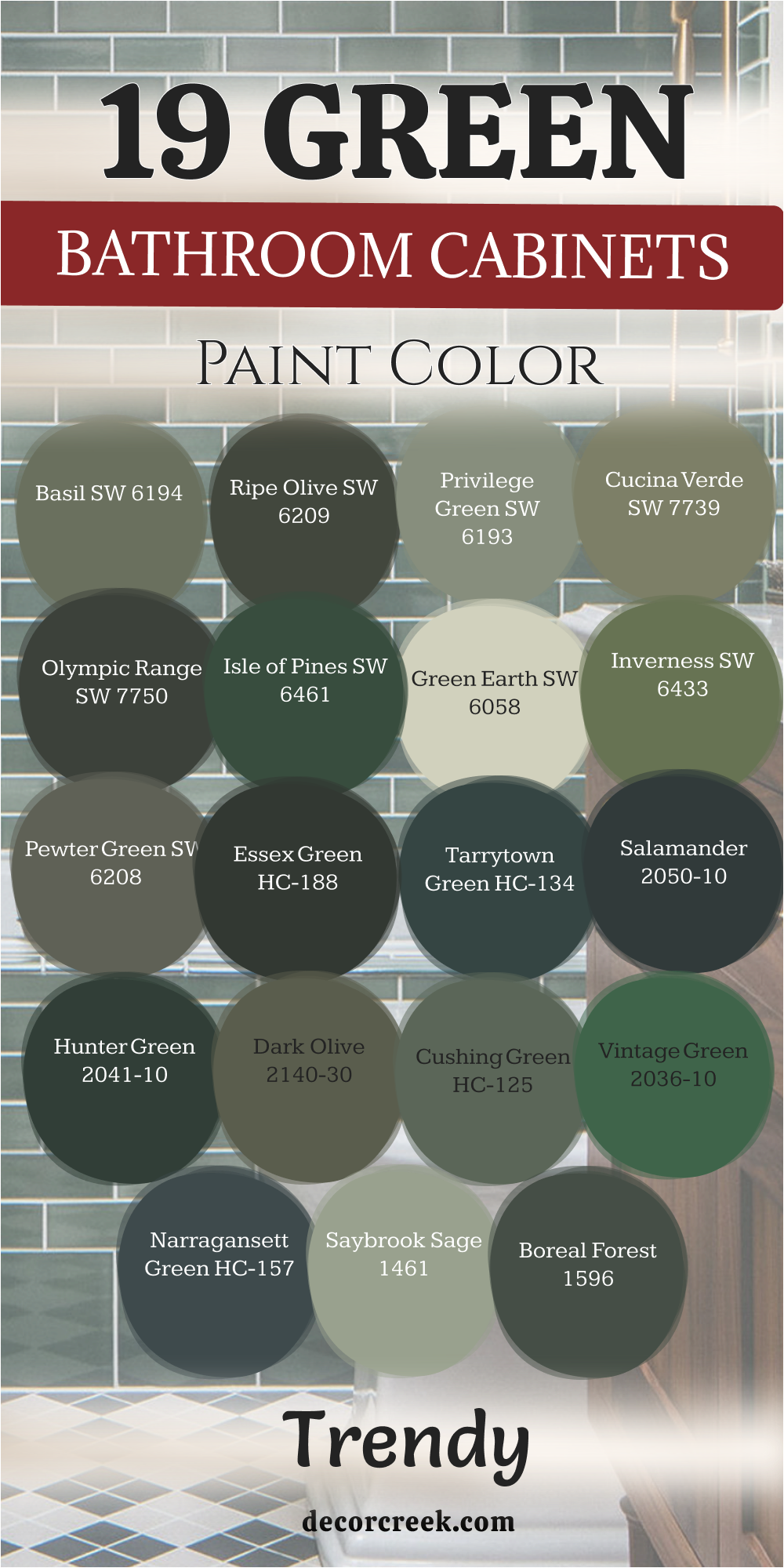
21 Paint Color For The Green Bathroom Walls
Lacewing SW 6729
Lacewing SW 6729 is a very pale and sweet green that feels like a light mint leaf. This color is perfect for a bathroom where you want to start your day feeling very bright and happy. I find that it works wonders in small rooms because it makes the walls feel like they are moving back.
It has a very crisp quality that reminds me of a fresh glass of water on a hot day. You will love how it makes your white tile and white towels look incredibly clean and new. It is a very soft choice that does not feel heavy or dark even if you have no windows.
You can pair it with silver fixtures to keep the room looking very cool and very refreshing. Many of my clients pick this for a kids’ bathroom because it feels so cheerful and lighthearted. This paint goes on very easily and covers the wall with a very smooth and pretty tint. Your bathroom will feel very open and very airy with this lovely light green shade.
Best used in: small bathrooms, kids’ rooms, laundry rooms, and ceilings
Pairs well with: Extra White SW 7006, Window Pane SW 6210, Watery SW 6478, silver hardware The key rule of this color for farmhouse style is to use it where you want natural light to feel kind, soft, and inviting throughout the day.
Aloe Vera SW 6464
Aloe Vera SW 6464 is a very light and cooling green that feels like a fresh breath of air. This color is one of the best choices for a bathroom wall because it feels so healthy and clean. I love how it brings a sense of the outdoors inside without being too bold or too dark.
It has a tiny hint of gray that keeps it from looking like a bright neon or candy color. You will notice that it creates a very peaceful mood for your morning shower or a late bath. This shade reminds me of the inside of a fresh plant leaf on a very sunny afternoon.
It looks beautiful when paired with light wood floors and white marble countertops in a modern home. Many people choose this for a guest bathroom because it makes everyone feel very comfortable and relaxed. This paint is light enough to use in any size room without making it feel small or crowded. Your home will feel very updated and very fresh with this soft and natural green color.
Best used in: bathroom walls, nurseries, sunrooms, and kitchens
Pairs well with: High Reflective White SW 7757, Sea Salt SW 6204, Dewy SW 6469, light marble The key rule of this color for farmhouse style is to use it where you want natural light to feel kind, soft, and inviting throughout the day.
Contented SW 6191
Contented SW 6191 is a medium-light green that has a very strong gray base for a soft look. This color is a favorite for many homeowners because it feels very mature and very well-balanced. I find that it works perfectly in bathrooms with a lot of natural light and white wood trim.
It has a very organic feel that reminds me of a quiet walk through a misty forest. You will enjoy how it provides a bit of color that still feels like a quiet and soft neutral. This shade is deep enough to make your white cabinets pop but light enough to stay very bright.
It works wonderfully with brushed nickel or black hardware for a very modern and clean design. Many designers pick this shade when they want a green that feels very adult and very steady. It is a very reliable color that looks great in the morning light and under evening bulbs. Your bathroom walls will feel very stylish and very professional with this lovely and soft paint.
Best used in: main bathrooms, bedrooms, mudrooms, and kitchen walls
Pairs well with: Alabaster SW 7008, Sea Salt SW 6204, Urban Bronze SW 7048, black hardware The key rule of this color for farmhouse style is to use it where you want natural light to feel kind, soft, and inviting throughout the day.

Slow Green SW 6456
Slow Green SW 6456 is a very pale and watery green that feels very soft and very gentle. This color is perfect for someone who wants a hint of nature without committing to a dark room. I love how it makes a bathroom feel very quiet and very steady for your daily routine.
It has a very fresh quality that reminds me of the sky right after a spring rain. You can use this on all four walls of a large bathroom without it feeling too bright or busy. It looks amazing when paired with white subway tiles and light-colored stone flooring in your home.
The green in this paint is very subtle and stays very light even in rooms with small windows. Many of my clients pick this for their master bathroom because it feels very high-end and spa-like. This paint is very easy to coordinate with almost any style of bathroom furniture and towels. Your bathroom will feel very bright and very open with this pretty and soft green shade.
Best used in: master bathrooms, small baths, laundry rooms, and ceilings
Pairs well with: Pure White SW 7005, Rainwashed SW 6211, Fleeting Green SW 6455, silver accents The key rule of this color for farmhouse style is to use it where you want natural light to feel kind, soft, and inviting throughout the day.
Gratifying Green SW 6435
Gratifying Green SW 6435 is a medium-light green that has a very cheerful and lively personality. This color is a wonderful choice for a bathroom wall that needs a little bit of extra energy. I find that it brings a lot of life to a room that feels a bit cold or plain.
It has a very clear green tone that reminds me of a sunny field in the middle of spring. You will notice that it makes the whole room feel much more happy as soon as you finish painting. This shade is very popular for families who want a bathroom that feels fun but still very clean.
It is a very flexible color that works well with both light and dark wood vanity cabinets. Many people love how it adds a splash of real color that makes their morning feel more exciting. This paint is very durable and stays looking fresh and bright for a very long time in a home. Your walls will feel very attractive and very welcoming with this lovely and bright green.
Best used in: bathroom walls, kids’ rooms, laundry rooms, and kitchens
Pairs well with: Extra White SW 7006, Filmy Green SW 6190, Sea Salt SW 6204, light oak The key rule of this color for farmhouse style is to use it where you want natural light to feel kind, soft, and inviting throughout the day.
Quietude SW 6212
Quietude SW 6212 is a medium green that has a very cool and watery spirit on the walls. This color is deeper than most mint shades and brings a real sense of style to the room. I love how it creates a very stable and relaxing environment for a long soak in the tub.
It has enough blue in it to feel very fresh and very modern for a new home project. You will find that it coordinates well with both light gray and beige tile options on the floor. This shade is rich enough to be noticed but soft enough to not feel too loud or heavy.
It looks beautiful with chrome or silver fixtures that sparkle against the green background in the light. Many designers choose this for a guest bathroom to create a very high-end and professional look. This paint is very good at making a room feel more intentional and very well-designed. Your bathroom will feel very updated and very stylish with this beautiful and deep shade.
Best used in: main bathrooms, bedrooms, dining rooms, and accent walls
Pairs well with: Rainwashed SW 6211, Greek Villa SW 7551, Underseas SW 6214, dark wood The key rule of this color for farmhouse style is to use it where you want natural light to feel kind, soft, and inviting throughout the day.
Dewy SW 6469
Dewy SW 6469 is a very light and soft green that has a tiny bit of blue to keep it cool. This color is perfect if you want your bathroom walls to feel very fresh and very light. I find that it acts almost like a neutral because it is so pale and so gentle on the eyes.
It reminds me of the grass in the morning before the sun has dried up all the water. You can use this to make a small powder room feel much larger and more open than it is. It looks stunning when paired with white marble and silver hardware for a very high-end look.
The color is very soft and does not feel too bold for someone who likes a simple style. Many of my clients love how it makes their bathroom feel like a clean hotel room in a big city. This is a very smart choice for a bright and airy feeling in your daily morning routine. Your home will feel very pretty and very updated with this lovely and light green.
Best used in: small bathrooms, nurseries, laundry rooms, and ceilings
Pairs well with: High Reflective White SW 7757, Aloe SW 6464, Sea Salt SW 6204, silver accents The key rule of this color for farmhouse style is to use it where you want natural light to feel kind, soft, and inviting throughout the day.
Waterscape SW 6470
Waterscape SW 6470 is a medium-light green that has a very strong blue undertone for a cool look. This color is one of my favorite picks for a bathroom where you want a very watery feel. I find that it brings a lot of energy and a very fresh spirit to any room you paint it in.
It has a very clear and crisp quality that reminds me of a tropical sea on a sunny day. You will enjoy how it looks with white subway tile and dark wood vanity cabinets in your home. This shade is very popular for people who want a look that is both natural and very modern.
It works very well with silver or chrome fixtures that match the cool tones of the green paint. Many people love how it makes their bathroom feel very clean and very full of life every day. This paint is very durable and holds up well to the steam and moisture of a busy family bathroom. Your walls will feel very fresh and very attractive with this lovely and bright shade.
Best used in: bathroom walls, kitchens, laundry rooms, and kids’ rooms
Pairs well with: Pure White SW 7005, Rainwashed SW 6211, In the Navy SW 9178, silver hardware The key rule of this color for farmhouse style is to use it where you want natural light to feel kind, soft, and inviting throughout the day.

Softened Green SW 6177
Softened Green SW 6177 is a medium green that feels very balanced and very natural on the walls. This color is a great choice for a main bathroom that needs a real sense of presence and depth. I find that it looks very elegant and quiet when paired with light gray stone or tile work.
It has a very steady quality that helps the whole room feel very focused and very grounded. You will find that it coordinates well with many different styles of flooring and metal hardware. This shade is deep enough to hide a bit of dust but light enough to feel very fresh.
It is a very popular choice for master bathrooms because it feels very high-end and very adult. The color looks very organic and reminds me of a garden right before the sun goes down. You can use it to add a bit of luxury and style to your daily washroom project. This is a very smart and beautiful choice for any bathroom wall in your home.
Best used in: bathroom walls, vanities, kitchens, and mudrooms
Pairs well with: Clary Sage SW 6178, Alabaster SW 7008, Extra White SW 7006, gray stone The key rule of this color for farmhouse style is to use it where you want natural light to feel kind, soft, and inviting throughout the day.
Liveable Green SW 6176
Liveable Green SW 6176 is a very light and airy green that stays true to its simple name on the walls. This color is so soft that it almost acts as a neutral background for all your bathroom decor. I recommend this for small bathrooms where you want a hint of nature without any dark weight.
It has a very fresh quality that makes the air in the room feel much lighter and cleaner. You can pair it with dark floors to create a very nice contrast that looks very professional. The green in this paint is very gentle and does not feel too bright or too loud at all.
It looks beautiful when paired with white marble or light gray stone countertops in your home. Many people love how it provides a very quiet and soft look for their daily guest bathroom area. It is a very easy color to decorate around because it matches almost any style of furniture. This is a top pick for a bright and open feeling in any small bathroom area.
Best used in: powder rooms, small baths, nurseries, and kitchens
Pairs well with: Softened Green SW 6177, Alabaster SW 7008, Clary Sage SW 6178, light wood The key rule of this color for farmhouse style is to use it where you want natural light to feel kind, soft, and inviting throughout the day.
Healing Aloe 1562
Healing Aloe 1562 is a very light and watery green that feels like a quiet spa on a tropical island. This color is one of my favorite picks for small bathrooms that do not have any big windows. I find that it brings a sense of light and air into dark corners very effectively and easily.
It has a hint of blue and gray that keeps it from looking like a bright mint or candy color. You will love how it makes your white porcelain tub and sink look very bright and very clean. It is a very soft and gentle shade that works well for a long and relaxing soak.
You can pair it with light gray tiles or white marble for a very high-end and modern look. This paint is very popular because it makes people feel very peaceful as soon as they walk in. It is a very safe and beautiful choice for any home renovation project this year. Your bathroom walls will feel like a fresh breath of air with this lovely shade.
Best used in: small bathrooms, nurseries, bedrooms, and ceilings
Pairs well with: Chantilly Lace OC-65, Fog Mist OC-31, Beach Glass 1564, light marble The key rule of this color for farmhouse style is to use it where you want natural light to feel kind, soft, and inviting throughout the day.
Silver Sage 506
Silver Sage 506 is a beautiful mix of green, gray, and blue that feels very cool and very refreshing. This color is a classic choice for bathroom walls because it looks like the surface of a quiet lake. I love how it changes its look depending on whether you have warm or cool light bulbs on.
It is a very sophisticated shade that makes any room feel much more designed and intentional. You will notice that it provides a very soft backdrop for white towels and silver metal fixtures. It is light enough to keep the room feeling open but has enough gray to feel grounded.
Many people use this color to create a very quiet and steady mood in their daily life. It works very well with medium-toned wood floors or light gray stone tiles in a bathroom. This paint is a very dependable option for a master suite where you want to feel relaxed. Your home will feel very stylish and updated with this very popular and soft green shade.
Best used in: master suites, guest baths, living areas, and kitchens
Pairs well with: White Dove OC-17, Sea Haze 1563, Swiss Coffee OC-45, brushed nickel The key rule of this color for farmhouse style is to use it where you want natural light to feel kind, soft, and inviting throughout the day.
Soft Fern 2144-40
Soft Fern 2144-40 is a light and leafy green that feels like a gentle breeze in a spring garden. This color is a wonderful choice for bathroom walls that need a little bit of warmth and light. I love how it makes a room feel very open and friendly without being too bright or yellow.
You will find that it works perfectly with white trim and light-colored stone floors in your home. It is a very organic shade that helps you feel more connected to nature while you get ready. The pigment is soft enough to cover all four walls without making the room feel small or dark.
It looks beautiful when paired with light wood accents and fluffy white towels on the rack. Many people choose this for a guest bathroom because it is very welcoming and very pretty to look at. This paint has a way of making the air in the room feel much fresher and cleaner. It is a very reliable choice for anyone who wants a soft and natural look.
Best used in: guest bathrooms, laundry rooms, kitchens, and bedrooms
Pairs well with: Cloud White OC-130, Gray Owl OC-52, Swiss Coffee OC-45, light wood tones The key rule of this color for farmhouse style is to use it where you want natural light to feel kind, soft, and inviting throughout the day.
Pale Smoke 1584
Pale Smoke 1584 is a very light gray-green that has a strong blue undertone to keep it cool. This color is perfect for a bathroom where you want to feel very clean and very energized. I find that it acts almost like a neutral because it is so soft and light on the walls.
It reminds me of the sky on a misty morning or a piece of sea glass on the beach. You can use this to make a tiny bathroom feel much larger and more open than it is. It looks stunning when paired with dark wood vanities or black hardware for a bit of contrast.
The color is very gentle and does not feel too bold for someone who likes a simple look. Many of my clients love how it makes their bathroom feel like a high-end hotel room in a city. This is a very smart choice for a bright and airy feeling in your daily morning washroom. It is a very pretty and versatile color that works with many different home styles.
Best used in: small bathrooms, bedrooms, laundry rooms, and ceilings
Pairs well with: Simply White OC-117, Gray Huskie 1473, Midnight 2131-10, silver accents The key rule of this color for farmhouse style is to use it where you want natural light to feel kind, soft, and inviting throughout the day.
Lichen Green 2150-20
Lichen Green 2150-20 is a deep and earthy green that feels very rich and full of life. This color is a bold choice that brings a lot of organic character to your bathroom walls. I love to use this in rooms that have a lot of natural light to show off the pigment.
It reminds me of the deep moss that grows on old trees in a very quiet forest. You will find that it makes a wonderful statement when paired with gold or brass mirrors and lights. It is a very sturdy shade that feels very grounded and strong in a large master bathroom.
You should pair it with light-colored tiles to keep the room from feeling too dark or heavy. Many people love how it creates a very cozy and private feeling for their morning bathroom routine. This paint is perfect for an accent wall or a full room if you want a lot of drama. Your bathroom will feel very unique and custom with this beautiful and deep forest shade.
Best used in: accent walls, vanities, powder rooms, and exterior doors
Pairs well with: Alabaster SW 7008, Creamy SW 7012, Wickham Gray HC-171, gold hardware The key rule of this color for farmhouse style is to use it where you want natural light to feel kind, soft, and inviting throughout the day.
Misted Fern 482
Misted Fern 482 is a medium-light green that feels very fresh and full of energy on the walls. This color has a bit of a silvery quality that makes it look very soft and very pretty. I find that it works very well in bathrooms with a lot of white trim and bright lights.
It has a very natural feel that makes the room feel like a small indoor garden area. You will enjoy how it provides a lovely contrast against dark wood floors or bathroom cabinets. It is a very flexible shade that works with both traditional and modern home styles in our year.
The green in this paint is very clear and does not feel too muddy or too gray. It looks beautiful when paired with fresh flowers and woven baskets for a very natural and organic look. Many of my clients pick this because it makes them feel very happy and very awake every day. This is a wonderful pick for a main bathroom that the whole family uses often.
Best used in: main bathrooms, kitchens, kids’ rooms, and laundry rooms
Pairs well with: Decorator’s White CC-20, Moonshine OC-56, Shaded Fern 2148-40, light oak The key rule of this color for farmhouse style is to use it where you want natural light to feel kind, soft, and inviting throughout the day.
Saybrook Sage HC-114
Saybrook Sage HC-114 is a classic and true sage green that feels very balanced and very sturdy. This color has been a favorite for many years because it never seems to go out of style. I like to use this in traditional bathrooms that have a lot of white crown molding and trim.
It has enough saturation to be a real color but stays soft enough to be very relaxing. You will see that it works well with both beige and gray tiles on the bathroom floor. This shade reminds me of an old garden or a quiet country house in the middle of summer.
It is a very reliable color that looks good under almost any type of bathroom light bulb. You can pair it with dark bronze hardware for a very grounded and very classic look in your home. Most people feel very comfortable with this shade because it feels very familiar and natural. It is a great way to add a bit of color that still feels very safe and pretty.
Best used in: traditional baths, exterior siding, kitchens, and dining rooms
Pairs well with: Simply White OC-117, Revere Pewter HC-172, Shaker Beige HC-45, dark bronze The key rule of this color for farmhouse style is to use it where you want natural light to feel kind, soft, and inviting throughout the day.
Guilford Green HC-116
Guilford Green HC-116 is a silvery green that acts as a bridge between a neutral and a real color. This shade was a very famous color of the year because it looks so good in so many rooms. I find that it works very well in bathrooms that have a lot of different textures like tile and wood.
It has a very natural and earthy feel that reminds me of a quiet forest floor in the morning. You will enjoy how it changes slightly from a warm green to a cool gray as the sun moves. It is a very sophisticated choice for a master bathroom where you want a high-end look and feel.
This paint makes a great backdrop for black metal mirrors or dark bronze faucets in your washroom. It is light enough to keep the room feeling big but has enough color to stay very interesting. Most people find this shade very easy to live with for a very long time in their house. Your bathroom walls will feel very updated and very classy with this specific choice.
Best used in: master bathrooms, living rooms, hallways, and kitchen cabinets
Pairs well with: Simply White OC-117, Revere Pewter HC-172, Stonington Gray HC-170, dark metals The key rule of this color for farmhouse style is to use it where you want natural light to feel kind, soft, and inviting throughout the day.
Hollingsworth Green HC-141
Hollingsworth Green HC-141 is a light and minty green that has a lot of gray to keep it soft. This color feels very vintage and very charming in a bathroom with a lot of white trim work. I find that it makes any room feel much brighter and more cheerful as soon as the paint dries.
It has a watery quality that is perfect for a room where you want to feel very clean. You can pair it with silver or chrome fixtures for a very classic and sparkling look in your home. The color is light enough to use on the ceiling if you want a very immersive feel in the room.
It works wonderfully in small guest bathrooms that need a little bit of extra light and life every day. This shade is very soft and does not feel too bold or aggressive for a small bathroom area. Many of my clients love how it reminds them of old-fashioned spa retreats or beach house rooms. It is a very pretty and lighthearted choice for a fresh bathroom wall update this year.
Best used in: guest baths, kitchens, bedrooms, and powder rooms
Pairs well with: Chantilly Lace OC-65, Stonington Gray HC-170, Cloud White OC-130, silver metals The key rule of this color for farmhouse style is to use it where you want natural light to feel kind, soft, and inviting throughout the day.
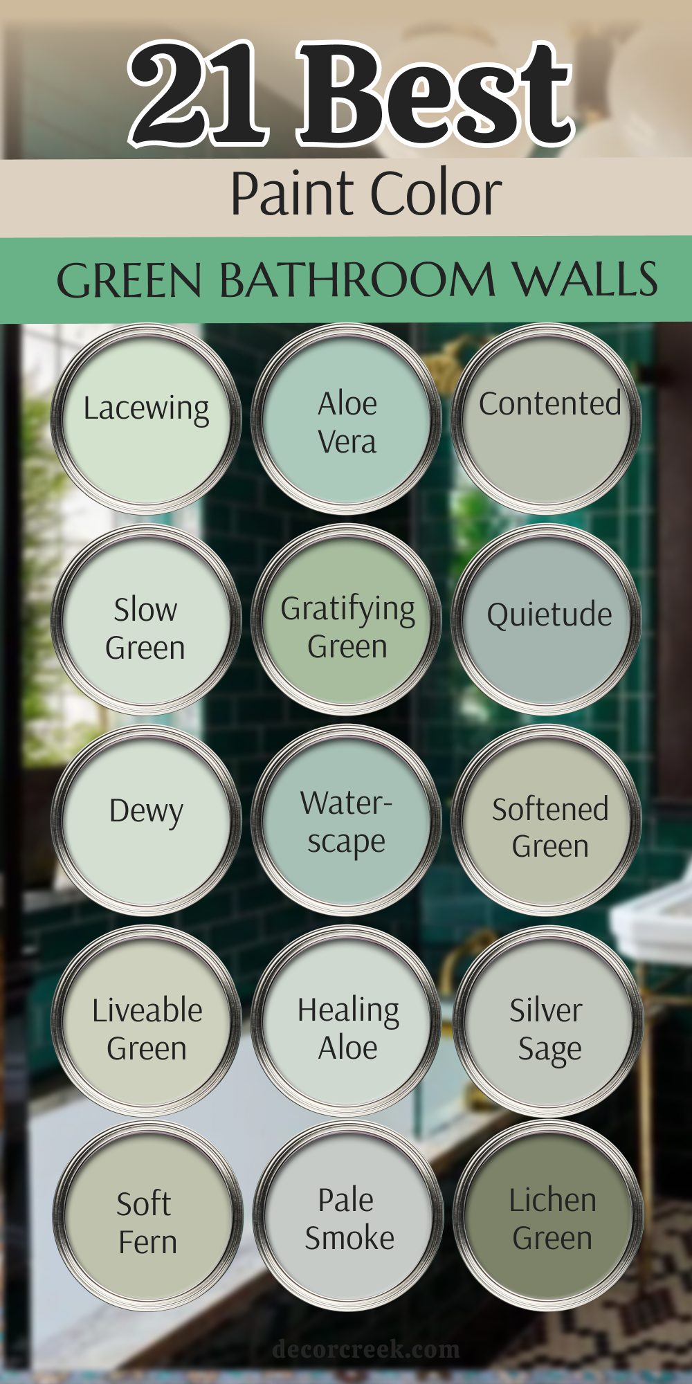
My Final Thoughts about 33 Green bathroom inspiration paint colors
Picking the right green can make your bathroom the favorite part of your house and a place where you truly love to spend time. I believe that color has a huge impact on how we feel every single day when we wake up and start our morning routines. Whether you choose a dark forest green for drama or a light misty sage for softness, make sure it fits your own personal taste and style.
Don’t be afraid to try a large sample on your wall before you buy the whole gallon of paint from the store. Painting is a great way to show your style and personality without spending a fortune on new tiles, a vanity, or a heavy tub. I hope this long list helps you find the perfect shade for your next big bathroom project during this year. You have the power to change the whole mood of your home with just a few brushes and a little bit of time.
Remember that light changes everything about a color, so take your time and watch the paint on your own walls as the day goes by. You might see a green look very bright in the morning sun and then look very deep and quiet when the evening comes. You are going to love how fresh and brand new your home feels with a splash of green to liven up the space.
Good luck with your painting project and make sure to enjoy your beautiful new room when it is finally finished and dry. Taking the time to pick the right brand and the right tone will make you feel like a professional interior designer in your own home. Your bathroom should be a little piece of nature that makes you feel calm and happy every time you open the door. I am so excited for you to see how a simple color can make such a giant difference in your daily life.