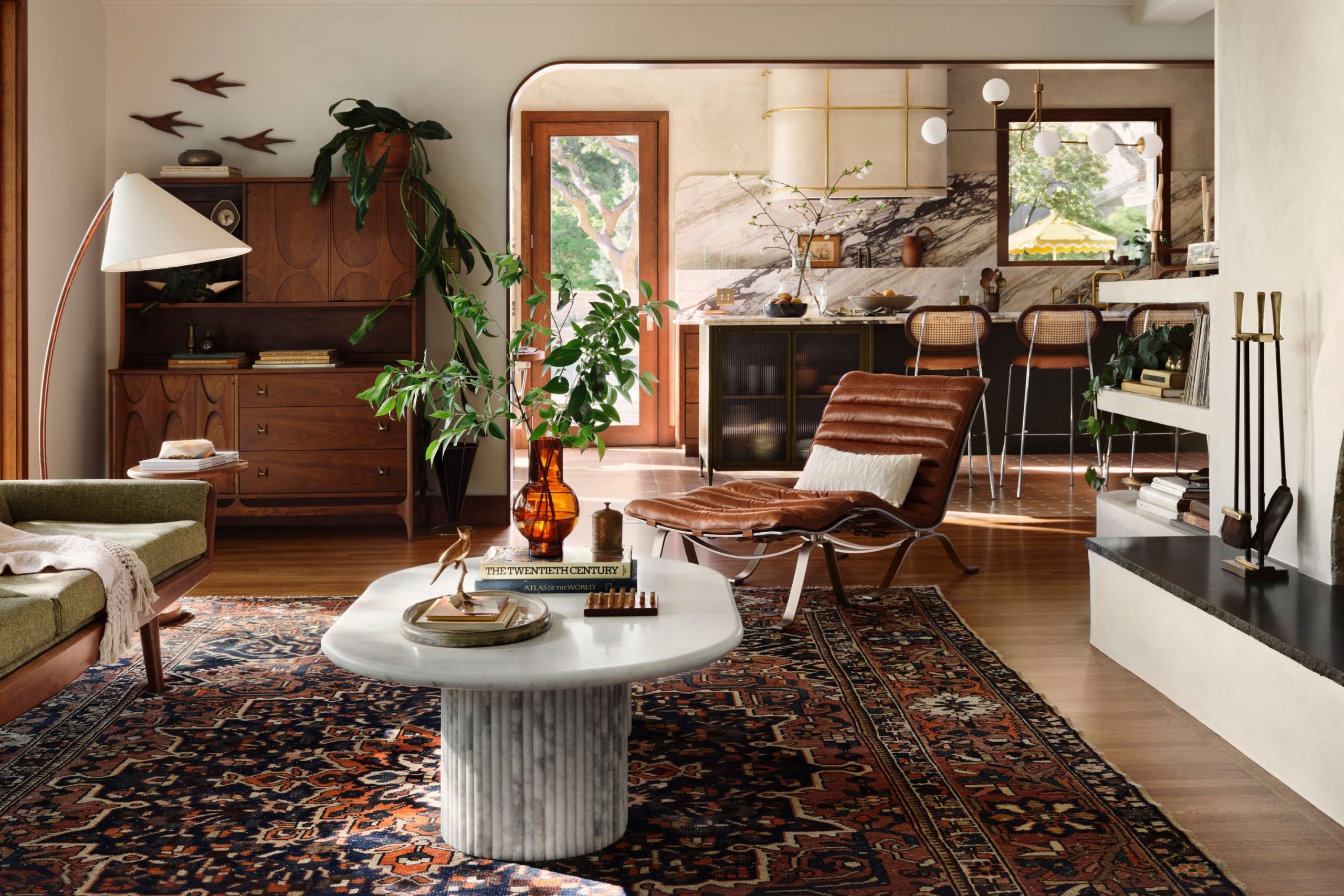
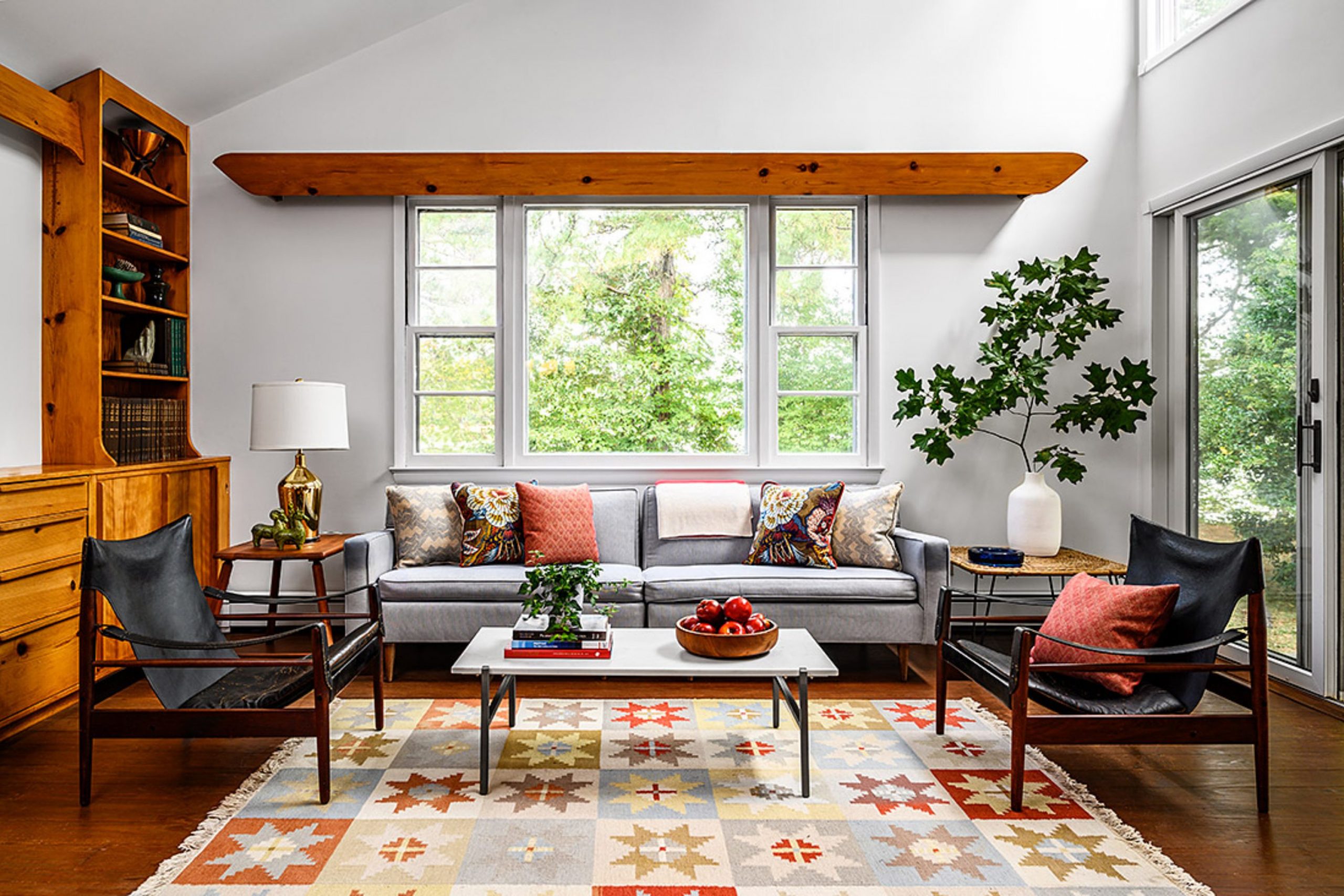
If you are looking at your living room and feeling like it needs a major style injection, Mid-Century Modern (MCM) colors are the key. MCM design is all about clean lines, function, and a beautiful connection to nature, and the right paint color makes all of that sing.
When I work with clients, the color we choose for the living area is the biggest choice we make; it sets the entire mood for the house. It has to feel good, it has to feel intentional, and it absolutely has to work with your furniture.
For me, the perfect MCM palette includes rich, grounded colors alongside clean, optimistic neutrals. This palette brings history and excitement right onto your walls.
You deserve a living room that makes you smile the moment you walk in, and this guide is filled with my favorite, proven colors to help you achieve that sophisticated, happy feeling.
I put this collection together to take the guesswork out of bringing authentic, beautiful MCM style into your own home.
Why Sherwin-Williams and Benjamin Moore Are Still My Favorite
In my design practice, I am constantly testing paints, and after all these years, I keep coming back to Sherwin-Williams and Benjamin Moore. My reason is simple: the quality is unmatched, and the colors feel right.
These companies have perfected the art of creating paints with complexity, meaning the color changes beautifully with the light instead of falling flat.
For MCM design, where light and shadow are critical elements, this complexity is vital. Sherwin-Williams offers incredible depth in their rich greens and mustards, perfect for those signature MCM pops of color. Benjamin Moore excels at creating nuanced, clean whites and foundational grays that prevent a room from feeling stark.
When I recommend a color to a client, I need to know it will look as good in their home as it did in my design plan, and these two brands consistently deliver that rich, dependable color quality.
They are the backbone of any lasting, beautiful interior project I undertake.
How I Pick the Best Colors for Real Homes
When I choose a color for a client’s living room, I follow a specific process that always yields a successful result, moving beyond simple aesthetics.
First, I consider the light: does the room face North, South, East, or West?
A North-facing room needs a warm color to fight the cool light, while a South-facing room can handle a cooler neutral. Second, I look at the largest pieces of furniture—the sofa and the wooden credenzas—because the wall color must compliment these fixed elements, not compete with them.
Third, I always think about how the client feels in the room. If they want energy, we lean into jewel tones; if they want tranquility, we stick to muted neutrals.
For Mid-Century Modern, the key is balancing period accuracy (the earthy greens and oranges) with modern livability (the soft, clean neutrals). The colors in this guide have passed all these tests; they work beautifully in real light, with real furniture, and they bring that immediate, happy MCM feeling to any home.
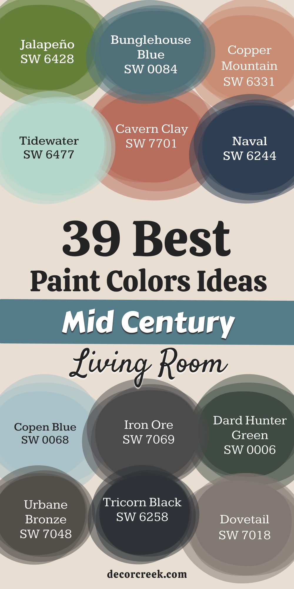
29 Mid-Century Modern Living Room Paint Color Ideas by Sherwin-Williams
Alabaster – SW 7008
Alabaster is a perfect, creamy off-white that acts as a soothing backdrop for the angular furniture of the Mid-Century period. It has a delightful softness that prevents it from ever feeling stark, which is important for a living area meant to feel inviting.
This color is phenomenal for letting colorful artwork and vintage textiles truly become the center of attention. Alabaster carries a subtle warmth that combats the cool light often found in north-facing rooms, maintaining a gentle glow throughout the day. I often suggest it for ceilings and trim to create a unified, airy feeling in a smaller living room.
It works wonderfully with natural wood tones, highlighting the beautiful grain of walnut or teak sideboards. Alabaster is my go-to choice for a client who desires a bright, gallery-like feel but still wants a hint of comfort and historical correctness. The shade provides a clean, crisp foundation that perfectly honors the design’s focus on simple forms. It’s a reliable, sophisticated choice that avoids the coldness of many pure whites. Alabaster keeps the room feeling fresh, light, and wonderfully grounded.
🎨 Check out the complete guide to this color right HERE 👈

Pure White – SW 7005
Pure White is a clean, bright white with almost no discernible undertones, making it my favorite choice for a truly crisp, gallery-like living room. This color is ideal for showcasing bold, primary-colored art or vividly patterned MCM textiles because it offers a perfectly neutral canvas.
Pure White makes a room feel instantly larger and maximizes the feeling of available light, which is excellent for darker living areas.
I recommend using it on walls and trim for a seamless, modern aesthetic that puts all the focus on the furniture’s form. It contrasts beautifully with Tricorn Black or Urbane Bronze, creating a sharp, intentional look that defines architectural features. Pure White is sophisticated and straightforward, allowing the room’s design elements to take the lead. This shade is perfect for emphasizing the clean lines and geometric shapes that are so crucial to the MCM aesthetic.
It provides a sharp, energetic foundation that feels modern and incredibly intentional. Pure White remains bright and consistent under various lighting conditions, a valuable quality in a main living area.
🎨 Check out the complete guide to this color right HERE 👈

Accessible Beige – SW 7036
Accessible Beige is a fantastic, perfectly balanced greige that offers a touch more warmth than a traditional gray, which is essential for a cozy living room. This neutral color is incredibly versatile and works beautifully with the rich, warm wood tones that define Mid-Century furniture.
It avoids the heaviness of true beige but provides a deeper foundation than a simple off-white, grounding the whole room. Accessible Beige changes gently with the light, moving from a soft beige in the morning to a warm gray in the evening, maintaining interest.
I often use it as a full-room color when a client wants a sophisticated backdrop that remains light and easy to decorate around. It pairs flawlessly with deep olive greens or burnt oranges, allowing those iconic MCM accent colors to really pop. Accessible Beige is a reliable, warm neutral that always makes a living room feel welcoming and current. This shade is one of the easiest colors to live with and decorate around. It’s warm, refined, and always feels appropriate for any furniture style.
🎨 Check out the complete guide to this color right HERE 👈

Agreeable Gray – SW 7029
Agreeable Gray is a famously versatile greige that leans slightly warmer than many grays, making it a perfect, soft neutral for a Mid-Century living room. This color is a foundational choice that pairs equally well with warm teak wood and cool metals, offering great flexibility in furniture selection.
Agreeable Gray prevents a room from feeling too cold, which can happen with pure gray, ensuring the living area remains inviting and comfortable. I often recommend it to clients who want a light, modern wall color but are nervous about using a true white that might feel too sterile.
It works wonderfully as a backdrop for both muted pastels and vibrant jewel tones, allowing for dynamic accent choices. Agreeable Gray looks excellent in almost any light condition, a major benefit for a main living room used throughout the day. It provides a quiet, sophisticated backdrop that is easy on the eyes. This shade creates a subtle, refined atmosphere without drawing excessive attention to the walls themselves. Agreeable Gray is reliably chic and endlessly adaptable.
🎨 Check out the complete guide to this color right HERE👈

Dorian Gray – SW 7017
Dorian Gray is a rich, mid-tone true gray with very subtle violet undertones that adds depth and sophistication to a living room. This color is wonderful for creating an intentional, slightly moodier feel that still manages to feel cozy, especially when paired with natural wood.
Dorian Gray works beautifully as an accent wall color, providing a dramatic contrast for a white sofa or a piece of statement artwork. It is a fantastic partner to the signature mustard yellows and warm reds of the MCM palette. I often use it in rooms with plenty of natural light, where its deep tone prevents the space from looking washed out during the day.
Dorian Gray gives the room an immediate sense of gravity and maturity, perfect for a sophisticated adult living room. It offers a powerful grounding effect that anchors a colorful and busy furniture arrangement. This shade feels bespoke and highly tailored, elevating the entire design. Dorian Gray is a deep, sophisticated gray that acts as a strong, grounding neutral.
🎨 Check out the complete guide to this color right HERE 👈

Amazing Gray – SW 7044
Amazing Gray is a complex, deep greige that holds a strong earthy brown influence, making it warmer and more grounded than a typical gray. This color is fantastic for creating a sophisticated, textural feel that complements the organic materials of Mid-Century design, like woven rugs and leather chairs.
Amazing Gray provides more depth and visual weight than a light neutral, making the walls feel substantial and warm.
I often recommend it for full rooms where a client wants a darker color but doesn’t want the starkness of a true dark gray. It pairs wonderfully with the bright, optimistic oranges and greens of the MCM palette, making them feel richer. Amazing Gray has a beautiful, natural quality that makes the living room feel instantly inviting and comfortable.
It looks especially good in conjunction with crisp white trim, providing a sharp, intentional contrast.
This shade offers a sophisticated blend of gray and taupe, adding warmth to any wall. It’s a versatile choice that feels deep yet beautifully balanced.
🎨 Check out the complete guide to this color right HERE 👈
Dovetail – SW 7018
Dovetail is a deep, rich charcoal gray that carries a soft brown undertone, preventing it from feeling cold and giving it a wonderful, earthy character. This color is perfect for creating a dramatic, intimate feeling in a living room, especially as an accent wall behind a statement sofa or fireplace.
Dovetail pairs exceptionally well with teak and walnut furniture, as the dark tone really highlights the wood’s warm grain.
It’s an excellent backdrop for the vibrant yellows and cool blues that are characteristic of Mid-Century design, making those colors appear more saturated. I often use it in rooms with high ceilings to visually lower the ceiling and create a cozier feeling. Dovetail gives the room a sense of immediate maturity and sophistication, anchoring the whole design with its deep tone. It offers a powerful, grounding presence that is bold and highly effective. This shade provides an intense, sophisticated backdrop that feels truly custom. Dovetail is a strong, dramatic choice that makes a big impact.
🎨 Check out the complete guide to this color right HERE 👈

Tricorn Black – SW 6258
Tricorn Black is a classic, pure black with virtually no undertones, making it a powerful and intentional color for a dramatic living room. This color is not for the faint of heart, but when used well—often on a feature wall or on built-in shelving—it creates an incredibly sophisticated, graphic effect.
Tricorn Black is exceptional for making lighter elements, like a white fireplace or colorful MCM pottery, stand out with sharp contrast.
I often use it to frame windows and doors, defining the architecture and creating a clean, modern line against a lighter wall. It pairs brilliantly with brass and gold accents, adding a layer of sophisticated glamour to the room. Tricorn Black provides the ultimate grounding force, anchoring the entire design with its depth. It is bold, chic, and always makes a strong statement about the room’s intentional design. This shade offers a stunning, deep contrast that elevates all surrounding colors. It provides a sharp, undeniable punctuation mark in a modern setting. Tricorn Black is pure, intentional drama.
🎨 Check out the complete guide to this color right HERE 👈

Urbane Bronze – SW 7048
Urbane Bronze is a deep, rich, and earthy bronze-brown that functions as a dark neutral, carrying a strong architectural and organic feel. This color is an excellent substitute for black or dark gray, offering a slightly warmer, more nuanced mood that feels very grounded and sophisticated.
Urbane Bronze pairs perfectly with natural textures like linen and leather, and it beautifully enhances the warmth of teak and walnut woods.
I often use it as a full-room color in a den or a cozy living area to create an intimate, cave-like atmosphere that encourages relaxation. It works wonderfully with muted greens and sandy beiges, creating a mature, organic palette. Urbane Bronze gives the room a sense of quiet power and deep maturity, anchoring the design with its earthy presence.
It provides a weighty, sophisticated backdrop that is both stylish and incredibly comforting. This shade offers a deep, grounded color that feels both ancient and modern.
It’s a contemporary neutral that brings a serious sense of gravitas.
🎨 Check out the complete guide to this color right HERE 👈

Iron Ore – SW 7069
Iron Ore is a deep, sophisticated charcoal gray that has a very strong, noticeable softness due to its dark brown undertones, preventing it from ever looking harsh or stark. This color is my favorite dark neutral when Tricorn Black feels too intense; it provides the drama of black but with a softer, more grounded finish.
Iron Ore is fantastic for an accent wall, especially behind a television or a low-slung sofa, creating a sophisticated focal point.
It pairs beautifully with brass accents and bright, primary colors, making them feel richer and more vibrant. I often use it in living rooms to create a cozy, den-like feeling without making the room feel too small. Iron Ore has a powerful presence that anchors the furniture arrangement and adds immediate architectural weight.
It offers a smooth, charcoal-like texture that feels incredibly sophisticated. This shade provides the perfect balance between dramatic depth and inviting warmth.
Iron Ore is a versatile, powerful dark neutral.
🎨 Check out the complete guide to this color right HERE 👈

Naval – SW 6244
Naval is a deep, classic navy blue that perfectly captures the sophisticated confidence of the Mid-Century Modern era. This color is strong and intentional, but the depth of the blue keeps it from feeling overwhelming, adding a quiet drama to a living room.
Naval is incredible when used as an accent wall, offering a powerful, tailored backdrop for light-colored furniture and metal accents.
It pairs beautifully with mustard yellow, burnt orange, and gold, creating that iconic MCM color combination that feels both retro and fresh. I often recommend it for rooms with ample natural light, where the blue truly deepens and changes throughout the day.
Naval gives the room a sense of immediate style and maturity, acting as a stunning counterpoint to the clean, organic shapes of the furniture.
It is a bold color that feels inherently polished and timeless. This shade provides a rich, elegant depth that commands attention. Naval is a sophisticated, classic blue that works wonderfully in a main living area.
🎨 Check out the complete guide to this color right HERE 👈

Dress Blues – SW 9176
Dress Blues is a rich, true indigo blue that is slightly brighter and more vibrant than Naval, offering a more playful, energetic take on the classic navy. This color is fantastic for a living room where you want a noticeable, confident splash of blue that still feels refined and deeply satisfying.
Dress Blues works wonderfully as an accent wall color, providing a strong, tailored contrast for white trim and light wood pieces.
It pairs brilliantly with bright oranges, warm reds, and metallic accents, creating a high-energy MCM palette. I often use it in less formal living areas or dens to inject a sense of joyous, yet sophisticated, color.
Dress Blues has a beautiful, classic quality that feels both historical and perfectly contemporary, anchoring the design.
It provides a striking depth that feels rich and highly intentional. This shade offers a confident, vivid blue that is wonderfully chic. Dress Blues is an exciting and sophisticated color choice.
Copen Blue – SW 0068
Copen Blue is a beautiful, muted light blue that carries a strong gray undertone, giving it a sophisticated, dusty quality that prevents it from looking childish. This color is perfect for a living room where you want a soft, restful blue that maintains a light and airy feeling throughout the day.
Copen Blue works wonderfully as a full-room color, providing a gentle wash of color that feels incredibly peaceful and easy to live with.
It pairs beautifully with the warm beiges and natural wood tones of Mid-Century design, adding a clean, cool contrast. I often recommend it for smaller living rooms to make them feel more expansive and open due to its light value. Copen Blue provides a subtle, fresh energy that feels bright and wonderfully clean. It offers a soft, sky-like quality that is very calming. This shade is a sophisticated, versatile light blue that avoids feeling cold. Copen Blue is a peaceful, refreshing choice for any main area.
🎨 Check out the complete guide to this color right HERE 👈
Dard Hunter Green – SW 0041
Dard Hunter Green is a deep, rich, saturated forest green that perfectly captures the earthy, naturalistic tones favored in the early Mid-Century period. This color is bold and grounding, giving a living room an immediate sense of gravity and historical depth.
Dard Hunter Green is fantastic for a library nook or an accent wall, providing a dramatic, enveloping backdrop for leather and dark wood furniture.
It pairs exceptionally well with muted yellows and deep oranges, creating a sophisticated and organic MCM color scheme. I often use it in rooms that receive bright sunlight, as its depth prevents the color from washing out during the day. Dard Hunter Green offers a powerful connection to nature, making the room feel protected and profoundly comfortable. It is a confident color that anchors the entire design with its rich hue. This shade provides an intense, deep green that feels incredibly luxurious. Dard Hunter Green is a moody, sophisticated statement color.
🎨 Check out the complete guide to this color right HERE 👈
Pewter Green – SW 6208
Pewter Green is a stunning, muted sage-green that has a strong gray undertone, giving it a soft, dusty, and incredibly sophisticated look. This color is an absolute hallmark of the current revival of Mid-Century design, as it feels both historical and perfectly modern.
Pewter Green works beautifully as a full-room color, providing a grounded, organic backdrop that is easy to live with and decorate around.
It pairs flawlessly with warm gold accents, teak wood, and creamy white textiles, creating a refined and natural aesthetic. I often recommend it to clients who want a colored wall but are hesitant about anything too bright or bold. Pewter Green provides a beautiful, subtle depth that changes gently with the light, maintaining visual interest. It offers a natural, earthy elegance that promotes a relaxed, comfortable feeling. This shade provides a sophisticated, soft green that is universally flattering. Pewter Green is a highly versatile and profoundly chic choice.
🎨 Check out the complete guide to this color right HERE 👈
Evergreen Fog – SW 9130
Evergreen Fog is a beautiful, muted green-gray that is highly versatile, sitting perfectly between a true green and a complex neutral. This color is excellent for a Mid-Century living room where you want a subtle hint of color that feels very organic, sophisticated, and incredibly easy to live with.
Evergreen Fog works wonderfully as a full-room color, providing a soft, earthy wash that is both peaceful and visually interesting.
It pairs beautifully with light, natural wood tones and white trim, creating a fresh, contemporary aesthetic that still feels grounded. I often suggest it for main living areas because its neutral base ensures it looks fantastic in varying light conditions. Evergreen Fog provides a feeling of quiet elegance and a strong connection to nature. It offers a soothing, misty quality that makes the room feel immediately calm. This shade is a sophisticated neutral that carries a beautiful, organic green tint. Evergreen Fog is a modern, relaxed, and incredibly chic color.
🎨 Check out the complete guide to this color right HERE 👈

Jalapeño – SW 6629
Jalapeño is a vibrant, saturated yellow-green that embodies the playful, optimistic side of the Mid-Century Modern color palette. This color is bold, energetic, and fantastic for injecting immediate personality and zest into a living room.
Jalapeño works exceptionally well as an accent wall or used inside built-in shelving to provide a surprising pop of color against a neutral backdrop. It pairs brilliantly with deep navies, crisp whites, and dark walnut wood, creating a striking, high-contrast look.
I often use it in rooms that need a boost of energy or a touch of cheerful drama. Jalapeño is a confident color that speaks to the era’s adventurous spirit and adds a sense of lively fun to the living area. It provides a burst of optimistic, vivid color that feels custom. This shade offers an exciting, contemporary twist on a classic MCM hue. Jalapeño is a dynamic, cheerful, and unforgettable accent.
🎨 Check out the complete guide to this color right HERE 👈
Relentless Olive – SW 6425
Relentless Olive is a rich, grounded olive-green that carries a subtle brown undertone, giving it an earthy, sophisticated character that feels weighty and substantial. This color is perfect for a Mid-Century living room that favors a moody, organic palette, complementing leather, natural wood, and woven materials beautifully.
Relentless Olive works wonderfully as an accent wall, providing a deep, textured backdrop that makes lighter furniture pieces pop.
It pairs exceptionally well with muted oranges, mustard yellows, and dark brass accents, creating a mature and established feel. I often recommend it for dens or cozy living areas where a client wants a deep, enveloping color that promotes relaxation and intimacy. Relentless Olive has a powerful, grounding presence that feels entirely sophisticated. It offers a nuanced, textural depth that is incredibly appealing. This shade provides an intense, organic green that feels historically correct and refined. Relentless Olive is a strong, mature, and cozy choice.
Bunglehouse Blue – SW 0048
Bunglehouse Blue is a complex, deep teal-blue that carries strong green undertones, giving it a slightly muted, earthy quality that is far more sophisticated than a simple bright blue. This color is excellent for adding a rich, intentional jewel-tone to a living room, pairing beautifully with the warm wood of MCM furniture.
Bunglehouse Blue works wonderfully as an accent wall, providing a dramatic, luxurious backdrop for light gray or beige sofas.
It pairs flawlessly with vibrant oranges, deep mustards, and gold accents, creating a lively but grounded color scheme. I often use it to give a room an immediate sense of history and depth, anchoring the design with its sophisticated tone. Bunglehouse Blue has a timeless quality that feels both refreshing and deeply satisfying. It offers a rich, oceanic depth that feels incredibly luxurious. This shade provides a sophisticated blend of blue and green, adding a unique character. Bunglehouse Blue is a compelling and elegant statement color.
🎨 Check out the complete guide to this color right HERE 👈
Restful – SW 6458
Restful is a very light, airy blue-green that is highly diluted with white, offering a serene, pale wash of color for a tranquil living room. This color is perfect for clients who want a hint of color that maintains the brightness and expansiveness of a white wall, ensuring the room feels open.
Restful works beautifully as a full-room color, providing a soft, barely-there wash that is incredibly easy on the eyes and promotes a relaxed atmosphere.
It pairs effortlessly with light wood tones and white trim, creating a clean, coastal-inspired MCM aesthetic. I often recommend it for smaller living rooms or those with limited natural light, as its high Light Reflectance Value (LRV) helps to bounce light around. Restful provides a subtle, fresh energy that feels clean and wonderfully peaceful. It offers an ethereal, pale quality that is very soothing. This shade is a sophisticated, light blue-green that avoids feeling sterile. Restful is a peaceful, refreshing, and beautifully soft choice.
🎨 Check out the complete guide to this color right HERE 👈
Copper Mountain – SW 6356
Copper Mountain is a rich, earthy terracotta-orange that is a signature, grounding color of the Mid-Century Modern palette, evoking sun-baked desert tones. This color is bold, warm, and fantastic for creating an immediate sense of personality and organic style in a living room.
Copper Mountain works wonderfully as an accent wall, providing a deep, warm backdrop that makes neutral furniture pieces pop with intensity.
It pairs brilliantly with deep navies, muted greens, and dark walnut wood, creating a dramatic, intentional color combination. I often use it in rooms that feel too stark or cold, as its deep orange warmth instantly makes the room feel cozy and inviting. Copper Mountain has a powerful, grounding presence that anchors the design with its rich, natural hue. It offers a vibrant, earthy depth that feels incredibly sophisticated. This shade provides a confident, warm orange that is historically correct and very chic. Copper Mountain is a bold, beautiful, and deeply satisfying color.
🎨 Check out the complete guide to this color right HERE 👈
Coral Reef – SW 6606
Coral Reef is a vibrant, optimistic coral-pink that is pure Mid-Century energy, adding a playful and sunny disposition to a living room. This color is bright and lively, perfect for injecting immediate cheerfulness and a dash of retro glamour into a smaller area or feature wall.
Coral Reef works wonderfully inside a bookcase or as a vibrant accent against a crisp white wall, providing a surprising and joyous pop of color.
It pairs brilliantly with deep teal, navy blue, and cool grays, creating a striking, balanced contrast. I often suggest it for clients who love the retro flair of the 1950s and want a truly cheerful, unforgettable color. Coral Reef is a confident color that speaks of fun and warmth, adding a lively excitement to the room. It provides a burst of sunny, vivid pink that feels instantly happy. This shade offers an energetic, bold take on a classic retro hue. Coral Reef is a cheerful, memorable, and stunning accent.
🎨 Check out the complete guide to this color right HERE 👈
Saffron Thread – SW 6663
Saffron Thread is a rich, warm mustard-yellow that is one of the most iconic and essential colors of the Mid-Century Modern era, providing instant authenticity and warmth. This color is sophisticated, earthy, and fantastic for adding a grounded, vintage glow to a living room.
Saffron Thread works wonderfully as an accent wall, providing a deep, sun-baked backdrop that makes white or gray furniture stand out beautifully.
It pairs brilliantly with deep teal, charcoal gray, and dark wood, creating a rich, sophisticated MCM color scheme. I often use it in rooms that lack warmth or natural light, as its deep yellow tone instantly provides an amber glow. Saffron Thread has a powerful, sophisticated presence that anchors the design with its rich hue. It offers a warm, earthy depth that feels incredibly inviting. This shade provides an iconic, confident yellow that is historically correct and very chic. Saffron Thread is a beautiful, mature, and deeply satisfying color.
🎨 Check out the complete guide to this color right HERE 👈
Blonde – SW 6128
Blonde is a warm, sunny gold-yellow that is lighter and more cheerful than mustard, bringing an optimistic and airy glow to a living room. This color is perfect for clients who want a noticeable yellow that feels bright and welcoming without the heaviness of a deep mustard.
Blonde works beautifully as a full-room color, providing a consistent, gentle warmth that makes the room feel continuously sunny and inviting.
It pairs wonderfully with crisp white trim and light oak or beechwood furniture, creating a fresh, cheerful aesthetic. I often recommend it for rooms that face north to help counteract the cool light and inject a much-needed feeling of sunshine. Blonde provides a feeling of happiness and lightheartedness, making the living area feel immediately joyful. It offers an airy, gentle warmth that is very easy to live with. This shade is a sophisticated, versatile yellow that feels soft and welcoming. Blonde is a cheerful, refreshing, and beautifully optimistic choice.
🎨 Check out the complete guide to this color right HERE 👈
Invigorate – SW 6886
Invigorate is a vibrant, cheerful chartreuse-yellow that is pure, high-energy MCM, perfect for adding an electric burst of personality to a living room. This color is bold, playful, and fantastic for injecting immediate excitement and a contemporary retro feel into an accent area.
Invigorate works exceptionally well inside built-in shelving or on a single, unexpected piece of architecture to provide a stunning, energetic pop.
It pairs brilliantly with deep navy, charcoal gray, and dark wood, creating a striking, high-contrast and very intentional look. I often use it in rooms that need a serious boost of energy and drama. Invigorate is a confident color that speaks to the design’s adventurous spirit and adds a sense of lively, memorable fun. It provides a burst of optimistic, vivid color that feels utterly unique. This shade offers an exciting, pure yellow-green that instantly grabs attention. Invigorate is a dynamic, playful, and unforgettable accent.
🎨 Check out the complete guide to this color right HERE 👈
Jubilee – SW 6248
Jubilee is a mid-tone, classic blue that has a clean, gentle gray undertone, giving it a sophisticated, slightly misty quality that is both calming and chic. This color is an excellent substitute for a true navy when you want a strong blue that remains light enough to use on all four walls without feeling too dark.
Jubilee works wonderfully as a full-room color, providing a soft, consistent wash of sophisticated blue that pairs beautifully with teak and brass.
It pairs flawlessly with creamy whites, warm grays, and natural wood, creating a refined, coastal-tinged MCM aesthetic. I often recommend it for main living areas where a client wants a color that is noticeably blue but still feels mature and easy to relax in. Jubilee provides a feeling of quiet elegance and peaceful confidence. It offers a soft, classic blue depth that is incredibly versatile. This shade is a sophisticated, calming blue that avoids the heaviness of darker tones. Jubilee is a beautiful, easy-to-live-with choice.
🎨 Check out the complete guide to this color right HERE 👈
Turkish Coffee – SW 6076
Turkish Coffee is a deep, rich, saturated espresso brown that acts as a sophisticated, dark neutral, offering a warm and powerful grounding force to a living room. This color is perfect for an accent wall, providing a deep, velvety backdrop that makes lighter furniture pieces and artwork stand out with sharp clarity.
Turkish Coffee pairs exceptionally well with the warm tones of teak, walnut, and leather, enhancing the organic, mid-century material palette.
I often use it in large, bright rooms to visually warm the space and create a more intimate, den-like atmosphere. It works wonderfully with muted oranges, mustard yellows, and creamy beiges, creating a rich, established, and very masculine aesthetic. Turkish Coffee has a powerful, refined presence that anchors the design with its deep, earthy hue. It offers a velvety, textural depth that feels incredibly luxurious. This shade provides an intense, sophisticated brown that feels historically correct and highly chic. Turkish Coffee is a bold, beautiful, and deeply comforting color.
🎨 Check out the complete guide to this color right HERE 👈
Rookwood Dark Red – SW 2801
Rookwood Dark Red is a deep, historical brick-red that carries strong brown and earthy undertones, giving it a sophisticated, muted warmth perfect for an established living room. This color is rich, grounded, and fantastic for adding a powerful sense of heritage and maturity to a space.
Rookwood Dark Red works wonderfully as an accent wall or used in a study area within the living room, providing a dramatic, enveloping backdrop.
It pairs brilliantly with deep greens, charcoal grays, and dark wood, creating a rich, moody, and highly intentional color scheme. I often use it in rooms with traditional architectural details to highlight the history while keeping the furniture modern. Rookwood Dark Red has a weighty, sophisticated presence that anchors the design with its earthy, deep hue. It offers a velvety, complex richness that feels incredibly luxurious. This shade provides an intense, confident red that feels deeply established and refined. Rookwood Dark Red is a bold, mature, and deeply satisfying color.
🎨 Check out the complete guide to this color right HERE 👈
Aqua-Sphere – SW 7613
Aqua-Sphere is a light, clean aqua-blue that leans slightly toward green, offering a cheerful, bright, and very optimistic pop of color for a lively living room. This color is airy and fun, perfect for injecting immediate joy and a dash of retro flair into an accent area or a smaller wall.
Aquasphere works wonderfully inside a niche or used on a single, unexpected piece of architecture to provide a stunning, energetic pop.
It pairs brilliantly with crisp white, light wood, and vibrant coral, creating a fresh, high-energy MCM look. I often use it in rooms that feel too serious or need a boost of playful energy. Aqua-sphere is a confident color that speaks to the era’s adventurous spirit and adds a sense of lighthearted, memorable fun. It provides a burst of cheerful, vivid blue-green that feels instantly happy. This shade offers an exciting, pure aqua that instantly brightens the view. Aqua-Sphere is a dynamic, playful, and unforgettable accent.
🎨 Check out the complete guide to this color right HERE 👈

25 Boho Mid-Century Modern Living Room Paint Color Ideas by Sherwin-Williams
Alabaster – SW 7008
Alabaster is a perfect, creamy off-white that acts as a fundamental backdrop for the relaxed, layered textures of Boho MCM design. It has a beautiful, gentle warmth that ensures it never looks sterile, which is essential for a living area meant to feel cozy and organic.
This color is phenomenal for letting rattan, macrame, woven textiles, and colorful vintage rugs truly become the focus of the room.
Alabaster carries a subtle, soft glow that beautifully complements all the natural wood tones of both MCM and Boho pieces. I often suggest it for entire rooms to create a unified, airy feeling that maximizes light and allows accessories to take the lead. It works perfectly with natural, earthy tones, enhancing the rich greens of houseplants and the deep terracotta of pottery. Alabaster is my essential choice for a client who desires a bright, airy foundation that feels deeply comfortable and authentically styled. The shade provides a soft, organic canvas that perfectly honors the design’s focus on natural materials. It’s a reliable, sophisticated choice that avoids the coldness of stark white. Alabaster keeps the room feeling fresh, light, and wonderfully relaxed.
🎨 Check out the complete guide to this color right HERE 👈
Pure White – SW 7005
Pure White is a clean, bright white with minimal undertones, making it my preferred choice for a crisp, high-contrast look that highlights Boho textures against a sharp backdrop. This color is ideal for showcasing heavily patterned throws, intricate wall hangings, and the strong geometric shapes of MCM furniture because it offers a perfectly neutral visual break.
Pure White makes a room feel instantly expansive and ensures all the layered elements remain clean and distinct.
I recommend using it on walls and trim for a seamless effect that directs all visual attention to the room’s global-inspired accessories. It contrasts beautifully with deep jewel tones like Navy or Cavern Clay, creating a sharp, intentional look that defines the color palette. Pure White is straightforward and chic, allowing the room’s dynamic, textural elements to truly sing. This shade is perfect for emphasizing the clean lines of MCM pieces while making layered Boho textures pop. It provides a bright, energetic foundation that feels modern and incredibly clean. Pure White remains consistently bright under varying lighting, a valuable quality for a main living area.
🎨 Check out the complete guide to this color right HERE 👈
Accessible Beige – SW 7036
Accessible Beige is a fantastic, warm greige that provides an excellent, grounded foundation for a Boho MCM living room, offering more color depth than a pure neutral. This color is incredibly versatile and pairs beautifully with the earthy, natural textures—like jute, cane, and thick linen—that define the Boho aesthetic.
Accessible Beige avoids feeling drab but provides a soft, mid-tone color that connects the warm wood of MCM pieces with the woven materials of Boho style.
I often use it as a full-room color when a client wants a sophisticated, warm neutral that still feels organic and cozy. It pairs flawlessly with creamy whites and deep terracotta, allowing those natural, earthy tones to truly shine. Accessible Beige is a reliable, warm greige that always makes a living room feel inviting, comfortable, and current. This shade is one of the easiest colors to live with and looks fantastic with houseplants. It’s warm, organic, and always feels appropriate for a relaxed, layered style. Accessible Beige is a perfect connector color.
🎨 Check out the complete guide to this color right HERE 👈
Agreeable Gray – SW 7029
Agreeable Gray is a famously versatile greige that leans slightly warm, making it a wonderful, soft neutral that grounds the eclectic mix of a Boho MCM living room. This color is a perfect base that pairs equally well with warm rattan and cool metals, offering great flexibility for mixing furniture styles.
Agreeable Gray is fantastic for preventing a room from feeling too cold, which is important when layering various materials, ensuring the living area remains inviting and soft.
I often recommend it to clients who want a light, modern wall color but need to accommodate both bright Boho colors and neutral MCM pieces. It works beautifully as a backdrop for vibrant textiles, global prints, and natural materials, maintaining sophistication. Agreeable Gray looks excellent in almost any light, providing a reliable, soft neutral that never competes with the furniture. It provides a quiet, sophisticated backdrop that makes the room feel airy and calm. This shade creates a subtle, refined atmosphere without dominating the visual space. Agreeable Gray is reliably chic and endlessly flexible.
🎨 Check out the complete guide to this color right HERE 👈
Dover White – SW 6385
Dover White is a soft, creamy white that carries a subtle, warm yellow undertone, giving it a rich, vintage feel that pairs beautifully with the earthiness of Boho MCM. This color is excellent when you want a white that feels truly aged and comfortable, avoiding the sterile feeling of a pure, modern white.
Dover White works wonderfully as a full-room color, providing a consistent, gentle glow that enhances natural materials like cane and wood.
It pairs flawlessly with jute rugs, clay pottery, and muted reds, creating an authentic, sun-baked aesthetic. I often suggest it for rooms that lack warmth, as its creamy undertone helps to inject a subtle feeling of sunshine. Dover White provides a feeling of cozy, established elegance that is incredibly easy to live with and decorate around. It offers a rich, butter-like softness that is very welcoming. This shade is a sophisticated, warm white that feels historical and organic. Dover White is a charming, inviting, and beautifully nuanced choice.
🎨 Check out the complete guide to this color right HERE 👈

Universal Khaki – SW 6150
Universal Khaki is a warm, mid-tone tan-khaki that carries strong green-gray undertones, giving it a sophisticated, earthy feel perfect for a grounded Boho MCM look. This color is fantastic for creating a sophisticated, organic base that complements the leather, wood, and layered textiles of the style.
Universal Khaki provides more depth than a light neutral, making the walls feel intentional and warm. I often recommend it for full rooms where a client wants an earthy, natural color that avoids the starkness of a light beige.
It pairs beautifully with deep olive greens, creamy whites, and dark wood, creating a mature, organic palette. Universal Khaki has a beautiful, natural quality that makes the living room feel instantly inviting and comfortable. It looks particularly good with contrasting crisp white trim, providing a tailored, intentional line. This shade offers a sophisticated blend of beige and green, adding warmth and earthiness to any wall. It’s a versatile color that feels deep yet wonderfully balanced.
🎨 Check out the complete guide to this color right HERE 👈
Shiitake – SW 9173
Shiitake is a gorgeous, complex beige-taupe that carries a slight grayish-pink undertone, giving it a wonderfully earthy, almost mushroom-like quality that is very modern and organic. This color is excellent for a sophisticated Boho MCM setting, providing a warm, grounded neutral that has significant visual interest.
Shiitake works beautifully as a full-room color, providing a consistent, textured backdrop that enhances natural materials like wicker and rattan.
It pairs flawlessly with creamy off-whites, deep reds, and natural wood, creating a highly organic and comforting aesthetic. I often suggest it for clients who want a unique neutral that is slightly moodier than simple beige, adding quiet depth. Shiitake provides a feeling of quiet elegance and a strong, earthy foundation. It offers a nuanced, sophisticated depth that makes the room feel curated. This shade is a versatile, mature neutral that carries a beautiful, organic complexity. Shiitake is a chic, earthy, and incredibly appealing color.
🎨 Check out the complete guide to this color right HERE 👈

Patience – SW 7555
Patience is a soft, light greige that leans distinctly towards a warm beige-pink, giving it a subtle, blush-like warmth that feels incredibly delicate and inviting. This color is perfect for a soft Boho MCM look, providing a gentle neutral that ensures the room feels light and airy while still maintaining a hint of unique color.
Patience works beautifully as a full-room color, providing a consistent, soft glow that enhances the coziness of layered fabrics.
It pairs effortlessly with creamy whites, light wood tones, and soft terracotta, creating a very tender and organic aesthetic. I often recommend it for rooms that need a slight boost of warmth without introducing a noticeable color. Patience provides a subtle, ethereal energy that feels wonderfully soothing. It offers a sophisticated, barely-there warmth that is very easy to live with. This shade is a chic, light neutral that carries a beautiful, unique blush undertone. Patience is a peaceful, refreshing, and beautifully soft choice.
🎨 Check out the complete guide to this color right HERE 👈
Kilim Beige – SW 6106
Kilim Beige is a warm, established mid-tone beige that carries a noticeable orange-pink undertone, giving it a sun-baked, earthy richness perfect for a Boho MCM living room. This color is fantastic for creating an immediate sense of warmth and natural heritage, grounding the eclectic mix of furniture.
Kilim Beige works wonderfully as a full-room color, providing a deep, consistent backdrop that beautifully highlights creamy fabrics and dark wood.
It pairs exceptionally well with deep reds, muted greens, and dark walnut, creating a rich, authentic, and organic palette. I often use it in rooms that feel too cool or stark, as its deep beige warmth instantly makes the room feel incredibly comfortable and established. Kilim Beige has a powerful, sophisticated presence that anchors the design with its rich, earthy hue. It offers a nuanced, textural depth that feels incredibly inviting. This shade provides an intense, confident beige that feels historically correct and very chic. Kilim Beige is a bold, beautiful, and deeply satisfying color.
🎨 Check out the complete guide to this color right HERE 👈

Cavern Clay – SW 7701
Cavern Clay is a deep, rich terracotta-orange that is a signature, earthy color perfect for the grounded, organic side of the Boho MCM palette. This color is bold, warm, and fantastic for creating an immediate sense of organic style and personality in a living room.
Cavern Clay works wonderfully as an accent wall, providing a deep, sun-baked backdrop that makes neutral furniture and macrame pieces pop with intensity.
It pairs brilliantly with deep navies, creamy whites, and dark wood, creating a dramatic, intentional color combination. I often use it to anchor a room filled with rattan and linen, creating a high-contrast but organic feel. Cavern Clay has a powerful, grounding presence that anchors the design with its rich, natural hue. It offers a vibrant, earthy depth that feels incredibly sophisticated. This shade provides a confident, warm orange that is historically correct and very chic. Cavern Clay is a bold, beautiful, and deeply satisfying color.
🎨 Check out the complete guide to this color right HERE 👈

Rosemary – SW 6187
Rosemary is a deep, rich, saturated sage-green that carries a strong gray undertone, giving it a sophisticated, dusky quality that is ideal for a grounded Boho MCM look. This color is an excellent substitute for Pewter Green when you want a slightly more saturated, deeper shade.
Rosemary works beautifully as a full-room color in a cozy den or as an accent wall, providing a grounded, organic backdrop for natural textures.
It pairs flawlessly with creamy beiges, leather, and warm gold accents, creating a refined and earthy aesthetic. I often recommend it to clients who want a moodier, deeper green that still feels connected to nature. Rosemary provides a feeling of quiet elegance and a strong, comforting connection to the outdoors. It offers a beautiful, subtle depth that changes gently with the light. This shade provides a sophisticated, deep green that is universally appealing. Rosemary is a highly versatile and profoundly chic choice.
🎨 Check out the complete guide to this color right HERE👈

Evergreen Fog – SW 9130
Evergreen Fog is a beautiful, muted green-gray that is highly versatile, sitting perfectly as an organic neutral for the Boho MCM style. This color is excellent for a living room where you want a subtle hint of color that feels very organic, sophisticated, and incredibly easy to live with.
Evergreen Fog works wonderfully as a full-room color, providing a soft, earthy wash that is both peaceful and visually interesting.
It pairs beautifully with light, natural wood tones and white trim, creating a fresh, contemporary aesthetic that still feels grounded. I often suggest it for main living areas because its neutral base ensures it looks fantastic with layered colors and varied textures. Evergreen Fog provides a feeling of quiet elegance and a strong connection to nature. It offers a soothing, misty quality that makes the room feel immediately calm. This shade is a sophisticated neutral that carries a beautiful, organic green tint. Evergreen Fog is a modern, relaxed, and incredibly chic color.
🎨 Check out the complete guide to this color right HERE 👈
Shade-Grown – SW 6188
Shade-Grown is a very deep, intense, and earthy forest green that carries a strong brown undertone, creating a rich, velvety color perfect for a dramatic Boho MCM look. This color is a powerful accent, giving a living room an immediate sense of dramatic depth and natural gravity.
Shade-Grown is fantastic for an accent wall or the back of a built-in shelf, providing a deep, enveloping backdrop for light rattan and vibrant prints.
It pairs exceptionally well with bright oranges, warm beiges, and gold accents, creating a highly sophisticated and organic color scheme. I often use it in rooms that receive bright sunlight, as its depth prevents the color from washing out. Shade-Grown offers a powerful connection to the deep outdoors, making the room feel protected and profoundly intimate. It is a bold color that anchors the entire design with its rich, saturated hue. This shade provides an intense, deep green that feels incredibly luxurious and custom. Shade-Grown is a moody, sophisticated statement color.
🎨 Check out the complete guide to this color right HERE 👈
Coastal Plain – SW 6192
Coastal Plain is a warm, mid-tone sage-green that has a distinct yellow-brown undertone, giving it a sun-baked, earthy quality that is perfect for a relaxed Boho MCM aesthetic. This color is wonderful for creating an immediate sense of warmth and natural calm in a living room.
Coastal Plain works beautifully as a full-room color, providing a consistent, gentle backdrop that pairs well with light wood and layered textiles.
It pairs flawlessly with creamy whites, muted reds, and natural fabrics, creating a highly organic and comfortable aesthetic. I often recommend it for clients who want a green that feels established and wonderfully soft, avoiding any brightness. Coastal Plain provides a feeling of quiet elegance and a strong, earthy foundation. It offers a beautiful, subtle depth that makes the room feel naturally curated. This shade is a sophisticated, versatile green that feels soft and incredibly appealing. Coastal Plain is a chic, earthy, and profoundly comfortable color.
🎨 Check out the complete guide to this color right HERE 👈
Rookwood Dark Red – SW 2801
Rookwood Dark Red is a deep, historical brick-red that carries strong brown and earthy undertones, giving it a sophisticated, muted warmth perfect for an established Boho MCM living room. This color is rich, grounded, and fantastic for adding a powerful sense of heritage and earthy maturity to a space.
Rookwood Dark Red works wonderfully as an accent wall, providing a dramatic, enveloping backdrop for natural leather and woven textures.
It pairs brilliantly with deep greens, sandy beiges, and dark wood, creating a rich, organic, and highly intentional color scheme. I often use it to anchor a room with numerous white and light-colored Boho elements, providing essential weight and depth. Rookwood Dark Red has a weighty, sophisticated presence that anchors the design with its earthy, deep hue. It offers a velvety, complex richness that feels incredibly luxurious. This shade provides an intense, confident red that feels deeply established and refined. Rookwood Dark Red is a bold, mature, and deeply satisfying color.
🎨 Check out the complete guide to this color right HERE 👈
Naval – SW 6244
Naval is a deep, classic navy blue that perfectly captures the sophisticated confidence of the Mid-Century Modern era, serving as a powerful dark accent for the Boho style. This color is strong and intentional, adding a quiet drama and rich depth to a living room.
Naval is incredible when used as an accent wall, offering a powerful, tailored backdrop for white macrame, rattan, and light wood furniture. It pairs beautifully with mustard yellow, deep terracotta, and gold accents, creating a high-contrast but grounded color combination.
I often recommend it for rooms with ample natural light, where the blue truly deepens and looks velvety. Naval gives the room a sense of immediate style and maturity, contrasting beautifully with the organic, textured elements. It is a bold color that feels inherently polished and incredibly chic. This shade provides a rich, elegant depth that commands attention. Naval is a sophisticated, classic blue that grounds a busy, layered design.
🎨 Check out the complete guide to this color right HERE 👈
Indigo Batik – SW 7602
Indigo Batik is a deep, heavily saturated indigo blue that leans towards a blue-black, offering a sophisticated, rich color that is a fantastic dark neutral for a Boho MCM setting. This color is strong and moody, providing a quiet drama that feels very intentional and custom-designed.
Indigo Batik is wonderful when used as an accent wall or on built-in shelving, offering a powerful, tailored backdrop for light-colored furniture and vintage textiles. It pairs beautifully with burnt orange, deep mustard, and brass, creating a classic, rich MCM palette.
I often use it to frame windows and draw the eye to the outside view, defining the architecture. Indigo Batik gives the room an immediate sense of depth and sophistication, anchoring the design with its intense tone. It is a bold color that feels inherently polished and wonderfully grounded. This shade provides a rich, elegant depth that feels textural and refined. Indigo Batik is a strong, sophisticated, and deeply satisfying color.
🎨 Check out the complete guide to this color right HERE 👈

Tricorn Black – SW 6258
Tricorn Black is a classic, pure black with virtually no undertones, making it a powerful and intentional color for a dramatic, graphic Boho MCM look. This color, used sparingly—on a feature wall or on a fireplace surround—creates an incredibly sophisticated, sharp contrast against natural textures.
Tricorn Black is exceptional for making lighter Boho elements, like a white woven pendant light or colorful pottery, stand out with extreme clarity. I often use it to highlight architectural features or define a wall plane against a creamy white full-room color.
It pairs brilliantly with brass and gold accents, adding a layer of sophisticated glamour to the organic, relaxed aesthetic. Tricorn Black provides the ultimate grounding force, anchoring the layered design with its intense depth. It is bold, chic, and always makes a strong statement about intentionality. This shade offers a stunning, deep contrast that elevates all surrounding elements. It provides a sharp, undeniable punctuation mark in a modern setting. Tricorn Black is pure, focused drama.
🎨 Check out the complete guide to this color right HERE 👈
Iron Ore – SW 7069
Iron Ore is a deep, sophisticated charcoal gray that has a very strong, noticeable softness due to its dark brown undertones, making it a perfect moody neutral for the Boho MCM style. This color is my favorite dark neutral when Tricorn Black feels too severe; it provides the drama of black but with a softer, more grounded finish.
Iron Ore is fantastic for an accent wall, especially behind a rattan headboard or a low-slung sofa, creating a sophisticated focal point.
It pairs beautifully with brass accents, earthy greens, and natural linen, enriching the whole palette. I often use it in living rooms to create a cozy, den-like feeling without making the room feel too heavy. Iron Ore has a powerful presence that anchors the furniture and adds immediate architectural weight. It offers a smooth, charcoal-like texture that feels incredibly sophisticated. This shade provides the perfect balance between dramatic depth and inviting warmth. Iron Ore is a versatile, powerful dark neutral that grounds a layered look.
🎨 Check out the complete guide to this color right HERE 👈
Urbane Bronze – SW 7048
Urbane Bronze is a deep, rich, and earthy bronze-brown that functions as a dark neutral, carrying a strong architectural and organic feel, which is ideal for Boho MCM design. This color is an excellent substitute for black or dark gray, offering a slightly warmer, more nuanced mood that feels very grounded and comfortable.
Urbane Bronze pairs perfectly with natural textures like linen, rattan, and leather, and it beautifully enhances the warmth of teak and walnut woods.
I often use it as a full-room color in a cozy living area to create an intimate, cave-like atmosphere that encourages deep relaxation. It works wonderfully with creamy beiges and muted greens, creating a mature, organic, and sophisticated palette. Urbane Bronze gives the room a sense of quiet power and deep maturity, anchoring the design with its earthy presence. It provides a weighty, sophisticated backdrop that is both stylish and incredibly comforting. This shade offers a deep, grounded color that feels both ancient and modern. It’s a contemporary neutral that brings a serious sense of gravitas.
🎨 Check out the complete guide to this color right HERE 👈
Dried Thyme – SW 6186
Dried Thyme is a soft, muted sage-green that carries a distinct gray-brown undertone, giving it an earthy, sophisticated character that feels wonderfully soft and natural. This color is perfect for a relaxed Boho MCM look, complementing woven materials, light leather, and dark wood beautifully.
Dried Thyme works wonderfully as a full-room color, providing a soft, consistent wash that is peaceful and easy to live with. It pairs exceptionally well with warm beiges, brass accents, and creamy white textiles, creating a refined, organic aesthetic.
I often recommend it to clients who want a green that feels historically established and beautifully subdued. Dried Thyme provides a feeling of quiet elegance and a strong connection to nature. It offers a nuanced, textural depth that is incredibly appealing. This shade provides a sophisticated, versatile green that is universally flattering. Dried Thyme is a highly chic and profoundly comfortable color.
🎨 Check out the complete guide to this color right HERE 👈
Copper Mountain – SW 6356
Copper Mountain is a rich, earthy terracotta-orange that is a signature, grounding color for the organic, sun-baked side of the Boho MCM palette. This color is bold, warm, and fantastic for creating an immediate sense of personality and organic style in a living room.
Copper Mountain works wonderfully as an accent wall, providing a deep, warm backdrop that makes neutral furniture and layered textiles pop with intensity.
It pairs brilliantly with deep navies, muted greens, and dark walnut wood, creating a dramatic, intentional color combination. I often use it to anchor a room filled with light rattan and linen, creating a high-contrast but organic feel. Copper Mountain has a powerful, grounding presence that anchors the design with its rich, natural hue. It offers a vibrant, earthy depth that feels incredibly sophisticated. This shade provides a confident, warm orange that is historically correct and very chic. Copper Mountain is a bold, beautiful, and deeply satisfying color.
🎨 Check out the complete guide to this color right HERE 👈

Saffron Thread – SW 6378
Saffron Thread is a rich, warm mustard-yellow that is one of the most iconic and essential colors of the Mid-Century Modern era, providing instant authenticity and a sun-baked glow to a Boho setting. This color is sophisticated, earthy, and fantastic for adding a grounded, vintage warmth to a living room.
Saffron Thread works wonderfully as an accent wall, providing a deep, sun-baked backdrop that makes white or gray furniture and woven materials stand out beautifully.
It pairs brilliantly with deep teal, charcoal gray, and dark wood, creating a rich, sophisticated MCM color scheme. I often use it in rooms that lack natural light, as its deep yellow tone instantly provides an amber glow. Saffron Thread has a powerful, sophisticated presence that anchors the design with its rich hue. It offers a warm, earthy depth that feels incredibly inviting. This shade provides an iconic, confident yellow that is historically correct and very chic. Saffron Thread is a beautiful, mature, and deeply satisfying color.
Bungalow Beige – SW 7511
Bungalow Beige is a warm, established mid-tone beige that carries a slight pink-brown undertone, giving it a soft, earthy richness perfect for a comfortable Boho MCM living room. This color is fantastic for creating an immediate sense of warmth and natural calm, grounding the room’s eclectic elements.
Bungalow Beige works wonderfully as a full-room color, providing a consistent, gentle backdrop that pairs well with natural wood and layered textiles.
It pairs flawlessly with creamy whites, soft sage greens, and natural fabrics, creating a highly organic and comfortable aesthetic. I often recommend it for clients who want a neutral that feels established and beautifully soft, avoiding any starkness. Bungalow Beige provides a feeling of quiet elegance and a strong, earthy foundation. It offers a beautiful, subtle depth that makes the room feel naturally curated. This shade is a sophisticated, versatile beige that feels soft and incredibly appealing. Bungalow Beige is a chic, earthy, and profoundly comfortable color.
🎨 Check out the complete guide to this color right HERE 👈
Roycroft Rose – SW 0034
Roycroft Rose is a deep, muted, dusty rose that carries strong brown and gray undertones, giving it a sophisticated, earthy warmth perfect for a feminine-leaning Boho MCM living room. This color is rich, grounded, and fantastic for adding a subtle, mature sense of color and depth to a space.
Roycroft Rose works wonderfully as an accent wall, providing a dramatic, enveloping backdrop for rattan, light wood, and creamy fabrics.
It pairs brilliantly with deep greens, charcoal grays, and brass accents, creating a rich, moody, and highly intentional color scheme. I often use it in rooms that need a touch of inviting softness and historical character. Roycroft Rose has a weighted, sophisticated presence that anchors the design with its earthy, deep hue. It offers a velvety, complex richness that feels incredibly luxurious. This shade provides an intense, confident rose that feels deeply established and refined. Roycroft Rose is a bold, mature, and deeply satisfying color.
🎨 Check out the complete guide to this color right HERE 👈

23 Colorful Mid-Century Modern Living Room Paint Color Ideas
Naval – SW 6244
Naval is a deep, classic navy blue that perfectly captures the sophisticated confidence of the Mid-Century Modern era with a strong, saturated color. This color is intentional and intense, adding a quiet drama and rich depth to a lively living room. Naval is incredible when used as an accent wall, offering a powerful, tailored backdrop for bright yellow, orange, or green furniture.
It pairs beautifully with mustard yellow, burnt orange, and gold, creating that iconic, high-energy MCM color combination. I often recommend it for rooms with ample natural light, where the blue truly deepens and looks velvety.
Naval gives the room a sense of immediate style and maturity, contrasting beautifully with the clean lines of the furniture. It is a bold color that feels inherently polished and incredibly chic. This shade provides a rich, elegant depth that commands attention. Naval is a sophisticated, classic blue that works wonderfully as a primary or accent color.
🎨 Check out the complete guide to this color right HERE 👈
Indigo Batik – SW 7602
Indigo Batik is a deep, heavily saturated indigo blue that leans towards a blue-black, offering a sophisticated, rich color that is a fantastic intense alternative to navy. This color is strong and moody, providing a quiet drama that feels very intentional and custom-designed.
Indigo Batik is wonderful when used as an accent wall or on built-in shelving, offering a powerful, tailored backdrop for light gray or white upholstery. It pairs beautifully with burnt orange, vivid yellow, and brass, creating a classic, rich, and deeply contrasting MCM palette.
I often use it to frame windows and draw the eye to the outside view, defining the architecture. Indigo Batik gives the room an immediate sense of depth and sophistication, anchoring the design with its intense tone. It is a bold color that feels inherently polished and wonderfully grounded. This shade provides a rich, elegant depth that feels textural and refined. Indigo Batik is a strong, sophisticated, and deeply satisfying color.
🎨 Check out the complete guide to this color right HERE 👈
Tidewater – SW 6477
Tidewater is a soft, airy aqua-blue that leans slightly green, offering a cheerful, bright, and very optimistic pop of color for a lively living room. This color is light and fun, perfect for injecting immediate joy and a dash of retro flair onto a single wall or in a smaller area.
Tidewater works wonderfully as a full-room color in a sunny space, providing a consistent, gentle wash that makes the room feel continuously airy. It pairs brilliantly with crisp white, light wood, and vibrant coral, creating a fresh, high-energy MCM look.
I often use it in rooms that feel too serious or need a serious boost of playful energy. Tidewater is a confident color that speaks to the era’s adventurous spirit and adds a sense of lighthearted, memorable fun. It provides a burst of cheerful, vivid blue-green that feels instantly happy. This shade offers an exciting, pure aqua that instantly brightens the view. Tidewater is a dynamic, playful, and unforgettable accent.
🎨 Check out the complete guide to this color right HERE 👈
Bunglehouse Blue – SW 0048
Bunglehouse Blue is a complex, deep teal-blue that carries strong green undertones, giving it a slightly muted, earthy quality that is far more sophisticated than a simple bright blue. This color is excellent for adding a rich, intentional jewel-tone to a living room, pairing beautifully with the warm wood of MCM furniture.
Bunglehouse Blue works wonderfully as an accent wall, providing a dramatic, luxurious backdrop for light gray or beige sofas.
It pairs flawlessly with vibrant oranges, deep mustards, and gold accents, creating a lively but grounded color scheme. I often use it to give a room an immediate sense of history and depth, anchoring the design with its sophisticated tone. Bunglehouse Blue has a timeless quality that feels both refreshing and deeply satisfying. It offers a rich, oceanic depth that feels incredibly luxurious. This shade provides a sophisticated blend of blue and green, adding a unique character. Bunglehouse Blue is a compelling and elegant statement color.
🎨 Check out the complete guide to this color right HERE 👈
Peacock Plume – SW 0020
Peacock Plume is a vibrant, deep teal that has a strong blue influence, offering a dramatic, jewel-toned color perfect for a luxurious, confident living room. This color is intense and visually rich, providing a sophisticated pop of color that feels custom-designed.
Peacock Plume works wonderfully as an accent wall, offering a powerful, tailored backdrop for neutral furniture and metallic accents.
It pairs brilliantly with saturated yellows, oranges, and warm reds, creating a truly opulent MCM color combination. I often use it in rooms that are generally neutral to inject a much-needed feeling of depth and excitement. Peacock Plume gives the room a sense of immediate richness and style, anchoring the design with its gorgeous hue. It is a bold color that feels inherently glamorous and incredibly chic. This shade provides an intense, vibrant depth that commands attention. Peacock Plume is a sophisticated, striking, and deeply satisfying color.
🎨 Check out the complete guide to this color right HERE 👈
Jalapeño – SW 6629
Jalapeño is a vibrant, saturated yellow-green that embodies the playful, optimistic side of the Mid-Century Modern color palette. This color is bold, energetic, and fantastic for injecting immediate personality and zest into a living room.
Jalapeño works exceptionally well as an accent wall or used inside built-in shelving to provide a surprising pop of color against a neutral backdrop.
It pairs brilliantly with deep navies, crisp whites, and dark walnut wood, creating a striking, high-contrast look. I often use it in rooms that need a boost of energy or a touch of cheerful drama. Jalapeño is a confident color that speaks to the era’s adventurous spirit and adds a sense of lively fun to the living area. It provides a burst of optimistic, vivid color that feels custom. This shade offers an exciting, contemporary twist on a classic MCM hue. Jalapeño is a dynamic, cheerful, and unforgettable accent.
Avocado – SW 2861
Avocado is a rich, grounded olive-green that is slightly brighter and more saturated than other olive tones, giving it a warm, substantial character perfect for a statement wall. This color is excellent for a Mid-Century living room that favors a moody, organic palette, complementing leather, natural wood, and woven materials beautifully.
Avocado works wonderfully as an accent wall, providing a deep, textured backdrop that makes lighter furniture pieces pop.
It pairs exceptionally well with muted oranges, mustard yellows, and dark brass accents, creating a mature and established feel. I often recommend it for cozy living areas where a client wants a deep, enveloping color that still feels historically accurate. Avocado has a powerful, grounding presence that feels entirely sophisticated. It offers a nuanced, textural depth that is incredibly appealing. This shade provides an intense, organic green that feels historically correct and refined. Avocado is a strong, mature, and cozy choice.
Pewter Green – SW 6208
Pewter Green is a stunning, muted sage-green that has a strong gray undertone, giving it a soft, dusty, and incredibly sophisticated look, perfect for a refined color scheme. This color is an absolute hallmark of the current revival of Mid-Century design, as it feels both historical and perfectly modern.
Pewter Green works beautifully as a full-room color, providing a grounded, organic backdrop that is easy to live with and decorate around. It pairs flawlessly with warm gold accents, teak wood, and creamy white textiles, creating a refined and natural aesthetic.
I often recommend it to clients who want a colored wall but are hesitant about anything too bright or bold. Pewter Green provides a beautiful, subtle depth that changes gently with the light, maintaining visual interest. It offers a natural, earthy elegance that promotes a relaxed, comfortable feeling. This shade provides a sophisticated, soft green that is universally flattering. Pewter Green is a highly versatile and profoundly chic choice.
🎨 Check out the complete guide to this color right HERE 👈
Dard Hunter Green – SW 0041
Dard Hunter Green is a deep, rich, saturated forest green that perfectly captures the earthy, naturalistic tones favored in the early Mid-Century period. This color is bold and grounding, giving a living room an immediate sense of gravity and historical depth.
Dard Hunter Green is fantastic for a library nook or an accent wall, providing a dramatic, enveloping backdrop for leather and dark wood furniture.
It pairs exceptionally well with muted yellows and deep oranges, creating a sophisticated and organic MCM color scheme. I often use it in rooms that receive bright sunlight, as its depth prevents the color from washing out during the day. Dard Hunter Green offers a powerful connection to nature, making the room feel protected and profoundly comfortable. It is a confident color that anchors the entire design with its rich hue. This shade provides an intense, deep green that feels incredibly luxurious. Dard Hunter Green is a moody, sophisticated statement color.
Cavern Clay – SW 7701
Cavern Clay is a deep, rich terracotta-orange that is a signature, earthy color perfect for the grounded, organic side of the MCM palette, giving the room a sun-baked glow. This color is bold, warm, and fantastic for creating an immediate sense of organic style and personality in a living room.
Cavern Clay works wonderfully as an accent wall, providing a deep, warm backdrop that makes neutral furniture pieces pop with intensity.
It pairs brilliantly with deep navies, muted greens, and dark walnut wood, creating a dramatic, intentional color combination. I often use it to anchor a room filled with light wood and clean lines, creating a high-contrast but organic feel. Cavern Clay has a powerful, grounding presence that anchors the design with its rich, natural hue. It offers a vibrant, earthy depth that feels incredibly sophisticated. This shade provides a confident, warm orange that is historically correct and very chic. Cavern Clay is a bold, beautiful, and deeply satisfying color.
🎨 Check out the complete guide to this color right HERE 👈
Rookwood Dark Red – SW 2801
Rookwood Dark Red is a deep, historical brick-red that carries strong brown and earthy undertones, giving it a sophisticated, muted warmth perfect for an established living room. This color is rich, grounded, and fantastic for adding a powerful sense of heritage and maturity to a space.
Rookwood Dark Red works wonderfully as an accent wall, providing a dramatic, enveloping backdrop for leather and dark wood furniture.
It pairs brilliantly with deep greens, charcoal grays, and brass accents, creating a rich, moody, and highly intentional color scheme. I often use it in rooms with traditional architectural details to highlight the history while keeping the furniture modern. Rookwood Dark Red has a weighty, sophisticated presence that anchors the design with its earthy, deep hue. It offers a velvety, complex richness that feels incredibly luxurious. This shade provides an intense, confident red that feels deeply established and refined. Rookwood Dark Red is a bold, mature, and deeply satisfying color.
🎨 Check out the complete guide to this color right HERE 👈
Coral Reef – SW 6606
Coral Reef is a vibrant, optimistic coral-pink that is pure Mid-Century energy, adding a playful and sunny disposition to a living room. This color is bright and lively, perfect for injecting immediate cheerfulness and a dash of retro glamour into a smaller area or feature wall.
Coral Reef works wonderfully inside a bookcase or as a vibrant accent against a crisp white wall, providing a surprising and joyous pop of color.
It pairs brilliantly with deep teal, navy blue, and cool grays, creating a striking, balanced contrast. I often suggest it for clients who love the retro flair of the 1950s and want a truly cheerful, unforgettable color. Coral Reef is a confident color that speaks of fun and warmth, adding a lively excitement to the room. It provides a burst of sunny, vivid pink that feels instantly happy. This shade offers an energetic, bold take on a classic retro hue. Coral Reef is a cheerful, memorable, and stunning accent.
🎨 Check out the complete guide to this color right HERE 👈
Invigorate – SW 6886
Invigorate is a vibrant, cheerful chartreuse-yellow that is pure, high-energy MCM, perfect for adding an electric burst of personality to a living room. This color is bold, playful, and fantastic for injecting immediate excitement and a contemporary retro feel into an accent area.
Invigorate works exceptionally well inside built-in shelving or on a single, unexpected piece of architecture to provide a stunning, energetic pop.
It pairs brilliantly with deep navy, charcoal gray, and dark wood, creating a striking, high-contrast and very intentional look. I often use it in rooms that need a serious boost of energy and drama. Invigorate is a confident color that speaks to the design’s adventurous spirit and adds a sense of lively, memorable fun. It provides a burst of optimistic, vivid color that feels utterly unique. This shade offers an exciting, pure yellow-green that instantly grabs attention. Invigorate is a dynamic, playful, and unforgettable accent.
Copper Mountain – SW 6356
Copper Mountain is a rich, earthy terracotta-orange that is a signature, grounding color of the Mid-Century Modern palette, evoking sun-baked desert tones. This color is bold, warm, and fantastic for creating an immediate sense of personality and organic style in a living room.
Copper Mountain works wonderfully as an accent wall, providing a deep, warm backdrop that makes neutral furniture pieces pop with intensity.
It pairs brilliantly with deep navies, muted greens, and dark walnut wood, creating a dramatic, intentional color combination. I often use it in rooms that feel too stark or cold, as its deep orange warmth instantly makes the room feel cozy and inviting. Copper Mountain has a powerful, grounding presence that anchors the design with its rich, natural hue. It offers a vibrant, earthy depth that feels incredibly sophisticated. This shade provides a confident, warm orange that is historically correct and very chic. Copper Mountain is a bold, beautiful, and deeply satisfying color.
🎨 Check out the complete guide to this color right HERE 👈
Saffron Thread – SW 6663
Saffron Thread is a rich, warm mustard-yellow that is one of the most iconic and essential colors of the Mid-Century Modern era, providing instant authenticity and warmth. This color is sophisticated, earthy, and fantastic for adding a grounded, vintage glow to a living room.
Saffron Thread works wonderfully as an accent wall, providing a deep, sun-baked backdrop that makes white or gray furniture stand out beautifully.
It pairs brilliantly with deep teal, charcoal gray, and dark wood, creating a rich, sophisticated MCM color scheme. I often use it in rooms that lack warmth or natural light, as its deep yellow tone instantly provides an amber glow. Saffron Thread has a powerful, sophisticated presence that anchors the design with its rich hue. It offers a warm, earthy depth that feels incredibly inviting. This shade provides an iconic, confident yellow that is historically correct and very chic. Saffron Thread is a beautiful, mature, and deeply satisfying color.
Blonde – SW 6128
Blonde is a warm, sunny gold-yellow that is lighter and more cheerful than mustard, bringing an optimistic and airy glow to a living room. This color is perfect for clients who want a noticeable yellow that feels bright and welcoming without the heaviness of a deep mustard.
Blonde works beautifully as a full-room color, providing a consistent, gentle warmth that makes the room feel continuously sunny and inviting.
It pairs wonderfully with crisp white trim and light oak or beechwood furniture, creating a fresh, cheerful aesthetic. I often recommend it for rooms that face north to help counteract the cool light and inject a much-needed feeling of sunshine. Blonde provides a feeling of happiness and lightheartedness, making the living area feel immediately joyful. It offers an airy, gentle warmth that is very easy to live with. This shade is a sophisticated, versatile yellow that feels soft and welcoming. Blonde is a cheerful, refreshing, and beautifully optimistic choice.
🎨 Check out the complete guide to this color right HERE 👈
Heartthrob – SW 6866
Heartthrob is a vibrant, saturated classic red that is bold and energetic, providing a powerful, confident color for a striking living room. This color is pure drama and flair, fantastic for injecting immediate personality and heat into a main living area.
Heartthrob works exceptionally well as an accent wall or used to define a specific zone, demanding attention and creating a sophisticated focal point.
It pairs brilliantly with charcoal gray, navy blue, and brass accents, creating a high-contrast, tailored, and very intentional look. I often use it in rooms that can handle intense color and require a serious boost of energy. Heartthrob is a confident color that speaks of passion and excitement, adding a sense of lively, memorable fun. It provides a burst of optimistic, vivid red that feels utterly unique. This shade offers an exciting, pure red that instantly commands the eye. Heartthrob is a dynamic, powerful, and unforgettable accent.
🎨 Check out the complete guide to this color right HERE 👈
Tanager SW 6601
Tanager is a deep, warm, terracotta-orange that is slightly richer and darker than Cavern Clay, offering a sophisticated, grounded glow to a living room. This color is bold, earthy, and fantastic for creating an immediate sense of organic style and personality in a main living area.
Tanager works wonderfully as an accent wall, providing a deep, sun-baked backdrop that makes neutral furniture pieces pop with intensity.
It pairs brilliantly with deep teals, forest greens, and dark walnut wood, creating a dramatic, intentional color combination. I often use it to anchor a room filled with light wood and clean lines, creating a high-contrast but organic feel. Tanager has a powerful, grounding presence that anchors the design with its rich, natural hue. It offers a vibrant, earthy depth that feels incredibly sophisticated. This shade provides a confident, warm orange that is historically correct and very chic. Tandoori is a bold, beautiful, and deeply satisfying color.
🎨 Check out the complete guide to this color right HERE 👈
Dress Blues – SW 9176
Dress Blues is a rich, true indigo blue that is slightly brighter and more vibrant than Naval, offering a more playful, energetic take on the classic navy for a colorful setting. This color is fantastic for a living room where you want a noticeable, confident splash of blue that still feels refined and deeply satisfying.
Dress Blues works wonderfully as an accent wall color, providing a strong, tailored contrast for white trim and light wood pieces.
It pairs brilliantly with bright oranges, warm reds, and metallic accents, creating a high-energy MCM palette. I often use it in less formal living areas or dens to inject a sense of joyous, yet sophisticated, color. Dress Blues has a beautiful, classic quality that feels both historical and perfectly contemporary, anchoring the design. It provides a striking depth that feels rich and highly intentional. This shade offers a confident, vivid blue that is wonderfully chic. Dress Blues is an exciting and sophisticated color choice.
Teal Stencil SW 0018
Teal Stencil is a rich, heavily saturated blue-green that is moody and luxurious, offering a striking jewel-tone perfect for a confident living room. This color is intense and visually rich, providing a sophisticated pop of color that feels custom-designed. Teal Stencil works wonderfully as an accent wall, offering a powerful, tailored backdrop for neutral furniture and metallic accents.
It pairs brilliantly with saturated yellows, oranges, and warm reds, creating a truly opulent MCM color combination.
I often use it in rooms that are generally neutral to inject a much-needed feeling of depth and excitement. Teal Stencil gives the room a sense of immediate richness and style, anchoring the design with its gorgeous hue. It is a bold color that feels inherently glamorous and incredibly chic. This shade provides an intense, vibrant depth that commands attention. Teal Stencil is a sophisticated, striking, and deeply satisfying color.
🎨 Check out the complete guide to this color right HERE 👈
Blue Peacock SW 0064
Blue Peacock is a deep, true, saturated green that carries a distinct blue undertone, giving it a rich, traditional, yet vibrant feel perfect for a statement wall. This color is bold and grounding, giving a living room an immediate sense of gravity and rich depth.
Blue Peacock is fantastic for a library nook or an accent wall, providing a dramatic, enveloping backdrop for leather and dark wood furniture.
It pairs exceptionally well with bright yellows and deep oranges, creating a sophisticated and organic MCM color scheme. I often use it in rooms that receive bright sunlight, as its depth prevents the color from washing out during the day. Blue Peacock offers a powerful connection to nature, making the room feel protected and profoundly comfortable. It is a confident color that anchors the entire design with its rich hue. This shade provides an intense, deep green that feels incredibly luxurious. Blue Peacock is a moody, sophisticated statement color.
🎨 Check out the complete guide to this color right HERE 👈
Grounded SW 6089
Grounded is a deep, earthy brown-green that is heavily muted with gray, offering a sophisticated, almost military-like color that is fantastic for an organic, colorful look. This color is rich and grounding, providing a moody backdrop that pairs beautifully with the warm wood of MCM furniture.
Groundwork works wonderfully as an accent wall, providing a dramatic, textured backdrop for light gray or beige sofas.
It pairs flawlessly with vibrant yellows, burnt oranges, and metallic accents, creating a lively but grounded color scheme. I often use it to give a room an immediate sense of history and depth, anchoring the design with its sophisticated tone. Grounded has a powerful, quiet quality that feels both refreshing and deeply satisfying. It offers a rich, oceanic depth that feels incredibly luxurious. This shade provides a sophisticated blend of brown and green, adding a unique character. Grounded is a compelling and elegant statement color.
🎨 Check out the complete guide to this color right HERE 👈
Roycroft Bottle Green – SW 2847
Roycroft Bottle Green is a very deep, almost black-green that is intensely saturated and moody, offering a dramatic, refined color for a sophisticated living room. This color is intense and visually rich, providing a sophisticated pop of color that feels custom-designed.
Roycroft Bottle Green works wonderfully as an accent wall, offering a powerful, tailored backdrop for neutral furniture and metallic accents.
It pairs brilliantly with saturated yellows, deep oranges, and warm reds, creating a truly opulent MCM color combination. I often use it in rooms that are generally neutral to inject a much-needed feeling of depth and excitement. Roycroft Bottle Green gives the room a sense of immediate richness and style, anchoring the design with its gorgeous hue. It is a bold color that feels inherently glamorous and incredibly chic. This shade provides an intense, vibrant depth that commands attention. Roycroft Bottle Green is a sophisticated, striking, and deeply satisfying color.
🎨 Check out the complete guide to this color right HERE 👈

25 Small Mid-Century Modern Living Room Paint Color Ideas
White Dove – OC-17
White Dove is a beautiful, creamy off-white with a very subtle touch of gray, giving it a soft, gentle character that is perfect for making a small room feel expansive. It has a delightful softness that prevents it from ever feeling stark, which is important for a living area meant to feel cozy and inviting.
This color is phenomenal for letting colorful artwork and streamlined furniture become the center of attention without competition.
. White Dove carries a subtle warmth that combats the cool light often found in small or north-facing rooms, maintaining a gentle glow throughout the day. I often suggest it for both walls and trim to create a unified, airy feeling that visually removes boundaries. It works wonderfully with natural wood tones, highlighting the beautiful grain of walnut or teak sideboards. White Dove is my essential choice for a client who desires a bright, gallery-like feel but still wants a hint of comfort and sophistication. The shade provides a clean, crisp foundation that perfectly honors the design’s focus on simple forms. It’s a reliable, sophisticated choice that avoids the coldness of pure white.
🎨 Check out the complete guide to this color right HERE 👈

Alabaster – 7008
Alabaster is a creamy off-white that acts as a soothing, bright backdrop for the smaller scale furniture of a Mid-Century space, helping the room feel larger. It has a beautiful, gentle warmth that ensures it never looks sterile, which is essential for a living area meant to feel cozy and relaxed.
This color is phenomenal for letting limited colorful accessories or a single piece of statement art truly become the focus of the room. Alabaster carries a subtle, soft glow that beautifully complements all the natural wood tones of your furniture pieces.
I often suggest it for entire rooms to create a unified, airy feeling that maximizes light and simplifies the visual palette. It works perfectly with natural, earthy tones, enhancing the rich greens of houseplants and the deep terracotta of pottery. Alabaster is my essential choice for a client who desires a bright, airy foundation that feels deeply comfortable and visually expanding. The shade provides a soft, organic canvas that perfectly honors the design’s focus on simple forms. It’s a reliable, sophisticated choice that avoids the coldness of stark white.
🎨 Check out the complete guide to this color right HERE 👈
Classic Gray – OC-23
Classic Gray is a very light, bright gray that is heavily infused with white, offering a whisper of cool color that is perfect for expanding a small living room visually. This color has a beautiful lightness that ensures it never feels heavy or claustrophobic, maintaining an airy, sophisticated feeling throughout the day.
Classic Gray is fantastic for letting the texture of a wool rug or the pattern of a graphic pillow stand out against a quiet background. It carries a subtle, soft blue undertone that prevents it from looking dingy in low light conditions, maintaining a fresh look.
I often suggest it for full rooms to create a sophisticated, neutral backdrop that maximizes light reflection and visual size. It works wonderfully with pops of bright yellow or navy blue accents, offering a tailored, clean contrast. Classic Gray is my go-to choice for a client who wants a sophisticated, modern neutral that visually adds square footage. The shade provides a clean, crisp foundation that feels very light and airy. It’s a reliable, cool neutral that avoids feeling stark or cold.
🎨 Check out the complete guide to this color right HERE 👈

Agreeable Gray – 7029
Agreeable Gray is a famously versatile greige that leans slightly warm, making it a wonderful, soft neutral that grounds a small living room without weighing it down. This color is a perfect base that pairs equally well with warm teak and cool metals, offering great flexibility for furniture mixing in a tight space.
Agreeable Gray is fantastic for preventing a room from feeling too cold, which is important when trying to make a small area feel inviting and comfortable.
I often recommend it to clients who want a light, modern wall color but need to maintain a warm, welcoming feeling in a limited area. It works beautifully as a backdrop for vibrant accent pieces, maintaining sophistication without competing for visual attention. Agreeable Gray looks excellent in almost any light, providing a reliable, soft neutral that makes a small room feel airier. It provides a quiet, sophisticated backdrop that is easy on the eyes and visually expands the walls. This shade creates a subtle, refined atmosphere without dominating the visual space. Agreeable Gray is reliably chic and endlessly flexible.
🎨 Check out the complete guide to this color right HERE 👈
Revere Pewter – HC-172
Revere Pewter is a classic, mid-tone gray that carries a beautiful, warm beige undertone, giving it a rich greige quality that provides substance to a small room. This color is excellent for a small living room where you want a noticeable neutral that feels grounded and sophisticated, without feeling too light or too dark.
Revere Pewter works wonderfully as a full-room color, providing a consistent, gentle warmth that pairs beautifully with dark wood furniture. It pairs flawlessly with crisp white trim and rich, saturated jewel tones, allowing the furniture to pop with intention.
I often recommend it for clients who want a color that feels established and wonderfully soft, preventing the walls from seeming too thin. Revere Pewter provides a feeling of quiet elegance and a strong, comforting foundation. It offers a nuanced, sophisticated depth that makes the room feel curated and warm. This shade is a sophisticated, versatile greige that is universally appealing. Revere Pewter is a highly chic and profoundly comfortable choice.
🎨 Check out the complete guide to this color right HERE 👈

Crushed Ice – 7647
Crushed Ice is a very light, near-white gray that is highly diluted with white, offering a serene, pale wash of cool color for a tranquil small living room. This color is perfect for clients who want a hint of color that maintains the brightness and expansiveness of a white wall, ensuring the room feels open and reflective.
Crushed Ice works beautifully as a full-room color, providing a soft, barely-there wash that is incredibly easy on the eyes and visually pushes the walls back. It pairs effortlessly with dark wood tones and white trim, creating a clean, high-contrast, yet airy aesthetic.
I often recommend it for smaller living rooms with limited natural light, as its high Light Reflectance Value (LRV) helps to bounce light around and maximize the feeling of space. Crushed Ice provides a subtle, fresh energy that feels clean and wonderfully peaceful. It offers an ethereal, pale quality that is very soothing. This shade is a sophisticated, light gray that avoids feeling sterile. Crushed Ice is a peaceful, refreshing, and beautifully soft choice.
🎨 Check out the complete guide to this color right HERE 👈
Pale Sea Mist – 2147-50
Pale Sea Mist is a light, airy blue-green that carries a distinct gray undertone, giving it a serene, pale wash of color that is excellent for a small, tranquil living room. This color is perfect for clients who want a hint of color that maintains the brightness and visually expands the space.
Pale Sea Mist works beautifully as a full-room color, providing a soft, consistent wash that feels incredibly peaceful and easy to live with.
It pairs effortlessly with light wood tones and white trim, creating a clean, gentle aesthetic that feels both fresh and sophisticated. I often recommend it for small living rooms to make them feel more expansive and open due to its light, reflective value. Pale Sea Mist provides a subtle, fresh energy that feels bright and wonderfully clean. It offers a soft, sea-like quality that is very calming. This shade is a sophisticated, versatile light blue-green that avoids feeling cold. Pale Sea Mist is a peaceful, refreshing, and beautifully soft choice.
🎨 Check out the complete guide to this color right HERE 👈
Sea Salt – 6204
Sea Salt is a soft, muted green-blue that carries a strong gray undertone, giving it a dusty, sophisticated quality that feels very organic and serene in a small space. This color is an excellent choice for a small living room where you want a hint of color that maintains an airy, light feeling.
Sea Salt works beautifully as a full-room color, providing a soft, consistent wash that pairs beautifully with natural wood and creamy white textiles.
It pairs flawlessly with warm beiges and gold accents, creating a refined and natural aesthetic. I often recommend it to clients who want a color that is noticeable but still feels incredibly light and easy to relax in. Sea Salt provides a feeling of quiet elegance and a strong connection to nature. It offers a soothing, misty quality that makes the room feel immediately peaceful. This shade is a sophisticated neutral that carries a beautiful, organic green-blue tint. Sea Salt is a modern, relaxed, and incredibly chic color.
🎨 Check out the complete guide to this color right HERE 👈

Palladian Blue – HC-144
Palladian Blue is a mid-tone blue-green that is slightly more saturated than Sea Salt, offering a richer, beautiful wash of color that still feels airy and bright enough for a small room. This color is perfect for adding a touch of sophisticated color that maintains a vibrant, light feeling throughout the day.
Palladian Blue works wonderfully as a full-room color, providing a consistent, gentle glow that feels both elegant and easy to live with.
It pairs beautifully with crisp white trim and dark wood accents, creating a tailored, traditional-meets-modern aesthetic. I often recommend it for clients who want a color that feels intentional and a little deeper than a pale neutral. Palladian Blue provides a feeling of refined sophistication and a gentle, uplifting energy. It offers a beautiful, clear depth that is incredibly versatile. This shade is a sophisticated, classic blue-green that avoids feeling dull. Palladian Blue is a compelling, elegant, and perfectly balanced choice.
🎨 Check out the complete guide to this color right HERE 👈

Quietude SW 6212
Quietude is a soft, muted blue-green that leans distinctly towards green, offering a gentle, earthy wash of color that is perfect for a cozy, small living room. This color is excellent for a small space where you want a hint of color that feels very organic, sophisticated, and incredibly easy to live with.
Quietude works wonderfully as a full-room color, providing a soft, consistent wash that is both peaceful and visually interesting.
It pairs beautifully with light, natural wood tones and white trim, creating a fresh, contemporary aesthetic that still feels grounded. I often suggest it for small living areas because its muted base ensures it looks fantastic in varying light conditions without feeling heavy. Quietude provides a feeling of quiet elegance and a strong connection to nature. It offers a soothing, misty quality that makes the room feel immediately calm. This shade is a sophisticated neutral that carries a beautiful, organic green tint. Quietude is a modern, relaxed, and incredibly chic color.
🎨 Check out the complete guide to this color right HERE 👈
Glass Slipper – 1632
Glass Slipper is a light, clean robin’s egg blue that carries a delicate gray undertone, offering a cheerful, bright, and very optimistic wash of color for a small living room. This color is airy and fun, perfect for injecting immediate joy and a feeling of height into a small area.
Glass Slipper works wonderfully as a full-room color, providing a soft, gentle wash that makes the room feel continuously open and light.
It pairs brilliantly with crisp white trim, light wood, and warm yellow accents, creating a fresh, high-energy MCM look. I often use it in small rooms that feel too dark or need a serious boost of playful energy. Glass Slipper is a confident color that speaks to a lighthearted spirit and adds a sense of cheerful fun. It provides a burst of airy, vivid blue that feels instantly happy. This shade offers an exciting, pure blue that instantly brightens the view. Glass Slipper is a dynamic, playful, and unforgettable accent.
🎨 Check out the complete guide to this color right HERE 👈
Tidewater – 6477
Tidewater is a soft, airy aqua-blue that leans slightly green, offering a cheerful, bright, and very optimistic pop of color that visually expands a small living room. This color is light and fun, perfect for injecting immediate joy and a dash of retro flair onto a single wall or the whole room.
Tidewater works wonderfully as a full-room color in a sunny space, providing a consistent, gentle wash that makes the room feel continuously airy.
It pairs brilliantly with crisp white, light wood, and vibrant coral, creating a fresh, high-energy MCM look. I often use it in small rooms that feel too serious or need a serious boost of playful energy. Tidewater is a confident color that speaks to the era’s adventurous spirit and adds a sense of lighthearted, memorable fun. It provides a burst of cheerful, vivid blue-green that feels instantly happy. This shade offers an exciting, pure aqua that instantly brightens the view. Tidewater is a dynamic, playful, and unforgettable accent.
🎨 Check out the complete guide to this color right HERE 👈
Hale Navy – HC-154
Hale Navy is a deep, classic navy blue with a slight charcoal undertone, offering a powerful, sophisticated color that can surprisingly work well in a small room as an intentional accent. This color is strong and intentional, adding a quiet drama and rich depth to a lively living room’s feature wall.
Hale Navy is incredible when used as an accent wall or on the back of a bookcase, offering a tailored backdrop for light-colored furniture and metallic accents.
It pairs beautifully with mustard yellow, bright orange, and gold, creating a strong, high-contrast, and chic MCM color combination. I often recommend it for a single wall in a small room to create depth and draw the eye, making the opposite wall recede. Hale Navy gives the room a sense of immediate style and maturity, contrasting beautifully with the clean lines of the furniture. It is a bold color that feels inherently polished and incredibly chic. This shade provides a rich, elegant depth that commands attention.
🎨 Check out the complete guide to this color right HERE 👈

Naval – 6244
Naval is a deep, classic navy blue that perfectly captures the sophisticated confidence of the Mid-Century Modern era, serving as a striking accent for a small living room. This color is strong and intentional, adding a quiet drama and rich depth to a lively living room’s feature wall.
Naval is incredible when used as an accent wall, offering a powerful, tailored backdrop for light-colored furniture and metallic accents.
It pairs beautifully with mustard yellow, burnt orange, and gold, creating that iconic, high-contrast MCM color combination. I often recommend it for a single wall in a small room to create depth and draw the eye, making the opposite walls feel more expansive. Naval gives the room a sense of immediate style and maturity, contrasting beautifully with the clean lines of the furniture. It is a bold color that feels inherently polished and incredibly chic. This shade provides a rich, elegant depth that commands attention. Naval is a sophisticated, classic blue that works wonderfully as an anchor.
🎨 Check out the complete guide to this color right HERE 👈
Vintage Vogue – 462
Vintage Vogue is a deep, muted olive-green that carries a subtle blue-gray undertone, giving it a sophisticated, earthy character that feels weighty and substantial. This color is perfect for a small living room that favors a moody, organic palette, complementing leather, natural wood, and woven materials beautifully.
Vintage Vogue works wonderfully as an accent wall, providing a deep, textured backdrop that makes lighter furniture pieces pop. It pairs exceptionally well with muted oranges, mustard yellows, and dark brass accents, creating a mature and established feel.
I often recommend it for cozy, small living areas where a client wants a deep, enveloping color that promotes relaxation and intimacy. Vintage Vogue has a powerful, grounding presence that feels entirely sophisticated. It offers a nuanced, textural depth that is incredibly appealing. This shade provides an intense, organic green that feels historically correct and refined. Vintage Vogue is a strong, mature, and cozy choice.
🎨 Check out the complete guide to this color right HERE 👈
Pewter Green – 6208
Pewter Green is a stunning, muted sage-green that has a strong gray undertone, giving it a soft, dusty, and incredibly sophisticated look that grounds a small living room. This color is an excellent choice for a small space, as it feels both historical and perfectly modern without being too bright.
Pewter Green works beautifully as a full-room color, providing a grounded, organic backdrop that is easy to live with and decorate around. It pairs flawlessly with warm gold accents, teak wood, and creamy white textiles, creating a refined and natural aesthetic.
I often recommend it to clients who want a subtle color that still feels incredibly light and easy to relax in. Pewter Green provides a beautiful, subtle depth that changes gently with the light, maintaining visual interest. It offers a natural, earthy elegance that promotes a relaxed, comfortable feeling. This shade provides a sophisticated, soft green that is universally flattering.
🎨 Check out the complete guide to this color right HERE 👈
Amherst Gray – HC-167
Amherst Gray is a deep, classic charcoal gray that carries a subtle blue-green undertone, offering a powerful, sophisticated color that works well on an accent wall in a small room. This color is strong and intentional, adding a quiet drama and rich depth to a living room’s feature wall.
Amherst Gray is incredible when used as an accent wall or on a fireplace surround, offering a tailored backdrop for light-colored furniture and metallic accents. It pairs beautifully with bright yellows, burnt oranges, and brass, creating a strong, high-contrast, and chic MCM color combination.
I often recommend it for a single wall in a small room to create depth and draw the eye, making the opposite wall recede. Amherst Gray gives the room a sense of immediate style and maturity, contrasting beautifully with the clean lines of the furniture. It is a bold color that feels inherently polished and incredibly chic. This shade provides a rich, elegant depth that commands attention.
🎨 Check out the complete guide to this color right HERE 👈

Iron Ore – 7069
Iron Ore is a deep, sophisticated charcoal gray that has a very strong, noticeable softness due to its dark brown undertones, making it a perfect moody neutral for a small accent wall. This color is my favorite dark neutral when black feels too intense; it provides the drama of black but with a softer, more grounded finish.
Iron Ore is fantastic for an accent wall, especially behind a television or a low-slung sofa, creating a sophisticated focal point.
It pairs beautifully with brass accents, earthy greens, and natural linen, enriching the whole palette. I often use it on a single wall in small living rooms to create a cozy, den-like feeling without making the entire room feel too closed in. Iron Ore has a powerful presence that anchors the furniture and adds immediate architectural weight. It offers a smooth, charcoal-like texture that feels incredibly sophisticated. This shade provides the perfect balance between dramatic depth and inviting warmth.
🎨 Check out the complete guide to this color right HERE 👈
Jackson Tan – HC-46
Jackson Tan is a warm, established mid-tone tan that carries a distinct red-orange undertone, giving it an earthy richness perfect for a cozy, small living room. This color is fantastic for creating an immediate sense of warmth and natural calm, grounding the room’s limited elements.
Jackson Tan works wonderfully as a full-room color, providing a consistent, gentle backdrop that pairs well with light wood and layered textiles.
It pairs flawlessly with creamy whites, soft sage greens, and natural fabrics, creating a highly organic and comfortable aesthetic. I often recommend it for clients who want a neutral that feels established and beautifully soft, avoiding any starkness. Jackson Tan provides a feeling of quiet elegance and a strong, earthy foundation. It offers a beautiful, subtle depth that makes the room feel naturally curated. This shade is a sophisticated, versatile tan that feels soft and incredibly appealing.
🎨 Check out the complete guide to this color right HERE 👈
Saffron Thread – 6663
Saffron Thread is a rich, warm mustard-yellow that is one of the most iconic and essential colors of the Mid-Century Modern era, providing instant authenticity and warmth to a small accent wall. This color is sophisticated, earthy, and fantastic for adding a grounded, vintage glow to a living room’s feature wall.
Saffron Thread works wonderfully as an accent wall, providing a deep, sun-baked backdrop that makes white or gray furniture stand out beautifully.
It pairs brilliantly with deep teal, charcoal gray, and dark wood, creating a rich, sophisticated MCM color scheme. I often use it in rooms that lack warmth or natural light, as its deep yellow tone instantly provides an amber glow. Saffron Thread has a powerful, sophisticated presence that anchors the design with its rich hue. It offers a warm, earthy depth that feels incredibly inviting. This shade provides an iconic, confident yellow that is historically correct and very chic.
Terra Cotta Tile – 2090-30
Terra Cotta Tile is a deep, rich terracotta-orange that is a signature, earthy color perfect for a bold accent in a small living room. This color is bold, warm, and fantastic for creating an immediate sense of organic style and personality on a single wall.
Terra Cotta Tile works wonderfully as an accent wall, providing a deep, warm backdrop that makes neutral furniture pieces pop with intensity.
It pairs brilliantly with deep navies, muted greens, and dark walnut wood, creating a dramatic, intentional color combination. I often use it to anchor a small room with light wood and clean lines, creating a high-contrast but organic feel. Terra Cotta Tile has a powerful, grounding presence that anchors the design with its rich, natural hue. It offers a vibrant, earthy depth that feels incredibly sophisticated. This shade provides a confident, warm orange that is historically correct and very chic.
🎨 Check out the complete guide to this color right HERE 👈
Coral Reef – 6606
Coral Reef is a vibrant, optimistic coral-pink that is pure Mid-Century energy, adding a playful and sunny disposition to a small living room’s accent area. This color is bright and lively, perfect for injecting immediate cheerfulness and a dash of retro glamour into a single, small wall or niche.
Coral Reef works wonderfully inside a bookcase or as a vibrant accent against a crisp white wall, providing a surprising and joyous pop of color.
It pairs brilliantly with deep teal, navy blue, and cool grays, creating a striking, balanced contrast. I often suggest it for clients who love the retro flair of the 1950s and want a truly cheerful, unforgettable accent color. Coral Reef is a confident color that speaks of fun and warmth, adding a lively excitement to the room. It provides a burst of sunny, vivid pink that feels instantly happy. This shade offers an energetic, bold take on a classic retro hue.
🎨 Check out the complete guide to this color right HERE 👈
Woodstock Tan – HC-20
Woodstock Tan is a classic, mid-tone tan that carries a beautiful, slightly gold undertone, giving it a rich, sun-baked quality that provides substance to a small room. This color is excellent for a small living room where you want a noticeable neutral that feels grounded and sophisticated, without feeling too light or too dark.
Woodstock Tan works wonderfully as a full-room color, providing a consistent, gentle warmth that pairs beautifully with dark wood furniture.
It pairs flawlessly with crisp white trim and rich, saturated jewel tones, allowing the furniture to pop with intention. I often recommend it for clients who want a color that feels established and wonderfully soft, preventing the walls from seeming too thin. Woodstock Tan provides a feeling of quiet elegance and a strong, comforting foundation. It offers a nuanced, sophisticated depth that makes the room feel curated and warm. This shade is a sophisticated, versatile tan that is universally appealing.
🎨 Check out the complete guide to this color right HERE 👈
Accessible Beige – 7036
Accessible Beige is a fantastic, perfectly balanced greige that offers a touch more warmth than a traditional gray, which is essential for a cozy small living room. This neutral color is incredibly versatile and works beautifully with the rich, warm wood tones that define Mid-Century furniture.
It avoids the heaviness of true beige but provides a deeper foundation than a simple off-white, grounding the whole room. Accessible Beige changes gently with the light, moving from a soft beige in the morning to a warm gray in the evening, maintaining interest.
I often use it as a full-room color when a client wants a sophisticated backdrop that remains light and easy to decorate around. It pairs flawlessly with deep olive greens or burnt oranges, allowing those iconic MCM accent colors to really pop. Accessible Beige is a reliable, warm neutral that always makes a living room feel welcoming and current. This shade is one of the easiest colors to live with and decorate around. It’s warm, refined, and always feels appropriate for any furniture style.
🎨 Check out the complete guide to this color right HERE 👈
Cloud Cover – OC-25
Cloud Cover is a very light, airy off-white that carries a subtle cool-gray undertone, giving it a sophisticated, misty quality that is excellent for expanding a small living room visually. This color is perfect for clients who want a near-white that maintains a bright, open feeling while still having a delicate, cool tint.
Cloud Cover works beautifully as a full-room color, providing a soft, barely-there wash that is incredibly easy on the eyes and visually pushes the walls back.
It pairs effortlessly with dark wood tones and crisp white trim, creating a clean, high-contrast, yet airy aesthetic. I often recommend it for smaller living rooms to make them feel more expansive and open due to its reflective value. Cloud Cover provides a subtle, fresh energy that feels clean and wonderfully peaceful. It offers an ethereal, pale quality that is very soothing. This shade is a sophisticated, light neutral that avoids feeling sterile. Cloud Cover is a peaceful, refreshing, and beautifully soft choice.
🎨 Check out the complete guide to this color right HERE 👈
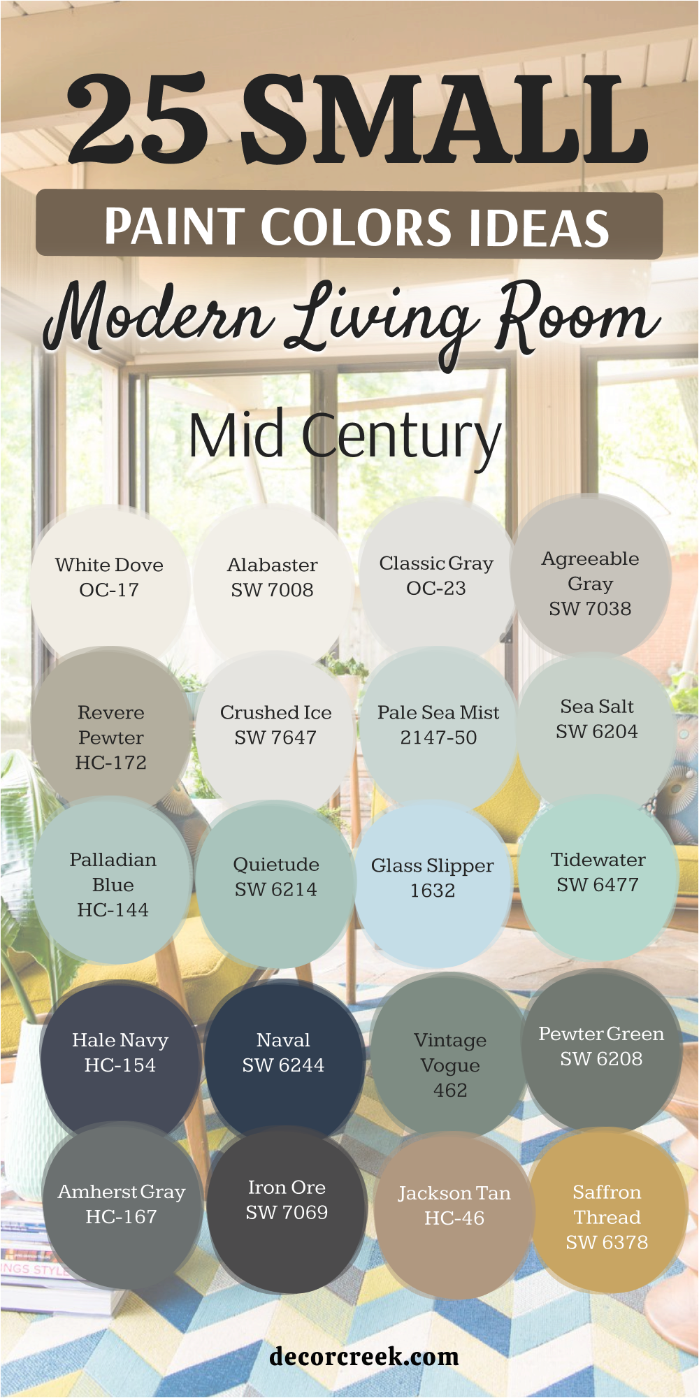
Final Take From My Projects
The most significant misstep I frequently observe clients making when selecting colors for their living rooms is basing their entire decision solely on a tiny swatch viewed in an unnatural light or on a digital screen. My extensive experience, gathered from countless home staging and detailed design projects, has profoundly taught me that the true life and character of a paint color are entirely dependent on its specific environment.
This environment includes the unique qualities of the natural light that enters the room at various times of the day, the tactile texture of the sofa fabric, and, crucially, the specific tone and grain of the existing wood furniture.
For achieving success with Mid-Century Modern aesthetics, the core principle is choosing a wall color that strategically allows the iconic furniture pieces and the clean architectural shapes to be the unquestionable focal point, rather than allowing the wall color itself to dominate or distract.
Whether you opt to introduce a rich, deeply saturated jewel tone, such as Naval, for a single, dramatic accent wall, or prefer to select a gentle, visually expanding neutral, such as Alabaster, to wash the entire room, the paint color serves as the essential, sophisticated foundation.
It is this foundation that imbues your design with necessary gravity, depth, and unique personality. I urge you not to simply follow fleeting trends; instead, concentrate on pursuing and capturing the distinct, happy feeling you desire and deserve the very moment you step through your front door.
The carefully selected colors presented in this comprehensive guide—ranging from the grounded, earthy mustards and organic greens to the crisp, clean whites—are all time-tested and proven to consistently create a sophisticated, tailored, and genuinely happy feeling.
Trust your personal instincts, utilize this collection of handpicked colors as your expert starting point, and prepare yourself to absolutely adore the way your beautifully colored living room makes you feel every single day.