I know how much we all love the modern farmhouse look—it feels incredibly cozy, deeply rooted in comfort, and simultaneously current all at once. There is a reason this style remains a favorite: it balances traditional warmth with clean, contemporary lines. If you’re planning a significant project for 2026, getting the paint color just right is arguably the most crucial decision you will make.
It’s the foundation of your design and what sets the entire mood and emotional tone in the home. As someone who constantly designs interiors, selecting palettes, and staging homes to maximize their appeal, I see firsthand the powerful, almost instantaneous impact a coat of fresh paint has on a room. It’s not merely an update; it’s a complete and fundamental shift in the atmosphere and how a person experiences the space.
The colors I select are not just trends; they are reliable staples that evoke genuine feeling. I want to share my favorite tried-and-true colors with you—the ones I return to repeatedly because of their consistent performance. My focus is on the shades that flawlessly bring that perfect, sought-after blend of classic farmhouse warmth and clean, modern simplicity. These particular colors possess a profound power to truly evoke positive emotion, creating spaces where families want to gather and relax.
I’ve diligently put together a comprehensive list of my go-to shades for every key area: your hardworking kitchen, the welcoming living room, the peaceful bathroom, and the crucial first impression that is the exterior. These are the specific colors that have the magic to make a house feel like a genuine, settled home—comfortable, unequivocally beautiful, and absolutely ready for the design standards of 2026.
Get ready to finally find the perfect colors that truly speak to your heart for your next big, successful renovation project!
Why I Always Trust Sherwin-Williams and Benjamin Moore for Farmhouse Paint Colors
When I’m working on a design project, especially one with a specific feel like the modern farmhouse, I rely on the best paint brands without hesitation. Sherwin-Williams and Benjamin Moore are simply the industry leaders, and it’s for good reasons that impact the final result. Their colors are manufactured with such rich pigments and high-quality formulas that the finish is always reliable and deep, which is key for getting that beautiful, lasting look.
I find their color palettes are perfectly curated to include all the soft, muted neutrals, warm whites, and deep, grounding colors that are absolutely essential for defining the farmhouse style. When I recommend a specific shade, I know that when you apply it, it will look exactly the way it’s supposed to—it won’t disappoint with weird, unexpected undertones showing up later.
They also offer excellent paint finishes that stand up to the wear and tear of family life, which is essential for a home to function beautifully and stay attractive. Using these brands is a simple way to ensure the foundational element of your design—the color—is a complete success and makes your beautiful design choices look their absolute best.
How I Choose the Perfect Paint Shades for a Modern Farmhouse
Picking the right paint color can feel tricky, but I have a simple method that ensures a successful modern farmhouse look every single time. The goal is always to find that delicate balance between rustic character and a crisp, contemporary feel. I start by looking for colors that are inherently soft and genuinely welcoming; nothing too harsh or bright belongs in this aesthetic, as it can disrupt the peace.
Whites are crucial, but I lean toward warm whites, the kind that have a slight touch of cream or gray to keep them from feeling empty or sterile. For the main living areas, I often look at grounded neutrals—beautiful beiges, warm greiges, or pale, misty grays. These colors naturally connect the indoors with nature and give the home a relaxing and easygoing feeling.
Next, I absolutely think about contrast. A modern farmhouse needs a few deep, dramatic accents, like a moody green or a dark charcoal, to define certain features like an island, a mudroom bench, or the exterior trim. This contrast is what brings in the “modern” part of the design, keeping it fresh. Finally, I always thoroughly consider the light. Light changes everything about a paint color; it is the biggest variable.
I carefully look at how the natural light hits the walls at different times of the day—morning light is cooler and blue, and afternoon and evening light is much warmer. I strongly recommend my clients test their top three or four samples on large swatches right in the room, watching them for a full day. This practical process guarantees we select a shade that lives beautifully and harmoniously in that specific home.
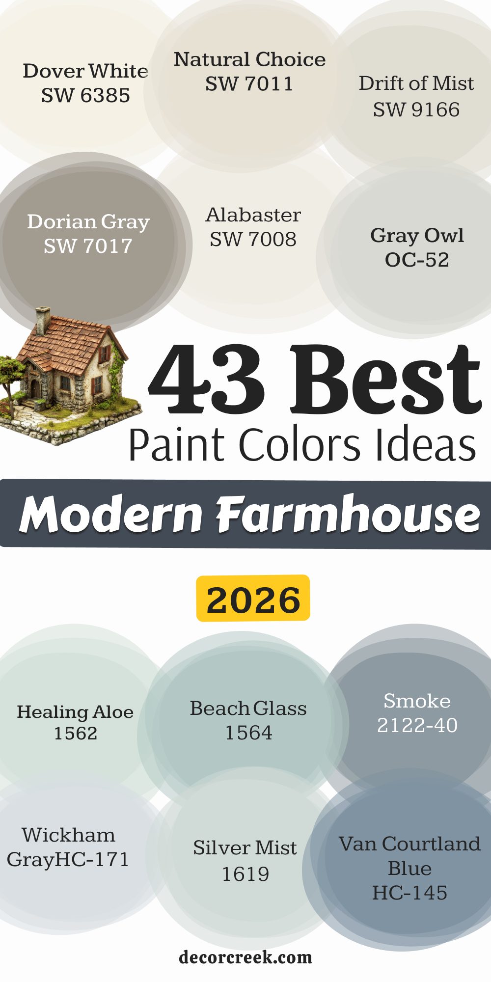
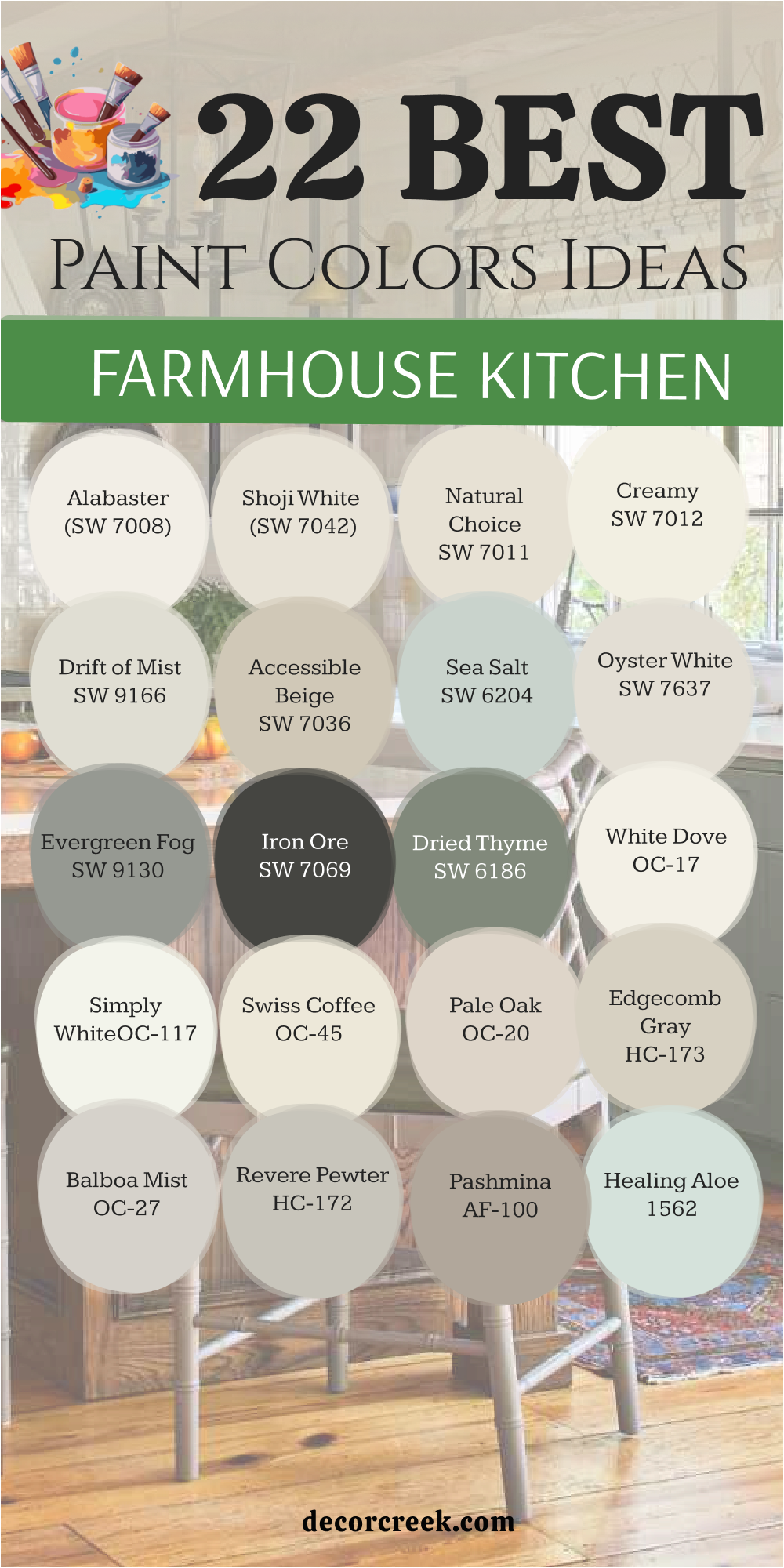
22 Paint Color Ideas For The Farmhouse Kitchen
Alabaster SW 7008
Alabaster is a creamy, beautiful white that feels incredibly inviting and soft, bringing a gentle brightness to the kitchen. This color is one of my go-to whites for kitchen cabinets because it avoids any cold blue undertones that can make a room feel unwelcoming or stark. It has just enough warmth to make it feel rich and cozy, perfect for a busy gathering place like the kitchen where warmth is essential.
Alabaster pairs wonderfully with natural wood tones, helping those rustic elements pop without competing with their texture. It’s a color that works well on both the walls and the ceiling, giving the whole kitchen a cohesive, light-filled look that feels complete. I find it’s a brilliant choice for creating a light and airy feel, even in kitchens that don’t get a huge amount of sun exposure.
It really reflects the available light beautifully, making the whole room feel larger and more open. It also looks stunning when used as the primary exterior color for a truly classic farmhouse appearance. This shade is a safe bet for anyone seeking a perfect, warm white that will not disappoint or cause future regrets.
🎨 Check out the complete guide to this color right HERE 👈

Shoji White SW 7042
Shoji White is a versatile off-white that carries a hint of beige and gray, giving it a wonderfully sophisticated depth that is rarely found in simple whites. It never looks stark or glaring, which is essential for maintaining a comfortable and welcoming farmhouse feel, especially in a kitchen.
I love using this color on kitchen walls when the cabinets are a crisp, true white; it provides a gentle, muted contrast that adds architectural interest without distraction. Shoji White can shift slightly depending on the light, sometimes appearing as a soft greige and other times looking more like a creamy white that feels aged.
This depth is what prevents the color from feeling flat or boring, keeping the room visually engaging and interesting. It’s a fabulous color for open-concept homes because it flows beautifully into other rooms painted in similar warm neutrals without a harsh break. This color is also sturdy enough to stand up to bolder accent colors like a deep blue or moody green on a central kitchen island. If you want an off-white that truly feels anchored and warm, this is a wonderful candidate to consider seriously.
🎨 Check out the complete guide to this color right HERE 👈

Natural Choice SW 7011
Natural Choice is a warm, beautiful off-white that sits nicely between a stark white and a true beige, offering the best qualities of both. This color has lovely cream undertones that make it feel very comfortable and grounded, ideal for a functional and homey kitchen where cooking happens.
I often recommend Natural Choice when a client wants a white but is worried about the color feeling too cold, as this shade always provides a lovely, dependable warmth. It works beautifully on shiplap or beadboard, highlighting the texture of the materials without drawing too much unnecessary attention.
The color is easy to coordinate with a variety of backsplash tiles and stone countertop materials, making it a flexible and easy foundation for your whole design plan. Natural Choice is a fantastic option for creating a kitchen that feels clean and modern yet still retains that essential farmhouse softness and welcoming atmosphere. It’s a very livable color that truly makes a kitchen feel complete and inviting to everyone who enters.
🎨 Check out the complete guide to this color right HERE 👈

Creamy SW 7012
Creamy is a delightful and true warm white with a buttery richness that absolutely lives up to its pleasing name. This color has a sunny and positive disposition, making a kitchen feel bright, cheerful, and incredibly welcoming throughout the day. I use Creamy when a space really needs an injection of warmth, especially in kitchens that face north or don’t receive direct, bright sunlight for long periods.
It makes cabinets feel rich and luxurious without being too yellow or dated in appearance, which is a common fear. Creamy pairs beautifully with light wood floors and rustic wood accents, enhancing the texture of the farmhouse elements you choose.
It’s a great color for both walls and trim work, allowing the natural light to bounce around and truly brighten the whole room effectively. This shade is a wonderful choice for achieving a traditional farmhouse look with a crisp, clean update that will feel fresh for many years to come. It’s simply a comfortable and inviting color that brings joy to the space.
🎨 Check out the complete guide to this color right HERE 👈

Drift of Mist SW 9166
Drift of Mist is a light, airy greige that offers a beautiful, subtle shift from plain white, injecting a quiet sophistication into the kitchen environment. This color has a delicate and nuanced balance of gray and beige, ensuring it reads as a neutral that is both modern and warm at the same time.
I often use Drift of Mist on walls to provide a soft, gentle contrast to true white cabinets and trim, adding visual interest without making a strong, distracting statement. It works beautifully in contemporary farmhouse designs where a very clean, muted palette is desired for a sleek, refined look.
The color is wonderful at changing slightly depending on the light, sometimes leaning a little more gray and other times appearing more creamy and soft. Drift of Mist is a perfect background color, allowing your beautiful fixtures, hardware, and accessories to naturally become the focus of the design. It’s a light neutral that feels utterly fresh and wonderfully easy to live with day after day in a busy kitchen.
🎨 Check out the complete guide to this color right HERE 👈

Accessible Beige SW 7036
Accessible Beige is a fantastic, dependable greige that leans perfectly into the beige side while still having enough gray to keep it modern and completely current. This color is a wonderful choice for those who find pure gray too cold or stark for a cozy, hardworking kitchen environment. It has an undeniable warmth that makes a kitchen feel grounded and comfortable, truly feeling like the hub of the home.
I often recommend Accessible Beige for walls in kitchens with white or light-colored cabinets to add some much-needed depth and definition to the walls. It provides a beautiful, natural backdrop that complements stone countertops and subway tile exceptionally well without clashing.
This versatile shade is a classic color that provides a rich, inviting contrast to crisp white trim and doors, highlighting architectural details. Accessible Beige is a powerhouse neutral that helps a room feel substantial and elegantly put-together without much strenuous effort.
🎨 Check out the complete guide to this color right HERE 👈

Sea Salt SW 6204
Sea Salt is a gentle, misty gray-green that introduces a lovely, soothing touch of natural color into the kitchen, bringing a hint of the outside in. This shade is perfect for farmhouse kitchens that want a subtle nod to the coast or a little bit of cheerful, fresh personality. I love using Sea Salt on a kitchen island or a lower set of cabinets to create a striking focal point that is still very relaxing and appealing.
It’s a color that is deeply influenced by light, sometimes reading as a true pale green and other times appearing as a muted blue-gray, offering beautiful shifts. Sea Salt pairs exceptionally well with bright white trim and natural wood elements, enhancing the rustic feel of the space and its materials.
It’s an unexpected but delightful choice that truly makes a kitchen feel unique, personal, and special. This shade adds a beautiful, soft element of color that isn’t too bright or distracting, maintaining a peaceful, inviting atmosphere.
🎨 Check out the complete guide to this color right HERE 👈

Oyster White SW 7637
Oyster White is a highly sophisticated off-white that possesses just a touch of beige and a hint of gray, giving it a beautiful, natural depth and complexity. This color is a perfect choice when you want a white that feels grounded and not at all stark or plain, offering more visual interest.
I often use Oyster White on kitchen walls alongside darker trim or beautiful wood accents to highlight the material contrast in the design. It provides a wonderfully soft, almost velvety background that makes the whole room feel richer and much more custom and established.
Oyster White holds up exceptionally well to both cool and warm lighting, making it a reliable color choice for almost any kitchen exposure. It’s the kind of shade that looks good with everything, from sleek stainless steel appliances to antique brass hardware. This color is a fantastic way to achieve a clean, modern farmhouse kitchen that still feels comfortable and truly lived-in.
🎨 Check out the complete guide to this color right HERE 👈

Evergreen Fog SW 9130
Evergreen Fog is a beautiful, muted gray-green that brings a deep, nature-inspired mood and grounding presence to the kitchen. This color is stunning on cabinets, particularly on a kitchen island or the lower set, providing a rich, grounded contrast to white upper cabinets and trim. It is a fantastic choice for adding a touch of sophisticated drama without making the room feel heavy or unnecessarily dark.
I appreciate how Evergreen Fog works effortlessly with natural materials like wood butcher block counters and stone tiles, enhancing their inherent textures and beauty.
The shade is a lovely way to introduce a touch of organic, earthy color that still reads as a sophisticated and complex neutral tone. It is perfect for a modern farmhouse kitchen that leans slightly moody and wants a strong, confident, and memorable color statement. This color is absolutely gorgeous and brings so much personality and depth to a central kitchen design.
🎨 Check out the complete guide to this color right HERE 👈

Iron Ore SW 7069
Iron Ore is an intensely deep charcoal with beautiful brown undertones, creating a stunning near-black that is dramatically grounding and impactful. This color is spectacular when used for a bold statement in the kitchen, like on the island, the pantry door, or even as a defining accent wall.
It adds a powerful, modern punch that contrasts sharply with light walls and white trim, embodying the modern half of the farmhouse aesthetic perfectly. I love how Iron Ore anchors a room, making lighter elements like white marble or pale wood feel even brighter and more prominent by comparison.
It is a color that adds immediate sophistication and a sense of visual luxury to a typically bright kitchen working space. Iron Ore is a fabulous alternative to true black, as the subtle brown base keeps it from feeling too harsh or cold in the light. This shade is a confident choice for a kitchen design that wants to look sleek, contemporary, and incredibly stylish and memorable.
🎨 Check out the complete guide to this color right HERE 👈

Dried Thyme SW 6186
Dried Thyme is a beautiful, muted, mid-toned green that has definite gray undertones, making it feel grounded and naturally inspired. This color is a wonderful choice for kitchen cabinets, particularly for a central island, providing a rich, earthy focal point in the room.
I appreciate how Dried Thyme brings an organic, natural feeling to the kitchen, connecting the interior to the greenery outside the windows. It pairs beautifully with creamy whites and natural wood elements, enhancing the rustic textures you incorporate into the design.
Dried Thyme is a sophisticated color that adds personality without being overly bright or distracting to the eye. This shade works well in farmhouse designs that favor natural, muted colors and a sense of effortless history. It provides a lovely, established depth that makes the entire kitchen feel custom and thoughtfully put together.
🎨 Check out the complete guide to this color right HERE 👈

White Dove OC-17
White Dove is a creamy, highly popular white that has a definite softness, making it feel inviting and incredibly versatile in the kitchen. This color is an absolute favorite for kitchen cabinets because it avoids any harshness and provides a soft, buttery glow that is very flattering.
I often recommend White Dove for walls and trim, as it provides just enough depth to look substantial without feeling stark or unpainted. It pairs wonderfully with nearly all countertop materials, from dark soapstone to light marble.
White Dove is a fantastic foundational white that always feels warm and clean, never cold or sterile. This shade is a great choice for achieving a classic, truly timeless farmhouse look that remains completely fresh and updated. It is a dependable color that beautifully reflects the light, making the kitchen feel airy and bright.
🎨 Check out the complete guide to this color right HERE 👈

Simply White OC-117
Simply White is a crisp, bright, and clean white that has a subtle yellow undertone, giving it a delightful warmth without losing its brilliance. This color is perfect for kitchen walls and ceilings, where you want maximum reflection of light and an utterly fresh appearance.
I love using Simply White on cabinets to create a sharp, high-contrast look when paired with a dark counter or backsplash. It is a very pure and straightforward white that works well in modern farmhouse designs that favor a light and airy feel. Simply White is a highly dependable color that looks great in any light, maintaining its brightness throughout the day.
This shade makes other colors and materials, like wood and metal, stand out beautifully in the design. It is a fantastic choice for a kitchen that needs to feel energetic, clean, and wonderfully simple.
🎨 Check out the complete guide to this color right HERE 👈

Swiss Coffee OC-45
Swiss Coffee is a beautiful, warm off-white with a noticeable creamy base that gives it a rich, comforting feel in the kitchen. This color is perfect for walls when you want a white that feels deeply established and cozy, avoiding a new or stark appearance.
I often recommend Swiss Coffee for kitchens with wood elements or darker flooring, as it complements warm tones beautifully. It has a lovely, subtle richness that provides a soft contrast to bright white trim, adding quiet dimension.
Swiss Coffee is a dependable choice for creating a grounded and very welcoming atmosphere that encourages lingering. This shade is a great option for a farmhouse kitchen that favors warmth and a slightly traditional, yet always clean, style. It is a sophisticated off-white that feels substantial and effortlessly put-together.
🎨 Check out the complete guide to this color right HERE 👈

Pale Oak OC-20
Pale Oak is a lovely, light greige that is incredibly airy and balanced, feeling neither too warm nor too cool in the kitchen setting. This color is perfect for walls when you want a neutral that offers more depth than white but remains very light and sophisticated.
I often use Pale Oak because of its versatility; it pairs beautifully with both white cabinets and natural wood tones without competing with them. It has a soft, delicate quality that makes the kitchen feel refined and quietly elegant.
Pale Oak is a fantastic color for creating flow in an open-concept design, connecting the kitchen to other areas seamlessly. This shade is a dependable choice for a modern farmhouse that seeks a light, updated neutral that feels beautifully custom. It is a gorgeous, gentle color that adds subtle complexity.
🎨 Check out the complete guide to this color right HERE 👈

Edgecomb Gray HC-173
Edgecomb Gray is a highly popular, sophisticated greige that leans slightly warmer, making it a very inviting neutral for the kitchen. This color is perfect for walls when you want a true, grounded color that avoids the coldness of many pure grays, bringing an earthy feel.
I often recommend Edgecomb Gray for walls in kitchens with white cabinets to provide a soft, rich contrast that adds definition to the architecture. It works wonderfully to complement stone countertops and wood finishes, enhancing their natural textures.
Edgecomb Gray is a fantastic, highly adaptable color that changes beautifully with the light, maintaining its warmth. This shade is a dependable choice for a cozy, modern farmhouse look that feels both established and completely current. It is an enduring neutral that always makes a kitchen feel complete and well-designed.
🎨 Check out the complete guide to this color right HERE 👈

Balboa Mist OC-27
Balboa Mist is a very light, misty gray that has definite, beautiful warm undertones, keeping it soft and approachable in the kitchen. This color is perfect for walls when you want a light gray that won’t feel stark, offering a gentle, sophisticated color quality.
I often use Balboa Mist to provide a subtle, refined background that looks crisp next to bright white trim and ceiling. It works wonderfully with marble and clean, light fixtures, enhancing the feeling of purity and order.
Balboa Mist is a great choice for creating an airy, light-filled atmosphere that still has a quiet complexity to the color. This shade is a dependable neutral for a modern farmhouse that favors soft, muted palettes and a clean design. It is a truly lovely color that brings a gentle elegance to the space.
🎨 Check out the complete guide to this color right HERE 👈

Revere Pewter HC-172
Revere Pewter is a classic, mid-toned greige that is perfectly balanced, leaning neither too brown nor too gray, giving it broad appeal. This color is perfect for walls when you want a substantial, sophisticated neutral that anchors the kitchen design and provides depth.
I often recommend Revere Pewter to clients who want a reliable color that looks fantastic with both white cabinets and darker wood accents. It works wonderfully to highlight the lines of the trim and millwork with its rich contrast.
Revere Pewter is a fantastic choice for creating a grounded, traditional farmhouse feeling that is still very much in style. This shade is a dependable and popular color that always makes a kitchen feel rich, well-established, and totally welcoming. It is a powerful neutral that ties the whole room together.
🎨 Check out the complete guide to this color right HERE 👈

Pashmina AF-100
Pashmina is a rich, warm greige that possesses a deep, comforting saturation, making it a powerful statement neutral in the kitchen. This color is perfect for an accent wall or the kitchen island when you want a more substantial color that adds drama and elegance to the room.
I often use Pashmina to create a cozy, defined atmosphere that feels custom and sophisticated against lighter elements. It works wonderfully with natural materials like copper, wood, and stone, enhancing their earthy presence.
Pashmina is a great choice for a farmhouse kitchen that favors a richer, more established color palette and wants a feel of quiet luxury. This shade is a dependable, deep neutral that prevents a room from feeling washed out and brings a confident feel to the space. It is a truly beautiful and grounding color.
🎨 Check out the complete guide to this color right HERE 👈

Healing Aloe 1562
Healing Aloe is a very pale, beautiful shade of watery blue-green that is incredibly soft and truly refreshing in the kitchen. This color is perfect for a soft touch of color on walls or a pantry door, bringing a light, airy, and gentle feel to the room.
I often use Healing Aloe to introduce a subtle coolness that is still warm enough to feel inviting and pleasant. It works beautifully with white and cream-colored cabinets, creating a delicate, beautiful contrast that is easy on the eyes.
Healing Aloe is a great choice for a farmhouse kitchen that wants a gentle, water-inspired color that is still highly versatile and cheerful. This shade is a dependable choice for bringing a feeling of quiet restfulness to a busy area. It is a lovely, refreshing color that feels light and effortlessly charming.
🎨 Check out the complete guide to this color right HERE 👈

Gray Owl OC-52
Gray Owl is a popular, light, and airy gray that has subtle cool undertones, making it feel perfectly refreshing and clean in the kitchen. This color is perfect for walls when you want a sophisticated, cool neutral that reads purely as gray without much color contamination or distracting shifts.
I often use Gray Owl on the walls to create a clean, contemporary feel that pairs beautifully with stainless steel appliances and white cabinetry. It works wonderfully with white shiplap, offering a gentle but noticeable contrast that highlights the architectural texture.
Gray Owl is a great choice for bringing a feeling of quiet order and elegant simplicity to the space. This shade is a fantastic, straightforward gray that always looks sharp and perfectly composed, adding a modern edge. It is a dependable neutral that keeps the kitchen feeling light and crisp.
🎨 Check out the complete guide to this color right HERE 👈

Natural Cream OC-14
Natural Cream is a gorgeous, soft neutral that sits perfectly between a light beige and an off-white, offering substantial warmth without being yellow. This color is perfect for walls when you want a rich neutral background that feels cozy and perfectly grounded in the kitchen.
I often recommend Natural Cream for its ability to look rich and well-established without feeling heavy or dark in the light. It works wonderfully with both dark wood islands and crisp white cabinets, acting as a pleasing bridge between them.
Natural Cream is a fantastic choice for a farmhouse kitchen that wants to maximize warmth and ensure the room feels deeply inviting and welcoming. This shade is a dependable, versatile color that creates an immediate feeling of comfort and quiet sophistication. It is simply a beautiful and reliable choice.
🎨 Check out the complete guide to this color right HERE 👈

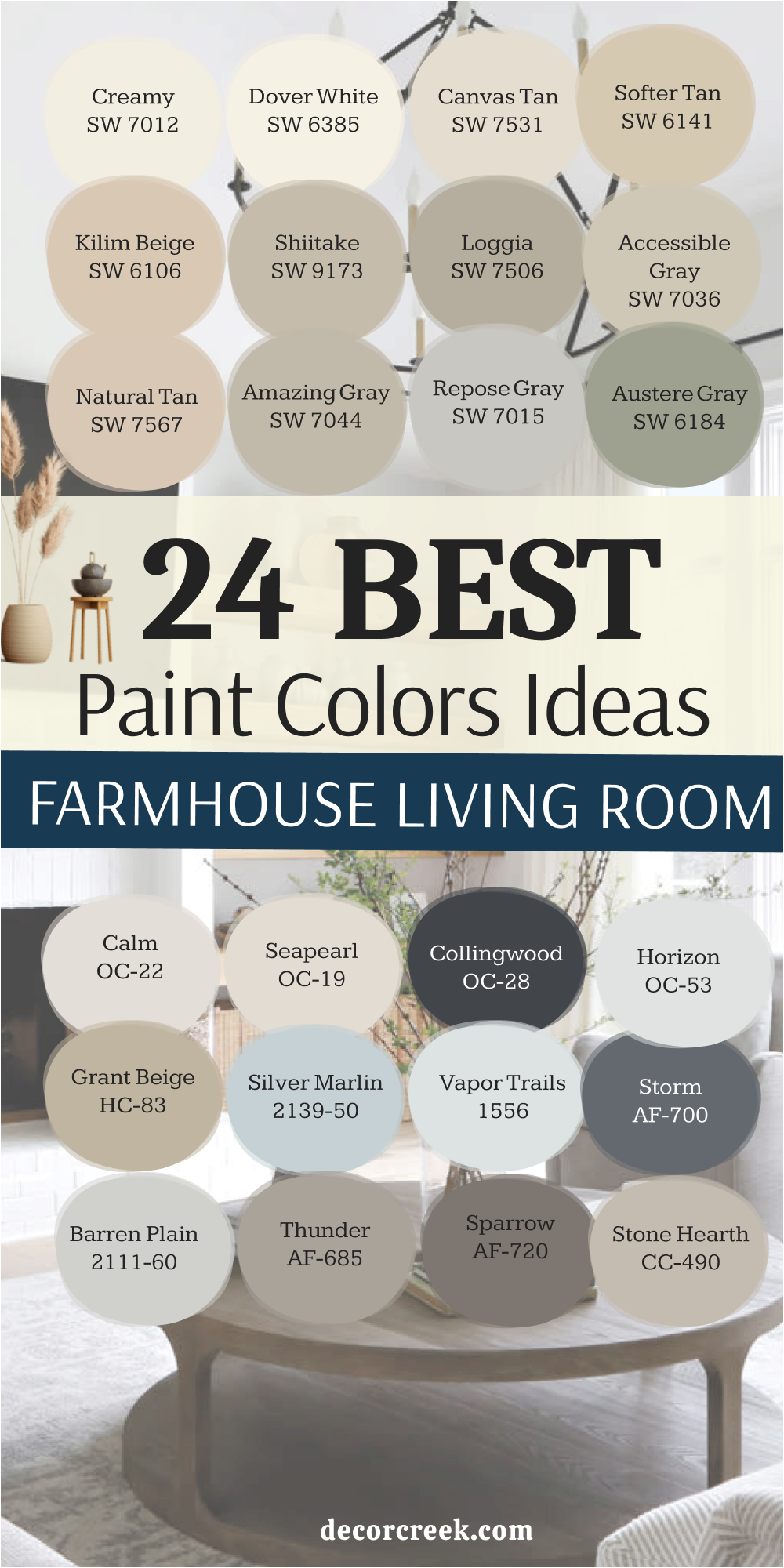
24 paint color ideas for the Farmhouse living room
Creamy SW 7012
Creamy is a beautiful, warm white that delivers a cheerful and inviting glow to a living room, making it feel instantly comfortable and deeply welcoming. This shade has a subtle yellow undertone that prevents it from ever feeling cold or sterile, which is so important for a cozy gathering area where relaxation is key.
I often use Creamy on all the walls in a living room to create a soft, continuous background for showcasing artwork, furniture, and family photos. It pairs exceptionally well with the rustic, natural textures often found in farmhouse decor, such as woven rugs, linen sofas, and rough-hewn wood beams.
The color is wonderful at reflecting light, making the room appear brighter and more expansive, which is always a pleasing effect. Creamy works well with many accent colors, from deep navy to soft sage green, giving you tremendous flexibility with your decorating choices over time. This shade is a fantastic foundation for a classic farmhouse look that remains completely fresh, light, and easy on the eyes. It is simply a reliable and very welcoming white that feels like a hug.
🎨 Check out the complete guide to this color right HERE 👈
Dover White SW 6385
Dover White is a very popular white with a definite, comforting touch of creamy yellow, giving it a delightful softness and richness. This color is an excellent choice for a living room because it always feels warm and inviting, truly setting a pleasant, relaxed tone for lounging. I often suggest Dover White for the walls and trim, as its slight richness keeps the room from feeling stark or unpainted, adding a gentle glow.
It is a wonderful companion to natural light, absorbing the sun’s warmth and distributing it evenly throughout the day, creating a beautiful atmosphere. Dover White stands up well to both bright light and shaded corners, maintaining its lovely creamy quality without fail or unexpected shifts.
This color is easy to coordinate with both dark and light wood furniture, making it a flexible anchor for your living room design, regardless of your personal collection. It is a truly classic shade that always achieves that desirable, cozy farmhouse aesthetic with a crisp, clean update.
🎨 Check out the complete guide to this color right HERE 👈

Canvas Tan SW 7531
Canvas Tan is a beautiful, light neutral that is the perfect blend of a pale tan and a soft greige, giving it a rich and wonderfully grounded feel in a living space. This color is ideal for a farmhouse living room where you want more color saturation than white but still absolutely need a reliable, light backdrop that acts as a true neutral.
I often use Canvas Tan when the goal is to make the room feel especially warm and established, as its depth adds a sense of history and permanence. It pairs beautifully with stone fireplaces and leather seating, enhancing those tactile, rustic materials that define the style. Canvas Tan provides a lovely, gentle contrast to crisp white trim, highlighting the architectural details of the room’s millwork.
It’s a wonderful choice for creating a living room that feels both sophisticated and utterly relaxed for everyday enjoyment by the whole family. This is a very comfortable neutral that avoids feeling boring or dated, remaining truly current and appealing.
🎨 Check out the complete guide to this color right HERE 👈

Softer Tan SW 6141
Softer Tan is a welcoming and beautifully saturated beige that feels like a truly warm hug for a living room, inviting you to sit down. This color is perfect for those who want to move away from gray tones and introduce a comfortable, natural earthiness into their home’s central gathering area.
I recommend Softer Tan to create a cozy and intimate atmosphere, which is essential for a truly relaxing living room where family and friends gather often. It works beautifully with rich, textured fabrics and dark wood furniture, helping to define the space with a sense of solidity and quality.
Softer Tan is a surprisingly flexible neutral that can be styled in many ways, from traditional to more contemporary farmhouse looks, adapting to your taste. The color has enough depth to look substantial on its own without needing a lot of competing decoration to fill the walls. This shade is a dependable choice for a living room that needs warmth, depth, and a perfectly comfortable, lived-in feel.
🎨 Check out the complete guide to this color right HERE 👈
Kilim Beige SW 6106
Kilim Beige is a warm, established beige that has been a favorite for years, and for good reason—it’s wonderfully dependable, saturated, and cozy. This color has lovely red and gold undertones that make a living room feel rich, grounded, and incredibly welcoming to guests.
I often suggest Kilim Beige when the home has strong architectural features or built-ins that truly need a substantial background color to stand against. It provides a beautiful contrast to white trim, drawing attention to the details and lines of the room’s design.
Kilim Beige holds up well in different light conditions, always maintaining its warm, earthy quality without appearing washed out or weak. This shade is perfect for achieving a comfortable, slightly more traditional farmhouse style that feels truly and completely inviting. It’s a powerhouse color that always gives a room a wonderfully complete and polished appearance.
🎨 Check out the complete guide to this color right HERE 👈

Shiitake SW 9173
Shiitake is a beautiful, sophisticated warm greige that leans slightly brown, giving it a rich and grounded presence in a living room environment. This color is perfect for adding depth and substance without making the room feel dark or heavy in its overall look.
I love using Shiitake for a cozy, intimate feel, especially in living rooms with a lot of natural light that can easily handle a deeper, more saturated color. It pairs beautifully with both light and dark wood tones, acting as a flexible bridge between them in the design scheme.
Shiitake is a fantastic background color for showcasing textural elements like linen sofas and chunky knit throws, making them feel softer. It’s a modern neutral that feels utterly current and keeps the farmhouse aesthetic feeling sleek and sophisticatedly updated. This shade is a wonderful way to introduce a complex, earthy color that still functions completely as a neutral base for decorating.
🎨 Check out the complete guide to this color right HERE 👈

Loggia SW 7506
Loggia is a gorgeous, mid-toned neutral that is a perfect blend of beige and gray, creating a rich and wonderfully versatile greige. This color is an excellent choice for a living room that needs a little more depth and personality than a standard white or light gray can provide.
I often recommend Loggia when a client is looking for a color that can anchor a large room and make it feel more proportional and inviting at the same time. It has enough saturation to look substantial on its own, working beautifully with light trim and dark furniture pieces.
Loggia is a sophisticated color that creates a subtle, beautiful contrast against bright white built-ins or a grand stone fireplace. This shade is truly flexible and works wonderfully with all kinds of accent colors, from deep jewel tones to soft, muted pastels. It’s a wonderful, dependable choice for a grounded and cozy living room.
🎨 Check out the complete guide to this color right HERE 👈

Accessible Gray SW 7036
Accessible Gray is a reliable and immensely popular greige that sits perfectly between gray and beige, offering the best of both worlds in a single shade. This color is ideal for a farmhouse living room because it has a comforting warmth that prevents it from ever feeling cold, a common concern with true grays.
I often use Accessible Gray on walls to provide a beautiful, soft contrast to white trim and ceilings, defining the architecture. It’s a highly adaptable shade that changes nicely with the light, sometimes appearing more beige and other times reading a little more gray depending on the time of day.
Accessible Gray is fantastic for creating a consistent, flowing color palette across an open-concept living area, ensuring harmony. This shade is a beautiful, easy-to-live-with neutral that serves as a perfect backdrop for artwork, family photos, and all your beloved decor items. It’s a perfect neutral that will look good for many years to come.
🎨 Check out the complete guide to this color right HERE 👈
Natural Tan SW 7567
Natural Tan is a lovely, genuine tan with a grounded earthiness that brings a comforting, natural feel to any living room. This color is perfect for those who truly love the natural, sun-baked tones often found in traditional, rustic farmhouse elements.
I recommend Natural Tan for living rooms where the goal is maximum warmth and a feeling of rustic simplicity and ease. It pairs beautifully with antique wood pieces, metal accents, and other warm, textural materials in the space.
Natural Tan provides a gentle but noticeable contrast to white trim, defining the lines of the room without being too dramatic or jarring. This shade is a wonderful choice for creating a living room that feels utterly relaxed, homey, and comfortable for all occasions and seasons. It is a dependable color that brings a classic, simple beauty to the center of your home.
🎨 Check out the complete guide to this color right HERE 👈
Amazing Gray SW 7044
Amazing Gray is a warm, mid-toned gray that carries a beautiful, comforting hint of brown, making it a true and complex greige. This color is an excellent choice for a living room because it offers more depth than lighter neutrals but still feels incredibly balanced and natural.
I love using Amazing Gray to create a cozy, defined atmosphere, especially in rooms with higher ceilings that can easily handle a bit more color weight and saturation. It works beautifully to highlight the texture of shiplap or beadboard, adding architectural interest to the walls.
Amazing Gray pairs well with rich wood floors and metal light fixtures, embodying both the rustic and modern sides of the farmhouse aesthetic. This shade is a sophisticated and confident neutral that helps a living room feel grounded and beautifully finished.
🎨 Check out the complete guide to this color right HERE 👈

Repose Gray SW 7015
Repose Gray is a very popular, light greige that has slightly cool undertones, making it a highly sophisticated and versatile choice for a living room. This color is perfect for the walls when you want a light neutral that definitely reads as gray but is kept from being too stark by a gentle touch of beige.
I often use Repose Gray with a crisp white trim for a very clean, contemporary farmhouse look that feels light and airy. It’s a beautifully balanced color that works well in most lighting conditions, maintaining its refined appearance.
Repose Gray is an excellent choice for creating a feeling of modern elegance and visual restraint on a traditionally warm style. This shade is a sophisticated and highly dependable neutral that always makes a home look custom and completely polished.
🎨 Check out the complete guide to this color right HERE 👈

Austere Gray SW 6184
Austere Gray is a muted, earthy gray-green that offers a beautiful, nature-inspired richness to the living room walls. This color is perfect for those who want to introduce a significant color element that remains incredibly restful and refined.
I often recommend Austere Gray for walls to create a soothing, grounded atmosphere that complements natural wood floors and stone elements beautifully. It works wonderfully to provide a deep, sophisticated contrast to bright white trim and built-ins, drawing attention to their details.
Austere Gray is a fantastic choice for a farmhouse living room that leans toward an organic, slightly moody, and established aesthetic. This shade is a dependable color that brings depth and a unique sense of history to the space.
🎨 Check out the complete guide to this color right HERE 👈
Calm OC-22
Calm is an airy, incredibly light greige that sits very close to off-white, offering just the slightest hint of gray and beige. This color is perfect for a living room where you want walls that look almost white but have a gentle, beautiful softness that prevents them from feeling stark.
I often use Calm on all walls and ceilings to create a continuous, light-filled, and utterly relaxing atmosphere that feels weightless. It works beautifully with both warm-toned furniture and cooler accent colors, making it highly versatile.
Calm is a great choice for providing a refined, barely-there background that maximizes the feeling of openness and ease. This shade is a dependable, high-end neutral that makes any living room feel beautifully clean and exquisitely put together.
🎨 Check out the complete guide to this color right HERE 👈
Seapearl OC-19
Seapearl is a beautiful, warm off-white that carries a noticeable, soft hint of greige, giving it a rich, substantial quality in the living room. This color is perfect for walls when you want a white that feels anchored and avoids a stark, bright glare, maintaining a feeling of warmth.
I often recommend Seapearl because it provides a wonderful, gentle contrast to true white trim, adding quiet dimension to the room. It works beautifully with natural textures and simple, rustic decor elements, enhancing the farmhouse feel.
Seapearl is a fantastic choice for creating a grounded and inviting atmosphere that feels completely natural and effortless. This shade is a dependable, sophisticated off-white that looks consistently good in different lighting conditions.
🎨 Check out the complete guide to this color right HERE 👈

Collingwood OC-28
Collingwood is a beautiful, mid-toned gray that carries a soft, warm undertone, preventing it from feeling cold and giving it a sophisticated greige quality.
This color is perfect for walls when you want a grounded, rich neutral that provides excellent definition and depth to the living room. I often use Collingwood to create a sense of refined elegance and cozy containment, especially in larger, open rooms.
It works wonderfully with dark wood furniture and light, plush textiles, balancing texture and color. Collingwood is a great choice for a farmhouse living room that favors a slightly deeper, more established neutral palette. This shade is a dependable color that ensures the room feels custom-designed and thoughtfully put-together.
🎨 Check out the complete guide to this color right HERE 👈

Horizon OC-53
Horizon is a very light, airy gray with a distinct, pleasing blue undertone, giving it a cool, refreshing quality in the living room. This color is perfect for walls when you want a light neutral that feels clean and open, suggesting airiness and sky.
I often recommend Horizon for sunny living rooms where a little coolness is welcome, creating a crisp, gentle atmosphere. It works beautifully with bright white trim and natural wood, offering a lovely, delicate contrast.
Horizon is a great choice for a modern farmhouse design that leans slightly toward a coastal or refreshing, simple aesthetic. This shade is a dependable, light gray that brings a feeling of quiet sophistication and lightness to the space.
🎨 Check out the complete guide to this color right HERE 👈

Grant Beige HC-83
Grant Beige is a beautiful, classic mid-toned beige that has a significant saturation, giving it a rich, warm, and comforting presence in the living room. This color is perfect for walls when you want a strong, dependable neutral that feels deeply traditional and incredibly cozy.
I often use Grant Beige to create a sense of history and substantiality in a room, especially when paired with antique furniture. It works wonderfully with white trim and dark leather accents, enhancing the rustic elegance of the space.
Grant Beige is a fantastic choice for a farmhouse living room that favors warmth, depth, and a classic, established aesthetic. This shade is a dependable, rich color that always makes a home feel incredibly welcoming and complete.
🎨 Check out the complete guide to this color right HERE 👈

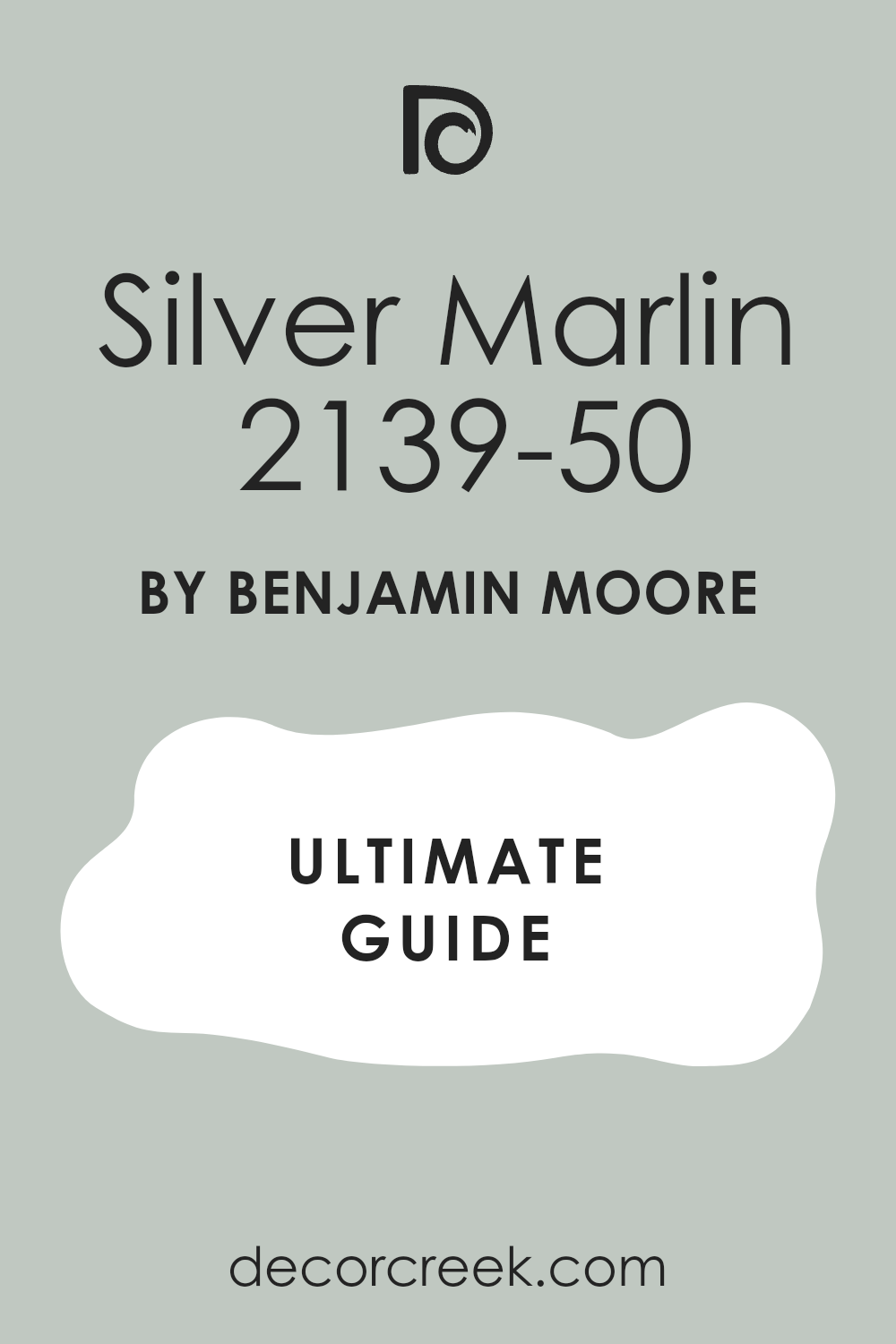
Silver Marlin 2139-50
Silver Marlin is a gorgeous, muted blue-gray that has a sophisticated, silvery quality, making it feel refined and airy in the living room. This color is perfect for an accent wall or to add a subtle layer of color to the walls that still reads as a near-neutral.
I often recommend Silver Marlin for its beautiful complexity; it feels watery and refreshing without being overly bright or demanding. It works wonderfully with light-colored furniture and dark wood floors, creating a balanced, elegant contrast.
Silver Marlin is a great choice for a farmhouse living room that wants a touch of soothing, atmospheric color. This shade is a dependable, quiet color that brings a lovely feeling of refinement to the space.
🎨 Check out the complete guide to this color right HERE 👈
Vapor Trails 1556
Vapor Trails is an ethereal, light blue-gray that is incredibly airy and clean, bringing a feeling of openness to the living room. This color is perfect for walls when you want a very light color that feels like a soft breath of fresh air, maximizing the feeling of height and openness.
I often use Vapor Trails to create a completely light-filled and spacious atmosphere, especially in smaller or darker living rooms. It works beautifully with white trim and minimal, clean-lined decor.
Vapor Trails is a great choice for a modern farmhouse design that values simplicity, light, and a refreshing, gentle palette. This shade is a dependable, almost-white color that provides a beautifully soft background.
🎨 Check out the complete guide to this color right HERE 👈

Storm AF-700
Storm is a deep, rich charcoal with noticeable warmth, creating a powerfully grounded and sophisticated color for the living room. This color is perfect for an accent wall or built-in shelving, adding a dramatic, modern punch that anchors the whole room’s design.
I often recommend Storm to create intentional depth and an architectural statement, contrasting sharply with light walls and furniture. It works wonderfully with metal accents, raw wood, and plush textiles, enhancing texture.
Storm is a fantastic choice for a farmhouse living room that boldly leans into the “modern” side of the aesthetic. This shade is a dependable, confident dark color that brings a feeling of quiet luxury and visual weight.
🎨 Check out the complete guide to this color right HERE 👈

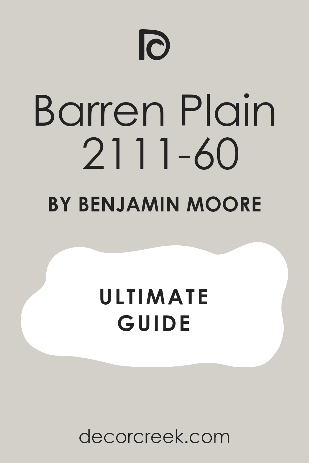
Barren Plain 2111-60
Barren Plain is a light, gentle gray that has a definite touch of warmth, preventing it from feeling cold and giving it a soft, inviting quality. This color is perfect for walls when you want a true, airy gray that remains neutral and easy to pair with various decor elements.
I often use Barren Plain to create a subtle, beautiful contrast against bright white trim, defining the lines of the room delicately. It works wonderfully with simple, textured fabrics and light wood floors.
Barren Plain is a great choice for a modern farmhouse that seeks a clean, light gray palette without any starkness. This shade is a dependable, refined neutral that always makes the living room feel fresh and beautifully composed.
🎨 Check out the complete guide to this color right HERE 👈
Thunder AF-685
Thunder is a rich, warm greige that possesses substantial depth, falling firmly into the mid-tone range, giving it a cozy, grounded feel. This color is perfect for walls when you want a deep neutral that feels established and wonderfully inviting, promoting a relaxed atmosphere.
I often recommend Thunder for its ability to create a sense of containment and intimacy in a living room, especially in rooms with higher ceilings. It works wonderfully with leather, dark wood, and woven materials, enhancing the rustic feel.
Thunder is a fantastic choice for a farmhouse living room that favors depth, warmth, and a sophisticated, slightly moody aesthetic. This shade is a dependable, deep neutral that anchors the entire design.
🎨 Check out the complete guide to this color right HERE 👈

Sparrow AF-720
Sparrow is a deep, earthy brown-gray that feels rich and grounded, creating a warm, sophisticated greige with visual weight. This color is perfect for a substantial accent wall or built-ins, adding a profound, natural richness to the living room design.
I often use Sparrow to introduce a highly established, almost historical feeling to the space, balancing it with light furniture. It works wonderfully with stone elements, natural linen, and metal accents, emphasizing texture and material quality.
Sparrow is a great choice for a farmhouse living room that favors a nature-inspired, deep, and beautifully custom color scheme. This shade is a dependable, unique color that brings an immediate feeling of high-end design.
🎨 Check out the complete guide to this color right HERE 👈

Stone Hearth CC-490
Stone Hearth is a beautiful, mid-toned beige that has a gentle gray influence, making it a very warm and approachable greige. This color is perfect for walls when you want a substantial, comforting neutral that feels rich and incredibly inviting, like the name suggests.
I often recommend Stone Hearth for its consistent warmth and ability to look beautiful in different lights without shifting oddly. It works wonderfully with white trim and both light and dark wood furniture, tying them together effortlessly.
Stone Hearth is a fantastic choice for a farmhouse living room that wants a grounded, deeply cozy, and classic neutral palette. This shade is a dependable color that always makes a room feel complete and settled.
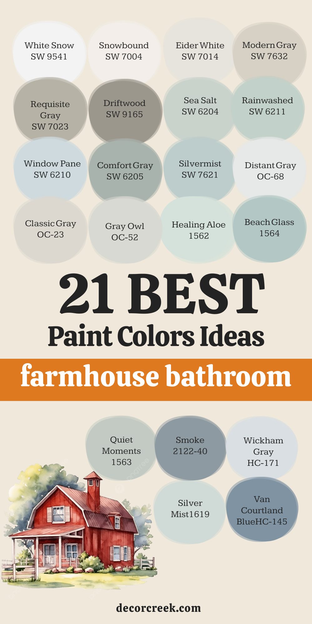
21 paint color ideas for the Farmhouse bathroom
White Snow SW 9541
White Snow is a very crisp and clean white that feels exceptionally fresh and bright in a farmhouse bathroom. This color is perfect for creating a clean, spa-like feel, which is always desirable in a bathroom setting where purity is key. I often use White Snow on walls and vanities to help reflect light and make a smaller bathroom appear much larger and more open.
It pairs beautifully with classic marble or white subway tile, enhancing the texture and shine of the beautiful materials you select. White Snow is a wonderful choice for achieving a very bright, simple, and updated farmhouse aesthetic that feels completely new. It is an extremely versatile shade that works well with any accent color you might choose for towels, rugs, or accessories without clashing.
This color stands up well to both natural and artificial lighting, maintaining its pure white quality without looking dull or strange. It provides a lovely, stark contrast to dark floors or black hardware for a truly sharp, modern element in the design. White Snow is an essential color for creating a sanitary and highly functional feeling in a bathroom, promoting a sense of order. It is a great choice for keeping the overall design light, airy, and wonderfully refined.
🎨 Check out the complete guide to this color right HERE 👈

Snowbound SW 7004
Snowbound is a beautifully bright white that has a very subtle, soft pink or cool undertone, making it feel grounded and slightly muted. This color is perfect for a bathroom where you want a clean, bright look that isn’t too glaringly stark or cold when you first walk in. I often use Snowbound on the shiplap walls of a farmhouse bathroom for a classic, textured appearance that still reads as highly contemporary.
It works wonderfully to complement both warm gold and cool silver hardware, making it a flexible choice for fixtures in your design plan. Snowbound has just enough body to look great next to a true, crisp white trim, giving the room subtle and pleasing dimension. It is an excellent choice for creating a light and highly sophisticated backdrop for a gorgeous freestanding tub or a simple vanity.
This color is a fantastic way to introduce a brilliant white that still feels slightly soft and comfortable to live with every day. It is a dependable white that will always make a bathroom feel impeccably clean and wonderfully organized for daily routines. This shade helps to bounce natural light around, making the bathroom feel refreshed and completely inviting.
🎨 Check out the complete guide to this color right HERE 👈

Eider White SW 7014
Eider White is a fantastic off-white that has a definite, beautiful touch of gray, creating a very light greige that feels anchored. This color is perfect for a bathroom when you want a warm white but are worried about it looking too creamy or yellow in the reflective light. I often recommend Eider White for the walls as it provides a soft, gentle contrast to bright white trim and the clean look of porcelain fixtures. It offers a quiet color that adds depth without making the room feel in any way heavy or visually smaller.
Eider White works wonderfully to complement both rich natural wood vanities and darker tiled floors, acting as a pleasing bridge between them. It’s a very sophisticated shade that creates a peaceful and relaxing atmosphere, which is truly ideal for a personal bathroom retreat. This color is highly adaptable and maintains its soft neutral quality in various types of lighting, from morning sun to evening vanity lights.
It is an excellent choice for a modern farmhouse aesthetic that leans slightly toward a highly muted, refined feel. Eider White is a dependable color that brings a feeling of order and comfortable harmony to a highly functional room. This shade is a favorite for its ability to always look completely fresh and perfectly finished.
🎨 Check out the complete guide to this color right HERE 👈

Modern Gray SW 7632
Modern Gray is a beautiful light greige that has a strong and comforting beige base with a gentle gray influence, creating true warmth. This color is perfect for a farmhouse bathroom that needs a touch of color depth to feel grounded and rich, moving beyond a plain white box. I often use Modern Gray on the walls to give the room a soft, earthy quality that contrasts nicely with bright white porcelain fixtures.
It works wonderfully with black or oil-rubbed bronze hardware, creating a sharp and stylish modern contrast that defines the details. Modern Gray is an excellent choice for making a bathroom feel a little more sophisticated and less purely utilitarian in its design. It is a warm shade that keeps the room from feeling stark or uninviting, even when paired with a lot of white tile surfaces.
This color provides a lovely, muted background that beautifully complements stone countertops or soft wood accents in the space. It is a highly flexible neutral that flows easily from the rest of the home’s primary, comfortable color palette. Modern Gray is a dependable color that ensures the bathroom feels complete, balanced, and perfectly designed. This shade is a wonderful balance of warm and cool tones, making it universally appealing and easy to style.
🎨 Check out the complete guide to this color right HERE 👈

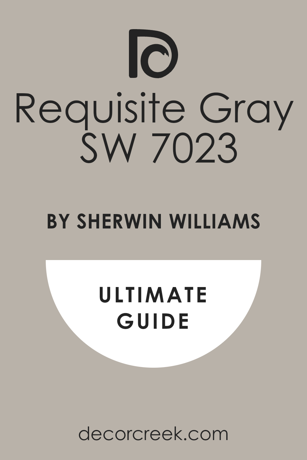
Requisite Gray SW 7023
Requisite Gray is a mid-toned gray that leans distinctly toward the warmer side with lovely brown undertones, giving it a rich appearance. This color is perfect for a dramatic bathroom vanity or a shiplap accent wall, providing a rich, beautiful, and substantial contrast. I often recommend Requisite Gray to add substance and an architectural anchor to an otherwise very light or white bathroom design. It works wonderfully with light-colored flooring and white countertops, allowing those light elements to truly stand out and shine.
Requisite Gray is an excellent choice for creating a sophisticated and slightly moody atmosphere that still feels grounded and cozy. It’s a great color for providing depth and interest, which is a key element in creating a polished design. This shade looks fantastic with both brushed nickel and gold fixtures, highlighting the metallic shine and texture.
It is a very substantial gray that avoids feeling cold or overly industrial, maintaining a warm, earthy quality throughout the day. Requisite Gray is a confident choice for a modern farmhouse design that favors deeper, grounding colors. This color is a dependable way to add depth and a custom-designed feel to the bathroom space.
🎨 Check out the complete guide to this color right HERE 👈
Driftwood SW 3027
Driftwood is a beautiful, grounded medium brown-gray, making it a rich and complex greige with an organic feel. This color is perfect for a farmhouse bathroom that is seeking an organic, natural color palette that feels connected to the outdoors. I often use Driftwood on a bathroom vanity to mimic the look of aged, weathered wood, providing a beautiful rustic touch.
It works wonderfully with light, creamy whites and natural stone tiles, enhancing their inherent textures and quality. Driftwood is an excellent choice for adding a cozy, established feel to a bathroom without making the overall room feel too dark or heavy. It’s a sophisticated neutral that can easily be paired with dark metal hardware for a polished and completed finish.
This shade has enough depth to look substantial and well-considered on the walls or as an accent element. It is a dependable color that brings a subtle, beautiful connection to the natural world indoors, promoting relaxation. Driftwood is a very versatile greige that maintains its inherent warmth even in lower light conditions or in north-facing rooms. This color is a fantastic way to achieve a rich, custom-designed look.
Sea Salt SW 6204
Sea Salt is a gentle, misty gray-green that introduces a lovely, soothing touch of natural color into the bathroom. This shade is perfect for farmhouse bathrooms that want a nod to a coastal or garden feel, making them very refreshing and calming. I love using Sea Salt on all the walls to create a completely enveloping and utterly refreshing, water-inspired atmosphere.
It’s a color that is deeply influenced by light, sometimes reading as a very pale green and other times as a soft blue-gray, offering beautiful shifts. Sea Salt pairs exceptionally well with bright white trim and light wood floating shelves, enhancing the rustic and natural feel. It’s an unexpected but delightful choice that truly makes a bathroom feel like a peaceful and personal retreat from the outside world.
This shade adds a beautiful, soft element of color that isn’t too bright or distracting, maintaining a peaceful atmosphere. It is a wonderful color for creating a feeling of cleanliness and a little bit of cheerful, simple personality. Sea Salt is a great color to wake up to, feeling both refreshing and beautifully composed for a great start to the day. This shade is a very popular and dependable choice for a light and airy design.
🎨 Check out the complete guide to this color right HERE 👈
Rainwashed SW 6211
Rainwashed is a light, wonderfully muted blue-green that is absolutely perfect for creating a relaxing and water-inspired bathroom setting. This color has a very ethereal and airy quality, bringing a sense of lightness and purity to the entire room. I often recommend Rainwashed for the walls of a bathroom to create a soft, welcoming atmosphere that immediately feels like a tranquil spa experience.
It pairs beautifully with crisp white shiplap, trim, and plumbing fixtures, emphasizing their clean lines and modern appeal. Rainwashed is a color that works wonderfully to complement both dark wood vanities and pale, tiled floors, providing a beautiful middle ground. It’s a fantastic shade for introducing a touch of color that is still soft enough to function completely as a comforting neutral background.
This color changes nicely with the light, often showing more blue in the morning and a lovely green in the afternoon sun. It is a very dependable color choice for a farmhouse aesthetic that leans slightly toward a serene coastal or charming cottage feel. Rainwashed is a gentle, sophisticated color that will always make a bathroom feel complete, well-designed, and completely fresh. This shade is highly versatile and easy to decorate around with natural textures and simple, beautiful materials.
🎨 Check out the complete guide to this color right HERE 👈

Window Pane SW 6210
Window Pane is a beautiful, airy blue with a soft touch of green that gives it a wonderfully fresh and clean feel, like clear water. This color is perfect for a farmhouse bathroom that needs a sophisticated pop of color that remains truly soft and muted, preventing visual clutter. I often use Window Pane on the walls to create a feeling of openness and lightness, especially in a smaller space that needs to feel expansive.
It works beautifully with white tile and bright trim, enhancing the crispness of those classic and essential materials. Window Pane is a great alternative to white or gray if you want to introduce a soothing, watery color that promotes a sense of peace. It’s a sophisticated shade that prevents the room from feeling too sterile or cold, thanks to its very slight green undertone.
This color is highly versatile and works with both light wood tones and darker metal accents, creating a balanced and complete look. It is a dependable choice for creating a truly serene and very restful atmosphere that encourages quiet moments. Window Pane is a great color that makes a bathroom feel completely updated, pleasantly designed, and uniquely charming. This shade is an absolutely beautiful and refreshing color for a light-filled room that needs just a hint of color.
🎨 Check out the complete guide to this color right HERE 👈
Comfort Gray SW 6205
Comfort Gray is a rich, beautifully muted green-gray that has a sophisticated, grounding quality that feels deeply established. This color is perfect for a farmhouse bathroom that wants a deeper, more established color palette that feels intentional and custom. I often use Comfort Gray on the walls to create a sense of depth and architectural interest, especially when combined with classic white trim.
It works wonderfully to complement natural materials like woven baskets, rich wood, and stone, providing a true rustic feel. Comfort Gray is a fantastic choice for a bathroom that needs to feel substantial, well-detailed, and a true part of the home’s design. It’s a truly versatile shade that works with a variety of lighting situations, always maintaining its rich and complex color.
This color is deep enough to make white porcelain fixtures look exceptionally bright and clean by contrast. It is a dependable choice for a modern farmhouse aesthetic that favors earthy and slightly moodier colors. Comfort Gray is a great color for a master bathroom, creating a refined and very relaxing retreat. This shade is a wonderful way to introduce a significant amount of color without it feeling overpowering.
🎨 Check out the complete guide to this color right HERE 👈

Silvermist SW 7621
Silvermist is a light, atmospheric gray-blue that has a lovely, subtle green undertone, giving it a beautifully complex character. This color is perfect for a farmhouse bathroom when you want a cooling shade that feels sophisticated and incredibly gentle on the eye. I often use Silvermist on the walls to create a soothing, misty atmosphere that instantly feels light and utterly refreshing.
It works wonderfully with white marble, chrome fixtures, and bright white trim, emphasizing a clean, polished look. Silvermist is a great choice for providing a delicate touch of color that still reads as very neutral and airy throughout the day. It’s a highly flexible shade that changes beautifully with the light, sometimes looking more gray and other times more blue.
This color is excellent for promoting a feeling of peace and order, which is perfect for a functional space. It is a dependable choice for a modern farmhouse that appreciates a gentle, watery color palette. Silvermist is a truly lovely shade that ensures the bathroom feels finished and highly customized.
Distant Gray OC-68
Distant Gray is an incredibly light, pale gray that has a beautifully clean and crisp quality, appearing almost white in bright light. This color is perfect for a farmhouse bathroom that needs the slightest hint of color to avoid a stark white appearance, offering a soft dimension. I often use Distant Gray on the walls to provide a quiet, barely-there contrast to pure white trim and shiplap.
It works wonderfully to complement natural wood tones, making them appear richer and more defined by contrast. Distant Gray is a great choice for creating a light and airy atmosphere that still feels sophisticated and well-considered. It is a highly versatile shade that works well with both cool-toned stone and warm-toned metals in the fixtures.
This color is excellent for making a smaller bathroom feel significantly larger and more open to the eye. It is a dependable, high-end neutral that brings a feeling of quiet refinement to the design. Distant Gray is a favorite for achieving a minimalist farmhouse aesthetic that is still inviting.
🎨 Check out the complete guide to this color right HERE 👈
Classic Gray OC-23
Classic Gray is a beautiful, light greige that has a warmth that prevents it from ever feeling cold or unwelcoming in the bathroom. This color is perfect for walls when you want a true neutral that offers more depth than white but remains wonderfully soft and gentle. I often recommend Classic Gray for the walls because it flows beautifully with almost any other color in the home and doesn’t demand attention.
It works wonderfully with white subway tile, ensuring a clean break without a jarring contrast between the surfaces. Classic Gray is a great choice for creating a comfortable, established atmosphere that feels completely natural and effortless. It’s a highly versatile shade that performs well in both bright sunlight and softer artificial light.
This color provides a subtle, beautiful backdrop that allows plumbing fixtures and hardware to truly shine. It is a dependable shade for a modern farmhouse design that prioritizes warmth and simple elegance. Classic Gray is a favorite for its ability to look great no matter the circumstances.
🎨 Check out the complete guide to this color right HERE 👈

Gray Owl OC-52
Gray Owl is a popular, light, and airy gray that has subtle cool undertones, making it feel perfectly refreshing and clean. This color is perfect for a farmhouse bathroom that wants a sophisticated, cool neutral that reads purely as gray without much color contamination. I often use Gray Owl on the walls to create a clean, contemporary feel that pairs beautifully with chrome or polished nickel fixtures.
It works wonderfully with white shiplap, offering a gentle but noticeable contrast that highlights the architectural texture. Gray Owl is a great choice for bringing a feeling of quiet order and elegant simplicity to the space. It’s a highly dependable shade that maintains its light appearance even in lower light conditions, preventing the room from feeling closed in.
This color provides a clean background that allows natural wood vanities or dark tile floors to truly anchor the room. It is an excellent choice for a modern farmhouse design that favors a crisp, clean aesthetic over a warm one. Gray Owl is a fantastic, straightforward gray that always looks sharp and perfectly composed.
🎨 Check out the complete guide to this color right HERE 👈
Healing Aloe 1562
Healing Aloe is a very pale, beautiful shade of watery blue-green that is incredibly soft and truly restorative. This color is perfect for a farmhouse bathroom where the main goal is to create a peaceful, therapeutic, and very personal retreat. I often use Healing Aloe on all the walls to create an atmosphere that feels light, airy, and wonderfully refreshing, like a spa day.
It works beautifully with white and cream-colored fabrics and fixtures, enhancing their purity and clean lines. Healing Aloe is a great choice for introducing a touch of subtle color that is still neutral enough to be universally appealing and quiet. It’s a highly dependable shade that performs well in a variety of lighting, maintaining its beautiful, soothing quality throughout the day.
This color provides a gentle, beautiful background that is very restful to the eye and encourages relaxation. It is a wonderful choice for a farmhouse aesthetic that leans slightly toward a cozy cottage or coastal feel. Healing Aloe is a favorite for its ability to create a genuine sense of escape.
🎨 Check out the complete guide to this color right HERE 👈
Beach Glass 1564
Beach Glass is a gorgeous, muted blue-green that is slightly deeper than Healing Aloe, offering a richer, water-inspired color. This color is perfect for a farmhouse bathroom when you want a beautiful, soothing color that truly stands out but still feels incredibly grounded. I often recommend Beach Glass for a vanity color or a wainscoting accent, but it also looks lovely on all the walls for a more saturated feel.
It works wonderfully with white subway tile and natural wood accents, creating a high-end, bespoke feeling in the room. Beach Glass is a great choice for adding a touch of sophisticated, saturated color that remains beautifully muted and easy to live with.
It’s a highly dependable shade that creates an immediate feeling of depth and coastal elegance in the space. This color provides a beautiful, serene background that makes white fixtures look crisp and truly inviting. It is a fantastic choice for a farmhouse that wants a sophisticated blend of coastal influence and rustic charm.
🎨 Check out the complete guide to this color right HERE 👈

Quiet Moments 1563
Quiet Moments is a gentle, mid-toned blue-green-gray that perfectly captures the feeling of a calm, overcast day. This color is perfect for a farmhouse bathroom that needs a grounding, muted color that promotes a genuine feeling of peace and introspection. I often use Quiet Moments on the walls to create a sense of elegant sophistication and deep relaxation that makes the room feel substantial.
It works beautifully with brushed metal fixtures and soft lighting, enhancing a cozy, spa-like atmosphere. Quiet Moments is a great choice for providing a rich, sophisticated color that doesn’t feel overly bright or demanding of attention.
It’s a highly dependable shade that changes nicely with the light, offering subtle shifts between green and blue tones. This color provides a gorgeous, complex background that complements simple, clean-lined fixtures beautifully. It is a wonderful choice for a farmhouse aesthetic that values depth, quiet luxury, and personal comfort.
🎨 Check out the complete guide to this color right HERE 👈

Smoke 2122-40
Smoke is a sophisticated, muted blue-gray that has a lovely depth, creating a slightly moodier and more dramatic feel. This color is perfect for a farmhouse bathroom vanity or an accent wall, adding a confident touch of saturated, grounded color. I often recommend Smoke to add a layer of elegance and contrast to a bathroom that is otherwise very white and bright.
It works wonderfully with marble, brass, and dark wood, creating a refined, custom look that feels truly high-end. Smoke is a great choice for introducing a cool, substantial color that feels both modern and utterly classic in its restraint.
It’s a highly dependable shade that anchors a room and allows lighter elements to truly pop and shine brightly. This color provides a beautiful, deep background that is perfect for highlighting simple, striking silhouettes. It is a fantastic choice for a farmhouse design that enjoys a powerful, confident color statement.
🎨 Check out the complete guide to this color right HERE 👈

Wickham Gray HC-171
Wickham Gray is a light, incredibly soft gray that carries a very subtle hint of blue, making it feel beautifully cool and clean. This color is perfect for a farmhouse bathroom when you want a light neutral that feels refreshing and airy without being stark white.
I often use Wickham Gray on the walls to provide a beautiful, crisp contrast to both pure white trim and a dark, rustic vanity. It works wonderfully to complement both natural stone tiles and white porcelain, enhancing their clean surfaces. Wickham Gray is a great choice for creating a feeling of lightness and order that still has a gentle, sophisticated color quality.
It’s a highly dependable shade that avoids any strange color undertones, reading as a pure, light, pleasing gray. This color provides a soft, elegant background that makes the room feel polished and completely intentional. It is a wonderful choice for a farmhouse aesthetic that leans slightly toward a refined, traditional feel.
🎨 Check out the complete guide to this color right HERE 👈

Silver Mist 1619
Silver Mist is a very light and clear gray-green that has a wonderfully clean, minty freshness to it. This color is perfect for a farmhouse bathroom that needs a whisper of light color that feels incredibly refreshing and soft. I often recommend Silver Mist for the walls to create a bright, airy atmosphere that feels light and open to the eye.
It works beautifully with white marble and chrome fixtures, emphasizing a clean and functional design. Silver Mist is a great choice for introducing a delicate touch of color that is still neutral enough to be very adaptable.
It’s a highly dependable shade that is light enough to look wonderful in even the smallest powder room without making it feel cramped. This color provides a lovely, gentle background that promotes a feeling of simple, uncomplicated elegance. It is a wonderful choice for a farmhouse aesthetic that values a very light, almost ethereal color palette.
Van Courtland Blue HC-145
Van Courtland Blue is a gorgeous, muted mid-toned blue that has a sophisticated, historic, and beautiful gray undertone. This color is perfect for a farmhouse bathroom vanity or for an accent wall, bringing a deep, substantial, and classic color presence. I often recommend Van Courtland Blue to add a confident touch of color and a feeling of established history to the space.
It works wonderfully with white shiplap, brass hardware, and dark wood, creating a rich, nautical-inspired contrast. Van Courtland Blue is a great choice for introducing a sophisticated, truly memorable color that is still grounded and completely comfortable.
It’s a highly dependable shade that reads as a beautiful, rich, and classic blue-gray without ever looking too bright or childish. This color provides a strong, elegant background that makes white fixtures look incredibly crisp and inviting. It is a fantastic choice for a farmhouse design that favors confident color choices and historical depth.
🎨 Check out the complete guide to this color right HERE 👈
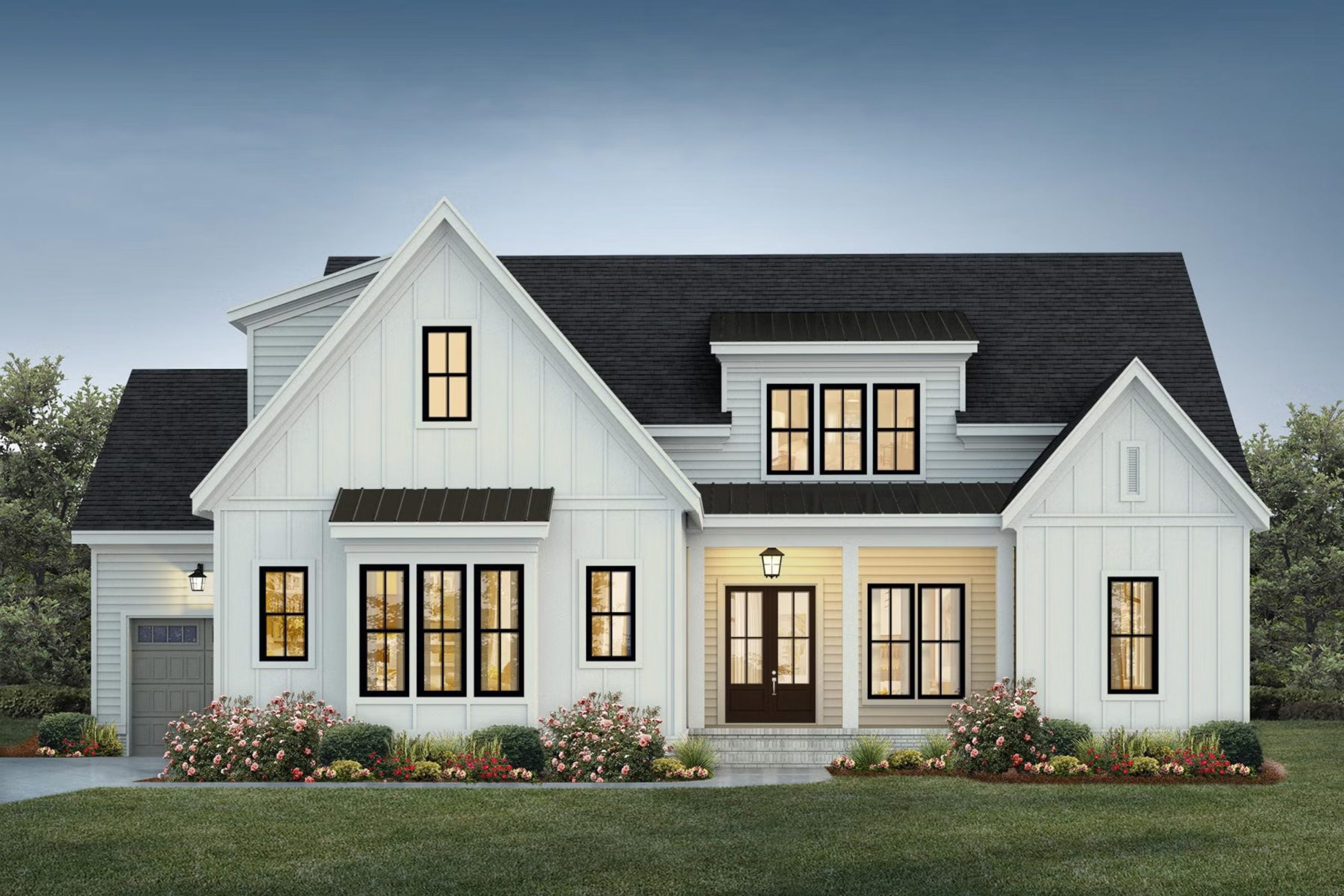
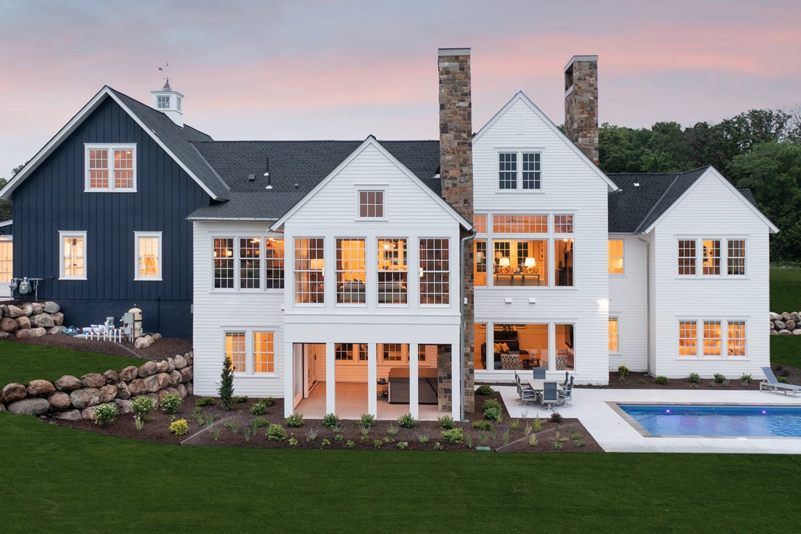
26 Paint Color Ideas For The Farmhouse Exterior
Alabaster SW 7008
Alabaster is a beautifully warm and soft white that is a quintessential choice for the farmhouse exterior. This color has just enough creaminess to feel welcoming and established without looking too stark or glaringly bright in the direct sunlight. I often recommend Alabaster for the main body of the house, pairing it with dark trim or a deep wood tone for a classic, sophisticated contrast that truly stands out.
It works beautifully on all types of exterior siding, including board-and-batten, shiplap, and traditional lap siding, enhancing the texture. Alabaster reflects light wonderfully, making the home look bright and inviting throughout the day, even in overcast weather.
It’s a color that speaks to both tradition and modern simplicity, perfectly embodying the modern farmhouse look you desire. This shade is a safe and incredibly reliable choice for achieving a lasting, clean exterior that will look fantastic for years to come. It is simply a stunning and foundational white.
🎨 Check out the complete guide to this color right HERE 👈
Pure White SW 7005
Pure White is a crisp, brilliant white that has very little to no discernible undertones, making it exceptionally clean and true. This color is an excellent choice for the trim, fascia, and window frames of a farmhouse exterior when you want the ultimate contrast against a darker body color.
I also use Pure White for the main body when the desire is for a highly clean, contemporary farmhouse aesthetic that truly pops against the landscape. It is the perfect bright white to make dark accent colors like black or charcoal feel exceptionally sharp and defined in the design.
Pure White holds up well in direct sunlight, maintaining its purity without casting any unexpected yellow or blue shadows on the surface. This shade is a dependable choice for creating a fresh, sharp, and absolutely stunning exterior look that feels precise. It is the ultimate bright white for a modern, well-defined farmhouse.
🎨 Check out the complete guide to this color right HERE 👈

Shoji White SW 7042
Shoji White is a sophisticated off-white that carries a subtle hint of beige and gray, giving it a soft, earthy depth on a home’s exterior. This color is perfect for a farmhouse that wants a white that feels grounded and slightly historical, rather than starkly new or modern.
I often use Shoji White on the body of the house, especially when the home is surrounded by natural landscaping or mature trees, to blend with its surroundings. It works beautifully with natural stone accents and raw wood elements, connecting the home seamlessly with its outdoor environment.
Shoji White is an excellent choice for a softer, more muted palette, contrasting gently with a slightly deeper trim color for dimension. This shade is a fantastic way to achieve a clean, elegant look that still feels inherently warm and inviting to the eye. It is a very versatile and easy-to-live-with exterior color.
🎨 Check out the complete guide to this color right HERE 👈
Greek Villa SW 7551
Greek Villa is a beautiful, creamy white that has lovely yellow undertones, making it feel delightfully warm and inviting on a home’s exterior. This color is perfect for a farmhouse that wants to feel sun-drenched and welcoming, avoiding any hint of coldness or starkness.
I often recommend Greek Villa for the main body of the house, paired with a dark green or black trim for a classic, charming contrast that looks established. It works wonderfully to bring warmth to homes in areas that experience a lot of cloudy weather or don’t receive constant, bright sun.
Greek Villa maintains its beautiful warmth without ever looking too yellow or dated in appearance under different light conditions. This shade is a wonderful choice for achieving a classic, cozy farmhouse look with a very clean and updated finish. It is a dependable and absolutely beautiful warm white.
🎨 Check out the complete guide to this color right HERE 👈

Oyster White SW 7637
Oyster White is a gorgeous off-white that possesses a sophisticated touch of both beige and gray, creating a very light and gentle greige. This color is perfect for an exterior when you want a white that feels anchored and not at all stark or plain against the sky.
I often use Oyster White on the body of the house when I want a gentle contrast to both bright white trim and deep, dark accents like shutters. It works wonderfully with brick or natural stone, providing a beautiful, textural harmony between the materials of the facade.
Oyster White is a sophisticated and reliable neutral that holds up well in different light exposures throughout the day. This shade is a fantastic way to achieve a clean, modern farmhouse look that still feels rich and beautifully custom-designed. It is a very dependable and soft exterior color.
🎨 Check out the complete guide to this color right HERE 👈
Dover White SW 6385
Dover White is a very popular white that carries a distinct, comforting touch of creamy yellow, giving it an undeniable softness on an exterior. This color is perfect for a farmhouse that wants to feel exceptionally welcoming, avoiding the harsh look of a pure, bright white.
I often suggest Dover White for the main body, as its slight richness keeps the home from looking flat or washed out in direct sun. It is a wonderful companion to both dark roofs and natural wood porch elements, enhancing their presence and providing a cohesive look.
Dover White is an excellent choice for achieving a traditional farmhouse look that still reads as clean and perfectly maintained for years. This shade is a dependable way to ensure your home feels approachable, cozy, and beautifully established within its surroundings. It is a classic and very elegant exterior white.
🎨 Check out the complete guide to this color right HERE 👈
Natural Choice SW 7011
Natural Choice is a warm and lovely off-white that sits beautifully between a stark white and a true beige for a home’s exterior. This color has subtle cream undertones that make it feel very comfortable and grounded, ideal for a functional and homey farmhouse aesthetic.
I often recommend Natural Choice when a client wants a white but is worried about the color looking too cold or bright in the intense daylight. It works beautifully on exterior siding, providing a gentle body color that pairs easily with nearly any trim or accent color you choose.
Natural Choice is a fantastic option for creating a farmhouse exterior that feels clean and modern yet still retains that essential feeling of warmth and welcome. This shade is a very livable color that truly makes a house feel like a well-loved home.
🎨 Check out the complete guide to this color right HERE 👈
Accessible Beige SW 7036
Accessible Beige is a fantastic, dependable greige that leans perfectly into the beige side while still having enough gray to keep it modern and fresh. This color is a wonderful choice for the body of a farmhouse exterior if pure white feels too bright or high-contrast for your taste.
It has an undeniable warmth that makes a home feel grounded and very comfortable, connecting it beautifully to the earth and landscaping. I often recommend Accessible Beige for homes that are surrounded by a lot of greenery, as the color complements natural surroundings wonderfully.
It provides a beautiful, natural backdrop that makes dark window frames and metal roofs truly stand out and look defined. This versatile shade is a classic color that provides a rich, inviting contrast to crisp white trim and doors.
🎨 Check out the complete guide to this color right HERE 👈
Drift of Mist SW 9166
Drift of Mist is a light, airy greige that offers a beautiful, subtle shift from plain white, injecting a quiet sophistication into the exterior palette. This color has a delicate balance of gray and beige, ensuring it reads as a neutral that is both modern and warm on your home’s façade.
I often use Drift of Mist on the body of the house to provide a soft, beautiful contrast to bright white trim and black accents. It works beautifully in contemporary farmhouse designs where a very clean, muted palette is desired for a sleek look.
The color is wonderful at changing slightly with the light, sometimes leaning a little more gray and other times appearing more creamy and soft. Drift of Mist is a perfect background color, allowing the architecture and landscaping to become the focus.
🎨 Check out the complete guide to this color right HERE 👈
Repose Gray SW 7015
Repose Gray is a very popular, light greige that has slightly cool undertones, making it a highly sophisticated choice for a farmhouse exterior.
This color is perfect for the main body of the house when you want a light neutral that definitely reads as gray but is prevented from being too cold by a touch of beige. I often use Repose Gray with a crisp white trim and black metal roof for a very striking, contemporary farmhouse look that feels precise.
It’s a beautifully balanced color that works well in a variety of geographical locations and light exposures. Repose Gray is an excellent choice for creating a feeling of modern elegance and visual restraint on a traditional home style. This shade is a sophisticated and highly dependable neutral that always makes a home look custom and completely polished.
🎨 Check out the complete guide to this color right HERE 👈
Mindful Gray SW 7016
Mindful Gray is a beautiful, true mid-toned gray that carries a warm, definite greige undertone, giving it a strong, grounded presence. This color is perfect for the body of a farmhouse exterior when you want a substantial color that provides definition without being overly dark.
I often recommend Mindful Gray because it feels rich and well-established, pairing wonderfully with white trim and stone accents. It works beautifully to anchor the home visually, especially on larger structures that need more color weight.
Mindful Gray is an excellent choice for a traditional farmhouse aesthetic that favors a slightly deeper, more saturated neutral. This shade is a dependable, honest gray that always makes a home feel complete and beautifully designed.
🎨 Check out the complete guide to this color right HERE 👈

Dorian Gray SW 7017
Dorian Gray is a rich, deeper mid-toned gray that maintains a lovely warmth, classifying it as a sophisticated, darker greige. This color is perfect for the main body of a farmhouse when you want a profound, anchored color that creates a powerful, refined statement.
I often use Dorian Gray with crisp white trim for a dramatic, high-contrast look that feels very contemporary and sharp. It works wonderfully to provide depth and architectural interest, making lighter elements pop.
Dorian Gray is an excellent choice for a farmhouse exterior that is looking for a strong, confident neutral with visual weight. This shade is a dependable, elegant color that ensures the home feels custom and truly high-end.
🎨 Check out the complete guide to this color right HERE 👈

Iron Ore SW 7069
Iron Ore is an intensely deep charcoal with brown undertones, creating a stunning near-black that is dramatically grounding and impactful. This color is spectacular when used for the main body of the house for a true modern, moody farmhouse statement.
I also recommend Iron Ore for window trim, doors, and accents when the body is light white, creating a sharp, defining contrast. It adds a powerful, modern punch that embodies the sleek half of the farmhouse aesthetic.
Iron Ore is a fabulous alternative to true black, as the subtle brown base keeps it from feeling too harsh or cold in the bright sun. This shade is a confident choice for an exterior design that wants to look sleek, contemporary, and incredibly stylish.
🎨 Check out the complete guide to this color right HERE 👈
Tricorn Black SW 6258
Tricorn Black is a very pure, saturated black that has virtually no undertones, making it exceptionally sharp, clean, and intense. This color is perfect for doors, window frames, and accent shutters when the farmhouse body is a crisp white, providing the maximum visual impact and contrast.
I often recommend Tricorn Black for a bold, striking modern farmhouse look that utilizes a high-contrast palette for drama. It works wonderfully to define the architectural details and makes the white body color feel even brighter and purer.
Tricorn Black is a powerful choice for adding sophistication and a contemporary edge to a traditional shape. This shade is a dependable, straightforward black that always looks precise and strong.
🎨 Check out the complete guide to this color right HERE 👈

Urbane Bronze SW 7048
Urbane Bronze is a rich, deep brown-gray that offers a sophisticated, grounding color with a profound, earthy depth. This color is perfect for the main body or for accent trim when you want a strong, complex color that feels established and organic.
I often recommend Urbane Bronze because its subtle metallic quality catches the light beautifully, adding a high-end feel to the facade. It works wonderfully with natural wood tones and creamy whites, creating a rich, textured contrast.
Urbane Bronze is a fantastic choice for a farmhouse that favors a deep, nature-inspired palette and a truly bespoke feel. This shade is a dependable, warm dark color that brings a sense of quiet luxury.
🎨 Check out the complete guide to this color right HERE 👈

White Dove OC-17
White Dove is a creamy, highly popular white that has a definite softness, making it feel inviting and incredibly versatile on the exterior. This color is an absolute favorite for the main body because it avoids any harshness and provides a soft, buttery glow in the sunlight.
I often recommend White Dove for body and trim, as it provides just enough depth to look substantial without feeling stark against the landscape. It pairs wonderfully with dark accents like black or navy, creating a balanced, classic farmhouse look.
White Dove is a fantastic foundational white that always feels warm and clean, never cold. This shade is a great choice for achieving a classic, lasting farmhouse look that remains completely fresh.
🎨 Check out the complete guide to this color right HERE 👈
Chantilly Lace OC-65
Chantilly Lace is a crisp, bright, and exceptionally clean white that is very close to a pure white, lacking almost any color undertones. This color is perfect for trim, porches, and columns when you want the ultimate, sharp contrast against a colored body, maximizing definition.
I often use Chantilly Lace for the main body of the house for a truly sleek, brilliant, and contemporary farmhouse appearance. It works wonderfully to reflect light and make the home feel crisp and utterly pristine.
Chantilly Lace is a great choice for a modern farmhouse design that favors a clean, high-contrast, and simple color palette. This shade is a dependable, straightforward white that always looks sharp and precise.
🎨 Check out the complete guide to this color right HERE 👈

Simply White OC-117
Simply White is a crisp, bright, and clean white that has a subtle yellow undertone, giving it a delightful warmth without sacrificing its brilliance. This color is perfect for the main body of a farmhouse when you want a white that feels light, airy, and truly welcoming.
I love using Simply White because it is a very pure and straightforward white that works well in modern farmhouse designs that favor a luminous, expansive feel.
It is a highly dependable color that looks great in any light, maintaining its brightness throughout the day. Simply White is a fantastic choice for a home that needs to feel energetic, clean, and wonderfully simple in its presentation.
🎨 Check out the complete guide to this color right HERE 👈
Swiss Coffee OC-45
Swiss Coffee is a beautiful, warm off-white with a noticeable creamy base that gives it a rich, comforting feel on the exterior. This color is perfect for the body when you want a white that feels deeply established and cozy, avoiding a stark or sterile appearance.
I often recommend Swiss Coffee for homes in wooded or darker areas, as it complements warm natural tones beautifully. It has a lovely, subtle richness that provides a soft, quiet contrast to true white trim.
Swiss Coffee is a dependable choice for creating a grounded and very welcoming atmosphere that feels lived-in and loved. This shade is a sophisticated off-white that feels substantial and effortlessly put-together.
🎨 Check out the complete guide to this color right HERE 👈
Seapearl OC-19
Seapearl is a beautiful, warm off-white that carries a noticeable, soft hint of greige, giving it a rich, substantial quality on the exterior. This color is perfect for the body when you want a white that feels anchored and avoids a stark, bright glare, maintaining a feeling of warmth against the sky.
I often recommend Seapearl because it provides a wonderful, gentle contrast to true white trim, adding quiet dimension to the facade. It works beautifully with natural stone foundations and rustic wood accents.
Seapearl is a fantastic choice for creating a grounded and inviting atmosphere that feels completely natural and effortless. This shade is a dependable, sophisticated off-white that looks consistently good in different lighting conditions.
🎨 Check out the complete guide to this color right HERE 👈
Edgecomb Gray HC-173
Edgecomb Gray is a highly popular, sophisticated greige that leans slightly warmer, making it a very inviting neutral for the exterior body. This color is perfect when you want a true, grounded color that avoids the coldness of many pure grays, bringing an earthy feel to the facade.
I often recommend Edgecomb Gray for the main body to provide a soft, rich contrast against crisp white trim and a dark metal roof. It works wonderfully to complement natural stone and wood finishes, enhancing their textures.
Edgecomb Gray is a fantastic, highly adaptable color that changes beautifully with the light, maintaining its warmth. This shade is a dependable choice for a cozy, modern farmhouse look that feels both established and completely current.
🎨 Check out the complete guide to this color right HERE 👈
Revere Pewter HC-172
Revere Pewter is a classic, mid-toned greige that is perfectly balanced, leaning neither too brown nor too gray, giving it broad appeal on the exterior.
This color is perfect for the main body when you want a substantial, sophisticated neutral that anchors the home design and provides depth. I often recommend Revere Pewter to clients who want a reliable color that looks fantastic with both white trim and darker accent colors.
It works wonderfully to highlight the lines of the windows and architectural details with its rich contrast. Revere Pewter is a fantastic choice for creating a grounded, traditional farmhouse feeling that is still very much in style. This shade is a dependable and popular color that always makes a home feel rich and well-established.
🎨 Check out the complete guide to this color right HERE 👈
Pashmina AF-100
Pashmina is a rich, warm greige that possesses a deep, comforting saturation, making it a powerful statement neutral for the exterior. This color is perfect for the body of the house when you want a more substantial color that adds drama and elegance to the facade.
I often use Pashmina to create a cozy, defined atmosphere that feels custom and sophisticated against lighter elements. It works wonderfully with natural materials like copper, wood, and stone, enhancing their earthy presence.
Pashmina is a great choice for a farmhouse that favors a richer, more established color palette and wants a feel of quiet luxury and visual weight. This shade is a dependable, deep neutral that prevents a home from feeling washed out.
🎨 Check out the complete guide to this color right HERE 👈
Chelsea Gray HC-168
Chelsea Gray is a highly versatile, deep charcoal gray that has a soft, warm undertone, preventing it from feeling starkly cold on the exterior. This color is perfect for a dark, bold body color that provides dramatic contrast against white trim and a green landscape.
I often recommend Chelsea Gray for its ability to look rich and substantial, anchoring the home beautifully and giving it a high-end feel. It works wonderfully with natural stone and wood elements, enhancing their texture.
Chelsea Gray is a fantastic choice for a modern farmhouse that favors a strong, sophisticated, and moody aesthetic. This shade is a dependable, confident dark color that always looks elegant and refined.
🎨 Check out the complete guide to this color right HERE 👈

Kendall Charcoal HC-166
Kendall Charcoal is a rich, very dark gray that carries a strong green undertone, giving it a complex, highly sophisticated, and earthy quality. This color is perfect for a very deep, near-black body color that feels nuanced and refined rather than just black.
I often use Kendall Charcoal for the main body of the house to create a profound, grounded statement against bright white trim. It works wonderfully with natural surroundings, complementing trees and greenery beautifully.
Kendall Charcoal is a great choice for a high-end, contemporary farmhouse look that wants a dark, highly custom color. This shade is a dependable, complex dark neutral that adds tremendous visual weight.
🎨 Check out the complete guide to this color right HERE 👈

Hale Navy HC-154
Hale Navy is a true, classic navy blue that is deeply saturated and possesses a definite gray undertone, preventing it from looking too bright or primary. This color is perfect for a bold, statement-making exterior body or for accent doors and shutters against a white house.
I often recommend Hale Navy for its ability to look incredibly sophisticated and confident, adding a traditional yet modern touch. It works wonderfully with white trim and natural wood, creating a beautiful, crisp contrast.
Hale Navy is a fantastic choice for a farmhouse that wants a strong, established, and memorable color that feels both welcoming and traditional. This shade is a dependable, rich blue that always looks sharp and tailored.
🎨 Check out the complete guide to this color right HERE 👈

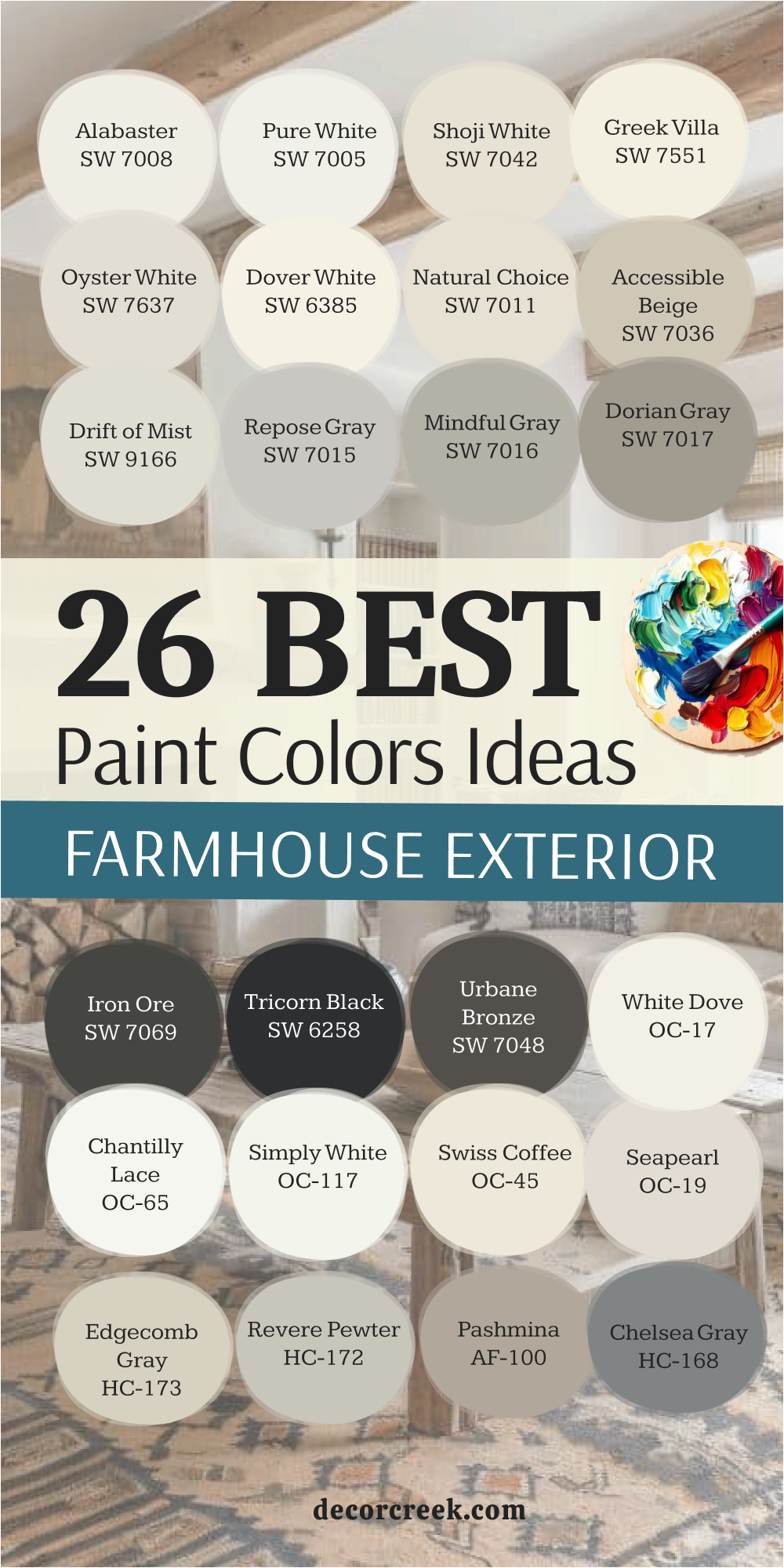
My Final Thoughts For The 43 Paint Color Ideas For The modern Farmhouse in 2026
Choosing the perfect paint colors for your home is an incredibly rewarding, yet deeply personal, process. It’s where your own style truly meets the principles of good design. However, when it comes to successfully mastering the modern farmhouse aesthetic, I want to emphasize that sticking to a sophisticated, carefully selected palette of warm whites, rich grounded neutrals, and strategic deep accents is the absolute key to achieving lasting success.
These foundational choices prevent the look from becoming too trendy or overwhelming.
I have spent years perfecting these color combinations and have shared only my most favorite colors—the ones I fully trust from Sherwin-Williams and Benjamin Moore—because I know, from countless projects, that their superior quality and rich pigments deliver beautiful, reliable, and consistent results every single time they are applied.
As you finalize your selections, remember the distinct emotional roles each room’s color plays. The perfect color for your kitchen is paramount; it must bring undeniable warmth and reflective light, instantly making it feel like the true, welcoming heart of your home where everyone gathers.
Your living room color should be a nurturing choice that feels like a comfortable, grounding hug, inviting everyone to relax deeply and stay a while, fostering connection and ease. For the bathroom, the requirement is different: think impeccably clean, wonderfully refreshing, and profoundly peaceful—it should serve as your own personal sanctuary and retreat.
And never underestimate the exterior color; it is the ultimate first impression you make to the world, so it needs to look both striking for curb appeal and genuinely welcoming as it settles beautifully against the natural landscape.
Please take your time, be patient with the process, and test your favorite shades on generously sized swatches directly on the walls, watching carefully how the light changes their character throughout the day.
Ultimately, trust your own intuition to find the specific colors that truly make your house feel like the beautifully designed, cohesive, and functional home you’ve always wanted for 2026 and well into the future.