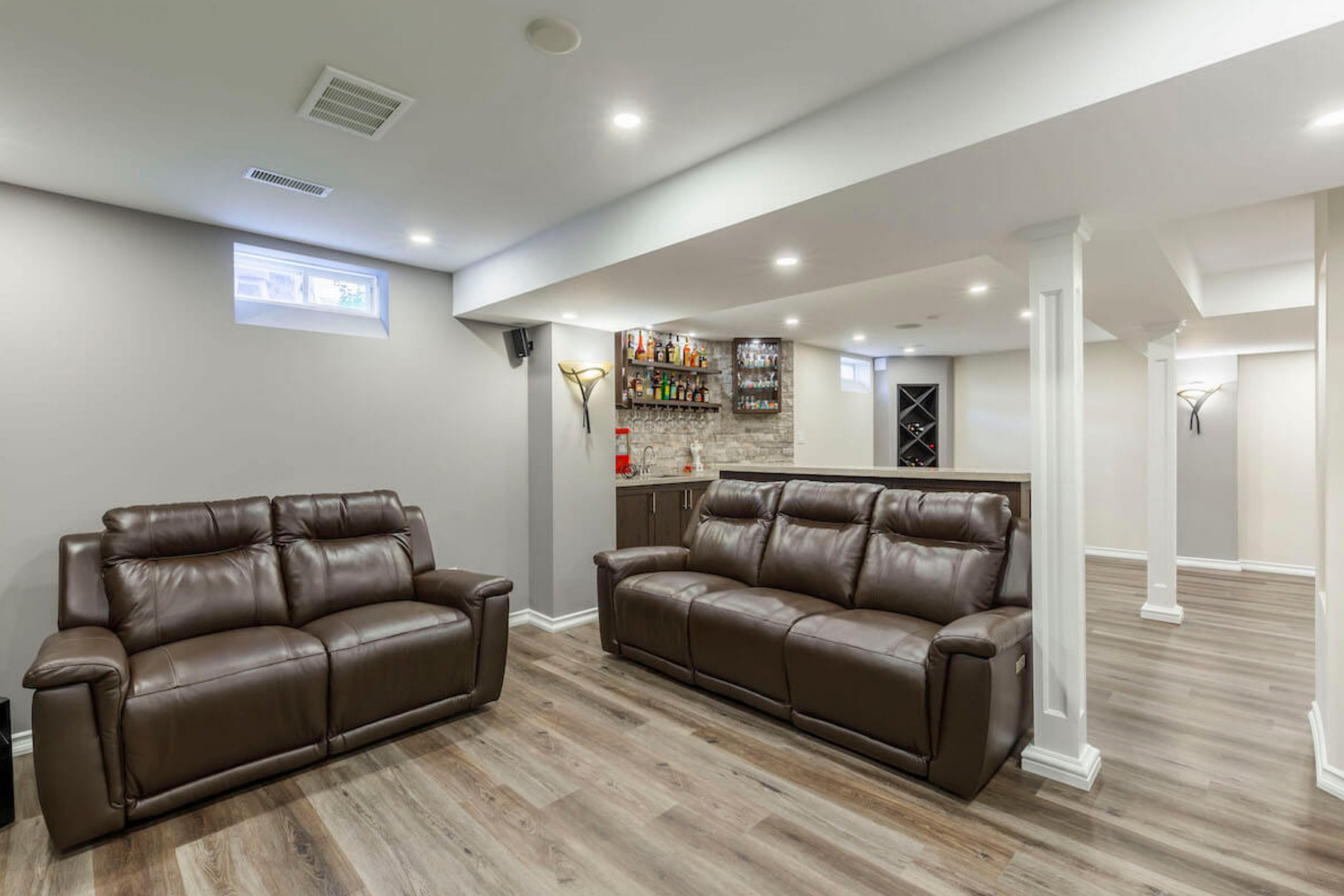
When I design a basement, I always start by imagining how people will feel down there. Basements are different from any other room in a home — they sit quietly below everything else, often forgotten until you realize how much potential they hold. The right color can completely change how a basement feels. Without it, these rooms can seem dull, cold, or lifeless. But with the right paint, they become cozy extensions of the home — places where laughter, movie nights, and quiet mornings all feel natural.
Over the years, I’ve learned that basements need colors that work harder. They need tones that reflect light, soften sharp shadows, and bring warmth where sunlight can’t reach.
Paint can change not only how a basement looks but how it welcomes people. When I’m working on one, I think about texture, light, and comfort together. Even a simple shade of cream or gray can make the space feel open, balanced, and safe.
Basements are also deeply personal spaces. Some families use them as playrooms or game zones, while others turn them into cozy retreats or home theaters.
That’s why I choose colors that fit those moods — shades that balance warmth and brightness, energy and calm. When the tone is right, even a basement with no windows can feel lived-in, full of light, and part of everyday life upstairs.
Color doesn’t just decorate; it connects the whole home together, from the top floor to the quiet corner below.
Why I Trust Sherwin-Williams and Benjamin Moore for Basement Paints
After years of designing homes, I’ve used almost every paint brand available, but Sherwin-Williams and Benjamin Moore consistently earns my trust, especially for basements. Their colors stay true and steady, even in the trickiest lighting. Basements often have mixed bulbs, limited windows, and uneven brightness — yet these paints always hold their tone. I never have to worry about them turning too gray, too yellow, or too flat.
Another thing I appreciate is how durable the finishes are. Basements can be humid, especially near laundry areas or exterior walls.
Sherwin-Williams paints stand up beautifully against moisture, keeping walls smooth and clean for years. The coverage is strong and even, often perfect in just two coats — which means less work and a flawless finish every time.
But what truly makes me rely on Sherwin-Williams is how alive their colors feel. Even under artificial light, their shades look layered and natural. Soft beiges keep their glow, deep blues stay rich, and whites stay bright without glare.
When my clients see the final result, they often tell me it’s the first time their basement has felt truly finished. That’s why I keep returning to these paints — they bring beauty, comfort, and dependability together. Every project feels personal, and Sherwin-Williams makes sure the result lasts.
How I Choose the Right Color for a Basement
Every basement tells a different story, and color helps me bring that story to life. The first thing I consider is light — or often, the lack of it. If the basement gets little to no daylight, I lean toward warmer, lighter shades that reflect brightness instead of absorbing it. Soft creams, gentle grays, and warm neutrals can lift the room and make it feel bigger. For home theaters or lounge areas, I go in the opposite direction — deep, rich tones like navy, green, or charcoal create comfort and intimacy.
I also pay close attention to the floor and ceiling. A darker ceiling might pull the color deeper, while a pale floor can make walls appear lighter.
I always test samples under the exact light the room will have — basements can trick the eye, so testing is key. Neutral tones often become my foundation because they let art, textiles, and furniture shine without competing.
Then I think about how the space will be used. Is it for family movie nights, a quiet reading room, a gym, or a guest suite?
Each use has its own rhythm, and the right color supports that feeling.
I’ve found that the best basement palettes mix warmth, balance, and light. Even one well-chosen tone can make the room feel connected to the rest of the home. Above all, I choose colors that make people want to spend time there — rooms that feel comfortable, cared for, and alive, even below ground.
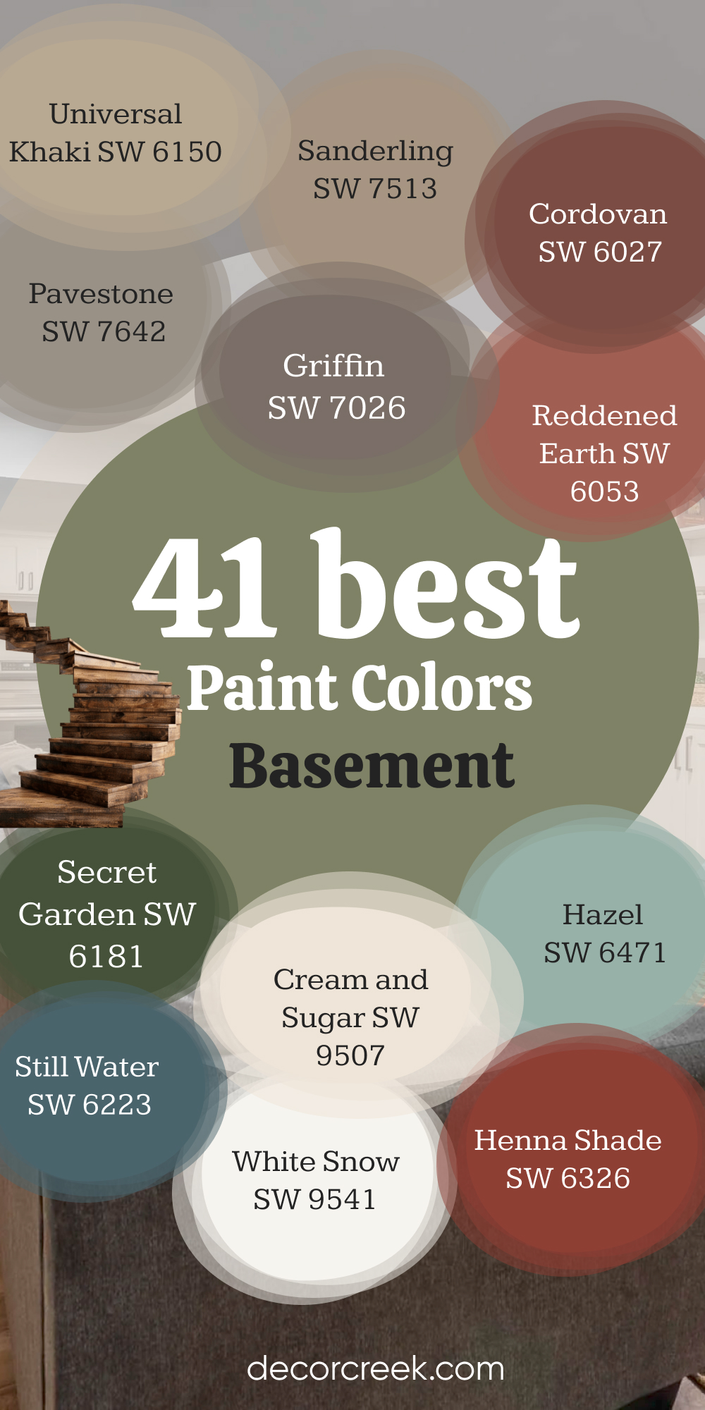
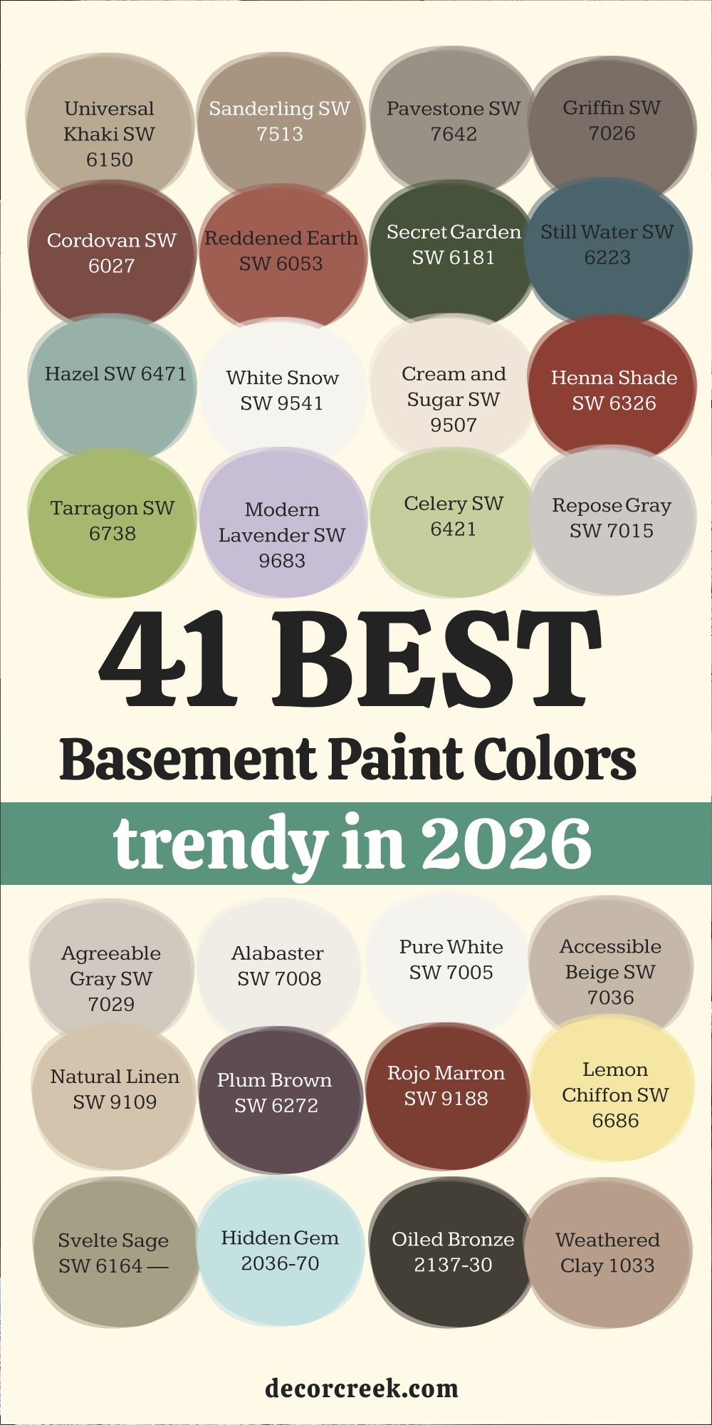
41 Basement Paint Colors Trendy in 2026
Universal Khaki SW 6150
Universal Khaki is one of those shades that quietly brings everything together. It’s warm but never heavy, a blend of beige and soft brown that makes a basement feel grounded. I often use it when I want the room to feel safe and balanced, like a favorite sweater that always fits right. In natural light, it looks earthy and calm; under basement lighting, it keeps a cozy glow.
The tone pairs easily with wood furniture, stone accents, or black fixtures—it never competes, only supports. I love how Universal Khaki smooths out awkward corners and makes low ceilings feel softer.
It’s the color that works in family rooms, small offices, or even laundry areas, keeping everything connected.
The key rule of this color for basements is to use it when you want a dependable, homey warmth that makes people stay longer without realizing why.

Sanderling SW 7513
Sanderling has a quiet beauty that feels both relaxed and refined. It’s a taupe with a whisper of gray, and I reach for it when a basement needs a touch of comfort without losing structure. This shade gives depth to walls without making them feel closed in. I’ve used it in movie rooms, guest spaces, and home gyms—it looks great everywhere.
The way it reacts with lighting is what makes it special; it stays steady, never turning yellow or dull. Sanderling works beautifully beside creamy whites or warm leathers, and it can even handle metallics like bronze and silver.
It’s a shade that feels natural, like clay touched by sunlight. The key rule of this color for basements is to use it when you want warmth and ease blended together in one simple choice.

Pavestone SW 7642
Pavestone is one of my favorite neutrals for creating balance in a basement. It sits between gray and brown, carrying the calm of stone but the warmth of soil. When you paint with Pavestone, the room feels solid and welcoming at the same time. It’s a wonderful base for both modern and rustic designs. I love pairing it with white ceilings and dark floors—it makes the room feel anchored but not boxed in.
The color also hides scuffs or fingerprints well, which is always useful in active spaces. Pavestone works perfectly in rooms that have a mix of materials—wood, brick, metal—because it connects them all.
Under soft light, it feels warm; under cool bulbs, it stays neutral. The key rule of this color for basements is to use it when you want a natural, grounded feeling that stands the test of time.

Griffin SW 7026
Griffin is a deep gray-brown that brings a touch of quiet drama to any basement. I love using it in places meant for relaxing—like home theaters or game rooms—because it makes the space feel snug and thoughtful. It’s dark enough to be stylish, but not so dark that it swallows the light. Griffin pairs beautifully with white trim or beige furniture, giving the perfect contrast.
It also works with warm lighting, making walls look soft instead of harsh. When I paint with Griffin, I often add gold or brass decor to bring out its richness.
It’s one of those colors that make people feel grounded and at ease. The key rule of this color for basements is to use it when you want an elegant depth that still feels warm and familiar.

Cordovan SW 6027
Cordovan has a beautiful, old-world richness that adds comfort to a basement in an instant. It’s a mix of deep red and brown, like polished leather or mahogany. When I use this color, the room suddenly feels more alive, especially in the evenings. It reflects warm light beautifully, wrapping the space in a soft glow.
Cordovan pairs well with beige carpets, off-white trim, and metal details like bronze or gold. It’s great for accent walls, built-in cabinets, or even doors when you want a touch of personality.
This shade works especially well in basements that double as home bars or libraries—it feels classic and grounded. The key rule of this color for basements is to use it when you want depth and warmth that make people feel instantly welcome.
Reddened Earth SW 6053
Reddened Earth brings a soft, natural energy to the basement—it feels like the ground after a summer rain. This clay-toned shade has just the right amount of red to bring life without being bold. It’s warm, earthy, and cozy, perfect for spaces where families gather or relax. I love pairing it with natural wood tones or creamy whites for a balanced look.
It also works with soft grays if you want something more modern. The beauty of Reddened Earth is how it reacts to artificial lighting—it glows instead of dulling.
When you want a basement to feel lived in and comfortable, this is the shade to reach for. The key rule of this color for basements is to use it when you want a soft, nurturing warmth that feels close to nature.

Secret Garden SW 6181
Secret Garden is one of those greens that completely changes a basement’s mood. It’s deep, rich, and full of quiet strength. When I use it, the room suddenly feels thoughtful and grounded. It’s perfect for offices, reading nooks, or cozy lounges. I love pairing it with off-white trim or natural wood—it feels balanced and calm.
Secret Garden has just enough depth to make furniture pop but not so much that it feels heavy. It handles both warm and cool lighting beautifully, staying true to its deep green tone.
Even a single accent wall in this color can bring the whole room together. The key rule of this color for basements is to use it when you want nature’s richness to fill the room.
Still Water SW 6223
Still Water is a shade that always feels peaceful but full of character. It’s a blend of blue, green, and gray that adds dimension to a basement. When I paint with Still Water, the room takes on a sense of calm strength—it feels grounded yet open. This color pairs wonderfully with tan leather, gold accents, or light woods. In dim basements, it holds its tone beautifully, never looking flat.
I’ve used it in home gyms, family rooms, and even small offices—it adapts every time. Still Water works especially well in spaces where you want balance between energy and rest.
The key rule of this color for basements is to use it when you want depth and elegance that don’t overwhelm.

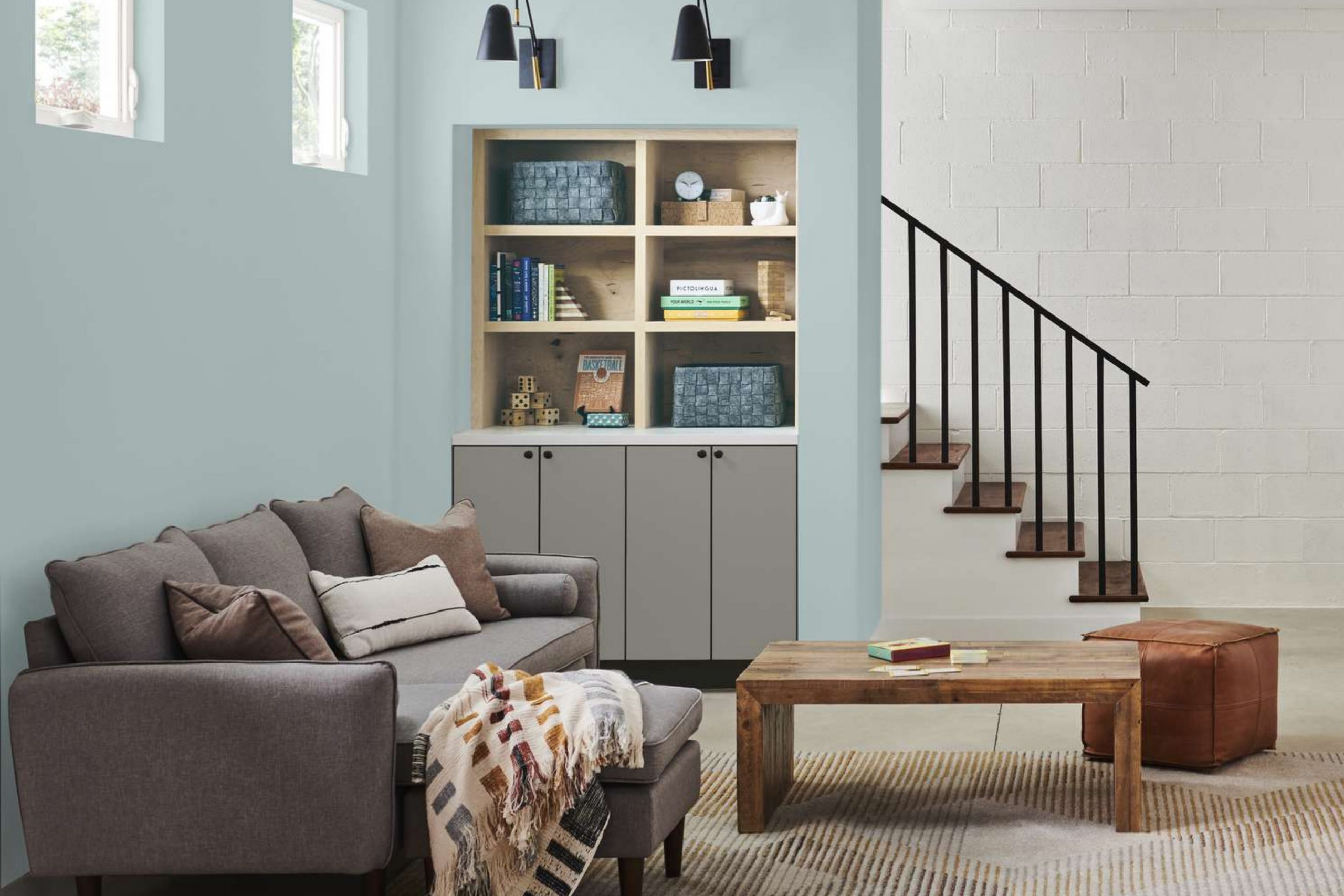
Hazel SW 6471
Hazel is like a breath of fresh air for any basement. It’s a soft blue-green that instantly lightens up darker rooms. I use it when I want to bring a bit of cheer and brightness into spaces that lack windows. Hazel pairs beautifully with white trim, pale flooring, and natural materials like wicker or oak. It reflects light well, so even artificial bulbs seem softer and warmer.
This color works perfectly in craft rooms, play areas, or casual hangouts. It’s a refreshing tone that feels welcoming without being too bold.
The key rule of this color for basements is to use it when you want a light, friendly look that makes the room feel alive.

Modern Lavender SW 9683
Modern Lavender adds a soft hint of personality that feels graceful and fresh. It’s not too purple or too gray—it’s the perfect middle ground for a basement that needs life. I love using it in creative spaces, guest rooms, or quiet corners. It pairs beautifully with light wood, gold accents, and off-white trim. Under soft lighting, it feels romantic and soothing; under brighter bulbs, it gains a crisp charm.
This shade is perfect for homeowners who want color without intensity. It helps even small basements feel open and lively.
The key rule of this color for basements is to use it when you want quiet beauty that feels unique but never too much.
White Snow SW 9541
White Snow is my go-to for basements that need a true lift. It’s crisp and bright but has a gentle softness that keeps it from feeling harsh. I use it for walls, ceilings, or trim when I want to create a sense of openness. It reflects light in all directions, making even the smallest basement feel airy and fresh. Paired with natural wood or pastel accents, it looks clean and timeless.
White Snow works beautifully for modern and classic styles alike—it never feels cold or sterile. It’s also a great backdrop for colorful art or furniture.
The key rule of this color for basements is to use it when you want the feeling of sunlight even without windows.

via decorcreek.com
Tarragon SW 6738
Tarragon is one of those greens that surprises people with how easy it is to live with. It’s soft, earthy, and has a touch of yellow that makes it feel fresh even in dim light. I use Tarragon in basements that need energy but not boldness. It looks beautiful with white cabinets, neutral rugs, and natural wood tones.
This color makes the air feel lighter and the room seem bigger. Tarragon is especially good for family basements—it keeps the mood cheerful without being loud.
It also changes gently throughout the day, giving subtle variety. The key rule of this color for basements is to use it when you want a natural, grounded look with an uplifting twist.
Cream and Sugar SW 9507
Cream and Sugar is the shade I choose when I want to bring softness and warmth into a cold basement. It’s a delicate beige with just a hint of cream that makes walls feel like they’re glowing from within. This color gives the illusion of sunlight even when none is present. I often use it in basements with tile or concrete floors to add comfort.
It pairs beautifully with soft whites, woven textures, and cozy fabrics. Cream and Sugar also balances darker woods or leather furniture without feeling washed out.
When light hits it, the walls seem to gently reflect warmth around the room. The key rule of this color for basements is to use it when you want gentle brightness that feels inviting all day.

Henna Shade SW 6326
Henna Shade feels like warmth captured in color form. It’s a deep red-brown that instantly adds character to any basement. I love how it feels rich and bold but still friendly. In low light, it looks warm and full; under brighter lighting, it shows soft reddish undertones that bring depth. I’ve used this color for accent walls behind shelving or fireplaces—it makes those features stand out beautifully.
Henna Shade pairs perfectly with gold decor, tan rugs, and creamy trims. It gives basements an elegant, cozy look that feels timeless yet personal.
The key rule of this color for basements is to use it when you want rich warmth that brings heart to the room.
Celery SW 6421
Celery is one of the happiest greens I’ve ever used in a basement. It has a touch of yellow that brings warmth, like morning sunlight across the floor. When I use Celery, the whole room seems more alive and cheerful. It’s a wonderful choice for playrooms, craft spaces, or laundry areas where energy matters.
This shade looks lovely next to white trim, light wood, or woven baskets. Even in artificial lighting, it keeps its freshness without turning dull.
It’s the kind of color that makes chores or quiet moments feel brighter. The key rule of this color for basements is to use it when you want a sense of easy, natural joy.

Repose Gray SW 7015
Repose Gray is one of my most trusted colors for basements—it never fails. It’s a gentle gray with a soft warmth that feels balanced no matter the light. I use it when I want to make a basement feel modern but not cold. It pairs well with almost every other color—whites, woods, blacks, and even muted blues. Repose Gray reflects light in a way that keeps walls from feeling flat.
It’s the color I recommend when someone wants calm without boredom. In larger basements, it feels expansive; in smaller ones, it adds quiet brightness.
The key rule of this color for basements is to use it when you want flexible comfort that fits every style.

Agreeable Gray SW 7029
Agreeable Gray is exactly what its name suggests—it works anywhere, and everyone loves it. This warm gray has a beige undertone that gives it softness. I use it often in finished basements because it hides shadows and adds gentle light. It looks amazing with white trim, beige carpets, or dark floors. Agreeable Gray makes furniture and decor stand out without drawing too much attention to itself.
It’s the perfect backdrop for family life, art, or simple design. Under any lighting—LEDs, soft bulbs, or natural rays—it stays balanced.
The key rule of this color for basements is to use it when you want reliable, comfortable brightness that always feels right.

Alabaster SW 7008
Alabaster is my favorite soft white for basements that need peace and warmth. It’s creamy and smooth, never harsh or too bright. I’ve painted entire basements in Alabaster to make them feel larger and more open. It pairs wonderfully with black accents, gold details, or wood furniture. The beauty of Alabaster lies in its glow—it reflects light softly, like candlelight.
This color makes a basement feel safe and lived-in, perfect for movie nights or family gatherings. It’s a white that feels human, not sterile.
The key rule of this color for basements is to use it when you want clean simplicity with a warm heart.

Pure White SW 7005
Pure White is a crisp, modern white that fits perfectly in basements with sleek design. It’s bright but not blinding, and it works with every color scheme. I use it for ceilings, trim, and sometimes entire walls when I want to open up a room. Pure White reflects light beautifully, making basements feel taller and airier. It pairs easily with grays, beiges, or deep blues.
I also love how furniture pops against it—it turns even small basements into bright retreats. This shade feels polished and fresh, yet never cold.
The key rule of this color for basements is to use it when you want clarity, brightness, and a sense of modern ease.

Accessible Beige SW 7036
Accessible Beige is one of those shades that works magic in any basement. It’s warm, soft, and easy to live with. The beige tone has just a whisper of gray, which keeps it balanced and natural. I love how it brings comfort without heaviness—it’s like a neutral hug for the walls. Accessible Beige looks great with both warm and cool accents, from brass to charcoal.
It also hides wear and scuffs beautifully, which is a bonus in busy basements. This is the shade I reach for when someone wants warmth without yellow tones.
The key rule of this color for basements is to use it when you want relaxed charm that never feels dated.

Natural Linen SW 9109
Natural Linen is a color that always feels like comfort in its purest form. It’s a soft beige with just enough warmth to make any basement feel lived in and welcoming. When I paint with Natural Linen, the walls seem to glow as if touched by sunlight. It works perfectly in finished basements that double as family rooms or small apartments because it gives a gentle backdrop for every style.
I often pair it with white trim or warm gray furniture—it makes the whole room feel balanced and natural.
What I love most about Natural Linen is how it changes under different lighting; in daylight, it looks creamy and bright, while under warm bulbs, it becomes cozier and deeper.
It’s that kind of color that doesn’t demand attention but earns it quietly. Whether your basement has wood floors or tile, Natural Linen connects all the elements with soft grace. The key rule of this color for basements is to use it when you want subtle warmth that feels easy, timeless, and full of comfort.

Plum Brown SW 6272
Plum Brown is a rich and thoughtful shade that adds soul to a basement. It’s a mix of brown and plum that feels cozy and sophisticated all at once. I like to use it in spaces meant for quiet moments—reading corners, wine cellars, or small lounge areas. The color has an old-world charm that pairs beautifully with gold accents and soft lighting.
When I brush this color on, the walls seem to pull you closer, almost like a warm blanket. It works perfectly with creamy whites, leather furniture, or even stone textures.
Plum Brown adds character without making a room feel small, which is rare for darker shades. It gives a sense of depth that basements often need. In the evening light, it turns almost velvety, giving the space a calm richness. The key rule of this color for basements is to use it when you want warmth that feels intimate, deep, and full of quiet luxury.

Rojo Marron SW 9188
Rojo Marron is that perfect touch of earth and warmth that instantly changes how a basement feels. It’s a deep red-brown that brings life and grounding energy to walls. I love using it in basements with brick, leather, or natural wood—it connects beautifully with those textures. This color reminds me of aged terracotta and worn clay, filled with history and warmth.
Under soft light, it glows like embers; under brighter light, it feels sturdy and rich. Rojo Marron adds charm to movie rooms, bars, or reading corners, where you want comfort with depth.
It pairs perfectly with creamy trim or tan upholstery. Even a single accent wall can change the entire mood. I love that it hides imperfections, making basements look freshly designed every time. The key rule of this color for basements is to use it when you want a cozy, grounded feeling that feels both rustic and elegant.
Weathered Clay 1033
Weathered Clay is soft, natural, and full of quiet warmth. It’s a beige-gray mix with hints of pink and tan, reminding me of sun-baked earth. I use it when I want a basement to feel inviting but subtle. This color pairs perfectly with natural wood, ivory trim, and soft textiles like linen or wool. It has that wonderful quality of blending into the background while still giving the room character.
Under basement lighting, Weathered Clay glows softly instead of fading away. It works beautifully for multipurpose basements where family gathers for games, movies, or work.
It’s gentle, grounding, and endlessly versatile. The key rule of this color for basements is to use it when you want a natural tone that feels like quiet comfort.
Lemon Chiffon SW 6686
Lemon Chiffon brings a sense of lightness that basements often miss. It’s a cheerful, creamy yellow that glows under every kind of light. I use it when I want a basement to feel friendly, sunny, and full of energy. It’s perfect for children’s playrooms, laundry areas, or craft spaces that need brightness without being too bold.
Lemon Chiffon pairs beautifully with white trim and natural wood finishes, adding a fresh warmth that feels like morning sunlight.
Even on gray days, it keeps the basement feeling positive and open. It’s a soft yellow that stays balanced—never sharp or brassy. I often recommend it to homeowners who want to brighten dark corners or add cheer to windowless rooms. The key rule of this color for basements is to use it when you want brightness that lifts moods and makes every day feel a bit lighter.

Muted Rose 2170-50
Muted Rose is one of my favorite ways to bring warmth and personality into a basement. It’s a soft, dusty pink that feels cozy rather than bright. When I use it, the whole room seems to exhale—it becomes inviting and warm. Muted Rose looks stunning next to creamy whites, brass details, or light oak furniture. It’s ideal for reading corners or basements turned into creative studios.
The color reflects light gently, adding a blush of warmth without overpowering the space. It’s also lovely as an accent color behind shelves or art.
Muted Rose feels friendly and personal, making basements feel more lived in and cared for. The key rule of this color for basements is to use it when you want soft charm that feels both warm and fresh.
Plum Perfect 1371
Plum Perfect brings quiet drama and elegance to a basement. It’s a deep plum shade with just the right amount of gray to keep it grounded. I use it when I want to create a sense of intimacy—perfect for a movie room or wine corner. Under warm lighting, it glows with richness; under cool bulbs, it shows its sophisticated purple undertone.
Plum Perfect pairs beautifully with ivory trim, gold hardware, and dark woods. It’s bold but never harsh, adding depth that makes other colors stand out.
Even in small basements, it can feel luxurious if used thoughtfully. The key rule of this color for basements is to use it when you want rich elegance that feels confident, stylish, and calm.
Svelte Sage SW 6164
Svelte Sage is one of those colors that makes people instantly take a deep breath. It’s a muted green-gray with warmth underneath, giving a calm and grounded feeling. I often choose it for basements that serve as guest suites or quiet retreats. It pairs beautifully with off-white trim, brass hardware, and soft beige fabrics.
Svelte Sage has an earthy richness that makes everything around it look more natural. It’s soft enough to feel inviting but has enough depth to make a statement.
In artificial light, it keeps a steady balance—never too gray or too green. The best thing about Svelte Sage is how it connects people to nature, even underground. The key rule of this color for basements is to use it when you want a peaceful, balanced tone that feels warm and restorative.

Hidden Gem 2036-70
Hidden Gem is one of those unexpected colors that surprises you with how cheerful it feels in a basement. It’s a soft, minty aqua that instantly adds freshness and life to darker rooms. I love pairing it with crisp white trim or natural oak—it feels playful but still calm.
Hidden Gem is perfect for creative corners, kids’ rooms, or hobby spaces where you want energy without boldness.
It reflects light beautifully, making even small basements feel open and airy. This shade has a gentle coolness that keeps things clean and lively. It also works well with neutral furniture or natural textures, creating a light, breezy mood. The key rule of this color for basements is to use it when you want to bring brightness, freshness, and soft joy to every wall.
Oiled Bronze 2137-30
Oiled Bronze feels like quiet strength in color form. It’s a dark brown with rich undertones that look like aged wood or metal. I use it in basements that need a touch of depth—home bars, dens, or cozy lounges. The color adds warmth without being flashy and looks beautiful under dim lighting. When paired with cream or beige tones, it creates a dramatic but comfortable contrast.
Oiled Bronze also works wonderfully with brick or stone, tying together natural textures. It’s a shade that instantly makes a basement feel grounded and mature.
I love that it looks slightly different depending on the light—sometimes deep chocolate, sometimes almost black, always elegant. The key rule of this color for basements is to use it when you want a bold foundation that feels solid and timeless.
Classic Gray OC-23
Classic Gray is one of those shades that never lets me down. It’s a whisper of gray touched with warmth, soft enough to brighten a basement but strong enough to feel finished. I love using it when I want walls to fade quietly into the background while still adding a gentle elegance. It reacts beautifully to every kind of light—dim bulbs, warm lamps, or daylight streaming through a small window.
Classic Gray makes any basement feel calm, open, and clean. It pairs well with white trim, light woods, and even black metal accents. The beauty of this color is its flexibility; it works in modern homes and traditional ones alike.
I often choose it for basements that double as guest rooms or home offices because it feels welcoming without effort. It never looks cold or dull, just smooth and balanced. The key rule of this color for basements is to use it when you want a soft, neutral look that gives peace to the eyes and warmth to the heart.
Edgecomb Gray HC-173
Edgecomb Gray feels like the perfect mix between beige and gray—it’s the soft middle ground that makes basements feel homey and bright. I use it when I want a shade that adapts to every situation, never too dark or too light. This color carries just enough warmth to make artificial light look flattering, which is ideal for basements. It looks amazing next to creamy trim, stone accents, or woven textures.
Edgecomb Gray brings quiet sophistication, the kind that doesn’t demand attention but holds it. It’s also one of my favorite choices for connecting open areas like stairways or hallways leading into the basement, creating a seamless flow.
Even when the space is small, this color keeps it airy and comfortable. The key rule of this color for basements is to use it when you want balance—something that feels both classic and modern, steady and soft.

Revere Pewter HC-172
Revere Pewter is the perfect “just right” color. It’s warm gray with a hint of taupe that feels natural and inviting. I’ve used it in more basements than I can count because it makes every space feel grounded. It works beautifully with both bright lighting and low light, always keeping a cozy undertone. Revere Pewter pairs nicely with crisp whites, deep blues, and natural woods.
When I want a basement to feel calm but not empty, this is the shade I reach for. It gives walls a gentle presence without overpowering furniture or art.
I love how it changes with the day—soft gray in the morning, warm beige in the evening. It’s the kind of color that people never get tired of. The key rule of this color for basements is to use it when you want warmth and comfort that always feels natural.

White Dove OC-17
White Dove is my forever favorite for making basements look fresh and cozy at once. It’s not a harsh white—it carries a soft warmth that feels welcoming in any kind of light. I love how it reflects both natural and artificial lighting, keeping basements bright but never sterile. White Dove pairs perfectly with wood floors, brass details, and even soft blues or greens.
It makes rooms feel open, but still has that touch of warmth that keeps things from feeling bare. This color is wonderful for trim, ceilings, or full walls—it adds that quiet glow that basements often need.
It’s perfect for homes that want a classic, clean look that still feels lived in. The key rule of this color for basements is to use it when you want pure brightness with a soft heart.

Simply White OC-117
Simply White is bright, friendly, and easy to love. It’s the shade I use when a basement needs energy and light. This white is crisp but never sharp—it feels airy and uplifting. I often pair it with pale wood floors or colorful accents to give the basement personality. Simply White catches every bit of light and bounces it around the room, making even the darkest corners feel open.
It’s also one of the best whites for modern basements with minimal decor—it highlights clean lines beautifully. When used with warm lighting, it becomes creamy and comfortable.
I love how it makes artwork, furniture, and fabrics come alive. The key rule of this color for basements is to use it when you want a bright, cheerful base that keeps the whole room glowing.

Pale Oak OC-20
Pale Oak feels like a warm whisper across the walls. It’s a soft off-white with a beige-gray undertone that gives basements an easy elegance. I often use Pale Oak in finished basements that serve as living rooms or home offices—it adds refinement without effort. It pairs perfectly with black accents, wood beams, and woven textures.
The color stays warm under artificial light and looks creamy during the day. It has that rare ability to make a room feel both cozy and clean.
Even in a basement with no windows, Pale Oak keeps the space from feeling boxed in. It’s calm, balanced, and endlessly adaptable. The key rule of this color for basements is to use it when you want a modern softness that never feels cold or empty.

Balboa Mist OC-27
Balboa Mist is a color I reach for when I want something graceful and quiet. It’s a soft greige—part gray, part beige—with just a touch of warmth. In a basement, it creates a polished look that feels sophisticated but not fussy. It works well with white trim, light wood, or stone details.
What makes Balboa Mist so special is how it moves with the light—sometimes appearing silvery, sometimes creamy, always inviting.
I love how it adds just enough color to keep walls interesting while staying neutral enough for any decor. It’s the kind of shade that looks good year after year. The key rule of this color for basements is to use it when you want calm energy and soft elegance that feels effortless.

Grant Beige HC-83
Grant Beige is a color that brings instant warmth and character. It’s a beige with gentle gray undertones, which keeps it from ever looking flat or yellow. I love using it in basements that need coziness and connection—it makes the space feel finished and welcoming. This color pairs beautifully with creamy trim, black frames, or soft fabrics.
It’s ideal for basements that double as family hangouts or guest areas. Grant Beige has that quiet confidence that makes a room feel loved and cared for.
Even in artificial lighting, it keeps a warm, natural glow. It’s one of those dependable shades that never goes out of style. The key rule of this color for basements is to use it when you want soft warmth with a steady, classic feel.

Kendall Charcoal HC-166
Kendall Charcoal is dramatic, bold, and incredibly elegant. It’s a deep gray with a rich, velvety finish that makes a basement feel grounded and strong. I often use it for accent walls or cabinetry to add depth and structure. Despite being dark, Kendall Charcoal doesn’t close in the room—it adds dimension.
When paired with crisp white trim or gold fixtures, it feels luxurious and modern. I’ve used it in media rooms and wine cellars, where its richness enhances the mood.
The color also hides imperfections beautifully, which makes it practical as well as stylish. Kendall Charcoal turns any basement into a statement space. The key rule of this color for basements is to use it when you want refined drama that still feels comfortable.

Chelsea Gray HC-168
Chelsea Gray is that perfect middle tone between light and dark—it’s rich, balanced, and endlessly stylish. I like using it for basements where I want a strong, modern feel without losing warmth. It pairs wonderfully with white trim, wood floors, or matte black details. The color gives walls a sense of weight that feels cozy rather than heavy.
Under soft light, Chelsea Gray turns velvety and soothing. It’s great for basements with clean lines, simple decor, and natural textures.
It creates a feeling of sophistication that’s still welcoming. The key rule of this color for basements is to use it when you want modern comfort with a touch of depth.

Hale Navy HC-154
Hale Navy is one of the most stunning deep tones you can use in a basement. It’s a dark navy blue with hints of gray that make it feel steady and timeless. I use it when I want a basement to feel rich, stylish, and a little dramatic. It pairs beautifully with white trim, brass fixtures, and natural wood tones.
Hale Navy brings the feeling of depth that basements often need, while keeping things classy and comfortable.
It’s perfect for game rooms, home theaters, or offices where focus matters. Under warm light, it glows like ink; under cool light, it feels crisp and strong. It’s a color that makes everything around it look better. The key rule of this color for basements is to use it when you want sophistication and comfort wrapped in one.

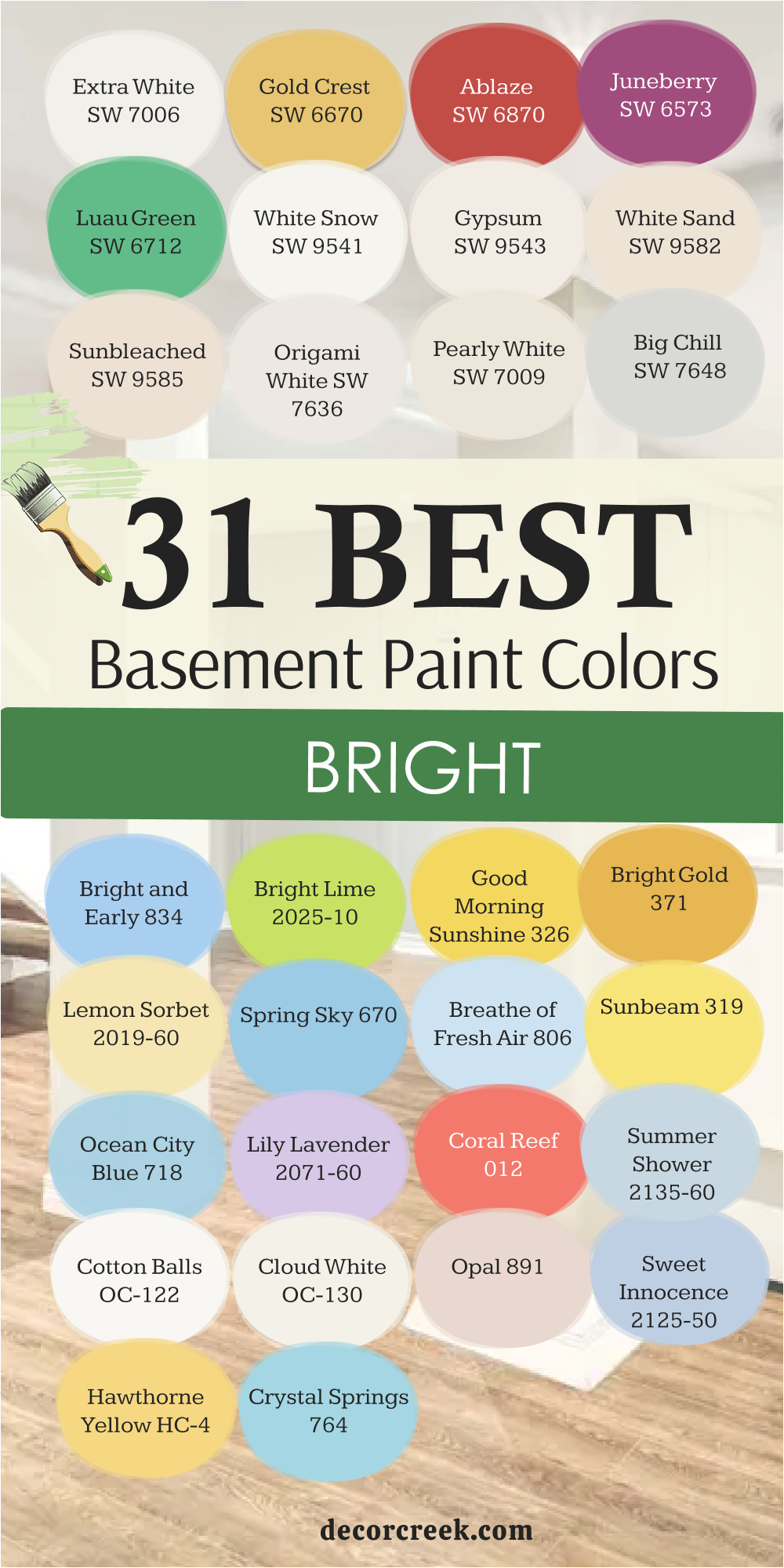
31 Basement Paint Colors Bright
Bright Lime 2025-10
Bright Lime is for basements that need fun, life, and movement. It’s a lively green-yellow that turns dull rooms into happy ones. I love using it for accent walls, workout spaces, or playrooms—it instantly boosts energy. Paired with white or gray trim, Bright Lime feels bold but balanced. It’s a great way to add color to basements that otherwise feel heavy.
The tone brings a sense of youthfulness and creativity without being too loud. Even a small touch—like painting cabinets or doors—can completely refresh the space.
It’s a daring choice, but it works beautifully when used with care. The key rule of this color for basements is to use it when you want excitement, energy, and a spark of modern playfulness.
Coral Reef 012
Coral Reef is joy bottled in paint form. It’s a soft coral with a peachy warmth that fills basements with life and color. I use it for accent walls, small offices, or play areas that need a friendly burst of energy. Coral Reef pairs beautifully with bright whites, rattan, or warm wood details. The color changes slightly with the light—soft coral in the morning, richer and warmer by evening.
It gives a playful but mature charm, perfect for basements where families gather. Even a touch of it—like on cabinets or stair railings—can bring the whole space to life.
The key rule of this color for basements is to use it when you want joyful energy that still feels relaxed and easy on the eyes.
Extra White SW 7006
Extra White is the shade I choose when a basement needs a total lift. It’s clean, modern, and pure without being too sharp. This white reflects every bit of light in the room, turning even the darkest corners into something open and bright. I use it in basements that need clarity—especially those used as studios, playrooms, or laundry spaces.
It pairs beautifully with gray, navy, or soft wood tones. What I love most is how it brings definition to every line in the room; trim and furniture suddenly feel fresh and new.
Even under artificial lighting, Extra White keeps its cool tone steady without turning blue or dull. It’s also one of the easiest colors to match with decor—it’s the perfect blank canvas for design. The key rule of this color for basements is to use it when you want crisp brightness that feels organized, modern, and clean.
Gold Crest SW 6670
Gold Crest brings a touch of sunshine where it’s most needed. It’s a warm golden yellow that instantly adds cheer to any basement. I love using it in areas that need energy—home gyms, craft rooms, or small sitting corners. It has a softness that keeps it friendly, never too bold or loud. Under warm light, it glows like morning sunlight; under cooler bulbs, it still holds its happy tone.
Gold Crest pairs beautifully with white trim, light oak, and even navy accents for contrast. I’ve seen this color completely change the mood of a basement, turning it from dull to joyful.
It reminds people that basements can feel just as alive as the rest of the house. The key rule of this color for basements is to use it when you want warmth that feels bright, happy, and full of life.
Ablaze SW 6870
Ablaze is for those moments when you want energy in every corner. It’s a bold coral-red that fills a basement with personality and warmth. I use it when homeowners want a playful touch or a creative vibe. It’s wonderful for accent walls, art studios, or game rooms where color brings joy. Ablaze has the magic to make even small basements feel fun and inviting.
When paired with white trim or black metal, it looks modern and stylish. The color glows beautifully under warm lighting, adding movement and life.
I love how it brings a sense of confidence to a space that’s often overlooked. The key rule of this color for basements is to use it when you want bold warmth that makes people smile the second they walk in.
White Snow SW 9541
White Snow is my gentle bright white that feels like sunlight on fresh linen. It’s clean, light, and soft all at once. I use it in basements where the goal is to make everything look bigger and fresher. Unlike cooler whites, White Snow stays warm under every bulb—it never turns harsh. It pairs beautifully with light grays, beige, and pastel tones.
I’ve painted entire basements in this color, and the result is always the same: open, airy comfort. It also works beautifully as trim for colorful walls, helping them look even brighter.
This shade brings calm energy that feels pure and natural. The key rule of this color for basements is to use it when you want an easy brightness that looks beautiful day and night.
Juneberry SW 6573
Juneberry is a rich, berry-toned purple that feels cozy and cheerful at once. It’s perfect for basements that double as creative spaces or small lounges. I like using it when I want something colorful but still refined. Juneberry pairs beautifully with creamy trim and gold accents—it adds a touch of charm and personality.
Under warm light, it feels like a deep rose; under cooler light, it takes on a royal plum tone. This color makes walls glow softly, creating a warm cocoon effect.
It works especially well for basements that need warmth without heaviness. The key rule of this color for basements is to use it when you want friendly elegance and a little creative spark.
Luau Green SW 6712
Luau Green feels like a breeze of energy rushing through a basement. It’s a lively tropical green that brings instant freshness. I love using it in children’s areas or creative corners because it fills the space with life. Paired with white trim, it feels crisp and fun; with wood tones, it becomes more natural and balanced.
Even in low light, Luau Green holds its brightness, keeping basements from feeling dull. It’s a color that reminds me of spring gardens and optimism.
I often pair it with coral or pale yellow accents for a playful finish. The key rule of this color for basements is to use it when you want energy, brightness, and a natural sense of joy.
Gypsum SW 9543
Gypsum is a soft, warm white that feels creamy and inviting. It’s ideal for basements that need light but also a touch of warmth. I love how it catches artificial lighting—it glows softly without glare. Gypsum pairs perfectly with neutral furnishings, woven textures, and even bold accent pieces. It’s wonderful for finished basements that double as family rooms or guest areas.
The color feels steady and natural, creating a backdrop that supports everything else in the room. Even under the lowest ceilings, it keeps things light and cozy.
I like to call it the “comfort white” because it feels both clean and lived in. The key rule of this color for basements is to use it when you want subtle glow and warmth in equal measure.
White Sand SW 9582
White Sand is like a touch of sunlight trapped in paint. It’s soft, warm, and slightly golden—perfect for basements that feel too gray. I use it when I want to bring life into a room without strong color. White Sand pairs beautifully with light wood, beige upholstery, and natural stone. It gives basements an open, breezy feeling while still feeling grounded.
The tone changes beautifully under different lighting—bright and sunny under LEDs, creamy under warm bulbs. This color also works well for open-concept basements, tying multiple areas together with one easy, elegant tone.
The key rule of this color for basements is to use it when you want gentle light that always feels comfortable.

Ocean City Blue 718
Ocean City Blue is a breath of cool air for dark basements. It’s a soft, airy blue that makes a room feel light and open without feeling chilly. I love how this color carries the calmness of water but still brings brightness. When used with white trim or natural wood, it feels balanced and breezy.
Ocean City Blue looks stunning in basements that serve as offices, workout rooms, or small lounges—it makes the air feel fresh.
Even in artificial light, it keeps its gentle sky-blue tone steady. I’ve used it in spaces with low ceilings, and it always adds height and movement. The color feels pure and hopeful, like a window to the outdoors. The key rule of this color for basements is to use it when you want gentle coolness that refreshes and opens up the room.
Lily Lavender 2071-60
Lily Lavender adds a whisper of color that feels tender and light. It’s a soft lilac tone that instantly brightens basements while keeping them cozy. I often use it in guest rooms, craft areas, or reading nooks where I want a touch of personality without heaviness. Lily Lavender pairs beautifully with creamy whites, soft grays, and brushed gold accents.
It reacts gently to light, glowing under warm bulbs and turning fresh under cooler tones. What I adore most is how it adds character without overpowering the space—it feels gentle and poetic.
This color brings an almost dreamlike charm to rooms that might otherwise feel plain. The key rule of this color for basements is to use it when you want a soft, welcoming tone that feels personal and comforting.
White Sand SW 9583
White Sand 9583 has a touch more depth than its twin, giving basements a creamier, more sophisticated tone. I use it when I want warmth with just a little richness. It’s perfect for family rooms, offices, or basements with wood trim. It pairs beautifully with gray, tan, and even green accents.
The color keeps a calm brightness that never feels heavy, even in tight spaces. It also makes ceilings look higher and the whole room more welcoming.
I’ve used it in homes with limited light, and it always surprises people with how warm it feels. The key rule of this color for basements is to use it when you want an elegant warmth that gently fills every corner.
Good Morning Sunshine 326
Good Morning Sunshine feels like the light you wish every basement had. It’s a warm, buttery yellow that brings energy and friendliness. I use it when I want to turn a basement into a place that feels lively from the moment you step in. It pairs perfectly with white trim, natural wood, and gray flooring.
Even in small or windowless basements, it makes the walls feel alive. Under soft light, the color glows gently, wrapping the room in warmth.
It’s perfect for family play areas or laundry rooms where brightness matters. Good Morning Sunshine always reminds me of optimism—it feels clean, happy, and welcoming. The key rule of this color for basements is to use it when you want soft, joyful light that instantly lifts the mood.
Sunbleached SW 9585
Sunbleached feels like faded sunlight—soft, clean, and soothing. It’s a light beige-white with a hint of warmth that makes basements glow. I love how it pairs with both warm and cool tones—it fits any design style. Under soft lighting, Sunbleached turns slightly creamy, adding comfort to the space.
It works perfectly in multipurpose basements because it adapts to every use. Whether you’re watching movies, working, or relaxing, this shade keeps the space balanced and bright.
It’s wonderful with rattan, pale wood, and natural fabrics. The key rule of this color for basements is to use it when you want a subtle, sunlit feeling that makes every activity more pleasant.

Spring Sky 670
Spring Sky brings a sense of calm openness to a basement. It’s a gentle, pale blue that reminds me of clear daylight after rain. I use it when I want a refreshing yet quiet color. It pairs beautifully with white trim, silver fixtures, and natural flooring. The lightness of Spring Sky helps small basements feel taller and cleaner.
Even under artificial light, it keeps its crisp blue tone without dulling. It’s a perfect choice for home offices, art spaces, or small guest rooms where peace matters.
The color brings a breath of air to rooms that can sometimes feel closed in. The key rule of this color for basements is to use it when you want clarity and freshness that never feels cold.
Origami White SW 7636
Origami White feels like a folded layer of softness across basement walls. It’s a pale white with a whisper of gray that gives it elegance and balance. I use this color when I want brightness without glare—it makes the light feel calm and even. In basements with minimal windows, Origami White keeps the space open and polished.
It pairs beautifully with wood tones, woven furniture, and brushed nickel accents. What I love most is how flexible it is: it works for clean, modern basements as easily as cozy, traditional ones.
Under warm bulbs, it takes on a cream-like softness; under cool LEDs, it looks fresh and crisp. It’s a perfect choice for multipurpose basements where families gather or guests stay. The key rule of this color for basements is to use it when you want brightness that still feels calm and natural.

Breathe of Fresh Air 806
Breathe of Fresh Air truly lives up to its name. It’s a soft, airy blue with just a touch of warmth, perfect for making basements feel open. I love using it in rooms that need brightness but still want calm. It pairs beautifully with white or beige furniture, natural fabrics, and light flooring.
Under warm lighting, it turns slightly misty; under cool light, it feels clean and peaceful. I often use it in guest areas or relaxation zones—it gives a sense of easy comfort.
This color also pairs nicely with wood tones, bringing harmony between warmth and coolness. The key rule of this color for basements is to use it when you want freshness that feels relaxing, bright, and endlessly soothing.
Sunbeam 319
Sunbeam is one of those colors that instantly makes a basement feel alive. It’s a warm, golden yellow that brings the feeling of natural light into spaces that might otherwise feel closed in. I love how it glows gently rather than blindingly, wrapping the walls in a welcoming warmth. It works perfectly in playrooms, hobby spaces, or family basements where energy matters.
Sunbeam pairs beautifully with white trim, tan furniture, or even navy accents for a cheerful contrast. It reacts wonderfully to every type of light, keeping a steady brightness throughout the day.
When I walk into a room painted in Sunbeam, it always feels like morning—fresh, hopeful, and happy. The key rule of this color for basements is to use it when you want comfort and energy to live together in harmony.
Pearly White SW 7009
Pearly White brings a quiet shimmer to basement walls. It’s a soft off-white with just a hint of warmth, making rooms feel open and cared for. I often use it in basements that need a touch of elegance without losing comfort. The color glows beautifully under any kind of lighting—gentle, smooth, and welcoming.
Pearly White pairs well with everything from stone fireplaces to black iron fixtures, bringing balance to the room.
It has enough warmth to soften shadows but enough brightness to keep things fresh. I like using it in larger finished basements where it connects open areas like hallways, lounges, and guest spaces. It’s one of those colors that feels refined yet easy to live with. The key rule of this color for basements is to use it when you want graceful light that flatters every corner.

Bright Gold 371
Bright Gold brings richness and warmth that makes basements glow. It’s a deep golden yellow that adds both energy and depth. I use it in spaces where I want to create a cozy, sunlit feeling. This color looks amazing paired with white trim, tan fabrics, or deep wood tones. It’s perfect for traditional or rustic-style basements that need warmth and personality.
Under warm bulbs, Bright Gold glimmers softly, filling the room with comfort. Under cool lighting, it still keeps its golden glow, never looking flat.
Even used as an accent, it transforms walls into a statement of joy and strength. The key rule of this color for basements is to use it when you want brightness that feels rich and full of heart.
Lemon Sorbet 2019-60
Lemon Sorbet is a light, creamy yellow that feels fresh and sweet. It’s the kind of color that makes a basement feel cheerful without being too bright. I often choose it for basements that need warmth but not too much energy. It pairs perfectly with white, pale gray, and natural wood tones. Lemon Sorbet reflects light beautifully, giving even small rooms an airy glow.
It’s perfect for children’s playrooms, laundry spaces, or creative nooks. The color always feels clean and smooth, like morning sunshine filtered through a curtain. It also balances beautifully with pastel accents.
The key rule of this color for basements is to use it when you want easy brightness that feels kind, soft, and welcoming.
Big Chill SW 7648
Big Chill is the kind of gray that makes a basement feel refreshed and alive. It’s a light, cool-toned gray that reflects light beautifully, giving even dim spaces a clean look. I use it when homeowners want a modern, airy feel without harshness. Big Chill pairs beautifully with white trim, silver details, and deep navy or black accents.
It gives basements a sleek finish that feels uncluttered and open. I’ve used it in home gyms and family lounges—it always brings a sense of cool energy.
The best part is how it stays steady under all lighting—it never turns blue or green, just smooth and bright. The key rule of this color for basements is to use it when you want clarity, calm, and a touch of modern freshness.

Bright and Early 834
Bright and Early feels exactly like its name—fresh, optimistic, and full of light. It’s a soft blue that instantly makes basements feel airy and cheerful. I love using it in rooms that need a bit of sky indoors, like play areas or reading nooks. The color pairs perfectly with crisp white trim, natural wood, and woven textures.
It has just enough brightness to bring life into low-light spaces without feeling too strong. Under warm lighting, it softens into a gentle pastel that feels peaceful.
Under daylight bulbs, it takes on a crisp, breezy tone. This color always brings out smiles because it feels full of energy and hope. The key rule of this color for basements is to use it when you want a gentle pop of color that feels joyful and light.
Summer Shower 2135-60
Summer Shower is one of my favorite basement colors because it feels like clear, gentle daylight. It’s a pale blue with a trace of gray, giving a refreshing calm that never feels cold. I often use it in family basements or guest spaces that need airiness. It pairs beautifully with crisp white trim, silver hardware, and natural fabrics.
This shade looks wonderful under both warm and cool light, always staying soft and graceful. Summer Shower gives a soothing, polished look that’s timeless and easy to decorate around.
It’s like painting peace onto your walls. The key rule of this color for basements is to use it when you want a clean, restful brightness that feels effortless.
Cotton Balls OC-122
Cotton Balls feels as soft as its name suggests. It’s a warm, creamy white that makes any basement look clean and inviting. I love using it for full walls, trim, or ceilings—it ties everything together beautifully. This white reflects light evenly, bringing warmth into spaces that lack sunlight. It pairs perfectly with beige, soft gray, or even navy blue accents.
Cotton Balls gives the feeling of comfort without dullness—it’s simple but full of heart. It’s one of those whites that make everything else in the room shine, from art to furniture.
Even in artificial lighting, it stays warm and balanced. The key rule of this color for basements is to use it when you want gentle brightness that feels cozy and lived in.
Cloud White OC-130
Cloud White has a softness that reminds me of daylight filtered through curtains. It’s a warm white with just a hint of cream that flatters every kind of light. I love using it in basements with low ceilings or minimal windows—it helps the whole space feel taller and cleaner. Cloud White pairs beautifully with wood beams, brass fixtures, and soft textiles. It brings a quiet luxury that makes the room feel cared for.
I often recommend it for multipurpose basements where families relax or entertain—it makes every area feel connected. The color stays smooth and even, never too bright or flat.
The key rule of this color for basements is to use it when you want pure, timeless warmth with a touch of softness.

Opal 891
Opal feels like the perfect middle between white and pastel. It’s a light, pearly shade with a hint of blush and gray, giving basements an elegant glow. I like using it in creative or relaxation spaces because it feels uplifting and peaceful. Opal pairs beautifully with natural wood, brushed gold, or even green plants.
The tone changes delicately throughout the day, shifting from soft cream to pale rose under warm light. It adds dimension to walls without overwhelming the space.
I love how it brings warmth and sophistication to otherwise plain basements. The key rule of this color for basements is to use it when you want gentle charm with just a touch of color.
Sweet Innocence 2125-50
Sweet Innocence is a light, airy gray-blue that feels graceful and polished. It’s the kind of color that makes a basement instantly relaxing. I use it in guest rooms, bathrooms, or reading spaces below ground—it adds light and a sense of calm. Sweet Innocence pairs beautifully with white trim, natural textures, and silver details.
It holds its tone beautifully under every kind of lighting, never turning dull or too cool. The color feels like a deep breath—it clears visual clutter and creates balance.
It also works wonderfully next to beige or wood, adding contrast while keeping harmony. The key rule of this color for basements is to use it when you want calm brightness that feels peaceful and timeless.
Hawthorne Yellow HC-4
Hawthorne Yellow is full of cheer and confidence. It’s a classic golden yellow that brings warmth and happiness to basements that need life. I love using it in spaces where families spend time together—it makes laughter feel louder and light feel stronger. This color looks stunning with white trim, wood tones, and patterned fabrics.
Under warm light, it feels cozy and rich; under cool light, it stays sunny and fresh. Hawthorne Yellow can turn any basement into a welcoming gathering place.
It adds a sense of brightness that feels natural and lasting. The key rule of this color for basements is to use it when you want a golden warmth that feels friendly, hopeful, and full of charm.

Crystal Springs 764
Crystal Springs is one of the most refreshing blues for basements. It’s a cool, clear shade with just a touch of softness that makes rooms feel calm and open. I often use it in basements that serve as offices or hobby areas—it helps the mind focus while keeping the room bright. Crystal Springs pairs beautifully with white trim, chrome fixtures, and pale wood.
It has a clean elegance that never feels too cold. Under warm light, it softens into a misty blue; under natural daylight, it sparkles.
The color brings a sense of order and lightness, perfect for homes that value calm simplicity. The key rule of this color for basements is to use it when you want clear, refreshing brightness that feels calm and balanced.
28 Basement Paint Colors Dark
Tricorn Black SW 6258
Tricorn Black is pure confidence in a can. It’s the truest, richest black I’ve ever used, and it brings strength and elegance to any basement. I love using it for accent walls, doors, or built-ins—it makes everything look intentional. When paired with warm lighting, it glows softly and never feels harsh. Tricorn Black adds dimension, especially in large basements where lighter walls might look flat.
It looks striking next to brass, marble, or crisp white trim. Even a little of this color goes a long way, creating contrast that feels bold but beautiful. I often use it behind shelving or around fireplaces for a cozy, sophisticated edge
The key rule of this color for basements is to use it when you want depth and drama that still feels refined and inviting.

Iron Ore SW 7069
Iron Ore is one of my favorite deep shades—it’s a charcoal so rich it almost feels like velvet. I love how it brings quiet strength to basements without being as stark as black. This color works beautifully for media rooms, bar areas, or moody lounges. Under soft lighting, Iron Ore feels luxurious and comforting.
It pairs perfectly with gold, tan leather, or creamy whites. I’ve seen it completely change how people feel about a dark room—it makes shadows feel intentional, not gloomy.
It also hides imperfections wonderfully, which makes it practical as well as stylish. The key rule of this color for basements is to use it when you want a dramatic foundation that feels warm, modern, and endlessly rich.

Virtual Taupe SW 7039
Virtual Taupe is a deep, earthy neutral that makes basements feel grounded. It’s not quite brown and not quite gray—it sits right in between, giving walls a calm weight. I love using it in cozy family basements or offices because it feels stable and balanced. It pairs beautifully with cream, black, or muted green.
Under warm light, it turns rich and toasty; under cooler light, it becomes a soft stone tone. Virtual Taupe gives the illusion of texture even on plain walls.
I also like how it works as a background for art or wood accents. The key rule of this color for basements is to use it when you want subtle strength and a natural, grounded mood.

Attitude Gray SW 7060
Attitude Gray brings quiet confidence into a basement. It’s a dark gray with hints of green that give it warmth and depth. I use it when I want a dramatic look that still feels calm. This color pairs beautifully with white trim, tan fabrics, and brushed metal accents.
Under dim light, it looks cozy; under brighter light, it shows its character with soft green undertones. Attitude Gray works especially well for basements turned into offices or lounges—it adds focus without heaviness.
I love how it makes every other color around it look richer. The key rule of this color for basements is to use it when you want deep color that feels elegant and steady.

Dark Night SW 6237
Dark Night feels like sophistication wrapped in color. It’s a deep blue-green that fills basements with warmth and mystery. I use it when I want a bold statement that still feels comforting. Dark Night looks beautiful under soft lighting, turning velvety and rich. It pairs perfectly with gold accents, white trim, and dark wood furniture.
This color brings luxury to even small spaces, making basements feel like cozy retreats. I love it for home theaters, wine cellars, or reading corners—it makes everything feel more intimate.
The key rule of this color for basements is to use it when you want dark beauty that feels refined and welcoming.

Caviar SW 6991
Caviar is the most elegant black-brown tone I’ve found. It’s dark, smooth, and full of quiet power. I use it for basements that need structure—home bars, offices, or modern lounges. Unlike a flat black, Caviar has warmth that makes it livable. It pairs beautifully with beige, gold, or marble textures.
Under dim light, it takes on a soft, velvety finish that feels luxurious. Caviar turns an ordinary wall into something stunning and bold. I love pairing it with textured fabrics like linen or velvet for contrast.
It’s dramatic but never cold. The key rule of this color for basements is to use it when you want richness that feels timeless and graceful.
Peppercorn SW 7674
Peppercorn is a dark gray that manages to feel both bold and soothing. It’s the perfect shade for homeowners who want drama without too much darkness. I often use it in basements with white trim or natural stone—it creates balance and elegance. Peppercorn reacts beautifully to light; in bright rooms, it looks smoky and modern, while in dim areas, it feels cozy and sophisticated.
It’s ideal for TV rooms or dens where comfort is key. I love how it pairs with natural materials like wood and metal—it adds polish without losing warmth.
The key rule of this color for basements is to use it when you want a strong, stylish tone that still feels calm and livable.

Urbane Bronze SW 7048
Urbane Bronze has the grounded beauty of nature—it’s deep, warm, and endlessly versatile. I use it when I want a basement to feel both modern and comforting. The bronze undertone keeps it from being too dark, adding softness and richness. It pairs beautifully with stone, wood, and creamy white trim.
I’ve used Urbane Bronze in basements with low ceilings, and it actually makes them feel cozier, not smaller. It’s a color that seems to glow from within when lit gently.
The best thing about it is its balance—it feels luxurious but still welcoming. The key rule of this color for basements is to use it when you want warmth and modern depth all in one.

Inkwell SW 6992
Inkwell is deep, moody, and endlessly elegant. It’s a black-blue shade that brings quiet drama to basements. I love using it in media rooms or cozy hangouts—it makes the space feel rich and layered. Inkwell looks stunning against white trim or brass details. It reacts beautifully to light, sometimes reading as navy, sometimes as charcoal.
Even though it’s dark, it feels soft and comforting, not heavy. I often use it behind built-in shelves or around fireplaces for contrast.
The result always feels thoughtful and timeless. The key rule of this color for basements is to use it when you want a dramatic backdrop that still feels soothing.

Roycroft Bronze Green SW 2846
Roycroft Bronze Green is one of my favorite deep greens for basements—it’s rich, classic, and full of character. This color reminds me of old libraries and vintage furniture. I love using it to create warmth and sophistication in darker rooms. It pairs beautifully with leather, brass, and creamy trim.
Under low lighting, it looks deep forest green; under bright light, it reveals bronze and olive undertones.
Roycroft Bronze Green turns basements into cozy, inviting spaces that feel luxurious but grounded. It’s perfect for reading corners, bars, or home offices. The key rule of this color for basements is to use it when you want deep comfort and timeless style that feels naturally rich.
Black Magic SW 6994
Black Magic is pure sophistication with a hint of mystery. It’s a deep black with the slightest warm undertone that keeps it from feeling harsh. I love using it when a basement needs structure and a sense of calm drama. It looks incredible on accent walls, built-ins, or doors—it frames a room beautifully.
Under soft lighting, Black Magic becomes velvety, almost smoky, giving the space quiet confidence. I pair it with creamy whites, dark woods, and brass hardware for balance.
It turns basements into cozy sanctuaries, places where you can rest and recharge. Even a small touch, like painting a stair railing or bookshelf, adds boldness. The key rule of this color for basements is to use it when you want deep beauty that feels powerful but never cold
Gauntlet Gray SW 7019
Gauntlet Gray is one of those shades that feels strong but not heavy. It’s a deep charcoal with a soft brown undertone, which gives it warmth and balance. I use it for basements that need mood and coziness, especially around fireplaces or media centers. It pairs wonderfully with crisp white trim, beige accents, and warm woods.
Under warm lighting, Gauntlet Gray feels rich and layered; under cool lighting, it reads sleek and modern. It’s versatile enough for both rustic and contemporary homes.
I love how it grounds furniture and makes colors pop against it. The key rule of this color for basements is to use it when you want strength, comfort, and timeless character all at once.

Woodlawn Blue SW 0078
Woodlawn Blue is a soft, misty blue that brings calm energy to dark basements. It’s the kind of color that lightens a room without overpowering it. I use it when I want a basement to feel open, fresh, and peaceful. It pairs beautifully with white trim, light floors, and soft grays.
Woodlawn Blue reflects light well, creating a sense of airiness even in spaces with low ceilings. It’s perfect for guest rooms, reading nooks, or studios—it brings quiet charm wherever it goes.
This color carries a bit of nostalgia, like vintage china or old beach cottages. The key rule of this color for basements is to use it when you want gentle color that feels clean, uplifting, and timeless.
Wrought Iron 2124-10
Wrought Iron is one of my favorite near-blacks—it’s deep, moody, and full of elegance. It’s not a flat black; it has soft blue undertones that make it feel more layered. I use it when I want drama that still feels approachable. On basement walls, it adds instant sophistication and makes lighter decor pop beautifully.
Wrought Iron pairs perfectly with crisp whites, warm grays, and metallic details. It’s stunning in home theaters, offices, or art-filled basements.
Even in low light, it never feels too dark—it has a quiet glow that gives life to the room. The key rule of this color for basements is to use it when you want modern elegance that feels rich and balanced.

Kendall Charcoal HC-166
Kendall Charcoal is one of those shades I keep coming back to. It’s a deep, steady gray that gives basements instant depth and comfort. I love how it anchors a room—it’s dark but never harsh. Paired with white trim and brass lighting, it feels polished and timeless.
Kendall Charcoal works beautifully for basements with lots of texture—brick walls, stone fireplaces, or paneled ceilings.
It’s especially lovely in spaces meant for relaxing or entertaining. Under soft light, it takes on a velvety texture that feels calm and inviting. This color holds its elegance through every season. The key rule of this color for basements is to use it when you want dependable sophistication that feels both modern and warm.
Black Satin 2131-10
Black Satin has a luxurious softness that feels like silk on the walls. It’s a deep, inky black with a smooth finish that instantly modernizes a basement. I use it for homeowners who want bold style but still crave warmth. This color pairs beautifully with creamy whites, dark walnut, or metallic accents.
It’s stunning behind artwork or shelves, where it adds contrast and depth. Even though it’s dark, it reflects light softly, keeping the space cozy instead of heavy.
I’ve used it in home theaters and basements with minimal natural light—it always looks rich and intentional. The key rule of this color for basements is to use it when you want modern drama that feels smooth, elegant, and timeless.
Old Navy 2063-10
Old Navy is that perfect deep blue that feels both classic and comforting. It’s bold enough to make a statement but gentle enough to live with every day. I use it when I want to bring character into a basement without overwhelming it. This color pairs beautifully with white trim, gold accents, and neutral furniture.
Under soft light, it feels velvety and rich; under bright light, it becomes crisp and nautical. Old Navy works wonderfully for basements turned into bars, offices, or creative spaces.
It adds personality and charm in one brushstroke. The key rule of this color for basements is to use it when you want strong color that feels refined and endlessly versatile.

Carter Gray CW-80
Carter Gray is a balanced, dark gray that feels steady and elegant. It’s deep enough to make a statement but soft enough to feel comforting. I love using it in basements where people gather—it creates intimacy and warmth. Carter Gray pairs perfectly with creamy trim, bronze lighting, and natural fabrics.
It’s one of those colors that shifts gently through the day—charcoal in the morning, smoky taupe in the evening.
It adds quiet sophistication to walls, cabinets, or even doors. The finish feels velvety and rich, turning basements into polished retreats. The key rule of this color for basements is to use it when you want dark comfort that feels balanced and refined.

Hunter Green 2041-10
Hunter Green brings nature’s calm into the basement. It’s a rich, deep green that feels timeless and full of depth. I use it when I want to create a cozy, thoughtful atmosphere—perfect for libraries, wine rooms, or quiet hangouts. Paired with leather furniture, gold accents, or stone textures, it feels classic and strong.
Even in artificial light, Hunter Green keeps its richness and warmth. The color seems to breathe life into darker corners, adding warmth where you’d least expect it.
It’s bold, but it feels completely at home underground. The key rule of this color for basements is to use it when you want natural depth that feels strong, classic, and welcoming.

Wenge AF-180
Wenge is a deep brown with soft purple undertones that bring instant sophistication to a basement. It reminds me of fine wood—rich, polished, and endlessly elegant. I use it when a room needs luxury and comfort. It looks incredible with creamy whites, brass hardware, and soft lighting. Wenge brings warmth without heaviness, creating a cocoon-like feeling.
In modern basements, it pairs beautifully with minimalist decor, giving depth and contrast. It’s also wonderful for accent walls or cabinetry, where its richness shines.
The key rule of this color for basements is to use it when you want grounded beauty that feels smooth, mature, and full of quiet strength.
Lucerne AF-530
Lucerne is a moody blue with a deep teal base that feels dramatic yet comforting. I love how it transforms basements into cozy, refined spaces. It’s perfect for home theaters, offices, or lounges—it adds emotion without being overpowering. Lucerne pairs beautifully with gold accents, dark wood, and soft fabrics. Under warm lighting, it feels velvety and rich; under cooler bulbs, it becomes crisp and sharp.
It’s a color that captures both stillness and style. I’ve seen it turn simple basements into stunning retreats.
The key rule of this color for basements is to use it when you want color with presence—strong, emotional, and endlessly elegant.
Essex Green HC-188
Essex Green is one of the most stunning deep greens I’ve ever used. It’s rich, dark, and full of quiet character. I reach for it when I want a basement to feel strong but still warm and welcoming. This shade has the soul of an old forest—it feels grounded and steady. When paired with white trim, the contrast is breathtaking. I love how it wraps around a room, making it feel private and elegant.
Under soft lighting, Essex Green turns almost velvety, giving basements a cocoon-like warmth. It pairs perfectly with brass details, stone surfaces, and soft textiles.
I often use it in home bars or reading rooms because it encourages people to slow down and enjoy the space. The key rule of this color for basements is to use it when you want depth that feels natural, graceful, and deeply rooted.

Vintage Vogue 462
Vintage Vogue feels like a story told in color—rich, moody, and timeless. It’s a dark olive green with gray undertones that give it balance and maturity. I use it when I want a basement to feel classic but not too formal. This color pairs beautifully with warm woods, gold decor, and creamy fabrics. Under soft light, it becomes cozy and soft; under bright light, it shows off its refined green tone.
I especially love it in basements with vintage or mid-century furniture—it highlights craftsmanship and detail. Vintage Vogue brings quiet luxury to any space, making even small basements feel layered and elegant.
The key rule of this color for basements is to use it when you want warmth and depth that feel graceful and sophisticated.

Van Deusen Blue HC-156
Van Deusen Blue brings rich character and calm confidence. It’s a deep navy with a touch of gray that feels both modern and timeless. I often use it in basements that need color but not too much brightness. Van Deusen Blue looks amazing with white trim, brass lighting, and tan leather furniture.
Under soft lighting, it feels like velvet; under cool light, it turns crisp and strong. This color works beautifully for home offices, bars, or entertainment spaces—it has focus and warmth all at once.
I also love how it balances other tones in the room, anchoring lighter colors around it. The key rule of this color for basements is to use it when you want strong personality with quiet sophistication.

New London Burgundy HC-61
New London Burgundy is a deep red that brings drama and comfort together. It’s rich, bold, and full of warmth, perfect for basements that need personality. I love how this color glows under soft lighting—it feels luxurious without being overwhelming. When paired with creamy whites or gold accents, it takes on a warm, classic charm.
It’s beautiful in basements used for entertaining or relaxing; it makes every corner feel intentional. I often use it behind fireplaces or on accent walls to create a sense of intimacy.
The color reminds me of aged wine and old books—it’s refined but full of life. The key rule of this color for basements is to use it when you want rich warmth that feels both elegant and familiar.
Black Forest Green
Black Forest Green is deep, lush, and endlessly comforting. It’s almost black at first glance, but under the light, it reveals a forest-green richness that feels natural and bold. I use it for basements that need depth and peace—home theaters, lounges, or study areas. It pairs beautifully with warm brass, walnut wood, and off-white trim.
Black Forest Green gives a feeling of calm security, like being surrounded by trees at dusk. Even in rooms with little light, it feels strong and soothing.
It’s not a color you notice right away—it’s one you feel. I love how it brings quiet power without shouting. The key rule of this color for basements is to use it when you want dark elegance that feels rooted and serene.
Soot 2129-20
Soot is a deep charcoal-blue that adds instant sophistication to basements. It’s darker than navy but softer than pure black, creating a perfect in-between. I love using it in basements with good lighting because it turns the space into something sleek and modern. Soot looks incredible with white trim, pale gray furniture, or metallic accents. It has a quiet strength that gives walls presence without heaviness.
Under warm bulbs, it feels rich and moody; under cool light, it becomes crisp and architectural. I often use Soot on cabinetry or doors—it adds just enough contrast to make the whole room shine.
The key rule of this color for basements is to use it when you want understated drama that feels calm and confident.
Deep Mauve 1265
Deep Mauve brings warmth, emotion, and a surprising sophistication to basements. It’s a muted purple with brown undertones that feels comforting and elegant. I love using it when a space needs color but still wants to stay cozy. Deep Mauve pairs beautifully with creamy whites, natural wood, and soft gray accents. Under warm lighting, it feels velvety and rich; under cooler bulbs, it turns gentle and romantic.
It’s especially lovely in basements used for creative spaces or lounges—it adds charm and personality without taking over. Deep Mauve is one of those colors that people can’t quite name but always love.
The key rule of this color for basements is to use it when you want soft depth that feels unique, relaxed, and quietly beautiful.
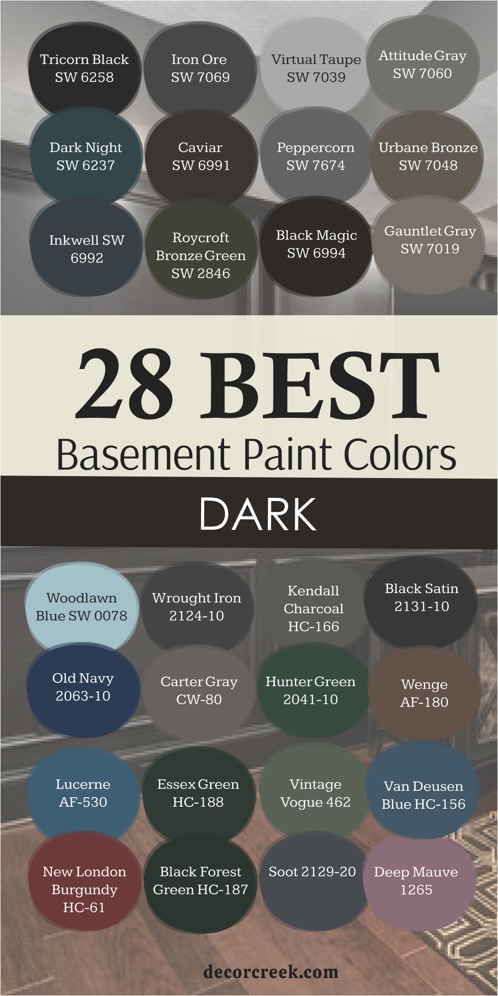
11 Basement Bedroom Paint Colors
Neutral Ground SW 7568
Neutral Ground is one of those shades that makes every basement bedroom feel safe and restful. It’s a creamy beige with a soft, inviting warmth that looks lovely under any light. I use it when I want a room to feel calm but not empty—it gives just enough color to feel cozy. Neutral Ground pairs beautifully with white trim, light wood, or muted green bedding. It’s the color that helps people exhale after a long day.
Even in rooms without windows, it glows gently instead of feeling dull. I love how it wraps the walls in comfort without calling too much attention to itself.
The tone stays steady through every season, never looking too warm or too gray. The key rule of this color for basement bedrooms is to use it when you want simple, lasting warmth that helps people feel at home.

Snowbound SW 7004
Snowbound is a soft, milky white that turns a dark basement bedroom into a bright retreat. It’s clean but not cold, and it reflects light so well that it can make the room feel larger. I use it on both walls and ceilings to open up the space. Snowbound pairs beautifully with pale linens, beige rugs, or black metal accents—it’s simple, classic, and always stylish.
What I love most is how it makes natural textures like wood and rattan stand out. Even under artificial light, it keeps its creamy balance without turning harsh.
It’s perfect for small bedrooms that need clarity and calm. The key rule of this color for basement bedrooms is to use it when you want a pure, airy feel that invites light and peace.

Acacia Haze SW 9132
Acacia Haze brings a quiet green-gray softness that feels like nature has moved indoors. It’s soothing, earthy, and perfect for bedrooms that need warmth with a touch of freshness. I love pairing it with natural fabrics and brass or wood accents—it gives the room a balanced, cozy look. Acacia Haze works beautifully under dim lighting, staying warm and gentle.
It’s not flashy, but it makes the entire room feel thoughtful and grounded. I’ve used it in basement bedrooms with low ceilings, and it made the space feel taller and more open.
It’s a wonderful shade for creating relaxation that lasts. The key rule of this color for basement bedrooms is to use it when you want natural calm that feels soft, steady, and endlessly welcoming.

Pavestone SW 7642
Pavestone feels like strength wrapped in softness. It’s a gray-brown tone that adds depth without heaviness, perfect for a basement bedroom that should feel grounded but calm. I often use it when the room has stone or wood textures—it ties everything together beautifully. Under warm lighting, Pavestone glows softly, creating a restful and balanced mood.
It’s especially lovely with white bedding, black fixtures, or tan headboards. I like how this color adds maturity to a room without making it feel too dark.
Pavestone makes you want to curl up with a book and relax—it has that lived-in comfort that never goes out of style. The key rule of this color for basement bedrooms is to use it when you want cozy depth that feels quiet and real.
Drizzle SW 7642
Drizzle is one of those colors that feels like a breath of fresh air. It’s a soft, misty blue-green that brings brightness to basement bedrooms while keeping the mood calm. I love how it adds a hint of personality without feeling bold. Drizzle pairs beautifully with creamy trim, linen bedding, and light wood tones. Under soft light, it feels peaceful and balanced—never too cold.
It’s perfect for bedrooms where you want a light, soothing touch that still feels alive. Even in darker corners, Drizzle keeps its charm and freshness.
The key rule of this color for basement bedrooms is to use it when you want subtle color that feels clean, modern, and relaxing.
Greek Villa SW 7551
Greek Villa is the perfect creamy white for basement bedrooms that need light and warmth together. It’s soft, classic, and full of quiet comfort. I love how it makes a small basement bedroom feel bigger without feeling stark. It pairs beautifully with beige, gray, or warm wood accents. Greek Villa reflects light in a gentle way that makes walls seem to glow.
I often use it for full rooms—walls, trim, and ceilings—to create a seamless, airy feeling. Even under dim lighting, it never feels dull.
This color works with every design style, from modern to traditional. The key rule of this color for basement bedrooms is to use it when you want soft brightness that makes a space feel naturally welcoming.

Wind Chime AF-465
Wind Chime is a light gray with a touch of blue that feels effortless and clean. I use it when I want a basement bedroom to feel fresh and open. The color adds calm without making the room feel cold. It pairs beautifully with white trim, silver fixtures, and pale wood floors. Wind Chime works especially well for minimalist or modern styles—it gives that quiet sophistication that doesn’t need decoration to shine.
Under warm lighting, it gains a cozy tone, while under daylight bulbs, it feels crisp and clear.
I love how it keeps a bedroom feeling light and breathable. The key rule of this color for basement bedrooms is to use it when you want an airy, modern calm that stays balanced all day.
Pale Smoke 1584
Pale Smoke is one of my favorite soft colors for a restful basement bedroom. It’s a pale gray-blue with just a hint of green, giving it a misty, peaceful quality. I use it when I want the room to feel calm and light, like morning air. It pairs beautifully with white bedding, wicker decor, or soft gray fabrics. Even in rooms with low lighting, Pale Smoke stays fresh and delicate.
It’s especially lovely for guest rooms because it feels clean and inviting. The color changes gently throughout the day, giving the walls quiet depth.
The key rule of this color for basement bedrooms is to use it when you want a subtle, airy tone that soothes without fading away.
Revere Pewter HC-172
Revere Pewter is that perfect “just right” color for a basement bedroom. It’s a warm gray that feels comforting, familiar, and endlessly flexible. I love using it when I want a color that will always look good, no matter the lighting. It pairs beautifully with creamy whites, wood tones, or soft blues. Under basement lighting, it holds its warmth, keeping the room from feeling cold.
Revere Pewter gives a sense of comfort and stability—it’s timeless and easy to live with. It’s the kind of color that helps people rest deeply. The key rule of this color for basement bedrooms is to use it when you want calm warmth that stays classic and beautiful for years.
Simply White OC-117
Simply White is a bright, lively white that makes a basement bedroom feel fresh and clear. It has a crisp, clean quality that reflects light beautifully. I use it in bedrooms that need energy without losing comfort. Paired with warm wood furniture, soft linens, or woven decor, Simply White feels balanced and easy. It’s perfect for modern or minimal rooms that rely on natural textures to add warmth.
Even under low light, it keeps the room bright and cheerful. It’s a white that invites you in, not one that pushes you away. The key rule of this color for basement bedrooms is to use it when you want clean brightness that makes mornings feel new again.
Chelsea Gray HC-168
Chelsea Gray is a deep, thoughtful gray that brings warmth and personality to basement bedrooms. It’s bold but never heavy—it feels cozy and modern at the same time. I love using it on feature walls or full rooms when I want a dramatic yet comfortable atmosphere. Chelsea Gray pairs beautifully with white bedding, brass lamps, and wood accents. Under soft light, it turns velvety and rich; under bright light, it feels elegant and structured.
It’s perfect for homeowners who want something mature but soothing. This color creates a restful depth that’s ideal for sleeping or reading. The key rule of this color for basement bedrooms is to use it when you want cozy sophistication with a touch of boldness.
My Last Word on Choosing Paint Colors for Basements
Choosing the right paint color for a basement isn’t just about looks—it’s about feeling. These rooms need warmth, balance, and comfort to feel truly connected to the rest of your home. Whether you go bright, dark, or somewhere in between, what matters most is how the color supports the way you live.
Light tones lift the space, darker shades bring focus and calm, and warm neutrals make everything feel welcoming. I’ve always believed that a well-painted basement should feel like a natural extension of your home—not an afterthought.
Pick colors that make you want to spend time there, that make laughter sound warmer and evenings feel cozier.
That’s when a basement becomes more than just a lower level—it becomes part of your story.