Picking the right paint for a house near the water is a big deal because the sun and salt change how things look very quickly. I have spent years helping people make their homes look beautiful and ready to show off to neighbors and friends who come to visit.
You want a home that feels like a private getaway every time you pull into the driveway and look at your front door. A great coat of paint makes your house stand out in the neighborhood and tells people you take great pride in where you live.
I want to help you find a special shade that makes you smile every morning when you walk out to get the mail. Selecting a color is about more than just a trend; it is about finding a look that fits your personality and the coastal landscape. You deserve to live in a place that looks fresh and brings you a sense of joy throughout the entire year.
My goal is to make sure your home looks just as amazing as the view of the ocean that you love so much.
Why I Always Trust Sherwin-Williams and Benjamin Moore for Beach House Exterior Colors
I always stick with Sherwin-Williams and Benjamin Moore because their paint lasts a long time against the strong wind and harsh salt air. These brands have huge color fans and thousands of options that let me find the exact shade of white or blue I need for a project. I know the paint will stay bright for many years and won’t peel or crack off the siding after just one hot summer season.
When I stage a home for a client, I need to know the colors will look exactly like the little paper samples I hold in my hand. These companies make high-quality products that cover the wood or old siding perfectly in just a couple of coats of fresh paint.
Using these brands gives me the confidence that the finished house will look professional and high-end to anyone who passes by the property. You are making a big investment in your home, so it makes sense to use the best materials that are built to handle the weather.
I have seen how other paints can fade, but these two names always deliver the best results for a seaside cottage or a modern mansion.
How I Choose the Perfect Exterior Paint Color for a Beach House
I start by looking at the natural light because the sun hits coastal homes very hard from the moment it rises over the water. High noon sun can wash out a light color and make it look white, so I usually pick a shade that has a bit more depth and weight.
I also look closely at the roof color and the stone on the porch or the driveway to make sure every single part matches. It is very important to think about the houses next door so yours looks unique and special but still fits in with the rest of the neighborhood. I always test a big patch of paint on the wall to see how it changes from a bright morning to a dark and moody evening.
Looking at a small swatch is not enough when you are painting an entire building that everyone will see every single day. I check how the color looks next to the green grass and the blue sky to make sure the whole picture is perfect. Taking the time to do these steps ensures that you will not be surprised by how the color turns out once the job is finished.
I want your house to be the one that people stop to look at because it looks so well-planned and so beautiful in the sun.
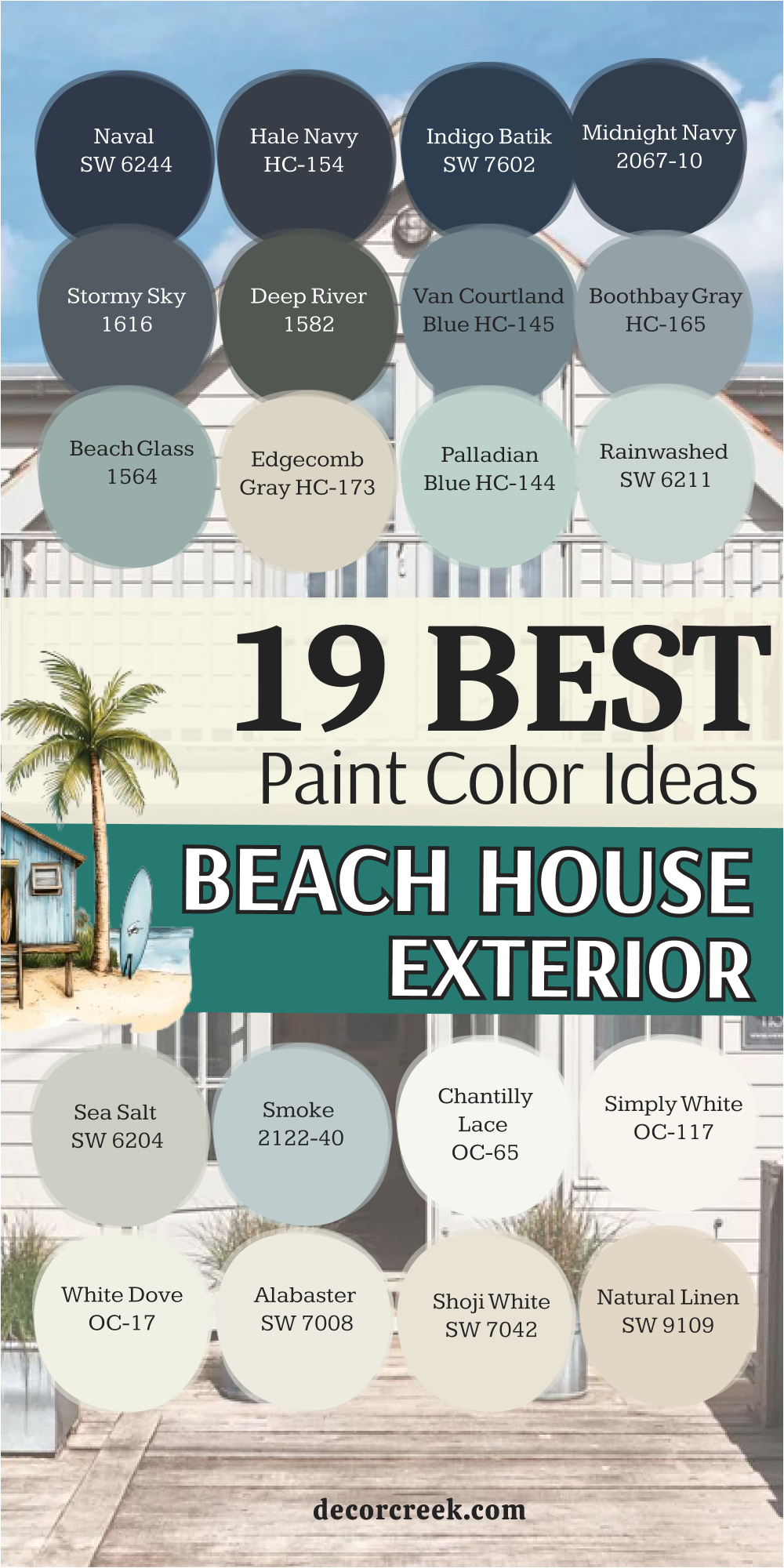
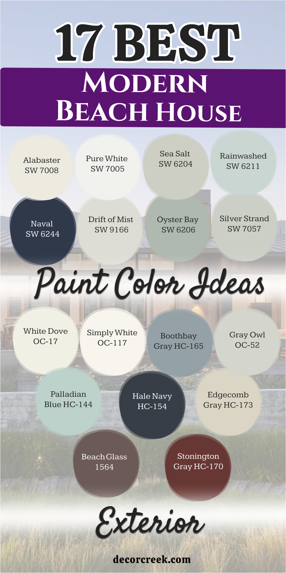
17 Modern Beach House Exterior Paint Color Ideas
Alabaster SW 7008
Alabaster SW 7008 is a creamy white that feels very cozy and friendly on a large home. This shade avoids looking too sharp or cold when the bright sun reflects off the siding. It works well on traditional coastal cottages that need a fresh look without being blinding.
I like how it hides a little bit of dust from the wind better than a pure stark white. Many homeowners pick this because it looks great with green plants and black light fixtures. It provides a soft backdrop for a colorful front door like light blue or coral.
The paint has a warm heart that makes a large building feel much more like a small home. You will notice it looks very rich and expensive when paired with dark window frames. It is a top choice for people who want a classic look that never feels old.
Best used in: living rooms, kitchens, hallways, bedrooms, and farmhouse exteriors
Pairs well with: Iron Ore SW 7069, Agreeable Gray SW 7029, Natural Linen SW 9109, warm wood tones
The key rule of this color for farmhouse style is to use it where you want natural light to feel kind, soft, and inviting throughout the day.
🎨 Check out the complete guide to this color right HERE 👈

Pure White SW 7005
Pure White SW 7005 gives a very clean and crisp appearance to any siding or trim. This color is a favorite for modern houses with straight lines and big glass windows. It does not have any yellow or blue tones hidden inside so it stays very neutral.
I use this when I want the architectural details of the porch to really pop out. The brightness of the paint makes the whole house look brand new even if it is an older building. It reflects a lot of light which helps keep the house a bit cooler in the hot sun.
This shade is a smart pick for a minimalist look that feels very organized and neat. Neighbors will think your house looks like a professional photo from a magazine. It provides a sharp contrast against a dark roof or dark gray shutters.
Best used in: trim, cabinets, modern exteriors, and ceilings
Pairs well with: Black Magic SW 6991, March Wind SW 7668, Naval SW 6244, silver hardware
The key rule of this color for farmhouse style is to use it where you want a crisp and clean finish that makes every other detail stand out.
🎨 Check out the complete guide to this color right HERE 👈

Sea Salt SW 6204
Sea Salt SW 6204 is a mix of green and gray that looks like the shallow water at the shore. This color changes a lot depending on if it is cloudy or sunny outside. It feels very relaxing and matches the grass and sand perfectly.
I love using this on small bungalows to make them feel special and unique. It is not a loud color so it does not bother the people living on your street. The gray parts of the paint keep it from looking like a bright mint green.
It looks very sophisticated when you put it next to a white porch railing. Most people feel very happy when they see this color on a beach property. It is one of the most popular choices for people who love the ocean.
Best used in: bathrooms, bedrooms, and coastal cottage exteriors
Pairs well with: Summit Gray SW 7669, Alabaster SW 7008, Heron Plume SW 6070, light oak
The key rule of this color for farmhouse style is to use it to bring a bit of nature onto your walls while keeping things feeling light.
🎨 Check out the complete guide to this color right HERE 👈

Rainwashed SW 6211
Rainwashed SW 6211 is a light blue that has a tiny bit of green to make it look watery. This color makes a house look very airy and light as if it could float on the breeze. I find that it looks best on houses with lots of white trim and white windows.
It reminds people of a clear sky after a quick summer rain storm. This shade is fun but still looks very professional and grown-up on a large exterior. It helps a house blend in with the beautiful colors of a coastal landscape.
You will see that it makes your home look very welcoming to guests and visitors. The color stays looking fresh for a long time even in the bright coastal sun. It is a great way to add color without being too bold or scary.
Best used in: entryways, laundry rooms, and seaside exterior siding
Pairs well with: Extra White SW 7006, First Star SW 7646, Grays Harbor SW 6236, dark wood
The key rule of this color for farmhouse style is to use it to create a soft and airy feeling that mimics the beauty of a clear sky.
🎨 Check out the complete guide to this color right HERE 👈

Naval SW 6244
Naval SW 6244 is a very dark and deep blue that looks like the ocean at night. This is a strong choice for a house that wants to look very bold and modern. It creates a huge statement and makes white trim look incredibly bright.
I love this for the main color of a house or just for a front door. It feels very sturdy and solid which is a nice feeling for a home. The dark color hides small marks and dirt very well over time. It looks very fancy and high-end when you see it on a well-maintained property.
Many people like how it makes their house the most interesting one on the block. It is a classic color that people have used for many years on ships and coastal buildings.
Best used in: accent walls, kitchen islands, front doors, and bold house siding
Pairs well with: Pure White SW 7005, Goldfinch SW 6905, Repose Gray SW 7015, brass accents
The key rule of this color for farmhouse style is to use it to ground your home with a deep and strong tone that feels very stable.
🎨 Check out the complete guide to this color right HERE 👈

Drift of Mist SW 9166
Drift of Mist SW 9166 is a very light gray that almost looks like a soft white. This color is perfect for someone who wants something different than white but still very light. It looks like the foggy air on a cool morning by the docks.
I like how it provides a very soft look to the outside of a house. It does not have any harsh tones so it feels very gentle to the eye. This shade works well with both dark and light accent colors on the roof.
It is a very safe choice if you are worried about picking a color you might tire of. Your house will look very clean and updated with this shade of gray. It is a smart pick for a modern home that wants to look soft.
Best used in: whole-house interiors, hallways, and modern coastal exteriors
Pairs well with: Urbane Bronze SW 7048, Alabaster SW 7008, Pewter Green SW 6208, slate tiles
The key rule of this color for farmhouse style is to use it as a neutral base that feels much more interesting than a plain white wall.
🎨 Check out the complete guide to this color right HERE 👈

Oyster Bay SW 6206
Oyster Bay SW 6206 is a medium green-gray that feels very earthy and grounded. This color looks like the smooth inside of a seashell you find on the beach. It has enough color to stand out but it still feels very natural and quiet.
I think it looks amazing on houses that have a lot of trees and bushes around them. It is a very sophisticated shade that makes a home look very well-designed. The green tones come out more when the sun is shining directly on the walls.
It creates a very peaceful look for a vacation home where you want to relax. This color is great for hiding the salt spray that can sometimes dull a paint finish. It is a solid choice for a house that wants to feel connected to the land.
Best used in: bedrooms, exterior siding, and home offices
Pairs well with: Shoji White SW 7042, Sea Salt SW 6204, Space Black SW 251-C1, stone accents
The key rule of this color for farmhouse style is to use it to give your home an organic and natural look that feels very connected to the earth.
🎨 Check out the complete guide to this color right HERE 👈

Silver Strand SW 7057
Silver Strand SW 7057 is a very light gray with a tiny hint of blue and green hidden inside. This color looks very elegant and expensive on a coastal home of any size. It changes its look depending on the weather which makes the house feel alive.
I use this when a homeowner wants a very light look that is not a standard white. It feels very cool and refreshing on a hot day in the sun. The blue tones make it feel very coastal and perfect for a house near the water.
It is a very popular color because it is easy to look at for a long time. Your home will look very bright and happy with this paint on the walls. It pairs beautifully with dark gray or black shutters for a classic look.
Best used in: bathrooms, bedrooms, and light gray house exteriors
Pairs well with: Snowbound SW 7004, Ambitious Amber SW 6357, Iron Ore SW 7069, chrome fixtures
The key rule of this color for farmhouse style is to use it to create a light and airy feel that has just enough color to be interesting.
🎨 Check out the complete guide to this color right HERE 👈

White Dove OC-17
White Dove OC-17 is a soft and creamy white that is very famous for being perfect. This color has a tiny bit of gray in it which keeps it from looking yellow. I pick this for homes that need to look traditional and high-end at the same time.
It feels very warm and inviting when you walk up to the front porch. The paint looks very smooth and clean on both siding and wooden trim. It is a very popular choice for staging homes because everyone seems to love it.
This shade makes the house look very large and open to the light. It is a great white for houses that get a lot of direct sun all day long. You can trust that this color will look good on any style of beach house.
Best used in: trim, doors, kitchen cabinets, and traditional exteriors
Pairs well with: Revere Pewter HC-172, Hale Navy HC-154, Balboa Mist OC-27, dark bronze
The key rule of this color for farmhouse style is to use it as a soft and gentle white that makes every room feel very welcoming and bright.
🎨 Check out the complete guide to this color right HERE 👈

Simply White OC-117
Simply White OC-117 is a very bright and cheerful white that has a tiny bit of warmth. This color makes a house look like it is glowing when the sun hits it. I like to use it on modern beach houses that want a very fresh and clean vibe.
It is not a cold white so it still feels very friendly and happy. The paint makes all the colors in your garden look much more vibrant. It is a very simple choice that takes the stress out of picking a paint color. Your house will look very neat and well-cared for with this bright shade.
It is a great way to make a small house look much bigger than it really is. This color is a classic that will look good for many years to come.
Best used in: ceilings, trim, modern kitchens, and bright exteriors
Pairs well with: Black HC-190, Kendall Charcoal HC-166, Silver Gray 2131-60, light wood
The key rule of this color for farmhouse style is to use it to make your home feel very bright and full of energy all day long.
🎨 Check out the complete guide to this color right HERE 👈

Boothbay Gray HC-165
Boothbay Gray HC-165 is a beautiful medium gray that has a very strong blue undertone. This color reminds me of the ocean on a cloudy day when the waves are a bit choppy. I love how it looks against bright white trim because it makes the blue pop even more.
It is a very smart choice for a house with a lot of character and history. The paint feels very sturdy and can handle the bright light of a coastal afternoon without fading away. You will find that it looks very professional and high-end on a large exterior wall.
It is a great way to have a blue house that still feels very neutral and grown-up. Many people choose this because it feels very fresh and clean in any weather. This shade makes your home look very well-designed and stands out from the lighter houses. It creates a very strong look that visitors will remember for a long time.
Best used in: exterior siding, kitchen islands, bathrooms, and front doors
Pairs well with: Simply White OC-117, Chantilly Lace OC-65, Hale Navy HC-154, dark slate
The key rule of this color for farmhouse style is to use it when you want a blue-gray tone that feels very solid and grounded on your home.
🎨 Check out the complete guide to this color right HERE 👈

Gray Owl OC-52
Gray Owl OC-52 is a very cool gray that has a tiny bit of green and blue mixed in. This color is a favorite for modern homes that want to look very light and open. I like how it looks very soft and gentle even when the sun is very bright outside.
It is a very popular shade because it goes well with almost any other accent color you choose. The paint makes the house look very neat and organized without being too stark like a plain white. It feels very refreshing and cool which is perfect for a home near the beach.
You will notice that it changes slightly throughout the day as the sun moves across the sky. It is a very safe and smart choice for someone who wants a modern look. This color helps your home feel very airy and light from the moment you see it. It provides a very smooth look that makes the architecture of your house look great.
Best used in: whole-house interiors, hallways, and modern exterior siding
Pairs well with: White Dove OC-17, Chelsea Gray HC-168, Black Satin 2131-10, silver accents
The key rule of this color for farmhouse style is to use it as a light and cool neutral that keeps your home feeling very modern and fresh.
🎨 Check out the complete guide to this color right HERE 👈

Palladian Blue HC-144
Palladian Blue HC-144 is a soft and watery blue that has a little bit of green in it. This color makes me think of clear tropical water where you can see all the way to the bottom. I use this when I want a house to look very happy and full of life.
It is a very traditional coastal color that people have loved for a very long time. The paint looks amazing with white railings and white window frames around a big porch. It feels very airy and light which makes the whole building look much more inviting.
You will feel very relaxed just looking at this shade on your exterior walls. It is a great way to add a lot of personality to your home without it being too loud. This color is perfect for a vacation home where the main goal is to have fun and rest. It stays looking bright and cheerful even on a rainy or cloudy day.
Best used in: bedrooms, bathrooms, and cottage-style exterior siding
Pairs well with: Simply White OC-117, Woodmont Cream 204, Wickham Gray HC-171, natural wood
The key rule of this color for farmhouse style is to use it to create a soft and watery feeling that brings the spirit of the ocean to your walls.
🎨 Check out the complete guide to this color right HERE 👈

Hale Navy HC-154
Hale Navy HC-154 is a very deep and classic navy blue that never goes out of style. This color is very strong and makes a house look very sturdy and expensive. I love using it for a whole house because it creates such a bold and beautiful look.
It makes white trim look very crisp and bright which is perfect for a coastal vibe. The dark paint is very good at hiding any dirt or marks that might get on the siding. It looks very sophisticated and high-end which makes your property value feel higher.
Many people pick this for their front door to create a very welcoming and strong entrance. It is a classic choice that works well with gold or silver hardware on the outside. Your home will look very solid and well-built with this deep shade of blue. It is one of the most trusted colors for a house that wants to make a statement.
Best used in: exterior siding, front doors, kitchen cabinets, and accent walls
Pairs well with: White Dove OC-17, Coventry Gray HC-169, brass fixtures
The key rule of this color for farmhouse style is to use it as a powerful and deep anchor that makes every other part of your house look bright.
🎨 Check out the complete guide to this color right HERE 👈

Edgecomb Gray HC-173
Edgecomb Gray HC-173 is a very warm gray that some people call a greige because it is between gray and beige. This color is perfect for a beach house because it looks like the color of warm sand. I use this when a home needs to feel very cozy and friendly to anyone who visits.
It is a very soft shade that does not have any harsh or cold tones in it. The paint looks very rich and smooth on siding and works well with many different roof colors. It is a very popular choice for staging homes because it makes every house feel like a comfortable home.
You will like how it provides a very neutral backdrop for your outdoor furniture and plants. This color is very easy to live with and you will likely never get tired of it. It looks very elegant and high-quality when you see it on a large scale. Your house will feel very warm and sun-kissed with this beautiful shade.
Best used in: living rooms, bedrooms, and warm exterior siding
Pairs well with: White Dove OC-17, Revere Pewter HC-172, Hale Navy HC-154, dark wood
The key rule of this color for farmhouse style is to use it to bring a sandy and warm feeling to your home that makes it feel very cozy.
🎨 Check out the complete guide to this color right HERE 👈

Beach Glass 1564
Beach Glass 1564 is a medium blue-green that looks just like the little pieces of glass you find on the shore. This color has a lot of gray in it which keeps it looking very sophisticated and soft. I love this for a coastal home because it feels so connected to the environment around it.
It is a very relaxing color that makes you want to sit on the porch and read a book. The paint looks very pretty with light-colored stone or brick accents on the house. It is a great way to use color without making the house look like a bright toy.
You will see that it changes its look as the sun goes down and the shadows get longer. This shade is very popular for people who want their home to feel like a quiet retreat. It makes a house look very unique and special in a neighborhood of white or gray homes. Your home will look very peaceful and lovely with this watery shade on the walls.
Best used in: bathrooms, bedrooms, and seaside cottage siding
Pairs well with: White Heron OC-57, Gray Owl OC-52, Mount Saint Anne 1565, light oak
The key rule of this color for farmhouse style is to use it to create a soft and natural look that feels like a quiet day at the beach.
🎨 Check out the complete guide to this color right HERE 👈

Stonington Gray HC-170
Stonington Gray HC-170 is a very clean and classic gray that does not have any hidden warm tones. This color is a favorite for modern houses because it looks very crisp and professional. I pick this when a homeowner wants a gray that stays looking like gray even in different light.
It feels very cool and refreshing on a house that gets a lot of hot afternoon sun. The paint makes white trim look very sharp and helps the house look very well-maintained. It is a very sturdy color that gives a house a very solid and reliable appearance.
You will notice that it provides a great contrast against colorful flowers in your front yard. This shade is very versatile and works well with both black and silver light fixtures. Your home will look very smart and updated with this clean shade of gray. It is a top choice for a house that wants a very neat and tidy look.
Best used in: whole-house interiors, kitchen cabinets, and modern house exteriors
Pairs well with: Decorator’s White OC-149, Hale Navy HC-154, Amherst Gray HC-167, chrome fixtures
The key rule of this color for farmhouse style is to use it as a cool and clean neutral that makes your home look very modern and sharp.
🎨 Check out the complete guide to this color right HERE 👈

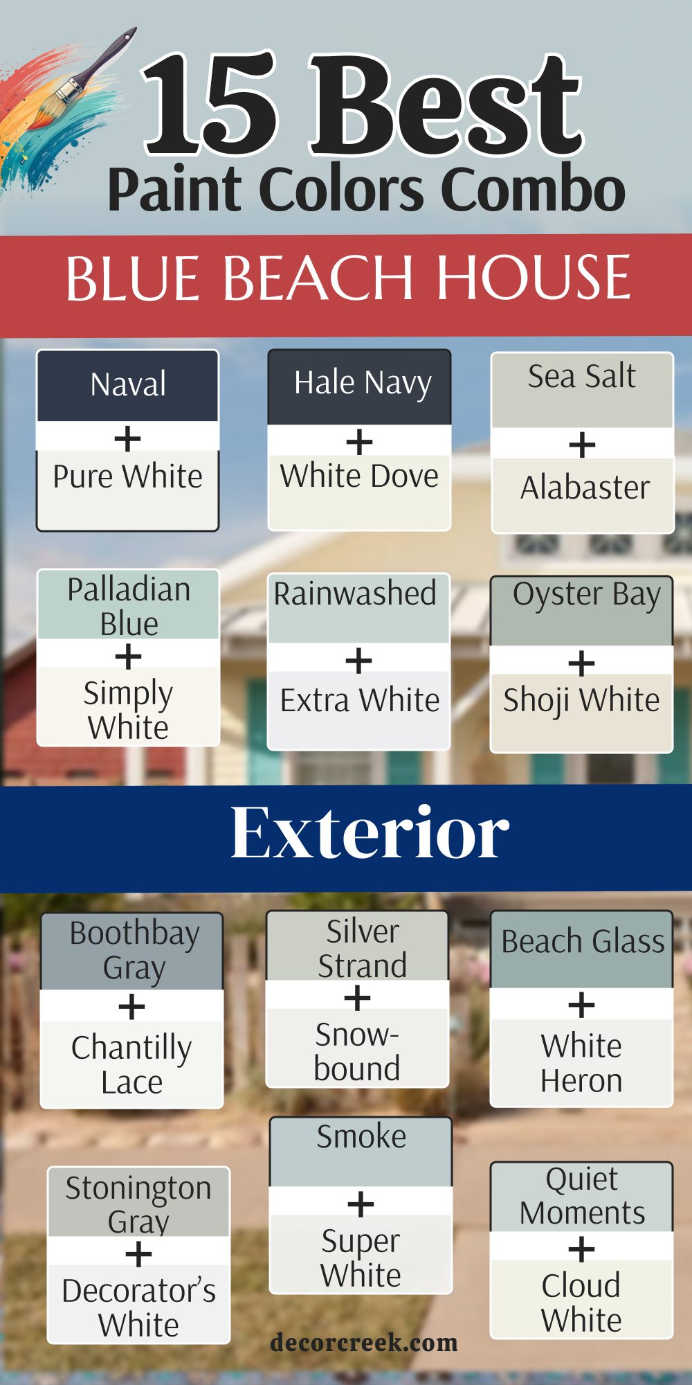
15 Blue Beach House Exterior Paint Color Combo
Naval SW 6244 + Pure White SW 7005
Naval SW 6244 + Pure White SW 7005 is a very bold and sharp look for a large coastal home. This pairing creates a huge contrast that makes the white trim look like it is glowing against the dark blue. I love how the dark blue reminds people of the deep ocean water far from the shore.
It is a very smart choice for a house with big porches and many windows. The dark siding helps hide any salt marks that might blow in from the sea. You will find that this house stands out as the most expensive looking building on the whole block.
It feels very sturdy and solid as if the house has been there for a hundred years. The white paint keeps the dark blue from feeling too heavy or dark in the shadows. Most neighbors will stop and stare because the colors look so professional and neat together. It is a classic way to show that you take great pride in your beautiful beach property.
Best used in: living rooms, kitchens, hallways, bedrooms, and farmhouse exteriors
Pairs well with: Iron Ore SW 7069, Agreeable Gray SW 7029, Natural Linen SW 9109, warm wood tones
The key rule of this color for farmhouse style is to use it where you want natural light to feel kind, soft, and inviting throughout the day.
Hale Navy HC-154 + White Dove OC-17
Hale Navy HC-154 + White Dove OC-17 is a very soft and traditional look for a cozy seaside cottage. This combination uses a very famous navy blue that looks good in every kind of morning light. I find that the creamy white trim makes the blue feel much more friendly and welcoming.
It is a very popular pick for families who want a home that feels very safe and warm. The blue is deep but the soft white prevents it from looking too harsh against the green grass. You will see that the house looks very rich and high-quality when these two shades meet.
It reminds people of a classic captain’s house that has seen many summer storms. The paint covers the siding beautifully and makes the whole building look very well-cared for. It is a great way to get a high-end look without trying too hard. Your home will feel like a very special retreat for your friends and family.
Best used in: entryways, front doors, siding, and traditional trim
Pairs well with: Revere Pewter HC-172, Gray Owl OC-52, silver hardware, dark stone
The key rule of this color for farmhouse style is to use it to create a strong and reliable look that feels very anchored to the ground.
Sea Salt SW 6204 + Alabaster SW 7008
Sea Salt SW 6204 + Alabaster SW 7008 is a very light and airy mix that looks like the colors of a sandy beach. This pair is perfect for a house that wants to blend in with the natural beauty of the coast. I love how the soft green-gray siding looks next to the warm white window frames.
It creates a very gentle look that does not tire the eyes even in the brightest sun. This is a very smart choice for a smaller house that you want to look much larger. The colors feel very fresh and clean as if a cool breeze is always blowing around the porch.
You will notice that the house feels very light and happy even on a very hot day. It is a very popular choice for staging because it makes people feel very relaxed and at home. The green tones come out beautifully when you have a lot of plants around the foundation. It is a lovely way to make your home feel like a part of the shore.
Best used in: bathrooms, bedrooms, siding, and porch ceilings
Pairs well with: Summit Gray SW 7669, Heron Plume SW 6070, light oak, wicker furniture
The key rule of this color for farmhouse style is to use it to bring a bit of nature onto your walls while keeping things feeling light.
Palladian Blue HC-144 + Simply White OC-117
Palladian Blue HC-144 + Simply White OC-117 is a very cheerful and watery combo that makes a house look very bright. This light blue has a bit of green that makes it look like a clear summer sky over the water. I use this when a house needs a big personality and a very happy vibe for the neighbors.
The bright white trim makes the watery blue look very crisp and very clean. It is a very traditional coastal look that feels very fun and full of energy. You will feel like you are on a permanent vacation every time you see your home.
The paint looks very smooth and hides the small imperfections of old wooden siding quite well. It is a great choice for a house with a big front porch and white rocking chairs. Most people feel a sense of joy when they drive past a house painted in these shades. It is a very classic and lovely way to decorate a beach property.
Best used in: laundry rooms, cottage exteriors, trim, and kitchen cabinets
Pairs well with: Woodmont Cream 204, Wickham Gray HC-171, dark wood, brass accents
The key rule of this color for farmhouse style is to use it to create a soft and watery feeling that mimics the beauty of a clear sky.
Rainwashed SW 6211 + Extra White SW 7006
Rainwashed SW 6211 + Extra White SW 7006 is a very cool and refreshing mix for a modern seaside home. This color is a tiny bit more green than blue which makes it look very organic and soft. I find that the very bright white trim makes the whole house look like it was just built yesterday.
It is a very smart look for someone who wants a house that feels very light and breezy. The colors do not absorb much heat so the house stays a bit cooler in the summer sun. You will love how the house looks when the sun reflects off the water and onto the walls.
It creates a very clean and tidy appearance that is very easy to maintain over the years. Many people pick this because it looks very high-end without being too dark or heavy. Your home will look like a very peaceful sanctuary away from the busy world. It is a great way to add a soft touch of color to your neighborhood.
Best used in: entryways, siding, shutters, and sunrooms
Pairs well with: Grays Harbor SW 6236, First Star SW 7646, slate tiles, silver fixtures
The key rule of this color for farmhouse style is to use it to make your home feel very bright and full of energy all day long.

Oyster Bay SW 6206 + Shoji White SW 7042
Oyster Bay SW 6206 + Shoji White SW 7042 is a very sophisticated and earthy combination for a coastal property. This medium green-gray siding looks very rich and matches the color of many beach stones. I like to use a creamy white like Shoji White because it is not too bright for the eyes.
This pair feels very grounded and solid which is a great feeling for a family home. It looks amazing on houses that have a lot of natural wood or stone details on the porch. The paint looks very expensive and makes the house stand out in a very quiet and polite way.
You will find that this color hides the dust from the wind very well so it stays looking clean. It is a very safe choice for someone who wants color but still wants a very neutral look. Most people think this house looks very well-designed and very smart. It is a wonderful way to connect your home to the earth and the sea.
Best used in: exterior siding, master bedrooms, offices, and trim
Pairs well with: Space Black SW 251-C1, Sea Salt SW 6204, copper gutters, warm stone
The key rule of this color for farmhouse style is to use it to give your home an organic and natural look that feels very connected to the earth.

Boothbay Gray HC-165 + Chantilly Lace OC-65
Boothbay Gray HC-165 + Chantilly Lace OC-65 is a very sharp and modern blue-gray look for a large house. This gray has a lot of blue in it so it looks very much like the ocean on a cool morning. I use the very bright white of Chantilly Lace to make the blue tones really stand out.
It is a very high-end look that you would see in a fancy magazine about coastal living. The colors feel very fresh and crisp which helps the house look very neat and organized. You will love how the house looks against a blue sky because the colors match so perfectly.
It is a very sturdy look that makes the building feel very strong and well-protected. Most visitors will think your home looks very elegant and very professional. The paint covers very well and keeps its bright look for a long time. It is a top choice for a house that wants a very clean and modern coastal vibe.
Best used in: exterior siding, kitchen islands, front doors, and modern trim
Pairs well with: Hale Navy HC-154, Simply White OC-117, dark slate, chrome hardware
The key rule of this color for farmhouse style is to use it when you want a blue-gray tone that feels very solid and grounded on your home.

Silver Strand SW 7057 + Snowbound SW 7004
Silver Strand SW 7057 + Snowbound SW 7004 is a very light and airy combination that feels very refreshing. This very pale gray has a tiny hint of blue and green that changes throughout the day. I use it with a soft white trim to keep the whole house looking very bright and open.
It is a very smart pick for a house that gets a lot of shadow from nearby trees. The colors make the house feel very cool and peaceful even when the weather is very hot. You will notice that the house looks very large and very inviting to anyone who walks by.
It is a very popular choice for people who want a very soft look that is not just plain white. The paint makes the architectural details of the siding look very smooth and very clean. You will feel very happy with how light and bright your home feels every single morning. It is a classic and very easy way to make a beach house look great.
Best used in: bathrooms, bedrooms, siding, and trim
Pairs well with: Iron Ore SW 7069, Ambitious Amber SW 6357, gray stone, silver accents
The key rule of this color for farmhouse style is to use it to create a light and airy feel that has just enough color to be interesting.

Beach Glass 1564 + White Heron OC-57
Beach Glass 1564 + White Heron OC-57 is a very soft and watery mix that looks very much like the shore. This medium blue-green color is very relaxing to look at on a large scale. I find that the cool white trim makes the color look very sophisticated and not too bright.
It is a very traditional look for a cottage that wants to feel very cozy and special. The colors remind people of finding treasures in the sand after a big tide comes in. You will love how the house looks during a sunset because the colors turn very warm and pretty.
It is a very smart choice for a house that is close to the dunes and the sea grass. The paint hides small marks very well and stays looking fresh for many coastal summers. Most people find this house to be very charming and very welcoming to guests. It is a lovely way to show your love for the colors of the ocean.
Best used in: exterior siding, guest rooms, bathrooms, and porch railings
Pairs well with: Gray Owl OC-52, Mount Saint Anne 1565, light oak, white furniture
The key rule of this color for farmhouse style is to use it to create a soft and natural look that feels like a quiet day at the beach.
Stonington Gray HC-170 + Decorator’s White OC-149
Stonington Gray HC-170 + Decorator’s White OC-149 is a very clean and cool look for a modern beach house. This gray is very pure and does not have any yellow or red tones hidden inside of it. I use the very bright white of Decorator’s White to create a very sharp and professional appearance.
It is a very smart choice for a house with modern lines and metal accents on the roof. The colors feel very sturdy and give the building a very strong and reliable look. You will find that the house looks very neat and very well-organized in any kind of light.
It is a very popular pick for people who want a house that looks very expensive and high-end. The paint stays looking new for a long time and does not fade easily in the sun. Most neighbors will think your home looks very updated and very stylish. It is a great way to have a gray house that feels very fresh and very coastal.
Best used in: whole-house interiors, siding, modern trim, and kitchen cabinets
Pairs well with: Hale Navy HC-154, Amherst Gray HC-167, black metal, chrome fixtures
The key rule of this color for farmhouse style is to use it as a cool and clean neutral that makes your home look very modern and sharp.
Smoke 2122-40 + Super White OC-152
Smoke 2122-40 + Super White OC-152 is a very light and misty blue that looks very elegant on a home. This color is very soft and looks like the fog moving over the water in the early morning. I like to use a very bright white trim to make the soft blue feel very clean and crisp.

It is a very sophisticated look that makes a house feel very peaceful and very quiet. The colors are very easy on the eyes and make the whole building look very light. You will notice that the house feels very cool and refreshing during the long hot days of summer.
It is a very smart choice for a house that wants to look unique but still very classic. The paint looks very smooth on the walls and makes the windows pop out beautifully. Many people feel very happy when they see this soft and airy color on a coastal property. It is a wonderful way to create a house that feels like a gentle getaway.
Best used in: bedrooms, siding, bathrooms, and ceiling trim
Pairs well with: White Dove OC-17, Gray 2121-10, dark wood, silver accents
The key rule of this color for farmhouse style is to use it to create a misty and light feeling that makes your home look very airy.
Van Courtland Blue HC-145 + Swiss Coffee OC-45
Van Courtland Blue HC-145 + Swiss Coffee OC-45 is a very strong and traditional blue for a coastal home. This shade of blue is a bit darker and looks very rich and very professional on the siding. I use the warm and creamy white of Swiss Coffee to make the blue feel very cozy and inviting.

It is a very classic look that reminds people of old coastal towns and historic buildings. The colors feel very sturdy and make the house look very well-built and very solid. You will love how the blue looks against a bright green lawn and colorful flowers in the garden.
It is a very popular choice for people who want a house with a lot of character and history. The paint covers the wood very well and stays looking bright for many years of wind and sun. Most visitors will think your home looks very high-end and very well-designed. It is a great way to give your beach house a very strong and beautiful personality.
Best used in: exterior siding, front doors, offices, and shutters
Pairs well with: Revere Pewter HC-172, Simply White OC-117, brass hardware, dark stone
The key rule of this color for farmhouse style is to use it as a deep and reliable blue that makes your home look very solid.

Quiet Moments 1563 + Cloud White OC-130
Quiet Moments 1563 + Cloud White OC-130 is a very soft mix of blue, green, and gray that feels very light. This color is very famous for making people feel very happy and very relaxed when they see it. I find that the soft white trim makes the whole house look like a fluffy cloud over the ocean.

It is a very smart choice for a house where you want to go to escape the busy city life. The colors are very gentle and do not look too bright even in the direct noon sun. You will notice that the house feels very airy and looks very much like it belongs on the coast.
It is a very popular choice for staging because everyone likes how peaceful and clean it looks. The paint makes the siding look very smooth and helps the house look very well-maintained. You will feel very proud to live in a home that looks so light and so beautiful every day. It is a lovely and very soft way to paint a coastal cottage.
Best used in: bedrooms, bathrooms, siding, and kitchen cabinets
Pairs well with: Palladian Blue HC-144, Shaker Beige HC-45, light wood, white wicker
The key rule of this color for farmhouse style is to use it to create a soft and airy feel that has just enough color to be interesting.

Stormy Sky 1616 + Simply White OC-117
Stormy Sky 1616 + Simply White OC-117 is a very deep and dramatic gray-blue that looks very modern. This color is very dark and looks like the clouds before a big summer rain on the beach. I use the bright white of Simply White to create a very high contrast that looks very stylish.
It is a very bold choice for someone who wants their home to look very unique and very strong. The dark siding hides many marks and stays looking very clean for a long time in the sea air. You will find that the house looks very expensive and very well-designed with this deep shade.
It is a very smart look for a modern house with sharp angles and big glass windows. Most people will think your home is very trendy and looks like a professional photo from a book. The paint is very high-quality and makes the house feel very solid and very safe. It is a great way to make a big statement with your coastal property.
Best used in: exterior siding, front doors, accent walls, and kitchen islands
Pairs well with: Gray Owl OC-52, Chantilly Lace OC-65, black metal, chrome accents
The key rule of this color for farmhouse style is to use it to ground your home with a deep and strong tone that feels very stable.
Indigo Batik SW 7602 + Greek Villa SW 7551
Indigo Batik SW 7602 + Greek Villa SW 7551 is a very rich and deep navy blue that looks very beautiful. This color is very vibrant and has a lot of blue in it so it does not look like black. I use the warm white of Greek Villa to make the whole house feel very inviting and very soft.

It is a very classic look for a beach house that wants to look very elegant and very strong. The deep blue looks amazing with white trim and a bright yellow or red front door. It feels very sturdy and makes the house look like it can handle any kind of coastal weather.
You will love how the colors stay bright and do not fade away in the strong summer sun. It is a very popular pick for people who love the look of the deep blue sea. Most neighbors will think your house looks very well-cared for and very high-end. Your home will feel like a very solid and very beautiful place to live every single day.
Best used in: siding, front doors, shutters, and traditional trim
Pairs well with: Alabaster SW 7008, Naval SW 6244, gold accents, dark wood
The key rule of this color for farmhouse style is to use it as a powerful and deep anchor that makes every other part of your house look bright.

15 Contemporary Beach House Exterior Paint Color Combo
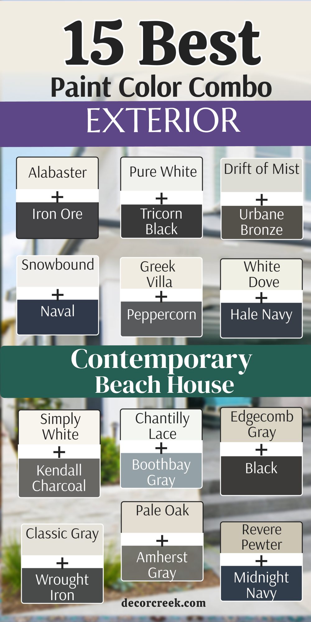
Alabaster SW 7008 + Iron Ore SW 7069
Alabaster SW 7008 + Iron Ore SW 7069 is a very popular look for a modern beach home that wants to feel very cozy. This warm white siding looks very soft when the bright coastal sun hits the walls throughout the day.
I use the dark charcoal of Iron Ore for the trim to make the house look very sharp and very expensive. It is a very smart choice for a family who wants a fresh look that is not too cold or boring. The dark accents help ground the building so it does not feel like it is floating away in the light.
You will notice that the house looks very clean and very well-organized from the street view. It is a very high-end style that works perfectly with natural wood decks and black metal light fixtures. The paint covers the wood beautifully and stays looking very rich for a long time. Most people feel very happy seeing this mix because it is very easy on the eyes and very welcoming. Your house will look like a very stylish retreat that everyone in the neighborhood will admire.
Best used in: living rooms, kitchens, hallways, bedrooms, and farmhouse exteriors
Pairs well with: Iron Ore SW 7069, Agreeable Gray SW 7029, Natural Linen SW 9109, warm wood tones
The key rule of this color for farmhouse style is to use it where you want natural light to feel kind, soft, and inviting throughout the day.

Pure White SW 7005 + Tricorn Black SW 6258
Pure White SW 7005 + Tricorn Black SW 6258 is the most crisp and clean look you can pick for a modern house. This combination is very bold because the white is very bright and the black is very dark and very true.
I like to use this on houses with very straight lines and big glass windows to make them look very neat. It is a very powerful choice that tells people you love a very organized and very tidy home. The black trim makes the windows look like pieces of art against the bright white siding.
You will find that the house looks very brand new even if it is an older building near the sea. It is a very trendy style that photographers love to use for magazines and websites. The paint reflects a lot of light which helps the house stay a bit cooler during the hot months. Your home will stand out as the most modern and sharp building on the whole block. It is a very simple and very effective way to make a big statement.
Best used in: trim, cabinets, modern exteriors, and ceilings
Pairs well with: Black Magic SW 6991, March Wind SW 7668, Naval SW 6244, silver hardware
The key rule of this color for farmhouse style is to use it where you want a crisp and clean finish that makes every other detail stand out.

Drift of Mist SW 9166 + Urbane Bronze SW 7048
Drift of Mist SW 9166 + Urbane Bronze SW 7048 is a very earthy and sophisticated mix for a coastal property. This very light gray siding looks like the soft morning fog and feels very gentle. I use the deep bronze trim to add a lot of warmth and a very natural feeling to the house.
It is a very smart look for a home that is surrounded by trees and sandy grass. The dark trim has a bit of brown and green in it which makes it look very rich and very expensive. You will love how the house blends in with the natural colors of the shore and the woods.
It is a very quiet look that does not need to shout to be noticed by the neighbors. The paint stays looking very clean and hides any dust from the wind quite well over time. Most visitors will think your home looks very well-designed and very peaceful to live in. It is a wonderful way to have a modern house that still feels very connected to the ground.
Best used in: whole-house interiors, hallways, and modern coastal exteriors
Pairs well with: Urbane Bronze SW 7048, Alabaster SW 7008, Pewter Green SW 6208, slate tiles
The key rule of this color for farmhouse style is to use it as a neutral base that feels much more interesting than a plain white wall.

Snowbound SW 7004 + Naval SW 6244
Snowbound SW 7004 + Naval SW 6244 is a very fresh and very coastal look for any beach house. This soft white has a tiny bit of gray that keeps it from looking too yellow in the bright sun. I find that the deep navy blue trim makes the house look like it belongs right on the dock.
It is a very popular choice for people who want a classic navy look with a modern twist. The white siding makes the whole building look very large and very open to the light. You will feel a lot of joy when you see how the blue and white match the colors of the ocean.
It is a very sturdy look that makes the house feel very strong and very well-built. The paint covers the siding very well and keeps its bright appearance for a long time in the sea air. Most people will think your house looks very cheerful and very welcoming for guests. It is a great way to show your love for the seaside in a very smart way.
Best used in: bathrooms, bedrooms, and light gray house exteriors
Pairs well with: Snowbound SW 7004, Ambitious Amber SW 6357, Iron Ore SW 7069, chrome fixtures
The key rule of this color for farmhouse style is to use it to create a light and airy feel that has just enough color to be interesting.
Greek Villa SW 7551 + Peppercorn SW 7674
Greek Villa SW 7551 + Peppercorn SW 7674 is a very cozy and very modern combination for a family home. This creamy white siding feels very warm and friendly to everyone who walks up the path.
I use the dark gray of Peppercorn to create a very nice contrast that is not as harsh as black. It is a very smart choice for a house that wants to look high-end and very soft at the same time. The colors look very smooth and help the house look very well-maintained and very neat.
You will find that the house feels very inviting and looks very pretty in the evening light. It is a very popular pick for staging homes because it makes people feel very comfortable. The paint stays looking fresh and clean for many years of coastal sun and wind. Most neighbors will think your home looks very stylish and very well-planned. It is a lovely way to give your beach house a very soft and modern personality.
Best used in: kitchens, bathrooms, bedrooms, and warm white exteriors
Pairs well with: Peppercorn SW 7674, Urban Bronze SW 7048, Sea Salt SW 6204, dark wood
The key rule of this color for farmhouse style is to use it where you want a very soft and creamy look that makes every room feel very friendly.
White Dove OC-17 + Hale Navy HC-154
White Dove OC-17 + Hale Navy HC-154 is a very famous and very traditional look that works perfectly by the sea. This soft white siding avoids looking too sharp and feels very rich on the walls. I love using the deep navy blue for the shutters or the front door to create a very classic vibe.
It is a very popular choice for people who want their house to look like a historic coastal retreat. The colors feel very solid and make the building look very sturdy and very well-built. You will notice that the house looks very clean and very elegant from the street.
It is a very high-end style that looks great with stone porches and green plants. The paint looks very smooth and handles the bright coastal light very well over many summers. Most visitors will think your home looks very beautiful and very well-designed. It is a great way to have a house that looks both old-fashioned and very modern at the same time.
Best used in: trim, doors, kitchen cabinets, and traditional exteriors
Pairs well with: Revere Pewter HC-172, Hale Navy HC-154, Balboa Mist OC-27, dark bronze
The key rule of this color for farmhouse style is to use it as a soft and gentle white that makes every room feel very welcoming and bright.
Simply White OC-117 + Kendall Charcoal HC-166
Simply White OC-117 + Kendall Charcoal HC-166 is a very bright and very modern mix for a coastal property. This very clear white siding makes the house look like it is glowing on a sunny day. I use the deep charcoal trim to add a lot of depth and a very professional look to the building.
It is a very smart pick for a house with a lot of interesting architectural shapes. The colors look very crisp and help the whole house look very neat and very organized. You will love how the dark trim makes the white walls look even brighter and cleaner.
It is a very trendy style that is very popular for high-end coastal developments. The paint stays looking very sharp and does not fade easily in the strong sun. Most people will think your home looks very expensive and very well-planned. It is a wonderful way to make a big statement with a very simple color palette.
Best used in: ceilings, trim, modern kitchens, and bright exteriors
Pairs well with: Black HC-190, Kendall Charcoal HC-166, Silver Gray 2131-60, light wood
The key rule of this color for farmhouse style is to use it to make your home feel very bright and full of energy all day long.

Chantilly Lace OC-65 + Boothbay Gray HC-165
Chantilly Lace OC-65 + Boothbay Gray HC-165 is a very clean and very blue look for a modern beach house. This very bright white siding is very pure and does not have any yellow or red tones in it.
I use the blue-gray of Boothbay Gray to make the house feel very coastal and very refreshing. It is a very smart look for someone who wants a house that looks very neat and very cool. The colors feel very light and make the whole building look very large and very open.
You will find that the house looks very beautiful against the blue water of the ocean. It is a very popular choice for modern cottages that want to feel very special and unique. The paint looks very smooth and stays looking very fresh for many years of sea air. Most neighbors will think your home looks very stylish and very well-designed. It is a great way to have a very modern look that still feels very connected to the beach.
Best used in: kitchens, bathrooms, modern exteriors, and trim
Pairs well with: Boothbay Gray HC-165, Hale Navy HC-154, silver metal, black accents
The key rule of this color for farmhouse style is to use it as a very pure white that makes every other color in the room look very bright.
Edgecomb Gray HC-173 + Black HC-190
Edgecomb Gray HC-173 + Black HC-190 is a very warm and very modern look for a sandy beach house. This soft greige siding looks like the color of warm sand and feels very cozy. I use the sharp black trim to create a very bold and very professional appearance.
It is a very smart choice for a house that wants to look high-end and very welcoming at the same time. The colors look very rich and help the house look very well-maintained and very solid. You will find that the house feels very inviting and looks very pretty in the morning light.
It is a very popular pick for people who love a neutral look with a bit of a kick. The paint stays looking very fresh and clean for many summers in the bright sun. Most visitors will think your home looks very well-planned and very elegant. It is a lovely way to give your beach house a very warm and modern personality.
Best used in: living rooms, bedrooms, and warm exterior siding
Pairs well with: White Dove OC-17, Revere Pewter HC-172, Hale Navy HC-154, dark wood
The key rule of this color for farmhouse style is to use it to bring a sandy and warm feeling to your home that makes it feel very cozy.
Classic Gray OC-23 + Wrought Iron 2124-10
Classic Gray OC-23 + Wrought Iron 2124-10 is a very soft and very sophisticated mix for a coastal home. This very light gray siding looks very elegant and feels very gentle on the eyes. I use the dark charcoal trim of Wrought Iron to add a lot of strength and a very modern vibe.

It is a very smart look for a house that wants to look expensive and very quiet. The colors look very smooth and help the whole building look very neat and very organized. You will love how the house looks against a gray sky or a sunny day because the colors are very flexible.
It is a very trendy style that many architects like to use for new coastal projects. The paint stays looking very sharp and does not show much wear over time. Most people will think your home looks very well-designed and very smart. It is a wonderful way to have a very modern house that still feels very soft.
Best used in: whole-house interiors, siding, modern trim, and bedrooms
Pairs well with: White Dove OC-17, Wrought Iron 2124-10, silver metal, dark wood
The key rule of this color for farmhouse style is to use it as a very soft gray that makes every room feel very light and very open.

Pale Oak OC-20 + Amherst Gray HC-167
Pale Oak OC-20 + Amherst Gray HC-167 is a very warm and very earthy combination for a seaside property. This light greige siding looks like weathered wood and feels very natural on the house. I use the medium gray trim to create a very nice balance that is very easy to look at.

It is a very smart choice for a home that wants to feel very cozy and very well-built. The colors look very rich and help the house look very well-maintained and very tidy. You will find that the house feels very inviting and looks very beautiful in the late afternoon sun.
It is a very popular pick for staging because it makes the whole property feel very solid. The paint stays looking fresh and handles the coastal wind and salt very well. Most neighbors will think your home looks very stylish and very well-designed. It is a lovely way to give your beach house a very warm and natural personality.
Best used in: living rooms, bedrooms, siding, and warm trim
Pairs well with: Chantilly Lace OC-65, Revere Pewter HC-172, dark stone, brass accents
The key rule of this color for farmhouse style is to use it to create a warm and natural look that feels very connected to the ground.

Revere Pewter HC-172 + Midnight Navy 2067-10
Revere Pewter HC-172 + Midnight Navy 2067-10 is a very strong and very classic mix for any coastal home. This famous greige siding looks very rich and matches almost any kind of stone or brick. I use the very dark navy blue trim to create a very bold and very professional look.

It is a very smart choice for a house that wants to look very high-end and very sturdy. The colors feel very solid and make the building look very well-built and very safe. You will notice that the house looks very clean and very elegant from the sidewalk.
It is a very popular style that people have loved for a very long time because it works so well. The paint looks very smooth and handles the bright sun of the beach very well over the years. Most visitors will think your home looks very beautiful and very well-planned. It is a great way to have a house that looks very modern and very traditional at the same time.
Best used in: living rooms, kitchens, siding, and traditional trim
Pairs well with: White Dove OC-17, Hale Navy HC-154, black metal, warm wood
The key rule of this color for farmhouse style is to use it as a deep and reliable neutral that makes your home look very solid.
Balboa Mist OC-27 + Black Satin 2131-10
Balboa Mist OC-27 + Black Satin 2131-10 is a very light and very sharp look for a modern beach house. This very pale gray siding looks very fresh and feels very airy on a big building. I use the dark black trim to create a very high contrast that looks very stylish and very professional.

It is a very smart look for someone who wants a house that looks very neat and very clean. The colors feel very light and make the whole house look very large and very open. You will find that the house looks very beautiful against the blue sky and green grass.
It is a very popular choice for new homes that want to look very special and very trendy. The paint looks very smooth and stays looking very fresh for a long time. Most neighbors will think your home looks very well-designed and very high-end. It is a great way to have a very modern look that still feels very light and very bright.
Best used in: whole-house interiors, siding, modern trim, and bathrooms
Pairs well with: White Dove OC-17, Black Satin 2131-10, silver accents, dark stone
The key rule of this color for farmhouse style is to use it to create a light and airy feel that has just enough color to be interesting.
Silver Satin OC-26 + Deep River 1582
Silver Satin OC-26 + Deep River 1582 is a very soft and very sophisticated mix for a coastal home. This very light gray siding looks almost like a soft white and feels very gentle. I use the deep green-gray trim of Deep River to add a lot of depth and a very natural vibe.
It is a very smart look for a house that wants to look expensive and very peaceful. The colors look very smooth and help the whole building look very neat and very organized. You will love how the house looks against the water because the colors are very much like the shore.
It is a very high-end style that works perfectly with stone patios and metal light fixtures. The paint covers the wood beautifully and stays looking very rich for many summers. Most people feel very happy seeing this mix because it is very easy on the eyes. Your house will look like a very stylish retreat that everyone will admire.
Best used in: whole-house interiors, hallways, siding, and modern trim
Pairs well with: Simply White OC-117, Deep River 1582, black metal, light wood
The key rule of this color for farmhouse style is to use it as a very soft gray that makes every room feel very light and very open.

Gray Owl OC-52 + Chelsea Gray HC-168
Gray Owl OC-52 + Chelsea Gray HC-168 is a very cool and very modern look for a beach house. This light gray siding has a tiny bit of blue and green that feels very refreshing. I use the medium gray trim to create a very nice balance that is very smart and very clean.
It is a very smart choice for a house that wants to look high-end and very professional at the same time. The colors look very rich and help the house look very well-maintained and very tidy. You will find that the house feels very inviting and looks very pretty in the morning light.
It is a very popular pick for staging homes because it makes people feel very relaxed. The paint stays looking very fresh and handles the coastal wind very well. Most neighbors will think your home looks very stylish and very well-planned. It is a lovely way to give your beach house a very cool and modern personality.
Best used in: whole-house interiors, hallways, and modern exterior siding
Pairs well with: White Dove OC-17, Chelsea Gray HC-168, Black Satin 2131-10, silver accents
The key rule of this color for farmhouse style is to use it as a light and cool neutral that keeps your home feeling very modern and fresh.

18 Cozy Beach House Exterior Paint Colors
Alabaster SW 7008
Alabaster SW 7008 is a very popular choice for a home that needs to feel soft and welcoming. This white has a little bit of yellow inside that makes it feel very warm and friendly. I like to use it on big houses because it does not look too bright when the sun hits the siding.
It feels like a giant hug for your home when you pull into the driveway after a long day. The paint looks very rich and makes the windows and doors stand out in a nice way. You will notice that it matches very well with natural wood decks and green grass.
It is a very smart pick for a family who wants their beach house to feel like a real home. Most people feel very happy when they see this color on a sunny afternoon. Your house will look very neat and very well-cared for with this classic shade. It is a wonderful way to make a large building look very sweet and very kind.
Best used in: living rooms, kitchens, hallways, bedrooms, and farmhouse exteriors
Pairs well with: Iron Ore SW 7069, Agreeable Gray SW 7029, Natural Linen SW 9109, warm wood tones
The key rule of this color for farmhouse style is to use it where you want natural light to feel kind, soft, and inviting throughout the day.
🎨 Check out the complete guide to this color right HERE 👈
Shoji White SW 7042
Shoji White SW 7042 is a very creamy white that looks a bit like the color of a fresh mushroom. This shade is very soft and does not have any harsh or cold tones hidden in it. I find that it works perfectly for a house that has a lot of stone or brick accents.
It feels very cozy and makes the house look like it has been part of the beach for a long time. The paint stays looking very clean even if the wind blows a bit of sand against the walls. You will love how it looks in the morning light because it feels very bright and very fresh.
It is a very popular choice for people who want a neutral look that is not a boring white. Most visitors will think your home looks very stylish and very warm at the same time. Your house will feel very solid and very reliable with this beautiful and soft paint. It is a great way to have a very cozy home by the water.
Best used in: exterior siding, trim, bedrooms, and living areas
Pairs well with: Urbane Bronze SW 7048, Fawn Brindle SW 7615, Pure White SW 7005, natural stone
The key rule of this color for farmhouse style is to use it to create a warm and grounded look that feels very connected to the earth.
🎨 Check out the complete guide to this color right HERE 👈
Creamy SW 7012
Creamy SW 7012 is a very soft and rich white that looks just like its name sounds. This color has a lot of warmth which makes a beach house feel very sunny even on a cloudy day. I use this when I want a home to look very traditional and very high-end without being too loud.
It feels very smooth on the siding and makes the house look very well-maintained. You will notice that it provides a very nice backdrop for colorful flowers like red roses or blue hydrangeas. It is a very smart choice for a cottage that needs a fresh look but still wants to be cozy.
The paint covers the wood very well and keeps its rich look for many years. Most people feel a sense of peace when they walk up to a house painted in this shade. Your home will look very sweet and very inviting to all your friends and family. It is a classic way to make your property look very beautiful and very soft.
Best used in: trim, kitchen cabinets, siding, and bedroom walls
Pairs well with: Foothills SW 7514, Studio Mauve SW 0062, Alabaster SW 7008, dark wood
The key rule of this color for farmhouse style is to use it where you want a very soft and creamy look that makes every room feel very friendly.
🎨 Check out the complete guide to this color right HERE 👈

Greek Villa SW 7551
Greek Villa SW 7551 is a very bright white that still manages to feel very warm and very cozy. This color is a favorite for modern beach houses that want a very clean and very open vibe. I like how it makes the house look like it is glowing when the sun reflects off the ocean.
It is a very simple choice that makes any building look much newer and much better. The paint does not have any blue or gray tones so it stays looking very sunny all day long. You will see that it makes your outdoor furniture and bright cushions look very vibrant.
It is a very popular pick for staging because it makes every house look very large and very happy. Most neighbors will think your home looks very neat and very well-planned. Your house will feel like a very bright and very joyful place to live every single day. It is a wonderful way to have a house that feels very light and very fresh.
Best used in: kitchens, bathrooms, bedrooms, and warm white exteriors
Pairs well with: Peppercorn SW 7674, Urban Bronze SW 7048, Sea Salt SW 6204, dark wood
The key rule of this color for farmhouse style is to use it where you want a very soft and creamy look that makes every room feel very friendly.
🎨 Check out the complete guide to this color right HERE 👈
White Duck SW 7010
White Duck SW 7010 is a very light greige that looks very clean and very sophisticated on a home. This color has a bit of gray and a bit of cream mixed together to make it very neutral. I use this when a homeowner wants a house that looks modern but still feels very cozy.
It looks very pretty against a blue sky and makes the house look very sturdy. The paint stays looking very good even in the salty air near the beach. You will find that it hides small marks better than a very bright white would.
It is a very smart choice for a house that has a lot of white trim around the windows. Most people think this house looks very well-designed and very expensive. Your home will feel very solid and very stylish with this beautiful shade on the walls. It is a great way to have a neutral house that has a lot of character.
Best used in: whole-house siding, trim, bedrooms, and laundry rooms
Pairs well with: Black Magic SW 6991, Agreeable Gray SW 7029, Alabaster SW 7008, silver hardware
The key rule of this color for farmhouse style is to use it as a soft and gentle neutral that makes your home look very clean.
🎨 Check out the complete guide to this color right HERE 👈
Drift of Mist SW 9166
Drift of Mist SW 9166 is a very light gray that feels very airy and very soft on a coastal building. This color looks like the light fog that rolls in over the sand in the early morning. I like how it provides a very modern look while still feeling very cozy and very quiet.
It is a very safe choice because it matches almost any roof color or stone porch. The paint looks very smooth and makes the house look very neat and very organized. You will love how it changes slightly as the sun moves across the sky during the day.
It is a very popular pick for houses that want to look high-end without being too bold. Most visitors will think your home looks very peaceful and very well-designed. Your house will feel like a very light and very fresh sanctuary by the sea. It is a wonderful way to have a gray house that feels very soft and very kind.
Best used in: whole-house interiors, hallways, and modern coastal exteriors
Pairs well with: Urbane Bronze SW 7048, Alabaster SW 7008, Pewter Green SW 6208, slate tiles
The key rule of this color for farmhouse style is to use it as a neutral base that feels much more interesting than a plain white wall.
🎨 Check out the complete guide to this color right HERE 👈
Accessible Beige SW 7036
Accessible Beige SW 7036 is a very famous and very warm beige that looks good on every house. This color is very cozy and reminds me of the warm sand on a very hot summer day. I use this when I want a home to feel very sturdy and very welcoming to everyone.
It is a very smart choice for a family home because it hides dirt and dust very well. The paint looks very rich and makes the white trim around the doors look very bright. You will notice that the house looks very solid and very well-built with this shade.
It is a very popular pick for staging because it makes people feel very comfortable right away. Most neighbors will think your home looks very classic and very well-maintained. Your house will feel like a very warm and very friendly place to spend your summer. It is a great way to have a beige house that feels very modern and very fresh.
Best used in: living rooms, siding, kitchens, and hallways
Pairs well with: Alabaster SW 7008, Urban Bronze SW 7048, Cadet SW 9143, warm wood
The key rule of this color for farmhouse style is to use it to bring a sandy and warm feeling to your home that makes it feel very cozy.
🎨 Check out the complete guide to this color right HERE 👈

Natural Linen SW 9109
Natural Linen SW 9109 is a very warm and very soft color that looks like a clean piece of fabric. This shade has a lot of yellow and tan in it which makes it feel very sunny and happy. I find that it works beautifully for a beach house that needs to look very cozy and very sweet.
It feels very traditional and makes the building look very well-cared for over the years. The paint stays looking very bright and does not fade easily in the strong coastal sun. You will love how it looks next to dark green bushes and colorful flowers in your yard.
It is a very popular choice for people who want a home that feels very safe and very warm. Most visitors will think your home looks very inviting and very high-quality. Your house will feel like a very cozy and very sunny retreat every single day. It is a wonderful way to make your property look very beautiful and very soft.
Best used in: bedrooms, siding, living rooms, and warm trim
Pairs well with: Alabaster SW 7008, Iron Ore SW 7069, Pewter Green SW 6208, wicker accents
The key rule of this color for farmhouse style is to use it to create a warm and natural look that feels very connected to the ground.
🎨 Check out the complete guide to this color right HERE 👈

Sea Salt SW 6204
Sea Salt SW 6204 is a very light mix of green and gray that looks just like the shallow ocean water. This color is very relaxing and makes a house look very special and very unique. I like to use it on small cottages to make them feel very cozy and very airy at the same time.
It is a very smart choice for a house that is surrounded by a lot of sand and sea grass. The paint changes its look depending on if it is a sunny day or a cloudy afternoon. You will notice that it feels very fresh and very cool when the weather is very hot.
It is a very popular pick for people who love the colors of the nature around them. Most neighbors will think your home looks very stylish and very peaceful. Your house will feel like a very light and very happy place to live by the sea. It is a great way to add a bit of color that still feels very neutral.
Best used in: bathrooms, bedrooms, and coastal cottage exteriors
Pairs well with: Summit Gray SW 7669, Alabaster SW 7008, Heron Plume SW 6070, light oak
The key rule of this color for farmhouse style is to use it to bring a bit of nature onto your walls while keeping things feeling light.
🎨 Check out the complete guide to this color right HERE 👈
Rainwashed SW 6211
Rainwashed SW 6211 is a very soft and watery blue that feels very light and very refreshing. This color makes a beach house look very cheerful and very full of life. I find that it looks amazing with bright white trim and a big front porch for relaxing.
It is a very traditional coastal color that people have loved for a very long time. The paint feels very airy and makes the whole building look much more inviting and kind. You will see that it makes your home look very unique and very pretty in the neighborhood.
It is a very popular choice for vacation homes where you want to feel happy and relaxed. Most visitors will feel a sense of joy when they see this soft and watery shade. Your house will feel like a very bright and very joyful sanctuary away from the world. It is a wonderful way to show your love for the beautiful colors of the sky.
Best used in: entryways, laundry rooms, and seaside exterior siding
Pairs well with: Extra White SW 7006, First Star SW 7646, Grays Harbor SW 6230, dark wood
The key rule of this color for farmhouse style is to use it to create a soft and airy feeling that mimics the beauty of a clear sky.
🎨 Check out the complete guide to this color right HERE 👈
Oyster Bay SW 6206
Oyster Bay SW 6206 is a very sophisticated green-gray that looks like a smooth stone from the beach. This color is very cozy and feels very grounded and very solid on a house. I use this when a homeowner wants a house that looks very rich and very well-designed.
It is a very smart choice for a property that has a lot of trees and natural landscape. The paint looks very expensive and makes the house stand out in a very quiet and polite way. You will find that it hides the salt spray and dust from the wind very well over time.
It is a very popular pick for people who want a house that feels very safe and very sturdy. Most people think this house looks very well-planned and very high-end. Your home will feel like a very solid and very beautiful place to spend your time. It is a great way to have a house that feels very connected to the earth.
Best used in: bedrooms, exterior siding, and home offices
Pairs well with: Shoji White SW 7042, Sea Salt SW 6204, Space Black SW 251-C1, stone accents
The key rule of this color for farmhouse style is to use it to give your home an organic and natural look that feels very connected to the earth.
🎨 Check out the complete guide to this color right HERE 👈
Silver Strand SW 7057
Silver Strand SW 7057 is a very light and misty gray that has a tiny hint of blue and green. This color is very elegant and makes a coastal home look very high-quality and very fresh. I like to use it with soft white trim to keep the whole house looking very bright and open.
It is a very smart pick for a house that wants to look modern but still feel very cozy. The colors feel very light and make the whole building look very large and very inviting. You will notice that it feels very cool and refreshing when the summer sun is very strong.
It is a very popular choice for people who want a very soft look that is not just plain white. Most neighbors will think your home looks very stylish and very well-maintained. Your house will feel like a very light and very happy retreat every single morning. It is a wonderful way to make a beach house look very beautiful and very clean.
Best used in: bathrooms, bedrooms, and light gray house exteriors
Pairs well with: Snowbound SW 7004, Ambitious Amber SW 6357, Iron Ore SW 7069, chrome fixtures
The key rule of this color for farmhouse style is to use it to create a light and airy feel that has just enough color to be interesting.
🎨 Check out the complete guide to this color right HERE 👈
White Dove OC-17
White Dove OC-17 is a very soft and very creamy white that people use when they want perfection. This color has a bit of gray that keeps it from looking too yellow or too bright in the sun. I use this for homes that need to look very traditional and very expensive at the same time.
It feels very warm and very inviting when you walk up to the front door. The paint looks very smooth on the siding and helps the house look very well-cared for. You will find that it makes the whole property look very large and very open to the light.
It is a very popular choice for staging because it makes everyone feel very comfortable and happy. Most visitors will think your home looks very beautiful and very well-designed. Your house will feel like a very soft and very welcoming sanctuary for your family. It is a classic way to have a house that looks both old-fashioned and very modern.
Best used in: trim, doors, kitchen cabinets, and traditional exteriors
Pairs well with: Revere Pewter HC-172, Hale Navy HC-154, Balboa Mist OC-27, dark bronze
The key rule of this color for farmhouse style is to use it as a soft and gentle white that makes every room feel very welcoming and bright.
🎨 Check out the complete guide to this color right HERE 👈
Simply White OC-117
Simply White OC-117 is a very bright and very cheerful white that has just a tiny bit of warmth. This color makes a house look like it is glowing when the morning sun hits the walls. I like to use it on modern beach houses that want a very fresh and very clean appearance.
It is a very simple choice that makes any building look much newer and much better right away. The paint makes the colors of your garden and the blue sky look much more vibrant and pretty. You will see that it makes the whole house look very neat and very well-organized from the street.
It is a very popular pick because it takes all the stress out of choosing a paint color. Most neighbors will think your home looks very stylish and very full of energy. Your house will feel like a very bright and very joyful place to live every single day. It is a wonderful way to have a house that feels very light and very fresh.
Best used in: ceilings, trim, modern kitchens, and bright exteriors
Pairs well with: Black HC-190, Kendall Charcoal HC-166, Silver Gray 2131-60, light wood
The key rule of this color for farmhouse style is to use it to make your home feel very bright and full of energy all day long.
🎨 Check out the complete guide to this color right HERE 👈
Swiss Coffee OC-45
Swiss Coffee OC-45 is a very rich and very creamy white that looks very high-end on a home. This color is very soft and feels very cozy and very traditional for a beach property. I find that it works beautifully with a dark green or dark blue front door to create a nice look.
It feels very warm and makes the building look very well-built and very sturdy. The paint stays looking very bright and does not fade easily in the strong coastal sun. You will love how it looks next to natural stone paths and colorful flowers in your yard.
It is a very popular choice for people who want a home that feels very safe and very welcoming. Most visitors will think your home looks very inviting and very well-designed. Your house will feel like a very cozy and very sunny retreat every single day. It is a wonderful way to make your property look very beautiful and very soft.
Best used in: siding, trim, kitchen cabinets, and living rooms
Pairs well with: Chelsea Gray HC-168, New Edgecombe Gray, dark wood, brass accents
The key rule of this color for farmhouse style is to use it as a very soft and creamy white that makes every room feel very friendly.
🎨 Check out the complete guide to this color right HERE 👈
Pale Oak OC-20
Pale Oak OC-20 is a very light and very warm greige that looks like weathered wood from the beach. This color is very cozy and feels very natural and very soft on a house. I use this when a homeowner wants a house that looks modern but still feels very grounded.
It is a very smart choice for a property that has a lot of natural wood and stone details. The paint looks very expensive and makes the house stand out in a very quiet and polite way. You will find that it hides any dust or sand from the wind very well over many years.
It is a very popular pick for people who want a house that feels very safe and very sturdy. Most people think this house looks very well-planned and very high-end. Your home will feel like a very solid and very beautiful place to spend your time. It is a great way to have a house that feels very connected to the ground.
Best used in: living rooms, bedrooms, siding, and warm trim
Pairs well with: Chantilly Lace OC-65, Revere Pewter HC-172, dark stone, brass accents
The key rule of this color for farmhouse style is to use it to create a warm and natural look that feels very connected to the ground.
🎨 Check out the complete guide to this color right HERE 👈
Edgecomb Gray HC-173
Edgecomb Gray HC-173 is a very warm gray that looks just like the color of warm sand. This color is very cozy and feels very friendly and very soft on a house. I use this when I want a home to feel very sturdy and very welcoming to everyone who visits.
It is a very smart choice for a family home because it hides dirt and marks very well over time. The paint looks very rich and makes the bright white trim around the windows look very sharp. You will notice that the house looks very solid and very well-built with this shade.
It is a very popular pick for staging because it makes people feel very comfortable right away. Most neighbors will think your home looks very classic and very well-maintained. Your house will feel like a very warm and very friendly place to spend your summer. It is a great way to have a gray house that feels very warm and very fresh.
Best used in: living rooms, bedrooms, and warm exterior siding
Pairs well with: White Dove OC-17, Revere Pewter HC-172, Hale Navy HC-154, dark wood
The key rule of this color for farmhouse style is to use it to bring a sandy and warm feeling to your home that makes it feel very cozy.
🎨 Check out the complete guide to this color right HERE 👈
Classic Gray OC-23
Classic Gray OC-23 is a very soft and very light gray that looks very elegant and very fresh. This color is very cozy and feels very gentle on the eyes for a coastal property. I like to use it with bright white trim to keep the whole house looking very bright and open.
It is a very smart pick for a house that wants to look modern but still feel very quiet. The colors feel very light and make the whole building look very large and very inviting. You will notice that it feels very cool and refreshing when the summer sun is very strong.
It is a very popular choice for people who want a very soft look that is not just plain white. Most neighbors will think your home looks very stylish and very well-designed. Your house will feel like a very light and very happy retreat every single morning. It is a wonderful way to make a beach house look very beautiful and very clean.
Best used in: whole-house interiors, siding, modern trim, and bedrooms
Pairs well with: White Dove OC-17, Wrought Iron 2124-10, silver metal, dark wood
The key rule of this color for farmhouse style is to use it as a very soft gray that makes every room feel very light and very open.
🎨 Check out the complete guide to this color right HERE 👈
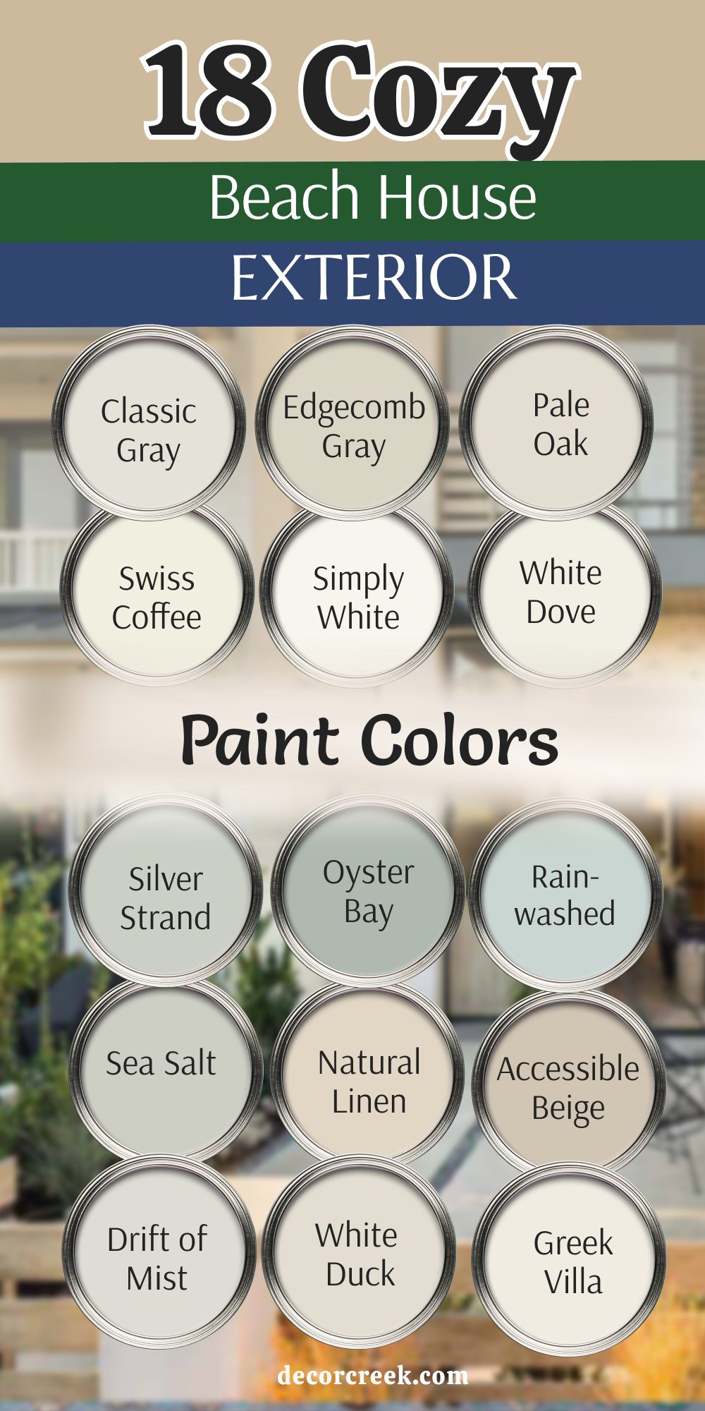
My Final Thoughts about 19 Beach House Exterior Paint Color Ideas
Picking the right color for your beach house is all about making yourself feel happy and proud when you come home after a long day. I have shown you many ways to use blue, gray, and white to make your property look its best and stand out in the neighborhood.
Remember that the sun near the ocean is very strong and can change how a color looks, so testing your paint on a large wall is very important. You want a home that looks great to your friends but also stays strong against the salty wind and the damp sea air. A fresh coat of high-quality paint can help your house look brand new and feel like a special place to relax with your family.
I hope these ideas help you find the perfect shade for your own piece of paradise so you can enjoy the view every morning. Take your time with this big decision and choose a color that makes your heart feel good every time you pull into the driveway. Your beach house is a place for making memories that last a lifetime, and it should look as beautiful as the happy memories you make there.
A great paint job protects your investment and tells the world that you love where you live and care for your home.
You deserve to have a beautiful house that reflects the peace of the ocean and the joy of the summer sun. Trust your eyes and pick a shade that brings a big smile to your face whenever you see it from the street.