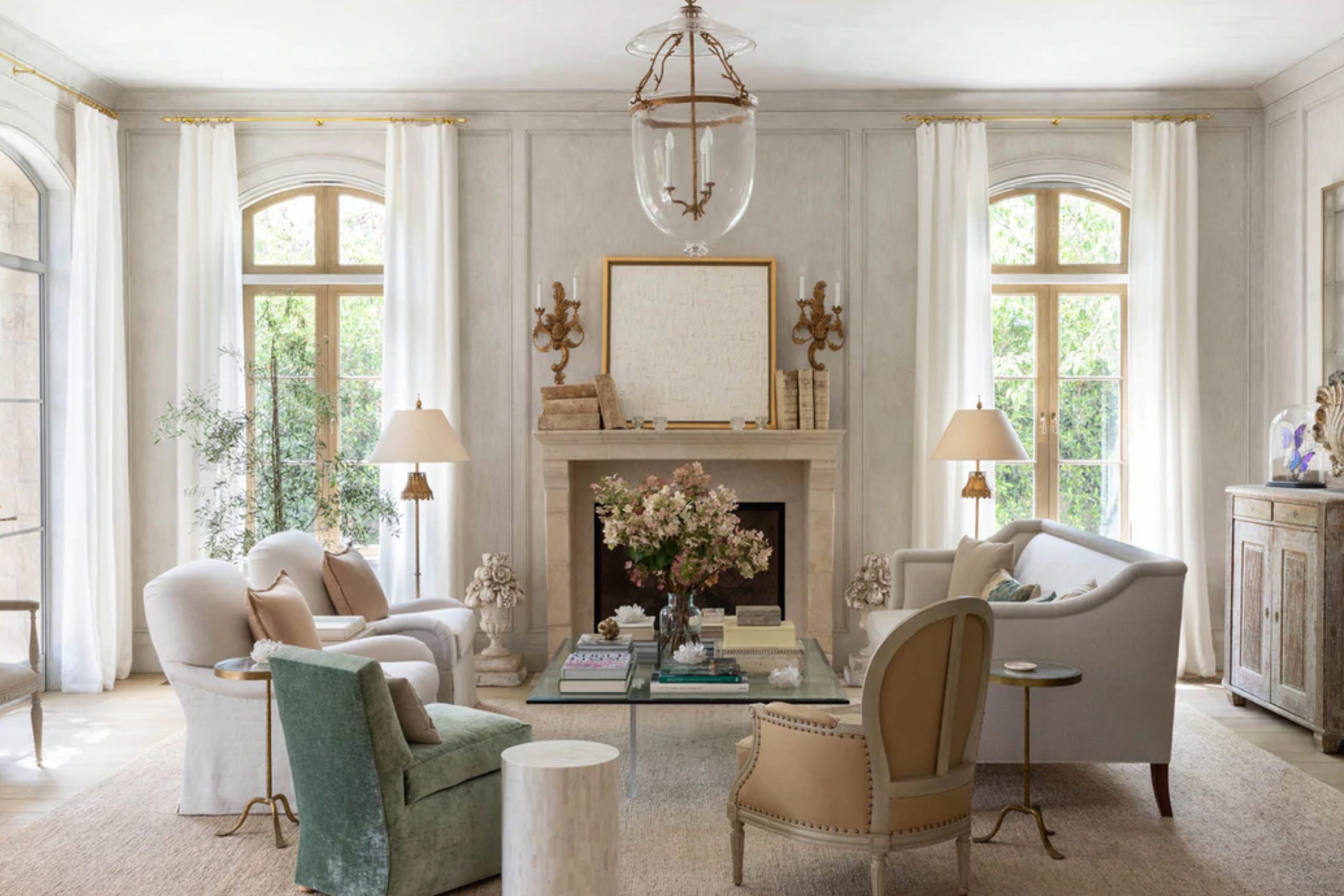
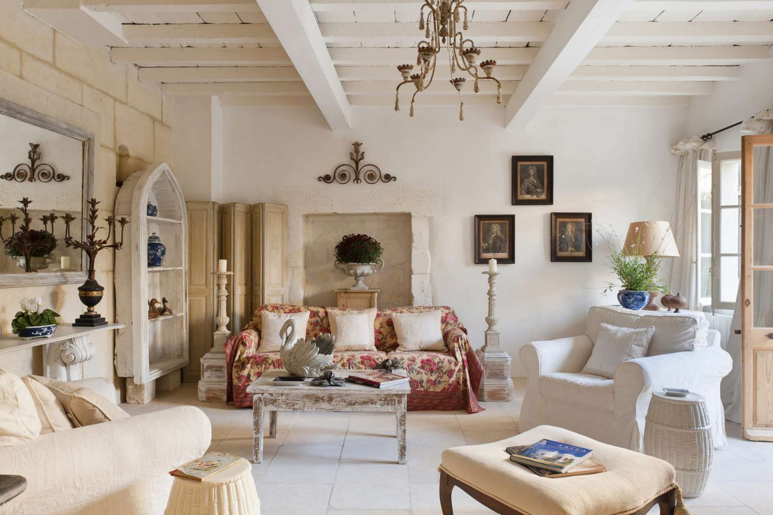
I design French country rooms with colors that feel friendly and lived-in. I reach for creamy whites, chalky blues, dusty greens, and warm linen notes that look right with stone, iron, and old wood. I match paint to real life: morning light, muddy boots by the door, a linen tablecloth you use every day.
I think about how you cook, where you read, and which chair gets the sun. I picture kids running through the hall and a dog sleeping by the door. I want colors that forgive scuffs, love texture, and make every corner feel like home.
I test big boards so I can see the color beside floors, beams, and fabrics. I move the boards from room to room and watch them at breakfast, noon, and night. I compare them next to hardware, grout, and the finish on your stove.
I take quick photos so I can check how the color looks on a phone, because that’s how we share ideas.
I keep the mood gentle, never flashy, so every room feels easy to be in and easy to love. I build soft contrast instead of sharp edges, and I let wood grain and woven baskets carry the story. I aim for rooms that invite a deep breath, a long talk, and a slow meal with friends.
What Makes a True French Country Palette (Undertones, Texture, Light)
I study undertones first, because yellow, pink, or green hints can push a room warm or cool fast. I pair paint with texture—lime-washed walls, soft linen, aged metal—so the color reads natural and grounded. I respect light: south light can wash colors out, north light can make them look chilly.
I add warmth with creams and beiges when a room needs comfort, and I use grayed blues and greens to balance busy tile or strong grain. I like finishes with a quiet glow: eggshell on walls, satin on doors and trim.
I check how colors sit with old pine, oak, or walnut, since each wood changes the feel. I hold swatches near stone, brick, and tile because minerals can shift a hue.
I test near plants and baskets, too; natural items can make colors feel richer. I keep strong black to small accents—lanterns, hooks, frames—so the whole look stays kind. I finish by stepping back and asking, “Would I want to wake up to this every day?”
How I Choose French Country Paint Colors for Each Room
I start by reading the fixed elements: flooring, counters, backsplash, beams, and fabric. I pick one main neutral for flow, then one gentle color family for charm—often blue or green. I sample three close shades on big boards and watch them from morning to evening. I check how they sit with hardware: brass, iron, or pewter.
I keep trim creamy, ceilings a touch lighter, and doors one step deeper for depth. I finish with woven baskets, pottery, and warm wood so the paint feels at home
. I also look at traffic: halls and mudrooms get tougher sheens and forgiving tones. I pick cabinet colors that love your dishes and your light, not just a photo online.
I choose bath colors that flatter skin and towels, so mornings feel kind. I repeat a few tones through the house to keep it connected, then add one special note in a study or dining room.
I leave room for quilts, art, and family finds to shine. I want the color story to guide, not boss, the life you live there.
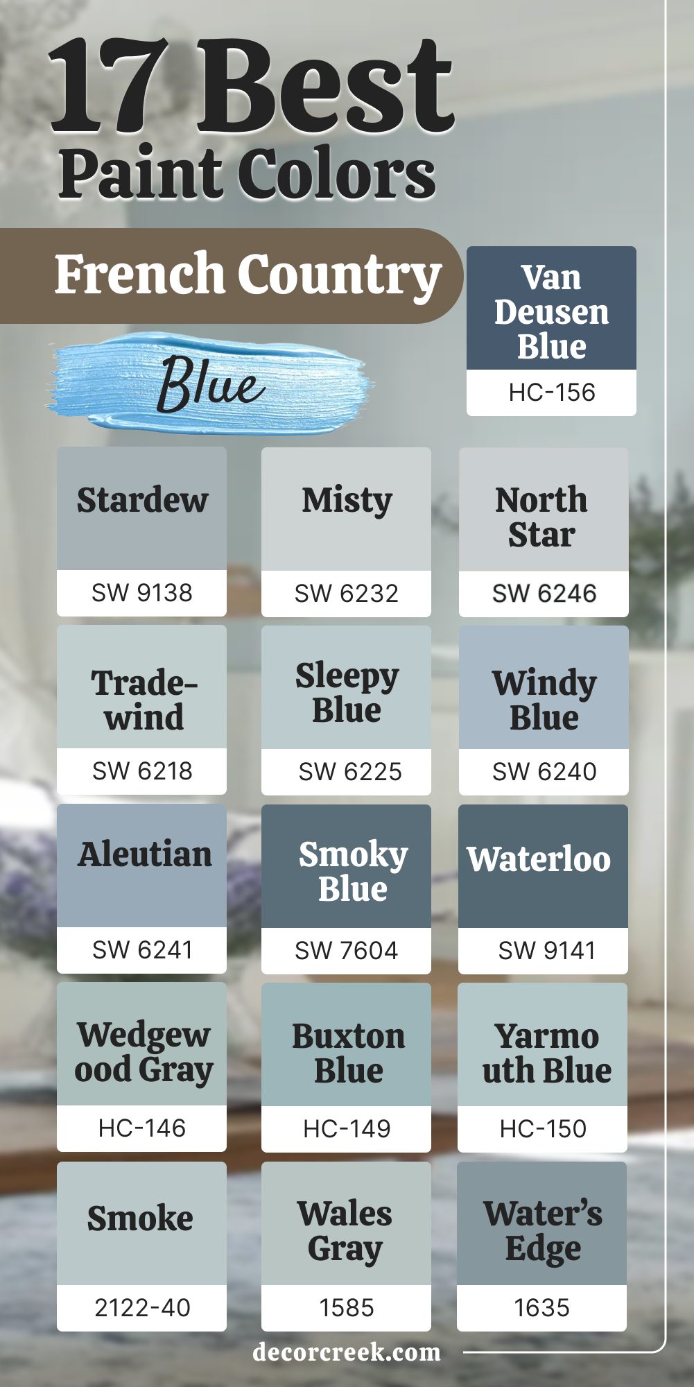
17 Best French Country Blue Paint Colors
Stardew SW 9138
Stardew SW 9138 feels like washed denim that has seen family dinners and quiet mornings. Stardew SW 9138 looks gentle in north light and never turns icy on a gray day. Stardew SW 9138 pairs easily with warm oak floors, brass pulls, and creamy trim. Stardew SW 9138 sits well beside limestone tile and soft white curtains.
Stardew SW 9138 makes a kitchen island friendly without shouting for attention. Stardew SW 9138 gives bedroom walls a light blue hush that helps the whole room breathe.
🎨 Check out the complete guide to this color right HERE 👈

Misty SW 6232
Misty SW 6232 reads like a soft sky right after rain, easy on the eyes and steady all day. Misty SW 6232 keeps hallways bright and tidy, even with low natural light. Misty SW 6232 likes warm counters, rattan stools, and aged bronze lights. Misty SW 6232 stays crisp with white tile and keeps grout from looking dingy.
Misty SW 6232 works for a small bath because it feels airy without going cold. Misty SW 6232 makes trim pop when I use a creamy white beside it.
🎨 Check out the complete guide to this color right HERE 👈

North Star SW 6246
North Star SW 6246 is a quiet blue-gray that behaves well with marble, nickel, and cool light. North Star SW 6246 keeps a laundry room fresh and neat when paired with bright white cabinets. North Star SW 6246 helps bedrooms feel light while still grounded by wood nightstands. North Star SW 6246 holds color next to stainless steel and pale stone backsplashes.
North Star SW 6246 shows its best in rooms that face north or east. North Star SW 6246 looks lovely with woven blinds and soft wool rugs.
🎨 Check out the complete guide to this color right HERE 👈

Tradewind SW 6218
Tradewind SW 6218 brings a sea-kissed note that feels friendly in kitchens and sunrooms. Tradewind SW 6218 loves warm brass hardware, butcher block, and soft linen drapes. Tradewind SW 6218 stays true in bright light and does not turn neon by noon. Tradewind SW 6218 makes beadboard look custom and charming.
Tradewind SW 6218 pairs with creamy trim and a slightly darker island for balance. Tradewind SW 6218 settles a busy floor pattern by giving the eye a gentle rest.
🎨 Check out the complete guide to this color right HERE 👈

Sleepy Blue SW 6225
Sleepy Blue SW 6225 feels like a lullaby for walls, kind and steady for reading corners. Sleepy Blue SW 6225 shines with soft ivory, warm oak, and woven baskets. Sleepy Blue SW 6225 suits nursery walls where I want easy mornings and early bedtimes. Sleepy Blue SW 6225 matches nickel mirrors and white tile in a sweet cottage bath.
Sleepy Blue SW 6225 never leans purple, which keeps the look honest. Sleepy Blue SW 6225 welcomes handmade quilts and light cotton sheets.
🎨 Check out the complete guide to this color right HERE 👈
Windy Blue SW 6240
Windy Blue SW 6240 carries a breezy note that fits shiplap, window seats, and porch doors. Windy Blue SW 6240 stands up to afternoon sun without going loud. Windy Blue SW 6240 pairs with clay pots, olive branches, and soft beige rugs. Windy Blue SW 6240 likes cream trim and black lantern lights for contrast. Windy Blue SW 6240 reads friendly on kitchen walls near cool stone counters.
Windy Blue SW 6240 makes a guest room feel cared for from the first step in.
🎨 Check out the complete guide to this color right HERE 👈

Aleutian SW 6241
Aleutian SW 6241 gives more body, like a favorite chambray shirt with a hint of gray. Aleutian SW 6241 anchors built-ins and islands while still feeling easy to live with. Aleutian SW 6241 pairs with soapstone, iron brackets, and seeded glass pendants. Aleutian SW 6241 sits nicely beside warm walnut and aged terra-cotta.
Aleutian SW 6241 keeps hallways tidy and pulled together with creamy doors. Aleutian SW 6241 makes a small entry feel welcoming and well dressed.
🎨 Check out the complete guide to this color right HERE 👈
Smoky Blue SW 7604
Smoky Blue SW 7604 is moody in the best way, rich enough for a pantry or mudroom lockers. Smoky Blue SW 7604 looks handsome with unlacquered brass and butcher block. Smoky Blue SW 7604 holds its depth next to white tile and dark grout. Smoky Blue SW 7604 can carry a dining room when chairs and drapes stay light.
Smoky Blue SW 7604 adds story to a stair rail or interior door. Smoky Blue SW 7604 brings out the grain in reclaimed oak shelves.
🎨 Check out the complete guide to this color right HERE 👈
Waterloo SW 9141
Waterloo SW 9141 brings deep river color that feels classic with limestone and iron. Waterloo SW 9141 makes a kitchen island feel custom and strong. Waterloo SW 9141 pairs with honed marble, brass bin pulls, and woven seats. Waterloo SW 9141 can wrap a study and still feel friendly with cream trim.
Waterloo SW 9141 looks rich behind oil portraits and simple pottery. Waterloo SW 9141 plays well with checkerboard floors in soft gray and white.
🎨 Check out the complete guide to this color right HERE 👈
Wedgewood Gray HC-146
Wedgewood Gray HC-146 reads like a misty morning in the countryside. Wedgewood Gray HC-146 pairs well with warm woods and creamy trim in family rooms. Wedgewood Gray HC-146 keeps a bath fresh with nickel taps and white towels. Wedgewood Gray HC-146 works in kitchens with marble and soft brass.
Wedgewood Gray HC-146 stays gentle under strong sun without glare. Wedgewood Gray HC-146 helps open shelves look tidy and light.
🎨 Check out the complete guide to this color right HERE 👈
Buxton Blue HC-149
Buxton Blue HC-149 brings a cottage feel that fits beams, pottery, and cotton slipcovers. Buxton Blue HC-149 holds true in mixed light and does not turn green. Buxton Blue HC-149 pairs with warm beige rugs and black sconce arms. Buxton Blue HC-149 keeps paneled walls looking neat and well cared for.
Buxton Blue HC-149 sits nicely with soapstone and cream cabinets. Buxton Blue HC-149 is a sweet pick for a reading nook by the window.
Yarmouth Blue HC-150
Yarmouth Blue HC-150 is seaside and friendly, never sharp. Yarmouth Blue HC-150 loves white beadboard and wicker baskets. Yarmouth Blue HC-150 keeps entry walls light even with limited daylight. Yarmouth Blue HC-150 pairs with warm pine benches and bronze hooks.
Yarmouth Blue HC-150 makes a small powder room feel bright and clean. Yarmouth Blue HC-150 looks right with striped cotton rugs and linen towels.
Smoke 2122-40
Smoke 2122-40 feels like a cloud passing, soft and even. Smoke 2122-40 pairs with nickel, marble, and crisp white tile. Smoke 2122-40 helps busy kitchens feel neat and restful. Smoke 2122-40 works on cabinets when walls stay creamy.
Smoke 2122-40 keeps bedrooms light yet gathered with oak nightstands. Smoke 2122-40 reads steady from morning to evening.
Wales Gray 1585
Wales Gray 1585 leans blue with a smart gray base. Wales Gray 1585 keeps hallways bright and pulled together. Wales Gray 1585 pairs with brass picture lights and linen drapes. Wales Gray 1585 sits well beside herringbone floors and white doors. Wales Gray 1585 is tidy for laundry rooms with open shelving.
Wales Gray 1585 stays polite in north light and soft in south light.
Water’s Edge 1635
Water’s Edge 1635 brings a riverbank feel that likes stone and iron. Water’s Edge 1635 carries a dining room when chairs and art stay light. Water’s Edge 1635 pairs with pewter frames and creamy trim. Water’s Edge 1635 holds color by big windows without glare.
Water’s Edge 1635 is lovely on built-ins with brass mesh doors. Water’s Edge 1635 gives porch ceilings a gentle hint of blue.
🎨 Check out the complete guide to this color right HERE 👈
Van Deusen Blue HC-156
Van Deusen Blue HC-156 is crisp and classic, perfect for a strong island. Van Deusen Blue HC-156 pairs with marble, brass, and white shaker fronts. Van Deusen Blue HC-156 looks handsome on interior doors and paneled walls. Van Deusen Blue HC-156 handles bright light without going loud.
Van Deusen Blue HC-156 sets off antique wood tables and woven chairs. Van Deusen Blue HC-156 gives mudrooms a tailored, sturdy look.
🎨 Check out the complete guide to this color right HERE 👈

Newburyport Blue HC-155
Newburyport Blue HC-155 brings nautical charm that still feels warm at home. Newburyport Blue HC-155 pairs with crisp white trim and striped cotton rugs. Newburyport Blue HC-155 suits stair rails, built-ins, and cozy window seats. Newburyport Blue HC-155 keeps its depth beside stainless and soapstone.
Newburyport Blue HC-155 looks great with rattan shades and brass lanterns. Newburyport Blue HC-155 gives a dining room mood without feeling heavy.
🎨 Check out the complete guide to this color right HERE 👈

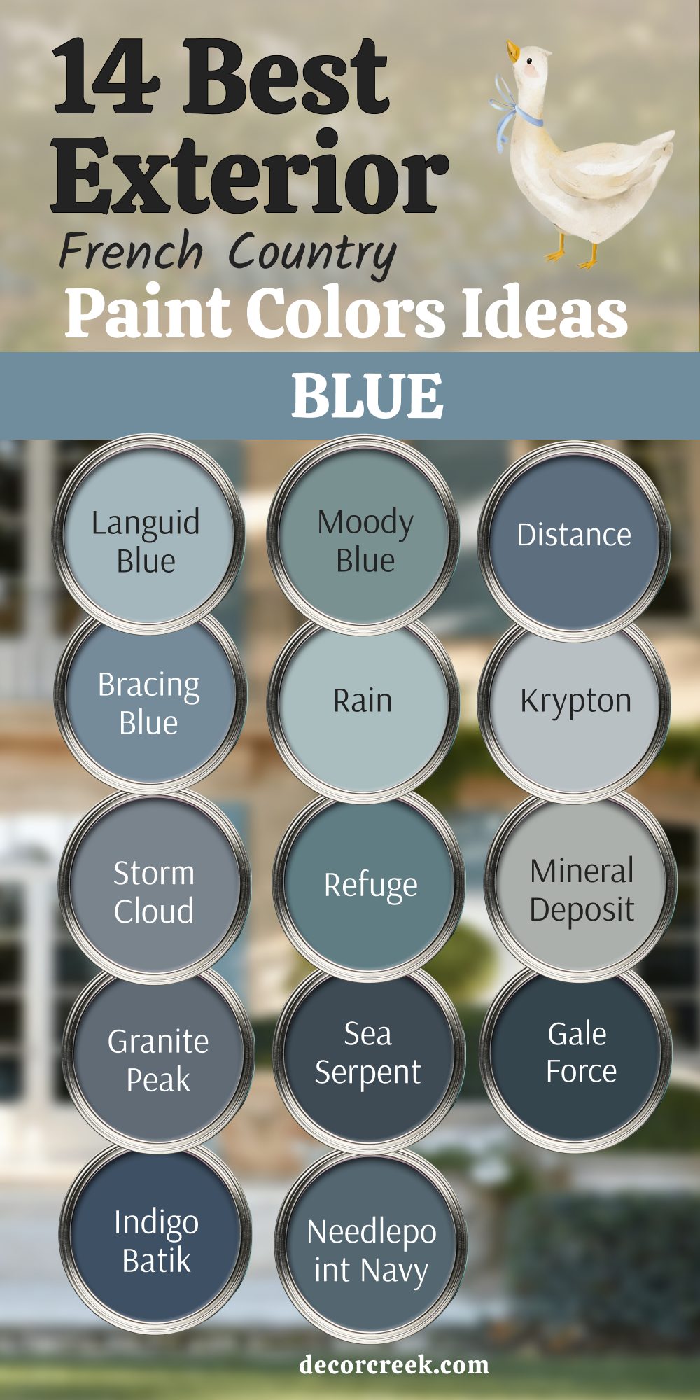
14 Best Exterior French Country Blue Paint Color Ideas
Languid Blue SW 6226
Languid Blue SW 6226 looks like old shutters on a sunlit lane. Languid Blue SW 6226 sits sweetly beside cream stucco and warm stone. Languid Blue SW 6226 keeps porches friendly with wicker and clay pots. Languid Blue SW 6226 holds color in strong sun without glare. Languid Blue SW 6226 pairs with copper lanterns and aged iron railings.
Languid Blue SW 6226 gives gates and doors a gentle, welcome feel.
Moody Blue SW 6221
Moody Blue SW 6221 brings a richer porch note that still feels neighborly. Moody Blue SW 6221 pairs with lime-wash walls and pale grout. Moody Blue SW 6221 plays well with brass house numbers and wood benches. Moody Blue SW 6221 keeps shutters looking tailored and neat. Moody Blue SW 6221 stands up to rain and shade without dulling down. Moody Blue SW 6221 warms up next to cream trim and tan stone paths.
🎨 Check out the complete guide to this color right HERE 👈
Distance SW 6243
Distance SW 6243 carries depth for front doors and carriage-house doors. Distance SW 6243 pairs with pewter hardware and seeded glass. Distance SW 6243 looks strong under bright summer light. Distance SW 6243 feels steady beside white lime-wash and soft beige stucco.
Distance SW 6243 fits slate roofs and copper gutters. Distance SW 6243 grounds a facade when the garden blooms are bright.
🎨 Check out the complete guide to this color right HERE 👈

Bracing Blue SW 6242
Bracing Blue SW 6242 brings a crisp look to shutters and window boxes. Bracing Blue SW 6242 pairs with cream fascia and soft gray stone. Bracing Blue SW 6242 helps pale brick read balanced and tidy. Bracing Blue SW 6242 stays true from sunrise to dusk. Bracing Blue SW 6242 suits beadboard porch ceilings and swing frames.
Bracing Blue SW 6242 works with oil-rubbed bronze door sets.
🎨 Check out the complete guide to this color rightHERE 👈

Rain SW 6219
Rain SW 6219 is a gentle porch color that loves wicker and striped cushions. Rain SW 6219 pairs with white railings and tan pavers. Rain SW 6219 keeps entry doors fresh near light stucco. Rain SW 6219 shows best with brass bells and clay pots. Rain SW 6219 plays kindly with olive planters and rosemary.
Rain SW 6219 brightens shady sides without feeling thin.
🎨 Check out the complete guide to this color right HERE 👈
Krypton SW 6247
Krypton SW 6247 reads cool and clean against creamy trim. Krypton SW 6247 suits shutters on stone cottages and pale brick. Krypton SW 6247 pairs with nickel door sets and gray slate walks. Krypton SW 6247 holds color in winter light and summer glare.
Krypton SW 6247 frames windows neatly on second stories. Krypton SW 6247 looks sharp with black lanterns and iron mailboxes.
🎨 Check out the complete guide to this color right HERE 👈
Storm Cloud SW 6249
Storm Cloud SW 6249 brings steel-blue depth for doors and gables. Storm Cloud SW 6249 pairs with weathered wood and galvanized planters. Storm Cloud SW 6249 settles red brick and adds balance. Storm Cloud SW 6249 stays handsome in rain, fog, and full sun. Storm Cloud SW 6249 matches zinc gutters and gray roofs.
Storm Cloud SW 6249 gives a farmhouse porch a tailored finish.
Refuge SW 6228
Refuge SW 6228 offers a friendly medium blue for shutters and trim. Refuge SW 6228 pairs with creamy stucco and limestone. Refuge SW 6228 holds its tone near green plantings and ivy. Refuge SW 6228 supports wide porch swings and beadboard ceilings. Refuge SW 6228 looks tidy with pewter knockers and house plates.
Refuge SW 6228 helps wide facades feel gathered and warm.
🎨 Check out the complete guide to this color right HERE 👈
Mineral Deposit SW 7652
Mineral Deposit SW 7652 leans blue-gray and hugs stonework nicely. Mineral Deposit SW 7652 pairs with tan grout and lime-wash walls. Mineral Deposit SW 7652 keeps carriage doors neat and classic. Mineral Deposit SW 7652 stands firm beside copper lights and iron hooks.
Mineral Deposit SW 7652 holds up to dust and summer glare. Mineral Deposit SW 7652 calms busy roof lines and layered trims.
🎨 Check out the complete guide to this color right HERE 👈

Granite Peak SW 6250
Granite Peak SW 6250 is a deep blue-gray that reads stately on doors. Granite Peak SW 6250 pairs with pale mortar and cream shutters. Granite Peak SW 6250 loves brass knockers and heavy strap hinges. Granite Peak SW 6250 looks rich under porch shadows and bold sun.
Granite Peak SW 6250 frames arched entries with quiet strength. Granite Peak SW 6250 supports stone planters and laurel hedges.
🎨 Check out the complete guide to this color right HERE 👈

Sea Serpent SW 7615
Sea Serpent SW 7615 gives strong character to gates, shutters, and beams. Sea Serpent SW 7615 pairs with travertine and warm beige stucco. Sea Serpent SW 7615 stands steady in wind and salt air. Sea Serpent SW 7615 works with black lanterns and rope door pulls.
Sea Serpent SW 7615 anchors porch floors painted light gray. Sea Serpent SW 7615 brings focus to wide, simple facades.
🎨 Check out the complete guide to this color right HERE 👈
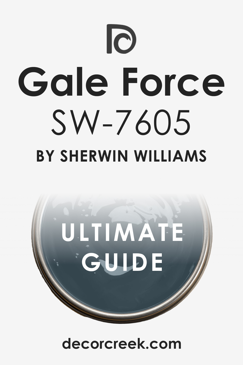
Gale Force SW 7605
Gale Force SW 7605 offers deep blue drama made friendly by cream trim. Gale Force SW 7605 suits board-and-batten and paneled doors. Gale Force SW 7605 pairs with brass numbers and bell pulls. Gale Force SW 7605 holds color next to bright hydrangeas and white roses.
Gale Force SW 7605 keeps its look under summer glare. Gale Force SW 7605 fits barn doors and cottage gates alike.
🎨 Check out the complete guide to this color right HERE 👈
Indigo Batik SW 7602
Indigo Batik SW 7602 reads classic on shutters and porch ceilings. Indigo Batik SW 7602 pairs with warm stone steps and white columns. Indigo Batik SW 7602 supports black accents without feeling harsh. Indigo Batik SW 7602 makes dormers feel finished and neat.
Indigo Batik SW 7602 sits well with copper caps and wood trellises. Indigo Batik SW 7602 carries across large fronts without tiring the eyes.
🎨 Check out the complete guide to this color right HERE 👈

Needlepoint Navy SW 0032
Needlepoint Navy SW 0032 brings heritage mood to doors and carriage lights. Needlepoint Navy SW 0032 pairs with cream trims and limestone sills. Needlepoint Navy SW 0032 feels right with boxwoods and clipped hedges. Needlepoint Navy SW 0032 holds depth under porch shade at noon.
Needlepoint Navy SW 0032 favors brass knockers and striped door mats. Needlepoint Navy SW 0032 gives a stately hello without feeling stiff.
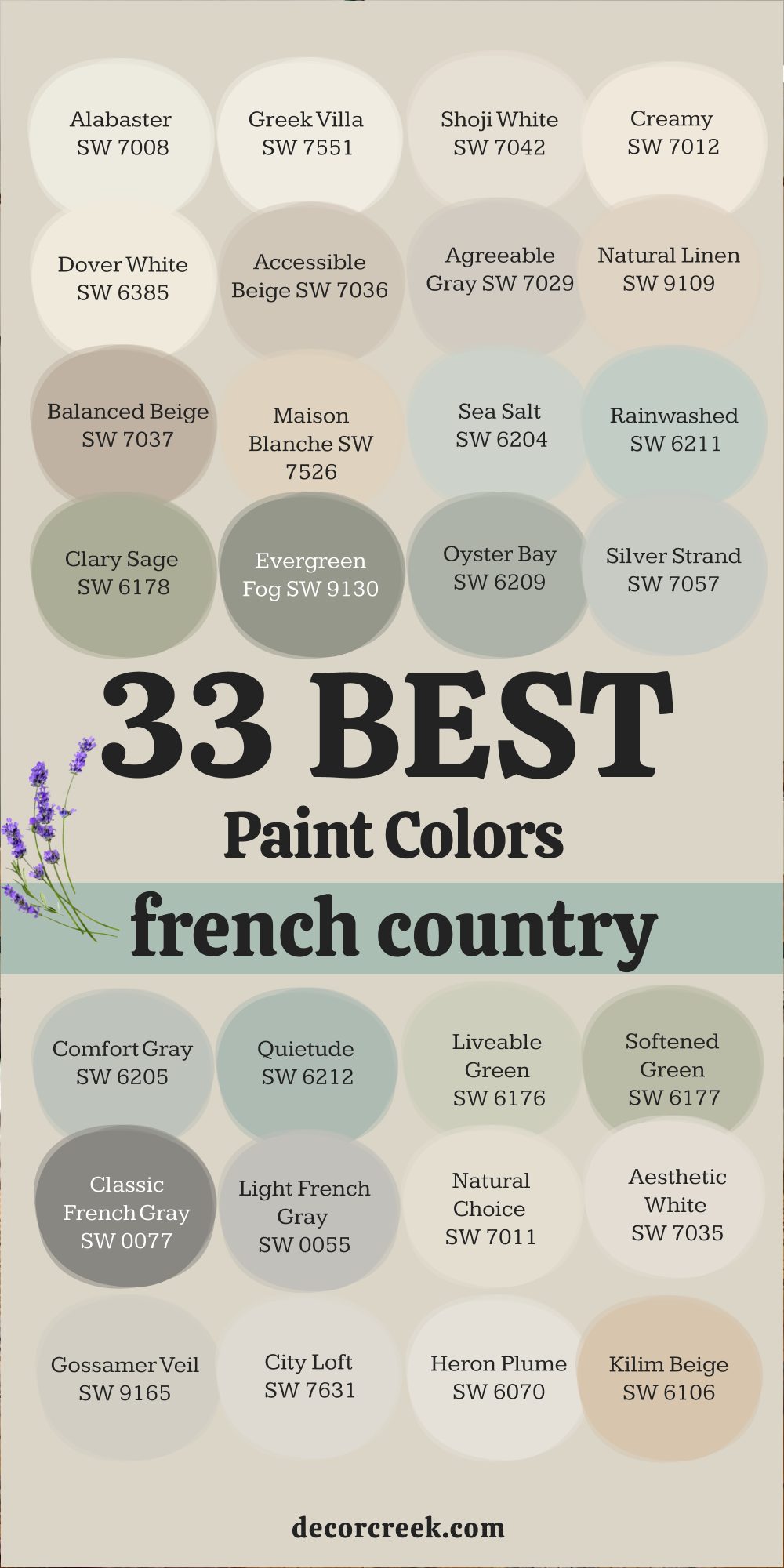
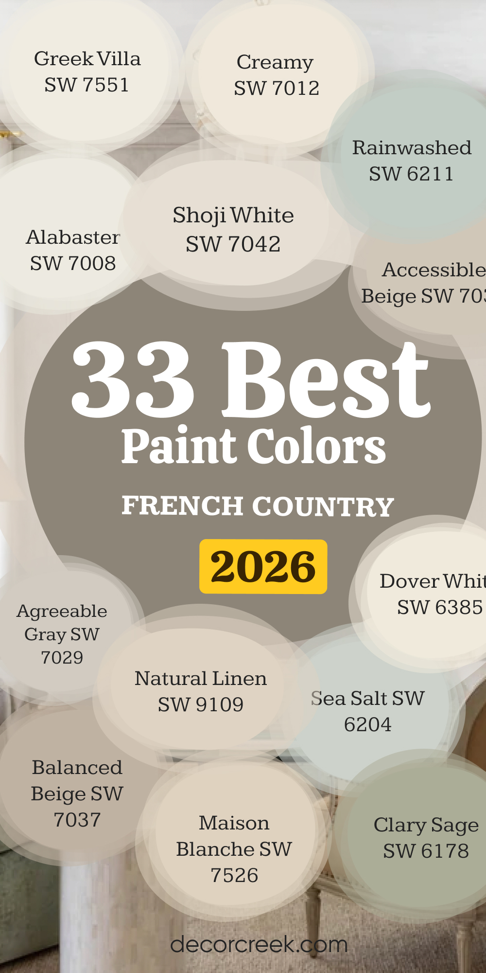
33 Best French Country Paint Colors in 2026
Alabaster SW 7008 (Sherwin-Williams)
Alabaster SW 7008 gives me a soft, milky white that keeps rooms bright without glare and makes wood and stone feel warmer. Alabaster SW 7008 reads friendly in morning light and stays steady at night under warm bulbs. Alabaster SW 7008 pairs beautifully with oak beams, woven shades, and cream linens that I reach for often.
Alabaster SW 7008 works on walls and trim when I want a seamless cottage look with gentle depth. Alabaster SW 7008 likes eggshell on walls and satin on doors so the finish looks neat and cared for.
Alabaster SW 7008 helps pottery, art, and family photos feel important without shouting.
🎨 Check out the complete guide to this color right HERE 👈

Greek Villa SW 7551 (Sherwin-Williams)
Greek Villa SW 7551 brings a creamy glow that I love for kitchens with stone, butcher block, and brass. Greek Villa SW 7551 holds its warmth in north light and never turns yellow in the afternoon sun. Greek Villa SW 7551 makes white tile and marble backsplashes look soft and inviting. Greek Villa SW 7551 sits well with wicker stools, cotton curtains, and simple iron hooks.
Greek Villa SW 7551 shines on ceilings when walls go one shade deeper for balance. Greek Villa SW 7551 gives entries and halls a kind, open feeling that welcomes friends in.
🎨 Check out the complete guide to this color right HERE 👈

Shoji White SW 7042 (Sherwin-Williams)
Shoji White SW 7042 leans warm with a cozy beige kiss that smooths busy floors and patterned tile. Shoji White SW 7042 helps me tie black lanterns, pale oak, and linen slipcovers into one gentle story. Shoji White SW 7042 looks tidy in eggshell and sets off satin trim just right. Shoji White SW 7042 keeps long walls from feeling cold, even on gray winter days.
Shoji White SW 7042 pairs with clay pots, soft quilts, and woven baskets I love to stage.
Shoji White SW 7042 supports art walls and family frames without stealing the show.
🎨 Check out the complete guide to this color right HERE 👈

Creamy SW 7012 (Sherwin-Williams)
Creamy SW 7012 wraps a room like warm milk and fresh bread, the feeling I want in busy homes. Creamy SW 7012 loves terra-cotta, aged brass, and open shelving filled with simple dishes. Creamy SW 7012 keeps kitchens friendly in the morning rush and gentle at dinnertime. Creamy SW 7012 makes beadboard and built-ins look custom and cared for in satin.
Creamy SW 7012 stays steady beside cool stone counters and bright windows.
Creamy SW 7012 gives nurseries and bedrooms a soft glow that helps everyone unwind.
🎨 Check out the complete guide to this color right HERE 👈

Dover White SW 6385 (Sherwin-Williams)
Dover White SW 6385 brings sunny cheer without tipping into sharp or brassy. Dover White SW 6385 keeps narrow halls from feeling tight by bouncing light kindly. Dover White SW 6385 pairs well with honey oak, rattan, and cotton rugs I use for texture. Dover White SW 6385 stands up to bright afternoon light and still reads warm at dusk.
Dover White SW 6385 makes paneled doors and trim feel welcoming in satin.
Dover White SW 6385 supports blue, green, and clay accents across a whole home.
🎨 Check out the complete guide to this color right HERE 👈

Accessible Beige SW 7036 (Sherwin-Williams)
Accessible Beige SW 7036 blends beige and gray in a way that helps rooms feel grounded and easy. Accessible Beige SW 7036 sits beautifully beside travertine, tan grout, and pale oak. Accessible Beige SW 7036 works across open plans where I want one calm thread from room to room. Accessible Beige SW 7036 pairs with black hardware and creamy trim for gentle contrast.
Accessible Beige SW 7036 stays steady in shifting light, which saves guesswork.
Accessible Beige SW 7036 likes woven blinds, pottery, and warm metals I reach for often.
🎨 Check out the complete guide to this color right HERE 👈

Agreeable Gray SW 7029 (Sherwin-Williams)
Agreeable Gray SW 7029 gives me a balanced base when I plan a whole-home palette. Agreeable Gray SW 7029 plays nicely with creamy whites, oak doors, and iron accents. Agreeable Gray SW 7029 looks clean by windows and steady in shaded corners, which I rely on. Agreeable Gray SW 7029 calms shiny tile and busy granite without feeling dull.
Agreeable Gray SW 7029 supports art, books, and family pieces that tell your story.
Agreeable Gray SW 7029 helps trims, beams, and built-ins sit together with ease.
🎨 Check out the complete guide to this color right HERE 👈

Natural Linen SW 9109 (Sherwin-Williams)
Natural Linen SW 9109 feels like washed flax and warm bread, my favorite mix for kitchens. Natural Linen SW 9109 pairs with terra-cotta pots, iron brackets, and cotton runners. Natural Linen SW 9109 keeps long hallways friendly and soft from morning to night. Natural Linen SW 9109 likes cream trim and doors one step darker for depth.
Natural Linen SW 9109 works with stone floors and butcher block I use often.
Natural Linen SW 9109 supports quiet blues and sages without clashing.
🎨 Check out the complete guide to this color right HERE 👈

Balanced Beige SW 7037 (Sherwin-Williams)
Balanced Beige SW 7037 sits squarely between gray and beige, which helps big rooms feel steady. Balanced Beige SW 7037 pairs with travertine, warm grout, and linen drapes. Balanced Beige SW 7037 handles tall ceilings and wide walls without washing out. Balanced Beige SW 7037 welcomes blue, green, and clay accents so I can layer softly.
Balanced Beige SW 7037 keeps trim and doors looking rich in satin. Balanced Beige SW 7037 suits living rooms where family life gets busy.
🎨 Check out the complete guide to this color right HERE 👈

Maison Blanche SW 7526 (Sherwin-Williams)
Maison Blanche SW 7526 brings a chalky, old-world note I love for French country rooms. Maison Blanche SW 7526 pairs with lime-wash finishes, brass frames, and antique finds. Maison Blanche SW 7526 looks kind on plaster and smooth on drywall in eggshell. Maison Blanche SW 7526 supports checkerboard floors and stone hearths with ease.
Maison Blanche SW 7526 works in foyers where first impressions matter most.
Maison Blanche SW 7526 helps fabrics and wood grains feel gentle and collected.
🎨 Check out the complete guide to this color right HERE 👈
Sea Salt SW 6204 (Sherwin-Williams)
Sea Salt SW 6204 gives a soft green hint that freshens kitchens and baths I style often. Sea Salt SW 6204 reads cooler in shade and a touch warmer in sun, which I plan for. Sea Salt SW 6204 pairs with white tile, nickel taps, and woven towels. Sea Salt SW 6204 keeps small rooms feeling light without turning minty.
Sea Salt SW 6204 sits nicely with warm woods and rattan for balance. Sea Salt SW 6204 helps bedrooms feel easy when paired with cream bedding.
🎨 Check out the complete guide to this color right HERE 👈

Rainwashed SW 6211 (Sherwin-Williams)
Rainwashed SW 6211 leans blue-green with a gentle wash that suits cottage rooms. Rainwashed SW 6211 pairs with beadboard, white quartz, and polished nickel I use often. Rainwashed SW 6211 holds its look in bright light and stays kind at dusk. Rainwashed SW 6211 likes cream trim and natural woven shades.
Rainwashed SW 6211 keeps laundry rooms fresh and inviting for daily chores. Rainwashed SW 6211 supports soft stripes and small floral prints with charm.
🎨 Check out the complete guide to this color right HERE 👈

Clary Sage SW 6178 (Sherwin-Williams)
Clary Sage SW 6178 gives me a soft herb note that warms wood and black iron. Clary Sage SW 6178 looks steady beside stone floors and tan grout I see often. Clary Sage SW 6178 pairs with brass latches, linen panels, and clay jars. Clary Sage SW 6178 works in dining rooms where I want a friendly, gathered feel.
Clary Sage SW 6178 sits well with creamy trim and doors one step deeper.
Clary Sage SW 6178 keeps bedrooms feeling restful without going gray.
🎨 Check out the complete guide to this color right HERE 👈
Evergreen Fog SW 9130 (Sherwin-Williams)
Evergreen Fog SW 9130 brings a misty green-gray that suits modern cottages and old farmhouses. Evergreen Fog SW 9130 pairs with oak, leather, and black fixtures that I love. Evergreen Fog SW 9130 stays composed in strong sun and evening lamp light. Evergreen Fog SW 9130 makes paneled walls and built-ins feel tailored in satin.
Evergreen Fog SW 9130 supports stone fireplaces and woven rugs with ease.
Evergreen Fog SW 9130 gives entries quiet character that guests notice.
🎨 Check out the complete guide to this color right HERE 👈

Oyster Bay SW 6206 (Sherwin-Williams)
Oyster Bay SW 6206 leans sage with a cool edge that helps rooms feel balanced. Oyster Bay SW 6209 pairs with soapstone, pewter frames, and cream linens I use often. Oyster Bay SW 6209 reads steady next to white tile and black grout lines. Oyster Bay SW 6209 suits kitchens with brass pulls and wicker stools. Oyster Bay SW 6209 looks handsome on cabinets when walls stay lighter. Oyster Bay SW 6209 supports blue pottery and striped runners with ease.
🎨 Check out the complete guide to this color right HERE 👈

Silver Strand SW 7057 (Sherwin-Williams)
Silver Strand SW 7057 gives a pale gray-green that reads clean and thoughtful. Silver Strand SW 7057 pairs with marble, nickel, and bright white trim. Silver Strand SW 7057 holds color near big windows and shaded corners I test. Silver Strand SW 7057 makes bedrooms feel easy with oak nightstands and cotton quilts. Silver Strand SW 7057 likes eggshell on walls and satin on doors. Silver Strand SW 7057 supports soft blues and creams across a whole home.
🎨 Check out the complete guide to this color right HERE 👈

Comfort Gray SW 6205 (Sherwin-Williams)
Comfort Gray SW 6205 brings a cozy green-gray that feels right in family rooms. Comfort Gray SW 6205 pairs with woven baskets, iron lamps, and light oak floors. Comfort Gray SW 6205 stays even through changing daylight I always check. Comfort Gray SW 6205 helps white tile and beadboard look fresh, not stark.
Comfort Gray SW 6205 plays nicely with brass and pewter hardware. Comfort Gray SW 6205 supports checked fabrics and ticking stripes I love.
🎨 Check out the complete guide to this color right HERE 👈

Quietude SW 6212 (Sherwin-Williams)
Quietude SW 6212 leans soft blue-green with a gentle, lived-in mood. Quietude SW 6212 pairs with white quartz, nickel taps, and linen shower curtains. Quietude SW 6212 helps small baths feel bright without going icy. Quietude SW 6212 sits well beside rattan mirrors and woven hampers.
Quietude SW 6212 makes bedrooms feel easy with cream bedding and oak frames. Quietude SW 6212 keeps kitchens friendly when paired with warm woods.
🎨 Check out the complete guide to this color right HERE 👈
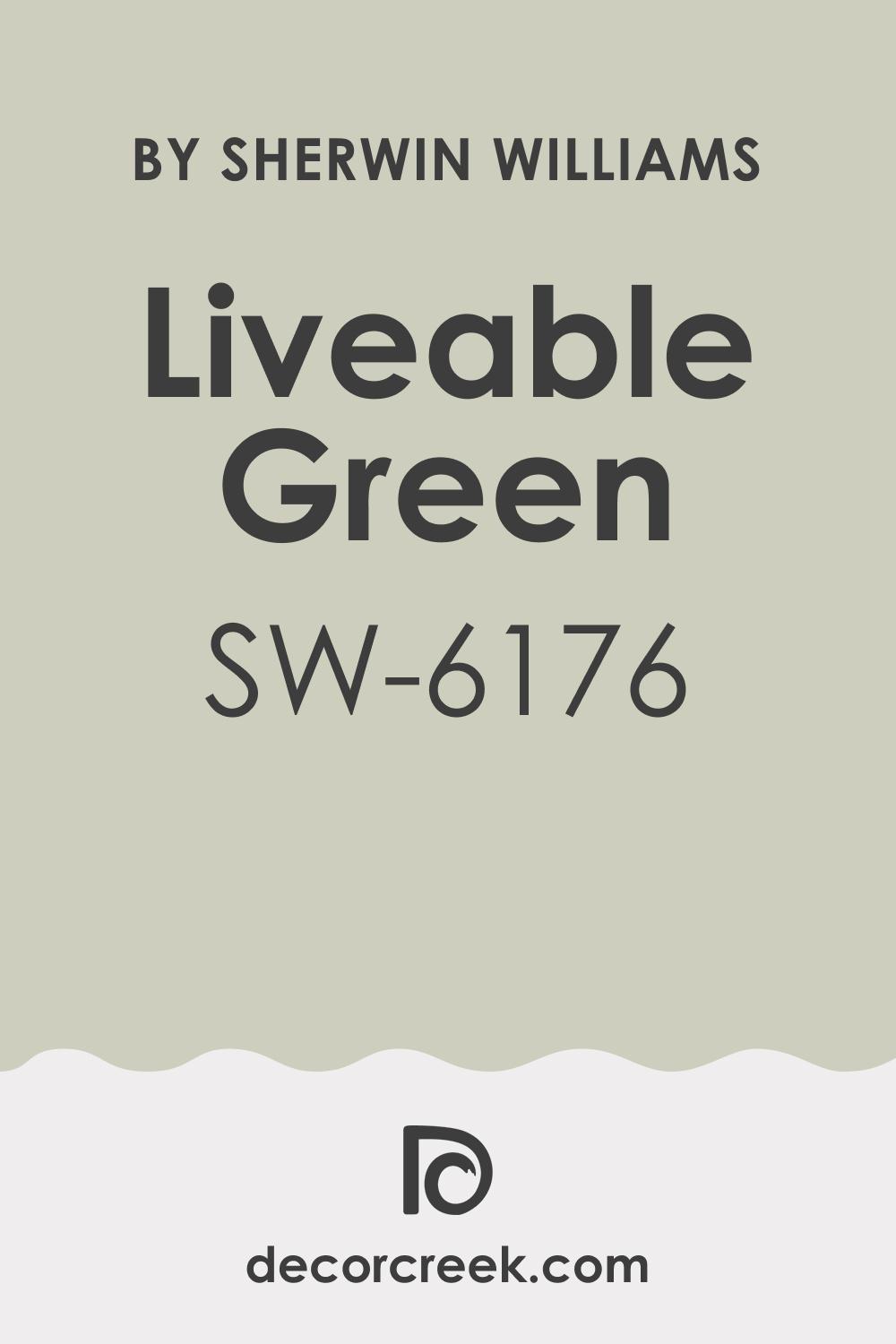
Liveable Green SW 6176 (Sherwin-Williams)
Liveable Green SW 6176 gives me a friendly leaf note that loves wood and stone. Liveable Green SW 6176 pairs with travertine backsplashes and tan grout I see often. Liveable Green SW 6176 reads steady in north light and stays warm near lamps. Liveable Green SW 6176 makes breakfast nooks feel welcoming with cotton cushions.
Liveable Green SW 6176 suits entry walls where I want a clean hello. Liveable Green SW 6176 balances black fixtures and brass pulls with ease.
🎨 Check out the complete guide to this color right HERE 👈
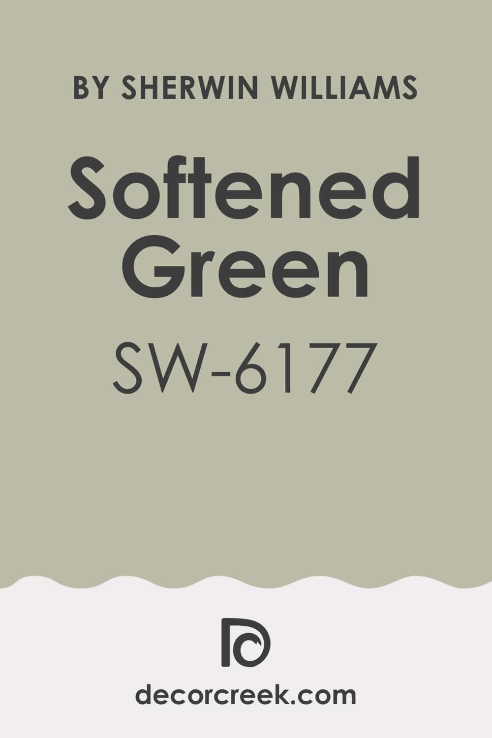
Softened Green SW 6177 (Sherwin-Williams)
Softened Green SW 6177 brings a hushed garden note that works across busy homes. Softened Green SW 6177 pairs with butcher block, wicker, and light tile. Softened Green SW 6177 holds its tone in bright kitchens and shaded halls. Softened Green SW 6177 likes creamy trim and doors one shade deeper.
Softened Green SW 6177 supports patterned curtains and simple stripes. Softened Green SW 6177 helps bedrooms feel gentle without leaning gray.
🎨 Check out the complete guide to this color right HERE 👈
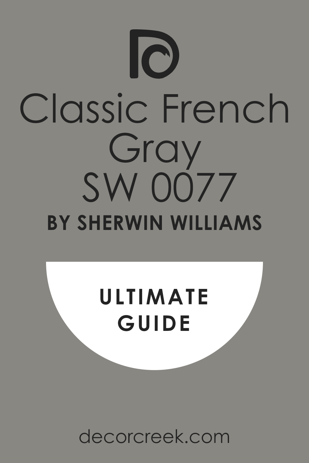
Classic French Gray SW 0077 (Sherwin-Williams)
Classic French Gray SW 0077 gives a tailored gray that feels right with stone and iron. Classic French Gray SW 0077 pairs with cream trim, brass knobs, and oak floors. Classic French Gray SW 0077 stays even in changing light that I always test. Classic French Gray SW 0077 suits built-ins, doors, and paneled walls in satin.
Classic French Gray SW 0077 supports linen sofas and striped rugs with ease. Classic French Gray SW 0077 makes art and frames look crisp but friendly.
🎨 Check out the complete guide to this color right HERE 👈
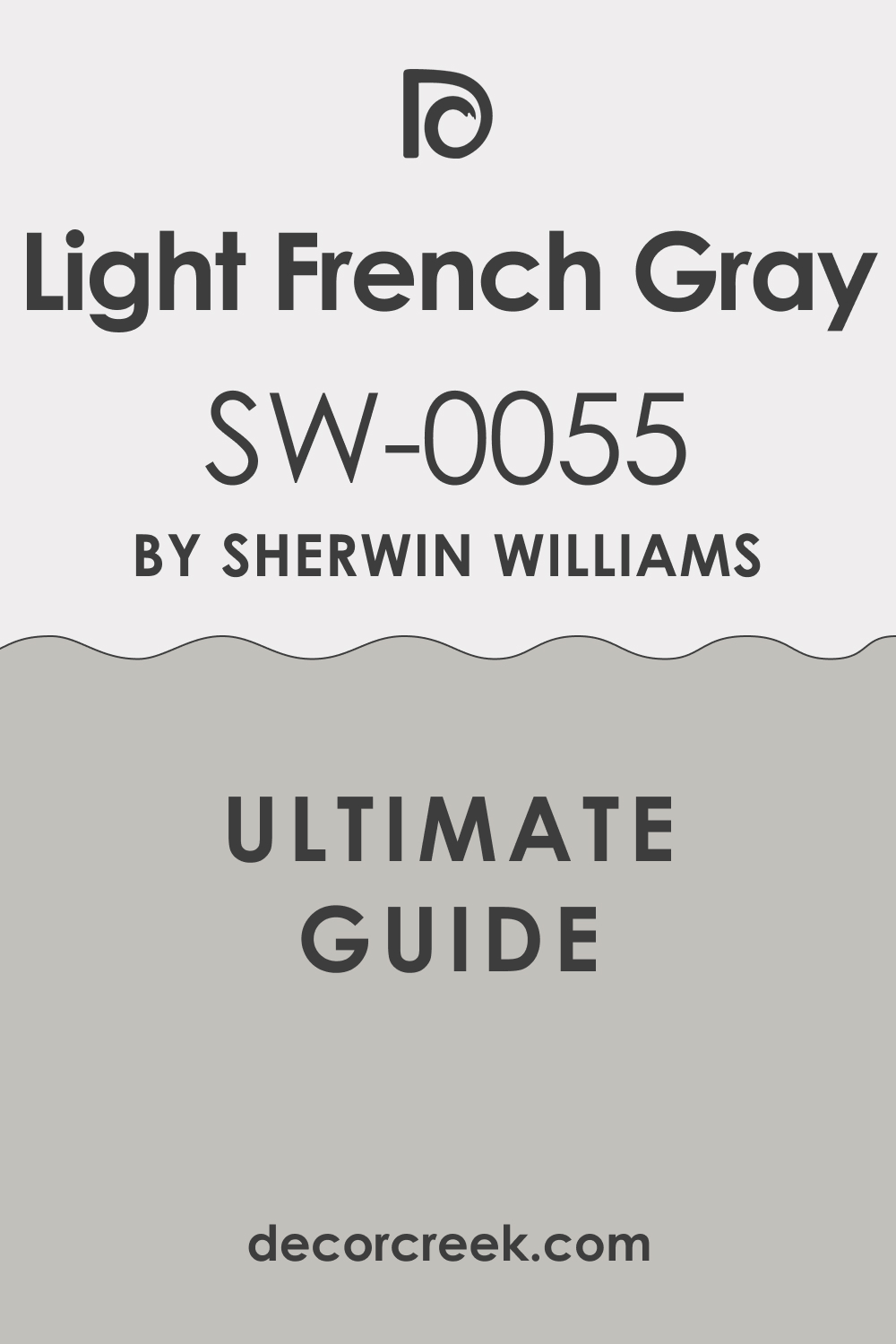
Light French Gray SW 0055 (Sherwin-Williams)
Light French Gray SW 0055 offers a lighter hand when I want airy, tidy rooms. Light French Gray SW 0055 pairs with white tile, nickel, and cool marble. Light French Gray SW 0055 keeps hallways bright and neat on busy days. Light French Gray SW 0055 likes eggshell walls and creamy trim for softness.
Light French Gray SW 0055 supports blue, green, and beige accents without fuss. Light French Gray SW 0055 makes stair rails and doors feel crisp and finished.
🎨 Check out the complete guide to this color right HERE 👈
Natural Choice SW 7011 (Sherwin-Williams)
Natural Choice SW 7011 brings a warm off-white that hugs wood tones. Natural Choice SW 7011 pairs with woven blinds, pottery, and brass lanterns I love. Natural Choice SW 7011 holds light beautifully in entries and long halls. Natural Choice SW 7011 works with checkerboard floors and stone hearths.
Natural Choice SW 7011 suits eggshell on walls and satin on trim. Natural Choice SW 7011 lets art, fabrics, and family pieces shine gently.
🎨 Check out the complete guide to this color right HERE 👈

Aesthetic White SW 7035 (Sherwin-Williams)
Aesthetic White SW 7035 reads like pale parchment and soft linen. Aesthetic White SW 7035 pairs with pewter frames, oak tables, and cotton runners. Aesthetic White SW 7035 keeps big rooms feeling easy from morning to night. Aesthetic White SW 7035 sets off paneled doors and window trim in satin.
Aesthetic White SW 7035 supports blue pottery and sage pillows I often add. Aesthetic White SW 7035 brings a gentle glow to kitchens and living rooms.
🎨 Check out the complete guide to this color right HERE 👈

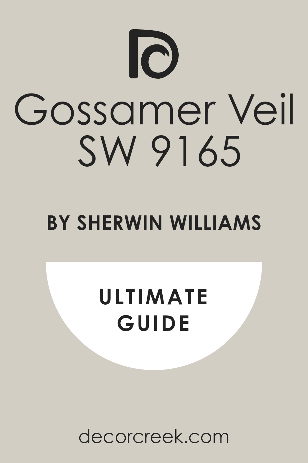
Gossamer Veil SW 9165 (Sherwin-Williams)
Gossamer Veil SW 9165 gives a light gray-beige that I trust for open plans. Gossamer Veil SW 9165 pairs with black fixtures, oak shelves, and wicker baskets. Gossamer Veil SW 9165 looks clean by windows and steady in shade. Gossamer Veil SW 9165 likes creamy trim and doors a notch deeper.
Gossamer Veil SW 9165 supports blue, clay, and sage accents smoothly. Gossamer Veil SW 9165 helps busy homes feel organized and gentle.
🎨 Check out the complete guide to this color right HERE 👈
City Loft SW 7631 (Sherwin-Williams)
City Loft SW 7631 brings a soft, airy note that works in condos and cottages alike. City Loft SW 7631 pairs with bright white tile, nickel taps, and pale oak. City Loft SW 7631 holds its tone across rooms with mixed light that I plan for. City Loft SW 7631 suits eggshell walls and satin doors for polish.
City Loft SW 7631 supports woven textures and cotton slipcovers I use often. City Loft SW 7631 lets art and books read clear and warm.
🎨 Check out the complete guide to this color right HERE 👈

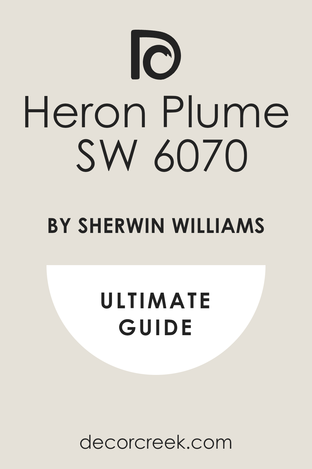
Heron Plume SW 6070 (Sherwin-Williams)
Heron Plume SW 6070 reads like feather gray with a friendly warmth. Heron Plume SW 6070 pairs with marble, pewter, and linen drapes I love. Heron Plume SW 6070 helps small rooms feel open without feeling stark. Heron Plume SW 6070 looks tidy on trim and paneled doors in satin.
Heron Plume SW 6070 supports blue and sage accents with easy balance. Heron Plume SW 6070 keeps hallways neat and light in daily life.
🎨 Check out the complete guide to this color right HERE 👈
Kilim Beige SW 6106 (Sherwin-Williams)
Kilim Beige SW 6106 brings a biscuit warmth that flatters wood, leather, and clay. Kilim Beige SW 6106 pairs with travertine, tan grout, and brass lights. Kilim Beige SW 6106 keeps dining rooms friendly for long meals and easy talk. Kilim Beige SW 6106 likes creamy trim and woven shades for softness.
Kilim Beige SW 6106 supports blue art and sage fabrics I often mix. Kilim Beige SW 6106 holds steady in sunrooms and shaded corners.
🎨 Check out the complete guide to this color rightHERE 👈

Nomadic Desert SW 6107 (Sherwin-Williams)
Nomadic Desert SW 6107 gives a sandy depth that grounds open rooms. Nomadic Desert SW 6107 pairs with rough wood beams, iron rails, and linen runners. Nomadic Desert SW 6107 behaves well near bright windows and evening lamps. Nomadic Desert SW 6107 looks rich on doors and built-ins in satin.
Nomadic Desert SW 6107 supports soft blues and greens for gentle contrast. Nomadic Desert SW 6107 keeps entries and living rooms feeling warm and lived-in.
🎨 Check out the complete guide to this color right HERE 👈

White Dove OC-17 (Benjamin Moore)
White Dove OC-17 offers a creamy white I trust for trim, cabinets, and walls. White Dove OC-17 pairs with marble, brass, and woven stools in busy kitchens. White Dove OC-17 reads warm in north light and looks clean in sun. White Dove OC-17 helps art, pottery, and photos feel important and cozy.
White Dove OC-17 keeps hallways bright without glare when life gets busy. White Dove OC-17 makes paneled doors look finished and friendly.
🎨 Check out the complete guide to this color right HERE 👈

Pale Oak OC-20 (Benjamin Moore)
Pale Oak OC-20 gives a gentle beige-gray that suits cottage rooms. Pale Oak OC-20 pairs with oak floors, rattan shades, and cream fabrics I love. Pale Oak OC-20 holds tone near windows and shaded corners I always test. Pale Oak OC-20 likes eggshell walls with satin trim for quiet polish.
Pale Oak OC-20 supports blue and sage accents across a whole home. Pale Oak OC-20 makes bedrooms feel easy in morning and evening light.
🎨 Check out the complete guide to this color right HERE 👈

Edgecomb Gray HC-173 (Benjamin Moore)
Edgecomb Gray HC-173 delivers a warm gray that ties stone and wood together. Edgecomb Gray HC-173 pairs with brass picture lights, linen drapes, and pottery. Edgecomb Gray HC-173 stays even through daily light shifts I plan around. Edgecomb Gray HC-173 works for open plans where I want one steady thread.
Edgecomb Gray HC-173 supports creamy trim and slightly darker doors. Edgecomb Gray HC-173 helps kitchens and living rooms feel friendly and neat.
🎨 Check out the complete guide to this color right HERE 👈

Quiet Moments 1563 (Benjamin Moore)
Quiet Moments 1563 brings a soft blue-green that relaxes busy rooms gently. Quiet Moments 1563 pairs with white tile, nickel taps, and woven towels. Quiet Moments 1563 holds its look beside marble, soapstone, and oak accents. Quiet Moments 1563 likes eggshell walls and satin vanities in baths.
Quiet Moments 1563 supports striped rugs and cotton shower curtains I pick often. Quiet Moments 1563 gives bedrooms and nooks a whispered, easy mood I trust.
🎨 Check out the complete guide to this color right HERE 👈

My Final Take on Choosing French Country Paint Colors
I want your home to feel like a hug, not a showroom. I keep colors gentle, layered, and human. I let light lead, and I let wood, stone, and fabric guide my picks. I test big boards, I watch them for a full day, and I keep trims creamy so everything blends. I choose one steady neutral, one soft color family, and one warm accent, and then I stop. I would rather your rooms feel honest and loved than perfect and stiff.
I plan for mornings and evenings, because colors change with sun and lamps. I hold samples next to floors, counters, and fabrics you already have. I listen to how you live—where you eat, where you read, where the shoes pile up.
I pick finishes that wipe clean and feel soft to the touch. I repeat a few tones from room to room so the whole home feels connected.
I use a deeper door, a darker island, or a quiet stripe to anchor the look. I leave some light walls for breath and keep wood close for warmth. I watch shadows, because edges and corners can shift a color fast.
I add metals with care—brass for warmth, iron for strength, pewter for ease. I stop before it feels busy, so your things can shine.
I want friends to walk in and say, “This feels like you,” and I want you to feel that every single day.