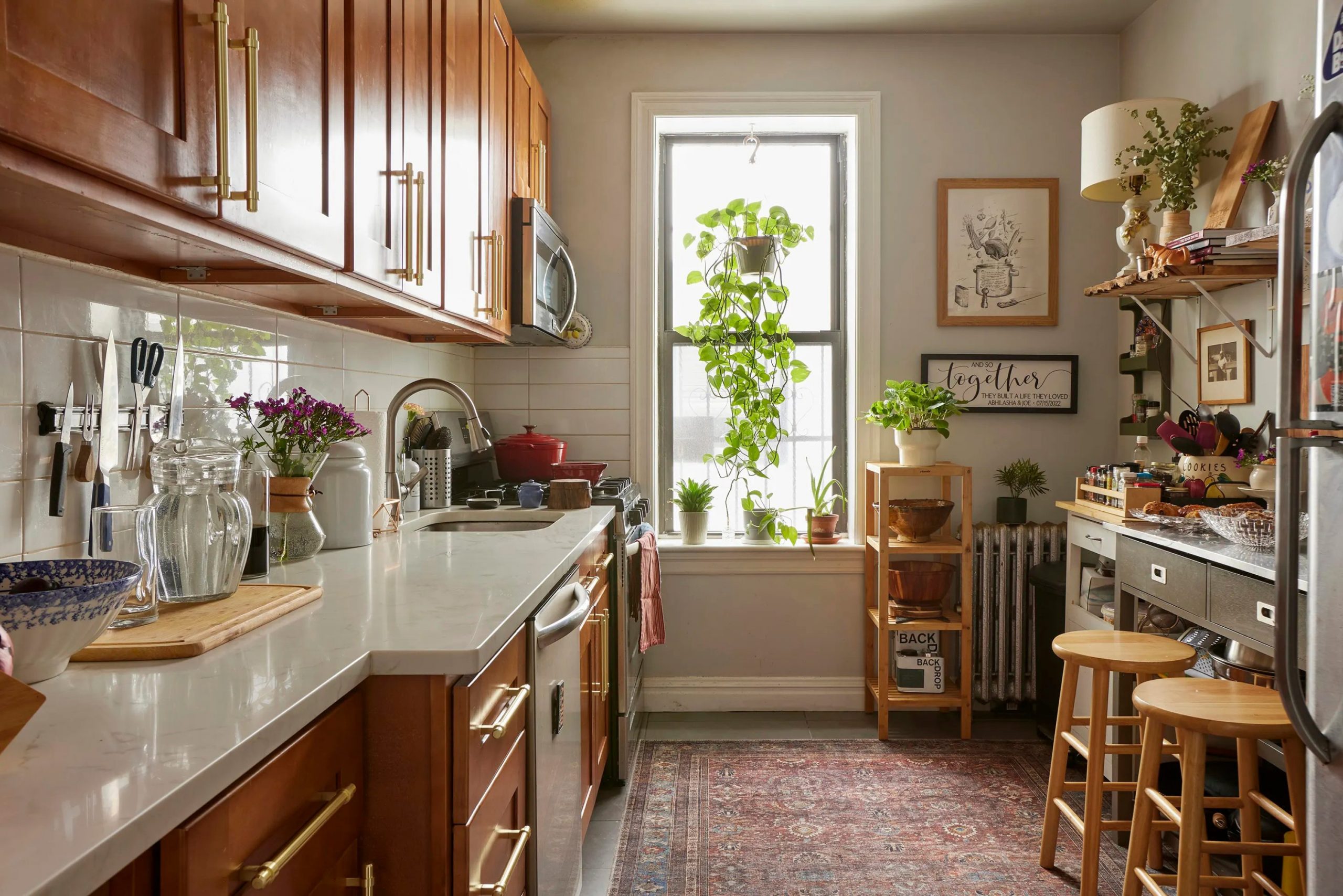
Kitchens serve as the heart of every home where families gather and memories start. I know that picking the right shade feels like a big task because you want your family to feel comfortable. A kitchen should not just look good but also feel like a warm hug when you walk in. Many people feel stuck because there are too many choices at the paint store.
My goal is to help you find that perfect look that makes you want to stay in your kitchen all day. We will look at many options together to find the one that fits your style. This process is about more than just aesthetics; it is about creating a sanctuary where you can relax after a long day. When the walls reflect the right tone, the entire atmosphere of the house shifts toward peace and happiness.
I want to make sure the color you choose reflects your personality while also serving as a timeless backdrop for all your future celebrations and quiet morning coffees.
By carefully selecting the right depth and undertone, we can turn a functional cooking space into a soulful room that draws everyone in naturally.
Why I Trust Sherwin-Williams and Benjamin Moore for Cozy Kitchen Paint Colors
I rely on these two brands because they make high-quality paint that lasts a long time. Sherwin-Williams has colors that look the same on your wall as they do on the small paper cards. Benjamin Moore is famous for having very deep and rich colors that make walls look expensive. Both brands offer paint that is easy to clean when you spill food or drinks while cooking.
I have used these brands in hundreds of homes and they never let me down. You can trust that the finish will look smooth and beautiful for many years. Choosing a good brand means you do not have to repaint your kitchen again next year. Beyond the durability, these companies invest heavily in pigment technology, ensuring that the color stays vibrant even if your kitchen gets a lot of direct sunlight.
Their professional-grade finishes also help hide small imperfections on the walls, giving your kitchen a high-end look without a complete renovation. Using these trusted names provides peace of mind that your investment will stand up to the daily hustle and bustle of a busy family life and maintain its elegance.
How I Choose Warm, Inviting Paint Colors for a Cozy Kitchen
I always look at the windows first to see how much sun comes inside the room. Sun makes colors look brighter while shadows can make colors look darker or a bit blue. I pick shades that have a little bit of yellow or brown in them to make the kitchen feel friendly. It is important to look at your cabinets and floors before you buy any paint cans.
I suggest painting a big piece of poster board and moving it around the room during the day. This helps you see how the color changes from breakfast time until dinner time. My method ensures that you love the final result without any bad surprises after the job is finished.
You should also consider the height of your ceilings and the color of your artificial lighting, as lightbulbs can drastically change a paint’s appearance in the evening.
By observing the samples in different corners, you can identify if a color turns too muddy or too bright in specific spots. Taking this extra time to test the samples prevents the frustration of living with a color that only looks good for one hour a day.
This careful planning turns a simple painting project into a professional interior design transformation that feels intentional and expertly crafted for your specific environment.
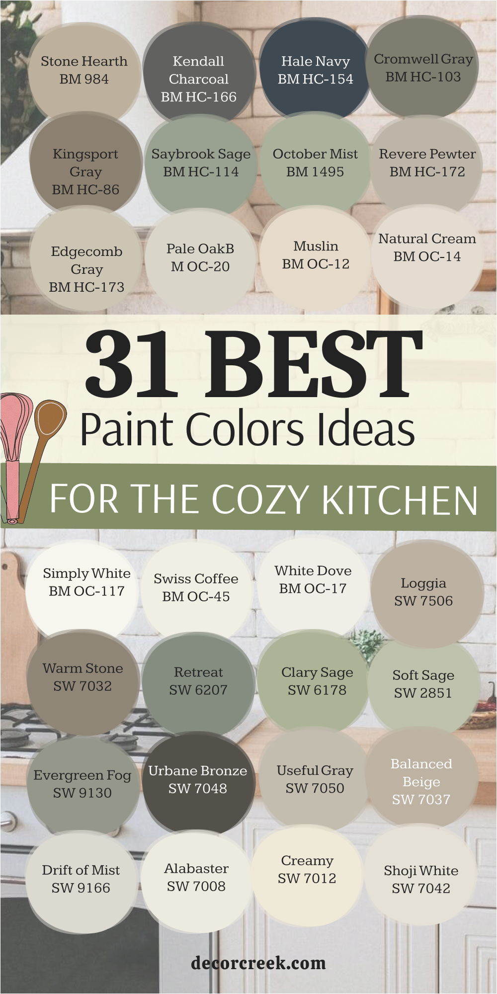
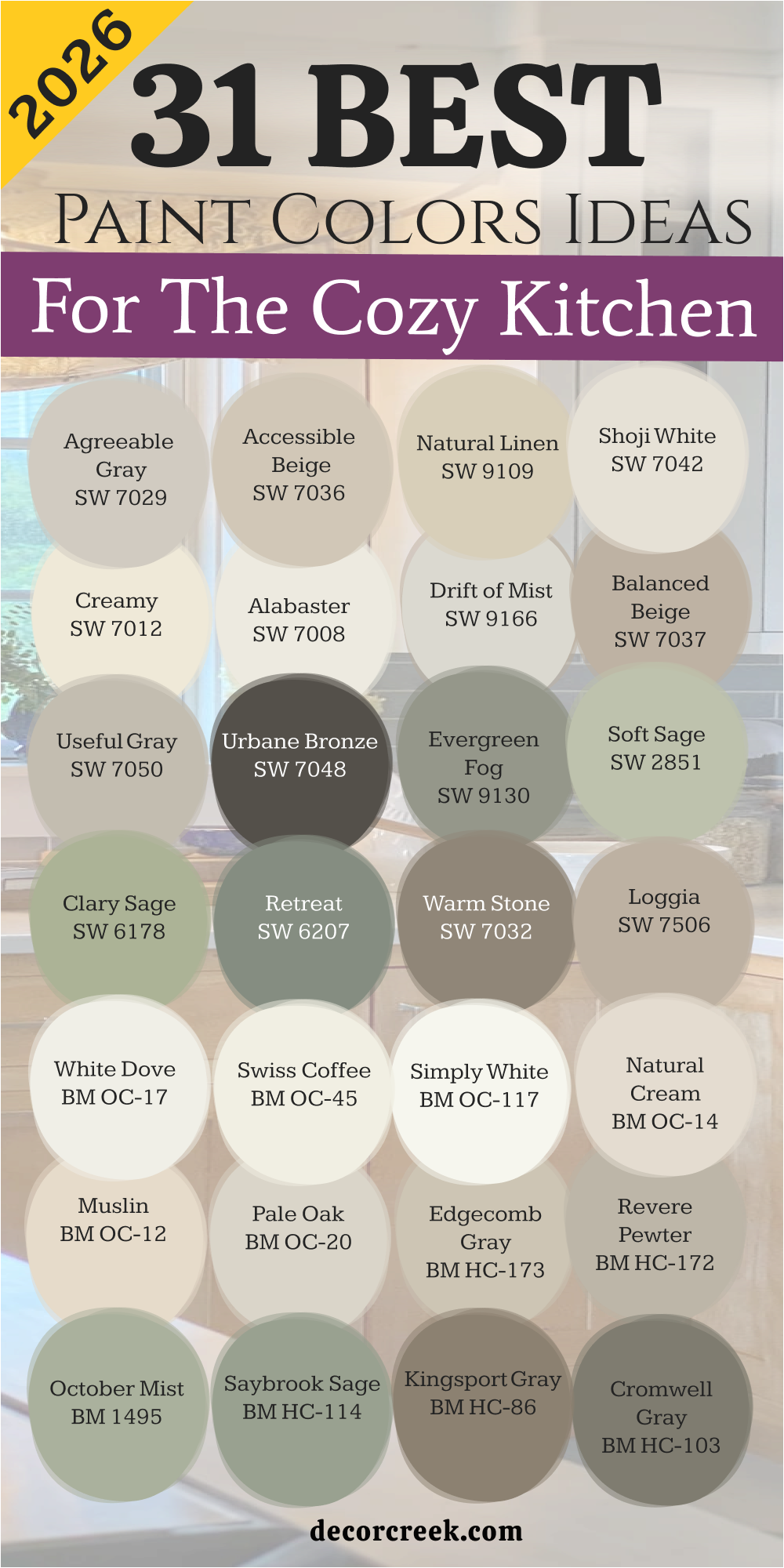
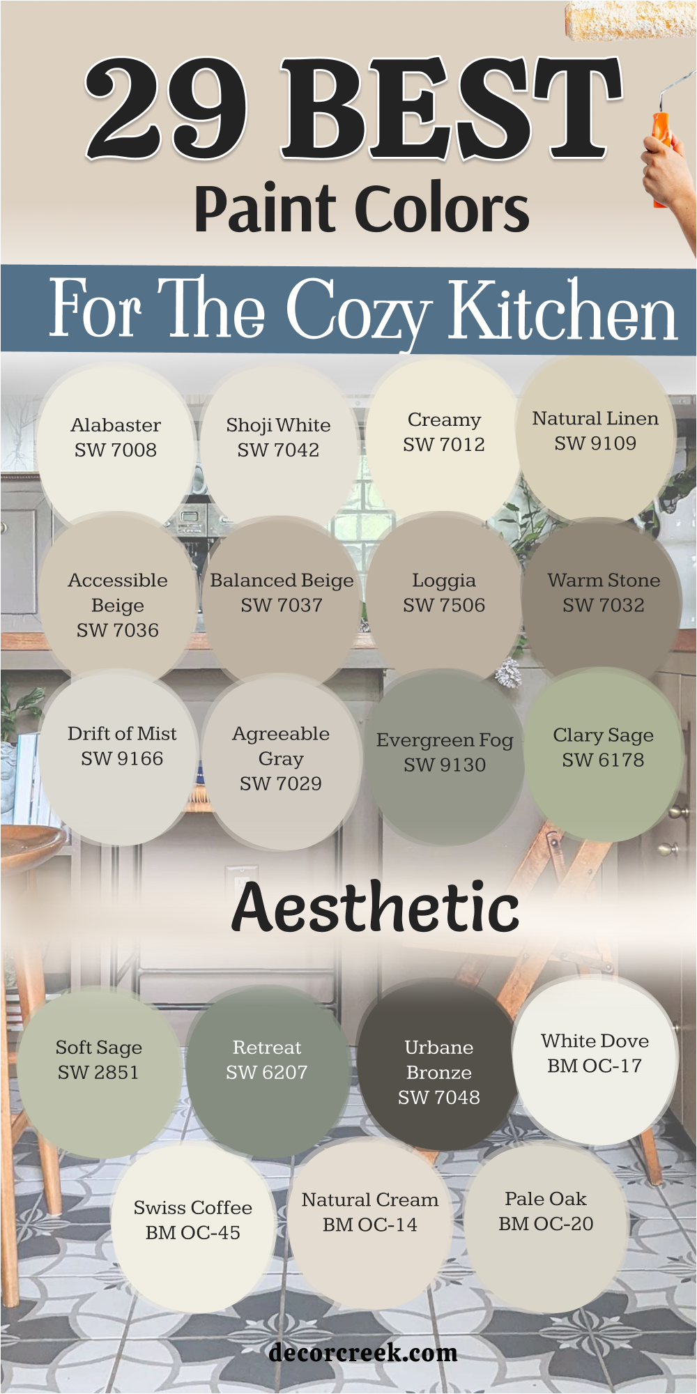
31 Paint Color Ideas For The Cozy Kitchen In 2026
Agreeable Gray SW 7029
Agreeable Gray SW 7029 works because it blends the best parts of gray and beige into one mix. This shade helps your cabinets stand out without making the room look too dark or cold. You will notice that it shifts its look depending on what light bulbs you use at night.
Many homeowners pick this choice because it matches almost any floor color you already have. It acts as a perfect background for colorful decorations like red towels or blue plates.
The warmth inside this paint keeps the room from feeling like a sterile hospital or a boring office. It is a top pick for people who want a modern look that still feels very welcoming to guests. You can use it on every wall and it will never feel like too much color.
Best used in: kitchens, living rooms, foyers, and laundry rooms
Pairs well with: Extra White SW 7006, Mega Greige SW 7031, Sea Salt SW 6204, dark bronze hardware The key rule of this color for farmhouse style is to use it where you want natural light to feel kind, soft, and inviting throughout the day.
🎨 Check out the complete guide to this color right HERE 👈

Accessible Beige SW 7036
Accessible Beige SW 7036 provides a soft look that reminds people of sandy beaches on a sunny day. This color does not have the yellow tones that make some older paints look dated or dirty. It feels very grounded and solid which helps a busy kitchen feel much more organized and neat.
I love how it looks next to white trim because the contrast is very sharp and clean. You will find that this shade makes your kitchen feel larger even if you have a small layout. It hides small fingerprints and dust better than very bright white paints do for active families.
Your friends will ask what color this is because it creates such a friendly vibe for talking. It is a reliable choice that has stayed popular for many years because it just works.
Best used in: kitchens, open floor plans, hallways, and mudrooms
Pairs well with: Alabaster SW 7008, Urban Bronze SW 7048, Cadet SW 9143, light oak flooring The key rule of this color for farmhouse style is to use it where you want natural light to feel kind, soft, and inviting throughout the day.
🎨 Check out the complete guide to this color right HERE 👈

Natural Linen SW 9109
Natural Linen SW 9109 brings the look of organic fabric right onto your kitchen walls for a soft effect. This color feels very earthy and honest which is great for a place where you prepare fresh food. It has enough depth to show up against white cabinets but stays light enough to feel airy.
I think it looks best when you have wooden cutting boards and plants sitting on your counters. You will enjoy how this shade makes the morning light look golden and pretty in your breakfast nook. It is not too brown and not too white so it hits a perfect middle ground for comfort.
This paint makes a house feel like a home the moment the brushes are put away for the day. It creates a backdrop that makes your family photos look wonderful on the wall.
Best used in: kitchens, dining areas, bedrooms, and cozy dens
Pairs well with: Pure White SW 7005, Foothills SW 7514, French Roast SW 6069, wicker textures The key rule of this color for farmhouse style is to use it where you want natural light to feel kind, soft, and inviting throughout the day.
🎨 Check out the complete guide to this color right HERE 👈

Shoji White SW 7042
Shoji White SW 7042 is a very creamy shade that sits right between a white and a light beige. This color is great for making a kitchen feel soft without using any harsh or bright tones. It works well if you have a lot of black accents like cabinet handles or light fixtures.
I often use this when a client wants a white kitchen that does not feel cold or like ice. The warmth in this paint comes out when the sun hits it directly in the late afternoon. It creates a very soft transition between different rooms in an open house layout.
You can use it on the ceiling too to make the whole room feel like a soft cloud. It is a smart choice for people who love a minimalist look that still feels very cozy.
Best used in: kitchens, exteriors, bedrooms, and large Great Rooms
Pairs well with: Iron Ore SW 7069, Accessible Beige SW 7036, Fawn Brindle SW 7615, walnut wood The key rule of this color for farmhouse style is to use it where you want natural light to feel kind, soft, and inviting throughout the day.
🎨 Check out the complete guide to this color right HERE 👈

Creamy SW 7012
Creamy SW 7012 lives up to its name by looking like a bowl of fresh vanilla ice cream. This paint is very soft and helps to hide any bumps or imperfections on your kitchen walls. It provides a very traditional look that makes a kitchen feel like a place where cookies are baked.
I like how it looks when paired with warm metal finishes like brass or copper faucets. You will find that this color makes the room feel very bright without being hard on your eyes. It is a wonderful choice for kitchens that do not get a lot of natural light from windows.
This shade makes the whole room feel happy and upbeat even on a cloudy or rainy day. It is a classic color that never goes out of fashion for a family home.
Best used in: kitchens, trim, cabinets, and nursery rooms
Pairs well with: Studio Taupe SW 7549, Reynard SW 6348, Westhighland White SW 7566, gold accents The key rule of this color for farmhouse style is to use it where you want natural light to feel kind, soft, and inviting throughout the day.
🎨 Check out the complete guide to this color right HERE 👈

Alabaster SW 7008
Alabaster SW 7008 is a famous choice for a reason because it is the perfect off-white for any wall. It does not look blue or yellow which makes it a very balanced pick for your kitchen project. I use this when I want the kitchen to feel very clean but also very relaxed and lived-in.
It reflects light in a beautiful way that makes the room feel glowing and special at night. You can paint your cabinets and walls this same color to make the room look very tall. It works perfectly with farmhouse styles or even very modern and sleek kitchen designs.
This color makes every piece of furniture in the room look better and more expensive than it is. It is a safe and beautiful choice for anyone who is nervous about picking a paint color.
Best used in: living rooms, kitchens, hallways, bedrooms, and farmhouse exteriors
Pairs well with: Iron Ore SW 7069, Agreeable Gray SW 7029, Natural Linen SW 9109, warm wood tones The key rule of this color for farmhouse style is to use it where you want natural light to feel kind, soft, and inviting throughout the day.
🎨 Check out the complete guide to this color right HERE 👈

Drift of Mist SW 9166
Drift of Mist SW 9166 is a very light gray that has a tiny bit of warmth tucked inside it. This color reminds me of a soft fog in the morning before the sun comes out fully. It is a great pick if you want a gray kitchen that still feels very soft and friendly.
I like how it stays neutral even when you change your rugs or your kitchen towels often. It does not compete with your granite or quartz countertops for attention in the room. You will notice that it makes your white trim look very crisp and very bright in comparison.
This shade is perfect for a kitchen where you want to feel relaxed while you drink coffee. It provides a very light and airy feel that keeps the heart of the home feeling open.
Best used in: kitchens, bathrooms, bedrooms, and ceilings
Pairs well with: Tin Woodman SW 9165, Pewter Green SW 6208, Pure White SW 7005, silver hardware The key rule of this color for farmhouse style is to use it where you want natural light to feel kind, soft, and inviting throughout the day.
🎨 Check out the complete guide to this color right HERE 👈

Balanced Beige SW 7037
Balanced Beige SW 7037 is a deeper tan color that brings a lot of personality to a kitchen wall. It is a true beige that does not have any weird pink or green undertones hiding in it. This color makes a kitchen feel very sturdy and provides a great contrast for white kitchen cabinets.
I recommend this for larger kitchens where a very light color might look a bit washed out. It feels very cozy during the winter months when you want your home to feel like a cave. You will see that it coordinates perfectly with stone backsplashes and tile floors in brown tones.
It is a very grounding color that makes people want to sit down and stay for a while. This paint choice shows that you are confident in your style and love a classic look.
Best used in: kitchens, living rooms, home offices, and master suites
Pairs well with: Virtual Taupe SW 7039, Aesthetic White SW 7035, Breezy SW 7616, dark wood The key rule of this color for farmhouse style is to use it where you want natural light to feel kind, soft, and inviting throughout the day.
🎨 Check out the complete guide to this color right HERE 👈

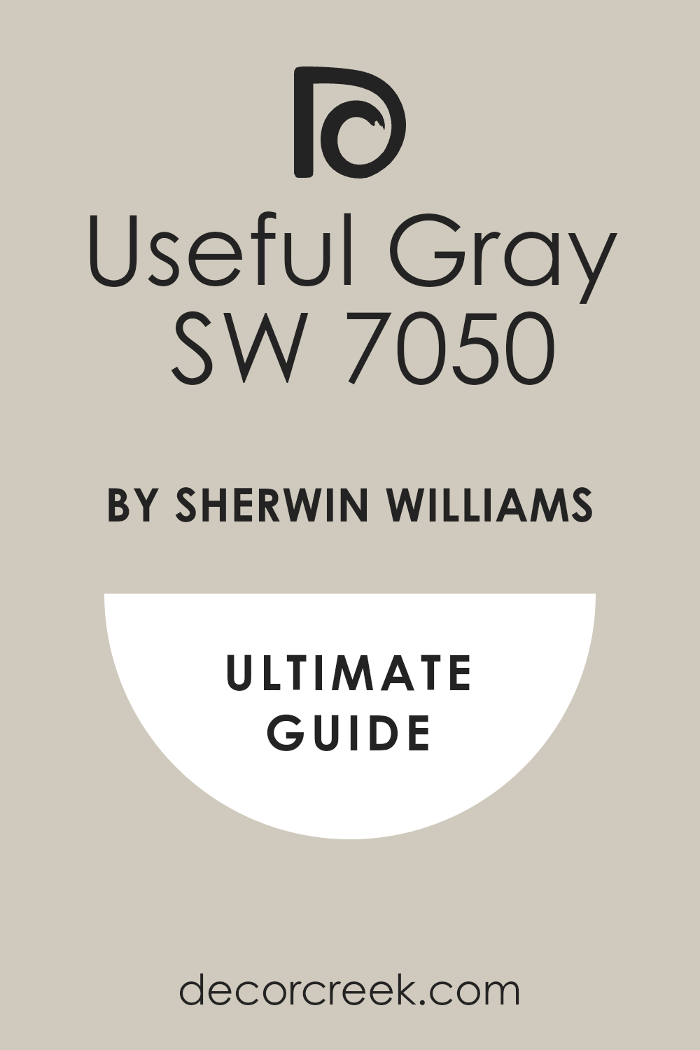
Useful Gray SW 7050
Useful Gray SW 7050 is a unique mix of gray and green that feels very connected to nature. This color brings a soft and organic feeling into the kitchen which is great for cooking. It changes throughout the day and might look more green when the sun is shining brightly.
I love how it looks with natural wood shelves and potted herbs on the windowsill. It is a sophisticated choice that feels more interesting than a basic gray or a plain beige. You will find that it creates a very quiet and peaceful atmosphere for your family meals.
This shade is excellent for masking the small messes that happen in a busy family kitchen. It is a hard-working color that looks beautiful in many different lighting situations at home.
Best used in: kitchens, entryways, mudrooms, and dining rooms
Pairs well with: Naval SW 6244, Alabaster SW 7008, Timber Bark SW 7513, slate floors The key rule of this color for farmhouse style is to use it where you want natural light to feel kind, soft, and inviting throughout the day.
🎨 Check out the complete guide to this color right HERE 👈
Urbane Bronze SW 7048
Urbane Bronze SW 7048 is a very dark and moody color that adds a lot of drama to a kitchen. This shade is a mix of dark brown and gray that looks very high-end and very modern. I suggest using it on a kitchen island or a single accent wall to create a focal point.
It makes gold or brass handles look like jewelry against the dark and rich background. You will love how it makes the room feel very private and very fancy during evening parties. It is a bold choice that shows you have a very strong sense of interior design style.
Even though it is dark, it still feels very warm because of the brown tones inside it. This color is perfect for creating a kitchen that feels like a cozy and upscale restaurant.
Best used in: kitchen islands, accent walls, exteriors, and front doors
Pairs well with: Modern Gray SW 7632, Shoji White SW 7042, Messenger Bag SW 7740, brass hardware The key rule of this color for farmhouse style is to use it where you want natural light to feel kind, soft, and inviting throughout the day.
🎨 Check out the complete guide to this color right HERE 👈

Evergreen Fog SW 9130
Evergreen Fog SW 9130 is a beautiful green color that has a lot of gray mixed into the base. This shade feels like a forest on a cloudy day and brings a very fresh feeling. I love using this on kitchen cabinets to give the room a very custom and unique look.
It is a very soft green that does not feel too bright or too much like a crayon. You will find that it matches very well with light wood floors and white stone counters. It makes the kitchen feel like a part of the garden even when you are inside cooking.
This color is very popular right now because people want to feel more connected to nature. It is a relaxing shade that makes the kitchen a very pleasant place to spend your time.
Best used in: kitchen cabinets, bedrooms, bathrooms, and accent walls
Pairs well with: Neutral Ground SW 7568, Dried Edamame SW 6162, Uber Umber SW 9107, leather pulls The key rule of this color for farmhouse style is to use it where you want natural light to feel kind, soft, and inviting throughout the day.
🎨 Check out the complete guide to this color right HERE 👈

Soft Sage SW 9647
Soft Sage SW 9647 is a light and delicate green that makes a kitchen feel very spring-like. This color is very gentle on the eyes and helps to create a very light and airy mood. I like to use this in kitchens that have a lot of white dishes and light-colored accessories.
It provides a soft hint of color without being too loud or taking over the whole room. You will enjoy how it makes the kitchen feel very clean and very organized at all times. This shade works wonderfully in cottage-style homes where you want a very sweet feeling.
It pairs beautifully with floral patterns and light-colored wood furniture in the dining area. This is a great choice if you want to move away from neutrals but stay very safe.
Best used in: kitchens, laundry rooms, bathrooms, and sunrooms
Pairs well with: Dover White SW 6385, Clary Sage SW 6178, Mink SW 6004, white porcelain The key rule of this color for farmhouse style is to use it where you want natural light to feel kind, soft, and inviting throughout the day.
🎨 Check out the complete guide to this color right HERE 👈
Clary Sage SW 6178
Clary Sage SW 6178 is a medium-toned green that feels very classic and very traditional for a home. This color has a yellow undertone which makes it feel very warm and very sun-drenched. I often recommend this for kitchens that have traditional wooden cabinets in oak or cherry.
It helps to tone down the orange in the wood and makes the whole room look updated. You will see that it creates a very cozy atmosphere that feels like a country house. It is a very sturdy color that can handle a lot of activity and still look great.
This shade makes your green plants look even more vibrant and healthy in the kitchen. It is a favorite for people who want a kitchen that feels established and very comfortable.
Best used in: kitchens, dining rooms, home exteriors, and bedrooms
Pairs well with: Dover White SW 6385, Sagebrush SW 7531, Tumblin’ Tumbleweed SW 6330, copper The key rule of this color for farmhouse style is to use it where you want natural light to feel kind, soft, and inviting throughout the day.
🎨 Check out the complete guide to this color right HERE 👈

Retreat SW 6207
Retreat SW 6207 is a deeper green with blue and gray tones that feels very steady. This color makes a statement in a kitchen and gives it a very high-quality look and feel. I like to use it on the lower cabinets with white cabinets on the top for a two-tone style.
It feels very sophisticated and modern but still has a lot of traditional charm and warmth. You will find that it looks amazing with marble or quartz that has gray veining in it. It creates a very focused environment that is perfect for trying out new and complex recipes.
This shade is bold enough to be noticed but soft enough to stay very easy to live with. It is a great way to add a lot of personality to your kitchen without being too wild.
Best used in: kitchen cabinets, islands, master bedrooms, and dens
Pairs well with: Sea Salt SW 6204, Spare White SW 6203, Grizzle Gray SW 7068, marble The key rule of this color for farmhouse style is to use it where you want natural light to feel kind, soft, and inviting throughout the day.
🎨 Check out the complete guide to this color right HERE 👈

Warm Stone SW 7032
Warm Stone SW 7032 is a rich brown-gray color that makes a kitchen feel very solid and safe. This shade is like the color of a smooth river rock that has been warmed by the afternoon sun. I love this color for creating a very cozy and dark kitchen that feels like a mountain lodge.
It provides a beautiful background for copper pots and pans hanging on a wall rack. You will notice that it makes the room feel very intimate and great for small family dinners. It is a dark color that does not feel cold because of the heavy brown tones in the mix.
This paint hides every bit of kitchen grime and keeps the room looking very polished and clean. It is a very smart choice for a kitchen that sees a lot of heavy cooking and use.
Best used in: kitchens, basements, accent walls, and exterior trim
Pairs well with: Creamy SW 7012, Balanced Beige SW 7037, Van Dyke Brown SW 7041, stone The key rule of this color for farmhouse style is to use it where you want natural light to feel kind, soft, and inviting throughout the day.
🎨 Check out the complete guide to this color right HERE 👈

Loggia SW 7506
Loggia SW 7506 is a warm greige that feels very creamy and soft on the eyes in any light. This color is darker than a typical beige but lighter than a standard brown paint choice. I use it when I want to give a kitchen a very upscale and professional look that is very inviting.
It works well with both light and dark wood floors which makes it a very versatile pick. You will find that it makes your kitchen feel very high-end and very well-designed for a low cost. It reflects enough light to keep the room from feeling small or closed in at any time.
This shade is perfect for people who want a kitchen that looks like it belongs in a magazine. It provides a very neutral base that lets your cooking skills be the main star of the show.
Best used in: kitchens, living rooms, hallways, and guest bedrooms
Pairs well with: Alabaster SW 7008, Moth Wing SW 9174, Portobello SW 6102, linen fabrics The key rule of this color for farmhouse style is to use it where you want natural light to feel kind, soft, and inviting throughout the day.
🎨 Check out the complete guide to this color right HERE 👈

White Dove OC-17
White Dove OC-17 is a very popular white because it has a tiny hint of gray and yellow. This color is famous for being the most flexible white paint you can find for your home. I use it on trim and walls together to create a very seamless and very soft kitchen look.
It never looks like a cold blue or a harsh yellow under any type of indoor lighting. You will love how it makes your kitchen feel very clean and very updated without being boring. It is a great choice for cabinets because it gives them a very soft and expensive-looking finish.
This shade helps to make small kitchens feel much larger and much brighter than they really are. It is a classic choice that you will likely never want to change or paint over.
Best used in: kitchens, trim, doors, and whole-house painting
Pairs well with: Revere Pewter HC-172, Hale Navy HC-154, Balboa Mist OC-27, dark wood The key rule of this color for farmhouse style is to use it where you want natural light to feel kind, soft, and inviting throughout the day.
🎨 Check out the complete guide to this color right HERE 👈

Swiss Coffee OC-45
Swiss Coffee OC-45 is a warm and creamy white that feels very soft and very traditional for a home. This color has been a favorite for designers for a long time because it feels so welcoming.
I recommend this for a kitchen where you want a very soft and gentle look for your family. It works beautifully with antique furniture and older homes that have a lot of character and history.
You will see that it creates a very cozy glow when you turn on your kitchen lights at night. It is not a stark white so it does not show every tiny splash or bit of dust immediately. This shade makes the kitchen feel like a very happy and very sun-filled part of the house. It is a wonderful color for creating a kitchen that feels like it has a lot of soul.
Best used in: kitchens, living rooms, bedrooms, and traditional homes
Pairs well with: Fossil AF-65, New Hope Gray 2130-50, White Heron OC-57, brass The key rule of this color for farmhouse style is to use it where you want natural light to feel kind, soft, and inviting throughout the day.
🎨 Check out the complete guide to this color right HERE 👈

Simply White OC-117
Simply White OC-117 is a very crisp white that still has a tiny bit of warmth to keep it soft. This color was a color of the year because it looks so fresh and so clean on walls. I love using this in kitchens with a lot of natural light to make the room feel huge.
It provides a very bright background that makes all your colorful fruits and veggies pop on the counter. You will notice that it makes your kitchen feel very modern and very up-to-date with current trends.
It is a very honest color that does not change much when the sun goes down in the evening. This shade is perfect for a kitchen where you want a very simple and very uncluttered look. It is a very high-energy white that makes the morning feel very bright and very productive.
Best used in: kitchens, ceilings, trim, and modern homes
Pairs well with: Silver Lake 1598, Dove Wing OC-18, Black Beauty 2128-10, colorful accents The key rule of this color for farmhouse style is to use it where you want natural light to feel kind, soft, and inviting throughout the day.
🎨 Check out the complete guide to this color right HERE 👈

Natural Cream OC-14
Natural Cream OC-14 is a soft greige that leans more towards the gray side but stays very warm. This color is very sophisticated and makes a kitchen look very balanced and very professional for guests. I use this when a client wants a gray kitchen that still feels very soft and very inviting.
It looks wonderful with stainless steel appliances because it bridges the gap between metal and warmth. You will find that it makes the room feel very steady and very peaceful during a busy day.
It is a great shade for masking the normal wear and tear that happens in a high-traffic kitchen. This color is very easy to coordinate with different types of tile and wood flooring options. It is a reliable and beautiful choice for a kitchen that needs a soft and modern touch.
Best used in: kitchens, hallways, living rooms, and open floor plans
Pairs well with: Chantilly Lace OC-65, Kendall Charcoal HC-166, Boothbay Gray HC-165, oak The key rule of this color for farmhouse style is to use it where you want natural light to feel kind, soft, and inviting throughout the day.
🎨 Check out the complete guide to this color right HERE 👈

Muslin OC-12
Muslin OC-12 is a classic beige that reminds me of unbleached cotton or a soft woolen blanket. This color is very traditional and brings a lot of warmth into a kitchen that feels too cold. I recommend this for kitchens that have a lot of white cabinets to provide a soft contrast.
It feels very cozy and creates a very traditional look that is perfect for large family homes. You will enjoy how it makes the kitchen feel like a very safe and very comfortable place.
It works well with dark wood accents and helps to make the room feel very grounded and solid. This shade is a great choice if you love a neutral look that is not gray or white. It is a very warm color that makes the kitchen feel like the heart of the home.
Best used in: kitchens, dining rooms, bedrooms, and entryways
Pairs well with: Swiss Coffee OC-45, Wood Grain 2137-30, Chocolate Candy Brown 2107-10, rugs The key rule of this color for farmhouse style is to use it where you want natural light to feel kind, soft, and inviting throughout the day.
🎨 Check out the complete guide to this color right HERE 👈

Pale Oak OC-20
Pale Oak OC-20 is a very light and elegant greige that feels like a soft whisper on the walls. This color is very popular because it is so light but still has a lot of personality and warmth. I use this in small kitchens to make them feel much bigger while still keeping a cozy vibe.
It changes a lot with the light and can look like a very soft off-white or a light gray. You will love how it makes your kitchen look very clean and very high-end for a low effort.
It provides a beautiful background for gold or black hardware on your kitchen cabinets and doors. This shade is very calming and makes the kitchen a very nice place to relax and cook. It is a versatile choice that works in almost any kitchen style from old to very new.
Best used in: kitchens, bedrooms, bathrooms, and living rooms
Pairs well with: White Dove OC-17, Wrought Iron 2124-10, Chantilly Lace OC-65, light wood The key rule of this color for farmhouse style is to use it where you want natural light to feel kind, soft, and inviting throughout the day.
🎨 Check out the complete guide to this color right HERE 👈

Edgecomb Gray HC-173
Edgecomb Gray HC-173 is a very famous color that is the perfect mix of gray and beige for a home. This color is very soft and works in almost any light which makes it a very safe pick. I often use this as a whole-house color because it flows so well from the kitchen to other rooms.
It has a very organic feel that makes the kitchen feel very natural and very well-balanced for families. You will see that it makes your white trim look very bright and very clean in every light.
It is a very friendly color that makes people feel at ease the moment they walk inside the room. This shade is excellent for creating a kitchen that feels very updated but still very classic. It is a top choice for staging a home because everyone seems to love how it looks.
Best used in: kitchens, living rooms, hallways, and open spaces
Pairs well with: White Heron OC-57, Nickel 2130-50, Revere Pewter HC-172, dark floors The key rule of this color for farmhouse style is to use it where you want natural light to feel kind, soft, and inviting throughout the day.
🎨 Check out the complete guide to this color right HERE 👈

Revere Pewter HC-172
Revere Pewter HC-172 is perhaps the most famous greige color in the world for a good reason. This color is a bit deeper than other grays and brings a lot of structure to a kitchen wall. I love how it looks with white cabinets because it creates a very classic and very clean look.
It has a tiny bit of green in the base which makes it feel very earthy and very grounded. You will find that it makes your kitchen feel very high-quality and very well-decorated for your family.
It is a very sturdy color that looks great even in kitchens that do not have a lot of sun. This shade has been a favorite for many years because it is so reliable and beautiful for homes. It is a great pick if you want a color that is proven to look amazing in a kitchen.
Best used in: kitchens, living rooms, bedrooms, and whole-house painting
Pairs well with: Simply White OC-117, Chelsea Gray HC-168, Fog Mist OC-31, stone accents The key rule of this color for farmhouse style is to use it where you want natural light to feel kind, soft, and inviting throughout the day.
🎨 Check out the complete guide to this color right HERE 👈

October Mist 1495
October Mist 1495 is a soft and silvery green that was once a color of the year for Benjamin Moore. This color feels very fresh and brings a bit of the outdoors into your kitchen space every day. I like to use this for people who want a hint of color that still feels very neutral and safe.
It works beautifully with natural wood and light-colored stone counters in a modern kitchen design. You will enjoy how it makes the kitchen feel very peaceful and very quiet for your morning coffee.
This shade is a great alternative to gray if you want something that feels a bit more alive. It is a very gentle color that makes the room feel very soft and very welcoming to everyone. It is a smart choice for a kitchen that needs a little bit of a unique and fresh personality.
Best used in: kitchens, bedrooms, bathrooms, and accent walls
Pairs well with: Steam AF-15, Gloucester Sage HC-100, Hint of Violet 2114-60, plants The key rule of this color for farmhouse style is to use it where you want natural light to feel kind, soft, and inviting throughout the day.
🎨 Check out the complete guide to this color right HERE 👈

Saybrook Sage HC-114
Saybrook Sage HC-114 is a medium green that has a lot of gray and a bit of silver in the mix. This color feels very historic and looks great in older homes or very traditional kitchen layouts. I recommend this for a kitchen where you want a very established and very cozy feeling for guests.
It provides a beautiful contrast for white or cream-colored cabinets and light wood furniture pieces. You will see that it makes the room feel very steady and very comfortable for long family dinners.
It is a very relaxing color that helps to hide the mess and chaos of a very busy kitchen. This shade works well with traditional patterns like stripes or floral designs in your kitchen curtains. It is a classic green that feels very sophisticated and very high-end for a family home.
Best used in: kitchens, dining rooms, exteriors, and bedrooms
Pairs well with: Cloud White OC-130, Shaker Beige HC-45, Old Navy 2063-10, wood trim The key rule of this color for farmhouse style is to use it where you want natural light to feel kind, soft, and inviting throughout the day.
🎨 Check out the complete guide to this color right HERE 👈

Kingsport Gray HC-86
Kingsport Gray HC-86 is a deep and warm brownish-gray that feels very rich and very substantial on walls. This color is great for creating a very cozy and very dark kitchen that feels like a warm hug.
I love using this on a kitchen island to make it stand out as the center of the whole room. It looks amazing with gold hardware and warm wood floors that have a lot of grain and texture.
You will find that it makes the kitchen feel very intimate and very special for your family meals. Even though it is a dark color, it stays very warm because of the heavy brown tones inside. This shade is perfect for a kitchen where you want to feel very tucked in and very relaxed. It is a bold and beautiful choice for someone who loves a very deep and very rich look.
Best used in: kitchen islands, libraries, accent walls, and exteriors
Pairs well with: Manchester Tan HC-81, Simply White OC-117, Van Courtland Blue HC-145, brass The key rule of this color for farmhouse style is to use it where you want natural light to feel kind, soft, and inviting throughout the day.
🎨 Check out the complete guide to this color right HERE 👈
Cromwell Gray HC-103
Cromwell Gray HC-103 is a very deep green-gray that feels very moody and very high-end for a kitchen. This color is a bit darker than others and brings a lot of drama and style to the walls. I suggest using this if you have a lot of white trim to provide a very sharp and pretty contrast.
It makes your kitchen feel like a professional chef’s kitchen because it looks so serious and clean. You will love how it makes the room feel very private and very cozy during the dark winter months.
It is a very grounding color that makes all your kitchen gadgets look very modern and very cool. This shade is great for people who are not afraid of using dark colors to create a lot of mood. It provides a very rich background that makes every meal feel like a special occasion for you.
Best used in: kitchen cabinets, accent walls, exteriors, and home offices
Pairs well with: Edgecomb Gray HC-173, White Dove OC-17, Black Jack 2133-20, marble The key rule of this color for farmhouse style is to use it where you want natural light to feel kind, soft, and inviting throughout the day.
🎨 Check out the complete guide to this color right HERE 👈

Hale Navy HC-154
Hale Navy HC-154 is one of the most famous dark blue colors because it is so perfectly balanced and rich. This color looks like a very dark ocean and brings a lot of depth and mystery to a kitchen.
I often use this on lower cabinets with white upper cabinets for a very classic and nautical look. It makes gold or silver handles look very bright and very expensive against the dark blue base.
You will see that it makes the kitchen feel very solid and very well-designed for a modern family. It is a very warm navy that does not feel cold or like a school uniform color at all. This shade is a great way to add a lot of color without it feeling too bright or too loud. It is a timeless choice that people have loved for a very long time because it is beautiful.
Best used in: kitchen islands, cabinets, front doors, and accent walls
Pairs well with: Coventry Gray HC-169, White Dove OC-17, Woodmont Cream 204, brass The key rule of this color for farmhouse style is to use it where you want natural light to feel kind, soft, and inviting throughout the day.
🎨 Check out the complete guide to this color right HERE 👈

Kendall Charcoal HC-166
Kendall Charcoal HC-166 is a very dark and rich gray that feels very modern and very sophisticated for walls. This color is like a dark slate and provides a very dramatic look for a kitchen project.
I like to use this in kitchens with a lot of natural wood to balance out the dark and cool tones. It makes your white dishes and white counters look very bright and very clean in the room.
You will find that it creates a very focused and very quiet atmosphere for your cooking and baking. It is a very bold choice that makes a kitchen look like it was designed by a professional expert. This shade is perfect for people who want a very modern and very sleek look for their home. It is a very powerful color that brings a lot of confidence and style to the heart of the home.
Best used in: kitchen islands, accent walls, exteriors, and bathrooms
Pairs well with: Revere Pewter HC-172, Simply White OC-117, AF-685 Thunder, stainless steel The key rule of this color for farmhouse style is to use it where you want natural light to feel kind, soft, and inviting throughout the day.
🎨 Check out the complete guide to this color right HERE 👈

Stone Hearth 984
Stone Hearth 984 is a warm and medium-toned greige that feels very soft and very creamy on the walls. This color is darker than a beige but has a lot of gray to keep it looking very modern and fresh.
I recommend this for a kitchen where you want a very cozy and very earthy feeling for your family. It works beautifully with stone floors and natural wood accents like big ceiling beams or shelves. You will enjoy how it makes the kitchen feel very grounded and very safe for your kids and pets.
It is a very easy color to live with because it is so neutral and so well-balanced for light. This shade makes the room feel very warm and very inviting even when there is no sun outside. It is a great choice for a kitchen that needs a soft and natural touch to feel like home.
Best used in: kitchens, living rooms, bedrooms, and open floor plans
Pairs well with: Cloud White OC-130, Sparrow AF-720, Mascarpone AF-20, warm wood The key rule of this color for farmhouse style is to use it where you want natural light to feel kind, soft, and inviting throughout the day.
🎨 Check out the complete guide to this color right HERE 👈
29 Aesthetic Paint Colors For The Cozy Kitchen
Alabaster SW 7008
Alabaster SW 7008 remains a top pick because it provides a creamy look that never feels too yellow. This color acts like a soft blanket for your walls by making every corner feel very gentle. I suggest using it when you have dark wood floors to create a high-end look in your home.
It helps to bounce the light around the room so your kitchen feels bright even on rainy days. You will find that it makes your cabinets look very fresh and very clean for your family. It is a very soft white that helps people feel relaxed as soon as they walk inside.
Many designers pick this shade because it works with almost any style of furniture you own. It provides a beautiful background that makes your colorful fruit bowls and plants look amazing. Your kitchen will feel very open and very large when you use this popular and pretty shade.
Best used in: living rooms, kitchens, hallways, bedrooms, and farmhouse exteriors
Pairs well with: Iron Ore SW 7069, Agreeable Gray SW 7029, Natural Linen SW 9109, warm wood tones The key rule of this color for farmhouse style is to use it where you want natural light to feel kind, soft, and inviting throughout the day.
🎨 Check out the complete guide to this color right HERE 👈
Shoji White SW 7042
Shoji White SW 7042 is a very special shade that sits right between a warm white and a light greige. This color makes a kitchen feel very soft and helps to smooth out any rough parts of the room.
I love how it looks when you have black metal lights or dark cabinet handles for contrast. It is not a cold color at all which makes it perfect for a kitchen where people gather. You will notice that it looks very different as the sun moves across the sky each day.
It brings a very organic and natural feeling to the walls that makes the house feel steady. This shade is excellent for creating a look that is very simple but also very sophisticated and rich. It is a great choice for people who want a neutral home that still has a lot of soul.
Best used in: kitchens, exteriors, bedrooms, and large Great Rooms
Pairs well with: Iron Ore SW 7069, Accessible Beige SW 7036, Fawn Brindle SW 7615, walnut wood The key rule of this color for farmhouse style is to use it where you want natural light to feel kind, soft, and inviting throughout the day.
🎨 Check out the complete guide to this color right HERE 👈
Creamy SW 7012
Creamy SW 7012 offers a very rich and buttery feel that makes a kitchen look very traditional and sweet. This paint is very soft on the eyes and helps to create a very happy and bright mood.
I recommend this for kitchens that have older wood cabinets because it makes the wood look better. It feels very warm and reminds me of vanilla cream or a soft white cake from a bakery. You will enjoy how it makes the room glow when you have your lamps on in the evening.
It is a very reliable color that helps to hide small marks or dust on the kitchen walls. This shade makes the kitchen feel like a very friendly place where guests want to stay and chat. It is a classic choice for a family home because it makes everything feel very safe and cozy.
Best used in: kitchens, trim, cabinets, and nursery rooms
Pairs well with: Studio Taupe SW 7549, Reynard SW 6348, Westhighland White SW 7566, gold accents The key rule of this color for farmhouse style is to use it where you want natural light to feel kind, soft, and inviting throughout the day.
🎨 Check out the complete guide to this color right HERE 👈
Natural Linen SW 9109
Natural Linen SW 9109 brings a very earthy and sandy tone into the kitchen for a natural look. This color feels very solid and helps the walls look like they are covered in a soft fabric. I like to use this when I want to make a big kitchen feel a bit more intimate.
It works perfectly with wicker baskets and wooden cutting boards on your kitchen counters and shelves. You will find that it creates a very beautiful contrast with white trim and white ceiling paint.
It is a very warm shade that makes the morning light feel very golden and very pretty. This color helps to create a very relaxed vibe that is perfect for a busy family house. It is a smart pick for anyone who wants a kitchen that feels connected to nature and soil.
Best used in: kitchens, dining areas, bedrooms, and cozy dens
Pairs well with: Pure White SW 7005, Foothills SW 7514, French Roast SW 6069, wicker textures The key rule of this color for farmhouse style is to use it where you want natural light to feel kind, soft, and inviting throughout the day.
🎨 Check out the complete guide to this color right HERE 👈
Accessible Beige SW 7036
Accessible Beige SW 7036 is a very popular color because it has a perfect balance of gray and tan. This shade makes a kitchen feel very updated and very clean without being too bright or cold.
I use this when I want to give a room a very steady and very grounded feeling for guests. It looks wonderful next to stone backsplashes and tile floors that have brown or gray tones. You will love how it makes your kitchen feel very organized and very well-designed for your life.
It is a very flexible color that stays looking good even if you change your rug or curtains. This paint helps to make the kitchen feel like a very warm and very welcoming part of the home. It is a great choice for people who want a modern look that is still very easy to live with.
Best used in: kitchens, open floor plans, hallways, and mudrooms
Pairs well with: Alabaster SW 7008, Urban Bronze SW 7048, Cadet SW 9143, light oak flooring The key rule of this color for farmhouse style is to use it where you want natural light to feel kind, soft, and inviting throughout the day.
🎨 Check out the complete guide to this color right HERE 👈
Balanced Beige SW 7037
Balanced Beige SW 7037 is a deeper and richer tan that brings a lot of warmth to the walls. This color makes a kitchen feel very sturdy and provides a great look for a large room. I suggest this for people who want their kitchen to feel very cozy and very safe like a nest.
It looks amazing with white cabinets because the color of the walls really stands out and pops. You will notice that it creates a very traditional look that feels like it has been there forever.
It is a very hard-working color that masks fingerprints and small messes from kids and pets very well. This shade makes the room feel very private and very comfortable for long dinners and talks. It is a very confident color choice that shows you love a very classic and warm home style.
Best used in: kitchens, living rooms, home offices, and master suites
Pairs well with: Virtual Taupe SW 7039, Aesthetic White SW 7035, Breezy SW 7616, dark wood The key rule of this color for farmhouse style is to use it where you want natural light to feel kind, soft, and inviting throughout the day.
🎨 Check out the complete guide to this color right HERE 👈
Loggia SW 7506
Loggia SW 7506 is a very creamy greige that feels like a high-end hotel or a very fancy resort. This color is soft and rich which makes a kitchen look very expensive and very well-thought-out.
I like to use this on walls when the cabinets are a very bright white color for contrast. It provides a very smooth look that makes the room feel very balanced and very quiet for you. You will find that it works well with both gold and silver metal finishes on your kitchen sinks.
It reflects light in a very gentle way so the room never feels too dark or too heavy. This shade is perfect for creating a kitchen that looks like it belongs in a very nice magazine. It is a very stylish choice that makes your home feel very special and very well-crafted for guests
Best used in: kitchens, living rooms, hallways, and guest bedrooms
Pairs well with: Alabaster SW 7008, Moth Wing SW 9174, Portobello SW 6102, linen fabrics The key rule of this color for farmhouse style is to use it where you want natural light to feel kind, soft, and inviting throughout the day.
🎨 Check out the complete guide to this color right HERE 👈
Warm Stone SW 7032
Warm Stone SW 7032 is a dark and moody brownish-gray that makes a kitchen feel very solid and private. This color is like the earth and brings a very natural and very grounded feeling to the walls.
I love using this in kitchens that have a lot of natural light to keep the room from being too bright. It makes your white trim and white dishes look very sharp and very clean against the dark paint. You will enjoy how it makes the kitchen feel very cozy and very intimate during the night hours.
It is a very sophisticated choice that shows you have a very strong and very unique sense of style. This shade is excellent for hiding any small imperfections or bumps on your old kitchen walls. It is a very warm and very deep color that makes the heart of the home feel very safe.
Best used in: kitchens, basements, accent walls, and exterior trim
Pairs well with: Creamy SW 7012, Balanced Beige SW 7037, Van Dyke Brown SW 7041, stone The key rule of this color for farmhouse style is to use it where you want natural light to feel kind, soft, and inviting throughout the day.
🎨 Check out the complete guide to this color right HERE 👈
Drift of Mist SW 9166
Drift of Mist SW 9166 is a very light and airy gray that has a tiny bit of warmth inside it. This color reminds me of a soft morning sky before the sun gets too high and too bright. I use this when a client wants a gray kitchen that still feels very soft and very friendly.
It is a very light color that helps to make a small kitchen feel much larger than it is. You will love how it looks with light wood floors and white stone counters in a modern kitchen.
It provides a very quiet background that lets your cooking and your family photos be the star. This shade is very easy to coordinate with different colors of rugs and kitchen towels and plates. It is a very fresh and very clean choice for a kitchen that needs to feel light and open.
Best used in: kitchens, bathrooms, bedrooms, and ceilings
Pairs well with: Tin Woodman SW 9165, Pewter Green SW 6208, Pure White SW 7005, silver hardware The key rule of this color for farmhouse style is to use it where you want natural light to feel kind, soft, and inviting throughout the day.
🎨 Check out the complete guide to this color right HERE 👈
Agreeable Gray SW 7029
Agreeable Gray SW 7029 is a famous and reliable color that is a perfect mix of gray and beige. This color works in almost any kitchen because it adapts to the light that you have in the room. I recommend this for people who are picking a paint color for the first time because it is safe.
It helps to make your cabinets look very updated and very fresh for your family and your guests. You will notice that it has a very soft and very warm feeling that keeps the room from being cold.
It is a very neutral shade that makes it easy to decorate your kitchen with any colors you like. This paint is a top pick for making a home feel very clean and very well-organized for a busy life. It is a beautiful choice that you will likely enjoy for a very long time in your kitchen.
Best used in: kitchens, living rooms, foyers, and laundry rooms
Pairs well with: Extra White SW 7006, Mega Greige SW 7031, Sea Salt SW 6204, dark bronze hardware The key rule of this color for farmhouse style is to use it where you want natural light to feel kind, soft, and inviting throughout the day.
🎨 Check out the complete guide to this color right HERE 👈
Evergreen Fog SW 9130
Evergreen Fog SW 9130 brings a soft and organic green tone that makes your kitchen feel like a peaceful garden. This color is very popular because it feels fresh and new while still staying very grounded and steady.
I love using this on kitchen cabinets to give the room a custom look that feels very high-end. It looks wonderful with light oak floors and white stone counters that have small gray veins in them. You will find that this shade changes with the light and looks deeper during the rainy or cloudy days. It is a very relaxing color that helps you feel at ease while you prepare meals for your family.
This paint choice shows that you are brave with color but still want a home that feels very natural. It provides a beautiful and soft background that makes every wooden bowl or green plant look more vibrant. Your friends will love how unique and very inviting your kitchen feels with this earthy and soft green.
Best used in: kitchen cabinets, bedrooms, bathrooms, and accent walls
Pairs well with: Neutral Ground SW 7568, Dried Edamame SW 6162, Uber Umber SW 9107, leather pulls The key rule of this color for farmhouse style is to use it where you want natural light to feel kind, soft, and inviting throughout the day.
🎨 Check out the complete guide to this color right HERE 👈
Clary Sage SW 6178
Clary Sage SW 6178 is a medium green that has a lot of yellow in it to make it feel sun-drenched. This color works perfectly for a kitchen where you want a very traditional and very established country feel.
I recommend this shade if you have older wooden cabinets because it makes the wood look rich and warm. It feels very sturdy and can handle a lot of family activity without showing every little smudge or mark. You will see that it makes the room feel very cozy and very much like a farmhouse in the woods.
This paint brings a bit of the outside world into your home which helps a room feel more alive. It is a very friendly color that makes people want to sit down and share a long meal together. Using this on the walls creates a very soft and very traditional mood that never goes out of style.
Best used in: kitchens, dining rooms, home exteriors, and bedrooms
Pairs well with: Dover White SW 6385, Sagebrush SW 7531, Tumblin’ Tumbleweed SW 6330, copper The key rule of this color for farmhouse style is to use it where you want natural light to feel kind, soft, and inviting throughout the day.
🎨 Check out the complete guide to this color right HERE 👈
Soft Sage SW 9647
Soft Sage SW 9647 is a very light and delicate green that makes a kitchen feel very airy and bright. This color is very gentle on the eyes and helps to create a very quiet and peaceful mood for cooking.
I like to use this in kitchens that have a lot of white accessories and white ceramic dishes on the shelves. It provides a soft hint of color that is much more interesting than a basic white or a plain gray. You will enjoy how it makes the kitchen feel very clean and very well-organized for your daily chores.
This shade works wonderfully in small kitchens because it keeps the walls feeling very light and very open for you. It pairs beautifully with light-colored wood and floral patterns in your kitchen curtains or seat cushions for chairs. This is a great choice if you want a kitchen that feels very sweet and very light for guests.
Best used in: kitchens, laundry rooms, bathrooms, and sunrooms
Pairs well with: Dover White SW 6385, Clary Sage SW 6178, Mink SW 6004, white porcelain The key rule of this color for farmhouse style is to use it where you want natural light to feel kind, soft, and inviting throughout the day.
🎨 Check out the complete guide to this color right HERE 👈
Retreat SW 6207
Retreat SW 6207 is a deeper and more solid green that has blue and gray tones mixed into the base. This color makes a very big statement and gives your kitchen a look that is very high-quality and rich.
I like to use it on the lower cabinets with white cabinets on top to create a two-tone kitchen style. It feels very sophisticated and modern but still has a lot of traditional charm that makes it feel like home. You will find that it looks amazing with marble or quartz that has dark gray patterns in the stone.
It creates a very focused and very quiet environment that is perfect for trying out big new recipes for dinner. This shade is bold enough to be noticed by everyone but stays very easy to live with for many years. It is a great way to add a lot of personality to your kitchen without it being too loud or bright.
Best used in: kitchen cabinets, islands, master bedrooms, and dens
Pairs well with: Sea Salt SW 6204, Spare White SW 6203, Grizzle Gray SW 7068, marble The key rule of this color for farmhouse style is to use it where you want natural light to feel kind, soft, and inviting throughout the day.
🎨 Check out the complete guide to this color right HERE 👈
Urbane Bronze SW 7048
Urbane Bronze SW 7048 is a very dark and rich color that adds a lot of drama and style to a kitchen. This shade is a mix of dark brown and charcoal gray that looks very expensive and very modern for any home. I suggest using it on a kitchen island or an accent wall to create a strong focal point in the room.
It makes gold or brass handles look like beautiful jewelry against the dark and very rich-looking background of the paint. You will love how it makes the room feel very private and very fancy during your evening dinner parties with friends.
It is a bold choice that shows you have a very strong sense of interior design and personal style for you. Even though it is a dark color it still feels very warm because of the deep brown tones inside the mix. This color is perfect for creating a kitchen that feels like a cozy and upscale restaurant right in your house.
Best used in: kitchen islands, accent walls, exteriors, and front doors
Pairs well with: Modern Gray SW 7632, Shoji White SW 7042, Messenger Bag SW 7740, brass hardware The key rule of this color for farmhouse style is to use it where you want natural light to feel kind, soft, and inviting throughout the day.
🎨 Check out the complete guide to this color right HERE 👈
White Dove OC-17
White Dove OC-17 is a very famous white because it has a tiny hint of gray and yellow to keep it soft. This color is known for being very flexible and looks good in almost any light you have in the kitchen. I use it on trim and walls together to create a very seamless and very soft look for my clients.
It never looks like a cold blue or a harsh yellow which makes it a very safe and pretty pick for you. You will love how it makes your kitchen feel very clean and very updated without being boring or too stark.
It is a great choice for cabinets because it gives them a very soft and very expensive-looking finish on the wood. This shade helps to make small kitchens feel much larger and much brighter than they really are on the inside. It is a classic choice that you will likely never want to change or paint over in your home.
Best used in: kitchens, trim, doors, and whole-house painting
Pairs well with: Revere Pewter HC-172, Hale Navy HC-154, Balboa Mist OC-27, dark wood The key rule of this color for farmhouse style is to use it where you want natural light to feel kind, soft, and inviting throughout the day.
🎨 Check out the complete guide to this color right HERE 👈
Swiss Coffee OC-45
Swiss Coffee OC-45 is a warm and creamy white that feels very soft and very traditional for a family home. This color has been a favorite for designers for a long time because it feels so very welcoming and friendly.
I recommend this for a kitchen where you want a very soft and gentle look for your kids and guests. It works beautifully with antique furniture and older homes that have a lot of character and history in the walls.
You will see that it creates a very cozy glow when you turn on your kitchen lights at night for dinner. It is not a bright white so it does not show every tiny splash or bit of dust on the walls. This shade makes the kitchen feel like a very happy and very sun-filled part of the whole house for you. It is a wonderful color for creating a kitchen that feels like it has a lot of soul and warmth.
Best used in: kitchens, living rooms, bedrooms, and traditional homes
Pairs well with: Fossil AF-65, New Hope Gray 2130-50, White Heron OC-57, brass The key rule of this color for farmhouse style is to use it where you want natural light to feel kind, soft, and inviting throughout the day.
🎨 Check out the complete guide to this color right HERE 👈
Natural Cream OC-14
Natural Cream OC-14 is a soft greige that leans more towards the gray side but stays very warm on the walls. This color is very sophisticated and makes a kitchen look very balanced and very professional for your guests at home. I use this when a client wants a gray kitchen that still feels very soft and very inviting for the family.
It looks wonderful with stainless steel appliances because it bridges the gap between cold metal and warm paint colors. You will find that it makes the room feel very steady and very peaceful during a busy day of cooking.
It is a great shade for masking the normal wear and tear that happens in a high-traffic family kitchen area. This color is very easy to coordinate with different types of tile and wood flooring options you might have. It is a reliable and beautiful choice for a kitchen that needs a soft and modern touch for the family.
Best used in: kitchens, hallways, living rooms, and open floor plans
Pairs well with: Chantilly Lace OC-65, Kendall Charcoal HC-166, Boothbay Gray HC-165, oak The key rule of this color for farmhouse style is to use it where you want natural light to feel kind, soft, and inviting throughout the day.
🎨 Check out the complete guide to this color right HERE 👈
Pale Oak OC-20
Pale Oak OC-20 is a very light and elegant greige that feels like a soft whisper on the walls of your kitchen. This color is very popular because it is so light but still has a lot of personality and warmth for you. I use this in small kitchens to make them feel much bigger while still keeping a very cozy and soft vibe.
It changes a lot with the light and can look like a soft off-white or a light gray during the day. You will love how it makes your kitchen look very clean and very high-end for a low amount of effort.
It provides a beautiful background for gold or black hardware on your kitchen cabinets and pantry doors for style. This shade is very calming and makes the kitchen a very nice place to relax and cook for your kids. It is a versatile choice that works in almost any kitchen style from very old to very new and modern.
Best used in: kitchens, bedrooms, bathrooms, and living rooms
Pairs well with: White Dove OC-17, Wrought Iron 2124-10, Chantilly Lace OC-65, light wood The key rule of this color for farmhouse style is to use it where you want natural light to feel kind, soft, and inviting throughout the day.
🎨 Check out the complete guide to this color right HERE 👈
Muslin OC-12
Muslin OC-12 is a classic beige that reminds me of unbleached cotton or a soft woolen blanket in the winter. This color is very traditional and brings a lot of warmth into a kitchen that might feel too cold or dark.
I recommend this for kitchens that have a lot of white cabinets to provide a soft and pretty contrast on walls. It feels very cozy and creates a very traditional look that is perfect for large and busy family homes today. You will enjoy how it makes the kitchen feel like a very safe and very comfortable place for everyone to be.
It works well with dark wood accents and helps to make the room feel very grounded and very solid for you. This shade is a great choice if you love a neutral look that is not gray or bright white on the walls. It is a very warm color that makes the kitchen feel like the true heart of the home for everyone.
Best used in: kitchens, dining rooms, bedrooms, and entryways
Pairs well with: Swiss Coffee OC-45, Wood Grain 2137-30, Chocolate Candy Brown 2107-10, rugs The key rule of this color for farmhouse style is to use it where you want natural light to feel kind, soft, and inviting throughout the day.
🎨 Check out the complete guide to this color right HERE 👈
Edgecomb Gray HC-173
Edgecomb Gray HC-173 is a very famous color that is the perfect mix of gray and beige for a family home. This color is very soft and works in almost any light which makes it a very safe and pretty pick for you.
I often use this as a whole-house color because it flows so well from the kitchen to other living rooms. It has a very organic feel that makes the kitchen feel very natural and very well-balanced for your family’s needs. You will see that it makes your white trim look very bright and very clean in every light during the day.
It is a very friendly color that makes people feel at ease the moment they walk inside the kitchen room. This shade is excellent for creating a kitchen that feels very updated but still very classic and very soft for you. It is a top choice for staging a home because everyone seems to love how it looks on the walls.
Best used in: kitchens, living rooms, hallways, and open spaces
Pairs well with: White Heron OC-57, Nickel 2130-50, Revere Pewter HC-172, dark floors The key rule of this color for farmhouse style is to use it where you want natural light to feel kind, soft, and inviting throughout the day.
🎨 Check out the complete guide to this color right HERE 👈
Revere Pewter HC-172
Revere Pewter HC-172 is perhaps the most famous greige color because it is so perfectly balanced and very beautiful for walls. This color is a bit deeper than other grays and brings a lot of structure to a kitchen wall for you.
I love how it looks with white cabinets because it creates a very classic and very clean look for the family. It has a tiny bit of green in the base which makes it feel very earthy and very grounded in the room. You will find that it makes your kitchen feel very high-quality and very well-decorated for your family and guests.
It is a very sturdy color that looks great even in kitchens that do not have a lot of sun coming in. This shade has been a favorite for many years because it is so reliable and beautiful for almost any home style. It is a great pick if you want a color that is proven to look amazing in a cozy kitchen space.
Best used in: kitchens, living rooms, bedrooms, and whole-house painting
Pairs well with: Simply White OC-117, Chelsea Gray HC-168, Fog Mist OC-31, stone accents The key rule of this color for farmhouse style is to use it where you want natural light to feel kind, soft, and inviting throughout the day.
🎨 Check out the complete guide to this color right HERE 👈
October Mist 1495
October Mist 1495 is a soft and silvery green that makes your kitchen feel very fresh and very connected to nature. This color feels very gentle and brings a bit of the outdoors into your kitchen every day for your family to enjoy.
I like to use this for people who want a hint of color that still feels very neutral and very safe to use. It works beautifully with natural wood and light-colored stone counters in a modern and clean kitchen design for you. You will enjoy how it makes the kitchen feel very peaceful and very quiet for your morning coffee and breakfast time.
This shade is a great alternative to gray if you want something that feels a bit more alive and colorful on walls. It is a very gentle color that makes the room feel very soft and very welcoming to everyone who walks in. It is a smart choice for a kitchen that needs a little bit of a unique and fresh personality for the year.
Best used in: kitchens, bedrooms, bathrooms, and accent walls
Pairs well with: Steam AF-15, Gloucester Sage HC-100, Hint of Violet 2114-60, plants The key rule of this color for farmhouse style is to use it where you want natural light to feel kind, soft, and inviting throughout the day.
🎨 Check out the complete guide to this color right HERE 👈
Saybrook Sage HC-114
Saybrook Sage HC-114 is a medium green that has a lot of gray and a bit of silver mixed into the paint. This color feels very historic and looks great in older homes or very traditional kitchen layouts for a cozy feeling. I recommend this for a kitchen where you want a very established and very soft feeling for your family and guests.
It provides a beautiful contrast for white or cream-colored cabinets and light wood furniture pieces in the dining area. You will see that it makes the room feel very steady and very comfortable for long family dinners and talks.
It is a very relaxing color that helps to hide the mess and chaos of a very busy family kitchen every day. This shade works well with traditional patterns like stripes or floral designs in your kitchen curtains and chair pads. It is a classic green that feels very sophisticated and very high-end for a happy and warm family home.
Best used in: kitchens, dining rooms, exteriors, and bedrooms
Pairs well with: Cloud White OC-130, Shaker Beige HC-45, Old Navy 2063-10, wood trim The key rule of this color for farmhouse style is to use it where you want natural light to feel kind, soft, and inviting throughout the day.
🎨 Check out the complete guide to this color right HERE 👈
Kingsport Gray HC-86
Kingsport Gray HC-86 is a deep and warm brownish-gray that feels very rich and very substantial on your kitchen walls. This color is great for creating a very cozy and very dark kitchen that feels like a warm hug for you. I love using this on a kitchen island to make it stand out as the center of the whole room for guests.
It looks amazing with gold hardware and warm wood floors that have a lot of grain and texture for a rich look. You will find that it makes the kitchen feel very intimate and very special for your family meals and holiday parties. Even though it is a dark color it stays very warm because of the heavy brown tones inside the paint mix.
This shade is perfect for a kitchen where you want to feel very tucked in and very relaxed after a long day. It is a bold and beautiful choice for someone who loves a very deep and very rich interior design look.
Best used in: kitchen islands, libraries, accent walls, and exteriors
Pairs well with: Manchester Tan HC-81, Simply White OC-117, Van Courtland Blue HC-145, brass The key rule of this color for farmhouse style is to use it where you want natural light to feel kind, soft, and inviting throughout the day.
🎨 Check out the complete guide to this color right HERE 👈
Cromwell Gray HC-103
Cromwell Gray HC-103 is a very deep green-gray that feels very moody and very high-end for a kitchen space. This color is a bit darker than others and brings a lot of drama and style to the walls for your family.
I suggest using this if you have a lot of white trim to provide a very sharp and pretty contrast for eyes. It makes your kitchen feel like a professional chef’s kitchen because it looks so serious and clean for your cooking needs. You will love how it makes the room feel very private and very cozy during the dark and cold winter months.
It is a very grounding color that makes all your kitchen gadgets look very modern and very cool on the counter. This shade is great for people who are not afraid of using dark colors to create a lot of mood for guests. It provides a very rich background that makes every meal feel like a special occasion for you and your kids.
Best used in: kitchen cabinets, accent walls, exteriors, and home offices
Pairs well with: Edgecomb Gray HC-173, White Dove OC-17, Black Jack 2133-20, marble The key rule of this color for farmhouse style is to use it where you want natural light to feel kind, soft, and inviting throughout the day.
🎨 Check out the complete guide to this color right HERE 👈
Stone Hearth 984
Stone Hearth 984 is a warm and medium-toned greige that feels very soft and very creamy on the walls of a home. This color is darker than a beige but has a lot of gray to keep it looking very modern and fresh for you.
I recommend this for a kitchen where you want a very cozy and very earthy feeling for your whole family. It works beautifully with stone floors and natural wood accents like big ceiling beams or wooden shelves on the wall. You will enjoy how it makes the kitchen feel very grounded and very safe for your kids and pets to play in.
It is a very easy color to live with because it is so neutral and so well-balanced for natural light. This shade makes the room feel very warm and very inviting even when there is no sun outside during the day. It is a great choice for a kitchen that needs a soft and natural touch to feel truly like a home.
Best used in: kitchens, living rooms, bedrooms, and open floor plans
Pairs well with: Cloud White OC-130, Sparrow AF-720, Mascarpone AF-20, warm wood The key rule of this color for farmhouse style is to use it where you want natural light to feel kind, soft, and inviting throughout the day.
🎨 Check out the complete guide to this color right HERE 👈
Hale Navy HC-154
Hale Navy HC-154 is one of the most famous dark blue colors because it is so perfectly balanced and rich for walls. This color looks like a very dark ocean and brings a lot of depth and mystery to a kitchen for your family.
I often use this on lower cabinets with white upper cabinets for a very classic and nautical look for a home. It makes gold or silver handles look very bright and very expensive against the dark blue base of the paint color. You will see that it makes the kitchen feel very solid and very well-designed for a modern and active family today.
It is a very warm navy that does not feel cold or like a school uniform color at all for your eyes. This shade is a great way to add a lot of color without it feeling too bright or too loud for guests. It is a timeless choice that people have loved for a long time because it is truly beautiful and soft.
Best used in: kitchen islands, cabinets, front doors, and accent walls
Pairs well with: Coventry Gray HC-169, White Dove OC-17, Woodmont Cream 204, brass The key rule of this color for farmhouse style is to use it where you want natural light to feel kind, soft, and inviting throughout the day.
🎨 Check out the complete guide to this color right HERE 👈
Kendall Charcoal HC-166
Kendall Charcoal HC-166 is a very dark and rich gray that feels very modern and very sophisticated for kitchen walls. This color is like a dark slate and provides a very dramatic and clean look for a kitchen project for your home.
I like to use this in kitchens with a lot of natural wood to balance out the dark and cool tones. It makes your white dishes and white stone counters look very bright and very clean in the room for your guests. You will find that it creates a very focused and very quiet atmosphere for your cooking and baking and family talks.
It is a very bold choice that makes a kitchen look like it was designed by a professional expert for your family. This shade is perfect for people who want a very modern and very sleek look for their home and kitchen walls. It is a very powerful color that brings a lot of confidence and style to the heart of your home for years.
Best used in: kitchen islands, accent walls, exteriors, and bathrooms
Pairs well with: Revere Pewter HC-172, Simply White OC-117, AF-685 Thunder, stainless steel The key rule of this color for farmhouse style is to use it where you want natural light to feel kind, soft, and inviting throughout the day.
🎨 Check out the complete guide to this color right HERE 👈
27 Paint Color For The Small Cozy Kitchen
Greek Villa SW 7551
Greek Villa SW 7551 is a very soft white that has a tiny bit of yellow and beige to keep it from looking like ice. This color works perfectly in small kitchens because it opens up the walls and makes everything feel much bigger for you.
I recommend using it if you want a clean look that still feels very friendly and very inviting for your family. It looks wonderful with natural wood floors and helps to hide any small shadows in the corners of the room. You will notice that it makes the morning sun look very bright and very happy on your kitchen counters.
It is a very popular choice for small homes because it provides a fresh start for any style of decoration. This shade helps your kitchen feel very airy and light which is important when you do not have much room. It is a very reliable paint that makes your white trim look very crisp and very pretty in any light.
Best used in: small kitchens, trim, bedrooms, and dark hallways
Pairs well with: In the Navy SW 9178, Urban Bronze SW 7048, Illusive Green SW 9164, warm oak The key rule of this color for farmhouse style is to use it where you want natural light to feel kind, soft, and inviting throughout the day.
🎨 Check out the complete guide to this color right HERE 👈

White Flour SW 7102
White Flour SW 7102 is a very creamy and soft white that reminds me of baking bread in a warm kitchen. This color is great for making a small room feel very cozy and very traditional for your kids and guests.
I like to use this when the kitchen has a lot of windows to catch the light and make the walls glow. It is a very gentle shade that does not feel harsh on your eyes even when the sun is very bright outside. You will find that it makes your wooden cabinets look very rich and very well-cared for in the room.
This paint provides a very soft background that makes your colorful kitchen towels and plates look very nice and bright. It is a very welcoming color that makes people want to sit down and have a cup of tea. Using this shade is a smart way to make a tiny kitchen feel very special and very well-designed for you.
Best used in: kitchens, breakfast nooks, bathrooms, and ceilings
Pairs well with: French Roast SW 6069, Sea Salt SW 6204, Kilim Beige SW 6106, brass The key rule of this color for farmhouse style is to use it where you want natural light to feel kind, soft, and inviting throughout the day.
🎨 Check out the complete guide to this color right HERE 👈
Moderate White SW 6140
Moderate White SW 6140 is a warm white that has a little bit of a peach or tan undertone to it. This color brings a lot of warmth to a small kitchen and makes it feel very sun-drenched and happy for everyone.
I suggest using this if your kitchen feels a bit cold or if you have a lot of white appliances. It helps to bridge the gap between different materials and makes the whole room look very put together and neat. You will enjoy how it makes the kitchen feel very snug and very safe during the evening hours at home.
This shade is a great choice for creating a look that is very traditional and very soft for your family meals. It reflects light in a very kind way that makes every person in the room look very healthy and good. This is a very comfortable color that makes the heart of your home feel very sweet and very pleasant.
Best used in: kitchens, dining rooms, bedrooms, and laundry rooms
Pairs well with: Latte SW 6108, Hopsack SW 6109, Svelte Sage SW 6164, bronze hardware The key rule of this color for farmhouse style is to use it where you want natural light to feel kind, soft, and inviting throughout the day.
🎨 Check out the complete guide to this color right HERE 👈

Aesthetic White SW 7035
Aesthetic White SW 7035 is a very light gray that has a lot of beige inside to keep it looking very soft. This color is a favorite for small kitchens because it is more interesting than a plain white paint choice.
I love how it looks with light gray stone counters and silver faucets for a very modern and clean look. It helps to make the walls look very smooth and hides small bumps or marks from a busy family life. You will see that it changes a lot during the day and looks very different in the morning and at night.
It is a very sophisticated shade that makes your small kitchen look like it was designed by an expert for you. This paint helps to create a very quiet and very balanced atmosphere that is perfect for a small home. It is a very stylish pick that makes your kitchen feel very updated and very high-end for the year.
Best used in: kitchens, living rooms, whole-house painting, and trim
Pairs well with: Chelsea Gray SW 7003, Pure White SW 7005, Naval SW 6244, marble The key rule of this color for farmhouse style is to use it where you want natural light to feel kind, soft, and inviting throughout the day.
🎨 Check out the complete guide to this color right HERE 👈

Casa Blanca SW 7571
Casa Blanca SW 7571 is a very rich and creamy off-white that feels very luxurious and very soft on the walls. This color is like a warm ivory and brings a lot of traditional style to a small kitchen for your family.
I recommend this if you want your kitchen to feel very fancy but also very welcoming and very friendly for guests. It works beautifully with gold accents and dark wood furniture to create a very classic and pretty look in the room. You will find that it makes the room feel very bright and very open even if you do not have many windows.
This shade is a great choice for making a small kitchen feel like a very important part of the house. It provides a very soft and glowing background that makes your morning breakfast feel very special and very calm. Using this color is a wonderful way to add a bit of elegance to your home without spending a lot.
Best used in: kitchens, entryways, bedrooms, and traditional living rooms
Pairs well with: Foothills SW 7514, Van Dyke Brown SW 7041, Alabaster SW 7008, dark wood The key rule of this color for farmhouse style is to use it where you want natural light to feel kind, soft, and inviting throughout the day.
🎨 Check out the complete guide to this color right HERE 👈
Eider White SW 7014
Eider White SW 7014 is a very light gray that has a tiny bit of a purple or pink undertone to keep it soft. This color is great for small kitchens that have a lot of cool light coming in from the north windows.
I like to use this to make a room feel very fresh and very modern without it feeling like a cold ice box. It looks wonderful with dark gray cabinets or black accents for a very sharp and very clean look for you. You will notice that it makes your white trim look very bright and very bold in the kitchen area.
This shade helps to make the walls feel very light and very airy which is perfect for a tiny cooking space. It is a very trendy color that makes your home feel very current and very well-decorated for your family and guests. This paint choice shows that you like a clean and simple look that still has a lot of personality.
Best used in: kitchens, bathrooms, bedrooms, and modern offices
Pairs well with: Repose Gray SW 7015, Dorian Gray SW 7017, Black Magic SW 6991, slate The key rule of this color for farmhouse style is to use it where you want natural light to feel kind, soft, and inviting throughout the day.
🎨 Check out the complete guide to this color right HERE 👈

Crushed Ice SW 7647
Crushed Ice SW 7647 is a very light and cool gray that helps to make a small kitchen feel very open and clean. This color is very popular for people who love a modern and minimalist look in their family home for the year.
I often use this when a kitchen has a lot of stainless steel and glass to create a very sleek vibe. It helps to bounce the light around the room and makes the small area feel much larger than it really is. You will enjoy how it makes the kitchen feel very quiet and very focused while you are busy cooking dinner.
This shade is very easy to live with because it stays neutral and does not change much in different lights. It provides a very crisp background that makes your green plants and fresh herbs look very vibrant and pretty. This is a great choice for a small kitchen that needs a fresh and very cool look to feel good.
Best used in: small kitchens, laundry rooms, bathrooms, and modern living areas
Pairs well with: Iron Ore SW 7069, Big Dipper SW 9153, Snowbound SW 7004, chrome The key rule of this color for farmhouse style is to use it where you want natural light to feel kind, soft, and inviting throughout the day.
🎨 Check out the complete guide to this color right HERE 👈

Toque White SW 7003
Toque White SW 7003 is a very soft and warm off-white that feels very creamy and very gentle for your walls. This color is a bit deeper than a standard white and brings a lot of comfort to a small kitchen area for you.
I suggest using this if you want a look that is very traditional but still feels very fresh and very updated. It works beautifully with warm wood tones and helps to make the room feel very cozy and very snug for the family. You will find that it creates a very soft and glowing atmosphere when you turn on your kitchen lights at night.
This shade is a great pick for making a small room feel very welcoming and very friendly for all your guests. It provides a very neutral background that lets your colorful kitchen gadgets and fruit look very nice and bright. Using this paint is a smart way to make a small kitchen feel like a very warm and happy place.
Best used in: kitchens, trim, bedrooms, and small dining areas
Pairs well with: Agreeable Gray SW 7029, Urbane Bronze SW 7048, Felted Wool SW 9171, linen The key rule of this color for farmhouse style is to use it where you want natural light to feel kind, soft, and inviting throughout the day.
🎨 Check out the complete guide to this color right HERE 👈
Snowbound SW 7004
Snowbound SW 7004 is a very crisp and clean white that has a tiny bit of gray to keep it from being too bright. This color is a favorite for designers who want a very modern and very fresh look in a small kitchen space.
I love how it makes the walls look like a blank canvas for all your beautiful kitchen decorations and plants. It helps to make a tiny kitchen feel very open and very airy which is a great way to feel more relaxed. You will notice that it makes your cabinets look very sharp and very clean for your family and guests to see.
This shade is perfect for people who love a very simple and very uncluttered look in their family home today. It is a very high-energy white that makes the morning feel very productive and very bright for your cooking. This is a wonderful choice for a small kitchen that needs to feel very light and very large for you.
Best used in: small kitchens, trim, cabinets, and modern homes
Pairs well with: Colonnade Gray SW 7641, Peppercorn SW 7674, Naval SW 6244, black accents The key rule of this color for farmhouse style is to use it where you want natural light to feel kind, soft, and inviting throughout the day.
🎨 Check out the complete guide to this color right HERE 👈

Gossamer Veil SW 9165
Gossamer Veil SW 9165 is a very light and soft greige that feels very sophisticated and very modern on the walls. This color is a perfect middle ground for a small kitchen because it is not too dark and not too light for you.
I recommend this shade for people who want a gray look that still feels very warm and very inviting for the family. It looks wonderful with white trim and light-colored stone counters to create a very balanced and pretty look. You will enjoy how it makes the small room feel very steady and very well-designed for your daily cooking tasks.
This paint helps to mask any small fingerprints or dust that might show up in a busy family kitchen area. It provides a very quiet background that makes your family photos and art look very nice and special on the walls. This is a great choice for a small kitchen that needs a soft and modern touch to feel truly good
.Best used in: kitchens, hallways, living rooms, and small bedrooms
Pairs well with: Drift of Mist SW 9166, Sea Salt SW 6204, Urban Bronze SW 7048, oak The key rule of this color for farmhouse style is to use it where you want natural light to feel kind, soft, and inviting throughout the day.
🎨 Check out the complete guide to this color right HERE 👈

Familiar Beige SW 6093
Familiar Beige SW 6093 is a warm and friendly tan that brings a lot of traditional style and comfort to a small kitchen. This color is like a soft sandy beach and makes the walls feel very solid and very grounded for your family.
I like to use this when a kitchen has a lot of white cabinets to provide a soft and very pretty contrast. It helps to make the small room feel very cozy and very snug for long talks over a cup of hot coffee. You will find that it creates a very warm and welcoming atmosphere for all your guests and friends to enjoy.
This shade is a great pick for making a house feel more like a home as soon as you paint the walls. It works well with warm metal finishes like brass or copper faucets and handles for a very classic look. Using this color is a wonderful way to add a lot of warmth and soul to a small kitchen space for you.
Best used in: small kitchens, dining areas, entryways, and family rooms
Pairs well with: Dover White SW 6385, Diverse Beige SW 6079, Practical Beige SW 6100, wood The key rule of this color for farmhouse style is to use it where you want natural light to feel kind, soft, and inviting throughout the day.
🎨 Check out the complete guide to this color right HERE 👈
Taupe Tone SW 7633
Taupe Tone SW 7633 is a medium-toned brownish-gray that brings a lot of richness and style to a small kitchen. This color is a bit deeper and helps to make the room feel very substantial and very high-quality for you.
I suggest using this on one accent wall or on the lower cabinets to create a very stylish and modern look. It looks amazing with white trim and light counters because it makes the whole kitchen look very sharp and neat. You will enjoy how it makes the small kitchen feel very private and very cozy during the evening hours at home.
This shade is excellent for hiding any small messes that happen in a busy kitchen with kids and pets every day. It provides a very sophisticated background that makes your kitchen look like a professional designer chose the paint. This is a great choice for people who want a small kitchen to have a very strong and beautiful personality.
Best used in: kitchen islands, accent walls, mudrooms, and home offices
Pairs well with: Aesthetic White SW 7035, Urban Bronze SW 7048, Snowbound SW 7004, stone The key rule of this color for farmhouse style is to use it where you want natural light to feel kind, soft, and inv throughout the day.
🎨 Check out the complete guide to this color right HERE 👈

Dovetail SW 7018
Dovetail SW 7018 is a medium-gray that has a lot of warmth inside it to keep the kitchen feeling very friendly. This color is very steady and makes a small kitchen look very modern and very well-organized for your family life.
I love how it looks with light-colored wood floors and white cabinets for a very classic and pretty look in the room. It helps to create a very focused and very quiet atmosphere for your cooking and baking tasks during the day. You will see that it makes your silver or black kitchen hardware look very sharp and very clean on the walls.
This shade is a great way to add a bit of depth to a small room without making it feel too dark or small. It is a very popular choice for people who want a kitchen that looks very professional and very stylish for guests. This is a wonderful paint pick for a small kitchen that needs a strong and very soft gray touch.
Best used in: kitchen cabinets, islands, exteriors, and accent walls
Pairs well with: Repose Gray SW 7015, Eider White SW 7014, Black Magic SW 6991, marble The key rule of this color for farmhouse style is to use it where you want natural light to feel kind, soft, and inviting throughout the day.
🎨 Check out the complete guide to this color right HERE 👈

Sealskin SW 7675
Sealskin SW 7675 is a very dark and moody brownish-black that brings a lot of drama and style to a small kitchen. This color is very rich and helps to create a very high-end and very fancy look for your family and guests.
I recommend using this on a kitchen island or a small pantry door to make it stand out as a focal point. It makes gold or brass handles look like beautiful jewelry against the very dark and rich background of the paint.
You will love how it makes the kitchen feel very private and very cozy during your dinner parties at home. Even though it is a dark color it stays very warm because of the deep brown tones mixed inside the base. This shade is perfect for people who are not afraid to use dark colors to make a small space look very chic. It provides a very powerful and beautiful look that makes your kitchen feel very special and very unique.
Best used in: kitchen islands, front doors, accent walls, and exterior trim
Pairs well with: Shoji White SW 7042, Crushed Ice SW 7647, Agreeable Gray SW 7029, brass The key rule of this color for farmhouse style is to use it where you want natural light to feel kind, soft, and inviting throughout the day.
🎨 Check out the complete guide to this color right HERE 👈
Seapearl OC-19
Seapearl OC-19 is a very light and soft off-white that feels like a polished stone or a pretty shell from the beach. This color is a favorite for small kitchens because it provides a very clean and very light look for the walls.
I like to use this to make a tiny room feel much larger and more open for a busy family to enjoy every day. It has a tiny bit of gray and beige which keeps it from looking too bright or too cold in the morning light. You will find that it makes your white trim look very crisp and helps your kitchen cabinets look very fresh.
This shade is a great choice for creating a look that is very simple but also very sophisticated and pretty for guests. It provides a very quiet background that lets your colorful fruits and fresh flowers look very vibrant and nice. This is a wonderful paint for a small kitchen that needs a soft and very airy feel to be happy.
Best used in: small kitchens, bathrooms, bedrooms, and open floor plans
Pairs well with: Hale Navy HC-154, Revere Pewter HC-172, Simply White OC-117, light wood The key rule of this color for farmhouse style is to use it where you want natural light to feel kind, soft, and inviting throughout the day.
🎨 Check out the complete guide to this color right HERE 👈

Cloud White OC-130
Cloud White OC-130 is a warm and soft white that feels very creamy and very gentle on the walls of a small kitchen. This color is very popular because it brings a lot of traditional style and comfort to any family home today.
I recommend this if you want your small kitchen to feel very cozy and very welcoming for your kids and friends. It works beautifully with warm wood tones and helps to make the whole room feel very snug and very pretty. You will enjoy how it makes the room feel very bright and very open even if the kitchen is very tiny.
This shade is a great choice for making a house feel more like a home as soon as you finish painting the walls. It provides a very soft and glowing background that makes your morning coffee time feel very special and very calm. Using this color is a smart way to add a lot of warmth and soul to a small kitchen space.
Best used in: kitchens, trim, cabinets, and traditional living rooms
Pairs well with: Pale Oak OC-20, Edgecomb Gray HC-173, Chelsea Gray HC-168, brass The key rule of this color for farmhouse style is to use it where you want natural light to feel kind, soft, and inviting throughout the day.
🎨 Check out the complete guide to this color right HERE 👈

Soft Chamois OC-13
Soft Chamois OC-13 is a very light and creamy yellow-white that feels very sun-filled and happy on the walls. This color is great for small kitchens that do not get a lot of natural light because it makes them feel much brighter.
I suggest using this if you want a look that is very cheerful and very friendly for your family to enjoy every day. It helps to make the walls look very soft and provides a very warm and welcoming atmosphere for all your guests. You will find that it makes your wooden furniture and floors look very rich and very well-balanced in the room.
This shade is a great pick for creating a kitchen that feels very sweet and very light for your daily cooking. It provides a very soft background that makes your green plants and herbs look very vibrant and healthy on the counter. This is a wonderful paint for a small kitchen that needs a happy and very warm touch to feel good.
Best used in: small kitchens, laundry rooms, bedrooms, and breakfast nooks
Pairs well with: Wickham Gray HC-171, Shaker Beige HC-45, White Dove OC-17, gold The key rule of this color for farmhouse style is to use it where you want natural light to feel kind, soft, and inviting throughout the day.
🎨 Check out the complete guide to this color right HERE 👈

Feather Down OC-6
Feather Down OC-6 is a soft and warm beige that feels like a cozy blanket or a soft bird’s wing on the walls. This color is very traditional and brings a lot of comfort to a small kitchen space for your family and guests.
I like to use this when a kitchen has a lot of white cabinets to provide a soft and very pretty contrast for eyes. It helps to make the small room feel very snug and very safe for long family dinners and talks at home. You will see that it creates a very warm and welcoming atmosphere that makes people want to stay for a while.
This shade is a great choice for making a house feel very established and very well-cared for as you live in it. It works well with warm metal finishes and natural textures like wicker or wood for a very classic look. Using this color is a wonderful way to add a lot of warmth and soul to a small kitchen for you.
Best used in: small kitchens, dining rooms, entryways, and bedrooms
Pairs well with: Simply White OC-117, Wedgewood Gray HC-146, Van Buren Brown HC-70, linen The key rule of this color for farmhouse style is to use it where you want natural light to feel kind, soft, and inviting throughout the day.
Wind’s Breath OC-24
Wind’s Breath OC-24 is a light and warm greige that feels very sophisticated and very modern on small kitchen walls. This color is a perfect middle ground because it is more interesting than a white but lighter than a standard beige.
I recommend this shade for people who want a gray look that still feels very soft and very inviting for the family. It looks wonderful with white trim and light stone counters to create a very balanced and pretty look in the room. You will enjoy how it makes the small room feel very steady and very well-designed for your daily life.
This paint helps to mask any small marks or dust that might show up in a busy kitchen with kids and pets. It provides a very quiet background that makes your family art and photos look very nice and special on the walls. This is a great choice for a small kitchen that needs a soft and modern touch to feel truly like home.
Best used in: kitchens, living rooms, hallways, and open floor plans
Pairs well with: White Dove OC-17, Revere Pewter HC-172, Kendall Charcoal HC-166, oak The key rule of this color for farmhouse style is to use it where you want natural light to feel kind, soft, and inviting throughout the day.
🎨 Check out the complete guide to this color right HERE 👈

Pale Smoke 1584
Pale Smoke 1584 is a very light and airy blue-gray that brings a bit of the sky into your small kitchen every day. This color feels very fresh and very cool and helps to make the small room feel much more open and light.
I like to use this for people who want a hint of color that still feels very neutral and very safe for the home. It works beautifully with white cabinets and silver hardware to create a very clean and modern look for your family. You will enjoy how it makes the kitchen feel very peaceful and very quiet for your morning breakfast time.
This shade is a great alternative to a plain gray if you want something that feels a bit more alive and pretty. It is a very gentle color that makes the room feel very soft and very welcoming to everyone who walks in the door. This is a smart choice for a small kitchen that needs a fresh and unique personality for the year.
Best used in: small kitchens, bathrooms, bedrooms, and laundry rooms
Pairs well with: Chantilly Lace OC-65, Hale Navy HC-154, Gray Owl OC-52, silver The key rule of this color for farmhouse style is to use it where you want natural light to feel kind, soft, and inviting throughout the day.
Healing Aloe 1562
Healing Aloe 1562 is a very light and soft green that has a lot of gray and blue mixed into the paint color. This color is very calming and helps to create a very peaceful and very quiet atmosphere in a small kitchen.
I recommend this if you want your kitchen to feel like a soft garden or a spa where you can relax. It looks wonderful with light-colored wood floors and white stone counters in a modern and clean kitchen design for you. You will find that it makes the room feel very fresh and very airy even if the kitchen is very tiny.
This shade is a great pick for making a small room feel very welcoming and very friendly for all your family. It provides a very soft background that makes your green plants and fresh herbs look very vibrant and healthy on the wall. Using this color is a wonderful way to add a bit of fresh color and peace to a small kitchen space.
Best used in: kitchens, bathrooms, bedrooms, and nursery rooms
Pairs well with: White Dove OC-17, Boothbay Gray HC-165, Woodlawn Blue HC-147, plants The key rule of this color for farmhouse style is to use it where you want natural light to feel kind, soft, and inviting throughout the day.
🎨 Check out the complete guide to this color right HERE 👈

Silver Satin OC-26
Silver Satin OC-26 is a very light and elegant off-white that has a tiny bit of gray to keep it looking very modern. This color is a favorite for small kitchens because it provides a very clean and very high-end look for the walls.
I like to use this to make a tiny room feel much larger and more open for a busy family to enjoy. It has a very sophisticated feel that makes your kitchen look like it was designed by a professional for your home. You will find that it makes your white trim look very crisp and helps your kitchen cabinets look very fresh and new.
This shade is a great choice for creating a look that is very simple but also very beautiful and pretty for guests. It provides a very quiet background that lets your colorful fruits and fresh flowers look very vibrant and nice in the room. This is a wonderful paint for a small kitchen that needs a soft and very modern feel.
Best used in: kitchens, living rooms, bedrooms, and whole-house painting
Pairs well with: Simply White OC-117, Hale Navy HC-154, Kendall Charcoal HC-166, marble The key rule of this color for farmhouse style is to use it where you want natural light to feel kind, soft, and inviting throughout the day.
🎨 Check out the complete guide to this color right HERE 👈
Balboa Mist OC-27
Balboa Mist OC-27 is a very light and soft greige that feels very creamy and very gentle on small kitchen walls for you. This color is very popular because it brings a lot of modern style and warmth to any family home today.
I recommend this if you want your small kitchen to feel very cozy and very welcoming for your kids and friends. It works beautifully with white trim and light stone counters to create a very balanced and pretty look in the room. You will enjoy how it makes the room feel very bright and very open even if the kitchen is very tiny.
This shade is a great choice for making a house feel very updated and very well-designed as soon as you paint. It provides a very soft and glowing background that makes your morning coffee time feel very special and very calm at home. Using this color is a smart way to add a lot of style and soul to a small kitchen space for you.
Best used in: kitchens, living rooms, hallways, and small bedrooms
Pairs well with: White Dove OC-17, Revere Pewter HC-172, Chelsea Gray HC-168, oak The key rule of this color for farmhouse style is to use it where you want natural light to feel kind, soft, and inviting throughout the day.
🎨 Check out the complete guide to this color right HERE 👈

Collingwood OC-28
Collingwood OC-28 is a very light and elegant gray that has a tiny bit of warmth to keep it from being too cold. This color is great for small kitchens because it provides a very clean and very modern look for your family to enjoy.
I often use this when a kitchen has a lot of natural light to make the walls look very smooth and very pretty. It helps to make a tiny kitchen feel very open and very airy which is a great way to feel more relaxed. You will notice that it makes your cabinets look very sharp and very clean for your family and guests to see in the room.
This shade is perfect for people who love a very simple and very modern look in their family home for the year. It provides a very quiet background that makes your kitchen look very professional and very well-designed for your daily cooking. This is a wonderful paint for a small kitchen that needs a fresh and very soft gray touch.
Best used in: small kitchens, living rooms, bedrooms, and whole-house painting
Pairs well with: Simply White OC-117, Wrought Iron 2124-10, Stonington Gray HC-170, stone The key rule of this color for farmhouse style is to use it where you want natural light to feel kind, soft, and inviting throughout the day.
🎨 Check out the complete guide to this color right HERE 👈

Smoke Embers 1466
Smoke Embers 1466 is a medium-toned gray that brings a lot of richness and style to a small kitchen area for you. This color is a bit deeper and helps to make the room feel very substantial and very high-quality for your family. I suggest using this on one accent wall or on the lower cabinets to create a very stylish and modern look in the home.
It looks amazing with white trim and light counters because it makes the whole kitchen look very sharp and very neat for guests. You will enjoy how it makes the small kitchen feel very private and very cozy during the evening hours at home.
This shade is excellent for hiding any small messes that happen in a busy kitchen with kids and pets every day. It provides a very sophisticated background that makes your kitchen look like a professional designer chose the paint for the year. This is a great choice for people who want a small kitchen to have a very strong and beautiful personality
.Best used in: kitchens, hallways, living rooms, and small dining areas
Pairs well with: White Dove OC-17, Silver Satin OC-26, Hale Navy HC-154, stainless steel The key rule of this color for farmhouse style is to use it where you want natural light to feel kind, soft, and inviting throughout the day.
🎨 Check out the complete guide to this color right HERE 👈

Dragon’s Breath 1547
Dragon’s Breath 1547 is a very dark and moody brownish-gray that brings a lot of drama and style to a small kitchen. This color is very rich and helps to create a very high-end and very fancy look for your family and guests to see.
I recommend using this on a kitchen island or a small pantry door to make it stand out as a focal point in the room. It makes gold or brass handles look like beautiful jewelry against the very dark and rich background of the paint color. You will love how it makes the kitchen feel very private and very cozy during your dinner parties at home.
ven though it is a dark color it stays very warm because of the deep brown tones mixed inside the paint base. This shade is perfect for people who are not afraid to use dark colors to make a small space look very chic. It provides a very powerful and beautiful look that makes your kitchen feel very special and very unique.
Best used in: kitchen islands, front doors, accent walls, and exterior trim
Pairs well with: Balboa Mist OC-27, Revere Pewter HC-172, Simply White OC-117, brass The key rule of this color for farmhouse style is to use it where you want natural light to feel kind, soft, and inviting throughout the day.
🎨 Check out the complete guide to this color right HERE 👈

Boothbay Gray HC-165
Boothbay Gray HC-165 is a medium blue-gray that brings a lot of color and style to a small kitchen space for you. This color feels very traditional and very classic and helps to make the walls look very rich and very solid for your family.
I like to use this when a kitchen has a lot of white cabinets and white trim to provide a very sharp contrast. It helps to make the small room feel very cozy and very snug for long family dinners and talks at home during the day. You will find that it creates a very warm and welcoming atmosphere that makes people want to stay and chat for a while.
This shade is a great choice for making a house feel very established and very well-cared for as you live in it. It works well with warm metal finishes and natural textures like wood or stone for a very classic and pretty look. Using this color is a wonderful way to add a lot of style and soul to a small kitchen.
Best used in: kitchens, bathrooms, exteriors, and accent walls
Pairs well with: White Dove OC-17, Simply White OC-117, Kendall Charcoal HC-166, silver The key rule of this color for farmhouse style is to use it where you want natural light to feel kind, soft, and inviting throughout the day.
🎨 Check out the complete guide to this color right HERE 👈

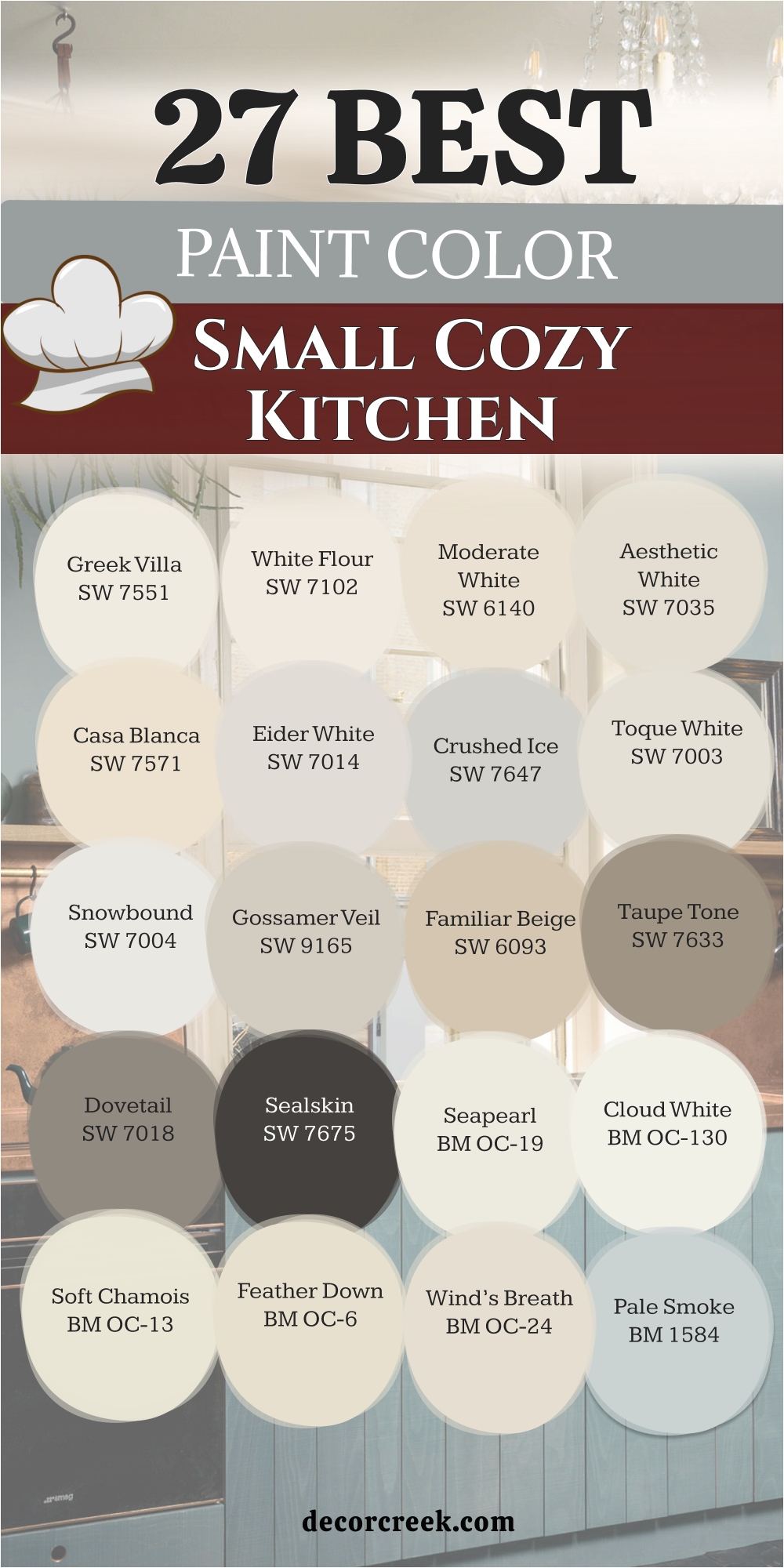
21 Paint Color For The Warm And Cozy Kitchen
Ivory Lace SW 7013
Ivory Lace SW 7013 offers a very soft and delicate feeling that makes a kitchen feel like it is glowing. This color is much warmer than a standard white and helps to create a very friendly atmosphere for your family.
I suggest using it if you want your kitchen to feel very light but also very snug and comfortable. It looks wonderful with light wood floors and helps to make the walls look very smooth and very clean for guests. You will notice that it makes the morning sun look very golden and very happy on your kitchen breakfast table.
It is a very popular choice for creating a home that feels very soft and very well-balanced for daily life. This shade helps your kitchen feel very airy and light which is a great way to start your morning. It is a very reliable paint that makes your white trim look very crisp and very pretty in any light.
Best used in: kitchens, bedrooms, trim, and nursery rooms
Pairs well with: Accessible Beige SW 7036, Urbane Bronze SW 7048, Alabaster SW 7008, warm wood The key rule of this color for farmhouse style is to use it where you want natural light to feel kind, soft, and inviting throughout the day.
🎨 Check out the complete guide to this color right HERE 👈

White Sesame SW 9586
White Sesame SW 9586 is a very creamy and warm off-white that brings a lot of traditional style to a kitchen. This color is great for making a room feel very cozy and very traditional for your kids and your guests.
I like to use this when the kitchen has a lot of stone and tile to catch the light. It is a very gentle shade that does not feel harsh on your eyes even when the sun is bright. You will find that it makes your wooden cabinets look very rich and very well-cared for in the room.
This paint provides a very soft background that makes your colorful kitchen towels and plates look very nice and bright. It is a very welcoming color that makes people want to sit down and have a long talk together. Using this shade is a smart way to make a kitchen feel very special and very well-designed for you.
Best used in: kitchens, dining rooms, hallways, and living areas
Pairs well with: Shoji White SW 7042, Iron Ore SW 7069, Kilim Beige SW 6106, brass hardware The key rule of this color for farmhouse style is to use it where you want natural light to feel kind, soft, and inviting throughout the day.
🎨 Check out the complete guide to this color right HERE 👈
Napery SW 6386
Napery SW 6386 is a warm yellow-white that feels very sun-drenched and happy on your kitchen walls for the family. This color brings a lot of warmth to a kitchen and makes it feel very traditional and very sweet for everyone.
I suggest using this if your kitchen feels a bit cold or if you have a lot of dark furniture. It helps to bridge the gap between different materials and makes the whole room look very put together and neat. You will enjoy how it makes the kitchen feel very snug and very safe during the evening hours at home.
This shade is a great choice for creating a look that is very traditional and very soft for your meals. It reflects light in a very kind way that makes every person in the room look very healthy and good. This is a very comfortable color that makes the heart of your home feel very sweet and pleasant.
Best used in: kitchens, breakfast nooks, laundry rooms, and guest rooms
Pairs well with: Dover White SW 6385, Svelte Sage SW 6164, French Roast SW 6069, copper The key rule of this color for farmhouse style is to use it where you want natural light to feel kind, soft, and inviting throughout the day.
Pavilion Beige SW 7512
Pavilion Beige SW 7512 is a very light and soft tan that feels very sophisticated and very modern on the walls. This color is a favorite for cozy kitchens because it is more interesting than a plain white paint choice for you.
I love how it looks with white cabinets and silver faucets for a very modern and very clean look. It helps to make the walls look very smooth and hides small bumps or marks from a busy family life.
You will see that it changes a lot during the day and looks very different in the morning. It is a very sophisticated shade that makes your kitchen look like it was designed by an expert for you. This paint helps to create a very quiet and very balanced atmosphere that is perfect for a family home. It is a very stylish pick that makes your kitchen feel very updated and very high-end for the year.
Best used in: kitchens, living rooms, whole-house painting, and entryways
Pairs well with: Alabaster SW 7008, Balanced Beige SW 7037, Urban Bronze SW 7048, marble The key rule of this color for farmhouse style is to use it where you want natural light to feel kind, soft, and inviting throughout the day.
🎨 Check out the complete guide to this color right HERE 👈
Ligonier Tan SW 7717
Ligonier Tan SW 7717 is a rich and deep tan that brings a lot of warmth and soul to the kitchen. This color is like a warm sandy beach and makes the walls feel very solid and very grounded for families.
recommend this if you want your kitchen to feel very fancy but also very welcoming and very friendly. It works beautifully with gold accents and dark wood furniture to create a very classic and pretty look in the room. You will find that it makes the room feel very bright and very open even if you use dark colors.
This shade is a great choice for making a kitchen feel like a very important part of the whole house. It provides a very soft and glowing background that makes your morning breakfast feel very special and very calm. Using this color is a wonderful way to add a bit of elegance to your home without spending much.
Best used in: kitchens, dining rooms, exteriors, and traditional living rooms
Pairs well with: Divine White SW 6105, Latte SW 6108, Foothills SW 7514, dark wood The key rule of this color for farmhouse style is to use it where you want natural light to feel kind, soft, and inviting throughout the day.
Wool Skein SW 6148
Wool Skein SW 6148 is a very light and soft tan that has a tiny bit of green inside to keep it soft. This color is great for kitchens that have a lot of natural light coming in from the big windows.
I like to use this to make a room feel very fresh and very modern without it feeling like a cold box. It looks wonderful with dark wood cabinets or black accents for a very sharp and very clean look for you. You will notice that it makes your white trim look very bright and very bold in the kitchen area today.
his shade helps to make the walls feel very light and very airy which is perfect for a cooking space. It is a very trendy color that makes your home feel very current and very well-decorated for your family. This paint choice shows that you like a clean and simple look that still has a lot of personality.
Best used in: kitchens, bedrooms, bathrooms, and laundry rooms
Pairs well with: Greek Villa SW 7551, Urban Bronze SW 7048, Svelte Sage SW 6164, oak The key rule of this color for farmhouse style is to use it where you want natural light to feel kind, soft, and inviting throughout the day.
🎨 Check out the complete guide to this color right HERE 👈

Canvas Tan SW 7531
Canvas Tan SW 7531 is a very light and warm tan that helps to make a kitchen feel very open and clean. This color is very popular for people who love a modern and minimalist look in their family home for the year.
I often use this when a kitchen has a lot of wood and stone to create a very organic and soft vibe. It helps to bounce the light around the room and makes the area feel much larger than it really is. You will enjoy how it makes the kitchen feel very quiet and very focused while you are busy cooking.
This shade is very easy to live with because it stays neutral and does not change much in light. It provides a very crisp background that makes your green plants and fresh herbs look very vibrant and pretty. This is a great choice for a kitchen that needs a fresh and very warm look to feel good.
Best used in: kitchens, living rooms, hallways, and open spaces
Pairs well with: Pure White SW 7005, Foothills SW 7514, French Roast SW 6069, wicker The key rule of this color for farmhouse style is to use it where you want natural light to feel kind, soft, and inviting throughout the day.
🎨 Check out the complete guide to this color right HERE 👈

Nomadic Desert SW 6107
Nomadic Desert SW 6107 is a warm and medium-toned tan that feels very creamy and very gentle for your kitchen. This color is a bit deeper than a light beige and brings a lot of comfort to a family kitchen for you.
I suggest using this if you want a look that is very traditional but still feels very fresh and updated. It works beautifully with warm wood tones and helps to make the room feel very cozy and very snug. You will find that it creates a very soft and glowing atmosphere when you turn on your kitchen lights.
This shade is a great pick for making a room feel very welcoming and very friendly for all guests. It provides a very neutral background that lets your colorful kitchen gadgets and fruit look very nice and bright. Using this paint is a smart way to make a kitchen feel like a very warm and happy place.
Best used in: kitchens, family rooms, bedrooms, and entryways
Pairs well with: Latte SW 6108, Kilim Beige SW 6106, Divine White SW 6105, warm wood The key rule of this color for farmhouse style is to use it where you want natural light to feel kind, soft, and inviting throughout the day.
🎨 Check out the complete guide to this color right HERE 👈

Chatura Gray SW 9169
Chatura Gray SW 9169 is a warm and deep gray that has a lot of brown inside to keep it looking very soft. This color is a favorite for designers who want a very modern and very rich look in a kitchen space.
I love how it makes the walls look very solid and provides a great background for your kitchen plants. It helps to make a kitchen feel very grounded and very sturdy which is a great way to feel more safe. You will notice that it makes your cabinets look very sharp and very clean for your family and guests.
This shade is perfect for people who love a very simple and very modern look in their home today. It is a very high-quality gray that makes the room feel very expensive and very well-designed for you. This is a wonderful choice for a kitchen that needs to feel very strong and very warm for the family.
Best used in: kitchens, accent walls, exteriors, and home offices
Pairs well with: Aesthetic White SW 7035, Shoji White SW 7042, Urban Bronze SW 7048, stone The key rule of this color for farmhouse style is to use it where you want natural light to feel kind, soft, and inviting throughout the day.
🎨 Check out the complete guide to this color right HERE 👈
Thunderous SW 6201
Thunderous SW 6201 is a very deep and moody gray-green that feels very sophisticated and very modern on the walls. This color is a perfect choice for a kitchen because it is more interesting than a white or a beige.
I recommend this shade for people who want a dark look that still feels very soft and very inviting for the family. It looks wonderful with white trim and light-colored stone counters to create a very balanced and pretty look. You will enjoy how it makes the room feel very steady and very well-designed for your daily life and tasks.
This paint helps to mask any small fingerprints or dust that might show up in a busy family kitchen. It provides a very quiet background that makes your family art and photos look very nice and special. This is a great choice for a kitchen that needs a soft and modern touch to feel truly like home.
Best used in: kitchen cabinets, islands, exteriors, and accent walls
Pairs well with: Sea Salt SW 6204, Alabaster SW 7008, Pewter Green SW 6208, marble The key rule of this color for farmhouse style is to use it where you want natural light to feel kind, soft, and inviting throughout the day.
Svelte Sage SW 6164
Svelte Sage SW 6164 is a warm and friendly green that brings a lot of traditional style and comfort to a kitchen. This color is like a soft field and makes the walls feel very solid and very grounded for your family.
I like to use this when a kitchen has a lot of white cabinets to provide a soft and very pretty contrast. It helps to make the room feel very cozy and very snug for long talks over a cup of hot soup.
You will find that it creates a very warm and welcoming atmosphere that makes people want to stay for dinner. This shade is a great pick for making a house feel more like a home as soon as you paint. It works well with warm metal finishes like brass or copper faucets and handles for a very classic look. Using this color is a wonderful way to add a lot of warmth and soul to a kitchen space.
Best used in: kitchens, dining rooms, bedrooms, and exteriors
Pairs well with: Moderate White SW 6140, Clary Sage SW 6178, Foothills SW 7514, wood The key rule of this color for farmhouse style is to use it where you want natural light to feel kind, soft, and inviting throughout the day.
🎨 Check out the complete guide to this color right HERE 👈
Grant Beige HC-83
Grant Beige HC-83 is a medium-toned tan that brings a lot of richness and style to a warm and cozy kitchen. This color is a bit deeper and helps to make the room feel very substantial and very high-quality for you. I suggest using this on walls to create a very stylish and traditional look in your family home for the year.
It looks amazing with white trim and light counters because it makes the whole kitchen look very sharp. You will enjoy how it makes the kitchen feel very private and very cozy during the evening hours at home. This shade is excellent for hiding any small messes that happen in a busy kitchen with kids and pets.
It provides a very sophisticated background that makes your kitchen look like a professional designer chose the paint. This is a great choice for people who want a kitchen to have a very strong and beautiful personality.
Best used in: kitchens, living rooms, hallways, and dining areas
Pairs well with: White Dove OC-17, Simply White OC-117, Revere Pewter HC-172, oak The key rule of this color for farmhouse style is to use it where you want natural light to feel kind, soft, and inviting throughout the day.
🎨 Check out the complete guide to this color right HERE 👈

Shaker Beige HC-45
Shaker Beige HC-45 is a classic and warm tan that has been a favorite for many years for family homes. This color is very steady and makes a kitchen look very traditional and very well-organized for your daily life.
I love how it looks with dark wood floors and white cabinets for a very classic and pretty look. It helps to create a very focused and very quiet atmosphere for your cooking and baking tasks during the day. You will see that it makes your silver or gold kitchen hardware look very sharp and very clean on the walls.
This shade is a great way to add a bit of warmth to a room without making it feel too small. It is a very popular choice for people who want a kitchen that looks very professional and very stylish. This is a wonderful paint pick for a kitchen that needs a strong and very soft tan touch for the family.
Best used in: kitchens, dining rooms, living rooms, and entryways
Pairs well with: Swiss Coffee OC-45, Simply White OC-117, Hale Navy HC-154, warm wood The key rule of this color for farmhouse style is to use it where you want natural light to feel kind, soft, and inviting throughout the day.
🎨 Check out the complete guide to this color right HERE 👈

Manchester Tan HC-81
Manchester Tan HC-81 is a very light and soft tan that feels like fresh linen or a soft sandy beach. This color is very rich and helps to create a very high-end and very fancy look for your family and guests.
I recommend using this on all the walls to make the kitchen feel very open and very warm for your kids. It makes gold or brass handles look like beautiful jewelry against the soft and rich background of the paint. You will love how it makes the kitchen feel very private and very cozy during your dinner parties at home.
Even though it is a light color it stays very warm because of the tan tones mixed inside the base. This shade is perfect for people who want a look that is very simple and very chic for the home. It provides a very powerful and beautiful look that makes your kitchen feel very special and very unique.
Best used in: kitchens, living rooms, hallways, and open floor plans
Pairs well with: White Dove OC-17, Simply White OC-117, Revere Pewter HC-172, wood The key rule of this color for farmhouse style is to use it where you want natural light to feel kind, soft, and inviting throughout the day.
🎨 Check out the complete guide to this color right HERE 👈

Lenox Tan HC-44
Lenox Tan HC-44 is a deep and warm tan that brings a lot of color and comfort to a kitchen space. This color is a favorite for people who want a very rich and very traditional look for the kitchen walls.
I like to use this to make a room feel very established and very cozy for a busy family to enjoy. It has a tiny bit of gold and orange which keeps it looking very warm and happy in the morning light. You will find that it makes your white trim look very crisp and helps your kitchen cabinets look fresh.
This shade is a great choice for creating a look that is very traditional but also very sophisticated for guests. It provides a very quiet background that lets your colorful fruits and fresh flowers look very vibrant and nice. This is a wonderful paint for a kitchen that needs a soft and very warm feel to be happy.
Best used in: kitchens, dining rooms, libraries, and entryways
Pairs well with: Simply White OC-117, Cloud White OC-130, Shaker Beige HC-45, brass The key rule of this color for farmhouse style is to use it where you want natural light to feel kind, soft, and inviting throughout the day.
🎨 Check out the complete guide to this color right HERE 👈
Natural Wicker OC-1
Natural Wicker OC-1 is a warm and soft tan that feels very creamy and very gentle on the kitchen walls. This color is very popular because it brings a lot of traditional style and comfort to any family home.
I recommend this if you want your kitchen to feel very cozy and very welcoming for your kids and friends. It works beautifully with warm wood tones and helps to make the whole room feel very snug and pretty.
You will enjoy how it makes the room feel very bright and very open even if you have dark furniture. This shade is a great choice for making a house feel more like a home as soon as you finish. It provides a very soft and glowing background that makes your morning coffee time feel very special and calm. Using this color is a smart way to add a lot of warmth and soul to a kitchen space.
Best used in: kitchens, dining rooms, bedrooms, and entryways
Pairs well with: Simply White OC-117, White Dove OC-17, Shaker Beige HC-45, wood The key rule of this color for farmhouse style is to use it where you want natural light to feel kind, soft, and inviting throughout the day.
🎨 Check out the complete guide to this color right HERE 👈
Ballet White OC-9
Ballet White OC-9 is a very light and creamy off-white that feels very sun-filled and happy on the walls. This color is great for kitchens because it makes them feel much brighter and much more open for your family.
I suggest using this if you want a look that is very cheerful and very friendly for everyone to enjoy. It helps to make the walls look very soft and provides a very warm and welcoming atmosphere for all guests.
You will find that it makes your wooden furniture and floors look very rich and very well-balanced in the room. This shade is a great pick for creating a kitchen that feels very sweet and very light for your cooking. It provides a very soft background that makes your green plants and herbs look very vibrant and healthy. This is a wonderful paint for a kitchen that needs a happy and very warm touch to feel good.
Best used in: kitchens, living rooms, bedrooms, and whole-house painting
Pairs well with: Simply White OC-117, Revere Pewter HC-172, Kendall Charcoal HC-166, gold The key rule of this color for farmhouse style is to use it where you want natural light to feel kind, soft, and inviting throughout the day.
🎨 Check out the complete guide to this color right HERE 👈
Stoneware CSP-245
Stoneware CSP-245 is a light and warm tan that feels very sophisticated and very modern on the kitchen walls. This color is a perfect middle ground because it is more interesting than a white but lighter than a brown.
I recommend this shade for people who want a tan look that still feels very soft and inviting. It looks wonderful with white trim and light stone counters to create a very balanced and pretty look. You will enjoy how it makes the room feel very steady and very well-designed for your daily life.
This paint helps to mask any small marks or dust that might show up in a busy family kitchen area. It provides a very quiet background that makes your family art and photos look very nice and special. This is a great choice for a kitchen that needs a soft and modern touch to feel like home.
Best used in: kitchens, living rooms, hallways, and open floor plans
Pairs well with: White Dove OC-17, Revere Pewter HC-172, Kendall Charcoal HC-166, stone The key rule of this color for farmhouse style is to use it where you want natural light to feel kind, soft, and inviting throughout the day.
Elmira White HC-84
Elmira White HC-84 is a very light and airy tan that brings a bit of the beach into your kitchen. This color feels very fresh and very cool and helps to make the room feel much more open and light.
I like to use this for people who want a hint of color that still feels very neutral. It works beautifully with white cabinets and silver hardware to create a very clean and modern look for families. You will enjoy how it makes the kitchen feel very peaceful and very quiet for your morning breakfast time.
This shade is a great alternative to a plain gray if you want something that feels a bit more warm. It is a very gentle color that makes the room feel very soft and very welcoming to everyone at home. This is a smart choice for a kitchen that needs a fresh and unique personality for the year.
Best used in: kitchens, living rooms, bedrooms, and whole-house painting
Pairs well with: White Dove OC-17, Revere Pewter HC-172, Hale Navy HC-154, silver The key rule of this color for farmhouse style is to use it where you want natural light to feel kind, soft, and inviting throughout the day.
Horizon OC-53
Horizon OC-53 is a very light and soft gray that has a tiny bit of blue to keep it fresh. This color is very calming and helps to create a very peaceful and very quiet atmosphere in a kitchen.
I recommend this if you want your kitchen to feel like a soft morning sky where you can relax. It looks wonderful with light-colored wood floors and white stone counters in a modern and clean design for you.
You will find that it makes the room feel very fresh and very airy even during a busy day. This shade is a great pick for making a room feel very welcoming and very friendly for all family. It provides a very soft background that makes your green plants and fresh herbs look very vibrant and healthy. Using this color is a wonderful way to add a bit of fresh color and peace to a kitchen.
Best used in: kitchens, bathrooms, bedrooms, and modern living areas
Pairs well with: Simply White OC-117, Gray Owl OC-52, Hale Navy HC-154, marble The key rule of this color for farmhouse style is to use it where you want natural light to feel kind, soft, and inviting throughout the day.
🎨 Check out the complete guide to this color right HERE 👈

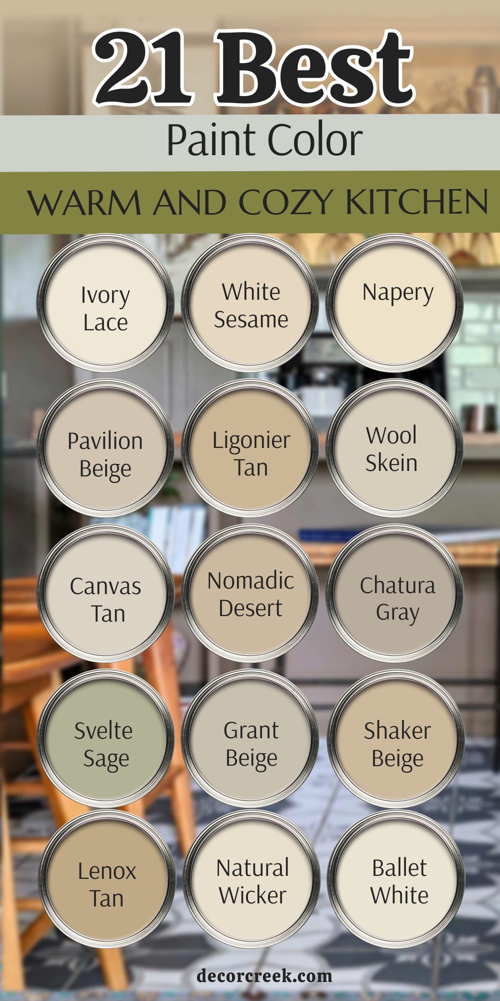
My Final Thoughts About 31 Paint Color Ideas For The Cozy Kitchen
It is truly impressive how a simple change in hue can completely shift the energy of a kitchen. Whether you are leaning toward the earthy depth of Evergreen Fog or the airy brightness of Greek Villa, the cozy factor ultimately comes down to how these colors interact with your specific light and lifestyle.
For a kitchen to feel cozy rather than just clean, it is often best to look for colors with beige, tan, or soft green undertones. These shades mimic natural elements and make the space feel lived-in and grounded. If you are working with a small space, you don’t have to feel restricted to pure white. Colors like Sea Salt or Pale Oak offer enough pigment to show personality while still reflecting enough light to prevent a cramped feeling.
Remember that the way a shadow falls on a color is what creates that sought-after depth. A cozy kitchen doesn’t exist in a vacuum, so ensure your choice flows into the rest of your home. Using a bridge color on the trim can tie even the boldest cabinet colors back to the rest of the house.