Sherwin-Williams Urbane Bronze is a rich, moody paint color that instantly brings depth to any room. It sits somewhere between dark gray, deep brown, and charcoal, creating a cozy and grounded feeling.
Over the years, I have helped many families choose the right shades to match this heavy hue. It can feel tricky to pick the perfect partner for such a strong anchor, but it becomes simple once you see how different undertones react. My goal is to help you find combinations that make your home feel intentional, inviting, and comfortable.
When you work with a strong dark shade like this, you have to think about how it acts under different lighting conditions throughout the long day. Sometimes it looks like a deep chocolate brown, and other times it looks like a rich piece of dark volcanic stone.
It changes its personality completely depending on whether you have large bright windows or soft warm lamps glowing in the corner.
If you pair it with a color that is too bright or harsh, the room can end up feeling shocking and disjointed to look at. If you choose a partner that has the right warm undertones, the entire room comes together like a beautiful masterpiece.
Why I Always Trust Sherwin-Williams and Benjamin Moore for the Best Colors That Go With Urbane Bronze
I have spent years transforming residential interiors and preparing homes to look flawlessly polished, and when it comes to designing a space around a deep, commanding anchor like Urbane Bronze, paint quality is absolutely everything. Sherwin-Williams and Benjamin Moore are my absolute favorite, go-to brands because their liquid pigments are incredibly rich, heavy, and structurally stable.
Urbane Bronze presents a highly unique challenge for coordinating colors. Because this tone is a complex blend of deep brown, gray, and subtle green, it is a master chameleon that is highly susceptible to “color shifting.” Cheaper paint brands frequently break down when placed next to such a powerful dark hue, causing neighboring walls to look muddy, washed out, or flash an unexpected, unflattering undertone.
Premium formulations from these two industry leaders ensure that the complementary shades you select maintain their true, intentional character on the wall. Their colors are engineered with complex, grounded undertones that can either sharply frame or softly balance the heavy bronze weight, looking clean, deliberate, and undeniably expensive.
Furthermore, their high-end finishes offer the structural durability and seamless coverage necessary to keep your entire color palette looking fresh and flawless for years to come.
How I Choose the Perfect Color to Pair With Urbane Bronze
Finding the right color to pair with Urbane Bronze requires a highly strategic approach to balance out the room’s unique architectural layout, hard fixtures, and lighting sources. I always begin my design process by strictly analyzing the natural and artificial light flooding the space. If your room lacks large windows and relies heavily on warm artificial bulbs, pairing the bronze with a crisp, cool off-white or a misty blue-gray will balance the heavy warmth perfectly without letting the room feel claustrophobic.
Conversely, if the space is blessed with bright, natural morning sun, you can easily pull off a rich, organic linen tone or a deep, earthy forest green for a stunning, dramatic look.
Next, I look closely at the existing hard finishes in the room, such as the flooring, countertops, and metallic hardware. Urbane Bronze looks incredibly modern, sharp, and tailored when paired with bright white trim and matte black fixtures, but it can look wonderfully classic, soft, and timeless when placed next to warm honey oak, leather textures, or polished brass.
To guarantee success and avoid a stressful mistake, the ultimate step is to paint large, generous sample swatches of your accent options directly on the walls next to your Urbane Bronze samples and woodwork. I always tell my clients to observe these samples at different times of the day to see how the tones interact as the sun moves.
Ultimately, you want to select a balanced pairing that maintains its clarity and brings out the organic, luxurious depth of the bronze, ensuring your home feels like a cohesive, high-end retreat.
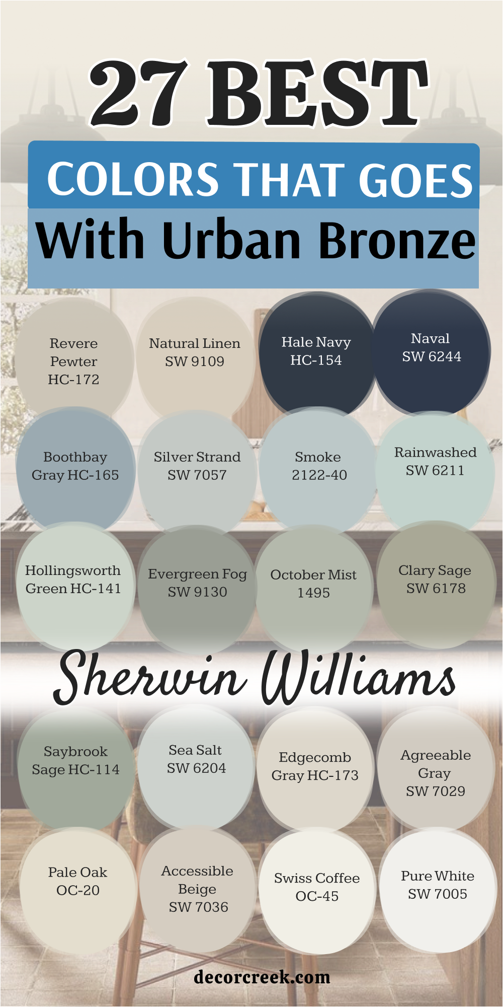
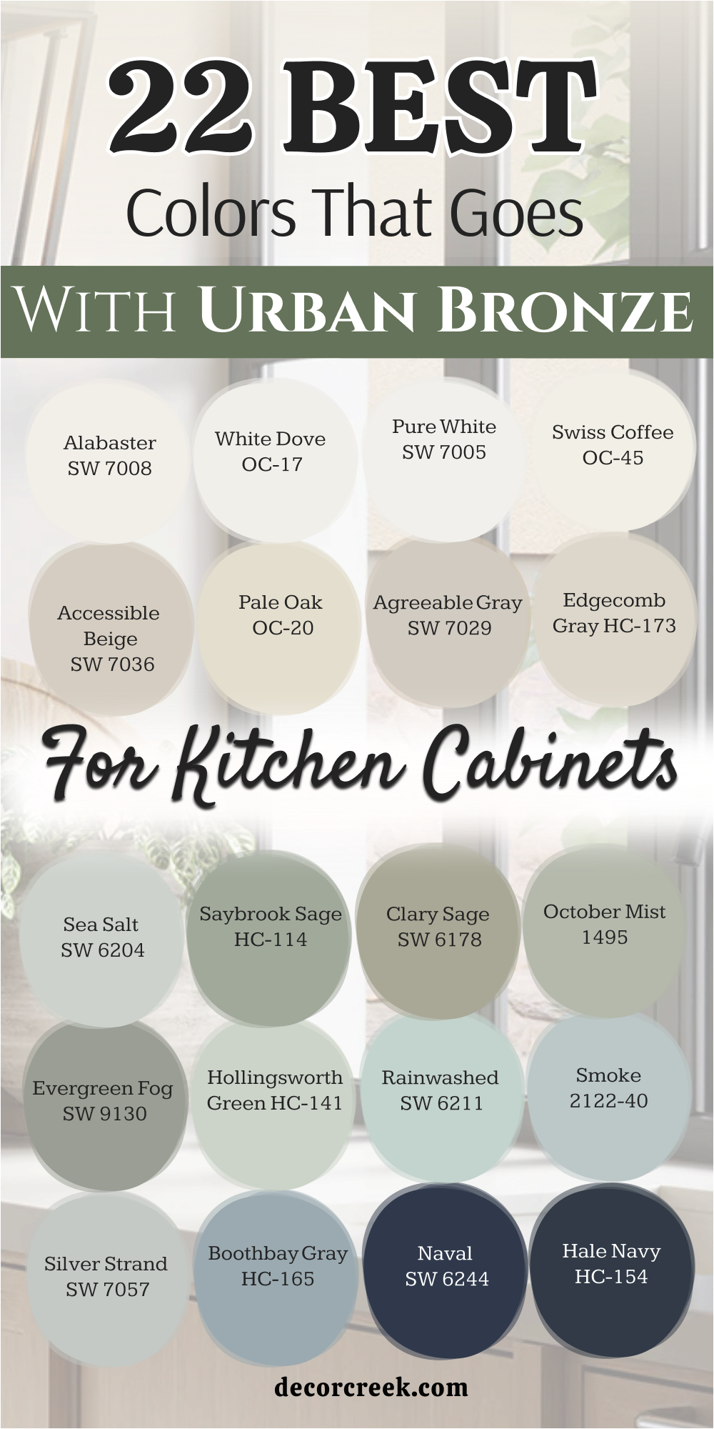
22 Best Colors that Goes with Urban Bronze for Kitchen Cabinets
Alabaster SW 7008
Alabaster SW 7008 provides a creamy, warm backdrop that keeps your kitchen from feeling too dark. This soft white breaks up the heavy look of dark lower cabinets while keeping the room feeling friendly.
I love using this combination because it strikes a balance between clean design and cozy living. It does not feel stark or cold like a true bright white often does. Your kitchen will feel bright during the day and incredibly cozy once the sun goes down. It creates a beautiful contrast that immediately welcomes guests into the heart of your home.
Best used in: living rooms, kitchens, hallways, bedrooms, and farmhouse exteriors
Pairs well with: Iron Ore SW 7069, Agreeable Gray SW 7029, Natural Linen SW 9109, warm wood tones
The key rule of this color for farmhouse style is to use it where you want natural light to feel kind, soft, and inviting throughout the day.
🎨 Check out the complete guide to this color right HERE 👈

White Dove OC-17
White Dove OC-17 features a touch of gray in its background that cuts through any unwanted yellow tones. This shade makes your upper cabinets look light while anchoring the dark bronze on the base islands.
I recommend this pick for homeowners who want a clean look without the clinical feel of a hospital. It works nicely with marble countertops and brass hardware details. The soft undertone keeps the entire cooking area looking soft and beautifully integrated. You will find that it brings out the rich brown notes in your main dark paint color.
Best used in: kitchens, dining rooms, trim work, ceilings, and open floor plans
Pairs well with: Revere Pewter HC-172, Hale Navy HC-154, Chelsea Gray HC-168, warm metallic hardware
The key rule of this color for classic style is to apply it on trim and upper cabinetry to keep the upper half of the room feeling airy.
🎨 Check out the complete guide to this color right HERE 👈

Pure White SW 7005
Pure White SW 7005 serves as a crisp option that does not have strong blue or yellow undertones. This choice keeps your kitchen looking sharp and modern next to a deep bronze island. I use it when a client wants a high-contrast look that still feels soft on the eyes.
It reflects just enough light to open up smaller cooking areas. The color matches almost any tile backsplash you choose to install. It gives the kitchen a fresh start every single morning.
Best used in: modern kitchens, bathrooms, trim, doors, and exterior siding
Pairs well with: Black Fox SW 7020, Charcoal Blue SW 2739, Repose Gray SW 7015, polished chrome
The key rule of this color for modern style is to use it on large wall sections to create a clean, crisp frame for dark focal points.
🎨 Check out the complete guide to this color right HERE 👈

Swiss Coffee OC-45
Swiss Coffee OC-45 delivers a warm, rich creaminess that softens the masculine edge of dark bronze. This color makes a kitchen feel like a cozy cottage where people want to gather and talk.
I notice it pairs beautifully with warm oak floors and woven baskets. It prevents the dark bronze from looking too harsh or gloomy in low light. The creamy base brings out the hidden warmth in the dark cabinets. It is a wonderful choice for creating a family-friendly atmosphere.
Best used in: traditional kitchens, cozy living rooms, entryways, and historical homes
Pairs well with: Artifact SW 6138, Saybrook Sage HC-114, Edgecomb Gray HC-173, antique brass
The key rule of this color for traditional style is to use it in rooms with plenty of warm textiles to build a welcoming environment.
🎨 Check out the complete guide to this color right HERE 👈

Accessible Beige SW 7036
Accessible Beige SW 7036 acts as a fantastic neutral that has a strong grayish-beige background. This shade prevents your kitchen from looking flat by adding a layer of muddy warmth.
I pick this color when whites feel too bright for a homeowner’s personal taste. It transitions smoothly between dark cabinets and light countertops. The neutral tone keeps the room feeling grounded and completely connected. It holds its color well even when your kitchen lights are turned down low.
Best used in: open concept kitchens, family rooms, hallways, and accent walls
Pairs well with: Urbane Bronze SW 7048, Pure White SW 7005, Cadet SW 9143, dark stained wood
The key rule of this color for transitional style is to blend it with dark accents to create a balanced look that is neither too hot nor too cold.
🎨 Check out the complete guide to this color right HERE 👈

Pale Oak OC-20
Pale Oak OC-20 looks like a soft, weathered gray with a warm heart beating underneath. This color works beautifully on kitchen walls when the cabinets are painted a dark bronze. I love how it changes with the sun, looking bright at noon and warm in the evening.
It provides a quiet backdrop that lets your dark woodwork stand out as the main star. The paint color keeps the kitchen looking elegant without trying too hard. It bridges the gap between modern clean lines and old-world comfort.
Best used in: small kitchens, bright bedrooms, bathrooms, and laundry rooms
Pairs well with: Kendall Charcoal HC-166, White Dove OC-17, Boothbay Gray HC-165, matte black hardware
The key rule of this color for elegant style is to use it in well-lit areas where its delicate warm undertones can shine without turning muddy.
🎨 Check out the complete guide to this color right HERE 👈

Agreeable Gray SW 7029
Agreeable Gray SW 7029 is a highly popular option because it adapts to almost any lighting situation. This greige shade supports the dark bronze cabinets by adding a soft layer of neutral color to the walls.
I find that it keeps a kitchen feeling balanced and pleasant to look at. It does not lean too far into blue or too far into yellow. The color creates a smooth flow from the kitchen into the rest of the house. It is a safe choice that always yields beautiful results.
Best used in: kitchens, whole-house painting, dark hallways, and entryways
Pairs well with: Anew Gray SW 7030, Alabaster SW 7008, Mega Greige SW 7031, oil rubbed bronze
The key rule of this color for versatile style is to use it as a main wall color to tie different cabinet finishes together seamlessly.
🎨 Check out the complete guide to this color right HERE 👈

Edgecomb Gray HC-173
Edgecomb Gray HC-173 provides an earthy creaminess that feels rich and substantial on kitchen walls. This color prevents the dark bronze from feeling cold or isolated in a large room. I use it to create a soft contrast that feels gentle on the eyes first thing in the morning.
It goes well with limestone tiles and natural stone accents. The shade adds a touch of historical charm to a modern kitchen setup. It makes the entire cooking area feel established and deeply rooted.
Best used in: dining kitchens, living rooms, corridors, and exterior trim
Pairs well with: Hale Navy HC-154, White Dove OC-17, Revere Pewter HC-172, natural stone
The key rule of this color for timeless design is to use it alongside natural stone elements to bring out its organic warmth.
🎨 Check out the complete guide to this color right HERE 👈

Sea Salt SW 6204
Sea Salt SW 6204 introduces a whisper of green and blue that lightens the mood of a dark kitchen. This color acts like a breath of fresh air next to heavy bronze cabinets. I like using it to bring a touch of the outdoors inside the home.
The cool undertone contrasts beautifully with the warm brown notes in the bronze paint. It keeps the kitchen feeling interesting without relying on bright, loud colors. Your kitchen will feel unique and personal with this combination.
Best used in: coastal kitchens, bathrooms, sunrooms, and laundry areas
Pairs well with: Summit Gray SW 7669, High Reflective White SW 7757, Alabaster SW 7008, light wood tones
The key rule of this color for coastal style is to place it near windows where natural light emphasizes its soft green-blue personality.
🎨 Check out the complete guide to this color right HERE 👈

Saybrook Sage HC-114
Saybrook Sage HC-114 brings a rich, earthy green tone into the kitchen configuration. This color matches the outdoor feelings hidden inside the dark bronze paint. I recommend this pairing for homes surrounded by trees or beautiful gardens.
It creates a seamless link between your indoor kitchen and the green world outside. The green tone feels steady and mature rather than bright or youthful. It turns your kitchen into a comforting sanctuary for cooking and baking.
Best used in: country kitchens, dining spaces, accent walls, and front doors
Pairs well with: Simply White OC-117, Shaker Beige HC-45, Urbane Bronze SW 7048, copper pots
The key rule of this color for country style is to pair it with warm metals like copper or brass to highlight its rich heritage.
🎨 Check out the complete guide to this color right HERE 👈

Clary Sage SW 6178
Clary Sage SW 6178 introduces a soft, herbal green that feels like bringing a quiet garden inside your home. This color has yellow undertones that match the warm earthy qualities of dark bronze beautifully. I like using this shade on kitchen walls when the cabinets are coated in that deep, heavy bronze paint.
It feels rich and grounded without making the cooking area look small or dark. The combination reminds me of natural elements like moss and stone. Your family will feel a sense of comfort every time they walk into the room.
Best used in: kitchens, dining rooms, mudrooms, and cottage exteriors
Pairs well with: Alabaster SW 7008, Accessible Beige SW 7036, Urbane Bronze SW 7048, light oak flooring
The key rule of this color for garden-inspired style is to pair it with light woods to keep the green looking fresh and alive throughout the day.
🎨 Check out the complete guide to this color right HERE 👈

October Mist 1495
October Mist 1495 acts as a gentle, silver-green bridge between light neutrals and deep dark tones. This color feels soft as a blanket and adapts beautifully to different lighting conditions. I choose this shade when a homeowner wants a hint of color without committing to a loud or bright look.
It wraps around the dark bronze cabinets and softens their heavy, masculine edges. The kitchen feels instantly elevated into a peaceful retreat for cooking and sharing meals. It brings out the hidden gray notes in your dark paint choice.
Best used in: kitchens, bedrooms, bathrooms, and cozy reading nooks
Pairs well with: White Dove OC-17, Pale Oak OC-20, Iron Ore SW 7069, brushed brass hardware
The key rule of this color for soft organic style is to use it in rooms with large windows so the natural daylight can highlight its delicate silver undertones.
🎨 Check out the complete guide to this color right HERE 👈

Evergreen Fog SW 9130
Evergreen Fog SW 9130 delivers a gorgeous blend of green, gray, and a tiny hint of blue. This color feels substantial enough to stand up to the heavy weight of dark bronze. I love using this mix for a sophisticated, mid-tone look on kitchen walls or surrounding cabinets.
It does not disappear next to dark accents but instead creates a rich story. The kitchen takes on a handsome, tailored appearance that feels incredibly intentional. It is a wonderful pick for adding character to a cookie-cutter house.
Best used in: kitchen islands, accent walls, studies, and entryways
Pairs well with: Pure White SW 7005, Agreeable Gray SW 7029, Tricorn Black SW 6258, warm leather accents
The key rule of this color for tailored style is to use it where it can meet bright white trim to showcase its deep, moody personality.
🎨 Check out the complete guide to this color right HERE 👈

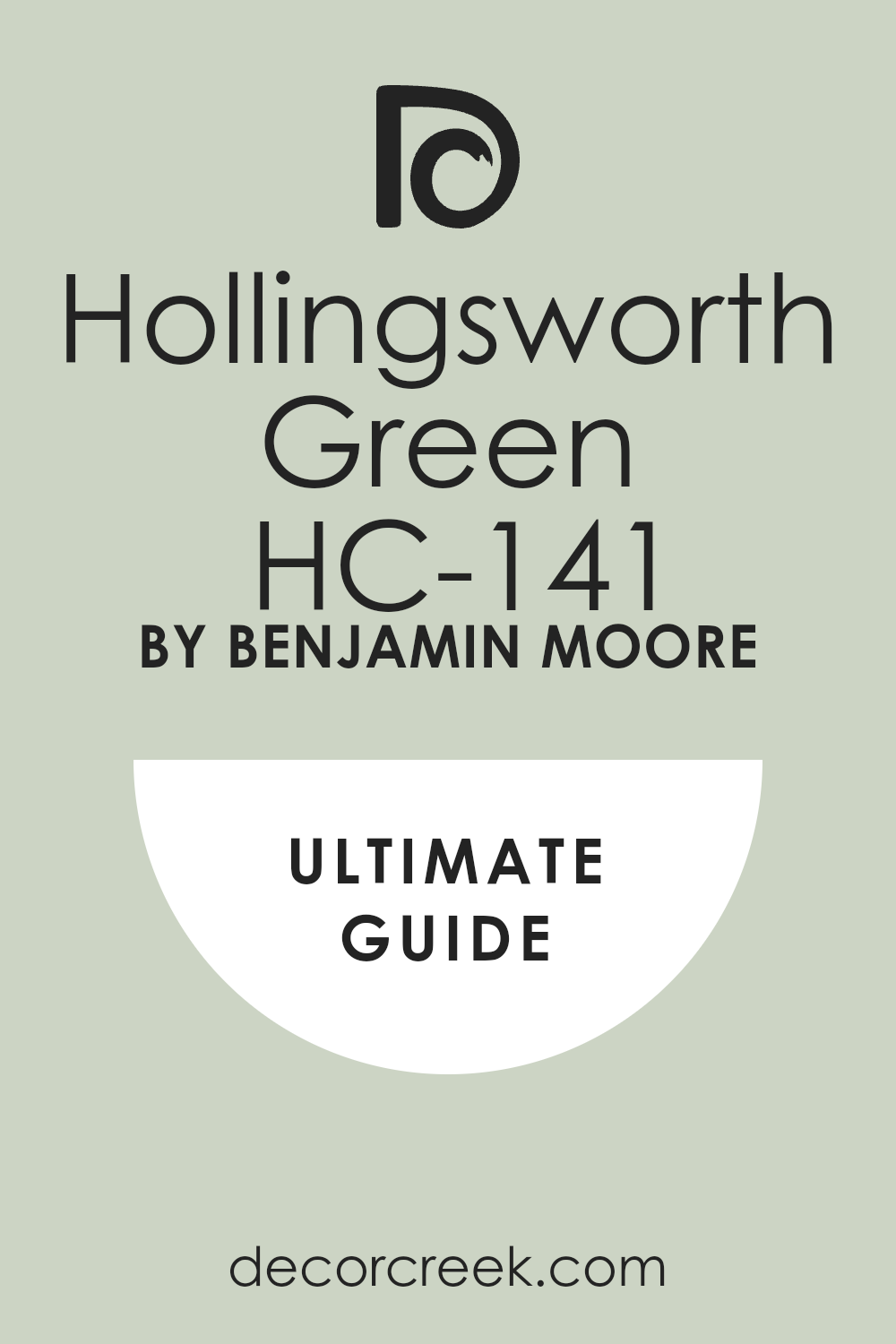
Hollingsworth Green HC-141
Hollingsworth Green HC-141 offers a light, watery green that has a lot of gray hidden inside. This choice brightens up dark corners around heavy bronze cabinets without looking like a children’s playroom. I recommend it for kitchens that feel a bit dark or cramped during the afternoon hours.
The color brings a cheerful but mature energy to the woodwork. It contrasts sharply with the dark bronze to make your layout look interesting and dynamic. You will love how it makes your kitchen feel clean and crisp.
Best used in: traditional kitchens, bright bathrooms, laundry rooms, and sunrooms
Pairs well with: Chantilly Lace OC-65, Edgecomb Gray HC-173, Urbane Bronze SW 7048, polished nickel
The key rule of this color for refreshing style is to use it alongside crisp white ceilings to maximize the bright, open feeling of the room.
🎨 Check out the complete guide to this color right HERE 👈
Rainwashed SW 6211
Rainwashed SW 6211 carries a clear blue-green tint that looks like a rainy sky over a forest. This color provides a cool contrast to the warm, brown-toned bronze on your main cabinets. I use this pairing when a client wants a kitchen that feels clean, light, and a little bit playful.
It keeps the dark bronze from looking too serious or heavy. The light bounces off this color beautifully, making the entire kitchen feel larger than it actually is. It feels like a fresh start every time you walk in.
Best used in: kitchens, guest bathrooms, beach house areas, and porch ceilings
Pairs well with: Snowbound SW 7004, Extra White SW 7006, Revere Pewter HC-172, light maple wood
The key rule of this color for airy style is to pair it with very light countertops to emphasize its cool, breezy nature.
🎨 Check out the complete guide to this color right HERE 👈

Smoke 2122-40
Smoke 2122-40 is a romantic gray-blue that has a heavy dose of smoke written right into its formula. This color acts as a stunning backdrop for dark bronze kitchen islands or lower cabinets. I notice it makes bronze look extra rich by bringing out its deepest charcoal undertones.
It feels elegant and expensive without being loud or boastful. The kitchen transforms into a beautifully curated room that looks like an interior design magazine. It works wonderfully with classic marble or quartz countertops.
Best used in: kitchens, formal dining rooms, master bedrooms, and front doors
Pairs well with: Simply White OC-117, Coventry Gray HC-169, Urbane Bronze SW 7048, dark walnut accents
The key rule of this color for elegant style is to use it where warm evening light can soften its cool gray-blue base.
🎨 Check out the complete guide to this color right HERE 👈

Silver Strand SW 7057
Silver Strand SW 7057 shifts between silver, gray, and green depending on how the sun hits the wall. This chameleon color supports dark bronze cabinets by adding an interesting layer of light reflection. I select this paint when a kitchen has modern lines and needs a clean, sophisticated color story.
It keeps the room looking bright while still offering a distinct personality. The dark bronze stands out as a bold statement piece against this soft, shimmering background. It is an excellent choice for a clean look.
Best used in: modern kitchens, open living spaces, bathrooms, and laundry zones
Pairs well with: Pure White SW 7005, Iron Ore SW 7069, Sea Salt SW 6204, stainless steel appliances
The key rule of this color for modern style is to use it across large, unbroken walls to see its beautiful color shifts throughout the day.
🎨 Check out the complete guide to this color right HERE 👈
Boothbay Gray HC-165
Boothbay Gray HC-165 is a steady, mid-tone blue-gray that feels very grounded and historic. This color pairs nicely with dark bronze to create a handsome, traditional kitchen atmosphere. I like how the blue notes in the gray bring out the warm brown tones in the bronze.
It prevents the kitchen from looking washed out or boring. The combination feels solid, dependable, and highly sophisticated. Your kitchen will look like it was designed by an expert who knows how to handle color.
Best used in: kitchen cabinets, island bases, mudrooms, and exterior shutters
Pairs well with: White Dove OC-17, Swiss Coffee OC-45, Urbane Bronze SW 7048, unlacquered brass
The key rule of this color for historic style is to pair it with warm metal hardware like brass or copper to highlight its rich blue tones.
🎨 Check out the complete guide to this color right HERE 👈
Naval SW 6244
Naval SW 6244 is a deep, majestic navy blue that matches the intensity of your dark bronze paint. This combination is bold and dramatic, perfect for a kitchen that wants to make a strong impression.
I use this mix by putting the navy on the walls and the bronze on the cabinets for a moody look. The dark blue adds an extra layer of richness that standard grays or whites cannot provide. It feels incredibly cozy and sheltering when you are cooking at night. It turns your kitchen into a spectacular focal point.
Best used in: accent walls, kitchen islands, dining rooms, and home libraries
Pairs well with: Alabaster SW 7008, Accessible Beige SW 7036, Pure White SW 7005, gold accents
The key rule of this color for dramatic style is to ensure you have good lighting fixtures so the deep tones do not feel gloomy.
🎨 Check out the complete guide to this color right HERE 👈

Hale Navy HC-154
Hale Navy HC-154 operates as a classic, historic navy that carries a lot of gray in its background. This shade balances the deep bronze by creating a rich, dark color story that feels very traditional. I recommend this pairing for large kitchens that can handle a lot of deep color on the woodwork.
It looks beautiful next to bright white farmhouse sinks and shiny white tile backsplashes. The contrast between the navy, bronze, and white feels crisp and perfectly organized. It brings a lot of dignity to your home.
Best used in: kitchen islands, butler’s pantries, exterior siding, and front doors
Pairs well with: White Dove OC-17, Revere Pewter HC-172, Classic Gray OC-23, warm wood floors
The key rule of this color for traditional style is to use it alongside bright white accents to keep the deep colors looking sharp and clean.
🎨 Check out the complete guide to this color right HERE 👈

Natural Linen SW 9109
Natural Linen SW 9109 provides a warm, sandy backdrop that feels like a cozy beach towel. This color takes away any harshness from the dark bronze cabinets and replaces it with pure comfort. I love this shade because it does not turn gray or cold in shadows.
It keeps your kitchen looking cheerful, bright, and deeply welcoming for family members. The combination looks wonderful with woven bar stools and natural wood cutting boards. It makes the kitchen feel like the true heart of the house.
Best used in: kitchen walls, open concept areas, hallways, and family bedrooms
Pairs well with: Alabaster SW 7008, Urbane Bronze SW 7048, Balanced Beige SW 7037, warm textiles
The key rule of this color for cozy style is to use it in rooms that need an extra dose of warmth to balance out dark, heavy furniture.
🎨 Check out the complete guide to this color right HERE 👈

Revere Pewter HC-172
Revere Pewter HC-172 is a legendary greige color that bridges the gap between warm beige and cool gray. This color sits beautifully next to dark bronze cabinets by offering a rich, reliable mid-tone background.
I use it when white walls feel too stark but a true beige feels too old-fashioned for the house. It anchors the kitchen and creates a smooth transition between different rooms. The color looks expensive and holds its own against the strong personality of the bronze paint. It is a foolproof choice for an elegant home.
Best used in: kitchens, open floor plans, living rooms, and exterior trim
Pairs well with: White Dove OC-17, Hale Navy HC-154, Chelsea Gray HC-168, dark wood tones
The key rule of this color for versatile style is to use it as the main wall paint to tie together light countertops and dark cabinet finishes.
🎨 Check out the complete guide to this color right HERE 👈

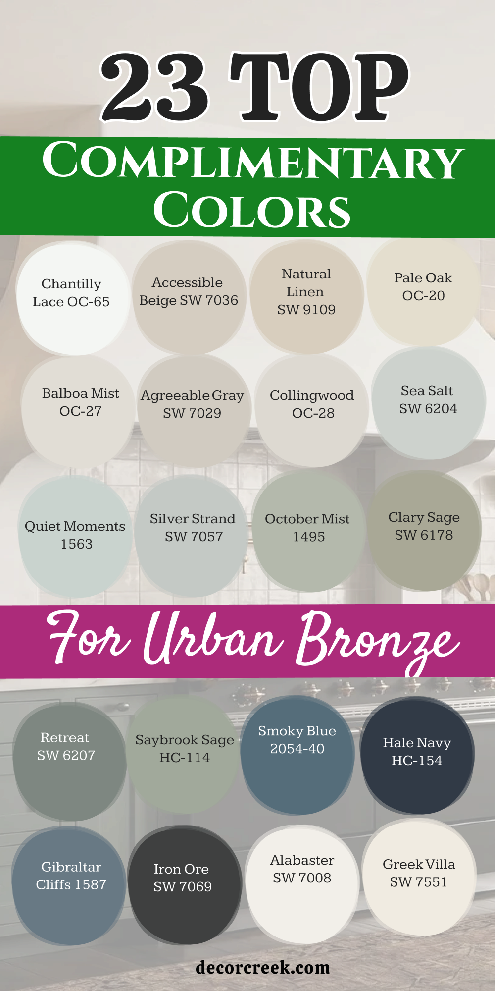
23 Top Complimentary Colors for Urban Bronze
Alabaster SW 7008
Alabaster SW 7008 serves as a warm, inviting white that immediately softens the heavy look of a dark bronze accent wall. This shade brings a gentle glow into any living space without feeling too bright or clinical under evening lights.
I love using this color because it creates a beautiful balance that lets your furniture stand out. It feels comfortable and familiar, making guests feel right at home the moment they step inside. The creamy undertone keeps the entire room looking friendly and connected through all seasons.
Best used in: living rooms, kitchens, hallways, bedrooms, and farmhouse exteriors
Pairs well with: Iron Ore SW 7069, Agreeable Gray SW 7029, Natural Linen SW 9109, warm wood tones
The key rule of this color for farmhouse style is to use it where you want natural light to feel kind, soft, and inviting throughout the day.
🎨 Check out the complete guide to this color right HERE 👈
Greek Villa SW 7551
Greek Villa SW 7551 offers a rich, deep creaminess that adds an instant layer of luxury next to dark bronze. This color acts like a soft blanket on your walls, preventing the deep bronze from looking cold or intimidating.
I recommend it for open living areas where you want a bright look that still feels full of heart. It reflects daylight beautifully while holding its warm personality when the lamps are turned on. The combination makes any room look tailored, polished, and beautifully cared for.
Best used in: living rooms, bedrooms, exterior trim, and dark hallways
Pairs well with: Iron Ore SW 7069, Accessible Beige SW 7036, Urbane Bronze SW 7048, warm textiles
The key rule of this color for welcoming style is to use it in south-facing rooms to capture the glowing afternoon sunlight.
🎨 Check out the complete guide to this color right HERE 👈

Shoji White SW 7042
Shoji White SW 7042 steps in as a clever hybrid between a soft white and a very light greige. This color has a unique warmth that matches the organic, muddy look of dark bronze perfectly. I select this paint when a room gets a lot of bright sunlight that might make regular white walls look too shiny.
It absorbs the light gracefully and keeps the room feeling grounded and cozy. Your walls will look soft and smooth, providing the perfect frame for deep bronze woodwork or furniture.
Best used in: open concept spaces, living rooms, entryways, and modern exterior siding
Pairs well with: Urbane Bronze SW 7048, Pure White SW 7005, Pewter Green SW 6208, natural stone
The key rule of this color for organic modern style is to use it in sun-drenched rooms to keep the light looking soft instead of blinding.
🎨 Check out the complete guide to this color right HERE 👈

White Dove OC-17
White Dove OC-17 features a tiny hint of gray that keeps it looking clean without turning into a cold white. This shade supports dark bronze by creating a soft, sophisticated contrast that feels gentle on your eyes.
I notice it works wonderfully on baseboards and crown molding to frame dark walls with true elegance. It keeps the room looking organized and sharp while maintaining a friendly, family-oriented spirit. You will see that it highlights the rich brown tones hidden deep inside the bronze paint.
Best used in: kitchens, dining rooms, trim work, ceilings, and open floor plans
Pairs well with: Revere Pewter HC-172, Hale Navy HC-154, Chelsea Gray HC-168, warm metallic hardware
The key rule of this color for classic style is to apply it on trim and upper cabinetry to keep the upper half of the room feeling airy.
🎨 Check out the complete guide to this color right HERE 👈
Chantilly Lace OC-65
Chantilly Lace OC-65 stands out as a crisp, bright white that has almost no hidden undertones at all. This choice creates a very clean contrast next to dark bronze, making your home look modern and exciting.
I use this mix when a homeowner wants their dark accent pieces to look completely sharp and well-defined. It works like a fresh, blank canvas that makes every piece of artwork and furniture pop. The room feels incredibly bright and full of energy from morning until night.
Best used in: modern living rooms, trim, doors, art galleries, and small bathrooms
Pairs well with: Tricorn Black SW 6258, Kendall Charcoal HC-166, Urbane Bronze SW 7048, chrome fixtures
The key rule of this color for modern minimalist style is to use it on all trim and walls together to create a seamless, high-contrast frame for dark furniture.
🎨 Check out the complete guide to this color right HERE 👈

Accessible Beige SW 7036
Accessible Beige SW 7036 delivers a lovely layer of muddy warmth that bridges light and dark elements together. This neutral shade keeps a room from looking too stark by adding a comfortable, earthy background to your walls.
I pick this color when a family wants a cozy environment that does not lean too far into gray. It works beautifully alongside dark bronze cabinets or doors, making the entire home feel tied together. The color stays steady and warm even during gloomy winter days.
Best used in: open concept kitchens, family rooms, hallways, and accent walls
Pairs well with: Urbane Bronze SW 7048, Pure White SW 7005, Cadet SW 9143, dark stained wood
The key rule of this color for transitional style is to blend it with dark accents to create a balanced look that is neither too hot nor too cold.
🎨 Check out the complete guide to this color right HERE 👈
Natural Linen SW 9109
Natural Linen SW 9109 feels like a warm beach walk with its sandy, comfortable background tone. This color takes any heavy or serious feeling out of dark bronze and replaces it with pure relaxation.
I love how it makes a living room feel friendly, cozy, and completely down-to-earth for children and pets. It pairs naturally with woven rugs, wooden coffee tables, and soft cotton fabrics. Your home will feel like a welcoming retreat where anyone can kick off their shoes and relax.
Best used in: kitchen walls, open concept areas, hallways, and family bedrooms
Pairs well with: Alabaster SW 7008, Urbane Bronze SW 7048, Balanced Beige SW 7037, warm textiles
The key rule of this color for cozy style is to use it in rooms that need an extra dose of warmth to balance out dark, heavy furniture.
🎨 Check out the complete guide to this color right HERE 👈
Pale Oak OC-20
Pale Oak OC-20 behaves like a soft, whispering gray that holds a very warm heart underneath its surface. This paint color provides a quiet, elegant backdrop that lets dark bronze elements stand out as the main feature.
I find that it changes beautifully with the sun, looking clean at noon and perfectly warm in the evening. It keeps small spaces looking large while adding just enough color to feel interesting. It is a wonderful choice for a smooth, sophisticated look.
Best used in: small kitchens, bright bedrooms, bathrooms, and laundry rooms
Pairs well with: Kendall Charcoal HC-166, White Dove OC-17, Boothbay Gray HC-165, matte black hardware
The key rule of this color for elegant style is to use it in well-lit areas where its delicate warm undertones can shine without turning muddy.
🎨 Check out the complete guide to this color right HERE 👈
Balboa Mist OC-27
Balboa Mist OC-27 is a beautiful light gray that carries a tiny hint of warm purple in its background. This subtle twist makes it look extra soft and charming next to a deep bronze anchor wall. I use this shade when a client wants a gray room that does not feel cold or clinical like concrete.
It brings a gentle, artistic feeling to living spaces and bedrooms alike. The color keeps your home looking fresh and light while honoring the dark tones nearby.
Best used in: master bedrooms, cozy living rooms, wide hallways, and bright bathrooms
Pairs well with: Chantilly Lace OC-65, Chelsea Gray HC-168, Urbane Bronze SW 7048, silver metallic details
The key rule of this color for soft modern style is to pair it with clean white trim to highlight its delicate, artistic undertone.
🎨 Check out the complete guide to this color right HERE 👈

Agreeable Gray SW 7029
Agreeable Gray SW 7029 remains a top choice because it adapts to almost any lighting situation without a fuss. This smart greige color supports dark bronze by creating a balanced, pleasant background for the eyes.
I find that it ties different rooms together smoothly, making the whole house flow like a single story. It does not lean too far into blue or too far into yellow, keeping everything steady. It is a safe and reliable partner that always delivers beautiful results.
Best used in: kitchens, whole-house painting, dark hallways, and entryways
Pairs well with: Anew Gray SW 7030, Alabaster SW 7008, Mega Greige SW 7031, oil rubbed bronze
The key rule of this color for versatile style is to use it as a main wall color to tie different cabinet finishes together seamlessly.
🎨 Check out the complete guide to this color right HERE 👈
Collingwood OC-28
Collingwood OC-28 offers a steady, mid-tone gray that feels clean, balanced, and completely modern. This color provides a wonderful medium contrast against dark bronze, keeping the room from feeling split between extreme light and dark.
I love how it grounds a room while keeping the walls looking bright enough to save energy on lighting. It coordinates beautifully with stainless steel appliances and gray stone tiles. Your home will look organized, intentional, and beautifully designed with this combination.
Best used in: modern living rooms, open kitchens, long hallways, and home offices
Pairs well with: White Dove OC-17, Iron Ore SW 7069, Slate Gray 2115-40, industrial metal furniture
The key rule of this color for contemporary style is to use it in spaces with clean geometric lines to emphasize its balanced neutral base.
🎨 Check out the complete guide to this color right HERE 👈

Sea Salt SW 6204
Sea Salt SW 6204 introduces a beautiful whisper of green and blue that lightens the mood of any dark room. This color acts like a fresh breeze next to heavy bronze furniture or doors. I like using it to bring a soft touch of nature into standard indoor areas.
The cool undertone contrasts nicely with the warm brown notes inside the bronze paint. It keeps your home looking unique and interesting without relying on loud, distracting shades.
Best used in: coastal kitchens, bathrooms, sunrooms, and laundry areas
Pairs well with: Summit Gray SW 7669, High Reflective White SW 7757, Alabaster SW 7008, light wood tones
The key rule of this color for coastal style is to place it near windows where natural light emphasizes its soft green-blue personality.
🎨 Check out the complete guide to this color right HERE 👈
Quiet Moments 1563
Quiet Moments 1563 delivers a gentle mix of blue, green, and gray that feels like a misty morning sky. This color works beautifully with dark bronze to create a deeply relaxing and mature atmosphere.
I choose this shade for bedrooms or bathrooms where people go to unwind after a long, busy day. The soft color takes away the heavy, serious edge of dark bronze and makes it feel poetic. It turns any standard room into a beautiful, personalized sanctuary.
Best used in: master suites, main bathrooms, reading rooms, and nursery walls
Pairs well with: Simply White OC-117, Palladian Blue HC-144, Urbane Bronze SW 7048, light linen fabrics
The key rule of this color for relaxing style is to use it where soft lamp light can bring out its comforting blue-gray mix in the evenings.
🎨 Check out the complete guide to this color right HERE 👈

Silver Strand SW 7057
Silver Strand SW 7057 shifts playfully between silver, gray, and green depending on how the daylight hits the wall. This chameleon color supports dark bronze accents by adding an interesting layer of light reflection to the space.
I select this paint when a home has modern lines and needs a clean, sophisticated look. It keeps the walls looking bright while offering a distinct, proud personality of its own. The dark bronze stands out beautifully as a bold statement piece.
Best used in: modern kitchens, open living spaces, bathrooms, and laundry zones
Pairs well with: Pure White SW 7005, Iron Ore SW 7069, Sea Salt SW 6204, stainless steel appliances
The key rule of this color for modern style is to use it across large, unbroken walls to see its beautiful color shifts throughout the day.
🎨 Check out the complete guide to this color right HERE 👈
October Mist 1495
October Mist 1495 acts as a soft, silver-green bridge between light neutrals and deep dark tones. This color feels gentle and adapts beautifully to different rooms without looking overwhelming. I choose this shade when a homeowner wants a hint of color without committing to a bright look.
It wraps around dark bronze and softens its heavy, masculine edges immediately. The room feels elevated into a peaceful area for sharing family stories and meals.
Best used in: kitchens, bedrooms, bathrooms, and cozy reading nooks
Pairs well with: White Dove OC-17, Pale Oak OC-20, Iron Ore SW 7069, brushed brass hardware
The key rule of this color for soft organic style is to use it in rooms with large windows so the natural daylight can highlight its delicate silver undertones.
🎨 Check out the complete guide to this color right HERE 👈
Clary Sage SW 6178
Clary Sage SW 6178 introduces a soft, herbal green that feels like bringing a quiet garden right into your home. This color has yellow undertones that match the warm earthy qualities of dark bronze perfectly.
I like using this shade on main living walls when the trim or fireplace is coated in deep bronze paint. It feels rich and grounded without making the area look small or dark. The combination reminds me of natural elements like forest moss and river stone.
Best used in: kitchens, dining rooms, mudrooms, and cottage exteriors
Pairs well with: Alabaster SW 7008, Accessible Beige SW 7036, Urbane Bronze SW 7048, light oak flooring
The key rule of this color for garden-inspired style is to pair it with light woods to keep the green looking fresh and alive throughout the day.
🎨 Check out the complete guide to this color right HERE 👈
Retreat SW 6207
Retreat SW 6207 brings a deep, dusty green-gray that has enough strength to sit directly next to dark bronze. This color is perfect for creating a handsome, studious look that feels completely grounded in nature.
I use this combination in home offices or dens where people need to focus and feel comfortable. The deep green tone coordinates beautifully with leather chairs and warm wood bookshelves. It makes the room feel substantial, safe, and deeply intentional.
Best used in: home offices, accent walls, cozy dens, and exterior siding
Pairs well with: Extra White SW 7006, Sea Salt SW 6204, Urbane Bronze SW 7048, rich leather
The key rule of this color for studious style is to pair it with bright white trim to give its deep green base a sharp, clean border.
🎨 Check out the complete guide to this color right HERE 👈
Saybrook Sage HC-114
Saybrook Sage HC-114 brings a rich, heritage green tone into your living environment. This color matches the outdoor feelings hidden inside the dark bronze paint, creating a seamless link with nature. I recommend this pairing for homes surrounded by trees or beautiful backyard gardens.
The green tone feels steady and mature rather than bright or youthful, which keeps the house looking elegant. It turns any room into a comforting space for relaxation and family gatherings.
Best used in: country kitchens, dining spaces, accent walls, and front doors
Pairs well with: Simply White OC-117, Shaker Beige HC-45, Urbane Bronze SW 7048, copper pots
The key rule of this color for country style is to pair it with warm metals like copper or brass to highlight its rich heritage.
🎨 Check out the complete guide to this color right HERE 👈
Smoky Blue 2122-40
Smoky Blue 2122-40 delivers a rich, mysterious blue tone that features a heavy blanket of gray undertone. This shade creates a gorgeous, artistic statement when paired with a dark bronze accent wall.
I love how the cool blue notes bring out the rich, velvety brown qualities of the bronze paint. It feels incredibly sophisticated and works wonderfully in formal dining rooms or entryways. The combination makes your home look like it was designed by a high-end expert.
Best used in: formal dining rooms, accent walls, entryways, and master bedrooms
Pairs well with: Chantilly Lace OC-65, Gray Owl OC-52, Urbane Bronze SW 7048, gold metallic accents
The key rule of this color for artistic style is to use it where natural afternoon light can show off its deep, smoky blue character.
Hale Navy HC-154
Hale Navy HC-154 operates as a classic, historic navy that carries a lot of grounding gray in its formula. This shade balances the deep bronze by creating a rich, dark color story that feels very traditional and steady.
I recommend this pairing for large rooms that can handle a lot of deep color on the walls. It looks beautiful next to bright white trim and warm hardwood floors, keeping the entire space looking organized. It brings a wonderful sense of dignity to your home.
Best used in: kitchen islands, butler’s pantries, exterior siding, and front doors
Pairs well with: White Dove OC-17, Revere Pewter HC-172, Classic Gray OC-23, warm wood floors
The key rule of this color for traditional style is to use it alongside bright white accents to keep the deep colors looking sharp and clean.
🎨 Check out the complete guide to this color right HERE 👈
Gibraltar Cliffs 1587
Gibraltar Cliffs 1587 features a strong, stormy gray-blue color that looks like ocean waves hitting a rocky shore. This color matches the deep intensity of bronze while introducing a cool, sophisticated energy to the room.
I use this mix to create a dramatic look that still feels incredibly comfortable to live in every day. It provides a handsome backdrop for light-colored furniture and metallic light fixtures. The room takes on a bold, confident character that immediately impresses anyone who enters.
Best used in: media rooms, accent walls, home libraries, and powder bathrooms
Pairs well with: Super White OC-152, Stonington Gray HC-170, Urbane Bronze SW 7048, brushed chrome
The key rule of this color for bold modern style is to pair it with light gray furniture to balance the heavy weight of the dark walls.
Iron Ore SW 7069
Iron Ore SW 7069 stands as a deep, charcoal black that sits right on the edge of true darkness. This color works with dark bronze to create a ultra-moody, modern look that feels like a cozy cocoon.
I recommend this daring combination for media rooms or bedrooms where you want to erase the boundaries of the walls completely. It feels incredibly sheltering, warm, and high-end when done correctly. The mix creates a rich texture that makes the whole room feel special and unique.
Best used in: theatre rooms, master bedrooms, exterior window trim, and modern accent walls
Pairs well with: Alabaster SW 7008, Agreeable Gray SW 7029, Urbane Bronze SW 7048, modern brass lighting
The key rule of this color for dramatic modern style is to use it on the main focal point wall and keep the remaining elements simple and clean.
🎨 Check out the complete guide to this color right HERE 👈

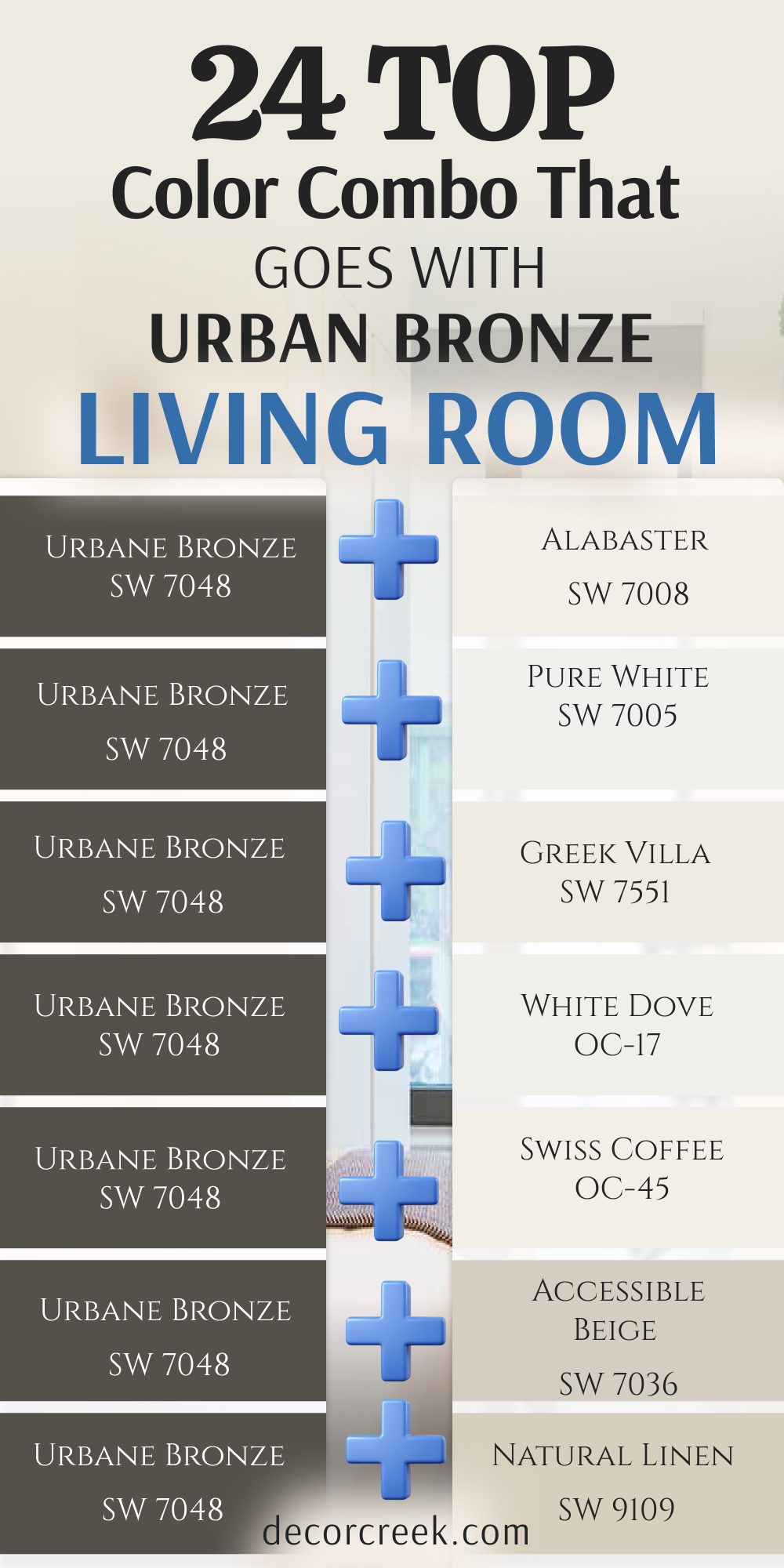
24 Top Color Combo that Goes with Urban Bronze Living Room
Urban Bronze SW 7048 + Alabaster SW 7008
Urban Bronze SW 7048 mixed with Alabaster SW 7008 creates a classic look that splits the room beautifully between light and dark. This combination works wonderfully when you want a dark accent wall behind your television or main couch.
I use this mix to give a large living room a clear focal point without losing any brightness. The warm white walls balance out the heavy dark paint on the main feature wall. It feels balanced and incredibly smart for everyday family living. Your furniture will stand out beautifully against this high-contrast backdrop.
Best used in: living rooms, kitchens, hallways, bedrooms, and farmhouse exteriors
Pairs well with: Iron Ore SW 7069, Agreeable Gray SW 7029, Natural Linen SW 9109, warm wood tones
The key rule of this color for farmhouse style is to use it where you want natural light to feel kind, soft, and inviting throughout the day.
Urban Bronze SW 7048 + Pure White SW 7005
Urban Bronze SW 7048 combined with Pure White SW 7005 serves as a crisp option that feels clean and modern. This choice keeps your living room looking sharp and bright next to the deep bronze accents
I use it when a family wants a high-contrast style that still feels completely comfortable on the eyes. It reflects just enough daylight to open up smaller sitting areas beautifully. The color match gives your main gathering room a fresh start every single morning. It looks wonderful with large windows and modern black metal light fixtures.
Best used in: modern kitchens, bathrooms, trim, doors, and exterior siding
Pairs well with: Black Fox SW 7020, Charcoal Blue SW 2739, Repose Gray SW 7015, polished chrome
The key rule of this color for modern style is to use it on large wall sections to create a clean, crisp frame for dark focal points.
Urban Bronze SW 7048 + Greek Villa SW 7551
Urban Bronze SW 7048 paired with Greek Villa SW 7551 offers a rich, deep creaminess that adds an instant layer of luxury. This color acts like a soft blanket on your remaining walls, preventing the deep bronze from looking intimidating.
I recommend it for open living areas where you want a bright look that still holds a lot of heart. It reflects daylight beautifully while keeping its warm personality when the evening lamps are turned on. The combination makes any family room look tailored, polished, and beautifully cared for.
Best used in: living rooms, bedrooms, exterior trim, and dark hallways
Pairs well with: Iron Ore SW 7069, Accessible Beige SW 7036, Urbane Bronze SW 7048, warm textiles
The key rule of this color for welcoming style is to use it in south-facing rooms to capture the glowing afternoon sunlight.
Urban Bronze SW 7048 + White Dove OC-17
Urban Bronze SW 7048 alongside White Dove OC-17 features a tiny hint of gray that keeps the room looking clean. This shade supports the dark bronze by creating a soft, sophisticated contrast that feels extra gentle on your eyes.
I notice it works wonderfully when you paint the main walls white and use the bronze on doors or built-in bookshelves. It keeps the room looking organized and sharp while maintaining a friendly, family-oriented spirit. You will see that it highlights the rich brown tones hidden deep inside the dark paint.
Best used in: kitchens, dining rooms, trim work, ceilings, and open floor plans
Pairs well with: Revere Pewter HC-172, Hale Navy HC-154, Chelsea Gray HC-168, warm metallic hardware
The key rule of this color for classic style is to apply it on trim and upper cabinetry to keep the upper half of the room feeling airy.
Urban Bronze SW 7048 + Swiss Coffee OC-45
Urban Bronze SW 7048 mixed with Swiss Coffee OC-45 delivers a warm, rich creaminess that softens any hard edges. This color combo makes a living room feel like a cozy cottage where people want to sit down and talk for hours.
I notice it pairs beautifully with warm oak floors, thick woven blankets, and large fabric sofas. It prevents the dark bronze from looking too gloomy or heavy when the sun starts to go down. The creamy base brings out the hidden warmth in the dark walls.
Best used in: traditional kitchens, cozy living rooms, entryways, and historical homes
Pairs well with: Artifact SW 6138, Saybrook Sage HC-114, Edgecomb Gray HC-173, antique brass
The key rule of this color for traditional style is to use it in rooms with plenty of warm textiles to build a welcoming environment.
Urban Bronze SW 7048 + Accessible Beige SW 7036
Urban Bronze SW 7048 joined by Accessible Beige SW 7036 acts as a fantastic neutral pairing with a grayish-beige background. This shade prevents your family living room from looking flat by adding a layer of comfortable warmth.
I pick this combination when whites feel too bright or cold for a homeowner’s personal taste. It transitions smoothly between your dark accent walls and lighter furniture pieces. The neutral tone keeps the entire room feeling grounded, safe, and completely connected.
Best used in: open concept kitchens, family rooms, hallways, and accent walls
Pairs well with: Urbane Bronze SW 7048, Pure White SW 7005, Cadet SW 9143, dark stained wood
The key rule of this color for transitional style is to blend it with dark accents to create a balanced look that is neither too hot nor too cold.
Urban Bronze SW 7048 + Natural Linen SW 9109
Urban Bronze SW 7048 with Natural Linen SW 9109 feels like a warm beach walk with its sandy, comfortable background. This color combo takes any serious feeling out of the dark bronze and replaces it with pure everyday relaxation.
I love how it makes a main living room feel friendly, cozy, and completely down-to-earth for children and pets. It pairs naturally with woven rugs, wooden coffee tables, and soft cotton fabrics. Your home will feel like a welcoming retreat where anyone can kick off their shoes.
Best used in: kitchen walls, open concept areas, hallways, and family bedrooms
Pairs well with: Alabaster SW 7008, Urbane Bronze SW 7048, Balanced Beige SW 7037, warm textiles
The key rule of this color for cozy style is to use it in rooms that need an extra dose of warmth to balance out dark, heavy furniture.
Urban Bronze SW 7048 + Pale Oak OC-20
Urban Bronze SW 7048 together with Pale Oak OC-20 looks like a soft, weathered gray with a warm heart underneath. This color combo works beautifully when the pale gray coats the main walls and the bronze frames the windows or fireplace.
I love how it changes with the sun, looking clean at noon and perfectly warm in the evening. It provides a quiet backdrop that lets your dark woodwork stand out as the main star. The mix keeps the living room looking elegant without trying too hard.
Best used in: small kitchens, bright bedrooms, bathrooms, and laundry rooms
Pairs well with: Kendall Charcoal HC-166, White Dove OC-17, Boothbay Gray HC-165, matte black hardware
The key rule of this color for elegant style is to use it in well-lit areas where its delicate warm undertones can shine without turning muddy.
Urban Bronze SW 7048 + Edgecomb Gray HC-173
Urban Bronze SW 7048 combined with Edgecomb Gray HC-173 provides an earthy creaminess that feels rich and substantial. This color prevents the dark bronze from feeling cold or isolated in a large, open living room.
I use it to create a soft contrast that feels gentle on the eyes during quiet morning hours. It goes beautifully with limestone tiles, brick fireplaces, and natural stone accents. The shade adds a touch of historical charm to a modern family home setup.
Best used in: dining kitchens, living rooms, corridors, and exterior trim
Pairs well with: Hale Navy HC-154, White Dove OC-17, Revere Pewter HC-172, natural stone
The key rule of this color for timeless design is to use it alongside natural stone elements to bring out its organic warmth.
Urban Bronze SW 7048 + Agreeable Gray SW 7029
Urban Bronze SW 7048 mixed with Agreeable Gray SW 7029 is a highly popular option because it adapts to any light. This greige shade supports the dark bronze accent walls by adding a soft layer of neutral color to the room.
I find that it keeps a living room feeling balanced, pleasant, and easy to look at. It does not lean too far into blue or too far into yellow, keeping the mood steady. The color creates a smooth flow from the living room into the hallways.
Best used in: kitchens, whole-house painting, dark hallways, and entryways
Pairs well with: Anew Gray SW 7030, Alabaster SW 7008, Mega Greige SW 7031, oil rubbed bronze
The key rule of this color for versatile style is to use it as a main wall color to tie different cabinet finishes together seamlessly.
Urban Bronze SW 7048 + Revere Pewter HC-172
Urban Bronze SW 7048 alongside Revere Pewter HC-172 bridges the gap between warm beige and cool gray. This color sits beautifully next to dark bronze by offering a rich, reliable mid-tone background for your walls.
I use it when white walls feel too stark but a true tan feels too old-fashioned for your style. It anchors the living room and creates a smooth transition between different seating areas. The color looks expensive and holds its own against the strong dark paint.
Best used in: kitchens, open floor plans, living rooms, and exterior trim
Pairs well with: White Dove OC-17, Hale Navy HC-154, Chelsea Gray HC-168, dark wood tones
The key rule of this color for versatile style is to use it as the main wall paint to tie together light countertops and dark cabinet finishes.
Urban Bronze SW 7048 + Balboa Mist OC-27
Urban Bronze SW 7048 paired with Balboa Mist OC-27 is a beautiful light gray that carries a tiny hint of warm purple. This subtle twist makes the walls look extra soft and charming next to a deep bronze fireplace wall.
I use this shade when a client wants a gray living room that does not feel cold like concrete. It brings a gentle, artistic feeling to your main gathering spaces. The color keeps your home looking fresh and light while honoring the deep tones nearby.
Best used in: master bedrooms, cozy living rooms, wide hallways, and bright bathrooms
Pairs well with: Chantilly Lace OC-65, Chelsea Gray HC-168, Urbane Bronze SW 7048, silver metallic details
The key rule of this color for soft modern style is to pair it with clean white trim to highlight its delicate, artistic undertone.
Urban Bronze SW 7048 + Sea Salt SW 6204
Urban Bronze SW 7048 and Sea Salt SW 6204 introduces a beautiful whisper of green and blue into the room. This color acts like a fresh breeze next to heavy bronze furniture, doors, or accent walls.
I like using it to bring a soft touch of the coastal outdoors into your main indoor living space. The cool green-blue undertone contrasts nicely with the warm brown notes inside the bronze paint. It keeps your home looking unique and interesting without relying on loud colors.
Best used in: coastal kitchens, bathrooms, sunrooms, and laundry areas
Pairs well with: Summit Gray SW 7669, High Reflective White SW 7757, Alabaster SW 7008, light wood tones
The key rule of this color for coastal style is to place it near windows where natural light emphasizes its soft green-blue personality.
Urban Bronze SW 7048 + Rainwashed SW 6211
Urban Bronze SW 7048 mixed with Rainwashed SW 6211 carries a clear blue-green tint that looks like a clean rainy sky. This color provides a cool contrast to the warm, brown-toned bronze on your feature walls.
I use this pairing when a family wants a living room that feels clean, light, and a little bit playful. It keeps the dark bronze from looking too serious or heavy during daytime hours. The light bounces off this color beautifully, making the entire living area feel larger.
Best used in: kitchens, guest bathrooms, beach house areas, and porch ceilings
Pairs well with: Snowbound SW 7004, Extra White SW 7006, Revere Pewter HC-172, light maple wood
The key rule of this color for airy style is to pair it with very light countertops to emphasize its cool, breezy nature.
Urban Bronze SW 7048 + Quiet Moments 1563
Urban Bronze SW 7048 plus Quiet Moments 1563 delivers a gentle mix of blue, green, and gray like a misty morning. This color works beautifully with dark bronze to create a deeply relaxing and mature living room atmosphere.
I choose this shade for spaces where people go to unwind completely after a long, busy day at work. The soft color takes away the heavy, serious edge of dark bronze and makes it feel poetic. It turns a standard family room into a beautiful sanctuary.
Best used in: master suites, main bathrooms, reading rooms, and nursery walls
Pairs well with: Simply White OC-117, Palladian Blue HC-144, Urbane Bronze SW 7048, light linen fabrics
The key rule of this color for relaxing style is to use it where soft lamp light can bring out its comforting blue-gray mix in the evenings.
Urban Bronze SW 7048 + Silver Strand SW 7057
Urban Bronze SW 7048 together with Silver Strand SW 7057 shifts playfully between silver, gray, and green based on the sun. This chameleon color supports dark bronze accents by adding an interesting layer of light reflection to the living room.
I select this paint mix when a home has modern lines and needs a clean, sophisticated color story. It keeps the walls looking bright while offering a distinct, proud personality of its own. The dark bronze stands out beautifully as a bold statement.
Best used in: modern kitchens, open living spaces, bathrooms, and laundry zones
Pairs well with: Pure White SW 7005, Iron Ore SW 7069, Sea Salt SW 6204, stainless steel appliances
The key rule of this color for modern style is to use it across large, unbroken walls to see its beautiful color shifts throughout the day.
Urban Bronze SW 7048 + October Mist 1495
Urban Bronze SW 7048 with October Mist 1495 acts as a soft, silver-green bridge between light walls and dark accents. This color feels gentle and adapts beautifully to different corners of the living room without looking out of place.
I choose this shade when a family wants a hint of nature without committing to a bright green look. It wraps around the dark bronze fireplace or trim and softens its heavy edges immediately. The room feels elevated into a peaceful area for sharing stories.
Best used in: kitchens, bedrooms, bathrooms, and cozy reading nooks
Pairs well with: White Dove OC-17, Pale Oak OC-20, Iron Ore SW 7069, brushed brass hardware
The key rule of this color for soft organic style is to use it in rooms with large windows so the natural daylight can highlight its delicate silver undertones.
Urban Bronze SW 7048 + Clary Sage SW 6178
Urban Bronze SW 7048 joined by Clary Sage SW 6178 introduces a soft, herbal green that feels like bringing a quiet garden inside. This color has warm yellow undertones that match the earthy qualities of your dark bronze paint perfectly.
I like using this shade on main living room walls when the built-in shelves are coated in deep bronze paint. It feels rich and grounded without making your main seating area look small or dark. The combination reminds me of natural forest elements.
Best used in: kitchens, dining rooms, mudrooms, and cottage exteriors
Pairs well with: Alabaster SW 7008, Accessible Beige SW 7036, Urbane Bronze SW 7048, light oak flooring
The key rule of this color for garden-inspired style is to pair it with light woods to keep the green looking fresh and alive throughout the day.
Urban Bronze SW 7048 + Evergreen Fog SW 9130
Urban Bronze SW 7048 combined with Evergreen Fog SW 9130 delivers a gorgeous blend of green, gray, and blue. This color feels substantial enough to stand up to the heavy visual weight of dark bronze walls.
I love using this mix for a sophisticated, mid-tone look in formal living rooms or dens. It does not disappear next to dark accents but instead creates a rich, handsome story. Your living space takes on a tailored, custom appearance that feels incredibly intentional and high-end.
Best used in: kitchen islands, accent walls, studies, and entryways
Pairs well with: Pure White SW 7005, Agreeable Gray SW 7029, Tricorn Black SW 6258, warm leather accents
The key rule of this color for tailored style is to use it where it can meet bright white trim to showcase its deep, moody personality.
Urban Bronze SW 7048 + Saybrook Sage HC-114
Urban Bronze SW 7048 alongside Saybrook Sage HC-114 brings a rich, heritage green tone into your living environment. This color matches the outdoor feelings hidden inside the dark bronze paint, creating a seamless link with nature.
I recommend this pairing for homes with large windows looking out at trees or beautiful backyard gardens. The green tone feels steady and mature rather than bright or youthful, keeping the house looking elegant. It turns the room into a comforting space for family gatherings.
Best used in: country kitchens, dining spaces, accent walls, and front doors
Pairs well with: Simply White OC-117, Shaker Beige HC-45, Urbane Bronze SW 7048, copper pots
The key rule of this color for country style is to pair it with warm metals like copper or brass to highlight its rich heritage.
Urban Bronze SW 7048 + Boothbay Gray HC-165
Urban Bronze SW 7048 mixed with Boothbay Gray HC-165 is a steady, mid-tone blue-gray that feels grounded and historic. This color pairs nicely with dark bronze to create a handsome, traditional living room atmosphere.
I like how the blue notes in the gray bring out the warm brown tones in the bronze paint. It prevents the main living area from looking washed out, flat, or boring. The combination feels solid, dependable, and highly sophisticated for a family home.
Best used in: kitchen cabinets, island bases, mudrooms, and exterior shutters
Pairs well with: White Dove OC-17, Swiss Coffee OC-45, Urbane Bronze SW 7048, unlacquered brass
The key rule of this color for historic style is to pair it with warm metal hardware like brass or copper to highlight its rich blue tones.

Urban Bronze SW 7048 + Smoky Blue 2054-40
Urban Bronze SW 7048 paired with Smoky Blue 2054-40 delivers a rich, mysterious blue tone with a heavy gray blanket underneath. This shade creates a gorgeous, artistic statement when painted on adjacent walls in a large living room.
I love how the cool blue notes bring out the rich, velvety brown qualities of the bronze accent pieces. It feels incredibly sophisticated and works wonderfully if you love hosting formal evening gatherings. The combination makes your home look custom-designed.
Best used in: formal dining rooms, accent walls, entryways, and master bedrooms
Pairs well with: Chantilly Lace OC-65, Gray Owl OC-52, Urbane Bronze SW 7048, gold metallic accents
The key rule of this color for artistic style is to use it where natural afternoon light can show off its deep, smoky blue character.
Urban Bronze SW 7048 + Hale Navy HC-154
Urban Bronze SW 7048 and Hale Navy HC-154 operates as a classic, historic navy that carries a lot of grounding gray. This shade balances the deep bronze by creating a rich, dark color story that feels very traditional and steady.
I recommend this pairing for large living rooms that can handle a lot of deep color on the walls without feeling tiny. It looks beautiful next to crisp white trim and warm hardwood floors, keeping the entire space looking organized.
Best used in: kitchen islands, butler’s pantries, exterior siding, and front doors
Pairs well with: White Dove OC-17, Revere Pewter HC-172, Classic Gray OC-23, warm wood floors
The key rule of this color for traditional style is to use it alongside bright white accents to keep the deep colors looking sharp and clean.
Urban Bronze SW 7048 + Naval SW 6244
Urban Bronze SW 7048 mixed with Naval SW 6244 is a deep, majestic navy blue that matches the intensity of your dark paint. This combination is bold and dramatic, perfect for a living room that wants to make a strong statement.
I use this mix by putting the navy on the main walls and the bronze on the fireplace mantle for a moody look. The dark blue adds an extra layer of richness that standard light grays cannot provide. It feels cozy and sheltering.
Best used in: accent walls, kitchen islands, dining rooms, and home libraries
Pairs well with: Alabaster SW 7008, Accessible Beige SW 7036, Pure White SW 7005, gold accents
The key rule of this color for dramatic style is to ensure you have good lighting fixtures so the deep tones do not feel gloomy.
25 Top Color Combo that goes with Urban Bronze Exterior
Urban Bronze SW 7048 + Oyster White SW 7637
Urban Bronze SW 7048 paired with Oyster White SW 7637 gives the outside of a house a very smart look. The light gray-white color coats the main siding while the dark bronze highlights the shutters and front door.
I love this combination because it looks beautiful against green landscaping and gray stone walkways. It does not blind neighbors on sunny days like a bright white siding can do. The house looks expensive, sturdy, and fully integrated into its natural surroundings. It gives your home a great deal of curb appeal.
Best used in: whole house exterior siding, trim combinations, front porches, and garage doors
Pairs well with: stone accents, dark metal light fixtures, green shrubbery, concrete paths
The key rule of this color combo for exterior style is to use the lighter shade on the main body of the house to reflect the heat of the sun.
Urban Bronze SW 7048 + Pearly White SW 7009
Urban Bronze SW 7048 mixed with Pearly White SW 7009 creates an exterior that looks incredibly clean but soft. This off-white color has a tiny bit of green and gray hidden inside it that keeps it from glaring in the bright noon sun.
I recommend this pairing for modern farmhouse designs where you want a crisp contrast that still looks friendly. The dark bronze stands out beautifully on the window trim and metal roofs next to this siding. It feels like a refreshing change from traditional, heavy cream colors. Your house will look bright, welcoming, and perfectly balanced throughout the day.
Best used in: whole house exterior siding, trim combinations, front porches, and garage doors
Pairs well with: stone accents, dark metal light fixtures, green shrubbery, concrete paths
The key rule of this color combo for exterior style is to use the lighter shade on the main body of the house to reflect the heat of the sun.
Urban Bronze SW 7048 + Creamy SW 7012
Urban Bronze SW 7048 alongside Creamy SW 7012 offers a rich, warm greeting to anyone who drives up to your home. This soft white color behaves like a warm hug for your home siding, cutting out any cold or clinical vibes completely.
I choose this mix when a family wants their home to look historic, cozy, and completely down-to-earth. The dark bronze grounds the roofline and front door while the warm cream makes the porch feel wide open. It coordinates beautifully with red brick walkways and natural cedar porch pillars.
Best used in: whole house exterior siding, trim combinations, front porches, and garage doors
Pairs well with: stone accents, dark metal light fixtures, green shrubbery, concrete paths
The key rule of this color combo for exterior style is to use the lighter shade on the main body of the house to reflect the heat of the sun.

Urban Bronze SW 7048 + Antique White OC-83
Urban Bronze SW 7048 combined with Antique White OC-83 brings a deeply traditional, old-world elegance to the front yard. This color has a strong yellow-beige undertone that feels established, expensive, and full of historical story.
I love how it looks on large stucco or siding houses that need a warm color to stand up to heavy tree shade. The deep bronze trim keeps the antique color looking sharp and prevents it from looking too yellow. It creates a picture-perfect look that reminds me of beautiful historic estates.
Best used in: whole house exterior siding, trim combinations, front porches, and garage doors
Pairs well with: stone accents, dark metal light fixtures, green shrubbery, concrete paths
The key rule of this color combo for exterior style is to use the lighter shade on the main body of the house to reflect the heat of the sun.
Urban Bronze SW 7048 + Navajo White OC-95
Urban Bronze SW 7048 and Navajo White OC-95 delivers a deep, rich tan-cream look that handles bright outdoor light beautifully. This color choice never looks washed out or blinding even when the sun is directly overhead in the summer.
I select this mix for ranch-style homes or properties nestled into sandy or wooded environments. The dark bronze works hard as an accent on the gutters, shutters, and trim lines to frame the warm tan siding. It feels steady, comforting, and deeply tied to nature.
Best used in: whole house exterior siding, trim combinations, front porches, and garage doors
Pairs well with: stone accents, dark metal light fixtures, green shrubbery, concrete paths
The key rule of this color combo for exterior style is to use the lighter shade on the main body of the house to reflect the heat of the sun.
Urban Bronze SW 7048 + Manchester Tan HC-81
Urban Bronze SW 7048 together with Manchester Tan HC-81 provides a sophisticated, sandy backdrop that looks modern and clean. This specific tan features a heavy gray undertone that keeps it looking neutral rather than yellow or orange in the afternoon light.
I like using this combination on stone-front homes where the tan pulls out the natural earthy colors of the rock. The dark bronze accents bring a handsome, sharp definition to the window frames and garage doors. It is a foolproof choice for an upscale neighborhood look.
Best used in: whole house exterior siding, trim combinations, front porches, and garage doors
Pairs well with: stone accents, dark metal light fixtures, green shrubbery, concrete paths
The key rule of this color combo for exterior style is to use the lighter shade on the main body of the house to reflect the heat of the sun.

Urban Bronze SW 7048 + Kilim Beige SW 6106
Urban Bronze SW 7048 joined by Kilim Beige SW 6106 acts as a highly reliable, classic exterior choice that families love. This beige brings a true, balanced warmth that covers your siding with a friendly and inviting coat of color.
I find that it bridges the gap perfectly between dark roofing materials and the natural green lawn. The deep bronze highlights on the front door or shutters add a layer of modern style to this traditional base. It gives your entire property a sturdy, well-maintained appearance.
Best used in: whole house exterior siding, trim combinations, front porches, and garage doors
Pairs well with: stone accents, dark metal light fixtures, green shrubbery, concrete paths
The key rule of this color combo for exterior style is to use the lighter shade on the main body of the house to reflect the heat of the sun.
Urban Bronze SW 7048 + Sand Dollar OC-71
Urban Bronze SW 7048 plus Sand Dollar OC-71 introduces a soft, pinkish-beige warmth that looks beautiful under a clear blue sky. This delicate color option gives a cheerful, bright personality to your home exterior without relying on a boring plain white.
I use this pairing when a client wants their home to feel breezy, light, and uniquely personalized. The dark bronze frames the windows tightly, which prevents the soft siding color from looking too sweet or youthful. It feels balanced, clean, and wonderfully inviting.
Best used in: whole house exterior siding, trim combinations, front porches, and garage doors
Pairs well with: stone accents, dark metal light fixtures, green shrubbery, concrete paths
The key rule of this color combo for exterior style is to use the lighter shade on the main body of the house to reflect the heat of the sun.
Urban Bronze SW 7048 + Muslin OC-12
Urban Bronze SW 7048 mixed with Muslin OC-12 looks like a fresh roll of natural canvas sitting against the dark woods. This color combo delivers a quiet, low-contrast warmth that makes your home feel peaceful and integrated into the landscape.
I recommend this pick for homeowners who want an organic look that feels gentle on the eyes from the street. The dark bronze accents anchor the roof peaks and corner boards gracefully. It looks particularly stunning when framed by large, mature trees and natural stone steps.
Best used in: whole house exterior siding, trim combinations, front porches, and garage doors
Pairs well with: stone accents, dark metal light fixtures, green shrubbery, concrete paths
The key rule of this color combo for exterior style is to use the lighter shade on the main body of the house to reflect the heat of the sun.

Urban Bronze SW 7048 + Lenox Tan HC-44
Urban Bronze SW 7048 alongside Lenox Tan HC-44 brings a deep, golden-brown richness to your home siding. This color has enough visual weight to stand up directly to the dark bronze without getting lost or overwhelmed by its strength.
I choose this combination for traditional or craftsman style homes that want a proud, substantial look from the curb. The gold notes in the tan bring out the hidden brown warmth locked inside the bronze trim paint. It makes the entire house look grand and beautifully established.
Best used in: whole house exterior siding, trim combinations, front porches, and garage doors
Pairs well with: stone accents, dark metal light fixtures, green shrubbery, concrete paths
The key rule of this color combo for exterior style is to use the lighter shade on the main body of the house to reflect the heat of the sun.
Urban Bronze SW 7048 + Cedar Key SW 7534
Urban Bronze SW 7048 mixed with Cedar Key SW 7534 behaves like a soft, weathered gray-tan that feels coastal and relaxed. This color prevents your home from looking too dark by adding a layer of clean, sandy neutral to the main body.
I love this combination because it adapts beautifully to changing weather, looking bright on sunny days and warm on cloudy ones. The dark bronze trim adds a modern twist that keeps the weathered color looking sharp and intentional. It gives the house a highly sophisticated beach-cottage feeling.
Best used in: whole house exterior siding, trim combinations, front porches, and garage doors
Pairs well with: stone accents, dark metal light fixtures, green shrubbery, concrete paths
The key rule of this color combo for exterior style is to use the lighter shade on the main body of the house to reflect the heat of the sun.
Urban Bronze SW 7048 + Tony Taupe SW 7038
Urban Bronze SW 7048 combined with Tony Taupe SW 7038 creates a beautiful, mid-tone exterior that feels incredibly solid. This taupe color sits in the middle of gray and brown, making it a perfect cousin to the deep bronze paint.
I use this pairing when a family wants a modern, monochromatic look that does not rely on bright whites. The house looks tailored and sleek, with the dark bronze accentuating the architectural lines and front entryway. It is an excellent choice for a contemporary neighborhood.
Best used in: whole house exterior siding, trim combinations, front porches, and garage doors
Pairs well with: stone accents, dark metal light fixtures, green shrubbery, concrete paths
The key rule of this color combo for exterior style is to use the lighter shade on the main body of the house to reflect the heat of the sun.
Urban Bronze SW 7048 + Perfect Greige SW 6073
Urban Bronze SW 7048 paired with Perfect Greige SW 6073 delivers a rich, muddy blend of gray and beige on the siding. This color combo offers a seamless look where the trim and the main walls talk to each other beautifully.
I find that it hides dust and outdoor dirt exceptionally well, making it very practical for busy families. The dark bronze highlights the front door and garage doors to break up the mid-tone body perfectly. The entire home takes on a handsome, sturdy look that lasts for years.
Best used in: whole house exterior siding, trim combinations, front porches, and garage doors
Pairs well with: stone accents, dark metal light fixtures, green shrubbery, concrete paths
The key rule of this color combo for exterior style is to use the lighter shade on the main body of the house to reflect the heat of the sun.
Urban Bronze SW 7048 + Feather Down OC-6
Urban Bronze SW 7048 together with Feather Down OC-6 offers a light, cloud-like off-white that feels soft as a feather. This shade supports the dark bronze by creating a soft, gentle contrast that does not look harsh or aggressive from the street.
I notice it works wonderfully on traditional homes with large front porches and decorative trim pieces. The dark bronze grounds the base of the house while this soft light color opens up the entryway. It makes your home look loved, bright, and completely classic.
Best used in: whole house exterior siding, trim combinations, front porches, and garage doors
Pairs well with: stone accents, dark metal light fixtures, green shrubbery, concrete paths
The key rule of this color combo for exterior style is to use the lighter shade on the main body of the house to reflect the heat of the sun.
Urban Bronze SW 7048 + Sparrow AF-720
Urban Bronze SW 7048 with Sparrow AF-720 introduces a rich, deep earthy gray that creates a low-contrast look. This combination is dark, moody, and highly sophisticated, perfect for a home that wants to blend into a wooded lot.
I use this mix by putting the mid-tone gray on the siding and the dark bronze on the shutters and columns. It feels incredibly sheltering, modern, and high-end when seen from the road. The house looks like a custom architectural piece designed to honor the surrounding nature.
Best used in: whole house exterior siding, trim combinations, front porches, and garage doors
Pairs well with: stone accents, dark metal light fixtures, green shrubbery, concrete paths
The key rule of this color combo for exterior style is to use the lighter shade on the main body of the house to reflect the heat of the sun.
Urban Bronze SW 7048 + Dry Sage SW 6182
Urban Bronze SW 7048 joined by Dry Sage SW 6182 brings a beautiful, olive-tinted green into the exterior story. This color matches the organic, muddy undertones of the dark bronze perfectly, creating a look straight from a forest.
I recommend this pairing for country homes or bungalows surrounded by lush gardens and flower beds. The green siding feels steady and mature, while the dark bronze trim adds a modern frame to the windows. It turns your home into a beautiful, storybook cottage that welcomes you back every evening.
Best used in: whole house exterior siding, trim combinations, front porches, and garage doors
Pairs well with: stone accents, dark metal light fixtures, green shrubbery, concrete paths
The key rule of this color combo for exterior style is to use the lighter shade on the main body of the house to reflect the heat of the sun.
Urban Bronze SW 7048 + Rosemary SW 6187
Urban Bronze SW 7048 mixed with Rosemary SW 6187 delivers a deep, rich green look that carries a lot of dark gray inside. This combination is bold and dramatic, perfect for an exterior that wants to make a strong, natural statement.
I use this mix to create a striking lodge-style feeling on homes with a lot of wood and stone work. The deep green siding looks incredible next to dark bronze window casings and black outdoor lanterns. It feels cozy, solid, and completely integrated into the great outdoors.
Best used in: whole house exterior siding, trim combinations, front porches, and garage doors
Pairs well with: stone accents, dark metal light fixtures, green shrubbery, concrete paths
The key rule of this color combo for exterior style is to use the lighter shade on the main body of the house to reflect the heat of the sun.

Urban Bronze SW 7048 + Carolina Gull 2138-40
Urban Bronze SW 7048 alongside Carolina Gull 2138-40 offers a soft, silvery green-gray that looks fresh and clean. This color provides a beautiful mid-tone backdrop that lightens up the mood of the heavy bronze accents.
I choose this pairing when a family wants a touch of color on their siding that still looks highly professional and elegant. The dark bronze handles the shutters and roof gutters to give the soft green-gray a crisp border. It makes your house look unique, smart, and fully updated.
Best used in: whole house exterior siding, trim combinations, front porches, and garage doors
Pairs well with: stone accents, dark metal light fixtures, green shrubbery, concrete paths
The key rule of this color combo for exterior style is to use the lighter shade on the main body of the house to reflect the heat of the sun.
Urban Bronze SW 7048 + Oil Cloth CC-458
Urban Bronze SW 7048 combined with Oil Cloth CC-458 creates an earthy, historic look with a heavy dose of mustard-green inside. This unique color combo gives your home siding a vintage, well-traveled character that stands out from standard neutrals.I love using this mix on craftsman homes where you want to highlight old-fashioned architectural details. The dark bronze trim grounds the interesting siding color and keeps it looking mature and grounded. Your house will have a distinct, artistic personality that turns heads in a good way.
Best used in: whole house exterior siding, trim combinations, front porches, and garage doors
Pairs well with: stone accents, dark metal light fixtures, green shrubbery, concrete paths
The key rule of this color combo for exterior style is to use the lighter shade on the main body of the house to reflect the heat of the sun.
Urban Bronze SW 7048 + Wythe Blue HC-143
Urban Bronze SW 7048 paired with Wythe Blue HC-143 introduces a beautiful, historic blue-green to the exterior configuration. This color acts like a happy greeting on the siding or the front door next to heavy bronze framing.
I like using it to bring a touch of old-world coastal charm to traditional neighborhood homes. The cool blue tones contrast beautifully with the rich brown notes inside the bronze paint. It keeps the exterior looking interesting, bright, and full of personal life without being too loud.
Best used in: whole house exterior siding, trim combinations, front porches, and garage doors
Pairs well with: stone accents, dark metal light fixtures, green shrubbery, concrete paths
The key rule of this color combo for exterior style is to use the lighter shade on the main body of the house to reflect the heat of the sun.

Urban Bronze SW 7048 + Mount Saint Anne 1565
Urban Bronze SW 7048 and Mount Saint Anne 1565 delivers a gorgeous, smoky blue-gray that looks like a slate roof in the rain. This color works with dark bronze to create a deeply handsome and upscale atmosphere for your home.
I choose this shade for homeowners who want their house to look sophisticated and modern from the street. The cool gray-blue siding takes away the heavy brown edge of the dark bronze trim, making it look extra sleek. It coordinates wonderfully with light gray stone steps.
Best used in: whole house exterior siding, trim combinations, front porches, and garage doors
Pairs well with: stone accents, dark metal light fixtures, green shrubbery, concrete paths
The key rule of this color combo for exterior style is to use the lighter shade on the main body of the house to reflect the heat of the sun.
Urban Bronze SW 7048 + Water’s Edge 1635
Urban Bronze SW 7048 mixed with Water’s Edge 1635 carries a clear, soft blue tint that looks like an ocean harbor sky. This color provides a cooling contrast to the warm, brown-toned bronze used on your porch rails or gutters.
I use this pairing when a client wants their home exterior to feel light, classic, and completely refreshing to look at. It prevents the dark bronze from looking too heavy or intimidating near the entrance. The house takes on a breezy, cheerful look that stands out beautifully in any season.
Best used in: whole house exterior siding, trim combinations, front porches, and garage doors
Pairs well with: stone accents, dark metal light fixtures, green shrubbery, concrete paths
The key rule of this color combo for exterior style is to use the lighter shade on the main body of the house to reflect the heat of the sun.
Urban Bronze SW 7048 + Kendall Charcoal HC-166
Urban Bronze SW 7048 together with Kendall Charcoal HC-166 creates a very modern, dark charcoal look for the entire property. This deep color combo strips away traditional whites and creams to make a bold, contemporary statement wall on your siding.
I recommend this daring choice for modern split-level homes or industrial designs with a lot of metal glass windows. The dark bronze trim blends smoothly with the charcoal siding, making the whole house look like a single solid sculpture. It feels incredibly high-end, sleek, and protective.
Best used in: whole house exterior siding, trim combinations, front porches, and garage doors
Pairs well with: stone accents, dark metal light fixtures, green shrubbery, concrete paths
The key rule of this color combo for exterior style is to use the lighter shade on the main body of the house to reflect the heat of the sun.

Urban Bronze SW 7048 + Chelsea Gray HC-168
Urban Bronze SW 7048 joined by Chelsea Gray HC-168 provides a classic, mid-tone gray background that looks timeless and sturdy. This color prevents the dark bronze from feeling cold by adding a layer of rich, warm gray to the main walls.
I use it to create a balanced look that feels solid and highly organized from the driveway. It goes naturally with dark gray asphalt shingles and concrete driveways, keeping everything tied together smoothly. Your house will look professional, clean, and perfectly designed.
Best used in: whole house exterior siding, trim combinations, front porches, and garage doors
Pairs well with: stone accents, dark metal light fixtures, green shrubbery, concrete paths
The key rule of this color combo for exterior style is to use the lighter shade on the main body of the house to reflect the heat of the sun.

Urban Bronze SW 7048 + Black Fox SW 7020
Urban Bronze SW 7048 combined with Black Fox SW 7020 sits right on the edge of a deep, velvety dark brown-black look. This color combo works to create an ultra-modern, dark exterior that blends into the natural evening shadows beautifully.
I recommend this combination for modern cabins or architectural homes that want to hide the boundaries of the house completely. It feels sheltering and rich, bringing a luxury lodge feeling to your property. The dark black highlights on the roofline make the bronze siding look extra warm.
Best used in: whole house exterior siding, trim combinations, front porches, and garage doors
Pairs well with: stone accents, dark metal light fixtures, green shrubbery, concrete paths
The key rule of this color combo for exterior style is to use the lighter shade on the main body of the house to reflect the heat of the sun.
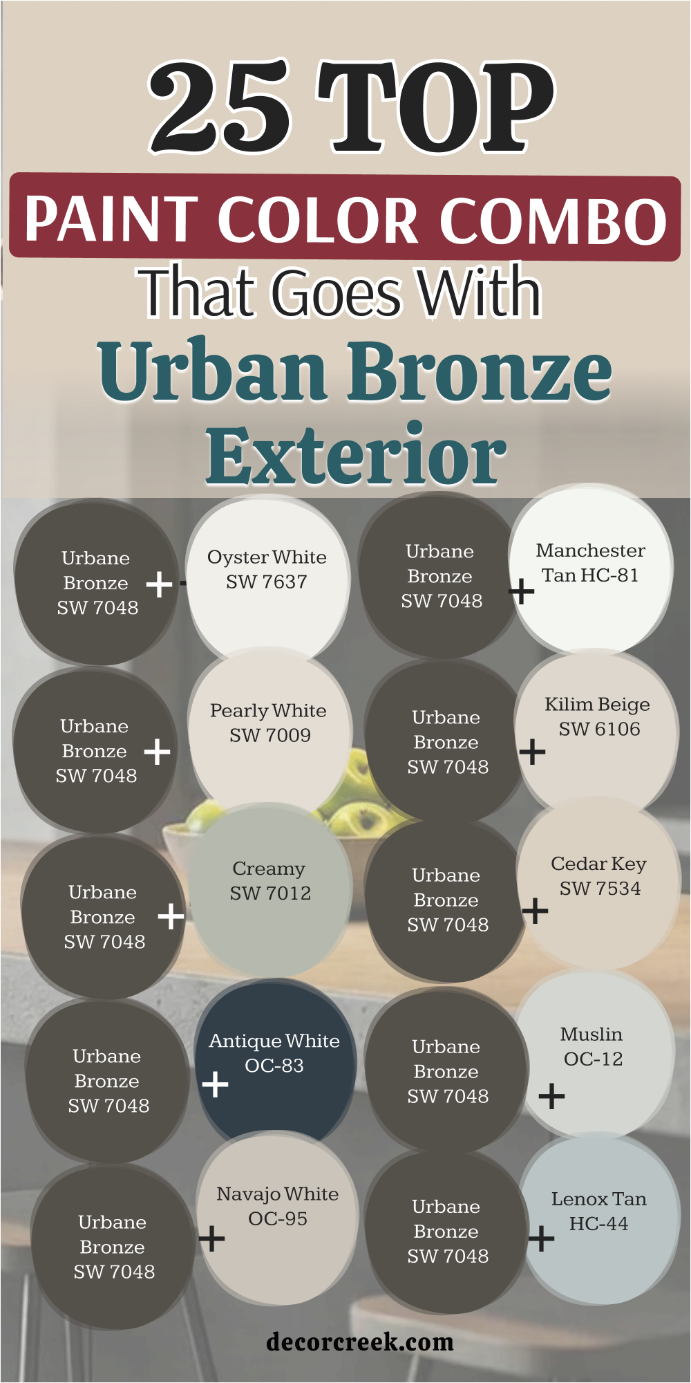
My Final Thoughts about 27 Best Colors that goes with Urban Bronze by Sherwin Williams
Choosing the right partner for a deep, rich color like Sherwin-Williams Urbane Bronze always comes down to finding a beautiful, natural balance. You can pair this heavy shade with a soft cream to make a family room feel completely cozy, or choose a cool gray to make it look sleek and modern.
Green and blue tones work wonders because they bring out the organic, earthy look hidden deep inside the dark paint. It is a very strong color, but it rewards you with an incredibly rich feeling once you match its energy with the correct companion.
I always tell my clients to trust their own feelings when looking at different paint samples on their walls. Every home has its own special windows and lighting fixtures that change how a color looks from morning until night. Take your time, watch how the shadows move across your sample boards, and do not rush into a big decision. Building a home is a beautiful journey that should feel fun, rewarding, and full of love for your family.
With these top options in your design toolkit, you can confidently create an environment that feels intentional, welcoming, and exactly right for your lifestyle.