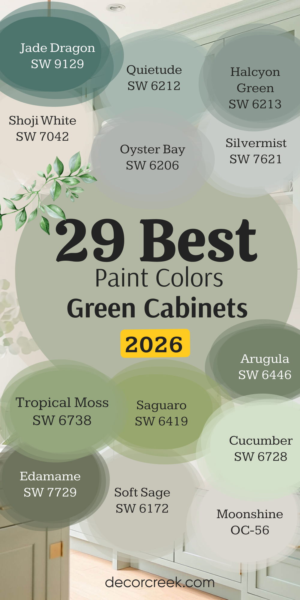
Choosing the perfect paint color to go with your green cabinets can feel like a big decision, and honestly, it should be treated with care. After all, your kitchen, bathroom, or laundry room is a central place where you and your family spend so much time every single day, and you absolutely want it to feel just right—functional, inviting, and beautifully designed.
Green cabinets are a truly wonderful and forward-thinking choice because green, in all its variations, is inherently a grounding and tremendously versatile color. However, finding the absolutely ideal wall color to fully complement them is the essential key to making your entire room sing with polished style.
As a home interior designer and staging expert, I’ve seen firsthand how selecting the right paint pairing can instantly make green cabinets look sophisticated, cheerful, or delightfully cozy.
This comprehensive list of the 29 best paint colors for green cabinets in 2026 is based on years of real-world experience, seeing exactly what combinations truly work together to create a lasting, beautiful, and completely cohesive look.
You can now forget the guesswork, the endless swatching, and the fear of making a mistake—I’ve rounded up my favorite, most reliable colors that will genuinely bring out the very best in your green cabinetry.
My primary goal is to give you a straightforward, expert-backed guide so you can pick a color that you will not just like, but absolutely love for years to come.
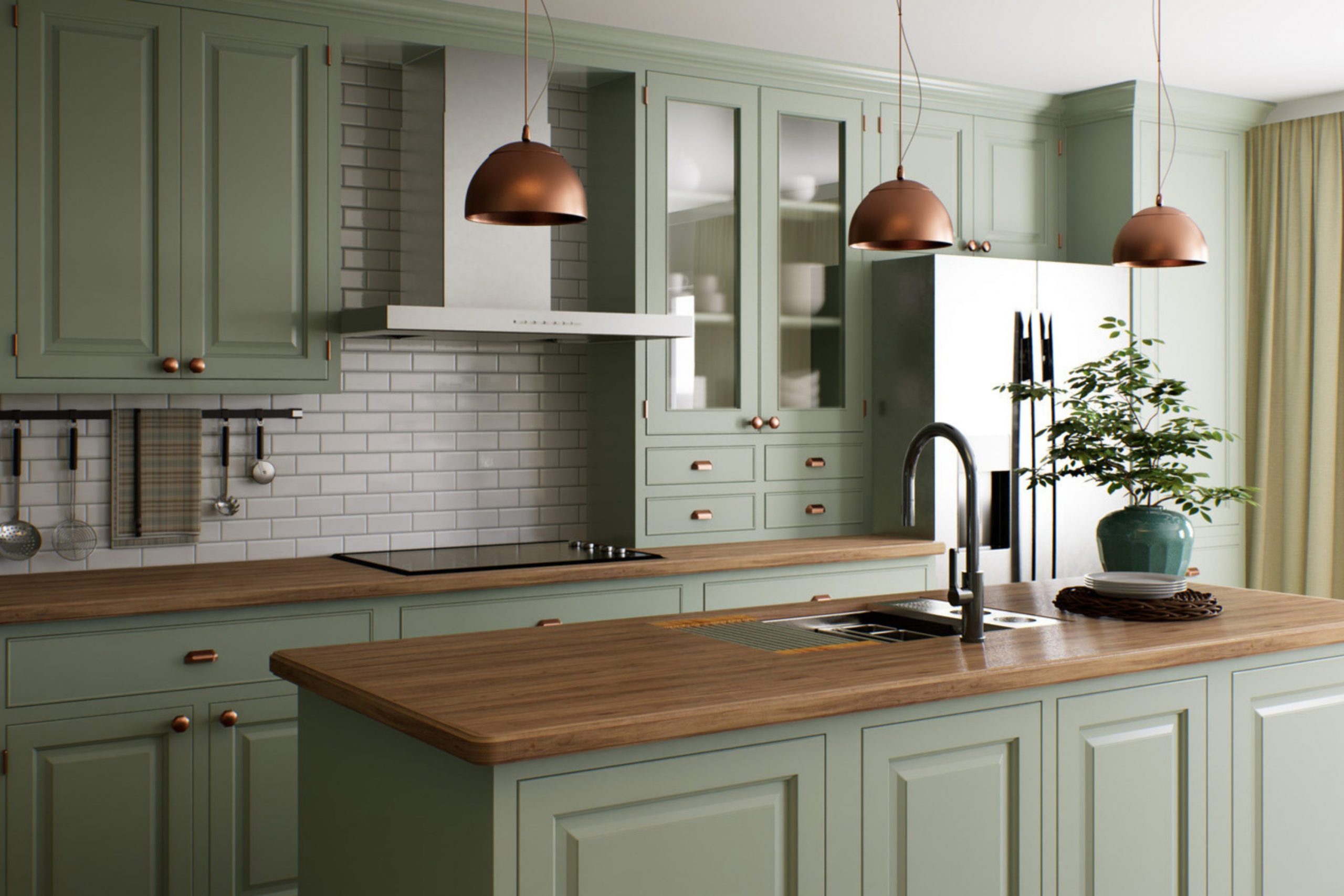
Why I Always Trust Sherwin-Williams and Benjamin Moore for These Color Pairings
When it comes to paint, quality, performance, and color consistency matter a great deal more than people realize, which is precisely why I consistently recommend only Sherwin-Williams and Benjamin Moore. These industry-leading companies have been painstakingly refining and curating their color collections for decades, resulting in pigments that are reliably rich, appropriately deep, and perfectly true to the swatch in almost every lighting situation.
When you are seriously looking for a specific paint color to pair effectively with green cabinets, you critically need a shade that has reliable and intentional undertones so it doesn’t clash or look unexpectedly jarring. Lesser quality or budget paints might look correct in the can, but they often change drastically or look muddy when applied on a large wall surface, especially when placed right next to a strong, saturated color like green.
Both Sherwin-Williams and Benjamin Moore offer beautifully complex neutrals and carefully crafted colors that are engineered to work well with a vast range of other tones and fixed finishes.
Furthermore, their durability, coverage, and washability are always top-notch, which is absolutely essential in a hardworking, high-traffic area like a kitchen.
For me, specifying colors from these two trusted brands means I can be completely confident in the final outcome, consistently delivering a stunning, professional, and long-lasting look for all my clients.
They simply offer the most trusted, most extensive, and most beautifully articulated palettes in the entire industry.
How I Choose the Perfect Shade to Pair with Green Cabinets
Choosing the perfect paint shade to match green cabinets is a highly intentional process that goes far beyond just liking a color on a chip. First and foremost, I always consider the true undertone of the green cabinets themselves. Is the cabinet color warm and yellow-based (think moss or olive), or is it cooler with distinct blue or gray notes (like seafoam or hunter green)? The wall color absolutely needs to acknowledge and respond to this cabinet undertone to avoid a jarring clash and ensure the colors harmonize.
Second, I meticulously look at the lighting in the room; natural light changes constantly throughout the day, and artificial light adds its own color cast, which is why testing large samples is completely non-negotiable. A paint color that looks crisp and bright in a morning-sunlit room might feel heavy or dingy in a darker, north-facing setting.
Third, I carefully think about the feeling and emotional tone we want to create—do we want a high-contrast, bold, and dramatic look, or a gentle, soothing, and muted backdrop? For a bold, contrasting look, I might suggest a crisp, clean white or a deep, dark neutral. For a softer, more integrated look, I lean towards warm grays or light greiges. Finally, I always consider the existing fixed elements like the flooring, countertops, and backsplash, ensuring the new wall color ties everything together seamlessly, making the entire room feel custom.
It’s all about creating a visually harmonious and intentional picture where the green cabinets are celebrated as the star, and the walls provide the most thoughtful, perfect supporting role.
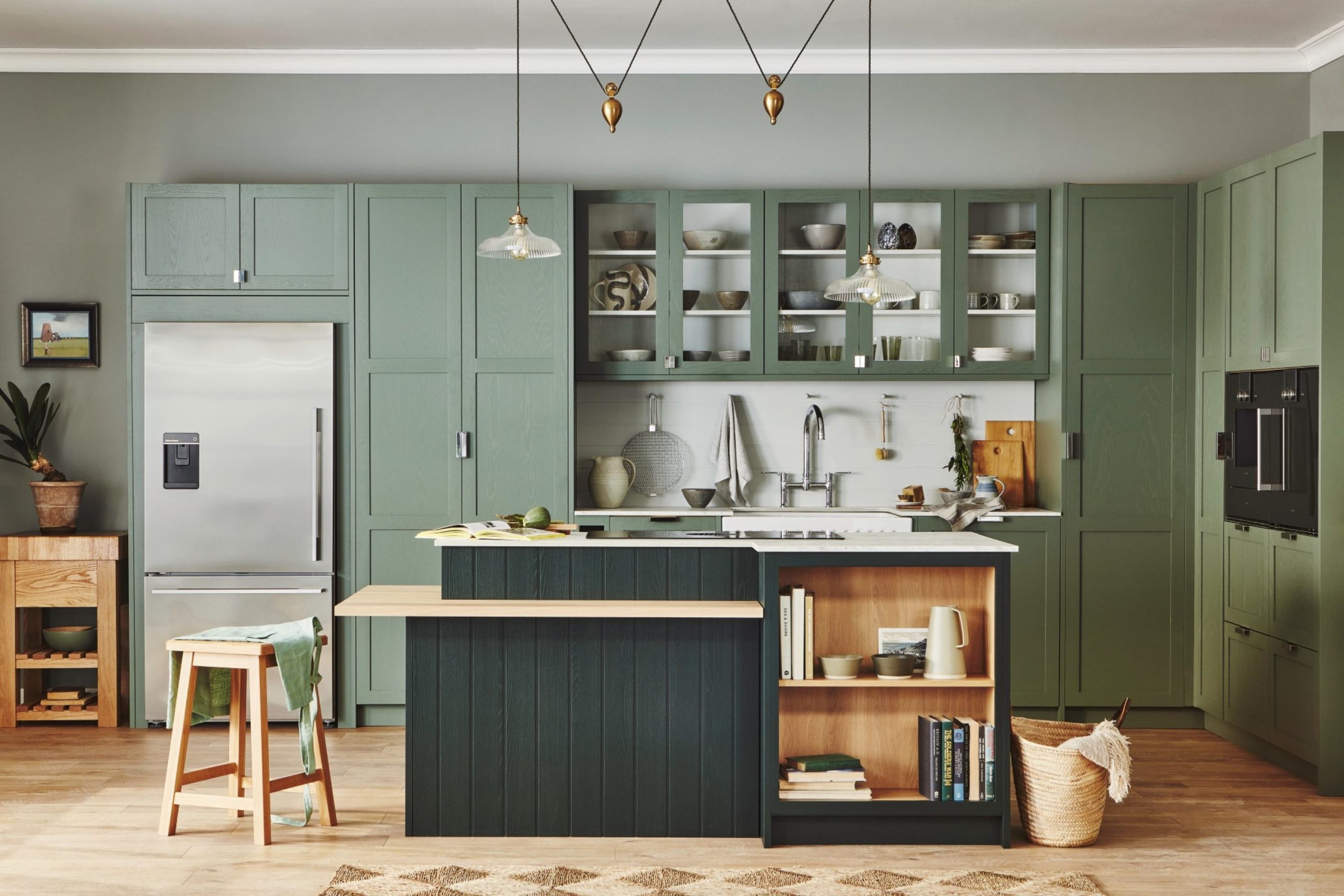
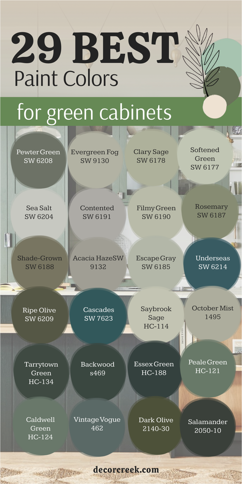
29 Best Paint Colors For Green Cabinets
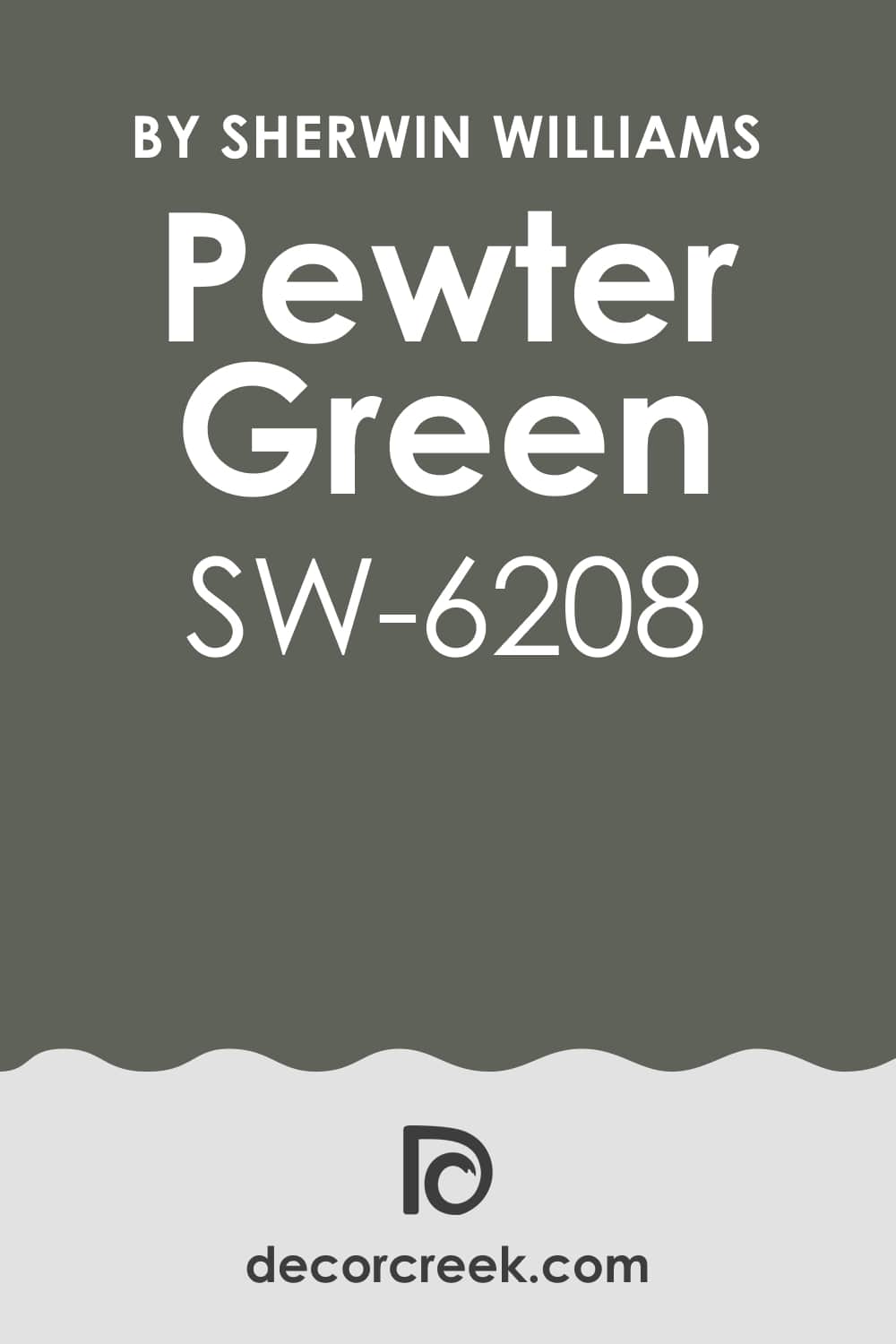
Pewter Green SW 6208
Pewter Green SW 6208 is a deep, smoky green-gray that can look absolutely stunning next to brighter or lighter green cabinets. Pewter Green has a wonderful sophisticated character that adds an instant touch of classic elegance to any room. It works beautifully to create contrast, especially when paired with a light sage or a minty green cabinet color.
This shade is one of those colors that changes depending on the light, sometimes looking more gray and other times showing its rich green depth. It’s an excellent choice for a moody, cozy kitchen or a dramatic dining area adjacent to the cabinets. I find that this color grounds a room and gives it a settled, finished feeling.
It pairs beautifully with warm woods and brass hardware for a truly refined appearance. If your green cabinets are on the lighter side, using Pewter Green on the walls will make them pop with definition. The richness of this color makes it feel very custom and high-end, proving that walls don’t always need to be white.
🎨 Check out the complete guide to this color right HERE 👈
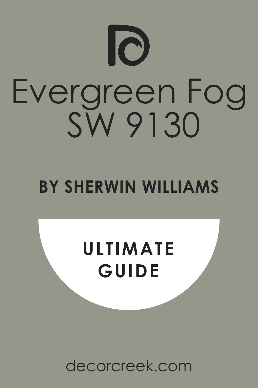
Evergreen Fog SW 9130
Evergreen Fog SW 9130 is a popular, gentle, and pleasing color that acts as a beautifully soft neutral. Evergreen Fog is a perfect mix of green, gray, and a touch of blue, making it incredibly versatile for almost any style of green cabinet. It works exceptionally well next to deeper, more saturated green cabinets by providing a slightly lighter, complementary background.
This shade doesn’t fight for attention; instead, it allows your cabinets to be the focal point while still providing a dose of color. It is a fantastic option if you want a wall color that is definitely not white but still feels airy and open.
I often use Evergreen Fog in open-concept areas because it transitions so nicely between different furniture and decor styles. The gray undertone keeps it sophisticated, preventing it from feeling too bright or childish. This paint color is a reliable go-to for creating a calm and welcoming atmosphere in your home.
🎨 Check out the complete guide to this color right HERE 👈
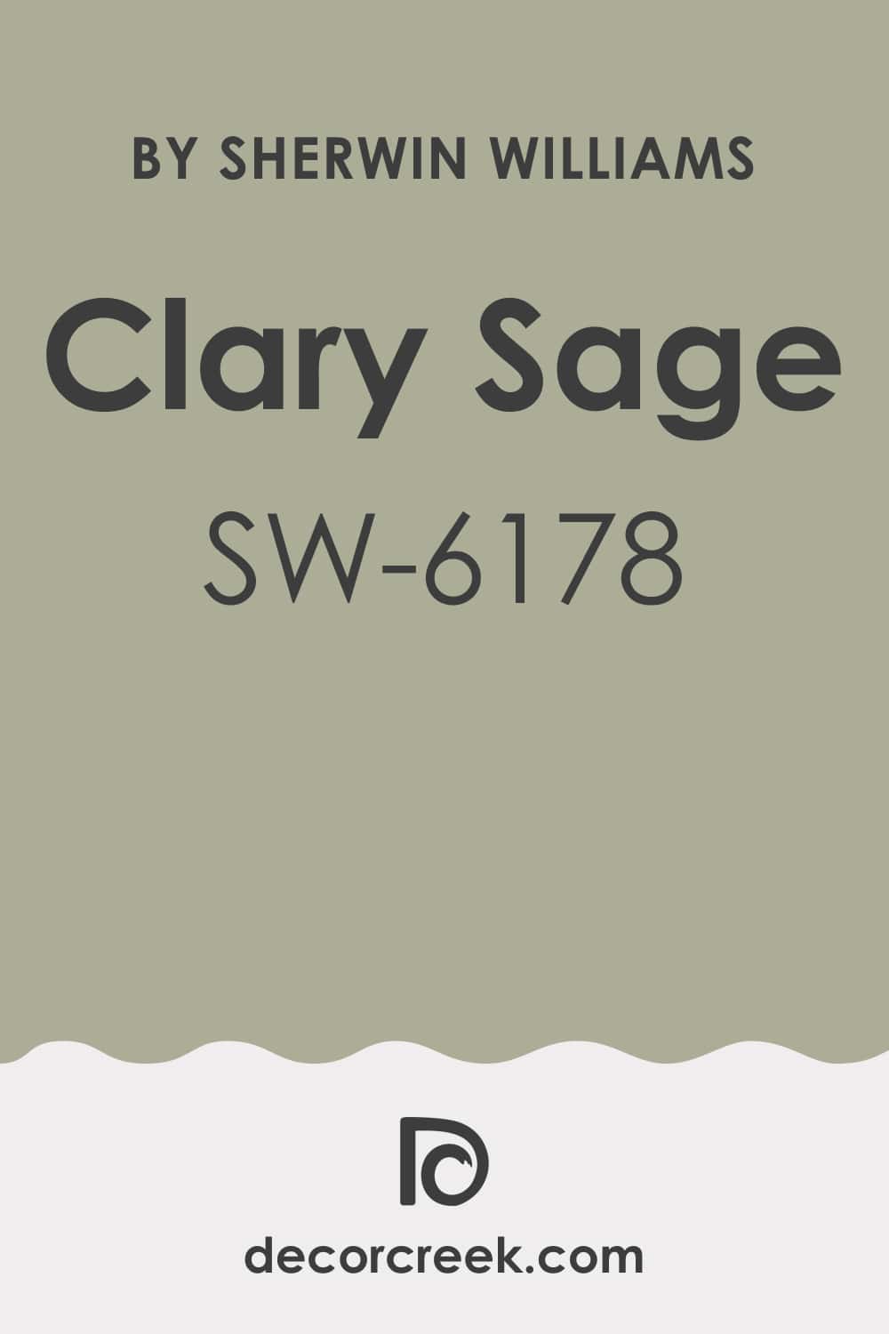
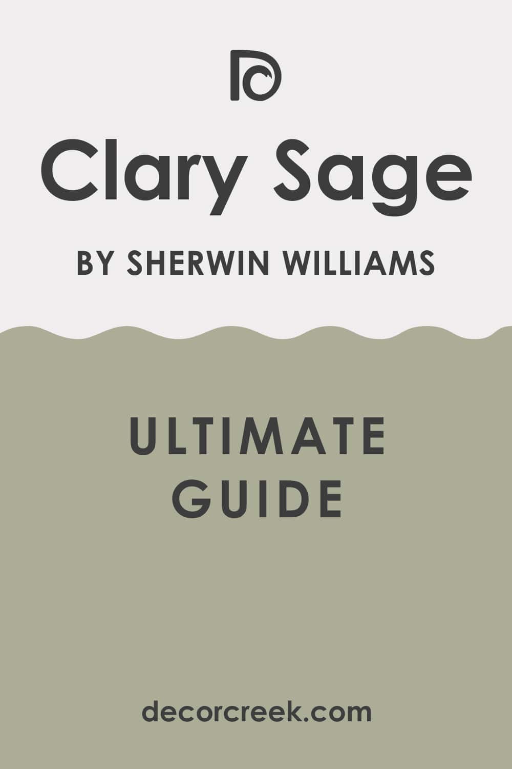
Clary Sage SW 6178
Clary Sage SW 6178 is a beautiful, muted sage that has a lovely earthy quality, making it a very grounding choice for your walls. Clary Sage pairs wonderfully with deeper forest greens or mossy green cabinets, creating a monochromatic but textured look.
It’s a light-to-medium green with a strong gray influence, which keeps it from looking too bright or overwhelming. This color brings a natural, organic feel into a kitchen or laundry room that is very comforting. It’s a great way to introduce color without sacrificing lightness, as it reflects light nicely.
I often recommend Clary Sage when the goal is to achieve a cozy, almost farmhouse-inspired aesthetic. This particular shade feels very classic and avoids feeling too much like a passing trend. It creates a seamless flow of color when you use it with a coordinating green on the cabinets. Think of Clary Sage as a calming, dependable partner for your bolder green cabinets.
🎨 Check out the complete guide to this color right HERE 👈
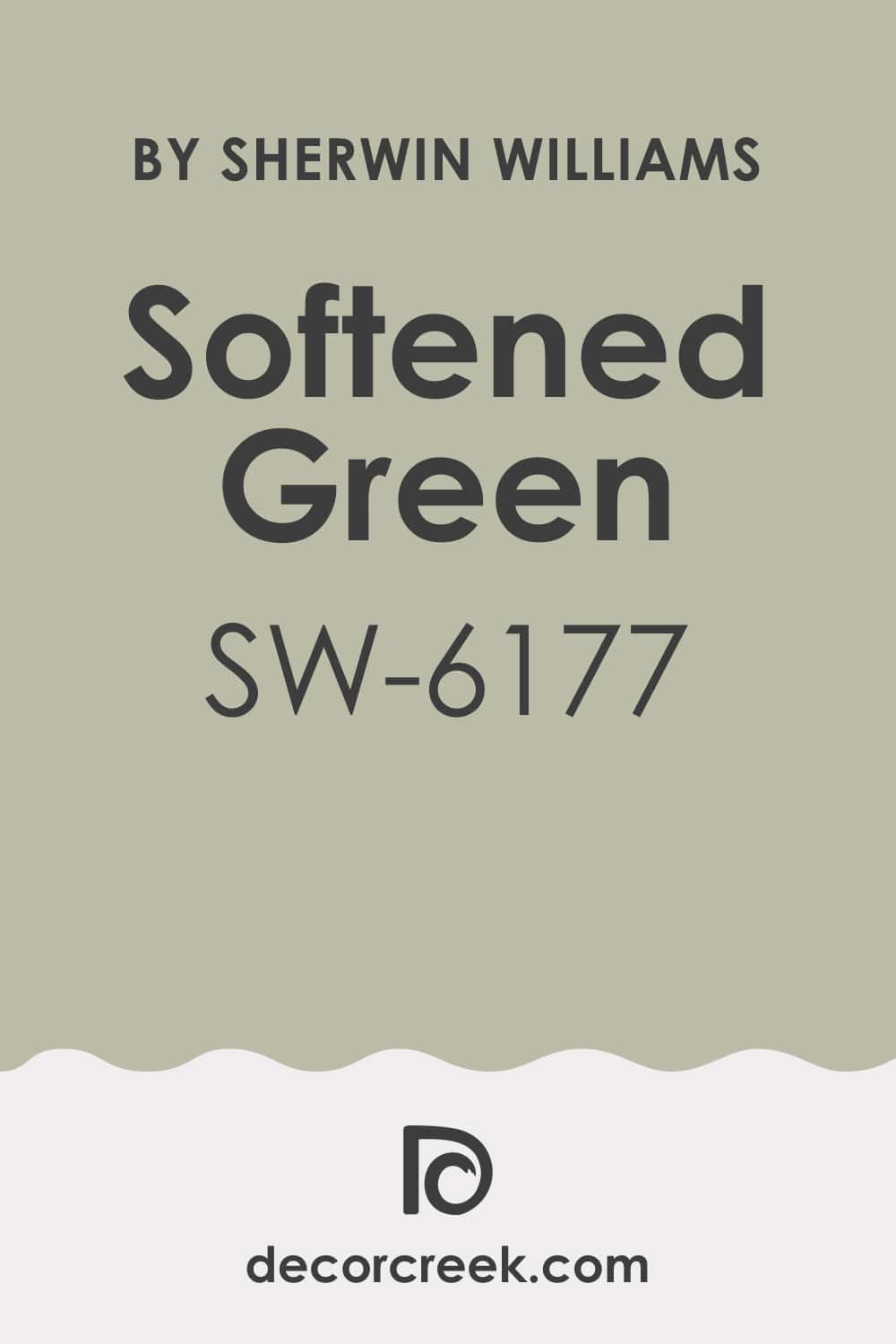
Softened Green SW 6177
Softened Green SW 6177 is a pale, whisper of a green that is airy and bright, almost acting as a refreshing neutral. Softened Green is an excellent option for pairing with dark, dramatic green cabinets like hunter green or deep olive.
Its lightness provides a crisp contrast that prevents the darker cabinets from making the room feel too small or heavy. This color is also a smart choice for smaller kitchens because it bounces light around beautifully, making the room feel larger. It has just enough green pigment to keep it warm, unlike a cool white or gray.
I find that Softened Green gives a room a cheerful and inviting character without being distracting. It’s a clean and refreshing shade that works particularly well with white countertops and chrome or nickel hardware. If you are looking for a color that complements your dark green cabinets but keeps the overall room feeling light and open, this is a wonderful candidate.
🎨 Check out the complete guide to this color right HERE 👈
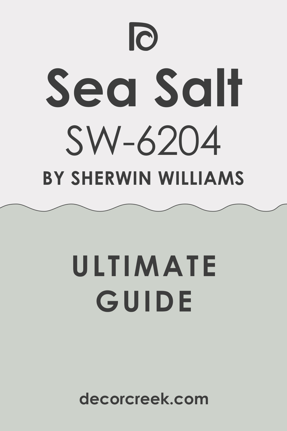
Sea Salt SW 6204
Sea Salt SW 6204 is a highly popular color that leans heavily on blue and gray, giving it a cool and refreshing feel. Sea Salt is famous for its chameleon-like qualities, appearing slightly green in some lights and more blue or gray in others, which is why it works so well with green cabinets.
It provides a beautiful coastal or spa-like contrast to most shades of green cabinet. This color is an ideal choice if your green cabinets have yellow undertones because the slight blue in Sea Salt will balance the warmth nicely. It’s bright enough to keep a room feeling lively but muted enough not to feel intensely colorful.
I often use Sea Salt to create a relaxed and easygoing atmosphere in a kitchen or bathroom. It pairs exceptionally well with polished silver hardware and bright white trim. Sea Salt is a reliable and lovely color that offers a refreshing visual break next to saturated green cabinetry.
🎨 Check out the complete guide to this color right HERE 👈
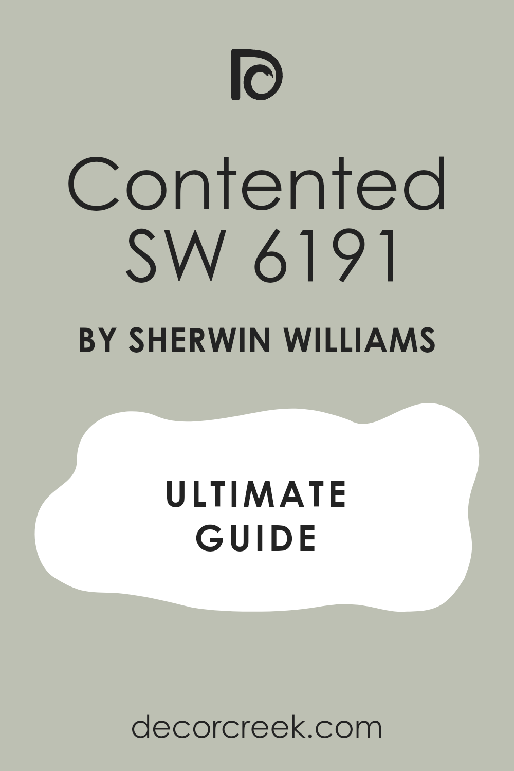
Contented SW 6191
Contented SW 6191 is a lovely mid-tone color that blends green and gray beautifully, resulting in a hue that is both colorful and restrained. Contented is perfect for creating a harmonious and layered look when paired with similar depth green cabinets, such as an army green or a deep sage.
The color has a wonderful softness to it that makes a room feel instantly welcoming and unpretentious. This shade avoids being too dark but has enough pigment to provide a nice visual weight on the walls. It’s a great color for a kitchen that receives moderate natural light, as it won’t wash out easily.
I often recommend Contented when a client wants a color that is noticeably green but still functions like a neutral in the overall design. It looks particularly fantastic with black or bronze hardware, adding a touch of rustic sophistication. Contented truly lives up to its name, creating a peaceful and satisfying backdrop for your green cabinets.
🎨 Check out the complete guide to this color right HERE 👈
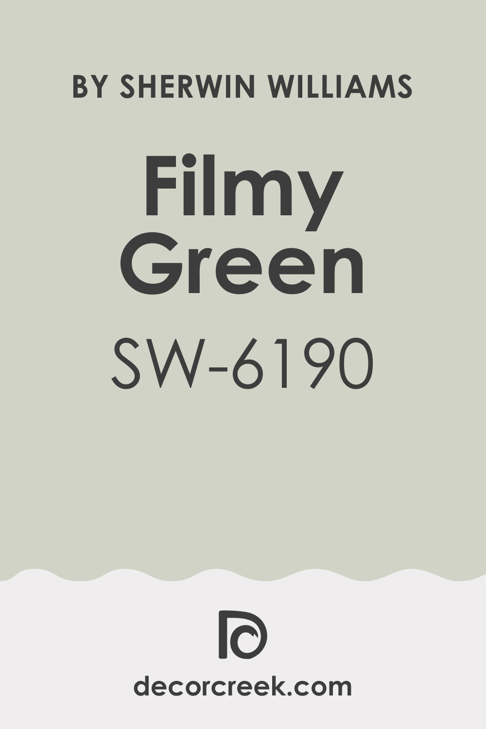
Filmy Green SW 6190
Filmy Green SW 6190 is a light, delicate green that has a soft gray veil cast over it, making it incredibly versatile and easy on the eyes. Filmy Green is a fantastic pairing for almost any intensity of green cabinet, from deep forest to light mint.
It’s light enough to be used generously on all walls without closing in a room, making it feel airy and refreshing. This shade works well as a subtle transition color if your green cabinets are connecting to a room painted in a neutral white or gray. It has a beautiful, natural quality that makes you feel connected to the outdoors.
I often use Filmy Green in homes that have a lot of natural wood elements because it complements them so nicely. This color provides a quiet backdrop, allowing the architecture and the cabinets to take center stage. Filmy Green is an easy-to-live-with color that provides a comforting warmth without being too yellow.
🎨 Check out the complete guide to this color right HERE 👈
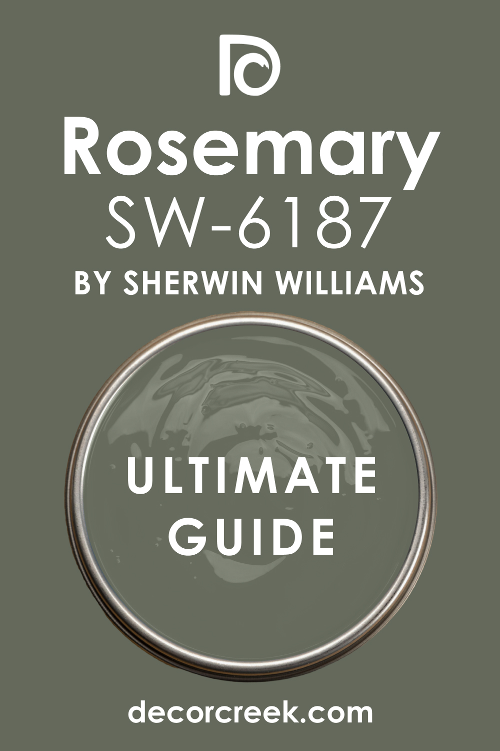
Rosemary SW 6187
Rosemary SW 6187 is a rich, warm olive green with deep gray undertones, making it a sophisticated and dramatic choice. Rosemary is a truly handsome color that works best when contrasted with much lighter green cabinets or even a deep cream cabinet for a high-end look.
It is a fantastic choice for accent walls or for rooms where you want a very cozy, intimate feel. This shade looks particularly stunning in a room with warm, recessed lighting, which pulls out its lovely olive tones. I often use Rosemary to give a room a distinctly traditional or historic feel, as it is a deeply established and respected color choice.
The depth of the color provides a wonderful visual anchor, grounding the lighter elements in the room. This paint color is a strong statement, and it works well with natural stone and darker wood floors. Rosemary is a gorgeous, complex color for those who aren’t afraid of a strong wall.
🎨 Check out the complete guide to this color right HERE 👈
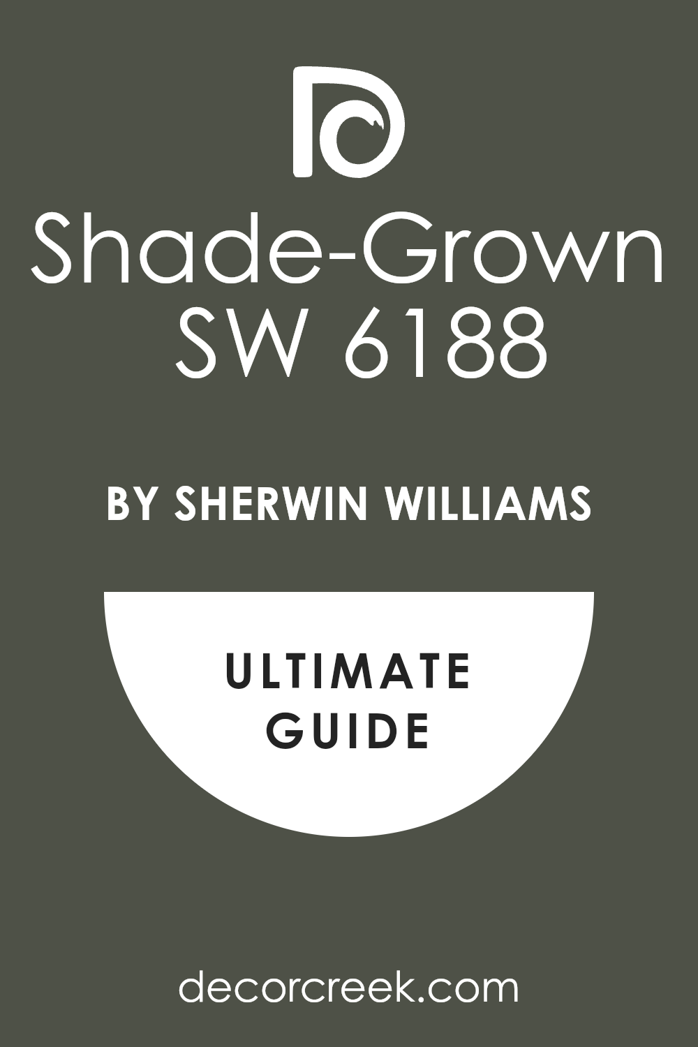
Shade-Grown SW 6188
Shade-Grown SW 6188 is a deep, true olive green that is incredibly rich and full-bodied, almost like the deepest part of a forest. Shade-Grown makes an amazing complementary wall color for lighter green cabinets, offering a dramatic and earthy contrast.
This color is perfect for creating a luxurious, cocoon-like atmosphere in a room. I find that it works exceptionally well in rooms that have lots of white trim and strong architectural features, as the contrast makes the details pop.
It’s a great choice if you have a kitchen island painted a lighter green and want the perimeter walls to feel incredibly grounded. This shade pairs beautifully with natural materials like butcher block countertops and copper accents. Shade-Grown is an absolutely gorgeous, moody color that gives a room a sense of depth and maturity. It’s a sophisticated option that is memorable and unique.
🎨 Check out the complete guide to this color right HERE 👈
Acacia Haze SW 9132
Acacia Haze SW 9132 is a beautiful mid-tone color that sits perfectly between green and gray, with a clear note of warmth. Acacia Haze is a fantastic color to pair with green cabinets that have a slightly cooler, blue-green base, as its warmth balances the coolness.
It is a wonderful color to use if you want a wall that feels colorful but still acts as a neutral background for art and accessories. This shade looks excellent in rooms with natural light, where its green undertones really come alive.
I often recommend Acacia Haze for clients who are nervous about using too much color, as its heavy gray influence keeps it very safe and sophisticated. It offers a fresh, earthy feel that never goes out of style. This paint color is one of my favorite options for creating a cohesive look that connects the cabinets to the rest of the room seamlessly.
🎨 Check out the complete guide to this color right HERE 👈

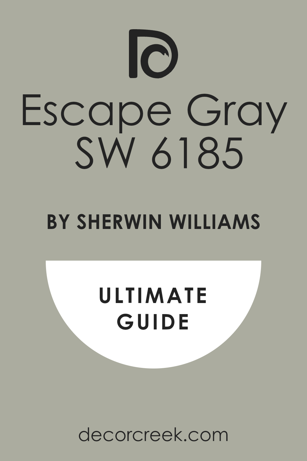
Escape Gray SW 6185
Escape Gray SW 6185 is a gorgeous muted green-gray that truly leans into the neutral category while still retaining an organic feel. Escape Gray is an ideal choice for pairing with vivid, clear green cabinets because its softness allows the cabinet color to truly shine.
It provides a perfect background that is neither stark white nor intensely colored, offering just the right amount of depth. This shade is one of the most versatile colors, working well in both traditional and modern settings.
I find that Escape Gray creates a very calm and composed environment, making it a great option for a kitchen or dining area. It looks particularly stunning with natural wood floors and matte black hardware on the cabinets. This paint color is a quiet superstar, proving that sometimes the best color is one that supports rather than competes.
🎨 Check out the complete guide to this color right HERE 👈
Undersea SW 6214
Undersea SW 6214 is a rich, deep color that is a vibrant mix of blue and green, resulting in a jewel-toned teal. Undersea offers a striking and dramatic complement to many shades of green cabinets, especially lighter or more yellow-toned greens.
It is a bold choice that creates an immediate sense of richness and sophistication in a room. This color works beautifully in rooms that have high ceilings or plenty of white trim, as the contrast really makes the color pop. I often use Underseas when I want to create a slightly exotic or art deco-inspired feel in a home.
The deep saturation of the color makes it feel luxurious and expensive. This shade is a wonderful choice for a statement powder room or a kitchen with natural light to fully appreciate its depth. Underseas is a stunning, high-impact color that delivers a memorable look.
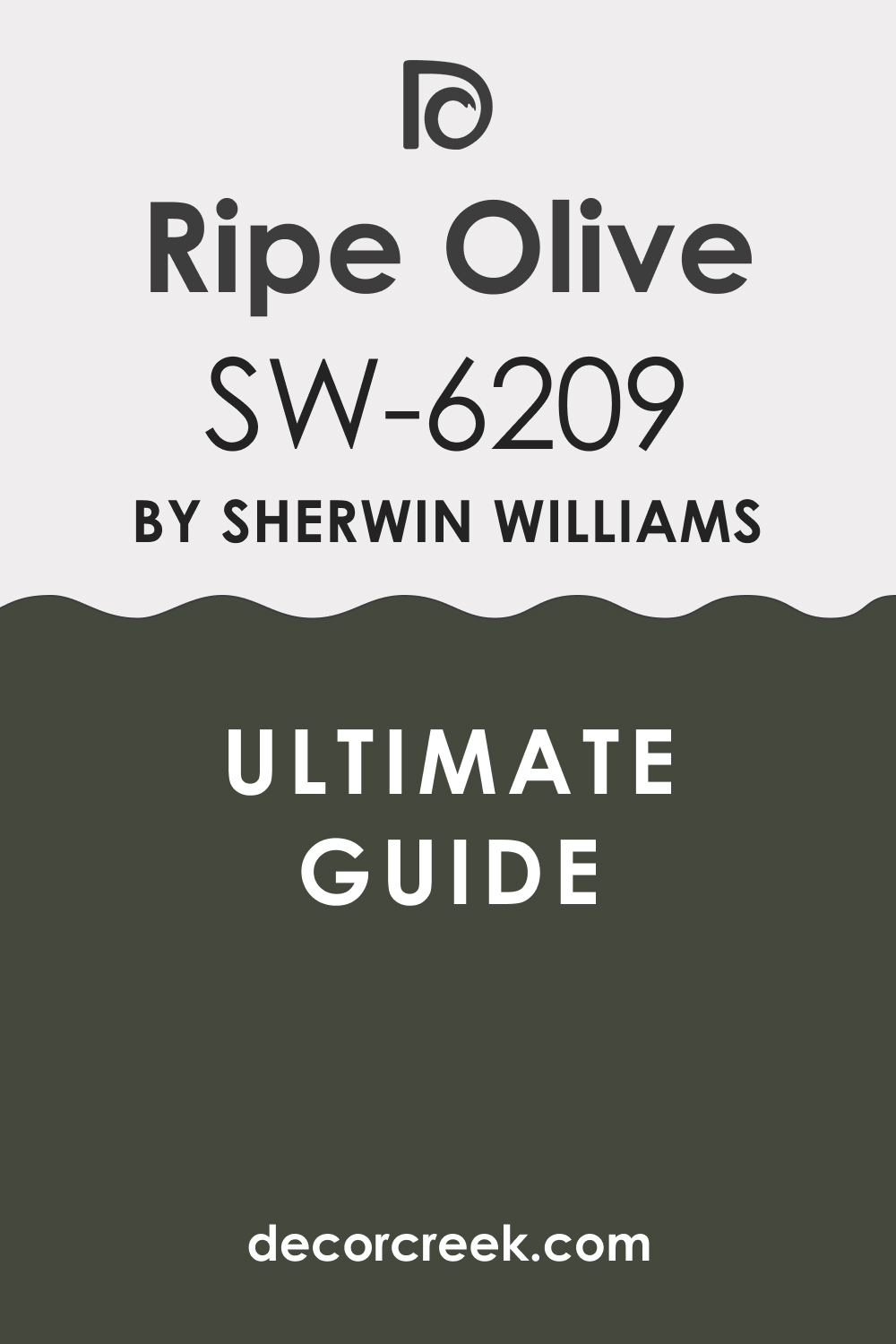
Ripe Olive SW 6209
Ripe Olive SW 6209 is a rich, truly saturated olive green that is earthy and deeply grounding, reminiscent of nature’s darkest shades. Ripe Olive is a fabulous choice for pairing with lighter, creamier green cabinets or even soft sage, creating a beautiful contrast in depth.
It gives a room an immediate sense of warmth and traditional elegance, feeling very established and refined. This color works wonderfully in rooms with natural stone accents or rich, dark wood furniture. I often suggest Ripe Olive when the goal is a moody, sophisticated kitchen or a cozy library-style space adjacent to the cabinets.
The depth of this color means it needs good lighting to avoid feeling heavy, but when lit correctly, it is absolutely stunning. This shade pairs well with brass or copper hardware, which really makes the yellow undertones of the olive shine. Ripe Olive is a gorgeous, complex color for a truly distinctive aesthetic.
🎨 Check out the complete guide to this color right HERE 👈
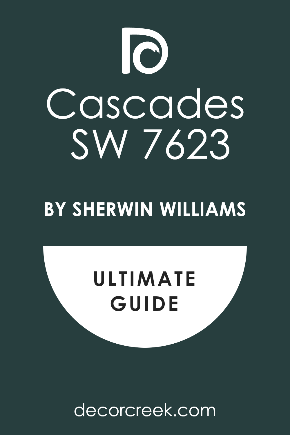
Cascades SW 7623
Cascades SW 7623 is a deep, gorgeous teal that is heavily saturated, with a commanding presence that leans slightly more blue than green. Cascades makes a magnificent backdrop for light, crisp green cabinets, offering a striking, high-contrast look that feels very modern and fresh.
This jewel tone is vibrant and rich, immediately drawing the eye and giving the room a memorable character. I often use Cascades to create a sense of drama and depth, especially in rooms with high ceilings or large windows. It is a bold color that speaks volumes, so it pairs best with simple, clean-lined decor.
This shade looks amazing with white quartz countertops and polished chrome hardware, emphasizing its clean, contemporary feel. Cascades is a standout color that is both beautiful and daring, perfect for making a stylish statement.
🎨 Check out the complete guide to this color right HERE 👈
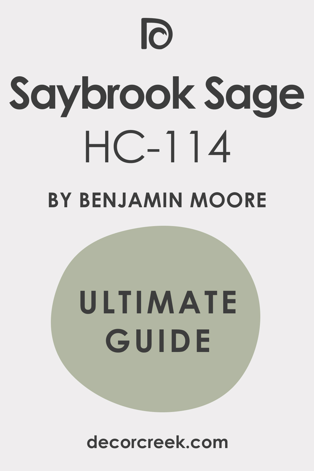
Saybrook Sage HC-114
Saybrook Sage HC-114 is a beautiful, muted gray-green from the Benjamin Moore Historic Collection, giving it a classic and enduring appeal. Saybrook Sage is an extremely flexible color that complements almost every shade of green cabinet, from light mint to deep forest green.
It has a lovely balance of green and gray, making it feel perfectly neutral while still providing a gentle wash of color. This shade is a go-to for creating a comfortable, traditional feel that is utterly welcoming.
I find that Saybrook Sage holds up well in various lighting conditions, maintaining its soft, agreeable character. It pairs beautifully with wood tones and cream trim for a timeless, settled look. This paint color is a dependable choice for a quiet, sophisticated backdrop that allows your green cabinets to truly shine as the focal point.
🎨 Check out the complete guide to this color right HERE 👈
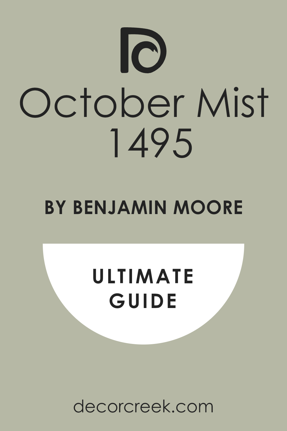
October Mist 1495
October Mist 1495 is a soft, gentle sage that is Benjamin Moore’s Color of the Year for 2022, and it remains a wonderfully relevant and versatile choice. October Mist is an ideal partner for deeper, more serious green cabinets, providing a light, airy contrast that is still earthy and grounded.
It has just the right amount of gray to keep it feeling sophisticated and adult, avoiding any hint of brightness. This shade works brilliantly to create a gentle transition between different rooms in an open-concept living area.
I often use October Mist to bring a touch of nature inside, giving a room a fresh, restorative feeling. It looks fantastic with natural wood floors and simple, classic furnishings. This paint color is a comforting and quiet color that creates an inviting canvas for your beautiful green cabinets.
🎨 Check out the complete guide to this color right HERE 👈
Tarrytown Green HC-134
Tarrytown Green HC-134 is a deep, truly traditional forest green that is rich, saturated, and incredibly elegant, embodying a historic charm. Tarrytown Green is a powerful color that creates a stunning, high-contrast wall when paired with lighter green cabinets or even a pale sage.
It’s an ideal choice for creating a cozy, library-like atmosphere in a kitchen or study space. This shade gives a room immediate weight and architectural interest, making it feel very custom and intentional.
I often recommend Tarrytown Green for homes with lots of white wainscoting or trim, as the contrast is simply breathtaking. It looks marvelous with brass hardware, which pulls out the warmth in the dark green pigment. This paint color is a sophisticated and bold selection that brings a distinguished, old-world feel to your modern home.
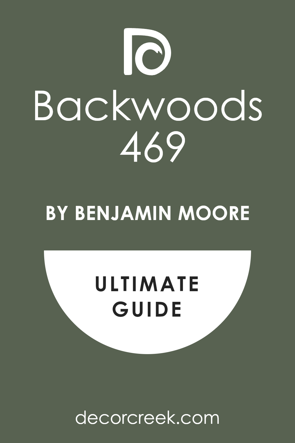
Backwoods 469
Backwoods 469 is a deep, almost black-green that is incredibly grounding and moody, perfect for a high-drama aesthetic. Backwoods is a fantastic complementary color for very light, creamy, or pale green cabinets, allowing the cabinets to stand out with a crisp definition.
It’s a color that exudes luxury and refinement, making a bold statement without being garish or loud. This shade is a wonderful choice for creating a cozy, den-like feel in a room, making it feel safe and enclosed.
I find that Backwoods works best when used with natural wood elements and deep-toned leathers, enhancing its earthy quality. It looks stunning when paired with warm metals like copper or antique gold on the cabinet hardware. Backwoods is a beautiful, deeply saturated color that offers a sophisticated and memorable wall treatment for your space.
🎨 Check out the complete guide to this color right HERE 👈
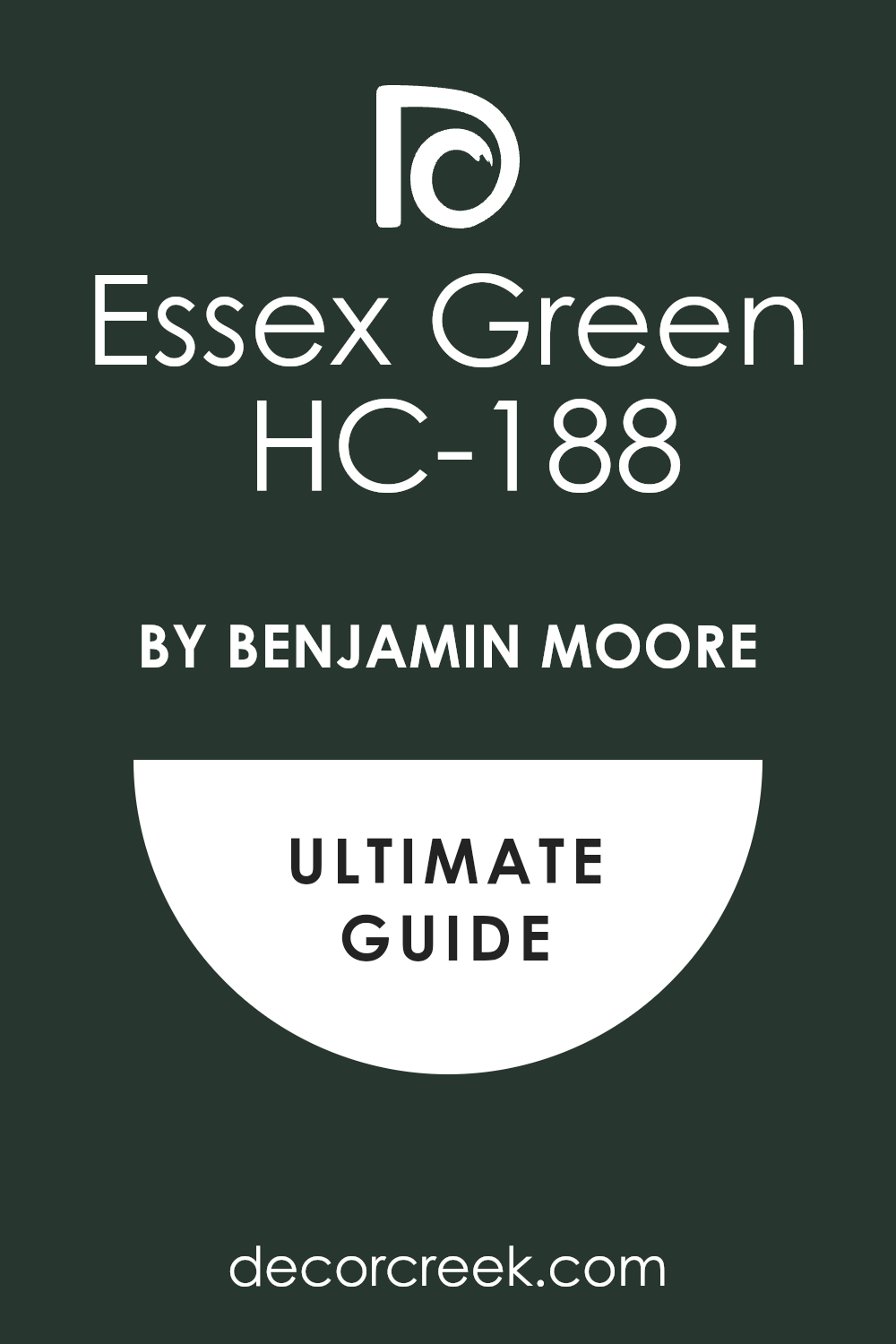
Essex Green HC-188
Essex Green HC-188 is a nearly black, deeply saturated green that feels incredibly rich and classic, embodying a timeless, historical feel. Essex Green works best as a dramatic, contrasting backdrop for light to medium green cabinets, making them truly pop off the walls.
This is the color you choose when you want to make an undeniable, luxurious statement in a room. I often use Essex Green in spaces with plenty of natural light or bright white trim to prevent the room from feeling too dim.
It provides a phenomenal, sophisticated anchor to any design. This shade looks absolutely stunning when paired with marble countertops and shiny, polished nickel hardware. Essex Green is a bold and elegant choice that delivers a sense of enduring quality and high-end design.
🎨 Check out the complete guide to this color right HERE 👈
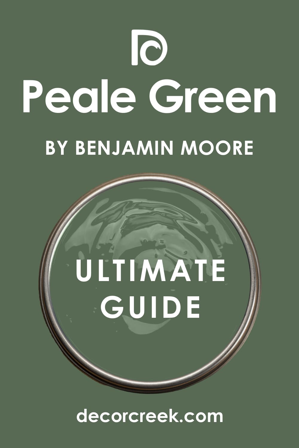
Peale Green HC-121
Peale Green HC-121 is a classic, medium-toned green that has a strong presence without being overly saturated or heavy. Peale Green is a beautiful choice for walls when you have a lighter, almost pastel green on your cabinets, creating a lovely layered green look.
It has a beautiful, natural quality that makes a room feel organic and grounded. This shade is versatile enough to work in both traditional and slightly more modern settings.
I find that Peale Green provides a sense of quiet authority, making the room feel thoughtfully decorated and settled. It looks wonderful with medium-tone wood floors and simple white trim. This paint color is a reliable, established green that offers a warm and welcoming backdrop for your green cabinetry.
🎨 Check out the complete guide to this color right HERE 👈
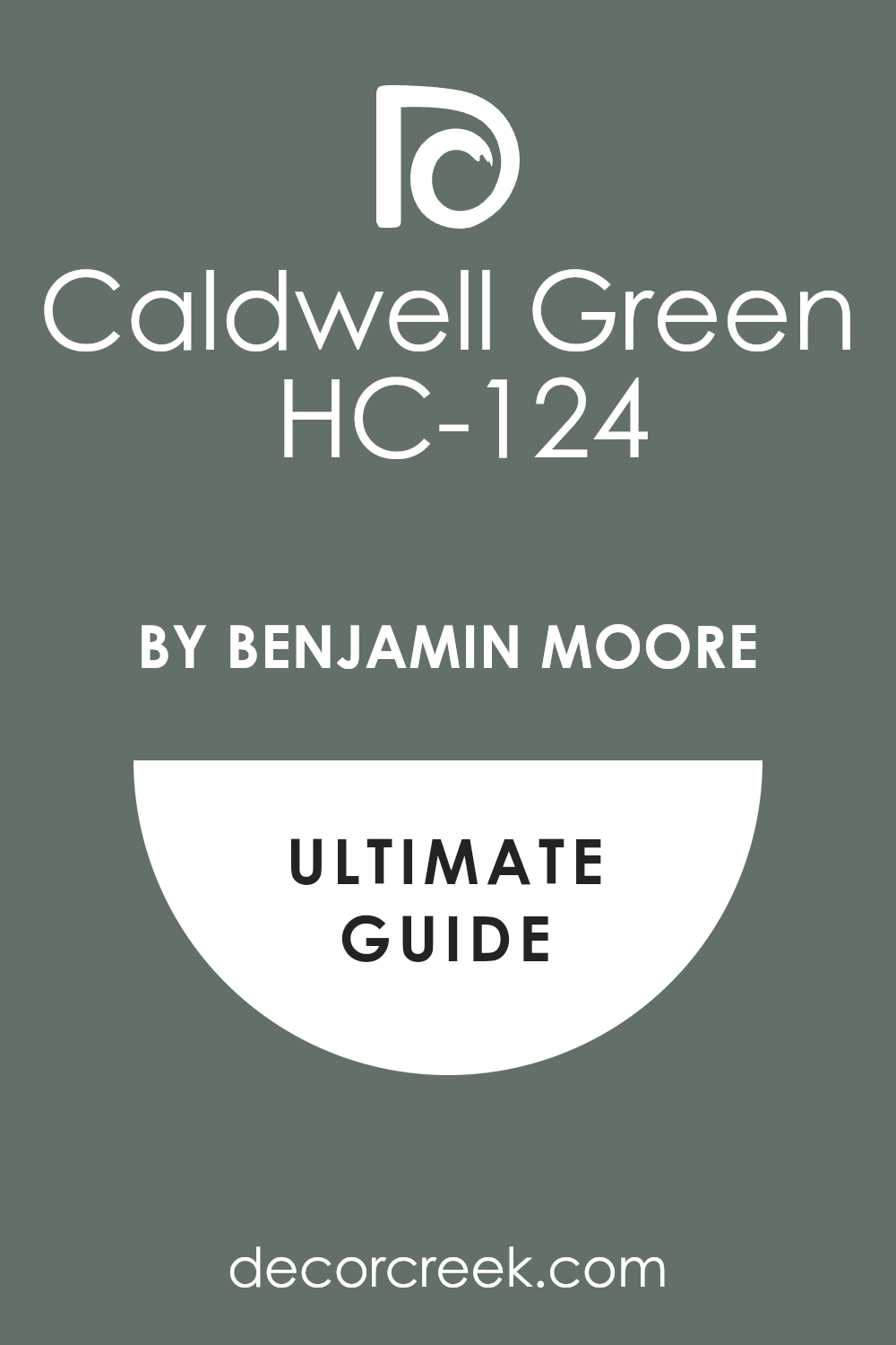
Caldwell Green HC-124
Caldwell Green HC-124 is a dark, yet bright, true green that carries a lot of energy and natural vitality, feeling cheerful and crisp. Caldwell Green is an excellent wall color for pairing with very light, creamy, or off-white green cabinets, offering a fresh, lively contrast.
This shade works brilliantly to bring an element of the outdoors inside, making the room feel fresh and alive. I often recommend Caldwell Green for sunny breakfast nooks or mudrooms where a burst of color is appreciated.
It looks fantastic with clean white trim and simple, modern light fixtures. This paint color is a strong, happy green that creates an immediate focal point and a joyful atmosphere.
🎨 Check out the complete guide to this color right HERE 👈
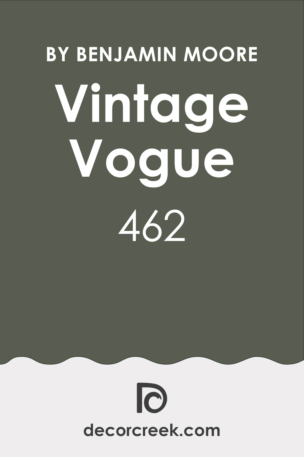
Vintage Vogue 462
Vintage Vogue 462 is a sophisticated, deeply moody green that has significant blue and gray undertones, making it feel truly complex and refined.
Vintage Vogue is a stunning choice for contrasting with light sage or pale mint green cabinets, offering a wall color that is both dark and rich. It is a wonderful color for creating a cozy, enveloping atmosphere in a room, perfect for a kitchen where people gather.
This shade gives a room a sense of history and depth, feeling custom-designed and high-end. I find that Vintage Vogue pairs beautifully with warm metals like bronze and oil-rubbed hardware. This paint color is a gorgeous, atmospheric choice that is rich and wonderfully dramatic.
🎨 Check out the complete guide to this color right HERE 👈
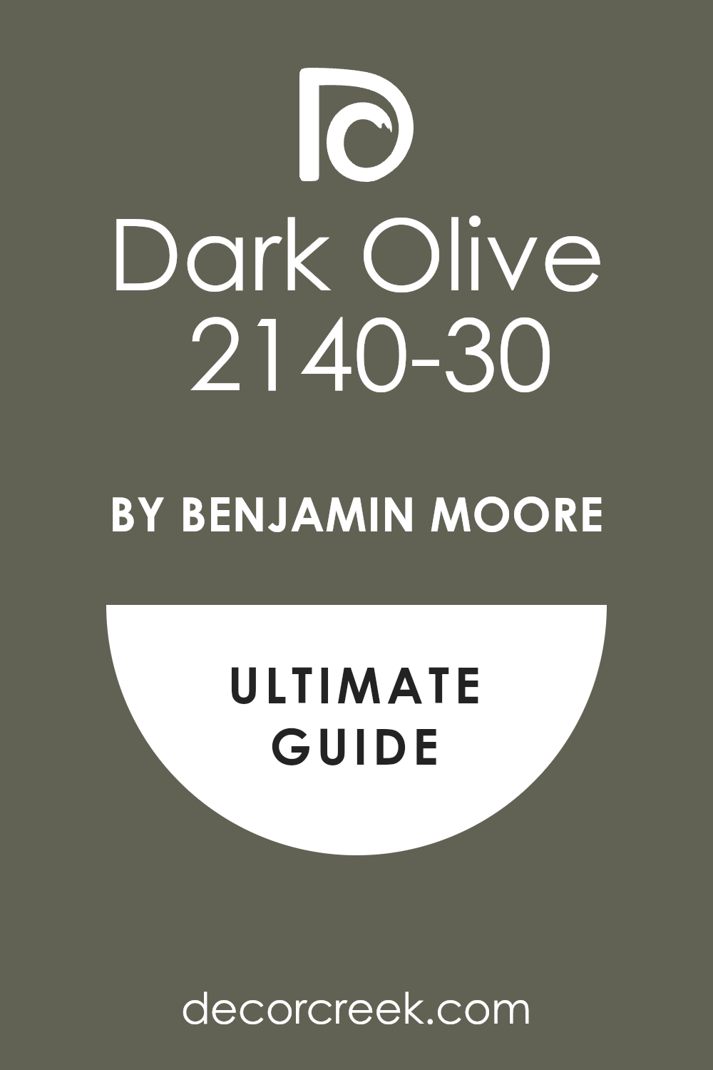
Dark Olive 2140-30
Dark Olive 2140-30 is a classic, deep olive green with strong yellow undertones, giving it a comforting, earthy warmth. Dark Olive is an ideal wall color for pairing with lighter, cooler-toned green cabinets, as its warmth balances the cool tones beautifully.
It gives a room an immediate sense of tradition and permanence, feeling grounded and sophisticated. This shade works wonderfully with natural materials like stone and wood, enhancing its organic quality.
I often use Dark Olive when the design goal is to create a cozy, slightly rustic, yet elegant kitchen. It looks exceptional with matte black or dark bronze hardware on the cabinets. Dark Olive is a rich, dependable color that provides a gorgeous, earthy backdrop for your space.
🎨 Check out the complete guide to this color right HERE 👈
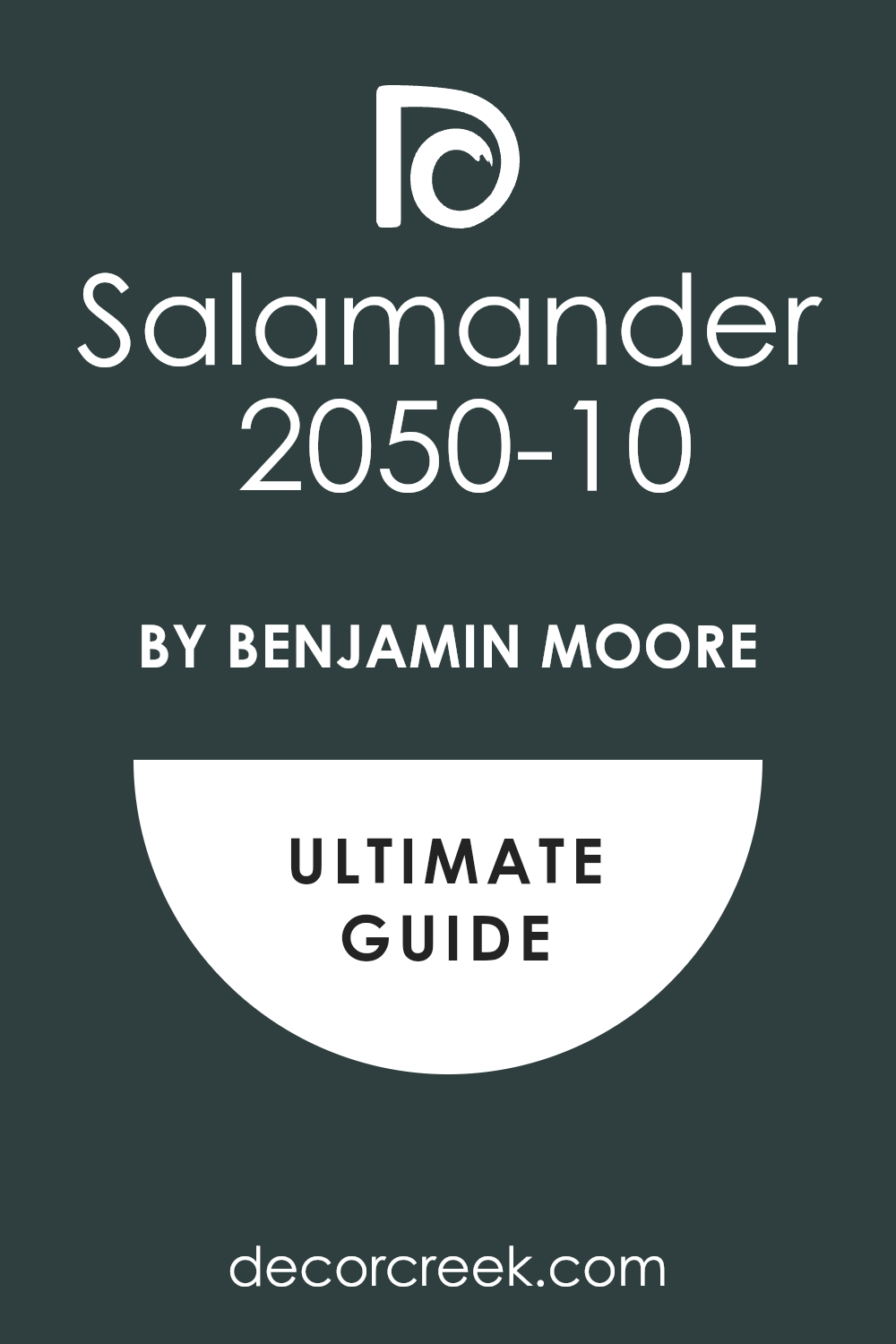
Salamander 2050-10
Salamander 2050-10 is a stunning, deep teal-green that is almost black in some lights, carrying a dramatic, commanding presence. Salamander is a bold, beautiful choice for walls that contrasts strikingly with light, airy green cabinets or a soft seafoam.
It creates an instant sense of luxury and intrigue, giving the room a high-end, custom look. This shade is best used in well-lit areas or rooms with ample white trim to balance its intensity.
I often recommend Salamander for a powerful statement wall or a dining area adjacent to the cabinets. It looks phenomenal with polished gold accents and clean, crisp white elements. Salamander is a sophisticated, deeply atmospheric color that is both memorable and incredibly chic.
🎨 Check out the complete guide to this color right HERE 👈
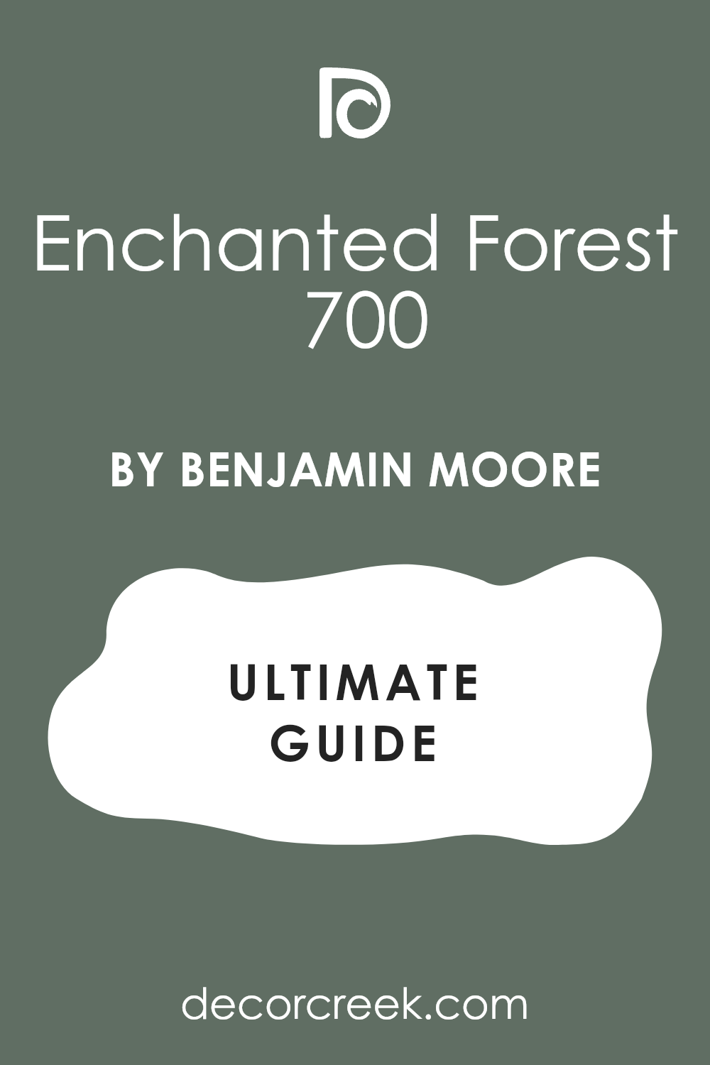
Enchanted Forest 700
Enchanted Forest 700 is a deep, true forest green that is intensely saturated and rich, reminiscent of a deep, shady woodland. Enchanted Forest is a magnificent color to use on walls when paired with very pale or light sage green cabinets, providing maximum, beautiful contrast.
It is a wonderful color for creating a cozy, secluded feel, making a room feel intimate and luxurious. This shade works best when you want to lean into a traditional or sophisticated English country style.
I find that Enchanted Forest pairs beautifully with natural wood cabinets and antique brass hardware. It needs good lighting to truly showcase its depth and beauty. Enchanted Forest is a rich, powerful color that delivers an undeniably dramatic and refined aesthetic.
🎨 Check out the complete guide to this color right HERE 👈
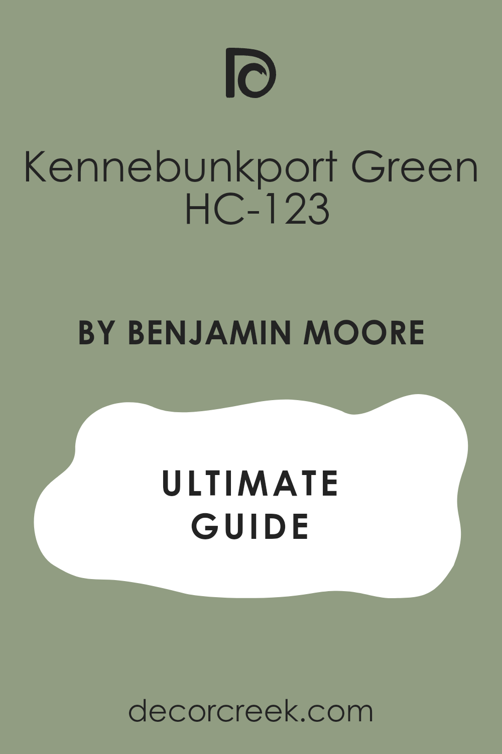
Kennebunkport Green HC-123
Kennebunkport Green HC-123 is a mid-tone, classic green that leans towards the warmer side, with a noticeable yellow undertone that keeps it cheerful.
Kennebunkport Green is a lovely choice for a monochromatic look with darker green cabinets, creating a layered effect that is comforting and subtle. It is a dependable color that feels historic and established, giving a room a sense of settled charm.
This shade works well in rooms that receive a variety of natural light throughout the day. I often use Kennebunkport Green to give a kitchen or mudroom a traditional, friendly character. It looks fantastic with natural materials and cream-colored trim, enhancing its warmth. This paint color is a reliable and inviting green that is very easy to live with.
🎨 Check out the complete guide to this color right HERE👈
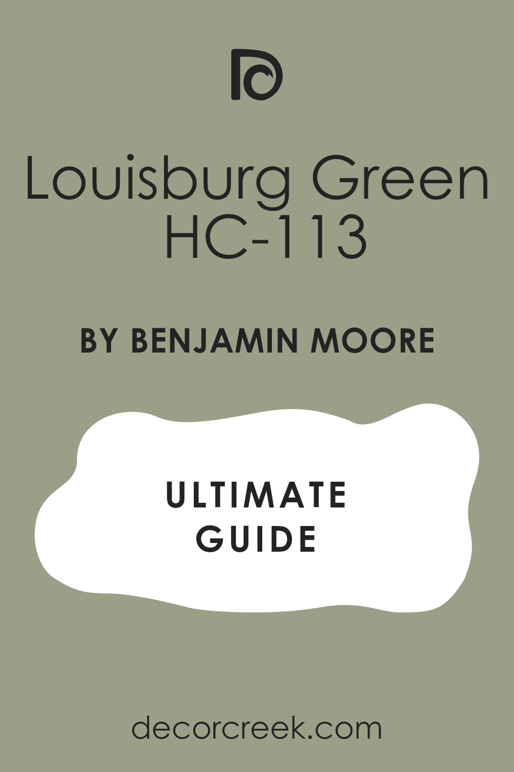
Louisburg Green HC-113
Louisburg Green HC-113 is a muted, pale green that has a substantial gray influence, making it act almost as a neutral, very gentle on the eye. Louisburg Green is an excellent option for walls when paired with deep, saturated green cabinets, as it provides a light, soothing contrast.
It’s a wonderful color for keeping a room feeling bright and open while still adding a touch of sophisticated color. This shade is versatile enough to work in both modern and traditional kitchens.
I find that Louisburg Green creates a peaceful and refined atmosphere that is very welcoming. It looks great with clean white trim and simple silver or chrome hardware. Louisburg Green is a quiet, beautiful color that allows your green cabinets to truly command attention.
🎨 Check out the complete guide to this color right HERE 👈
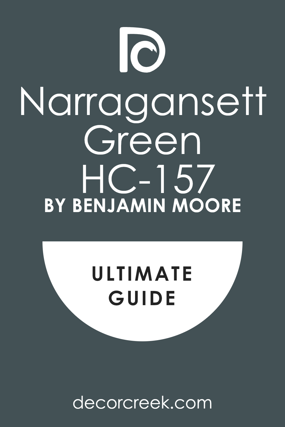
Narragansett Green HC-157
Narragansett Green HC-157 is a deeply saturated, complex color that leans heavily on blue and gray, resulting in a dark, mysterious teal-green. Narragansett Green is a phenomenal wall color for creating a dramatic contrast with light, bright green cabinets or a pale lime green.
It’s a sophisticated, moody shade that immediately gives a room a high-end, bespoke feel. This shade works wonderfully in rooms with plenty of light-colored elements, such as white marble or light wood.
I often use Narragansett Green to create an intimate, jewel-box effect in a kitchen or dining area. It looks amazing with brass or gold accents, which sparkle against its depth. Narragansett Green is a beautiful, striking color that delivers a sense of sophisticated drama.
🎨 Check out the complete guide to this color right HERE 👈
Wasabi AF-430
Wasabi AF-430 is a vibrant, fresh green with a distinct yellow undertone that makes it energetic and slightly unexpected, a true pop of color. Wasabi is a fantastic wall color for pairing with dark, heavily grayed green cabinets, offering a bold, cheerful contrast.
It is a color that brings instant life and playfulness to a room, feeling very current and optimistic. This shade works best in small doses or in rooms that receive plenty of natural light to prevent it from feeling too intense.
I often recommend Wasabi for small accent walls or in a casual, bright kitchen setting. It looks great with simple white trim and minimalist, modern hardware. Wasabi is a spirited, cheerful color that is sure to make your space feel unique and lively.
29 Best Paint Colors For Green Cabinets Trendy This Year
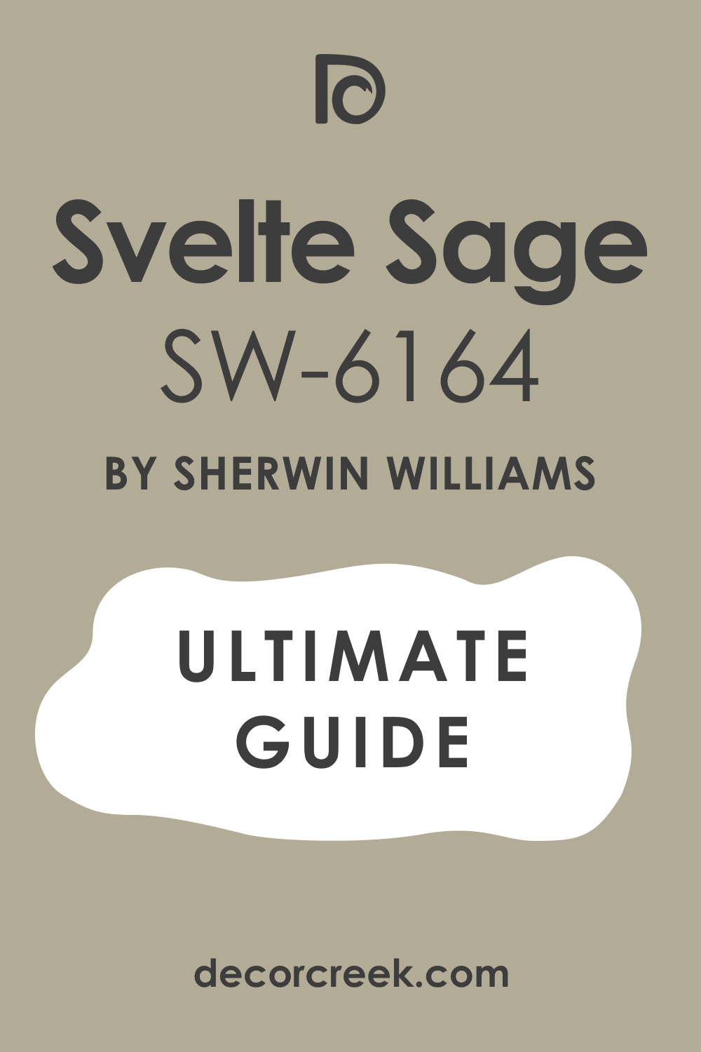
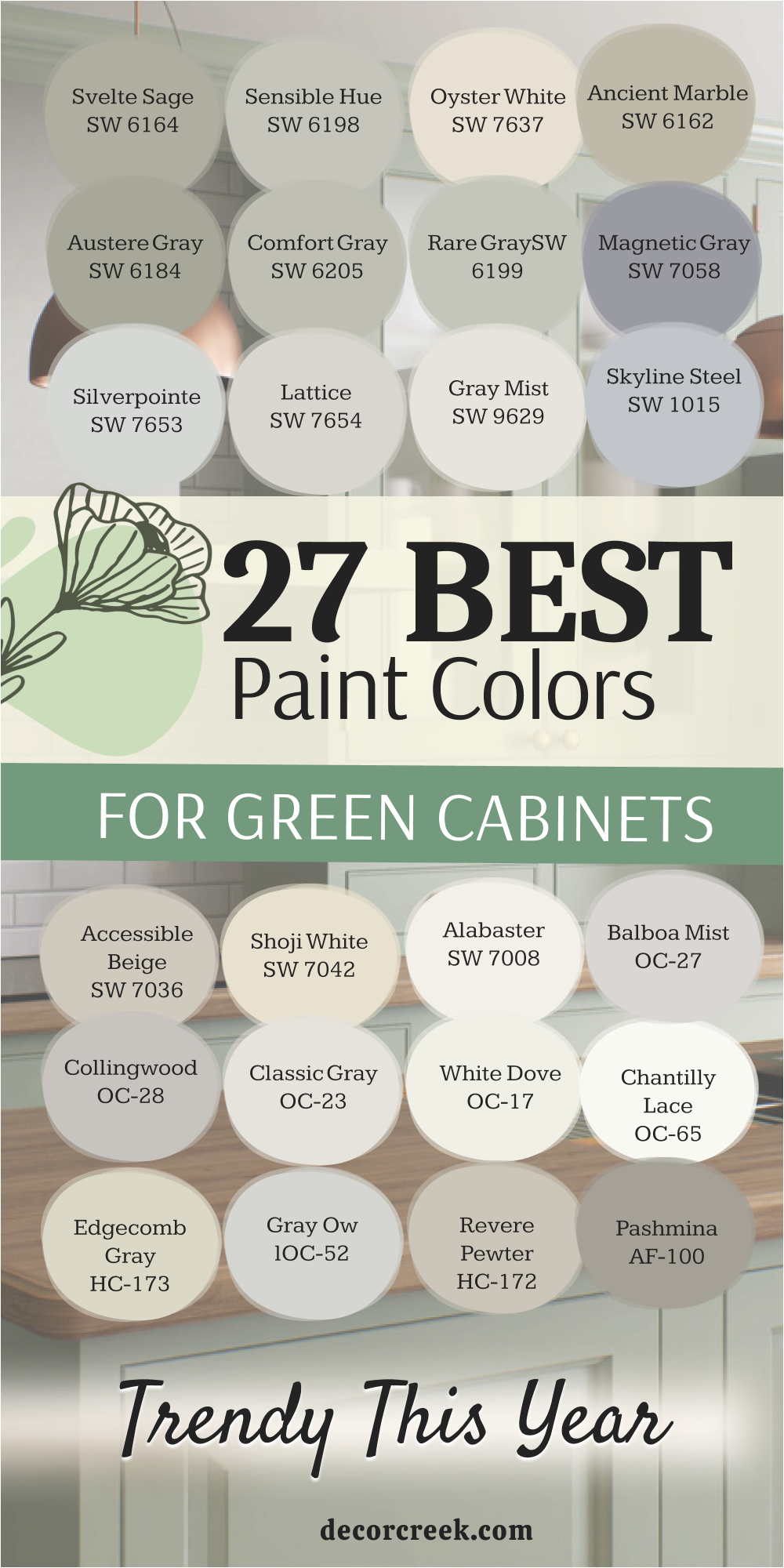
Svelte Sage SW 6164
Svelte Sage SW 6164 is a true mid-tone sage with strong gray undertones, making it a wonderful, dependable neutral that feels current and restful. Svelte Sage works beautifully on walls when paired with green cabinets of a similar or darker shade, providing a harmonious, monochromatic look.
It is a reliable color that is sophisticated and muted, avoiding any sense of being too bright or overly green. This shade offers a perfect earthy backdrop that connects your interior to the natural world.
I find that Svelte Sage is extremely flexible, working well with warm wood tones and a variety of metal finishes. It’s a fantastic, on-trend color that will not feel dated next year. Svelte Sage is a great choice for creating a cozy, settled, and utterly charming atmosphere in your home.
🎨 Check out the complete guide to this color right HERE 👈
Sensible Hue SW 6198
Sensible Hue SW 6198 is a lovely, light green-gray that truly functions as an exceptional neutral, offering just a whisper of color. Sensible Hue is an ideal choice for pairing with darker, more dramatic green cabinets, as it provides a necessary lightness and contrast.
It’s a very versatile color that reflects light well, making a kitchen feel airy and open. This shade has enough warmth to keep it from feeling cold but enough gray to maintain a modern sophistication.
I often recommend Sensible Hue when the goal is a wall color that supports the cabinets without competing for attention. It works beautifully with white countertops and brushed nickel hardware. Sensible Hue is a perfectly balanced color that lives up to its name, offering a smart, refined backdrop.
Oyster White SW 7637
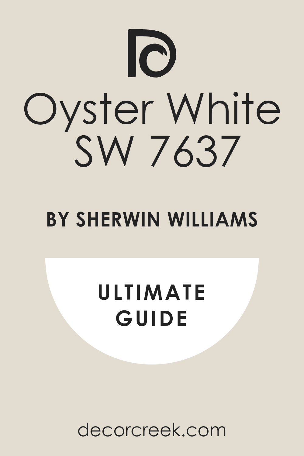
Oyster White SW 7637 is a warm, creamy white that has just enough beige and gray in it to keep it from feeling stark or cold. Oyster White is a brilliant wall color for pairing with any shade of green cabinet, offering a crisp, clean contrast that is instantly classic.
It’s a dependable choice for creating a bright, airy feel, making even small kitchens feel larger. This shade is one of my go-to whites because its gentle warmth complements the green tones so nicely, avoiding a harsh line.
I find that Oyster White works well with both warm wood and cool marble accents. It is a versatile color that provides a gorgeous, reliable foundation for your design. Oyster White is a friendly, inviting white that will always be in style.
🎨 Check out the complete guide to this color right HERE 👈
Ancient Marble SW 6162
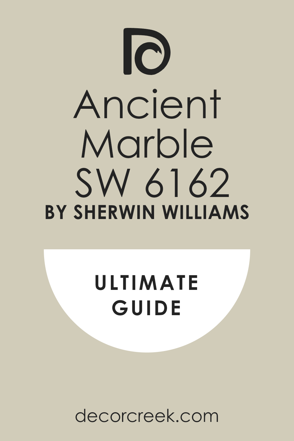
Ancient Marble SW 6162 is a gentle, light color that falls between green and beige, creating a lovely, earthy greige with a definite green tint. Ancient Marble is a perfect partner for deeper green cabinets, offering a light but warm background that feels organic and grounding.
It is a fantastic choice if you want a wall color that is definitely not white but still feels neutral and restrained. This shade works wonderfully in rooms with natural light, where its subtle green undertone truly comes alive.
I often use Ancient Marble to create a soft, seamless transition between rooms. It is a sophisticated color that avoids feeling sterile and provides a wonderful canvas for accessories. Ancient Marble is a beautiful, easygoing color that perfectly complements the green cabinet trend.
🎨 Check out the complete guide to this color right HERE 👈
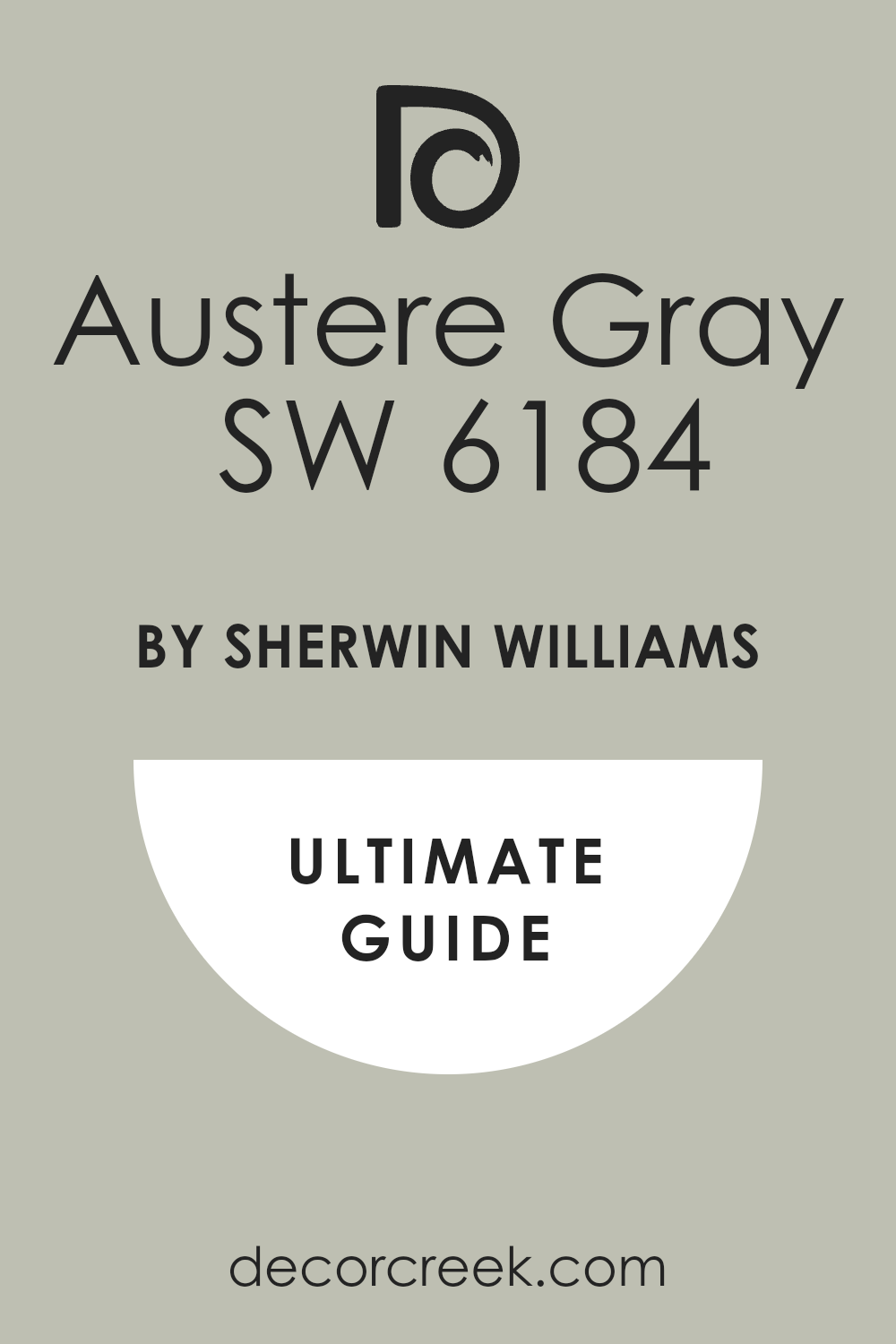
Austere Gray SW 6184
Austere Gray SW 6184 is a unique shade that is a mid-tone gray with a substantial, noticeable green undertone, giving it a soft, organic feel. Austere Gray is an excellent choice for pairing with a bright or yellow-toned green cabinet, as the gray provides a beautiful, muted balance.
It’s a wonderful color for creating a calm and settled atmosphere, acting as a sophisticated and unexpected neutral. This shade is versatile and works well in both traditional and modern homes. I find that Austere Gray provides a sense of quiet depth without being too dark.
It looks fantastic with oil-rubbed bronze or black hardware on the cabinets. Austere Gray is a highly versatile and dependable color that beautifully complements the green cabinet trend.
🎨 Check out the complete guide to this color right HERE 👈
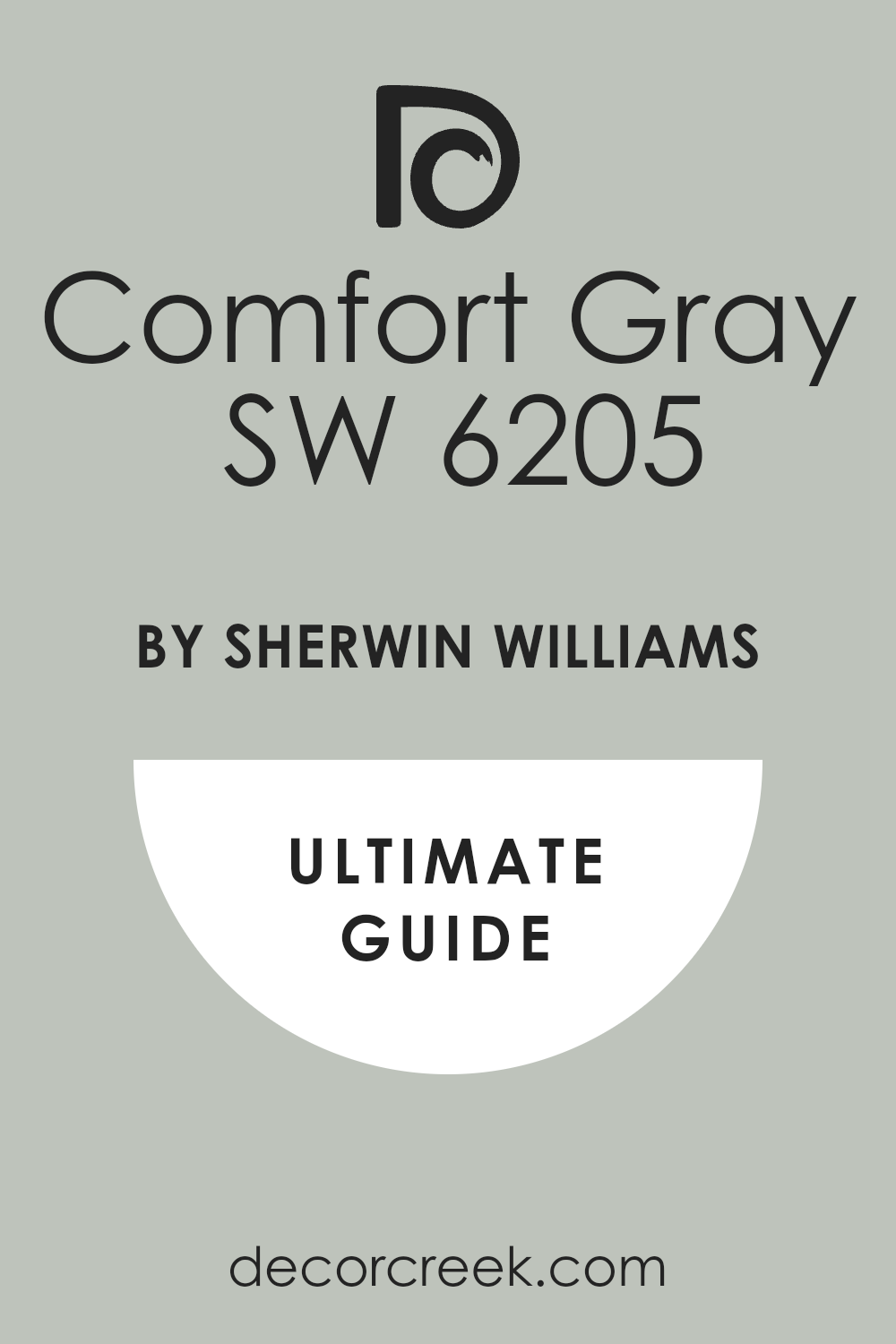
Comfort Gray SW 6205
Comfort Gray SW 6205 is a lovely light color that sits perfectly on the line between gray, green, and blue, making it incredibly airy and versatile. Comfort Gray is an ideal wall color for pairing with darker, more traditional green cabinets, providing a light, refreshing, and crisp contrast.
It’s a favorite choice for creating a gentle, spa-like feel in a kitchen or utility room. This shade truly changes throughout the day, sometimes looking more gray, sometimes more blue, and sometimes showing its pretty green side.
I often recommend Comfort Gray for open-concept homes because it pairs nicely with so many other shades. It looks beautiful with white trim and silver hardware. Comfort Gray is a wonderfully soothing color that provides a beautiful, clean backdrop.
🎨 Check out the complete guide to this color right HERE 👈
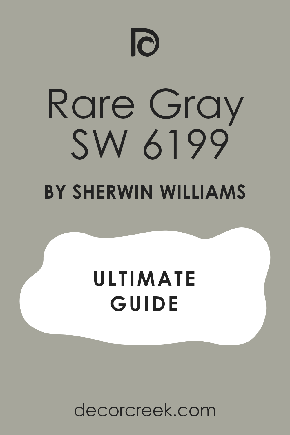
Rare Gray SW 6199
Rare Gray SW 6199 is a light, sophisticated gray that has a very gentle green influence, making it warmer and more complex than a typical cool gray.
Rare Gray is a perfect choice for pairing with dark, moody green cabinets, providing a light, crisp contrast that feels modern and clean. It’s a fantastic color for creating a feeling of lightness and airiness in a smaller space.
This shade acts as a reliable neutral that never feels dull or boring. I find that Rare Gray works exceptionally well with natural wood accents and clean-lined decor. It maintains its cool, collected demeanor in different lighting conditions. Rare Gray is a quiet, beautiful color that allows the strong cabinet color to be the star.
🎨 Check out the complete guide to this color right HERE 👈
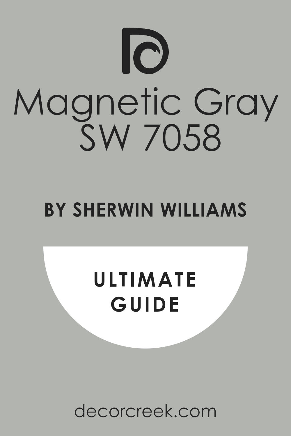
Magnetic Gray SW 7058
Magnetic Gray SW 7058 is a medium-to-dark gray that has a definite cool undertone, but with just a hint of green that makes it feel grounded and earthy. Magnetic Gray is a powerful wall color for pairing with light, creamy green cabinets, providing a dramatic, sophisticated contrast.
It’s a wonderful color for creating a cozy, enveloping atmosphere in a room with a lot of natural light. This shade adds a sense of depth and weight to a space, making it feel finished and intentional.
I often recommend Magnetic Gray for an accent wall or a dining area adjacent to the cabinets. It looks excellent with brass or warm gold hardware. Magnetic Gray is a striking, handsome color that provides a very chic backdrop.
🎨 Check out the complete guide to this color right HERE 👈
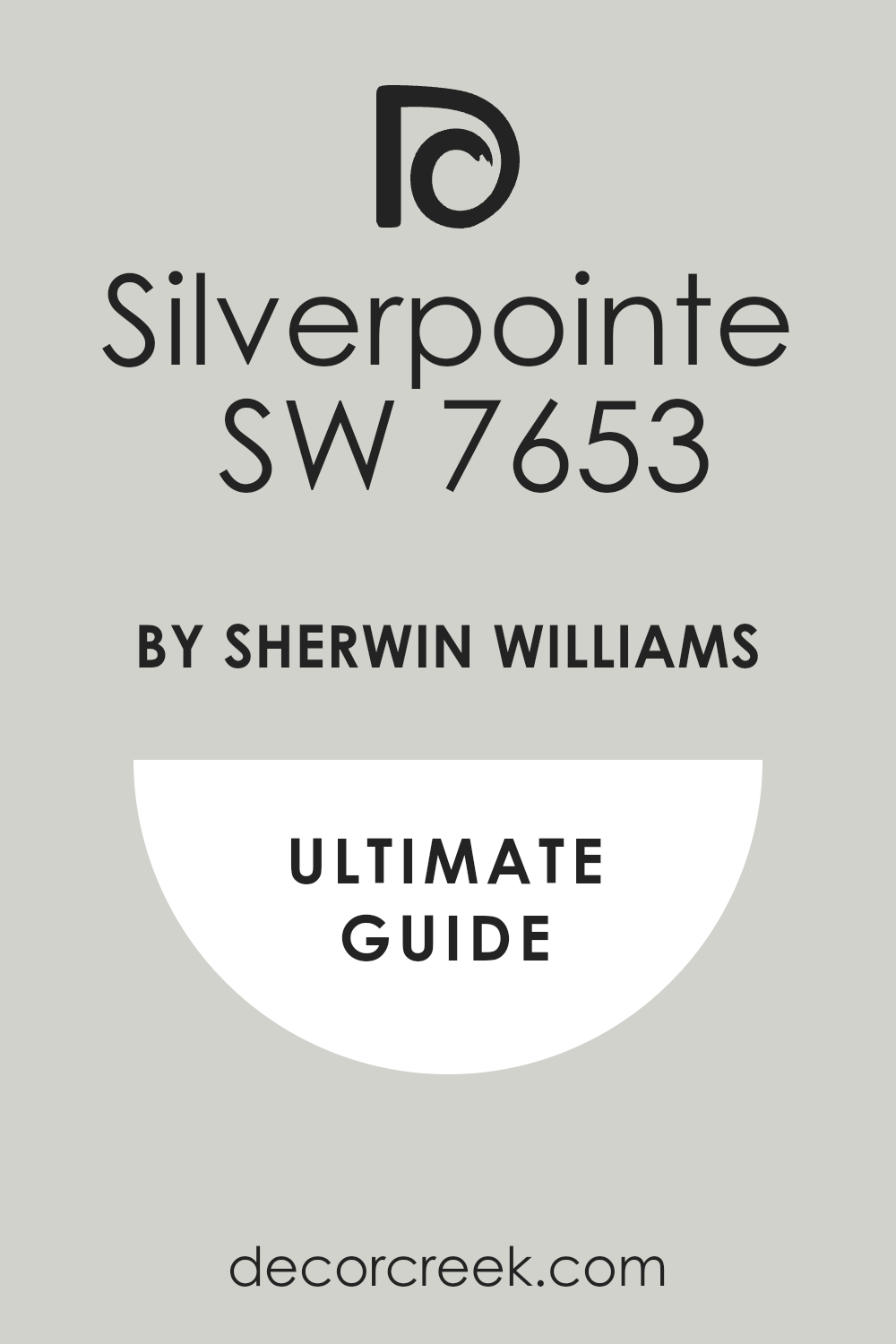
Silverpointe SW 7653
Silverpointe SW 7653 is a very light, almost white gray that has a subtle, almost invisible green undertone, giving it a slight warmth. Silverpointe is a perfect pairing for dark, saturated green cabinets, offering a crisp, clean white that still feels interesting and soft.
It’s a wonderful choice for keeping a room feeling bright and open, especially in kitchens that don’t receive a lot of natural light. This shade is a reliable neutral that pairs well with almost any other color or material.
I find that Silverpointe is versatile enough for both modern and traditional styles. It looks beautiful with clean white trim and stainless steel appliances. Silverpointe is a light, airy color that acts as a fantastic, bright contrast to green cabinets.
🎨 Check out the complete guide to this color right HERE 👈
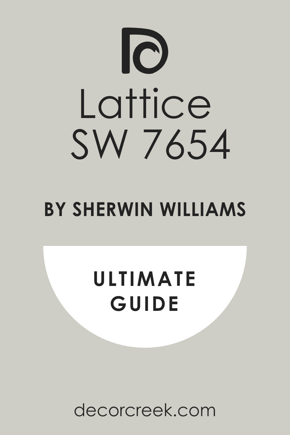
Lattice SW 7654
Lattice SW 7654 is a gentle, light gray that has a warm, lovely undertone that keeps it from looking too cold, often reading as a pale greige. Lattice is an ideal color for pairing with mid-tone to dark green cabinets, providing a soft, natural contrast that is quiet and sophisticated.
It’s a fantastic neutral choice for an open-concept living area where you want a paint color that fades into the background. This shade works wonderfully with natural fibers and wood accents, enhancing its organic quality.
I often recommend Lattice when a client wants a color that feels very light but is definitely not stark white. It pairs beautifully with almost any metal finish on the cabinet hardware. Lattice is a very agreeable color that offers a dependable and airy backdrop.
🎨 Check out the complete guide to this color right HERE 👈
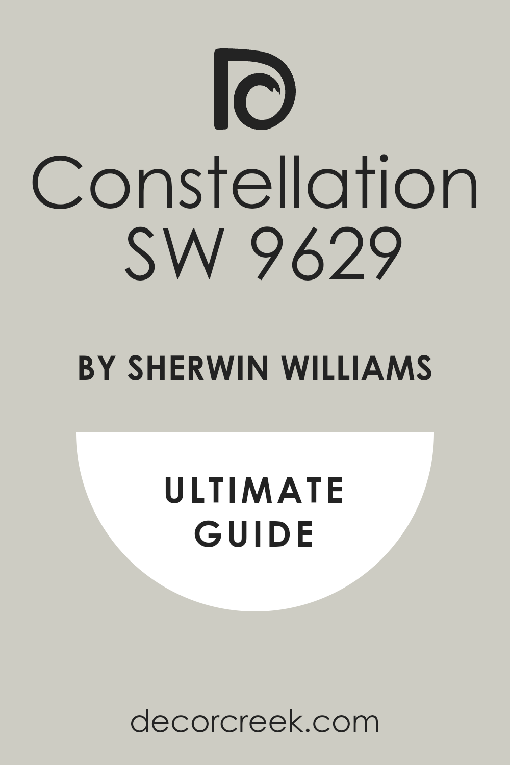
Constellation SW 9629
Constellation SW 9629 is a very light, slightly creamy gray that is almost white but has a beautiful warmth to it, feeling very gentle and soft. Constellation is a perfect wall color for pairing with rich, deep green cabinets, providing a soft, welcoming contrast that is light and bright.
It’s a fantastic color for keeping a room feeling open and luminous, especially in areas with lower ceilings. This shade has enough color to keep white trim from looking dingy but is neutral enough to feel effortless.
I find that Constellation works exceptionally well with marble and light wood elements. It’s a reliable, sophisticated off-white that feels very custom and high-end. Constellation is a wonderfully subtle color that creates a soft, clean frame for your green cabinets.
🎨 Check out the complete guide to this color right HERE 👈
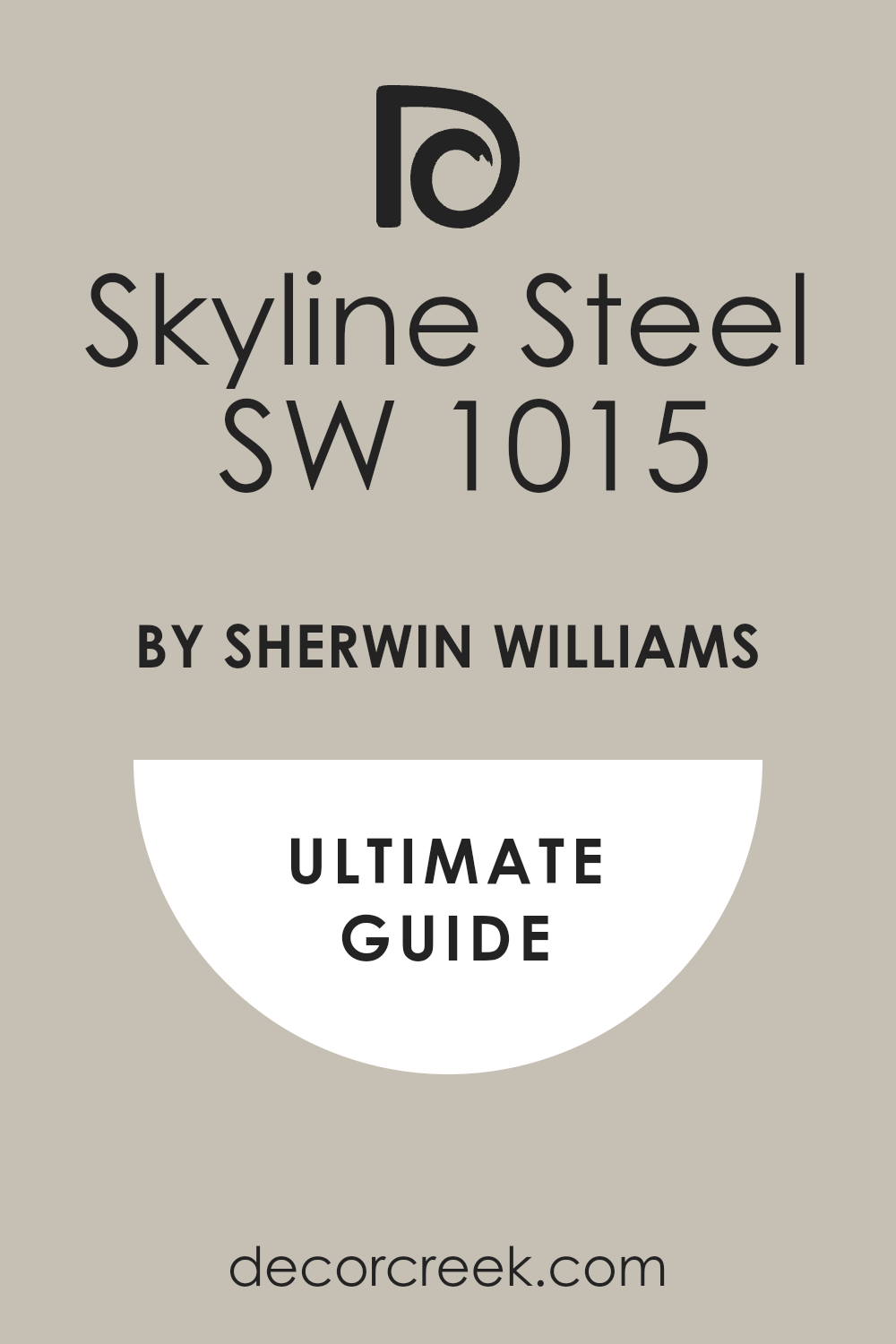
Skyline Steel SW 1015
Skyline Steel SW 1015 is a cool, clear gray that has a striking, modern look with a definite blue-green influence, giving it depth. Skyline Steel is an excellent pairing for warm, yellow-toned green cabinets, as its coolness provides a beautiful, balancing contrast.
It’s a wonderful color for creating a crisp, clean, and contemporary feel in a kitchen or utility room. This shade works well in rooms that have lots of natural light, where its cool undertones can shine without feeling dim.
I often recommend Skyline Steel for a sophisticated, slightly industrial-inspired look. It looks fantastic with polished chrome or stainless steel hardware. Skyline Steel is a beautiful, modern gray that is both cool and incredibly refined.
🎨 Check out the complete guide to this color right HERE 👈
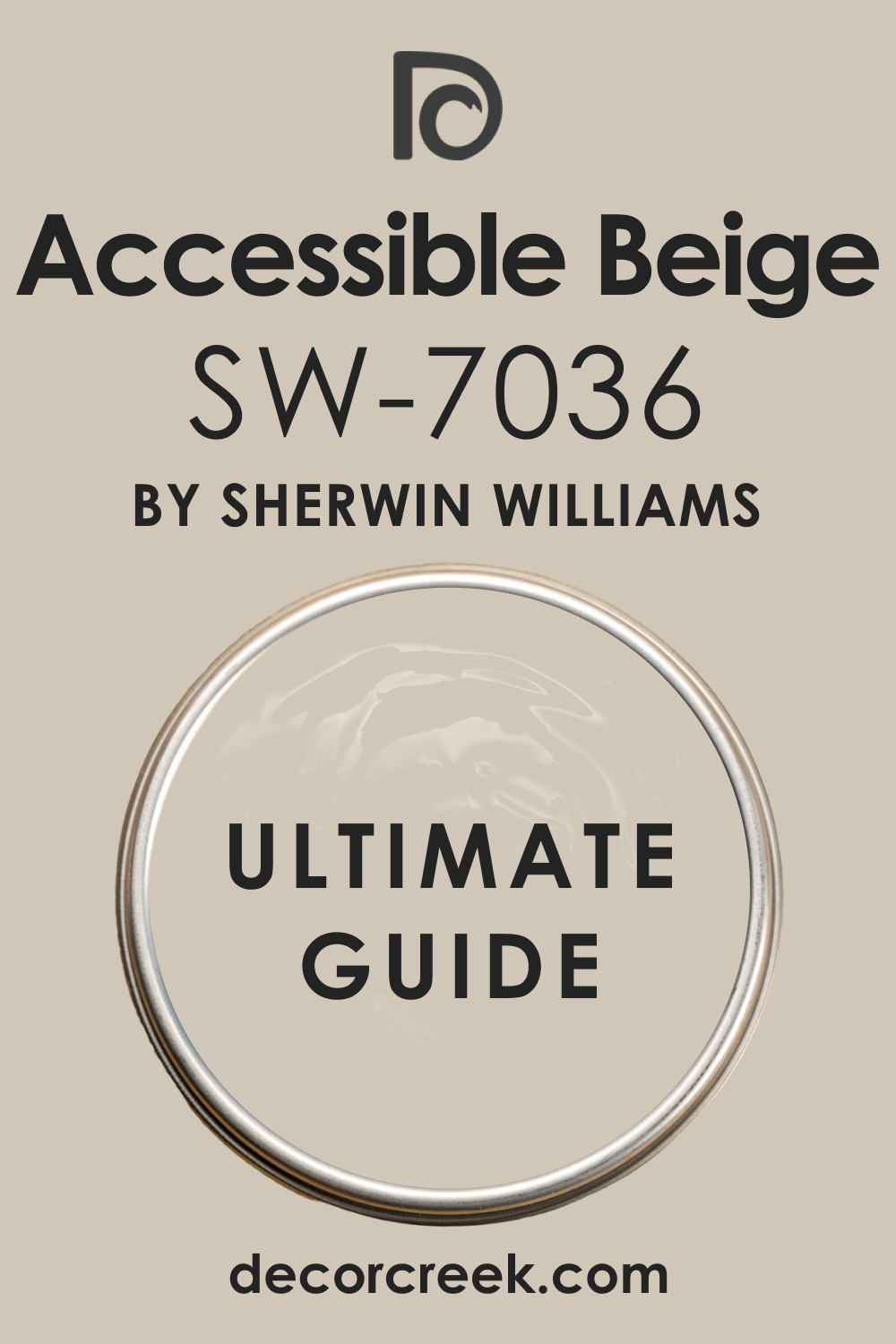
Accessible Beige SW 7036
Accessible Beige SW 7036 is a hugely popular greige that perfectly balances beige and gray, resulting in a warm, versatile neutral. Accessible Beige is an ideal wall color for pairing with cool, blue-toned green cabinets, as its warmth provides a necessary and beautiful counterbalance.
It’s a wonderful choice for creating a cozy, inviting atmosphere that feels grounded and natural. This shade is one of the most reliable neutrals in the Sherwin-Williams collection, working well in almost any light.
I find that Accessible Beige pairs beautifully with warm wood floors and matte black hardware on the cabinets. It is a fantastic, dependable color that delivers a sophisticated, earth-toned backdrop.
🎨 Check out the complete guide to this color right HERE 👈
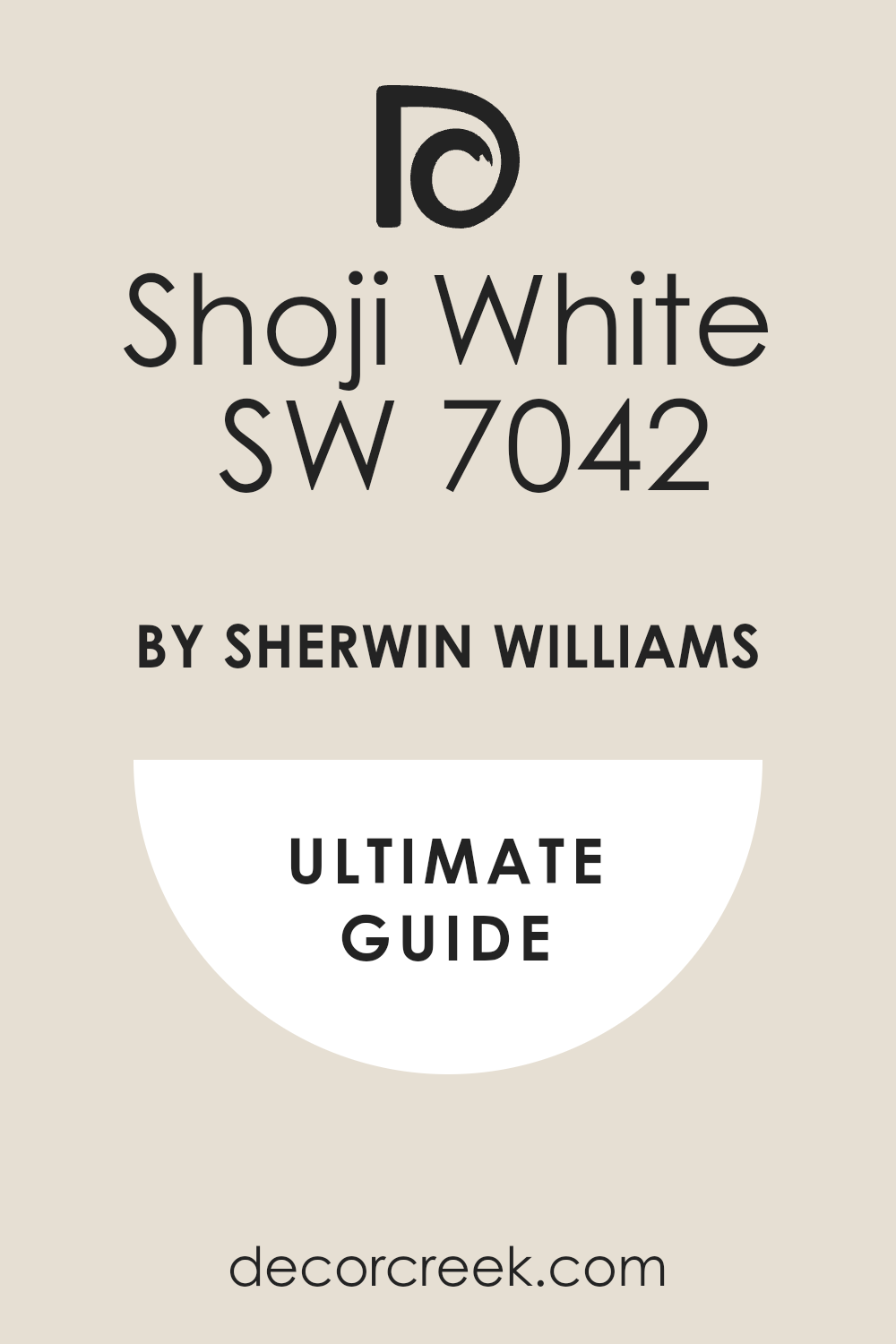
Shoji White SW 7042
Shoji White SW 7042 is a soft, creamy off-white that has a definite greige undertone, making it feel warm and incredibly rich. Shoji White is a superb choice for walls when paired with virtually any shade of green cabinet, offering a sophisticated, velvety white contrast.
It’s a wonderful color for creating a gentle, organic feel that avoids the starkness of pure white. This shade works beautifully to connect a kitchen to other, warmer-toned living areas.
I often recommend Shoji White when a client wants a white that feels cozy and welcoming rather than sterile. It looks fantastic with brass or warm gold accents. Shoji White is a gorgeous, soft white that provides a luxurious, soft frame for your green cabinetry.
🎨 Check out the complete guide to this color right HERE 👈
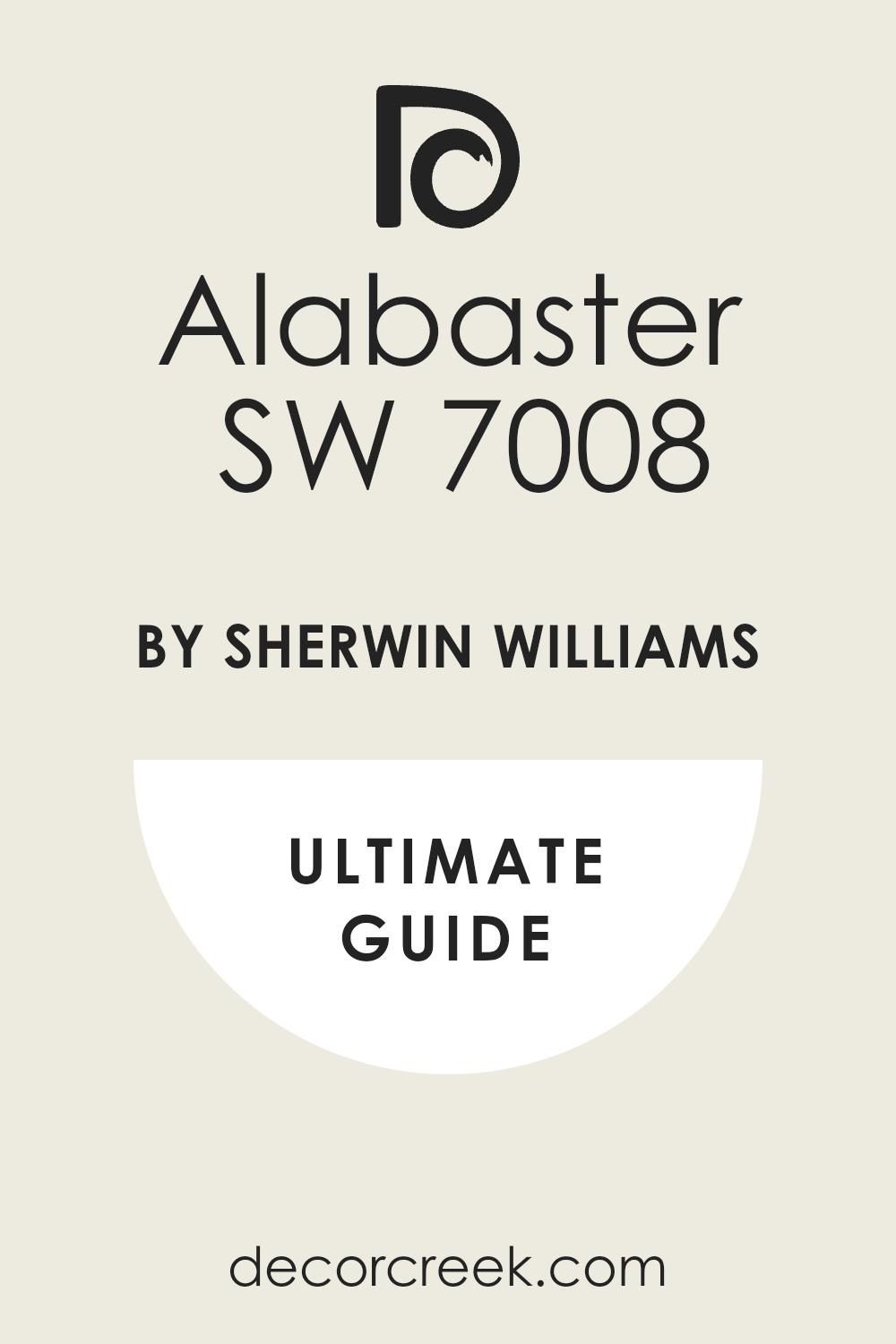
Alabaster SW 7008
Alabaster SW 7008 is a very popular, bright yet warm white that has a subtle, creamy undertone, making it feel soft and inviting. Alabaster is a perfect wall color for pairing with dark, moody green cabinets, offering a crisp, bright contrast that feels instantly fresh and classic.
It’s a wonderful choice for creating a light and airy feel in any size kitchen. This shade is incredibly versatile and works well with almost every style of decor.
I find that Alabaster looks beautiful with wood tones and complements all metal finishes. It is a reliable, dependable white that will always be a staple in design. Alabaster is a clean, bright color that provides a flawless, welcoming backdrop.
🎨 Check out the complete guide to this color right HERE 👈
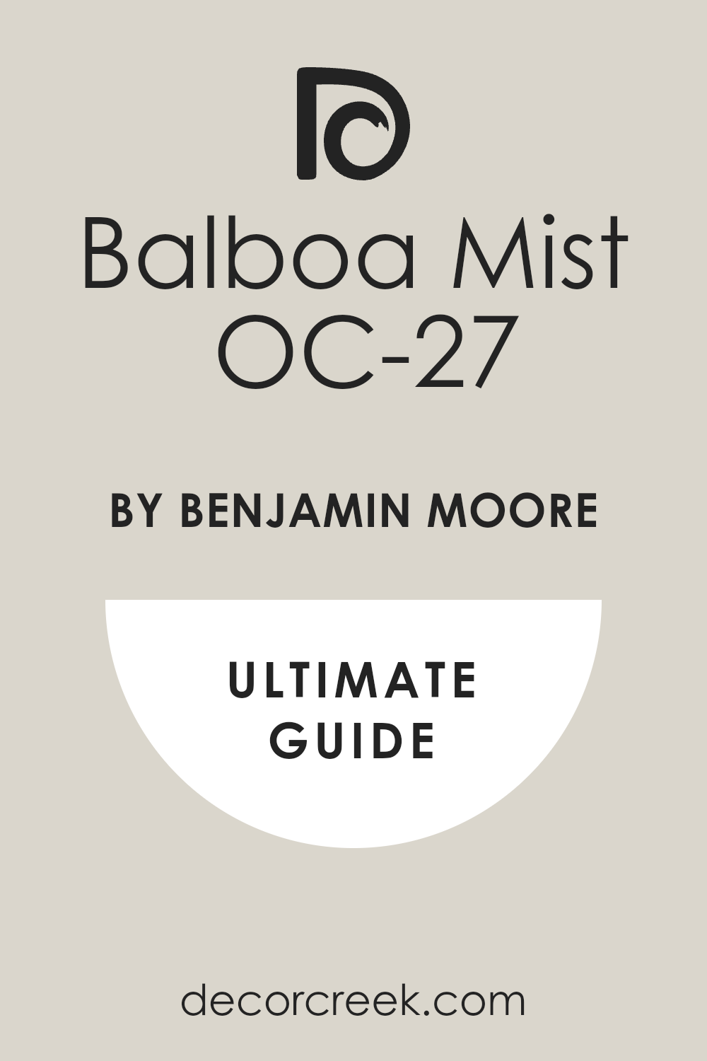
Balboa Mist OC-27
Balboa Mist OC-27 is a beautiful, light greige that has a creamy, soft warmth and a subtle violet-gray undertone, making it incredibly complex. Balboa Mist is an excellent pairing for clear, true green cabinets, as it offers a soft, sophisticated neutral that is never boring.
It’s a wonderful color for creating an elegant, refined atmosphere that feels quiet and composed. This shade is a top-tier choice for open-concept living because it transitions seamlessly between different areas.
I often recommend Balboa Mist when a client wants a neutral that feels modern yet inviting. It looks fantastic with polished nickel and white marble. Balboa Mist is a refined, subtle color that offers a beautiful, high-end backdrop.
🎨 Check out the complete guide to this color right HERE 👈
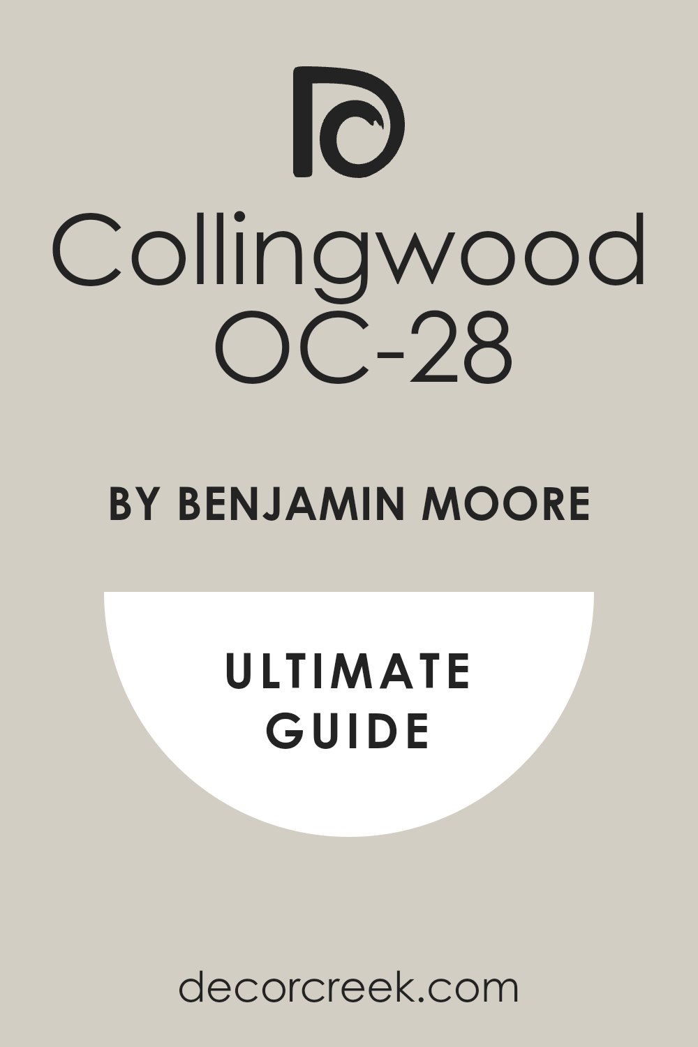
Collingwood OC-28
Collingwood OC-28 is a sophisticated, mid-tone gray that carries a noticeable purple-taupe undertone, making it a wonderful warm neutral. Collingwood is an ideal wall color for pairing with light, yellow-toned green cabinets, as its coolness helps to balance the warmth beautifully.
It’s a wonderful color for creating a settled, refined atmosphere that feels deeply comfortable and grounded. This shade works well in rooms that receive plenty of natural light, where its complexity can be fully appreciated.
I find that Collingwood pairs nicely with warm wood and cream-colored accents. It is a dependable, popular gray that is a favorite for high-end residential design. Collingwood is a gorgeous, complex color that provides a sophisticated setting for your green cabinets.
🎨 Check out the complete guide to this color right HERE 👈
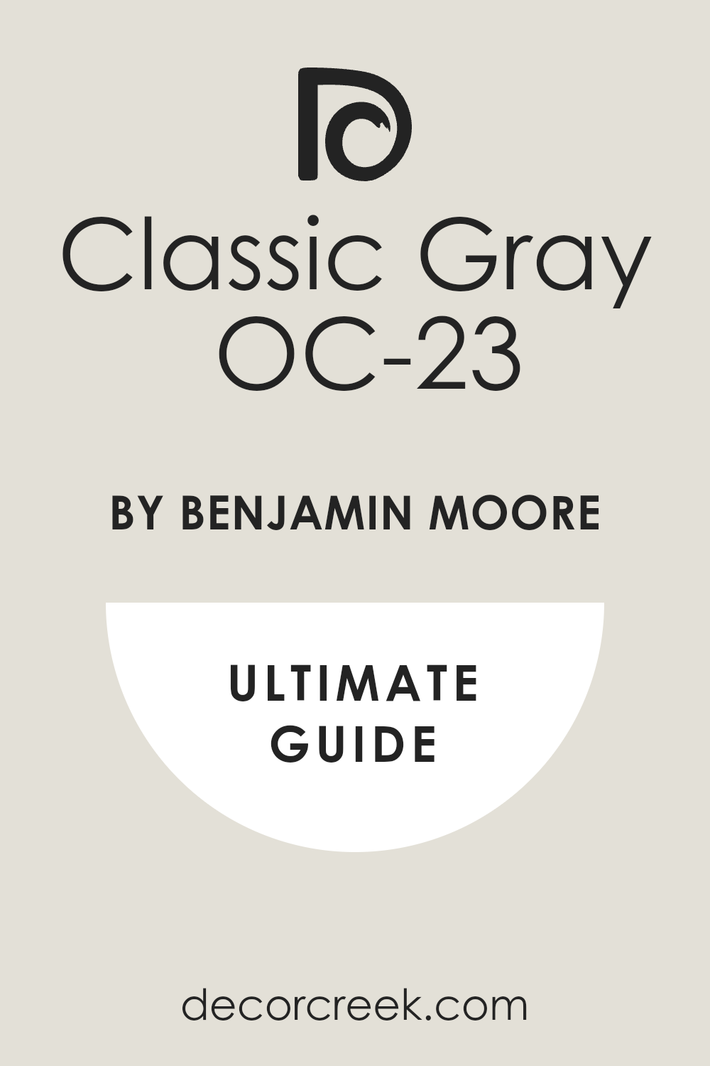
Classic Gray OC-23
Classic Gray OC-23 is a very light, almost white gray that has a very faint green or beige undertone, making it one of the most versatile neutrals available.
Classic Gray is a perfect pairing for dark, saturated green cabinets, offering a light, clean contrast that is soft and welcoming. It’s an excellent choice for keeping a room feeling bright and open without resorting to a cold, stark white.
This shade works wonderfully in almost any light and environment. I often recommend Classic Gray as a fail-safe neutral that never disappoints. It looks beautiful with white trim and complements all cabinet styles. Classic Gray is a reliable, beautiful color that provides a simple yet refined backdrop.
🎨 Check out the complete guide to this color right HERE 👈
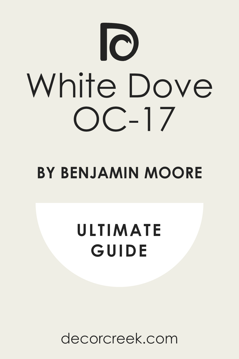
White Dove OC-17
White Dove OC-17 is a very popular, creamy off-white that has a lovely soft warmth without a heavy yellow undertone, making it incredibly versatile.
White Dove is a superb choice for walls when paired with any shade of green cabinet, from light mint to deep forest, offering a gentle, classic contrast. It’s a wonderful color for creating a soft, inviting atmosphere that feels polished and clean.
This shade works beautifully to highlight architectural details and trim. I find that White Dove is the ultimate dependable white, feeling crisp yet cozy. It looks fantastic with brass and polished nickel hardware. White Dove is a gorgeous, timeless white that is guaranteed to provide a beautiful frame for your cabinetry.
🎨 Check out the complete guide to this color right HERE 👈
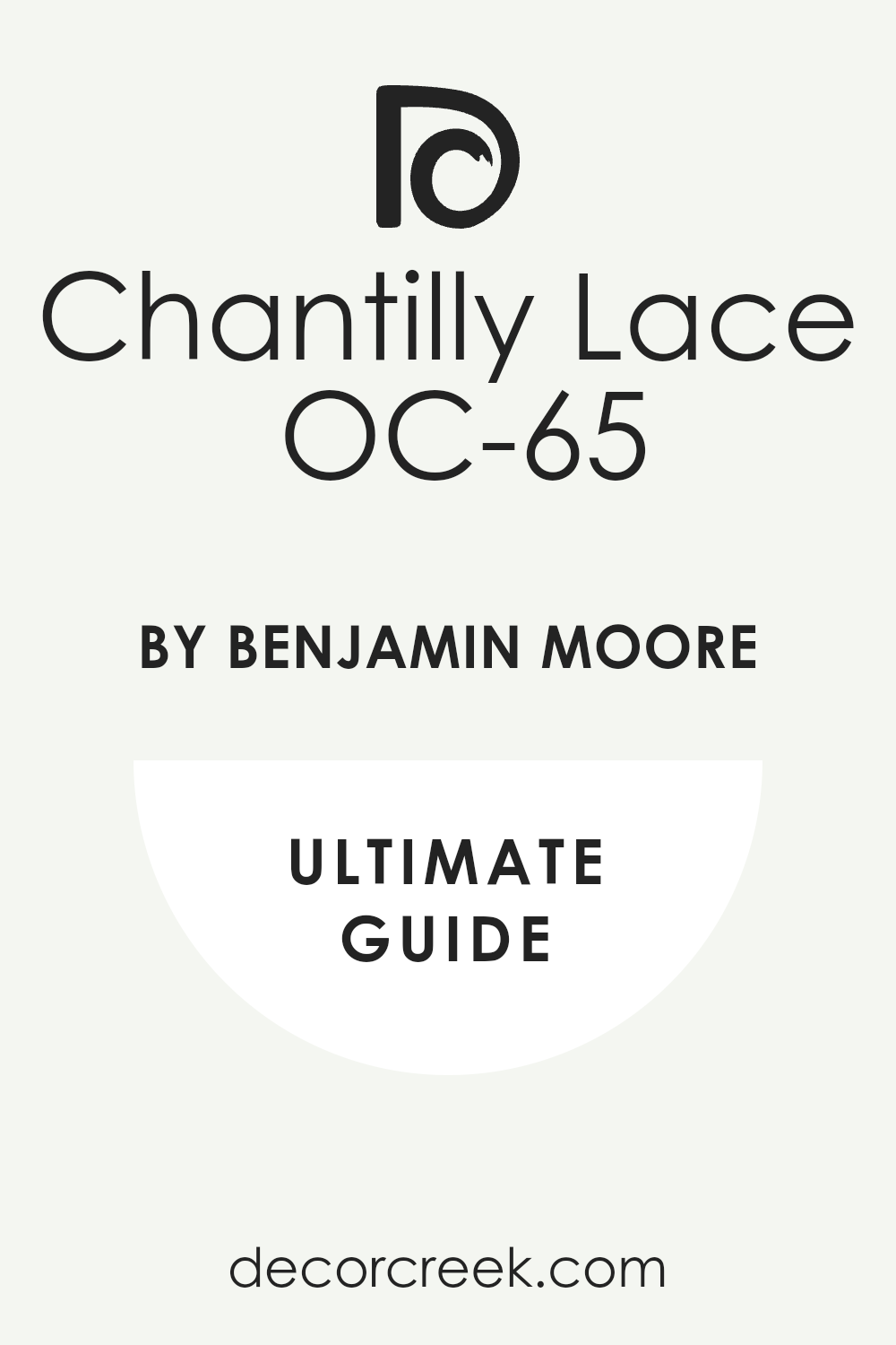
Chantilly Lace OC-65
Chantilly Lace OC-65 is a crisp, clean, true white with no noticeable undertones, making it bright and utterly pure. Chantilly Lace is an ideal wall color for pairing with any shade of green cabinet, especially the darker, moodier ones, offering the highest level of bright contrast.
It’s a wonderful choice for creating a very modern, clean, and graphic look in a kitchen. This shade works well in rooms that have lots of natural light, truly maximizing the feeling of brightness.
I often recommend Chantilly Lace when a stark, gallery-like backdrop is desired. It looks fantastic with contemporary cabinet styles and polished chrome. Chantilly Lace is a brilliant, crisp white that provides a clean, impactful contrast.
🎨 Check out the complete guide to this color right HERE 👈
Edgecomb Gray HC-173
Edgecomb Gray HC-173 is a beautiful, very popular greige that is perfectly balanced between beige and gray, resulting in a warm, comforting neutral. Edgecomb Gray is an excellent pairing for cool, blue-toned green cabinets, as its warmth gently balances the coolness beautifully.
It’s a wonderful color for creating a cozy, welcoming atmosphere that is grounded and sophisticated. This shade works well in a wide variety of lighting conditions and is incredibly flexible.
I find that Edgecomb Gray pairs beautifully with almost any color of wood and all metal finishes. It is a fantastic, highly reliable color that delivers a warm, inviting backdrop.
🎨 Check out the complete guide to this color right HERE 👈
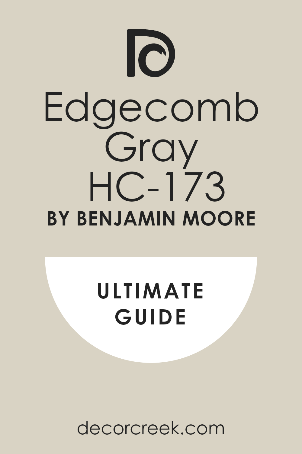
Gray Owl OC-52
Gray Owl OC-52 is a light, clean gray that has a very subtle, cool blue-green undertone, making it feel fresh and airy. Gray Owl is an ideal wall color for pairing with warm, yellow-toned green cabinets, as its coolness provides a lovely, gentle balance.
It’s a wonderful choice for creating a calm, collected, and slightly modern feel in a kitchen. This shade works well in rooms with good natural light, maintaining its clean, crisp appearance.
I often recommend Gray Owl when a light, sophisticated neutral is needed. It looks fantastic with white marble and brushed stainless steel. Gray Owl is a beautiful, versatile gray that provides a clean, refreshing backdrop.
🎨 Check out the complete guide to this color right HERE 👈
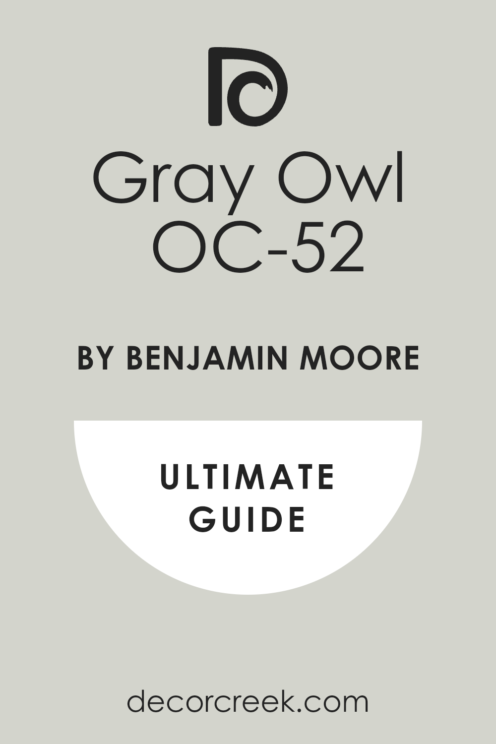
Revere Pewter HC-172
Revere Pewter HC-172 is a classic, mid-tone greige that is known for its incredible versatility, sitting perfectly between warm beige and cool gray.
Revere Pewter is a superb choice for walls when paired with dark, traditional green cabinets, providing a warm, grounded contrast that is richly sophisticated. It’s a wonderful color for creating a cozy, traditional, and welcoming atmosphere.
This shade is one of the most reliable and beloved neutrals, working well in almost any light and setting. I find that Revere Pewter pairs beautifully with warm wood tones and antique brass hardware. It is a dependable, luxurious color that delivers a beautiful, refined backdrop.
🎨 Check out the complete guide to this color right HERE 👈
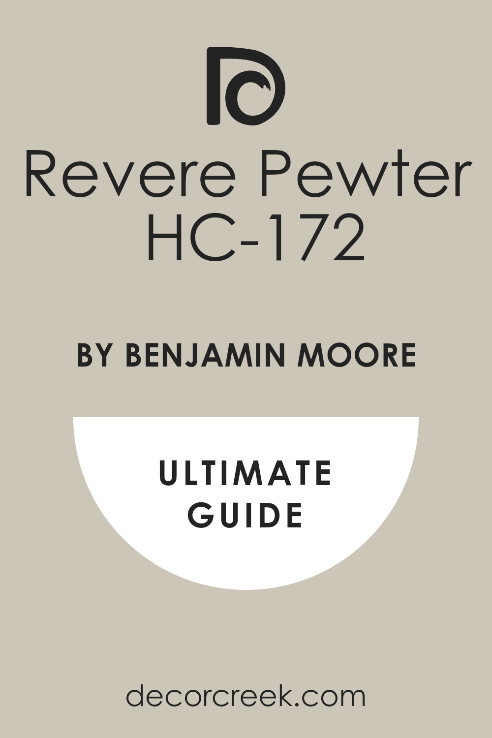
Pashmina AF-100
Pashmina AF-100 is a deep, rich greige that has a noticeable warm brown undertone, making it a very sophisticated and weighty neutral. Pashmina is an excellent wall color for pairing with light, creamy green cabinets, providing a rich, dark contrast that feels incredibly grounding.
It’s a wonderful choice for creating a cozy, intimate, and elegant atmosphere. This shade works well in rooms with ample light or when used to create a dramatic, moody effect. I often recommend Pashmina for a refined, custom look that feels very settled and warm.
It looks fantastic with matte black or dark bronze hardware. Pashmina is a gorgeous, complex color that provides a deep, sophisticated frame for your green cabinets.
🎨 Check out the complete guide to this color right HERE 👈
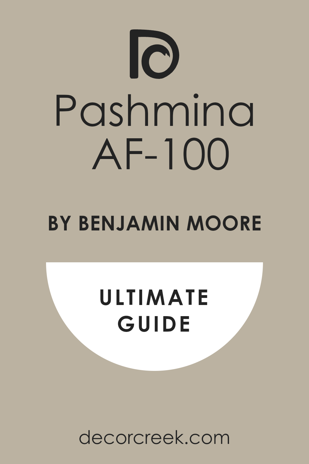
Natural Cream OC-14
Natural Cream OC-14 is a very pale, gentle cream that has a slight beige undertone, making it feel warm, soft, and utterly inviting. Natural Cream is an ideal pairing for dark, saturated green cabinets, offering a bright, creamy contrast that feels instantly classic and soft.
It’s a wonderful choice for creating a comfortable, traditional feel that is light and airy. This shade works beautifully in rooms that have a lot of white trim, as it softens the contrast nicely.
I find that Natural Cream is a reliable, warm white that avoids feeling too yellow. It looks beautiful with warm wood and natural stone accents. Natural Cream is a lovely, dependable color that creates a soft, welcoming backdrop.
🎨 Check out the complete guide to this color right HERE 👈
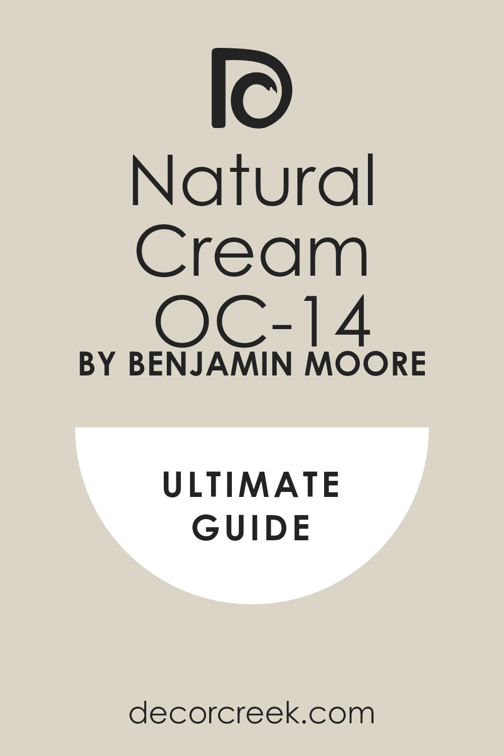
Linen White OC-146
Linen White OC-146 is a classic, creamy off-white that has a definite yellow-beige undertone, giving it a rich and lovely warmth.
Linen White is a perfect wall color for pairing with cool, blue-toned green cabinets, as its warmth balances the cool green beautifully for a sophisticated look. It’s a wonderful choice for creating a cozy, traditional, and welcoming atmosphere in a kitchen.
This shade works well in rooms that have low light, as the creaminess helps to brighten without feeling stark. I often recommend Linen White when a softer, historical white is desired. It looks fantastic with antique brass and gold accents. Linen White is a gorgeous, warm white that provides a soft, beautiful contrast.
🎨 Check out the complete guide to this color right HERE 👈
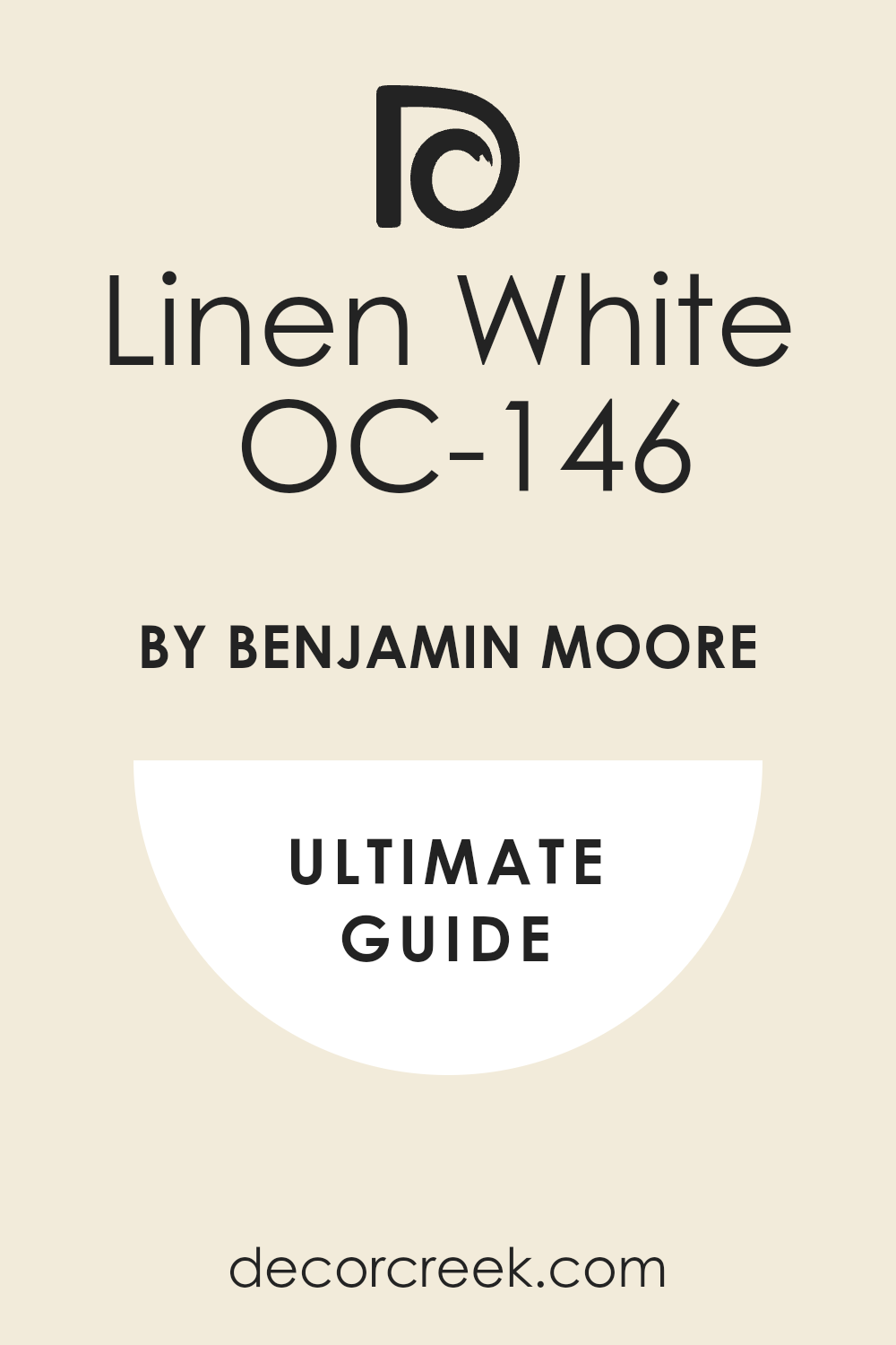
Soft Chamois OC-13
Soft Chamois OC-13 is a pale, creamy off-white that has a noticeable warm beige undertone, making it incredibly gentle and sophisticated.
Soft Chamois is an excellent choice for walls when paired with dark, dramatic green cabinets, offering a warm, velvety contrast that is both bright and soft. It’s a wonderful color for creating a feeling of old-world elegance and warmth.
This shade works beautifully to soften harsh lines and create a cohesive, inviting feel. I find that Soft Chamois is a dependable, warm white that never feels harsh. It looks fantastic with wood tones and bronze hardware. Soft Chamois is a beautiful, subtle white that provides a soft, classic backdrop.
🎨 Check out the complete guide to this color right HERE 👈
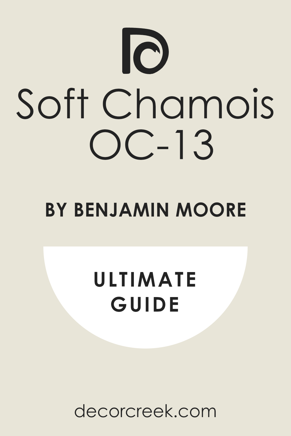
Moonshine OC-56
Moonshine OC-56 is a very light, almost white gray that has a cool, subtle green-blue undertone, making it feel airy and crisp. Moonshine is an ideal wall color for pairing with warm, yellow-toned green cabinets, as its coolness provides a lovely, necessary balance.
It’s a wonderful choice for creating a fresh, clean, and slightly modern atmosphere in a kitchen. This shade works well in rooms with natural light, where its clean undertone can shine.
I often recommend Moonshine when a light, sophisticated, and slightly cool neutral is required. It looks fantastic with white trim and polished chrome. Moonshine is a beautiful, refreshing gray that provides a clean, bright backdrop.
🎨 Check out the complete guide to this color right HERE 👈
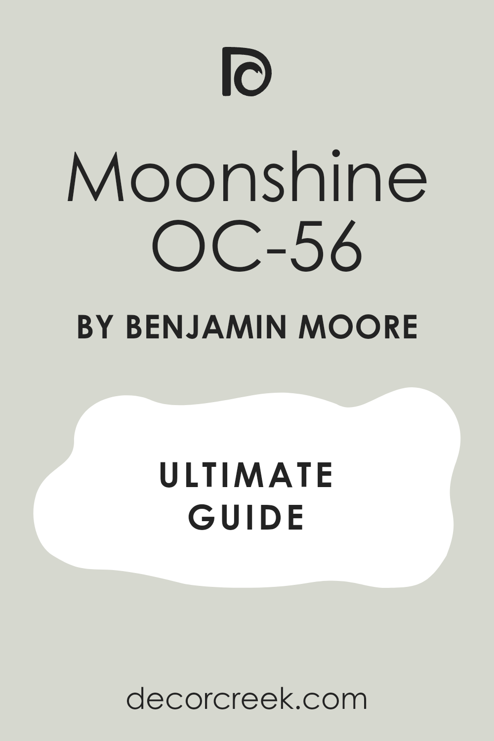
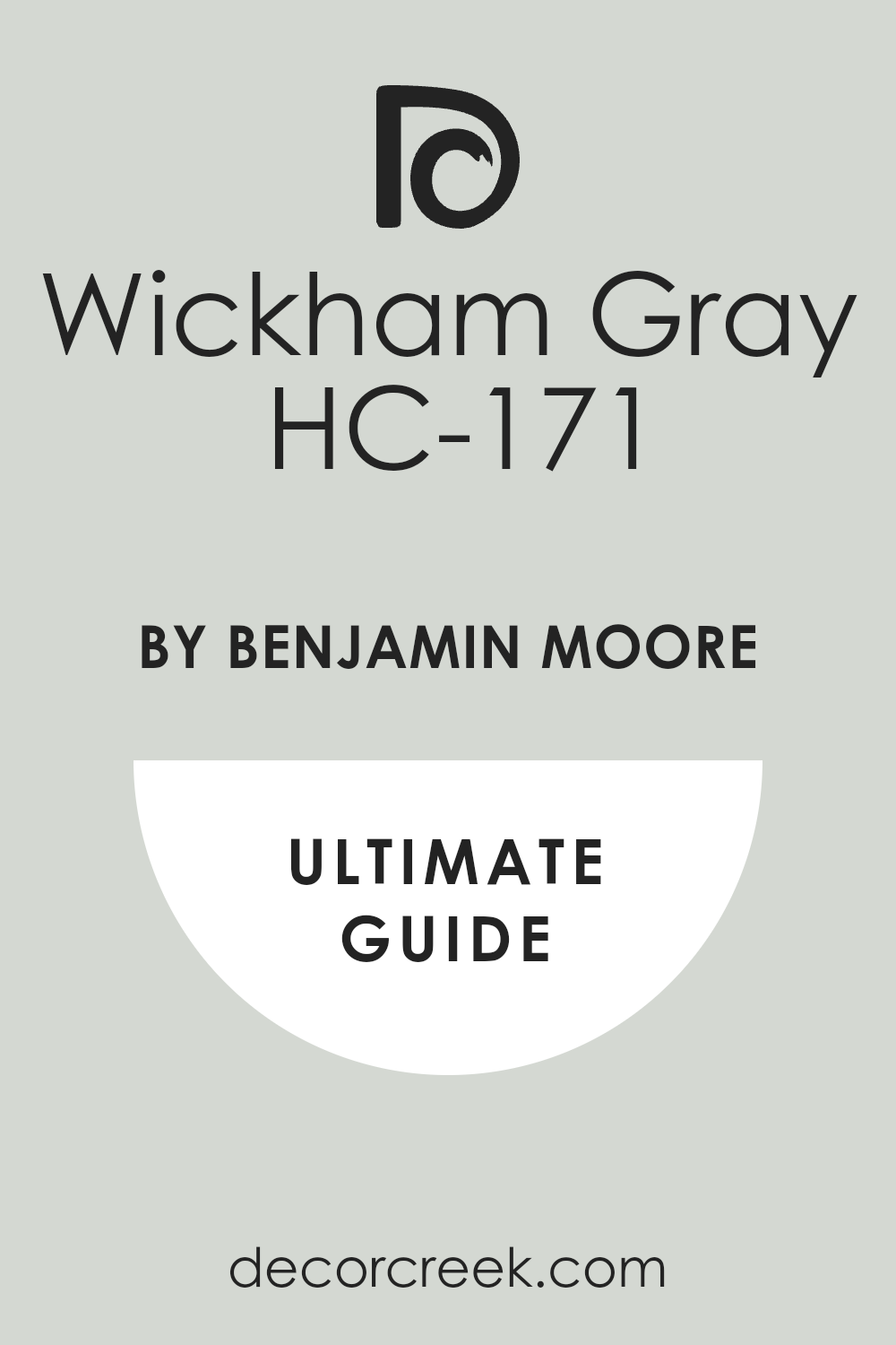
Wickham Gray HC-171
Wickham Gray HC-171 is a light, historical gray that has a distinct blue and very subtle green undertone, making it feel classic and refined.
Wickham Gray is an excellent choice for walls when paired with rich, earthy green cabinets, providing a light, airy contrast that is sophisticated and crisp. It’s a wonderful color for creating a serene, traditional, and well-composed atmosphere.
This shade works beautifully in rooms that have ample light, maintaining its clean, pure appearance. I often recommend Wickham Gray when a classic, slightly cool neutral is needed for a timeless look. It looks fantastic with white marble and silver accents. Wickham Gray is a beautiful, refined gray that provides a composed and sophisticated backdrop.
🎨 Check out the complete guide to this color right HERE 👈
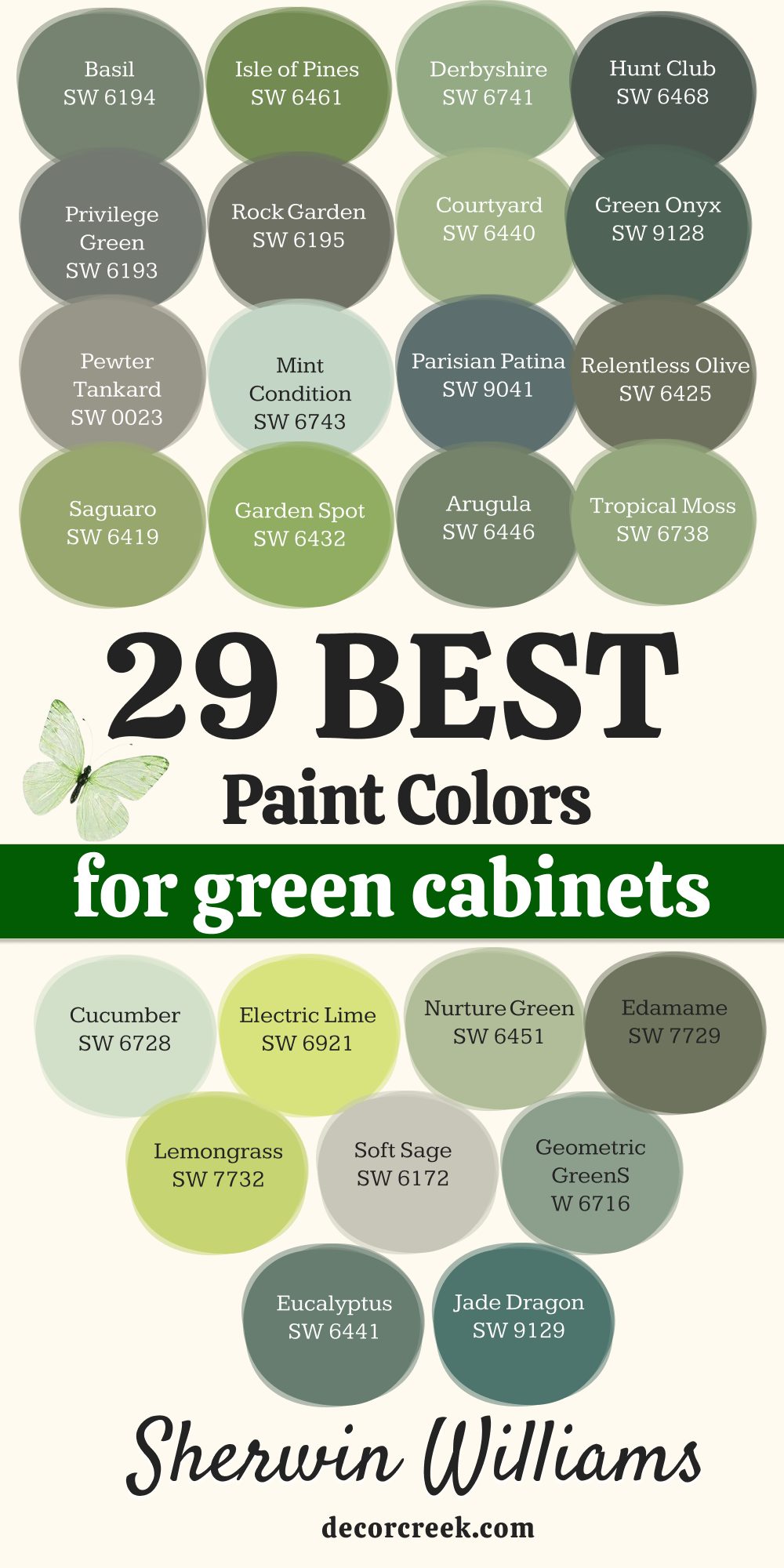
29 Best Paint Colors For Green Cabinets By Sherwin Williams
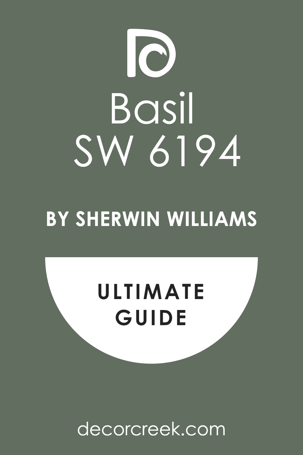
Basil SW 6194
Basil SW 6194 is a deep, earthy green with strong gray undertones, making it a rich and beautifully saturated color that feels grounded and mature.
Basil works exceptionally well as a wall color when paired with a much lighter or brighter shade of green cabinet, offering a dramatic, harmonious contrast. It is a fantastic choice for creating a moody, sophisticated, and slightly rustic feel in a kitchen or study.
This shade has a wonderful depth that makes a room feel finished and intentional. I find that Basil pairs beautifully with warm wood elements and oil-rubbed bronze hardware. It’s a gorgeous, deep color that provides a rich, natural backdrop.
🎨 Check out the complete guide to this color right HERE 👈
Isle of Pines SW 6461
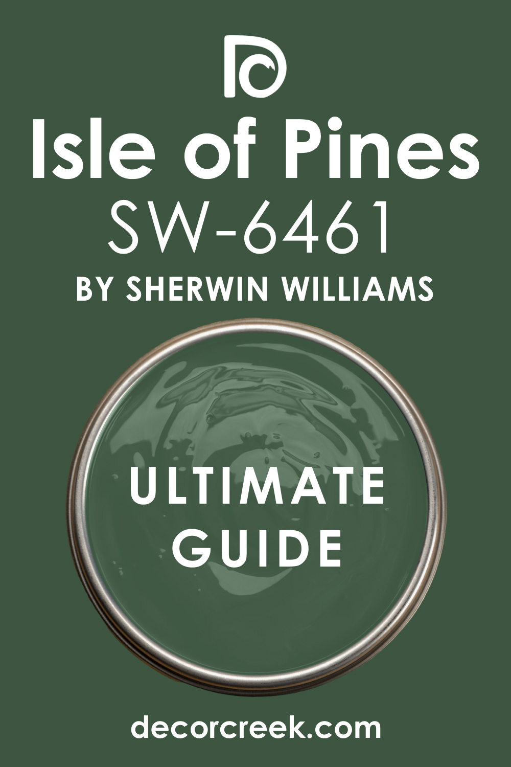
Isle of Pines SW 6461 is a vibrant, clear green that is bright and full of life, feeling fresh and energetic like a sunny meadow. Isle of Pines is a bold, lively choice for walls when paired with a darker, more traditional green cabinet, providing a cheerful, high-energy contrast.
It is a wonderful color for creating an optimistic, nature-inspired feel in a breakfast nook or mudroom. This shade works best in rooms with plenty of light to truly showcase its vibrancy.
I often recommend Isle of Pines for a statement wall or a casual, bright setting. It looks fantastic with clean white trim and simple, modern light fixtures. Isle of Pines is a happy, strong green that immediately invigorates a room.
🎨 Check out the complete guide to this color right HERE 👈
Derbyshire SW 6741
Derbyshire SW 6741 is a lovely, mid-tone green that is clean and pure, sitting perfectly between a moss and a true emerald, feeling lively and clear.
Derbyshire is an excellent wall color for pairing with light, creamy green cabinets, providing a fresh, lively contrast that is bright and inviting. It is a fantastic color for creating a happy, energetic, and nature-infused atmosphere in a kitchen.
This shade works beautifully with white countertops and chrome accents, emphasizing its clean look. I often use Derbyshire to give a room a cheerful, contemporary feel. It’s a clean, bright green that truly brings the outdoors in.
Hunt Club SW 6468
Hunt Club SW 6468 is a traditional, deep forest green that is rich, dark, and incredibly elegant, embodying a sophisticated, classic style. Hunt Club is a powerful color that creates a stunning, contrasting wall when paired with much lighter green cabinets or a soft sage.
It is a wonderful choice for creating a cozy, intimate, and very refined atmosphere in a room. This shade gives a room immediate weight and traditional appeal.
I often recommend Hunt Club for homes with white wainscoting or trim, where the contrast is striking. It looks marvelous with brass hardware, which pulls out the warmth in the dark pigment. Hunt Club is a sophisticated and enduring choice that delivers a distinguished look.
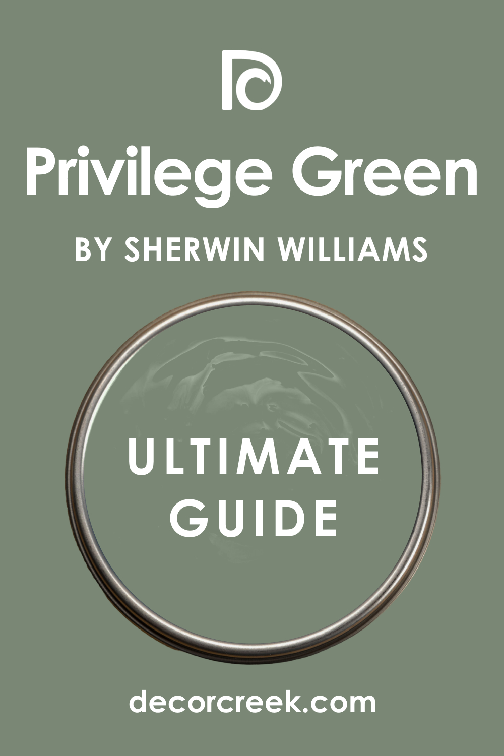
Privilege Green SW 6193
Privilege Green SW 6193 is a gorgeous, complex gray-green that has a deep, slightly moody character, feeling rich and very sophisticated.
Privilege Green is an excellent wall color for pairing with light, bright green cabinets, providing a grounding, dramatic contrast that feels luxurious. It is a wonderful color for creating a cozy, enveloping atmosphere that is perfect for a gathering space.
This shade works beautifully with natural stone and warm wood floors. I find that Privilege Green gives a room a sense of depth and maturity. It looks fantastic with antique gold or copper accents. Privilege Green is a rich, atmospheric color that offers a beautiful, high-end backdrop.
🎨 Check out the complete guide to this color right HERE 👈
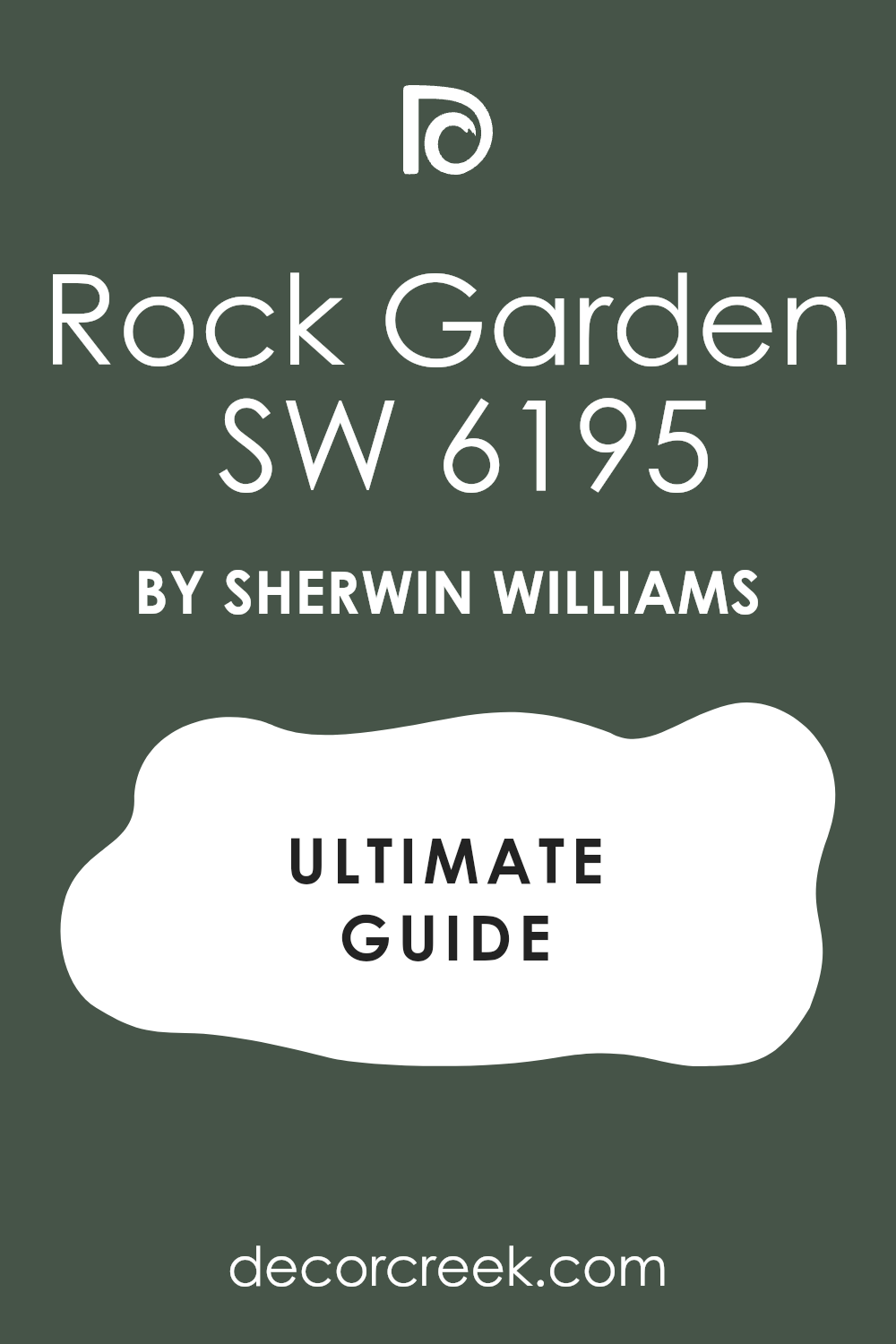
Rock Garden SW 6195
Rock Garden SW 6195 is a deep, earthy olive green that carries strong brown and gray undertones, making it a rugged and grounded color. Rock Garden is a fantastic choice for walls when paired with a light, fresh green cabinet, providing a beautiful, natural, and rich contrast.
It is a wonderful color for creating a comfortable, traditional, and slightly masculine feel in a kitchen or utility area. This shade works perfectly with natural materials like slate and dark wood.
I often recommend Rock Garden for an authentic, earthy aesthetic. It looks stunning with black or oil-rubbed bronze hardware. Rock Garden is a strong, handsome color that provides a wonderful, natural anchor.
🎨 Check out the complete guide to this color right HERE 👈
Courtyard SW 6440
Courtyard SW 6440 is a bright, clear green that is lively and pure, carrying a strong energy that is happy and youthful. Courtyard is a bold, cheerful choice for walls when paired with a deeper, more reserved green cabinet, offering an exciting, lively contrast.
It is a wonderful color for creating a burst of optimism and life in a breakfast nook or sunroom. This shade works best in very well-lit areas to prevent it from feeling too intense. I often use Courtyard to give a room a modern, playful character.
It looks fantastic with white trim and light wood elements. Courtyard is an invigorating, high-energy green that is sure to make a statement.
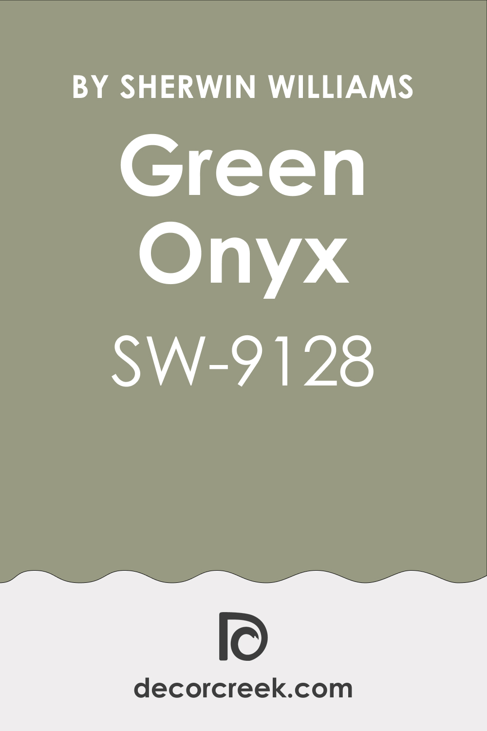
Green Onyx SW 9128
Green Onyx SW 9128 is a rich, saturated color that sits between emerald and teal, feeling jewel-toned, luxurious, and highly pigmented. Green Onyx is a striking wall color for pairing with light, creamy green cabinets, providing a vibrant, dramatic, and elegant contrast.
It is a fantastic choice for creating a high-impact, refined look in a formal dining area or a sophisticated kitchen. This shade works beautifully with gold or brass accents, which truly sparkle against its depth.
I find that Green Onyx makes a room feel instantly custom and expensive. It is a bold, beautiful color that delivers a sense of enduring quality and style.
🎨 Check out the complete guide to this color right HERE 👈
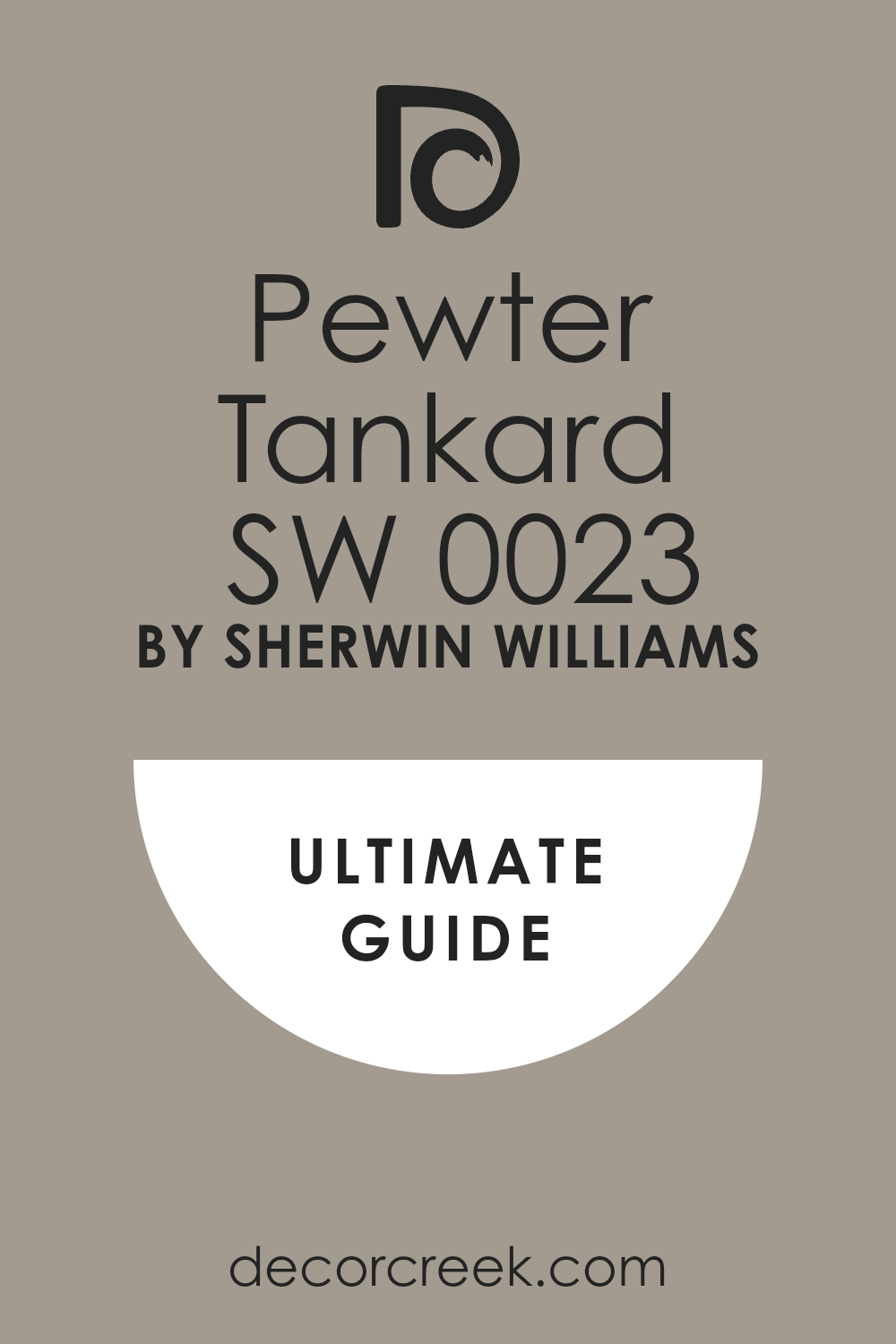
Pewter Tankard SW 0023
Pewter Tankard SW 0023 is a deep, warm gray that has a noticeable brown and slight green undertone, making it a very grounded, sophisticated neutral.
Pewter Tankard is an excellent choice for walls when paired with light, airy green cabinets, offering a deep, earthy contrast that feels cozy and settled. It is a wonderful color for creating an intimate, library-like atmosphere in a room with a lot of natural light.
This shade adds a sense of depth and weight to a space, feeling very traditional and warm. I often recommend Pewter Tankard for a refined, custom look. It looks beautiful with copper or antique brass hardware. Pewter Tankard is a strong, handsome color that provides a rich, grounded backdrop.
🎨 Check out the complete guide to this color right HERE 👈
Mint Condition SW 6743
Mint Condition SW 6743 is a lovely, pale, soft green that has a refreshing, light, and airy quality, feeling clean and cheerful. Mint Condition is an ideal wall color for pairing with dark, heavily saturated green cabinets, providing a light, crisp, and clean contrast.
It is a fantastic choice for keeping a room feeling bright and open, especially in smaller kitchens or utility rooms. This shade works well with white countertops and silver hardware, enhancing its clean aesthetic.
I often use Mint Condition to create a gentle, slightly vintage, and welcoming feel. It is a beautiful, easy-to-live-with color that offers a refreshing visual break next to dark cabinetry.
Parisian Patina SW 9041
Parisian Patina SW 9041 is a gorgeous, oxidized copper color that is a deep, moody teal-green with a strong gray influence, feeling historic and rich.
Parisian Patina is a stunning wall color for pairing with light, creamy green cabinets, offering a dramatic, sophisticated, and earthy contrast. It is a wonderful color for creating a feeling of age, character, and luxury in a room.
This shade works beautifully with distressed wood and antique finishes. I find that Parisian Patina gives a room a custom, old-world charm. It looks fantastic with matte black or dark bronze hardware. Parisian Patina is a complex, atmospheric color that delivers a uniquely refined aesthetic.
Relentless Olive SW 6425
Relentless Olive SW 6425 is a deep, very earthy olive green with a pronounced yellow-brown undertone, making it feel grounded and organic.
Relentless Olive is an ideal choice for walls when paired with lighter, cooler-toned green cabinets, as its warmth balances the cool tones perfectly. It is a wonderful color for creating a cozy, rustic, yet elegant atmosphere in a kitchen or study.
This shade works beautifully with natural stone and medium-tone wood. I often recommend Relentless Olive when an authentic, earthy feel is desired. It looks excellent with matte black or dark bronze accents. Relentless Olive is a rich, dependable color that provides a gorgeous, natural backdrop.
Saguaro SW 6419
Saguaro SW 6419 is a vibrant, mid-tone green that is clear and slightly yellow-toned, giving it a lively, cheerful, and desert-inspired feel.
Saguaro is a bold, happy choice for walls when paired with a deeper, more traditional green cabinet, offering an energetic, contrasting look. It is a wonderful color for creating a burst of optimism and natural life in a sunroom or breakfast area.
This shade works best in well-lit spaces to truly appreciate its clarity. I often use Saguaro to give a room a unique, optimistic character. It looks fantastic with white trim and simple, modern light fixtures. Saguaro is an invigorating, joyful green that creates an immediate focal point.
Garden Spot SW 6432
Garden Spot SW 6432 is a bright, true green that is clear and crisp, carrying a refreshing and lively energy, much like a newly cut lawn.
Garden Spot is a cheerful wall color for pairing with a dark, sophisticated green cabinet, providing a fresh, high-contrast look that is vibrant and clean. It is a wonderful color for creating a joyful, natural, and open atmosphere in a kitchen.
This shade works beautifully with white countertops and bright, clean accents. I often recommend Garden Spot for a statement wall or a room where a strong pop of color is welcomed. It’s a clean, invigorating green that brings the essence of the garden inside.
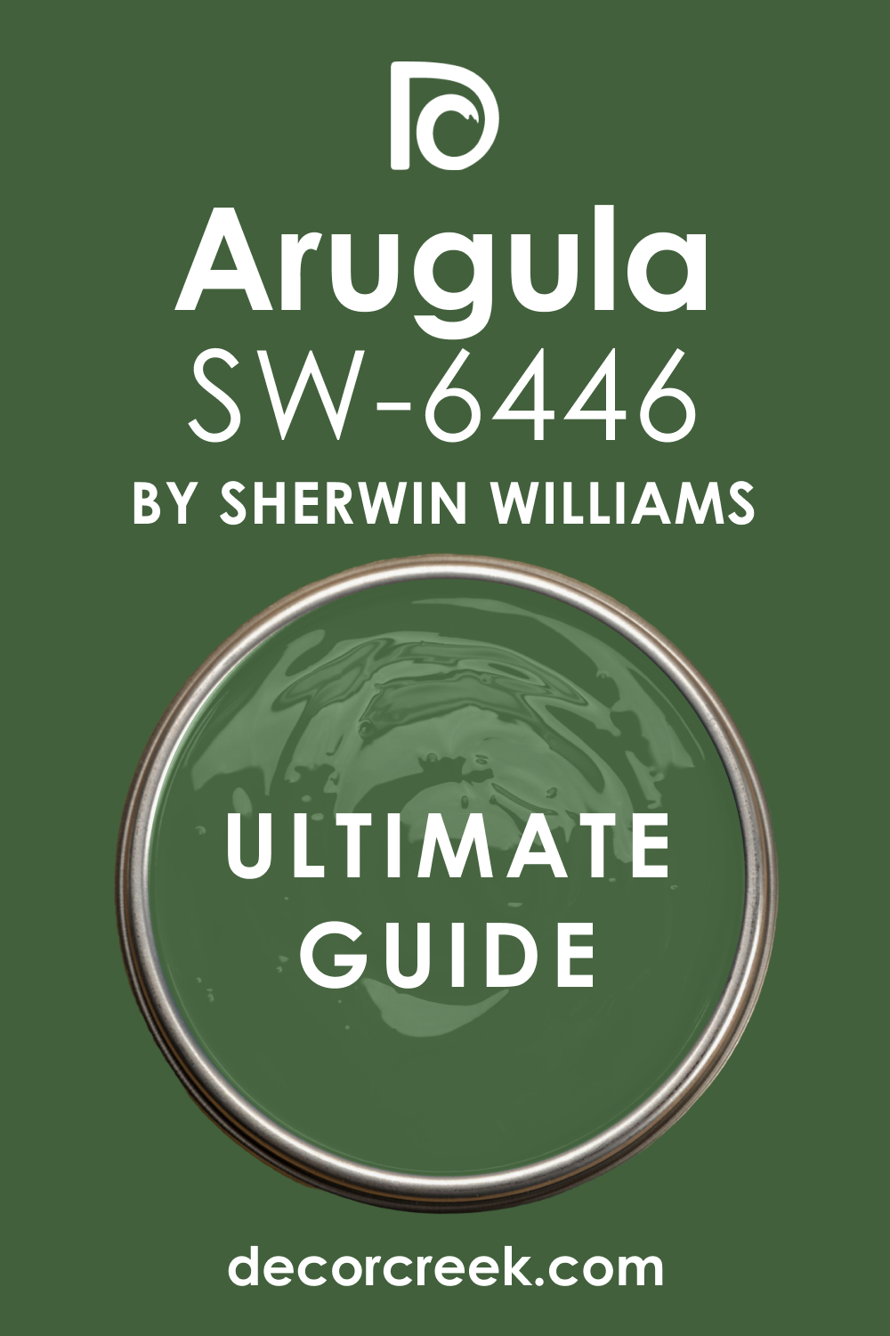
Arugula SW 6446
Arugula SW 6446 is a deep, slightly muted green with strong yellow-olive undertones, making it feel rich, earthy, and warmly sophisticated.
Arugula is an excellent choice for walls when paired with a light, creamy green cabinet, providing a deep, grounded, and elegant contrast. It is a wonderful color for creating a cozy, intimate, and traditional atmosphere in a kitchen.
This shade works perfectly with warm wood floors and cream-colored accents. I find that Arugula gives a room a sense of organic depth and maturity. It looks fantastic with brass or copper hardware. Arugula is a rich, natural color that offers a beautifully sophisticated backdrop.
🎨 Check out the complete guide to this color right HERE 👈
Vegan SW 6738
Vegan SW 6738 is a bright, clear green that is vibrant and lively, with a noticeable yellow undertone that makes it feel energetic and fresh.
Vegan is a bold, cheerful wall color for pairing with a deep, reserved green cabinet, offering a vibrant, happy contrast that is full of life. It is a wonderful color for creating a burst of optimism and life in a sun-drenched room.
This shade works best in well-lit areas to prevent it from feeling too intense. I often use Vegan to give a room a playful, youthful character. It looks fantastic with white trim and clean, modern furnishings. Vegan is a striking, lively green that creates an immediate, cheerful impact.
White Willow SW 6728
White Willow SW 6728 is a very pale, refreshing green that is light, airy, and clean, feeling wonderfully crisp and gentle.
White Willow is an ideal wall color for pairing with a dark, traditional green cabinet, providing a light, crisp, and bright contrast that is incredibly clean. It is a fantastic choice for keeping a room feeling open and light, especially in smaller kitchens.
This shade works beautifully with white countertops and brushed nickel hardware, emphasizing its clean look. I often use White Willow to create a gentle, airy, and refreshing feel. It is a light, easy color that offers a lovely visual break next to saturated cabinetry.
Electric Lime SW 6921
Electric Lime SW 6921 is a very bright, clear, and highly saturated yellow-green that is energetic and undeniably bold, a true statement color.
Electric Lime is a daring wall color for pairing with a very deep, almost black-green cabinet, offering a dramatic, high-contrast look that is full of personality. It is a wonderful color for creating an unexpected, modern, and high-energy feel in a small accent area.
This shade works best when used sparingly or in a room with a lot of white to balance its intensity. I often recommend Electric Lime for a truly unique and playful space. It looks fantastic with black or white accents. Electric Lime is a bold, spirited color that is memorable and full of cheer.
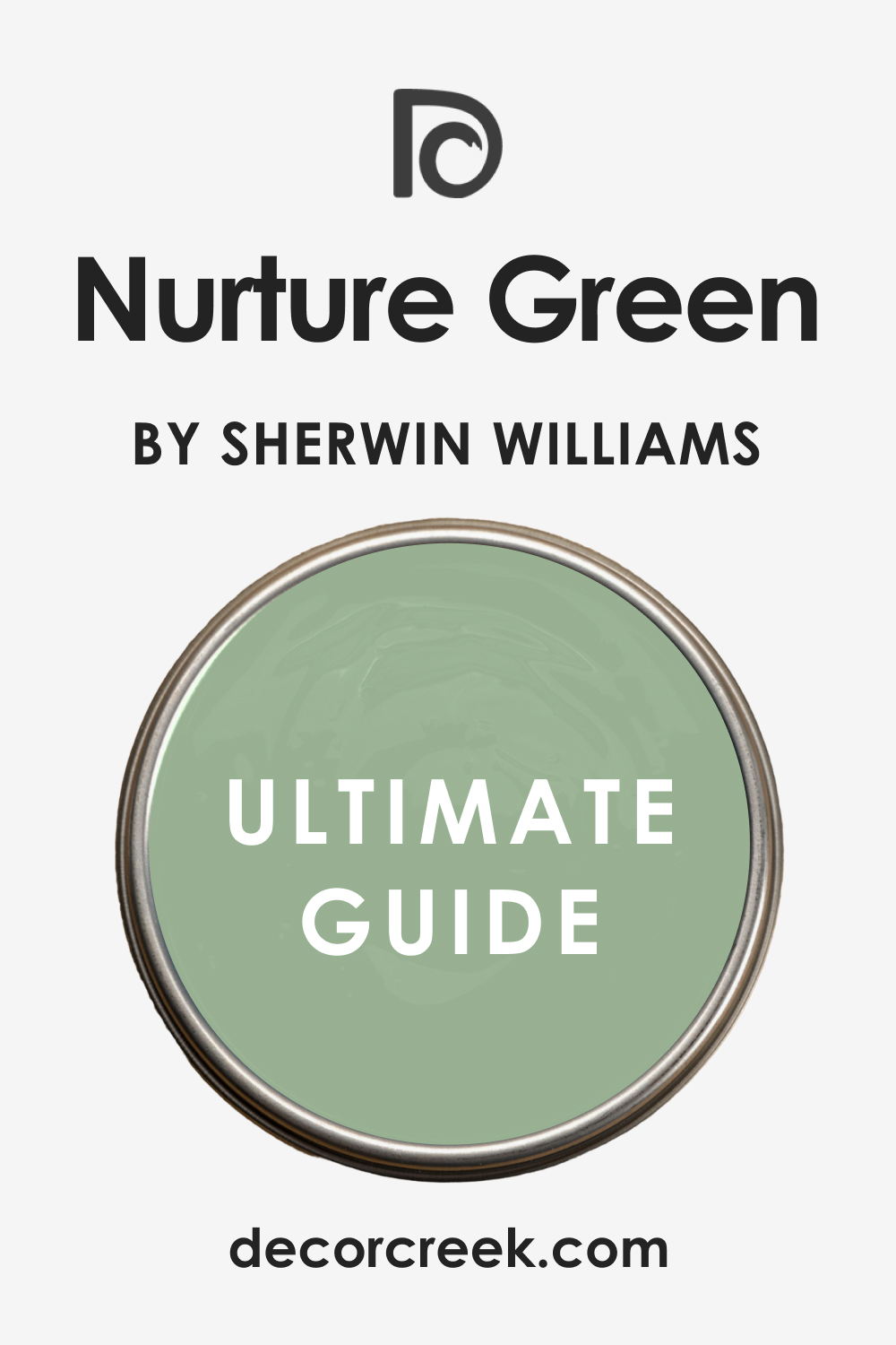
Nurture Green SW 6451
Nurture Green SW 6451 is a beautiful, mid-tone green that is soft and slightly muted, with a balanced mix of yellow and blue undertones, feeling organic.
Nurture Green is an excellent choice for walls when paired with a darker, more dramatic green cabinet, providing a light, harmonious, and grounded contrast. It is a wonderful color for creating a calm, natural, and inviting atmosphere in a kitchen.
This shade works well in various lighting conditions, maintaining its soft character. I often use Nurture Green to give a room a gentle, settled feel. It looks beautiful with wood tones and cream accents. Nurture Green is a dependable, peaceful color that offers a quiet, natural backdrop.
🎨 Check out the complete guide to this color right HERE 👈
Edamame SW 7729
Edamame SW 7729 is a deep, rich olive green that has a strong brown and yellow undertone, making it feel earthy, sophisticated, and incredibly warm.
Edamame is an ideal wall color for pairing with light, creamy green cabinets, providing a deep, grounding, and elegant contrast. It is a wonderful color for creating a cozy, traditional, and mature atmosphere in a kitchen.
This shade works perfectly with natural stone and dark wood floors. I often recommend Edamame when an authentic, high-end, earthy feel is desired. It looks stunning with brass or copper hardware. Edamame is a rich, dependable color that provides a gorgeous, sophisticated backdrop.
Lemongrass SW 7732
Lemongrass SW 7732 is a bright, fresh yellow-green that is lively and pure, carrying a strong, optimistic, and slightly tropical energy.
Lemongrass is a cheerful wall color for pairing with a dark, reserved green cabinet, offering a vibrant, contrasting look that is full of life and light. It is a wonderful color for creating a burst of happy energy in a breakfast nook or mudroom.
This shade works best in well-lit areas to truly showcase its brightness. I often use Lemongrass to give a room a playful, contemporary character. It looks fantastic with clean white trim and simple, modern furnishings. Lemongrass is an invigorating, lively green that creates an immediate, cheerful focal point.
Clary Sage SW 6178
Clary Sage SW 6178 is a pale, delicate green that is heavily muted with gray, making it feel incredibly airy, gentle, and quiet. Clary Sage is a perfect choice for walls when paired with dark, saturated green cabinets, providing a light, soft contrast that is both sophisticated and restful.
It is a wonderful color for keeping a room feeling open and bright while still adding a subtle hint of color. This shade works well in a variety of lighting conditions, maintaining its gentle nature.
I often recommend Clary Sage for a serene, refined, and understated look. It looks beautiful with white trim and silver or chrome hardware. Clary Sage is a calming, easy color that offers a lovely, quiet backdrop.
🎨 Check out the complete guide to this color right HERE 👈
Dancing Green SW 6716
Dancing Green SW 6716 is a clear, bright, true green that is highly saturated and vibrant, feeling clean and full of life and energy.
Dancing Green is a bold, energetic wall color for pairing with a deeper, more reserved green cabinet, offering a punchy, exciting contrast that is youthful and clean. It is a wonderful color for creating a lively, optimistic atmosphere in a kitchen or utility space.
This shade works best in well-lit areas to prevent it from overwhelming the room. I often use Dancing Green to give a room a modern, artistic character. It looks fantastic with simple white and black accents. Dancing Green is an invigorating, strong color that creates a unique and energetic statement.
Fresh Eucalyptus SW 9658
Fresh Eucalyptus SW 9658 is a deep, gorgeous teal-green that is highly saturated and moody, carrying a rich, sophisticated depth.
Fresh Eucalyptus is a striking wall color for pairing with light, creamy green cabinets, providing a dramatic, elegant, and jewel-toned contrast. It is a wonderful color for creating a luxurious, custom, and intimate atmosphere in a room.
This shade works beautifully with gold or brass accents, which truly pop against its richness. I find that Eucalyptus gives a room a sense of depth and enduring style. It is a bold, beautiful color that delivers a sophisticated, high-end aesthetic.
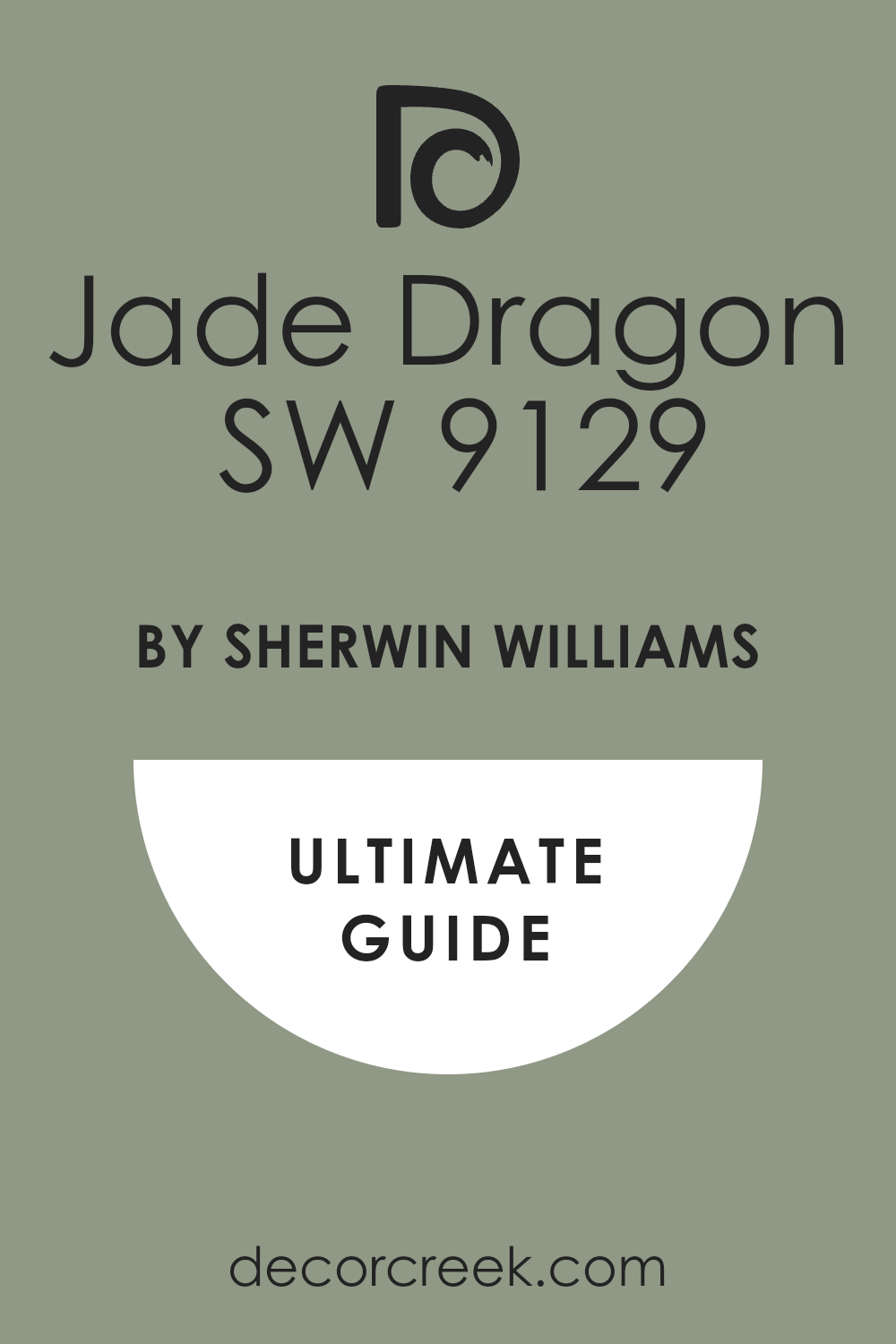
Jade Dragon SW 9129
Jade Dragon SW 9129 is a vibrant, clear teal-green that is highly pigmented and exotic, carrying a strong, commanding, and rich presence. Jade Dragon is a stunning wall color for pairing with light, airy green cabinets, offering a dramatic, striking, and sophisticated contrast.
It is a fantastic choice for creating a luxurious, jewel-box effect in a kitchen or dining area. This shade works beautifully with gold hardware and clean white marble.
I often recommend Jade Dragon for a bold statement that feels both unique and elegant. It is a beautiful, memorable color that delivers a sense of worldly sophistication.
🎨 Check out the complete guide to this color right HERE 👈
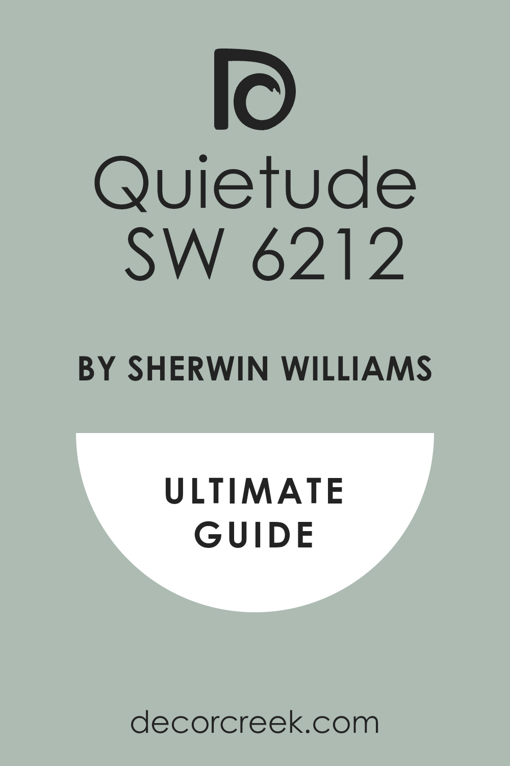
Quietude SW 6212
Quietude SW 6212 is a lovely light color that sits between green and blue, with a strong gray influence, making it feel peaceful and incredibly versatile.
Quietude is an ideal wall color for pairing with darker, more traditional green cabinets, providing a light, refreshing, and spa-like contrast. It is a fantastic choice for creating a gentle, composed, and airy atmosphere in a kitchen.
This shade works beautifully with white countertops and silver hardware. I often use Quietude to bring a sense of tranquility to a room. It is a beautifully soothing color that provides a light, serene backdrop.
🎨 Check out the complete guide to this color right HERE 👈
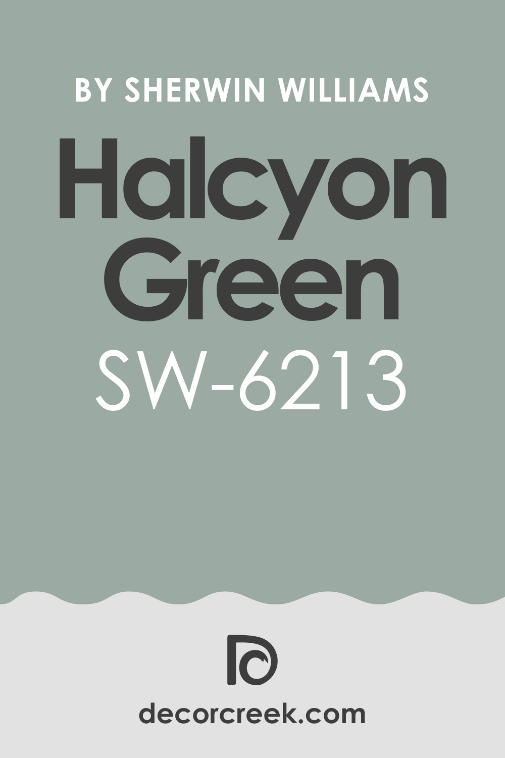
Halcyon Green SW 6213
Halcyon Green SW 6213 is a mid-tone color that is a perfect balance of blue and green, with a gentle gray influence, feeling calming and sophisticated.
Halcyon Green is an excellent choice for walls when paired with dark, earthy green cabinets, providing a fresh, cool, and balanced contrast. It is a wonderful color for creating a composed, coastal, or spa-inspired atmosphere in a kitchen.
This shade works well in rooms with good natural light, where its clear color can shine. I often recommend Halcyon Green for a refined, refreshing look. It looks beautiful with white trim and brushed nickel. Halcyon Green is a beautiful, easygoing color that provides a serene, lovely backdrop.
🎨 Check out the complete guide to this color right HERE 👈
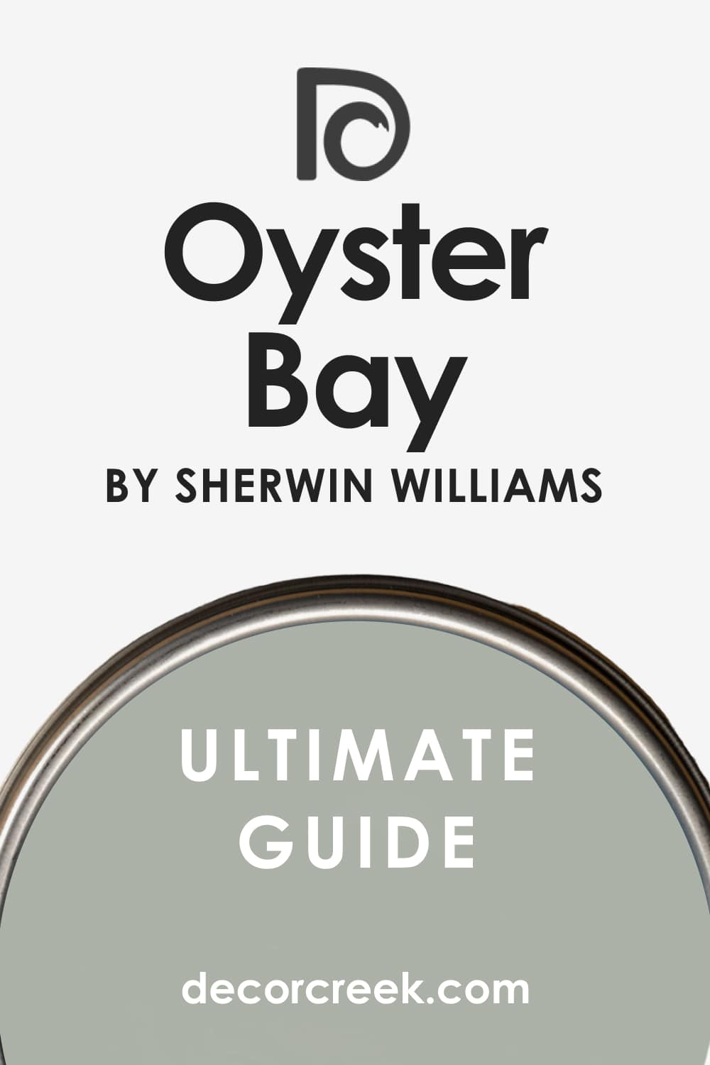
Oyster Bay SW 6206
Oyster Bay SW 6206 is a lovely, muted color that is a soft green-blue-gray, making it feel very organic, gentle, and highly sophisticated.
Oyster Bay is an ideal wall color for pairing with deeper, more saturated green cabinets, providing a lighter, harmonious, and sophisticated contrast. It is a fantastic choice for creating a peaceful, coastal, and welcoming atmosphere in a kitchen.
This shade works well in a wide variety of lighting, maintaining its soft, agreeable character. I often use Oyster Bay to create a gentle, settled, and refined look. It is a beautiful, dependable color that offers a soft, elegant backdrop.
🎨 Check out the complete guide to this color right HERE 👈
Silvermist SW 7621
Silvermist SW 7621 is a light, airy color that is a beautiful mix of gray, green, and a hint of blue, making it feel sophisticated and subtle.
Silvermist is a perfect pairing for dark, traditional green cabinets, offering a light, refreshing, and clean contrast that is never stark. It is a wonderful choice for keeping a room feeling bright and open while adding a soft wash of color.
This shade works well with white trim and silver or chrome accents. I often recommend Silvermist for a refined, airy, and gentle aesthetic. It is a beautiful, versatile color that provides a clean, elegant frame for your green cabinets.
My Final Thoughts About 29 Best Paint Colors For Green Cabinets In 2026
When you finish painting, the most important thing is that the final look brings you genuine joy every single time you walk into that room. You’ve chosen the beautiful color of green for your cabinets, and that is a wonderful, grounding decision that brings a feeling of tranquility and connection to nature into your home.
Now, the wall color is the critical element that completes the entire design story. It must not merely match, but actively enhance the beauty of your green cabinets.
Think about what you want your kitchen to feel like—do you crave a bright, crisp contrast from a white like White Dove or Chantilly Lace, which will instantly make the space feel light and airy?
Or would you prefer a deeper, more cozy and layered look with a color like Pewter Green or Basil, which creates a feeling of enveloping warmth and sophisticated drama?
These two directions create entirely different emotional responses, and it’s vital to choose the one that truly resonates with your personal taste.
All 29 colors I’ve shared here—whether they are a soft neutral like Accessible Beige, a refreshing gray like Silverpointe, or a bold jewel tone like Green Onyx—are all proven winners from brands I absolutely trust.
Please remember to always sample your top choices directly on your walls, because the lighting in your home, whether it’s natural sunlight or evening artificial light, will be the ultimate deciding factor.
Trust your instincts and the way the colors make you feel when you look at them at different times of the day.
Your kitchen is going to look stunning, and I hope this guide gives you the confidence to make a choice that you will truly adore for many years to come.
