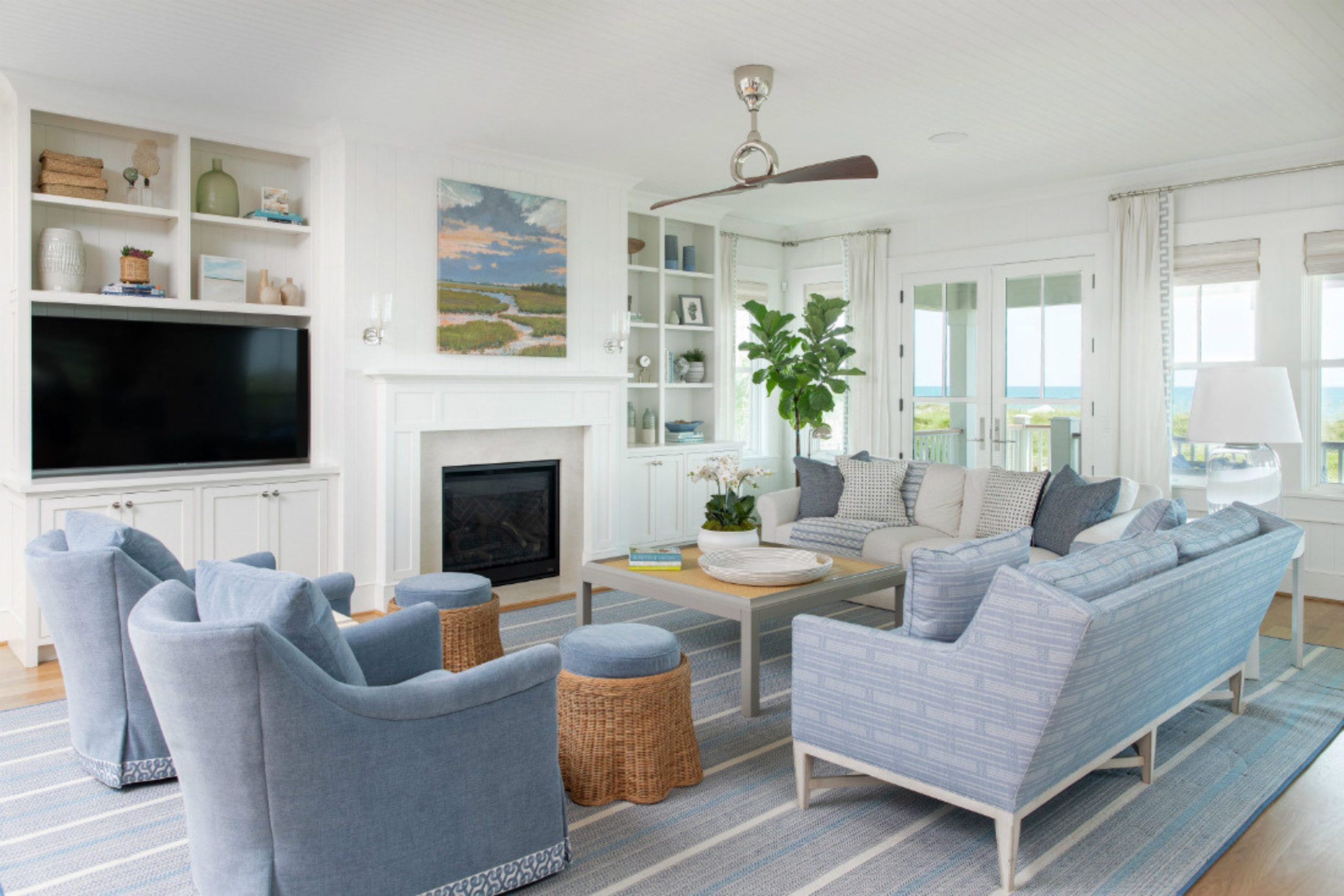
I have spent years walking through beach cottages and seaside villas, carefully studying the light, textures, and colors to find the perfect look for my clients. Choosing a palette for a home near the water is about so much more than just picking a pretty blue or a soft white.
It’s about capturing the way sunlight reflects off the waves, how the sky shifts throughout the day, and making sure the walls always feel open, light, and full of air.
My job as a designer is to create a space that feels thoughtfully put together, like a professional styled it, but without ever making it feel stiff or overly polished. A coastal home should feel natural and easy, not forced.
I want every person who walks into your house to instantly feel at ease, like they can kick off their shoes, take a deep breath, and truly relax.
We choose tones that gently remind us of warm sand, soft shells, and the calm colors of the ocean sky.
This guide will help you discover the exact shades I use when I stage homes for sale or help families settle into their dream coastal retreats, creating spaces that feel both beautiful and lived-in.
Why I Always Trust Sherwin-Williams and Benjamin Moore for Coastal Interior Paint Colors
I only use Sherwin-Williams and Benjamin Moore because their paint stays true to the swatch even in bright sun.
Coastal homes get a lot of natural light, and cheap paint can start to look yellow or muddy very quickly. These two brands have the best pigments that keep your walls looking fresh for a long time.
I also love how these paints hold up against the salt air and humidity that come with living near the coast. When I am staging a million-dollar home, I cannot take risks with the finish or the quality.
These brands offer the most beautiful range of watery blues and soft sandy beiges that I have ever found.
How I Choose the Perfect Coastal Paint Color for Any Room
I always start by looking at which direction the windows face because the sun changes how paint looks throughout the day. North-facing rooms need warmer tones so they do not feel chilly, while south-facing rooms can handle those cool, crisp blues.
I bring large samples to every house to see how the colors react to the flooring and furniture already in the room.
I also think about how each room flows into the next one so the whole house feels connected. You do not want a bright green room right next to a dark blue one if you want a cohesive look. I aim for a balance of light neutrals and soft accents that pull the outdoors inside.
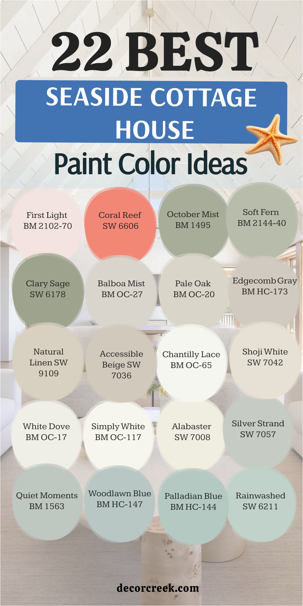
22 Seaside Cottage House Paint Color Ideas
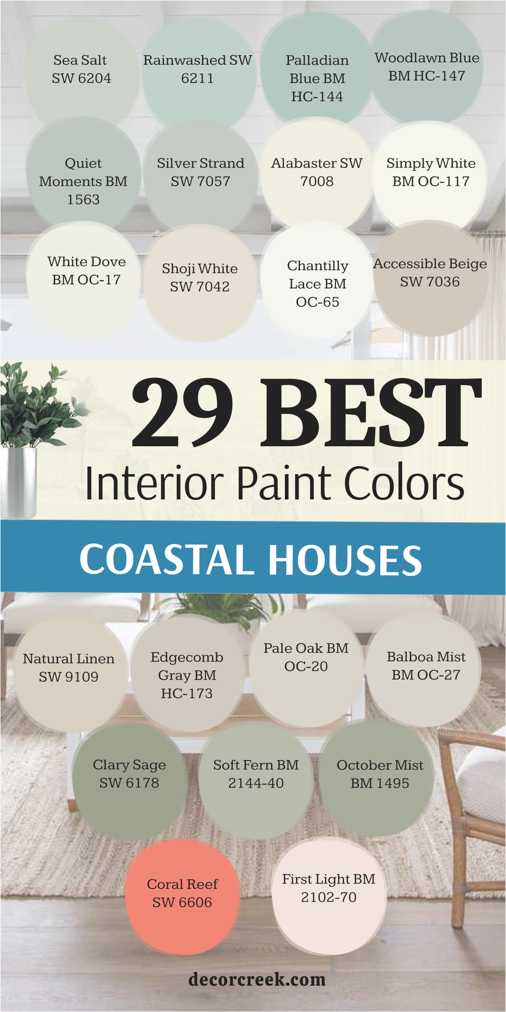
Sea Salt SW 6204
Sea Salt SW 6204 acts like a chameleon by changing between green and blue depending on the time of day. This shade makes me think of morning mist on the beach before the sun gets too high.
I use it often in bathrooms to create a spa feel that everyone loves. It stays light enough to keep small rooms feeling open and large. You will notice it looks different in every house, which makes it very special.
This pick is a favorite for people who want a hint of color without it being too loud. It works wonders on kitchen cabinets if you want something unique but still safe. My clients always tell me this is the shade that makes them feel most at home.
Best used in: bathrooms, bedrooms, laundry rooms, and kitchens
Pairs well with: Alabaster SW 7008, Heron Plume SW 6070, and light wood textures The key rule of this color for seaside style is to use it where you want the walls to shift beautifully with the changing natural light.
🎨 Check out the complete guide to this color right HERE 👈

Rainwashed SW 6211
Rainwashed SW 6211 brings a bit more pigment to the walls than other pale greens. This color reminds me of the clear water in a tropical lagoon on a sunny afternoon.
I find that it looks amazing when paired with bright white trim and dark wood floors. It has enough depth to stand out but it never feels heavy or dark. I suggest using this if you want your cottage to have a cheery and bright personality.
It looks great in sunrooms where the light can really make the green tones pop. Many of my staging projects use this to make a house feel clean and fresh. You can count on it to stay looking bright even on cloudy days.
Best used in: sunrooms, guest bedrooms, entryways, and mudrooms
Pairs well with: Pure White SW 7005, Window Pane SW 6210, and wicker furniture The key rule of this color for seaside style is to use it in rooms with lots of windows to highlight its watery and fresh personality.
🎨 Check out the complete guide to this color right HERE 👈

Palladian Blue BM HC-144
Palladian Blue BM HC-144 is a classic choice that leans more toward a soft aqua. I love how this shade makes a room feel like it belongs right on the edge of the ocean.
It is a very soft color that works well in living areas where families spend a lot of time. The blue and green are mixed perfectly so it never looks like a nursery blue. I often pair it with gold hardware to add a little bit of fancy style to a cottage.
It is one of those shades that makes people stop and ask for the name immediately. This paint works well with sandy colored rugs and linen curtains. You will find that it makes even a small room feel much taller and wider.
Best used in: living rooms, dining rooms, master suites, and ceilings
Pairs well with: Simply White BM OC-117, Woodlawn Blue BM HC-147, and gold accents The key rule of this color for seaside style is to use it when you want a sophisticated and watery look that feels like a high-end resort.
🎨 Check out the complete guide to this color right HERE 👈

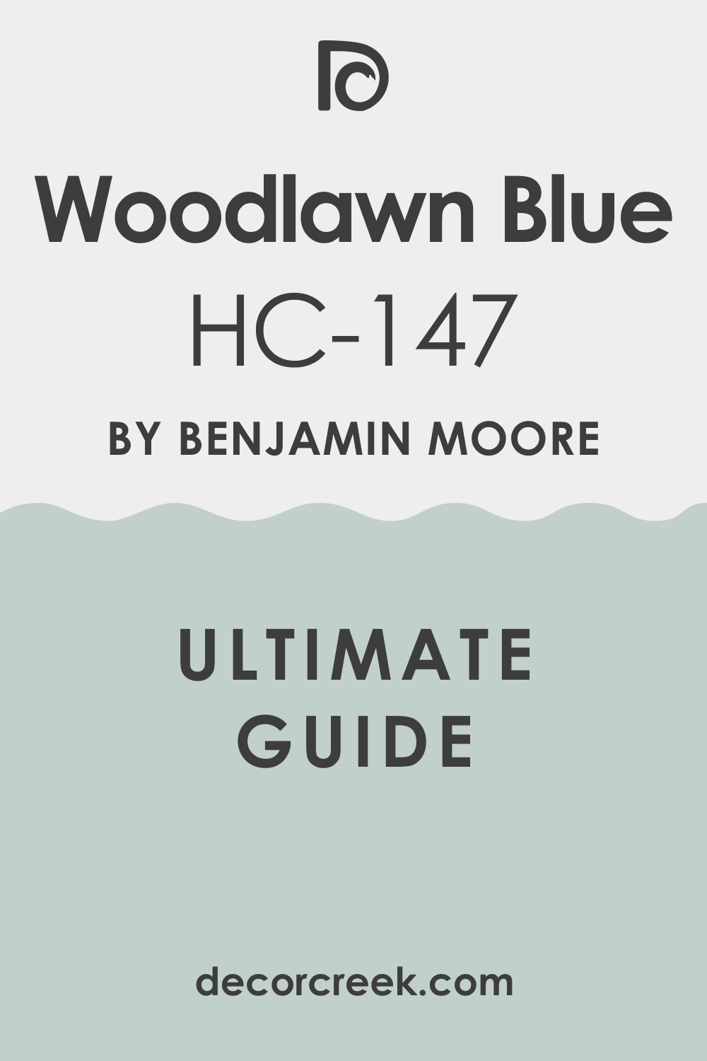
Woodlawn Blue BM HC-147
Woodlawn Blue BM HC-147 offers a bit more blue than some of the other shades on my list. This color feels very traditional and looks stunning in old seaside cottages with lots of character.
I like to use it on front doors to give guests a friendly welcome as they walk up. It has a very crisp feel that makes white furniture look even brighter and cleaner. I think it looks best when the sun is shining directly on it in the morning.
It is a strong enough color to define a room but it is not too dark to be scary. I have used this in many kitchens to create a happy place for breakfast. It is a very reliable color that does not change its look too much in different lights.
Best used in: kitchens, breakfast nooks, front doors, and shutters
Pairs well with: White Dove BM OC-17, Hale Navy BM HC-154, and silver hardware The key rule of this color for seaside style is to use it to create a classic and cheerful look that pairs perfectly with traditional white trim.
🎨 Check out the complete guide to this color right HERE 👈
Quiet Moments BM 1563
Quiet Moments BM 1563 is a soft mix of blue, green, and gray that feels very peaceful. I recommend this for bedrooms because it helps people feel relaxed before they go to sleep.
It is a very light shade that acts almost like a neutral in some lighting. I like how it looks against dark navy accents or deep wood furniture. This color is great for making a house feel cohesive if you use it in hallways.
It never feels too bright or overwhelming for a homeowner who likes things simple. I often use this when a client wants a color that is hard to pin down. It feels like a cool breeze on a hot summer day at the shore.
Best used in: master bedrooms, nurseries, hallways, and home offices
Pairs well with: Cloud White BM OC-130, Shaker Beige BM HC-45, and navy blue decor The key rule of this color for seaside style is to use it in private areas where you want a soft and relaxing atmosphere for resting.
🎨 Check out the complete guide to this color right HERE 👈

Silver Strand SW 7057
Silver Strand SW 7057 is a cool gray that has a very clear blue undertone. I find that this shade looks like the sky right before a summer rainstorm over the ocean.
It is a very modern choice for coastal homes that want to look updated and fresh. I love using it in open floor plans because it transitions between rooms very well. It keeps a house feeling cool even when it is very hot outside.
The gray in it prevents the blue from looking too much like a child’s bedroom. I think it looks very sharp with black accents or dark metal light fixtures. It provides a clean backdrop for colorful artwork or bright pillows.
Best used in: open floor plans, living rooms, kitchens, and bathrooms
Pairs well with: Pure White SW 7005, Naval SW 6244, and black metal finishes The key rule of this color for seaside style is to use it when you want a modern and cool look that feels very fresh and clean.
🎨 Check out the complete guide to this color right HERE 👈
Alabaster SW 7008
Alabaster SW 7008 is my favorite warm white for any house near the beach. This white is not too yellow and not too blue, so it feels very balanced and soft. I use it on walls when a client has a lot of colorful beach art they want to show off.
It makes a room feel very cozy and friendly without being too stark or cold. I often paint the trim and the walls the same color but in different finishes for a rich look. It reminds me of white sand that has been warmed by the sun all day long.
This is a very safe choice if you are worried about picking the wrong color. It makes every room look larger and filled with light.
Best used in: living rooms, kitchens, hallways, bedrooms, and farmhouse exteriors
Pairs well with: Iron Ore SW 7069, Agreeable Gray SW 7029, Natural Linen SW 9109, and warm wood tones The key rule of this color for seaside style is to use it where you want natural light to feel kind, soft, and inviting throughout the day.
🎨 Check out the complete guide to this color right HERE 👈

Simply White BM OC-117
Simply White BM OC-117 is a very crisp and clean white that has just a tiny bit of warmth. I love using this on kitchen cabinets because it looks so fresh and bright.
It is a great choice for a house that does not get a lot of natural light because it helps brighten things up. I think it is the perfect white for trim and doors because it makes the wall colors pop. It feels very energetic and happy in a way that other whites do not.
I have used this on many ceilings to make them feel higher than they really are. This shade is a favorite for designers who want a very clean and modern coastal look. It never feels dingy or old even after many years.
Best used in: kitchen cabinets, trim, ceilings, and dark hallways
Pairs well with: Hale Navy BM HC-154, Revere Pewter BM HC-172, and bright colors The key rule of this color for seaside style is to use it to create a sharp contrast and bring a sense of energy into a dim room.
🎨 Check out the complete guide to this color right HERE 👈

White Dove BM OC-17
White Dove BM OC-17 is a very popular white because it has a soft and creamy feel. I use this when I want a room to feel a little more traditional and comfortable.
It is not a blinding white, so it is very easy on the eyes when the sun hits it. I like how it looks with soft blues and greens in a cottage setting. It is a very forgiving color that hides small imperfections on the walls.
I often suggest this for large living areas where you want a soft glow. It makes a house feel lived-in and loved rather than just a show house. Many people pick this because it goes with almost any furniture color.
Best used in: living rooms, bedrooms, trim, and kitchen islands
Pairs well with: Sea Salt SW 6204, Balboa Mist BM OC-27, and antique furniture The key rule of this color for seaside style is to use it for a soft and lived-in feel that makes every guest feel immediately comfortable.
🎨 Check out the complete guide to this color right HERE 👈

Shoji White SW 7042
Shoji White SW 7042 is a very warm white that can sometimes look like a very light beige. I love this for coastal homes because it reminds me of dried seagrass and natural fibers.
It creates a very soft and grounded look that is perfect for a relaxing retreat. I find it looks best in rooms with a lot of natural wood or stone elements. It is a great alternative to gray if you want something that feels a bit warmer.
I use it to create a backdrop that feels very organic and natural. It is very easy to live with and does not demand too much attention. This is a great choice for a whole-house color if you want a warm flow.
Best used in: exteriors, living rooms, bedrooms, and entryways
Pairs well with: Urbane Bronze SW 7048, Fawn Brindle SW 7640, and natural wood The key rule of this color for seaside style is to use it to bring a warm and organic feel that mimics the look of natural beach elements.
🎨 Check out the complete guide to this color right HERE 👈

Chantilly Lace BM OC-65
Chantilly Lace BM OC-65 is the cleanest white you can find without it having any blue or yellow in it. I use this when I want a very high-end and modern look for a beach house.
It makes everything around it look very sharp and defined. I love it on modern architecture where the lines of the house are very straight. It works perfectly with very bright coastal colors like coral or turquoise.
It reflects so much light that it can make a dark room feel like it has a new window. I often use it for trim to make sure the wall colors look exactly like the swatch. It is a very crisp and cool white that feels very fresh.
Best used in: trim, doors, modern kitchens, and art galleries
Pairs well with: any bright color, black accents, and cool grays The key rule of this color for seaside style is to use it for a crisp and modern look that highlights the architectural lines of your home.
🎨 Check out the complete guide to this color right HERE 👈

Accessible Beige SW 7036
Accessible Beige SW 7036 is a beige that has a little bit of gray in it to keep it from looking too yellow. I find this color looks like wet sand on a beautiful beach.
It is a very popular choice because it goes with both warm and cool furniture. I like to use it in basements or rooms that do not have many windows to keep them feeling cozy. It is a very sturdy color that makes a room feel solid and grounded.
I often use this for a main living area to create a warm and inviting vibe. It is a classic coastal neutral that will not go out of style. Many people love how it makes white trim really stand out.
Best used in: living rooms, basements, hallways, and open floor plans
Pairs well with: Alabaster SW 7008, Sea Salt SW 6204, and dark wood floors The key rule of this color for seaside style is to use it as a solid and warm neutral that ties together different wood tones and colors.
🎨 Check out the complete guide to this color right HERE 👈

Natural Linen SW 9109
Natural Linen SW 9109 is a warm and soft tan that feels like a cozy blanket. I love using this in bedrooms to create a sense of warmth and comfort.
It reminds me of the linen fabrics often used in beach house decor. I think it looks beautiful with white bedding and soft blue pillows. It is a very easy color to decorate around because it is so neutral.
I find that it makes a room feel very sunny even when the weather is bad. It has a very natural feel that brings the outdoors inside. This is a great choice for someone who wants a beach house look without using any blue.
Best used in: bedrooms, dining rooms, sunrooms, and cozy dens
Pairs well with: Shoji White SW 7042, Watery SW 6478, and woven textures The key rule of this color for seaside style is to use it to create a warm and textured backdrop that feels very natural and inviting.
🎨 Check out the complete guide to this color right HERE 👈

Edgecomb Gray BM HC-173
Edgecomb Gray BM HC-173 is a perfect mix of gray and beige, often called greige. I use this color more than almost any other because it works in every single room.
It feels very light and airy but still has enough color to make a statement. I find it looks like the soft gray of smooth stones found on the shore. It changes slightly with the light but it always looks clean and pretty.
I love it for staging because everyone who sees it seems to like it. It makes a house feel very expensive and well-designed. You can use it in a tiny bathroom or a giant living room with the same great results.
Best used in: every room, open floor plans, hallways, and kitchens
Pairs well with: White Dove BM OC-17, Revere Pewter BM HC-172, and navy blue The key rule of this color for seaside style is to use it as a versatile and light greige that makes every room feel professionally styled and airy.
🎨 Check out the complete guide to this color right HERE 👈

Pale Oak BM OC-20
Pale Oak BM OC-20 is a very light and elegant greige that feels very soft on the walls. I love how it makes a room look very bright while still having a touch of warmth.
It is a very sophisticated choice for a formal living room or a master suite. I think it looks like the inside of a seashell where the colors are very pale. It is a great choice if you want a white look but with a little more depth.
I find it looks best with very clean white trim and light-colored furniture. It is a very peaceful color that helps a house feel very quiet and high-end. This shade is perfect for creating a very light and breezy coastal atmosphere.
Best used in: master bedrooms, formal living rooms, dining rooms, and nurseries
Pairs well with: Chantilly Lace BM OC-65, Gray Owl BM OC-52, and soft pinks The key rule of this color for seaside style is to use it for an elegant and light look that feels very soft and high-end.
🎨 Check out the complete guide to this color right HERE 👈

Balboa Mist BM OC-27
Balboa Mist BM OC-27 is a light gray that has a warm undertone to keep it from feeling cold. I find this shade looks very modern and fresh in a seaside home.
It works very well in rooms with a lot of natural light where it stays looking bright. I like to use it in kitchens with white marble countertops for a very clean look. It is a very popular choice for people who want a gray house that still feels friendly.
I often pair it with blue accents to bring out the coastal vibe. It makes a great backdrop for a gallery wall of family photos. Many of my clients pick this for their main living areas because it is so easy to live with.
Best used in: kitchens, living rooms, hallways, and bathrooms
Pairs well with: Simply White BM OC-117, Hale Navy BM HC-154, and marble surfaces The key rule of this color for seaside style is to use it for a modern and warm gray look that feels very clean and updated.
🎨 Check out the complete guide to this color right HERE 👈

Clary Sage SW 6178
Clary Sage SW 6178 is a soft and earthy green that brings a natural look to a cottage. I love using this in a home office or a library to create a focused feel.
It reminds me of the beach grass that grows on the dunes along the coast. I find it looks very beautiful with dark wood furniture and leather accents. It is a very grounded color that feels a bit more serious than the light blues.
I think it adds a lot of personality to a house without being too loud or bright. It works very well in rooms that have views of the garden or the woods. This is a great choice for someone who wants a cozy and natural coastal feel.
Best used in: home offices, libraries, mudrooms, and accent walls
Pairs well with: Alabaster SW 7008, Accessible Beige SW 7036, and dark wood The key rule of this color for seaside style is to use it to bring a natural and grounded feel that reminds you of coastal greenery.
🎨 Check out the complete guide to this color right HERE 👈

Soft Fern BM 2144-40
Soft Fern BM 2144-40 is a very light and airy green that feels like a breath of fresh air. I like using this in kitchens to create a happy and bright place for cooking.
It is a very soft shade that does not feel heavy or dark at all. I think it looks like the new leaves on a tree in the springtime near the water. It works very well with white furniture and light wood floors.
I find it creates a very cheerful and lighthearted atmosphere in a home. It is a great way to add color if you are tired of using blue all the time. Many people find it very refreshing and unique for a beach house.
Best used in: kitchens, guest bedrooms, sunrooms, and bathrooms
Pairs well with: White Dove BM OC-17, Pale Oak BM OC-20, and floral prints The key rule of this color for seaside style is to use it to create a cheerful and refreshing look that feels light and full of life.
🎨 Check out the complete guide to this color right HERE 👈
Sea Salt SW 6204
Sea Salt SW 6204 is a version of the popular shade that emphasizes the green tones. I use this when a client wants a very organic and earthy look for their home.
It looks very beautiful in rooms with a lot of plants and natural light. I find it makes a house feel very connected to the outdoors and the ocean. It is a very soft color that is easy to look at all day long.
I like to pair it with warm beige and sandy colors for a true beach feel. It works wonders in a bathroom where you want to feel like you are at a luxury spa. This color is very popular for a reason because it just feels right in a coastal home.
Best used in: bathrooms, bedrooms, laundry rooms, and kitchens
Pairs well with: Alabaster SW 7008, Shoji White SW 7042, and natural stone The key rule of this color for seaside style is to use it to create a soft and organic feel that connects your home to the natural beauty of the coast.
🎨 Check out the complete guide to this color right HERE 👈
October Mist BM 1495
October Mist BM 1495 is a soft and earthy green that has a lot of gray in it. I love this for a more modern and sophisticated coastal look.
It feels very grounded and looks amazing with natural wood and black accents. I think it reminds me of the sea moss and rocks found along the shoreline. It is a very trendy color that still feels like it belongs in a beach house.
I find it works best in rooms where you want a bit more drama and depth. It is a very versatile green that does not feel too bright or neon. I use it often for kitchen islands or accent walls to add some interest.
Best used in: kitchen islands, accent walls, entryways, and dining rooms
Pairs well with: Steam BM AF-15, Morning Dew BM OC-140, and black hardware The key rule of this color for seaside style is to use it for a sophisticated and earthy look that adds depth and interest to your home.
🎨 Check out the complete guide to this color right HERE 👈

Coral Reef SW 6606
Coral Reef SW 6606 is a bright and happy pinkish-orange that adds a lot of energy. I love using this for a front door or a small powder room to give a surprise of color.
It reminds me of the beautiful sunsets over the ocean and the shells on the beach. I find it looks best when paired with lots of white to keep it from being too much. It is a very fun and playful color that makes people smile when they see it.
I think it is perfect for a house that wants to feel like a vacation home. It works very well with tropical patterns and bright blue accents. This is a great choice if you want to be bold and have some fun with your decor.
Best used in: front doors, powder rooms, accent walls, and furniture
Pairs well with: Pure White SW 7005, Watery SW 6478, and tropical prints The key rule of this color for seaside style is to use it in small doses to add a fun and energetic pop of color that feels like a sunset.
🎨 Check out the complete guide to this color right HERE 👈
First Light BM 2102-70
First Light BM 2102-70 is a very pale and soft pink that feels like the sky at dawn. I love using this in bedrooms or nurseries to create a very sweet and gentle look.
It is a very light shade that acts almost like a neutral if you use it correctly. I find it looks beautiful with light gray and white for a very soft coastal palette. It reminds me of the pink sand found on some tropical islands.
It is a very happy and refreshing color that brightens up any room. I think it looks great with gold accents and light-colored wood. This is a perfect choice for someone who wants a very soft and pretty beach house.
🎨 Check out the complete guide to this color right HERE 👈

18 Coastal Boho House Interior Paint Colors
Tidewater SW 6477
Tidewater SW 6477 brings a light and breezy energy that feels like a fresh morning at the beach. This color is a very pale blue that works perfectly for a relaxed coastal boho house.
I find that it looks amazing when paired with light wood floors and woven rugs. It makes a room feel very open and bright even if the windows are small. You will notice that it stays looking very clean and crisp throughout the entire day.
This shade is a great choice for kitchens where you want a happy and light feeling. It reminds me of the clear sky right above the ocean waves on a sunny day. My clients love how it makes their homes feel like a vacation spot every morning.
Best used in: kitchens, bathrooms, laundry rooms, and small bedrooms
Pairs well with: Alabaster SW 7008, light oak, rattan textures, and soft white linens The key rule of this color for boho style is to use it where you want a light and airy backdrop that highlights your favorite natural wood furniture.
🎨 Check out the complete guide to this color right HERE 👈

Watery SW 6478
Watery SW 6478 has a bit more depth than a standard blue and leans into a soft aqua tone. This color makes me think of the shallow water near the shore where the sand is white.
I like to use it on accent walls or even on painted furniture for a pop of color. It has a very refreshing personality that keeps a room from feeling too boring or plain. I find that it looks beautiful when you mix it with brass hardware or gold frames.
It is a very cool shade that helps a house feel much fresher during the hot summer months. Many people use this in their bathrooms to create a fun and watery look for guests. You can count on this color to add a lot of charm to your coastal boho home.
Best used in: bathrooms, kitchen islands, accent walls, and front doors
Pairs well with: Pure White SW 7005, brass fixtures, and dark teal accents The key rule of this color for boho style is to use it as a focal point to bring a sense of tropical energy into a neutral room.
🎨 Check out the complete guide to this color right HERE 👈
Tradewind SW 6218
Tradewind SW 6218 is a classic light blue that feels very steady and pretty on the walls. This color reminds me of the sky on a perfect summer afternoon when the breeze is blowing.
I find it looks very sophisticated in living rooms that have a lot of white slipcovered furniture. It is a very balanced shade that does not lean too far into green or purple. I love how it creates a very inviting feeling in entryways for people coming in from the beach.
It works wonders in bedrooms where you want to feel a sense of peace before sleeping. This shade is very popular because it looks exactly like the color of a coastal dream house. It stays looking very bright and cheerful no matter what the weather is like outside.
Best used in: living rooms, bedrooms, entryways, and dining areas
Pairs well with: Alabaster SW 7008, Sea Salt SW 6204, and sandy beige tones The key rule of this color for boho style is to use it in large rooms to create a soft and traditional coastal feel that never goes out of style.
🎨 Check out the complete guide to this color right HERE 👈

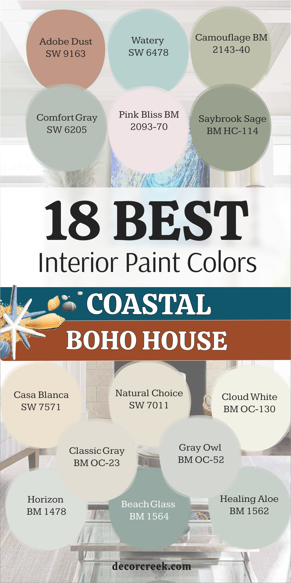
Comfort Gray SW 6205
Comfort Gray SW 6205 is a deeper blue-green that has a very grounded and solid feel to it. This color reminds me of the ocean on a cloudy day when the water looks a bit more gray.
I use this when a client wants a room to feel extra cozy and private like a little retreat. It looks very high-end when you pair it with dark wood furniture and vintage rugs. I find that it adds a lot of character to a house that has a lot of open spaces.
It is a very rich shade that still feels light enough to be part of a coastal palette. This color is great for a master suite where you want to feel tucked away from the world. It provides a very beautiful contrast against bright white trim and doors.
Best used in: master bedrooms, home offices, and cozy reading nooks
Pairs well with: Pure White SW 7005, Accessible Beige SW 7036, and dark wood textures The key rule of this color for boho style is to use it in rooms where you want a sense of depth and a very comfortable atmosphere.
🎨 Check out the complete guide to this color right HERE 👈

Aesthetic White SW 7035
Aesthetic White SW 7035 is a soft off-white that has a tiny bit of gray and beige in the mix. This color is my top choice for a main wall color because it goes with everything you own.
It reminds me of the color of bleached driftwood that you find scattered along the sand. I find it looks very clean and updated without being as cold as a bright white. It makes a great backdrop for colorful boho pillows and hanging plants in every room.
I love how it changes slightly with the light but always keeps a house looking very fresh. This is a very safe choice if you are worried about picking a color that might be too loud. It keeps your home feeling very light and airy all year long.
Best used in: whole-house color, living rooms, and open floor plans
Pairs well with: Pure White SW 7005, Sea Salt SW 6204, and natural jute rugs The key rule of this color for boho style is to use it as a neutral base that allows your colorful decor and plants to really stand out.
🎨 Check out the complete guide to this color right HERE 👈

Creamy SW 7012
Creamy SW 7012 is a warm and soft white that feels very friendly and welcoming in a home. This color reminds me of the warm sand on a beautiful afternoon when the sun is starting to set.
I like to use it in living areas where you want a soft glow rather than a sharp brightness. It is not a yellow white but it definitely has enough warmth to make a room feel very cozy. I find it looks beautiful with soft blues and greens in a coastal boho setting.
It is a very forgiving color that makes older walls look much smoother and cleaner. Many people pick this because it makes a house feel lived-in and very happy for families. It provides a very gentle and soft feeling for any room in your beach cottage.
Best used in: living rooms, kitchens, bedrooms, and hallways
Pairs well with: Alabaster SW 7008, Watery SW 6478, and warm wood tones The key rule of this color for boho style is to use it to create a warm and inviting look that feels very soft and friendly.
🎨 Check out the complete guide to this color right HERE 👈

Casa Blanca SW 7571
Casa Blanca SW 7571 is a rich and creamy white that has a bit of a vintage coastal feel. This color reminds me of the old stucco houses found in sunny beach towns long ago. I love using it in a boho-style home to create a very layered and interesting look.
It is a very warm shade that makes a room feel very solid and high-quality. I find it looks very beautiful with lots of green plants and textured fabrics like wool or linen. It adds a lot of character to a house that is full of unique items you have collected.
It works very well in bedrooms to create a very soft and pretty place to dream. This is a great choice for someone who loves a warm and classic coastal look.
Best used in: bedrooms, dining rooms, entryways, and exteriors
Pairs well with: Shoji White SW 7042, Urbane Bronze SW 7048, and vintage rugs The key rule of this color for boho style is to use it for a warm and vintage look that adds a lot of character and comfort to your home.
🎨 Check out the complete guide to this color right HERE 👈
Natural Choice SW 7011
Natural Choice SW 7011 is a very soft and light beige that feels very organic and clean. This color reminds me of the natural fibers like linen and cotton used in beach decor. I use this when I want a room to feel very connected to nature and the outdoors.
It looks very beautiful with white furniture and lots of natural light from big windows. It is a very easy color to decorate around because it is so neutral and soft on the eyes. I find that it makes a great backdrop for a boho coastal home with lots of woven baskets.
It works very well in every room to create a very fresh and airy atmosphere. This is a very popular and beautiful choice for any homeowner who loves a natural look.
Best used in: every room, open floor plans, kitchens, and bathrooms
Pairs well with: Pure White SW 7005, Sea Salt SW 6204, and natural wood The key rule of this color for boho style is to use it to create a natural and clean look that feels very connected to the outdoors.
🎨 Check out the complete guide to this color right HERE 👈
Cloud White BM OC-130
Cloud White BM OC-130 is a very soft and pretty white that has a tiny bit of warmth in it. This color reminds me of the fluffy white clouds in a bright blue coastal sky.
I love using this on walls and trim together for a very cohesive and light look. It feels very airy and makes a room feel like it is filled with soft and kind light. I find it looks very beautiful with soft pastels and natural wood in a boho setting.
It adds a touch of elegance and softness to any room in the house where you spend time. It works very well in living areas to create a very welcoming and fresh vibe for guests. This is a favorite choice for designers who want a soft and clean look.
Best used in: living rooms, bedrooms, kitchens, and trim
Pairs well with: Simply White BM OC-117, Woodlawn Blue BM HC-147, and soft colors The key rule of this color for boho style is to use it to create a soft and airy look that makes every room feel light and elegant.
🎨 Check out the complete guide to this color right HERE 👈

Classic Gray BM OC-23
Classic Gray BM OC-23 is a very light and clean gray that feels very modern and fresh. This color reminds me of the soft gray of the mist over the water in the early morning.
I use this as a main wall color when I want a very neutral and updated look for a client. It is a very light shade that works well in any lighting and makes a room feel open. I find it looks very beautiful with white trim and dark blue accents in a coastal home.
It adds a touch of sophistication and style to a boho-style house without being too dark. It works very well in every room to create a very consistent and lighthearted feel. This is a very popular and reliable choice for any homeowner who wants a clean look.
Best used in: every room, open floor plans, hallways, and kitchens
Pairs well with: White Dove BM OC-17, Hale Navy BM HC-154, and modern decor The key rule of this color for boho style is to use it for a modern and clean gray look that makes every room feel light and updated.
🎨 Check out the complete guide to this color right HERE 👈

Gray Owl BM OC-52
Gray Owl BM OC-52 is a very popular light gray that has a cool and crisp feeling on the walls. This color reminds me of the color of the sea on a bright and clear day in the winter. I love using this in bathrooms and kitchens to create a very clean and fresh look.
It is a very light shade that can sometimes look a bit blue or green in certain lights. I find it looks very beautiful with white marble and chrome fixtures in a coastal home. It adds a touch of energy and freshness to a boho-style house that has a lot of light.
It works very well in living areas to create a very light and airy atmosphere for everyone. This is a great choice for a modern and clean beach house look.
Best used in: kitchens, bathrooms, living rooms, and bedrooms
Pairs well with: Chantilly Lace BM OC-65, navy blue, and marble surfaces The key rule of this color for boho style is to use it for a cool and crisp gray look that feels very fresh and clean.
🎨 Check out the complete guide to this color right HERE 👈

Horizon BM 1478
Horizon BM 1478 is a very light and soft blue-gray that feels very peaceful and airy. This color looks like the sky right where it meets the water on the very edge of the world.
I use this in bedrooms and bathrooms to create a very relaxing and spa-like vibe for my clients. It is a very subtle shade that adds just enough color to keep a room from being plain white. I find it looks very beautiful with white furniture and soft sandy colors in a boho home.
It is a very easy color to live with and makes a room feel very open and bright. It adds a touch of softness to a coastal boho home that has a lot of natural textures. This is a very pretty and gentle choice for any room where you want to rest.
Best used in: bedrooms, bathrooms, nurseries, and laundry rooms
Pairs well with: White Dove BM OC-17, Edgecomb Gray BM HC-173, and soft textures The key rule of this color for boho style is to use it to create a soft and peaceful look that feels very light and airy.
Beach Glass BM 1564
Beach Glass BM 1564 is a beautiful mid-tone blue-green that has a lot of depth and character. This color reminds me of the small pieces of smoothed glass you find along the shoreline.
I love using this in dining rooms and living areas to create a very stylish coastal look. It is a very cooling and refreshing color that makes a room feel very special and unique. I find it looks very beautiful with white trim and natural wood accents in a boho home.
It adds a touch of personality and charm to a house that needs a bit more color. It works very well as an accent wall or for a whole room if you want a bold look. This is a favorite choice for a clear and pretty coastal color that everyone notices.
Best used in: dining rooms, living rooms, accent walls, and bedrooms
Pairs well with: Simply White BM OC-117, Revere Pewter BM HC-172, and natural wood The key rule of this color for boho style is to use it to add a stylish and refreshing blue-green look that feels very coastal and unique.
🎨 Check out the complete guide to this color right HERE 👈

Healing Aloe BM 1562
Healing Aloe BM 1562 is a very soft and light green that feels very fresh and relaxing on the walls. This color reminds me of the soft green of a succulent plant growing in the sand.
I use this in bedrooms and bathrooms to create a very peaceful and gentle atmosphere. It is a very light shade that is easy to look at and makes a room feel very bright. I find it looks very beautiful with white bedding and light wood furniture in a coastal home.
It adds a touch of softness and nature to a boho-style house with lots of plants. It works very well in any room where you want to feel a sense of rest and fresh air. This is a very pretty and lighthearted choice for a beach house retreat.
Best used in: bedrooms, bathrooms, nurseries, and sunrooms
Pairs well with: White Dove BM OC-17, Pale Oak BM OC-20, and natural textures The key rule of this color for boho style is to use it to create a soft and refreshing green look that feels very peaceful and light.
🎨 Check out the complete guide to this color right HERE 👈

Saybrook Sage BM HC-114
Saybrook Sage BM HC-114 is a soft and earthy green that has a lot of tradition and charm. This color reminds me of the coastal herbs and plants found in a seaside garden.
I love using this in kitchens and living areas to create a very warm and inviting look. It is a very grounded color that adds a sense of history to a boho-style home. I find it looks very beautiful with white cabinets and dark wood floors for a classic feel.
It adds a touch of personality and comfort to any room in the house where you gather. It works very well for a house that wants to feel very lived-in and cozy for the family. This is a great choice for someone who loves a natural and classic coastal look.
Best used in: kitchens, living rooms, entryways, and exterior doors
Pairs well with: Simply White BM OC-117, Woodlawn Blue BM HC-147, and warm wood The key rule of this color for boho style is to use it for a warm and earthy green look that adds a lot of character and charm to your home.
🎨 Check out the complete guide to this color right HERE 👈

Camouflage BM 2143-40
Camouflage BM 2143-40 is a very soft and light green-gray that feels very organic and unique. This color reminds me of the soft colors of the dunes and the beach grass in the wind.
I use this as a main wall color when I want a very neutral and natural look for a client. It is a very light shade that can look more green or more gray depending on the light. I find it looks very beautiful with white trim and natural textures in a boho coastal home.
It adds a touch of sophistication and softness to any room in the house you choose. It works very well in every room to create a very consistent and fresh feeling for the family. This is a very popular and beautiful choice for a subtle and natural color.
Best used in: every room, open floor plans, bedrooms, and bathrooms
Pairs well with: White Dove BM OC-17, Edgecomb Gray BM HC-173, and natural wood The key rule of this color for boho style is to use it for a soft and organic green-gray look that feels very natural and clean.
🎨 Check out the complete guide to this color right HERE 👈
Pink Bliss BM 2093-70
Pink Bliss BM 2093-70 is a very pale and soft pink that feels very sweet and lighthearted. This color reminds me of the soft pink inside of a seashell you find on the beach.
I love using this in bedrooms and powder rooms to create a very gentle and pretty look. It is a very light shade that adds a touch of warmth and color without being too bright. I find it looks very beautiful with white furniture and light gray accents in a coastal home.
It adds a touch of charm and freshness to any room in the house where you want joy. It works very well in any room where you want to feel a sense of happiness and light. This is a very pretty and gentle choice for a beach house that feels very special.
Best used in: bedrooms, powder rooms, nurseries, and accent walls
Pairs well with: Chantilly Lace BM OC-65, Gray Owl BM OC-52, and soft colors The key rule of this color for boho style is to use it to create a soft and gentle look that feels very pretty and lighthearted.
🎨 Check out the complete guide to this color right HERE 👈
Adobe Dust 2175-40
Adobe Dust 2175-40 is a warm and earthy terracotta that adds a lot of warmth and energy. This color reminds me of the warm earth and sunsets found in coastal desert areas.
I love using this for an accent wall or on a piece of furniture to create a focal point. It is a very rich color that adds a sense of comfort and style to a home. I find it looks very beautiful with lots of plants and white furniture in a boho setting.
It adds a touch of personality and warmth to a house that might feel a bit too cool. It works very well in dining rooms or entryways to create a very welcoming vibe for guests. This is a great choice for someone who loves a warm and earthy look in their home.
Best used in: accent walls, dining rooms, entryways, and furniture
Pairs well with: Alabaster SW 7008, Sea Salt SW 6204, and natural textures The key rule of this color for boho style is to use it to add a warm and earthy pop of color that feels very cozy and stylish.
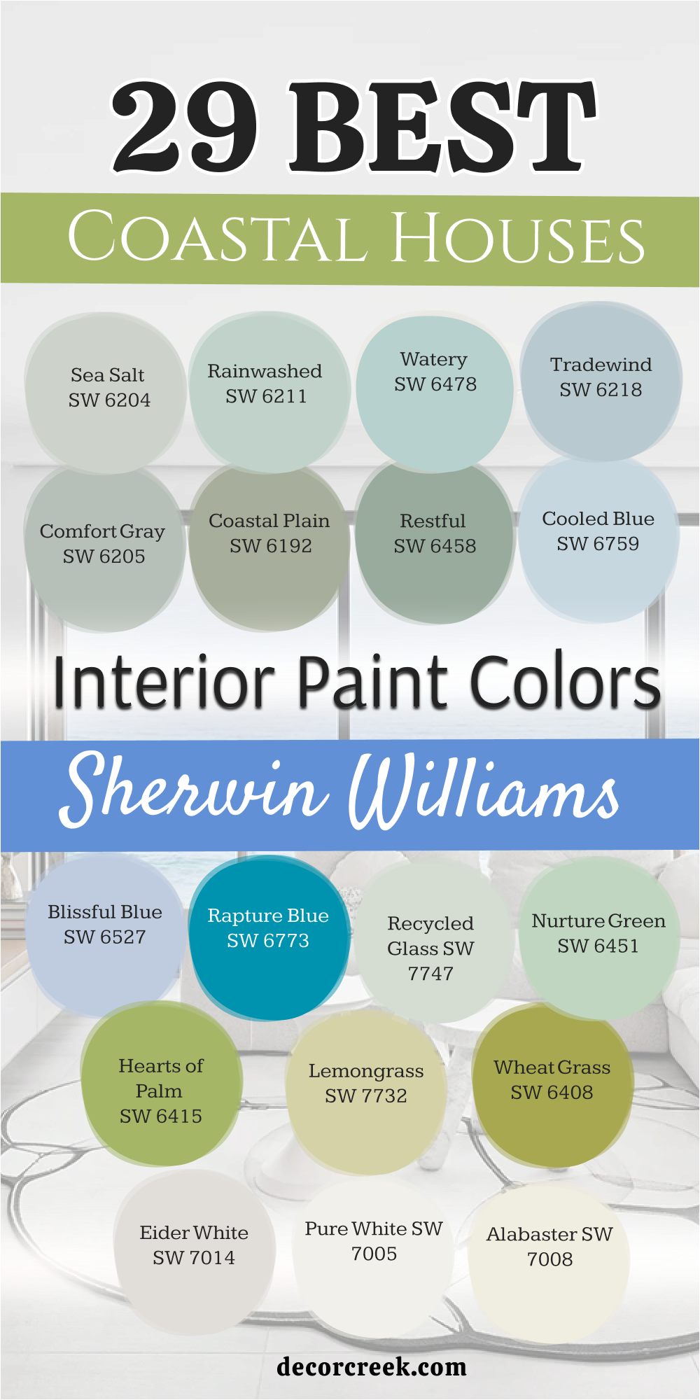
29 Coastal Houses Interior Paint Colors From Sherwin Williams
Sea Salt SW 6204
Sea Salt is a legendary coastal shade known for its incredible chameleon-like qualities. Depending on the lighting, it can shift between a soft green, a muted blue, and a subtle gray.
It perfectly captures the essence of sea foam and salt-crusted driftwood found along the shoreline. I find it creates a serene, spa-like atmosphere that works beautifully as a whole-house neutral for those who want a hint of color without committing to a bold pigment.
It is a very versatile choice that feels incredibly fresh in the morning light and cozy in the evening. Many designers consider this the “gold standard” for beach house interiors because it harmonizes so well with natural elements like jute, linen, and weathered oak. If you are looking for a color that feels like a breath of fresh air, this is the one.
Best used in: Living rooms, primary suites, bathrooms, and laundry rooms.
Pairs well with: Alabaster SW 7008, light oak flooring, white linen textiles, and sea glass accents.
🎨 Check out the complete guide to this color right HERE 👈
Rainwashed SW 6211
Rainwashed is slightly more saturated than Sea Salt, leaning more toward a tranquil green-blue that feels very established and calm.
It has a very clean and airy personality, reminiscent of the sky just after a coastal storm when the air is crisp and the colors are saturated. It brings a refreshing energy to a space without being overwhelming, making it a staple for traditional coastal interiors that need a bit more depth.
I love how it looks against bright white cabinetry, as it makes the blue-green tones really stand out. It creates a very soothing environment that is perfect for escaping the summer heat. This color is also a favorite for porch ceilings to create that classic coastal “Haint Blue” look with a unique green twist.
Best used in: Kitchens, laundry rooms, sunrooms, and guest suites.
Pairs well with: Pure White SW 7005, sea grass rugs, silver hardware, and navy blue decor.
🎨 Check out the complete guide to this color right HERE 👈
Watery SW 6478
Watery is a bright, clear aqua that brings the vibrant tones of tropical island waters directly into your living space. It is much more energetic and youthful than the muted greens, making it a fantastic choice for a playful coastal boho vibe or a coastal cottage.
I love how it adds a crisp, cheerful personality to smaller rooms or functional spaces that might otherwise feel dark or cramped. It has a very uplifting quality that mimics the shallow, sun-drenched waters of the Caribbean.
When you pair it with gold or brass fixtures, it takes on a surprisingly sophisticated and high-end look. This is the perfect color for someone who wants their home to feel like a permanent vacation spot.
Best used in: Bathrooms, home offices, kids’ bedrooms, and kitchen islands.
Pairs well with: Greek Villa SW 7551, brass fixtures, coral accents, and bright white furniture.
🎨 Check out the complete guide to this color right HERE 👈
Tradewind SW 6218
Tradewind is a sophisticated, breezy blue with a touch of gray that keeps it from looking too “baby blue” or juvenile. It mimics the color of the horizon on a clear summer day when the ocean and sky seem to blend together perfectly.
This shade is excellent for creating a classic, nautical feel that remains timeless, calming, and effortlessly elegant. It feels very steady on the walls and provides a beautiful backdrop for nautical artwork and white slipcovered furniture.
I find that it works particularly well in entryways to set a peaceful tone for the rest of the home. It is a very safe yet beautiful choice for those who love traditional coastal style but want something with a bit more color than a standard gray.
Best used in: Entryways, dining rooms, bedrooms, and hallways.
Pairs well with: Extra White SW 7006, sandy beige tones, navy accents, and dark wood textures.
🎨 Check out the complete guide to this color right HERE 👈
Comfort Gray SW 6205
Despite its name, Comfort Gray is a beautiful, mid-tone blue-green with a very strong gray undertone that gives it a grounded feel. It is deeper and more substantial than Sea Salt, making it perfect for a room where you want a bit more drama, intimacy, and coziness.
It feels very organic and works exceptionally well with vintage coastal decor and salvaged wood pieces. This color is fantastic for creating a retreat-like atmosphere in a master bedroom or a private study.
It has a very refined quality that looks expensive and well-thought-out, especially when paired with chunky knit blankets and textured rugs. It is the ideal choice for a coastal home that wants to feel rooted in nature and history.
Best used in: Master bedrooms, cozy dens, cabinetry, and home libraries.
Pairs well with: Shoji White SW 7042, weathered wood, matte black accents, and cream-colored upholstery.
🎨 Check out the complete guide to this color right HERE 👈
Coastal Plain SW 6192
Coastal Plain is a soft, sage-like green that feels very earthy, muted, and deeply rooted in the natural coastal landscape. It reminds me of the hardy vegetation and beach grasses found along the dunes that shift beautifully in the wind.
This color provides a wonderful bridge between a botanical theme and a coastal aesthetic, offering a very calm and steady backdrop for any room. It is a more sophisticated way to bring green into the home, as it avoids being too “minty” or bright.
I find it looks particularly striking on a kitchen island or in a mudroom where it can hide a bit of wear while still looking fresh. It brings a quiet, peaceful strength to the interior design.
Best used in: Kitchen islands, mudrooms, living room accent walls, and sunrooms.
Pairs well with: Pure White SW 7005, terracotta pottery, warm wood tones, and botanical prints.
🎨 Check out the complete guide to this color right HERE 👈

Restful SW 6458
Restful is a mid-tone green that is entirely true to its name, offering a deep sense of quiet and relaxation. It has a slightly more “piney” or forest-coastal influence, providing a lush, cool atmosphere that feels like a shaded coastal grove.
It works beautifully in rooms where you want to emphasize a connection to outdoor greenery and the shaded parts of a coastal landscape. This is a great choice for those who find light blues too cold and want something with more “life” and warmth.
It looks very elegant when paired with traditional furniture and rich, creamy fabrics. It is a sophisticated green that adds a touch of luxury without losing its relaxed, beachy charm.
Best used in: Bedrooms, libraries, home offices, and formal dining areas.
Pairs well with: Alabaster SW 7008, dark walnut furniture, cream upholstery, and brass accents.
🎨 Check out the complete guide to this color right HERE 👈
Cooled Blue SW 6759
Cooled Blue is a bright, icy blue that feels very crisp, clean, and modern on the walls. It has a high light reflectance value, making it an ideal candidate for brightening up a dark hallway, a small laundry room, or a basement space.
It provides a sharp, energetic “pop” that feels very fresh and updated compared to more traditional, dusty blues. This color reminds me of clear ice or the very brightest part of a wave before it breaks.
It is a very “happy” color that works well in spaces where you want to feel energized and productive. It is a great way to make a small beach cottage feel much larger and more open than it actually is.
Best used in: Bathrooms, laundry rooms, kids’ spaces, and small hallways.
Pairs well with: High Reflective White SW 7757, gray slate tiles, and modern minimalist decor.
🎨 Check out the complete guide to this color right HERE 👈
Blissful Blue SW 6527
Blissful Blue is a soft, traditional periwinkle-leaning blue that feels incredibly sweet, calming, and ethereal. It is a very gentle shade that works best in spaces intended for total relaxation, as it has a very quiet and unobtrusive presence on the walls.
It reminds me of the softest parts of a summer sky just before dusk. This color is perfect for a guest bedroom where you want your visitors to feel completely at peace and pampered.
It has a dreamy quality that pairs beautifully with soft, flowy curtains and delicate floral arrangements. It is a classic choice for a “shabby chic” coastal look that prioritizes comfort and softness above all else.
Best used in: Nurseries, guest bedrooms, powder rooms, and reading nooks.
Pairs well with: Snowbound SW 7004, light gray accents, and soft lavender or white textiles.
🎨 Check out the complete guide to this color right HERE 👈
Rapture Blue SW 6773
Rapture Blue is a bold, saturated teal that makes a serious statement and demands attention. It captures the deep, intense, and mysterious colors of the ocean’s depths or a vibrant coral reef.
This is a high-energy color that works best as a focal point, bringing a luxury “resort” or “boutique hotel” feel to the home. I love using this on a front door to create a memorable entrance or on an accent wall to add depth to a large living area.
It is a very confident color that shows off your personality and love for the sea. When balanced with enough white and natural light, it feels incredibly sophisticated and modern.
Best used in: Front doors, accent walls, furniture pieces, and powder baths.
Pairs well with: Pure White SW 7005, vibrant gold accents, and dark ebony wood.
Recycled Glass SW 7747
Recycled Glass is a very pale, misty green that feels translucent, light, and incredibly airy. It is extremely subtle, offering just a whisper of color that keeps a room feeling expansive and uncluttered.
It is the perfect choice for a minimalist coastal look where you want to move away from pure white but don’t want a “colored” room. It reminds me of the soft, matte finish of frosted sea glass found after years of being tumbled in the waves.
This shade is very sophisticated and works well in modern open-concept homes. It provides a very clean backdrop that allows high-end furniture and architecture to be the stars of the show.
Best used in: Open floor plans, dining areas, kitchens, and modern living rooms.
Pairs well with: Greek Villa SW 7551, glass decor, and polished chrome finishes.
🎨 Check out the complete guide to this color right HERE 👈
Nurture Green SW 6451
Nurture Green is a soft, minty pastel that feels very youthful, organic, and full of life. It provides a cheerful, “springtime at the beach” vibe that can instantly brighten a person’s mood.
It is a fantastic way to introduce green into a home without it feeling too dark, moody, or “muddy.” I find it works exceptionally well in kitchens where it feels very clean and appetizing.
It has a nostalgic quality that reminds me of vintage beach cottages from the 1950s but feels completely updated when paired with modern fixtures. It is a very friendly color that makes any space feel welcoming and lighthearted.
Best used in: Kitchens, breakfast nooks, craft rooms, and children’s play areas.
Pairs well with: Extra White SW 7006, light maple wood, and pastel-toned decor.
🎨 Check out the complete guide to this color right HERE 👈
Hearts of Palm SW 6415
Hearts of Palm is a vibrant, yellow-green that feels undeniably tropical and full of sunshine. It mimics the color of sunlit palm fronds and lush island greenery perfectly.
This color is daring, fun, and energetic—perfect for a coastal home that isn’t afraid of a little personality and a bold aesthetic. I love using this in sunrooms where the natural light can really make the yellow undertones glow.
It creates a very organic and lively atmosphere that feels like you are sitting in a tropical garden. It is a great way to add a “wow” factor to a home that is primarily decorated with neutral tones.
Best used in: Sunrooms, accent walls, patio areas, and breakfast rooms.
Pairs well with: Alabaster SW 7008, bamboo textures, and bold floral prints.
Lemongrass SW 7732
Lemongrass is a sophisticated, warm green with a heavy yellow-gold undertone that feels very sunny and high-end.
It has a certain “glow” to it that makes a room feel permanently filled with afternoon sunlight. It works particularly well in coastal homes that lean more toward a Mediterranean, “Spanish Coastal,” or “Tuscan” influence.
It feels very rich and pairs beautifully with natural stone like travertine or limestone. This is a very “grown-up” version of a lime green that feels elegant rather than neon. It adds a touch of warmth to a palette that can sometimes feel too cool or clinical.
Best used in: Living rooms, dining rooms, entryways, and kitchen walls.
Pairs well with: Shoji White SW 7042, dark bronze hardware, and warm stone surfaces.
Wheat Grass SW 6408
Wheat Grass is a bold, chartreuse-leaning green that adds a mid-century modern twist to a traditional coastal palette.
It is energetic, sharp, and very contemporary, working well as a punchy accent in an otherwise neutral or white room. It reminds me of the vibrant greens found in coastal marshlands.
I love using this color on a piece of furniture—like a sideboard or a chair—to give a room an instant style upgrade. It is not for the faint of heart, but for those who love modern design, it is an incredibly rewarding color to use. It keeps the coastal look feeling current and edgy.
Best used in: Accent furniture, front doors, modern kitchens, and creative studios.
Pairs well with: Pure White SW 7005, charcoal grays, and sleek metal finishes.
🎨 Check out the complete guide to this color right HERE 👈

Eider White SW 7014
Eider White is a cool-toned off-white with a very subtle gray-pink undertone that gives it a unique softness. It provides a misty, gentle look that is very forgiving on the walls, hiding minor imperfections better than a flat white.
It is a fantastic alternative to bright white for those who want a softer, more seamless transition between different rooms in the house. I find it feels very “expensive” and quiet, making it perfect for a modern coastal home that values tranquility.
In certain lights, the gray becomes more prominent, giving it a very clean and stony appearance. It is a very reliable neutral that never feels stark or cold.
Best used in: Whole-house color, hallways, and large open living areas.
Pairs well with: Naval SW 6244, marble surfaces, and cool-toned gray wood.
🎨 Check out the complete guide to this color right HERE 👈
Pure White SW 7005
Pure White is the ultimate versatile white and is a staple in almost every coastal design project I handle. It is clean and bright but contains a tiny, nearly invisible drop of warmth that keeps it from feeling like a sterile hospital room.
It is the gold standard for trim, doors, and cabinetry in coastal designs because it makes the surrounding blue and green wall colors really “pop.”
If you want a very minimalist, ultra-modern coastal look, you can use this on both the walls and the trim in different sheens. It reflects an enormous amount of light, which is essential for making beach houses feel airy and spacious.
Best used in: Trim, ceilings, cabinets, and modern minimalist walls.
Pairs well with: Every single color in this coastal palette.
🎨 Check out the complete guide to this color right HERE 👈

Alabaster SW 7008
Alabaster is a beloved, award-winning warm white that feels incredibly cozy, inviting, and soft. In a coastal home, it provides that “sun-bleached” look that feels lived-in, comfortable, and timeless.
It is less stark than Pure White and adds a subtle layer of creamy softness to the light in a room. I love using this color in living rooms where people gather, as it creates a very friendly and relaxed atmosphere.
It pairs perfectly with warm wood tones and natural fibers like jute and sisal. It is the perfect white for someone who wants their home to feel warm and bright without being “yellow.”
Best used in: Living rooms, bedrooms, exteriors, and traditional kitchens.
Pairs well with: Sea Salt SW 6204, warm wood furniture, and brass accents.
🎨 Check out the complete guide to this color right HERE 👈
Greek Villa SW 7551
Greek Villa is a rich, creamy white that feels very sun-drenched and brings to mind the white-washed walls of a Mediterranean seaside villa.
It has a slight yellow undertone that makes it glow beautifully in natural light, especially during the “golden hour.” It is a beautiful choice for a “Coastal Chic” aesthetic that is a bit more polished and luxurious.
I find it looks incredible in kitchens with white marble and gold hardware. It is a very clean white but has enough body to it that it doesn’t feel thin or “flat.” It is a very sophisticated choice for a bright and happy home.
Best used in: Kitchens, bathrooms, bedrooms, and high-end living spaces.
Pairs well with: Watery SW 6478, gold finishes, and light-colored stone.
🎨 Check out the complete guide to this color right HERE 👈

Shoji White SW 7042
Shoji White is a sophisticated “greige” white that sits right in the sweet spot between white, gray, and beige. It is very soft, organic, and grounded, making it a perfect neutral foundation for a boho-coastal home.
It feels much more substantial than a standard off-white and adds a touch of architectural depth to the walls. I love how it works with natural jute rugs and reclaimed wood, as it shares those same warm, earthy undertones.
It is a very calming color that works well in large, open spaces because it changes subtly with the light throughout the day. It is a favorite for those who want a “natural” look.
Best used in: Main living areas, exteriors, and master suites.
Pairs well with: Coastal Plain SW 6192, natural jute, and black metal accents.
🎨 Check out the complete guide to this color right HERE 👈
Accessible Beige SW 7036
Accessible Beige is the quintessential “sand” color and is arguably one of the most popular neutrals in existence. It is a perfect balance of gray and beige (greige) that feels warm and inviting but never looks yellow or “dirty.”
In a coastal house, it provides an excellent neutral foundation that allows your blue and green accents to really shine without the room feeling “too blue.” It is a very “safe” color that looks great in almost any lighting condition.
It feels very high-end and classic when paired with white slipcovered furniture and simple coastal decor. It is the perfect choice for an open-concept floor plan.
Best used in: Open floor plans, kitchens, and entryways.
Pairs well with: Sea Salt SW 6204, white slipcovered furniture, and dark bronze accents.
🎨 Check out the complete guide to this color right HERE 👈
Natural Linen SW 9109
Natural Linen is a warm, classic beige that perfectly mimics the look of high-quality, unbleached linen fabric. It adds a wonderful layer of texture, warmth, and comfort to a coastal home, making it feel very high-end and “curated.”
I find it looks its best in bedrooms and dining rooms where you want a sense of softness and luxury. It is a bit deeper than a standard off-white, which helps a room feel more intimate and “contained.”
It is a timeless choice that works beautifully with traditional coastal furniture and navy blue accents. It feels very organic and grounded, like a quiet day on a private beach.
Best used in: Dining rooms, bedrooms, and formal living areas.
Pairs well with: Alabaster SW 7008, navy blue textiles, and dark wood floors.
🎨 Check out the complete guide to this color right HERE 👈
Canvas Tan SW 7531
Canvas Tan is a light, airy beige with a slight yellow undertone that feels like a sunny, warm day on a sandy beach. It is brighter and more “upbeat” than Natural Linen and keeps a room feeling very energetic and light-filled.
This is a great choice for entryways where you want to greet guests with a warm and sunny vibe. It hides dirt and scuffs remarkably well, making it a practical choice for high-traffic areas in a beach house.
It looks wonderful when paired with light oak or bleached wood elements. It is a very “cheerful” neutral that stays looking bright even on overcast days.
Best used in: Entryways, sun-drenched living rooms, and mudrooms.
Pairs well with: Tradewind SW 6218, light oak, and white trim.
🎨 Check out the complete guide to this color right HERE 👈

Fawn Brindle SW 7640
Fawn Brindle is a cool, stony gray-beige that reminds me of wet sand or the weathered rocks found along a rugged coastline.
It provides a more modern, moody, and sophisticated neutral option that adds a nice layer of contrast to the lighter whites in this palette. I love using this in a home office or a basement where you want a color that feels a bit more “serious” and grounded.
It also makes for a stunning exterior color for a coastal cottage. It is a very versatile “mid-tone” that works well with both warm and cool accents, making it a very flexible choice for a changing interior.
Best used in: Home offices, exteriors, and lower-level family rooms.
Pairs well with: Pure White SW 7005, slate tiles, and cool blue accents.
🎨 Check out the complete guide to this color right HERE 👈
Curio Gray SW 0024
Curio Gray is a deep, warm taupe that adds significant weight, depth, and a sense of history to a space. It is a very sophisticated choice for cabinetry, kitchen islands, or built-in bookshelves, providing a “moored” and stable feeling in a house full of light colors.
It looks incredibly expensive when paired with antique brass hardware and creamy white walls. This is a great color for adding a touch of “old world” coastal charm to a new build.
It feels very cozy and protective, making it a great choice for a small library or a primary bedroom accent. It is a rich, complex color that reveals different undertones throughout the day.
Best used in: Kitchen islands, libraries, furniture pieces, and accent walls.
Pairs well with: Greek Villa SW 7551, antique brass, and rich leather textures.
🎨 Check out the complete guide to this color right HERE 👈
Agreeable Gray SW 7029
Agreeable Gray is the most popular “greige” in the world for a reason—it’s incredibly versatile and works beautifully in almost any lighting. In a coastal home, it creates a clean, modern backdrop that feels a bit fresher and lighter than a traditional beige.
This color has a subtle way of adapting to its surroundings. Next to blue decor, it leans slightly cooler, while warm wood tones bring out a softer, more beige feel. It’s a true “safe choice” for a whole-home color, especially if you’re planning to sell or want a calm, cohesive look throughout.
Paired with crisp white trim, Agreeable Gray looks neat and polished, allowing your coastal decor and artwork to stand out without competing for attention.
Best used in: Whole-house color, open areas, and rental properties.
Pairs well with: Rainwashed SW 6211, white trim, and charcoal accents.
🎨 Check out the complete guide to this color right HERE 👈

Drift of Mist SW 9166
Drift of Mist is a very light, airy gray that feels like a soft morning fog rolling in off the ocean. It is extremely subtle, elegant, and quiet, making it an excellent choice for those who want a minimalist, cool-toned neutral that isn’t white.
It creates a very peaceful and high-end atmosphere that works beautifully in modern bedrooms and bathrooms. I find that it looks particularly stunning when used on ceilings to give a room a cohesive, “wrapped” feeling.
It is a very light shade that maintains its gray identity even in rooms with a lot of direct sunlight. It is a very “airy” color that feels light as a feather.
Best used in: Bedrooms, bathrooms, ceilings, and modern apartments.
Pairs well with: Upward SW 6239, marble countertops, and polished nickel.
🎨 Check out the complete guide to this color right HERE 👈

Upward SW 6239
Upward is a soft, silvery blue that feels very lighthearted, pure, and incredibly refreshing. It is a denim-like blue that works perfectly for a coastal cottage or “Cape Cod” feel.
It is very calming and makes any room feel like a sanctuary or a quiet escape from the world. I love using this in laundry rooms or mudrooms to make chores feel a bit more pleasant.
It is a very “honest” blue that doesn’t lean too much into green or purple, staying true to its airy nature. It reminds me of a pair of well-worn jeans or a clear sky. It is a classic coastal color that will never go out of style.
Best used in: Bedrooms, laundry rooms, porches, and guest baths.
Pairs well with: Pure White SW 7005, navy blue accents, and light gray wood.
🎨 Check out the complete guide to this color right HERE 👈

Naval SW 6244
Naval is the definitive navy blue—it is deep, stable, classic, and incredibly authoritative. In a coastal home, it acts as the “anchor,” providing a crisp and dramatic contrast to the lighter blues and whites in the rest of the house.
It brings a sense of traditional nautical luxury and “preppy” style to any space it touches. I love using this on kitchen islands, bathroom vanities, or even a front door to create a very strong first impression.
It is a timeless choice that feels both historic and modern at the same time. When paired with gold or brass hardware, it looks absolutely stunning and very high-end.
Best used in: Kitchen islands, bathroom vanities, front doors, and accent walls.
Pairs well with: Pure White SW 7005, gold/brass finishes, and light tan leather.
🎨 Check out the complete guide to this color right HERE 👈

29 Coastal Houses Interior Paint Colors Trendy This Year
Sea Salt SW 6204
Sea Salt is a legendary coastal shade known for its incredible chameleon-like qualities. Depending on the lighting, it can shift between a soft green, a muted blue, and a subtle gray. It perfectly captures the essence of sea foam and salt-crusted driftwood found along the shoreline.
I find it creates a serene, spa-like atmosphere that works beautifully as a whole-house neutral for those who want a hint of color without committing to a bold pigment. It is a very versatile choice that feels incredibly fresh in the morning light and cozy in the evening.
Many designers consider this the gold standard for beach house interiors because it harmonizes so well with natural elements like jute, linen, and weathered oak. If you are looking for a color that feels like a breath of fresh air, this is the one.
Best used in: Living rooms, primary suites, bathrooms, and laundry rooms.
Pairs well with: Alabaster SW 7008, light oak flooring, white linen textiles, and sea glass accents.
🎨 Check out the complete guide to this color right HERE 👈
Rainwashed SW 6211
Rainwashed is slightly more saturated than Sea Salt, leaning more toward a tranquil green-blue that feels very established and calm. It has a very clean and airy personality, reminiscent of the sky just after a coastal storm when the air is crisp and the colors are saturated.
It brings a refreshing energy to a space without being overwhelming, making it a staple for traditional coastal interiors that need a bit more depth. I love how it looks against bright white cabinetry, as it makes the blue-green tones really stand out.
It creates a very soothing environment that is perfect for escaping the summer heat. This color is also a favorite for porch ceilings to create that classic coastal Haint Blue look with a unique green twist.
Best used in: Kitchens, laundry rooms, sunrooms, and guest suites.
Pairs well with: Pure White SW 7005, sea grass rugs, silver hardware, and navy blue decor.
🎨 Check out the complete guide to this color right HERE 👈
Tradewind SW 6218
Tradewind is a sophisticated, breezy blue with a touch of gray that keeps it from looking too baby blue or juvenile. It mimics the color of the horizon on a clear summer day when the ocean and sky seem to blend together perfectly.
This shade is excellent for creating a classic, nautical feel that remains timeless, calming, and effortlessly elegant. It feels very steady on the walls and provides a beautiful backdrop for nautical artwork and white slipcovered furniture.
I find that it works particularly well in entryways to set a peaceful tone for the rest of the home. It is a very safe yet beautiful choice for those who love traditional coastal style but want something with a bit more color than a standard gray.
Best used in: Entryways, dining rooms, bedrooms, and hallways.
Pairs well with: Extra White SW 7006, sandy beige tones, navy accents, and dark wood textures.
🎨 Check out the complete guide to this color right HERE 👈
Waterscape SW 6470
Waterscape is a lush, watery blue-green that carries a bit more “punch” than the typical pastel coastal shades. It has a very refreshing, cooling effect on a room, making it feel like you are submerged in a clear tidal pool.
This color is fantastic for those who want a true “coastal” identity that is visible and vibrant without being neon. I find it looks particularly striking in bathrooms where it can be paired with white marble or light-colored tiles to create a high-end resort feeling.
It has enough pigment to stand up to rooms with very bright, direct sunlight, where lighter colors might wash out. It is a joyful, life-affirming color that brings a strong sense of the ocean indoors.
Best used in: Bathrooms, sunrooms, kitchen islands, and front doors.
Pairs well with: Snowbound SW 7004, driftwood accents, and coral-colored decor.
🎨 Check out the complete guide to this color right HERE 👈
Topsail SW 6217
Topsail is an incredibly light, airy blue that is nearly white but carries just enough pigment to give a room a distinct “sky” feeling.
It is the perfect choice for ceilings or for very small rooms where you want to maximize the sense of space while still avoiding a plain white wall. It reminds me of the very top of a sail catching the light on a bright day.
I often recommend this for hallways or narrow staircases because it reflects light beautifully and makes walls feel like they are receding. It is a very gentle, quiet color that provides a sense of endless vertical space. It is a favorite for creating a “cloud-like” atmosphere in a nursery or a relaxing guest bedroom.
Best used in: Ceilings, hallways, nurseries, and small bathrooms.
Pairs well with: Pure White SW 7005, light gray textiles, and navy blue accents.
🎨 Check out the complete guide to this color right HERE 👈
Silver Strand SW 7057
Silver Strand is a sophisticated, moody neutral that sits perfectly between silver, green, and blue. It is much more gray than Sea Salt, which gives it a very modern, understated elegance. I find it looks best in homes that want a “quiet luxury” coastal feel—it is calm, muted, and very refined.
It reminds me of the mist over the Atlantic on a quiet morning. This color is exceptionally versatile; it can look like a cool gray in some lights and a soft seafoam in others.
It is a fantastic choice for open-concept living areas where you want a consistent color that feels light but has a definite personality. It pairs beautifully with black metal accents and modern minimalist furniture.
Best used in: Open-concept living areas, bedrooms, and home offices.
Pairs well with: High Reflective White SW 7757, charcoal grays, and polished chrome.
🎨 Check out the complete guide to this color right HERE 👈
Comfort Gray SW 6205
Comfort Gray is a beautiful, mid-tone blue-green with a very strong gray undertone that gives it a grounded and mature feel. It is deeper and more substantial than the lighter shades in this palette, making it perfect for a room where you want a bit more drama and intimacy.
It feels very organic and works exceptionally well with vintage coastal decor and reclaimed wood pieces. This color is fantastic for creating a retreat-like atmosphere in a primary bedroom.
It has a very refined quality that looks expensive, especially when paired with chunky knit blankets and textured rugs. It is the ideal choice for a coastal home that wants to feel rooted in nature.
Best used in: Master bedrooms, cozy dens, cabinetry, and home libraries.
Pairs well with: Shoji White SW 7042, weathered wood, matte black accents, and cream upholstery.
🎨 Check out the complete guide to this color right HERE 👈
Coastal Plain SW 6192
Coastal Plain is a soft, sage-like green that feels very earthy and rooted in the natural landscape. It reminds me of the hardy vegetation and beach grasses found along the dunes.
This color provides a wonderful bridge between a botanical theme and a coastal aesthetic, offering a very calm and steady backdrop. It is a sophisticated way to bring green into the home, as it avoids being too bright.
I find it looks particularly striking on a kitchen island or in a mudroom where it can hide a bit of wear while still looking fresh. It brings a quiet, peaceful strength to the interior design that feels very grounding.
Best used in: Kitchen islands, mudrooms, living room accent walls, and sunrooms.
Pairs well with: Pure White SW 7005, terracotta pottery, warm wood tones, and botanical prints.
🎨 Check out the complete guide to this color right HERE 👈
Aesthetic White SW 7035
Aesthetic White is a very popular off-white that carries a subtle gray-beige (greige) undertone. It is much softer than a pure white and provides a “stone-like” quality to the walls. In a coastal home, it acts as the perfect neutral that doesn’t feel too yellow in warm light or too blue in cool light.
It reminds me of sun-bleached shells or fine white sand. I love using this color for the main walls of a house because it provides a warm, inviting canvas that allows your blue and green accents to truly shine.
It is a very “forgiving” color that looks great in any lighting and makes a home feel cohesive and high-end without being stark.
Best used in: Whole-house color, living rooms, and open floor plans.
Pairs well with: Pure White SW 7005 (for trim), Sea Salt SW 6204, and natural wood.
🎨 Check out the complete guide to this color right HERE 👈
Snowbound SW 7004
Snowbound is a crisp, clean white that carries a very slight cool undertone. It is one of the most versatile whites for a coastal home because it feels bright and refreshing without being clinical.
It is a “true” white that stays looking clean even in rooms with a lot of shadows. I find it is the perfect choice for kitchen cabinets or for walls in a modern beach house where you want a very “gallery-like” feel.
It makes any artwork or colorful coastal decor pop with intensity. It provides a sharp, energetic backdrop that feels very updated and youthful. It is the ultimate choice for a high-contrast look when paired with navy blue.
Best used in: Kitchen cabinetry, modern walls, and bathrooms.
Pairs well with: Naval SW 6244, gray tones, and bright colorful accents.
🎨 Check out the complete guide to this color right HERE 👈

Greek Villa SW 7551
Greek Villa is a rich, creamy white that feels sun-drenched and brings to mind the white-washed walls of a Mediterranean villa.
It has a slight yellow undertone that makes it glow beautifully in natural light. It is a beautiful choice for a “Coastal Chic” aesthetic that is polished and luxurious. I find it looks incredible in kitchens with white marble and gold hardware.
It is a very clean white but has enough body to it that it doesn’t feel thin. It is a sophisticated choice for a bright and happy home that values warmth and light.
Best used in: Kitchens, bathrooms, bedrooms, and high-end living spaces.
Pairs well with: Watery SW 6478, gold finishes, and light-colored stone.
🎨 Check out the complete guide to this color right HERE 👈
Pure White SW 7005
Pure White is the ultimate workhorse white. It is clean and bright but contains a tiny drop of warmth that keeps it from feeling like a hospital room.
It is the gold standard for trim, doors, and cabinetry in coastal designs because it makes the surrounding blue and green wall colors really stand out. If you want a very minimalist coastal look, you can use this on both the walls and the trim in different sheens.
It reflects an enormous amount of light, which is essential for making beach houses feel airy.
Best used in: Trim, ceilings, cabinets, and modern minimalist walls.
Pairs well with: Every single color in this coastal palette.
🎨 Check out the complete guide to this color right HERE 👈
Oyster White SW 7637
Oyster White is a sophisticated, warm greige that leans more toward a “light stone” color than a white. It is very soft and provides a beautiful, muted backdrop that feels extremely high-end.
It reminds me of the inside of an oyster shell—pearly, soft, and naturally elegant. I love using this in dining rooms or primary bedrooms where you want a sense of luxury and calm.
It is deep enough to provide a nice contrast against bright white trim but light enough to keep a house feeling open. It is a fantastic alternative for someone who finds gray too cold and beige too dated.
Best used in: Living rooms, dining rooms, and exterior siding.
Pairs well with: Pure White SW 7005, dark wood, and gold accents.
🎨 Check out the complete guide to this color right HERE 👈
Drift of Mist SW 9166
Drift of Mist is a very light, airy gray that feels like a soft morning fog rolling in off the ocean.
It is extremely subtle, elegant, and quiet, making it an excellent choice for those who want a minimalist, cool-toned neutral that isn’t white. It creates a very peaceful and high-end atmosphere that works beautifully in modern bedrooms.
I find that it looks particularly stunning when used on ceilings to give a room a cohesive, wrapped feeling. It maintains its gray identity even in rooms with a lot of direct sunlight.
Best used in: Bedrooms, bathrooms, and ceilings.
Pairs well with: Upward SW 6239, marble countertops, and polished nickel.
🎨 Check out the complete guide to this color right HERE 👈
Agreeable Gray SW 7029
The most popular greige in the world for a reason. Agreeable Gray is incredibly adaptable and works in almost any lighting situation.
In a coastal home, it provides a clean, modern backdrop that feels slightly cooler and more updated than a traditional beige. It picks up the colors around it, so it harmonizes perfectly with blue and green coastal accents.
It is the perfect safe bet for a whole-house color. It looks very crisp against white trim and allows your coastal artwork to be the main focus.
Best used in: Whole-house color and open floor plans.
Pairs well with: Rainwashed SW 6211 and white trim.
🎨 Check out the complete guide to this color right HERE 👈
Palladian Blue BM HC-144
Palladian Blue is a classic, airy blue-green that carries a wonderful sense of history and grace. It is one of the most beloved coastal colors because it strikes a perfect balance between blue, green, and gray.
It feels very “expensive” and timeless. I find it looks its best in formal living rooms or dining rooms where you want a touch of coastal elegance. It reminds me of the clear, shallow waters of a calm bay.
It is a very “happy” color that doesn’t feel overwhelming, even when used on all four walls. It provides a beautiful glow to a room when hit by natural sunlight.
Best used in: Living rooms, dining rooms, and primary bedrooms.
Pairs well with: White Dove BM OC-17 and dark mahogany furniture.
🎨 Check out the complete guide to this color right HERE 👈
Quiet Moments BM 1563
Quiet Moments is a very soft, muted blue-gray-green that is true to its name—it creates an instant feeling of peace. It is very similar to Silver Strand but has a bit more of a blue-green presence.
It is a sophisticated, “grown-up” coastal color that feels very serene and spa-like. I love using this in bathrooms and master suites to create a sanctuary away from the world.
It is a color that recedes into the background, making a space feel larger and more open. It is perfect for a bedroom where you want to wake up feeling refreshed and calm.
Best used in: Bedrooms, bathrooms, and meditation rooms.
Pairs well with: Cloud White BM OC-130 and light silver accents.
🎨 Check out the complete guide to this color right HERE 👈
Ocean Air BM 2123-50
Ocean Air is a very light, refreshing blue that feels like a crisp breeze. It is brighter and cleaner than the muted grays, leaning toward a more traditional “coastal cottage” blue.
It is an excellent choice for a kitchen or a breakfast nook where you want a bright and energetic start to the day. It has a youthful, cheerful quality that makes it perfect for a beach house intended for families and gatherings.
It reflects light beautifully and makes a room feel very “sun-washed.” It is a classic blue that never feels heavy or dark.
Best used in: Kitchens, breakfast nooks, and laundry rooms.
Pairs well with: Chantilly Lace BM OC-65 and sandy neutrals.
🎨 Check out the complete guide to this color right HERE 👈
Beach Glass BM 1564
Beach Glass is a beautiful mid-tone blue-green that has more depth and “weight” than the pale pastels. It is the darker sibling to Quiet Moments and offers a very stylish, designer look.
I love using this in dining rooms or for a dramatic bathroom to create a focal point. It reminds me of thick, tumbled glass found on the shore.
It has a cooling effect on a room and feels very sophisticated when paired with white trim and natural wood. It is a color that people will notice and compliment—it has a very strong coastal identity.
Best used in: Dining rooms, bathrooms, and accent walls.
Pairs well with: Simply White BM OC-117 and warm wood tones.
🎨 Check out the complete guide to this color right HERE 👈
Healing Aloe BM 1562
Healing Aloe is a very soft, pale green that feels incredibly fresh and organic. It is a very “light” color that acts almost as a neutral with a green soul.
It reminds me of succulent plants or soft beach grass. I use this when a client wants a space to feel natural and calm but finds blues too traditional.
It is a very “zen” color that looks fantastic with lots of indoor plants and natural light. It creates a very gentle and inviting atmosphere that is perfect for a relaxing living room or a quiet guest room.
Best used in: Bedrooms, living rooms, and sunrooms.
Pairs well with: White Dove BM OC-17 and natural textures.
🎨 Check out the complete guide to this color right HERE 👈
Gray Owl BM OC-52
Gray Owl is a legendary light gray that carries a very subtle blue-green undertone. In a coastal home, it feels very “cool” and crisp, like a clear winter morning by the sea.
It is a very clean gray that doesn’t feel muddy or yellow. I find it is a great choice for a modern beach house where you want a consistent, light gray throughout the space. It looks very professional and polished.
It is a color that adapts well to its surroundings—it will look more gray in some rooms and more blue in others. It is the ultimate “cool” neutral.
Best used in: Whole-house color, kitchens, and hallways.
Pairs well with: Chantilly Lace BM OC-65 and navy blue.
🎨 Check out the complete guide to this color right HERE 👈
Classic Gray BM OC-23
Classic Gray is a very light, sophisticated off-white that carries just a hint of warm gray. It is one of the most elegant neutrals in the Benjamin Moore catalog.
It reminds me of soft mist or polished pebbles. It is a very “quiet” color that allows your furniture and view to be the focus. I love using this in large, open living spaces because it provides a very cohesive and high-end feel.
It is a color that looks expensive and well-designed without being loud. It is perfect for a “modern coastal” aesthetic.
Best used in: Living rooms, entryways, and open floor plans.
Pairs well with: White Dove BM OC-17 and black accents.
🎨 Check out the complete guide to this color right HERE 👈
Cloud White BM OC-130
Cloud White is a soft, creamy white that feels very pillowy and gentle. It is a favorite for trim and cabinetry because it has a “softness” that bright whites lack.
In a coastal home, it adds a layer of comfort and coziness. It reminds me of fluffy clouds on a summer afternoon. I love using this on both walls and trim for a very soft, seamless look in a bedroom.
It provides a warm, inviting glow that makes a house feel like a home. It is a very classic and reliable choice.
Best used in: Trim, cabinetry, and bedrooms.
Pairs well with: Palladian Blue BM HC-144 and warm neutrals.
🎨 Check out the complete guide to this color right HERE 👈
Chantilly Lace BM OC-65
Chantilly Lace is Benjamin Moore’s “truest” white. It has almost no visible undertones, making it very clean, bright, and crisp. It is the perfect choice for a modern coastal home where you want a very “sharp” look.
It makes colors like Ocean Air or Beach Glass look their absolute best. I find it is the best white for trim if you want a very high-contrast look against your wall colors.
It feels very fresh and reflects a massive amount of light. It is a very popular choice for a minimalist, “Scandi-Coastal” vibe.
Best used in: Trim, modern walls, and kitchen cabinets.
Pairs well with: Bold blues, grays, and modern decor.
🎨 Check out the complete guide to this color right HERE 👈
White Dove BM OC-17
White Dove is a legendary off-white that is soft, creamy, and very classic. It has a tiny bit of gray in it, which keeps it from looking too yellow. It is one of the most recommended whites for a reason—it looks good in almost every lighting situation.
In a coastal house, it provides a very “timeless” and “stately” feel. I love using this for trim and doors throughout a home to provide a consistent, soft frame for the rooms.
It feels very high-quality and reliable. It is the perfect white for a traditional beach house.
Best used in: Trim, doors, and whole-house wall color.
Pairs well with: Healing Aloe BM 1562 and warm wood tones.
🎨 Check out the complete guide to this color right HERE 👈
Seapearl BM OC-19
Seapearl is a beautiful off-white that leans more toward a very light gray. It is very sophisticated and has a “pearly” quality, just as the name suggests.
It is a bit cooler than White Dove but warmer than Gray Owl. It is the perfect middle-ground for someone who wants a modern look that still feels soft.
I find it looks fantastic in large living rooms with lots of natural light. It provides a very clean, updated backdrop that feels very high-end. It is a very “professional” designer color.
Best used in: Living rooms, kitchens, and open floor plans.
Pairs well with: Classic Gray BM OC-23 and silver hardware.
🎨 Check out the complete guide to this color right HERE 👈

Wind’s Breath BM OC-24
Wind’s Breath is a warm, airy greige that feels very organic and soft. It is deeper than Seapearl and provides a bit more “warmth” to a room.
It reminds me of tall grass blowing in the wind on a coastal cliff. I love using this in bedrooms or nurseries to create a very cozy and safe atmosphere. it is a very natural color that pairs beautifully with wood and stone.
It is a great choice for a “Boho-Coastal” look that emphasizes natural textures and warmth. It feels very welcoming and calm.
Best used in: Bedrooms, nurseries, and living areas.
Pairs well with: White Dove BM OC-17 and warm wood.
🎨 Check out the complete guide to this color right HERE 👈

Pale Oak BM OC-20
Pale Oak is a very popular greige that is light, elegant, and perfectly balanced. It is a bit cooler than Wind’s Breath, making it feel very modern and clean.
It is often described as the perfect “taupe” because it isn’t too pink or too yellow. In a coastal home, it acts as a very sophisticated neutral that looks great with white slipcovered furniture.
It is deep enough to make white trim pop but light enough to keep a room feeling very airy. It is a favorite for high-end coastal renovations.
Best used in: Primary bedrooms, living rooms, and whole-house color.
Pairs well with: Chantilly Lace BM OC-65 and black accents.
🎨 Check out the complete guide to this color right HERE 👈
Balboa Mist BM OC-27
Balboa Mist is a beautiful, light gray with a very subtle warm undertone. It is very similar to Pale Oak but leans a bit more into its gray side.
It reminds me of the mist over a rocky coastline. It is a very “chic” color that works well in modern, urban-coastal homes. I find it looks particularly good in dining rooms where you want a touch of sophistication.
It provides a very clean, fresh backdrop that feels very updated and “in style.” It is a reliable and beautiful choice for any room.
Best used in: Dining rooms, hallways, and living spaces.
Pairs well with: White Dove BM OC-17 and navy blue.
🎨 Check out the complete guide to this color right HERE 👈
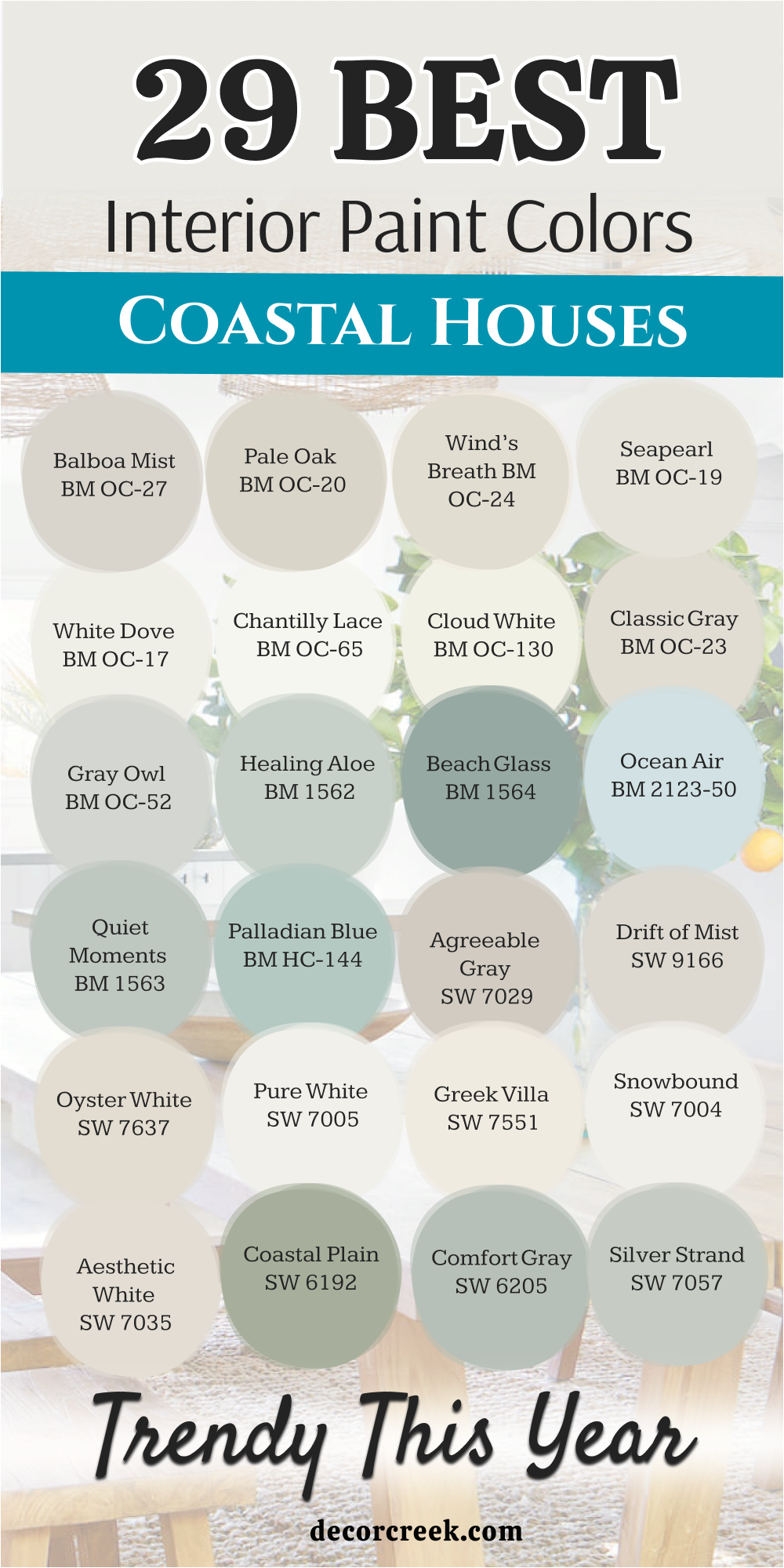
My Final Thoughts about 29 Coastal Houses Interior Paint Colors
Choosing the right colors for a coastal home is much like capturing the shifting moods of the sea itself. It is a delicate balance between light and shadow, where the goal is to bring that sense of endless horizon and fresh air indoors. The beauty of this collection lies in its versatility; it moves effortlessly from the sun-bleached warmth of a sandy shore to the cool, misty depths of the ocean on a quiet morning.
When you look at these shades, you realize that a true coastal interior isn’t just about blue—it is about how the light interacts with the walls. The whites and greiges we explored serve as the essential foundation, acting like the canvas that allows every other detail to stand out.
They provide that crisp, clean framework that makes a space feel expansive and intentional.
At the same time, the “chameleon” colors like Sea Salt or Silver Strand add a layer of soul to a home.
They change with the passing hours, looking like a soft green in the morning and a moody gray by twilight, ensuring the house never feels static.
These tones bridge the gap between the structured world of architecture and the organic, unpredictable beauty of nature.