Finding the right neutral paint for your home can easily feel like an exhausting guessing game that leaves you completely overwhelmed. You buy countless expensive sample pots, paint small, messy squares all over your main walls, and spend days nervously watching how the shifting morning and afternoon light completely changes the undertones.
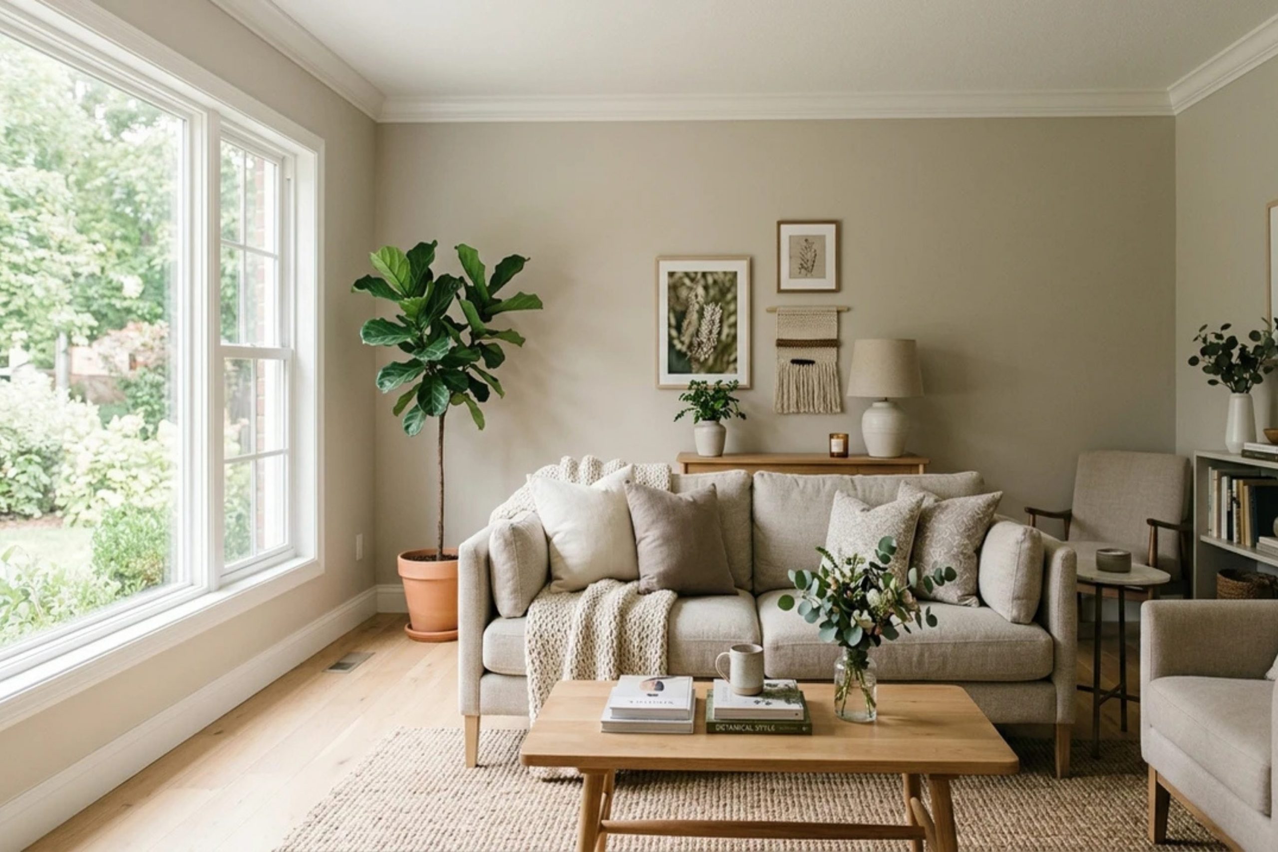
Sherwin-Williams Natural Linen SW 9109 is an exceptionally beautiful shade that instantly makes your family living rooms feel incredibly warm, cozy, and deeply welcoming to everyone who steps inside. It is a highly versatile, dependable neutral that hits the perfect sweet spot because it expertly avoids looking too intensely yellow on sun-drenched days or too coldly gray on dark, rainy winter afternoons.
When you choose to use this specific sandy shade across your main living zones, you build a soft, sophisticated backdrop that allows your primary furniture arrangements and colorful accent decorations to truly stand out. It goes far beyond standard white paint to establish an authentically comfortable, relaxed atmosphere where family members and weekend guests naturally want to gather together and stay for a long while.
It grounds your entire interior layout, smoothing over minor drywall flaws while completely transforming drafty, stark open spaces into deeply inviting sanctuaries. Let us look closely at how you can intentionally layer this flexible shade alongside thirty other fantastic paint choices to maximize your house’s layout and make your home feel entirely cohesive, beautifully staged, and wonderfully cozy across all seasons.
By understanding how these different color families interact, you can effortlessly guide your home’s personality from a breezy coastal retreat to a tailored contemporary lounge with absolute design confidence.
Why Natural Linen by Sherwin-Williams Is One of My Favorite Neutral Paint Colors
I have used hundreds of paint shades in my career as an interior designer and home stager. This specific neutral stands out because it brings instant comfort to a house. It mimics the look of natural fibers, adding a soft texture to your walls even though the paint is flat. Buyers respond well to it because it feels clean but never cold or clinical.
It acts like a friendly handshake when you walk through the front door. The shade has enough depth to contrast nicely with bright white trim. It handles bright afternoon sun and dim hallway lights with total ease. It is a reliable tool in my design toolkit that never lets me down.
How I Choose the Best Colors to Pair With Natural Linen in Any Room
Choosing accent paints requires looking at the undertones of your main wall color. This paint has a warm, sandy base that pairs beautifully with shades that share that same warmth. I also love pairing it with contrasting cool shades like soft greens and deep blues to create balance. You want to think about how you use the room before you pick your secondary shades.
For a busy family room, I might choose a rich charcoal to ground the walls. For a bright kitchen, I prefer a crisp white that makes the cabinets pop against the linen backdrop. Always look at your paint chips together under the actual lightbulbs in your house.
This simple check ensures your choices look great together at breakfast and at dinner.
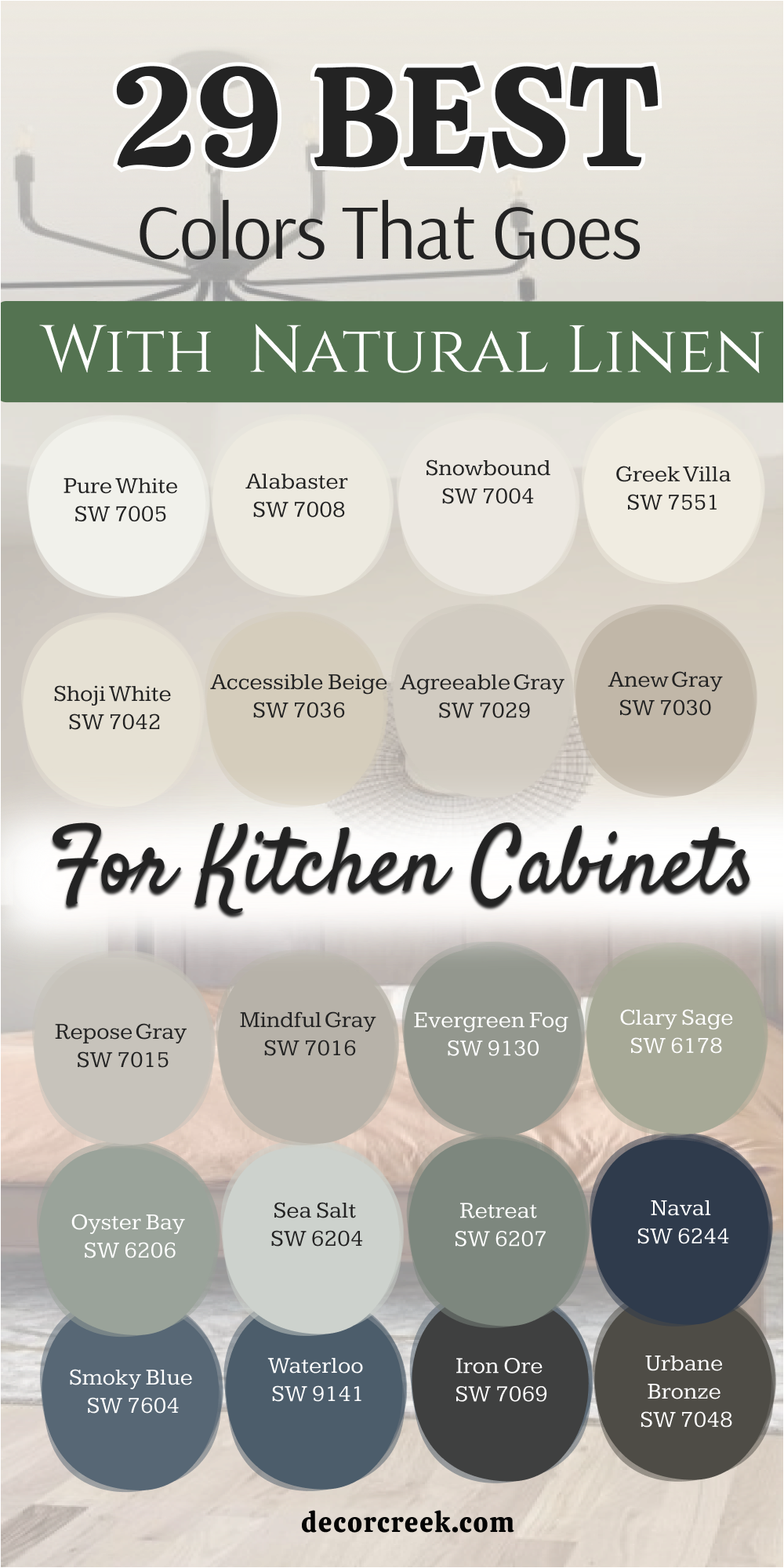
29 Best Colors That Go With Natural Linen for Kitchen Cabinets
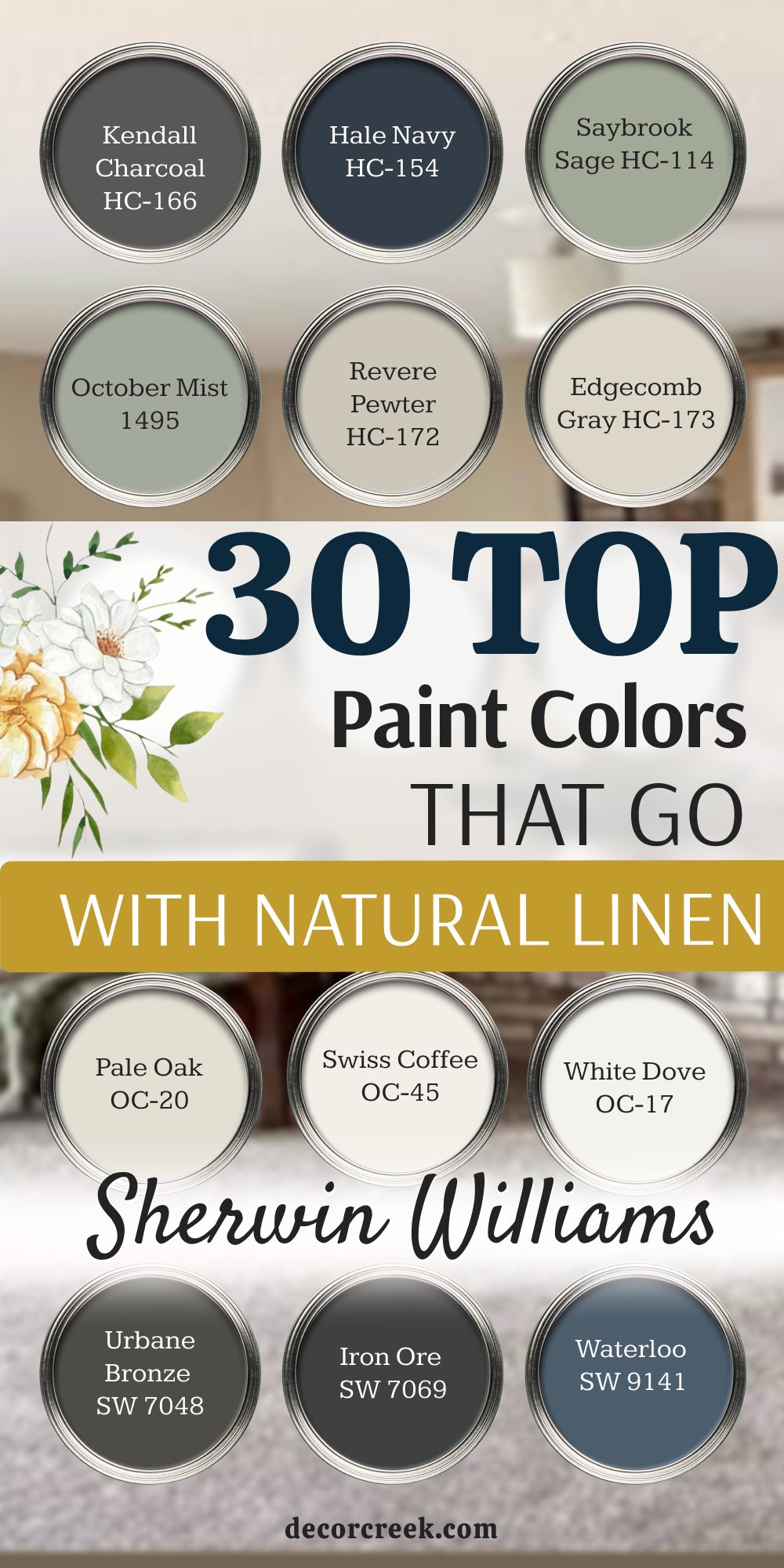
Alabaster SW 7008
Alabaster SW 7008 provides a soft creaminess that keeps your kitchen looking bright without feeling cold. This popular shade softens the sharp edges of modern cabinetry while maintaining a clean look.
It reflects plenty of light to make small cooking areas look much larger than their actual size. Homebuyers love this look because it feels high-end and welcoming. You can use it on upper cabinets to make your ceilings look higher.
It creates a beautiful contrast when the lower walls feature a slightly darker neutral shade. It handles greasy fingerprints better than a stark, bright white paint. This choice makes your morning coffee routine feel bright and cheerful. It ties together traditional wood cutting boards and shiny stainless steel appliances flawlessly.
Best used in: living rooms, kitchens, hallways, bedrooms, and farmhouse exteriors
Pairs well with: Iron Ore SW 7069, Agreeable Gray SW 7029, Natural Linen SW 9109, warm wood tones The key rule of this color for farmhouse style is to use it where you want natural light to feel kind, soft, and inviting throughout the day.
🎨 Check out the complete guide to this color right HERE 👈

Pure White SW 7005
Pure White SW 7005 offers a crisp look that lacks any harsh blue undertones. This crisp choice makes kitchen cabinets look sharp and freshly scrubbed. It provides a striking balance against warm, sandy wall colors.
You will notice how it highlights the architectural details of your cabinet doors. It acts as a clean slate for any colorful dishware you display on open shelving. It brings a sense of order to a busy cooking environment.
The shade works perfectly for minimalist designs that need a touch of warmth. It keeps its bright appearance even in kitchens with small windows. This option makes your countertop materials look expensive and clean.
Best used in: kitchens, bathrooms, trim, doors, and modern exteriors
Pairs well with: Black Fox SW 7020, Sea Salt SW 6204, Natural Linen SW 9109, marble countertops The key rule of this color for farmhouse style is to use it where you want natural light to feel kind, soft, and inviting throughout the day.
🎨 Check out the complete guide to this color right HERE 👈

Snowbound SW 7004
Snowbound SW 7004 contains a tiny hint of gray that takes the blinding edge off the paint. This soft quality helps it blend nicely with muted wall tones. It creates a quiet background that lets your kitchen island become the star of the room.
You can pair it with black hardware for a classic look that never goes out of style. It brings a cheerful brightness to dark corners under your upper cabinets. It helps bridge the gap between cool metal appliances and warm wood floors.
The shade makes your kitchen feel like a peaceful place to bake cookies on the weekend. It hides dust well, which busy families always appreciate. It keeps your cooking area looking neat and organized.
Best used in: bedrooms, kitchens, trim, moldings, and cottage exteriors
Pairs well with: Mindful Gray SW 7016, Naval SW 6244, Natural Linen SW 9109, brass hardware The key rule of this color for farmhouse style is to use it where you want natural light to feel kind, soft, and inviting throughout the day.
🎨 Check out the complete guide to this color right HERE 👈

Greek Villa SW 7551
Greek Villa SW 7551 shows a rich, warm undertone that makes a kitchen feel instantly cozy. This tone reminds people of old-world European kitchens filled with good food. It works beautifully with natural stone tile backsplashes and oil-rubbed bronze faucets.
You will love how it glows when the evening sun hits the cabinet faces. It prevents a large wall of cabinets from looking flat or boring. It creates a seamless look when paired with other sandy neutrals.
This paint option makes your kitchen feel like the true heart of the home. It gives a sense of history to brand-new kitchen installations. It keeps the atmosphere feeling relaxed and comfortable for guests.
Best used in: kitchens, dining rooms, entryways, trims, and Mediterranean exteriors
Pairs well with: Urbane Bronze SW 7048, Clary Sage SW 6178, Natural Linen SW 9109, terracotta tiles The key rule of this color for farmhouse style is to use it where you want natural light to feel kind, soft, and inviting throughout the day.
🎨 Check out the complete guide to this color right HERE 👈

Shoji White SW 7042
Shoji White SW 7042 walks the line between a very light beige and a rich cream. This versatility makes it an excellent choice for full kitchen cabinetry layouts. It creates a soft look that minimizes the visual weight of heavy pantry doors.
You can use it to create a cozy, layered neutral look in your home. It pairs wonderfully with warm wood accents like oak barstools. It softens the appearance of dark granite countertops.
The shade makes your kitchen feel clean without looking sterile. It provides a comforting backdrop for family breakfasts. It looks rich and intentional in any lighting condition.
Best used in: open concept spaces, kitchens, bedrooms, trim, and stucco exteriors
Pairs well with: Repose Gray SW 7015, Garret Gray SW 6075, Natural Linen SW 9109, oak flooring The key rule of this color for farmhouse style is to use it where you want natural light to feel kind, soft, and inviting throughout the day.
🎨 Check out the complete guide to this color right HERE 👈

Accessible Beige SW 7036
Accessible Beige SW 7036 provides a sturdy, grounded look for kitchen island bases or lower cabinets. This rich tone adds a layer of sophistication to the cooking area. It hides scuff marks from kicking feet at the island breakfast bar perfectly.
You can pair it with creamy white upper cabinets for a beautiful two-tone look. It brings out the warm flecks in quartz countertops. It makes the kitchen feel connected to the rest of a warm-toned house.
The shade feels substantial and high-quality on wooden cabinet doors. It provides a great backdrop for shiny chrome or matte black plumbing fixtures. It makes the room feel cozy during chilly winter mornings.
Best used in: family rooms, kitchens, hallways, accent walls, and traditional exteriors
Pairs well with: Alabaster SW 7008, Cadet SW 9143, Natural Linen SW 9109, dark walnut accents The key rule of this color for farmhouse style is to use it where you want natural light to feel kind, soft, and inviting throughout the day.
🎨 Check out the complete guide to this color right HERE 👈

Agreeable Gray SW 7029
Agreeable Gray SW 7029 blends gray and beige to create a perfect greige for kitchen woodwork. This balanced shade adapts to whatever lighting enters your cooking area. It tones down the warmth of yellow-toned wood floors nicely.
You can use it to create a modern look that still feels friendly and inviting. It coordinates beautifully with stainless steel appliances and gray tile work. It gives your cabinets a smooth, professional appearance that stands the test of time.
The shade makes small kitchens feel sophisticated and orderly. It provides a soft contrast against bright white quartz surfaces. It keeps your home looking updated and fresh for visitors.
Best used in: living rooms, kitchens, open floor plans, entries, and siding exteriors
Pairs well with: Extra White SW 7006, Anew Gray SW 7030, Natural Linen SW 9109, brushed nickel The key rule of this color for farmhouse style is to use it where you want natural light to feel kind, soft, and inviting throughout the day.
🎨 Check out the complete guide to this color right HERE 👈

Anew Gray SW 7030
Anew Gray SW 7030 delivers a deeper greige option that brings rich structure to cabinetry. This mid-tone shade adds a sense of luxury to a large kitchen layout. It works beautifully on lower cabinets to anchor the entire room visually.
You can pair it with crisp white walls for a sharp, clean look. It highlights the craftsmanship of custom trim work and crown molding. It holds up well against the daily wear and tear of a busy household.
The shade makes brass hardware look incredibly bright and expensive. It creates a cozy feeling in large kitchens with high ceilings. It provides a beautiful bridge between warm and cool design elements.
Best used in: kitchens, dining areas, laundry rooms, doors, and shake exteriors
Pairs well with: Snowbound SW 7004, Iron Ore SW 7069, Natural Linen SW 9109, slate flooring The key rule of this color for farmhouse style is to use it where you want natural light to feel kind, soft, and inviting throughout the day.
🎨 Check out the complete guide to this color right HERE 👈

Repose Gray SW 7015
Repose Gray SW 7015 offers a soft gray tint with a tiny touch of brown warmth. This combination keeps the cabinets from looking cold like industrial metal. It pairs wonderfully with light gray stone backsplashes and clean countertops.
You will notice how it coordinates with modern linear hardware styles. It brings a quiet elegance to your meal preparation area. It helps small kitchens feel more open and airy. The shade works well for houses with an open floor plan near the living room.
It provides a subtle shift in tone when moving between different rooms. It makes your colorful cookbooks and fruit bowls stand out beautifully.
Best used in: bedrooms, kitchens, family rooms, trim, and modern farmhouse exteriors
Pairs well with: Pure White SW 7005, Coral Clay SW 9005, Natural Linen SW 9109, zinc accents The key rule of this color for farmhouse style is to use it where you want natural light to feel kind, soft, and inviting throughout the day.
🎨 Check out the complete guide to this color right HERE 👈

Mindful Gray SW 7016
Mindful Gray SW 7016 shows a strong, reliable gray tone that brings serious character to a kitchen. This shade creates a sophisticated look on a central kitchen island. It provides excellent contrast against bright white tiled walls.
You can use it to ground a room that receives a lot of intense sunlight. It hides kitchen messes and splatters until you have time to clean. It pairs beautifully with thick wood countertops or butcher block blocks.
The shade gives a stately appearance to pantry doors and built-in shelving. It makes silver hardware shine with extra brightness. It makes your kitchen feel like a high-end design studio.
Best used in: kitchens, home offices, lower cabinets, basements, and trim work
Pairs well with: Eider White SW 7014, Homburg Gray SW 7622, Natural Linen SW 9109, copper pots The key rule of this color for farmhouse style is to use it where you want natural light to feel kind, soft, and inviting throughout the day.
🎨 Check out the complete guide to this color right HERE 👈

Evergreen Fog SW 9130
Evergreen Fog SW 9130 brings a gorgeous green tone with a hint of gray into your kitchen. This mid-tone option makes your cabinetry look like an expensive custom installation. It connects your indoor cooking area to the beauty of nature outside your window.
You can pair it with brass handles to make the doors look extra special. It grounds large kitchen islands with a sense of quiet confidence. It works wonders in sunny rooms where the light brings out its rich undertones.
This color makes morning coffee feel peaceful and relaxing for the whole family. It hides everyday cooking splatters better than almost any lighter paint shade. It elevates the look of simple white dishes stored on open wooden shelves.
Best used in: kitchens, mudrooms, accent walls, home offices, and siding exteriors
Pairs well with: Alabaster SW 7008, Accessible Beige SW 7036, Natural Linen SW 9109, warm wood tones The key rule of this color for farmhouse style is to use it where you want natural light to feel kind, soft, and inviting throughout the day.
🎨 Check out the complete guide to this color right HERE 👈

Clary Sage SW 6178
Clary Sage SW 6178 offers a soft herbal green look that feels completely cozy. This gentle paint color brings a touch of garden charm directly onto your kitchen cabinets. It contrasts beautifully with warm sandy tones on the surrounding walls.
You will love how it softens the cold appearance of large stainless steel refrigerators. It gives your home a welcoming feeling that makes guests want to linger around the counter. It coordinates nicely with light quartz countertops and white ceramic tile backsplashes.
This shade looks particularly beautiful in houses with plenty of natural wood detailing. It keeps its cheerful green appearance even on dark winter afternoons. It provides a crisp backdrop for displays of fresh green herbs on the windowsill.
Best used in: kitchens, bathrooms, laundry rooms, entryways, and cottage exteriors
Pairs well with: Dover White SW 6385, Shoji White SW 7042, Natural Linen SW 9109, butcher block counters The key rule of this color for farmhouse style is to use it where you want natural light to feel kind, soft, and inviting throughout the day.
🎨 Check out the complete guide to this color right HERE 👈

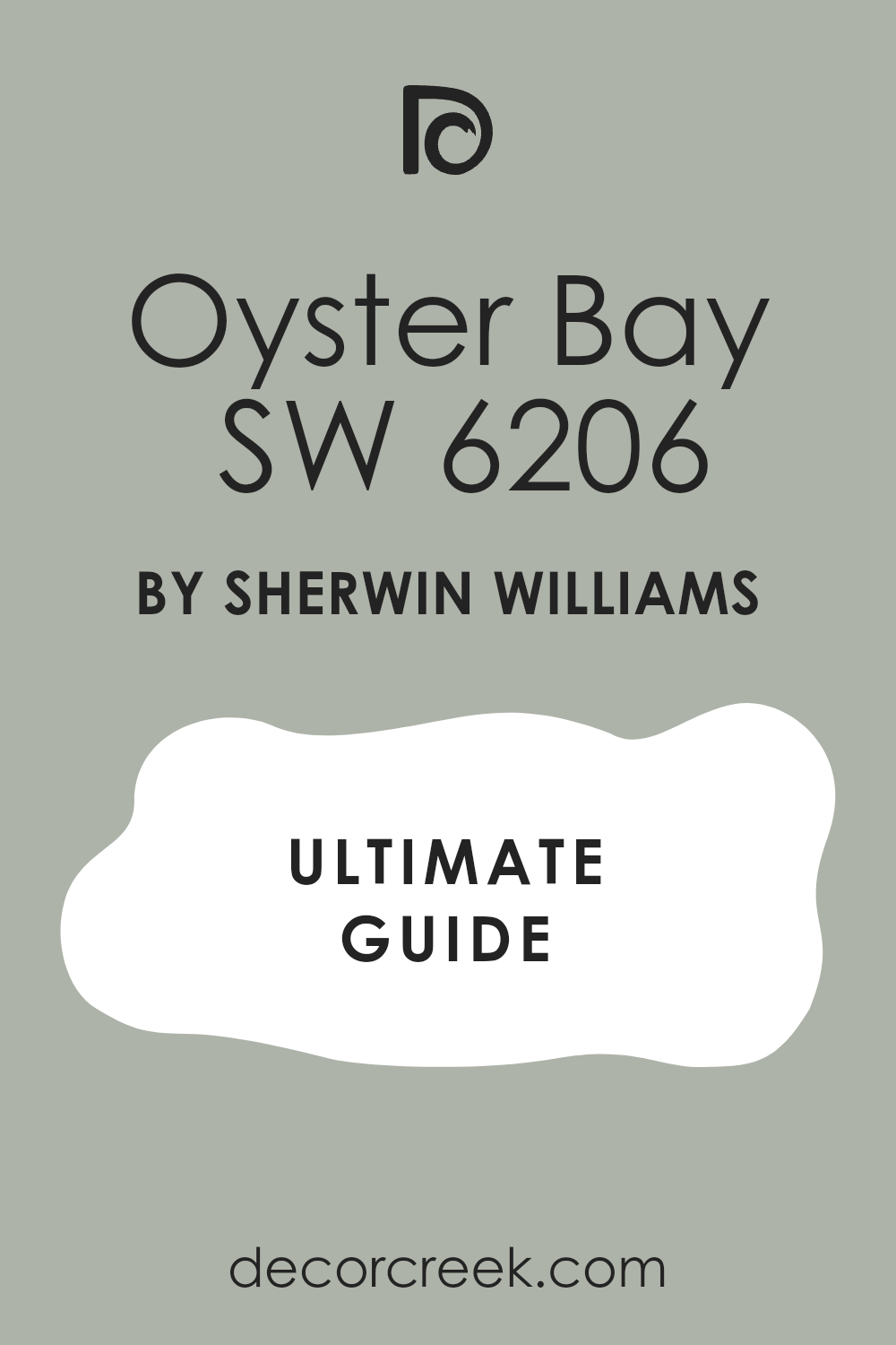
Oyster Bay SW 6206
Oyster Bay SW 6206 blends green, gray, and a tiny hint of blue for a unique coastal look. This shifting color adds a layer of sophistication to standard kitchen cabinetry. It changes character depending on whether you use warm or cool lightbulbs in the room.
You can use it on a lower cabinet run to create a soft two-tone effect. It looks incredibly smart alongside shiny chrome faucets and white farmhouse sinks. It brings a crisp airiness to tight cooking spaces that lack big windows.
This option makes your kitchen feel like a high-end beach cottage or a relaxed vacation home. It keeps things looking clean and organized without relying on boring neutrals. It highlights the clean lines of modern shaker-style cabinet doors perfectly.
Best used in: kitchens, bathrooms, laundry rooms, bedrooms, and coastal exteriors
Pairs well with: Pure White SW 7005, Sea Salt SW 6204, Natural Linen SW 9109, brushed nickel hardware The key rule of this color for farmhouse style is to use it where you want natural light to feel kind, soft, and inviting throughout the day.
🎨 Check out the complete guide to this color right HERE 👈
Sea Salt SW 6204
Sea Salt SW 6204 delivers a very light greenish-gray tint that brightens up any room instantly. This pale shade makes bulky kitchen cabinets feel light and floating against your walls. It responds beautifully to the shifting daylight by showing hints of soft blue.
You will find that it makes small kitchens feel double their actual size. It provides a gentle splash of color for people who are afraid of dark paint. It pairs effortlessly with light wood flooring and white marble surfaces.
This selection creates a happy environment for packing school lunches or cooking family dinners. It looks clean but maintains a distinct personality that neighbors will admire. It keeps the cooking atmosphere feeling entirely fresh and updated.
Best used in: bathrooms, kitchens, sunrooms, bedrooms, and seaside cottages
Pairs well with: High Reflective White SW 7757, Oyster Bay SW 6206, Natural Linen SW 9109, light oak accents The key rule of this color for farmhouse style is to use it where you want natural light to feel kind, soft, and inviting throughout the day.
🎨 Check out the complete guide to this color right HERE 👈

Retreat SW 6207
Retreat SW 6207 provides a deep, rich olive tone that makes a bold statement on cabinetry. This grounding shade gives your kitchen a solid, high-quality appearance that feels anchored. It works best on lower cabinets or a large central island to create contrast.
You can pair it with bright white upper walls to balance the deep tones. It makes copper cookware and brass light fixtures pop with incredible warmth. It brings a cozy feeling into oversized kitchens that feel too open or chilly.
This option is perfect for homeowners who want an architectural look in their home. It stands up beautifully to heavy daily use from pets and active children. It makes your cooking space feel important and carefully designed.
Best used in: kitchen islands, lower cabinets, accent walls, dens, and dramatic exteriors
Pairs well with: Alabaster SW 7008, Extra White SW 7006, Natural Linen SW 9109, copper hardware The key rule of this color for farmhouse style is to use it where you want natural light to feel kind, soft, and inviting throughout the day.
🎨 Check out the complete guide to this color right HERE 👈
Naval SW 6244
Naval SW 6244 is a deep, classic navy blue that brings instant structure to your kitchen. This timeless paint choice makes cabinets look incredibly striking against a neutral backdrop. It creates a high-contrast look that feels both traditional and modern at once.
You can use it to turn a plain kitchen island into a stunning centerpiece. It looks magnificent when paired with bright white quartz countertops and gold hardware. It gives a sense of stability and luxury to the busiest room in the house.
This shade hides scuff marks and fingerprints on lower cabinets with absolute ease. It makes your glassware and white plates stand out beautifully inside glass-front cabinets. It brings a rich, confident energy to your home design.
Best used in: kitchen islands, lower cabinets, dining rooms, front doors, and accent walls
Pairs well with: Snowbound SW 7004, Agreeable Gray SW 7029, Natural Linen SW 9109, gold finishes The key rule of this color for farmhouse style is to use it where you want natural light to feel kind, soft, and inviting throughout the day.
🎨 Check out the complete guide to this color right HERE 👈

Smoky Blue SW 7604
Smoky Blue SW 7604 offers a beautiful mid-tone blue with a heavy dose of gray mixed in. This dusty blue selection gives cabinetry a relaxed, lived-in look that feels very comfortable. It avoids looking like a bright primary color by keeping a soft and muted appearance.
You will enjoy how it coordinates with gray stone tile or slate floors. It provides a wonderful alternative to traditional gray or beige kitchen paint. It makes your cooking area feel like a welcoming space for evening entertaining.
This color looks stunning under warm kitchen pendant lights after the sun goes down. It creates a pretty frame around white porcelain sinks and light countertops. It brings a artistic touch to standard builder-grade kitchen cabinets.
Best used in: kitchens, laundry rooms, home libraries, accent walls, and shutters
Pairs well with: Pure White SW 7005, Repose Gray SW 7015, Natural Linen SW 9109, weathered wood The key rule of this color for farmhouse style is to use it where you want natural light to feel kind, soft, and inviting throughout the day.
🎨 Check out the complete guide to this color right HERE 👈
Waterloo SW 9141
Waterloo SW 9141 displays a rich, deep slate blue that feels deeply grounding and sophisticated. This paint shade brings a historic, moody character to a modern kitchen setting. It provides a heavy contrast that grounds lower cabinets while keeping a colorful look.
You can use it to update an old kitchen without replacing the actual woodwork. It works wonderfully with dark wood elements like walnut or dark oak finishes. It reflects just enough light to keep from looking completely black in dim corners.
This selection makes your kitchen feel like an expensive custom-built library or lounge. It hides daily smudges perfectly, making it excellent for households with busy toddlers. It adds a layer of depth that makes the whole room feel special.
Best used in: lower cabinets, kitchen islands, accent walls, home offices, and trim paint
Pairs well with: Greek Villa SW 7551, Accessible Beige SW 7036, Natural Linen SW 9109, brass fixtures The key rule of this color for farmhouse style is to use it where you want natural light to feel kind, soft, and inviting throughout the day.
🎨 Check out the complete guide to this color right HERE 👈
Iron Ore SW 7069
Iron Ore SW 7069 is a deep charcoal shade that is just a few steps away from pure black. This charcoal option brings a high-end designer look to modern kitchen cabinets. It creates a stunning frame for light countertops and bright tiled walls.
You will notice how it makes stainless steel appliances look integrated and seamless. It looks incredibly striking when used on a large focal point like a floor-to-ceiling pantry wall. It provides a bold, modern look that still retains a soft look due to its velvet undertone.
This color makes bright metal hardware look like jewelry against the dark wood background. It brings an instant sense of luxury and order to your cooking space. It helps hide the seams and imperfections of older cabinet doors.
Best used in: kitchen islands, lower cabinets, interior doors, window frames, and modern exteriors
Pairs well with: Alabaster SW 7008, Snowbound SW 7004, Natural Linen SW 9109, white marble The key rule of this color for farmhouse style is to use it where you want natural light to feel kind, soft, and inviting throughout the day.
🎨 Check out the complete guide to this color right HERE 👈

Urbane Bronze SW 7048
Urbane Bronze SW 7048 mixes deep brown and gray to create a rich, muddy bronze tone. This warm dark choice brings an organic, earthy feel to kitchen cabinetry. It grounds a room beautifully while connecting with natural elements like stone and brick.
You can use it to create a cozy, high-end look on a central kitchen island. It softens the starkness of bright white dishes and bright white quartz surfaces. It behaves like a dark neutral that never feels cold or sterile in winter light.
This shade makes your kitchen feel like a cozy cabin retreat right in the city. It pairs beautifully with stained wood open shelves and warm copper accents. It provides a look that feels rooted in nature.
Best used in: kitchen islands, accent walls, trim, front doors, and exterior siding
Pairs well with: Shoji White SW 7042, Agreeable Gray SW 7029, Natural Linen SW 9109, warm bronze metals The key rule of this color for farmhouse style is to use it where you want natural light to feel kind, soft, and inviting throughout the day.
🎨 Check out the complete guide to this color right HERE 👈

White Dove OC-17
White Dove OC-17 is a soft, creamy white that designers use for a clean but gentle look. This popular shade keeps kitchen cabinets looking bright without any blinding harshness. It features a tiny touch of gray that prevents it from turning yellow under warm lights.
You will love how it coordinates with both warm sandy walls and cool stone countertops. It makes small, dark kitchens feel instantly open, airy, and full of natural light. It highlights the classic molding details on traditional cabinet doors without creating shadows.
This option gives your home a classic, clean appearance that buyers love during home staging. It makes the entire kitchen feel fresh and ready for baking projects. It coordinates beautifully with every hardware finish available.
Best used in: kitchen cabinets, trim, doors, ceilings, and traditional home exteriors
Pairs well with: Revere Pewter HC-172, Hale Navy HC-154, Natural Linen SW 9109, matte black hardware The key rule of this color for farmhouse style is to use it where you want natural light to feel kind, soft, and inviting throughout the day.
🎨 Check out the complete guide to this color right HERE 👈

Swiss Coffee OC-45
Swiss Coffee OC-45 offers a rich, warm white tone that feels incredibly welcoming. This color choice makes kitchen cabinets look bright while wrapping the room in comfort. It lacks any cold, clinical undertones, making it feel like a cozy blanket for your walls.
You can use it to create a traditional kitchen look that feels full of family history. It looks beautiful alongside warm honey-colored oak floors and brass plumbing fixtures. It keeps large expanses of cabinetry from looking too stark or overly modern.
This shade creates a wonderful background for colorful family artwork or colorful dishware displays. It handles low-light rooms beautifully by maintaining its warm glow all day long. It makes your morning breakfast routine feel bright and cheerful.
Best used in: kitchens, living rooms, entryways, trim work, and cottage siding
Pairs well with: Edgecomb Gray HC-173, Chelsea Gray HC-168, Natural Linen SW 9109, oil-rubbed bronze The key rule of this color for farmhouse style is to use it where you want natural light to feel kind, soft, and inviting throughout the day.
🎨 Check out the complete guide to this color right HERE 👈

Pale Oak OC-20
Pale Oak OC-20 is a delicate, light greige that brings a soft whisper of color to cabinetry. This light neutral choice sits beautifully between a crisp white and a true beige. It provides just enough contrast to make bright white trim pop in your kitchen.
You will see how it mimics the soft look of weathered oak wood planks. It creates a clean, bright look that feels peaceful for cooking and dining. It pairs perfectly with light gray granite or modern white quartz countertops.
This shade makes dark, heavy appliances look much more balanced in a small room layout. It keeps your kitchen looking clean and bright without looking boring or unfinished. It handles changing daily light conditions with total ease.
Best used in: open concept kitchens, family rooms, hallways, bedrooms, and trim work
Pairs well with: White Dove OC-17, Kendall Charcoal HC-166, Natural Linen SW 9109, nickel fixtures The key rule of this color for farmhouse style is to use it where you want natural light to feel kind, soft, and inviting throughout the day.
🎨 Check out the complete guide to this color right HERE 👈

Edgecomb Gray HC-173
Edgecomb Gray HC-173 is a rich, creamy greige that acts as a fantastic backdrop for cabinets. This versatile shade changes personality depending on the amount of sunlight entering the kitchen. It brings a classic, upscale feeling to simple wooden cabinet fronts.
You can use it to tie together a kitchen that has both gray and beige design elements. It provides a sturdy look that hides daily smudges from pets and small hands. It highlights the beauty of natural wood cutting boards resting against the walls.
This choice makes your cooking space feel warm, grounded, and expensive. It works beautifully for a full kitchen makeover because it coordinates with almost any tile choice. It creates a smooth transition into surrounding living spaces.
Best used in: kitchen walls, cabinetry, hallways, living rooms, and traditional siding
Pairs well with: Simply White OC-117, Hale Navy HC-154, Natural Linen SW 9109, dark wood accents The key rule of this color for farmhouse style is to use it where you want natural light to feel kind, soft, and inviting throughout the day.
🎨 Check out the complete guide to this color right HERE 👈

Revere Pewter HC-172
Revere Pewter HC-172 is a classic mid-tone greige that brings serious structure to a kitchen. This famous shade adds a layer of traditional elegance to custom woodwork and cabinets. It contrasts beautifully with bright white walls and bright white quartz countertops.
You will notice how it grounds a large kitchen island with a high-end designer look. It hides everyday cooking messes and dust perfectly for busy families. It pairs wonderfully with antique brass hardware and classic subway tile backsplashes.
This option makes your kitchen look substantial, intentional, and completely put together. It keeps its rich depth even in rooms that receive very little natural light during winter. It gives a sense of quality to any cabinetry style.
Best used in: kitchen islands, lower cabinetry, family rooms, entries, and exterior trim
Pairs well with: White Dove OC-17, Iron Ore SW 7069, Natural Linen SW 9109, antique brass The key rule of this color for farmhouse style is to use it where you want natural light to feel kind, soft, and inviting throughout the day.
🎨 Check out the complete guide to this color right HERE 👈

October Mist 1495
October Mist 1495 is a soft, silvery green that introduces a quiet organic feel to cabinets. This earthy shade acts like a gentle neutral with a colorful personality. It coordinates beautifully with natural stone accents and warm butcher block island tops.
You can use it to create a cheerful kitchen that feels connected to the outdoors. It softens the hard edges of modern stainless steel cooking appliances nicely. It looks lovely when afternoon sunlight hits the cabinet faces, bringing out the soft green tone.
This selection makes your home feel welcoming and relaxed for weekend guests. It provides a unique look without being too bright or loud for resale. It keeps the cooking area looking fresh and inviting.
Best used in: kitchen cabinets, bathrooms, laundry rooms, bedrooms, and cottage exteriors
Pairs well with: Swiss Coffee OC-45, Pale Oak OC-20, Natural Linen SW 9109, natural wood elements The key rule of this color for farmhouse style is to use it where you want natural light to feel kind, soft, and inviting throughout the day.
🎨 Check out the complete guide to this color right HERE 👈

Saybrook Sage HC-114
Saybrook Sage HC-114 delivers a traditional sage green with a crisp, clear undertone. This classic color choice brings an old-world charm to kitchen cabinet doors. It works beautifully with traditional crown molding and antique hardware choices.
You will love how it pairs with warm sandy wall tones to create a balanced environment. It brings a cheerful energy to your morning baking and cooking routines. It looks stately when used on a large pantry cabinet or a central island unit.
This shade makes white farmhouse sinks look bright, clean, and striking. It gives your kitchen a custom look that feels rooted in timeless design traditions. It keeps the room looking organized and full of character.
Best used in: kitchens, dining rooms, sunrooms, front doors, and historic exteriors
Pairs well with: Cloud White OC-130, Revere Pewter HC-172, Natural Linen SW 9109, iron hardware The key rule of this color for farmhouse style is to use it where you want natural light to feel kind, soft, and inviting throughout the day.
🎨 Check out the complete guide to this color right HERE 👈

Hale Navy HC-154
Hale Navy HC-154 is a deep, rich navy blue that looks incredibly regal on kitchen cabinetry. This bold selection features a strong gray base that keeps it looking dark and professional. It provides an excellent anchor for lower cabinets when paired with light upper walls.
You can use it to make standard kitchen island bases look like high-end furniture pieces. It makes crisp white countertops and shiny brass handles look striking and beautiful. It brings a sense of luxury and importance to your meal preparation space.
This shade hides scuff marks from kitchen stools completely, which is great for families. It creates a beautiful backdrop for evening dinner parties and gatherings.
Best used in: kitchen islands, lower cabinets, accent walls, front doors, and siding trim
Pairs well with: White Dove OC-17, Edgecomb Gray HC-173, Natural Linen SW 9109, brass accents The key rule of this color for farmhouse style is to use it where you want natural light to feel kind, soft, and inviting throughout the day.
🎨 Check out the complete guide to this color right HERE 👈

Kendall Charcoal HC-166
Kendall Charcoal HC-166 offers a dark, rich gray tone that brings dramatic flair to cabinetry. This deep color choice adds a strong modern element to any kitchen layout. It highlights the clean architectural lines of flat-panel or shaker cabinet doors.
You can pair it with bright white tiled walls to keep the room looking open and bright. It looks magnificent alongside warm wood floors that balance the dark gray tone. It hides daily smudges and fingerprints perfectly from pets and active children.
This shade makes metallic hardware shine with extra brightness and luxury. It creates a sophisticated look that turns your cooking space into a designer showpiece. It brings a solid structure to large open-concept kitchens.
Best used in: kitchen islands, lower cabinetry, accent walls, fireplaces, and modern exteriors
Pairs well with: Simply White OC-117, Pale Oak OC-20, Natural Linen SW 9109, chrome fixtures The key rule of this color for farmhouse style is to use it where you want natural light to feel kind, soft, and inviting throughout the day.
🎨 Check out the complete guide to this color right HERE 👈

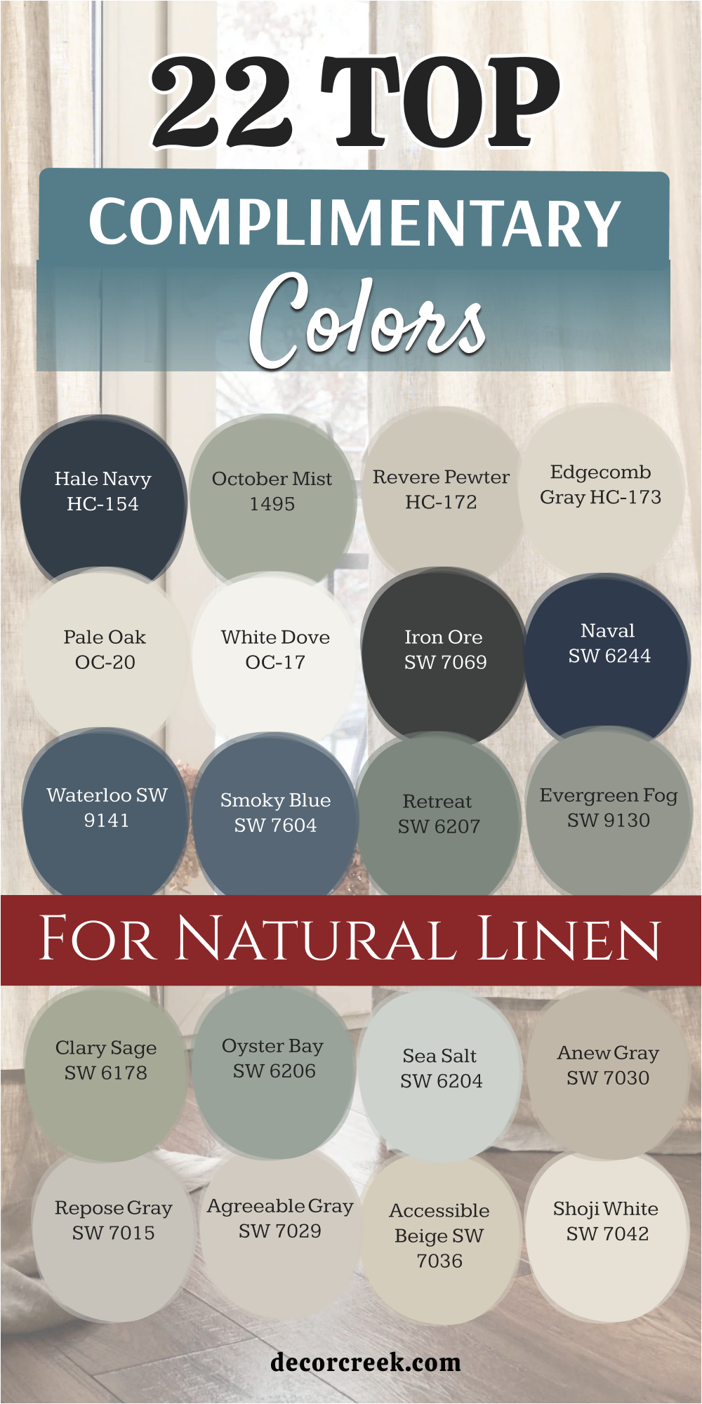
22 Top Complimentary Colors for Natural Linen
Alabaster SW 7008
Alabaster SW 7008 acts as a perfect trim option to frame your warm linen walls. This pairing creates a soft look that makes your living areas feel cohesive. It avoids the harsh contrast that standard ceiling white paint often creates.
You will see a beautiful, gentle shift in tone where the wall meets the ceiling. This combination makes your home feel cozy and well-planned. It enhances the look of natural sunlight filtering through your windows.
The shade brings a touch of classic elegance to baseboards and door frames. It makes your rooms look finished and polished for guests. This duo works well in every single room of the house.
Best used in: living rooms, kitchens, hallways, bedrooms, and farmhouse exteriors
Pairs well with: Iron Ore SW 7069, Agreeable Gray SW 7029, Natural Linen SW 9109, warm wood tones The key rule of this color for farmhouse style is to use it where you want natural light to feel kind, soft, and inviting throughout the day.
🎨 Check out the complete guide to this color right HERE 👈
Greek Villa SW 7551
Greek Villa SW 7551 adds a soft glow when applied to moldings and doors adjacent to your main walls. This rich cream color softens sharp room transitions while keeping the overall layout looking bright.
It eliminates the cold glare of standard commercial white paints in your hallways. You can use it to warm up dark corners that receive minimal morning sunshine. It emphasizes the subtle sandy qualities of your primary wall choice without competing for attention.
Home staging projects benefit greatly from this pairing because it feels clean and well-kept. This option makes window frames pop against a slightly deeper background. It frames your views beautifully while giving a sense of architectural structure to plain rooms. It maintains a soft appearance under both warm LED bulbs and bright daylight.
Best used in: kitchens, dining rooms, entryways, trims, and Mediterranean exteriors
Pairs well with: Urbane Bronze SW 7048, Clary Sage SW 6178, Natural Linen SW 9109, terracotta tiles The key rule of this color for farmhouse style is to use it where you want natural light to feel kind, soft, and inviting throughout the day.
🎨 Check out the complete guide to this color right HERE 👈
Shoji White SW 7042
Shoji White SW 7042 works as a stunning companion that bridges the gap between light cream and soft beige. This adaptable choice allows you to create a quiet, layered look within an open floor plan. It coordinates beautifully with textured linen drapery and light-colored woven rugs.
You will notice how it grounds baseboards without creating a harsh horizontal line around the floor. It brings a crisp yet inviting look to shared family spaces. It highlights the grain of natural white oak flooring instead of washing it out.
This shade performs beautifully in living areas where relaxation is the main goal. It creates a seamless flow when moving from small entryways into large sitting rooms. It keeps your interior looking cohesive and thoughtfully designed from every angle.
Best used in: open concept spaces, kitchens, bedrooms, trim, and stucco exteriors
Pairs well with: Repose Gray SW 7015, Garret Gray SW 6075, Natural Linen SW 9109, oak flooring The key rule of this color for farmhouse style is to use it where you want natural light to feel kind, soft, and inviting throughout the day.
🎨 Check out the complete guide to this color right HERE 👈
Accessible Beige SW 7036
Accessible Beige SW 7036 provides a slightly deeper tan alternative that adds excellent structural balance. This popular neutral brings a rich feeling to accent walls or built-in media centers. It coordinates nicely with the warm undertones of your primary wall paint.
You can use it to add dimension to a long hallway or a large staircase wall. It creates a beautiful backdrop for dark wood furniture pieces and leather chairs. It masks minor scuff marks from daily family traffic along busy baseboards perfectly.
This selection makes large, intimidating rooms feel much friendlier and more tightly edited. It gives a solid foundation to spaces that feature high ceilings and extensive window walls. It keeps the tone of the house feeling entirely grounded and steady.
Best used in: family rooms, kitchens, hallways, accent walls, and traditional exteriors
Pairs well with: Alabaster SW 7008, Cadet SW 9143, Natural Linen SW 9109, dark walnut accents The key rule of this color for farmhouse style is to use it where you want natural light to feel kind, soft, and inviting throughout the day.
🎨 Check out the complete guide to this color right HERE 👈
Agreeable Gray SW 7029
Agreeable Gray SW 7029 introduces a touch of cool balance to a predominantly warm room layout. This balanced greige acts as an ideal coordinator for homes with mixed metallic fixtures. It helps tone down overly yellow patches of sunlight during mid-day hours.
You will love how it looks on interior doors against your warm linen-colored walls. It brings a modern sensibility to traditional architectural details like wainscoting. It makes colorful decorative pillows and patterned area rugs look clean and intentional.
This paint option gives home sellers a competitive edge because it coordinates with almost any buyer furniture. It feels fresh and light without losing its identity in bright afternoon light. It brings an instantly updated look to older drywall surfaces.
Best used in: living rooms, kitchens, open floor plans, entries, and siding exteriors
Pairs well with: Extra White SW 7006, Anew Gray SW 7030, Natural Linen SW 9109, brushed nickel The key rule of this color for farmhouse style is to use it where you want natural light to feel kind, soft, and inviting throughout the day.
🎨 Check out the complete guide to this color right HERE 👈
Repose Gray SW 7015
Repose Gray SW 7015 features a soft gray tint that brings a cool, cloudy element into your design. This choice creates a sophisticated contrast when paired with warmer sandy wall backdrops. It works wonders on accent features like fireplace mantels or built-in bookshelves.
You can use it to establish a clean look in small, tight entry zones. It coordinates beautifully with silver frames and brushed nickel lighting fixtures. It gives a modern, tailored finish to standard baseboards and door casings.
This shade helps prevent a warm room from looking too heavy or monotone. It provides a quiet backdrop that lets your favorite colorful artwork grab the spotlight. It looks crisp and clean throughout every changing season of the year.
Best used in: bedrooms, kitchens, family rooms, trim, and modern farmhouse exteriors
Pairs well with: Pure White SW 7005, Coral Clay SW 6051, Natural Linen SW 9109, zinc accents The key rule of this color for farmhouse style is to use it where you want natural light to feel kind, soft, and inviting throughout the day.
🎨 Check out the complete guide to this color right HERE 👈
Anew Gray SW 7030
Anew Gray SW 7030 offers a mid-tone greige presence that provides rich depth to architectural trim. This solid choice adds a luxurious weight to heavy interior doors and window casings. It forms a handsome frame around rooms painted in lighter, warmer neutral shades.
You will notice how it accentuates the height of your ceilings when used along crown moldings. It hides daily smudges from hands and pets near light switches with absolute ease. It complements natural stone flooring tiles and dark slate entryways beautifully.
This paint option creates an upscale look that feels stable and very well-planned. It prevents large living areas from feeling too open or chilly in the winter. It grounds your design scheme with classic authority.
Best used in: kitchens, dining areas, laundry rooms, doors, and shake exteriors
Pairs well with: Snowbound SW 7004, Iron Ore SW 7069, Natural Linen SW 9109, slate flooring The key rule of this color for farmhouse style is to use it where you want natural light to feel kind, soft, and inviting throughout the day.
🎨 Check out the complete guide to this color right HERE 👈
Sea Salt SW 6204
Sea Salt SW 6204 injects a light splash of watery green-gray into your neutral color scheme. This delicate selection provides a beautiful touch of color without looking loud or childish. It reacts beautifully to changing weather outside by showing hints of soft blue.
You can use it on accent walls in guest bathrooms to create a refreshing vibe. It pairs effortlessly with light linen fabrics and light oak furniture pieces. It brightens up dark, windowless laundry rooms or mudrooms instantly.
This shade makes your home feel connected to a breezy coastal landscape. It brings a happy, cheerful personality into spaces that feel a bit plain. It maintains a clean, well-edited appearance under any style of indoor lighting.
Best used in: bathrooms, kitchens, sunrooms, bedrooms, and seaside cottages
Pairs well with: High Reflective White SW 7757, Oyster Bay SW 6206, Natural Linen SW 9109, light oak accents The key rule of this color for farmhouse style is to use it where you want natural light to feel kind, soft, and inviting throughout the day.
🎨 Check out the complete guide to this color right HERE 👈
Oyster Bay SW 6206
Oyster Bay SW 6206 delivers a rich slate-green look with a very mature, grounded presence. This mid-tone shade adds a layer of design sophistication to plain feature walls. It contrasts wonderfully against light sandy tones, making your favorite furniture pop.
You will love using it in home libraries or productive home office areas. It brings out the cool gray flecks inside standard granite or quartz countertops. It coordinates smoothly with matte black hardware and weathered iron light stands.
This paint choice gives a rich, customized look to standard builder-grade rooms. It feels substantial and reliable while adding a pleasant hint of natural color. It keeps the indoor environment looking orderly and highly professional.
Best used in: kitchens, bathrooms, laundry rooms, bedrooms, and coastal exteriors
Pairs well with: Pure White SW 7005, Sea Salt SW 6204, Natural Linen SW 9109, brushed nickel hardware The key rule of this color for farmhouse style is to use it where you want natural light to feel kind, soft, and inviting throughout the day.
🎨 Check out the complete guide to this color right HERE 👈

Clary Sage SW 6178
Clary Sage SW 6178 brings a soft, herbal green element that feels deeply connected to nature. This soothing color breaks up the monotony of large expanses of neutral walls. It looks spectacular when applied to built-in mudroom cubbies or hallway accent panels.
You can pair it with rich gold frames or warm brass hardware fixtures. It softens the starkness of bright white baseboards and window blinds. It reminds visitors of formal garden paths and clean country living.
This option creates a welcoming atmosphere right at your front entry door. It handles bright, direct sunshine without washing out or looking too neon. It provides a comfortable backdrop that makes natural wood tones look incredibly expensive.
Best used in: kitchens, bathrooms, laundry rooms, entryways, and cottage exteriors
Pairs well with: Dover White SW 6385, Shoji White SW 7042, Natural Linen SW 9109, butcher block counters The key rule of this color for farmhouse style is to use it where you want natural light to feel kind, soft, and inviting throughout the day.
🎨 Check out the complete guide to this color right HERE 👈
Evergreen Fog SW 9130
Evergreen Fog SW 9130 introduces a gorgeous, dusty green tone that anchors your main living spaces. This designer favorite brings a sense of high-end luxury to focal points like fireplace surrounds.
It pairs beautifully with sandy walls to create a balanced, earthy atmosphere. You will notice how it highlights the texture of woven baskets and linen pillows. It gives plain sheetrock walls the appearance of thick, custom wood paneling.
It hides dust and daily wear perfectly in high-traffic family zones. This shade makes a confident design statement without shouting for attention over your decor. It makes your indoor seating areas feel incredibly cozy and well-curated. It elevates the look of simple architectural elements instantly.
Best used in: kitchens, mudrooms, accent walls, home offices, and siding exteriors
Pairs well with: Alabaster SW 7008, Accessible Beige SW 7036, Natural Linen SW 9109, warm wood tones The key rule of this color for farmhouse style is to use it where you want natural light to feel kind, soft, and inviting throughout the day.
🎨 Check out the complete guide to this color right HERE 👈
Retreat SW 6207
Retreat SW 6207 provides a bold olive-gray punch that brings dramatic structure into your house. This deep tone creates an incredible amount of contrast against pale, sandy backdrops. It works best on specific focal features like accent walls or built-in media centers.
You can use it to ground an oversized bedroom that feels too large or drafty. It looks magnificent alongside rich walnut wood grains and heavy bronze light fixtures. It gives your home a custom, architect-designed appearance that buyers notice immediately.
This paint choice stands up to heavy daily activity without showing marks or scuffs. It makes light-colored upholstered furniture look bright and crisp by comparison. It brings an important, established feeling to your overall design theme.
Best used in: kitchen islands, lower cabinets, accent walls, dens, and dramatic exteriors
Pairs well with: Alabaster SW 7008, Extra White SW 7006, Natural Linen SW 9109, copper hardware The key rule of this color for farmhouse style is to use it where you want natural light to feel kind, soft, and inviting throughout the day.
🎨 Check out the complete guide to this color right HERE 👈
Smoky Blue SW 7604
Smoky Blue SW 7604 offers a beautiful, dusty blue option that feels relaxed and historical. This muted selection avoids looking like a bright playroom color due to its heavy gray undertone.
It creates a handsome pairing with warm sandy hues, offering a classic sky-and-sand contrast. You will love how it looks on a bedroom feature wall behind a neutral headboard. It highlights the beauty of white trim work and light ceramic tile details.
It brings a creative, artistic touch to standard household layouts. This paint choice looks rich and deep when evening lamps are turned on. It frames your windows beautifully, drawing your eye toward outdoor views. It keeps your interior looking distinctive and full of personality.
Best used in: kitchens, laundry rooms, home libraries, accent walls, and shutters
Pairs well with: Pure White SW 7005, Repose Gray SW 7015, Natural Linen SW 9109, weathered wood The key rule of this color for farmhouse style is to use it where you want natural light to feel kind, soft, and inviting throughout the day.
🎨 Check out the complete guide to this color right HERE 👈
Waterloo SW 9141
Waterloo SW 9141 displays a rich, moody slate blue that brings serious depth to a room. This paint shade functions like a colorful dark neutral that pairs beautifully with warm sandy walls. It creates a stunning backdrop for brass mirrors and bright gold light fixtures.
You can use it to give a small powder room an expensive, custom lounge appearance. It grounds your vision when used on a central wall in an open-concept house. It conceals fingerprints and daily smudges flawlessly in busy family environments.
This selection makes your white molding elements look crisp, clean, and highly detailed. It adds a layer of historic charm to brand-new drywall installations. It makes your living spaces feel important and carefully tailored.
Best used in: lower cabinets, kitchen islands, accent walls, home offices, and trim paint
Pairs well with: Greek Villa SW 7551, Accessible Beige SW 7036, Natural Linen SW 9109, brass fixtures The key rule of this color for farmhouse style is to use it where you want natural light to feel kind, soft, and inviting throughout the day.
🎨 Check out the complete guide to this color right HERE 👈
Naval SW 6244
Naval SW 6244 is a commanding navy blue that delivers an ultimate level of classic contrast. This bold paint choice turns plain interior doors into beautiful focal design statements. It contrasts sharply with warm linen backdrops, creating a high-end coastal or traditional look.
You will notice how it makes light neutral sofas stand out with extra crispness. It works beautifully on accent walls behind large television screens to hide the black monitor. It brings a stately, dependable energy into entries and formal dining rooms.
This shade gives a luxurious finish to standard wood trim and paneling details. It makes your gold or brass hardware elements shine like real jewelry. It ensures your home looks confident and expertly styled for guests.
Best used in: kitchen islands, lower cabinets, dining rooms, front doors, and accent walls
Pairs well with: Snowbound SW 7004, Agreeable Gray SW 7029, Natural Linen SW 9109, gold finishes The key rule of this color for farmhouse style is to use it where you want natural light to feel kind, soft, and inviting throughout the day.
🎨 Check out the complete guide to this color right HERE 👈
Iron Ore SW 7069
Iron Ore SW 7069 acts as a soft charcoal black that injects deep modern structure into your house. This deep charcoal option looks spectacular on window frames and interior door faces. It provides a sharp, contemporary edge that balances out warm, soft wall tones.
You can use it to frame a fireplace insert or anchor a floating staircase wall. It creates a striking designer look that makes the surrounding neutral paint look freshly applied. It hides everyday scuff marks along baseboards better than any light paint on the market.
This choice makes metallic accents like chrome or brass look incredibly expensive and bright. It brings an instant sense of order and high-end staging to plain rooms. It gives your home an updated, architectural feel effortlessly.
Best used in: kitchen islands, lower cabinets, interior doors, window frames, and modern exteriors
Pairs well with: Alabaster SW 7008, Snowbound SW 7004, Natural Linen SW 9109, white marble The key rule of this color for farmhouse style is to use it where you want natural light to feel kind, soft, and inviting throughout the day.
🎨 Check out the complete guide to this color right HERE 👈
White Dove OC-17
White Dove OC-17 functions as a go-to trim option that designers trust for a clean look. This popular shade features a soft touch of gray that keeps it from turning yellow in dark corners. It provides a gentle, clean frame around warm sandy walls without looking too stark.
You will enjoy how it unifies your baseboards, doors, and ceilings into one smooth look. It reflects natural sunlight beautifully, making dark hallways feel open and airy. It highlights the fine craftsmanship of crown moldings without creating deep, harsh shadows.
This selection gives your home a fresh, move-in-ready appearance that buyers appreciate. It coordinates beautifully with both warm bronze and cool nickel hardware choices. It keeps the entire room looking neat and polished.
Best used in: kitchen cabinets, trim, doors, ceilings, and traditional home exteriors
Pairs well with: Revere Pewter HC-172, Hale Navy HC-154, Natural Linen SW 9109, matte black hardware The key rule of this color for farmhouse style is to use it where you want natural light to feel kind, soft, and inviting throughout the day.
🎨 Check out the complete guide to this color right HERE 👈
Pale Oak OC-20
Pale Oak OC-20 offers a quiet whisper of light greige that sits beautifully next to sandy hues. This light neutral provides just enough difference to create a soft, two-tone wall effect. It mimics the natural look of weathered wood planks or soft limestone tiles.
You can use it to maintain a bright, open feel across large connected living areas. It pairs smoothly with light gray stone fireplaces and cream upholstered furniture pieces. It helps heavy dark electronics look more integrated into a bright room layout.
This shade keeps your home looking clean and updated without relying on plain white walls. It handles shifting morning and evening light conditions with absolute perfection. It brings a balanced look to your design layout.
Best used in: open concept kitchens, family rooms, hallways, bedrooms, and trim work
Pairs well with: White Dove OC-17, Kendall Charcoal HC-166, Natural Linen SW 9109, nickel fixtures The key rule of this color for farmhouse style is to use it where you want natural light to feel kind, soft, and inviting throughout the day.
🎨 Check out the complete guide to this color right HERE 👈
Edgecomb Gray HC-173
Edgecomb Gray HC-173 provides a rich, creamy greige option that adds excellent wall substance. This flexible color choice responds to sunlight by shifting between a warm gray and a soft tan. It coordinates beautifully with rooms that feature both beige carpet and gray stone details.
You will see how it builds a cozy, layered atmosphere when paired with warm linen tones. It hides daily smudges from busy household hands along narrow corridors perfectly. It emphasizes the natural beauty of oak mantels and wooden furniture items.
This paint choice makes your family spaces feel expensive, stable, and highly cohesive. It works wonderfully for complete home updates because it matches almost any flooring material. It creates a beautiful bridge between different room styles.
Best used in: kitchen walls, cabinetry, hallways, living rooms, and traditional siding
Pairs well with: Simply White OC-117, Hale Navy HC-154, Natural Linen SW 9109, dark wood accents The key rule of this color for farmhouse style is to use it where you want natural light to feel kind, soft, and inviting throughout the day.
🎨 Check out the complete guide to this color right HERE 👈
Revere Pewter HC-172
Revere Pewter HC-172 delivers a classic mid-tone greige presence that anchors your living zones. This famous color choice brings a layer of traditional elegance to accent walls and trim. It provides a beautiful contrast against bright white ceilings and warm sandy main walls.
You can use it to add architectural weight to a large central hallway or fireplace bump-out. It hides daily tracking dust and pet hair from showing on baseboards flawlessly. It coordinates wonderfully with antique brass light fixtures and classic white tile work.
This selection makes your home look substantial, permanent, and completely put together. It retains its rich depth even on dark, rainy days when indoor light is low. It adds quality to your design.
Best used in: kitchen islands, lower cabinetry, family rooms, entries, and exterior trim
Pairs well with: White Dove OC-17, Iron Ore SW 7069, Natural Linen SW 9109, antique brass The key rule of this color for farmhouse style is to use it where you want natural light to feel kind, soft, and inviting throughout the day.
🎨 Check out the complete guide to this color right HERE 👈
October Mist 1495
October Mist 1495 introduces a soft, silvery green tint that brings a pleasant organic element indoors. This muted shade acts like a colorful neutral that pairs easily with sandy wall choices. It coordinates beautifully with natural woven window shades and dried botanical displays.
You will love how it looks on accent walls in master bedrooms or guest rooms. It breaks up long lines of beige or gray paint with a happy, fresh personality. It softens the hard appearance of large metallic appliances and modern electronics nicely.
This selection makes your home feel welcoming and entirely relaxed for weekend visitors. It offers an interesting look without being too bright for long-term resale value. It keeps the atmosphere feeling entirely updated.
Best used in: kitchen cabinets, bathrooms, laundry rooms, bedrooms, and cottage exteriors
Pairs well with: Swiss Coffee OC-45, Pale Oak OC-20, Natural Linen SW 9109, natural wood elements The key rule of this color for farmhouse style is to use it where you want natural light to feel kind, soft, and inviting throughout the day.
🎨 Check out the complete guide to this color right HERE 👈
Hale Navy HC-154
Hale Navy HC-154 stands as a deep, regal navy blue that provides a striking design contrast. This classic color choice relies on a strong gray base to maintain a dark, professional look. It works perfectly on specific focal points like entry accent walls or built-in office shelves.
You can use it to make standard white molding and warm linen walls look exceptionally crisp. It makes brass picture frames and colorful landscape paintings stand out beautifully. It brings an instant sense of high-end luxury to formal dining rooms or media spaces.
This shade hides kicking marks under breakfast bars completely, which parents always appreciate. It creates an excellent backdrop for cozy evening gatherings with close friends.
Best used in: kitchen islands, lower cabinets, accent walls, front doors, and siding trim
Pairs well with: White Dove OC-17, Edgecomb Gray HC-173, Natural Linen SW 9109, brass accents The key rule of this color for farmhouse style is to use it where you want natural light to feel kind, soft, and inviting throughout the day.
🎨 Check out the complete guide to this color right HERE 👈
27 Top Color Combo that goes with Natural Linen Living Room
Natural Linen SW 9109 + Alabaster SW 7008
Natural Linen SW 9109 + Alabaster SW 7008 creates a classic neutral look for a relaxing living room. This combination makes the entire room feel bright and airy during the day. It provides a beautiful backdrop for linen sofas and wicker baskets.
You can use it to build a cozy texture-rich environment. It highlights architectural details like fireplaces and built-in bookshelves gently. This look makes small living spaces feel much larger and open.
It welcomes guests with a warm and friendly atmosphere. The pairing keeps the room looking clean and organized effortlessly. It works perfectly with light oak floors and neutral rugs.
Best used in: living rooms, kitchens, hallways, bedrooms, and farmhouse exteriors
Pairs well with: Iron Ore SW 7069, Agreeable Gray SW 7029, Natural Linen SW 9109, warm wood tones The key rule of this color for farmhouse style is to use it where you want natural light to feel kind, soft, and inviting throughout the day.
Natural Linen SW 9109 + Pure White SW 7005
Natural Linen SW 9109 + Pure White SW 7005 makes your living room feel exceptionally crisp and orderly. This pairing features a distinct break between the soft sandy walls and the bright white borders.
It prevents your sitting area from looking washed out or overly yellow on rainy afternoons. You can apply the crisp white option to built-in shelving units and fireplace brick mantels. It beautifully reflects the warm lamp light during cozy evening television viewings.
It provides a sharp framework that makes bold patterned artwork pop off your living room walls. This combination helps traditional furniture setups look cleaner and much more current. It ensures your family gathering spots always feel bright, neat, and highly welcoming.
Best used in: living rooms, kitchens, hallways, bedrooms, and farmhouse exteriors
Pairs well with: Iron Ore SW 7069, Agreeable Gray SW 7029, Natural Linen SW 9109, warm wood tones The key rule of this color for farmhouse style is to use it where you want natural light to feel kind, soft, and inviting throughout the day.
Natural Linen SW 9109 + Greek Villa SW 7551
Natural Linen SW 9109 + Greek Villa SW 7551 forms a soft, buttery pairing that wraps your family room in comfort. This combination relies on two warm shades that blend together with very minimal harsh contrast.
It gives your walls a creamy texture that feels heavy, expensive, and deeply inviting. You will love using this duo in sunrooms or living areas with large bay windows. It brings out the golden honey tones in natural pine or white oak flooring materials.
It acts as a friendly background for traditional plaid fabrics and heavy wool throw blankets. This selection works wonderfully for staging houses because it feels instantly like a clean, loving home. It makes large, drafty living spaces feel much smaller, friendlier, and more contained.
Best used in: living rooms, kitchens, hallways, bedrooms, and farmhouse exteriors
Pairs well with: Iron Ore SW 7069, Agreeable Gray SW 7029, Natural Linen SW 9109, warm wood tones The key rule of this color for farmhouse style is to use it where you want natural light to feel kind, soft, and inviting throughout the day.
Natural Linen SW 9109 + Shoji White SW 7042
Natural Linen SW 9109 + Shoji White SW 7042 creates a beautiful layered neutral look for minimalists. This pairing blends a light sandy wall base with a rich, soft ivory trim. It gives your shared living spaces a clean look that avoids feeling cold like modern gallery designs.
You can use it to build a relaxing atmosphere centered around linen couches and wicker baskets. It coordinates flawlessly with large potted indoor trees and natural jute accent rugs. It softens the appearance of heavy crown moldings while highlighting the shape of your doors.
This option helps create a continuous flowing look in large, modern open-concept main levels. It keeps your primary seating layout looking perfectly styled, neat, and very carefully curated.
Best used in: living rooms, kitchens, hallways, bedrooms, and farmhouse exteriors
Pairs well with: Iron Ore SW 7069, Agreeable Gray SW 7029, Natural Linen SW 9109, warm wood tones The key rule of this color for farmhouse style is to use it where you want natural light to feel kind, soft, and inviting throughout the day.
Natural Linen SW 9109 + Accessible Beige SW 7036
Natural Linen SW 9109 + Accessible Beige SW 7036 delivers an authentic tan partnership that brings deep structural richness. This pairing uses two varying levels of beige to establish a handsome, multi-toned room effect.
It works beautifully when you paint the deeper tan shade inside built-in bookcases or window alcoves. It provides a sturdy look that effortlessly handles high traffic from family pets and active kids. You will find that it complements dark walnut coffee tables and leather reclining chairs perfectly.
This selection gives your living room a permanent, established character that looks very intentional. It hides everyday drywall dust and corner smudges better than bright white paint combinations. It maintains a steady, dependable warmth during cold winter days.
Best used in: living rooms, kitchens, hallways, bedrooms, and farmhouse exteriors
Pairs well with: Iron Ore SW 7069, Agreeable Gray SW 7029, Natural Linen SW 9109, warm wood tones The key rule of this color for farmhouse style is to use it where you want natural light to feel kind, soft, and inviting throughout the day.
Natural Linen SW 9109 + Agreeable Gray SW 7029
Natural Linen SW 9109 + Agreeable Gray SW 7029 introduces a touch of cool gray balance to warm rooms. This mixture of sandy walls and a neutral greige coordinator creates a flexible layout for any furniture style.
It softens the intense yellow hue of strong afternoon sunlight streaming through front windows. You can use it on a main accent wall to ground a floating television setup beautifully. It coordinates nicely with silver picture framing and brushed nickel floor lamps.
This selection gives home interior stagers a reliable layout that coordinates with most buyer furniture sets. It looks fresh and clean without losing its true color identity in dim corner seating areas. It instantly updates the appearance of older plaster or damaged drywall surfaces.
Best used in: living rooms, kitchens, hallways, bedrooms, and farmhouse exteriors
Pairs well with: Iron Ore SW 7069, Agreeable Gray SW 7029, Natural Linen SW 9109, warm wood tones The key rule of this color for farmhouse style is to use it where you want natural light to feel kind, soft, and inviting throughout the day.
Natural Linen SW 9109 + Repose Gray SW 7015
Natural Linen SW 9109 + Repose Gray SW 7015 brings a cloudy, soft element into your main sitting space. This combination relies on a subtle cool contrast to make your warm sandy walls appear fresh. It works wonders on central living room features like brick fireplaces or heavy accent columns.
You can use it to build a modern, tailored framework around your primary sitting arrangement. It pairs smoothly with gray tweed sofas and dark charcoal accent pillows. This option prevents a warm-toned living room from looking too heavy, dated, or monotone.
It provides a quiet background that lets your colorful accent decorations take center stage. It looks crisp and incredibly clean across all seasons of the year.
Best used in: living rooms, kitchens, hallways, bedrooms, and farmhouse exteriors
Pairs well with: Iron Ore SW 7069, Agreeable Gray SW 7029, Natural Linen SW 9109, warm wood tones The key rule of this color for farmhouse style is to use it where you want natural light to feel kind, soft, and inviting throughout the day.
Natural Linen SW 9109 + Anew Gray SW 7030
Natural Linen SW 9109 + Anew Gray SW 7030 offers a deep greige pairing that brings strong, handsome character. This combination provides excellent structural contrast by using a rich mid-tone shade alongside your main walls.
It outlines your living room doors and window frames with a very luxurious, high-end appearance. You can paint the darker shade on a main feature wall to create immediate visual depth. It complements large natural stone hearths and dark slate floor details beautifully.
This choice creates an upscale designer look that feels stable, grounded, and very professional. It keeps oversized family rooms from feeling too vast, empty, or chilly during winter. It anchors your entire decorative plan with traditional authority.
Best used in: living rooms, kitchens, hallways, bedrooms, and farmhouse exteriors
Pairs well with: Iron Ore SW 7069, Agreeable Gray SW 7029, Natural Linen SW 9109, warm wood tones The key rule of this color for farmhouse style is to use it where you want natural light to feel kind, soft, and inviting throughout the day.
Natural Linen SW 9109 + Mindful Gray SW 7016
Natural Linen SW 9109 + Mindful Gray SW 7016 delivers a reliable gray presence that anchors your conversation areas. This combination features a strong gray shade that provides excellent weight against the sandy wall backdrop.
It looks spectacular when applied to large focal points like built-in media centers or fireplace mantels. You can use it to balance out a room that receives an abundance of bright sunlight. It masks minor smudges from hands around light switches and doorways flawlessly.
This duo pairs beautifully with thick wooden accent beams or dark chestnut coffee tables. It gives your living space a highly structured appearance that feels important and custom-designed. It makes metallic finishes like chrome or copper shine with extra brightness.
Best used in: living rooms, kitchens, hallways, bedrooms, and farmhouse exteriors
Pairs well with: Iron Ore SW 7069, Agreeable Gray SW 7029, Natural Linen SW 9109, warm wood tones The key rule of this color for farmhouse style is to use it where you want natural light to feel kind, soft, and inviting throughout the day.
Natural Linen SW 9109 + Sea Salt SW 6204
Natural Linen SW 9109 + Sea Salt SW 6204 introduces a watery, coastal green tint into your living room design. This unique pairing provides a light splash of color without looking childish or overly bright.
It responds beautifully to external weather shifts by revealing soft hints of blue and gray. You can use the green tone on a specific accent wall to frame beautiful outdoor garden views. It pairs smoothly with cream-colored cotton furniture fabrics and light white oak tables.
This option makes small family sitting rooms feel much larger and more open instantly. It brings a cheerful, happy personality into spaces that feel a little bit plain. It maintains a clean, well-edited look under any style of indoor lighting.
Best used in: living rooms, kitchens, hallways, bedrooms, and farmhouse exteriors
Pairs well with: Iron Ore SW 7069, Agreeable Gray SW 7029, Natural Linen SW 9109, warm wood tones The key rule of this color for farmhouse style is to use it where you want natural light to feel kind, soft, and inviting throughout the day.
Natural Linen SW 9109 + Oyster Bay SW 6206
Natural Linen SW 9109 + Oyster Bay SW 6206 provides a rich slate-green companion with a mature presence. This combination adds an instant layer of design sophistication to plain living room accent walls.
It contrasts wonderfully against your main sandy walls, allowing your light wood furniture to pop. You will love using this specific pairing in home library nooks or cozy reading corners. It coordinates smoothly with matte black iron floor lamps and charcoal gray area rugs.
This paint duo gives a highly customized, high-end look to standard builder-grade house layouts. It feels substantial and grounding while adding a pleasant whisper of natural outdoor color. It keeps the family relaxation environment looking orderly and beautiful.
Best used in: living rooms, kitchens, hallways, bedrooms, and farmhouse exteriors
Pairs well with: Iron Ore SW 7069, Agreeable Gray SW 7029, Natural Linen SW 9109, warm wood tones The key rule of this color for farmhouse style is to use it where you want natural light to feel kind, soft, and inviting throughout the day.
Natural Linen SW 9109 + Clary Sage SW 6178
Natural Linen SW 9109 + Clary Sage SW 6178 brings a soft, garden green element that breaks up neutral walls. This herbal selection brings a refreshing touch of nature directly into your central living zone.
It looks spectacular when applied to custom wainscoting panels or built-in media surrounds. You can pair it with rich gold picture frames or warm brass lighting fixtures easily. It softens the appearance of bright white baseboards and window blinds beautifully.
It reminds visitors of formal garden paths and relaxed countryside country living. This option creates an incredibly welcoming atmosphere right across your primary sitting arrangement. It handles intense afternoon sun without looking too neon or fading away completely.
Best used in: living rooms, kitchens, hallways, bedrooms, and farmhouse exteriors
Pairs well with: Iron Ore SW 7069, Agreeable Gray SW 7029, Natural Linen SW 9109, warm wood tones The key rule of this color for farmhouse style is to use it where you want natural light to feel kind, soft, and inviting throughout the day.
Natural Linen SW 9109 + Evergreen Fog SW 9130
Natural Linen SW 9109 + Evergreen Fog SW 9130 introduces a dusty, high-end green tone to your living room. This designer favorite selection brings an instant sense of luxury to feature walls around your fireplace.
It pairs beautifully with your sandy wall paint to build a balanced, earthy atmosphere. You will notice how it accentuates the texture of woven storage baskets and linen pillows. It gives plain sheetrock walls the heavy look of custom wooden paneling work.
It hides daily scuffs and pet hair perfectly in high-traffic family TV rooms. This combination makes a confident design statement without shouting for attention over your furniture. It makes your indoor conversation spaces feel entirely cozy and well-edited.
Best used in: living rooms, kitchens, hallways, bedrooms, and farmhouse exteriors
Pairs well with: Iron Ore SW 7069, Agreeable Gray SW 7029, Natural Linen SW 9109, warm wood tones The key rule of this color for farmhouse style is to use it where you want natural light to feel kind, soft, and inviting throughout the day.
Natural Linen SW 9109 + Retreat SW 6207
Natural Linen SW 9109 + Retreat SW 6207 provides a bold olive-gray statement that adds dramatic framework. This deep tone creates a massive amount of contrast against your pale, sandy living room walls.
It works beautifully on specific focal features like accent walls behind large media centers. You can use it to ground an oversized family room that feels too open or drafty. It looks magnificent alongside rich walnut coffee tables and heavy bronze lighting fixtures.
It gives your home an expensive, architect-designed appearance that buyers notice immediately during home staging. This selection stands up to heavy daily family activities without showing smudges or marks. It makes light ivory furniture pieces look incredibly bright by comparison.
Best used in: living rooms, kitchens, hallways, bedrooms, and farmhouse exteriors
Pairs well with: Iron Ore SW 7069, Agreeable Gray SW 7029, Natural Linen SW 9109, warm wood tones The key rule of this color for farmhouse style is to use it where you want natural light to feel kind, soft, and inviting throughout the day.
Natural Linen SW 9109 + Smoky Blue SW 7604
Natural Linen SW 9109 + Smoky Blue SW 7604 offers a beautiful, dusty sky-and-sand contrast for family spaces. This muted selection avoids looking like a bright playroom color due to its heavy gray undertone.
It creates a handsome pairing with your warm sandy walls, offering a timeless natural look. You will love how it looks on an accent feature wall behind a neutral fabric couch. It highlights the clean lines of white baseboard trims and light ceramic tile details.
It brings a creative, artistic feel into standard builder-grade suburban house layouts. This combination looks rich and deep when your living room table lamps are turned on. It frames your windows beautifully, drawing your eyes toward outdoor backyard views.
Best used in: living rooms, kitchens, hallways, bedrooms, and farmhouse exteriors
Pairs well with: Iron Ore SW 7069, Agreeable Gray SW 7029, Natural Linen SW 9109, warm wood tones The key rule of this color for farmhouse style is to use it where you want natural light to feel kind, soft, and inviting throughout the day.
Natural Linen SW 9109 + Waterloo SW 9141
Natural Linen SW 9109 + Waterloo SW 9141 displays a rich, moody slate blue that brings serious depth. This paint pairing functions like a colorful dark neutral that matches your sandy walls perfectly.
It creates a stunning background for large brass wall mirrors and bright gold light pendants. You can use it to give a standard living room corner an expensive custom lounge appearance. It grounds your vision when used on a central focal wall in an open-concept house.
It conceals fingerprints and daily smudges flawlessly in busy households with small children. This selection makes your white crown moldings look exceptionally crisp, clean, and highly detailed. It adds historic charm to modern homes.
Best used in: living rooms, kitchens, hallways, bedrooms, and farmhouse exteriors
Pairs well with: Iron Ore SW 7069, Agreeable Gray SW 7029, Natural Linen SW 9109, warm wood tones The key rule of this color for farmhouse style is to use it where you want natural light to feel kind, soft, and inviting throughout the day.
Natural Linen SW 9109 + Naval SW 6244
Natural Linen SW 9109 + Naval SW 6244 is a commanding navy pairing that delivers ultimate classic contrast. This bold choice turns an accent wall behind your main sofa into a beautiful design statement.
It contrasts sharply with your warm linen backdrops, creating a high-end coastal or traditional look. You will notice how it makes light cream-colored couches stand out with extra crispness. It works beautifully on walls behind television screens to hide the black monitor from view.
It brings a stately, dependable energy into formal sitting areas and entries. This combination gives a luxurious finish to standard wood trim and paneling details. It makes your gold picture frames shine like real jewelry.
Best used in: living rooms, kitchens, hallways, bedrooms, and farmhouse exteriors
Pairs well with: Iron Ore SW 7069, Agreeable Gray SW 7029, Natural Linen SW 9109, warm wood tones The key rule of this color for farmhouse style is to use it where you want natural light to feel kind, soft, and inviting throughout the day.
Natural Linen SW 9109 + Stardew SW 9138
Natural Linen SW 9109 + Stardew SW 9138 offers a pale, pastel blue-gray that brings a breezy airiness. This soft selection provides a light touch of color that makes your living room feel incredibly relaxing.
It mimics the beautiful look of a clear morning sky resting above a warm sandy beach. You can use it on a main feature wall to create a peaceful backdrop for family reading. It coordinates beautifully with white cotton curtains and light maple wood coffee tables.
It helps small living spaces with low ceilings look much more open and spacious. This paint pairing gives your home a refreshing personality that neighbors will surely admire. It keeps the conversation atmosphere feeling light and cheerful all day.
Best used in: living rooms, kitchens, hallways, bedrooms, and farmhouse exteriors
Pairs well with: Iron Ore SW 7069, Agreeable Gray SW 7029, Natural Linen SW 9109, warm wood tones The key rule of this color for farmhouse style is to use it where you want natural light to feel kind, soft, and inviting throughout the day.
Natural Linen SW 9109 + Iron Ore SW 7069
Natural Linen SW 9109 + Iron Ore SW 7069 injects a deep, contemporary edge into your main living zones. This soft charcoal black option looks spectacular on window frames and fireplace accent walls.
It provides a sharp architectural structure that balances out your soft, sandy wall tones. You can use it to frame a television display or anchor a central sitting arrangement. It creates a striking designer look that makes the surrounding neutral paint look freshly applied.
It hides everyday scuff marks along baseboards better than any light paint available. This choice makes metallic accents like chrome or brass look incredibly expensive and bright. It brings an instant sense of high-end staging to plain square rooms.
Best used in: living rooms, kitchens, hallways, bedrooms, and farmhouse exteriors
Pairs well with: Iron Ore SW 7069, Agreeable Gray SW 7029, Natural Linen SW 9109, warm wood tones The key rule of this color for farmhouse style is to use it where you want natural light to feel kind, soft, and inviting throughout the day.
Natural Linen SW 9109 + Urbane Bronze SW 7048
Natural Linen SW 9109 + Urbane Bronze SW 7048 mixes deep brown and gray for an organic, earthy feel. This warm, dark choice brings a solid grounding presence into your primary conversation spaces.
It connects your indoor design with natural outdoor elements like stone hearths and brick accents. You can use it on a main feature wall to create a cozy, high-end cabin look. It softens the stark appearance of bright white built-in shelves and light stone surfaces.
It behaves like a dark neutral that never feels cold or sterile in winter light. This choice makes your living room feel like a mountain resort right in the city. It pairs beautifully with stained wood open shelves.
Best used in: living rooms, kitchens, hallways, bedrooms, and farmhouse exteriors
Pairs well with: Iron Ore SW 7069, Agreeable Gray SW 7029, Natural Linen SW 9109, warm wood tones The key rule of this color for farmhouse style is to use it where you want natural light to feel kind, soft, and inviting throughout the day.
Natural Linen SW 9109 + White Dove OC-17
Natural Linen SW 9109 + White Dove OC-17 functions as a go-to combination that designers trust. This pairing features a soft white trim with a touch of gray that frames sandy walls. It provides a gentle, clean outline around your living spaces without looking too stark.
You will enjoy how it unifies your baseboards, doors, and ceilings into one smooth look. It reflects natural sunlight beautifully, making narrow room entryways feel open and airy. It highlights the fine craftsmanship of crown moldings without creating deep, harsh shadows.
This selection gives your home a fresh, move-in-ready appearance that buyers appreciate during staging. It coordinates beautifully with both warm bronze and cool nickel hardware choices.
Best used in: living rooms, kitchens, hallways, bedrooms, and farmhouse exteriors
Pairs well with: Iron Ore SW 7069, Agreeable Gray SW 7029, Natural Linen SW 9109, warm wood tones The key rule of this color for farmhouse style is to use it where you want natural light to feel kind, soft, and inviting throughout the day.
Natural Linen SW 9109 + Swiss Coffee OC-45
Natural Linen SW 9109 + Swiss Coffee OC-45 offers a rich, warm white combination that feels welcoming. This color selection makes your living room look bright while wrapping the entire area in comfort. It lacks any cold, clinical undertones, making it feel like a cozy blanket for your walls.
You can use it to build a traditional room look that feels full of family history. It looks beautiful alongside warm honey-colored oak floors and brass lighting fixtures. It keeps large expanses of drywall from looking too flat or overly modern.
This option creates a wonderful background for displaying colorful family artwork or patterned rugs. It handles low-light rooms beautifully by maintaining its warm glow all day.
Best used in: living rooms, kitchens, hallways, bedrooms, and farmhouse exteriors
Pairs well with: Iron Ore SW 7069, Agreeable Gray SW 7029, Natural Linen SW 9109, warm wood tones The key rule of this color for farmhouse style is to use it where you want natural light to feel kind, soft, and inviting throughout the day.
Natural Linen SW 9109 + Pale Oak OC-20
Natural Linen SW 9109 + Pale Oak OC-20 offers a quiet whisper of light greige next to sandy hues. This light neutral pairing provides just enough difference to create a soft, two-tone wall effect. It mimics the natural, expensive look of weathered stone tile work or soft limestone blocks.
You can use it to maintain a bright, open feel across large connected family rooms. It pairs smoothly with light gray brick fireplaces and cream upholstered furniture pieces.
It helps heavy dark electronic monitors look more integrated into a bright room layout. This selection keeps your home looking clean and updated without relying on plain white walls. It handles shifting morning light conditions with absolute perfection.
Best used in: living rooms, kitchens, hallways, bedrooms, and farmhouse exteriors
Pairs well with: Iron Ore SW 7069, Agreeable Gray SW 7029, Natural Linen SW 9109, warm wood tones The key rule of this color for farmhouse style is to use it where you want natural light to feel kind, soft, and inviting throughout the day.
Natural Linen SW 9109 + Edgecomb Gray HC-173
Natural Linen SW 9109 + Edgecomb Gray HC-173 provides a creamy greige option with excellent wall substance. This flexible combination responds to changing light by shifting between a warm gray and a soft tan.
It coordinates beautifully with family rooms that feature both beige carpet and gray stone details. You will see how it builds a cozy, layered atmosphere when paired with your linen walls. It hides daily smudges from busy household hands along narrow corridors perfectly.
It emphasizes the natural beauty of oak wood mantels and rustic furniture items. This paint choice makes your family spaces feel expensive, stable, and highly cohesive. It works wonderfully for complete home updates because it matches almost any flooring.
Best used in: living rooms, kitchens, hallways, bedrooms, and farmhouse exteriors
Pairs well with: Iron Ore SW 7069, Agreeable Gray SW 7029, Natural Linen SW 9109, warm wood tones The key rule of this color for farmhouse style is to use it where you want natural light to feel kind, soft, and inviting throughout the day.
Natural Linen SW 9109 + Revere Pewter HC-172
Natural Linen SW 9109 + Revere Pewter HC-172 delivers a classic mid-tone greige presence that anchors rooms. This famous color pairing brings a layer of traditional elegance to accent walls and fireplace surrounds.
It provides a beautiful contrast against bright white ceilings and warm sandy main walls. You can use it to add architectural weight to a large central hallway or TV wall. It hides daily tracking dust and pet hair from showing on baseboards flawlessly.
It coordinates wonderfully with antique brass light fixtures and classic white tile work. This selection makes your home look substantial, permanent, and completely put together. It retains its rich depth even on dark, rainy days when indoor light is low.
Best used in: living rooms, kitchens, hallways, bedrooms, and farmhouse exteriors
Pairs well with: Iron Ore SW 7069, Agreeable Gray SW 7029, Natural Linen SW 9109, warm wood tones The key rule of this color for farmhouse style is to use it where you want natural light to feel kind, soft, and inviting throughout the day.
Natural Linen SW 9109 + October Mist 1495
Natural Linen SW 9109 + October Mist 1495 introduces a soft, silvery green tint that brings organic charm. This muted green selection acts like a colorful neutral that pairs easily with your sandy walls.
It coordinates beautifully with natural woven window shades and dried botanical mantle displays. You will love how it looks on a large feature wall in your family room. It breaks up long lines of plain beige paint with a happy, fresh personality.
It softens the hard appearance of large black electronic screens and metal fixtures nicely. This selection makes your home feel welcoming and entirely relaxed for weekend visitors. It offers an interesting look without being too bright for long-term resale value.
Best used in: living rooms, kitchens, hallways, bedrooms, and farmhouse exteriors
Pairs well with: Iron Ore SW 7069, Agreeable Gray SW 7029, Natural Linen SW 9109, warm wood tones The key rule of this color for farmhouse style is to use it where you want natural light to feel kind, soft, and inviting throughout the day.
Natural Linen SW 9109 + Hale Navy HC-154
Natural Linen SW 9109 + Hale Navy HC-154 stands as a deep, regal navy blue that provides striking contrast. This classic color pairing relies on a strong gray base to maintain a dark, professional look. It works perfectly on specific focal points like entry accent walls or built-in media shelves.
You can use it to make standard white moldings and your warm sandy walls look exceptionally crisp. It makes brass picture frames and colorful landscape paintings stand out beautifully. It brings an instant sense of high-end luxury to formal sitting rooms or open living areas.
This shade hides kicking marks under breakfast bars completely, which parents always appreciate. It creates an excellent backdrop for cozy evening gatherings with close friends.
Best used in: living rooms, kitchens, hallways, bedrooms, and farmhouse exteriors
Pairs well with: Iron Ore SW 7069, Agreeable Gray SW 7029, Natural Linen SW 9109, warm wood tones The key rule of this color for farmhouse style is to use it where you want natural light to feel kind, soft, and inviting throughout the day.
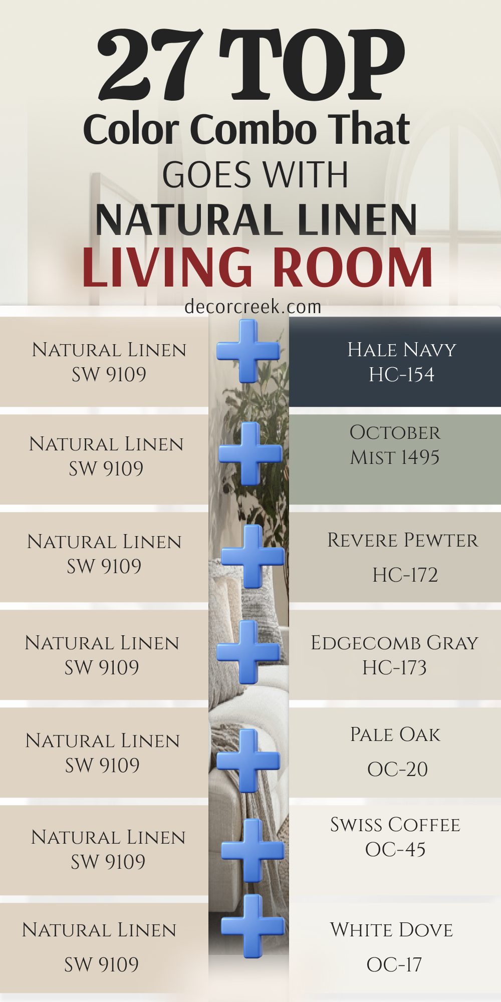
30 Top Color Combo that goes with Natural Linen Exterior
Natural Linen SW 9109 + Creamy SW 7012
Natural Linen SW 9109 + Creamy SW 7012 creates a wonderfully soft, understated contrast for an inviting living room. Creamy lives up to its name by providing a rich, warm white background that lacks any harsh, clinical coldness.
When paired with the sandy depth of Natural Linen, it mimics the peaceful feeling of a sunlit morning. You can use Creamy on crown moldings, built-in shelving, and window casings to frame your living spaces with gentle warmth.
This combination works exceptionally well in rooms with limited natural light, as it bounces illumination around without looking flat or stark. It provides a timeless background for soft texture layers like knit pillows, linen drapes, and woven accent rugs.
Best used in: living rooms, kitchens, hallways, bedrooms, and traditional interiors
Pairs well with: Urbane Bronze SW 7048, Accessible Beige SW 7036, soft brass fixtures, warm oak flooring The key rule of this combination is to let Creamy bring a gentle, soft-focused glow to spaces where crisp whites feel too sharp.

Natural Linen SW 9109 + Antique White SW 6119
Natural Linen SW 9109 + Antique White SW 6119 is a traditionalist’s dream, offering an exceptionally rich and cozy atmosphere. Antique White brings a strong, warm undertone with a whisper of yellow-beige that blends beautifully with Natural Linen.
This pairing creates a low-contrast, tone-on-tone effect that feels historic, secure, and deeply comforting. It is perfect for larger family rooms with traditional architecture, heavy crown moldings, and stone or brick fireplaces.
The duo softens the appearance of sharp angles and creates an excellent backdrop for antique wooden furniture and dark leather chairs. It makes large, open layouts feel instantly more intimate and grounded.
Best used in: living rooms, traditional dining rooms, historical homes, and cozy dens
Pairs well with: Porpoise SW 7047, deep walnut stains, oil-rubbed bronze accents, vintage patterned rugs The key rule of this combo is to lean into traditional warmth, making it ideal for gathering spaces that should feel established and time-honored.
Natural Linen SW 9109 + Dover White SW 6385
Natural Linen SW 9109 + Dover White SW 6385 delivers a welcoming, sun-kissed look that is incredibly popular in casual coastal and farmhouse designs. Dover White is a favored warm white that carries a soft yellow undertone, giving it a friendly, cheerful personality.
When used alongside Natural Linen, it provides a clean but distinctly warm border for your living room walls. This duo makes a sitting area feel bright and welcoming without ever feeling cold or sterile.
It complements natural light beautifully, making it an excellent choice for open main-floor spaces, entryways, and sunrooms. It acts as a beautiful frame for botanical artwork, warm wood elements, and woven storage baskets.
Best used in: living rooms, open-concept main levels, kitchens, and cottage-style interiors
Pairs well with: Sea Salt SW 6204, Clary Sage SW 6178, medium tone wood floors, brushed brass accents The key rule of this pairing is to use it where you want a bright, cheerful, and sunny atmosphere that feels effortlessly welcoming.
Natural Linen SW 9109 + Casa Blanca SW 7571
Natural Linen SW 9109 + Casa Blanca SW 7571 offers a luxurious, creamy neutral pairing with an elegant, Mediterranean-inspired warmth. Casa Blanca is a rich, off-white shade that balances beige and ivory notes perfectly.
Paired with Natural Linen, it creates a subtle, sophisticated transition between walls and trim work. This selection gives your living room a high-end boutique hotel feel, making everything appear curated, expensive, and deeply relaxing.
It handles strong afternoon sunlight beautifully by absorbing the intensity and turning it into a soft, golden glow. It looks stunning when paired with large statement lighting fixtures and plush upholstered seating arrangements.
Best used in: living rooms, primary bedrooms, formal sitting areas, and entryways
Pairs well with: Urbane Bronze SW 7048, Tony Taupe SW 7038, matte black accents, linen textiles The key rule of this pairing is to rely on its heavy, expensive-looking undertones to create a calm, sophisticated, and unified neutral haven.
Natural Linen SW 9109 + Natural Choice SW 7011
Natural Linen SW 9109 + Natural Choice SW 7011 forms a flawless, low-contrast organic pairing that minimalists adore. Natural Choice is a soft, muted off-white with a slight greige-beige undertone, making it exceptionally grounded and calm.
Because both shades share a similar understated DNA, this combination creates a seamless, flowing aesthetic across your entire living room. It is a fantastic choice for open floor plans where you want a clean look without relying on stark gallery whites.
This pairing emphasizes natural textures, making your linen couches, jute rugs, and raw wood elements take center stage. It looks incredibly fresh, well-edited, and organized.
Best used in: living rooms, open-concept areas, modern farmhouse spaces, and hallways
Pairs well with: Iron Ore SW 7069, Mindful Gray SW 7016, matte black hardware, light white oak elements The key rule of this color duo is to create a peaceful, continuous flow that calms the senses and opens up your spatial layout.
Natural Linen SW 9109 + Canvas Tan SW 7531
Natural Linen SW 9109 + Canvas Tan SW 7531 is a masterful study in tone-on-tone neutral design. Canvas Tan is a light, sandy khaki shade that sits just a step away from Natural Linen on the color spectrum.
When used together—such as Natural Linen on the walls and Canvas Tan on the doors and trim—they create an intentional, layered look with very soft contrast. This combination gives your living room a tailored, custom-designed appearance that avoids feeling plain or flat.
It is highly practical for busy households because these sandy shades easily mask minor wall smudges and dust. It beautifully highlights light oak or maple flooring.
Best used in: living rooms, home offices, entryways, and complete home staging
Pairs well with: Loggia SW 7506, Black Fox SW 7020, woven textures, warm cognac leather The key rule of this pairing is to use it for an elegant, tone-on-tone background that feels grounded, warm, and highly professional.

Natural Linen SW 9109 + Kilim Beige SW 6106
Natural Linen SW 9109 + Kilim Beige SW 6106 brings a cozy, traditional warmth with a slightly deeper tan presence. Kilim Beige is a legendary Sherwin-Williams neutral known for its authentic, warm beige undertones.
This combination layers two distinct depths of beige to give your living room an established, cozy feel. It works beautifully when you want to paint an accent wall, highlight built-in bookcases, or ground an open-concept living room layout.
It coordinates effortlessly with warm wood cabinetry, terracotta decorative accents, and traditional furniture setups. It maintains a steady, dependable warmth that makes winter evenings feel exceptionally cozy.
Best used in: living rooms, traditional family rooms, transitional spaces, and hallways
Pairs well with: Nomadic Desert SW 6107, Iron Ore SW 7069, warm brick elements, brass hardware The key rule of this pairing is to establish a dependable, warm beige environment that feels structurally solid and comfortable.
Natural Linen SW 9109 + Nomadic Desert SW 6107
Natural Linen SW 9109 + Nomadic Desert SW 6107 offers a rich, desert-inspired tan partnership that brings deep structural presence. Nomadic Desert is a true mid-tone beige that adds a handsome weight when paired alongside the lighter Natural Linen.
This duo is excellent for creating a warm, cozy focal feature, such as an accent wall behind a media console or framing a stone fireplace surround. It looks beautiful alongside dark walnut furniture, leather accent chairs, and brass light fixtures.
This choice prevents large, vaulted living rooms from feeling too empty or drafty, wrapping the architecture in a steady, reliable comfort.
Best used in: living rooms, accent walls, home libraries, and spacious family areas
Pairs well with: Kilim Beige SW 6106, Black Fox SW 7020, rich leather, natural stone hearths The key rule of this combination is to bring an organic, grounded depth to your main living zones using varying levels of true tan.

Natural Linen SW 9109 + Sandbar SW 7547
Natural Linen SW 9109 + Sandbar SW 7547 provides a gorgeous, earthy contrast that feels sophisticated and organic. Sandbar is a unique mid-tone tan with a beautiful taupe-gray undertone, which keeps it from looking too yellow or orange.
Paired with Natural Linen, it introduces a highly refined, stone-like elegance into your conversation areas. You can use Sandbar on a fireplace accent wall, custom wainscoting panels, or built-in media centers to create visual interest.
It works seamlessly with greige carpets, gray stonework, and light neutral upholstery, making it a highly versatile layout for transitional home designs.
Best used in: living rooms, fireplace surrounds, built-ins, and transitional interiors
Pairs well with: Alabaster SW 7008, Urbane Bronze SW 7048, linen fabrics, light stone details The key rule of this combination is to balance out warm sandy walls with a muddy, stone-inspired taupe-tan for an upscale look.
Natural Linen SW 9109 + Balanced Beige SW 7037
Natural Linen SW 9109 + Balanced Beige SW 7037 is a well-proportioned partnership that brings a true greige-tan balance. Balanced Beige is a dependable mid-tone shade that hits the sweet spot between warm beige and cool gray.
This combination gives your living room a beautifully structured framework without feeling overly dark. It looks spectacular when Balanced Beige is applied to interior doors, window trim, or a central feature wall.
It easily handles high-traffic areas, hiding scuffs and fingerprints flawlessly. This duo pairs beautifully with gray tweed sofas, dark wood coffee tables, and mixed metallic accents like brushed nickel and bronze.
Best used in: living rooms, high-traffic hallways, interior trim and doors, and family rooms
Pairs well with: Pure White SW 7005, Accessible Beige SW 7036, charcoal gray pillows, modern decor The key rule of this combination is to use a balanced, mid-tone greige to give your warm sandy walls a tailored and contemporary edge.
Natural Linen SW 9109 + Loggia SW 7506
Natural Linen SW 9109 + Loggia SW 7506 delivers a smooth, creamy taupe companion that exudes quiet luxury. Loggia is a sophisticated neutral with a soft gray-beige base and a subtle hint of mauve-taupe undertone.
This gives your living room a unique, high-end designer look that feels soft and complex. When layered with Natural Linen, it creates a cozy, velvet-like atmosphere that feels instantly calming.
This pairing looks exceptional in rooms with layered textiles, soft velvet accent chairs, and warm ambient lamp lighting. It offers a fresh alternative to standard gray or beige paint paths, keeping your home looking highly stylized.
Best used in: living rooms, formal sitting areas, master bedrooms, and accent walls
Pairs well with: Shoji White SW 7042, Urbane Bronze SW 7048, brass lighting, plush neutral textiles The key rule of this color duo is to use its sophisticated taupe undertones to add a sense of luxury, softness, and calm to your home.

Natural Linen SW 9109 + Tony Taupe SW 7038
Natural Linen SW 9109 + Tony Taupe SW 7038 brings a strong, handsome architectural contrast into your primary living zones. Tony Taupe is a rich, darker mid-tone taupe that provides excellent visual weight against the pale background of Natural Linen.
This combination is highly effective for grounding open-concept spaces or adding character to plain builder-grade rooms. Use Tony Taupe on a prominent accent wall, interior doors, or wrapped around a kitchen island that opens into the living room.
It pairs beautifully with dark wood tones, oil-rubbed bronze hardware, and neutral upholstered sofas, creating a cohesive and well-anchored design plan.
Best used in: living rooms, feature walls, interior doors, and open-concept layouts
Pairs well with: Alabaster SW 7008, Balanced Beige SW 7037, dark walnut coffee tables, heavy textures The key rule of this pairing is to use a bold, darker taupe to give your sandy walls a striking, grounded architectural framework.

Natural Linen SW 9109 + Prairie Grass SW 7546
Natural Linen SW 9109 + Prairie Grass SW 7546 introduces a warm, muted olive-tan hue that brings an organic, historical charm. Prairie Grass is a complex color that sits between an earthy khaki and a soft, dusty green.
When paired with Natural Linen, it evokes the soothing colors of a natural landscape, making your living room feel grounded and tranquil. It works wonderfully on an accent feature wall, custom mudroom built-ins, or fireplace mantels.
This combination pairs seamlessly with warm leather furniture, antique brass light fixtures, and rustic wooden beams, giving your home a beautifully curated, collected-over-time character.
Best used in: living rooms, cozy dens, accent walls, and country-inspired interiors
Pairs well with: Creamy SW 7012, Canvas Tan SW 7531, warm wood tones, botanical accents The key rule of this combo is to embrace its muddy, natural green-beige undertone to create a restful, outdoor-inspired retreat.
Natural Linen SW 9109 + Svelte Sage SW 6164
Natural Linen SW 9109 + Svelte Sage SW 6164 brings a soft, peaceful garden element directly into your home. Svelte Sage is a beautiful, muted sage green with a strong yellow-beige undertone, making it blend effortlessly with warm neutrals like Natural Linen.
This pairing feels refreshing and tranquil, making your primary conversation space feel like a relaxing sunroom. It looks spectacular on custom wainscoting panels, accent walls, or painted media cabinetry.
Svelte Sage responds beautifully to changing light, revealing soft silver-gray tones in the evening. It coordinates smoothly with light white oak floors, neutral cotton curtains, and plenty of indoor potted plants.
Best used in: living rooms, sunrooms, accent walls, and cottage-style spaces
Pairs well with: Alabaster SW 7008, Mindful Gray SW 7016, light wood elements, woven textiles The key rule of this pairing is to bring a quiet, organic touch of nature indoors without overwhelming your neutral design foundation.
Natural Linen SW 9109 + Artichoke SW 6179
Natural Linen SW 9109 + Artichoke SW 6179 delivers a bold, sophisticated olive green presence with deep organic weight. Artichoke is a rich, medium-to-dark green that acts like a dramatic neutral when placed against the light backdrop of Natural Linen.
This combination creates an instant focal point, making it perfect for an accent wall behind your main sofa or wrapped around a cozy fireplace hearth. It adds an artistic, high-end designer feel to standard rooms.
It coordinates wonderfully with rich gold picture frames, cognac leather chairs, and dark chocolate wood coffee tables, creating a balanced and confident look.
Best used in: living rooms, dramatic accent walls, built-in shelving backs, and libraries
Pairs well with: Pure White SW 7005, Accessible Beige SW 7036, brass accents, warm leather The key rule of this color pairing is to use a confident, earthy olive to establish a bold, high-contrast look that feels deeply connected to nature.
Natural Linen SW 9109 + Ripe Olive SW 6209
Natural Linen SW 9109 + Ripe Olive SW 6209 offers an ultra-moody, deep green contrast that brings serious luxury. Ripe Olive is a dark, velvety green with a touch of gray that feels grounding, sophisticated, and daring.
When contrasted against your warm Natural Linen walls, it creates a striking visual break that highlights architectural features beautifully. It is an exceptional choice for a dramatic accent wall, painted fireplace brick, or custom built-in media centers.
Ripe Olive completely hides television screens when mounted against it, making your entertainment setup look sleek. It makes light cream furniture and brass hardware shine like jewelry.
Best used in: living rooms, media walls, fireplace surrounds, and moody accent spaces
Pairs well with: High Reflective White SW 7757, Natural Linen SW 9109, warm brass, dark wood tones The key rule of this combination is to use a deep, saturated forest olive to bring high-end, custom designer drama to a warm neutral layout.

Natural Linen SW 9109 + Rocky River SW 6215
Natural Linen SW 9109 + Rocky River SW 6215 introduces a rich, moody teal-green color that feels majestic and deep. Rocky River balances rich green tones with a strong slate-blue undertone, giving it a complex, water-like appearance.
Paired with Natural Linen, it creates an elegant sand-and-sea contrast that feels incredibly custom and refined. You can use it to build a cozy reading nook, frame an accent wall, or update a central media layout.
It pairs smoothly with matte black metal accents, charcoal gray area rugs, and bright gold decorative details, giving your home a confident, upscale personality that stands out beautifully.
Best used in: living rooms, accent walls, painted cabinetry, and modern transitional homes
Pairs well with: Alabaster SW 7008, Agreeable Gray SW 7029, matte black hardware, gold mirrors The key rule of this color duo is to embrace its complex green-blue depth to give your warm living space a striking and highly customized focal point.
Natural Linen SW 9109 + Riverway SW 6222
Natural Linen SW 9109 + Riverway SW 6222 displays a stunning, dusty slate teal that brings an artistic, sophisticated energy. Riverway is a mid-to-dark blue-green with a prominent gray backbone, ensuring it looks mature and grounded rather than overly bright.
This pairing looks magnificent when Riverway is used on an accent wall behind a neutral sofa or on board-and-batten accent trim work. It draws the eyes immediately and provides a beautiful backdrop for light oak furniture and crisp white curtains.
It easily conceals fingerprints and everyday smudges, making it as practical as it is beautiful for active family gathering rooms.
Best used in: living rooms, board-and-batten features, accent walls, and entryways
Pairs well with: Pure White SW 7005, Canvas Tan SW 7531, light oak floors, modern furniture The key rule of this combination is to use a sophisticated, gray-toned slate teal to add a calm, cool-toned artistic element to a warm room.

Natural Linen SW 9109 + Slate Tile SW 7624
Natural Linen SW 9109 + Slate Tile SW 7624 offers a handsome, dark slate blue-gray that brings a structured denim look. Slate Tile is a deep, smoky blue with heavy gray undertones, making it behave like a colorful dark neutral.
When paired with the sandy tones of Natural Linen, it delivers a timeless color combination reminiscent of rocky coastlines. It works perfectly on feature walls, built-in bookcases, or painted accent columns.
This duo grounds your living room arrangement beautifully, contrasting sharply with cream fabrics, white baseboards, and silver or chrome lighting fixtures for a highly tailored and clean look.
Best used in: living rooms, built-in media centers, feature walls, and coastal-modern spaces
Pairs well with: White Dove OC-17, Repose Gray SW 7015, silver picture framing, neutral tweed sofas The key rule of this pairing is to use a deep, smoky slate blue to provide a crisp, modern, and structured frame around your warm living spaces.

Natural Linen SW 9109 + Downing Slate SW 2819
Natural Linen SW 9109 + Downing Slate SW 2819 is a historic, rich gray-blue combination that brings immediate architectural authority. Downing Slate belongs to Sherwin-Williams’ historical collection, offering a deeply saturated, grayed-blue tone that feels timeless and stately.
This pairing creates a dramatic contrast when applied to focal points like a fireplace accent wall, window grids, or custom wainscoting. It gives your living room a permanent, established character that looks incredibly high-end.
It pairs beautifully with rich leather upholstery, antique brass accents, and large statement mirrors, making your central seating layout look entirely bespoke.
Best used in: living rooms, accent walls, historical home updates, and fireplace features
Pairs well with: Dover White SW 6385, Natural Choice SW 7011, rich leather chairs, antique brass The key rule of this combination is to use an authentic, historic slate blue to anchor your warm rooms with timeless, stately elegance.

Natural Linen SW 9109 + Porpoise SW 7047
Natural Linen SW 9109 + Porpoise SW 7047 brings a luxurious, dark bronze-gray element that grounds your conversation areas. Porpoise is a rich, deep brown-gray that feels velvety, warm, and highly sophisticated.
Because it carries a warm undertone, it coordinates flawlessly with Natural Linen without creating the cold contrast of standard black paint. It is an exceptional selection for painting built-in media units, accent walls, or interior doors.
This combination looks spectacular alongside dark walnut coffee tables, gold light fixtures, and cream-colored upholstered sectionals, creating a cozy, high-end lounge environment right in your home.
Best used in: living rooms, built-in media surrounds, interior doors, and modern accent walls
Pairs well with: Alabaster SW 7008, Accessible Beige SW 7036, gold lighting, cream furniture The key rule of this pairing is to use a deep, warm bronze-gray to build a cozy, high-end atmosphere that feels stable, grounded, and rich.

Natural Linen SW 9109 + Anonymous SW 7046
Natural Linen SW 9109 + Anonymous SW 7046 provides a gorgeous, mid-to-dark olive-gray companion with an incredibly calming presence. Anonymous is a complex neutral that blends gray, brown, and a subtle whisper of green.
Paired with Natural Linen, it creates a deeply organic, stone-and-sand layout that feels beautifully curated. You can use Anonymous on a main feature wall or to outline a brick fireplace structure.
It coordinates smoothly with matte black iron floor lamps, charcoal accent pillows, and natural wood shelves. This paint duo brings a highly customized designer look to standard rooms, keeping the family environment looking orderly, relaxing, and beautiful.
Best used in: living rooms, fireplace surrounds, accent walls, and organic modern interiors
Pairs well with: Shoji White SW 7042, Sandbar SW 7547, natural wood shelves, black metal details The key rule of this combination is to use a muddy, complex olive-gray to bring an understated, stone-like designer elegance to your walls.
Natural Linen SW 9109 + Black Fox SW 7020
Natural Linen SW 9109 + Black Fox SW 7020 delivers the ultimate high-contrast organic statement for modern living spaces. Black Fox is a spectacular, ultra-dark charcoal brown that behaves like a soft, rich black with a warming espresso backbone.
When contrasted against pale Natural Linen walls, it creates a breathtaking, sophisticated break. It works beautifully on window frames, fireplace statement walls, or painted built-in bookcases.
It grounds large, open-concept rooms effortlessly, making light cream furniture pop with dramatic crispness. This duo hides scuff marks perfectly while making metallic accents like brass or chrome look incredibly bright.
Best used in: living rooms, window frames, dramatic feature walls, and modern open levels
Pairs well with: Pure White SW 7005, Canvas Tan SW 7531, brass hardware, light white oak floors The key rule of this color duo is to swap harsh black paint for a rich, warm charcoal-brown to achieve stunning contrast with an inviting feel.
Natural Linen SW 9109 + Griffin SW 7026
Natural Linen SW 9109 + Griffin SW 7026 mixes deep brown and slate gray for an organic, deeply comforting shelter effect. Griffin is a rich, muddy dark brown-gray that brings a solid, earthy grounding presence to your conversation areas.
It helps connect your indoor interior design with natural outdoor elements like stone hearths, brick columns, and wood beams. Use it on a main feature wall or inside reading alcoves to create a cozy, high-end cabin aesthetic.
It behaves like a dark neutral that never feels cold or sterile in winter light. It looks magnificent alongside stained wood open shelving and neutral fabric sofas.
Best used in: living rooms, cozy alcoves, fireplace accents, and rustic-modern spaces
Pairs well with: Creamy SW 7012, Natural Choice SW 7011, rustic wood beams, natural stone The key rule of this pairing is to embrace its deep, muddy brown-gray undertones to wrap your central seating areas in an atmosphere of pure comfort.
Natural Linen SW 9109 + Pashmina AF-100
Natural Linen SW 9109 + Pashmina AF-100 offers a beautiful, high-end greige pairing with exceptional wall substance. Pashmina is a celebrated Benjamin Moore neutral that displays a rich, muddy mid-tone greige with no harsh yellow or green tones.
This flexible combination responds beautifully to changing daily light, shifting gracefully between a soft tan and a warm gray. It coordinates seamlessly with living rooms that feature both beige carpeting and gray stone details.
You will love how it builds a cozy, layered atmosphere when paired with your linen walls. It creates an upscale designer look that feels stable, grounded, and highly cohesive.
Best used in: living rooms, complete home updates, transitional spaces, and accent walls
Pairs well with: White Dove OC-17, Edgecomb Gray HC-173, transitional furniture, mixed metals The key rule of this combination is to rely on its rich, muddy greige composition to bridge the gap between warm sandy tones and cool gray accents.

Natural Linen SW 9109 + Stone Hearth CC-490
Natural Linen SW 9109 + Stone Hearth CC-490 delivers a classic, stone-inspired greige presence that anchors rooms beautifully. Stone Hearth is a highly reliable mid-tone neutral from Benjamin Moore that brings a layer of traditional elegance to accent walls and fireplace surrounds.
It provides a beautiful, soft contrast against bright white ceilings and warm sandy main walls. You can use it to add architectural weight to a television wall or a large central entry.
It coordinates wonderfully with antique brass light fixtures, linen upholstery, and classic white tile work, making your home look substantial, permanent, and completely put together.
Best used in: living rooms, feature walls, transitional spaces, and entryway dividers
Pairs well with: Swiss Coffee OC-45, Pale Oak OC-20, antique brass, classic linen sofas The key rule of this color pairing is to use an elegant, stone-like mid-tone neutral to keep your main conversation layouts looking grounded and timeless.
Natural Linen SW 9109 + Kingsport Gray HC-86
Natural Linen SW 9109 + Kingsport Gray HC-86 brings a rich, deep historic brown-gray that adds immediate warmth and stature. Kingsport Gray is a classic historical shade from Benjamin Moore that offers excellent structural depth.
This combination provides a stunning contrast against bright white borders and your warm sandy main walls. You can use it to give a standard living room corner an expensive custom lounge appearance or ground a floating media setup.
It conceals daily scuffs and pet hair flawlessly along baseboards and doors. This selection looks rich and deep when your lamps are turned on, making your evening conversation spots feel incredibly intimate.
Best used in: living rooms, historical updates, trim and doors, and cozy accent walls
Pairs well with: Alabaster SW 7008, Canvas Tan SW 7531, warm lamp lighting, rich textiles The key rule of this color duo is to utilize its deep, historic brown-gray presence to give your home a permanent, high-end architect-designed look.
Natural Linen SW 9109 + Gloucester Sage HC-100
Natural Linen SW 9109 + Gloucester Sage HC-100 introduces a gorgeous, dark mossy green with a heavy gray-brown backbone. Gloucester Sage is an incredibly rich, sophisticated historical green from Benjamin Moore that acts like a bold, organic dark neutral.
When contrasted against your pale sandy walls, it creates a striking designer look that reminds visitors of formal countryside estates. It looks spectacular when applied to feature walls, fireplace accents, or built-in bookcases.
It softens the hard appearance of large black electronics and matches beautifully with rich brass fixtures and warm leather seating setups.
Best used in: living rooms, historic accent walls, fireplace masonry, and home libraries
Pairs well with: Dover White SW 6385, Antique White SW 6119, rich brass fixtures, leather furniture The key rule of this combination is to use a deep, historical mossy green to break up neutral walls with a sophisticated touch of nature.
Natural Linen SW 9109 + Amherst Gray HC-167
Natural Linen SW 9109 + Amherst Gray HC-167 delivers a striking, contemporary edge using a deep, true charcoal gray. Amherst Gray is a sophisticated mid-to-dark gray from Benjamin Moore that carries slight warm undertones, allowing it to coordinate beautifully with Natural Linen.
This combination provides a sharp architectural structure that balances out your soft, sandy wall tones. You can use it to frame a media wall, paint a fireplace surround, or create a stunning feature wall.
It creates an instant sense of high-end home staging, making your surrounding neutral paint look incredibly fresh, clean, and highly detailed.
Best used in: living rooms, modern feature walls, fireplace surrounds, and structural trim
Pairs well with: Pure White SW 7005, Repose Gray SW 7015, modern decor accents, silver hardware The key rule of this color pairing is to introduce a bold, architectural charcoal gray to give your warm living room a crisp, contemporary framework.

Natural Linen SW 9109 + Wrought Iron 2124-10
Natural Linen SW 9109 + Wrought Iron 2124-10 stands as a spectacular, iconic deep charcoal black that provides the ultimate modern contrast. Wrought Iron is a beloved Benjamin Moore shade that is softer than a true black, carrying subtle undertones of navy and gray that keep it looking velvety and rich.
This bold choice turns an accent wall or window trim into a stunning design statement. It contrasts sharply with your warm linen backdrops, creating an upscale modern-rustic look.
It works beautifully on walls behind television screens to hide the black monitor completely, ensuring your living room always looks perfectly styled, neat, and highly curated.
Best used in: living rooms, window sashes, media accent walls, and fireplace surrounds
Pairs well with: White Dove OC-17, Natural Choice SW 7011, bright gold frames, light cream fabrics The key rule of this combination is to use a soft, velvety charcoal black to inject high-end designer drama and sharp architectural lines into your warm neutral space.

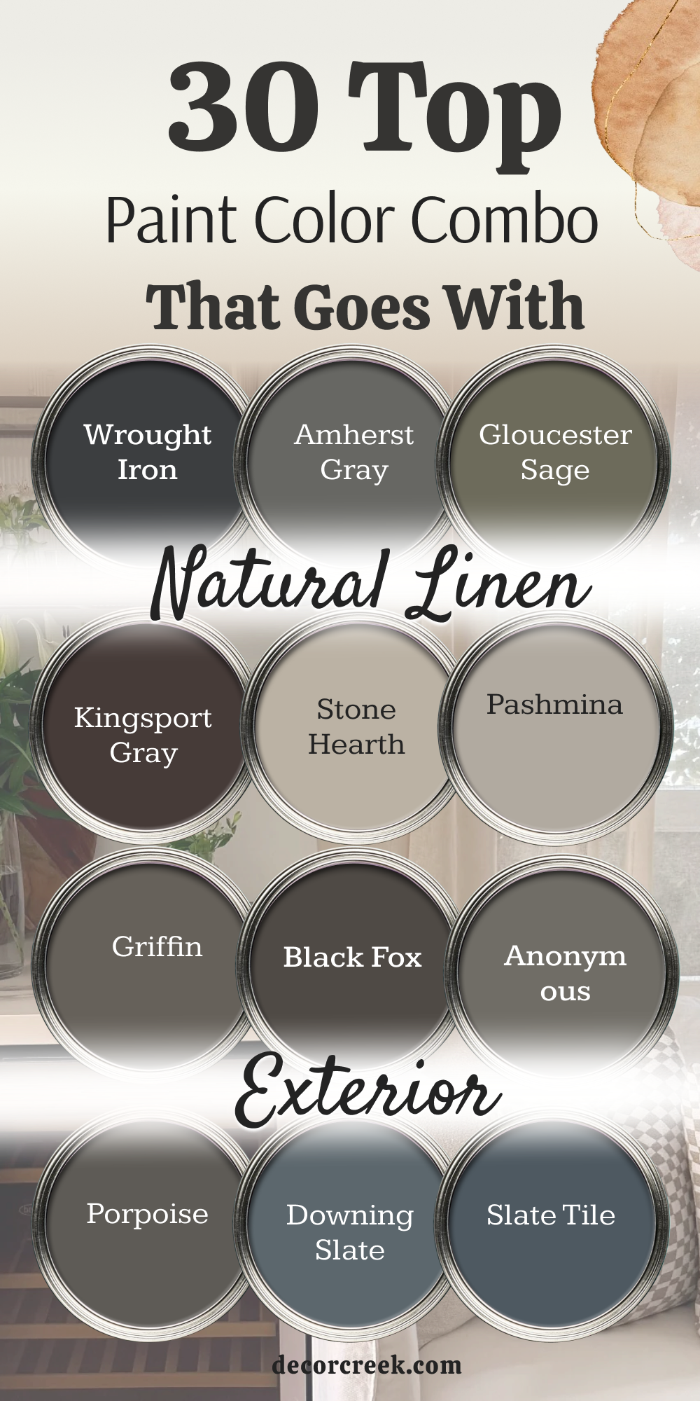
This curated palette of 30 color companions proves exactly why Sherwin-Williams Natural Linen SW 9109 is considered one of the most flexible foundations in interior design. Because it sits perfectly in that cozy sweet spot—not too yellow, not too pink, and never cold—it behaves like a true chameleon, letting you steer your living spaces into completely different design styles depending on what you pair it with.
When looking at the collection as a whole, your choices generally fall into three distinct design mindsets for a living space.
The first approach focuses on low-contrast, timeless classics using pairs like Creamy, Natural Choice, and Canvas Tan. These combinations are all about creating a continuous, airy flow. They rely on a tone-on-tone approach that feels soft, elegant, and incredibly spacious. They let natural textures like light white oak, jute, and linen fabrics take center stage, giving you a bright, welcoming backdrop that never competes with your furniture.
The second mindset tells an earthy and organic story. When you step into shades like Svelte Sage, Riverway, or Anonymous, Natural Linen acts like warm beach sand that softens the cool nature of greens, blues, and muddy grays. These combinations bring a peaceful, outdoor-inspired feel into your home. They ground the room beautifully and give it a custom, curated-over-time character that feels both relaxing and sophisticated.
The third direction relies on bold, architectural statements. If you want dramatic contrast without the clinical coldness of pure black and stark white, anchoring Natural Linen with deep shades like Ripe Olive, Black Fox, or Wrought Iron is a designer favorite. These deep, complex colors introduce sharp structural frame lines, make warm metal fixtures pop like jewelry, and effortlessly hide large flat-screen TVs when used on media wall