Choosing the right paint is undoubtedly the most critical step in transforming a simple structure of wood and stone into a place that truly feels like a home. Over the past decade, I have spent countless hours observing the silent dance of light against plaster, noting how a single shade can shift its entire personality from the soft glow of dawn to the deep shadows of midnight.
Picking a color is far more complex than finding a pretty square on a plastic fan deck at the local hardware store; it is about emotional resonance. It is about the specific way a soft ivory or a deep forest green makes you feel when you cross the threshold after an exhausting day at work.
I want to empower you to find that perfect aesthetic for your own walls, ensuring you feel a deep sense of pride and comfort in your living space. Many homeowners are paralyzed by the fear of making a costly mistake, but I am here to serve as your expert guide through the premier color trends arriving in 2026.
Together, we will explore a curated palette ranging from luminous whites and sophisticated grays to the dramatic, moody greens that are currently dominating the high-end design world. This comprehensive list is born from my personal experience as a professional designer and home stager, where I have seen firsthand which colors actually deliver on their promise once they are applied to a real room.
Why I Always Trust Sherwin-Williams and Benjamin Moore for North Facing Bedrooms
North-facing bedrooms present a unique architectural challenge because the light entering these spaces is consistently cool, flat, and often carries a distinct blue or grayish tint. Through years of trial and error, I have learned to rely almost exclusively on Sherwin-Williams and Benjamin Moore for these tricky environments because their paint formulas contain superior pigment loads. These two industry giants have invested heavily in research to ensure their paint offers exceptional hide and maintains the integrity of the undertone you fell in love with on the sample card.
In my professional experience, budget-friendly paints frequently fail in north-facing light, often turning “muddy” or appearing far colder than expected once the sun moves. Benjamin Moore, in particular, has a masterful way of formulating light shades that retain an inner warmth even when the sky outside is overcast or drizzling.
Sherwin-Williams provides an expansive library of colors with nuanced undertones that are specifically designed to make a bedroom feel like a sanctuary rather than a cold box. I put my reputation on these brands because they consistently produce predictable, high-quality results that keep my clients coming back.
When you invest in these paints, you aren’t just buying color; you are buying a finish that resists scuffs, covers old stains, and looks beautiful for many years to come.
How I Choose the Perfect Paint Shade for North Facing Rooms
My process for selecting the ideal shade begins with a deep analysis of the room’s natural light throughout the entire day. Because northern light is inherently “chilly,” my first rule is to strictly avoid any colors with heavy blue, violet, or cool-gray undertones, as these will only make the room feel colder and less inviting. Instead, I search for shades that feature a subtle “secret” base of yellow, peach, or soft pink to counteract the blue light and inject a much-needed sense of artificial sunshine.
I never make a final decision based on a small paper swatch; instead, I insist on painting large, two-foot-wide samples directly onto multiple walls. This allows us to observe how the color reacts at 8:00 AM, in the harsh glare of noon, and under the warm glow of evening lamps. It is vital to see how the paint interacts with the specific wood tones of your flooring and the textures of your upholstery, as colors reflect off one another in ways that can surprise you.
I always remind my clients to look closely at the “dead zones”—those dark corners where shadows gather—to ensure the paint doesn’t turn too dark or oppressive. My ultimate goal is to find a harmonious shade that bridges the gap between elegance and coziness.
I am relentless in this pursuit, continuing to test and refine until the color perfectly captures the unique vibe and heartbeat of the house.
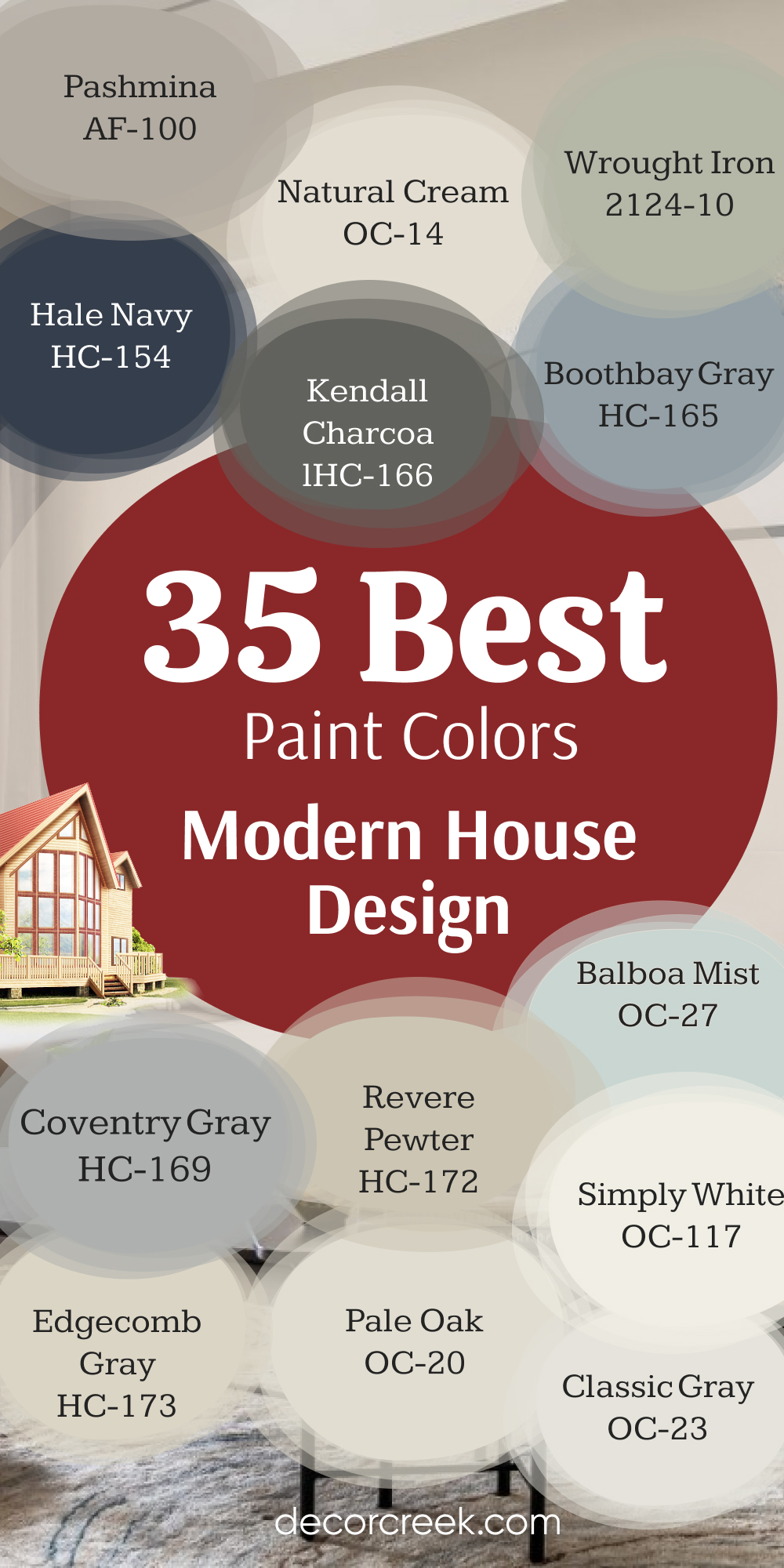
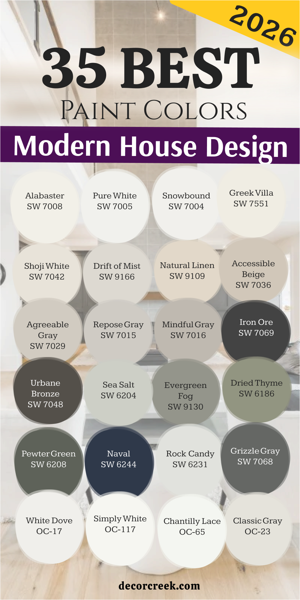
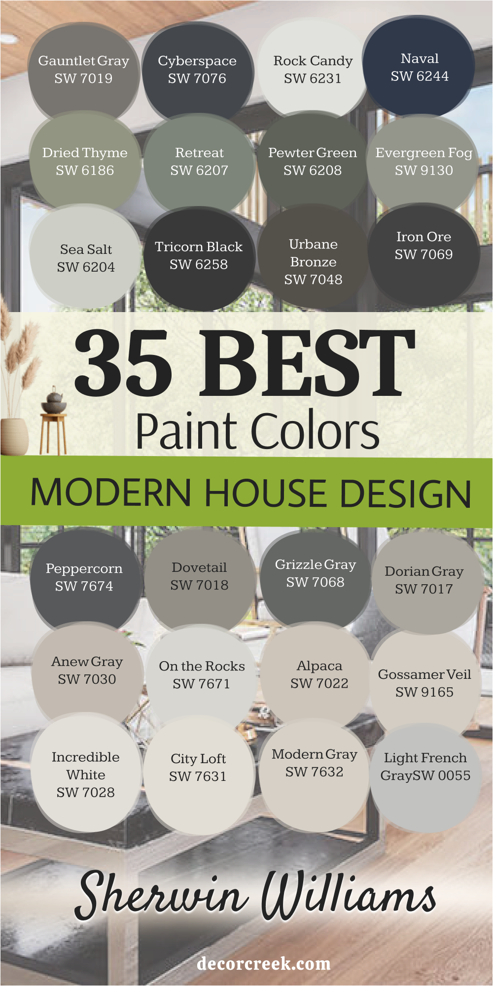
35 Best Paint Colors To Use In Modern House Design in 2026
Alabaster SW 7008
Alabaster SW 7008 is a soft white that does not feel too sharp or cold on the walls. This color has a tiny bit of cream in it that helps a room feel very cozy and inviting. Alabaster SW 7008 works great on both walls and trim if you want a clean look that is not boring.
This shade looks wonderful when you have dark wood floors or black metal accents in your furniture. Alabaster SW 7008 is a favorite for living rooms because it makes the walls look soft and clean. Many people choose this color when they want a white that feels like a warm hug.
Alabaster SW 7008 stays bright even in rooms that do not have a lot of big windows for sun. This paint color is one of the most popular choices for modern homes because it is so easy to live with. Alabaster SW 7008 helps your colorful pillows and art stand out without being a distraction. You will find that this white is very forgiving and hides small bumps on your walls.
🎨 Check out the complete guide to this color right HERE 👈

Pure White SW 7005
Pure White SW 7005 is a very clean shade that does not have any strong yellow or blue tones. This color is perfect for kitchen cabinets because it looks very crisp and high end. Pure White SW 7005 makes a great ceiling color when you want the room to feel taller and more open.
This shade is a safe pick for any room because it matches almost every kind of fabric and rug. Pure White SW 7005 is not too bright like a piece of paper, so it will not hurt your eyes. I like to use this color in hallways to make them feel less narrow and much brighter. Pure White SW 7005 gives a fresh look to older homes that need a bit of a modern update.
This color is a top choice for trim because it provides a nice contrast against darker wall colors. Pure White SW 7005 is a reliable friend in the world of paint because it always looks professional. You can use this white in a bathroom to make the whole area feel sanitized and very tidy.
🎨 Check out the complete guide to this color right HERE 👈

Snowbound SW 7004
Snowbound SW 7004 has a very slight gray undertone that keeps it from looking too warm or creamy. This color is excellent for modern homes that have a lot of cool metal or stone features. Snowbound SW 7004 creates a crisp background for a gallery wall filled with black and white photos.
This shade can sometimes look a little bit pink in certain lights, so check your samples carefully. Snowbound SW 7004 is a great choice for a bedroom where you want a very clean and airy feeling. I often suggest this color for trim when the walls are painted a cool or true gray.
Snowbound SW 7004 helps a small room feel much larger than it actually is by reflecting light. This color is a staple for designers who want a white that feels very fresh and current. Snowbound SW 7004 works well in a nursery because it feels very soft and gentle on the eyes. You should try this color if you want a white that feels modern but still has some personality.
🎨 Check out the complete guide to this color right HERE 👈

Greek Villa SW 7551
Greek Villa SW 7551 is a rich white that brings a lot of warmth into any area of your home. This color reminds me of old stones in the sun and feels very expensive on the walls. Greek Villa SW 7551 is a great pick for an exterior if you want your house to look bright.
Many people use this shade in their dining rooms to create a soft and welcoming place to eat. Greek Villa SW 7551 has a yellow base that keeps it from ever feeling cold or like an office. This color looks beautiful with brass hardware and light oak wood floors in a modern kitchen.
Greek Villa SW 7551 is thick and covers the old paint on your walls very well in two coats. I love how this white makes a room feel sunny even on a day when it is raining. Greek Villa SW 7551 is a classic choice that will stay in style for many years to come. You will love how this color makes your home feel like a fancy vacation spot every day.
🎨 Check out the complete guide to this color right HERE 👈

Shoji White SW 7042
Shoji White SW 7042 is a mix between a soft white and a very light beige color. This color is perfect for people who think white is too bright but beige is too dark. Shoji White SW 7042 looks amazing on the outside of a house with dark wood accents and black trim.
This shade creates a very soft look that makes a bedroom feel like a quiet place to rest. Shoji White SW 7042 is a great choice for a whole house color because it flows well between rooms. I like to use this color in large open floor plans to make the area feel connected and soft.
Shoji White SW 7042 changes quite a bit depending on the time of day, so watch it closely. This color is very popular for modern farmhouse styles because it feels very natural and earthy. Shoji White SW 7042 is a smart pick if you want a wall color that feels very cozy. You will find that this shade makes your furniture look grounded and very well put together.
🎨 Check out the complete guide to this color right HERE 👈

Drift of Mist SW 9166
Drift of Mist SW 9166 is a very light gray that feels as soft as a cloud in the sky. This color is a great alternative to white if you want just a tiny bit of contrast on your walls. Drift of Mist SW 9166 works perfectly in a modern living room with a big gray or navy sofa.
This shade is light enough that it does not make a room feel small or dark at all. Drift of Mist SW 9166 has a very clean look that doesn’t lean too much into blue or green. I suggest this color for offices because it feels very professional and helps you focus on your work.
Drift of Mist SW 9166 is a wonderful choice for laundry rooms to make the chore feel more pleasant. This color looks best when paired with a very bright white trim to make the gray pop. Drift of Mist SW 9166 is a gentle gray that will not make your home feel like a cold basement. You should use this color if you want a modern look that still feels very light and airy.
🎨 Check out the complete guide to this color right HERE 👈

Natural Linen SW 9109
Natural Linen SW 9109 is a beautiful tan color that looks like the fabric it is named after. This color brings a lot of earthiness into a room and makes it feel very warm and solid. Natural Linen SW 9109 is perfect for a cozy den or a room where you watch movies with family.
This shade looks great with green plants and leather chairs in a modern home setup. Natural Linen SW 9109 is a darker neutral that helps hide dirt and scuffs in high traffic areas. I love using this color in entryways because it gives guests a warm and friendly greeting.
Natural Linen SW 9109 works well with both gold and black finishes on your lights and faucets. This color is a great way to add some depth to a room without using a very dark paint. Natural Linen SW 9109 feels very organic and matches well with natural wood and stone textures. You will appreciate how this color adds a layer of comfort to your house that white cannot do.
🎨 Check out the complete guide to this color right HERE 👈

Accessible Beige SW 7036
Accessible Beige SW 7036 is a famous color because it looks good in almost every single house. This color is a gray beige that does not look too yellow or too muddy on the walls. Accessible Beige SW 7036 is a safe bet for selling a house because most people really like it.
This shade works well in kitchens with white cabinets to add a bit of warmth and color. Accessible Beige SW 7036 is a great choice for hallways that connect many different rooms together. I find that this color looks very high end when you use it with chunky white baseboards. Accessible Beige SW 7036 is a neutral that makes a home feel finished and very well designed.
This color is light enough to be used in dark basements to make them feel more like living areas. Accessible Beige SW 7036 is a workhorse color that handles different lighting situations very well. You can trust this color to make your home look updated and very stylish for a long time.
🎨 Check out the complete guide to this color right HERE 👈

Agreeable Gray SW 7029
Agreeable Gray SW 7029 is often called the perfect color because it sits right between gray and beige. This color is very popular for modern homes because it works with both warm and cool furniture. Agreeable Gray SW 7029 makes a room look very clean and put together without being too stark. This shade is a great choice for an open living area where you want a consistent look.
Agreeable Gray SW 7029 does not turn blue or purple like some other grays might do in the light. I recommend this color for anyone who is overwhelmed by all the different paint choices available. Agreeable Gray SW 7029 looks very elegant in a master bedroom with soft white bedding and rugs.
This color helps your home feel larger and more cohesive when used throughout the main floor. Agreeable Gray SW 7029 is a reliable pick that interior designers use over and over again for a reason. You will love how easy it is to match your curtains and pillows to this very friendly shade.
🎨 Check out the complete guide to this color right HERE 👈

Repose Gray SW 7015
Repose Gray SW 7015 is a cool gray that has just a tiny hint of warmth to keep it from being icy. This color is a bit darker than some other light grays, which gives the walls more definition. Repose Gray SW 7015 is perfect for a modern kitchen with marble countertops and stainless steel. This shade looks very sophisticated in a formal dining room or a home office with built in shelves.
Repose Gray SW 7015 is a great color to use if you want your white trim to really stand out. I often use this color in bathrooms to create a very clean and updated look for my clients. Repose Gray SW 7015 works well in rooms with a lot of natural light coming through the windows.
This color is a favorite for those who want a true gray look that still feels like a home. Repose Gray SW 7015 adds a touch of class to any room and makes the architecture look more expensive. You should choose this gray if you want a wall color that feels very modern and sharp.
🎨 Check out the complete guide to this color right HERE 👈

Mindful Gray SW 7016
Mindful Gray SW 7016 is one step darker than Repose Gray and offers a lot of depth for your walls. This color is a mid tone gray that works very well for an accent wall or a whole room. Mindful Gray SW 7016 makes a great backdrop for colorful artwork or bright furniture pieces you love.
This shade is very grounded and makes a large room feel more comfortable and a bit smaller. Mindful Gray SW 7016 is a top choice for painted brick fireplaces in a modern living room setting. I like to use this color on the exterior of a home for a very stylish and updated look.
Mindful Gray SW 7016 pairs beautifully with wood accents and dark metal hardware on your doors. This color is strong enough to stand on its own but neutral enough to not be too loud. Mindful Gray SW 7016 is a great way to add some drama to a room without going to a black color. You will enjoy how this gray makes your home feel very sturdy and well built for years.
🎨 Check out the complete guide to this color right HERE 👈

Iron Ore SW 7069
Iron Ore SW 7069 is a very dark charcoal color that looks almost black but has more soft depth. This color is perfect for an accent wall in a bedroom to make the bed the main focus. Iron Ore SW 7069 looks stunning on interior doors to give them a very high end and custom look.
This shade is a great choice for the outside of a house if you want a very modern look. Iron Ore SW 7069 works well in a media room where you want the walls to be dark for movies. I love using this color for kitchen islands to make them stand out from the rest of the cabinets.
Iron Ore SW 7069 is a bold choice that makes a big statement in any part of your modern home. This color looks very cool when paired with light wood floors and bright white trim for contrast. Iron Ore SW 7069 is not as harsh as a true black, making it much easier to use in a house. You will find that this dark shade adds a lot of character and style to your favorite rooms.
🎨 Check out the complete guide to this color right HERE 👈

Urbane Bronze SW 7048
Urbane Bronze SW 7048 is a deep and earthy color that is a mix of dark gray and rich brown. This color was a color of the year because it feels very natural and very grounded for a home. Urbane Bronze SW 7048 looks incredible on a front door to give your house a very modern look.
This shade is a wonderful choice for a home office where you want to feel tucked in and focused. Urbane Bronze SW 7048 works very well with green plants and gold decorations on your shelves or tables. I like to use this color in bedrooms to create a very cozy and safe feeling for sleeping. Urbane Bronze SW 7048 is a great way to bring a bit of nature inside your house through your walls.
This color looks very expensive and high quality when it is painted on a flat or matte surface. Urbane Bronze SW 7048 is a bold neutral that adds a lot of visual interest to a modern design. You will love how this color makes your room feel very special and very different from others.
🎨 Check out the complete guide to this color right HERE 👈

Sea Salt SW 6204
Sea Salt SW 6204 is a very light green that also has some gray and blue mixed inside of it. This color is famous for making people feel very relaxed as soon as they see it on the walls. Sea Salt SW 6204 is the most popular choice for bathrooms because it feels very fresh and clean.
This shade looks different in every room, sometimes looking more green and sometimes more gray. Sea Salt SW 6204 is a great color for a coastal or modern house that wants a touch of nature. I suggest using this color in a bedroom if you want a very light and airy place to sleep.
Sea Salt SW 6204 pairs perfectly with white trim and light colored wood furniture in your home. This color is very soft and does not feel loud or bright even when the sun hits it directly. Sea Salt SW 6204 is a wonderful way to add a tiny bit of color without it being too much. You will find that this shade makes your home feel very peaceful and very light for everyone.
🎨 Check out the complete guide to this color right HERE 👈

Evergreen Fog SW 9130
Evergreen Fog SW 9130 is a mid tone green that has a lot of gray in it to keep it soft. This color is very trendy for 2026 because it feels modern and organic at the same time. Evergreen Fog SW 9130 looks amazing on kitchen cabinets if you want a look that is not white.
This shade is a great pick for a mudroom or a laundry room to add some style to chores. Evergreen Fog SW 9130 works well with natural wood tones and black hardware in a modern house. I love using this color in a dining room to create a very sophisticated and cool atmosphere.
Evergreen Fog SW 9130 is dark enough to have some personality but light enough to not be scary. This color feels very fresh and brings a bit of the outside world into your living room. Evergreen Fog SW 9130 is a great choice for an accent wall in a nursery or a small office. You will enjoy how this green makes your home feel very current and very well designed for today.
🎨 Check out the complete guide to this color right HERE 👈

Dried Thyme SW 6186
Dried Thyme SW 6186 is a darker green that looks like the herb it is named after. This color has a lot of gray in it which makes it feel very vintage and cool. Dried Thyme SW 6186 is a wonderful choice for an exterior color on a modern home with wood siding.
This shade looks great in a home library or on built in bookshelves for a moody look. Dried Thyme SW 6186 is a strong color that makes a room feel very private and very safe. I find that this green looks best when you use it with warm gold or copper accents.
Dried Thyme SW 6186 is a great way to add a bit of drama to a bathroom or a small powder room. This color helps to highlight the greenery of your plants and makes them look extra bright. Dried Thyme SW 6186 is a sophisticated green that will not make your room look like a forest. You will love how this color adds a layer of history and character to your new modern walls.
🎨 Check out the complete guide to this color right HERE 👈

Pewter Green SW 6208
Pewter Green SW 6208 is a very deep and cool green that feels like it belongs in a fancy hotel. This color is a great choice for kitchen cabinets if you want a look that is very bold. Pewter Green SW 6208 works well with white marble and shiny gold handles for a luxury feel.
This shade is dark enough to act as a neutral in many modern house designs today. Pewter Green SW 6208 makes a bedroom feel very dark and perfect for sleeping in late. I like to use this color on an accent wall behind a TV to help the screen blend in. Pewter Green SW 6208 looks very high end and professional when you use it in an office.
This color is a favorite for people who want a dark room that is not black or gray. Pewter Green SW 6208 has a very calming and steady energy that makes a home feel very solid. You will find that this green is very stylish and will impress everyone who visits your house.
🎨 Check out the complete guide to this color right HERE 👈

Naval SW 6244
Naval SW 6244 is a classic navy blue that is very dark and very deep on the walls. This color is a staple for modern design because it feels very strong and very traditional. Naval SW 6244 looks amazing in a dining room with white trim and a big wood table.
This shade is a great pick for a boy’s bedroom or a home office for a professional look. Naval SW 6244 works well with gold accents and light colored rugs to keep it from being too dark. I often suggest this color for kitchen islands to give the room a nice pop of color.
Naval SW 6244 is a color that never goes out of style and always looks very crisp and clean. This navy blue is very bold and makes a big impact as soon as you walk in. Naval SW 6244 is perfect for creating a focal point in a large room with high ceilings. You will love how this blue makes your home feel very expensive and very well put together.
🎨 Check out the complete guide to this color right HERE 👈

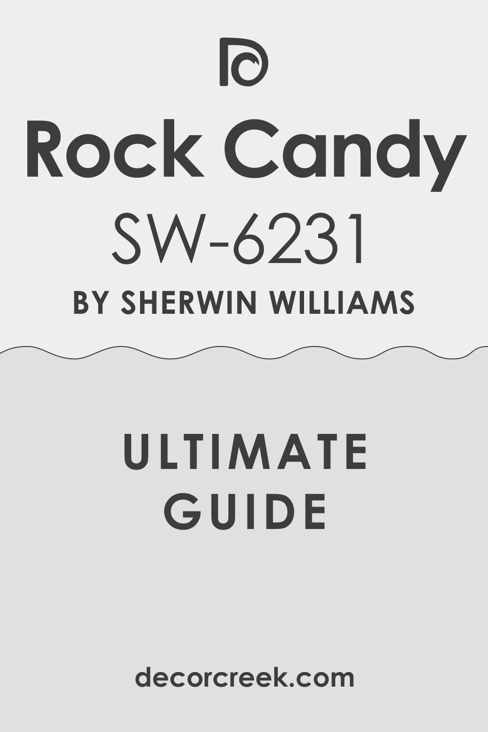
Rock Candy SW 6231
Rock Candy SW 6231 is a very light and airy blue gray that feels like a breath of fresh air. This color is so light that it can almost look white in some very bright rooms. Rock Candy SW 6231 is a great choice for a nursery or a child’s room for a soft look. This shade works well in a bathroom to make it feel very clean and like a spa day.
Rock Candy SW 6231 has a cool feeling that makes a hot and sunny room feel much cooler. I like to use this color on ceilings to add a tiny bit of interest without being too much. Rock Candy SW 6231 pairs beautifully with dark gray furniture and white curtains in a living room.
This color is very easy to look at and will not make your eyes tired after a while. Rock Candy SW 6231 is a sweet and gentle color that fits perfectly in a modern home. You will appreciate how this shade adds a hint of color while keeping everything very bright.
🎨 Check out the complete guide to this color right HERE 👈
Grizzle Gray SW 7068
Grizzle Gray SW 7068 is a dark and moody gray that has a tiny bit of green hidden inside. This color is perfect for creating a very cozy and dark atmosphere in a small den or office. Grizzle Gray SW 7068 looks very modern on the exterior of a house with light stone accents.
This shade is a great alternative to black if you want something with a bit more life. Grizzle Gray SW 7068 works well in a bedroom where you want the walls to feel like a warm hug. I find that this color looks best when paired with very light wood floors for a nice contrast. Grizzle Gray SW 7068 is a bold choice that adds a lot of depth and character to your home.
This color is great for hiding marks and fingerprints in houses with kids or pets running around. Grizzle Gray SW 7068 is a sophisticated choice for anyone wanting a high fashion look on their walls. You will love how this gray makes your home feel very cozy and very private for your family.
🎨 Check out the complete guide to this color right HERE 👈

White Dove OC-17
White Dove OC-17 is a legendary white color that designers love for its very soft and creamy look. This color does not have any harsh yellow tones, which makes it feel very clean and soft. White Dove OC-17 is the perfect choice for trim, doors, and cabinets in a modern house design. This shade works wonderfully on walls in a living room to create a very inviting environment.
White Dove OC-17 is light enough to make any room feel much bigger and much more open. I always recommend this color when someone is looking for a white that is not too bright. White Dove OC-17 has a very gentle look that helps your furniture and art be the stars.
This color is a classic that looks good in both old traditional homes and new modern ones. White Dove OC-17 is very easy to use because it matches almost every other color in the world. You will find that this white makes your home feel very bright and very happy every single day.
🎨 Check out the complete guide to this color right HERE 👈

Simply White OC-117
Simply White OC-117 is a very bright and crisp white that feels like a clean sheet of paper. This color was a color of the year because it is so pure and so simple for walls. Simply White OC-117 has a tiny bit of warmth that keeps it from looking like a cold hospital.
This shade is amazing for dark rooms that need a lot of help feeling brighter and larger. Simply White OC-117 looks very modern when you use it for both the walls and the trim together. I love using this color in kitchens to make everything feel very sanitized and very fresh for cooking. Simply White OC-117 is a great background for a room with lots of colorful plants and pillows.
This color is a favorite for people who want a very clean and minimalist look in their home. Simply White OC-117 is a reliable pick that makes every other color in the room look better. You will love how this white makes your home feel very energized and very light for everyone.
🎨 Check out the complete guide to this color right HERE 👈

Chantilly Lace OC-65
Chantilly Lace OC-65 is known for being the truest white with almost no yellow or blue in it. This color is very popular for modern homes because it is so crisp and so very clean. Chantilly Lace OC-65 is the best choice for trim if you want it to look very sharp.
This shade works well in a bathroom to make the white tile look even brighter and newer. Chantilly Lace OC-65 is a favorite for designers who want a very high end and gallery look. I find that this color looks best in rooms with a lot of big windows for natural light.
Chantilly Lace OC-65 is a great way to make a small room feel like it has much more space. This color is very honest and shows exactly what it is without changing much in different light. Chantilly Lace OC-65 is a smart pick for anyone wanting a very modern and very bright house. You will appreciate how this white makes your home feel very tidy and very professional looking.
🎨 Check out the complete guide to this color right HERE 👈

Classic Gray OC-23
Classic Gray OC-23 is a very light and soft gray that acts like a neutral white on the walls. This color is perfect for someone who wants a hint of gray without the room feeling dark. Classic Gray OC-23 looks very elegant in a bedroom with white bedding and soft light fixtures.
This shade is a great choice for hallways to give them a bit of color and interest. Classic Gray OC-23 works well in a modern living room with light oak floors and beige furniture. I often use this color to create a very soft and welcoming feeling throughout a whole house.
Classic Gray OC-23 is light enough that it will not clash with any of your existing decorations. This color is a staple for creating a look that is very high end and very thoughtfully done. Classic Gray OC-23 is a very friendly gray that makes everyone feel right at home as they enter. You will love how this color adds a touch of class to your walls while staying very light.
🎨 Check out the complete guide to this color right HERE 👈

Pale Oak OC-20
Pale Oak OC-20 is a beautiful greige color that looks like the wood of an oak tree. This color is very warm and very soft, making it perfect for a cozy master bedroom retreat. Pale Oak OC-20 looks amazing in a kitchen with white cabinets and dark stone countertops for style.
This shade is a great choice for a living room where you want a very natural feeling. Pale Oak OC-20 has a lot of depth for such a light color and hides wall bumps well. I love using this color in entries to make the house feel warm and very expensive to guests. Pale Oak OC-20 works well with gold, black, and silver finishes on your lights and faucets.
This color is a favorite for those who want a home that feels very organic and grounded. Pale Oak OC-20 is a very versatile color that handles shadows and bright light very beautifully. You will find that this shade makes your home feel very comfortable and very well designed.
🎨 Check out the complete guide to this color right HERE 👈

Edgecomb Gray HC-173
Edgecomb Gray HC-173 is a classic beige gray that feels very organic and very soft on walls. This color is a part of the historical collection because it is so popular and so very reliable. Edgecomb Gray HC-173 looks wonderful in a dining room with wood furniture and a big rug. This shade is a great choice for a whole house color because it is so easy to live with.
Edgecomb Gray HC-173 has a warmth that makes a room feel very cozy even on a cold winter day. I recommend this color for anyone who wants a neutral that is a bit darker than white. Edgecomb Gray HC-173 pairs perfectly with white trim and dark wood floors in a modern home design.
This color is very good at making a house feel like it has been there for a long time. Edgecomb Gray HC-173 is a soft and friendly choice that will make your home feel very peaceful. You will love how this color makes your walls look very finished and very professional for years.
🎨 Check out the complete guide to this color right HERE 👈

Balboa Mist OC-27
Balboa Mist OC-27 is a very light and airy gray that has a tiny bit of warmth in its base. This color is perfect for a modern bathroom where you want a very clean and soft look. Balboa Mist OC-27 works well in a bedroom to create a very light and restful place for sleep.
This shade looks very nice in a kitchen with marble and light wood accents for a fresh look. Balboa Mist OC-27 is a great color for a small house because it keeps the walls feeling far away. I like to use this color for offices to make the room feel very bright and very open for work.
Balboa Mist OC-27 is a very soft gray that will not make your home feel like a cold office. This color is a favorite for staging homes because it looks good to almost every person who sees it. Balboa Mist OC-27 is a reliable pick that adds a touch of modern style to any room you paint. You will find that this shade makes your home feel very light and very airy for your family.
🎨 Check out the complete guide to this color right HERE 👈

Revere Pewter HC-172
Revere Pewter HC-172 is perhaps the most famous greige color in the world for many good reasons. This color is a perfect mix of gray and beige that looks good in almost every lighting setup. Revere Pewter HC-172 works amazingly well in a basement to make it feel like a real living area.
This shade is a great choice for kitchen cabinets if you want a look that is very high end. Revere Pewter HC-172 has a lot of depth and makes a room feel very solid and very well built. I find that this color looks best when used with a very bright white trim for a big contrast. Revere Pewter HC-172 is a workhorse color that interior designers have used for many years with success.
This color is very grounded and makes your home feel very expensive and very thoughtfully painted. Revere Pewter HC-172 is a classic choice that will not go out of style for a very long time. You will love how this color makes your home feel very cozy and very well put together for guests.
🎨 Check out the complete guide to this color right HERE 👈

Coventry Gray HC-169
Coventry Gray HC-169 is a mid tone gray that feels very cool and very sophisticated on the walls. This color is a great choice for a formal dining room or a home office for a sharp look. Coventry Gray HC-169 looks wonderful in a room with a lot of white furniture and silver accents. This shade is dark enough to provide a lot of contrast against your white trim and doors.
Coventry Gray HC-169 has a very clean look that does not lean too much into blue or green tones. I like to use this color for a bedroom accent wall to add a bit of drama and style. Coventry Gray HC-169 is a very modern gray that makes a room feel very professional and very tidy.
This color works well in a laundry room to make the space feel very updated and very clean. Coventry Gray HC-169 is a great way to add some depth to your home without it being too dark. You will find that this gray adds a touch of high fashion to your modern house design easily.
🎨 Check out the complete guide to this color right HERE 👈

Boothbay Gray HC-165
Boothbay Gray HC-165 is a beautiful gray that has a lot of soft blue and green mixed inside. This color feels very much like the ocean on a cloudy day and is very soft on the eyes. Boothbay Gray HC-165 looks amazing on kitchen cabinets for a look that is very unique and fresh.
This shade is a great choice for a bathroom to make it feel like a very fancy and clean spa. Boothbay Gray HC-165 works well with white marble and brass hardware for a very modern house look. I love using this color in a bedroom to create a very light and peaceful environment for resting.
Boothbay Gray HC-165 is a color that adds a lot of personality without being too loud or too bright. This color is very popular for coastal homes but works perfectly in any modern design today. Boothbay Gray HC-165 is a soft and friendly choice that will make your home feel very special. You will appreciate how this shade adds a hint of nature to your walls in a stylish way.
🎨 Check out the complete guide to this color right HERE 👈

Kendall Charcoal HC-166
Kendall Charcoal HC-166 is a very dark and rich gray that feels very high end and very solid. This color is a great choice for an accent wall or a home theater where you want it dark. Kendall Charcoal HC-166 looks stunning on the exterior of a home with light wood or stone details.
This shade is a very bold choice that makes a big statement in any room of the house. Kendall Charcoal HC-166 works well in a study or library for a very moody and focused atmosphere. I like to use this color for kitchen islands to make them stand out as a piece of furniture.
Kendall Charcoal HC-166 is a very modern color that adds a lot of depth and drama to your design. This color looks very professional when paired with white trim and light colored floors for style. Kendall Charcoal HC-166 is a favorite for those who want a dark and cozy feeling in their home. You will love how this charcoal adds a layer of class and fashion to your modern walls.
🎨 Check out the complete guide to this color right HERE 👈

Hale Navy HC-154
Hale Navy HC-154 is often called the perfect navy blue because it is so deep and so very true. This color is a staple for modern house design because it looks good with everything you own. Hale Navy HC-154 looks amazing in a dining room with white wainscoting and a gold light fixture.
This shade is a great pick for a front door to give your house a very classic look. Hale Navy HC-154 works well with warm wood tones and bright white trim for a big impact on style. I find that this color is very popular for home offices because it feels very steady and smart. Hale Navy HC-154 is a color that will never go out of style and will always look very expensive.
This navy blue is bold but feels very safe and very comfortable for a living room as well. Hale Navy HC-154 is perfect for creating a focal point in a large room with a lot of light. You will find that this blue adds a lot of character and style to your favorite rooms today.
🎨 Check out the complete guide to this color right HERE 👈

October Mist 1495
October Mist 1495 is a soft and earthy green that has a lot of gray and silver mixed in it. This color was a color of the year because it feels very natural and very current for homes. October Mist 1495 looks wonderful in a bedroom to create a very soft and organic feeling for rest.
This shade is a great choice for a kitchen if you want a look that is fresh and unique. October Mist 1495 works well with natural wood accents and white trim in a modern house design. I love using this color in a nursery or a guest room for a very gentle and friendly look.
October Mist 1495 is a color that brings the outside in without being too bright or too loud on walls. This color is very sophisticated and makes your home feel very updated and very well designed for now. October Mist 1495 is a soft and friendly choice that will make your home feel very peaceful and tidy. You will enjoy how this green adds a hint of nature to your walls in a very stylish way.
🎨 Check out the complete guide to this color right HERE 👈

Natural Cream OC-14
Natural Cream OC-14 is a beautiful mix of white and beige that feels very rich and very soft. This color is perfect for someone who wants a warm home that still feels very light and very open. Natural Cream OC-14 looks amazing in a living room with white trim and dark wood furniture for style. This shade is a great choice for a whole house color because it is so easy to match with rugs.
Natural Cream OC-14 has a warmth that makes a room feel very cozy and very welcoming to all guests. I recommend this color for anyone who wants a white that has a lot of depth and character in it. Natural Cream OC-14 pairs perfectly with gold and black finishes on your lights and faucets in a kitchen.
This color is a favorite for creating a look that is very high end and very thoughtfully done for now. Natural Cream OC-14 is a very friendly neutral that makes everyone feel right at home as they enter. You will love how this color adds a touch of class to your walls while staying very bright.
🎨 Check out the complete guide to this color right HERE 👈

Pashmina AF-100
Pashmina AF-100 is a mid tone greige that feels very sophisticated and very expensive on the walls. This color is a bit darker than some others, which gives the room a lot of definition and style. Pashmina AF-100 looks wonderful in a master bedroom with soft white bedding and dark wood floors. This shade is a great choice for a dining room to create a very warm and formal atmosphere.
Pashmina AF-100 has a very clean look that does not lean too much into yellow or pink tones at all. I like to use this color for a living room to make the space feel very grounded and very solid. Pashmina AF-100 is a very modern color that adds a lot of depth and character to your house design.
This color works well with both warm and cool furniture pieces you might already have in your home. Pashmina AF-100 is a great way to add some drama to your home without it being too dark or loud. You will find that this greige adds a touch of high fashion to your modern house design very easily.
🎨 Check out the complete guide to this color right HERE 👈

35 Best Paint Colors From Sherwin Wiliams To Use In Modern House Design
Alabaster SW 7008
Alabaster SW 7008 is a soft white that does not feel too sharp or cold on the walls. This color has a tiny bit of cream in it that helps a room feel very cozy and inviting. Alabaster SW 7008 works great on both walls and trim if you want a clean look that is not boring.
This shade looks wonderful when you have dark wood floors or black metal accents in your furniture. Alabaster SW 7008 is a favorite for living rooms because it makes the walls look soft and clean. Many people choose this color when they want a white that feels like a warm hug.
Alabaster SW 7008 stays bright even in rooms that do not have a lot of big windows for sun. This paint color is one of the most popular choices for modern homes because it is so easy to live with. Alabaster SW 7008 helps your colorful pillows and art stand out without being a distraction. You will find that this white is very forgiving and hides small bumps on your walls.
🎨 Check out the complete guide to this color right HERE 👈
Pure White SW 7005
Pure White SW 7005 is a very clean shade that does not have any strong yellow or blue tones. This color is perfect for kitchen cabinets because it looks very crisp and high end. Pure White SW 7005 makes a great ceiling color when you want the room to feel taller and more open. This shade is a safe pick for any room because it matches almost every kind of fabric and rug.
Pure White SW 7005 is not too bright like a piece of paper, so it will not hurt your eyes. I like to use this color in hallways to make them feel less narrow and much brighter. Pure White SW 7005 gives a fresh look to older homes that need a bit of a modern update.
This color is a top choice for trim because it provides a nice contrast against darker wall colors. Pure White SW 7005 is a reliable friend in the world of paint because it always looks professional. You can use this white in a bathroom to make the whole area feel sanitized and very tidy.
🎨 Check out the complete guide to this color right HERE 👈
Snowbound SW 7004
Snowbound SW 7004 has a very slight gray undertone that keeps it from looking too warm or creamy. This color is excellent for modern homes that have a lot of cool metal or stone features. Snowbound SW 7004 creates a crisp background for a gallery wall filled with black and white photos. This shade can sometimes look a little bit pink in certain lights, so check your samples carefully.
Snowbound SW 7004 is a great choice for a bedroom where you want a very clean and airy feeling. I often suggest this color for trim when the walls are painted a cool or true gray. Snowbound SW 7004 helps a small room feel much larger than it actually is by reflecting light.
This color is a staple for designers who want a white that feels very fresh and current. Snowbound SW 7004 works well in a nursery because it feels very soft and gentle on the eyes. You should try this color if you want a white that feels modern but still has some personality.
🎨 Check out the complete guide to this color right HERE 👈
Greek Villa SW 7551
Greek Villa SW 7551 is a rich white that brings a lot of warmth into any area of your home. This color reminds me of old stones in the sun and feels very expensive on the walls. Greek Villa SW 7551 is a great pick for an exterior if you want your house to look bright.
Many people use this shade in their dining rooms to create a soft and welcoming place to eat. Greek Villa SW 7551 has a yellow base that keeps it from ever feeling cold or like an office. This color looks beautiful with brass hardware and light oak wood floors in a modern kitchen.
Greek Villa SW 7551 is thick and covers the old paint on your walls very well in two coats. I love how this white makes a room feel sunny even on a day when it is raining. Greek Villa SW 7551 is a classic choice that will stay in style for many years to come. You will love how this color makes your home feel like a fancy vacation spot every day.
🎨 Check out the complete guide to this color right HERE 👈
Shoji White SW 7042
Shoji White SW 7042 is a mix between a soft white and a very light beige color. This color is perfect for people who think white is too bright but beige is too dark. Shoji White SW 7042 looks amazing on the outside of a house with dark wood accents and black trim.
This shade creates a very soft look that makes a bedroom feel like a quiet place to rest. Shoji White SW 7042 is a great choice for a whole house color because it flows well between rooms. I like to use this color in large open floor plans to make the area feel connected and soft.
Shoji White SW 7042 changes quite a bit depending on the time of day, so watch it closely. This color is very popular for modern farmhouse styles because it feels very natural and earthy. Shoji White SW 7042 is a smart pick if you want a wall color that feels very cozy. You will find that this shade makes your furniture look grounded and very well put together.
🎨 Check out the complete guide to this color right HERE 👈
Drift of Mist SW 9166
Drift of Mist SW 9166 is a very light gray that feels as soft as a cloud in the sky. This color is a great alternative to white if you want just a tiny bit of contrast on your walls. Drift of Mist SW 9166 works perfectly in a modern living room with a big gray or navy sofa.
This shade is light enough that it does not make a room feel small or dark at all. Drift of Mist SW 9166 has a very clean look that doesn’t lean too much into blue or green. I suggest this color for offices because it feels very professional and helps you focus on your work.
Drift of Mist SW 9166 is a wonderful choice for laundry rooms to make the chore feel more pleasant. This color looks best when paired with a very bright white trim to make the gray pop. Drift of Mist SW 9166 is a gentle gray that will not make your home feel like a cold basement. You should use this color if you want a modern look that still feels very light and airy.
🎨 Check out the complete guide to this color right HERE 👈
Natural Linen SW 9109
Natural Linen SW 9109 is a beautiful tan color that looks like the fabric it is named after. This color brings a lot of earthiness into a room and makes it feel very warm and solid. Natural Linen SW 9109 is perfect for a cozy den or a room where you watch movies with family.
This shade looks great with green plants and leather chairs in a modern home setup. Natural Linen SW 9109 is a darker neutral that helps hide dirt and scuffs in high traffic areas. I love using this color in entryways because it gives guests a warm and friendly greeting.
Natural Linen SW 9109 works well with both gold and black finishes on your lights and faucets. This color is a great way to add some depth to a room without using a very dark paint. Natural Linen SW 9109 feels very organic and matches well with natural wood and stone textures. You will appreciate how this color adds a layer of comfort to your house that white cannot do.
🎨 Check out the complete guide to this color right HERE 👈
Accessible Beige SW 7036
Accessible Beige SW 7036 is a famous color because it looks good in almost every single house. This color is a gray beige that does not look too yellow or too muddy on the walls. Accessible Beige SW 7036 is a safe bet for selling a house because most people really like it.
This shade works well in kitchens with white cabinets to add a bit of warmth and color. Accessible Beige SW 7036 is a great choice for hallways that connect many different rooms together. I find that this color looks very high end when you use it with chunky white baseboards. Accessible Beige SW 7036 is a neutral that makes a home feel finished and very well designed.
This color is light enough to be used in dark basements to make them feel more like living areas. Accessible Beige SW 7036 is a workhorse color that handles different lighting situations very well. You can trust this color to make your home look updated and very stylish for a long time.
🎨 Check out the complete guide to this color right HERE 👈
Agreeable Gray SW 7029
Agreeable Gray SW 7029 is often called the perfect color because it sits right between gray and beige. This color is very popular for modern homes because it works with both warm and cool furniture. Agreeable Gray SW 7029 makes a room look very clean and put together without being too stark. This shade is a great choice for an open living area where you want a consistent look.
Agreeable Gray SW 7029 does not turn blue or purple like some other grays might do in the light. I recommend this color for anyone who is overwhelmed by all the different paint choices available.
Agreeable Gray SW 7029 looks very elegant in a master bedroom with soft white bedding and rugs. This color helps your home feel larger and more cohesive when used throughout the main floor. Agreeable Gray SW 7029 is a reliable pick that interior designers use over and over again for a reason. You will love how easy it is to match your curtains and pillows to this very friendly shade.
🎨 Check out the complete guide to this color right HERE 👈
Repose Gray SW 7015
Repose Gray SW 7015 is a cool gray that has just a tiny hint of warmth to keep it from being icy. This color is a bit darker than some other light grays, which gives the walls more definition. Repose Gray SW 7015 is perfect for a modern kitchen with marble countertops and stainless steel. This shade looks very sophisticated in a formal dining room or a home office with built in shelves.
Repose Gray SW 7015 is a great color to use if you want your white trim to really stand out. I often use this color in bathrooms to create a very clean and updated look for my clients. Repose Gray SW 7015 works well in rooms with a lot of natural light coming through the windows.
This color is a favorite for those who want a true gray look that still feels like a home. Repose Gray SW 7015 adds a touch of class to any room and makes the architecture look more expensive. You should choose this gray if you want a wall color that feels very modern and sharp.
🎨 Check out the complete guide to this color right HERE 👈
Mindful Gray SW 7016
Mindful Gray SW 7016 is one step darker than Repose Gray and offers a lot of depth for your walls. This color is a mid tone gray that works very well for an accent wall or a whole room. Mindful Gray SW 7016 makes a great backdrop for colorful artwork or bright furniture pieces you love. This shade is very grounded and makes a large room feel more comfortable and a bit smaller.
Mindful Gray SW 7016 is a top choice for painted brick fireplaces in a modern living room setting. I like to use this color on the exterior of a home for a very stylish and updated look. Mindful Gray SW 7016 pairs beautifully with wood accents and dark metal hardware on your doors.
This color is strong enough to stand on its own but neutral enough to not be too loud. Mindful Gray SW 7016 is a great way to add some drama to a room without going to a black color. You will enjoy how this gray makes your home feel very sturdy and well built for years.
🎨 Check out the complete guide to this color right HERE 👈
Light French Gray SW 0055
Light French Gray SW 0055 is a very classic and true gray color that does not have much blue or yellow. This color is perfect for a modern house because it looks very clean and very professional. Light French Gray SW 0055 works well in a kitchen with white cabinets and silver appliances for style. This shade is a great pick for a bedroom because it feels very steady and very quiet on walls.
Light French Gray SW 0055 is dark enough to make white trim look very bright and very sharp. I find that this color is very popular for hallways and entries to create a modern look. Light French Gray SW 0055 is a favorite for designers who want a gray that is very balanced.
This color looks very high end when you use it in a large living room with lots of light. Light French Gray SW 0055 is a reliable choice that adds a touch of class to any room. You will appreciate how this gray makes your home feel very updated and very well put together.
🎨 Check out the complete guide to this color right HERE 👈
Modern Gray SW 7632
Modern Gray SW 7632 is a warm and soft greige that is very popular for a whole house color. This color is perfect for creating a cozy and inviting home that still looks very fresh. Modern Gray SW 7632 looks amazing in an open floor plan because it flows well between rooms.
This shade is a great choice for a living room with light wood floors and beige rugs. Modern Gray SW 7632 has a tiny bit of warmth that keeps it from looking like a cold basement. I love using this color in bedrooms to make them feel very soft and very comfortable for sleep.
Modern Gray SW 7632 works well with both gold and black metal accents in your modern house. This color is a favorite for staging because it makes the house look very tidy and ready. Modern Gray SW 7632 is a very friendly neutral that everyone will like when they visit you. You will find that this shade makes your home feel very bright and very well designed for now.
🎨 Check out the complete guide to this color right HERE 👈

City Loft SW 7631
City Loft SW 7631 is a very light and airy gray that has a hint of warm beige inside of it. This color is perfect for someone who wants a very light home that is not just plain white. City Loft SW 7631 looks wonderful in a modern bedroom with white furniture and soft light fixtures. This shade is a great choice for small bathrooms to make them feel much larger than they are.
City Loft SW 7631 has a very clean look that makes every room feel very fresh and very tidy. I often use this color to create a very soft and welcoming feeling throughout a new house. City Loft SW 7631 is light enough that it will not make your home feel dark on cloudy days.
This color is a staple for creating a look that is very high end and very thoughtfully done. City Loft SW 7631 is a very friendly gray that makes everyone feel right at home as they enter. You will love how this color adds a touch of class to your walls while staying very light.
🎨 Check out the complete guide to this color right HERE 👈

Incredible White SW 7028
Incredible White SW 7028 is a very soft and warm white that has a tiny hint of gray in its base. This color is perfect for walls when you want a look that is very light but not too bright. Incredible White SW 7028 works well in a modern living room with big windows and lots of sun. This shade is a great choice for a master bedroom to create a very restful and soft area.
Incredible White SW 7028 has a very gentle look that helps your furniture and art be the stars. I find that this color looks best when paired with a very bright white trim for contrast. Incredible White SW 7028 is a favorite for designers who want a white that feels very cozy and full.
This color is very easy to use because it matches almost every other color in your house. Incredible White SW 7028 is a reliable pick that makes your home feel very bright and very happy. You will love how this white makes your home feel very clean and very well put together today.
🎨 Check out the complete guide to this color right HERE 👈
Gossamer Veil SW 9165
Gossamer Veil SW 9165 is a beautiful and light greige that feels very soft and very airy on walls. This color is a bit more gray than some others, giving it a very modern and current look. Gossamer Veil SW 9165 looks amazing in a living room with dark wood floors and light furniture. This shade is a great choice for a whole house color because it is so easy to live with.
Gossamer Veil SW 9165 has a warmth that keeps it from ever looking too cold or like an office. I recommend this color for anyone who wants a neutral that is a bit more than just white. Gossamer Veil SW 9165 pairs perfectly with black hardware and white trim in a modern house design.
This color is very good at making a home feel very finished and very professional looking. Gossamer Veil SW 9165 is a soft and friendly choice that will make your home feel very peaceful. You will love how this color makes your walls look very updated and very stylish for years.
🎨 Check out the complete guide to this color right HERE 👈
Alpaca SW 7022
Alpaca SW 7022 is a warm and soft gray that can sometimes look a little bit pink in certain light. This color is perfect for creating a very cozy and inviting bedroom with soft bedding and rugs. Alpaca SW 7022 looks wonderful in a kitchen with white cabinets and warm wood floors for style. This shade is a great choice for a living room where you want a very natural and earthy feeling.
Alpaca SW 7022 has a lot of depth and makes a room feel very solid and very well built. I love using this color in entries to make the house feel warm and very expensive to guests. Alpaca SW 7022 works well with both gold and black finishes on your lights and faucets today.
This color is a favorite for those who want a home that feels very organic and very grounded. Alpaca SW 7022 is a very versatile color that handles shadows and bright light very beautifully. You will find that this shade makes your home feel very comfortable and very well designed.
🎨 Check out the complete guide to this color right HERE 👈
On the Rocks SW 7671
On the Rocks SW 7671 is a very light and clean gray that feels very modern and very fresh. This color is perfect for a modern bathroom where you want a very clean and bright look. On the Rocks SW 7671 works well in a bedroom to create a very light and restful place for sleep.
This shade looks very nice in a kitchen with marble and light wood accents for a new look. On the Rocks SW 7671 is a great color for a small house because it keeps walls feeling open. I like to use this color for offices to make the room feel very bright and very professional.
On the Rocks SW 7671 is a very soft gray that will not make your home feel like a cold place. This color is a favorite for staging homes because it looks good to almost every person who sees it. On the Rocks SW 7671 is a reliable pick that adds a touch of modern style to any room. You will find that this shade makes your home feel very light and very airy for your family.
🎨 Check out the complete guide to this color right HERE 👈
Anew Gray SW 7030
Anew Gray SW 7030 is a mid tone greige that offers a lot of depth and warmth for your walls. This color is one step darker than Agreeable Gray and feels very solid and very grounded today. Anew Gray SW 7030 works amazing in a living room with a lot of white trim and big rugs.
This shade is a great choice for a kitchen if you want a look that is very high end. Anew Gray SW 7030 has a warmth that makes a room feel very cozy even on a cold winter day. I find that this color looks best when used with a very bright white trim for a big contrast.
Anew Gray SW 7030 is a workhorse color that interior designers have used for many years with success. This color is very grounded and makes your home feel very expensive and very thoughtfully painted. Anew Gray SW 7030 is a classic choice that will not go out of style for a very long time. You will love how this color makes your home feel very cozy and very well put together.
🎨 Check out the complete guide to this color right HERE 👈
Dorian Gray SW 7017
Dorian Gray SW 7017 is a rich and sophisticated gray that feels very modern and very professional on walls. This color is a great choice for a formal dining room or a home office for a sharp look. Dorian Gray SW 7017 looks wonderful in a room with a lot of white furniture and silver accents. This shade is dark enough to provide a lot of contrast against your white trim and doors.
Dorian Gray SW 7017 has a very clean look that does not lean too much into blue or green tones. I like to use this color for a bedroom accent wall to add a bit of drama and style. Dorian Gray SW 7017 is a very modern gray that makes a room feel very professional and very tidy.
This color works well in a laundry room to make the space feel very updated and very clean. Dorian Gray SW 7017 is a great way to add some depth to your home without it being too dark. You will find that this gray adds a touch of high fashion to your modern house design.
🎨 Check out the complete guide to this color right HERE 👈

Grizzle Gray SW 7068
Grizzle Gray SW 7068 is a dark and moody gray that has a tiny bit of green hidden inside. This color is perfect for creating a very cozy and dark atmosphere in a small den or office. Grizzle Gray SW 7068 looks very modern on the exterior of a house with light stone accents.
This shade is a great alternative to black if you want something with a bit more life. Grizzle Gray SW 7068 works well in a bedroom where you want the walls to feel like a warm hug. I find that this color looks best when paired with very light wood floors for a nice contrast.
Grizzle Gray SW 7068 is a bold choice that adds a lot of depth and character to your home. This color is great for hiding marks and fingerprints in houses with kids or pets running around. Grizzle Gray SW 7068 is a sophisticated choice for anyone wanting a high fashion look on their walls. You will love how this gray makes your home feel very cozy and very private for your family.
🎨 Check out the complete guide to this color right HERE 👈
Dovetail SW 7018
Dovetail SW 7018 is a mid to dark gray that feels very solid and very sturdy on your walls. This color is perfect for kitchen cabinets or a large kitchen island for a very modern look. Dovetail SW 7018 works well in a bedroom to create a very dark and restful area for sleep.
This shade looks very sophisticated in a home office with built in shelves and dark wood furniture. Dovetail SW 7018 has a very clean look that helps to highlight your white trim and doors. I like to use this color for an accent wall in a living room to add some drama.
Dovetail SW 7018 is a very modern gray that makes a room feel very professional and very tidy. This color works well in a bathroom to create a look that is very updated and fresh. Dovetail SW 7018 is a great way to add some depth to your home without using a true black. You will find that this gray adds a touch of class to your modern house design very easily.
🎨 Check out the complete guide to this color right HERE 👈

Peppercorn SW 7674
Peppercorn SW 7674 is a very dark charcoal that looks like the spice it is named after today. This color is a great choice for an accent wall or a media room for a moody look. Peppercorn SW 7674 looks stunning on the exterior of a home with light wood or stone details.
This shade is a very bold choice that makes a big statement in any room of the house. Peppercorn SW 7674 works well in a study or library for a very focused and steady atmosphere. I find that this color looks best when paired with white trim and light colored floors for style.
Peppercorn SW 7674 is a very modern color that adds a lot of depth and drama to your design. This color is great for hiding marks and fingerprints in houses with kids or pets running around. Peppercorn SW 7674 is a favorite for those who want a dark and cozy feeling in their home. You will love how this charcoal adds a layer of class and fashion to your modern walls.
🎨 Check out the complete guide to this color right HERE 👈

Iron Ore SW 7069
Iron Ore SW 7069 is a very dark charcoal color that looks almost black but has more soft depth. This color is perfect for an accent wall in a bedroom to make the bed the main focus. Iron Ore SW 7069 looks stunning on interior doors to give them a very high end and custom look.
This shade is a great choice for the outside of a house if you want a very modern look. Iron Ore SW 7069 works well in a media room where you want the walls to be dark for movies. I love using this color for kitchen islands to make them stand out from the rest of the cabinets.
Iron Ore SW 7069 is a bold choice that makes a big statement in any part of your modern home. This color looks very cool when paired with light wood floors and bright white trim for contrast. Iron Ore SW 7069 is not as harsh as a true black, making it much easier to use in a house. You will find that this dark shade adds a lot of character and style to your favorite rooms.
🎨 Check out the complete guide to this color right HERE 👈
Urbane Bronze SW 7048
Urbane Bronze SW 7048 is a deep and earthy color that is a mix of dark gray and rich brown. This color was a color of the year because it feels very natural and very grounded for a home. Urbane Bronze SW 7048 looks incredible on a front door to give your house a very modern look. This shade is a wonderful choice for a home office where you want to feel tucked in and focused.
Urbane Bronze SW 7048 works very well with green plants and gold decorations on your shelves or tables. I like to use this color in bedrooms to create a very cozy and safe feeling for sleeping. Urbane Bronze SW 7048 is a great way to bring a bit of nature inside your house through your walls. This color looks very expensive and high quality when it is painted on a flat or matte surface.
Urbane Bronze SW 7048 is a bold neutral that adds a lot of visual interest to a modern design. You will love how this color makes your room feel very special and very different from others.
🎨 Check out the complete guide to this color right HERE 👈
Tricorn Black SW 6258
Tricorn Black SW 6258 is a very true and pure black that does not have any hidden colors. This color is perfect for a front door to give your house a very sharp and modern look. Tricorn Black SW 6258 looks amazing on interior trim and doors for a very high end custom feel.
This shade is a bold choice for an accent wall in a large room with lots of light. Tricorn Black SW 6258 works well in a kitchen on the island or lower cabinets for big contrast. I find that this color looks best when you use a lot of white and wood nearby.
Tricorn Black SW 6258 is a classic black that will always look very clean and very professional. This color is great for making a statement and showing off your modern house design style. Tricorn Black SW 6258 helps to hide everything and makes the room feel very private and very solid. You will love how this black adds a lot of drama and high fashion to your favorite rooms.
🎨 Check out the complete guide to this color right HERE 👈

Sea Salt SW 6204
Sea Salt SW 6204 is a very light green that also has some gray and blue mixed inside of it. This color is famous for making people feel very relaxed as soon as they see it on the walls. Sea Salt SW 6204 is the most popular choice for bathrooms because it feels very fresh and clean.
This shade looks different in every room, sometimes looking more green and sometimes more gray. Sea Salt SW 6204 is a great color for a coastal or modern house that wants a touch of nature. I suggest using this color in a bedroom if you want a very light and airy place to sleep.
Sea Salt SW 6204 pairs perfectly with white trim and light colored wood furniture in your home. This color is very soft and does not feel loud or bright even when the sun hits it directly. Sea Salt SW 6204 is a wonderful way to add a tiny bit of color without it being too much. You will find that this shade makes your home feel very peaceful and very light for everyone.
🎨 Check out the complete guide to this color right HERE 👈
Evergreen Fog SW 9130
Evergreen Fog SW 9130 is a mid tone green that has a lot of gray in it to keep it soft. This color is very trendy for 2026 because it feels modern and organic at the same time. Evergreen Fog SW 9130 looks amazing on kitchen cabinets if you want a look that is not white.
This shade is a great pick for a mudroom or a laundry room to add some style to chores. Evergreen Fog SW 9130 works well with natural wood tones and black hardware in a modern house. I love using this color in a dining room to create a very sophisticated and cool atmosphere. Evergreen Fog SW 9130 is dark enough to have some personality but light enough to not be scary.
This color feels very fresh and brings a bit of the outside world into your living room. Evergreen Fog SW 9130 is a great choice for an accent wall in a nursery or a small office. You will enjoy how this green makes your home feel very current and very well designed for today.
🎨 Check out the complete guide to this color right HERE 👈
Pewter Green SW 6208
Pewter Green SW 6208 is a very deep and cool green that feels like it belongs in a fancy hotel. This color is a great choice for kitchen cabinets if you want a look that is very bold. Pewter Green SW 6208 works well with white marble and shiny gold handles for a luxury feel.
This shade is dark enough to act as a neutral in many modern house designs today. Pewter Green SW 6208 makes a bedroom feel very dark and perfect for sleeping in late. I like to use this color on an accent wall behind a TV to help the screen blend in.
Pewter Green SW 6208 looks very high end and professional when you use it in an office. This color is a favorite for people who want a dark room that is not black or gray. Pewter Green SW 6208 has a very calming and steady energy that makes a home feel very solid. You will find that this green is very stylish and will impress everyone who visits your house.
🎨 Check out the complete guide to this color right HERE 👈
Retreat SW 6207
Retreat SW 6207 is a beautiful mid tone green that has a lot of gray mixed into it today. This color is perfect for a bedroom where you want a very natural and earthy feeling on walls. Retreat SW 6207 looks wonderful in a living room with light wood floors and white furniture for style. This shade is a great choice for an accent wall in an office for a professional look.
Retreat SW 6207 has a warmth that keeps it from looking too cold or too bright in the sun. I love using this color in a dining room to create a very sophisticated and fresh look. Retreat SW 6207 works well with both gold and black metal accents in your modern house design.
This color is a favorite for those who want a green that feels very quiet and soft. Retreat SW 6207 is a very friendly color that brings a bit of the outside world into your home. You will find that this green adds a lot of character and style to your favorite rooms easily.
🎨 Check out the complete guide to this color right HERE 👈

Dried Thyme SW 6186
Dried Thyme SW 6186 is a darker green that looks like the herb it is named after. This color has a lot of gray in it which makes it feel very vintage and cool. Dried Thyme SW 6186 is a wonderful choice for an exterior color on a modern home with wood siding.
This shade looks great in a home library or on built in bookshelves for a moody look. Dried Thyme SW 6186 is a strong color that makes a room feel very private and very safe. I find that this green looks best when you use it with warm gold or copper accents.
Dried Thyme SW 6186 is a great way to add a bit of drama to a bathroom or a small powder room. This color helps to highlight the greenery of your plants and makes them look extra bright. Dried Thyme SW 6186 is a sophisticated green that will not make your room look like a forest. You will love how this color adds a layer of history and character to your new modern walls.
🎨 Check out the complete guide to this color right HERE 👈
Naval SW 6244
Naval SW 6244 is a classic navy blue that is very dark and very deep on the walls. This color is a staple for modern design because it feels very strong and very traditional. Naval SW 6244 looks amazing in a dining room with white trim and a big wood table.
This shade is a great pick for a boy’s bedroom or a home office for a professional look. Naval SW 6244 works well with gold accents and light colored rugs to keep it from being too dark. I often suggest this color for kitchen islands to give the room a nice pop of color.
Naval SW 6244 is a color that never goes out of style and always looks very crisp and clean. This navy blue is very bold and makes a big impact as soon as you walk in. Naval SW 6244 is perfect for creating a focal point in a large room with high ceilings. You will love how this blue makes your home feel very expensive and very well put together.
🎨 Check out the complete guide to this color right HERE 👈
Rock Candy SW 6231
Rock Candy SW 6231 is a very light and airy blue gray that feels like a breath of fresh air. This color is so light that it can almost look white in some very bright rooms. Rock Candy SW 6231 is a great choice for a nursery or a child’s room for a soft look.
This shade works well in a bathroom to make it feel very clean and like a spa day. Rock Candy SW 6231 has a cool feeling that makes a hot and sunny room feel much cooler. I like to use this color on ceilings to add a tiny bit of interest without being too much.
Rock Candy SW 6231 pairs beautifully with dark gray furniture and white curtains in a living room. This color is very easy to look at and will not make your eyes tired after a while. Rock Candy SW 6231 is a sweet and gentle color that fits perfectly in a modern home. You will appreciate how this shade adds a hint of color while keeping everything very bright.
🎨 Check out the complete guide to this color right HERE 👈
Cyberspace SW 7076
Cyberspace SW 7076 is a very dark and moody blue that has a lot of gray mixed into it. This color is perfect for an accent wall or a media room for a very high end look. Cyberspace SW 7076 looks stunning on interior doors to give them a very custom and fancy feel.
This shade is a very bold choice that makes a big statement in any room of the house. Cyberspace SW 7076 works well in a master bedroom for a very dark and restful atmosphere today. I find that this color looks best when paired with white trim and light colored wood floors.
Cyberspace SW 7076 is a very modern color that adds a lot of depth and drama to your design. This color is great for hiding marks and fingerprints in houses with kids or pets running around. Cyberspace SW 7076 is a favorite for those who want a dark and cozy feeling in their home. You will love how this deep blue adds a layer of class and fashion to your walls.
🎨 Check out the complete guide to this color right HERE 👈

Gauntlet Gray SW 7019
Gauntlet Gray SW 7019 is a mid to dark gray that feels very solid and very professional on walls. This color is perfect for an accent wall in a living room or a large home office today. Gauntlet Gray SW 7019 looks wonderful in a room with a lot of white trim and silver accents.
This shade is dark enough to provide a lot of contrast against your white furniture and doors. Gauntlet Gray SW 7019 has a very clean look that helps to highlight the shapes of your room. I like to use this color for kitchen cabinets to give the space a very modern house look.
Gauntlet Gray SW 7019 is a very steady gray that makes a room feel very tidy and well built. This color works well in a laundry room to make the space feel very updated and fresh. Gauntlet Gray SW 7019 is a great way to add some depth to your home without it being too dark. You will find that this gray adds a touch of high fashion to your modern house design.
🎨 Check out the complete guide to this color right HERE 👈
21 Trendy Paint Colors To Use In Small Modern House Design
Eider White SW 7014
Eider White SW 7014 is a very light gray white that feels soft and very gentle on walls. This color is perfect for small rooms because it keeps the space feeling bright and very open. Eider White SW 7014 looks wonderful in a tiny bedroom with white bedding and light wood furniture.
This shade is a great choice for hallways to make them feel much wider than they really are. Eider White SW 7014 has a tiny bit of warmth that keeps it from looking too cold or blue. I often use this color to create a very soft and welcoming feeling throughout a small house.
Eider White SW 7014 is light enough that it will not make your home feel dark on rainy days. This color is a staple for creating a look that is very high end and very tidy. Eider White SW 7014 is a very friendly neutral that makes everyone feel right at home as they enter. You will love how this color adds a touch of class to your small walls today.
🎨 Check out the complete guide to this color right HERE 👈

Ivory Lace SW 7013
Ivory Lace SW 7013 is a very soft and warm cream color that feels like a big hug. This color is perfect for small living rooms because it makes the area feel cozy and inviting. Ivory Lace SW 7013 works well on both walls and trim if you want a clean look that is soft.
This shade looks wonderful when you have dark wood floors or black metal accents in your home. Ivory Lace SW 7013 is a favorite for nurseries because it makes the walls look very gentle and clean. Many people choose this color when they want a white that feels very warm and very sweet. Ivory Lace SW 7013 stays bright even in small rooms that do not have a lot of big windows.
This paint color is one of the most popular choices for modern homes because it is easy. Ivory Lace SW 7013 helps your colorful art stand out without being a distraction on the wall today. You will find that this cream is very forgiving and hides small marks on your small walls.
🎨 Check out the complete guide to this color right HERE 👈
Origami White SW 7636
Origami White SW 7636 is a clean white that has a tiny bit of gray and beige inside. This color is perfect for small kitchens because it makes everything look very fresh and very tidy. Origami White SW 7636 makes a great wall color when you want the room to feel much larger.
This shade is a safe pick for any small room because it matches almost every kind of rug. Origami White SW 7636 is not too bright like a piece of paper so it won’t hurt eyes. I like to use this color in small bathrooms to make them feel less narrow and bright.
Origami White SW 7636 gives a fresh look to small homes that need a bit of a modern update. This color is a top choice for trim because it provides a nice contrast against wall colors. Origami White SW 7636 is a reliable friend in the world of paint because it always looks professional. You can use this white anywhere to make the whole area feel sanitized and very well kept.
🎨 Check out the complete guide to this color right HERE 👈
Nebulous White SW 7063
Nebulous White SW 7063 is a very cool and light gray white that feels like a foggy day. This color is perfect for small modern houses that have a lot of silver or blue accents. Nebulous White SW 7063 creates a crisp background for a small living room with a gray sofa today.
This shade can sometimes look a little bit blue in certain lights so check your samples carefully. Nebulous White SW 7063 is a great choice for a small office where you want a clean feeling. I often suggest this color for small bedrooms to make the walls feel like they are far away.
Nebulous White SW 7063 helps a small room feel much larger than it actually is by reflecting light. This color is a staple for designers who want a white that feels very fresh and current. Nebulous White SW 7063 works well in a modern laundry room because it feels very clean and tidy. You should try this color if you want a white that feels modern but still very soft.
🎨 Check out the complete guide to this color right HERE 👈
Incredible White SW 7028
Incredible White SW 7028 is a very soft and warm white that has a tiny hint of gray. This color is perfect for small walls when you want a look that is light but cozy. Incredible White SW 7028 works well in a small living room with one big window and sun.
This shade is a great choice for a small bedroom to create a very restful and soft area. Incredible White SW 7028 has a very gentle look that helps your furniture and art be the stars. I find that this color looks best when paired with a very bright white trim for contrast.
Incredible White SW 7028 is a favorite for designers who want a white that feels very full. This color is very easy to use because it matches almost every other color in your house. Incredible White SW 7028 is a reliable pick that makes your small home feel very bright today. You will love how this white makes your home feel very clean and very well put together.
🎨 Check out the complete guide to this color right HERE 👈
Oyster White SW 7637
Oyster White SW 7637 is a soft and warm greige that feels very rich and expensive on walls. This color is perfect for small dining areas because it makes the room feel very sophisticated and nice. Oyster White SW 7637 works well in a small house where you want a look that is not white. This shade looks wonderful when you have light wood floors and gold accents in your small room.
Oyster White SW 7637 is a favorite for small entries because it gives a warm and friendly greeting. Many people choose this color when they want a neutral that feels very modern and very solid. Oyster White SW 7637 stays bright enough to keep a small room from feeling dark or like a box.
This paint color is one of the best choices for small modern homes because it adds depth. Oyster White SW 7637 helps your furniture look grounded and very well put together in a small space. You will find that this greige is very forgiving and looks great in any light of day.
🎨 Check out the complete guide to this color right HERE 👈

Pediment SW 7634
Pediment SW 7634 is a beautiful and warm gray that feels very soft and very organic on walls. This color is perfect for small rooms because it adds color without making the space feel closed in. Pediment SW 7634 looks wonderful in a small bedroom with white bedding and soft light fixtures today.
This shade is a great choice for small hallways to give them a bit of color and interest. Pediment SW 7634 has a warmth that keeps it from looking too cold or blue in small spaces. I often use this color to create a very soft and welcoming feeling throughout a small house.
Pediment SW 7634 is light enough that it will not make your small home feel dark or small. This color is a staple for creating a look that is very high end and very tidy. Pediment SW 7634 is a very friendly neutral that makes everyone feel right at home as they enter. You will love how this color adds a touch of class to your small walls today.
🎨 Check out the complete guide to this color right HERE 👈
Skyline Steel SW 1015
Skyline Steel SW 1015 is a mid tone gray that feels very modern and very professional on small walls. This color is perfect for a small home office or a study where you want a sharp look. Skyline Steel SW 1015 works well in a small room with a lot of white trim and silver.
This shade is dark enough to provide some contrast against your white furniture and small doors. Skyline Steel SW 1015 has a very clean look that helps to highlight the shapes of your room. I like to use this color for a small living room accent wall to add some style.
Skyline Steel SW 1015 is a very steady gray that makes a small room feel very well built. This color works well in a small laundry room to make the space feel very updated and clean. Skyline Steel SW 1015 is a great way to add some depth to your small home without it. You will find that this gray adds a touch of high fashion to your modern house design.
🎨 Check out the complete guide to this color right HERE 👈
Useful Gray SW 7050
Useful Gray SW 7050 is a soft green gray that feels very natural and very grounded on walls. This color is perfect for small rooms because it brings a touch of the outside world in. Useful Gray SW 7050 looks wonderful in a small bedroom with wood furniture and green plants today.
This shade is a great choice for small bathrooms to make them feel very fresh and clean. Useful Gray SW 7050 has a warmth that keeps it from looking too cold or like a basement. I often use this color to create a very soft and welcoming feeling in a small kitchen.
Useful Gray SW 7050 is light enough that it will not make your small home feel dark or tiny. This color is a staple for creating a look that is very high end and very tidy. Useful Gray SW 7050 is a very friendly neutral that makes everyone feel right at home as they enter. You will love how this color adds a touch of class to your small walls today.
🎨 Check out the complete guide to this color right HERE 👈
Silver Strand SW 7057
Silver Strand SW 7057 is a very light and airy blue green gray that feels like the ocean. This color is perfect for small bathrooms because it makes them feel like a very clean spa area. Silver Strand SW 7057 works well in a small bedroom to create a very light and restful place.
This shade looks very nice in a small kitchen with white tile and silver accents today. Silver Strand SW 7057 is a great color for a small house because it keeps walls feeling open. I like to use this color for small offices to make the room feel very bright and fresh.
Silver Strand SW 7057 is a very soft color that will not make your small home feel loud. This color is a favorite for staging small homes because it looks good to every single person. Silver Strand SW 7057 is a reliable pick that adds a touch of modern style to any room. You will find that this shade makes your small home feel very light and very airy.
🎨 Check out the complete guide to this color right HERE 👈

Comfort Gray SW 6205
Comfort Gray SW 6205 is a mid tone green gray that feels very steady and very soft today. This color is perfect for small living rooms because it adds a lot of personality and style. Comfort Gray SW 6205 looks wonderful in a small bedroom with white bedding and dark wood floors.
This shade is a great choice for an accent wall in a small office for a nice look. Comfort Gray SW 6205 has a warmth that keeps it from looking too cold or blue on walls. I love using this color in a small dining room to create a very sophisticated and fresh look.
Comfort Gray SW 6205 works well with both gold and black metal accents in your small house. This color is a favorite for those who want a green that feels very quiet and soft. Comfort Gray SW 6205 is a very friendly color that brings a bit of nature into a house. You will find that this green adds a lot of character and style to your small rooms.
🎨 Check out the complete guide to this color right HERE 👈

Rainwashed SW 6211
Rainwashed SW 6211 is a light and airy green blue that feels like a spring day after rain. This color is perfect for small bathrooms because it makes them feel very fresh and very clean. Rainwashed SW 6211 works well in a small bedroom to create a very light and happy environment.
This shade looks very nice in a small kitchen with white cabinets and light wood accents today. Rainwashed SW 6211 is a great color for a small house because it keeps the walls feeling open. I like to use this color for small nurseries to make the room feel very soft and sweet.
Rainwashed SW 6211 is a very cheerful color that will not make your small home feel dark. This color is a favorite for coastal styles but works in any small modern house design today. Rainwashed SW 6211 is a reliable pick that adds a touch of color to any small room. You will find that this shade makes your small home feel very light and very airy.
🎨 Check out the complete guide to this color right HERE 👈

Silvermist SW 7621
Silvermist SW 7621 is a beautiful and soft blue gray that feels very sophisticated and very cool today. This color is perfect for small rooms because it adds a high end look without being dark. Silvermist SW 7621 looks wonderful in a small bedroom with white bedding and silver light fixtures. This shade is a great choice for small bathrooms to give them a very clean and spa feel.
Silvermist SW 7621 has a clean look that keeps it from looking too muddy or yellow in light. I often use this color to create a very soft and welcoming feeling in a small office. Silvermist SW 7621 is light enough that it will not make your small home feel like a box.
This color is a staple for creating a look that is very high end and very tidy. Silvermist SW 7621 is a very friendly neutral that makes everyone feel right at home as they enter. You will love how this color adds a touch of class to your small walls.
Lattice SW 7654
Lattice SW 7654 is a very light and crisp gray that feels very modern and very fresh today. This color is perfect for small rooms because it keeps the space feeling bright and very open. Lattice SW 7654 looks wonderful in a tiny bedroom with white bedding and light wood furniture. This shade is a great choice for small hallways to make them feel much wider than really.
Lattice SW 7654 has a clean look that keeps it from looking too warm or yellow in light. I often use this color to create a very soft and welcoming feeling throughout a house. Lattice SW 7654 is light enough that it will not make your small home feel dark on rainy.
This color is a staple for creating a look that is very high end and very tidy. Lattice SW 7654 is a very friendly neutral that makes everyone feel right at home as they enter. You will love how this color adds a touch of class to your small walls.
🎨 Check out the complete guide to this color right HERE 👈
Modern Gray SW 7632
Modern Gray SW 7632 is a warm and soft greige that is very popular for small house colors. This color is perfect for creating a cozy and inviting home that still looks very fresh. Modern Gray SW 7632 looks amazing in a small living area because it flows well between rooms.
This shade is a great choice for a small bedroom with light wood floors and beige rugs. Modern Gray SW 7632 has a tiny bit of warmth that keeps it from looking like a cold place. I love using this color in small rooms to make them feel very soft and very comfortable.
Modern Gray SW 7632 works well with both gold and black metal accents in your small house. This color is a favorite for staging because it makes the house look very tidy and ready. Modern Gray SW 7632 is a very friendly neutral that everyone will like when they visit you. You will find that this shade makes your small home feel very bright and well designed.
🎨 Check out the complete guide to this color right HERE 👈
Pale Moon OC-108
Pale Moon OC-108 is a very soft and light yellow white that feels like a sunny morning today. This color is perfect for small rooms that need a little bit of warmth and extra light. Pale Moon OC-108 looks wonderful in a small kitchen with white cabinets and dark wood floors.
This shade is a great choice for small nurseries to make the walls look very gentle. Pale Moon OC-108 has a tiny bit of yellow that keeps it from looking too cold or blue. I often use this color to create a very soft and welcoming feeling in a small room.
Pale Moon OC-108 is light enough that it will not make your small home feel dark or tiny. This color is a staple for creating a look that is very happy and very tidy. Pale Moon OC-108 is a very friendly color that makes everyone feel right at home as they enter. You will love how this color adds a touch of sun to your small walls.
Horizon OC-53
Horizon OC-53 is a very light and airy gray that has a tiny hint of blue inside. This color is perfect for small rooms because it keeps the walls feeling far away and open. Horizon OC-53 looks wonderful in a tiny bedroom with white bedding and light wood furniture today.
This shade is a great choice for small bathrooms to make them feel very fresh and clean. Horizon OC-53 has a clean look that keeps it from looking too warm or yellow in light. I often use this color to create a very soft and welcoming feeling throughout a house.
Horizon OC-53 is light enough that it will not make your small home feel dark on rainy. This color is a staple for creating a look that is very high end and very tidy. Horizon OC-53 is a very friendly neutral that makes everyone feel right at home as they enter. You will love how this color adds a touch of class to your small walls.
🎨 Check out the complete guide to this color right HERE 👈

Gray Cashmere 2138-60
Gray Cashmere 2138-60 is a beautiful and soft blue green gray that feels like a warm sweater today. This color is perfect for small rooms because it adds color without making the space feel dark. Gray Cashmere 2138-60 looks wonderful in a small bedroom with white bedding and soft light fixtures.
This shade is a great choice for small bathrooms to give them a very clean spa feel. Gray Cashmere 2138-60 has a warmth that keeps it from looking too cold or blue on small walls. I often use this color to create a very soft and welcoming feeling in a small room.
Gray Cashmere 2138-60 is light enough that it will not make your small home feel like a box. This color is a staple for creating a look that is very high end and very tidy. Gray Cashmere 2138-60 is a very friendly neutral that makes everyone feel right at home. You will love how this color adds a touch of class to your small walls.
🎨 Check out the complete guide to this color right HERE 👈
Wickham Gray HC-171
Wickham Gray HC-171 is a classic and light gray that feels very sophisticated and very fresh today. This color is perfect for small rooms because it keeps the space feeling bright and very open. Wickham Gray HC-171 looks wonderful in a tiny bedroom with white bedding and light wood furniture.
This shade is a great choice for small hallways to make them feel much wider than really. Wickham Gray HC-171 has a clean look that keeps it from looking too warm or yellow in light. I often use this color to create a very soft and welcoming feeling throughout a house.
Wickham Gray HC-171 is light enough that it will not make your small home feel dark on rainy. This color is a staple for creating a look that is very high end and very tidy. Wickham Gray HC-171 is a very friendly neutral that makes everyone feel right at home as they enter. You will love how this color adds a touch of class to your small walls.
🎨 Check out the complete guide to this color right HERE 👈

Healing Aloe 1562
Healing Aloe 1562 is a very light and soft green gray that feels like a fresh plant. This color is perfect for small bathrooms because it makes them feel very clean and like a spa. Healing Aloe 1562 works well in a small bedroom to create a very light and restful place.
This shade looks very nice in a small kitchen with white tile and silver accents today. Healing Aloe 1562 is a great color for a small house because it keeps walls feeling open. I like to use this color for small nurseries to make the room feel very soft and sweet.
Healing Aloe 1562 is a very soft color that will not make your small home feel loud. This color is a favorite for staging small homes because it looks good to every single person. Healing Aloe 1562 is a reliable pick that adds a touch of modern style to any room. You will find that this shade makes your small home feel very light and very airy.
🎨 Check out the complete guide to this color right HERE 👈

Quiet Moments 1563
Quiet Moments 1563 is a beautiful and soft blue green gray that feels very sophisticated and cool today. This color is perfect for small rooms because it adds a high end look without being dark. Quiet Moments 1563 looks wonderful in a small bedroom with white bedding and soft light fixtures. This shade is a great choice for small bathrooms to give them a very clean and spa feel.
Quiet Moments 1563 has a warmth that keeps it from looking too cold or blue on small walls. I often use this color to create a very soft and welcoming feeling in a small room. Quiet Moments 1563 is light enough that it will not make your small home feel like a box.
This color is a staple for creating a look that is very high end and very tidy. Quiet Moments 1563 is a very friendly neutral that makes everyone feel right at home as they enter. You will love how this color adds a touch of class to your small walls.
🎨 Check out the complete guide to this color right HERE 👈

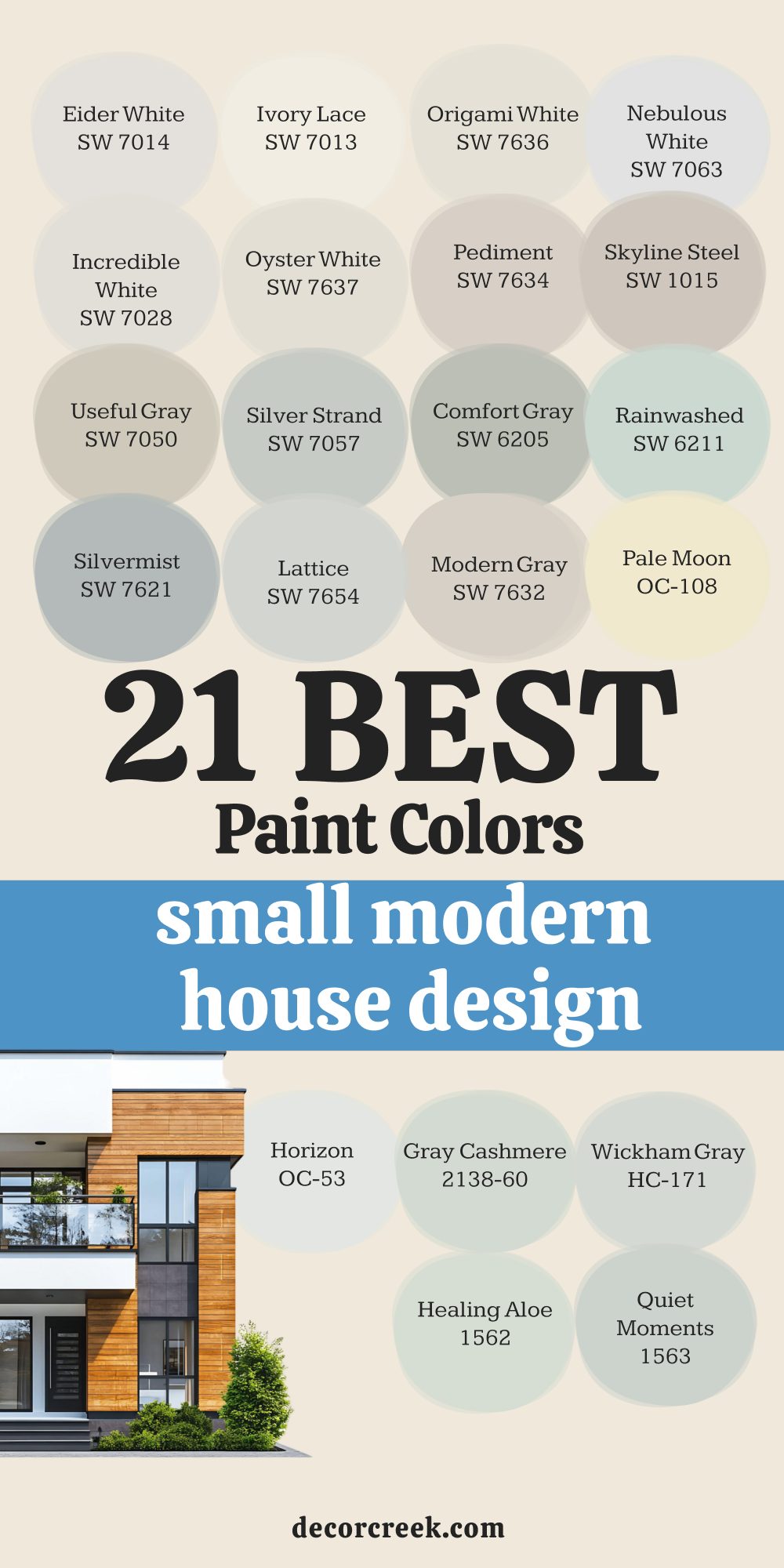
27 Trendy Paint Colors To Use In Modern Bungalow House Design
Natural Linen SW 9109
Natural Linen SW 9109 is a beautiful tan color that looks like the fabric it is named after today. This color brings a lot of earthiness into a bungalow and makes it feel very warm and solid. Natural Linen SW 9109 is perfect for a cozy den or a room where you watch movies with family. This shade looks great with green plants and leather chairs in a modern bungalow setup.
Natural Linen SW 9109 is a darker neutral that helps hide dirt and scuffs in high traffic areas. I love using this color in entryways because it gives guests a warm and friendly greeting. Natural Linen SW 9109 works well with both gold and black finishes on your lights and faucets.
This color is a great way to add some depth to a room without using a very dark paint. Natural Linen SW 9109 feels very organic and matches well with natural wood and stone textures. You will appreciate how this color adds a layer of comfort to your bungalow that white cannot.
🎨 Check out the complete guide to this color right HERE 👈
Shoji White SW 7042
Shoji White SW 7042 is a mix between a soft white and a very light beige color today. This color is perfect for people who think white is too bright but beige is too dark. Shoji White SW 7042 looks amazing on the outside of a bungalow with dark wood accents and black.
This shade creates a very soft look that makes a bedroom feel like a quiet place to rest. Shoji White SW 7042 is a great choice for a whole house color because it flows well. I like to use this color in large open bungalow areas to make the area feel connected and soft.
Shoji White SW 7042 changes quite a bit depending on the time of day so watch it closely. This color is very popular for modern styles because it feels very natural and earthy on walls. Shoji White SW 7042 is a smart pick if you want a wall color that feels very cozy. You will find that this shade makes your furniture look grounded and very well put together.
🎨 Check out the complete guide to this color right HERE 👈
Drift of Mist SW 9166
Drift of Mist SW 9166 is a very light gray that feels as soft as a cloud in the sky. This color is a great alternative to white if you want just a tiny bit of contrast on walls. Drift of Mist SW 9166 works perfectly in a modern bungalow living room with a big gray sofa.
This shade is light enough that it does not make a room feel small or dark at all. Drift of Mist SW 9166 has a very clean look that doesn’t lean too much into blue or green. I suggest this color for offices because it feels very professional and helps you focus on your work.
Drift of Mist SW 9166 is a wonderful choice for laundry rooms to make the chore feel more pleasant. This color looks best when paired with a very bright white trim to make the gray pop. Drift of Mist SW 9166 is a gentle gray that will not make your home feel like a cold basement. You should use this color if you want a modern look that still feels very light.
🎨 Check out the complete guide to this color right HERE 👈
Accessible Beige SW 7036
Accessible Beige SW 7036 is a famous color because it looks good in almost every single house today. This color is a gray beige that does not look too yellow or too muddy on bungalow walls. Accessible Beige SW 7036 is a safe bet for selling a house because most people really like it.
This shade works well in kitchens with white cabinets to add a bit of warmth and color. Accessible Beige SW 7036 is a great choice for hallways that connect many different rooms together. I find that this color looks very high end when you use it with chunky white baseboards. Accessible Beige SW 7036 is a neutral that makes a bungalow feel finished and very well designed.
This color is light enough to be used in dark basements to make them feel more like living areas. Accessible Beige SW 7036 is a workhorse color that handles different lighting situations very well. You can trust this color to make your home look updated and very stylish for a long time.
🎨 Check out the complete guide to this color right HERE 👈
Balanced Beige SW 7037
Balanced Beige SW 7037 is a mid tone beige that offers a lot of warmth and depth for bungalow walls. This color is perfect for a living room where you want a very cozy and grounded feeling today. Balanced Beige SW 7037 works amazing in a room with a lot of white trim and big rugs. This shade is a great choice for a kitchen if you want a look that is very high end.
Balanced Beige SW 7037 has a warmth that makes a room feel very cozy even on a cold winter day. I find that this color looks best when used with a very bright white trim for contrast. Balanced Beige SW 7037 is a workhorse color that interior designers have used for many years with success.
This color is very grounded and makes your home feel very expensive and very thoughtfully painted. Balanced Beige SW 7037 is a classic choice that will not go out of style for a very long time. You will love how this color makes your bungalow feel very cozy and well put together.
🎨 Check out the complete guide to this color right HERE 👈

Modern Gray SW 7632
Modern Gray SW 7632 is a warm and soft greige that is very popular for bungalow house colors. This color is perfect for creating a cozy and inviting home that still looks very fresh. Modern Gray SW 7632 looks amazing in a bungalow living area because it flows well between rooms.
This shade is a great choice for a bedroom with light wood floors and beige rugs today. Modern Gray SW 7632 has a tiny bit of warmth that keeps it from looking like a cold place. I love using this color in bungalow rooms to make them feel very soft and very comfortable.
Modern Gray SW 7632 works well with both gold and black metal accents in your modern bungalow. This color is a favorite for staging because it makes the house look very tidy and ready. Modern Gray SW 7632 is a very friendly neutral that everyone will like when they visit you. You will find that this shade makes your bungalow feel very bright and well designed.
🎨 Check out the complete guide to this color right HERE 👈
Canvas Tan SW 7531
Canvas Tan SW 7531 is a soft and light tan color that feels very natural and very warm today. This color is perfect for bungalow walls because it adds warmth without making the space feel dark. Canvas Tan SW 7531 looks wonderful in a living room with dark wood floors and green plants. This shade is a great choice for a bedroom where you want a very cozy and earthy feeling.
Canvas Tan SW 7531 has a warmth that keeps it from looking too cold or gray in bungalow light. I often use this color to create a very soft and welcoming feeling throughout a house. Canvas Tan SW 7531 is light enough that it will not make your home feel dark or tiny.
This color is a staple for creating a look that is very high end and very tidy. Canvas Tan SW 7531 is a very friendly neutral that makes everyone feel right at home as they enter. You will love how this color adds a touch of class to your bungalow walls.
🎨 Check out the complete guide to this color right HERE 👈

Loggia SW 7506
Loggia SW 7506 is a mid tone greige that feels very sophisticated and very expensive on bungalow walls. This color is a bit darker than some others, giving the room a lot of definition and style today. Loggia SW 7506 looks wonderful in a master bedroom with soft white bedding and dark wood floors. This shade is a great choice for a dining room to create a very warm and formal atmosphere.
Loggia SW 7506 has a very clean look that does not lean too much into yellow or pink tones. I like to use this color for a living room to make the space feel very grounded and solid. Loggia SW 7506 is a very modern color that adds a lot of depth and character to your house.
This color works well with both warm and cool furniture pieces you might already have today. Loggia SW 7506 is a great way to add some drama to your home without it being too dark. You will find that this greige adds a touch of high fashion to your modern bungalow design.
🎨 Check out the complete guide to this color right HERE 👈

Oyster White SW 7637
Oyster White SW 7637 is a soft and warm greige that feels very rich and expensive on bungalow walls. This color is perfect for dining areas because it makes the room feel very sophisticated and nice. Oyster White SW 7637 works well in a bungalow where you want a look that is not white today. This shade looks wonderful when you have light wood floors and gold accents in your room.
Oyster White SW 7637 is a favorite for entries because it gives a warm and friendly greeting to guests. Many people choose this color when they want a neutral that feels very modern and very solid. Oyster White SW 7637 stays bright enough to keep a room from feeling dark or like a small box.
This paint color is one of the best choices for modern bungalow homes because it adds depth. Oyster White SW 7637 helps your furniture look grounded and very well put together in your house. You will find that this greige is very forgiving and looks great in any light of day.
🎨 Check out the complete guide to this color right HERE 👈
Anew Gray SW 7030
Anew Gray SW 7030 is a mid tone greige that offers a lot of depth and warmth for your walls. This color is one step darker than Agreeable Gray and feels very solid and very grounded today. Anew Gray SW 7030 works amazing in a living room with a lot of white trim and big rugs.
This shade is a great choice for a kitchen if you want a look that is very high end. Anew Gray SW 7030 has a warmth that makes a room feel very cozy even on a cold winter day. I find that this color looks best when used with a very bright white trim for a big contrast.
Anew Gray SW 7030 is a workhorse color that interior designers have used for many years with success. This color is very grounded and makes your home feel very expensive and very thoughtfully painted. Anew Gray SW 7030 is a classic choice that will not go out of style for a very long time. You will love how this color makes your home feel very cozy and very well put together.
🎨 Check out the complete guide to this color right HERE 👈
Repose Gray SW 7015
Repose Gray SW 7015 is a cool gray that has just a tiny hint of warmth to keep it from being icy. This color is a bit darker than some other light grays, which gives the walls more definition. Repose Gray SW 7015 is perfect for a modern bungalow kitchen with marble countertops and stainless steel. This shade looks very sophisticated in a formal dining room or a home office with built in shelves.
Repose Gray SW 7015 is a great color to use if you want your white trim to really stand out. I often use this color in bathrooms to create a very clean and updated look for my clients. Repose Gray SW 7015 works well in rooms with a lot of natural light coming through the windows.
This color is a favorite for those who want a true gray look that still feels like a home. Repose Gray SW 7015 adds a touch of class to any room and makes the architecture look more expensive. You should choose this gray if you want a wall color that feels very modern and sharp.
🎨 Check out the complete guide to this color right HERE 👈
Mindful Gray SW 7016
Mindful Gray SW 7016 is one step darker than Repose Gray and offers a lot of depth for bungalow walls today. This color is a mid tone gray that works very well for an accent wall or a whole room. Mindful Gray SW 7016 makes a great backdrop for colorful artwork or bright furniture pieces you love. This shade is very grounded and makes a large room feel more comfortable and a bit smaller.
Mindful Gray SW 7016 is a top choice for painted brick fireplaces in a modern bungalow setting. I like to use this color on the exterior of a home for a very stylish and updated look. Mindful Gray SW 7016 pairs beautifully with wood accents and dark metal hardware on your bungalow doors.
This color is strong enough to stand on its own but neutral enough to not be too loud. Mindful Gray SW 7016 is a great way to add some drama to a room without going to a black color. You will enjoy how this gray makes your home feel very sturdy and well built for years.
🎨 Check out the complete guide to this color right HERE 👈
Evergreen Fog SW 9130
Evergreen Fog SW 9130 is a mid tone green that has a lot of gray in it to keep it soft. This color is very trendy for 2026 because it feels modern and organic at the same time. Evergreen Fog SW 9130 looks amazing on kitchen cabinets if you want a look that is not white.
This shade is a great pick for a mudroom or a laundry room to add some style to chores. Evergreen Fog SW 9130 works well with natural wood tones and black hardware in a modern bungalow. I love using this color in a dining room to create a very sophisticated and cool atmosphere. Evergreen Fog SW 9130 is dark enough to have some personality but light enough to not be scary.
This color feels very fresh and brings a bit of the outside world into your living room. Evergreen Fog SW 9130 is a great choice for an accent wall in a nursery or a small office. You will enjoy how this green makes your home feel very current and very well designed for today.
🎨 Check out the complete guide to this color right HERE 👈
Retreat SW 6207
Retreat SW 6207 is a beautiful mid tone green that has a lot of gray mixed into it today. This color is perfect for a bungalow bedroom where you want a very natural and earthy feeling. Retreat SW 6207 looks wonderful in a living room with light wood floors and white furniture for style. This shade is a great choice for an accent wall in an office for a professional look.
Retreat SW 6207 has a warmth that keeps it from looking too cold or too bright in the sun. I love using this color in a dining room to create a very sophisticated and fresh look. Retreat SW 6207 works well with both gold and black metal accents in your modern bungalow design.
This color is a favorite for those who want a green that feels very quiet and soft. Retreat SW 6207 is a very friendly color that brings a bit of the outside world into your home. You will find that this green adds a lot of character and style to your favorite rooms easily.
🎨 Check out the complete guide to this color right HERE 👈
Pewter Green SW 6208
Pewter Green SW 6208 is a very deep and cool green that feels like it belongs in a fancy hotel. This color is a great choice for bungalow kitchen cabinets if you want a look that is very bold. Pewter Green SW 6208 works well with white marble and shiny gold handles for a luxury feel today.
This shade is dark enough to act as a neutral in many modern house designs today. Pewter Green SW 6208 makes a bedroom feel very dark and perfect for sleeping in late. I like to use this color on an accent wall behind a TV to help the screen blend in. Pewter Green SW 6208 looks very high end and professional when you use it in an office.
This color is a favorite for people who want a dark room that is not black or gray. Pewter Green SW 6208 has a very calming and steady energy that makes a home feel very solid. You will find that this green is very stylish and will impress everyone who visits your bungalow.
🎨 Check out the complete guide to this color right HERE 👈
Dried Thyme SW 6186
Dried Thyme SW 6186 is a darker green that looks like the herb it is named after today. This color has a lot of gray in it which makes it feel very vintage and cool. Dried Thyme SW 6186 is a wonderful choice for an exterior color on a bungalow with wood siding.
This shade looks great in a home library or on built in bookshelves for a moody look. Dried Thyme SW 6186 is a strong color that makes a room feel very private and very safe. I find that this green looks best when you use it with warm gold or copper accents.
Dried Thyme SW 6186 is a great way to add a bit of drama to a bathroom or a small powder room. This color helps to highlight the greenery of your plants and makes them look extra bright. Dried Thyme SW 6186 is a sophisticated green that will not make your room look like a forest. You will love how this color adds a layer of history and character to your modern walls.
🎨 Check out the complete guide to this color right HERE 👈
Urbane Bronze SW 7048
Urbane Bronze SW 7048 is a deep and earthy color that is a mix of dark gray and rich brown today. This color was a color of the year because it feels very natural and very grounded for a home. Urbane Bronze SW 7048 looks incredible on a front door to give your bungalow a modern look. This shade is a wonderful choice for a home office where you want to feel tucked in and focused.
Urbane Bronze SW 7048 works very well with green plants and gold decorations on your bungalow shelves. I like to use this color in bedrooms to create a very cozy and safe feeling for sleeping. Urbane Bronze SW 7048 is a great way to bring a bit of nature inside your house through your walls.
This color looks very expensive and high quality when it is painted on a flat or matte surface. Urbane Bronze SW 7048 is a bold neutral that adds a lot of visual interest to a modern bungalow. You will love how this color makes your room feel very special and very different from others.
🎨 Check out the complete guide to this color right HERE 👈
Iron Ore SW 7069
Iron Ore SW 7069 is a very dark charcoal color that looks almost black but has more soft depth. This color is perfect for an accent wall in a bungalow bedroom to make the bed the main focus. Iron Ore SW 7069 looks stunning on interior doors to give them a very high end and custom look today. This shade is a great choice for the outside of a house if you want a very modern look.
Iron Ore SW 7069 works well in a media room where you want the walls to be dark for movies. I love using this color for kitchen islands to make them stand out from the rest of the cabinets. Iron Ore SW 7069 is a bold choice that makes a big statement in any part of your modern bungalow.
This color looks very cool when paired with light wood floors and bright white trim for contrast. Iron Ore SW 7069 is not as harsh as a true black making it much easier to use in a house. You will find that this dark shade adds a lot of character and style to your favorite rooms.
🎨 Check out the complete guide to this color right HERE 👈
Alabaster SW 7008
Alabaster SW 7008 is a soft white that does not feel too sharp or cold on bungalow walls today. This color has a tiny bit of cream in it that helps a room feel very cozy and inviting. Alabaster SW 7008 works great on both walls and trim if you want a clean look that is not boring.
This shade looks wonderful when you have dark wood floors or black metal accents in your bungalow. Alabaster SW 7008 is a favorite for living rooms because it makes the walls look soft and clean. Many people choose this color when they want a white that feels like a warm hug.
Alabaster SW 7008 stays bright even in rooms that do not have a lot of big windows for sun. This paint color is one of the most popular choices for modern homes because it is easy. Alabaster SW 7008 helps your colorful pillows and art stand out without being a distraction. You will find that this white is very forgiving and hides small bumps on your bungalow walls.
🎨 Check out the complete guide to this color right HERE 👈
Pure White SW 7005
Pure White SW 7005 is a very clean shade that does not have any strong yellow or blue tones today. This color is perfect for bungalow kitchen cabinets because it looks very crisp and high end. Pure White SW 7005 makes a great ceiling color when you want the room to feel taller and open. This shade is a safe pick for any room because it matches almost every kind of rug.
Pure White SW 7005 is not too bright like a piece of paper so it will not hurt your eyes. I like to use this color in hallways to make them feel less narrow and much brighter. Pure White SW 7005 gives a fresh look to older bungalows that need a bit of a modern update.
This color is a top choice for trim because it provides a nice contrast against darker wall colors. Pure White SW 7005 is a reliable friend in the world of paint because it always looks professional. You can use this white anywhere to make the whole area feel sanitized and very tidy.
🎨 Check out the complete guide to this color right HERE 👈

Natural Choice SW 7011
Natural Choice SW 7011 is a very soft and warm white that feels very organic and very clean today. This color is perfect for bungalow walls when you want a look that is light but not too bright. Natural Choice SW 7011 works well in a living room with big windows and lots of natural light. This shade is a great choice for a master bedroom to create a very restful and soft area.
Natural Choice SW 7011 has a very gentle look that helps your furniture and art be the stars. I find that this color looks best when paired with a very bright white trim for contrast. Natural Choice SW 7011 is a favorite for designers who want a white that feels very cozy and full.
This color is very easy to use because it matches almost every other color in your bungalow. Natural Choice SW 7011 is a reliable pick that makes your home feel very bright and happy today. You will love how this white makes your home feel very clean and very well put together.
🎨 Check out the complete guide to this color right HERE 👈

Sea Salt SW 6204
Sea Salt SW 6204 is a very light green that also has some gray and blue mixed inside of it today. This color is famous for making people feel very relaxed as soon as they see it on the walls. Sea Salt SW 6204 is the most popular choice for bathrooms because it feels very fresh and clean. This shade looks different in every room sometimes looking more green and sometimes more gray.
Sea Salt SW 6204 is a great color for a coastal bungalow that wants a touch of nature inside. I suggest using this color in a bedroom if you want a very light and airy place to sleep. Sea Salt SW 6204 pairs perfectly with white trim and light colored wood furniture in your bungalow.
This color is very soft and does not feel loud or bright even when the sun hits it directly. Sea Salt SW 6204 is a wonderful way to add a tiny bit of color without it being too much. You will find that this shade makes your home feel very peaceful and light for everyone.
🎨 Check out the complete guide to this color right HERE 👈
Rock Candy SW 6231
Rock Candy SW 6231 is a very light and airy blue gray that feels like a breath of fresh air today. This color is so light that it can almost look white in some very bright bungalow rooms. Rock Candy SW 6231 is a great choice for a nursery or a child’s room for a soft look.
This shade works well in a bathroom to make it feel very clean and like a spa day. Rock Candy SW 6231 has a cool feeling that makes a hot and sunny room feel much cooler today. I like to use this color on ceilings to add a tiny bit of interest without being too much.
Rock Candy SW 6231 pairs beautifully with dark gray furniture and white curtains in a bungalow living room. This color is very easy to look at and will not make your eyes tired after a while. Rock Candy SW 6231 is a sweet and gentle color that fits perfectly in a modern bungalow home. You will appreciate how this shade adds a hint of color while keeping everything very bright.
🎨 Check out the complete guide to this color right HERE 👈
Coastal Plain SW 6192
Coastal Plain SW 6192 is a beautiful mid tone green that has a lot of gray mixed into it today. This color is perfect for a bungalow bedroom where you want a very natural and earthy feeling. Coastal Plain SW 6192 looks wonderful in a living room with light wood floors and white furniture. This shade is a great choice for an accent wall in an office for a professional look today.
Coastal Plain SW 6192 has a warmth that keeps it from looking too cold or too bright in the sun. I love using this color in a dining room to create a very sophisticated and fresh look. Coastal Plain SW 6192 works well with both gold and black metal accents in your modern bungalow design. This color is a favorite for those who want a green that feels very quiet and soft.
Coastal Plain SW 6192 is a very friendly color that brings a bit of the outside world into your home. You will find that this green adds a lot of character and style to your favorite bungalow rooms.
🎨 Check out the complete guide to this color right HERE 👈

Collonade Gray SW 7641
Collonade Gray SW 7641 is a beautiful greige that feels very sophisticated and very expensive on bungalow walls today. This color is a bit more gray than some others giving it a very modern and current look. Collonade Gray SW 7641 looks amazing in a living room with dark wood floors and light furniture. This shade is a great choice for a whole bungalow color because it is so easy to live with.
Collonade Gray SW 7641 has a warmth that keeps it from ever looking too cold or like an office. I recommend this color for anyone who wants a neutral that is a bit more than just white today. Collonade Gray SW 7641 pairs perfectly with black hardware and white trim in a modern bungalow design. This color is very good at making a home feel very finished and very professional looking.
Collonade Gray SW 7641 is a soft and friendly choice that will make your bungalow feel very peaceful. You will love how this color makes your walls look very updated and very stylish for years.
Iron Mountain 2134-30
Iron Mountain 2134-30 is a very dark charcoal color that looks almost black but has more soft depth today. This color is perfect for an accent wall in a bungalow bedroom to make the bed the main focus. Iron Mountain 2134-30 looks stunning on interior doors to give them a very high end and custom look. This shade is a great choice for the outside of a bungalow if you want a very modern look.
Iron Mountain 2134-30 works well in a media room where you want the walls to be dark for movies today. I love using this color for kitchen islands to make them stand out from the rest of the cabinets. Iron Mountain 2134-30 is a bold choice that makes a big statement in any part of your modern bungalow.
This color looks very cool when paired with light wood floors and bright white trim for contrast. Iron Mountain 2134-30 is not as harsh as a true black making it much easier to use in a house. You will find that this dark shade adds a lot of character and style to your rooms.
🎨 Check out the complete guide to this color right HERE 👈

Revere Pewter HC-172
Revere Pewter HC-172 is perhaps the most famous greige color in the world for many good reasons today. This color is a perfect mix of gray and beige that looks good in almost every bungalow lighting. Revere Pewter HC-172 works amazingly well in a basement to make it feel like a real living area. This shade is a great choice for bungalow kitchen cabinets if you want a look that is high end.
Revere Pewter HC-172 has a lot of depth and makes a room feel very solid and very well built. I find that this color looks best when used with a very bright white trim for a big contrast. Revere Pewter HC-172 is a workhorse color that interior designers have used for many years with success.
This color is very grounded and makes your bungalow feel very expensive and very thoughtfully painted. Revere Pewter HC-172 is a classic choice that will not go out of style for a long time. You will love how this color makes your home feel very cozy and well put together.
🎨 Check out the complete guide to this color right HERE 👈
My Final Thoughts
Choosing a paint color is undeniably a monumental decision in the home improvement process, but it is vital to remember that it should also be the most exhilarating and creative part of making your house truly yours.
Throughout my years in the industry, I have witnessed the incredible transformative power of a single gallon of paint; I have seen how the perfect luminous shade can breathe life into a windowless, dark room, making it feel expansive, and how a rich, deep tone can ground a cavernous space, turning it into a cozy, intimate sanctuary.
You are in a wonderful position today because both Sherwin-Williams and Benjamin Moore offer such a sophisticated and diverse array of choices that there is a perfect match for every personality and architectural style.
However, I cannot stress this enough: always perform a real-world test on your specific walls before committing to the full project.
Lighting is the ultimate director of color; a shade that appears flawless under the fluorescent humming of a retail store will inevitably shift its character once it meets the unique shadows and sunbeams of your home.
I sincerely hope this curated list of premier colors for 2026 serves as a roadmap to help you navigate your design journey with absolute confidence and clarity.
Your home is far more than just a building; it is the backdrop of your life, a place where you should feel an overwhelming sense of happiness and profound pride in the environment you have painstakingly created. Trust your intuition—when you see a color that makes your heart skip a beat, listen to that feeling, and do not be afraid to step outside your comfort zone to try something bold or new.
A fresh coat of professional-grade paint remains the fastest, most effective way to revitalize your spirit and give your entire house a stunning new identity.
I am truly honored to have shared my personal favorite colors and professional insights with you, and I look forward to seeing how you transform your space into a masterpiece.