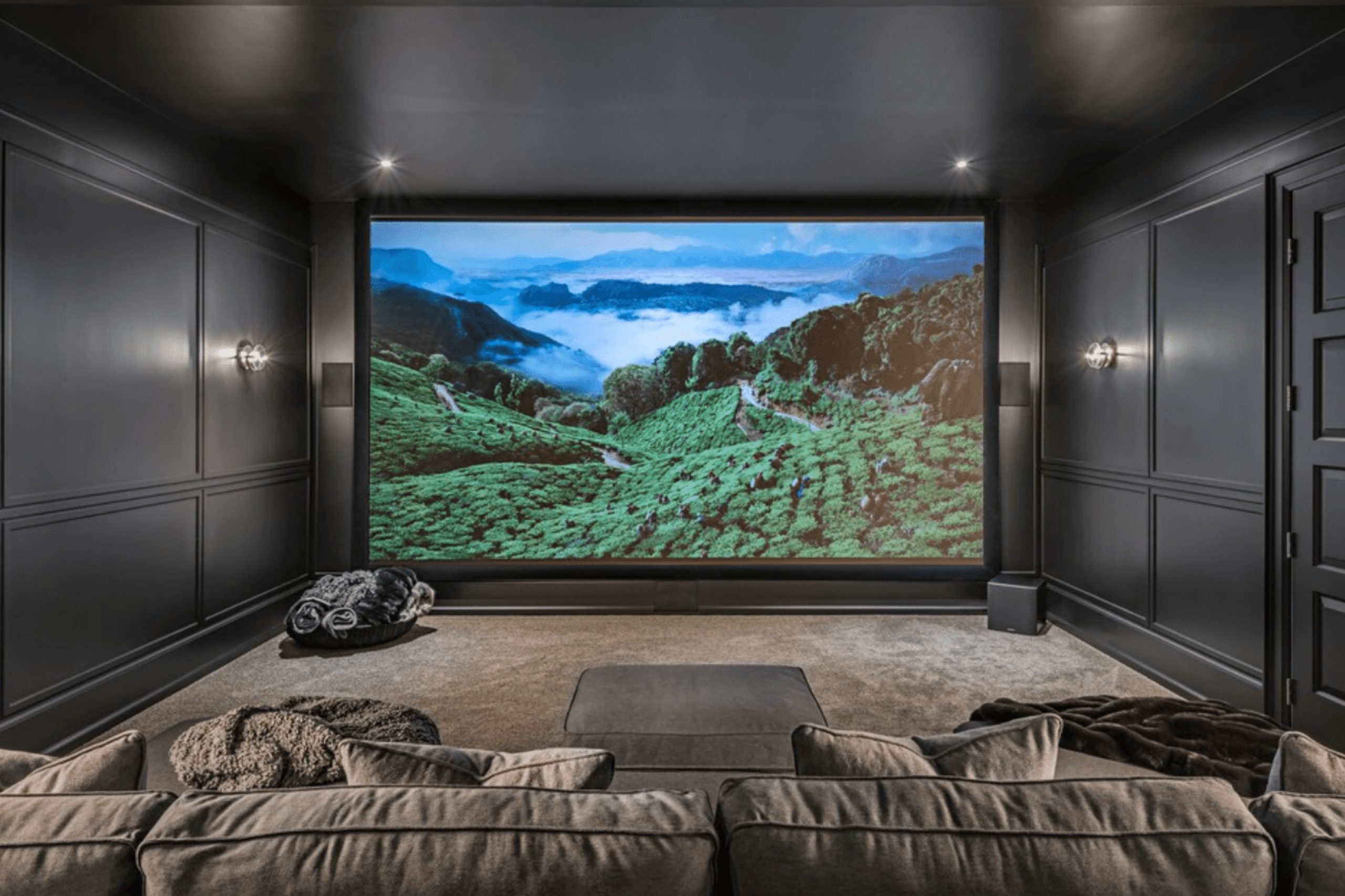
When I think about a home theater, I think about more than just a screen and chairs. The walls around you are what make the room feel like a real theater. Paint color shapes the mood in ways you might not notice right away, but you can always feel. It changes how light bounces, how shadows stretch, and even how relaxed you feel when the movie begins.
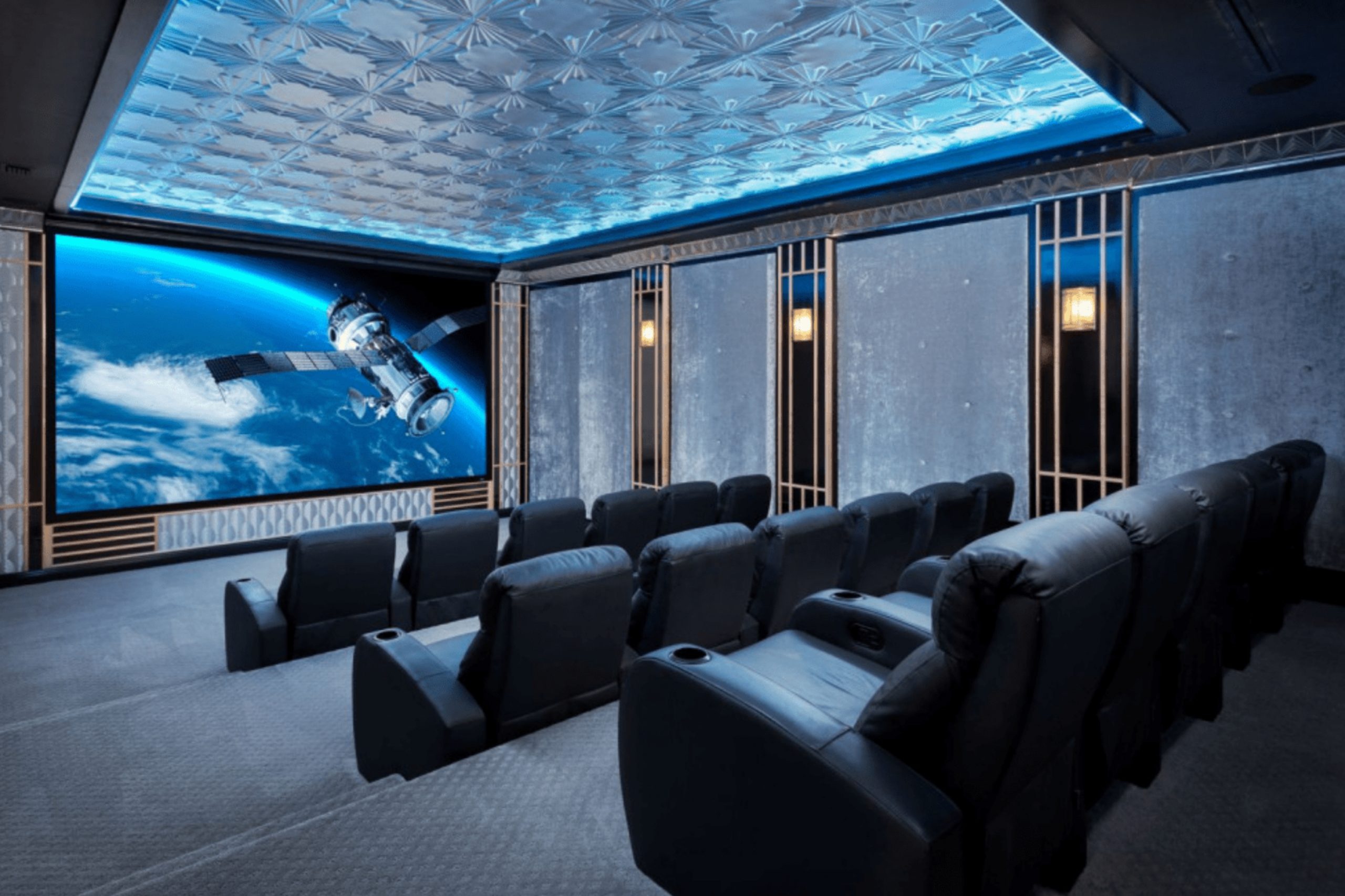
A pale color can make the screen look dull, while a darker shade makes it shine brighter. Deep blues and greens add richness, like sitting inside a storybook.
Charcoals and grays bring a steady comfort that makes the room feel grounded. Black shades erase the room altogether, letting you forget where you are and focus only on the story. Choosing the right shade is the first step in turning an ordinary room into a true retreat.
It’s not just about color—it’s about creating a world where the outside fades away and every movie feels special.
Why I Believe Paint Colors Shape the Feeling of a Home Theater
Paint colors are the background of every single scene you watch in your own home. A good shade wraps you in comfort, rests your eyes, and gives the screen the spotlight. The wrong shade can reflect light, make images look flat, and pull you out of the story. When I work on a theater, I never choose a color straight from a small chip.
I paint large samples and test them with dimmed lights, because how a color behaves in soft light is what truly matters. I want people to feel like they’ve stepped away from the noise of the house the second they walk in.
Deep tones pull the walls back and let the screen glow, while richer colors add a mood that matches the drama of the story. The right paint doesn’t just set a background—it creates an atmosphere that makes movie nights unforgettable.
That’s why I believe color is the soul of a home theater.
How I Choose the Right Paint Shade for a Home Theater
I always start by asking how the room will really be used. Is it for big family nights with popcorn and laughter, for sports games with friends, or for quiet evenings with just a couple of chairs? Every answer helps shape the right mood. Then I study the light. Some theaters are in basements with no windows at all, while others have small windows that let in a little brightness.
If there’s natural light, I choose deeper tones to keep glare under control. For windowless rooms, I can go as dark as I want to create full immersion. If the space needs warmth, I reach for earthy browns or deep greens that feel protective.
If it needs energy, I bring in blues or rich navies that spark life while still keeping the room dark. I test the shade on more than one wall, because corners and ceilings react differently.
The best paint is the one that disappears as soon as the story starts, letting you forget the room and fall into the film.
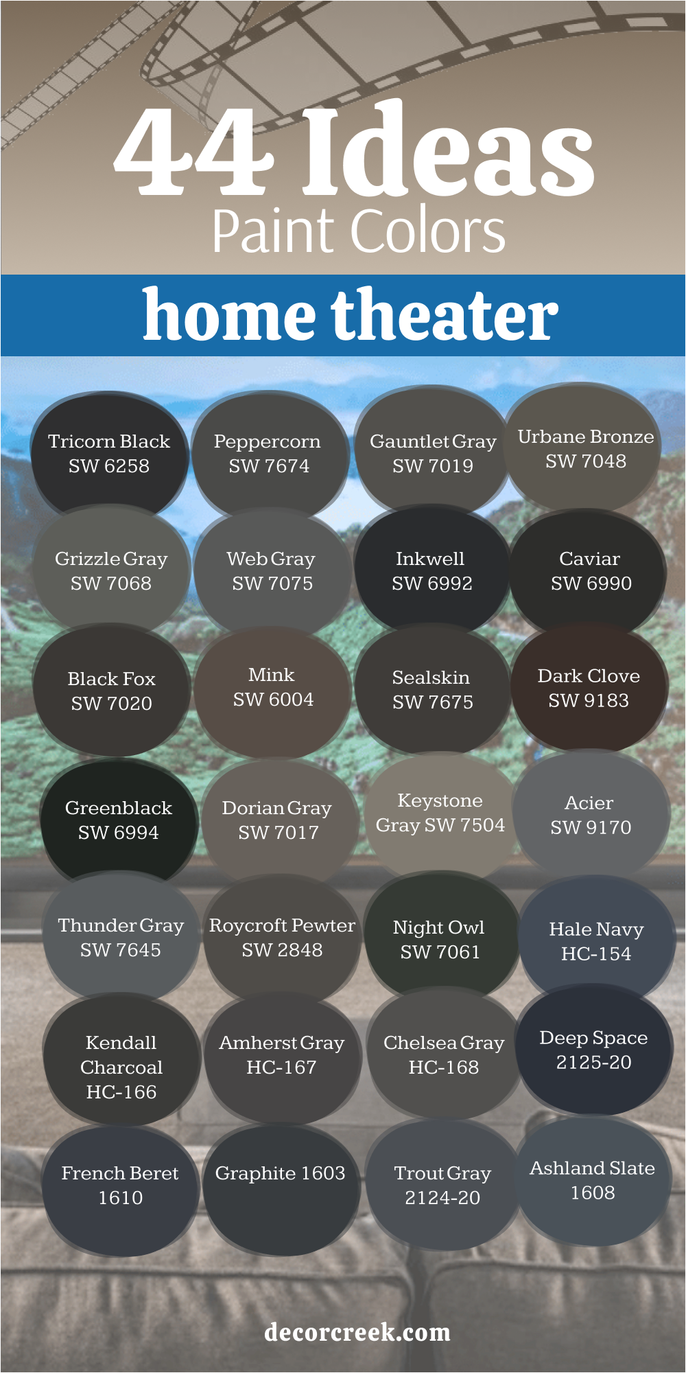
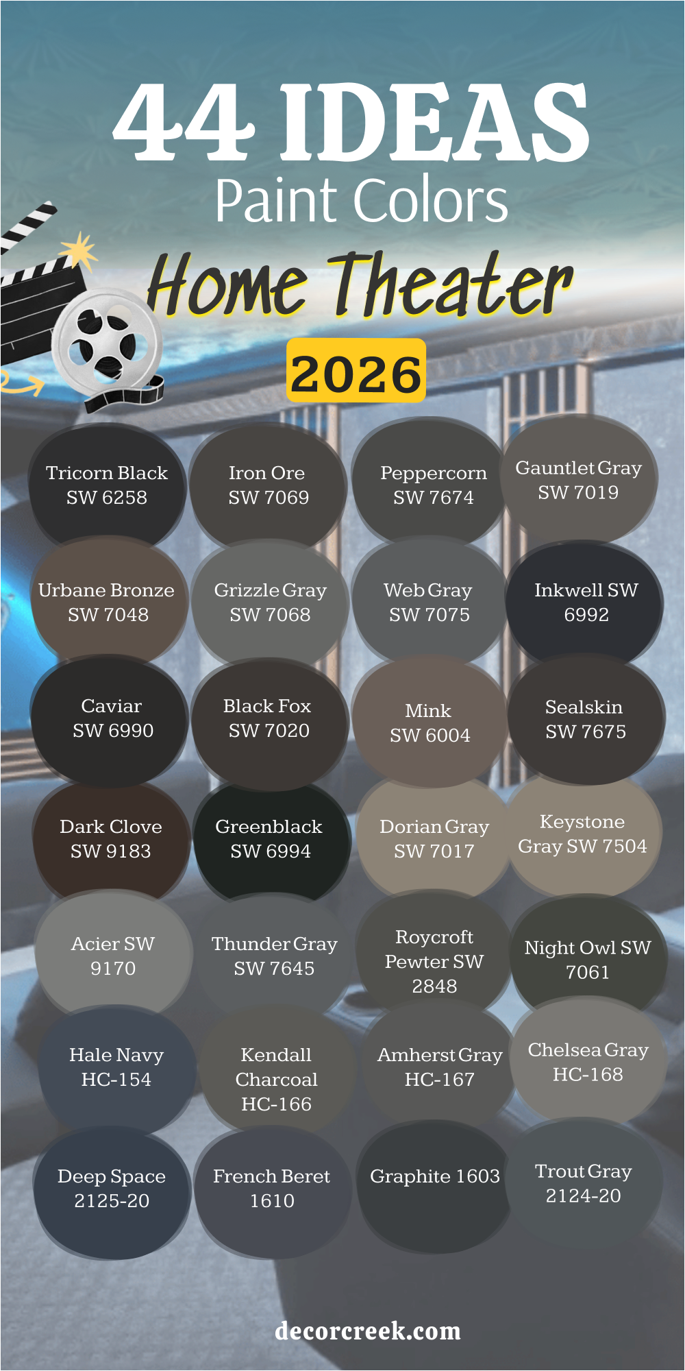
44 Ideas Home Theater Paint Colors in 2026
Tricorn Black SW 6258
Tricorn Black makes a home theater feel like a real cinema. This color swallows extra light so the screen becomes the star. I often use it when someone wants the truest theater experience at home. On walls and ceilings, it hides edges and corners until you barely notice the room itself. Soft leather chairs or velvet curtains work beautifully with this shade, adding layers of richness. I like to pair it with warm, dim lights so the darkness feels safe instead of harsh.
Tricorn Black also works well in basements where you want to cut out all brightness and create full focus. I’ve seen families spend hours together in rooms painted this way because the color makes everything outside fade away.
It feels private, like the world stops at the door. Tricorn Black is not just dark—it’s powerful, stylish, and dramatic.
To me, it is the paint color that unlocks the true magic of movie nights.

Peppercorn SW 7674
Peppercorn feels strong and steady in a theater. It has a depth that makes the screen shine brighter but also has more character than flat black. I like to use it when people want a shade that feels bold but still leaves room for design. Peppercorn pairs beautifully with navy accents, patterned rugs, or soft gray furniture. In low lighting, it almost melts into the background, wrapping the room in comfort.
It is a great choice for mid-size theaters where you want drama but not total darkness. I’ve noticed Peppercorn makes people relax faster, as if the room is giving them permission to slow down.
It balances strength with calm energy, perfect for long weekends of movies or games. The walls feel like a safe cocoon, but the shade is never boring.
Peppercorn is practical, stylish, and full of warmth—everything you want for a home theater.

Gauntlet Gray SW 7019
Gauntlet Gray has the kind of strength that feels reliable in a theater room. It’s not as dark as black, but it still controls light beautifully, making the screen glow brighter. I like this shade for homeowners who want a color that feels modern but still warm. It works well with brown leather recliners, walnut wood finishes, or bronze light fixtures.
Under dimmed lights, Gauntlet Gray creates an atmosphere that feels polished yet comfortable. The room becomes a place where you want to linger even after the movie ends.
I also like how this gray looks with soft rugs and thick curtains—it makes everything feel layered and complete. It’s a good option for people who want a theater that doesn’t feel too closed-in or cold.
Gauntlet Gray adds depth while still letting the room breathe. To me, it’s a perfect balance between drama and comfort, a color that turns a movie night into a ritual.

Urbane Bronze SW 7048
Urbane Bronze is rich and earthy, a blend of brown and gray that feels grounded. When I use it in a theater, it creates an inviting warmth without losing the depth you need for watching films. This color works especially well with natural textures—think linen throws, rattan baskets, or wooden trim.
It pairs easily with tan or caramel-colored seating, adding layers of coziness to the room. Under dim light, Urbane Bronze deepens and gives the walls a velvety effect.
I’ve seen it make small theaters feel larger because the tone is strong but not overpowering. It has just the right amount of character to keep the room interesting, even with minimal décor.
Urbane Bronze feels like a hug around the space, keeping distractions away. For families who want both style and comfort, it’s one of my favorite recommendations.
This color proves that dark shades don’t have to feel cold—they can feel alive and full of presence.

Grizzle Gray SW 7068
Grizzle Gray brings bold drama with just a hint of green in its undertone. I often turn to it when a plain charcoal feels too flat. In a home theater, it makes the walls look deep and textured, almost like natural stone. It works beautifully with navy furniture, patterned carpets, or brass accents.
In low lighting, it becomes even richer, wrapping the room in quiet strength. Grizzle Gray has a way of making everything in the room look more expensive and intentional.
I think of it as a color that gives the theater both personality and purpose. It doesn’t just sit quietly—it adds character without taking over. People often tell me it feels cozy but also dramatic, which is a rare combination.
Grizzle Gray is perfect for those who want their theater to feel like a destination, not just another room. It makes watching a movie feel like an event.

Web Gray SW 7075
Web Gray is sleek and modern, a dark gray that feels clean and controlled. I love it in theaters with contemporary design where sharp edges and minimal décor set the mood. It holds back light reflections, letting the screen shine without distraction. With silver fixtures or chrome accents, Web Gray feels crisp and stylish. I like to pair it with velvet seating or deep rugs to balance its sharpness with softness.
The shade has just enough brightness to feel polished, not heavy. I often recommend it for people who want a theater that feels sophisticated but not intimidating.
In dim lighting, Web Gray softens and becomes more comforting. It’s one of those colors that looks good even when the room is empty, waiting for the lights to dim. Web Gray helps the theater feel fresh, current, and ready for every kind of story.
Inkwell SW 6992
Inkwell feels like midnight captured in paint. It’s a blend of deep blue and black, giving it a richness that makes walls feel velvety. I often use it when families want a dramatic room that still has a hint of color. In low light, Inkwell nearly disappears, leaving only the glow of the screen. With soft wall sconces, the color picks up just enough blue to create a moody atmosphere.
I’ve paired it with navy furniture and thick curtains to build a cocoon-like feeling. It works beautifully on ceilings too, pulling the whole room together in a seamless way.
Inkwell is perfect for theaters where you want intensity but not flatness. It feels more alive than plain black, more complex than simple gray. This shade turns a theater into a retreat, where every movie feels like stepping into another world.
It’s one of my most trusted deep tones for cinema-style design.

Caviar SW 6990
Caviar is a rich black with just enough warmth to keep it from feeling flat. I love using it when someone wants a theater that feels luxurious and private. It’s a color that doesn’t shout but sets the mood quietly and powerfully. On walls and ceilings, Caviar swallows glare and makes the screen the true focus.
I like pairing it with dark wood floors, leather seats, and soft golden lights—it turns the whole room into a refined retreat.
In dim settings, it feels velvety, almost like fabric stretched across the walls. It’s a color that lets people settle in, relax, and forget about everything else. Caviar also works well in smaller theaters, where pure black might feel too heavy. It creates intimacy without crushing the space. Every time I use it, the room ends up feeling balanced, polished, and deeply comfortable.
For me, Caviar is the kind of shade that makes a theater feel timeless in its beauty.

Black Fox SW 7020
Black Fox is one of my favorite shades for people who want both darkness and warmth. It leans toward brown, so it feels cozier than a stark black. I’ve used it in theaters where families wanted a mix of drama and comfort, and it always delivered. With bronze or copper accents, the room feels layered and rich. Paired with soft throws and deep rugs, it creates an inviting den-like atmosphere.
I like how Black Fox changes under lighting—by day it shows its earthy tone, by night it deepens into near-black shadows. It works beautifully with rustic styles but also blends into modern designs with ease.
I think of it as a softer, more approachable way to add depth. Black Fox makes a home theater feel grounded, warm, and secure. It’s the kind of shade that people never get tired of seeing, even after countless movie nights.

Mink SW 6004
Mink is a dark taupe that brings a refined softness to theater walls. It’s not as stark as black, but it still offers enough depth to keep the screen glowing. I often suggest it when homeowners want a shade that feels moody but gentle. Mink pairs wonderfully with cream rugs, beige furniture, or wood accents.
Under dim lighting, it feels velvety and rich, almost like chocolate. I love how it balances darkness with warmth, making the room both stylish and inviting.
It’s a good option for theaters that double as multipurpose rooms because it doesn’t overwhelm. With Mink, you get a backdrop that lets both movies and everyday life shine. It’s a color that makes the room feel cared for and complete. For me, Mink always brings elegance without sacrificing comfort.

Sealskin SW 7675
Sealskin is bold and dramatic, perfect for theaters that need true darkness. It has a brown undertone that gives it strength and depth. When I use Sealskin, the room feels private and wrapped in protection, like nothing outside can reach you. It pairs well with textured walls, heavy curtains, or wood beams. I often recommend it for basements, where you want to erase brightness and create a full cinema feel.
Sealskin handles both cool and warm lighting beautifully, shifting slightly in tone but always staying rich. It’s a color that supports long viewing sessions without straining the eyes.
I love how it makes a room feel completely dedicated to the screen. With Sealskin, the theater isn’t just a space—it becomes an escape. Every time I see it finished on walls, I know the room is ready for unforgettable movie nights.
Dark Clove SW 9183
Dark Clove has a deep, chocolate richness that makes a theater feel warm and inviting. It’s darker than most browns but still carries a cozy note. I love it paired with leather chairs, wood paneling, or brass light fixtures—it feels like an old-world cinema. In dim light, Dark Clove softens and adds warmth without reflecting too much brightness.
It’s one of those shades that makes people want to stay and talk even after the movie is over. I think of it as both dramatic and approachable, the perfect balance.
It works especially well in basement theaters where warmth helps balance the cooler air. Dark Clove is a shade that draws people in and holds them there. For me, it creates a theater that feels as much about connection as it is about film. With Dark Clove, the room becomes a retreat filled with richness and comfort.
Greenblack SW 6994
Greenblack is one of those colors that looks almost pure black, but with just a touch of green hiding underneath. I love it because in low light it feels like a deep shadow, yet under certain bulbs it shows that secret green tone, adding personality. In a home theater, it makes walls feel endless, almost like you’ve stepped into a professional screening room.
It pairs beautifully with natural wood trim, dark green fabrics, or even stone details. I often use it for clients who want something darker than gray but not as stark as pure black.
Greenblack makes the room feel alive without being distracting. It absorbs glare from the screen while still offering depth that feels layered. For me, it’s the kind of shade that rewards you the longer you spend time in the room. Every time the lights dim, it reminds you why deep colors matter so much in a theater.

Dorian Gray SW 7017
Dorian Gray is softer than most of the deep colors I use, but it has a calming strength that works in theaters. It’s a mid-to-dark gray that keeps reflections low while giving the walls a gentle tone. I like using it in multipurpose rooms, where the theater might also serve as a family space. With beige or cream furniture, Dorian Gray feels warm and balanced.
With darker accents, it shifts into a more dramatic backdrop. This shade is perfect for people who don’t want a theater to feel too heavy but still need focus on the screen.
I often recommend it for smaller rooms where black would be too much. Dorian Gray creates comfort without stealing attention. It’s a steady, flexible color that adapts to whatever the room needs. For me, it’s proof that a theater can feel welcoming without losing its drama.

Keystone Gray SW 7504
Keystone Gray has a grounded, earthy undertone that makes it different from cooler grays. I like it because it adds warmth to theater walls while still staying dark enough to keep the screen sharp. This shade pairs beautifully with wood accents, tan seating, or natural fabrics. It’s especially useful in basements, where you want to avoid a cold feeling.
In dim light, Keystone Gray deepens and feels steady, almost protective. I’ve seen it work in both modern and traditional theaters, which makes it a versatile choice.
It doesn’t overwhelm but still makes a clear statement. Keystone Gray helps the room feel more inviting, like a place to gather as much as to watch. I think of it as a shade that adds a heartbeat to the walls, keeping the theater human and approachable. It’s one of my favorite warm grays for spaces where comfort matters.
Acier SW 9170
Acier is a mid-dark gray that feels sleek and contemporary. I use it when a homeowner wants a modern theater that looks polished and clean. It doesn’t overpower, but it still creates the depth you need for screen viewing. Acier pairs well with metal accents, minimalist furniture, and bold lighting fixtures. In dim light, it becomes even richer, almost like brushed steel.
I like how it creates a sense of focus without being heavy. It’s perfect for families who want their theater to feel stylish and purposeful. Acier holds its own against large screens and advanced sound systems, giving the room a finished look.
It’s steady, reliable, and sharp, the kind of color that never feels dated. For me, Acier is about control—controlling light, mood, and attention so the story on screen is what shines most.
Thunder Gray SW 7645
Thunder Gray feels bold and stormy, full of presence without being overwhelming. It’s darker than mid-gray but softer than pure black, which makes it perfect for theaters. I like to pair it with cool-toned seating or metallic fixtures for a strong, modern vibe. In low light, Thunder Gray deepens into shadow, helping the screen feel brighter.
It works beautifully with both sleek designs and cozy setups, depending on how you style it. I often recommend it for larger rooms where you want weight on the walls without closing the room in.
Thunder Gray gives the space a dramatic foundation that doesn’t feel too harsh. It’s a shade that makes a room feel powerful, steady, and ready for hours of film. I think of it as the storm outside while the story unfolds inside. It always makes theaters feel cinematic and memorable.
Roycroft Pewter SW 2848
Roycroft Pewter feels historic and rich, perfect for a home theater with character. It’s darker than most grays, leaning toward charcoal with a touch of heritage style. I love using it in rooms with traditional wood trim, patterned carpets, or antique-inspired light fixtures. It creates a sense of depth that feels strong and elegant at the same time.
In low lighting, Roycroft Pewter nearly dissolves into shadow, making the screen shine brighter. I’ve noticed that it works especially well in rooms designed to mimic old-world cinemas.
The shade carries a sense of permanence—it makes the walls feel steady, as if they’ve always been there. Roycroft Pewter is not flashy, but it holds a quiet power that transforms a simple theater into a dignified retreat.
With this color, the room feels balanced, warm, and deeply rooted. It’s one of those shades that makes every detail around it look more intentional.

Night Owl SW 7061
Night Owl mixes deep gray with a hint of green, giving it a layered richness. I like it for theaters where plain gray might feel too flat. In dim light, Night Owl becomes almost shadow-like, soft but strong. It pairs beautifully with natural wood, green accents, or dark leather furniture.
I often recommend it for homeowners who want a theater that feels grounded but not too cold. The green undertone adds just enough life to keep the walls from feeling plain.
Night Owl works especially well in basements, where the extra depth makes the space more inviting. I think of it as a shade that feels both dramatic and friendly.
It creates a room where you can relax, focus, and feel at home all at once. With Night Owl, the theater becomes a place you want to return to again and again.

Amherst Gray HC-167
Amherst Gray is refined and elegant, a dark gray that leans slightly cool. I love using it in modern theaters that need sharpness without coldness. It pairs beautifully with steel accents, black furniture, or sleek lighting fixtures. In dim light, it takes on a deep, moody quality that feels cinematic. Amherst Gray has enough character to feel special but not so much that it distracts.
I often suggest it for people who want their theater to feel polished and purposeful. The shade works equally well on walls and ceilings, creating a seamless look.
It balances boldness with subtlety, giving the room a steady rhythm. Amherst Gray feels timeless in its strength and modern in its clarity. For me, it’s one of those colors that makes any theater look like it was designed with intention.

French Beret 1610
French Beret is a smoky navy with refined charm. I often recommend it for homeowners who love navy but want something more muted and stylish. In a theater, it feels like a nod to classic cinema with a modern twist. French Beret pairs well with silver or gray seating, velvet curtains, and low warm lighting. I love how it creates depth without feeling heavy—it’s darker than most navies but not as strict as black.
In dim light, it deepens beautifully, giving walls a subtle richness. It’s also a color that feels good when the lights are on, keeping the room elegant and balanced.
French Beret works for both small and large theaters because it manages to feel intimate without being too strong. It’s sophisticated, inviting, and always cinematic. For me, French Beret is one of those rare shades that feels both stylish and timeless.
Graphite 1603
Graphite is bold and steady, a deep gray that almost crosses into black. I like it for theaters that want seriousness without going fully dark. Graphite makes the screen pop by creating a strong backdrop, but it still shows its gray personality in brighter light. I often use it with steel accents, glass tables, or modern seating. It feels crisp and stylish, especially in contemporary theaters.
In dim light, Graphite nearly melts into shadow, which makes it perfect for movie watching. It works best for people who like clean lines and a no-nonsense look.
This shade carries weight without feeling suffocating, making it easier to live with long-term. Graphite has a professional, sleek quality that elevates any design. For me, it’s a perfect balance of drama and clarity. It makes a theater look finished, thoughtful, and ready for film.
Iron Ore SW 7069
Iron Ore is dark but not as heavy as pure black. I love it because it has a slight softness, which makes it warmer and more welcoming. This shade is perfect for people who want a rich theater mood without going all the way to pitch black. With dim golden lighting and plush fabrics, Iron Ore glows in the background.
It makes the screen brighter, but it also makes the people in the room feel comfortable. I often suggest it for families who use their theater as a gathering spot, not just a place to watch films.
It works with modern designs but also looks stunning with wood trim or vintage details. Iron Ore keeps the focus on the story while letting the room feel like home.
It’s a color that carries both drama and comfort, which is rare. Every time I see it on walls, I feel that the room is ready for long evenings filled with laughter, movies, and memories.

Trout Gray 2124-20
Trout Gray is a cool charcoal with soft blue undertones. I love it for theaters that need depth but also a touch of energy. It pairs beautifully with navy accents, patterned rugs, and brushed steel fixtures. In dim lighting, it leans darker, almost like a storm cloud rolling across the sky.
Trout Gray feels dramatic without being stark, which is why I often recommend it for mid-sized theaters. It works equally well in basements and above-ground spaces because the undertones adapt to light.
I like how it feels moody but approachable, a balance that many darker colors don’t manage. Trout Gray helps the theater feel layered, comfortable, and stylish. It’s a shade that keeps people engaged without distracting them. For me, Trout Gray always creates an atmosphere where movies feel bigger and stories feel richer.
Ashland Slate 1608
Ashland Slate is a strong, grounding shade that works beautifully in a theater. It’s a dark gray with a solid presence, the kind of color that makes walls feel protective and steady. I often use it in basements where the goal is to make the room feel cozy without being too heavy. With wood trim and leather seating, Ashland Slate feels warm and classic.
In dim light, it looks like smooth stone, adding weight without harshness. I love how it makes the screen glow brighter, almost like a spotlight against the dark backdrop.
This shade works for both traditional and modern theaters, adapting easily to the style of the room. Ashland Slate is reliable—it doesn’t overpower, but it always makes the theater look finished and intentional. For me, it’s a go-to color when homeowners want depth and comfort at the same time.
Deep Space 2125-20
Deep Space feels like a plunge into mystery—it’s a black with a strong blue undertone. I use it when a theater needs extra depth and mood. On ceilings, it gives the illusion that the room stretches higher and wider, like an open night sky. On walls, it swallows light but leaves just a hint of color that keeps things interesting. Deep Space pairs well with navy furniture, silver lighting, and patterned carpets.
It’s perfect for people who want something darker than navy but more complex than plain black. I’ve seen it turn an ordinary basement into a breathtaking cinema room.
In dim light, the blue undertone is subtle but adds a quiet vibrancy. Deep Space is bold, moody, and cinematic all at once. For me, it’s the kind of shade that reminds you why paint is the most powerful tool in setting a mood.

Stonecutter 2135-20
Stonecutter is bold and moody, a mix of gray and green that feels dramatic without being plain. I love how it gives theater walls a sense of texture, almost like carved rock. In low lighting, it deepens and feels steady, helping the room fade away so the screen can shine. Stonecutter pairs well with dark wood floors, soft rugs, and warm metal accents.
It’s a shade that works especially well for people who want something unique instead of classic black or gray. I often suggest it for theaters that aim for a natural, grounded atmosphere.
Stonecutter makes the room feel layered and rich, perfect for long viewing sessions. It’s bold, interesting, and always cinematic. For me, this color brings character to the room while still keeping the focus exactly where it should be—on the story unfolding on the screen.
Black Ink 2127-20
Black Ink is one of the deepest, richest blacks I’ve ever used in a theater. It has an almost glossy depth that makes walls look endless. When I paint both walls and ceilings with Black Ink, the room feels like it disappears, leaving only the glowing screen. It’s the kind of shade that creates complete focus and immersion.
I like pairing it with subtle lighting, soft seating, and heavy curtains for a true cinema look. Black Ink has a sharpness that feels modern but also classic—it never goes out of style.
In dim light, it looks seamless, erasing edges and corners. This shade is perfect for serious film lovers who want their theater to feel like an escape from reality. Black Ink is bold, dramatic, and unforgettable. For me, it’s one of the best choices when the goal is to create total focus and true magic.
Mysterious AF-565
Mysterious is exactly what its name suggests—dark, moody, and full of depth. It’s a navy-black hybrid that feels layered and stylish. I love it for theaters where homeowners want drama but also a hint of personality. In dim lighting, Mysterious leans darker, making the walls feel like velvet. With brass fixtures or warm light, the blue undertone glows just enough to keep the room alive.
It pairs beautifully with soft seating, patterned carpets, or metallic details. I think of it as a color that hides the walls but still whispers with richness. Mysterious makes the theater feel modern, elegant, and cinematic.
It’s bold but never flat, a shade that changes with the light. For me, it’s one of those unforgettable tones that makes every theater feel special.
Racoon Fur 2126-20
Racoon Fur is a near-black shade with a cool undertone. It feels sharp and refined, perfect for a modern-style theater. I love how it absorbs light, creating a clean, focused backdrop for the screen. Racoon Fur pairs well with silver accents, black furniture, or minimalist design.
It has a crispness that makes the room feel sleek without being cold. In low lighting, it nearly disappears, leaving the screen to glow as the only source of light.
I like it because it gives the theater a professional look, almost like a real cinema. Racoon Fur is strong but never overwhelming. It’s a color that helps the theater feel intentional and stylish at the same time.
For me, it’s one of the best choices for homeowners who want sharpness and focus without sacrificing comfort.
Wrought Iron 2124-10
Wrought Iron is one of those colors that feels classic and dependable. It’s a deep charcoal with a slight warmth that keeps it from looking flat. I love using it in theaters where the goal is to have richness without the full intensity of black. In dim light, Wrought Iron blends into shadow, letting the screen stand out beautifully.
It pairs well with wood trim, cream seating, or warm lighting, giving the room a soft glow. I’ve used it in both small and large theaters, and it always feels comfortable rather than overwhelming.
The shade works for families who want their theater to feel elegant but also inviting. Wrought Iron makes the walls feel like they’re gently holding the room together. It’s not cold, not stark, but balanced and refined. For me, it’s one of the most trusted near-black shades for building a cozy, cinematic retreat.

Mopboard Black CW-680
Mopboard Black has a historic charm that feels unique in a modern theater. It’s a true, deep black that comes from a classic collection, and I love how it brings a sense of tradition to the room. When used on walls and trim together, it makes the theater feel like an old-world cinema. I like to pair it with heavy velvet curtains, vintage light fixtures, and dark wood floors.
Mopboard Black doesn’t just hide in the background—it adds dignity and weight. In dim light, it wraps the room completely, creating privacy and focus.
This color works especially well for homeowners who want their theater to feel more like an experience than just a room. It’s bold but never out of place. Mopboard Black proves that sometimes the simplest choice is the strongest. For me, it’s about creating a theater with both elegance and authority.
Onyx 2133-10
Onyx is pure, dramatic black—the kind of color that makes everything else fade away. It’s one of my favorites for ceilings and walls when you want the full cinema effect. In theaters, it swallows every bit of light, letting the screen shine at its brightest. I often use it in modern designs where sharp edges and minimal décor are the goal.
Onyx pairs beautifully with sleek seating, glass details, or metallic accents. It feels bold, confident, and stylish, the kind of color that doesn’t need help to make an impact.
In dim lighting, it erases corners and edges, giving the room a seamless look. I’ve seen Onyx turn even small spaces into immersive retreats. It works for people who want their theater to feel private and powerful. For me, Onyx is a statement of focus—everything disappears, and the story on screen takes over completely.
Kendall Charcoal HC-166
Kendall Charcoal is a bold, steady gray with just the right amount of warmth. It’s dark enough to make the screen pop, but not so heavy that it closes in a room. I love it in theaters with wood trim or leather seating, where its depth feels balanced and strong. In low light, Kendall Charcoal feels dramatic but not harsh, a quality that makes it easy to live with.
It blends well with both classic and modern styles, so it’s flexible for different kinds of homes. I often recommend it for homeowners who want a theater that feels serious but still inviting.
The shade has a natural weight that makes the room feel complete. Kendall Charcoal doesn’t just sit quietly—it anchors the whole design. For me, it’s a color that makes a statement without stealing the show. It’s dependable, stylish, and endlessly comfortable for watching films.

Deep Royal 2061-10
Deep Royal is a navy that carries energy and richness, making it perfect for homeowners who want color in their theater. It’s dark enough to keep reflections under control but bright enough to feel bold and stylish. I love pairing Deep Royal with leather chairs or metallic lighting to bring out its personality. In dim light, it softens and deepens, creating a moody atmosphere that still feels alive.
Deep Royal is great for families who want their theater to feel dramatic without going fully black or gray. It adds vibrancy while still supporting focus on the screen.
This shade feels regal, like it was made to set the stage for big moments. It’s one of the best choices when you want a theater to feel both dramatic and fun. For me, Deep Royal always brings a spark of excitement into the room.
Shadow 2117-30
Shadow is bold and artistic, a deep plum that makes a striking statement in a theater. It feels dramatic in a way that’s different from black or gray. I love using it when homeowners want something unexpected that still works with low light. Shadow pairs beautifully with velvet curtains, black trim, or patterned rugs. In dim settings, it looks rich and layered, almost like fabric stretched across the walls.
It creates warmth while still letting the screen remain the focus. This shade is perfect for people who love a little flair in their design. Shadow gives the room an energy that feels creative and personal.
I think of it as the color of theater curtains, full of drama and mood. For me, Shadow turns a simple home theater into an artistic experience.
Flint AF-560
Flint is a deep gray that feels both modern and elegant. It has a sleek quality, like polished stone, which makes it perfect for a theater with a contemporary design. I love pairing it with steel fixtures, glass tables, or minimalist seating for a sharp, clean look. In dim light, Flint deepens into a velvety backdrop that keeps the screen glowing without distractions.
It’s dark enough to hide corners and reflections, but not so heavy that it closes the room in. This makes it an excellent choice for medium or smaller theaters where pure black might feel too harsh.
Flint is versatile, adapting to both cool and warm lighting easily. I’ve used it in theaters that double as game rooms, and it always feels stylish yet steady. For me, Flint is about control—it grounds the room and makes it feel polished. It’s the kind of shade that never loses its charm.
Chelsea Gray HC-168
Chelsea Gray is a dark gray that feels warm and approachable, making it one of my favorite choices for theaters that double as living spaces. It’s deep enough to keep the screen in focus but soft enough to feel cozy with the lights on. I often suggest Chelsea Gray to families who want a theater that still feels welcoming for everyday use.
It pairs beautifully with cream seating, warm wood, or even gold accents. In dim light, Chelsea Gray takes on a smooth, velvety quality that makes the room feel wrapped in comfort.
I like it because it never feels too heavy—it’s dark, but it breathes. The shade is flexible, blending seamlessly with both modern and classic styles. Chelsea Gray holds the room together without overpowering it. It’s perfect for homeowners who want drama with warmth, and style without coldness. For me, Chelsea Gray always makes a theater feel human and inviting.

Silhouette AF-655
Silhouette is rich and moody, a deep mix of gray and brown that feels layered and full of life. I love it for theaters where homeowners want depth without going completely black. It pairs beautifully with warm fabrics, plush rugs, and golden light fixtures. In low lighting, Silhouette feels velvety, giving the walls a soft richness.
It makes a theater feel warm and dramatic at the same time. I often suggest it for spaces where the family wants comfort along with style.
Silhouette adds character without being overwhelming, which makes it easy to live with long-term. I think of it as a shade that pulls the theater together like a curtain closing before a show. It’s dependable, dramatic, and full of personality. For me, Silhouette always creates a room that feels layered and complete.
Bear Creek 1470
Bear Creek is a deep brown that feels earthy and grounding. It’s a color that instantly warms up a theater, making it feel more inviting. I love it paired with rustic wood details, tan leather, or woven textures—it creates a space that feels both strong and cozy. In dim light, Bear Creek deepens to near-black, letting the screen shine while still keeping its rich undertone.
This shade works beautifully in basements, where warmth helps balance cooler air. It’s a bold color but also approachable, perfect for families who want comfort and strength in the same room.
Bear Creek makes every theater feel sturdy and lived-in, like a favorite retreat. I think of it as a reminder that dark doesn’t have to mean cold. For me, Bear Creek always brings a natural, earthy balance to the design.
Nightfall 1596
Nightfall is nearly black with a smoky undertone that gives it extra dimension. It’s a striking choice for theaters where you want maximum drama. I love it on both walls and ceilings, where it makes the room feel fully enclosed and focused. In dim light, Nightfall looks like pure shadow, keeping every eye fixed on the screen.
It pairs beautifully with simple, modern furniture or heavy curtains. I often use it in rooms where families want the full movie theater effect, without compromise.
Nightfall is bold but not flat—it carries a quiet richness that feels steady and confident. It’s perfect for homeowners who want their theater to feel private and powerful. For me, Nightfall is one of the truest cinema shades, making every film feel larger than life.
Hale Navy HC-154
Hale Navy is one of the most beloved navy shades, and for good reason. It has the depth of black with the energy of blue, which makes it perfect for a theater. I love using it when families want something dramatic but more colorful than gray or charcoal. Hale Navy pairs beautifully with brass light fixtures, cream seating, and wood accents.
In dim light, it deepens to an almost black tone, keeping the focus squarely on the screen. I often suggest it for theaters that also double as entertaining spaces—it feels stylish even when the lights are on.
The shade has a timeless appeal that never feels trendy or outdated. Hale Navy adds richness without heaviness, making the room feel alive. To me, it’s a shade that combines drama with approachability. Every time I see it in a theater, I know the room is ready for unforgettable nights.

Midnight Oil 1631
Midnight Oil is a dark, striking black with a smooth depth. It has a clean, refined quality that makes theaters feel sharp and polished. I like using it in modern spaces where simplicity is key. Midnight Oil pairs well with gray seating, metal accents, and clean lines. In dim light, it deepens beautifully, almost like ink spread across the walls.
It hides corners and edges so the room feels endless. This shade is perfect for people who want full focus and intensity in their theater.
Midnight Oil has a modern edge but never feels cold. It’s dramatic, bold, and unshakable. For me, it’s one of those shades that turns a theater into a pure, distraction-free escape.
Twilight Zone 2127-10
Twilight Zone is a moody blue-black that feels bold and stylish. It has the darkness you need for a theater, but the blue undertone gives it life and character. I love how it pairs with chrome or silver accents, adding a modern twist. In dim lighting, Twilight Zone nearly disappears, keeping the screen the focus. With cool lighting, the blue shows more, adding a cinematic edge.
This color works especially well in modern theaters or spaces designed with a futuristic feel. It’s dramatic but never plain, always keeping interest.
Twilight Zone makes the room feel like a stage where stories come alive. For me, it’s a shade that blends drama with style, creating a home theater that feels unforgettable.
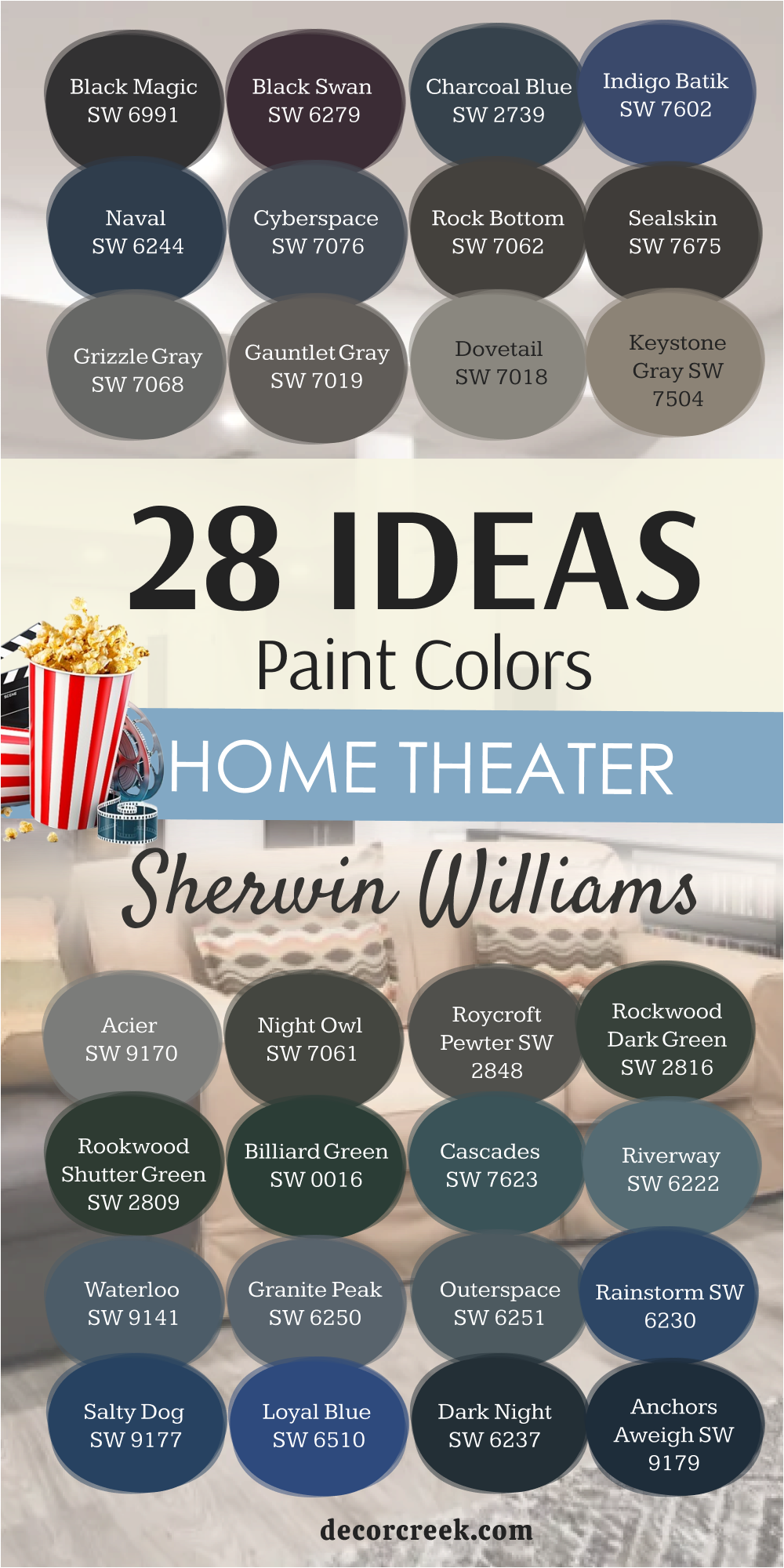
28 Ideas Home Theater Paint Colors by Sherwin-Williams
Black Magic SW 6991
Black Magic is a color that makes any home theater feel instantly dramatic. It’s a pure, deep black that erases distractions, giving the screen all the attention. I often use it in theaters where families want the closest thing to a professional cinema. When applied to all four walls and even the ceiling, it turns the room into a cocoon that fully surrounds you.
I love how Black Magic pairs with subtle warm lighting—just enough to see without pulling you away from the movie. It works beautifully with leather chairs, velvet curtains, and modern metal accents.
In dim light, the walls seem to vanish, creating a seamless experience. Black Magic is also perfect for basements, where you want to shut out all natural light and focus on the film. It’s bold, strong, and unforgettable. For me, it’s one of the most powerful tools to create total immersion in a theater room.

Black Swan SW 6279
Black Swan is a moody black with a hidden plum undertone that gives it extra drama. I love using it when someone wants a theater that feels bold but not predictable. Under soft lighting, the purple note comes forward, adding richness and personality. This color works especially well with velvet seating, patterned rugs, or copper accents that bring out its depth.
It’s a wonderful choice for homeowners who want their theater to feel artistic and unique. Black Swan hides reflections while still offering a layered look that keeps the walls interesting.
In dim settings, it feels like pure shadow, but with more softness than a hard black. I often recommend it when families want their theater to double as a stylish lounge.
It’s a color that sparks conversation even before the movie starts. For me, Black Swan always makes a room feel dramatic, elegant, and one of a kind.

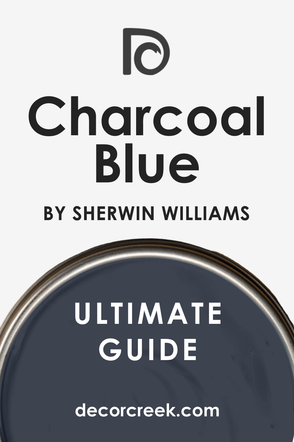
Charcoal Blue SW 2739
Charcoal Blue blends the seriousness of black with the richness of navy. It’s a stunning choice for theaters where you want depth but also a hint of color. I love pairing it with brass light fixtures or warm wood accents, which highlight its complex tones. In low lighting, Charcoal Blue feels like midnight, giving the room a moody and immersive quality.
It works perfectly for walls, but I also love it on ceilings where it creates a starry-sky effect. This shade feels sharp and polished, making the theater look carefully designed.
It’s strong without being too stark, colorful without being distracting. Families often tell me it feels both dramatic and calming, the perfect mix for movie nights. Charcoal Blue makes a statement but still lets the screen take center stage. For me, it’s one of the best choices for adding elegance with a touch of creativity.
Indigo Batik SW 7602
Indigo Batik is a true, rich navy that feels classic yet fresh in a theater. It has a depth that works beautifully in low light, while still offering color for those who don’t want pure black or gray. I like pairing it with cream seating or silver fixtures to highlight its richness. In dim settings, Indigo Batik almost melts into shadow, creating focus on the screen.
With warm lighting, it shows more of its navy tone, giving the room a stylish edge. This shade is ideal for families who want a theater that feels dramatic but not too dark.
It has enough life to make the space interesting, yet enough weight to keep the mood serious. Indigo Batik is flexible, working in both modern and traditional designs. For me, it always brings sophistication and depth. It’s a navy that never feels dated, only refined and cinematic.

Naval SW 6244
Naval is one of the most dependable deep blues for a home theater. It carries the weight of black but with the vibrancy of navy, making it versatile and rich. I often use it for homeowners who want their theater to feel dramatic but not cold. Naval pairs beautifully with leather chairs, wooden trim, or metallic lighting. In dim light, it deepens into near-black, perfect for eliminating reflections.
Yet, when the lights are up, the navy shows through, keeping the room colorful and stylish. It’s bold without being harsh, a rare quality in such a dark shade.
Naval feels equally at home in a sleek modern theater or a cozy family space. It’s a color that always makes the room feel complete, as if it was designed with care. For me, Naval is one of those timeless choices that never disappoints in a theater setting.

Cyberspace SW 7076
Cyberspace is a dramatic navy-black that feels sleek and modern in a theater. It’s darker than most navies, yet more alive than plain black. I love it because it creates a moody cocoon without being overwhelming. In dim light, Cyberspace almost disappears, letting the movie take full control of the room. With silver fixtures or chrome accents, the blue undertone shines through, giving the space a polished edge.
This shade works perfectly for people who want a futuristic or contemporary theater design. It also pairs well with deep rugs and velvet curtains, creating layers of texture against the dark background.
Cyberspace hides flaws and corners, which is ideal in basements. I’ve seen it transform plain rooms into stylish cinema lounges that feel high-end. For me, Cyberspace is bold, refined, and always ready for the spotlight.

Rock Bottom SW 7062
Rock Bottom is a deep gray-green that feels grounded and strong. I love how it mixes earthiness with drama, making it an unexpected but powerful theater color. In low lighting, it turns shadowy and dark, perfect for reducing glare. With warm light, its green tone peeks through, adding character and depth.
I like pairing Rock Bottom with leather furniture, stone accents, or wood beams to highlight its natural strength.
It’s a wonderful choice for homeowners who want something different than the usual blacks and grays. Rock Bottom makes the room feel rooted, like the walls have weight and purpose. It creates a moody, enveloping atmosphere that helps people forget the world outside.
For me, this shade is perfect when you want a theater that feels bold and unique while still cinematic.

Sealskin SW 7675
Sealskin is a deep brown-black that feels rich and protective. It’s darker than most browns but warmer than a flat black, which makes it very inviting. I love it in theaters because it gives a sense of strength while keeping the room comfortable. Sealskin works especially well with textured walls, leather seating, or wood trim.
In dim light, it absorbs shadows and makes the screen stand out beautifully. It’s a strong shade that feels serious but not cold, which is ideal for long viewing sessions.
Sealskin is also a great choice for basements because it hides corners and keeps the atmosphere cozy. I think of it as a color that wraps the room in quiet strength.
For me, it’s a dependable, dramatic shade that makes every theater feel safe and complete.
Grizzle Gray SW 7068
Grizzle Gray is bold and moody, with a subtle green undertone that makes it stand out. I love using it when plain gray feels too flat for a theater. In low lighting, it looks like deep stone, solid and dramatic. With navy accents or patterned rugs, the green undertone adds richness to the design.
Grizzle Gray makes theaters feel sturdy and layered, perfect for families who want warmth with depth. It pairs well with both classic and modern décor, giving flexibility in styling.
This color creates a mood that’s cozy but not dull, dramatic but still inviting. I often recommend it for medium or large theaters where boldness is welcome. Grizzle Gray is strong, steady, and full of personality. For me, it’s one of the most reliable choices for adding richness and balance.
Gauntlet Gray SW 7019
Gauntlet Gray is stylish and solid, a deep gray that works beautifully in theaters. It controls light without making the room feel too heavy. I love pairing it with bronze light fixtures, dark wood floors, or soft area rugs. In dim light, Gauntlet Gray becomes a soft shadow that keeps attention on the screen. It works well in rooms where you want a modern look but also comfort.
This color has enough warmth to feel inviting while still staying dramatic. I like it for theaters that double as entertaining spaces because it feels balanced in any light.
Gauntlet Gray is dependable, versatile, and always polished. It makes the theater look cared for and intentional. For me, it’s a shade that always delivers a mix of drama and coziness.
Dovetail SW 7018
Dovetail is a mid-to-dark gray that feels dependable and balanced. I love it in theaters where people want depth without going all the way to black. It has just enough warmth to keep the room inviting, especially when paired with wood trim or warm lighting. In dim light, Dovetail deepens into a soft shadow, making the screen pop with clarity.
It works beautifully with cream seating, bronze fixtures, or textured fabrics. I like how it adapts to different styles—it feels modern in a sleek design but classic with traditional details.
Dovetail is never overwhelming, which makes it a safe choice for smaller theaters. Families who use their theater often appreciate how comfortable it feels over long hours. To me, it’s a color that holds the room steady while still looking stylish. Dovetail makes a theater room feel intentional, polished, and welcoming.

Keystone Gray SW 7504
Keystone Gray has an earthy undertone that gives it a warm, grounded feel. It’s darker than a beige but lighter than charcoal, making it a flexible option for home theaters. I often use it in spaces where black would feel too strong. Keystone Gray works especially well with natural fabrics, wood accents, and warm metal details.
In dim light, it settles into a soothing depth that makes the screen shine brighter. I like how it balances drama with softness, making the room feel both serious and friendly.
It’s a good fit for multipurpose theaters that also serve as family gathering spots. This color never feels cold—it always has a touch of warmth that makes people feel at home. Keystone Gray may not be the boldest shade, but it’s one of the most comfortable. For me, it’s the quiet strength behind a successful theater design.
Acier SW 9170
Acier is a cool, mid-dark gray that feels sharp and contemporary. I love it in theaters where clean lines and modern design are the goal. It gives walls the depth they need to minimize glare while still feeling polished. Paired with steel light fixtures, sleek furniture, and neutral fabrics, Acier creates a refined, professional look.
In low lighting, it takes on a richer, darker tone that adds drama without heaviness. I often suggest it for theaters in newer homes, where the design calls for something fresh and minimal.
Acier is easy to pair with other colors, especially blacks, silvers, and darker blues. It feels dependable and crisp, like the walls are framing the story on screen. For me, Acier always makes a theater feel complete, like the finishing touch that ties everything together. It’s modern, reliable, and effortlessly stylish.
Night Owl SW 7061
Night OwlNight Owl is a fascinating mix of gray and green, giving it depth that plain grays lack. I like it because it feels moody and natural at the same time. In theaters, it provides darkness while still offering a subtle richness. I often pair it with wood trim, green fabrics, or dark leather seating. In dim light, Night Owl feels like a deep shadow, cozy and protective.
It’s an excellent choice for basements, where its earthy undertone adds warmth to the space. I’ve seen it work beautifully in both rustic and modern theaters, proving its versatility.
Night Owl keeps the focus on the screen but still adds quiet character. It’s strong without being harsh, stylish without being cold. For me, Night Owl is a shade that makes a theater feel lived-in and welcoming, like a retreat designed for comfort.
Roycroft Pewter SW 2848
Roycroft Pewter is a historic, deep charcoal with richness that feels timeless. I love it in theaters that aim for a traditional, old-world vibe. This shade pairs beautifully with patterned rugs, wood paneling, and brass light fixtures. In low lighting, Roycroft Pewter becomes almost black, creating the perfect backdrop for film. It gives the room a sense of weight and stability, like the walls are strong enough to hold the atmosphere together.
I often use it in larger theaters where boldness is welcome. It’s dramatic without being overwhelming, a balance that works well for family movie nights.
Roycroft Pewter has a quiet elegance that makes the room feel intentional. It doesn’t demand attention, but it always makes the design feel complete. For me, it’s one of those shades that elevates a theater from ordinary to special.
Rockwood Dark Green SW 2816
Rockwood Dark Green is deep, moody, and full of character. I love using it in theaters where the goal is to create a cozy, cocoon-like feel with a touch of natural richness. Its green undertone brings warmth and calm, making the room feel more personal than a plain black or gray. In dim light, Rockwood Dark Green almost turns into a shadow, perfect for focusing attention on the screen.
It pairs beautifully with wood trim, brass accents, or leather seating. I often recommend it for basements, where the green tone balances out cooler lighting and air.
This shade feels historic and grounded, like something that has always belonged in the home. Rockwood Dark Green makes a theater both dramatic and comfortable. For me, it’s one of the best alternatives when someone wants darkness with depth and a hint of nature.
Rookwood Shutter Green SW 2809
Rookwood Shutter Green is another rich, dark green that thrives in theater rooms. It’s darker than Rockwood Dark Green, with even more shadow and mystery. I love it because it offers the mood of black but with more personality. In dim light, it feels nearly black, but under warm lighting, its green undertone peeks through.
I like pairing it with antique brass fixtures, heavy curtains, and warm woods for a traditional cinema look.
This shade works beautifully in theaters with a vintage or historic design style. It makes the room feel grounded, intimate, and timeless. Rookwood Shutter Green adds elegance without being too bold or bright. It’s perfect for people who want their theater to feel like a true escape. For me, it’s one of those hidden gems that adds character and richness to a space.
Billiard Green SW 0016
Billiard Green is bold and dramatic, the kind of shade that makes a statement without being too loud. It reminds me of the color of a classic pool table, dark and rich with a playful edge. I love using it in theaters where homeowners want something different from the usual blacks and grays. Billiard Green pairs beautifully with dark wood, patterned carpets, and vintage-inspired light fixtures.
In low lighting, it becomes moody and immersive, perfect for long movie nights. I like how it adds personality while still keeping the focus on the screen.
This shade works well in both small and large theaters, adapting easily to different spaces. It feels fun, stylish, and full of character. For me, Billiard Green is proof that theaters don’t always have to be black to feel cinematic.

Cascades SW 7623
Cascades is a striking dark teal that combines depth with vibrancy. It’s bold but not overwhelming, perfect for homeowners who want a theater that feels dramatic and unique. I love how Cascades changes with the light—sometimes it feels like deep ocean water, other times like a cool midnight green. In theaters, it adds a sense of richness that goes beyond simple darkness.
I often pair it with silver accents, velvet fabrics, or wood trim to highlight its layers. Cascades works especially well in basements, where its depth enhances the cozy atmosphere.
In low light, it’s almost black, but still carries that quiet undertone of teal. I think of it as a color that makes the room feel artistic and intentional. For me, Cascades always creates a cinematic backdrop that feels both bold and stylish.

Riverway SW 6222
Riverway is a moody blue-green that feels calm but dramatic in a theater setting. It has enough darkness to reduce glare while still carrying a quiet energy. I love it paired with warm lighting and natural textures, which highlight its depth. In dim settings, Riverway feels like deep water, steady and rich. It makes a theater room feel like a retreat, perfect for relaxing into a story.
This shade works well with cream seating, soft throws, or wood details. I often suggest it for families who want their theater to feel personal and inviting, not just functional.
Riverway has personality without being distracting, and that’s what makes it perfect for cinema spaces. For me, it’s a shade that feels both steady and imaginative, like a bridge between home comfort and movie magic.

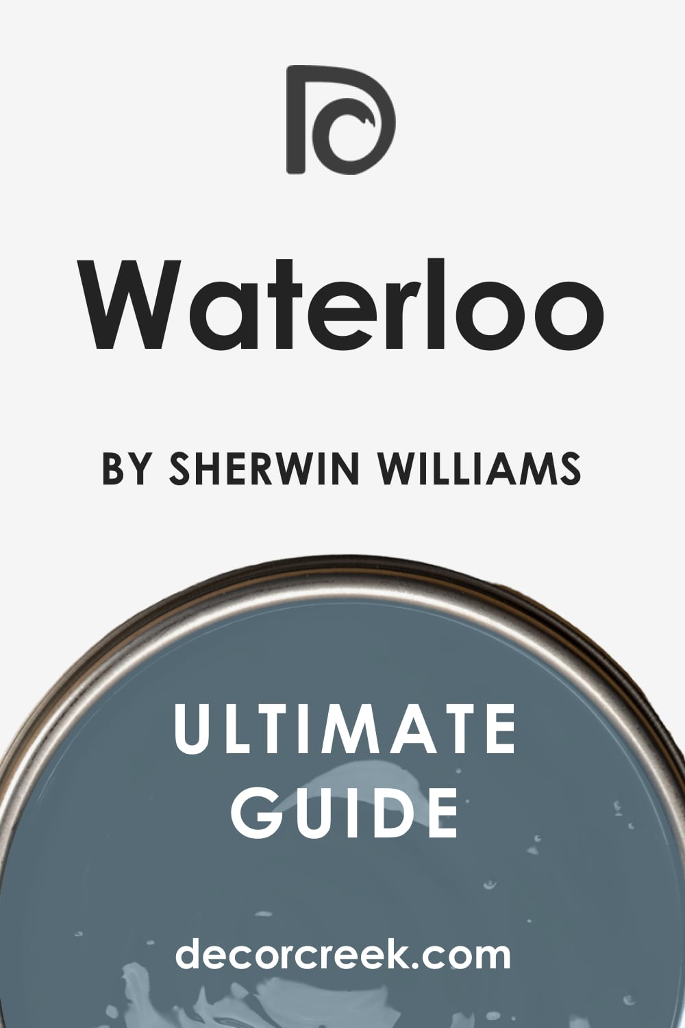
Waterloo SW 9141
Waterloo is a rich, deep blue that feels strong and elegant in a theater. It carries more warmth than a typical navy, which makes the room inviting as well as dramatic. I love using it for homeowners who want a dark color that isn’t too heavy or flat. In dim light, Waterloo settles into a cozy depth, helping the screen glow brighter. With warm lighting, it shows more of its blue tone, adding a hint of energy.
This shade pairs beautifully with leather seating, wood trim, or metallic accents. Waterloo feels timeless, working equally well in classic or modern designs
It’s a dependable shade that never looks dated. I think of Waterloo as a balance between boldness and comfort. For me, it’s a favorite when families want their theater to feel rich, stylish, and welcoming all at once.
Granite Peak SW 6250
Granite Peak is a stormy gray-blue that adds weight and drama to a theater. It has the seriousness of charcoal but with a hint of color that makes it feel more alive. I love it in theaters where plain gray would feel too flat. Granite Peak pairs well with silver fixtures, patterned carpets, and navy accents. In dim light, it deepens into shadow, perfect for focusing on the screen.
I often suggest it for basements, where its richness helps balance cooler spaces. Granite Peak feels dependable and strong, almost like stone walls around you.
It works for both small and large theaters, adapting to the size of the room. I think of it as a shade that holds everything together quietly. For me, Granite Peak always creates a moody, cinematic atmosphere.

Outerspace SW 6251
Outerspace is a dark teal-gray that feels modern and sleek. It’s deeper than most blues, with just a touch of green that adds interest. I love how it changes with lighting—sometimes more blue, sometimes more green, always moody. In theaters, it keeps the room dark but stylish, perfect for homeowners who want a unique twist.
Outerspace pairs beautifully with chrome accents, black seating, and velvet fabrics. In low light, it nearly disappears, creating a cocoon-like atmosphere.
I often recommend it for contemporary theater designs, where its sharpness feels right at home. Outerspace has a name that fits—it makes the room feel endless, like stepping into another world. For me, it’s a shade that feels both artistic and cinematic, a bold alternative to plain black.

Rainstorm SW 6230
Rainstorm is a bold navy that leans toward teal, making it dramatic and energetic. It’s darker than most blues, but still has enough vibrancy to add personality. I love it for theaters where families want a bit of life on the walls, not just shadow. In dim light, Rainstorm feels moody and rich, while under warm bulbs, it glows with subtle color. This shade pairs well with wood floors, gold accents, or patterned seating.
It makes a statement without being distracting, which is perfect for a theater. I think of Rainstorm as a color that keeps the room alive even when the lights are low.
It’s bold, stylish, and full of depth. For me, Rainstorm always brings a spark of energy to movie nights.

Salty Dog SW 9177
Salty Dog is one of the boldest dark blues in the Sherwin-Williams collection. It has a brightness hidden within its depth that makes it playful and strong at the same time. I love using it in theaters for homeowners who want something memorable and unique. Salty Dog pairs beautifully with crisp white trim, gold accents, or deep wood seating.
In low light, it softens into a darker navy, but when the lights come up, it shows its full vibrant character. This makes it versatile, shifting with the mood of the room.
It’s a great option for families who use their theater for more than just movies—like game nights or sports viewings. Salty Dog feels stylish and bold, but still works to keep focus on the screen. For me, it’s a shade that turns a theater into a lively, dynamic gathering spot.

Loyal Blue SW 6510
Loyal Blue is a deep, true blue that feels bold yet trustworthy in a home theater. It carries more brightness than navy but still has enough depth to control reflections. I love it for families who want their theater to feel full of energy and personality. In dim light, Loyal Blue darkens beautifully, helping the screen glow more intensely.
When the lights are on, its blue tone feels lively and welcoming. This shade works well with silver or chrome accents, patterned rugs, and even brighter throw pillows for contrast.
I think of it as a color that keeps the room fun without losing focus. Loyal Blue is strong but not overwhelming, which makes it easy to live with. For me, it’s a great option when homeowners want both drama and playfulness in their theater.

Dark Night SW 6237
Dark Night is a moody green-blue that feels rich, elegant, and cinematic. It’s darker than teal but softer than pure navy, giving it a layered personality. I love using Dark Night in theaters because it makes the walls feel luxurious and enveloping. In low light, it leans toward shadow, creating complete focus on the screen.
With warm lighting, its jewel-tone character comes forward, adding beauty and richness. This shade pairs beautifully with leather seating, brass light fixtures, and velvet curtains.
It feels dramatic without being stark, which makes it perfect for family theaters. Dark Night creates an atmosphere that feels stylish, warm, and cinematic all at once. For me, it’s one of those rare shades that feels endlessly rich and perfect for long evenings of film.

Anchors Aweigh SW 9179
Anchors Aweigh is a strong navy-black that feels steady and bold. It’s darker than most blues, with a weight that makes it perfect for theater walls. I like it for homeowners who want depth but still a hint of color under the right light. In dim settings, Anchors Aweigh feels nearly black, helping the room disappear around the screen.
With brighter lights, its navy tone appears, adding character and charm. This shade works especially well in sleek, modern theaters where sharp edges and clean lines define the space.
I often pair it with metallic accents or soft leather seating for balance. Anchors Aweigh is serious, stylish, and dramatic. For me, it’s one of the most reliable choices for achieving a refined, cinema-quality atmosphere.

Dress Blues SW 9176
Dress Blues is bold and commanding, a true navy that feels both classic and strong. It reminds me of military uniforms, carrying confidence and elegance in every inch. I love using it in theaters that need color but still want to feel serious. In low light, Dress Blues deepens into near-black, giving focus to the screen.
Under brighter lights, it shows its navy richness, keeping the room stylish. It pairs beautifully with white trim, warm brass lighting, or dark wood floors.
I think of it as a shade that adds formality without stiffness. Dress Blues creates a theater that feels powerful, confident, and timeless. For me, it’s one of those colors that always looks sharp and polished.
Turkish Tile SW 7611
Turkish Tile is a vibrant blue with surprising depth, making it a bold choice for a theater. It’s brighter than many of the other dark shades, but it still holds enough richness to work in dim lighting. I love it for homeowners who want something artistic and unique. Turkish Tile pairs beautifully with silver details, patterned rugs, and soft seating in neutral tones.
In low light, it softens, while under warm lighting, it glows with jewel-like energy. This shade works well in modern designs, especially for people who want their theater to double as a stylish lounge.
It adds vibrancy without pulling too much focus away from the screen. Turkish Tile feels creative, fun, and dramatic all at once. For me, it’s the perfect color when you want your theater to stand out from the ordinary.
29 Basement Home Theater Paint Colors
Domino SW 6989
Domino is a bold, true black that feels powerful and dramatic in a basement theater. I love using it because it erases distractions, letting the screen glow as the only focus. On both walls and ceilings, Domino creates an enclosed, cinematic effect that feels immersive. In a basement, where natural light is limited, this shade works perfectly to build a private retreat.
I often pair it with warm accent lights, leather seating, and heavy curtains to balance the intensity. Domino has a sleek quality that fits modern designs, but it also works beautifully with rustic wood and vintage touches.
In dim light, it feels endless, like the walls have no boundaries. It’s strong without being overwhelming, especially when softened with textures and layered lighting. For me, Domino is one of the best true blacks for creating a full theater effect. It’s bold, serious, and unforgettable.

Raven SW 6540
Raven is a dramatic black with a subtle blue undertone that adds a layer of richness. I like using it in basement theaters where homeowners want depth with just a hint of color. In low light, Raven reads almost pure black, hiding corners and reflections. But under warmer bulbs, that cool undertone shows through, giving the room personality.
Raven pairs well with chrome accents, dark seating, and sleek, modern décor. It creates a moody, stylish backdrop without being too flat. I think of it as a color that balances seriousness with just enough life to keep things interesting.
In basements, where the air and light can feel heavy, Raven adds sharpness and energy. It’s bold and dependable, perfect for homeowners who want a refined theater look. For me, Raven always brings a touch of modern elegance to the space.
Krypton SW 6247
Krypton is lighter than most basement theater shades, but it has a coolness that works beautifully. It’s a steel blue-gray that makes the room feel steady and modern. I love using it when homeowners don’t want total darkness but still need a focused backdrop. Krypton pairs well with silver fixtures, gray seating, and blue accents.
In dim light, it deepens, almost hiding its lighter quality, while in brighter light it keeps the space from feeling too closed-in. It’s a great option for small basements where black would feel overwhelming.
Krypton gives enough mood for theater use but still feels friendly and usable during the day. I often suggest it for multipurpose basements that combine a theater with a game or family room. For me, Krypton proves that you don’t always need the darkest color to create drama. It’s practical, stylish, and welcoming.
Serious Gray SW 6256
Serious Gray lives up to its name—it’s a thoughtful, steady shade that feels bold without being cold. It has a strong blue undertone that gives it depth, perfect for a basement theater. I love pairing Serious Gray with navy seating, silver lighting, or patterned rugs to enhance its richness. In dim settings, it turns shadowy and moody, wrapping the room in comfort.
With brighter bulbs, its blue tone becomes clearer, adding character. Serious Gray is versatile, fitting both sleek modern designs and more classic spaces.
It’s the kind of shade that works well in larger basements where you want walls to feel grounded. I often recommend it when homeowners want drama but not pure black. For me, Serious Gray is reliable and stylish, the kind of color that makes every theater feel purposeful. It’s strong, steady, and endlessly cinematic.

Foggy Day SW 6235
Foggy Day is a cool, stormy blue-gray that feels moody and rich. It’s darker than mid-tone grays but softer than a full navy, making it perfect for a basement theater. I love how it changes with lighting—sometimes reading as a calm gray, other times as a deep blue. In low light, Foggy Day provides just enough darkness to keep the focus on the screen.
With warm lighting, it reveals a more colorful personality, keeping the room lively. I often pair it with plush seating, wood accents, and layered fabrics for balance.
Foggy Day makes the theater feel welcoming while still dramatic. It’s a wonderful choice for homeowners who want something other than black but still cinematic. For me, Foggy Day always feels like the right mix of comfort and depth. It turns a basement theater into a place that feels stylish and easy to enjoy.

Blustery Sky SW 9140
Blustery Sky is a deep, stormy blue that feels strong and dramatic in a basement theater. I love it because it has the richness of navy with just enough gray to keep it grounded. In dim light, it settles into a moody shade that keeps attention on the screen. With brighter lighting, its blue tone shines through, adding energy and personality.
Blustery Sky pairs beautifully with silver accents, soft rugs, and dark leather seating. It creates a room that feels stylish without losing focus. I often suggest it for homeowners who want their theater to feel bold but not too dark.
Blustery Sky balances strength with approachability, which makes it easy to live with. For me, it’s a color that brings both drama and comfort, perfect for family movie nights in the basement.
Smoky Azurite SW 9148
Smoky Azurite is a jewel-toned blue with incredible depth. It’s darker than most teals but richer than navy, making it an unforgettable choice for a theater. I love using it in basements because it makes the room feel luxurious and cocoon-like. In low light, Smoky Azurite becomes shadowy and deep, perfect for focus on the screen.
Under warmer lights, its jewel tone glows, giving the space a touch of richness. This shade pairs beautifully with velvet curtains, metallic lighting, or patterned rugs.
Smoky Azurite works well for homeowners who want something bold and stylish instead of classic gray or black. It has personality without being distracting, which makes it perfect for a cinema space. For me, Smoky Azurite is the kind of color that makes every theater feel unique and unforgettable.

Still Water SW 6223
Still Water is a dark teal that feels rich, calm, and dramatic all at once. It has the mood of navy but with a hint of green that adds warmth and character. I love using Still Water in basements because it creates a grounded, enveloping feeling. In dim lighting, it nearly disappears into shadow, but under warm bulbs, its jewel tone emerges.
Still Water pairs beautifully with wood accents, dark fabrics, and brass fixtures. It’s a flexible shade that works in both modern and classic theater designs. This color makes the room feel like a retreat, pulling you into the story on screen.
Still Water is dramatic without being harsh, and rich without being too loud. For me, it’s one of the most beautiful deep tones for a theater. It makes every basement feel more cinematic.

Mount Etna SW 7625
Mount Etna is a dramatic gray-blue that feels strong and moody in a theater. It has the weight of charcoal but with a cool blue undertone that adds depth. I love it for basements because it makes the room feel both protective and stylish. In low light, Mount Etna darkens into a steady shadow that helps the screen shine brighter. With warm light, it shows more blue, adding richness.
I like pairing it with metallic accents, leather furniture, or soft textured rugs. Mount Etna works well in larger theaters where a bold wall color is needed to anchor the space.
It’s a color that feels timeless and modern at the same time. For me, Mount Etna always makes a theater feel solid, dramatic, and carefully designed.
Gale Force SW 7605
Gale Force is a dark navy with teal undertones, full of energy and depth. I love using it for homeowners who want something unique but still classic. In a basement theater, Gale Force makes the walls feel strong and enveloping. In dim light, it’s almost black, perfect for reducing glare. With brighter lights, its teal note comes forward, adding personality.
Gale Force pairs beautifully with gold fixtures, patterned carpets, and velvet seating. It feels rich and stylish, the kind of shade that makes the room feel special.
I often recommend it for homeowners who want their theater to double as a lounge space. Gale Force is bold without being overwhelming, colorful without being distracting. For me, it’s one of the most exciting navy shades for a cinematic basement retreat.

Refuge SW 6228
Refuge is a moody blue-gray that feels steady and comforting in a basement theater. I love how it balances between blue and gray, giving the room both depth and calm energy. In dim light, Refuge darkens into a shadowy tone that keeps the screen front and center. With brighter lighting, its blue side shows through, adding personality and richness.
Refuge pairs beautifully with silver accents, soft fabrics, and dark wood trim. It’s a shade that makes the theater feel polished without being cold.
I often recommend it for basements that serve multiple purposes, because it’s versatile and never overwhelming. Refuge is dependable, stylish, and soothing all at once. For me, it’s one of the easiest colors to live with, making the theater feel welcoming every time the lights dim.

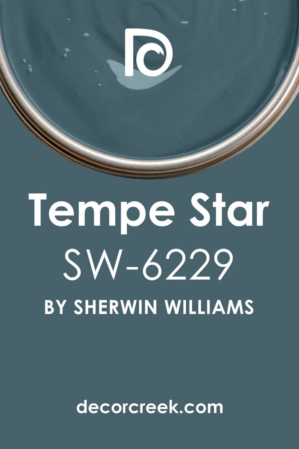
Tempe Star SW 6229
Tempe Star is a deep teal-blue that feels bold and full of life. I love using it when homeowners want something darker than turquoise but more vibrant than navy. In a basement theater, Tempe Star creates a moody cocoon that feels cinematic. In dim light, it almost looks black, which makes the screen glow brighter.
With warm bulbs, the teal undertone shines through, adding richness. Tempe Star pairs beautifully with gold accents, patterned rugs, or plush velvet seating.
It’s a shade that feels luxurious but not stiff. I often recommend it for families who want their theater to feel like a stylish lounge as well as a cinema. Tempe Star has depth, personality, and elegance, all in one. For me, it’s one of the most striking jewel-toned choices for a basement theater.
Slate Tile SW 7624
Slate Tile is a deep blue-gray that feels steady, moody, and sophisticated. It reminds me of storm clouds, full of depth but never heavy. I like using it in theaters where homeowners want something darker than mid-gray but softer than black. In dim light, Slate Tile becomes shadowy and immersive, helping viewers focus on the screen.
With brighter light, it reveals a beautiful balance of blue and gray. It pairs well with modern metallic fixtures, soft rugs, and clean-lined seating.
Slate Tile has a professional, polished quality that makes the theater look complete. It’s dramatic without being overpowering, which is ideal for basement spaces. For me, Slate Tile is about quiet strength—it holds the room together while letting the story on screen shine.

Storm Cloud SW 6249
Storm Cloud is a bold, stormy blue-gray that feels rich and dramatic. I love it for theaters because it makes walls look deep and layered. In low light, it leans darker, becoming a moody backdrop for the screen. Under brighter bulbs, its blue side shows through, adding vibrancy. Storm Cloud pairs beautifully with dark wood, patterned carpets, and metallic lighting.
It creates a space that feels stylish but also cocoon-like. I often suggest it for homeowners who want a theater that feels cinematic without being stark.
Storm Cloud has presence, energy, and depth, the qualities that make a theater memorable. For me, it’s one of those colors that makes every movie night feel special.
Needlepoint Navy SW 0032
Needlepoint Navy is a traditional navy with a timeless richness. It has enough darkness to reduce glare but enough color to stay lively. I love using it in basement theaters where families want a classic look. In dim light, it nearly disappears into shadow, but in brighter settings, its navy tone shines with elegance.
Needlepoint Navy pairs beautifully with brass accents, cream seating, or dark wood trim. It’s a dependable choice that always feels stylish and balanced.
I often recommend it for theaters that double as multipurpose spaces, because it works well with different design elements. This shade has the drama of navy but with warmth that feels welcoming. For me, Needlepoint Navy always brings both tradition and sophistication to a theater.
Searching Blue SW 6536
Searching Blue is a deep, dramatic blue with a touch of softness that makes it unique. I love how it feels moody without being too heavy, which works beautifully in basement theaters. In dim lighting, Searching Blue darkens into a shadowy tone, giving the screen center stage. With brighter light, its blue richness shows through, keeping the room lively and stylish.
This shade pairs well with silver accents, patterned rugs, and soft seating. I often suggest it for homeowners who want their theater to feel dramatic but not plain.
Searching Blue carries depth and elegance while still feeling approachable. It’s bold, memorable, and always cinematic. For me, it’s a perfect choice when you want your theater to stand out with color but still keep its focus.

Charcoal Blue SW 2739
Charcoal Blue blends the seriousness of black with the richness of navy, making it a striking basement theater choice. I love it because it gives the room depth without losing character. In dim light, Charcoal Blue becomes almost black, creating complete focus on the screen. Under brighter lighting, its navy undertone emerges, adding sophistication.
This shade pairs beautifully with brass fixtures, velvet curtains, and dark furniture. It works in both modern and traditional theaters, adapting to different design styles easily.
Charcoal Blue is strong but never overwhelming. It makes a theater feel moody and stylish all at once. For me, it’s a color that creates the perfect balance of drama and character.
Smoky Blue SW 7604
Smoky Blue is softer than many theater colors, but it has a richness that feels comforting in basements. I like it because it’s deep enough to control light yet colorful enough to keep the space friendly. In dim light, Smoky Blue takes on a moody, shadowy tone. In brighter settings, it looks more vibrant, adding warmth and energy.
This shade pairs well with cream seating, silver accents, and wood finishes. I often recommend it for families who want their basement theater to feel versatile and not overly dark.
Smoky Blue brings calm energy to the room without losing focus. For me, it’s a shade that makes the theater feel both cinematic and homey at the same time.
Distance SW 6243
Distance is a moody blue-gray that feels rich and layered, like a storm rolling across the horizon. I love it for basement theaters where homeowners want something darker than mid-tone grays but not pure navy. In dim light, it becomes shadowy and immersive, perfect for focus. With brighter light, its gray side shows through, keeping the room stylish and balanced.
Distance pairs beautifully with metallic accents, plush rugs, and velvet seating. It creates an atmosphere that feels dramatic but never heavy.
I often suggest it for medium-sized theaters where boldness is welcome but comfort is key. Distance has both strength and approachability, which makes it easy to enjoy. For me, it’s one of those shades that turns a basement theater into a retreat.

Indigo Batik SW 7602
Indigo Batik is a classic, deep navy with timeless appeal. I love it because it has the seriousness of black but with the energy of blue. In a basement theater, Indigo Batik feels dramatic, stylish, and comforting. In dim lighting, it almost disappears into shadow, creating the perfect backdrop for the screen. With warm light, its navy richness shines through, adding elegance.
This shade pairs beautifully with cream furniture, silver fixtures, or even dark wood floors. Indigo Batik is versatile, working well in both modern and traditional theaters.
It’s bold enough to feel cinematic but soft enough to remain welcoming. For me, Indigo Batik is one of the most dependable and stylish choices for a home theater.
Naval SW 6244
Naval is a deep navy that feels strong, elegant, and endlessly dependable in a basement theater. I love it because it carries the weight of black but with a richness that adds warmth. In dim lighting, Naval nearly disappears, giving the screen full control. With brighter lights, its deep blue tone shows, adding character without distraction.
It pairs beautifully with brass lighting, dark wood floors, and velvet seating. Naval works in both sleek modern designs and classic, cozy setups.
I often recommend it for homeowners who want drama but not the starkness of pure black. Naval feels timeless and stylish, the kind of shade that never goes out of fashion. For me, it’s one of those colors that always delivers—comfortable, dramatic, and full of presence.
Dark Night SW 6237
Dark Night is a jewel-toned green-blue that feels luxurious and dramatic. It’s darker than teal but softer than navy, making it a layered and moody choice for theaters. In low light, it nearly melts into shadow, perfect for focus. With warm bulbs, its jewel-like depth glows, creating richness. I love pairing Dark Night with brass fixtures, leather chairs, and heavy curtains.
It feels sophisticated and cozy at the same time, perfect for a basement retreat. Dark Night works especially well for families who want their theater to feel stylish as well as comfortable.
It’s bold but never overwhelming, always balanced and rich. For me, Dark Night is one of the most elegant shades you can use in a theater.
Anchors Aweigh SW 9179
Anchors Aweigh is a near-black navy that brings strength and steadiness to a theater. It has the darkness you need to reduce glare, but with a subtle blue undertone that gives it personality. In dim settings, it looks almost black, perfect for immersing viewers in the screen. Under brighter light, its navy side reveals itself, adding depth.
I often pair Anchors Aweigh with chrome accents, velvet seating, or polished wood. It works beautifully in modern theaters where clean lines matter, but also adapts to traditional spaces with ease.
Anchors Aweigh feels bold, refined, and professional. For me, it’s one of the most dependable shades for building a cinematic mood in a basement.
Dress Blues SW 9176
Dress Blues is a bold, commanding navy that feels sharp and confident in a theater. It reminds me of uniforms—strong, structured, and polished. In dim light, it reads as nearly black, perfect for hiding corners and edges. With brighter lights, its rich navy tone comes forward, giving the room personality.
Dress Blues pairs beautifully with brass or gold fixtures, patterned rugs, and classic leather seating. It makes the theater feel elegant and formal, but still comfortable for long use.
I like it because it works in both large and small spaces, adapting easily. Dress Blues is a color that feels steady, stylish, and cinematic. For me, it always creates a sense of purpose in a theater room.
Turkish Tile SW 7610
Turkish Tile is a vibrant, jewel-toned blue that makes a bold statement in a basement theater. It’s brighter than most dark shades, but it still has enough richness to work in low light. In dim settings, it softens, creating a moody cocoon. Under brighter lighting, it glows with striking personality. I love pairing Turkish Tile with silver accents, soft seating, and patterned fabrics.
It feels creative, stylish, and artistic, perfect for homeowners who want their theater to stand out. Turkish Tile is bold but not distracting, a rare balance for such a vibrant shade.
It works beautifully in multipurpose basements, where personality is just as important as function. For me, Turkish Tile makes a theater feel alive, stylish, and unforgettable.

Oceanside SW 6496
Oceanside is a jewel-toned blue-green that feels dramatic and vibrant. I love using it in basements where homeowners want something bold and full of life. In dim lighting, Oceanside leans darker, creating a moody and cinematic backdrop. With brighter lights, it glows with energy, almost like tropical water.
This shade pairs beautifully with brass accents, patterned rugs, or rich wood trim. Oceanside makes the theater feel stylish and artistic, a place where stories feel larger than life.
It’s perfect for homeowners who want a space that feels more than just functional. Oceanside adds depth, personality, and a touch of luxury. For me, it’s one of the most exciting colors for turning a basement into a true destination.
Teal Stencil SW 0019
Teal Stencil is a dark, dramatic teal with a creative edge. It has more green than a classic navy, which makes it unique in a theater setting. In low light, it settles into shadow, but with warm lighting, its teal richness comes alive. I love pairing Teal Stencil with brass fixtures, soft fabrics, and wood seating. It creates a moody yet vibrant space that feels personal and expressive.
Teal Stencil is perfect for homeowners who want something artistic instead of traditional. It has drama, but also playfulness, which makes the theater feel alive.
For me, Teal Stencil is a bold choice that rewards those who want personality in their basement retreat.
Ripe Olive SW 6209
Ripe Olive is a deep, earthy green that brings warmth and strength to a basement theater. It feels grounded and protective, almost like the walls are wrapping the room in comfort. In dim light, it reads nearly black, making the screen glow brighter. With brighter lighting, its olive undertone peeks through, adding richness. I love using Ripe Olive in theaters that have wood beams, leather seating, or rustic details.
It creates a cozy, enveloping atmosphere that feels timeless. Ripe Olive is perfect for homeowners who want a theater that feels natural and inviting. For me, it’s one of the most comforting dark greens I use in design.

Rockwood Dark Green SW 2816
Rockwood Dark Green is a classic, moody green that feels rich and elegant. It’s darker than many greens, which makes it perfect for theater walls. In dim lighting, it settles into shadow, helping the screen stay sharp and clear. With warm lighting, its historic green character emerges, adding depth and charm. Rockwood Dark Green pairs beautifully with brass light fixtures, dark curtains, and patterned rugs.
It creates a theater that feels both grounded and sophisticated. I often recommend it for basements because its warmth balances the coolness of underground spaces.
For me, Rockwood Dark Green always delivers a mix of tradition, comfort, and cinematic mood.
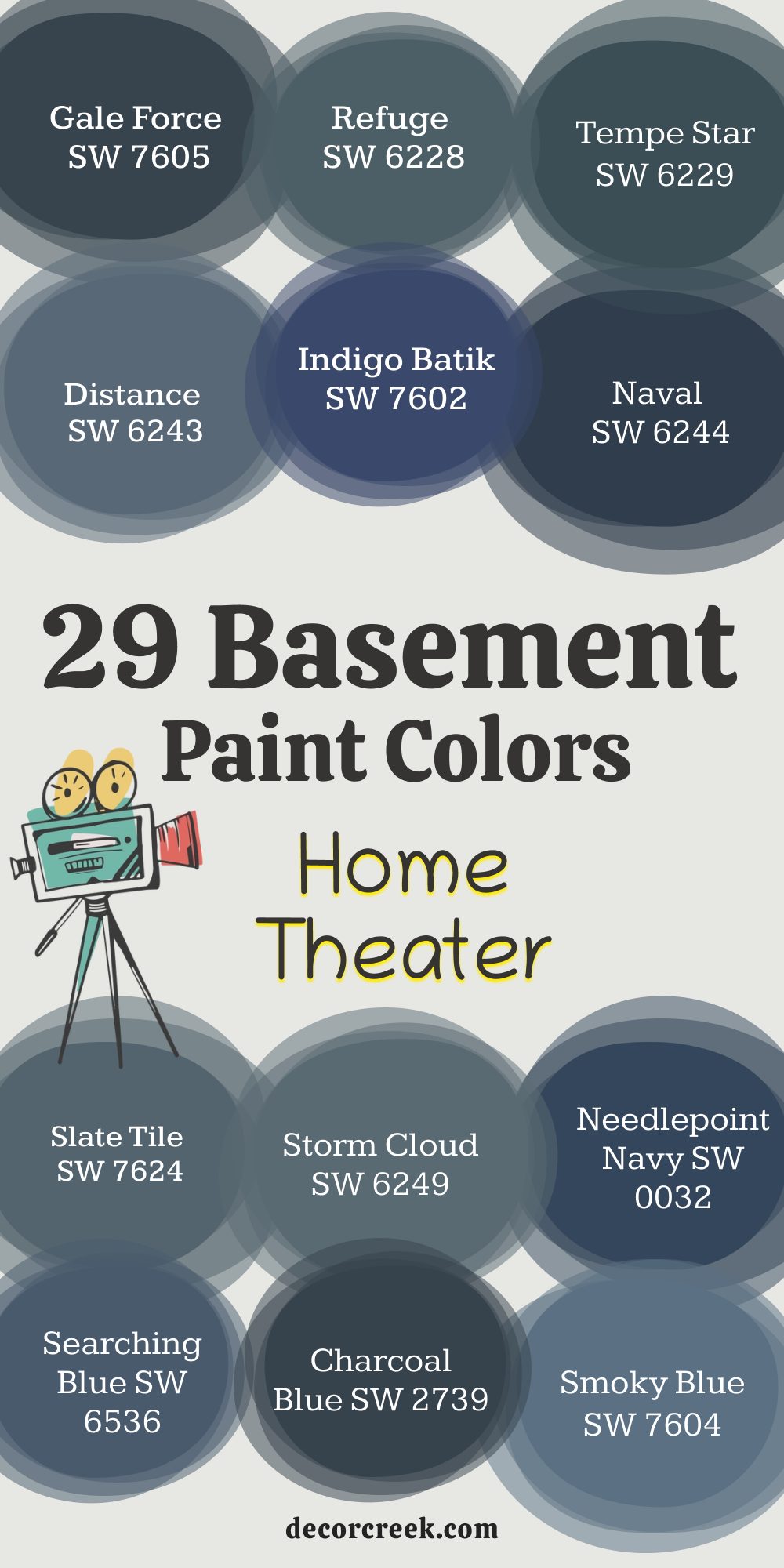
Final Thoughts on 29 Basement Home Theater Paint Colors
When I think about designing a basement home theater, I know paint is what sets the whole mood. Furniture, rugs, and lights all matter, but the wall color is what truly shapes how the room feels when the screen lights up. Dark colors swallow reflections, help the story on screen shine, and make the room feel like a true escape from daily life.
Shades of black bring drama, deep blues add elegance, and dark greens create a warm cocoon. Browns and charcoals balance coziness with strength, turning even unfinished basements into refined retreats.
I’ve seen families gather more often in rooms painted in these kinds of tones, because they feel private and special. A strong, dark shade doesn’t just cover the walls—it changes how the space works, letting everyone relax and focus together. These 29 basement colors show that you don’t need to stick with plain black to get the right effect. You can choose navy, teal, or even olive and still have a cinematic atmosphere.
For me, the best basement theaters are the ones where the paint color disappears when the movie starts but makes the room unforgettable when the lights come up.
These colors are about more than design—they’re about comfort, connection, and creating a place where memories are made.