Red is a bold choice that fills a room with energy and passion. Many people feel scared to use it because it can easily take over a room. I love working with this fiery color to make homes look exciting and cozy. The secret to making it work is finding the right partner shades to balance the strength of the red.
When you match red with the right background, you create a beautiful balance that looks amazing. This guide will show you exactly how to pick the best shades to pair with your favorite red paint.
You can make your home look like a professional put it together with just a little bit of color knowledge.
Let us look at the best choices to make your rooms look great.
Why I Always Trust Sherwin-Williams and Benjamin Moore for the Best Paint Colors That Go With Red
I always use Sherwin-Williams and Benjamin Moore when I style houses for buyers. These two brands have the best ingredients that make the paint look rich and deep on your walls.
They offer true shades that do not change into weird unexpected tones when the sun hits them.
Red demands a high-quality partner shade, or the room will look cheap and messy. These companies make options that hold their own next to a strong, bright wall. You can trust their color chips to show you exactly what you will get on your drywall.
Buying cheap paint usually means you will have to repaint the entire room after a week.
How I Choose the Perfect Paint Colors that go With Red
I always start by looking at the undertones of the red paint on the wall. Some reds have a lot of blue in them and look like berries, while others have yellow and look like bricks.
Blue-reds need cool partners, and yellow-reds need warm partners to look their best. I also think about how much natural sunlight comes through the windows during the day.
Bright rooms can handle darker accents, while dark hallways need light shades to stay cheerful. You should always paint a small test piece and hold it next to your red wall. Watch how the colors talk to each other in the morning light and under your lamps at night. This simple step saves you from making a huge mistake that costs a lot of money.
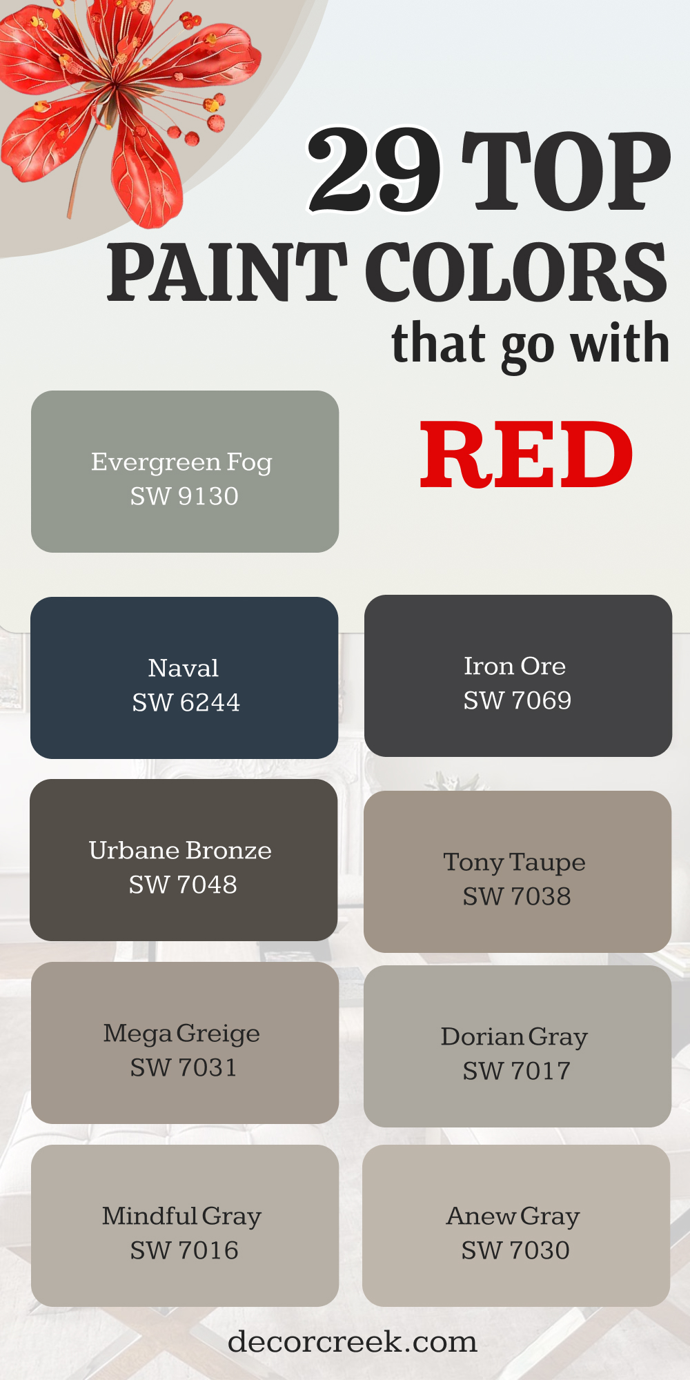
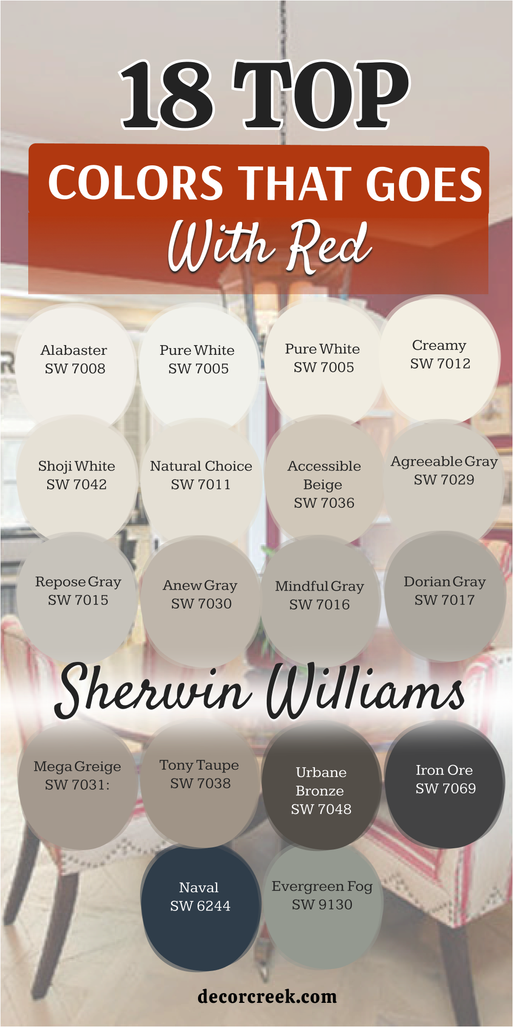
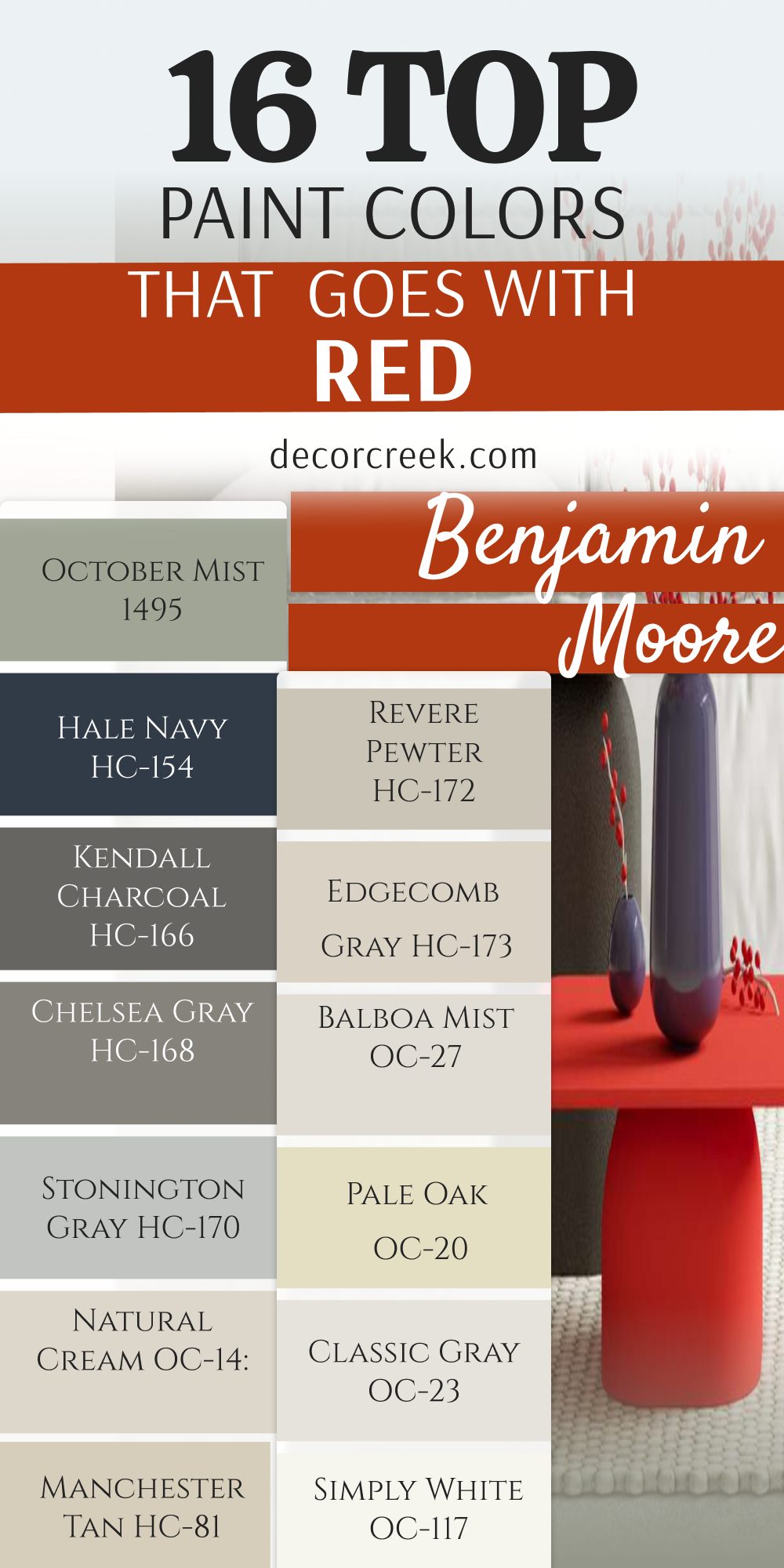
18 Top Paint Colors that go With Red from Sherwin Williams
Alabaster SW 7008
Alabaster SW 7008 is a creamy white that softens the loud energy of a bright crimson wall. This shade brings a cozy feeling to the room without looking too yellow or dirty.
It reflects light gently so your eyes can rest when walking into a vibrant area. I use it on trim and doors to make a sharp border next to a deep cherry hue.
It keeps the room from feeling dark while adding a rich texture to the walls. Home buyers always love how clean and friendly this combination looks in photos. It makes people feel welcome the moment they step through the front door. You can use it in almost any room where you want a comfortable vibe. It handles bright daylight beautifully without losing its soft creamy appearance.
Best used in: living rooms, kitchens, hallways, bedrooms, and farmhouse exteriors
Pairs well with: Iron Ore SW 7069, Agreeable Gray SW 7029, Natural Linen SW 9109, warm wood tones The key rule of this color for farmhouse style is to use it where you want natural light to feel kind, soft, and inviting throughout the day.

Pure White SW 7005
Pure White SW 7005 gives you a clean line that makes a modern red pop with excitement. This choice lacks any heavy yellow or blue undertones so it stays completely neutral.
It behaves like a crisp piece of paper against a bold coat of tomato red paint. I choose it for modern homes that need a sharp and bright appearance.
It makes the walls look straight and the ceilings feel much higher than they are. The brightness will make your red look even richer and more expensive. It creates a striking contrast that catches your eye right away. You will notice how it cleans up the look of old wooden floors too. It works best when you want a high-energy look that feels very fresh.
Best used in: modern kitchens, trim, ceilings, bathrooms, and contemporary living spaces
Pairs well with: Black Magic SW 6991, Dorian Gray SW 7017, Charcoal Blue SW 2739, dark metals The key rule of this color for contemporary style is to apply it on trim to make your main walls stand out with crisp definition.

Greek Villa SW 7551
Greek Villa SW 7551 has a tiny drop of yellow that warms up a cold berry red wall. This shade feels like heavy silk and brings a rich look to your living areas.
It stops a northern room from feeling chilly when paired with a deep burgundy. I love how it softens hard edges in a room with high ceilings.
It works wonderfully when you want a rich look that does not feel cold. The soft undertone grounds the room and matches beautifully with gold light fixtures. It makes the red wall feel like a planned design choice instead of an accident. People feel relaxed when they sit in a room painted with this mix. It holds its beauty even under cheap yellow light bulbs at night.
Best used in: dining rooms, entryways, bedrooms, cozy dens, and kitchen cabinets
Pairs well with: Urbane Bronze SW 7048, Accessible Beige SW 7036, Bronze Tone SW 6153, gold accents The key rule of this color for elegant style is to use it on all four walls to create a soft backdrop for your accent pieces.

Creamy SW 7012
Creamy SW 7012 is a rich option that looks like vanilla ice cream next to a barn red. This color has a lot of warmth that tames the wildness of a strong primary red.
It creates a traditional look that feels like an old historic mansion. I pick it when a client wants their home to feel warm and traditional.
It fills the room with a sunny glow even on cloudy winter days. The heavy warm base keeps the red from looking too aggressive or harsh. It wraps the room in comfort and looks great with antique wooden furniture. Your guests will feel like staying for a long time because it feels so safe. It works beautifully on cabinets next to a red brick accent wall.
Best used in: traditional kitchens, dining rooms, family rooms, trim, and historical homes
Pairs well with: Studio Clay SW 9172, Foothills SW 7514, Pointed Leaf SW 6438, dark wood antiques The key rule of this color for traditional style is to pair it with warm wood furniture to bring out the richest tones in the wood grain.

Shoji White SW 7042
Shoji White SW 7042 sits right on the border between a soft white and a light beige paint. This color shifts its look depending on what kind of red you put next to it. It stays quiet and lets a bright scarlet wall do all the talking. I love using this shade in open floor plans where rooms connect.
It keeps the house looking cohesive while your red wall provides a fun surprise. The greige undertone keeps the white from looking too stark or blinding in the sun.
It matches well with woven baskets and natural linen fabrics in the room. It gives a modern organic feeling that makes a house feel like a retreat. This choice is perfect for families who want style without losing comfort.
Best used in: open concept spaces, bedrooms, entryways, sunrooms, and modern farmhouses
Pairs well with: Iron Ore SW 7069, Pewter Green SW 6208, Fawn Brindle SW 7640, natural fibers The key rule of this color for organic style is to use it in rooms with large windows to let the outdoor greenery complement your indoor palette.

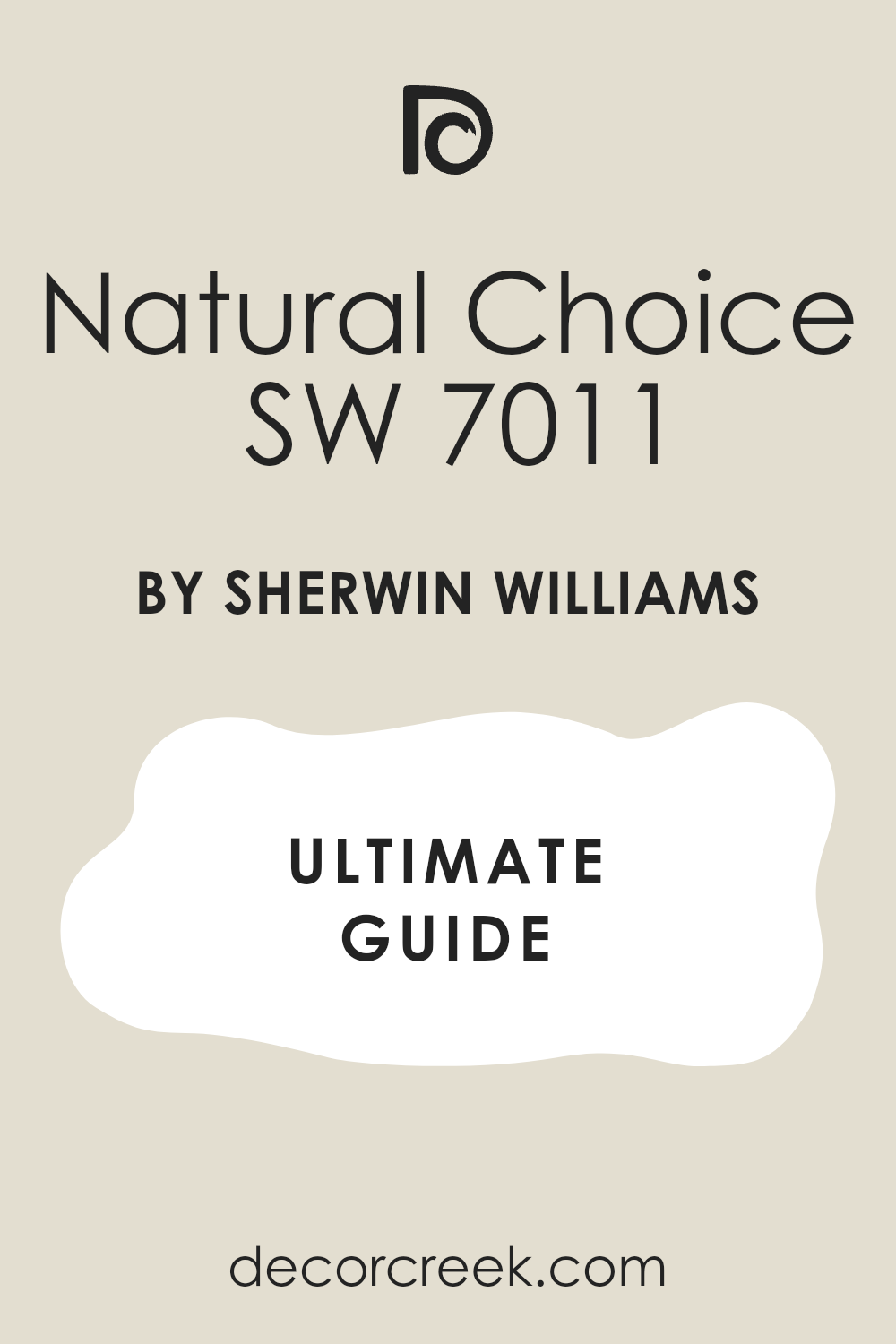
Natural Choice SW 7011
Natural Choice SW 7011 is a muted background option that subdues the heat of a red wall. This shade has a chalky quality that absorbs light instead of bouncing it around. It works well if you worry that your red room will look too bright. I use it to create a soft environment that feels grounded and real.
It keeps the red from reflecting off the white walls and turning the room pink. It offers a steady balance that makes the room feel sturdy and well-built.
The color looks amazing with stone fireplaces and rustic wooden beams on the ceiling. It feels honest and simple, which helps people feel down to earth. This choice works best when you want to tone down a very loud room.
Best used in: rustic living rooms, mudrooms, dens, hallways, and stone fireplace accents
Pairs well with: Black Fox SW 7020, Mega Greige SW 7031, Rosemary SW 6187, raw stone elements The key rule of this color for rustic style is to match it with matte finishes to keep the natural and earthy feeling intact.
Accessible Beige SW 7036
Accessible Beige SW 7036 is a famous neutral that goes with a warm brick red. This shade contains a bit of gray which stops it from looking like muddy yellow clay. It acts like a handsome suit that makes a bright red tie look professional. I paint this on the main walls when a client wants a red accent wall.
It bridges the gap between modern style and old-fashioned comfort perfectly. The beige tone keeps the room feeling cozy while the gray tone keeps it modern.
It hides dirt and scuff marks really well in busy family homes. It makes any room look instantly styled and ready for a magazine shoot. You cannot go wrong with this choice because it matches almost everything.
Best used in: family rooms, long hallways, kitchens, basements, and open entryways
Pairs well with: Urbane Bronze SW 7048, Pure White SW 7005, Cadet SW 9143, brushed nickel The key rule of this color for transitional style is to use it as the main wall color to tie different room styles together seamlessly.

Agreeable Gray SW 7029
Agreeable Gray SW 7029 is a versatile paint that balances between warm and cool tones easily. This color adapts to a ruby red wall by showing its cool side to create contrast. It prevents a red room from feeling like a hot oven in the summer heat. I recommend this shade for open living areas that get a lot of daily use.
It provides a clean look that does not feel cold like a hospital wall. The gray background makes the red look sharp and very intentional.
It coordinates well with stainless steel appliances and modern gray couches. It gives a sense of order to a room that has a lot of colorful decorations. This is my favorite choice for making a house look ready to sell.
Best used in: open floor plans, kitchens, living rooms, bedrooms, and rental properties
Pairs well with: Anew Gray SW 7030, Extra White SW 7006, In the Navy SW 9178, modern decor The key rule of this color for staging style is to paint it everywhere to make small rooms feel larger and brighter to buyers.

Repose Gray SW 7015
Repose Gray SW 7015 has a tiny hint of blue and green hidden deep inside its formula. This cool background makes a fiery orange-red wall look balanced and well-behaved. It cools down the visual temperature of the room so you can sit there for hours. I choose this when a room has large windows facing the afternoon sun.
The light gray color keeps the red from becoming blinding when the sun shines in. It looks beautiful with dark silver hardware and light gray carpets on the floor.
It creates a smart look that feels very upscale and expensive. Your artwork will stand out beautifully against this soft gray background paint. It brings a crisp air to a room that needs a fresh start.
Best used in: bright living rooms, bathrooms, bedrooms, home offices, and modern trim
Pairs well with: Eider White SW 7014, Pavestone SW 7642, Naval SW 6244, silver hardware The key rule of this color for crisp style is to pair it with cool light fixtures to highlight the clean blue tones inside the paint.

Anew Gray SW 7030
Anew Gray SW 7030 is a deeper gray that brings a lot of weight into a red room. This color does not disappear on the wall; it stands up as a strong partner. It matches the heavy visual weight of a rich wine or burgundy paint color. I use it in large rooms that feel too empty and need to feel closer.
It wraps the walls in a rich tone that feels safe and solid under your feet. The warmth in this gray keeps it from looking like cold wet concrete.
It pairs wonderfully with dark brown leather chairs and heavy velvet curtains. It creates a handsome look that reminds people of a private library. This choice makes a big statement without using loud colors.
Best used in: formal dining rooms, libraries, main bedrooms, basements, and accent walls
Pairs well with: Snowbound SW 7004, Mega Greige SW 7031, Iron Ore SW 7069, dark leather The key rule of this color for handsome style is to use it in rooms with high ceilings to make the area feel more intimate.
Mindful Gray SW 7016
Mindful Gray SW 7016 is a mid-tone gray that creates a strong contrast with mid-range reds. This color stays true to its gray roots without shifting into beige or blue easily. It sets a serious tone that makes a red accent wall look like a work of art. I love this shade for home offices where you need to focus your mind.
It keeps your eyes from getting tired from looking at a bright red wall all day. The color gives a structured feeling to the room that feels organized and neat.
It looks great with dark iron light fixtures and clean white trim boards. It helps a room feel anchored so the red does not make you feel jittery. This shade works best when you want a solid and dependable color plan.
Best used in: home offices, laundry rooms, kitchens, hallways, and exterior trim
Pairs well with: Repose Gray SW 7015, Eider White SW 7014, Black Magic SW 6991, iron fixtures The key rule of this color for structured style is to use it on adjacent walls to give your eyes a resting spot away from the red.

Dorian Gray SW 7017
Dorian Gray SW 7017 is a sophisticated gray that has a classic look next to a deep crimson. This color feels rich and elegant, like a expensive wool coat on a winter day. It takes away the cheap look that bright reds can sometimes give to a room. I pick this shade for formal areas where people gather for special dinners.
It makes a great background for gold-framed mirrors and colorful oil paintings. The gray color has enough depth to handle a very dark red without looking washed out.
It creates a stately atmosphere that makes people sit up a little straighter. Your home will feel like an elegant estate when you mix these two colors together. It works best in rooms that have traditional architectural details like crown molding.
Best used in: formal living rooms, dining spaces, entryways, exteriors, and cabinetry
Pairs well with: Alabaster SW 7008, Mindful Gray SW 7016, Naval SW 6244, gold frames The key rule of this color for stately style is to use it on architectural details like wainscoting to create depth on your walls.

Mega Greige SW 7031
Mega Greige SW 7031 is a thick mix of brown and gray that loves a warm rust red. This color brings a lot of earthy warmth into a room without turning yellow. It creates a rich background that makes a brick-red fireplace look stunning. I use this shade when a client wants a cozy room that feels like a warm hug.
It fills up large empty spaces and makes them feel friendly and lived-in. The gray part of the paint keeps it looking modern, while the brown part brings comfort.
It looks wonderful with thick wool blankets and rustic wooden coffee tables. It creates a cozy sanctuary where your family will love to watch movies together. This choice is perfect for creating a warm autumn feeling all year long.
Best used in: cozy dens, family basements, bedrooms, large living rooms, and cabins
Pairs well with: Anew Gray SW 7030, Pure White SW 7005, Bronze Tone SW 6153, rustic wood The key rule of this color for cozy style is to use warm light bulbs to emphasize the brown tones hidden in the gray paint.
Tony Taupe SW 7038
Tony Taupe SW 7038 is a rich grayish-brown that feels like expensive milk chocolate. This color grounds a bright red wall and gives it a very solid foundation. It stops the red from bouncing around and making the room feel unstable. I like this shade for transitional homes that blend old and new furniture pieces.
It makes a neutral background that feels much richer than a simple tan or beige. The color coordinates beautifully with tan leather couches and dark bronze doorknobs.
It creates a warm atmosphere that feels high-end and very well thought out. Your walls will look like they belong in a luxury hotel when you use this mix. It works best when you want a rich neutral that has its own personality.
Best used in: main bedrooms, living rooms, home theaters, exteriors, and accent trim
Pairs well with: Shoji White SW 7042, Accessible Beige SW 7036, Urbane Bronze SW 7048, tan leather The key rule of this color for rich style is to use it on the exterior of a home to create a welcoming look against a red front door.
Urbane Bronze SW 7048
Urbane Bronze SW 7048 is a deep dark color that mixes brown, gray, and black together. This shade creates a dramatic look when put next to a rich oxblood red wall. It looks like dark volcanic rock and brings a lot of strength to a room. I choose this color for small rooms where we want to create a moody vibe.
It makes the walls seem to disappear into the shadows while the red shines bright. The brown undertone keeps the dark color from looking cold or scary to guests.
It pairs beautifully with bright brass lamps and modern leather furniture pieces. It creates a secret club feeling that feels exclusive and very fancy. This choice is for bold people who want a room that tells a story.
Best used in: study rooms, accent walls, powder rooms, exterior siding, and front doors
Pairs well with: Greek Villa SW 7551, Shoji White SW 7042, Messenger Bag SW 7740, brass hardware The key rule of this color for dramatic style is to use it on a single focal wall to ground a room with a high ceiling.

Iron Ore SW 7069
Iron Ore SW 7069 is a soft charcoal black that makes a cherry red wall look incredibly sharp. This color offers a modern alternative to true black paint, which can look too harsh. It looks like heavy iron metal and brings an industrial feeling to the room. I use it on window frames and railings next to red brick or red paint.
It frames the red color and makes it look like a piece of art in a gallery. The charcoal shade absorbs a lot of light, which helps tone down a bright red wall.
It looks amazing with modern concrete floors and shiny silver metal fixtures. It gives a clean, masculine look that feels very powerful and organized. This choice turns any boring wall into an exciting design statement.
Best used in: modern lofts, window frames, accent walls, doors, and contemporary exteriors
Pairs well with: Pure White SW 7005, Repose Gray SW 7015, Extra White SW 7006, industrial metal The key rule of this color for industrial style is to use it on doors and window trim to frame your view of the outdoors.

Naval SW 6244
Naval SW 6244 is a classic dark blue that creates a nautical look next to a bright red. This color combination reminds people of flags, ships, and beautiful coastal summer homes. It creates a high contrast that feels energetic and very traditional at the same time. I love this mix for children’s bedrooms or fun game rooms in the basement.
The deep blue calms down the high energy of the red without hiding it away. It looks beautiful with crisp white bedding and shiny gold drawer pulls.
It gives a patriotic feeling that feels clean, honest, and very cheerful. Your room will feel like a fresh summer breeze when you use these shades together. This choice works best when you keep the trim a very clean white color.
Best used in: boys bedrooms, game rooms, lake houses, dining rooms, and front doors
Pairs well with: Alabaster SW 7008, Icy SW 6539, Restless Sea SW 9182, white linen fabrics The key rule of this color for nautical style is to use a bright white trim to separate the blue and red colors cleanly.

Evergreen Fog SW 9130
Evergreen Fog SW 9130 is a soft green with a lot of gray that looks like a misty forest. This color acts like a complementary partner to red because green sits across from red on the color wheel. It avoids looking like a bright Christmas decoration because the gray tones soften the green. I pick this shade for peaceful bedrooms that have red accents.
It brings a natural feeling into the house that feels grounded and connected to earth. The green tone makes a brick red look rich, warm, and very sophisticated.
It looks wonderful with light oak wood floors and soft woven blankets. It creates a gentle balance that makes a busy room feel quiet and orderly. This choice is great for people who love nature colors in their home.
Best used in: bedrooms, home offices, sitting rooms, kitchen cabinets, and cozy entryways
Pairs well with: Pure White SW 7005, Accessible Beige SW 7036, Dried Edamame SW 9122, light oak wood The key rule of this color for natural style is to use it in rooms with natural wood elements to enhance the organic feeling.

16 Top Paint Colors that go with Red from Benjamin Moore
White Dove OC-17
White Dove OC-17 is a soft white that interior designers use all the time next to red. This color has a tiny touch of gray that keeps it from looking too bright or blinding. It acts like a soft cloud that cushions the loud impact of a ruby red wall. I paint this on trim boards to create a soft transition into a red dining room.
It matches with old or new styles of furniture without any trouble at all. The soft color keeps the room looking light and airy while staying very cozy.
It helps a red room look expensive and well-planned instead of messy. Home buyers always feel comfortable when they see this clean shade on the walls. It works perfectly in any light condition from morning until night.
Best used in: trim work, molded ceilings, kitchens, bedrooms, and traditional living rooms
Pairs well with: Revere Pewter HC-172, Balboa Mist OC-27, Kendall Charcoal HC-166, classic decor The key rule of this color for designer style is to use it on crown molding to frame dark walls with a soft glow.

Swiss Coffee OC-45
Swiss Coffee OC-45 is a warm white that feels like a hot cup of creamy milk. This color brings a rich traditional feeling when paired with a deep burgundy paint. It prevents a room from looking cold or empty by adding a gentle warmth to the walls. I love this shade for living rooms that have red accent pillows and rugs.
It provides a soft background that lets your colorful decorations stand out beautifully. The warm undertone keeps the white from turning blue in northern window light.
It looks great with brass lamps and dark mahogany wooden tables. It creates an upscale look that feels very friendly and welcoming to guests. This shade is a safe bet for anyone who wants a warm white paint.
Best used in: warm living rooms, entryways, family spaces, kitchen cabinets, and hallways
Pairs well with: Shaker Beige HC-45, Chelsea Gray HC-168, Clay Beige OC-11, warm brass metal The key rule of this color for welcoming style is to use it in entryways to give visitors a warm greeting as they enter.

Chantilly Lace OC-65
Chantilly Lace OC-65 is the cleanest white paint that Benjamin Moore makes for homes. This shade has no hidden undertones at all, making it look like fresh winter snow. It creates a stunning contrast next to a modern, bright fire-engine red wall. I pick this color for clean modern apartments that want a sharp look.
It makes every color next to it look brighter, cleaner, and much more intense. The crispness of this white will make your red wall look like a bold piece of modern art.
It bounces a lot of light around the room to keep things feeling open and bright. You will love how it makes your clean modern furniture lines look very sharp. This choice works best when you want a high-contrast look that feels very new.
Best used in: modern galleries, crisp kitchens, bright bathrooms, trim, and contemporary lofts
Pairs well with: Black HC-190, Gray Owl OC-52, Hale Navy HC-154, modern minimalist furniture The key rule of this color for minimalist style is to use it on both walls and trim to create a seamless bright backdrop.

Simply White OC-117
Simply White OC-117 has a tiny hint of yellow warmth that makes it look like fresh cream. This shade brings a joyful feeling into a room that has a dark red accent wall. It keeps the room from looking gloomy or dark by adding a bright sunny touch. I use it on kitchen cabinets when the walls are painted a warm brick red.
The color looks clean without ever feeling cold or sharp like a hospital room. It creates a cheerful environment where people love to cook and eat together.
It works beautifully with natural wood countertops and colorful ceramic dishes. Your kitchen will look bright and happy every morning when the sun comes up. This choice is perfect for making a dark kitchen feel much larger.
Best used in: bright kitchens, sunrooms, children’s spaces, trim, and cottage-style homes
Pairs well with: Silver Half Dollar 2121-40, Pale Oak OC-20, Simplywood stains, bright fabrics The key rule of this color for cottage style is to use it on beaded board paneling to create a textured look on your walls.

Classic Gray OC-23
Classic Gray OC-23 is a very pale gray that looks like a soft mist on the wall. This color stays quiet and acts like a canvas for a bright red furniture piece or wall. It offers just enough color to show a line against white trim boards. I recommend this shade for bedrooms that need to feel quiet and restful.
The pale gray cools down the heat of the red without making the room look dark. It adapts to the changing sunlight throughout the day without losing its soft look.
It pairs nicely with light silver metals and soft white fabrics in the room. It gives a sophisticated look that feels very high-end and clean. This choice works well when you want something a little special instead of plain white.
Best used in: bedrooms, quiet sitting areas, hallways, modern bathrooms, and open spaces
Pairs well with: White Dove OC-17, Charcoal 2121-10, Stonington Gray HC-170, silver accents The key rule of this color for sophisticated style is to use it in rooms with low light to bring out its soft gray personality.

Pale Oak OC-20
Pale Oak OC-20 is a beautiful greige paint that reminds people of weathered wood. This color shifts between gray and beige to match the specific red paint you use. It keeps a bright scarlet from looking too crazy or overwhelming in a small space. I use this shade in dining rooms to create an elegant atmosphere for dinner parties.
It adds a rich look to the walls that makes cheap furniture look expensive. The warm gray tone keeps the room feeling cozy when the sun goes down at night.
It looks wonderful with dark wood floors and large white linen curtains. It creates a balanced look that feels very mature and well-designed. This choice is a favorite for people who want a soft luxury look.
Best used in: elegant dining rooms, main bedrooms, open entryways, living areas, and cabinets
Pairs well with: Chantilly Lace OC-65, Revere Pewter HC-172, Chelsea Gray HC-168, dark wood floors The key rule of this color for luxury style is to paint it on the walls and use a brighter white on the ceiling to lift the room.

Balboa Mist OC-27
Balboa Mist OC-27 is a fresh pale gray that has a tiny touch of purple in its base. This hidden tone helps it pair beautifully with berry reds and deep wine colors. It creates a cool background that makes a rich red wall look regal and important. I choose this color for master bedrooms that have red silk curtains.
The gray shade keeps the room looking clean while the purple hint adds richness. It stops the red from looking dusty or old-fashioned on your walls.
It looks great with shiny glass lamps and silver metal frames around your art. It gives a clean look that feels very feminine and fancy. This choice works best in rooms that get a lot of natural light from the sky.
Best used in: main bedrooms, formal sitting rooms, powder rooms, closets, and bright hallways
Pairs well with: Simply White OC-117, Kendall Charcoal HC-166, Flint AF-560, glass decorations The key rule of this color for regal style is to pair it with silver accessories to highlight the cool tones in the paint.

Edgecomb Gray HC-173
Edgecomb Gray HC-173 is a warm gray that feels like a soft sandy beach. This color is a bit darker than Pale Oak and brings more presence into a red room. It pairs perfectly with traditional brick reds and deep copper tones. I use this shade on the main walls of a house when staging it for a quick sale.
It makes the whole house feel connected and warm next to a bold red front door. The beige side of the paint brings comfort while the gray side keeps it looking modern.
It hides everyday dust and fingerprints from children very well. It creates a dependable background that makes your home feel safe and solid. This choice is loved by builders because it always looks great.
Best used in: family rooms, hallways, entryways, open floor plans, and traditional kitchens
Pairs well with: White Dove OC-17, Revere Pewter HC-172, Hale Navy HC-154, natural stone The key rule of this color for builder style is to use it as a bridge color between different rooms with different wood tones.

Revere Pewter HC-172
Revere Pewter HC-172 is a famous rich greige paint that has a lot of depth on the wall. This color stands up strong next to a deep red wall without getting lost in the background. It creates a rich historic look that reminds people of old luxury estates. I choose this shade for large living rooms that have high ceilings and big windows.
The color fills the room with a sturdy feel that makes the walls look solid and thick. It keeps a bright red wall from making the room feel unstable or dizzy.
It coordinates beautifully with dark leather chairs and large stone fireplaces. It gives a sense of history and importance to a new home that lacks character. This choice is perfect when you want a neutral wall color with real strength.
Best used in: large living rooms, basements, historic homes, dining rooms, and exterior stucco
Pairs well with: Edgecomb Gray HC-173, White DoveOC-17, Kendall Charcoal HC-166, stone textures The key rule of this color for historic style is to use it in rooms with heavy wood moldings to create a classic look.

Manchester Tan HC-81
Manchester Tan HC-81 is a clean tan paint that looks like fresh khaki fabric. This color offers a traditional look that pairs beautifully with warm country reds. It avoids looking orange or muddy because it has a clean yellow base. I use it in country homes that want a warm and inviting look for visitors.
The tan shade makes a red accent wall look warm, friendly, and very traditional. It fills the room with a golden light that looks beautiful during the afternoon hours.
It coordinates well with cream-colored couches and warm pine wood furniture pieces. It creates a comfortable space where people can relax in their blue jeans. This choice is great for creating a classic American look.
Best used in: country kitchens, family dens, mudrooms, traditional entryways, and cabins
Pairs well with: Bleeker Beige HC-80, Moore Crest 1065, Mount Saint Anne CC-710, warm pine wood The key rule of this color for country style is to pair it with plaid or checked fabrics to create a rustic home feeling.

Natural Cream OC-14
Natural Cream OC-14 is a soft neutral that blends gray and yellow together like warm milk. This color keeps a bright red from looking too aggressive or harsh on your eyes. It offers a soft alternative to bright white paint that can look too sharp in small rooms. I use this shade in long hallways that lead into a red dining room.
It helps your eyes adjust to the bright color change between the different rooms. The color has a soft texture that makes the walls look like they are covered in silk fabric.
It looks wonderful with soft gray carpets and dark bronze metal doorknobs. It creates a quiet look that helps a busy family house feel more organized. This choice works best when you want a soft look that is very easy to live with.
Best used in: long hallways, transitions, small bedrooms, laundry areas, and entryways
Pairs well with: White Dove OC-17, Amherst Gray HC-167, Chelsea Gray HC-168, dark metal knobs The key rule of this color for soft style is to use it where you want a smooth color flow between bright and dark rooms.

Stonington Gray HC-170
Stonington Gray HC-170 is a cool slate gray that has a very clear blue undertone. This color provides a cool contrast that makes a fiery orange-red wall look balanced. It looks like clean stones from a riverbed and brings a fresh feeling into the room. I recommend this shade for modern kitchens with red accent islands.
The blue-gray color makes the red wood look sharp, clean, and very intentional. It keeps the kitchen looking clean and cool even when the oven is hot and cooking.
It looks great with stainless steel refrigerators and white marble countertops. It gives an upscale look that feels very clean, modern, and professional. This choice is perfect for people who love clean lines and cold tones.
Best used in: modern kitchens, home offices, bright bathrooms, laundry rooms, and trim accent
Pairs well with: Chantilly Lace OC-65, Coventry Gray HC-169, Hale Navy HC-154, marble counters The key rule of this color for clean style is to pair it with bright LED lighting to emphasize the fresh blue tones.

Chelsea Gray HC-168
Chelsea Gray HC-168 is a dark gray that brings a lot of drama and strength to a red room. This color has enough depth to look rich next to a bright ruby or crimson paint. It looks like wet slate stone and makes a red accent wall look like a masterpiece. I paint this shade in formal dining rooms to create an intimate mood for dinner.
The dark walls make the red decorations look bright and full of exciting energy. The color keeps the red from looking cheap by adding a heavy layer of sophistication.
It pairs beautifully with dark walnut tables and large crystal chandeliers on the ceiling. It creates a luxury look that makes every meal feel like a special holiday celebration. This choice is for people who love dark colors with a lot of style.
Best used in: formal dining rooms, media rooms, exterior siding, cabinets, and focal walls
Pairs well with: Simply White OC-117, Classic Gray OC-23, Revere Pewter HC-172, crystal lighting The key rule of this color for formal style is to use a high-gloss finish on the trim to create a beautiful contrast with matte walls.

Kendall Charcoal HC-166
Kendall Charcoal HC-166 is a deep dark gray that looks like rich volcanic ash. This color creates a modern look when paired with a bright tomato red wall or door. It has a rich green undertone that gives it a lot of warmth for a dark gray. I choose this shade for modern living rooms that want a cozy theater feeling.
It absorbs the extra light in the room so your red accents can shine like bright stars. The deep shade makes a large room feel cozy and tightly put together for the family.
It looks wonderful with light gray modern couches and bright yellow accent pillows. It creates a strong look that feels very confident and architectural. This choice turns any ordinary room into an exciting design statement.
Best used in: home theaters, modern living rooms, exterior siding, doors, and dark accent walls
Pairs well with: White Dove OC-17, Stonington Gray HC-170, Caliente AF-290, modern furniture The key rule of this color for bold style is to use it on the exterior of a modern house to frame a bright red front door.

Hale Navy HC-154
Hale Navy HC-154 is a rich dark blue that looks like the deep ocean at night. This color is a classic partner for bright red because it creates a patriotic look. It avoids looking childish because it has a lot of gray and black mixed into the blue paint. I use this shade in boys’ bedrooms or masculine study rooms with red desks.
The deep navy blue brings a steady order that balances the wild energy of the red paint. It looks beautiful with crisp white trim boards and natural leather chairs.
It gives a timeless feeling that looks clean, honest, and very upscale for a home. Your room will look like a captain’s cabin on a luxury boat when you use this mix. This choice works best when you have good lighting to see the blue tones.
Best used in: libraries, boys bedrooms, accent walls, front doors, and kitchen islands
Pairs well with: Cloud White OC-130, Classic Gray OC-23, Manchester Tan HC-81, natural leather The key rule of this color for classic style is to use brass hardware to bring out the rich maritime history of the color combination.

October Mist 1495
October Mist 1495 is a soft sage green that looks like dried herb leaves in a garden. This color works beautifully with red because green and red are natural opposites that love each other. It avoids looking like a winter holiday because the sage tone has a dusty gray quality. I pick this shade for entryways that open into a warm red living room.
It brings a natural freshness into the house that feels calm and connected to the outdoors. The green tone makes a warm brick red look soft, earthy, and very sophisticated.
It looks wonderful with light oak wood furniture and woven wicker storage baskets. It creates an organic balance that helps a busy room feel relaxing and orderly. This choice is great for people who want a gentle color plan.
Best used in: entryways, light kitchens, bedrooms, sitting areas, and cottage cabinets
Pairs well with: Steam AF-15, Pale Oak OC-20, Gloucester Sage HC-100, light oak wood The key rule of this color for organic style is to pair it with potted plants to emphasize the natural garden feeling.

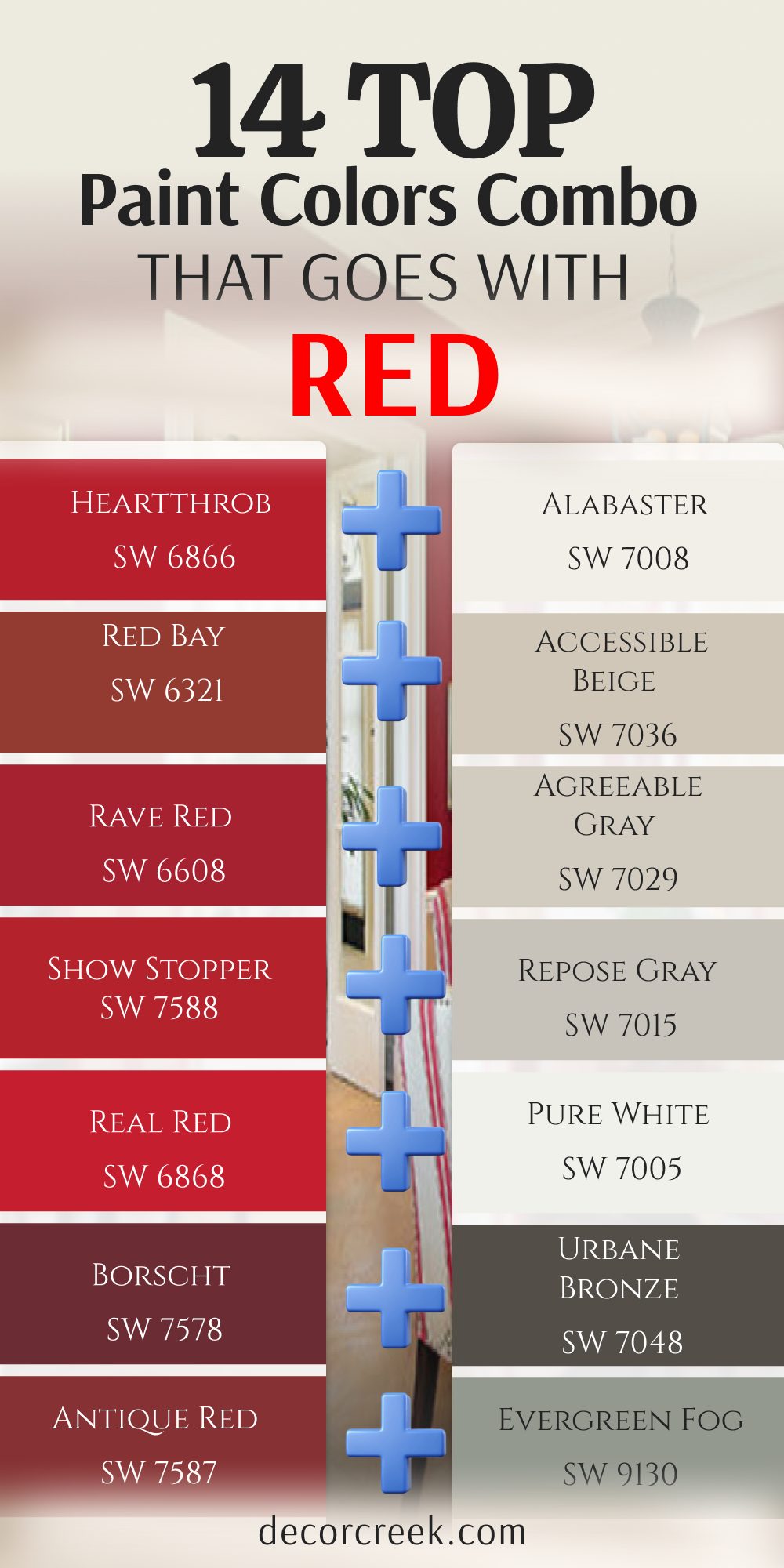
14 Top Paint Color Combo that Goes with Red
Heartthrob SW 6866 + Alabaster SW 7008
Heartthrob SW 6866 is a passionate primary red that demands attention the moment you look at it. Pairing it with Alabaster SW 7008 softens the blow so the red does not hurt your eyes. The creamy white trim wraps around the bright red wall like a soft frame.

This combo creates a cheerful look that works great in a festive dining room. It keeps the room looking clean and high-end without feeling cold. The warm white stops the bold red from looking too aggressive in bright daylight. It creates an environment where family members want to sit down and enjoy a long meal.
Best used in: living rooms, kitchens, hallways, bedrooms, and farmhouse exteriors
Pairs well with: Iron Ore SW 7069, Agreeable Gray SW 7029, Natural Linen SW 9109, warm wood tones The key rule of this color for farmhouse style is to use it where you want natural light to feel kind, soft, and inviting throughout the day.
Red Bay SW 6321 + Accessible Beige SW 7036
Red Bay SW 6321 is a warm terra-cotta red that looks like baked clay pots in the sun. Accessible Beige SW 7036 is the perfect neutral partner because it shares the same warm clay feelings. This mix creates a southwestern look that feels very cozy and close to the earth.
I love using this combo in family rooms where people gather to talk. It makes the space feel grounded and very comfortable for guests. The gray hint in the beige keeps the warm red from turning too orange or muddy. It is an ideal palette for anyone who wants a rich autumn feeling in their home.
Best used in: family rooms, long hallways, kitchens, basements, and open entryways
Pairs well with: Urbane Bronze SW 7048, Pure White SW 7005, Cadet SW 9143, brushed nickel The key rule of this color for transitional style is to use it as the main wall color to tie different room styles together seamlessly.
Rave Red SW 6608 + Agreeable Gray SW 7029
Rave Red SW 6608 is a bright berry red that has a lot of youthful energy inside. Agreeable Gray SW 7029 steps in to cool things down with its balanced gray and beige tones. This pair works well in modern homes that want a pop of fun color in the kitchen.
via decorcreek.com
The gray background keeps the bright red from looking messy or out of control. It looks very clean and intentional to buyers walking through the property. The combination balances hot and cold temperatures perfectly so the room feels comfortable all day. It brings a fresh look that makes small spaces feel lively and new.
Best used in: open floor plans, kitchens, living rooms, bedrooms, and rental properties
Pairs well with: Anew Gray SW 7030, Extra White SW 7006, In the Navy SW 9178, modern decor The key rule of this color for staging style is to paint it everywhere to make small rooms feel larger and brighter to buyers.
Show Stopper SW 7588 + Repose Gray SW 7015
Show Stopper SW 7588 is a glamorous Hollywood red that loves to be the center of the world. Repose Gray SW 7015 provides a cool gray backdrop that acts like a stage for the red paint. The blue undertone in the gray keeps the bright red from making the room feel too hot.
This combination feels very smart and sophisticated for an entry hall. It tells visitors that you love good design right when they step inside. The crisp gray trim coordinates nicely with modern silver metal light fixtures. It creates a high-fashion look that updates an older house instantly.
Best used in: bright living rooms, bathrooms, bedrooms, home offices, and modern trim
Pairs well with: Eider White SW 7014, Pavestone SW 7642, Naval SW 6244, silver hardware The key rule of this color for crisp style is to pair it with cool light fixtures to highlight the clean blue tones inside the paint.
Real Red SW 6868 + Pure White SW 7005
Real Red SW 6868 is a true primary color with no hidden orange or blue tones at all. Pure White SW 7005 matches this honesty with its own crisp and clean white formula. This mix creates a high-energy contrast that looks very modern and graphic on your walls.
I recommend this pair for home offices or creative art studios. It keeps your brain awake and full of good ideas all day. The white walls bounce daylight around so the red accent elements look sharp and clear. It gives a minimalist look that feels extremely organized and professional.
Best used in: modern kitchens, trim, ceilings, bathrooms, and contemporary living spaces
Pairs well with: Black Magic SW 6991, Dorian Gray SW 7017, Charcoal Blue SW 2739, dark metals The key rule of this color for contemporary style is to apply it on trim to make your main walls stand out with crisp definition.
Borscht SW 7578 + Urbane Bronze SW 7048
Borscht SW 7578 is a dark purple-red that looks like rich beet soup or expensive wine. Urbane Bronze SW 7048 adds a heavy layer of dark drama with its deep charcoal brown tones. This combination creates a moody sanctuary that feels very private and expensive.
I use this mix in small powder rooms or private library spaces. It wraps you in a rich dark coat of pure luxury. The warm brown undertone in the bronze keeps the dark walls from looking scary or cold. It works best when you want to create an exclusive club feeling at home.
Best used in: study rooms, accent walls, powder rooms, exterior siding, and front doors
Pairs well with: Greek Villa SW 7551, Shoji White SW 7042, Messenger Bag SW 7740, brass hardware The key rule of this color for dramatic style is to use it on a single focal wall to ground a room with a high ceiling.
Antique Red SW 7587 + Evergreen Fog SW 9130
Antique Red SW 7587 is a muted brick red that feels like an old historic barn wall. Evergreen Fog SW 9130 provides a soft sage green background that balances the red naturally. This complementary pair looks like an autumn forest and feels very close to nature.
It stops the red from looking too loud by grounding it with an earthy green partner shade. It works beautifully in country homes that use a lot of light oak wood. The gray tones inside both paints keep them from looking like simple Christmas holiday decorations. It brings a grounded feel to a busy family room area.
Best used in: bedrooms, home offices, sitting rooms, kitchen cabinets, and cozy entryways
Pairs well with: Pure White SW 7005, Accessible Beige SW 7036, Dried Edamame SW 9122, light oak wood The key rule of this color for natural style is to use it in rooms with natural wood elements to enhance the organic feeling.
Bolero SW 7600 + Shoji White SW 7042
Bolero SW 7600 is a deep romantic red that has a strong spanish dance energy inside. Shoji White SW 7042 softens this passion with its pale greige texture on the surrounding walls. This mix creates an elegant dining room where people want to stay for hours.
The warm white walls stop the deep red from turning the room into a dark cave. It looks very sophisticated and soft under warm evening lamp light. The greige base matches nicely with woven baskets and natural linen curtains. It provides a rich look that feels mature and comfortable.
Best used in: open concept spaces, bedrooms, entryways, sunrooms, and modern farmhouses
Pairs well with: Iron Ore SW 7069, Pewter Green SW 6208, Fawn Brindle SW 7640, natural fibers The key rule of this color for organic style is to use it in rooms with large windows to let the outdoor greenery complement your indoor palette.
Show Stopper SW 7588 + Iron Ore SW 7069
Show Stopper SW 7588 makes another appearance here next to a much darker partner paint. Iron Ore SW 7069 is a soft charcoal black that frames the bright red with industrial strength. This pair looks very masculine, modern, and powerful in a contemporary home loft.
The black absorbs the wild light from the red wall to keep things looking organized. It creates a bold architectural statement that changes the feel of the whole property. It looks amazing next to modern concrete floors and shiny steel railings. This choice is for confident people who want an exciting look.
Best used in: modern lofts, window frames, accent walls, doors, and contemporary exteriors
Pairs well with: Pure White SW 7005, Repose Gray SW 7015, Extra White SW 7006, industrial metal The key rule of this color for industrial style is to use it on doors and window trim to frame your view of the outdoors.
Red Barn SW 7591 + Naval SW 6244
Red Barn SW 7591 is a rustic dark red that feels honest and traditional to Americans. Naval SW 6244 pairs with it to create a classic maritime look that feels very sturdy. This combo works wonderfully in a boy’s bedroom or a fun family game room.
The deep navy blue anchors the room while the red barn paint adds exciting energy. It looks clean when framed with white trim boards and natural leather chairs. The dark blue tones prevent the high-energy red from making the children feel too jittery. It is a traditional look that always stays in fashion.
Best used in: boys bedrooms, game rooms, lake houses, dining rooms, and front doors
Pairs well with: Alabaster SW 7008, Icy SW 6539, Restless Sea SW 9182, white linen fabrics The key rule of this color for nautical style is to use a bright white trim to separate the blue and red colors cleanly.
Caliente AF-290 + White Dove OC-17
Caliente AF-290 is a famous radiant red that won awards for its pure beautiful energy. White Dove OC-17 is the ultimate designer white that makes this red look like a million bucks. The soft white trim cushions the vibrant red walls to create a classic look.
This is my favorite combination for a formal dining room accent wall. It makes the whole house look instantly high-end and ready for important guests. The tiny touch of gray in the white stops the daylight from looking blinding. It gives a clean color flow that looks great in real estate photos.
Best used in: trim work, molded ceilings, kitchens, bedrooms, and traditional living rooms
Pairs well with: Revere Pewter HC-172, Balboa Mist OC-27, Kendall Charcoal HC-166, classic decor The key rule of this color for designer style is to use it on crown molding to frame dark walls with a soft glow.
Dinner Party AF-300 + Pale Oak OC-20
Dinner Party AF-300 is a rich burgundy red that feels deep, dark, and very sophisticated. Pale Oak OC-20 provides a soft greige canvas that lets the wine color look incredibly elegant. This mix creates a warm atmosphere that makes people feel full and happy during a meal.

The light walls keep the room feeling open while the red adds a layer of comfort. It looks beautiful with dark wood floors and large silver candle holders. The warm gray background changes its look gently as the sun moves across the sky. It is a beautiful option for a master bedroom retreat.
Best used in: elegant dining rooms, main bedrooms, open entryways, living areas, and cabinets
Pairs well with: Chantilly Lace OC-65, Revere Pewter HC-172, Chelsea Gray HC-168, dark wood floors The key rule of this color for luxury style is to paint it on the walls and use a brighter white on the ceiling to lift the room.
Million Dollar Red 2003-10 + Edgecomb Gray HC-173
Million Dollar Red 2003-10 is a bright orange-red that feels like a shiny new sports car. Edgecomb Gray HC-173 tones down this extreme speed with its sandy beach warmth. This pair creates a modern look that feels friendly instead of scary or aggressive.
It works great in an entryway to show off your fun personality to neighbors. The warm gray keeps the bright walls looking classy and completely professional. It handles busy family traffic well because the sandy tone hides everyday fingerprints. It gives a solid background that grounds the high-energy red paint.
Best used in: family rooms, hallways, entryways, open floor plans, and traditional kitchens
Pairs well with: White Dove OC-17, Revere Pewter HC-172, Hale Navy HC-154, natural stone The key rule of this color for builder style is to use it as a bridge color between different rooms with different wood tones.
New London Burgundy HC-61 + Hale Navy HC-154
New London Burgundy HC-61 is a historic dark plum red with a lot of traditional weight. Hale Navy HC-154 joins it to create a regal look that feels like an old university library. This dark combination is perfect for a cozy study or a home theater room.
The blue and red tones blend into a rich dark atmosphere that feels very safe. It looks best with shiny brass lamps and rich natural leather furniture pieces. The gray mixed into the navy blue stops the palette from looking childish or cheap. It turns a boring dark room into an elegant historical space.
Best used in: libraries, boys bedrooms, accent walls, front doors, and kitchen islands
Pairs well with: Cloud White OC-130, Classic Gray OC-23, Manchester Tan HC-81, natural leather The key rule of this color for classic style is to use brass hardware to bring out the rich maritime history of the color combination.
29 Top Paint Colors that Go With Red | Designer’s Opinion
Alabaster SW 7008
Alabaster SW 7008 is a creamy white that softens the loud energy of a bright crimson wall. This shade brings a cozy feeling to the room without looking too yellow or dirty. It reflects light gently so your eyes can rest when walking into a vibrant area. I use it on trim and doors to make a sharp border next to a deep cherry hue. It keeps the room from feeling dark while adding a rich texture to the walls.
Home buyers always love how clean and friendly this combination looks in photos. It makes people feel welcome the moment they step through the front door.
You can use it in almost any room where you want a comfortable vibe. It handles bright daylight beautifully without losing its soft creamy appearance. It bridges the gap between old traditional furniture and modern white styles with complete ease.
Best used in: living rooms, kitchens, hallways, bedrooms, and farmhouse exteriors
Pairs well with: Iron Ore SW 7069, Agreeable Gray SW 7029, Natural Linen SW 9109, warm wood tones The key rule of this color for farmhouse style is to use it where you want natural light to feel kind, soft, and inviting throughout the day.
Pure White SW 7005
Pure White SW 7005 gives you a clean line that makes a modern red pop with excitement. This choice lacks any heavy yellow or blue undertones so it stays completely neutral.
It behaves like a crisp piece of paper against a bold coat of tomato red paint. I choose it for modern homes that need a sharp and bright appearance. It makes the walls look straight and the ceilings feel much higher than they are.
The brightness will make your red look even richer and more expensive. It creates a striking contrast that catches your eye right away. You will notice how it cleans up the look of old wooden floors too. It works best when you want a high-energy look that feels very fresh. It functions beautifully as a crisp ceiling paint to brighten up a dark cherry basement room.
Best used in: modern kitchens, trim, ceilings, bathrooms, and contemporary living spaces
Pairs well with: Black Magic SW 6991, Dorian Gray SW 7017, Charcoal Blue SW 2739, dark metals The key rule of this color for contemporary style is to apply it on trim to make your main walls stand out with crisp definition.
Greek Villa SW 7551
Greek Villa SW 7551 has a tiny drop of yellow that warms up a cold berry red wall. This shade feels like heavy silk and brings a rich look to your living areas. It stops a northern room from feeling chilly when paired with a deep burgundy. I love how it softens hard edges in a room with high ceilings. It works wonderfully when you want a rich look that does not feel cold.
The soft undertone grounds the room and matches beautifully with gold light fixtures. It makes the red wall feel like a planned design choice instead of an accident.
People feel relaxed when they sit in a room painted with this mix. It holds its beauty even under cheap yellow light bulbs at night. It adds an elegant style that makes everyday spaces feel a lot more luxurious.
Best used in: dining rooms, entryways, bedrooms, cozy dens, and kitchen cabinets
Pairs well with: Urbane Bronze SW 7048, Accessible Beige SW 7036, Bronze Tone SW 6153, gold accents The key rule of this color for elegant style is to use it on all four walls to create a soft backdrop for your accent pieces.
Creamy SW 7012
Creamy SW 7012 is a rich option that looks like vanilla ice cream next to a barn red. This color has a lot of warmth that tames the wildness of a strong primary red.
It creates a traditional look that feels like an old historic mansion. I pick it when a client wants their home to feel warm and traditional. It fills the room with a sunny glow even on cloudy winter days.
The heavy warm base keeps the red from looking too aggressive or harsh. It wraps the room in comfort and looks great with antique wooden furniture. Your guests will feel like staying for a long time because it feels so safe. It works beautifully on cabinets next to a red brick accent wall. It is the best choice for historical homes that need a warm vintage feel.
Best used in: traditional kitchens, dining rooms, family rooms, trim, and historical homes
Pairs well with: Studio Clay SW 7046, Foothills SW 7514, Pointed Leaf SW 6438, dark wood antiques The key rule of this color for traditional style is to pair it with warm wood furniture to bring out the richest tones in the wood grain.
Shoji White SW 7042
Shoji White SW 7042 sits right on the border between a soft white and a light beige paint. This color shifts its look depending on what kind of red you put next to it. It stays quiet and lets a bright scarlet wall do all the talking. I love using this shade in open floor plans where rooms connect. It keeps the house looking cohesive while your red wall provides a fun surprise.
The greige undertone keeps the white from looking too stark or blinding in the sun. It matches well with woven baskets and natural linen fabrics in the room. It gives a modern organic feeling that makes a house feel like a retreat. This choice is perfect for families who want style without losing comfort. It provides a dusty warmth that handles muddy boots and high traffic wonderfully.
Best used in: open concept spaces, bedrooms, entryways, sunrooms, and modern farmhouses
Pairs well with: Iron Ore SW 7069, Pewter Green SW 6208, Fawn Brindle SW 7640, natural fibers The key rule of this color for organic style is to use it in rooms with large windows to let the outdoor greenery complement your indoor palette.
Natural Choice SW 7011
Natural Choice SW 7011 is a muted background option that subdues the heat of a red wall. This shade has a chalky quality that absorbs light instead of bouncing it around.
It works well if you worry that your red room will look too bright. I use it to create a soft environment that feels grounded and real. It keeps the red from reflecting off the white walls and turning the room pink.
It offers a steady balance that makes the room feel sturdy and well-built. The color looks amazing with stone fireplaces and rustic wooden beams on the ceiling. It feels honest and simple, which helps people feel down to earth. This choice works best when you want to tone down a very loud room. It brings a soft plaster appearance to your walls that looks handmade.
Best used in: rustic living rooms, mudrooms, dens, hallways, and stone fireplace accents
Pairs well with: Black Fox SW 7020, Mega Greige SW 7031, Rosemary SW 6187, raw stone elements The key rule of this color for rustic style is to match it with matte finishes to keep the natural and earthy feeling intact.
Accessible Beige SW 7036
Accessible Beige SW 7036 is a famous neutral that goes with a warm brick red. This shade contains a bit of gray which stops it from looking like muddy yellow clay.
It acts like a handsome suit that makes a bright red tie look professional. I paint this on the main walls when a client wants a red accent wall. It bridges the gap between modern style and old-fashioned comfort perfectly.
The beige tone keeps the room feeling cozy while the gray tone keeps it modern. It hides dirt and scuff marks really well in busy family homes. It makes any room look instantly styled and ready for a magazine shoot. You cannot go wrong with this choice because it matches almost everything. It looks rich even in dark basements that lack good natural windows.
Best used in: family rooms, long hallways, kitchens, basements, and open entryways
Pairs well with: Urbane Bronze SW 7048, Pure White SW 7005, Cadet SW 9143, brushed nickel The key rule of this color for transitional style is to use it as the main wall color to tie different room styles together seamlessly.
Agreeable Gray SW 7029
Agreeable Gray SW 7029 is a versatile paint that balances between warm and cool tones easily. This color adapts to a ruby red wall by showing its cool side to create contrast.
It prevents a red room from feeling like a hot oven in the summer heat. I recommend this shade for open living areas that get a lot of daily use. It provides a clean look that does not feel cold like a hospital wall.
The gray background makes the red look sharp and very intentional. It coordinates well with stainless steel appliances and modern gray couches. It gives a sense of order to a room that has a lot of colorful decorations. This is my favorite choice for making a house look ready to sell. It builds a beautiful foundation that lets your red accent pillows catch everyone’s eye.
Best used in: open floor plans, kitchens, living rooms, bedrooms, and rental properties
Pairs well with: Anew Gray SW 7030, Extra White SW 7006, In the Navy SW 9178, modern decor The key rule of this color for staging style is to paint it everywhere to make small rooms feel larger and brighter to buyers.
Repose Gray SW 7015
Repose Gray SW 7015 has a tiny hint of blue and green hidden deep inside its formula. This cool background makes a fiery orange-red wall look balanced and well-behaved.
It cools down the visual temperature of the room so you can sit there for hours. I choose this when a room has large windows facing the afternoon sun. The light gray color keeps the red from becoming blinding when the sun shines in.
It looks beautiful with dark silver hardware and light gray carpets on the floor. It creates a smart look that feels very upscale and expensive. Your artwork will stand out beautifully against this soft gray background paint. It brings a crisp air to a room that needs a fresh start. It is the best choice for modern apartments with bright primary red furniture.
Best used in: bright living rooms, bathrooms, bedrooms, home offices, and modern trim
Pairs well with: Eider White SW 7014, Pavestone SW 7642, Naval SW 6244, silver hardware The key rule of this color for crisp style is to pair it with cool light fixtures to highlight the clean blue tones inside the paint.
Anew Gray SW 7030
Anew Gray SW 7030 is a deeper gray that brings a lot of weight into a red room. This color does not disappear on the wall; it stands up as a strong partner.
It matches the heavy visual weight of a rich wine or burgundy paint color. I use it in large rooms that feel too empty and need to feel closer. It wraps the walls in a rich tone that feels safe and solid under your feet.
The warmth in this gray keeps it from looking like cold wet concrete. It pairs wonderfully with dark brown leather chairs and heavy velvet curtains. It creates a handsome look that reminds people of a private library. This choice makes a big statement without using loud colors. It anchors a red accent wall so the room feels balanced and complete.
Best used in: formal dining rooms, libraries, main bedrooms, basements, and accent walls
Pairs well with: Snowbound SW 7004, Mega Greige SW 7031, Iron Ore SW 7069, dark leather The key rule of this color for handsome style is to use it in rooms with high ceilings to make the area feel more intimate.

Mindful Gray SW 7016
Mindful Gray SW 7016 is a mid-tone gray that creates a strong contrast with mid-range reds. This color stays true to its gray roots without shifting into beige or blue easily.
It sets a serious tone that makes a red accent wall look like a work of art. I love this shade for home offices where you need to focus your mind. It keeps your eyes from getting tired from looking at a bright red wall all day.
The color gives a structured feeling to the room that feels organized and neat. It looks great with dark iron light fixtures and clean white trim boards. It helps a room feel anchored so the red does not make you feel jittery. This shade works best when you want a solid and dependable color plan. It stands up to busy family activities without showing daily scuffs.
Best used in: home offices, laundry rooms, kitchens, hallways, and exterior trim
Pairs well with: Repose Gray SW 7015, Eider White SW 7014, Black Magic SW 6991, iron fixtures The key rule of this color for structured style is to use it on adjacent walls to give your eyes a resting spot away from the red.
Dorian Gray SW 7017
Dorian Gray SW 7017 is a sophisticated gray that has a classic look next to a deep crimson. This color feels rich and elegant, like a expensive wool coat on a winter day.
It takes away the cheap look that bright reds can sometimes give to a room. I pick this shade for formal areas where people gather for special dinners. It makes a great background for gold-framed mirrors and colorful oil paintings.
The gray color has enough depth to handle a very dark red without looking washed out. It creates a stately atmosphere that makes people sit up a little straighter. Your home will feel like an elegant estate when you mix these two colors together. It works best in rooms that have traditional architectural details like crown molding. It provides a luxurious weight that makes plain drywall look expensive.
Best used in: formal living rooms, dining spaces, entryways, exteriors, and cabinetry
Pairs well with: Alabaster SW 7008, Mindful Gray SW 7016, Naval SW 6244, gold frames The key rule of this color for stately style is to use it on architectural details like wainscoting to create depth on your walls.
Mega Greige SW 7031
Mega Greige SW 7031 is a thick mix of brown and gray that loves a warm rust red. This color brings a lot of earthy warmth into a room without turning yellow.
It creates a rich background that makes a brick-red fireplace look stunning. I use this shade when a client wants a cozy room that feels like a warm hug. It fills up large empty spaces and makes them feel friendly and lived-in.
The gray part of the paint keeps it looking modern, while the brown part brings comfort. It looks wonderful with thick wool blankets and rustic wooden coffee tables. It creates a cozy sanctuary where your family will love to watch movies together. This choice is perfect for creating a warm autumn feeling all year long. It offers a rich stone quality that feels very protective.
Best used in: cozy dens, family basements, bedrooms, large living rooms, and cabins
Pairs well with: Anew Gray SW 7030, Pure White SW 7005, Bronze Tone SW 6153, rustic wood The key rule of this color for cozy style is to use warm light bulbs to emphasize the brown tones hidden in the gray paint.
Tony Taupe SW 7038
Tony Taupe SW 7038 is a rich grayish-brown that feels like expensive milk chocolate. This color grounds a bright red wall and gives it a very solid foundation.
It stops the red from bouncing around and making the room feel unstable. I like this shade for transitional homes that blend old and new furniture pieces. It makes a neutral background that feels much richer than a simple tan or beige.
The color coordinates beautifully with tan leather couches and dark bronze doorknobs. It creates a warm atmosphere that feels high-end and very well thought out. Your walls will look like they belong in a luxury hotel when you use this mix. It works best when you want a rich neutral that has its own personality. It shields the room from feeling too loud or chaotic.
Best used in: main bedrooms, living rooms, home theaters, exteriors, and accent trim
Pairs well with: Shoji White SW 7042, Accessible Beige SW 7036, Urbane Bronze SW 7048, tan leather The key rule of this color for rich style is to use it on the exterior of a home to create a welcoming look against a red front door.
Urbane Bronze SW 7048
Urbane Bronze SW 7048 is a deep dark color that mixes brown, gray, and black together. This shade creates a dramatic look when put next to a rich oxblood red wall.
It looks like dark volcanic rock and brings a lot of strength to a room. I choose this color for small rooms where we want to create a moody vibe. It makes the walls seem to disappear into the shadows while the red shines bright.
The brown undertone keeps the dark color from looking cold or scary to guests. It pairs beautifully with bright brass lamps and modern leather furniture pieces. It creates a secret club feeling that feels exclusive and very fancy. This choice is for bold people who want a room that tells a story. It gives a heavy metallic feel that frames red accents beautifully.
Best used in: study rooms, accent walls, powder rooms, exterior siding, and front doors
Pairs well with: Greek Villa SW 7551, Shoji White SW 7042, Messenger Bag SW 7740, brass hardware The key rule of this color for dramatic style is to use it on a single focal wall to ground a room with a high ceiling.
Iron Ore SW 7069
Iron Ore SW 7069 is a soft charcoal black that makes a cherry red wall look incredibly sharp. This color offers a modern alternative to true black paint, which can look too harsh.
It looks like heavy iron metal and brings an industrial feeling to the room. I use it on window frames and railings next to red brick or red paint. It frames the red color and makes it look like a piece of art in a gallery.
The charcoal shade absorbs a lot of light, which helps tone down a bright red wall. It looks amazing with modern concrete floors and shiny silver metal fixtures. It gives a clean, masculine look that feels very powerful and organized. This choice turns any boring wall into an exciting design statement. It acts like an anchor that stops bright primary colors from feeling messy.
Best used in: modern lofts, window frames, accent walls, doors, and contemporary exteriors
Pairs well with: Pure White SW 7005, Repose Gray SW 7015, Extra White SW 7006, industrial metal The key rule of this color for industrial style is to use it on doors and window trim to frame your view of the outdoors.
Naval SW 6244
Naval SW 6244 is a classic dark blue that creates a nautical look next to a bright red. This color combination reminds people of flags, ships, and beautiful coastal summer homes.
It creates a high contrast that feels energetic and very traditional at the same time. I love this mix for children’s bedrooms or fun game rooms in the basement. The deep blue calms down the high energy of the red without hiding it away.
It looks beautiful with crisp white bedding and shiny gold drawer pulls. It gives a patriotic feeling that feels clean, honest, and very cheerful. Your room will feel like a fresh summer breeze when you use these shades together. This choice works best when you keep the trim a very clean white color. It provides a sturdy structure that makes a playroom feel neat and organized.
Best used in: boys bedrooms, game rooms, lake houses, dining rooms, and front doors
Pairs well with: Alabaster SW 7008, Icy SW 6539, Restless Sea SW 9182, white linen fabrics The key rule of this color for nautical style is to use a bright white trim to separate the blue and red colors cleanly.
Evergreen Fog SW 9130
Evergreen Fog SW 9130 is a soft green with a lot of gray that looks like a misty forest. This color acts like a complementary partner to red because green sits across from red on the color wheel.
It avoids looking like a bright Christmas decoration because the gray tones soften the green. I pick this shade for peaceful bedrooms that have red accents. It brings a natural feeling into the house that feels grounded and connected to earth.
The green tone makes a brick red look rich, warm, and very sophisticated. It looks wonderful with light oak wood floors and soft woven blankets. It creates a gentle balance that makes a busy room feel quiet and orderly. This choice is great for people who love nature colors in their home. It introduces a soft sage texture that takes the sting out of a hot red wall.
Best used in: bedrooms, home offices, sitting rooms, kitchen cabinets, and cozy entryways
Pairs well with: Pure White SW 7005, Accessible Beige SW 7036, Dried Edamame SW 9122, light oak wood The key rule of this color for natural style is to use it in rooms with natural wood elements to enhance the organic feeling.
White Dove OC-17
White Dove OC-17 is a soft white that interior designers use all the time next to red. This color has a tiny touch of gray that keeps it from looking too bright or blinding.
It acts like a soft cloud that cushions the loud impact of a ruby red wall. I paint this on trim boards to create a soft transition into a red dining room. It matches with old or new styles of furniture without any trouble at all.
The soft color keeps the room looking light and airy while staying very cozy. It helps a red room look expensive and well-planned instead of messy. Home buyers always feel comfortable when they see this clean shade on the walls. It works perfectly in any light condition from morning until night. It gives a creamy texture that keeps a bright primary red looking mature and elegant.
Best used in: trim work, molded ceilings, kitchens, bedrooms, and traditional living rooms
Pairs well with: Revere Pewter HC-172, Balboa Mist OC-27, Kendall Charcoal HC-166, classic decor The key rule of this color for designer style is to use it on crown molding to frame dark walls with a soft glow.
Swiss Coffee OC-45
Swiss Coffee OC-45 is a warm white that feels like a hot cup of creamy milk. This color brings a rich traditional feeling when paired with a deep burgundy paint.
It prevents a room from looking cold or empty by adding a gentle warmth to the walls. I love this shade for living rooms that have red accent pillows and rugs. It provides a soft background that lets your colorful decorations stand out beautifully.
The warm undertone keeps the white from turning blue in northern window light. It looks great with brass lamps and dark mahogany wooden tables. It creates an upscale look that feels very friendly and welcoming to guests. This shade is a safe bet for anyone who wants a warm white paint. It makes small dark hallways feel sunny and bright even on winter days.
Best used in: warm living rooms, entryways, family spaces, kitchen cabinets, and hallways
Pairs well with: Shaker Beige HC-45, Chelsea Gray HC-168, Clay Beige OC-11, warm brass metal The key rule of this color for welcoming style is to use it in entryways to give visitors a warm greeting as they enter.

Chantilly Lace OC-65
Chantilly Lace OC-65 is the cleanest white paint that Benjamin Moore makes for homes. This shade has no hidden undertones at all, making it look like fresh winter snow.
It creates a stunning contrast next to a modern, bright fire-engine red wall. I pick this color for clean modern apartments that want a sharp look. It makes every color next to it look brighter, cleaner, and much more intense.
The crispness of this white will make your red wall look like a bold piece of modern art. It bounces a lot of light around the room to keep things feeling open and bright. You will love how it makes your clean modern furniture lines look very sharp. This choice works best when you want a high-contrast look that feels very new. It gives an ice-clean boundary that makes colors explode with fun energy.
Best used in: modern galleries, crisp kitchens, bright bathrooms, trim, and contemporary lofts
Pairs well with: Black HC-190, Gray Owl OC-52, Hale Navy HC-154, modern minimalist furniture The key rule of this color for minimalist style is to use it on both walls and trim to create a seamless bright backdrop.
Simply White OC-117
Simply White OC-117 has a tiny hint of yellow warmth that makes it look like fresh cream. This shade brings a joyful feeling into a room that has a dark red accent wall.
It keeps the room from looking gloomy or dark by adding a bright sunny touch. I use it on kitchen cabinets when the walls are painted a warm brick red. The color looks clean without ever feeling cold or sharp like a hospital room.
It creates a cheerful environment where people love to cook and eat together. It works beautifully with natural wood countertops and colorful ceramic dishes. Your kitchen will look bright and happy every morning when the sun comes up. This choice is perfect for making a dark kitchen feel much larger. It adds a glow that coordinates nicely with warm copper cooking pots on the wall.
Best used in: bright kitchens, sunrooms, children’s spaces, trim, and cottage-style homes
Pairs well with: Silver Half Dollar 2121-40, Pale Oak OC-20, Simplywood stains, bright fabrics The key rule of this color for cottage style is to use it on beaded board paneling to create a textured look on your walls.
Classic Gray OC-23
Classic Gray OC-23 is a very pale gray that looks like a soft mist on the wall. This color stays quiet and acts like a canvas for a bright red furniture piece or wall.
It offers just enough color to show a line against white trim boards. I recommend this shade for bedrooms that need to feel quiet and restful. The pale gray cools down the heat of the red without making the room look dark.
It adapts to the changing sunlight throughout the day without losing its soft look. It pairs nicely with light silver metals and soft white fabrics in the room. It gives a sophisticated look that feels very high-end and clean. This choice works well when you want something a little special instead of plain white. It provides a soft paper-like background that makes bold artwork stand out sharply.
Best used in: bedrooms, quiet sitting areas, hallways, modern bathrooms, and open spaces
Pairs well with: White Dove OC-17, Charcoal 2121-10, Stonington Gray HC-170, silver accents The key rule of this color for sophisticated style is to use it in rooms with low light to bring out its soft gray personality.
Pale Oak OC-20
Pale Oak OC-20 is a beautiful greige paint that reminds people of weathered wood. This color shifts between gray and beige to match the specific red paint you use.
It keeps a bright scarlet from looking too crazy or loud in a small space. I use this shade in dining rooms to create an elegant atmosphere for dinner parties. It adds a rich look to the walls that makes cheap furniture look expensive.
The warm gray tone keeps the room feeling cozy when the sun goes down at night. It looks wonderful with dark wood floors and large white linen curtains. It creates a balanced look that feels very mature and well-designed. This choice is a favorite for people who want a soft luxury look. It coats the room in a cloudy tan shade that makes everyone feel completely relaxed.
Best used in: elegant dining rooms, main bedrooms, open entryways, living areas, and cabinets
Pairs well with: Chantilly Lace OC-65, Revere Pewter HC-172, Chelsea Gray HC-168, dark wood floors The key rule of this color for luxury style is to paint it on the walls and use a brighter white on the ceiling to lift the room.
Balboa Mist OC-27
Balboa Mist OC-27 is a fresh pale gray that has a tiny touch of purple in its base. This hidden tone helps it pair beautifully with berry reds and deep wine colors.
It creates a cool background that makes a rich red wall look regal and important. I choose this color for master bedrooms that have red silk curtains. The gray shade keeps the room looking clean while the purple hint adds richness.
It stops the red from looking dusty or old-fashioned on your walls. It looks great with shiny glass lamps and silver metal frames around your art. It gives a clean look that feels very feminine and fancy. This choice works best in rooms that get a lot of natural light from the sky. It provides a shadow-like beauty that changes into a soft warm white under evening lamps.
Best used in: main bedrooms, formal sitting rooms, powder rooms, closets, and bright hallways
Pairs well with: Simply White OC-117, Kendall Charcoal HC-166, Flint AF-560, glass decorations The key rule of this color for regal style is to pair it with silver accessories to highlight the cool tones in the paint.
Edgecomb Gray HC-173
Edgecomb Gray HC-173 is a warm gray that feels like a soft sandy beach. This color is a bit darker than Pale Oak and brings more presence into a red room.
It pairs perfectly with traditional brick reds and deep copper tones. I use this shade on the main walls of a house when staging it for a quick sale. It makes the whole house feel connected and warm next to a bold red front door.
The beige side of the paint brings comfort while the gray side keeps it looking modern. It hides everyday dust and fingerprints from children very well. It creates a dependable background that makes your home feel safe and solid. This choice is loved by builders because it always looks great. It coats the room in a rich oat color that makes simple decorations look beautiful.
Best used in: family rooms, hallways, entryways, open floor plans, and traditional kitchens
Pairs well with: White Dove OC-17, Revere Pewter HC-172, Hale Navy HC-154, natural stone The key rule of this color for builder style is to use it as a bridge color between different rooms with different wood tones.
Revere Pewter HC-172
Revere Pewter HC-172 is a famous rich greige paint that has a lot of depth on the wall. This color stands up strong next to a deep red wall without getting lost in the background.
It creates a rich historic look that reminds people of old luxury estates. I choose this shade for large living rooms that have high ceilings and big windows. The color fills the room with a sturdy feel that makes the walls look solid and thick.
It keeps a bright red wall from making the room feel unstable or dizzy. It coordinates beautifully with dark leather chairs and large stone fireplaces. It gives a sense of history and importance to a new home that lacks character. This choice is perfect when you want a neutral wall color with real strength. It offers a thick muddy gray stone shade that brings complete comfort to a large space.
Best used in: large living rooms, basements, historic homes, dining rooms, and exterior stucco
Pairs well with: Edgecomb Gray HC-173, White Dove OC-17, Kendall Charcoal HC-166, stone textures The key rule of this color for historic style is to use it in rooms with heavy wood moldings to create a classic look.
Kendall Charcoal HC-166
Kendall Charcoal HC-166 is a deep dark gray that looks like rich volcanic ash. This color creates a modern look when paired with a bright tomato red wall or door.
It has a rich green undertone that gives it a lot of warmth for a dark gray. I choose this shade for modern living rooms that want a cozy theater feeling. It absorbs the extra light in the room so your red accents can shine like bright stars.
The deep shade makes a large room feel cozy and tightly put together for the family. It looks wonderful with light gray modern couches and bright yellow accent pillows. It creates a strong look that feels very confident and architectural. This choice turns any ordinary room into an exciting design statement. It acts like a heavy slate shield that keeps bright colors from looking childish.
Best used in: home theaters, modern living rooms, exterior siding, doors, and dark accent walls
Pairs well with: White Dove OC-17, Stonington Gray HC-170, Caliente AF-290, modern furniture The key rule of this color for bold style is to use it on the exterior of a modern house to frame a bright red front door.
Hale Navy HC-154
Hale Navy HC-154 is a rich dark blue that looks like the deep ocean at night. This color is a classic partner for bright red because it creates a patriotic look.
It avoids looking childish because it has a lot of gray and black mixed into the blue paint. I use this shade in boys’ bedrooms or masculine study rooms with red desks. The deep navy blue brings a steady order that balances the wild energy of the red paint.
It looks beautiful with crisp white trim boards and natural leather chairs. It gives a standard look that feels clean, honest, and very upscale for a home. Your room will feel like a captain’s cabin on a luxury boat when you use this mix. This choice works best when you have good lighting to see the blue tones. It gives a heavy traditional structure that coordinates beautifully with shiny brass lamps.
Best used in: libraries, boys bedrooms, accent walls, front doors, and kitchen islands
Pairs well with: Cloud White OC-130, Classic Gray OC-23, Manchester Tan HC-81, natural leather The key rule of this color for classic style is to use brass hardware to bring out the rich maritime history of the color combination.
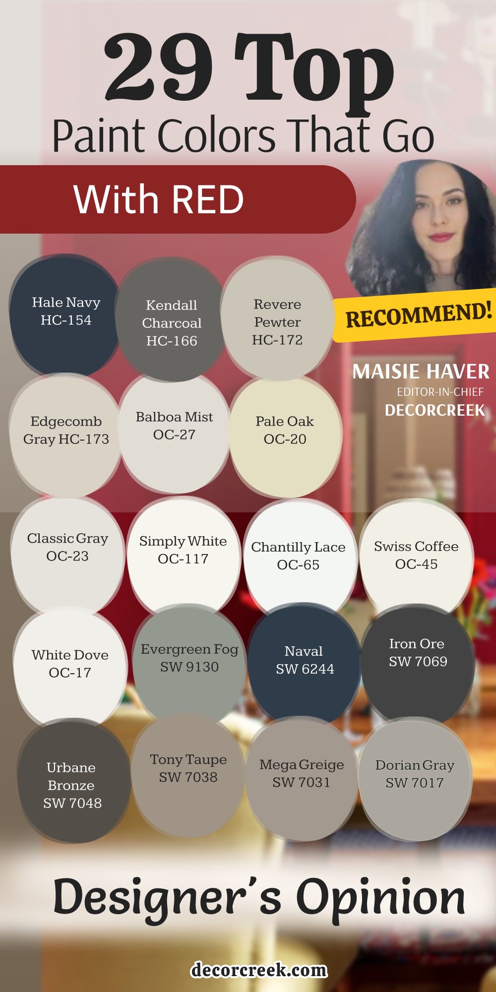
Choosing a partner for red paint is all about the art of managing energy, where every decision dictates the mood of the entire room. Red is undeniably the most visually aggressive, dynamic, and dominant color on the entire wheel. It possesses a fascinating optical trait: it actively steps forward toward your eye, making walls feel physically closer and instantly flooding any space with an intense layer of warmth, intimacy, and psychological power.
Because of this intense presence, the 29 companion colors we explored should never be viewed as mere accidental background noise, plain fillers, or basic default choices. Instead, you must treat each of these shades as a precision design tool. They are specifically engineered to subtly tame that fiery heat, wrap it in an elegant, sophisticated frame, or step back completely to let it celebrate its rich, luxurious fullness.
Depending on the path you choose, a neutral companion can either quiet down a loud red to create a space of restrained, timeless luxury, or act as a crisp, intentional canvas that makes a bold scarlet or deep burgundy pop like a curated masterpiece.
By mastering this relationship, you ensure your red never feels overwhelming, but instead showcases a confident, designer-level balance.