When I look at a fence, I don’t just see wood or metal—I see the frame that sets the whole feeling of a home. The right paint colour makes a fence look strong, cared for, and part of the landscape. A deep shade can make greenery look brighter, while a softer tone can connect the fence to stone paths or siding. Paint doesn’t just cover; it protects against weather, sun, and time.
That’s why picking the right shade matters as much as choosing the right finish. A fence in the right colour makes every step toward the front door feel welcoming and complete.
I’ve always believed a fence is more than a barrier. It’s the first thing people notice when they arrive, and it shapes how the home feels before anyone even walks through the door. A colour that fits well with the garden, the roof, and the siding tells visitors that care has been put into every detail.
When I see a fence painted in the right shade, it feels like the whole property is in harmony. It’s not just about style—it’s about creating a home that feels safe, warm, and put together.
Why I Trust Sherwin-Williams and Benjamin Moore for Fence Paints
I rely on Sherwin-Williams and Benjamin Moore because their colours always stay true. Even after seasons of rain, heat, or snow, the paint holds its depth and beauty. I’ve seen cheaper paints fade or peel too quickly, and that’s a frustration I don’t want for myself or anyone else. These two brands also give me a wide palette, from classic blacks to earthy greens and warm browns.
The quality matters as much as the colour itself. A fence takes direct sunlight, heavy rain, and sometimes even snow, so the finish has to be strong. With these brands, I know the colour won’t turn dull or wash away in a year. I’ve tested them on my own projects, and they stand up to time beautifully.
They give me not only confidence but also freedom to choose shades that fit any style of home.
When I need paint that won’t let me down, I know exactly where to look. Both companies give me confidence that the fences I design will stay sharp and strong year after year.
For me, it’s not only about beauty—it’s about trust.
How I Choose the Right Paint Colour for Fences
When I choose a fence colour, I always think about the house, the garden, and the light. A dark fence can frame flowers like a picture, while a softer grey can match stone patios and walkways. I also look at roof shingles and siding so the fence feels like it belongs. If the yard has many trees, a green shade blends with nature.
If the home feels modern, deep navy or charcoal feels right. I test colours in sunlight and shadow because they change with the day. My goal is simple: to make the fence support the whole look of the home without stealing the show.
I think about how the fence will look in winter with bare trees, in summer with bright flowers, and even in the evening when lights turn on.
A good colour doesn’t just match—it makes everything around it shine. That’s why I never rush the choice. I hold up samples, step back, and imagine how the fence will look in every season. The best shade is the one that feels steady no matter what changes around it.
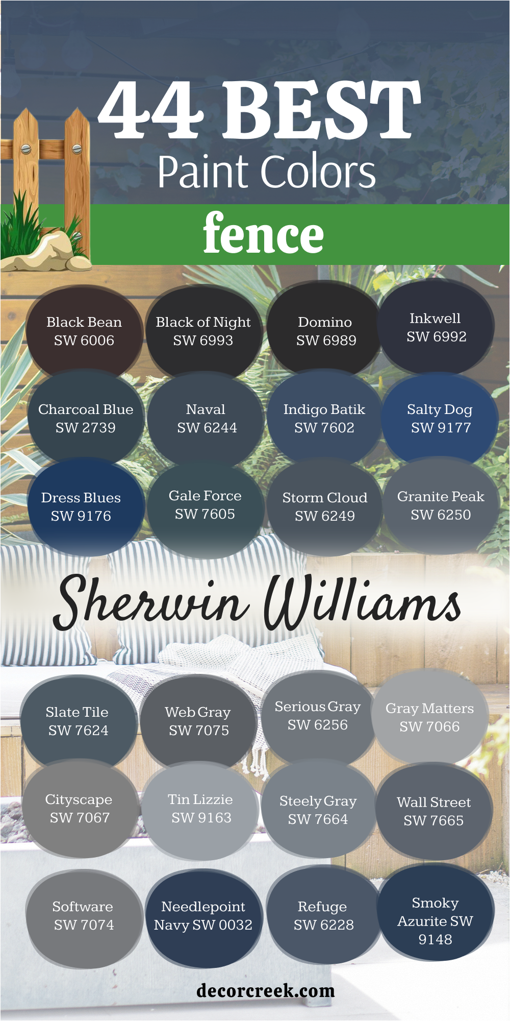
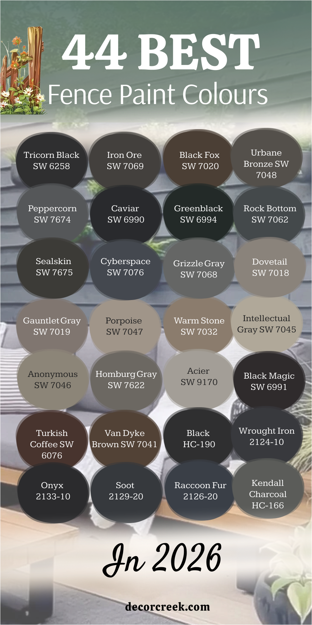
44 Best Fence Paint Colours in 2026
Tricorn Black SW 6258
Tricorn Black gives a fence the deepest and most dramatic look. Tricorn Black works when I want a crisp outline that makes plants pop. Tricorn Black pairs with white trim, modern homes, and metal details. Tricorn Black also looks rich beside brick and stone walls. Tricorn Black doesn’t fade into the background; it stands tall and confident.
I often use this shade to create strong borders in gardens. Tricorn Black makes even simple fences look stylish.
Tricorn Black is also easy to dress up with copper or steel fixtures. Tricorn Black shines best when the goal is bold and lasting impact.

Iron Ore SW 7069
Iron Ore gives fences a softer, almost charcoal tone. Iron Ore feels deep without being as heavy as pure black. Iron Ore works well with rustic homes and cottage gardens. Iron Ore has a warmth that makes wood textures glow. Iron Ore can pair with beige siding, stone, and natural wood decks. Iron Ore gives balance when a pure black feels too strong
. Iron Ore is my pick when I want something dark but inviting. Iron Ore also makes greenery look lush against the fence.
Iron Ore creates a backdrop that feels steady all year. Iron Ore makes the fence both useful and beautiful.

Black Fox SW 7020
Black Fox is a brownish black that feels earthy and grounded. Black Fox works well with homes that have wood or tan siding. Black Fox makes fences blend with the soil and natural paths. Black Fox feels warmer than a sharp black, which helps in softer landscapes. Black Fox pairs beautifully with copper lights and stone gardens.
Black Fox gives a timeless strength that still feels friendly.
Black Fox makes roses and colorful blooms stand out. Black Fox also keeps its tone in sun and shade. Black Fox is my answer when a fence should feel strong but natural. Black Fox always tells a steady story.

Urbane Bronze SW 7048
Urbane Bronze carries deep brown with a metal edge. Urbane Bronze gives a fence modern character. Urbane Bronze works with both stone homes and sleek designs. Urbane Bronze also matches bronze fixtures or iron gates perfectly. Urbane Bronze makes gardens look organized and framed.
Urbane Bronze holds its own against both green yards and gravel paths. Urbane Bronze feels elegant yet welcoming.
Urbane Bronze has a depth that looks beautiful in low evening light. Urbane Bronze makes fences look sturdy and designed, not just functional. Urbane Bronze is a favourite when I want richness without going too dark.

Peppercorn SW 7674
Peppercorn is a smoky grey that makes fences look refined. Peppercorn balances between deep grey and soft black. Peppercorn works well in city homes where sharp edges look smart. Peppercorn pairs nicely with concrete, stone, and modern landscaping. Peppercorn is deep enough to give strength but not as dark as pure black.
Peppercorn makes light flowers glow when set against the fence. Peppercorn also fits with navy doors and grey trims.
Peppercorn has a flexible style that suits many homes. Peppercorn always feels steady and clean. Peppercorn keeps fences looking polished year after year.

Caviar SW 6990
Caviar brings rich black with a slight warmth. Caviar makes fences bold but not harsh. Caviar is deep enough to carry modern style with ease. Caviar pairs with bright white siding for striking contrast. Caviar also works with warm red brick and wood porches. Caviar adds strength without feeling cold.
Caviar makes climbing vines look more alive. Caviar fits both classic and modern homes. Caviar is one of my favourites when I want a strong yet rich look.
Caviar makes any fence feel like part of a carefully chosen design.
Greenblack SW 6994
Greenblack mixes black with the faintest green undertone. Greenblack feels earthy and connected to the landscape. Greenblack pairs beautifully with wood decks and forest backdrops. Greenblack makes plants blend softly without losing strength. Greenblack adds interest compared to a flat black. Greenblack suits cabins, cottages, and homes with natural siding.
Greenblack also matches bronze fixtures and stone walkways. Greenblack feels rich but not too formal.
Greenblack gives depth to a fence without stealing the eye. Greenblack makes the whole yard feel tied together in a natural way.
Rock Bottom SW 7062
Rock Bottom is a rugged dark grey that feels grounded. Rock Bottom gives fences a solid, earthy mood. Rock Bottom pairs with natural stone, gravel paths, and darker roofs. Rock Bottom works well in mountain or country settings. Rock Bottom makes greenery appear brighter against its depth.
Rock Bottom keeps a modern edge in urban yards.
Rock Bottom feels reliable and sturdy in all seasons. Rock Bottom pairs with soft neutral homes for balance. Rock Bottom also works near fireplaces or outdoor kitchens. Rock Bottom makes fences feel lasting and dependable.
Sealskin SW 7675
Sealskin is a very dark brown that feels close to black. Sealskin adds warmth where pure black feels too stark. Sealskin works perfectly with wooden porches and brick paths. Sealskin feels inviting in evening light with lanterns or string lights. Sealskin pairs with both modern and rustic homes. Sealskin highlights natural greenery by giving a soft contrast.
Sealskin blends with earthy tones better than sharp black. Sealskin makes fences feel both solid and welcoming.
Sealskin is perfect when I want strength but also warmth. Sealskin makes outdoor living areas feel complete.
Cyberspace SW 7076
Cyberspace is a sleek, cool charcoal. Cyberspace makes fences look modern and neat. Cyberspace pairs with silver hardware and metal accents. Cyberspace keeps its depth in both bright sun and shade. Cyberspace gives sharp edges without feeling too cold.
Cyberspace looks clean against light concrete or pale siding. Cyberspace makes colorful flowers glow against the dark tone.
Cyberspace suits homes with glass, steel, or modern design. Cyberspace creates fences that feel precise and stylish. Cyberspace is a go-to for fresh, bold outdoor lines.

Grizzle Gray SW 7068
Grizzle Gray has a rich depth that makes fences look strong and grounded. I often use this shade when I want a fence to feel modern but still natural. It pairs beautifully with stone patios and darker roofing. The muted tone highlights the textures of wood and metal hardware. In gardens, it sets off colorful flowers and bright leaves without being too harsh.
This colour also works well with neutral siding, tying the yard together. It feels dependable through all seasons and holds its beauty in sunlight.
I like how it balances between a cool grey and a dark neutral. A fence painted in this shade looks sturdy, steady, and designed with intention. It never feels too bold, yet it never fades into the background.

Dovetail SW 7018
Dovetail brings a softer grey tone that feels steady and welcoming. I turn to it when a fence needs to match warm siding or stone paths. It creates harmony with both modern and traditional homes. The shade is deep enough to frame a yard while still looking gentle. It brings out the color of natural wood furniture and outdoor lighting.
This tone works especially well with tan and cream house exteriors. It adds balance to landscapes filled with both flowers and shrubs.
Even in changing daylight, it keeps its even character. I find it helps fences look polished without looking too formal. It’s a perfect choice for a yard that feels cared for and complete.

Gauntlet Gray SW 7019
Gauntlet Gray carries a bold, medium-dark grey that gives fences a steady presence. I often choose it when I want definition without the sharpness of black. It pairs beautifully with light stone, beige siding, or brick walkways. The shade frames greenery in a way that makes it stand out. It has enough depth to feel solid but enough softness to stay friendly.
I like using it in both city yards and suburban gardens. This tone holds its strength against rain, sun, and changing light. It’s a practical yet stylish choice for outdoor structures.
A fence in this colour looks deliberate and timeless. It makes the whole yard feel neatly tied together.
Porpoise SW 7047
Porpoise offers a warm grey-brown that blends gently with natural landscapes. I use it when I want a fence to feel connected to the earth. It pairs well with clay paths, stone accents, and wood decking. This shade gives softness without losing depth. It complements both colorful flowers and leafy greens. In evening light, it takes on a cozy richness that feels inviting.
I find it works well for homes with tan or cream siding. It helps the fence look part of the yard, not separate from it. Even as seasons change, the tone feels steady and warm.
It’s a thoughtful pick for creating balance between home and garden.

Warm Stone SW 7032
Warm Stone is a grounded neutral that makes fences feel natural and steady. I often turn to it for homes that already use warm woods or earthy siding. It blends seamlessly with brick patios and stone walkways. The tone feels balanced and practical in outdoor spaces. It highlights plants without pulling attention away.
This shade gives fences a sense of sturdiness without heaviness. In daylight it looks grounded, and in evening light it feels cozy.
I’ve seen it keep its character year after year with little change. It’s a trusted colour for blending modern and classic styles. It makes outdoor areas feel finished and inviting.

Intellectual Gray SW 7045
Intellectual Gray has a balanced look that feels calm yet purposeful on a fence. I like it because it sits right between warm and cool tones, making it easy to match. It blends beautifully with stone patios, light siding, and wooden decks. This shade gives a fence a softer strength that doesn’t overpower the yard.
It works well with garden greenery, allowing plants to shine. I often use it for homes that need a modern but approachable touch.
The tone shifts gently with sunlight, adding interest throughout the day. It pairs well with neutral trim and natural textures. A fence in this colour feels steady without being too bold. It’s always a reliable choice for a polished outdoor setting.
Anonymous SW 7046
Anonymous offers a muted depth that feels grounded and versatile for fences. I reach for it when I want something darker than greige but softer than charcoal. It pairs beautifully with earthy siding and clay pathways. The shade feels natural and strong without being too sharp. It sets a steady background for bright flowers and leafy shrubs.
I’ve noticed it works especially well in shaded yards. This tone has a quiet elegance that feels comfortable and lasting.
It doesn’t demand attention, yet it completes the outdoor look. I often recommend it for homes that need a reliable, all-season colour. It helps the fence feel like it belongs naturally to the landscape.

Homburg Gray SW 7622
Homburg Gray has a refined green-grey character that brings fences a unique touch. I enjoy using it when I want something with depth but not a flat neutral. It pairs nicely with stone walls, natural wood, and darker roofs. This shade feels rich and inviting, especially in wooded settings. It brings harmony to yards filled with plants and trees.
In sunlight it shows its green undertone, adding subtle charm. The tone gives outdoor structures a crafted, thoughtful look.
It’s a wonderful choice for homes with natural landscaping. A fence in this colour feels part of nature while still looking neat. It’s one of my favourites for earthy, elegant yards.
Acier SW 9170
Acier is a medium grey that makes fences look smart and steady. I find it useful when a yard needs definition without too much weight. It pairs well with both modern homes and traditional siding. The tone works beautifully with silver fixtures and metal gates. It creates balance between darker trims and lighter walls.
This shade helps greenery look vibrant against its background. In both cloudy and sunny weather, it holds its character.
It feels dependable, which is what I want for fences. A fence in this shade looks neat and long-lasting. It’s a safe yet stylish choice for many outdoor designs.
Black Magic SW 6991
Black Magic gives fences a pure, striking black that feels bold and lasting. I often use it when I want a clean outline that stands out. It pairs well with white siding, red brick, or stone paths. The depth of this colour makes flowers and greenery feel brighter. It works perfectly for modern homes that need sharp contrast.
The finish always looks sleek and polished in the sun. I’ve seen it hold its richness through every season.
It makes even simple fences look intentional and strong. This shade is perfect when confidence and clarity are the goal. It always leaves a lasting impression in outdoor design.
Turkish Coffee SW 6076
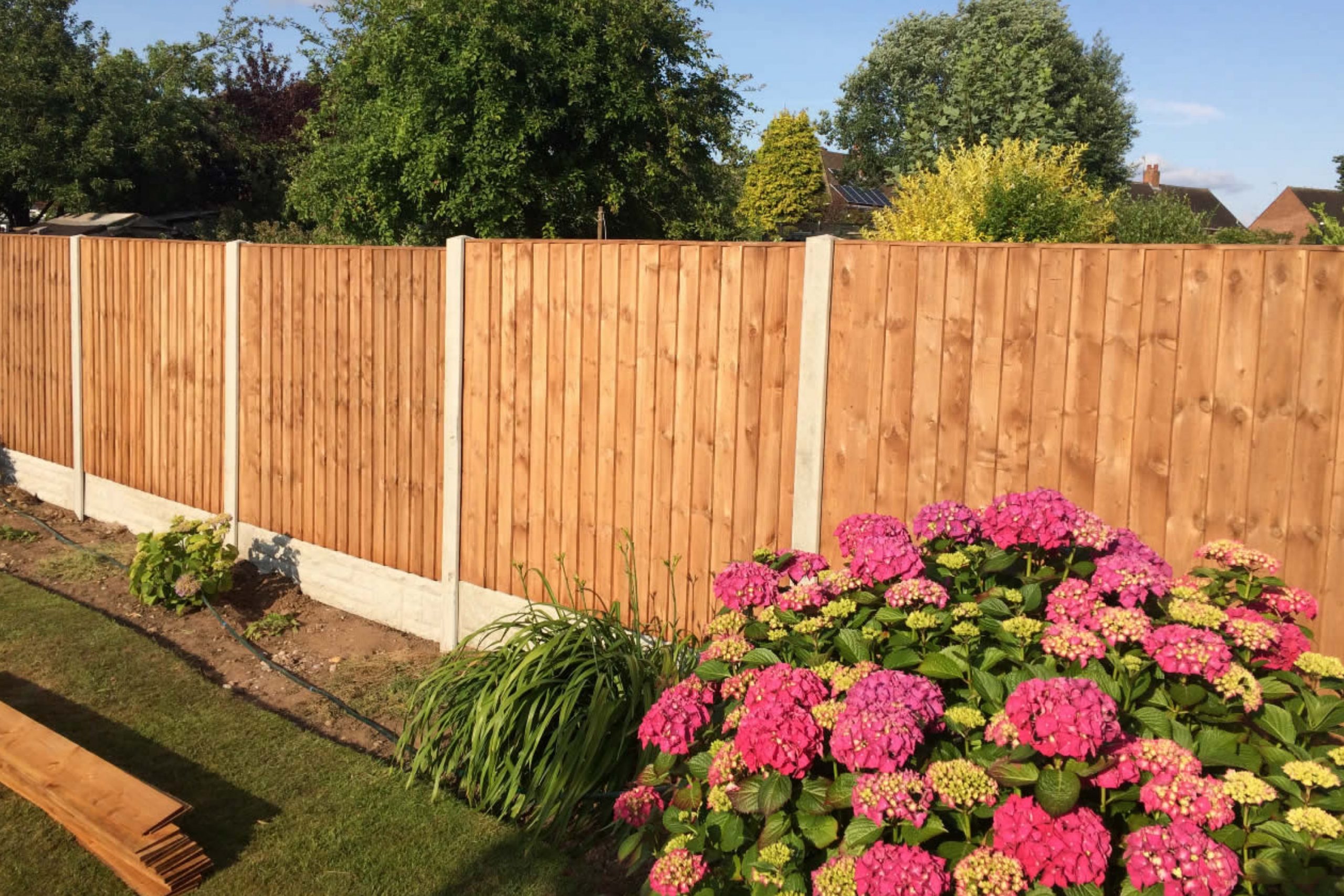
Turkish Coffee is a rich brown that gives fences warmth and depth. I like using it when I want a colour that feels natural but stronger than wood stain. It pairs beautifully with tan siding, cream trims, and stone walkways. The shade highlights outdoor greenery in a way that feels welcoming. It adds a touch of elegance without being too formal.
In evening light it takes on a cozy richness that feels inviting. The colour holds its depth through seasons of sun and rain.
It’s perfect for homes that want a fence to blend with nature. A fence painted in this shade feels solid and grounded. It’s one of my go-to browns for creating warmth outdoors.
Van Dyke Brown SW 7041
Van Dyke Brown is a deep, earthy tone that feels traditional and sturdy. I often choose it for fences that need a timeless strength. It works well with brick homes, stone patios, and rustic siding. The shade blends beautifully with wooded landscapes and country gardens. It has a richness that looks elegant under natural light.
I like how it grounds outdoor spaces without feeling heavy. It also pairs with lighter trims to create balance. This colour makes fences look both practical and designed.
A fence in this shade feels like it will last for decades. It’s a trusted choice for homes with classic style.

Black HC-190
Black HC-190 gives fences a bold, striking edge that never fades. I use it when I want the strongest contrast against greenery. It makes modern homes look sharp and defined. The colour pairs beautifully with white siding and stone details. It highlights flowers and plants by creating a deep backdrop.
This tone works equally well in city and country settings. It feels powerful without being harsh.
The finish looks polished no matter the season. A fence painted in this shade becomes a strong frame for the yard. It’s always a confident choice for lasting style.
Wrought Iron 2124-10
Wrought Iron is a deep charcoal with just a hint of softness. I like using it when pure black feels too strong. It pairs well with neutral siding, brick walkways, and metal gates. The shade gives fences a sleek but approachable look. It makes outdoor greenery appear brighter and fresher.
The tone feels steady in both sunlight and shadow. I often recommend it for modern and classic homes alike.
It gives structure to the yard without stealing attention. A fence in this shade looks neat, strong, and thoughtfully chosen. It’s one of my favourites for blending style and strength.

Onyx 2133-10
Onyx is a rich black that feels elegant and striking on fences. I use it to create strong borders that highlight a home’s design. It pairs perfectly with crisp white siding and bold trims. The depth of the shade makes landscapes feel more defined. It works well for both traditional and modern exteriors.
The colour has a sleek finish that always looks polished. It gives a sense of confidence to any yard.
In all types of light it holds its strength. A fence in this shade looks solid and enduring. It’s a powerful choice that always makes an impression.
Soot 2129-20
Soot is a dramatic black with a cool undertone that feels sharp and modern. I like to use it when a fence needs to give strong definition without any softness. It works beautifully with concrete paths, steel fixtures, and glass details. The tone sets off greenery in a crisp, striking way. It also balances well with light siding or pale stone walls.
In the evening, it holds its depth, adding a sleek edge to outdoor areas. This shade feels right for homes with clean lines and bold design.
It keeps its rich colour through all weather and seasons. A fence painted in this tone feels purposeful and bold. It’s perfect for making a strong architectural statement.
Raccoon Fur 2126-20
Raccoon Fur is a dark grey with blue undertones that gives fences character. I often use it when I want something more interesting than plain black. It works well with navy doors, stone walkways, and slate roofing. The cool tone makes greenery and flowers feel vibrant. It has a richness that feels modern but still welcoming.
The shade is steady in both shade and bright sunlight. I like how it frames a yard without being too heavy.
It creates a polished backdrop for outdoor living areas. A fence in this colour looks stylish yet practical. It’s a dependable pick for homes that want depth with a twist.
Kendall Charcoal HC-166
Kendall Charcoal offers a deep grey that feels timeless and steady. I turn to it when a fence needs strength without the starkness of black. It pairs beautifully with white trim, stone walls, and warm wood decks. The tone works for both classic and modern architecture. It has enough depth to feel bold, but it never overwhelms the landscape.
The colour highlights plants and flowers in a soft, balanced way. I’ve seen it stay rich and reliable through harsh weather.
It’s one of those shades that feels right in almost any setting. A fence in this tone looks thoughtful and enduring. It’s a favourite for giving outdoor areas a lasting finish.

Amherst Gray HC-167
Amherst Gray is a strong, medium-dark grey that makes fences feel grounded. I like using it when I want a look that is serious but not too heavy. It pairs nicely with brick paths, stone landscaping, and beige siding. The tone has just enough softness to keep a yard welcoming. It provides balance when paired with brighter trim or accents.
In sunlight, it holds its depth beautifully. I’ve noticed it creates harmony in both city yards and rural settings.
This shade feels steady through all seasons. A fence in this colour looks solid without being severe. It’s a versatile choice for many different home styles.

Chelsea Gray HC-168
Chelsea Gray carries a medium richness that makes fences look clean and modern. I often pick it when I want definition but not darkness. It works beautifully with cream siding, stone patios, and wood accents. The tone highlights outdoor plants by creating a subtle frame. It feels stylish without being too bold. I’ve seen it pair equally well with classic and new builds.
The colour looks polished in bright sunlight and evening shade. It’s a dependable option when a lighter neutral is too soft.
A fence in this shade gives balance to the whole yard. It’s one of my go-to greys for neat, steady design.
Edgecomb Gray HC-173
Edgecomb Gray is a soft, light grey with a warm undertone that makes fences feel gentle yet polished. I often use it when a yard needs brightness without going to white. It pairs beautifully with stone paths, tan siding, and natural wood decks. The tone adds a sense of ease to outdoor areas.
It highlights flowers and shrubs without competing for attention. I’ve noticed it holds up beautifully in changing light.
This colour works especially well for homes that lean toward warm neutrals. It makes a fence look cared for and clean. A yard painted in this tone feels open and balanced. It’s an easy shade to love for both modern and classic homes.

Revere Pewter HC-172
Revere Pewter is a greige that blends warmth and grey for a balanced look. I like using it when I want a fence to connect the home to its surroundings. It pairs perfectly with cream trim, stone patios, and wood porches. The colour feels inviting and steady, never too harsh. It allows greenery to stand out while softening the overall look.
I’ve seen it adapt well to sun, shade, and seasonal change. This shade feels modern but also works for traditional homes.
It creates harmony with both cool and warm accents. A fence in this colour looks grounded and thoughtful. It’s always a safe yet stylish choice.

Storm AF-700
Storm AF-700 is a moody grey that gives fences strength and elegance. I often turn to it when I want a darker neutral that isn’t black. It pairs beautifully with brick walls, slate paths, and darker roofing. The tone feels bold enough to define a yard but soft enough to stay approachable. It makes flowers and plants pop with colour.
I like how it looks different under sunlight and evening light. This shade works well for modern homes with sharp lines.
It also fits older homes with stone or wood exteriors. A fence in this colour feels striking yet balanced. It’s a dependable shade for making a steady impression.
Nightfall 1596
Nightfall is a deep, shadowy grey that feels powerful on fences. I use it when I want something bold without going to pure black. It pairs perfectly with lighter trims, stone accents, and metal fixtures. The colour has a depth that frames greenery beautifully. In daylight it holds a strong, steady tone.
At night it blends seamlessly with the shadows of the yard. This shade works well for homes with both classic and modern details.
It brings a confident character to outdoor areas. A fence in this tone looks solid, enduring, and stylish. It’s a choice that always feels sure and lasting.
Deep Royal 2061-10
Deep Royal is a strong blue that adds richness to fences. I love using it when I want colour that feels bold but not too bright. It pairs well with grey siding, stone paths, and light trims. The shade creates a striking background for plants and flowers. It feels regal yet still works in casual outdoor spaces.
In sunlight it glows with depth, while in shade it looks steady. This colour has a sophistication that makes any fence stand out.
It’s perfect for homes that want a dash of personality outdoors. A fence painted in this tone looks unique and confident. It’s one of my favourites for adding colour with strength.
Hale Navy HC-154
Hale Navy is a deep blue that brings strength and style to fences. I like using it when I want a classic look with a modern edge. It pairs beautifully with white siding, brick paths, and natural wood accents. The colour has enough depth to feel bold without being too dark. It highlights plants and flowers by giving them a crisp backdrop. In sunlight, it glows with richness, while in shade it stays steady.
This shade feels dependable through every season. It works equally well for city homes and coastal cottages.
A fence in this colour feels confident and sharp. It’s a timeless choice that never disappoints.

Newburyport Blue HC-155
Newburyport Blue is a nautical blue that feels crisp and welcoming on fences. I often choose it for homes with coastal character. It pairs beautifully with cream trim, stone accents, and shingle siding. The tone has a brightness that adds energy without being too loud. It brings out the green of lawns and gardens in a striking way. In daylight, it feels breezy, while in the evening it looks grounded.
This shade suits both classic and modern designs. It makes outdoor areas feel lively yet steady. A fence in this colour always looks polished and cheerful. It’s a perfect pick for freshening up outdoor style.

Gentleman’s Gray 2062-20
Gentleman’s Gray is a dramatic blue with hints of green that feels bold and unique. I use it when I want a fence to stand out with personality. It pairs perfectly with stone paths, dark trims, and wood details. The colour feels rich in sunlight and moody in shadow. It frames flowers and greenery in an elegant way. I like how it gives depth without being plain or flat.
This shade suits modern homes with character as well as historic designs. It’s strong yet refined, which makes it so versatile. A fence in this tone looks both stylish and confident. It’s always a memorable choice for outdoor spaces.

Salamander 2050-10
Salamander is a dark green that feels earthy and dramatic on fences. I enjoy using it for homes surrounded by trees and natural landscapes. It pairs beautifully with tan siding, stone patios, and bronze accents. The shade blends with nature while still standing out with depth. In bright light, it shows its green character, while in shade it feels almost black.
This colour gives a fence a grounding strength. It makes flowers and shrubs appear brighter and fresher.
I find it especially striking in wooded yards. A fence in this tone feels bold but connected to the land. It’s one of my favourites for natural harmony.

Essex Green HC-188
Essex Green is a deep forest green that gives fences richness and depth. I often turn to it when I want something classic yet bold. It pairs perfectly with stone walkways, wood siding, and brick patios. The colour blends beautifully with trees and garden plants. It feels strong in sunlight and almost mysterious in shade. This tone brings a sense of tradition to outdoor areas.
I like how it makes a yard feel full and well-kept. It holds its depth year after year without fading. A fence in this shade feels both natural and elegant. It’s a trusted colour for outdoor design with character.

Hunter Green 2041-10
Hunter Green is a bold, classic shade that makes fences feel strong and traditional. I use it when I want a fence to blend with the richness of a full garden. It pairs beautifully with brick paths, tan siding, and natural stone. The tone feels steady in sunlight and deep in shadow. It gives a fence a timeless strength that works in both rural and urban yards.
The colour enhances flowers by setting a lush backdrop. I like how it grounds outdoor areas with character.
This shade is also perfect for homes with historic charm. A fence in this tone feels established and dependable. It’s a choice that never loses its appeal.
Forest Green 2047-10
Forest Green is a deep shade that feels natural and earthy on fences. I often pick it for yards surrounded by trees and wooded areas. It pairs nicely with natural wood decks, stone walkways, and warm siding. The tone brings harmony to gardens filled with shrubs and evergreens. It feels bold in bright daylight and rich at dusk. This colour makes flowers stand out with energy.
I like using it for homes that want a fence to feel part of nature. It holds its depth well through all seasons.
A fence in this tone looks steady, strong, and connected. It’s a reliable colour for creating balance outdoors.
Narragansett Green HC-157
Narragansett Green is a dark teal-green that adds sophistication to fences. I enjoy using it when I want something different from a classic black or grey. It pairs beautifully with white trims, grey siding, and stone accents. The shade feels stylish and modern while still grounded.
It brings out the beauty of gardens and makes flowers pop. In the sun it glows with a jewel-like depth, while in shade it feels calm and steady.
This tone is perfect for homes with coastal or traditional character. It gives a fence personality without feeling loud. A yard painted in this colour looks fresh and thoughtful. It’s one of my favourite greens for outdoor design.
Ashland Slate 1608
Ashland Slate is a deep grey-blue that feels polished and steady on fences. I use it when I want a fence to carry strength with a touch of colour. It pairs well with light stone, cream trims, and darker roofing. The tone adds richness to outdoor areas without feeling too bold. It frames plants and flowers beautifully by creating contrast.
In sunlight it shows more blue, while in shade it leans toward grey. I find it works for both modern and classic homes.
The colour holds its depth through different seasons. A fence in this shade looks refined and long-lasting. It’s a dependable choice for adding subtle colour outdoors.
Black Bean SW 6006
Black Bean is a rich brown-black that makes fences feel bold yet warm. I like it for homes that need depth without the sharpness of pure black. It pairs beautifully with tan siding, natural stone, and wood decks. The shade blends with earthy tones while still giving strong contrast. In bright light, it shows its brown warmth, and in shade, it leans darker.
It’s perfect for creating a fence that feels sturdy and inviting. This colour highlights greenery without overpowering it.
I often use it in country homes or rustic settings. It works equally well for modern designs needing a softer black. A fence painted in this tone feels both stylish and grounded.
Black of Night SW 6993
Black of Night is a crisp, dark black that gives fences a sharp modern edge. I turn to it when I want a clean and confident outline around a property. It pairs perfectly with white siding, metal accents, and stone details. The tone adds contrast that makes flowers and greenery shine. It holds its depth beautifully under both sun and shade.
This colour makes even simple fences look deliberate and polished. I find it suits modern and urban homes especially well.
It’s strong but not overwhelming, which keeps the design balanced. A fence in this shade feels sleek and dependable. It’s a favourite for bold outdoor design.

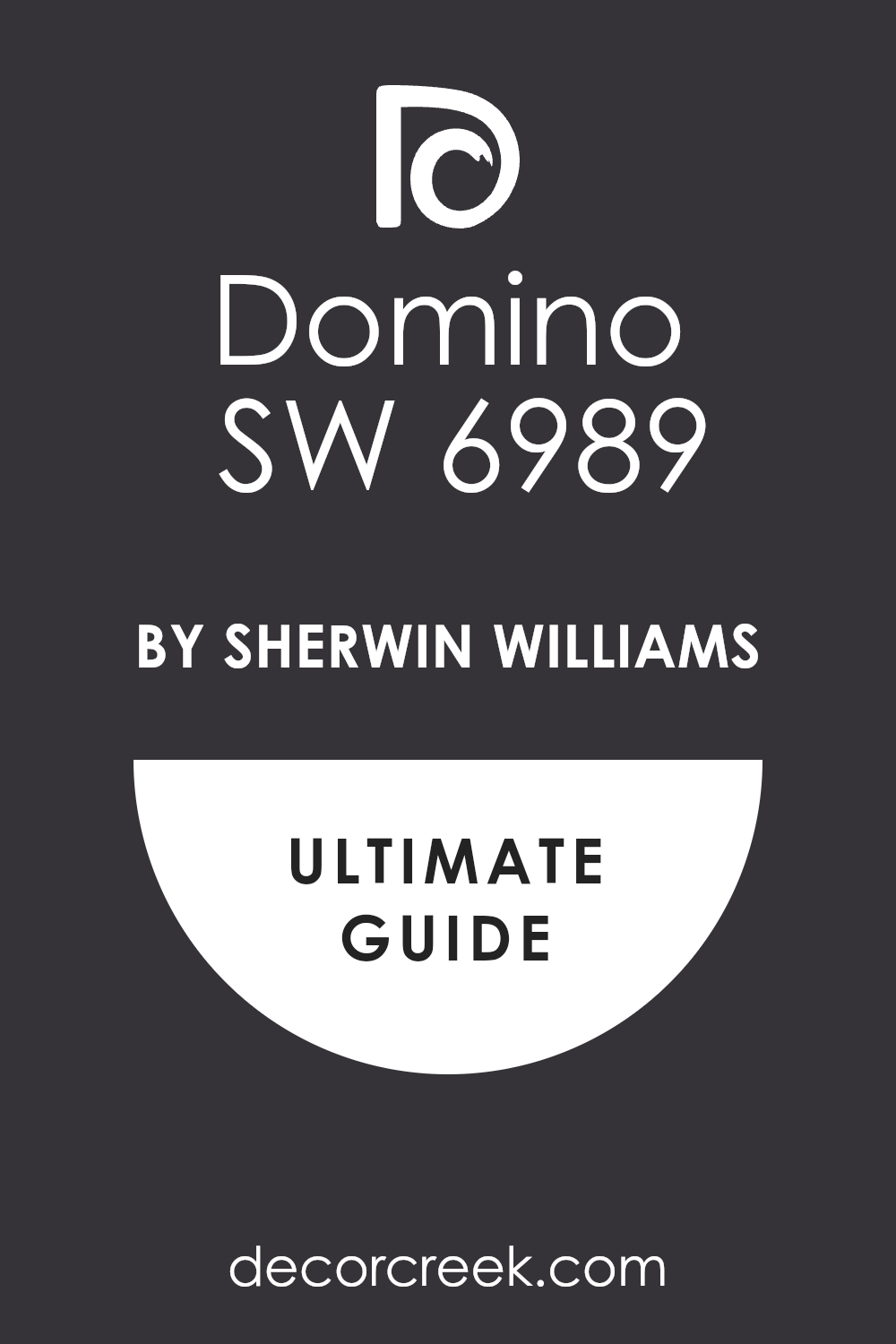
Domino SW 6989
Domino is a deep black with a touch of warmth that feels refined on fences. I often choose it when a stark black feels too harsh. It pairs beautifully with brick patios, cream trims, and tan siding. The tone has richness that softens hard edges outdoors. It creates a backdrop that lets plants and flowers stand out. In sunlight it glows subtly, while in shade it looks bold and steady.
This colour gives outdoor areas balance and elegance. It works well for both traditional and modern homes. A fence in this shade looks strong yet approachable. It’s a dependable choice for lasting style.
Inkwell SW 6992
Inkwell is a deep black with a hint of blue that feels striking on fences. I use it when I want a fence to have a little personality beyond plain black. It pairs perfectly with stone accents, metal gates, and grey siding. The tone looks bold in daylight and moody in evening shade. It enhances the character of flowers and greenery around it.
This shade has a sleek modern feel but still works with classic homes.
I like how it creates sharp definition without being flat. A fence in this colour looks polished and unique. It’s an excellent choice for standing out with confidence.

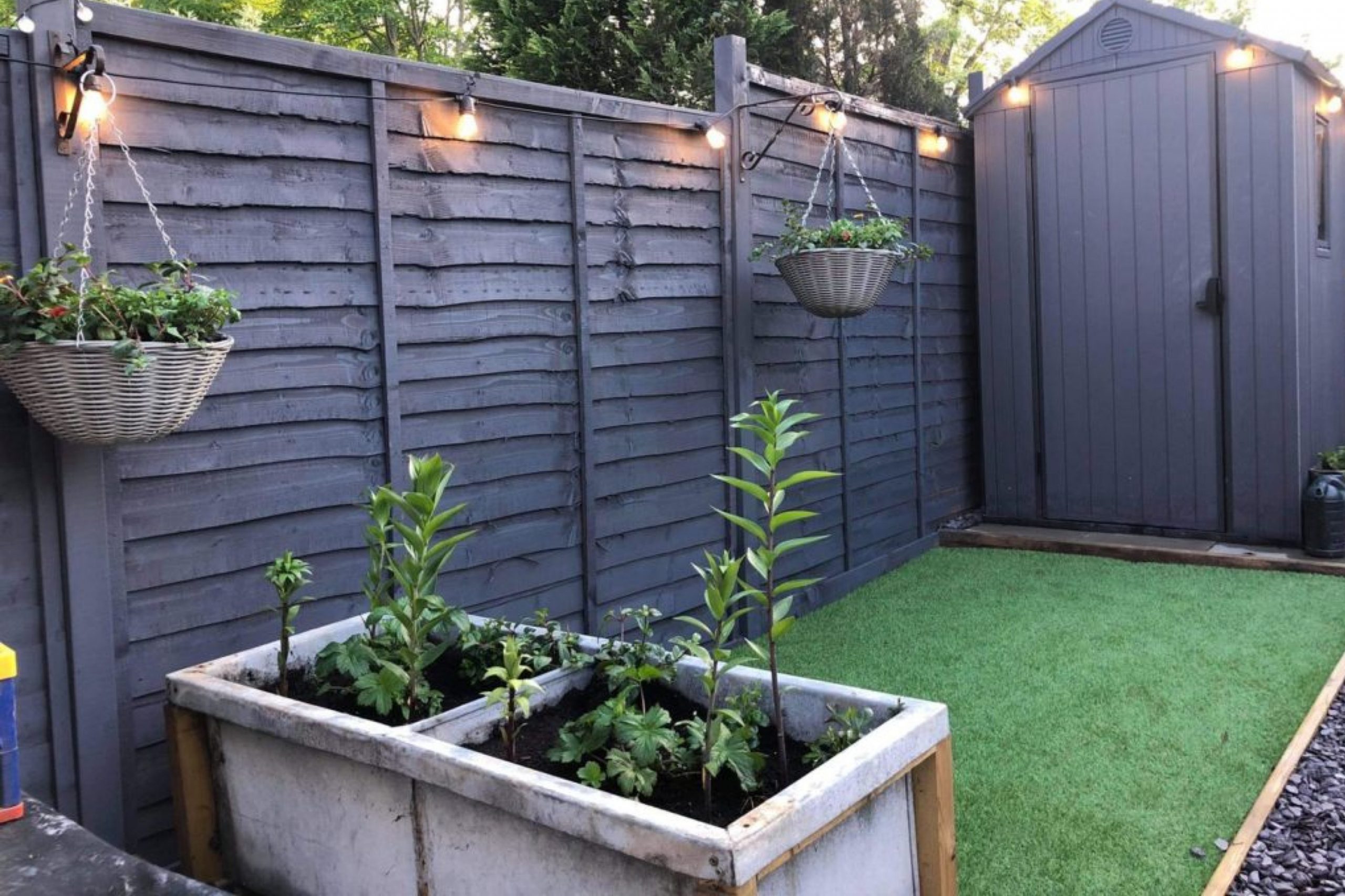
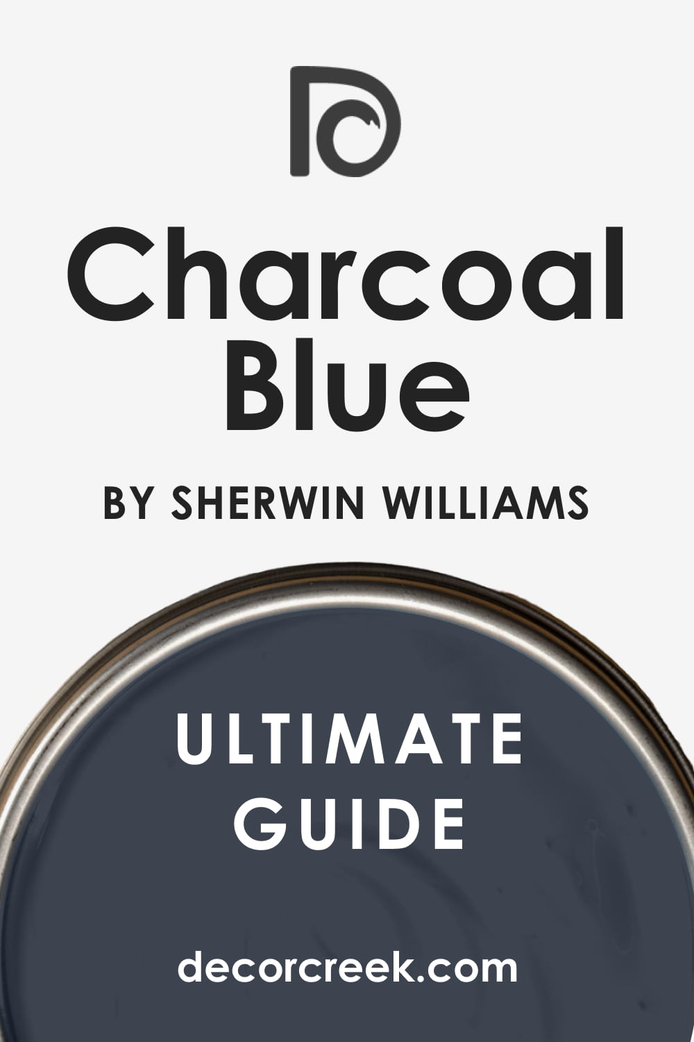
Charcoal Blue SW 2739
Charcoal Blue is a strong blue-grey that gives fences depth and character. I enjoy using it when I want colour without it being too bright. It pairs beautifully with white trims, stone walkways, and wood porches. The shade feels refined in sunlight and grounded in shadow. It creates a handsome backdrop for gardens and outdoor seating areas.
This tone works well for both classic cottages and modern homes. It gives fences a sense of personality while staying versatile.
The colour adapts nicely across seasons without losing richness. A fence in this shade feels confident and inviting. It’s one of my go-to deep blues for outdoor design.
Naval SW 6244
Naval is a rich navy that gives fences a classic and dignified look. I like using it for homes that need a deep colour with personality. It pairs beautifully with white siding, natural wood, and brick accents. The tone has enough depth to feel strong but not too harsh. In bright light, it shows its blue richness, while in shade it feels more grounded.
This colour makes gardens feel organized and full of life. I find it works especially well for coastal and traditional homes.
It balances boldness with elegance in a way that lasts. A fence in this shade feels thoughtful and refined. It’s a trusted pick for long-term style.

Indigo Batik SW 7602
Indigo Batik is a dark blue with energy that makes fences look unique. I reach for it when I want something different from grey or black. It pairs beautifully with stone walkways, cream trim, and metal accents. The tone feels rich during the day and dramatic in the evening. It creates a striking backdrop for outdoor plants and flowers.
This colour has a stylish quality that makes a yard feel complete. I like it for modern homes as well as transitional styles.
It stays steady across seasons and lighting changes. A fence in this shade feels creative and strong. It’s perfect for a bold but inviting yard.

Salty Dog SW 9177
Salty Dog is a bright navy that brings vibrancy to fences. I often choose it when I want a playful yet polished look. It pairs nicely with white trim, light siding, and coastal-inspired décor. The tone has a lively energy in sunlight, while in shade it feels calmer. It gives a garden an extra pop without overwhelming the design. This colour is especially fitting for seaside or cottage homes.
It makes flowers and greenery feel even more cheerful. I love how it keeps outdoor areas looking fresh and fun.
A fence in this tone feels spirited and stylish. It’s a wonderful pick for lively outdoor settings.

Dress Blues SW 9176
Dress Blues is a bold navy that carries strength and sharpness. I like using it for fences that need a serious yet stylish tone. It pairs perfectly with stone accents, tan siding, and metal hardware. The shade feels crisp and clean in both sun and shade. It makes outdoor greenery stand out with clarity. I’ve found it works best for homes with a modern or classic military-inspired style.
This colour feels disciplined but not cold. It adds a sense of order and refinement to the yard. A fence in this shade looks purposeful and polished.
It’s a confident choice that never goes unnoticed.
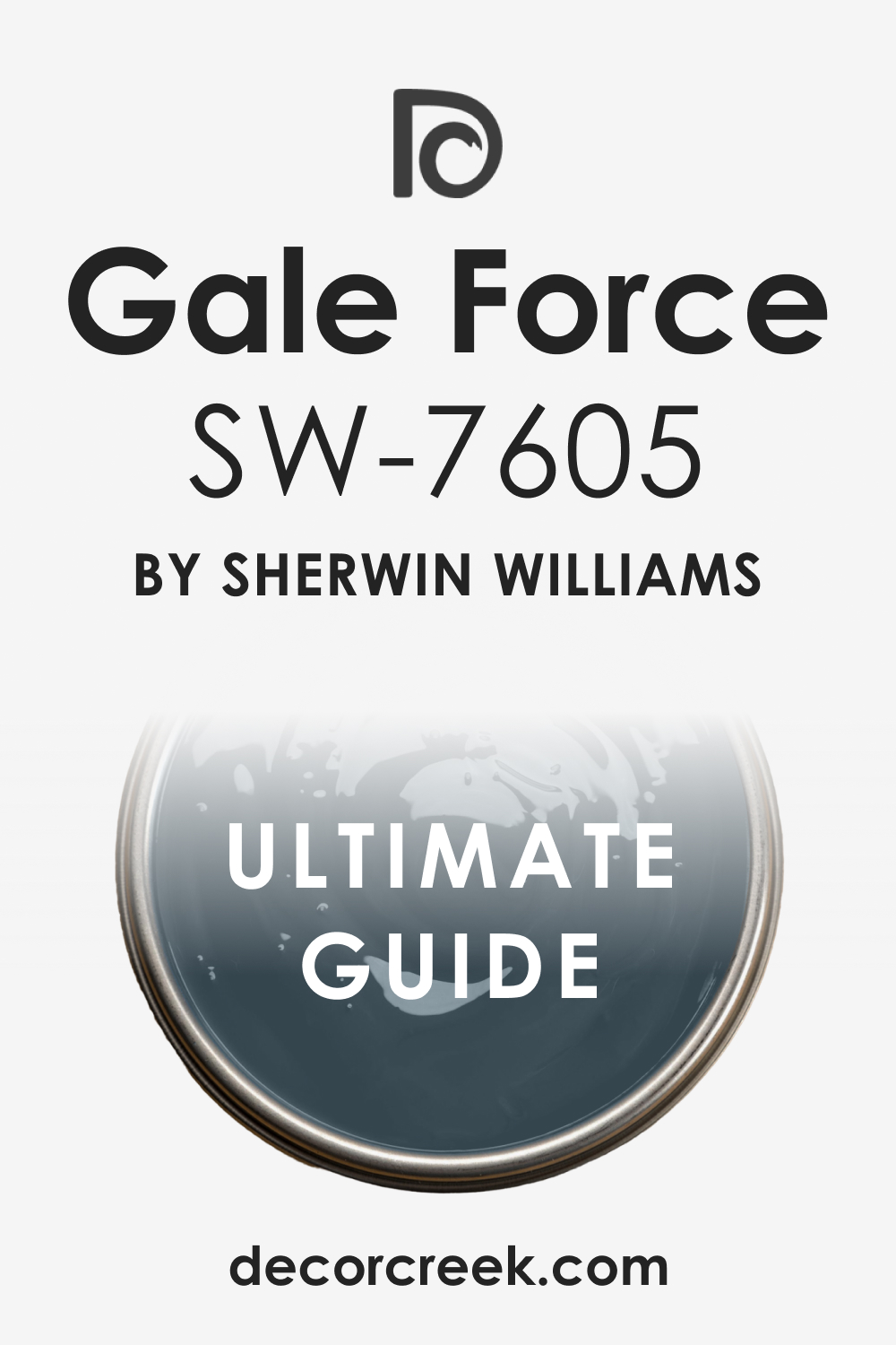
Gale Force SW 7605
Gale Force is a deep blue with a touch of green that feels bold on fences. I enjoy using it when I want a colour that feels dramatic but not too dark. It pairs beautifully with brick patios, stone paths, and natural wood. The tone shifts slightly with light, adding interest throughout the day. It gives a fence depth while still letting plants and flowers shine.
This colour feels versatile across different home styles. It works for coastal cottages, suburban yards, and city homes alike.
The richness stays steady through seasonal changes. A fence in this shade feels both stylish and lasting. It’s one of my favourites for strong, colourful design.
Storm Cloud SW 6249
Storm Cloud is a moody blue-grey that gives fences a rich and thoughtful look. I like using it when a yard needs definition but also a softer edge. It pairs beautifully with stone walls, light siding, and metal fixtures. The tone feels dramatic in sunlight and calm in shadow. It makes greenery stand out while blending naturally with the landscape.
This shade has a depth that feels modern but still welcoming. It holds its richness through seasonal changes without fading.
I often recommend it for homes that want a fence with character. A fence in this tone feels steady, stylish, and designed with care. It’s always a dependable choice for outdoor areas.
Granite Peak SW 6250
Granite Peak is a deep slate blue that adds elegance to fences. I use it when I want something darker than mid-blue but not quite navy. It pairs perfectly with grey stone, cream trims, and wood siding. The tone looks strong and handsome in any light. It makes flowers pop with brightness against the darker backdrop. This shade feels sophisticated without being too bold.
It’s an excellent choice for modern and transitional homes alike. I like how it creates a sense of balance in outdoor spaces.
A fence in this colour feels polished and enduring. It always brings a yard together with style.

Slate Tile SW 7624
Slate Tile is a blue-grey with depth that makes fences feel grounded and smart. I often use it when I want colour but not too much brightness. It pairs beautifully with stone patios, tan siding, and neutral trims. The tone holds steady in both sunlight and shadow. It creates a refined background for greenery and flowers. I’ve noticed it works especially well for modern homes.
The colour feels strong but never too heavy. It’s dependable for yards that need definition. A fence in this shade looks neat, stylish, and lasting. It’s one of my reliable favourites for outdoor design.

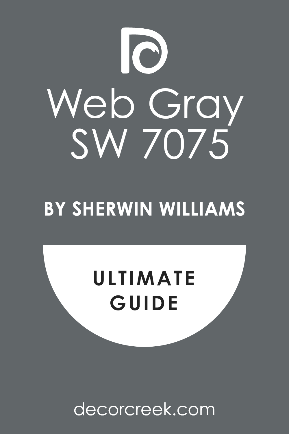
Web Gray SW 7075
Web Gray is a cool, medium-dark grey that feels steady and sharp on fences. I choose it when black feels too bold but lighter greys feel too soft. It pairs perfectly with white trims, stone walkways, and brick siding. The tone adds structure without being harsh. It brings out the beauty of flowers and shrubs by creating balance. In bright light it looks crisp, while in shade it feels solid.
This shade fits well with both traditional and modern homes. It has a clean look that lasts through all seasons. A fence in this colour feels neat and dependable. It’s always a practical and stylish choice.
Serious Gray SW 6256
Serious Gray is a strong grey-blue that gives fences a sophisticated tone. I enjoy using it when I want a shade with personality but not too much brightness. It pairs beautifully with stone patios, neutral siding, and metal accents. The colour feels steady during the day and richer in the evening. It provides contrast that makes gardens look organized. This shade works well in both urban and suburban yards.
It holds its depth even in changing weather. I like how it balances strength with a friendly look. A fence in this tone feels thoughtful and stylish. It’s a reliable pick for a polished outdoor finish.
Gray Matters SW 7066
Gray Matters is a medium grey that makes fences look modern and balanced. I often choose it when I want a neutral that feels fresh but not too light. It pairs beautifully with white trim, stone patios, and wood decks. The tone adds definition without stealing attention from the garden. It feels steady in bright sun and soft in shade. This shade is easy to work with across different house styles.
It makes outdoor plants and flowers feel more vibrant. I find it especially useful for homes that lean toward cool palettes. A fence in this colour feels neat and lasting. It’s a simple, stylish option for many yards.
Cityscape SW 7067
Cityscape is a darker grey that gives fences strength and character. I use it when I want something bolder than mid-grey but softer than black. It pairs perfectly with stone details, tan siding, and metal gates. The tone adds weight and structure to outdoor spaces. It feels strong during the day and cozy at dusk. This colour works beautifully in urban settings with modern architecture.
It balances out greenery by giving it a crisp frame. I like how it holds up well through changing seasons. A fence in this shade feels practical yet polished. It’s one of my favourites for dependable outdoor design.
Tin Lizzie SW 9163
Tin Lizzie is a cool grey with a steel-like quality that feels smart on fences. I reach for it when I want a shade that looks sleek but approachable. It pairs nicely with concrete paths, metal details, and lighter siding. The tone feels sharp in sunlight and steady in shadow. It gives structure without being too dark. This shade highlights plants and flowers by offering a neutral background.
I’ve seen it work in both modern and traditional settings. It’s easy to blend with other outdoor finishes. A fence in this colour looks stylish and strong. It’s a flexible choice that always feels current.

Steely Gray SW 7664
Steely Gray is a medium grey-blue that makes fences look fresh and steady. I like using it for homes that need a hint of colour without brightness. It pairs beautifully with stone patios, white trim, and natural wood. The tone feels crisp in the daytime and smooth in the evening. It helps balance outdoor greenery by adding gentle contrast.
This shade suits both coastal cottages and modern city homes. It adapts well to different seasons and light conditions.
I often recommend it for yards that need structure without heaviness. A fence in this tone feels neat and dependable. It’s a refreshing option for outdoor design.
Wall Street SW 7665
Wall Street is a deep grey that gives fences a serious and polished look. I use it when I want something darker than mid-grey but not fully black. It pairs perfectly with cream trim, metal gates, and stone walkways. The tone feels bold during the day and steady in the evening. It frames gardens beautifully by providing sharp contrast. This shade works especially well for modern homes.
It holds its depth in sun, rain, and changing seasons. I like how it makes outdoor areas feel complete and well-structured. A fence in this colour looks confident and lasting. It’s always a smart, reliable choice.
Software SW 7074
Software is a cool grey with a sleek and modern look that works beautifully on fences. I often use it when I want a neutral that feels crisp and updated. It pairs nicely with stone patios, white trims, and metal accents. The tone gives structure to the yard without being too dark. It highlights flowers and greenery by creating balance. In bright light, it looks sharp, and in shade, it feels smooth.
This colour adapts well to both modern and transitional homes. It holds steady across all seasons without losing its character. A fence in this shade feels polished and dependable. It’s a favourite choice for clean, modern design.
Needlepoint Navy SW 0032
Needlepoint Navy is a classic navy that gives fences a refined look. I reach for it when I want deep colour without the heaviness of black. It pairs beautifully with cream siding, stone paths, and wood details. The tone has a richness that feels both bold and inviting. It sets off gardens by framing greenery with elegance. In sunlight, it glows with energy, while in shade, it stays steady.
This colour works well for traditional and coastal-inspired homes. It creates a timeless background for outdoor spaces. A fence in this tone feels strong and stylish. It’s always a reliable and beautiful option.
Refuge SW 6228
Refuge is a moody blue that makes fences look bold and thoughtful. I like it for homes that need a deep colour with personality. It pairs perfectly with grey stone, white trim, and darker siding. The tone feels rich in daylight and dramatic in the evening. It creates a backdrop that highlights both flowers and trees. This colour has a grounding effect that feels steady in outdoor spaces.
I often recommend it for modern or transitional designs. It stands out without being too bright. A fence in this shade looks stylish and lasting. It’s a confident choice for a yard with character.
Smoky Azurite SW 9148
Smoky Azurite is a deep blue that carries a jewel-like richness on fences. I often turn to it when I want a shade that feels luxurious but approachable. It pairs beautifully with cream siding, wood decks, and stone accents. The tone glows in the sun and feels moody in shadow. It highlights plants and flowers by giving them a vibrant backdrop. This colour fits well with both modern and traditional architecture.
It adapts beautifully across seasons, keeping its depth and charm. I like how it makes a fence feel more intentional and styled. A yard with this shade looks confident and refined. It’s always a striking choice for outdoor design.

Dark Night SW 6237
Dark Night is a bold blue-green that gives fences a dramatic presence. I use it when I want a colour that feels rich but not too bright. It pairs perfectly with natural wood, bronze accents, and stone paths. The tone has a deep, elegant quality that works in both urban and rural yards. It makes greenery look brighter and flowers more lively. In the sun, it shows its blue side, while in shade, it leans green.
This colour holds up beautifully through every season. It gives a fence confidence and depth that lasts. A fence in this tone feels bold and designed. It’s a favourite when I want drama outdoors.
Cascades SW 7623
Cascades is a deep green-blue that gives fences a rich and natural strength. I often choose it when I want a fence to blend with trees and garden foliage. It pairs beautifully with tan siding, stone pathways, and wood decks. The tone feels bold in sunlight and moody in the evening. It makes flowers and greenery stand out with clarity. This shade feels grounded and lasting through every season.
I like how it works for both rustic cabins and modern homes. It creates harmony between the house and the landscape. A fence in this colour looks thoughtful and enduring. It’s a reliable pick for a bold but natural design.
Still Water SW 6223
Still Water is a dark teal that brings richness and depth to fences. I use it when I want something more colourful than grey but still refined. It pairs nicely with stone walls, cream trim, and wood accents. The tone feels vibrant in sunlight and steady in shadow. It creates a striking frame for flowers and shrubs. This colour works well in both urban gardens and country yards.
It adapts beautifully across different architectural styles. I like how it balances boldness with warmth. A fence in this shade looks stylish and long-lasting. It’s one of my favourites for making outdoor areas stand out.

Moscow Midnight SW 9142
Moscow Midnight is a dramatic navy with depth that feels bold on fences. I enjoy using it when I want a fence to carry a modern yet classic look. It pairs beautifully with white trims, stone patios, and darker siding. The tone glows in bright sun and feels mysterious at dusk. It makes greenery pop with life against its deep backdrop. This shade feels elegant while still approachable.
It works especially well for city homes and sharp architectural lines. The colour holds steady through seasonal changes. A fence in this tone feels polished and confident. It’s a bold and reliable option for outdoor spaces.
Mountain Road SW 7743
Mountain Road is a grounded green-brown that feels earthy and natural on fences. I reach for it when I want a fence to blend seamlessly with gardens and wooded areas. It pairs perfectly with stone paths, rustic siding, and outdoor wood features. The tone has a steady character that works well in all light. It highlights plants without pulling focus away from them.
This colour makes a yard feel rooted and balanced. I’ve seen it fit beautifully in rural and suburban settings alike. It’s practical but also stylish in its depth. A fence in this shade looks reliable and welcoming. It’s a great choice for homes with natural landscapes.
Andiron SW 6174
Andiron is a dark green with a quiet richness that suits fences beautifully. I often use it for homes surrounded by gardens and trees. It pairs nicely with stone walls, tan siding, and natural decks. The tone looks bold in sunlight and deep in shade. It gives a strong backdrop for flowers and shrubs to shine. This colour feels traditional but also works for modern exteriors.
It adapts well to different seasons, staying rich and steady. I like how it connects a home to its outdoor surroundings. A fence in this shade looks strong and classic. It’s one of my trusted picks for green-based designs.
Rookwood Shutter Green SW 2809
Rookwood Shutter Green is a historic, deep green that gives fences a traditional charm. I like using it for classic homes where heritage and character matter. It pairs beautifully with brick paths, cream trims, and wood accents. The tone feels steady in bright sun and rich in shade. It creates a strong backdrop that highlights plants and flowers. This colour fits perfectly with colonial or farmhouse styles.
It makes outdoor areas feel rooted and well cared for. I’ve seen it age gracefully through every season. A fence in this shade looks proud and lasting. It’s a timeless choice for homes with history.
Shade-Grown SW 6188
Shade-Grown is a dark forest green that brings a grounded, natural look to fences. I use it when I want a colour that blends easily with trees and gardens. It pairs nicely with stone walkways, rustic siding, and bronze accents. The tone feels bold during the day and mysterious at night. It creates harmony with outdoor landscapes while still offering depth. This colour feels right at home in wooded or country settings.
It makes flowers and lighter plants stand out beautifully. I like its steady quality across changing light and seasons. A fence in this shade feels sturdy and connected. It’s a reliable green for natural-inspired design.
Courtyard SW 6440
Courtyard is a rich mid-green that feels fresh and alive on fences. I often turn to it when I want a shade that highlights gardens. It pairs beautifully with tan siding, light trims, and stone accents. The tone feels vibrant without being too bright. It makes outdoor spaces feel cheerful and balanced. This colour works well for both suburban yards and countryside homes.
It adapts nicely to sunlight, staying vivid but steady. I like how it creates a welcoming frame around outdoor living areas. A fence in this shade feels lively and inviting. It’s a great pick for homes with abundant greenery.
Rock Garden SW 6195
Rock Garden is a deep, earthy green that makes fences look bold and natural. I enjoy using it when I want a fence to blend into the landscape. It pairs perfectly with stone paths, darker siding, and rustic decks. The tone feels steady and confident in all types of light. It gives gardens a structured backdrop that makes flowers pop. This colour works especially well in rural settings.
It creates a connection between the house and surrounding plants. I like how it holds up beautifully through the seasons. A fence in this shade looks solid and enduring. It’s a dependable choice for earthy outdoor design.
Hunt Club SW 6468
Hunt Club is a rich, classic green that feels strong and stylish on fences. I use it for homes that need a bold colour to frame their yard. It pairs beautifully with cream trim, wood accents, and stone landscaping. The tone shines in sunlight and deepens in shade. It enhances the brightness of flowers and garden beds. This colour feels traditional but also works for modern designs.
It adds a touch of refinement to outdoor areas. I like how it balances strength with warmth. A fence in this shade looks confident and lasting. It’s one of my go-to greens for bold outdoor statements.
Isle of Pines SW 6461
Isle of Pines is a deep green with a touch of blue that gives fences a bold, natural look. I like using it for homes surrounded by trees and large gardens. It pairs beautifully with stone patios, tan siding, and wood accents. The tone feels vibrant in daylight and grounded in the evening. It creates harmony between the fence and the landscape.
This colour highlights flowers and shrubs by giving them strong contrast. It works well for traditional homes as well as cabins.
I’ve seen it hold its richness through every season. A fence in this shade looks striking yet connected. It’s a reliable pick for a strong outdoor design.

Billiard Green SW 0016
Billiard Green is a rich, classic green that feels bold and steady on fences. I reach for it when I want a deep colour with character. It pairs perfectly with cream trim, brick paths, and stone accents. The tone feels polished during the day and more dramatic in shade. It creates a fence that looks confident without being too dark.
This colour adds personality while still fitting naturally with the landscape. It’s especially beautiful in yards with a lot of greenery.
I like how it enhances the freshness of outdoor plants. A fence in this shade feels strong and lasting. It’s always a dependable choice for outdoor spaces.
Olympic Range Green SW 7738
Olympic Range Green is a dark olive tone that gives fences a rugged and earthy look. I often use it for homes with natural or rustic styling. It pairs beautifully with wood decks, stone walkways, and bronze fixtures. The colour feels deep in sunlight and steady in shadow. It blends into natural surroundings while adding definition. This shade makes flowers and lighter plants stand out.
It adapts well to seasonal changes, keeping its richness. I like how it feels balanced between bold and natural.
A fence in this shade looks grounded and reliable. It’s a wonderful choice for outdoor harmony.
Black Forest SW 2235
Black Forest is a dark green-black that makes fences feel powerful and dramatic. I use it when I want a fence to almost disappear into wooded surroundings. It pairs perfectly with tan siding, rustic wood, and stone features. The tone feels bold in bright light and mysterious in shade. It creates a backdrop that makes flowers and plants glow with colour.
This shade works especially well for homes in rural or forested settings. It feels timeless while also stylish. The colour holds its depth beautifully through every season.
A fence in this tone looks steady and strong. It’s one of my favourite dramatic greens for outdoors.
Roycroft Bottle Green SW 2847
Roycroft Bottle Green is a heritage-inspired green that gives fences richness and tradition. I enjoy using it for classic homes with character. It pairs beautifully with brick patios, cream trim, and stone accents. The tone feels steady during the day and elegant in the evening. It highlights gardens by offering a strong frame. This colour works well for both historic and farmhouse designs.
It creates a sense of warmth and permanence in outdoor spaces. I like how it blends with natural landscapes while standing out just enough. A fence in this shade feels proud and lasting. It’s a timeless pick for homes with history.
Red SW 2802
Rockwood Red is a deep, earthy red that gives fences a warm and historic feel. I like using it for traditional homes where character matters. It pairs beautifully with cream trims, stone pathways, and wood accents. The tone feels bold in daylight and rich in shade. It sets a striking backdrop for greenery and flowers. This colour works especially well in rustic and farmhouse settings.
It brings a sense of heritage to outdoor spaces. I’ve seen it stay vibrant through changing seasons.
A fence in this shade feels welcoming and strong. It’s a classic choice for adding warmth to a yard.
Rookwood Terra Cotta SW 2803
Rookwood Terra Cotta is a warm reddish-brown that makes fences feel inviting. I often use it for homes that want a natural yet colorful accent outdoors. It pairs perfectly with tan siding, cream trim, and brick details. The tone glows beautifully in sunlight and feels cozy at dusk. It enhances garden flowers by providing a rich backdrop.
This shade works well for cottages and southwestern-inspired designs. It connects the house to the earth with warmth.
I like how it creates a cheerful yet steady mood outside. A fence in this shade looks unique and welcoming. It’s one of my favourites for adding earthy colour.
Fired Brick SW 6335
Fired Brick is a classic red that makes fences bold and striking. I use it when I want a fence to stand out with character. It pairs beautifully with white trims, grey siding, and stone paths. The tone feels vibrant in the sun and strong in the evening. It frames gardens in a way that highlights plants and flowers. This colour works for both traditional and farmhouse styles.
It adds a touch of charm without being too bright. I’ve noticed it holds its richness well over time. A fence in this shade looks cheerful and confident. It’s always a strong and stylish choice.
Sierra Redwood SW 7598
Sierra Redwood is a deep red-brown that gives fences warmth and strength. I often reach for it when I want a rustic yet elegant look. It pairs perfectly with natural stone, tan siding, and wood details. The tone feels earthy and steady in any light. It blends beautifully with outdoor landscapes while still standing out. This colour makes flowers and greenery appear more vibrant.
It feels reliable through all seasons of sun and rain. I like how it grounds a yard with quiet strength. A fence in this shade looks bold and inviting. It’s a dependable pick for natural outdoor beauty.
My Last Word on Fence Paint Colours
When I think about fences, I see more than just a border — I see the frame that holds the story of a home. The colour you choose is not a small detail; it changes the way your yard feels every single day. A dark tone can make greenery look brighter, while a warm shade can bring comfort and connection. I’ve watched how the right colour makes a fence feel cared for and part of the landscape, not just a wall.
That’s why I always take the time to pick carefully, testing shades in light and shadow. Paint protects the wood, but it also shapes the mood.
A fence done in the right colour feels steady, welcoming, and designed with love. In the end, the best colour is the one that makes you smile each time you come home.