Finding the perfect shade of blue for your home can genuinely feel like searching for a hidden, valuable treasure. I refer to a very special group of blues as “French Blues” because they immediately conjure up images of genuine old-world charm, much like a delicately preserved antique ribbon, the faded elegance of a 17th-century tapestry, or a beautiful, revered painting.
These sophisticated colors are absolutely not just a bright navy or a simple light baby blue; they inherently possess a specific, refined sophisticated dustiness or a complex richness that makes any room feel instantly special, curated, and deeply collected.
As a home interior designer, I know from experience that choosing this particular kind of nuanced blue is truly one of the quickest and most impactful ways to give your home a luxurious, effortlessly put-together feeling without the necessity of spending a fortune on entirely new furnishings.
The right French Blue acts precisely like a magnificent piece of fine jewelry—it elevates and enhances everything else already present in the room. Looking ahead to 2026, the best French Blues are definitively the ones that masterfully blend that classic, historical elegance with a fresh, modern sensibility.
I have diligently put together my essential list of the absolute best, most complex blues available from my most trusted paint companies, ensuring I can help you confidently bring this sought-after color into your own personal rooms. Let’s delve into the specific shades that will make your walls feel like they’ve been patiently waiting for this exact, defining moment of color.
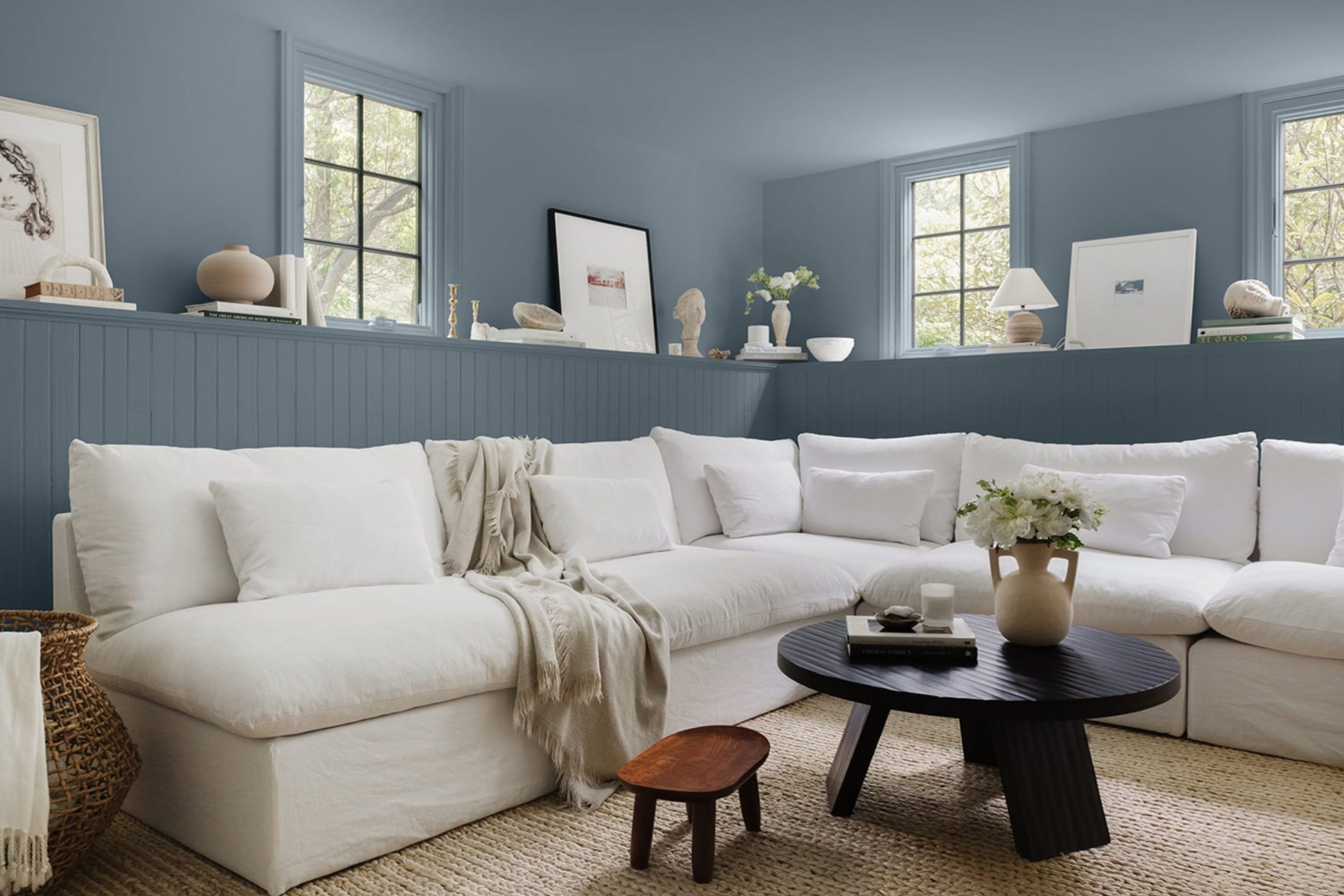
Why I Always Trust Sherwin-Williams and Benjamin Moore for French Blue Paint Colors
When I am actively staging a home for sale or meticulously designing a client’s forever living room, I remain resolutely dedicated to using only two premier paint brands: Sherwin-Williams and Benjamin Moore. This isn’t merely a matter of designer habit or preference; it is fundamentally about the unmatched quality of their products and, most critically, the deep integrity of their color formulas.
French Blue, as a category, is a delicate and often tricky color to perfect, as it requires having just the precise amount of gray, violet, or green undertone to ensure it looks genuinely expensive and never cheap or flat. Sherwin-Williams and Benjamin Moore utilize special, proprietary methods of mixing their pigments that consistently deliver a depth and complexity to these blues that you simply cannot replicate or find anywhere else on the market.
These seasoned companies also possess a deep technical understanding of how natural and artificial light dramatically changes a blue paint color throughout the ebb and flow of the day. Crucially, their formulas are consistently reliable and predictable, meaning the precise color you select from the physical chip will be the rich, lasting color that beautifully adorns your walls for many years.
When you are genuinely seeking that perfect, subtle, and incredibly nuanced French Blue—that specific, elusive shade that manages to feel both historically significant and entirely current—you absolutely require the very best quality available.
These two esteemed brands consistently deliver that rich, beautiful, and defining complexity that is the hallmark of a true French Blue. I feel completely confident and good about instructing my clients to choose these paints because I know the finished product will always look fantastic and truly stand the rigorous test of time and changing trends.
How I Choose the Perfect French Blue Shade for Any Room
Selecting the absolute best French Blue is an art that revolves entirely around understanding the delicate relationship between the color’s inherent qualities and the unique lighting conditions of the room it will occupy. This beautiful blue is emphatically not a one-size-fits-all color solution; it requires being chosen with careful, thoughtful consideration to ensure it makes the room feel and perform its absolute best.
For a room that receives a great deal of strong sunlight throughout the day, I would likely opt for a slightly dustier or a deeper French Blue because the strong, intense sun exposure will invariably wash out a lighter color, making it appear much paler than it truly is. A deeper, more substantial shade, such as Distance SW 6243, stands up confidently to that bright light and proudly showcases its genuine, intended color.
For a room that receives very little natural light, such as a north-facing bedroom or an interior hallway, I have to proceed with even greater caution. In this case, I might deliberately use a slightly brighter French Blue, like Palladian Blue HC-144, which has a beautiful green-blue base that helps it feel cheerful and actively prevents the room from reading as cold or gloomy.
Another critical design element I always carefully consider is the trim work. French Blue looks undeniably fantastic with a crisp, pure white trim, which offers a modern pop, but using a creamy white trim will instantly make the blue appear even richer, softer, and more Old World in character. You also must think logically about the large furniture pieces and rugs you already own.
For instance, if your sofa is upholstered in warm brown leather, a slightly grayish-blue will harmonize and tie everything together nicely. It is ultimately about finding the specific blue that truly makes your existing belongings feel happy and cohesive. The final, non-negotiable step is always to diligently test the color on a large section of the wall and live with it for a minimum of a few days to truly see how it behaves in real-life conditions. Always trust what the color actually does in your room, not just what the small chip looks like under the artificial light in the store.
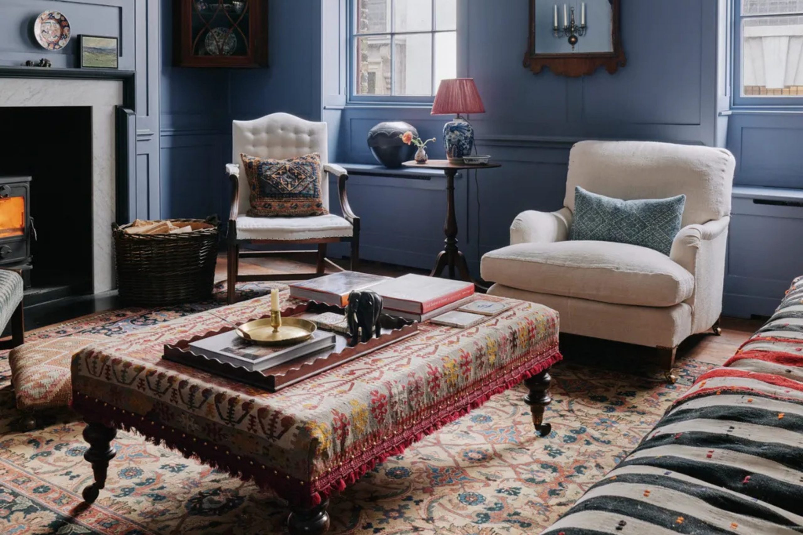
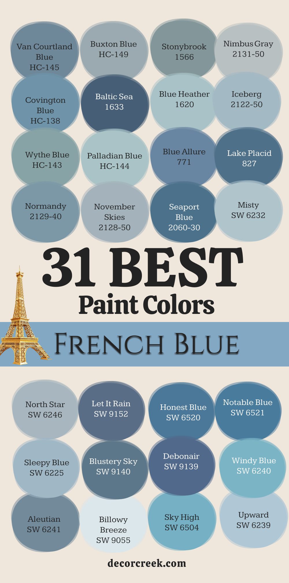
31 Best French Blue Paint Colors
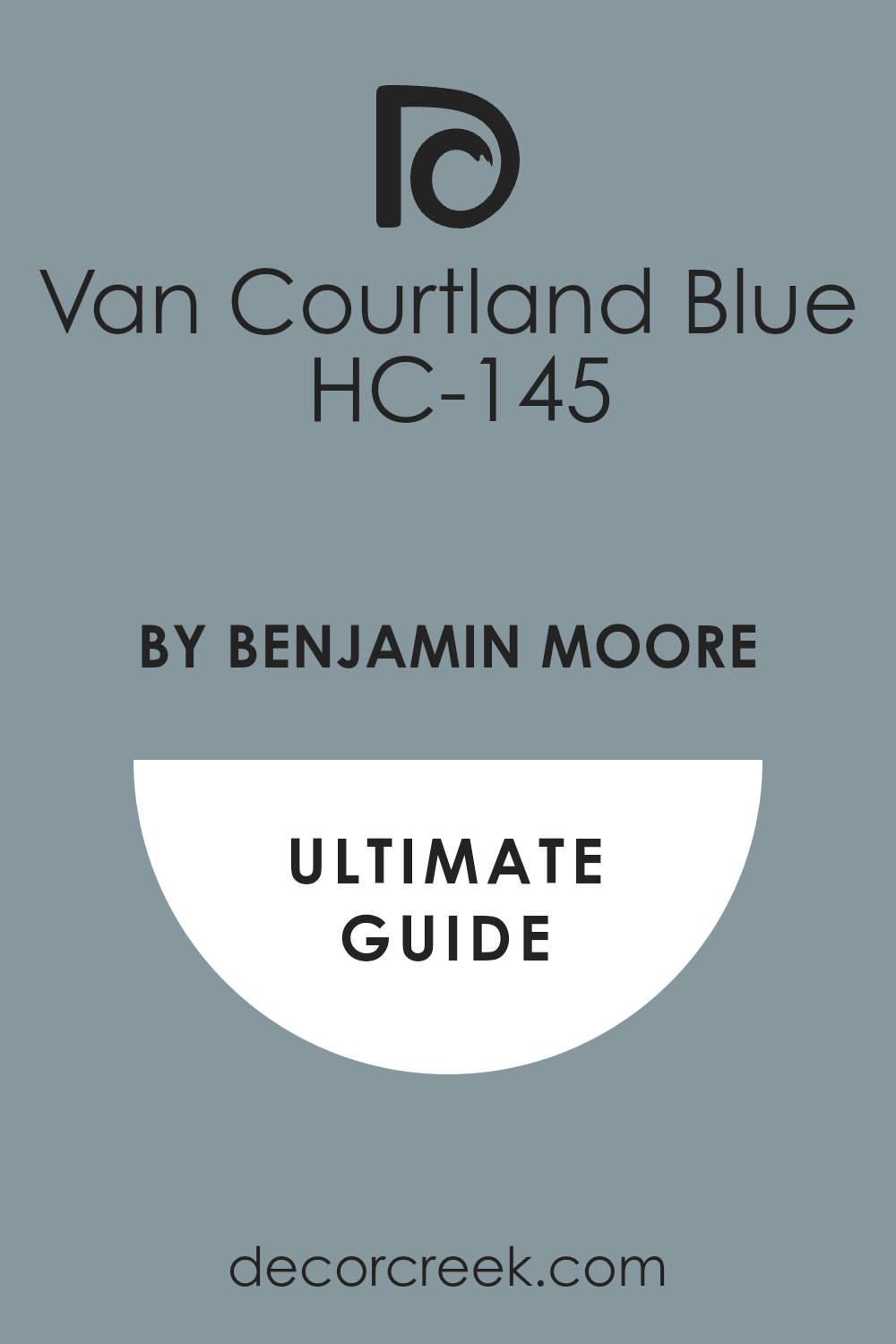
Van Courtland Blue HC-145
Van Courtland Blue HC-145 is a distinguished, medium blue that has a beautiful, classic quality. This color is perfectly balanced, showing off its blue side without becoming too navy or too bright. It has a definite gray undertone that gives it a sophisticated, slightly antique feeling.
I often use this color in dining rooms or studies because it makes the room feel important and established. Van Courtland Blue works wonderfully with rich, dark wood furniture, helping to ground the room. It is a fantastic choice if you want a blue that is clearly present but still feels reserved.
This shade looks particularly stunning when paired with bright white trim, creating a strong, elegant contrast. It has an enduring appeal that keeps it from ever looking dated. The subtle gray ensures the color never appears cheap or childish, maintaining its refined maturity. You can count on this blue to make any room feel instantly custom and polished. It truly captures the essence of a beautiful, historic French blue.
🎨 Check out the complete guide to this color right HERE 👈
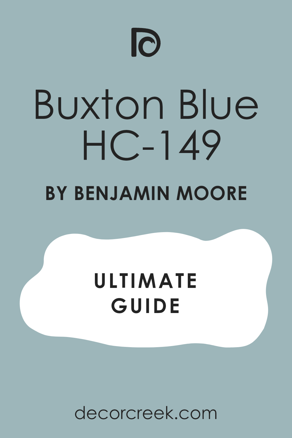
Buxton Blue HC-149
Buxton Blue HC-149 is a cheerful, medium-light blue that has a definite touch of green, giving it a lively, almost aqua quality. This color feels fresh and light, like a beautiful sky on a sunny day. I love to use this shade in kitchens or bathrooms because it brings a vibrant, clean energy to the walls.
Buxton Blue is a great way to add color without making the room feel heavy or dark. The hint of green keeps the color feeling very natural and pleasing to the eye. It pairs beautifully with bright white or creamy trim for a truly crisp look. This shade is one of my favorites for creating a happy, uplifting environment.
It is sophisticated enough for any main room but still feels relaxed and informal. It looks fantastic with silver or brushed nickel hardware and accessories. You will find that this blue maintains its beautiful saturation even in rooms with less natural light. This color is perfect if you want a blue that feels both historic and invigoratingly fresh.
🎨 Check out the complete guide to this color right HERE 👈
Stonybrook 1566
Stonybrook 1566 is a gorgeous, dusty blue that sits perfectly between blue and gray. This color has a strong muted quality, making it feel very soft and organic on the wall. I often choose Stonybrook for bedrooms because its quiet nature encourages rest and peacefulness.
It is a fantastic option if you are worried about a blue being too bright or cold in your room. The heavy gray presence gives the color a wonderful, earthy texture and depth. Stonybrook pairs beautifully with both light wood and rich, dark flooring.
It works well as a grounding neutral that adds color without taking over the room. This shade truly captures a beautiful, faded look, like an old piece of French linen. It is an excellent background for showcasing colorful artwork or patterned textiles. You can rely on this color to give your room an immediate feeling of quiet sophistication and refined taste.
Beneath the Clouds 2131-50
Beneath the Clouds 2131-50 is a light, ethereal color that is more gray than blue but carries a beautiful, cool blue undertone. This color is incredibly gentle and feels very soft and airy on the walls. I turn to Beneath the Clouds when a client wants an almost-white wall but still needs a hint of cool color to feel complete.
It is a beautiful compromise that brightens a room while adding a gentle wash of color. The coolness in the gray prevents it from feeling institutional or sterile. Beneath the Clouds is a fantastic choice for open-concept areas where you want a very light, flowing color.
It pairs beautifully with deeper blues and blacks in your furniture and accessories. This color is perfect for creating a very clean, crisp, and modern aesthetic. It helps smaller rooms feel larger and more open by reflecting light efficiently. You will find that this blue-gray looks sophisticated in almost any light condition.
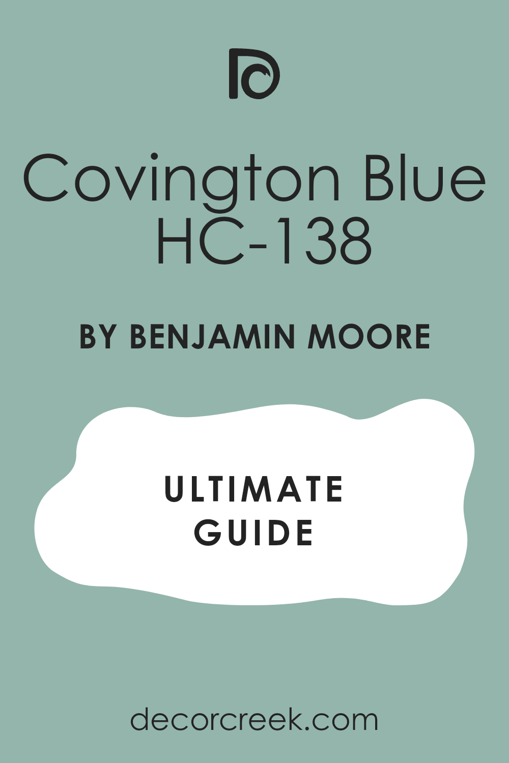
Covington Blue HC-138
Covington Blue HC-138 is a rich, medium-dark blue with a noticeable depth and a lovely, classic feel. This color is saturated enough to make a statement but still has a reserved, elegant quality. I love using Covington Blue in cozy reading nooks or formal living rooms where you want a sense of drama and importance.
It works incredibly well with creamy white trim, creating a stunning, high-contrast look that feels very traditional. Covington Blue is a dependable choice for a true, historic blue that is neither too bright nor too gray.
It provides a wonderful backdrop for metallic accents, such as gold or brass. This shade is one of my favorites for creating a room that feels luxurious and well-appointed. It is a fantastic color to consider if you have high ceilings and want a color that can carry the height. You can be sure that this blue will always look expensive and refined on your walls.
🎨 Check out the complete guide to this color right HERE 👈
Baltic Sea CSP-680
Baltic Sea CSP-680 is a deep, dramatic blue that hints at the profound depth of the ocean. This color has a beautiful intensity that is almost navy but is softened by a noticeable touch of gray. I often use Baltic Sea for an accent wall or in small, powder rooms where a dramatic jewel tone is needed.
It’s a wonderful choice for creating a cozy, intimate atmosphere that feels enveloping. The gray undertone keeps this deep color from feeling black or overly harsh. Baltic Sea pairs beautifully with bright white to make the contrast feel crisp and defined.
It also looks fantastic with wooden furniture that has a warm, natural stain. This shade is perfect for giving a room a strong sense of style and sophistication. It truly makes a bold statement without being jarring to the eye. You will find that this deep blue looks beautiful when illuminated by warm lamplight in the evening.
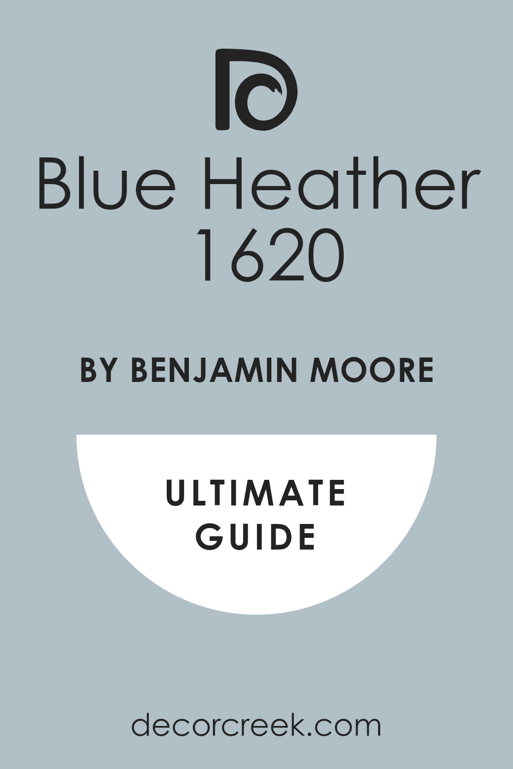
Blue Heather 1620
Blue Heather 1620 is a very soft, light blue that has a pretty, almost powder blue quality but is grounded by a hint of gray. This color feels very gentle and airy, like a beautiful, clear morning sky. I often recommend Blue Heather for guest rooms or laundry rooms where you want a clean, fresh, and slightly happy feeling.
It is a fantastic choice if you want a light blue that is clearly blue but avoids looking too baby blue. The gentle gray keeps it sophisticated and soft on the wall. Blue Heather pairs beautifully with light, creamy whites for a gentle, tone-on-tone look.
It helps to make a small room feel instantly more expansive and open by reflecting light well. This shade is perfect for creating a light, airy, and very charming aesthetic in any room. It has a quiet elegance that is very pleasing and easy to live with day after day. You can be confident this blue will bring a fresh, welcoming feel to your home.
🎨 Check out the complete guide to this color right HERE 👈
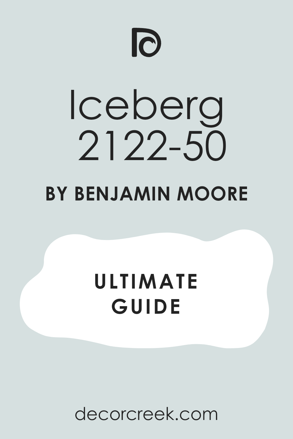
Iceberg 2122-50
Iceberg 2122-50 is a pale, icy blue that leans strongly toward gray, giving it a beautifully crisp and clean feel. This color feels very light and refreshing, like a clear, cold winter day. I often use Iceberg in sunny rooms where the intense light might wash out a darker blue.
It works incredibly well as a neutral color that provides just a cool whisper of blue. The heavy gray component prevents this pale shade from ever looking too saccharine or sweet. Iceberg pairs beautifully with stark white trim for a very modern, sharp contrast.
It is a fantastic choice for creating a clean, minimalist aesthetic in a bedroom or office. This shade helps to cool down a room that receives a lot of warm, western sunlight. It has a refined, sophisticated quality that feels very grown-up and chic. You can trust this blue-gray to create a light, bright, and very orderly environment.
🎨 Check out the complete guide to this color right HERE 👈
Wythe Blue HC-143
Wythe Blue HC-143 is an iconic, complex blue-green that has a deep, almost historical richness. This color is famous for changing beautifully with the light, sometimes looking green and sometimes looking distinctly blue. I frequently use Wythe Blue in traditional living rooms or sunrooms because it adds such character and depth.
It is a fantastic choice if you love blue but want a color with a bit of a twist and a strong green presence. Wythe Blue pairs stunningly with deep, rich wood tones and antique furnishings. The color has a wonderful earthiness that makes it feel organic and grounded.
This shade is perfect for creating a sophisticated, coastal-inspired look that feels established and elegant. It is one of those colors that people always ask about when they see it on a wall. You will find that this blue-green truly adds an artistic, nuanced touch to any architectural style.
🎨 Check out the complete guide to this color right HERE 👈
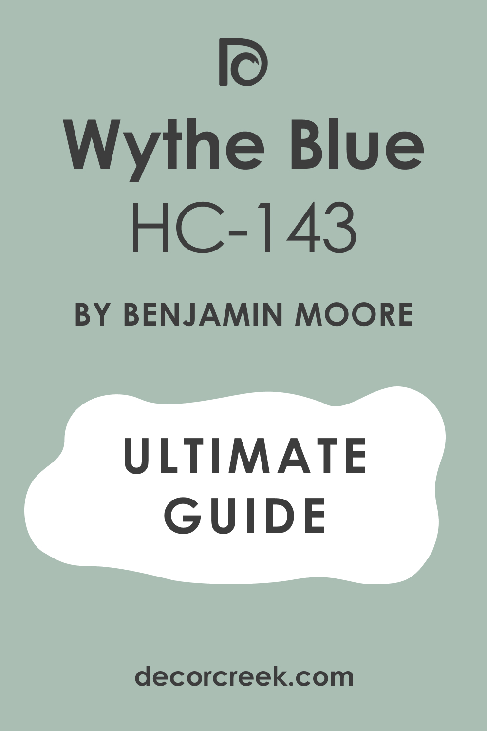
Palladian Blue HC-144
Palladian Blue HC-144 is a beautiful, light blue-green that is softer and more subdued than Wythe Blue. This color is renowned for its calming effect and its beautiful, ethereal quality. I often choose Palladian Blue for bedrooms and nurseries because it creates an atmosphere of peacefulness and gentleness.
It is a fantastic choice if you want a light color that feels incredibly airy and bright on the wall. The gentle green undertone prevents the blue from looking cold or too overtly baby blue. Palladian Blue pairs perfectly with creamy white trim, creating a delicate, soft contrast.
This shade is ideal for giving a room a restful, classic, and slightly formal look. It works well in almost any light exposure, maintaining its soft, beautiful tone throughout the day. You can rely on this blue-green to make any room feel instantly more tranquil and welcoming.
🎨 Check out the complete guide to this color right HERE 👈
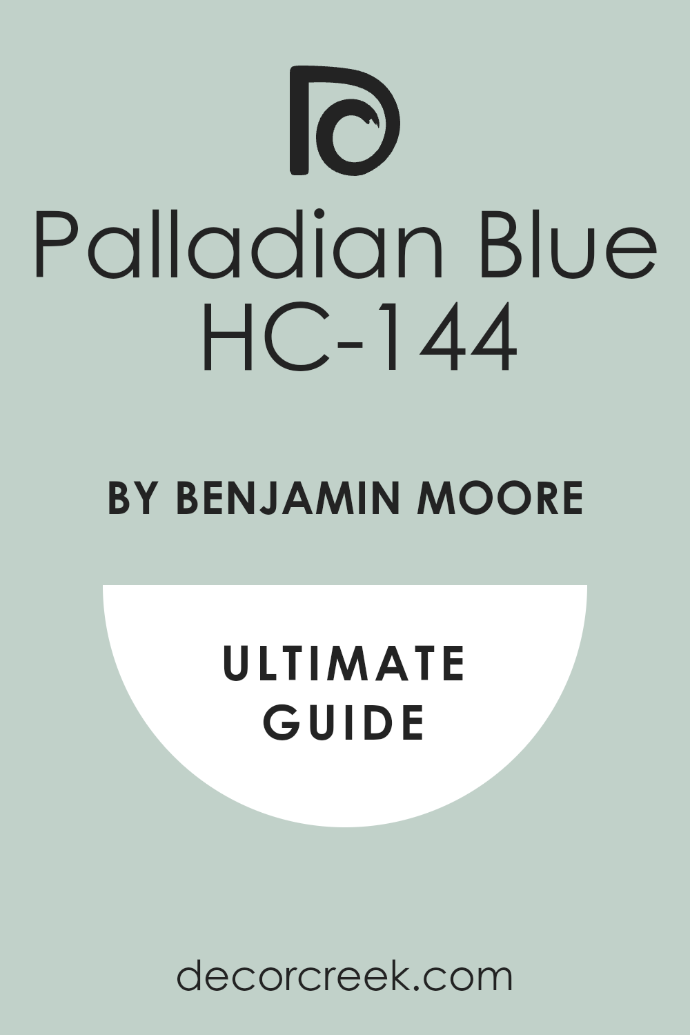
Blue Allure 771
Blue Allure 771 is a vivid, medium-saturated blue that is clean and lively without being cartoonish. This color has a strong, honest blue presence that is very clear and direct. I like to use Blue Allure in children’s rooms or playrooms where a cheerful, bright color is needed. It is a great choice if you want a blue that is unequivocally blue and feels happy and energetic.
The color has a crisp, nautical quality that is always fresh and appealing. Blue Allure pairs beautifully with bright white to enhance its clean, sharp appearance. It is a fantastic color to use as an accent against softer, neutral walls.
This shade is perfect for creating an interior that feels vibrant and full of optimistic energy. It holds its own well in bright light, maintaining its beautiful saturation. You can count on this blue to create a strong, memorable feature in your home.
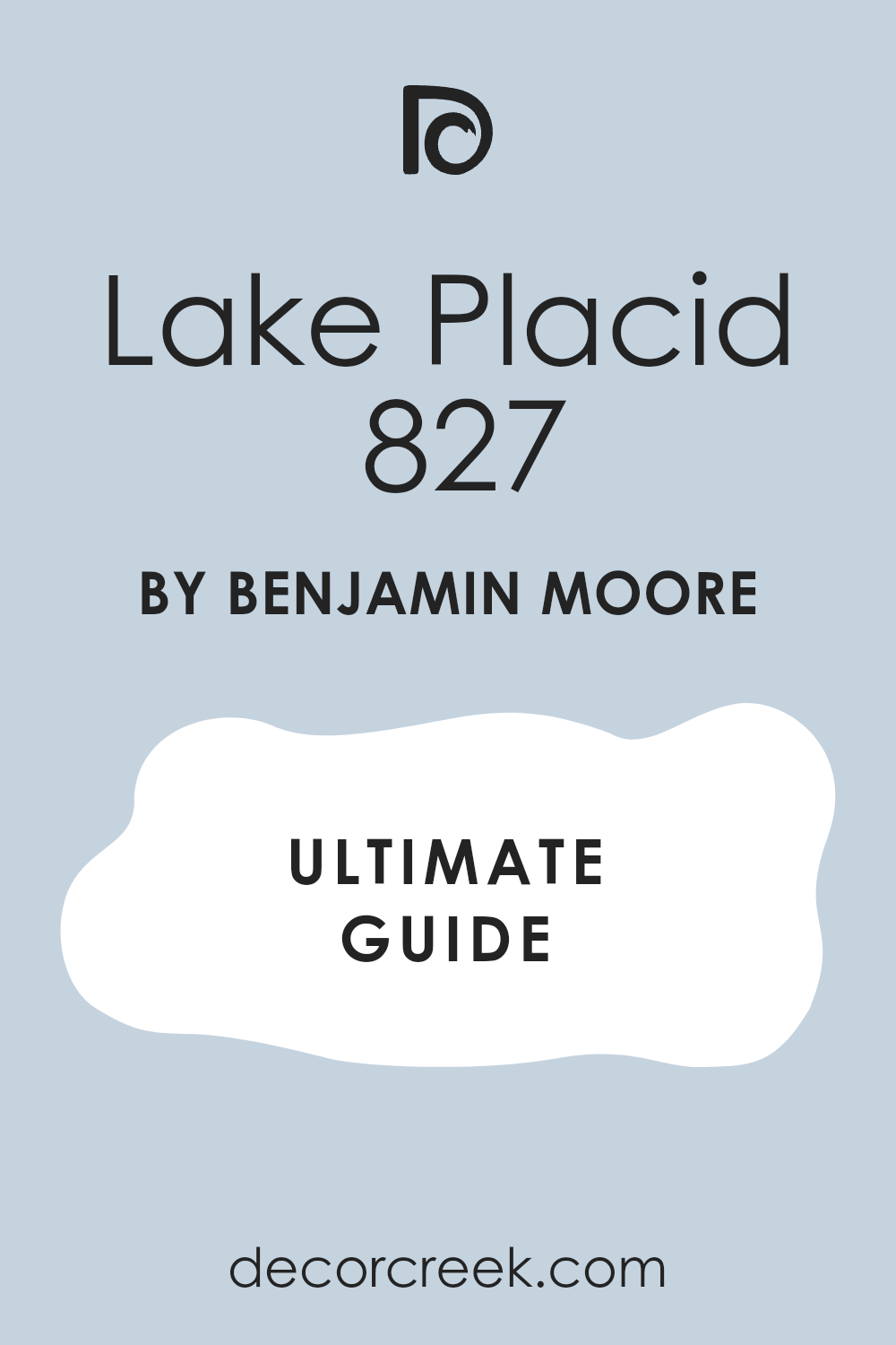
Lake Placid 827
Lake Placid 827 is a deep, rich blue that has a magnificent depth, reminiscent of a cold, still lake. This color is highly saturated and feels substantial and luxurious on the wall. I often choose Lake Placid for libraries or formal dining rooms where a dramatic, jewel-box effect is desired.
It is a fantastic choice if you want a bold blue that feels traditional and high-end. The color has a powerful, enveloping quality that makes a room feel intimate and cozy. Lake Placid contrasts stunningly with bright white trim and dark wood floors.
This shade is perfect for creating an atmosphere of sophistication and timeless elegance. It works beautifully with metallic accents, such as antique brass or bronze. You will find that this deep blue is both powerful and surprisingly easy to live with, as it absorbs light beautifully.
🎨 Check out the complete guide to this color right HERE 👈
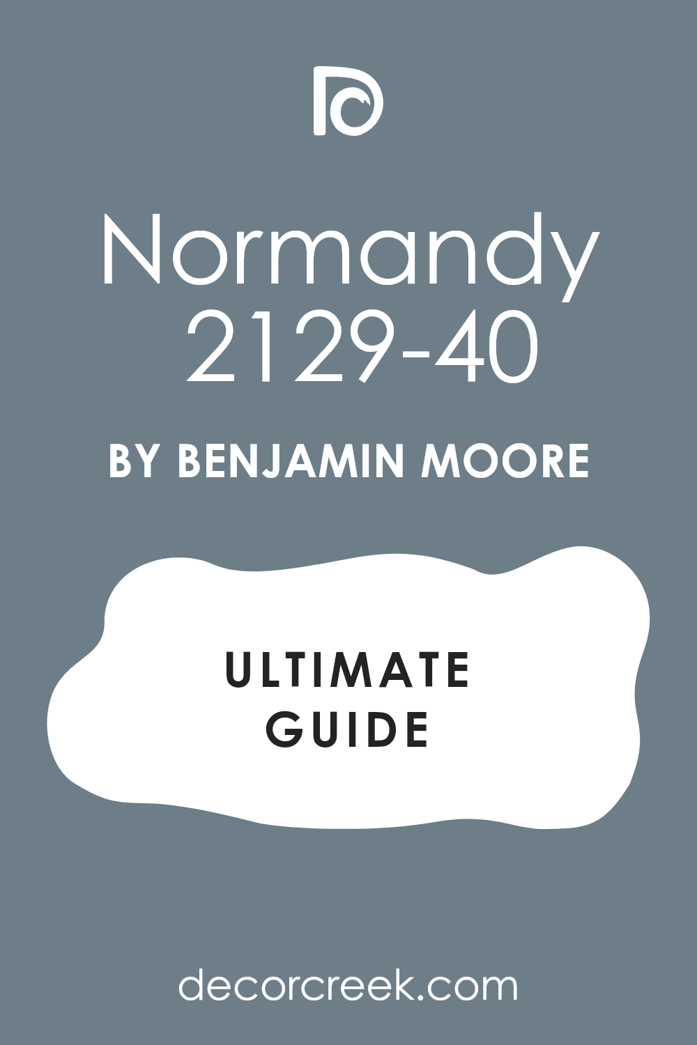
Normandy 2129-40
Normandy 2129-40 is a refined, medium-dark blue that has a beautiful, hazy quality from its gray undertones. This color feels soft, sophisticated, and very European in its reserve. I often use Normandy in bedrooms or home offices where a deep, but quiet, color is needed for focus.
It is a great choice if you want a deep blue that avoids the intensity of a navy. The subtle gray prevents it from feeling too stark or overwhelming. Normandy pairs wonderfully with softer, creamy whites for a gentle, historic contrast.
This shade is perfect for creating a classic, tailored look that feels both comfortable and chic. It looks particularly stunning with linen and natural fiber furniture. You can be sure that this muted blue will bring a refined, sophisticated presence to your walls.
🎨 Check out the complete guide to this color right HERE 👈
November Skies 2128-50
November Skies 2128-50 is a moody, mid-tone blue-gray that truly captures the feeling of a quiet, overcast sky. This color is heavily influenced by gray, giving it a mature, thoughtful quality. I often choose November Skies for open-concept areas or hallways because it acts as a complex neutral with color.
It is a fantastic choice if you love the idea of a blue but are worried about it being too saturated or bright. The color has a wonderful subtlety that makes it interesting without being dominant. November Skies pairs beautifully with almost any shade of wood, from light maple to dark walnut.
This shade is perfect for creating a modern, understated aesthetic that feels clean and sophisticated. It looks incredibly chic when paired with black or white accents. You will find that this blue-gray is both versatile and undeniably elegant on the wall.
🎨 Check out the complete guide to this color right HERE 👈

Seaport Blue 2060-30
Seaport Blue 2060-30 is a striking, deep blue that leans slightly toward green, giving it a rich, maritime feel. This color is highly saturated and feels very confident and classic on the wall.
I often use Seaport Blue in nautical-themed rooms or as a strong accent color against light walls. It is a fantastic choice if you want a vibrant blue that still feels sophisticated and historic. The hint of green gives it a complexity that is missing in a simple navy.
Seaport Blue contrasts perfectly with crisp white trim, creating a sharp, defined look. This shade is perfect for creating a strong, dramatic, and well-traveled atmosphere. It is a fantastic color for highlighting interesting architectural details in a room. You can count on this blue to bring a powerful sense of traditional style and confidence to your design.
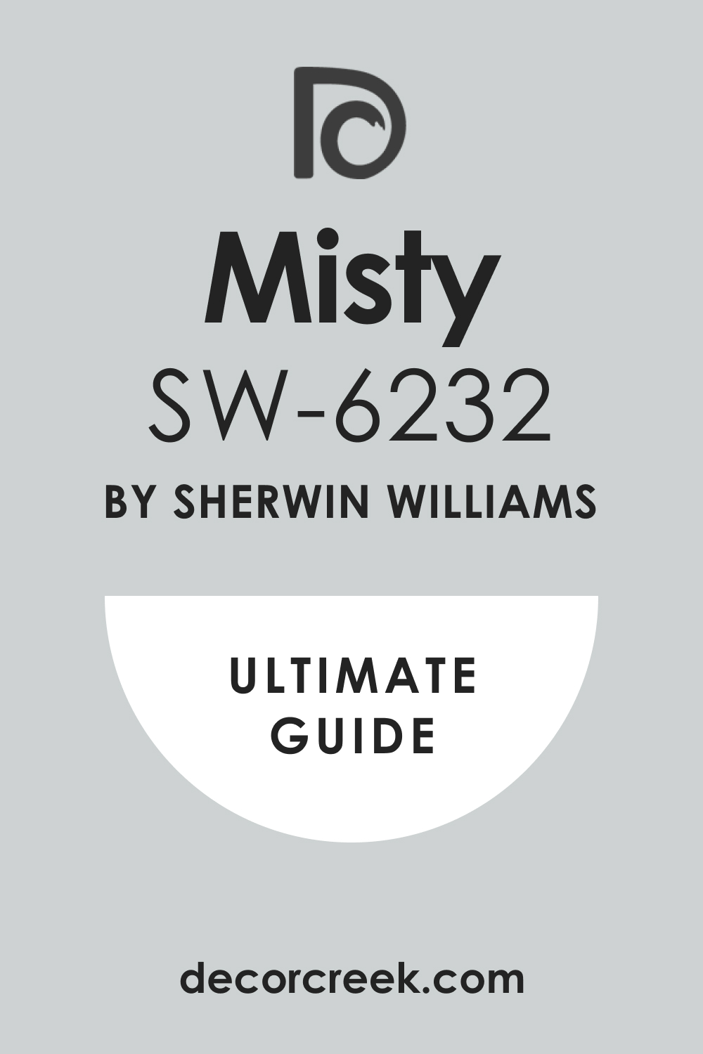
Misty SW 6232
Misty SW 6232 is a very light, soft blue-gray that feels incredibly airy and delicate. This color is heavily diluted with gray, resulting in a gentle, almost atmospheric shade. I love to use Misty in bathrooms or laundry rooms because it provides a clean, refreshing feeling.
It is a fantastic choice if you want a hint of blue on your walls without any strong saturation. The color has a wonderful soothing quality that is perfect for private rooms. Misty pairs beautifully with bright white for a very clean, crisp contrast.
It helps to bounce light around the room, making small areas feel more expansive. This shade is perfect for creating a light, modern, and uncluttered aesthetic. It is a reliable color that looks sophisticated in nearly all lighting conditions. You can trust this soft blue-gray to create a subtle yet beautiful backdrop.
🎨 Check out the complete guide to this color right HERE 👈
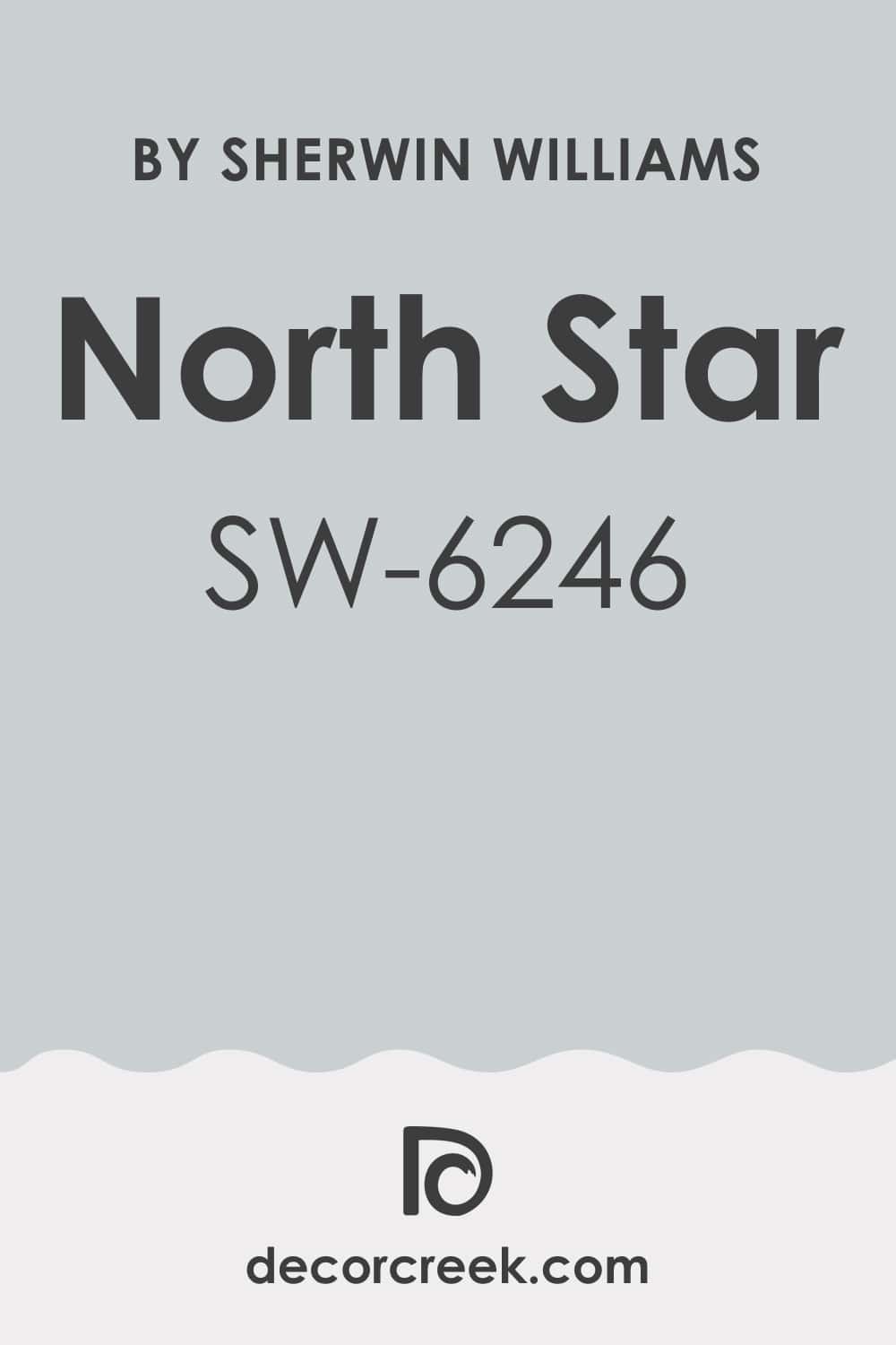
North Star SW 6246
North Star SW 6246 is a light, sophisticated blue that is almost fully gray but retains a cool, distinct blue influence. This color is known for its incredible versatility, acting as a chameleon in different lights.
I often use North Star as a primary wall color in open-concept homes because it offers a soft, flowing transition. It is a fantastic choice if you want a light blue that is absolutely not baby blue but feels completely grown up and chic.
The strong gray base makes it feel refined and grounded. North Star pairs beautifully with dark wood and metallic accents, making them pop. This shade is perfect for creating an updated, contemporary look that is easy to live with. It is a truly dependable blue-gray that looks expensive and custom. You will find that this color provides a light, airy feeling without making the room feel sterile.
🎨 Check out the complete guide to this color right HERE 👈
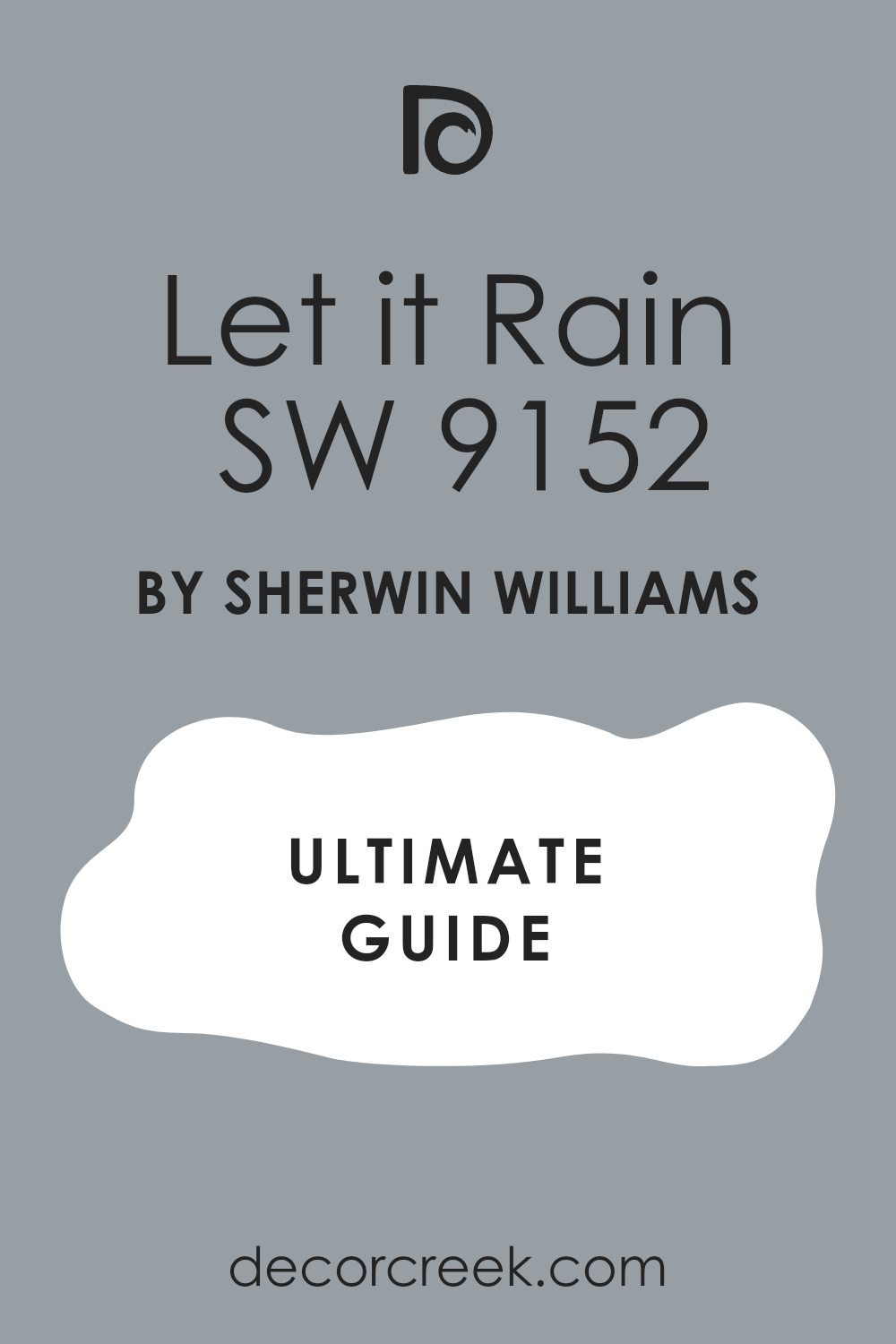
Let It Rain SW 9152
Let It Rain SW 9152 is a moody, saturated blue that leans slightly towards purple, giving it a deep, velvety feel. This color has a beautiful depth that suggests a rich, twilight sky. I love using Let It Rain in powder rooms or as a feature wall in a bedroom for a touch of drama.
It is a fantastic choice if you want a deep blue that feels intimate and unique. The purple undertone adds complexity and a luxurious warmth to the color. Let It Rain contrasts beautifully with creamy white trim for a soft, historic appearance.
This shade is perfect for creating a dramatic, cocooning atmosphere that encourages relaxation. It works wonderfully with rich, textured fabrics like velvet and wool. You can count on this deep blue to bring a sophisticated, high-end feel to your interior design.
🎨 Check out the complete guide to this color right HERE 👈
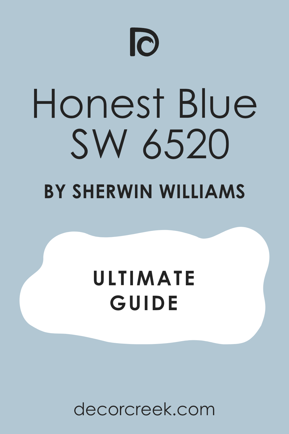
Honest Blue SW 6520
Honest Blue SW 6520 is a bright, clear medium-dark blue that has a direct, traditional quality. This color is very reliable and is clearly blue without a lot of confusing gray or green undertones. I often use Honest Blue in children’s rooms or as a feature wall in a casual den.
It is a great choice if you want a straightforward, true blue that feels confident and classic. The color has a clean, energetic presence that is very appealing. Honest Blue pairs wonderfully with crisp white trim for a classic, nautical look.
This shade is perfect for creating a strong, happy, and dependable atmosphere. It maintains its intensity well, making it a good choice for rooms with lots of light. You will find that this blue is a refreshing and timeless addition to your home.
🎨 Check out the complete guide to this color right HERE 👈
Notable Blue SW 6521
Notable Blue SW 6521 is a vibrant, medium-saturated blue that carries a slightly electric, cheerful energy. This color is brighter than Honest Blue but remains sophisticated enough for adult spaces.
I often choose Notable Blue for laundry rooms or as a punch of color in a brightly lit hallway. It is a fantastic choice if you want a blue that is uplifting and lively. The color feels clean and highly fresh, almost like a clear summer sky.
Notable Blue pairs perfectly with a bright white trim to maximize its clarity and brightness. This shade is perfect for creating an interior that feels optimistic and full of life. It works well to make a room feel instantly more welcoming and positive. You can be confident that this blue will bring a fresh, vibrant, and memorable touch to your design.
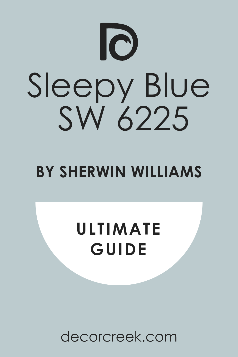
Sleepy Blue SW 6225
Sleepy Blue SW 6225 is a very soft, light blue that has just a hint of gray, making it feel very gentle and restful. This color is perfectly named, as it truly encourages a feeling of tranquility and peace.
I love to use Sleepy Blue in bedrooms and nurseries because of its inherently soothing nature. It is a great choice if you want a light blue that is undeniably blue but is not too bright or cold. The subtle gray keeps it from looking overly sweet or pastel.
Sleepy Blue pairs beautifully with creamy whites for a gentle, ethereal look. This shade is perfect for creating an atmosphere that is conducive to relaxation and peacefulness. It looks gorgeous in a room with soft, layered textiles and natural wood. You will find that this blue is one of the most comforting and beautiful light shades available.
🎨 Check out the complete guide to this color right HERE 👈
Blustery Sky SW 9140
Blustery Sky SW 9140 is a deep, saturated blue that has a strong, handsome gray undertone. This color is very moody and sophisticated, reminiscent of an imposing, twilight sky. I often use Blustery Sky on an accent wall in a primary bedroom or in a dedicated media room.
It is a fantastic choice if you want a deep, atmospheric blue that provides drama without being a stark navy. The color has a wonderful, velvety depth that feels luxurious. Blustery Sky contrasts excellently with crisp, bright white trim to make the contrast feel sharp.
This shade is perfect for creating a luxurious, cocooning feel that is incredibly chic. It works wonderfully with metallic finishes like gold and bronze. You can be sure that this muted deep blue will bring a sense of richness and elegance to your walls.
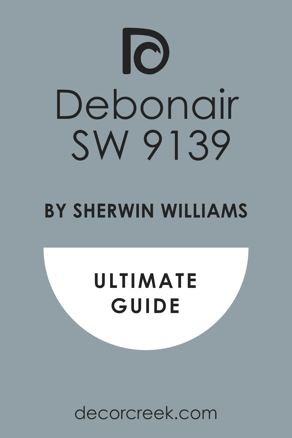
Debonair SW 9139
Debonair SW 9139 is a vibrant, clean blue that has a noticeable violet undertone, giving it a playful, cheerful quality. This color is highly saturated and feels lively and energetic on the wall. I often choose Debonair for guest bedrooms or creative spaces where a touch of unexpected color is needed.
It is a great choice if you want a blue that is fun but still feels tailored and sophisticated. The violet hint adds a unique warmth and complexity to the color. Debonair pairs beautifully with a neutral cream to soften its vibrancy and anchor the look.
This shade is perfect for creating a cozy, stylish, and slightly bohemian interior aesthetic. It maintains its bright, happy tone even in lower light conditions. You will find that this blue is a delightful way to introduce personality into your design.
🎨 Check out the complete guide to this color right HERE 👈
Windy Blue SW 6240
Windy Blue SW 6240 is a clean, medium-light blue that is bright and clear, like a perfect spring sky. This color is highly refreshing and has a wonderful, airy quality. I love to use Windy Blue in living areas or kitchens where a fresh, inviting atmosphere is desired.
It is a fantastic choice if you want a true, classic blue that is neither too dark nor too pale. The color has an energetic cleanliness that is always appealing. Windy Blue pairs wonderfully with warm, creamy white trim for a softer, more traditional look.
This shade is perfect for creating a light, cheerful, and crisp aesthetic in your home. It works well in almost any light, maintaining its beautiful, clear saturation. You can rely on this blue to bring a clean, tidy, and happy feeling to your walls.
🎨 Check out the complete guide to this color right HERE 👈

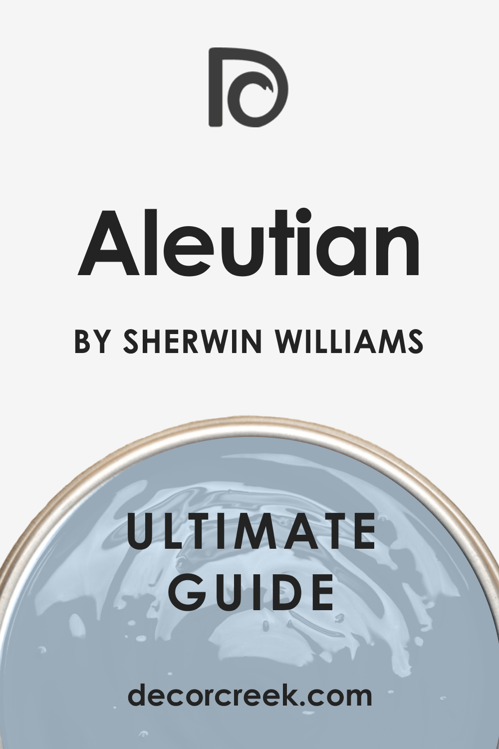
Aleutian SW 6241
Aleutian SW 6241 is a muted, sophisticated blue that has a strong gray influence, giving it an earthy, grounded quality. This color feels soft, deep, and very reserved, reminiscent of a quiet coastal fog.
I often use Aleutian in bedrooms or main living spaces where a deeply soothing color is needed. It is a fantastic choice if you want a blue that feels mature and complex, avoiding any bright or cold tones. The heavy gray presence makes it a fantastic neutral that happens to be blue.
Aleutian pairs beautifully with both light and dark wood, adapting easily to different furniture. This shade is perfect for creating a cozy, refined, and restful atmosphere. It looks incredibly chic when paired with linen and wool textures. You will find that this blue is a truly sophisticated and versatile backdrop.
🎨 Check out the complete guide to this color right HERE 👈
Billowy Breeze SW 9055
Billowy Breeze SW 9055 is a very light, almost white blue that has the palest hint of color, like a breath of fresh air. This color is incredibly airy and gentle, creating a barely-there effect on the walls. I often choose Billowy Breeze for ceilings or walls where the client wants a color that is just a degree off white.
It is a fantastic choice if you want a blue that is subtle and completely non-dominant. The color has a wonderful quality that helps to make rooms feel open and spacious. Billowy Breeze pairs beautifully with a pure white trim for a soft, tone-on-tone contrast.
This shade is perfect for creating a light, ethereal, and very contemporary aesthetic. It works well in small rooms that need maximum light reflection. You can be sure that this pale blue will bring a refined, sophisticated wash of color to your home.
Sky High SW 6504
Sky High SW 6504 is a clean, medium blue that has a beautiful balance of brightness and softness. This color feels very classic and reassuring, like a stable, clear daytime sky. I love to use Sky High as a reliable, all-around blue in family rooms or offices.
It is a fantastic choice if you want a blue that is perfectly situated between light and dark, avoiding extremes. The color has a pleasant saturation that is still very relaxing and easy to live with.
Sky High pairs wonderfully with creamy or crisp white trim for a versatile, traditional look. This shade is perfect for creating an atmosphere of stability and composure in your home. It works well in most lighting conditions, maintaining its true, honest color. You will find that this blue is one of the easiest and most dependable shades to decorate with.
🎨 Check out the complete guide to this color right HERE 👈

Upward SW 6239
Upward SW 6239 is a light, airy blue that has a slight gray undertone, giving it a modern, soft quality. This color is one of the most popular light blues because of its elegant, sophisticated feel.
I often recommend Upward for bedrooms or coastal-themed living areas. It is a fantastic choice if you want a light blue that is not a pastel but still feels incredibly fresh and bright. The gray component keeps the color muted and refined on the wall.
Upward pairs beautifully with warm cream trim for a perfect balance of cool and cozy. This shade is perfect for creating a restful, dreamy, and highly contemporary atmosphere. It works well in large and small rooms, making both feel open. You can trust this blue to bring a sophisticated, light touch to your home.
🎨 Check out the complete guide to this color right HERE 👈

Distance SW 6243
Distance SW 6243 is a deep, saturated blue that is intense and commanding without crossing into navy territory. This color has a beautiful, commanding presence that is perfect for making a statement.
I often use Distance for an accent wall or in a room where a strong, dramatic color is desired. It is a fantastic choice if you want a bold blue that feels rich, elegant, and enveloping. The color has a wonderful depth that feels luxurious and custom.
Distance contrasts perfectly with a sharp, bright white trim to create a classic, defined contrast. This shade is perfect for creating a sophisticated, high-end, and powerful aesthetic. It works beautifully to make a room feel cozy and intimate. You will find that this blue is a powerful and very rewarding color choice.
🎨 Check out the complete guide to this color right HERE 👈

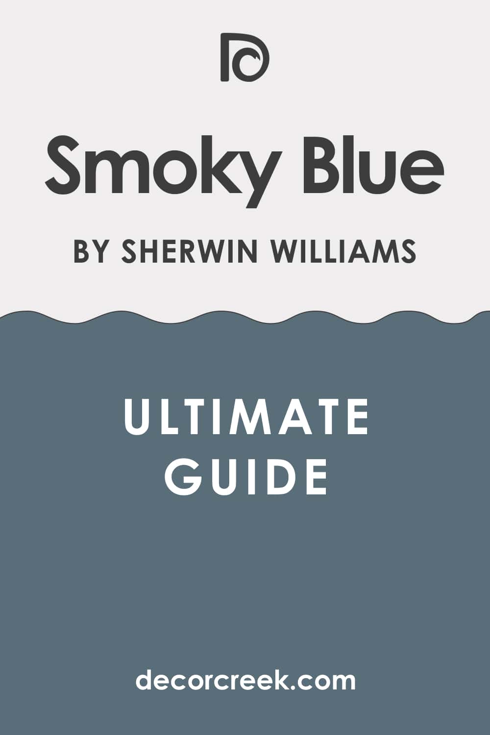
Smoky Blue SW 7604
Smoky Blue SW 7604 is a complex, deep blue that is heavily mixed with gray and a touch of green, giving it a hazy, mysterious feel. This color is highly sophisticated and restrained, ideal for an elegant interior. I often use Smoky Blue in formal living spaces or a primary bedroom.
It is a fantastic choice if you want a deep, muted blue that is subtle and not too bright. The gray and green undertones make it feel deeply grounded and organic. Smoky Blue pairs beautifully with earthy cream tones for a serene, harmonious palette.
This shade is perfect for creating a quiet, restful atmosphere that is chic and refined. It works wonderfully with natural wood and linen textures. You can be sure that this blue is a truly complex and beautiful choice.
🎨 Check out the complete guide to this color right HERE 👈
Gale Force SW 7605
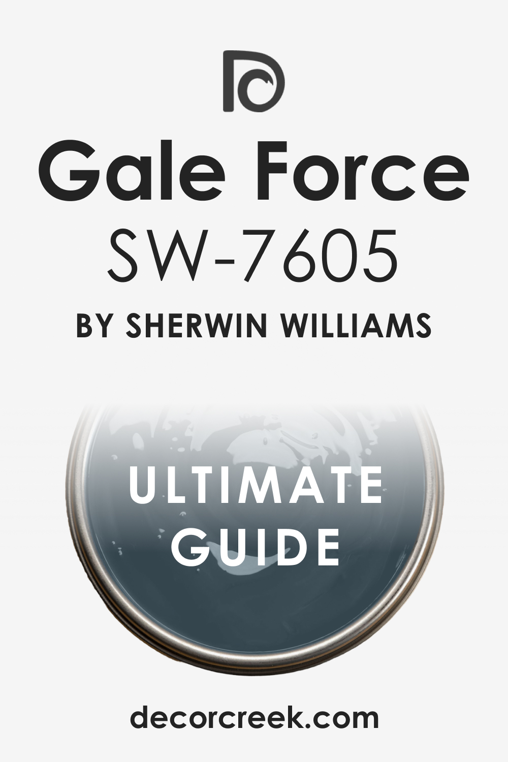
Gale Force SW 7605 is a very deep, dark blue-green that has an intense, almost charcoal-like depth. This color is incredibly dramatic and looks nearly black in low light, revealing its beautiful blue-green richness in the sun.
I often choose Gale Force for accent walls, cabinetry, or dramatic powder rooms. It is a fantastic choice if you want a dark, nearly black color that still has a rich, defined color. The strong green undertone gives it a unique, earthy complexity. Gale Force pairs stunningly with very bright white for a powerful, crisp contrast.
This shade is perfect for creating a luxurious, cocooning, and highly contemporary aesthetic. It works wonderfully to make a room feel instantly custom and sophisticated. You will find that this deep blue-green is a powerful and very rewarding statement color.
🎨 Check out the complete guide to this color right HERE 👈
31 Best French Blue Paint Colors by Sherwin Williams
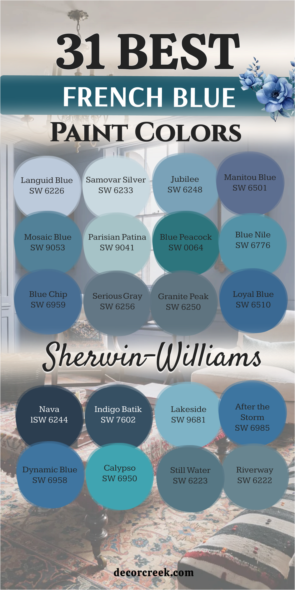
Languid Blue SW 6226
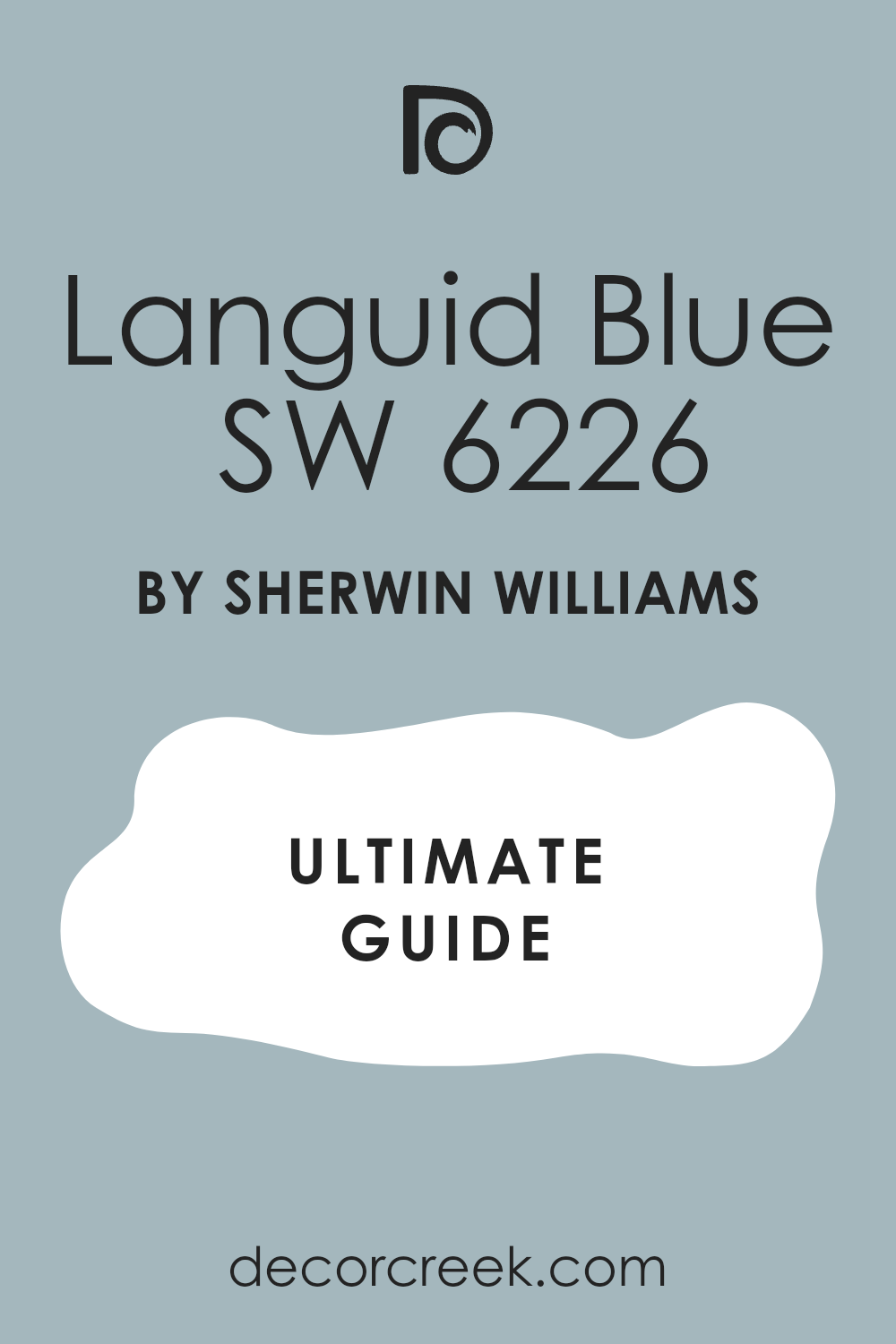
Languid Blue SW 6226 is a soft, medium-light blue that is heavily diluted with gray, giving it a wonderfully quiet and restful quality. This color feels gentle and serene, like a calm lake at dawn. I often use Languid Blue in bedrooms or quiet reading areas where relaxation is the priority.
It is a fantastic choice if you want a blue that is sophisticated and muted without feeling cold. The high gray content makes it very easy to live with and decorate around. Languid Blue pairs beautifully with creamy whites for a soft, historic contrast.
This shade is perfect for creating an atmosphere of deep tranquility and refined comfort. It works well with both light and dark furniture, adapting easily. You can rely on this muted blue to provide a restful and elegant backdrop.
🎨 Check out the complete guide to this color right HERE 👈
Samovar Silver SW 6233
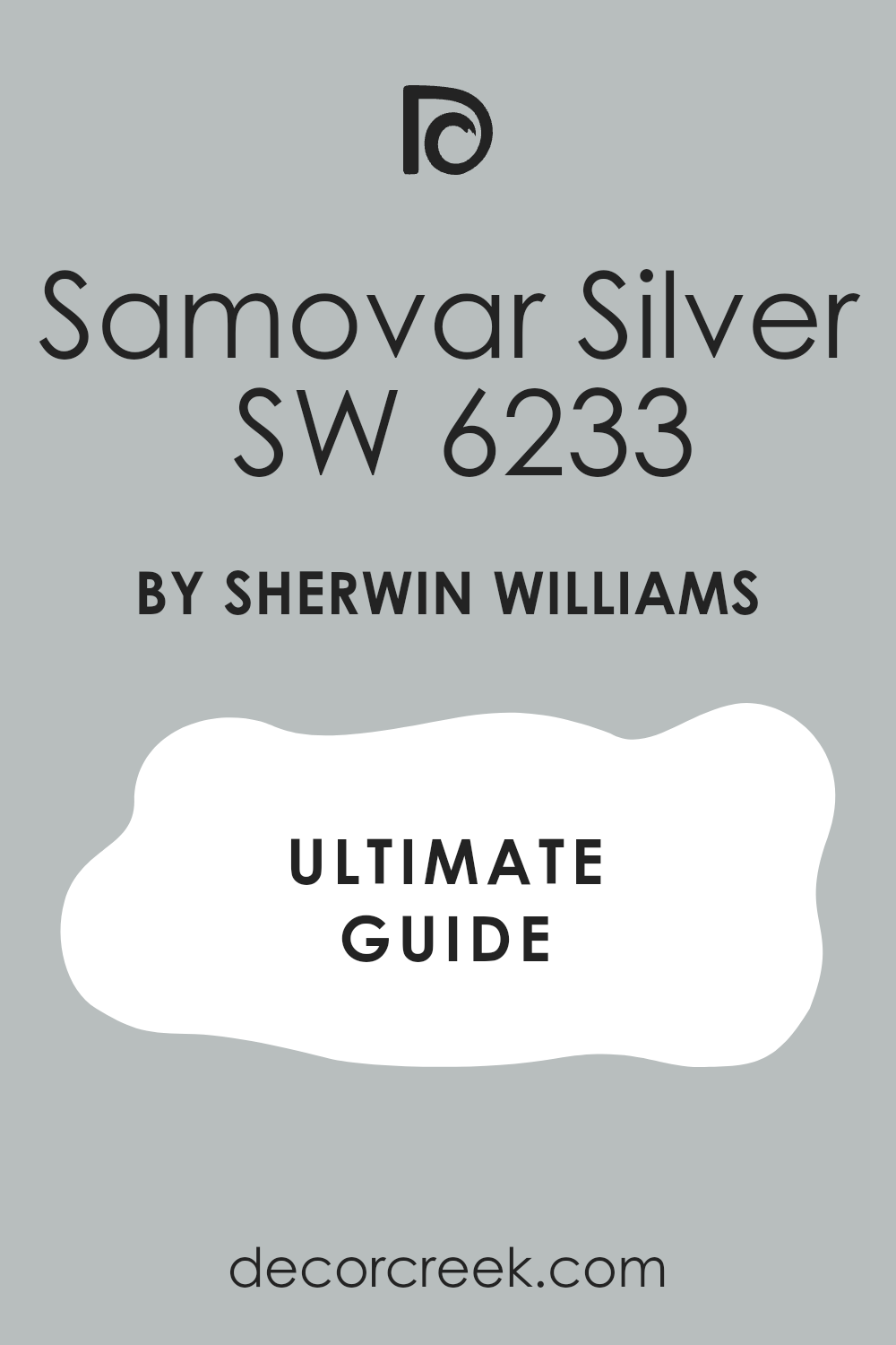
Samovar Silver SW 6233 is a pale, silvery blue-gray that is almost a neutral white but retains a clear, cool tint. This color is incredibly light and airy, creating a beautiful, ethereal wash on the walls. I often choose Samovar Silver for open-plan areas where a very light, flowing color is needed.
It is a fantastic choice if you want a blue that is barely there but still adds a cool sophistication. The strong gray makes it a modern and clean alternative to white. Samovar Silver pairs wonderfully with stark white trim for a sharp, contemporary look.
This shade is perfect for creating a minimalist, airy, and very chic aesthetic. It works well to make a smaller room feel much larger. You will find that this blue-gray is a truly refined and light-reflective color.
🎨 Check out the complete guide to this color right HERE 👈
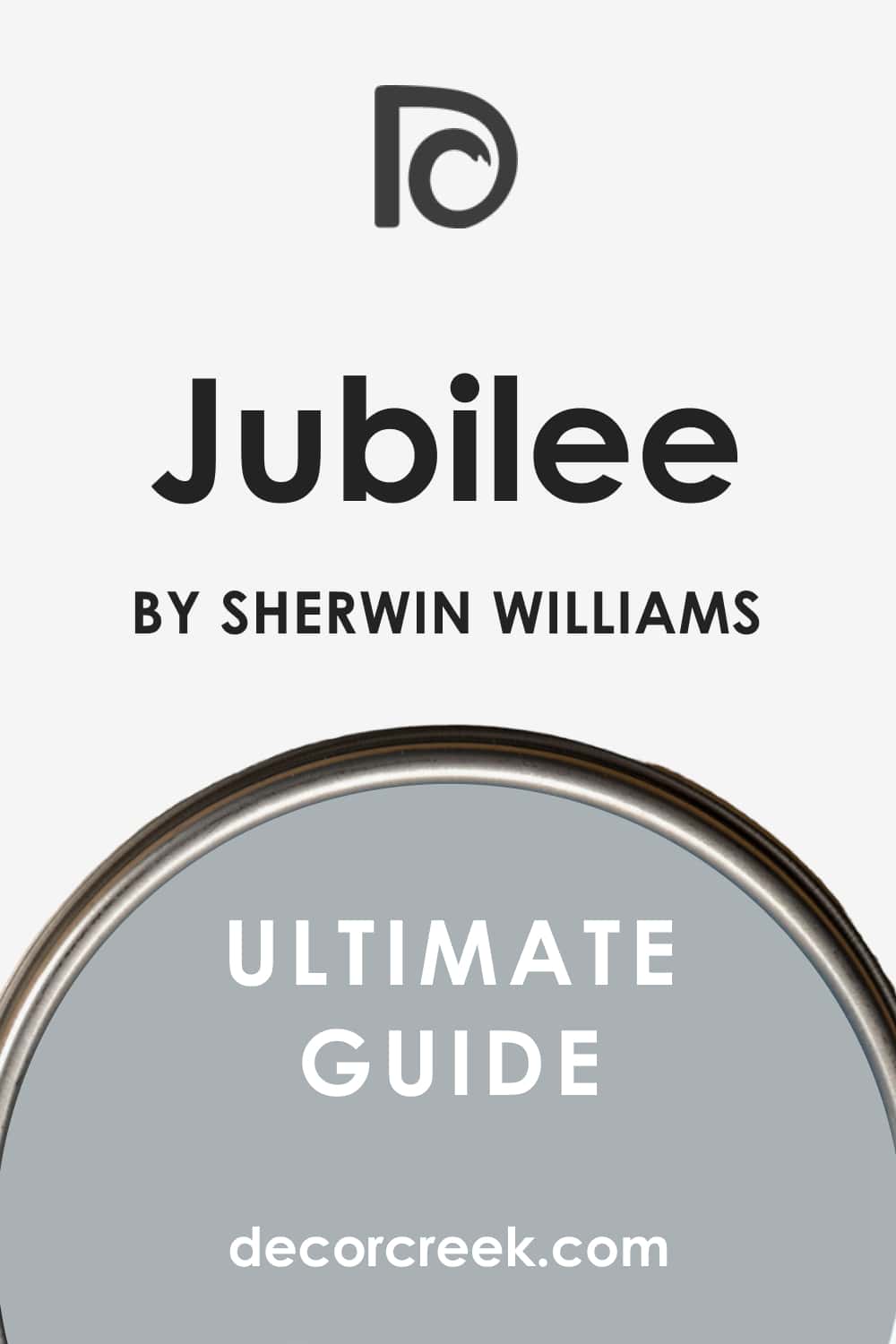
Jubilee SW 6248
Jubilee SW 6248 is a bright, medium-toned blue that has a clean, energetic presence without being overly intense. This color feels fresh, lively, and optimistic, like a clear day at sea. I love to use Jubilee in family gathering spaces or creative offices where a happy color is needed.
It is a fantastic choice if you want a blue that is vibrant but still feels classic and dependable. The color has a wonderful clarity that is always appealing. Jubilee pairs beautifully with a pure white trim to enhance its crispness and definition.
This shade is perfect for creating a clean, inviting, and cheerful atmosphere. It holds its saturation well in high-light conditions. You can count on this blue to bring a noticeable, refreshing touch to your home.
🎨 Check out the complete guide to this color right HERE 👈
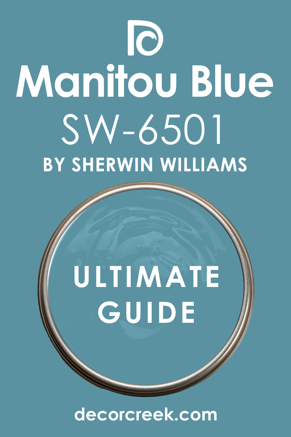
Manitou Blue SW 6501
Manitou Blue SW 6501 is a deep, medium-saturated blue that carries a strong, sophisticated violet undertone. This color feels luxurious and velvety, giving the walls a substantial, rich presence. I often choose Manitou Blue for formal rooms or a primary bedroom with an elegant design.
It is a fantastic choice if you want a blue that has a unique warmth and complexity beyond a simple navy. The violet tint makes it incredibly chic and refined. Manitou Blue contrasts beautifully with soft, creamy trim for a high-end, bespoke look.
This shade is perfect for creating an intimate, cozy, and highly luxurious atmosphere. It works wonderfully with gold and silver accents. You will find that this blue is a true designer color that brings immediate elegance.
🎨 Check out the complete guide to this color right HERE 👈
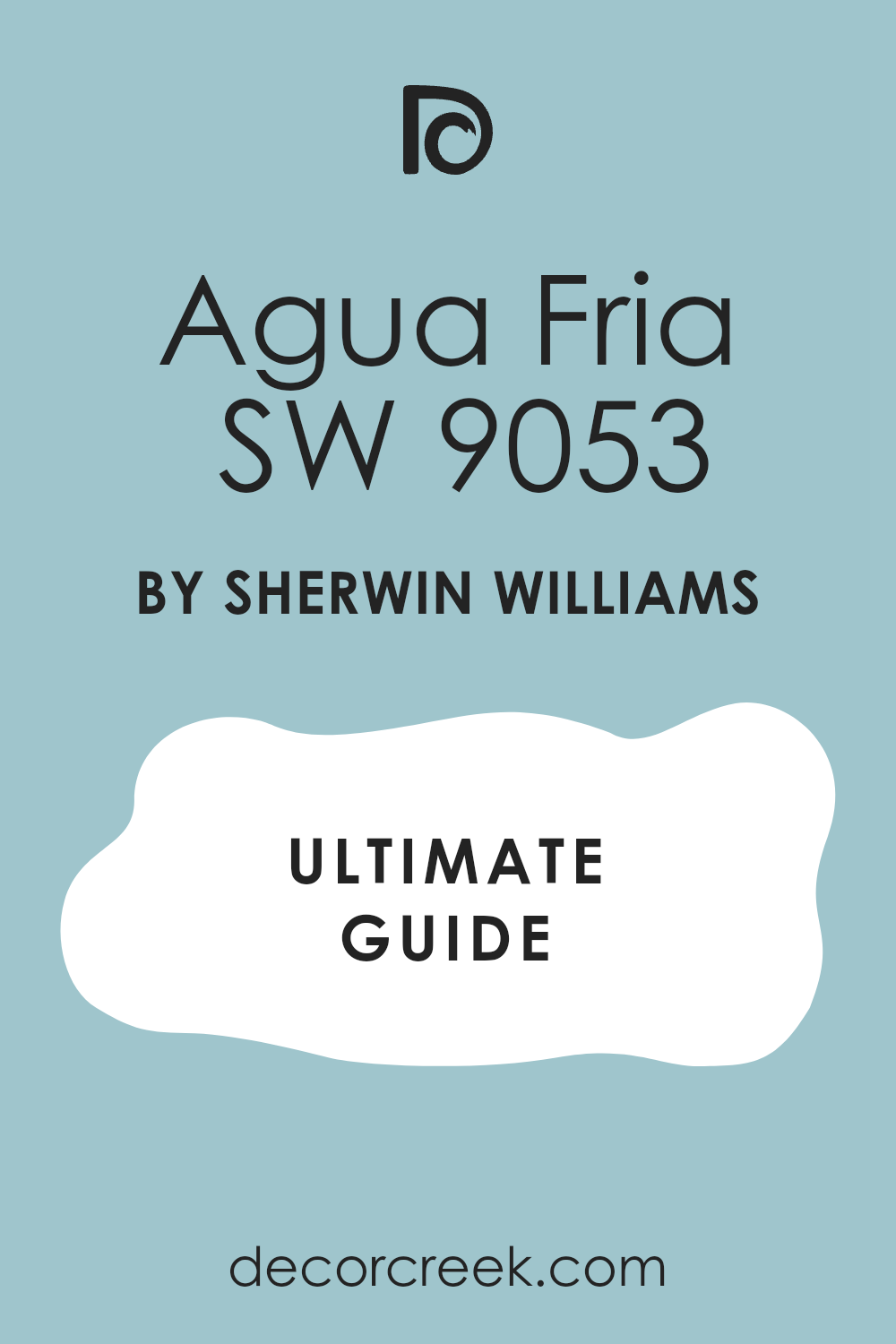
Agua Fría SW 9053
Agua Fría SW 9053 is a vivid, clean, medium blue that is bright and clear, reminiscent of colorful glass tiles. This color is highly saturated and feels energetic, happy, and straightforward. I like to use Mosaic Blue in bathrooms or play areas where a strong, vibrant color is desired.
It is a fantastic choice if you want a blue that is bold and truly pops on the wall. The color has a wonderful, clean quality that is always refreshing. Mosaic Blue pairs perfectly with bright white trim to create a dynamic, sharp contrast.
This shade is perfect for creating an interior that feels fun, spirited, and very memorable. It looks great in natural light, maintaining its beautiful intensity. You can rely on this blue to be a lively and cheerful addition to your design.
🎨 Check out the complete guide to this color right HERE 👈
Parisian Patina SW 9041
Parisian Patina SW 9041 is a muted, pale blue-green that is heavily influenced by gray, giving it a soft, aged quality. This color feels gentle, historic, and wonderfully restrained, like an antique copper roof.
I often use Parisian Patina in traditional living areas or sunrooms for its sophisticated, gentle color. It is a fantastic choice if you want a blue-green that is incredibly soft and acts like a calming neutral. The heavy gray presence makes it feel organic and grounded.
Parisian Patina pairs beautifully with creamy whites for a subtle, elegant contrast. This shade is perfect for creating an atmosphere of quiet elegance and classic charm. It works well in nearly all light exposures, maintaining its soft tone. You will find that this blue-green is a refined and very soothing choice.
Blue Peacock SW 0064
Blue Peacock SW 0064 is a deep, striking blue-green that is intense and saturated, like the magnificent colors on a peacock feather. This color is bold and feels luxurious, mysterious, and captivating on the wall.
I often choose Blue Peacock for accent walls or cabinetry where a dramatic, jewel-toned color is needed. It is a fantastic choice if you want a bold blue that leans heavily into a rich green base. The color has a wonderful intensity that is highly fashionable.
Blue Peacock contrasts stunningly with bright white trim for a sharp, modern look. This shade is perfect for creating a glamorous, dramatic, and sophisticated aesthetic. It works wonderfully with metallic gold and deep wood tones. You can be sure that this color will be a luxurious and memorable feature in your home.
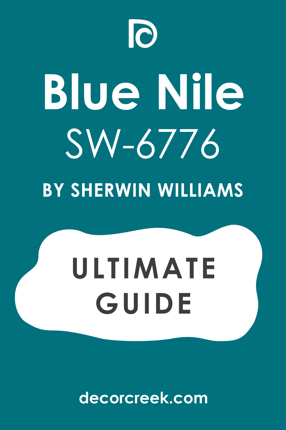
Blue Nile SW 6776
Blue Nile SW 6776 is a vibrant, medium-saturated blue that has a noticeable green undertone, giving it a clear, watery feel. This color is highly refreshing and feels clean, lively, and optimistic.
I love to use Blue Nile in coastal-inspired rooms or bathrooms for its bright, aquatic quality. It is a fantastic choice if you want a blue that is cheerful and has a complex, clear depth. The green tint makes it feel more complex than a simple sky blue.
Blue Nile pairs wonderfully with a bright white trim to emphasize its clarity and freshness. This shade is perfect for creating a light, airy, and very invigorating atmosphere. It works well in high-light conditions, maintaining its beautiful intensity. You will find that this blue is a refreshing and highly appealing color choice.
🎨 Check out the complete guide to this color right HERE 👈
Blue Chip SW 6959
Blue Chip SW 6959 is a deep, saturated blue that is rich and confident, offering a strong, true color. This color is very direct and feels classic, dependable, and substantial on the wall. I often use Blue Chip in home offices or formal living areas where a serious, elegant color is needed.
It is a fantastic choice if you want a bold blue that is very reliable and avoids any strong gray or green shifts. The color has a powerful, classic presence that is always sophisticated. Blue Chip contrasts perfectly with crisp white trim for a traditional, defined look.
This shade is perfect for creating a grounded, traditional, and very tailored aesthetic. It holds its deep tone beautifully, even in bright light. You can count on this blue to bring a strong, established elegance to your design.
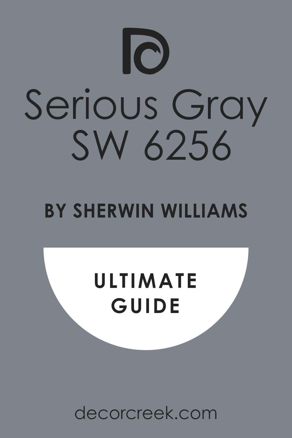
Serious Gray SW 6256
Serious Gray SW 6256 is a deep, muted blue-gray that has a strong, calming presence on the wall. This color is heavily influenced by gray, giving it a sophisticated, reserved, and adult quality.
I often choose Serious Gray for main bedrooms or media rooms where a cozy, enveloping feel is desired. It is a fantastic choice if you want a deep color that acts like a neutral, providing depth without brightness.
The color has a wonderful subtlety that is very refined. Serious Gray pairs beautifully with creamy whites and dark wood, creating an intimate contrast. This shade is perfect for creating a grounded, quiet, and highly sophisticated atmosphere. It looks incredible when paired with metallic accents for a touch of glamour. You will find that this blue-gray is both dramatic and wonderfully restful.
🎨 Check out the complete guide to this color right HERE 👈
Granite Peak SW 6250
Granite Peak SW 6250 is a deep, heavily muted blue that is so full of gray it often reads as a cool, stony gray with a blue wash. This color feels solid, dependable, and highly sophisticated in its reserve. I often use Granite Peak on exterior accents or in rooms needing a strong, grounded neutral.
It is a fantastic choice if you want a deep color that provides weight without feeling heavy or navy. The color has an earthy, mineral quality that is very refined. Granite Peak pairs beautifully with bright white for a crisp, contemporary contrast.
This shade is perfect for creating a composed, mature, and very tailored aesthetic. It works well with industrial or rustic materials like concrete and wood. You can be sure that this muted blue is a truly complex and elegant choice.
🎨 Check out the complete guide to this color right HERE 👈

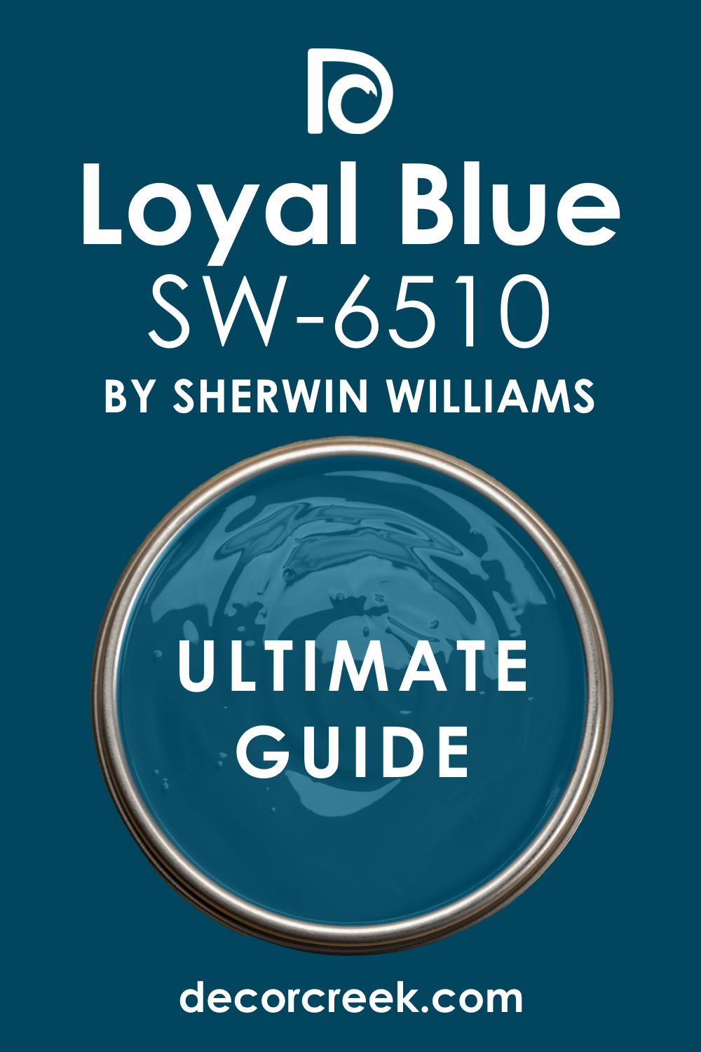
Loyal Blue SW 6510
Loyal Blue SW 6510 is a strong, saturated blue that is rich and bold, offering a direct, confident color. This color is very much a true blue, avoiding significant gray or green interference. I often choose Loyal Blue for accent walls or in rooms where a strong, traditional blue is desired.
It is a fantastic choice if you want a vibrant, classic blue that is both happy and serious. The color has a wonderful clarity that is always appealing. Loyal Blue contrasts beautifully with bright white trim for a sharp, nautical, or traditional look.
This shade is perfect for creating an energetic, dependable, and very classic atmosphere. It holds its intensity well, making it a reliable feature color. You will find that this blue is a straightforward and highly rewarding shade.
🎨 Check out the complete guide to this color right HERE 👈
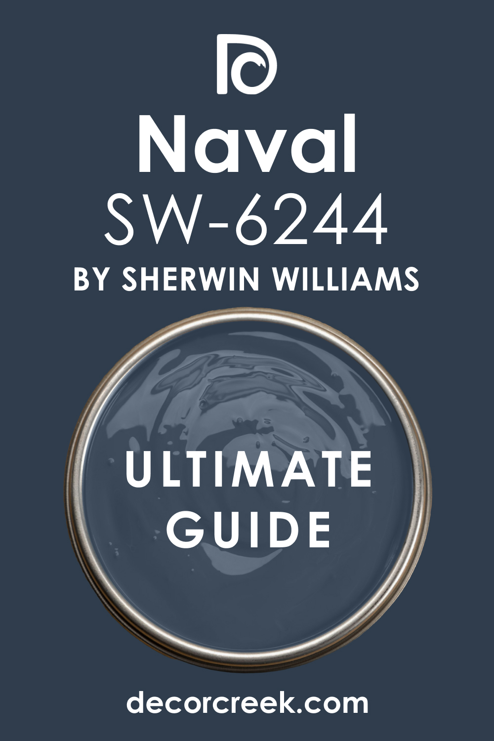
Naval SW 6244
Naval SW 6244 is a deep, classic navy blue that is rich, dark, and highly sophisticated. This color is one of the most popular navy shades because of its elegance and commanding presence. I often use Naval on cabinetry, accent walls, or in dramatic dining rooms.
It is a fantastic choice if you want a dark blue that is nearly black but still clearly reads as blue. The color has a powerful, enveloping quality that feels luxurious. Naval pairs perfectly with gold or brass accents and crisp white trim for a high-contrast, dramatic look.
This shade is perfect for creating a tailored, sophisticated, and deeply intimate atmosphere. It works beautifully to ground a large room. You can be sure that this classic navy is a powerhouse color for adding elegance.
🎨 Check out the complete guide to this color right HERE 👈
Indigo Batik SW 7602
Indigo Batik SW 7602 is a deep, complex blue that has a rich, dusty quality, reminiscent of hand-dyed fabric. This color is highly saturated but muted by a hint of gray, giving it a sophisticated depth.
I often choose Indigo Batik for bedrooms or living rooms where a rich, earthy blue is needed. It is a fantastic choice if you want a deep color that feels organic and nuanced, avoiding a stark, primary navy. The color has a wonderful, enveloping presence that is very cozy.
Indigo Batik pairs beautifully with creamy whites and natural wood tones. This shade is perfect for creating a refined, globally-inspired, and very comfortable atmosphere. It works well with patterned textiles. You will find that this blue is a truly artistic and sophisticated choice.
🎨 Check out the complete guide to this color right HERE 👈

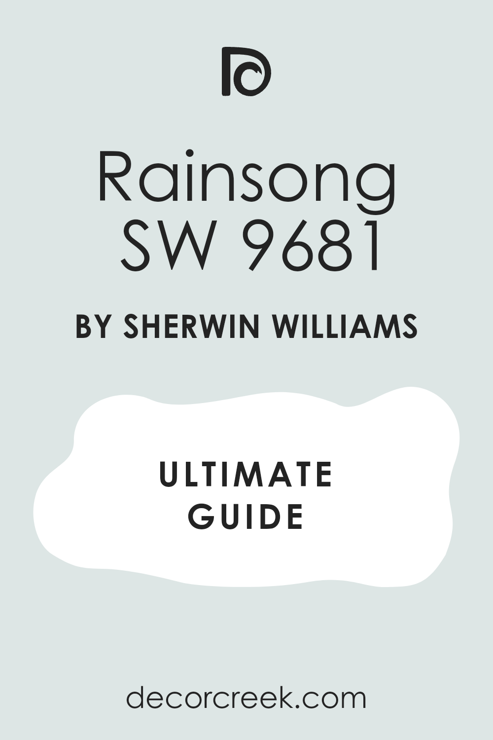
Rainsong SW 9681
Rainsong SW 9681 is a light, airy blue that carries a strong, clear freshness, like water on a beautiful day. This color is gentle and bright, creating a feeling of open space. I often use Rainsong in sunrooms or bathrooms for its refreshing, clean quality.
It is a fantastic choice if you want a light blue that is clearly present but still feels airy and non-dominant. The color has a pleasant lightness that is always welcoming. Rainsong pairs wonderfully with a pure white trim to enhance its crispness and clarity.
This shade is perfect for creating a light, cheerful, and very refreshing aesthetic. It works well in small rooms that need to feel expansive. You can rely on this blue to bring a clean, happy feeling to your walls.
🎨 Check out the complete guide to this color right HERE 👈
After the Storm SW 6985
After the Storm SW 6985 is a vibrant, saturated blue that has a bold, powerful presence on the wall. This color is intense and feels energetic, confident, and very much alive.
I often choose After the Storm for feature walls or children’s rooms where a strong, memorable color is desired. It is a fantastic choice if you want a highly energetic blue that truly pops and grabs attention. The color has a wonderful, crisp clarity that is appealing.
After the Storm contrasts sharply with bright white trim for a defined, modern look. This shade is perfect for creating a dramatic, lively, and very engaging atmosphere. It maintains its intensity well, even in high light. You will find that this blue is a powerful and very rewarding statement color.
Dynamic Blue SW 6958
Dynamic Blue SW 6958 is a highly saturated, clean blue that is bright and full of positive energy. This color is vibrant and feels lively, optimistic, and highly refreshing. I love to use Dynamic Blue in creative spaces or casual living areas where a cheerful color is needed.
It is a fantastic choice if you want a blue that is bold, happy, and full of life. The color has a wonderful clarity that is always inviting. Dynamic Blue pairs perfectly with a crisp white trim to maximize its clean appearance.
This shade is perfect for creating an interior that feels energetic, welcoming, and very memorable. It works well to make a room feel instantly happier. You can rely on this blue to be a lively and rewarding addition to your design.
Calypso SW 6950
Calypso SW 6950 is a bright, clear blue that has a noticeable green undertone, giving it a playful, tropical feel. This color is highly saturated and feels vibrant, sunny, and very cheerful. I often choose Calypso for pool houses or bathrooms where a fun, watery color is needed.
It is a fantastic choice if you want a blue that is energetic and instantly transports you to a vacation setting. The green tint adds a wonderful, fresh complexity. Calypso pairs beautifully with bright white to enhance its clean, vivid look.
This shade is perfect for creating a light-hearted, dynamic, and very memorable atmosphere. It works well in high-light conditions. You will find that this blue is a truly fun and highly appealing shade.
Still Water SW 6223
Still Water SW 6223 is a deep, saturated blue that has a very strong green undertone, making it look almost like a rich teal. This color feels grounded, substantial, and highly sophisticated. I often use Still Water on cabinetry or accent walls for a rich, jewel-toned effect.
It is a fantastic choice if you want a deep color that is complex and earthy, avoiding a simple navy. The green base makes it feel organic and luxurious. Still Water pairs beautifully with earthy cream tones and dark wood.
This shade is perfect for creating a cozy, refined, and deeply intimate atmosphere. It works wonderfully with metallic accents. You can be sure that this blue-green is a powerful and very rewarding color choice.
🎨 Check out the complete guide to this color right HERE 👈

Riverway SW 6222
Riverway SW 6222 is a rich, medium blue that is heavily influenced by green and gray, giving it a deep, watery feel. This color is complex and feels earthy, organic, and very collected. I often choose Riverway for traditional living rooms or bedrooms where a sophisticated, grounding color is needed.
It is a fantastic choice if you want a blue that is muted, deep, and beautifully subtle. The green-gray presence makes it feel wonderfully relaxed and mature. Riverway pairs beautifully with creamy whites and natural wood.
This shade is perfect for creating a composed, highly refined, and deeply comfortable atmosphere. It works well with rustic or traditional decor. You will find that this blue-green is a truly elegant and versatile shade.
🎨 Check out the complete guide to this color right HERE 👈

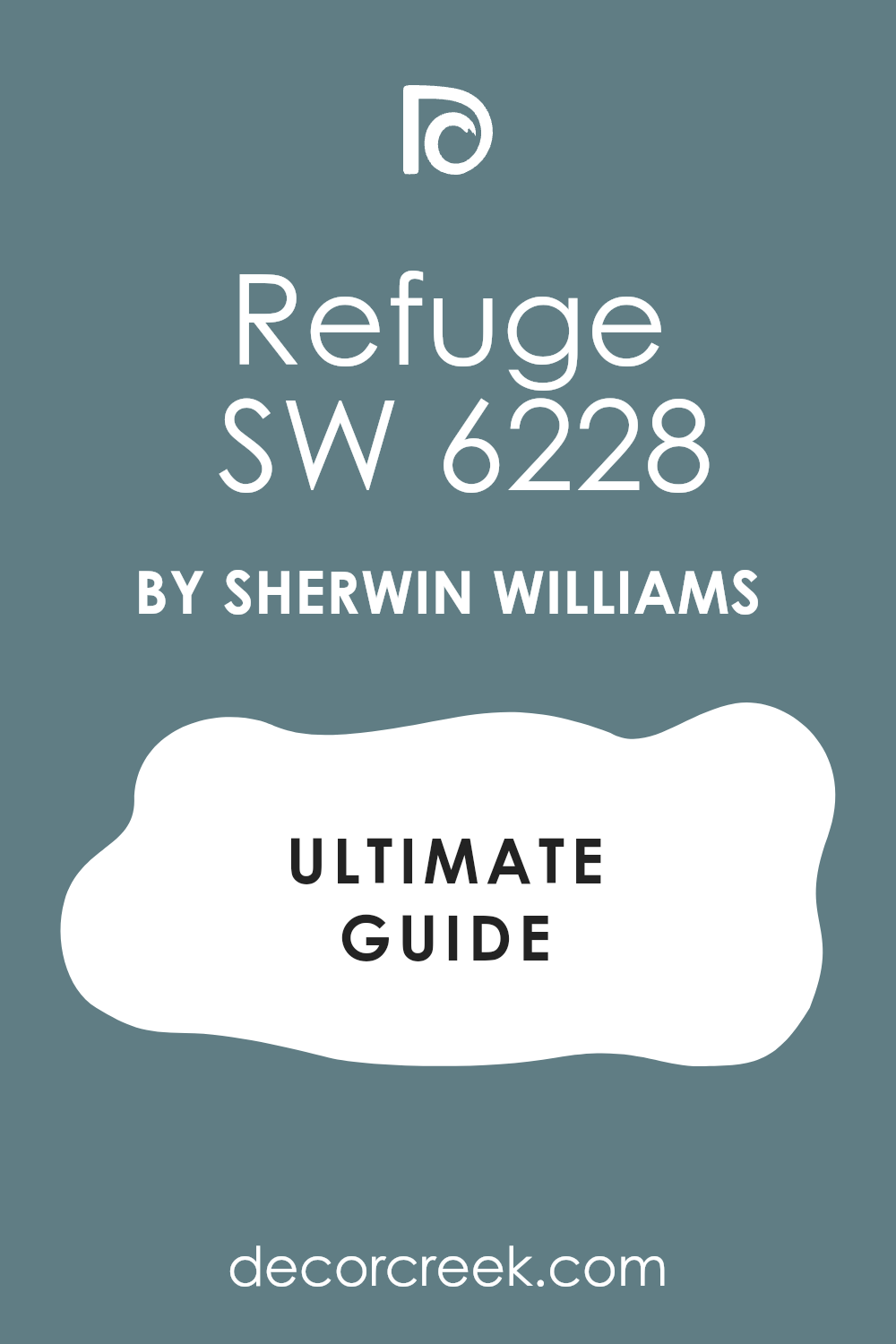
Refuge SW 6228
Refuge SW 6228 is a deep, muted blue that is heavily blended with gray, giving it a quiet, reserved, and sophisticated presence. This color feels soft, grounding, and very mature on the wall.
I often use Refuge in bedrooms or cozy dens where a deep, but non-dramatic, color is needed. It is a fantastic choice if you want a deep blue that acts like a rich neutral, providing depth without brightness. The heavy gray component makes it very chic and easy to live with.
Refuge contrasts beautifully with creamy white trim for a soft, tailored look. This shade is perfect for creating a grounded, quiet, and deeply restful atmosphere. It looks incredible when paired with linen and soft fabrics. You will find that this blue-gray is both dramatic and wonderfully soothing.
🎨 Check out the complete guide to this color right HERE 👈
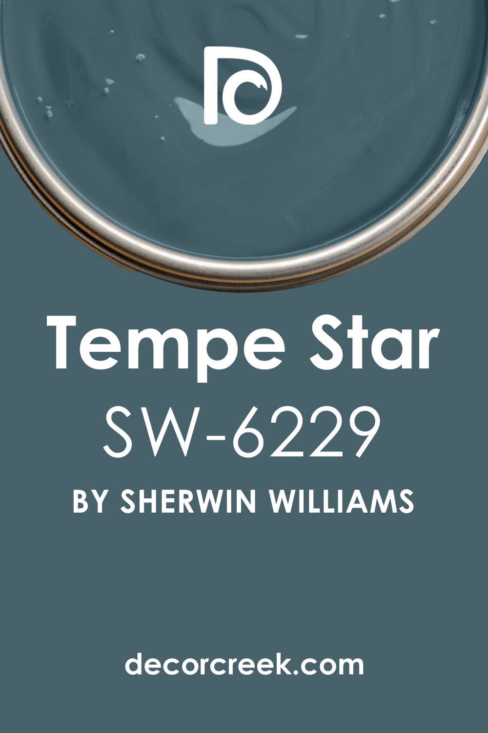
Tempe Star SW 6229
Tempe Star SW 6229 is a deep, dark blue-green that is highly saturated and has a dramatic, commanding feel. This color is rich and feels intense, sophisticated, and very substantial.
I often choose Tempe Star for cabinetry or an accent wall where a bold, jewel-toned color is desired. It is a fantastic choice if you want a deep color that is complex and looks expensive and custom. The strong green undertone gives it a unique, earthy richness.
Tempe Star contrasts sharply with bright white for a powerful, defined look. This shade is perfect for creating a dramatic, luxurious, and highly tailored aesthetic. It works wonderfully with metallic accents like gold. You can be sure that this deep blue-green is a bold and very rewarding color choice.
🎨 Check out the complete guide to this color right HERE 👈
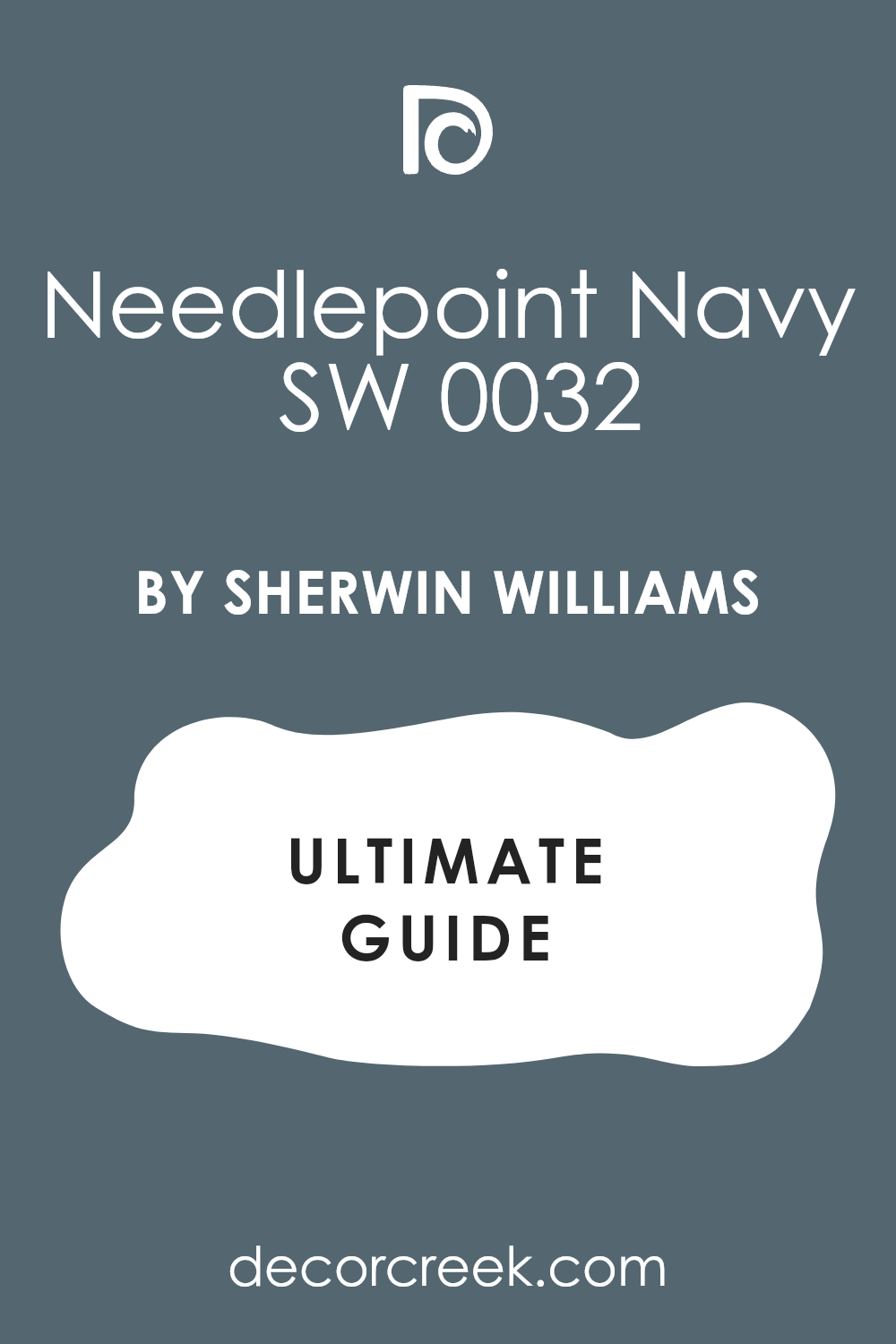
Needlepoint Navy SW 0032
Needlepoint Navy SW 0032 is a classic, deep navy blue that is very dark and highly traditional. This color is rich, strong, and highly dependable as a background shade. I often use Needlepoint Navy in libraries or media rooms where a cozy, intimate feel is needed.
It is a fantastic choice if you want a dark blue that is nearly black but still clearly reads as a deep, established blue. The color has a strong, classic presence that is always sophisticated. Needlepoint Navy pairs perfectly with crisp white trim and rich, dark wood.
This shade is perfect for creating a formal, tailored, and deeply intimate atmosphere. It works beautifully to ground a large or small room. You can be sure that this classic navy is a powerful, traditional choice.
🎨 Check out the complete guide to this color right HERE 👈
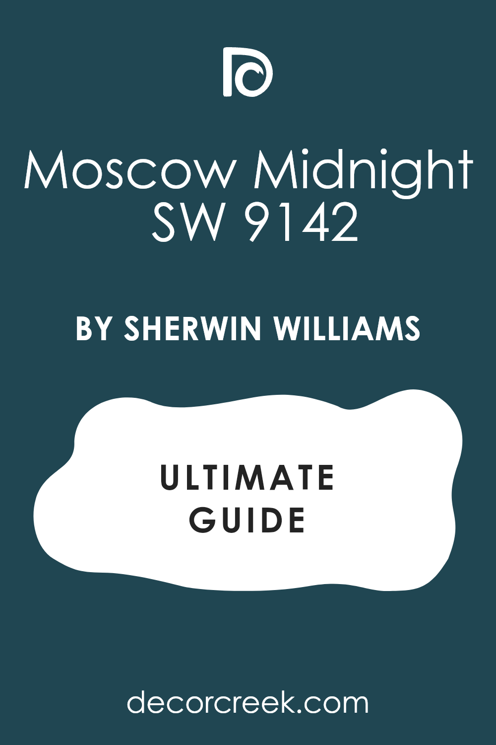
Moscow Midnight SW 9142
Moscow Midnight SW 9142 is a deep, dramatic blue that has a strong violet undertone, giving it a rich, luxurious, and complex feel. This color is highly saturated and feels substantial, velvety, and deeply mysterious.
I often choose Moscow Midnight for powder rooms or accent walls where a touch of unexpected glamour is needed. It is a fantastic choice if you want a deep blue that is unique and has a warm, sophisticated depth. The violet hint makes it incredibly chic.
Moscow Midnight contrasts beautifully with bright white for a high-contrast, modern drama. This shade is perfect for creating an intimate, glamorous, and highly custom aesthetic. It works wonderfully with gold and silver. You will find that this deep blue is a true designer color that brings immediate luxury.
🎨 Check out the complete guide to this color right HERE 👈
Anchors Aweigh SW 9179
Anchors Aweigh SW 9179 is a very deep, almost-black navy blue that is rich, dark, and highly commanding. This color is extremely popular for its ability to provide drama and sophistication. I often use Anchors Aweigh on exterior trim, cabinetry, or dramatic accent walls.
It is a fantastic choice if you want a blue that provides maximum contrast and weight without being true black. The color has a powerful, grounding presence that is very refined. Anchors Aweigh contrasts stunningly with pure white trim for a sharp, graphic look.
This shade is perfect for creating a tailored, sophisticated, and deeply dramatic aesthetic. It works beautifully to highlight architectural features. You can be sure that this navy is a top-tier choice for high-impact design.
🎨 Check out the complete guide to this color right HERE 👈

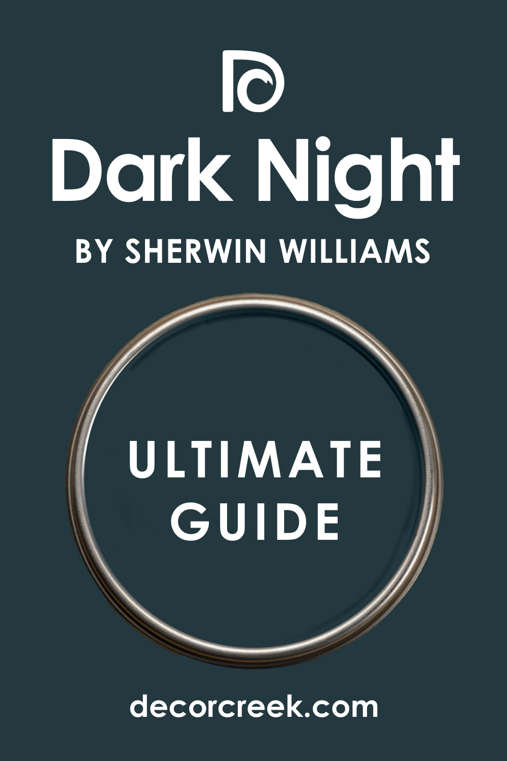
Dark Night SW 6237
Dark Night SW 6237 is a deep, muted blue that carries a strong gray undertone, giving it a moody, sophisticated, and almost charcoal appearance. This color is rich and feels complex, quiet, and highly reserved.
I often use Dark Night in bedrooms or living spaces where a deeply restful, cozy color is needed. It is a fantastic choice if you want a deep color that is more sophisticated and less intense than a standard navy. The heavy gray makes it feel wonderfully grounded and soft.
Dark Night pairs beautifully with creamy whites for an intimate, subtle contrast. This shade is perfect for creating a tailored, quiet, and deeply comfortable atmosphere. It works well with natural textures and simple furnishings. You will find that this blue-gray is a truly refined and versatile choice.
🎨 Check out the complete guide to this color right HERE 👈
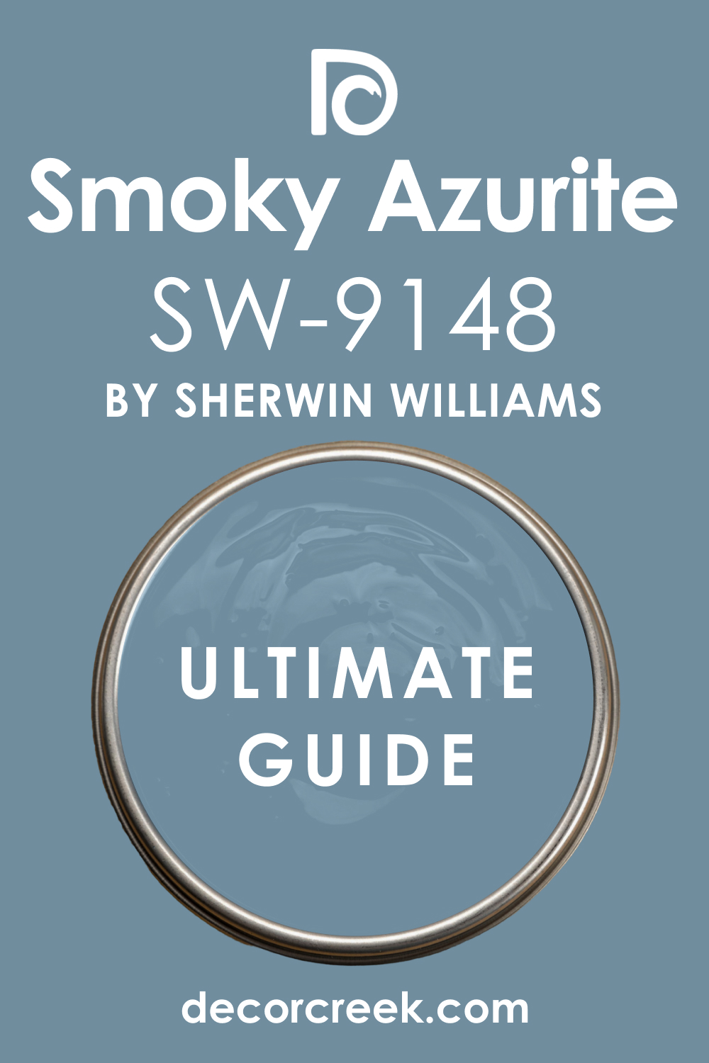
Smoky Azurite SW 9148
Smoky Azurite SW 9148 is a deep, highly saturated blue that has a noticeable violet undertone, giving it a rich, gemstone-like quality. This color is bold and feels confident, dramatic, and uniquely luxurious.
I often choose Smoky Azurite for accent walls or in rooms where a powerful, jewel-toned color is desired. It is a fantastic choice if you want a deep blue that is complex and feels custom and high-end. The violet hint adds a sophisticated warmth and richness.
Smoky Azurite contrasts beautifully with a soft cream trim for an opulent, tailored look. This shade is perfect for creating an intimate, glamorous, and very memorable atmosphere. It works wonderfully with metallic accents. You can be sure that this deep blue is a powerful and very rewarding color choice.
🎨 Check out the complete guide to this color right HERE 👈
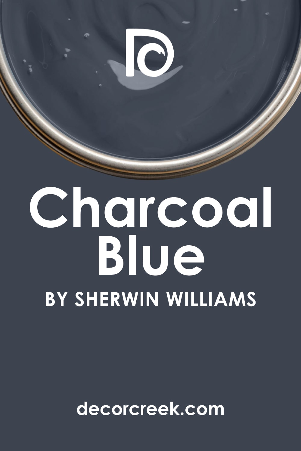
Charcoal Blue SW 2739
Charcoal Blue SW 2739 is a deep, heavily muted blue that is so dark it is nearly a charcoal gray, with only a hint of blue coming through. This color feels grounding, highly sophisticated, and very reserved.
I often use Charcoal Blue on cabinetry or exterior siding for a deep, substantial neutral. It is a fantastic choice if you want a blue that acts like a black or deep gray but maintains a cool color complexity. The color has an incredible depth that is very refined.
Charcoal Blue contrasts sharply with bright white for a crisp, modern look. This shade is perfect for creating a tailored, composed, and very chic aesthetic. It works well with both warm and cool-toned materials. You will find that this muted blue is a truly elegant and commanding shade.
🎨 Check out the complete guide to this color right HERE 👈
Messenger Bag SW 7740
Messenger Bag SW 7740 is a muted, medium-light blue that has a noticeable green undertone, giving it an earthy, watery feel. This color is gentle and feels organic, restful, and very natural.
I often use Messenger Bag in bathrooms or sunrooms where a refreshing, nature-inspired color is needed. It is a fantastic choice if you want a blue that is soft, soothing, and subtly complex. The green hint makes it feel grounded and relaxed.
Messenger Bag pairs beautifully with creamy whites and light wood. This shade is perfect for creating a quiet, comfortable, and very natural aesthetic. It works well in most lighting conditions, maintaining its soft tone. You will find that this blue-green is a refined and very soothing choice.
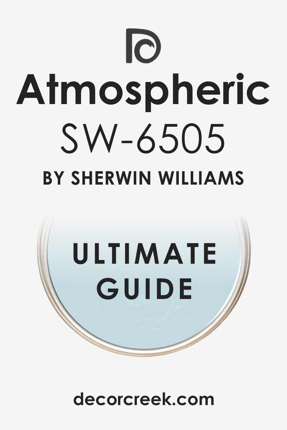
Atmospheric SW 6505
Atmospheric SW 6505 is a vibrant, clear medium blue that is bright, energetic, and full of optimistic light. This color is highly saturated and feels lively, clean, and refreshing on the wall.
I love to use Atmospheric in children’s rooms or casual dens where a happy, strong color is needed. It is a fantastic choice if you want a blue that is unequivocally bold and cheerful. The color has a wonderful clarity that is always inviting.
Atmospheric contrasts perfectly with bright white trim for a sharp, clean look. This shade is perfect for creating an interior that feels vibrant, positive, and very memorable. It holds its beautiful intensity well in bright light. You can rely on this blue to be a lively and energetic addition to your design.
🎨 Check out the complete guide to this color right HERE 👈
Adrift SW 7608
Adrift SW 7608 is a very pale, muted blue that is so light it is almost white, carrying just a whisper of cool color. This color is incredibly airy and gentle, creating a barely-there effect.
I often choose Blanche Blue for walls or ceilings where the client wants a wash of cool sophistication. It is a fantastic choice if you want a blue that is incredibly subtle and non-dominant. The color has a wonderful quality that helps to open up a room.
Blanche Blue pairs beautifully with a pure white trim for a soft, refined contrast. This shade is perfect for creating a light, ethereal, and very contemporary aesthetic. It works well in small rooms that need maximum light. You can be sure that this pale blue will bring a refined, sophisticated touch to your home.
🎨 Check out the complete guide to this color right HERE 👈

31 Best French Blue Paint Colors Trendy This Year
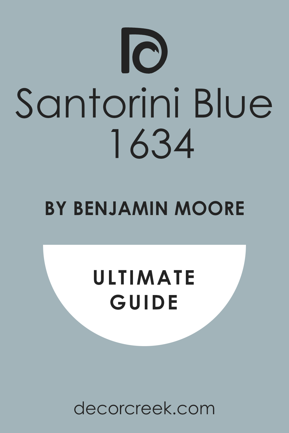
Santorini Blue 1634
Santorini Blue 1634 is a vibrant, medium-dark blue that is clean and highly saturated, reminiscent of the Greek Isles. This color is intense and feels lively, energetic, and powerfully cheerful on the wall.
I often choose Santorini Blue for accent walls or in rooms where a bold, tropical, or Mediterranean feel is desired. It is a fantastic choice if you want a blue that truly pops and is full of optimistic life.
The color has a wonderful clarity that is always invigorating. Santorini Blue contrasts sharply with bright white trim for a clean, eye-catching look. This shade is perfect for creating a vibrant, sunny, and very memorable atmosphere. It holds its beautiful intensity well in bright sunlight. You can rely on this blue to bring a powerful sense of joy and travel to your home.
🎨 Check out the complete guide to this color right HERE 👈
Mt. Rainier Gray 2129-60
Mt. Rainier Gray 2129-60 is a pale, cool gray that has a definite blue undertone, giving it a crisp, mountain air quality. This color is very light and feels extremely airy, almost like a washed-out white. I often use Mt. Rainier Gray in open-concept areas where a very light, flowing color is needed.
It is a fantastic choice if you want a blue tint that is incredibly subtle and acts as a sophisticated neutral. The high gray content makes it feel modern and restrained. Mt. Rainier Gray pairs beautifully with stark white trim for a minimal, sharp contrast.
This shade is perfect for creating a clean, uncluttered, and highly contemporary aesthetic. It works well to make any room feel instantly larger and brighter. You will find that this blue-gray is a refined and very chic choice.
Blue Danube 2062-30
Blue Danube 2062-30 is a deep, saturated blue that is rich and intense, reminiscent of fine china or a classic European waterway. This color is highly dramatic and feels luxurious, confident, and very substantial.
I often choose Blue Danube for formal rooms or cabinetry where a bold, high-end jewel tone is desired. It is a fantastic choice if you want a deep blue that is commanding and highly sophisticated. The color has a strong, velvety depth that absorbs light beautifully.
Blue Danube contrasts stunningly with bright white trim for a powerful, defined contrast. This shade is perfect for creating a classic, elegant, and intimate atmosphere. It works wonderfully with brass and bronze accents. You can be sure that this deep blue will bring a powerful sense of traditional luxury to your design.
🎨 Check out the complete guide to this color right HERE 👈

Blue Hydrangea 2062-60
Blue Hydrangea 2062-60 is a bright, clear medium blue that has a beautiful, refreshing tone, like the flower itself. This color is highly vibrant and feels lively, optimistic, and welcoming. I love to use Blue Hydrangea in sunrooms or casual living spaces where a cheerful color is desired.
It is a fantastic choice if you want a blue that is unequivocally happy and energetic. The color has a wonderful clarity that is always appealing. Blue Hydrangea pairs perfectly with creamy white trim for a softer, more cottage-like look.
This shade is perfect for creating a clean, inviting, and positive atmosphere. It holds its beautiful saturation well in high light. You will find that this blue is a refreshing and very charming addition to your home.
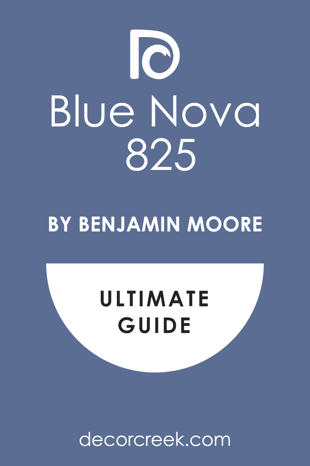
Blue Nova 825
Blue Nova 825 is a mid-tone blue that has a sophisticated, slightly hazy quality, acting as a complex, modern neutral. This color is the perfect balance of richness and gray, giving it a reserved elegance.
I often use Blue Nova in contemporary living rooms or bedrooms for a refined pop of color. It is a fantastic choice if you want a blue that is on-trend and feels deeply chic without being too dramatic. The color has a wonderful complexity that changes beautifully with the light.
Blue Nova contrasts well with both bright and creamy white trim. This shade is perfect for creating an atmosphere of modern composure and understated luxury. It works beautifully with natural textures and simple forms. You can be confident that this blue is a subtle yet powerful design statement.
🎨 Check out the complete guide to this color right HERE 👈
Van Deusen Blue HC-156
Van Deusen Blue HC-156 is a deep, handsome blue that is highly saturated but reserved, sitting perfectly between navy and royal blue. This color is incredibly classic and feels traditional, confident, and very established.
I often choose Van Deusen Blue for studies, libraries, or formal entryways. It is a fantastic choice if you want a bold blue that feels historic and sophisticated. The color has a powerful, grounded presence that is always refined.
Van Deusen Blue contrasts sharply with bright white trim for a strong, defined, and elegant look. This shade is perfect for creating a tailored, traditional, and high-end aesthetic. It works wonderfully as a backdrop for gold frames and rich wood. You will find that this deep blue is one of the most reliable classic shades.
🎨 Check out the complete guide to this color right HERE 👈

Gentleman’s Gray 2062-20
Gentleman’s Gray 2062-20 is a deep, muted blue that has a strong gray-green undertone, giving it an earthy, historic richness. This color is highly sophisticated and feels like a distinguished menswear fabric.
I often use Gentleman’s Gray for cabinetry, accent walls, or cozy reading corners. It is a fantastic choice if you want a deep color that is complex and avoids a simple primary blue look.
The gray-green makes it feel organic and grounded. Gentleman’s Gray pairs beautifully with creamy whites for an antique, bespoke contrast. This shade is perfect for creating a refined, intimate, and traditionally elegant atmosphere. It works wonderfully with natural wood tones. You can be sure that this deep blue is a truly sophisticated and adult choice.
🎨 Check out the complete guide to this color right HERE 👈

Evening Dove 2128-30
Evening Dove 2128-30 is a deep, soft blue-gray that truly captures the quiet mood of twilight. This color is heavily muted and feels incredibly restful, mature, and gentle. I often choose Evening Dove for bedrooms or media rooms where a deep, cozy color is needed.
It is a fantastic choice if you want a deep blue that is more gray than blue, acting as a rich neutral. The heavy gray makes it wonderfully easy to live with and decorate around. Evening Dove contrasts gently with creamy white trim for a sophisticated, soft finish.
This shade is perfect for creating a grounded, quiet, and highly composed atmosphere. It looks gorgeous with layered textiles and soft lighting. You will find that this blue-gray is a truly restful and elegant choice.
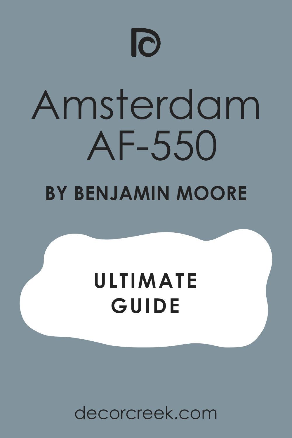
Amsterdam AF-550
Amsterdam AF-550 is a vibrant, clear medium blue that is highly saturated and clean, reminiscent of a bright, classic blue pottery. This color is energetic and feels lively, optimistic, and straightforward.
I love to use Amsterdam in casual dens or bright laundry rooms for a pop of happy color. It is a fantastic choice if you want a blue that is bold and truly pops on the wall. The color has a wonderful clarity that is always refreshing.
Amsterdam contrasts perfectly with bright white trim to create a dynamic, sharp look. This shade is perfect for creating an interior that feels fun, spirited, and very memorable. It holds its beautiful intensity well in bright light. You can rely on this blue to be a lively and cheerful addition to your design.
🎨 Check out the complete guide to this color right HERE 👈
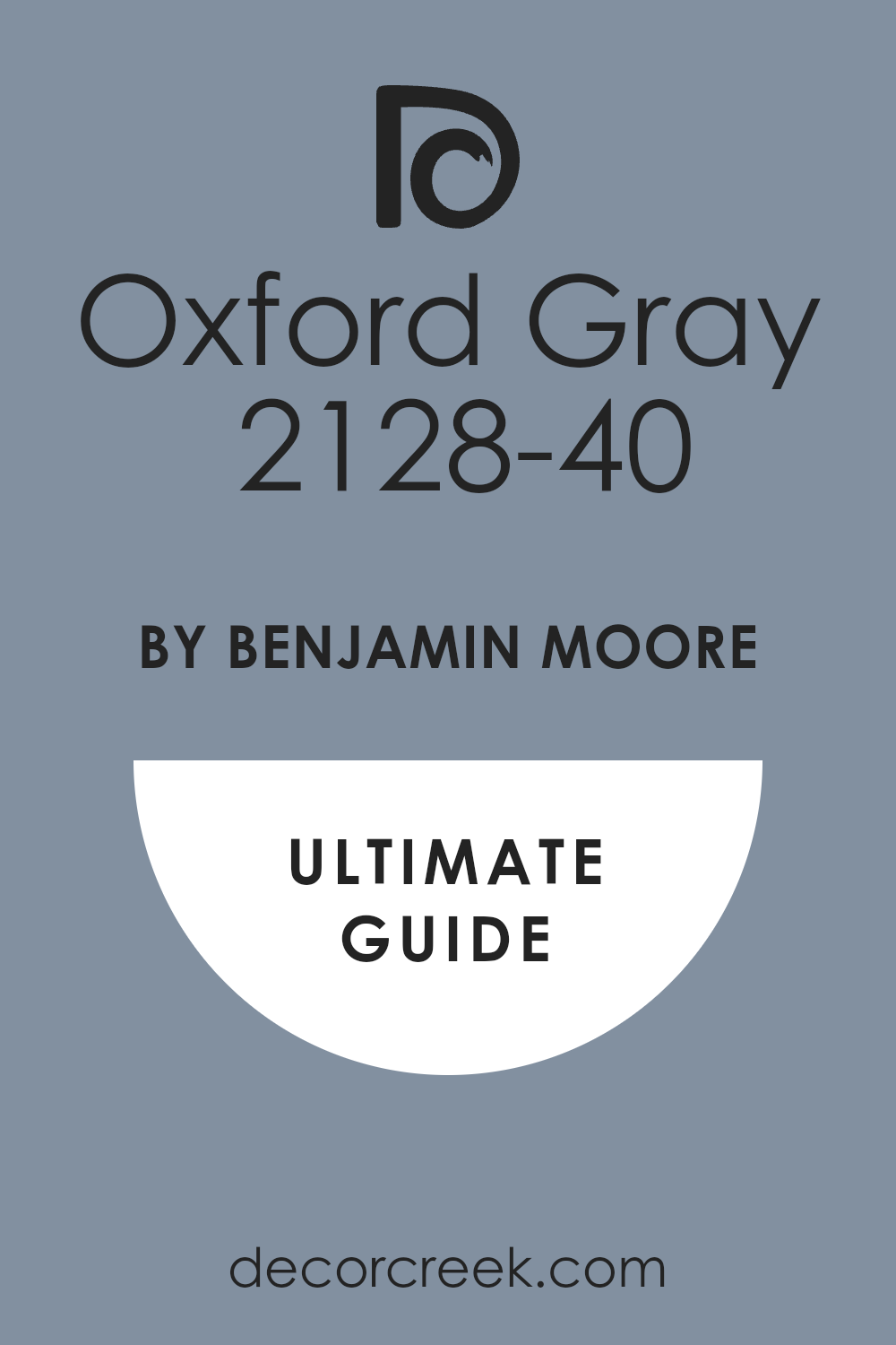
Oxford Gray 2128-40
Oxford Gray 2128-40 is a muted, mid-tone blue-gray that is highly refined and highly versatile. This color is perfectly balanced, acting as a sophisticated color that retains a strong gray neutrality.
I often choose Oxford Gray for main living areas or hallways because it provides flow and subtle color. It is a fantastic choice if you want a blue that is reserved and quietly chic. The balanced gray content makes it wonderfully easy to coordinate with other colors.
Oxford Gray pairs beautifully with almost any shade of trim, from pure white to a light cream. This shade is perfect for creating a clean, sophisticated, and very versatile backdrop. It works well with both modern and traditional decor. You will find that this blue-gray is a fantastic foundation color for your home.
🎨 Check out the complete guide to this color right HERE 👈
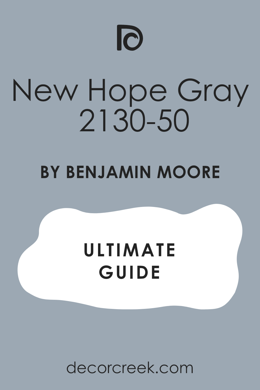
New Hope Gray 2130-50
New Hope Gray 2130-50 is a mid-tone gray that carries a clear, cool blue undertone, giving it a crisp, refreshing quality. This color is primarily gray but provides a sophisticated wash of cool color.
I often use New Hope Gray as a main neutral in contemporary settings or hallways. It is a fantastic choice if you want a color that is mostly neutral but has a cool, inviting complexity. The blue hint keeps the gray from feeling heavy or industrial.
New Hope Gray pairs well with pure white trim for a sharp, modern contrast. This shade is perfect for creating an understated, refined, and very clean aesthetic. It works well to make a room feel orderly and put-together. You will find that this blue-gray is a truly elegant and adaptable color.
🎨 Check out the complete guide to this color right HERE 👈
Rock Gray 1615
Rock Gray 1615 is a cool, medium gray that has a strong, noticeable blue undertone, giving it a solid, dependable feel. This color feels grounded and mature, like a natural stone.
I often choose Rock Gray for studies or bedrooms where a strong, neutral color with depth is desired. It is a fantastic choice if you want a sophisticated gray that carries a cool color influence. The blue undertone makes it feel less flat than a pure gray.
Rock Gray pairs beautifully with bright white trim for a crisp contrast. This shade is perfect for creating a composed, tailored, and very mature aesthetic. It works well with both dark wood and metallic finishes. You can be sure that this blue-gray is a reliable and highly versatile shade.
Dusky Blue 1640
Dusky Blue 1640 is a deep, complex blue that has a strong violet undertone, reminiscent of the sky just after sunset. This color is rich and feels dramatic, intimate, and highly luxurious.
I often use Dusky Blue for accent walls or cabinetry where a sophisticated, jewel-toned color is needed. It is a fantastic choice if you want a deep blue that is unique and has a warm, mysterious complexity. The violet hint makes it incredibly chic.
Dusky Blue contrasts beautifully with creamy white trim for an opulent, soft look. This shade is perfect for creating a cozy, glamorous, and deeply personal atmosphere. It works wonderfully with gold and bronze accents. You will find that this deep blue is a true designer color that brings immediate luxury.
Stratton Blue HC-142
Stratton Blue HC-142 is a muted, medium blue-green that has a rich, earthy quality, making it feel highly traditional and established. This color is a classic that provides a beautiful, historic wash of color.
I often choose Stratton Blue for formal dining rooms or studies for its refined, sophisticated presence. It is a fantastic choice if you want a blue that leans into green and has a strong, comforting depth. The color has a wonderful earthiness that makes it feel grounded.
Stratton Blue pairs stunningly with rich wood and creamy white trim. This shade is perfect for creating a warm, elegant, and very traditional atmosphere. It works well with antique furnishings. You can be sure that this blue-green is a dependable and beautiful historic shade.
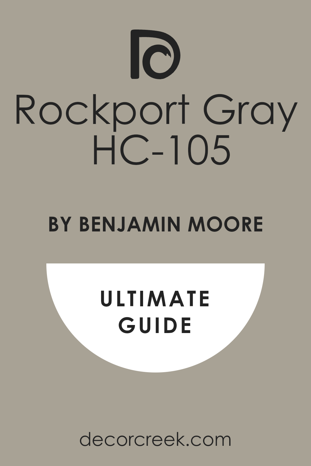
Rockport Gray HC-105
Rockport Gray HC-105 is a medium gray that carries a noticeable blue-green undertone, giving it a complex, muted quality. This color is primarily gray but has a sophisticated wash of cool, earthy color.
I often use Rockport Gray as a main neutral in traditional or coastal homes. It is a fantastic choice if you want a color that is deeply versatile and acts as a calming anchor. The blue-green hint makes it feel organic and collected.
Rockport Gray pairs beautifully with creamy whites and natural wood tones. This shade is perfect for creating a composed, comfortable, and very grown-up aesthetic. It works well with almost any accent color. You will find that this blue-gray is a truly complex and beautiful choice.
🎨 Check out the complete guide to this color right HERE 👈
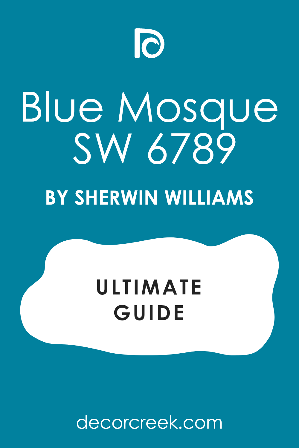
Blue Mosque SW 6789
Blue Mosque SW 6789 is a vibrant, clear blue that has a clean, energetic presence, like a crisp northern sky. This color is highly saturated and feels lively, optimistic, and welcoming.
I love to use Blue Mosque in laundry rooms or casual dens where a happy, strong color is needed. It is a fantastic choice if you want a blue that is bold, pure, and full of life. The color has a wonderful clarity that is always appealing.
Blue Mosque contrasts perfectly with bright white trim for a sharp, clean look. This shade is perfect for creating an interior that feels vibrant, positive, and very memorable. It holds its beautiful intensity well in bright light. You can rely on this blue to be a lively and energetic addition to your design.
🎨 Check out the complete guide to this color right HERE 👈
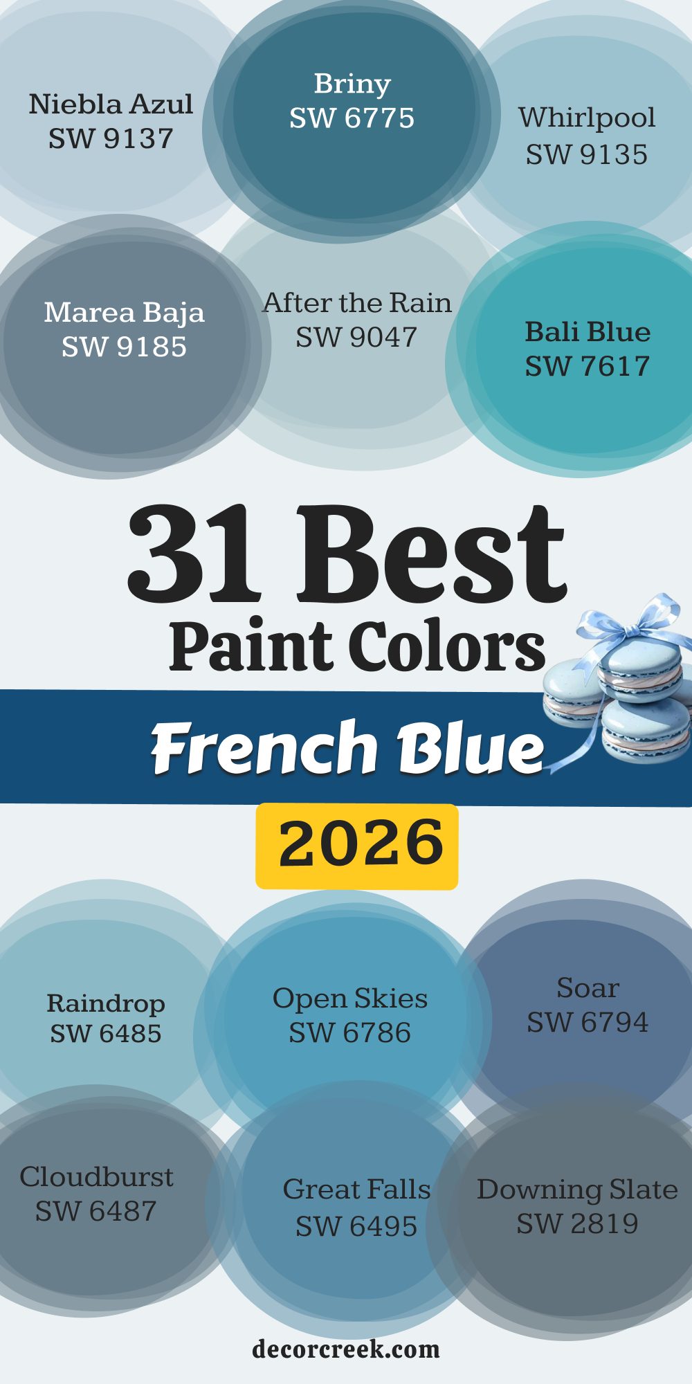
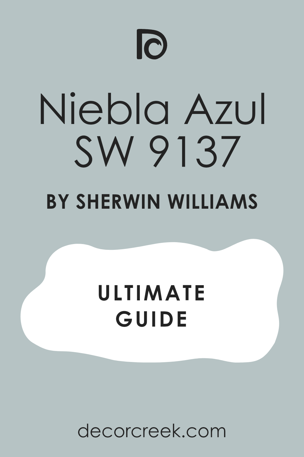
Niebla Azul SW 9137
Niebla Azul SW 9137 is a soft, light blue that is heavily muted with gray, giving it a hazy, ethereal quality. This color is gentle and feels restful, quiet, and very refined. I often use Niebla Azul in bedrooms or nurseries for its inherently soothing nature.
It is a fantastic choice if you want a blue that is sophisticated and acts as a very light neutral. The heavy gray component makes it easy to live with and decorate around. Niebla Azul pairs beautifully with creamy whites for a soft, comforting contrast.
This shade is perfect for creating an atmosphere of deep tranquility and gentle composure. It works well in most lighting conditions. You will find that this muted blue is a truly elegant and adaptable shade.
🎨 Check out the complete guide to this color right HERE 👈
Briny SW 6775
Briny SW 6775 is a deep, saturated blue-green that is rich and intense, reminiscent of deep ocean water. This color is highly dramatic and feels luxurious, mysterious, and captivating. I often choose Briny for accent walls or cabinetry where a bold, jewel-toned color is needed.
It is a fantastic choice if you want a deep blue that is complex and leans strongly into a rich green base. The color has a wonderful intensity that is highly fashionable. Briny contrasts stunningly with bright white trim for a sharp, modern look.
This shade is perfect for creating a glamorous, dramatic, and sophisticated aesthetic. It works wonderfully with metallic gold and deep wood tones. You can be sure that this color will be a luxurious and memorable feature in your home.
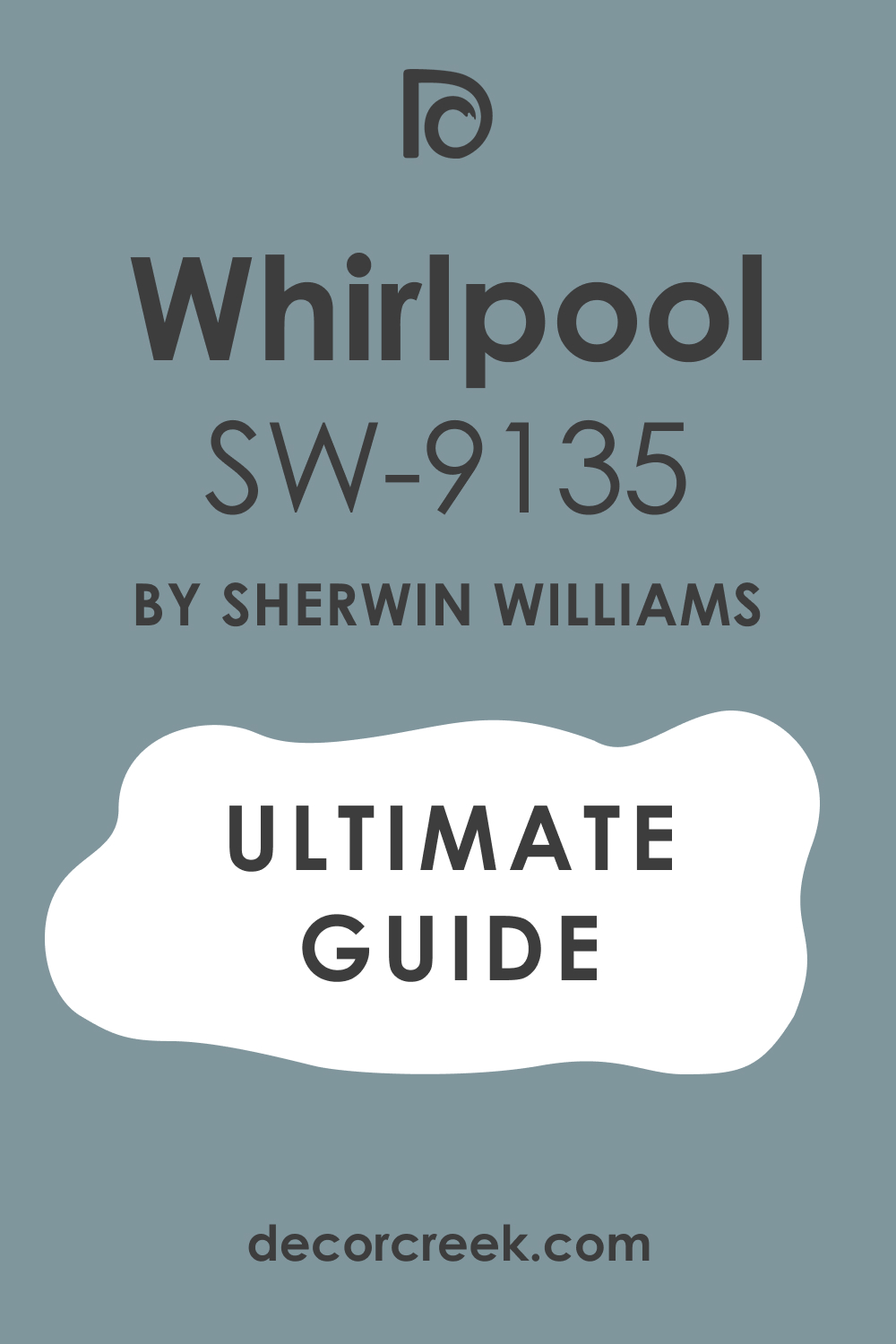
Whirlpool SW 9135
Whirlpool SW 9135 is a soft, light blue that is primarily blue but has a gentle gray undertone, giving it a refreshing, airy feel. This color is bright and feels clean, lively, and optimistic. I love to use Whirlpool in bathrooms or children’s rooms where a fresh, light color is desired.
It is a fantastic choice if you want a blue that is clearly blue but avoids any overwhelming saturation. The color has a wonderful clarity that is always appealing. Whirlpool pairs perfectly with bright white trim to enhance its crispness and lightness.
This shade is perfect for creating a light, cheerful, and very refreshing aesthetic. It works well to make a room feel open and welcoming. You will find that this blue is a delightful and highly appealing shade.
🎨 Check out the complete guide to this color right HERE 👈
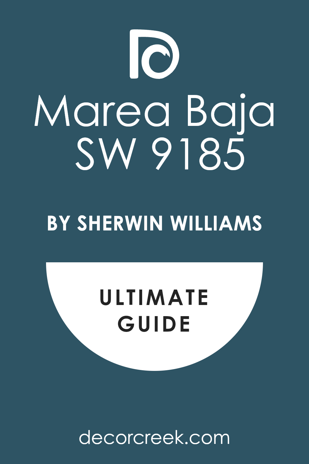
Marea Baja SW 9185
Marea Baja SW 9185 is a deep, muted blue that is heavily influenced by gray and a touch of green, giving it an earthy, reserved quality. This color is rich and feels sophisticated, grounded, and very mature.
I often use Marea Baja in bedrooms or living areas where a deep, cozy neutral color is needed. It is a fantastic choice if you want a blue that is quiet, complex, and avoids any bright tones. The heavy gray-green presence makes it feel organic and refined.
Marea Baja pairs beautifully with creamy whites and natural wood. This shade is perfect for creating a composed, highly refined, and deeply comfortable atmosphere. It works well with leather and wool textures. You will find that this blue-gray is a truly elegant and versatile choice.
🎨 Check out the complete guide to this color right HERE 👈
After the Rain SW 9047
After the Rain SW 9047 is a soft, light blue-green that is gentle and highly muted, carrying a feeling of cool freshness. This color is incredibly airy and feels organic, quiet, and very soothing. I often choose After the Rain for bedrooms or sunrooms for its peaceful, delicate color.
It is a fantastic choice if you want a blue-green that is incredibly soft and acts as a comforting neutral. The light color makes it feel open and expansive. After the Rain pairs beautifully with creamy whites for a soft, gentle contrast.
This shade is perfect for creating an atmosphere of quiet elegance and peaceful composure. It works well in most light exposures. You can be sure that this light blue-green is a refined and very soothing choice.
Mediterranean SW 7617
Mediterranean SW 7617 is a vibrant, saturated blue that has a strong green undertone, giving it a rich, watery, tropical feel. This color is intense and feels lively, exotic, and highly cheerful.
I often choose Mediterranean for bathrooms or accent walls where a bold, vacation-inspired color is desired. It is a fantastic choice if you want a blue that is full of life and has a strong, clear complexity. The green base makes it feel organic and unique.
Mediterranean contrasts sharply with bright white for a clean, eye-catching look. This shade is perfect for creating a vibrant, sunny, and very memorable atmosphere. It holds its beautiful intensity well in bright light. You can rely on this blue to bring a powerful sense of joy and escape to your home.
🎨 Check out the complete guide to this color right HERE 👈
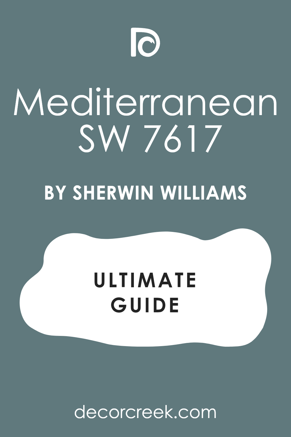
Raindrop SW 6485
Raindrop SW 6485 is a light, airy blue that has a slight green undertone, giving it a refreshing, clean quality. This color is gentle and feels soft, lively, and very fresh on the wall. I often use Raindrop in bedrooms or kitchens where a light, welcoming color is needed.
It is a fantastic choice if you want a blue that is clearly present but still feels airy and non-dominant. The color has a pleasant lightness that is always inviting. Raindrop pairs wonderfully with a pure white trim to enhance its crispness and clarity.
This shade is perfect for creating a light, cheerful, and very refreshing aesthetic. It works well in small rooms that need to feel open. You will find that this blue is a delightful and highly appealing shade.
🎨 Check out the complete guide to this color right HERE 👈
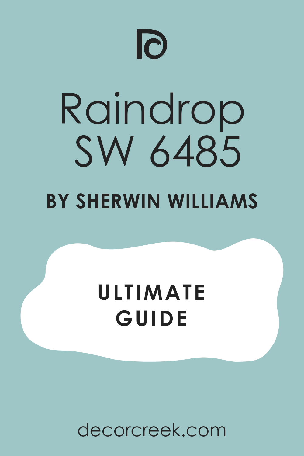
Cloudless SW 6786
Cloudless SW 6786 is a vibrant, clean medium blue that is bright, energetic, and full of optimistic light. This color is highly saturated and feels lively, clear, and refreshing on the wall.
I love to use Cloudless in children’s rooms or casual dens where a happy, strong color is needed. It is a fantastic choice if you want a blue that is unequivocally bold and cheerful. The color has a wonderful clarity that is always inviting.
Cloudless contrasts perfectly with bright white trim for a sharp, clean look. This shade is perfect for creating an interior that feels vibrant, positive, and very memorable. It holds its beautiful intensity well in bright light. You can rely on this blue to be a lively and energetic addition to your design.
Soar SW 6799
Soar SW 6799 is a deep, saturated blue that has a strong violet undertone, giving it a rich, sophisticated warmth. This color is intense and feels luxurious, confident, and very substantial.
I often choose Soar for accent walls or formal rooms where a bold, jewel-toned color is desired. It is a fantastic choice if you want a deep blue that is complex and looks expensive and custom. The violet hint makes it incredibly chic.
Soar contrasts beautifully with creamy white trim for a high-end, bespoke look. This shade is perfect for creating an intimate, glamorous, and highly tailored aesthetic. It works wonderfully with gold and silver. You will find that this deep blue is a true designer color that brings immediate elegance.
Cloudburst SW 6487
Cloudburst SW 6487 is a deep, muted blue that is heavily mixed with gray, giving it a hazy, sophisticated, and moody feel. This color is rich and feels composed, quiet, and very mature. I often use Cloudburst in bedrooms or living areas where a deeply restful, cozy color is needed.
It is a fantastic choice if you want a deep color that is more sophisticated and less intense than a standard navy. The heavy gray makes it feel wonderfully grounded and soft. Cloudburst contrasts beautifully with creamy whites for an intimate, subtle contrast.
This shade is perfect for creating a tailored, quiet, and deeply comfortable atmosphere. It works well with natural textures and simple furnishings. You will find that this blue-gray is a truly refined and versatile choice.
🎨 Check out the complete guide to this color right HERE 👈

Great Falls SW 6495
Great Falls SW 6495 is a strong, saturated blue that is rich and bold, offering a direct, confident color. This color is very much a true blue, avoiding significant gray or green interference.
I often choose Great Falls for accent walls or in rooms where a strong, traditional blue is desired. It is a fantastic choice if you want a vibrant, classic blue that is both happy and serious. The color has a wonderful clarity that is always appealing.
Great Falls contrasts beautifully with bright white trim for a sharp, nautical, or traditional look. This shade is perfect for creating an energetic, dependable, and very classic atmosphere. It holds its intensity well, making it a reliable feature color. You will find that this blue is a straightforward and highly rewarding shade.
Downing Slate SW 2819
Downing Slate SW 2819 is a deep, muted blue that is heavily mixed with gray, giving it a rich, stony, and highly sophisticated presence. This color is substantial and feels grounding, quiet, and very mature.
I often use Downing Slate on cabinetry or in formal rooms where a strong, historic color is needed. It is a fantastic choice if you want a deep color that acts like a rich neutral, providing depth without brightness. The heavy gray makes it feel wonderfully refined and soft.
Downing Slate pairs beautifully with creamy white trim for a soft, elegant contrast. This shade is perfect for creating a tailored, composed, and deeply comfortable aesthetic. It works well with traditional furnishings. You will find that this blue-gray is a truly refined and versatile choice.
🎨 Check out the complete guide to this color right HERE 👈

Porcelain SW 0053
Porcelain SW 0053 is a very pale, muted blue that is so light it is almost white, carrying a clear, cool wash of color. This color is incredibly airy and gentle, creating a barely-there effect. I often choose Porcelain for walls or ceilings where the client wants a whisper of cool sophistication.
It is a fantastic choice if you want a blue that is incredibly subtle and non-dominant. The color has a wonderful quality that helps to open up a room. Porcelain pairs beautifully with a pure white trim for a soft, refined contrast.
This shade is perfect for creating a light, ethereal, and very contemporary aesthetic. It works well in small rooms that need maximum light. You can be sure that this pale blue will bring a refined, sophisticated touch to your home.
🎨 Check out the complete guide to this color right HERE 👈
Lakeside SW 9683
Lakeside SW 9683 is a light, airy blue that has a strong, clear freshness, like a bright sky on a sunny day. This color is gentle and bright, creating a feeling of open space. I often use Searchlight in sunrooms or bathrooms for its refreshing, clean quality.
It is a fantastic choice if you want a light blue that is clearly present but still feels airy and non-dominant. The color has a pleasant lightness that is always welcoming. Searchlight pairs wonderfully with a pure white trim to enhance its crispness and clarity.
This shade is perfect for creating a light, cheerful, and very refreshing aesthetic. It works well in small rooms that need to feel expansive. You will find that this blue is a delightful and highly appealing shade.
🎨 Check out the complete guide to this color right HERE 👈
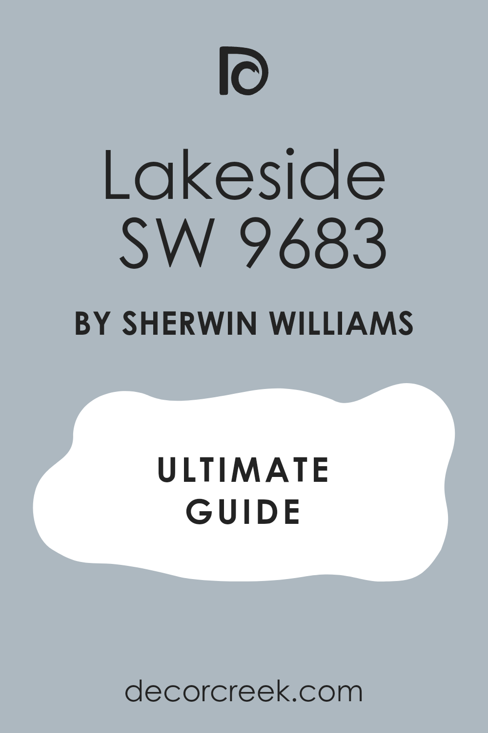
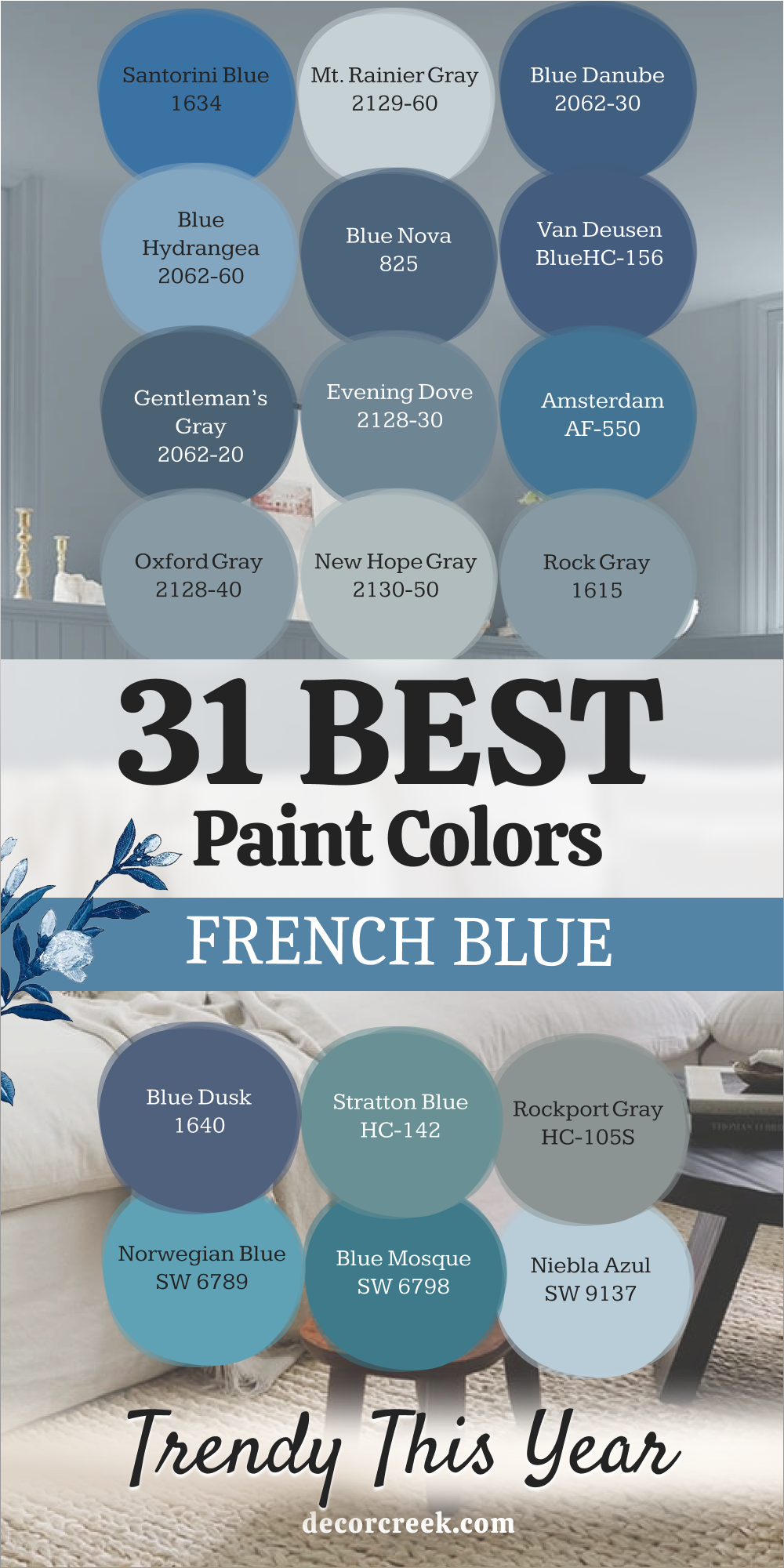
My Final Thoughts about 31 Best French Blue Paint Colors for 2026
I hope that examining these 31 stunning French Blue paint colors from Sherwin-Williams and Benjamin Moore has made your design choices clearer and more confident. As a home interior expert, I know that choosing such a sophisticated blue is a significant commitment, but the payoff you receive is simply immense.
This specific range of blues—from the deep, dramatic richness of Gale Force SW 7605 to the light, atmospheric whisper of Misty SW 6232—offers you the quickest way to inject your home with a feeling of curated, thoughtful elegance. These are not just colors, but carefully chosen tones that carry history and refinement.
This color category is incredibly powerful because it perfectly blends traditional heritage with a contemporary freshness, making your home both current and enduringly chic. A successful French Blue always avoids looking common or too bright; it is a complex color that looks expensive and settled on the wall. It never clashes with your furnishings, but instead, helps them shine.
The key to your success is not just choosing a color you like on the chip, but selecting the one that performs flawlessly in the unique lighting of your room throughout the day. Remember, the color is the first thing that greets you and the last thing you see before you sleep, and it profoundly affects your daily mood.
By choosing one of these beautiful, nuanced French Blues, you are not just painting a wall; you are creating a thoughtful, confident, and beautiful atmosphere that will make you feel great every time you walk through the door. This is an investment in your emotional well-being and the aesthetic pleasure of your home.
