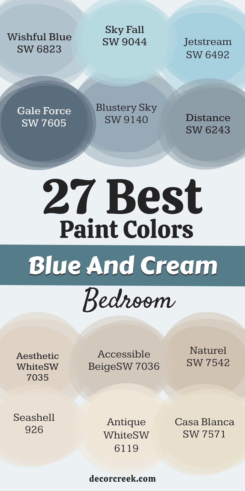
Choosing the perfect paint color for your bedroom walls can feel like a big decision, almost like choosing the overall mood for the place where you rest, recharge, and begin each day. Because this space is so personal, the colors that surround you truly matter! Over the years, I’ve discovered that blue and cream is one of the most beloved, timeless, and reliable color combinations for a bedroom.
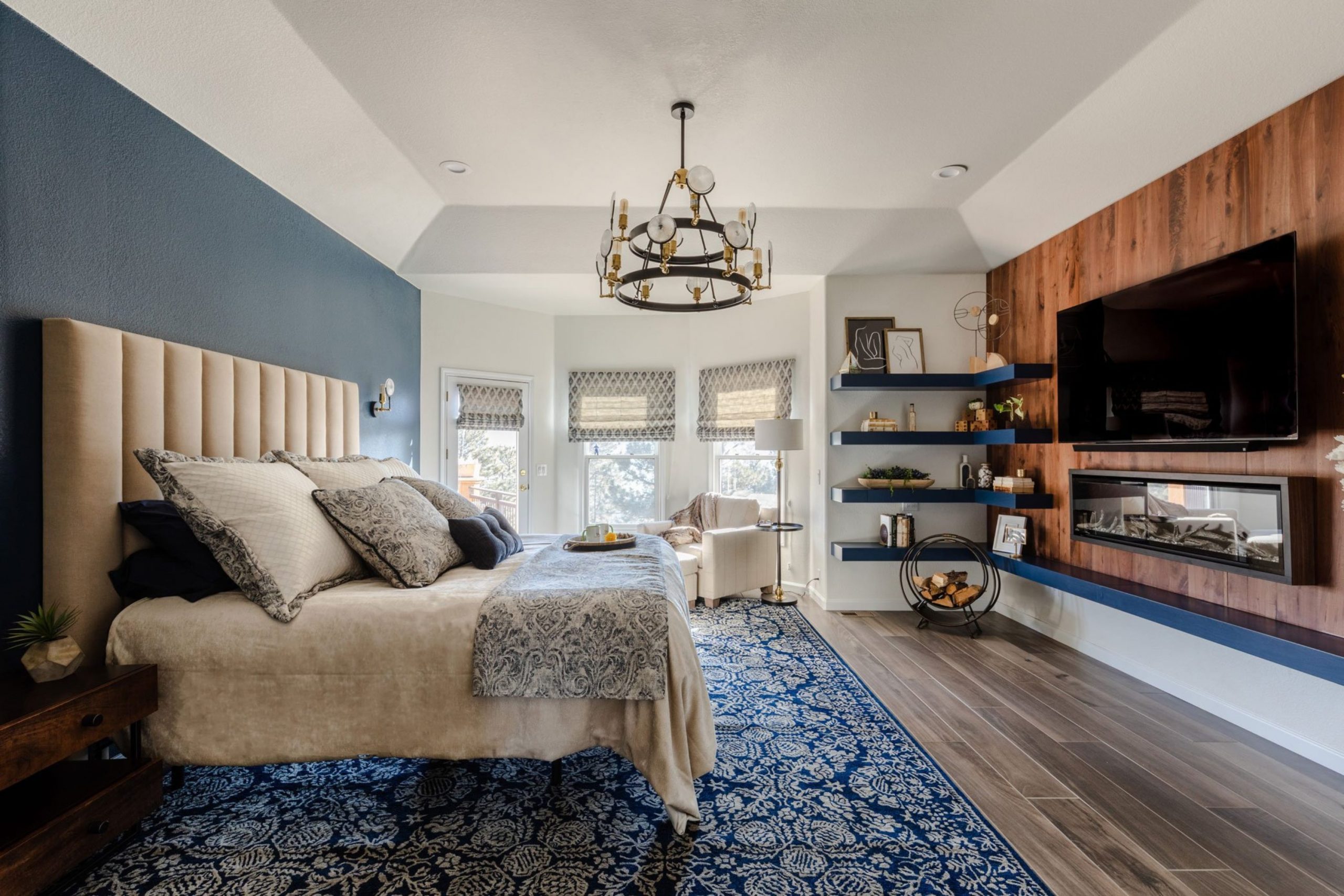
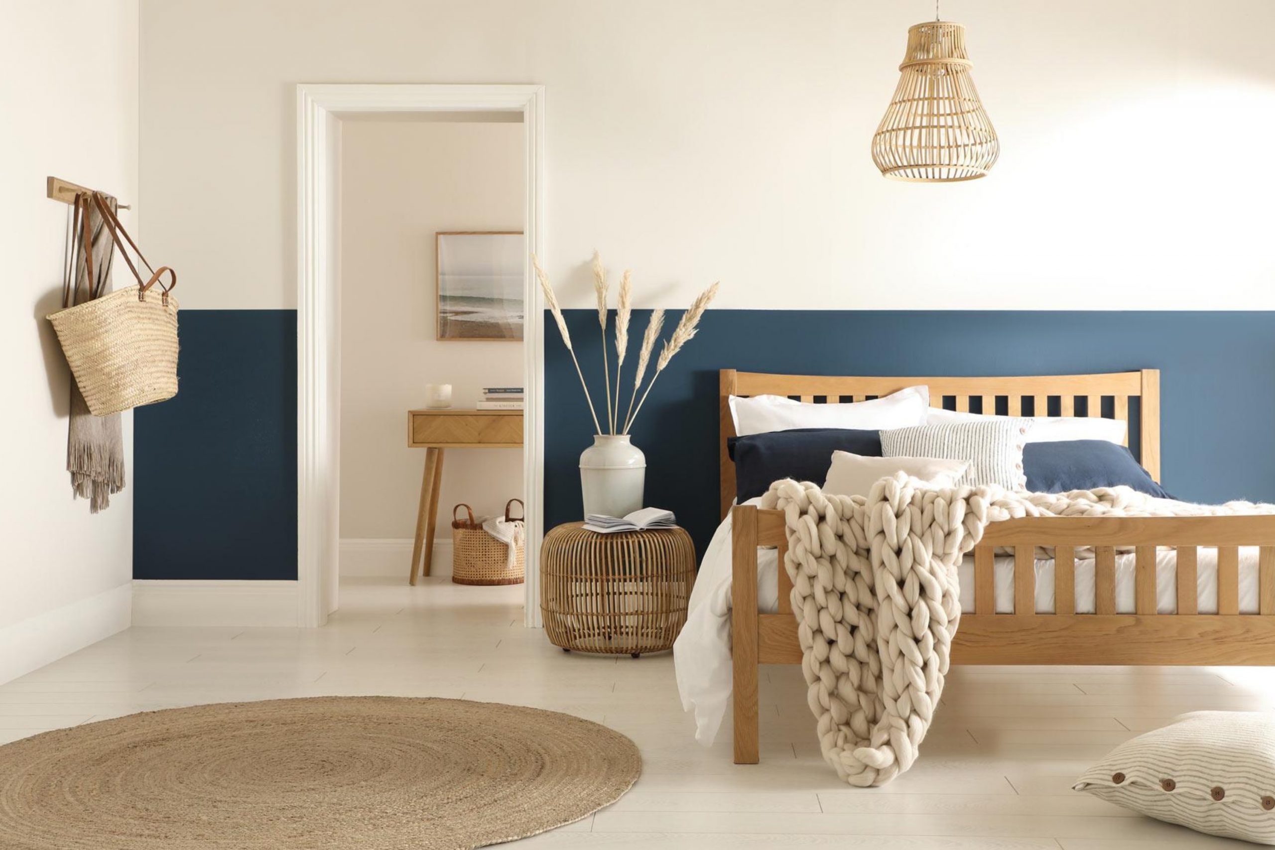
It’s one of those pairings that simply works no matter the style. Cream tones bring a soft, warm glow that feels gentle and welcoming, while blue adds a cooling, peaceful balance that instantly relaxes the senses.
Together, they create a look that is both sophisticated and incredibly cozy, turning any bedroom into a restful retreat that feels intentionally designed. In this guide, I’ve gathered my top 27 favorite blue and cream bedroom ideas, along with helpful insights into how I choose the right colors for my clients.
Get ready to discover the shades that can make your bedroom feel beautifully complete and perfectly “you.”
Why I Always Trust Sherwin-Williams and Benjamin Moore for Blue & Cream Paint Colors
When I’m designing a bedroom, I almost always reach for Sherwin-Williams and Benjamin Moore paint colors as my starting point. This isn’t just out of habit—it’s the result of years of experience relying on their exceptional quality and consistency. These two paint brands have mastered the art of creating rich, accurate colors that apply beautifully on the wall. I can trust that the shades I select will look exactly as expected once they dry, without any surprising undertones suddenly becoming visible. Their pigments are also dense and durable, meaning the color maintains its depth and clarity over time, even in rooms that get a lot of daily use.
Another huge reason I depend on these brands is their unmatched variety. Their cream palette ranges from barely-there off-whites to warm, buttery neutrals with incredible softness. And when it comes to blue, their options span from airy sky tones to velvety navy shades. This extensive selection gives me freedom to find the perfect match for any room’s natural light, architectural features, or décor style.
Whether I’m working with a small, cozy bedroom or a bright, airy primary suite, Sherwin-Williams and Benjamin Moore consistently deliver paint colors that help me achieve a polished, professional result every single time. Using trusted brands allows me to guarantee a finished space that feels beautiful, intentional, and long-lasting.
How I Choose the Perfect Blue or Cream Shade for Any Bedroom
Selecting the right blue or cream paint color is far more involved than simply picking a shade you like on a paint strip. It’s a thoughtful process, especially when the goal is to create a restful bedroom atmosphere. The first thing I always pay attention to is the natural light the room receives throughout the day.
In a north-facing bedroom, the light tends to be cooler and softer, so I usually choose a warmer cream to add comfort or a brighter, lighter blue to prevent the room from feeling dull or shadowy. In contrast, a south-facing bedroom gets warm, golden light from morning to evening, which allows me to choose cooler creams or deeper, more saturated blues without worrying that the room will feel too cold.
Next, I consider the fixed elements already in the room—things like the flooring, trim, window frames, or built-ins. These details might seem small, but they have a major influence on how paint colors appear. For example, if the trim is a crisp, bright white, I need a cream that won’t look too yellow next to it.
If the room has warm wood floors with orange or red undertones, I choose blues and creams that complement those hues instead of clashing with them.
27 blue and cream bedroom paint color ideas for 2026
Alabaster SW 7008
Alabaster is a very popular cream that I use all the time for a light, inviting feel. It acts like a soft, creamy white that won’t feel stark or cold on your walls. It has a gentle, barely-there warmth that keeps a room from feeling sterile.
It pairs beautifully with any shade of blue, from a pale aqua to a deep navy. It is a fantastic choice for trim or ceiling color if you want a slightly softer look than a pure white. It reflects light well, helping to brighten a bedroom that doesn’t get a lot of natural sun.
It is a great shade to use throughout an entire house for a cohesive look. It avoids the yellow undertones that can sometimes make creams look dated. It is perfect for creating a relaxed, airy atmosphere in the main sleeping area. It is a reliable option for a welcoming bedroom that feels fresh and current.
👉 Read the full guide for this color HERE 👈

Creamy SW 7012
Creamy is a rich, true cream that brings a feeling of comfort and old-world charm. It has a definite yellow-gold undertone, making it feel very warm and welcoming. It is wonderful when you want a color that truly feels like “cream” and not just an off-white.
It pairs especially well with darker, muted blues, like slate or indigo, for a dramatic contrast. It is an excellent choice for a traditional or cottage-style bedroom that needs extra coziness. It looks especially beautiful in a room with dark wood furniture, highlighting its rich color.
It can be a bit intense in very sunny rooms, so be sure to test it carefully. It makes a bedroom feel immediately soft and much more inviting to relax in. It provides a lovely backdrop for layered textures and patterned bedding. It is a fantastic way to introduce a rich warmth without using a darker color on the walls.
👉 Read the full guide for this color HERE 👈

Dover White SW 6385
Dover White is a fantastic off-white that leans toward a slightly creamy appearance. It is a light and bright shade, but it lacks the starkness of a pure white. It has a nice warmth that prevents it from ever feeling cold or institutional.
It is a beautiful partner for all sorts of blue accents, especially those with a hint of gray. It works exceptionally well in both modern and traditional bedroom settings. It is a shade I often recommend for clients who want a white but are afraid of it looking too harsh.
It maintains its creamy quality even in rooms with less natural daylight. It is an easy shade to coordinate with existing furniture and fabrics. It provides a very clean canvas while still adding a sense of softness to the walls. It remains a very popular choice for its reliably bright, slightly warm finish.
👉 Read the full guide for this color HERE 👈

Casa Blanca SW 7571
Casa Blanca is a warm, slightly beige-tinted cream that provides a lovely, grounding base. It is a versatile neutral with enough depth to stand up to bolder blue colors. It is perfect if you want a cream that looks a bit richer and more substantial on the walls.
It has a cozy, earthy quality that makes it great for a relaxing bedroom environment. It is a good option when your room has a lot of architectural detail you want to soften. It prevents a room from feeling too white while still keeping the atmosphere bright.
It works especially well with natural wood tones and woven textures. It provides a sophisticated background that doesn’t compete with other decor elements. It is a great choice for bedrooms where you want to emphasize comfort and warmth. It brings an easy warmth that feels effortlessly stylish and welcoming.
👉 Read the full guide for this color HERE 👈

Antique White SW 6119
Antique White is a soft, muted cream with a touch of gray, giving it a historic, refined feel. It is a sophisticated shade that feels gently aged and highly textured. It is a great choice if you want a color that feels neutral but has more depth than a standard off-white.
It pairs beautifully with misty, grayish blues, creating a very cohesive look. It is well-suited for traditional or rustic bedroom designs where warmth is key. It maintains its lovely softness even under the light of a bedside lamp.
It is a wonderful backdrop for showcasing art or detailed furniture pieces. It is a color that can transition easily between different seasons and decorating styles. It is one of my go-to colors for creating a classic, established feeling in a bedroom. It offers a gentle contrast to brighter white trim, adding architectural interest.
👉 Read the full guide for this color HERE 👈

Navajo White SW 6126
Navajo White is a warmer, slightly deeper cream with a discernible peach or beige undertone. It offers a richer, more saturated color than many other light creams. It can look quite vibrant in a very sunny room, so careful testing is essential.
It is excellent for pairing with deep, oceanic blues for a classic, high-contrast look. It is a color that feels wonderfully comforting and incredibly cozy, like a warm blanket. It is a great choice for a north-facing bedroom that needs a strong injection of warmth.
It is a favorite for creating a Spanish Colonial or Mediterranean-inspired bedroom look. It is a shade that provides a strong, yet neutral, foundation for the room’s design. It is one of the more colorful creams, ensuring your walls won’t look boring. It is a perfect choice when you want a noticeable warmth on your bedroom walls.
👉 Read the full guide for this color HERE 👈

White Dove OC-17
White Dove is a perennial favorite, offering a soft, creamy white that designers consistently love. It is highly regarded for its perfect balance of warmth without noticeable yellow undertones. It is clean and bright but retains a lovely softness that makes it bedroom-friendly.
It works beautifully as a trim color alongside a deeper blue wall paint. It is a fantastic choice for walls when you want the room to feel light and airy but not cold. It provides a crisp contrast to dark furniture or brightly colored linens.
It is a nearly flawless neutral that performs well in almost any light condition. It is the kind of color that makes a bedroom feel fresh and well-kept. It can stand on its own as a main wall color or complement another shade. It is one of the most reliable and versatile creamy whites available from Benjamin Moore.
👉 Read the full guide for this color HERE 👈

Swiss Coffee OC-45
Swiss Coffee is a warm, enveloping off-white that offers a creamy, slightly beige quality. It is a lovely shade for creating a soft, cloud-like feeling in a bedroom. It is often praised for its ability to feel clean without appearing too stark.
It pairs wonderfully with lighter, almost pastel blues for a delicate aesthetic. It is a good option when you want a color that is clearly warm but not overly yellow. It provides a muted, comfortable backdrop for a range of decorating styles.
It is a go-to for adding a cozy factor to any room in the house. It looks especially inviting under the glow of warm, ambient lighting. It can be used on both the walls and the ceiling for an all-over, seamless feel. It is a popular choice for achieving a current, updated look in a bedroom.
👉 Read the full guide for this color HERE 👈

Cloud White OC-130
Cloud White is a luminous, airy off-white that has a subtle, almost milky creaminess. It is known for its ability to reflect light beautifully, making rooms feel expansive. It has a gentle, inviting quality that is much softer than a pure white.
It is an ideal companion for a wide variety of blues, especially those with gray or green undertones. It is often selected for trim, but it’s absolutely gorgeous as a wall color too. It works wonders in a bedroom where you are aiming for a refined, classic appearance.
It manages to stay true to its color even in shadowy corners of the room. It is one of those colors that feels consistently clean and always in style. It provides a perfect blank canvas for patterned bedding and colorful artwork. It is one of Benjamin Moore’s best-selling creamy whites for a good reason.
👉 Read the full guide for this color HERE 👈

Simply White OC-117
Simply White is a very clean, bright white with just a hint of creamy warmth. It was named Benjamin Moore’s Color of the Year in 2016 for its exceptional clarity. It is an excellent choice if you want a white that doesn’t lean too yellow but isn’t cold.
It works beautifully to define trim and ceiling details against a bolder blue wall color. It makes a bedroom feel fresh, crisp, and incredibly well-lit. It is versatile enough to work in both modern, clean-lined bedrooms and traditional ones.
It can sometimes appear a little cooler in low light, so check your samples carefully. It is a great option for a bedroom that receives plenty of natural daylight. It provides the perfect bright backdrop for showcasing any style of furniture. It is a sophisticated creamy white that acts like a shot of fresh air for a room.
👉 Read the full guide for this color HERE 👈

Ballet White OC-9
Ballet White is a warm, complicated off-white that has elements of cream, beige, and a whisper of gray. It is highly valued for its ability to shift beautifully between different light sources. It is a creamy neutral that has a noticeable depth without being a dark color.
It is a perfect backdrop for muted, dusty blues for a soft, cohesive look. It has a wonderful sophisticated quality that suits a refined primary bedroom. It is a great way to warm up a cool-toned room without resorting to strong yellow shades.
It is a shade that I often suggest for clients who appreciate classic, understated colors. It feels soft and inviting, contributing to a restful sleeping environment. It is an excellent companion to natural materials like linen and light wood. It offers a gentle, sophisticated warmth that is a pleasure to wake up to.
👉 Read the full guide for this color HERE 👈

Maritime White OC-5
Maritime White is a creamy off-white that has a very pleasing warmth and a slight taupe undertone. It is a color that looks rich and substantial on the walls, feeling less like an off-white. It is excellent for balancing a very vibrant, energetic shade of blue.
It has a depth that makes it stand out from typical light neutral colors. It is a great way to add an earthy warmth to a coastal-themed bedroom. It is a versatile shade that complements both warm-toned and cool-toned furnishings.
It provides a cozy, comforting feel that is ideal for a sleeping sanctuary. It is often used in rooms where a subtle, defined color is preferred over a pure white. It is a choice that feels both current and classic at the same time. It offers a grounded, welcoming warmth that is perfect for a bedroom.
Seashell 926
Seashell is a creamy off-white with a very light touch of pink or mauve undertone, making it feel especially warm. It is a beautifully complex color that has a gentle, welcoming glow on the wall. It is fantastic for adding a feminine, romantic feel to a bedroom without being overtly colored.
It is an ideal pairing for soft, airy blue shades, like a pale cornflower or sky blue. It works well in a space that needs a bit of cheerful brightness and warmth. It is a delicate and inviting shade that feels perfect for a cozy retreat.
It offers a unique spin on a neutral, providing more character than a typical cream. It looks wonderful with white bedding and light, sheer curtains. It is a color that feels very soothing and contributes to a peaceful atmosphere. It is a great choice when you want a very light wall color with a noticeable warmth.
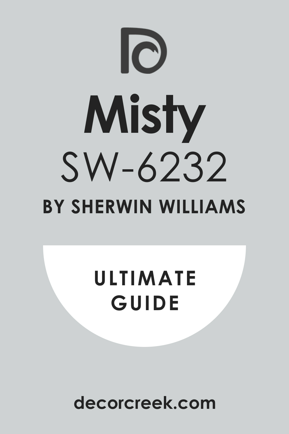
Misty SW 6232
Misty is a beautiful, pale blue that leans heavily into gray, creating a very sophisticated, muted shade. It is a light color that feels airy and restful without appearing baby blue. It has a lovely foggy quality that gives it a refined and adult feel.
It works perfectly with crisp, bright cream colors for a classic, clean look. It is an excellent choice for a primary bedroom where a subdued, calming feeling is desired. It changes beautifully with the light, sometimes looking bluer and sometimes grayer.
It is a popular blue because it avoids being either too bright or too dark on the walls. It is a great foundation color for adding deeper blue accents in the decor. It contributes to a soft, serene environment that is wonderful for sleeping. It is one of the most reliable, easy-to-use pale blues in the Sherwin-Williams collection.
👉 Read the full guide for this color HERE 👈
Sea Salt SW 6204
Sea Salt is an incredibly popular color, famous for being a light, atmospheric blend of blue, green, and gray. It is a chameleon color that looks different depending on the light and surrounding colors. It feels like a breath of fresh air, evoking the feeling of a beach or coastal area.
It pairs beautifully with soft, pale cream colors like Alabaster or Creamy. It is a fantastic choice for a bedroom because it’s inherently soothing and non-jarring. It has enough color to be interesting but isn’t so saturated that it feels dominant.
It is an excellent choice for a guest bedroom because of its broad appeal. It looks amazing with natural wood furniture and woven textures. It is a shade that I often recommend for clients looking for a restful and gentle blue. It provides a lovely, gentle wash of color that feels very light and airy.
👉 Read the full guide for this color HERE 👈

Rainwashed SW 6211
Rainwashed is a slightly deeper, more saturated version of the blue-green-gray family than Sea Salt. It is a gorgeous color that feels like a hazy, tranquil lagoon or a distant mountain mist. It has a substantial presence on the wall without feeling heavy or dark.
It pairs wonderfully with creams that have a touch of warmth, like Casa Blanca or Antique White. It is a fantastic choice for a bedroom if you want a noticeable but soothing color. It provides a calming, watery backdrop that is inherently restful and pleasing.
It is a great option for a room with a lot of natural light that can handle a deeper shade. It offers a very distinct personality while remaining a calming color. It works well in a bedroom where you want to emphasize a sophisticated, natural palette. It is a beautiful, slightly muted blue-green that is very popular for good reason.
👉 Read the full guide for this color HERE 👈

Tradewind SW 6218
Tradewind is a clear, medium blue with a noticeable green undertone, giving it a lively, tropical feel. It is a vibrant yet soothing shade that feels like a beautiful afternoon sky. It has more saturation than many other blues, making it a wonderful accent wall color.
It is perfectly complemented by pure, bright cream shades such as Simply White or White Dove. It is a great choice for a bedroom that is aiming for a light, coastal, or breezy look. It is a cheerful but not jarring blue that can truly define a room’s mood.
It looks fantastic when paired with crisp white and natural wood furnishings. It is a color that can feel energizing in the morning and restful at night. It is a lovely way to bring a subtle sense of nature’s beauty inside. It provides a clear, happy blue without any overly childish tones.
👉 Read the full guide for this color HERE 👈

Sleepy Blue SW 6225
Sleepy Blue is a delightful, mid-tone blue that is quite pure with just a touch of gray to keep it soft. It is an inviting shade that feels comfortable and exactly like the name suggests. It is a slightly more saturated, true blue without leaning too much toward green or violet.
It is an excellent pairing for light, buttery cream colors like Creamy or Navajo White. It is a wonderful color choice for a bedroom where you want a noticeably blue wall. It is a shade that maintains its restful quality even in bright daylight.
It is perfect for creating a cozy, nurturing environment for a good night’s rest. It works well in a traditional setting but can also look fresh in a modern one. It is one of those colors that just feels inherently good and very livable. It offers a reliable, cheerful blue that still feels calming and adult.
👉 Read the full guide for this color HERE 👈

Bracing Blue SW 6242
Bracing Blue is a bright, clear, medium-toned blue that is lively and carries a definite energy. It is a noticeable, rich blue that stands out on the wall, feeling energetic and clean. It has a crisp, refreshing quality that is perfect for starting your day.
It is best paired with a very clean, bright cream to keep the look sophisticated. It is a great option for a bedroom where you want a strong, invigorating color statement. It works well with white trim and geometric patterns for a modern style.
It is a shade that evokes the feeling of a clear, bright summer sky. It can be quite intense, so it works well as an accent wall or in well-lit rooms. It provides a wonderful pop of color that feels deliberate and very stylish. It is a perfect choice if you aren’t afraid of using a true, vibrant blue.
👉 Read the full guide for this color HERE 👈

Palladian Blue HC-144
Palladian Blue is a highly popular Benjamin Moore color, known for its beautiful mix of light blue, soft green, and gentle gray. It is a very atmospheric and sophisticated color that seems to shift and glow on the wall.
It has a historical quality that makes it perfect for classic or traditional homes. It looks stunning with a creamy, antique white trim like White Dove or Swiss Coffee. It is one of the most reliable and beloved blues for a restful bedroom setting. It has enough saturation to be a clear color but remains soft and muted.
It is a wonderful choice for bringing a watery, natural feeling into a sleeping area. It works beautifully with dark wood furniture for a high-contrast, elegant effect. It is a sophisticated alternative to a plain blue, adding a touch of complexity. It offers a gentle, beautiful wash of color that is eternally stylish.
👉 Read the full guide for this color HERE 👈

Wythe Blue HC-143
Wythe Blue is a richer, more saturated blue-green-gray than Palladian Blue, providing a deeper color experience. It is a gorgeous, deep teal-blue that feels very luxurious and comforting on the walls. It has a jewel-toned richness that elevates the look of any bedroom design.
It is excellent when combined with a classic, warm cream like Ballet White or Maritime White. It is a fantastic choice for a primary bedroom where you want a more dramatic color. It looks especially good in rooms with high ceilings or lots of light to show off its depth.
It is part of Benjamin Moore’s Historical Collection, giving it a proven, classic appeal. It can be used as an accent wall or on all four walls for a deeply atmospheric room. It is a beautiful, grown-up shade that adds a strong personality to a room. It provides a luxurious, cocoon-like feeling that is perfect for resting and relaxing.
👉 Read the full guide for this color HERE 👈

Breath of Fresh Air 806
Breath of Fresh Air is a very pale, light blue with a clean, crystalline quality. It is a light, airy color that truly lives up to its name, feeling weightless. It is an almost-white blue, making it ideal for rooms where you want just a whisper of color.
It pairs well with the purest cream shades, such as Simply White, for a light, breezy look. It is a wonderful option for small bedrooms, as it helps the walls seem to recede. It is a fantastic choice for a youthful, cheerful, and bright aesthetic.
It can sometimes read as a very pale gray-blue depending on the light in the room. It is great for adding a cheerful, optimistic touch to a morning routine. It provides a very gentle wash of color that is never jarring or harsh. It is one of the lightest, most delicate blues in the Benjamin Moore catalog.
👉 Read the full guide for this color HERE 👈

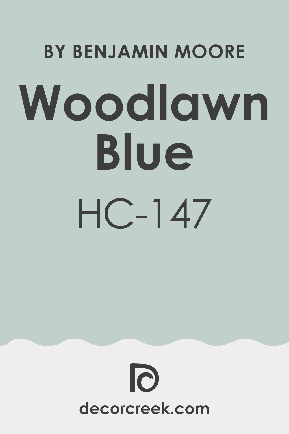
Woodlawn Blue HC-147
Woodlawn Blue is a slightly traditional, clear blue with a moderate gray undertone that keeps it grounded. It is a lovely, mid-toned color that feels incredibly restful and reliable. It has a beautiful balance, being neither too bright nor too muted on the walls.
It works excellently with a warm, creamy trim color like Cloud White or Alabaster. It is a great choice for bedrooms where you want a classic, enduring blue shade. It is part of the Historical Collection, giving it a tried-and-true background.
It provides a sense of quiet sophistication and easy elegance to a sleeping area. It is a versatile blue that adapts well to different fabric patterns and textures. It is a fantastic option for creating a bedroom that feels consistently inviting. It is one of the most reliable, easy-to-decorate-with blue colors I recommend.
👉 Read the full guide for this color HERE 👈
Iceberg 2122-50
Iceberg is a very light, bright blue that has a clean, crisp feel, like a winter sky. It is a refreshing and clear shade that can look almost silver in certain lighting. It has a vibrant quality without being overly saturated or childish in appearance.
It pairs wonderfully with a clean, slightly creamy white like White Dove for a modern look. It is a great choice for a bedroom that is generally quite sunny and needs a cooling element. It is a good option for a secondary color, such as an accent wall or a painted dresser.
It is a color that can add a fun, youthful energy without sacrificing sophistication. It is a very clear, light blue that feels wonderfully fresh and vibrant. It is perfect for creating a bedroom that feels very tidy and well put together. It provides a cool, clear contrast to warm wood furniture and floors.
👉 Read the full guide for this color HERE 👈

November Skies 2128-50
November Skies is a darker, moodier blue-gray that has a deep, dramatic presence. It is a complex, rich shade that feels sophisticated and deeply comforting at night. It has a noticeable depth that makes it a great choice for creating a cozy, cocoon-like effect.
It works wonderfully with a clean, warm cream like White Dove to lighten the overall look. It is an excellent choice for a primary bedroom where a luxurious, dramatic feel is desired. It looks stunning when paired with metallic accents, such as brass or silver lamps.
It is a good option for a room with plenty of light, as it can feel very dark otherwise. It provides a strong, grounding foundation for all other decor elements. It is a highly sophisticated shade that adds a sense of refined elegance to the room. It is one of the most appealing dark blue-grays in the Benjamin Moore collection.
👉 Read the full guide for this color HERE 👈

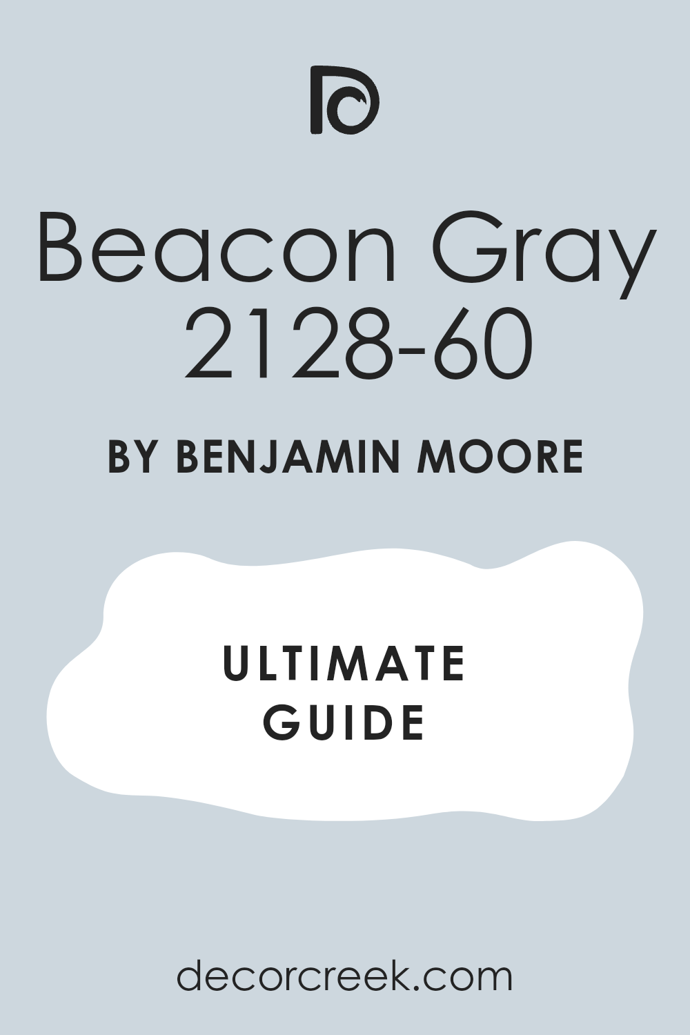
Beacon Gray 2128-60
Beacon Gray is a light, delicate blue that leans heavily toward a pale gray. It is a very soft, atmospheric color that feels gentle and almost cloud-like. It is a fantastic neutral because it has color but remains very versatile and understated.
It pairs perfectly with any of the warm cream colors for a light, tranquil scheme. It is a wonderful color choice for a bedroom that needs a soothing, very gentle application of color. It can change from looking more blue to more gray depending on the time of day.
It is a great option for a restful guest room that should appeal to a wide audience. It provides a lovely, muted backdrop that doesn’t compete with other decor. It is one of my go-to shades when a client wants a light blue that isn’t too strong. It offers a beautifully soft, contemporary feel that is always in style.
👉 Read the full guide for this color HERE 👈
Blue Heather 1620
Blue Heather is a beautiful, mid-tone blue with a slight lavender or violet undertone, giving it unique depth. It is a complex, interesting color that provides a very gentle and inviting presence. It has a noticeable warmth that makes it stand out from typical, cooler blue shades.
It works beautifully with light, clean cream colors to enhance its subtle warmth. It is a fantastic choice for a bedroom where you want a comforting, slightly romantic feel. It looks wonderful when paired with natural linen and textured bedding.
It can feel both classic and very current, depending on the furniture style. It is a shade that I often suggest for adding a subtle twist to a standard blue room. It is a perfect backdrop for creating a space that feels deeply personal and quiet. It offers a lovely, comforting depth that is perfect for a sleeping area.
👉 Read the full guide for this color HERE 👈

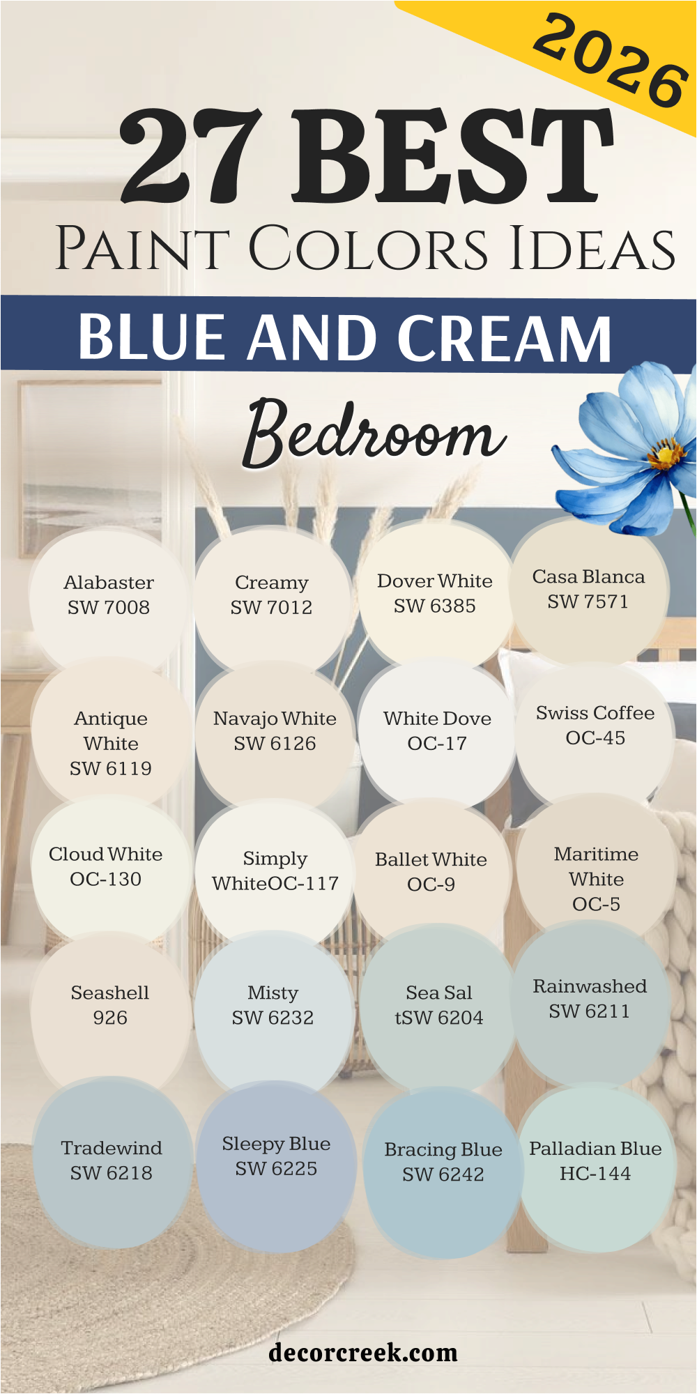
27 blue and cream bedroom paint color ideas by sherwin williams
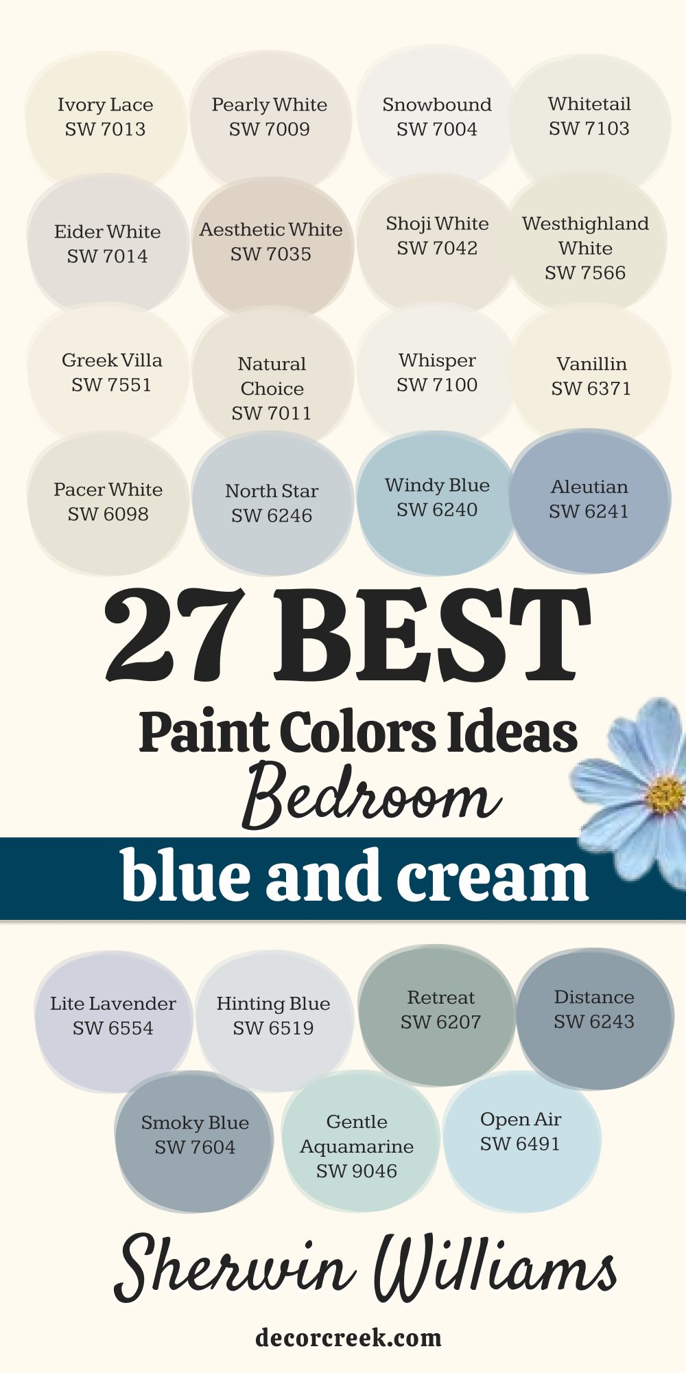
Ivory Lace SW 7013
Ivory Lace is a soft, delicate cream with very gentle yellow undertones that keep it consistently warm. It is a fantastic alternative to stark white, providing a touch of softness without being too colored. It has an inviting, almost luminous quality that makes a bedroom feel airy and bright, especially when the morning sun hits it.
It pairs beautifully with medium-to-dark blues, offering a lovely, clean contrast that defines the space. It is a wonderful choice for walls, trim, or cabinetry in a cohesive bedroom design, providing a seamless, sophisticated base. It is often a favorite because it performs reliably well in many different lighting situations, never appearing muddy or too yellow.
It provides a very clean, yet slightly warm, canvas for colorful accessories and fabrics, allowing them to take center stage. The subtle warmth is its greatest strength, giving rooms an immediate sense of hominess and comfort. It is a shade that feels elegant and slightly traditional while still looking incredibly fresh and current.
It is perfect for creating a restful environment that feels light, spacious, and impeccably well-kept. It is a popular Sherwin-Williams cream because of its reliable and gentle warmth, making it one of the most versatile neutrals.
I often recommend it for transitional spaces where a soft, continuous flow of color is desired, ensuring the bedroom feels connected to the rest of the home.
👉 Read the full guide for this color HERE 👈

Pearly White SW 7009
Pearly White is a fantastic off-white that has a definite touch of creamy warmth and a whisper of gray, giving it a subtle complexity. It is a versatile neutral that can adapt gracefully to both warm and cool-toned furnishings, making it easy to incorporate into existing decor. It has a gentle, sophisticated quality that feels very refined and upscale on the walls, offering more depth than a standard builder’s white.
It is a great pairing for rich, deep blues, like navy or indigo, for a stunning, high-contrast look that feels classic and dramatic. It is an excellent choice for a bedroom if you want a color that is almost white but has more substance and avoids the starkness of pure white.
The faint gray undertone is key to its sophistication, preventing it from ever looking too yellow or too sterile. It maintains a crisp, clean appearance while avoiding any cold or sterile feelings, making the room feel cozy and inviting.
It is a wonderful backdrop for showcasing artwork or interesting architectural details, letting them pop against the muted canvas. It provides a lovely, light base that can be easily accessorized in any color scheme, changing moods simply with new linens.
It is a shade that feels perpetually fresh and sophisticated in any sleeping area, a true designer’s secret for an elevated white. It offers a gentle, refined warmth that makes a room feel instantly inviting and serene upon entering.
👉 Read the full guide for this color HERE 👈

Snowbound SW 7004
Snowbound is a very crisp, clean white with a slight red or pink undertone, which actually gives it a critical degree of warmth. It is a bright white that manages to avoid feeling cold or harsh on a wall, offering a fresh, lively atmosphere. It has a subtle creamy warmth that makes it a perfect choice for an overall wall color, especially in rooms with cooler northern light exposure.
It works wonderfully as a trim color to create sharp, crisp lines against any blue shade, providing strong, architectural definition. It is a great option for a bedroom where you want the walls to look as bright as possible, maximizing the available light.
It reflects light brilliantly, helping to make a smaller bedroom appear larger and more open, creating an illusion of space. Its slight pink/red undertone is what gives it that beautiful blush of warmth, making it feel like a comforting envelope.
It is a highly reliable white that designers frequently turn to for a clean, sharp finish that complements modern design. It provides a beautiful, bright backdrop for colorful bedding and window treatments, making accent colors truly stand out.
It is a fantastic choice for a modern, clean aesthetic that still feels comfortable and never institutional. It is often used as a gallery wall color because of its ability to make other objects and colors the focus. It offers a clean, bright, and slightly creamy feel that is eternally stylish and incredibly versatile.
👉 Read the full guide for this color HERE 👈

Whitetail SW 7103
Whitetail is a soft, warm white that feels fresh but never cold, striking an ideal balance between clean and comfortable. It has a barely perceptible creaminess that makes it incredibly welcoming for a bedroom, moving it safely out of the harsh white category.
It is a shade that pairs exceptionally well with all kinds of blues, from the lightest sky blue to the deepest midnight navy, providing flexibility. It is a great choice for walls if you want a light, airy feel in the room, creating an atmosphere of weightlessness and tranquility.
It also works beautifully on trim or ceiling to subtly soften the contrast against more saturated colors on the walls. This color’s gentle warmth makes it a stellar choice for a bedroom because it feels restorative and calm.
It performs well in rooms with lots of natural light, maintaining its softness without becoming glaring or overwhelming. It is a highly versatile color that easily integrates with existing furniture and a variety of decorating styles, from farmhouse to modern.
It provides a lovely neutral backdrop that allows other decor elements to shine, keeping the focus on your bedding and accessories. It is a choice that gives you a clean yet inherently cozy look, perfect for those who want white walls but not a cold house.
👉 Read the full guide for this color HERE 👈

Eider White SW 7014
Eider White is a very light, creamy gray off-white that has a sophisticated, almost misty appeal, making it a very complex neutral. It is the ideal color when you want to move away from pure white but specifically don’t want a strong cream or yellow undertone in the room. It pairs perfectly with muted, grayish-blue shades for a very harmonious palette, leaning into a modern, refined aesthetic.
It gives a bedroom a calm, grown-up feel, ideal for a private sanctuary where tranquility is paramount. Unlike many creams, it has a cool but not cold, grayish base, which prevents it from looking dingy or yellowing over time. It is a great choice for a room that receives a lot of light, as its gray undertone ensures it will never look glaringly white or washed out.
It provides a subtle depth that makes the walls more interesting than a flat white, giving the room a textural feel. It looks very contemporary and clean when paired with bright white trim, creating a gentle yet effective contrast. It is a versatile neutral that can work with almost any style of décor, acting as the perfect bridge between warm and cool colors.
👉 Read the full guide for this color HERE 👈

Aesthetic White SW 7035
Aesthetic White is a warm, creamy shade that noticeably leans towards beige, providing a lovely, grounding foundation for the room. It has enough saturation to feel like a true color, rather than just a very light tint, giving the walls a substantial and defined presence. It is excellent for creating a cozy, natural atmosphere in the bedroom, perfect for a soothing and restorative space.
It beautifully complements deep, earthy blues and blue-greens, creating a high-end, sophisticated color scheme rooted in nature. This shade brings an effortless warmth to a room that feels both stylish and inherently cozy, making the bedroom feel like a comforting hug.
It is perfect for rooms where you want to emphasize comfort and layered textures, like linen, wool, and throws. It specifically avoids yellow or pink undertones, staying reliably in the soft beige-cream realm, which keeps it current. It is an excellent choice for a bedroom because it is never too harsh or overwhelming, always remaining calm and peaceful. It provides a background that feels settled and quiet, making it easy to achieve a timeless, elegant look.
👉 Read the full guide for this color HERE 👈

Shoji White SW 7042
Shoji White is an incredibly popular creamy shade with noticeable beige and gray undertones, giving it beautiful neutrality and complex character. It is just deep enough to provide a soft contrast against white trim, which helps to define the architectural features of the room. It feels warm, natural, and very organic on the wall, making it a favorite for farmhouse and modern rustic styles.
It is a great choice if you are looking for a cream that is not overtly yellow-toned but still has significant warmth and presence. It pairs wonderfully with all shades of blue, from light to dark, as its grounded neutral base makes it highly adaptable. It is perfect for creating a cocooning feel, providing a very cozy atmosphere in a bedroom without being too dark.
Its balance of beige, gray, and cream makes it exceptionally versatile and highly rated by designers. It looks fantastic with natural wood elements, wicker, and natural fibers, enhancing its organic appeal. It is one of the most reliable and sophisticated creams I use for living areas, a true all-star neutral for any home. It gives the room depth and complexity while remaining a very light neutral, preventing the space from feeling flat.
👉 Read the full guide for this color HERE 👈

Westhighland White SW 7566
Westhighland White is a clean, bright cream with a strong but pleasantly cheerful yellow undertone that makes it exceptionally warm. It is one of the warmest cream shades in the Sherwin-Williams collection, offering a dose of concentrated sunshine. It brings a sunny, cheerful mood into a room, which is perfect for a bedroom that feels dark or faces the cooler north.
It is great for pairing with cooler, cleaner blues to balance out its warmth, creating a lively but not overwhelming contrast. It is an excellent choice for a north-facing room that needs a strong injection of warmth to combat the cool light throughout the day. This color looks saturated and rich but not too dark on the wall, appearing almost buttery in the sunlight.
It is ideal for traditional or cottage styles where you want to emphasize coziness, historic warmth, and charm. It can look quite bright in very sunny rooms, so be sure to test it carefully to ensure the yellow doesn’t become too dominant. It creates a very welcoming and happy atmosphere to wake up to, feeling like a permanent ray of sunshine indoors.
👉 Read the full guide for this color HERE 👈

Greek Villa SW 7551
Greek Villa is a light, soft cream that has the perfect balance of white and warm beige, resulting in a color that is almost flawless. It is clean but not glaring, which makes it absolutely ideal for bedroom walls where comfort and restfulness are key. It has a very slight gray undertone that helps it remain sophisticated and prevents it from appearing overly yellow.
It works as a lovely, bright canvas that looks terrific with any blue shade, from the darkest navy to the lightest sky blue. It is perfect if you want the room to feel light and airy but not empty or sterile, maintaining a cozy feel. It reflects light well, helping to make a smaller bedroom feel more open and expansive without being a stark white.
It is a dependable choice for trim, as it softens the contrast compared to a pure white, giving the room a subtle glow. It provides a very refined and modern creamy white that is a favorite for open-concept spaces. It creates a very serene, quiet foundation for any decor, acting as an understated anchor in a sophisticated room.
👉 Read the full guide for this color HERE 👈

Natural Choice SW 7011
Natural Choice is a soft, warm creamy-beige that acts as an incredibly versatile, sophisticated neutral, bridging cream and beige. This shade has noticeable depth and saturation, making it feel more interesting and substantial than a standard cream or off-white. It is excellent for creating a cozy, earthy feel in a bedroom, reminiscent of natural fibers and quiet calm.
It pairs beautifully with more muted, grayish-blue or blue-green shades, creating a harmonious and sophisticated natural palette. It is a good choice if you want a color that is light but still clearly present and defined on the wall, not a washed-out neutral. It works well with natural wood and warm textures, enhancing the feeling of a well-designed, custom space.
It is perfect for creating a timeless, classic look that won’t feel dated, appealing to traditional and contemporary tastes. It provides a quiet, understated elegance that is perfect for resting and is often found in luxury hotel bedrooms. It has enough saturation to feel like a reliable color, giving the wall a velvety, finished appearance.
👉 Read the full guide for this color HERE 👈

Whisper SW 9591
Whisper is a clean, very light cream that feels soft and almost weightless, defining the lightest end of the creamy white spectrum. It is one of the lightest creams I use, perfect for a hint of softness and warmth that is barely perceptible but essential. It is very close to white but has a soft, warm quality that deliberately takes away the harshness and coldness of true white.
It pairs beautifully with very light, airy blues for a delicate aesthetic, creating a dreamy, ethereal space. It is a great choice for walls if you want the room to feel as bright as possible while still introducing a sense of coziness. It helps make a small room feel more expansive and open, acting as a subtle spatial trick to maximize light.
It is the perfect neutral backdrop for colorful artwork or patterned bedding, letting the accessories command attention. It creates a very fresh, clean, and modern atmosphere, feeling crisp and rejuvenating. It performs well in well-lit rooms, maintaining its softness and avoiding a washed-out appearance.
👉 Read the full guide for this color HERE 👈

Vanillin SW 6371
Vanillin is a rich, warm cream with noticeable golden-yellow undertones that give it a luxurious, almost buttery feel. It is a very cozy and welcoming color, perfect for a bedroom where you want to emphasize deep, comforting warmth and intimacy. It has a rich, almost edible look on the wall, providing a feeling of indulgence and classic elegance.
It is an excellent choice for contrasting with deep, nautical, or navy blues, creating a striking and traditional look. It is ideal for creating a traditional, elegant, or vintage-inspired style, especially in bedrooms with historical architectural features. It can look a little intense in very sunny light, so it is best used in moderately lit spaces to maintain its rich quality.
It creates a very calming, enveloping atmosphere for nighttime rest, making the room feel like a sanctuary. It looks beautiful with dark wood furniture and heavy, textured fabrics, like velvet or silk. It gives the walls a sense of depth and substance, ensuring the room feels decorated and finished.
Pacer White SW 6098
Pacer White is a unique creamy off-white with a slight, almost green or olive undertone, giving it an earthy, sophisticated feel. It is a fantastic neutral that looks more interesting and complex than a typical cream or beige, making it a designer’s choice. It pairs beautifully with muted, blue-green shades for a very harmonious, natural look, reminiscent of soft moss or dried sage.
It is a great choice for a bedroom where you want to specifically avoid the pink or strong yellow undertones found in many other creams. This shade brings a sense of serenity and refinement to the room, feeling calm and grounded.
It works well as a subtle backdrop for displaying collections or artwork, allowing them to stand out without distraction. It feels very contemporary and clean when paired with crisp white trim, providing a gentle, natural contrast. It provides a soft yet discernible warmth on the walls, a perfect subtle greige with a twist.
👉 Read the full guide for this color HERE 👈

North Star SW 6246
North Star is a very light, almost weightless blue that leans heavily into gray, creating a very sophisticated, ethereal shade. It feels airy and clean without appearing too baby blue or pastel, making it suitable for adult spaces. It is a great choice for walls if you want a very gentle, subtle blue that hints at color without being too dominant.
It pairs perfectly with crisp, bright creams like Snowbound for a fresh, classic, and high-contrast look. It creates a very calm, serene atmosphere that is ideal for rest, making it a favorite for primary bedrooms. It works beautifully as an all-over room color because it is not too saturated or dark, preventing the room from feeling small.
It can look very pale blue or light gray depending on the light, offering dynamic complexity throughout the day. It is a great background that provides a hint of color without being dominant, ideal for a minimalist or Scandinavian style. It looks well with natural wood and light, airy fabrics, enhancing its tranquil appeal.
👉 Read the full guide for this color HERE 👈

Windy Blue SW 6240
Windy Blue is a clean, medium-light blue that is reminiscent of a clear spring sky, bright and uplifting. This shade is saturated enough to be clearly blue, but still remains soft and peaceful, avoiding any harshness. It is a great choice for creating a cheerful yet relaxing bedroom atmosphere, perfect for a guest room or secondary bedroom.
It pairs wonderfully with warmer, slightly richer creams like Ivory Lace or Greek Villa, balancing the warmth and cool tones. This color brings a sense of freshness and openness into the room, making it feel expansive and breathable. It works well as an accent wall or on all four walls in a well-lit area, providing a beautiful wash of color.
It has no strong green or violet undertones, staying a fairly true, clean blue that is easy to decorate with. It provides a lovely brightness that can be uplifting, perfect for a morning routine. It creates a very clean and tidy look when paired with white trim, feeling crisp and nautical.
👉 Read the full guide for this color HERE 👈

Aleutian SW 6241
Aleutian is a muted, medium-dark blue with strong gray undertones, giving it sophistication and a wonderful complexity. This color feels deep and mysterious, ideal for a cozy, cocooning atmosphere that encourages deep sleep. It is a great choice if you want a deep blue that is not a full navy but has a subtle, historic quality.
It contrasts beautifully with warm, bright creams like Alabaster for an elegant, high-contrast pairing that looks polished. This shade is perfect for creating a cocooning, comforting feel in a primary bedroom, making the space feel like a five-star retreat.
It looks incredibly rich when paired with velvet, deep wood tones, and metallic accents for a luxurious feel. It provides enough saturation to be a focal point in the room, a statement color that remains incredibly calming. It works well in rooms with plenty of light to showcase its depth and subtle gray shifts.
👉 Read the full guide for this color HERE 👈

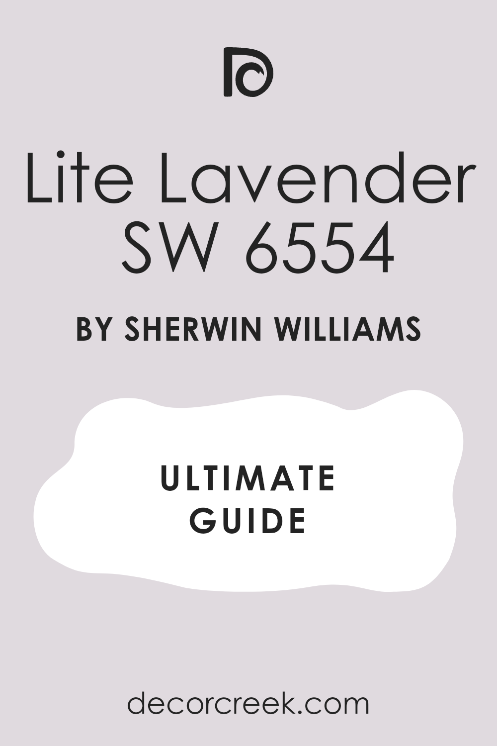
Lite Lavender SW 6554
Lite Lavender is a very light, almost pastel blue-violet shade with a soft, icy feel, offering a unique take on a pastel. This color is a lovely choice for a very gentle and ethereal color accent, moving away from standard blues and pinks. It feels very calming and dreamy, perfect for a restful area or a child’s bedroom where a tranquil mood is needed.
It pairs excellently with clean, warm creams like Snowbound to maintain its lightness and enhance its subtle color. This shade gives a bedroom a light, romantic, or feminine touch without being strongly colored, remaining understated and elegant.
It looks almost white in very bright light, providing only a hint of color that changes subtly with the shadows. It is a good choice if you want to move away from a traditional blue but keep a calm feeling, introducing an element of surprise. It provides a unique softness that is very easy on the eyes, a truly soothing and gentle shade.
👉 Read the full guide for this color HERE 👈
Hinting Blue SW 6519
Hinting Blue is an extremely light, almost invisible blue that looks like the barest whisper of color on the wall. This color is ideal when you want to move away from pure white but do not want a noticeable color, just a touch of cool softness.
It feels clean, fresh, and very light, perfect for smaller bedrooms where every bit of perceived space matters. It pairs beautifully with any warm cream for a minimal contrast, keeping the overall palette light and monochromatic. This shade helps the room feel bright and airy without drawing attention to itself, acting as the perfect silent backdrop.
It is an excellent choice for a ceiling color to give it a soft, sky-like feeling, a subtle trick to elevate the room’s mood. It performs well in rooms with low light, as it won’t absorb light and feel dark, maintaining its lightness. It provides a sense of soft, peaceful glow, a truly ephemeral and delicate color.
👉 Read the full guide for this color HERE 👈

Retreat SW 6207
Retreat is a rich, earthy blue-green shade that has a strong gray undertone, giving it a natural, deeply subdued feel. This color feels deep and very relaxing, like a quiet forest pool or a deep mountain lake, bringing the outdoors in.
It is a great choice if you want a deep blue that brings in an element of nature, feeling organic and incredibly grounding. It pairs excellently with warm, richer creams like Antique White or Shoji White, creating a sophisticated and cozy contrast. This shade is perfect for creating a rich, cozy, and adult feel in a primary bedroom, ideal for a deeply restorative sanctuary.
It looks luxurious and sophisticated when paired with wood elements, leather, and rich textures. It provides a strong, grounding foundation for the room’s decor, giving the walls a substantial weight. It is one of the most popular blue-greens for bedrooms due to its profound tranquility and depth.
👉 Read the full guide for this color HERE 👈

Distance SW 6243
Distance is a deep, saturated navy blue that has a strong, clean tone without an excessive amount of gray, making it a true, vibrant navy. This shade is bold but not overwhelming, perfect for making a dramatic, elegant accent in a sophisticated room. It is a great choice for an accent wall or for all four walls in a well-lit room where you want to create depth and drama.
It contrasts perfectly with the lightest creams, like Pure White, for a classic nautical look that is crisp and timeless. This color gives a bedroom a sense of depth and elegance, making the walls feel like velvet or a deep night sky.
It creates an enveloping, cozy feeling that is ideal for sleeping, encouraging total relaxation. It looks amazing when paired with white textures and metallic accents, allowing the light accessories to pop against the dark backdrop. It is a great way to introduce a strong, rich color into your design, serving as a powerful focal point.
👉 Read the full guide for this color HERE 👈

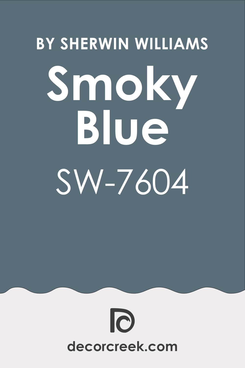
Smoky Blue SW 7604
Smoky Blue is a complex, deep blue that is mixed with a good amount of gray and a touch of green, giving it a hazy, mysterious feel. This shade is very sophisticated and restrained, ideal for an elegant, understated interior with an organic feel. It is a great choice if you want a deep but muted blue that is not too bright, maintaining a sophisticated air.
It pairs beautifully with soft, earthy creams like Aesthetic White or Ballet White for a serene and harmonious palette. This color creates a very calm, relaxing atmosphere that is perfect for unwinding and encourages a peaceful mind.
It has enough depth to give a room character, shifting beautifully in the light to reveal its complexity. It looks beautiful when combined with natural wood and light linens, enhancing its natural, calming feel. It is one of my favorite complex blues for bedrooms because it avoids the typical naval look.
👉 Read the full guide for this color HERE 👈
Gentle Aquamarine SW 9046
Gentle Aquamarine is a light, fresh blue with a distinct green undertone, reminiscent of clean ocean water or a bright tropical pool. This shade is lively and happy, yet still soft enough for a bedroom, providing an energetic but not overwhelming lift. It is a great choice if you want a brighter, more refreshing blue that feels clear and vibrant.
It pairs excellently with clean, bright creams, such as Simply White, for a tropical or coastal style that feels perpetually sunny. This color can bring a vacation feel into your bedroom, making it feel like a refreshing getaway.
It looks especially good in rooms that receive plenty of light, which helps to illuminate its beautiful blue-green tone. It provides a pleasant pop of color that feels clean and fresh, perfect for a cheerful aesthetic. It is a great choice for a guest room or a room where you want to wake up feeling energized and ready to go.
Open Air SW 6491
Open Air is a clean, very light sky blue that feels incredibly fresh, light, and almost cloud-like. This shade is perfect for creating a very airy and clear mood in the bedroom, like an endless summer sky.
It is a great choice if you want a very gentle blue that doesn’t have strong gray or green undertones, keeping it clean and pure. It beautifully complements light, warm creams, such as Dover White, for a classic, clean look that is both light and comforting.
This color helps a small room feel more open and expansive, tricking the eye into seeing more space. It looks beautiful with white cloud-like patterns or textures, enhancing its ethereal quality. It is a great way to bring the soothing feeling of the sky indoors, ideal for a quiet, contemplative space.
👉 Read the full guide for this color HERE 👈

Pool Blue SW 6944
Pool Blue is a vibrant, saturated blue with a distinct green undertone, reminiscent of a sparkling swimming pool on a hot day. This color is very lively and energetic, perfect for making a bold, playful statement in a modern room.
It is a great choice if you are not afraid to use a richer, cleaner blue that has a strong personality and presence. It pairs excellently with clean, bright creams to balance its intensity, giving the room a crisp, defined look.
This shade can give a bedroom a playful, tropical, or retro feel, perfect for adding a burst of fun energy. It looks stunning as an accent wall in a room with cream walls, drawing the eye and anchoring the space. It provides a cheerful pop of color that feels fun and invigorating, a true mood booster. It works well in very sunny rooms where softer blues might look washed out by the strong light.
👉 Read the full guide for this color HERE 👈

Sky High SW 6504
Sky High is a medium, clean blue that has a lovely balance of brightness and softness, making it an excellent all-around blue. This shade feels very classic and reassuring, like a clear daytime sky, evoking a sense of calm and stability.
It is a great choice if you want a reliable, beautiful blue that is neither too dark nor too light, sitting right in the middle. It pairs excellently with any of my favorite cream shades for a versatile look that can be dressed up or down.
This color gives a bedroom a sense of stability and serenity, creating a non-jarring backdrop for rest. It works well as an all-over room color without overwhelming the area, providing just the right amount of color. It provides a pleasant saturation that remains very relaxing, making it a consistently restful shade.
👉 Read the full guide for this color HERE 👈

Icy SW 6534
Icy is a very light, almost freezing blue that has a slight but noticeable violet undertone, giving it a subtle depth and complexity. This shade feels clean, cool, and very refreshing, almost like a mountain stream or fresh snow.
It is a great choice for a room that receives a lot of warm sunlight and needs a cooling element to balance the heat. It pairs excellently with clean creams to highlight its cool quality, creating a crisp, contemporary feel.
This color gives a bedroom a light, almost crystalline appearance, a subtle way to add elegance and sparkle. It is a good way to add color while keeping the palette very light, acting as a sophisticated off-white with personality. It provides a subtle complexity that makes it more interesting than a standard light blue, a refined, pale pastel.
👉 Read the full guide for this color HERE 👈

Upward SW 6239
Upward is a very light, airy blue that has a light gray undertone, giving it a modern and incredibly soft look. This shade is one of the most popular light blues, known for its sophistication and ability to look great in almost any light.
It is a great choice if you want a light blue that doesn’t lean too baby blue, remaining chic and adult. It pairs excellently with a warm cream to create the perfect balance of cool and cozy, preventing the room from feeling too cold.
This color creates a very calm, dreamy atmosphere, ideal for sleeping and unwinding after a long day. It performs well in most lighting conditions, maintaining its softness and avoiding harsh reflections. It provides a very clean and light background for any decor style, making it incredibly easy to live with and accessorize.
👉 Read the full guide for this color HERE 👈

27 blue and cream bedroom paint color ideas trendy this year
Breaktime SW 6463
Breaktime is a fresh, medium-light mint-blue shade that feels deeply relaxing and incredibly restorative, living up to its name. It has a strong green undertone that gives it an invigorating, natural feel, reminiscent of clear lagoon water. It is a great choice for a bedroom where you want to bring in a profound sense of calm renewal and a vibrant, yet soothing, presence.
It pairs excellently with creams like Shoji White for an earthy yet bright palette, creating a natural, high-end contrast. This shade is perfect for creating a distinct coastal or tranquil spa-like style, making your bedroom a true escape. It provides a pleasant pop of color that remains very soothing, never feeling harsh or overwhelming on the walls.
Its invigorating green base makes it feel alive but still incredibly calm. It looks beautiful with natural wood elements, woven textures, and crisp white linens, enhancing its organic appeal. I often recommend it for a bedroom that receives strong sunlight, as it maintains its cool clarity without washing out.
👉 Read the full guide for this color HERE 👈

Moderate White SW 6140
Moderate White is a deep, saturated creamy-beige shade that has a strong warmth and a distinct earthy quality, offering more color than a typical off-white. This color feels very cozy and substantial on the wall, giving a room a feeling of being well-established and finished. It is a great choice if you want your “cream” to be clearly visible and have some depth, avoiding a stark, flat look.
It contrasts beautifully with cleaner, brighter blues like Upward for a contemporary feel, balancing the cool blue with its strong underlying warmth. This shade is perfect for creating a cocooning, enveloping sensation, which is ideal for a restful primary bedroom.
It performs well in rooms with lots of natural light that can showcase its richness and prevent it from feeling heavy. Its depth and saturation make it a strong anchor for the room’s color palette. It provides a very warm, welcoming feel, making the bedroom feel like a comforting retreat, especially at night under warm lamp light.
👉 Read the full guide for this color HERE 👈

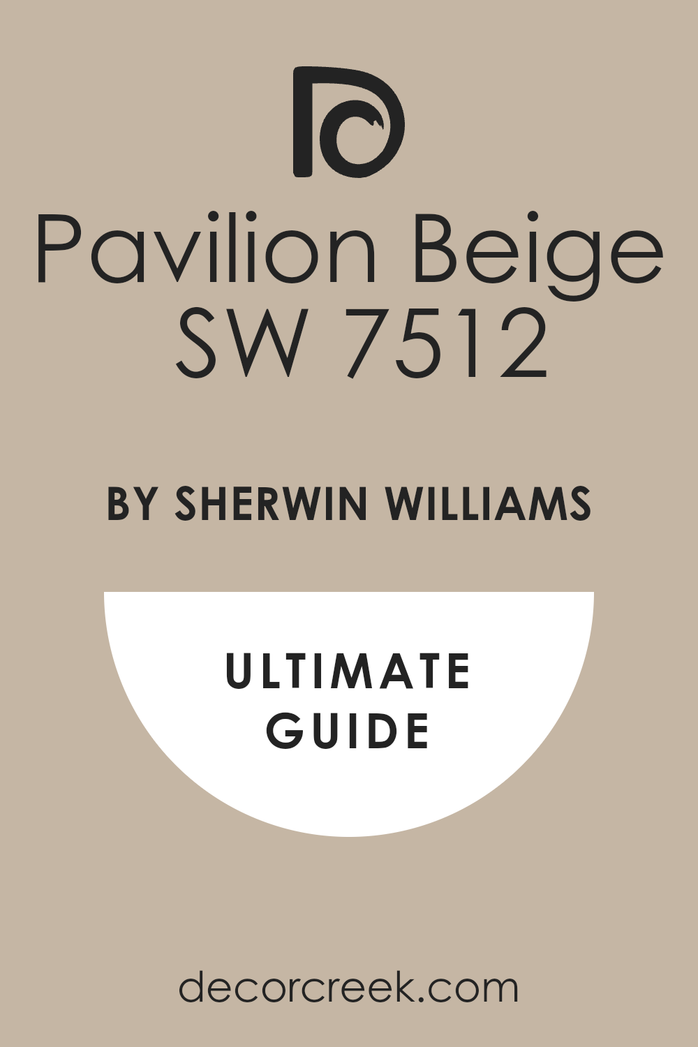
Pavilion Beige SW 7512
Pavilion Beige is a warm, medium beige that has soft, creamy undertones, giving it a gentle, incredibly welcoming feel. This color is a lovely neutral that effectively works as a warm cream substitute, perfect for avoiding yellow tones while maintaining warmth. It is a great choice for creating a cozy and classic background that feels stable and enduring.
It pairs excellently with muted, grayish-blue shades like Misty for a highly sophisticated contrast that looks polished and adult. This shade is perfect for a bedroom where you want to emphasize deep comfort and traditional elegance, providing a rich, subtle base.
It provides a strong sense of stability and permanence, making the room feel settled and timeless. I recommend it for creating a hotel-like atmosphere due to its reliable, refined neutrality and soft finish. It works wonderfully with layered textures and classic furniture styles.
👉 Read the full guide for this color HERE 👈
Accessible Beige SW 7036
Accessible Beige is an incredibly popular neutral that is essentially the perfect, balanced blend of beige and gray (greige) with a touch of creamy warmth. This color feels very contemporary yet comfortably warm and welcoming, making it one of the most versatile colors available. It is a great choice if you want a cream substitute that is highly neutral and does not lean yellow, pink, or green.
It pairs excellently with virtually any shade of blue, from navy to sky blue, since it is such a perfectly balanced neutral base. This shade is perfect for creating a refined and serene interior that feels effortlessly modern.
It provides a soft yet discernible color on the wall, giving it body without dominating the space. It is one of my most reliable, go-to neutrals for bedrooms because of its chameleon-like ability to adapt to light and surrounding colors. It is often used in whole-house schemes for a sophisticated, cohesive flow.
👉 Read the full guide for this color HERE 👈

Shoji White SW 7042
Shoji White is a creamy white with subtle beige and gray undertones that is incredibly sophisticated, functioning beautifully as a rich, warm cream. This shade has just enough saturation to provide a soft contrast against clean white trim, defining architectural details without harsh lines.
It is a great choice if you are looking for a cream with an organic, natural feel, perfect for a modern rustic or refined farmhouse aesthetic. It pairs excellently with deep, earthy blues like Retreat for a rich yet quiet palette rooted in nature.
This color is perfect for creating an enveloping and cozy feeling, making the walls feel like soft linen. Its beige-gray base ensures it never looks yellow in low light, maintaining its sophisticated neutrality. It is one of my most relied-upon, versatile creams because it manages to be both warm and neutral simultaneously.
👉 Read the full guide for this color HERE 👈

Egret White SW 7570
Egret White is a very light, sophisticated creamy-gray that feels exceptionally soft and atmospheric, offering a gentle depth. This shade is complex, featuring a subtle violet or pink undertone that gives it a unique, glowing warmth, especially in the evening light.
It is a great choice if you want an off-white that has surprising depth and avoids the look of a flat white. It pairs excellently with muted blues to create a very romantic and gentle aesthetic, perfect for a refined, calming bedroom.
This color is perfect for a bedroom where you want an airy and elegant feel, feeling light as a feather while still having body. Its slight purple/pink base makes it a great color for a south-facing room where it will neutralize strong yellow light.
👉 Read the full guide for this color HERE 👈

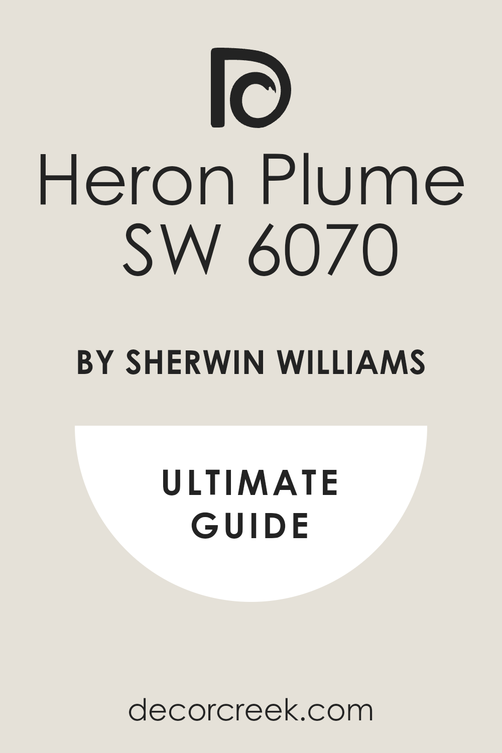
Heron Plume SW 6070
Heron Plume is a light, creamy-beige shade that has a very slight gray undertone, making it exceptionally soft and restrained. This color is a lovely, light neutral that functions perfectly as a warm cream substitute with a contemporary edge.
It is a great choice for walls if you want a hint of color that is clearly present but not overwhelming or distracting. It pairs excellently with any blue to create a balanced and calm interior, from light sky blues to deep navies.
This shade is perfect for creating a quiet, sophisticated atmosphere, working well with high-end, textured fabrics and furniture. It provides a soft, illuminated backdrop without the commitment of a bolder color.
👉 Read the full guide for this color HERE 👈
Natural Linen SW 9109
Natural Linen is a soft, warm beige that has unmistakable creamy undertones, strongly reminiscent of natural woven fabric like linen or jute. This color feels very organic, deeply cozy, and grounded, bringing a sense of simple, earthy elegance to the space.
It is a great choice for creating a natural, deeply restful feeling in the bedroom, appealing to a calm and serene aesthetic. It pairs excellently with nautical or grayish blues to create a harmonious, natural contrast, like sand and sea.
This shade is perfect for creating a warm, hotel-like style, feeling sophisticated, classic, and incredibly comfortable. Its warmth makes it an ideal choice for combating cool northern light without resorting to yellow undertones.
👉 Read the full guide for this color HERE 👈

Creamy Breeze SW 9056
Creamy Breeze is a light, fresh cream that has a soft, clean yellow undertone, giving it a distinct sunny disposition. This color feels inherently bright and welcoming, making it perfect for a bedroom that is generally dark or needs an uplifting touch. It is a great choice if you want a cream that brings a sunny warmth and cheerful energy into the space.
It pairs excellently with clean, medium-light blues to create a wonderfully cheerful and fresh look, like a bright summer day.
This shade is perfect for creating an optimistic and uplifting atmosphere, making the transition from sleep to waking easier and brighter. It works beautifully with white furniture and light-colored wood to enhance its airy feel.
👉 Read the full guide for this color HERE 👈

Kestrel White SW 7516
Kestrel White is a muted, warm cream with complex beige and gray undertones, giving it a rich, antique, historic feel. This color feels deep and soft, providing a perfect, cozy anchor for a traditional or refined bedroom.
It is a great choice if you want a cream that feels rich, layered, and slightly more intense than a standard off-white. It pairs excellently with deep, classic blues to create a timeless contrast that feels established and elegant.
This shade is perfect for creating a traditional and homey style, working beautifully with wainscoting and heavy trim. Its inherent complexity and depth add a luxurious, custom touch to the walls.
👉 Read the full guide for this color HERE 👈

Felted Wool SW 9171
Felted Wool is a medium, deeply warm gray that has a strong beige or cream undertone (a true greige), making it an incredibly soft, sophisticated neutral. This color feels luxurious and intensely enveloping, truly living up to the feeling of a soft blanket or favorite sweater.
It is a great choice for creating a cocooning, sophisticated feel, which is excellent for deep sleep in a primary bedroom. It pairs excellently with clean, mid-tone blues to create a modern yet warm contrast that avoids feeling stark.
This shade is perfect for a primary bedroom where a rich, calming color is desired, providing drama without being a dark navy. Its velvety finish and depth are perfect for creating an upscale, cozy sanctuary.
👉 Read the full guide for this color HERE 👈

Naturel SW 7542
Naturel is a light, soft beige-cream that feels very earthy, organic, and effortlessly tranquil. This color is a beautiful, versatile neutral that pairs easily with other colors due to its balanced, natural base.
It is a great choice if you are looking for a cream with a strong natural base, like clay or earth, avoiding artificial undertones. It pairs excellently with muted blue-greens to create a harmonious, quiet look that feels pulled from a nature palette.
This shade is perfect for creating a relaxing, spa-like atmosphere, contributing to a sense of well-being and calm. Its gentle saturation ensures the walls have body but still feel incredibly light and airy.
Wool Skein SW 6148
Wool Skein is a warm, medium-light beige with strong creamy undertones, creating a very cozy and substantial look. This color feels very welcoming and traditional, offering a comforting and familiar presence in the room.
It is a great choice if you want a cream that is distinctly warm and rich, providing a noticeable glow to the walls. It pairs excellently with deep, classic blues to create a timeless, strong contrast that emphasizes both colors.
This shade is perfect for creating a rich, rustic, or traditional style, working beautifully with antique furniture and dark wood floors. Its strong warmth makes it an ideal solution for balancing rooms that receive cool, northern light.
👉 Read the full guide for this color HERE 👈

Loyal Blue SW 6510
Loyal Blue is a clean, medium-dark blue that has a beautiful, vibrant tone and excellent clarity. This color feels classic, strong, and very dependable, reminiscent of a traditional, clear blue.
It is a great choice if you want a rich, true blue without strong gray or green undertones, offering a pure color experience. It contrasts excellently with bright, clean creams to create a crisp, nautical look that is both fresh and elegant.
This shade is perfect for creating a traditional, elegant, and noticeable interior, providing a powerful, yet familiar, focal point. Its depth and purity of color ensure it reads clearly as blue on the wall, even in low light.
👉 Read the full guide for this color HERE 👈

Lullaby SW 9136
Lullaby is a very light, soft blue with a barely perceptible violet undertone that makes it incredibly soothing and gentle. This color feels very gentle, dreamy, and perfectly suited for a bedroom, aligning with rest and peace.
It is a great choice for creating a serene, nursery-like atmosphere, or a soft, adult primary bedroom. It pairs excellently with the lightest creams to maintain its airy, weightless quality, resulting in a monochromatic soft scheme.
This shade is perfect for creating a light, soft, and relaxing area, making the room feel expansive and ethereal. Its delicate violet touch adds a unique warmth, preventing it from feeling too cold or icy.
Lazy Gray SW 6254
Lazy Gray is a light, airy blue that leans heavily into gray, creating a very calm and highly sophisticated shade. This color feels like a soft, summer mist or a cloudy sky, ideal for unwinding and contemplation.
It is a great choice if you want a blue that effectively acts as a neutral, providing color without overwhelming the senses. It pairs excellently with warm creams to keep it from feeling cold, achieving a balanced, gentle elegance.
This shade is perfect for creating a contemporary, quiet, and adult interior, working beautifully in minimalist or modern coastal styles. Its muted quality ensures it looks fantastic with natural wood and leather accents.
👉 Read the full guide for this color HERE 👈

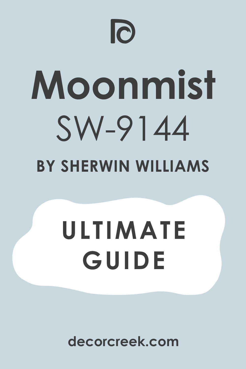
Moonmist SW 9144
Moonmist is a muted, medium-light blue that has a slight green undertone and a good amount of gray, making it look very natural and organic. This color feels very tranquil and earthy, like a quiet night or a hazy mountain view.
It is a great choice for creating a restful, earthy palette, connecting the room to a natural, subdued aesthetic. It pairs excellently with creams that have a strong beige undertone for a warm, harmonious contrast.
This shade is perfect for creating a cozy, naturally lit interior, giving the walls a velvety, deep texture. Its complex undertones prevent it from looking flat, giving the color a beautiful depth.
👉 Read the full guide for this color HERE 👈
Blustery Sky SW 9140
Blustery Sky is a saturated, medium-dark blue with a good amount of gray that gives it a beautiful, elegant depth and atmospheric quality. This color feels atmospheric, rich, and very dramatic, reminiscent of an impending storm or deep twilight.
It is a great choice for an accent wall or for creating an enveloping, cocooning feel on all four walls. It contrasts excellently with bright, clean creams to illuminate its depth, resulting in a crisp and powerful visual.
This shade is perfect for creating a luxurious, sophisticated primary bedroom, making the room feel like a high-end, custom space. Its depth works wonders in rooms with high ceilings or large windows to prevent the room from feeling small.
Gale Force SW 7605
Gale Force is a very deep, dark blue-green shade that looks almost black in shadow but shows its rich, complex depth in direct light. This color feels intensely dramatic, strong, and very contemporary, making a bold statement.
It is a great choice if you want a dark, bold color that gives a room immense character and a luxurious, intimate feel. It pairs excellently with very light creams to create a striking, graphic contrast that is sharp and modern.
This shade is perfect for creating a luxurious, cocooning feeling, ideal for a bedroom that is meant to be a quiet, private refuge. Its strong depth allows accessories and artwork to truly pop off the wall.
👉 Read the full guide for this color HERE 👈

Debonair SW 9139
Debonair is a clean, medium-saturated violet-blue that feels bright, cheerful, and incredibly inviting. This color is a great choice if you want a blue that has more energy and a distinct warmth due to its violet base.
It pairs excellently with neutral creams to soften its vibrancy, creating a balanced and harmonious scheme.
This shade is perfect for creating a playful yet sophisticated interior, making it a wonderful color for a guest room or a child’s bedroom. Its lively tone works well in rooms that need a boost of cheerful, uplifting color.
👉 Read the full guide for this color HERE 👈

North Star SW 6246
North Star is a deep, subdued blue with noticeable gray undertones, creating a very sophisticated and earthy shade. This color feels like a deep, foggy sea or a misty mountain evening, ideal for profound rest and contemplation.
It is a great choice if you want a deep blue that remains very calm and quiet, avoiding any vibrant intensity. It pairs excellently with warm, slightly darker creams for a harmonious, cozy look that feels balanced and grounded.
This shade is perfect for creating a traditional, enveloping feel, ideal for a warm, historic aesthetic. Its deep, muted quality makes it a timeless and very adult choice for a primary suite.
👉 Read the full guide for this color HERE 👈

Storm Cloud SW 6249
Storm Cloud is a complex, medium-dark blue that has a strong gray and slight green undertone, giving it an atmospheric feel. This color feels atmospheric, deep, and very reassuring, reminiscent of a calm, pre-storm sky.
It is a great choice for creating a sophisticated, natural palette that is both calming and intriguing. It pairs excellently with creams that have strong beige undertones for an earthy contrast that feels custom and layered.
This shade is perfect for creating a calm, adult interior, providing a strong, stable color that changes beautifully with the light. Its complexity makes it a dynamic background for layered decor.
Notable Blue SW 6521
Notable Blue is a clean, bright, medium blue with good saturation that looks very fresh, vibrant, and optimistic. This color is a great choice if you want a blue that has a cheerful and lively feel, avoiding any muddiness.
It pairs excellently with clean, bright creams to emphasize its freshness, creating a crisp and defined aesthetic.
This shade is perfect for creating a coastal or classically bright interior, bringing a sense of joy and vitality into the room. Its clear tone makes it a great choice for a room that needs a light-hearted, energetic lift.
Honest Blue SW 6520
Honest Blue is a medium-dark, clean blue that is a very reliable and straightforward shade without significant complex undertones. This color feels deep and stable, ideal for creating a sense of security and classic dependability in the room.
It is a great choice if you want a strong, traditional blue that is universally pleasing and easy to decorate around. It pairs excellently with any warm cream to create a classic, strong contrast that is always in style.
This shade is perfect for creating a traditional, timeless bedroom, offering a clear, true blue presence on the walls. Its reliability makes it a top choice for traditional and nautical styles.
👉 Read the full guide for this color HERE 👈

Jetstream SW 6492
Jetstream is a light, clean sky blue with a very slight green undertone that feels incredibly fresh, airy, and open. This color is a great choice if you want a light blue that doesn’t lean too heavily toward gray, maintaining a clean, vibrant lightness.
It pairs excellently with clean, warm creams to create a light, ethereal look that feels soft and delicate.
This shade is perfect for creating an open, serene atmosphere, making the room feel like a cloud in the sky. Its lightness makes it an excellent choice for maximizing the perceived size of a smaller bedroom.
Sky Fall SW 9049
Sky Fall is a very light, almost pastel blue-green that feels exceptionally soft, gentle, and muted. This color is a lovely, airy shade that brings in a subtle, dreamy element of nature, like a misty spring morning.
It pairs excellently with the lightest creams to maintain its weightless quality, resulting in a very ethereal palette.
This shade is perfect for creating a romantic, dreamy, and very peaceful setting, ideal for a tranquil, quiet space. Its pastel nature provides color without any noticeable commitment or intensity.
👉 Read the full guide for this color HERE👈

Wishful Blue SW 6813
Wishful Blue is a bright but soft, medium blue with a subtle violet undertone that gives it a unique depth and warmth. This color feels very lively and intriguing, yet remains reassuringly soft and gentle on the eyes.
It is a great choice if you want a blue that has a little more personality and character than a standard sky blue.
It pairs excellently with neutral creams to highlight its unique tint, creating a sophisticated and personalized look. This shade is perfect for creating a cozy, slightly bohemian interior, feeling both comforting and creatively inspiring.
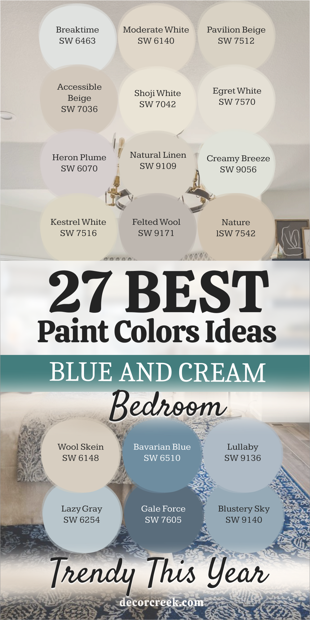
My Final Thoughts about 27 blue and cream bedroom paint color ideas
I sincerely hope that exploring this extensive list of 27 beautiful blue and cream shades has provided you with a wealth of inspiration and clarity for your bedroom design project. As a professional designer, I consistently emphasize to my clients that the wall color is, without a doubt, the single most important foundation for establishing a room’s entire atmosphere and emotional tone.
In the bedroom, this is particularly critical, as the space is dedicated entirely to rest and restoration.
The blue and cream color scheme is a time-tested combination that is virtually guaranteed to succeed because it masterfully balances the essential elements of warmth and coolness in a perfect, harmonious equilibrium.
The cool, tranquil nature of blue promotes relaxation and peace, while the soft, embracing warmth of cream prevents the space from feeling cold or stark.
Choosing the right cream is your first key decision. You must carefully consider the undertone: do you prefer a highly subtle, almost-white neutral, such as Sherwin-Williams’ Ivory Lace or Benjamin Moore’s White Dove, which keeps the space feeling light and expansive? Or, are you drawn to a richer, buttery, or beige-tinted tone, like SW’s Vanillin or Shoji White, which adds profound coziness, depth, and a tangible sense of enveloping warmth?
Your choice of blue dictates the room’s energy. You can opt for a quiet, deeply restful grayish-blue, such as SW’s Misty or BM’s Lazy Gray, for maximum serenity and sophistication.
Alternatively, if you want a brighter, more invigorating space, choose a cleaner, more vibrant blue, like SW’s Windy Blue or Pool Blue, to give the room a refreshing lift and a cheerful start to your day.
The most critical takeaway I can offer is this: You absolutely must test large, physical samples on your bedroom walls. The unique natural light that floods your room—whether it’s cool and north-facing, or warm and south-facing—will interact with the paint’s pigments in ways that a small paint chip cannot predict.
The color will look dramatically different from morning light to evening light.
No matter which of these 27 expertly curated options you ultimately select, by following this simple testing process, you will ensure you create a retreat that feels perfectly tailored to you—a true, personal sanctuary designed for absolute peace and comfort.
