Dark green paint has the unique power to transform a standard house into a sanctuary that feels exactly like a serene, cozy forest. Over the past several years, I have dedicated countless hours to studying how light hits different wall textures and carefully selecting the most harmonious shades for families to live in.
It is very common for homeowners to feel a sense of hesitation or even fear when considering dark colors; there is a widespread myth that deep tones will inevitably turn a beautiful room into a cramped, dark cave.
I am here to dispel those myths and show you that these deep, velvety greens actually serve to make your living space feel incredibly rich, sophisticated, and expensive.
The process of picking a new color for your home should be an exciting creative journey that sparks joy, rather than a stressful chore that weighs on your brain.
Together, we are going to explore the very best options available today—shades specifically chosen to make every single corner of your home look more polished and intentional than ever before.
Why I Always Trust Sherwin-Williams and Benjamin Moore for the Best Dark Green Paint Colors
I consistently return to these two industry-leading brands because their paint is remarkably reliable; it stays vibrant on the wall and looks exactly like the small paper sample you fell in love with at the store. Sherwin-Williams offers an impressive range of professional options that provide excellent coverage, easily hiding old scuffs or stubborn marks with just a couple of coats.
On the other hand, Benjamin Moore is famous for creating complex pigments that retain their deep, realistic character whether they are under the bright morning sun or a soft yellow light bulb at night.
Whenever I am professionally staging a house for a quick sale, I absolutely require results that are consistent and dependable. These companies have invested decades into their research to ensure that their paint does not fade over time or take on a cheap, chalky appearance.
Your home is your most important investment, and you truly deserve to have these high-quality, premium materials surrounding you in your primary living areas every day.
How I Choose the Perfect Dark Green Shade for Any Room
Selecting the right shade always begins with a careful evaluation of your windows to determine exactly how much natural sunlight flows into the space throughout the day. You must be mindful that a very saturated dark green can easily be mistaken for pure black if the room lacks sufficient natural light or high-quality lamps.
Because of this, I always strongly advise my clients to paint a large test square directly on the wall first; this allows you to observe how the pigment reacts to the shadows and shifts in mood as evening falls.
Beyond the lighting, you should take a close look at your existing furniture to see if the pieces will truly match the bold new atmosphere of your walls. Dark green is a surprisingly versatile backdrop that works beautifully with natural wood grains, shiny gold hardware, and crisp white architectural accents.
Ultimately, my goal is to help you create a space that feels perfectly balanced, grounded, and exactly right for the rhythms of your daily life.
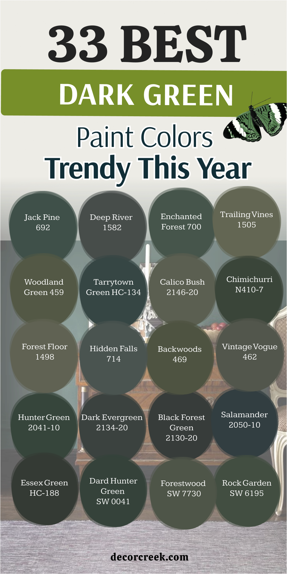
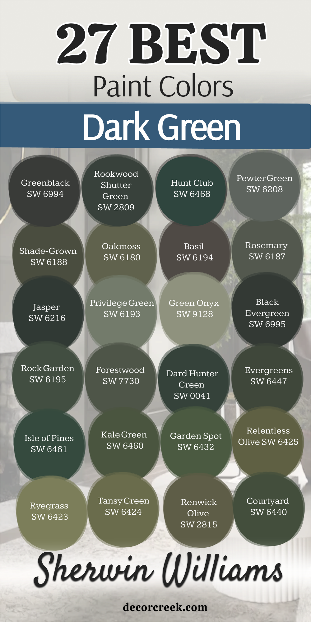
33 Best Dark Green Paint Colors Trendy This Year
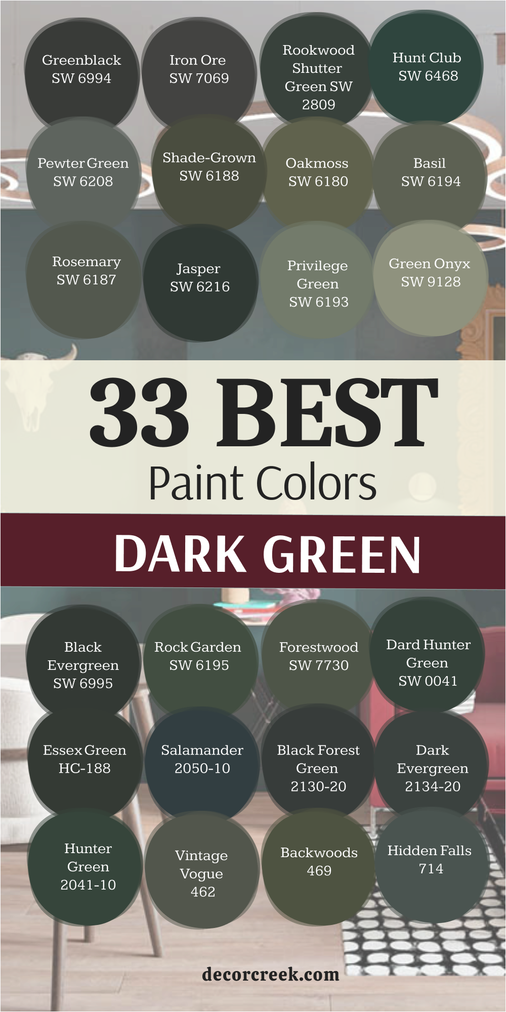
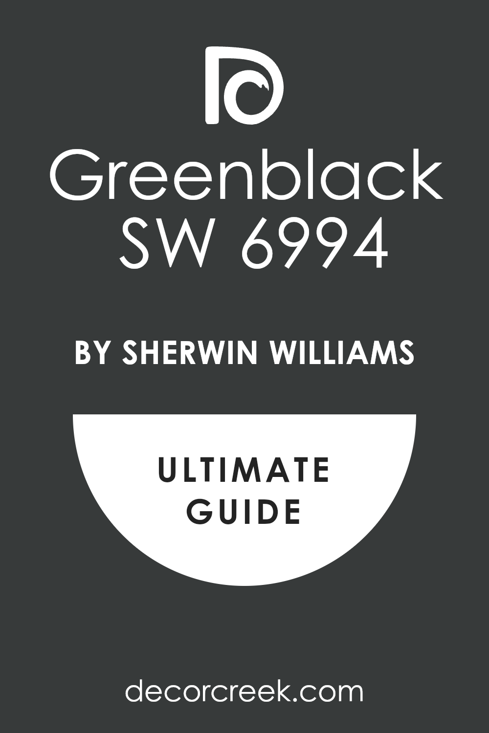
Greenblack SW 6994
Greenblack SW 6994 is the deepest shade you can find that still has a hint of nature in it. This color looks almost like midnight but feels much softer than a standard black. It creates a very strong statement on a focal wall.
Many people choose it when they want a moody look for a private study. You will notice it changes throughout the day as the sun moves across the sky. It works perfectly for hiding imperfections on older walls.
The depth of the pigment makes the room feel very sturdy and high-end. I like to use it when the ceiling is tall and white. It brings a sense of grounding to a large area. You can trust this shade to stay trendy for a very long time.
Best used in: home offices, accent walls, theater rooms, and modern exteriors
Pairs well with: Extra White SW 7006, Honey Oak, Brass hardware, Carrara marble The key rule of this color for farmhouse style is to use it where you want a sharp contrast against bright white trim.
👉 Read the full guide for this color HERE 👈
Iron Ore SW 7069
Iron Ore SW 7069 behaves like a chameleon because it sits right between charcoal and a deep forest hue. This shade is famous for being dark without feeling cold or unfriendly. It adds a layer of mystery to any hallway or door.
I find that it makes light colored furniture pop and look brand new. The finish looks velvety when you apply two coats on a smooth surface. It provides a heavy feeling that makes a bedroom feel very secure.
Many designers pick this for cabinets to give a kitchen a modern edge. It does not show fingerprints or dust as much as lighter paints do. You will love how it makes your art pieces stand out against the dark background. It is a reliable choice for anyone wanting a bold change.
Best used in: kitchen cabinets, front doors, window frames, and moody bedrooms
Pairs well with: Alabaster SW 7008, Repose Gray SW 7015, light wood, leather accents The key rule of this color for farmhouse style is to use it on architectural details like beams or fireplace mantels to create focal points.
👉 Read the full guide for this color HERE 👈

Rookwood Shutter Green SW 2809
Rookwood Shutter Green SW 2809 belongs to the historic collection which means it has a classic feeling. This green has a bit of blue and gray hidden inside the mixture. It reminds me of the shutters on old beautiful mansions in the countryside.
You can use it to make a house look more expensive and established. It feels very formal and works great in a dining room where you host big dinners. The color is saturated enough to look green even in low light.
It creates a very traditional look that never feels out of place. I suggest this for people who love the look of old libraries. It stays looking fresh even after years of wear and tear. This is a solid pick for a house that needs a bit of character.
Best used in: exterior shutters, traditional dining rooms, libraries, and front doors
Pairs well with: Kilim Beige SW 6106, Classical White SW 2829, dark mahogany, antique gold The key rule of this color for farmhouse style is to use it on the exterior to give your home a sense of history and permanence.
Hunt Club SW 6468
Hunt Club SW 6468 is a jewel tone that feels very rich and energetic. This green is bright enough to show its true color but dark enough to be sophisticated. It makes me think of deep pine forests and old velvet jackets. You will find that it brings a lot of life to a room that feels boring.
It looks amazing when paired with gold frames or mirrors. The pigment is very strong and gives great coverage on the first try. It is a fun choice for a small bathroom where you want to surprise your guests.
I think it looks best with white trim to keep it looking crisp. It makes a house feel like a cozy retreat from the busy world outside. This shade is for people who are not afraid to use real color.
Best used in: powder rooms, library walls, cozy dens, and accent furniture
Pairs well with: Pure White SW 7005, Gold accents, Cognac leather, Navy blue The key rule of this color for farmhouse style is to use it in small doses to add a pop of forest-inspired luxury.
Pewter Green SW 6208
Pewter Green SW 6208 has a lot of gray in it which makes it very easy to live with every day. This color is soft and does not yell for attention when you walk in. It feels like a natural stone or a mossy rock in the woods.
Many homeowners love it for their kitchen cabinets because it looks clean and earthy. It works well with both silver and gold metals in your home. The color creates a very balanced mood that helps you relax after work.
I like how it sits quietly in the background while still looking stylish. It is a great middle-ground choice if you cannot decide between gray and green. You will find that it matches almost any type of flooring you have. It is a very safe and beautiful option for any room.
Best used in: kitchen cabinets, laundry rooms, mudrooms, and bedroom walls
Pairs well with: Spare White SW 6203, Sea Salt SW 6204, Light oak, Brushed nickel The key rule of this color for farmhouse style is to use it on cabinetry to bring an organic, grounded feeling to the heart of the home.
👉 Read the full guide for this color HERE 👈

Shade-Grown SW 6188
Shade-Grown SW 6188 is a deep olive that feels very warm and organic. This color has a lot of yellow and brown undertones that make it feel like the earth. It is a perfect choice for a room where you want to feel tucked away and safe.
The warmth of the green makes it pair beautifully with brick or stone. I often use this in basements to make them feel more like a real living part of the house. It has a heavy weight to it that makes large rooms feel more intimate.
The color does not feel cold even on a cloudy day. It reminds me of the leaves at the very end of summer. You can use it to create a very rustic and cozy atmosphere. It is a wonderful shade for a cottage or a cabin.
Best used in: dens, basements, exterior siding, and cozy living rooms
Pairs well with: Dover White SW 6385, Balanced Beige SW 7037, Red brick, Copper accents The key rule of this color for farmhouse style is to use it in rooms with lots of texture like wool rugs and woven baskets.
👉 Read the full guide for this color HERE 👈
Oakmoss SW 6180
Oakmoss SW 6180 is a true forest green that feels very natural and vibrant. This color is not too dark and not too light which makes it very flexible. It looks like the moss you find growing on the side of a tree.
I think it works best in rooms that have a lot of wood furniture. It brings the feeling of the outdoors right into your living room. The color is very friendly and makes guests feel welcome immediately.
You can use it on all four walls without making the room feel small. It provides a nice backdrop for plants and greenery. The pigment is very steady and does not shift too much in different lighting. It is a great pick for someone who loves a nature-themed house.
Best used in: living rooms, sunrooms, entryways, and kids’ rooms
Pairs well with: Rice Grain SW 6155, Urban Putty SW 7532, Pine wood, Creamy whites The key rule of this color for farmhouse style is to use it as a bridge between your indoor furniture and the greenery outside your windows.
👉 Read the full guide for this color HERE 👈
Basil SW 6194
Basil SW 6194 is a dusty green that looks very high-end and designer. This color has a softness to it that makes it very pleasing to the eye. It is dark enough to have depth but light enough to feel airy.
Many people use it for built-in bookshelves to make them look custom. It has a slightly sage feeling but with a much deeper base. I love how it looks when the sun hits it in the afternoon. It makes a room feel very sophisticated and well-planned.
You can use it in a nursery or a master bedroom for a very peaceful look. The color is very popular right now because it is so easy to coordinate. It makes every piece of furniture look like it belongs there.
Best used in: master bedrooms, built-in shelving, dining rooms, and home offices
Pairs well with: Shoji White SW 7042, Mindful Gray SW 7016, Walnut wood, Linen fabrics The key rule of this color for farmhouse style is to use it on shiplap or beadboard for a textured, garden-inspired wall.
👉 Read the full guide for this color HERE
Rosemary SW 6187
Rosemary SW 6187 is a deep herb green that feels very trendy and modern. This shade has a lot of gray which keeps it from looking too bright or grassy. It is a very popular choice for modern farmhouse styles because it looks so clean.
I find that it works perfectly for an accent wall behind a bed. The color feels very solid and gives a room a sense of purpose. It looks great with black hardware and light wood floors. You will notice that it feels very cozy in the evening under warm lamps.
It is one of those colors that everyone seems to like once it is on the wall. The coverage is excellent and it hides marks from kids or pets. It is a very reliable and pretty shade of green.
Best used in: accent walls, mudrooms, kitchen islands, and bedrooms
Pairs well with: Eider White SW 7014, Black Fox SW 7020, Light maple, Slate tile The key rule of this color for farmhouse style is to use it on your kitchen island to make it the star of the room.
👉 Read the full guide for this color HERE 👈

Jasper SW 6216
Jasper SW 6216 is so dark that it almost looks like a black jade stone. This is the green for you if you want the darkest wall possible. It is extremely moody and looks very expensive in a small room.
I love using this for a powder room to create a “wow” moment for guests. It feels very heavy and substantial on the walls. You need to have good lighting to see the green highlights in the paint. It creates a very dramatic look that feels like a luxury hotel.
The color is very deep and does not have any yellow in it. It stays looking cool and crisp no matter what. It is a bold choice that pays off with a very stylish look.
Best used in: powder rooms, moody dens, exteriors, and formal offices
Pairs well with: High Reflective White SW 7757, Marble, Silver accents, Cool grays The key rule of this color for farmhouse style is to use it on the exterior trim or front door for a very sharp and clean entrance.
👉 Read the full guide for this color HERE 👈

Privilege Green SW 6193
Privilege Green SW 6193 is a teal-leaning green that feels very lush. This color has a lot of personality and brings a cool feeling to a room. It is dark but still has a lot of blue energy inside of it. I like to use this in bathrooms to make them feel like a spa.
It looks very beautiful with white tiles and silver faucets. The color is deep enough to feel mature but bright enough to be interesting. It makes a great contrast against warm wood tones in the house.
You will find that it changes a lot depending on if you use warm or cool light bulbs. It is a very refreshing shade that feels like a deep pool of water. This is a great choice for someone who wants a unique green.
Best used in: bathrooms, laundry rooms, accent walls, and furniture
Pairs well with: Snowbound SW 7004, Naval SW 6244, White oak, Chrome hardware The key rule of this color for farmhouse style is to use it in areas where you want a clean and crisp feeling of water and nature.
👉 Read the full guide for this color HERE 👈
Green Onyx SW 9128
Green Onyx SW 9128 is a soft and earthy green that feels very balanced. This color is not too dark so it works well in rooms with smaller windows. It has a natural look that reminds me of garden herbs.
I find that it makes a kitchen feel very homey and warm. It is a great choice for people who want a green that is easy to look at every day. The color does not feel heavy or dark like some of the other shades.
It works very well with beige and cream colors in your rugs or curtains. You can use it in a hallway to make the transition between rooms feel smooth. It is a very polite color that does not demand all the attention. It is a classic choice for a family home.
Best used in: kitchens, hallways, breakfast nooks, and guest rooms
Pairs well with: Greek Villa SW 7551, Accessible Beige SW 7036, Woven wood shades, Bronze The key rule of this color for farmhouse style is to use it to create a soft and inviting kitchen that feels like the heart of the home.
👉 Read the full guide for this color HERE 👈
Rock Garden SW 6195
Rock Garden SW 6195 is a rich and deep green that feels very botanical. This color looks like the leaves of a tropical plant in the shade. It has a lot of depth and makes a room feel very lush and full. I think it looks amazing in a living room with lots of real plants.
The green is very pure and does not look too gray or too brown. It provides a very strong backdrop for light colored artwork. You will love how it makes a room feel like a secret garden.
It is a very comforting color that feels very high-quality. The paint has a nice glow to it even in a matte finish. It is a great choice for someone who wants a true green.
Best used in: living rooms, plant rooms, sunrooms, and bedrooms
Pairs well with: Origami White SW 7636, Urban Bronze SW 7048, Rattan furniture, Terracotta The key rule of this color for farmhouse style is to use it in a room where you have lots of natural textures like wicker and wood.
👉 Read the full guide for this color HERE 👈

Forestwood SW 7730
Forestwood SW 7730 is a traditional green that feels very steady and reliable. This color is what most people think of when they imagine a forest green. It is not too dark so it keeps the room feeling friendly.
I use this often for home offices because it helps people focus. The color is very earthy and reminds me of a walk in the woods. It looks very good with leather chairs and wooden desks. You will find that it stays looking the same regardless of the time of day.
It is a very consistent color that is easy to paint with. It gives a room a very solid and finished feeling. This is a perfect choice for a classic study or library.
Best used in: home offices, libraries, mudrooms, and dining rooms
Pairs well with: Creamy SW 7012, Latte SW 6108, Dark leather, Gold leaf The key rule of this color for farmhouse style is to use it to create a studious and quiet corner for reading or working.
👉 Read the full guide for this color HERE 👈
Dard Hunter Green SW 0041
Dard Hunter Green SW 0041 is a heritage color that feels very noble. This shade is very dark and has a slight blue tint to it. It was used a lot in old houses and still looks great today.
I like to use it on kitchen cabinets for a very high-end look. It makes a small room feel like a jewelry box. The color is very deep and hides any imperfections on the surface. You will find that it looks very elegant with marble countertops.
It creates a very formal atmosphere that is great for entertaining. It is a very strong color that makes a lasting impression on guests. This is a great pick for a house with a lot of history.
Best used in: kitchen cabinets, formal dining rooms, front doors, and accent walls
Pairs well with: Alabaster SW 7008, Pewter hardware, White marble, Dark wood The key rule of this color for farmhouse style is to use it on the front door to give your guests a very grand welcome.
👉 Read the full guide for this color HERE 👈
Essex Green HC-188
Essex Green HC-188 is a very dark green that looks like a classic forest. This color is one of the most famous greens from Benjamin Moore. It is very deep and looks almost black in rooms without many windows.
I find that it makes a house look very established and expensive. It is a great choice for a formal library or a cozy den. The color is very rich and does not have any distracting undertones. It looks amazing with brass light fixtures and white trim.
You will love how it creates a very quiet and still feeling in a room. It is a very traditional choice that will never go out of style. This is a very safe bet for a high-end look.
Best used in: libraries, front doors, formal living rooms, and shutters
Pairs well with: Simply White OC-117, Revere Pewter HC-172, Brass, Cherry wood The key rule of this color for farmhouse style is to use it on the shutters of a white house for a perfect classic look.
👉 Read the full guide for this color HERE 👈

Salamander 2050-10
Salamander 2050-10 is a very dark green that has a lot of blue and black in it. This color is very moody and changes a lot depending on the light. It can look like a deep teal or a soft black in different parts of the day.
I love using this for a bedroom to make it feel very dark and ready for sleep. It is a very deep and mysterious color that adds a lot of interest. You will find that it makes gold and silver accents shine very brightly.
It is a very bold choice that makes a room feel very modern. The paint is very thick and gives a very smooth finish. It is a great pick for someone who wants a very dark and cool green.
Best used in: bedrooms, accent walls, powder rooms, and modern dens
Pairs well with: Chantilly Lace OC-65, Gray Owl OC-52, Silver, Velvet fabrics The key rule of this color for farmhouse style is to use it in a small room to make the walls seem to disappear into the shadows.
👉 Read the full guide for this color HERE 👈

Black Forest Green 2130-20
Black Forest Green 2130-20 is a very deep and dark green that feels very cold. This color has a lot of gray and blue which makes it look very crisp. It is a great choice for a modern home with lots of glass and metal.
I like to use it for a focal wall in a living room. The color is very sophisticated and looks like a designer chose it. You will find that it makes light wood floors look very warm and bright.
It is a very saturated color that stays looking dark even in the sun. It creates a very calm and focused environment for a home office. This is a very stylish and cool shade of green.
Best used in: modern living rooms, accent walls, offices, and exteriors
Pairs well with: White Heron OC-57, Stonington Gray HC-170, Light maple, Steel The key rule of this color for farmhouse style is to use it in a modern home to add a touch of nature without being too bright.
Hunter Green 2041-10
Hunter Green 2041-10 is a classic and vibrant green that feels very traditional. This color is dark but it has a lot of life and brightness to it. It is the perfect shade for someone who wants a green that actually looks green.
I like to use it in a dining room to create a very warm and inviting space. It looks very good with white wainscoting and dark wood tables. The color is very nostalgic and reminds me of old country houses.
You will find that it makes a room feel very full and finished. It is a very friendly shade that guests will always comment on. This is a very popular choice for a classic and cozy home.
Best used in: dining rooms, entryways, kitchens, and traditional bedrooms
Pairs well with: White Dove OC-17, Shaker Beige HC-45, Oak wood, Brass The key rule of this color for farmhouse style is to use it with white wall panels to create a very clean and classic look.
👉 Read the full guide for this color HERE 👈

Vintage Vogue 462
Vintage Vogue 462 is a soft and dusty dark green that feels very fashion-forward. This color has a bit of gray and brown which makes it look very muted.
It is a very popular choice for bedrooms because it feels so relaxing. I love how it looks with linen bedding and natural wood. The color is deep but it does not feel heavy or oppressive. It makes a room feel very stylish and updated.
You will notice that it works well with both modern and old furniture. It is a very flexible color that looks good in almost any light. This is a great pick for someone who wants a trendy but easy green.
Best used in: bedrooms, living rooms, cozy nooks, and furniture
Pairs well with: Swiss Coffee OC-45, Pale Oak OC-20, Linen, Light walnut The key rule of this color for farmhouse style is to use it in a bedroom to create a very soft and comfortable place to rest.
👉 Read the full guide for this color HERE 👈

Backwoods 469
Backwoods 469 is a deep olive green that feels very earthy and warm. This color has a lot of yellow in it which makes it feel like the sun is hitting it.
It is a very cozy choice for a family room or a den. I find that it makes a room feel very safe and tucked away. It looks amazing with leather sofas and wool blankets. The color is very natural and reminds me of the forest floor.
You will love how it makes a room feel very organic and real. It is a very consistent color that stays looking warm all day long. This is a great choice for a house that wants to feel very close to nature.
Best used in: family rooms, dens, mudrooms, and exteriors
Pairs well with: Navajo White OC-95, Manchester Tan HC-81, Leather, Woven rugs The key rule of this color for farmhouse style is to use it in a mudroom to hide dirt and make the entry feel very earthy.
👉 Read the full guide for this color HERE 👈
Hidden Falls 714
Hidden Falls 714 is a cool and dark green that has a lot of teal in it. This color feels very fresh and deep like a mountain lake. It is a great choice for a bathroom or a laundry room.
I like to use it to add a splash of color to a house that is mostly white. The color is very sophisticated and looks very expensive. You will find that it makes white cabinets look very bright and clean.
It is a very deep color but it still feels very airy and light. It creates a very clean and focused mood in a room. This is a very pretty and unique shade of dark green.
Best used in: bathrooms, laundry rooms, accent walls, and kitchen islands
Pairs well with: Paper White OC-55, Gray Cloud 2126-60, Marble, Polished nickel The key rule of this color for farmhouse style is to use it in a laundry room to make a boring chore feel more pleasant.
Forest Floor 1498
Forest Floor 1498 is a muted and earthy green that feels very balanced. This color has a lot of gray and brown which makes it look very natural.
It is a very easy color to live with and does not feel too bold. I often use this for a whole room because it is so soft on the eyes. The color reminds me of dried leaves and mossy rocks. It looks very good with beige and cream furniture.
You will notice that it makes a room feel very quiet and still. It is a very reliable color that works well in many different types of houses. This is a perfect choice for a family home that needs a bit of color.
Best used in: living rooms, bedrooms, hallways, and guest rooms
Pairs well with: White Down OC-131, Revere Pewter HC-172, Natural wood, Soft textiles The key rule of this color for farmhouse style is to use it on all four walls to create a very consistent and natural look.
Chimichurri CSP-810
Chimichurri CSP-810 is a bright and bold dark green that feels very energetic. This color has a lot of pigment and looks very rich on the walls. It is a great choice for someone who wants their walls to make a statement.
I find that it works very well in a small bathroom or a pantry. The color is very deep but it still has a lot of green light in it. It looks amazing with white tiles and gold hardware.
You will love how it makes a room feel very high-end and designer. It is a very fun and vibrant shade of green that adds a lot of personality. This is a great pick for a house that needs some excitement.
Best used in: pantries, powder rooms, accent walls, and furniture
Pairs well with: Chantilly Lace OC-65, Gold accents, White tile, Dark wood The key rule of this color for farmhouse style is to use it in a small space to give it a big burst of color and style.
Tarrytown Green HC-134
Tarrytown Green HC-134 is a deep and classic green that has a lot of blue in it. This color is very famous and is used by many designers for a formal look. It is dark and rich and looks very expensive on the walls.
I find that it works very well for a front door or a formal office. The color is very steady and does not look too bright or too dark. It looks amazing with white trim and dark wood floors.
You will love how it makes a room feel very professional and finished. It is a very traditional choice that always looks good. This is a very safe and beautiful pick for any home.
Best used in: front doors, formal offices, libraries, and shutters
Pairs well with: Cloud White OC-130, Stonington Gray HC-170, Brass, Mahogany The key rule of this color for farmhouse style is to use it on your front door to make a very strong and beautiful first impression.
Woodland Green 459
Woodland Green 459 is a true earthy green that feels very natural and warm. This color has a lot of brown in it which makes it look like the woods.
It is a very cozy choice for a room where you want to relax. I like to use it in a family room with a big stone fireplace. The color is very grounding and makes the room feel very solid.
It looks great with leather chairs and warm wood accents. You will notice that it makes a house feel very homey and inviting. It is a very natural color that does not feel artificial or trendy. This is a great choice for a classic and comfortable home.
Best used in: family rooms, dens, mudrooms, and fireplace walls
Pairs well with: Navajo White OC-95, Tan rugs, Stone, Copper hardware The key rule of this color for farmhouse style is to use it in rooms where you have a lot of natural stone and wood.
Trailing Vines 1505
Trailing Vines 1505 is a soft and muted dark green that feels very garden-like. This color is not too dark so it keeps the room feeling light and airy. It has a natural look that reminds me of climbing plants on a wall.
I find that it makes a bedroom feel very peaceful and fresh. It is a great choice for people who want a green that is very easy to match. The color works very well with white and beige bedding.
You can use it in a sunroom to make the transition to the garden feel smooth. It is a very polite color that makes the room feel very soft. This is a perfect choice for a master bedroom.
Best used in: bedrooms, sunrooms, laundry rooms, and guest rooms
Pairs well with: White Dove OC-17, Pale Oak OC-20, Woven wood, Cotton fabrics The key rule of this color for farmhouse style is to use it in a bedroom to make it feel like a soft and natural retreat.
Enchanted Forest 700
Enchanted Forest 700 is a deep and magical green that feels very lush. This color has a lot of blue and green mixed together for a very rich look. It is a great choice for an accent wall in a living room.
I like to use it to create a sense of wonder and depth in a house. The color is very sophisticated and looks like a custom mix. You will find that it makes silver and gold accents look very bright.
It is a very deep color but it still has a lot of life in it. It creates a very quiet and beautiful atmosphere in a room. This is a very stylish and pretty shade of dark green.
Best used in: living rooms, accent walls, bedrooms, and dining rooms
Pairs well with: Chantilly Lace OC-65, Gray Owl OC-52, Silver, Velvet The key rule of this color for farmhouse style is to use it as an accent wall to add a bit of drama to a simple room.
👉 Read the full guide for this color HERE 👈
Deep River 1582
Deep River 1582 is a very dark green that has a lot of gray and blue in it. This color feels very cool and deep like a river in the shade. It is a great choice for a modern home with lots of white and gray.
I find that it makes a room feel very still and focused. The color is very sophisticated and looks very high-end. You will notice that it makes light wood floors look very bright.
It is a very saturated color that stays looking dark and cool. It creates a very calm environment for a bedroom or an office. This is a very stylish and modern pick for a house.
Best used in: bedrooms, offices, accent walls, and exteriors
Pairs well with: White Heron OC-57, Stonington Gray HC-170, Light wood, Metal The key rule of this color for farmhouse style is to use it in a modern home to add a deep and natural feeling.
👉 Read the full guide for this color HERE 👈

Jack Pine 692
Jack Pine 692 is a vibrant and dark green that feels very fresh and natural. This color looks like the needles on a pine tree in the mountains.
It is a great choice for a room that needs a lot of color and energy. I like to use it in a mudroom or a kitchen to make it feel very lively. The color is very deep but it still has a lot of green light in it.
It looks amazing with natural wood and white accents. You will love how it makes a room feel very clean and outdoor-themed. It is a very strong and beautiful shade of green. This is a great pick for a house in the country.
Best used in: mudrooms, kitchens, entryways, and mountain cabins
Pairs well with: Simply White OC-117, Pine wood, Slate, Iron The key rule of this color for farmhouse style is to use it in an entryway to bring the feeling of the forest inside.
👉 Read the full guide for this color HERE 👈
27 Best Dark Green Paint Colors Sherwin Williams
Greenblack SW 6994
Greenblack SW 6994 is the most powerful way to bring a sense of mystery to your walls. This shade is so deep that it often looks like a moonless night in the woods. I find that it creates a very solid background for any bright art pieces you own.
It does not feel like a typical black because the green base gives it a living soul. You will love how it makes a large living area feel much more grounded and intentional. The pigment is very thick and covers up any old marks or stains on the drywall.
Many of my clients use it to make their home theater feel like a real cinema. It stays looking very clean and sharp even after many years of use. This is a very bold choice for someone who wants a high-end look. It makes a very strong statement about your personal style and taste.
Best used in: home offices, accent walls, theater rooms, and modern exteriors
Pairs well with: Extra White SW 7006, Honey Oak, Brass hardware, Carrara marble The key rule of this color for farmhouse style is to use it where you want a sharp contrast against bright white trim.
👉 Read the full guide for this color HERE 👈
Rookwood Shutter Green SW 2809
Rookwood Shutter Green SW 2809 carries a lot of history and weight in its deep pigment. This color was made to look like the expensive homes built a long time ago. It has a beautiful mix of gray and blue that keeps it looking very cool.
I often suggest this for a dining room where you want guests to feel fancy. It creates a very formal atmosphere that makes every meal feel like a special event. You will notice that it does not shift too much when you turn on the lamps.
It looks very natural when paired with dark wood floors and white ceilings. The finish is very smooth and makes the walls look like they are made of velvet. It is a very reliable color that never goes out of fashion. This shade is a perfect pick for a house with a lot of character.
Best used in: exterior shutters, traditional dining rooms, libraries, and front doors
Pairs well with: Kilim Beige SW 6106, Classical White SW 2829, dark mahogany, antique gold The key rule of this color for farmhouse style is to use it on the exterior to give your home a sense of history and permanence.
Hunt Club SW 6468
Hunt Club SW 6468 is a very rich jewel tone that brings a lot of energy. This green is deep enough to be dark but bright enough to be seen. It reminds me of the thick leaves found in a tropical jungle after rain.
I like to use it in a small bathroom to create a surprise for anyone who enters. It makes a room feel very lush and full of life without being too loud. You will see that it pairs beautifully with gold mirrors and white marble sinks.
The color is very saturated and gives a very professional look to the walls. It makes a house feel like a cozy retreat from the busy outside world. This shade is for people who want a green that feels very active and real. It is a very fun way to add personality to your home.
Best used in: powder rooms, library walls, cozy dens, and accent furniture
Pairs well with: Pure White SW 7005, Gold accents, Cognac leather, Navy blue The key rule of this color for farmhouse style is to use it in small doses to add a pop of forest-inspired luxury.
Pewter Green SW 6208
Pewter Green SW 6208 has a lot of gray inside which makes it feel very soft. This color is a top choice for people who want a natural and earthy look. It looks like the color of a mossy stone sitting in a quiet forest stream.
Many homeowners use it for their kitchen cabinets because it feels very clean and balanced. It works very well with silver or gold metals throughout the house. The color provides a very peaceful mood that helps you feel at home immediately.
I like how it stays in the background and lets your furniture be the star. It is a very safe choice if you are worried about the room being too dark. You will find that it matches almost any type of floor or carpet. This is a very beautiful and easy shade to live with.
Best used in: kitchen cabinets, laundry rooms, mudrooms, and bedroom walls
Pairs well with: Spare White SW 6203, Sea Salt SW 6204, Light oak, Brushed nickel The key rule of this color for farmhouse style is to use it on cabinetry to bring an organic, grounded feeling to the heart of the home.
👉 Read the full guide for this color HERE 👈
Shade-Grown SW 6188
Shade-Grown SW 6188 is a warm and deep olive that feels very heavy and solid. This color has brown undertones that make it feel like the actual earth under your feet. It is a perfect choice for a room where you want to feel tucked away.
The warmth of the green makes it look great next to a brick fireplace. I often use this in basements to make them feel more like a cozy den. It has a lot of weight to it that makes big spaces feel much more private.
The color does not feel cold even when the weather is gray outside. It reminds me of the deep forest where the sun does not always reach. You can use it to create a very rustic and inviting atmosphere for your family. This shade is a wonderful choice for a homey cottage.
Best used in: dens, basements, exterior siding, and cozy living rooms
Pairs well with: Dover White SW 6385, Balanced Beige SW 7037, Red brick, Copper accents The key rule of this color for farmhouse style is to use it in rooms with lots of texture like wool rugs and woven baskets.
👉 Read the full guide for this color HERE 👈
Oakmoss SW 6180
Oakmoss SW 6180 is a true green that feels like walking through a park in spring. This color is not too dark which makes it very friendly for smaller rooms. It has a natural look that makes people feel very relaxed and happy.
I think it works best in rooms that have lots of wooden chairs and tables. It brings the feeling of the great outdoors right into your main living area. The color is very welcoming and makes guests feel comfortable right away.
You can use it on every wall without making the house feel like a cave. It provides a perfect background for your indoor plants and green decorations. The paint looks very steady and does not change much in different lights. This is a great pick for someone who loves nature themes.
Best used in: living rooms, sunrooms, entryways, and kids’ rooms
Pairs well with: Rice Grain SW 6155, Urban Putty SW 7532, Pine wood, Creamy whites The key rule of this color for farmhouse style is to use it as a bridge between your indoor furniture and the greenery outside your windows.
👉 Read the full guide for this color HERE 👈
Basil SW 6194
Basil SW 6194 is a dusty and sophisticated green that looks like a designer picked it. This shade has a softness to it that is very pleasing to the eye. It is dark enough to have real depth but light enough to feel airy.
Many people choose it for built-in shelves to make them look custom and expensive. It has a slight sage feeling but with a much stronger and deeper base. I love how it looks when the afternoon sun shines through the window.
It makes a room feel very well-planned and modern at the same time. You can use it in a nursery or a master bedroom for a peaceful look. The color is very popular because it is so easy to match with decor. It makes your furniture look like it truly belongs in the room.
Best used in: master bedrooms, built-in shelving, dining rooms, and home offices
Pairs well with: Shoji White SW 7042, Mindful Gray SW 7016, Walnut wood, Linen fabrics The key rule of this color for farmhouse style is to use it on shiplap or beadboard for a textured, garden-inspired wall.
👉 Read the full guide for this color HERE 👈
Rosemary SW 6187
Rosemary SW 6187 is a deep herb green that feels very trendy and fresh. This color has a lot of gray which keeps it from looking too bright. It is a very popular choice for modern farmhouse designs because it looks clean.
I find that it works perfectly for an accent wall behind a large bed. The color feels very solid and gives a room a real sense of purpose. It looks amazing when you use black hardware and light wooden floors.
You will notice that it feels very cozy in the evening under warm lights. It is one of those greens that everyone seems to love once it is painted. The coverage is very good and it hides any small dents in the walls. This is a very reliable and pretty shade for any home.
Best used in: accent walls, mudrooms, kitchen islands, and bedrooms
Pairs well with: Eider White SW 7014, Black Fox SW 7020, Light maple, Slate tile The key rule of this color for farmhouse style is to use it on your kitchen island to make it the star of the room.
👉 Read the full guide for this color HERE 👈
Jasper SW 6216
Jasper SW 6216 is so dark that it often looks like a beautiful black gemstone. This is the right green for you if you want the darkest walls possible. It is extremely moody and looks very expensive in a small room or office.
I love using this for a powder room to create a very big impact. It feels very heavy and substantial when you walk into the space. You need to have good lights to see the green tones in the paint. It creates a very dramatic look that feels like a stay in a luxury hotel.
The color is very deep and does not have any yellow or brown in it. It stays looking cool and crisp no matter what the weather is like. This is a bold choice that looks very stylish and professional.
Best used in: powder rooms, moody dens, exteriors, and formal offices
Pairs well with: High Reflective White SW 7757, Marble, Silver accents, Cool grays The key rule of this color for farmhouse style is to use it on the exterior trim or front door for a very sharp and clean entrance.
👉 Read the full guide for this color HERE 👈
Privilege Green SW 6193
Privilege Green SW 6193 has a blue tint that makes it feel very lush and cool. This color has a lot of personality and brings a fresh feeling to any room. It is dark but still has a lot of water-like energy inside the pigment.
I like to use this in bathrooms to make them feel like a high-end spa. It looks very beautiful when paired with white tiles and silver faucets. The color is deep enough to feel mature but bright enough to be fun.
It makes a great contrast against warm wood floors in your house. You will find that it changes a lot depending on the type of light bulbs. It is a very refreshing shade that feels like a deep mountain pool. This is a great choice for someone who wants a unique green.
Best used in: bathrooms, laundry rooms, accent walls, and furniture
Pairs well with: Snowbound SW 7004, Naval SW 6244, White oak, Chrome hardware The key rule of this color for farmhouse style is to use it in areas where you want a clean and crisp feeling of water and nature.
👉 Read the full guide for this color HERE 👈
Green Onyx SW 9128
Green Onyx SW 9128 is a soft and earthy green that feels very balanced and light. This color is not too dark so it works well in rooms with smaller windows and less sun. It has a natural look that reminds me of garden herbs growing in the spring.
I find that it makes a kitchen feel very homey and warm for the whole family. It is a great choice for people who want a green that is easy to look at every single day. The color does not feel heavy or dark like some of the other deep forest shades.
It works very well with beige and cream colors in your rugs or window curtains. You can use it in a hallway to make the transition between rooms feel very smooth. It is a very polite color that does not demand all the attention in the house. This is a classic choice for making a family home feel very welcoming.
Best used in: kitchens, hallways, breakfast nooks, and guest rooms
Pairs well with: Greek Villa SW 7551, Accessible Beige SW 7036, Woven wood shades, Bronze The key rule of this color for farmhouse style is to use it to create a soft and inviting kitchen that feels like the heart of the home.
👉 Read the full guide for this color HERE 👈
Rock Garden SW 6195
Rock Garden SW 6195 is a rich and deep green that feels very botanical and lush. This color looks like the leaves of a tropical plant sitting in the cool shade. It has a lot of depth and makes a room feel very full and finished.
I think it looks amazing in a living room with lots of real plants and vines. The green is very pure and does not look too gray or too brown in the light. It provides a very strong backdrop for light colored artwork or family photos.
You will love how it makes a room feel like a secret garden hidden away. It is a very comforting color that feels very high-quality and smooth on the wall. The paint has a nice glow to it even if you use a matte finish. It is a great choice for someone who wants a true green that feels alive.
Best used in: living rooms, plant rooms, sunrooms, and bedrooms
Pairs well with: Origami White SW 7636, Urban Bronze SW 7048, Rattan furniture, Terracotta The key rule of this color for farmhouse style is to use it in a room where you have lots of natural textures like wicker and wood.
👉 Read the full guide for this color HERE 👈
Forestwood SW 7730
Forestwood SW 7730 is a traditional green that feels very steady and reliable for any house. This color is what most people think of when they imagine a real forest green. It is not too dark so it keeps the room feeling friendly and open.
I use this often for home offices because it helps people focus on their work. The color is very earthy and reminds me of a long walk in the deep woods. It looks very good with leather chairs and large wooden desks in a study.
You will find that it stays looking the same regardless of the time of day. It is a very consistent color that is easy for anyone to paint with. It gives a room a very solid and finished feeling that lasts for years. This is a perfect choice for a classic study or a quiet home library.
Best used in: home offices, libraries, mudrooms, and dining rooms
Pairs well with: Creamy SW 7012, Latte SW 6108, Dark leather, Gold leaf The key rule of this color for farmhouse style is to use it to create a studious and quiet corner for reading or working.
👉 Read the full guide for this color HERE 👈
Dard Hunter Green SW 0041
Dard Hunter Green SW 0041 is a heritage color that feels very noble and old-fashioned. This shade is very dark and has a slight blue tint buried inside the green. It was used a lot in old houses and still looks great in modern homes today.
I like to use it on kitchen cabinets for a very high-end and custom look. It makes a small room feel like a jewelry box filled with beautiful things. The color is very deep and hides any small marks on the wood or walls.
You will find that it looks very elegant when paired with white marble countertops. It creates a very formal atmosphere that is great for entertaining your best friends. It is a very strong color that makes a lasting impression on every guest. This is a great pick for a house that has a lot of history and charm.
Best used in: kitchen cabinets, formal dining rooms, front doors, and accent walls
Pairs well with: Alabaster SW 7008, Pewter hardware, White marble, Dark wood The key rule of this color for farmhouse style is to use it on the front door to give your guests a very grand welcome.
👉 Read the full guide for this color HERE 👈
Evergreens SW 6447
Evergreens SW 6447 is a deep and true green that brings the feeling of nature inside. This color has a lot of pigment and looks very rich when the sun hits it. It reminds me of the thick branches on a pine tree during the winter months.
I find that it makes a house feel very sturdy and well-built from the inside out. It looks amazing with natural wood floors and warm yellow light from the lamps. The green is very visible and does not turn black in the corners of the room.
You will love how it makes your white furniture look very crisp and new. It is a very steady color that works well in big and small rooms alike. This is a great choice for a house that wants to feel very grounded and real. It makes the living area feel like a peaceful forest hideaway.
Best used in: living rooms, entryways, kitchen islands, and exterior trim
Pairs well with: Pure White SW 7005, Accessible Beige SW 7036, Pine, Black metal The key rule of this color for farmhouse style is to use it as a primary color for your kitchen island to ground the space.
👉 Read the full guide for this color HERE 👈
Isle of Pines SW 6461
Isle of Pines SW 6461 is a very vibrant and dark green that feels very fresh. This color has a bit of energy that makes the walls look like they are breathing. It is a great choice for someone who wants a green that stays green in low light.
I like to use it in a mudroom to make the entrance feel very exciting and new. The color is very deep but it still has a lot of natural light reflecting off of it. It looks amazing with light wooden benches and woven baskets for your shoes.
You will find that it makes a room feel very outdoor-themed and healthy for the family. It is a very strong and beautiful shade that covers the walls very easily. This is a great pick for a house that needs a burst of natural energy. It makes every day feel like a trip to a beautiful island forest.
Best used in: mudrooms, powder rooms, entryways, and accent walls
Pairs well with: Alabaster SW 7008, Light maple wood, Wicker, Jute rugs The key rule of this color for farmhouse style is to use it in entryways to create a seamless flow between the porch and the house.
👉 Read the full guide for this color HERE 👈

Kale Green SW 6460
Kale Green SW 6460 looks very organic and rich like the leaves in a healthy garden. This color has a bit of a yellow base which makes it feel very warm and friendly. It is a very popular choice for kitchens where you want a natural and healthy mood.
I find that it works perfectly with butcher block countertops and copper pots. The color feels very thick and gives a room a sense of abundance and life. It looks great when you have a lot of sunlight coming through the kitchen windows.
You will notice that it feels very cozy when you are cooking a big meal. It is a very reliable green that stays looking vibrant and rich for a long time. The coverage is excellent and it makes the walls look very smooth and clean. This is a very pretty and earthy shade for a busy family kitchen.
Best used in: kitchens, dining rooms, laundry rooms, and pantries
Pairs well with: Dover White SW 6385, Copper accents, Wood tones, Stone tile The key rule of this color for farmhouse style is to use it in the kitchen to highlight natural materials like wood and stone.
Garden Spot SW 6432
Garden Spot SW 6432 is a bright and happy dark green that adds a lot of life. This color is a bit lighter than a forest green and feels very cheerful on the wall. It reminds me of a well-kept lawn on a very sunny day in the summer.
I like to use it in a kids’ playroom or a sunroom to keep the mood light. The color is very deep but it never feels moody or dark like a cave. It looks very good with white furniture and bright colorful rugs on the floor.
You will find that it makes people smile when they walk into the room for the first time. It is a very fun and vibrant shade of green that adds a lot of personality. This is a great pick for a house that needs a bit of joy and energy. It brings the brightness of the garden inside your home.
Best used in: sunrooms, playrooms, laundry rooms, and guest bathrooms
Pairs well with: Extra White SW 7006, Bright yellows, Light gray, Natural wood The key rule of this color for farmhouse style is to use it in sunny rooms to maximize the feeling of being in a greenhouse.
Relentless Olive SW 6425
Relentless Olive SW 6425 has a very strong yellow base that makes it feel very warm. This color is deep but it carries a lot of sunlight inside the green pigment. It is a very cozy choice for a family room where you spend your evenings.
I find that it makes a room feel very safe and tucked away from the world. It looks amazing with leather sofas and warm wool blankets during the winter. The color is very natural and reminds me of the trees in a sunny olive grove.
You will love how it makes a room feel very organic and real to the touch. It is a very consistent color that stays looking warm even on a rainy day. This is a great choice for a house that wants to feel very close to nature. It makes the living space feel very grounded and comfortable.
Best used in: family rooms, dens, master bedrooms, and exteriors
Pairs well with: Shoji White SW 7042, Dark wood, Terracotta, Gold hardware The key rule of this color for farmhouse style is to use it in rooms where you want a cozy and warm atmosphere at night.
Ryegrass SW 6423
Ryegrass SW 6423 is a softer dark green that works well in sunny rooms with windows. This color has a bit of a dusty look that makes it very easy to live with. It is not too dark so the walls never feel like they are closing in on you.
I often suggest this for a breakfast nook where you want to feel the morning sun. The color looks like tall grass swaying in a field during the late summer afternoon. It matches very well with light oak floors and white linen curtains on the windows.
You will find that it provides a very peaceful and quiet mood for your home. It is a very safe choice for someone who wants color but not too much drama. The paint looks very natural and blends in with the views from your windows. This is a very beautiful and polite shade of green for any room.
Best used in: breakfast nooks, bedrooms, hallways, and sunrooms
Pairs well with: Snowbound SW 7004, Light oak, Green plants, Creamy whites The key rule of this color for farmhouse style is to use it in rooms that face the sun to keep the green looking fresh.
👉 Read the full guide for this color HERE 👈
Tansy Green SW 6424
Tansy Green SW 6424 looks very traditional and warm in a dining room with wood. This color is deep and has a lot of yellow and brown mixed in for warmth. It is a very popular choice for houses that have a lot of antique furniture.
I find that it makes a room feel very established and full of family history. The color feels very solid and gives a room a sense of purpose and structure. It looks great when you use warm light bulbs in your lamps and chandeliers.
You will notice that it feels very cozy during big family dinners or holidays. It is a very reliable green that everyone seems to find comfortable and nice. The coverage is very good and it makes the walls look very high-end and rich. This is a very reliable and pretty shade for a classic home.
Best used in: dining rooms, entryways, kitchens, and cozy dens
Pairs well with: Greek Villa SW 7551, Antique wood, Brass, Warm grays The key rule of this color for farmhouse style is to use it in the dining room to create a sense of tradition and warmth.
Renwick Olive SW 2815
Renwick Olive SW 2815 is a historic color that feels very classic and high-quality. This shade is very balanced and looks like it belongs in a very expensive home. It has a beautiful mix of earth tones that keeps it from looking too bright.
I often use this for a library or a home office to make it feel smart. It creates a very formal atmosphere that makes the whole house feel more valuable. You will notice that it looks very good with dark wood floors and gold frames.
The color stays looking the same in the morning and in the late evening hours. It provides a very quiet and focused feeling that helps you work or read comfortably. This is a very traditional choice that will stay in style for many years. It makes any room look very well-planned and sophisticated for your family.
Best used in: libraries, home offices, dining rooms, and exterior trim
Pairs well with: Alabaster SW 7008, Dark walnut, Brass hardware, Leather The key rule of this color for farmhouse style is to use it on trim or built-ins for a very custom and historic look.
Courtyard SW 6440
Courtyard SW 6440 is a deep and leafy green that makes a hallway feel very lush. This color has a lot of pigment and looks like a thick hedge in a garden. It is a very popular choice for people who want a real green that is dark.
I find that it works perfectly for a mudroom or a back entrance to the house. The color feels very solid and gives the house a sense of strength and growth. It looks amazing when you have white trim to make the green really pop out.
You will love how it makes a small space feel very deep and interesting to see. It is one of those colors that brings a lot of life to a boring part of the house. The paint is very thick and hides any marks from your pets or children. This is a very pretty and natural shade for any entryway or hall.
Best used in: hallways, mudrooms, entryways, and kitchen islands
Pairs well with: Pure White SW 7005, Slate tile, Black metal, Light wood The key rule of this color for farmhouse style is to use it in transition spaces to bring the outside garden feeling indoors.
Arugula SW 6446
Arugula SW 6446 is a very bold and dark green that makes a great statement. This color has a bit of blue in it which makes it feel very cool and modern. It is a great choice for someone who wants their walls to look very designer and fresh.
I like to use it for an accent wall in a living room to add some drama. The color is very deep but it still has a lot of energy and light inside. It looks amazing with silver hardware and cool gray furniture in a modern home.
You will find that it makes your white artwork stand out very clearly on the wall. It is a very fun and vibrant shade of green that adds a lot of style. This is a great pick for a house that needs a very modern and cool update. It makes the room feel very sophisticated and well-designed for a homeowner.
Best used in: accent walls, powder rooms, bedrooms, and modern offices
Pairs well with: High Reflective White SW 7757, Gray tones, Silver, Cool wood The key rule of this color for farmhouse style is to use it on a focal wall to give a simple room a modern edge.
👉 Read the full guide for this color HERE 👈
Inverness SW 6433
Inverness SW 6433 feels very natural and steady for a room where you want to rest. This color is dark and has a lot of gray and brown mixed in for a soft look. It is a very popular choice for master bedrooms because it is so relaxing to see.
I find that it makes a room feel very quiet and safe during the night time. The color feels very solid and gives a room a sense of peace and calm energy. It looks amazing when you use white bedding and natural wood nightstands next to it.
You will notice that it stays looking very soft and nice regardless of the light. It is one of those greens that makes you feel like you are in a forest cabin. The coverage is very good and it makes the walls look very velvet and smooth. This is a very reliable and pretty shade for a restful home.
Best used in: master bedrooms, cozy dens, living rooms, and guest rooms
Pairs well with: Shoji White SW 7042, Natural wood, Linen, Soft grays The key rule of this color for farmhouse style is to use it in the bedroom to create a grounded and natural place to sleep.
Greenfield SW 6439
Greenfield SW 6439 is a rich and earthy green that works perfectly for the exterior. This color is deep and has a lot of brown which makes it look like the ground. It is a very popular choice for houses that are surrounded by trees and nature.
I find that it makes a house look like it has been there for a very long time. The color feels very sturdy and gives a home a sense of permanence and history. It looks amazing when you use black trim and natural stone on the front porch.
You will notice that it hides dirt and dust very well on the outside of the house. It is a very reliable green that stays looking deep and rich in the sunlight. This is a very pretty and earthy shade for a cottage or a mountain house. It helps the building blend into the landscape perfectly.
Best used in: exterior siding, front doors, mudrooms, and garage doors
Pairs well with: Alabaster SW 7008, Black trim, Natural stone, Cedar wood The key rule of this color for farmhouse style is to use it on the exterior to make the house feel connected to the land.
25 Best Dark Green Paint Colors Benjamin Moore
Essex Green HC-188
Essex Green HC-188 is a very dark green that looks like a classic forest at dusk. This color is one of the most famous greens because it looks very high-end and expensive. It is very deep and looks almost black in rooms that do not have many windows.
I find that it makes a house look very established and full of history immediately. It is a great choice for a formal library or a cozy den for reading. The color is very rich and does not have any distracting yellow or blue tones.
It looks amazing with brass light fixtures and bright white trim on the ceiling. You will love how it creates a very quiet and still feeling in a large room. It is a very traditional choice that will never go out of style for any homeowner. This is a very safe bet for anyone wanting a truly dark and noble look.
Best used in: libraries, front doors, formal living rooms, and shutters
Pairs well with: Simply White OC-117, Revere Pewter HC-172, Brass, Cherry wood The key rule of this color for farmhouse style is to use it on the shutters of a white house for a perfect classic look.
👉 Read the full guide for this color HERE 👈
Salamander 2050-10
Salamander 2050-10 is a very dark green that has a lot of blue and black in it. This color is very moody and changes a lot depending on the light in the room. It can look like a deep teal or a soft black in different parts of the day.
I love using this for a bedroom to make it feel very dark and ready for sleep. It is a very deep and mysterious color that adds a lot of interest to the house. You will find that it makes gold and silver accents shine very brightly against the walls.
It is a very bold choice that makes a room feel very modern and cool. The paint is very thick and gives a very smooth finish once it is dry. It is a great pick for someone who wants a very dark and unique green. This shade makes every piece of furniture look like a piece of art.
Best used in: bedrooms, accent walls, powder rooms, and modern dens
Pairs well with: Chantilly Lace OC-65, Gray Owl OC-52, Silver, Velvet fabrics The key rule of this color for farmhouse style is to use it in a small room to make the walls seem to disappear into the shadows.
👉 Read the full guide for this color HERE 👈
Black Forest Green HC-187
Black Forest Green HC-187 is a very deep and dark green that feels very cold and sharp. This color has a lot of gray and blue which makes it look very crisp and clean. It is a great choice for a modern home with lots of glass and metal parts.
I like to use it for a focal wall in a living room to add some depth. The color is very sophisticated and looks like a professional designer chose it for you. You will find that it makes light wood floors look very warm and bright by contrast.
It is a very saturated color that stays looking dark even in the bright sun. It creates a very calm and focused environment for a home office or study area. This is a very stylish and cool shade of green for a modern family. It brings a lot of class to any room without being too loud.
Best used in: modern living rooms, accent walls, offices, and exteriors
Pairs well with: White Heron OC-57, Stonington Gray HC-170, Light maple, Steel The key rule of this color for farmhouse style is to use it in a modern home to add a touch of nature without being too bright.
👉 Read the full guide for this color HERE 👈
Hunter Green 2041-10
Hunter Green 2041-10 is a classic and vibrant green that feels very traditional and happy. This color is dark but it has a lot of life and brightness to it compared to others. It is the perfect shade for someone who wants a green that actually looks very green.
I like to use it in a dining room to create a very warm space for meals. It looks very good with white wainscoting and dark wood tables in the center. The color is very nostalgic and reminds me of old country houses from my childhood.
You will find that it makes a room feel very full and finished for guests. It is a very friendly shade that guests will always comment on when they visit. This is a very popular choice for a classic and cozy family home. It makes everything feel much more established and comfortable for daily life.
Best used in: dining rooms, entryways, kitchens, and traditional bedrooms
Pairs well with: White Dove OC-17, Shaker Beige HC-45, Oak wood, Brass The key rule of this color for farmhouse style is to use it with white wall panels to create a very clean and classic look.
👉 Read the full guide for this color HERE 👈
Vintage Vogue 462
Vintage Vogue 462 is a soft and dusty dark green that feels very fashion-forward and new. This color has a bit of gray and brown which makes it look very muted and soft. It is a very popular choice for bedrooms because it feels so relaxing for your mind.
I love how it looks with linen bedding and natural wood furniture in the room. The color is deep but it does not feel heavy or mean to the eyes. It makes a room feel very stylish and updated without trying too hard to be bold.
You will notice that it works well with both modern and old pieces of furniture. It is a very flexible color that looks good in almost any type of light. This is a great pick for someone who wants a trendy but easy green. It adds a lot of beauty to any corner of the house.
Best used in: bedrooms, living rooms, cozy nooks, and furniture
Pairs well with: Swiss Coffee OC-45, Pale Oak OC-20, Linen, Light walnut The key rule of this color for farmhouse style is to use it in a bedroom to create a very soft and comfortable place to rest.
👉 Read the full guide for this color HERE 👈
Backwoods 469
Backwoods 469 is a deep olive green that feels very earthy and warm to the soul. This color has a lot of yellow in it which makes it feel like the sun is hitting it. It is a very cozy choice for a family room or a den where you watch movies.
I find that it makes a room feel very safe and tucked away from the cold. It looks amazing with leather sofas and wool blankets during the winter time. The color is very natural and reminds me of the forest floor under tall trees.
You will love how it makes a room feel very organic and real for your family. It is a very consistent color that stays looking warm all day and night. This is a great choice for a house that wants to feel very close to nature. It makes every room feel like a quiet part of the woods.
Best used in: family rooms, dens, mudrooms, and exteriors
Pairs well with: Navajo White OC-95, Manchester Tan HC-81, Leather, Woven rugs The key rule of this color for farmhouse style is to use it in a mudroom to hide dirt and make the entry feel very earthy.
👉 Read the full guide for this color HERE 👈
Hidden Falls 714
Hidden Falls 714 is a cool and dark green that has a lot of teal inside of it. This color feels very fresh and deep like a mountain lake in the summer. It is a great choice for a bathroom or a laundry room to look clean.
I like to use it to add a splash of color to a house that is mostly white. The color is very sophisticated and looks very expensive to anyone who sees it. You will find that it makes white cabinets look very bright and clean by contrast.
It is a very deep color but it still feels very airy and light in the space. It creates a very clean and focused mood in a room for doing your daily chores. This is a very pretty and unique shade of dark green for any modern home. It brings a sense of water and freshness to your indoor life.
Best used in: bathrooms, laundry rooms, accent walls, and kitchen islands
Pairs well with: Paper White OC-55, Gray Cloud 2126-60, Marble, Polished nickel The key rule of this color for farmhouse style is to use it in a laundry room to make a boring chore feel more pleasant.
Forest Floor 1498
Forest Floor 1498 is a muted and earthy green that feels very balanced and soft. This color has a lot of gray and brown which makes it look very natural and calm. It is a very easy color to live with and does not feel too bold or bright.
I often use this for a whole room because it is so soft on the eyes. The color reminds me of dried leaves and mossy rocks in a quiet forest area. It looks very good with beige and cream furniture in a living room.
You will notice that it makes a room feel very quiet and still for relaxing. It is a very reliable color that works well in many different types of houses. This is a perfect choice for a family home that needs a bit of natural color. It makes your living space feel grounded and very peaceful for your family.
Best used in: living rooms, bedrooms, hallways, and guest rooms
Pairs well with: White Down OC-131, Revere Pewter HC-172, Natural wood, Soft textiles The key rule of this color for farmhouse style is to use it on all four walls to create a very consistent and natural look.
Tarrytown Green HC-134
Tarrytown Green HC-134 is a deep and classic green that has a lot of blue in it. This color is very famous and is used by many designers for a formal look today. It is dark and rich and looks very expensive on the walls of your home.
I find that it works very well for a front door or a formal office space. The color is very steady and does not look too bright or too dark in the sun. It looks amazing with white trim and dark wood floors in a hallway.
You will love how it makes a room feel very professional and finished for everyone. It is a very traditional choice that always looks good regardless of the trends. This is a very safe and beautiful pick for any home that needs a classic touch. It gives a very strong sense of quality and style to your house.
Best used in: front doors, formal offices, libraries, and shutters
Pairs well with: Cloud White OC-130, Stonington Gray HC-170, Brass, Mahogany The key rule of this color for farmhouse style is to use it on your front door to make a very strong and beautiful first impression.
Woodland Green 459
Woodland Green 459 is a true earthy green that feels very natural and warm to see. This color has a lot of brown in it which makes it look like the woods. It is a very cozy choice for a room where you want to relax and rest.
I like to use it in a family room with a big stone fireplace in the middle. The color is very grounding and makes the room feel very solid for your family life. It looks great with leather chairs and warm wood accents on the walls.
You will notice that it makes a house feel very homey and inviting for all your guests. It is a very natural color that does not feel artificial or like a trend. This is a great choice for a classic and comfortable home that loves nature. It makes your living space feel like a real part of the forest.
Best used in: family rooms, dens, mudrooms, and fireplace walls
Pairs well with: Navajo White OC-95, Tan rugs, Stone, Copper hardware The key rule of this color for farmhouse style is to use it in rooms where you have a lot of natural stone and wood.
Trailing Vines 1505
Trailing Vines 1505 is a soft and muted dark green that feels very garden-like and fresh. This color is not too dark so it keeps the room feeling light and airy. It has a natural look that reminds me of climbing plants on an old wall.
I find that it makes a bedroom feel very peaceful and fresh for waking up. It is a great choice for people who want a green that is very easy to match with. The color works very well with white and beige bedding on your bed.
You can use it in a sunroom to make the transition to the garden feel smooth. It is a very polite color that makes the room feel very soft to the eye. This is a perfect choice for a master bedroom where you want to feel relaxed. It adds a bit of natural beauty without being too loud or dark.
Best used in: bedrooms, sunrooms, laundry rooms, and guest rooms
Pairs well with: White Dove OC-17, Pale Oak OC-20, Woven wood, Cotton fabrics The key rule of this color for farmhouse style is to use it in a bedroom to make it feel like a soft and natural retreat.
Enchanted Forest 700
Enchanted Forest 700 is a deep and magical green that feels very lush and rich. This color has a lot of blue and green mixed together for a very unique look. It is a great choice for an accent wall in a living room or den.
I like to use it to create a sense of wonder and depth in a house. The color is very sophisticated and looks like a custom mix made just for you. You will find that it makes silver and gold accents look very bright and shiny.
It is a very deep color but it still has a lot of life and light in it. It creates a very quiet and beautiful atmosphere in a room for having guests over. This is a very stylish and pretty shade of dark green for any home. It makes the space feel very special and full of magic.
Best used in: living rooms, accent walls, bedrooms, and dining rooms
Pairs well with: Chantilly Lace OC-65, Gray Owl OC-52, Silver, Velvet The key rule of this color for farmhouse style is to use it as an accent wall to add a bit of drama to a simple room.
👉 Read the full guide for this color HERE 👈
Deep River 1582
Deep River 1582 is a very dark green that has a lot of gray and blue in it. This color feels very cool and deep like a river sitting in the shade. It is a great choice for a modern home with lots of white and gray parts.
I find that it makes a room feel very still and focused for your mind. The color is very sophisticated and looks very high-end to anyone who enters. You will notice that it makes light wood floors look very bright and clean by comparison.
It is a very saturated color that stays looking dark and cool all day long. It creates a very calm environment for a bedroom or an office for working. This is a very stylish and modern pick for a house that loves cool tones. It brings a lot of peace and quiet to any room you paint.
Best used in: bedrooms, offices, accent walls, and exteriors
Pairs well with: White Heron OC-57, Stonington Gray HC-170, Light wood, Metal The key rule of this color for farmhouse style is to use it in a modern home to add a deep and natural feeling.
👉 Read the full guide for this color HERE 👈
Jack Pine 692
Jack Pine 692 is a vibrant and dark green that feels very fresh and natural to see. This color looks like the needles on a pine tree in the high mountains. It is a great choice for a room that needs a lot of color and energy.
I like to use it in a mudroom or a kitchen to make it feel very lively. The color is very deep but it still has a lot of green light reflecting from it. It looks amazing with natural wood and white accents in the room decor.
You will love how it makes a room feel very clean and outdoor-themed for your family. It is a very strong and beautiful shade of green that covers the walls well. This is a great pick for a house in the country or by a forest. It makes every day feel like a trip into the deep and healthy woods.
Best used in: mudrooms, kitchens, entryways, and mountain cabins
Pairs well with: Simply White OC-117, Pine wood, Slate, Iron The key rule of this color for farmhouse style is to use it in an entryway to bring the feeling of the forest inside.
👉 Read the full guide for this color HERE 👈
Cushing Green HC-125
Cushing Green HC-125 is a mid-tone dark green that feels very classic and balanced for any room. This color is not too dark and not too light so it works in almost any space. It has a traditional look that makes a room feel very established and safe for the family.
I like to use it in a living room to create a very steady and nice atmosphere. The color is very earthy and reminds me of a garden in the middle of summer. It matches very well with cream colored sofas and wooden tables in the center.
You will find that it provides a very peaceful and quiet mood for your home life. It is a very safe choice for someone who wants real color that feels like a classic. The paint looks very natural and hides any small marks on the walls from daily use. This is a very beautiful and easy green for any house.
Best used in: living rooms, dining rooms, hallways, and kitchen cabinets
Pairs well with: Cloud White OC-130, Tan, Oak wood, Black accents The key rule of this color for farmhouse style is to use it on kitchen cabinets for a very classic and timeless garden feeling.
👉 Read the full guide for this color HERE 👈
Peale Green HC-121
Peale Green HC-121 looks very historic and noble in a formal dining room with white trim. This color is deep and has a lot of yellow and brown mixed in for a warm look. It is a very popular choice for houses that have a lot of old furniture and rugs.
I find that it makes a room feel very formal and full of history for your family. The color feels very solid and gives a room a sense of purpose and strength for hosting dinners. It looks great when you use warm light bulbs in your lamps and chandeliers at night.
You will notice that it feels very cozy during big family holidays and special events. It is a very reliable green that stays looking rich and high-end for many years. The coverage is very good and it makes the walls look very smooth and professional. This is a very reliable and pretty shade for a classic home.
Best used in: formal dining rooms, libraries, entryways, and historic exteriors
Pairs well with: Alabaster, Dark wood, Gold leaf, Creamy whites The key rule of this color for farmhouse style is to use it in the dining room to create a sense of tradition and warmth.
👉 Read the full guide for this color HERE 👈

Dakota Shadow 448
Dakota Shadow 448 is a soft and smoky green that feels very quiet and peaceful on the walls. This color has a lot of gray which makes it look very muted and soft to the eyes. It is a very popular choice for bedrooms because it helps people feel very calm before sleep.
I love how it looks with light gray bedding and natural wood floors in the space. The color is deep but it does not feel heavy or like it is taking up space. It makes a room feel very stylish and updated in a very quiet and nice way.
You will notice that it works well in rooms that have a lot of natural sunlight during the day. It is a very flexible color that looks good with almost any type of modern decor. This is a great pick for someone who wants a green that is soft and easy.
Best used in: bedrooms, living rooms, guest rooms, and cozy corners
Pairs well with: White Dove OC-17, Gray tones, Light oak, Soft blue accents The key rule of this color for farmhouse style is to use it in a bedroom to create a very quiet and peaceful place to sleep.
Dark Olive 2140-30
Dark Olive 2140-30 has a lot of brown and yellow that makes it feel very warm and organic. This color is deep and earthy and looks like the leaves on an old tree in the sun. It is a very cozy choice for a family room where you spend your time together.
I find that it makes a room feel very safe and warm for everyone in the house. It looks amazing with leather chairs and warm wood accents on the walls and floors. The color is very natural and reminds me of a forest during the late autumn months.
You will love how it makes a room feel very grounded and real for your daily life. It is a very consistent color that stays looking warm even on a dark or rainy day. This is a great choice for a house that wants to feel very close to the earth.
Best used in: family rooms, kitchens, mudrooms, and exterior trim
Pairs well with: Navajo White OC-95, Warm wood, Copper, Terracotta The key rule of this color for farmhouse style is to use it in rooms where you want a cozy and warm atmosphere at night.
👉 Read the full guide for this color HERE 👈
Ashwood Moss 1484
Ashwood Moss 1484 is a very dusty and natural green that looks like moss on an old tree. This color has a lot of gray which makes it look very designer and high-end for any room. It is a very popular choice for modern living rooms because it looks very clean and soft.
I find that it makes a room feel very well-planned and modern without being too bright. The color feels very solid and gives a room a sense of peace and natural style for guests. It looks amazing when you use white trim and light colored rugs on the floor of the room.
You will notice that it stays looking very soft and nice in both the sun and the shade. It is one of those greens that makes a house feel very updated and beautiful for a family. This is a very reliable and pretty shade for any modern home.
Best used in: living rooms, bedrooms, entryways, and home offices
Pairs well with: Chantilly Lace OC-65, Light wood, Linen, Cool grays The key rule of this color for farmhouse style is to use it in a living room to create a very fresh and natural atmosphere.
👉 Read the full guide for this color HERE 👈
Boreal Forest AF-480
Boreal Forest AF-480 is a deep and cool green that brings a sense of forest air into the house. This color is rich and looks like the deep woods in the north where it is cold. It is a great choice for a room that gets a lot of sun because the cool tones balance it.
I like to use it for an accent wall in a bedroom to make it feel very fresh. The color is very sophisticated and looks like a custom mix made by a professional for your walls. You will find that it makes white furniture look very bright and clean in the room.
It is a very deep color but it still has a lot of life and green light in it for the eyes. It creates a very quiet and beautiful atmosphere in any room you choose to paint. This is a very stylish and pretty shade of dark green for any home.
Best used in: bedrooms, accent walls, living rooms, and dens
Pairs well with: Simply White OC-117, Cool grays, Silver, Blue-toned fabrics The key rule of this color for farmhouse style is to use it on a focal wall to add a bit of natural drama to a room.
Regent Green 2136-20
Regent Green 2136-20 is almost black and looks very sophisticated in a small and moody room. This is the green for you if you want the darkest and most dramatic walls possible in your home. It is extremely deep and looks very expensive in a powder room or a private office.
I love using this for a library to create a very focused and rich feeling for reading. It feels very heavy and substantial on the walls when you walk into the space. You need to have good lights to see the green highlights hidden in the dark paint pigment.
It creates a very dramatic look that feels like a stay in a luxury hotel room. The color is very deep and does not have any yellow or brown in it at all. It stays looking cool and crisp no matter what the lighting is like in the room.
Best used in: powder rooms, libraries, accent walls, and moody dens
Pairs well with: High Reflective White, Marble, Gold accents, Cool grays The key rule of this color for farmhouse style is to use it in a small room to make the walls look very rich and deep.
👉 Read the full guide for this color HERE 👈
Louisburg Green HC-113
Louisburg Green HC-113 is a lighter dark green that feels very traditional and easy to live with. This color is soft and has a bit of a gray look which makes it very friendly for the eye. It is not too dark so the room stays feeling open and bright for your family.
I like to use it in a kitchen or a breakfast nook for a natural feeling. The color looks like sage leaves growing in a garden during a cloudy morning in spring. It matches very well with cream colored furniture and light wood floors in any room.
You will find that it provides a very peaceful and quiet mood for your home every day. It is a very safe choice for someone who wants color but wants it to feel light and nice. The paint looks very natural and blends in with the views from your windows.
Best used in: kitchens, bedrooms, hallways, and living rooms
Pairs well with: White Dove OC-17, Cream, Light wood, Soft floral patterns The key rule of this color for farmhouse style is to use it in the kitchen to create a soft and inviting place for the family.
👉 Read the full guide for this color HERE 👈
Tate Olive HC-112
Tate Olive HC-112 is a warm and earthy olive that makes a room feel very homey and lived-in. This color has a lot of yellow and brown which makes it feel very natural like the earth. It is a very popular choice for houses that want to feel cozy and comfortable for guests.
I find that it makes a room feel very safe and grounded for your daily life at home. The color feels very solid and gives a room a sense of history and warmth for the family. It looks great when you use warm light bulbs and have lots of wooden furniture in the room.
You will notice that it stays looking very rich and nice regardless of the weather outside. It is one of those greens that makes you feel very relaxed and happy to be home. This is a very reliable and pretty shade for a cozy house.
Best used in: family rooms, kitchens, mudrooms, and exterior siding
Pairs well with: Navajo White OC-95, Dark wood, Copper, Warm textiles The key rule of this color for farmhouse style is to use it in a family room to create a very warm and welcoming atmosphere.
👉 Read the full guide for this color HERE 👈
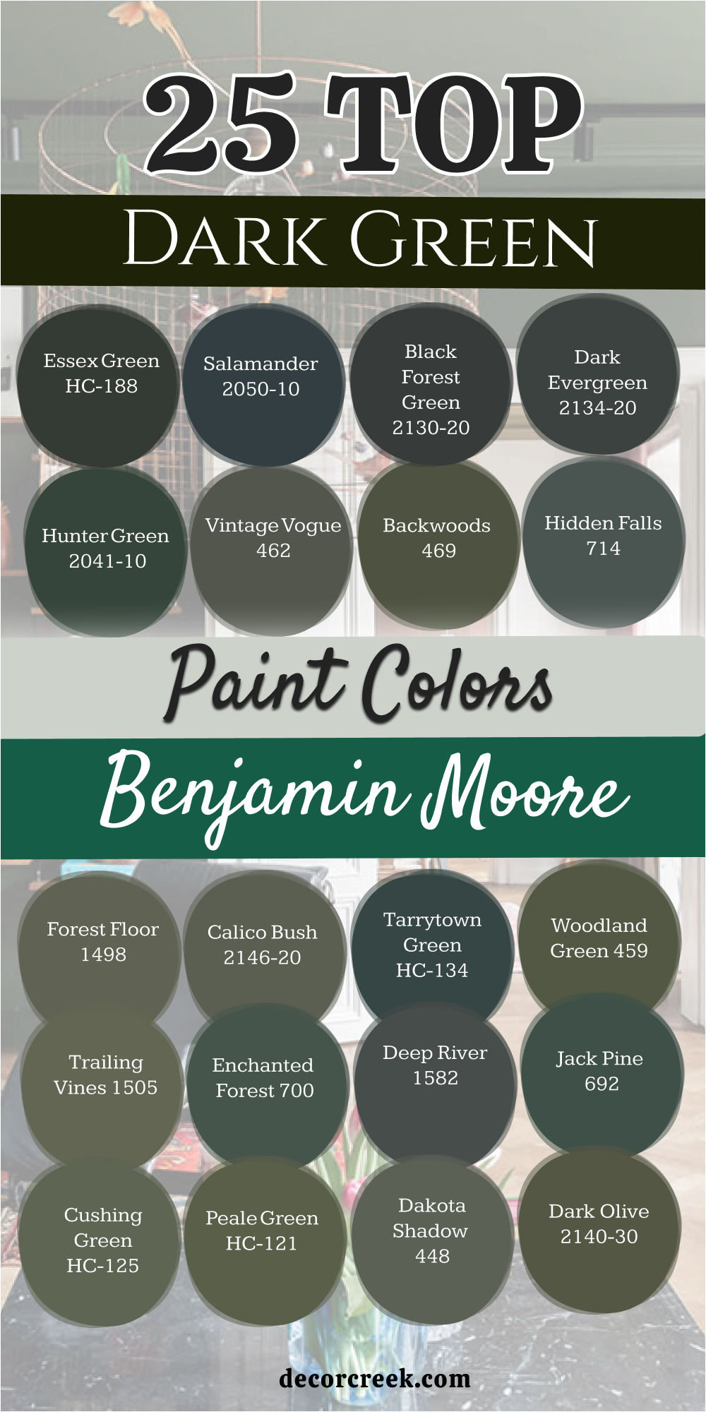
19 Top Dark Green Paint Colors – Designer’s Opinion
Greenblack SW 6994
Greenblack SW 6994 is my top pick for anyone who wants a very bold and modern focal wall in their home. This shade is so deep that it works like a neutral base while still showing off a hint of forest life.
It creates a very strong and stable feeling in a room that needs a bit of weight. I find that it makes light colored furniture look incredibly crisp and brand new. You will see that it acts like a velvet curtain that pulls the whole room together.
The pigment is very rich and hides any bumps or marks on the old walls. It is a very smart choice for a bedroom where you want to sleep in total darkness. Many of my clients love it because it feels very high-end and special. It adds a level of class that is hard to find with lighter colors. This is a very stylish and solid choice for a modern family.
Best used in: home offices, accent walls, theater rooms, and modern exteriors
Pairs well with: Extra White SW 7006, Honey Oak, Brass hardware, Carrara marble The key rule of this color for farmhouse style is to use it where you want a sharp contrast against bright white trim.
👉 Read the full guide for this color HERE 👈
Pewter Green SW 6208
Pewter Green SW 6208 is the one I suggest most for kitchen cabinets because it looks so natural and clean. This color has a lot of gray in it which makes it very soft and easy to look at every day.
It reminds me of moss growing on a stone near a quiet forest path. I love how it matches with both silver and gold handles on your drawers. It provides a very balanced mood that helps the kitchen feel like a peaceful place to cook.
You will notice that it does not show fingerprints as much as other dark paints do. It works very well in houses that have a lot of natural wood and stone textures. The color stays looking very steady and nice even when the sun goes down. This is a very safe and beautiful choice for any family home. It makes your living space feel very grounded and very real.
Best used in: kitchen cabinets, laundry rooms, mudrooms, and bedroom walls
Pairs well with: Spare White SW 6203, Sea Salt SW 6204, Light oak, Brushed nickel The key rule of this color for farmhouse style is to use it on cabinetry to bring an organic, grounded feeling to the heart of the home.
👉 Read the full guide for this color HERE 👈
Shade-Grown SW 6188
Shade-Grown SW 6188 is perfect for making a large room feel much more cozy and intimate for your guests. This color is a warm olive that has a lot of earth and sun buried inside the pigment. It makes me think of a hidden forest glen where the air is cool and still.
I often use this in basements to make them feel like a real and inviting part of the house. The warmth of the green keeps the room from ever feeling cold or unfriendly. You will love how it makes a big living area feel like a safe and tucked away retreat.
It looks amazing when paired with red brick or dark wooden beams on the ceiling. The paint provides a very heavy and solid feeling that gives a house a lot of character. This is a wonderful shade for anyone who loves a rustic and homey style. It brings a lot of comfort to your daily life.
Best used in: dens, basements, exterior siding, and cozy living rooms
Pairs well with: Dover White SW 6385, Balanced Beige SW 7037, Red brick, Copper accents The key rule of this color for farmhouse style is to use it in rooms with lots of texture like wool rugs and woven baskets.
👉 Read the full guide for this color HERE 👈
Hunt Club SW 6468
Hunt Club SW 6468 always gets compliments because it is such a rich and beautiful jewel tone for the walls. This green has a lot of energy that makes a room feel very alive and exciting to be in. It is deep enough to be sophisticated but bright enough to show its true color.
I like to use it in small powder rooms to create a very big and happy surprise for visitors. It looks very expensive when you pair it with gold frames and white marble details. You will find that it makes your home feel like a luxury getaway every single day.
The color is very saturated and gives excellent coverage on the very first coat of paint. It makes a room feel very full and finished in a very designer way. This shade is for people who want their home to have a lot of personality. It is a very fun and vibrant green for any house.
Best used in: powder rooms, library walls, cozy dens, and accent furniture
Pairs well with: Pure White SW 7005, Gold accents, Cognac leather, Navy blue The key rule of this color for farmhouse style is to use it in small doses to add a pop of forest-inspired luxury.
Oakmoss SW 6180
Oakmoss SW 6180 is the best choice for a room that needs a direct connection to the outdoors and nature. This color is a true green that feels very fresh and friendly to everyone who sees it. It looks like the moss you would find on an old oak tree in a sunny park.
I think it works best in rooms where you have a lot of plants and natural wood furniture. It brings the peaceful feeling of the forest right into your main living area for the family. The color is very welcoming and makes guests feel comfortable as soon as they sit down.
You can use it on all the walls without making the space feel too dark or small. It provides a perfect background for woven rugs and wooden tables. The pigment is very steady and looks great in both natural and lamp light. This is a perfect pick for a nature-themed home.
Best used in: living rooms, sunrooms, entryways, and kids’ rooms
Pairs well with: Rice Grain SW 6155, Urban Putty SW 7532, Pine wood, Creamy whites The key rule of this color for farmhouse style is to use it as a bridge between your indoor furniture and the greenery outside your windows.
👉 Read the full guide for this color HERE 👈
Rosemary SW 6187
Rosemary SW 6187 is the most popular green right now for people who love the modern farmhouse style of decorating. This color has a lot of gray which keeps it looking very clean and updated for today.
It is a very soft and deep herb green that feels very trendy and smart. I find that it works perfectly as an accent wall in a bedroom or a kitchen. The color feels very solid and gives any room a real sense of purpose and style.
It looks amazing when you use black metal hardware and light colored wooden floors. You will notice that it feels very cozy in the evening when you turn on the warm lights. It is one of those colors that makes the whole house look like it was professionally designed. The coverage is very good and it hides any small marks from kids or pets. This is a very reliable and pretty shade for a family home.
Best used in: accent walls, mudrooms, kitchen islands, and bedrooms
Pairs well with: Eider White SW 7014, Black Fox SW 7020, Light maple, Slate tile The key rule of this color for farmhouse style is to use it on your kitchen island to make it the star of the room.
👉 Read the full guide for this color HERE 👈
Rock Garden SW 6195
Rock Garden SW 6195 makes any room feel like a lush garden which helps people feel very relaxed and happy. This color is a rich and deep botanical green that looks like the leaves of a healthy plant.
It has a lot of depth and makes a room feel very full and finished for the family. I think it looks amazing in a sunroom or a living area with lots of real greenery. The green is very pure and does not turn too gray or brown in the different lights of the day.
It provides a very strong backdrop for light colored art or wooden shelves. You will love how it makes a room feel like a secret hiding place from the busy world. It is a very comforting color that feels very smooth and high-quality on the wall. This is a great choice for someone who wants a true and living green.
Best used in: living rooms, plant rooms, sunrooms, and bedrooms
Pairs well with: Origami White SW 7636, Urban Bronze SW 7048, Rattan furniture, Terracotta The key rule of this color for farmhouse style is to use it in a room where you have lots of natural textures like wicker and wood.
👉 Read the full guide for this color HERE 👈
Rookwood Shutter Green SW 2809
Rookwood Shutter Green SW 2809 is a classic that I use whenever I want a house to feel historic and noble. This color belongs to the traditional collection and carries a lot of weight and importance.
It has a beautiful mix of gray and blue that keeps it looking very cool and formal. I often suggest this for a dining room where you want to have fancy family dinners. It creates a very established atmosphere that makes the whole house feel more valuable.
You will notice that it does not change much when you turn on the evening lamps. It looks very natural and right when paired with dark wood and gold accents. The finish is very smooth and makes the walls look very high-end for your guests. This is a perfect pick for a house that has a lot of classic character and style.
Best used in: exterior shutters, traditional dining rooms, libraries, and front doors
Pairs well with: Kilim Beige SW 6106, Classical White SW 2829, dark mahogany, antique gold The key rule of this color for farmhouse style is to use it on the exterior to give your home a sense of history and permanence.
Essex Green HC-188
Essex Green HC-188 is the deepest forest green that never fails to look very high-end and expensive on any wall. This color is a legend in the design world because it is so rich and dark. It looks almost black in rooms that do not have a lot of windows or natural sun.
I find that it makes a home look very established and full of tradition as soon as it is painted. It is a great choice for a formal library or a cozy den for the family. The color is very pure and does not have any distracting blue or yellow tones inside.
It looks amazing with brass light fixtures and bright white trim on the walls. You will love how it creates a very quiet and still feeling in a room for resting. This is a very safe bet for anyone wanting a truly noble and dark look for their house.
Best used in: libraries, front doors, formal living rooms, and shutters
Pairs well with: Simply White OC-117, Revere Pewter HC-172, Brass, Cherry wood The key rule of this color for farmhouse style is to use it on the shutters of a white house for a perfect classic look.
👉 Read the full guide for this color HERE 👈
Salamander 2050-10
Salamander 2050-10 is great for a bedroom because it is so dark and moody for a good sleep every night. This color is very unique because it has a lot of blue and black mixed into the green base. It changes a lot depending on the light and can look like a deep teal or a soft midnight.
I love using this to add a sense of mystery and style to a small room. It makes gold and silver decorations shine very brightly against the dark walls. You will find that it creates a very modern and cool atmosphere for a home office or a den.
The paint is very thick and gives a very smooth and velvet finish once it is dry. It is a bold choice that makes every piece of furniture look very special. This is a great pick for a homeowner who wants a very dark and cool green.
Best used in: bedrooms, accent walls, powder rooms, and modern dens
Pairs well with: Chantilly Lace OC-65, Gray Owl OC-52, Silver, Velvet fabrics The key rule of this color for farmhouse style is to use it in a small room to make the walls seem to disappear into the shadows.
👉 Read the full guide for this color HERE 👈
Black Forest Green HC-187
Black Forest Green HC-187 is my favorite for a modern office where you need to feel very focused and smart. This color is very deep and dark but has a cool gray and blue feeling to it. It is a great choice for a home that has lots of metal and glass parts in the design.
I like to use it for a focal wall in a living room to add a bit of mystery. The color is very sophisticated and looks like a professional designer picked it for you. You will find that it makes light wood floors and white rugs look very bright and clean.
It stays looking dark and crisp even in the middle of a very sunny day. It creates a very calm environment where you can work or read in peace. This is a very stylish and cool shade for any modern family home. It brings a lot of class to your rooms.
Best used in: modern living rooms, accent walls, offices, and exteriors
Pairs well with: White Heron OC-57, Stonington Gray HC-170, Light maple, Steel The key rule of this color for farmhouse style is to use it in a modern home to add a touch of nature without being too bright.
👉 Read the full guide for this color HERE 👈
Vintage Vogue 462
Vintage Vogue 462 is so soft and pretty that it works in almost any room in the whole house for any family. This color has a dusty and muted look that makes it very easy to live with every day. It is a very popular choice for bedrooms because it feels so relaxing and fashion-forward.
I love how it looks with linen fabrics and natural wood nightstands in a bedroom. The color is deep but it never feels heavy or like a cave for the eyes. It makes a room feel very updated and stylish without being too loud or bold.
You will notice that it matches both old and new pieces of furniture very well. It is a very flexible color that looks good in almost any type of lighting. This is a great pick for someone who wants a trendy green that stays looking nice for years.
Best used in: bedrooms, living rooms, cozy nooks, and furniture
Pairs well with: Swiss Coffee OC-45, Pale Oak OC-20, Linen, Light walnut The key rule of this color for farmhouse style is to use it in a bedroom to create a very soft and comfortable place to rest.
👉 Read the full guide for this color HERE 👈
Backwoods 469
Backwoods 469 is the best warm green for a family room with leather sofas and wool rugs for the winter. This color is a deep olive that has a lot of yellow and brown warmth inside of it. It makes a room feel very safe and tucked away from the busy world outside.
I find that it works very well for creating a cozy den where the family can watch movies. The color is very natural and reminds me of a warm forest floor in the late afternoon sun. You will love how it makes a room feel very organic and real for everyone who enters.
It is a very consistent color that stays looking warm and inviting all day long. This is a great choice for a house that wants to feel very close to nature. It makes your living space feel very grounded and comfortable for your family life.
Best used in: family rooms, dens, mudrooms, and exteriors
Pairs well with: Navajo White OC-95, Manchester Tan HC-81, Leather, Woven rugs The key rule of this color for farmhouse style is to use it in a mudroom to hide dirt and make the entry feel very earthy.
👉 Read the full guide for this color HERE 👈
Tarrytown Green HC-134
Tarrytown Green HC-134 is a very steady and noble color that makes a front door look amazing for every guest. This color is a classic green with a blue tint that feels very formal and high-quality. It is very famous and is used by many designers for a very expensive look today.
I find that it works perfectly for a formal office or a front entrance to the house. The color is very reliable and does not look too bright or too dark in the light. It looks beautiful when you have white trim and dark wood floors in a hallway.
You will love how it makes a room feel very professional and finished for your family. It is a traditional choice that will always stay in style regardless of what is new. This is a very safe and pretty pick for any home that needs a sense of quality and pride.
Best used in: front doors, formal offices, libraries, and shutters
Pairs well with: Cloud White OC-130, Stonington Gray HC-170, Brass, Mahogany The key rule of this color for farmhouse style is to use it on your front door to make a very strong and beautiful first impression.
Ashwood Moss 1484
Ashwood Moss 1484 is a very designer color that looks like it came straight from a high-end magazine for your home. This color is a dusty and soft green that feels very sophisticated and modern. It is a very popular choice for living rooms because it makes the walls look very clean and soft.
I find that it creates a very well-planned atmosphere that helps people feel relaxed. The color is very solid and gives a room a sense of peace and natural style. It looks amazing when you use white trim and light colored rugs on the floor.
You will notice that it stays looking very soft and nice in all types of light. It is one of those greens that makes a house feel very updated and special for a family. This is a very reliable and pretty shade for any modern home that loves nature.
Best used in: living rooms, bedrooms, entryways, and home offices
Pairs well with: Chantilly Lace OC-65, Light wood, Linen, Cool grays The key rule of this color for farmhouse style is to use it in a living room to create a very fresh and natural atmosphere.
👉 Read the full guide for this color HERE 👈
Boreal Forest AF-480
Boreal Forest AF-480 brings a very cool and fresh feeling to a house that gets a lot of sun during the day. This color is a deep and cool green that reminds me of the air in a mountain forest. It is a great choice for an accent wall in a bedroom to help you feel calm.
I like to use it to create a sense of depth and mystery in a modern home. The color is very sophisticated and looks like a custom mix made by a professional. You will find that it makes white furniture look very bright and clean in the room.
It is a very deep color but it still has a lot of life and light reflecting from it. It creates a very quiet and beautiful atmosphere that helps you rest at night. This is a very stylish and pretty shade of dark green for any home that needs a cool touch.
Best used in: bedrooms, accent walls, living rooms, and dens
Pairs well with: Simply White OC-117, Cool grays, Silver, Blue-toned fabrics The key rule of this color for farmhouse style is to use it on a focal wall to add a bit of natural drama to a room.
Regent Green 2136-20
Regent Green 2136-20 is a very daring choice that makes a small powder room look absolutely stunning and rich. This color is almost black and is the darkest green you can find for your walls. It is extremely deep and looks very expensive in a private office or a small library.
I love using this for a moody den to create a very focused and professional feeling for work. It feels very heavy and substantial on the walls as soon as you walk in. You need to have good lights to see the green highlights hidden in the dark paint.
It creates a very dramatic look that feels like a stay in a luxury hotel room. The color is very deep and does not have any warm brown or yellow tones. It stays looking cool and crisp no matter what the sun is doing. This is a bold and very smart choice for a stylish house.
Best used in: powder rooms, libraries, accent walls, and moody dens
Pairs well with: High Reflective White, Marble, Gold accents, Cool grays The key rule of this color for farmhouse style is to use it in a small room to make the walls look very rich and deep.
👉 Read the full guide for this color HERE 👈
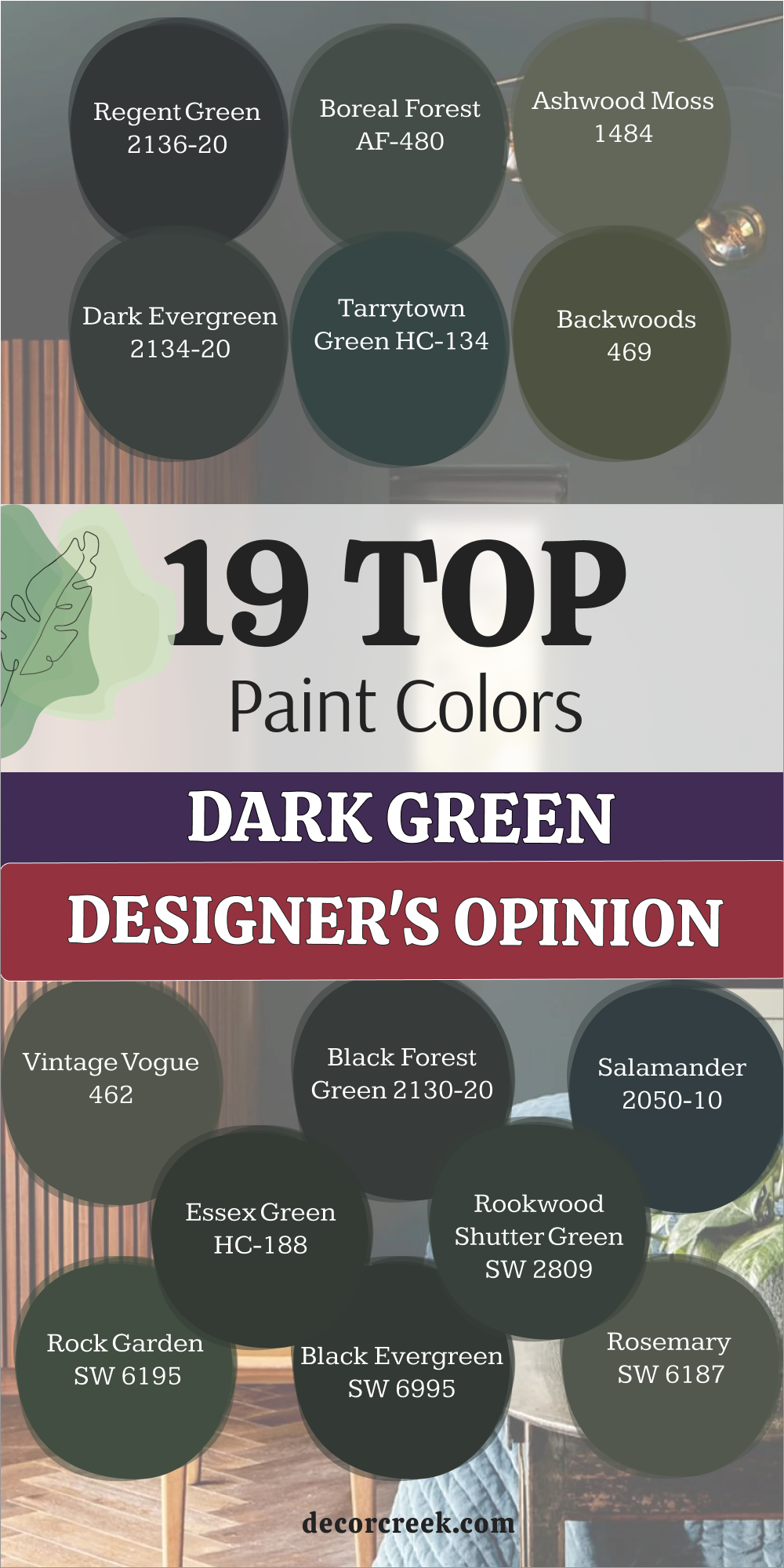
My Final Thoughts about 33 Best Dark Green Paint Colors
Choosing the perfect dark green is more than just picking a pretty swatch from a fan deck; it is about deciding how you want your home to feel when you walk through the door. Dark green has effectively become a new neutral, bringing the serenity of the outdoors directly into your living space. Whether you opt for a cool forest shade or a warm olive, these colors provide a sophisticated backdrop that makes everything from gold frames and light textiles to wooden furniture look more expensive, cohesive, and intentional.
It is vital to remember that any deep green acts as a chameleon. In a room with small windows, shades like Essex Green or Greenblack may appear almost black, creating a soft, velvet-like effect. However, in a sun-drenched living room, that same paint will reveal its true, vibrant natural depth.
For this reason, it is always wise to test samples on different walls to observe how the tone shifts from the crisp light of the morning to the warm glow of evening lamps.
When making your selection, consider the overall temperature of your interior.
Cool variations with blue or gray undertones, such as Salamander or Tarrytown Green, are ideal for modern offices and bedrooms where an atmosphere of calm and focus is paramount.
Meanwhile, warmer shades like Backwoods or Oakmoss, with their yellowish-brown bases, are the best choices for family rooms and kitchens, filling them with coziness and a grounded connection to the earth.