When I walk into a home, I don’t just see walls—I see a story waiting to be told through color. Paint can change how a home feels, how people connect, and even how they start their day. The right shade can make mornings feel lighter, evenings more peaceful, and rooms more inviting. Over the years, I’ve learned that interior paint is not just about decoration—it’s about emotion and comfort.
In my work, I’ve seen how one color can completely change how a person feels about their home. A soft white can make a kitchen glow, a warm gray can make a bedroom feel safe, and a deep blue can make a living room feel grounded.
Choosing paint is a mix of heart and reason—it’s about what feels right, not just what looks good.
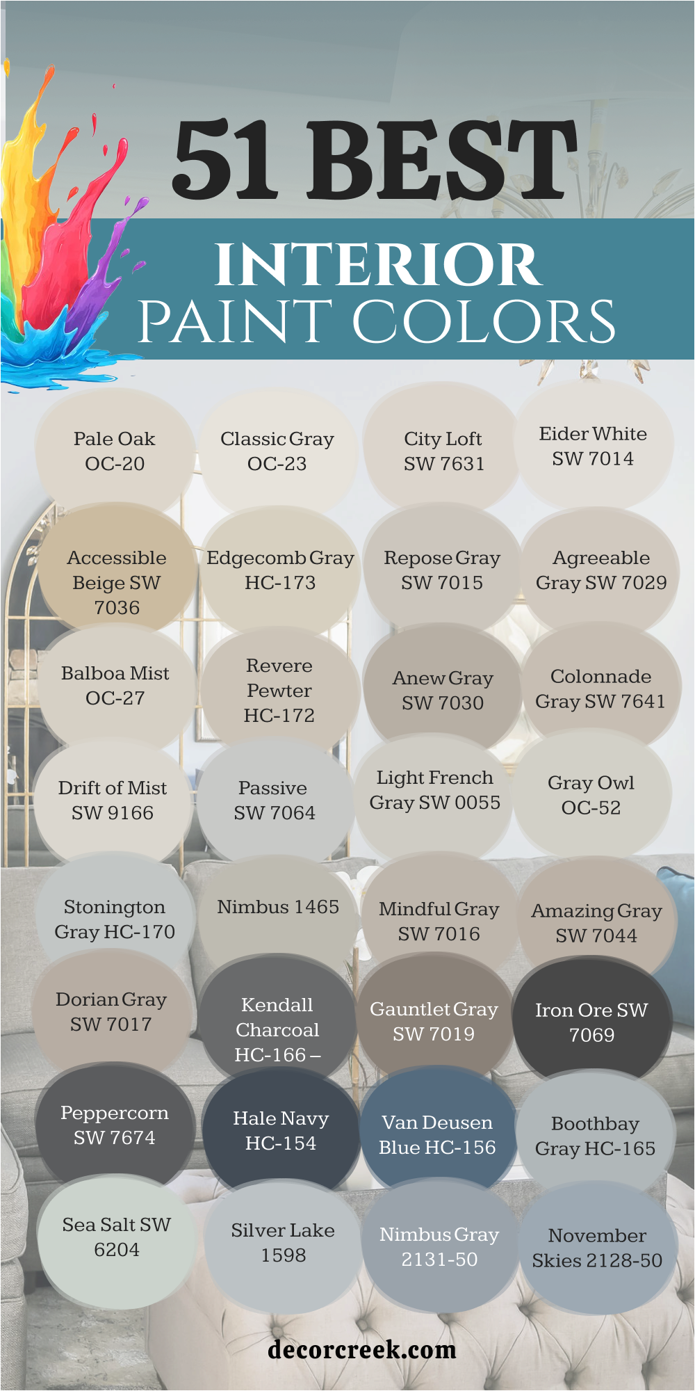
That’s why I’ve gathered the 51 best interior paint colors that continue to shine in homes year after year. They’re shades that bring warmth, balance, and a sense of belonging.
Whether you love light neutrals or rich tones, these colors have proven they can make every home feel like it’s finally complete.
Why I Trust Sherwin-Williams and Benjamin Moore for Interior Paints
After many years of working with homes, I’ve tested almost every brand of paint. Some looked great on the first day but faded too soon or never felt quite right once the light shifted. That’s why I keep coming back to Sherwin-Williams and Benjamin Moore. Their colors always look rich, balanced, and true—no matter the lighting or time of day.
Both brands have something special. Sherwin-Williams paints glide smoothly and cover perfectly, even when switching from dark to light tones.
Their formulas also dry evenly and last for years without losing color. Benjamin Moore offers a different kind of strength—their colors have a natural depth that makes a room feel thoughtful and designed. When I choose between them, I know I’m choosing reliability.
Another reason I trust these brands is how well they match with real-life living. They’re durable enough for busy hallways, kitchens, and family rooms, yet still soft enough for bedrooms or cozy corners.
Even after years of sunlight, washing, and life happening all around, these paints hold up beautifully.
In every home I design, I depend on colors that tell a story but also stand the test of time.
Sherwin-Williams and Benjamin Moore have never let me down—they make it easy to turn any wall into something that feels like home.
How I Choose the Right Interior Paint Color
When I start choosing a color for a room, I always begin with light. Light changes everything—it can turn a gray into beige, or make a white feel too bright or too dull. I spend time watching how sunlight moves through the room during the day. Morning light brings out cooler tones, while evening light adds warmth. That’s the secret to finding a color that feels right all day long.
- Next, I think about the purpose of the room.
A kitchen needs energy, a bedroom needs rest, and a living room needs balance. Warm whites or gentle grays work beautifully for spaces where families gather, while deeper tones bring focus and comfort to smaller rooms. I believe color should match how you live, not just what’s trending.
- I also pay attention to textures and materials.
Wood floors, stone counters, and fabrics all change how a color looks. Sometimes I’ll paint a small sample on the wall and leave it for a few days—it helps me see how the color behaves in different light and beside furniture.
- Finally, I remind myself that color is personal.
It’s not about impressing anyone—it’s about how it makes you feel when you walk in the door. The best interiors aren’t about perfection; they’re about comfort. Choosing paint isn’t a technical task—it’s a feeling you learn to trust.
That’s why I always tell my clients: don’t rush. Let the color speak to you, live with it for a little while, and when it feels right—you’ll know.
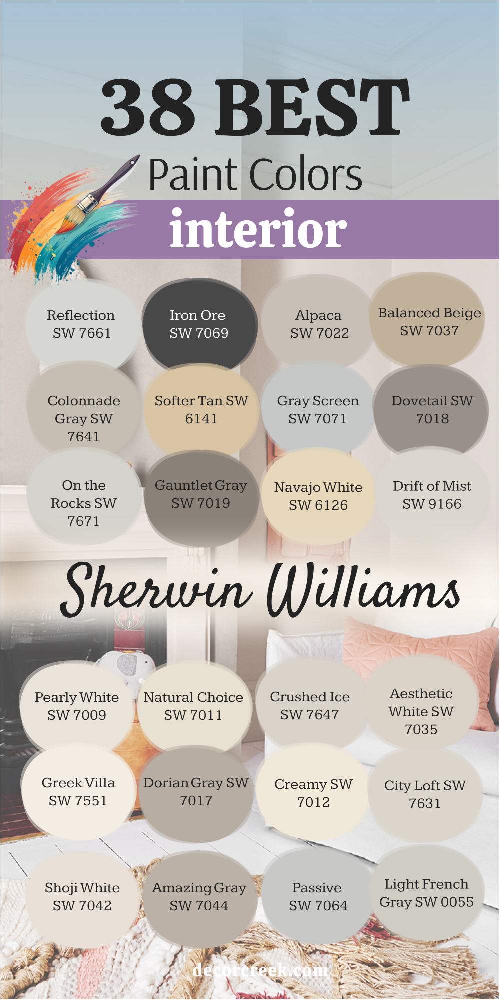
38 Best Interior Paint Colors by Sherwin-Williams
Pure White SW 7005
Pure White always feels clean but never cold. I love how it reflects just the right amount of light, making rooms look brighter without feeling empty. It works beautifully on walls, trim, or ceilings, especially when you want a balanced background for décor. I’ve used it in homes with both modern and rustic styles, and it fits perfectly every time. In natural light, it feels soft and airy; under warm lamps, it glows gently.
It pairs easily with wood tones, marble, and muted blues. Pure White has that rare balance—simple, fresh, and endlessly welcoming.
The key rule of this color for interior walls is to use it in rooms that need brightness and quiet beauty.
🎨 Check out the complete guide to this color right HERE 👈

Agreeable Gray SW 7029
Agreeable Gray is the color I reach for when a home needs calm energy. It sits right between gray and beige, which makes it incredibly flexible. In the morning, it feels light and warm; at night, it turns into a gentle gray. It works for open spaces, bedrooms, or entryways—anywhere you want comfort and flow.
I like pairing it with crisp white trim and soft beige fabrics. It brings balance without ever feeling dull.
The key rule of this color for interior walls is to test it in natural light first—it changes beautifully through the day.
🎨 Check out the complete guide to this color right HERE 👈

Repose Gray SW 7015
Repose Gray is one of my favorite neutrals because it quietly supports everything around it. It’s neither too cool nor too warm, which makes decorating easy. I’ve used it in family rooms where it stays elegant no matter the furniture color. It feels modern, gentle, and inviting all at once.
When paired with white trim or black doors, it gives a room depth and style.
The key rule of this color for interior walls is to use it where you want a steady and balanced background.
🎨 Check out the complete guide to this color right HERE 👈

Snowbound SW 7004
Snowbound reminds me of a bright winter morning—it’s fresh, light, and full of life. I often use it for bedrooms, kitchens, or trim to add a soft brightness. It has a slightly cool undertone that pairs beautifully with silver, blue, and charcoal details. It’s clean without being sharp.
When the sunlight hits it, the room feels renewed.
The key rule of this color for interior walls is to combine it with warm lighting or natural textures to keep it feeling cozy.
🎨 Check out the complete guide to this color right HERE 👈

Alabaster SW 7008
Alabaster brings warmth in the most graceful way. It’s a creamy white that feels soft and easy to live with. I often use it in living rooms, bedrooms, and even hallways to create a gentle glow. It matches beautifully with wood, stone, and soft fabric tones.
In bright light, it looks clean; in dim light, it feels warm and calm.
The key rule of this color for interior walls is to use it where you want a soft and welcoming feeling.
🎨 Check out the complete guide to this color right HERE 👈

Dover White SW 6385
Dover White has a gentle golden undertone that adds life to a room. It feels cheerful without being loud. I like using it in homes that need warmth—especially in living or dining rooms. It works well with natural woods, beige fabrics, and even muted greens.
It’s also a perfect color for older homes, bringing a touch of tradition to modern spaces.
The key rule of this color for interior walls is to pair it with warm lighting and earthy accents.
🎨 Check out the complete guide to this color right HERE 👈

Accessible Beige SW 7036
Accessible Beige is that perfect middle ground—it’s beige with a hint of gray, making it friendly and balanced. I often choose it for rooms where families gather because it feels steady and warm.
It changes beautifully depending on the light, sometimes looking creamy, other times slightly taupe. It’s timeless and dependable.
The key rule of this color for interior walls is to use it in open areas where light shifts throughout the day.
🎨 Check out the complete guide to this color right HERE 👈

Worldly Gray SW 7043
Worldly Gray gives any room a soft and grounded feeling. It’s neutral but never boring, warm but not beige. I love how it pairs with natural wood and black metal—perfect for homes that mix modern and rustic touches.
It looks especially good in living rooms or bedrooms with plenty of natural light.
The key rule of this color for interior walls is to balance it with light furniture or fabrics.
🎨 Check out the complete guide to this color right HERE 👈
Tricorn Black SW 6258
Tricorn Black is powerful, simple, and classic. I often use it for doors, cabinets, or accent walls to create structure in a room. It’s deep without feeling harsh. When paired with white or pale tones, it looks rich and timeless.
It brings elegance to even the simplest space.
The key rule of this color for interior walls is to use it for contrast—it makes lighter shades stand out beautifully.
🎨 Check out the complete guide to this color right HERE 👈

Mindful Gray SW 7016
Mindful Gray is steady and beautiful. It’s warm enough to feel comfortable but cool enough to stay modern. I love how it adapts to every room—it can look beige in sunlight and gray at night.
It fits beautifully with white trim, soft wood, and neutral fabrics. It’s one of those colors that make a home feel complete.
The key rule of this color for interior walls is to use it when you want a relaxed and lived-in atmosphere.
🎨 Check out the complete guide to this color right HERE 👈

Kilim Beige SW 6106
Kilim Beige is one of those colors that immediately makes a room feel lived-in and loved. It has a natural, soft warmth that reminds me of sunlit clay or light sand. I’ve used it in family rooms, entryways, and even kitchens—it always adds a welcoming glow. It’s beige, but not flat; it carries just enough depth to keep things interesting. I especially love how it reacts to daylight—it looks creamy in the morning and golden in the afternoon.
When paired with white trim, it feels fresh; with dark wood, it becomes rich and comforting. It also complements earthy decor—rattan, jute, and linen all come alive next to it.
The key rule of this color for interior walls is to use it where you want a mix of natural warmth and timeless charm.
🎨 Check out the complete guide to this color right HERE 👈

Eider White SW 7014
Eider White has a soft, smoky undertone that gives a quiet personality to a neutral room. It’s the kind of white that never feels too stark or too creamy—it’s right in between. I often choose it for bedrooms or home offices where I want the walls to fade softly into the background while still feeling elegant. It has a faint gray-pink tint that shows in some lighting, which adds a cozy layer without turning pink.
I’ve seen it pair beautifully with brushed nickel fixtures and cool-toned woods. It’s also lovely in kitchens, especially next to marble or stainless steel.
The key rule of this color for interior walls is to use it where you need softness without losing brightness.
🎨 Check out the complete guide to this color right HERE 👈

Antique White SW 6119
Antique White brings an instant sense of comfort and familiarity. It’s the kind of color that feels like it’s always been there, like it belongs. I often use it in older homes when I want to refresh a room without taking away its character. Its creamy tone catches warm light beautifully, giving rooms a nostalgic glow.
It pairs well with brass fixtures, soft greens, and deep browns—classic choices that never go out of style. I also love using it for ceilings when I want a gentler transition from wall to trim.
The key rule of this color for interior walls is to use it to preserve charm while bringing in warmth.
🎨 Check out the complete guide to this color right HERE 👈

Anew Gray SW 7030
Anew Gray is dependable and graceful, one of my long-time favorites. It sits between warm and cool tones, making it a perfect bridge between white trim and dark furniture. It’s the color I reach for when a space needs both comfort and elegance. In natural light, it feels soft and calm; at night, it turns rich and grounding.
It blends well with both modern finishes and rustic textures, making it incredibly flexible. I’ve used it for everything—walls, cabinets, and even bathroom vanities.
The key rule of this color for interior walls is to choose it when you want consistency and a feeling of quiet sophistication.
🎨 Check out the complete guide to this color right HERE 👈
Light French Gray SW 0055
Light French Gray has that gentle balance between lightness and structure. It’s the perfect gray for people who want something clean but not cold. I love how it feels refined without being formal—it’s a color that lets other elements in the room shine. It’s particularly beautiful with crisp white trim and brushed gold or bronze hardware.
It also complements navy, blush, or natural linen fabrics beautifully. When I use it in bedrooms, it always feels grounded yet airy.
The key rule of this color for interior walls is to use it in spaces where calm design and gentle light meet.
🎨 Check out the complete guide to this color right HERE 👈
Passive SW 7064
Passive is one of those effortless grays that feels pure and clear. It leans slightly cool, which gives rooms an open, airy quality. I like using it in kitchens and bathrooms because it reflects light beautifully. When paired with darker grays or black accents, it creates an elegant contrast. In rooms with white furniture, it feels soft and modern; in rooms with wood tones, it becomes calm and balanced.
It’s also one of my favorite background colors for art or gallery-style walls.
The key rule of this color for interior walls is to use it when you want a clean, refined foundation that lets your décor shine.
🎨 Check out the complete guide to this color right HERE 👈
Amazing Gray SW 7044
Amazing Gray truly earns its name—it’s warm, approachable, and always flattering. I love how it adds depth to a room without making it feel smaller. It’s one of those tones that adapts easily—pair it with light trim for a relaxed look or with dark finishes for elegance. It feels especially lovely in living rooms and hallways where you want consistency and softness.
The hint of beige within keeps it from feeling industrial. It’s perfect for homes that need warmth but still want a modern touch.
The key rule of this color for interior walls is to use it where you want depth that feels friendly, not heavy.
🎨 Check out the complete guide to this color right HERE 👈
Shoji White SW 7042
Shoji White feels like soft fabric on a breezy day—light, creamy, and full of gentle warmth. It has just enough beige in it to make a room feel lived-in, yet it still reads as bright and fresh. I often use it for whole-home palettes because it adapts beautifully to different lighting and décor. It works well with both black accents and warm wood tones. It also flatters every texture—from linen sofas to marble counters. It’s one of those colors that makes a house feel instantly inviting.
The key rule of this color for interior walls is to choose it for spaces that need warmth and flexibility together.
🎨 Check out the complete guide to this color right HERE 👈

City Loft SW 7631
City Loft feels light, smooth, and quietly refined. It’s that perfect neutral that works everywhere—from small bedrooms to large, open kitchens. It carries a whisper of beige and gray, which makes it feel balanced no matter the light. I’ve used it in apartments with little sunlight, and it instantly makes them feel bigger and brighter. It also pairs beautifully with modern furniture and natural wood. It’s a color that never demands attention but still makes everything look more complete.
The key rule of this color for interior walls is to use it when you want an easy, graceful foundation for your home.
🎨 Check out the complete guide to this color right HERE 👈

Creamy SW 7012
Creamy is like a soft hug in color form. It brings warmth without heaviness, perfect for living rooms or kitchens where you want comfort and brightness. I’ve used it with beige, sage green, and even navy accents—it adapts beautifully. The color glows under both daylight and soft lamps, giving every corner a welcoming light. It’s a lovely choice for trim or wainscoting if you want something softer than pure white.
The key rule of this color for interior walls is to use it to bring warmth and happiness into everyday life.
🎨 Check out the complete guide to this color right HERE 👈

Dorian Gray SW 7017
Dorian Gray carries a natural confidence that makes any room feel complete. It’s a medium-toned gray with a warm undertone that keeps it from ever feeling flat. I’ve used it in dining rooms, home offices, and even bedrooms—it always gives the space a sense of quiet strength. It looks especially beautiful paired with crisp white trim or dark-stained wood. I love how it catches light differently throughout the day, sometimes soft and smooth, other times rich and shadowy. It also works well with black, navy, or cream décor, giving a balanced, elegant mood.
The key rule of this color for interior walls is to use it where you want depth, character, and lasting comfort.
🎨 Check out the complete guide to this color right HERE 👈

Greek Villa SW 7551
Greek Villa is a warm, creamy white that brings softness wherever it goes. It’s one of those colors that feels natural—never too bright, never too dull. I love using it for entire homes when I want that gentle, cohesive flow from room to room. It pairs beautifully with beige, taupe, or black accents, creating an easy sense of balance. I’ve used it in kitchens with gold fixtures and wood shelves—it looks stunning in both daylight and evening glow. It feels like light made cozy.
The key rule of this color for interior walls is to choose it for rooms where you want brightness with a touch of warmth and comfort.
🎨 Check out the complete guide to this color right HERE 👈

Aesthetic White SW 7035
Aesthetic White feels refined yet easy, perfect for homes that want something bright but not plain. It has just enough greige to keep it grounded. I’ve used it in living rooms with high ceilings, and it always looks peaceful and balanced. It complements natural wood, linen, and rattan perfectly. It’s also one of my favorite colors for open floor plans—it keeps the space light while adding a hint of depth.
The key rule of this color for interior walls is to use it where you need softness that connects rooms beautifully.
🎨 Check out the complete guide to this color right HERE 👈

Crushed Ice SW 7647
Crushed Ice is a light gray that feels cool, smooth, and sophisticated. It’s clean but not cold—a perfect backdrop for modern interiors. I love it in kitchens, bathrooms, and offices because it reflects light in a calming way. When paired with white cabinets and marble surfaces, it gives that high-end look without feeling overdone. In rooms with dark flooring, it balances perfectly, keeping the space fresh and open.
The key rule of this color for interior walls is to use it when you want a subtle modern look that stays timeless.
🎨 Check out the complete guide to this color right HERE 👈

Natural Choice SW 7011
Natural Choice has a warmth that feels like a soft afternoon glow. It’s one of those colors that instantly makes a space feel welcoming and lived-in. I’ve used it in hallways and bedrooms where it creates an easy, natural flow. It pairs beautifully with creamy whites and soft browns, giving a layered, cozy effect. It also looks stunning next to warm metals like brass or copper.
The key rule of this color for interior walls is to use it where you want quiet warmth that never feels heavy.
🎨 Check out the complete guide to this color right HERE 👈

Pearly White SW 7009
Pearly White lives up to its name—it’s elegant, smooth, and has a soft shimmer under natural light. It’s a wonderful option for minimalist spaces because it adds dimension without drawing attention. I love using it in bathrooms, dressing areas, or light-filled bedrooms. It pairs beautifully with soft grays, greens, or blush tones. It’s a color that feels calm but still has personality.
The key rule of this color for interior walls is to use it to bring brightness and polish into softer, quieter spaces.
🎨 Check out the complete guide to this color right HERE 👈
Drift of Mist SW 9166
Drift of Mist has that easy, lived-in beauty that works everywhere. It’s a balanced mix of beige and gray that gives a home a natural, collected feeling. I’ve used it in open floor plans where it connects living areas effortlessly. It looks graceful next to white trim, natural wood, or light stone. What I love most is how it changes with daylight—it never feels the same, but always feels right.
The key rule of this color for interior walls is to use it to create calm continuity throughout your home.
🎨 Check out the complete guide to this color right HERE 👈

Navajo White SW 6126
Navajo White is warm and creamy with a hint of golden light. It’s one of those traditional shades that still feels current. I like using it in homes that need warmth and character without going too dark. It pairs beautifully with brown leather, beige fabrics, and soft gray trim. It’s especially lovely in dining rooms or entryways where natural light hits the walls.
The key rule of this color for interior walls is to use it where you want to blend classic comfort with everyday charm.
🎨 Check out the complete guide to this color right HERE 👈
Gauntlet Gray SW 7019
Gauntlet Gray is deep, bold, and full of presence. It’s a statement shade that adds drama without feeling too dark. I’ve used it for accent walls, built-ins, and even kitchen islands—it instantly adds sophistication. It works beautifully with white walls or light wood tones for contrast. Despite its depth, it never feels heavy—it’s strong but controlled.
The key rule of this color for interior walls is to use it as a grounding shade to give structure to softer surroundings.
🎨 Check out the complete guide to this color right HERE 👈

On the Rocks SW 7671
On the Rocks is a light gray that feels crisp and versatile. It has a subtle coolness that works beautifully in modern homes or smaller spaces. I like pairing it with black fixtures, marble counters, or dark flooring. It gives rooms a clean, open feeling while still adding just enough color to keep them interesting. It’s one of those shades that makes a space look effortlessly neat.
The key rule of this color for interior walls is to use it when you want a clean, neutral base that highlights textures and light.
🎨 Check out the complete guide to this color right HERE 👈
Dovetail SW 7018
Dovetail is a strong, medium gray with earthy undertones that make it dependable and rich. It’s one of my favorites for cozy rooms like studies, dining rooms, or dens. It feels timeless and steady, pairing perfectly with white trim, gold accents, or dark wood. It can make even a small room feel intimate but not closed in. It’s elegant without trying too hard.
The key rule of this color for interior walls is to use it where you want a sense of strength and refined comfort.
🎨 Check out the complete guide to this color right HERE 👈

Gray Screen SW 7071
Gray Screen is clean, cool, and modern. It’s a great option for spaces that get plenty of light and need balance. I’ve used it in bathrooms and offices where clarity matters—it keeps the space crisp and clear. It pairs wonderfully with navy, white, or black décor, creating a fresh and stylish combination.
The key rule of this color for interior walls is to use it where brightness and simplicity need to meet.
🎨 Check out the complete guide to this color right HERE 👈

Softer Tan SW 6141
Softer Tan feels warm and friendly, like a comfortable backdrop to everyday life. It works in any room that needs a touch of coziness without becoming too dark. It’s especially lovely in living rooms and hallways with natural light. I love pairing it with creamy whites, olive green, or even soft blush for a charming, welcoming look.
The key rule of this color for interior walls is to use it when you want natural warmth that feels effortlessly inviting.
🎨 Check out the complete guide to this color right HERE 👈
Colonnade Gray SW 7641
Colonnade Gray is elegant and smooth, perfect for open spaces or transitional homes. It sits between warm and cool, making it incredibly flexible. I love how it flows from room to room, creating a sense of calm order. It complements both modern and traditional décor, which makes it a safe yet stylish choice.
The key rule of this color for interior walls is to use it to unify different spaces under one graceful tone.
🎨 Check out the complete guide to this color right HERE 👈

Balanced Beige SW 7037
Balanced Beige lives up to its name—it feels perfectly centered. It’s neither too gray nor too warm, making it easy to use throughout an entire home. I often recommend it to families who want a neutral but not boring backdrop. It matches beautifully with deep blues, whites, and soft pinks. It makes furniture and décor pop without shouting for attention.
The key rule of this color for interior walls is to use it for steady comfort that ties your home together.
🎨 Check out the complete guide to this color right HERE 👈

Alpaca SW 7022
Alpaca is a quiet mix of taupe and gray that brings an understated elegance. It changes with the light—soft and silvery in the morning, richer in the evening. It’s perfect for bedrooms and living areas that need calm energy. It also pairs well with whites, charcoals, and warm browns.
The key rule of this color for interior walls is to use it when you want your room to feel relaxed but refined.
🎨 Check out the complete guide to this color right HERE 👈

Iron Ore SW 7069
Iron Ore is dramatic yet approachable. It’s not pure black—it has a deep charcoal softness that feels luxurious. I use it often for interior doors, accent walls, and built-in cabinetry. It makes other colors pop and adds beautiful depth to a space. It also looks stunning with white walls or warm metallics.
The key rule of this color for interior walls is to use it to ground a room and give it confidence.
🎨 Check out the complete guide to this color right HERE 👈

Reflection SW 7661
Reflection feels like cool morning light—it’s fresh, airy, and modern. It’s a soft gray with subtle blue undertones, perfect for spaces that need a touch of clarity. I often use it in bathrooms, offices, or sunrooms. It makes a room look open and clean, but never cold. When paired with white trim or soft wood, it creates an elegant, peaceful atmosphere.
The key rule of this color for interior walls is to use it where freshness and balance matter most.
🎨 Check out the complete guide to this color right HERE 👈
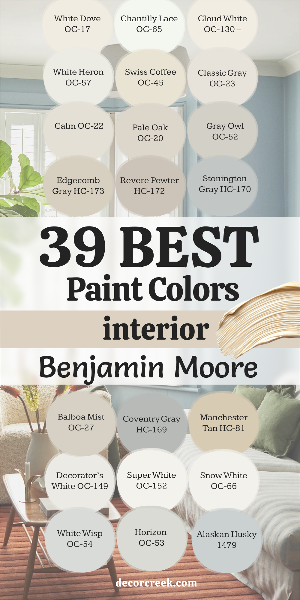
39 Best Interior Paint Colors by Benjamin Moore
White Dove OC-17
White Dove is one of those colors I could use forever—it always feels right. It has a soft, creamy warmth that keeps a room open and bright but never sterile. I’ve painted it in sunlit kitchens, traditional bedrooms, and even moody living rooms, and it adapts perfectly every time. What I love most about White Dove is how it reacts to light—it seems to collect the warmth of the day and release it slowly through the evening, keeping every room feeling gentle and calm.
It pairs beautifully with natural textures—warm wood floors, woven baskets, and linen curtains. Against brass hardware, it glows; beside black accents, it looks refined and clean.
I’ve used it on ceilings and trim too, where it adds a touch of elegance without being too stark. Whether in old homes or modern ones, White Dove brings balance—it bridges the gap between bright whites and softer neutrals.
It’s not just a background; it’s the quiet heartbeat of a beautiful room. It’s steady, familiar, and endlessly adaptable—the kind of white that always feels like home.
The key rule of this color for interior walls is to use it when you want brightness that feels lived in, warm, and deeply comfortable.

Chantilly Lace OC-65
Chantilly Lace feels like clarity in paint form—pure, fresh, and effortlessly bright. It’s Benjamin Moore’s cleanest white, but it never feels harsh. It’s the white that gives rooms a sense of order and focus, the kind that makes details shine. I love using it in homes with lots of natural light, where it reflects brightness like glass, yet still feels soft to the eye.
It’s ideal for trim, doors, ceilings, and modern interiors where clean lines matter. It brings out the depth in other colors—navy looks bolder, gray looks sharper, and even soft beige feels elegant beside it.
When I use Chantilly Lace, I think of simplicity done beautifully—it’s minimal but full of life.
It’s the white that makes a home feel crisp and composed without losing warmth.
The key rule of this color for interior walls is to use it when you want clear definition, polished detail, and simple modern elegance.

Cloud White OC-130
Cloud White is the definition of quiet comfort. It’s a creamy white that always feels natural—never too bright, never too heavy. I love how it warms up a space while keeping it open and breathable. It’s perfect for living rooms, bedrooms, and dining areas where you want light that feels gentle and steady.
In sunlight, it glows with a golden softness; in dim light, it becomes cozy and grounded. It pairs beautifully with beige, taupe, or muted gray tones, and it looks stunning next to natural wood.
Cloud White doesn’t demand attention—it brings balance and familiarity to a home.
It’s one of those colors that feels like a favorite sweater—comfortable, flattering, and timeless.
The key rule of this color for interior walls is to use it when you want soft, lasting warmth that feels natural and classic.

White Heron OC-57
White Heron has that elegant, refined coolness that makes any space look polished. It’s bright but carries a light gray undertone, which gives it just enough depth to feel sophisticated. I use it when I want a clean look without the harshness of pure white. It’s perfect for kitchens, bathrooms, or entryways where clarity matters but softness still counts.
It pairs beautifully with marble countertops, silver hardware, and gray cabinetry. It’s stunning in homes with lots of windows because it reflects daylight gracefully.
When night falls, White Heron shifts to a gentle glow that feels peaceful and even. It’s balanced and graceful—a quiet kind of beauty that never tires the eye.
The key rule of this color for interior walls is to use it where you want clean freshness with a calm, refined edge.
Swiss Coffee OC-45
Swiss Coffee is warm, inviting, and endlessly forgiving—it’s that shade of white that makes every home feel loved. It has a creamy base with a soft golden undertone, creating a glow that feels both elegant and lived in. I use it often in family rooms, hallways, and kitchens because it flatters every kind of light.
What makes Swiss Coffee so timeless is its adaptability—it feels modern next to crisp trim and cozy beside warm woods.
It looks beautiful against soft greens, golds, and natural fabrics. In daylight, it looks bright; at night, it turns smooth and mellow. Swiss Coffee feels like a gentle hug from your home.
The key rule of this color for interior walls is to use it when you want subtle warmth that feels familiar, calm, and endlessly welcoming.

Classic Gray OC-23
Classic Gray is a whisper of color—it adds just enough warmth to give walls a soft, polished glow. It’s perfect for those moments when white feels too stark and beige feels too dark. I love using it in living rooms, hallways, and bedrooms because it’s flexible and flattering in every light.
It looks clean and bright in natural light and gains a touch of warmth in evening glow. It pairs perfectly with white trim, gold accents, or textured fabrics.
Classic Gray creates the feeling of order and ease—it’s minimal but not plain. It’s one of those shades that makes a room feel “finished” without trying.
The key rule of this color for interior walls is to use it where you want understated elegance and quiet flow.

Calm OC-22
Calm lives up to its name—it’s soothing, light, and full of balance. It’s a soft blend of gray and beige with a whisper of lavender that makes it uniquely peaceful. I’ve used it in bedrooms, nurseries, and reading corners—it always brings a sense of rest. Calm looks delicate, but it holds its own beautifully among textures and patterns.
It pairs well with creamy whites, brushed nickel, or pale wood. It feels gentle in daylight and softly cocooning at night. What I love most is how it encourages stillness—it makes rooms feel cared for and calm without effort.
The key rule of this color for interior walls is to use it when you want tranquility that feels warm, simple, and endlessly soothing.
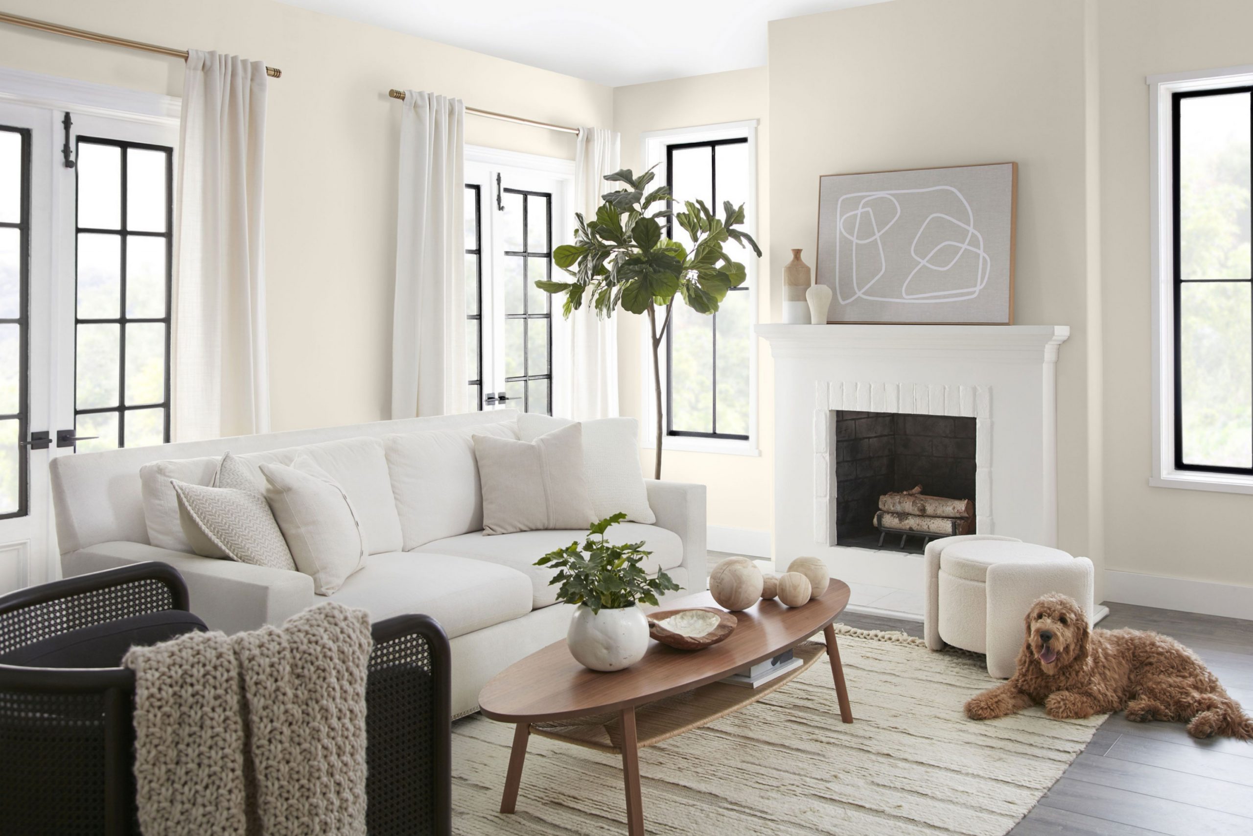
Pale Oak OC-20
Pale Oak is one of the most graceful neutrals you can choose. It’s a warm, smooth greige that moves easily between gray and beige depending on the light. I love using it throughout entire homes because it connects rooms naturally. It glows in sunlight and turns cozy in the evening, creating that soft transition every home needs.
It pairs beautifully with creamy whites like White Dove and with natural wood tones.
It’s especially lovely against stone or light tile—it picks up those earthy textures beautifully. Pale Oak feels sophisticated without trying—it’s elegant, timeless, and easy to live with.
The key rule of this color for interior walls is to use it when you want quiet connection and subtle warmth that ties your spaces together.

Gray Owl OC-52
Gray Owl is crisp, fresh, and quietly stylish. It leans cool, but not cold, which makes it perfect for clean, modern interiors. I love how it shifts gently between gray and blue depending on the light—it keeps a room feeling alive. I often use it in kitchens, offices, or bedrooms where a sense of focus and airiness matters.
It looks especially good with navy, white, or natural wood.
Gray Owl balances modernity with comfort—it’s the kind of color that makes a home feel thoughtfully designed without being fussy. It’s modern, but it still feels human.
The key rule of this color for interior walls is to use it when you want crisp freshness with a touch of warmth and personality.

Edgecomb Gray HC-173
Edgecomb Gray is one of my trusted colors for creating harmony. It’s that soft greige that brings every tone in a room together. I’ve used it in homes with white kitchens, dark floors, or vintage furniture—it always works. It’s warm enough to feel inviting but balanced enough to stay modern.
In natural light, it glows softly; in low light, it deepens into a warm beige-gray. It pairs effortlessly with crisp trim, creamy accents, and even muted greens. Edgecomb Gray feels grounded and forgiving, the kind of neutral you can build your whole palette around.
The key rule of this color for interior walls is to use it when you want connection, comfort, and quiet balance.

Stonington Gray HC-170
Stonington Gray is one of those colors that always feels confident and composed. It’s a true gray with a refined cool undertone that gives walls shape and structure without making them feel cold. I often turn to it when I want a space to look clean, focused, and quietly elegant. It’s perfect for kitchens, offices, or living rooms where balance and brightness matter.
In daylight, it feels crisp and architectural; in dim light, it softens to a misty, silvery tone that adds calm. It pairs beautifully with white trim, marble, and brushed nickel.
I’ve seen it work equally well in traditional homes and minimalist spaces—it always finds its place. When used alongside navy, charcoal, or wood accents, it adds depth without heaviness.
Stonington Gray feels timeless. It’s the kind of color that won’t fade with trends because it’s built on simplicity and strength.
The key rule of this color for interior walls is to use it when you want classic grace and modern balance that last through every season.

Balboa Mist OC-27
Balboa Mist is warm, smooth, and endlessly adaptable. It’s a light greige that seems to glow from within, catching just the right amount of light no matter the room. I love using it in open spaces because it helps everything flow naturally—it connects different areas without calling attention to itself.
It pairs beautifully with warm whites, natural wood, and creamy fabrics. It looks soft and sophisticated with gold accents, and clean and modern next to black or gray.
In the morning, Balboa Mist feels bright and creamy; by evening, it turns into a gentle taupe-gray that wraps the room in quiet comfort. It’s refined, familiar, and flattering to every kind of décor.
Balboa Mist is that rare shade that always feels like home. It’s understated but rich in warmth, adding light and softness without a single sharp edge.
The key rule of this color for interior walls is to use it when you want comfort, quiet flow, and graceful warmth that holds a home together.

Coventry Gray HC-169
Coventry Gray feels strong yet graceful—it has that cool, polished tone that makes a room look effortlessly designed. It’s a medium gray with just enough blue to keep it interesting, perfect for creating clean lines and modern contrast. I use it when I want a space to feel sharp, focused, and serene without feeling cold.
It’s stunning with bright whites like Chantilly Lace, and equally beautiful next to dark trim or warm oak floors. It looks sophisticated in daylight and moody at dusk, shifting with the light in the most subtle way.
In a bedroom, it feels peaceful; in a hallway or kitchen, it adds structure and rhythm.
Coventry Gray reminds me of brushed steel—it’s simple, strong, and elegant.
The key rule of this color for interior walls is to use it when you want calm strength with a touch of refined modern style.

Manchester Tan HC-81
Manchester Tan is the warmth of sunlight captured in color. It’s soft, sandy, and beautifully balanced. I use it when I want a neutral that brings comfort but still feels open and bright. It’s perfect for traditional homes or any space that needs a touch of golden light without the heaviness of yellow.
It pairs wonderfully with creamy whites, sage greens, and light woods. In daylight, it feels warm and friendly; at night, it turns smooth and earthy.
Manchester Tan gives rooms that “just right” feeling—neither too bold nor too pale. It’s dependable, easy to decorate with, and always welcoming.
Whenever I use this color, it reminds me of calm mornings and open windows—it’s familiar, peaceful, and full of light.
The key rule of this color for interior walls is to use it when you want a classic warmth that brings quiet happiness into your home.

Alaskan Husky 1479
Alaskan Husky feels like quiet light reflected off snow—it’s fresh, crisp, and beautifully cool. It’s a gray-blue with just enough color to give life to a space without making it feel cold. I often reach for this shade when a room needs clarity and openness, especially in small or low-light spaces. It instantly makes rooms feel wider, taller, and more peaceful.
In morning light, Alaskan Husky looks clean and airy; in the evening, it softens into a silvery tone that feels soothing. I’ve used it in bedrooms where people wanted a sense of retreat and in home offices where focus was key.
What I love most about Alaskan Husky is how it adapts—it feels modern in a minimalist home and comforting in a traditional one. It’s subtle but expressive, giving a hint of color that still reads as neutral.
The key rule of this color for interior walls is to use it in rooms where you want clean calmness with a soft touch of color.
Decorator’s White OC-149
Decorator’s White is clean, bright, and full of confidence. It’s the white I reach for when I want a crisp backdrop that still feels refined. It leans cool but never stark, making it perfect for modern spaces or rooms with gray, blue, or black accents. I’ve used it in art-filled homes, contemporary kitchens, and open lofts—it always makes details pop.
In natural light, Decorator’s White feels luminous and fresh; in evening light, it keeps its clear tone without yellowing.
It’s also one of my favorite trim colors because it adds just the right amount of contrast without stealing attention. It’s timeless, sleek, and perfectly composed.
Decorator’s White brings definition and clarity to any palette. It’s the perfect supporting color that helps everything else shine.
The key rule of this color for interior walls is to use it when you want precision, contrast, and modern polish.

Silver Lake 1598
Silver Lake is a color that feels elegant from the very first brushstroke. It’s a soft, cool gray with a hint of blue that captures light beautifully. In bright rooms, it feels airy and reflective, while in shaded areas, it takes on a rich, smooth tone. It’s one of those shades that instantly elevates a home, creating a feeling of ease and balance.
I often pair Silver Lake with crisp whites like Decorator’s White or with muted taupes for warmth. It looks stunning alongside brushed nickel, marble, or slate.
Silver Lake reminds me of fog rolling over water—it has depth but also softness. It’s dependable, flexible, and always chic. Whether it’s a new home or one filled with history, this shade fits right in.
The key rule of this color for interior walls is to use it where you want a light gray that feels balanced, elegant, and endlessly adaptable.
Super White OC-152
Super White feels bold, pure, and powerful. It’s one of the brightest whites in Benjamin Moore’s palette, and I love it for rooms where you want light to be the main feature. It’s crisp without being harsh, and it brings an immediate sense of freshness to a space. I’ve used it in modern living rooms, bathrooms, and even art studios—it makes everything feel sharp and clear.
It pairs perfectly with black, navy, and deep gray, creating stunning high-contrast designs. It’s also beautiful next to natural textures like stone, leather, or warm wood—it keeps them feeling modern and balanced.
In bright sunlight, Super White gleams with brilliance; under warm light, it mellows just enough to stay comfortable.
It’s the definition of clean simplicity.
The key rule of this color for interior walls is to use it when you want pure brightness and architectural clarity that feels fresh every day.
Snow White OC-66
Snow White is crisp yet gentle—a soft, elegant white that feels like quiet air. It’s slightly cooler than Cloud White but warmer than pure bright whites, which makes it easy to use across many rooms. It gives interiors a refined, timeless feeling, perfect for anyone who wants a fresh but comforting home.
In morning light, it sparkles softly; by night, it becomes smooth and calm. It pairs beautifully with both cool and warm tones—gray, blush, taupe, or navy.
It’s also one of my favorite whites for trim because it highlights architectural lines without feeling too bold. Snow White has a softness that flatters every texture and color around it.
It’s polished but never pretentious—the kind of white that feels both modern and familiar.
The key rule of this color for interior walls is to use it when you want light that feels refined, even, and quietly bright.

Horizon OC-53
Horizon is one of those soft grays that never shouts, but always makes its presence known. It feels like a breath of clean air—subtle, light, and endlessly balanced. When I first tried it in a client’s kitchen, I was amazed by how it shifted throughout the day. In the morning, it glowed with a silvery brightness that made the room look bigger; by afternoon, it deepened into a gentle misty tone that felt calm and steady. It has a cool undertone, but it never looks blue or flat—it’s neutral in the best way.
I love pairing Horizon with crisp white trim like Chantilly Lace or a creamy neutral such as Swiss Coffee. Together, they create that effortless coastal harmony that feels both modern and timeless.
Whenever I walk into a room painted in Horizon, it feels like the light has been softened just enough to make everything look better. It brings order and stillness but never feels distant.
The key rule of this color for interior walls is to use it where you want brightness that stays soft, balanced, and easy on the eyes.

Silver Fox 2108-50
Silver Fox is one of those colors that instantly makes a home feel refined and grounded. It’s a rich taupe-gray with soft brown undertones that add warmth and texture without heaviness. I often use it in living rooms or dining areas where you want depth but still need comfort. It feels like soft velvet on the walls—subtle, smooth, and quietly luxurious. In daylight, it looks calm and earthy; under warm lighting, it turns cozy and inviting.
I love pairing Silver Fox with creamy whites, deep charcoals, and warm metals like brushed gold or copper.
It complements natural fabrics such as linen, suede, and wool beautifully. In traditional homes, it enhances architectural details, and in modern spaces, it adds dimension and softness. It’s one of those shades that fits anywhere—it brings calm balance without fading into the background.
Whenever I use Silver Fox, I notice how people immediately feel at ease in the room. It’s timeless and comforting, the kind of color that makes everything around it look better.
The key rule of this color for interior walls is to use it where you want elegance and warmth to live side by side.
Boothbay Gray HC-165
Boothbay Gray is the perfect marriage of gray and blue. It feels steady, stylish, and comforting. There’s a softness in it that makes a home feel well-loved but not too relaxed—it still carries quiet structure. I often use it in kitchens, bathrooms, and laundry rooms where clean tones are essential. It reflects light in a gentle way that makes the room feel brighter without the glare of pure white.
What I love most about Boothbay Gray is its versatility. In natural daylight, it looks fresh and coastal; in evening light, it deepens into a more traditional gray-blue with wonderful warmth.
I’ve used it with marble counters, brass fixtures, and natural linen—it looks perfect every time. It can also soften industrial or modern spaces, bringing them a touch of warmth and approachability.
When paired with whites like Cloud White or White Dove, it creates a sophisticated palette that feels effortless and timeless. It’s one of those rare colors that fits any style—from farmhouse to modern loft.
The key rule of this color for interior walls is to use it when you want soft structure and gentle sophistication at the same time.

Whale Gray 2134-40
Whale Gray has presence—it’s rich, grounding, and full of quiet confidence. It’s deep enough to add drama but still warm enough to feel welcoming. I love using it in dining rooms, offices, or accent walls where I want a strong but elegant foundation. It carries a cool undertone that works well with crisp whites, while its depth makes metals like gold and brass stand out beautifully.
When natural light hits Whale Gray, it reveals soft, smoky undertones that give the color life. It feels sophisticated without trying too hard—bold, but never too heavy.
It also pairs beautifully with warm woods, adding texture and contrast to the space. I’ve even used it on cabinetry where it instantly gives a custom, designer look.
This color reminds me of tailored fabric—it feels refined, grounded, and timeless. Whale Gray has a way of making a home feel both structured and relaxed, which is why it’s one of my favorites for layered interiors.
The key rule of this color for interior walls is to use it when you want a dark neutral that adds strength and calm elegance together.
Kendall Charcoal HC-166
Kendall Charcoal is deep, rich, and endlessly dependable. It’s a strong gray with warm undertones that give it a soft edge. I love it because it’s dramatic without ever feeling overbearing. I often use it on feature walls, kitchen islands, or interior doors—it instantly gives a room definition and character. In living rooms, it can make a large space feel intimate; in small spaces, it adds sophistication and structure.
It looks beautiful with creamy whites, wood tones, and brass details. If you pair it with lighter grays or natural linen fabrics, it becomes cozy and stylish.
I’ve even used it with navy accents for a layered, designer look. It adapts effortlessly between modern and traditional interiors.
Kendall Charcoal feels confident—it anchors a space while allowing other details to shine. It’s one of those colors that seems to steady the energy of a home.
The key rule of this color for interior walls is to use it as an anchor that adds timeless strength and quiet refinement.

Nimbus 1465
Nimbus feels like a smooth, even breath of air. It’s a warm gray that leans ever so slightly toward beige, giving a home balance and comfort. It’s one of my favorite neutrals for entire interiors because it connects different rooms seamlessly. I’ve used it in living rooms, hallways, and even kitchens—it never feels out of place.
What makes Nimbus special is its softness. It doesn’t compete with art, furniture, or décor; instead, it supports everything with subtle elegance.
It looks gorgeous with white trim, deep navy, or muted terracotta accents. It can make a modern room feel relaxed or give a traditional one a fresh update.
It’s a peaceful shade that gives walls life while staying quietly in the background.
The key rule of this color for interior walls is to use it when you want a stable, natural gray that makes every room flow together with ease.
Rockport Gray HC-105
Rockport Gray feels steady, classic, and confident. It’s a mid-tone gray that leans slightly warm, making it easy to live with year after year. I’ve used it in offices, entryways, and living rooms where I wanted structure and harmony. It has just enough weight to give a room importance but not enough to make it dark. In natural light, it takes on a soft stone-like quality that feels organic and timeless.
This color looks especially beautiful paired with white trim or creamy ceilings—it brings out the warmth hidden within its base.
I also love combining it with dark furniture or black frames for contrast. It’s incredibly flexible and adapts well to different décor styles—from classic and traditional to contemporary minimalism.
Rockport Gray feels dependable, like a foundation color that holds everything else together. It adds quiet sophistication that never feels forced.
The key rule of this color for interior walls is to use it when you want stability and depth that blend seamlessly with your home’s style.
Cement Gray 2112-60
Cement Gray brings order and calm to a space. It’s a clean, neutral gray that feels steady and fresh, like cool stone under sunlight. I love how it simplifies a room—removing distractions and highlighting everything else. It’s perfect for kitchens, bathrooms, and hallways where you want clarity and brightness without the glare of pure white.
I’ve paired Cement Gray with bright whites for a crisp, modern palette, and with warm woods for a cozy contrast.
It works with polished nickel, black hardware, or even bold color accents like mustard or navy. It’s a chameleon color—it takes on different moods depending on what’s around it.
What makes Cement Gray so special is its honesty. It doesn’t compete or demand—it quietly supports every design choice you make.
The key rule of this color for interior walls is to use it where simplicity and modern comfort meet.
Stormy Monday 2112-50
Stormy Monday feels rich and layered, like soft gray smoke swirling in candlelight. It’s a warm gray with earthy undertones, which gives it a cozy sophistication. I love using it in bedrooms or dining rooms where I want atmosphere and warmth. It creates a cocoon effect without feeling dark. In daylight, it shows a calm, even tone; under lamps, it turns into a warm, soothing shadow that wraps the room beautifully.
It pairs perfectly with creamy whites, natural linen, and deep walnut tones. When used with metallic touches—like gold or bronze—it adds quiet luxury.
I’ve also used it beside stone fireplaces or textured rugs, where it enhances the feeling of home. It’s one of those shades that makes people stop and breathe slower—it carries stillness.
Stormy Monday feels like an invitation to unwind. It adds elegance and intimacy in a way that’s effortless.
The key rule of this color for interior walls is to use it in rooms where you want depth, comfort, and timeless softness.
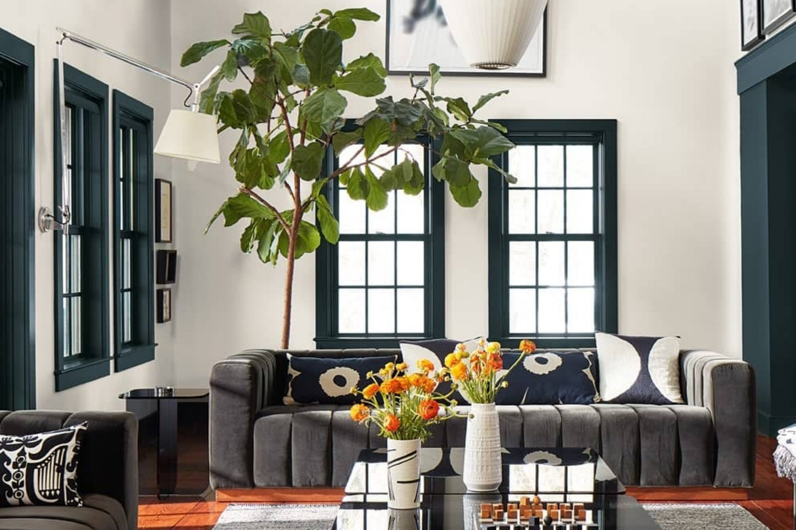
Van Deusen Blue HC-156
Van Deusen Blue is a timeless favorite—it’s deep, rich, and full of personality. It’s not just a blue; it’s a color that changes with the light, offering layers of navy, slate, and ink. I love using it for cabinets, accent walls, or formal dining rooms where you want to make a confident statement. It’s strong but never harsh. When paired with white trim, it feels classic; with gold fixtures, it becomes truly elegant.
It also brings warmth to rooms with natural light and character to darker spaces. I’ve paired it with warm wood floors, gray fabrics, and crisp whites—it shines every time.
It’s bold but calming, polished but inviting. It has that “old library” feeling—rich, thoughtful, and comforting.
The key rule of this color for interior walls is to use it where you want depth, character, and timeless beauty.

Shadow Gray 2125-40
Shadow Gray captures the soft color of sea foam beneath the clouds—it’s a blue-gray that’s refreshing yet calm. It gives rooms a light, airy feeling while still adding a touch of emotion. I’ve used it in bedrooms, nurseries, and bathrooms where the goal was peace with a bit of personality. It pairs beautifully with crisp whites, brushed silver, or warm beige accents.
In sunlight, it feels light and coastal; in the evening, it deepens to a muted stormy hue that feels elegant and steady.
It’s perfect for homes that want a touch of color but prefer quiet tones over bold ones. I often pair it with creamy furniture or light oak floors—it brings out the softness in both.
Shadow Gray has that rare ability to make a room feel alive and composed at the same time.
The key rule of this color for interior walls is to use it where you want a whisper of blue with a steady, relaxing tone.
Wolf Gray 2127-40
Wolf Gray feels bold, dependable, and perfectly balanced between blue and gray. It’s rich enough to stand out, yet soft enough to feel timeless. I love using it for home offices, dining rooms, or cabinetry—it gives presence without feeling heavy. It works beautifully with white trim, warm brass accents, and dark wood furniture.
In daylight, it looks cool and elegant; in dim light, it gains a smoky warmth that adds mood and depth.
I’ve also used it with patterned fabrics or soft neutrals—it lets those textures shine while grounding the design. It’s a perfect color for people who love navy but want something quieter.
Wolf Gray gives a sense of sophistication that feels effortless, like confidence that doesn’t need to prove itself.
The key rule of this color for interior walls is to use it where you want strength, focus, and relaxed elegance.
Hale Navy HC-154
Hale Navy is the definition of classic elegance. It’s deep and moody but never feels heavy. I’ve used it in so many ways—on kitchen islands, bedroom walls, and built-in shelves—and it always feels refined. It pairs perfectly with clean whites, brass accents, and warm wood tones. In daylight, it looks crisp and modern; in evening light, it turns into a cozy cocoon of sophistication.
Hale Navy gives any room a sense of purpose. It’s strong and confident but carries a softness that keeps it livable.
It’s one of those colors that instantly makes a home feel more put-together. Whether in a coastal home or a traditional townhouse, it brings balance, grace, and charm.
The key rule of this color for interior walls is to use it as a statement that stays classic no matter the trend.

Beacon Gray 2128-60
Beacon Gray feels fresh and open, like clean air drifting through a window. It’s a soft gray with a gentle blue tone that instantly brightens a room. I often choose it for bathrooms, bedrooms, or coastal homes—it gives spaces that peaceful, sunlit energy. It pairs perfectly with white trim, silver fixtures, and sandy neutrals.
I love how Beacon Gray changes through the day. In morning light, it looks airy and reflective; by evening, it deepens into a more muted gray-blue that feels calm and safe.
It’s one of those shades that creates a happy medium between color and neutrality. It adds freshness without feeling cold.
It’s ideal for rooms where you want to breathe a little easier, surrounded by light that always feels kind.
The key rule of this color for interior walls is to use it when you want light color that stays easy and natural.
November Skies 2128-50
November Skies is like a quiet afternoon before the rain—a mix of gray and blue that brings thoughtful beauty to a room. It’s not dramatic, but it has soul. I love using it in bedrooms, studies, or hallways where reflection and rest matter. It’s cool and refined, yet never distant. With white trim, it looks crisp; with beige or tan, it looks warm and lived-in.
It pairs beautifully with wood accents, silver hardware, and creamy fabrics. When used in large, airy rooms, it adds a sense of stability.
It’s also wonderful for transitional homes that mix old and new elements. I’ve seen it make even the simplest décor feel considered and composed.
November Skies is a color that feels grown-up but never heavy—it’s the perfect mix of elegance and comfort.
The key rule of this color for interior walls is to use it when you want serenity with just a touch of mystery.
Proposal AF-260
Proposal is a gentle, romantic gray with a faint lavender undertone that adds grace and warmth. It’s a soft color that feels comforting without being overly sweet. I love using it in bedrooms, reading nooks, or powder rooms—it adds a delicate layer of personality that’s easy to live with. In daylight, it feels airy and balanced; in lamplight, it glows with quiet charm.
This color pairs beautifully with whites, taupes, or soft golds. It also complements silver fixtures and light fabrics like linen or cotton.
Proposal is perfect for anyone who wants a subtle color that still feels special. It adds just enough character to make a room feel finished and serene.
The key rule of this color for interior walls is to use it when you want softness, comfort, and a touch of grace.
New Hope Gray 2130-50
New Hope Gray feels balanced, elegant, and steady—like the middle ground between blue, gray, and a touch of mist. It’s one of those colors that instantly adds sophistication without asking for attention. I’ve used it in dining rooms, home offices, and entryways where I wanted depth that feels welcoming, not formal. In daylight, it looks cool and polished; under soft lamps, it turns velvety and smooth. It pairs perfectly with white trim, beige upholstery, or brushed brass accents. I also love it with darker shades like Kendall Charcoal—it creates beautiful contrast.
What makes New Hope Gray special is how it holds emotion and structure at once. It feels confident, almost architectural, yet still gentle.
I often recommend it for rooms where you want calm energy with a touch of modern grace. It fits as easily in coastal homes as it does in city apartments.
The key rule of this color for interior walls is to use it where you want calm focus and quiet sophistication.
Caliente AF-290
Caliente is bold, rich, and full of warmth—it’s red done right. It carries a deep, earthy tone that feels powerful but never too loud. I love using it in dining rooms or entryways where it can catch the light and create energy. It pairs beautifully with white trim, warm wood, and brass accents. In a small room, it feels dramatic; in a larger space, it feels regal and full of life.
What I admire most about Caliente is how it changes mood. In daylight, it’s radiant and confident; in evening light, it turns into a deep, glowing ember that feels luxurious.
I often use it as an accent color to break up neutral palettes—it adds the perfect amount of strength and warmth.
The key rule of this color for interior walls is to use it to bring energy, passion, and presence into your home.
51 Best Interior Paint Colors in 2026
Pure White SW 7005
Pure White continues to be one of the most loved colors for 2026, and I understand why—it’s bright, dependable, and endlessly adaptable. It has just enough warmth to keep it from feeling sharp, which makes it perfect for every kind of home. I love using it as a base for trim, ceilings, or whole walls when I want the décor to stand out.
It reflects light beautifully, keeping rooms feeling open and refreshed.
It pairs with everything—bold colors, wood tones, or soft neutrals. When I walk into a room painted Pure White, it feels like a blank page ready for life to happen.
The key rule of this color for interior walls is to use it in spaces that need light, flow, and quiet confidence.
Alabaster SW 7008
Alabaster is more than just a white—it’s the feeling of warmth wrapped in light. It’s that perfect creamy tone that seems to hug a room without overwhelming it. When I walk into a home painted in Alabaster, it feels calm and intentional, like the air itself has softened. I love how it takes both morning and evening light and turns it into a gentle glow. It doesn’t shout for attention; instead, it quietly enhances every texture and material around it.
In bedrooms, Alabaster makes the walls look like they’re lit from within. In living rooms, it pairs beautifully with oak floors, woven textiles, or brass details.
It’s especially striking with black or bronze accents—it brings out the warmth in darker tones without losing its brightness. Even in hallways or stairwells, where light can shift quickly, Alabaster remains consistent and graceful.
I use this color when I want to bring life to neutral spaces without leaning cold or stark. It creates rooms that feel nurturing, grounded, and touched by sunlight all day long.
The key rule of this color for interior walls is to use it when you want a soft, glowing white that feels kind, comforting, and timeless.
Snowbound SW 7004
Snowbound reminds me of a fresh morning—bright, clean, and full of clarity. It’s a crisp white that carries just enough gray to stay balanced. I reach for it when I want brightness with structure, especially in modern homes where lines and materials are meant to shine. In kitchens, Snowbound reflects natural light perfectly, making the space feel open and elegant.
It pairs effortlessly with navy, charcoal, or natural wood, creating that perfect mix of cool and warm contrast.
I’ve used it on cabinetry paired with brushed gold hardware—it feels refined but never cold. Even in shadowy corners, it keeps its energy, adding quiet depth instead of dullness.
Snowbound’s beauty is its restraint—it’s clean but not sterile, bright but not glaring. It gives rooms that sense of thoughtful simplicity that lasts year after year.
The key rule of this color for interior walls is to use it where you want modern brightness that still feels natural and soft.
Greek Villa SW 7551
Greek Villa feels like soft sunshine filtered through white curtains—it’s warm, elegant, and endlessly welcoming. It’s a white that doesn’t compete with the décor but instead complements it, connecting spaces in a smooth, gentle way. I love using it throughout entire homes because it feels consistent yet full of character.
In living rooms, Greek Villa pairs beautifully with beige upholstery and gold or bronze accents, creating a touch of quiet luxury.
In kitchens, it brings out the natural warmth of wood tones and polished metals. In bedrooms, it feels like rest—it’s calm, delicate, and light. When the light changes, it never feels stark; it glows with the color of soft cream.
What I love most is its ability to bridge styles. Whether you have rustic furniture, coastal tones, or sleek modern pieces, Greek Villa brings it all together in harmony.
The key rule of this color for interior walls is to use it when you want light that feels warm, elegant, and deeply lived-in.
White Dove OC-17
White Dove is the color I trust the most—it’s reliable, familiar, and quietly stunning. It has just the right touch of warmth to make rooms glow, without losing its gentle brightness. It’s perfect for creating balance between walls, trim, and furniture. Every time I use it, it feels like the home breathes a little easier.
In open living spaces, White Dove helps reflect light evenly, making the walls feel soft and continuous. I often pair it with taupe, gray, or navy—it blends beautifully with both warm and cool tones.
On trim or cabinetry, it gives a clean, classic finish that never looks flat. Whether in a modern apartment or a cozy cottage, it carries the same timeless charm.
White Dove doesn’t just brighten a space; it adds a sense of quiet assurance. It makes a home feel cared for and complete.
The key rule of this color for interior walls is to use it for steady brightness that feels graceful and enduring.
Chantilly Lace OC-65
Chantilly Lace is pure light in paint form. It’s crisp, luminous, and one of the truest whites I’ve ever used. There’s no yellow or cream in it—just clarity. That’s what makes it so beautiful in modern homes where clean lines and contrast matter. When I use it next to dark trim or deep colors, it shines even more, creating that gallery-like balance designers love.
It’s especially stunning in spaces with lots of natural light. In daylight, it feels fresh and expansive; under warm lamps, it becomes smooth and delicate.
It also pairs wonderfully with natural wood or stone, creating contrast without harshness.
Chantilly Lace gives rooms a feeling of openness and confidence. It’s the white that says “everything is in its place.”
The key rule of this color for interior walls is to use it when you want perfect clarity and light without losing warmth.
Cloud White OC-130
Cloud White is one of the most soothing whites I know—it’s warm, creamy, and completely unpretentious. It feels like morning sunlight resting on a wall. I love using it in living spaces where people gather, because it encourages comfort and connection. It softens edges and blends beautifully with natural textures like linen, jute, and oak.
It’s my go-to for transitional homes, where modern meets traditional. In bright light, Cloud White feels fresh; in low light, it turns buttery and soft.
I’ve used it for entire interiors when I want to make a home feel cohesive, familiar, and timeless. It also makes artwork and furniture look more inviting—it’s the perfect quiet backdrop.
Cloud White is proof that gentle doesn’t mean boring—it’s easy, elegant, and full of life.
The key rule of this color for interior walls is to use it where you want soft connection and natural harmony.
Swiss Coffee OC-45
Swiss Coffee feels like warmth made visible. It’s rich but never heavy, soft but still full of energy. It has a golden undertone that adds glow and depth to a space, making even the simplest rooms feel layered and cozy. I use it often in kitchens, family rooms, and entryways—it welcomes you in with light that feels kind.
What makes Swiss Coffee special is how it complements both natural and artificial lighting.
In sunlight, it feels creamy and fresh; at night, it turns warm and comforting. It’s a wonderful companion for wood furniture, woven rugs, and matte black accents. I’ve even used it on ceilings to give rooms a seamless, embracing glow.
Swiss Coffee feels like home—it’s that perfect blend of refinement and warmth that never ages.
The key rule of this color for interior walls is to use it when you want warmth that feels quietly luxurious and deeply human.
Creamy SW 7012
Creamy feels like the color of a slow morning—a soft, glowing white that fills a room with warmth. It’s a comfort color through and through, adding sweetness and ease without being sugary. I love using it in family rooms, nurseries, or kitchens where the goal is joy and togetherness. It pairs beautifully with light oak, pale blue, or natural fabrics.
Creamy adapts effortlessly—it can feel bright and open in the day, then intimate and calm at night.
I’ve seen it elevate simple spaces, bringing out the charm of every texture. It looks beautiful with classic furniture and equally stunning in minimalist designs.
It’s the paint equivalent of a cozy blanket—welcoming, kind, and timeless.
The key rule of this color for interior walls is to use it when you want an inviting home that feels like a gentle embrace.
Natural Choice SW 7011
Natural Choice is soft, balanced, and beautifully grounded. It’s a creamy neutral that sits right between beige and white, creating calm flow through the home. It’s especially perfect for open plans—it keeps transitions smooth and airy. I love pairing it with natural materials: woven baskets, oak floors, and linen upholstery.
In the morning, it glows softly; at night, it becomes warm and enveloping.
It has a versatility that makes it work with almost every palette—muted greens, grays, and even deep navy tones. It’s understated but full of character, perfect for homes that want gentle light and natural grace.
The key rule of this color for interior walls is to use it when you want neutral warmth that feels simple, whole, and serene.
Dover White SW 6385
Dover White is cozy and sunlit—it feels like happiness on the walls. It’s a soft, golden white that brings light even to the dimmest rooms. I love using it in dining areas and bedrooms where warmth makes people linger a little longer. It pairs wonderfully with warm woods, creamy décor, and soft fabrics.
In daylight, Dover White feels cheerful and open; in the evening, it deepens to a creamy, candle-lit tone.
It’s perfect for traditional homes or anyone who loves a welcoming atmosphere. Dover White doesn’t just brighten a room—it adds spirit and warmth that stays.
The key rule of this color for interior walls is to use it when you want a friendly, glowing tone that never fades.
Shoji White SW 7042
Shoji White is modern softness at its best. It’s a creamy greige that walks the line between warm and cool. I often choose it for homes that need connection and flow—it creates visual warmth without heaviness. In daylight, it feels bright and airy; in low light, it turns rich and gentle.
It pairs effortlessly with both natural materials and bold accents. I love it next to walnut, black trim, or woven fabrics. It adds balance and calm without ever looking flat. Shoji White brings texture and depth to even minimalist designs—it’s subtle but full of intention.
The key rule of this color for interior walls is to use it when you want soft warmth with modern balance.
Pale Oak OC-20
Pale Oak is that gentle neutral I return to again and again. It has the warmth of soft linen and the calm of morning light. It’s a greige that leans slightly warm but never feels yellow—it just makes every room glow. When I use it in homes, I notice how it adapts so easily: bright and open in daylight, cozy and smooth in lamplight. It’s perfect for open layouts because it connects rooms naturally, creating flow without repetition.
I often pair Pale Oak with creamy trim like White Dove or Natural Choice—it keeps everything looking soft and sophisticated.
It’s a color that loves texture, especially against oak flooring, woven rugs, or stone details. It also works beautifully with modern fixtures like brushed brass or matte black, giving that perfect blend of timeless and current.
Pale Oak is the kind of shade that doesn’t shout for attention—it quietly enhances everything around it. Whether on its own or with bolder accents, it gives a home the feeling of ease and care.
The key rule of this color for interior walls is to use it when you want gentle warmth and natural connection between spaces.
Classic Gray OC-23
Classic Gray is one of those colors that earns its name. It’s graceful, steady, and endlessly easy to live with. I love it because it never looks too cool or too warm—it’s always balanced. In bright rooms, it feels clean and polished; in shaded spaces, it turns soft and calm. It’s especially beautiful in homes that rely on natural textures like wood and linen.
I use Classic Gray when I want walls to support, not compete with, the rest of the décor.
It’s stunning with white trim, gold accents, or black-framed art. It works just as well in modern spaces as in traditional homes, giving a quiet sophistication that lasts.
The beauty of Classic Gray is its adaptability—it flows between tones, moods, and lighting with ease. Every time I see it on a wall, it reminds me how powerful subtlety can be.
The key rule of this color for interior walls is to use it when you want effortless refinement and balance that never goes out of style.
City Loft SW 7631
City Loft feels soft and smooth, like a whisper of beige with a hint of gray. It’s that perfect in-between tone that brings unity to a home. I love it for living rooms, hallways, or open floor plans where consistency matters. It blends beautifully with both warm and cool finishes, making it one of my most flexible go-to colors.
In natural light, City Loft feels bright and comforting; under lamps, it becomes warm and cozy.
It works beautifully with creamy whites, rattan, and textured fabrics. When paired with black accents or crisp trim, it takes on a more modern look without losing warmth.
What I love most is its calm confidence—it doesn’t demand attention but always leaves an impression. It’s a quiet bridge between modern simplicity and timeless charm.
The key rule of this color for interior walls is to use it when you want smooth flow and understated warmth.
Eider White SW 7014
Eider White is a chameleon—it changes softly with the light, always keeping a sense of peace. It’s an off-white with a touch of gray, and in some rooms, a whisper of pink or taupe appears, making it beautifully complex. I’ve used it in bedrooms and kitchens, and every time it brings calm energy without feeling flat.
Eider White pairs perfectly with brushed nickel, soft oak, and linen fabrics. It brightens darker corners without being stark.
I love using it with cool undertones when I want to maintain balance in a home full of mixed materials. It’s also wonderful for ceilings and trim when you want subtle contrast with slightly deeper wall colors.
It’s a shade that keeps the mood easy and connected—it feels personal and refined at the same time.
The key rule of this color for interior walls is to use it when you want a fresh backdrop that adapts beautifully to changing light.
Accessible Beige SW 7036
Accessible Beige is one of the most dependable neutrals I’ve ever used. It sits perfectly between beige and gray, feeling soft, natural, and balanced. I love how it warms up a space without ever turning yellow or dull. It’s the color I choose when I want a cozy, timeless tone that fits every home style.
I often pair it with white trim and layered textures—linen sofas, natural rugs, and oak floors. It works beautifully with both warm and cool tones, connecting everything together.
In daylight, it looks clean and even; in the evening, it turns warmer and more intimate. It’s as inviting as a favorite sweater—comfortable, beautiful, and never too much.
Accessible Beige reminds me why neutrals are powerful—it lets everything else in the room feel special.
The key rule of this color for interior walls is to use it where you want timeless warmth and everyday comfort.
Edgecomb Gray HC-173
Edgecomb Gray is that perfect, trustworthy greige that never goes out of style. It’s warm enough to feel cozy but light enough to stay open and airy. I love using it in homes with lots of wood or natural light—it balances everything with quiet grace. It’s one of those colors that looks beautiful anywhere: living rooms, kitchens, or hallways.
When paired with crisp trim or creamy whites, it feels refined; with deep accents, it becomes grounded and elegant.
It’s the kind of shade that makes everything feel thoughtful and put-together. It flows between gray and beige depending on the time of day, always staying harmonious.
Edgecomb Gray is like a steady heartbeat—it ties everything together without ever standing in the way.
The key rule of this color for interior walls is to use it when you want balance that feels naturally welcoming.
Repose Gray SW 7015
Repose Gray has long been one of my most-used colors, and it remains just as relevant in 2026. It’s neutral, adaptable, and endlessly balanced. It’s a soft gray with a hint of warmth, which makes it feel comfortable without leaning beige. In large rooms, it feels sophisticated and clean; in small rooms, it opens up the space without looking cold.
I pair it with pure whites, deep charcoals, or navy accents—it always plays well with others.
It’s ideal for open plans because it flows easily from one space to the next. The best part is how it reacts to light—it never looks flat, always soft and layered.
When I walk into a home painted in Repose Gray, I feel calm and focused. It’s the color of order and peace.
The key rule of this color for interior walls is to use it where you want steadiness and style that lasts.
Agreeable Gray SW 7029
Agreeable Gray is one of those rare shades that fits any home. It’s warm, balanced, and completely adaptable. It blends beige and gray so smoothly that it feels fresh and cozy all at once. I’ve used it in living rooms, bedrooms, and hallways—it always feels right.
The magic of Agreeable Gray lies in its balance. In morning light, it feels bright and airy; by evening, it turns into a warm cocoon.
It pairs with every tone—from white and tan to deep blue or black. It’s the color I choose when clients want one shade for the whole house. It never disappoints.
Agreeable Gray has that quiet charm that makes a home feel lived in and loved.
The key rule of this color for interior walls is to use it when you want an all-purpose neutral that keeps warmth and harmony in perfect balance.
Balboa Mist OC-27
Balboa Mist is soft, creamy, and just the right mix of gray and beige. It has a delicate warmth that keeps rooms feeling friendly and clean. I often use it in open-concept homes—it brings smooth transition and balance. With white trim, it feels elegant; with dark furniture, it feels grounded and welcoming.
It’s especially lovely in rooms with lots of natural light, where it glows softly throughout the day. Balboa Mist is subtle but never dull—it’s that color that quietly makes everything else look better.
The key rule of this color for interior walls is to use it when you want a polished, gentle, and timeless mood in your home.
Balboa Mist OC-27
Balboa Mist is one of those rare shades that feels like quiet sunlight in color form. It’s a warm gray with a soft creamy undertone that instantly brings calm to a home. I love how it shifts gently through the day—fresh and airy in the morning, warm and grounded by evening. It never looks flat, even in shadowy rooms, and it always keeps its comforting glow.
I often use Balboa Mist in open layouts because it connects spaces without creating sharp transitions.
It looks beautiful with white trim and natural wood floors, blending elegance with ease. It’s also the perfect companion for warm metals like brass or gold—those accents sparkle next to its smooth softness.
In bedrooms, it creates an atmosphere that feels like exhaling; in living rooms, it gives walls quiet movement and depth.
It pairs well with textures—linen curtains, woven baskets, or stone finishes—all of which seem to glow a little brighter beside it. Balboa Mist never competes; it completes.
The key rule of this color for interior walls is to use it when you want gentle balance and lasting warmth that makes your home feel naturally at ease.
Revere Pewter HC-172
Revere Pewter is one of those colors that defines “home” for me. It’s a balanced greige with just the right amount of warmth to make a room feel safe and welcoming. It’s neither too beige nor too gray, and that’s why it’s so timeless. Whenever I use it, I know it will age gracefully—it always does.
It works beautifully in almost every setting, from modern spaces with clean lines to older homes with history and charm.
I love pairing it with crisp whites, black accents, and natural wood—it helps tie everything together. Revere Pewter also plays well with light; it changes tone softly from morning to night, giving a room life without noise.
This is the color I choose for whole-house palettes when I want flow and simplicity. It feels trustworthy, like it’s been part of the home forever. Every time I walk into a Revere Pewter room, it feels finished—comfortable, calm, and beautifully familiar.
The key rule of this color for interior walls is to use it where you want timeless warmth that feels both fresh and established.

Anew Gray SW 7030
Anew Gray carries the perfect blend of strength and calm. It’s rich enough to ground a space, yet still soft enough to stay inviting. I’ve used it in living rooms, bedrooms, and even on cabinetry—it always brings quiet sophistication. It has a subtle beige warmth that keeps it from feeling cold, which is why it’s so easy to pair with wood, white, or metallic tones.
When the light hits it, Anew Gray reveals layers of greige that shift gently through the day. It feels earthy but never heavy.
I like it most in homes that have both modern and classic elements—it bridges those two styles effortlessly. It’s the kind of shade that makes you pause, not because it stands out, but because it feels just right.
It’s dependable, grounded, and graceful—everything a home’s foundation color should be.
The key rule of this color for interior walls is to use it where you want steady beauty that holds the room together.
Colonnade Gray SW 7641
Colonnade Gray is like the perfect middle note in a song—it brings harmony to everything around it. It’s warm enough to feel comfortable but cool enough to stay fresh. I love using it for large, connected spaces like open living areas or hallways because it keeps the flow seamless. It works with every finish, from warm gold to sleek chrome.
In daylight, it feels balanced and clear; in evening light, it turns soft and inviting.
It pairs beautifully with white trim and natural textures like linen or rattan. I’ve even used it next to navy cabinetry—it looked tailored and polished. Colonnade Gray has quiet charm; it makes rooms look designed, not decorated.
It’s one of those colors that feels familiar from the moment it goes on the wall.
The key rule of this color for interior walls is to use it when you want structure and smooth connection between rooms.
Drift of Mist SW 9166
Drift of Mist feels like a soft breath of air—it’s light, graceful, and full of subtle warmth. It’s a perfect greige for homes that want brightness without the cool edge of pure gray. I love how it reacts to natural light, staying neutral but never bland. It’s ideal for large spaces that need calm continuity.
It pairs perfectly with warm whites, soft beiges, and even muted greens. In living rooms, it brings an easy elegance; in bedrooms, it feels like rest.
Drift of Mist works well in any style—modern, farmhouse, transitional—it adapts and enhances. I’ve also used it with black doors and hardware for a bit of contrast; it still keeps everything feeling serene.
Every time I use Drift of Mist, it reminds me of why gentle tones matter—they make life feel a little quieter and a little more beautiful.
The key rule of this color for interior walls is to use it when you want an atmosphere that feels bright, balanced, and endlessly calm.
Passive SW 7064
Passive is a light, true gray that creates calm order in any room. It’s clean without being cold and modern without feeling harsh. I love it for kitchens and bathrooms where you want a soft, silvery backdrop that still looks lived in. In rooms with plenty of sunlight, it shines with quiet clarity; in low light, it turns cozy and smooth.
It works well with nearly every accent color—black, navy, blush, or wood. I often use it when clients want a neutral that feels fresh and sophisticated.
It reflects light beautifully, giving walls a polished, even finish that lasts.
Passive is a steady color—it doesn’t compete, it supports. It makes spaces feel well-balanced and quietly confident.
The key rule of this color for interior walls is to use it when you want a peaceful modern tone that keeps your home feeling fresh and composed.
Light French Gray SW 0055
Light French Gray carries the poise of a classic neutral and the charm of a soft morning sky. It’s elegant but not too serious, calm but not dull. I use it when a room needs definition without depth. It’s the kind of color that holds light beautifully and never fights the furniture.
It pairs perfectly with crisp whites, deep blues, or warm golds. I’ve seen it in bedrooms, foyers, and home offices—it always makes a statement in the quietest way.
The subtle coolness keeps it refined, while its balance allows it to blend easily with warm textures like wood or woven fabrics.
Light French Gray feels timeless—it fits seamlessly in any decade, any home.
The key rule of this color for interior walls is to use it when you want quiet confidence and polished simplicity.
Gray Owl OC-52
Gray Owl is one of those rare colors that instantly brings freshness. It’s cool, soft, and just bright enough to open a room without feeling stark. It’s a go-to for kitchens, offices, and light-filled bedrooms. I love how it reacts to different lighting—it leans greenish in daylight, bluer at dusk, always graceful.
It works beautifully with white trim, navy fabrics, or marble accents. In homes that have both warm and cool elements, Gray Owl bridges them effortlessly.
It’s clean but not sterile, modern but never cold. When used throughout a home, it gives a cohesive, airy feel that still feels cozy.
Gray Owl feels like a deep breath—it’s simple, pure, and incredibly easy to live with.
The key rule of this color for interior walls is to use it where you want lightness and clarity with a touch of grace.
Stonington Gray HC-170
Stonington Gray is refined and strong—it has a classic cool undertone that adds sophistication without feeling distant. It’s one of my favorite colors for creating contrast with white trim or darker flooring. It feels crisp and clean, the kind of gray that gives structure to a space without taking away warmth.
It’s ideal for modern homes, coastal interiors, or any space that needs clarity and definition.
I’ve used it in kitchens with marble counters, and it instantly elevates the space. It’s also beautiful in bedrooms paired with navy or charcoal. Stonington Gray has a steady quality—it anchors the room without overpowering it.
Every time I see it, it reminds me that gray can feel both classic and new at the same time.
The key rule of this color for interior walls is to use it when you want timeless sophistication that keeps a home feeling balanced.
Nimbus 1465
Nimbus is quiet, steady, and beautifully versatile. It’s a true neutral gray with a touch of beige that makes it feel grounded. I often use it for entire homes because it transitions smoothly from room to room. It’s warm enough to feel inviting but cool enough to look modern.
In living rooms, it gives calm structure; in bedrooms, it becomes soft and enveloping.
I love pairing it with deep blues, whites, or natural materials—it brings harmony to all of them. Nimbus is dependable; it never fades into the background, yet it never dominates either.
It’s the color of balance, and that’s what makes it endlessly appealing.
The key rule of this color for interior walls is to use it when you want stability and flow that stays elegant in every light.
Mindful Gray SW 7016
Mindful Gray feels calm, centered, and beautifully grounded—it’s the kind of color that quietly builds character in a home. It sits right between warm and cool, which makes it incredibly easy to pair with nearly anything. I love using it in living rooms or bedrooms because it creates balance without feeling dull. It’s gray, yes—but with warmth that makes a room feel cared for and lived in.
In daylight, Mindful Gray feels open and relaxed; in the evening, it deepens into a soft, cocoon-like tone that feels safe and welcoming. I often combine it with crisp white trim for contrast or pair it with deep blues and brass for an elegant edge.
It works equally well in modern and traditional homes, connecting different styles effortlessly.
This shade has quiet strength—it doesn’t try to impress; it simply belongs. Every time I use it, I can feel the room take on a sense of calm confidence.
The key rule of this color for interior walls is to use it when you want steady comfort and subtle sophistication in your home.
Amazing Gray SW 7044
Amazing Gray carries the weight of warmth—it’s deep and soft, like a favorite sweater that fits every time. It’s slightly darker than most neutrals, giving rooms a bit more character and mood. I love using it when I want walls that feel structured but still gentle. It’s the kind of color that adds instant polish without formality.
It pairs beautifully with white trim, rich woods, and warm metals like bronze or gold. I’ve used it in dining rooms where it creates intimacy, and in bedrooms where it feels like quiet shelter.
Under sunlight, it shows its soft greige tone; at night, it becomes warm and rich. Amazing Gray adapts to any light with grace.
It’s the color that turns a plain room into a finished one—it makes everything look deliberate and welcoming.
The key rule of this color for interior walls is to use it where you want grounded warmth with easy elegance.
Dorian Gray SW 7017
Dorian Gray is solid and sophisticated—it gives every space a quiet confidence. It’s a medium gray with a subtle beige undertone, which keeps it from ever feeling cold. I like using it in rooms that need definition—like entryways, offices, or dining areas. It holds light beautifully, giving walls depth and shape without heaviness.
When paired with crisp white trim, it feels clean and architectural; with warm woods, it turns comforting and calm. It’s especially striking when paired with darker accents like black hardware or deep blue textiles.
Dorian Gray has that steady rhythm—it makes a home feel put together without feeling stiff.
Every time I see it, I think of balance—it’s classic, modern, and endlessly reliable.
The key rule of this color for interior walls is to use it when you want dependable beauty that gives a room quiet strength.
Kendall Charcoal HC-166
Kendall Charcoal is bold and deeply refined—a statement color that never feels overdone. It’s dark, smoky, and elegant, the kind of shade that makes a space feel instantly more grounded. I love using it for accent walls, kitchen islands, or built-ins. It pairs beautifully with creamy whites, brass fixtures, and warm wood.
What makes Kendall Charcoal so special is its depth—it has richness without harshness.
In daylight, it feels sophisticated and structured; at night, it glows like velvet under lamplight. It’s perfect for rooms that need strength and focus. I’ve seen it turn plain walls into architectural moments.
It’s the color I reach for when I want a home to feel confident and timeless, not trendy.
The key rule of this color for interior walls is to use it when you want boldness that still feels refined and balanced.
Gauntlet Gray SW 7019
Gauntlet Gray is dramatic but welcoming—it’s deep, warm, and full of personality. It’s one of those colors that adds instant presence to a room. I often use it in dining rooms, libraries, or exteriors—it looks luxurious everywhere. It pairs well with light neutrals, black trim, or gold accents, giving a perfect balance between strength and comfort.
In natural light, it shows its brown undertone, making it feel cozy and rich; in dim light, it becomes a deep, moody gray with just the right amount of softness.
It’s versatile enough to anchor modern designs or complement traditional details.
Gauntlet Gray feels like a deep breath—it’s steady, confident, and endlessly elegant.
The key rule of this color for interior walls is to use it when you want warmth and drama that feel perfectly at home.
Iron Ore SW 7069
Iron Ore is power in color form—it’s bold, modern, and endlessly stylish. It’s a soft black that carries warmth, making it approachable and easy to live with. I love using it on accent walls, doors, or cabinetry—it creates depth that makes every other color pop. It’s strong but never cold, sleek but still livable.
When paired with white or warm wood, Iron Ore feels high-contrast and chic.
In low light, it turns velvety and intimate, adding instant sophistication. It’s perfect for anyone who wants a bold look that still feels timeless. I’ve seen it transform ordinary rooms into rich, layered spaces.
Iron Ore doesn’t just change a wall—it defines it.
The key rule of this color for interior walls is to use it when you want bold contrast with depth and warmth.
Peppercorn SW 7674
Peppercorn is the definition of refined drama. It’s dark, smoky, and layered with subtle blue undertones that add complexity. It feels like a soft charcoal coat that fits perfectly in every season. I love using it in bedrooms, powder rooms, or studies where mood and coziness matter. It pairs beautifully with gold accents, white trim, and even deep navy fabrics.
In daylight, Peppercorn shows its cool edge; at night, it becomes soft and enveloping.
It’s one of those colors that makes people stop and ask what it is—it’s elegant but approachable. I also love it on cabinetry—it gives kitchens and bathrooms a tailored, modern finish.
Peppercorn feels like modern luxury—clean, rich, and always balanced.
The key rule of this color for interior walls is to use it when you want a deep, sophisticated tone that still feels inviting.

Hale Navy HC-154
Hale Navy is classic and commanding—a deep blue with a timeless charm. It’s rich without being heavy, moody without losing warmth. I’ve used it everywhere—from kitchen islands to entire bedrooms—and it never fails to add elegance. It pairs beautifully with crisp white trim, brass hardware, or warm wood.
In sunlight, it looks fresh and bold; in softer light, it deepens into an inky navy that feels luxurious.
Hale Navy adds instant depth and personality to a room while keeping its composure. It’s the color that makes a home feel anchored, tailored, and complete.
It’s impossible to go wrong with Hale Navy—it always looks like it belongs.
The key rule of this color for interior walls is to use it when you want depth, character, and timeless style.
Van Deusen Blue HC-156
Van Deusen Blue feels strong, balanced, and intelligent—it’s a blue with depth and personality, perfect for statement rooms. It’s slightly lighter than Hale Navy but carries the same sense of sophistication. I love using it in offices or entryways—it brings clarity and calm focus.
Paired with white trim or pale neutrals, it feels classic; with darker wood or gold accents, it becomes rich and layered.
Van Deusen Blue shifts gently through light—it can feel crisp and traditional in the morning, then moody and introspective at night.
It’s one of those blues that never feels too cold or too formal—it’s beautifully human.
The key rule of this color for interior walls is to use it when you want strength and grace in the same breath.
Boothbay Gray HC-165
Boothbay Gray is that perfect bridge between gray and blue—it’s cool, clean, and wonderfully relaxing. It adds color without taking over, which makes it ideal for kitchens, bathrooms, or cozy reading spaces. I love how it brightens under sunlight and softens at dusk, keeping rooms balanced throughout the day.
It pairs effortlessly with whites, natural woods, and stone textures. It has just enough warmth to feel inviting and enough gray to stay sophisticated.
Boothbay Gray works in nearly every style—it’s coastal, classic, and contemporary all at once.
It’s the color that makes a house feel effortlessly well-dressed.
The key rule of this color for interior walls is to use it where you want quiet color that always feels polished and easy.
Sea Salt SW 6204
Sea Salt is one of those colors that instantly changes how a home feels—it’s soft, refreshing, and full of quiet life. It’s a mix of green, gray, and blue that shifts beautifully with the light. In the morning, it feels airy and bright; in the evening, it turns soothing and mellow. I’ve used it in bathrooms, bedrooms, and even living spaces where clients wanted something that feels restful but not dull.
What makes Sea Salt so special is how it plays with natural light—it reacts like water, always adapting. It pairs wonderfully with warm whites, sandy neutrals, and even muted navy accents.
I love using it in coastal-inspired homes, but it’s just as striking in modern or rustic spaces. It gives walls a hint of color that feels effortless and natural.
Sea Salt has that rare ability to make you feel instantly at ease—it’s both calming and alive, the perfect balance of freshness and comfort.
The key rule of this color for interior walls is to use it when you want your home to feel light, relaxed, and naturally beautiful.

Silver Lake 1598
Silver Lake feels cool and calm but never cold. It’s a pale gray-blue that creates instant peace without losing depth. I love using it in open spaces where light moves through the day—it subtly shifts from silvery gray in the morning to soft blue at night. It’s ideal for bedrooms, bathrooms, or home offices where focus and relaxation meet.
It pairs wonderfully with clean whites, muted beiges, or darker grays. I often use it alongside natural elements—marble, light wood, or stone—it highlights their texture without overpowering them.
Silver Lake gives any room a sense of balance, clarity, and quiet elegance.
It’s a thoughtful color, the kind that makes you want to breathe deeper.
The key rule of this color for interior walls is to use it when you want soft coolness that feels sophisticated and calm.
Natural Linen SW 9109
Natural Linen brings gentle warmth wherever it goes. It’s that perfect beige-gray that feels cozy without being stuffy. I love how it adds comfort and connection to a room—it looks like woven fabric turned into color. In daylight, it glows with a hint of cream; at night, it settles into a smooth, warm neutral.
It pairs beautifully with wood, wicker, and linen fabrics—it loves texture. I use it in family rooms, dining areas, and bedrooms where I want relaxed energy.
It’s versatile enough to work with crisp whites or deep charcoals, which makes it perfect for layered interiors.
Natural Linen feels like a home you’ve loved for years—it carries softness, balance, and quiet ease.
The key rule of this color for interior walls is to use it when you want warmth that feels natural and timeless.

Balanced Beige SW 7037
Balanced Beige is steady, warm, and welcoming—it’s the definition of a perfect neutral. It’s a beige with just enough gray to keep it grounded, giving any room a feeling of comfort and grace. I’ve used it in living rooms, bedrooms, and hallways where flow and softness matter most.
It’s especially beautiful paired with white trim, soft wood tones, or brushed gold accents. In daylight, it looks warm and bright; in evening light, it deepens into a cozy glow that makes every texture come alive.
It works with almost any style—traditional, farmhouse, or modern—because it sits right in the middle of warm and cool.
Balanced Beige is one of those colors that makes a home feel cared for and connected.
The key rule of this color for interior walls is to use it when you want neutral warmth that feels inviting and endlessly livable.
Perfect Greige SW 6073
Perfect Greige truly lives up to its name—it’s the ideal meeting point between gray and beige. It feels soft, warm, and beautifully consistent in every kind of light. I use it often in open-concept homes because it ties different materials and tones together effortlessly. It’s neither too cool nor too warm, and that’s exactly what makes it timeless.
When paired with creamy trim or rich wood tones, Perfect Greige feels classic and smooth. It’s perfect for living rooms or bedrooms that need calm structure without looking flat.
It also works beautifully next to bold accents—black furniture, navy walls, or brass lighting.
It’s one of those rare colors that feels like it’s always belonged—it’s confident but kind.
The key rule of this color for interior walls is to use it when you want harmony and warmth that flow naturally from room to room.
Caliente AF-290
Caliente is pure energy—it’s bold, warm, and full of life. It’s a red that feels strong but never harsh, the kind of color that makes a home feel alive. I use it sparingly but purposefully—on an accent wall, in a dining room, or in a front entry where it makes an unforgettable impression.
It pairs beautifully with crisp white trim, dark wood, and gold accents. In bright daylight, it radiates confidence; in soft lighting, it deepens into a luxurious red that feels sophisticated.
Caliente isn’t a background—it’s a centerpiece. It fills the room with warmth, passion, and personality.
When I use this shade, I always see smiles—it adds courage and heart to a home.
The key rule of this color for interior walls is to use it when you want warmth and energy that make a statement without losing elegance.
Nimbus Gray 2131-50
Nimbus Gray is smooth and thoughtful—it’s a mid-tone blue-gray that brings calm with a hint of strength. It reminds me of a cloudy morning that feels peaceful, not gloomy. I love using it in bedrooms, offices, or even entryways where you want balance between serenity and presence.
It pairs well with crisp white trim, soft beige tones, and brushed metal accents. It’s rich enough to make a statement but still gentle enough to stay timeless.
Under daylight, it feels open and clear; under lamplight, it becomes deeper and more intimate. Nimbus Gray gives any room a clean, modern rhythm that’s still easy to live with.
It’s the color that grounds a home without taking away its softness.
The key rule of this color for interior walls is to use it when you want subtle color with depth and calm energy.
Coventry Gray HC-169
Coventry Gray is refined, cool, and effortlessly classic. It’s a true gray with a calm blue undertone that gives rooms a sense of balance and depth. I love using it in modern homes or spaces with white trim and clean lines—it brings a quiet sophistication that lasts.
In daylight, it looks airy and crisp; in the evening, it takes on a silvery glow that feels smooth and elegant. It pairs perfectly with black, navy, and natural wood tones.
Coventry Gray feels like a color you can trust—it’s stylish but never demanding, modern but timeless.
It’s one of those shades that quietly enhances everything around it.
The key rule of this color for interior walls is to use it when you want structure, clarity, and calm refinement.
November Skies 2128-50
November Skies feels like a memory of a quiet afternoon—it’s cool, graceful, and deeply soothing. It’s a true gray-blue that carries elegance without effort. I love using it in bedrooms, studies, or calm family spaces. In sunlight, it looks fresh and open; in evening light, it turns smooth and moody, like dusk settling in.
It pairs beautifully with white trim, gray upholstery, or even warm tan accents. It’s not overpowering—it’s confident in its simplicity.
November Skies has an emotional softness that feels mature but never old-fashioned. It gives a room purpose and peace at the same time.
Every time I see it, it feels like quiet reflection in color form.
The key rule of this color for interior walls is to use it when you want calm strength and elegant balance.
On the Rocks SW 7671
On the Rocks feels like calm light frozen in color—it’s a cool, even gray that brings stillness and freshness at the same time. I love using it in open homes or small rooms that need brightness without white. It works as a gentle backdrop for art, textures, and natural elements.
It pairs beautifully with warm woods, black accents, and creamy whites. In daylight, it feels clean and bright; under lamps, it softens into a silvery-gray tone that feels soothing.
On the Rocks has that rare quality of making rooms look effortlessly styled—it adds quiet polish without effort.
It’s the kind of gray that makes everything around it feel intentional.
The key rule of this color for interior walls is to use it when you want clarity, calm, and subtle sophistication.
Reflection SW 7661
Reflection is one of the most adaptable grays I know—it’s fresh, silvery, and full of light. It carries a soft blue undertone that keeps it cool but never cold. I use it often in bedrooms, bathrooms, and open living areas because it feels both peaceful and modern. It reflects natural light beautifully, almost like water catching the sun.
It pairs well with navy, black, or white, creating a crisp and refined palette. I also love it with natural textures—rattan, linen, or light oak—it keeps the space feeling organic and calm.
Reflection has a clean rhythm to it; it feels effortless and open.
It’s one of those shades that simply makes a room feel better.
The key rule of this color for interior walls is to use it when you want brightness with quiet character and steady beauty.
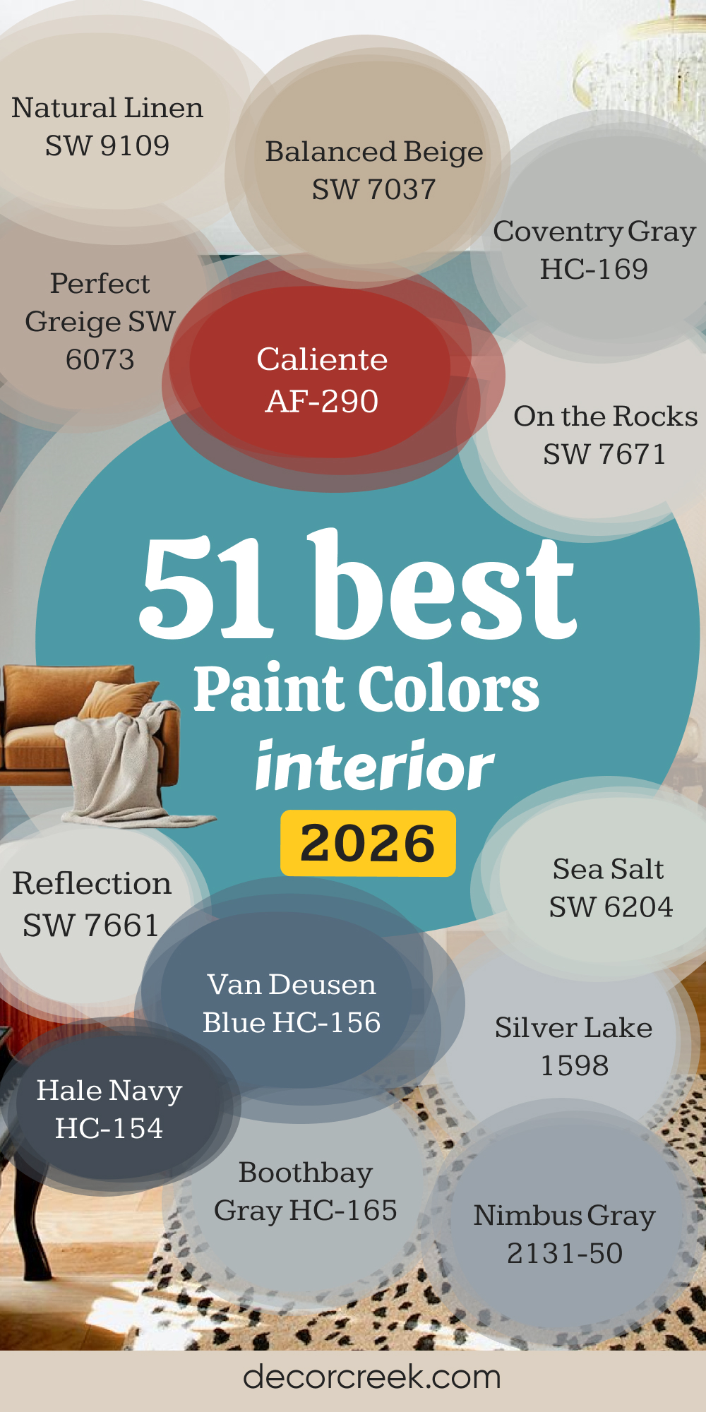
My Last Word on the 51 Best Interior Paint Colors
When I look at these 51 colors together, I see more than shades on a wall—I see feelings, stories, and moments that shape a home. Every color here has its own personality: some speak softly, others fill a room with energy, and a few simply listen, letting everything else shine. That’s the beauty of interior paint—it doesn’t just change a surface, it changes how you feel when you wake up, cook, or unwind at the end of the day.
Over the years, I’ve watched homes come alive because of colors like these. A soft white can make a small kitchen glow; a muted gray can turn a bedroom into a sanctuary.
Warm neutrals remind us of morning light, while cool tones calm our thoughts after long days. And that’s what choosing paint is really about—it’s not just design, it’s emotion. It’s about finding the color that feels like you.
Sherwin-Williams and Benjamin Moore continue to lead because their colors hold depth and honesty. They stay beautiful in every light, in every season. I’ve trusted them in hundreds of projects because I know how their tones age, shift, and settle over time—they grow with the home, not apart from it.
If you’re choosing a color for your own walls, trust your heart as much as your eye. Stand in the room during different hours, see how the sunlight moves, and notice which shades make you smile. Whether you’re drawn to creamy whites like Alabaster or rich tones like Hale Navy, the right color will make your space feel complete.
These 51 shades prove that great design isn’t about trends—it’s about comfort, warmth, and the quiet joy of living in a place that feels truly yours.
And when you find that perfect color, you’ll know. The room won’t just look right—it’ll feel right.