When I think about classrooms, I always think about how color can change the way children feel and learn. A good color on the wall can make kids feel safe, focused, and ready to share ideas. I have seen rooms turn from dull to welcoming just by choosing the right shade. Paint does more than look nice—it sets the mood for teachers and students every single day.
I choose shades that make learning brighter, kinder, and easier, because I know how much time students and teachers spend inside those walls.
I’ve stood in classrooms where a too-dark color made the room feel heavy, and I’ve watched kids become restless in spaces that felt closed in.
Then I’ve seen the same walls repainted in a fresh, thoughtful shade, and the whole energy shifted—students spoke up more, teachers moved with ease, and the room felt alive again.
Color is a quiet tool, but in learning environments, it speaks louder than we think. It can carry joy, encourage attention, and give every child a sense that they belong.
Why I Trust Sherwin-Williams and Benjamin Moore for Classroom Wall Paints
I trust Sherwin-Williams and Benjamin Moore because their colors stay true and work in real classrooms with all kinds of light. I’ve used their paints in schools, libraries, and study areas, and they last without fading. The finish is strong, so it stands up to busy hallways and messy hands, which is something every teacher notices.
What I like most is that their range is broad enough for every need—bright whites that make classrooms sparkle, soft grays that encourage focus, and light blues and greens that keep kids feeling balanced.
I’ve seen how their colors adapt from early childhood spaces filled with play to high school rooms where focus and order matter most.
When I need walls that look fresh but also feel good to spend hours in, this is the brand I reach for. Their paints don’t just coat a wall—they support learning, day after day.
How I Choose the Right Paint Color for Classroom Walls
I always start with light. A room with big windows can hold stronger colors, because natural brightness balances everything. But a classroom with little daylight works better with softer, brighter tones that lift the mood. Light changes how every shade feels, so it’s the first thing I study.
I also think about the age of the students. Young children respond beautifully to light, cheerful shades that make the room feel playful.
Older students often need neutrals that allow them to focus, while still keeping the room from feeling strict or cold. The walls must also fit the furniture, boards, and shelves, so the whole room feels like one complete setting.
I always test a large swatch directly on the wall and leave it up for a full day. Seeing the paint at morning drop-off, during midday lessons, and at afternoon dismissal tells me if the choice is right.
A good classroom color has to work through all those hours, keeping energy balanced and supporting both teaching and learning. That’s how I know when I’ve found the right shade.
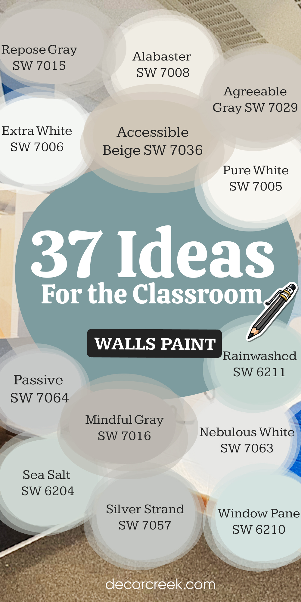
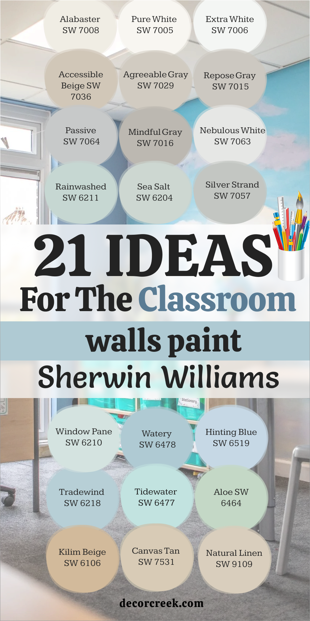
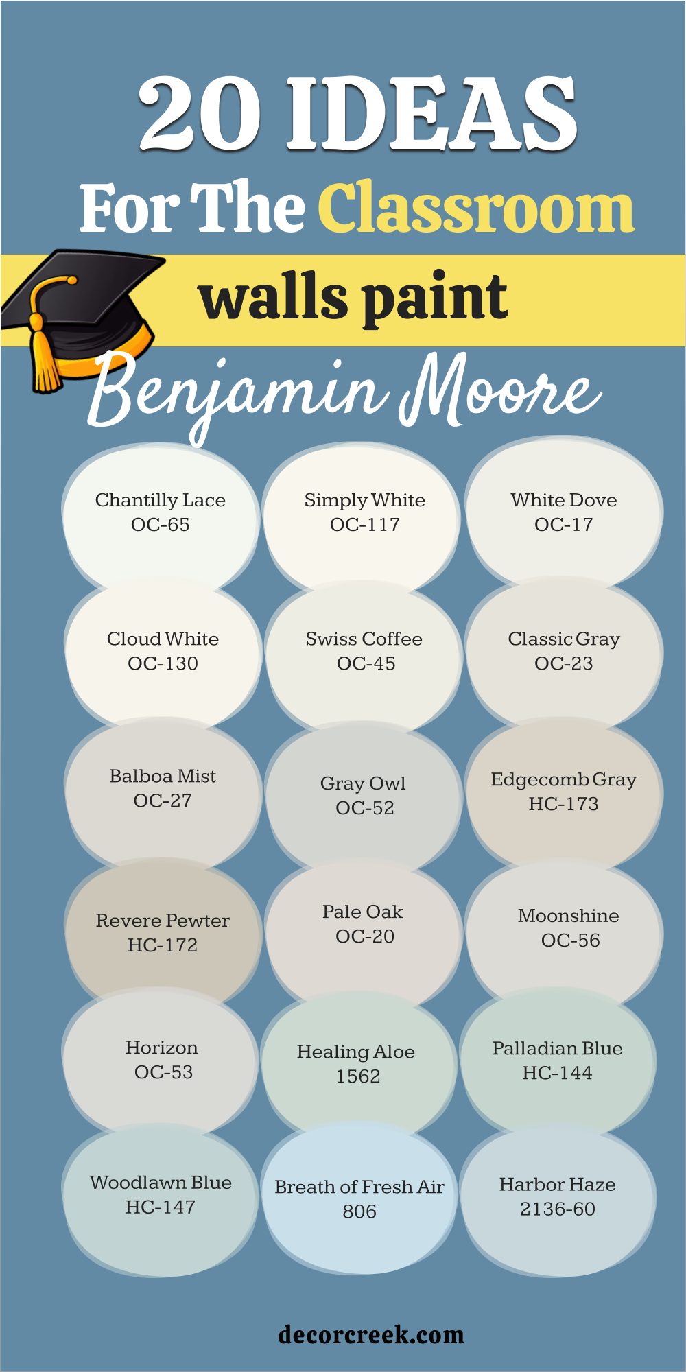
21 ideas for the Classroom Walls Paint by Sherwin-Williams
Alabaster SW 7008
Alabaster brings a soft brightness that feels clean without being harsh. Alabaster makes a classroom look open and ready for learning. Alabaster gives teachers a neutral backdrop that works with colorful posters. Alabaster pairs beautifully with wood desks or metal chairs. Alabaster reflects both sunlight and indoor lights, keeping the room cheerful.
Alabaster feels steady, which helps kids focus. Alabaster works in both small and big classrooms. Alabaster allows accents like blue charts or green bins to shine.
Alabaster is one of my safest choices when a school wants warmth and clarity. Alabaster never looks dull, even on cloudy days.

Pure White SW 7005
Pure White gives walls a crisp, bright look that makes every detail stand out. Pure White feels fresh in the morning and steady in the afternoon. Pure White is strong enough to carry bold posters and busy boards. Pure White pairs easily with both warm wood floors and cool tiles. Pure White makes small classrooms feel larger and more open.
Pure White works well in art or science rooms where brightness matters. Pure White holds up even under strong overhead lights.
Pure White feels clean but not sterile, keeping the room inviting. Pure White is a true favorite for modern schools. Pure White always keeps a classroom looking ready for the day.

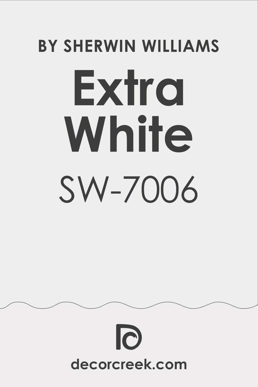
Extra White SW 7006
Extra White brings a sharper brightness than many other whites. Extra White makes the room feel clear, almost like fresh paper. Extra White allows colors like yellow charts or red artwork to pop. Extra White keeps classrooms sharp and focused for older students. Extra White works best in rooms with big windows to balance its cool tone.
Extra White feels modern and works in new school buildings. Extra White pairs nicely with gray trim or blue chairs. Extra White gives energy to study areas and labs.
Extra White is easy to clean and still looks crisp after time. Extra White sets a strong base for creative, busy rooms.
Accessible Beige SW 7036
Accessible Beige brings a soft, grounded tone that feels easy to learn in. Accessible Beige makes classrooms feel steady and welcoming. Accessible Beige pairs well with wood desks and cream boards. Accessible Beige looks gentle but never boring on large walls. Accessible Beige holds natural light with warmth. Accessible Beige works for both younger and older students.
Accessible Beige allows colorful bookshelves to stand out. Accessible Beige blends beautifully with navy, green, or mustard accents.
Accessible Beige gives classrooms a cozy and steady mood. Accessible Beige keeps learning areas warm without feeling heavy.

Agreeable Gray SW 7029
Agreeable Gray is one of my go-to choices because it fits every mood. Agreeable Gray looks warm in the morning and cool by afternoon light. Agreeable Gray pairs perfectly with both white boards and colorful rugs. Agreeable Gray gives students a focused, calm feeling. Agreeable Gray never feels too strong, even on all four walls.
Agreeable Gray blends with both modern and classic furniture. Agreeable Gray supports bold accent colors without clashing.
Agreeable Gray works in libraries, offices, and group study areas too. Agreeable Gray makes classrooms feel modern but friendly. Agreeable Gray is a trusted choice for balanced learning spaces.

Repose Gray SW 7015
Repose Gray brings a quiet steadiness to busy classrooms. Repose Gray works with natural wood trim and bright white boards. Repose Gray holds up beautifully in both natural and artificial light. Repose Gray makes students feel settled while still ready to learn. Repose Gray pairs with soft blues or greens for a gentle accent.
Repose Gray gives classrooms a fresh but professional feel. Repose Gray works in both elementary schools and high schools. Repose Gray is easy to decorate around with colorful posters.
Repose Gray is strong enough to carry the energy of an active classroom. Repose Gray is one of my favorites for lasting balance.

Passive SW 7064
Passive is a cool gray that feels fresh and light on walls. Passive makes classrooms look modern and bright. Passive pairs beautifully with black trim or navy chairs. Passive helps students stay focused without distraction. Passive works well in rooms with bright natural light. Passive keeps posters and boards from feeling too heavy.
Passive looks crisp in art and design classrooms. Passive works beautifully with polished concrete or tile floors.
Passive feels right for middle and high school settings. Passive keeps classrooms simple but smart.
Mindful Gray SW 7016
Mindful Gray is a thoughtful choice for classrooms that need focus. Mindful Gray feels steady without being too dark. Mindful Gray pairs well with both chalkboards and whiteboards. Mindful Gray allows bright colors to pop without taking over. Mindful Gray works best in larger classrooms with good lighting. Mindful Gray has just enough warmth to feel welcoming.
Mindful Gray suits study areas where attention matters. Mindful Gray blends nicely with navy, teal, or mustard. Mindful Gray makes classrooms feel professional but not stiff. Mindful Gray is always a wise and lasting option.

Nebulous White SW 7063
Nebulous White gives a soft, cloudy feel that looks light and fresh. Nebulous White works in small classrooms where brightness matters. Nebulous White pairs beautifully with light wood desks. Nebulous White keeps posters and artwork looking lively. Nebulous White looks soft but never washed out. Nebulous White works with both warm and cool accents. Nebulous White makes reading corners brighter.
Nebulous White feels clean without being sharp. Nebulous White supports bold bulletin boards well. Nebulous White keeps classrooms open and easy to enjoy.
Rainwashed SW 6211
Rainwashed brings a soft blue-green that feels gentle and refreshing. Rainwashed makes classrooms look lively without being loud. Rainwashed pairs beautifully with white trim and wood floors. Rainwashed works well for younger students who need cheer. Rainwashed gives walls an airy, uplifting feel. Rainwashed allows colorful books and posters to shine. Rainwashed blends easily with other greens and blues.
Rainwashed looks fresh in morning and afternoon light. Rainwashed works in art rooms and reading spaces. Rainwashed always feels like a bright breath in classrooms.

Sea Salt SW 6204
Sea Salt is a soft green with hints of gray that feels steady. Sea Salt keeps classrooms feeling open and light. Sea Salt works with both white and wood furniture. Sea Salt balances bright posters without clashing. Sea Salt fits both young and older student settings. Sea Salt holds natural light beautifully through the day. Sea Salt pairs with blues, creams, and grays for accents.
Sea Salt looks refreshing without being strong. Sea Salt works well in classrooms with big windows. Sea Salt creates a balanced, friendly setting.

Silver Strand SW 7057
Silver Strand is a gray-green tone that feels fresh and modern. Silver Strand looks light in sun and soft under lamps. Silver Strand pairs with bright white trim for a crisp edge. Silver Strand works well in science and reading rooms. Silver Strand allows bulletin boards to stand out clearly. Silver Strand feels peaceful but never boring.
Silver Strand blends beautifully with navy or teal accents. Silver Strand fits open classroom layouts. Silver Strand keeps walls light but steady. Silver Strand is one of my favorite modern choices.

Window Pane SW 6210
Window Pane is a gentle blue that feels like fresh morning light. Window Pane makes classrooms cheerful but soft. Window Pane pairs with crisp white trim for clean edges. Window Pane works well for early grades where comfort matters. Window Pane holds up well with playful posters and art. Window Pane brightens smaller rooms with limited light.
Window Pane pairs with light wood or metal furniture. Window Pane looks fresh in group learning spaces. Window Pane gives walls a hopeful, airy feel. Window Pane works beautifully year after year.
Watery SW 6478
Watery is a playful blue that adds life to the classroom. Watery makes walls look fun without being too bold. Watery pairs with white boards and bright chairs. Watery feels uplifting in the morning and steady at noon. Watery allows learning charts to pop against it. Watery looks cheerful in art and reading corners. Watery pairs with greens or yellows for extra cheer.
Watery works for younger classrooms with lots of activity. Watery gives teachers a background that feels happy. Watery is always a student favorite shade.
Hinting Blue SW 6519
Hinting Blue is a clear light blue that feels open and clean. Hinting Blue makes classrooms look larger and brighter. Hinting Blue pairs with both light and dark trim. Hinting Blue allows posters to stand out clearly. Hinting Blue works beautifully with natural wood desks. Hinting Blue fits younger grades with playful energy. Hinting Blue looks steady even in artificial lighting.
Hinting Blue pairs well with navy, white, or green accents. Hinting Blue feels light but strong enough for busy walls. Hinting Blue always keeps the classroom mood bright.
Tradewind SW 6218
Tradewind is a soft, breezy blue that feels uplifting. Tradewind works well in classrooms that need lightness. Tradewind pairs beautifully with cream trim and wood floors. Tradewind looks gentle in morning light and fresh in the afternoon. Tradewind holds posters without looking busy. Tradewind works in both small and large classrooms.
Tradewind fits creative spaces with lots of projects. Tradewind pairs with greens and grays for calm accents. Tradewind feels friendly and easy on the eyes. Tradewind is a color I trust for long-term use.

Tidewater SW 6477
Tidewater brings a lively aqua that feels bright and happy. Tidewater works well in classrooms with lots of windows. Tidewater pairs beautifully with white trim for freshness. Tidewater makes posters and art pop with energy. Tidewater feels playful for younger grades. Tidewater can be balanced with gray or cream furniture. Tidewater looks bright even in cloudy weather.
Tidewater pairs with other blues for layered accents. Tidewater works in music or art classrooms. Tidewater is a shade that lifts student energy.
Aloe SW 6464
Aloe is a soft green that feels light and hopeful. Aloe keeps classrooms gentle and welcoming. Aloe pairs well with white boards and wood trim. Aloe makes posters and books stand out clearly. Aloe works beautifully in reading corners. Aloe looks fresh with blue or yellow accents. Aloe keeps walls lively but not too strong.
Aloe feels right for both younger and older students. Aloe supports both play and focus. Aloe is always a steady, friendly green.
Kilim Beige SW 6106
Kilim Beige is a warm beige that feels steady and home-like. Kilim Beige makes classrooms feel grounded. Kilim Beige pairs with wood floors and cream trim. Kilim Beige holds up well in bright natural light. Kilim Beige works for older student classrooms. Kilim Beige keeps posters from clashing with the wall. Kilim Beige feels warm but not too heavy.
Kilim Beige blends beautifully with navy or burgundy accents. Kilim Beige is a safe, steady choice for schools. Kilim Beige never goes out of style in classrooms.

Canvas Tan SW 7531
Canvas Tan brings a soft, sandy tone that feels steady. Canvas Tan works well with bright white trim. Canvas Tan pairs with wood furniture for natural balance. Canvas Tan keeps classrooms bright without glare. Canvas Tan looks lovely in group learning spaces. Canvas Tan holds up well under strong lighting. Canvas Tan blends easily with bold posters.
Canvas Tan feels steady for both kids and teachers. Canvas Tan keeps the focus on learning materials. Canvas Tan always makes classrooms feel balanced.

Natural Linen SW 9109
Natural Linen gives classrooms a warm, woven look. Natural Linen works well with both wood and metal furniture. Natural Linen holds natural light beautifully. Natural Linen pairs with blues and greens for accents. Natural Linen feels friendly in younger student classrooms. Natural Linen never looks flat, even on large walls.
Natural Linen keeps posters easy to see. Natural Linen balances rooms with colorful chairs. Natural Linen is a color that feels lasting and steady. Natural Linen always works well in learning settings.

20 ideas for the Classroom Walls Paint by Benjamin Moore
Chantilly Lace OC-65
Chantilly Lace gives walls a pure, clean brightness. Chantilly Lace works in both small and large classrooms. Chantilly Lace pairs perfectly with wood desks. Chantilly Lace makes posters and boards look sharp. Chantilly Lace feels open in the morning sun. Chantilly Lace works beautifully with modern furniture. Chantilly Lace allows bold accents to stand out.
Chantilly Lace makes classrooms brighter in low light. Chantilly Lace is easy to decorate around. Chantilly Lace is one of my most trusted whites.

Simply White OC-117
Simply White brings a warm brightness to classrooms. Simply White works in creative rooms with busy walls. Simply White makes the classroom feel open and fresh. Simply White pairs with light wood furniture beautifully. Simply White is steady through all lighting changes. Simply White feels welcoming to students of all ages. Simply White works with bold, playful posters.
Simply White is fresh but never cold. Simply White pairs easily with both warm and cool tones. Simply White is always a safe choice.

White Dove OC-17
White Dove gives walls a gentle softness. White Dove works well for classrooms with lots of reading. White Dove pairs with both wood and white trim. White Dove looks bright without glare. White Dove holds posters and art without clashing. White Dove feels steady for younger students. White Dove blends with both pastels and bold colors.
White Dove works for both traditional and modern schools. White Dove keeps classrooms open and fresh. White Dove is one of my long-time favorites.

Cloud White OC-130
Cloud White brings a light, airy brightness. Cloud White looks balanced in classrooms all day. Cloud White pairs well with modern desks. Cloud White supports colorful charts and boards. Cloud White feels light but never weak. Cloud White blends with both soft and strong tones. Cloud White works for both small and big classrooms.
Cloud White makes rooms look polished and clean. Cloud White is steady even under fluorescent lights. Cloud White always feels uplifting.

Swiss Coffee OC-45
Swiss Coffee is a warm white that feels cozy. Swiss Coffee pairs with both light and dark wood. Swiss Coffee looks bright in sunlight. Swiss Coffee makes posters easy to see. Swiss Coffee gives walls a welcoming glow. Swiss Coffee works in younger classrooms. Swiss Coffee blends with blues, greens, or reds. Swiss Coffee feels balanced all day long.
Swiss Coffee works in libraries and reading rooms. Swiss Coffee is always dependable.

Classic Gray OC-23
Classic Gray is a soft gray with warmth. Classic Gray looks polished in classrooms. Classic Gray pairs with crisp white trim. Classic Gray works in modern school settings. Classic Gray holds both natural and lamp light well. Classic Gray gives walls a balanced look. Classic Gray pairs with colorful seating easily. Classic Gray works well in study areas.
Classic Gray keeps rooms open but steady. Classic Gray is one of my easy go-to colors.

Balboa Mist OC-27
Balboa Mist is a gentle greige tone. Balboa Mist works in classrooms with light wood. Balboa Mist feels soft without being dull. Balboa Mist pairs with both warm and cool accents. Balboa Mist holds up beautifully in afternoon light. Balboa Mist blends with bold posters easily. Balboa Mist makes classrooms steady for focus.
Balboa Mist works with both modern and classic setups. Balboa Mist supports lively art without clashing. Balboa Mist is always a balanced choice.

Gray Owl OC-52
Gray Owl is a clear, modern gray. Gray Owl works well in classrooms with windows. Gray Owl pairs with white trim beautifully. Gray Owl feels focused but never heavy. Gray Owl works in study areas and libraries. Gray Owl blends with navy, teal, or red accents. Gray Owl stays steady under strong lighting.
Gray Owl keeps classrooms looking modern. Gray Owl makes walls look clean and sharp. Gray Owl is one of my favorite light grays.

Edgecomb Gray HC-173
Edgecomb Gray brings warmth to classroom walls. Edgecomb Gray looks balanced in morning and afternoon light. Edgecomb Gray pairs beautifully with cream trim. Edgecomb Gray keeps posters easy to see. Edgecomb Gray feels welcoming to students. Edgecomb Gray blends with blues, greens, or reds.
Edgecomb Gray works in both small and large rooms. Edgecomb Gray looks polished without being cold. Edgecomb Gray is a true staple shade. Edgecomb Gray always feels steady.

Revere Pewter HC-172
Revere Pewter is a warm gray that feels timeless. Revere Pewter works in classrooms with strong lighting. Revere Pewter pairs with both wood and metal desks. Revere Pewter makes posters stand out clearly. Revere Pewter feels steady and strong. Revere Pewter fits both young and older student settings.
Revere Pewter blends with navy and burgundy accents. Revere Pewter makes classrooms look polished. Revere Pewter holds up through changing seasons. Revere Pewter is one of my reliable picks.

Pale Oak OC-20
Pale Oak is a warm neutral that feels soft. Pale Oak works beautifully in reading rooms. Pale Oak pairs with light wood and white trim. Pale Oak makes posters easy to read. Pale Oak looks gentle but never flat. Pale Oak feels steady for group learning. Pale Oak supports both bold and soft colors.
Pale Oak works well in small classrooms. Pale Oak holds natural light with ease. Pale Oak always feels friendly.

Moonshine OC-56
Moonshine is a soft gray that feels clear. Moonshine works in classrooms with lots of windows. Moonshine pairs with white trim for crisp edges. Moonshine allows colorful accents to shine. Moonshine looks bright without being sharp. Moonshine fits modern learning spaces. Moonshine blends with both pastels and bold tones.
Moonshine is steady under classroom lights. Moonshine makes walls look clean and polished. Moonshine is always a safe gray choice.
Horizon OC-53
Horizon is a cool gray that feels light and steady. Horizon works beautifully in classrooms that get bright sunlight. Horizon pairs well with white trim and wood desks. Horizon allows posters and bulletin boards to pop with color. Horizon feels polished but never harsh. Horizon is easy to decorate around with bold accents.
Horizon works well in art and reading corners. Horizon blends with blues, greens, and yellows easily. Horizon makes classrooms look modern and neat. Horizon is a shade that always stays fresh.

Healing Aloe 1562
Healing Aloe is a soft green that feels fresh and gentle. Healing Aloe works beautifully in early grade classrooms. Healing Aloe pairs with cream trim and light wood. Healing Aloe looks lively but not too bold. Healing Aloe allows colorful chairs and posters to stand out. Healing Aloe feels hopeful and kind for learning spaces.
Healing Aloe blends well with blues and grays. Healing Aloe looks clear in both natural and lamp light. Healing Aloe works well in reading corners and art rooms. Healing Aloe is a favorite for playful but steady walls.

Palladian Blue HC-144
Palladian Blue is a soft aqua that feels uplifting. Palladian Blue brightens classrooms with a cheerful mood. Palladian Blue pairs with crisp white trim beautifully. Palladian Blue works best in rooms with lots of natural light. Palladian Blue makes posters and art stand out clearly. Palladian Blue blends with both warm and cool tones. Palladian Blue feels right for younger students.
Palladian Blue looks fresh in both large and small rooms. Palladian Blue gives walls a bright, playful energy. Palladian Blue always brings joy to learning spaces.

Woodlawn Blue HC-147
Woodlawn Blue is a soft, watery blue that feels easy to learn in. Woodlawn Blue makes classrooms brighter and more open. Woodlawn Blue pairs with white trim for a crisp look. Woodlawn Blue works well in creative spaces and art rooms. Woodlawn Blue allows bold posters to shine. Woodlawn Blue blends with soft greens and grays.
Woodlawn Blue feels friendly and light. Woodlawn Blue works for both young and older students. Woodlawn Blue keeps classrooms feeling balanced all day. Woodlawn Blue is always a smart choice for learning.
Breath of Fresh Air 806
Breath of Fresh Air is a true light blue that feels uplifting. Breath of Fresh Air makes classrooms look bright and airy. Breath of Fresh Air pairs beautifully with white trim. Breath of Fresh Air works best in small classrooms. Breath of Fresh Air holds posters and charts clearly. Breath of Fresh Air blends with yellow and green accents.
Breath of Fresh Air makes reading corners cheerful. Breath of Fresh Air looks steady under classroom lights. Breath of Fresh Air always gives a hopeful feel. Breath of Fresh Air is one of my go-to classroom blues.
Harbor Haze 2136-60
Harbor Haze is a misty blue that feels cool and fresh. Harbor Haze works in classrooms with lots of natural light. Harbor Haze pairs with white trim for a clean look. Harbor Haze makes posters easy to read. Harbor Haze blends well with navy or teal accents. Harbor Haze works beautifully in group learning areas. Harbor Haze feels modern but never cold.
Harbor Haze holds steady through changing daylight. Harbor Haze fits both small and large rooms. Harbor Haze is a shade I trust for focus and clarity.
Soft Fern 2144-40
Soft Fern is a light green that feels gentle and steady. Soft Fern makes classrooms lively without being bright. Soft Fern pairs well with cream trim and wood desks. Soft Fern allows posters and artwork to shine. Soft Fern blends with blues and yellows easily. Soft Fern fits perfectly in younger student classrooms. Soft Fern looks balanced under both natural and lamp light.
Soft Fern keeps the walls feeling fresh all day. Soft Fern works beautifully in reading corners. Soft Fern is always a kind, steady green.
Hollingsworth Green HC-141
Hollingsworth Green is a soft green with a touch of blue. Hollingsworth Green works well in classrooms with lots of activity. Hollingsworth Green pairs with crisp white trim. Hollingsworth Green keeps posters and charts lively. Hollingsworth Green blends with cream and gray accents. Hollingsworth Green looks balanced in daylight.
Hollingsworth Green fits art and science classrooms nicely. Hollingsworth Green makes students feel ready to learn. Hollingsworth Green works beautifully in open layouts. Hollingsworth Green is always a bright, friendly choice.
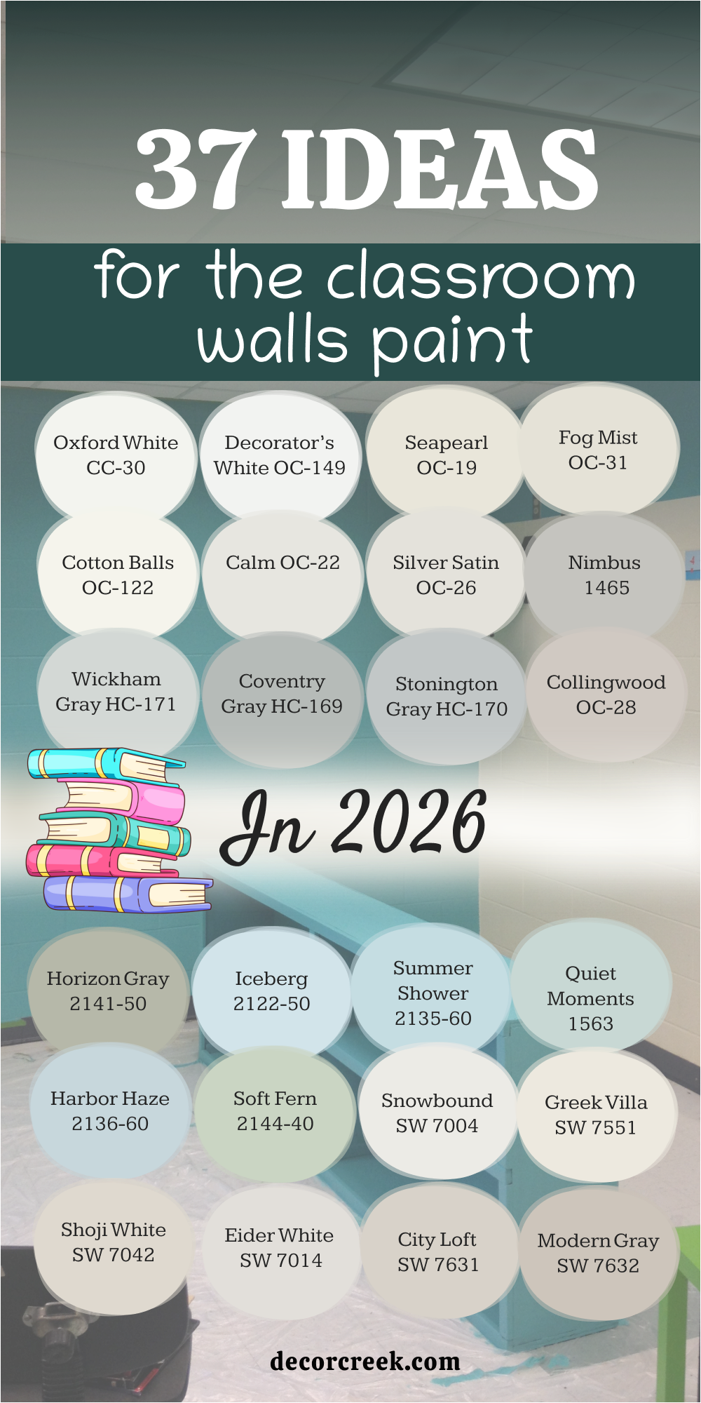
37 ideas for the Classroom Walls Paint in 2026
Snowbound SW 7004
Snowbound brings a crisp brightness that makes any classroom feel ready for learning. In smaller rooms it gives the sense of more air and light, while in larger spaces it feels polished without being too sharp. Morning sunlight bounces beautifully off the walls, and even on a rainy day the shade keeps the room from feeling dull. I’ve seen it pair easily with both wood desks and shiny metal chairs, never clashing with furniture styles.
Teachers love how colorful posters and charts pop against it, and students benefit from the clarity. Because it works with both warmer and cooler tones, decorating becomes simple and flexible.
Snowbound is one of those colors that holds steady through every season of the school year, always keeping classrooms fresh and inviting.

Greek Villa SW 7551
Greek Villa shines with a soft warmth that welcomes students the moment they walk in. Under strong sunlight it glows with depth, while under artificial lamps it stays even and calm. This shade fits beautifully with cream trim, pale wood, or whiteboards, tying everything together without effort. Pastel accents like light blue or mint add a playful edge, while stronger colors such as navy or burgundy look bold and confident against it.
I’ve used it in classrooms where long school days demand comfort, and it always delivers a gentle balance. Large rooms feel polished and professional, while small ones open up and feel less crowded.
It’s a dependable shade that holds up through busy school life, giving both teachers and students a friendly background they can trust day after day.

Shoji White SW 7042
Shoji White brings balance, mixing softness with clarity in a way that feels just right for classrooms. The color lightens walls enough to keep the room fresh, but also has the strength to support focus through long lessons. Whether a room has modern metal desks or traditional wooden furniture, it blends naturally and creates unity.
Bright student artwork and bulletin boards come forward against it without making the room feel too busy.
I’ve noticed that under daylight it stays steady, and under fluorescent bulbs it never turns flat or lifeless. It’s as useful for younger children who need comfort as it is for older students who require focus. Teachers value it because it adapts easily to different ages and subjects, offering both clarity and warmth in a single shade.

Eider White SW 7014
Eider White gives classrooms a pale, clean tone that feels open and supportive. In natural daylight it reflects softly, avoiding glare while still brightening the walls enough to keep the mood up. Teachers appreciate that charts and writing boards stay clear and easy to read no matter where students sit.
The neutral balance makes it easy to pair with gray accents, beige furniture, or colorful chairs without clashing.
I’ve seen classrooms with bright storage bins and bookshelves look especially lively against it, while still keeping focus on learning. Even in rooms with little natural light, the shade holds its clarity, making lessons feel brighter. It’s a steady backdrop that doesn’t compete for attention but instead supports everything else in the room, from posters to teaching tools.

City Loft SW 7631
City Loft carries soft beige undertones that create warmth without heaviness. In the morning light it glows with a sense of freshness, and as the day moves on, shadows bring out a cozy richness. I often pair it with cream trim and natural wood desks, which gives classrooms a balanced, welcoming style.
Stronger colors like navy blue or forest green pop beautifully against it, adding energy without feeling overwhelming.
In artificial lighting it holds steady, which makes it perfect for classrooms used into the evening. Teachers find that it sets a calm mood while still leaving room for lively decorations. It’s a versatile choice that adapts easily to elementary schools, middle schools, or even creative studios where both focus and inspiration matter.

Modern Gray SW 7632
Modern Gray brings a warm balance that feels gentle but steady, perfect for classrooms where focus is key. In the morning light it looks soft and fresh, while in the afternoon it deepens slightly, adding richness to the walls. I love how it pairs with both white trim and wood furniture, creating a mix that feels professional yet inviting. Bright student projects and colorful charts pop clearly without the wall color fighting for attention.
It’s a shade that teachers often appreciate because it holds up under both natural light and strong fluorescent bulbs.
In creative rooms like art or music classes, it becomes a calming base for all the energy happening around it. Modern Gray never feels too heavy or too pale—it stays right in the middle, making it a dependable choice for almost any grade level.

Incredible White SW 7028
Incredible White is one of those shades that quietly does its job while making everything else look better. On the wall it reads as a soft, light gray with just a hint of warmth, which keeps the classroom bright but not stark. I’ve seen it pair especially well with bold colors like teal chairs or red storage bins, allowing those accents to shine.
Under natural light it feels airy, while under fluorescent bulbs it stays clean and steady. Teachers like it because it helps reduce glare but still gives the room a lifted feeling.
It’s flexible enough for classrooms filled with posters, maps, or artwork, yet calm enough for study areas where focus matters most. Incredible White may look simple, but it has the quiet strength to carry a busy learning space without stealing attention.
Oyster White SW 7637
Oyster White carries a warm undertone that makes classrooms feel cozy and approachable. I’ve noticed it works best in rooms with lots of student interaction, where the goal is to feel connected and at ease. Sunlight brings out its gentle warmth, while cloudy days reveal its softer, cooler side. This balance makes it practical for schools where light shifts throughout the day.
Against dark wood trim or bright whiteboards, it holds its ground without clashing. Posters and classroom artwork show up clearly, keeping the room lively but not overwhelming.
It’s a color that quietly encourages focus while still giving the room a welcoming feel. Oyster White works across many grade levels, from playful kindergarten settings to focused high school classrooms, adapting to each space with ease.

Aesthetic White SW 7035
Aesthetic White has a quiet charm that makes classrooms feel comfortable and organized. It’s not a bold shade, but that’s exactly what makes it so effective as a backdrop. Natural light gives it a soft brightness, while artificial lighting keeps it steady and neutral. I find it especially useful in classrooms with lots of colorful elements, since it doesn’t compete with posters, charts, or storage bins.
Pairing it with wood desks and cream trim gives the room warmth, while gray or navy accents bring a modern edge.
Teachers value how it creates a balanced mood where students can focus, but still feel welcome. It’s also a forgiving color, hiding marks better than pure white, which makes it practical for busy school life.

Big Chill SW 7648
Big Chill is a clean, cool gray that instantly makes a classroom feel modern and fresh. In bright daylight it looks crisp, almost like a polished page ready for new ideas. Under fluorescent lighting it holds steady without looking too cold. I like how it pairs with sleek furniture, such as metal desks and colorful chairs, giving classrooms a smart, up-to-date feel.
It also provides a great backdrop for bulletin boards filled with bright posters, maps, or artwork.
Students stay focused because the wall color doesn’t distract, yet the room never feels flat. Teachers often choose it for middle and high schools, where a sharper look feels right. Big Chill is one of those shades that quietly supports both learning and creativity without calling attention to itself.
Crushed Ice SW 7647
Crushed Ice has a cool, airy character that feels perfect for keeping classrooms bright and fresh. In daylight it shows a soft gray tone that lightens the room without stealing attention from teaching tools. Under fluorescent lights, it remains steady and dependable, which is so important in schools where artificial lighting dominates.
I often notice how colorful artwork, charts, and posters seem sharper against it, giving students a clear visual focus.
Wooden desks look grounded beside it, while modern metal furniture gains a crisp edge. This shade works beautifully in classrooms designed for older children, as it encourages focus and organization. At the same time, it never feels cold or unfriendly, making it versatile enough for younger grades too.
Crushed Ice is a true workhorse shade—quiet, supportive, and always reliable.
On The Rocks SW 7671
On The Rocks is a light gray that offers calm steadiness in active learning spaces. It reflects daylight with a smooth glow, creating a background that feels polished and professional. Teachers appreciate how this shade balances bold classroom materials without clashing or looking too busy.
It pairs well with both dark and light trim, which makes it easy to adapt to different school buildings.
I find it especially effective in classrooms filled with technology—screens, tablets, and projectors—since the neutral tone reduces glare and visual strain. In smaller rooms it opens the walls, while in larger ones it gives structure and focus.
This is a shade I reach for when schools want something modern yet approachable. On The Rocks keeps energy in the classroom steady without taking away warmth.
Lattice SW 7654
Lattice brings a hint of green mixed with gray, creating a gentle shade that feels balanced and uplifting. In bright light it looks soft and fresh, while in dimmer rooms it keeps just enough color to stay interesting. I love using it in classrooms where creativity is encouraged, because it pairs so well with blues, yellows, and creams.
It feels lively enough to spark energy but not so strong that it distracts from learning. Against whiteboards or bulletin boards, it creates clear contrast that helps students focus on lessons.
Teachers often comment on how it gives the room a fresh, updated feel without being dramatic. Wooden furniture looks grounded next to it, while modern seating adds a playful edge. Lattice is one of those shades that helps classrooms feel alive and welcoming all day long.
North Star SW 6246
North Star is a cool blue-gray that feels clean and steady, perfect for focused classrooms. In the morning it reflects light beautifully, giving the room a soft brightness. Under overhead lamps it keeps its clarity, never turning dull or flat. This shade is especially good in classrooms with minimal natural light, since it adds a sense of openness.
Posters and learning charts stand out clearly, while bright chairs or rugs add cheerful pops of color.
I find it works particularly well in upper grade levels, where students need concentration and structure. Still, it has just enough friendliness to feel right in younger classrooms too. North Star pairs easily with both modern and traditional furniture, making it flexible for schools of all styles.
Misty SW 6232
Misty carries a soft blue undertone that gives classrooms a fresh, airy mood. Sunlight brings out its gentle brightness, while cloudy days reveal a cool calmness that still feels clear. Teachers like how it works as a neutral backdrop, letting posters, bookshelves, and art projects shine.
It blends nicely with white trim, pale woods, and even colorful seating, making decorating easier. I often suggest it for classrooms where creativity is encouraged, since the shade inspires energy without being loud.
Even under fluorescent lights, Misty keeps its clean look and doesn’t wash out. It’s a versatile option that works for both small classrooms and larger group spaces. Misty gives the sense of an open, welcoming room where students can feel ready to learn and share ideas.

Krypton SW 6247
Krypton offers a cool gray with blue undertones that feels refreshing in classrooms. In bright daylight it takes on a crisp, clean quality that makes the walls feel sharp and neat. Under artificial lighting it keeps its character, never looking too flat or dull. Teachers find it especially helpful in rooms with lots of visual material since it calms the background without stealing attention.
It pairs beautifully with white trim and looks striking next to navy or teal seating. Wooden desks give it warmth, while modern chairs keep the room playful.
I often recommend it for middle and high school classrooms where focus and organization matter. Krypton creates an atmosphere where students can stay clear-headed and ready to learn.
Mineral Deposit SW 7652
Mineral Deposit is a medium gray with a hint of green that gives classrooms a modern yet natural feel. When sunlight hits it, the shade feels soft and welcoming, while in artificial light it shows more of its cool side. I like how this balance keeps classrooms looking fresh at any time of day. It pairs well with cream trim and light wood furniture, but also looks sharp with darker tones.
Posters and learning boards appear crisp against it, which helps teachers keep students’ attention where it matters. The color also hides scuffs better than lighter shades, making it practical for busy schools.
Mineral Deposit brings a polished look to classrooms without feeling heavy, giving both teachers and students a clear, grounded environment.
Topsail SW 6217
Topsail is a light blue-green that adds freshness and brightness to classroom walls. With big windows it feels cheerful and airy, while in dimmer rooms it still provides enough lift to keep the mood up. I’ve seen it work beautifully in elementary settings where energy and creativity are encouraged. Paired with crisp white trim, it looks clean and playful, while wood furniture gives it a natural warmth.
Charts, posters, and colorful bins shine against it, turning the room into an inviting learning space. Teachers appreciate that it looks steady under all lighting conditions, never losing its brightness.
Topsail is a shade that helps classrooms feel welcoming without being distracting, making it an ideal choice for everyday learning.
Opaline SW 6189
Opaline offers a very soft green that brings a gentle, uplifting feel to classrooms. It’s the kind of shade that makes students feel at ease as soon as they enter. In natural daylight it looks fresh and bright, while under lamps it takes on a slightly warmer character. This versatility makes it easy to use across different types of schools. It works beautifully with cream trim and natural wood desks, but it also adapts to more modern settings with metal furniture.
Posters and colorful projects show clearly against it, adding life without clutter. Teachers often like it because it’s easy on the eyes and helps create a calm, focused learning atmosphere.
Opaline is subtle enough for everyday use, yet lively enough to keep classrooms engaging.
Oxford White CC-30
Oxford White is a clean, crisp white that feels professional and organized in any classroom. It brings a brightness that makes small rooms look larger and keeps big ones looking polished. Natural light bounces off it beautifully, creating a sense of clarity. Against darker furniture it looks sharp, while lighter wood tones give it warmth. I’ve seen it work especially well in modern schools where a fresh, updated look is needed.
Posters and learning boards stand out with strong contrast, making information easy for students to see. Even under fluorescent bulbs, it doesn’t lose its clean edge.
Oxford White is a shade that always feels ready for learning, setting the stage for energy and focus in the classroom.
Decorator’s White OC-149
Decorator’s White is a sleek, bright shade that gives classrooms a polished and professional appearance. It reflects natural light beautifully, making the room feel crisp and open. In schools with modern design, this color fits perfectly, pairing with both glass and metal details. It works well with colorful seating or bulletin boards, providing the clean background that allows accents to shine.
Teachers appreciate how charts and writing on whiteboards stand out against it without blending in. Under fluorescent lighting, it holds its brightness and never feels flat.
This shade brings a smart energy into the classroom, ideal for older students who need focus and clarity during long lessons.
Seapearl OC-19
Seapearl has a soft warmth that makes classrooms feel inviting and approachable. In daylight, it shows a gentle off-white glow that calms the room, while in the evening it takes on a slightly deeper tone. It blends easily with wood furniture and soft cream trim, creating a balanced look. Posters and student projects look lively against this shade, without feeling too busy.
Teachers often like it for younger classrooms, where the goal is to create a safe and encouraging atmosphere. It also works well in multipurpose rooms, adapting to both study and creative activities.
Seapearl is practical, warm, and dependable, a color that quietly supports everyday learning.

Fog Mist OC-31
Fog Mist is a pale neutral that brings lightness without being stark. In classrooms, it creates a soft backdrop that works with both bright and muted accents. Natural daylight gives it a gentle glow, while fluorescent lamps keep it steady and clear. I’ve seen it look especially good in classrooms with colorful storage or bold rugs, since it balances all the energy.
Wooden furniture sits comfortably against it, while metal details stand out in a modern way. Teachers often find it easy to decorate around, since it doesn’t compete with posters or displays.
Fog Mist helps classrooms feel fresh and orderly, making it a smart choice for both new schools and older buildings in need of an update.
Cotton Balls OC-122
Cotton Balls brings a warm, soft brightness to classroom walls. It feels less sharp than pure white, which makes it easier on the eyes during long study hours. In sunlight it glows gently, and under artificial lights it maintains its clean look. This shade pairs beautifully with pale wood furniture, but it’s just as comfortable with colorful seating or bold decorations.
Posters, maps, and charts show up clearly against it, keeping the classroom lively without overwhelming the walls. Teachers often like it for younger student spaces, where comfort and brightness both matter.
Cotton Balls creates a background that feels friendly and welcoming, supporting learning while keeping the room cheerful.
Calm OC-22
Calm is a light neutral that gives classrooms a sense of steadiness and focus. It has just enough warmth to keep the walls from looking flat, while still providing the brightness teachers need. In natural light it looks clear and balanced, and under fluorescent lamps it stays consistent. This shade works well in classrooms with lots of busy posters, since it doesn’t compete for attention.
Wood furniture blends beautifully with it, while colorful accents—like blue chairs or yellow storage bins—stand out clearly. Teachers value it because it creates a mood that supports concentration, yet still feels welcoming.
Calm is a versatile option for different grade levels, offering a backdrop that adapts to any teaching style.
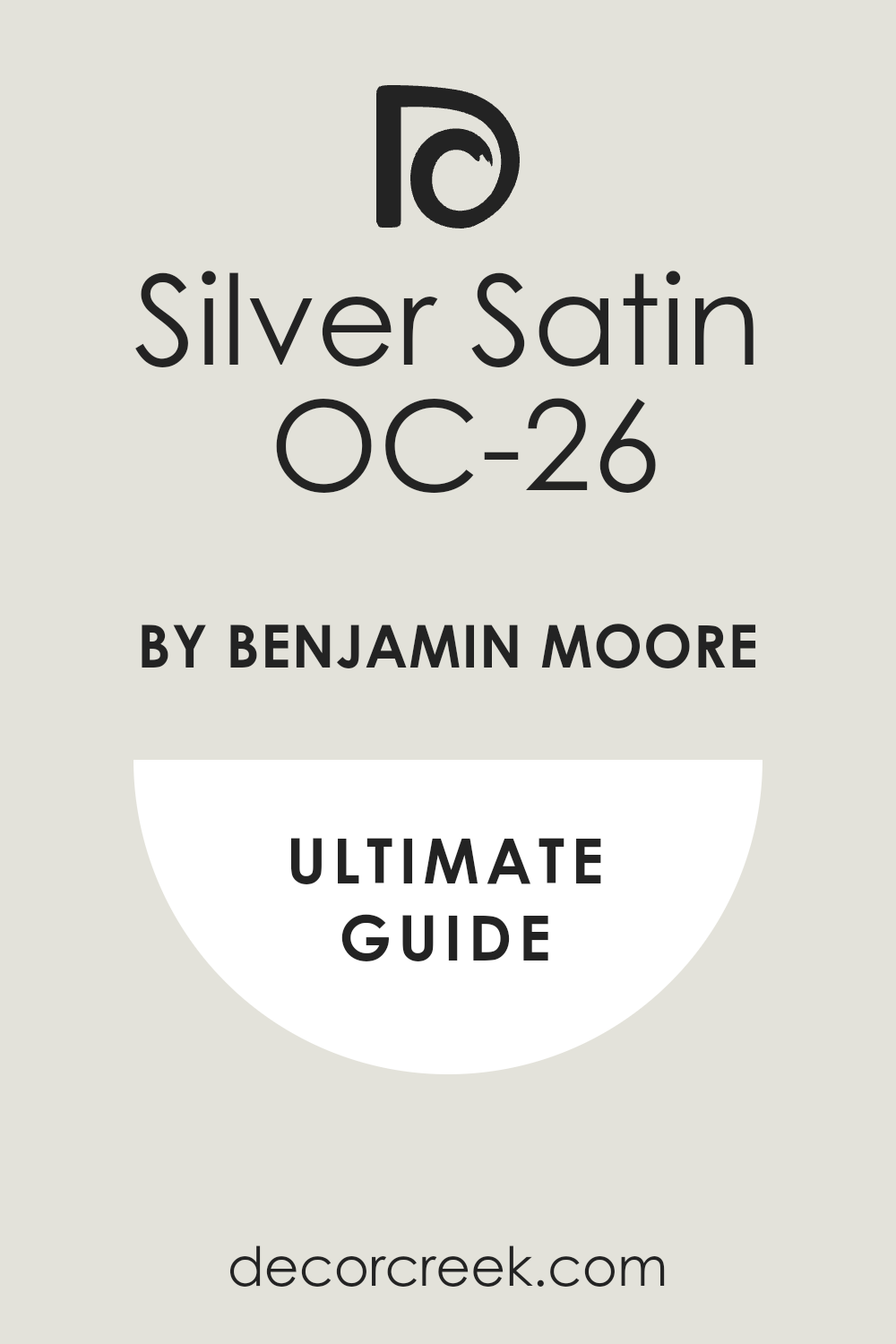
Silver Satin OC-26
Silver Satin is a soft off-white with a hint of gray that makes classrooms look refined yet approachable. In daylight it feels airy and bright, while under fluorescent lights it maintains a clean, steady appearance. Teachers appreciate how it balances colorful bulletin boards and artwork without letting the room feel chaotic. It pairs beautifully with both light wood and darker trim, which makes it easy to adapt to different school interiors.
I’ve seen it work especially well in multipurpose rooms, where flexibility is key. Posters and maps stand out clearly, and students stay focused because the walls don’t compete for attention.
Silver Satin is practical but also has a quiet charm that keeps classrooms looking modern and fresh.
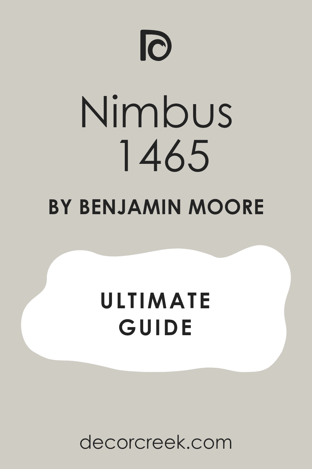
Nimbus 1465
Nimbus is a medium gray that creates a grounded and professional look for classrooms. It feels soft in bright natural light but develops a slightly deeper tone in dimmer settings, giving walls character throughout the day. I like how it works in classrooms designed for older students who need concentration and order.
It pairs beautifully with white trim, while wood desks and darker chairs bring warmth. Posters and lesson boards show strong contrast, making information easy to follow.
Teachers often choose it when they want a color that hides wear and tear better than lighter shades. Nimbus has just enough depth to feel modern but still stays gentle enough for long school hours.
Wickham Gray HC-171
Wickham Gray is a pale gray with a cool, airy feel that brings freshness to the classroom. In daylight it almost looks like a misty blue, giving the room a quiet brightness. I’ve used it in spaces with large windows, and it always looks lively without being distracting. Paired with crisp white trim, it creates a clean, polished finish.
Teachers enjoy how it gives posters and colorful bins room to stand out while keeping the overall mood relaxed and balanced.
Wooden furniture adds warmth to it, while metal details make it look sleek and modern. Wickham Gray is versatile across grade levels, working just as well for playful early classrooms as it does for structured study spaces.

Coventry Gray HC-169
Coventry Gray has a cool, medium depth that makes classrooms feel focused and modern. It looks fresh in morning light and takes on a more serious tone in the afternoon, giving the room dimension throughout the day. Teachers often like it for upper-grade classrooms where structure and attention are key.
It pairs perfectly with whiteboards, black trim, or dark furniture, creating a bold contrast. At the same time, brighter posters and student work really shine against it.
The color holds well under fluorescent lights, making it practical for schools with little natural light. Coventry Gray brings a touch of strength without feeling too heavy, offering a steady background for learning.

Stonington Gray HC-170
Stonington Gray is a classic cool gray that feels crisp and clear on classroom walls. In daylight it has a slight blue undertone, adding a fresh touch that keeps the room from looking dull. It works especially well in classrooms filled with technology—projectors, screens, and tablets—since it helps reduce glare and eye strain.
White trim gives it a sharp, clean edge, while wood desks soften the look. Teachers find it easy to decorate around because it adapts to bright and muted colors alike.
Posters and charts stand out with clarity, which makes the room look organized even with lots of activity. Stonington Gray is one of those shades that always feels current and dependable.

Collingwood OC-28
Collingwood is a warm gray that makes classrooms feel welcoming yet structured. In bright daylight it shows a soft warmth, while in artificial lighting it keeps a steady, balanced tone. Teachers often appreciate how this shade supports concentration without looking plain. It pairs nicely with cream trim and natural wood furniture, but it also looks modern next to black accents or colorful chairs.
Posters, maps, and charts pop clearly against it, adding life without clutter. I’ve seen it used in both elementary and high school classrooms, and in every case, it creates an inviting mood.
Collingwood is flexible and dependable, giving walls a polished look that lasts.

Horizon Gray 2141-50
Horizon Gray has a subtle green undertone that adds freshness to a neutral base. In daylight it feels earthy and natural, while under fluorescent lighting it softens into a gentle gray. I find it perfect for classrooms that need both calm and focus, as it supports learning without distraction. It works well with cream or white trim, and pairs beautifully with wooden desks and shelving.
Teachers like how it adapts to different subjects—looking lively in creative rooms and steady in study areas.
Bright accents such as navy or yellow bring extra energy, giving the classroom personality. Horizon Gray offers a flexible backdrop that makes any learning environment feel grounded and ready.
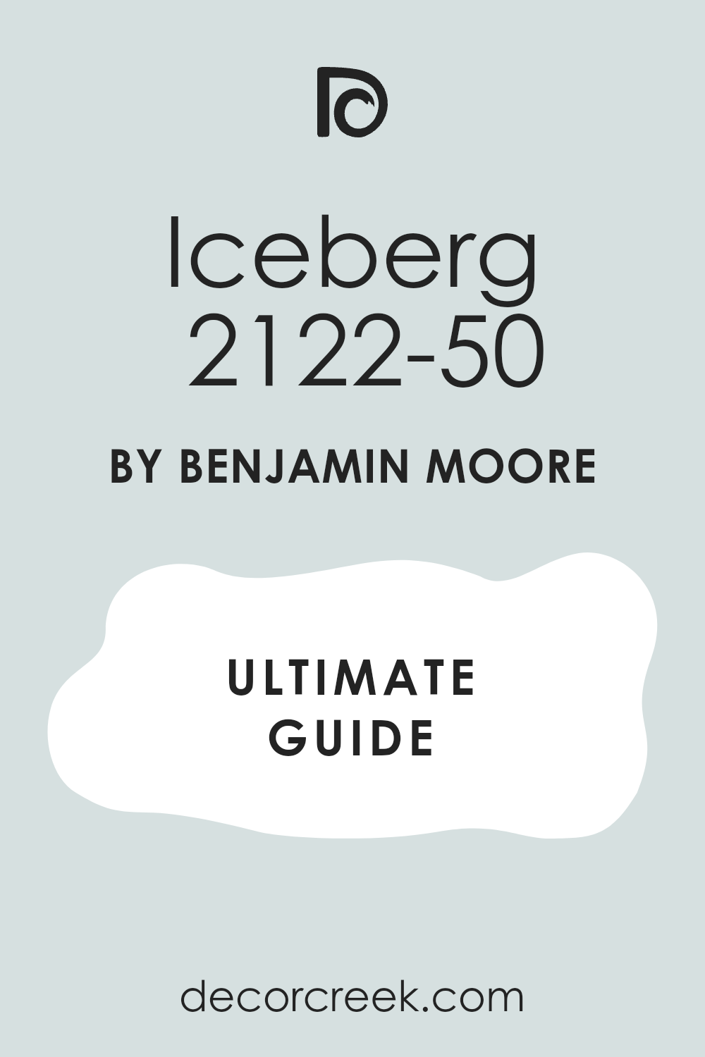
Iceberg 2122-50
Iceberg is a very light blue that adds brightness and clarity to classroom walls. It reflects natural daylight beautifully, creating a cheerful mood in the morning and a steady glow under lamps. This shade works especially well in smaller classrooms, making them appear more open. Against whiteboards and bulletin boards, it gives clear contrast, helping students stay focused.
Teachers love how student artwork stands out with energy while the walls remain calm and clean.
Pairing it with white trim gives a crisp finish, while pale wood keeps it softer and warmer. Iceberg is playful enough for younger grades but still polished enough for older students, making it one of my favorite versatile choices.
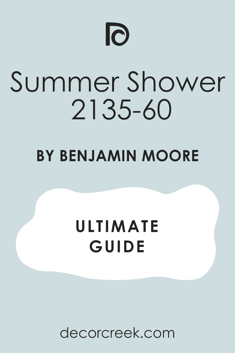
Summer Shower 2135-60
Summer Shower is a gentle blue with a touch of green that feels refreshing and lighthearted. In sunlight it brightens the classroom, giving it an uplifting energy, while in dimmer settings it still feels clear and steady. It pairs beautifully with white or cream trim, and colorful chairs or storage bins look cheerful against it.
Teachers appreciate how it creates a happy atmosphere without being overwhelming.
Posters, maps, and student projects shine clearly, making the classroom engaging and lively. I often suggest this shade for early-grade rooms or art-focused spaces, since it sparks creativity while still keeping focus. Summer Shower is a color that makes classrooms feel welcoming every day of the year.
Quiet Moments 1563
Quiet Moments combines blue and green tones with a touch of gray, offering a peaceful yet engaging mood. In daylight it feels airy and soft, while under classroom lights it stays balanced and soothing. I love using it in multipurpose rooms because it works equally well for study, art, and group projects.
White trim gives it a crisp edge, while wooden desks make it feel warmer. Teachers say it helps students stay relaxed but still attentive, striking a rare balance.
Posters and colorful displays look vibrant against it without overwhelming the walls. Quiet Moments is versatile, polished, and comforting, a true favorite for classrooms that need both focus and creativity.

My Last Word on Classroom Walls Paint Ideas
When I think about the classrooms I’ve worked in, I always return to how color sets the stage for learning. A wall shade is never just decoration—it becomes part of the daily rhythm for both teachers and students. Bright whites open a room and keep the energy high. Soft grays give focus when attention matters most. Gentle greens and blues add a touch of comfort, helping children feel safe while they work.
I’ve learned that the best colors don’t take the spotlight but instead let student voices, posters, and projects shine. They create balance in busy spaces filled with books, charts, and creativity. The right shade also works with changing light, from early mornings to long afternoons under fluorescent bulbs.
In the end, what matters most is choosing a color that supports learning while keeping the room welcoming. When the walls are painted with care, students feel more ready to listen, share, and grow. That’s why I always see paint as one of the simplest yet strongest tools for building classrooms that truly work.