Bathrooms may be small, but the right paint color makes them feel welcoming and full of life. I’ve always believed that the color of the walls sets the tone for how you feel when you step inside. A gentle white, a warm beige, or a strong navy can make all the difference.
Paint can brighten a dim room, soften sharp lines, or give strength to a master bath.
In this guide, I’ve gathered my favorite bathroom paint colors to help you create a place that feels fresh and full of comfort.
Why I Believe Bathroom Colors Matter More Than We Think
When I walk into a bathroom, the walls tell me the story before anything else does. A bright shade feels like the morning sun, while a darker shade feels steady and grounding. Bathrooms are often where we start and end our day, so color matters here more than we realize.
Soft tones can make getting ready easier, while bold colors give a sense of energy.
For me, it’s not just about looks, but about how the colors affect daily routines.
How I Choose the Perfect Bathroom Shade for Every Style
When I pick a bathroom color, I think about the size of the room, how much light it gets, and what feeling I want to create. Light shades make a small bathroom feel open, while warmer tones give comfort. Cool blues and greens remind me of water and bring freshness, while dark tones add drama.
I also look at the tile, countertops, and fixtures because the color has to tie everything together.
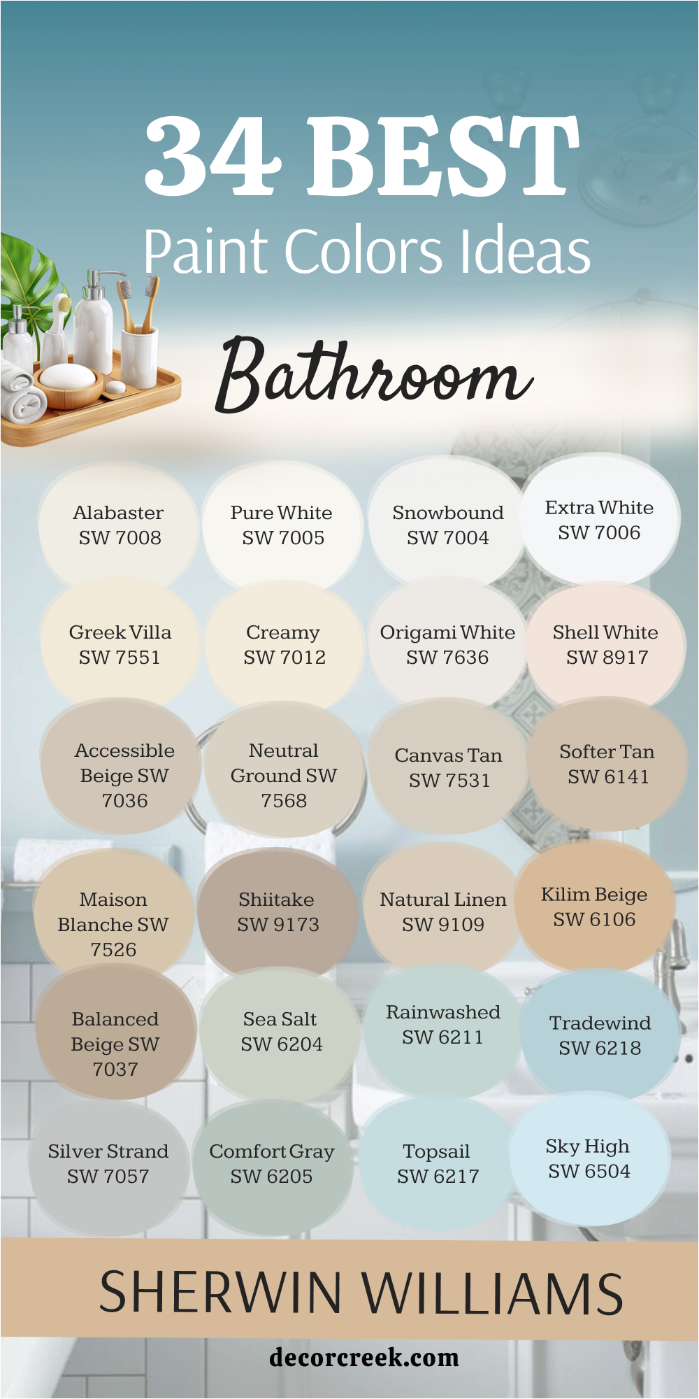
34 Bathroom Paint Color Ideas by Sherwin Williams
Light and Bright Bathroom Colors
Light and Bright Bathroom Colors always bring freshness into a room that many people think of as small and practical. I love how these shades catch natural light and make the walls feel more open and inviting. When I use them, the bathroom instantly feels cleaner and easier to enjoy, even without large windows.
They pair beautifully with marble counters, white tiles, or shiny silver fixtures, adding a sense of order and brightness. These colors also make it easier to highlight mirrors, sinks, and lighting details that might otherwise be lost.
For me, light and bright tones are the easiest way to give a bathroom a refreshing look that feels graceful and full of energy.
Alabaster SW 7008
Alabaster gives bathrooms a soft brightness that feels clean without being harsh. I love how it warms up natural light, making mornings feel gentle. It pairs well with marble counters and brushed nickel fixtures. In small bathrooms, this shade makes the walls feel open. I often use it when I want a fresh look that still feels welcoming.
This color works beautifully in both modern and classic styles.Alabaster also stays steady in different types of light, so it looks just as good in the evening as it does in the morning.
It’s a shade that always brings balance and comfort, no matter the size of the bathroom.

Pure White SW 7005
Pure White is one of those shades that always feels fresh. It reflects light well, making even the darkest bathroom corners seem brighter. I often match it with black hardware for a striking contrast. This shade works with both cool and warm finishes, which makes it very flexible. Bathrooms with little daylight benefit most from this color. It always feels crisp and neat.
Pure White also highlights mirrors, sinks, and shiny tiles, helping the whole room feel brighter. It’s a shade I turn to when I want a bathroom that looks clean and balanced all year round.

Snowbound SW 7004
Snowbound has a gentle softness that makes bathrooms look bright but not too sharp. I use it when I want the room to feel polished but not cold. It pairs beautifully with silver mirrors and gray stone floors. Snowbound works well in both tiny powder rooms and larger master baths.
It keeps the look light without feeling flat. I love it for creating a fresh, airy style.This shade also balances beautifully with both cool lighting and warm bulbs, keeping the bathroom steady at any time of day.
Snowbound is one of those colors that always feels dependable, no matter the design style.

Extra White SW 7006
Extra White is my choice when I need a true bright white. It makes a bathroom look very clean and sharp. I often pair it with navy or charcoal accents to give it strength. This shade works well with glossy tiles and chrome fixtures. In smaller rooms, it reflects light perfectly, making the walls feel taller. It’s the kind of color that always feels neat and structured.
Extra White also highlights architectural details like trim and molding, giving the bathroom a crisp finish.
It’s a color I reach for when I want the room to feel bold, clear, and full of light.
Greek Villa SW 7551
Greek Villa has a soft warmth that makes bathrooms feel inviting. It’s not too bright, and it carries a gentle cream tone that softens sharp edges. I love using it with gold or brass finishes for an elegant look. This color pairs well with natural stone and wood. In the morning, it feels like gentle sunlight on the walls. It gives the bathroom a graceful charm.
Greek Villa also works beautifully in both traditional and modern designs, never feeling out of place. It’s the kind of shade that creates a lasting sense of comfort while still looking refined.

Creamy SW 7012
Creamy is a warm white that feels like comfort. It works well in bathrooms where I want a cozy touch without going too beige. This shade softens bright light and makes the room feel gentle. I often use it with wood vanities and woven baskets for a relaxed look. It pairs well with both silver and gold fixtures. Creamy always brings warmth to the bathroom.
I also find that it creates a flattering background for mirrors, making daily routines feel easier. This shade has a timeless quality that keeps the bathroom looking fresh year after year.

Origami White SW 7636
Origami White is a modern, stylish white that carries a hint of gray. It makes bathrooms feel sleek but not cold. I like using it in rooms with marble or gray tile. This shade gives a fresh look without being too plain. It feels steady and balanced, which makes it great for everyday use. Origami White always adds a quiet touch of elegance.I’ve noticed it works especially well in bathrooms with lots of natural light, keeping the look polished all day.
It’s a color that adapts beautifully, giving both warmth and structure depending on the finishes around it.
Shell White SW 8917
Shell White has a soft pink undertone that makes bathrooms feel gentle and warm. I love how it flatters the skin tone in mirrors, which is great for daily routines. It pairs well with creamy tiles and brushed gold hardware. This color makes small bathrooms feel charming and inviting. It works beautifully in powder rooms for a soft touch. Shell White feels light but warm at the same time.I also find it adds a hint of personality without being overwhelming, which makes it easy to live with.
Over the years, this shade has become one of my favorite choices for creating a welcoming mood.

Warm and Inviting Bathroom Colors
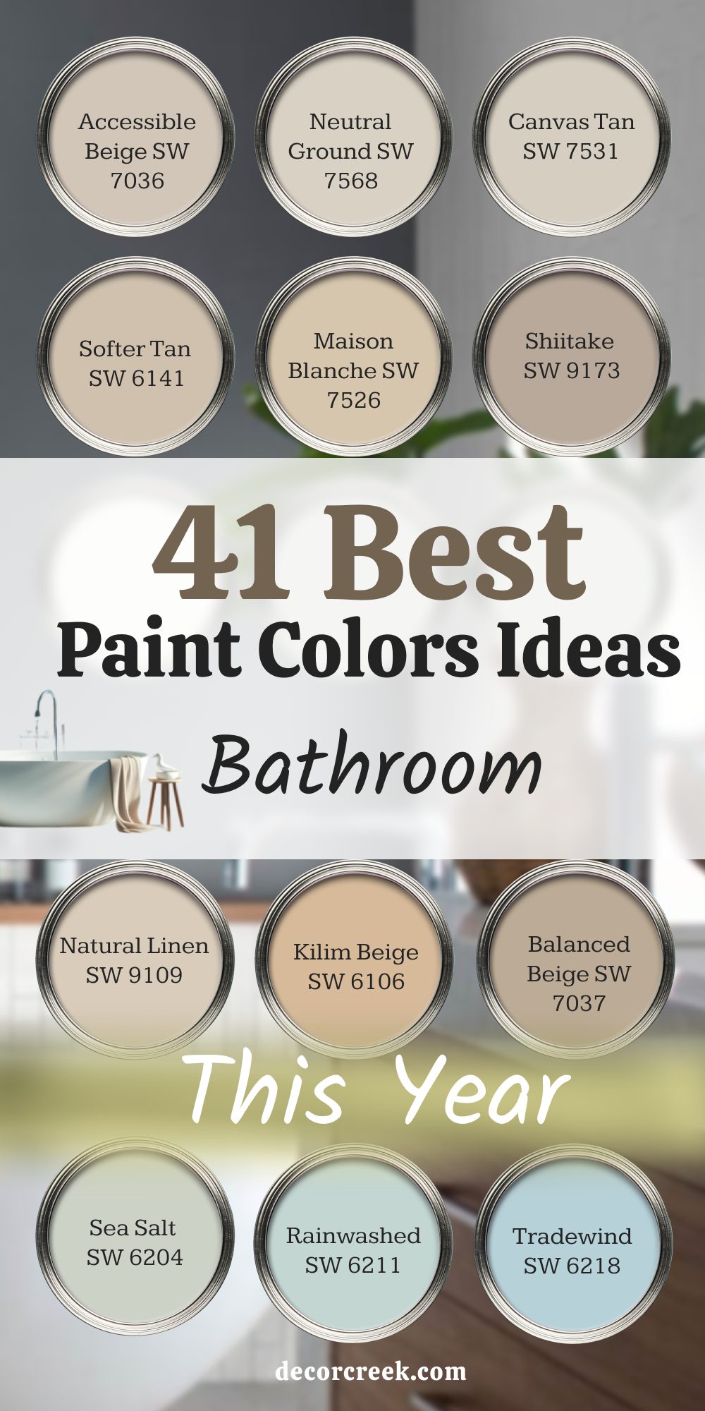
Accessible Beige SW 7036
Accessible Beige gives bathrooms a grounded, warm feeling. I love how it blends with natural materials like wood or stone. It’s a shade that feels steady without being too dark. This color works beautifully in master bathrooms where I want a cozy yet fresh style. It pairs well with bronze or black finishes. Accessible Beige is one of my go-to shades for comfort. It also adapts easily to different types of light, staying soft in the morning and cozy at night.
I find it’s a color that helps the bathroom feel calm and balanced, no matter the size.

Neutral Ground SW 7568
Neutral Ground carries a gentle warmth that makes bathrooms feel relaxed. It’s light enough to brighten a room but still holds a grounded look. I like pairing it with cream tiles and natural woods. This shade feels steady and works with many finishes. It’s especially nice in bathrooms that need a little warmth but not too much color.
Neutral Ground always feels balanced.I find it blends seamlessly with both modern chrome accents and classic bronze details. It’s one of those shades that makes a bathroom feel easy to enjoy day after day.

Canvas Tan SW 7531
Canvas Tan has a light, natural tone that works perfectly in bathrooms. It reminds me of soft sand and feels easy to live with. I often use it when I want the bathroom to feel bright but not plain. This shade pairs well with warm wood and white tile. It works great for both modern and classic bathrooms. Canvas Tan gives a sense of comfort and ease.It also softens strong lighting, keeping the room gentle throughout the day.
This color makes the bathroom feel both fresh and warmly grounded.

Softer Tan SW 6141
Softer Tan is warm but not heavy. It brings a welcoming glow to bathroom walls. I like pairing it with soft white trim for a balanced look. This shade feels especially nice in rooms with warm lighting. It works well with natural stone and beige tiles. Softer Tan makes bathrooms feel inviting and steady.
I’ve seen it blend beautifully in both rustic and polished bathroom designs. It’s a shade that always adds a gentle touch of comfort.
Maison Blanche SW 7526
Maison Blanche feels graceful with its soft cream and beige mix. It’s a perfect choice when I want a bathroom to look polished yet warm. This color pairs beautifully with gold hardware and marble. It works well in larger bathrooms where I want a classic touch. Maison Blanche carries a refined charm without being too formal. It always feels smooth and inviting.I love how it can shift from looking elegant in daylight to cozy in evening light.
It’s a timeless pick for bathrooms that need a soft, rich backdrop.
Shiitake SW 9173
Shiitake is a warm taupe that brings depth to bathroom walls. I often use it in larger rooms where I want more character. It pairs well with white trim and black hardware. Shiitake gives a sense of richness without being too dark. It works beautifully with both modern and classic bathroom styles. I like it for master baths that need a stronger tone.
This color also looks especially nice with natural stone flooring. Shiitake always helps the room feel steady and inviting.

Natural Linen SW 9109
Natural Linen feels soft and easy, like fresh fabric. It brings warmth to bathroom walls without being too bold. I often use it in bathrooms where I want a neutral but friendly background. It pairs well with cream tiles and wooden vanities. This shade feels simple yet full of character. Natural Linen always makes bathrooms feel cozy and balanced.
I find it also brightens the room without losing that natural warmth. It’s a color that never feels forced, always gentle and welcoming.

Kilim Beige SW 6106
Kilim Beige has a warm touch that makes bathrooms glow. I love how it pairs with both dark and light finishes. This shade feels grounded but not heavy. It works beautifully in bathrooms with stone floors or rustic wood. Kilim Beige is a color I use when I want strength without losing softness. It carries warmth in a steady way.
It also holds up beautifully in both natural and artificial light. Kilim Beige always brings a balanced richness to the walls.

Balanced Beige SW 7037
Balanced Beige is a classic, steady color that feels secure. It has enough depth to stand strong but still keeps a gentle tone. I like pairing it with crisp white trim for contrast. This shade works well in master bathrooms where I want a timeless look. It pairs nicely with stone, tile, and metal finishes. Balanced Beige always feels strong yet approachable.
It also adapts easily to both bright daylight and softer evening light. This makes it one of my most reliable bathroom shades.

Cool and Calming Bathroom Colors
Sea Salt SW 6204
Sea Salt brings a fresh, airy touch to bathrooms. It carries a soft green-gray tone that feels gentle and refreshing. I love how it changes slightly with the light, keeping the room interesting. Sea Salt pairs beautifully with white trim and silver fixtures. It works especially well in small bathrooms that need a lift. This shade always feels light and refreshing
.I find it creates a spa-like comfort without being too strong. Sea Salt is one of those shades that never disappoints

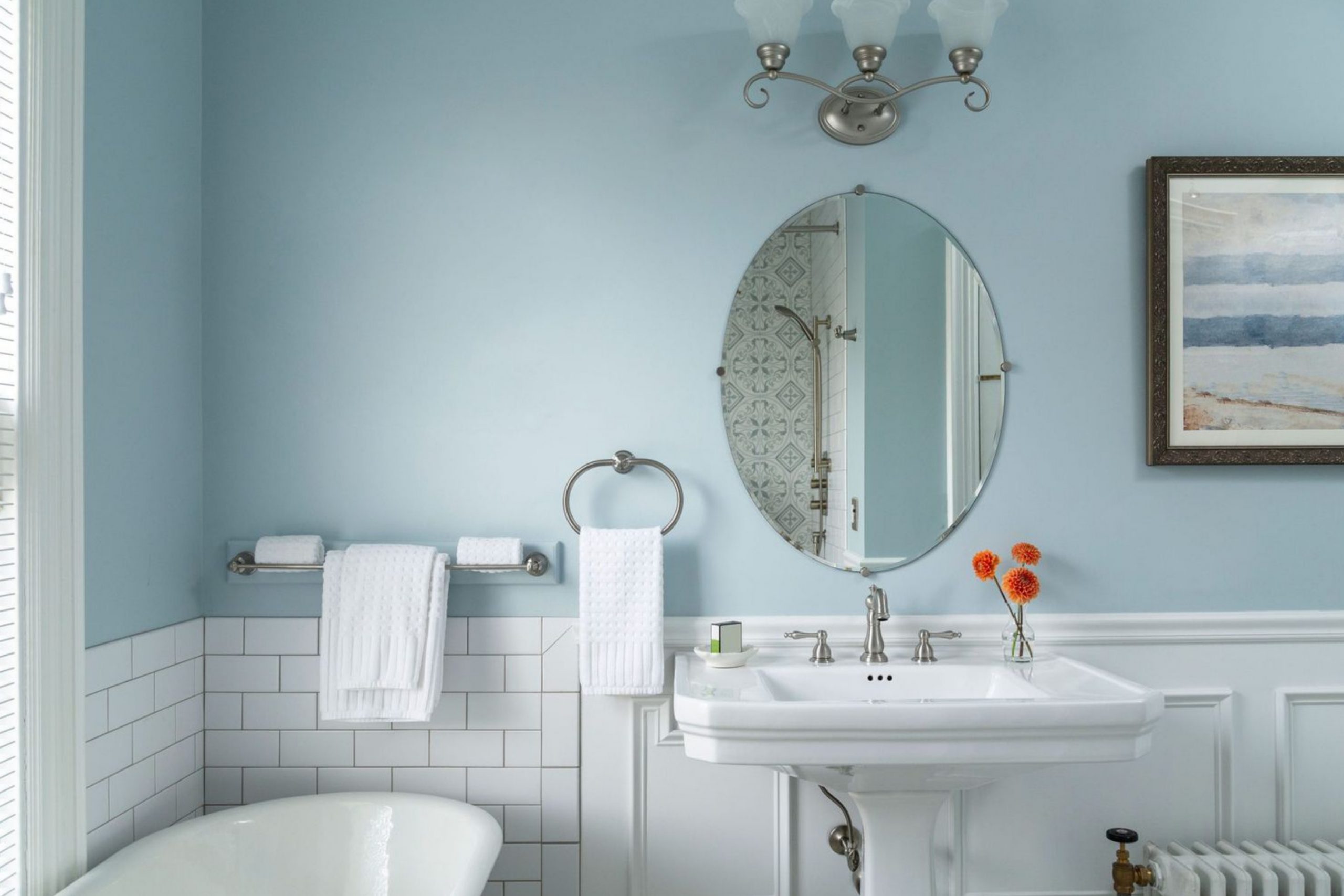
Rainwashed SW 6211
Rainwashed feels like soft water on the walls. It’s a light blue-green that gives bathrooms a fresh mood. I love pairing it with sandy beige tiles and white trim. It makes small bathrooms feel more open and bright. Rainwashed has a soothing quality that works beautifully for daily routines. It always feels fresh and airy.
\I also like how it brings a playful brightness to bathrooms with little natural light. Rainwashed feels uplifting every time you step inside.

Tradewind SW 6218
Tradewind carries a breezy blue tone that reminds me of the ocean. It’s perfect for bathrooms where I want a touch of cool color. This shade works well with white vanities and silver finishes. It feels uplifting without being too bold. Tradewind makes bathrooms feel lively and refreshing. It’s one of my favorite soft blues
.I also find it blends wonderfully with natural wood details. This shade adds an easy, coastal mood to any bathroom.

Silver Strand SW 7057
Silver Strand has a gray-green look that feels stylish. I often use it in modern bathrooms where I want a clean but interesting wall color. It pairs well with marble and chrome finishes. This shade changes slightly with the light, giving depth to the room. Silver Strand always adds a steady, refined look. It makes bathrooms feel polished but not cold.
I love how it balances strength and softness at the same time. Silver Strand is always dependable for a calm, refined design.

Comfort Gray SW 6205
Comfort Gray is a gentle green-gray that feels soft and welcoming. It works beautifully with white trim and natural wood. I often use it when I want a bathroom to feel fresh and steady. It pairs well with silver and brushed nickel finishes. Comfort Gray has a natural charm that fits both small and large bathrooms.
It always feels refreshing. I also notice it adds a layer of softness that helps the room feel restful. Comfort Gray makes a bathroom inviting without losing style.

Topsail SW 6217
Topsail carries a light, airy blue that feels bright. It works well in bathrooms with little natural light. I love pairing it with crisp white trim for a neat look. This shade feels fresh, like open air. Topsail is great for smaller bathrooms where brightness matters most. It always feels cheerful and light.
I also like how it pairs with sandy beige tiles for a soft, beachy look. Topsail gives bathrooms an easy, breezy mood.
Sky High SW 6504
Sky High is a pale, airy blue that adds brightness. It works beautifully with white tiles and silver finishes. I often use it in bathrooms that need a soft touch of color. Skylight feels fresh and uplifting, perfect for morning routines. This shade makes small bathrooms feel more open. Skylight always brings a touch of brightness. I also enjoy how it softens hard edges, giving the bathroom a smoother look. It’s one of my go-to choices for a light and cheerful feel.

North Star SW 6246
North Star is a soft gray-blue that feels steady and clean. It pairs beautifully with white trim and dark hardware. I like using it in modern bathrooms for a balanced look. North Star works well in both small and large bathrooms. It always feels fresh and stylish. This shade is one of my favorite light blues.
I also appreciate how it brings out the beauty of marble or granite counters. North Star gives bathrooms a polished finish with gentle charm.
Bold and Striking Bathroom Colors
Bold and Striking Bathroom Colors give bathrooms energy and personality. I love how these deeper shades can make even a simple vanity or mirror feel dramatic. They create contrast against white tiles and polished fixtures, adding a sharp edge to the design. These colors work especially well in powder rooms, where a strong impression matters most.
In master bathrooms, bold shades bring a sense of depth and richness that softer tones cannot.
They are the perfect choice when I want the bathroom to feel full of character and unforgettable style.
Naval SW 6244
Naval is a deep navy that brings strength to bathroom walls. I love pairing it with white trim for sharp contrast. It works beautifully with brass and gold finishes. Naval feels rich and dramatic, perfect for master bathrooms. This shade adds character without being too dark.
It always feels bold and confident.I also notice it highlights mirrors and lighting beautifully, giving the bathroom a striking focal point. Naval is a color that always leaves a strong impression.

Indigo Batik SW 7602
Indigo Batik has a strong blue tone that feels powerful. It pairs well with crisp whites and black fixtures. I often use it for accent walls in larger bathrooms. This color works beautifully with marble or gray stone. Indigo Batik adds drama while still feeling stylish. It’s a shade full of character.
It also creates a cozy depth in the evenings, making bathrooms feel intimate. Indigo Batik always gives the room a rich and confident presence.

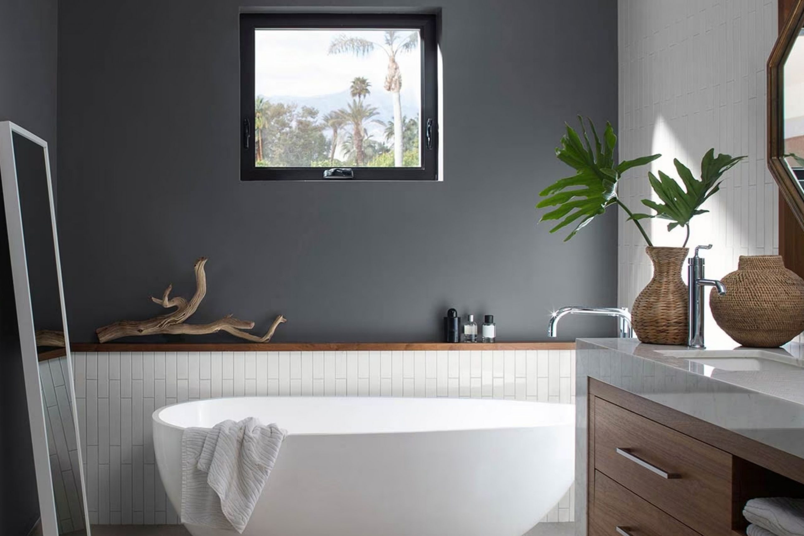
Iron Ore SW 7069
Iron Ore is a deep charcoal that feels strong and grounded. I use it when I want bathrooms to have a bold edge. It pairs well with white trim and silver finishes. Iron Ore looks stunning with modern tile and clean lines. This shade works well in larger bathrooms where depth is needed. It always feels striking and powerful.
I also love how it blends seamlessly with natural stone textures. Iron Ore adds an instant sense of structure and style.

Tricorn Black SW 6258
Tricorn Black is a true black that adds drama. It works beautifully in bathrooms when paired with white and gold. I often use it for vanities or accent walls. This shade makes a bold statement while staying stylish. Tricorn Black always feels sharp and modern. It gives bathrooms a confident look. It also highlights architectural details, drawing attention to trim or tile work.
Tricorn Black makes any bathroom feel bold and designed with purpose.

Urbane Bronze SW 7048
Urbane Bronze has a rich brown-gray tone that feels steady and bold. I often use it in bathrooms for a modern yet warm style. It pairs beautifully with natural wood and brass finishes. Urbane Bronze adds depth without being too stark. This shade works especially well in master bathrooms. It always feels rich and stylish.
It also gives the room a grounded elegance that feels lasting. Urbane Bronze makes a bathroom look both modern and welcoming.

Peppercorn SW 7674
Peppercorn is a deep gray that feels dramatic but soft. It pairs well with white trim and black hardware. I like using it in bathrooms with large windows where light balances the depth. Peppercorn works well with stone and natural textures. It always feels strong and stylish. This shade brings elegance to bathroom walls.
It also changes beautifully throughout the day, from moody in low light to sharp in bright daylight. Peppercorn is a shade that adds quiet drama without heaviness.

Slate Tile SW 7624
Slate Tile is a strong blue-gray that feels modern. I often use it to add bold character to bathrooms. It pairs beautifully with white vanities and silver finishes. This shade makes a statement without being too heavy. Slate Tile works well for accent walls or full bathrooms. It always feels sharp and stylish.
I also find it blends wonderfully with both cool gray tiles and warm wooden vanities. Slate Tile is a shade that always brings personality to the design.

Cascades SW 7623
Cascades has a deep green-blue tone that feels rich. It works beautifully with brass fixtures and natural stone. I love using it in larger bathrooms for drama. This shade feels bold but still inviting. Cascades always makes bathrooms look unique and strong. It’s full of personality and charm.
I also notice it adds a sense of depth that feels elegant and lasting. Cascades is a shade that never fails to impress with its richness.
Caviar SW 6990
Caviar is a deep black-brown that feels rich and elegant. It pairs beautifully with white trim and gold finishes. I like using it in bathrooms for a dramatic effect. Caviar works especially well in powder rooms where I want a strong impression. It always feels stylish and bold. This shade adds a touch of luxury.
It also looks striking with crystal lighting or mirrors, adding extra sparkle. Caviar is a color that makes any bathroom feel elevated and memorable.
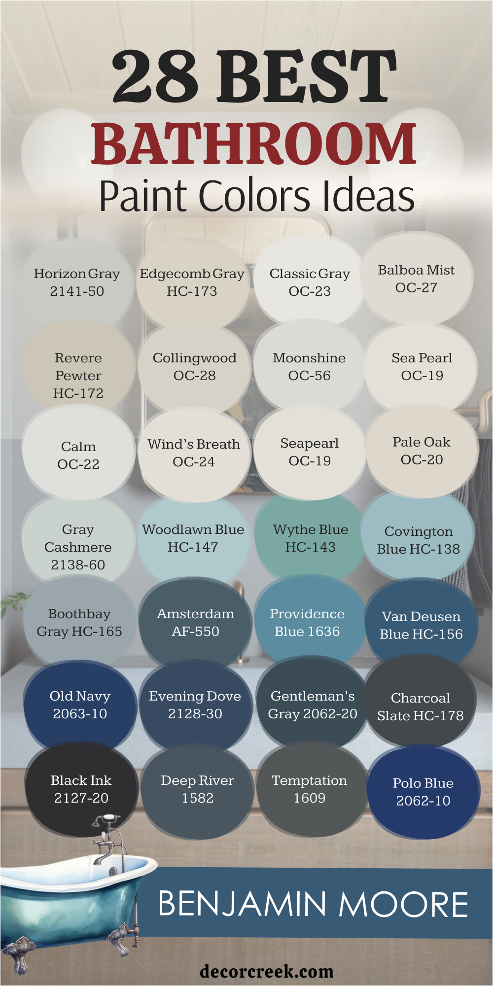
28 Bathroom Paint Color Ideas by Benjamin Moore
Horizon Gray 2141-50
Horizon Gray feels balanced and soft, making bathrooms look steady without feeling dark. I like how it works in both small powder rooms and larger master baths, giving each a natural flow. The green undertone makes it pair beautifully with stone tiles and wood finishes. In the morning light, this shade feels fresh and inviting. I
t creates a quiet strength that doesn’t overpower the room. Horizon Gray is one of my favorite choices for bathrooms that need gentle color without heaviness.
It also adjusts beautifully to both natural and artificial light, always staying graceful. Horizon Gray is a reliable backdrop that lets other bathroom details shine.
Edgecomb Gray HC-173
Edgecomb Gray brings warmth while keeping a fresh look. It’s perfect for bathrooms that need a cozy but not heavy shade. I love how it pairs with creamy whites and brushed nickel finishes. The greige tone makes it flexible with both warm and cool tile. In natural light, it feels open and welcoming, never flat.
Edgecomb Gray gives bathrooms a look that feels both modern and classicIt also blends smoothly with wood tones, making it versatile for vanities or shelving.
Edgecomb Gray creates an easy flow in the bathroom that feels natural.

Classic Gray OC-23
Classic Gray has a light touch that makes bathrooms look neat and graceful. It’s soft enough to blend with marble, wood, or stone without clashing. I often choose it for smaller bathrooms where brightness is needed. This shade works beautifully with both gold and silver hardware. It feels clean but never too stark, keeping the bathroom comfortable.
Classic Gray always brings a polished yet simple look.It also keeps its balance in both daylight and evening light.
Classic Gray is one of my most dependable neutrals for any style of bathroom.

Balboa Mist OC-27
Balboa Mist carries warmth that makes bathrooms feel welcoming. I love how it balances soft beige tones with a fresh gray touch. It pairs well with warm tiles, wooden vanities, and even marble counters. This shade gives bathrooms a refined look without being too strong. In the evening, it feels cozy under soft lighting. Balboa Mist always makes the room feel inviting and smooth.
It also provides a flexible base for both bold accents and delicate finishes. Balboa Mist is the kind of shade that keeps the bathroom feeling graceful year after year.

Revere Pewter HC-172
Revere Pewter feels grounded and steady, perfect for larger bathrooms. Its greige tone pairs with almost any material, from stone to wood. I love how it looks next to crisp white trim for contrast. In bathrooms, it adds richness without making the walls feel heavy. This shade has a timeless quality that works across styles.
Revere Pewter always feels dependable and stylish. It also complements dark hardware beautifully, giving the bathroom extra depth. Revere Pewter is a true classic that always feels right in any setting.

Collingwood OC-28
Collingwood is light but full of character. It blends beautifully with white vanities and gray or beige tiles. I like using it in bathrooms where I want brightness with a touch of warmth. This shade works with modern clean lines and classic fixtures alike. It feels calm but not flat, always polished. Collingwood keeps bathrooms looking refined and balanced.
It also adapts well to changing light throughout the day, staying calm and steady. Collingwood is one of those colors that never fights with other finishes.

Moonshine OC-56
Moonshine has a gentle gray tone with a green hint that keeps bathrooms fresh. I like using it in smaller rooms because it opens the walls without being too plain. It pairs nicely with chrome finishes and white tile. The shade changes slightly with lighting, which keeps the room interesting.
Moonshine always feels light and graceful. It’s a go-to when I want a soft modern touch. It also creates a background that flatters mirrors and lighting. Moonshine gives bathrooms a modern edge while staying easy to enjoy.
Sea Pearl OC-19
Sea Pearl has a creamy brightness that makes bathrooms glow. It works beautifully with marble and brushed brass finishes. I love how it gives walls a fresh look that still feels soft. In powder rooms, it makes the space feel elegant and welcoming. This shade fits with both warm and cool accents.
Sea Pearl always adds a polished look.It also pairs beautifully with natural wood, giving the bathroom an organic feel.
Sea Pearl is one of my favorite shades for creating soft elegance.

Calm OC-22
Calm is a light neutral that makes bathrooms feel gentle and easy to live with. I use it when I want the walls to look fresh without standing out too much. It pairs well with creamy tiles and silver or gold hardware. In small bathrooms, it keeps the space open and airy. Calm has a soft glow under warm lighting. This shade always feels comfortable and welcoming.
It also balances strong accents, allowing bold mirrors or vanities to stand out. Calm keeps the bathroom feeling simple but refined.
Wind’s Breath OC-24
Wind’s Breath carries a warm touch that feels steady and natural. It’s light enough to brighten bathrooms but rich enough to add character. I love how it works with stone floors and white vanities. In both daylight and evening light, it stays balanced. This shade feels dependable and smooth. Wind’s Breath always brings a quiet charm.
It also works with both rustic and modern bathroom styles, making it very adaptable. Wind’s Breath creates a soft base that enhances every finish around it.
Seapearl OC-19
Seapearl is elegant with its creamy neutral tone. I love pairing it with gold fixtures and marble counters. It keeps bathrooms bright while adding just enough warmth. In small powder rooms, it creates an inviting glow. This shade is easy to use with many styles, from classic to modern. Seapearl always feels smooth and refined.
It also gives bathrooms a clean backdrop that highlights decorative accents. Seapearl is a color that never feels too plain or too heavy.
Pale Oak OC-20
Pale Oak has a greige softness that gives bathrooms warmth without heaviness. I love using it in larger rooms where I want comfort and brightness together. It pairs beautifully with wood tones and soft white trim. In natural light, it feels graceful and elegant. Pale Oak works well with both warm and cool finishes.
This shade always makes bathrooms feel welcoming. It also creates a soft background for bolder colors in towels or decor. Pale Oak is a reliable neutral that never goes out of style.

Gray Cashmere 2138-60
Gray Cashmere brings a light blue-green tone that feels refreshing. It’s perfect for bathrooms where I want a touch of color without being bold. This shade pairs beautifully with silver fixtures and white vanities. In daylight, it feels airy and bright. I love how it works with sandy beige or white tile. Gray Cashmere always feels light and joyful.
It also changes softly with different lighting, keeping the bathroom interesting. Gray Cashmere is one of my favorite ways to add cheerful personality.
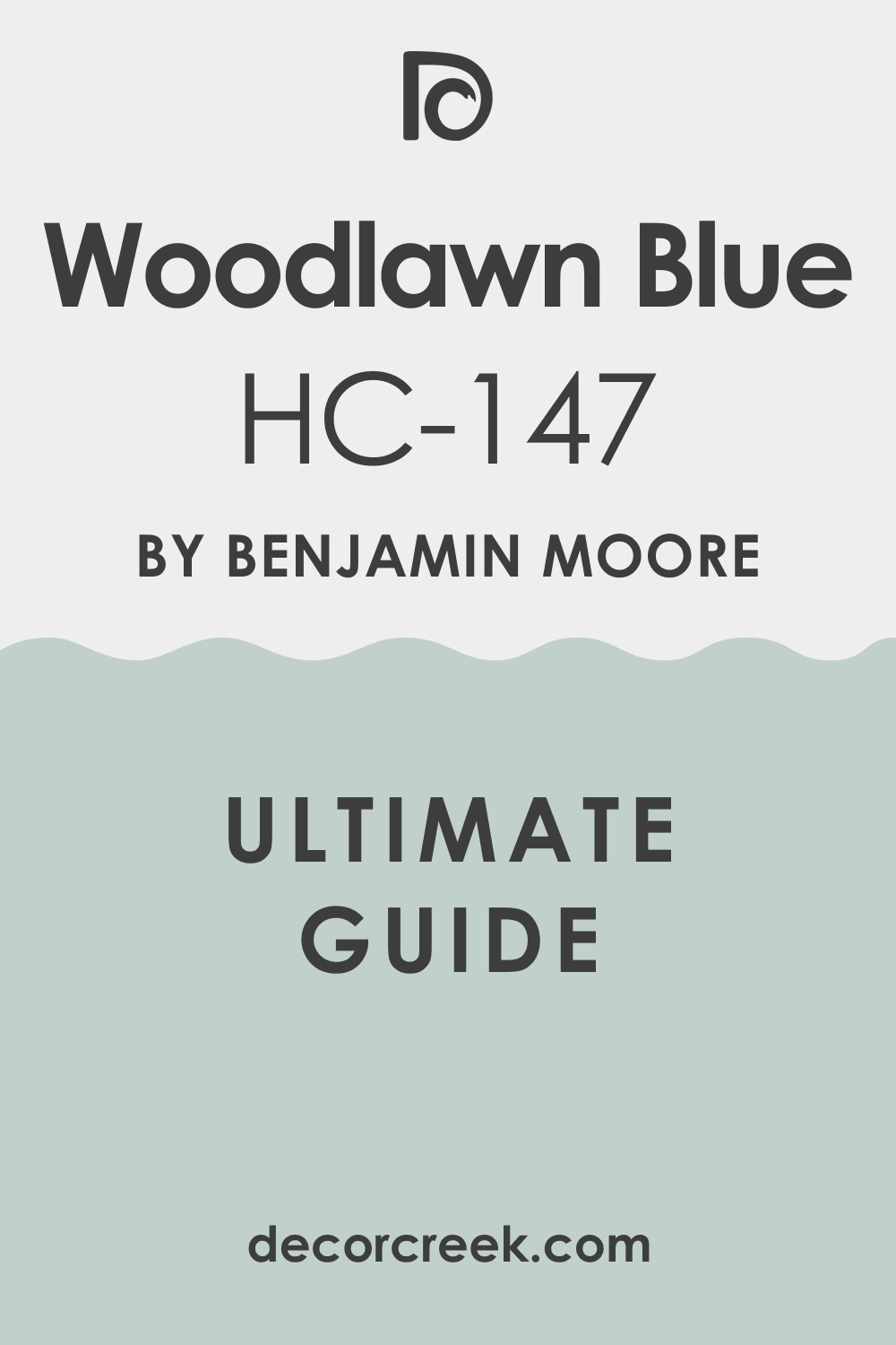
Woodlawn Blue HC-147
Woodlawn Blue has a cheerful, coastal look that I love for bathrooms. It pairs perfectly with white trim and natural wood. This shade adds brightness without being too bold. In small bathrooms, it feels fresh and uplifting. Woodlawn Blue is perfect for a light and happy mood. It always brings energy to the walls.
It also works well in larger bathrooms where I want a breezy coastal style. Woodlawn Blue is always bright but never overwhelming.
Wythe Blue HC-143
Wythe Blue is rich and stylish, with a mix of blue and green. It pairs beautifully with gold fixtures for a dramatic look. I love using it in powder rooms where I want the walls to stand out. This shade feels bold but still welcoming. In larger bathrooms, it adds depth and character. Wythe Blue always brings a strong, unique style.
It also makes brass and marble shine, highlighting every detail in the room. Wythe Blue is a shade full of personality that never feels dull.

Covington Blue HC-138
Covington Blue has a clear, fresh tone that makes bathrooms feel bright. I like pairing it with white vanities and light tile. This shade works beautifully in small rooms that need life. It feels cheerful but not overpowering. Covington Blue keeps the room fresh all day. It always adds an uplifting touch.
It also brings a playful spark to bathrooms without feeling childish. Covington Blue is perfect when I want a lighthearted, fresh mood.
Boothbay Gray HC-165
Boothbay Gray has a cool gray-blue tone that feels modern and steady. It pairs beautifully with crisp white trim and chrome hardware. I use it when I want bathrooms to feel structured but not dark. This shade looks stylish with marble counters. Boothbay Gray works in both small and large bathrooms. It always feels sharp and polished.
It also adds just enough depth to create interest while staying soft. Boothbay Gray is a shade that always feels reliable and stylish.

Amsterdam AF-550
Amsterdam is bold and striking, perfect for bathrooms that need a strong presence. I like pairing it with white trim and gold accents. This shade works best in larger rooms where it can shine. It feels confident and full of character. Amsterdam always adds richness to walls. It’s a shade that makes a statement.
It also creates a luxurious backdrop for lighting and mirrors.
Amsterdam gives bathrooms a strong identity that feels both modern and rich.
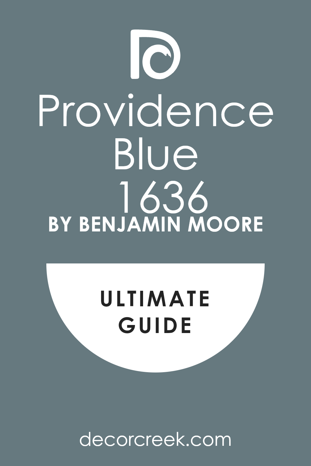
Providence Blue 1636
Providence Blue is cheerful and lively, perfect for bathrooms that need energy. It pairs beautifully with silver fixtures and natural wood. I love using it in powder rooms for a playful mood. This shade feels bright and uplifting. Providence Blue always brings life to the walls. It makes the room feel full of character.
It also stands out beautifully next to white trim, giving the bathroom crisp contrast. Providence Blue makes every detail in the room pop.
Van Deusen Blue HC-156
Van Deusen Blue has a deep blue-gray look that feels modern and bold. It pairs beautifully with marble and chrome. I use it in master bathrooms where I want drama without losing polish. This shade feels steady and rich. Andes Summit always adds depth and style. It keeps the bathroom looking strong.
It also works well with black hardware for a sleek, high-end touch. Andes Summit makes the bathroom feel confident and modern.

Old Navy 2063-10
Old Navy is a classic deep navy that feels strong and stylish. I love pairing it with white trim and brass finishes. It works beautifully in both large and small bathrooms. This shade adds depth without overwhelming the space. Old Navy always feels confident and polished. It gives bathrooms a rich, bold look.It also pairs beautifully with patterned tiles for a more playful style.
Old Navy is a shade that feels both traditional and fresh.

Evening Dove 2128-30
Evening Dove has a dark blue-gray tone that feels sophisticated. It pairs beautifully with silver or gold finishes. I like using it on vanities or feature walls. This shade works especially well in modern bathrooms. Evening Dove always feels bold and strong. It gives bathrooms a dramatic edge.
It also highlights bright accents like white tile, making the contrast sharper.
Evening Dove gives the bathroom a sense of depth that feels balanced.
Gentleman’s Gray 2062-20
Gentleman’s Gray feels rich and full of character. It carries a deep blue-green tone that pairs beautifully with marble and brass. I use it when I want bathrooms to feel dramatic and stylish. This shade has strength but still feels inviting. Gentleman’s Gray works beautifully in both powder rooms and master baths. It always makes the walls stand out.
It also looks incredible with natural light, shifting from bold to moody through the day. Gentleman’s Gray is always striking and never boring.
Charcoal Slate HC-178

Charcoal Slate is a deep gray that feels modern and grounded. I like pairing it with white trim for strong contrast. It works well with sleek tile and chrome fixtures. In larger bathrooms, it adds depth and strength. Charcoal Slate always feels stylish and bold. It makes a strong design statement.
It also enhances the shine of mirrors and lighting fixtures. Charcoal Slate is a shade that instantly makes bathrooms feel more polished.
Black Ink 2127-20
Black Ink is a rich, dark black that feels striking. It pairs beautifully with gold or silver finishes. I love using it for vanities or accent walls in bathrooms. This shade gives a sharp, polished look. Black Ink always feels bold and stylish. It turns bathrooms into statement rooms.
It also pairs beautifully with textured tiles, adding drama and dimension. Black Ink makes bathrooms unforgettable.
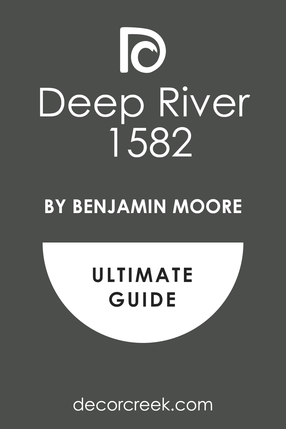
Deep River 1582
Deep River carries a strong blue-gray tone that feels steady. It pairs beautifully with white trim and marble. I like using it in modern bathrooms for a rich, stylish look. This shade feels polished without being too heavy. Deep River always adds depth and character. It’s one of my favorite bold neutrals.
It also matches well with black hardware for a dramatic finish. Deep River gives bathrooms both strength and grace.
Temptation 1609
Temptation is a deep charcoal tone that feels bold and dramatic. It pairs beautifully with white vanities and silver finishes. I like using it in master bathrooms for a strong edge. This shade adds a modern, striking look. Temptation always feels confident.
It makes bathrooms stand out.It also works beautifully in powder rooms where I want an instant impact. Temptation is a shade that always feels powerful.
Polo Blue 2062-10
Polo Blue is a rich navy that feels confident and classic. It pairs beautifully with brass and white finishes. I love using it in powder rooms for a bold impression. This shade works beautifully in modern and traditional bathrooms. Polo Blue always feels stylish.
It gives bathrooms a sharp, strong look.It also highlights decorative mirrors and lighting in a stunning way. Polo Blue adds bold character while keeping a polished finish.
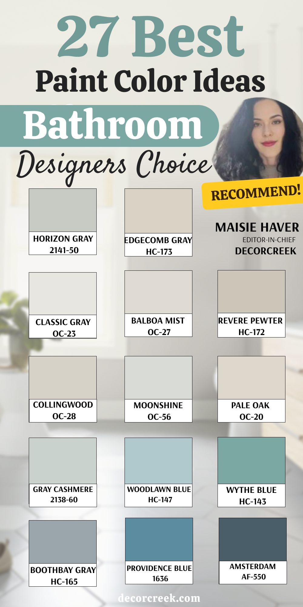
27 Bathroom Paint Color Ideas Designers’ Choice
Horizon Gray 2141-50
Horizon Gray feels steady yet soft, making bathrooms look balanced and graceful. I love how it blends with stone floors and creamy counters. The hint of green in it adds a touch of freshness without standing out too much. It works beautifully in both small powder rooms and large master baths. This shade makes mornings feel fresh and evenings cozy. Horizon Gray is one of my trusted choices for creating easy beauty.
It also adjusts nicely under different lighting, always looking natural. Horizon Gray pairs well with wood tones, adding warmth to cool bathrooms. It’s a shade that never feels outdated, no matter the design style.
Edgecomb Gray HC-173
Edgecomb Gray has a warm, light greige tone that feels relaxed. It pairs beautifully with both modern and classic bathrooms. I often use it with marble vanities and brushed nickel finishes. The color is gentle enough to open up a small room yet strong enough to ground a larger one. It always feels welcoming and smooth. Edgecomb Gray is one of those shades that never feels wrong. It also creates a balanced background for colorful accents like towels or artwork.
Edgecomb Gray blends easily with wood, stone, or tile finishes. This shade always keeps bathrooms looking cozy and stylish.
Classic Gray OC-23
Classic Gray gives bathrooms a clean and graceful touch. It works beautifully with white tile, polished chrome, or gold fixtures. I often choose it when I want a light background that isn’t plain white. This shade keeps the bathroom open and easy to enjoy. It brings out the details in trim and mirrors without being too bold. Classic Gray always feels polished and fresh. It also looks soft and flattering under warm lighting.
Classic Gray helps smaller bathrooms feel open while keeping them inviting. It’s a simple color that always delivers elegance.
Balboa Mist OC-27
Balboa Mist has a warm undertone that makes bathrooms feel bright but also inviting. I like using it in master bathrooms where I want both elegance and comfort. It pairs well with wood tones, marble, or brass. The shade looks different in changing light, keeping the room interesting. Balboa Mist is refined but not stiff. It always makes the bathroom glow with quiet charm. It also pairs beautifully with natural fabrics and woven baskets.
Balboa Mist has a graceful warmth that flatters every detail. This shade works across many styles, from modern to classic.
Revere Pewter HC-172
Revere Pewter feels rich and grounded, a favorite for creating classic bathrooms. It works well with white trim and bold black fixtures. I use it in larger bathrooms to bring depth without making the room heavy. It feels steady and full of character. This shade always ties the look together in a strong way. Revere Pewter is timeless in its effect. It also adapts well to both modern and farmhouse-style bathrooms.
Revere Pewter creates harmony with stone, tile, or wood. This color always brings a sense of lasting beauty.
Collingwood OC-28
Collingwood has a clean, soft gray tone that makes bathrooms look refined. I like pairing it with bright white vanities for contrast. It feels gentle enough for small spaces but strong enough to give presence in large ones. This shade works with warm or cool accents. It always feels smooth and polished. Collingwood is perfect when I want an easy yet stylish bathroom. It also looks elegant under natural daylight, holding its tone steady.
Collingwood supports both bold and neutral accents equally well. This color always gives the room a graceful balance.
Moonshine OC-56
Moonshine feels airy with its light gray tone and soft green hint. I love how it reflects natural light, making bathrooms feel brighter. It pairs beautifully with silver finishes and sleek tiles. The shade changes gently through the day, keeping the room lively. Moonshine is light but not plain. It always feels modern and easy to live with. It also highlights mirrors and glass beautifully, adding sparkle to the bathroom.
Moonshine is one of those shades that feels effortless. It brings a soft elegance to any design.
Pale Oak OC-20
Pale Oak has a soft greige look that warms bathrooms without making them dark. It pairs beautifully with white trim, stone, or brass accents. I often use it when I want bathrooms to feel cozy but still open. It brings elegance without drawing too much attention. Pale Oak always feels balanced and stylish. It’s a shade full of quiet charm.
It also works beautifully in both daylight and warm evening light. Pale Oak gives bathrooms a timeless, graceful glow. This shade is dependable for creating comfort and class.
Gray Cashmere 2138-60
Gray Cashmere has a soft green-blue tone that feels cheerful. It works beautifully with white tile and brushed nickel. I like using it in bathrooms that need a gentle lift. This shade feels light and full of life. It makes mornings feel bright and fresh. Gray Cashmere always adds a joyful energy. It also shifts softly with the light, keeping the room interesting all day.
Gray Cashmere pairs well with sandy tiles for a breezy touch. This shade always feels lively without being overpowering.
Woodlawn Blue HC-147
Woodlawn Blue is cheerful and breezy, perfect for bathrooms that need lightness. It pairs beautifully with natural wood and white trim. I love using it to give a soft coastal feel. The shade feels happy without being overwhelming. It works beautifully in powder rooms and larger baths. Woodlawn Blue always makes the room feel lively. It also complements silver and chrome finishes for a crisp look.
Woodlawn Blue brings a touch of seaside charm indoors. This color always keeps the bathroom bright and welcoming.
Wythe Blue HC-143
Wythe Blue is a strong, stylish mix of blue and green. It pairs beautifully with gold hardware and crisp white trim. I use it when I want bathrooms to feel bold yet refined. This shade gives depth without being too heavy. It works perfectly in both powder rooms and larger bathrooms. Wythe Blue always feels unique and full of character. It also enhances natural stone, giving the bathroom a luxurious edge.
Wythe Blue feels bold yet balanced, never too loud. This shade always makes a lasting impression.
Boothbay Gray HC-165
Boothbay Gray has a cool gray-blue tone that feels calm but stylish. It pairs beautifully with marble counters and chrome fixtures. I like using it in modern bathrooms where I want a polished look. This shade works well in any size room. Boothbay Gray always feels clean and steady. It gives bathrooms a refined finish.
It also works as a perfect backdrop for both light and dark decor. Boothbay Gray carries a quiet strength that feels reliable. This shade always keeps the bathroom looking sharp.
Providence Blue 1636
Providence Blue is cheerful and full of energy. It pairs beautifully with white vanities and brushed silver. I love using it in small bathrooms where I want a playful touch. This shade feels lively and welcoming. It works beautifully with both warm and cool accents. Providence Blue always makes bathrooms feel joyful.It also gives a crisp contrast against white trim, making details pop.
Providence Blue feels uplifting in both daylight and evening light. This color always adds personality to the room.
Amsterdam AF-550
Amsterdam is bold and deep, a strong shade for bathrooms that need drama. It pairs beautifully with gold accents and crisp white trim. I use it in larger bathrooms to add richness. This shade feels confident and polished. It always gives the room a striking look.
Amsterdam is perfect when I want strength and style together. It also highlights mirrors and lighting beautifully, making them sparkle.
Amsterdam brings a touch of luxury to any bathroom. This shade always feels powerful and stylish.
Gentleman’s Gray 2062-20
Gentleman’s Gray is rich with its deep blue-green tone. It pairs beautifully with marble, brass, and crisp white trim. I love using it for vanities or feature walls. The shade feels elegant and strong. It works beautifully in both modern and traditional bathrooms. Gentleman’s Gray always makes a bold impression.
It also shifts beautifully through the day, from lively blue in daylight to moody green at night.
Gentleman’s Gray adds richness that feels refined. This color always stands out with charm.
Deep River 1582
Deep River feels rich and grounded, with a blue-gray depth. It pairs beautifully with white tile and silver fixtures. I use it when I want bathrooms to feel strong without being black. This shade adds sophistication while staying welcoming. It works well in larger rooms with natural light. Deep River always feels polished and steady.
It also blends seamlessly with both rustic and modern finishes.
Deep River gives bathrooms a bold edge while staying elegant. This color always feels strong and reliable.
Drift of Mist SW 9166
Drift of Mist is a soft neutral that feels airy. It pairs beautifully with stone counters and creamy tiles. I love using it in bathrooms that need brightness without starkness. This shade works beautifully in small spaces. Drift of Mist always feels fresh and light. It’s a perfect background color.
It also softens the look of sharp fixtures, making the bathroom feel smoother.
Drift of Mist blends easily with both warm and cool accents. This shade always keeps the room looking gentle and welcoming.

Skyline Steel SW 1015
Skyline Steel is a light gray that feels modern and steady. I often pair it with silver finishes and white trim. It works beautifully in both powder rooms and master baths. The shade feels structured but never heavy. Skyline Steel always adds quiet strength. It makes bathrooms look refined.
It also gives balance to bold accent pieces, like dark mirrors or flooring. Skyline Steel carries a graceful presence that stays stylish over time. This color always feels sharp and dependable.
Repose Gray SW 7015
Repose Gray feels dependable and stylish. I use it in bathrooms where I want a classic neutral. It pairs beautifully with marble and chrome finishes. This shade works well in any size bathroom. Repose Gray always feels polished and balanced. It gives bathrooms a smooth, elegant look.
It also adapts beautifully to different light, never feeling too dark. Repose Gray pairs seamlessly with wood tones for extra warmth. This color always creates a grounded and stylish mood.

Eider White SW 7014
Eider White has a soft, warm look that brightens bathrooms. It pairs beautifully with natural wood and creamy tiles. I use it when I want a fresh background that isn’t plain white. This shade always feels graceful. It makes small bathrooms feel inviting. Eider White brings a gentle brightness. It also works wonderfully with both gold and silver accents.
Eider White adds a layer of softness that flatters every detail. This color always keeps the bathroom looking fresh and balanced.

Agreeable Gray SW 7029
Agreeable Gray is warm and flexible, a favorite for many bathrooms. It pairs beautifully with both silver and gold finishes. I love how it works with stone or wood accents. This shade feels cozy without being dark. It fits both modern and classic styles. Agreeable Gray always feels easy and inviting.It also blends smoothly with bright whites, making trim details stand out.
Agreeable Gray has a warmth that makes bathrooms feel comfortable every day. This color always adapts to the design without effort.

Dorian Gray SW 7017
Dorian Gray is a medium gray that feels rich and polished. I like pairing it with crisp white trim and sleek fixtures. This shade works beautifully in larger bathrooms. It adds depth without feeling too heavy. Dorian Gray always feels stylish and strong. It’s perfect for bathrooms that need character.It also enhances bold finishes like black hardware or dark wood vanities.
Dorian Gray creates a modern edge while staying welcoming. This shade always brings a confident mood.

Alpaca SW 7022
Alpaca has a soft gray-beige tone that feels gentle. It pairs beautifully with stone floors and brushed silver. I love how it adds warmth without being bold. This shade works well in both small and large bathrooms. Alpaca always feels light and welcoming. It brings a natural touch to walls. It also softens the feel of bright white tiles, creating balance.
Alpaca is a shade that feels comforting without losing elegance. This color always makes the bathroom easy to enjoy.
City Loft SW 7631
City Loft feels polished with its soft neutral tone. It pairs beautifully with sleek finishes and bright white trim. I use it when I want bathrooms to feel clean and airy. This shade works in both modern and classic rooms. City Loft always feels refined. It gives bathrooms a neat, easy look.It also looks beautiful with natural textures like wicker baskets or linen curtains.
City Loft carries a brightness that feels welcoming. This color always helps bathrooms stay timeless.

Egret White SW 7570
Egret White is a creamy neutral that makes bathrooms glow. It pairs beautifully with warm wood and soft lighting. I love how it adds brightness without being too sharp. This shade feels soft and graceful. Egret White always feels inviting. It works well in both small and large bathrooms. It also blends well with brushed nickel or chrome accents.
Egret White has a warmth that keeps bathrooms feeling cozy. This color always feels gentle but polished.
Silverpointe SW 7653
Silverpointe is a cool gray that feels neat and modern. I like pairing it with white vanities and chrome fixtures. This shade works beautifully in small bathrooms. It feels crisp and clean without being stark. Silverpointe always feels stylish. It brings a fresh touch to walls.It also works nicely with glass details, enhancing the sparkle of mirrors or lighting.
Silverpointe creates a clean background for any decor. This color always keeps bathrooms looking sharp and sleek.
Modern Gray SW 7632
Modern Gray is a warm neutral that feels graceful. It pairs beautifully with cream finishes and soft wood tones. I use it when I want a bathroom to feel cozy yet polished. This shade always feels inviting. Modern Gray works well in any bathroom style. It keeps the look simple and refined. It also balances bold accents like dark mirrors or patterned tiles.
Modern Gray makes bathrooms feel warm without heaviness. This color always gives a steady, stylish finish.

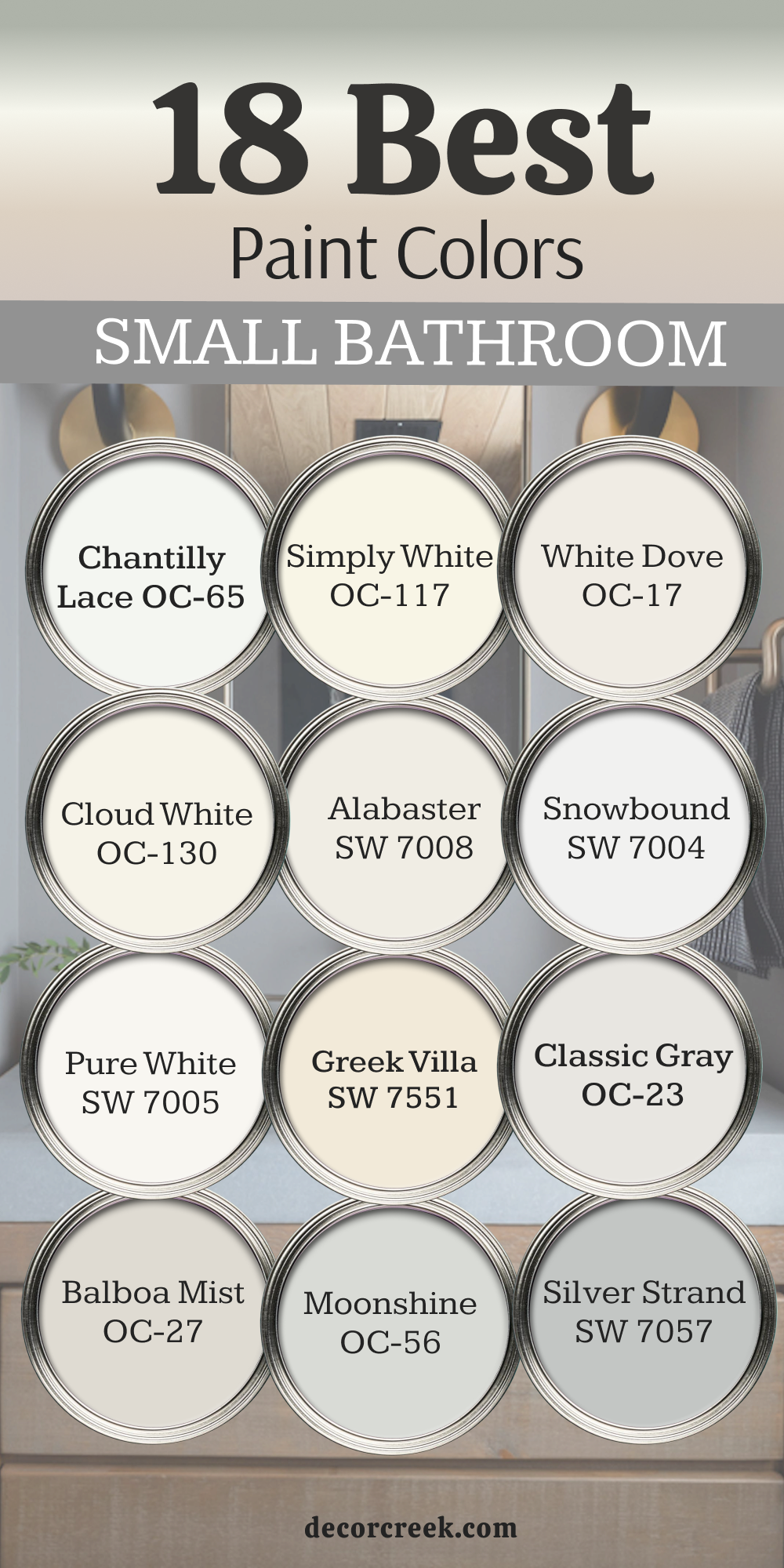
18 Best Small Bathroom Paint Colors
Chantilly Lace OC-65
Chantilly Lace is crisp and bright, perfect for tiny bathrooms. It reflects light beautifully, making walls feel more open. I pair it with silver fixtures for a clean look. This shade always feels polished. Chantilly Lace works well in powder rooms where light is limited. It gives small spaces a sharp, airy mood. It also creates a strong contrast with dark hardware, making details pop
. Chantilly Lace feels fresh from morning to night. This color always delivers a pure, neat finish.

Simply White OC-117
Simply White is warm and cheerful. It works beautifully in compact bathrooms with wood or tile accents. I love how it makes the room feel larger and more open. This shade always feels inviting. Simply White balances warmth and brightness. It’s a trusted choice for small bathrooms.It also pairs perfectly with mirrors, enhancing reflection and brightness.
Simply White creates a cozy glow without being heavy. This color always feels lively and friendly.

White Dove OC-17
White Dove has a soft glow that makes bathrooms feel friendly. I often use it in small spaces where I want both brightness and warmth. It pairs beautifully with marble and brass. White Dove always feels graceful. It makes tight bathrooms welcoming. This shade keeps the look polished.It also blends well with natural light, staying soft and balanced all day.
White Dove gives bathrooms an inviting elegance. This color always feels smooth and timeless.

Cloud White OC-130
Cloud White feels creamy and soft, giving small bathrooms a gentle glow. It pairs beautifully with warm wood vanities. I love how it softens sharp tile edges. Cloud White always feels smooth. It brings warmth without closing in the space. This shade makes small rooms glow with charm.It also highlights soft lighting, creating a gentle atmosphere.
Cloud White is perfect for cozy bathrooms with natural textures. This color always feels graceful and welcoming.

Alabaster SW 7008
Alabaster has a warm brightness that suits compact bathrooms. It reflects light while staying gentle on the eyes. I pair it with chrome finishes for a clean look. This shade always feels welcoming. Alabaster makes small spaces look bigger. It’s one of my favorites for powder rooms.It also keeps its warmth in both natural and artificial light.
Alabaster helps bathrooms feel bright but not cold. This color always adds comfort and charm.
Snowbound SW 7004
Snowbound feels neat and crisp, perfect for small bathrooms. It pairs beautifully with black hardware for contrast. I love how it keeps the room sharp and polished. Snowbound always feels structured. It’s a simple way to give small rooms a fresh edge. This shade makes walls stand tall.It also adapts beautifully to modern designs, making bathrooms feel sleek.
Snowbound is a reliable choice when I want brightness and structure. This color always feels confident.
Pure White SW 7005
Pure White is clean and modern. It works beautifully in tight bathrooms where I need brightness. I like pairing it with bold mirrors for contrast. Pure White always feels crisp. It makes even the smallest rooms open up. This shade brings a strong sense of order. It also matches with nearly any finish, making design choices easier. Pure White highlights bathroom fixtures beautifully. This color always delivers a sharp, clear look.
Greek Villa SW 7551
Greek Villa feels soft and welcoming. It pairs beautifully with brushed gold fixtures. I love how it gives small bathrooms a graceful glow. Greek Villa always feels elegant. It warms up tight rooms without making them heavy. This shade feels bright but cozy.It also works across different styles, from classic to modern.
Greek Villa gives bathrooms a sense of gentle charm. This color always feels refined and inviting.
Classic Gray OC-23
Classic Gray is polished and soft, perfect for small bathrooms. It pairs beautifully with silver finishes and light wood. I like how it adds character without being bold. Classic Gray always feels balanced. It makes walls look fresh and neat. This shade is one of my go-tos for small rooms. It also keeps its brightness steady through the day.
Classic Gray brings a graceful simplicity to compact spaces. This color always feels dependable and stylish.
Balboa Mist OC-27
Balboa Mist has a gentle warmth that makes compact bathrooms glow. It pairs beautifully with marble or creamy tiles. I love how it keeps the look easy and inviting. Balboa Mist always feels smooth. It brightens small spaces in a quiet way. This shade adds gentle charm.It also highlights brass accents, giving the bathroom elegance.
Balboa Mist feels graceful while staying practical. This color always fits both classic and modern designs.
Moonshine OC-56
Moonshine feels light and fresh, a great choice for tight spaces. It pairs beautifully with white vanities and chrome finishes. I like how it shifts gently in different light. Moonshine always feels lively. It makes small bathrooms feel more open. This shade gives a modern clean look.It also works beautifully with natural wood for a soft balance.
Moonshine adds a subtle brightness that lifts the mood. This color always feels crisp and smooth.
Silver Strand SW 7057
Silver Strand is a soft gray-green that feels stylish. It works beautifully in compact bathrooms with white accents. I pair it with polished chrome for a sleek look. Silver Strand always feels neat. It brings interest without being bold. This shade makes walls look polished. It also adapts nicely to natural and artificial light, staying balanced.
Silver Strand is perfect when I want both freshness and depth. This color always feels steady and elegant.
Sea Salt SW 6204
Sea Salt feels refreshing in small bathrooms. It pairs beautifully with white trim and sandy tiles. I like how it lifts the mood of a tight space. Sea Salt always feels bright. It adds gentle color without heaviness. This shade makes bathrooms feel lively. It also adapts nicely to natural and artificial light, staying balanced.
Silver Strand is perfect when I want both freshness and depth. This color always feels steady and elegant.
Rainwashed SW 6211
Rainwashed has a cheerful blue-green look. It works beautifully in compact bathrooms with stone accents. I love how it adds brightness without being too strong. Rainwashed always feels easy. It makes small rooms more inviting. This shade carries freshness.It also pairs beautifully with sandy flooring for a coastal mood.
Rainwashed feels lighthearted and welcoming. This color always adds energy.
Healing Aloe 1562
Healing Aloe feels soft and natural. It pairs beautifully with white vanities and creamy counters. I use it when I want a tiny bathroom to feel uplifting. Healing Aloe always feels light. It adds gentle color that never overpowers. This shade works beautifully in powder rooms.It also reflects daylight beautifully, keeping the bathroom cheerful.
Healing Aloe feels fresh while staying subtle. This color always creates a gentle balance.

Wickham Gray HC-171
Wickham Gray feels neat and stylish. It pairs beautifully with chrome finishes. I love how it brightens small rooms. Wickham Gray always feels clean. It adds a modern touch without being cold. This shade makes bathrooms look polished.It also works well with glass details, enhancing mirrors and lighting.
Wickham Gray feels crisp in both natural and artificial light. This color always keeps bathrooms fresh.
Gray Owl OC-52

Gray Owl is light and balanced, perfect for small bathrooms. It pairs beautifully with white tile and silver hardware. I like how it adds character without heaviness. Gray Owl always feels fresh. It makes small spaces look open. This shade keeps the look smooth.It also supports bold accent pieces like black hardware or dark mirrors.
Gray Owl adds clarity without losing warmth. This color always feels adaptable.

North Star SW 6246
North Star has a soft gray-blue tone that feels uplifting. It pairs beautifully with white finishes. I love how it keeps small bathrooms bright. North Star always feels fresh. It makes walls stand out in a gentle way. This shade adds cheerful lightness.It also works beautifully with marble and silver finishes.
North Star gives compact bathrooms a graceful, airy style. This color always feels steady and polished.
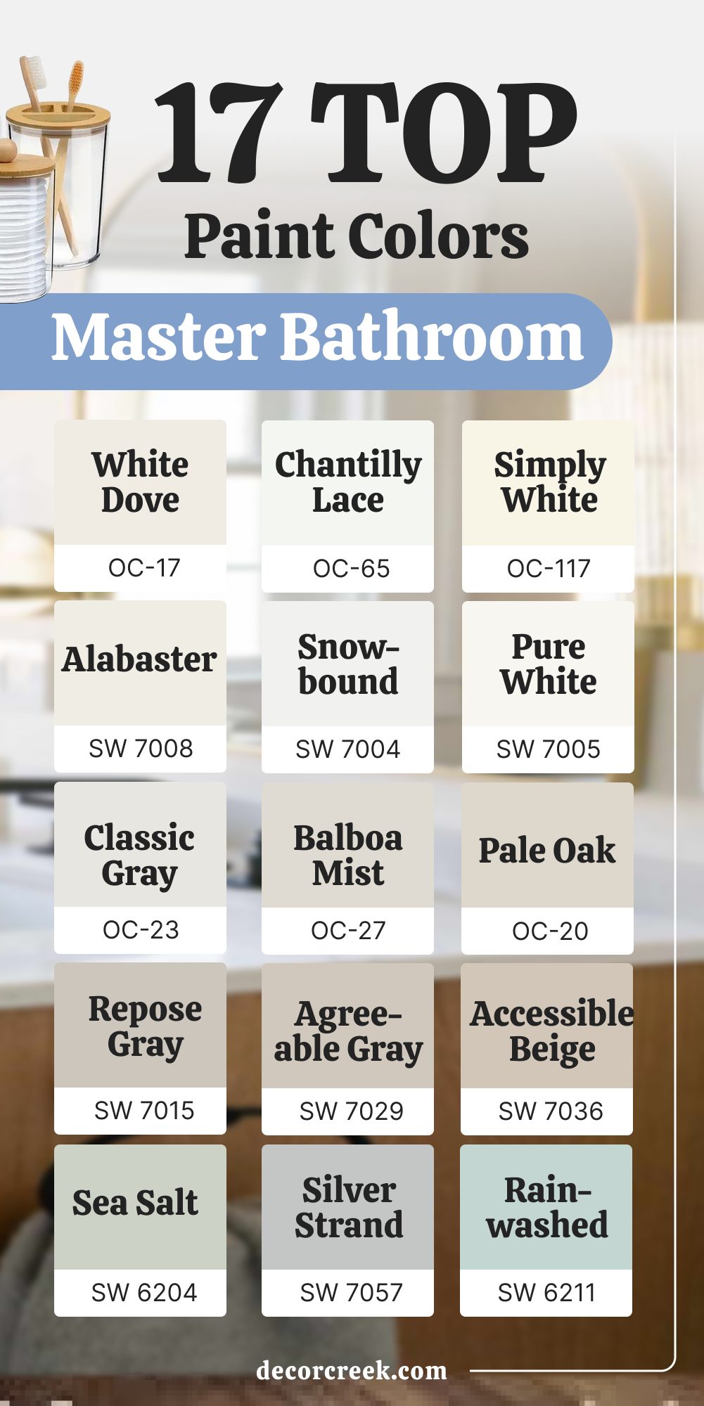
17 Top Master Bathroom Paint Colors
White Dove OC-17
White Dove is a classic for master bathrooms. It feels soft and polished. I pair it with marble for elegance. White Dove always feels graceful. It adds warmth to large bathrooms. This shade keeps the room refined. It also looks beautiful with brass and gold finishes, adding a touch of luxury.
White Dove holds its charm in both natural and artificial light. This color always brings a timeless, welcoming feel.
Chantilly Lace OC-65
Chantilly Lace feels crisp and sharp. It works beautifully in large bathrooms with high ceilings. I pair it with chrome fixtures for a clean look. Chantilly Lace always feels bright. It makes the room feel open and airy. This shade adds structure.. It also balances bold accents, making mirrors and lighting stand out.
Chantilly Lace has a clear, pure tone that feels fresh all day. This color always makes bathrooms look neat and confident.
Simply White OC-117
Simply White is warm and inviting. It pairs beautifully with wood accents. I love how it balances brightness and comfort. Simply White always feels fresh. It works perfectly in large bathrooms. This shade adds charm.It also gives bathrooms a cozy glow in the evenings.
Simply White blends seamlessly with both rustic and modern finishes. This color always keeps the room feeling cheerful and open.
Alabaster SW 7008
Alabaster has a gentle warmth that suits master bathrooms. It pairs beautifully with brass or silver fixtures. I like how it glows under soft lighting. Alabaster always feels welcoming. It adds comfort without heaviness. This shade keeps bathrooms balanced.It also softens the look of sharp edges and strong lines.
Alabaster gives the bathroom a calming glow that feels natural. This color always brings a touch of softness to large spaces.
Snowbound SW 7004
Snowbound feels clean and neat. It pairs beautifully with bold black or chrome finishes. I use it when I want a polished, modern look. Snowbound always feels fresh. It makes large bathrooms look sharp. This shade adds crispness.It also highlights natural light beautifully, keeping bathrooms bright all day.
Snowbound is a color that works in both sleek and classic settings. This shade always feels dependable and stylish.
Pure White SW 7005
Pure White is a dependable bright shade. It works beautifully in master baths with bold mirrors. I pair it with strong contrasts for impact. Pure White always feels structured. It adds clarity to large rooms. This shade gives bathrooms a fresh edge.It also adapts well to any finish, from shiny chrome to soft wood.
Pure White makes bathroom details stand out clearly. This color always delivers a sharp, modern feel.
Classic Gray OC-23
Classic Gray feels graceful in master bathrooms. It pairs beautifully with silver finishes. I love how it softens large spaces. Classic Gray always feels light. It adds charm without heaviness. This shade makes rooms feel balanced.It also works well with both cool marble and warm wood.
Classic Gray keeps the bathroom feeling elegant yet simple. This color always creates a polished background.
Balboa Mist OC-27
Balboa Mist carries warmth and polish. It pairs beautifully with marble and warm metals. I use it when I want elegance with ease. Balboa Mist always feels refined. It adds glow to master bathrooms. This shade keeps the look smooth.It also softens bright lighting, making the room feel gentler.
Balboa Mist works with many finishes, staying flexible. This color always keeps bathrooms looking graceful.
Pale Oak OC-20
Pale Oak feels graceful and rich. It pairs beautifully with stone and wood. I love how it balances warmth with brightness. Pale Oak always feels stylish. It works beautifully in large bathrooms. This shade adds depth.It also adapts beautifully to natural light, glowing in the morning and softening at night.
Pale Oak gives bathrooms a cozy yet refined look. This color always feels elegant and lasting.
Repose Gray SW 7015
Repose Gray feels steady and classic. It pairs beautifully with crisp trim and marble. I use it for balance in large bathrooms. Repose Gray always feels polished. It makes the room look refined. This shade adds structure.It also works well as a backdrop for both bold and light accents.
Repose Gray creates a smooth harmony in the bathroom. This color always feels reliable and stylish.
Agreeable Gray SW 7029
Agreeable Gray is warm and flexible. It pairs beautifully with both silver and gold accents. I love how it softens large bathrooms. Agreeable Gray always feels inviting. It adds comfort and balance. This shade makes rooms welcoming.It also blends easily with wood tones, giving bathrooms a natural touch.
Agreeable Gray feels steady in any type of light. This color always makes the bathroom feel grounded.
Accessible Beige SW 7036
Accessible Beige feels warm and grounded. It pairs beautifully with natural wood and soft lighting. I like how it creates comfort in large bathrooms. Accessible Beige always feels steady. It adds richness without heaviness. This shade works beautifully with many styles. It also brings out the warmth of stone and tile finishes.
Accessible Beige makes master baths feel cozy yet elegant. This color always delivers balance.
Sea Salt SW 6204
Sea Salt feels refreshing in master bathrooms. It pairs beautifully with white and sandy tones. I love how it brightens the room. Sea Salt always feels lively. It makes the bathroom cheerful. This shade adds a gentle lift.It also gives bathrooms a spa-like mood, perfect for daily routines.
Sea Salt changes softly with light, keeping the space interesting. This color always feels uplifting and fresh.
Silver Strand SW 7057
Silver Strand feels polished and stylish. It pairs beautifully with stone and sleek finishes. I like using it for a modern master bath. Silver Strand always feels refined. It makes the room look structured. This shade adds quiet richness.It also complements mirrors and glass beautifully, making details sparkle.
Silver Strand has a cool steadiness that feels modern. This color always creates a graceful bathroom mood.
Rainwashed SW 6211
Rainwashed is cheerful and light. It pairs beautifully with sandy beige and white trim. I love how it lifts the look of master bathrooms. Rainwashed always feels fresh. It adds playful charm. This shade makes mornings brighter. It also works well with natural textures like woven baskets or stone floors.
Rainwashed creates a bright, easy mood that feels joyful. This color always adds life to the bathroom.
Gray Owl OC-52
Gray Owl is crisp and modern. It pairs beautifully with black fixtures and marble. I like how it keeps bathrooms bright but stylish. Gray Owl always feels neat. It adds clarity to large rooms. This shade feels fresh and dependable.It also adapts beautifully to different lighting, never turning flat.
Gray Owl gives bathrooms a sharp yet comfortable finish. This color always feels clean and polished.
Stonington Gray HC-170
Stonington Gray feels steady and classic. It pairs beautifully with white trim and silver finishes. I love how it adds balance to master bathrooms. Stonington Gray always feels polished. It gives walls a structured look. This shade works in both modern and traditional styles. It also highlights the beauty of marble and stone surfaces.
Stonington Gray feels reliable in every type of bathroom. This color always creates a refined atmosphere.

Final Thoughts on a Restful Bedroom
Bathrooms are not just about function — they shape how we start and end the day. The right color can make a room brighter, warmer, fresher, or bolder. I choose shades that fit the size of the bathroom, the light it gets, and the mood I want to create. Each color here has the power to change how you feel in your daily routine.
From soft whites to bold blues, there is a shade for every style and mood. When the right color is on the walls, the bathroom becomes a place of comfort and confidence.
I’ve seen how the right shade can completely shift how a family uses the room, making mornings smoother and evenings more restful. These colors don’t just cover walls — they create feelings that last for years.
With the right choice, the bathroom becomes more than a practical space; it becomes a room you truly enjoy stepping into every day.