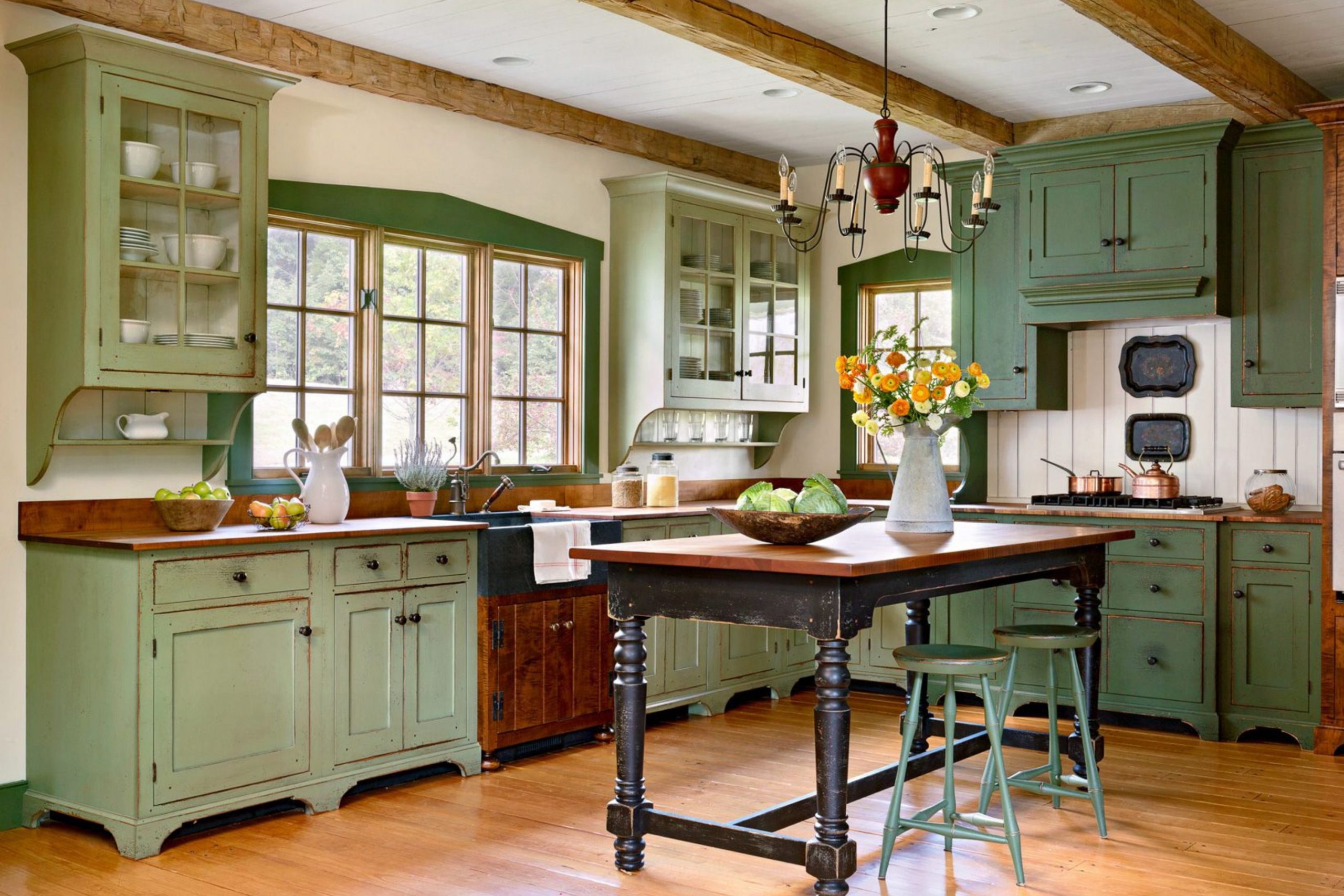
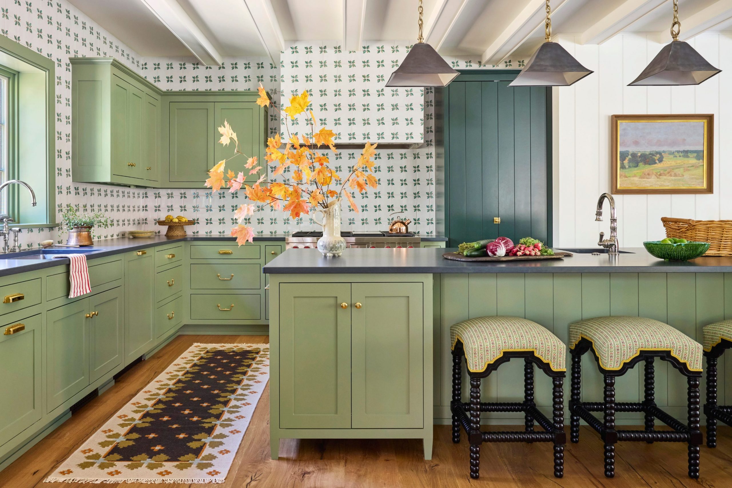
I have spent many years walking through kitchens that felt cold, clinical, and uninviting, only to see how a fresh coat of green paint could change everything in an instant. Green is the ultimate color of life, renewal, and growth; it has a unique ability to make the heart of the home feel grounded and connected to the world outside.
I see so many homeowners get stuck when picking the right shade because they worry it will look too bold, overwhelming, or trend-heavy. My job is to show you that green can be just as easy to live with and just as timeless as any classic neutral.
I want you to feel a genuine sense of pride and inspiration every single morning when you walk into your kitchen to brew your first cup of coffee. These specific colors were hand-picked to make your neighbors jealous of your design sense and to make your family feel instantly at home.
I truly believe every kitchen deserves a distinct personality that reflects the warmth and character of the people living inside it.
Why I Trust Sherwin-Williams and Benjamin Moore for the Best Green Kitchen Cabinet Paint Colors
I always turn to these two legendary brands because their pigments are engineered to stay true and vibrant even when hit by harsh, direct sunlight throughout the day. Sherwin-Williams has a wonderful way of formulating colors that look incredibly expensive and high-end, yet always feel approachable and friendly.
Benjamin Moore offers a sophisticated depth of color that transforms standard cabinets into pieces of fine, high-quality furniture. Having used these paints on hundreds of professional projects, I know the finish will always look smooth, durable, and professional.
In a high-traffic area like a kitchen, you cannot afford a paint that peels, cracks, or shifts in color after a year of heavy use. These companies invest heavily in research to ensure their paint lasts through spills, steam, and the inevitable messy fingers. I trust them implicitly because they make my work look better and, more importantly, they keep my clients happy for a very long time.
How I Choose the Perfect Green Shade for Kitchen Cabinets
I start my selection process by carefully observing how much natural light flows through the windows, particularly during the golden hour of the afternoon. I also pay close attention to the floor material, as a warm wood floor will reflect light that makes green cabinets look much earthier, while a cool stone floor can bring out blue or gray undertones.
I never rely on tiny paper swatches; I always bring large, hand-painted boards into the actual kitchen to see how the color transitions from the bright morning to the shadows of night. I want you to think about the specific mood you want to capture when you are cooking a big Sunday dinner for friends and family.
Dark greens feel very fancy, moody, and expensive, while lighter greens feel happy, airy, and bright. I always check every sample against the countertop material to ensure the two surfaces complement one another rather than fighting for attention. My ultimate goal is to find a perfect balance that makes the room feel larger, more intentional, and more interesting. I never pick a color simply because it is trending on the internet; I pick colors that have the staying power to be loved for a lifetime.
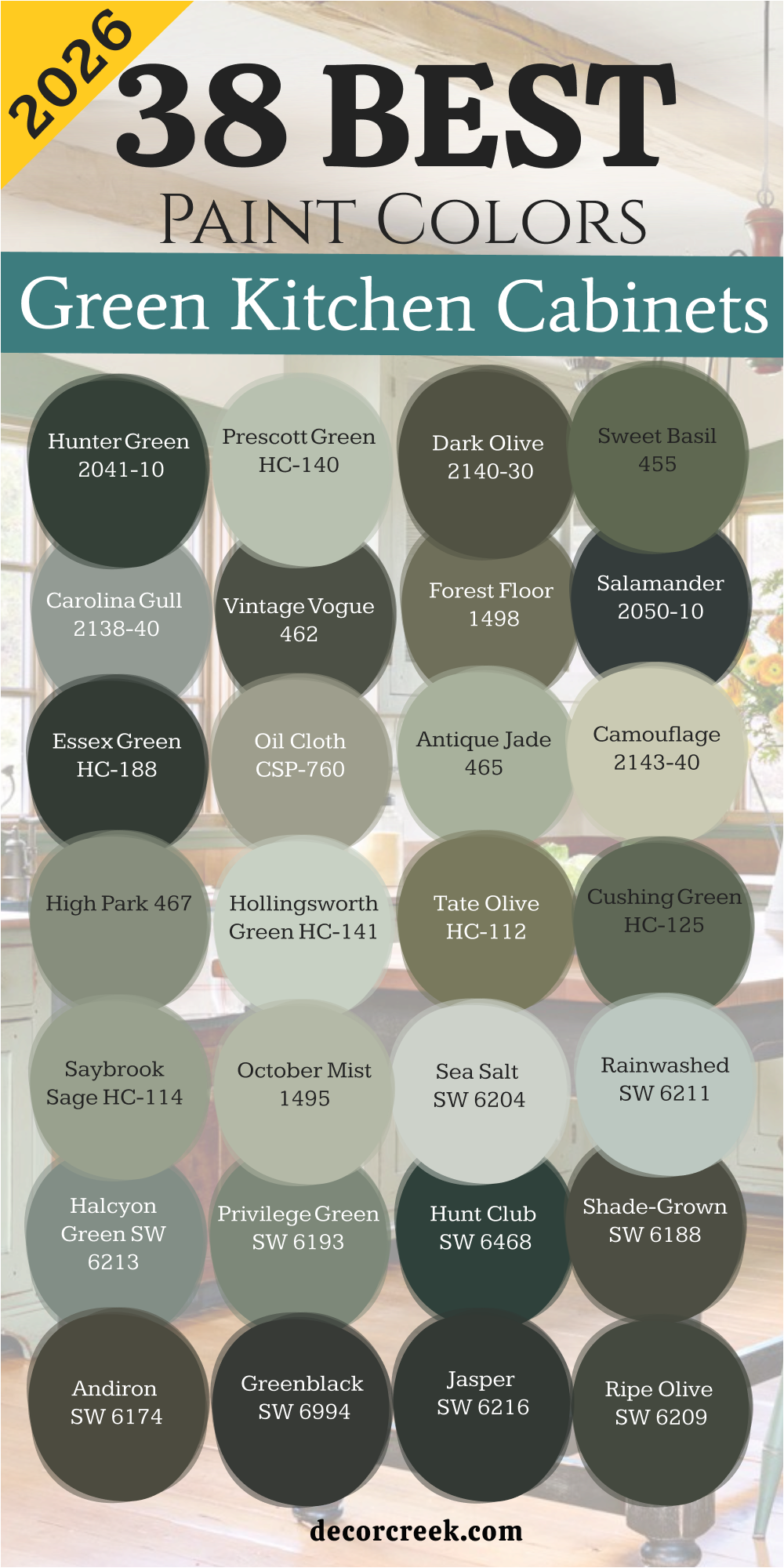
38 Best Green Kitchen Cabinets Paint Colors In 2026
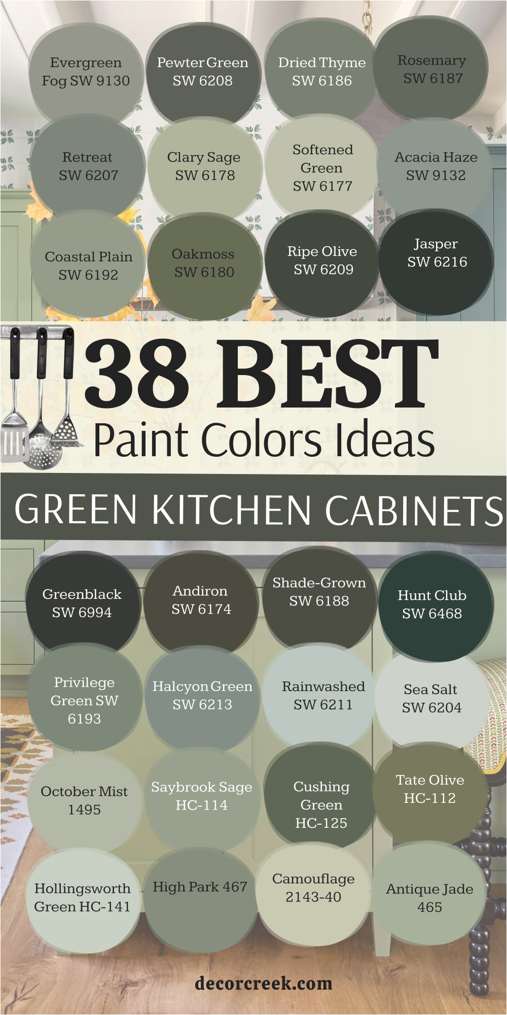
Evergreen Fog SW 9130
Evergreen Fog SW 9130 acts like a bridge between gray and green that fits perfectly in a busy home. This shade brings a sense of organic beauty to your cabinets without being too loud. The paint looks different depending on the time of day which keeps the room interesting. It hides small smudges and fingerprints better than very light colors do.
This tone pairs beautifully with gold hardware for a very rich and high-end look. It works well if you have light oak floors or butcher block countertops. This is the kind of color that makes guests stop and ask for the name of the paint.
It feels like a walk in a misty forest right in your own cooking area. The finish stays looking fresh even as your style changes over the next few years. It provides enough pigment to be noticed while staying soft enough for a small room.
Best used in: kitchens, laundry rooms, mudrooms, and home offices
Pairs well with: Urbane Bronze SW 7048, Neutral Ground SW 7568, Ethereal White SW 6182, light wood tones The key rule of this color for farmhouse style is to use it where you want natural light to feel kind, soft, and inviting throughout the day.

Pewter Green SW 6208
Pewter Green SW 6208 provides a dark and moody backdrop that makes white dishes really pop on open shelves. This selection has enough gray in it to look very mature and sophisticated on lower cabinets. It feels like a cozy hug when you are baking on a cold winter day.
The depth of the pigment works best when you have plenty of overhead lighting to show it off. This color creates a striking contrast when paired with bright white marble or quartz countertops. It looks like a custom designer color that you would see in a fancy magazine. The shade is deep enough to hide the wear and tear of a kitchen with kids and pets.
It brings a sense of history to a new home that might feel too plain. This choice makes brass faucet fixtures look like sparkling jewelry against the dark paint. It is my favorite choice for a kitchen island that needs to stand out as a focal point.
Best used in: kitchen islands, base cabinets, accent walls, and exterior doors
Pairs well with: Shoji White SW 7042, Spare White SW 6203, Woodmere SW 9611, copper accents The key rule of this color for farmhouse style is to use it where you want natural light to feel kind, soft, and inviting throughout the day.

Dried Thyme SW 6186
Dried Thyme SW 6186 offers a mid-tone green that feels very earthy and honest for a traditional kitchen. This hue reminds me of garden herbs and fresh air which is perfect for a cooking area. It has a cool undertone that keeps it from looking too yellow or sickly.
The paint covers wood grain beautifully and gives the cabinets a smooth and solid appearance. It looks amazing with black hardware for a sharp and modern look. This tone is not too dark for a kitchen that does not have many windows. It brings out the warmth in terracotta tiles or brick backsplashes.
The color feels very stable and classic so you will not get tired of it quickly. It is a smart choice for people who want a green that is easy to coordinate with. This selection creates a background that makes your colorful kitchen towels and bowls look great.
Best used in: full cabinetry sets, pantry doors, shutters, and breakfast nooks
Pairs well with: Alabaster SW 6241, Sea Salt SW 6204, Prairie Grass SW 7546, black metal The key rule of this color for farmhouse style is to use it where you want natural light to feel kind, soft, and inviting throughout the day.

Rosemary SW 6187
Rosemary SW 6187 leans into a deep forest tone that feels very lush and expensive on large cabinets. This dark option has a hidden warmth that prevents it from feeling like a cold or harsh green. It makes a kitchen feel like a private getaway where you can relax and focus.
The color looks stunning when it is carried all the way to the ceiling on tall pantry cupboards. It provides a perfect balance to bright stainless steel appliances and sinks. This is a bold choice that shows you have great taste and confidence in your home. It feels very traditional but works surprisingly well in a very modern and sleek kitchen.
The shade gives the room a sense of weight and importance that lighter colors cannot achieve. It pairs well with heavy wood beams and rustic elements found in older homes. This is a color that people remember long after they leave your house.
Best used in: large kitchens, studies, library shelving, and trim work
Pairs well with: Creamy SW 7012, Kayak Green SW 6473, Greige SW 6071, antique gold The key rule of this color for farmhouse style is to use it where you want natural light to feel kind, soft, and inviting throughout the day.

Retreat SW 6207
Retreat SW 6207 uses a heavy dose of blue and gray to create a green that is very easy on the eyes. This moody blue-green feels like a rainy day at a lake house which is very soothing for a busy family. It works well in kitchens that have lots of white tile or white walls to keep things bright.
The shade is a sophisticated choice that looks much more expensive than it actually is. It makes the transitions between rooms feel very smooth if your walls are painted gray. This color brings a cool feeling to a kitchen that gets too much hot afternoon sun. It is a great middle-ground for people who cannot decide between green and blue paint.
The finish looks wonderful with silver or chrome hardware for a very clean look. It helps to make small kitchens feel like they have more character and style. This choice feels very professional and put together for any home designer.
Best used in: cabinets, bathroom vanities, bedroom walls, and built-in benches
Pairs well with: Pure White SW 7005, On the Rocks SW 7671, Smoky Azurite SW 9148, cool marble The key rule of this color for farmhouse style is to use it where you want natural light to feel kind, soft, and inviting throughout the day.

Clary Sage SW 6178
Clary Sage SW 6178 brings a soft and herbal look to your kitchen that feels very light and cheerful. This light green does not feel like a baby nursery or a hospital room. It works perfectly with light colored wood floors and white ceramic sinks. The paint makes a kitchen feel bigger because it reflects a lot of the natural light.
It is a classic choice for a cottage style home where you want things to feel breezy. This tone hides dust very well which is great for people who do not like to clean every day. It pairs nicely with floral patterns or linen curtains in the dining area nearby.
The color feels like spring all year long no matter what the weather looks like outside. It is a safe option that most people will find very pleasing and easy to live with. This selection looks lovely with white quartz countertops that have very faint gray veining.
Best used in: small kitchens, laundry rooms, guest baths, and porch ceilings
Pairs well with: Dover White SW 6385, Sagey SW 6175, Svelte Sage SW 6164, wicker accents The key rule of this color for farmhouse style is to use it where you want natural light to feel kind, soft, and inviting throughout the day.

Softened Green SW 6177
Softened Green SW 6177 offers a very gentle wash of color that feels almost like a neutral gray. This wash is perfect if you want a green kitchen but are afraid of it being too bright. It looks very elegant when used on both the cabinets and the surrounding trim work.
The color creates a very soft look that works well with vintage hardware and glass knobs. It makes the room feel very airy and open which is great for low ceilings. This choice is a great background for a collection of white plates or copper pots. It has just enough color to make the white countertops look very crisp and clean.
The paint feels very high-end and custom without being a color that shouts for attention. it is a reliable choice for a kitchen that is open to the rest of the living area. This shade makes a home feel like a peaceful place to rest after a long day of work.
Best used in: kitchen cabinets, bedroom walls, hallways, and painted furniture
Pairs well with: Snowbound SW 7004, Clary Sage SW 6178, Chatura Gray SW 9169, light oak The key rule of this color for farmhouse style is to use it where you want natural light to feel kind, soft, and inviting throughout the day.

Acacia Haze SW 9132
Acacia Haze SW 9132 is a medium green that has a lot of gray and blue mixed inside it. This trendy color looks very modern but it will still look good ten years from now. It works best in rooms with medium-toned wood floors like walnut or cherry.
The pigment brings a cool and crisp feeling to a kitchen that needs a fresh start. It is a great choice if you want your kitchen to feel unique but still very tasteful. This shade makes the metal in your appliances look very shiny and clean. It is deep enough to provide contrast against white walls without being too dark.
The color feels very sophisticated and is often used by designers for luxury homes. It covers well and gives a very professional look to even older cabinet doors. This selection makes the whole room feel more expensive and well-planned.
Best used in: cabinets, office walls, accent doors, and bathroom vanities
Pairs well with: High Reflective White SW 7757, Origami White SW 7636, Morning Fog SW 6255, slate floors The key rule of this color for farmhouse style is to use it where you want natural light to feel kind, soft, and inviting throughout the day.

Coastal Plain SW 6192
Coastal Plain SW 6192 is a medium green that feels very balanced and steady on a set of cabinets. This paint has a very organic look that reminds me of river stones and mossy banks. It is dark enough to feel like a real color but light enough to not feel heavy.
The tone looks wonderful with warm brass or gold cabinet pulls and drawer slides. It helps to ground a kitchen that has very high ceilings or lots of white walls. This choice feels very natural and works well with indoor plants and wooden bowls. It is a very popular choice for people who want a green that feels very traditional.
The shade does not change its look too much when the lights are turned on at night. it is a great way to add color to your home without it feeling too overwhelming. This selection makes a kitchen feel like a solid and dependable place for the whole family.
Best used in: kitchens, mudrooms, entryways, and exterior shutters
Pairs well with: Greek Villa SW 7551, Eider White SW 7014, Sea Salt SW 6204, dark wood The key rule of this color for farmhouse style is to use it where you want natural light to feel kind, soft, and inviting throughout the day.

Oakmoss SW 6180
Oakmoss SW 6180 is a rich and earthy green that has a lot of yellow and brown in its base. This warm shade feels very cozy which is great for a kitchen where people gather to talk. It looks beautiful in a home that has lots of natural stone and wood elements.
The pigment is a strong color that makes a very big statement in a small or medium kitchen. It makes white countertops look extremely bright and clean by comparison. This choice feels like it belongs in an old farmhouse or a country cottage in the woods. It is very good at hiding the messy parts of cooking like splatters or dust.
The tone gives a kitchen a very established and historic look that feels very comfortable. it pairs nicely with warm metals like copper and antique bronze hardware. This is a color that brings a lot of heart and soul into the center of your home.
Best used in: lower cabinets, islands, front doors, and accent furniture
Pairs well with: White Flour SW 7102, Rice Grain SW 6155, Svelte Sage SW 6164, warm stone The key rule of this color for farmhouse style is to use it where you want natural light to feel kind, soft, and inviting throughout the day.
Ripe Olive SW 6209
Ripe Olive SW 6209 provides a deep and sophisticated look that feels like a forest at twilight. This dark shade has a wonderful balance of gray and green that prevents it from looking too bright. It acts as a perfect anchor for a kitchen with high ceilings and lots of light.
The finish looks incredibly expensive when paired with warm wood accents like oak or walnut. It is a fantastic choice for hiding the daily messes that happen in a busy family kitchen. This color makes gold or brass hardware shine like jewelry against a dark velvet background.
It works well on a kitchen island to create a strong focal point in an open room. The pigment is rich enough to make even simple cabinet doors look like custom furniture. It brings a grounded and stable feeling to the house that everyone will notice. This selection is for anyone who wants a bold look that still feels very natural.
Best used in: kitchen islands, base cabinets, studies, and accent walls
Pairs well with: Shoji White SW 7042, Alabaster SW 7008, Copper Mountain SW 6356, dark wood tones The key rule of this color for farmhouse style is to use it where you want natural light to feel kind, soft, and inviting throughout the day.

Jasper SW 6216
Jasper SW 6216 is a very dark green that often looks like a soft black in low light. This moody selection has deep blue undertones that make it feel very cool and modern. It creates a striking and dramatic look that works beautifully in a kitchen with white marble.
The color is so deep that it provides a sense of mystery and luxury to the room. It looks best when used on cabinets that have clean lines and simple hardware. This shade is perfect for a homeowner who wants to make a big statement with their paint.
It pairs well with light gray floors to keep the kitchen from feeling too heavy. The paint covers exceptionally well and gives a very smooth and professional finish. It makes white dishes and light-colored pottery really stand out on open shelves. This choice is a designer favorite for creating a high-end look without a high price tag.
Best used in: large kitchens, library shelving, front doors, and lower cabinets
Pairs well with: Pure White SW 7005, Accessible Beige SW 7036, Sea Salt SW 6204, silver hardware The key rule of this color for farmhouse style is to use it where you want natural light to feel kind, soft, and inviting throughout the day.

Greenblack SW 6994
Greenblack SW 6994 sits right on the edge of being black but shows a hidden green soul. This near-black tone is much more interesting than a standard black because it feels organic. It looks very sharp and clean when used on kitchen cabinets in a modern farmhouse.
The color provides a beautiful contrast against light wood beams and white walls. It is a very durable choice that keeps its rich look even after years of cleaning. This shade makes copper pots and pans look amazing when they are hanging nearby.
It works well in a kitchen that has plenty of windows to show off the green tint. The paint creates a very solid and sturdy look for your storage areas. It is a great way to add drama to a room while keeping a connection to nature. This selection feels very fancy and will make your kitchen feel like a professional workspace.
Best used in: base cabinets, window trim, exterior accents, and modern kitchens
Pairs well with: Snowbound SW 7004, Iron Ore SW 7069, Carrara marble, warm brass The key rule of this color for farmhouse style is to use it where you want natural light to feel kind, soft, and inviting throughout the day.
Andiron SW 6174
Andiron SW 6174 is a deep olive green that has a lot of brown and gold mixed in. This earthy shade feels very warm and traditional like an old country estate. It looks wonderful with brick backsplashes and stone floors in a rustic kitchen.
The color changes beautifully as the sun moves through the room during the day. It provides a very cozy and comfortable background for cooking and eating with family. This paint makes wood countertops look very rich and brings out their natural grain. It is a great choice if you want a dark green that does not feel cold.
The pigment is very stable and does not look different under different types of light bulbs. It gives a kitchen a sense of history even if the house is brand new. This choice is perfect for creating a kitchen that feels like the heart of the home.
Best used in: cabinets, mudrooms, dens, and furniture pieces
Pairs well with: Creamy SW 7012, Dover White SW 6385, leather accents, antique bronze The key rule of this color for farmhouse style is to use it where you want natural light to feel kind, soft, and inviting throughout the day.
Shade-Grown SW 6188
Shade-Grown SW 6188 is a dark forest green that feels very lush and full of life. This color has a lot of gray in it which keeps it looking very professional and neat. It works well on both upper and lower cabinets to create a very cohesive look.
The shade looks amazing with cream-colored tiles and warm white walls. It provides a very natural feeling that reminds me of deep woods and cool shade. This paint is very forgiving and hides minor scratches and wear very well over time. It makes white quartz countertops look very bright and clean by comparison.
The color feels very high-end and is a great alternative to dark gray or navy. It brings a lot of personality to the kitchen without being too loud or distracting. This selection is a great way to bring a bit of the outdoors inside your home.
Best used in: kitchen cabinetry, pantry doors, exterior shutters, and islands
Pairs well with: Alabaster SW 7008, Pure White SW 7005, Naval SW 6244, light oak floors The key rule of this color for farmhouse style is to use it where you want natural light to feel kind, soft, and inviting throughout the day.

Hunt Club SW 6468
Hunt Club SW 6468 is a classic emerald green that feels very traditional and upscale. This rich color has a slight blue undertone that makes it look very crisp and clean. It is a fantastic choice for a kitchen island that you want to be the star of the room.
The shade looks beautiful with polished nickel or chrome hardware for a very bright look. It brings a sense of energy and life to the kitchen that makes people want to gather. This paint makes white subway tile backsplashes look very classic and timeless.
It is deep enough to feel substantial but bright enough to still look like a true green. The color works well in homes that have a lot of traditional furniture and rugs. It gives a very polished and finished look to any set of kitchen cabinets. This choice is for people who love color and want their kitchen to feel very special.
Best used in: islands, accent cabinets, home offices, and front doors
Pairs well with: Greek Villa SW 7551, Extra White SW 7006, wood butcher block, gold accents The key rule of this color for farmhouse style is to use it where you want natural light to feel kind, soft, and inviting throughout the day.
Privilege Green SW 6193
Privilege Green SW 6193 is a medium green that has a very soft and botanical feel. This shade has a touch of gold in it that makes it feel very warm and welcoming. It works perfectly in a kitchen that has lots of natural light and light wood floors.
The color is very easy on the eyes and creates a very relaxed atmosphere for cooking. It pairs beautifully with white marble and light-colored granite countertops. This paint is a great choice if you want a green that feels fresh and modern. It looks very nice with woven baskets and natural textures in the kitchen.
The shade is light enough to be used in a small kitchen without making it feel cramped. It provides a gentle pop of color that makes the room feel very cheerful and bright. This selection is a wonderful way to update an old kitchen and give it new life.
Best used in: full kitchens, laundry rooms, guest bathrooms, and built-ins
Pairs well with: Pure White SW 7005, Accessible Beige SW 7036, Urbane Bronze SW 7048, light wood The key rule of this color for farmhouse style is to use it where you want natural light to feel kind, soft, and inviting throughout the day.
Halcyon Green SW 6213
Halcyon Green SW 6213 is a beautiful mix of green and blue with a soft gray base. This color feels very coastal and breezy which is great for a bright kitchen. It looks very sophisticated and is a favorite among many interior designers. The shade changes its look depending on the light which makes the room feel dynamic.
It works well with white quartz countertops and silver or gold hardware. This paint makes the kitchen feel very airy and open even if the room is small. It has a very calming quality that makes the kitchen a great place to start your day. The color provides a unique look that stands out from more common grays and whites.
It is very versatile and works with many different styles of decor and furniture. This choice is perfect for anyone who wants a kitchen that feels like a peaceful retreat.
Best used in: cabinets, bathroom vanities, bedroom walls, and cottage kitchens
Pairs well with: Alabaster SW 7008, Dover White SW 6385, Agreeable Gray SW 7029, cool marble The key rule of this color for farmhouse style is to use it where you want natural light to feel kind, soft, and inviting throughout the day.
Rainwashed SW 6211
Rainwashed SW 6211 is a very light and airy green that has a lot of blue and gray mixed in. This shade feels like a fresh spring morning and makes any kitchen look very bright. It is a great choice for cabinets if you want a look that is very light and cheerful.
The color works beautifully with white tile and light wood accents like maple. It makes the room feel much larger because it reflects so much of the natural light. This paint is very easy to live with and does not feel too bold or overwhelming. It looks very nice with polished chrome or brushed nickel hardware for a clean look.
The shade is a classic choice for a cottage or farmhouse style kitchen. It provides a soft wash of color that feels very clean and updated. This selection is perfect for creating a kitchen that feels very open and inviting.
Best used in: small kitchens, ceilings, laundry rooms, and nursery walls
Pairs well with: Alabaster SW 7008, Pure White SW 7005, Naval SW 6244, light granite The key rule of this color for farmhouse style is to use it where you want natural light to feel kind, soft, and inviting throughout the day.

Sea Salt SW 6204
Sea Salt SW 6204 is a legendary color that perfectly balances green, gray, and a hint of blue. This shade is one of the most popular choices because it looks good in almost any light. It brings a very soft and coastal feeling to the kitchen cabinets that is very soothing.
The color works well with both warm wood and cool metal finishes. It is a very safe choice that most homeowners find very easy to coordinate with. This paint makes the kitchen feel very fresh and updated without being too trendy. It looks great with white countertops and helps them to look even brighter.
The shade is very versatile and can work in a modern or a traditional setting. It provides just enough color to be noticed while staying very soft and neutral. This selection is a great way to add a bit of personality to your home in a very tasteful way.
Best used in: cabinets, walls, bathrooms, and laundry rooms
Pairs well with: Alabaster SW 7008, Shoji White SW 7042, Pure White SW 7005, warm wood The key rule of this color for farmhouse style is to use it where you want natural light to feel kind, soft, and inviting throughout the day.

October Mist 1495
October Mist 1495 serves as a gentle silver-green that acts like a neutral in a busy family kitchen. This shade provides a soft and leafy backdrop that makes everyone feel relaxed during meal times. It works beautifully because it does not try to compete with other colors in the room.
The paint looks wonderful with natural wood floors and large windows that let in the sun. It has enough gray in its base to stay looking very professional on large sets of cabinets. This color makes white porcelain sinks and light countertops look very fresh and clean.
It is a very popular choice for people who want a modern look that still feels connected to nature. The finish is smooth and hides the small bumps and scratches that happen in a real home. It creates a very airy feeling that helps a small kitchen feel much bigger and brighter. This selection is a smart way to add a bit of personality without making a huge or risky statement.
Best used in: full cabinetry, kitchen walls, mudrooms, and bedroom furniture
Pairs well with: Steam AF-15, Gloucester Sage HC-100, Collector’s Item AF-45, light oak The key rule of this color for farmhouse style is to use it where you want natural light to feel kind, soft, and inviting throughout the day.

Saybrook Sage HC-114
Saybrook Sage HC-114 is a classic mid-tone green that has been a favorite for many years. This color offers a very traditional look that reminds me of old garden paths and stone cottages. It looks fantastic when paired with dark bronze hardware or black iron handles.
The shade has a perfect amount of pigment to stand out against white walls without being too dark. It works well with butcher block countertops and warm wood accents found in a farmhouse. This paint is very reliable because it stays looking the same in both the morning and the evening.
It provides a very grounded feeling that makes the kitchen feel like the strongest room in the house. The tone is very easy to live with and does not feel like a trend that will go away soon. It covers wood grain very well and gives the cabinets a high-quality finished look. This choice is perfect for someone who wants a kitchen that feels stable and very welcoming.
Best used in: kitchen cabinets, exterior siding, front doors, and laundry rooms
Pairs well with: Chantilly Lace OC-65, Revere Pewter HC-172, White Dove OC-17, terracotta tiles The key rule of this color for farmhouse style is to use it where you want natural light to feel kind, soft, and inviting throughout the day.

Cushing Green HC-125
Cushing Green HC-125 provides a rich and deep herbal tone that feels very historic and important. This shade has a lot of depth that makes a kitchen feel very expensive and custom-built. It looks amazing on lower cabinets when the upper walls are a crisp and clean white.
The color brings a lot of heart to the home and makes the kitchen feel very cozy at night. It pairs beautifully with warm metals like polished brass and antique copper fixtures. This paint is strong enough to hide the messy fingerprints that come with having a busy family.
It works well in a room with lots of natural light to show off its true green character. The pigment is very dense and creates a very solid look for heavy pantry doors. It gives the room a sense of character that makes people want to sit and stay for a long time. This selection is a great choice for creating a sophisticated and very traditional cooking space.
Best used in: lower cabinets, islands, library shelves, and home offices
Pairs well with: Cloud White OC-130, Simply White OC-117, Woodmont Cream 204, dark walnut The key rule of this color for farmhouse style is to use it where you want natural light to feel kind, soft, and inviting throughout the day.
Tate Olive HC-112
Tate Olive HC-112 is a warm and earthy green that has a heavy dose of yellow and brown inside. This color feels very organic and reminds me of the woods during a late autumn afternoon. It looks wonderful in a kitchen with rustic beams and natural stone backsplashes.
The shade brings a very cozy and lived-in feeling to even a brand new house. It works perfectly with off-white countertops and warm wood furniture in the dining area. This paint is very good at making a large kitchen feel more intimate and friendly for guests.
It has a very traditional soul that fits well in a farmhouse or a cottage style home. The tone is very rich and provides a great contrast against bright white trim and ceilings. It stays looking warm and inviting even on cloudy days when there is not much sun. This choice is for people who love the colors of the earth and want a very grounded kitchen.
Best used in: cabinets, mudrooms, exterior trim, and cozy dens
Pairs well with: Swiss Coffee OC-45, Edgecomb Gray HC-173, Manchester Tan HC-81, brick accents The key rule of this color for farmhouse style is to use it where you want natural light to feel kind, soft, and inviting throughout the day.
Hollingsworth Green HC-141
Hollingsworth Green HC-141 is a light and misty green that feels very soft and watery. This shade has a lot of gray and blue which keeps it from looking too bright or like a neon color. It works perfectly for upper cabinets to keep the kitchen feeling light and very open.
The color looks beautiful with white marble or light gray quartz countertops and silver hardware. This paint makes the whole room feel very fresh and updated like a spring morning. It is a very safe choice for someone who is painting their cabinets for the very first time.
The shade reflects a lot of light and helps to brighten up a kitchen that does not have many windows. It provides a very gentle pop of color that is very pleasing to the eye for a long time. This selection makes the kitchen feel like a peaceful place to enjoy a quiet breakfast.
Best used in: full kitchens, bathroom vanities, laundry rooms, and bedroom walls
Pairs well with: White Heron OC-57, Gray Owl OC-52, Stonington Gray HC-170, polished chrome The key rule of this color for farmhouse style is to use it where you want natural light to feel kind, soft, and inviting throughout the day.
High Park 467
High Park 467 offers a medium green tone that feels very balanced and sophisticated for any home. This color has a dusty quality that makes it look very high-end and designer-made. It looks fantastic on a kitchen island when the rest of the cabinets are a soft white.
The shade brings enough color to be interesting without taking over the whole room. It pairs very well with medium-toned wood floors and brass cabinet pulls. This paint covers beautifully and gives a very smooth and professional look to the doors.
It is a great choice for a kitchen that is open to the living room because it is so easy to look at. The tone is very stable and does not look too different when the kitchen lights are on at night. It gives the room a sense of style and shows that you have great taste in home design. This choice is perfect for a modern farmhouse look that feels very fresh and current.
Best used in: kitchen islands, base cabinets, entryways, and accent furniture
Pairs well with: Chantilly Lace OC-65, Sea Pearl OC-19, Pale Oak OC-20, black hardware The key rule of this color for farmhouse style is to use it where you want natural light to feel kind, soft, and inviting throughout the day.
Camouflage 2143-40
Camouflage 2143-40 is a very light green that leans heavily into a warm and sandy gray. This color is a master of disguise and looks like a neutral until you see it next to true gray. It works perfectly in a kitchen where you want a very soft and understated look.
The shade looks beautiful with off-white tiles and warm wood cutting boards on the counter. This paint makes the kitchen feel very calm and quiet which is great for a busy house. It is a fantastic choice for people who are afraid of using a green that is too bold or bright.
The tone hides dust and dirt very well so your kitchen always looks clean and tidy. It provides a very soft background that makes your colorful fruit bowls and flowers stand out. This selection is a very elegant way to add a hint of color to a very traditional home.
Best used in: kitchen cabinets, walls, hallways, and exterior siding
Pairs well with: White Dove OC-17, Woodmont Cream 204, Mascarpone AF-20, natural textures The key rule of this color for farmhouse style is to use it where you want natural light to feel kind, soft, and inviting throughout the day.
Antique Jade 465
Antique Jade 465 is a soft and mid-tone green that feels very botanical and very fresh. This color reminds me of eucalyptus leaves and garden plants which is great for a kitchen. It looks wonderful with white quartz countertops and light gray tile floors.
The shade brings a very happy and cheerful feeling to the room every single day. It works well with silver or gold hardware depending on how warm you want the room to feel. This paint is light enough to be used on all the cabinets without making the room feel small.
It provides a very clean and updated look that guests will surely notice and love. The tone is very versatile and works with many different styles of kitchen furniture and decor. It gives the kitchen a very unique personality that feels very personal and well-planned. This choice is a great way to make your kitchen feel like a bright and sunny garden room.
Best used in: full cabinetry, bathroom vanities, guest rooms, and porch furniture
Pairs well with: Simply White OC-117, Moonshine 2140-60, Gray Cloud 2126-60, light wood The key rule of this color for farmhouse style is to use it where you want natural light to feel kind, soft, and inviting throughout the day.

Oil Cloth CSP-760
Oil Cloth CSP-760 is a complex and moody green that has a lot of gray and tan mixed in. This color feels very vintage and sophisticated like an old library or a country house. It looks amazing on kitchen cabinets that have a lot of detail and traditional molding.
The shade changes its look beautifully as the light in the kitchen shifts during the day. It pairs very well with dark wood floors and antique brass hardware for a rich look. This paint provides a very grounded and stable feeling to the center of your home. It is a great choice for people who want a color that feels very custom and hard to find.
The tone is very rich and gives the cabinets a very solid and heavy appearance. It creates a very warm and inviting atmosphere that is perfect for hosting dinner parties. This selection is a very stylish way to make your kitchen feel very special and high-end.
Best used in: kitchen cabinets, islands, mudrooms, and accent walls
Pairs well with: Cloud White OC-130, Revere Pewter HC-172, Chelsea Gray HC-168, warm stone The key rule of this color for farmhouse style is to use it where you want natural light to feel kind, soft, and inviting throughout the day.
Essex Green HC-188
Essex Green HC-188 is a very dark and near-black green that feels extremely elegant and rich. This color provides a very dramatic look that makes a big statement in any kitchen. It looks best when paired with bright white countertops and plenty of good lighting.
The shade has a very classic feel that reminds me of traditional English estates and gardens. It works perfectly on a kitchen island to create a very strong and beautiful focal point. This paint is very durable and hides the wear and tear of a busy kitchen very well.
It makes brass or gold hardware look like sparkling jewelry against a very dark background. The tone gives the kitchen a sense of history and importance that lighter colors cannot do. It provides a very cozy and warm feeling when the sun goes down and the lights are low. This choice is for the homeowner who wants a kitchen that looks very expensive and very bold.
Best used in: base cabinets, islands, front doors, and exterior trim
Pairs well with: Chantilly Lace OC-65, White Down OC-131, Revere Pewter HC-172, polished brass The key rule of this color for farmhouse style is to use it where you want natural light to feel kind, soft, and inviting throughout the day.

Salamander 2050-10
Salamander 2050-10 is a deep and mysterious shade that sits right between a dark forest green and a navy blue. This selection brings a heavy dose of drama to your cabinets and makes white countertops look incredibly bright. It feels like a very expensive choice that you would find in a high-end designer home.
The color is so dark that it acts as a neutral while still showing a beautiful green soul in the light. It works perfectly for a kitchen island that needs to be the star of the whole room. This paint provides a very solid and sturdy look that hides any messy fingerprints from the kids.
It looks stunning when paired with warm gold or copper hardware for a very rich finish. The tone gives the kitchen a sense of weight and importance that makes the house feel very stable. It is a fantastic option for a modern farmhouse that needs a touch of bold and moody character. This choice is for people who are not afraid to make a big statement with their interior design.
Best used in: kitchen islands, base cabinets, front doors, and accent furniture
Pairs well with: Cloud White OC-130, Gray Owl OC-52, Simply White OC-117, warm brass The key rule of this color for farmhouse style is to use it where you want natural light to feel kind, soft, and inviting throughout the day.

Forest Floor 1498
Forest Floor 1498 offers a mid-to-dark green that has a lot of gray and brown mixed in for a very earthy look. This paint reminds me of a walk in the deep woods and brings that natural feeling right into your home. It looks wonderful with brick floors and natural stone countertops in a traditional kitchen.
The shade is very stable and does not look too bright even when the afternoon sun hits it. It provides a very cozy and warm background that makes your family feel right at home. This color works well with wood beams and rustic elements found in a classic farmhouse style.
The pigment is very rich and gives the cabinets a very custom and high-quality appearance. It is a smart choice for people who want a dark green that still feels very warm and friendly. The finish is very forgiving and stays looking fresh even in a very busy and messy kitchen. This selection makes your home feel like a peaceful place to rest and cook for the people you love.
Best used in: kitchen cabinets, mudrooms, exterior trim, and cozy dens
Pairs well with: Swiss Coffee OC-45, Revere Pewter HC-172, Manchester Tan HC-81, natural wood The key rule of this color for farmhouse style is to use it where you want natural light to feel kind, soft, and inviting throughout the day.
Vintage Vogue 462
Vintage Vogue 462 is a sophisticated and dark green that feels very fashion-forward and trendy. This shade has a dusty quality that makes it look like it has a long history in your home. It works perfectly on a set of tall cabinets to give the kitchen a very polished and finished look.
The color brings a lot of personality to the room without being too loud or hard to look at. It pairs beautifully with light-colored marble or quartz that has thin gray veining. This paint makes your kitchen look like a professional studio where great meals are created every day.
It provides a very nice contrast against light wood floors and white walls. The tone is very deep but stays looking like a true green rather than turning into black. It gives the room a sense of style that shows you pay attention to the little details. This choice is a favorite for designers who want a kitchen to feel both classic and very modern at the same time.
Best used in: full cabinetry, islands, office shelving, and accent walls
Pairs well with: Chantilly Lace OC-65, Pale Oak OC-20, Stonington Gray HC-170, gold accents The key rule of this color for farmhouse style is to use it where you want natural light to feel kind, soft, and inviting throughout the day.

Carolina Gull 2138-40
Carolina Gull 2138-40 is a medium gray-green that feels very soft and easy to live with for many years. This color acts as a beautiful bridge between a standard gray and a more colorful green. It looks very elegant on cabinets in a small kitchen because it does not make the room feel dark.
The shade changes its look slightly as the light moves through the windows which is very interesting. It works well with silver or chrome hardware for a very clean and updated appearance. This paint is a very safe choice for someone who wants to try color but still likes a neutral look.
It provides a very calm and steady feeling to the kitchen during the busy morning rush. The tone is very popular because it coordinates so easily with many different floor and counter types. It hides dust very well which makes it a very practical choice for a real family home. This selection is a wonderful way to add a bit of style to your kitchen in a very quiet way.
Best used in: kitchen cabinets, bathroom vanities, laundry rooms, and bedroom walls
Pairs well with: White Dove OC-17, Edgecomb Gray HC-173, Simply White OC-117, polished chrome The key rule of this color for farmhouse style is to use it where you want natural light to feel kind, soft, and inviting throughout the day.
Sweet Basil 455
Sweet Basil 455 is a rich and herbal green that feels very traditional and full of life. This color has a lot of energy and makes the kitchen feel like a very happy place to be. It looks fantastic with warm wood accents and white ceramic farmhouse sinks. The shade has a very classic look that reminds me of herb gardens and country life.
It works beautifully on both the upper and lower cabinets to create a very cohesive and pretty look. This paint makes the room feel very cozy and inviting for friends who come over for dinner. It is a strong green that stays true to its color no matter what the lighting looks like.
The pigment provides a very high-end finish that makes older cabinets look brand new again. It brings a lot of heart into the center of the home and makes the kitchen feel very special. This choice is perfect for a homeowner who wants a kitchen that feels very classic and very green.
Best used in: kitchen cabinetry, pantry doors, exterior shutters, and furniture
Pairs well with: Cloud White OC-130, Mascarpone AF-20, Revere Pewter HC-172, copper pots The key rule of this color for farmhouse style is to use it where you want natural light to feel kind, soft, and inviting throughout the day.
Dark Olive 2140-30
Dark Olive 2140-30 provides a deep and earthy tone that is very grounding for a large kitchen. This selection has a lot of yellow and brown in its base which keeps it feeling very warm and cozy. It looks amazing with natural stone backsplashes and dark wood floors in a rustic setting.
The color is deep enough to provide a lot of contrast against white walls and light ceilings. It makes the kitchen feel like a very stable and solid part of the house. This paint is very good at hiding the daily wear and tear from cooking and cleaning. It works well with antique brass or bronze hardware to create a very historic look.
The shade is very sophisticated and gives the cabinets a very custom and expensive feel. It stays looking warm and inviting even when the weather outside is cold and grey. This choice is for people who want a kitchen that feels very traditional and very comfortable.
Best used in: base cabinets, islands, mudrooms, and library shelves
Pairs well with: Swiss Coffee OC-45, Navajo White OC-95, Woodmont Cream 204, iron hardware The key rule of this color for farmhouse style is to use it where you want natural light to feel kind, soft, and inviting throughout the day.
Prescott Green HC-140
Prescott Green HC-140 is a light and airy sage that has a very soft and herbal personality. This color brings a fresh and happy feeling to the kitchen that makes it look like spring all year. It works perfectly in a kitchen with lots of white tile and light-colored wood accents.
The shade is very easy on the eyes and helps the room to feel much larger than it really is. It reflects a lot of natural light which makes the kitchen a very bright place to work. This paint is a classic choice for a cottage style home where you want things to feel breezy.
It looks very nice with glass cabinet knobs or silver pulls for a very light look. The tone provides a gentle wash of color that is very pleasing and easy to decorate around. It gives the kitchen a very clean and updated look that feels very fresh and new. This selection is a great way to make your kitchen feel like a very bright and inviting room.
Best used in: full kitchens, laundry rooms, bathrooms, and bedroom furniture
Pairs well with: White Heron OC-57, Gray Owl OC-52, Simply White OC-117, light oak The key rule of this color for farmhouse style is to use it where you want natural light to feel kind, soft, and inviting throughout the day.
Hunter Green 2041-10
Hunter Green 2041-10 is a very deep and traditional forest green that feels extremely classic. This color provides a very rich and formal look that makes the kitchen feel very important. It looks best when used with bright white trim and countertops to keep the room from feeling too dark.
The shade has a very historic feel that reminds me of grand estates and old libraries. It works perfectly on a kitchen island to create a very strong and beautiful focal point in the room. This paint is very durable and stays looking great even in a kitchen that gets a lot of use.
It makes gold or brass hardware look like jewelry against the very dark and moody background. The tone gives the room a sense of history and permanence that lighter colors cannot achieve. It provides a very cozy and warm feeling at night when the kitchen lights are turned down low. This choice is for a homeowner who wants a kitchen that looks very expensive and very traditional.
Best used in: base cabinets, islands, front doors, and exterior trim
Pairs well with: Chantilly Lace OC-65, Revere Pewter HC-172, Simply White OC-117, polished brass The key rule of this color for farmhouse style is to use it where you want natural light to feel kind, soft, and inviting throughout the day.

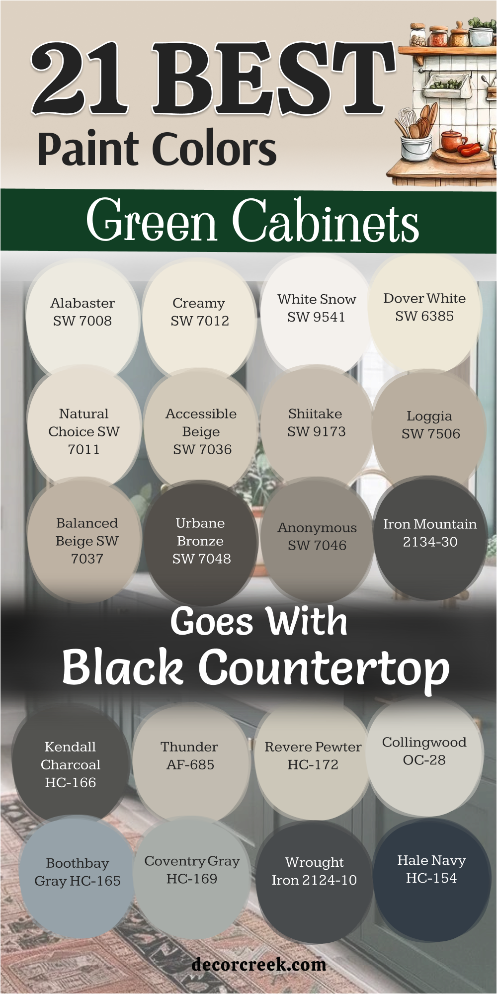
21 Best Paint Colors For The Green Cabinets That Goes With Black Countertop
Alabaster SW 7008
Alabaster SW 7008 is a creamy and warm white that makes a perfect companion for dark green cabinets. This color softens the look of the room when you have heavy black countertops and deep green paint. It works well because it is not too bright or stark like a pure white would be.
The paint brings a sense of light to the upper walls while the dark colors stay on the bottom. It helps to balance the room so it does not feel too top-heavy or dark overall. This shade is a very popular choice for farmhouse kitchens because it feels very inviting.
It looks great with natural wood accents and black hardware that matches the counters. The tone is very forgiving and stays looking clean even in a busy kitchen with lots of activity. it provides a very soft background that makes the green cabinets really stand out and look their best. This selection is a smart way to make a dark and moody kitchen feel more comfortable.
Best used in: upper cabinets, walls, trim, and ceilings
Pairs well with: Pewter Green SW 6208, Iron Ore SW 7069, Urbane Bronze SW 7048, black granite The key rule of this color for farmhouse style is to use it where you want natural light to feel kind, soft, and inviting throughout the day.

Creamy SW 7012
Creamy SW 7012 is a rich and warm off-white that feels very soft against black stone countertops. This color has a lot of yellow in its base which makes it feel very cozy and traditional. It works perfectly in a kitchen with dark green cabinets to keep the room from feeling too cold.
The shade reflects light in a very kind and gentle way that makes the kitchen glow. It looks wonderful on the walls or the upper cabinets to provide a nice contrast to the dark island. This paint is a great choice if you want a kitchen that feels very established and very comfortable.
It pairs beautifully with warm metals like copper and antique brass hardware on the cabinets. The tone helps to bridge the gap between the dark black counters and the colorful green paint. It gives the room a very finished and professional look that is very easy to live with. This selection is perfect for creating a kitchen that feels like a very warm and inviting heart of the home.
Best used in: walls, trim, upper cabinets, and pantry doors
Pairs well with: Rosemary SW 6187, Andiron SW 6174, Black Magic SW 6991, warm wood The key rule of this color for farmhouse style is to use it where you want natural light to feel kind, soft, and inviting throughout the day.

White Snow SW 9541
White Snow SW 9541 is a bright and clean white that provides a sharp contrast against dark green cabinets and black countertops. This color has just enough body to keep it from feeling too thin or blue in the light. It works well on the walls to make a kitchen with dark finishes feel much more open and balanced.
The shade makes the black stone look very crisp and helps the green paint show its true personality. It is a fantastic choice for a modern farmhouse that needs a very fresh and updated look. This paint reflects a lot of sunlight which is helpful if your kitchen does not have many windows.
It looks very nice with polished chrome or black hardware for a very sleek appearance. The tone is very easy to coordinate with because it does not have any strong or hidden undertones. It gives the kitchen a very professional and polished finish that guests will notice right away. This selection is a great way to make a moody kitchen feel very clean and very bright.
Best used in: walls, ceilings, trim, and upper cabinets
Pairs well with: Jasper SW 6216, Tricorn Black SW 6258, Silver Strand SW 7057, marble accents The key rule of this color for farmhouse style is to use it where you want natural light to feel kind, soft, and inviting throughout the day.

Dover White SW 6385
Dover White SW 6385 is a very popular and creamy white that has been a favorite for many years. This color offers a warm and welcoming feel that balances the heavy look of black countertops perfectly. It works beautifully with mid-tone greens like sage or olive to create a very traditional kitchen.
The shade has a soft yellow base that keeps the room from feeling too cold or clinical. It looks wonderful on the trim and the ceiling to tie the whole kitchen together. This paint is very reliable and stays looking warm and cozy even on dark or rainy days. It provides a very grounded feeling that makes the kitchen feel like a solid and happy place.
The tone is very easy to live with and does not feel like a trend that will go out of style. It covers very well and gives the upper walls a very high-quality and smooth appearance. This choice is perfect for someone who wants a kitchen that feels very stable and very inviting.
Best used in: trim, cabinets, walls, and exterior siding
Pairs well with: Clary Sage SW 6178, Black Fox SW 7020, Urbane Bronze SW 7048, warm oak The key rule of this color for farmhouse style is to use it where you want natural light to feel kind, soft, and inviting throughout the day.
Natural Choice SW 7011
Natural Choice SW 7011 is a soft and sandy white that feels very organic next to green and black. This color has a bit of beige in it which makes it a great neutral for a busy kitchen. It works perfectly with earthy green cabinets to create a very grounded and natural look.
The shade is not as bright as a pure white which makes it very easy on the eyes. It looks beautiful on the walls to provide a soft background for your black stone countertops. This paint is a great choice if you want a kitchen that feels very calm and very steady.
It pairs nicely with natural textures like woven baskets and wooden cutting boards. The tone helps to make the dark green cabinets feel like a natural part of the room. It gives the kitchen a very finished and sophisticated look that feels very custom. This selection is a wonderful way to add a bit of warmth to a very modern or dark kitchen.
Best used in: walls, trim, bedroom walls, and entryways
Pairs well with: Evergreen Fog SW 9130, Iron Ore SW 7069, Anonymous SW 7046, stone tiles The key rule of this color for farmhouse style is to use it where you want natural light to feel kind, soft, and inviting throughout the day.

Accessible Beige SW 7036
Accessible Beige SW 7036 is a legendary neutral that perfectly balances gray and beige tones. This color works surprisingly well with green cabinets because it does not have any hidden pink or yellow. It provides a very steady and professional look that makes black countertops feel very upscale.
The shade is deep enough to have its own personality without taking away from the green paint. It looks wonderful in an open-concept kitchen where the colors need to flow into the living room. This paint is very popular because it looks good in almost any kind of lighting during the day.
It helps to ground the kitchen and makes the upper half of the room feel very solid. The tone is very versatile and works with both modern and very traditional furniture. It hides small smudges and dust very well which is great for a kitchen with kids. This selection is a safe and stylish way to coordinate a kitchen with bold colors and dark counters.
Best used in: main walls, open floor plans, hallways, and kitchen trim
Pairs well with: Retreat SW 6207, Black Magic SW 6991, Urbane Bronze SW 7048, light wood The key rule of this color for farmhouse style is to use it where you want natural light to feel kind, soft, and inviting throughout the day.

Shiitake SW 9173
Shiitake SW 9173 is a medium-toned beige that feels very rich and earthy like a forest floor. This color provides a lot of warmth and depth to a kitchen with dark green cabinets and black stone. It works well in large rooms where a simple white might feel too cold or empty.
The shade has a very natural look that reminds me of stones and dried wood. It looks beautiful on the walls to create a cozy and intimate feeling in the cooking area. This paint is a great choice for a farmhouse kitchen that needs to feel very lived-in and comfortable.
It pairs perfectly with black hardware and dark wood accents found on an island. The tone is very sophisticated and makes the whole room feel more expensive and well-planned. It stays looking warm and inviting even at night when the overhead lights are turned down low. This choice is for the homeowner who wants a kitchen that feels very cozy and very traditional.
Best used in: kitchen walls, dining rooms, accent walls, and mudrooms
Pairs well with: Rosemary SW 6187, Tricorn Black SW 6258, Shoji White SW 7042, copper accents The key rule of this color for farmhouse style is to use it where you want natural light to feel kind, soft, and inviting throughout the day.

Loggia SW 7506
Loggia SW 7506 is a warm and taupe-like neutral that brings a lot of class to a kitchen. This color has a gray base that keeps it looking very modern even though it is quite warm. It works beautifully with deep forest green cabinets and black granite countertops.
The shade provides a very solid background that makes the other colors in the room feel anchored. It looks wonderful in a kitchen with high ceilings to help the room feel more comfortable. This paint is a favorite for designers who want a look that is both neutral and very interesting.
It pairs well with silver or black hardware to create a very sharp and clean look. The tone helps to bridge the gap between the dark floor and the lighter ceiling. It gives the kitchen a very polished and professional finish that will stay stylish for a long time. This selection is perfect for creating a kitchen that feels very established and very high-end.
Best used in: main kitchen walls, living areas, hallways, and trim
Pairs well with: Ripe Olive SW 6209, Black Fox SW 7020, Alabaster SW 7008, natural stone The key rule of this color for farmhouse style is to use it where you want natural light to feel kind, soft, and inviting throughout the day.

Balanced Beige SW 7037
Balanced Beige SW 7037 is a true mid-tone beige that does not lean too far into any other color. This shade provides a very steady and reliable background for dark green cabinets and black counters. It works well because it has enough pigment to be noticed against white trim and ceilings.
The color brings a lot of warmth to the room without making it feel small or dark. It looks beautiful on the walls to provide a soft and earthy feel for the whole family. This paint is a great choice for people who want a color that feels very traditional and very stable.
It pairs nicely with warm wood floors and black metal accents throughout the kitchen. The tone is very easy to live with and stays looking the same throughout the entire day. It provides a very comfortable and inviting atmosphere that is perfect for hosting guests. This selection is a smart way to add a bit of color to your walls in a very tasteful way.
Best used in: kitchen walls, laundry rooms, entryways, and breakfast nooks
Pairs well with: Dried Thyme SW 6186, Iron Ore SW 7069, Pure White SW 7005, leather decor The key rule of this color for farmhouse style is to use it where you want natural light to feel kind, soft, and inviting throughout the day.

Urbane Bronze SW 7048
Urbane Bronze SW 7048 is a deep and moody color that sits right between dark gray and dark brown. This shade provides a very dramatic and upscale look when used near green cabinets and black stone. It works perfectly on a kitchen island or a pantry door to create a strong focal point.
The color has a very organic feel that reminds me of deep woods and natural metal. It looks wonderful with gold or brass hardware to add a touch of sparkle to the dark paint. This paint is very popular for modern homes that want a look that feels very custom.
It helps to ground the kitchen and gives it a sense of importance and weight. The tone is very sophisticated and is often used by designers for luxury interior projects. It stays looking rich and deep even in a room with a lot of bright natural light. This choice is for the homeowner who wants a kitchen that looks very expensive and very bold.
Best used in: islands, accent walls, trim, and exterior doors
Pairs well with: Evergreen Fog SW 9130, Shoji White SW 7042, Modern Gray SW 7632, warm wood The key rule of this color for farmhouse style is to use it where you want natural light to feel kind, soft, and inviting throughout the day.

Anonymous SW 7046
Anonymous SW 7046 is a medium-dark gray with a hint of green and brown hidden inside. This color works beautifully with sage or olive green cabinets because they share the same earthy soul. It provides a very steady and professional background for black countertops and white trim.
The shade is deep enough to hide minor messes while still looking very clean and sharp. It looks wonderful on the walls of a kitchen that has plenty of windows and light. This paint is a great choice for a modern farmhouse that wants a look that is very unique.
It pairs well with black hardware and light wood floors to keep the room feeling balanced. The tone is very sophisticated and makes the kitchen feel like a well-planned designer space. It provides a very calm and quiet atmosphere that is perfect for a busy home. This selection is a stylish way to add a bit of drama to your walls in a very tasteful way.
Best used in: kitchen walls, islands, mudrooms, and accent areas
Pairs well with: Clary Sage SW 6178, Tricorn Black SW 6258, Snowbound SW 7004, stone accents The key rule of this color for farmhouse style is to use it where you want natural light to feel kind, soft, and inviting throughout the day.

Iron Mountain 2134-30
Iron Mountain 2134-30 is a soft and deep gray that feels as solid and stable as its name suggests. This color provides a very dramatic look when paired with dark green cabinets and black stone counters. It works perfectly in a large kitchen to create a sense of intimacy and cozy warmth.
The shade has a very refined look that feels much more expensive than a basic gray paint. It looks beautiful on a kitchen island to anchor the room and provide a strong center. This paint is a favorite for high-end homes because of its deep and complex personality.
It pairs wonderfully with bright white trim to keep the room from feeling too heavy or dark. The tone is very sophisticated and makes all of your kitchen appliances look very modern. It stays looking rich and professional even after years of daily use in a busy house. This choice is perfect for anyone who wants a kitchen that feels very grounded and very high-end.
Best used in: islands, base cabinets, accent walls, and library shelves
Pairs well with: High Park 467, Chantilly Lace OC-65, Revere Pewter HC-172, silver hardware The key rule of this color for farmhouse style is to use it where you want natural light to feel kind, soft, and inviting throughout the day.

Kendall Charcoal HC-166
Kendall Charcoal HC-166 provides a rich and deep gray that looks extremely high-end next to green cabinetry. This color has a natural depth that makes black countertops feel like a deliberate part of a dark and moody design. It works well on a kitchen island to create a solid anchor in the middle of a large room.
The shade is very versatile and does not lean too far into blue or purple as the sun moves across the sky. It looks wonderful with warm brass hardware that pops against the dark and velvety finish. This paint is a favorite for designers who want a kitchen to feel very stable and very expensive.
It pairs beautifully with light gray stone floors and white trim to keep the room looking sharp. The tone provides a very professional background that makes your kitchen look like a custom studio. It hides the daily wear and tear of a busy family life better than almost any other neutral. This choice is perfect for making a bold statement while keeping the house feeling grounded and calm.
Best used in: islands, base cabinets, accent walls, and library shelving
Pairs well with: Saybrook Sage HC-114, Simply White OC-117, Revere Pewter HC-172, gold accents The key rule of this color for farmhouse style is to use it where you want natural light to feel kind, soft, and inviting throughout the day.

Thunder AF-685
Thunder AF-685 is a sophisticated neutral that sits right in the middle of being gray and beige. This color offers a very soft look that balances the heavy appearance of black stone countertops. It works beautifully with muted green cabinets to create a kitchen that feels very fresh and updated.
The shade changes its look slightly depending on the light which keeps the room feeling very interesting. It looks wonderful on the walls to provide a quiet and calm background for your cooking tasks. This paint is a great choice for an open-concept home where you want the colors to flow easily.
It pairs nicely with both black and silver hardware for a very clean and polished finish. The tone helps to bridge the gap between dark floors and a bright white ceiling in a large room. It gives the kitchen a very refined personality that shows you have a great eye for detail. This selection is a smart way to make a kitchen with dark finishes feel much more airy and open.
Best used in: kitchen walls, main living areas, hallways, and guest baths
Pairs well with: October Mist 1495, Wrought Iron 2124-10, Cloud White OC-130, light oak The key rule of this color for farmhouse style is to use it where you want natural light to feel kind, soft, and inviting throughout the day.

Revere Pewter HC-172
Revere Pewter HC-172 is a legendary color that many people consider the perfect neutral for any room. This color has a unique ability to look good with almost any shade of green you pick for your cabinets. It works perfectly to soften the look of a kitchen that has dark black countertops and heavy wood floors.
The shade brings a lot of warmth to the walls without ever looking yellow or too old-fashioned. It looks beautiful in a farmhouse kitchen where you want a look that is both traditional and modern. This paint is very reliable and stays looking consistent no matter what time of day it is.
It provides a very steady and welcoming feeling that makes the kitchen the heart of the home. The tone is very easy to coordinate with other fabrics and furniture in the dining area. It covers very well and gives the walls a very high-quality and professional-looking finish. This choice is a safe and stylish bet for anyone who wants a kitchen that feels very balanced.
Best used in: main walls, open kitchens, trim, and cabinetry
Pairs well with: Cushing Green HC-125, Chelsea Gray HC-168, White Dove OC-17, black metal The key rule of this color for farmhouse style is to use it where you want natural light to feel kind, soft, and inviting throughout the day.

Collingwood OC-28
Collingwood OC-28 is a light and cool gray that feels very fresh when used with green and black. This color provides a very clean backdrop that helps your green cabinets become the star of the show. It works well in kitchens that do not get a lot of natural sun because it stays looking bright.
The shade has a very modern feel that works perfectly for a clean and simple kitchen design. It looks wonderful on the walls to help the black countertops feel very crisp and well-defined. This paint is a great choice if you want a neutral that is lighter than a standard beige or tan.
It pairs beautifully with stainless steel appliances and silver hardware for a very sleek appearance. The tone is very easy on the eyes and helps the kitchen feel much larger than it really is. It provides a very professional and updated look that makes the whole house feel more current. This selection is a fantastic way to make a moody kitchen feel much more cheerful and open.
Best used in: walls, entryways, bedrooms, and kitchen trim
Pairs well with: High Park 467, Hale Navy HC-154, Chantilly Lace OC-65, marble tiles The key rule of this color for farmhouse style is to use it where you want natural light to feel kind, soft, and inviting throughout the day.

Boothbay Gray HC-165
Boothbay Gray HC-165 is a beautiful medium gray that has a very strong and cool blue undertone. This color works amazingly well with green cabinets because it feels like the colors of the sea and sky. It provides a very steady and calm background that balances the darkness of black stone counters.
The shade is deep enough to have its own personality without taking away from the rest of the room. It looks wonderful on the walls of a kitchen that has white trim and plenty of light. This paint is a favorite for people who want a color that feels very fresh and very custom.
It pairs well with black hardware and light wood accents to create a very balanced look. The tone is very sophisticated and makes the whole kitchen feel like a well-planned designer space. It provides a very quiet atmosphere that makes cooking a very relaxing and happy activity. This selection is a stylish way to add a bit of blue-gray drama to your kitchen walls.
Best used in: kitchen walls, bathroom vanities, exterior doors, and islands
Pairs well with: Saybrook Sage HC-114, Wrought Iron 2124-10, Simply White OC-117, cool stone The key rule of this color for farmhouse style is to use it where you want natural light to feel kind, soft, and inviting throughout the day.

Coventry Gray HC-169
Coventry Gray HC-169 is a true and solid gray that feels very reliable and very professional on the walls. This color offers a great contrast against deep olive or forest green cabinets in a large kitchen. It works perfectly with black countertops to create a very sharp and modern look for the home.
The shade stays very true to its color and does not shift too much in different types of light. It looks beautiful on the walls to provide a very clean and updated feeling for the family. This paint is a great choice for someone who wants a kitchen that looks very polished and very neat.
It pairs nicely with silver hardware and white ceilings to keep the room feeling very balanced. The tone is very versatile and works with many different styles of kitchen furniture and decor. It provides a very comfortable and steady atmosphere that is perfect for a busy household. This selection is a smart way to give your kitchen a very high-end and designer-made appearance.
Best used in: kitchen walls, hallways, office spaces, and trim
Pairs well with: Tate Olive HC-112, Stonington Gray HC-170, Super White OC-152, black granite The key rule of this color for farmhouse style is to use it where you want natural light to feel kind, soft, and inviting throughout the day.

Wrought Iron 2124-10
Wrought Iron 2124-10 is a very deep and moody charcoal that often looks like a soft and matte black. This selection provides a massive amount of drama when used as an accent near green kitchen cabinets. It works perfectly on a pantry door or a kitchen island to anchor the entire room design.
The color has a very organic soul that reminds me of old metal and dark river stones. It looks stunning when paired with bright white walls and dark green lower cabinets for a tri-tone look. This paint is very popular for modern farmhouses that want to feel very custom and very bold.
It helps to ground the kitchen and gives it a sense of history and weight that is very impressive. The tone is very sophisticated and makes your brass or gold hardware look like expensive jewelry. It stays looking rich and professional even in a room with very bright and direct afternoon sunlight. This choice is for the homeowner who wants a kitchen that feels very expensive and very powerful.
Best used in: islands, pantry doors, exterior trim, and accent walls
Pairs well with: October Mist 1495, White Dove OC-17, Revere Pewter HC-172, warm wood The key rule of this color for farmhouse style is to use it where you want natural light to feel kind, soft, and inviting throughout the day.

Hale Navy HC-154
Hale Navy HC-154 is a classic and deep blue that works surprisingly well as a neutral in a green kitchen. This color brings a lot of traditional style and energy to a room with black countertops and green paint. It works best on a kitchen island to create a very strong and beautiful focal point for guests.
The shade has a very rich and royal feeling that makes the whole house feel more upscale. It looks beautiful when paired with white marble and light-colored wood floors to keep things bright. This paint is a legendary choice that stays in style for many years without ever looking dated.
It provides a very solid and sturdy look that hides the mess of a busy cooking area very well. The tone is very sophisticated and makes all of your stainless steel appliances look very clean. It gives the room a sense of character and depth that makes people want to spend more time there. This choice is for the person who loves a classic look that feels both bold and very safe.
Best used in: islands, lower cabinets, front doors, and library shelves
Pairs well with: Saybrook Sage HC-114, Chantilly Lace OC-65, Gray Owl OC-52, gold hardware The key rule of this color for farmhouse style is to use it where you want natural light to feel kind, soft, and inviting throughout the day.

Deep Space 2125-20
Deep Space 2125-20 is a very dark gray with a heavy blue base that feels like a night sky. This color provides a very modern and moody look that goes perfectly with forest green cabinetry. It works well on a kitchen island to create a sharp contrast against black countertops and white walls.
The shade is deep enough to act as a neutral while still having a very interesting and unique personality. It looks wonderful with silver or polished nickel hardware for a very sleek and clean finish. This paint is a great choice for someone who wants a look that is very high-end and designer-made.
It helps to ground the kitchen and makes the upper half of the room feel much larger and brighter. The tone is very sophisticated and stays looking rich and consistent throughout the entire day. It provides a very quiet and professional atmosphere that is perfect for a modern family home. This selection is a stylish way to make your kitchen feel very custom and very special.
Best used in: islands, accent cabinets, office walls, and pantry doors
Pairs well with: High Park 467, Cloud White OC-130, Stonington Gray HC-170, silver accents The key rule of this color for farmhouse style is to use it where you want natural light to feel kind, soft, and inviting throughout the day.

27 Green Paint Colors For The Farmhouse Kitchen Cabinets
Salamander 2050-10
Salamander 2123-10 brings a heavy dose of drama to your cabinets and makes white countertops look incredibly bright. This selection acts as a deep anchor that sits right between a dark forest green and a navy blue. It feels like a very expensive choice that you would find in a high-end designer home. The color is so dark that it behaves like a neutral while showing a beautiful green soul in the light.
It works perfectly for a kitchen island that needs to be the star of the whole room. This paint provides a very solid and sturdy look that hides any messy fingerprints from the kids. It looks stunning when paired with warm gold or copper hardware for a very rich finish. The tone gives the kitchen a sense of weight and importance that makes the house feel very stable.
It is a fantastic option for a modern farmhouse that needs a touch of bold and moody character. This choice is for people who are not afraid to make a big statement with their interior design.
Best used in: kitchen islands, base cabinets, front doors, and accent furniture
Pairs well with: Cloud White OC-130, Gray Owl OC-52, Simply White OC-117, warm brass The key rule of this color for farmhouse style is to use it where you want natural light to feel kind, soft, and inviting throughout the day.
Backwoods 469
Backwoods 469 offers a rich and deep herbal tone that feels very historic and important in a country home. This shade has a lot of depth that makes a kitchen feel very expensive and custom-built. It looks amazing on lower cabinets when the upper walls are a crisp and clean white.
The color brings a lot of heart to the home and makes the kitchen feel very cozy at night. It pairs beautifully with warm metals like polished brass and antique copper fixtures. This paint is strong enough to hide the messy fingerprints that come with having a busy family.
It works well in a room with lots of natural light to show off its true forest character. The pigment is very dense and creates a very solid look for heavy pantry doors. It gives the room a sense of character that makes people want to sit and stay for a long time. This selection is a great choice for creating a sophisticated and very traditional farmhouse cooking space.
Best used in: full cabinetry, islands, mudrooms, and exterior doors
Pairs well with: White Dove OC-17, Revere Pewter HC-172, Simply White OC-117, natural wood The key rule of this color for farmhouse style is to use it where you want natural light to feel kind, soft, and inviting throughout the day.
Saybrook Sage HC-114
Saybrook Sage HC-114 is a classic mid-tone green that has been a favorite for many years. This color offers a very traditional look that reminds me of old garden paths and stone cottages. It looks fantastic when paired with dark bronze hardware or black iron handles.
The shade has a perfect amount of pigment to stand out against white walls without being too dark. It works well with butcher block countertops and warm wood accents found in a farmhouse. This paint is very reliable because it stays looking the same in both the morning and the evening.
It provides a very grounded feeling that makes the kitchen feel like the strongest room in the house. The tone is very easy to live with and does not feel like a trend that will go away soon. It covers wood grain very well and gives the cabinets a high-quality finished look. This choice is perfect for someone who wants a kitchen that feels stable and very welcoming.
Best used in: kitchen cabinets, exterior siding, front doors, and laundry rooms
Pairs well with: Chantilly Lace OC-65, Revere Pewter HC-172, White Dove OC-17, terracotta tiles The key rule of this color for farmhouse style is to use it where you want natural light to feel kind, soft, and inviting throughout the day.
October Mist 1495
October Mist 1495 serves as a gentle silver-green that acts like a neutral in a busy family kitchen. This shade provides a soft and leafy backdrop that makes everyone feel relaxed during meal times. It works beautifully because it does not try to compete with other colors in the room.
The paint looks wonderful with natural wood floors and large windows that let in the sun. It has enough gray in its base to stay looking very professional on large sets of cabinets. This color makes white porcelain sinks and light countertops look very fresh and clean.
It is a very popular choice for people who want a modern look that still feels connected to nature. The finish is smooth and hides the small bumps and scratches that happen in a real home. It creates a very airy feeling that helps a small kitchen feel much bigger and brighter. This selection is a smart way to add a bit of personality without making a huge or risky statement.
Best used in: full cabinetry, kitchen walls, mudrooms, and bedroom furniture
Pairs well with: Steam AF-15, Gloucester Sage HC-100, Collector’s Item AF-45, light oak The key rule of this color for farmhouse style is to use it where you want natural light to feel kind, soft, and inviting throughout the day.
High Park 467
High Park 467 offers a medium green tone that feels very balanced and sophisticated for any home. This color has a dusty quality that makes it look very high-end and designer-made. It looks fantastic on a kitchen island when the rest of the cabinets are a soft white.
The shade brings enough color to be interesting without taking over the whole room. It pairs very well with medium-toned wood floors and brass cabinet pulls. This paint covers beautifully and gives a very smooth and professional look to the doors.
It is a great choice for a kitchen that is open to the living room because it is so easy to look at. The tone is very stable and does not look too different when the kitchen lights are on at night. It gives the room a sense of style and shows that you have great taste in home design. This choice is perfect for a modern farmhouse look that feels very fresh and current.
Best used in: kitchen islands, base cabinets, entryways, and accent furniture
Pairs well with: Chantilly Lace OC-65, Sea Pearl OC-19, Pale Oak OC-20, black hardware The key rule of this color for farmhouse style is to use it where you want natural light to feel kind, soft, and inviting throughout the day.
Cushing Green HC-125
Cushing Green HC-125 provides a rich and deep herbal tone that feels very historic and important. This shade has a lot of depth that makes a kitchen feel very expensive and custom-built. It looks amazing on lower cabinets when the upper walls are a crisp and clean white.
The color brings a lot of heart to the home and makes the kitchen feel very cozy at night. It pairs beautifully with warm metals like polished brass and antique copper fixtures. This paint is strong enough to hide the messy fingerprints that come with having a busy family.
It works well in a room with lots of natural light to show off its true green character. The pigment is very dense and creates a very solid look for heavy pantry doors. It gives the room a sense of character that makes people want to sit and stay for a long time. This selection is a great choice for creating a sophisticated and very traditional cooking space.
Best used in: lower cabinets, islands, library shelves, and home offices
Pairs well with: Cloud White OC-130, Simply White OC-117, Woodmont Cream 204, dark walnut The key rule of this color for farmhouse style is to use it where you want natural light to feel kind, soft, and inviting throughout the day.
Gloucester Sage HC-100
Gloucester Sage HC-100 is a dark, earthy green that feels as solid and stable as a mountain. This color provides a very traditional look that works perfectly in a farmhouse kitchen with lots of wood. It looks wonderful when paired with off-white trim and black iron hardware for a sharp look.
The shade has a heavy dose of gray and brown which keeps it from feeling too bright. It works well on a large island to ground the center of a very light and open room. This paint is very reliable and hides the daily wear and tear of a busy family kitchen.
It provides a very cozy and warm feeling that makes everyone want to gather for dinner. The tone is very sophisticated and makes your kitchen look like a custom-designed space. It stays looking rich and professional even after many years of heavy use by the family. This selection is for someone who wants a deep color that feels very connected to the earth.
Best used in: cabinets, islands, exterior siding, and mudrooms
Pairs well with: Stonington Gray HC-170, White Dove OC-17, Wickham Gray HC-171, dark wood The key rule of this color for farmhouse style is to use it where you want natural light to feel kind, soft, and inviting throughout the day.
Regent Green 2136-20
Regent Green 2136-20 is a very deep and near-black green that feels extremely elegant and rich. This color provides a very dramatic look that makes a big statement in any kitchen. It looks best when paired with bright white countertops and plenty of good lighting.
The shade has a very classic feel that reminds me of traditional English estates and gardens. It works perfectly on a kitchen island to create a very strong and beautiful focal point. This paint is very durable and hides the wear and tear of a busy kitchen very well.
It makes brass or gold hardware look like sparkling jewelry against a very dark background. The tone gives the kitchen a sense of history and importance that lighter colors cannot do. It provides a very cozy and warm feeling when the sun goes down and the lights are low. This choice is for the homeowner who wants a kitchen that looks very expensive and very bold.
Best used in: base cabinets, islands, library shelving, and front doors
Pairs well with: Chantilly Lace OC-65, White Down OC-131, Revere Pewter HC-172, polished brass The key rule of this color for farmhouse style is to use it where you want natural light to feel kind, soft, and inviting throughout the day.
Army Green 2141-30
Army Green 2141-30 is a warm and olive-toned green that feels very organic and grounded. This color brings a sense of history to a farmhouse kitchen and works well with rustic elements. It looks fantastic with copper pots and pans hanging from a central rack over the island.
The shade has a lot of brown in its base which keeps it feeling very cozy and inviting. It pairs perfectly with warm wood floors and white ceramic farmhouse sinks in a traditional home. This paint covers wood grain beautifully and gives the cabinets a very smooth and professional look.
It provides a very steady and reliable background for a busy family to gather and cook. The tone is very easy on the eyes and does not change its look too much in the light. It gives the kitchen a very unique personality that feels very personal and well-planned. This choice is perfect for anyone who loves the warm and earthy colors of the natural world.
Best used in: kitchen cabinets, mudrooms, exterior shutters, and furniture
Pairs well with: Swiss Coffee OC-45, Manchester Tan HC-81, Simply White OC-117, brick accents The key rule of this color for farmhouse style is to use it where you want natural light to feel kind, soft, and inviting throughout the day.
Spanish Olive 1509
Spanish Olive 1509 is a very light and soft green that feels almost like a warm and sandy gray. This color is a master of disguise and looks like a neutral until you see it next to true gray. It works perfectly in a kitchen where you want a very soft and understated farmhouse look.
The shade looks beautiful with off-white tiles and warm wood cutting boards on the counter. This paint makes the kitchen feel very calm and quiet which is great for a busy house. It is a fantastic choice for people who are afraid of using a green that is too bold.
The tone hides dust and dirt very well so your kitchen always looks clean and tidy. It provides a very soft background that makes your colorful fruit bowls and flowers stand out. This selection is a very elegant way to add a hint of color to a very traditional home. It makes the whole kitchen feel very bright and very easy to live in every day.
Best used in: kitchen walls, cabinets, hallways, and guest bedrooms
Pairs well with: White Dove OC-17, Revere Pewter HC-172, Simply White OC-117, natural textures The key rule of this color for farmhouse style is to use it where you want natural light to feel kind, soft, and inviting throughout the day.
Sagebrush CSP-770
Sagebrush CSP-770 offers a mid-tone herbal look that feels very dusty and sophisticated on a set of cabinets. This color has a strong gray base which keeps the green from feeling too bright or overwhelming in a sunny room. It works perfectly in a farmhouse kitchen that has lots of natural wood and white ceramic accents.
The shade brings a very steady and grounded feeling to the heart of your home during the day. It looks wonderful with black iron hardware for a very classic and timeless appearance. This paint is a great choice if you want your kitchen to feel very calm and very professional.
It pairs beautifully with light-colored stone floors and white quartz countertops for a fresh look. The tone stays looking very consistent even when the light shifts from morning to evening in the room. It gives the cabinets a very custom and high-quality finish that guests will surely notice right away. This selection is a smart way to add a bit of organic color to a traditional family space.
Best used in: full cabinetry, laundry rooms, mudrooms, and bedroom furniture
Pairs well with: Simply White OC-117, Edgecomb Gray HC-173, Revere Pewter HC-172, warm oak The key rule of this color for farmhouse style is to use it where you want natural light to feel kind, soft, and inviting throughout the day.
Peale Green HC-121
Peale Green HC-121 is a rich and traditional forest green that brings a lot of history to a kitchen. This color has a deep and lush personality that makes the whole room feel much more expensive. It looks best when paired with warm white trim and plenty of natural light from large windows.
The shade provides a very cozy and intimate feeling that is perfect for a big family kitchen. It works beautifully on a kitchen island to create a strong and very handsome focal point. This paint is very durable and hides the daily wear and tear of a busy cooking area well.
It makes brass or gold hardware look like sparkling jewelry against the dark and velvety finish. The tone gives the room a sense of weight and importance that makes the house feel very solid. It provides a very warm and inviting atmosphere that is perfect for hosting long dinner parties. This choice is for the homeowner who wants a kitchen that looks very established and very bold.
Best used in: base cabinets, islands, library shelves, and exterior doors
Pairs well with: Cloud White OC-130, Shaker Beige HC-45, White Heron OC-57, polished brass The key rule of this color for farmhouse style is to use it where you want natural light to feel kind, soft, and inviting throughout the day.

Mohegan Sage 2138-30
Mohegan Sage 2138-30 is a dark and moody green that has a lot of gray and brown mixed inside its base. This color provides a very sophisticated look that feels like a quiet retreat in the middle of a busy house. It works perfectly on kitchen cabinets that have traditional molding and heavy wood details.
The shade changes its look beautifully as the light in the kitchen shifts throughout the entire day. It pairs very well with dark wood floors and antique bronze hardware for a very rich look. This paint provides a very grounded and stable feeling to the center of your family home.
It is a great choice for people who want a color that feels very custom and very high-end. The tone is very rich and gives the cabinets a very solid and heavy appearance that lasts. It creates a very warm and inviting atmosphere that is perfect for a cozy farmhouse kitchen. This selection is a very stylish way to make your kitchen feel very special and designer-made.
Best used in: kitchen islands, base cabinets, mudrooms, and accent walls
Pairs well with: Swiss Coffee OC-45, Revere Pewter HC-172, Gray Owl OC-52, warm stone The key rule of this color for farmhouse style is to use it where you want natural light to feel kind, soft, and inviting throughout the day.
Hollingsworth Green HC-141
Hollingsworth Green HC-141 is a light and misty green that feels very soft and watery on a sunny morning. This shade has a lot of gray and blue which keeps it from looking too bright or like a neon color. It works perfectly for upper cabinets to keep the kitchen feeling light and very open and airy.
The color looks beautiful with white marble or light gray quartz countertops and silver cabinet hardware. This paint makes the whole room feel very fresh and updated like a bright spring garden. It is a very safe choice for someone who is painting their cabinets for the very first time.
The shade reflects a lot of light and helps to brighten up a kitchen that does not have many windows. It provides a very gentle pop of color that is very pleasing to the eye for many years. This selection makes the kitchen feel like a peaceful place to enjoy a very quiet and happy breakfast.
Best used in: full kitchens, bathroom vanities, laundry rooms, and bedroom walls
Pairs well with: White Heron OC-57, Gray Owl OC-52, Stonington Gray HC-170, polished chrome The key rule of this color for farmhouse style is to use it where you want natural light to feel kind, soft, and inviting throughout the day.
Evergreen Fog 9130
Evergreen Fog 9130 acts like a bridge between gray and green that fits perfectly in a busy and active home. This shade brings a sense of organic beauty to your cabinets without being too loud or overwhelming. The paint looks different depending on the time of day which keeps the room feeling very interesting.
It hides small smudges and fingerprints better than very light colors do in a real kitchen. This tone pairs beautifully with gold hardware for a very rich and high-end designer look. It works well if you have light oak floors or butcher block countertops in your farmhouse.
This is the kind of color that makes guests stop and ask for the name of the paint. It feels like a walk in a misty forest right in your own favorite cooking area. The finish stays looking fresh even as your style changes over the next few years of living. It provides enough pigment to be noticed while staying soft enough for a small or medium room.
Best used in: kitchens, laundry rooms, mudrooms, and home offices
Pairs well with: Urbane Bronze SW 7048, Neutral Ground SW 7568, Ethereal White SW 6182, light wood The key rule of this color for farmhouse style is to use it where you want natural light to feel kind, soft, and inviting throughout the day.
Pewter Green 6208
Pewter Green 6208 provides a dark and moody backdrop that makes white dishes really pop on open kitchen shelves. This selection has enough gray in it to look very mature and sophisticated on your lower cabinets. It feels like a cozy hug when you are baking on a cold and snowy winter day.
The depth of the pigment works best when you have plenty of overhead lighting to show it off. This color creates a striking contrast when paired with bright white marble or quartz countertops. It looks like a custom designer color that you would see in a very fancy home magazine.
The shade is deep enough to hide the wear and tear of a kitchen with kids and pets. It brings a sense of history to a new home that might feel too plain or simple. This choice makes brass faucet fixtures look like sparkling jewelry against the dark green paint. It is my favorite choice for a kitchen island that needs to stand out as a focal point.
Best used in: kitchen islands, base cabinets, accent walls, and exterior doors
Pairs well with: Shoji White SW 7042, Spare White SW 6203, Woodmere SW 9611, copper accents The key rule of this color for farmhouse style is to use it where you want natural light to feel kind, soft, and inviting throughout the day.
Sea Salt 6204
Sea Salt 6204 is a legendary color that perfectly balances green, gray, and a hint of soft blue. This shade is one of the most popular choices because it looks good in almost any light. It brings a very soft and coastal feeling to the kitchen cabinets that is very soothing.
The color works well with both warm wood and cool metal finishes in a farmhouse setting. It is a very safe choice that most homeowners find very easy to coordinate with other colors. This paint makes the kitchen feel very fresh and updated without being too trendy or bold.
It looks great with white countertops and helps them to look even brighter and cleaner. The shade is very versatile and can work in a modern or a traditional country setting. It provides just enough color to be noticed while staying very soft and neutral on the eyes. This selection is a great way to add a bit of personality to your home in a tasteful way.
Best used in: cabinets, walls, bathrooms, and laundry rooms
Pairs well with: Alabaster SW 7008, Shoji White SW 7042, Pure White SW 7005, warm wood The key rule of this color for farmhouse style is to use it where you want natural light to feel kind, soft, and inviting throughout the day.
Retreat 6207
Retreat 6207 uses a heavy dose of blue and gray to create a green that is very easy on the eyes. This moody blue-green feels like a rainy day at a lake house which is very soothing for a family. It works well in kitchens that have lots of white tile or white walls to keep things bright.
The shade is a sophisticated choice that looks much more expensive than it actually is on cabinets. It makes the transitions between rooms feel very smooth if your walls are already painted gray. This color brings a cool feeling to a kitchen that gets too much hot afternoon sunlight.
It is a great middle-ground for people who cannot decide between green and blue paint. The finish looks wonderful with silver or chrome hardware for a very clean and updated look. It helps to make small kitchens feel like they have more character and a custom style. This choice feels very professional and put together for any home designer or staging expert.
Best used in: cabinets, bathroom vanities, bedroom walls, and built-in benches
Pairs well with: Pure White SW 7005, On the Rocks SW 7671, Smoky Azurite SW 9148, cool marble The key rule of this color for farmhouse style is to use it where you want natural light to feel kind, soft, and inviting throughout the day.
Svelte Sage 6164
Svelte Sage 6164 is a warm and earthy green that has a lot of yellow and tan hidden in its base. This color feels very organic and reminds me of a quiet garden in the late summer afternoon. It looks wonderful in a farmhouse kitchen with natural wood floors and warm stone countertops.
The shade brings a very cozy and lived-in feeling to the home that everyone will appreciate. It works perfectly with off-white walls and copper hardware to create a very traditional look. This paint is very good at making a large room feel more intimate and friendly for your guests.
It has a very traditional soul that fits perfectly in a cottage or a country style house. The tone is very rich and provides a great contrast against bright white ceilings and window trim. It stays looking warm and inviting even on cloudy days when there is not much natural light. This choice is for people who love the colors of the earth and want a very grounded kitchen.
Best used in: full cabinets, kitchen walls, entryways, and mudroom benches
Pairs well with: Alabaster SW 7008, Dover White SW 6385, Natural Linen SW 9109, warm wood The key rule of this color for farmhouse style is to use it where you want natural light to feel kind, soft, and inviting throughout the day.
Clary Sage 6178
Clary Sage 6178 brings a soft and herbal look to your kitchen that feels very light and cheerful. This light green does not feel like a baby nursery but rather like a sophisticated garden room. It works perfectly with light colored wood floors and white ceramic sinks in a farmhouse.
The paint makes a kitchen feel bigger because it reflects a lot of the natural sunlight. It is a classic choice for a cottage style home where you want things to feel breezy. This tone hides dust very well which is great for people who have very busy lives.
It pairs nicely with floral patterns or linen curtains in the dining area nearby for a soft look. The color feels like spring all year long no matter what the weather looks like outside your window. It is a safe option that most people will find very pleasing and easy to live with. This selection looks lovely with white quartz countertops that have very faint gray veining in the stone.
Best used in: small kitchens, laundry rooms, guest baths, and porch ceilings
Pairs well with: Dover White SW 6385, Sagey SW 6175, Svelte Sage SW 6164, wicker accents The key rule of this color for farmhouse style is to use it where you want natural light to feel kind, soft, and inviting throughout the day.
Rosemary 6187
Rosemary 6187 leans into a deep forest tone that feels very lush and expensive on a large set of cabinets. This dark option has a hidden warmth that prevents it from feeling like a cold or harsh color. It makes a kitchen feel like a private getaway where you can relax and focus on cooking.
The color looks stunning when it is carried all the way to the ceiling on tall pantry doors. It provides a perfect balance to bright stainless steel appliances and large farmhouse sinks. This is a bold choice that shows you have great taste and confidence in your own home.
It feels very traditional but works surprisingly well in a very modern and sleek kitchen design. The shade gives the room a sense of weight and importance that lighter colors cannot achieve alone. It pairs well with heavy wood beams and rustic elements found in older farmhouse homes. This is a color that people remember long after they leave your beautiful house.
Best used in: large kitchens, studies, library shelving, and trim work
Pairs well with: Creamy SW 7012, Kayak Green SW 6473, Greige SW 6071, antique gold The key rule of this color for farmhouse style is to use it where you want natural light to feel kind, soft, and inviting throughout the day.
Jasper 6216
Jasper 6216 is a very dark green that often looks like a soft and matte black in low light. This moody selection has deep blue undertones that make it feel very cool and modern on cabinets. It creates a striking and dramatic look that works beautifully in a kitchen with white marble.
The color is so deep that it provides a sense of mystery and luxury to the entire room. It looks best when used on cabinets that have clean lines and very simple hardware. This shade is perfect for a homeowner who wants to make a big statement with their choice.
It pairs well with light gray floors to keep the kitchen from feeling too heavy or dark. The paint covers exceptionally well and gives a very smooth and professional finish to the wood. It makes white dishes and light-colored pottery really stand out on open kitchen shelves. This choice is a designer favorite for creating a high-end look without a very high price tag.
Best used in: large kitchens, library shelving, front doors, and lower cabinets
Pairs well with: Pure White SW 7005, Accessible Beige SW 7036, Sea Salt SW 6204, silver hardware The key rule of this color for farmhouse style is to use it where you want natural light to feel kind, soft, and inviting throughout the day.
Acacia Haze 9132
Acacia Haze 9132 is a medium green that has a lot of gray and blue mixed inside its base. This trendy color looks very modern but it will still look good ten years from now in your home. It works best in rooms with medium-toned wood floors like walnut or warm cherry.
The pigment brings a cool and crisp feeling to a kitchen that needs a fresh new start. It is a great choice if you want your kitchen to feel unique but still very tasteful. This shade makes the metal in your appliances look very shiny and clean and new.
It is deep enough to provide contrast against white walls without being too dark for a small room. The color feels very sophisticated and is often used by designers for luxury interior projects. It covers well and gives a very professional look to even older cabinet doors after painting. This selection makes the whole room feel more expensive and well-planned for the family.
Best used in: cabinets, office walls, accent doors, and bathroom vanities
Pairs well with: High Reflective White SW 7757, Origami White SW 7636, Morning Fog SW 6255, slate floors The key rule of this color for farmhouse style is to use it where you want natural light to feel kind, soft, and inviting throughout the day.
Garden Gate 6167
Garden Gate 6167 is a deep and earthy green that feels as solid and stable as its name suggests. This color provides a very traditional look that works perfectly in a farmhouse kitchen with wood. It looks wonderful when paired with off-white trim and black iron hardware for a sharp contrast.
The shade has a heavy dose of gray and brown which keeps it from feeling too bright. It works well on a large island to ground the center of a very light and open room. This paint is very reliable and hides the daily wear and tear of a busy family home.
It provides a very cozy and warm feeling that makes everyone want to gather for a meal. The tone is very sophisticated and makes your kitchen look like a custom-designed space for guests. It stays looking rich and professional even after many years of heavy use by the whole family. This selection is for someone who wants a deep color that feels very connected to nature.
Best used in: full cabinets, kitchen islands, mudrooms, and front doors
Pairs well with: Alabaster SW 7008, Accessible Beige SW 7036, Agreeable Gray SW 7029, warm wood The key rule of this color for farmhouse style is to use it where you want natural light to feel kind, soft, and inviting throughout the day.
Privilege Green 6193
Privilege Green 6193 is a medium green that has a very soft and botanical feel on your cabinets. This shade has a touch of gold in it that makes it feel very warm and welcoming. It works perfectly in a kitchen that has lots of natural sunlight and light-colored wood floors.
The color is very easy on the eyes and creates a very relaxed atmosphere for cooking meals. It pairs beautifully with white marble and light-colored granite countertops in a farmhouse kitchen. This paint is a great choice if you want a green that feels fresh and very modern.
It looks very nice with woven baskets and natural textures throughout the kitchen area. The shade is light enough to be used in a small room without making it feel cramped. It provides a gentle pop of color that makes the room feel very cheerful and very bright. This selection is a wonderful way to update an old kitchen and give it a new life.
Best used in: full kitchens, laundry rooms, guest bathrooms, and built-ins
Pairs well with: Pure White SW 7005, Accessible Beige SW 7036, Urbane Bronze SW 7048, light wood The key rule of this color for farmhouse style is to use it where you want natural light to feel kind, soft, and inviting throughout the day.
Dried Thyme 6186
Dried Thyme 6186 offers a mid-tone green that feels very earthy and honest for a traditional kitchen. This hue reminds me of garden herbs and fresh air which is perfect for a busy cooking area. It has a cool undertone that keeps it from looking too yellow or sickly under lights.
The paint covers wood grain beautifully and gives the cabinets a very smooth and solid appearance. It looks amazing with black hardware for a sharp and modern farmhouse look in the room. This tone is not too dark for a kitchen that does not have many windows or sunlight.
It brings out the warmth in terracotta tiles or brick backsplashes found in older homes. The color feels very stable and classic so you will not get tired of it quickly. It is a smart choice for people who want a green that is easy to coordinate with. This selection creates a background that makes your colorful kitchen towels and bowls look great.
Best used in: full cabinetry sets, pantry doors, shutters, and breakfast nooks
Pairs well with: Alabaster SW 6241, Sea Salt SW 6204, Prairie Grass SW 7546, black metal The key rule of this color for farmhouse style is to use it where you want natural light to feel kind, soft, and inviting throughout the day.
Homestead CC-724
Homestead CC-724 is a rich and vibrant green that feels very historic and full of local character. This color has a lot of energy and makes the kitchen feel like a very happy place to gather. It looks fantastic with warm wood accents and white ceramic farmhouse sinks in a country house.
The shade has a very classic look that reminds me of lush fields and country living. It works beautifully on both the upper and lower cabinets to create a very cohesive and pretty look. This paint makes the room feel very cozy and inviting for friends who come over for dinner.
It is a strong green that stays true to its color no matter what the lighting looks like. The pigment provides a very high-end finish that makes older cabinets look brand new again after painting. It brings a lot of heart into the center of the home and makes the kitchen feel special. This choice is perfect for a homeowner who wants a kitchen that feels classic and green.
Best used in: kitchen cabinets, islands, mudrooms, and front doors
Pairs well with: Greek Villa SW 7551, Dover White SW 6385, Natural Choice SW 7011, brass accents The key rule of this color for farmhouse style is to use it where you want natural light to feel kind, soft, and inviting throughout the day.
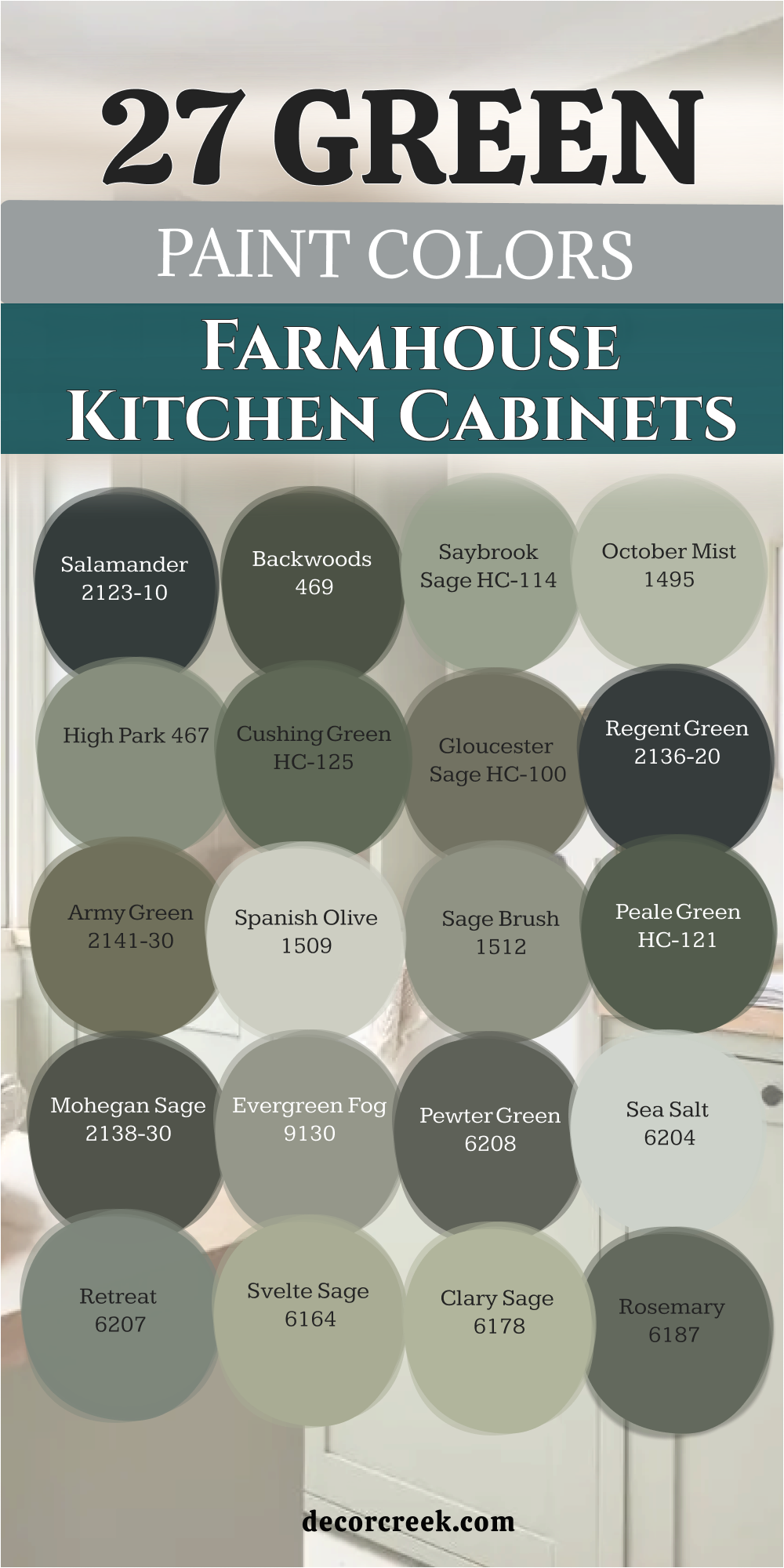
21 Best Paint colors For The Green Cabinets That Goes With White Countertop
White Dove OC-17
White Dove OC-17 has earned its place as a legendary choice because it balances brightness with a tiny drop of gray. This shade provides a soft and creamy look that feels very expensive when paired with forest green cabinets. It works perfectly on the walls and upper cabinetry to make a kitchen feel much taller and more open.
The color has a wonderful way of looking like a true white without feeling cold or clinical. It looks beautiful next to white quartz countertops because it shares the same soft and clean soul. This paint is very popular because it stays looking fresh even in rooms that do not get much natural sun.
It pairs nicely with warm brass hardware and light oak floors for a very classic farmhouse look. The tone is very forgiving and does not show every little smudge or speck of dust during the day. It gives the kitchen a very polished and finished look that feels both modern and traditional. This selection is a smart way to create a kitchen that feels very welcoming and bright.
Best used in: walls, trim, upper cabinets, and ceilings
Pairs well with: Saybrook Sage HC-114, Revere Pewter HC-172, Woodmont Cream 204, black hardware The key rule of this color for farmhouse style is to use it where you want natural light to feel kind, soft, and inviting throughout the day.

Simply White OC-117
Simply White OC-117 offers a very crisp and cheerful look that has just a hint of yellow warmth hidden inside. This color makes a kitchen feel like it is glowing with sunlight even on a very cloudy or rainy afternoon. It works beautifully on the trim and the walls to make deep emerald green cabinets really pop.
The shade is bright enough to feel very modern but warm enough to feel very comfortable for a family. It looks wonderful with white marble countertops that have warm gold or tan veining in the stone. This paint is very reliable and is often picked by designers for high-end luxury kitchen projects.
It provides a very clean and sharp contrast against dark wood floors and rustic ceiling beams. The tone is very easy to live with and makes the whole house feel more energetic and alive. It covers wood grain very well and gives the upper cabinetry a very smooth and solid appearance. This choice is perfect for someone who wants a kitchen that feels very happy and updated.
Best used in: trim, cabinets, walls, and exterior accents
Pairs well with: Backwoods 469, Hale Navy HC-154, Silver Gray 2131-60, warm wood tones The key rule of this color for farmhouse style is to use it where you want natural light to feel kind, soft, and inviting throughout the day.

Swiss Coffee OC-45
Swiss Coffee OC-45 is a rich and creamy off-white that brings a lot of traditional charm to any kitchen. This color feels very soft and cozy which is great for a kitchen where people gather to talk. It works perfectly with olive and sage green cabinets to create a very grounded and earthy look.
The shade has a very sophisticated soul that makes the whole room feel much more expensive. It looks beautiful on the walls to provide a warm and inviting background for your white countertops. This paint is a favorite for people who want a look that is very established and high-end.
It pairs nicely with antique bronze or copper hardware to add a touch of vintage style. The tone helps to soften the sharp lines of a modern kitchen and makes it feel more lived-in. It provides a very comfortable and steady atmosphere that makes cooking a very pleasant activity. This selection is a wonderful way to add a bit of warmth and history to a brand new home.
Best used in: kitchen walls, main living areas, trim, and cabinetry
Pairs well with: October Mist 1495, Dark Olive 2140-30, Edgecomb Gray HC-173, stone tiles The key rule of this color for farmhouse style is to use it where you want natural light to feel kind, soft, and inviting throughout the day.

Super White PM-1
Super White PM-1 is a very brilliant and clean white that feels like a fresh art gallery for your home. This color provides a very sharp and modern background for any shade of green kitchen cabinets. It works well in very small kitchens because it reflects every bit of light back into the room.
The shade is very simple and does not have any hidden yellow or blue to worry about later. It looks wonderful with white countertops to create a very sleek and unified look for the counters. This paint is a great choice for a modern farmhouse that wants a very crisp and updated feeling.
It pairs beautifully with black metal hardware and stainless steel appliances for a sharp contrast. The tone is very easy on the eyes and helps the kitchen feel much more spacious than it is. It provides a very professional and high-quality finish that makes the whole house feel very current. This selection is a fantastic way to make your kitchen feel very bright and clean.
Best used in: walls, ceilings, trim, and modern cabinets
Pairs well with: Salamander 2123-10, High Park 467, Wrought Iron 2124-10, silver accents The key rule of this color for farmhouse style is to use it where you want natural light to feel kind, soft, and inviting throughout the day.
Cloud White OC-130
Cloud White OC-130 is a soft and sophisticated white that many designers call the most perfect off-white. This color provides a very gentle and light feeling that balances dark green cabinets without being too stark. It works beautifully on the walls and trim to create a very high-end and designer look.
The shade has a tiny bit of warmth that keeps it from looking like a cold or clinical hospital room. It looks wonderful with white quartz countertops that have very faint and subtle gray veining. This paint is very popular because it looks great in both the bright morning sun and the low evening light.
It provides a very steady and professional background that makes the kitchen look very custom-built. The tone is very easy to coordinate with different types of wood floors and colorful area rugs. It gives the kitchen a very refined personality that shows you have great taste in design. This choice is a smart and stylish bet for anyone who wants a kitchen that feels very balanced.
Best used in: main walls, cabinetry, trim, and bedroom walls
Pairs well with: Saybrook Sage HC-114, Cushing Green HC-125, Revere Pewter HC-172, black metal The key rule of this color for farmhouse style is to use it where you want natural light to feel kind, soft, and inviting throughout the day.

High Reflective White SW 7757
High Reflective White SW 7757 is the brightest and cleanest white available to homeowners for a crisp look. This color provides a very modern feel that makes green cabinets the main focus of the room. It works perfectly in dark kitchens that need a massive boost of light to feel comfortable and open.
The shade is very pure and does not change its appearance under different types of light bulbs. It looks wonderful with white countertops to create a very fresh and seamless look for the kitchen. This paint is a great choice for a modern farmhouse that wants to feel very sharp and new.
It pairs beautifully with black hardware and light wood floors to create a very balanced design. The tone is very energetic and helps the kitchen feel like a productive and happy space. It provides a very professional and polished finish that will make your kitchen the star of the home. This selection is a fantastic way to make a dark kitchen feel much more cheerful and open.
Best used in: walls, trim, ceilings, and modern cabinetry
Pairs well with: Pewter Green SW 6208, Evergreen Fog SW 9130, Tricorn Black SW 6258, gold accents The key rule of this color for farmhouse style is to use it where you want natural light to feel kind, soft, and inviting throughout the day.
Alabaster SW 7008
Alabaster SW 7008 is a world-famous white that perfectly balances a clean look with a very warm heart. This color provides a soft and inviting background that makes green cabinets feel very comfortable. It works beautifully in a farmhouse kitchen where you want a look that is both cozy and very stylish.
The shade has a very steady and reliable personality that looks good in almost any room in the house. It looks wonderful with white countertops and warm wood accents like butcher block or oak. This paint is a legendary choice because it is very easy to coordinate with other paints and fabrics.
It provides a very grounded feeling that makes the kitchen the most popular room in the home. The tone is very forgiving and stays looking clean even with a lot of family activity every day. It covers very well and gives the walls a high-quality and smooth appearance that lasts. This choice is perfect for someone who wants a kitchen that feels very stable and welcoming.
Best used in: walls, trim, cabinets, and exterior siding
Pairs well with: Sea Salt SW 6204, Rosemary SW 6187, Urbane Bronze SW 7048, warm wood The key rule of this color for farmhouse style is to use it where you want natural light to feel kind, soft, and inviting throughout the day.
Pure White SW 7005
Pure White SW 7005 is a very versatile and clean white that has just a tiny drop of gray to keep it steady. This color provides a very soft and professional look that goes with any shade of green cabinetry. It works perfectly to brighten up a kitchen without ever looking too stark or like a cold blue.
The shade is very popular for modern homes because it looks very fresh and stays looking current. It looks wonderful with white quartz countertops and helps the cabinets show their true and beautiful color. This paint is a safe choice for people who want a neutral that is easy to live with for many years.
It pairs nicely with both black and silver hardware for a very clean and polished finish for the room. The tone helps to bridge the gap between dark floors and a bright white ceiling in any kitchen. It gives the room a very refined personality that makes the whole house feel more put together. This selection is a smart way to make a green kitchen feel much more airy and open.
Best used in: walls, trim, ceilings, and kitchen cabinetry
Pairs well with: Retreat SW 6207, Iron Ore SW 7069, Naval SW 6244, light oak floors The key rule of this color for farmhouse style is to use it where you want natural light to feel kind, soft, and inviting throughout the day.

Snowbound SW 7004
Snowbound SW 7004 is a cool and fresh white that has a very soft and slightly gray undertone inside. This color provides a very clean backdrop that helps your green cabinets feel very sharp and well-defined. It works well in kitchens that have plenty of windows and a lot of bright and natural sunlight.
The shade has a very modern feel that works perfectly for a clean and simple kitchen cabinet design. It looks wonderful on the walls to help the white countertops feel very crisp and high-quality. This paint is a great choice if you want a white that feels a little cooler than a cream or a beige.
It pairs beautifully with stainless steel appliances and black hardware for a very modern farmhouse appearance. The tone is very easy on the eyes and helps the kitchen feel much larger than it really is. It provides a very professional and updated look that makes the whole house feel more expensive. This selection is a fantastic way to make a green kitchen feel much more cheerful and open.
Best used in: walls, trim, entryways, and modern kitchens
Pairs well with: Evergreen Fog SW 9130, Pewter Green SW 6208, Tricorn Black SW 6258, cool stone The key rule of this color for farmhouse style is to use it where you want natural light to feel kind, soft, and inviting throughout the day.

Greek Villa SW 7551
Greek Villa SW 7551 is a rich and sun-drenched white that brings a lot of warmth and energy to the kitchen. This color feels very soft and creamy which is great for a kitchen where the family gathers every day. It works perfectly with deep emerald and forest green cabinets to create a very rich and high-end look.
The shade has a very sophisticated soul that makes the whole room feel much more custom-built. It looks beautiful on the walls to provide a warm and inviting background for white countertops. This paint is a favorite for people who want a look that is both neutral and very interesting to look at.
It pairs nicely with warm brass or gold hardware to add a touch of sparkle to the room. The tone helps to soften the lines of the cabinets and makes the kitchen feel more comfortable. It provides a very steady and happy atmosphere that makes the home feel very stable and safe. This selection is a wonderful way to add a bit of warmth and light to a very traditional home.
Best used in: walls, trim, cabinetry, and exterior siding
Pairs well with: Rosemary SW 6187, Sea Salt SW 6204, Iron Ore SW 7069, warm wood The key rule of this color for farmhouse style is to use it where you want natural light to feel kind, soft, and inviting throughout the day.

Extra White SW 7006
Extra White SW 7006 is a very clean and bright white that has a slight cool blue soul hidden inside its base. This color provides a very sharp and modern look that makes any green paint look very crisp and clear. It works perfectly in kitchens that need a lot of brightness to feel large and very easy to work in.
The shade is very simple and stays looking very fresh and updated for a long time. It looks wonderful with white countertops to create a very seamless and high-quality look for the kitchen. This paint is a great choice for a modern farmhouse that wants to feel very new and very clean.
It pairs beautifully with black hardware and silver appliances for a very balanced and sharp design. The tone is very energetic and helps the kitchen feel like a very productive and happy center of the home. It provides a very professional and polished finish that will make your guests feel very impressed. This selection is a fantastic way to make a green kitchen feel much more bright and open.
Best used in: walls, trim, ceilings, and modern cabinetry
Pairs well with: Pewter Green SW 6208, Evergreen Fog SW 9130, Tricorn Black SW 6258, cool marble The key rule of this color for farmhouse style is to use it where you want natural light to feel kind, soft, and inviting throughout the day.

Iron Ore SW 7069
Iron Ore SW 7069 is a very deep and moody charcoal that often looks like a soft and natural black. This selection provides a massive amount of drama when used near green kitchen cabinets and white countertops. It works perfectly on a kitchen island to anchor the entire room and create a strong focal point.
The color has a very organic soul that reminds me of deep stones and dark earth found in nature. It looks stunning when paired with bright white walls and light green lower cabinets for a tri-tone look. This paint is very popular for custom homes that want to feel very expensive and very bold.
It helps to ground the kitchen and gives it a sense of history and weight that is very impressive. The tone is very sophisticated and makes your gold or brass hardware look like sparkling and high-end jewelry. It stays looking rich and professional even in a room with very bright and direct afternoon sunlight. This choice is for the homeowner who wants a kitchen that feels very powerful and very designer-made.
Best used in: islands, base cabinets, front doors, and accent walls
Pairs well with: Evergreen Fog SW 9130, Alabaster SW 7008, Pure White SW 7005, warm wood The key rule of this color for farmhouse style is to use it where you want natural light to feel kind, soft, and inviting throughout the day.

Shoji White SW 7042
Shoji White SW 7042 acts as a bridge between white and beige, creating a very calm and creamy atmosphere. This color provides a soft and natural background that prevents dark green cabinets from feeling too heavy against white counters. It works beautifully in a farmhouse kitchen that uses a lot of linen, wood, and stone textures.
The shade is very gentle and changes its personality slightly based on the amount of sunlight coming in. It looks wonderful on walls to give the room a warm, sun-kissed glow all year round. This paint is a favorite for people who find pure whites too cold or bright for a cozy home.
It pairs perfectly with black hardware for a “soft modern” look that is very popular right now. The tone is very versatile and coordinates easily with different shades of oak or walnut flooring. It gives the kitchen a very finished and steady feeling that is incredibly easy to live with. This selection is a smart choice for making a kitchen feel more like a sanctuary.
Best used in: walls, trim, cabinetry, and exterior surfaces
Pairs well with: Pewter Green SW 6208, Urbane Bronze SW 7048, Khaki Shade SW 7533, natural materials The key rule of this color for farmhouse style is to use it where you want natural light to feel kind, soft, and inviting throughout the day.

Origami White SW 7636
Origami White SW 7636 is a light and airy neutral with a very subtle grey undertone that keeps it looking clean. This color provides a sophisticated backdrop that lets your green cabinets take the spotlight without any yellow interference. It works perfectly in a modern farmhouse where you want the white countertops to feel integrated rather than separate.
The shade is bright enough to open up a small kitchen but has enough body to feel substantial on the walls. It looks wonderful with medium-toned green cabinets and polished nickel hardware for a classic look. This paint is a reliable choice for open-concept homes where the kitchen must blend with the living area.
It provides a very quiet and peaceful vibe that makes the morning coffee routine feel more relaxing. The tone is very current and fits well with the “clean girl” aesthetic of modern interior design. It covers beautifully and provides a high-quality finish that looks great under both LED and natural light. This selection is a fantastic way to keep a colorful kitchen feeling very light.
Best used in: walls, trim, upper cabinets, and guest rooms
Pairs well with: Acacia Haze SW 9132, Sea Salt SW 6204, Iron Ore SW 7069, light stone The key rule of this color for farmhouse style is to use it where you want natural light to feel kind, soft, and inviting throughout the day.
Eider White SW 7014
Eider White SW 7014 is a very soft grey-white that feels exceptionally cool and clean in a sunny kitchen. This color provides a beautiful contrast to warm-toned green cabinets like olive or sage. It works well to make white countertops appear very crisp and helps them stand out against the painted wood.
The shade is a great alternative to traditional cream if you want your farmhouse to feel a bit more modern. It looks wonderful on the walls to create a neutral canvas that doesn’t feel boring or flat. This paint is a designer secret for creating a high-end look that feels custom and very intentional.
It pairs beautifully with black or silver hardware for a very sharp and professional finish in the kitchen. The tone is very calm and helps to settle a room that has a lot of different textures and colors. It provides a very smooth transition from the cabinets to the ceiling for a cohesive feel. This selection is a stylish way to add a bit of “cool” factor to your green kitchen design.
Best used in: walls, trim, cabinetry, and hallways
Pairs well with: Coastal Plain SW 6192, Retreat SW 6207, Tricorn Black SW 6258, cool marble The key rule of this color for farmhouse style is to use it where you want natural light to feel kind, soft, and inviting throughout the day.
Sea Pearl OC-19
Sea Pearl OC-19 is a refined and light off-white that sits in the perfect spot between grey and cream. This color provides a very soft and elegant look that complements light green cabinets and white stone beautifully. It works well in kitchens that need a subtle touch of warmth without any yellow or pink undertones.
The shade is very versatile and looks stunning on upper cabinets to make the room feel breezy and light. It looks wonderful with white quartz countertops, making the whole kitchen feel like a high-end spa. This paint is a popular choice for homeowners who want a neutral that feels very light but has a “rich” depth to it.
It pairs nicely with gold or brass hardware for a very chic and feminine farmhouse look. The tone is very soothing and helps to make the kitchen a place where you actually want to spend your time. It gives the room a polished personality that is both current and very timeless. This selection is a wonderful way to achieve a very airy and expensive-looking kitchen.
Best used in: walls, trim, cabinets, and bathroom vanities
Pairs well with: High Park 467, Silver Fox 2108-50, Simply White OC-117, light wood The key rule of this color for farmhouse style is to use it where you want natural light to feel kind, soft, and inviting throughout the day.

Steam AF-15
Steam AF-15 is a clean and fresh white that offers a soft glow without being too stark or clinical. This color provides a wonderful highlight for deep, dark green cabinets and helps the white countertops feel unified. It works perfectly on the trim and ceiling to frame the colorful cabinetry in a very professional way.
The shade has a very gentle and friendly personality that makes the kitchen feel very lived-in and loved. It looks beautiful on the walls of a kitchen that has plenty of character and unique architectural details. This paint is a great choice if you want a white that feels very pure but also very “kind” under different lighting.
It pairs beautifully with natural wood accents and brass hardware for a warm and modern feel. The tone is very easy to coordinate with other colors in the house, making it a reliable staple. It provides a high-quality finish that makes even old walls look fresh and updated. This selection is a fantastic way to keep a green kitchen feeling very bright and very clean.
Best used in: walls, trim, ceilings, and cabinetry
Pairs well with: October Mist 1495, Salamander 2123-10, Revere Pewter HC-172, warm wood The key rule of this color for farmhouse style is to use it where you want natural light to feel kind, soft, and inviting throughout the day.

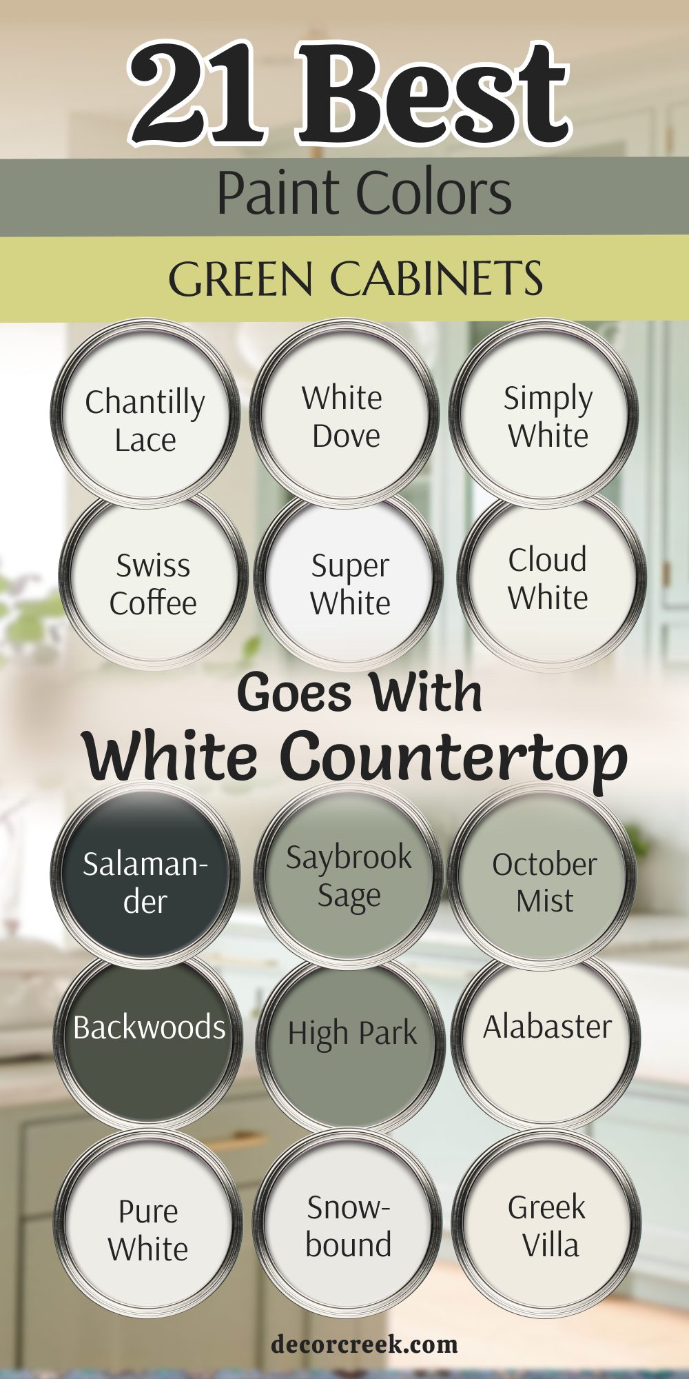
My Final Thoughts about 38 best Green kitchen cabinets paint colors
Choosing a green for your kitchen is about more than just following a trend; it is about bringing a sense of life, growth, and stability into the busiest room of your home. Whether you choose a deep, moody shade like Jasper to create a high-end sanctuary or a soft, airy tone like Sea Salt for a breezy cottage feel, you are making a choice that connects your indoor space to the natural world.
I have seen how the right green can transform a kitchen from a simple workspace into a soulful gathering spot where memories are made. Remember that green is incredibly versatile—it can act as a bold statement or a quiet neutral depending on the undertones you select. The magic happens when you pair your chosen green with the right white or black countertops to balance the light in the room.
Before you make your final decision, I always suggest painting a large sample board and watching it change as the sun moves through your kitchen. A color that looks like a forest at noon might look like a cozy olive by candlelight. Trust your instincts and choose the shade that makes you feel most at home. Your kitchen is the heart of your house, and it deserves a color that reflects your unique style and warmth.