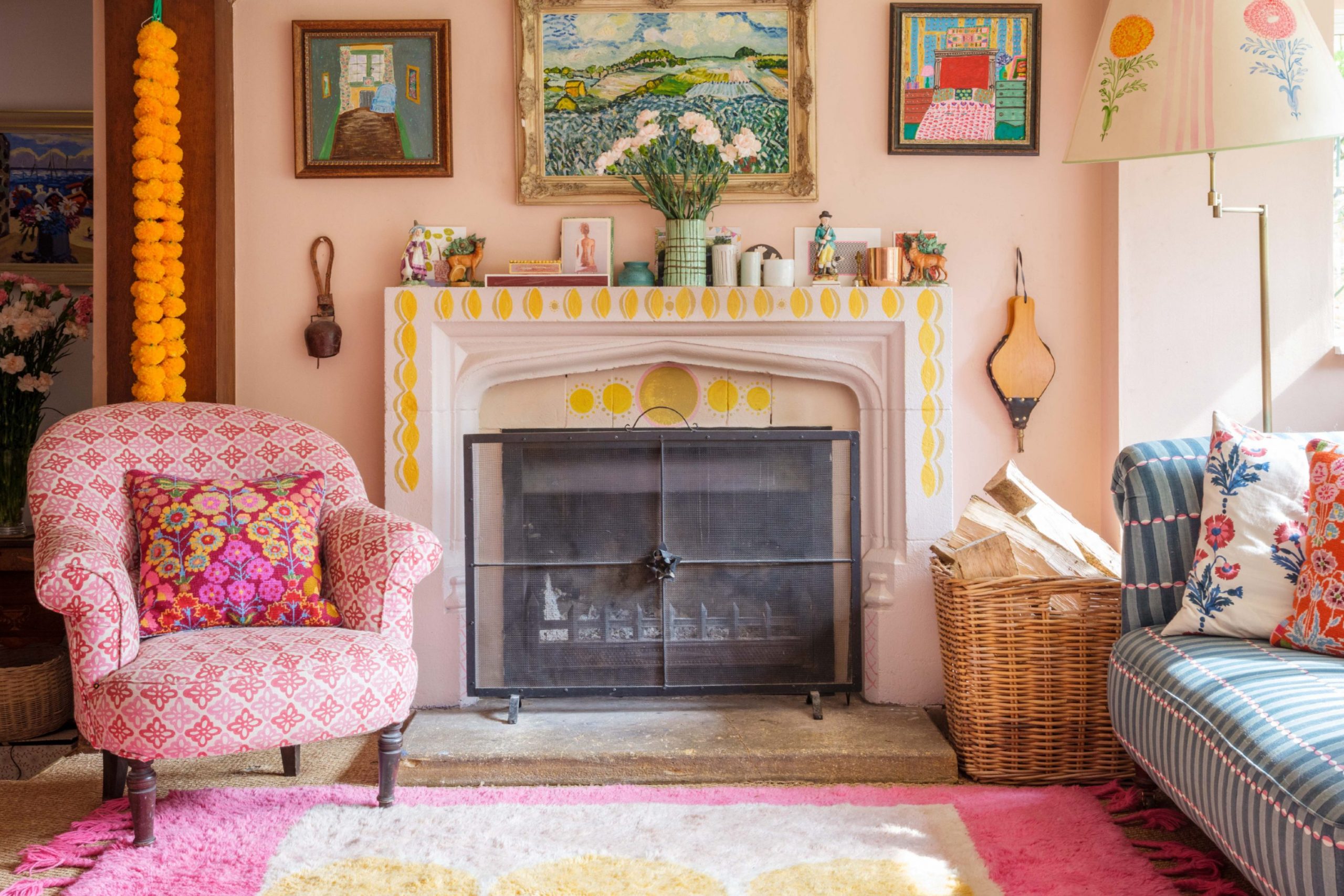
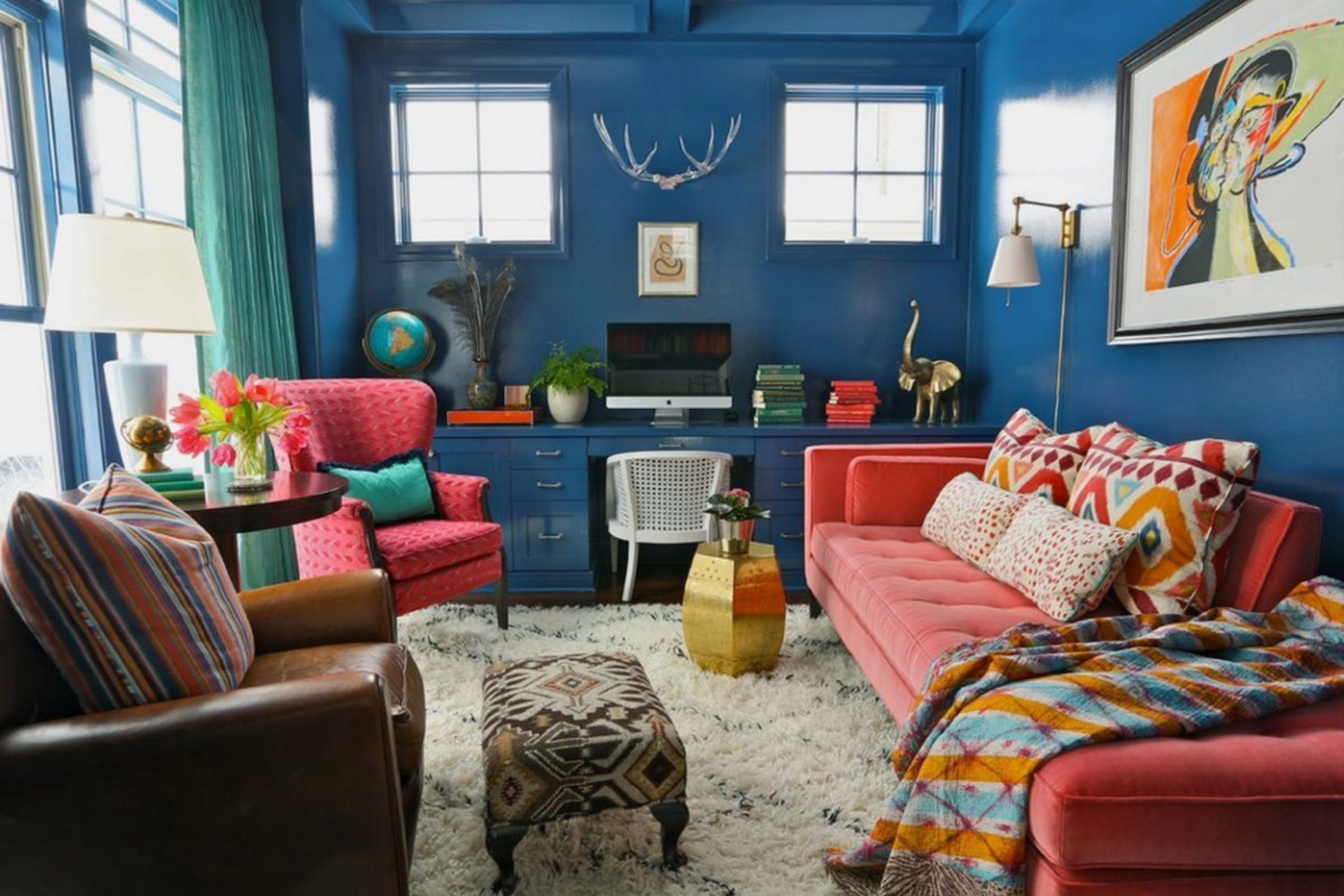
Finding the absolute right paint for a home filled with a lifetime of mismatched treasures, inherited antiques, and modern finds is a profound challenge that requires both intuition and strategy. You are searching for walls that possess the structural integrity to hold a diverse collection together, acting as a sophisticated anchor without either stealing the spotlight from your decor or fading into a look that feels sterile and boring.
In my professional life, I spend my days staging high-end houses and meticulously picking palettes that have the power to make tired, old furniture look like expensive gallery pieces and brand-new items look like they are overflowing with history and heart.
Eclectic design is, at its core, an visual essay of your personal story; the paint you choose is the essential background canvas that makes that story legible, inviting, and easy for the world to read.
These specific color ideas for 2026 focus heavily on hues that feel authentic, lived-in, and deeply grounded in reality.
Why I Rely on Sherwin-Williams and Benjamin Moore for Eclectic Home Colors
I consistently turn to Sherwin-Williams and Benjamin Moore because these companies have mastered the complex science of light and pigment in a way that few others can match. In a truly eclectic home, you are almost always dealing with a high-contrast mix of textures—think heavy velvet drapery, raw reclaimed wood, polished marble, and industrial metals—all competing for attention within the same four walls.
These two industry leaders create paints using high-grade, rich pigments that maintain their integrity throughout the day, ensuring the color doesn’t shift into an unintended or “ugly” undertone once the sun goes down and the artificial lights turn on.
Their extensive fan decks are saturated with a level of depth that is absolutely vital when your goal is to make a room look intentionally curated and high-design rather than cluttered or messy. Furthermore, I place immense trust in their physical durability; a home that is full of life and activity requires high-performance walls that can handle the bumps and scuffs of a busy, creative household.
How I Choose Paint Colors That Create a Bold and Collected Eclectic Look
My process for picking a transformational color always begins with the “anchor”—the largest or most cherished piece of furniture you own and love. I spend time analyzing the subtle, hidden tones within a vintage Persian rug or the primary brushstrokes of a favorite painting to identify a natural starting point for the room’s energy.
It is a common misconception that a “bold” look requires a loud or neon color; in reality, a bold look simply requires a confident, saturated choice that stands its ground. I strictly avoid “wishy-washy” colors that look washed out in high light, as they inevitably make a carefully planned room feel unfinished or accidental.
Instead, I hunt for sophisticated shades that have a strategic amount of gray, umber, or brown hidden deep inside them to keep the room’s energy steady and mature. Ultimately, successful eclectic design is a delicate dance of balance between the architecture of the walls and the soul of the objects you have lovingly collected over the years.
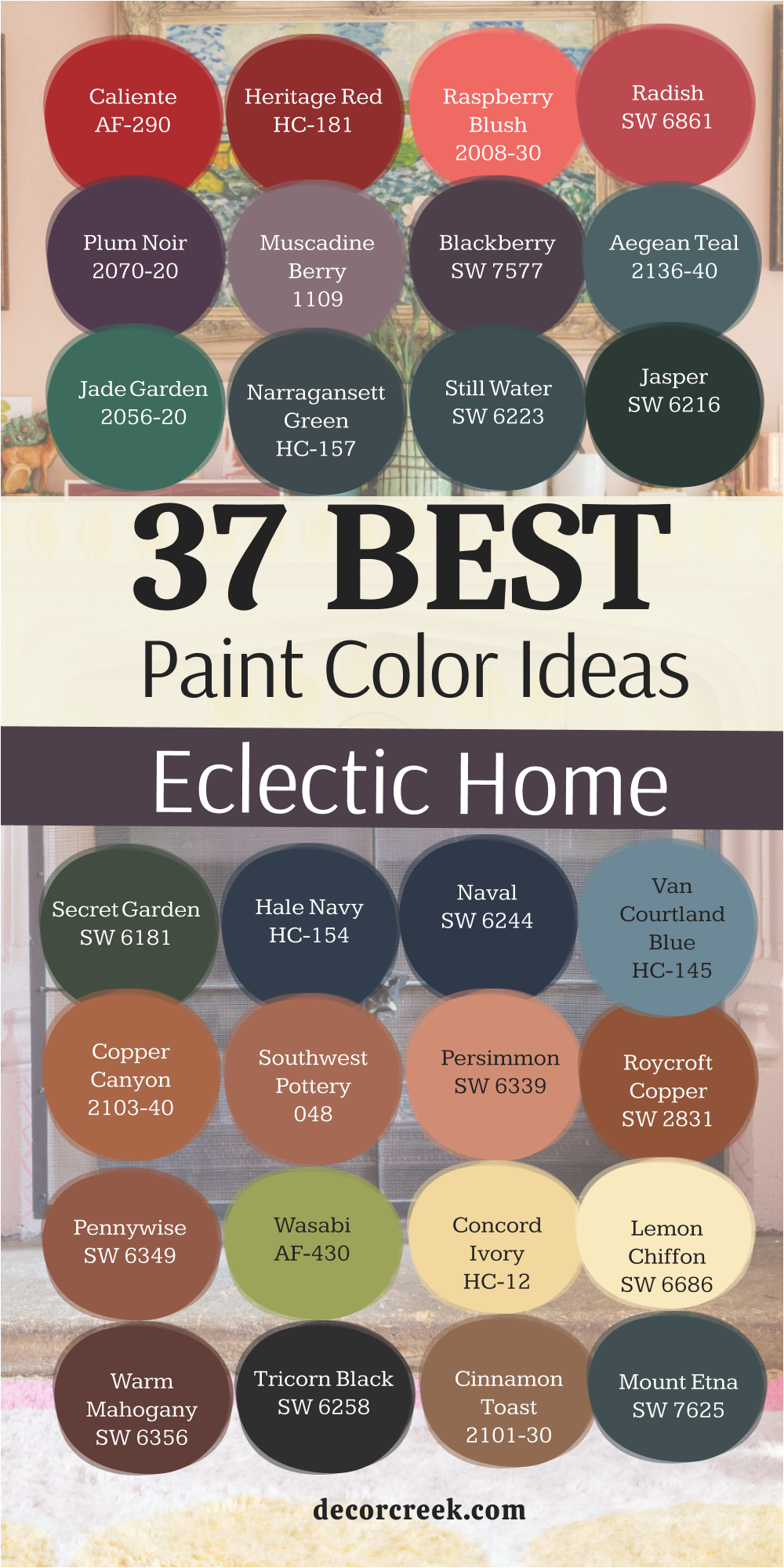
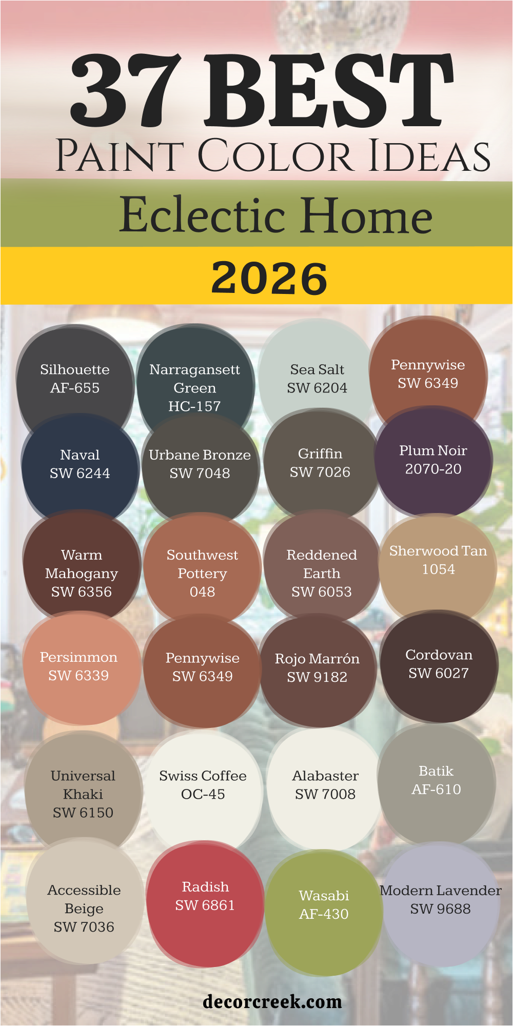
37 Eclectic Home Paint Color Ideas In 2026
Silhouette AF-655
Silhouette AF-655 starts as a heavy, dark chocolate shade that feels like a warm hug for your walls. This color works perfectly when you have bright art that needs a dark background to really stand out. It fills the room with a sense of luxury that feels very high-end and intentional.
You will notice how it hides imperfections on older walls while making gold frames look absolutely stunning. This deep tone acts like a neutral because it stays quiet and lets your furniture do all the talking.
Many people worry that dark colors make a room small, but this one actually makes the walls feel like they are moving back. It creates a cozy feeling that is hard to find with lighter shades of tan or gray. I love using it in rooms where you want to sit and talk for hours. It provides a steady base for a room full of patterns and different fabrics.
Best used in: dining rooms, libraries, accent walls, and moody bedrooms
Pairs well with: Steam AF-15, Head Over Heels AF-250, Silver Satin OC-26, and dark walnut furniture The key rule of this color for farmhouse style is to use it where you want natural light to feel kind, soft, and inviting throughout the day.
Narragansett Green HC-157
Narragansett Green HC-157 brings a salty, deep ocean feeling into your home without being a simple navy blue. This color has a lot of black in it, which helps it ground a room that has too many bright objects. It looks very smart in houses that have traditional trim and big windows.
You can use it to create a focal point in an office or a small bathroom for a punch of drama. It pairs beautifully with light oak floors and white marble accents. This shade changes from a dark forest green to a deep charcoal blue depending on your light bulbs.
It is a sturdy choice for anyone who wants a home that feels solid and well-built. I find that it makes green plants look much more vibrant against its dark surface. It is a favorite for people who like a mix of nautical and vintage styles together.
Best used in: home offices, kitchen islands, front doors, and powder rooms
Pairs well with: Revere Pewter HC-172, Simply White OC-117, Shaker Beige HC-45, and brass hardware The key rule of this color for farmhouse style is to use it where you want natural light to feel kind, soft, and inviting throughout the day.
Tricorn Black SW 6258
Tricorn Black SW 6258 is the most honest black paint you can buy because it has no hidden purple or blue tones. It provides a sharp edge to an eclectic room that might otherwise feel a bit too loose or messy.
This color makes every other color in the room look brighter and more crisp. I often use it on doors or window frames to frame the view outside like a piece of art. It is a very brave choice for a whole room, but it looks incredible with high ceilings.
The finish stays true no matter how much sun hits the wall during the afternoon. You can trust this shade to bring a modern feeling to a house filled with antique rugs. It works like a heavy anchor for your design plan. Most designers keep a gallon of this ready for quick updates to furniture or accents.
Best used in: window trim, interior doors, accent walls, and modern exteriors
Pairs well with: Extra White SW 7006, Classic French Gray SW 0077, Grayish SW 6001, and light wood tones The key rule of this color for farmhouse style is to use it where you want natural light to feel kind, soft, and inviting throughout the day.

Iron Ore SW 7069
Iron Ore SW 7069 is a charcoal shade that feels much softer than a true black. It has a velvet-like quality that makes a room feel expensive and very private. This color is great for hiding the television on a wall so it does not stick out.
It looks wonderful with soft leathers and woven baskets. I like how it balances out bright white furniture by providing a lot of contrast. This shade is very popular for kitchen cabinets because it does not show fingerprints easily.
It gives a room a grounded feeling that helps you relax at the end of a long day. Even though it is dark, it has a warmth that keeps it from feeling cold or like concrete. It is a top pick for a modern home that still wants to feel lived-in and friendly.
Best used in: kitchen cabinets, media rooms, exterior siding, and fireplace surrounds
Pairs well with: Alabaster SW 7008, City Loft SW 7631, Agreeable Gray SW 7029, and cognac leather The key rule of this color for farmhouse style is to use it where you want natural light to feel kind, soft, and inviting throughout the day.

Naval SW 6244
Naval SW 6244 is a classic navy that feels very royal and confident in any setting. This color is a safe bet for someone who wants to try a dark wall for the first time. It reminds people of the night sky and makes a bedroom feel very safe and secure.
I use it to make gold mirrors and brass lamps really shine. It works well with light gray carpets and white bedding. This shade of blue is deep enough to be interesting but familiar enough to be comfortable. It does not feel trendy because it has been a favorite for so many years.
You will find that it makes a small hallway look much longer and deeper. It is a great choice for a house that mixes old maps with new furniture.
Best used in: bedrooms, laundry rooms, kitchen islands, and shutters
Pairs well with: Origami White SW 7636, Kilim Beige SW 6106, Roycroft Copper SW 2831, and bright white trim The key rule of this color for farmhouse style is to use it where you want natural light to feel kind, soft, and inviting throughout the day.

Urbane Bronze SW 7048
Urbane Bronze SW 7048 is a mix of brown and gray that feels very much like a stone from a river. It is a natural choice for a home that has a lot of indoor plants and wooden beams. This color feels very earthy and helps a room feel connected to the world outside.
It is dark enough to be bold but warm enough to stay cozy during the winter. I love how it looks when the sun hits it because you can see the brown tones come forward. It makes a great background for a gallery wall full of black and white photos.
This color is very popular for exteriors too because it blends in with trees and shadows. It is a smart choice for an eclectic home that leans towards a rustic style.
Best used in: living rooms, bedrooms, exterior trim, and dens
Pairs well with: Modern Gray SW 7632, Messenger Bag SW 7740, Bone Black SW 9159, and natural wood The key rule of this color for farmhouse style is to use it where you want natural light to feel kind, soft, and inviting throughout the day.

Griffin SW 7026
Griffin SW 7026 is a deep, muddy brown that looks like expensive clay. It is a very sophisticated color that you do not see in every house on the block. This shade makes a room feel like an old-fashioned club where people go to read.
It handles shadows very well and stays looking rich even in low light. I suggest using it in a room with a lot of light-colored textiles to create balance. It makes copper and bronze items look like they belong in a museum.
This color is excellent for a small library or a cozy corner where you keep your books. It feels very grounded and does not try to be anything other than a solid, warm brown. It is a great way to add a bit of history to a newer building.
Best used in: studies, dining rooms, accent walls, and mudrooms
Pairs well with: Shoji White SW 7042, Sand Beach SW 7529, Foothills SW 7514, and woven textures The key rule of this color for farmhouse style is to use it where you want natural light to feel kind, soft, and inviting throughout the day.
Plum Royale 2070-20
Plum Royale 2070-20 is a very dark purple that looks almost black until the light catches it. This color is for the person who wants a room that feels like a secret. It is a very romantic shade that works beautifully in a bedroom with lots of pillows.
I like to use it behind a velvet headboard to create a very lush look. It brings a lot of personality to a house and shows that you are not afraid of color. You will notice that it makes green and gold accents pop with a lot of energy.
It is a very dense color that covers the walls in a way that feels like fabric. This shade is perfect for a home that features vintage glass and lace. It is a bold move that always pays off with a lot of compliments.
Best used in: master bedrooms, powder rooms, velvet-heavy lounges, and accent doors
Pairs well with: Chantilly Lace OC-65, Gray Owl OC-52, Silver Cloud 2129-70, and gold accents The key rule of this color for farmhouse style is to use it where you want natural light to feel kind, soft, and inviting throughout the day.

Polished Mahogany SW 2838
Polished Mahogany SW 2838 is a reddish-brown that feels like a warm fire in a cold room. It is a very traditional color that looks fresh when you pair it with modern shapes. This shade makes a large room feel much more intimate and friendly for guests.
It has a glow to it that reminds me of old library books and fine wine. I use it when a room feels too cold or empty to give it some immediate soul. It works well with cream-colored rugs and dark wood tables.
This color is very strong, so it serves as a great anchor for a room with high ceilings. You can trust it to stay stylish for a very long time because it is based on natural wood tones. It is a perfect choice for an eclectic home that loves a bit of drama.
Best used in: dining rooms, entryways, library walls, and furniture flips
Pairs well with: Creamy SW 7012, Latte SW 6108, Van Dyke Brown SW 7041, and white trim The key rule of this color for farmhouse style is to use it where you want natural light to feel kind, soft, and inviting throughout the day.
Southwest Pottery 048
Southwest Pottery 048 is a bright and earthy orange-red that feels like a trip to the desert. This color is full of life and brings a happy energy to a kitchen or a sunroom. It looks amazing with turquoise accents and light-colored wood furniture.
I find that it makes people feel more awake and creative when they are in the room. This shade is very warm and works well in houses that get a lot of natural sunlight. It is a great way to make a hallway feel less boring and more like a path to somewhere fun.
You can use it on a single wall to create a big impact without painting the whole room. It reminds me of handmade tiles and clay pots from a local market. This is a top pick for a house that celebrates global crafts and bright textiles.
Best used in: kitchens, sunrooms, accent walls, and front doors
Pairs well with: White Heron OC-57, Wood Grain 2137-30, Pale Moon OC-108, and clay textures The key rule of this color for farmhouse style is to use it where you want natural light to feel kind, soft, and inviting throughout the day.
Reddened Earth SW 6053
Reddened Earth SW 6053 captures the look of sun-dried clay found in a vast desert landscape. This color brings a grounded and organic feel to any room that needs a bit more warmth. I love how it makes simple wooden chairs and woven rugs look like they have a story to tell.
Reddened Earth SW 6053 is a very friendly shade that invites people to sit down and stay for a while. It works like a neutral but has much more heart than a basic tan or beige. You will see it change from a soft terracotta to a deep brick tone as the sun moves across the sky.
It is a fantastic choice for a room with lots of green plants because the colors balance each other perfectly. This shade makes white trim look very bright and clean by comparison. I suggest using it in a space where you want to feel a connection to the natural world. It is a reliable color that feels both ancient and very current for today.
Best used in: bedrooms, cozy living rooms, mudrooms, and accent walls
Pairs well with: Pure White SW 7005, Canvas Tan SW 7531, Rockwood Dark Green SW 2812, and terracotta tiles The key rule of this color for farmhouse style is to use it where you want natural light to feel kind, soft, and inviting throughout the day.
Sherwood Tan 1054
Sherwood Tan 1054 is a rich and creamy color that reminds me of a warm latte on a cold morning. This shade provides a very sturdy background for a home that features lots of colorful art and old books. Sherwood Tan 1054 is much deeper than a standard cream which gives the walls a lot of visual weight.
It creates a feeling of history and stability in a house that might have a lot of moving parts. I find that it hides dust and wear very well, making it great for busy hallways. You can use it to make a large, cold room feel much more compact and personal.
It glows under soft lamp light and makes evening gatherings feel very special. This color is a bridge between traditional style and a more relaxed, eclectic way of living. It works beautifully with dark bronze hardware and heavy fabric curtains. Choosing this shade means you want a home that feels established and very well-loved.
Best used in: hallways, living rooms, traditional dining areas, and guest rooms
Pairs well with: Simply White OC-117, Van Buren Brown HC-70, Wedgewood Gray HC-146, and dark wood The key rule of this color for farmhouse style is to use it where you want natural light to feel kind, soft, and inviting throughout the day.
Persimmon SW 6339
Persimmon SW 6339 is a cheerful and energetic shade that sits right between orange and pink. This color brings a sense of playfulness to an eclectic home that needs a bright spark. Persimmon SW 6339 looks wonderful in a breakfast nook where the morning sun can make it glow.
I like to use it in small doses or on a focal wall to keep the energy high. It makes white furniture look modern and helps gray accents feel less gloomy. This shade is perfect for a person who wants their home to feel like a happy escape.
You will notice it creates a very warm light in the room that makes everyone look healthy and glowing. It is a brave color that shows you have a fun personality and a great eye for design. Many people find that it helps them feel more creative when they are surrounded by such a vibrant tone. It is an excellent choice for a house that celebrates joy and unique finds.
Best used in: kitchens, bathrooms, accent walls, and furniture pieces
Pairs well with: Alabaster SW 7008, Naval SW 6244, Sea Salt SW 6204, and light ash wood The key rule of this color for farmhouse style is to use it where you want natural light to feel kind, soft, and inviting throughout the day.
Pennywise SW 6349
Pennywise SW 6349 is a deep and dusty orange that feels like a sunset over a rugged mountain. This color adds a lot of depth to a room without feeling too loud or distracting. Pennywise SW 6349 is a great way to bring a vintage feeling into a new home.
I use it to ground rooms that have a lot of tall ceilings or open floor plans. It pairs beautifully with dark leathers and black iron accents for a very strong look. This shade feels very solid and helps a house feel like a protective shell from the outside world.
You will see how it brings out the richness in old oriental rugs and patterned pillows. It is a very sophisticated choice for an eclectic designer who loves earthy, natural tones. I find that it works best when you have a mix of old and new items in the same room. It is a dependable color that stays looking great as your style changes over time.
Best used in: dens, entryways, dining rooms, and library corners
Pairs well with: Shoji White SW 7042, Urbane Bronze SW 7048, Kilim Beige SW 6106, and brass details The key rule of this color for farmhouse style is to use it where you want natural light to feel kind, soft, and inviting throughout the day.
Rojo Marrón SW 9182
Rojo Marrón SW 9182 is a sophisticated and dark red that looks like high-quality wine or aged leather. This color brings an immediate sense of importance and luxury to any room it covers. Rojo Marrón SW 9182 is perfect for a dining room where you want guests to feel fancy and relaxed.
I love how it creates a moody atmosphere that is perfect for long dinners and conversation. This shade is very dense and makes a large room feel much more cozy and tight. It provides a stunning backdrop for silver frames and crystal glassware.
You will notice that it has a very timeless quality that does not go out of style. It feels like a color you would find in a grand old hotel or a historic mansion. I suggest using it if you want to make a bold statement that feels very mature and collected. It is a powerful tool for creating a home that feels very special and unique.
Best used in: formal dining rooms, master suites, accent walls, and front doors
Pairs well with: Drift of Mist SW 9166, Black Magic SW 6991, Accessible Beige SW 7036, and velvet fabrics The key rule of this color for farmhouse style is to use it where you want natural light to feel kind, soft, and inviting throughout the day.
Cordovan SW 6027
Cordovan SW 6027 is a deep and mysterious purple-brown that feels very lush and expensive. This color acts as a beautiful bridge between a dark neutral and a bold accent. Cordovan SW 6027 works very well in rooms where you want to create a sense of deep quiet.
I like to use it in bedrooms because it makes the space feel very private and safe. It looks incredible when paired with soft cream rugs and light-colored curtains. This shade is very good at hiding shadows and making the walls look like they go on forever.
You can trust it to bring a touch of class to an eclectic home filled with different textures. It feels very grounded and does not change much under different types of light. This is a top choice for anyone who loves the look of fine antiques and polished wood. It gives a room a finished look that is hard to achieve with lighter colors.
Best used in: bedrooms, studies, accent walls, and basement lounges
Pairs well with: Snowbound SW 7004, Balanced Beige SW 7037, Virtual Taupe SW 7039, and silk textiles The key rule of this color for farmhouse style is to use it where you want natural light to feel kind, soft, and inviting throughout the day.
Universal Khaki SW 6150
Universal Khaki SW 6150 is a smart and steady tan that has a tiny bit of green hidden inside it. This color is a true workhorse for an eclectic home because it goes with almost everything. Universal Khaki SW 6150 provides a clean and professional background for a room full of busy patterns.
I use it when a client has a lot of colorful furniture that needs a quiet place to sit. It looks very natural and reminds me of a sturdy canvas bag or a trench coat. This shade is great for open living areas because it flows easily from one room to the next. You will find that it makes blue and red accents stand out without feeling too heavy.
It is a very safe choice that still feels much more interesting than a basic white wall. I suggest it for homes that want to look organized and very well-thought-out. It is a classic color that provides a very reliable base for your design.
Best used in: open floor plans, kitchens, exteriors, and hallways
Pairs well with: Incredible White SW 7028, Van Dyke Brown SW 7041, Roycroft Copper SW 2831, and black accents The key rule of this color for farmhouse style is to use it where you want natural light to feel kind, soft, and inviting throughout the day.
Swiss Coffee OC-45
Swiss Coffee OC-45 is a creamy white that feels very soft and friendly rather than cold and clinical. This color is the perfect white for an eclectic home because it is warm and welcoming. Swiss Coffee OC-45 makes a room feel very bright and open while still feeling like a cozy hug.
I use it to tie together rooms that have many different colors of wood furniture. It provides a soft glow when the sun hits it and does not look harsh or blinding. This shade is a favorite for kitchen cabinets and trim because it looks very clean but still very soft.
You will notice that it makes your colorful art look very professional and crisp on the wall. It is a very flexible color that works in any room of the house regardless of the light. I think it is the best choice for anyone who wants a simple background that still feels high-quality. It is a staple for designers who want a home to feel light and airy.
Best used in: whole-house walls, trim, kitchen cabinets, and ceilings
Pairs well with: Fossil AF-65, Hale Navy HC-154, Revere Pewter HC-172, and natural light The key rule of this color for farmhouse style is to use it where you want natural light to feel kind, soft, and inviting throughout the day.

Alabaster SW 7008
Alabaster SW 7008 is a soft and milky white that brings a sense of balance to an eclectic home. This color is famous for being neither too yellow nor too gray, which makes it very easy to use. Alabaster SW 7008 creates a very peaceful feeling in a bedroom or a busy living area.
I use it to make small rooms feel larger and more organized than they really are. It works beautifully with natural materials like stone, wood, and wool blankets. This shade is a top choice for people who want a clean look but hate the feeling of a cold hospital room.
You will see how it softens the edges of a room and makes everything feel more inviting. It is a very reliable color that looks great in both bright daylight and soft evening lamplight. Many homeowners choose this as their main house color because it is so easy to live with. It is a perfect background for a life filled with family and friends.
Best used in: living rooms, kitchens, hallways, bedrooms, and farmhouse exteriors
Pairs well with: Iron Ore SW 7069, Agreeable Gray SW 7029, Natural Linen SW 9109, and warm wood tones The key rule of this color for farmhouse style is to use it where you want natural light to feel kind, soft, and inviting throughout the day.

Batik AF-610
Batik AF-610 is a complex gray with a hint of purple and brown that feels very sophisticated. This color is perfect for an eclectic home that wants a neutral wall with a bit of a secret. Batik AF-610 changes its look throughout the day depending on how the light enters the room.
I love how it makes modern furniture look very sharp and antique furniture look very updated. It provides a cool and steady energy that helps you feel focused and calm. This shade is great for a home office or a dining room where you want a bit of drama.
You will notice it creates a very soft and blurry background for your favorite wall decor. It is a very smart choice for anyone who wants to move away from basic beige or gray. I find that it works best with silver or chrome accents to keep it looking fresh. It is a unique color that shows you have a very modern and eclectic taste.
Best used in: home offices, dining rooms, bedrooms, and accent walls
Pairs well with: Steam AF-15, Flint AF-560, Constellation AF-540, and metal finishes The key rule of this color for farmhouse style is to use it where you want natural light to feel kind, soft, and inviting throughout the day.
Accessible Beige SW 7036
Accessible Beige SW 7036 is a very smart neutral that stays warm without ever looking like a yellow sponge. This color acts as a perfect mediator in an eclectic home where you have many competing patterns and bold rugs. Accessible Beige SW 7036 has a slight gray undertone that keeps it looking fresh and modern even in older houses.
I use it to create a seamless look throughout a whole house because it adapts so well to different lighting. It makes your colorful furniture look more expensive and your white trim look much brighter. You will find that it is very forgiving with wall scuffs and fingerprints, which makes it great for families. This shade provides a steady and reliable background for gallery walls and large bookshelves.
It feels very airy in the morning and transitions into a cozy, warm tone as the evening sun sets. Many designers call this the perfect neutral because it never clashes with other colors in the room. It is a solid choice for creating a home that feels both open and very well-collected.
Best used in: open concept living areas, hallways, kitchens, and guest bedrooms
Pairs well with: Urbane Bronze SW 7048, Pure White SW 7005, Cadet SW 9143, and dark wood floors The key rule of this color for farmhouse style is to use it where you want natural light to feel kind, soft, and inviting throughout the day.

Shiitake SW 9173
Shiitake SW 9173 is a warm and earthy stone color that brings a natural feeling to your indoor walls. This color reminds me of a smooth pebble found in a forest stream or a piece of soft linen fabric. Shiitake SW 9173 is deep enough to provide contrast against light furniture but light enough to keep a room feeling big.
I love how it balances out bright colors like red or teal in an eclectic design plan. It creates a very grounded feeling that makes a house feel solid and very well-built. This shade is a great way to add a bit of luxury to a bathroom or a laundry room.
You will notice that it looks very sophisticated when paired with black metal light fixtures. It stays looking clean and organized even when the room is full of your favorite hobby supplies. This color is perfect for someone who wants a home that feels like a quiet retreat from the busy world. It is a very mature and polished choice for any room in your house.
Best used in: bedrooms, bathrooms, laundry rooms, and transition spaces
Pairs well with: Alabaster SW 7008, Greek Villa SW 7551, Black Magic SW 6991, and natural textures The key rule of this color for farmhouse style is to use it where you want natural light to feel kind, soft, and inviting throughout the day.

Natural Linen SW 9109
Natural Linen SW 9109 is a soft and sandy tan that feels like a warm day at the beach. This color brings a very relaxed and breezy energy to an eclectic home that might feel too heavy. Natural Linen SW 9109 works perfectly with white slipcovered sofas and light-colored wooden tables.
I use it to make a dark room feel much brighter and more friendly for guests. It has a tiny bit of yellow in it that gives the walls a happy glow without being too loud. This shade is a great alternative to plain white because it adds a layer of depth and texture.
You can use it to highlight architectural details like crown molding or built-in cabinets. It feels very lightweight and makes the ceilings in a room look much higher than they are. This color is a top pick for anyone who loves a coastal or bohemian eclectic style. It provides a very clean canvas for all your colorful pillows and handmade blankets.
Best used in: sunrooms, bedrooms, kitchens, and small hallways
Pairs well with: Divine White SW 6105, Foothills SW 7514, Sea Salt SW 6204, and light oak The key rule of this color for farmhouse style is to use it where you want natural light to feel kind, soft, and inviting throughout the day.

Neutral Ground SW 7568
Neutral Ground SW 7568 is a very clean and simple off-white that feels very stable and honest. This color is excellent for people who want a bright house that still feels very traditional. Neutral Ground SW 7568 acts like a soft focus lens for your room, blurring out the chaos of an eclectic collection.
I like to use it in entryways to give visitors a warm and clear welcome as they walk in. It stays looking bright even on cloudy days when other colors might look a bit muddy. This shade pairs beautifully with vintage brass frames and dark navy blue accents.
It is a very flexible color that doesn’t demand your attention but supports everything else. You will find that it makes your indoor plants look much greener and more full of life. It is a smart choice for a kitchen because it feels very hygienic and crisp. Choosing this color means you want a home that feels organized, light, and very easy to live in.
Best used in: entryways, kitchens, whole-house painting, and ceilings
Pairs well with: Naval SW 6244, Foothills SW 7514, Greek Villa SW 7551, and copper accents The key rule of this color for farmhouse style is to use it where you want natural light to feel kind, soft, and inviting throughout the day.

Raindance 1572
Raindance 1572 is a beautiful mix of blue, green, and gray that looks like the sky before a storm. This color brings a very cool and refreshing feeling to an eclectic room that has a lot of warm wood. Raindance 1572 is a great way to add personality to a space without it feeling too bright or overwhelming.
I love how it changes its mood depending on whether the day is sunny or rainy. It makes silver and glass items look very sparkly and clean against the muted background. This shade is a favorite for bathrooms because it feels very much like a high-end spa.
You will notice that it helps a small room feel much more open and airy. It is a very sophisticated choice for someone who loves nature-inspired colors. I find that it works very well with dark gray floors or white tile. This color is a perfect example of how a muted tone can still be full of life.
Best used in: bathrooms, bedrooms, laundry rooms, and kitchen islands
Pairs well with: White Dove OC-17, Gray Owl OC-52, Hale Navy HC-154, and marble surfaces The key rule of this color for farmhouse style is to use it where you want natural light to feel kind, soft, and inviting throughout the day.
Secret Garden SW 6181
Secret Garden SW 6181 is a very deep and moody forest green that feels like an old-world library. This color is for the brave homeowner who wants their walls to feel like a piece of art. Secret Garden SW 6181 brings a lot of drama and mystery to an eclectic home filled with antiques.
I use it to create a focal point in a dining room or behind a bed for a very lush look. It makes metallic colors like gold and copper look incredibly bright and very expensive. This shade is very good at creating a cozy and private feeling in a room used for resting.
You will see how it makes wood furniture look more rich and full of character. It feels very grounded and permanent, like a part of the earth itself. This is a top pick for anyone who wants a home that feels very unique and storied. It provides a stunning background for old maps and botanical drawings.
Best used in: dining rooms, libraries, accent walls, and front doors
Pairs well with: Alabaster SW 7008, Creamy SW 7012, Urbane Bronze SW 7048, and gold leaf The key rule of this color for farmhouse style is to use it where you want natural light to feel kind, soft, and inviting throughout the day.
Still Water SW 6223
Still Water SW 6223 is a dark and heavy teal that feels like the deep parts of a quiet lake. This color is very elegant and adds a layer of sophistication to an eclectic design. Still Water SW 6223 is a great choice for a home office where you need to feel calm and focused.
I like how it looks with light gray furniture because the contrast is very striking and modern. It brings a lot of color into a room without being too loud or making your eyes tired. This shade feels very cool to the touch and helps a sunny room feel much more comfortable.
You will find that it creates a very professional look for a business space or a formal den. It hides wall marks very well and stays looking beautiful for a long time. This color is perfect for someone who wants a bold look that still feels very grown-up. It is a favorite for those who love the colors of the sea and the sky.
Best used in: home offices, dens, kitchen cabinets, and accent walls
Pairs well with: Pure White SW 7005, Repose Gray SW 7015, Sea Salt SW 6204, and walnut wood The key rule of this color for farmhouse style is to use it where you want natural light to feel kind, soft, and inviting throughout the day.

Sea Salt SW 6204
Sea Salt SW 6204 is a very famous color that is a light mix of green, gray, and blue. This color feels very fresh and clean, like a breeze coming off the ocean waves. Sea Salt SW 6204 is a wonderful choice for a kitchen or a bathroom in an eclectic home.
I use it to make rooms feel more open and to bring a little bit of the outdoors inside. It changes its look constantly throughout the day, sometimes looking more green and sometimes more gray. This shade is very easy on the eyes and helps you feel more relaxed when you are in the room.
You can pair it with white trim for a very classic look or with dark wood for more contrast. It makes small spaces feel much less crowded and much more peaceful. This color is a top choice for anyone who wants a soft and pretty background for their life. It is a reliable color that almost everyone seems to love right away.
Best used in: bathrooms, bedrooms, kitchens, and laundry rooms
Pairs well with: Summit Gray SW 7669, Alabaster SW 7008, Accessible Beige SW 7036, and driftwood The key rule of this color for farmhouse style is to use it where you want natural light to feel kind, soft, and inviting throughout the day.

Jade Garden 2056-20
Jade Garden 2056-20 is a vibrant and rich green that feels very much like a precious gemstone. This color brings a lot of energy and a sense of health to any room in an eclectic home. Jade Garden 2056-20 looks amazing in a sunroom where it can compete with the bright light outside.
I find that it makes people feel more creative and happy when they are surrounded by it. It works beautifully with vintage furniture that has a lot of detail and dark wood tones. This shade is a great way to show off your love for color and your unique style.
You will notice that it makes white accents look very sharp and intentional. It feels very organic and reminds me of lush tropical leaves in a deep jungle. This color is a bold choice that will make your home stand out from all the others on the street. It is perfect for a house that is filled with art and travel souvenirs.
Best used in: sunrooms, dining rooms, accent walls, and furniture flips
Pairs well with: Chantilly Lace OC-65, Revere Pewter HC-172, Black Beauty 2128-10, and rattan furniture The key rule of this color for farmhouse style is to use it where you want natural light to feel kind, soft, and inviting throughout the day.
Fresh Eucalyptus SW 9658
Fresh Eucalyptus SW 9658 is a soft and dusty green that feels very much like a dried herb. This color brings a very quiet and natural feeling to an eclectic home that needs more balance. Eucalyptus Leaf SW 9660 is a great choice for a bedroom because it helps the mind feel at ease.
I love how it looks with natural linen fabrics and light-colored wooden floors. It is deep enough to have a lot of character but light enough to not feel overwhelming. This shade acts like a neutral but with a lot more personality than a simple gray or tan.
You will see how it makes your favorite wooden furniture look more warm and inviting. It is a very sophisticated color that feels very modern and very fresh for 2026. This is a top pick for anyone who wants a home that feels like a natural sanctuary. It provides a beautiful background for black and white photography and simple art.
Best used in: bedrooms, living rooms, nurseries, and entryways
Pairs well with: Shoji White SW 7042, Urbane Bronze SW 7048, Silver Strand SW 7057, and linen textiles The key rule of this color for farmhouse style is to use it where you want natural light to feel kind, soft, and inviting throughout the day.
Hazel SW 6471
Hazel SW 6471 is a dreamy blue-green that feels like a quiet afternoon by a hidden pond. This color brings a soft and gentle energy to an eclectic home that has a lot of busy metal and wood textures. Hazel SW 6471 acts as a cooling agent in rooms that get a lot of hot afternoon sun.
I use it to make guest rooms feel very welcoming and a little bit more special than a standard neutral. It has enough gray in it to keep it from looking like a child’s bedroom color. This shade looks very high-end when you pair it with antique gold mirrors or dark cherry wood furniture.
You will notice that it makes white bedding and curtains look incredibly crisp and clean. It feels very airy and light, helping a small space feel much more open to the world. Many people find that this color helps them feel more focused and less rushed in their daily lives. It is a beautiful choice for someone who wants their home to feel like a pretty escape.
Best used in: guest bedrooms, bathrooms, laundry rooms, and kitchen cabinets
Pairs well with: Alabaster SW 7008, Pure White SW 7005, Naval SW 6244, and vintage gold accents The key rule of this color for farmhouse style is to use it where you want natural light to feel kind, soft, and inviting throughout the day.
Upward SW 6239
Upward SW 6239 is a light and breezy blue that reminds me of a clear sky after a rainstorm. This color brings a very positive and open feeling to an eclectic home that needs a bit more breathing room. Upward SW 6239 is a wonderful choice for ceilings because it makes them feel like they are floating higher.
I love using it in small hallways to take away that cramped feeling and replace it with light. It looks very modern when paired with black hardware and very traditional with white trim. This shade is a great way to add color without making a room feel dark or heavy.
You will see how it makes your wood furniture look much richer because the blue and brown balance each other. It is a very safe color that still feels very intentional and well-chosen for a curated house. This is a top pick for anyone who loves a coastal or classic look. It provides a very clean and happy background for all your favorite indoor activities.
Best used in: bedrooms, ceilings, small bathrooms, and sunrooms
Pairs well with: Snowbound SW 7004, Drift of Mist SW 9166, Naval SW 6244, and light-colored woods The key rule of this color for farmhouse style is to use it where you want natural light to feel kind, soft, and inviting throughout the day.

First Crush CSP-310
First Crush CSP-310 is a very soft and pale pink that feels like a warm glow rather than a bright paint. This color brings a sense of kindness and sweetness to an eclectic home that features a lot of hard edges. First Crush CSP-310 is a very grown-up version of pink that works beautifully as a neutral.
I use it to add a layer of warmth to rooms that feel a bit too cold or gray. It makes people look very healthy and happy when they are standing in the room. This shade is perfect for a bedroom where you want to feel totally relaxed and at peace.
You will notice it behaves like an off-white but with a much more interesting heart. It looks stunning when paired with dark charcoal accents or light gray rugs. This color is a brave choice that ends up feeling very sophisticated and very welcoming. It is an excellent way to show off your softer side in your design plan.
Best used in: bedrooms, dressing rooms, powder rooms, and cozy nurseries
Pairs well with: Chantilly Lace OC-65, Gray Owl OC-52, Wrought Iron 2124-10, and soft velvet The key rule of this color for farmhouse style is to use it where you want natural light to feel kind, soft, and inviting throughout the day.
Modern Lavender SW 9688
Modern Lavender SW 9688 is a cool and misty purple that feels very fresh and a little bit futuristic. This color brings a unique and creative energy to an eclectic home that wants to stand out. Modern Lavender SW 9688 is not your grandmother’s floral purple because it has a strong gray base.
I love how it looks in an office where you want to feel both focused and inspired. It makes white furniture pop and adds a layer of mystery to the corners of the room. This shade is very good at creating a soft and dreamy mood that is perfect for a relaxing evening.
You will find that it changes its look quite a bit as the sun moves, sometimes looking almost gray. It is a very smart choice for someone who wants to try something new and very different. This color is a great bridge between a bold accent and a quiet background. It feels very current and very stylish for a modern lifestyle.
Best used in: home offices, guest rooms, accent walls, and creative spaces
Pairs well with: Extra White SW 7006, Iron Ore SW 7069, Sea Salt SW 6204, and silver finishes The key rule of this color for farmhouse style is to use it where you want natural light to feel kind, soft, and inviting throughout the day.
Lemon Chiffon SW 6686
Lemon Chiffon SW 6686 is a soft and buttery yellow that feels like a sunny morning in a warm kitchen. This color brings a happy and bright energy to an eclectic home that needs more light. Lemon Chiffon SW 6686 is much more gentle than a bright primary yellow, making it very easy to live with.
I use it to make a small, dark room feel much more cheerful and welcoming for the family. It works beautifully with blue accents and dark wooden floors for a very classic look. This shade makes white trim look very crisp and helps green plants look very vibrant.
You will notice that it creates a very warm and inviting light in the room all day long. It is a great choice for an entryway to give guests a very friendly first impression of your home. This color reminds me of old-fashioned lemonade and summer days spent on a porch. It is a timeless choice that always feels very fresh and very full of life.
Best used in: kitchens, entryways, laundry rooms, and breakfast nooks
Pairs well with: Alabaster SW 7008, Naval SW 6244, Grays Harbor SW 6236, and white cabinetry The key rule of this color for farmhouse style is to use it where you want natural light to feel kind, soft, and inviting throughout the day.
Wasabi AF-430
Wasabi AF-430 is a bold and zesty green with a lot of yellow that feels very much like a fresh leaf. This color brings a high level of energy and a modern edge to an eclectic design. Wasabi AF-430 is a fantastic choice for an accent wall in a room that needs a big personality.
I love how it makes dark wood furniture look more contemporary and less heavy. It is a very brave color that shows you have a lot of confidence in your personal style. This shade is perfect for a kitchen where you want to feel energized while you cook.
You will notice that it catches the light in a way that makes the whole room feel much more alive. It is a very organic color that still feels very sharp and very sophisticated. This color is a top pick for anyone who loves a mid-century modern look with an eclectic twist. It provides a very fun and memorable background for your favorite parties.
Best used in: kitchen walls, accent walls, furniture pieces, and mudrooms
Pairs well with: Simply White OC-117, Black Beauty 2128-10, Revere Pewter HC-172, and natural wood The key rule of this color for farmhouse style is to use it where you want natural light to feel kind, soft, and inviting throughout the day.
Radish SW 6861
Radish SW 6861 is a deep and punchy pink-red that feels like a bowl of fresh fruit. This color brings a lot of heat and a sense of excitement to an eclectic home. Radish SW 6861 is a great way to draw attention to a special piece of architecture or a front door.
I find that it makes people feel more talkative and active when they are in its presence. It works very well with black and white patterns for a very graphic and modern look. This shade is a top choice for a powder room where you want to make a big impact in a small space.
You will see how it makes gold accents and mirrors look incredibly rich and very high-end. It is a very juicy color that feels both very classic and very modern at the same time. This color is perfect for someone who wants their home to feel like a bold expression of their heart. It is a very fun and sturdy choice that you will love seeing every single day.
Best used in: powder rooms, front doors, accent walls, and furniture flips
Pairs well with: Alabaster SW 7008, Tricorn Black SW 6258, Accessible Beige SW 7036, and brass hardware The key rule of this color for farmhouse style is to use it where you want natural light to feel kind, soft, and inviting throughout the day.
26 Paint Color Schemes For Vintage Eclectic Home
Revere Pewter HC-172+ Hale Navy HC-154
Revere Pewter HC-172 is a very famous mix of gray and beige that feels like a soft stone wall in a historic cottage. This color acts like a perfect bridge between old world charm and modern living in a vintage eclectic house. I use it when I want a room to feel solid and reliable without being too dark or too cold.
It looks incredible next to dark mahogany furniture and helps antique gold frames really stand out. This shade has a way of hiding the age of old walls while making them look very polished. You will notice it changes its look depending on the time of day, sometimes appearing more gray and other times more warm.
It is a very sturdy background for a room filled with vintage rugs and velvet chairs. Many people choose this color because it makes a home feel established and very well-cared for. It provides a quiet energy that lets your unique collections take the center stage. This is a very smart choice for a house that has a lot of architectural history.
Best used in: living rooms, open floor plans, kitchens, and whole-house painting
Pairs well with: White Dove OC-17, Chelsea Gray HC-168, Hale Navy HC-154, and dark wood antiques The key rule of this color for farmhouse style is to use it where you want natural light to feel kind, soft, and inviting throughout the day.

Hale Navy HC-154 is a deeply saturated blue that feels like a crisp uniform or a stormy sea at night. This color is a true classic that brings a lot of authority and weight to a vintage eclectic room. I love how it makes white crown molding look sharp and very professional against the dark walls.
It is a great choice for a study or a library where you want to feel tucked away and focused. This shade works as a neutral because it goes so well with red, yellow, and green accents. You will find that it makes copper pots and brass lamps look like they are glowing from within.
It creates a very safe and protective feeling that is perfect for a cozy bedroom retreat. This color is very popular for kitchen islands because it anchors the room and hides daily wear. It is a very confident shade that tells a story of strength and good taste. Choosing this color means you appreciate a look that has worked for generations.
Best used in: libraries, bedrooms, kitchen islands, and front doors
Pairs well with: Coventry Gray HC-169, Lenox Tan HC-44, Cloud White OC-130, and leather books The key rule of this color for farmhouse style is to use it where you want natural light to feel kind, soft, and inviting throughout the day.

Paper White 1590+Aged White SW 9180
Paper White 1590 is a soft blue-gray that reminds me of the misty morning air in an old city. This color brings a very gentle and sophisticated feeling to an eclectic home that has a lot of character. I use it to lighten up rooms that have heavy, dark wood trim or vintage furniture.
It feels very airy and light but has enough gray to stay looking mature and very intentional. This shade is perfect for a dining room where you want a background that is both pretty and steady. You will see how it makes silver serving pieces and glass mirrors look very elegant.
It has a tiny bit of blue that comes out in the daylight to make the room feel fresh. This color is very easy to live with and does not demand too much attention from the eye. It is a top pick for a house that wants to feel light and full of history at the same time. I find it creates a very polite and welcoming atmosphere for any visitor.
Best used in: dining rooms, guest bedrooms, hallways, and painted furniture
Pairs well with: Chantilly Lace OC-65, Stonington Gray HC-170, Mount Saint Anne 1565, and vintage lace The key rule of this color for farmhouse style is to use it where you want natural light to feel kind, soft, and inviting throughout the day.
Aged White SW 9180 is a warm and creamy off-white that feels like the pages of a very old book. This color is perfect for a vintage eclectic home because it does not look like modern, bright paint. I use it to make a house feel lived-in and comfortable from the very first day.
It provides a soft and glowing background for antique portraits and dark wooden wardrobes. This shade is much more friendly than a stark white and helps a room feel warm even on a cloudy day. You will notice that it softens the edges of your furniture and makes everything feel more connected.
It is a great choice for trim and ceilings if you want a look that is soft and very traditional. This color works beautifully with floral patterns and worn-in leather chairs. It feels very honest and simple, making it a reliable base for any eclectic design. Choosing this color shows that you value comfort and a sense of history in your home.
Best used in: living rooms, bedrooms, trim work, and traditional kitchens
Pairs well with: Sea Salt SW 6204, Pointed Leaf SW 6436, Urbane Bronze SW 7048, and warm textiles The key rule of this color for farmhouse style is to use it where you want natural light to feel kind, soft, and inviting throughout the day.
Vintage Vessel SW 9050+Salisbury Green HC-139
Vintage Vessel SW 9050 is a dusty and muted blue that feels like a piece of antique pottery found at a market. This color brings a very specific and curated feeling to a vintage eclectic room. I love how it looks in a kitchen with white cabinets or in a small bathroom with a clawfoot tub.
It has a soft, chalky quality that makes the walls look like they have been there for decades. This shade is a great way to add a bit of color without making the house look too modern or bright. You will see how it highlights the details in old wood carvings and brass hardware.
It creates a very peaceful mood that is perfect for a home used for relaxing and reading. This color is very popular with people who love the look of old French or English country houses. It is a very charming choice that adds a lot of personality to a smaller space. I think it is one of the best colors for making a house feel truly unique.
Best used in: bathrooms, kitchens, laundry rooms, and bedroom accent walls
Pairs well with: Alabaster SW 7008, Pure White SW 7005, Naval SW 6244, and wicker furniture The key rule of this color for farmhouse style is to use it where you want natural light to feel kind, soft, and inviting throughout the day.
Salisbury Green HC-139 is a soft and sage-like green that feels like an old garden wall covered in moss. This color brings a very natural and steady energy to a house filled with vintage finds. I use it to create a connection between the indoors and the trees outside your windows.
It looks very sophisticated when paired with dark wood floors and white linen curtains. This shade is deep enough to have a real presence but light enough to stay very easy to live with. You will find that it makes red and pink accents in a room look very vibrant and intentional.
It creates a very quiet and focused feeling that is perfect for a home office or a parlor. This color has a traditional heart that helps an eclectic home feel very well-organized. It stays looking fresh and clean throughout the day and into the night. Many designers love this shade because it feels both very old and very current at the same time.
Best used in: living rooms, studies, sunrooms, and bedroom walls
Pairs well with: Simply White OC-117, Shaker Beige HC-45, Newberry Port Blue HC-155, and botanical prints The key rule of this color for farmhouse style is to use it where you want natural light to feel kind, soft, and inviting throughout the day.
Heritage Red HC-181+Silver Sage 506
Heritage Red HC-181 is a deep and classic red that feels like a grand front door or a very expensive rug. This color brings a lot of heat and excitement to a vintage eclectic design plan. I like to use it in dining rooms to make the space feel very important and full of life.
It is a very brave choice that shows you have a lot of passion for your home and your style. This shade makes dark wood furniture look incredibly rich and gives white trim a very sharp look. You will notice it creates a very warm and inviting glow when you use soft lamps in the evening.
It is a traditional color that has been used for centuries to show off wealth and good taste. This color is a great way to make a hallway feel less like a path and more like a destination. It is a sturdy and confident choice for anyone who wants a home that feels very grand. I find that it works best when you have a lot of light to balance its strength.
Best used in: dining rooms, entryways, front doors, and library accents
Pairs well with: Revere Pewter HC-172, Black Beauty 2128-10, Goldtone OC-112, and oil paintings The key rule of this color for farmhouse style is to use it where you want natural light to feel kind, soft, and inviting throughout the day.
Silver Sage 506 is a very soft mix of green and gray that looks like a misty morning in a forest. This color brings a very cool and refreshing feeling to a vintage eclectic house. I love how it makes small rooms feel much more open and light than they really are.
It acts as a perfect background for antique silver and light-colored wooden furniture. This shade is very gentle on the eyes and helps a busy home feel much more organized. You will see how it changes from a light green to a soft gray as the sun moves around.
It is a favorite for bedrooms because it helps the mind stay quiet and ready for sleep. This color feels very high-end and reminds me of a luxury hotel from a long time ago. It is a very safe choice that still has a lot of personality and a very unique look. Choosing this color means you want a home that feels very light and full of grace.
Best used in: bedrooms, bathrooms, nursery walls, and spa-like spaces
Pairs well with: White Dove OC-17, Gray Owl OC-52, Hale Navy HC-154, and silver accents The key rule of this color for farmhouse style is to use it where you want natural light to feel kind, soft, and inviting throughout the day.
Blackberry SW 7577+Boothbay Gray HC-165
Blackberry SW 7577 is a very dark and moody purple that feels like a bowl of ripe fruit in the summer. This color brings a lot of drama and a sense of luxury to a vintage eclectic room. I use it to create a very private and special feeling in a master bedroom or a small den.
It is a very dense color that covers the walls with a deep and velvety texture. This shade makes gold mirrors and white bedding look absolutely stunning and very intentional. You will notice that it stays looking very rich even in a room that does not get much light.
It is a very brave choice that shows you are not afraid to be different and bold. This color is perfect for a house that features a lot of old glass and dark wood accents. It feels very romantic and helps a room feel like a secret hideaway. Choosing this color means you want your home to be a place of beauty and deep mystery.
Best used in: bedrooms, powder rooms, accent walls, and cozy lounges
Pairs well with: Alabaster SW 7008, Accessible Beige SW 7036, Kilim Beige SW 6106, and velvet pillows The key rule of this color for farmhouse style is to use it where you want natural light to feel kind, soft, and inviting throughout the day.
Boothbay Gray HC-165 is a sophisticated blue-gray that reminds me of the sea on a cloudy afternoon. This color brings a very cool and steady energy to a vintage eclectic home. I love using it on kitchen cabinets or in a large living room to provide a smart background.
It has enough blue to be interesting but enough gray to stay very mature and neutral. This shade looks very high-end when paired with white marble and dark bronze hardware. You will find that it makes your vintage wood furniture look more clean and updated.
It creates a very professional and organized feeling that is hard to find with lighter colors. This color is very popular because it feels both very fresh and very much like a part of history. It is a great choice for anyone who wants a house that feels very solid and well-planned. I find that it works beautifully in almost any lighting condition.
Best used in: kitchen cabinets, living rooms, exteriors, and mudrooms
Pairs well with: Simply White OC-117, Revere Pewter HC-172, Hale Navy HC-154, and slate floors The key rule of this color for farmhouse style is to use it where you want natural light to feel kind, soft, and inviting throughout the day.

Copper Canyon 2103-40+Mount Etna SW 7625
Copper Canyon 2103-40 is a rich and glowing orange that looks like a shiny new penny or a warm clay pot. This color brings a high level of heat and a sense of old-world energy to a vintage eclectic room. I like to use it in small spaces to create a big impact that feels very intentional and high-end.
It makes dark wood antiques look absolutely stunning because the warm tones in the paint bring out the grain of the wood. This shade is perfect for a room filled with old maps and travel books. You will notice it creates a very cozy and welcoming light that makes everyone feel at home.
It is a very brave choice that works well in houses with a lot of character and history. This color feels very solid and reminds me of handmade items from a local market. It is an excellent way to add a bit of sunshine to a room that stays in the shadows. Choosing this color shows you have a fun and adventurous spirit in your design.
Best used in: entryways, powder rooms, accent walls, and library nooks
Pairs well with: Simply White OC-117, Van Buren Brown HC-70, Hale Navy HC-154, and brass hardware The key rule of this color for farmhouse style is to use it where you want natural light to feel kind, soft, and inviting throughout the day.
Mount Etna SW 7625 is a deep and smoky blue-green that feels like a vast forest during a rainstorm. This color brings a very steady and grounded feeling to a vintage eclectic house. I use it to add a layer of mystery and depth to a living room or a master bedroom.
It has a lot of gray in it, which keeps it looking very mature and very sophisticated for 2026. This shade makes gold picture frames and light gray furniture look very sharp and professional. You will see how it acts as a dark neutral that goes with almost any other color you choose.
It creates a very private and safe feeling that is perfect for a room used for resting. This color is a top pick for anyone who loves a look that is both natural and very dramatic. It hides wall imperfections very well and stays looking rich throughout the entire day. Many designers choose this shade when they want a home to feel very solid and well-built.
Best used in: living rooms, bedrooms, kitchen islands, and exterior trim
Pairs well with: Alabaster SW 7008, Accessible Beige SW 7036, Sea Salt SW 6204, and dark leather The key rule of this color for farmhouse style is to use it where you want natural light to feel kind, soft, and inviting throughout the day.
Antique Pearl 2113-70+Rosemary SW 6187
Antique Pearl 2113-70 is a very light and soft gray that has a tiny hint of lavender hidden inside it. This color brings a very gentle and pretty feeling to a vintage eclectic home. I use it to make a dark hallway or a small bedroom feel much more open and airy.
It acts as a perfect background for vintage lace and light-colored wooden furniture. This shade is much more interesting than a basic white and gives the walls a soft glow. You will notice that it makes your silver mirrors and glass lamps look very sparkly and clean.
It feels very lightweight and helps a busy room feel much more organized and peaceful. This color is a favorite for nurseries or guest rooms because it is so easy on the eyes. It is a very safe choice that still has a lot of personality and a very unique heart. Choosing this color means you want a home that feels light, clean, and full of history.
Best used in: bedrooms, nurseries, bathrooms, and small hallways
Pairs well with: Chantilly Lace OC-65, Gray Owl OC-52, Wrought Iron 2124-10, and floral prints The key rule of this color for farmhouse style is to use it where you want natural light to feel kind, soft, and inviting throughout the day.
Rosemary SW 6187 is a deep and leafy green that feels like an old herb garden in the afternoon. This color brings a very natural and organic energy to a house filled with vintage treasures. I love how it makes wooden beams and stone fireplaces look like they belong in a forest.
It is a very sophisticated shade that adds a lot of depth without being too dark or heavy. This color works beautifully with cream-colored rugs and dark bronze hardware. You will find that it makes red and yellow accents in a room look very intentional and bright.
It creates a very quiet and focused feeling that is perfect for a study or a cozy den. This color has a traditional heart that helps an eclectic home feel very well-balanced. It stays looking fresh and clean even in rooms that do not get a lot of direct sunlight. Choosing this color shows you have a deep love for nature and classic design.
Best used in: studies, dining rooms, kitchen cabinets, and accent walls
Pairs well with: Alabaster SW 7008, Kilim Beige SW 6106, Iron Ore SW 7069, and natural wood The key rule of this color for farmhouse style is to use it where you want natural light to feel kind, soft, and inviting throughout the day.

Van Courtland Blue HC-145+Toile Red SW 0006
Van Courtland Blue HC-145 is a medium-toned blue that feels like a historical room in a grand old mansion. This color brings a very smart and confident feeling to a vintage eclectic home. I use it to provide a strong background for gallery walls and large wooden bookshelves.
It has enough gray to stay looking very mature and does not look like a bright primary blue. This shade looks very high-end when paired with white trim and dark oak floors. You will notice it makes your vintage portraits and gold frames look very important and clear.
It creates a very steady and reliable energy that helps a home feel very well-organized. This color is very popular because it is easy to live with and stays stylish for many years. It is a great choice for anyone who wants a house that feels solid, traditional, and very well-planned. I find that it works beautifully in living rooms where you host many guests.
Best used in: living rooms, dining rooms, entryways, and exterior shutters
Pairs well with: Simply White OC-117, Revere Pewter HC-172, Hale Navy HC-154, and brass accents The key rule of this color for farmhouse style is to use it where you want natural light to feel kind, soft, and inviting throughout the day.
Toile Red SW 0006 is a soft and dusty red that reminds me of an old farmhouse or a piece of vintage fabric. This color brings a lot of warmth and a sense of comfort to a vintage eclectic design. I like to use it in kitchens or laundry rooms to add a bit of historical charm and heart.
It is a very friendly shade that makes a room feel lived-in and very well-loved. This color makes light wood furniture look very fresh and helps white accents stand out clearly. You will notice it creates a very cozy and inviting glow when the sun hits the walls.
It is a traditional color that feels very honest and simple, making it a reliable choice for any room. This color is a great way to make a home feel more personal and less like a new building. It works beautifully with woven baskets and handmade pottery. Choosing this color shows you value tradition and a sense of home.
Best used in: kitchens, laundry rooms, mudrooms, and accent furniture
Pairs well with: Alabaster SW 7008, Accessible Beige SW 7036, Naval SW 6244, and vintage linens The key rule of this color for farmhouse style is to use it where you want natural light to feel kind, soft, and inviting throughout the day.
Wickham Gray HC-171+Dried Thyme SW 6186
Wickham Gray HC-171 is a very light and airy gray with a tiny hint of blue that feels like a cool morning breeze. This color is perfect for a vintage eclectic home because it makes the walls look clean and very bright. I use it to open up small spaces and to provide a crisp background for dark wood furniture.
It acts like a soft focus lens that makes your unique collections look very professional and organized. This shade is much more modern than a basic tan but stays very respectful of historical architecture. You will notice it makes your colorful art and green plants look very vibrant on the wall.
It feels very lightweight and helps a house feel much less crowded even with many objects. This color is a top pick for anyone who loves a light, clean, and very classic look. It provides a very peaceful and happy energy that is perfect for any room in the house. Choosing this color means you want a home that feels fresh and full of light.
Best used in: living rooms, kitchens, bedrooms, and bathrooms
Pairs well with: White Dove OC-17, Stonington Gray HC-170, Hale Navy HC-154, and marble surfaces The key rule of this color for farmhouse style is to use it where you want natural light to feel kind, soft, and inviting throughout the day.

Dried Thyme SW 6186 is a medium-toned green that feels like a dried bunch of herbs hanging in a pantry. This color brings a very quiet and natural feeling to a vintage eclectic house. I love how it makes natural wood and stone textures look very rich and full of life.
It is deep enough to have a lot of character but light enough to stay very easy to live with. This shade acts like a neutral but with a lot more personality than a simple gray or beige. You will see how it makes your favorite wooden furniture look more warm and inviting for guests.
It is a very sophisticated color that feels very modern and very fresh for a curated home. This is a top pick for anyone who wants a house that feels like a natural sanctuary. It provides a beautiful background for black and white photography and simple line art. Choosing this color shows you have a very calm and steady approach to your home design.
Best used in: bedrooms, home offices, kitchen islands, and mudrooms
Pairs well with: Shoji White SW 7042, Urbane Bronze SW 7048, Silver Strand SW 7057, and linen textiles The key rule of this color for farmhouse style is to use it where you want natural light to feel kind, soft, and inviting throughout the day.

Palladian Blue HC-144+Peppercorn SW 7674
Palladian Blue HC-144 is a soft and watery blue-green that feels like a clear day at an old coastal town. This color brings a very cool and refreshing feeling to a vintage eclectic room. I love how it makes small rooms feel much more open and light than they really are.
It acts as a perfect background for antique silver and light-colored wooden furniture. This shade is very gentle on the eyes and helps a busy home feel much more organized and quiet. You will see how it changes from a light blue to a soft green as the light moves around the room.
It is a favorite for bathrooms because it makes the space feel like a high-end spa. This color feels very high-quality and reminds me of beautiful buildings from a long time ago. It is a very safe choice that still has a lot of personality and a very unique look. Choosing this color means you want a home that feels very light and full of grace.
Best used in: bedrooms, bathrooms, sunrooms, and ceiling accents
Pairs well with: Simply White OC-117, Revere Pewter HC-172, Wood Grain 2137-30, and glass decor The key rule of this color for farmhouse style is to use it where you want natural light to feel kind, soft, and inviting throughout the day.

Peppercorn SW 7674 is a very dark and moody gray that feels like a piece of slate or a stormy sky. This color brings a lot of drama and a sense of luxury to a vintage eclectic house. I use it to create a very private and special feeling in a media room or a small den.
It is a very dense color that covers the walls with a deep and velvety texture that hides marks well. This shade makes gold mirrors and light-colored rugs look absolutely stunning and very intentional. You will notice that it stays looking very rich even in a room that does not get much light.
It is a very brave choice that shows you are not afraid to be different and bold with your design. This color is perfect for a house that features a lot of modern art and dark metal accents. It feels very sophisticated and helps a room feel like a high-end retreat from the world. Choosing this color means you want your home to be a place of beauty and strength.
Best used in: media rooms, dining rooms, accent walls, and kitchen cabinets
Pairs well with: Alabaster SW 7008, Repose Gray SW 7015, Extra White SW 7006, and cognac leather The key rule of this color for farmhouse style is to use it where you want natural light to feel kind, soft, and inviting throughout the day.
Concord Ivory HC-12+Roycroft Copper SW 2831
Concord Ivory HC-12 is a rich and buttery yellow that feels like the warm sunlight hitting an old stone cottage. This color brings a high level of cheer and a sense of historical warmth to a vintage eclectic house. I use it to make dark rooms feel much more alive and to provide a sunny background for dark wood furniture.
It has a traditional soul that makes antique paintings and gold-leaf frames look absolutely perfect. This shade is much more sophisticated than a bright primary yellow because it has a soft, creamy base. You will notice it creates a very welcoming and friendly light that makes guests want to stay longer.
It looks wonderful when paired with blue and white china or dark green plants. This color is a top choice for a kitchen or a breakfast nook where you want to start your day with a smile. Choosing this color shows you have a happy heart and a love for classic, time-tested beauty. It provides a steady and bright energy for your daily life.
Best used in: kitchens, breakfast nooks, hallways, and traditional living rooms
Pairs well with: Simply White OC-117, Hale Navy HC-154, Salisbury Green HC-139, and blue accents The key rule of this color for farmhouse style is to use it where you want natural light to feel kind, soft, and inviting throughout the day.
Roycroft Copper SW 2831 is a deep and earthy orange that looks like a piece of hammered metal or a late autumn leaf. This color brings a lot of heat and a sense of craftsmanship to a vintage eclectic design. I love how it makes dark oak furniture and black iron fixtures look very strong and very intentional.
It is a part of a historical collection, so it feels very grounded in the past while looking fresh today. This shade is perfect for a cozy den or a dining room where you want a very rich and moody atmosphere. You will see how it creates a warm glow that makes every evening feel like a special event.
It acts as a bold anchor for a room filled with patterned textiles and global treasures. This color is a very brave choice that shows you appreciate the beauty of natural, earthy tones. It feels very solid and brings a sense of permanence to a house that is always changing. Choosing this color means you want a home that feels very warm and full of soul.
Best used in: dens, dining rooms, library walls, and accent furniture
Pairs well with: Universal Khaki SW 6150, Tricorn Black SW 6258, Alabaster SW 7008, and copper decor The key rule of this color for farmhouse style is to use it where you want natural light to feel kind, soft, and inviting throughout the day.
Wedgewood Gray HC-146+Sheraton Sage SW 0014
Wedgewood Gray HC-146 is a soft and elegant blue-gray that reminds me of fine old dishes and cool morning mist. This color brings a very smart and steady energy to a vintage eclectic home that has a lot of history. I use it to provide a sophisticated background for gallery walls and large wooden bookshelves.
It has enough blue to be interesting but enough gray to stay very mature and easy on the eyes. This shade looks very high-end when paired with white trim and dark mahogany furniture. You will notice it makes your vintage portraits and silver frames look very important and clear.
It creates a very peaceful and organized feeling that is hard to find with brighter colors. This color is very popular because it feels both very fresh and very much like a part of a storied past. It is a great choice for anyone who wants a house that feels solid, traditional, and very well-planned. I find that it works beautifully in almost any lighting condition.
Best used in: master bedrooms, dining rooms, home offices, and cabinetry
Pairs well with: White Dove OC-17, Revere Pewter HC-172, Van Buren Brown HC-70, and silver accents The key rule of this color for farmhouse style is to use it where you want natural light to feel kind, soft, and inviting throughout the day.
Sheraton Sage SW 0014 is a soft and dusty green that feels like the quiet walls of a historic manor house. This color brings a very natural and calm energy to an eclectic home filled with vintage treasures. I love how it makes wooden beams and stone fireplaces look like they belong in a quiet country garden.
It is a very sophisticated shade that adds a lot of depth without being too dark or overwhelming. This color works beautifully with cream-colored rugs and dark bronze hardware to create a balanced look. You will find that it makes red and yellow accents in a room look very intentional and bright. It creates a very quiet and focused feeling that is perfect for a study or a cozy reading nook.
This color has a traditional heart that helps an eclectic home feel very well-organized and steady. It stays looking fresh and clean even in rooms that do not get a lot of direct sunlight throughout the day. Choosing this color shows you have a deep love for nature and classic, curated design.
Best used in: living rooms, studies, sunrooms, and bedroom walls
Pairs well with: Alabaster SW 7008, Kilim Beige SW 6106, Roycroft Copper SW 2831, and botanical prints The key rule of this color for farmhouse style is to use it where you want natural light to feel kind, soft, and inviting throughout the day.
Potter’s Clay 1221+French Roast SW 6069
Potter’s Clay 1221 is a warm and earthy brown that looks like a piece of handmade pottery sitting in the sun. This color brings a very grounded and organic feeling to any room that needs a bit more warmth. I love how it makes simple wooden chairs and woven rugs look like they have a long story to tell.
Potter’s Clay 1221 is a very friendly shade that invites people to sit down and talk for a long time. It works like a neutral but has much more heart and soul than a basic tan or gray wall. You will see it change from a soft terracotta to a deep chocolate tone as the sun moves across the sky.
It is a fantastic choice for a room with lots of green plants because the colors balance each other perfectly. This shade makes white trim look very bright and clean by comparison, adding a nice touch of contrast. I suggest using it in a space where you want to feel a strong connection to the natural world. It is a reliable color that feels both ancient and very current for an eclectic home.
Best used in: dens, entryways, mudrooms, and cozy living areas
Pairs well with: Cloud White OC-130, Gray Owl OC-52, Hale Navy HC-154, and clay textures The key rule of this color for farmhouse style is to use it where you want natural light to feel kind, soft, and inviting throughout the day.
French Roast SW 6069 is a very dark and rich brown that looks like a cup of strong coffee or a bar of dark chocolate. This color brings a lot of drama and a sense of high-end luxury to a vintage eclectic house. I use it to create a very private and special feeling in a master bedroom or a small, cozy den.
It is a very dense color that covers the walls with a deep and velvety texture that hides wall marks well. This shade makes gold mirrors and light-colored rugs look absolutely stunning and very intentional in their placement. You will notice that it stays looking very rich even in a room that does not get much natural light.
It is a very brave choice that shows you are not afraid to be different and bold with your personal style. This color is perfect for a house that features a lot of old glass and dark wood accents. It feels very romantic and helps a room feel like a secret hideaway from the rest of the world. Choosing this color means you want your home to be a place of beauty and deep, quiet strength.
Best used in: dining rooms, libraries, accent walls, and furniture flips
Pairs well with: Creamy SW 7012, Latte SW 6108, Van Dyke Brown SW 7041, and white trim The key rule of this color for farmhouse style is to use it where you want natural light to feel kind, soft, and inviting throughout the day.
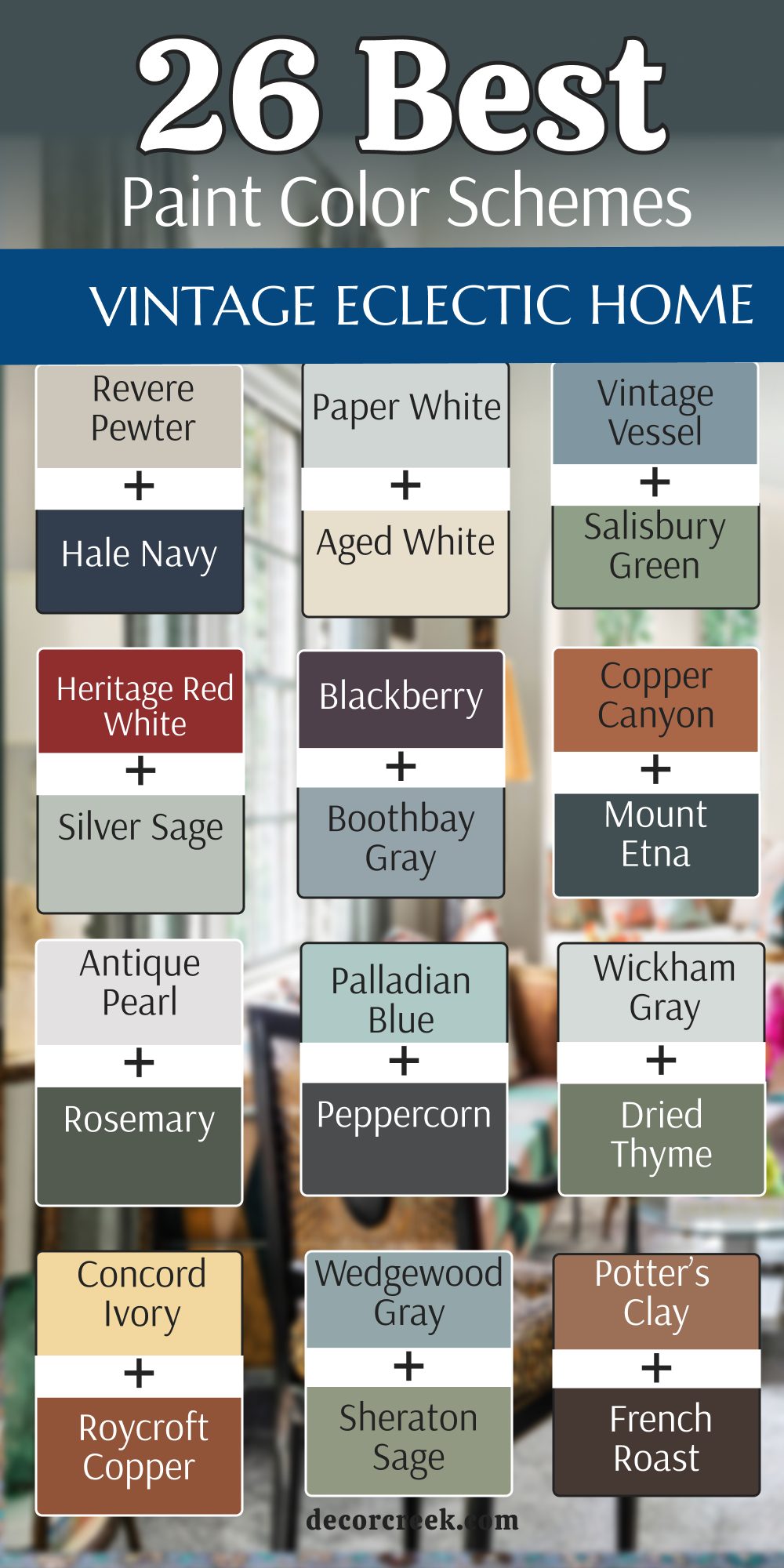
25 Paint Color Schemes For Cozy Eclectic Home
Swiss Coffee OC-45+Redend Point SW 9081
Swiss Coffee OC-45 is a creamy white that feels very soft and friendly rather than cold and clinical. This color is the perfect white for an eclectic home because it is warm and welcoming. Swiss Coffee OC-45 makes a room feel very bright and open while still feeling like a cozy hug.
I use it to tie together rooms that have many different colors of wood furniture. It provides a soft glow when the sun hits it and does not look harsh or blinding. This shade is a favorite for kitchen cabinets and trim because it looks very clean but still very soft.
You will notice that it makes your colorful art look very professional and crisp on the wall. It is a very flexible color that works in any room of the house regardless of the light. I think it is the best choice for anyone who wants a simple background that still feels high-quality. It is a staple for designers who want a home to feel light and airy.
Best used in: whole-house walls, trim, kitchen cabinets, and ceilings
Pairs well with: Fossil AF-65, Hale Navy HC-154, Revere Pewter HC-172, and natural light The key rule of this color for farmhouse style is to use it where you want natural light to feel kind, soft, and inviting throughout the day.
Redend Point SW 9081 is a soft and sandy pink-beige that feels like a warm desert breeze. This color brings a very grounded and organic feeling to an eclectic home that needs to feel more quiet. Redend Point SW 9081 acts like a big hug for your walls because it is so soft and inviting.
I love how it makes natural wood furniture and woven baskets look very intentional and stylish. It is a very friendly shade that helps people feel relaxed and at home as soon as they walk in. This color works beautifully in a bedroom where you want a sense of peace and total comfort.
You will see how it changes from a warm tan to a soft mauve depending on the time of day. It is a very sophisticated choice that feels much more modern than a basic brown or gray. This shade is perfect for anyone who wants a home that feels like a natural sanctuary from the world. It provides a beautiful background for gold accents and cream-colored textiles.
Best used in: bedrooms, living rooms, entryways, and cozy reading nooks
Pairs well with: Pure White SW 7005, Foothills SW 7514, Kestrel White SW 7516, and terracotta The key rule of this color for farmhouse style is to use it where you want natural light to feel kind, soft, and inviting throughout the day.

Pale Oak OC-20+Evergreen Fog SW 9130
Pale Oak OC-20 is a very light and graceful gray that has a lot of warmth hidden inside it. This color brings a very airy and clean feeling to an eclectic house that features a lot of vintage objects. Pale Oak OC-20 works perfectly to brighten up a dark hallway or a small kitchen without looking stark.
I use it to create a seamless look throughout a home because it adapts so well to different lighting conditions. It makes your colorful furniture look more expensive and your white trim look much brighter and cleaner. You will find that it is very forgiving with daily wear, which makes it great for busy family homes.
This shade provides a steady and reliable background for large gallery walls and tall bookshelves. It feels very fresh in the morning and transitions into a cozy, warm tone as the sun sets. Many people choose this color because it never feels too heavy or too loud for a relaxed life. It is a solid choice for creating a home that feels both open and very well-collected.
Best used in: open concept living areas, hallways, kitchens, and guest bedrooms
Pairs well with: Chantilly Lace OC-65, Revere Pewter HC-172, Hale Navy HC-154, and warm wood floors The key rule of this color for farmhouse style is to use it where you want natural light to feel kind, soft, and inviting throughout the day.

Evergreen Fog SW 9130 is a beautiful mix of green and gray that looks like a misty forest in the early morning. This color brings a very steady and natural energy to an eclectic home that wants to feel more grounded. Evergreen Fog SW 9130 is deep enough to have a lot of personality but light enough to stay very easy on the eyes.
I love how it makes wooden beams and stone fireplaces look like they belong in a quiet country setting. It is a very sophisticated shade that adds a lot of depth without being too dark or overwhelming for guests. This color works beautifully with cream-colored rugs and dark bronze hardware to create a balanced look.
You will find that it makes red and yellow accents in a room look very intentional and bright. It creates a very quiet and focused feeling that is perfect for a study or a cozy den. This color has a traditional heart that helps a busy home feel very well-organized and calm. Choosing this color shows you have a deep love for nature and a very steady style.
Best used in: bedrooms, studies, kitchen cabinets, and accent walls
Pairs well with: Shoji White SW 7042, Urbane Bronze SW 7048, Silver Strand SW 7057, and linen textiles The key rule of this color for farmhouse style is to use it where you want natural light to feel kind, soft, and inviting throughout the day.

Mushroom Cap 1114+ Malted Milk SW 6057
Mushroom Cap 1114 is a warm and earthy tan that feels like a soft piece of leather or a fresh loaf of bread. This color brings a high level of cozy energy to an eclectic home that needs more warmth. Mushroom Cap 1114 acts as a perfect background for a room full of books, blankets, and favorite antiques.
I use it to make large, cold rooms feel much more intimate and friendly for the whole family. It has a soft and glowing quality that makes the walls look like they are reaching out to greet you. This shade looks very high-end when paired with dark wood furniture and white linen curtains.
You will notice it creates a very welcoming light that makes everyone want to sit and talk for hours. It is a very safe choice that still feels much more interesting than a basic white or gray wall. Many people find that this color helps them feel more relaxed and at ease in their daily lives. It is a timeless choice that always feels very fresh and very full of heart.
Best used in: living rooms, entryways, bedrooms, and traditional dining areas
Pairs well with: Simply White OC-117, Van Buren Brown HC-70, Wedgewood Gray HC-146, and dark wood The key rule of this color for farmhouse style is to use it where you want natural light to feel kind, soft, and inviting throughout the day.
Malted Milk SW 6057 is a soft and dusty pink that feels like a warm drink on a very cold winter day. This color brings a sense of kindness and sweetness to an eclectic home that features a lot of hard edges. Malted Milk SW 6057 is a very grown-up version of pink that works beautifully as a soft neutral.
I use it to add a layer of warmth to rooms that feel a bit too cold or gray and boring. It makes people look very healthy and happy when they are standing in the room under soft light. This shade is perfect for a bedroom where you want to feel totally relaxed and at peace with yourself.
You will notice it behaves like an off-white but with a much more interesting and caring heart. It looks stunning when paired with dark charcoal accents or light gray rugs for a modern look. This color is a brave choice that ends up feeling very sophisticated and very welcoming to guests. It is an excellent way to show off your softer side in your overall home design plan.
Best used in: bedrooms, dressing rooms, powder rooms, and cozy nurseries
Pairs well with: Alabaster SW 7008, Urbane Bronze SW 7048, Agreeable Gray SW 7029, and soft textiles The key rule of this color for farmhouse style is to use it where you want natural light to feel kind, soft, and inviting throughout the day.
Quiet Moments 1563+Threaded Needle SW 9183
Quiet Moments 1563 is a soft blue-green-gray mix that reminds me of a peaceful morning sky over the water. This color brings a very cool and refreshing feeling to an eclectic room that has many warm textures. Quiet Moments 1563 is a great way to add personality to a space without it feeling too bright or busy.
I love how it changes its mood depending on whether the day is sunny or cloudy outside. It makes silver and glass items look very sparkly and clean against the muted background of the walls. This shade is a favorite for bedrooms because it feels very much like a high-end and quiet sanctuary.
You will notice that it helps a small room feel much more open and airy for the family. It is a very sophisticated choice for someone who loves nature-inspired colors and a relaxed life. I find that it works very well with dark gray floors or white marble accents in a kitchen. This color is a perfect example of how a muted tone can still be full of life.
Best used in: bedrooms, bathrooms, nursery walls, and laundry rooms
Pairs well with: White Dove OC-17, Gray Owl OC-52, Hale Navy HC-154, and silver accents The key rule of this color for farmhouse style is to use it where you want natural light to feel kind, soft, and inviting throughout the day.

Threaded Needle SW 9183 is a warm and earthy neutral that feels like a piece of vintage linen or a soft blanket. This color brings a very quiet and steady energy to an eclectic house that needs to feel more simple. Threaded Needle SW 9183 acts like a perfect foundation for a room full of mismatched furniture and unique art.
I use it to provide a clean and professional background that doesn’t compete with your favorite objects. It looks very natural and reminds me of handmade items and simple crafts from a local market. This shade is great for open living areas because it flows very easily from one room to another.
You will find that it makes blue and green accents stand out without feeling too heavy or dark. It is a very safe choice that still feels much more interesting than a basic white wall. I suggest it for homes that want to look organized and very well-thought-out for the future. It is a classic color that provides a very reliable base for your design.
Best used in: living rooms, hallways, kitchens, and whole-house painting
Pairs well with: Alabaster SW 7008, Iron Ore SW 7069, Naval SW 6244, and woven textures The key rule of this color for farmhouse style is to use it where you want natural light to feel kind, soft, and inviting throughout the day.
Cardamom AF-440+Svelte Sage SW 6164
Cardamom AF-440 is a rich and spicy tan that looks like a warm wood floor or a fresh cup of tea. This color brings a high level of heat and a sense of old-world energy to a cozy eclectic room. I like to use it in dining rooms to create a big impact that feels very intentional and high-end.
It makes dark wood furniture look absolutely stunning because the warm tones in the paint bring out the grain. This shade is perfect for a room filled with old maps, leather books, and favorite travel souvenirs. You will notice it creates a very cozy and welcoming light that makes everyone feel right at home. It is a very brave choice that works well in houses with a lot of character and history.
This color feels very solid and reminds me of fine craftsmanship and quality materials used in the past. It is an excellent way to add a bit of sunshine to a room that stays in the shadows. Choosing this color shows you have a fun and adventurous spirit in your home design.
Best used in: dining rooms, entryways, studies, and kitchen islands
Pairs well with: Steam AF-15, Flint AF-560, Revere Pewter HC-172, and copper accents The key rule of this color for farmhouse style is to use it where you want natural light to feel kind, soft, and inviting throughout the day.
Svelte Sage SW 6164 is a soft and earthy green that feels like a quiet walk through a meadow in late summer. This color brings a very natural and calm energy to an eclectic home filled with favorite vintage treasures. I love how it makes wooden furniture and stone fireplaces look like they belong in a quiet country setting.
It is a very sophisticated shade that adds a lot of depth without being too dark or heavy. This color works beautifully with cream-colored rugs and dark bronze hardware to create a balanced look. You will find that it makes red and yellow accents in a room look very intentional and bright.
It creates a very quiet and focused feeling that is perfect for a study or a cozy reading nook. This color has a traditional heart that helps a busy home feel very well-organized and steady. It stays looking fresh and clean even in rooms that do not get a lot of direct sunlight. Choosing this color shows you have a deep love for nature and classic, curated design.
Best used in: living rooms, guest bedrooms, sunrooms, and kitchen walls
Pairs well with: Alabaster SW 7008, Urbane Bronze SW 7048, Sea Salt SW 6204, and natural wood The key rule of this color for farmhouse style is to use it where you want natural light to feel kind, soft, and inviting throughout the day.
Cedar Key OC-16+Likeable Sand SW 6058
Cedar Key OC-16 is a warm and sandy tan that feels like a quiet beach on a very cloudy day. This color brings a high level of cozy energy to an eclectic home that needs a soft and steady background. Cedar Key OC-16 acts as a perfect mediator for a room full of bright pillows, colorful rugs, and mismatched furniture.
I use it to make large and open spaces feel much more intimate and friendly for family gatherings. It has a tiny bit of gray in it which keeps the tan from looking too orange or dated. This shade looks very high-end when paired with white linen curtains and dark chocolate wood furniture.
You will notice it creates a very welcoming light that makes everyone want to sit and stay for a second cup of tea. It is a very safe choice that still feels much more interesting than a basic white or gray wall. Many people find that this color helps them feel more relaxed and grounded in their daily lives. It is a timeless choice that always feels very fresh and very full of heart.
Best used in: living rooms, hallways, guest bedrooms, and laundry rooms
Pairs well with: White Dove OC-17, Revere Pewter HC-172, Hale Navy HC-154, and natural textures The key rule of this color for farmhouse style is to use it where you want natural light to feel kind, soft, and inviting throughout the day.

Likeable Sand SW 6058 is a soft and dusty pink-tan that feels like a warm desert sunset in the summer. This color brings a sense of kindness and comfort to an eclectic home that features a lot of metal or wood. Likeable Sand SW 6058 is a very grown-up version of a blush color that works beautifully as a soft neutral.
I use it to add a layer of warmth to rooms that feel a bit too cold or like they are missing a soul. It makes people look very healthy and glowing when they are standing in the room under soft evening light. This shade is perfect for a bedroom where you want to feel totally relaxed and safe from the outside world.
You will notice it behaves like an off-white but with a much more interesting and caring heart for the home. It looks stunning when paired with dark charcoal accents or light gray rugs for a very modern look. This color is a brave choice that ends up feeling very sophisticated and very welcoming to all your guests. It is an excellent way to show off your softer side in your overall home design plan.
Best used in: bedrooms, nurseries, powder rooms, and cozy entryways
Pairs well with: Alabaster SW 7008, Urbane Bronze SW 7048, Iron Ore SW 7069, and soft textiles The key rule of this color for farmhouse style is to use it where you want natural light to feel kind, soft, and inviting throughout the day.
October Mist 1495+Morris Room Grey SW 0037
October Mist 1495 is a soft and silver-green that reminds me of the first frost on a quiet garden. This color brings a very steady and natural energy to an eclectic home that wants to feel more grounded. October Mist 1495 is deep enough to have a lot of personality but light enough to stay very easy on the eyes.
I love how it makes wooden beams and stone fireplaces look like they belong in a quiet country setting. It is a very sophisticated shade that adds a lot of depth without being too dark or overwhelming for guests. This color works beautifully with cream-colored rugs and dark bronze hardware to create a balanced look.
You will find that it makes red and yellow accents in a room look very intentional and bright. It creates a very quiet and focused feeling that is perfect for a study or a cozy den. This color has a traditional heart that helps a busy home feel very well-organized and calm. Choosing this color shows you have a deep love for nature and a very steady style.
Best used in: kitchens, bedrooms, home offices, and accent walls
Pairs well with: Steam AF-15, Gloucester Sage HC-100, Saybrook Sage HC-114, and botanical prints The key rule of this color for farmhouse style is to use it where you want natural light to feel kind, soft, and inviting throughout the day.

Morris Room Grey SW 0037 is a deep and historical tan that feels like a room in a very old and grand hotel. This color brings a high level of luxury and a sense of stability to a cozy eclectic home. Morris Room Grey SW 0037 acts as a perfect background for a room full of books, gold frames, and velvet chairs.
I use it to make large, open spaces feel much more intimate and friendly for the whole family. It has a soft and glowing quality that makes the walls look like they are reaching out to greet you. This shade looks very high-end when paired with dark wood furniture and white linen curtains.
You will notice it creates a very welcoming light that makes everyone want to sit and talk for hours. It is a very safe choice that still feels much more interesting than a basic white or gray wall. Many people find that this color helps them feel more relaxed and at ease in their daily lives. It is a timeless choice that always feels very fresh and very full of heart.
Best used in: formal dining rooms, living areas, dens, and master bedrooms
Pairs well with: Westhighland White SW 7566, Urbane Bronze SW 7048, Naval SW 6244, and leather accents The key rule of this color for farmhouse style is to use it where you want natural light to feel kind, soft, and inviting throughout the day.
Muscadine Berry 1109+Warm Stone SW 7032
Muscadine Berry 1109 is a rich and dusty purple that feels like a bowl of fresh fruit in the summer heat. This color brings a lot of drama and a sense of luxury to a cozy eclectic home design. I use it to create a very private and special feeling in a master bedroom or a small, quiet den.
It is a very dense color that covers the walls with a deep and velvety texture that hides marks well. This shade makes gold mirrors and light-colored rugs look absolutely stunning and very intentional in their placement. You will notice that it stays looking very rich even in a room that does not get much natural light.
It is a very brave choice that shows you are not afraid to be different and bold with your personal style. This color is perfect for a house that features a lot of old glass and dark wood accents. It feels very romantic and helps a room feel like a secret hideaway from the rest of the world. Choosing this color means you want your home to be a place of beauty and deep, quiet strength.
Best used in: bedrooms, dining rooms, powder rooms, and accent walls
Pairs well with: Swiss Coffee OC-45, Revere Pewter HC-172, Gray Owl OC-52, and brass hardware The key rule of this color for farmhouse style is to use it where you want natural light to feel kind, soft, and inviting throughout the day.
Warm Stone SW 7032 is a medium-toned gray-brown that feels like a solid wall in a cozy mountain cabin. This color brings a very steady and grounded feeling to an eclectic house that features a lot of wood. Warm Stone SW 7032 acts as a perfect mediator for a room full of bright pillows, colorful rugs, and furniture.
I use it to make large and open spaces feel much more intimate and friendly for family gatherings. It has a tiny bit of warmth in it which keeps the gray from looking too cold or clinical. This shade looks very high-end when paired with white linen curtains and dark chocolate wood furniture.
You will notice it creates a very welcoming light that makes everyone want to sit and stay for a second cup of tea. It is a very safe choice that still feels much more interesting than a basic white or gray wall. Many people find that this color helps them feel more relaxed and grounded in their daily lives. It is a timeless choice that always feels very fresh and very full of heart.
Best used in: living rooms, kitchens, entryways, and exterior trim
Pairs well with: Alabaster SW 7008, Accessible Beige SW 7036, Urbane Bronze SW 7048, and natural wood The key rule of this color for farmhouse style is to use it where you want natural light to feel kind, soft, and inviting throughout the day.

Manchester Tan HC-81+Foothills SW 7514
Manchester Tan HC-81 is a very smart and steady neutral that stays warm without looking like a yellow sponge. This color acts as a perfect mediator in an eclectic home where you have many competing patterns and rugs. Manchester Tan HC-81 has a slight gray undertone that keeps it looking fresh and modern even in older houses.
I use it to create a seamless look throughout a whole house because it adapts so well to lighting. It makes your colorful furniture look more expensive and your white trim look much brighter and cleaner. You will find that it is very forgiving with wall scuffs and fingerprints, which makes it great for families. This shade provides a steady and reliable background for gallery walls and large bookshelves.
It feels very airy in the morning and transitions into a cozy, warm tone as the evening sun sets. Many designers call this the perfect neutral because it never clashes with other colors in the room. It is a solid choice for creating a home that feels both open and very well-collected.
Best used in: living rooms, hallways, kitchens, and whole-house painting
Pairs well with: Simply White OC-117, Revere Pewter HC-172, Hale Navy HC-154, and dark wood floors The key rule of this color for farmhouse style is to use it where you want natural light to feel kind, soft, and inviting throughout the day.

Foothills SW 7514 is a deep and earthy brown-gray that feels like a quiet forest path in the late fall. This color brings a high level of luxury and a sense of stability to a cozy eclectic home design. Foothills SW 7514 acts as a perfect background for a room full of books, gold frames, and velvet chairs.
I use it to make large, open spaces feel much more intimate and friendly for the whole family. It has a soft and glowing quality that makes the walls look like they are reaching out to greet you. This shade looks very high-end when paired with dark wood furniture and white linen curtains.
You will notice it creates a very welcoming light that makes everyone want to sit and talk for hours. It is a very safe choice that still feels much more interesting than a basic white or gray wall. Many people find that this color helps them feel more relaxed and at ease in their daily lives. It is a timeless choice that always feels very fresh and very full of heart.
Best used in: dining rooms, master bedrooms, dens, and kitchen islands
Pairs well with: Shoji White SW 7042, Accessible Beige SW 7036, Naval SW 6244, and leather accents The key rule of this color for farmhouse style is to use it where you want natural light to feel kind, soft, and inviting throughout the day.
Cloud White OC-130+Wythe Blue HC-143
Cloud White OC-130 is a soft and milky white that feels very light and airy without being cold or clinical. This color is the perfect white for an eclectic home because it is warm and welcoming to every guest. Cloud White OC-130 makes a room feel very bright and open while still feeling like a cozy, soft hug.
I use it to tie together rooms that have many different colors of wood furniture and bright patterns. It provides a soft glow when the sun hits it and does not look harsh or blinding during the day. This shade is a favorite for kitchen cabinets and trim because it looks very clean but still very soft.
You will notice that it makes your colorful art look very professional and crisp on the wall. It is a very flexible color that works in any room of the house regardless of the natural light. I think it is the best choice for anyone who wants a simple background that still feels high-quality. It is a staple for designers who want a home to feel light and airy.
Best used in: walls, trim, ceilings, and kitchen cabinetry
Pairs well with: Simply White OC-117, Revere Pewter HC-172, Gray Owl OC-52, and natural light The key rule of this color for farmhouse style is to use it where you want natural light to feel kind, soft, and inviting throughout the day.

Wythe Blue HC-143 is a beautiful mix of blue, green, and gray that looks like an old-fashioned jewelry box. This color brings a very cool and refreshing feeling to a cozy eclectic room that has a lot of warm wood furniture. Wythe Blue HC-143 is a great way to add personality to a space without it feeling too bright or overwhelming for your eyes.
I love how it changes its mood depending on whether the day is sunny or cloudy outside your windows. It makes silver and glass items look very sparkly and clean against the muted background of the paint. This shade is a favorite for front doors and dining rooms because it feels very high-end and very stable.
You will notice that it helps a small room feel much more open and airy for your family and guests. It is a very sophisticated choice for someone who loves nature-inspired colors and a relaxed way of living. I find that it works very well with dark gray floors or white marble accents in a kitchen. This color is a perfect example of how a muted tone can still be full of energy.
Best used in: front doors, dining rooms, kitchen islands, and master bedrooms
Pairs well with: White Dove OC-17, Revere Pewter HC-172, Hale Navy HC-154, and gold accents The key rule of this color for farmhouse style is to use it where you want natural light to feel kind, soft, and inviting throughout the day.

Westhighland White SW 7566+French Macaroon SW 9003
Westhighland White SW 7566 is a very warm and creamy white that feels like a fresh bowl of vanilla ice cream. This color is perfect for an eclectic home because it brings a soft and gentle energy to the walls. Westhighland White SW 7566 acts like a light and bright background that still has a lot of heart and warmth.
I use it to make small rooms feel much larger and to bring a little bit of happiness inside. It changes its look slightly throughout the day, always looking very clean and very inviting for the family. This shade is a great alternative to plain white because it adds a layer of depth and soft texture.
You can use it to highlight architectural details like crown molding or built-in cabinets in a living room. It feels very lightweight and makes the ceilings in a room look much higher than they really are. This color is a top pick for anyone who loves a cozy and collected eclectic style for their home. It provides a very clean canvas for all your colorful pillows and handmade blankets.
Best used in: whole-house walls, kitchens, bedrooms, and trim
Pairs well with: Urbane Bronze SW 7048, Foothills SW 7514, Sea Salt SW 6204, and warm wood The key rule of this color for farmhouse style is to use it where you want natural light to feel kind, soft, and inviting throughout the day.
French Macaroon SW 9003 is a soft and creamy green that feels like a light dessert or a fresh spring leaf. This color brings a gentle and happy energy to a cozy eclectic home that needs a bit more life. I love how it looks in a kitchen with white tile or in a bedroom with floral blankets and light wood furniture.
It has a soft and chalky quality that makes the walls look very expensive and very custom. This shade is a great way to add color without making the house look too dark or heavy for the family. You will see how it highlights the details in your favorite wooden frames and woven baskets.
It creates a very peaceful mood that is perfect for a home used for relaxing and reading books. This color is very popular with people who love a look that is both fresh and very traditional. It is a very charming choice that adds a lot of personality to any room in the house. I think it is one of the best colors for making a house feel truly special.
Best used in: kitchens, bathrooms, laundry rooms, and bedroom walls
Pairs well with: Alabaster SW 7008, Pure White SW 7005, Sea Salt SW 6204, and light oak floors The key rule of this color for farmhouse style is to use it where you want natural light to feel kind, soft, and inviting throughout the day.
Cinnamon Toast 2101-30+Wool Skein SW 6148
Cinnamon Toast 2101-30 is a deep and spicy brown that feels like a warm fire or a fresh cup of coffee. This color brings a high level of heat and a sense of old-world energy to a cozy eclectic house. I like to use it in small spaces to create a big impact that feels very intentional and very cozy.
It makes dark wood antiques look absolutely stunning because the warm tones in the paint bring out the grain of the wood. This shade is perfect for a room filled with old maps, leather books, and favorite travel souvenirs. You will notice it creates a very welcoming light that makes everyone feel right at home as soon as they sit down.
It is a very brave choice that works well in houses with a lot of character and a long history. This color feels very solid and reminds me of fine craftsmanship and quality materials used many years ago. It is an excellent way to add a bit of sunshine to a room that stays in the shadows. Choosing this color shows you have a fun and adventurous spirit in your home design.
Best used in: dens, entryways, powder rooms, and library corners
Pairs well with: Simply White OC-117, Van Buren Brown HC-70, Revere Pewter HC-172, and copper hardware The key rule of this color for farmhouse style is to use it where you want natural light to feel kind, soft, and inviting throughout the day.
Wool Skein SW 6148 is a soft and steady tan that has a tiny bit of green hidden inside it to keep it fresh. This color is a true workhorse for a cozy eclectic home because it goes with almost everything you already own. Wool Skein SW 6148 provides a clean and professional background for a room full of busy patterns and rugs.
I use it when a client has a lot of colorful furniture that needs a quiet and soft place to sit. It looks very natural and reminds me of a sturdy canvas bag or a piece of heavy linen fabric. This shade is great for open living areas because it flows very easily from one room to another during the day.
You will find that it makes blue and red accents stand out without feeling too heavy or too dark. It is a very safe choice that still feels much more interesting than a basic white wall for your family. I suggest it for homes that want to look organized and very well-thought-out for the long term. It is a classic color that provides a very reliable base for your design plans.
Best used in: whole-house walls, hallways, kitchens, and sunrooms
Pairs well with: Alabaster SW 7008, Urbane Bronze SW 7048, Naval SW 6244, and woven textures The key rule of this color for farmhouse style is to use it where you want natural light to feel kind, soft, and inviting throughout the day.

Deep Creek 1477+Hale Navy HC-154
Deep Creek 1477 is a rich and earthy olive-gray that feels like a walk through a deep forest in the autumn. This color brings a very steady and grounded feeling to a cozy eclectic house that features a lot of wood. Deep Creek 1477 acts as a perfect background for a room full of books, gold frames, and velvet chairs.
I use it to make large and open spaces feel much more intimate and friendly for your family gatherings. It has a soft and glowing quality that makes the walls look like they are reaching out to greet everyone. This shade looks very high-end when paired with dark wood furniture and white linen curtains in a master bedroom.
You will notice it creates a very welcoming light that makes everyone want to sit and talk for hours on end. It is a very safe choice that still feels much more interesting than a basic white or gray wall. Many people find that this color helps them feel more relaxed and at ease in their daily lives. It is a timeless choice that always feels very fresh and very full of heart.
Best used in: dining rooms, home offices, master bedrooms, and accent walls
Pairs well with: Cloud White OC-130, Gray Owl OC-52, Hale Navy HC-154, and natural wood The key rule of this color for farmhouse style is to use it where you want natural light to feel kind, soft, and inviting throughout the day.
Hale Navy HC-154 is a deeply saturated blue that feels like a crisp uniform or a stormy sea at night. This color is a true classic that brings a lot of authority and weight to a vintage eclectic room. I love how it makes white crown molding look sharp and very professional against the dark walls.
It is a great choice for a study or a library where you want to feel tucked away and focused. This shade works as a neutral because it goes so well with red, yellow, and green accents. You will find that it makes copper pots and brass lamps look like they are glowing from within.
It creates a very safe and protective feeling that is perfect for a cozy bedroom retreat. This color is very popular for kitchen islands because it anchors the room and hides daily wear. It is a very confident shade that tells a story of strength and good taste. Choosing this color means you appreciate a look that has worked for generations.
Best used in: libraries, bedrooms, kitchen islands, and front doors
Pairs well with: Coventry Gray HC-169, Lenox Tan HC-44, Cloud White OC-130, and leather books The key rule of this color for farmhouse style is to use it where you want natural light to feel kind, soft, and inviting throughout the day.
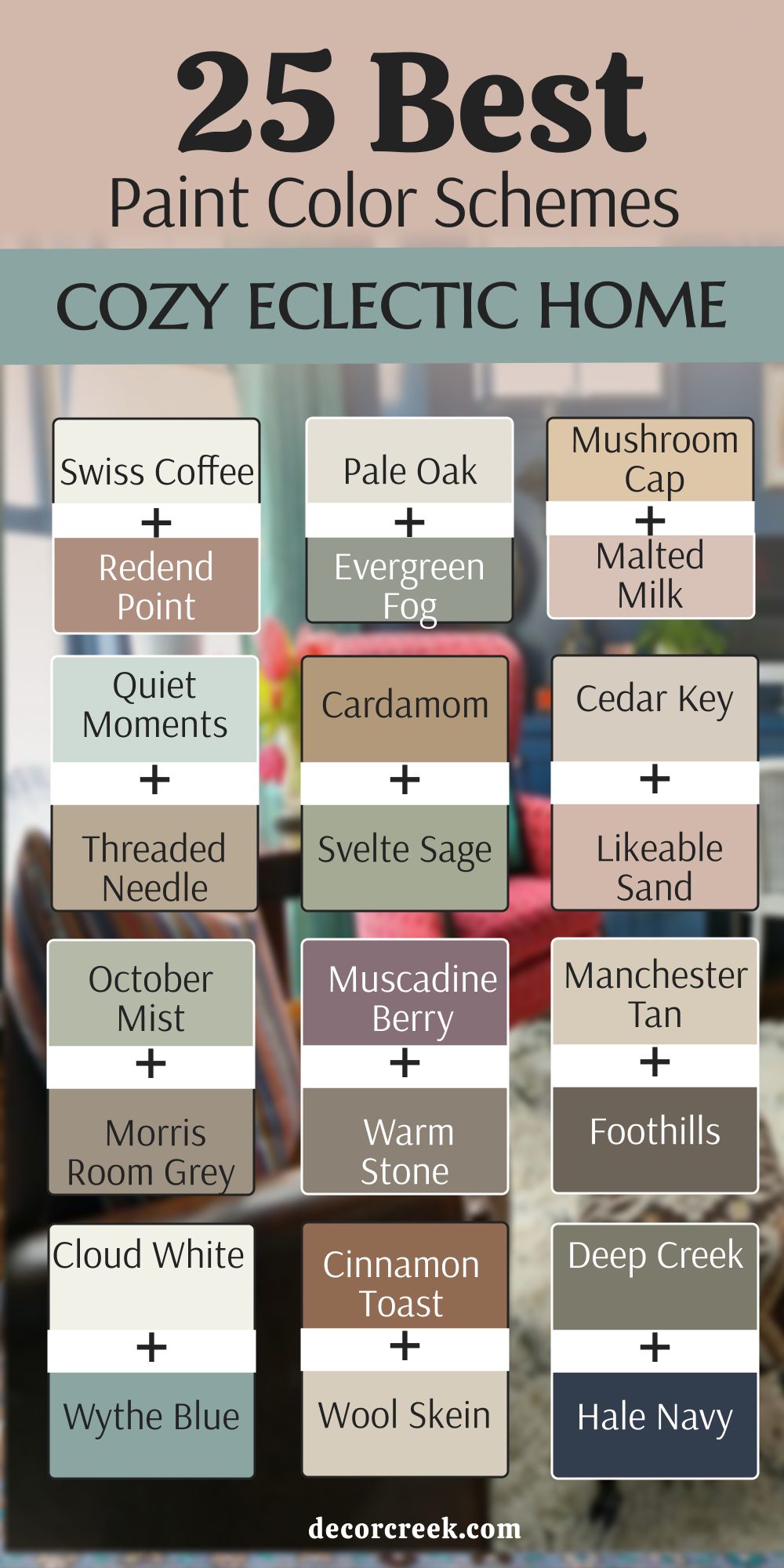
23 Paint Color Ideas For Modern Eclectic Home
High Reflective White SW 7757
High Reflective White SW 7757 is a very pure and bright white that feels like a clean art gallery wall. This color is the perfect base for a modern eclectic home because it has no hidden yellow or blue tones. High Reflective White SW 7757 makes every piece of colorful furniture and art in the room look incredibly sharp and clear.
I use it to open up dark rooms and to make small spaces feel like they go on forever for the family. It provides a very crisp and professional background that lets your unique design choices do all the talking. This shade is a favorite for modern kitchens and bathrooms because it feels very hygienic and very fresh.
You will notice that it reflects a lot of natural light, making the whole house feel more energetic and happy. It is a very flexible color that works in any room regardless of the furniture you choose to place there. I think it is the best choice for anyone who wants a simple and clean background that still feels high-quality. It is a staple for designers who want a home to feel very light and very modern.
Best used in: modern living rooms, art-heavy hallways, kitchens, and trim
Pairs well with: Tricorn Black SW 6258, Iron Ore SW 7069, Naval SW 6244, and bright accent colors The key rule of this color for farmhouse style is to use it where you want natural light to feel kind, soft, and inviting throughout the day.
Iron Mountain 2134-30
Iron Mountain 2134-30 is a deep and smoky charcoal that feels like a solid piece of stone or a dark mountain. This color brings a lot of drama and a sense of high-end luxury to a modern eclectic home design. I use it to create a very private and special feeling in a media room or a large living area.
It is a very dense color that covers the walls with a deep and velvety texture that hides wall marks well. This shade makes gold mirrors and light-colored rugs look absolutely stunning and very intentional in their placement. You will notice that it stays looking very rich even in a room that does not get much natural light.
It is a very brave choice that shows you are not afraid to be different and bold with your personal style. This color is perfect for a house that features a lot of modern art and dark metal accents in every room. It feels very sophisticated and helps a room feel like a high-end retreat from the busy world outside. Choosing this color means you want your home to be a place of beauty and deep, quiet strength.
Best used in: media rooms, dining rooms, accent walls, and kitchen islands
Pairs well with: Chantilly Lace OC-65, Revere Pewter HC-172, Stonington Gray HC-170, and industrial metal The key rule of this color for farmhouse style is to use it where you want natural light to feel kind, soft, and inviting throughout the day.

Greek Villa SW 7551
Greek Villa SW 7551 is a soft and creamy white that feels very sunny and warm without looking too yellow. This color is a favorite for modern eclectic homes because it makes the space feel very bright and very friendly. Greek Villa SW 7551 acts as a perfect background for a room full of books, colorful art, and favorite wooden furniture.
I use it to create a seamless look throughout a whole house because it adapts so well to different lighting. It makes your colorful furniture look more expensive and your dark metal accents look much sharper and cleaner. You will find that it is very forgiving with daily wear, which makes it great for busy family homes with children.
This shade provides a steady and reliable background for gallery walls and large bookshelves in a living room. It feels very airy in the morning and transitions into a cozy, warm tone as the sun sets in the evening. Many designers choose this color because it never feels too heavy or too loud for a relaxed life. It is a solid choice for creating a home that feels both open and very well-collected.
Best used in: whole-house walls, kitchens, bedrooms, and exteriors
Pairs well with: Urbane Bronze SW 7048, Naval SW 6244, Accessible Beige SW 7036, and natural textures The key rule of this color for farmhouse style is to use it where you want natural light to feel kind, soft, and inviting throughout the day.

Metropolis CC-546
Metropolis CC-546 is a sophisticated and deep gray that feels like a high-end office in a big city. This color brings a very smart and steady energy to a modern eclectic home that has a lot of style. I use it to provide a strong background for gallery walls and large wooden bookshelves in a modern living room.
It has enough depth to be interesting but enough gray to stay very mature and easy on the eyes. This shade looks very high-end when paired with white trim and dark oak floors in a dining area. You will notice it makes your modern art and silver frames look very important and clear for everyone to see.
It creates a very peaceful and organized feeling that is hard to find with brighter colors for the house. This color is very popular because it feels both very fresh and very much like a part of a well-planned design. It is a great choice for anyone who wants a house that feels solid, professional, and very well-designed. I find that it works beautifully in almost any lighting condition throughout the day.
Best used in: living rooms, home offices, dining rooms, and hallways
Pairs well with: Simply White OC-117, Revere Pewter HC-172, Hale Navy HC-154, and glass decor The key rule of this color for farmhouse style is to use it where you want natural light to feel kind, soft, and inviting throughout the day.
Black Magic SW 6991
Black Magic SW 6991 is a very dark and honest black that feels like a deep night sky without any stars. This color is a very brave choice that brings a lot of authority and weight to a modern eclectic room. I love how it makes white crown molding look sharp and very professional against the dark walls of a house.
It is a great choice for a study or a library where you want to feel totally tucked away and focused. This shade works as a neutral because it goes so well with red, yellow, and green accents in your design. You will find that it makes copper pots and brass lamps look like they are glowing from within the room.
It creates a very safe and protective feeling that is perfect for a cozy bedroom retreat for the family. This color is very popular for kitchen islands because it anchors the room and hides daily wear and fingerprints. It is a very confident shade that tells a story of strength and good taste to every visitor. Choosing this color means you appreciate a look that is both bold and very permanent.
Best used in: accent walls, window trim, kitchen islands, and interior doors
Pairs well with: Extra White SW 7006, Agreeable Gray SW 7029, Alabaster SW 7008, and bright metals The key rule of this color for farmhouse style is to use it where you want natural light to feel kind, soft, and inviting throughout the day.
Aegean Teal 2136-40
Aegean Teal 2136-40 is a balanced blend of blue and green with a gray foundation that feels very smart and grounded. This color brings a high level of sophistication to a modern eclectic home that needs a bit of moody energy. I love using it on kitchen cabinets or in a dining room to make the space feel very intentional and high-end.
It has a way of making simple white dishes and light wood furniture look much more expensive than they are. This shade acts like a deep neutral that works beautifully with orange or yellow accent pillows in a living room. You will notice it creates a very calm and steady light that helps everyone feel relaxed during long dinner parties.
It is a very brave choice for 2026 that shows you have a great eye for depth and rich tones. This color feels very solid and reminds me of the deep water in a quiet bay under a cloudy sky. It is an excellent way to add color to a modern house without making it look like a child’s playroom. Choosing this color means you want a home that feels both creative and very well-designed.
Best used in: kitchen cabinets, dining rooms, home offices, and accent walls
Pairs well with: Cloud White OC-130, Gray Owl OC-52, Hale Navy HC-154, and walnut wood The key rule of this color for farmhouse style is to use it where you want natural light to feel kind, soft, and inviting throughout the day.
Shoji White SW 7042
Shoji White SW 7042 is a very warm and soft off-white that feels like a piece of handmade paper or a light stone. This color is a favorite for modern eclectic homes because it makes the walls look very clean but never cold. Shoji White SW 7042 acts as a perfect background for a room full of black metal furniture and large green plants.
I use it to create a seamless look throughout a whole house because it adapts so well to natural sunlight. It makes your colorful art look more professional and your dark furniture look much sharper and cleaner to the eye. You will find that it is very forgiving with daily wear, which makes it great for busy families with pets.
This shade provides a steady and reliable background for gallery walls and large bookshelves in any modern living area. It feels very airy in the morning and transitions into a cozy, warm tone as the evening sun starts to set. Many designers choose this color because it never feels too heavy or too loud for a relaxed and collected life. It is a solid choice for creating a home that feels both open and very well-built.
Best used in: whole-house walls, exteriors, kitchens, and modern living areas
Pairs well with: Urbane Bronze SW 7048, Pure White SW 7005, Iron Ore SW 7069, and natural wood The key rule of this color for farmhouse style is to use it where you want natural light to feel kind, soft, and inviting throughout the day.

Gray Owl OC-52
Gray Owl OC-52 is a light and cool gray that feels very much like a misty morning sky over a modern city. This color brings a very crisp and refreshing energy to a modern eclectic room that has a lot of colorful furniture. Gray Owl OC-52 is a great way to add a bit of depth to a space without making it feel dark or heavy.
I love how it changes its mood depending on whether the day is sunny or rainy outside your window. It makes silver and glass items look very sparkly and clean against the muted background of the walls. This shade is a favorite for modern bathrooms because it feels very much like a high-end and quiet sanctuary.
You will notice that it helps a small room feel much more open and airy for your family and guests. It is a very sophisticated choice for someone who loves a clean look and a very relaxed way of living. I find that it works very well with dark gray floors or white marble countertops in a modern kitchen. This color is a perfect example of how a light tone can still have a lot of character.
Best used in: bathrooms, modern kitchens, open living areas, and small bedrooms
Pairs well with: White Dove OC-17, Hale Navy HC-154, Revere Pewter HC-172, and black accents The key rule of this color for farmhouse style is to use it where you want natural light to feel kind, soft, and inviting throughout the day.

Peppercorn SW 7674
Peppercorn SW 7674 is a very dark and moody gray that feels like a piece of heavy slate or a deep shadow. This color brings a lot of drama and a sense of high-end luxury to a modern eclectic house design. I use it to create a very private and special feeling in a media room or a large, open living area.
It is a very dense color that covers the walls with a deep and velvety texture that hides wall marks very well. This shade makes gold mirrors and light-colored rugs look absolutely stunning and very intentional in their placement. You will notice that it stays looking very rich even in a room that does not get much natural light.
It is a very brave choice that shows you are not afraid to be different and bold with your personal style. This color is perfect for a house that features a lot of modern art and dark metal accents in every room. It feels very sophisticated and helps a room feel like a high-end retreat from the busy world outside. Choosing this color means you want your home to be a place of beauty and deep strength.
Best used in: media rooms, dining rooms, accent walls, and kitchen cabinets
Pairs well with: Alabaster SW 7008, Repose Gray SW 7015, Extra White SW 7006, and cognac leather The key rule of this color for farmhouse style is to use it where you want natural light to feel kind, soft, and inviting throughout the day.
Hale Navy HC-154
Hale Navy HC-154 is a deeply saturated blue that feels like a crisp uniform or the dark ocean at night. This color is a true classic that brings a lot of authority and weight to a modern eclectic room. I love how it makes white trim look sharp and very professional against the dark walls of a modern house.
It is a great choice for a home office or a bedroom where you want to feel totally tucked away. This shade works as a neutral because it goes so well with red, orange, and light gray accents in your design. You will find that it makes copper pots and brass lamps look like they are glowing from within the room.
It creates a very safe and protective feeling that is perfect for a cozy and modern bedroom retreat. This color is very popular for kitchen islands because it anchors the room and hides daily wear and fingerprints. It is a very confident shade that tells a story of strength and good taste to every visitor who enters. Choosing this color means you appreciate a look that is both bold and very permanent.
Best used in: library walls, bedrooms, kitchen islands, and front doors
Pairs well with: Coventry Gray HC-169, Lenox Tan HC-44, Cloud White OC-130, and leather accents The key rule of this color for farmhouse style is to use it where you want natural light to feel kind, soft, and inviting throughout the day.
Repose Gray SW 7015
Repose Gray SW 7015 is a very smart and steady neutral that stays cool without ever looking like cold concrete. This color acts as a perfect mediator in a modern eclectic home where you have many bright pieces of furniture. Repose Gray SW 7015 has a slight warmth to it that keeps it from looking too clinical or like a hospital room.
I use it to create a seamless look throughout a whole house because it adapts so well to different lighting. It makes your colorful art look more expensive and your white trim look much brighter and cleaner to the eye. You will find that it is very forgiving with wall scuffs and fingerprints, which makes it great for busy families.
This shade provides a steady and reliable background for large gallery walls and modern metal bookshelves. It feels very airy in the morning and transitions into a cozy tone as the evening sun starts to set. Many designers call this the perfect gray because it never clashes with other colors in the room. It is a solid choice for creating a home that feels both open and very well-designed.
Best used in: open concept living areas, hallways, kitchens, and whole-house walls
Pairs well with: Eider White SW 7014, Pavestone SW 7642, Naval SW 6244, and dark wood floors The key rule of this color for farmhouse style is to use it where you want natural light to feel kind, soft, and inviting throughout the day.

Caliente AF-290
Caliente AF-290 is a bright and energetic red that feels like a bold statement or a spicy pepper. This color brings a high level of heat and a sense of modern energy to an eclectic home that needs a spark. I love using it on a focal wall or a front door to make the house feel very alive and very brave.
It has a way of making simple black furniture and white rugs look incredibly sharp and very professional. This shade is perfect for a dining room or a kitchen where you want to feel active and happy. You will notice it creates a very warm and inviting light that makes everyone feel more talkative and energized.
It is a very brave choice for 2026 that shows you have a lot of confidence in your personal home style. This color feels very solid and reminds me of high-end art galleries and modern design museums. It is an excellent way to add color to a house without it looking traditional or old-fashioned. Choosing this color means you want a home that feels both bold and very full of life.
Best used in: accent walls, dining rooms, front doors, and modern kitchens
Pairs well with: White Heron OC-57, Black Beauty 2128-10, Gray Owl OC-52, and modern metal The key rule of this color for farmhouse style is to use it where you want natural light to feel kind, soft, and inviting throughout the day.
Caviar SW 6990
Caviar SW 6990 is a very deep and rich black that feels like a piece of dark velvet or a quiet night. This color brings a lot of drama and a sense of high-end luxury to a modern eclectic home design. I use it to create a very private and special feeling in a bedroom or a small, cozy media room.
It is a very dense color that covers the walls with a deep and smooth texture that hides wall marks well. This shade makes gold mirrors and light-colored rugs look absolutely stunning and very intentional in their placement. You will notice that it stays looking very rich even in a room that does not get much natural light.
It is a very brave choice that shows you are not afraid to be different and bold with your design. This color is perfect for a house that features a lot of modern art and dark metal accents in every room. It feels very sophisticated and helps a room feel like a high-end retreat from the busy world outside. Choosing this color means you want your home to be a place of beauty and deep, quiet strength.
Best used in: modern bedrooms, accent walls, exterior trim, and kitchen islands
Pairs well with: Extra White SW 7006, Agreeable Gray SW 7029, Alabaster SW 7008, and bright metals The key rule of this color for farmhouse style is to use it where you want natural light to feel kind, soft, and inviting throughout the day.
Stonington Gray HC-170
Stonington Gray HC-170 is a sophisticated and cool gray that feels like a solid piece of stone in a modern building. This color brings a very smart and steady energy to a modern eclectic home that has a lot of unique style. I use it to provide a strong background for gallery walls and large metal bookshelves in a modern living room.
It has enough depth to be interesting but enough gray to stay very mature and easy on the eyes. This shade looks very high-end when paired with white trim and dark oak floors in a modern dining area. You will notice it makes your colorful art and silver frames look very important and clear for everyone to see.
It creates a very peaceful and organized feeling that is hard to find with brighter colors for the house. This color is very popular because it feels both very fresh and very much like a part of a well-planned design. It is a great choice for anyone who wants a house that feels solid, professional, and very modern. I find that it works beautifully in almost any lighting throughout the day.
Best used in: living rooms, kitchens, hallways, and modern exteriors
Pairs well with: Simply White OC-117, Revere Pewter HC-172, Hale Navy HC-154, and glass decor The key rule of this color for farmhouse style is to use it where you want natural light to feel kind, soft, and inviting throughout the day.

Jasper SW 6216
Jasper SW 6216 is a very deep and moody green that feels like a dark forest during a heavy rainstorm. This color brings a lot of drama and a sense of high-end luxury to a modern eclectic home design. I use it to create a very private and special feeling in a dining room or a large, open living area.
It is a very dense color that covers the walls with a deep and velvety texture that hides marks very well. This shade makes gold mirrors and light-colored rugs look absolutely stunning and very intentional in their placement. You will notice that it stays looking very rich even in a room that does not get much natural light.
It is a very brave choice that shows you are not afraid to be different and bold with your personal style. This color is perfect for a house that features a lot of modern art and dark metal accents in every room. It feels very sophisticated and helps a room feel like a high-end retreat from the busy world outside. Choosing this color means you want your home to be a place of beauty and deep, quiet strength.
Best used in: dining rooms, accent walls, kitchen cabinets, and exterior doors
Pairs well with: Alabaster SW 7008, Accessible Beige SW 7036, Sea Salt SW 6204, and dark leather The key rule of this color for farmhouse style is to use it where you want natural light to feel kind, soft, and inviting throughout the day.

Paper White OC-55
Paper White OC-55 is a very light and cool gray that feels like a fresh sheet of paper or a morning mist. This color is a favorite for modern eclectic homes because it makes the space feel very bright and very professional. Paper White OC-55 acts as a perfect background for a room full of books, colorful art, and modern furniture.
I use it to create a seamless look throughout a whole house because it adapts so well to different lighting. It makes your colorful furniture look more expensive and your dark metal accents look much sharper and cleaner. You will find that it is very forgiving with daily wear, which makes it great for busy family homes with children.
This shade provides a steady and reliable background for gallery walls and large bookshelves in a modern room. It feels very airy in the morning and transitions into a cool, calm tone as the evening sun starts to set. Many designers choose this color because it never feels too heavy or too loud for a relaxed life. It is a solid choice for creating a home that feels open and very well-designed.
Best used in: modern kitchens, hallways, bathrooms, and ceilings
Pairs well with: Chantilly Lace OC-65, Gray Owl OC-52, Hale Navy HC-154, and silver finishes The key rule of this color for farmhouse style is to use it where you want natural light to feel kind, soft, and inviting throughout the day.
Evergreen Fog SW 9130
Evergreen Fog SW 9130 is a beautiful mix of green and gray that looks like a misty forest in the early morning. This color brings a very steady and natural energy to a modern eclectic home that wants to feel more grounded. Evergreen Fog SW 9130 is deep enough to have a lot of personality but light enough to stay very easy on the eyes.
I love how it makes modern metal furniture and large windows look like they belong in a quiet and natural setting. It is a very sophisticated shade that adds a lot of depth without being too dark or overwhelming for guests. This color works beautifully with light-colored rugs and dark bronze hardware to create a balanced look.
You will find that it makes red and yellow accents in a room look very intentional and bright. It creates a very quiet and focused feeling that is perfect for a study or a modern bedroom. This color has a strong heart that helps a busy home feel very well-organized and calm. Choosing this color shows you have a deep love for nature and a very steady, modern style.
Best used in: bedrooms, modern studies, kitchen cabinets, and accent walls
Pairs well with: Shoji White SW 7042, Urbane Bronze SW 7048, Silver Strand SW 7057, and linen textiles The key rule of this color for farmhouse style is to use it where you want natural light to feel kind, soft, and inviting throughout the day.
Kendall Charcoal HC-166
Kendall Charcoal HC-166 is a deep and smoky gray that feels like a solid piece of stone or a dark mountain. This color brings a lot of drama and a sense of high-end luxury to a modern eclectic home design. I use it to create a very private and special feeling in a media room or a large living area.
It is a very dense color that covers the walls with a deep and velvety texture that hides wall marks well. This shade makes gold mirrors and light-colored rugs look absolutely stunning and very intentional in their placement. You will notice that it stays looking very rich even in a room that does not get much natural light.
It is a very brave choice that shows you are not afraid to be different and bold with your personal style. This color is perfect for a house that features a lot of modern art and dark metal accents in every room. It feels very sophisticated and helps a room feel like a high-end retreat from the busy world outside. Choosing this color means you want your home to be a place of beauty and deep, quiet strength.
Best used in: media rooms, dining rooms, accent walls, and exteriors
Pairs well with: Simply White OC-117, Revere Pewter HC-172, Stonington Gray HC-170, and industrial metal The key rule of this color for farmhouse style is to use it where you want natural light to feel kind, soft, and inviting throughout the day.

City Loft SW 7631
City Loft SW 7631 is a very light and soft gray that has a lot of warmth hidden inside it, like a cozy apartment. This color brings a very airy and clean feeling to a modern eclectic house that features a lot of unique furniture.
City Loft SW 7631 works perfectly to brighten up a dark hallway or a small kitchen without looking too cold. I use it to create a seamless look throughout a home because it adapts so well to different lighting conditions. It makes your colorful furniture look more expensive and your white trim look much brighter and cleaner.
You will find that it is very forgiving with daily wear, which makes it great for busy family homes with children. This shade provides a steady and reliable background for large gallery walls and tall bookshelves in a modern living area. It feels very fresh in the morning and transitions into a cozy, warm tone as the sun sets. Many people choose this color because it never feels too heavy or too loud for a relaxed life. It is a solid choice for creating a home that feels both open and very well-collected.
Best used in: whole-house walls, bedrooms, kitchens, and modern entryways
Pairs well with: Alabaster SW 7008, Urbane Bronze SW 7048, Agreeable Gray SW 7029, and natural wood The key rule of this color for farmhouse style is to use it where you want natural light to feel kind, soft, and inviting throughout the day.

Raspberry Blush 2008-30
Raspberry Blush 2008-30 is a bright and energetic pink-orange that feels like a bold statement or a fresh piece of fruit. This color brings a high level of heat and a sense of modern energy to an eclectic home that needs a spark. I love using it on a focal wall or a kitchen island to make the house feel very alive and very brave.
It has a way of making simple black furniture and white rugs look incredibly sharp and very professional. This shade is perfect for a dining room or a kitchen where you want to feel active and happy. You will notice it creates a very warm and inviting light that makes everyone feel more talkative and energized.
It is a very brave choice for 2026 that shows you have a lot of confidence in your personal home style. This color feels very solid and reminds me of high-end art galleries and modern design museums. It is an excellent way to add color to a house without it looking traditional or old-fashioned. Choosing this color means you want a home that feels both bold and very full of life.
Best used in: dining rooms, kitchen islands, accent walls, and entryways
Pairs well with: White Dove OC-17, Gray Owl OC-52, Wrought Iron 2124-10, and modern art The key rule of this color for farmhouse style is to use it where you want natural light to feel kind, soft, and inviting throughout the day.
Black Fox SW 7020
Black Fox SW 7020 is a deep and earthy brown-black that feels like a solid piece of wood or a dark shadow. This color brings a lot of drama and a sense of high-end luxury to a modern eclectic home design. I use it to create a very private and special feeling in a bedroom or a small, cozy den.
It is a very dense color that covers the walls with a deep and velvety texture that hides marks well. This shade makes gold mirrors and light-colored rugs look absolutely stunning and very intentional in their placement. You will notice that it stays looking very rich even in a room that does not get much natural light.
It is a very brave choice that shows you are not afraid to be different and bold with your personal style. This color is perfect for a house that features a lot of modern art and dark metal accents in every room. It feels very sophisticated and helps a room feel like a high-end retreat from the busy world outside. Choosing this color means you want your home to be a place of beauty and deep, quiet strength.
Best used in: master bedrooms, accent walls, exteriors, and cabinetry
Pairs well with: Alabaster SW 7008, Accessible Beige SW 7036, Kilim Beige SW 6106, and leather furniture The key rule of this color for farmhouse style is to use it where you want natural light to feel kind, soft, and inviting throughout the day.

Boothbay Gray HC-165
Boothbay Gray HC-165 is a sophisticated and cool blue-gray that feels like the sea on a cloudy afternoon. This color brings a very smart and steady energy to a modern eclectic home that has a lot of style. I use it to provide a strong background for gallery walls and large metal bookshelves in a modern living room.
It has enough blue to be interesting but enough gray to stay very mature and easy on the eyes. This shade looks very high-end when paired with white trim and dark oak floors in a modern dining area. You will notice it makes your colorful art and silver frames look very important and clear for everyone to see.
It creates a very peaceful and organized feeling that is hard to find with brighter colors for the house. This color is very popular because it feels both very fresh and very much like a part of a well-planned design. It is a great choice for anyone who wants a house that feels solid, professional, and very modern. I find that it works beautifully in almost any lighting throughout the day.
Best used in: living rooms, kitchens, entryways, and modern exteriors
Pairs well with: Simply White OC-117, Revere Pewter HC-172, Hale Navy HC-154, and glass decor The key rule of this color for farmhouse style is to use it where you want natural light to feel kind, soft, and inviting throughout the day.
Urban Bronze SW 7048
Urban Bronze SW 7048 is a deep and smoky brown-gray that feels like a solid piece of stone or a dark mountain. This color brings a lot of drama and a sense of high-end luxury to a modern eclectic home design. I use it to create a very private and special feeling in a bedroom or a large, open living area.
It is a very dense color that covers the walls with a deep and velvety texture that hides wall marks very well. This shade makes gold mirrors and light-colored rugs look absolutely stunning and very intentional in their placement. You will notice that it stays looking very rich even in a room that does not get much natural light.
It is a very brave choice that shows you are not afraid to be different and bold with your personal style. This color is perfect for a house that features a lot of modern art and dark metal accents in every room. It feels very sophisticated and helps a room feel like a high-end retreat from the busy world outside. Choosing this color means you want your home to be a place of beauty and deep, quiet strength.
Best used in: living rooms, master bedrooms, exteriors, and accent walls
Pairs well with: Modern Gray SW 7632, Messenger Bag SW 7740, Bone Black SW 9159, and natural wood The key rule of this color for farmhouse style is to use it where you want natural light to feel kind, soft, and inviting throughout the day.
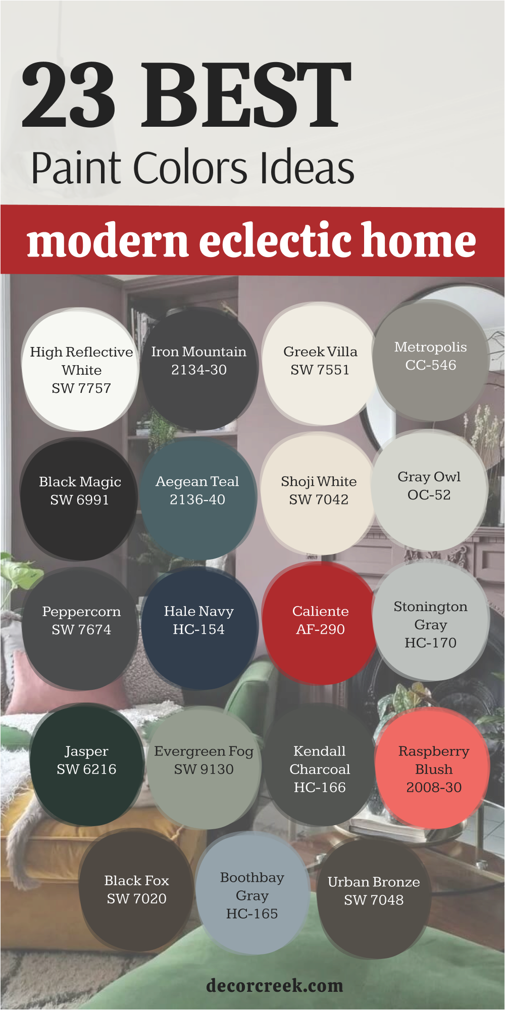
My Final Thoughts About 37 Eclectic Home Paint Color Ideas
Designing and decorating an eclectic home is far more than just arranging furniture; it is a deep and intentional process of creating a space that serves as a mirror to your unique personality. Every choice you make—from the texture of the upholstery to the specific hue on the walls—must resonate with your inner story and reflect who you truly are. True eclecticism does not tolerate randomness; it requires the courage to be yourself and the skill to combine seemingly incompatible elements in a way that feels inherently harmonious.
The 37 carefully selected colors presented above are not just a palette; they are your reliable and powerful foundation. They are designed to help you build a house that is perceived as simultaneously bold, decisive, and yet wonderfully cozy and “gathered” from pieces across time and space.
These shades create the necessary balance between visual excitement and domestic tranquility. It is vital to remember that paint is only one piece—albeit a crucial one—of the vast puzzle that is your interior. However, it is the paint that acts as the invisible glue, tying together all your favorite things, from a grandmother’s antique dresser to an ultra-modern art piece, transforming them into a single, cohesive composition.
I sincerely hope that these recommendations and detailed descriptions help you find the inner confidence to choose that one perfect shade that will make your home truly special and unique. Do not be afraid to experiment and step outside the bounds of the ordinary, for eclecticism is a celebration of individuality.
Most importantly, always trust your own eyes and your own feelings above all else. Choose the specific colors that bring a smile to your face and make you feel truly happy, peaceful, and inspired every single time you cross the threshold of your home. Let your interior be as multifaceted and beautiful as your life itself.