Choosing the right paint color for your kitchen walls can feel like a huge job, a truly major step in any home redesign, but I always remind my clients that it’s actually one of the most exciting and impactful parts of making your entire home look beautiful and feel truly custom.
As a home interior designer and staging expert, I absolutely see kitchens as the undisputed heart of the home, the central hub where families gather, nourishment happens, and some of the most cherished memories are created. Because of this vital role, the right wall color is crucial; it sets the entire mood and atmosphere for this important, heavily used room.
For 2026, I have meticulously put together my definitive list of the best 37 paint colors to serve as your personal guide, helping you create a kitchen that feels not only fresh and utterly welcoming, but also completely and authentically “you.” We’re looking beyond fleeting trends that disappear quickly; these are colors that have genuine staying power because they inherently make people feel happy, grounded, and deeply comfortable.
My goal is to guide you towards colors that won’t just photograph nicely in a magazine, but colors that will genuinely make you smile every single time you walk into your kitchen, fostering a sense of joy and belonging. Let’s work together to make your kitchen a true masterpiece of color and warm, inviting feeling.
Why I Always Trust Sherwin-Williams and Benjamin Moore for Kitchen Wall Paints
When I’m working on any interior design project, especially a kitchen remodel, I restrict my paint selection solely to paints from Sherwin-Williams and Benjamin Moore. Why this strict preference? Because quality is paramount, and it matters significantly more in a kitchen environment than perhaps any other room in the house. Kitchens are famously busy, hardworking places—they constantly deal with persistent steam, accidental food splatters, grease, and the need for frequent, rigorous cleanings.
These two industry-leading brands consistently and reliably offer superior quality paint formulations, which means the vibrant or subtle color you painstakingly pick will look richer, truer, and the paint film itself will hold up dramatically better over an extended period of time.
Think about the practical reality: you absolutely do not want to be forced to repaint your kitchen every year because a cheaper paint faded prematurely or chipped away easily around the cabinets. Both of these trusted companies provide an immense and comprehensive variety of colors, ranging from the perfect, buttery soft white to deep, complex, and interesting hues.
Their paint is engineered to go on smoothly and provides phenomenal coverage, which streamlines my job as a designer and most importantly, gives my clients a superior, longer-lasting, and more satisfying result.
They invest heavily in advanced pigment technology that absolutely ensures the exact color you see on the tiny chip sample is the consistent color that truly shines on your large kitchen wall. Choosing a trusted, quality brand is the most critical and foundational step towards a successful, beautiful, and lasting kitchen makeover.
How I Choose the Right Kitchen Wall Color for Style and Mood
Picking the perfect kitchen wall color is a detailed art that is about so much more than just selecting what looks superficially pretty on a card; it’s fundamentally about setting the entire stage for how you and your family genuinely live and feel in the space. I always start my color selection process by meticulously considering the quality and quantity of natural light your kitchen receives.
For instance, a north-facing kitchen generally needs a color with clear warm undertones to counteract the cool, blue-ish light and keep the room from feeling chilly or cold, while a bright, south-facing kitchen can confidently handle cooler, more saturated tones without ever feeling harsh or chilly.
Next, I take a close look at all the fixed and immovable elements—your existing cabinets, permanent countertops, and flooring. The wall color is the newcomer and absolutely needs to work harmoniously with what’s already established, not clash or fight against it. Do you desire a kitchen that feels bright, utterly airy, and invigorating for easy morning routines and busy days?
Then, a crisp, clean white or a pale, delicate gray might be the perfect answer to achieve that feeling. If, conversely, you want a more dramatic, intimate, and cozy feeling, perfect for evening entertaining or quiet dinners, I might strongly suggest a deep forest green or a rich, grounding charcoal. Color is an incredibly powerful tool for mood-setting.
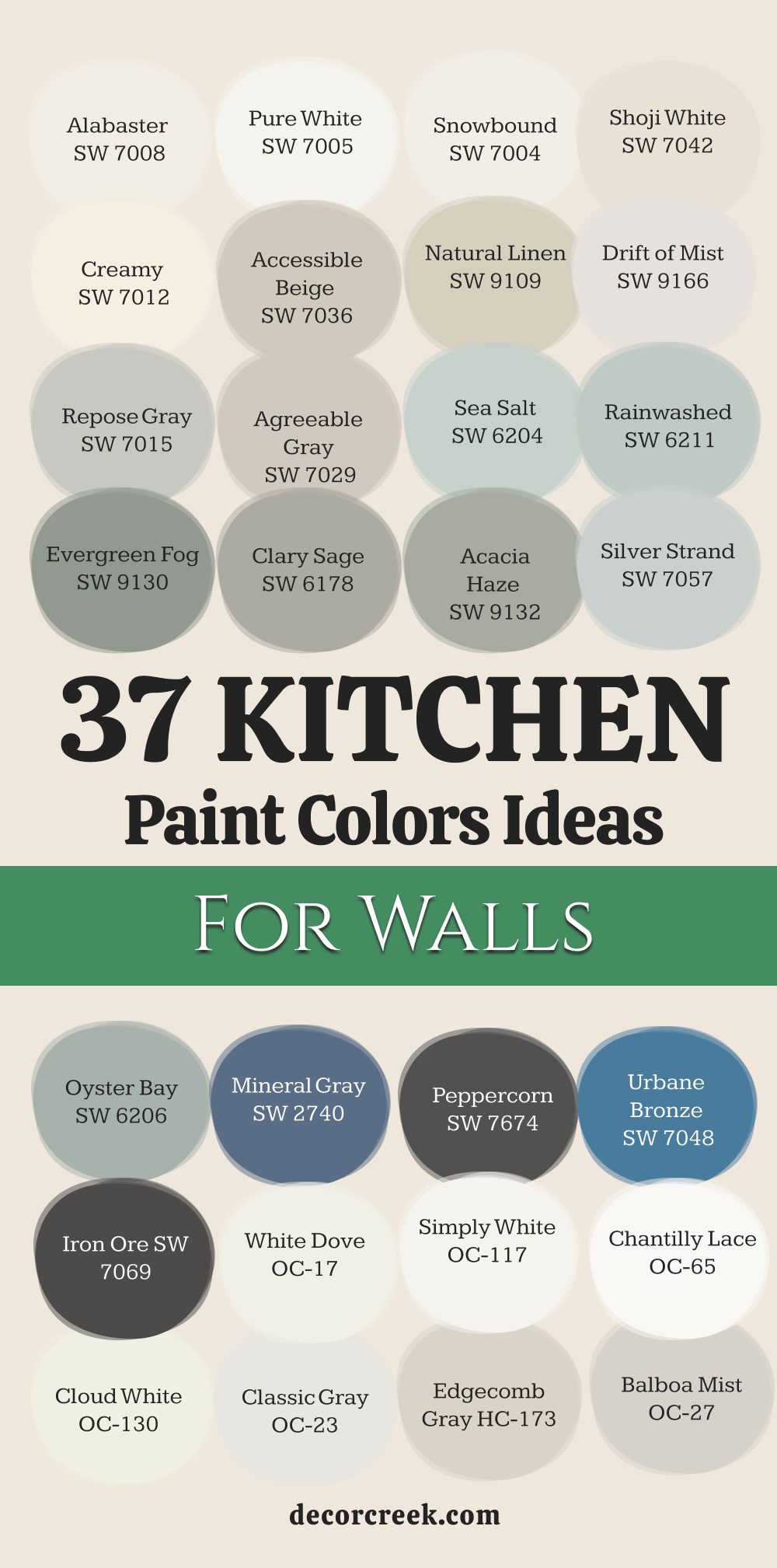
37 Kitchen Paint Color Ideas For Walls
Alabaster SW 7008
Alabaster is my favorite creamy, soft white that brings instant warmth without looking yellow. Alabaster has been popular for a long time, and it continues to be a top choice because it makes any kitchen feel bright and inviting.
This color works beautifully in kitchens that might not get much natural light, reflecting the available light and keeping things cheerful. It pairs wonderfully with warm wood cabinets and stainless steel appliances, creating a balanced and clean look. Alabaster is a gentle color that acts as a perfect backdrop, allowing your cabinets or backsplash to truly stand out.
It’s a very safe choice, but safe doesn’t mean boring—it means beautiful and dependable. I recommend Alabaster when you want a versatile white that feels cozy, not cold. This color makes every other color in the room look better by offering a soft contrast. It’s a gorgeous, popular white for a reason.
🎨 Check out the complete guide to this color right HERE 👈

Pure White SW 7005
Pure White is a crisp, clean white that has very few undertones, making it a reliable and refreshing choice for kitchen walls. Pure White lives up to its name by offering a true, untinted brightness that can make a kitchen feel instantly bigger and lighter.
I often use Pure White in modern or minimalist kitchens where the goal is a sleek and extremely clean aesthetic. It provides a sharp contrast to dark cabinets, such as navy or black, creating a high-impact look that is very stylish.
Because it is so neutral, Pure White is a fantastic option if you have colorful accessories or patterned tiles you want to show off. This color is great for ceilings too, making the room feel taller and more open. Pure White can feel a bit stark in low light, so it is best in a kitchen with lots of windows. This is the white to pick if you want a guaranteed bright and simple background.
🎨 Check out the complete guide to this color right HERE 👈

Snowbound SW 7004
Snowbound is a lovely white that has a hint of cool gray, making it a crisp but not icy option for your kitchen walls. Snowbound is a fantastic choice if you want a white that feels current and a little bit sophisticated.
This color is perfect for coordinating with cool-toned countertops, such as marble or white quartz with gray veining. I like using Snowbound in kitchens with a contemporary or transitional design because it offers a very clean-cut appearance.
It can help balance out warm wood floors by offering a nice, cool counterpoint on the walls. Snowbound works well with silver and brushed nickel hardware, keeping the whole kitchen looking coordinated and stylish. It is a very reliable color that avoids the pitfalls of looking too yellow or too blue. This refreshing white will keep your kitchen feeling clean and sharp all year long.
🎨 Check out the complete guide to this color right HERE 👈

Shoji White SW 7042
Shoji White is a sophisticated off-white that has soft beige-gray undertones, giving it a comforting, grounded feel. Shoji White is an excellent color when you want a light, airy feeling but find true whites too stark or harsh.
It’s a beautifully complex neutral that changes nicely depending on the time of day and the kind of light the kitchen receives. I often suggest Shoji White for kitchens with rustic or organic elements, like natural wood beams or brick. It has a slight warmth that makes it incredibly welcoming and perfect for creating a relaxed atmosphere.
This color works especially well with gold or brass hardware, lending a refined, gentle glow to the entire room. Shoji White is a wonderful choice for homeowners who love a light kitchen but prefer a softer, more traditional feel over a modern, stark white. It provides a quiet and inviting kitchen setting.
🎨 Check out the complete guide to this color right HERE 👈

Creamy SW 7012
Creamy is exactly what its name suggests—a warm, delicious, and buttery white that adds a soft, vintage feel to any kitchen. Creamy is the perfect color for anyone who finds modern whites too cold and wants to bring a sense of aged warmth into their home.
This color is fantastic in traditional or farmhouse-style kitchens where a cozy and lived-in feeling is the goal. I often pair Creamy with deep, rich wood tones on cabinets or floors to really bring out its lovely, gentle warmth.
It has just enough yellow pigment to make a kitchen feel instantly sunny and cheerful, even on a gloomy day. Creamy is a wonderful option for older homes or kitchens trying to achieve a cottage feel. It will never feel cold or sterile; instead, it provides a very sweet and inviting backdrop. Use Creamy to make your kitchen feel like a big, warm hug.
🎨 Check out the complete guide to this color right HERE 👈

Accessible Beige SW 7036
Accessible Beige is a fantastic light neutral that sits perfectly between gray and beige, offering the best of both worlds. Accessible Beige is a powerhouse color because it works with nearly everything, making it my go-to “greige” for kitchen walls.
It’s warm enough to avoid feeling sterile, yet gray enough to feel current and sophisticated, steering clear of those dated 90s beiges. I use Accessible Beige when I need a neutral color that will flow well with both cool and warm tones in connecting rooms.
It pairs beautifully with white, black, and almost any wood tone, making it incredibly flexible. This color is a wonderful choice for creating a cohesive and polished look throughout the main living areas of a home. Accessible Beige is a truly versatile backdrop that lets other kitchen features, like lighting fixtures or colorful dishes, become the stars. It’s a reliable, beautiful, and foolproof neutral.
🎨 Check out the complete guide to this color right HERE 👈

Natural Linen SW 9109
Natural Linen is a warm, sandy neutral color that brings an organic and textured feel to kitchen walls. Natural Linen is a comforting and grounding color that reminds me of beautiful, woven fabric. This color is perfect for a kitchen where you want a natural and effortless aesthetic.
I often recommend Natural Linen when working with stone elements, like granite or slate, because its earthy tones complement those materials perfectly. It has a welcoming warmth without being too dark, making it an excellent choice for a light and comfortable kitchen.
Natural Linen is also great for blending into other natural materials, such as rattan or light wood, giving the kitchen a relaxed, airy vibe. This color provides a quiet, sophisticated backdrop that allows your kitchen to feel elegant and uncomplicated. It’s a refined neutral that adds depth without demanding attention.
🎨 Check out the complete guide to this color right HERE 👈

Drift of Mist SW 9166
Drift of Mist is a very pale, gentle gray-beige that feels light, airy, and a touch mysterious. Drift of Mist is one of those colors that can feel like a breath of fresh air on your walls because it is so soft and light.
It’s a wonderful alternative to white when you want just a hint of color and some gentle depth. I like using Drift of Mist in kitchens that have bright, white cabinets because it provides a very soft and pleasing contrast.
It’s a very versatile color that can lean either warm or cool depending on the light in your kitchen. Drift of Mist works well with silver, pewter, or even some gold hardware, making it easy to accessorize. This pale neutral creates a soft, hazy look that is perfect for a kitchen that feels relaxed and unpretentious. It’s a beautiful, understated color that allows the architecture of the room to shine.
🎨 Check out the complete guide to this color right HERE 👈

Repose Gray SW 7015
Repose Gray is a favorite medium gray that has slight warm undertones of purple and brown, giving it complexity and depth. Repose Gray is incredibly popular because it manages to be a true gray while still feeling warm and welcoming, not cold or industrial.
I use Repose Gray when I want a neutral color that has a little more personality than a simple white or beige. It pairs beautifully with crisp white trim and looks fantastic next to rich wood tones, making it a great choice for transitional kitchens.
This color has the wonderful quality of changing slightly throughout the day, always keeping the kitchen feeling interesting and dimensional. Repose Gray works well with stainless steel and black accents, giving the kitchen a very polished and well-designed appearance. It is a sophisticated, mid-toned neutral that grounds the room perfectly.
🎨 Check out the complete guide to this color right HERE 👈

Agreeable Gray SW 7029
Agreeable Gray is consistently one of my top choices because it is a perfect balance of gray and beige, making it incredibly flexible and truly “agreeable.” Agreeable Gray is the ultimate neutral, working seamlessly with almost every style of kitchen, from traditional to modern.
It’s slightly warmer than Repose Gray, which makes it feel very cozy and inviting, especially in smaller kitchens. I often recommend Agreeable Gray to clients who are unsure about color because it is consistently beautiful and works in almost any lighting situation.
This color is a fantastic base for introducing pops of color through accessories or a fun backsplash. Agreeable Gray prevents a kitchen from looking washed out or boring by offering a soft, gentle color. It’s a foolproof option that provides a lovely, warm neutrality that everyone seems to love.
🎨 Check out the complete guide to this color right HERE 👈

Sea Salt SW 6204
Sea Salt is a gentle, soothing color that shifts between a very light green, blue, and gray, depending on the light. Sea Salt is the color I choose when a client wants to bring a touch of the ocean and natural world into their kitchen.
It is an incredibly relaxing and airy color that provides a very gentle hint of color without being too vibrant or distracting. I recommend Sea Salt for kitchens that are trying to achieve a coastal, beach house, or cottage-style feel.
It pairs beautifully with white or light gray cabinets and natural wood accents. This color is wonderful because it makes the room feel light and open, giving a truly comfortable atmosphere. Sea Salt is a perfect choice for those who want a quiet, refreshing color that feels gentle and inviting every single day.
🎨 Check out the complete guide to this color right HERE 👈

Rainwashed SW 6211
Rainwashed is a pale, delicate mix of blue and green, giving it a truly refreshing and soft aquatic feel. Rainwashed is the color I use when a client wants a light, airy blue that is tempered by a hint of green to keep it from feeling icy.
I recommend Rainwashed for kitchens that have a lot of natural light, where it will shine and look beautifully bright. This color creates a feeling of lightness and openness, making any kitchen feel instantly revitalized.
Rainwashed pairs wonderfully with white cabinets and silver hardware, enhancing its cool, crisp quality. It’s a lovely, gentle color that brings a touch of coastal charm and quiet sophistication to the walls. This is a delightful color that makes a kitchen feel clean, fresh, and wonderfully inviting.
🎨 Check out the complete guide to this color right HERE 👈

Evergreen Fog SW 9130
Evergreen Fog is a deep, muted, gray-green that has a rich, grounded quality, bringing the sophisticated beauty of nature indoors. Evergreen Fog is a wonderful choice for a kitchen island or an accent wall, but it is equally stunning on all four walls for a moodier, more dramatic feel.
I recommend Evergreen Fog for kitchens with plenty of natural light where you want a color that feels both natural and elegant. It pairs beautifully with wood tones and white trim, creating a stunning and very stylish contrast.
This color is a fantastic option for a kitchen with a transitional or modern farmhouse design, adding depth and a touch of the outdoors. Evergreen Fog is a sophisticated color that provides a cozy and thoughtful feeling to a kitchen. It’s a color that feels unique and carefully chosen, making your kitchen stand out in a beautiful way.
🎨 Check out the complete guide to this color right HERE 👈

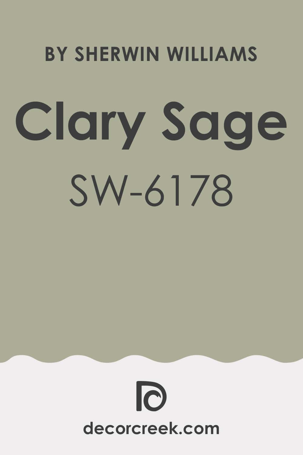
Clary Sage SW 6178
Clary Sage is a gorgeous, herbal mid-toned green that has warm, earthy undertones, giving it a wonderfully rustic feel. Clary Sage is the perfect color for bringing a feeling of quiet, natural warmth into a farmhouse or cottage-style kitchen.
I often recommend Clary Sage for kitchens that have traditional cabinetry and rustic elements, like pottery or copper accents. This color is very welcoming and provides a rich, comforting backdrop that feels incredibly homey and established.
Clary Sage pairs beautifully with dark wood flooring and antique brass hardware, creating a sense of history and charm. It’s a warm, versatile green that adds personality without being too bright or loud. This color truly makes a kitchen feel grounded and full of character.
🎨 Check out the complete guide to this color right HERE 👈
Acacia Haze SW 9132
Acacia Haze is a beautiful, muted, mid-tone green with gray undertones, making it feel grounded and very chic. Acacia Haze is the perfect color for adding a gentle touch of nature to your kitchen without committing to a darker or brighter green.
I often use Acacia Haze in kitchens that have open shelving and lots of white dinnerware to provide a lovely, soft background color. This color pairs wonderfully with natural materials like butcher block countertops or exposed wood beams.
Acacia Haze creates a soothing and quiet environment, making the kitchen feel like a peaceful sanctuary. It’s a color that works well in both traditional and slightly more modern settings, offering versatility and charm. Acacia Haze is a sophisticated green that adds a warm, earthy quality that is incredibly welcoming and visually interesting.
🎨 Check out the complete guide to this color right HERE 👈

Silver Strand SW 7057
Silver Strand is a very pale, light green-gray color that is airy and gentle, almost appearing as a sophisticated neutral. Silver Strand is a fantastic color when you want a hint of soothing green-blue but are scared of using too much color on your kitchen walls.
I often recommend Silver Strand for kitchens with lots of stainless steel, as its cool undertones complement the metal beautifully. This color is wonderful because it makes the room feel light and open, giving a truly refreshing atmosphere.
Silver Strand provides a gentle, soft contrast to white cabinets and looks beautiful with dark wood flooring. It’s a versatile and quiet color that creates a sense of peacefulness and clean simplicity in the kitchen. This color is a lovely choice for a kitchen where you want a light, gentle wash of calming color.
🎨 Check out the complete guide to this color right HERE 👈

Oyster Bay SW 6206
Oyster Bay is a beautiful, mid-toned coastal green-gray that has a wonderful, watery depth to it. Oyster Bay is the color I choose when a client wants a sophisticated green that feels calming and a little bit moody, without being too dark.
I often pair Oyster Bay with creamy white cabinets and warm wood tones to create a balanced and very high-end look. This color provides a quiet elegance to a kitchen and looks fantastic in both natural light and under warm artificial lighting.
Oyster Bay is a wonderful option for kitchens that are adjacent to a garden or patio, as it helps bring the outdoors in. It’s a very soothing color that creates a feeling of depth and thoughtfulness on the walls. This is a truly beautiful, refined color that makes a kitchen feel special and unique.
🎨 Check out the complete guide to this color right HERE 👈

Mineral Gray SW 2740
Mineral Gray is a dark, warm, charcoal gray that has lovely brown undertones, giving it a rich, earthy, and sophisticated depth. Mineral Gray is the perfect color for creating a kitchen that feels moody, grounded, and incredibly elegant, offering a high-impact statement.
I often recommend Mineral Gray for kitchens with plenty of natural light where you want to add a beautiful, dramatic contrast. This color pairs wonderfully with brass or gold hardware and light wood tones, creating a stunning, high-end look.
Mineral Gray is a strong color that adds a sense of luxury and refinement to the walls. It’s a bold, sophisticated choice that creates a truly unforgettable and custom-designed kitchen.
Naval SW 6244
Naval is a deep, sophisticated navy blue that is rich and commanding, offering a classic and elegant statement. Naval is the color I choose when a client wants a bold, truly beautiful blue that feels both traditional and very current.
I often recommend Naval for a kitchen island or an accent wall, but it is stunning on all four walls for a truly enveloped feeling. This color pairs beautifully with brass or copper hardware and white or gray countertops, creating a stunning, high-contrast look.
Naval is a substantial color that adds a sense of history, depth, and quiet luxury to the walls. It’s a powerful and inviting color that makes a kitchen feel polished and very carefully considered.
🎨 Check out the complete guide to this color right HERE 👈

Peppercorn SW 7674
Peppercorn is a dark, rich, saturated charcoal gray that is incredibly close to black, offering a powerful, grounded sophistication. Peppercorn is a fantastic color for adding drama and elegance to a kitchen, instantly making the room feel more custom and unique.
I recommend Peppercorn when you want to achieve a sophisticated, modern, or industrial style in your kitchen. It provides a striking contrast against white trim, bright cabinets, or a colorful backsplash, really allowing those elements to stand out.
Peppercorn pairs exceptionally well with polished chrome or stainless steel, lending a refined, sharp appearance. This color is a fantastic way to introduce a feeling of depth and strength to your kitchen walls. It’s a bold, sophisticated choice that creates a truly unforgettable and polished kitchen environment.
🎨 Check out the complete guide to this color right HERE 👈

Urbane Bronze SW 7048
Urbane Bronze is a very deep, rich, saturated bronze-brown-gray that is nearly black, offering incredible drama and sophistication. Urbane Bronze is a very strong color, and I often recommend it for a truly moody and high-impact kitchen design.
I use Urbane Bronze to create a powerful contrast against white countertops and light wood floors for a stunning, modern look. This color is fantastic for adding a grounded, architectural weight to a room, making a kitchen feel custom and carefully designed.
Urbane Bronze pairs beautifully with brushed brass or matte black hardware, enhancing its dramatic and thoughtful nature. It’s a wonderfully sophisticated color that provides a cozy, enveloped feeling, perfect for evening entertaining. This dark hue is a bold choice that results in an incredibly chic and memorable kitchen.
🎨 Check out the complete guide to this color right HERE 👈

Iron Ore SW 7069
Iron Ore is a deep, charcoal gray that is incredibly dark, sitting right on the edge of black, offering a powerful, grounded statement. Iron Ore is a marvelous color for adding drama and elegance to a kitchen, instantly making the room feel more custom and unique.
I recommend Iron Ore when you want to achieve a sophisticated, modern, or industrial style in your kitchen. It provides a striking contrast against white trim, bright cabinets, or a colorful backsplash, really allowing those elements to stand out.
Iron Ore pairs exceptionally well with polished chrome or stainless steel, lending a refined, sharp appearance. This color is a fantastic way to introduce a feeling of depth and strength to your kitchen walls. It’s a bold, sophisticated choice that creates a truly unforgettable and polished kitchen environment.
🎨 Check out the complete guide to this color right HERE 👈

White Dove OC-17
White Dove is a creamy, soft white that is one of Benjamin Moore’s most beloved colors, offering a perfect balance of brightness and warmth. White Dove is my favorite color for creating an effortlessly elegant and classic kitchen that feels both fresh and inviting.
I often recommend White Dove because it has just a hint of gray, which prevents it from ever looking yellow, even in warm light. This color is incredibly versatile and works well on both walls and cabinets, creating a cohesive, light-filled look.
White Dove provides a gentle contrast to black or dark wood elements, lending a refined simplicity to the room. It’s a beautifully soft white that avoids being stark, making the kitchen feel instantly comfortable and lovely. This color is a true hallmark of sophisticated, thoughtful design.
🎨 Check out the complete guide to this color right HERE 👈

Simply White OC-117
Simply White is a clean, bright, and slightly warm white that acts as a fantastic, crisp backdrop for any kitchen design. Simply White is an excellent choice for maximizing the natural light in your kitchen, making it feel instantly larger and more open.
I recommend Simply White for a modern, Scandinavian, or very clean transitional style where a pure, bright aesthetic is desired. This color has just a touch of yellow in it, which keeps it from feeling cold or harsh, maintaining a very welcoming quality.
Simply White is a wonderful partner for colorful artwork or unique hardware, allowing those items to truly shine against a bright background. It’s a versatile and extremely popular white that feels cheerful and consistently light. This is the white to choose when you want a guaranteed bright and uncomplicated kitchen.
🎨 Check out the complete guide to this color right HERE 👈

Chantilly Lace OC-65
Chantilly Lace is Benjamin Moore’s cleanest, purest white with virtually no discernible undertones, making it the perfect choice for a truly crisp look. Chantilly Lace is the ideal color for achieving a gallery-like, bright, and very modern kitchen that emphasizes sharp lines and simplicity.
I often use Chantilly Lace when I need a white that will look bright and clear no matter what other colors or materials are in the kitchen. This color is wonderful for trim and ceilings, too, as it provides a perfect, untainted bright edge to any wall color.
Chantilly Lace is excellent in contrast with deep, rich colors like navy, charcoal, or forest green for a stunning, high-impact design. It’s a refreshing and reliable white that guarantees a very clean and invigorating appearance. This pure color is the essence of bright, uncomplicated design.
🎨 Check out the complete guide to this color right HERE 👈

Cloud White OC-130
Cloud White is a soft, gentle white that has creamy yellow undertones, giving it a wonderful, almost antique, comforting warmth. Cloud White is the perfect option for those who want a white that feels cozy and less stark than some of the more modern, cooler whites.
I often recommend Cloud White for traditional, cottage, or farmhouse kitchens where a feeling of lived-in charm is the goal. This color pairs beautifully with warm wood cabinets and flooring, enhancing the room’s overall inviting and gentle glow.
Cloud White is an elegant white that avoids looking harsh, even in bright sunlight, making it a soothing choice for any kitchen. It’s a beloved classic that offers a wonderful sense of history and quiet sophistication. This is a very sweet and gentle white that makes a kitchen feel like home.
🎨 Check out the complete guide to this color right HERE 👈

Classic Gray OC-23
Classic Gray is a beautifully soft and extremely pale gray that acts almost as a white, but with a lovely, gentle depth. Classic Gray is one of my favorite neutrals because it is so light and airy, providing a sophisticated backdrop without weighing the room down.
I use Classic Gray when a true white feels too simple, and I want a whisper of color that adds dimension and refinement to the walls. This color works beautifully in both modern and traditional kitchens, offering a gentle, versatile presence.
Classic Gray has gentle warm undertones that keep it from ever feeling cold, ensuring your kitchen remains welcoming and comfortable. It’s a fantastic choice for open-plan living areas, as it flows seamlessly with many other colors and tones. This refined, light gray is the definition of understated elegance.
🎨 Check out the complete guide to this color right HERE 👈

Edgecomb Gray HC-173
Edgecomb Gray is a versatile, warm greige that leans slightly more beige, giving it a wonderfully soft and grounded quality. Edgecomb Gray is an incredibly popular color because it manages to be a perfect neutral that is cozy without feeling heavy or dated.
I often recommend Edgecomb Gray for kitchens with traditional or transitional styling where a warm, welcoming atmosphere is key. This color pairs beautifully with both white and off-white cabinets, creating a soft, pleasing contrast.
Edgecomb Gray has a beautiful depth that prevents it from looking washed out in bright light, always holding its gentle warmth. It’s a reliable and sophisticated choice that works well with almost any fixed element you have in your kitchen. This warm greige is a true winner for a kitchen that is meant to feel comfortable and beautifully designed.
🎨 Check out the complete guide to this color right HERE 👈

Balboa Mist OC-27
Balboa Mist is a light, elegant gray with a soft hint of purple-red undertones, making it a very refined and complex neutral. Balboa Mist is a beautiful alternative to a standard gray, offering a gentle warmth and sophistication that is quite unique.
I often use Balboa Mist in more formal or refined kitchen designs, as it has a gentle elegance that elevates the entire room. This color works wonderfully with crisp white trim and silver or polished chrome hardware, enhancing its cool, gentle quality.
Balboa Mist is light enough to keep the kitchen feeling bright but has enough color to add a lovely layer of depth to the walls. It’s a thoughtful and sophisticated neutral that avoids feeling stark or industrial. This beautiful gray is a perfect choice for creating a gentle, polished, and quietly luxurious kitchen environment.
🎨 Check out the complete guide to this color right HERE 👈

Pale Oak OC-20
Pale Oak is a lovely, light greige that has noticeable soft, warm beige and pink undertones, making it a very inviting and pretty color. Pale Oak is a fantastic color for creating a gentle, airy kitchen that feels both soft and current.
I recommend Pale Oak when a client wants a light neutral that still maintains a clear sense of warmth and cheerfulness. This color is wonderful because it changes beautifully with the light, sometimes looking more beige and sometimes more gray, always keeping things interesting.
Pale Oak pairs beautifully with white cabinets and marble or quartz countertops, providing a soft, gentle contrast. It’s a refined and elegant neutral that prevents a kitchen from looking boring or washed out. This delightful color is a very safe and beautiful choice for a light and welcoming kitchen.
🎨 Check out the complete guide to this color right HERE 👈

Collingwood OC-28
Collingwood is a sophisticated, mid-toned gray with a delicate violet undertone, giving it a lovely depth and richness. Collingwood is the color I choose when a client wants a true gray that has a little more personality and complexity than a simple neutral gray.
I often recommend Collingwood for kitchens with lots of natural light, where its beautiful undertones can really shine and prevent it from looking flat. This color is wonderful for creating a distinguished and polished look, especially when paired with crisp white trim.
Collingwood works well with darker cabinet colors like navy or forest green, providing a soft but clear contrast on the walls. It’s a very elegant and thoughtful gray that makes a kitchen feel custom and carefully designed. This is a beautiful, gentle gray that adds a touch of quiet refinement.
🎨 Check out the complete guide to this color right HERE 👈

Pashmina AF-100
Pashmina is a rich, warm, mid-tone greige that is deep and comforting, offering a truly grounded feeling to a kitchen. Pashmina is the perfect color for bringing a cozy, enveloping warmth to a kitchen without making the room feel too heavy or dark.
I often recommend Pashmina for kitchens with traditional or shaker cabinets where a feeling of established elegance is desired. This color pairs beautifully with wood elements and looks fantastic with creamy whites and soft creams for a lovely, layered look.
Pashmina has a beautiful depth that adds sophistication and a sense of luxury to the walls. It’s a very versatile color that can lean either gray or beige, depending on the light, always feeling warm. This rich greige is a wonderful choice for creating a kitchen that feels like a comfortable and welcoming retreat.
🎨 Check out the complete guide to this color right HERE 👈

Revere Pewter HC-172
Revere Pewter is one of Benjamin Moore’s most iconic colors, a classic greige that is well-balanced with a noticeable, earthy warmth. Revere Pewter is a time-tested favorite because it provides the perfect mid-tone neutral that works in almost any setting and lighting condition.
I often use Revere Pewter when I need a color that is warm enough to feel cozy but still modern enough to avoid looking dated beige. This color pairs beautifully with white, black, and almost every wood tone, making it incredibly flexible for a kitchen design.
Revere Pewter has a wonderful depth that grounds a room and looks great against stainless steel and bright white trim. It’s a reliable, beautiful, and sophisticated neutral that is always a safe and stylish bet. This powerhouse color is a fantastic foundation for a well-designed, comfortable kitchen.
🎨 Check out the complete guide to this color right HERE 👈

Natural Cream OC-14
Natural Cream is a gorgeous, soft, and slightly muted cream color that has a gentle, inviting warmth to it. Natural Cream is the color I choose when a client wants a very light, airy kitchen that still feels warm, avoiding the coolness of some whites.
I often recommend Natural Cream for traditional or cottage-style kitchens where a feeling of quiet, established elegance is the goal. This color pairs beautifully with wood accents and creamy, antique-style hardware, enhancing its lovely, gentle charm.
Natural Cream has just enough pigment to add a soft glow to the walls without ever looking yellow or stark. It’s a wonderfully sophisticated cream that is incredibly versatile and creates a sense of peaceful simplicity. This is a beautifully soft and inviting color that makes a kitchen feel like home.
🎨 Check out the complete guide to this color right HERE 👈

October Mist 1495
October Mist is a gentle, soft, and slightly dusty sage green that has an earthy, organic quality, feeling instantly comforting and grounded. October Mist is an excellent choice for bringing a natural, sophisticated touch of color into the kitchen without it feeling too vibrant or loud.
I often recommend October Mist for kitchens with natural wood elements, as it complements the organic tones beautifully. This color works wonderfully in a kitchen that is trying to achieve a modern farmhouse or sophisticated transitional look.
October Mist is a very soothing color that makes the kitchen feel like a peaceful sanctuary, perfect for quiet moments. It’s a versatile green that adds a unique, thoughtful personality to the walls. This gorgeous color is a fantastic way to infuse your kitchen with a gentle, chic, and natural feel.
🎨 Check out the complete guide to this color right HERE 👈

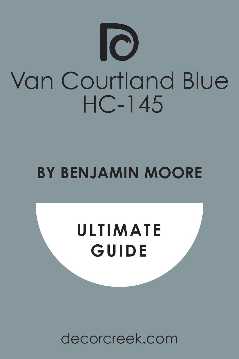
Van Courtland Blue HC-145
Van Courtland Blue is a classic, mid-toned, slightly dusty blue with gray undertones, giving it a rich, handsome, and historic quality. Van Courtland Blue is the perfect color for adding a touch of traditional color and sophistication to your kitchen walls.
I often recommend Van Courtland Blue for kitchens with crisp white cabinetry, creating a beautiful, clean, and preppy contrast. This color pairs beautifully with silver, polished nickel, or antique brass hardware, enhancing its classic and elegant appeal.
Van Courtland Blue is a comforting color that adds depth and a sense of history to the walls. It’s a beautiful, strong blue that makes a kitchen feel custom and very carefully considered.
🎨 Check out the complete guide to this color right HERE 👈
Wedgewood Gray HC-146
Wedgewood Gray is a beautiful, gentle, historic blue with a strong gray undertone, offering a muted and incredibly sophisticated look. Wedgewood Gray is the ideal color for adding a beautiful, soft color to your kitchen without it being too vibrant or intense.
I often recommend Wedgewood Gray for kitchens with a traditional or colonial style, as it has a rich, established feel. This color pairs wonderfully with creamy whites and soft yellow accents, creating a harmonious and very pleasing palette.
Wedgewood Gray is a comforting color that adds depth and a sense of quiet elegance to the walls. It’s a lovely, gentle color that makes a kitchen feel inviting and peacefully beautiful.
🎨 Check out the complete guide to this color right HERE 👈
20 Kitchen Paint Color Ideas For Walls From Sherwin Williams
Alabaster SW 7008
Alabaster is a gentle, creamy white that provides a soft, warm glow without any harsh yellow tones. Alabaster is my go-to for creating a welcoming and slightly antique feeling in a kitchen while still looking fresh and clean.
This is a versatile white that pairs beautifully with almost any other color, making it an excellent backdrop for colorful appliances or a unique tile backsplash. Alabaster prevents a room from feeling too sterile, which is important in a busy, homey kitchen. It reflects light beautifully, helping a smaller kitchen feel larger and brighter, especially when paired with white trim.
I often recommend Alabaster for a farmhouse or transitional style because of its classic, comforting appeal. It works wonderfully with brushed brass or gold hardware, lending a polished, refined touch. Alabaster is a reliable, warm white that makes any kitchen feel instantly cozier. It offers an elegant and quiet simplicity. This color creates a perfect, soft foundation for a truly beautiful kitchen design.
🎨 Check out the complete guide to this color right HERE 👈
Pure White SW 7005
Pure White is a crisp, true white that is perfect for achieving a modern, clean, and extremely bright kitchen aesthetic. Pure White is a simple, no-fuss color that provides maximum reflection of light, making your kitchen feel expansive and airy. I frequently use Pure White in high-contrast designs, such as pairing it with deep navy or black cabinets for a sophisticated, bold look.
This color is fantastic for showcasing architectural details, making trim and moldings pop against the wall. Pure White has very few noticeable undertones, meaning it stays consistently bright and neutral, no matter the lighting conditions.
It’s an excellent choice if your main goal is to have a simple, extremely clean, gallery-like background. Pure White is also very good for small kitchens because its brightness helps push the walls back, visually enlarging the area. This white creates a fresh, sharp feel that always looks contemporary. It is the ultimate choice for a reliably bright and clear kitchen.
🎨 Check out the complete guide to this color right HERE 👈
Creamy SW 7012
Creamy is a rich, buttery white with just enough warmth to feel inviting and delicious, like its name suggests. Creamy is the ideal color for anyone who finds modern whites too cold and wants to bring a sense of aged warmth into their home.
I recommend Creamy when the goal is a cozy, traditional, or cottage-style kitchen with lots of natural wood elements. The slight yellow undertone of Creamy makes any kitchen feel perpetually sunny and cheerful, even on the gloomiest day. It works beautifully with warm-toned countertops and traditional cabinet styles, enhancing the room’s gentle charm.
Creamy is a lovely choice if you want to move away from stark white and bring in a soft, welcoming glow. This color looks fantastic with bronze or aged copper hardware, enhancing the warm, antique feel. It provides a sweet, comforting backdrop that is wonderfully reminiscent of old-fashioned charm. Creamy is truly the color of home and comfort.
🎨 Check out the complete guide to this color right HERE 👈
Shoji White SW 7042
Shoji White is a versatile, grounded off-white that features pleasing beige and gray undertones, making it a sophisticated neutral. Shoji White offers the brightness of a white but with a little more depth and a wonderful organic feel.
I use Shoji White when a true white is too stark, and I want a color that feels a little more connected to nature. It is an excellent pairing for raw wood shelves or natural stone flooring, bringing a grounded texture to the walls. Shoji White can lean slightly warm or cool, making it adaptable to a variety of fixed elements already in your kitchen.
It is a quiet color that allows you to introduce bolder colors through textiles or accessories without clashing. Shoji White provides a soft, hazy backdrop that feels refined and effortlessly stylish. This color is great for creating a kitchen that feels light but still incredibly cozy and welcoming. It is a chic, complex neutral that adds a gentle touch of elegance.
🎨 Check out the complete guide to this color right HERE 👈
Natural Linen SW 9109
Natural Linen is a warm, light beige that evokes the feeling of beautiful, sun-bleached fabric, lending a natural texture to the walls. Natural Linen is the perfect color for anyone seeking a true, light beige that isn’t too yellow or too pink. It’s a comforting neutral that works wonders in kitchens aiming for an organic, minimalist, or rustic design.
I often pair Natural Linen with creamy whites and soft greens to create a naturally calming color palette. This color is wonderful because it never looks washed out; it always holds its gentle warmth and depth.
Natural Linen helps to unify a room with many different wood tones by providing a consistent, earthy backdrop. It’s a sophisticated neutral that adds quiet elegance and warmth without ever feeling dated or too heavy. Natural Linen is the ideal color for a kitchen that is meant to feel like a relaxing retreat from the outside world.
🎨 Check out the complete guide to this color right HERE 👈
Accessible Beige SW 7036
Accessible Beige is a fantastic, highly adaptable greige that is perfectly balanced between beige and gray, offering comforting neutrality. Accessible Beige is a powerhouse in my design toolkit because it manages to look good in almost every type of light and alongside most fixed elements.
I recommend Accessible Beige when there is a need to connect rooms with both warm (like wood) and cool (like marble) tones. It provides a warm, welcoming presence without ever looking dated or muddy. This color is an excellent base for any kitchen design, giving you the freedom to choose almost any cabinet color, from white to dark blue.
Accessible Beige is never boring; it has enough pigment to add dimension and sophistication to the walls. It’s a truly versatile neutral that appeals to a broad range of tastes and styles. This color provides a polished and cohesive look throughout your kitchen and connecting areas.
🎨 Check out the complete guide to this color right HERE 👈
Drift of Mist SW 9166
Drift of Mist is a very light, atmospheric gray-beige that feels light, airy, and a touch mysterious. Drift of Mist is an excellent choice when you want a color that is almost white but has just enough pigment to add a hint of shadow and interest to the walls. I often use Drift of Mist to soften the look of bright white cabinets, giving the room a gentler, more lived-in appearance.
This color works beautifully in contemporary and transitional kitchens where a light, quiet backdrop is desired. It’s a highly reflective color that helps maximize the natural light in your kitchen, making it feel open and airy.
Drift of Mist is wonderful because it allows all your accessories and artwork to really pop against a very soft background. This pale neutral provides a beautiful and gentle layer of sophistication without dominating the room. It’s a refined, soft gray-beige that feels effortlessly current.
🎨 Check out the complete guide to this color right HERE 👈
Repose Gray SW 7015
Repose Gray is a popular mid-toned gray that carries just enough warmth from its taupe undertones to keep it from feeling cold or sterile. Repose Gray is the perfect solution when you want a true gray that still feels friendly and welcoming for a kitchen setting.
I often pair Repose Gray with crisp white trim to create a sharp, sophisticated contrast that looks very stylish. This color works well in kitchens with a mix of metals, as it provides a stable, neutral base for both warm golds and cool silvers.
Repose Gray is dark enough to offer a great contrast against white cabinets but light enough to keep the kitchen from feeling dark or heavy. It has a complexity that makes the color change gently throughout the day, always keeping the walls interesting. Repose Gray is a sophisticated color that grounds a room and gives it a very polished, custom-designed feel.
🎨 Check out the complete guide to this color right HERE 👈
Agreeable Gray SW 7029
Agreeable Gray is a balanced greige that favors warmth, making it one of the most consistently popular and versatile paint colors available. Agreeable Gray is the color I suggest when a client wants a simple, beautiful, and absolutely safe bet for a warm, neutral kitchen.
It manages to feel current while maintaining a cozy, traditional appeal, bridging the gap between gray and beige beautifully. I recommend Agreeable Gray because it coordinates effortlessly with all types of flooring, from dark hardwood to light tile.
This color is fantastic for flowing between main living areas, ensuring your entire home has a cohesive and continuous feel. Agreeable Gray is a soft, comforting backdrop that lets your personal style and kitchen details truly shine without competition. It’s a reliable and pleasant color that provides a lovely, warm neutrality that everyone seems to love.
🎨 Check out the complete guide to this color right HERE 👈
Sea Salt SW 6204
Sea Salt is a dreamy, ethereal color that changes beautifully between a pale green, a soft blue, and a quiet gray, depending on the light. Sea Salt is the color I choose when a client wants to bring a refreshing, coastal-inspired feeling into their busy kitchen space.
It is an incredibly gentle color that adds a hint of personality without being too bright or loud, providing a gentle wash of color. I often use Sea Salt with white or light gray cabinets to enhance its light, airy, and rejuvenating qualities.
This color is wonderful for creating a restful and comfortable kitchen that feels like a getaway. Sea Salt makes any kitchen feel a little more unique and less generic, offering a beautiful, quiet character. It works wonderfully with natural wood tones and white subway tile for a relaxed, beach-cottage look. This is a truly delightful color that feels gentle and inviting every single time you see it.
🎨 Check out the complete guide to this color right HERE 👈
Evergreen Fog SW 9130
Evergreen Fog is a deep, muted, gray-green that has a rich, grounded quality, bringing the sophisticated beauty of nature indoors. Evergreen Fog is a wonderful choice for a kitchen island or an accent wall, but it is equally stunning on all four walls for a moodier, more dramatic feel.
I recommend Evergreen Fog for kitchens with plenty of natural light where you want a color that feels both natural and elegant. It pairs beautifully with wood tones and white trim, creating a stunning and very stylish contrast.
This color is a fantastic option for a kitchen with a transitional or modern farmhouse design, adding depth and a touch of the outdoors. Evergreen Fog is a sophisticated color that provides a cozy and thoughtful feeling to a kitchen. It’s a color that feels unique and carefully chosen, making your kitchen stand out in a beautiful way.
🎨 Check out the complete guide to this color right HERE 👈
Acacia Haze SW 9132
Acacia Haze is a beautiful, muted, mid-tone green with gray undertones, making it feel grounded and very chic. Acacia Haze is the perfect color for adding a gentle touch of nature to your kitchen without committing to a darker or brighter green.
I often use Acacia Haze in kitchens that have open shelving and lots of white dinnerware to provide a lovely, soft background color. This color pairs wonderfully with natural materials like butcher block countertops or exposed wood beams.
Acacia Haze creates a soothing and quiet environment, making the kitchen feel like a peaceful sanctuary. It’s a color that works well in both traditional and slightly more modern settings, offering versatility and charm. Acacia Haze is a sophisticated green that adds a warm, earthy quality that is incredibly welcoming and visually interesting.
🎨 Check out the complete guide to this color right HERE 👈
Silver Strand SW 7057
Silver Strand is a very pale, light green-gray color that is airy and gentle, almost appearing as a sophisticated neutral. Silver Strand is a fantastic color when you want a hint of soothing green-blue but are scared of using too much color on your kitchen walls.
I often recommend Silver Strand for kitchens with lots of stainless steel, as its cool undertones complement the metal beautifully. This color is wonderful because it makes the room feel light and open, giving a truly refreshing atmosphere.
Silver Strand provides a gentle, soft contrast to white cabinets and looks beautiful with dark wood flooring. It’s a versatile and quiet color that creates a sense of peacefulness and clean simplicity in the kitchen. This color is a lovely choice for a kitchen where you want a light, gentle wash of calming color.
🎨 Check out the complete guide to this color right HERE 👈
Oyster Bay SW 6206
Oyster Bay is a beautiful, mid-toned coastal green-gray that has a wonderful, watery depth to it. Oyster Bay is the color I choose when a client wants a sophisticated green that feels comforting and a little bit moody, without being too dark.
I often pair Oyster Bay with creamy white cabinets and warm wood tones to create a balanced and very high-end look. This color provides a quiet elegance to a kitchen and looks fantastic in both natural light and under warm artificial lighting.
Oyster Bay is a wonderful option for kitchens that are adjacent to a garden or patio, as it helps bring the outdoors in. It’s a very soothing color that creates a feeling of depth and thoughtfulness on the walls. This is a truly beautiful, refined color that makes a kitchen feel special and unique.
🎨 Check out the complete guide to this color right HERE 👈
Clary Sage SW 6178
Clary Sage is a gorgeous, herbal mid-toned green that has warm, earthy undertones, giving it a wonderfully rustic feel. Clary Sage is the perfect color for bringing a feeling of quiet, natural warmth into a farmhouse or cottage-style kitchen.
I often recommend Clary Sage for kitchens that have traditional cabinetry and rustic elements, like pottery or copper accents. This color is very welcoming and provides a rich, comforting backdrop that feels incredibly homey and established.
Clary Sage pairs beautifully with dark wood flooring and antique brass hardware, creating a sense of history and charm. It’s a warm, versatile green that adds personality without being too bright or loud. This color truly makes a kitchen feel grounded and full of character.
🎨 Check out the complete guide to this color right HERE 👈
Rainwashed SW 6211
Rainwashed is a pale, delicate mix of blue and green, giving it a truly refreshing and soft aquatic feel. Rainwashed is the color I use when a client wants a light, airy blue that is tempered by a hint of green to keep it from feeling icy.
I recommend Rainwashed for kitchens that have a lot of natural light, where it will shine and look beautifully bright. This color creates a feeling of lightness and openness, making any kitchen feel instantly revitalized.
Rainwashed pairs wonderfully with white cabinets and silver hardware, enhancing its cool, crisp quality. It’s a lovely, gentle color that brings a touch of coastal charm and quiet sophistication to the walls. This is a delightful color that makes a kitchen feel clean, fresh, and wonderfully inviting.
🎨 Check out the complete guide to this color right HERE 👈
Urbane Bronze SW 7048
Urbane Bronze is a very deep, rich, saturated bronze-brown-gray that is nearly black, offering incredible drama and sophistication. Urbane Bronze is a very strong color, and I often recommend it for a truly moody and high-impact kitchen design.
I use Urbane Bronze to create a powerful contrast against white countertops and light wood floors for a stunning, modern look. This color is fantastic for adding a grounded, architectural weight to a room, making a kitchen feel custom and carefully designed.
Urbane Bronze pairs beautifully with brushed brass or matte black hardware, enhancing its dramatic and thoughtful nature. It’s a wonderfully sophisticated color that provides a cozy, enveloped feeling, perfect for evening entertaining. This dark hue is a bold choice that results in an incredibly chic and memorable kitchen.
🎨 Check out the complete guide to this color right HERE 👈
Iron Ore SW 7069
Iron Ore is a deep, charcoal gray that is incredibly dark, sitting right on the edge of black, offering a powerful, grounded statement. Iron Ore is a marvelous color for adding drama and elegance to a kitchen, instantly making the room feel more custom and unique.
I recommend Iron Ore when you want to achieve a sophisticated, modern, or industrial style in your kitchen. It provides a striking contrast against white trim, bright cabinets, or a colorful backsplash, really allowing those elements to stand out.
Iron Ore pairs exceptionally well with polished chrome or stainless steel, lending a refined, sharp appearance. This color is a fantastic way to introduce a feeling of depth and strength to your kitchen walls. It’s a bold, sophisticated choice that creates a truly unforgettable and polished kitchen environment.
🎨 Check out the complete guide to this color right HERE 👈
Dried Thyme SW 6186
Dried Thyme is a beautiful, dusty, mid-tone sage green that has a cozy, earthy, and organic feel. Dried Thyme is the perfect color for bringing the feeling of an old-world garden or rustic charm into your kitchen walls.
I often recommend Dried Thyme for traditional or shaker-style cabinets because it provides a quiet, established, and welcoming warmth. This color pairs wonderfully with warm metals like copper and bronze, enhancing its vintage and comforting quality.
Dried Thyme is a sophisticated green that adds depth and a sense of history without feeling too dark or heavy. It’s a versatile color that works well with both light and dark wood tones, making it an easy partner for your existing kitchen elements. This green is incredibly soothing and creates a very inviting, natural backdrop for everyday living.
🎨 Check out the complete guide to this color right HERE 👈
Studio Clay SW 9172
Studio Clay is a warm, earthy, rosy beige that has beautiful red and orange undertones, giving it a soft, sun-baked quality. Studio Clay is a wonderful choice for bringing a natural, organic warmth to your kitchen, reminiscent of Mediterranean or desert landscapes.
I often recommend Studio Clay for a kitchen that is trying to achieve a bohemian or globally inspired aesthetic. This color pairs beautifully with natural wood tones, leather accents, and textured materials, creating a rich, layered feel.
Studio Clay is a cozy color that adds a beautiful depth and a wonderfully cheerful, sun-kissed feeling to your walls. It’s a sophisticated and unique neutral that offers warmth without being dominating or too bright. This color is a perfect way to infuse your kitchen with a gentle, comforting, and wonderfully exotic charm.
🎨 Check out the complete guide to this color right HERE 👈

17 Kitchen Paint Color Ideas For Walls By Benjamin Moore
White Dove OC-17
White Dove is a creamy, soft white that is one of Benjamin Moore’s most beloved colors, offering a perfect balance of brightness and warmth. White Dove is my favorite color for creating an effortlessly elegant and classic kitchen that feels both fresh and inviting.
I often recommend White Dove because it has just a hint of gray, which prevents it from ever looking yellow, even in warm light. This color is incredibly versatile and works well on both walls and cabinets, creating a cohesive, light-filled look.
White Dove provides a gentle contrast to black or dark wood elements, lending a refined simplicity to the room. It’s a beautifully soft white that avoids being stark, making the kitchen feel instantly comfortable and lovely. This color is a true hallmark of sophisticated, thoughtful design.
🎨 Check out the complete guide to this color right HERE 👈
Simply White OC-117
Simply White is a clean, bright, and slightly warm white that acts as a fantastic, crisp backdrop for any kitchen design. Simply White is an excellent choice for maximizing the natural light in your kitchen, making it feel instantly larger and more open.
I recommend Simply White for a modern, Scandinavian, or very clean transitional style where a pure, bright aesthetic is desired. This color has just a touch of yellow in it, which keeps it from feeling cold or harsh, maintaining a very welcoming quality.
Simply White is a wonderful partner for colorful artwork or unique hardware, allowing those items to truly shine against a bright background. It’s a versatile and extremely popular white that feels cheerful and consistently light. This is the white to choose when you want a guaranteed bright and uncomplicated kitchen.
🎨 Check out the complete guide to this color right HERE 👈
Chantilly Lace OC-65
Chantilly Lace is Benjamin Moore’s cleanest, purest white with virtually no discernible undertones, making it the perfect choice for a truly crisp look. Chantilly Lace is the ideal color for achieving a gallery-like, bright, and very modern kitchen that emphasizes sharp lines and simplicity.
I often use Chantilly Lace when I need a white that will look bright and clear no matter what other colors or materials are in the kitchen. This color is wonderful for trim and ceilings, too, as it provides a perfect, untainted bright edge to any wall color.
Chantilly Lace is excellent in contrast with deep, rich colors like navy, charcoal, or forest green for a stunning, high-impact design. It’s a refreshing and reliable white that guarantees a very clean and invigorating appearance. This pure color is the essence of bright, uncomplicated design.
🎨 Check out the complete guide to this color right HERE 👈
Cloud White OC-130
Cloud White is a soft, gentle white that has creamy yellow undertones, giving it a wonderful, almost antique, comforting warmth. Cloud White is the perfect option for those who want a white that feels cozy and less stark than some of the more modern, cooler whites.
I often recommend Cloud White for traditional, cottage, or farmhouse kitchens where a feeling of lived-in charm is the goal. This color pairs beautifully with warm wood cabinets and flooring, enhancing the room’s overall inviting and gentle glow.
Cloud White is an elegant white that avoids looking harsh, even in bright sunlight, making it a soothing choice for any kitchen. It’s a beloved classic that offers a wonderful sense of history and quiet sophistication. This is a very sweet and gentle white that makes a kitchen feel like home.
🎨 Check out the complete guide to this color right HERE 👈
Classic Gray OC-23
Classic Gray is a beautifully soft and extremely pale gray that acts almost as a white, but with a lovely, gentle depth. Classic Gray is one of my favorite neutrals because it is so light and airy, providing a sophisticated backdrop without weighing the room down.
I use Classic Gray when a true white feels too simple, and I want a whisper of color that adds dimension and refinement to the walls. This color works beautifully in both modern and traditional kitchens, offering a gentle, versatile presence.
Classic Gray has gentle warm undertones that keep it from ever feeling cold, ensuring your kitchen remains welcoming and comfortable. It’s a fantastic choice for open-plan living areas, as it flows seamlessly with many other colors and tones. This refined, light gray is the definition of understated elegance.
🎨 Check out the complete guide to this color right HERE 👈
Edgecomb Gray HC-173
Edgecomb Gray is a versatile, warm greige that leans slightly more beige, giving it a wonderfully soft and grounded quality. Edgecomb Gray is an incredibly popular color because it manages to be a perfect neutral that is cozy without feeling heavy or dated.
I often recommend Edgecomb Gray for kitchens with traditional or transitional styling where a warm, welcoming atmosphere is key. This color pairs beautifully with both white and off-white cabinets, creating a soft, pleasing contrast.
Edgecomb Gray has a beautiful depth that prevents it from looking washed out in bright light, always holding its gentle warmth. It’s a reliable and sophisticated choice that works well with almost any fixed element you have in your kitchen. This warm greige is a true winner for a kitchen that is meant to feel comfortable and beautifully designed.
🎨 Check out the complete guide to this color right HERE 👈
Balboa Mist OC-27
Balboa Mist is a light, elegant gray with a soft hint of purple-red undertones, making it a very refined and complex neutral. Balboa Mist is a beautiful alternative to a standard gray, offering a gentle warmth and sophistication that is quite unique.
I often use Balboa Mist in more formal or refined kitchen designs, as it has a gentle elegance that elevates the entire room. This color works wonderfully with crisp white trim and silver or polished chrome hardware, enhancing its cool, gentle quality.
Balboa Mist is light enough to keep the kitchen feeling bright but has enough color to add a lovely layer of depth to the walls. It’s a thoughtful and sophisticated neutral that avoids feeling stark or industrial. This beautiful gray is a perfect choice for creating a gentle, polished, and quietly luxurious kitchen environment.
🎨 Check out the complete guide to this color right HERE 👈
Pale Oak OC-20
Pale Oak is a lovely, light greige that has noticeable soft, warm beige and pink undertones, making it a very inviting and pretty color. Pale Oak is a fantastic color for creating a gentle, airy kitchen that feels both soft and current.
I recommend Pale Oak when a client wants a light neutral that still maintains a clear sense of warmth and cheerfulness. This color is wonderful because it changes beautifully with the light, sometimes looking more beige and sometimes more gray, always keeping things interesting.
Pale Oak pairs beautifully with white cabinets and marble or quartz countertops, providing a soft, gentle contrast. It’s a refined and elegant neutral that prevents a kitchen from looking boring or washed out. This delightful color is a very safe and beautiful choice for a light and welcoming kitchen.
🎨 Check out the complete guide to this color right HERE 👈
Collingwood OC-28
Collingwood is a sophisticated, mid-toned gray with a delicate violet undertone, giving it a lovely depth and richness. Collingwood is the color I choose when a client wants a true gray that has a little more personality and complexity than a simple neutral gray.
I often recommend Collingwood for kitchens with lots of natural light, where its beautiful undertones can really shine and prevent it from looking flat. This color is wonderful for creating a distinguished and polished look, especially when paired with crisp white trim.
Collingwood works well with darker cabinet colors like navy or forest green, providing a soft but clear contrast on the walls. It’s a very elegant and thoughtful gray that makes a kitchen feel custom and carefully designed. This is a beautiful, gentle gray that adds a touch of quiet refinement.
🎨 Check out the complete guide to this color right HERE 👈
Pashmina AF-100
Pashmina is a rich, warm, mid-tone greige that is deep and comforting, offering a truly grounded feeling to a kitchen. Pashmina is the perfect color for bringing a cozy, enveloping warmth to a kitchen without making the room feel too heavy or dark.
I often recommend Pashmina for kitchens with traditional or shaker cabinets where a feeling of established elegance is desired. This color pairs beautifully with wood elements and looks fantastic with creamy whites and soft creams for a lovely, layered look.
Pashmina has a beautiful depth that adds sophistication and a sense of luxury to the walls. It’s a very versatile color that can lean either gray or beige, depending on the light, always feeling warm. This rich greige is a wonderful choice for creating a kitchen that feels like a comfortable and welcoming retreat.
🎨 Check out the complete guide to this color right HERE 👈
Revere Pewter HC-172
Revere Pewter is one of Benjamin Moore’s most iconic colors, a classic greige that is well-balanced with a noticeable, earthy warmth. Revere Pewter is a time-tested favorite because it provides the perfect mid-tone neutral that works in almost any setting and lighting condition.
I often use Revere Pewter when I need a color that is warm enough to feel cozy but still modern enough to avoid looking dated beige. This color pairs beautifully with white, black, and almost every wood tone, making it incredibly flexible for a kitchen design.
Revere Pewter has a wonderful depth that grounds a room and looks great against stainless steel and bright white trim. It’s a reliable, beautiful, and sophisticated neutral that is always a safe and stylish bet. This powerhouse color is a fantastic foundation for a well-designed, comfortable kitchen.
🎨 Check out the complete guide to this color right HERE 👈
Natural Cream OC-14
Natural Cream is a gorgeous, soft, and slightly muted cream color that has a gentle, inviting warmth to it. Natural Cream is the color I choose when a client wants a very light, airy kitchen that still feels warm, avoiding the coolness of some whites.
I often recommend Natural Cream for traditional or cottage-style kitchens where a feeling of quiet, established elegance is the goal. This color pairs beautifully with wood accents and creamy, antique-style hardware, enhancing its lovely, gentle charm.
Natural Cream has just enough pigment to add a soft glow to the walls without ever looking yellow or stark. It’s a wonderfully sophisticated cream that is incredibly versatile and creates a sense of peaceful simplicity. This is a beautifully soft and inviting color that makes a kitchen feel like home.
🎨 Check out the complete guide to this color right HERE 👈
October Mist 1495
October Mist is a gentle, soft, and slightly dusty sage green that has an earthy, organic quality, feeling instantly comforting and grounded. October Mist is an excellent choice for bringing a natural, sophisticated touch of color into the kitchen without it feeling too vibrant or loud.
I often recommend October Mist for kitchens with natural wood elements, as it complements the organic tones beautifully. This color works wonderfully in a kitchen that is trying to achieve a modern farmhouse or sophisticated transitional look.
October Mist is a very soothing color that makes the kitchen feel like a peaceful sanctuary, perfect for quiet moments. It’s a versatile green that adds a unique, thoughtful personality to the walls. This gorgeous color is a fantastic way to infuse your kitchen with a gentle, chic, and natural feel.
🎨 Check out the complete guide to this color right HERE 👈
Wickham Gray HC-171
Wickham Gray is a very pale, beautiful light gray that has distinct, airy blue and green undertones, giving it a gentle, refreshing quality. Wickham Gray is the perfect color for creating a light and airy kitchen that still has a hint of cool, comforting color on the walls.
I often recommend Wickham Gray for kitchens that have a coastal or light traditional style, as it evokes a feeling of gentle sea breezes. This color pairs beautifully with white cabinets and polished nickel or chrome hardware, enhancing its cool, crisp quality.
Wickham Gray is very gentle, acting almost as a sophisticated white, but it adds a layer of depth that a true white lacks. It’s a wonderful, quiet color that makes a kitchen feel clean, open, and very peaceful. This pale, refreshing gray is a truly beautiful and calming choice.
🎨 Check out the complete guide to this color right HERE 👈

Silver Satin OC-26
Silver Satin is a luminous, very light gray that is practically an off-white, offering a gentle sophistication and beautiful reflectivity. Silver Satin is one of my favorite light colors when a client wants a very bright kitchen that still has a hint of delicate, creamy warmth.
I often use Silver Satin to create a light, luxurious feeling in a kitchen, as it has an almost pearl-like quality on the walls. This color works wonderfully with marble or white quartz countertops, making the whole room feel polished and expensive.
Silver Satin is a versatile color that reflects light beautifully, helping a smaller kitchen feel significantly larger and more open. It’s a gentle and highly refined neutral that offers a gentle wash of color and brightness. This elegant color is perfect for an effortlessly sophisticated kitchen aesthetic.
🎨 Check out the complete guide to this color right HERE 👈
Boothbay Gray HC-165
Boothbay Gray is a stunning, mid-toned gray with noticeable blue undertones, giving it a rich, sophisticated, and slightly coastal feel. Boothbay Gray is the color I choose when a client wants a true, classic gray that has a pleasant, deep color without being too dark.
I often recommend Boothbay Gray for kitchens with a transitional or traditional style where a beautiful, quiet color is desired. This color pairs wonderfully with white cabinets and dark wood floors, creating a very pleasing and grounded contrast.
Boothbay Gray is a sophisticated color that adds depth and a sense of establishment to the walls. It’s a very welcoming and versatile shade of gray that makes a kitchen feel custom and carefully curated. This beautiful, balanced color is a great option for a polished, inviting kitchen.
🎨 Check out the complete guide to this color right HERE 👈

Coventry Gray HC-169
Coventry Gray is a clean, classic, mid-to-dark gray that has very gentle blue undertones, giving it a crisp and highly sophisticated look. Coventry Gray is the perfect color for creating a tailored, traditional, or very elegant transitional kitchen design.
I often recommend Coventry Gray for an accent wall or island, but it is equally stunning on all four walls for a more dramatic, moody effect. This color provides a wonderful contrast against white trim and looks fantastic with polished chrome or stainless steel accents.
Coventry Gray is a powerful neutral that adds a serious level of depth and refinement to a kitchen. It’s a beautiful, strong gray that avoids feeling cold, instead offering a comforting feeling of quality. This bold color is a truly elegant choice for a distinguished kitchen.
🎨 Check out the complete guide to this color right HERE 👈


37 Kitchen Paint Color Ideas For Walls To Refresh Your Kitchen This Year
Navajo White SW 6126
Navajo White is a classic, creamy white with strong yellow undertones, giving it a comforting, sunny, and slightly historical warmth. Navajo White is a fantastic choice when you want a warm, inviting kitchen that feels instantly cozy and welcoming.
I often recommend Navajo White for a traditional or older home where a soft, aged white is more appropriate than a stark modern white. This color pairs beautifully with natural wood tones and traditional cabinetry, enhancing the room’s gentle charm.
Navajo White reflects light beautifully while maintaining its warm glow, making a kitchen feel cheerful even on a gloomy day. It’s a wonderful color for creating a sense of established comfort and ease. This classic white offers a lovely, gentle backdrop for a happy kitchen.
🎨 Check out the complete guide to this color right HERE 👈
Canvas Tan SW 7531
Canvas Tan is a warm, light beige with gentle gray undertones, making it a sophisticated neutral that is rich and grounded. Canvas Tan is the perfect color for adding a soft, earthy warmth to a kitchen without leaning into yellow or pink tones.
I often use Canvas Tan when a client wants a neutral that feels a little deeper and more substantial than a pale greige. This color pairs beautifully with white trim and black accents, creating a high-contrast, polished look.
Canvas Tan is a versatile color that looks great with almost any wood tone, making it easy to incorporate into an existing kitchen design. It’s a reliable and cozy neutral that gives a kitchen a very comfortable and welcoming atmosphere.
🎨 Check out the complete guide to this color right HERE 👈

Heron Plume SW 6070
Heron Plume is a soft, airy, and very pale off-white that has a gentle pink-peach undertone, giving it a delicate and gentle warmth. Heron Plumeis a wonderful color choice for an extremely light and bright kitchen that still needs a touch of soft color to feel cozy.
I often recommend Heron Plume for kitchens with a traditional or cottage style where a gentle, almost blush-like warmth is desired. This color pairs beautifully with crisp white trim, creating a soft, sophisticated transition on the walls.
Heron Plume helps to warm up a kitchen that receives a lot of northern light, preventing it from feeling cold or sterile. It’s a gentle and pretty color that creates a very sweet and inviting atmosphere.
🎨 Check out the complete guide to this color right HERE 👈
Kilim Beige SW 6106
Kilim Beige is a warm, mid-toned beige with strong orange and red undertones, giving it a cozy, earthy, and sun-baked quality. Kilim Beige is the perfect color for creating a kitchen that feels incredibly warm, inviting, and reminiscent of natural, earthy clay tones.
I often recommend Kilim Beige for kitchens with traditional or rustic elements, as its warmth complements those styles beautifully. This color pairs wonderfully with dark wood cabinets and traditional furniture, enhancing the room’s comforting, established charm.
Kilim Beige is a rich and grounding neutral that adds depth and a sense of warmth without being too dark. It’s a beautiful, inviting color that makes a kitchen feel deeply comfortable and homey.
🎨 Check out the complete guide to this color right HERE 👈

Maison Blanche SW 7526
Maison Blanche is a beautiful, creamy white that has soft beige and gold undertones, giving it a light, luxurious, and slightly European feel. Maison Blanche is the color I choose when a client wants a sophisticated white that feels special and has a lovely, gentle glow on the walls.
I often recommend Maison Blanche for kitchens with elegant, traditional styling or antique furniture to enhance the refined atmosphere. This color pairs beautifully with gold or brass hardware, lending a polished, gentle richness to the entire room.
Maison Blanche is a versatile, warm white that keeps the kitchen feeling bright but incredibly cozy and soft. It’s an elegant and quiet color that creates a beautiful, luminous backdrop.
🎨 Check out the complete guide to this color right HERE 👈
Ethereal Mood SW 7639
Ethereal Mood is a soft, pale, misty blue-gray that is delicate and airy, providing a very quiet, comforting presence. Ethereal Mood is the perfect color for bringing a light, refreshing, and almost dreamlike quality to your kitchen walls.
I often recommend Ethereal Mood for kitchens that have a light, coastal, or very simple Scandinavian style where quiet color is key. This color pairs beautifully with bright white cabinets and natural wood accents, creating a peaceful and open aesthetic.
Ethereal Mood is a gentle color that adds a hint of coolness and freshness without feeling cold or dominating. It’s a lovely, gentle neutral that makes a kitchen feel incredibly light, clean, and truly inviting.
🎨 Check out the complete guide to this color right HERE 👈

Mountain Road SW 7743
Mountain Road is a rich, warm, and sophisticated mid-tone olive green that has deep, grounded, earthy undertones. Mountain Road is a wonderful color for creating a kitchen that feels connected to nature, offering a sense of quiet strength and organic beauty.
I often recommend Mountain Road for kitchens with shaker cabinets and natural stone elements for a refined, modern farmhouse look. This color pairs beautifully with brass or copper hardware, enhancing its rich, sophisticated quality.
Mountain Road is a strong color that adds depth and a cozy, tailored feeling to the walls. It’s a great choice for a kitchen where you want a beautiful, memorable color that still feels warm and comforting.
🎨 Check out the complete guide to this color right HERE 👈
Retreat SW 6207
Retreat is a beautiful, deep, muted green that is a lovely mix of green, gray, and blue, giving it a wonderfully aged and complex color. Retreat is the color I choose when a client wants a sophisticated, cozy, and slightly moody green that feels incredibly restful and grounded.
I often recommend Retreat for kitchen islands or lower cabinets, but it is stunning on walls for a very enveloping, thoughtful atmosphere. This color pairs beautifully with warm wood tones and creamy whites, creating a balanced and rich color palette.
Retreat is a deep color that adds a luxurious feeling to a kitchen, making it feel custom and very carefully designed. It’s a memorable and comforting color that creates a beautiful, refined backdrop.
🎨 Check out the complete guide to this color right HERE 👈

Sanderling SW 7513
Sanderling is a warm, sandy, mid-tone beige that has a lovely golden quality, reminiscent of a sun-drenched beach. Sanderling is the perfect color for bringing a quiet, sunny warmth and a feeling of grounded comfort to your kitchen walls.
I often recommend Sanderling for kitchens with traditional or transitional styling where a warm, but not yellow, neutral is desired. This color pairs wonderfully with white cabinets and dark wood floors, creating a classic, welcoming contrast.
Sanderling is a rich neutral that adds depth and a sense of established coziness to the walls. It’s a very versatile and easy-to-live-with color that makes a kitchen feel happy and beautifully bright.
🎨 Check out the complete guide to this color right HERE 👈
Taupe of the Morning SW 9590
Taupe of the Morning is a lovely, fresh, light taupe that sits comfortably between beige and gray, offering a very balanced and soft neutrality. Taupe of the Morning is a great choice when you want a neutral that is modern and light but still maintains a comforting, welcoming warmth.
I often recommend Taupe of the Morning for kitchens that need a versatile neutral that will flow well with both cool and warm accents. This color pairs beautifully with white trim and provides a gentle, sophisticated contrast against black or deep-colored cabinetry.
Taupe of the Morning is a light color that helps keep the kitchen feeling open and airy while adding a beautiful layer of depth. It’s a refined, gentle neutral that creates a polished and contemporary kitchen feel.
🎨 Check out the complete guide to this color right HERE 👈
Softened Green SW 6177
Softened Green is a pale, delicate, almost minty green that is airy and refreshing, giving it a very light, cheerful quality. Softened Green is the ideal color for creating a bright, happy, and slightly whimsical kitchen that feels full of light and life.
I often recommend Softened Green for kitchens with a cottage or casual, playful aesthetic where a soft, refreshing color is needed. This color pairs beautifully with white, yellow, or pink accents, enhancing its cheerful and lighthearted nature.
Softened Green is a wonderful color for maximizing natural light, making the kitchen feel open and invigorated. It’s a gentle and happy color that makes a kitchen feel truly unique and very inviting.
🎨 Check out the complete guide to this color right HERE 👈

Rare Gray SW 6199
Rare Gray is a beautiful, pale, true gray that has a very faint hint of green undertones, giving it a soft, earthy quality. Rare Gray is a fantastic color choice when you want a light gray that avoids feeling cold or icy, offering a gentle, quiet warmth instead.
I often recommend Rare Gray for kitchens that have lots of white or light-colored elements and need a neutral to gently ground the room. This color pairs beautifully with both light and dark wood tones, making it incredibly versatile for existing kitchen elements.
Rare Gray is a sophisticated neutral that adds depth without making the kitchen feel heavy or dark. It’s a gentle and highly refined color that creates a peaceful and polished kitchen environment.
🎨 Check out the complete guide to this color right HERE 👈
Watery SW 6478
Watery is a clear, light, beautiful blue-green that is vibrant and refreshing, reminiscent of a tropical lagoon. Watery is the perfect color for bringing a joyful, invigorating feeling into your kitchen, creating an instant sense of brightness and life.
I often recommend Watery for kitchens with a coastal, fun, or very casual style where a pop of refreshing color is desired. This color pairs beautifully with white cabinets and stainless steel, enhancing its cool, crisp, and clean qualities.
Watery is a lovely color that makes a kitchen feel open, light, and wonderfully cheerful, like a sunny day at the beach. It’s a very happy and inviting color that creates a unique and memorable kitchen space.
🎨 Check out the complete guide to this color right HERE 👈
Tradewind SW 6218
Tradewind is a light, breezy blue with gentle green undertones, giving it a wonderfully soft and gentle coastal feel. Tradewind is the ideal color for creating a kitchen that feels light, airy, and truly restful, like a quiet day by the ocean.
I often recommend Tradewind for kitchens with a transitional or casual style where a comforting, light color is desired. This color pairs beautifully with white trim and light gray accents, enhancing its soft, ethereal quality.
Tradewind is a sophisticated blue that adds a hint of refreshing color without being too bright or dominating. It’s a beautiful, soft color that makes a kitchen feel incredibly inviting and peacefully open.
🎨 Check out the complete guide to this color right HERE 👈

Sleepy Blue SW 6225
Sleepy Blue is a gentle, muted, mid-toned blue that has a soft gray undertone, giving it a quiet, comforting, and grounded quality. Sleepy Blue is the perfect color for creating a kitchen that feels incredibly cozy and welcoming, like a quiet evening at home.
I often recommend Sleepy Blue for a traditional or cottage kitchen where a beautiful, gentle blue is desired. This color pairs wonderfully with creamy whites and natural wood tones, creating a lovely, balanced, and comforting palette.
Sleepy Blue is a sophisticated color that adds depth and a sense of quiet character to the walls. It’s a beautiful and versatile blue that makes a kitchen feel truly special and inviting.
🎨 Check out the complete guide to this color right HERE 👈
Stardew SW 9138
Stardew is a gorgeous, soft, dusty blue with a noticeable gray undertone, creating a beautiful, aged, and very refined color. Stardew is the color I choose when a client wants a sophisticated blue that is comforting and slightly moody, but still feels light and accessible.
I often recommend Stardew for kitchens with traditional or shaker cabinets where a refined, beautiful color is desired. This color pairs wonderfully with brass or gold hardware, enhancing its rich, gentle quality.
Stardew is a sophisticated color that adds depth and a sense of quiet elegance to the walls. It’s a beautiful, comforting blue that makes a kitchen feel custom and carefully designed.
🎨 Check out the complete guide to this color right HERE 👈
Rock Candy SW 6231
Rock Candy is a very pale, icy blue-white that is crisp and refreshing, offering a very clean, bright, and invigorating feel. Rock Candy is an excellent choice for maximizing the light in your kitchen, making it feel extremely open and beautifully bright.
I often recommend Rock Candy for a modern or minimalist kitchen where a very clean, simple aesthetic is the goal. This color pairs wonderfully with white trim and stainless steel, enhancing its cool, crisp quality.
Rock Candy is a gentle color that adds a hint of icy blue without feeling cold or dominating. It’s a refreshing and clean color that makes a kitchen feel truly invigorating and open.
🎨 Check out the complete guide to this color right HERE 👈

Ice Cube SW 6252
Ice Cube is a very light, icy, and extremely pale blue that is pure and simple, reminiscent of a crisp winter sky. Ice Cube is the perfect color for bringing a feeling of invigorating freshness and maximum light into your kitchen.
I often recommend Ice Cube for a kitchen with white cabinets where a gentle touch of cool color is desired to add interest. This color pairs wonderfully with polished chrome and silver accents, enhancing its crisp and clean qualities.
Ice Cube is a beautiful, light color that helps to make a kitchen feel expansive and very open. It’s a gentle and refreshing color that creates a peaceful and brilliantly clean kitchen environment.
🎨 Check out the complete guide to this color right HERE 👈
Summit Gray SW 7669
Summit Gray is a clean, mid-toned gray that is well-balanced with minimal undertones, making it a reliable and versatile neutral. Summit Gray is a fantastic choice when you want a true, honest gray that avoids leaning too much into blue or green.
I often recommend Summit Gray for kitchens with a contemporary or transitional style where a solid, dependable neutral is needed. This color pairs beautifully with both white and colored cabinets, providing a sharp, sophisticated contrast.
Summit Gray is a substantial color that adds depth and a sense of groundedness to the walls. It’s a reliable and beautiful neutral that creates a polished and modern kitchen feel.
🎨 Check out the complete guide to this color right HERE 👈

Mineral Gray SW 2740
Mineral Gray is a dark, warm, charcoal gray that has lovely brown undertones, giving it a rich, earthy, and sophisticated depth. Mineral Gray is the perfect color for creating a kitchen that feels moody, grounded, and incredibly elegant, offering a high-impact statement.
I often recommend Mineral Gray for kitchens with plenty of natural light where you want to add a beautiful, dramatic contrast. This color pairs wonderfully with brass or gold hardware and light wood tones, creating a stunning, high-end look.
Mineral Gray is a strong color that adds a sense of luxury and refinement to the walls. It’s a bold, sophisticated choice that creates a truly unforgettable and custom-designed kitchen.
Foggy Day SW 6235
Foggy Day is a lovely, deep, muted blue-gray that is atmospheric and quiet, bringing a sophisticated coastal feeling indoors. Foggy Day is the color I choose when a client wants a strong blue that is tempered by gray, making it feel more refined and less bright.
I often recommend Foggy Day for kitchens with white cabinets where a rich, contrasting wall color is desired to add depth and drama. This color pairs beautifully with warm wood accents and black hardware, creating a balanced and very stylish look.
Foggy Day is a substantial color that adds a sophisticated, thoughtful quality to the walls. It’s a beautiful, comforting color that creates a very elegant and well-designed kitchen.
🎨 Check out the complete guide to this color right HERE 👈
Grays Harbor SW 6236
Grays Harbor is a very deep, rich, saturated blue-gray that is almost charcoal, offering a powerful and incredibly sophisticated statement. Grays Harbor is the perfect color for creating a truly dramatic and moody kitchen that feels luxurious and custom-designed.
I often recommend Grays Harbor for a modern or industrial-style kitchen, where a bold, powerful color is desired for the walls. This color provides a striking contrast against white countertops and stainless steel, creating a sharp, high-impact look.
Grays Harbor is a strong color that adds a sense of depth and architectural weight to the room. It’s a bold, elegant choice that results in an incredibly chic and memorable kitchen.
🎨 Check out the complete guide to this color right HERE 👈

Naval SW 6244
Naval is a timeless, deep, sophisticated navy blue that is rich and commanding, offering a classic and elegant statement. Naval is the color I choose when a client wants a bold, truly beautiful blue that feels both traditional and very current.
I often recommend Naval for a kitchen island or an accent wall, but it is stunning on all four walls for a truly enveloped feeling. This color pairs beautifully with brass or copper hardware and white or gray countertops, creating a stunning, high-contrast look.
Naval is a substantial color that adds a sense of history, depth, and quiet luxury to the walls. It’s a powerful and inviting color that makes a kitchen feel polished and very carefully considered.
🎨 Check out the complete guide to this color right HERE 👈
Smoky Blue SW 7604
Smoky Blue is a beautiful, mid-toned blue with strong gray undertones, giving it a perfectly muted, smoky, and sophisticated quality. Smoky Blue is the ideal color for adding a rich, comforting, and traditional blue to your kitchen without it feeling too bright or childish.
I often recommend Smoky Blue for kitchens with shaker cabinets and warm wood floors, creating a balanced and very homey look. This color pairs wonderfully with creamy whites and soft yellow accents, enhancing its cozy and welcoming nature.
Smoky Blue is a sophisticated color that adds depth and a sense of established charm to the walls. It’s a beautiful, versatile blue that creates a very inviting and thoughtful kitchen environment.
🎨 Check out the complete guide to this color right HERE 👈

Halcyon Green SW 6213
Halcyon Green is a vibrant, clear blue-green that has a wonderfully bright and invigorating jewel-toned quality. Halcyon Green is the perfect color for bringing a joyful, refreshing, and slightly energetic feeling into your kitchen.
I often recommend Halcyon Green for kitchens with a fun, casual, or coastal style where a beautiful, uplifting color is desired. This color pairs wonderfully with white cabinets and light wood tones, creating a bright, lively, and airy aesthetic.
Halcyon Green is a beautiful color that makes a kitchen feel open, light, and wonderfully cheerful. It’s a memorable and inviting color that creates a unique and happy kitchen space.
🎨 Check out the complete guide to this color right HERE 👈
Comfort Gray SW 6205
Comfort Gray is a soft, light, gentle color that beautifully blends green, blue, and gray, offering a truly restful and easygoing presence. Comfort Gray is one of my favorite neutrals because it provides a quiet wash of color that feels incredibly peaceful and welcoming.
I often recommend Comfort Gray for kitchens with a transitional or casual style where a soothing, light color is key. This color pairs beautifully with white cabinets and provides a gentle, sophisticated contrast to dark wood.
Comfort Gray is a versatile color that adds depth and a sense of quiet simplicity to the walls. It’s a beautiful, soft color that makes a kitchen feel incredibly inviting and peacefully comfortable.
🎨 Check out the complete guide to this color right HERE 👈

Sea Salt SW 6204
Sea Salt is a dreamy, ethereal color that changes beautifully between a pale green, a soft blue, and a quiet gray, depending on the light. Sea Salt is the color I choose when a client wants to bring a refreshing, coastal-inspired feeling into their busy kitchen space.
It is an incredibly gentle color that adds a hint of personality without being too vibrant or distracting. I often use Sea Salt with white or light gray cabinets to enhance its light, airy, and rejuvenating qualities.
This color is wonderful for creating a restful and comfortable kitchen that feels like a getaway. Sea Salt makes any kitchen feel a little more unique and less generic, offering a beautiful, quiet character. This is a truly delightful color that feels gentle and inviting every single time you see it.
🎨 Check out the complete guide to this color right HERE 👈
Portico SW 7548
Portico is a rich, warm, and comforting terra-cotta color that has deep red and orange undertones, giving it a sun-baked, earthy quality. Portico is the perfect color for creating a kitchen that feels incredibly cozy, grounded, and reminiscent of a beautiful old-world villa.
I often recommend Portico for kitchens with rustic, Spanish, or Mediterranean-inspired design elements. This color pairs beautifully with deep wood tones, wrought iron, and rustic stone, enhancing the room’s warm, traditional charm.
Portico is a strong, beautiful color that adds depth and a wonderful, inviting richness to the walls. It’s a very memorable and warm color that makes a kitchen feel deeply comfortable and full of character.
🎨 Check out the complete guide to this color right HERE 👈
Shiitake SW 9173
Shiitake is a warm, mid-toned neutral that is a lovely mix of soft taupe and light beige, offering a rich, earthy, and sophisticated quality. Shiitake is a fantastic color choice when you want a neutral that is modern and light but still maintains a beautiful, comforting depth on the walls.
I often recommend Shiitake for kitchens that have wood or natural stone elements and need a neutral to complement those textures beautifully. This color pairs wonderfully with white trim and provides a soft, pleasing contrast against both dark and light cabinets.
Shiitake is a sophisticated neutral that adds depth and a sense of quiet elegance to the walls. It’s a reliable and beautiful color that creates a polished and contemporary kitchen feel.
🎨 Check out the complete guide to this color right HERE 👈

Foothills SW 7514
Foothills is a rich, warm, mid-tone brown that has a lovely earthy quality, reminiscent of rich, dark soil and natural stone. Foothills is the perfect color for bringing a feeling of incredible warmth, grounding, and established comfort to your kitchen walls.
I often recommend Foothills for traditional or lodge-style kitchens where a feeling of deep coziness and natural materials is key. This color pairs beautifully with creamy whites and soft greens, creating a wonderfully rich and layered color palette.
Foothills is a substantial color that adds a sense of depth and quiet luxury to the walls. It’s a memorable and warm color that makes a kitchen feel custom and incredibly inviting.
🎨 Check out the complete guide to this color right HERE 👈
Keystone Gray SW 7504
Keystone Gray is a warm, earthy, mid-toned gray that has gentle brown undertones, giving it a gentle, grounded, and slightly taupe quality. Keystone Gray is the perfect color for creating a sophisticated, gentle gray kitchen that feels both current and incredibly welcoming.
I often recommend Keystone Gray for kitchens with a transitional or traditional style where a beautiful, quiet neutral is desired. This color pairs wonderfully with creamy white trim and provides a soft, elegant contrast against dark wood floors.
Keystone Gray is a versatile gray that adds a lovely depth and a sense of thoughtful design to the walls. It’s a great color for a polished, comfortable kitchen that feels truly established.
🎨 Check out the complete guide to this color right HERE 👈
Anonymous SW 7046
Anonymous is a rich, deep, grounded green-gray-brown that is complex and sophisticated, offering an incredibly earthy depth. Anonymous is the color I choose when a client wants a moody, unique, and deeply sophisticated color that feels connected to the natural world.
I often recommend Anonymous for kitchen islands or an accent wall, but it is stunning on all four walls for an enveloped, rich feeling. This color pairs beautifully with natural wood tones and black accents, creating a high-end, contemporary look.
Anonymous is a powerful color that adds a sense of history, depth, and quiet luxury to the walls. It’s a bold, beautiful choice that makes a kitchen feel custom and very memorable.
🎨 Check out the complete guide to this color right HERE 👈

Pavestone SW 7642
Pavestone is a beautiful, mid-to-dark warm gray that has gentle brown and violet undertones, giving it a rich and highly sophisticated depth. Pavestone is the perfect color for creating a tailored, traditional, or very elegant transitional kitchen design with a little drama.
I often recommend Pavestone for kitchens with white cabinets and light countertops, where it provides a stunning, grounding contrast on the walls. This color pairs wonderfully with polished chrome or brushed nickel accents, enhancing its sharp, refined appearance.
Pavestone is a sophisticated color that adds a serious level of depth and tailored refinement to a kitchen. It’s a beautiful, strong color that creates a truly elegant and custom-designed kitchen.
🎨 Check out the complete guide to this color right HERE 👈
Mink SW 6004
Mink is a dark, sophisticated brown with strong gray undertones, giving it a wonderfully rich, grounded, and slightly dramatic quality. Mink is the ideal color for creating a kitchen that feels incredibly cozy, moody, and luxurious, offering a beautiful, warm contrast.
I often recommend Mink for a modern or transitional kitchen where a deep, high-impact color is desired on the walls. This color pairs beautifully with creamy whites and brass hardware, creating a stunning, high-end, and refined look.
Mink is a powerful color that adds depth and a sense of quiet sophistication to the walls. It’s a bold, warm choice that creates a truly unforgettable and comfortable kitchen environment.
🎨 Check out the complete guide to this color right HERE 👈
Llama Wool SW 9089
Llama Wool is a rich, dark, saturated brown that has strong red undertones, giving it a deep, comforting, and wonderfully earthy quality. Llama Wool is the perfect color for bringing a feeling of deep warmth, history, and established comfort into your kitchen walls.
I often recommend Llama Wool for traditional or library-style kitchens where a feeling of luxurious coziness is key. This color pairs beautifully with creamy whites, soft greens, and copper accents, creating a rich and wonderfully layered look.
Llama Wool is a substantial color that adds a sense of depth and quiet elegance to the walls. It’s a warm, memorable color that makes a kitchen feel custom and incredibly inviting.
Grizzle Gray SW 7068
Grizzle Gray is a very dark, intense charcoal gray that is deeply pigmented with gentle green undertones, offering a grounded and moody feel. Grizzle Gray is a fantastic color for creating a truly sophisticated and dramatic kitchen that feels tailored and custom-designed.
I often recommend Grizzle Gray for an accent wall or island, but it is equally stunning on all four walls for a rich, enveloped feeling. This color provides a striking contrast against white trim and looks fantastic with stainless steel and black accents.
Grizzle Gray is a strong color that adds a sense of depth and architectural weight to the room. It’s a bold, elegant choice that creates a truly chic and memorable kitchen.
🎨 Check out the complete guide to this color right HERE 👈

Black Fox SW 7020
Black Fox is a deep, near-black color that is tempered with warm brown undertones, making it a dramatic but incredibly cozy dark neutral. Black Fox is the color I choose when a client wants the drama of black but with a softer, warmer, and more inviting feel.
I often recommend Black Fox for modern, industrial, or moody kitchen designs where a powerful, grounding color is desired. This color pairs beautifully with natural wood tones, leather, and metallic accents for a refined, custom look.
Black Fox is a substantial color that adds a luxurious feeling of depth and sophistication to the walls. It’s a bold, warm choice that creates a truly unforgettable and uniquely designed kitchen.
🎨 Check out the complete guide to this color right HERE 👈

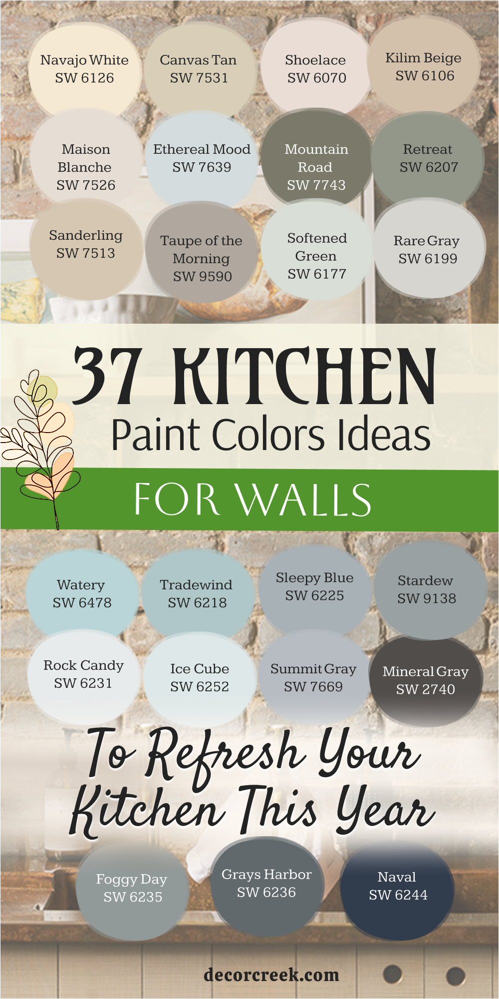
My Final Thoughts about 37 Kitchen Paint Color Ideas For Walls in 2026
Choosing a paint color for your kitchen is a deeply personal process, and I truly hope that this extensive collection of 37 ideas has given you all the inspiration and confidence you need to move forward. The ultimate goal here is to create a kitchen that goes beyond just looking fashionable; it must be a room that truly reflects your own personal taste, your family’s dynamic, and makes you feel genuinely happy and comfortable every single day you spend in it.
Whether you find yourself drawn to the quiet elegance and gentle refinement of a pale neutral like Classic Gray, or if you prefer the dramatic sophistication and rich character of a deep hue like Naval, your final color choice is a major decision that will set the entire mood and overall appearance for years to come.
I cannot stress enough the importance of quality, especially in a high-traffic area like the kitchen, which is why I confidently stand by premium brands like Sherwin-Williams and Benjamin Moore. These brands ensure that the beautiful color you select not only looks rich and true, but that the paint itself will be durable enough to withstand cleaning, steam, and everyday life, guaranteeing longevity. Before making a final commitment, please don’t be afraid to sample a few of your favorites directly on a large section of your kitchen wall.
This critical step allows you to truly see how the color interacts with the natural and artificial light and how it changes its personality throughout the day. The kitchen is, without a doubt, the true heart of your home; let its walls tell a beautiful story of warmth, happiness, and timeless style. Trust your instincts, pick the color that deeply resonates with your soul, and you absolutely cannot go wrong.

