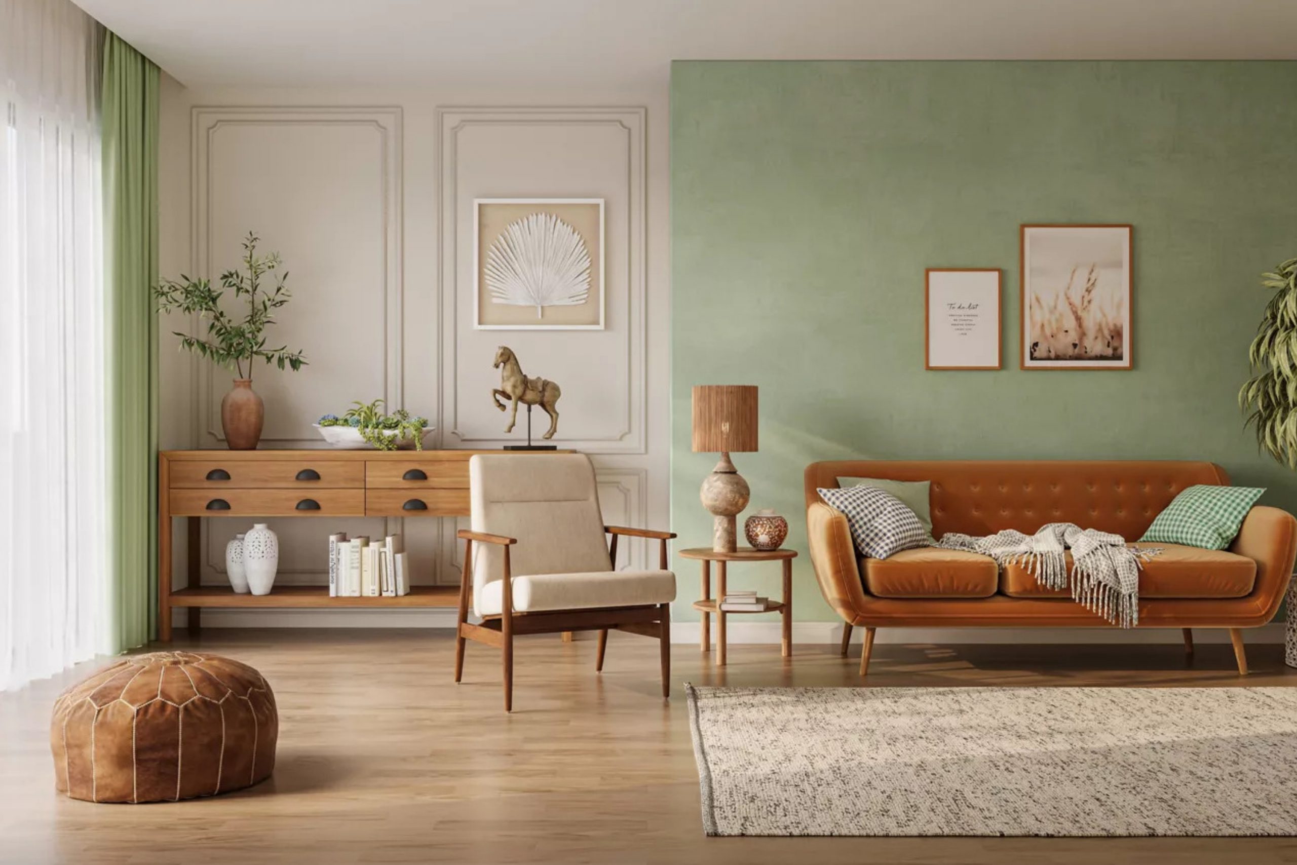
When I think about room colors, I don’t just see walls—I see feelings, memories, and the way a home welcomes people in. Every shade carries a mood, and the right mix of tones can change how a room feels from morning until night. A softer color can make mornings feel gentle, while a deeper tone can bring peace in the evening.
Together, they can create warmth, comfort, and a sense of belonging that lasts all day. I’ve always believed that no single color can do the job alone.
One shade highlights the beauty of another, and contrast can make both sides stronger. A quiet neutral can soften the boldness of navy, while a deep accent can give life to pale walls.
With so many choices, it’s easy to feel lost, but I lean on palettes I know will never fail. I’ve seen these colors in homes filled with family, friends, and real life—and I’ve watched them work again and again.
That’s why pairing them thoughtfully matters so much to me.
Why I Trust Sherwin-Williams and Benjamin Moore for Room Color Combinations
I turn to Sherwin-Williams and Benjamin Moore because I trust how their colors hold up in real life. I’ve watched them stay true through bright sunlight, rainy days, and the busy rhythm of daily life. Their paints don’t just look good in a sample—they last on the wall.
When I combine shades from these ranges, I can predict how they will behave together because I’ve seen the results in many homes.
The collections are wide enough to cover everything: soft whites, cozy neutrals, bold accents, and rich darks.
That variety makes it simple to design for different rooms without worry of mismatch. Bedrooms call for restful pairings, kitchens need freshness and light, and living rooms often benefit from balance between warmth and depth.
With these brands, I can find colors that speak to all those needs. I know the tones won’t fade quickly or feel dated too soon. That trust lets me create combinations with confidence.
How I Choose the Right Room Paint Color Combinations
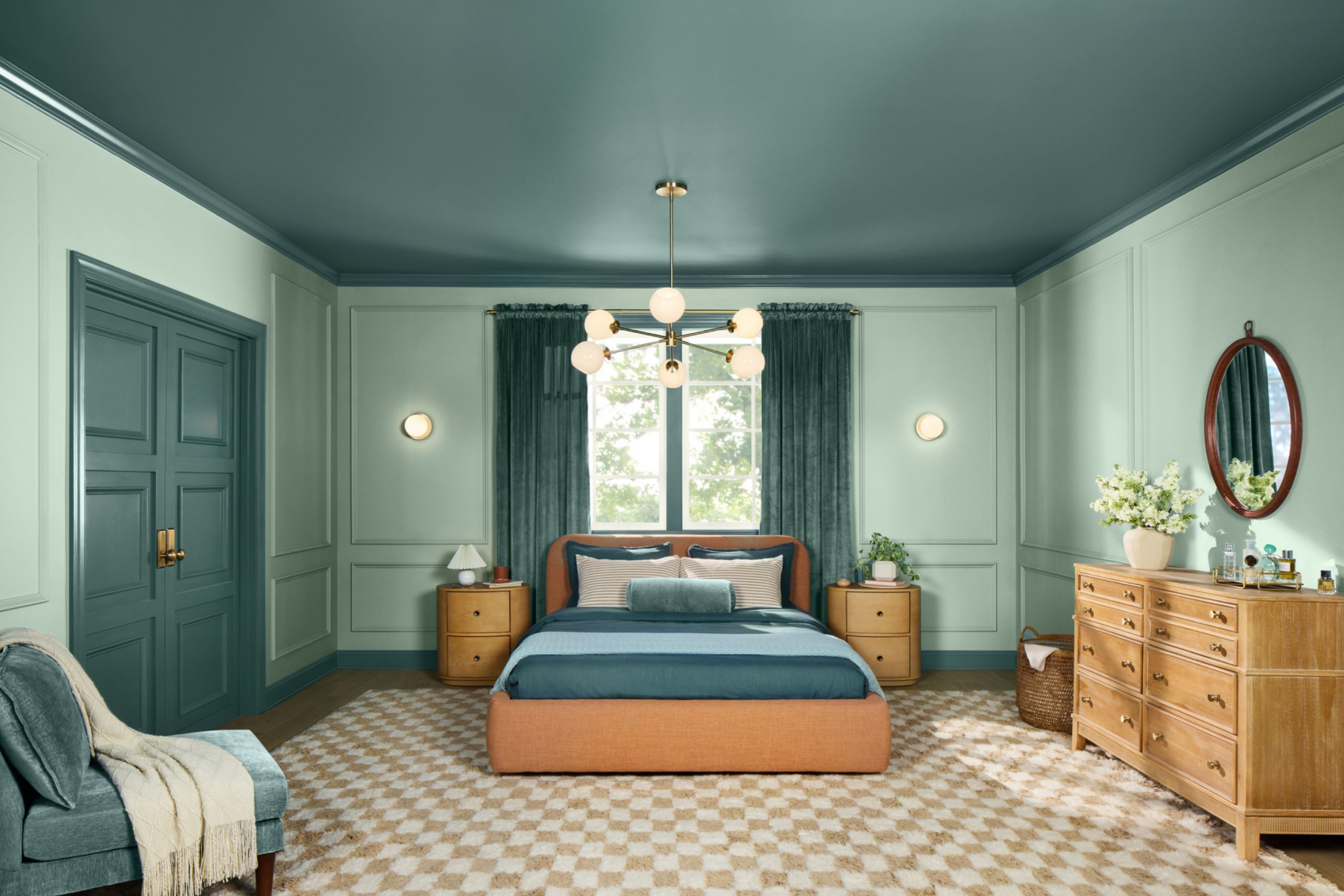
My first step is always light—it tells me everything. I watch how sunlight moves through the room from morning to night, how shadows stretch across walls, and how lamps change the mood after dark. Once I understand the light, I study undertones to be sure nothing clashes with wood floors, stone counters, or fabrics already in the room.
I like pairing warm and cool because that balance keeps rooms alive. Sometimes one wall needs a deep anchor shade while the others stay lighter to support it.
Other times, trim and ceilings play a quiet but powerful role, tying the look together. I test big swatches because paper cards never show the truth.
A full wall sample lets me live with the color for a day or two, and that’s when I see if it truly fits. The room itself begins to “speak,” showing whether it feels balanced and inviting.
When the tones flow with the furniture and light, I know the combination is right. That’s the moment where design turns into feeling.
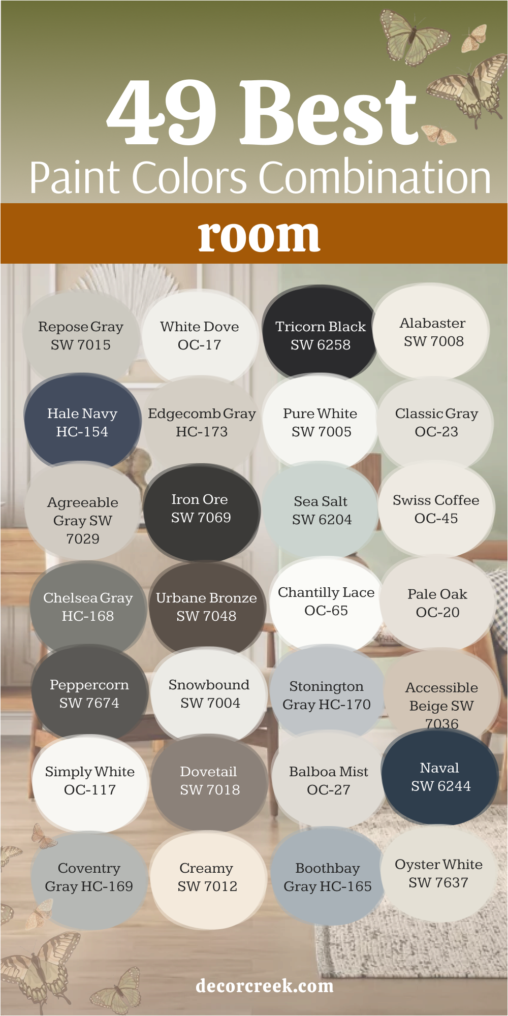
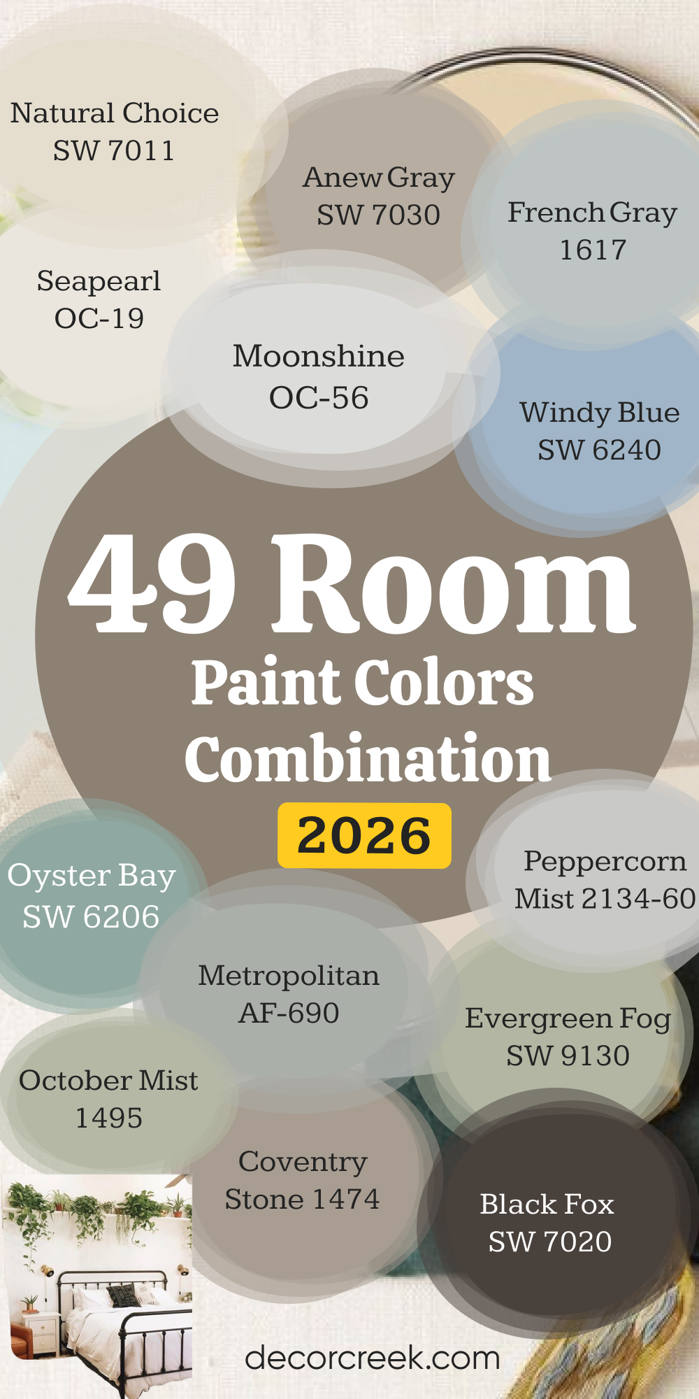
49 Room Paint Colors Combination in 2026
Repose Gray SW 7015
Repose Gray gives a steady background that feels welcoming without being too heavy. It works well in living rooms where you want both comfort and brightness. I’ve used it beside crisp white trim, and it instantly makes the edges stand out. With natural wood, it softens into a gentle contrast. It’s the kind of color that accepts both cool and warm accents without fighting them.
Repose Gray pairs beautifully with navy for strength. It also handles soft blues or greens if you want a quieter touch. On ceilings, a lighter white keeps it fresh. For hallways, it flows smoothly into deeper shades.
This is why it’s one of my go-to colors for families.

White Dove OC-17
White Dove brings light into rooms that need a gentle lift. It’s not too bright and never too dull. I like it in bedrooms where softness matters most. It pairs well with natural linens and light oak floors. When used on trim, it outlines deeper wall shades with grace. On kitchen cabinets, it gives a fresh but warm look. White Dove also balances dark furniture without making it feel too heavy.
I’ve seen it shine in small rooms, helping them feel more open. It’s flexible with both modern and classic styles. For ceilings, it keeps the look smooth and clean. This is a white I can always trust.

Tricorn Black SW 6258
Tricorn Black is bold and steady, the perfect choice when a room needs strength. I’ve used it on accent walls to anchor light furniture. Against white trim, it stands sharp and crisp. When paired with brass or gold hardware, it feels rich without being flashy. It works on doors too, making entries stand proud. With soft beige walls, it offers a dramatic balance.
On built-in bookshelves, it sets the stage for colorful accents. Tricorn Black can also frame windows beautifully. I like pairing it with lighter grays for balance.
Even in small doses, it changes how a room feels. It’s a shade for confidence.

Alabaster SW 7008
Alabaster carries warmth that feels inviting. I’ve seen it soften bedrooms, giving them a cozy glow. On walls, it blends with wood furniture like they were made for each other. When used with deep blues, it adds light without taking over. Alabaster looks beautiful on ceilings paired with beige walls. On kitchen cabinets, it gives a timeless brightness that families love.
It pairs nicely with black accents, offering balance. In hallways, it creates flow between rooms of different colors.
Alabaster has enough depth to avoid feeling flat. This is a color I return to often. It’s like a soft hug for any room.

Hale Navy HC-154
Hale Navy carries depth that feels rich and strong. On accent walls, it brings drama without being harsh. I love pairing it with crisp whites, which makes the navy pop. In bedrooms, it feels cozy and safe. On cabinets, it brings a modern edge that still feels classic. Hale Navy pairs beautifully with brass hardware for warmth. With natural wood, it balances strength and softness.
On doors, it creates a bold welcome. It also works outdoors, where sunlight brings out its richness.
Inside, paired with soft gray, it feels grounded. Hale Navy has been a trusted favorite for years.

Edgecomb Gray HC-173
Edgecomb Gray is soft, warm, and perfect for open areas. I’ve used it in living rooms where natural light shifts all day. It pairs well with white trim, keeping the look clean. With dark furniture, it offers balance. Edgecomb Gray blends beautifully with soft blues or greens. On ceilings, a crisp white keeps it airy. In dining rooms, it adds quiet comfort.
It’s flexible enough for both modern and traditional settings. I like it beside natural stone, where undertones connect perfectly.
It’s a color that works in any season. That’s why homeowners love it year after year.

Pure White SW 7005
Pure White feels like a fresh canvas that lets furniture and fabrics shine. I’ve used it in kitchens where cabinets look crisp but never harsh. It pairs well with marble countertops, giving a clean backdrop. With dark floors, it balances light and depth. On trim, Pure White draws neat lines around any shade. It softens nicely beside warm woods. In bedrooms, it makes bedding and decor feel brighter.
It also flows easily into other rooms, which makes open plans look connected.
I’ve paired it with bold colors, and it never competes. Pure White is steady, reliable, and always easy to live with.

Classic Gray OC-23
Classic Gray holds a quiet strength that works beautifully in living spaces. It’s light enough to keep a room open but has depth to show character. With white trim, it feels fresh and refined. Against dark furniture, it balances nicely without stealing focus. In bedrooms, it makes linens and soft textiles look more inviting. On ceilings, it shifts slightly with light, adding interest.
I’ve used it beside navy for a sharp look. It also works well with earthy tones like taupe and beige.
Classic Gray adapts to changing light without losing its charm. It’s a shade I often recommend to families.

Agreeable Gray SW 7029
Agreeable Gray is one of those colors that feels easy in any room. I’ve seen it bring warmth to open living areas without being too heavy. It pairs well with crisp white trim, keeping the look clean. With wood floors, it feels natural and grounded. On ceilings, a softer white keeps the flow gentle. Agreeable Gray works with both modern and traditional styles.
I like it paired with deep navy for balance. It also blends with soft green accents for a fresh touch.
In bedrooms, it feels restful yet not plain. It’s a color that always feels like a safe choice.

Iron Ore SW 7069
Iron Ore delivers drama with elegance. I’ve used it on accent walls to give depth without going to pure black. On kitchen islands, it creates a strong anchor. It pairs beautifully with brass or gold fixtures. With soft grays, it balances light and dark. Iron Ore also looks stunning on doors, both inside and outside. Against white trim, the contrast feels bold and sharp.
In bedrooms, it can be cozy with layered textiles. I’ve seen it shine in modern spaces and rustic homes alike.
With natural stone, it blends as though it belongs. Iron Ore always brings confidence to a room.

Sea Salt SW 6204
Sea Salt has a fresh, airy feeling that always reminds me of soft mornings. It works beautifully in bathrooms, reflecting light and keeping things bright. In bedrooms, it feels restful but not dull. Sea Salt pairs perfectly with crisp white trim. It also blends with sandy beiges for a coastal touch. On ceilings, it looks light and refreshing. I love it beside natural textures like linen or jute.
In kitchens, it keeps the look gentle yet lively. It flows well into gray-based tones, creating harmony. Sea Salt is one of my favorite soft greens for family homes.

Swiss Coffee OC-45
Swiss Coffee carries a warmth that feels like morning sunlight. It looks inviting in living rooms with wood furniture. On walls, it pairs easily with beige or gray accents. I’ve used it in kitchens for cabinets, where it feels timeless. It works well with brass and nickel hardware. Against dark floors, it keeps balance without looking too bright. In bedrooms, it wraps the room with comfort.
On ceilings, it blends smoothly with matching trims. Swiss Coffee also pairs beautifully with soft pastels for a layered look.
It’s a color I often suggest when families want a welcoming neutral.

Chelsea Gray HC-168
Chelsea Gray is bold but flexible. It brings weight to a room without feeling too dark. On accent walls, it highlights furniture beautifully. I like it in dining rooms where it adds a sense of depth. With crisp white trim, the look feels classic. Against warm woods, it softens just enough. On kitchen cabinets, Chelsea Gray gives a modern edge. In hallways, it makes art stand out.
It pairs well with lighter grays for balance. This shade is one I trust to bring character without overwhelming a room.

Urbane Bronze SW 7048
Urbane Bronze feels grounded and rich, like a steady foundation. I’ve used it in studies where focus is important. On accent walls, it brings drama without harshness. It pairs beautifully with soft beiges and creams. Against white trim, it looks striking. In bedrooms, it creates a cocoon-like mood when paired with warm textiles. On doors, it feels bold and welcoming.
I like combining it with wood tones for natural harmony. Urbane Bronze also plays well with brass accents.
It’s a shade that adds depth and maturity to any room.

Chantilly Lace OC-65
Chantilly Lace is one of the brightest whites I know. It feels pure and crisp, perfect for trim and ceilings. On walls, it makes rooms glow with freshness. Paired with dark accents, it creates bold contrast. With pale pastels, it feels gentle and light. I like it in kitchens where cabinets need a clean look. In bedrooms, it makes bedding and curtains pop.
It works beautifully in modern homes with simple lines.
Chantilly Lace also makes small rooms feel more open. It’s a white that always feels current and fresh.

Pale Oak OC-20
Pale Oak offers softness with character. On walls, it has just enough depth to stand out. I like using it in living rooms for a gentle background. Paired with white trim, it looks polished and steady. With dark accents, it balances without looking flat. In bedrooms, it feels inviting when layered with linens. On ceilings, a brighter white keeps it lifted.
Pale Oak pairs well with natural stone and warm woods. In dining areas, it sets a warm yet refined tone.
This is a shade that works easily across different styles.

Peppercorn SW 7674
Peppercorn is a deep gray that feels bold yet inviting. I’ve used it on feature walls to anchor a room with confidence. Against crisp white trim, the contrast looks sharp and stylish. In bedrooms, it adds a sense of intimacy when paired with soft bedding. On cabinets, it creates a sleek and modern edge. Peppercorn also pairs beautifully with brushed gold hardware.
With natural wood, it brings warmth and balance. In hallways, it makes art and photographs stand out.
I like using it with lighter grays to soften transitions. It’s a dramatic shade that still feels livable.

Snowbound SW 7004
Snowbound is a gentle white that never feels too stark. On walls, it gives a clean look that still feels warm. I often use it in kitchens where it makes cabinets shine. Paired with dark countertops, it balances beautifully. With light wood floors, it looks soft and welcoming. Snowbound also works well in bedrooms, creating a bright backdrop.
On trim, it outlines deeper shades with ease. In small rooms, it keeps things airy.
I like using it beside blues and greens for a fresh touch. Snowbound always delivers a steady, fresh look.

Stonington Gray HC-170
Stonington Gray has a cool edge that feels fresh and balanced. I’ve used it in living rooms where light changes through the day. Paired with white trim, it keeps the look crisp. Against dark wood furniture, it offers a clean contrast. In bedrooms, it feels refreshing with light bedding. On cabinets, it adds a modern edge. It pairs beautifully with navy and charcoal accents.
Stonington Gray also looks elegant with silver fixtures. In dining rooms, it creates a steady mood. It’s a shade I trust for cool-toned homes.

Accessible Beige SW 7036
Accessible Beige is warm and welcoming without being too heavy. On walls, it gives living rooms a cozy feeling. Paired with white trim, it feels balanced and classic. With wood flooring, it blends naturally. I like using it in bedrooms where it supports soft fabrics. On ceilings, a brighter white keeps it fresh. Accessible Beige works beautifully with greens and soft blues. It also connects well to outdoor views through windows. In open plans, it creates harmony between spaces. This shade has been a reliable favorite for years.

Simply White OC-117
Simply White is bright but never harsh. I’ve used it on trim to frame deeper shades beautifully. On walls, it makes a room glow with freshness. Paired with wood furniture, it adds contrast without heaviness. In kitchens, it looks clean and classic. On ceilings, it reflects light for an airy feel. Simply White also pairs well with pastels for a gentle mood.
Against dark accents, it stands sharp and clear. In bedrooms, it highlights soft linens and bedding. It’s one of those whites that feels right anywhere.

Dovetail SW 7018
Dovetail is a strong mid-gray with plenty of character. On walls, it adds depth without being too dark. Paired with white trim, it creates a sharp, polished look. In dining rooms, it feels elegant and grounded. On cabinets, it gives a modern, sleek touch. I like using it with metallic accents for shine. With warm wood, it balances beautifully. Dovetail pairs well with lighter grays in open areas.
It also looks handsome in entryways, setting the tone for the home. This shade is bold but never too much.

Balboa Mist OC-27
Balboa Mist is soft and easy to live with. On walls, it gives a quiet background that works in many settings. Paired with white trim, it feels polished. Against dark furniture, it balances beautifully. In bedrooms, it creates a restful mood. On ceilings, a brighter white keeps it fresh. I’ve paired it with navy for a sharp mix. It also connects well with natural stone and warm textures.
In living rooms, it helps blend different elements together. Balboa Mist is always a safe choice.

Naval SW 6244
Naval is deep and rich, a true navy with timeless strength. On accent walls, it makes a bold statement. Paired with white trim, it looks sharp and modern. On cabinets, it feels stylish and sophisticated. In bedrooms, it creates a cozy retreat. Naval pairs well with brass for warmth. Against lighter grays, it balances strength and softness.
On doors, it makes a strong entrance. I like it beside natural wood for contrast.
Naval is a classic shade that never goes out of style.

Coventry Gray HC-169
Coventry Gray is cool and steady. On walls, it feels modern without being cold. Paired with white trim, it’s crisp and fresh. With dark accents, it shows balance. In bedrooms, it feels fresh with light bedding. On cabinets, it brings a sleek touch. I like using it in bathrooms for a clean look. Coventry Gray pairs well with navy and charcoal.
In hallways, it creates flow between rooms. It’s a dependable gray with a modern edge.

Creamy SW 7012
Creamy carries warmth that feels like sunlight indoors. On walls, it adds comfort to living areas. Paired with white trim, it blends smoothly. With wood furniture, it feels natural and soft. In bedrooms, it makes fabrics feel inviting. On cabinets, it creates a timeless kitchen look. Creamy pairs well with light blues and greens.
On ceilings, it keeps things bright without starkness. In open rooms, it flows easily from one space to another. This color always feels like home.

Boothbay Gray HC-165
Boothbay Gray is a soft blue-gray that feels steady and fresh. On walls, it gives a coastal touch without being too bright. Paired with white trim, it looks crisp and clean. Against darker accents, it softens the contrast. In bedrooms, it feels like fresh air on a calm morning. On cabinets, it creates a subtle pop of color that still feels neutral.
Boothbay Gray pairs beautifully with natural wood for balance. In living rooms, it blends well with grays and beiges.
It also works outdoors, where sunlight highlights its soft tone. Boothbay Gray always feels balanced and reliable.

Oyster White SW 7637
Oyster White has warmth that feels gentle and grounded. On walls, it provides a soft background that supports any decor. Paired with white trim, it looks polished. With dark wood furniture, it adds balance without heaviness. In bedrooms, it makes linens and fabrics glow softly. On ceilings, a brighter white keeps the look airy. I like pairing it with light blues for a calm mix.
Oyster White also works beautifully in hallways to connect rooms. It adapts well to different light throughout the day.
This is a shade that never feels out of place.

Kendall Charcoal HC-166
Kendall Charcoal is bold, rich, and full of character. On walls, it brings depth that makes a room feel strong. Paired with crisp white trim, it stands out sharply. Against warm wood, it feels grounded. On cabinets, it adds modern style. In dining rooms, it creates a dramatic mood. I like it with brass or gold accents, which shine against its depth.
Kendall Charcoal also works well with lighter grays for balance. On doors, it delivers an impressive entrance.
It’s a color for people who want strength in their home.

Shoji White SW 7042
Shoji White carries a soft warmth that feels welcoming. On walls, it creates a clean but cozy backdrop. Paired with wood furniture, it looks natural. With dark accents, it softens the contrast. In bedrooms, it wraps the room in quiet comfort. On ceilings, a brighter white adds freshness. Shoji White also pairs beautifully with soft blues and greens.
In living rooms, it supports both modern and traditional decor.
I’ve seen it flow nicely into deeper shades for balance. Shoji White always feels adaptable and kind.

Horizon Gray 2141-50
Horizon Gray has a muted green tone that feels balanced and earthy. On walls, it connects well with outdoor views. Paired with white trim, it looks neat and fresh. With stone or brick, it feels natural and steady. In bedrooms, it offers a restful backdrop. On cabinets, it brings character without shouting.
Horizon Gray also pairs beautifully with beige and cream. In living rooms, it ties wood and fabric together.
Against dark accents, it keeps harmony. It’s a grounded shade that works in many rooms.
Mindful Gray SW 7016
Mindful Gray is steady, neutral, and always easy to live with. On walls, it balances light and dark perfectly. Paired with white trim, it feels polished and classic. With wood furniture, it blends naturally. In bedrooms, it makes fabrics feel more inviting. On ceilings, a brighter white keeps the look fresh. Mindful Gray pairs well with navy and black accents.
In open spaces, it flows smoothly from one room to another. It also looks good with warm undertones like beige.
It’s a shade that works everywhere in the home.

Silver Satin OC-26
Silver Satin is light and graceful. On walls, it gives rooms an airy feel. Paired with white trim, it looks clean and soft. Against darker shades, it balances beautifully. In bedrooms, it pairs well with pale linens. On ceilings, it keeps the look lifted and bright. Silver Satin works nicely in kitchens with marble or quartz.
In hallways, it creates a smooth flow between rooms. I also like it paired with navy for contrast.
Silver Satin always feels easy and gentle.
Storm Cloud SW 6249
Storm Cloud is deep and dramatic. On walls, it feels moody but not too heavy. Paired with white trim, it shows sharp contrast. Against lighter grays, it blends smoothly. In bedrooms, it creates a cocoon-like feel. On cabinets, it looks sleek and stylish. I like pairing it with metallic accents for shine.
In living rooms, it works well as a feature wall. With wood, it adds depth and warmth.
Storm Cloud always adds personality to a space.
Smoky Blue SW 7604
Smoky Blue is rich and bold with a calming edge. On walls, it adds depth without being too dark. Paired with white trim, it pops beautifully. On cabinets, it gives a stylish, modern look. In bedrooms, it feels cozy yet uplifting. Smoky Blue pairs well with brass accents for warmth. With natural wood, it balances nicely.
On doors, it makes a bold entrance. In living rooms, it works as a strong accent wall.
Smoky Blue always brings confidence and character.

Coventry Blue HC-138
Coventry Blue is light and cheerful. On walls, it gives a fresh touch without being too strong. Paired with white trim, it feels crisp and neat. In bedrooms, it brings a soft, airy look. On cabinets, it adds playful charm. Coventry Blue works well in bathrooms for brightness. Against grays, it blends into harmony.
In living rooms, it adds a gentle accent. With natural light, it shifts beautifully through the day.
Coventry Blue is uplifting and friendly.
Natural Choice SW 7011
Natural Choice has warmth that feels easy to live with. On walls, it supports any kind of decor. Paired with white trim, it looks clean. With dark accents, it balances softly. In bedrooms, it makes fabrics glow warmly. On ceilings, it blends smoothly with lighter whites. Natural Choice also pairs well with blues and greens.
In kitchens, it works nicely with stone countertops. In hallways, it connects different rooms easily.
It’s a shade that always feels welcoming.

Seapearl OC-19
Seapearl is soft and refined, with just the right balance of warmth. On walls, it feels steady without being plain. Paired with white trim, it looks polished. Against darker accents, it softens the edges. In bedrooms, it offers a gentle backdrop. On cabinets, it adds sophistication. Seapearl also pairs beautifully with navy for contrast.
In dining rooms, it feels elegant and balanced.
With wood furniture, it blends naturally. Seapearl is graceful and dependable.

French Gray 1617
French Gray carries a cool tone with sophistication. On walls, it feels steady and refined. Paired with white trim, it looks polished. With dark accents, it balances the weight. In bedrooms, it feels peaceful with light linens. On cabinets, it gives a sleek touch. French Gray also pairs beautifully with navy.
In hallways, it offers flow between rooms. With natural light, it shifts gently through the day.
It’s a shade that feels graceful and classic.
Anew Gray SW 7030
Anew Gray is versatile and modern. On walls, it carries warmth without being too dark. Paired with white trim, it feels clean and classic. With wood floors, it blends naturally. In bedrooms, it makes fabrics look richer. On cabinets, it adds style and depth. Anew Gray pairs beautifully with navy accents. It also works well with greens and creams.
In living rooms, it provides a steady backdrop. It’s a color I often recommend for open spaces.

Moonshine OC-56
Moonshine is light and airy, with a soft gray undertone. On walls, it brightens rooms without starkness. Paired with white trim, it feels smooth and fresh. With darker shades, it balances easily. In bedrooms, it offers a light touch. On ceilings, it lifts the look further. Moonshine pairs beautifully with blues and greens.
In living rooms, it creates an open flow. It also works nicely in kitchens with stone finishes.
Moonshine always feels soft and refreshing.
Windy Blue SW 6240
Windy Blue is cheerful and lively. On walls, it brightens rooms with ease. Paired with white trim, it feels crisp. In bedrooms, it gives a fresh and happy tone. On cabinets, it creates a playful look. Windy Blue works beautifully in bathrooms. With light wood, it feels natural and breezy.
In living rooms, it works as a charming accent wall. Against gray shades, it adds variety.
Windy Blue always brings energy to a room.

Metropolitan AF-690
Metropolitan is modern and sleek. On walls, it feels sophisticated without heaviness. Paired with white trim, it looks crisp and polished. With darker accents, it balances well. In bedrooms, it gives a refined edge. On cabinets, it looks sharp and stylish. Metropolitan pairs beautifully with metallics. In dining rooms, it sets an elegant tone.
With natural wood, it softens into harmony. Metropolitan always feels current and refined.
Oyster Bay SW 6206
Oyster Bay is a muted green-gray that feels natural. On walls, it brings a grounded touch. Paired with white trim, it looks fresh. With wood furniture, it feels earthy and balanced. In bedrooms, it creates a quiet retreat. On cabinets, it adds unique character. Oyster Bay pairs well with creams and soft grays. In living rooms, it blends with natural textures.
Against darker shades, it offers contrast. Oyster Bay is a favorite for those who love green tones.

Evergreen Fog SW 9130
Evergreen Fog is fresh and modern with a soft green tone. On walls, it brings natural ease. Paired with white trim, it feels bright. With wood accents, it looks grounded. In bedrooms, it makes fabrics feel softer. On cabinets, it adds stylish charm. Evergreen Fog pairs beautifully with creams and tans. In living rooms, it connects easily to outdoor views.
It also works nicely in kitchens with stone finishes. Evergreen Fog feels current and welcoming.

October Mist 1495
October Mist has a gentle green tone that feels uplifting. On walls, it adds freshness without being too strong. Paired with white trim, it looks neat. With wood furniture, it blends naturally. In bedrooms, it pairs well with light bedding. On cabinets, it creates a stylish accent. October Mist also works in bathrooms for brightness. In living rooms, it keeps the mood soft.
Against gray shades, it balances beautifully. October Mist feels lively but never too much.

Black Fox SW 7020
Black Fox is deep and dramatic with a brown undertone. On walls, it adds richness to living rooms. Paired with white trim, it creates bold contrast. With warm wood, it feels grounded. On cabinets, it gives kitchens a modern edge. In bedrooms, it makes fabrics feel cozier. Black Fox pairs well with brass and gold accents.
In dining rooms, it feels elegant and bold. On doors, it makes a striking entrance. Black Fox is powerful but always stylish.
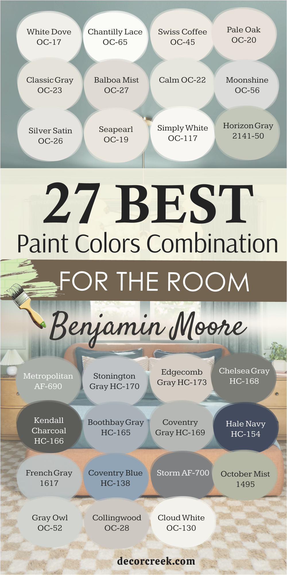
27 Room Paint Colors Combination by Benjamin Moore
White Dove OC-17
White Dove is soft and bright without being too sharp. On walls, it adds comfort and light. Paired with darker furniture, it offers gentle balance. With crisp trim, it looks polished and fresh. In kitchens, it makes cabinets glow with warmth. On ceilings, it blends smoothly with other whites. White Dove pairs well with blues and grays for contrast.
In bedrooms, it makes fabrics feel lighter. It works in both modern and classic homes. White Dove is a white I trust in any room.
Chantilly Lace OC-65
Chantilly Lace is one of the brightest whites. On walls, it gives a clean and pure look. Paired with black accents, it feels bold and modern. With wood tones, it adds balance. On trim, it creates sharp edges around any color. In kitchens, it makes cabinets feel fresh. On ceilings, it reflects light beautifully. Chantilly Lace pairs well with soft pastels too.
In bedrooms, it keeps the mood airy. This is a white that always feels crisp and reliable.
Swiss Coffee OC-45
Swiss Coffee carries warmth that feels like morning light. On walls, it creates comfort in living rooms. Paired with beige accents, it blends smoothly. With wood furniture, it feels soft and steady. In bedrooms, it wraps the room in warmth. On trim, it looks natural and smooth. Swiss Coffee also pairs well with light greens and blues.
In kitchens, it gives cabinets a timeless glow. On ceilings, it avoids harshness. Swiss Coffee always feels inviting.
Pale Oak OC-20
Pale Oak is soft and refined. On walls, it feels gentle but not plain. Paired with white trim, it looks neat and steady. With dark accents, it balances beautifully. In bedrooms, it makes linens feel cozy. On ceilings, it pairs well with crisp whites. Pale Oak blends with natural stone and wood. In living rooms, it sets a graceful tone.
It’s a shade that fits many styles easily. Pale Oak is one of my favorites for quiet balance.
Classic Gray OC-23
Classic Gray is easy and adaptable. On walls, it feels light but interesting. Paired with white trim, it creates a smooth look. With darker accents, it shows balance. In bedrooms, it works well with soft bedding. On ceilings, it adds gentle brightness. Classic Gray pairs nicely with navy for contrast. In kitchens, it looks fresh with stone counters.
In living rooms, it connects furniture and fabrics. This shade works anywhere in the home.
Balboa Mist OC-27
Balboa Mist feels calm and steady. On walls, it gives a light gray with warmth. Paired with crisp trim, it feels polished. With wood tones, it blends easily. In bedrooms, it creates a soft mood. On cabinets, it adds subtle depth. Balboa Mist pairs well with navy and charcoal. In dining rooms, it adds elegance.
In hallways, it flows smoothly into other colors. This is a shade that always feels balanced.
Calm OC-22
Calm feels soft and uplifting. On walls, it brings gentle light to rooms. Paired with white trim, it looks clean. With darker accents, it offers balance. In bedrooms, it gives a soothing backdrop. On ceilings, it connects well with bright whites. Calm pairs with both modern and traditional styles. In kitchens, it looks neat with stone finishes.
In living rooms, it creates harmony between elements. Calm is a color that never feels heavy.
Moonshine OC-56
Moonshine is bright with a touch of gray. On walls, it feels open and fresh. Paired with white trim, it looks clean. With darker shades, it balances easily. In bedrooms, it adds lightness. On ceilings, it blends smoothly. Moonshine pairs well with blues and greens. In kitchens, it feels neat and bright.
In living rooms, it helps open the space. Moonshine always feels refreshing.
Silver Satin OC-26
Silver Satin is graceful and light. On walls, it adds brightness without starkness. Paired with crisp trim, it looks polished. With dark accents, it balances well. In bedrooms, it pairs nicely with soft fabrics. On ceilings, it lifts the mood. Silver Satin works beautifully in kitchens with marble.
In living rooms, it adds elegance. In hallways, it flows gently into other shades. Silver Satin is dependable and easy to love.
Seapearl OC-19
Seapearl feels refined and steady. On walls, it has depth while staying light. Paired with white trim, it looks neat. With darker accents, it softens edges. In bedrooms, it gives a gentle backdrop. On cabinets, it adds sophistication. Seapearl pairs beautifully with navy and taupe. In living rooms, it sets an elegant tone.
In dining areas, it works with natural light. Seapearl always feels graceful.
Simply White OC-117
Simply White shines with brightness yet never feels harsh. On walls, it makes a room feel open and welcoming. Paired with dark accents, it creates striking contrast. With wood tones, it softens the look. In kitchens, it makes cabinets glow clean and fresh. On ceilings, it reflects natural light beautifully. Simply White pairs well with both modern and traditional styles.
In bedrooms, it makes fabrics look crisp. In hallways, it carries light through every corner. Simply White is a shade I reach for again and again.
Horizon Gray 2141-50
Horizon Gray carries a soft green undertone that feels natural. On walls, it connects smoothly with outdoor views. Paired with white trim, it looks balanced and fresh. With stone or wood, it blends easily. In bedrooms, it creates a grounded backdrop. On cabinets, it gives character without being bold. Horizon Gray pairs well with creams and light taupes.
In living rooms, it sets an earthy tone. In hallways, it provides flow with ease. Horizon Gray always feels steady and reliable.
Metropolitan AF-690
Metropolitan is sleek and modern with a refined edge. On walls, it gives rooms a polished look. Paired with crisp white trim, it feels clean. With darker accents, it creates balance. In bedrooms, it offers a sophisticated mood. On cabinets, it looks sharp and stylish. Metropolitan pairs beautifully with metallic details. In dining rooms, it feels elegant and composed.
With natural wood, it softens for harmony. Metropolitan always feels current and steady.
Stonington Gray HC-170
Stonington Gray is cool and balanced. On walls, it keeps rooms light yet grounded. Paired with white trim, it feels fresh. With navy, it creates striking depth. In bedrooms, it feels refreshing with pale bedding. On cabinets, it adds a modern touch. Stonington Gray pairs well with silver finishes. In living rooms, it feels neat and organized.
In hallways, it flows smoothly into darker grays. It’s a shade that always feels dependable.
Edgecomb Gray HC-173
Edgecomb Gray is warm and gentle. On walls, it gives softness without looking flat. Paired with white trim, it feels classic. With natural wood, it blends beautifully. In bedrooms, it creates a restful mood. On ceilings, a brighter white keeps it airy. Edgecomb Gray pairs nicely with muted blues. In kitchens, it looks timeless with stone counters.
In living rooms, it supports many styles. It’s a shade that feels easy to live with.
Chelsea Gray HC-168
Chelsea Gray carries boldness with elegance. On walls, it gives depth that feels rich. Paired with white trim, it stands out sharply. With warm wood, it feels grounded. In dining rooms, it adds a strong presence. On cabinets, it feels sleek and modern. Chelsea Gray pairs beautifully with brass accents. In hallways, it makes artwork shine.
In living rooms, it gives a steady backdrop. Chelsea Gray is bold yet graceful.
Kendall Charcoal HC-166
Kendall Charcoal is dramatic and strong. On walls, it brings weight to a room. Paired with crisp trim, it looks sharp. With wood tones, it softens just enough. In bedrooms, it feels cozy with layered textiles. On cabinets, it looks modern and stylish. Kendall Charcoal pairs with navy or deep green beautifully.
In dining rooms, it sets a bold mood. In hallways, it gives character without fuss. It’s a shade that makes a statement.
Boothbay Gray HC-165
Boothbay Gray is calm and steady with a hint of blue. On walls, it feels fresh and breezy. Paired with white trim, it looks crisp. With natural textures, it blends smoothly. In bedrooms, it gives a relaxed feeling. On cabinets, it adds charm without heaviness. Boothbay Gray pairs well with navy and charcoal.
In living rooms, it feels light yet grounded. In hallways, it flows gently into other tones.
Boothbay Gray always feels reliable.
Coventry Gray HC-169
Coventry Gray is clean, cool, and modern. On walls, it offers balance without starkness. Paired with white trim, it feels polished. With dark accents, it shows strong contrast. In bedrooms, it feels refreshing. On cabinets, it looks sleek and sharp. Coventry Gray pairs with blues and silvers nicely. In living rooms, it provides steady structure.
In dining rooms, it gives elegance without fuss. It’s a color I trust for a modern look.
Hale Navy HC-154
Hale Navy is deep and rich with timeless appeal. On walls, it adds bold character. Paired with white trim, it creates a sharp edge. With brass accents, it shines warmly. In bedrooms, it feels grounded and safe. On cabinets, it adds stylish sophistication. Hale Navy pairs beautifully with gray tones. In dining rooms, it feels elegant.
On doors, it creates a strong welcome. Hale Navy always makes a statement.
Coventry Blue HC-138
Coventry Blue is cheerful and fresh. On walls, it adds brightness with personality. Paired with white trim, it looks crisp. With soft grays, it blends smoothly. In bedrooms, it feels uplifting. On cabinets, it creates charm. Coventry Blue pairs well with navy or charcoal. In living rooms, it works as a playful accent.
In bathrooms, it adds freshness. Coventry Blue always feels light and joyful.
October Mist 1495
October Mist carries a green tone that feels lively. On walls, it adds freshness to any room. Paired with white trim, it looks clean. With wood accents, it feels natural. In bedrooms, it offers gentle energy. On cabinets, it feels unique and stylish. October Mist pairs beautifully with creams and taupes.
In living rooms, it connects easily with outdoor views. In bathrooms, it adds brightness. October Mist always feels refreshing.
Storm AF-700
Storm is a strong gray with depth. On walls, it feels steady and bold. Paired with white trim, it looks sharp. With wood tones, it balances nicely. In bedrooms, it adds a grounded mood. On cabinets, it feels sleek. Storm pairs well with navy and black. In living rooms, it creates a dramatic look.
In dining rooms, it feels rich and stylish. Storm is a color of confidence.
Gray Owl OC-52
Gray Owl is light and flexible. On walls, it feels fresh without being cold. Paired with white trim, it looks clean. With dark accents, it shows balance. In bedrooms, it feels airy. On cabinets, it adds modern charm. Gray Owl pairs well with navy for contrast. In living rooms, it creates openness.
In kitchens, it feels sharp with stone counters. Gray Owl is a safe and steady choice.

Collingwood OC-28
Collingwood is soft and welcoming. On walls, it feels warm without being heavy. Paired with crisp trim, it looks neat. With wood accents, it blends easily. In bedrooms, it offers comfort. On cabinets, it feels graceful. Collingwood pairs well with darker grays. In living rooms, it balances with fabrics and textures.
In dining areas, it adds a gentle edge. Collingwood always feels friendly.

Cloud White OC-130
Cloud White feels warm and classic. On walls, it adds brightness with softness. Paired with white trim, it blends smoothly. With dark accents, it balances gently. In bedrooms, it feels clean and steady. On cabinets, it creates a timeless look. Cloud White pairs well with wood tones. In living rooms, it sets a warm backdrop.
On ceilings, it connects easily with other shades. Cloud White is always dependable.

27 Room Paint Colors Combination by Sherwin Williams
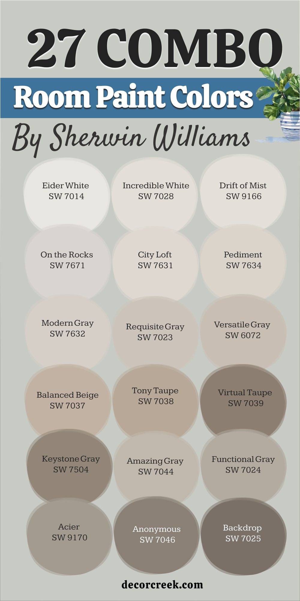
Eider White SW 7014
Eider White is a soft gray-white that carries a touch of warmth. On walls, it feels light without being flat. Paired with white trim, it creates a clean contrast. With wood accents, it blends naturally. In bedrooms, it offers a quiet backdrop for linens. On cabinets, it feels subtle yet refined. Eider White pairs well with soft greens and muted blues.
In hallways, it makes transitions smooth. It works nicely in both modern and traditional homes.
Eider White always feels steady and versatile.

Incredible White SW 7028
Incredible White carries a gentle mix of gray and beige. On walls, it looks warm but not too heavy. Paired with crisp trim, it feels polished. With darker accents, it balances the weight. In bedrooms, it feels welcoming and soft. On ceilings, it connects easily with brighter whites. Incredible White pairs well with natural wood furniture.
In kitchens, it works nicely with stone countertops.
In living rooms, it ties fabrics and decor together. This shade feels graceful and reliable.
Drift of Mist SW 9166
Drift of Mist feels airy and clean. On walls, it gives a light touch of gray. Paired with white trim, it looks fresh. With darker furniture, it softens the contrast. In bedrooms, it provides a soft backdrop. On ceilings, it keeps the look bright. Drift of Mist pairs beautifully with blues and greens. In kitchens, it feels crisp and modern.
In hallways, it flows smoothly into deeper grays. Drift of Mist always feels refreshing.

On the Rocks SW 7671
On the Rocks is a cool gray with a modern edge. On walls, it feels sleek and balanced. Paired with white trim, it looks sharp. With warm wood, it creates contrast. In bedrooms, it works well with light linens. On cabinets, it adds a stylish touch. On the Rocks pairs beautifully with navy or black. In dining rooms, it feels elegant and neat.
In living rooms, it keeps decor grounded. This shade always feels crisp and current.

City Loft SW 7631
City Loft carries warmth with a soft neutral base. On walls, it gives living areas a cozy glow. Paired with white trim, it looks smooth and classic. With darker furniture, it blends gently. In bedrooms, it feels soft and restful. On ceilings, a bright white keeps the look lifted. City Loft pairs nicely with taupes and creams.
In kitchens, it works with stone finishes. In hallways, it provides seamless flow. It’s a shade I often recommend for homes that need balance.

Pediment SW 7634
Pediment is warm and grounded with a beige-gray tone. On walls, it feels comfortable but not heavy. Paired with white trim, it looks polished. With wood accents, it blends naturally. In bedrooms, it creates a cozy mood. On cabinets, it adds soft character. Pediment pairs well with muted greens and blues.
In living rooms, it sets an inviting backdrop. In hallways, it flows gently into darker shades.
Pediment always feels welcoming and dependable.
Modern Gray SW 7632
Modern Gray is fresh yet warm. On walls, it feels balanced between beige and gray. Paired with white trim, it looks crisp. With darker furniture, it adds harmony. In bedrooms, it makes fabrics feel inviting. On cabinets, it looks graceful. Modern Gray pairs well with deep blues and greens. In living rooms, it creates a soft structure.
In kitchens, it connects nicely with natural stone. This shade is steady and timeless in feel.

Requisite Gray SW 7023
Requisite Gray has depth that feels solid but approachable. On walls, it creates balance in larger rooms. Paired with white trim, it looks polished. With wood tones, it blends easily. In bedrooms, it sets a cozy and grounded mood. On cabinets, it feels stylish and sleek. Requisite Gray pairs well with black accents. In living rooms, it supports bold decor without clashing.
In dining rooms, it creates an elegant background. It’s a strong but flexible gray.
Versatile Gray SW 6072
Versatile Gray lives up to its name, fitting many settings. On walls, it carries warmth with balance. Paired with white trim, it feels neat. With darker accents, it adds contrast. In bedrooms, it works beautifully with soft linens. On cabinets, it creates a calm base. Versatile Gray pairs nicely with green and beige tones. In living rooms, it blends with natural textures.
In kitchens, it supports both modern and rustic looks. This shade always adapts gracefully.
Balanced Beige SW 7037
Balanced Beige feels cozy and inviting. On walls, it gives warmth without being dark. Paired with white trim, it feels crisp. With wood floors, it blends beautifully. In bedrooms, it creates a soft retreat. On cabinets, it feels timeless. Balanced Beige pairs with both cool and warm shades. In living rooms, it keeps decor grounded.
In hallways, it connects easily to other colors. It’s a shade that always feels like home.

Tony Taupe SW 7038
Tony Taupe is warm and steady, perfect for living areas. On walls, it creates a comfortable base for furniture. Paired with white trim, it looks crisp and balanced. With wood accents, it blends naturally. In bedrooms, it gives a restful feel. On cabinets, it feels rich without being too bold. Tony Taupe pairs well with creams and darker browns.
In dining rooms, it creates a warm backdrop. In hallways, it flows smoothly into lighter shades.
Tony Taupe is dependable and inviting.

Virtual Taupe SW 7039
Virtual Taupe is deeper and more dramatic than lighter neutrals. On walls, it adds weight and richness. Paired with white trim, it looks bold and polished. With dark furniture, it blends with confidence. In bedrooms, it creates a cozy retreat. On cabinets, it feels stylish and modern. Virtual Taupe pairs beautifully with bronze hardware.
In living rooms, it adds depth without overwhelming. In dining rooms, it feels elegant and grounded.
This shade always carries strength.

Keystone Gray SW 7504
Keystone Gray is earthy and natural. On walls, it feels grounded and balanced. Paired with white trim, it looks neat. With stone or wood accents, it blends beautifully. In bedrooms, it adds warmth without heaviness. On cabinets, it feels steady and strong. Keystone Gray pairs well with muted greens.
In living rooms, it works as a solid base for decor. In hallways, it keeps transitions smooth.
Keystone Gray always feels connected to nature.
Amazing Gray SW 7044
Amazing Gray is versatile and classic. On walls, it adds warmth and character. Paired with white trim, it looks sharp. With wood accents, it blends easily. In bedrooms, it sets a soft mood. On cabinets, it gives a modern edge. Amazing Gray pairs well with navy or charcoal. In living rooms, it feels calm and grounded.
In dining rooms, it offers quiet elegance. Amazing Gray is always a safe and stylish choice.

Functional Gray SW 7024
Functional Gray has depth that makes rooms feel strong. On walls, it adds weight without darkness. Paired with white trim, it looks polished. With warm wood, it blends naturally. In bedrooms, it creates a cozy backdrop. On cabinets, it feels sleek and bold. Functional Gray pairs beautifully with metallic accents.
In living rooms, it grounds open areas. In dining rooms, it feels refined.
Functional Gray always feels steady and dependable.
Acier SW 9170
Acier is a modern gray with cool undertones. On walls, it feels crisp and contemporary. Paired with white trim, it looks sharp. With black accents, it creates bold contrast. In bedrooms, it gives a fresh backdrop. On cabinets, it feels sleek and urban. Acier pairs well with navy and silver details.
In living rooms, it supports modern decor. In hallways, it connects well with other grays. Acier is stylish and current.
Anonymous SW 7046
Anonymous is deep and earthy. On walls, it feels bold and dramatic. Paired with white trim, it looks striking. With wood accents, it blends with warmth. In bedrooms, it creates a cocoon-like feel. On cabinets, it feels grounded and rich. Anonymous pairs beautifully with creams and beiges. In living rooms, it adds strong character.
In dining rooms, it feels elegant and moody. Anonymous is for those who want depth.

Backdrop SW 7025
Backdrop is a dark gray-brown that carries strength. On walls, it adds bold drama. Paired with white trim, it looks powerful. With natural wood, it feels connected and warm. In bedrooms, it offers a cozy and intimate mood. On cabinets, it creates a modern, striking look. Backdrop pairs well with metallic finishes.
In living rooms, it works as a strong accent. In dining rooms, it gives richness and depth.
Backdrop is confident and stylish.

Porpoise SW 7047
Porpoise is earthy with a subtle brown-gray tone. On walls, it feels grounded and natural. Paired with white trim, it looks polished. With stone accents, it blends beautifully. In bedrooms, it makes fabrics feel warmer. On cabinets, it feels steady and timeless. Porpoise pairs nicely with muted greens.
In living rooms, it supports cozy decor. In dining rooms, it sets an earthy mood.
Porpoise is warm and welcoming.

Urbane Bronze SW 7048
Urbane Bronze feels deep and rich with character. On walls, it adds drama without being overpowering. Paired with white trim, it stands bold. With warm woods, it blends naturally. In bedrooms, it creates a cozy and intimate feel. On cabinets, it looks sleek and modern. Urbane Bronze pairs beautifully with brass and gold. In living rooms, it offers depth and style.
In dining rooms, it feels refined and elegant. Urbane Bronze is one of my favorites for bold design.
Status Bronze SW 7034
Status Bronze is dark with a warm bronze undertone. On walls, it feels dramatic and sophisticated. Paired with white trim, it pops with contrast. With dark wood, it looks rich and bold. In bedrooms, it adds elegance and intimacy. On cabinets, it feels luxurious. Status Bronze pairs well with cream accents. In living rooms, it creates warmth and depth.
In dining rooms, it feels upscale and moody. Status Bronze always feels glamorous.

Black Magic SW 6991
Black Magic is bold and commanding. On walls, it adds strength and style. Paired with white trim, it looks sharp and classic. With brass fixtures, it shines with elegance. In bedrooms, it makes a strong accent wall. On cabinets, it feels sleek and modern. Black Magic pairs beautifully with lighter grays. In living rooms, it adds dramatic flair.
In dining rooms, it feels chic and timeless. Black Magic is striking and unforgettable.

Caviar SW 6990
Caviar is rich and elegant with a true black tone. On walls, it feels bold and sophisticated. Paired with white trim, it looks crisp and powerful. With wood tones, it balances naturally. In bedrooms, it creates a dramatic retreat. On cabinets, it feels stylish and sleek. Caviar pairs well with metallic finishes. In living rooms, it makes a statement.
In dining rooms, it feels upscale and modern. Caviar always carries confidence.
Andiron SW 6174
Andiron is deep green with earthy strength. On walls, it feels bold and connected to nature. Paired with white trim, it looks sharp. With wood accents, it blends seamlessly. In bedrooms, it feels grounding and strong. On cabinets, it adds unique character. Andiron pairs beautifully with creams and tans. In living rooms, it sets a natural tone.
In dining rooms, it feels bold and dramatic. Andiron always brings depth and richness.
Pewter Green SW 6208
Pewter Green is deep and rich with a classic feel. On walls, it offers strong character. Paired with white trim, it looks crisp. With warm woods, it feels natural. In bedrooms, it creates a cozy retreat. On cabinets, it feels stylish and timeless. Pewter Green pairs beautifully with brass hardware. In living rooms, it adds depth.
In dining rooms, it feels refined and bold. Pewter Green is always reliable.

Rosemary SW 6187
Rosemary is earthy and deep, with a herbal green tone. On walls, it feels natural and grounding. Paired with white trim, it looks balanced. With stone or wood, it blends beautifully. In bedrooms, it offers a restful retreat. On cabinets, it adds rustic charm. Rosemary pairs well with creams and beiges. In living rooms, it sets a natural backdrop.
In dining rooms, it adds quiet richness. Rosemary always feels connected to nature.

Jasper SW 6216
Jasper is bold and dark with forest depth. On walls, it feels dramatic and strong. Paired with white trim, it creates striking contrast. With wood accents, it blends with richness. In bedrooms, it feels intimate and safe. On cabinets, it adds a moody edge. Jasper pairs beautifully with bronze and gold accents. In living rooms, it creates an elegant mood.
In dining rooms, it feels powerful and stylish. Jasper is one of the most dramatic greens I’ve used.

Closing Notes on 49 Room Paint Colors Combination
When I look at all these 49 room paint color combinations, I don’t just see shades on a chart. I see living rooms filled with laughter, kitchens glowing in the morning, and bedrooms that make rest easier. Every color here has a purpose, and when paired well, it can shape how a home feels every single day.
I’ve learned that the right combination isn’t only about trends—it’s about balance, comfort, and connection.
Some shades make rooms brighter, others bring depth, and many work quietly in the background, letting furniture and fabrics shine. What matters most is how the colors make you feel when you walk into the room.
I always tell people: test them, live with them, and choose the ones that make your heart feel at home.
That’s the true power of color—it’s not just on the wall, it’s in the way you live inside those walls.