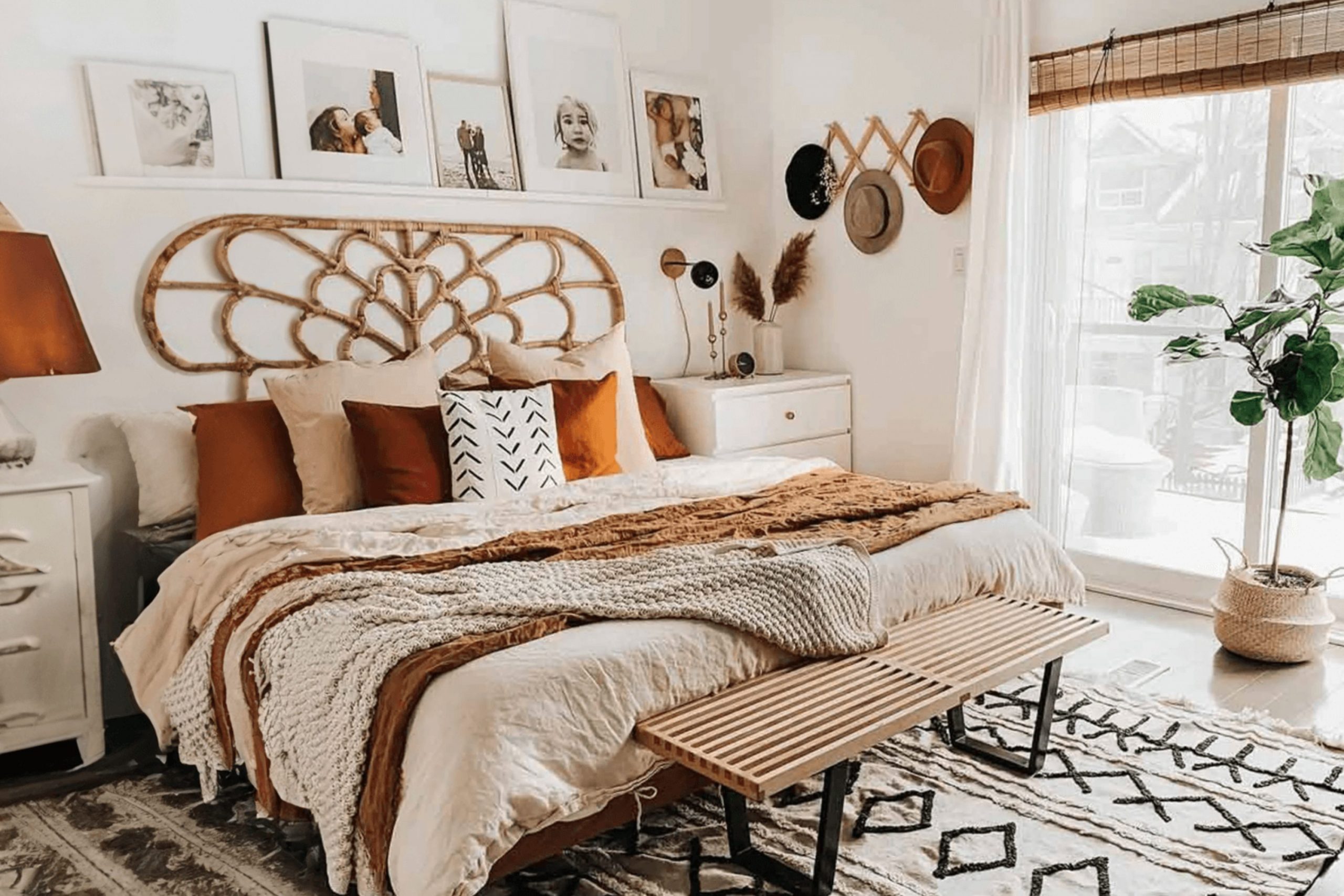
I have spent years helping people turn their sleeping areas into places that feel like a warm hug. When you think about a boho room, you probably think of plants, woven rugs, and lots of art. But the most important part of the whole look is the paint on your walls because it is the biggest thing you see. This color is the foundation for everything else you put in the room and it sets the mood for how you live. Without the right paint, even the prettiest decorations can look a little bit lost or out of place.
The right color makes all your treasures stand out and helps you feel relaxed when you lie down at night. I want to help you pick a shade that makes you smile every time you walk through the door. It is about creating a feeling that is all your own and matches your personality perfectly.
When the walls look good, the whole room feels finished and professional without needing a lot of extra money.
You deserve a bedroom that feels like a private getaway where you can truly be yourself every single day.
Why I Always Trust Sherwin-Williams and Benjamin Moore for the Best Boho Bedroom Paint Colors
I always pick these two brands because they make colors that look real and rich on your walls. When I am staging a house, I need to know that the paint will look exactly like the little paper sample I showed the owner. There is nothing worse than buying a big can of paint and finding out it looks totally different once it dries. These brands have spent a long time making sure their colors are deep and beautiful in every kind of home. They have so many choices that you can always find the exact shade of green or tan that you have been dreaming about.
Sherwin-Williams has some of the best earthy tones that look like clay or dried leaves. Benjamin Moore makes whites and pastels that feel very clean and never look like cheap plastic. These companies use high-quality bits of color that reflect light in a way that feels very natural.
This is important because boho style relies on looking organic and connected to the world outside your window. Using good paint means you won’t have to do the job again in a year because the color faded.
It stays looking fresh and vibrant for a long time which saves you a lot of hard work and stress.
How I Choose the Perfect Paint Color for a Boho Bedroom
Picking a color starts with looking at your floor and your biggest pieces of furniture. I like to see if your wood is dark like a forest or light like a sandy beach. You want the walls to match the bones of the room so everything feels like it belongs together. If you have a lot of colorful blankets and pillows, a soft white or tan on the walls is a smart move. This gives your eyes a place to rest and keeps the room from feeling too busy or messy.
If your furniture is very plain, you can go bold with a deep green or a terracotta orange. I always tell my friends to paint a big square on the wall and watch it as the sun moves across the sky. You need to see how the color changes from the bright morning light to the soft glow of the afternoon.
Some colors look pretty in the morning but might look a bit grumpy when the lamps are on at night.
Taking a few days to test the paint will help you feel very confident that you made the right choice for your home.
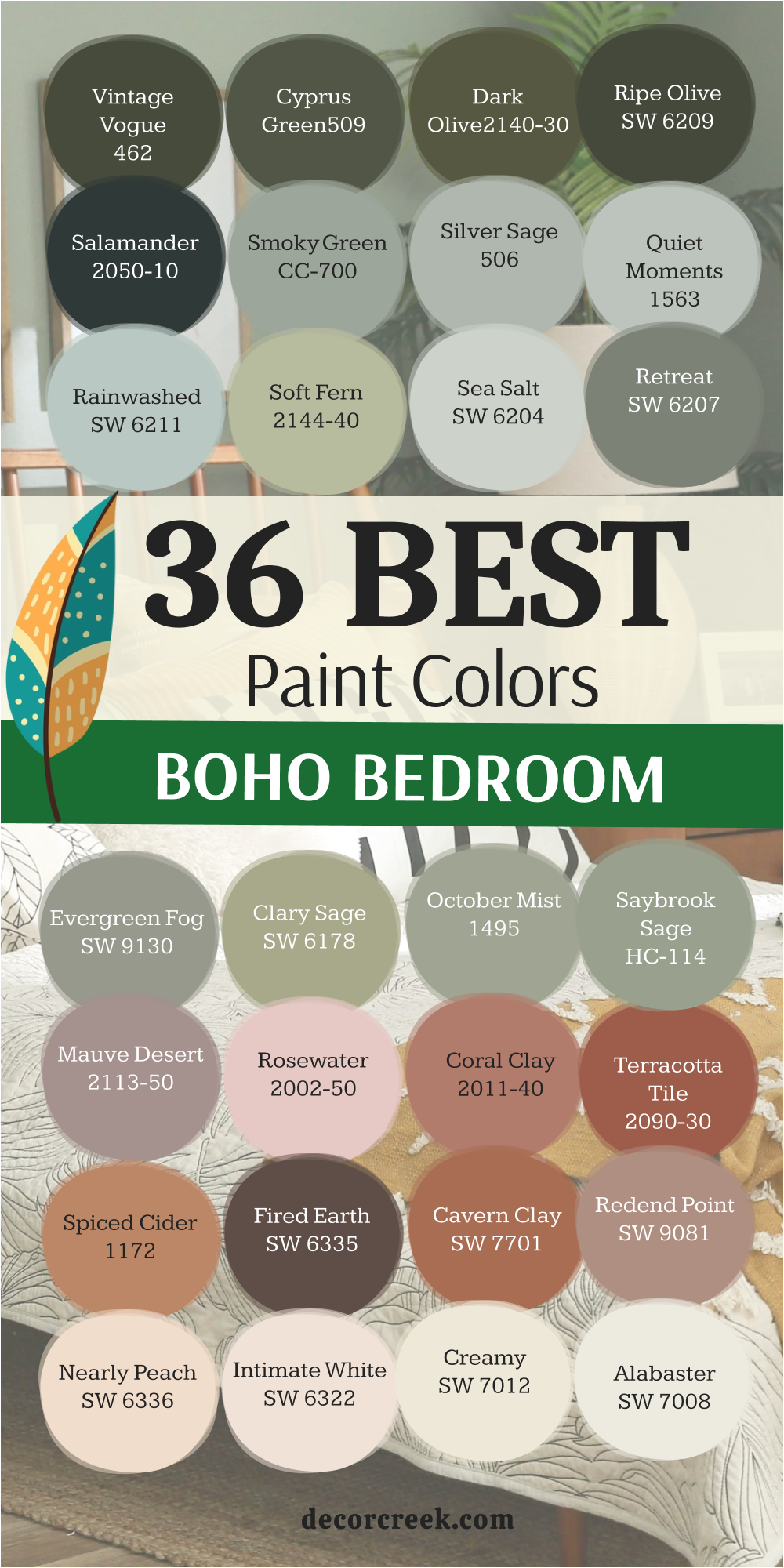
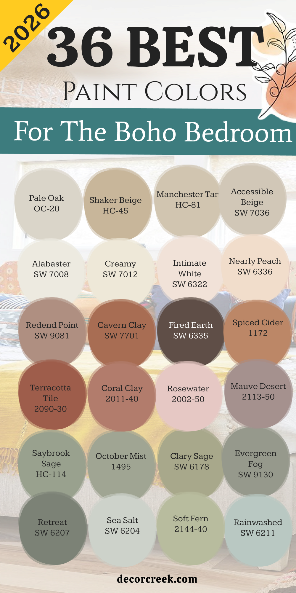
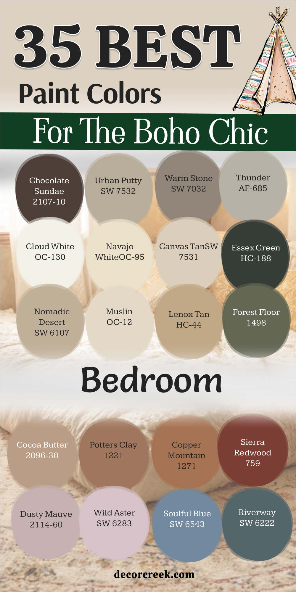
36 Best Paint Colors For The Boho Bedroom In 2026
White Dove OC-17
White Dove OC-17 is a soft shade that feels very friendly and light. This color has a tiny bit of yellow in it to keep the room from feeling like a cold doctor’s office. It looks wonderful when you hang macrame art or wooden shelves against it. Many people choose this because it makes a small room feel much bigger than it really is.
You will notice how it catches the morning sun and glows in a very pretty way. It stays in the background so your colorful rugs can be the stars of the show. This paint is a favorite for people who want a clean look that still feels cozy. I often use it in guest rooms because everyone seems to like it. It is a very safe choice that looks expensive and high-end.
Best used in: bedrooms, living rooms, moldings, and trim
Pairs well with: Revere Pewter HC-172, Balboa Mist OC-27, Wood tones The key rule of this color for boho style is to use it where you want your colorful plants and textiles to stand out against a clean backdrop.

Swiss Coffee OC-45
Swiss Coffee OC-45 feels like a warm cup of milk on a rainy afternoon. This color is very popular because it is not too bright and not too dark. It has a creamy look that makes walls feel soft to the touch even though they are just drywall. You can put this in a room with lots of green plants to create a jungle vibe.
It works well with rattan furniture and wicker baskets. This shade is famous for being one of the most versatile colors in the world of design. I like how it makes old furniture look like it belongs in a fancy magazine. You will find that it goes with almost any rug you buy. It is a great choice for a main bedroom.
Best used in: bedrooms, kitchens, and cabinetry
Pairs well with: Fossil AF-65, New Edgecomb Gray HC-173, Black accents The key rule of this color for boho style is to use it to create a soft glow that makes the room feel lived-in and comfortable.

Natural Cream OC-14
Natural Cream OC-14 sits right between a gray and a beige. This color is perfect if you cannot decide if you want a warm or a cool feeling. It looks very sophisticated when paired with white trim and dark wood floors. You will see it change slightly throughout the day as the light moves.
It provides a great foundation for a room filled with vintage finds. This shade is excellent for hiding a little bit of dust or small marks on the wall. I think it looks best when you use a lot of different textures like wool and linen. It feels very grounded and earthy. Many designers use this when they want a room to look very polished.
Best used in: bedrooms, entryways, and hallways
Pairs well with: Cloud White OC-130, Kendall Charcoal HC-166, Slate The key rule of this color for boho style is to use it as a neutral base that ties together mismatched furniture pieces.

Edgecomb Gray HC-173
Edgecomb Gray HC-173 is a classic choice that feels like a warm stone. This color is very popular for people who want a modern look that isn’t too cold. It works beautifully with light oak furniture and white bedding. You will notice that it makes your wall art pop.
It is a very light shade of greige that many people love. I use this when I want a room to feel very airy and open. It has enough color to show a contrast against white baseboards. This paint is very good at making a room feel organized and tidy. It is a very peaceful choice for a sleeping area.
Best used in: bedrooms, living areas, and open floor plans
Pairs well with: White Heron OC-57, Nickel, Dark wood The key rule of this color for boho style is to use it to bridge the gap between modern furniture and vintage bohemian accents.

Pale Oak OC-20
Pale Oak OC-20 is a very light and elegant color that reminds me of a quiet forest. This shade has a tiny bit of purple in the background which makes it look very rich. It is a great choice for a bedroom that gets a lot of natural sunlight. You will love how it makes the room feel soft and gentle.
It looks great with gold picture frames and brass lamps. This color is light enough to use on the ceiling too if you want a seamless look. I often suggest this for people who want a very light gray that doesn’t feel like blue. It is a very high-quality color that feels very high-end.
Best used in: bedrooms, nurseries, and bathrooms
Pairs well with: Chantilly Lace OC-65, Timber Wolf 1600, Brass The key rule of this color for boho style is to use it to add a touch of elegance to a room filled with organic shapes and plants.

Shaker Beige HC-45
Shaker Beige HC-45 is a medium tan that feels like a sandy beach. This color is very warm and makes a room feel like it is giving you a big hug. It looks wonderful with orange and red accents that are common in boho decor. You will see that it creates a very cozy atmosphere for sleeping.
It is a strong color that doesn’t get washed out by bright lights. I like to use this in rooms that have big windows and lots of trees outside. It feels very natural and connected to the earth. This paint is a great choice if you have a lot of white furniture.
Best used in: bedrooms, dining rooms, and cozy dens
Pairs well with: Simply White OC-117, Navy blue, Terracotta The key rule of this color for boho style is to use it to create a sun-kissed feeling that reminds you of the outdoors.
Manchester Tan HC-81
Manchester Tan HC-81 is a light and breezy tan that looks like a linen shirt. This color is very simple and doesn’t try too hard to be fancy. It works well in bedrooms with lots of woven rugs and hanging plants. You will notice it feels very fresh and clean.
It has a bit of a green undertone that makes it look great with indoor trees. I think it is one of the best colors for a relaxed lifestyle. It is not too yellow and not too pink. This shade is a favorite for people who want a beachy boho vibe. It makes the room feel light and happy.
Best used in: bedrooms, laundry rooms, and kitchens
Pairs well with: White Dove OC-17, Bleached wood, Blue accents The key rule of this color for boho style is to use it to create a relaxed and airy feeling that mimics a coastal retreat.

Accessible Beige SW 7036
Accessible Beige SW 7036 is a very famous color because it looks good in almost every house. This shade is a perfect mix of gray and beige that feels very updated. It looks great with black metal bed frames and white sheets. You will see that it makes a room feel very balanced.
It is a great choice if you are staging a home to sell. I love how it works with both warm and cool decorations. It is a very reliable color that never looks strange under different lights. This paint is a staple for any interior designer.
Best used in: whole house painting, bedrooms, and hallways
Pairs well with: Aesthetic White SW 7035, Urban Bronze SW 7048, Wood The key rule of this color for boho style is to use it when you want a versatile background that can change as you swap out your decor.

Alabaster SW 7008
Alabaster SW 7008 is a creamy white that feels very soft and kind. This color is not a stark white, so it doesn’t hurt your eyes when the sun hits it. It looks beautiful with dried flowers and pampas grass. You will find that it makes a room feel very open and bright.
It is a very popular choice for a boho farmhouse look. I use this when I want a room to feel very pure and simple. It works well on walls and trim for a very clean look. This shade is a classic that will stay stylish for a long time.
Best used in: living rooms, kitchens, hallways, bedrooms, and farmhouse exteriors
Pairs well with: Iron Ore SW 7069, Agreeable Gray SW 7029, Natural Linen SW 9109, warm wood tones The key rule of this color for farmhouse style is to use it where you want natural light to feel kind, soft, and inviting throughout the day.

Creamy SW 7012
Creamy SW 7012 is a rich and buttery white that feels very luxurious. This color is much warmer than a regular white and looks great with gold accents. It creates a very soft look for a bedroom that feels very romantic. You will love how it makes your skin look good in the mirror.
It is a great choice for a room with a lot of antique furniture. I think it looks best with light brown woods and soft pink fabrics. It feels very cozy and inviting. This paint is perfect for a room where you want to spend all day reading.
Best used in: bedrooms, bathrooms, and ceilings
Pairs well with: Dover White SW 6385, Latte SW 6108, Gold The key rule of this color for boho style is to use it to create a vintage feel that makes the room feel like it has a story to tell.

Intimate White SW 6322
Intimate White SW 6322 is a very delicate pink that looks like a pale shell. This color is not a bright bubblegum pink but a soft and dusty shade. It feels very romantic when you pair it with white lace and light wood. You will notice it makes the room feel warm and very sweet.
It works beautifully in a bedroom that gets a lot of afternoon light. I like to use this when I want a room to feel very soft and pretty. This paint is a great way to add a tiny bit of color without it being too much. It looks very sophisticated with gold mirrors and soft rugs. Many people find it helps them feel very peaceful before they go to sleep.
Best used in: bedrooms, nurseries, and walk-in closets
Pairs well with: Alabaster SW 7008, Urbane Bronze SW 7048, Dove Tail SW 7018 The key rule of this color for boho style is to use it when you want a hint of warmth that makes the walls feel like they are glowing softly.
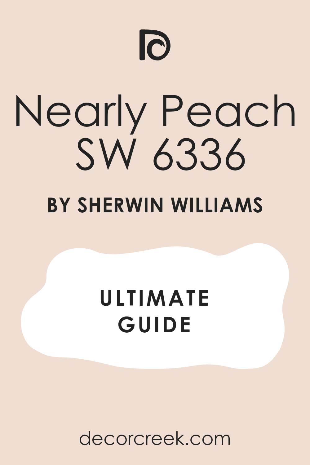
Nearly Peach SW 6336
Nearly Peach SW 6336 is a happy and light orange that feels like a summer morning. This color is very cheerful and makes any small room feel much more open. It looks wonderful with green leafy plants and terracotta pots. You will find that it creates a very sunny vibe even on a cloudy day.
It is a great choice for a boho room that has a lot of natural textures like jute or rattan. I think it looks best when you use white bedding to keep it feeling fresh. This shade is very popular for people who want a room that feels energetic. It is a very friendly color that welcomes you home. You will love how it makes your wooden furniture stand out.
Best used in: guest bedrooms, bathrooms, and sunny nooks
Pairs well with: Creamy SW 7012, Naval SW 6244, Copper The key rule of this color for boho style is to use it to bring a sense of natural sunlight into a room that needs more energy.
Redend Point SW 9081
Redend Point SW 9081 is a rich and earthy color that looks like natural clay. This shade is very famous because it feels very grounded and real. It works perfectly with a boho style because it reminds people of the desert. You will see that it makes a room feel very cozy and private.
It is a medium tone that looks great with dark wood and vintage rugs. I use this color when I want a room to feel very intentional and warm. It has a bit of pink and brown mixed together in a very pretty way. This paint is perfect for a feature wall behind your bed. It feels very modern but also very old-fashioned at the same time.
Best used in: bedrooms, accent walls, and cozy dens
Pairs well with: Foothills SW 7514, Kestrel White SW 7516, Terracotta The key rule of this color for boho style is to use it to create a sense of connection to the earth and natural materials.
Cavern Clay SW 7701
Cavern Clay SW 7701 is a bold and warm orange that looks like an old brick. This color is very strong and brings a lot of personality to your walls. It looks amazing with turquoise accents and lots of green plants. You will notice it creates a very cozy and cave-like feeling for sleeping.
It is a classic boho choice because it feels very global and adventurous. I suggest using this if you have a lot of art from your travels. It makes a big statement without being too bright or loud. This shade is very warm and makes the room feel very inviting at night. It is a very rich color that looks expensive on the wall.
Best used in: bedrooms, dining rooms, and library walls
Pairs well with: Moth Wing SW 9174, Origami White SW 7636, Deep teal The key rule of this color for boho style is to use it to ground the room with a deep and baked-earth feeling.

Fired Earth SW 6335
Fired Earth SW 6335 is a deep and dark brown that feels very solid. This color is great for making a large room feel much more intimate. It looks wonderful with white furniture and bright pillows to create a big contrast. You will find that it makes your bedroom feel like a secret hideaway.
It is a very sophisticated shade that works well with modern boho pieces. I like how it highlights the texture of woven baskets and wooden frames. This paint is very good at making a room feel very quiet and still. It is a brave choice that pays off with a very stylish look. You will love how it feels very high-end and designer.
Best used in: accent walls, bedrooms, and office spaces
Pairs well with: Shoji White SW 7042, Kilim Beige SW 6106, Brass The key rule of this color for boho style is to use it when you want to add a sense of history and depth to your sleeping area.
Spiced Apple Cider 1201
Spiced Apple Cider 1201 is a warm and glowing orange that looks like a sunset. This color is very rich and makes the whole room feel like it is lit by a fireplace. It looks great with cream-colored fabrics and dark brown rugs. You will see that it adds a lot of life to a room that feels a bit dull.
It is a wonderful choice for a boho bedroom because it feels very organic. I often recommend this for people who love the colors of autumn. It is a very comforting shade that helps you relax after a long day. This paint makes a great backdrop for black and white photos. It feels very cozy and full of light.
Best used in: bedrooms, hallways, and accent walls
Pairs well with: White Dove OC-17, Espresso wood, Gold The key rule of this color for boho style is to use it to mimic the warmth of a glowing fire or a setting sun.
Terracotta Tile 2090-30
Terracotta Tile 2090-30 is a very classic burnt orange that feels very traditional. This color is a staple for anyone who loves a bohemian look with a Mediterranean feel. It looks beautiful with blue accents and white linens. You will find that it makes the room feel very warm and very lived-in.
It is a very saturated color that holds its own in a room with big furniture. I like how it makes a room feel like it belongs in a warm and sunny place. This shade is perfect for creating a focal point in your bedroom. It is a very earthy and honest color that people really love. You will notice it feels very festive and happy.
Best used in: accent walls, bedrooms, and mudrooms
Pairs well with: Simply White OC-117, Navy, Olive green The key rule of this color for boho style is to use it to add a pop of heat and energy to a room filled with neutrals.
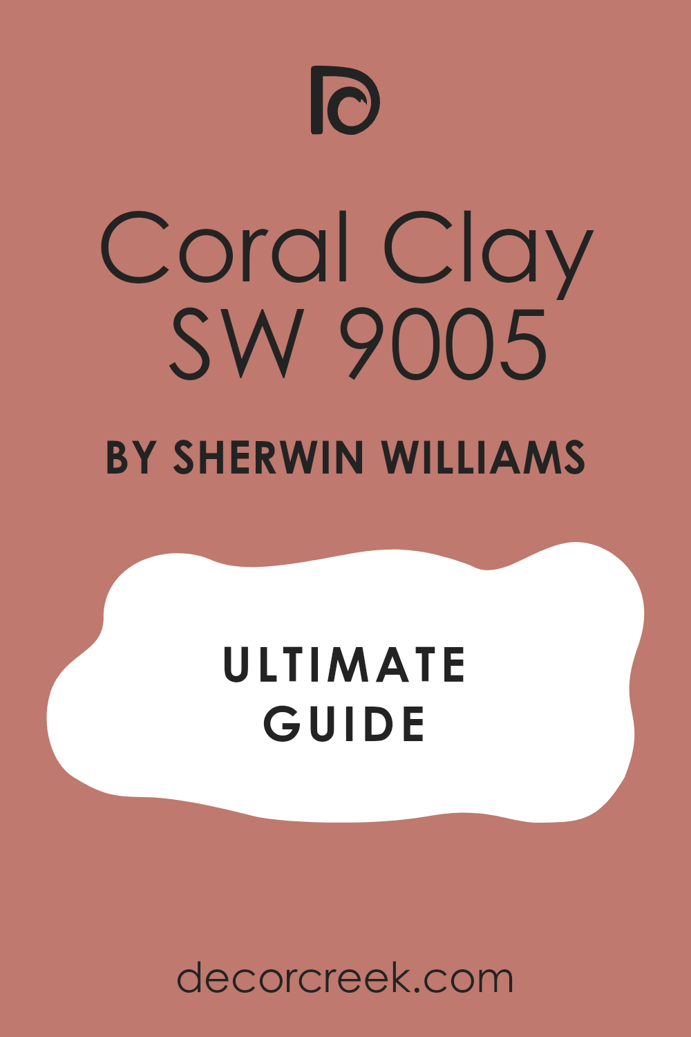
Coral Clay SW 9005
Coral Clay SW 9005 is a soft and muted pinkish-orange that feels very light. This color is a bit more playful than a true terracotta and looks very fresh. It works well with light gray and white decorations. You will love how it makes the room feel very airy and bright.
It is a great choice for a boho chic look that is a little bit more modern. I think it looks best with light wood furniture and cotton blankets. This shade is very gentle and doesn’t feel too heavy on the walls. It is a very pretty choice for a guest room or a teenager’s room. You will find it is very easy to live with every day.
Best used in: bedrooms, bathrooms, and laundry rooms
Pairs well with: Cloud White OC-130, Gray Owl OC-52, Wood tones The key rule of this color for boho style is to use it as a softer and more modern version of traditional clay colors.
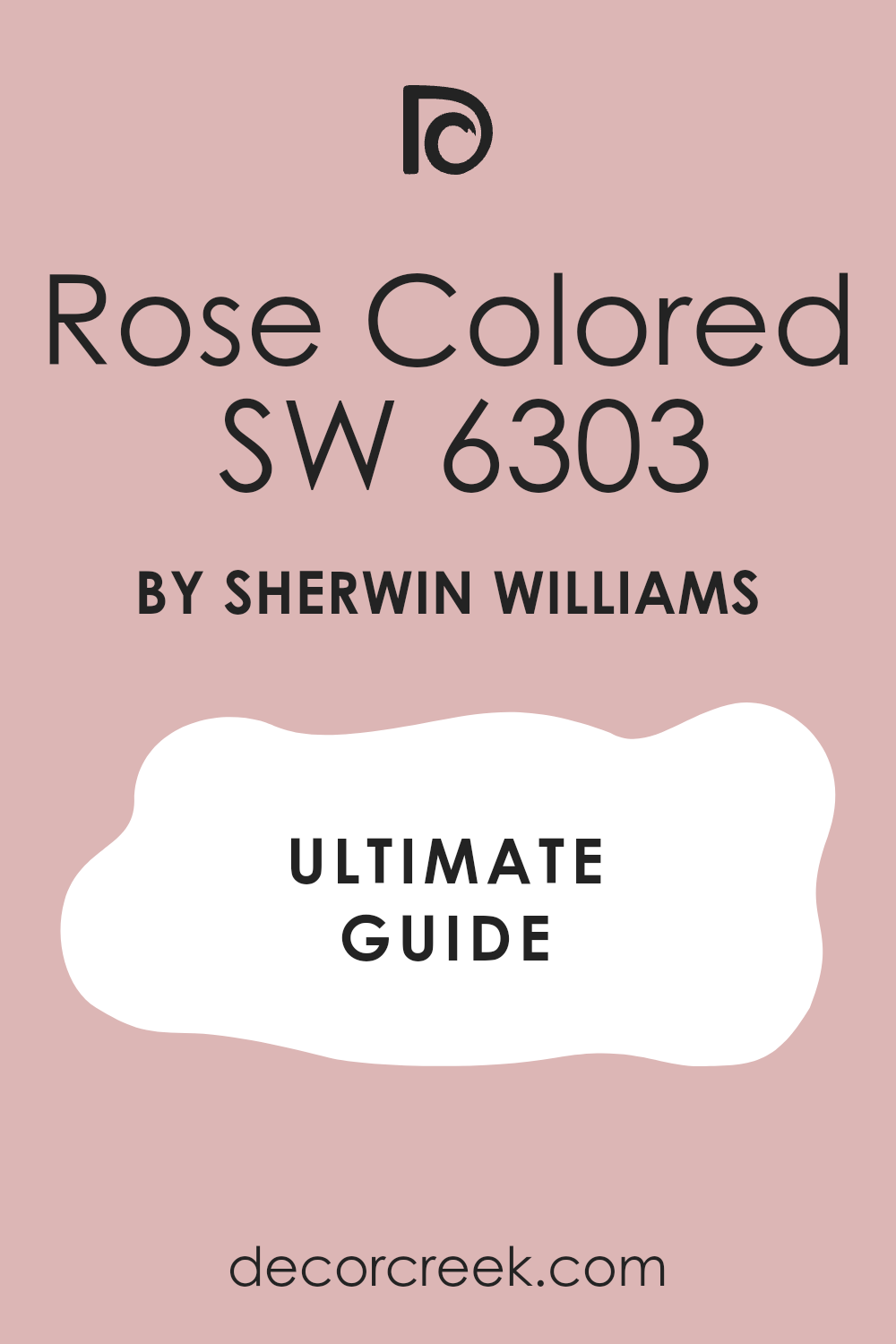
Rose Colored SW 6303
Rose Colored SW 6303 is a very pale and dusty rose that feels like a vintage dream. This color is very light and adds a touch of sweetness to your walls. It looks amazing with silver accents and white fluffy rugs. You will notice it makes the room feel very feminine and very soft.
It is a great choice for a boho room that has a lot of floral prints. I use this when I want a room to feel very quiet and very delicate. This paint is light enough that it almost acts like a neutral color. It is a very sophisticated pink that doesn’t feel too young. You will love how it looks when the lamps are turned on.
Best used in: bedrooms, nurseries, and dressing rooms
Pairs well with: Chantilly Lace OC-65, Slate gray, Pale gold The key rule of this color for boho style is to use it to create a vintage and romantic atmosphere that feels very gentle.
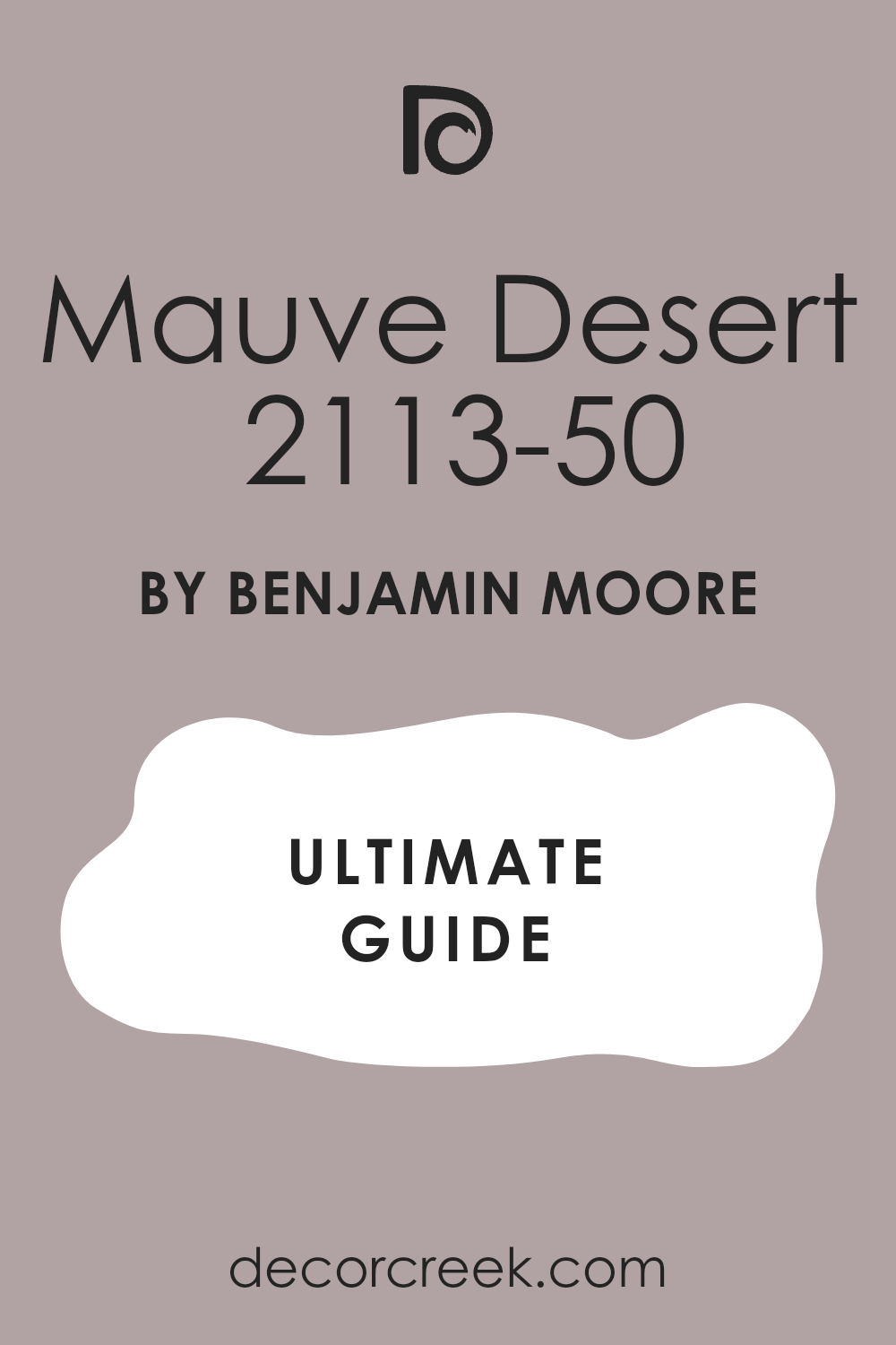
Mauve Desert 2113-50
Mauve Desert 2113-50 is a dusty purple that feels very mysterious and cool. This color is a bit different from the usual oranges and whites of boho design. It looks great with dark green plants and gold lamps. You will see that it creates a very interesting and unique look for your room.
It is a medium shade that feels very sophisticated and modern. I like to use this for people who want a room that feels a bit more grown-up. This paint has a gray undertone that keeps it from looking too bright. It is a very peaceful color that helps you wind down at night. You will find it looks very rich on the walls.
Best used in: main bedrooms, accent walls, and cozy corners
Pairs well with: Decorator’s White CC-20, Black, Silver The key rule of this color for boho style is to use it to add a touch of mystery and modern flair to your bedroom.
Saybrook Sage HC-114
Saybrook Sage HC-114 is a soft and silvery green that feels like a garden in the morning. This color is very light and helps a room feel very fresh and clean. It looks beautiful when you have a lot of white pillows and wooden bed frames. You will notice it makes the walls feel very natural and easy to look at.
It is a great choice for a boho room that has many hanging vines and potted trees. I like to use this when a bedroom needs to feel a bit cooler and more relaxed. This shade is a classic that never feels like it is too much. It works very well with light brown wicker and straw baskets. Many people pick this because it reminds them of being outside in nature.
Best used in: bedrooms, bathrooms, and sunrooms
Pairs well with: Cloud White OC-130, Revere Pewter HC-172, Oak wood tones The key rule of this color for boho style is to use it to create a soft and natural feeling that brings the colors of the forest indoors.

October Mist 1495
October Mist 1495 is a gentle sage green that has a tiny bit of silver in it. This color was a color of the year because it is so easy to love. It looks wonderful with gold mirrors and soft white blankets. You will find that it makes your bedroom feel very quiet and very still.
It is a medium shade that works perfectly as a backdrop for a boho art gallery wall. I suggest this color for people who want a green that is not too bright. This paint looks very rich when the sunlight hits it during the day. It is a very organic color that feels very honest and simple. You will love how it ties all your different furniture pieces together.
Best used in: bedrooms, kitchens, and living areas
Pairs well with: Steam AF-15, Gloucester Sage HC-100, Natural wood The key rule of this color for boho style is to use it as a versatile neutral that adds a touch of nature without being loud.

Clary Sage SW 6178
Clary Sage SW 6178 is a warm and earthy green that feels very herbal and soft. This color is a bit deeper than a light sage and has a yellow undertone. It looks amazing with terracotta pots and leather chairs. You will notice it makes the room feel very cozy and very lived-in.
It is a great choice for a boho bedroom that uses a lot of natural materials. I often use this when I want a room to feel like a cozy cottage in the woods. This paint is very good at making big white furniture look even brighter. It is a very friendly green that makes people feel very welcome. You will find it is very easy to match with your existing rugs.
Best used in: bedrooms, entryways, and dining rooms
Pairs well with: Dover White SW 6385, Sage SW 2860, Copper The key rule of this color for boho style is to use it to create a grounded and herbal atmosphere that feels very warm.

Evergreen Fog SW 9130
Evergreen Fog SW 9130 is a deep and moody green that has a lot of gray in it. This color is very popular for modern boho rooms that want a bit of drama. It looks beautiful with dark wood and brass light fixtures. You will see that it makes the room feel very private and very special.
It is a medium-to-dark shade that feels very high-end and designer. I like to use this on all four walls to make the room feel like a cozy nest. This paint changes a lot with the light and can look green or gray at different times. It is a very sophisticated choice for a main bedroom. You will love how it makes your white bedding look crisp and clean.
Best used in: bedrooms, accent walls, and home offices
Pairs well with: Shoji White SW 7042, Urbane Bronze SW 7048, Gold The key rule of this color for boho style is to use it to add a sense of mystery and depth to a room with lots of plants.

Retreat SW 6207
Retreat SW 6207 is a dusty green that feels very quiet and very mature. This color is not too bright and has a very soft look on the walls. It works wonderfully with light gray and black accents. You will find that it makes the room feel very steady and very balanced.
It is a great choice for a bedroom where you want to escape the busy world outside. I think it looks best with simple wooden furniture and linen fabrics. This shade is very easy on the eyes and helps the room feel very tidy. It is a very popular color for a modern boho chic look. You will notice it makes your indoor plants look very vibrant.
Best used in: bedrooms, bathrooms, and cozy reading nooks
Pairs well with: Spare White SW 6203, Sea Salt SW 6204, Iron The key rule of this color for boho style is to use it to create a quiet sanctuary that feels far away from the noisy world.

Sea Salt SW 6204
Sea Salt SW 6204 is a very light and breezy color that is a mix of green and blue. This color is a favorite for many because it feels like a breath of fresh air. It looks beautiful with white curtains and light-colored rugs. You will see that it makes a small bedroom feel much larger and more open.
It is a very light shade that changes based on what you put next to it. I love how it looks with light oak floors and wicker baskets. This paint is perfect for a boho room that wants to feel beachy and light. It is a very happy color that makes you feel good every morning. You will find it is one of the most popular colors in the world for a reason.
Best used in: bedrooms, bathrooms, and laundry rooms
Pairs well with: Summit Gray SW 7669, Fleur de Sel SW 7666, White The key rule of this color for boho style is to use it to bring a light and airy coastal feeling into your sleeping area.

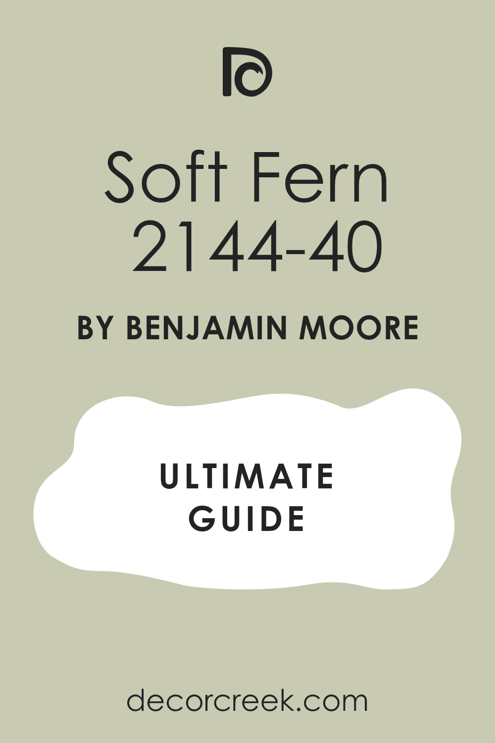
Soft Fern 2144-40
Soft Fern 2144-40 is a bright and happy green that feels like a sunny meadow. This color is very light and brings a lot of energy into a room. It looks great with orange and yellow accents that are common in boho decor. You will love how it makes the room feel very alive and very fresh.
It is a great choice for a room that does not have many windows. I use this when I want a room to feel like a secret garden indoors. This shade is very friendly and looks wonderful with a lot of wooden toys or books. It is a very cheerful green that never feels too dark or heavy. You will notice it makes you feel very awake and ready for the day.
Best used in: bedrooms, nurseries, and kitchens
Pairs well with: Simply White OC-117, Wood tones, Pink The key rule of this color for boho style is to use it to add a playful and energetic garden feel to the room.
Rainwashed SW 6211
Rainwashed SW 6211 is a soft blue-green that looks like a clear pond. This color is very light and feels very watery and soft. It looks beautiful with white lace and light wood furniture. You will find that it makes the room feel very clean and very open.
It is a great choice for a boho bedroom that needs a little bit of color but not too much. I like to use this with silver and glass decorations to keep it looking light. This paint is very good at making a room feel very airy and light. It is a very peaceful choice for a bedroom where you want to relax. You will love how it makes your white sheets look even brighter.
Best used in: bedrooms, bathrooms, and entryways
Pairs well with: Window Pane SW 6210, Pure White SW 7005, Blue The key rule of this color for boho style is to use it to create a light and watery backdrop that feels very gentle.

Quiet Moments 1563
Quiet Moments 1563 is a mix of blue, green, and gray that feels very soft. This color is very popular for bedrooms because it feels very light and gentle. It looks wonderful with white trim and dark wood floors. You will see that it makes the room feel very balanced and very easy to be in.
It is a light shade that works well with vintage finds and old books. I suggest this for people who want a color that is not quite blue and not quite green. This paint is very good at making a room feel very sophisticated. It is a very high-end color that looks great in any light. You will find it helps the room feel very organized.
Best used in: bedrooms, bathrooms, and nurseries
Pairs well with: Cloud White OC-130, Shaker Gray 2120-40, Silver The key rule of this color for boho style is to use it to create a soft and elegant atmosphere that feels very grown-up.

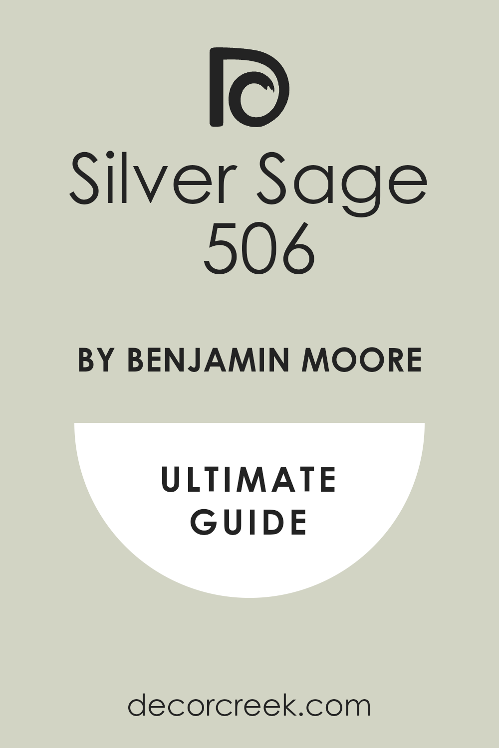
Silver Sage 506
Silver Sage 506 is a very light and silvery green that looks very expensive. This color has a lot of gray in it which makes it feel very modern and soft. It looks beautiful with gold frames and velvet pillows. You will notice it makes the room feel very rich and very special.
It is a great choice for a boho chic bedroom that wants to feel a bit more fancy. I love how it works with both dark and light wood. This paint is very good at reflecting light in a soft way that doesn’t hurt your eyes. It is a very classic color that will stay in style for many years. You will love how it looks with a lot of white fabrics.
Best used in: bedrooms, living rooms, and dining rooms
Pairs well with: White Heron OC-57, Gray, Brass The key rule of this color for boho style is to use it to add a touch of high-end elegance to your organic decor.
Smoky Green CC-700
Smoky Green CC-700 is a soft and misty shade that feels like a quiet morning in the mountains. This color is a very interesting mix of gray and green that looks very high-end on the walls. It works beautifully with light oak furniture and large woven rugs. You will see how it creates a very soft look that is easy to live with every day.
It is a medium light shade that provides a great background for colorful art and plants. I often pick this color when I want a room to feel very natural but also very tidy. This paint is wonderful for making a bedroom feel like a special place to hide away. It looks very sophisticated with white bedding and soft wool blankets. You will notice it feels very fresh and clean in the daylight.
Best used in: bedrooms, living rooms, and guest suites
Pairs well with: Cloud White OC-130, Gray Owl OC-52, dark wood tones The key rule of this color for boho style is to use it to create a soft and misty atmosphere that feels very organic and grounded.
Salamander 2050-10
Salamander 2050-10 is a very deep and dark green that looks like a thick forest at night. This color is perfect for people who want a bold and moody feeling in their bedroom. It looks amazing when you put it behind a bed with a light wood headboard. You will find that it makes all your green plants look very bright and healthy.
It is a strong choice that makes a room feel very private and very warm. I like to use this color to create a sense of mystery and drama in a small space. This paint is very dark, so it works best if you have good lamps or big windows. It feels very luxurious and like something you would see in a fancy hotel. You will love how it makes your gold picture frames shine.
Best used in: accent walls, main bedrooms, and cozy libraries
Pairs well with: Simply White OC-117, Gold, leather textures The key rule of this color for boho style is to use it to ground the room with a deep and forest-like intensity.

Ripe Olive SW 6209
Ripe Olive SW 6209 is a rich and dark green that feels very old-fashioned and sturdy. This color reminds me of old trees and mossy rocks in the woods. It looks wonderful with dark brown furniture and orange or red pillows. You will notice it makes the room feel very warm and very safe for sleeping.
It is a great choice for a boho room that has a lot of vintage treasures and old books. I suggest this color if you want your bedroom to feel very important and very solid. This paint is a favorite for creating a cozy nest that feels far away from the world. It works very well with brass lamps and copper pots. You will find it adds a lot of character to a plain room.
Best used in: bedrooms, home offices, and dens
Pairs well with: Alabaster SW 7008, Pewter Green SW 6208, warm wood The key rule of this color for boho style is to use it to create a deep and herbal feeling that feels very traditional.

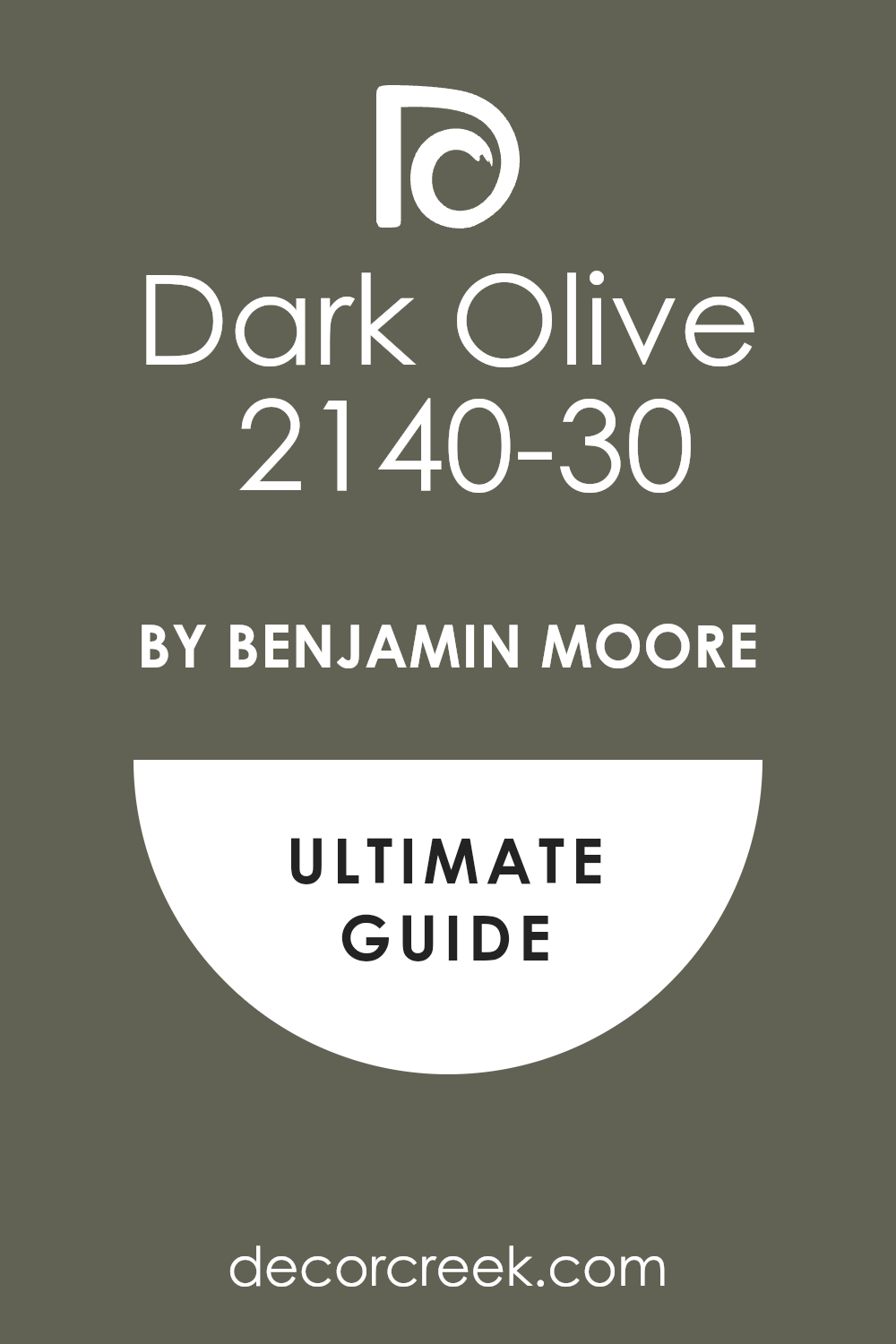
Dark Olive 2140-30
Dark Olive 2140-30 is a deep green with a lot of yellow in it that feels very warm. This color is a classic for a boho look because it matches perfectly with natural wood and clay. It looks beautiful with cream-colored fabrics and woven wall hangings. You will see that it makes the room feel very earthy and very real.
It is a medium-to-dark shade that works well on all four walls if you want a cozy vibe. I love how it looks when you have a lot of sunlight coming through the windows. This paint is very good at making a room feel like it has been there for a long time. It is a very comforting color that helps you feel connected to nature. You will love how it highlights the texture of your rugs.
Best used in: bedrooms, dining rooms, and exterior doors
Pairs well with: Navajo White OC-95, Terracotta, Black metal The key rule of this color for boho style is to use it to add a rich and organic warmth that feels very natural.
Cyprus Green 509
Cyprus Green 509 is a bright and bold green that feels very adventurous and fun. This color brings a lot of life to a bedroom and looks great with colorful patterns. It works beautifully with white furniture and bright yellow accents. You will find that it makes the room feel very energetic and happy.
It is a great choice for a boho room that is filled with art and music. I use this when I want a room to feel like a tropical getaway in the middle of the city. This paint is very vivid and looks great with dark floorboards. It is a very brave choice that shows off your creative personality. You will notice it makes the whole room feel much more vibrant.
Best used in: accent walls, bedrooms, and playrooms
Pairs well with: White Dove OC-17, Bright yellow, Rattan The key rule of this color for boho style is to use it to bring a sense of tropical energy and joy to your walls.
Vintage Vogue 462
Vintage Vogue 462 is a very sophisticated and dark green that looks like velvet. This color is very popular for modern boho bedrooms that want to look very chic. It looks amazing with gold accents and white bedding to create a sharp contrast. You will find that it makes the room feel very quiet and very high-end.
It is a deep shade that feels very intentional and very well-planned. I like to use this when a room needs a lot of personality without being too loud. This paint is very smooth and looks wonderful in a room with high ceilings. It feels very cozy at night when you have small fairy lights turned on. You will love how it makes your bedroom feel like a designer space.
Best used in: main bedrooms, accent walls, and formal dining areas
Pairs well with: Swiss Coffee OC-45, Brass, light wood tones The key rule of this color for boho style is to use it to add a touch of dark and velvety elegance to your organic decor.

35 Best Paint Colors For The Boho Chic Bedroom
Shoji White SW 7042
Shoji White SW 7042 is a very soft white that feels like it has a little bit of gray and beige inside. This color is not bright and shiny, so it feels very gentle on your eyes. It looks wonderful with linen curtains and light wood floors. You will notice it makes the room feel very open and very clean.
It is a great choice for a boho chic look because it is very simple and honest. I use this when I want a room to feel very light but not cold. This paint is very good at making all your different colors work together in a nice way. It feels very peaceful and like a fresh start every morning. You will find it is very easy to decorate with this shade.
Best used in: whole house interiors, bedrooms, and cabinets
Pairs well with: Urban Bronze SW 7048, Pure White SW 7005, Greige tones The key rule of this color for boho style is to use it to create a soft and warm backdrop that feels very light and airy.

Greek Villa SW 7551
Greek Villa SW 7551 is a sunny and warm white that feels like a vacation. This color has a tiny bit of yellow that makes it look like it is always being touched by the sun. It looks beautiful with blue accents and white fluffy blankets. You will find that it makes your bedroom feel very happy and very bright.
It is a very popular choice for a clean and simple boho look. I suggest this for rooms that do not get much natural light to help them feel sunnier. This paint is very fresh and looks great with green plants in white pots. It is a very friendly white that makes everyone feel at home. You will love how it makes the room feel very wide and spacious.
Best used in: bedrooms, kitchens, and exterior trim
Pairs well with: Alabaster SW 7008, In the Navy SW 9178, Wood The key rule of this color for boho style is to use it to bring a sense of bright and sunny warmth to the room.

Snowbound SW 7004
Snowbound SW 7004 is a very clean white that has a tiny bit of gray in the background. This color looks very modern and works well with cool colors like blue and purple. It looks wonderful with black metal bed frames and gray rugs. You will see that it makes the room feel very crisp and very tidy.
It is a great choice for a boho chic room that wants to feel very updated and new. I like how it creates a very sharp look when you have dark wood floors. This paint is very bright but the gray keeps it from being too harsh. It is a very reliable color for a modern home. You will notice it makes all your colorful pillows look very sharp.
Best used in: bedrooms, trim, and hallways
Pairs well with: Iron Ore SW 7069, Sea Salt SW 6204, Silver The key rule of this color for boho style is to use it to create a very clean and updated look that feels very fresh.

Simply White OC-117
Simply White OC-117 is a very famous and bright white that feels very pure. This color has just a tiny bit of warmth so it does not look like ice. It looks beautiful with any color you want to put in the room. You will find that it makes the room feel very open and very full of light.
It is a favorite for designers who want a room to look very high-end and clean. I use this when I want the architectural details of a room to stand out. This paint is very bright and makes every other color in the room look its best. It is a very happy and simple choice for a sleeping area. You will love how it looks with a lot of white layers on the bed.
Best used in: walls, trim, ceilings, and kitchens
Pairs well with: Silver Lining 2119-60, Black, all wood tones The key rule of this color for boho style is to use it to create a very bright and pure background for your art.

Cloud White OC-130
Cloud White OC-130 is a soft and fluffy white that feels like a light breeze. This color is very gentle and has just enough warmth to make a room feel friendly. It looks beautiful when you pair it with light wool rugs and soft cotton sheets. You will notice it makes the walls feel like they are barely there.
It is a great choice for a boho chic room that needs to feel very light and airy. I like to use this when I want a room to feel very clean but still very cozy. This paint is a classic for a reason because it never looks yellow or blue. It feels very high-end and looks wonderful with gold or brass lamps. You will find it is very easy to relax in a room this color.
Best used in: bedrooms, trim, and kitchen cabinets
Pairs well with: Revere Pewter HC-172, Pale Oak OC-20, light wood The key rule of this color for boho style is to use it to create a soft and dreamy background that feels very light.

Navajo White OC-95
Navajo White OC-95 is a rich and creamy tan that feels very warm and traditional. This color is much deeper than a regular white and looks like vanilla ice cream. It works beautifully with orange blankets and dark brown wooden furniture. You will find that it makes the room feel very sunny and very safe.
It is a wonderful choice for a boho bedroom that has a lot of old-fashioned charm. I suggest this color if you want your walls to feel like they are giving you a hug. This paint is very good at making a large room feel much more intimate and cozy. It looks very nice with black metal accents and green plants. You will love how it glows when you turn on your bedside lamps.
Best used in: bedrooms, living rooms, and hallways
Pairs well with: Simply White OC-117, Wrought Iron 2124-10, Terracotta The key rule of this color for boho style is to use it to ground the room with a sense of traditional warmth and comfort.
Canvas Tan SW 7531
Canvas Tan SW 7531 is a light and sandy neutral that feels like a trip to the beach. This color is very simple and doesn’t have any hidden pink or green in it. It looks wonderful with white furniture and woven straw baskets. You will notice it makes the room feel very grounded and very calm.
It is a great choice for a boho chic look because it feels very organic and real. I use this when I want a room to look natural without being too dark. This paint is very reliable and looks good in almost any kind of light. It feels very fresh and works well with a lot of different wood colors. You will find it is a very easy color to live with for many years.
Best used in: bedrooms, main living areas, and entryways
Pairs well with: Alabaster SW 7008, Urban Bronze SW 7048, jute textures The key rule of this color for boho style is to use it as a natural and sandy base for all your colorful decorations.

Balanced Beige SW 7037
Balanced Beige SW 7037 is a medium tan that feels very steady and very warm. This color is a bit darker than most whites but still feels very light and open. It looks beautiful with cream fabrics and dark green plants. You will see that it makes the room feel very solid and very well-decorated.
It is a great choice for a room that has a lot of white furniture to create a nice contrast. I like how it makes a bedroom feel very cozy and very private for sleeping. This paint is very popular because it hides small marks on the wall very well. It feels very earthy and looks great with leather or wood accents. You will love how it makes your white bedding pop.
Best used in: bedrooms, family rooms, and hallways
Pairs well with: Accessible Beige SW 7036, Virtual Taupe SW 7039, White The key rule of this color for boho style is to use it to create a warm and balanced feeling that ties the whole room together.

Nomadic Desert SW 6107
Nomadic Desert SW 6107 is a warm and sandy color that feels like a sunny day in the desert. This color is very rich and brings a lot of warmth to your walls. It looks amazing with red and orange pillows and dark wood beds. You will find that it makes the room feel very adventurous and full of life.
It is a perfect choice for a boho bedroom that uses a lot of global patterns. I suggest this color if you want a room that feels very cozy and very grounded. This paint is a bit darker than a beige and adds a lot of personality to the room. It looks very high-end with gold frames and velvet fabrics. You will notice it makes the room feel very inviting.
Best used in: bedrooms, dining rooms, and accent walls
Pairs well with: Kilim Beige SW 6106, Latte SW 6108, Dark wood The key rule of this color for boho style is to use it to bring a sense of global adventure and warmth to your home.

Muslin OC-12
Muslin OC-12 is a soft and light beige that looks like an old piece of fabric. This color is very gentle and has a bit of a vintage feel to it. It looks wonderful with white lace and light oak furniture. You will notice it makes the room feel very soft and very quiet.
It is a great choice for a boho chic room that wants to feel a bit more romantic. I use this when I want a neutral color that isn’t too gray or too bright. This paint is very good at making a room feel very comfortable and lived-in. It feels very natural and works well with many different plants. You will love how it makes your bedroom feel like a peaceful retreat.
Best used in: bedrooms, bathrooms, and laundry rooms
Pairs well with: Cloud White OC-130, Wood tones, soft pastels The key rule of this color for boho style is to use it to create a vintage and fabric-like softness on your walls.

Lenox Tan HC-44
Lenox Tan HC-44 is a rich and golden tan that feels very luxurious and warm. This color is quite deep and makes a room feel very expensive and high-end. It looks beautiful with dark green plants and white furniture. You will see that it adds a lot of depth and character to your bedroom.
It is a great choice for a room where you want to feel very cozy and very safe. I like how it creates a very warm glow when the sun hits it in the afternoon. This paint is very strong and works well in rooms with high ceilings. It feels very traditional but works perfectly for a boho look. You will find it is a very comforting color for a sleeping area.
Best used in: bedrooms, offices, and living rooms
Pairs well with: Simply White OC-117, Black, gold accents The key rule of this color for boho style is to use it to ground the room with a rich and golden warmth.
Adobe Beige 1128
Adobe Beige 1128 is a warm and earthy tan that looks like sun-dried clay. This color is very natural and brings a sense of the outdoors inside. It looks amazing with woven rugs and colorful patterned blankets. You will notice it makes the room feel very grounded and very warm.
It is a perfect choice for a boho room that has a lot of handmade items. I suggest this color if you want a wall that feels very honest and simple. This paint is medium in tone and creates a very cozy atmosphere for relaxing. It looks very nice with light-colored woods and green plants. You will love how it makes your room feel very connected to the earth.
Best used in: bedrooms, entryways, and mudrooms
Pairs well with: White Dove OC-17, Terracotta, Sage green The key rule of this color for boho style is to use it to create an earthy and hand-crafted feeling on your walls.
Cocoa Butter 2096-30
Cocoa Butter 2096-30 is a deep and creamy tan that feels very rich and smooth. This color is much darker than a regular beige and looks very high-end. It looks wonderful with white bedding and light wood furniture to create a contrast. You will find that it makes the room feel very sophisticated and very warm.
It is a great choice for a main bedroom that wants to feel like a fancy hotel. I use this when I want a room to feel very cozy but also very stylish. This paint is very warm and makes the walls feel very soft. It looks very nice with gold light fixtures and velvet pillows. You will notice it makes the room feel very quiet and private.
Best used in: bedrooms, accent walls, and dining rooms
Pairs well with: Cloud White OC-130, dark wood, brass The key rule of this color for boho style is to use it to add a rich and buttery depth to your sleeping area.
Potters Clay 1221
Potters Clay 1221 is a warm and reddish-brown that looks like a new flower pot. This color is very earthy and brings a lot of personality to a bedroom. It looks beautiful with light-colored rugs and green leafy plants. You will see that it makes the room feel very warm and very creative.
It is a perfect choice for a boho room that is filled with art and pottery. I like to use this color to create a sense of warmth and energy. This paint is quite deep and makes a great feature wall behind a bed. It feels very natural and reminds me of working with your hands. You will love how it makes the room feel very cozy at night.
Best used in: accent walls, bedrooms, and kitchens
Pairs well with: Simply White OC-117, Olive green, Teal The key rule of this color for boho style is to use it to add a sense of hand-made warmth and earthy energy.
Copper Mountain AC-12
Copper Mountain AC-12 is a rich and glowing orange that looks like a penny in the sun. This color is very warm and makes the walls feel like they are giving off heat. It looks beautiful when you put it next to dark wood furniture and white bedding. You will find that it makes the room feel very bold and full of life.
It is a wonderful choice for a boho bedroom that needs a lot of energy and spirit. I suggest this color if you want a room that feels very adventurous and special. This paint is quite deep and works perfectly as a backdrop for a collection of hats or woven art. It feels very grounded but also very exciting at the same time. You will notice it makes your green plants look incredibly bright.
Best used in: accent walls, bedrooms, and dining areas
Pairs well with: White Dove OC-17, Naval SW 6244, gold accents The key rule of this color for boho style is to use it to add a spicy and sun-drenched energy to your favorite corner.
Sierra Redwood SW 7598
Sierra Redwood SW 7598 is a deep and earthy red that feels like a big forest tree. This color is very strong and brings a lot of traditional boho feelings to a room. It looks amazing with black metal accents and cream-colored rugs. You will notice it makes the room feel very cozy and very private for sleeping.
It is a great choice for a room where you want to feel very safe and warm. I like to use this color when I want to make a big statement that feels very natural. This paint is very rich and looks like something you would find in a mountain cabin. It feels very high-end and looks wonderful with leather furniture. You will love how it makes the room feel very quiet and still.
Best used in: bedrooms, accent walls, and library spaces
Pairs well with: Simply White OC-117, Sage green, dark wood The key rule of this color for boho style is to use it to add a sense of history and deep forest warmth.
Dusty Mauve 2174-40
Dusty Mauve 2174-40 is a soft and greyish purple that feels very mysterious and light. This color is very pretty and adds a touch of magic to your bedroom walls. It looks wonderful with silver mirrors and white fluffy blankets. You will find that it makes the room feel very soft and very unique.
It is a great choice for a boho chic look that is a little bit different from the usual tans. I use this when I want a room to feel very gentle and very romantic. This paint is light enough that it does not make a small room feel crowded. It feels very sophisticated and works well with gray or white furniture. You will notice it creates a very peaceful vibe for resting.
Best used in: bedrooms, nurseries, and bathrooms
Pairs well with: Chantilly Lace OC-65, Gray Owl OC-52, Silver The key rule of this color for boho style is to use it to create a dreamy and soft atmosphere that feels very special.
Wild Aster 1240
Wild Aster 1240 is a bright and happy purple that feels like a spring flower. This color brings a lot of joy to a room and looks great with colorful patterns. It works beautifully with white furniture and light-colored rugs. You will see that it makes the room feel very energetic and fun.
It is a perfect choice for a boho room that is filled with art and light. I like to use this when I want a room to feel very creative and full of personality. This paint is very vivid and looks great with light wood floors. It is a very brave choice that shows you love to have fun with your home. You will love how it makes the whole room feel much more cheerful.
Best used in: accent walls, bedrooms, and playrooms
Pairs well with: Snowbound SW 7004, Mint green, Brass The key rule of this color for boho style is to use it to bring a sense of floral joy and creative spirit.
Soulful Blue SW 6543
Soulful Blue SW 6543 is a deep and medium blue that feels very steady and calm. This color looks like the sky just before the sun goes down. It looks beautiful with white bedding and light wood furniture to create a clean look. You will find that it makes the room feel very balanced and very cool.
It is a great choice for a boho bedroom that has a lot of natural light. I suggest this color if you want a room that feels very peaceful and very tidy. This paint is strong enough to show a lot of color but still feels very soft. It looks very nice with gold light fixtures and green plants. You will notice it makes the room feel very inviting and fresh.
Best used in: bedrooms, bathrooms, and laundry rooms
Pairs well with: Alabaster SW 7008, Wood tones, Silver The key rule of this color for boho style is to use it to bring a sense of the wide open sky into your sleeping space.
Riverway SW 6222
Riverway SW 6222 is a dark and moody blue-green that feels very deep and rich. This color looks like deep water in a quiet river. It works wonderfully with dark wood and brass accents to create a high-end look. You will see that it makes the room feel very private and very cozy.
It is a perfect choice for a modern boho room that wants to feel very chic. I like how it makes a bedroom feel like a secret hideaway from the world. This paint is quite dark and creates a very sophisticated atmosphere. It looks very nice with white furniture to create a big contrast. You will love how it makes the room feel very quiet at night.
Best used in: main bedrooms, accent walls, and dining rooms
Pairs well with: Sea Salt SW 6204, Pure White SW 7005, Gold The key rule of this color for boho style is to use it to add a sense of deep and watery mystery to your walls.

Jade Romanesque 476
Jade Romanesque 476 is a soft and medium green that feels very organic and real. This color looks like the leaves of a succulent plant. It looks beautiful with terracotta pots and light-colored woven rugs. You will find that it makes the room feel very natural and very grounded.
It is a great choice for a boho bedroom that has many plants and wooden shelves. I use this when I want a room to feel very connected to nature. This paint is very easy on the eyes and helps the room feel very fresh. It feels very traditional and works well with vintage furniture. You will notice it makes your bedroom feel like a quiet garden.
Best used in: bedrooms, kitchens, and sunrooms
Pairs well with: Simply White OC-117, Terracotta, wood tones The key rule of this color for boho style is to use it to create a soft and leafy feeling that feels very natural.
Forest Floor 1498
Forest Floor 1498 is a deep and earthy green that feels very solid and warm. This color looks like the moss on the ground in a thick forest. It works beautifully with dark wood furniture and orange or red pillows. You will notice it makes the room feel very cozy and very safe.
It is a wonderful choice for a boho bedroom that uses a lot of natural materials. I suggest this color if you want your walls to feel like they are part of the earth. This paint is very rich and adds a lot of character to a plain room. It looks very nice with brass lamps and copper pots. You will love how it makes the room feel very quiet and private.
Best used in: bedrooms, offices, and cozy dens
Pairs well with: Cloud White OC-130, Tan, Brass The key rule of this color for boho style is to use it to ground the room with a deep and mossy warmth.
Essex Green HC-188
Essex Green HC-188 is a very dark and traditional green that looks almost black. This color is very sophisticated and makes a room feel very expensive. It looks amazing when you put it behind a bed with a light wood headboard. You will find that it makes all your green plants look very bright and healthy.
It is a strong choice that makes a room feel very private and very warm. I like to use this color to create a sense of drama in a small space. This paint is very dark, so it works best if you have good lamps or big windows. It feels very luxurious and looks wonderful with gold frames. You will love how it makes your bedroom feel like a very special place.
Best used in: accent walls, main bedrooms, and library walls
Pairs well with: White Dove OC-17, Gold, leather The key rule of this color for boho style is to use it to create a deep and velvety forest feeling.

Hidden Sapphire CSP-690
Hidden Sapphire CSP-690 is a rich and deep blue that feels very royal and special. This color brings a lot of personality to a room and looks great with gold accents. It works beautifully with white bedding and light-colored rugs. You will find that it makes the room feel very bold and very happy.
It is a perfect choice for a boho room that wants to feel a bit more fancy. I use this when I want a room to feel very creative and full of life. This paint is very vivid and looks great with dark floorboards. It is a very brave choice that shows you love deep colors. You will notice it makes the whole room feel much more vibrant and rich.
Best used in: accent walls, bedrooms, and dining rooms
Pairs well with: Simply White OC-117, Gold, light wood The key rule of this color for boho style is to use it to add a touch of deep and royal blue to your creative space.

Deep River 1582
Deep River 1582 is a dark and moody mix of green and gray that feels very sophisticated. This color looks like the surface of a deep lake on a cloudy day. It works beautifully with light wood furniture and cream-colored rugs to create a strong contrast. You will notice it makes the room feel very private and very safe for sleeping.
It is a great choice for a modern boho bedroom that wants to feel very chic and grounded. I like to use this color when I want to create a sense of deep quiet in a home. This paint is very rich and adds a lot of character to plain walls. It looks very high-end with brass light fixtures and white bedding. You will love how it makes your green plants stand out against the dark background.
Best used in: main bedrooms, accent walls, and library spaces
Pairs well with: Cloud White OC-130, Silver Sage 506, light oak The key rule of this color for boho style is to use it to ground the room with a deep and watery intensity.
Indigo Batik SW 7602
Indigo Batik SW 7602 is a classic navy blue that feels very traditional and solid. This color brings a sense of the deep ocean into your bedroom. It looks amazing with white furniture and bright orange pillows to create a lively look. You will find that it makes the room feel very cozy and very well-decorated.
It is a perfect choice for a boho room that uses a lot of global patterns and fabrics. I suggest this color if you want a room that feels very steady and very bold. This paint is quite dark but feels very friendly and welcoming. It looks very nice with gold frames and woven wall hangings. You will notice it makes the whole room feel much more intentional and stylish.
Best used in: bedrooms, dining rooms, and cabinetry
Pairs well with: Alabaster SW 7008, Kilim Beige SW 6106, Copper The key rule of this color for boho style is to use it to add a sense of global tradition and deep blue warmth.

Stardew SW 9138
Stardew SW 9138 is a soft and grayish blue that feels very airy and light. This color looks like the sky early in the morning before the sun is fully up. It works wonderfully with light wood and white linen to create a fresh look. You will see that it makes the room feel very balanced and very easy to be in.
It is a great choice for a boho chic bedroom that needs to feel very calm and open. I like how it makes a room feel very tidy and very peaceful. This paint is a light-to-medium shade that looks good in any kind of light. It feels very modern and works well with silver or glass decorations. You will love how it makes your bedroom feel like a quiet sanctuary.
Best used in: bedrooms, bathrooms, and laundry rooms
Pairs well with: Pure White SW 7005, Iron Ore SW 7069, Silver The key rule of this color for boho style is to use it to create a soft and misty atmosphere that feels very gentle.

Copen Blue SW 0068
Copen Blue SW 0068 is a vintage-feeling blue that has a little bit of green and gray in it. This color looks very old-fashioned in a good way and feels very soft on the walls. It looks beautiful with white lace and light oak furniture. You will find that it makes the room feel very romantic and very quiet.
It is a wonderful choice for a boho room that has a lot of antique finds and flowers. I use this when I want a neutral color that still has a lot of personality. This paint is very good at making a room feel very comfortable and lived-in. It feels very natural and looks great with a lot of indoor plants. You will love how it makes your room feel very special and sweet.
Best used in: bedrooms, nurseries, and sunrooms
Pairs well with: Creamy SW 7012, Wood tones, Brass The key rule of this color for boho style is to use it to create a vintage and watery softness on your walls.
Sandy Hook Gray HC-108
Sandy Hook Gray HC-108 is a warm and earthy gray that feels very solid and real. This color reminds me of stones on a beach or dried mud in the sun. It looks wonderful with white trim and dark brown wooden furniture. You will notice it makes the room feel very grounded and very warm.
It is a great choice for a boho bedroom that uses a lot of natural textures like wool and jute. I suggest this color if you want your walls to feel very honest and simple. This paint is medium in tone and creates a very cozy atmosphere for relaxing at night. It looks very nice with black metal accents and green plants. You will find it is a very reliable color that never goes out of style.
Best used in: bedrooms, living rooms, and exteriors
Pairs well with: Simply White OC-117, Manchester Tan HC-81, Black The key rule of this color for boho style is to use it as a natural and stony base for all your treasures.
Stormy Monday 2112-50
Stormy Monday 2112-50 is a cool and medium gray that feels very modern and sleek. This color looks like the sky during a light rain shower. It works beautifully with white furniture and bright purple or blue accents. You will see that it makes the room feel very organized and very tidy.
It is a perfect choice for a boho chic room that wants to feel a bit more updated. I like to use this color to create a sense of balance and cool energy. This paint is a medium shade that provides a great background for a lot of art. It feels very sophisticated and looks great with silver light fixtures. You will love how it makes your colorful pillows look very sharp.
Best used in: bedrooms, bathrooms, and home offices
Pairs well with: Chantilly Lace OC-65, Slate, Silver The key rule of this color for boho style is to use it to create a cool and balanced backdrop that feels very updated.
Thunder AF-685
Thunder AF-685 is a warm and rich gray that feels very luxurious and soft. This color is part of a special collection because it looks good in almost any light. It looks amazing with cream fabrics and dark green plants to create a cozy look. You will find that it makes the room feel very high-end and very warm.
It is a great choice for a main bedroom that wants to feel like a fancy hotel suite. I use this when I want a room to feel very cozy but also very stylish. This paint is very smooth and makes the walls feel very soft to the eye. It looks very nice with gold frames and velvet pillows. You will notice it makes the room feel very quiet and private.
Best used in: bedrooms, living rooms, and hallways
Pairs well with: Cloud White OC-130, Steam AF-15, dark wood The key rule of this color for boho style is to use it to add a rich and velvety warmth to your sleeping area.

Warm Stone SW 7032
Warm Stone SW 7032 is a deep and earthy gray-brown that feels very solid and warm. This color is quite dark and makes a room feel very expensive and high-end. It looks beautiful with dark green plants and white furniture to create a contrast. You will see that it adds a lot of depth and character to your bedroom walls.
It is a great choice for a room where you want to feel very cozy and very safe for sleeping. I like how it creates a very warm feeling even when the sun is not shining. This paint is very strong and works well as a feature wall behind a bed. It feels very traditional but works perfectly for a modern boho look. You will find it is a very comforting color for a large room.
Best used in: bedrooms, accent walls, and exterior trim
Pairs well with: Shoji White SW 7042, Urban Putty SW 7532, Wood The key rule of this color for boho style is to use it to ground the room with a rich and stony warmth.

Urban Putty SW 7532
Urban Putty SW 7532 is a light and creamy neutral that feels very fresh and clean. This color is a mix of tan and gray that looks very modern. It looks wonderful with woven rugs and colorful patterned blankets. You will notice it makes the room feel very open and very bright.
It is a perfect choice for a boho chic room that has a lot of handmade items. I suggest this color if you want a wall that feels very simple and honest. This paint is light in tone and creates a very airy atmosphere for relaxing. It looks very nice with light-colored woods and green plants. You will love how it makes your room feel very tidy and organized.
Best used in: whole house interiors, bedrooms, and kitchens
Pairs well with: Alabaster SW 7008, Warm Stone SW 7032, Rattan The key rule of this color for boho style is to use it to create a clean and creamy background that feels very light.
Chocolate Sundae 2113-10
Chocolate Sundae 2107-10 is a very deep and dark brown that feels very rich and warm. This color looks like dark cocoa and brings a lot of personality to your walls. It looks amazing with white bedding and light wood furniture to create a big contrast. You will find that it makes the room feel very cozy and like a secret hideaway.
It is a brave choice for a boho bedroom that wants to feel very high-end and special. I like to use this color to create a sense of mystery and drama. This paint is very dark, so it works best if you have good lamps or big windows. It feels very luxurious and looks wonderful with gold or brass lamps. You will love how it makes your bedroom feel like a very special place.
Best used in: accent walls, main bedrooms, and cozy dens
Pairs well with: Simply White OC-117, Tan, Gold The key rule of this color for boho style is to use it to add a deep and chocolate-like warmth to the room.
Black Fox SW 7020
Black Fox SW 7020 is a dark and earthy black that has a lot of brown in it. This color feels very warm and solid compared to a regular cold black. It looks beautiful with light wood and cream-colored fabrics to create a very chic look. You will notice it makes the room feel very quiet and very high-end.
It is a perfect choice for a modern boho bedroom that wants to look very designer. I use this when I want to make a big statement that still feels very natural. This paint is very rich and looks like something you would find in a fancy magazine. It feels very sophisticated and looks wonderful with green plants. You will love how it makes your bedroom feel very private and special.
Best used in: accent walls, bedrooms, and exterior doors
Pairs well with: Shoji White SW 7042, Repose Gray SW 7015, Brass The key rule of this color for boho style is to use it to add a touch of dark and earthy drama to your walls.

27 Modern Boho Bedroom Paint Colors
Alabaster SW 7008
Alabaster SW 7008 is a creamy white that feels very soft and kind. This color is not a stark white, so it doesn’t hurt your eyes when the sun hits it. It looks beautiful with dried flowers and pampas grass. You will find that it makes a room feel very open and bright.
It is a very popular choice for a boho farmhouse look. I use this when I want a room to feel very pure and simple. It works well on walls and trim for a very clean look. This shade is a classic that will stay stylish for a long time. You will love how it makes your wood furniture look very warm.
Best used in: living rooms, kitchens, hallways, bedrooms, and farmhouse exteriors
Pairs well with: Iron Ore SW 7069, Agreeable Gray SW 7029, Natural Linen SW 9109, warm wood tones The key rule of this color for farmhouse style is to use it where you want natural light to feel kind, soft, and inviting throughout the day.
Pure White SW 7005
Pure White SW 7005 is a very bright and crisp white that feels very fresh. This color does not have any strong yellow or blue hiding in the background. It looks wonderful with black metal bed frames and large green plants. You will notice it makes the room feel very clean and very updated.
It is a great choice for a modern boho room that has a lot of colorful art. I like how it acts like a blank paper for all your favorite decorations. This paint is very reliable and looks good even in rooms with small windows. It feels very airy and light every single day. You will find it is one of the best colors for a tidy looking bedroom.
Best used in: walls, trim, ceilings, and kitchen cabinets
Pairs well with: Black Magic SW 6991, March Wind SW 7668, all wood tones The key rule of this color for boho style is to use it to create a sharp and clean look that makes every other color pop.

Chantilly Lace OC-65
Chantilly Lace OC-65 is a very popular white because it is very clear and bright. This color feels like a clean sheet of paper or a fresh glass of milk. It looks beautiful with light wood floors and white linen bedding. You will see that it makes the room feel very open and full of life.
It is a favorite for designers who want a very high-end and pure look. I use this when I want a room to feel very simple and very high-quality. This paint is very bright and makes the whole room glow in the morning. It is a very happy choice for a modern sleeping area. You will love how it highlights the texture of your woven wall hangings.
Best used in: bedrooms, trim, doors, and kitchens
Pairs well with: Gray Owl OC-52, Hale Navy HC-154, light oak The key rule of this color for boho style is to use it to create a very bright and pure background that feels very modern.

Swiss Coffee OC-45
Swiss Coffee OC-45 feels like a warm cup of milk on a rainy afternoon. This color is very popular because it is not too bright and not too dark. It has a creamy look that makes walls feel soft to the touch even though they are just drywall. You can put this in a room with lots of green plants to create a jungle vibe.
It works well with rattan furniture and wicker baskets. This shade is famous for being one of the most versatile colors in the world of design. I like how it makes old furniture look like it belongs in a fancy magazine. You will find that it goes with almost any rug you buy. It is a great choice for a main bedroom.
Best used in: bedrooms, kitchens, and cabinetry
Pairs well with: Fossil AF-65, New Edgecomb Gray HC-173, Black accents The key rule of this color for boho style is to use it to create a soft glow that makes the room feel lived-in and comfortable.
Natural Linen SW 9109
Natural Linen SW 9109 is a warm and sandy neutral that feels like a light tan. This color looks very organic and reminds me of handmade fabric. It looks wonderful with white furniture and dark wood accents. You will find that it makes the room feel very grounded and very warm.
It is a great choice for a modern boho look because it feels very real and simple. I use this when I want a room to look natural but still very clean. This paint is very reliable and looks good in many different kinds of light. It feels very fresh and works well with cotton and wool textures. You will notice it creates a very inviting feeling in your bedroom.
Best used in: bedrooms, living rooms, and laundry rooms
Pairs well with: Alabaster SW 7008, Urbane Bronze SW 7048, jute The key rule of this color for boho style is to use it as a soft and fabric-like base for your decorations.

Seapearl OC-19
Seapearl OC-19 is a very light gray that feels like a soft white. This color has just a hint of gray to keep it from being too bright or shiny. It looks beautiful with silver accents and light-colored wooden furniture. You will notice it makes the room feel very open and very sophisticated.
It is a great choice for a modern boho chic room that needs to feel very light. I like how it creates a very soft look on the walls that is easy to live with. This paint is very high-end and looks wonderful with white trim. It feels very peaceful and works well with many different plant types. You will love how it makes your bedroom feel very airy and light.
Best used in: bedrooms, hallways, and open floor plans
Pairs well with: White Dove OC-17, Hale Navy HC-154, Silver The key rule of this color for boho style is to use it to create a very light and updated background that feels very fresh.

Pale Oak OC-20
Pale Oak OC-20 is a very light and elegant color that reminds me of a quiet forest. This shade has a tiny bit of purple in the background which makes it look very rich. It is a great choice for a bedroom that gets a lot of natural sunlight. You will love how it makes the room feel soft and gentle.
It looks great with gold picture frames and brass lamps. This color is light enough to use on the ceiling too if you want a seamless look. I often suggest this for people who want a very light gray that doesn’t feel like blue. It is a very high-quality color that feels very high-end. You will find it makes your room feel very polished and tidy.
Best used in: bedrooms, nurseries, and bathrooms
Pairs well with: Chantilly Lace OC-65, Timber Wolf 1600, Brass The key rule of this color for boho style is to use it to add a touch of elegance to a room filled with organic shapes and plants.
Accessible Beige SW 7036
Accessible Beige SW 7036 is a very famous color because it looks good in almost every house. This shade is a perfect mix of gray and beige that feels very updated. It looks great with black metal bed frames and white sheets. You will see that it makes a room feel very balanced.
It is a great choice if you are staging a home to sell. I love how it works with both warm and cool decorations. It is a very reliable color that never looks strange under different lights. This paint is a staple for any interior designer. You will notice it makes your wood furniture look very nice.
Best used in: whole house painting, bedrooms, and hallways
Pairs well with: Aesthetic White SW 7035, Urban Bronze SW 7048, Wood The key rule of this color for boho style is to use it when you want a versatile background that can change as you swap out your decor.
Modern Gray SW 7632
Modern Gray SW 7632 is a warm and light gray that feels very sleek and new. This color is not cold at all and has a lot of warmth in the background. It looks wonderful with white furniture and light-colored woven rugs. You will see that it makes the room feel very organized and very bright.
It is a perfect choice for a modern boho room that wants to feel a bit more updated. I like to use this color to create a sense of balance and soft energy. This paint is a light shade that provides a great background for a lot of art. It feels very sophisticated and looks great with gold light fixtures. You will love how it makes your bedroom feel very fresh.
Best used in: bedrooms, living rooms, and kitchens
Pairs well with: Snowbound SW 7004, Black Fox SW 7020, Silver The key rule of this color for boho style is to use it to create a warm and modern backdrop that feels very updated.

Edgecomb Gray HC-173
Edgecomb Gray HC-173 is a classic choice that feels like a warm stone. This color is very popular for people who want a modern look that isn’t too cold. It works beautifully with light oak furniture and white bedding. You will notice that it makes your wall art pop.
It is a very light shade of greige that many people love. I use this when I want a room to feel very airy and open. It has enough color to show a contrast against white baseboards. This paint is very good at making a room feel very organized and tidy. It is a very peaceful choice for a sleeping area.
Best used in: bedrooms, living areas, and open floor plans
Pairs well with: White Heron OC-57, Nickel, Dark wood The key rule of this color for boho style is to use it to bridge the gap between modern furniture and vintage bohemian accents.
Agreeable Gray SW 7029
Agreeable Gray SW 7029 is a very popular choice that feels like a warm and light stone. This color is the perfect mix of gray and beige that looks good in every light. It works wonderfully with light oak furniture and soft white bedding to create a clean look. You will find that it makes the room feel very balanced and very tidy.
It is a great choice for a modern boho bedroom that needs a flexible background. I often use this when a room has a lot of different wood colors and textures. This paint is light enough to keep the room feeling big and bright. It feels very fresh and works well with both silver and gold lamps. You will love how it makes your green plants look very healthy and vibrant.
Best used in: bedrooms, living rooms, and open floor plans
Pairs well with: Extra White SW 7006, Mega Greige SW 7031, Dark wood The key rule of this color for boho style is to use it as a smart neutral that ties together old and new furniture.

Drift of Mist SW 9166
Drift of Mist SW 9166 is a very light and airy gray that feels like a soft fog. This color has a tiny bit of warmth to keep it from looking cold or blue. It looks beautiful with white linen curtains and light-colored woven rugs. You will notice it makes the walls feel very light and very open.
It is a great choice for a modern boho chic room that needs to feel very clean. I like how it creates a very soft look that is easy to live with for a long time. This paint is very high-end and looks wonderful with white trim and gold frames. It feels very peaceful and works well with many different fabric types. You will love how it makes your bedroom feel like a light sanctuary.
Best used in: bedrooms, hallways, and bathrooms
Pairs well with: Pure White SW 7005, Urban Bronze SW 7048, Silver The key rule of this color for boho style is to use it to create a very light and misty backdrop that feels very updated.

Redend Point SW 9081
Redend Point SW 9081 is a rich and earthy color that looks like natural clay. This shade is very famous because it feels very grounded and real. It works perfectly with a boho style because it reminds people of the desert. You will see that it makes a room feel very cozy and private.
It is a medium tone that looks great with dark wood and vintage rugs. I use this color when I want a room to feel very intentional and warm. It has a bit of pink and brown mixed together in a very pretty way. This paint is perfect for a feature wall behind your bed. It feels very modern but also very old-fashioned at the same time.
Best used in: bedrooms, accent walls, and cozy dens
Pairs well with: Foothills SW 7514, Kestrel White SW 7516, Terracotta The key rule of this color for boho style is to use it to create a sense of connection to the earth and natural materials.

Cavern Clay SW 7701
Cavern Clay SW 7701 is a bold and warm orange that looks like an old brick. This color is very strong and brings a lot of personality to your walls. It looks amazing with turquoise accents and lots of green plants. You will notice it creates a very cozy and cave-like feeling for sleeping.
It is a classic boho choice because it feels very global and adventurous. I suggest using this if you have a lot of art from your travels. It makes a big statement without being too bright or loud. This shade is very warm and makes the room feel very inviting at night. It is a very rich color that looks expensive on the wall.
Best used in: bedrooms, dining rooms, and library walls
Pairs well with: Moth Wing SW 9174, Origami White SW 7636, Deep teal The key rule of this color for boho style is to use it to ground the room with a deep and baked-earth feeling.
Mesa Tan SW 7695
Mesa Tan SW 7695 is a bright and happy orange that feels like a sun beginning to rise. This color brings a lot of joy to a room and looks great with colorful patterns. It works beautifully with white furniture and light-colored rugs. You will see that it makes the room feel very energetic and fun.
It is a perfect choice for a boho room that is filled with art and light. I like to use this when I want a room to feel very creative and full of personality. This paint is very vivid and looks great with light wood floors. It is a very brave choice that shows you love to have fun with your home. You will love how it makes the whole room feel much more cheerful.
Best used in: accent walls, bedrooms, and playrooms
Pairs well with: Chantilly Lace OC-65, Navy blue, Gold The key rule of this color for boho style is to use it to bring a sense of sun-drenched joy and creative spirit.
Georgia Peach 031
Georgia Peach 031 is a soft and sweet orange that feels like a piece of fruit. This color is very friendly and makes any bedroom feel much more inviting. It looks wonderful with green leafy plants and white cotton blankets. You will find that it creates a very sunny vibe even on a cloudy day.
It is a great choice for a boho room that has a lot of natural textures like rattan. I think it looks best when you use white bedding to keep it feeling fresh. This shade is very popular for people who want a room that feels happy. It is a very gentle color that welcomes you home at night. You will love how it makes your wooden furniture stand out.
Best used in: bedrooms, guest rooms, and sunrooms
Pairs well with: White Dove OC-17, Teal, Wood tones The key rule of this color for boho style is to use it to add a soft and fruity warmth to the room.
Evergreen Fog SW 9130
Evergreen Fog SW 9130 is a deep and moody green that has a lot of gray in it. This color is very popular for modern boho rooms that want a bit of drama. It looks beautiful with dark wood and brass light fixtures. You will see that it makes the room feel very private and very special.
It is a medium-to-dark shade that feels very high-end and designer. I like to use this on all four walls to make the room feel like a cozy nest. This paint changes a lot with the light and can look green or gray at different times. It is a very sophisticated choice for a main bedroom. You will love how it makes your white bedding look crisp and clean.
Best used in: bedrooms, accent walls, and home offices
Pairs well with: Shoji White SW 7042, Urbane Bronze SW 7048, Gold The key rule of this color for boho style is to use it to add a sense of mystery and depth to a room with lots of plants.
Clary Sage SW 6178
Clary Sage SW 6178 is a warm and earthy green that feels very herbal and soft. This color is a bit deeper than a light sage and has a yellow undertone. It looks amazing with terracotta pots and leather chairs. You will notice it makes the room feel very cozy and very lived-in.
It is a great choice for a boho bedroom that uses a lot of natural materials. I often use this when I want a room to feel like a cozy cottage in the woods. This paint is very good at making big white furniture look even brighter. It is a very friendly green that makes people feel very welcome. You will find it is very easy to match with your existing rugs.
Best used in: bedrooms, entryways, and dining rooms
Pairs well with: Dover White SW 6385, Sage SW 2860, Copper The key rule of this color for boho style is to use it to create a grounded and herbal atmosphere that feels very warm.
Rainwashed SW 6211
Rainwashed SW 6211 is a soft blue-green that looks like a clear pond. This color is very light and feels very watery and soft. It looks beautiful with white lace and light wood furniture. You will find that it makes the room feel very clean and very open.
It is a great choice for a boho bedroom that needs a little bit of color but not too much. I like to use this with silver and glass decorations to keep it looking light. This paint is very good at making a room feel very airy and light. It is a very peaceful choice for a bedroom where you want to relax. You will love how it makes your white sheets look even brighter.
Best used in: bedrooms, bathrooms, and entryways
Pairs well with: Window Pane SW 6210, Pure White SW 7005, Blue The key rule of this color for boho style is to use it to create a light and watery backdrop that feels very gentle.
Oyster Bay SW 6206
Oyster Bay SW 6206 is a medium green with a lot of gray that feels very cool. This color looks like the sky over the ocean on a foggy morning. It works wonderfully with dark wood and white fabrics to create a sharp look. You will notice it makes the room feel very balanced and very tidy.
It is a great choice for a modern boho bedroom that wants to feel very sleek. I like how it makes a room feel very quiet and very high-end. This paint is a medium shade that provides a great background for a lot of art. It feels very sophisticated and looks great with silver light fixtures. You will find it is a very easy color to live with for many years.
Best used in: bedrooms, living rooms, and office spaces
Pairs well with: Sea Salt SW 6204, Spare White SW 6203, Iron The key rule of this color for boho style is to use it to create a cool and stony backdrop that feels very updated.

October Mist 1495
October Mist 1495 is a gentle sage green that has a tiny bit of silver in it. This color was a color of the year because it is so easy to love. It looks wonderful with gold mirrors and soft white blankets. You will find that it makes your bedroom feel very quiet and very still.
It is a medium shade that works perfectly as a backdrop for a boho art gallery wall. I suggest this color for people who want a green that is not too bright. This paint looks very rich when the sunlight hits it during the day. It is a very organic color that feels very honest and simple. You will love how it ties all your different furniture pieces together.
Best used in: bedrooms, kitchens, and living areas
Pairs well with: Steam AF-15, Gloucester Sage HC-100, Natural wood The key rule of this color for boho style is to use it as a versatile neutral that adds a touch of nature without being loud.
Vintage Vogue 462
Vintage Vogue 462 is a very sophisticated and dark green that looks like velvet. This color is very popular for modern boho bedrooms that want to look very chic. It looks amazing with gold accents and white bedding to create a sharp contrast. You will find that it makes the room feel very quiet and very high-end.
It is a deep shade that feels very intentional and very well-planned. I like to use this when a room needs a lot of personality without being too loud. This paint is very smooth and looks wonderful in a room with high ceilings. It feels very cozy at night when you have small fairy lights turned on. You will love how it makes your bedroom feel like a designer space.
Best used in: main bedrooms, accent walls, and formal dining areas
Pairs well with: Swiss Coffee OC-45, Brass, light wood tones The key rule of this color for boho style is to use it to add a touch of dark and velvety elegance to your organic decor.
Newburg Green HC-158
Newburg Green HC-158 is a deep and dark blue-green that feels very rich and steady. This color looks like the ocean on a very deep and quiet night. It works beautifully with dark wood furniture and gold lamps to create a luxury look. You will see that it adds a lot of depth and character to your bedroom.
It is a great choice for a room where you want to feel very cozy and very private. I like how it creates a very warm feeling even though the color is cool. This paint is very strong and works well on all four walls for a nest-like feeling. It feels very traditional but works perfectly for a modern boho look. You will find it is a very comforting color for a main bedroom.
Best used in: bedrooms, accent walls, and entryways
Pairs well with: Simply White OC-117, Wood tones, Gold The key rule of this color for boho style is to use it to ground the room with a deep and watery mystery.
Wrought Iron 2124-10
Wrought Iron 2124-10 is a dark and moody gray that looks almost like a piece of coal. This color is very popular because it is not quite black, so it feels a bit softer. It looks amazing with white trim and light wood furniture to create a bold look. You will find that it makes the room feel very private and very high-end.
It is a great choice for a modern boho room that wants to look very sleek and new. I use this when I want to make a big statement that feels very solid. This paint is very rich and adds a lot of drama to a plain room. It looks very nice with brass light fixtures and green plants. You will love how it makes your bedroom feel very quiet and special at night.
Best used in: accent walls, bedrooms, and exterior doors
Pairs well with: Gray Owl OC-52, White Dove OC-17, Brass The key rule of this color for boho style is to use it to add a sense of dark and modern strength to your walls.

Urbane Bronze SW 7048
Urbane Bronze SW 7048 is a deep and warm brown-gray that feels very solid and earthy. This color was a color of the year because it feels like a big hug from the earth. It looks beautiful with light wood and cream-colored fabrics to create a soft look. You will notice it makes the room feel very quiet and very high-end.
It is a perfect choice for a modern boho bedroom that wants to look very designer. I use this when I want to make a statement that still feels very natural. This paint is very rich and looks like something you would find in a fancy magazine. It feels very sophisticated and looks wonderful with green plants. You will love how it makes your bedroom feel very private and special.
Best used in: accent walls, bedrooms, and window trim
Pairs well with: Shoji White SW 7042, Modern Gray SW 7632, Wood The key rule of this color for boho style is to use it to add a touch of dark and earthy drama to your walls.

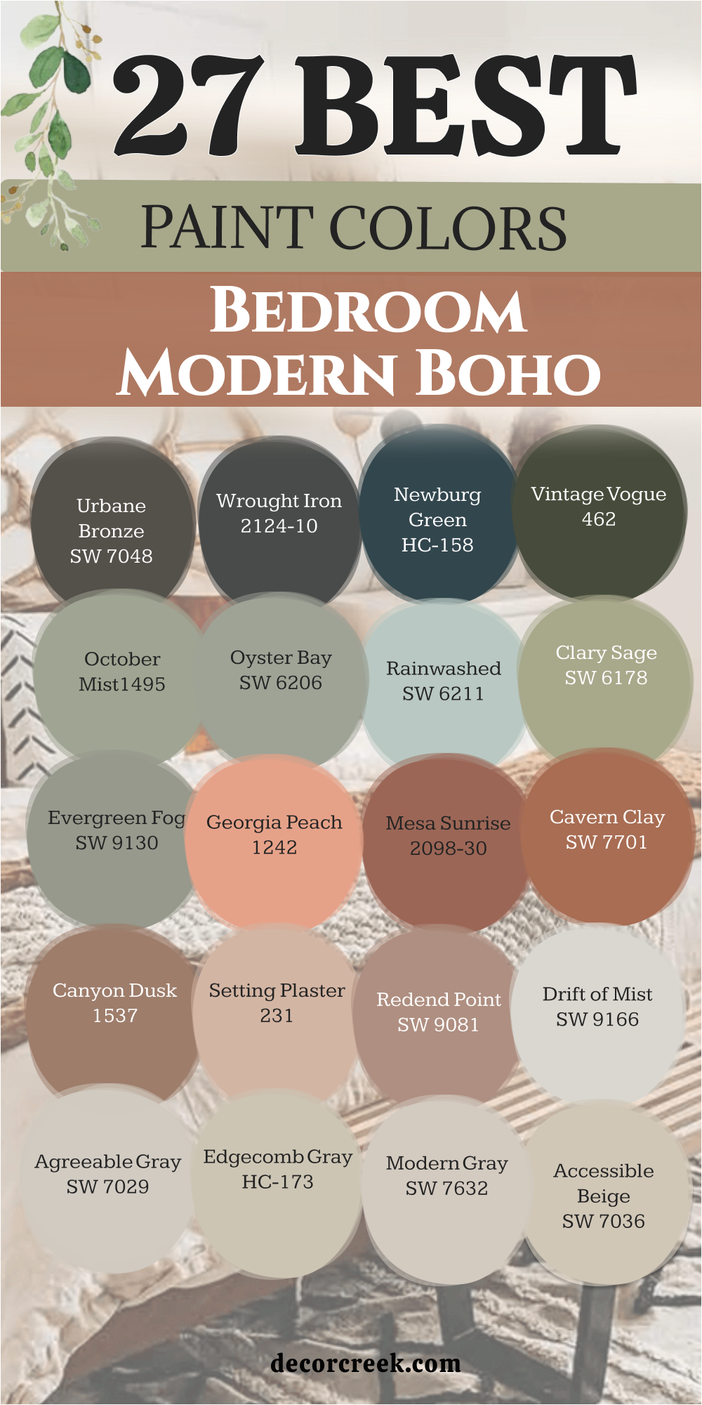
29 Cozy Boho Bedroom Paint Color Ideas
White Dove OC-17
White Dove OC-17 is a soft shade that feels very friendly and light. This color has a tiny bit of yellow in it to keep the room from feeling like a cold doctor’s office. It looks wonderful when you hang macrame art or wooden shelves against it. Many people choose this because it makes a small room feel much bigger than it really is.
You will notice how it catches the morning sun and glows in a very pretty way. It stays in the background so your colorful rugs can be the stars of the show. This paint is a favorite for people who want a clean look that still feels cozy. I often use it in guest rooms because everyone seems to like it. It is a very safe choice that looks expensive and high-end.
Best used in: bedrooms, living rooms, moldings, and trim
Pairs well with: Revere Pewter HC-172, Balboa Mist OC-27, Wood tones The key rule of this color for boho style is to use it where you want your colorful plants and textiles to stand out against a clean backdrop.
Creamy SW 7012
Creamy SW 7012 is a rich and buttery white that feels very luxurious. This color is much warmer than a regular white and looks great with gold accents. It creates a very soft look for a bedroom that feels very romantic. You will love how it makes your skin look good in the mirror.
It is a great choice for a room with a lot of antique furniture. I think it looks best with light brown woods and soft pink fabrics. It feels very cozy and inviting. This paint is perfect for a room where you want to spend all day reading. You will find it is one of the warmest whites you can pick.
Best used in: bedrooms, bathrooms, and ceilings
Pairs well with: Dover White SW 6385, Latte SW 6108, Gold The key rule of this color for boho style is to use it to create a vintage feel that makes the room feel like it has a story to tell.
Natural Cream OC-14
Natural Cream OC-14 sits right between a gray and a beige. This color is perfect if you cannot decide if you want a warm or a cool feeling. It looks very sophisticated when paired with white trim and dark wood floors. You will see it change slightly throughout the day as the light moves.
It provides a great foundation for a room filled with vintage finds. This shade is excellent for hiding a little bit of dust or small marks on the wall. I think it looks best when you use a lot of different textures like wool and linen. It feels very grounded and earthy. Many designers use this when they want a room to look very polished.
Best used in: bedrooms, entryways, and hallways
Pairs well with: Cloud White OC-130, Kendall Charcoal HC-166, Slate The key rule of this color for boho style is to use it as a neutral base that ties together mismatched furniture pieces.
Shoji White SW 7042
Shoji White SW 7042 is a very soft white that feels like it has a little bit of gray and beige inside. This color is not bright and shiny, so it feels very gentle on your eyes. It looks wonderful with linen curtains and light wood floors. You will notice it makes the room feel very open and very clean.
It is a great choice for a boho chic look because it is very simple and honest. I use this when I want a room to feel very light but not cold. This paint is very good at making all your different colors work together in a nice way. It feels very peaceful and like a fresh start every morning. You will find it is very easy to decorate with this shade.
Best used in: whole house interiors, bedrooms, and cabinets
Pairs well with: Urban Bronze SW 7048, Pure White SW 7005, Greige tones The key rule of this color for boho style is to use it to create a soft and warm backdrop that feels very light and airy.
Navajo White OC-95
Navajo White OC-95 is a rich and creamy tan that feels very warm and traditional. This color is much deeper than a regular white and looks like vanilla ice cream. It works beautifully with orange blankets and dark brown wooden furniture. You will find that it makes the room feel very sunny and very safe.
It is a wonderful choice for a boho bedroom that has a lot of old-fashioned charm. I suggest this color if you want your walls to feel like they are giving you a hug. This paint is very good at making a large room feel much more intimate and cozy. It looks very nice with black metal accents and green plants. You will love how it glows when you turn on your bedside lamps.
Best used in: bedrooms, living rooms, and hallways
Pairs well with: Simply White OC-117, Wrought Iron 2124-10, Terracotta The key rule of this color for boho style is to use it to ground the room with a sense of traditional warmth and comfort.
Casa Blanca SW 7571
Casa Blanca SW 7571 is a very warm and creamy white that feels like a cozy old cottage. This color has a lot of yellow and beige in it to make the room feel very sunny. It looks beautiful with light wood furniture and soft wool rugs. You will see that it makes the room feel very inviting and very friendly.
It is a great choice for a boho room that has many natural textures like wicker. I like to use this when a bedroom needs to feel a bit more traditional and warm. This paint is wonderful for making a room feel very lived-in and happy. It is a very rich white that looks great with gold lamps. You will find it is very easy to relax in a room this color.
Best used in: bedrooms, kitchens, and entryways
Pairs well with: Alabaster SW 7008, Kilim Beige SW 6106, Wood The key rule of this color for boho style is to use it to create a rich and creamy warmth that feels like a sun-filled room.
Kilim Beige SW 6106
Kilim Beige SW 6106 is a very popular tan that feels very warm and solid. This color is a bit deeper than a light beige and looks like natural sand. It works wonderfully with orange and red pillows to create a very cozy look. You will notice it makes the room feel very grounded and very safe.
It is a great choice for a boho bedroom that uses a lot of global patterns. I often use this when a room has a lot of colorful rugs and blankets. This paint is very reliable and looks good in almost any kind of light. It feels very fresh and works well with dark wood furniture. You will love how it makes your bedroom feel very inviting and warm.
Best used in: bedrooms, living rooms, and hallways
Pairs well with: Alabaster SW 7008, Latte SW 6108, Terracotta The key rule of this color for boho style is to use it as a warm and solid base for all your favorite decorations.
Manchester Tan HC-81
Manchester Tan HC-81 is a light and breezy tan that looks like a linen shirt. This color is very simple and doesn’t try too hard to be fancy. It works well in bedrooms with lots of woven rugs and hanging plants. You will notice it feels very fresh and clean.
It has a bit of a green undertone that makes it look great with indoor trees. I think it is one of the best colors for a relaxed lifestyle. It is not too yellow and not too pink. This shade is a favorite for people who want a beachy boho vibe. It makes the room feel light and happy.
Best used in: bedrooms, laundry rooms, and kitchens
Pairs well with: White Dove OC-17, Bleached wood, Blue accents The key rule of this color for boho style is to use it to create a relaxed and airy feeling that mimics a coastal retreat.
Shaker Beige HC-45
Shaker Beige HC-45 is a medium tan that feels like a sandy beach. This color is very warm and makes a room feel like it is giving you a big hug. It looks wonderful with orange and red accents that are common in boho decor. You will see that it creates a very cozy atmosphere for sleeping.
It is a strong color that doesn’t get washed out by bright lights. I like to use this in rooms that have big windows and lots of trees outside. It feels very natural and connected to the earth. This paint is a great choice if you have a lot of white furniture.
Best used in: bedrooms, dining rooms, and cozy dens
Pairs well with: Simply White OC-117, Navy blue, Terracotta The key rule of this color for boho style is to use it to create a sun-kissed feeling that reminds you of the outdoors.

Balanced Beige SW 7037
Balanced Beige SW 7037 is a medium tan that feels very steady and very warm. This color is a bit darker than most whites but still feels very light and open. It looks beautiful with cream fabrics and dark green plants. You will see that it makes the room feel very solid and very well-decorated.
It is a great choice for a room that has a lot of white furniture to create a nice contrast. I like how it makes a bedroom feel very cozy and very private for sleeping. This paint is very popular because it hides small marks on the wall very well. It feels very earthy and looks great with leather or wood accents. You will love how it makes your white bedding pop.
Best used in: bedrooms, family rooms, and hallways
Pairs well with: Accessible Beige SW 7036, Virtual Taupe SW 7039, White The key rule of this color for boho style is to use it to create a warm and balanced feeling that ties the whole room together.
Nomadic Desert SW 6107
Nomadic Desert SW 6107 is a warm and sandy color that feels like a sunny day in the desert. This color is very rich and brings a lot of warmth to your walls. It looks amazing with red and orange pillows and dark wood beds. You will find that it makes the room feel very adventurous and full of life.
It is a perfect choice for a boho bedroom that uses a lot of global patterns. I suggest this color if you want a room that feels very cozy and very grounded. This paint is a bit darker than a beige and adds a lot of personality to the room. It looks very nice with gold frames and velvet fabrics. You will notice it makes the room feel very inviting.
Best used in: bedrooms, dining rooms, and accent walls
Pairs well with: Kilim Beige SW 6106, Latte SW 6108, Dark wood The key rule of this color for boho style is to use it to bring a sense of global adventure and warmth to your home.
Cocoa Butter 1023
Cocoa Butter 1023 is a deep and creamy tan that feels very rich and smooth. This color is much darker than a regular beige and looks very high-end. It looks wonderful with white bedding and light wood furniture to create a contrast. You will find that it makes the room feel very sophisticated and very warm.
It is a great choice for a main bedroom that wants to feel like a fancy hotel. I use this when I want a room to feel very cozy but also very stylish. This paint is very warm and makes the walls feel very soft. It looks very nice with gold light fixtures and velvet pillows. You will notice it makes the room feel very quiet and private.
Best used in: bedrooms, accent walls, and dining rooms
Pairs well with: Cloud White OC-130, dark wood, brass The key rule of this color for boho style is to use it to add a rich and buttery depth to your sleeping area.
Potters Clay 1221
Potters Clay 1221 is a warm and reddish-brown that looks like a new flower pot. This color is very earthy and brings a lot of personality to a bedroom. It looks beautiful with light-colored rugs and green leafy plants. You will see that it makes the room feel very warm and very creative.
It is a perfect choice for a boho room that is filled with art and pottery. I like to use this color to create a sense of warmth and energy. This paint is quite deep and makes a great feature wall behind a bed. It feels very natural and reminds me of working with your hands. You will love how it makes the room feel very cozy at night.
Best used in: accent walls, bedrooms, and kitchens
Pairs well with: Simply White OC-117, Olive green, Teal The key rule of this color for boho style is to use it to add a sense of hand-made warmth and earthy energy.
Adobe Beige 1128
Adobe Beige 1128 is a warm and earthy tan that looks like sun-dried clay. This color is very natural and brings a sense of the outdoors inside. It looks amazing with woven rugs and colorful patterned blankets. You will notice it makes the room feel very grounded and very warm.
It is a perfect choice for a boho room that has a lot of handmade items. I suggest this color if you want a wall that feels very honest and simple. This paint is medium in tone and creates a very cozy atmosphere for relaxing. It looks very nice with light-colored woods and green plants. You will love how it makes your room feel very connected to the earth.
Best used in: bedrooms, entryways, and mudrooms
Pairs well with: White Dove OC-17, Terracotta, Sage green The key rule of this color for boho style is to use it to create an earthy and hand-crafted feeling on your walls.
Cinnamon Slate 2113-40
Cinnamon Slate 2113-40 is a deep mix of purple, brown, and gray that feels very rich. This color looks like a smooth stone you would find in a river. It works beautifully with white furniture and light-colored wooden floors. You will find that it makes the room feel very romantic and very soft.
It is a great choice for a boho bedroom that wants to feel very gentle and sweet. I like how it adds a bit of color without being too bright or loud. This paint is very good at making a room feel very cozy and lived-in. It feels very natural and looks great with a lot of green plants. You will love how it makes your bedroom feel like a peaceful hideaway.
Best used in: bedrooms, accent walls, and cozy corners
Pairs well with: Simply White OC-117, Gray, Brass The key rule of this color for boho style is to use it to add a touch of mystery and modern flair to your bedroom.
Dusty Mauve 2174-40
Dusty Mauve 2174-40 is a soft and greyish purple that feels very mysterious and light. This color is very pretty and adds a touch of magic to your bedroom walls. It looks wonderful with silver mirrors and white fluffy blankets. You will find that it makes the room feel very soft and very unique.
It is a great choice for a boho chic look that is a little bit different from the usual tans. I use this when I want a room to feel very gentle and very romantic. This paint is light enough that it does not make a small room feel crowded. It feels very sophisticated and works well with gray or white furniture. You will notice it creates a very peaceful vibe for resting.
Best used in: bedrooms, nurseries, and bathrooms
Pairs well with: Chantilly Lace OC-65, Gray Owl OC-52, Silver The key rule of this color for boho style is to use it to create a dreamy and soft atmosphere that feels very special.
Fading Rose SW 6296
Fading Rose SW 6296 is a soft and dusty pink that looks like a vintage dream. This color is very light and adds a touch of sweetness to your walls. It looks amazing with silver accents and white fluffy rugs. You will notice it makes the room feel very feminine and very soft.
It is a great choice for a boho room that has a lot of floral prints. I use this when I want a room to feel very quiet and very delicate. This paint is light enough that it almost acts like a neutral color. It is a very sophisticated pink that doesn’t feel too young. You will love how it looks when the lamps are turned on at night.
Best used in: bedrooms, nurseries, and dressing rooms
Pairs well with: Chantilly Lace OC-65, Slate gray, Pale gold The key rule of this color for boho style is to use it to create a vintage and romantic atmosphere that feels very gentle.
Spiced Cider SW 7702
Spiced Cider SW 7702 is a warm and glowing orange that looks like a sunset. This color is very rich and makes the whole room feel like it is lit by a fireplace. It looks great with cream-colored fabrics and dark brown rugs. You will see that it adds a lot of life to a room that feels a bit dull.
It is a wonderful choice for a boho bedroom because it feels very organic. I often recommend this for people who love the colors of autumn. It is a very comforting shade that helps you relax after a long day. This paint makes a great backdrop for black and white photos. It feels very cozy and full of light.
Best used in: bedrooms, hallways, and accent walls
Pairs well with: White Dove OC-17, Espresso wood, Gold The key rule of this color for boho style is to use it to mimic the warmth of a glowing fire or a setting sun.
Saybrook Sage HC-114
Saybrook Sage HC-114 is a soft and silvery green that feels like a garden in the morning. This color is very light and helps a room feel very fresh and clean. It looks beautiful when you have a lot of white pillows and wooden bed frames. You will notice it makes the walls feel very natural and easy to look at.
It is a great choice for a boho room that has many hanging vines and potted trees. I like to use this when a bedroom needs to feel a bit cooler and more relaxed. This shade is a classic that never feels like it is too much. It works very well with light brown wicker and straw baskets. Many people pick this because it reminds them of being outside in nature.
Best used in: bedrooms, bathrooms, and sunrooms
Pairs well with: Cloud White OC-130, Revere Pewter HC-172, Oak wood tones The key rule of this color for boho style is to use it to create a soft and natural feeling that brings the colors of the forest indoors.
Soft Fern 2144-40
Soft Fern 2144-40 is a bright and happy green that feels like a sunny meadow. This color is very light and brings a lot of energy into a room. It looks great with orange and yellow accents that are common in boho decor. You will love how it makes the room feel very alive and very fresh.
It is a great choice for a room that does not have many windows. I use this when I want a room to feel like a secret garden indoors. This shade is very friendly and looks wonderful with a lot of wooden toys or books. It is a very cheerful green that never feels too dark or heavy. You will notice it makes you feel very awake and ready for the day.
Best used in: bedrooms, nurseries, and kitchens
Pairs well with: Simply White OC-117, Wood tones, Pink The key rule of this color for boho style is to use it to add a playful and energetic garden feel to the room.
Clary Sage SW 6178
Clary Sage SW 6178 is a warm and earthy green that feels very herbal and soft. This color is a bit deeper than a light sage and has a yellow undertone. It looks amazing with terracotta pots and leather chairs. You will notice it makes the room feel very cozy and very lived-in.
It is a great choice for a boho bedroom that uses a lot of natural materials. I often use this when I want a room to feel like a cozy cottage in the woods. This paint is very good at making big white furniture look even brighter. It is a very friendly green that makes people feel very welcome. You will find it is very easy to match with your existing rugs.
Best used in: bedrooms, entryways, and dining rooms
Pairs well with: Dover White SW 6385, Sage SW 2860, Copper The key rule of this color for boho style is to use it to create a grounded and herbal atmosphere that feels very warm.
Retreat SW 6207
Retreat SW 6207 is a dusty green that feels very quiet and very mature. This color is not too bright and has a very soft look on the walls. It works wonderfully with light gray and black accents. You will find that it makes the room feel very balanced and very tidy.
It is a great choice for a bedroom where you want to escape the busy world outside. I think it looks best with simple wooden furniture and linen fabrics. This shade is very easy on the eyes and helps the room feel very tidy. It is a very popular color for a modern boho chic look. You will notice it makes your indoor plants look very vibrant.
Best used in: bedrooms, bathrooms, and cozy reading nooks
Pairs well with: Spare White SW 6203, Sea Salt SW 6204, Iron The key rule of this color for boho style is to use it to create a quiet sanctuary that feels far away from the noisy world.
Dried Thyme SW 6186
Dried Thyme SW 6186 is a deep and earthy green that feels very herbal and solid. This color reminds me of dried leaves in a jar. It looks wonderful with light wood and cream-colored fabrics to create a soft look. You will notice it makes the room feel very quiet and very high-end.
It is a perfect choice for a modern boho bedroom that wants to look very designer. I use this when I want to make a statement that still feels very natural. This paint is very rich and looks like something you would find in a fancy magazine. It feels very sophisticated and looks wonderful with green plants. You will love how it makes your bedroom feel very private and special.
Best used in: bedrooms, accent walls, and exteriors
Pairs well with: Shoji White SW 7042, Wood, Brass The key rule of this color for boho style is to use it to add a touch of dark and herbal intensity to your walls.

Riverway SW 6222
Riverway SW 6222 is a dark and moody blue-green that feels very deep and rich. This color looks like deep water in a quiet river. It works wonderfully with dark wood and brass accents to create a high-end look. You will see that it makes the room feel very private and very cozy.
It is a perfect choice for a modern boho room that wants to feel very chic. I like how it makes a bedroom feel like a secret hideaway from the world. This paint is quite dark and creates a very sophisticated atmosphere. It looks very nice with white furniture to create a big contrast. You will love how it makes the room feel very quiet at night.
Best used in: main bedrooms, accent walls, and dining rooms
Pairs well with: Sea Salt SW 6204, Pure White SW 7005, Gold The key rule of this color for boho style is to use it to add a sense of deep and watery mystery to your walls.
Aegean Teal 2136-40
Aegean Teal 2136-40 is a rich and balanced blue-green that feels very steady. This color was a color of the year because it is so easy to live with every day. It looks beautiful with light wood and woven rugs to create a natural look. You will notice it makes the room feel very grounded and very warm.
It is a great choice for a boho bedroom that wants to feel very intentional and stylish. I like how it adds a lot of personality to the room without being too loud. This paint is very smooth and looks wonderful in a room with high ceilings. It feels very cozy at night when you have small lamps turned on. You will love how it makes your bedroom feel like a designer space.
Best used in: bedrooms, cabinetry, and accent walls
Pairs well with: Cloud White OC-130, Gray Owl OC-52, Wood The key rule of this color for boho style is to use it to bridge the gap between bright blues and earthy greens.
Urbane Bronze SW 7048
Urbane Bronze SW 7048 is a deep and warm brown-gray that feels very solid and earthy. This color was a color of the year because it feels like a big hug from the earth. It looks beautiful with light wood and cream-colored fabrics to create a soft look. You will notice it makes the room feel very quiet and very high-end.
It is a perfect choice for a modern boho bedroom that wants to look very designer. I use this when I want to make a statement that still feels very natural. This paint is very rich and looks like something you would find in a fancy magazine. It feels very sophisticated and looks wonderful with green plants. You will love how it makes your bedroom feel very private and special.
Best used in: accent walls, bedrooms, and window trim
Pairs well with: Shoji White SW 7042, Modern Gray SW 7632, Wood The key rule of this color for boho style is to use it to add a touch of dark and earthy drama to your walls.
Black Fox SW 7020
Black Fox SW 7020 is a dark and earthy black that has a lot of brown in it. This color feels very warm and solid compared to a regular cold black. It looks beautiful with light wood and cream-colored fabrics to create a very chic look. You will notice it makes the room feel very quiet and very high-end.
It is a perfect choice for a modern boho bedroom that wants to look very designer. I use this when I want to make a big statement that still feels very natural. This paint is very rich and looks like something you would find in a fancy magazine. It feels very sophisticated and looks wonderful with green plants. You will love how it makes your bedroom feel very private and special.
Best used in: accent walls, bedrooms, and exterior doors
Pairs well with: Shoji White SW 7042, Repose Gray SW 7015, Brass The key rule of this color for boho style is to use it to add a touch of dark and earthy drama to your walls.
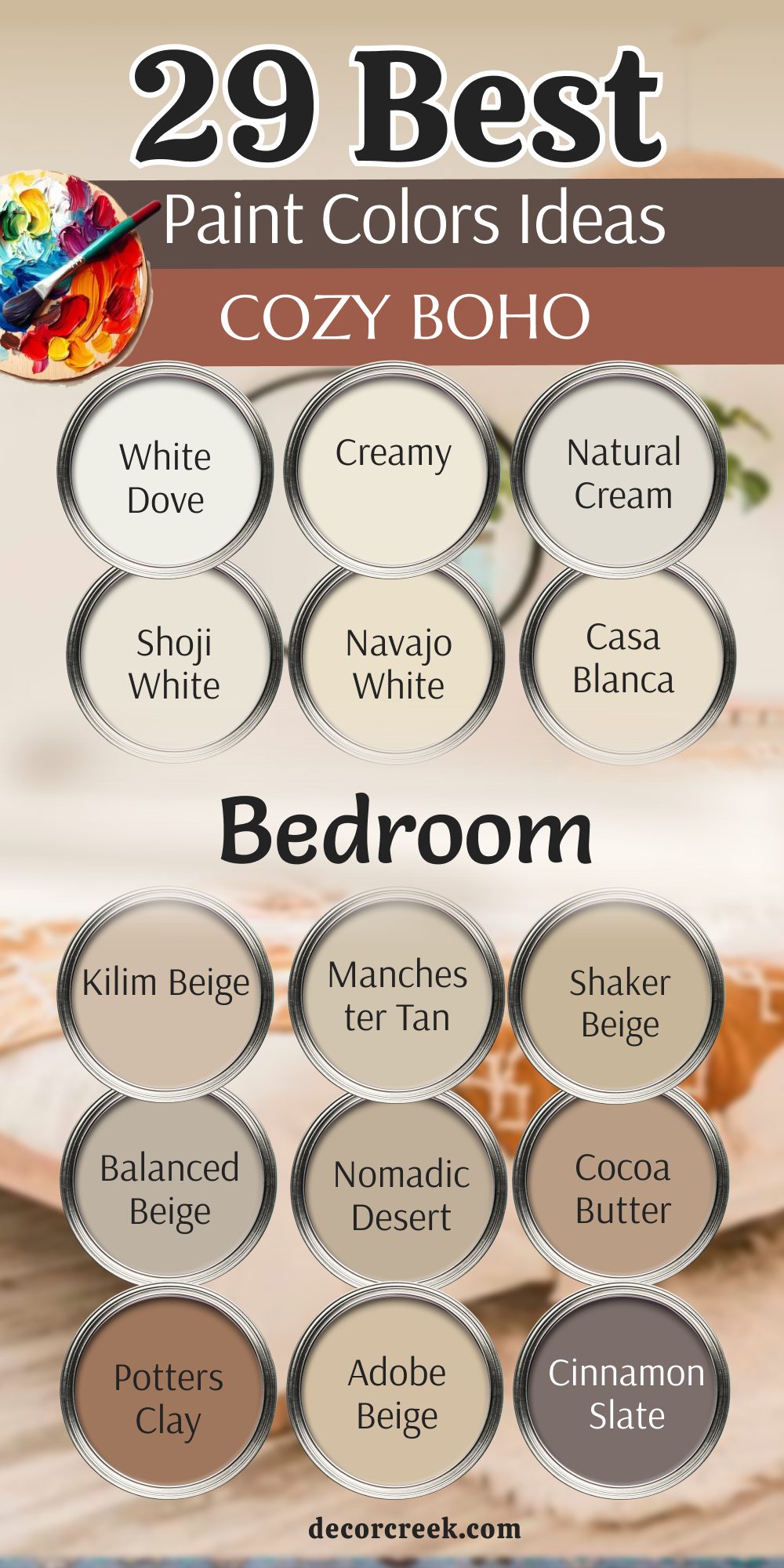
31 Dark Paint Colors For The Boho Bedroom
Iron Ore SW 7069
Iron Ore SW 7069 is a charcoal shade that looks like soft velvet on your walls. I use this deep gray when I want a bedroom to feel snug and safe like a warm hug. It acts as a strong anchor for all your bright blankets and woven wall hangings.
Iron Ore SW 7069 stays away from looking too cold because it has a tiny bit of warmth hidden inside the pigment. You will notice how your green plants look much brighter when they sit against this dark background. It makes every piece of light wood furniture stand out in a way that feels very professional.
This paint choice helps you fall asleep faster because it turns the room into a quiet sanctuary. I love how it hides small marks or dust which is great for busy homes. It gives you a sense of luxury without trying too hard to be fancy. You can use it on just one wall if you worry about the room feeling too small.
Best used in: accent walls, interior doors, and modern bedrooms
Pairs well with: Extra White SW 7006, Nebulous White SW 7063, warm wood tones The key rule of this color for boho style is to use it where you want your textures to pop and your mind to rest easily.

Tricorn Black SW 6258
Tricorn Black SW 6258 is the most honest black paint I have ever found for a home. This color does not have any secret blue or brown tones hiding in the shadows. It works like a giant picture frame for your entire life.
Tricorn Black SW 6258 makes your colorful boho rugs look like expensive pieces of art on the floor. I choose this for rooms where you have big windows so the light can bounce off the dark surface. It creates a bold look that tells people you are brave and creative.
You will feel very organized when your white bedding sits against this ink-colored wall. It is a great pick if you want a look that feels very fresh and clean every morning. I often suggest this to people who want their bedroom to feel very high-end and special. It is a simple way to make a big statement without needing a lot of extra decorations.
Best used in: window trim, accent walls, and furniture
Pairs well with: Snowbound SW 7004, Repose Gray SW 7015, vivid colors The key rule of this color for boho style is to use it as a sharp border to make your collection of treasures look more important.

Black Beauty 2128-10
Black Beauty 2128-10 has a rich feeling that reminds me of expensive silk. This shade has a very slight brown heart that keeps the room feeling friendly and cozy. I like to use it when a person wants a dark room that still feels very soft and welcoming.
Black Beauty 2128-10 helps all your gold frames and brass lamps shine like little stars at night. It creates a wonderful sense of depth that makes your walls seem to go on forever. You can pair it with cream-colored pillows to create a look that feels very balanced.
I find that this color makes people feel very relaxed as soon as they walk inside. It is a fantastic choice for a bedroom because it feels very private and personal. Your macrame wall art will look amazing against this dark and smooth surface. It is a smart way to get that high-end designer look on a normal budget.
Best used in: main bedrooms, cozy dens, and cabinetry
Pairs well with: Simply White OC-117, Revere Pewter HC-172, cognac leather The key rule of this color for boho style is to use it to ground the room with a rich feeling that feels soft to the eyes.
Onyx 2133-10
Onyx 2133-10 is a matte black that reminds me of natural stones found in a river. This color absorbs light in a way that makes the room feel very still and peaceful. I suggest this for people who need their bedroom to be a total escape from the noisy world.
Onyx 2133-10 provides a grounded look that matches perfectly with jute rugs and straw baskets. It has a very modern feel but still fits the organic vibe of a boho home. You will love how it makes your wood bed frame look like it was made just for this room.
I use it to create a look that is both simple and very powerful at the same time. It is a reliable color that looks good even when the sun is not shining. Your green vines and leaf patterns will feel very energetic against this dark stone shade. It is a perfect pick for someone who loves a clean and very natural home.
Best used in: bedrooms, fireplaces, and bookshelves
Pairs well with: Gray Owl OC-52, White Dove OC-17, natural textures The key rule of this color for boho style is to use it to create a heavy base that allows light fabrics to feel airy.
Wrought Iron 2124-10
Wrought Iron 2124-10 is a heavy gray that feels like a piece of history on your walls. This color is not quite black which makes it feel a bit more gentle for a sleeping area. I love how it has a slightly dusty look that reminds me of old iron gates.
Wrought Iron 2124-10 works beautifully with silver accents or light gray blankets. It creates a very moody feeling that is perfect for reading books on a rainy day. You can use it to make a large room feel much more intimate and filled with character.
I find that this shade helps people feel more creative because it is so interesting to look at. It changes slightly throughout the day as the sun moves across your furniture. You can trust this color to make your room feel very special and unique. It is a great choice for a boho look that feels a little bit vintage and worn in.
Best used in: bedrooms, kitchen islands, and front doors
Pairs well with: Chantilly Lace OC-65, Stonington Gray HC-170, light wood tones The key rule of this color for boho style is to use it to add a sense of weight and story to a room with light furniture.
Urbane Bronze SW 7048
Urbane Bronze SW 7048 is a mix of gray and brown that feels very much like the earth. This color was a top pick for a long time because it feels so natural and steady. I choose this for bedrooms that use a lot of stone, leather, and wood.
Urbane Bronze SW 7048 makes a room feel very expensive without being flashy or bright. It has a warmth that reminds me of sun-dried mud or aged metal. You will notice that it helps your mind feel very quiet and ready for sleep.
I love using this on window frames to frame the trees outside like a painting. It is a very strong color that gives your bedroom a solid foundation. You can mix it with light cream fabrics to keep the room from feeling too heavy. It is a favorite for people who want to feel connected to the outdoors while they are in bed.
Best used in: accent walls, bedrooms, and window trim
Pairs well with: Shoji White SW 7042, Modern Gray SW 7632, bone white The key rule of this color for boho style is to use it to add a touch of earthy drama that feels very sturdy.
Black Fox SW 7020
Black Fox SW 7020 is a very dark brown that almost looks black until you get close. This color has a lot of chocolate tones that make the room feel very delicious and warm. I use this when I want a boho bedroom to feel very organic and cozy.
Black Fox SW 7020 goes perfectly with orange pillows and red patterned blankets. It reminds me of the deep forest floor where everything is quiet and still. You will feel very protected in a room painted with this rich and heavy shade.
It creates a fantastic contrast with white lace or light cotton sheets. I suggest this for people who love the look of dark wood but want it on their walls. It is a very comforting color that makes a bedroom feel like a secret hideaway. You can use it to create a look that feels very hand-crafted and real.
Best used in: accent walls, bedrooms, and exterior doors
Pairs well with: Alabaster SW 7008, Repose Gray SW 7015, copper The key rule of this color for boho style is to use it to add a sense of deep forest warmth to your sleeping area.
Kendall Charcoal HC-166
Kendall Charcoal HC-166 is a rich gray that feels very solid and dependable. This color is great because it works with both warm and cool decorations. I like how it makes a bedroom feel very updated and stylish without being too trendy.
Kendall Charcoal HC-166 helps your colorful art pieces look very bright and clean. It has enough depth to feel moody but enough light to keep the room feeling open. You will find that it is very easy to match with different types of wood floors.
I often use this for people who want a dark room that still feels very tidy. It is a very smart color that looks good under any kind of light bulb. You can add lots of plants to create a look that feels very lush and alive. It is a classic choice that will make you feel proud of your home every day.
Best used in: bedrooms, home offices, and cabinetry
Pairs well with: White Dove OC-17, Revere Pewter HC-172, bright accents The key rule of this color for boho style is to use it as a neutral canvas that ties all your different textures together.

Chelsea Gray HC-168
Chelsea Gray HC-168 is a medium-dark gray that feels very high-end and polished. This color has a bit of a brownish tint that keeps it from looking like cold concrete. I use this when I want a bedroom to feel very chic and well-planned.
Chelsea Gray HC-168 makes your brass bed frame or gold lamps look like jewelry. It creates a look that is very balanced and easy on the eyes. You can use this color on all four walls to create a very cozy and wrap-around feeling.
I find that it makes people feel very focused and also very relaxed at the same time. It is a wonderful pick for a bedroom that also has a small desk or reading nook. You will love how it makes your white trim look very sharp and bright. It is a very stylish color that fits perfectly with a modern boho lifestyle.
Best used in: bedrooms, cabinetry, and living areas
Pairs well with: Simply White OC-117, Revere Pewter HC-172, warm wood The key rule of this color for boho style is to use it to create a look that is both trendy and very comfortable.

Caviar SW 6990
Caviar SW 6990 is a very dark black that feels as rich as the name suggests. This color has a tiny bit of warmth that makes it feel much better than a cold black. I suggest this for people who want their bedroom to feel very fancy and very private.
Caviar SW 6990 turns your room into a beautiful night sky that is perfect for resting. It makes your colorful throw pillows look like they are glowing with energy. You will find that it makes even a simple room look like a professional designer worked on it.
I love how it provides a very heavy contrast to light-colored rugs and floors. It is a very brave choice that will make your friends say wow when they see it. You can use it to create a very quiet environment that helps you dream big. It is a powerful color that gives you a lot of confidence in your home design.
Best used in: bedrooms, dining rooms, and library walls
Pairs well with: Creamy SW 7012, Accessible Beige SW 7036, gold The key rule of this color for boho style is to use it to ground the room with a sense of high-end mystery.
Deep River 1582
Deep River 1582 is a dark mix of green and gray that looks like a forest at night. This color has a very moody feeling that reminds me of deep water in a quiet lake. I like to use this when a bedroom needs a lot of personality and soul.
Deep River 1582 makes all your green plants look like they belong in a jungle. It has a very natural look that goes great with woven baskets and wood furniture. You will notice that the room feels very cool and refreshing during the hot summer.
I suggest this for people who want a dark color that is not just a plain gray. It creates a wonderful sense of adventure right inside your own home. You can pair it with white sheets to create a look that feels very crisp. It is a beautiful choice for anyone who loves the colors of the outdoors.
Best used in: main bedrooms, accent walls, and library spaces
Pairs well with: Cloud White OC-130, Silver Sage 506, light oak The key rule of this color for boho style is to use it to ground the room with a deep and watery intensity.
Newburg Green HC-158
Newburg Green HC-158 is a classic dark teal that feels very royal and special. This color has a lot of blue and green mixed together to create a very rich shade. I use this when I want a boho room to feel very creative and full of life.
Newburg Green HC-158 makes your gold mirrors and frames look absolutely beautiful. It is a very bold color that still feels very cozy for a sleeping area. You will find that it makes your bedroom feel like a very important part of the house.
I love how it changes from blue to green depending on the time of day. It creates a look that is very deep and full of wonderful secrets. You can match it with orange or yellow pillows for a very fun boho look. It is a very smart pick for someone who loves color but wants it to be dark.
Best used in: bedrooms, accent walls, and entryways
Pairs well with: Simply White OC-117, Wood tones, Gold The key rule of this color for boho style is to use it to ground the room with a deep and watery mystery.
Salamander 2050-10
Salamander 2050-10 is a very dark green that almost looks like black in the corners. This color is perfect for creating a lush jungle feeling in your bedroom. I suggest this for people who have a lot of plants and want them to stand out.
Salamander 2050-10 feels very heavy and solid which helps you feel safe at night. It has a very natural look that reminds me of deep moss in a thick forest. You will notice how your light-colored blankets look very bright against this wall.
I love using this to create a room that feels very private and very still. It is a very trendy color that fits perfectly with a boho chic lifestyle. You can use it on just one wall to create a very cool focal point behind the bed. It is a very beautiful choice that brings a lot of the outdoors inside.
Best used in: bedrooms, cozy dens, and cabinetry
Pairs well with: Simply White OC-117, Wood, Terracotta The key rule of this color for boho style is to use it to create a lush, botanical sanctuary that feels completely private.
Hunter Green 2041-10
Hunter Green 2041-10 is a traditional dark green that feels very steady and honest. This color reminds me of a big forest tree or an old-fashioned library. I use this when I want a boho bedroom to feel very grounded and real.
Hunter Green 2041-10 makes your wood furniture look like it has been there forever. It creates a very warm and inviting feeling that is great for resting. You will find that it is very easy to relax in a room with this natural shade.
I like how it makes your red or orange blankets look very bright and happy. It is a very reliable color that looks good with almost any kind of light. You can add lots of woven textures to create a look that feels very hand-made. It is a classic pick for someone who loves a very cozy and traditional home.
Best used in: accent walls, bedrooms, and dining areas
Pairs well with: White Dove OC-17, Naval SW 6244, gold accents The key rule of this color for boho style is to use it to add a spicy and sun-drenched energy to your favorite corner.

Essex Green HC-188
Essex Green HC-188 is a very dark green that looks very high-end and fancy. This color is almost black which gives it a lot of power and mystery. I suggest this for a master bedroom that wants to feel very special and private.
Essex Green HC-188 makes all your white linens look incredibly fresh and clean. It provides a wonderful background for a collection of vintage art or photos. You will feel very chic and stylish in a room painted with this deep shade.
I love how it makes a small room feel like a cozy jewel box. It is a very strong color that tells people you have great taste in design. You can pair it with gold lamps to create a very luxurious boho look. It is a beautiful way to make your bedroom feel like a five-star hotel.
Best used in: accent walls, main bedrooms, and library walls
Pairs well with: White Dove OC-17, Gold, leather The key rule of this color for boho style is to use it to create a deep and velvety forest feeling.
Ripe Olive SW 6209
Ripe Olive SW 6209 is a dusty dark green that feels very earthy and natural. This color looks like the leaves of an old olive tree in the sun. I use this when I want a bedroom to feel very grounded.
Ripe Olive SW 6209 makes your terracotta pots and orange rugs look amazing. It has a very soft look that is very easy to live with every day. You will find that it makes the room feel very quiet and very peaceful.
I suggest this for a boho look that feels very connected to the desert or the sea. It is a very trendy shade that still feels very real and simple. You can add lots of wood accents to create a look that feels very warm. It is a perfect pick for someone who loves a natural and very relaxed home.
Best used in: bedrooms, entryways, and dining rooms
Pairs well with: Dover White SW 6385, Sage SW 2860, Copper The key rule of this color for boho style is to use it to create a grounded and herbal atmosphere that feels very warm.
Dark Olive 2140-30
Dark Olive 2140-30 is a saturated green that feels very lush and full of life. This color has a lot of yellow tones that make it feel very warm and friendly. I like to use this when a bedroom has a lot of plants and needs a boost.
Dark Olive 2140-30 makes your wooden bed look very rich and beautiful. It creates a very cozy feeling that is perfect for sleeping in late. You will notice how the room feels very sunny even on a cloudy afternoon.
I suggest this for people who love the colors of nature. It is a very bold color that still feels very soft to the eyes. You can pair it with cream-colored fabrics to keep the room feeling light. It is a wonderful choice for a boho look that feels very organic and happy.
Best used in: bedrooms, kitchens, and sunrooms
Pairs well with: Simply White OC-117, Terracotta, wood tones The key rule of this color for boho style is to use it to create a soft and leafy feeling that feels very natural.
Greenblack SW 6994
Greenblack SW 6994 is a very dark shade that hides a green heart inside a black soul. This color is very mysterious because it looks different in every kind of light. I use this when I want a room to feel very deep and full of character.
Greenblack SW 6994 makes your white furniture look like it is floating in the room. It is a very strong color that creates a lot of drama in a bedroom. You will feel very safe and tucked away in a room painted with this shade.
I love how it makes your green plants look like they are glowing with life. It is a very chic pick for a modern boho home that wants to be different. You can use it to make a large bedroom feel much more cozy and private. It is a powerful color that gives your home a very professional designer look.
Best used in: accent walls, main bedrooms, and cabinetry
Pairs well with: Shoji White SW 7042, Pure White SW 7005, wood The key rule of this color for boho style is to use it to add a sense of deep and watery mystery to your walls.
Cyberspace SW 7076
Cyberspace SW 7076 is a very dark navy that feels like the deep parts of the ocean. This color has a bit of gray that keeps it looking very modern and very sleek. I suggest this for people who want a dark blue that is not too bright.
Cyberspace SW 7076 makes your white bedding and pillows look incredibly crisp. It creates a very quiet and still feeling that is great for falling asleep. You will find that it is very easy to match with silver or gold decorations.
I like how it makes a bedroom feel very organized and very well-planned. It is a very cool color that helps you feel relaxed during the summer heat. You can use it to create a very bold focal point on the wall behind your bed. It is a very smart choice for a boho chic look that feels very updated.
Best used in: accent walls, bedrooms, and media rooms
Pairs well with: Origami White SW 7636, Network Gray SW 7073, Wood The key rule of this color for boho style is to use it to add a cool, celestial depth to your sleeping area.

Naval SW 6244
Naval SW 6244 is a classic navy blue that feels very solid and very honest. This color has been a favorite for a long time because it looks good in any home. I use this when I want a boho bedroom to feel very steady and very safe.
Naval SW 6244 makes your orange and red blankets look very bright and fun. It is a very brave color that still feels very friendly and welcoming. You will feel like you are on a grand adventure every time you walk into your room.
I love how it makes your wood furniture look very rich and very special. It is a very reliable color that always looks good regardless of the light. You can add lots of white accents to create a look that feels very nautical. It is a perfect pick for someone who loves a bold and very traditional home.
Best used in: bedrooms, dining rooms, and exterior siding
Pairs well with: Coventry Gray HC-169, White Heron OC-57, Brass The key rule of this color for boho style is to use it to provide a strong, classic contrast to light-colored textiles.

Indigo Batik SW 7602
Indigo Batik SW 7602 is a dark blue that reminds me of hand-dyed fabrics from far away. This color has a lot of soul and feels very much like a hand-made item. I like to use this for a boho bedroom that uses a lot of patterns and textures.
Indigo Batik SW 7602 makes your white trim and furniture look very clean and sharp. It has a very artistic feeling that makes people feel very creative and inspired. You will find that it creates a very cozy and wrap-around feeling in the room.
I suggest this for people who want a blue that has a lot of depth and history. It is a very chic color that fits perfectly with a global traveler style. You can pair it with woven rugs and colorful art to create a fun room. It is a beautiful choice for anyone who loves the colors of a deep night sky.
Best used in: bedrooms, dining rooms, and cabinetry
Pairs well with: Alabaster SW 7008, Kilim Beige SW 6106, Copper The key rule of this color for boho style is to use it to add a sense of global tradition and deep blue warmth.
Mysterious Mauve SW 6262
Mysterious Mauve SW 6262 is a dark blue that has a lot of secret gray and black tones inside. This color is very deep and feels very much like a quiet dream. I use this when a bedroom needs a lot of mood and a very quiet vibe.
Mysterious SW 6262 makes your silver mirrors and frames look absolutely wonderful. It is a very strong color that turns a bedroom into a private sanctuary. You will notice how the walls seem to disappear into the shadows at night.
I like how it makes your light-colored blankets look very soft and inviting. It is a very smart color for a modern boho home that wants a touch of magic. You can use it to create a look that is both very dark and very quiet. It is a powerful choice that gives your room a very interesting and deep character.
Best used in: bedrooms, bathrooms, and laundry rooms
Pairs well with: Alabaster SW 7008, Wood tones, Silver The key rule of this color for boho style is to use it to bring a sense of the wide open sky into your sleeping space.
Dark Night SW 6237
Dark Night SW 6237 is a very saturated blue-green that feels like a deep sea. This color is very bold and brings a lot of energy to a boho bedroom. I suggest this for people who love color and are not afraid to use it.
Dark Night SW 6237 makes your gold lamps and brass bed look like treasure. It is a very rich shade that creates a very cozy and interesting environment. You will feel very inspired and happy in a room painted with this deep color.
I love how it makes your green plants look very lush and full of life. It is a very trendy color that looks like something from a fancy magazine. You can match it with orange or pink pillows for a very vibrant boho look. It is a beautiful way to make your bedroom feel very special and very alive.
Best used in: main bedrooms, accent walls, and dining rooms
Pairs well with: Sea Salt SW 6204, Pure White SW 7005, Gold The key rule of this color for boho style is to use it to add a sense of deep and watery mystery to your walls.
Summer Plum 2074-20
Summer Plum 2074-20 is a dark brown that has a very pretty purple tint. This color is very rich and feels like a warm cup of cocoa at night. I suggest this for people who want a dark room that is very soft and romantic.
Plum Brown 2074-20 makes your white trim and linens look very fresh. It creates a very quiet and intimate feeling that is perfect for a master suite. You will notice how the room feels very snug and very well-decorated.
I love how it makes your wood furniture look very deep and full of character. It is a very sophisticated color that fits perfectly with a modern boho chic look. You can use it to create a very peaceful sanctuary where you can truly relax. It is a beautiful pick for anyone who loves dark and very warm colors.
Best used in: bedrooms, bathrooms, and dressing rooms
Pairs well with: White Dove OC-17, Olive green, Brass The key rule of this color for boho style is to use it to create a soft and plaster-like warmth on your walls.
Iron Mountain 2134-30
Iron Mountain 2134-30 is a warm dark gray that feels as steady as a rocky peak. This color is great because it feels very soft despite being a very dark shade. I use this when I want a bedroom to feel very modern but also very cozy.
Iron Mountain 2134-30 helps all your white pillows and rugs look very clean. It has a very grounded feeling that makes you feel very safe and at home. You will find that it is very easy to mix with different colors and textures.
I often use this for people who want a trendy look that is very easy to live with. It is a very smart color that looks good under both sun and lamp light. You can add lots of woven items to create a look that feels very natural. It is a reliable choice that will make your home feel very high-end and special.
Best used in: bedrooms, accent walls, and exterior doors
Pairs well with: White Dove OC-17, Gold, Wood The key rule of this color for boho style is to use it to ground the room with a rich and stony warmth.

Vintage Wine 2116-20
Vintage Wine 2116-20 is a dusty dark purple that feels very old-fashioned and sweet. This color has a very romantic vibe that reminds me of an old artist studio. I like to use this for a boho bedroom that has a lot of lace and wood.
Vintage Wine 2116-20 makes your white furniture look like it has a secret story. It creates a very quiet and gentle feeling that is great for resting your mind. You will notice how the room feels very private and very soft to the eyes.
I suggest this for people who want a dark color that is very delicate and pretty. It is a very chic pick for a home that loves a touch of vintage charm. You can pair it with green plants to create a look that feels very fresh. It is a beautiful way to make your bedroom feel very personal and very artistic.
Best used in: bedrooms, bathrooms, and dressing rooms
Pairs well with: White Dove OC-17, Olive green, Brass The key rule of this color for boho style is to use it to create a soft and artistic atmosphere that feels very special.

Chocolate Sundae 2113-10
Chocolate Sundae 2113-10 is a very deep, warm espresso brown. This color is a brave neutral that makes a room feel incredibly cozy, safe, and expensive. I choose this for bedrooms where you want to feel tucked away from the rest of the house.
Chocolate Sundae 2107-10 provides a heavy and rich background for cream-colored shag rugs and wool blankets. It has a very natural feel that matches perfectly with hand-carved wood and woven art. You will love how it makes your white bedding look extra clean and inviting.
I find that this shade helps people feel very grounded because it looks like the honest color of the earth. It is a great choice for a boho look that feels very solid. You can add gold accents to make the room feel very high-end and designer.
Best used in: bedrooms, dens, and accent walls
Pairs well with: Simply White OC-117, Tan, Gold The key rule of this color for boho style is to use it to create a sense of deep, earthy security in your sleeping space.
Sealskin SW 7675
Sealskin SW 7675 is a dark, earthy brown-black that feels very organic. This color is one of the warmest dark colors available, making it feel very cozy for a sleeping nook. I use this when I want to avoid the cold look of a true black.
Sealskin SW 7675 works beautifully with brass hardware and light-colored wooden floors. It creates a very quiet and private feeling that helps you relax as soon as you step inside. You will notice how your green plants look incredibly vibrant against this rich wall color.
I often suggest this to people who love natural textures like leather and wicker. It is a very smart way to make a big statement that still feels very connected to nature. This paint makes your bedroom feel like a designer retreat that is full of warmth.
Best used in: bedrooms, exterior trim, and cabinetry
Pairs well with: Shoji White SW 7042, Repose Gray SW 7015, Brass The key rule of this color for boho style is to use it to add a touch of dark and earthy intensity to your walls.
Raisin Torte 2083-10
Raisin Torte 2083-10 is a thick, jam-like dark purple-brown that feels very rich. This color is the ultimate nesting color because it is warm and perfect for creating a private retreat. I like to use this when a person wants their room to feel very unique and full of soul.
Raisin Torte 2083-10 makes your gold lamps and copper decorations shine with a beautiful glow. It creates a very intimate atmosphere that is wonderful for a master bedroom. You will find that the room feels very snug and safe from the noisy outside world.
I suggest this for a boho look that is bold, artistic, and very comfortable. It has a very sophisticated feeling that tells everyone you love high-end design. You can pair it with light cream fabrics to keep the room from feeling too dark at night.
Best used in: bedrooms, accent walls, and cozy corners
Pairs well with: Cloud White OC-130, Copper, warm wood tones The key rule of this color for boho style is to use it to turn your bedroom into a warm and mysterious jewel box.
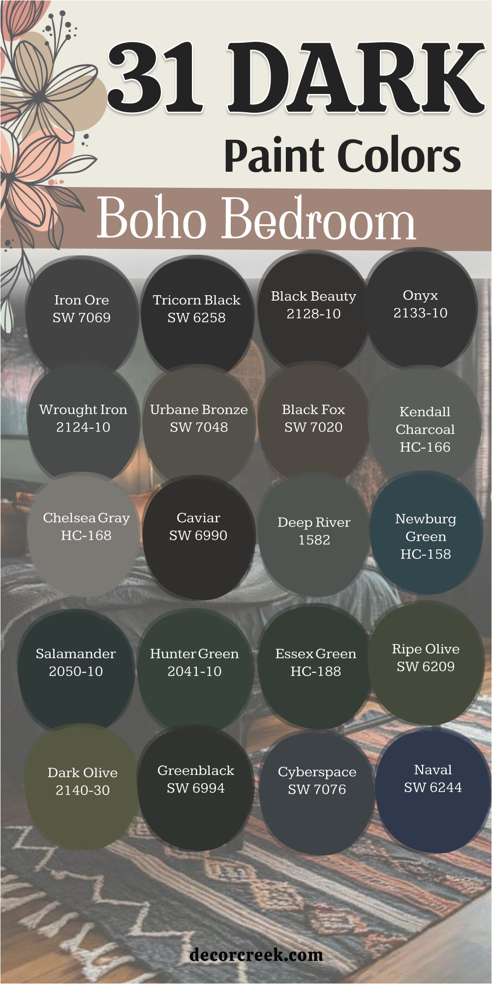
My Final Thoughts about 36 best paint colors for the boho bedroom
Picking the right paint for your bedroom is the most important step in making a home you love. I always remind people that a bedroom is the one place where you can be totally yourself. These 36 colors help you build a base for all your favorite things like soft pillows and green plants. You should not worry about making the room look too dark or too bright if the color makes you feel happy.
I find that the best homes are the ones that tell a story about the people who live there. Your paint choice is the start of that story and it helps every other decoration look much better. You can mix and match these shades to find a look that feels very personal and special. I suggest starting with one color that you really love and building the rest of the room around it. I know that choosing paint can feel like a big job but it is also a very fun adventure. You will be so happy when you see how a simple can of paint makes your bedroom feel like a designer retreat.
I hope this list gives you the confidence to try something new and creative on your walls. A boho home is all about freedom and being real with your style. You deserve a bedroom that feels like a warm hug at the end of a long day. These colors are here to help you find that perfect feeling of peace and joy.
I always tell my friends to trust their gut when they look at a paint sample. If a color makes you smile then it is the right one for your bedroom.