I know exactly how it feels to walk into a bedroom that feels empty and completely lacks a personal soul or personality. For many years, well-meaning people and designers told me that bedrooms must always be light, bright, and airy to feel “right” or comfortable.
However, through my own experience, I found that deep, moody colors bring a very special kind of artistic magic that pale, neutral shades simply cannot match or recreate. The dark feminine aesthetic is all about finding a way to feel both incredibly powerful and perfectly cozy at the exact same time.
It has become my absolute favorite way to transform a standard room into a warm, protective hug or a quiet, secret hideout from the rest of the world.
My goal is to show you how making these bold, courageous choices can quickly make your private sleeping area the most interesting and beautiful part of your entire house.
Why Dark Feminine Paint Colors Create a Strong Bedroom Mood
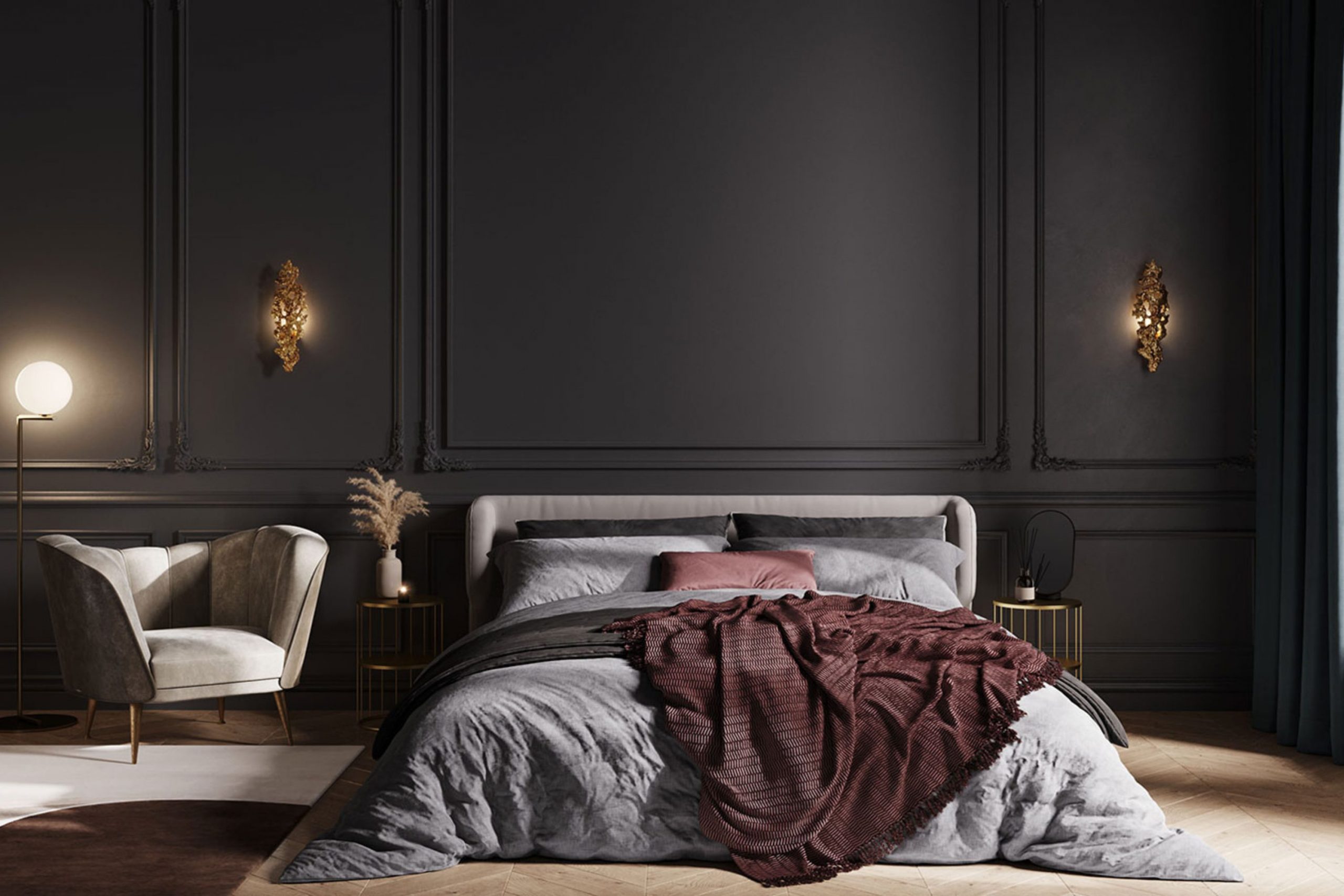
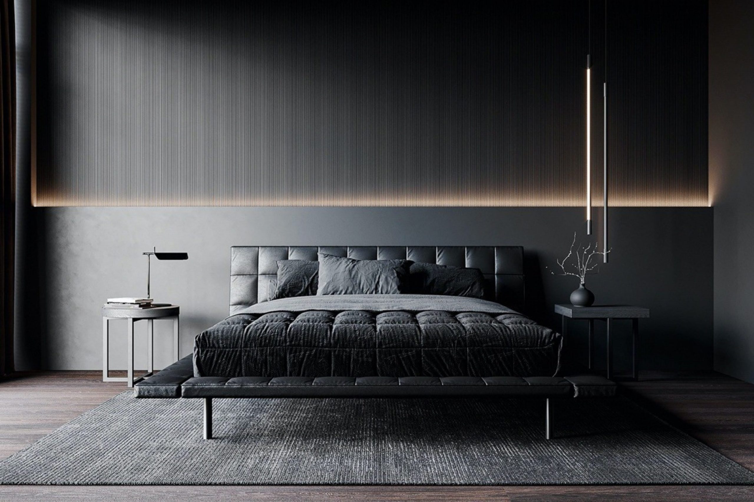
Choosing a dark, saturated color for your walls is a brave design move that truly pays off in comfort every single night you go to sleep. These deep shades act like a heavy velvet blanket for your walls, pulling every piece of furniture and decor together into one single, snug feeling of luxury.
I often notice that my clients feel much more confident and grounded in their own space when they choose a paint color with real depth and character. This choice creates a dramatic backdrop that makes your white sheets, soft bed, and colorful pillows stand out like bright stars in a midnight sky.
You get a profound sense of mystery and inner strength that keeps the noise and chaos of the outside world far away while you rest. It is not just a simple choice of paint; it is a powerful way to set a firm boundary for your personal peace, your rest, and your deepest dreams.
How I Choose the Perfect Dark Feminine Shade for Any Bedroom
I always take a long time to look at the natural light coming through the window before I ever open a single paint can or pick up a brush. A large room with big, south-facing windows can easily handle the very blackest paints, while smaller, darker rooms might need a hidden hint of purple or red to feel alive.
I also think carefully about the clothes you like to wear most and the specific types of jewelry you love to put on every day. If you find yourself drawn to gold, brass, and silk fabrics, I look for dark colors that have a very rich, warm base to complement those textures.
I also make it a point to test the paint on a large sample board and move it around to different corners of the room throughout the day.
You really need to see with your own eyes how the color shifts and changes when the sun goes down and your warm bedside lamps finally turn on.
My ultimate goal is to help you find a shade that feels heavy in a good way, like the comforting weight of a high-quality wool coat in the middle of winter.
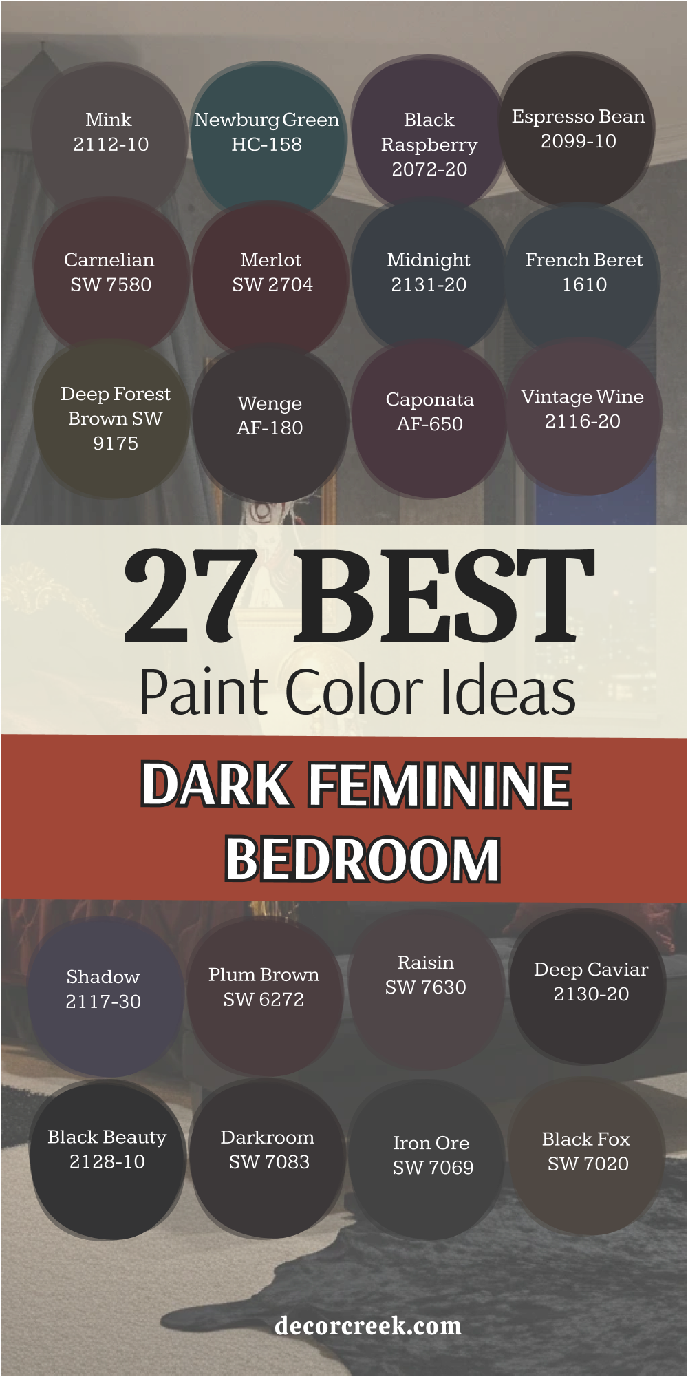
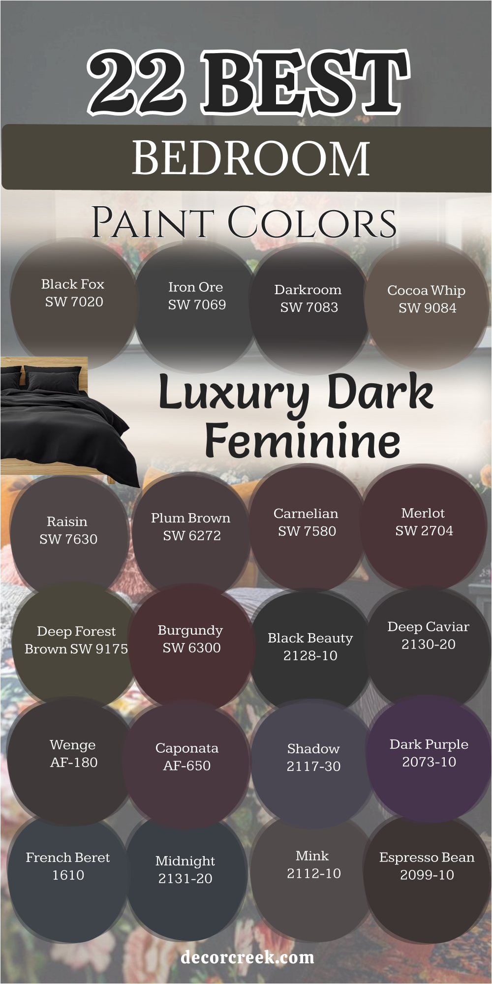
22 Luxury Dark Feminine Bedroom Paint Colors
Black Fox SW 7020
Black Fox SW 7020 blends the richness of chocolate with the strength of charcoal. This color acts as a soft anchor for a room that needs to feel expensive and grounded. I love how it sits between brown and black without ever feeling too cold or harsh. It makes your white bedding look crisp and your wooden furniture look like fine art.
You can feel the weight of this shade protecting your sleep from the morning sun. The warmth in the base keeps the walls from feeling like a cave. It provides a perfect background for gold frames or brass lamps that you want to highlight.
I suggest this for anyone who wants a dark room but fears the coldness of pure black. The finish feels like expensive leather that has been cared for over many years. It creates a sense of history and style that simple gray just cannot provide.
Best used in: bedrooms, home offices, accent walls, and cabinetry
Pairs well with: Alabaster SW 7008, Shoji White SW 7042, Silvermist SW 7621, light oak furniture The key rule of this color for a luxury look is to use it on all four walls to create a cozy, wrapped-in feeling.
🎨 Check out the complete guide to this color right HERE 👈
Iron Ore SW 7069
Iron Ore SW 7069 offers a deep charcoal look that feels soft like a well-worn sweater. This shade is my top pick for adding drama without using a flat, ink-black paint. It catches the light in a way that shows off the texture of your wall hangings.
I find that it works beautifully with soft pinks and cream colors for a balanced look. The mood it sets is one of quiet strength and total privacy for your evening rest. It makes a statement that you are not afraid of bold design choices in your home.
Your eyes will relax the moment you step into a room painted with this heavy gray. It hides small bumps on the wall while making the ceiling feel tall and grand. Every piece of art you hang will pop against this dark, matte-like surface. It is a sophisticated choice for a modern home that needs a touch of mystery.
Best used in: master suites, media rooms, window trim, and exterior doors
Pairs well with: Repose Gray SW 7015, Extra White SW 7006, Rose Tan SW 0069, gold hardware The key rule of this color for a moody style is to keep the lighting low and warm to bring out the hidden depth.
🎨 Check out the complete guide to this color right HERE 👈

Darkroom SW 7083
Darkroom SW 7083 carries a secret hint of purple that reveals itself under soft lamp light. This color reminds me of old movie theaters and vintage glamour from a long time ago. It feels very feminine because of that hidden plum undertone that softens the dark base.
I think it works best when paired with velvet curtains and thick, plush rugs. The paint creates a sanctuary where you can hide away from a busy, loud world. It makes a room feel smaller in a way that is comforting and very intimate.
You will notice how it changes from a deep black to a dark grape as the day ends. It is a choice for someone who wants their bedroom to feel like a high-end hotel suite. The richness of the pigment ensures that the color never looks washed out or thin. It provides a sense of luxury that helps you drift off to sleep with ease.
Best used in: bedrooms, powder rooms, library nooks, and furniture flips
Pairs well with: Snowbound SW 7004, Malted Milk SW 6057, Peppery SW 6615, dark walnut The key rule of this color for a posh vibe is to use satin or eggshell finishes to catch a tiny bit of light.
🎨 Check out the complete guide to this color right HERE 👈
Cocoa Whip SW 9084
Cocoa Whip SW 9084 brings the comfort of a warm mug of hot chocolate to your walls. This is a brown shade that feels soft and creamy rather than muddy or dull. I use this when I want a room to feel earthy but still very high-class and polished.
It reminds me of expensive silk dresses and the skin of a ripe, dark fruit. The color wraps around you and makes the bed feel like the center of the world. It pairs perfectly with light linens and natural textures like wool or woven baskets.
I love how it makes a bedroom feel like it belongs in a cozy cottage or a big manor. The feminine energy comes from the sweetness of the red tones hidden inside the brown. It is a steady color that makes you feel safe and relaxed after a long day at work. Your room will feel like a retreat where time slows down just for you.
Best used in: guest rooms, nurseries, reading corners, and master bedrooms
Pairs well with: Divine White SW 6105, Latte SW 6108, Redend Point SW 9081, brass accents The key rule of this color for a natural feel is to mix it with plenty of plants and green life.
🎨 Check out the complete guide to this color right HERE 👈

Raisin SW 7630
Raisin SW 7630 is a deep, blackened plum that feels like royalty and mystery combined. This shade is perfect for a woman who wants a room that feels both dark and colorful. It has a weight to it that makes the walls feel solid and very high-quality.
I find that it brings out the best in silver or chrome decorations and mirrors. The purple notes are mature and dark, so the room never feels like a child’s area. It creates a dramatic stage for your most beautiful furniture and softest bedding.
You will feel like you are stepping into a different world when you walk through the door. The color stays true even in low light, keeping its rich and intense personality. It is a bold way to show off your love for deep, saturated tones in your home. My clients always tell me how much they love the “hug” this color gives them.
Best used in: accent walls, master bedrooms, formal dining rooms, and vanities
Pairs well with: Origami White SW 7636, Breathless SW 6022, Urban Bronze SW 7048, glass decor The key rule of this color for a dramatic effect is to use it on the ceiling to create a jewel-box look.
🎨 Check out the complete guide to this color right HERE 👈
Plum Brown SW 6272
Plum Brown SW 6272 offers a sophisticated mix of earth and berries for your walls. This color is very deep and looks almost black until you look at it closely. The purple tint gives it a soft, romantic edge that pure black paint can never have.
I like to use this in rooms where the furniture is a light wood or a creamy white. It makes the bedroom feel like a very private and special place for resting. The mood is serious but also very sweet and inviting for a long night of sleep.
You can use it to make a large room feel more connected and much smaller. It hides the mess of daily life and keeps the focus on the beauty of the room. The depth of the paint reflects a sense of high fashion and classic style. It is a choice that feels unique and custom-made for a person with great taste.
Best used in: main bedrooms, cozy dens, cabinetry, and behind bookshelves
Pairs well with: Kestrel White SW 7516, Malted Milk SW 6057, Mink SW 6004, copper accents The key rule of this color for a romantic style is to add lots of different fabrics like lace and velvet.
🎨 Check out the complete guide to this color right HERE 👈
Carnelian SW 7580
Carnelian SW 7580 is a dark, stony red that feels like a precious gem from the earth. This color brings a heartbeat to the room with its warm and pulsing undertones. It is not a bright red, but a deep and dusty wine color that stays very quiet.
I use this when a client wants warmth but also wants the room to feel very dark. It works well with dark wood floors and heavy, traditional furniture pieces. The energy of the room becomes very focused and grounded when this paint is on the walls.
It reminds me of an old library or a room in a castle hidden in the woods. You will feel a sense of power when you wake up in a room with this much color. It stays elegant because the red is muted and does not shout for attention. Your bedroom will become a place of deep reflection and total physical comfort.
Best used in: dining rooms, bedrooms, study areas, and front doors
Pairs well with: Dover White SW 6385, Balanced Beige SW 7037, Roycroft Copper SW 2840, black metal The key rule of this color for a cozy mood is to use lamps with yellow bulbs to warm up the red.
🎨 Check out the complete guide to this color right HERE 👈
Merlot SW 2704
Merlot SW 2704 flows across the walls like a glass of fine, dark wine. This color is very rich and has a lot of red in it to keep the room feeling warm. I choose this for bedrooms that need to feel like a high-end escape from reality.
The shade is dark enough to be moody but red enough to be very exciting. It makes the air in the room feel thicker and more luxurious to breathe. I suggest using it with gold accents to make the red tones really stand out.
It is a very feminine choice because it feels soft and strong at the very same time. The paint covers the walls like a silk curtain that blocks out the noise of the day. You will love how it looks when candles are lit and the shadows start to dance. It is a timeless way to bring passion and deep rest into your sleeping space.
Best used in: accent walls, main bedrooms, powder rooms, and furniture
Pairs well with: Creamy SW 7012, Latte SW 6108, Black Magic SW 6991, antique gold The key rule of this color for a rich look is to use high-quality, high-thread-count white linens as a contrast.
Deep Forest Brown SW 9175
Deep Forest Brown SW 9175 takes you into the heart of the woods at midnight. This is a very dark green-brown that feels like moss and old trees. I love using this color for people who feel a strong connection to nature and the earth.
It brings a sense of life to the bedroom while keeping it very dark and still. The green notes make it feel fresh, while the brown notes keep it very stable. It acts as a neutral backdrop that allows your colorful pillows to shine bright.
I think it is one of the most relaxing dark colors I have ever worked with in a house. It does not feel heavy like lead, but heavy like the soil in a healthy garden. You will feel like you are hiding in a safe, green nest every single night. This paint is a great way to bring the outdoors inside in a very mature way.
Best used in: bedrooms, home offices, mudrooms, and kitchen islands
Pairs well with: Greek Villa SW 7551, Wool Skein SW 6148, Svelte Sage SW 6164, natural wood The key rule of this color for an earthy vibe is to use light-colored wood furniture to break up the darkness.
🎨 Check out the complete guide to this color right HERE 👈

Burgundy SW 6300
Burgundy SW 6300 is a classic choice for a room that needs to feel like a jewel. This color is deep and full of life, bringing a sense of high energy to a dark room. I find that it makes people feel very creative and inspired when they wake up.
The red is dark enough to be sophisticated and does not feel like a child’s crayon. It works very well with dark leathers and heavy wool blankets for a winter look. I like how it makes a bedroom feel like a place where important things happen.
The feminine touch comes from the softness of the red as it fades into the corners. It is a bold statement that tells everyone you have a very strong sense of style. The walls will feel like they are glowing from within when the light is just right. This is a color for a person who wants to live life with a lot of big feelings.
Best used in: formal bedrooms, dining rooms, library walls, and accent pieces
Pairs well with: Aesthetic White SW 7035, Macadamia SW 6142, Tricorn Black SW 6258, cream rugs The key rule of this color for a bold style is to use it in a room with white crown molding to frame the color.
Black Beauty 2128-10
Black Beauty 2128-10 is a rich and warm black that feels like a heavy velvet cloak for your walls. This color has a tiny drop of red deep inside that stops it from ever looking like cold metal. I love how it makes a bedroom feel expensive and very tucked away from the rest of the house.
The walls seem to move back and let your colorful art and white pillows take the lead. You will feel a sense of total quiet the moment you close the door on a room painted this dark. It is a great choice for a woman who wants her sleeping area to feel like a high-end gallery.
I think it looks best with shiny metals like gold or polished brass to add a little sparkle. Your furniture will look like it cost twice as much when it sits against this solid backdrop. The finish is smooth and deep, making the room feel like a safe and very private sanctuary. It is the ultimate way to show that you are brave enough to love the beauty of the night.
Best used in: master bedrooms, accent walls, interior doors, and custom cabinetry
Pairs well with: Cloud White CC-40, Revere Pewter HC-172, Pale Oak OC-20, gold light fixtures The key rule of this color for a luxury look is to use a matte finish so the black looks like soft fabric.
🎨 Check out the complete guide to this color right HERE 👈
Deep Caviar 2130-20
Deep Caviar 2130-20 offers a very dark brown-black that feels like the richest soil in a garden. This shade is perfect for making a large bedroom feel much more connected and warm. I find that it works better than a blue-black when you want to feel cozy and grounded.
The color changes with the sun, looking like dark coffee in the morning and pure ink at night. It creates a beautiful stage for light-colored rugs and soft, fuzzy blankets to rest upon. I suggest this color for someone who wants a very dark room that still feels natural.
It hides any small marks on the wall and gives the room a very sturdy and solid feeling. Your eyes will thank you for the lack of glare when you are trying to wind down for bed. The feminine energy comes from the earthy warmth that makes the walls feel very kind. It is a sophisticated pick for a modern home that needs a touch of classic drama.
Best used in: main bedrooms, home libraries, theater rooms, and window frames
Pairs well with: White Dove OC-17, Classic Gray OC-23, Swiss Coffee OC-45, warm wood tones The key rule of this color for a moody style is to pair it with oversized mirrors to bounce a little light around.
Wenge AF-180
Wenge AF-180 brings a deep chocolate and violet mix that feels like a very rare and precious wood. This color is part of a special collection because it looks good in almost any kind of lighting. I love how it feels both very old-fashioned and very modern at the exact same time.
The purple undertone is very quiet and only shows up when you use warm lamps at night. It makes a bedroom feel like a secret room in a very large and fancy old estate. I notice that my clients feel very relaxed when they are surrounded by such a deep, berry-brown.
It is a great way to use dark paint without making the room feel like a cold basement. The richness of the paint makes every corner of the room feel intentional and well-designed. You will feel like you are being hugged by the walls when you lay down to sleep. This is a top choice for a woman who loves the feeling of dark woods and rich fabrics.
Best used in: bedrooms, dining rooms, built-in shelving, and cozy dens
Pairs well with: Steam AF-15, Pashmina AF-100, Wish AF-680, silver accents The key rule of this color for a rich look is to use it on the baseboards too for a seamless appearance.
🎨 Check out the complete guide to this color right HERE 👈

Caponata AF-650
Caponata AF-650 is a delicious and deep plum color that feels like a bowl of dark summer fruit. This shade is very feminine because it is full of red and purple heart but stays very dark. I find that it makes a bedroom feel like a jewel box that holds all your favorite things.
The color is bold but it does not feel loud because the base is so heavy and grounded. It works perfectly with cream-colored silk and light gray wool for a balanced texture. I think it is a wonderful choice for an accent wall behind a tall, upholstered headboard.
The walls will feel like they are glowing with a soft heat when the afternoon sun hits them. It provides a sense of mystery that makes your personal space feel very special and unique. You will love the way your jewelry and perfumes look sitting on a dresser against this paint. It is a sophisticated way to bring deep color into a room without it feeling like a rainbow.
Best used in: accent walls, powder rooms, master suites, and vanity areas
Pairs well with: Mascarpone AF-20, Barren Plain 2111-60, Gray Owl OC-52, pewter hardware The key rule of this color for a cozy mood is to keep the ceiling a soft white to keep the room from feeling too low.
Shadow 2117-30
Shadow 2117-30 is a royal purple that was once the color of the year because it is so beautiful. This color is very moody and changes its look more than almost any other dark paint I know. In the morning, it can look like a soft charcoal, but at night it becomes a deep grape.
I love using this for people who want a room that feels like a work of art all on its own. It brings a sense of high drama and luxury that makes you feel like a queen in your own home. The depth of the purple is very mature and does not feel like a bright grape soda.
It creates a perfect background for black-and-white photos and silver picture frames. I find that it helps people sleep better because the color is so heavy and quiet for the eyes. The walls feel like they have a lot of stories to tell when they are painted this rich shade. It is a bold choice that will make your bedroom the most talked-about room in your house.
Best used in: bedrooms, formal living areas, hallways, and accent walls
Pairs well with: Simply White OC-117, Silver Satin OC-26, Paper White OC-55, velvet textures The key rule of this color for a dramatic effect is to use it in a room with a lot of natural light.
🎨 Check out the complete guide to this color right HERE 👈
Dark Purple 2073-10
Dark Purple 2073-10 is a very strong and deep violet that makes a very big statement. This color is for the woman who wants her room to feel powerful and very full of energy. I love how it stays dark even when the lights are on, keeping its rich personality.
It reminds me of dark velvet curtains on a stage or the sky just before a heavy storm. The purple is very pure and deep, which makes it feel very high-end and custom-made. I suggest using it with dark furniture to create a look that is totally coordinated and sleek.
It makes the bed feel like a safe island in the middle of a beautiful, dark ocean. The energy of the room stays very focused and private when you use such a saturated tone. You will feel a sense of pride every time you walk into a room with such a bold color. It is a great way to bring your love for bright colors into a dark and moody setting.
Best used in: accent walls, master bedrooms, music rooms, and small nooks
Pairs well with: Chantilly Lace OC-65, Stonington Gray HC-170, Black Satin 2131-10, chrome accents The key rule of this color for a posh vibe is to use only one or two other colors in the room.
French Beret 1610
French Beret 1610 is a classic navy blue that has been mixed with a lot of heavy gray. This color feels very smart and organized, like a very expensive suit or a dark coat. I use this when I want a bedroom to feel very cool and calm without using standard black.
The blue notes are very dark, so the room feels moody but still very fresh and clean. It works beautifully with white linens and light blue pillows for a very peaceful look. I find that men and women both love this color because it feels very balanced and strong.
It makes a great backdrop for wooden furniture of any color, from light pine to dark cherry. The walls seem to stand still and give you a sense of order after a very messy day. You will feel like your bedroom is a very high-quality place to rest and think. It is a timeless choice that never goes out of style and always looks very professional.
Best used in: bedrooms, kitchens, home offices, and exterior shutters
Pairs well with: Swiss Coffee OC-45, Wickham Gray HC-171, Woodmont Cream 204, navy fabrics The key rule of this color for a smart style is to use it on the trim as well as the walls.
🎨 Check out the complete guide to this color right HERE 👈
Midnight 2131-20
Midnight 2131-20 captures the color of the sky in the middle of the night far away from city lights. This is a very deep blue that feels soft and almost like a dark charcoal in some lights. I love how it brings a sense of the outdoors into the bedroom in a very mature way.
It makes the room feel very vast and large, even if the room is actually quite small. The blue is very soothing for the brain and helps you settle down for a long sleep. I think it looks wonderful with white crown molding and light-colored wood floors.
It is a very feminine choice because it feels like a soft velvet blanket covering the room. The paint has a depth that makes the walls look like you could step right through them. You will find that your colorful flowers and green plants look amazing against this blue. It is a steady and loyal color that makes a bedroom feel very safe and very quiet.
Best used in: master bedrooms, dens, dining rooms, and cabinetry
Pairs well with: Decorator’s White CC-20, Moonshine 2140-60, Iceberg 2122-50, silver hardware The key rule of this color for a natural feel is to use it in rooms with big windows.
Mink 2112-10
Mink 2112-10 is a beautiful dark gray that has a very strong purple and brown heart. This color is named after a soft fur because it feels just as smooth and luxurious. I like to use this for a bedroom that needs to feel very soft and very high-class.
It is not a cold gray, but a warm and inviting shade that loves to be around soft fabrics. I find that it makes a room feel very balanced and easy to live in every single day. The purple notes give it a feminine touch that makes the dark walls feel very sweet.
It works very well with silver mirrors and glass lamps that reflect the soft color. The mood it sets is one of quiet luxury and a very high level of personal comfort. You will feel like a movie star getting ready for the day in a room this beautiful. It is a smart choice for someone who wants a dark room that still feels light and airy.
Best used in: master suites, dressing rooms, living rooms, and guest beds
Pairs well with: White Heron OC-57, Gray Cloud 2126-60, Balboa Mist OC-27, crystal accents The key rule of this color for a soft look is to use lots of different gray and purple pillows.
Espresso Bean CSP-30
Espresso Bean CSP-30 is a very dark and rich brown that looks like a fresh coffee bean. This color is the ultimate in warmth and makes a bedroom feel like a cozy wooden cabin. I love how it makes the room feel very solid and very grounded to the earth.
It is a great alternative to black if you want the room to feel more inviting and less sharp. The brown notes are very deep and look amazing with gold frames and warm lighting. I suggest this for a room that has a lot of texture like brick or stone on the walls.
It creates a sense of history and strength that makes you feel very safe inside. The feminine energy comes from the richness of the chocolate tones that feel very soft. You will love the way this color stays warm and friendly even on the coldest winter days. It is a classic way to make a bedroom feel like a very private and very warm retreat.
Best used in: bedrooms, study areas, kitchen islands, and accent walls
Pairs well with: Wind’s Breath OC-24, Shaker Beige HC-45, Manchester Tan HC-81, bronze accents The key rule of this color for an earthy vibe is to use it with warm-toned wood furniture.
Vintage Wine 2116-20
Vintage Wine 2116-20 is a deep and dusty purple that feels like a room from a long time ago. This color is very romantic and has a lot of gray in it to keep it from being too bright. I love using this for people who want a bedroom that feels like a classic storybook.
It makes the walls look soft and hazy, which is very relaxing for your eyes at night. The purple is very mature and looks wonderful with antique furniture and old mirrors. I find that it brings a sense of peace and nostalgia to a modern home in a good way.
It works beautifully with soft pinks and creams for a very feminine and dark look. The paint catches the light in a way that makes the room feel very deep and very full of life. You will feel like you are stepping back in time to a more elegant world every evening. It is a beautiful way to show off your love for color and history in your sleeping space.
Best used in: accent walls, bedrooms, powder rooms, and furniture
Pairs well with: Fog Mist OC-31, Edgecomb Gray HC-173, Stormy Monday 2112-50, lace fabrics The key rule of this color for a romantic style is to use it with very soft and warm lighting.
🎨 Check out the complete guide to this color right HERE 👈

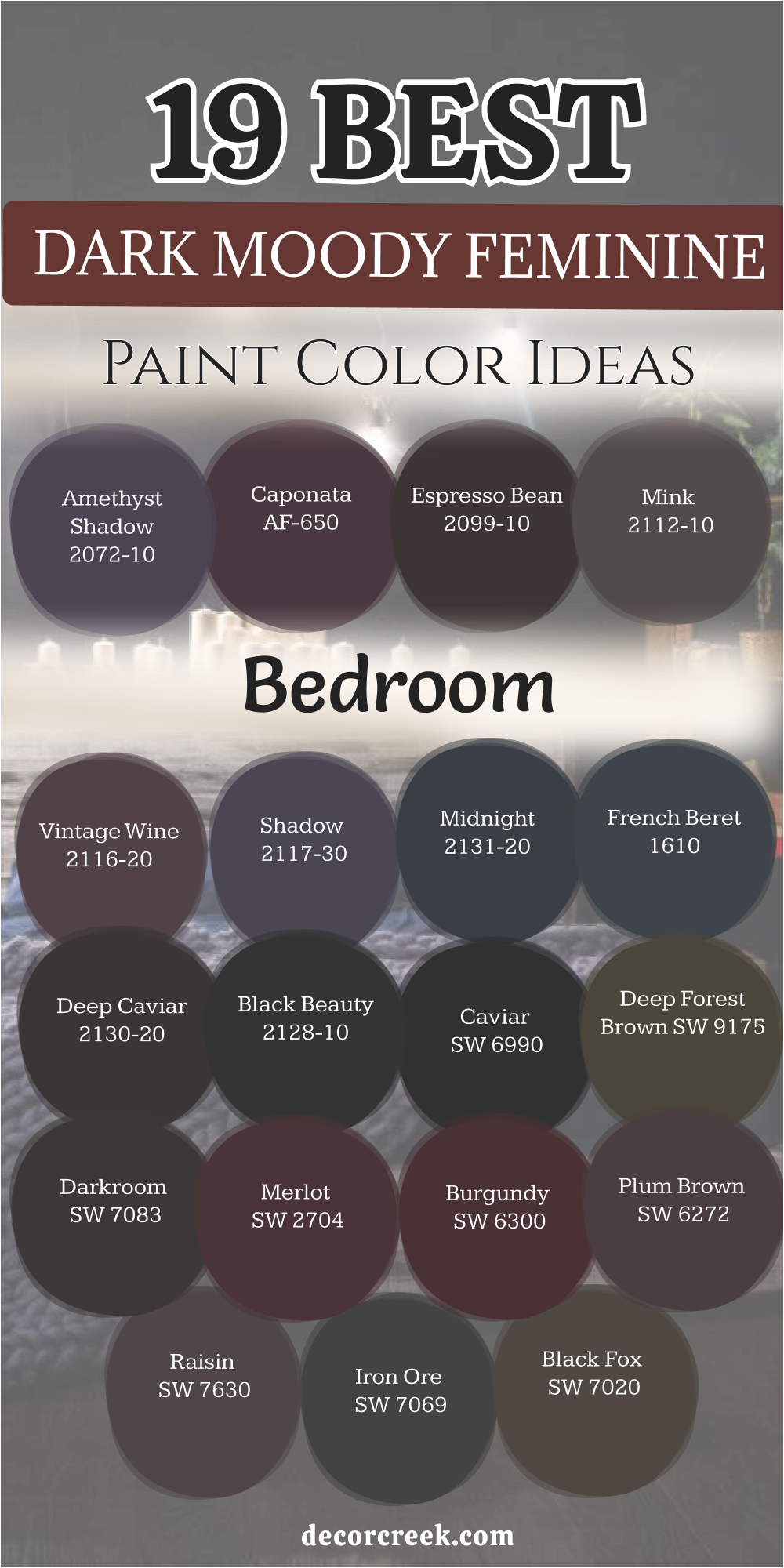
Amethyst Shadow 1441
Amethyst Shadow 1441 is a dark and mysterious purple that feels like a hidden treasure. This color is very saturated and brings a lot of personality to a bedroom very quickly. I love how it looks like a deep shadow in the corners of the room, adding a lot of depth.
The purple is very rich and makes the room feel like a very special and holy place. I suggest using it with silver or white accents to make the purple really stand out. It is a very bold choice for a woman who wants her room to feel very unique and powerful.
The walls will look like they are made of velvet or silk because the color is so deep. It provides a sense of mystery that keeps the room feeling fresh and interesting every day. You will feel a sense of wonder every time you see how the color changes in the light. It is a wonderful way to bring a lot of drama and beauty into your personal sanctuary.
Best used in: accent walls, master bedrooms, music rooms, and small nooks
Pairs well with: Chantilly Lace OC-65, Stonington Gray HC-170, Black Satin 2131-10, chrome accents The key rule of this color for a posh vibe is to use it in a room with very simple and clean lines.
🎨 Check out the complete guide to this color right HERE 👈
19 Dark Moody Feminine Bedroom Paint Color Ideas
Black Fox SW 7020
Black Fox SW 7020 creates a heavy sense of warmth that feels like a thick wool blanket. This shade is a mix of black and chocolate brown that removes all the coldness from a room. I love how it makes white furniture pop while keeping the overall mood very low and quiet.
It behaves like a neutral anchor but with much more heart than a standard flat gray. You will find that gold accents glow with a special kind of light against this deep wall. It is my favorite choice for a bedroom that needs to feel like a high-end mountain cabin.
The feminine energy comes from the soft brown base that feels very nurturing and safe. I suggest using this color if you want to ground a room that has very high ceilings. Every night will feel like a cozy retreat from the world when you surround yourself with this. It is a sophisticated way to bring the colors of the earth into your private sleeping area.
Best used in: main bedrooms, home offices, accent walls, and cabinetry
Pairs well with: Alabaster SW 7008, Shoji White SW 7042, Silvermist SW 7621, light oak furniture The key rule of this color for a moody look is to use it on all four walls to create a wrapped-in feeling.
🎨 Check out the complete guide to this color right HERE 👈
Iron Ore SW 7069
Iron Ore SW 7069 offers a deep charcoal look that is softer than a true jet black. This paint has a velvety finish that makes the walls feel like they are made of fabric. I notice that it brings a very strong and confident feeling to any room it touches.
It catches the natural light just enough to show off the architectural lines of your bedroom. Your colorful pillows and throws will look much brighter against this dark and steady backdrop. It creates a sanctuary where the morning sun will not wake you up too early.
I think it works best with soft pinks or creams to add a touch of sweetness to the dark. The mood it sets is one of total privacy and very deep, undisturbed rest every night. You will feel like your bedroom is a secret place that only you know about. It is a modern classic for anyone who loves the look of a dark and powerful room.
Best used in: master suites, media rooms, window trim, and exterior doors
Pairs well with: Repose Gray SW 7015, Extra White SW 7006, Rose Tan SW 0069, gold hardware The key rule of this color for a moody style is to keep the lighting low and warm to bring out the depth.
🎨 Check out the complete guide to this color right HERE 👈
Raisin SW 7630
Raisin SW 7630 is a blackened plum that feels like royalty in a very modern way. This color brings a rich berry tone to the walls that changes as the sun moves. I find that it makes a bedroom feel very expensive without being too flashy or bright.
The purple notes are dark enough to stay serious but warm enough to feel very inviting. It provides a beautiful contrast to silver mirrors and glass decorations in your room. I love how it makes a bed with white sheets look like a focal point in a gallery.
You will feel a sense of mystery and magic when you walk into a room this deep. It is a great choice for a woman who wants a dark room with a hidden splash of color. The paint has a weight that makes the walls feel solid and very high-quality to the touch. It is a bold way to express your personality while keeping the room very calm for sleep.
Best used in: accent walls, master bedrooms, formal dining rooms, and vanities
Pairs well with: Origami White SW 7636, Breathless SW 6022, Urban Bronze SW 7048, glass decor The key rule of this color for a dramatic effect is to use it on the ceiling to create a jewel-box look.
🎨 Check out the complete guide to this color right HERE 👈
Plum Brown SW 6272
Plum Brown SW 6272 brings a mix of garden soil and dark fruit to your bedroom walls. This shade is very deep and looks almost like black coffee with a splash of purple. I like how it makes a large room feel much more personal and much more connected.
It creates a very romantic mood that feels soft despite how dark the pigment is. I suggest pairing it with light-colored woods to keep the room feeling fresh and alive. The color stays true through the night, providing a steady and peaceful background for rest.
It makes every piece of art you hang look like it belongs in a very fancy museum. You will love the way it softens the edges of the room and hides any small flaws. The feminine touch is found in the warmth that pulses through the dark brown base. It is a unique choice for someone who wants a room that feels both earthy and elegant.
Best used in: main bedrooms, cozy dens, cabinetry, and behind bookshelves
Pairs well with: Kestrel White SW 7516, Malted Milk SW 6057, Mink SW 6004, copper accents The key rule of this color for a romantic style is to add lots of different fabrics like lace and velvet.
🎨 Check out the complete guide to this color right HERE 👈
Burgundy SW 6300
Burgundy SW 6300 is a classic choice for a room that needs to feel like a red jewel. This color is deep and full of life, bringing a sense of high energy to a dark room. I find that it makes people feel very creative and inspired when they wake up.
The red is dark enough to be sophisticated and does not feel like a child’s color. It works very well with dark leathers and heavy wool blankets for a winter look. I like how it makes a bedroom feel like a place where important things happen.
The feminine touch comes from the softness of the red as it fades into the corners. It is a bold statement that tells everyone you have a very strong sense of style. The walls will feel like they are glowing from within when the light is just right. This is a color for a person who wants to live life with a lot of big feelings.
Best used in: formal bedrooms, dining rooms, library walls, and accent pieces
Pairs well with: Aesthetic White SW 7035, Macadamia SW 6142, Tricorn Black SW 6258, cream rugs The key rule of this color for a bold style is to use it in a room with white crown molding to frame it.
Merlot SW 2704
Merlot SW 2704 flows across your walls like a glass of very dark and expensive wine. This shade is rich in red tones which keeps the bedroom feeling warm and very active. I choose this for rooms that need to feel like a high-end escape from the daily grind.
The color is dark enough to be moody but has enough red to feel very exciting to the eye. It makes the air in the room feel more luxurious and thicker in a very good way. I love using it with gold accents to make those deep red notes really stand out at night.
It is a very feminine choice because it feels both very soft and very powerful at once. The paint covers the walls like a silk curtain that blocks out all the outside noise. You will love how it looks when candles are lit and the shadows start to dance around. It is a way to bring passion and a sense of deep luxury into your personal resting area.
Best used in: accent walls, main bedrooms, powder rooms, and furniture
Pairs well with: Creamy SW 7012, Latte SW 6108, Black Magic SW 6991, antique gold The key rule of this color for a rich look is to use high-quality white linens as a bright contrast.
Darkroom SW 7083
Darkroom SW 7083 carries a secret hint of purple that only shows itself under a lamp. This color reminds me of vintage glamour and the feeling of an old Hollywood movie. It feels very feminine because of that hidden plum undertone that softens the dark base.
I think it works best when you use velvet curtains and very thick, plush floor rugs. The paint creates a sanctuary where you can hide away from a busy and loud world. It makes a bedroom feel smaller in a way that is comforting and very intimate for you.
You will notice how it changes from black to dark grape as the sun goes down each day. It is a choice for someone who wants their room to feel like a high-end hotel suite. The richness of the paint ensures the color never looks thin or like it is fading away. It provides a sense of luxury that helps you drift off to sleep with a happy heart.
Best used in: bedrooms, powder rooms, library nooks, and furniture flips
Pairs well with: Snowbound SW 7004, Malted Milk SW 6057, Peppery SW 6615, dark walnut The key rule of this color for a posh vibe is to use satin finishes to catch a tiny bit of light.
🎨 Check out the complete guide to this color right HERE 👈
Deep Forest Brown SW 9175
Deep Forest Brown SW 9175 takes you into the middle of the woods at the midnight hour. This is a very dark green-brown that feels like moss and the bark of very old trees. I love using this color for people who feel a strong connection to nature and the earth.
It brings a sense of life to the bedroom while keeping it very dark and very still. The green notes make it feel fresh while the brown notes keep the room feeling stable. It acts as a neutral backdrop that allows your colorful bedding and pillows to shine.
I think it is one of the most relaxing dark colors I have ever used in a home. It does not feel heavy like metal but heavy like the soil in a healthy summer garden. You will feel like you are hiding in a safe green nest every single night of the week. This paint is a great way to bring the feeling of the outdoors inside in a mature way.
Best used in: bedrooms, home offices, mudrooms, and kitchen islands
Pairs well with: Greek Villa SW 7551, Wool Skein SW 6148, Svelte Sage SW 6164, natural wood The key rule of this color for an earthy vibe is to use light-colored wood furniture to break the dark.
🎨 Check out the complete guide to this color right HERE 👈
Caviar SW 6990
Caviar SW 6990 is a true, deep black that feels like a starless night sky on your walls. This color is for the boldest people who want a room that is completely dark and moody. I find that it makes all other colors in the room look much more sharp and clear.
It creates a sense of endless depth that makes the walls seem to disappear into the air. The feminine touch comes from pairing it with soft textures like fur or silk sheets. I suggest using large mirrors to reflect a little bit of light back into the darkness.
You will feel like you are in a very private cocoon where the world cannot reach you. It hides every imperfection on the wall and makes the room feel very grand and tall. Your sleep will be deep because this color blocks out all the distracting light of the city. It is a powerful statement of style that shows you know exactly what you like in a home.
Best used in: accent walls, main bedrooms, theater rooms, and front doors
Pairs well with: Eider White SW 7014, Agreeable Gray SW 7029, Sea Salt SW 6204, silver accents The key rule of this color for a dramatic look is to use high-gloss paint on the trim for contrast.
🎨 Check out the complete guide to this color right HERE 👈
Black Beauty 2128-10
Black Beauty 2128-10 is a rich black that has a tiny drop of warmth hidden in the base. This color feels very high-end and reminds me of expensive black dresses and fast cars. I love how it makes a bedroom feel like a very private gallery for your favorite things.
The walls feel soft and deep, which helps to lower your stress the moment you enter. It provides a perfect background for gold frames or colorful paintings you want to show. I think it is a great choice for a woman who wants a room that feels very modern.
The warmth in the paint keeps the room from ever feeling like a cold or scary place. It makes your white bedding look very crisp and clean like a hotel in a big city. You will feel very proud to show off a room that has this much style and depth. It is a steady and strong color that will make you feel powerful and very well-rested.
Best used in: master bedrooms, accent walls, interior doors, and cabinetry
Pairs well with: Cloud White CC-40, Revere Pewter HC-172, Pale Oak OC-20, gold light fixtures The key rule of this color for a luxury look is to use a matte finish so the black looks like velvet.
🎨 Check out the complete guide to this color right HERE 👈
Deep Caviar 2130-20
Deep Caviar 2130-20 offers a very dark brown-black that feels like the richest chocolate. This shade is perfect for making a large bedroom feel much more cozy and very warm. I find that it works better than a blue-black when you want to feel grounded and safe.
The color changes with the light, looking like coffee in the morning and ink at night. It creates a beautiful stage for light-colored rugs and very soft, fuzzy blankets to rest. I suggest this color for someone who wants a very dark room that still feels natural.
It hides any small marks on the wall and gives the room a very solid and sturdy feeling. Your eyes will relax because there is no glare coming off these deep and dark walls. The feminine energy comes from the earthy warmth that makes the room feel very kind. It is a sophisticated pick for a home that needs a touch of classic and moody drama.
Best used in: main bedrooms, home libraries, theater rooms, and window frames
Pairs well with: White Dove OC-17, Classic Gray OC-23, Swiss Coffee OC-45, warm wood tones The key rule of this color for a moody style is to pair it with oversized mirrors to bounce light.
French Beret 1610
French Beret 1610 is a classic navy blue that has been mixed with a lot of heavy gray. This color feels very smart and organized, like a very expensive coat or a dark suit. I use this when I want a bedroom to feel very cool without using a standard black paint.
The blue notes are very dark, so the room feels moody but still very fresh and clean. It works beautifully with white linens and light blue pillows for a very peaceful look. I find that everyone loves this color because it feels very balanced and very strong.
It makes a great backdrop for wooden furniture of any color from light pine to dark. The walls seem to stand still and give you a sense of order after a very long day. You will feel like your bedroom is a very high-quality place to rest and think clearly. It is a timeless choice that never goes out of style and always looks very professional.
Best used in: bedrooms, kitchens, home offices, and exterior shutters
Pairs well with: Swiss Coffee OC-45, Wickham Gray HC-171, Woodmont Cream 204, navy fabrics The key rule of this color for a smart style is to use it on the trim as well as the walls.
🎨 Check out the complete guide to this color right HERE 👈
Midnight 2131-20
Midnight 2131-20 captures the color of the sky in the middle of the night far away. This is a very deep blue that feels soft and almost like a dark charcoal in the light. I love how it brings a sense of the outdoors into the bedroom in a very mature way.
It makes the room feel very vast and large, even if the room is actually quite small. The blue is very soothing for the brain and helps you settle down for a long sleep. I think it looks wonderful with white crown molding and light-colored wood floor boards.
It is a very feminine choice because it feels like a soft velvet blanket on the room. The paint has a depth that makes the walls look like you could step right through them. You will find that your colorful flowers and green plants look amazing against this blue. It is a steady and loyal color that makes a bedroom feel very safe and very quiet.
Best used in: master bedrooms, dens, dining rooms, and cabinetry
Pairs well with: Decorator’s White CC-20, Moonshine 2140-60, Iceberg 2122-50, silver hardware The key rule of this color for a natural feel is to use it in rooms with big windows.
Shadow 2117-30
Shadow 2117-30 is a royal purple that feels like high drama and very rich mystery. This color is very moody and changes its look more than almost any other dark paint. In the morning, it can look like charcoal, but at night it becomes a deep grape color.
I love using this for people who want a room that feels like a work of art on its own. It brings a sense of luxury that makes you feel like a queen in your own private home. The depth of the purple is very mature and does not feel like a bright child’s color.
It creates a perfect background for black-and-white photos and silver picture frames. I find that it helps people sleep better because the color is so heavy and very quiet. The walls feel like they have a lot of stories to tell when they are painted this rich. It is a bold choice that will make your bedroom the most special room in your house.
Best used in: bedrooms, formal living areas, hallways, and accent walls
Pairs well with: Simply White OC-117, Silver Satin OC-26, Paper White OC-55, velvet textures The key rule of this color for a dramatic effect is to use it in a room with natural light.
🎨 Check out the complete guide to this color right HERE 👈
Vintage Wine 2116-20
Vintage Wine 2116-20 is a deep and dusty purple that feels like a room from a story. This color is very romantic and has a lot of gray in it to keep it from being bright. I love using this for people who want a bedroom that feels like a classic old estate.
It makes the walls look soft and hazy, which is very relaxing for your eyes at night. The purple is very mature and looks wonderful with antique furniture and old mirrors. I find that it brings a sense of peace and nostalgia to a modern home in a good way.
It works beautifully with soft pinks and creams for a very feminine and dark look. The paint catches the light in a way that makes the room feel very deep and full. You will feel like you are stepping back in time to a more elegant world every evening. It is a beautiful way to show off your love for color and history in your bedroom.
Best used in: accent walls, bedrooms, powder rooms, and furniture
Pairs well with: Fog Mist OC-31, Edgecomb Gray HC-173, Stormy Monday 2112-50, lace fabrics The key rule of this color for a romantic style is to use it with very soft and warm lighting.
🎨 Check out the complete guide to this color right HERE 👈
Mink 2112-10
Mink 2112-10 is a beautiful dark gray that has a very strong purple and brown heart. This color is named after a soft fur because it feels just as smooth and luxurious. I like to use this for a bedroom that needs to feel very soft and very high-class.
It is not a cold gray, but a warm and inviting shade that loves to be around silk. I find that it makes a room feel very balanced and easy to live in every single day. The purple notes give it a feminine touch that makes the dark walls feel very sweet.
It works very well with silver mirrors and glass lamps that reflect the soft color. The mood it sets is one of quiet luxury and a very high level of personal comfort. You will feel like a movie star getting ready for the day in a room this beautiful. It is a smart choice for someone who wants a dark room that still feels light and airy.
Best used in: master suites, dressing rooms, living rooms, and guest beds
Pairs well with: White Heron OC-57, Gray Cloud 2126-60, Balboa Mist OC-27, crystal accents The key rule of this color for a soft look is to use lots of different gray and purple pillows.
Espresso Bean 2099-30
Espresso Bean 2099-30 is a very dark and rich brown that looks like a fresh coffee bean. This color is the ultimate in warmth and makes a bedroom feel like a cozy wooden cabin. I love how it makes the room feel very solid and very grounded to the earth below.
It is a great alternative to black if you want the room to feel more inviting and soft. The brown notes are very deep and look amazing with gold frames and very warm lamps. I suggest this for a room that has a lot of texture like brick or stone on the walls.
It creates a sense of history and strength that makes you feel very safe inside. The feminine energy comes from the richness of the chocolate tones that feel very kind. You will love the way this color stays warm and friendly even on the coldest winter days. It is a classic way to make a bedroom feel like a very private and very warm retreat.
Best used in: bedrooms, study areas, kitchen islands, and accent walls
Pairs well with: Wind’s Breath OC-24, Shaker Beige HC-45, Manchester Tan HC-81, bronze accents The key rule of this color for an earthy vibe is to use it with warm-toned wood furniture.
Caponata AF-650
Caponata AF-650 is a delicious and deep plum color that feels like a bowl of dark fruit. This shade is very feminine because it is full of red and purple heart but stays dark. I find that it makes a bedroom feel like a jewel box that holds all your favorite things.
The color is bold but it does not feel loud because the base is so heavy and grounded. It works perfectly with cream-colored silk and light gray wool for a balanced look. I think it is a wonderful choice for an accent wall behind a tall, padded headboard.
The walls will feel like they are glowing with a soft heat when the afternoon sun hits. It provides a sense of mystery that makes your personal space feel very special and unique. You will love the way your jewelry looks sitting on a dresser against this dark paint. It is a sophisticated way to bring deep color into a room without it being too much.
Best used in: accent walls, powder rooms, master suites, and vanity areas
Pairs well with: Mascarpone AF-20, Barren Plain 2111-60, Gray Owl OC-52, pewter hardware The key rule of this color for a cozy mood is to keep the ceiling a soft white.
Amethyst Shadow 1441
Amethyst Shadow 1441 is a dark and mysterious purple that feels like a hidden gem. This color is very saturated and brings a lot of personality to a bedroom very quickly. I love how it looks like a deep shadow in the corners, adding a lot of visual depth.
The purple is very rich and makes the room feel like a very special and holy place. I suggest using it with silver or white accents to make the purple really stand out. It is a very bold choice for a woman who wants her room to feel powerful and unique.
The walls will look like they are made of velvet because the color is so very deep. It provides a sense of mystery that keeps the room feeling fresh and interesting each day. You will feel a sense of wonder every time you see how the color changes in light. It is a wonderful way to bring a lot of drama and beauty into your personal sanctuary.
Best used in: accent walls, master bedrooms, music rooms, and small nooks
Pairs well with: Chantilly Lace OC-65, Stonington Gray HC-170, Black Satin 2131-10, chrome accents The key rule of this color for a posh vibe is to use it in a room with clean lines.
🎨 Check out the complete guide to this color right HERE 👈
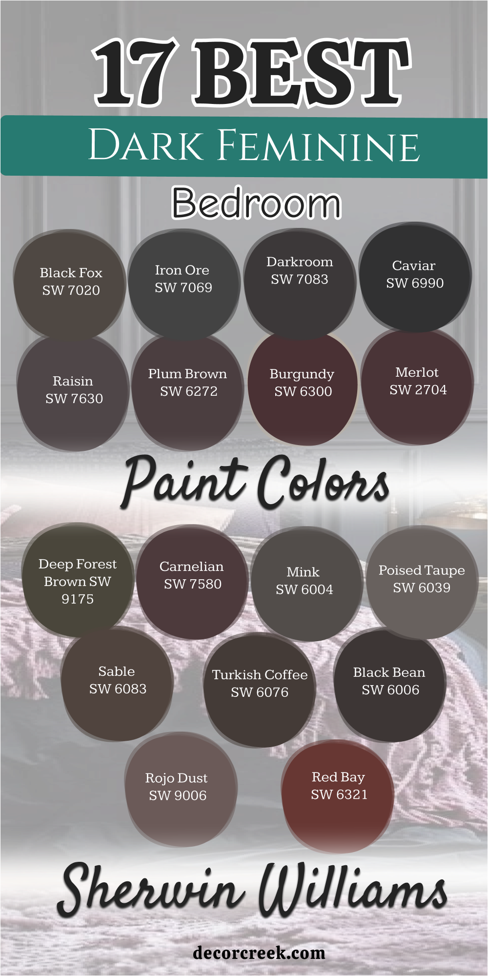
17 Best Dark Feminine Bedroom Paint Colors From Sherwin Williams
Black Fox SW 7020
Black Fox SW 7020 feels like a warm embrace from a dark and mysterious forest. This color blends the depth of black with the soft heart of a rich chocolate brown. I love how it creates a cozy feeling that makes you want to stay in bed all day.
It acts as a solid ground for your room while making your lighter furniture look bright. The warmth in this paint keeps the walls from ever feeling cold or like a cave. You will notice how it changes from a dark charcoal to a deep cocoa in the sun.
It is a great choice for a woman who wants a room that feels very high-class. The finish looks like expensive velvet that has been pulled across your bedroom walls. I find that it brings a sense of history and strength to a modern home. Your sleep will feel more private and protected behind this heavy and beautiful shade.
Best used in: bedrooms, home offices, accent walls, and cabinetry
Pairs well with: Alabaster SW 7008, Shoji White SW 7042, Silvermist SW 7621, light oak furniture The key rule of this color for a luxury look is to use it on all four walls to create a wrapped-in feeling.
🎨 Check out the complete guide to this color right HERE 👈
Iron Ore SW 7069
Iron Ore SW 7069 offers a deep charcoal look that is much softer than a flat black. This shade is my favorite way to bring a sense of mystery into a sleeping area. It catches the light just enough to show you where the corners of the room are.
I find that it works perfectly with soft pinks and cream colors for a balanced look. The mood it sets is one of quiet strength and total privacy for your evening rest. It makes a statement that you are bold and have a very strong sense of style.
Your eyes will relax the moment you step into a room painted with this heavy gray. It hides small bumps on the wall while making the ceiling feel very tall and grand. Every piece of art you hang will look like a masterpiece against this dark surface. It is a sophisticated choice for a home that needs a touch of modern drama.
Best used in: master suites, media rooms, window trim, and exterior doors
Pairs well with: Repose Gray SW 7015, Extra White SW 7006, Rose Tan SW 0069, gold hardware The key rule of this color for a moody style is to keep the lighting low and warm to bring out the hidden depth.
🎨 Check out the complete guide to this color right HERE 👈
Darkroom SW 7083
Darkroom SW 7083 carries a secret hint of purple that shows itself under your lamps. This color reminds me of old movie stars and the glamour of a long time ago. It feels very feminine because of that hidden plum note that softens the dark base.
I think it works best when paired with velvet curtains and very thick floor rugs. The paint creates a sanctuary where you can hide away from the loud outside world. It makes a bedroom feel smaller in a way that is comforting and very intimate.
You will see it change from a deep black to a dark grape as the sun goes down. It is a top choice for a woman who wants her room to feel like a hotel suite. The richness of the pigment ensures that the color always looks deep and very full. It provides a sense of luxury that helps you drift off to sleep with ease.
Best used in: bedrooms, powder rooms, library nooks, and furniture flips
Pairs well with: Snowbound SW 7004, Malted Milk SW 6057, Peppery SW 6615, dark walnut The key rule of this color for a posh vibe is to use satin or eggshell finishes to catch a tiny bit of light.
🎨 Check out the complete guide to this color right HERE 👈
Caviar SW 6990
Caviar SW 6990 is a true black that feels like a starless night sky for your walls. This color is for someone who is brave and wants a room that is totally moody. I find that it makes every other color in the room look much more sharp and clear.
It creates a sense of endless depth that makes the walls feel like they are floating. The feminine touch comes from the way it highlights soft fabrics like silk and fur. I suggest using large gold mirrors to bring a little bit of shine into the dark.
You will feel like you are in a very private nest where nobody can bother you. It hides every mark on the wall and makes the bedroom feel very grand and tall. Your rest will be deep because this paint blocks out all the light from the street. It is a powerful statement that shows you have a very unique and strong personality.
Best used in: accent walls, main bedrooms, theater rooms, and front doors
Pairs well with: Eider White SW 7014, Agreeable Gray SW 7029, Sea Salt SW 6204, silver accents The key rule of this color for a dramatic look is to use high-gloss paint on the trim for a sharp contrast.
🎨 Check out the complete guide to this color right HERE 👈
Raisin SW 7630
Raisin SW 7630 is a deep plum color that feels like royalty and mystery joined together. This shade is perfect for a woman who wants her room to feel both dark and colorful. It has a weight to it that makes the walls feel solid and very high in quality.
I find that it brings out the best in silver decorations and large glass mirrors. The purple notes are very mature and stay dark so the room feels like an adult area. It creates a dramatic stage for your most beautiful furniture and softest wool blankets.
You will feel like you are stepping into a special world when you walk through the door. The color stays true even in very low light, keeping its rich and intense personality. It is a bold way to show your love for deep and saturated tones in your own home. My clients always tell me how much they love the soft hug this color gives them.
Best used in: accent walls, master bedrooms, formal dining rooms, and vanities
Pairs well with: Origami White SW 7636, Breathless SW 6022, Urban Bronze SW 7048, glass decor The key rule of this color for a dramatic effect is to use it on the ceiling to create a jewel-box look.
🎨 Check out the complete guide to this color right HERE 👈
Plum Brown SW 6272
Plum Brown SW 6272 offers a mix of earth and berries for your private bedroom walls. This color is very deep and looks almost black until you look at it very closely. The purple tint gives it a soft and romantic edge that flat black paint cannot have.
I like to use this in rooms where the furniture is made of a very light wood. It makes the bedroom feel like a very private and special place for a long rest. The mood is serious but also very sweet and inviting for your evening sleep time.
You can use it to make a very large room feel more connected and much smaller. It hides the mess of daily life and keeps your focus on the beauty of the room. The depth of the paint reflects a sense of high fashion and very classic style. It is a choice that feels unique and was made just for a person with great taste.
Best used in: main bedrooms, cozy dens, cabinetry, and behind bookshelves
Pairs well with: Kestrel White SW 7516, Malted Milk SW 6057, Mink SW 6004, copper accents The key rule of this color for a romantic style is to add lots of different fabrics like lace and velvet.
🎨 Check out the complete guide to this color right HERE 👈
Burgundy SW 6300
Burgundy SW 6300 is a classic pick for a room that needs to feel like a red jewel. This color is deep and full of life, bringing a sense of energy to a dark room. I find that it makes people feel very creative and inspired when they wake up.
The red is dark enough to be sophisticated and does not feel like a bright crayon. It works very well with dark leather chairs and heavy wool blankets for a warm look. I like how it makes a bedroom feel like a place where very important things happen.
The feminine touch comes from the softness of the red as it meets the dark corners. It is a bold statement that tells everyone you have a very strong sense of style. The walls will feel like they are glowing from the inside when the light hits. This is a color for a person who wants to feel a lot of big and happy emotions.
Best used in: formal bedrooms, dining rooms, library walls, and accent pieces
Pairs well with: Aesthetic White SW 7035, Macadamia SW 6142, Tricorn Black SW 6258, cream rugs The key rule of this color for a bold style is to use it in a room with white crown molding.
Merlot SW 2704
Merlot SW 2704 flows across your bedroom walls like a glass of very dark wine. This color is very rich and has enough red in it to keep the room feeling warm. I choose this for bedrooms that need to feel like a high-end escape from work.
The shade is dark enough to be moody but red enough to be very exciting to see. It makes the air in the room feel thicker and more luxurious to your senses. I suggest using it with gold accents to make those red tones really stand out.
It is a very feminine choice because it feels soft and strong at the same time. The paint covers the walls like a silk curtain that blocks out the noisy day. You will love how it looks when candles are lit and the shadows start to play. It is a timeless way to bring passion and deep rest into your sleeping space.
Best used in: accent walls, main bedrooms, powder rooms, and furniture
Pairs well with: Creamy SW 7012, Latte SW 6108, Black Magic SW 6991, antique gold The key rule of this color for a rich look is to use high-quality white linens as a bright contrast.
Deep Forest Brown SW 9175
Deep Forest Brown SW 9175 takes you into the heart of the woods at midnight. This is a very dark green-brown that feels like moss and the bark of old trees. I love using this color for people who feel a strong connection to the earth.
It brings a sense of life to the bedroom while keeping it very dark and still. The green notes make it feel fresh while the brown notes keep it very stable. It acts as a neutral backdrop that allows your colorful pillows to shine very bright.
I think it is one of the most relaxing dark colors I have ever put in a house. It does not feel heavy like lead but heavy like the soil in a healthy garden. You will feel like you are hiding in a safe green nest every single night. This paint is a great way to bring the outdoors inside in a very mature way.
Best used in: bedrooms, home offices, mudrooms, and kitchen islands
Pairs well with: Greek Villa SW 7551, Wool Skein SW 6148, Svelte Sage SW 6164, natural wood The key rule of this color for an earthy vibe is to use light-colored wood furniture to break the darkness.
🎨 Check out the complete guide to this color right HERE 👈
Carnelian SW 7580
Carnelian SW 7580 is a dark and stony red that feels like a gem from the earth. This color brings a heartbeat to the room with its warm and pulsing red notes. It is not a bright red but a deep and dusty wine color that stays very quiet.
I use this when a client wants warmth but also wants the room to be very dark. It works well with dark wood floors and heavy and traditional furniture pieces. The energy of the room becomes very focused and grounded when this paint is used.
It reminds me of an old library or a room in a castle hidden in the trees. You will feel a sense of power when you wake up in a room with this color. It stays elegant because the red is muted and does not shout for your attention. Your bedroom will become a place of deep reflection and total physical comfort.
Best used in: dining rooms, bedrooms, study areas, and front doors
Pairs well with: Dover White SW 6385, Balanced Beige SW 7037, Roycroft Copper SW 2840, black metal The key rule of this color for a cozy mood is to use lamps with yellow bulbs to warm the red.
🎨 Check out the complete guide to this color right HERE 👈
Mink SW 6004
Mink SW 6004 is a sophisticated gray that has a very warm and purple soul inside. This color feels soft like the fur it is named after and brings a lot of class. I love how it makes a bedroom feel balanced between being very dark and very soft.
It is not a cold or blue gray but a shade that feels like a warm hug. The purple notes give it a feminine touch that makes the walls feel very sweet. It works very well with silver mirrors and glass lamps that reflect the soft paint.
The mood it sets is one of quiet luxury and a very high level of comfort for you. You will feel like you are staying in a very fancy suite every single night. It makes your colorful clothes and jewelry look like they are on display in a shop. It is a smart choice for someone who wants a dark room that still feels light.
Best used in: master suites, dressing rooms, living rooms, and guest beds
Pairs well with: Snowbound SW 7004, City Loft SW 7631, Breathless SW 6022, crystal accents The key rule of this color for a soft look is to use lots of different gray and purple pillows.
🎨 Check out the complete guide to this color right HERE 👈
Poised Taupe SW 6039
Poised Taupe SW 6039 is a beautiful mix of gray and brown that feels very steady. This color was once the color of the year because it is so easy to love. I find that it brings a sense of order and peace to a bedroom that feels messy.
It is dark enough to be moody but light enough to not feel too heavy for a room. The feminine touch comes from the hint of wood and earth that stays very soft. I like to use this with cream-colored rugs and dark wooden bed frames for balance.
It makes the air in the room feel very still and very relaxing for your busy brain. You will feel like you are in a high-end spa when you surround yourself with this. It hides dust and marks on the wall while keeping the room looking very clean. This is a perfect color for someone who wants a moody look that is very natural.
Best used in: bedrooms, living rooms, hallways, and kitchen cabinets
Pairs well with: Eider White SW 7014, Cornice SW 7006, Peppery SW 6615, woven textures The key rule of this color for a natural feel is to use it with lots of plants and green life.
🎨 Check out the complete guide to this color right HERE 👈
Sable SW 6083
Sable SW 6083 is a deep and earthy brown that looks like dark chocolate or fine soil. This color brings a sense of ultimate warmth and safety to your private bedroom. I love how it makes the walls feel solid like they are protecting you from the world.
It is a great choice if you want a dark room that feels very friendly and kind. The brown tones are rich and look amazing when you turn on your warm evening lamps. I suggest this for a room where you want to use a lot of gold and brass items.
It creates a sense of history that makes the room feel like it has many stories. The feminine energy comes from the sweetness of the warm tones in the dark base. You will love the way this color stays inviting even on the darkest winter nights. It is a classic way to make a bedroom feel like a very warm and private retreat.
Best used in: main bedrooms, library nooks, dining rooms, and accent walls
Pairs well with: Dover White SW 6385, Kilim Beige SW 6106, Latte SW 6108, brass accents The key rule of this color for a cozy mood is to use it with light-colored wood furniture.
Turkish Coffee SW 6076
Turkish Coffee SW 6076 is a very dark brown that feels as rich as a hot drink. This color is for someone who wants the darkest brown possible for their walls. I find that it makes a bedroom feel very serious and very high-end all at once.
It looks like pure ink at night but shows its warm brown heart when the sun hits. The depth of the paint creates a backdrop that makes your colorful art look amazing. I love using this with very light linens to create a sharp and beautiful contrast.
It makes the bed feel like the center of the world and a safe place to land. The feminine touch is found in the richness of the pigment that feels like silk. You will feel very powerful and very focused when you are in a room this dark. It is a sophisticated choice for a woman who loves the beauty of deep wood tones.
Best used in: bedrooms, home offices, entryways, and kitchen islands
Pairs well with: Pure White SW 7005, Accessible Beige SW 7036, Urbane Bronze SW 7048, leather The key rule of this color for a bold style is to use it in a room with a lot of natural light.
🎨 Check out the complete guide to this color right HERE 👈

Black Bean SW 6006
Black Bean SW 6006 is a warm black that has a lot of brown and purple hidden inside. This color feels very soft and is much more inviting than a standard charcoal gray. I love how it makes a bedroom feel like a secret hideout that is very high-class.
The walls seem to move back and let your colorful pillows and art take the lead. You will feel a sense of total quiet the moment you close the door on this room. It is a great choice for a woman who wants her space to feel like a private gallery.
I think it looks best with shiny metals like gold to add a little bit of sparkle. Your furniture will look more expensive when it sits against this solid dark wall. The finish is smooth and deep which makes the room feel very safe and very quiet. It is a way to show you are brave enough to love the beauty of the dark night.
Best used in: master bedrooms, accent walls, interior doors, and custom cabinets
Pairs well with: Shoji White SW 7042, Repose Gray SW 7015, Agreeable Gray SW 7029, gold The key rule of this color for a luxury look is to use it on the trim as well as the walls.
🎨 Check out the complete guide to this color right HERE 👈
Rojo Dust SW 9006
Rojo Dust SW 9006 is a dark and moody pink that has been mixed with a lot of gray. This color is very feminine because it stays soft while still being very dark. I love how it makes a bedroom feel romantic and mysterious at the same time.
It reminds me of the sky just after the sun has gone down in a desert place. The red tones are muted and stay very quiet so the room feels very peaceful. I find that it works beautifully with dark wood and very light and airy fabrics.
You will feel like you are in a dream when you are surrounded by this dusty shade. It provides a sense of mystery that makes your personal space feel very special. The walls feel like they are glowing with a soft warmth that helps you sleep. It is a unique choice for a person who wants a dark room with a soft soul.
Best used in: accent walls, guest rooms, powder rooms, and master suites
Pairs well with: Greek Villa SW 7551, Malted Milk SW 6057, Poised Taupe SW 6039, copper The key rule of this color for a romantic style is to use it with lots of candlelight and soft lamps.
Red Bay SW 6321
Red Bay SW 6321 is a bold and deep red that feels like a room in a royal palace. This color brings a lot of energy and passion into a dark and moody bedroom. I find that it makes people feel very strong and ready for the day when they wake.
The red is dark enough to stay elegant and does not feel like a bright fire engine. It works very well with dark leather and heavy wool blankets for a winter look. I like how it makes a bedroom feel like a place where very big dreams happen.
The feminine touch comes from the softness of the red as it meets the shadows. It is a bold statement that tells everyone you have a very strong sense of style. The walls will feel like they are pulsing with life when the light is just right. This is a color for a woman who wants her home to feel full of life and warmth.
Best used in: formal bedrooms, dining rooms, library walls, and accent pieces
Pairs well with: Aesthetic White SW 7035, Macadamia SW 6142, Tricorn Black SW 6258, cream rugs The key rule of this color for a bold style is to use it with white crown molding to frame it.
🎨 Check out the complete guide to this color right HERE 👈

16 Top Dark Feminine Bedroom Paint Colors From Benjamin Moore
Black Beauty 2128-10
Black Beauty 2128-10 is a rich black that holds a tiny drop of warmth deep inside. This shade feels like a heavy velvet cloak that wraps your bedroom in total peace. I love how it makes your white pillows and colorful art look like they are glowing.
It behaves like a solid anchor for a room that needs to feel very high-class. The walls will feel soft to the eye and will help you relax the moment you enter. You will notice that it never feels cold because of that hidden hint of brown.
It creates a perfect background for gold lamps or shiny brass picture frames. I find that it makes a small room feel like a very private and expensive nest. Your sleep will be deep because this paint blocks out all the light from outside. It is a bold choice for a woman who wants her home to feel very modern and strong.
Best used in: master bedrooms, accent walls, interior doors, and custom cabinetry
Pairs well with: Cloud White CC-40, Revere Pewter HC-172, Pale Oak OC-20, gold light fixtures The key rule of this color for a luxury look is to use a matte finish so the black looks like soft fabric.
🎨 Check out the complete guide to this color right HERE 👈
Deep Caviar 2130-20
Deep Caviar 2130-20 offers a very dark brown-black that feels like the richest soil. This color is perfect for making a large bedroom feel much more cozy and very warm. I find that it works better than a blue-black when you want to feel grounded.
The shade changes with the sun, looking like coffee in the morning and ink at night. It creates a beautiful stage for light-colored rugs and soft, fuzzy blankets to rest. I suggest this color for someone who wants a dark room that still feels very natural.
It hides any small marks on the wall and gives the room a very sturdy feeling. Your eyes will thank you for the lack of glare when you are trying to wind down. The feminine energy comes from the earthy warmth that makes the walls feel kind. It is a sophisticated pick for a modern home that needs a touch of classic drama.
Best used in: main bedrooms, home libraries, theater rooms, and window frames
Pairs well with: White Dove OC-17, Classic Gray OC-23, Swiss Coffee OC-45, warm wood tones The key rule of this color for a moody style is to pair it with oversized mirrors to bounce light.
French Beret 1610
French Beret 1610 is a classic navy blue that has been mixed with a lot of heavy gray. This color feels very smart and organized, like a very expensive coat or a suit. I use this when I want a bedroom to feel cool without using a standard black paint.
The blue notes are very dark, so the room feels moody but still very fresh and clean. It works beautifully with white linens and light blue pillows for a very peaceful look. I find that everyone loves this color because it feels very balanced and very strong.
It makes a great backdrop for wooden furniture of any color from light to dark. The walls seem to stand still and give you a sense of order after a long day. You will feel like your bedroom is a very high-quality place to rest and think. It is a timeless choice that never goes out of style and always looks professional.
Best used in: bedrooms, kitchens, home offices, and exterior shutters
Pairs well with: Swiss Coffee OC-45, Wickham Gray HC-171, Woodmont Cream 204, navy fabrics The key rule of this color for a smart style is to use it on the trim as well as the walls.
🎨 Check out the complete guide to this color right HERE 👈
Midnight 2131-20
Midnight 2131-20 captures the color of the sky in the middle of the night far away. This is a very deep blue that feels soft and almost like a dark charcoal in some light. I love how it brings a sense of the outdoors into the bedroom in a mature way.
It makes the room feel very vast and large, even if the room is actually quite small. The blue is very soothing for the brain and helps you settle down for a long sleep. I think it looks wonderful with white crown molding and light-colored wood floor boards.
It is a very feminine choice because it feels like a soft velvet blanket on the room. The paint has a depth that makes the walls look like you could step through them. You will find that your colorful flowers and green plants look amazing against this blue. It is a steady and loyal color that makes a bedroom feel safe and very quiet.
Best used in: master bedrooms, dens, dining rooms, and cabinetry
Pairs well with: Decorator’s White CC-20, Moonshine 2140-60, Iceberg 2122-50, silver hardware The key rule of this color for a natural feel is to use it in rooms with big windows.
Shadow 2117-30
Shadow 2117-30 is a royal purple that feels like high drama and very rich mystery. This color is very moody and changes its look more than almost any other dark paint. In the morning, it can look like charcoal, but at night it becomes a deep grape color.
I love using this for people who want a room that feels like a work of art. It brings a sense of luxury that makes you feel like a queen in your own home. The depth of the purple is very mature and does not feel like a bright child’s color.
It creates a perfect background for black-and-white photos and silver picture frames. I find that it helps people sleep better because the color is so heavy and quiet. The walls feel like they have a lot of stories to tell when they are painted this rich. It is a bold choice that will make your bedroom the most special room in the house.
Best used in: bedrooms, formal living areas, hallways, and accent walls
Pairs well with: Simply White OC-117, Silver Satin OC-26, Paper White OC-55, velvet textures The key rule of this color for a dramatic effect is to use it in a room with natural light.
🎨 Check out the complete guide to this color right HERE 👈
Vintage Wine 2116-20
Vintage Wine 2116-20 is a deep and dusty purple that feels like a room from a story. This color is very romantic and has a lot of gray in it to keep it from being bright. I love using this for people who want a bedroom that feels like a classic estate.
It makes the walls look soft and hazy, which is very relaxing for your eyes at night. The purple is very mature and looks wonderful with antique furniture and old mirrors. I find that it brings a sense of peace and nostalgia to a modern home in a good way.
It works beautifully with soft pinks and creams for a very feminine and dark look. The paint catches the light in a way that makes the room feel very deep and full. You will feel like you are stepping back in time to an elegant world every evening. It is a beautiful way to show off your love for color and history in your bedroom.
Best used in: accent walls, bedrooms, powder rooms, and furniture
Pairs well with: Fog Mist OC-31, Edgecomb Gray HC-173, Stormy Monday 2112-50, lace fabrics The key rule of this color for a romantic style is to use it with very soft and warm lighting.
🎨 Check out the complete guide to this color right HERE 👈
Mink 2112-10
Mink 2112-10 is a beautiful dark gray that has a very strong purple and brown heart. This color is named after a soft fur because it feels just as smooth and luxurious. I like to use this for a bedroom that needs to feel very soft and very high-class.
It is not a cold gray, but a warm and inviting shade that loves to be around silk. I find that it makes a room feel very balanced and easy to live in every day. The purple notes give it a feminine touch that makes the dark walls feel very sweet.
It works very well with silver mirrors and glass lamps that reflect the soft color. The mood it sets is one of quiet luxury and a very high level of personal comfort. You will feel like a movie star getting ready for the day in a room this beautiful. It is a smart choice for someone who wants a dark room that still feels light.
Best used in: master suites, dressing rooms, living rooms, and guest beds
Pairs well with: White Heron OC-57, Gray Cloud 2126-60, Balboa Mist OC-27, crystal accents The key rule of this color for a soft look is to use lots of different gray and purple pillows.
Espresso Bean CSP-30
Espresso Bean CSP-30 is a very dark and rich brown that looks like a coffee bean. This color is the ultimate in warmth and makes a bedroom feel like a cozy cabin. I love how it makes the room feel very solid and very grounded to the earth.
It is a great alternative to black if you want the room to feel more inviting. The brown notes are very deep and look amazing with gold frames and warm lamps. I suggest this for a room that has a lot of texture like brick or stone.
It creates a sense of history and strength that makes you feel very safe inside. The feminine energy comes from the richness of the chocolate tones that feel kind. You will love the way this color stays inviting even on the coldest winter days. It is a classic way to make a bedroom feel like a private and very warm retreat.
Best used in: bedrooms, study areas, kitchen islands, and accent walls
Pairs well with: Wind’s Breath OC-24, Shaker Beige HC-45, Manchester Tan HC-81, bronze accents The key rule of this color for an earthy vibe is to use it with warm-toned wood furniture.
Caponata AF-650
Caponata AF-650 is a delicious and deep plum color that feels like a bowl of dark fruit. This shade is very feminine because it is full of red and purple heart but stays dark. I find that it makes a bedroom feel like a jewel box that holds your favorite things.
The color is bold but it does not feel loud because the base is heavy and grounded. It works perfectly with cream-colored silk and light gray wool for a balanced look. I think it is a wonderful choice for an accent wall behind a tall, padded headboard.
The walls will feel like they are glowing with heat when the afternoon sun hits them. It provides a sense of mystery that makes your personal space feel very special. You will love the way your jewelry looks sitting on a dresser against this paint. It is a sophisticated way to bring deep color into a room without it being too much.
Best used in: accent walls, powder rooms, master suites, and vanity areas
Pairs well with: Mascarpone AF-20, Barren Plain 2111-60, Gray Owl OC-52, pewter hardware The key rule of this color for a cozy mood is to keep the ceiling a soft white.
Amethyst Shadow 1441
Amethyst Shadow 1441 is a dark and mysterious purple that feels like a hidden gem. This color is very saturated and brings a lot of personality to a bedroom quickly. I love how it looks like a deep shadow in the corners, adding a lot of visual depth.
The purple is very rich and makes the room feel like a very special and holy place. I suggest using it with silver or white accents to make the purple really stand out. It is a very bold choice for a woman who wants her room to feel powerful and unique.
The walls will look like they are made of velvet because the color is so very deep. It provides a sense of mystery that keeps the room feeling fresh each day. You will feel a sense of wonder every time you see how the color changes in light. It is a wonderful way to bring a lot of drama and beauty into your sanctuary.
Best used in: accent walls, master bedrooms, music rooms, and small nooks
Pairs well with: Chantilly Lace OC-65, Stonington Gray HC-170, Black Satin 2131-10, chrome accents The key rule of this color for a posh vibe is to use it in a room with clean lines.
🎨 Check out the complete guide to this color right HERE 👈
Wenge AF-180
Wenge AF-180 brings a deep chocolate and violet mix that feels like a precious wood. This color is special because it looks good in almost any kind of indoor lighting. I love how it feels both very old-fashioned and very modern at the exact same time.
The purple undertone is very quiet and only shows up when you use warm lamps at night. It makes a bedroom feel like a secret room in a very large and fancy old manor. I notice that my clients feel very relaxed when surrounded by this berry-brown.
It is a great way to use dark paint without making the room feel like a cold basement. The richness of the paint makes every corner of the room feel well-designed. You will feel like you are being hugged by the walls when you lay down to sleep. This is a top choice for a woman who loves dark woods and very rich fabrics.
Best used in: bedrooms, dining rooms, built-in shelving, and cozy dens
Pairs well with: Steam AF-15, Pashmina AF-100, Wish AF-680, silver accents The key rule of this color for a rich look is to use it on the baseboards too.
🎨 Check out the complete guide to this color right HERE 👈
Dark Purple 2073-10
Dark Purple 2073-10 is a very strong and deep violet that makes a big statement. This color is for the woman who wants her room to feel powerful and full of energy. I love how it stays dark even when the lights are on, keeping its rich personality.
It reminds me of dark velvet curtains on a stage or the sky just before a storm. The purple is very pure and deep, which makes it feel very high-end and custom. I suggest using it with dark furniture to create a look that is coordinated and sleek.
It makes the bed feel like a safe island in the middle of a beautiful, dark ocean. The energy of the room stays very focused and private when you use this tone. You will feel a sense of pride every time you walk into a room with this bold color. It is a great way to bring your love for bright colors into a moody setting.
Best used in: accent walls, master bedrooms, music rooms, and small nooks
Pairs well with: Chantilly Lace OC-65, Stonington Gray HC-170, Black Satin 2131-10, chrome accents The key rule of this color for a posh vibe is to use only one or two other colors.
Newburg Green HC-158
Newburg Green HC-158 is a deep teal that has a lot of gray and blue mixed inside. This color feels like the deep part of the ocean where the water is very still. I love using this for a bedroom that needs to feel very cool and very sophisticated.
It is a dark color that still brings a lot of life and energy to the walls. I find that it works beautifully with gold accents and dark wooden bed frames. It makes your white sheets look very crisp and helps you feel very fresh in the morning.
The feminine touch comes from the softness of the green tones that feel very natural. It provides a moody look that is not too heavy or too dark for a smaller room. You will love the way it makes your room feel like a high-end escape from the city. It is a classic and smart choice that will always look very stylish in your home.
Best used in: bedrooms, front doors, kitchen islands, and accent walls
Pairs well with: Revere Pewter HC-172, Simply White OC-117, Woodmont Cream 204, gold The key rule of this color for a fresh look is to use it with lots of white trim.
🎨 Check out the complete guide to this color right HERE 👈

Black Satin 2131-10
Black Satin 2131-10 is a very sleek and cool black that feels like a dark night sky. This color is very sharp and makes everything in your room look more expensive. I love how it provides a backdrop that makes your colorful art really stand out.
It feels very modern and is a great choice for a woman with a strong sense of style. The blue undertones keep the black from feeling too heavy or too warm for the room. I suggest using it with silver or chrome decorations to keep the look very clean.
It creates a sense of total privacy that helps you sleep through the entire night. The walls look smooth and very high-quality when you use this rich and dark paint. You will feel like you are in a high-end gallery every time you go to bed. It is a powerful way to show that you are not afraid of very bold and dark designs.
Best used in: accent walls, bedroom furniture, interior doors, and modern suites
Pairs well with: Cloud White CC-40, Stonington Gray HC-170, Iceberg 2122-50, silver The key rule of this color for a sleek style is to use it with very simple furniture.
Bitter Chocolate 2114-10
Bitter Chocolate 2114-10 is a very deep and dark brown that feels like real cocoa. This color brings ultimate warmth to your bedroom and makes it feel very safe. I love how it makes the walls feel like they are made of solid wood or dark earth.
It is a perfect alternative to black if you want the room to feel very cozy and kind. The brown notes are very rich and look amazing when you turn on your soft lamps. I suggest this for a room where you want to use a lot of gold and warm colors.
It creates a sense of history and strength that makes the room feel very special. The feminine energy comes from the sweetness of the brown tones that stay soft. You will love the way this color stays inviting even on a cold and rainy night. It is a classic way to make your bedroom feel like a very warm and private sanctuary.
Best used in: main bedrooms, dining rooms, library nooks, and accent walls
Pairs well with: Swiss Coffee OC-45, Shaker Beige HC-45, Manchester Tan HC-81, bronze The key rule of this color for a cozy mood is to use it with warm wood tones.
Black Raspberry 2072-20
Black Raspberry 2072-20 is a dark and juicy purple that feels very full of life. This color is very feminine because it has a lot of red and pink hidden in the dark. I love how it makes a bedroom feel like a secret jewel box for all your things.
The color is bold but it stays quiet because the base is so heavy and grounded. It works perfectly with cream silk and light gray wool for a very balanced look. I think it is a wonderful choice for an accent wall behind a very large bed.
The walls will feel like they are glowing with warmth when the sun hits them. It provides a sense of mystery that makes your personal space feel very unique. You will love the way your jewelry and perfumes look against this rich purple paint. It is a sophisticated way to bring deep color into a room without it being too loud.
Best used in: accent walls, powder rooms, master suites, and vanity areas
Pairs well with: Chantilly Lace OC-65, Gray Owl OC-52, Silver Satin OC-26, velvet The key rule of this color for a posh vibe is to use it with very soft textures.
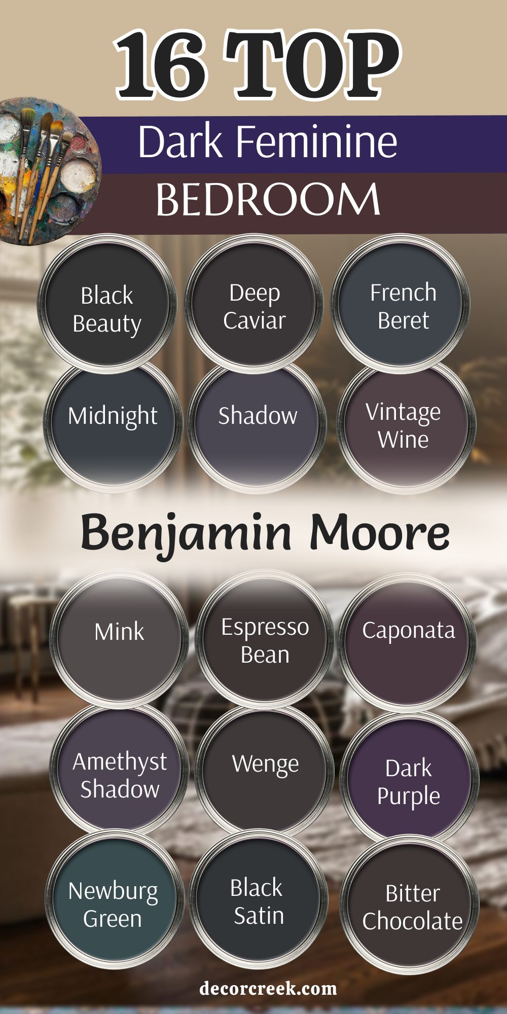
I believe that choosing a dark, saturated color for your bedroom is one of the absolute best ways to show yourself a true sense of self-love and care. It definitely takes a little bit of guts and artistic bravery to pick a deep, mysterious plum or a heavy, dramatic charcoal for all four walls of your sanctuary. However, once the last coat of paint is dry and the room is set, you will feel like you have finally created your own private world, tucked safely away from everyone else.
These 27 carefully selected shades prove once and for all that dark rooms do not have to feel like cold, empty boxes or scary, damp caves. Instead, they feel like the softness of luxury velvet, the richness of dark chocolate, and the stillness of the quiet sky just before the very first stars come out.
I always tell my clients that their bedroom should be the one place in their entire home where they do not have to be “light” or bright for other people’s comfort. In this personal space, you are allowed to be deep, you are allowed to be moody, and you can be totally surrounded by colors that make you feel emotionally strong and grounded. I truly hope this list helps you find that one perfect shade that feels like a long, warm hug for your weary soul after a busy day.
Everything from your wooden furniture and colorful art to your most personal dreams will look so much better against a backdrop that has real heart and character. You should trust your gut and pick the specific color that makes you feel so comfortable that you want to stay in bed just a little bit longer every morning.
By embracing the dark, you are creating a sophisticated and feminine retreat that celebrates your unique style and your need for deep, restorative peace.