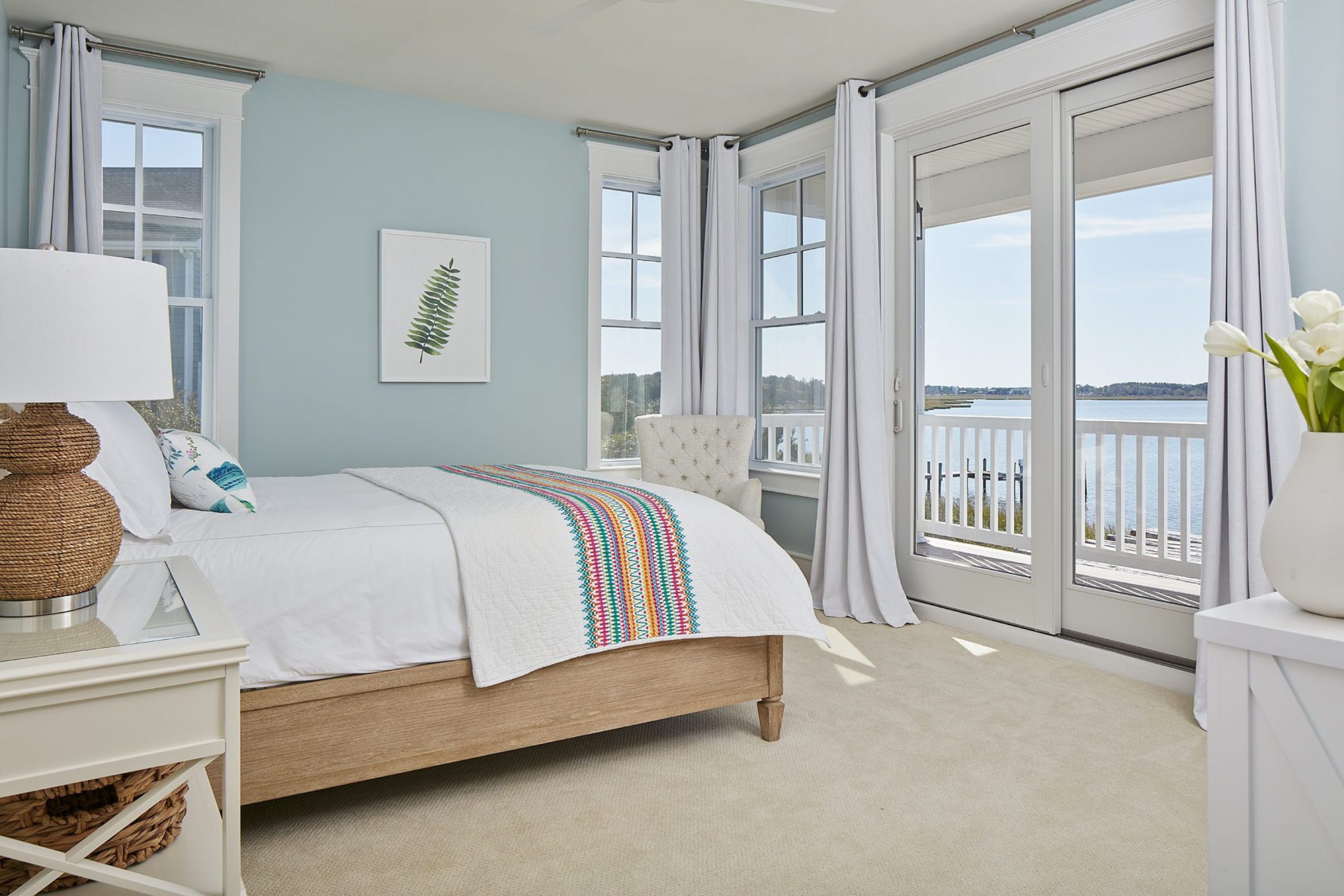
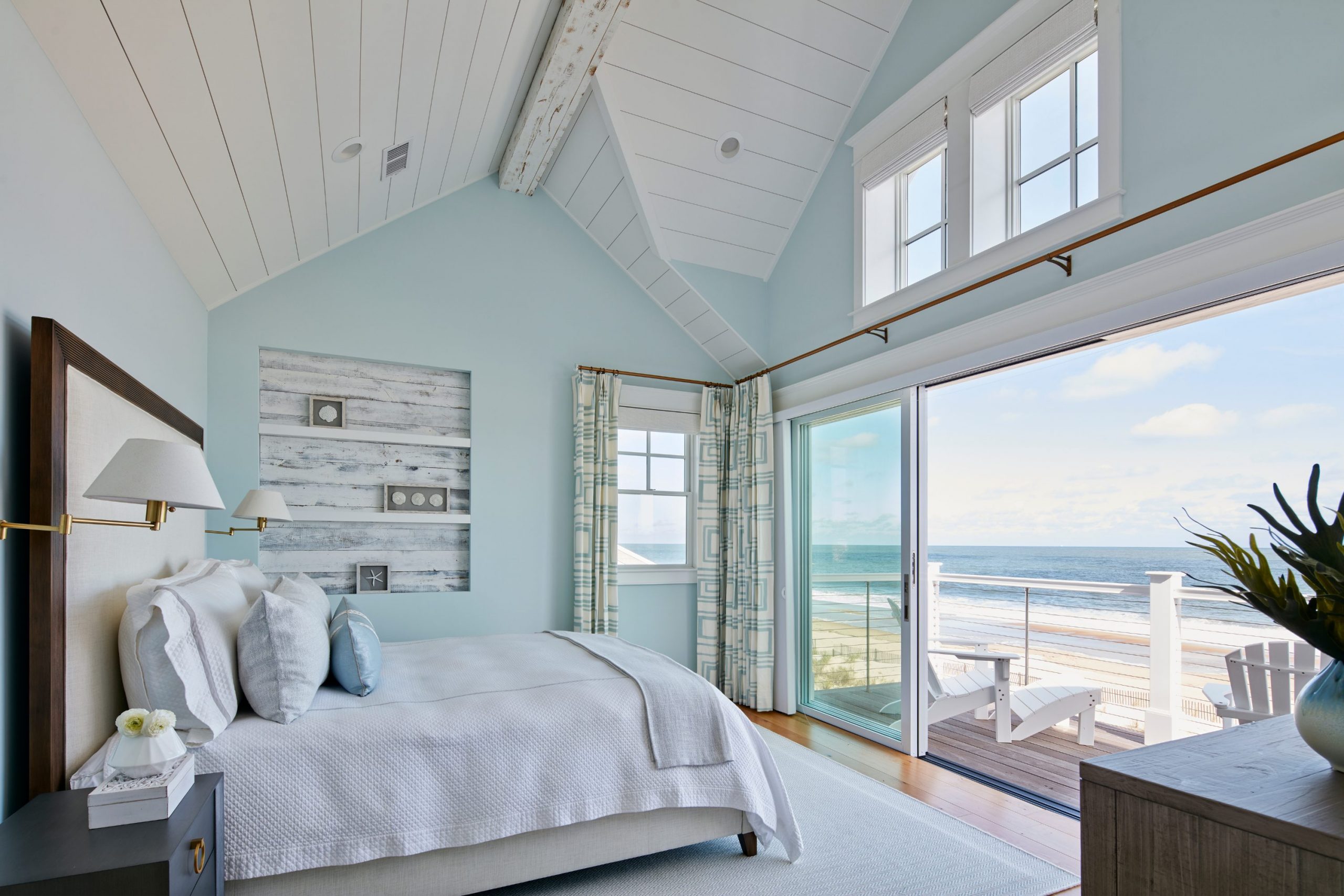
I know how much a bad paint color can ruin a good mood and make a room feel heavy. When you walk into your bedroom, you want to feel like you are standing on the shore with your toes in the sand and the sun on your face.
Coastal vibes bring a sense of peace that is hard to find anywhere else in a busy world. I have spent years helping people pick the right shades to make their homes feel like a permanent vacation.
It is not just about picking any blue paint; it is about how the natural light hits the walls throughout the day. In this guide, I will show you my favorite picks for a coastal look that works in real houses. I want your room to be a place where you can finally breathe easy and let go of all your stress.
You deserve a bedroom that feels light, fresh, and perfectly suited to your personal style.
Why I Always Trust Sherwin-Williams and Benjamin Moore for the Best Beachy Bedroom Paint Colors
I only use the best brands because I want your walls to look great for a long time without fading. Sherwin-Williams and Benjamin Moore make paints that actually look like the tiny chips you see in the store once they dry.
They have special ingredients and high-quality pigments that help the color stay bright even in very sunny rooms. I trust these companies because they offer so many options for light and airy styles that other brands just cannot match.
Their paint goes on smooth like butter and hides small mistakes on the wall very well during the painting process. When I work on a staging project, I need results that look high-end and expensive without a lot of extra work. These brands give me the confidence that the final look will be beautiful and durable for years to come. Using cheap paint usually ends up costing more time and money in the long run, so I always stick with the pros.
How I Choose the Perfect Beachy Shade for Any Bedroom
Picking a color starts with looking at your windows and seeing where the light comes from in the morning. If your room gets a lot of hot sun, a cool blue will feel refreshing like a cold drink on a summer afternoon. If your room is dark or small, a warm sandy white can make it feel much larger and friendlier to be in. I always tell my clients to paint a big sample on the wall first before buying all the cans.
Watch how the color changes from the bright morning until the sun goes down and the shadows get long. You want a shade that makes you smile every time you wake up and every time you go to sleep at night.
Choosing the right tone is about finding a balance between the furniture you own and the mood you want to create. Take your time with this step, because the right choice will turn your bedroom into the best part of your home.
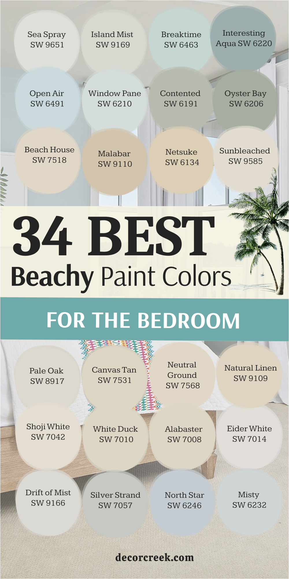
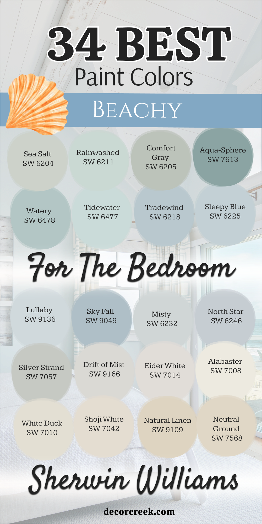
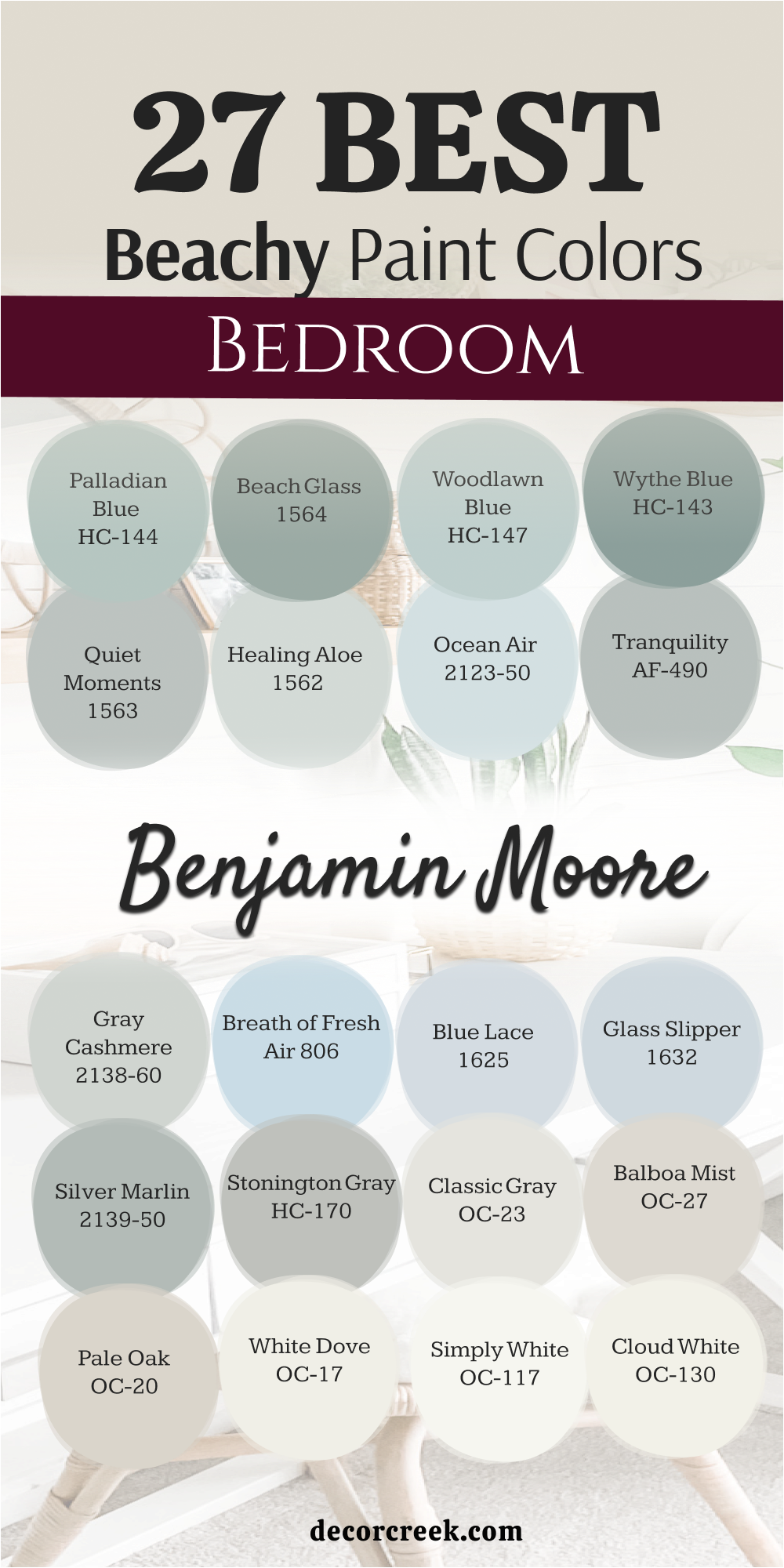
34 Beachy Paint Colors for the Bedroom from Sherwin Williams
Sea Salt SW 6204
Sea Salt SW 6204 is the most popular choice for anyone who loves the ocean. This color is a mix of green and gray that changes based on your light. It looks like the water in a shallow bay on a sunny day.
I use this color more than any other because it makes people feel relaxed. Many homeowners choose this shade when they want a clean look that is not boring. It acts like a neutral but still gives the room a pretty personality.
You will notice it looks greener if you have many trees outside your window. It turns more gray if the sky is cloudy or if you have cool light bulbs. This paint is a safe bet for a primary bedroom or a guest suite. I think it is the perfect middle ground for a coastal theme.
Best used in: bedrooms, bathrooms, laundry rooms, and kitchens
Pairs well with: Rainwashed SW 6211, Heron Plume SW 6070, Accessible Beige SW 7036, white trim The key rule of this color for farmhouse style is to use it where you want natural light to feel kind, soft, and inviting throughout the day.
🎨 Check out the complete guide to this color right HERE 👈

Rainwashed SW 6211
Rainwashed SW 6211 brings a cheerful and bright feeling to any sleeping area. This shade is a bit more blue than green compared to other popular coastal tones. It reminds me of a clear sky right after a storm has passed over the coast.
I love how it makes white furniture pop and look brand new. Small rooms feel much bigger when you put this on the walls. It has just enough color to be noticed without being too loud for a bedroom.
Kids and adults both seem to love how fresh this paint looks in the morning. The pigments are very clear and do not look muddy at all. I often suggest this for rooms that face the north to add a bit of life. It is a classic choice for a home near the water.
Best used in: kids bedrooms, bathrooms, sunrooms, and front doors
Pairs well with: Pure White SW 7005, Window Pane SW 6210, Silver Strand SW 7057, light oak The key rule of this color for farmhouse style is to use it where you want natural light to feel kind, soft, and inviting throughout the day.
🎨 Check out the complete guide to this color right HERE 👈

Alabaster SW 7008
Alabaster SW 7008 is a warm white that feels like soft sand under your feet. This color is not stark or cold like a hospital room. It has a tiny bit of yellow and gray that makes it feel cozy. I use this when a client wants a bright room that still feels like a home.
It works perfectly with wicker baskets and linen curtains. The finish looks very smooth and rich on the walls. I think it is the best white for people who are afraid of bright colors. It reflects the sun beautifully without hurting your eyes.
You can use it on the walls and the trim for a very clean look. It is a staple in my design kit for a reason.
Best used in: living rooms, kitchens, hallways, bedrooms, and farmhouse exteriors
Pairs well with: Iron Ore SW 7069, Agreeable Gray SW 7029, Natural Linen SW 9109, warm wood tones The key rule of this color for farmhouse style is to use it where you want natural light to feel kind, soft, and inviting throughout the day.
🎨 Check out the complete guide to this color right HERE 👈

Silver Strand SW 7057
Silver Strand SW 7057 is a sophisticated gray with heavy blue and green undertones. This color looks like the mist over the ocean in the early morning. It is a very cool color that helps lower the temperature of a sunny room.
I find that it makes silver hardware and mirrors look very fancy. Many people choose this when they want a beach look that is more modern. It is dark enough to provide contrast against white baseboards.
The color stays looking clean and crisp even in a busy house. It creates a very quiet and peaceful atmosphere for sleeping. I like to pair it with dark blue accents for a nautical feel. This is a top pick for a master bedroom makeover.
Best used in: main bedrooms, bathrooms, entryways, and cabinets
Pairs well with: Extra White SW 7006, In the Navy SW 9178, Sea Salt SW 6204, dark metal The key rule of this color for farmhouse style is to use it where you want natural light to feel kind, soft, and inviting throughout the day.
🎨 Check out the complete guide to this color right HERE 👈
Tradewind SW 6218
Tradewind SW 6218 is a true light blue that feels like a breeze. This color is very light and airy, making the ceiling feel higher. It does not have much gray in it, so it stays looking blue all day. I suggest this for rooms where you want to feel energized and happy.
It looks wonderful with light wood floors and white bedding. The shade is very traditional and never goes out of style. It reminds me of the Caribbean sea on a clear afternoon.
I love using it on the ceiling to mimic the open sky. It is a very friendly color that welcomes anyone into the room. This is a great choice for a cottage or a beach house.
Best used in: ceilings, bedrooms, nurseries, and laundry rooms
Pairs well with: Shell White SW 8917, Lullaby SW 9136, Naval SW 6244, light pine The key rule of this color for farmhouse style is to use it where you want natural light to feel kind, soft, and inviting throughout the day.
🎨 Check out the complete guide to this color right HERE 👈

Sleepy Blue SW 6225
Sleepy Blue SW 6225 is a soft and powdery blue that looks like a clear morning sky. This color is very gentle and helps the mind relax after a long day. It has a tiny hint of gray that keeps it looking mature and elegant.
I often use this in guest rooms to make visitors feel at home right away. It pairs beautifully with white linens and light gray carpets. The color does not change much in different lighting which makes it very reliable.
It feels very cool and crisp against dark wood furniture. I love how it makes a room feel like a quiet sanctuary. This is a wonderful choice for anyone who wants a classic coastal bedroom.
Best used in: guest bedrooms, nurseries, bathrooms, and laundry rooms
Pairs well with: Pure White SW 7005, North Star SW 6246, Cadet SW 9143, silver accents The key rule of this color for farmhouse style is to use it where you want natural light to feel kind, soft, and inviting throughout the day.
🎨 Check out the complete guide to this color right HERE 👈
Misty SW 6232
Misty SW 6232 is a very light gray that has a strong blue soul. This color is perfect for people who want a neutral room with a splash of ocean feeling. It looks like the sky right before the sun starts to peak through the clouds.
I find that it makes small bedrooms feel much larger and more open. It is a very smart choice for rooms that do not get a lot of natural light. The color is subtle enough to let your furniture be the star of the show.
It creates a very clean and professional look that works for staging. I love how it stays looking fresh even on dark and rainy days. This is one of my favorite colors for a modern beach house.
Best used in: hallways, bedrooms, kitchens, and home offices
Pairs well with: High Reflective White SW 7757, Steely Gray SW 7664, Samovar Silver SW 6233, chrome The key rule of this color for farmhouse style is to use it where you want natural light to feel kind, soft, and inviting throughout the day.
🎨 Check out the complete guide to this color right HERE 👈

North Star SW 6246
North Star SW 6246 is a crisp and cool blue-gray that feels very refreshing. This color is a bit more gray than other blues, which makes it feel very modern. It reminds me of the cold Atlantic ocean on a windy day.
I love using this in south-facing rooms to balance out the hot sun. It looks very sharp with white trim and black metal accents. The shade is very peaceful and helps create a great environment for sleep.
It is dark enough to show up well against white furniture. I think it is a very sophisticated take on the coastal trend. You will love how clean and organized your room feels with this paint.
Best used in: bedrooms, bathrooms, entryways, and mudrooms
Pairs well with: Extra White SW 7006, Charcoal Blue SW 2739, Misty SW 6232, light wood The key rule of this color for farmhouse style is to use it where you want natural light to feel kind, soft, and inviting throughout the day.
🎨 Check out the complete guide to this color right HERE 👈
Open Air SW 6491
Open Air SW 6491 is a bright and happy blue that feels like a summer day. This color has a bit of green in it which makes it feel very tropical. It looks like the water in a swimming pool or a tropical lagoon.
I use this when a client wants their bedroom to feel fun and full of energy. It looks amazing with white shutters and sandy-colored rugs. The color is very clear and makes a bold statement without being too dark.
It is a great way to bring the feeling of the outdoors inside your home. I love how it brightens up a dark corner instantly. This is a perfect choice for a kid’s room or a vacation home.
Best used in: kids rooms, bathrooms, sunrooms, and porch ceilings
Pairs well with: Alabaster SW 7008, Summer White SW 7537, Interesting Aqua SW 6220, wicker The key rule of this color for farmhouse style is to use it where you want natural light to feel kind, soft, and inviting throughout the day.
🎨 Check out the complete guide to this color right HERE 👈

Interesting Aqua SW 6220
Interesting Aqua SW 6220 is a rich and deep color that feels very cozy. This color has a lot of gray and green mixed into the blue base. It looks like the ocean water when it gets deeper and darker.
I love using this for a master bedroom that needs to feel like a private hideaway. It provides a beautiful contrast for light-colored headboards and art. The shade is very relaxing and helps you feel grounded.
It works well with both modern and traditional styles of furniture. I think it adds a lot of character to a house that feels too plain. This is a great choice for someone who wants a bit more color on their walls.
Best used in: master bedrooms, dining rooms, accent walls, and cabinets
Pairs well with: Spare White SW 6203, Sea Salt SW 6204, Rainwashed SW 6211, dark wood The key rule of this color for farmhouse style is to use it where you want natural light to feel kind, soft, and inviting throughout the day.
🎨 Check out the complete guide to this color right HERE 👈
Breaktime SW 6463
Breaktime SW 6463 is a cool and refreshing minty blue that feels like a splash of cold water. This color has a cheerful personality that makes any bedroom feel more alive and bright. It reminds me of the vintage beach cottages that line the coast in old movies.
I love using this shade in rooms where the morning sun is very strong. It helps to keep the mood light and airy throughout the entire day. The green undertone keeps the blue from feeling too icy or cold.
You will find that it looks beautiful next to white linens and light oak floors. It is a very clean color that makes a home feel organized and fresh. I suggest this for anyone who wants a playful yet relaxing coastal vibe. This shade is truly a breath of fresh air for your walls.
Best used in: bedrooms, bathrooms, laundry rooms, and kitchens
Pairs well with: Alabaster SW 7008, Extra White SW 7006, Open Air SW 6491, natural wood The key rule of this color for farmhouse style is to use it where you want natural light to feel kind, soft, and inviting throughout the day.
🎨 Check out the complete guide to this color right HERE 👈

Chatura Gray SW 9169
Chatura Gray SW 9169 is a very light and delicate green with a heavy dose of gray. This color looks like the soft plants that grow along the sand dunes. It is a very quiet shade that does not demand a lot of attention.
I find that it works perfectly for a guest room where you want people to feel at peace. It feels very natural and organic compared to brighter blues. The color changes beautifully when you add lamps with warm light bulbs at night.
It is dark enough to separate the walls from white trim without being heavy. I love how it brings a bit of the garden into the bedroom. This is a very sophisticated choice for a mature coastal design. You will enjoy how it makes the room feel like a hidden garden by the sea.
Best used in: guest rooms, nurseries, bathrooms, and entryways
Pairs well with: High Reflective White SW 7757, Sea Salt SW 6204, Drift of Mist SW 9166, stone textures The key rule of this color for farmhouse style is to use it where you want natural light to feel kind, soft, and inviting throughout the day.
Sea Spray SW 9651
Sea Spray SW 9651 is a soft and misty gray that has a very tiny hint of green. This color is named perfectly because it looks like the foam on top of waves. It is an excellent choice for a neutral bedroom that still wants a beachy soul.
I love how it creates a soft background for colorful pillows and blankets. It is a very safe color that most people find very pleasing and easy to live with. The shade helps a room feel larger because it reflects so much light.
It works well with both silver and gold hardware in a master suite. I often suggest this when a client is staging a home to sell near the coast. It feels very high-end and clean once it is on the walls. This is a staple color for a light and bright interior.
Best used in: whole-house painting, bedrooms, hallways, and cabinets
Pairs well with: Pure White SW 7005, Rainwashed SW 6211, Silver Strand SW 7057, navy blue The key rule of this color for farmhouse style is to use it where you want natural light to feel kind, soft, and inviting throughout the day.
🎨 Check out the complete guide to this color right HERE 👈
27 Beachy Paint Colors for the Bedroom from Benjamin Moore
Beach Glass 1564
Beach Glass 1564 is a medium-toned color that has a lot of depth and character. This color is darker than many other beachy shades which makes it feel very snug. It looks like the frosted glass you find washed up on the sand after a storm.
I use this when a bedroom is very large and needs to feel more grounded. It has a strong green-blue base that feels very connected to nature. The color looks stunning with dark mahogany or cherry wood furniture.
It is a very rich shade that feels more expensive than it actually is. I love how it stands out against thick white crown molding. It is perfect for a room that gets a lot of bright afternoon sun. This is a bold but safe choice for a serious coastal theme.
Best used in: accent walls, dining rooms, bedrooms, and powder rooms
Pairs well with: Cloud White OC-130, Mount Saint Anne 1565, Gray Owl OC-52, brass hardware The key rule of this color for farmhouse style is to use it where you want natural light to feel kind, soft, and inviting throughout the day.
🎨 Check out the complete guide to this color right HERE 👈

Woodlawn Blue HC-147
Woodlawn Blue HC-147 is a very classic and historical blue that feels very elegant. This color has a bit of a vintage feel that reminds me of grand beach hotels. It is a very balanced blue that does not lean too far into green or gray.
I love using this in a primary bedroom to create a sense of luxury. It looks wonderful when paired with antique furniture and white cotton rugs. The shade stays very true to its color even in rooms with very little light.
It provides a very peaceful environment that helps you fall asleep faster. I find that it is a very popular choice for people who love traditional design. It makes the ceiling look much higher when painted in a flat finish. This is a timeless choice that will look good for many years.
Best used in: master bedrooms, living rooms, entryways, and ceilings
Pairs well with: Simply White OC-117, Revere Pewter HC-172, Hale Navy HC-154, dark wood The key rule of this color for farmhouse style is to use it where you want natural light to feel kind, soft, and inviting throughout the day.
🎨 Check out the complete guide to this color right HERE 👈
Wythe Blue HC-143
Wythe Blue HC-143 is a deep and moody aqua that has a lot of gray in it. This color is part of the historical collection and feels very established and rich. It looks like the deep water of the ocean on a slightly cloudy day.
I use this as an accent color or on all four walls for a very cozy feel. It creates a beautiful backdrop for gold frames and colorful artwork. The shade is very relaxing and helps to quiet the mind at night.
It works very well in houses that have a lot of character and old wood floors. I love how it gives a room a specific personality that feels very custom. This is a great choice for a home office that doubles as a guest room. You will love the depth this color brings to your home.
Best used in: accent walls, bedroom walls, front doors, and cabinetry
Pairs well with: White Dove OC-17, Van Deusen Blue HC-156, Stonington Gray HC-170, warm leather The key rule of this color for farmhouse style is to use it where you want natural light to feel kind, soft, and inviting throughout the day.
🎨 Check out the complete guide to this color right HERE 👈

Healing Aloe 1562
Healing Aloe 1562 is a very light and airy green that feels like a spa. This color is incredibly soft and almost looks like a neutral gray in some lights. It is designed to make a room feel very fresh and very clean.
I suggest this for people who want a hint of color but are afraid of things being too bright. It looks amazing with natural materials like jute, linen, and light wood. The color is very soothing and helps to reduce stress when you walk into the room.
It reflects light beautifully and makes dark corners seem much brighter. I love using this in small bathrooms attached to the bedroom for a seamless look. This is one of the most relaxing colors in the entire Benjamin Moore catalog. It truly lives up to its name by creating a peaceful home.
Best used in: bathrooms, bedrooms, nurseries, and laundry rooms
Pairs well with: Cloud White OC-130, Quiet Moments 1563, Wickham Gray HC-171, light wood The key rule of this color for farmhouse style is to use it where you want natural light to feel kind, soft, and inviting throughout the day.
🎨 Check out the complete guide to this color right HERE 👈

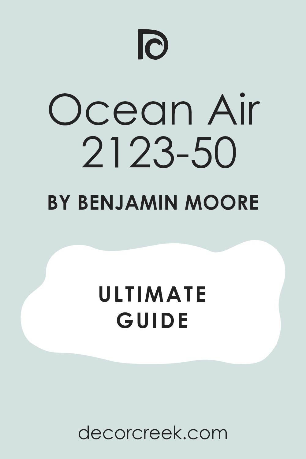
Ocean Air 2123-50
Ocean Air 2123-50 is a bright and crisp blue that feels like a morning at the beach. This color is very light and has a very clean look on the walls. It reminds me of the clear blue sky above the ocean on a summer day.
I love using this in rooms that need a boost of energy and light. It looks very sharp and modern when paired with black metal bed frames. The shade is very friendly and makes a bedroom feel very welcoming to guests.
It does not have much gray in it so it stays looking very blue. I find that it works well in rooms with a lot of white furniture and decor. This is a great way to bring a cheerful coastal feeling into your home. You will feel like you are on vacation every morning you wake up.
Best used in: kids rooms, guest bedrooms, ceilings, and bathrooms
Pairs well with: Chantilly Lace OC-65, Blue Note 2129-30, Paper White OC-55, silver The key rule of this color for farmhouse style is to use it where you want natural light to feel kind, soft, and inviting throughout the day.
🎨 Check out the complete guide to this color right HERE 👈
Tranquility AF-490
Tranquility AF-490 is a sophisticated mix of blue and gray that feels very balanced. This color is part of the Affinity collection which means it works with many other shades. It is a very calm choice for a bedroom where you want to escape the world.
I love how it provides a soft contrast for white bedding and dark furniture. The shade looks very high-end and works well in both large and small rooms. It has a very quiet personality that doesn’t overwhelm the senses.
I find that it looks particularly good in rooms with a lot of natural textures. It changes slightly throughout the day but always stays looking very pretty. This is a top pick for a master suite renovation. You will love the elegant feeling this paint provides.
Best used in: master suites, living rooms, hallways, and kitchen islands
Pairs well with: Steam AF-15, Crystalline AF-485, Flint AF-560, dark oak The key rule of this color for farmhouse style is to use it where you want natural light to feel kind, soft, and inviting throughout the day.
Gray Cashmere 2138-60
Gray Cashmere 2138-60 is a very light gray that has a hidden heart of blue and green. This color is very hard to describe because it changes so much with the light. It looks very soft and expensive on the walls of a bedroom.
I use this when a client wants a very neutral look that still feels coastal. It works beautifully with warm wood tones and gold accents. The shade is very light so it keeps the room feeling very open and airy.
It is a great choice for people who want their art and furniture to be the focus. I love how it creates a very peaceful and quiet atmosphere for sleeping. This is a very smart choice for a modern and clean beach house look. It is a color that you will never get tired of looking at.
Best used in: bedrooms, living rooms, kitchens, and whole-house painting
Pairs well with: Simply White OC-117, Revere Pewter HC-172, Wedgewood Gray HC-146, brass The key rule of this color for farmhouse style is to use it where you want natural light to feel kind, soft, and inviting throughout the day.
🎨 Check out the complete guide to this color right HERE 👈

Breath of Fresh Air 806
Breath of Fresh Air 806 is a bright and clear blue that feels like looking up at a cloudless sky. This color is very light and helps to open up a room that feels too small or cramped. It has a very clean look that makes everything in the bedroom feel brand new.
I love using this shade for ceilings to make the room feel like it has no roof at all. It works wonderfully with white shutters and light-colored wooden furniture. The color is very happy and helps you start your day with a positive feeling.
It does not have much gray in it so it stays looking like a true sky blue. I find that it is a favorite for nurseries and kids’ rooms because it is so cheerful. This is a classic choice for a home that needs a bit more light and joy. You will love how this color brings the outdoors inside your home.
Best used in: bedrooms, ceilings, nurseries, and sunrooms
Pairs well with: Simply White OC-117, Blue Lace 1625, Cloud White OC-130, light pine The key rule of this color for farmhouse style is to use it where you want natural light to feel kind, soft, and inviting throughout the day.
🎨 Check out the complete guide to this color right HERE 👈

Blue Lace 1625
Blue Lace 1625 is a very delicate and pale blue that has a soft lavender undertone. This color is very pretty and gives a bedroom a very feminine and romantic feel. It looks like the light reflecting off the water during a very early sunrise.
I use this when a client wants a room that feels very soft and very gentle. It looks stunning when paired with white floral patterns and silver mirrors. The shade is light enough to act like a neutral but still has a clear personality.
It creates a very quiet environment that is perfect for resting and relaxing. I find that it works best in rooms that get a lot of soft morning light. It is a very elegant choice for a guest suite or a master bedroom. This color will make your walls look like they are glowing with soft light.
Best used in: guest bedrooms, bathrooms, nurseries, and laundry rooms
Pairs well with: Chantilly Lace OC-65, Breath of Fresh Air 806, Silver Marlin 2139-50, crystal accents The key rule of this color for farmhouse style is to use it where you want natural light to feel kind, soft, and inviting throughout the day.
Glass Slipper 1632
Glass Slipper 1632 is a soft and misty blue that has a very strong gray base. This color is named for its clear and watery look on the walls of a bedroom. It is a very sophisticated shade that feels more grown-up than a standard baby blue.
I love how it looks when paired with dark charcoal accents and white trim. The color is very cooling and helps a sunny room feel much more comfortable. It is a great choice for a modern coastal home that wants a clean look.
The gray in the paint keeps it from looking too bright or overwhelming in large spaces. I find that it creates a very peaceful and steady mood in the house. This is one of my top picks for a high-end master bedroom renovation. You will enjoy how this shade changes from blue to gray as the sun sets.
Best used in: master suites, home offices, hallways, and bathrooms
Pairs well with: White Dove OC-17, Stonington Gray HC-170, Hale Navy HC-154, black metal The key rule of this color for farmhouse style is to use it where you want natural light to feel kind, soft, and inviting throughout the day.
🎨 Check out the complete guide to this color right HERE 👈

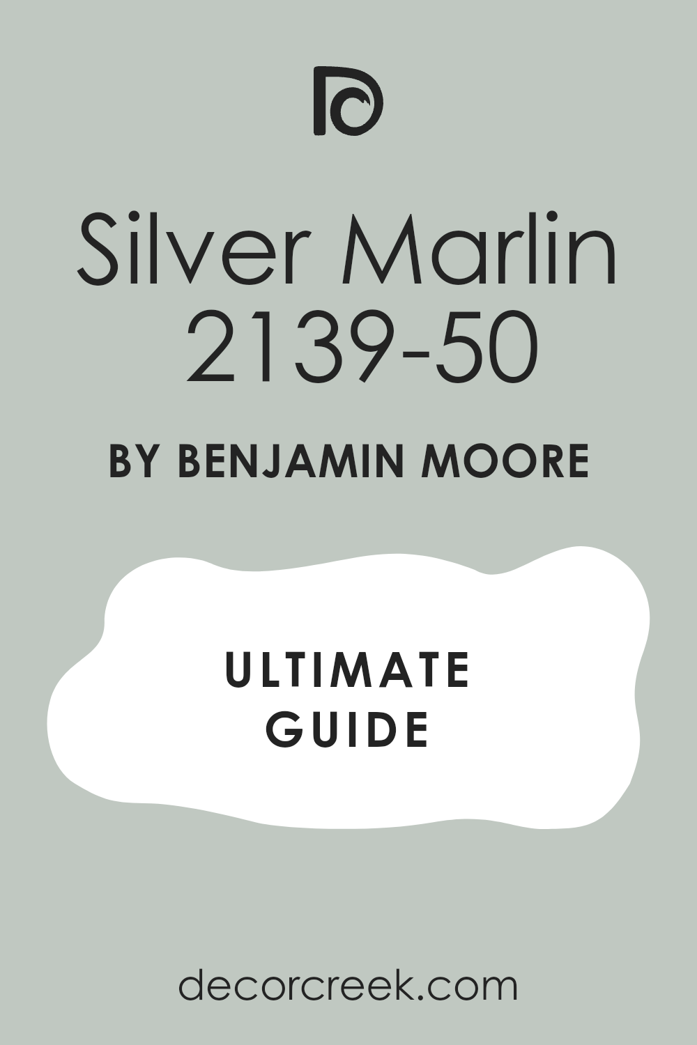
Silver Marlin 2139-50
Silver Marlin 2139-50 is a unique mix of gray, blue, and a tiny bit of green. This color looks like the scales of a fish or the ocean on a very foggy morning. It is a very rich and interesting shade that adds a lot of depth to a room.
I use this when a bedroom feels too flat and needs some extra character on the walls. It looks amazing with natural linen fabrics and dark wood bed frames. The color is dark enough to provide contrast but light enough to stay very airy.
It is a very smart choice for a house that has both modern and traditional pieces. I find that it makes white artwork and frames look very bright and clean. This is a very professional-looking color that works great for staging a coastal home. You will love the many different faces of this beautiful paint.
Best used in: bedrooms, living rooms, kitchens, and cabinetry
Pairs well with: Seapearl OC-19, Blue Lace 1625, Simply White OC-117, dark wood tones The key rule of this color for farmhouse style is to use it where you want natural light to feel kind, soft, and inviting throughout the day.
🎨 Check out the complete guide to this color right HERE 👈
Stonington Gray HC-170
Stonington Gray HC-170 is a true and honest gray that feels very clean and crisp. This color is part of the historical collection and it is a favorite for many designers. It has a very slight blue undertone that makes it feel perfect for a beach home.
I use this when a client wants a gray room that does not feel like concrete. It looks very sharp with bright white trim and dark navy blue accents. The shade is very steady and looks the same in almost every kind of lighting.
It is a very safe choice if you are worried about your paint looking too blue or green. I love how it makes a bedroom feel very organized and very modern. This is a great choice for a whole-house color that starts in the bedroom. You can never go wrong with a classic like this on your walls.
Best used in: whole-house painting, bedrooms, kitchens, and exteriors
Pairs well with: Simply White OC-117, Hale Navy HC-154, Glass Slipper 1632, silver hardware The key rule of this color for farmhouse style is to use it where you want natural light to feel kind, soft, and inviting throughout the day.
🎨 Check out the complete guide to this color right HERE 👈

Classic Gray OC-23
Classic Gray OC-23 is a very light and warm gray that feels like a soft wool blanket. This color is almost off-white, making it a perfect neutral for a coastal bedroom. It has a tiny hint of warmth that keeps it from feeling cold or industrial.
I use this for people who want a very bright and open room that still has some depth. It looks beautiful when paired with light oak floors and natural wicker furniture. The color is very light and helps a small room feel twice as large as it really is.
It works very well as a background for colorful beach art and bright pillows. I find that it is a very relaxing choice for a main sleeping area. This is a very reliable color that looks great in any kind of light. It is the perfect bridge between a white and a gray room.
Best used in: bedrooms, hallways, living rooms, and open floor plans
Pairs well with: White Dove OC-17, Balboa Mist OC-27, Edgecomb Gray HC-173, warm wood The key rule of this color for farmhouse style is to use it where you want natural light to feel kind, soft, and inviting throughout the day.
🎨 Check out the complete guide to this color right HERE 👈

Balboa Mist OC-27
Balboa Mist OC-27 is a very popular greige that feels like warm sand on a summer day. This color has a perfect mix of gray and beige which makes it very easy to use. It feels very cozy and inviting without being too dark or heavy on the walls.
I often suggest this for guest rooms to make them feel like a high-end hotel suite. It looks stunning with white linens and light blue accent pieces. The color is warm enough to make the room feel snug but cool enough to look modern.
I find that it works well with both gold and silver hardware in the bathroom. It is a very safe and pleasing color that most homeowners absolutely love. This is a great choice for a beachy bedroom that needs to feel very warm. You will love how easy it is to match your furniture to this shade.
Best used in: bedrooms, living rooms, kitchens, and hallways
Pairs well with: Simply White OC-117, Classic Gray OC-23, Pale Oak OC-20, navy blue The key rule of this color for farmhouse style is to use it where you want natural light to feel kind, soft, and inviting throughout the day.
🎨 Check out the complete guide to this color right HERE 👈

Pale Oak OC-20
Pale Oak OC-20 is a soft and elegant neutral that looks like sun-bleached wood. This color is very light and has a tiny hint of pink and gray in the base. It is a very sophisticated choice for a bedroom that wants to feel very calm.
I use this when a client wants a room that is bright but not stark white. It looks very expensive when paired with thick white trim and silk curtains. The shade is very versatile and works with many different wood tones in a room.
It feels very airy and helps the ceiling look much higher than it really is. I find that it creates a very quiet and peaceful mood for a master suite. This is a top pick for anyone who loves a clean and organic coastal look. You will enjoy how light and fresh your home feels with this color.
Best used in: master bedrooms, dining rooms, kitchens, and entries
Pairs well with: Chantilly Lace OC-65, Balboa Mist OC-27, Revere Pewter HC-172, gold accents The key rule of this color for farmhouse style is to use it where you want natural light to feel kind, soft, and inviting throughout the day.
🎨 Check out the complete guide to this color right HERE 👈

Simply White OC-117
Simply White OC-117 is a very clean and crisp white that has a tiny bit of warmth. This color is a favorite for designers because it looks like a fresh start. It is the perfect white for trim, doors, and bedroom walls in a beach house.
I use it to make a room feel very bright and full of natural light. It feels very energizing in the morning and very cozy at night with a lamp. The color is warm enough that it does not look blue or cold on the walls.
It works perfectly with every other color on this coastal list. I think it is the best choice for making a dark room feel very open. This is a very reliable white that will never let you down in your design. You can use it everywhere and it will look high-end and clean.
Best used in: walls, trim, ceilings, and cabinetry
Pairs well with: Hale Navy HC-154, Stonington Gray HC-170, Pale Oak OC-20, dark wood The key rule of this color for farmhouse style is to use it where you want natural light to feel kind, soft, and inviting throughout the day.
🎨 Check out the complete guide to this color right HERE 👈

Cloud White OC-130
Cloud White OC-130 is a soft and creamy white that feels very gentle on the eyes. This color is not as bright as other whites, which makes it feel very traditional. It looks like a soft fluffy cloud on a warm summer afternoon.
I use this when a bedroom has a lot of old character and needs a soft touch. It looks beautiful with antique furniture and warm brass light fixtures. The shade has a tiny bit of yellow in it which makes it feel very friendly.
It is a great choice for a bedroom where you want to feel very snug and safe. I love how it makes white bedding look even softer and more inviting. This is a classic white that has been a favorite for many years in home design. You will love the warm and cozy feeling it brings to your coastal space.
Best used in: bedrooms, living rooms, trim, and kitchens
Pairs well with: Beach Glass 1564, Gray Cashmere 2138-60, Simply White OC-117, warm wood tones The key rule of this color for farmhouse style is to use it where you want natural light to feel kind, soft, and inviting throughout the day.
🎨 Check out the complete guide to this color right HERE 👈

Seapearl OC-19
Seapearl OC-19 is a stunning off-white that feels like a smooth pearl found on the sand. This color is very light and has a soft gray undertone that keeps it looking modern. I use this when a bedroom needs to feel very bright without being too yellow or too blue.
It looks beautiful when the morning sun hits the walls and creates a soft glow. The shade is very versatile and works with almost any style of furniture you own. It acts like a perfect canvas for your coastal art and colorful throw pillows.
I find that it makes a small guest room feel much more expensive and open. Many people choose this for a main bedroom because it is so easy to live with every day. It creates a very clean and professional look that is great for home staging. This is a very reliable choice for a light and airy beach house theme.
Best used in: bedrooms, kitchens, hallways, and whole-house painting
Pairs well with: Silver Marlin 2139-50, Hale Navy HC-154, White Dove OC-17, natural oak The key rule of this color for farmhouse style is to use it where you want natural light to feel kind, soft, and inviting throughout the day.
🎨 Check out the complete guide to this color right HERE 👈

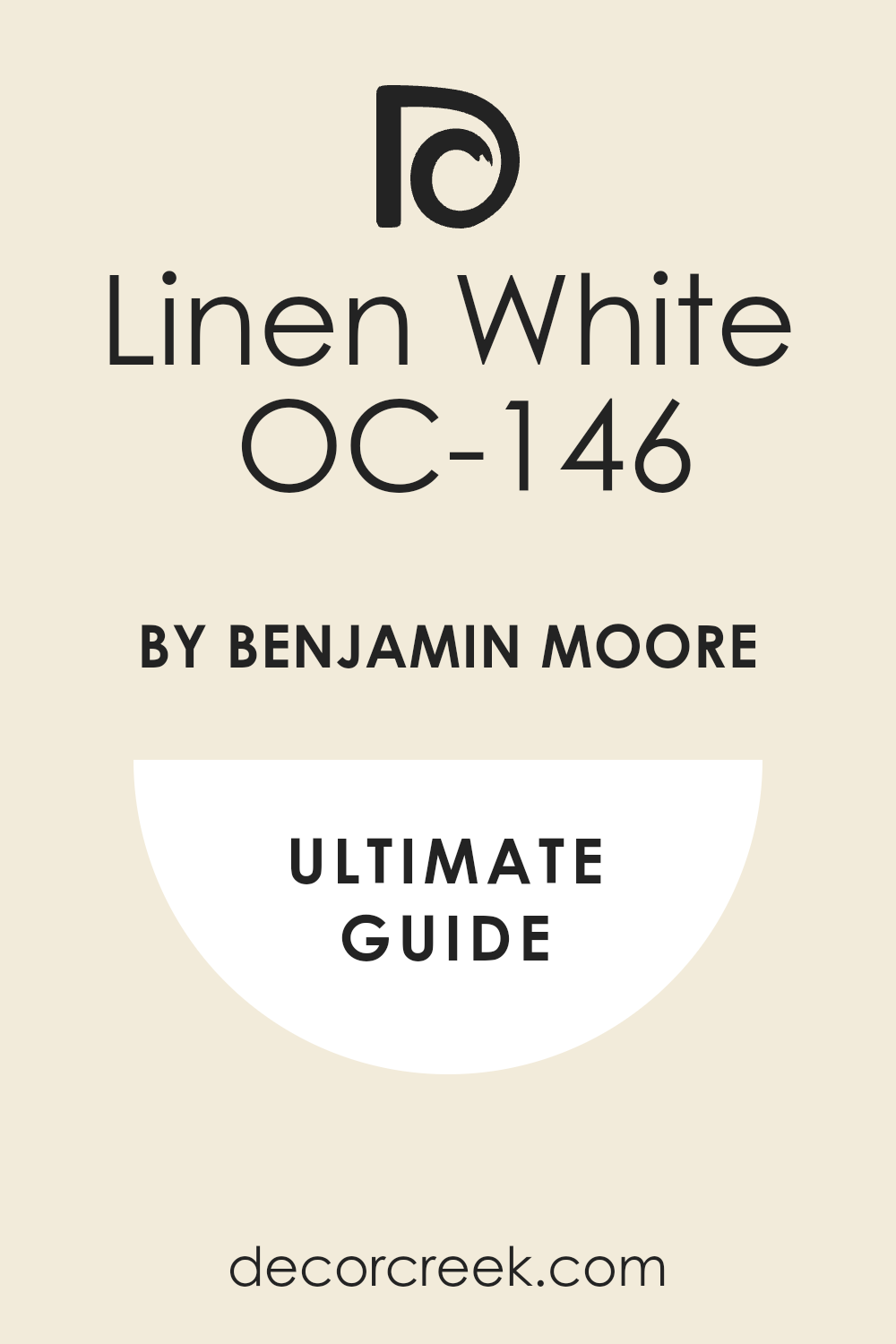
Linen White OC-146
Linen White OC-146 is a warm and creamy white that feels like a comfortable pair of pants. This color has a lot of yellow in the base which makes a bedroom feel very sunny. It reminds me of the warm light at the end of a long day at the beach.
I love using this in rooms that feel a bit cold or do not get much sun. It makes white trim and doors stand out and look very crisp and clean. The shade is very traditional and works well with antique wood pieces.
It creates a very friendly and welcoming mood for anyone who enters the room. I find that it looks wonderful with navy blue accents and brass lamps. This is a classic choice for a cozy cottage or a traditional coastal home. You will love how much warmth this color adds to your private sleeping space.
Best used in: bedrooms, living rooms, trim, and dark hallways
Pairs well with: Simply White OC-117, Woodlawn Blue HC-147, Revere Pewter HC-172, warm wood The key rule of this color for farmhouse style is to use it where you want natural light to feel kind, soft, and inviting throughout the day.
🎨 Check out the complete guide to this color right HERE 👈
Edgecomb Gray HC-173
Edgecomb Gray HC-173 is a perfect greige that looks like dry sand under a bright sun. This color is very famous because it balances gray and beige so perfectly. It is a very safe choice for a bedroom because it never looks too dark or too light.
I use this when a client wants a neutral look that still has a lot of personality. It looks amazing with white bedding and light blue or green accent pillows. The shade is very steady and does not change much as the light moves.
It creates a very grounded and peaceful feeling that is great for a master suite. I find that it makes a house feel very cohesive and well-designed from room to room. This is a top pick for a modern coastal look that needs to feel very warm. You will enjoy how easy it is to decorate around this beautiful neutral paint.
Best used in: bedrooms, living rooms, open floor plans, and entryways
Pairs well with: White Dove OC-17, Revere Pewter HC-172, Hale Navy HC-154, tan leather The key rule of this color for farmhouse style is to use it where you want natural light to feel kind, soft, and inviting throughout the day.
🎨 Check out the complete guide to this color right HERE 👈

Natural Cream OC-14
Natural Cream OC-14 is a rich and sophisticated neutral that feels very earthy. This color has a bit more depth than a standard off-white or light gray. It looks like the natural stone you might find along a rocky shoreline.
I use this for bedrooms that need to feel very quiet and very high-end. It provides a beautiful background for dark wood furniture and silver hardware. The shade is very warm but still looks very fresh and modern on the walls.
It is a great choice for a house that uses a lot of natural materials like wool and linen. I love how it makes a bedroom feel like a very private and safe sanctuary. This is a very smart choice for a mature and elegant coastal design project. You will love the rich and smooth look of this paint in your home.
Best used in: master bedrooms, dining rooms, kitchens, and exteriors
Pairs well with: Cloud White OC-130, Gray Cashmere 2138-60, Simply White OC-117, dark metal The key rule of this color for farmhouse style is to use it where you want natural light to feel kind, soft, and inviting throughout the day.
🎨 Check out the complete guide to this color right HERE 👈

Muslin OC-12
Muslin OC-12 is a classic warm beige that feels like a light canvas bag. This color is very traditional and brings a lot of comfort to a bedroom space. It looks like the color of the dunes in the late afternoon when the sun is low.
I find that it works very well with coastal themes that use a lot of tan and blue. It creates a very soft and inviting atmosphere that helps people feel at home. The shade is dark enough to show up against white trim but still feels very light.
It is a very safe color for rooms that get a mix of different types of light. I love using this in guest rooms to create a very warm and friendly vibe. This is a great choice for a home that wants a very natural and relaxed feeling. You will enjoy how cozy your room feels with this sandy shade on the walls.
Best used in: guest bedrooms, hallways, living rooms, and laundry rooms
Pairs well with: Simply White OC-117, Woodlawn Blue HC-147, Van Deusen Blue HC-156, wicker The key rule of this color for farmhouse style is to use it where you want natural light to feel kind, soft, and inviting throughout the day.
🎨 Check out the complete guide to this color right HERE 👈

Jockey Hollow Gray HC-108
Jockey Hollow Gray HC-108 is a medium-toned gray that has a very strong olive green base. This color is named after a famous coastal spot and it feels very historical. It looks like the deep shadows on a beach or the color of wet sand.
I use this for a bedroom that needs to feel very grounded and very snug at night. It looks stunning when paired with bright white linens and dark mahogany furniture. The shade is very unique and gives a room a lot of custom character.
It is dark enough to make a big statement without making the room feel like a cave. I find that it works very well as an accent wall or in a large master suite. This is a bold and smart choice for a coastal home with a lot of traditional style. You will love the depth and the natural feeling this color provides.
Best used in: master bedrooms, home offices, accent walls, and exteriors
Pairs well with: White Dove OC-17, Edgecomb Gray HC-173, Palladian Blue HC-144, warm brass The key rule of this color for farmhouse style is to use it where you want natural light to feel kind, soft, and inviting throughout the day.
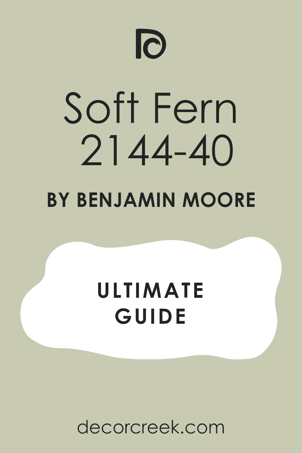
Soft Fern 2144-40
Soft Fern 2144-40 is a gentle and muted green that feels like a walk through a coastal forest. This color is very peaceful and brings a lot of the outdoors into your bedroom. It is a very natural shade that does not feel too bright or too minty.
I love using this for people who want a beachy look without using only blue paint. It looks amazing with light wood floors and natural linen curtains on the windows. The color is very soothing and helps to quiet the mind before you go to sleep.
It provides a soft and beautiful contrast against white crown molding and trim. I find that it makes a bedroom feel very fresh and very full of life. This is one of my favorite colors for a guest room or a nursery near the sea. You will enjoy the calm and organic atmosphere this green paint creates.
Best used in: guest rooms, nurseries, bathrooms, and sunrooms
Pairs well with: Simply White OC-117, Healing Aloe 1562, Silver Marlin 2139-50, natural wood The key rule of this color for farmhouse style is to use it where you want natural light to feel kind, soft, and inviting throughout the day.
🎨 Check out the complete guide to this color right HERE 👈
16 Beachy Blue Paint Colors for the Bedroom
I have picked these blues because they remind me of the many faces of the ocean. From the light misty sky to the deep moving water, these colors bring life to your walls. They help you wake up feeling fresh and fall asleep feeling very quiet and safe.
Blue is the most popular color for a bedroom because it helps the heart rate stay slow. Each of these shades has a different personality that can fit your specific style. Whether you like a modern look or a vintage cottage feel, there is a blue here for you.
I suggest looking at how much sun your room gets before you make a final choice. These colors work perfectly with white trim and sandy-colored rugs and furniture. You will feel like you are on a vacation every single day with these tones. They are the best ways to turn a plain room into a coastal getaway.
Sea Salt SW 6204
Sea Salt SW 6204 is the most popular choice for anyone who loves the ocean. This color is a mix of green and gray that changes based on your light. It looks like the water in a shallow bay on a sunny day.
I use this color more than any other because it makes people feel relaxed. Many homeowners choose this shade when they want a clean look that is not boring. It acts like a neutral but still gives the room a pretty personality.
You will notice it looks greener if you have many trees outside your window. It turns more gray if the sky is cloudy or if you have cool light bulbs. This paint is a safe bet for a primary bedroom or a guest suite. I think it is the perfect middle ground for a coastal theme.
Best used in: bedrooms, bathrooms, laundry rooms, and kitchens
Pairs well with: Rainwashed SW 6211, Heron Plume SW 6070, Accessible Beige SW 7036, white trim The key rule of this color for farmhouse style is to use it where you want natural light to feel kind, soft, and inviting throughout the day.
🎨 Check out the complete guide to this color right HERE 👈
Rainwashed SW 6211
Rainwashed SW 6211 brings a cheerful and bright feeling to any sleeping area. This shade is a bit more blue than green compared to other popular coastal tones. It reminds me of a clear sky right after a storm has passed over the coast.
I love how it makes white furniture pop and look brand new. Small rooms feel much bigger when you put this on the walls. It has just enough color to be noticed without being too loud for a bedroom.
Kids and adults both seem to love how fresh this paint looks in the morning. The pigments are very clear and do not look muddy at all. I often suggest this for rooms that face the north to add a bit of life. It is a classic choice for a home near the water.
Best used in: kids bedrooms, bathrooms, sunrooms, and front doors
Pairs well with: Pure White SW 7005, Window Pane SW 6210, Silver Strand SW 7057, light oak The key rule of this color for farmhouse style is to use it where you want natural light to feel kind, soft, and inviting throughout the day.
🎨 Check out the complete guide to this color right HERE 👈
Tradewind SW 6218
Tradewind SW 6218 is a true light blue that feels like a breeze. This color is very light and airy, making the ceiling feel higher. It does not have much gray in it, so it stays looking blue all day.
I suggest this for rooms where you want to feel energized and happy. It looks wonderful with light wood floors and white bedding. The shade is very traditional and never goes out of style. It reminds me of the Caribbean sea on a clear afternoon.
I love using it on the ceiling to mimic the open sky. It is a very friendly color that welcomes anyone into the room. This is a great choice for a cottage or a beach house.
Best used in: ceilings, bedrooms, nurseries, and laundry rooms
Pairs well with: Shell White SW 8917, Lullaby SW 9136, Naval SW 6244, light pine The key rule of this color for farmhouse style is to use it where you want natural light to feel kind, soft, and inviting throughout the day.
🎨 Check out the complete guide to this color right HERE 👈
Sleepy Blue SW 6225
Sleepy Blue SW 6225 is a soft and powdery blue that looks like a clear morning sky. This color is very gentle and helps the mind relax after a long day. It has a tiny hint of gray that keeps it looking mature and elegant.
I often use this in guest rooms to make visitors feel at home right away. It pairs beautifully with white linens and light gray carpets. The color does not change much in different lighting which makes it very reliable.
It feels very cool and crisp against dark wood furniture. I love how it makes a room feel like a quiet sanctuary. This is a wonderful choice for anyone who wants a classic coastal bedroom.
Best used in: guest bedrooms, nurseries, bathrooms, and laundry rooms
Pairs well with: Pure White SW 7005, North Star SW 6246, Cadet SW 9143, silver accents The key rule of this color for farmhouse style is to use it where you want natural light to feel kind, soft, and inviting throughout the day.
🎨 Check out the complete guide to this color right HERE 👈
Misty SW 6232
Misty SW 6232 is a very light gray that has a strong blue soul. This color is perfect for people who want a neutral room with a splash of ocean feeling. It looks like the sky right before the sun starts to peak through the clouds.
I find that it makes small bedrooms feel much larger and more open. It is a very smart choice for rooms that do not get a lot of natural light. The color is subtle enough to let your furniture be the star of the show.
It creates a very clean and professional look that works for staging. I love how it stays looking fresh even on dark and rainy days. This is one of my favorite colors for a modern beach house.
Best used in: hallways, bedrooms, kitchens, and home offices
Pairs well with: High Reflective White SW 7757, Steely Gray SW 7664, Samovar Silver SW 6233, chrome The key rule of this color for farmhouse style is to use it where you want natural light to feel kind, soft, and inviting throughout the day.
🎨 Check out the complete guide to this color right HERE 👈
North Star SW 6246
North Star SW 6246 is a crisp and cool blue-gray that feels very refreshing. This color is a bit more gray than other blues, which makes it feel very modern. It reminds me of the cold Atlantic ocean on a windy day.
I love using this in south-facing rooms to balance out the hot sun. It looks very sharp with white trim and black metal accents. The shade is very peaceful and helps create a great environment for sleep.
It is dark enough to show up well against white furniture. I think it is a very sophisticated take on the coastal trend. You will love how clean and organized your room feels with this paint.
Best used in: bedrooms, bathrooms, entryways, and mudrooms
Pairs well with: Extra White SW 7006, Charcoal Blue SW 2739, Misty SW 6232, light wood The key rule of this color for farmhouse style is to use it where you want natural light to feel kind, soft, and inviting throughout the day.
🎨 Check out the complete guide to this color right HERE 👈
Silver Strand SW 7057
Silver Strand SW 7057 is a sophisticated gray with heavy blue and green undertones. This color looks like the mist over the ocean in the early morning. It is a very cool color that helps lower the temperature of a sunny room.
I find that it makes silver hardware and mirrors look very fancy. Many people choose this when they want a beach look that is more modern. It is dark enough to provide contrast against white baseboards.
The color stays looking clean and crisp even in a busy house. It creates a very quiet and peaceful atmosphere for sleeping. I like to pair it with dark blue accents for a nautical feel. This is a top pick for a master bedroom makeover.
Best used in: main bedrooms, bathrooms, entryways, and cabinets
Pairs well with: Extra White SW 7006, In the Navy SW 9178, Sea Salt SW 6204, dark metal The key rule of this color for farmhouse style is to use it where you want natural light to feel kind, soft, and inviting throughout the day.
🎨 Check out the complete guide to this color right HERE 👈
Open Air SW 6491
Open Air SW 6491 is a bright and happy blue that feels like a summer day. This color has a bit of green in it which makes it feel very tropical. It looks like the water in a swimming pool or a tropical lagoon.
I use this when a client wants their bedroom to feel fun and full of energy. It looks amazing with white shutters and sandy-colored rugs. The color is very clear and makes a bold statement without being too dark.
It is a great way to bring the feeling of the outdoors inside your home. I love how it brightens up a dark corner instantly. This is a perfect choice for a kid’s room or a vacation home.
Best used in: kids rooms, bathrooms, sunrooms, and porch ceilings
Pairs well with: Alabaster SW 7008, Summer White SW 7557, Interesting Aqua SW 6220, wicker The key rule of this color for farmhouse style is to use it where you want natural light to feel kind, soft, and inviting throughout the day.
🎨 Check out the complete guide to this color right HERE 👈
Interesting Aqua SW 6220
Interesting Aqua SW 6220 is a rich and deep color that feels very cozy. This color has a lot of gray and green mixed into the blue base. It looks like the ocean water when it gets deeper and darker.
I love using this for a master bedroom that needs to feel like a private hideaway. It provides a beautiful contrast for light-colored headboards and art. The shade is very relaxing and helps you feel grounded.
It works well with both modern and traditional styles of furniture. I think it adds a lot of character to a house that feels too plain. This is a great choice for someone who wants a bit more color on their walls.
Best used in: master bedrooms, dining rooms, accent walls, and cabinets
Pairs well with: Spare White SW 6203, Sea Salt SW 6204, Rainwashed SW 6211, dark wood The key rule of this color for farmhouse style is to use it where you want natural light to feel kind, soft, and inviting throughout the day.
🎨 Check out the complete guide to this color right HERE 👈
Palladian Blue HC-144
Palladian Blue HC-144 is a gorgeous mix of blue, green, and a tiny bit of gray. This color is very famous because it looks good in almost every house. It is soft and elegant while still feeling very coastal.
I love how it changes color as the sun moves across the sky. Sometimes it looks more blue and other times it looks like soft seafoam. It is a great choice for someone who cannot decide between blue and green.
The paint makes a bedroom feel like a high-end spa. I recommend it for rooms with lots of natural fabrics like cotton and wool. It is a very classic color that designers have used for many years. You will not regret putting this on your bedroom walls.
Best used in: bedrooms, living rooms, guest baths, and furniture
Pairs well with: Woodlawn Blue HC-147, Simply White OC-117, Shaker Beige HC-45, gold accents The key rule of this color for farmhouse style is to use it where you want natural light to feel kind, soft, and inviting throughout the day.
🎨 Check out the complete guide to this color right HERE 👈

Woodlawn Blue HC-147
Woodlawn Blue HC-147 is a very classic and historical blue that feels very elegant. This color has a bit of a vintage feel that reminds me of grand beach hotels. It is a very balanced blue that does not lean too far into green or gray.
I love using this in a primary bedroom to create a sense of luxury. It looks wonderful when paired with antique furniture and white cotton rugs. The shade stays very true to its color even in rooms with very little light.
It provides a very peaceful environment that helps you fall asleep faster. I find that it is a very popular choice for people who love traditional design. It makes the ceiling look much higher when painted in a flat finish. This is a timeless choice that will look good for many years.
Best used in: master bedrooms, living rooms, entryways, and ceilings
Pairs well with: Simply White OC-117, Revere Pewter HC-172, Hale Navy HC-154, dark wood The key rule of this color for farmhouse style is to use it where you want natural light to feel kind, soft, and inviting throughout the day.
🎨 Check out the complete guide to this color right HERE 👈
Wythe Blue HC-143
Wythe Blue HC-143 is a deep and moody aqua that has a lot of gray in it. This color is part of the historical collection and feels very established and rich. It looks like the deep water of the ocean on a slightly cloudy day.
I use this as an accent color or on all four walls for a very cozy feel. It creates a beautiful backdrop for gold frames and colorful artwork. The shade is very relaxing and helps to quiet the mind at night.
It works very well in houses that have a lot of character and old wood floors. I love how it gives a room a specific personality that feels very custom. This is a great choice for a home office that doubles as a guest room. You will love the depth this color brings to your home.
Best used in: accent walls, bedroom walls, front doors, and cabinetry
Pairs well with: White Dove OC-17, Van Deusen Blue HC-156, Stonington Gray HC-170, warm leather The key rule of this color for farmhouse style is to use it where you want natural light to feel kind, soft, and inviting throughout the day.
🎨 Check out the complete guide to this color right HERE 👈
Quiet Moments 1563
Quiet Moments 1563 is a very pale and gentle blue-gray shade. This color is designed to make a room feel very still and peaceful. It has enough gray to keep it from looking like a baby boy’s room.
I find that it works very well with antique furniture and dark woods. It creates a soft background that does not compete with your art. The tone is very sophisticated and works for any age. It looks like a soft sky on a hazy summer morning.
I love using this in rooms that are meant for resting and reading. The color is light enough to keep the room feeling open. It is one of my favorite shades for a cozy beach cottage.
Best used in: master suites, nurseries, home offices, and ceilings
Pairs well with: White Dove OC-17, Healing Aloe 1562, Stonington Gray HC-170, navy blue The key rule of this color for farmhouse style is to use it where you want natural light to feel kind, soft, and inviting throughout the day.
🎨 Check out the complete guide to this color right HERE 👈

Breath of Fresh Air 806
Breath of Fresh Air 806 is a bright and clear blue that feels like looking up at a cloudless sky. This color is very light and helps to open up a room that feels too small or cramped.
It has a very clean look that makes everything in the bedroom feel brand new. I love using this shade for ceilings to make the room feel like it has no roof at all. It works wonderfully with white shutters and light-colored wooden furniture.
The color is very happy and helps you start your day with a positive feeling. It does not have much gray in it so it stays looking like a true sky blue. I find that it is a favorite for nurseries and kids’ rooms because it is so cheerful. This is a classic choice for a home that needs a bit more light and joy. You will love how this color brings the outdoors inside your home.
Best used in: bedrooms, ceilings, nurseries, and sunrooms
Pairs well with: Simply White OC-117, Blue Lace 1625, Cloud White OC-130, light pine The key rule of this color for farmhouse style is to use it where you want natural light to feel kind, soft, and inviting throughout the day.
🎨 Check out the complete guide to this color right HERE 👈
Glass Slipper 1632
Glass Slipper 1632 is a soft and misty blue that has a very strong gray base. This color is named for its clear and watery look on the walls of a bedroom. It is a very sophisticated shade that feels more grown-up than a standard baby blue.
I love how it looks when paired with dark charcoal accents and white trim. The color is very cooling and helps a sunny room feel much more comfortable. It is a great choice for a modern coastal home that wants a clean look.
The gray in the paint keeps it from looking too bright or overwhelming in large spaces. I find that it creates a very peaceful and steady mood in the house. This is one of my top picks for a high-end master bedroom renovation. You will enjoy how this shade changes from blue to gray as the sun sets.
Best used in: master suites, home offices, hallways, and bathrooms
Pairs well with: White Dove OC-17, Stonington Gray HC-170, Hale Navy HC-154, black metal The key rule of this color for farmhouse style is to use it where you want natural light to feel kind, soft, and inviting throughout the day.
🎨 Check out the complete guide to this color right HERE 👈
Blue Lace 1625
Blue Lace 1625 is a very delicate and pale blue that has a soft lavender undertone. This color is very pretty and gives a bedroom a very feminine and romantic feel. It looks like the light reflecting off the water during a very early sunrise.
I use this when a client wants a room that feels very soft and very gentle. It looks stunning when paired with white floral patterns and silver mirrors. The shade is light enough to act like a neutral but still has a clear personality.
It creates a very quiet environment that is perfect for resting and relaxing. I find that it works best in rooms that get a lot of soft morning light. It is a very elegant choice for a guest suite or a master bedroom. This color will make your walls look like they are glowing with soft light.
Best used in: guest bedrooms, bathrooms, nurseries, and laundry rooms
Pairs well with: Chantilly Lace OC-65, Breath of Fresh Air 806, Silver Marlin 2139-50, crystal accents The key rule of this color for farmhouse style is to use it where you want natural light to feel kind, soft, and inviting throughout the day.
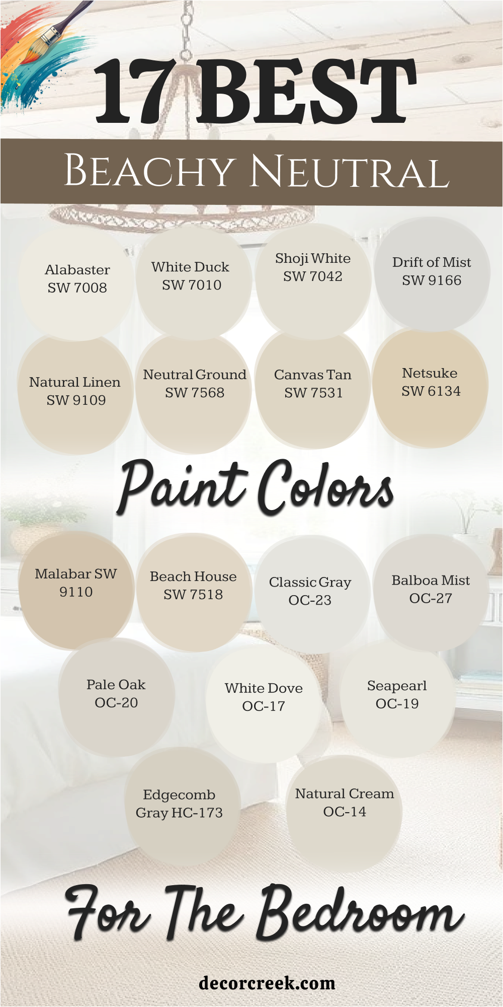
17 Beachy Neutral Paint Colors for the Bedroom
Alabaster SW 7008
Alabaster SW 7008 is a warm white that feels like soft sand under your feet. This color is not stark or cold like a hospital room. It has a tiny bit of yellow and gray that makes it feel cozy.
I use this when a client wants a bright room that still feels like a home. It works perfectly with wicker baskets and linen curtains. The finish looks very smooth and rich on the walls. I think it is the best white for people who are afraid of bright colors.
It reflects the sun beautifully without hurting your eyes. You can use it on the walls and the trim for a very clean look. It is a staple in my design kit for a reason.
Best used in: living rooms, kitchens, hallways, bedrooms, and farmhouse exteriors
Pairs well with: Iron Ore SW 7069, Agreeable Gray SW 7029, Natural Linen SW 9109, warm wood tones The key rule of this color for farmhouse style is to use it where you want natural light to feel kind, soft, and inviting throughout the day.
🎨 Check out the complete guide to this color right HERE 👈
White Duck SW 7010
White Duck SW 7010 is a very light and creamy neutral that looks like sun-bleached linen. This color is much warmer than a standard gray but cooler than a traditional beige.
It provides a soft and clean background that makes any bedroom feel more organized. I love how it hides imperfections on older walls while still looking high-end. It works very well with light blue accent pillows and ocean-themed artwork.
The shade remains very stable throughout the day and does not turn yellow. It is a great choice for a primary suite where you want a very calm atmosphere. I find that it pairs beautifully with natural wood floors and white molding. This is a smart choice for anyone who wants a sophisticated beachy look. You will love how much life this color brings to your bedroom.
Best used in: bedrooms, living rooms, kitchens, and whole-house painting
Pairs well with: Alabaster SW 7008, Agreeable Gray SW 7029, Sea Salt SW 6204, dark bronze The key rule of this color for farmhouse style is to use it where you want natural light to feel kind, soft, and inviting throughout the day.
🎨 Check out the complete guide to this color right HERE 👈
Shoji White SW 7042
Shoji White SW 7042 is a soft and warm off-white that feels very organic and natural. This color looks like the underside of a seashell or a smooth piece of driftwood. It has a beautiful balance of gray and beige that prevents it from looking too stark.
I use this when a client wants a room that feels very bright but also very cozy. It looks amazing when paired with natural textures like jute rugs and linen drapes. The shade is very versatile and works well in rooms with both warm and cool light.
It helps a small bedroom feel much larger and more airy without feeling cold. I find that it creates a very peaceful environment that is perfect for sleeping. This is a top pick for a coastal bedroom with a modern farmhouse feel. You will enjoy the warm glow this color gives your home.
Best used in: walls, trim, cabinets, and bedroom suites
Pairs well with: Urbane Bronze SW 7048, Fawn Brindle SW 7640, Worldly Gray SW 7043, wood The key rule of this color for farmhouse style is to use it where you want natural light to feel kind, soft, and inviting throughout the day.
🎨 Check out the complete guide to this color right HERE 👈

Drift of Mist SW 9166
Drift of Mist SW 9166 is a very light and airy gray that has a soft warmth to it. This color looks like the fog hanging over the ocean in the very early morning. It is an excellent choice for a neutral bedroom that needs a modern coastal touch.
I love how it provides a very subtle contrast against bright white baseboards. The shade is light enough to keep the room feeling very open and fresh. It works very well as a background for colorful beach photography and art.
I find that it is a very safe and pleasing color for staging houses for sale. It does not demand attention but makes the entire room look better and cleaner. This is a wonderful choice for a guest room or a main bedroom makeover. You will love how light and bright your house feels with this paint.
Best used in: bedrooms, hallways, open floor plans, and bathrooms
Pairs well with: Pure White SW 7005, Silver Strand SW 7057, Sea Salt SW 6204, black hardware The key rule of this color for farmhouse style is to use it where you want natural light to feel kind, soft, and inviting throughout the day.
🎨 Check out the complete guide to this color right HERE 👈

Natural Linen SW 9109
Natural Linen SW 9109 is a warm and inviting beige that looks like a heavy cotton fabric. This color is perfect for a bedroom where you want to feel tucked in and cozy at night. It reminds me of the tall grass that grows along the edges of a sandy beach path.
I use this when a client wants a room that feels very organic and close to nature. It provides a beautiful contrast against white bedding and light blue accent pieces. The shade is dark enough to show up well but light enough to keep the room feeling airy.
It works very well with dark wood furniture and woven baskets. I find that it creates a very grounded atmosphere that is great for a master suite. This is a very classic choice for a coastal home that needs a touch of warmth. You will love how this color makes your bedroom feel like a safe harbor.
Best used in: bedrooms, living rooms, entryways, and kitchens
Pairs well with: Alabaster SW 7008, Sea Salt SW 6204, Naval SW 6244, warm wood tones The key rule of this color for farmhouse style is to use it where you want natural light to feel kind, soft, and inviting throughout the day.
🎨 Check out the complete guide to this color right HERE 👈

Neutral Ground SW 7568
Neutral Ground SW 7568 is a soft and balanced greige that feels very steady and calm. This color has a perfect mix of beige and gray which makes it very easy to match. It looks like the smooth stones you might find scattered along a quiet shoreline.
I often suggest this for people who want a neutral look that is not too yellow. It looks stunning with white trim and light gray carpets or rugs. The color is very light and helps a small bedroom feel much bigger and brighter.
It works as a great background for your colorful pillows and seaside artwork. I find that it is a very relaxing choice for a main sleeping area in any home. This is a very reliable color that looks great in almost any kind of lighting. It is the perfect bridge between a white and a beige room.
Best used in: whole-house painting, bedrooms, hallways, and cabinets
Pairs well with: Pure White SW 7005, Canvas Tan SW 7531, Drift of Mist SW 9166, dark bronze The key rule of this color for farmhouse style is to use it where you want natural light to feel kind, soft, and inviting throughout the day.
🎨 Check out the complete guide to this color right HERE 👈
Canvas Tan SW 7531
Canvas Tan SW 7531 is a light and sandy neutral that feels like a summer afternoon. This color has a tiny bit of a yellow undertone that makes it feel very sunny and bright. It reminds me of the light reflecting off a sandy dune under a clear sky.
I use this for bedrooms that do not get much natural light to make them feel warmer. It looks beautiful when paired with light blue shutters and white linen drapes. The shade is very friendly and makes a guest room feel very welcoming and fresh.
It is dark enough to provide a nice contrast with white crown molding. I find that it works well with natural materials like jute and light oak wood. This is a great choice for a traditional beach house look that needs to feel cozy. You will love the happy and warm feeling this paint brings to your walls.
Best used in: bedrooms, living rooms, kitchens, and exteriors
Pairs well with: Shoji White SW 7042, Sea Salt SW 6204, Rainwashed SW 6211, wicker The key rule of this color for farmhouse style is to use it where you want natural light to feel kind, soft, and inviting throughout the day.
🎨 Check out the complete guide to this color right HERE 👈

Netsuke SW 6134
Netsuke SW 6134 is a warm and creamy beige with a very slight green undertone. This color is named after small carvings and it feels very detailed and rich. It looks like the color of antique driftwood that has been bleached by the sun.
I use this when a bedroom needs a bit more color than a standard off-white. It looks amazing with dark mahogany bed frames and white cotton bedding. The green hint keeps the beige from looking too muddy or flat on the walls.
It creates a very peaceful and natural environment that is perfect for resting. I find that it works best in rooms that get a lot of bright afternoon light. This is a very sophisticated choice for a mature coastal or cottage design. You will enjoy how this color makes your room feel very unique and special.
Best used in: bedrooms, dining rooms, kitchens, and home offices
Pairs well with: Alabaster SW 7008, Svelte Sage SW 6164, Malabar SW 9110, brass accents The key rule of this color for farmhouse style is to use it where you want natural light to feel kind, soft, and inviting throughout the day.
Malabar SW 9110
Malabar SW 9110 is a rich and sandy neutral that feels very high-end and smooth. This color has a lot of depth and makes a bedroom feel very substantial and solid. It looks like the wet sand right where the ocean waves hit the shore.
I love using this in master bedrooms to create a sense of luxury and comfort. It provides a beautiful backdrop for white frames and light blue accent pieces. The shade is warm enough to feel very cozy but cool enough to look very modern.
It works very well with both silver and gold hardware in an attached bathroom. I find that it creates a very quiet and grounded mood that helps with relaxation. This is a top pick for a coastal bedroom that needs a bit more weight on the walls. You will love the elegant and professional look of this specific paint.
Best used in: master suites, living rooms, hallways, and exteriors
Pairs well with: Pure White SW 7005, Netsuke SW 6134, Sea Salt SW 6204, dark wood tones The key rule of this color for farmhouse style is to use it where you want natural light to feel kind, soft, and inviting throughout the day.
🎨 Check out the complete guide to this color right HERE 👈
Beach House SW 7518
Beach House SW 7518 is a very light and airy beige that lives up to its name. This color is designed to make you feel like you are on a permanent vacation. It has a very clean look that reflects light beautifully all around the room.
I use this as a whole-house color because it is so easy to live with every day. It looks stunning with white trim and navy blue accent pillows or blankets. The shade is light enough to act like a white but has enough color to feel warm.
It helps a small bedroom feel much larger and more open than it really is. I find that it is a very popular choice for people who love a bright and simple look. This is a perfect choice for a cottage or a home near the water. You will feel very refreshed every time you walk into a room with this paint.
Best used in: whole-house painting, bedrooms, kitchens, and laundry rooms
Pairs well with: Alabaster SW 7008, Naval SW 6244, Silver Strand SW 7057, light wood The key rule of this color for farmhouse style is to use it where you want natural light to feel kind, soft, and inviting throughout the day.
🎨 Check out the complete guide to this color right HERE 👈
Classic Gray OC-23
Classic Gray OC-23 is a very light and warm gray that feels like a soft wool blanket. This color is almost off-white, making it a perfect neutral for a coastal bedroom. It has a tiny hint of warmth that keeps it from feeling cold or industrial.
I use this for people who want a very bright and open room that still has some depth. It looks beautiful when paired with light oak floors and natural wicker furniture. The color is very light and helps a small room feel twice as large as it really is.
It works very well as a background for colorful beach art and bright pillows. I find that it is a very relaxing choice for a main sleeping area. This is a very reliable color that looks great in any kind of light. It is the perfect bridge between a white and a gray room.
Best used in: bedrooms, hallways, living rooms, and open floor plans
Pairs well with: White Dove OC-17, Balboa Mist OC-27, Edgecomb Gray HC-173, warm wood The key rule of this color for farmhouse style is to use it where you want natural light to feel kind, soft, and inviting throughout the day.
🎨 Check out the complete guide to this color right HERE 👈
Balboa Mist OC-27
Balboa Mist OC-27 is a very popular greige that feels like warm sand on a summer day. This color has a perfect mix of gray and beige which makes it very easy to use. It feels very cozy and inviting without being too dark or heavy on the walls.
I often suggest this for guest rooms to make them feel like a high-end hotel suite. It looks stunning with white linens and light blue accent pieces. The color is warm enough to make the room feel snug but cool enough to look modern.
I find that it works well with both gold and silver hardware in the bathroom. It is a very safe and pleasing color that most homeowners absolutely love. This is a great choice for a beachy bedroom that needs to feel very warm. You will love how easy it is to match your furniture to this shade.
Best used in: bedrooms, living rooms, kitchens, and hallways
Pairs well with: Simply White OC-117, Classic Gray OC-23, Pale Oak OC-20, navy blue The key rule of this color for farmhouse style is to use it where you want natural light to feel kind, soft, and inviting throughout the day.
🎨 Check out the complete guide to this color right HERE 👈
Pale Oak OC-20
Pale Oak OC-20 is a soft and elegant neutral that looks like sun-bleached wood. This color is very light and has a tiny hint of pink and gray in the base. It is a very sophisticated choice for a bedroom that wants to feel very calm.
I use this when a client wants a room that is bright but not stark white. It looks very expensive when paired with thick white trim and silk curtains. The shade is very versatile and works with many different wood tones in a room.
It feels very airy and helps the ceiling look much higher than it really is. I find that it creates a very quiet and peaceful mood for a master suite. This is a top pick for anyone who loves a clean and organic coastal look. You will enjoy how light and fresh your home feels with this color.
Best used in: master bedrooms, dining rooms, kitchens, and entries
Pairs well with: Chantilly Lace OC-65, Balboa Mist OC-27, Revere Pewter HC-172, gold accents The key rule of this color for farmhouse style is to use it where you want natural light to feel kind, soft, and inviting throughout the day.
🎨 Check out the complete guide to this color right HERE 👈
White Dove OC-17
White Dove OC-17 is a soft white that is very popular with designers. This color has a tiny bit of gray in it to keep it from being too bright. It is the perfect white for trim, doors, and bedroom walls.
I use it to create a clean and simple beach look. It feels very light and helps a small room feel much bigger. The color is warm enough to feel friendly but cool enough to look modern. It works well with almost every other color on this list.
I think it is the best choice for a ceiling to make it look higher. It does not turn yellow even in rooms with weird lighting. This is a reliable choice for any beachy bedroom project.
Best used in: trim, cabinetry, bedrooms, and whole-house painting
Pairs well with: Balboa Mist OC-27, Revere Pewter HC-172, Hale Navy HC-154, wood floors The key rule of this color for farmhouse style is to use it where you want natural light to feel kind, soft, and inviting throughout the day.
🎨 Check out the complete guide to this color right HERE 👈

Seapearl OC-19
Seapearl OC-19 is a stunning off-white that feels like a smooth pearl found on the sand. This color is very light and has a soft gray undertone that keeps it looking modern.
I use this when a bedroom needs to feel very bright without being too yellow or too blue. It looks beautiful when the morning sun hits the walls and creates a soft glow. The shade is very versatile and works with almost any style of furniture you own.
It acts like a perfect canvas for your coastal art and colorful throw pillows. I find that it makes a small guest room feel much more expensive and open. Many people choose this for a main bedroom because it is so easy to live with every day. It creates a very clean and professional look that is great for home staging. This is a very reliable choice for a light and airy beach house theme.
Best used in: bedrooms, kitchens, hallways, and whole-house painting
Pairs well with: Silver Marlin 2139-50, Hale Navy HC-154, White Dove OC-17, natural oak The key rule of this color for farmhouse style is to use it where you want natural light to feel kind, soft, and inviting throughout the day.
🎨 Check out the complete guide to this color right HERE 👈
Edgecomb Gray HC-173
Edgecomb Gray HC-173 is a perfect greige that looks like dry sand under a bright sun. This color is very famous because it balances gray and beige so perfectly. It is a very safe choice for a bedroom because it never looks too dark or too light.
I use this when a client wants a neutral look that still has a lot of personality. It looks amazing with white bedding and light blue or green accent pillows. The shade is very steady and does not change much as the light moves.
It creates a very grounded and peaceful feeling that is great for a master suite. I find that it makes a house feel very cohesive and well-designed from room to room. This is a top pick for a modern coastal look that needs to feel very warm. You will enjoy how easy it is to decorate around this beautiful neutral paint.
Best used in: bedrooms, living rooms, open floor plans, and entryways
Pairs well with: White Dove OC-17, Revere Pewter HC-172, Hale Navy HC-154, tan leather The key rule of this color for farmhouse style is to use it where you want natural light to feel kind, soft, and inviting throughout the day.
🎨 Check out the complete guide to this color right HERE 👈
Natural Cream OC-14
Natural Cream OC-14 is a rich and sophisticated neutral that feels very earthy. This color has a bit more depth than a standard off-white or light gray. It looks like the natural stone you might find along a rocky shoreline.
I use this for bedrooms that need to feel very quiet and very high-end. It provides a beautiful background for dark wood furniture and silver hardware. The shade is very warm but still looks very fresh and modern on the walls.
It is a great choice for a house that uses a lot of natural materials like wool and linen. I love how it makes a bedroom feel like a very private and safe sanctuary. This is a very smart choice for a mature and elegant coastal design project. You will love the rich and smooth look of this paint in your home.
Best used in: master bedrooms, dining rooms, kitchens, and exteriors
Pairs well with: Cloud White OC-130, Gray Cashmere 2138-60, Simply White OC-117, dark metal The key rule of this color for farmhouse style is to use it where you want natural light to feel kind, soft, and inviting throughout the day.
🎨 Check out the complete guide to this color right HERE 👈