Gray has reigned as the undisputed king of neutrals for a very long time, and I encounter it in nearly every single property I stage or visit. It has become a staple of modern design, yet many people still carry a lingering worry that gray might eventually feel cold, impersonal, or even outright boring.
However, I have learned that this is only true if you make the mistake of picking the wrong secondary colors to accompany it. I have spent years meticulously observing the way different types of light—from the bright morning sun to soft evening lamps—hit gray walls and various fabrics.
My ultimate goal is to ensure that your home doesn’t just look like a showroom, but feels like a sanctuary where you actually want to live and spend your time.
Selecting the right paint colors is truly the fastest and most effective way to make your gray rooms look intentional, polished, and professionally designed. You don’t necessarily need a massive renovation budget or expensive new furniture to create a significant shift in the overall energy of your house.
By simply changing the pigments on the walls, you can achieve a remarkable transformation.
I want to guide you through the process of finding those exact, perfect shades that will make your gray features pop and give your entire interior a high-end, luxury feel without the high-end price tag.
Why I Always Trust Sherwin-Williams and Benjamin Moore for the Best Paint Colors
When I am managing a professional staging project, I simply cannot afford the risk of a color looking different than what I originally planned for the client. I consistently stick with industry leaders like Sherwin-Williams and Benjamin Moore because their paint quality and color accuracy are incredibly reliable across every single can.
These specific brands offer a massive, sophisticated selection of tones that were engineered to highlight and enhance the subtle beauty of gray. Their pigments are exceptionally rich and high-quality, which ensures that the final color looks deep, authentic, and “real” once it dries on your walls.
I have found through experience that when I select a warm white or a deep, moody blue from these professional fan decks, the color will behave exactly how I expect it to under various conditions. In contrast, cheaper paints can be unpredictable and may develop strange, unwanted yellow or purple undertones when placed next to a cool gray sofa or stone tile. These two companies have mastered the art of creating colors that stay true to their names regardless of the application.
I trust their formulas implicitly to deliver the results that keep my clients happy and satisfied every single time I finish a project.
How I Choose the Perfect Shade to Pair With Gray
The true secret to creating a stunning, magazine-worthy room lies in deeply understanding the specific undertones of the gray you are starting with. Before I ever open a paint can, I always perform a thorough check to see if the gray leans more toward a cool blue, a natural green, or a warm, earthy taupe.
If your existing gray is on the cool side, I usually recommend a crisp, brilliant white or a bold, classic navy to maintain a look that is sharp, clean, and modern. For those who have warmer grays or “greiges,” I love incorporating earthy greens or soft, buttery creams to keep the overall atmosphere feeling cozy and grounded.
Beyond just the undertones, I also spend a lot of time analyzing how much natural light a room receives during different parts of the day. A dark room with small windows might require a very bright, reflective white to prevent it from feeling like a dim cave. Conversely, a large, sun-drenched room can easily handle much darker, more dramatic colors without making the space feel cramped or small.
I always insist on testing a large sample directly on the wall so we can observe the color’s evolution from the first light of the morning to the deep shadows of the night.
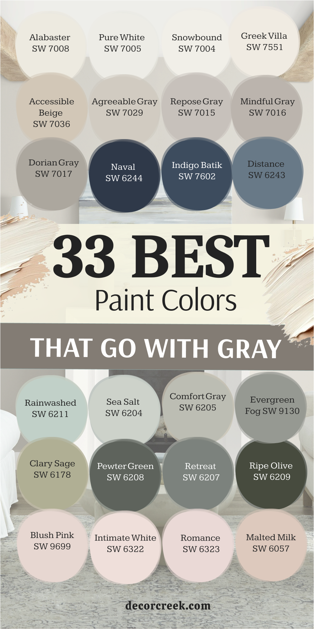
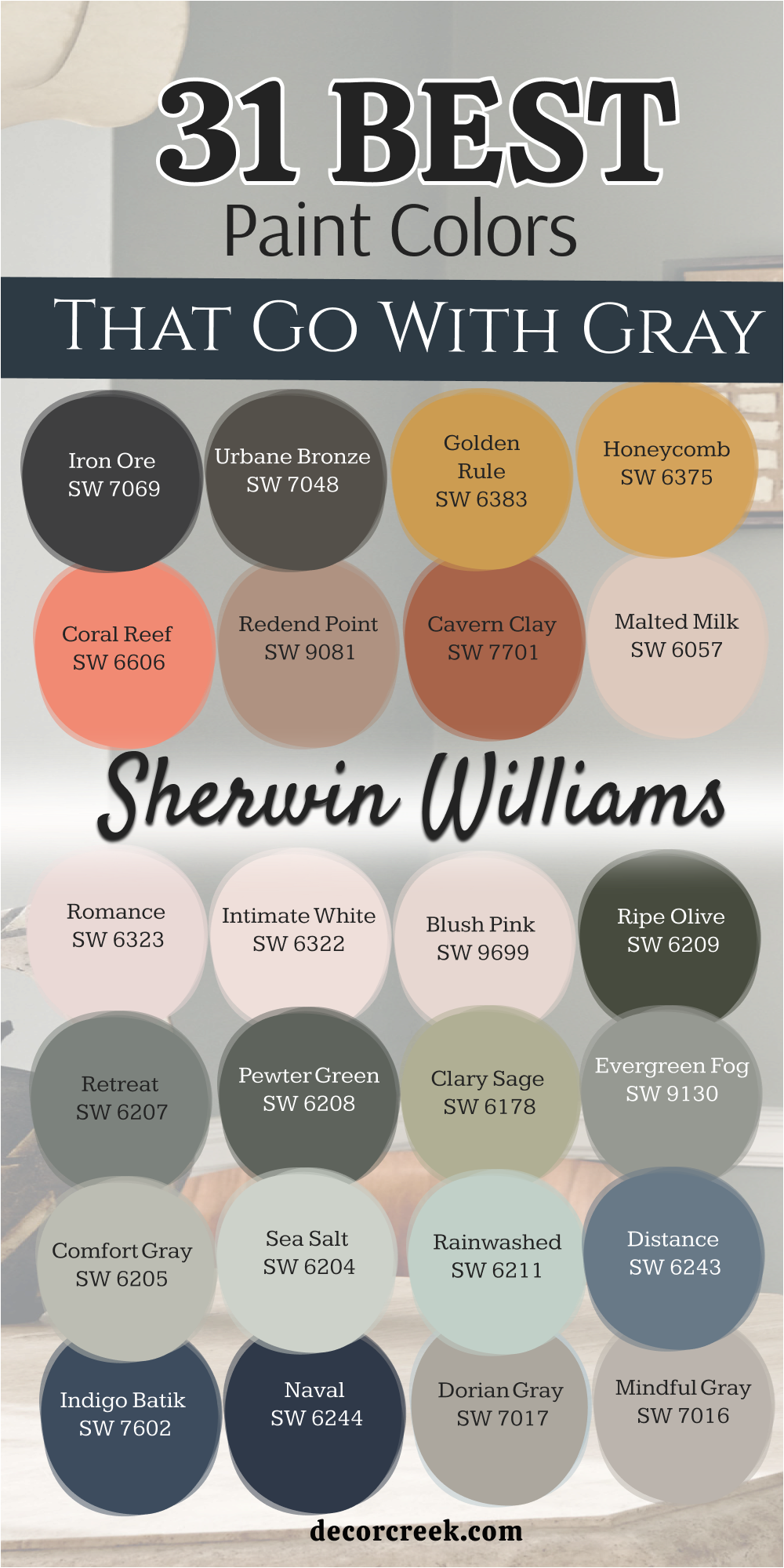
31 Paint Colors that go With Gray From Sherwin Williams
Alabaster SW 7008
Alabaster SW 7008 acts as a creamy and soft white that never feels too cold or sharp in your house. This color is great because it takes the edge off dark gray furniture and makes everything feel much friendlier. I find that it works perfectly for families who want a clean look that still feels like a real home.
Alabaster SW 7008 looks wonderful when the sun hits it because it glows with a gentle and kind warmth. You can use it on your walls to make a small gray room feel much larger and more open than before. It is a very smart choice for trim if you want a soft transition between your walls and the floor.
Many people love how it makes their colorful rugs and pillows look much more bright and pretty. This shade is a favorite for staging because it helps buyers feel relaxed the moment they walk inside. I always keep a gallon of this ready because it solves so many design problems with one coat. It is truly a dependable color that makes your gray accents look expensive and very well planned.
Best used in: living rooms, kitchens, hallways, bedrooms, and farmhouse exteriors
Pairs well with: Iron Ore SW 7069, Agreeable Gray SW 7029, Natural Linen SW 9109, warm wood tones The key rule of this color for farmhouse style is to use it where you want natural light to feel kind, soft, and inviting throughout the day.
🎨 Check out the complete guide to this color right HERE 👈

Pure White SW 7005
Pure White SW 7005 offers a very crisp and tidy appearance that stays looking fresh for a very long time. This color has just enough warmth to make sure your gray walls do not look like a dark cave. I love using it for kitchen cabinets because it makes the whole room look very sanitary and bright.
Pure White SW 7005 works well with both light and dark grays without changing its personality at all. It is a very steady color that does not pick up weird yellow or blue tones from your furniture. You will notice that it makes your gray sofa look much more modern and sharp when it is nearby.
It is a fantastic pick for ceilings because it helps reflect the light down into the rest of the room. I think it is the best choice for people who love a very minimal and organized way of living. This shade helps create a high-end look in a bathroom when paired with gray stone or marble tile. You can trust it to provide a clean backdrop for all of your favorite pieces of art and photos.
Best used in: trim, ceilings, modern kitchens, and bright bathrooms
Pairs well with: Black Magic SW 6991, March Wind SW 7668, pewter accents The key rule of this color for a modern style is to use it on trim to make your main gray wall color look sharp and professional.
🎨 Check out the complete guide to this color right HERE 👈

Snowbound SW 7004
Snowbound SW 7004 has a tiny bit of gray in its base which makes it a natural partner for gray rooms. This color feels very cool and light which helps a busy room feel much more orderly and simple. I often pick this when a homeowner has a lot of cool-toned stone or metal fixtures in their kitchen.
Snowbound SW 7004 prevents the room from feeling too heavy even if you have very dark gray accents. It is a very airy shade that makes you feel like you have more breathing room in a tight hallway. You should use it if you want your house to feel very current and like a professional designed it.
It looks very good next to silver hardware and stainless steel appliances in a modern kitchen setup. The color stays very true to its look even when the light changes from morning to late afternoon. Many of my clients choose this because they want a white that feels energetic and very crisp. It is a great way to make a basement feel like it is actually above ground and full of light.
Best used in: bedrooms, entryways, and minimalist living areas
Pairs well with: Colonnade Gray SW 7641, Storm Cloud SW 6249, silver hardware The key rule of this color for a clean style is to use it in rooms with lots of windows to maximize the bright feeling.
🎨 Check out the complete guide to this color right HERE 👈

Greek Villa SW 7551
Greek Villa SW 7551 provides a rich and sunny feeling that makes any gray room feel much more cheerful. This color is very full of life and helps a large area feel much more intimate and less empty. I like to suggest this for dining rooms where you want a very welcoming and happy vibe for guests.
Greek Villa SW 7551 pairs beautifully with gold frames and warm wooden tables next to gray chairs. It has a creamy quality that makes the room feel very soft and easy on the eyes after a long day. You will see that it helps warm up a cold gray floor and makes the room feel very balanced.
It is a very elegant shade that makes even a simple room look like a luxury hotel suite. I find that it works very well in houses that have a lot of traditional furniture and rich fabrics. People often tell me that this color makes them feel very happy and relaxed when they are at home. It is a classic choice that never feels out of date or like it was a passing fad.
Best used in: dining rooms, kitchens, and sunrooms
Pairs well with: Urban Bronze SW 7048, Drift of Mist SW 9166, gold accents The key rule of this color for an elegant style is to pair it with warm wood furniture to create a balanced and grounded look.
🎨 Check out the complete guide to this color right HERE 👈

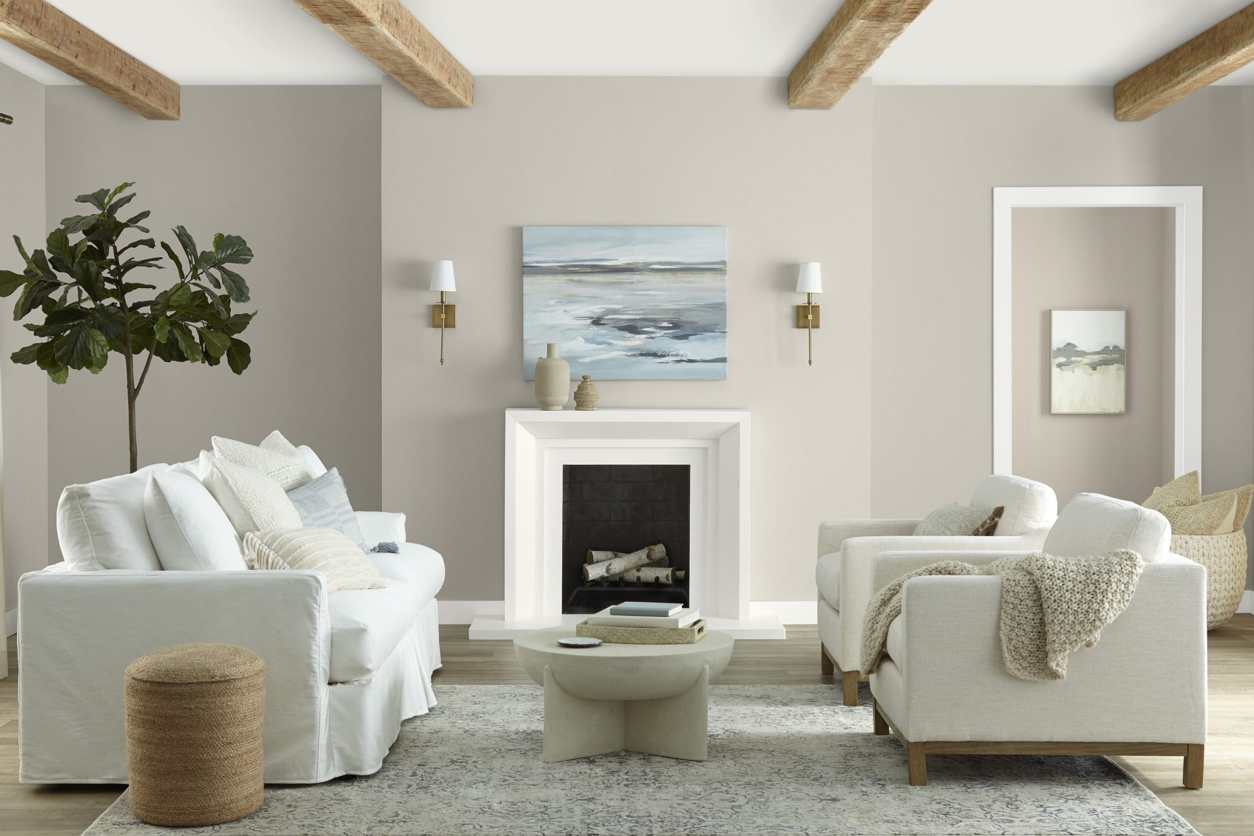
Accessible Beige SW 7036
Accessible Beige SW 7036 acts as the perfect middle ground between a warm tan and a cool gray color. This color is a real hero because it goes with almost every piece of furniture you might already own. I use it a lot in entryways because it makes the transition into the house feel very smooth and easy.
Accessible Beige SW 7036 helps gray walls feel less like concrete and more like a soft and cozy blanket. It is a very popular choice for staging because it makes every room look very expensive and well-kept. You can use it as your main wall color if you want a look that will be popular for many years.
It works wonderfully with dark wood floors and adds a lot of depth to a room without being too dark. Many people find this color very comforting because it feels very stable and solid on the walls. It is deep enough to show a nice contrast against white trim but still keeps the room feeling light. I think it is a great choice for anyone who wants a house that feels very professional and high-end.
Best used in: open concept floor plans, hallways, and family rooms
Pairs well with: Aesthetic White SW 7035, Sanders Gray SW 9545, dark woods The key rule of this color for a cozy style is to use it as a neutral base that allows your colorful decorations to be the stars.
🎨 Check out the complete guide to this color right HERE 👈

Agreeable Gray SW 7029
Agreeable Gray SW 7029 is the most famous neutral because it truly looks good in every single room of a house. This color is like a chameleon that changes just enough to match whatever gray furniture you put near it. I love how it makes a room feel very updated and ready for a professional real estate photo shoot.
Agreeable Gray SW 7029 has a perfect balance of warmth and coolness that makes everyone feel right at home. It is a very soft shade that helps a room feel quiet and focused instead of loud and distracting. You will notice that it hides dust and fingerprints much better than a very bright white paint would do.
It is a fantastic choice for a whole house color because it makes the transition between rooms very easy. I recommend this to people who want a safe but very stylish choice for their first home renovation project. It looks very sharp and intentional when you pair it with a very bright white on your baseboards. Most people choose this because they want a gray that feels like a hug instead of a cold winter day.
Best used in: whole house painting, kitchens, and rental properties
Pairs well with: Extra White SW 7006, Mega Greige SW 7031, navy blue The key rule of this color for a balanced style is to use it when you want a gray that feels warm and inviting rather than cold.
🎨 Check out the complete guide to this color right HERE 👈

Repose Gray SW 7015
Repose Gray SW 7015 is a slightly cooler gray that makes a home feel very modern and very chic. This color has a tiny hint of blue that keeps the room feeling fresh even when it is very hot outside. I find that it works best in bedrooms where you want to feel very calm before you go to sleep.
Repose Gray SW 7015 makes your white bedding look very crisp and helps gray headboards stand out. It provides a great background for black metal lamps and modern art pieces with lots of white space. You will like how it makes a small bathroom feel like a high-end spa with very little effort or cost.
It is a very trendy color that young homeowners ask me for all the time because it looks so cool. I think it is a great choice for a laundry room to make the chore of washing clothes feel more pleasant. The color is light enough to keep things bright but has enough pigment to show that you painted the walls. It is a very reliable shade for people who want their house to look very clean and very organized.
Best used in: modern bedrooms, bathrooms, and laundry rooms
Pairs well with: Eider White SW 7014, Dorian Gray SW 7017, black metal The key rule of this color for a modern style is to pair it with crisp white trim to show off its cool undertones.
🎨 Check out the complete guide to this color right HERE 👈

Mindful Gray SW 7016
Mindful Gray SW 7016 is a medium-toned gray that has a lot of strength and presence. This color is deep enough to make white furniture really pop in a room.
I love using it in a home office because it feels very serious and focused. It does not wash out in bright light like lighter grays might do.
This shade has a warm quality that prevents it from feeling like cold concrete. It looks very expensive when paired with thick white molding. You can use it on an accent wall or throughout a whole room for a bold look.
Best used in: home offices, basements, and accent walls
Pairs well with: Pearly White SW 7009, Homburg Gray SW 7622, leather furniture The key rule of this color for a bold style is to use it in rooms with high ceilings to give the walls a sense of grandeur.
🎨 Check out the complete guide to this color right HERE 👈

Dorian Gray SW 7017
Dorian Gray SW 7017 is a very sophisticated gray that makes a room feel grounded and very high-end. This color is deep and moody which is perfect for a room where you want to sit and read a book. I find that it makes a living room feel much more intimate and special for evening gatherings.
Dorian Gray SW 7017 looks amazing when you pair it with light gray rugs and very soft white curtains. It is a very durable color that does a great job of hiding the wear and tear of a busy family life. You will love how it brings a sense of history and weight to a house that was built very recently.
It is a great choice for a dining room because it makes candle light look very warm and very flickering. I think it looks best when you have thick white trim to create a really sharp and professional contrast. This color helps the house feel very private and like a safe place away from the rest of the world. It is a very stylish choice for people who want their home to feel like it has a lot of character.
Best used in: dens, media rooms, and master bedrooms
Pairs well with: Alabaster SW 7008, Granite Peak SW 6250, wood accents The key rule of this color for a moody style is to use it with plenty of lamps to create a warm and soft glow in the evening.
🎨 Check out the complete guide to this color right HERE 👈

Naval SW 6244
Naval SW 6244 is a deep and powerful blue that looks incredible next to light gray walls and furniture. This color is a classic that never goes out of style and makes any room look very regal and very smart. I love using it on a kitchen island to create a bold centerpiece that everyone will notice and talk about.
Naval SW 6244 feels very strong and reliable which is why it is such a popular choice for front doors too. It acts like a neutral color because it looks so good with almost every other shade in the paint fan. You will see that it makes your gray sofas look much more bright and fresh by providing a dark background.
It adds a lot of drama to a small powder room and makes it feel like a very special little place. I recommend this to anyone who wants to add a big splash of color without it feeling too wild or crazy. This shade of blue is very deep and looks like the night sky when you are far away from city lights. It is a very confident color that helps a gray home feel much more full of life and personality.
Best used in: kitchen islands, front doors, and accent walls
Pairs well with: Repose Gray SW 7015, Crisp Linen SW 6378, gold hardware The key rule of this color for a classic style is to use it as a bold statement piece against a sea of light gray.
🎨 Check out the complete guide to this color right HERE 👈

Indigo Batik SW 7602
Indigo Batik SW 7602 is a rich and artistic blue that brings a lot of soul to a room with gray floors. This color feels very handmade and special which is why it works so well in a creative home office. I like to use it in a bedroom to create a very deep and quiet place for sleeping and resting your mind.
Indigo Batik SW 7602 makes light gray bedding look very clean and helps white furniture stand out a lot. It has a slightly dusty quality that keeps it from looking like a bright crayon color on your big walls. You will enjoy how it looks with dark wood and brass lamps for a very cozy and very vintage feeling.
It is a great way to add color to a gray house if you want something that feels very classic and steady. I find that it makes a room feel very expensive and like a designer spent a lot of time on it. This color is perfect for an accent wall behind a gray headboard to make the bed feel very important. It is a very beautiful choice for people who love the look of old denim and deep ocean water colors.
Best used in: bedrooms, libraries, and home offices
Pairs well with: Zurich White SW 7626, On the Rocks SW 7671, brass accents The key rule of this color for an artistic style is to use it on a single wall to create a deep and interesting focus point.
🎨 Check out the complete guide to this color right HERE 👈

Distance SW 6243
Distance SW 6243 is a soft and foggy blue that looks very quiet and very peaceful on your walls. This color has a lot of gray in it so it blends perfectly with all of your other gray decorations. I suggest using it in a nursery or a guest room where you want people to feel very calm and very safe.
Distance SW 6243 makes the walls feel like they are further away which helps a small room feel much bigger. It is a very gentle shade that does not demand all of your attention when you enter. You will love how it looks next to white trim and light gray carpets for a very soft and cloud-like look.
It is a very good choice for a bathroom to make your morning routine feel much more relaxed and slow. I think it looks very high-end when you pair it with silver mirrors and very simple white towels. This color stays looking very soft even in the brightest light of the day without becoming too bright. It is a very smart pick for someone who wants a hint of color that still feels very neutral and very easy.
Best used in: guest bedrooms, bathrooms, and nurseries
Pairs well with: High Reflective White SW 7757, Passive SW 7064, silver accents The key rule of this color for a quiet style is to use it in rooms where you want to relax and forget about the busy day.
🎨 Check out the complete guide to this color right HERE 👈

Rainwashed SW 6211
Rainwashed SW 6211 is a light and happy blue-green that makes a gray room feel like a fresh spring morning. This color is very energetic and bright which helps a dark kitchen feel much more alive and much cleaner. I love using it in laundry rooms because it makes the work feel a little bit more like a vacation.
Rainwashed SW 6211 pairs beautifully with light gray cabinets and white stone countertops in any modern home. It has a very watery and soft look that makes everyone who sees it feel very refreshed and very positive. You will notice that it brings out the best in your gray furniture by adding a little bit of natural color.
It is a very popular choice for beach houses but it looks just as good in a regular suburban neighborhood. I recommend it to people who want their home to feel very light and very full of good energy all day. This shade looks very pretty with white wicker furniture or light wood accents for a very natural look. It is a very friendly color that makes your guests feel welcome the moment they step into the room.
Best used in: laundry rooms, bathrooms, and kitchens
Pairs well with: Westhighland White SW 7566, Tin Roof SW 9165, light wood The key rule of this color for a fresh style is to use it in rooms that get a lot of natural light to show off its green-blue glow.
🎨 Check out the complete guide to this color right HERE 👈

Sea Salt SW 6204
Sea Salt SW 6204 is one of my favorite colors because it changes between gray, green, and blue all day long. This color is very magical and makes a room feel very high-end and very carefully designed by a pro. I find that it works best in bathrooms where you want to feel like you are at a very expensive spa.
Sea Salt SW 6204 makes gray towels and stone floors look very intentional and very beautiful together. It is a very soft shade that is not too bold but still has enough color to be very interesting to see. You will love how it makes a bedroom feel very quiet and like a secret hiding place from the world.
It looks very good with dark gray accents and natural wood to create a very balanced and earthy look. I think it is the perfect choice for someone who cannot decide between a gray and a colorful paint. This color is a real crowd favorite because it is so easy to live with for a very long period of time. It makes every room feel very clean and like there is a fresh breeze blowing through the windows.
Best used in: bathrooms, bedrooms, and sunrooms
Pairs well with: Fleur de Sel SW 7666, Summit Gray SW 7669, natural textures The key rule of this color for a spa style is to pair it with natural materials like bamboo or light oak to keep it feeling organic.
🎨 Check out the complete guide to this color right HERE 👈

Comfort Gray SW 6205
Comfort Gray SW 6205 is a slightly darker and more grounded version of the popular sea-inspired paint colors. This color feels very steady and brings a lot of peace to a room that has a lot of gray features. I like to use it in a master bedroom to create a very solid and relaxing environment for the homeowners.
Comfort Gray SW 6205 looks very rich next to white trim and dark gray upholstered headboards in a room. It has a bit more green in it which makes it feel very connected to the trees and nature outside. You will see that it helps a large room feel much more finished and less like a work in progress.
It is a very sophisticated choice for people who want a color that is soft but still has some weight to it. I find that it works very well with silver light fixtures and big mirrors to help bounce light around. This color makes you feel very calm and very centered the moment you enter the room where it is painted. It is a very durable choice that looks good in both traditional homes and very modern apartments too.
Best used in: master bedrooms, living rooms, and guest suites
Pairs well with: Spare White SW 6203, Dovetail SW 7018, silver hardware The key rule of this color for a steady style is to use it when you want a color that is more substantial than a pale neutral.
🎨 Check out the complete guide to this color right HERE 👈

Evergreen Fog SW 9130
Evergreen Fog SW 9130 is a beautiful and earthy green that was a color of the year for a good reason. This color feels very natural and brings the feeling of a quiet forest right into your living room. I love how it looks next to light gray sofas and warm wood floors for a very balanced and cozy home.
Evergreen Fog SW 9130 is deep enough to feel moody but light enough that it does not make a room feel small. It is a very trendy choice that still feels like a classic because it is so easy to look at every day. You will notice that it makes your gray furniture look much more expensive and much more professional.
It is a great pick for an office because it helps you stay focused and feel very grounded while you work. I think it looks best when you have lots of real plants in the room to play off the green on the walls. This color makes a dining room feel very special and perfect for long meals with your favorite people. It is a very soft and dusty green that works well with almost any other neutral color in your house.
Best used in: living rooms, home offices, and dining rooms
Pairs well with: Shoji White SW 7042, Urbane Bronze SW 7048, wooden furniture The key rule of this color for a natural style is to use it as a bridge between your indoor gray items and the greenery outdoors.
🎨 Check out the complete guide to this color right HERE 👈

Clary Sage SW 6178
Clary Sage SW 6178 is a soft and herbal green that feels very organic and very light on your walls. This color makes a gray room feel much warmer and like it has a lot of life inside of it. I suggest using it in a kitchen to create a very cozy and very traditional look that everyone will love.
Clary Sage SW 6178 pairs perfectly with gray stone countertops and white cabinets for a very clean vibe. It has a yellow undertone that makes it feel like it is always being hit by a little bit of sunlight. You will like how it makes your house feel very peaceful and like a garden that you can live in.
It is a very good choice for a mudroom or an entryway to make the house feel very welcoming and soft. I think it looks very high-end when you pair it with antique gold frames and old wooden furniture pieces. This color is very easy on the eyes and helps you feel very relaxed when you are just sitting at home. It is a great way to add a bit of color to your gray home without it feeling too bright or overwhelming.
Best used in: kitchens, entryways, and small bedrooms
Pairs well with: Dover White SW 6385, Sage SW 2860, terracotta accents The key rule of this color for an organic style is to use it in rooms where you want a soft and sun-filled feeling.
🎨 Check out the complete guide to this color right HERE 👈

Pewter Green SW 6208
Pewter Green SW 6208 is a dark and moody green that looks very dramatic and very expensive in a home. This color is deep enough to act like a neutral but has a lot more personality than a simple gray paint. I love using it for an accent wall in a bedroom to make the bed look like a very special place.
Pewter Green SW 6208 makes light gray furniture really pop and look very bright and very modern in contrast. It feels very regal and strong which is perfect for a home library or a very serious study room. You will love how it looks with gold lamps and black frames for a very sharp and professional appearance.
It is a bold choice that tells people you know exactly what you like and are not afraid to use color. I think it makes a bathroom feel like a very private and very luxury retreat for the homeowners. This shade of green is very dusty and dark which keeps it from feeling like a bright forest color. It is a very sophisticated pick for anyone who wants a home that feels very moody and very quiet.
Best used in: accent walls, libraries, and master bathrooms
Pairs well with: Sea Salt SW 6204, Pure White SW 7005, gold accents The key rule of this color for a moody style is to use it on walls that face the sun to see the beautiful green pigments come to life.
🎨 Check out the complete guide to this color right HERE 👈

Retreat SW 6207
Retreat SW 6207 is a mid-tone green that feels very balanced and very solid on your bedroom walls. This color is great because it has a lot of gray in it which makes it very easy to match with gray rugs. I use it a lot in guest rooms because it makes people feel very welcome and very at ease right away.
Retreat SW 6207 helps a gray room feel much more interesting without being a distraction to the eye. It has a very quiet and steady personality that makes you feel like the house is very well-built and strong. You will like how it makes your white trim look very bright and very clean in every corner of the room.
It looks very good with leather furniture and heavy woolen blankets for a very cozy and warm feeling. I think it is a great choice for a house that is in a place with a lot of trees and natural beauty. The color stays looking very rich and deep even when the lamps are low in the evening hours. It is a very reliable choice for someone who wants a green that feels very adult and very professional.
Best used in: guest rooms, dens, and hallways
Pairs well with: Alabaster SW 7008, Mindful Gray SW 7016, leather accents The key rule of this color for a balanced style is to use it as a main wall color to create a very steady and quiet background.
🎨 Check out the complete guide to this color right HERE 👈

Ripe Olive SW 6209
Ripe Olive SW 6209 is a very dark and intense green that brings a lot of drama to a gray house. This color is perfect for a dining room where you want to have very fancy and very special dinners. I love how it looks when you paint the whole room, including the trim, for a very modern and bold look.
Ripe Olive SW 6209 makes light gray chairs look very bright and very sharp when they are in the room. It feels very historic and deep which is great for a house that has a lot of traditional character. You will notice that it makes gold and brass fixtures look like real jewelry on your dark green walls.
It is a very confident color that makes a big statement about your personal style and your taste. I recommend it for a powder room if you want to give your guests a very big and fun surprise when they visit. This shade is very dark like a forest at night and it feels very private and very safe inside. It is a very high-end choice that makes your home look like it was designed by a very famous person.
Best used in: dining rooms, powder rooms, and accent walls
Pairs well with: Greek Villa SW 7551, Pewter Green SW 6208, brass hardware The key rule of this color for a dramatic style is to use it in small rooms to create a very cozy and jewel-box feeling.
🎨 Check out the complete guide to this color right HERE 👈

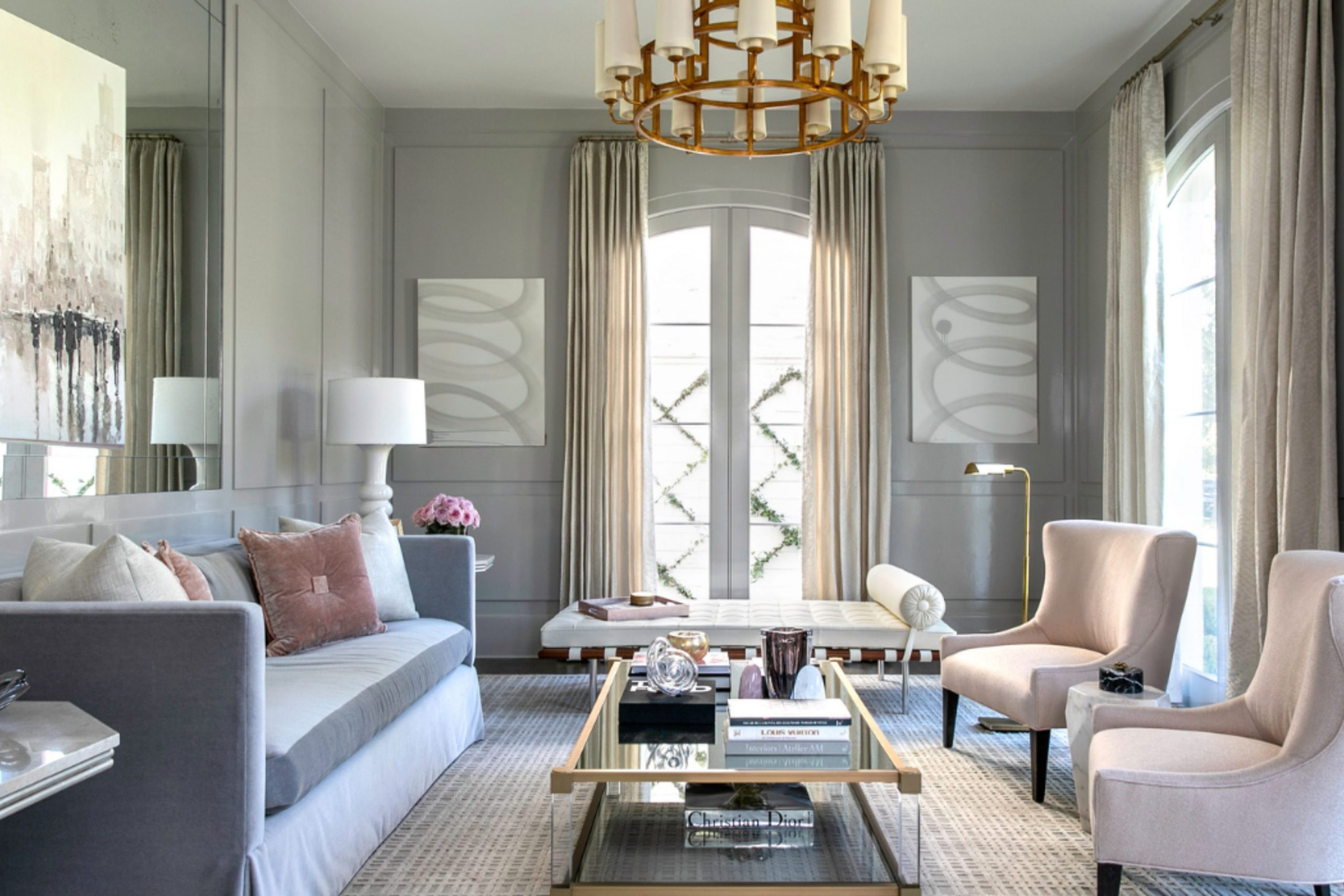
Pale Pink SW 9696
Pale Pink SW 9696 acts as a very soft and pretty color that makes gray furniture look much more gentle. This shade is great because it is not too bright or too sugary sweet for a main living area. I suggest using it in a bedroom to create a very happy and light feeling for everyone.
Pale Pink SW 9696 pairs beautifully with light gray rugs and white fluffy pillows for a cozy look. It has a bit of warmth that helps a cold gray room feel much more like a place to relax. You will like how it makes the room feel very sunny even on a very cloudy day.
It is a very trendy color that looks modern when you pair it with gold metal lamps. Many people choose this when they want to add a touch of romance to a neutral house. It provides a lovely glow that makes skin tones look very healthy and very bright. I think it is a perfect choice for a sophisticated and soft interior design project.
Best used in: bedrooms, nurseries, and lady’s home offices
Pairs well with: Repose Gray SW 7015, High Reflective White SW 7757, gold accents The key rule of this color for a soft style is to use it in rooms with plenty of white to keep the pink feeling airy and light.
🎨 Check out the complete guide to this color right HERE 👈
Intimate White SW 6322
Intimate White SW 6322 provides a very tiny hint of pink that stays very quiet on your large walls. This color is a fantastic choice if you want a white that feels much warmer than a standard paint. I love how it looks next to dark gray velvet chairs because it creates a sharp contrast. Intimate White SW 6322 makes a small guest room feel very welcoming and very full of light.
It does not feel like a nursery color because the pink undertone is very controlled and very light. You will notice that it helps a gray hallway feel much less like a cold office building. It looks very high-end when you pair it with light wood floors and very simple decor.
This shade is a great way to introduce a bit of warmth without committing to a bold color. I find that it makes a house feel very clean and very well cared for by the owners. It is a very sweet and gentle choice for anyone who loves a very bright and open house.
Best used in: guest rooms, hallways, and small bathrooms
Pairs well with: Dorian Gray SW 7017, Pure White SW 7005, light wood tones The key rule of this color for a gentle style is to use it where you want a white that feels like a soft morning glow.
🎨 Check out the complete guide to this color right HERE 👈
Romance SW 6323
Romance SW 6323 is a beautiful and sophisticated pink that feels very elegant next to gray stone work. This color has a dusty quality that makes it look very expensive and very carefully chosen. I like to use it in a formal sitting room where you want a very pretty and calm vibe.
Romance SW 6323 helps gray sofas look much more modern and a little bit more playful too. It is deep enough to see the pink clearly but light enough to stay very neutral and easy. You will enjoy how it looks with silver mirrors and light gray silk curtains in a bedroom.
It is a very popular choice for staging because it adds a unique touch that buyers always remember. I think it looks best when the room has lots of natural light to show off the soft tones. This color makes a house feel very peaceful and like a very safe place to be at night. It is a very grown-up version of pink that works perfectly in a modern gray home.
Best used in: master bedrooms, dressing rooms, and formal living areas
Pairs well with: Mindful Gray SW 7016, Eider White SW 7014, silver accents The key rule of this color for an elegant style is to pair it with cool grays to keep the pink looking crisp and professional.
🎨 Check out the complete guide to this color right HERE 👈
Malted Milk SW 6057
Malted Milk SW 6057 is a very unique tan that has a little bit of pink and gray mixed inside. This color feels like a warm cup of coffee and makes a gray room feel very cozy. I suggest using it in a dining room to create a very earthy and very traditional feeling.
Malted Milk SW 6057 looks amazing with dark brown wood and medium gray area rugs on the floor. It is a very steady color that makes a house feel very grounded and very solid on the walls. You will like how it hides small marks while still making the room look very bright and clean.
It is a great choice for a house that has a lot of antique furniture and old stories. I find that it makes a kitchen feel very heart-warming and perfect for baking on a rainy day. This shade is very rich and shows that you have a very classic and very steady style. It is a very dependable color that stays looking great for a very long period of time.
Best used in: dining rooms, kitchens, and cozy dens
Pairs well with: Revere Pewter HC-172, Alabaster SW 7008, dark wood furniture The key rule of this color for a cozy style is to use it with warm lighting to bring out the rich and creamy undertones.
🎨 Check out the complete guide to this color right HERE 👈
Cavern Clay SW 7701
Cavern Clay SW 7701 is a bold and earthy terracotta that brings a lot of heat to a gray room. This color is perfect for an accent wall if you want your house to feel very natural. I love using it behind a light gray sofa to create a very high-contrast and modern look.
Cavern Clay SW 7701 feels very organic and reminds me of the desert at a very beautiful sunset. It looks very sharp with black metal fixtures and light gray wood floors in a modern loft. You will see that it adds a lot of personality to a room that used to feel very boring.
It is a very confident color that shows you love to take risks with your interior design. I think it makes a home office feel very energetic and full of new and bright ideas. This shade of orange is very dusty which keeps it from feeling like a bright construction cone. It is a very high-end choice for someone who wants a home with a very bold character.
Best used in: accent walls, entryways, and creative home offices
Pairs well with: Gray Owl OC-52, Urbane Bronze SW 7048, black metal The key rule of this color for a bold style is to use it as a focal point to balance out large amounts of cool gray.
🎨 Check out the complete guide to this color right HERE 👈

Redend Point SW 9081
Redend Point SW 9081 is a soft and sandy color that feels very natural and very grounded on walls. This color was made to feel like a quiet hug and it works perfectly with gray furniture. I use it a lot in living rooms because it makes the house feel very trendy and very current.
Redend Point SW 9081 has a mix of pink and tan that makes it look very soft in any light. It helps a gray room feel much warmer and much more connected to the world outside the windows. You will notice that it makes white trim look very crisp and helps gray rugs stand out more.
It is a very relaxing shade that does not feel too dark or too heavy for a family room. I recommend it to anyone who wants a color that is easy to live with but very stylish. This shade makes your home feel very peaceful and like a very modern retreat for your family. It is a very beautiful choice for a house that values a natural and very simple look.
Best used in: living rooms, bedrooms, and bathrooms
Pairs well with: Edgecomb Gray HC-173, Snowbound SW 7004, natural textures The key rule of this color for a natural style is to use it with plenty of plants and wood to create an earthy vibe.
🎨 Check out the complete guide to this color right HERE 👈

Coral Reef SW 6606
Coral Reef SW 6606 is a very bright and fun color that adds a huge splash of energy to gray. This color is perfect for a laundry room or a craft room where you want to feel happy. I love using it for a front door on a gray house to give it a lot of curb appeal.
Coral Reef SW 6606 makes dark gray walls look very exciting and brings a lot of life to a room. It feels very tropical and reminds me of a vacation by the sea on a very sunny day. You will see that it makes people smile the moment they see it on your colorful walls.
It is a very brave choice that shows you have a very fun and very outgoing personality. I think it looks best when you use it in small amounts to create a very big impact. This shade of coral is very vibrant and helps a gray room feel much more playful and light. It is a fantastic pick for anyone who wants a home that feels very cheerful and very bright.
Best used in: front doors, laundry rooms, and accent furniture
Pairs well with: Stonington Gray HC-170, Extra White SW 7006, navy blue The key rule of this color for a fun style is to use it as a pop of color against a very neutral gray background.
🎨 Check out the complete guide to this color right HERE 👈
Honeycomb SW 6375
Honeycomb SW 6375 is a rich and golden yellow that makes a gray room feel much more sun-filled. This color is very warm and acts like a ray of light in a dark or windowless hallway. I suggest using it in a kitchen to create a very traditional and very welcoming heart of the home.
Honeycomb SW 6375 pairs beautifully with charcoal gray cabinets for a very high-end and custom look. It feels very classic and reminds me of a sunny field of flowers on a very calm afternoon. You will like how it makes your gray furniture look much more friendly and much more inviting.
It is a great way to add color if you want something that feels very established and very steady. I find that it makes a house feel very happy and full of positive energy for the family. This shade is very deep which keeps it from looking like a bright neon yellow on your walls. It is a very smart choice for a house that needs a bit more warmth and a bit more light.
Best used in: kitchens, breakfast nooks, and dark hallways
Pairs well with: Revere Pewter HC-172, Iron Ore SW 7069, white cabinetry The key rule of this color for a sunny style is to use it in rooms that need an extra boost of warmth and happiness.
🎨 Check out the complete guide to this color right HERE 👈
Golden Rule SW 6383
Golden Rule SW 6383 is a very deep and regal gold that brings a lot of wealth to a gray room. This color feels very traditional and looks like it belongs in a very expensive and old library. I love using it in a dining room to make dinner time feel very special and very formal.
Golden Rule SW 6383 makes light gray furniture look very bright and helps white trim pop like a star. It has a lot of brown in it which keeps it feeling very grounded and very sophisticated on walls. You will notice that it looks amazing with dark wood floors and big heavy curtains in a room.
It is a very confident color that shows you appreciate a very classic and very high-end look. I think it makes a house feel very warm and like a place with a lot of history inside. This shade is very rich and stays looking very good even when the sun goes down at night. It is a very beautiful choice for people who want a home that feels very sturdy and very grand.
Best used in: dining rooms, libraries, and entryways
Pairs well with: Classic Gray OC-23, Naval SW 6244, dark wood tones The key rule of this color for a regal style is to use it with high-quality fabrics like velvet to enhance the rich feeling.
🎨 Check out the complete guide to this color right HERE 👈
Urbane Bronze SW 7048
Urbane Bronze SW 7048 is a dark and moody mix of gray and brown that feels very high-end. This color is deep enough to make a very bold statement on your walls or your front door. I love using it for window trim because it makes the view outside look like a very pretty painting.
Urbane Bronze SW 7048 feels very natural and reminds me of river stones or old metal in a forest. It looks very sharp with light gray furniture and keeps the room feeling very modern and very clean. You will see that it adds a lot of depth to a room and makes it feel very private.
It is a very popular choice for modern farmhouses because it looks very steady and very professional. I think it makes a bedroom feel like a very quiet and very safe place to sleep every night. This shade is very sophisticated and shows that you have a very modern and very cool style. It is a very durable color that stays looking expensive for a very long period of time.
Best used in: exteriors, accent walls, and window trim
Pairs well with: Shoji White SW 7042, Modern Gray SW 7632, black hardware The key rule of this color for a moody style is to use it on structural elements to give the house a strong and grounded appearance.
🎨 Check out the complete guide to this color right HERE 👈

Iron Ore SW 7069
Iron Ore SW 7069 is a very dark charcoal that is almost black but feels much softer on the walls. This color is a fantastic partner for light gray because it creates a very high-contrast and sharp look. I love using it for interior doors to make a house look very custom and very expensive.
Iron Ore SW 7069 helps a gray room feel much more defined and much more architectural. It looks amazing with bright white trim and light gray furniture in a modern living room. You will notice that it does not feel as heavy as a true black paint would in a small space.
It is a very trendy choice for kitchen islands and looks great with silver or gold handles. I find that it makes a house feel very modern and like it was designed by a top interior expert. This shade is very steady and provides a very strong backdrop for all of your favorite decor items. It is a very bold and beautiful choice for anyone who wants a home with a lot of visual strength.
Best used in: interior doors, kitchen islands, and accent walls
Pairs well with: Alabaster SW 7008, Agreeable Gray SW 7029, light gray stone The key rule of this color for a strong style is to use it in small doses to highlight the best features of your gray room.
🎨 Check out the complete guide to this color right HERE 👈

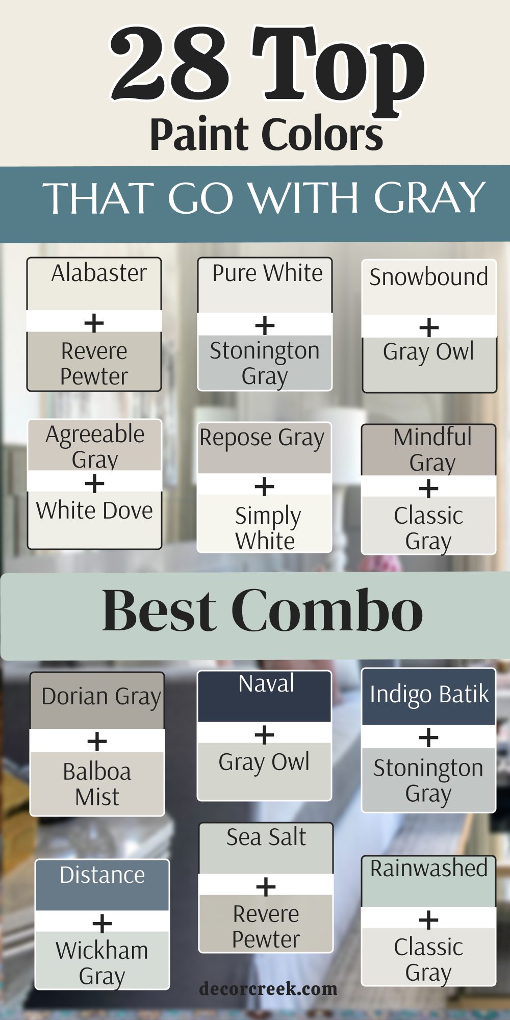
28 Paint Colors that go With Gray Best Combo
Alabaster SW 7008 + Revere Pewter HC-172
Alabaster SW 7008 and Revere Pewter HC-172 create a very soft and traditional look for a family room. This combination is perfect because the creamy white of Alabaster takes the cool edge off the light greige tones of Revere Pewter.
I often suggest this for large open spaces where you want a seamless transition between the walls and the trim. It makes the entire home feel incredibly cohesive and high-end without looking too sterile. You will notice that the warmth in both colors helps to hide the shadows in corners.
This pairing is a classic for a reason; it feels like a soft hug the moment you walk in. It works exceptionally well with medium-toned wood floors and brass accents.
Best used in: living rooms, open-concept kitchens, and entryways
Pairs well with: warm wood furniture, linen fabrics, and brass hardware The key rule for this combo is to use Alabaster on the trim to make the Revere Pewter walls look rich and intentional.

Pure White SW 7005 + Stonington Gray HC-170
Pure White SW 7005 and Stonington Gray HC-170 offer a very clean and cool pairing that is ideal for a modern bathroom. Stonington Gray has a slight blue undertone that feels very refreshing and watery, making it great for personal retreats.
Pure White acts as the perfect crisp border, ensuring the gray doesn’t feel too heavy or dark in a small space. I love using this combination when there is a lot of marble or silver hardware involved. It gives off a very sanitary and organized vibe that helps you feel energized in the morning.
This duo is fantastic for anyone who loves a minimalist or Scandinavian design style. It stays looking fresh even in rooms that don’t get a ton of natural sunlight.
Best used in: bathrooms, laundry rooms, and modern home offices
Pairs well with: silver fixtures, white marble, and navy accents The key rule for this combo is to keep decorations simple to let the crisp contrast between the white and cool gray shine.

Snowbound SW 7004 + Gray Owl OC-52
Snowbound SW 7004 and Gray Owl OC-52 make any room feel very bright and full of air. Gray Owl is a very light and ethereal gray that can sometimes look slightly green or blue depending on the light.
Snowbound is the perfect partner because it also has a tiny gray undertone, making the transition between wall and ceiling almost invisible. I find this works wonders in small apartments or basements where you need to maximize the feeling of space.
It provides a very soft background that allows your colorful furniture to really stand out. This is a very “designer” look that feels effortless and very current. It is perfect for those who want a neutral home that still has a bit of personality.
Best used in: small bedrooms, nurseries, and dark hallways
Pairs well with: light oak floors, pastels, and matte black accents The key rule for this combo is to use it in rooms with plenty of windows to see the beautiful shift in tones throughout the day.

Agreeable Gray SW 7029 + White Dove OC-17
Agreeable Gray SW 7029 and White Dove OC-17 represent the most popular combo for a reason—it is incredibly warm and versatile. Agreeable Gray is the ultimate “greige,” and White Dove is a soft, creamy white that isn’t too yellow.
Together, they create a balanced environment that works with both cool and warm furniture. I recommend this for homeowners who are nervous about choosing colors because it is almost impossible to get wrong.
It looks very expensive and well-planned, especially in transitional-style homes. This pairing handles the change from natural daylight to evening lamp light beautifully. It makes any room feel like it has been professionally staged for a magazine shoot.
Best used in: whole-house painting, family rooms, and kitchens
Pairs well with: leather chairs, woven rugs, and various wood tones The key rule for this combo is to use White Dove on the cabinets or built-ins to create a soft, inviting focal point.

Repose Gray SW 7015 + Simply White OC-117
Repose Gray SW 7015 and Simply White OC-117 provide a crisp and energetic look that works exceptionally well in a busy kitchen. Repose Gray is a cooler neutral that feels very sophisticated and modern.
Simply White is a very bright, high-energy white that brings a lot of “pop” to the gray walls. I love this for modern farmhouses because it feels very clean but still has a bit of soul. This combination makes stainless steel appliances and black hardware look very sharp and intentional.
You will like how the walls seem to change from gray to a soft silver in the afternoon sun. It is a very reliable choice for someone who wants their home to look very organized and tidy.
Best used in: kitchens, breakfast nooks, and mudrooms
Pairs well with: black metal, stainless steel, and quartz countertops The key rule for this combo is to use Simply White on the ceiling to reflect as much light as possible back onto the gray.

Mindful Gray SW 7016 + Classic Gray OC-23
Mindful Gray SW 7016 and Classic Gray OC-23 offer a great contrast between a medium-strength gray and a very light one. This is a fantastic way to do a “two-tone” room where one wall is darker than the others.
Mindful Gray has enough depth to feel grounded, while Classic Gray is so light it almost looks like an off-white. I find this pairing very useful for adding architectural interest to a plain, rectangular room.
It helps to define different areas in an open-concept floor plan without using a bright color. This duo feels very professional and is a great choice for a home office or a serious study. It provides a very stable and calming atmosphere for working or reading.
Best used in: open-concept living areas, home offices, and master suites
Pairs well with: dark walnut furniture, navy blue, and silver accents The key rule for this combo is to use Mindful Gray as an accent on the wall with the most architectural detail.

Dorian Gray SW 7017 + Balboa Mist OC-27
Dorian Gray SW 7017 and Balboa Mist OC-27 create a very rich and layered look for a master bedroom suite. Dorian Gray is a sophisticated, deeper gray that feels very cozy and secure.
Balboa Mist is a very soft, warm gray that acts as a beautiful highlight against the darker tones. I love this pairing because it feels very “hotel-luxury” and makes the bedding look incredibly inviting.
It is deep enough to feel moody in the evening but light enough to feel airy in the morning. This combination is great for those who want a bedroom that feels like a private sanctuary away from the rest of the house. It works beautifully with upholstered headboards and soft, plush carpeting.
Best used in: master bedrooms, dens, and media rooms
Pairs well with: velvet fabrics, dark wood, and warm lighting The key rule for this combo is to use Dorian Gray behind the bed to create a sense of depth and comfort.

Naval SW 6244 + Gray Owl OC-52
Naval SW 6244 and Gray Owl OC-52 are a classic power couple; this bold blue makes the light gray look very fresh and smart. Naval is a deep, authoritative navy that provides a stunning anchor for the light and breezy Gray Owl.
I often use this on kitchen islands or in dining rooms to create a focal point that everyone notices. The cool undertones in Gray Owl prevent the navy from feeling too heavy or overwhelming. This pairing feels very nautical and timeless, yet it works perfectly in a modern suburban home.
It is a great way to add “real” color to a gray house while keeping it very professional. You will love how white dishes and silver hardware pop against this background.
Best used in: dining rooms, kitchen islands, and entryways
Pairs well with: white trim, silver accents, and coastal decor The key rule for this combo is to use Naval on a smaller surface area so it accents rather than dominates the light gray.
Indigo Batik SW 7602 + Stonington Gray HC-170
Indigo Batik SW 7602 and Stonington Gray HC-170 create a moody and artistic pairing for a home library or office. Indigo Batik has a slightly dusty, denim-like quality that feels very soulful and quiet.
Stonington Gray is a steady, cool companion that keeps the room from feeling too dark. I like this for creative spaces because it feels very focused and serious without being boring. It looks incredible with gold picture frames and shelves full of colorful books.
This duo gives a room a sense of history and character, even if the house is brand new. It is a very sophisticated choice for someone who loves deep blues but wants to keep a gray theme.
Best used in: libraries, home offices, and small reading nooks
Pairs well with: gold frames, leather books, and warm wood shelving The key rule for this combo is to use Indigo Batik on all four walls if the room is small to create a “jewel box” effect.
Distance SW 6243 + Wickham Gray HC-171
Distance SW 6243 and Wickham Gray HC-171 work together to create a very quiet and peaceful feeling. Wickham Gray is a very pale, almost minty gray that feels very light on the walls.
Distance is a foggy, mid-tone blue that feels like a cloudy day at the sea. Together, they make a room feel very soft and easy on the eyes, which is perfect for relaxation. I suggest this for guest bedrooms where you want your visitors to feel instantly calm and at home.
This pairing doesn’t demand attention, but it makes the space feel very curated and thoughtful. It is a very smart choice for a bathroom to create a spa-like atmosphere.
Best used in: guest bedrooms, bathrooms, and nurseries
Pairs well with: white linens, silver accents, and soft textures The key rule for this combo is to use Wickham Gray as the primary color to keep the space feeling open and airy.

Sea Salt SW 6204 + Revere Pewter HC-172
Sea Salt SW 6204 and Revere Pewter HC-172 feel like a day at the beach in a very grown-up and sophisticated way. Sea Salt is a chameleon color that shifts between green, blue, and gray depending on the time of day.
Revere Pewter is a solid, warm greige that provides a grounded base for the lighter Sea Salt. I love this combination for sunrooms or bathrooms because it feels very organic and connected to nature.
It prevents the room from feeling too “beachy” or themed, keeping it elegant instead. This duo works wonderfully with natural materials like rattan, jute, and light oak. It is a favorite for staging homes near the water.
Best used in: sunrooms, master bathrooms, and laundry rooms
Pairs well with: rattan, jute rugs, and light wood furniture The key rule for this combo is to use Sea Salt in rooms with the most natural light to see its beautiful color shifts.
Rainwashed SW 6211 + Classic Gray OC-23
Rainwashed SW 6211 and Classic Gray OC-23 make a very light and happy mix for a nursery or a laundry room. Rainwashed is a cheerful blue-green that brings a lot of energy and positivity to a space.
Classic Gray is so light that it acts as a soft white, allowing the Rainwashed to be the star without being too bold. I find this pairing makes chores like washing clothes feel a little bit more pleasant.
It is a very “clean” looking combo that makes a room feel sanitized and fresh. This is a great pick for someone who wants to step away from all-gray but isn’t ready for dark colors. It looks very pretty with white wicker and light-colored accents.
Best used in: nurseries, laundry rooms, and craft rooms
Pairs well with: white wicker, light wood, and silver hardware The key rule for this combo is to use Classic Gray on the trim and ceiling to keep the Rainwashed feeling bright.
Evergreen Fog SW 9130 + Edgecomb Gray HC-173
Evergreen Fog SW 9130 and Edgecomb Gray HC-173 feel very natural and earthy together. Evergreen Fog was a color of the year because it captures a perfect forest-green tone that isn’t too dark.
Edgecomb Gray is a “stony” neutral that provides a very calm and steady backdrop. I love this for living rooms because it brings a sense of the outdoors inside, which is very relaxing.
This combination works beautifully with mid-century modern furniture or rustic wooden pieces. It feels very current and trendy but has enough depth to stay stylish for years. This is a great way to add a “nature” theme to a home that has gray floors or stone features.
Best used in: living rooms, dens, and mudrooms
Pairs well with: cognac leather, indoor plants, and rustic wood The key rule for this combo is to use Evergreen Fog on a feature wall to bring a sense of life to the neutral Edgecomb Gray.

Clary Sage SW 6178 + Pale Oak OC-20
Clary Sage SW 6178 and Pale Oak OC-20 offer a soft and organic look that brings the feeling of a garden inside. Clary Sage is a gentle, herbal green that feels very peaceful and historic.
Pale Oak is a very light, warm neutral that looks like sun-bleached wood on the walls. I suggest this for kitchens or breakfast nooks where you want a very welcoming and soft morning vibe.
It makes gray stone countertops look very intentional and much warmer than they actually are. This duo is perfect for those who love a “cottagecore” or traditional country style. It feels very light and breezy while still having a definite sense of color.
Best used in: kitchens, breakfast nooks, and small bedrooms
Pairs well with: terracotta, antique gold, and warm wood The key rule for this combo is to use Clary Sage on the walls and Pale Oak for the trim to create a soft, vintage look.

Pewter Green SW 6208 + Gray Owl OC-52
Pewter Green SW 6208 and Gray Owl OC-52 create a high-contrast look where the dark green makes the light gray look very crisp and sharp. Pewter Green is a moody, dusty forest shade that adds a lot of weight and drama to a room.
Gray Owl provides the necessary light to ensure the room doesn’t feel like a cave. I love this for an entryway because it makes a very strong first impression on guests. It feels very regal and sophisticated, like an old European estate.
This combination is great for those who aren’t afraid of dark colors but want to keep the house feeling modern. It looks fantastic with black metal and very bright white accents.
Best used in: entryways, accent walls, and home offices
Pairs well with: matte black metal, bright white, and gold accents The key rule for this combo is to use Pewter Green in a room that has a lot of white trim to provide a sharp frame for the color.
Retreat SW 6207 + Balboa Mist OC-27
Retreat SW 6207 and Balboa Mist OC-27 are a very peaceful pairing that works well for a spa-like bathroom or bedroom. Retreat is a mid-tone green with heavy gray undertones, making it a “safe” green for people who love neutrals.
Balboa Mist is a soft, warm companion that keeps the room feeling light and airy. I often use this in guest suites because it is a very universally liked combination. It feels very clean and high-end, like a luxury hotel in the mountains.
This duo is perfect for creating a quiet space where you can escape from the stress of the day. It works wonderfully with silver hardware and very soft, white towels.
Best used in: guest bedrooms, bathrooms, and quiet dens
Pairs well with: silver hardware, white linens, and soft gray rugs The key rule for this combo is to use Retreat on the walls and Balboa Mist on the ceiling for a truly immersive, calm feeling.
Ripe Olive SW 6209 + Edgecomb Gray HC-173
Ripe Olive SW 6209 and Edgecomb Gray HC-173 are a very dramatic and expensive-looking combo for a dining room. Ripe Olive is an intense, dark green that acts almost like a black but with much more life and soul.
Edgecomb Gray provides a soft, stony contrast that keeps the room from feeling too heavy. I love this for formal spaces where you want to have long, candlelit dinners with friends.
It makes gold and brass fixtures look like real jewelry against the dark walls. This is a very confident pairing that shows you have a very high-end and designer-focused style. It brings a lot of character and history to a dining area.
Best used in: formal dining rooms, powder rooms, and accent walls
Pairs well with: brass hardware, crystal, and dark wood furniture The key rule for this combo is to use plenty of warm, low-level lighting to make the Ripe Olive glow in the evening.
Pale Pink SW 9696 + Classic Gray OC-23
Pale Pink SW 9696 and Classic Gray OC-23 create a very soft and pretty look that is not too sugary sweet. Pale Pink is a sophisticated, “dusty” pink that feels adult and modern.
Pale Pink is so light it acts as a soft white, providing a clean border for the pink tones. I find this works beautifully in a girl’s bedroom or a creative workspace for a woman. It adds a touch of romance to the house without being overwhelming or childish.
This duo makes a room feel very sunny and optimistic, even on a cloudy day. It looks very high-end when paired with gold metal and very light wood.
Best used in: bedrooms, home offices, and dressing rooms
Pairs well with: gold metal, light wood, and white fur textures The key rule for this combo is to use Classic Gray as the trim color to keep the pink feeling modern and “grown-up.”
Intimate White SW 6322 + Pale Oak OC-20
Intimate White SW 6322 and Pale Oak OC-20 are a very gentle and light pairing for a small guest room. Intimate White is a white with a very faint pink undertone that adds a touch of warmth.
Pale Oak is a soft, warm greige that makes the room feel grounded and secure. Together, they make a small space feel much larger and very welcoming for visitors. I love this for hallways or guest baths because it feels very clean and very high-quality.
It is a very safe way to add a “glow” to a room without using a bold paint color. This combination is perfect for a house that values a very light and airy interior design.
Best used in: guest rooms, hallways, and small bathrooms
Pairs well with: light wood, white linens, and soft gray accents The key rule for this combo is to use Intimate White on the walls and Pale Oak on any built-in shelving for a subtle contrast.
Romance SW 6323 + Balboa Mist OC-27
Romance SW 6323 and Balboa Mist OC-27 feel very elegant and soft for a lady’s dressing room or master suite. Romance is a more “obvious” pink than Intimate White but still stays very dusty and sophisticated.
Balboa Mist provides a warm, gray-toned anchor that keeps the pink from looking too youthful. I suggest this for rooms where you want a very pretty and calm atmosphere for getting ready in the morning.
It makes skin tones look very healthy and provides a lovely, soft light in the room. This pairing is very trendy in modern luxury homes that want a touch of feminine charm. It looks fantastic with silver mirrors and plush gray furniture.
Best used in: dressing rooms, master bedrooms, and powder rooms
Pairs well with: silver mirrors, gray velvet, and crystal lighting The key rule for this combo is to use Balboa Mist as the main floor or rug color to ground the pink walls.
Malted Milk SW 6057 + Revere Pewter HC-172
Malted Milk SW 6057 and Revere Pewter HC-172 offer a very warm and unique look that feels like a cozy café. Malted Milk is a rich tan with hints of pink and gray, making it a very complex and interesting neutral.
Revere Pewter is the classic greige that adds stability and a modern touch to the combo. I like this for dining rooms or kitchens where you want a very earthy and welcoming heart of the home.
It works incredibly well with dark wood furniture and provides a lot of “soul” to the house. This duo is perfect for those who find all-gray homes too cold or empty. It feels very established and traditional, like a house that has many stories to tell.
Best used in: dining rooms, kitchens, and cozy dens
Pairs well with: dark wood, leather, and cream-colored ceramics The key rule for this combo is to use warm-toned light bulbs to bring out the rich “milk” tones in the paint.
Cavern Clay SW 7701 + Gray Owl OC-52
Cavern Clay SW 7701 and Gray Owl OC-52 are a bold pairing where the earthy orange pops beautifully against a cool gray background. Cavern Clay is a vibrant but dusty terracotta that brings a lot of heat and personality to a room.
Gray Owl acts as a very light, cool contrast that prevents the orange from feeling too overwhelming. I love using this for an accent wall in a living room or a creative home office. It feels very artistic and reminds me of modern southwestern design.
This is a very confident combination for homeowners who want their house to stand out and feel unique. It looks amazing with black metal fixtures and light wood floors.
Best used in: accent walls, creative home offices, and entryways
Pairs well with: black metal, light wood, and green plants The key rule for this combo is to use Cavern Clay on the wall that receives the most afternoon sunlight to see its full warmth.
Redend Point SW 9081 + Edgecomb Gray HC-173
Redend Point SW 9081 and Edgecomb Gray HC-173 are a very trendy and natural-looking pair for a modern living room. Redend Point is a soft, sandy clay color that was a color of the year for its “hug-like” quality.
Edgecomb Gray is a steady, stony neutral that keeps the look grounded and professional. I recommend this for families who want a modern home that still feels very warm and lived-in.
It hides the wear and tear of a busy life beautifully and stays looking stylish in any light. This combination is perfect for the “desert modern” or “organic modern” styles that are very popular right now. It works wonderfully with plenty of textures like wool, wood, and stone.
Best used in: living rooms, bedrooms, and family rooms
Pairs well with: textured wool rugs, natural wood, and stone accents The key rule for this combo is to use Redend Point in rooms with plenty of soft textiles to enhance its “cozy” feeling.
Coral Reef SW 6606 + Stonington Gray HC-170
Coral Reef SW 6606 and Stonington Gray HC-170 add a bright and fun look that brings a lot of energy to a room. Coral Reef is a vibrant, happy color that works perfectly as an accent against the cool, steady Stonington Gray.
I love using this combination for a laundry room or a front door to give the house a lot of personality. It feels very tropical and energetic, making even a boring chore feel a bit more like a vacation. This is a brave choice for someone who loves color and isn’t afraid to show it.
The gray keeps the coral from looking like a crayon color, making it feel more like a designer choice. You will notice how this combo instantly cheers up anyone who walks into the room.
Best used in: laundry rooms, front doors, and craft rooms
Pairs well with: white trim, navy accents, and coastal decor The key rule for this combo is to use Coral Reef on a single piece of furniture or a door to provide a “pop” without overdoing it.
Honeycomb SW 6375 + Revere Pewter HC-172
Honeycomb SW 6375 and Revere Pewter HC-172 make the gray feel very sunny and bright. Honeycomb is a rich, golden yellow that brings the feeling of sunlight into even the darkest corners of a house.
Revere Pewter provides a warm, greige base that keeps the yellow from feeling too “loud” or childish. I suggest this for kitchens or breakfast nooks where you want a very happy and welcoming morning vibe.
It makes gray cabinets look very intentional and much more friendly for a family home. This duo is a great way to add warmth to a house that doesn’t get a lot of natural light. It feels very established and traditional, like a classic sunny farmhouse.
Best used in: kitchens, breakfast nooks, and dark hallways
Pairs well with: dark wood, white cabinetry, and gray stone The key rule for this combo is to use Honeycomb in areas where you want to encourage conversation and energy.
Golden Rule SW 6383 + Classic Gray OC-23
Golden Rule SW 6383 and Classic Gray OC-23 create a very rich and warm look that feels very traditional and high-end. Golden Rule is a deep, regal gold that adds a lot of “weight” and value to a room’s appearance.
Classic Gray is a very light, almost white neutral that provides a clean, modern border for the gold. I love this for formal dining rooms or libraries where you want a very sophisticated and “old money” vibe.
It looks incredible with dark wood floors and big, heavy furniture pieces. This combination shows that you have a very classic and steady style that won’t go out of fashion. It makes a house feel very solid, safe, and expensive.
Best used in: formal dining rooms, libraries, and entryways
Pairs well with: dark walnut, velvet curtains, and brass hardware The key rule for this combo is to use Golden Rule on the walls above a white wainscoting for a very regal look.
Urbane Bronze SW 7048 + Simply White OC-117
Urbane Bronze SW 7048 and Simply White OC-117 provide a very high-contrast look that is bold and very modern. Urbane Bronze is a dark, moody mix of gray and brown that acts as a very strong anchor for a room.
Simply White is a high-energy, bright white that makes the dark bronze look even richer and more architectural. I love this for exteriors or for window trim because it makes the house look very designer and very sharp.
It is a very popular choice for modern farmhouses because it feels very sturdy and professional. This combination is great for creating a sense of drama in a bedroom or a home theater. It looks amazing with black hardware and natural wood accents.
Best used in: exteriors, window trim, and accent walls
Pairs well with: black hardware, natural wood, and modern furniture The key rule for this combo is to use Simply White for the majority of the room to let the Urbane Bronze act as a sharp, dark frame.
Iron Ore SW 7069 + White Dove OC-17
Iron Ore SW 7069 and White Dove OC-17 create a combination where the almost-black color makes the white trim look very bright. Iron Ore is a very dark charcoal that is much softer and friendlier than a true black.
White Dove is a creamy, soft white that prevents the contrast from feeling too “harsh” or cold. I love using this for interior doors or for a kitchen island to add a lot of visual interest to a gray home. It makes the whole house feel very custom-built and very expensive.
This pairing is a favorite for modern luxury designs because it is very simple but very powerful. It provides a very strong backdrop for art and colorful decorations.
Best used in: interior doors, kitchen islands, and modern living rooms
Pairs well with: gold hardware, light gray stone, and colorful art The key rule for this combo is to use Iron Ore as a high-contrast accent to highlight the architectural lines of your home.
21 Colors that Goes With Gray Furniture
Alabaster SW 7008
Alabaster SW 7008 makes gray sofas look very clean and helps them stand out in the room. This creamy white is a favorite for staging because it creates a soft, bright backdrop without the harshness of a pure hospital white.
I love how it warms up a charcoal gray sectional, making the living area feel much more inviting for family gatherings. You will notice that it picks up just enough warmth to balance the cool tones of a slate gray rug.
It provides a high-end, airy feel that makes even a simple gray chair look like a designer piece. This is my go-to choice when a room has a lot of gray and needs to feel more like a home.
Best used in: living rooms, bedrooms, and open-plan spaces
Pairs well with: charcoal gray sofas, light oak floors, and black accents The key rule for this color is to use it when you want your gray furniture to be the darkest, most grounded element in the room.
🎨 Check out the complete guide to this color right HERE 👈
White Dove OC-17
White Dove OC-17 is a soft white that prevents a gray room from feeling too cold or unfriendly. This Benjamin Moore classic has a tiny hint of gray in its base, which makes it the perfect partner for light gray upholstered beds or dining chairs.
I find that it creates a very sophisticated and “expensive” look that is very popular in modern luxury homes. It works well because it doesn’t fight with the gray; it just sits quietly in the background and lets the furniture shine.
You will love how it handles shadows, staying creamy and soft even in the evening light. It is a fantastic choice for those who want a neutral home that still feels very high-quality and soft.
Best used in: dining rooms, master suites, and hallways
Pairs well with: light gray velvet, silver mirrors, and marble coffee tables The key rule for this color is to use it on both walls and trim to create a seamless, soft glow around your gray furniture.
🎨 Check out the complete guide to this color right HERE 👈
Accessible Beige SW 7036
Accessible Beige SW 7036 warms up gray furniture and makes the whole room feel more connected. If you have a gray sofa that feels a bit too “industrial” or cold, this color will instantly fix that problem.
It bridges the gap between warm tan and cool gray, creating a very balanced and earthy atmosphere. I love how it looks with mid-toned gray furniture and dark wood legs. It makes the space feel very steady and stable, which is great for a busy family room.
You will notice that it hides everyday wear and tear much better than a lighter white paint would. It is a very safe and professional choice for anyone who wants a cozy, neutral home.
Best used in: family rooms, entryways, and finished basements
Pairs well with: greige furniture, dark wood, and textured blankets The key rule for this color is to use it as a neutral base to make cool gray furniture feel more intentional and warm.
🎨 Check out the complete guide to this color right HERE 👈
Edgecomb Gray HC-173
Edgecomb Gray HC-173 is a light gray-beige that creates a very smooth and soft look with gray pieces. This color is a “super-neutral” that is famous for its ability to look good in any lighting condition.
I often use it to paint living rooms where the owner has a mix of different gray furniture styles. It ties everything together into one cohesive design without being too bold or distracting.
You will like how it makes a medium-gray sofa look very sharp and professional against the walls. It has a “stony” quality that feels very natural and very high-end. This is a great choice for people who want a gray home that feels soft rather than cold and metallic.
Best used in: living rooms, home offices, and bedrooms
Pairs well with: medium-gray fabrics, stone textures, and navy accents The key rule for this color is to use it when you want a “no-fail” neutral that lets your gray furniture take center stage.
🎨 Check out the complete guide to this color right HERE 👈
Pale Oak OC-20
Pale Oak OC-20 is very light and airy, making gray furniture the main focus of the space. It is a very elegant off-white with just a drop of warm gray that feels like sun-bleached wood.
I love using it in small rooms where a dark gray dresser or bed might otherwise feel too heavy. It creates a beautiful contrast that makes the furniture look much more architectural and important.
You will see that it keeps the room feeling very bright and energized throughout the entire day. It is a favorite for modern apartments because it looks very clean and very organized. This shade provides a soft, museum-like quality that makes your furniture look like art.
Best used in: small apartments, guest rooms, and bright kitchens
Pairs well with: dark gray headboards, silver hardware, and light wood The key rule for this color is to use it in rooms with high ceilings to create a sense of unlimited space and light.
🎨 Check out the complete guide to this color right HERE 👈
Intimate White SW 6322
Intimate White SW 6322 is a white with a tiny hint of pink that makes gray furniture feel more soft and feminine. If you have a gray bedroom set that feels a bit too masculine, this color will add the perfect touch of warmth.
It is very subtle and doesn’t look like a “pink room,” but rather like a white room with a very warm morning glow. I find it works wonderfully with dark gray velvet chairs to create a very high-end, romantic look.
You will notice that it makes the gray look more like silver than like stone. It is a very sweet and gentle choice for anyone who wants a soft, welcoming sanctuary.
Best used in: guest rooms, master bedrooms, and nurseries
Pairs well with: charcoal velvet, silver accents, and white linens The key rule for this color is to use it in south-facing rooms to capture the most warmth from the sun.
🎨 Check out the complete guide to this color right HERE 👈
Romance SW 6323
Romance SW 6323 is a beautiful soft pink that looks very sophisticated next to a gray velvet chair. This color has a dusty, muted quality that makes it feel very adult and very expensive.
I love using it in a lady’s home office or a dressing room to create a very chic and pretty vibe. It helps gray furniture look much more playful and less serious without losing its professional edge.
You will enjoy how it brings a sense of calm and happiness to a room that used to feel a bit dull. It is a very trendy choice for modern homes that want a touch of character. This shade provides a lovely background that makes people look and feel their best.
Best used in: dressing rooms, home offices, and master suites
Pairs well with: light gray furniture, gold metal, and white fur The key rule for this color is to pair it with cool grays to keep the pink looking modern and crisp.
🎨 Check out the complete guide to this color right HERE 👈
Clary Sage SW 6178
Clary Sage SW 6178 brings a natural look that balances the industrial feel of gray furniture. This soft, herbal green feels very organic and reminds me of a quiet garden in the morning.
I suggest using it in a kitchen with gray cabinets or a living room with a gray linen sofa. It makes the gray feel much warmer and more connected to the world outside your windows.
You will notice that it adds a sense of history and stability to your home design. It is a very friendly color that makes guests feel relaxed and comfortable the moment they sit down. I think it looks best when paired with antique gold frames and light wood furniture.
Best used in: kitchens, living rooms, and mudrooms
Pairs well with: gray stone, light wood, and terracotta accents The key rule for this color is to use it in rooms where you want a soft, natural, and timeless feeling.
🎨 Check out the complete guide to this color right HERE 👈
Evergreen Fog SW 9130
Evergreen Fog SW 9130 is a deep green that makes gray furniture look very rich and expensive. This earthy, chameleon-like shade was a color of the year because it is so easy to live with and so beautiful.
I love how it makes a light gray sofa look very bright and very modern in contrast. It feels very grounded and natural, making your home feel like a high-end retreat in the woods.
You will see that it adds a lot of depth and character to a room that might otherwise feel empty. It is a very trendy choice that still feels like a classic because it is so calming. I find it works perfectly for an office where you need to stay focused and creative.
Best used in: living rooms, home offices, and dining rooms
Pairs well with: light gray fabrics, cognac leather, and indoor plants The key rule for this color is to use it as a bridge between your indoor gray items and the greenery outdoors.
🎨 Check out the complete guide to this color right HERE 👈
Pewter Green SW 6208
Pewter Green SW 6208 is a dark and moody green that provides a great backdrop for light gray sofas. This color is very regal and strong, giving your room a sense of mystery and high-end design.
I love using it for an accent wall behind a gray upholstered bed to make the furniture the focal point. It makes silver hardware and white trim pop like stars against a dark forest night.
You will enjoy how it makes the room feel very private and very safe for resting. It is a bold choice that shows you are confident in your personal style and taste. I think it makes a home library feel very traditional and very important.
Best used in: master bedrooms, libraries, and accent walls
Pairs well with: light gray furniture, gold accents, and dark wood The key rule for this color is to use it in rooms with plenty of lamps to create a warm, moody glow in the evening.
🎨 Check out the complete guide to this color right HERE 👈
Rainwashed SW 6211
Rainwashed SW 6211 is a light blue-green that makes gray furniture feel very fresh and clean. This happy and energetic color is perfect for a laundry room or a bathroom where you want to feel refreshed.
I love how it makes gray stone or tile look much more intentional and modern. It feels very watery and soft, reminding me of a clear spring day after a light rain.
You will notice that it brings a lot of life to a room that has a lot of neutral gray pieces. It is a very popular choice for beach houses, but it looks just as good in a modern suburban house. I recommend it for anyone who wants a home that feels light and very full of good energy.
Best used in: bathrooms, laundry rooms, and kitchens
Pairs well with: gray stone, white trim, and light wood The key rule for this color is to use it in rooms that get a lot of natural light to show off its cheerful glow.
🎨 Check out the complete guide to this color right HERE 👈
Naval SW 6244
Naval SW 6244 is a deep blue that makes a gray bed or sofa look very crisp and bright. This classic navy provides a powerful anchor for the room, making everything feel much more professional.
I often use it on a kitchen island to make gray countertops look very high-end and custom. It acts like a neutral because it goes with everything, but it has much more personality than a simple gray paint.
You will see that it makes light gray furniture really stand out and look very modern. It adds a sense of drama and stability to a large living room or an entryway. I think it is the perfect choice for a “power room” or a formal dining area.
Best used in: kitchen islands, dining rooms, and front doors
Pairs well with: light gray furniture, gold hardware, and white trim The key rule for this color is to use it as a bold statement piece to accent your favorite gray furniture.
🎨 Check out the complete guide to this color right HERE 👈
Hale Navy HC-154
Hale Navy HC-154 is a classic navy from Benjamin Moore that adds a lot of strength to a room with gray accents. It has a slightly more “stony” and grayed-out tone than other navies, making it a perfect match for gray furniture.
I find that it creates a very regal and timeless atmosphere that never goes out of style. It makes white cabinetry and gray stone floors look very sharp and well-coordinated.
You will love how it brings a sense of history and weight to a modern house. It is a very dependable color that looks good in both bright sun and low lamp light. I recommend it to anyone who wants a sophisticated home with a very traditional feel.
Best used in: home libraries, exteriors, and master bedrooms
Pairs well with: medium gray fabrics, brass accents, and white trim The key rule for this color is to use it when you want a blue that feels as steady and neutral as a gray.
🎨 Check out the complete guide to this color right HERE 👈

Indigo Batik SW 7602
Indigo Batik SW 7602 is a very deep and artistic blue that makes light gray furniture pop like a star. This color feels very handmade and soulful, like a piece of vintage fabric.
I love using it in a bedroom to create a very quiet and deep place for sleeping and resting. It makes light gray bedding and white furniture look very clean and very important in the room.
You will enjoy how it looks with dark wood and silver lamps for a very cozy and high-end feeling. It is a great way to add color to a gray house if you want something that feels very classic. I find that it makes a room feel very expensive and like a professional designed it.
Best used in: bedrooms, home offices, and libraries
Pairs well with: light gray furniture, silver accents, and white linens The key rule for this color is to use it on a single wall to create a deep and interesting focus point.
🎨 Check out the complete guide to this color right HERE 👈
Golden Rule SW 6383
Golden Rule SW 6383 is a warm gold that makes a gray room feel much sunnier and more energetic. If your gray furniture feels a bit too “cold” or boring, this rich gold will instantly bring it to life.
I love using it in a dining room to make dinner time feel very special and very formal. It makes light gray chairs look very bright and helps white trim pop like a star on the walls.
It has a lot of brown in it, which keeps it feeling very grounded and very sophisticated. You will notice that it looks amazing with dark wood floors and big, heavy curtains in a room. It is a very confident color that shows you appreciate a classic and high-end look.
Best used in: dining rooms, entryways, and kitchens
Pairs well with: light gray furniture, dark wood, and brass hardware The key rule for this color is to use it with high-quality fabrics like velvet to enhance the rich feeling.
🎨 Check out the complete guide to this color right HERE 👈
Honeycomb SW 6375
Honeycomb SW 6375 is a bright yellow that adds a fun and modern touch to gray furniture pieces. This color is very warm and acts like a ray of light in a dark or windowless hallway.
I suggest using it in a kitchen to create a very traditional and very welcoming heart of the home. It pairs beautifully with charcoal gray cabinets for a very high-end and custom look.
You will like how it makes your gray furniture look much more friendly and much more inviting to guests. It is a great way to add color if you want something that feels very established and steady. I find that it makes a house feel very happy and full of positive energy for the family.
Best used in: kitchens, dark hallways, and breakfast nooks
Pairs well with: charcoal gray, white cabinetry, and light wood The key rule for this color is to use it in rooms that need an extra boost of warmth and happiness.
🎨 Check out the complete guide to this color right HERE 👈
Cavern Clay SW 7701
Cavern Clay SW 7701 is an earthy terracotta color that looks amazing with dark gray industrial furniture. This color is very organic and reminds me of a beautiful desert sunset.
I love using it behind a light gray sofa to create a very high-contrast and modern look in a loft. It feels very confident and shows that you love to take risks with your interior design projects.
You will see that it adds a lot of personality to a room that used to feel very boring or empty. It makes a home office feel very energetic and full of new and bright ideas for your work. This shade is very dusty, which keeps it from feeling like a bright neon color on your walls.
Best used in: accent walls, entryways, and home offices
Pairs well with: dark gray metal, light wood, and green plants The key rule for this color is to use it as a focal point to balance out large amounts of cool gray.
🎨 Check out the complete guide to this color right HERE 👈
Redend Point SW 9081
Redend Point SW 9081 is a soft clay color that makes gray furniture feel very grounded and natural. This color was designed to feel like a “quiet hug,” and it works perfectly with modern gray pieces.
I use it a lot in living rooms because it makes the house feel very trendy and very current for 2026. It has a mix of pink and tan that makes it look very soft and inviting in any light. You will notice that it makes white trim look very crisp and helps gray rugs stand out more than before.
It is a very relaxing shade that does not feel too dark or too heavy for a family room. I recommend it to anyone who wants a color that is easy to live with but very stylish.
Best used in: living rooms, bedrooms, and family rooms
Pairs well with: light gray furniture, natural wood, and stone textures The key rule for this color is to use it with plenty of plants and wood to create an earthy, modern vibe.
🎨 Check out the complete guide to this color right HERE 👈
Silver Mist 1619
Silver Mist 1619 is a light blue-gray that blends perfectly with gray furniture for a very soft and quiet look. This Benjamin Moore color is so close to gray that it acts as a subtle whisper of color on your walls.
I find it is a fantastic choice for a bedroom where you want everything to feel very seamless and peaceful. It prevents the room from feeling too “busy” because it matches the tone of gray furniture so well.
You will love how it makes the walls feel like they are receding, making a small room feel much larger. It is a very sophisticated and “quiet luxury” choice for a modern home. This shade provides a very cool and refreshing atmosphere for resting.
Best used in: small bedrooms, guest baths, and nurseries
Pairs well with: light gray fabrics, silver hardware, and white trim The key rule for this color is to use it when you want a look that is very calm and monochromatic.
Kendall Charcoal HC-166
Kendall Charcoal HC-166 is a dark gray that creates a very moody and high-end look with lighter gray furniture. This is a “tone-on-tone” approach that looks incredibly professional and designer-led.
I love using it for an office or a media room where you want to feel completely immersed in the space. It makes light gray leather or fabric look very bright and very sharp in contrast.
You will notice that it adds a lot of architectural weight to a room, making it feel very solid and safe. It is a bold choice that works best in rooms with a lot of natural light to show off its rich pigments. I think it makes a house feel very modern and very cool.
Best used in: media rooms, home offices, and accent walls
Pairs well with: light gray furniture, white trim, and black metal The key rule for this color is to use it on all four walls for a dramatic, “wrap-around” feeling of luxury.
🎨 Check out the complete guide to this color right HERE 👈

Iron Ore SW 7069
Iron Ore SW 7069 is a dark charcoal that makes gray furniture look very bright and clean in contrast. It is almost black, but it has a soft, velvety quality that prevents it from feeling too harsh on the eyes.
I love using it for interior doors or a kitchen island to add a big splash of drama to a gray home. It helps a gray room feel much more defined and much more expensive to the observer. You will see that it provides a very strong backdrop for all of your favorite colorful decorations.
It is a very trendy choice that shows you have a very modern and very confident style. I find it makes a bedroom feel like a very quiet and very safe sanctuary at night.
Best used in: interior doors, accent walls, and kitchen islands
Pairs well with: light gray furniture, gold hardware, and white trim The key rule for this color is to use it in small doses to highlight the best features of your gray furniture.
🎨 Check out the complete guide to this color right HERE 👈
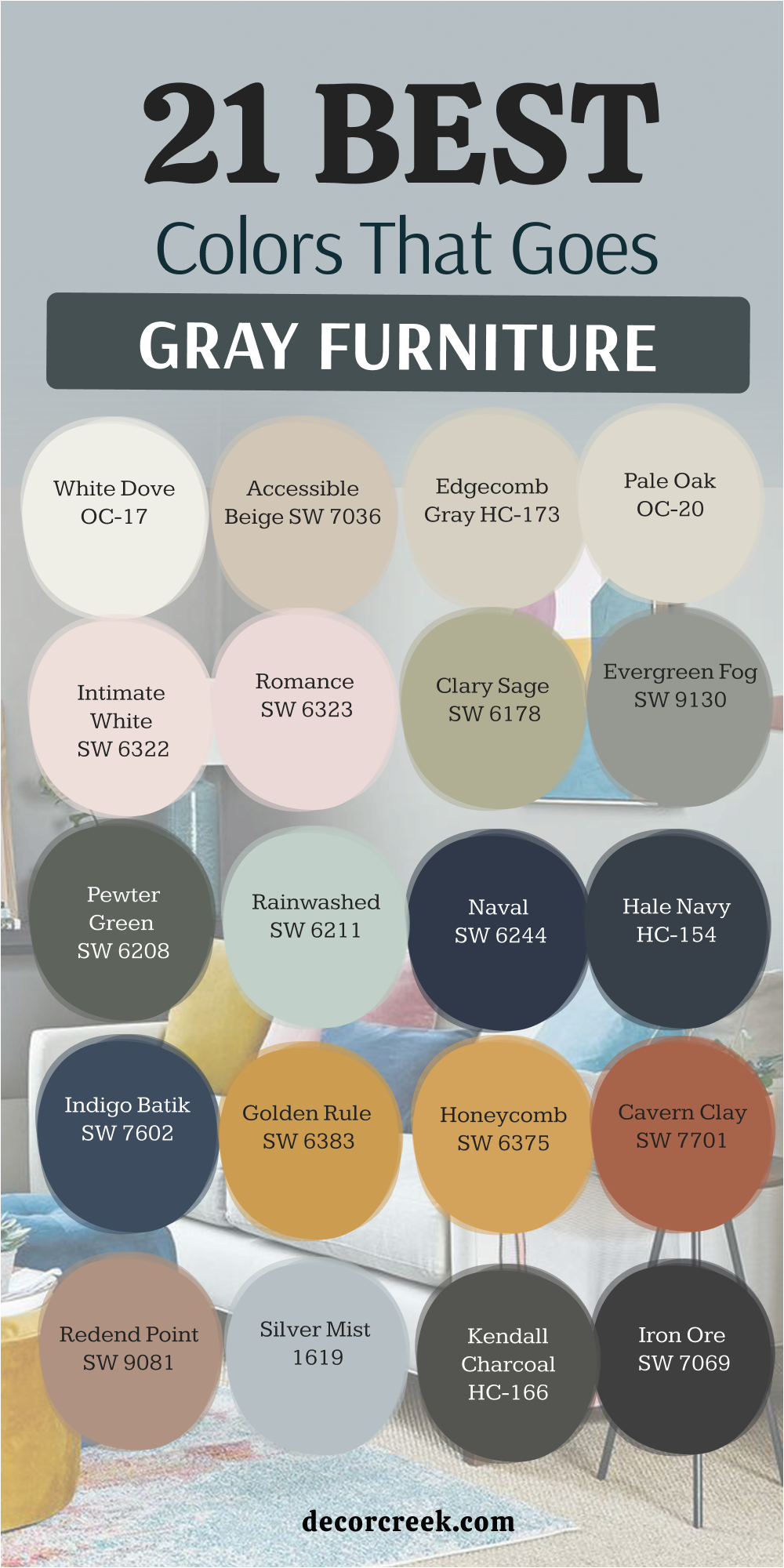
14 Paint Colors That Go With Gray Cabinets
Shoji White SW 7042
Shoji White SW 7042 is a very warm white that makes gray cabinets feel cozy and traditional. It sits right on the edge between a soft cream and a very light greige, which helps it bridge the gap between cool gray wood and warm indoor lighting.
I love using this in kitchens that have a lot of natural wood accents because it ties the whole room together beautifully. It prevents gray cabinets from looking too “blue” or cold in the early morning light.
You will notice that it makes the room feel much softer and more lived-in. This is a fantastic choice for a farmhouse or transitional style kitchen where comfort is just as important as style.
Best used in: kitchens, breakfast nooks, and open-plan living areas
Pairs well with: greige-gray cabinets, warm wood floors, and bronze hardware The key rule for this color is to use it in rooms with plenty of warm textures to highlight its creamy, inviting base.
🎨 Check out the complete guide to this color right HERE 👈

Creamy SW 7012
Creamy SW 7012 is a soft yellow-white that brings out the warmth in a gray kitchen. This color is very rich and acts like a splash of sunshine against darker gray cabinetry.
I find that it works wonders for making a kitchen feel more like the “heart of the home” rather than just a workspace. It provides a lovely contrast that makes the gray paint on your cabinets look deeper and more intentional.
You will enjoy how it makes white quartz or marble countertops pop against the walls. It is a very dependable color for those who want a classic, bright kitchen that never feels sterile. I think it looks best with traditional cabinet styles and soft, rounded hardware.
Best used in: traditional kitchens, dining rooms, and pantries
Pairs well with: medium gray cabinets, white marble, and brass accents The key rule for this color is to use it with warm-toned light bulbs to prevent the yellow undertone from looking too sharp.
🎨 Check out the complete guide to this color right HERE 👈

Zurich White SW 7626
Zurich White SW 7626 is a very neutral white that lets gray cabinets be the main star of the room. It has a tiny hint of gray in it, which makes it blend perfectly with your cabinetry without any clashing undertones.
I suggest this for modern, minimal kitchens where you want a very clean and “gallery-like” appearance. It stays looking very bright but doesn’t have the “blinding” effect that a pure white might have under bright kitchen lights.
You will love how it makes your stainless steel appliances look very sharp and integrated into the design. This is a very professional choice for a high-end look that feels very organized. It provides a very steady and quiet background for your cooking activities.
Best used in: modern kitchens, laundry rooms, and hallways
Pairs well with: cool gray cabinets, stainless steel, and black hardware The key rule for this color is to use it when you want a “true neutral” that won’t change color as the sun moves through the house.
🎨 Check out the complete guide to this color right HERE 👈
Navajo White SW 6126
Navajo White SW 6126 is a deep cream that makes gray cabinets feel very rich and classic. This color is quite warm and has a lot of history, making it perfect for older homes with lots of character.
I love how it looks next to dark charcoal gray cabinets because it creates a very high-end and cozy atmosphere. It prevents the room from feeling too modern or cold, adding a sense of weight and tradition to the walls.
You will see that it makes gold or copper hardware look absolutely stunning and very expensive. This shade is a great pick for a kitchen that is used for hosting big family dinners. It makes the space feel very grounded and very safe.
Best used in: traditional kitchens, libraries, and large dining areas
Pairs well with: dark gray cabinets, gold hardware, and dark wood The key rule for this color is to use it in rooms with large windows to keep the deep cream from feeling too heavy.
🎨 Check out the complete guide to this color right HERE 👈
Swiss Coffee OC-45
Swiss Coffee OC-45 is a designer favorite that looks amazing with almost any shade of gray. This Benjamin Moore classic is famous for being the “perfect” off-white because it is warm, bright, and very soft.
I use it constantly for staging because it makes gray cabinets look like they were custom-designed for the space. It has a very high-end “boutique hotel” vibe that buyers and homeowners always love.
You will notice that it creates a very smooth transition between the walls and the ceiling. It is a very “safe” choice that always looks professional and very carefully chosen. This shade helps a gray kitchen feel very airy and light throughout the entire day.
Best used in: whole-house painting, kitchens, and master baths
Pairs well with: light to medium gray cabinets, silver hardware, and white trim The key rule for this color is to use it in a satin finish on the walls to give it a subtle, expensive glow.
🎨 Check out the complete guide to this color right HERE 👈

Ballet White OC-9
Ballet White OC-9 is a very soft and pretty white that keeps a gray kitchen feeling bright. It is slightly more “stony” than other whites, which means it shares a lot of DNA with gray paint.
I find that it creates a very quiet and sophisticated look that is perfect for a calm morning coffee. It doesn’t scream for attention, but it makes the gray cabinets look very clean and well-maintained.
You will like how it handles different types of light, staying very neutral and easy on the eyes. It is a fantastic choice for those who want a minimalist home that still feels warm and soft. This color makes the room feel very organized and very intentional.
Best used in: kitchens, entryways, and small living spaces
Pairs well with: cool gray cabinets, light wood, and silver accents The key rule for this color is to pair it with light-colored flooring to keep the whole room feeling elevated and light.
🎨 Check out the complete guide to this color right HERE 👈
Manchester Tan HC-81
Manchester Tan HC-81 adds a lot of warmth to gray cabinets in a larger kitchen. This is a very steady and traditional tan that feels like linen or soft sand on the walls.
I suggest this if your kitchen has a lot of gray and you want to bring in a bit of an “earthy” feeling. It makes gray cabinetry look much more natural and helps it blend with a stone backsplash or floor.
You will love how it makes the room feel very solid and well-built for a busy family life. It is a very popular choice because it doesn’t turn yellow or orange; it stays a true, soft tan. This shade is perfect for creating a cozy and very traditional heart of the home.
Best used in: large kitchens, family rooms, and mudrooms
Pairs well with: warm gray cabinets, stone textures, and bronze hardware The key rule for this color is to use it in spaces with plenty of floor space to allow the warm tan to feel open and airy.
🎨 Check out the complete guide to this color right HERE 👈

Muslin OC-12
Muslin OC-12 is a simple and clean beige that balances out the cool tones of gray. It reminds me of natural unbleached cotton, which brings a very organic and soft feeling to a kitchen.
I love using this with light gray cabinets to create a very gentle and “breezy” look. It prevents the gray from feeling too cold and helps the room feel much more welcoming for guests.
You will notice that it makes white trim look very crisp and helps wooden cutting boards look like decor. It is a very understated choice that shows you have a very refined and simple taste. This color makes a kitchen feel very peaceful and perfect for a quiet Sunday morning.
Best used in: kitchens, breakfast nooks, and laundry rooms
Pairs well with: light gray cabinets, natural wood, and white trim The key rule for this color is to keep the room’s decor simple and natural to match the “linen” feel of the paint.
🎨 Check out the complete guide to this color right HERE 👈

Silver Satin OC-26
Silver Satin OC-26 is a very light gray-white that is perfect for a modern kitchen look. It is almost a gray itself, which creates a very trendy “monochromatic” look when paired with gray cabinets.
I find that it makes the room feel very sleek, fast, and organized. It is a great choice for a house that has a lot of technology and modern appliances. You will love how it makes the space feel very cool and refreshing during a hot summer day.
It provides a very high-end and “architectural” background for your kitchen design. This shade is a favorite for those who want their home to look like a modern art gallery. It is a very crisp and energetic choice for a busy household.
Best used in: modern kitchens, home offices, and bathrooms
Pairs well with: light gray cabinets, black metal, and silver hardware The key rule for this color is to use it in rooms with very clean lines and minimal clutter to maximize the “slick” look.
🎨 Check out the complete guide to this color right HERE 👈
Healing Aloe 1562
Healing Aloe 1562 is a soft green-blue that makes gray cabinets feel very fresh and updated. This color is very famous for its “spa-like” qualities and its ability to make people feel instantly relaxed.
I love using it in a kitchen to create a very calm and natural environment for cooking and eating. It makes gray cabinets look very organic, like stones in a clear river.
You will notice that it adds a beautiful “wash” of color that is very easy to live with for a long time. It is a very popular choice for coastal homes or for anyone who loves the colors of the sea. This shade provides a very light and airy feeling that makes the kitchen feel much more spacious.
Best used in: kitchens, bathrooms, and sunrooms
Pairs well with: medium gray cabinets, white stone, and light wood The key rule for this color is to use it with plenty of white accents to keep the “aloe” feeling fresh and clean.
🎨 Check out the complete guide to this color right HERE 👈

Quiet Moments 1563
Quiet Moments 1563 is a gentle blue-gray that creates a very peaceful look in a gray kitchen. It has more gray in it than Healing Aloe, which makes it a very steady and sophisticated choice.
I find that it makes gray cabinetry look very elegant and very professional. It is a fantastic color for a kitchen where you spend a lot of time winding down after work.
You will enjoy how it looks with silver hardware and white marble countertops in the evening. It provides a very soft and “hazy” atmosphere that feels very high-end and very carefully designed. This color is a classic for a reason; it is simply beautiful and very easy on the eyes. It makes your house feel like a very safe and quiet sanctuary.
Best used in: master suites, kitchens, and guest baths
Pairs well with: cool gray cabinets, silver mirrors, and white linens The key rule for this color is to use it in rooms where you want to encourage a sense of rest and quiet reflection.
🎨 Check out the complete guide to this color right HERE 👈

Van Deusen Blue HC-156
Van Deusen Blue HC-156 is a mid-tone blue that provides a great pop of color next to gray. This is a very “true” blue that feels very historic and very solid on the walls.
I love using it as an accent wall in a kitchen with gray cabinets to add a lot of personality. it makes the gray look much more bright and helps silver handles look like jewelry.
You will notice that it adds a sense of strength and confidence to your home design. It is a very popular choice for traditional homes but it looks just as good in a modern setting. I think it makes a kitchen feel very “custom” and like a professional designer chose every single detail. This shade is very rich and stays looking great even in low light.
Best used in: kitchen accent walls, dining rooms, and front doors
Pairs well with: light gray cabinets, white trim, and gold accents The key rule for this color is to use it as a bold contrast to make your gray cabinets stand out as a neutral anchor.
🎨 Check out the complete guide to this color right HERE 👈

Salamander 2050-10
Salamander 2050-10 is a very dark green that makes gray cabinets look very sharp and high-end. This color is so deep it can look black in certain lights, but the green undertone gives it a lot of life.
I love using it in a small kitchen or a bar area to create a very moody and luxury “club” feeling. It makes light gray cabinets pop with a very modern and aggressive style.
You will see that it adds a lot of depth and mystery to a room that used to feel very plain. It is a very brave choice that shows you have a very sophisticated and unique personal style. I find that it makes a house feel very private and very safe from the outside world. This shade is perfect for those who want a “jewel-box” effect in their home.
Best used in: small kitchens, bar areas, and accent walls
Pairs well with: light gray cabinets, brass hardware, and dark wood The key rule for this color is to use high-quality lighting to ensure the green pigments are visible and don’t just look black.
🎨 Check out the complete guide to this color right HERE 👈

Kendall Charcoal HC-166
Kendall Charcoal HC-166 is a dark gray that can make your gray cabinets look very cool through a “tone-on-tone” effect. This is a very modern way to design a kitchen where the walls are a darker version of the cabinet color.
I find that it makes the whole room feel very seamless, architectural, and very designer-led. It provides a very strong and grounded backdrop for stainless steel and white stone.
You will notice that it adds a lot of “weight” to the room, making it feel very high-end and very expensive. It is a bold choice that works best in kitchens with a lot of natural light or high ceilings. I think it makes a house feel very updated and ready for a professional magazine shoot. It is a very confident and stylish way to use gray in your home.
Best used in: modern kitchens, media rooms, and home offices
Pairs well with: lighter gray cabinets, white countertops, and black metal The key rule for this color is to use it when you want a very dramatic and cohesive “all-gray” luxury look.
🎨 Check out the complete guide to this color right HERE 👈
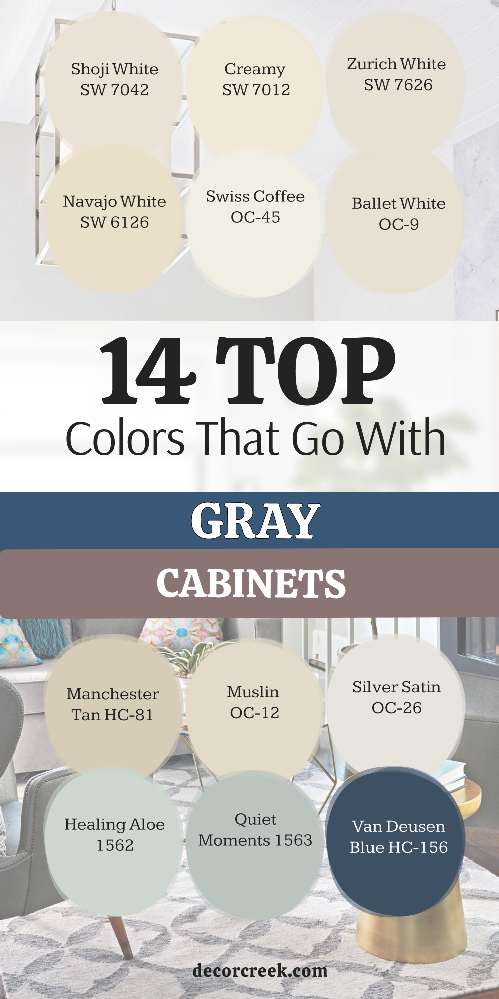
Gray is far from a “boring” or repetitive choice; in fact, it serves as one of the most sophisticated and flexible foundations you can possibly establish within the architecture of your home. It acts as a masterful canvas that invites creativity rather than stifling it.
Whether you are working with expansive gray walls, textured upholstery on furniture, or sleek modern cabinetry, it is important to realize that the secondary colors and accents you choose to layer on top will ultimately dictate the entire emotional mood and atmosphere of your living space. By shifting the palette just a few degrees toward a different hue, you can move from a high-energy environment to one of total serenity.
As someone who spends every single day observing the complex ways in which natural and artificial light interact with different pigments, I have seen firsthand how a simple, well-calculated change in paint can completely transform the “soul” of a room. It is truly remarkable how a space can be shifted from a cold, uninviting, and purely industrial setting into one that feels deeply warm, welcoming, and undeniably high-end.
This transformation doesn’t require a full renovation; rather, it relies on the professional understanding of how a new shade can breathe life into a neutral background, turning a standard house into a curated home.