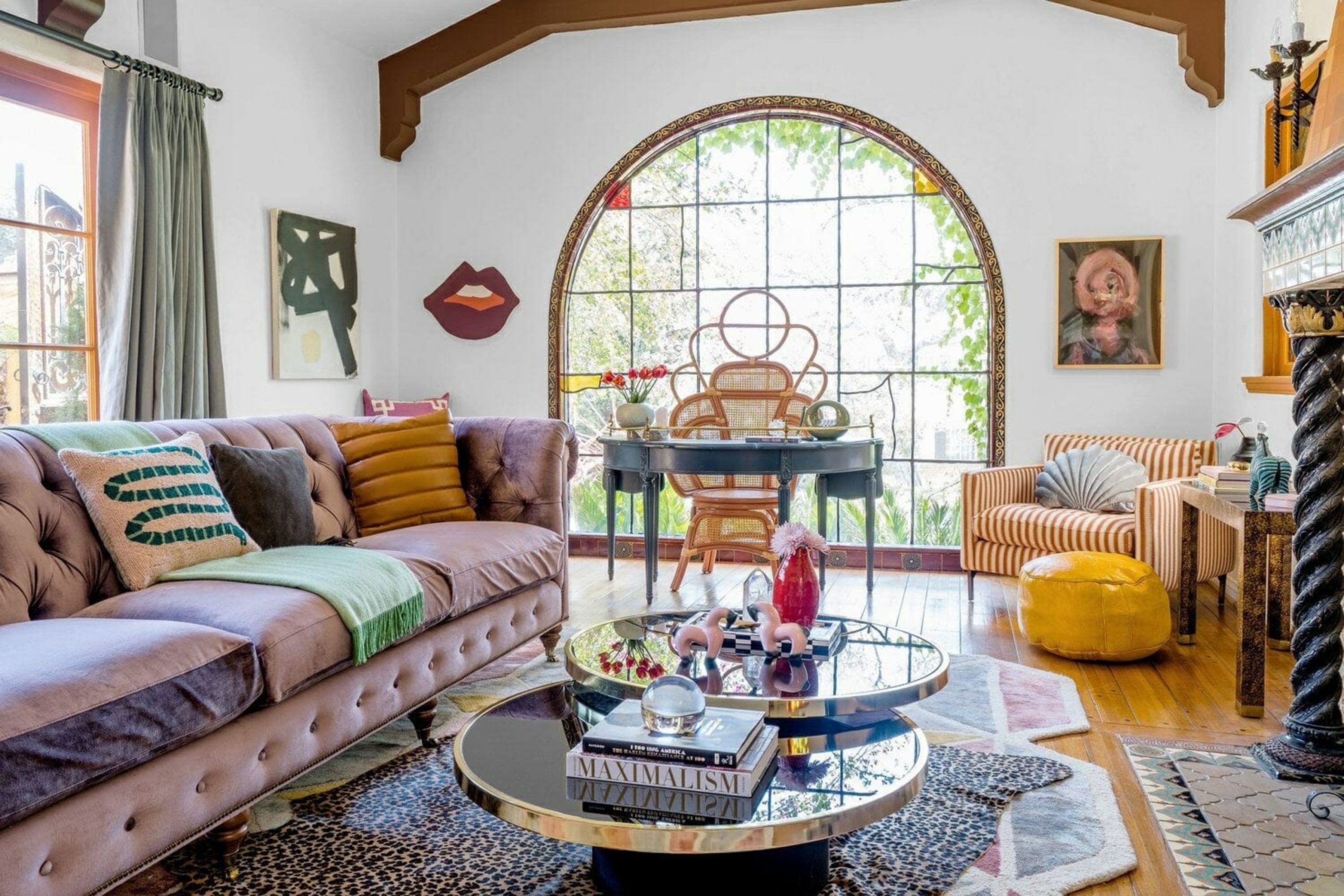
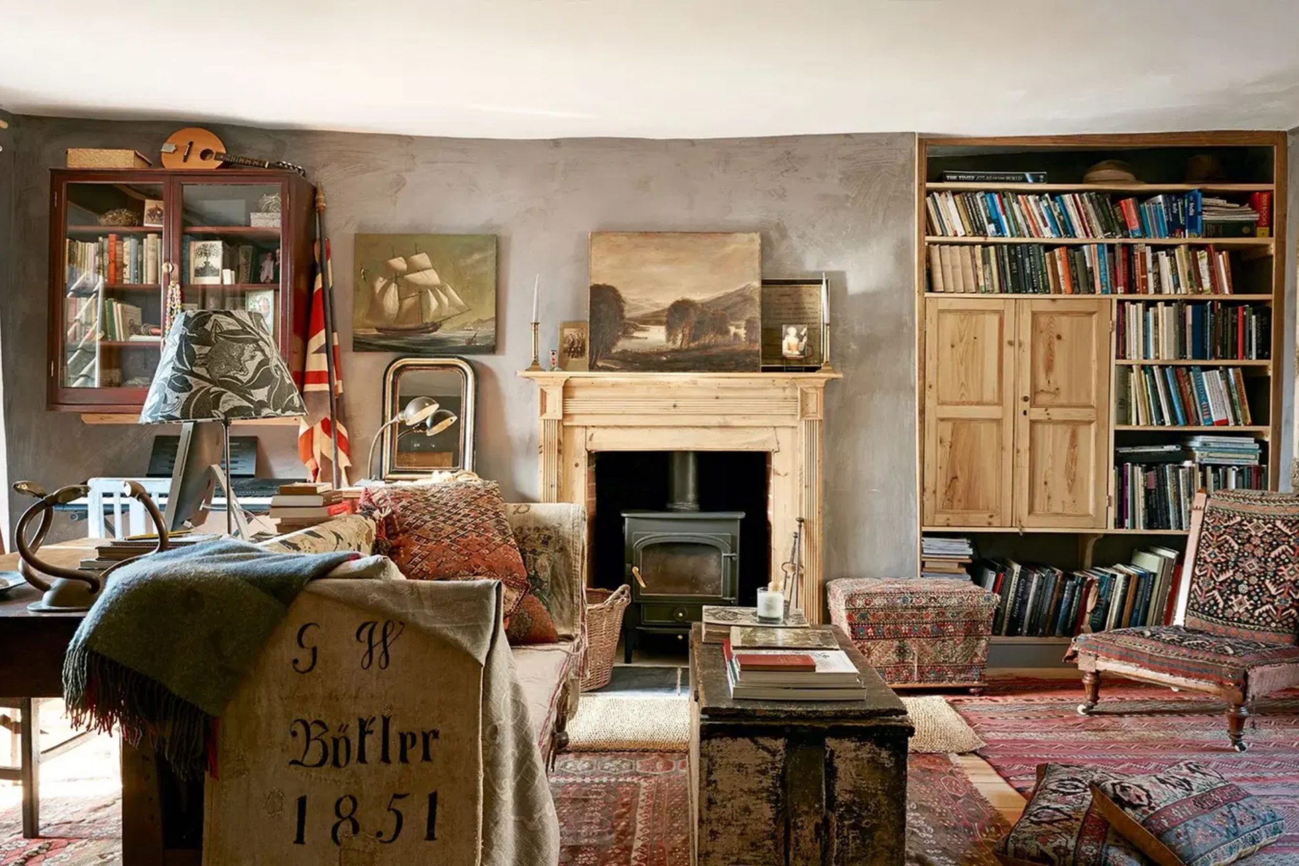
Finding the right paint for your home feels like picking a favorite memory to put on the walls. Vintage styles are back because they make us feel safe and connected to the past. I love helping people find colors that tell a story without saying a word.
Your living room is the heart of your house where everyone gathers to talk and relax. Picking a shade from years ago brings a special kind of magic into your daily life. It is not just about paint but about how you feel when you walk through the front door.
I want to help you pick a color that makes you smile every single morning.
This process of selecting a historical hue is more than a simple home improvement task; it is an emotional journey toward creating a sanctuary that resonates with your soul and honors the timeless traditions of interior design.
Why I Always Trust Sherwin-Williams and Benjamin Moore for the Best Vintage Living Room Paint Colors
I have spent years looking at paint chips and I always go back to these two brands. They have spent decades perfecting their recipes so the color looks the same on the wall as it does in your head. Their vintage collections are based on real history which makes your home feel authentic.
The quality of the paint means it covers well and stays looking fresh for a long time. I know that when I recommend these brands my clients will be happy with the results. They offer deep tones and soft neutrals that other brands just cannot match perfectly.
Using high-quality paint saves you money because you do not have to redo it next year. I trust these companies because they care about the science of color as much as the art of it.
It makes my job easier when I can rely on a product to look beautiful in any light, providing a richness and depth of pigment that brings a sophisticated, professional finish to every single wall in your home.
How I Choose the Perfect Vintage Shade for Any Living Room
Choosing a vintage look starts with thinking about how the sun hits your windows. I look at the furniture you already love to see which tones will play nicely together. Older styles often use colors that have a bit of gray or brown hidden inside them.
This makes the walls look like they have been there forever in a good way. I always tell people to paint a big sample on the wall before they buy the whole gallon. You need to see how the color changes from the bright morning to the cozy evening.
Darker shades work great if you want to feel tucked in and cozy at night. Lighter shades are better if you want your home to feel open and breezy. I listen to what my clients want their home to say to guests who visit.
Every room has a personality and the right paint helps that personality shine through, ensuring that the final choice reflects your unique life story while respecting the architectural bones of the space.
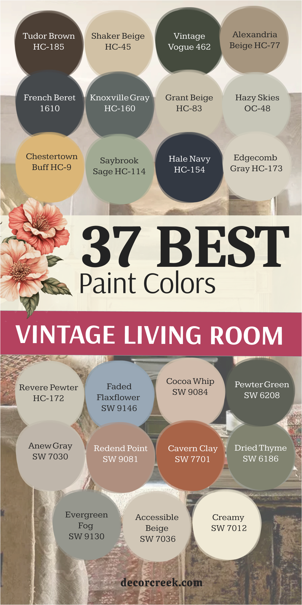
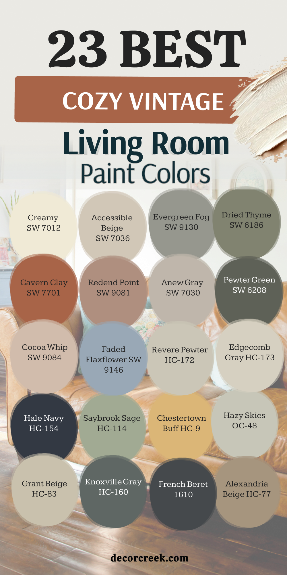
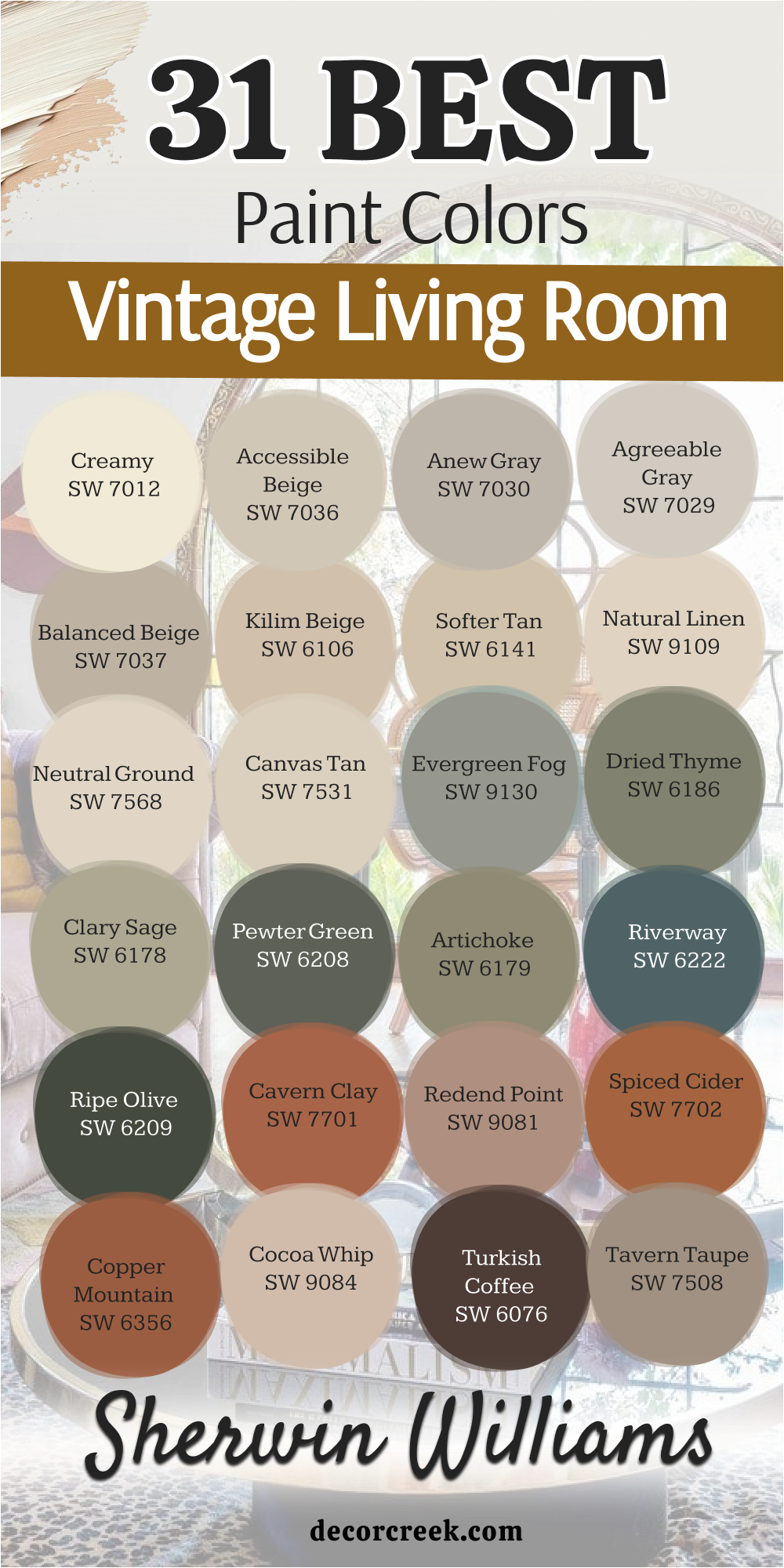
23 Cozy Vintage Living Room Paint Colors
Creamy SW 7012
Creamy SW 7012 starts off our list with a soft touch that feels like a warm hug. This shade is much better than a stark white because it has a drop of yellow and gray in it. It reminds me of old lace or a page from a very old book.
You can use it on the ceiling or the walls to make the whole area feel friendly. I often pick this when a house has a lot of dark wood floors. It keeps the room from feeling too heavy or dark. This paint looks great when the sun shines on it during the afternoon.
Many families choose it because it goes with almost any rug or sofa they own. It is a smart choice for making a small area feel much bigger than it really is.
Best used in: living rooms, bedrooms, entryways, and trim work
Pairs well with: Accessible Beige SW 7036, Pointing, dark oak furniture, and brass hardware The key rule of this color for vintage style is to use it where you want the walls to feel soft like a piece of silk under your fingers.
🎨 Check out the complete guide to this color right HERE 👈

Accessible Beige SW 7036
Accessible Beige SW 7036 is the most popular choice for a reason that everyone can see. This color acts like a bridge between the old world and the new world.
It does not turn yellow or pink when the lights go on at night. I think it looks like a soft sandy beach under a cloudy sky. You will find that it makes your colorful artwork really pop off the wall. It is a very safe choice if you are worried about picking something too bold.
The gray tones inside it keep it looking sophisticated instead of boring. It works well in houses that have an open floor plan. Most of my clients feel instantly relaxed when they see this on their walls.
Best used in: living rooms, open floor plans, hallways, and kitchens
Pairs well with: Alabaster SW 7008, Urban Bronze SW 7048, navy blue accents, and light wood The key rule of this color for vintage style is to use it as a background that lets your antique furniture be the star of the show.
🎨 Check out the complete guide to this color right HERE 👈

Evergreen Fog SW 9130
Evergreen Fog SW 9130 brings the feeling of a quiet forest right into your home. This green is mixed with a lot of gray so it feels very grown up. It reminds me of the misty mountains you might see on an old postcard.
I love using this in rooms where you want to sit and read a book. It feels very grounded and sturdy like a big old tree. This shade looks amazing next to leather chairs or gold picture frames. It is a color that feels special but does not shout for attention.
Many people find it helps them feel more focused and peaceful. It is a perfect example of a vintage shade that still feels fresh today.
Best used in: living rooms, home offices, cabinets, and accent walls
Pairs well with: Shoji White SW 7042, Uber Gray, bronze accents, and cognac leather The key rule of this color for vintage style is to use it to create a cozy corner that feels separate from the busy world outside.
🎨 Check out the complete guide to this color right HERE 👈

Dried Thyme SW 6186
Dried Thyme SW 6186 is a deeper green that feels very rich and full of life. It looks like the leaves of an herb garden after they have been picked and dried. This color has a lot of strength and makes a big statement in a living room.
I like to use it in rooms with tall ceilings and lots of trim. It creates a mood that is very elegant and a little bit moody. You can pair it with light colors to keep the room from feeling too dark. It reminds me of old libraries where people spent hours studying.
The color changes beautifully as the sun moves across the sky during the day. It is a classic choice for anyone who loves nature.
Best used in: living rooms, dining rooms, library nooks, and exterior doors
Pairs well with: Creamy SW 7012, Wood Ash, copper decor, and velvet fabrics The key rule of this color for vintage style is to use it when you want the room to feel expensive and full of history.
🎨 Check out the complete guide to this color right HERE 👈

Cavern Clay SW 7701
Cavern Clay SW 7701 is a warm earthy red that feels like a sunset in the desert. This color is bold but it also feels very welcoming to everyone who enters. It reminds me of old clay pots and handmade bricks from long ago.
I suggest this color if you want your living room to feel energetic and fun. It works very well with mid-century modern furniture that has clean lines. The warmth of the orange and red tones makes the room feel smaller and more intimate.
It is a great color for a room where people sit and talk for a long time. You can feel the heat and energy coming off the walls with this shade. It is a brave choice that pays off with a lot of style.
Best used in: living rooms, accent walls, dining areas, and sunrooms
Pairs well with: Origami White SW 7636, Distance SW 6243, turquoise accents, and light oak The key rule of this color for vintage style is to use it to bring a sense of adventure and warmth to a room that feels too cold.
🎨 Check out the complete guide to this color right HERE 👈

Redend Point SW 9081
Redend Point SW 9081 is a soft mix of pink, beige, and brown that looks very natural. It feels like a smooth stone you might find in a dry riverbed. This color is very gentle and makes the light in a room look very soft.
I like to use it when I want a room to feel like a quiet sanctuary. It is a very unique vintage shade that people do not see every day. It goes beautifully with natural materials like wool, linen, and clay.
The color is not too bright but it is definitely not boring. It gives the walls a glowing look that is very flattering to everyone. You will find that it makes your home feel very modern and old-fashioned at the same time.
Best used in: living rooms, bedrooms, bathrooms, and laundry rooms
Pairs well with: Foothills SW 7514, Pure White SW 7005, clay pottery, and woven baskets The key rule of this color for vintage style is to use it to create a soft glow that makes the room feel quiet and safe.
🎨 Check out the complete guide to this color right HERE 👈

Anew Gray SW 7030
Anew Gray SW 7030 is a slightly darker version of a classic neutral that adds a bit more drama. It has a bit of warmth so it never feels like a cold basement. I think of it as the color of a foggy morning in a big city.
It is a great choice if you have a lot of white trim and doors in your house. The contrast makes the architectural details of your home stand out. It is a very sturdy color that handles big furniture very well.
Many people like it because it hides small smudges or dust better than very light colors. It makes a living room feel established and well-designed. This is a color that will stay in style for many years to come.
Best used in: living rooms, basements, hallways, and exteriors
Pairs well with: Pure White SW 7005, Sea Salt SW 6204, dark charcoal, and silver accents The key rule of this color for vintage style is to use it to give your room a solid foundation that feels reliable and classic.
🎨 Check out the complete guide to this color right HERE 👈
Pewter Green SW 6208
Pewter Green SW 6208 is a dark and cool green that feels very sophisticated and deep. It has a lot of gray and blue in it which makes it look like old metal.
I love this color for a wall behind a fireplace or a big bookshelf. It creates a very dramatic look that makes the room feel like a cozy cave. You should use this if you want to make a big impact with your paint choice. It works best in rooms that get a lot of natural light so it does not feel too gloomy.
The color looks very expensive and works well with high-end fabrics. It reminds me of the deep forest in the middle of winter. It is a very bold way to bring a vintage feeling into a modern home.
Best used in: living rooms, studies, kitchen islands, and accent walls
Pairs well with: Shoji White SW 7042, Woodnut, gold leaf, and light gray marble The key rule of this color for vintage style is to use it to create a sense of mystery and depth in your favorite room.
🎨 Check out the complete guide to this color right HERE 👈

Cocoa Whip SW 9084
Cocoa Whip SW 9084 is a creamy brown that looks just like a warm cup of chocolate. This color is very sweet and makes a room feel very soft and inviting.
It is a great alternative to gray or beige if you want something a bit warmer. I think it looks beautiful in rooms with a lot of windows and plants. The brown tones make the green leaves of your plants look even brighter.
It is a color that reminds me of old-fashioned candy shops and bakeries. It makes the living room feel like a place where you can really relax. You will find that it makes people want to stay and chat for a while. It is a very friendly and approachable color for any home.
Best used in: living rooms, bedrooms, breakfast nooks, and nurseries
Pairs well with: Alabaster SW 7008, Black Magic SW 6991, pink accents, and walnut wood The key rule of this color for vintage style is to use it to make your home feel as sweet and comforting as a homemade treat.
🎨 Check out the complete guide to this color right HERE 👈
Faded Flaxflower SW 9146
Faded Flaxflower SW 9146 is a dusty blue that looks like a pair of well-worn denim jeans. This blue is very soft and does not feel too bright or overwhelming. It reminds me of the sky just before the sun fully comes up in the morning.
I like to use this in living rooms that need a bit of color but still want to stay quiet. It works very well with white furniture or light wood accents. The color has a vintage feel because it looks like it has been softened by the sun over time.
It is a very peaceful shade that helps everyone feel a bit more relaxed. Many people choose this for a cottage or a farmhouse look. It is a lovely way to add a bit of personality to your walls.
Best used in: living rooms, bedrooms, bathrooms, and porch ceilings
Pairs well with: Extra White SW 7006, Driftwood, lemon yellow accents, and wicker furniture The key rule of this color for vintage style is to use it to bring a bit of the outdoors inside in a very gentle way.
🎨 Check out the complete guide to this color right HERE 👈
Revere Pewter HC-172
Revere Pewter HC-172 is a famous pick because it changes its look depending on the light in your house. This color is a perfect mix of gray and beige that many designers call a greige.
I find that it makes a living room feel very sturdy and well-built. It reminds me of smooth river stones or old silver spoons that have been used for years. You can use it in a large room to make all the different parts feel like they belong together.
The color is deep enough to show off white trim but light enough to keep things bright. Many families love how it handles the shadows during the late afternoon. It is a reliable choice that never feels out of place in an older home. This paint makes the air in the room feel very steady and balanced for everyone.
Best used in: living rooms, kitchens, hallways, and open floor plans
Pairs well with: White Dove OC-17, Chelsea Gray HC-168, dark wood, and matte black metal The key rule of this color for vintage style is to use it as a neutral base that feels much more expensive than a regular tan.
🎨 Check out the complete guide to this color right HERE 👈

Edgecomb Gray HC-173
Edgecomb Gray HC-173 is a lighter and softer version of a classic neutral that feels very airy. This shade is excellent for making a dark living room feel like it has more windows than it really does.
I think of it as the color of fresh cream mixed with a tiny bit of gray dust. It is very gentle on the eyes and makes a great backdrop for vintage family photos. You will notice that it feels very organic and natural like a piece of linen fabric.
It is a great pick if you want a vintage look that still feels very clean and tidy. The warmth in this gray keeps the room from feeling like an office or a hospital. I suggest this for people who want a house that feels light and very welcoming. It is a very polite color that lets your colorful pillows and rugs do the talking.
Best used in: living rooms, bedrooms, small spaces, and hallways
Pairs well with: Revere Pewter HC-172, Hale Navy HC-154, light oak, and soft white trim The key rule of this color for vintage style is to use it in rooms where you want the walls to feel like a soft morning mist.
🎨 Check out the complete guide to this color right HERE 👈

Hale Navy HC-154
Hale Navy HC-154 is a powerful and deep blue that feels as vast as the ocean at night. This color is a true classic that has been used in beautiful homes for a very long time.
I love how it makes gold frames and white mantels look incredibly sharp and bright. It acts like a neutral because it goes with almost every other color you can think of. Using this on all four walls creates a very snug and private feeling in a living room.
It reminds me of old captain’s coats and the deep sea on a cloudy day. The color stays true and does not look like a bright primary blue once it dries. It is a very brave choice that makes your home look very high-end and thoughtful. Many of my clients feel very proud of their room once they see this finished.
Best used in: living rooms, dining rooms, library walls, and front doors
Pairs well with: Coventry Gray HC-169, Carrara marble, brass fixtures, and crisp white The key rule of this color for vintage style is to use it to add a sense of weight and importance to your favorite sitting area.
🎨 Check out the complete guide to this color right HERE 👈

Saybrook Sage HC-114
Saybrook Sage HC-114 is a soft green that feels like a garden in the early springtime. This shade is very traditional and looks wonderful in homes with a lot of history.
I think it looks like the leaves of a willow tree or a piece of sea glass found on the beach. It is a very refreshing color that makes the indoors feel connected to the trees outside. You will find that it makes wood furniture look very rich and warm.
It is not a loud green so it stays very polite on the walls all day long. The color has enough gray in it to keep it from looking like a child’s bedroom. It is a perfect choice for a living room where you want to sit and talk with your friends. People often tell me this color makes them feel more relaxed as soon as they sit down.
Best used in: living rooms, guest rooms, sunrooms, and kitchen cabinets
Pairs well with: Simply White OC-117, Shaker Beige HC-45, terracotta tiles, and floral patterns The key rule of this color for vintage style is to use it to bring a bit of the natural world into your daily life.
🎨 Check out the complete guide to this color right HERE 👈

Chestertown Buff HC-9
Chestertown Buff HC-9 is a warm and sunny yellow that feels like an old gold coin. This color is very traditional and reminds me of historic colonial homes from long ago.
It is a great way to make a room feel happy without using a color that is too bright or neon. I like to use it in rooms that do not get a lot of natural light to help them feel glowy. It feels very cozy and looks great with dark mahogany or cherry wood furniture.
The color has a bit of tan in it which makes it feel very stable and classic. It is a very friendly shade that makes a living room feel like the heart of the home. You will feel a sense of history when you walk into a room painted this way. It is a great choice for making a large space feel much more intimate.
Best used in: living rooms, entryways, dining rooms, and historic exteriors
Pairs well with: Hale Navy HC-154, White Heron, antique wood, and blue-and-white pottery The key rule of this color for vintage style is to use it where you want the walls to feel like they are reflecting a warm candle flame.
🎨 Check out the complete guide to this color right HERE 👈
Hazy Skies OC-48
Hazy Skies OC-48 is a very interesting color that sits right between green and gray. It looks like the sky on a day when you can almost see the sun through the clouds.
I love this shade because it is very hard to pin down which makes it feel very special. It works perfectly in a living room that has a lot of different textures like wool and velvet. The color changes its mood as the day goes on which keeps the room feeling interesting.
It is a very soft and dusty shade that reminds me of old landscape paintings. You can use it as a neutral that is just a little bit more exciting than plain beige. It feels very sophisticated and helps your furniture look its very best. This is a great pick for a home that wants to feel quiet and very well-decorated.
Best used in: living rooms, bedrooms, kitchens, and trim
Pairs well with: Wickham Gray HC-171, Cloud White OC-130, pewter accents, and dark floors The key rule of this color for vintage style is to use it to create a soft and dreamy feeling that stays very grown-up.
Grant Beige HC-83
Grant Beige HC-83 is a sturdy and handsome neutral that feels very grounded. This color has a bit of green hidden inside it which makes it look very organic. I think of it as the color of dried grass or old parchment paper.
It is a very reliable choice for a living room because it never feels too thin or too heavy. You will find that it hides the wear and tear of a busy family life very well. It looks very traditional when paired with dark wood and heavy curtains.
The color feels very solid and gives the room a sense of lasting strength. It is a great background for a room filled with books and old treasures. Many people like it because it feels very natural and does not try too hard to be trendy. It is a classic for a reason and always looks very professional.
Best used in: living rooms, hallways, offices, and home exteriors
Pairs well with: Swiss Coffee OC-45, Black Forest Green, leather furniture, and bronze The key rule of this color for vintage style is to use it as a strong foundation for a room that feels very lived-in.
🎨 Check out the complete guide to this color right HERE 👈

Knoxville Gray HC-160
Knoxville Gray HC-160 is a dark and moody blue-green that feels very dramatic and cool. This color looks like the deep water of a lake or a piece of heavy slate.
I suggest using this if you want your living room to feel very cozy and a bit mysterious. It makes a wonderful backdrop for a big gallery wall of art and photos. The color is very deep and looks almost black in some lights but the green keeps it feeling alive.
It is a very bold choice that makes a room feel like a private club or an old study. You should use it in a room with big windows to balance out the darkness of the paint. It feels very high-end and gives a house a lot of character right away. It is one of those colors that people will always ask you about when they visit.
Best used in: living rooms, accent walls, studies, and kitchen islands
Pairs well with: Edgecomb Gray HC-173, Simply White OC-117, gold accents, and cognac leather The key rule of this color for vintage style is to use it to make a large room feel more private and very special.
🎨 Check out the complete guide to this color right HERE 👈
French Beret 1610
French Beret 1610 is a very dark gray that has a tiny hint of blue tucked inside it. This color is very chic and reminds me of old city apartments in Europe. It is a great alternative to true black because it feels a bit softer and more interesting.
I love using this color on a single wall to create a big focal point in a living room. It makes light-colored furniture and bright rugs look absolutely amazing. The color feels very heavy and stable like a big piece of iron. You can feel the quality of the shade as soon as it goes on the wall.
It is a very modern way to do a vintage look that feels very stylish. Many of my clients love how it makes their home feel like a piece of art. It is a bold move that makes a very big statement.
Best used in: living rooms, media rooms, accent walls, and interior doors
Pairs well with: Chantilly Lace OC-65, Revere Pewter HC-172, bright art, and light wood The key rule of this color for vintage style is to use it to add a touch of city elegance to your favorite room.
🎨 Check out the complete guide to this color right HERE 👈
Alexandria Beige HC-77
Alexandria Beige HC-77 is a deep and warm tan that looks like a cup of coffee with a splash of milk. This color is very traditional and feels like it has been part of a home for a hundred years.
I like to use it in rooms where you want to feel very tucked in and warm during the winter. It reminds me of old libraries and expensive leather suitcases. The color has a lot of brown in it which makes it feel very natural and earthy.
It looks beautiful when the lamp light hits it in the evening. You can pair it with creamy whites to make the room feel very classic and clean. It is a very comfortable shade that makes everyone feel right at home. It is a great choice for a room that has a lot of traditional architecture and crown molding.
Best used in: living rooms, dining rooms, home offices, and exteriors
Pairs well with: Cloud White OC-130, Van Buren Brown HC-70, antique brass, and wool rugs The key rule of this color for vintage style is to use it to create a room that feels very sturdy and full of tradition.
🎨 Check out the complete guide to this color right HERE 👈
Vintage Vogue 462
Vintage Vogue 462 is a very deep and smoky green that feels like walking into an old forest at dusk. This color is one of my favorite tools for making a room feel very expensive and high-end.
It has a lot of gray and black in it which keeps the green from looking too bright. I think it looks beautiful in a living room that has a lot of natural wood and soft fabrics. It reminds me of the velvet curtains you might see in a very old theater.
You can use it on every wall if you want the room to feel like a cozy and private hideaway. The color is very strong and gives your home a sense of history and character. It looks amazing when you hang gold mirrors or white art on top of it. Many people feel very proud of how brave and stylish this color makes their home look.
Best used in: living rooms, bedrooms, libraries, and accent walls
Pairs well with: Edgecomb Gray HC-173, Swiss Coffee OC-45, brass lamps, and leather chairs The key rule of this color for vintage style is to use it to create a mood that feels very deep, dark, and full of stories.
🎨 Check out the complete guide to this color right HERE 👈
Shaker Beige HC-45
Shaker Beige HC-45 is a warm and friendly tan that looks like a fresh loaf of bread. This color is very popular because it stays true to its name and never looks pink or orange. I find that it makes a living room feel very sunny and cheerful even on a rainy day.
It reminds me of the sand on a beach or a piece of soft canvas fabric. You will notice that it makes your white ceilings and trim look very crisp and clean. It is a very safe choice for anyone who wants a vintage look that feels very light.
The color is deep enough to make the walls look painted but light enough to stay very breezy. It works perfectly with traditional furniture and colorful area rugs. Most families find this color very easy to live with for many years.
Best used in: living rooms, hallways, kitchens, and entryways
Pairs well with: White Dove OC-17, Hale Navy HC-154, warm oak, and navy blue accents The key rule of this color for vintage style is to use it as a warm backdrop that makes every guest feel instantly welcome.
🎨 Check out the complete guide to this color right HERE 👈

Tudor Brown HC-185
Tudor Brown HC-185 is a very dark and rich brown that looks like a bar of dark chocolate. This color is very traditional and reminds me of the heavy wood beams in a very old house. I love using this color in a living room to make it feel very sturdy and grounded.
It is a great alternative to black or gray if you want the room to feel much warmer. You can pair it with light cream colors to make a very dramatic and beautiful look. The color feels very solid and gives a sense of lasting strength to your walls.
It is a perfect choice for a room where you want to gather around a fireplace. Many people find that it makes their home feel very established and full of history. It is a bold move that makes your furniture look very special and important.
Best used in: living rooms, dining rooms, library nooks, and exterior trim
Pairs well with: Chestertown Buff HC-9, Cloud White OC-130, gold leaf, and stone fireplaces The key rule of this color for vintage style is to use it to add a sense of weight and old-world charm to your favorite space.
31 Vintage Living Room Paint Colors From Sherwin Williams
Creamy SW 7012
Creamy SW 7012 is a soft white that feels like a bowl of vanilla ice cream. This color is much warmer than a standard white because it has a drop of yellow in it. I often use this color for clients who want their walls to look clean but not cold.
It reminds me of old silk ribbons or the lace on a vintage dress. You can use it in a small living room to help the light bounce around the corners. It makes the whole house feel very soft and friendly for everyone who visits.
The color is a great choice for trim and doors if you want a look that is not too sharp. It feels very classic and goes with any style of furniture you might have. You will love how it glows when the lamps are turned on in the evening.
Best used in: living rooms, bedrooms, trim, and ceilings
Pairs well with: Accessible Beige SW 7036, Pointing, dark wood, and antique brass The key rule of this color for vintage style is to use it where you want the light to feel kind and soft all day long.
🎨 Check out the complete guide to this color right HERE 👈
Accessible Beige SW 7036
Accessible Beige SW 7036 is a very smart neutral that looks great in any kind of light. This color is a mix of gray and beige that feels very modern and vintage at the same time. I find that it acts like a perfect canvas for your favorite colorful pillows and art.
It reminds me of a soft wool blanket or a piece of weathered driftwood. You will see that it does not turn yellow or blue which makes it very easy to use. It is a very sturdy color that makes a living room feel very balanced and calm.
Many people choose this color because it works well in every room of the house. It gives the walls a finished look that feels very professional and thoughtful. You can feel the quality of the shade as soon as it is painted on the wall.
Best used in: living rooms, open floor plans, hallways, and kitchens
Pairs well with: Alabaster SW 7008, Urban Bronze SW 7048, navy accents, and light wood The key rule of this color for vintage style is to use it as a quiet background that lets your treasures be the star.
🎨 Check out the complete guide to this color right HERE 👈
Anew Gray SW 7030
Anew Gray SW 7030 is a slightly deeper gray that feels very sophisticated and warm. This color is a great choice if you want your living room to have a bit more drama. I think of it as the color of a foggy morning over a big stone castle.
It has enough warmth in it to keep your home from feeling cold or like an office. You will notice that it makes white furniture and bright art look very sharp. It is a very reliable shade that handles the light from big windows very well.
Many families like it because it is very good at hiding small marks or dust on the walls. It makes the room feel very established and like it has been there for a long time. This is a color that will stay looking beautiful even as your style changes.
Best used in: living rooms, basements, hallways, and home exteriors
Pairs well with: Pure White SW 7005, Sea Salt SW 6204, dark metal, and silver The key rule of this color for vintage style is to use it to give your room a solid foundation that feels very classic.
🎨 Check out the complete guide to this color right HERE 👈
Agreeable Gray SW 7029
Agreeable Gray SW 7029 is the most popular color for a reason that you can see right away. This shade is a very light and warm gray that goes with absolutely everything in your home.
I like to call it a chameleon color because it changes to match the things you put near it. It reminds me of a soft misty morning or the fur of a little gray kitten. You can use it in a whole house to make every room feel connected and peaceful.
It is a great choice if you are not sure which color to pick because it is very hard to get wrong. The color makes your living room feel very open and bright for your family. It is a very polite shade that stays in the background and makes everything else look better. Most of my clients feel very happy and relaxed when they see this on their walls.
Best used in: living rooms, bedrooms, kitchens, and whole-house painting
Pairs well with: Incredible White, Extra White SW 7006, dark floors, and blue accents The key rule of this color for vintage style is to use it to make the whole house feel clean, bright, and very steady.
🎨 Check out the complete guide to this color right HERE 👈

Balanced Beige SW 7037
Balanced Beige SW 7037 is a medium-toned tan that feels very warm and grounded. This color is deeper than a regular beige and gives the walls a lot of personality. I think it looks like the color of a toasted marshmallow or a soft leather glove.
It is a very traditional choice that makes a living room feel very cozy and snug. You can use it in a large room to make it feel a bit more intimate and private. The color has a bit of gray in it which keeps it from looking too yellow in the sun.
It looks beautiful when paired with dark wood furniture and heavy rugs. Many people find that it makes their home feel very sturdy and well-built. It is a very comfortable color that makes everyone want to sit down and stay for a while.
Best used in: living rooms, dining rooms, entryways, and home offices
Pairs well with: Alabaster SW 7008, Urbane Bronze SW 7048, warm wood, and black accents The key rule of this color for vintage style is to use it to create a room that feels very solid and full of warmth.
🎨 Check out the complete guide to this color right HERE 👈
Kilim Beige SW 6106
Kilim Beige SW 6106 is a very warm and sunny tan that has been a favorite for a long time. This color has a tiny hint of red or orange in it which makes it feel very energetic. I think of it as the color of a desert sunset or a piece of old pottery.
It is a great choice for a living room that needs a bit more warmth and life. You will see that it makes the room feel very glowing and happy during the day. It looks very traditional when paired with white trim and dark floors.
The color is very friendly and makes a house feel like a very welcoming place to be. Many families like it because it feels very natural and earthy on the walls. It is a classic vintage shade that reminds people of a very comfortable home.
Best used in: living rooms, kitchens, family rooms, and hallways
Pairs well with: Divine White SW 6105, Latte, dark chocolate brown, and turquoise accents The key rule of this color for vintage style is to use it where you want the walls to feel like they are giving you a warm welcome.
🎨 Check out the complete guide to this color right HERE 👈
Softer Tan SW 6141
Softer Tan SW 6141 is a very gentle and light brown that feels very quiet and soft. This color is a great alternative to white if you want the room to have more depth. I find that it looks like the color of soft sand or a pair of khaki pants.
It is a very traditional and polite color that never tries to take over the room. You can use it in a living room with a lot of windows to keep the light feeling very soft. It makes a great background for a room filled with plants and natural wood.
The color is very balanced and does not turn too yellow or too gray. Many people choose this color because it is very easy on the eyes at any time of day. It gives the walls a very clean and classic look that feels very timeless.
Best used in: living rooms, bedrooms, hallways, and kitchens
Pairs well with: Alabaster SW 7008, Universal Khaki SW 6105, green plants, and brown leather The key rule of this color for vintage style is to use it to create a soft and simple background for your daily life.
🎨 Check out the complete guide to this color right HERE 👈
Natural Linen SW 9109
Natural Linen SW 9109 is a beautiful color that looks just like a piece of high-quality fabric. This shade is a soft and sandy tan that makes any room feel very airy and light. I love using this color because it reminds me of old summer houses by the ocean.
It is much warmer than a plain white but it still keeps the room feeling very bright. You will notice that it has a tiny bit of yellow and gray mixed together perfectly. It makes a great partner for large windows where the sun can hit the walls throughout the day.
The color feels very organic and looks wonderful with wicker furniture or woven baskets. Many people pick this because it makes their living room feel very fresh and clean. It is a very polite color that makes everyone feel comfortable as soon as they walk in.
Best used in: living rooms, sunrooms, bedrooms, and kitchens
Pairs well with: Alabaster SW 7008, Shoji White SW 7042, light oak, and soft blue accents The key rule of this color for vintage style is to use it where you want the light to feel natural and the air to feel very breezy.
🎨 Check out the complete guide to this color right HERE 👈

Neutral Ground SW 7568
Neutral Ground SW 7568 is a very soft and creamy gray-beige that feels very steady. This color is perfect for a living room where you want a very quiet and gentle look. I think it looks like the color of a smooth stone or a very old piece of paper.
It is a great choice if you want a neutral that is not too yellow and not too cold. You can use it on every wall to make a small house feel much bigger than it is. It looks very sophisticated when you pair it with dark wood floors or black metal lamps.
The color stays very consistent and does not change much when you turn on the lights at night. Many families like it because it feels very sturdy and handles a busy life very well. It is a very smart pick for a home that wants to feel very well-designed and classic.
Best used in: living rooms, open floor plans, hallways, and trim
Pairs well with: Pure White SW 7005, Urbane Bronze SW 7048, silver accents, and charcoal gray The key rule of this color for vintage style is to use it as a solid foundation that feels very reliable and traditional.
🎨 Check out the complete guide to this color right HERE 👈
Canvas Tan SW 7531
Canvas Tan SW 7531 is a warm and khaki-toned color that feels very grounded and earthy. This shade reminds me of an old artist’s studio or a sturdy tent in the woods. I find that it works very well in living rooms that have a lot of traditional architecture.
It has enough depth to show off white crown molding and baseboards beautifully. You will see that it makes the room feel very cozy and protected from the outside world. It looks great when paired with olive green or deep red accents in your rugs and pillows.
The color feels very natural and does not try to be too bright or flashy. Many people choose it because it feels like a color that has been used in homes for a hundred years. it is a very comfortable choice for a room where your family spends a lot of time together.
Best used in: living rooms, dining rooms, studies, and home exteriors
Pairs well with: Alabaster SW 7008, Pewter Green SW 6208, dark wood, and copper The key rule of this color for vintage style is to use it to create a room that feels very strong and full of character.
🎨 Check out the complete guide to this color right HERE 👈

Evergreen Fog SW 9130
Evergreen Fog SW 9130 is a soft green mixed with gray that feels very sophisticated and deep. This color is very popular right now because it brings the feeling of nature into your house. I think it looks like the misty trees on a mountain during a quiet morning.
It is a very smart choice for a living room where you want to feel very focused and quiet. You can use it as a colorful neutral because it goes well with many other shades. It looks especially beautiful when you have leather chairs or gold picture frames in the room.
The gray tones keep the green from looking too bright or like a cartoon. Many of my clients tell me this color helps them feel much more relaxed after a long day. It is a very modern way to do a vintage look that feels very fresh and interesting.
Best used in: living rooms, home offices, cabinets, and accent walls
Pairs well with: Shoji White SW 7042, Uber Gray, bronze hardware, and warm wood The key rule of this color for vintage style is to use it to create a quiet corner that feels separate from the busy world.
🎨 Check out the complete guide to this color right HERE 👈
Dried Thyme SW 6186
Dried Thyme SW 6186 is a darker green that feels very rich and full of old-world charm. This color looks like the leaves of a garden that have been tucked away in a book. I love using this color in living rooms with a lot of light to show off its deep tones.
it makes a very big statement and tells people that you care about style. You can pair it with creamy white furniture to keep the room from feeling too dark. The color feels very sturdy and looks like it belongs in a grand old library.
It reminds me of the deep colors used in houses a long time ago. Many people feel very cozy when they are surrounded by this deep and earthy shade. It is a very brave pick that makes your home look very expensive and well-planned.
Best used in: living rooms, dining rooms, library walls, and front doors
Pairs well with: Creamy SW 7012, Wood Ash, copper accents, and velvet fabric The key rule of this color for vintage style is to use it when you want the room to feel full of history and importance.
🎨 Check out the complete guide to this color right HERE 👈
Clary Sage SW 6178
Clary Sage SW 6178 is a soft and herbal green that feels very refreshing and light. This color is a classic choice for a vintage farmhouse or a cottage living room.
I think it looks like the soft leaves of a sage plant in the garden. It is a very gentle green that does not overwhelm the other things in your room. You can use it to make a space feel more connected to the trees and grass outside your window.
It looks beautiful with light wood floors and white linen curtains. The color has enough yellow in it to stay warm even on a cloudy day. Many people find it very easy to live with because it is so soft on the eyes. It is a lovely way to add a bit of color to your walls while staying very polite and quiet.
Best used in: living rooms, bedrooms, kitchens, and sunrooms
Pairs well with: Alabaster SW 7008, floral prints, and light oak The key rule of this color for vintage style is to use it to bring a soft garden feeling into your home every day.
🎨 Check out the complete guide to this color right HERE 👈

Pewter Green SW 6208
Pewter Green SW 6208 is a dark and cool green that feels very majestic and strong. This color has a lot of gray and blue in it which makes it look like old metal. I love this color for a living room that wants to feel very private and snug.
It creates a very dramatic look that makes your guests say wow when they walk in. You should use this if you want to make your home feel very high-end and special. It works best in rooms with a lot of natural light so the dark paint does not feel too heavy.
The color looks very rich when paired with gold leaf or shiny brass decorations. It reminds me of the deep shadows in a forest in the middle of winter. It is a very bold way to bring a vintage feeling into a new home.
Best used in: living rooms, studies, kitchen islands, and accent walls
Pairs well with: Shoji White SW 7042, gold accents, and white marble The key rule of this color for vintage style is to use it to create a sense of mystery and deep beauty in your room.
🎨 Check out the complete guide to this color right HERE 👈
Artichoke SW 6179
Artichoke SW 6179 is a medium green that feels very organic and full of life. This color looks like the vegetables in a garden or a mossy rock by a stream. I find that it brings a lot of energy to a living room without being too loud.
It is a very traditional green that has been used for many years in cozy homes. You can use it to make your white furniture really stand out against the walls. The color feels very grounded and makes the room feel very sturdy and well-built.
It looks great with dark wood furniture and colorful rugs that have green and red in them. Many families like it because it feels very natural and like it belongs in the countryside. It is a great choice for making a room feel very friendly and full of personality.
Best used in: living rooms, dining rooms, kitchens, and entryways
Pairs well with: Creamy SW 7012, dark wood, and woven rugs The key rule of this color for vintage style is to use it to make your home feel as natural and sturdy as a garden.
🎨 Check out the complete guide to this color right HERE 👈
Ripe Olive SW 6209
Ripe Olive SW 6209 is a very deep and dark green that looks like the fruit it is named after. This color is very moody and makes a living room feel very small and cozy at night. I love using this color on all four walls to create a very dramatic and private space.
It reminds me of the deep colors found in old castles or grand historic houses. You should pair it with bright white trim to keep the lines of the room looking sharp. The color is very sophisticated and makes your gold and silver items shine like jewels.
It feels very heavy and stable like it has been on the walls for a very long time. Many of my clients feel very brave and stylish when they pick this deep shade. it is a perfect way to add a lot of drama to a simple room.
Best used in: living rooms, library walls, accent walls, and powder rooms
Pairs well with: Extra White SW 7006, Accessible Beige SW 7036, gold, and leather The key rule of this color for vintage style is to use it to create a room that feels like a private and expensive sanctuary.
🎨 Check out the complete guide to this color right HERE 👈

Cavern Clay SW 7701
Cavern Clay SW 7701 is a warm and earthy orange-red that feels like a sunset in the desert. This color is very bold and brings a lot of heat and energy to a living room. I think it looks like old clay pots or handmade bricks from a long time ago.
It is a great choice if you want your home to feel very welcoming and full of life. You can use it with mid-century modern furniture to create a look that is very stylish. The warmth of the color makes the room feel very intimate and perfect for long talks.
It looks amazing when the afternoon sun hits the walls and makes them glow. Many people find it very fun and exciting to have such a bold color in their home. It is a brave choice that makes a very big and happy statement.
Best used in: living rooms, dining areas, accent walls, and sunrooms
Pairs well with: Origami White SW 7636, Distance SW 6243, turquoise, and light wood The key rule of this color for vintage style is to use it to bring a sense of adventure and warmth to your daily life.
🎨 Check out the complete guide to this color right HERE 👈
Redend Point SW 9081
Redend Point SW 9081 is a soft mix of pink, beige, and brown that looks very natural. It feels like a smooth stone you might find in a dry riverbed. This color is very gentle and makes the light in a room look very soft.
I like to use it when I want a room to feel like a quiet sanctuary. It is a very unique vintage shade that people do not see every day. It goes beautifully with natural materials like wool, linen, and clay.
The color is not too bright but it is definitely not boring. It gives the walls a glowing look that is very flattering to everyone. You will find that it makes your home feel very modern and old-fashioned at the same time.
Best used in: living rooms, bedrooms, bathrooms, and laundry rooms
Pairs well with: Foothills SW 7514, Pure White SW 7005, clay pottery, and woven baskets The key rule of this color for vintage style is to use it to create a soft glow that makes the room feel quiet and safe.
🎨 Check out the complete guide to this color right HERE 👈
Spiced Cider SW 7702
Spiced Cider SW 7702 is a deep and warm orange that feels like a cozy autumn afternoon. This color brings a lot of heart and happiness to a living room. I think it looks like the skin of a ripe pumpkin or a pile of fallen leaves.
It is a very traditional color that was very popular in homes several decades ago. You can use it to make a large room feel much smaller and more inviting for your family. It looks wonderful when you have a lot of dark wood furniture or a stone fireplace.
The color is very rich and makes the air in the room feel very warm. Many people find that it helps them feel more energetic and cheerful. It is a great choice if you love colors that feel very earthy and strong.
Best used in: living rooms, dining rooms, kitchens, and accent walls
Pairs well with: Creamy SW 7012, Naval SW 6244, dark wood, and copper decorations The key rule of this color for vintage style is to use it to make your home feel as warm and spicy as a favorite holiday drink.
🎨 Check out the complete guide to this color right HERE 👈
Copper Mountain SW 6356
Copper Mountain SW 6356 is a bright and metallic-toned brown that looks very expensive. This color has a lot of red and orange in it which makes it feel very glowing. I love using this in living rooms that get a lot of afternoon sun to see the walls shine.
It reminds me of old copper pots hanging in a kitchen or a shiny new penny. You will see that it adds a lot of depth and interest to a plain room. It works very well with leather chairs and heavy wooden tables.
The color is very bold and tells people that you have a very strong sense of style. It feels very sturdy and gives your home a very established look. Many of my clients love how this color makes their home feel like a special treasure. It is a very exciting way to bring a vintage feeling to your walls.
Best used in: living rooms, home offices, library walls, and entryways
Pairs well with: Alabaster SW 7008, Black Magic SW 6991, turquoise accents, and walnut wood The key rule of this color for vintage style is to use it to add a touch of luxury and warmth to your favorite space.
🎨 Check out the complete guide to this color right HERE 👈

Cocoa Whip SW 9084
Cocoa Whip SW 9084 is a creamy and soft brown that feels very sweet and light. This color is a perfect choice for a living room where you want to relax and feel cozy. I think it looks like a warm cup of cocoa with a lot of milk in it.
It is a very friendly alternative to gray if you want your home to feel a bit more traditional. You can use it in a room with a lot of plants to make the green leaves look very bright. It makes a great background for vintage photos and colorful art.
The color is very gentle and helps everyone feel a bit more relaxed. Many families choose this because it feels very comforting and easy to live with. It gives the walls a very soft and finished look that feels very professional.
Best used in: living rooms, bedrooms, breakfast nooks, and nurseries
Pairs well with: Alabaster SW 7008, Black Magic SW 6991, pink accents, and walnut wood The key rule of this color for vintage style is to use it to make your home feel as sweet and comforting as a homemade treat.
🎨 Check out the complete guide to this color right HERE 👈
Turkish Coffee SW 6076
Turkish Coffee SW 6076 is a very dark and rich brown that looks almost like black in some lights. This color is very dramatic and makes a living room feel very private and expensive. I like to use it on a single wall or in a library nook to create a big focal point.
It reminds me of the dark wood used in grand old mansions from a long time ago. You should pair it with very light furniture to create a look that is very sharp and modern. The color feels very heavy and stable like a big piece of old furniture.
It gives a room a sense of mystery and makes your gold decorations look absolutely amazing. Many people feel very sophisticated when they have such a deep and dark color on their walls. It is a very brave choice that adds a lot of character to any house.
Best used in: living rooms, studies, accent walls, and powder rooms
Pairs well with: Creamy SW 7012, Kilim Beige SW 6106, brass hardware, and white marble The key rule of this color for vintage style is to use it to add a sense of weight and old-world importance to a room.
🎨 Check out the complete guide to this color right HERE 👈
Tavern Taupe SW 7508
Tavern Taupe SW 7508 is a medium-toned brown that feels very sturdy and traditional. This color looks like the walls of an old building that has stood for many years. I find that it makes a living room feel very grounded and well-built for a family.
It is a very reliable neutral that has a bit more personality than a regular tan. You can use it to show off white trim and architectural details in your home. It looks very handsome when paired with leather furniture and heavy rugs.
The color feels very natural and does not change much as the sun moves across the sky. Many people choose this because it feels very classic and handles a busy life very well. It is a smart choice for a room where you want to feel very steady and safe.
Best used in: living rooms, hallways, dining rooms, and home exteriors
Pairs well with: Pure White SW 7005, Urban Bronze SW 7048, dark wood, and silver accents The key rule of this color for vintage style is to use it as a solid foundation that feels very traditional and reliable.
🎨 Check out the complete guide to this color right HERE 👈
Warm Stone SW 7032
Warm Stone SW 7032 is a dark and cozy gray that has a lot of brown hidden inside it. This color feels very natural and looks like a large rock you might find in a park. I love using this color in a living room where you have a big fireplace or a lot of books.
It creates a mood that is very quiet and makes you want to sit down and rest. You can use it to make a large space feel much more intimate and private. The color is very sophisticated and makes your light-colored art look very bright.
It feels very heavy and stable like the walls of a very old and strong house. Many families like it because it feels very earthy and does not try to be too trendy. It is a very comfortable choice for a room that you use every single day.
Best used in: living rooms, basements, exterior accents, and master bedrooms
Pairs well with: Alabaster SW 7008, Agreeable Gray SW 7029, stone textures, and bronze The key rule of this color for vintage style is to use it to create a room that feels very solid, quiet, and grounded.
🎨 Check out the complete guide to this color right HERE 👈

Urbane Bronze SW 7048
Urbane Bronze SW 7048 is a very deep and dark color that sits between brown and gray. This shade is a famous choice for making a home look very modern and vintage at the same time. I think it looks like old metal or a piece of heavy iron from a factory.
It is a great choice for an accent wall or to paint your window frames. You will see that it makes all the other colors in your room look much more exciting. The color feels very strong and gives your house a lot of character right away.
It reminds me of the deep colors used in industrial buildings a long time ago. Many of my clients love how this color makes their home feel very high-end and special. It is a very bold way to add a lot of style to your favorite room.
Best used in: living rooms, accent walls, trim, and kitchen islands
Pairs well with: Shoji White SW 7042, Modern Gray SW 7632, gold accents, and light wood floors The key rule of this color for vintage style is to use it to add a touch of strength and modern history to your walls.
🎨 Check out the complete guide to this color right HERE 👈

Porpoise SW 7047
Porpoise SW 7047 is a medium-to-dark gray that has a very warm and brown feel. This color looks like the wet stones on a beach or a piece of heavy felt fabric. I find that it works very well in living rooms that want to feel very snug and private.
It is a very sophisticated neutral that adds a lot of depth to your walls. You can use it to create a very dramatic look when you pair it with bright white furniture. The color feels very sturdy and gives a sense of lasting strength to your home.
It is a great pick if you want a dark color that still feels very soft and welcoming. Many people like it because it handles the light from lamps very well in the evening. It gives the room a very finished and professional look that stays in style for a long time.
Best used in: living rooms, bedrooms, home offices, and exteriors
Pairs well with: Alabaster SW 7008, Anew Gray SW 7030, silver hardware, and dark wood The key rule of this color for vintage style is to use it to create a room that feels very quiet and well-built.
🎨 Check out the complete guide to this color right HERE 👈

Gauntlet Gray SW 7019
Gauntlet Gray SW 7019 is a strong and true gray that feels very steady and professional. This color is a medium shade that looks like old stone walls or a piece of heavy machinery. I like to use this in living rooms that have a lot of white trim to create a very sharp look.
It is a very reliable color that helps all your colorful furniture stand out. You will notice that it makes the room feel very balanced and easy to be in. It is a great choice if you want a vintage look that feels very clean and tidy.
The color stays very consistent and does not turn blue or yellow in the sun. Many families like it because it feels very sturdy and handles daily life very well. It is a classic gray that will look good in your home for many years to come.
Best used in: living rooms, hallways, kitchen cabinets, and home exteriors
Pairs well with: Repose Gray SW 7015, Pure White SW 7005, black metal, and bright art The key rule of this color for vintage style is to use it to give your room a solid and classic foundation.
🎨 Check out the complete guide to this color right HERE 👈
Faded Flaxflower SW 9146
Faded Flaxflower SW 9146 is a dusty and soft blue that feels very peaceful and light. This color looks like a pair of old jeans or a flower that has been dried in a book. I love using this color in living rooms where you want a bit of color but nothing too loud.
It is a very traditional blue that reminds me of old country houses and cottages. You can use it to make a room feel more connected to the sky outside your window. It looks beautiful when paired with white furniture and light wood floors.
The color has enough gray in it to stay very polite and quiet on the walls. Many people find it very relaxing to sit in a room painted with this soft blue. It is a lovely way to add a bit of personality to your favorite space.
Best used in: living rooms, bedrooms, bathrooms, and porch ceilings
Pairs well with: Extra White SW 7006, yellow accents, and wicker furniture The key rule of this color for vintage style is to use it to bring a bit of the natural sky into your home in a very gentle way.
🎨 Check out the complete guide to this color right HERE 👈
Dustblu SW 9161
Dustblu SW 9161 is a medium blue that has a lot of gray mixed into it to keep it soft. This color looks like the air on a foggy morning over a large lake. I find that it brings a lot of focus and quiet to a busy living room.
It is a very traditional color that was popular in homes many years ago. You can use it to create a mood that feels very steady and calm for your family. It looks very handsome when paired with dark wood and silver decorations.
The color is not too bright so it stays very sophisticated all day long. Many people pick this because it feels very natural and like it belongs in an older home. It is a great choice for making a room feel very established and full of character. You will love how it looks when the sun shines on it through your windows.
Best used in: living rooms, bedrooms, laundry rooms, and kitchen islands
Pairs well with: Pure White SW 7005, Anew Gray SW 7030, navy blue, and light gray The key rule of this color for vintage style is to use it to create a room that feels very quiet and sturdy.
🎨 Check out the complete guide to this color right HERE 👈
Slate Tile SW 7624
Slate Tile SW 7624 is a dark and moody blue-gray that feels very strong and deep. This color looks like the heavy stones on a roof or a piece of old metal. I love using this color in a living room to create a very dramatic and private feeling.
It makes a wonderful backdrop for a big collection of books or a gallery of photos. The color is very deep and looks almost like a dark stormy sky. You should use it in a room with a lot of light to balance out the darkness of the paint.
It feels very high-end and gives a house a lot of personality right away. It is one of those colors that makes your furniture look very special and important. Many people feel very proud of their home when they see this deep and beautiful shade.
Best used in: living rooms, accent walls, studies, and exterior doors
Pairs well with: Extra White SW 7006, gold hardware, and leather The key rule of this color for vintage style is to use it to add a sense of mystery and old-world weight to your walls.
🎨 Check out the complete guide to this color right HERE 👈

Riverway SW 6222
Riverway SW 6222 is a deep and beautiful blue-green that feels very organic and rich. This color looks like the water in a deep river or a piece of sea glass. I find that it brings a lot of life to a living room without being too bright or loud.
It is a very traditional shade that has been used in homes for a very long time. You can use it to make your white furniture look very sharp and clean against the walls. The color feels very grounded and makes the room feel very cozy and snug.
It looks great with dark wood and colorful rugs that have green and blue in them. Many families like it because it feels very natural and like it belongs in a house by the water. It is a perfect choice for making a room feel very friendly and full of life.
Best used in: living rooms, dining rooms, kitchen cabinets, and front doors
Pairs well with: Creamy SW 7012, Accessible Beige SW 7036, brass, and warm wood The key rule of this color for vintage style is to use it to make your home feel as natural and beautiful as a forest stream.
🎨 Check out the complete guide to this color right HERE 👈

18 Modern Vintage Living Room Paint Colors
Accessible Beige SW 7036
Accessible Beige SW 7036 is the color I choose when a room needs to feel both fresh and very old-fashioned. This shade is a perfect mix of gray and tan that keeps the walls looking very clean. I think it looks like the color of a soft wool sweater or a sandy beach.
It is a very smart choice for a living room because it goes with every piece of furniture you own. You will notice that it does not turn yellow when you turn on your lamps at night. It acts like a quiet background that lets your vintage rugs and art look their very best.
Most families love this color because it makes the house feel very steady and well-built. It is a very polite shade that makes a small room feel much larger and more open.
Best used in: living rooms, open floor plans, hallways, and kitchens
Pairs well with: Alabaster SW 7008, Urbane Bronze SW 7048, navy blue accents, and light wood The key rule of this color for modern vintage style is to use it as a neutral base that feels much more expensive than a regular tan.
🎨 Check out the complete guide to this color right HERE 👈
Agreeable Gray SW 7029
Agreeable Gray SW 7029 is a very light and warm gray that feels like a soft morning mist. This color is a favorite for modern vintage homes because it matches everything so perfectly. I find that it makes a living room feel very bright and airy even on a cloudy day.
It reminds me of the fur of a little kitten or a piece of soft felt fabric. You can use it in your whole house to make every room feel like it belongs together. It is a very safe choice if you are worried about picking a color that is too dark.
The color stays very consistent and does not look blue or purple in different lights. Many of my clients feel very relaxed as soon as they walk into a room painted this way. It gives the walls a finished look that is very professional and classic.
Best used in: living rooms, bedrooms, kitchens, and whole-house painting
Pairs well with: Extra White SW 7006, dark floors, and blue accents The key rule of this color for modern vintage style is to use it to make the house feel clean, bright, and very steady.
🎨 Check out the complete guide to this color right HERE 👈
Natural Linen SW 9109
Natural Linen SW 9109 looks exactly like the fabric it is named after and feels very organic. This shade is a soft tan that brings a bit of the outdoors into your living room. I love using this color because it makes the walls look like they have a lot of texture.
It is much warmer than a plain white but it still keeps the room feeling very breezy. You will notice that it makes your green plants and wood furniture look very rich. It reminds me of old summer houses and sunshine hitting a wooden porch.
The color is very gentle and helps everyone feel a bit more comfortable and relaxed. Many people pick this because it makes a house feel very fresh and clean without being cold. It is a very polite color that stays in the background and looks very timeless.
Best used in: living rooms, sunrooms, bedrooms, and kitchens
Pairs well with: Alabaster SW 7008, Shoji White SW 7042, light oak, and soft blue accents The key rule of this color for modern vintage style is to use it where you want the light to feel natural and the air to feel very soft.
🎨 Check out the complete guide to this color right HERE 👈
Canvas Tan SW 7531
Canvas Tan SW 7531 is a warm and sturdy color that feels very grounded and earthy. This shade reminds me of an old artist’s studio or a heavy piece of canvas cloth. I find that it works very well in living rooms that have a lot of traditional furniture.
It has enough depth to make your white trim and doors look very sharp and bright. You will see that it makes the room feel very cozy and protected from the outside world. It looks great when paired with olive green or deep red accents in your pillows.
The color feels very natural and does not try to be too flashy or bright. Many people choose it because it feels like a color that has been used in homes for a long time. It is a very comfortable choice for a room where your family spends a lot of time.
Best used in: living rooms, dining rooms, studies, and home exteriors
Pairs well with: Alabaster SW 7008, Pewter Green SW 6208, dark wood, and copper The key rule of this color for modern vintage style is to use it to create a room that feels very strong and full of character.
🎨 Check out the complete guide to this color right HERE 👈
Evergreen Fog SW 9130
Evergreen Fog SW 9130 is a beautiful mix of green and gray that feels very sophisticated. This color is very popular because it brings a touch of nature into a modern living room. I think it looks like the misty trees on a mountain during a very quiet morning.
It is a very smart choice for a room where you want to sit and talk with your friends. You can use it as a colorful neutral because it goes well with many other shades like tan and gold. It looks especially beautiful when you have leather chairs or gold picture frames in the room.
The gray tones keep the green from looking too bright or like it belongs in a child’s room. Many families tell me this color helps them feel much more focused and quiet. It is a very modern way to do a vintage look that feels very fresh and interesting.
Best used in: living rooms, home offices, cabinets, and accent walls
Pairs well with: Shoji White SW 7042, bronze hardware, and warm wood The key rule of this color for modern vintage style is to use it to create a quiet corner that feels separate from the busy world.
🎨 Check out the complete guide to this color right HERE 👈
Pewter Green SW 6208
Pewter Green SW 6208 is a dark and cool green that feels very majestic and strong. This color has a lot of gray in it which makes it look like old metal or slate. I love this color for a living room that wants to feel very private and snug like a cozy cave.
It creates a very dramatic look that makes your guests feel like they are in a special place. You should use this if you want to make your home feel very high-end and unique. It works best in rooms with a lot of windows so the dark paint does not feel too heavy.
The color looks very rich when you add gold lamps or shiny brass decorations. It reminds me of the deep shadows in a forest during the middle of winter. It is a very bold way to bring a vintage feeling into a brand new home.
Best used in: living rooms, studies, kitchen islands, and accent walls
Pairs well with: Shoji White SW 7042, gold accents, and white marble The key rule of this color for modern vintage style is to use it to create a sense of mystery and deep beauty in your room.
🎨 Check out the complete guide to this color right HERE 👈
Clary Sage SW 6178
Clary Sage SW 6178 is a soft and herbal green that feels very refreshing and light. This color is a classic choice for a modern vintage look that wants to feel a bit like a garden. I think it looks like the soft leaves of a sage plant or a piece of moss.
It is a very gentle green that does not take over the room or feel too loud. You can use it to make a space feel more connected to the trees outside your window. It looks beautiful with light wood floors and white linen curtains on the windows.
The color has enough warmth in it to stay very friendly even on a cloudy day. Many people find it very easy to live with because it is so soft on the eyes. It is a lovely way to add a bit of color while staying very polite and quiet.
Best used in: living rooms, bedrooms, kitchens, and sunrooms
Pairs well with: Alabaster SW 7008, floral prints, and light oak The key rule of this color for modern vintage style is to use it to bring a soft garden feeling into your home every day.
🎨 Check out the complete guide to this color right HERE 👈
Dried Thyme SW 6186
Dried Thyme SW 6186 is a darker green that feels very rich and full of old-world charm. This color looks like the leaves of an herb garden that have been dried in the sun. I love using this color in living rooms with a lot of light to show off its deep tones.
It makes a very big statement and tells people that you have a very strong sense of style. You can pair it with creamy white furniture to keep the room from feeling too dark at night. The color feels very sturdy and looks like it belongs in a grand old library full of books.
It reminds me of the deep colors used in very expensive houses a long time ago. Many people feel very cozy when they are surrounded by this deep and earthy shade. It is a very brave pick that makes your home look very well-planned and special.
Best used in: living rooms, dining rooms, library walls, and front doors
Pairs well with: Creamy SW 7012, copper accents, and velvet fabric The key rule of this color for modern vintage style is to use it when you want the room to feel full of history and importance.
🎨 Check out the complete guide to this color right HERE 👈
Faded Flaxflower SW 9146
Faded Flaxflower SW 9146 is a dusty and soft blue that feels very peaceful and light. This color looks like a pair of well-worn jeans or a blue sky on a foggy day. I love using this color in living rooms where you want a bit of color that stays very quiet.
It is a very traditional blue that reminds me of old country houses and peaceful mornings. You can use it to make a room feel more connected to the sky outside your window. It looks beautiful when you have white furniture and light wood floors in the room.
The color has enough gray in it to stay very sophisticated and not too bright. Many people find it very relaxing to sit in a room painted with this soft blue shade. It is a lovely way to add a bit of personality to your favorite sitting area.
Best used in: living rooms, bedrooms, bathrooms, and porch ceilings
Pairs well with: Extra White SW 7006, yellow accents, and wicker furniture The key rule of this color for modern vintage style is to use it to bring a bit of the natural sky into your home in a very gentle way.
🎨 Check out the complete guide to this color right HERE 👈
Dustblu SW 9161
Dustblu SW 9161 is a medium blue that has a lot of gray mixed into it to keep it soft. This color looks like the air on a foggy morning over a large and quiet lake. I find that it brings a lot of focus and quiet to a busy family living room.
It is a very traditional color that was popular in beautiful homes many years ago. You can use it to create a mood that feels very steady and calm for your whole family. It looks very handsome when paired with dark wood and silver decorations on the walls.
The color is not too bright so it stays very professional and stylish all day long. Many people pick this because it feels very natural and like it belongs in an older house. It is a great choice for making a room feel very established and full of character.
Best used in: living rooms, bedrooms, laundry rooms, and kitchen islands
Pairs well with: Pure White SW 7005, Anew Gray SW 7030, navy blue, and light gray The key rule of this color for modern vintage style is to use it to create a room that feels very quiet and sturdy.
🎨 Check out the complete guide to this color right HERE 👈
Slate Tile SW 7624
Slate Tile SW 7624 is a dark and moody blue-gray that feels very strong and deep. This color looks like the heavy stones on an old roof or a piece of solid metal. I love using this color in a living room to create a very dramatic and private feeling.
It makes a wonderful backdrop for a big collection of books or a gallery of family photos. The color is very deep and looks almost like a dark stormy sky right before the rain. You should use it in a room with a lot of light to balance out the darkness of the paint.
It feels very high-end and gives a house a lot of personality right away. It is one of those colors that makes your furniture look very special and important. Many people feel very proud of their home when they see this deep and beautiful shade finished.
Best used in: living rooms, accent walls, studies, and exterior doors
Pairs well with: Extra White SW 7006, gold hardware, and leather The key rule of this color for modern vintage style is to use it to add a sense of mystery and old-world weight to your walls.
🎨 Check out the complete guide to this color right HERE 👈
Riverway SW 6222
Riverway SW 6222 is a deep and beautiful blue-green that feels very organic and rich. This color looks like the water in a deep forest river or a piece of old sea glass. I find that it brings a lot of life to a living room without being too bright or loud.
It is a very traditional shade that has been used in homes for a very long time. You can use it to make your white furniture look very sharp and clean against the walls. The color feels very grounded and makes the room feel very cozy and snug at night.
It looks great with dark wood and colorful rugs that have green and blue in them. Many families like it because it feels very natural and like it belongs in a house near the water. It is a perfect choice for making a room feel very friendly and full of life.
Best used in: living rooms, dining rooms, kitchen cabinets, and front doors
Pairs well with: Creamy SW 7012, Accessible Beige SW 7036, brass, and warm wood The key rule of this color for modern vintage style is to use it to make your home feel as natural and beautiful as a forest stream.
🎨 Check out the complete guide to this color right HERE 👈
Cavern Clay SW 7701
Cavern Clay SW 7701 is a warm and earthy orange-red that feels like a sunset in the desert. This color is very bold and brings a lot of heart and energy to a living room. I think it looks like old clay pots or handmade bricks from a long time ago.
It is a great choice if you want your home to feel very welcoming and full of life. You can use it with mid-century modern furniture to create a look that is very stylish and fun. The warmth of the color makes the room feel very intimate and perfect for long talks.
It looks amazing when the afternoon sun hits the walls and makes them glow like fire. Many people find it very exciting to have such a bold color in their home. It is a brave choice that makes a very big and happy statement for your family.
Best used in: living rooms, dining areas, accent walls, and sunrooms
Pairs well with: Origami White SW 7636, Distance SW 6243, turquoise, and light wood The key rule of this color for modern vintage style is to use it to bring a sense of adventure and warmth to your daily life.
🎨 Check out the complete guide to this color right HERE 👈
Redend Point SW 9081
Redend Point SW 9081 is a soft mix of pink and tan that looks like a smooth river stone. This color is very gentle and makes the light in a living room look very soft and kind. I like to use it when I want a room to feel like a quiet sanctuary away from the world.
It is a very unique vintage shade that feels very fresh and modern at the same time. You will notice that it goes beautifully with natural things like wood, wool, and clay pots. The color is not too bright but it definitely has a lot of personality.
It gives the walls a glowing look that makes everyone in the room look very nice. You will find that it makes your home feel very peaceful and very well-decorated. It is a perfect choice for a room where you want to relax and feel very safe.
Best used in: living rooms, bedrooms, bathrooms, and laundry rooms
Pairs well with: Foothills SW 7514, Pure White SW 7005, clay pottery, and woven baskets The key rule of this color for modern vintage style is to use it to create a soft glow that makes the room feel quiet and safe.
🎨 Check out the complete guide to this color right HERE 👈
Spiced Cider SW 7702
Spiced Cider SW 7702 is a deep and warm orange that feels like a cozy autumn afternoon. This color brings a lot of happiness and heart to a modern vintage living room. I think it looks like the skin of a ripe pumpkin or a pile of dry leaves.
It is a very traditional color that was very popular in homes several decades ago. You can use it to make a large room feel much smaller and more inviting for your whole family. It looks wonderful when you have a lot of dark wood furniture or a big stone fireplace.
The color is very rich and makes the air in the room feel very warm and snug. Many people find that it helps them feel more energetic and cheerful during the day. It is a great choice if you love colors that feel very earthy and strong.
Best used in: living rooms, dining rooms, kitchens, and accent walls
Pairs well with: Creamy SW 7012, Naval SW 6244, dark wood, and copper decorations The key rule of this color for modern vintage style is to use it to make your home feel as warm and spicy as a favorite holiday drink.
🎨 Check out the complete guide to this color right HERE 👈
Cocoa Whip SW 9084
Cocoa Whip SW 9084 is a creamy and soft brown that feels very sweet and light on the walls. This color is a perfect choice for a living room where you want to sit and feel very cozy. I think it looks like a warm cup of cocoa with a lot of white milk in it.
It is a very friendly alternative to gray if you want your home to feel a bit more traditional. You can use it in a room with a lot of plants to make the green leaves look very bright. It makes a great background for old photos and colorful art that you love.
The color is very gentle and helps everyone feel a bit more relaxed and at home. Many families choose this because it feels very comforting and easy to live with every day. It gives the walls a very soft and finished look that is very professional.
Best used in: living rooms, bedrooms, breakfast nooks, and nurseries
Pairs well with: Alabaster SW 7008, Black Magic SW 6991, pink accents, and walnut wood The key rule of this color for modern vintage style is to use it to make your home feel as sweet and comforting as a homemade treat.
🎨 Check out the complete guide to this color right HERE 👈
Urbane Bronze SW 7048
Urbane Bronze SW 7048 is a very deep and dark color that sits right between brown and gray. This shade is a famous choice for making a house look very modern and vintage at the same time. I think it looks like old metal or a piece of heavy iron from an old factory.
It is a great choice for an accent wall or to paint your window frames and doors. You will see that it makes all the other colors in your room look much more exciting and bright. The color feels very strong and gives your house a lot of character right away.
It reminds me of the deep colors used in industrial buildings a long time ago. Many of my clients love how this color makes their home feel very high-end and special. It is a very bold way to add a lot of style to your favorite room.
Best used in: living rooms, accent walls, trim, and kitchen islands
Pairs well with: Shoji White SW 7042, gold accents, and light wood floors The key rule of this color for modern vintage style is to use it to add a touch of strength and modern history to your walls.
🎨 Check out the complete guide to this color right HERE 👈
Porpoise SW 7047
Porpoise SW 7047 is a medium-to-dark gray that has a very warm and brown feeling inside it. This color looks like the wet stones on a beach or a piece of heavy felt fabric. I find that it works very well in living rooms that want to feel very snug and private at night.
It is a very sophisticated neutral that adds a lot of depth to your walls. You can use it to create a very dramatic look when you pair it with bright white furniture. The color feels very sturdy and gives a sense of lasting strength to your whole house.
It is a great pick if you want a dark color that still feels very soft and welcoming. Many people like it because it handles the light from lamps very well in the evening. It gives the room a very finished and professional look that stays in style for a long time.
Best used in: living rooms, bedrooms, home offices, and exteriors
Pairs well with: Alabaster SW 7008, Anew Gray SW 7030, silver hardware, and dark wood The key rule of this color for modern vintage style is to use it to create a room that feels very quiet, strong, and well-built.
🎨 Check out the complete guide to this color right HERE 👈
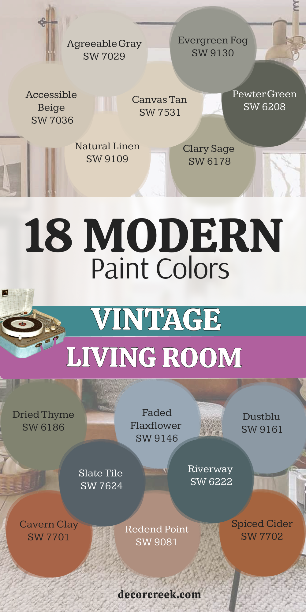
19 Vintage 70s Living Room Paint Colors
Avocado SW 2861
Avocado SW 2861 is the most iconic shade for anyone who wants a true throwback look. This green is very deep and earthy and looks like the skin of the fruit it is named after. I find that it brings a lot of personality to a living room that needs a bold change.
It reminds me of the fun kitchens and dens from fifty years ago where families spent their evenings. You can use it today with modern white furniture to make the color feel much cleaner. The color has a bit of brown in it which keeps it from looking too bright in the sun.
It looks very handsome when you pair it with dark wood and heavy woven fabrics. Many people love how it makes a house feel like it has a long and happy history. It is a very sturdy color that makes a big statement on any wall.
Best used in: living rooms, accent walls, kitchens, and front doors
Pairs well with: Creamy SW 7012, dark walnut wood, and orange accents The key rule of this color for 70s style is to use it as a bold anchor for a room filled with fun and funky patterns.
Ripe Olive SW 6209
Ripe Olive SW 6209 is a very dark and moody green that feels very private and snug. This color is much deeper than typical greens and looks like the shadows in a forest. I love using this color on all four walls to create a room that feels very cozy at night.
It reminds me of the sophisticated library rooms from the late 70s where people went to study. You should pair it with bright lamps and white ceilings to keep the room from feeling too small. The color is very rich and makes your gold frames and mirrors shine like bright stars.
It feels very heavy and stable like the walls of a very old and strong building. Many of my clients feel very brave and stylish when they see this deep shade finished. It is a perfect way to add a lot of drama to a simple room.
Best used in: living rooms, library walls, accent walls, and powder rooms
Pairs well with: Extra White SW 7006, Accessible Beige SW 7036, gold, and leather The key rule of this color for 70s style is to use it to create a room that feels like a private and expensive sanctuary.
🎨 Check out the complete guide to this color right HERE 👈
Artichoke SW 6179
Artichoke SW 6179 is a medium green that feels very organic and full of life. This color looks like the vegetables in a garden or a mossy rock by a quiet stream. I find that it brings a lot of energy to a living room without being too loud or bright.
It is a very traditional green that was used a lot in homes during the 70s for a natural look. You can use it to make your white furniture really stand out against the soft green walls. The color feels very grounded and makes the room feel very sturdy and well-built for a family.
It looks great with dark wood furniture and colorful rugs that have green and red in them. Many families like it because it feels very natural and like it belongs in the countryside. It is a great choice for making a room feel very friendly and full of personality.
Best used in: living rooms, dining rooms, kitchens, and entryways
Pairs well with: Creamy SW 7012, Dover White SW 6385, dark wood, and woven rugs The key rule of this color for 70s style is to use it to make your home feel as natural and sturdy as a garden.
🎨 Check out the complete guide to this color right HERE 👈
Goldenrod SW 6677
Goldenrod SW 6677 is a very bright and happy yellow that feels like a sunny summer day. This color is very bold and brings a lot of energy to any living room where it is used. I think it looks like the petals of a wild sunflower or a shiny piece of gold jewelry.
It is a classic 70s shade that makes a room feel very energetic and full of life. You can use it on a single wall if you are worried about the color being too strong for the whole room. It looks very fun when paired with white trim and dark green plants in the corners.
The color is very warm and makes the air in the room feel very cheerful and light. Many people find that it helps them feel much more happy as soon as they walk inside. It is a brave choice that pays off with a lot of light and happiness.
Best used in: living rooms, accent walls, breakfast nooks, and sunrooms
Pairs well with: Extra White SW 7006, Avocado SW 2861, dark wood, and blue accents The key rule of this color for 70s style is to use it to bring a sense of joy and bright light to your daily life.
🎨 Check out the complete guide to this color right HERE 👈
Nugget SW 6697
Nugget SW 6697 is a deep and rich yellow that looks like an old gold coin. This color has a bit of brown mixed in which makes it feel very sophisticated and steady. I like to use this in living rooms where you want a 70s look that still feels very grown up.
It reminds me of the warm colors used in grand old houses during the autumn months. You will notice that it makes your wood floors look very warm and very expensive. It is a great choice for a room where you want to gather around a fireplace with your family.
The color is very cozy and makes the walls feel like they are giving you a warm hug. Many people choose this because it is much more interesting than a plain beige or tan. It gives the room a very finished look that feels very professional and very classic.
Best used in: living rooms, dining rooms, entryways, and library walls
Pairs well with: Alabaster SW 7008, Urbane Bronze SW 7048, leather furniture, and brass The key rule of this color for 70s style is to use it where you want the walls to feel as warm and rich as gold.
🎨 Check out the complete guide to this color right HERE 👈
Harvest Gold SW 2858
Harvest Gold SW 2858 is one of the most famous colors from the past for a very good reason. This shade is a warm and muted yellow that feels like a field of wheat in the sun. I find that it brings a lot of heart and history to a living room without being too bright.
It reminds me of the happy family rooms where people watched movies together years ago. You can use it today to create a look that feels very cozy and very traditional for your kids. The color has a bit of tan in it which keeps it feeling very stable on the walls all day.
It looks beautiful when paired with dark wood furniture and orange or green pillows. Many families like it because it feels very natural and like it belongs in a very comfortable home. It is a great way to add a bit of sunshine to your house.
Best used in: living rooms, kitchens, family rooms, and hallways
Pairs well with: Creamy SW 7012, Avocado SW 2861, brown leather, and copper The key rule of this color for 70s style is to use it to make your home feel as warm and welcoming as a summer harvest.
🎨 Check out the complete guide to this color right HERE 👈
Butternut SW 6389
Butternut SW 6389 is a soft and creamy orange that feels very sweet and very light. This color looks like the skin of a squash or a bowl of warm soup in the winter. I love using this color in living rooms that need a bit of warmth but want to stay very bright.
It is a very friendly 70s shade that does not feel too bold or too overwhelming for a family. You can use it with white trim to create a look that feels very clean and very tidy. It looks wonderful when you have a lot of natural light coming through your big windows.
The color is very gentle and helps everyone feel a bit more relaxed and at home. Many people pick this because it makes a house feel very fresh and very happy at the same time. It is a lovely way to add a touch of color while staying very polite.
Best used in: living rooms, bedrooms, breakfast nooks, and nurseries
Pairs well with: Alabaster SW 7008, light oak, and green plants The key rule of this color for 70s style is to use it to create a soft and sunny glow in your favorite room.
Copper Mountain SW 6356
Copper Mountain SW 6356 is a bright and metallic-toned brown that looks very expensive on the walls. This color has a lot of red and orange in it which makes it feel very glowing like a fire. I love using this in living rooms that get a lot of afternoon sun to see the walls shine.
It reminds me of old copper pots or a shiny new penny you might find on the ground. You will see that it adds a lot of depth and interest to a plain room with simple furniture. It works very well with leather chairs and heavy wooden tables from the 70s era.
The color is very bold and tells people that you have a very strong and fun sense of style. It feels very sturdy and gives your home a very established and successful look. Many of my clients love how this color makes their home feel like a special treasure.
Best used in: living rooms, home offices, library walls, and entryways
Pairs well with: Alabaster SW 7008, Black Magic SW 6991, turquoise accents, and walnut The key rule of this color for 70s style is to use it to add a touch of luxury and warmth to your space.
🎨 Check out the complete guide to this color right HERE 👈
Cavern Clay SW 7701
Cavern Clay SW 7701 is a warm and earthy orange-red that feels like a sunset in the desert. This color is very bold and brings a lot of heart and energy to a 70s living room. I think it looks like old clay pots or handmade bricks from a very long time ago.
It is a great choice if you want your home to feel very welcoming and full of life for your guests. You can use it with mid-century modern furniture to create a look that is very stylish and cool. The warmth of the color makes the room feel very intimate and perfect for long family talks.
It looks amazing when the afternoon sun hits the walls and makes them glow like a warm flame. Many people find it very exciting to have such a bold and happy color in their house. It is a brave choice that makes a very big and happy statement.
Best used in: living rooms, dining areas, accent walls, and sunrooms
Pairs well with: Origami White SW 7636, Distance SW 6243, turquoise, and light wood The key rule of this color for 70s style is to use it to bring a sense of adventure and warmth to your daily life.
🎨 Check out the complete guide to this color right HERE 👈
Spiced Cider SW 7702
Spiced Cider SW 7702 is a deep and warm orange that feels like a cozy autumn afternoon. This color brings a lot of happiness and heart to a 70s living room. I think it looks like the skin of a ripe pumpkin or a big pile of dry leaves in the yard.
It is a very traditional color that was very popular in homes several decades ago for a cozy feel. You can use it to make a large room feel much smaller and more inviting for your whole family. It looks wonderful when you have a lot of dark wood furniture or a big stone fireplace in the room.
The color is very rich and makes the air in the room feel very warm and very snug. Many people find that it helps them feel more energetic and cheerful as soon as they enter. It is a great choice if you love colors that feel very earthy and strong.
Best used in: living rooms, dining rooms, kitchens, and accent walls
Pairs well with: Creamy SW 7012, Naval SW 6244, dark wood, and copper decorations The key rule of this color for 70s style is to use it to make your home feel as warm and spicy as a favorite drink.
🎨 Check out the complete guide to this color right HERE 👈
Red Bay SW 6321
Red Bay SW 6321 is a very deep and rich red that looks like a bowl of berries. This color is very powerful and makes a living room feel very energetic and full of life. I like to use it on an accent wall to create a big focal point that everyone will notice.
It reminds me of the bold red rooms from the 70s that felt very stylish and modern. You should pair it with white trim to make the red look even brighter and cleaner. The color is very warm and makes the room feel like a great place for a big party.
It looks very expensive when you add gold picture frames or dark wood furniture to the room. Many of my clients feel very brave and happy when they see this strong red on their walls. It is a perfect way to add a lot of personality to a room that feels too quiet.
Best used in: living rooms, dining rooms, accent walls, and entryways
Pairs well with: Alabaster SW 7008, Kilim Beige SW 6106, dark wood, and gold accents The key rule of this color for 70s style is to use it to add a sense of excitement and energy to your home.
🎨 Check out the complete guide to this color right HERE 👈
Mesa Tan SW 7695
Mesa Tan SW 7695 is a warm and sandy brown that feels very grounded and earthy. This color looks like the rocks in a desert or a piece of old pottery. I find that it makes a living room feel very steady and well-built for a busy family.
It is a very reliable neutral from the 70s that has a bit more warmth than a regular tan. You can use it to show off your favorite colorful art and patterned rugs beautifully. It looks very handsome when paired with leather furniture and heavy wood tables.
The color feels very natural and does not change much as the sun moves across the sky during the day. Many people choose this because it feels very classic and handles a busy life very well. It is a smart choice for a room where you want to feel very safe and very comfortable.
Best used in: living rooms, hallways, dining rooms, and home exteriors
Pairs well with: Pure White SW 7005, Urbane Bronze SW 7048, dark wood, and silver accents The key rule of this color for 70s style is to use it as a solid foundation that feels very traditional and reliable.
Rustic Red SW 7593
Rustic Red SW 7593 is a deep and muted red that looks like an old barn or a brick wall. This color is very traditional and feels like it has a lot of history inside it. I find that it brings a lot of heart and warmth to a living room that needs more color.
It reminds me of the cozy and welcoming homes from decades ago where people gathered together. You can use it to make a large room feel much smaller and more intimate for your family. It looks wonderful when you have a lot of dark wood furniture or a stone fireplace in the room.
The color is very rich and makes the air in the room feel very warm and very snug at night. Many people find that it helps them feel more energetic and cheerful as soon as they walk inside. It is a great choice if you love colors that feel very earthy and strong.
Best used in: living rooms, dining rooms, front doors, and accent walls
Pairs well with: Alabaster SW 7008, Balanced Beige SW 7037, dark wood, and gold The key rule of this color for 70s style is to use it to make your home feel as warm and sturdy as a brick house.
Chocolate Powder SW 9082
Chocolate Powder SW 9082 is a soft and medium brown that looks like a cup of cocoa with milk. This color is very gentle and makes a living room feel very sweet and very light. I think it looks like the color of an old teddy bear or a piece of soft suede fabric.
It is a very friendly 70s shade that does not feel too dark or too heavy for a family room. You can use it in a room with a lot of plants to make the green leaves look very bright and happy. It makes a great background for your old family photos and colorful art on the walls.
The color is very gentle and helps everyone feel a bit more relaxed and at home. Many families choose this because it feels very comforting and easy to live with every day. It gives the walls a very soft and finished look that feels very professional.
Best used in: living rooms, bedrooms, breakfast nooks, and nurseries
Pairs well with: Alabaster SW 7008, Black Magic SW 6991, pink accents, and walnut wood The key rule of this color for 70s style is to use it to make your home feel as sweet and comforting as a homemade treat.
Turkish Coffee SW 6076
Turkish Coffee SW 6076 is a very dark and rich brown that looks almost like black in some lights. This color is very dramatic and makes a living room feel very private and very expensive. I like to use it on a single wall or in a library nook to create a big focal point.
It reminds me of the dark wood used in grand old mansions from many years ago. You should pair it with very light furniture to create a look that is very sharp and very modern. The color feels very heavy and stable like a big piece of old furniture on the wall.
It gives a room a sense of mystery and makes your gold decorations look absolutely amazing. Many people feel very sophisticated when they have such a deep and dark color in their home. It is a very brave choice that adds a lot of character to any house.
Best used in: living rooms, studies, accent walls, and powder rooms
Pairs well with: Creamy SW 7012, Kilim Beige SW 6106, brass hardware, and white marble The key rule of this color for 70s style is to use it to add a sense of weight and old-world importance to a room.
🎨 Check out the complete guide to this color right HERE 👈
Mossy Gold SW 6139
Mossy Gold SW 6139 is a unique mix of yellow and green that feels very earthy and very fun. This color looks like the sun hitting the grass in a forest or a piece of old velvet fabric. I find that it brings a lot of personality to a 70s living room that wants to be different.
It is a very traditional shade that reminds me of the nature-loving homes from fifty years ago. You can use it to make your house feel very cozy and full of life for your family. It looks beautiful when paired with dark wood furniture and light cream curtains on the windows.
The color has enough green in it to stay very natural and grounded on the walls all day. Many people find it very interesting to look at because the color changes as the sun moves. It is a lovely way to add a bit of fun to your favorite sitting area.
Best used in: living rooms, dining rooms, kitchens, and accent walls
Pairs well with: Alabaster SW 7008, Urbane Bronze SW 7048, dark wood, and copper The key rule of this color for 70s style is to use it to bring a touch of the forest and the sun into your home.
Curry SW 6671
Curry SW 6671 is a warm and spicy yellow that brings a lot of heat and life to a room. This color looks like the spices in a kitchen or a sunny day in a hot place. I love using this color in a living room where people gather to talk and have a lot of fun.
It is a very bold 70s choice that tells everyone you have a very strong sense of style. You can use it with white trim to keep the color looking very clean and very bright for your guests. It looks amazing when the afternoon sun hits the walls and makes them glow like a warm flame.
The color is very rich and makes the air in the room feel very cheerful and light. Many people find that it helps them feel more energetic and happy as soon as they walk inside. It is a brave choice that makes a very big and happy statement for your home.
Best used in: living rooms, kitchens, accent walls, and dining areas
Pairs well with: Extra White SW 7006, dark wood, teal accents, and colorful rugs The key rule of this color for 70s style is to use it to add a sense of excitement and warmth to your daily life.
🎨 Check out the complete guide to this color right HERE 👈
Bosc Pear SW 6390
Bosc Pear SW 6390 is a soft and muted gold that feels very traditional and very steady. This color looks like the skin of a ripe fruit or a piece of old silk ribbon. I find that it makes a living room feel very sunny and cheerful without being too bright or loud.
It reminds me of the happy family rooms from decades ago where people gathered to relax. You can use it to make your house feel very cozy and very welcoming for everyone who visits. It looks beautiful when paired with dark wood furniture and green plants in the corners of the room.
The color has a bit of brown in it which keeps it feeling very stable on the walls all day. Many people choose this because it feels very classic and handles a busy family life very well. It is a great choice for making a room feel very friendly and full of personality.
Best used in: living rooms, kitchens, hallways, and dining rooms
Pairs well with: Creamy SW 7012, Avocado SW 2861, brown leather, and brass The key rule of this color for 70s style is to use it to make your home feel as warm and sunny as a summer afternoon.
🎨 Check out the complete guide to this color right HERE 👈
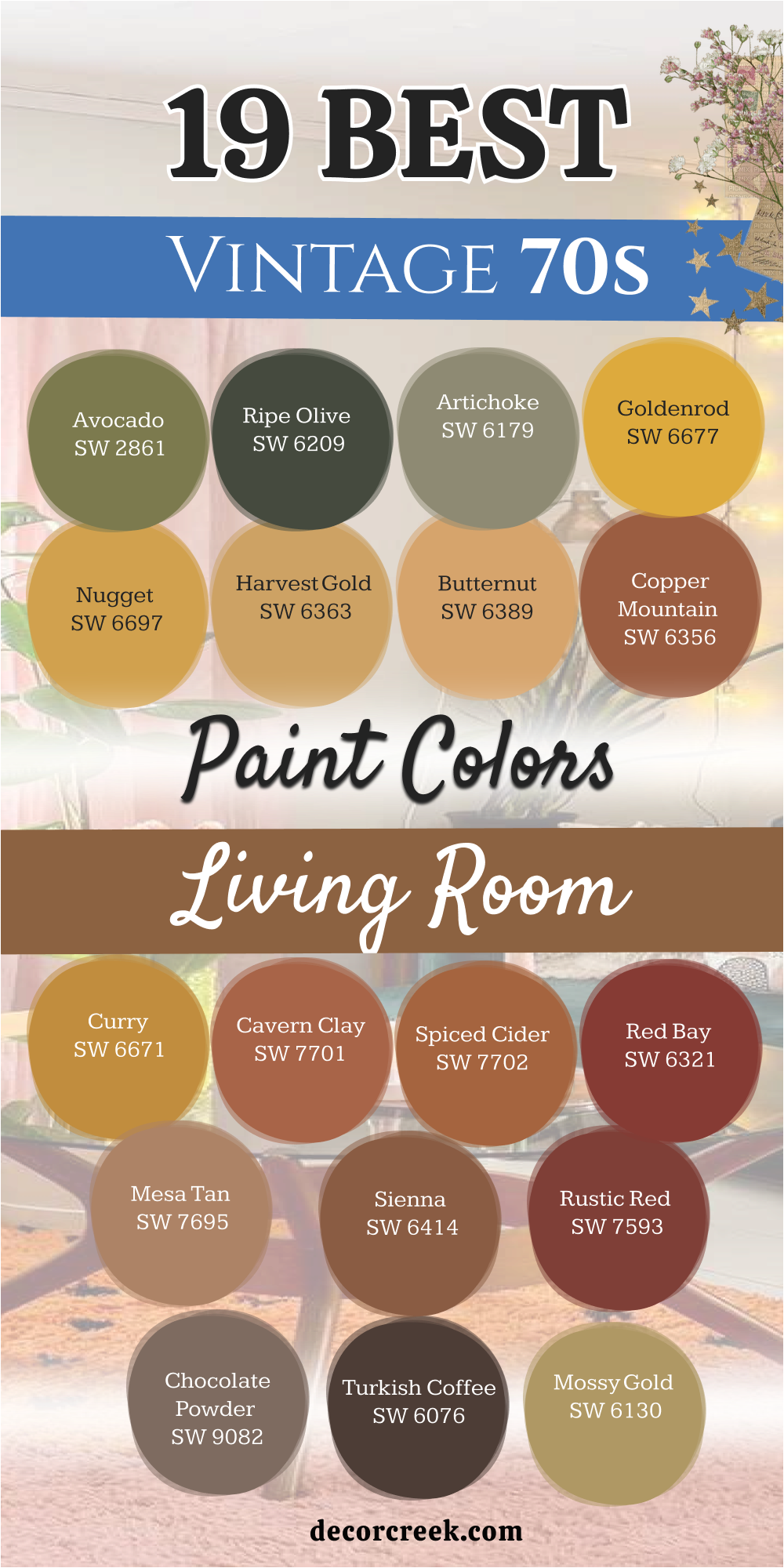
17 Vintage Farmhouse Living Room Paint Color
Alabaster SW 7008
Alabaster SW 7008 is the color I reach for most when a house needs to feel like a fresh start. This white is very soft and has a tiny bit of warmth so it never feels cold like an ice cube. I think it looks like the feathers of a swan or a clean cotton sheet drying in the sun.
It is a perfect choice for a living room with big wooden beams on the ceiling. You will see that it makes the room feel very open and full of bright air for your family. It is not too bright for the eyes and makes every piece of furniture look very neat.
Many families love how it makes their home feel very quiet and very clean at the same time. It is a very polite shade that lets the sunlight do all the work in the morning.
Best used in: living rooms, kitchens, hallways, bedrooms, and farmhouse exteriors
Pairs well with: Iron Ore SW 7069, Agreeable Gray SW 7029, Natural Linen SW 9109, warm wood tones The key rule of this color for farmhouse style is to use it where you want natural light to feel kind, soft, and inviting throughout the day.
🎨 Check out the complete guide to this color right HERE 👈

Creamy SW 7012
Creamy SW 7012 is a rich and soft white that feels like a big bowl of vanilla cream. This color is much warmer than a standard white because it has a drop of yellow and gray hidden inside. I often pick this when a house has a lot of dark wood floors that need to look friendlier.
It reminds me of old lace or the pages of a favorite book you have read many times. You can use it on the walls to make the whole area feel very cozy and safe. It keeps the room from feeling too sharp or too modern which is great for an old house.
This paint looks amazing when the sun shines on it during the late afternoon. Many people choose it because it goes with almost any rug or sofa they already own.
Best used in: living rooms, bedrooms, entryways, and trim work
Pairs well with: Accessible Beige SW 7036, dark oak furniture, and brass hardware The key rule of this color for farmhouse style is to use it where you want the walls to feel soft like a piece of silk under your fingers.
🎨 Check out the complete guide to this color right HERE 👈
White Duck SW 7010
White Duck SW 7010 is a very interesting color that sits right between a white and a very light gray. It looks like the soft feathers of a bird or a smooth stone from a quiet creek. I love using this color because it changes its look depending on how much sun is in the room.
It is a great choice if you want a neutral that has a bit more personality than a plain white. You will notice that it makes your white trim and doors look very crisp and very clean. It feels very organic and looks wonderful with natural wood and woven baskets on the floor.
The color is very gentle and helps everyone feel a bit more relaxed as soon as they sit down. Many people find it very easy to live with because it is so soft on the eyes all day long.
Best used in: living rooms, kitchens, bedrooms, and laundry rooms
Pairs well with: Urbane Bronze SW 7048, Alabaster SW 7008, charcoal accents, and light wood The key rule of this color for farmhouse style is to use it as a soft background that feels very natural and very steady.
🎨 Check out the complete guide to this color right HERE 👈
Natural Linen SW 9109
Natural Linen SW 9109 looks exactly like the fabric it is named after and feels very earthy. This shade is a soft tan that brings the feeling of the outdoors into your living room. I love using this color because it makes the walls look like they have a lot of history.
It is much warmer than a white but it still keeps the room feeling very breezy and light. You will notice that it makes your green plants and wood furniture look very rich and very deep. It reminds me of old summer houses and the sun hitting a wooden porch in the morning.
The color is very gentle and helps every guest feel a bit more comfortable and at home. Many people pick this because it makes a house feel very fresh without being too bright or loud.
Best used in: living rooms, sunrooms, bedrooms, and kitchens
Pairs well with: Alabaster SW 7008, Shoji White SW 7042, light oak, and soft blue accents The key rule of this color for farmhouse style is to use it where you want the light to feel natural and the air to feel very soft.
🎨 Check out the complete guide to this color right HERE 👈
Accessible Beige SW 7036
Accessible Beige SW 7036 is the most popular choice for a farmhouse for a very good reason. This color acts like a bridge between the old parts of your house and the new things you buy. It does not turn yellow or pink when the lights go on in the evening.
I think it looks like a soft sandy beach under a cloudy sky during the fall. You will find that it makes your colorful artwork really pop off the wall and look special. It is a very safe choice if you are worried about picking something that is too bold or too dark.
The gray tones inside it keep it looking very smart and sophisticated instead of boring. Most of my clients feel instantly relaxed when they see this on their living room walls.
Best used in: living rooms, open floor plans, hallways, and kitchens
Pairs well with: Alabaster SW 7008, Urban Bronze SW 7048, navy blue accents, and light wood The key rule of this color for farmhouse style is to use it as a background that lets your antique furniture be the star of the show.
🎨 Check out the complete guide to this color right HERE 👈
Anew Gray SW 7030
Anew Gray SW 7030 is a slightly darker version of a classic neutral that adds a bit more strength. It has a bit of warmth so it never feels like a cold basement or a dark office. I think of it as the color of a foggy morning over a big stone barn.
It is a great choice if you have a lot of white trim and white doors in your house. The contrast makes the architectural details of your home stand out for everyone to see. It is a very sturdy color that handles big furniture and busy family life very well.
Many people like it because it hides small smudges or dust better than very light colors do. It makes a living room feel very established and very well-designed right away. This is a color that will stay in style for many years in your home.
Best used in: living rooms, basements, hallways, and exteriors
Pairs well with: Pure White SW 7005, Sea Salt SW 6204, dark charcoal, and silver accents The key rule of this color for farmhouse style is to use it to give your room a solid foundation that feels reliable and classic.
🎨 Check out the complete guide to this color right HERE 👈
Agreeable Gray SW 7029
Agreeable Gray SW 7029 is a very light and warm gray that feels like a soft morning mist. This color is a favorite for farmhouse homes because it matches everything in the room so perfectly. I find that it makes a living room feel very bright and airy even when it is raining outside.
It reminds me of the fur of a little kitten or a piece of soft felt fabric. You can use it in your whole house to make every room feel like it belongs together. It is a very safe choice if you are worried about picking a color that is too dark.
The color stays very steady and does not look blue or purple in different lights during the day. Most of my clients feel very happy and relaxed when they see this on their walls.
Best used in: living rooms, bedrooms, kitchens, and whole-house painting
Pairs well with: Incredible White SW 7028, Extra White SW 7006, dark floors, and blue accents The key rule of this color for farmhouse style is to use it to make the whole house feel clean, bright, and very steady.
🎨 Check out the complete guide to this color right HERE 👈
Balanced Beige SW 7037
Balanced Beige SW 7037 is a medium-toned tan that feels very warm and very grounded. This color is deeper than a regular beige and gives the walls a lot of personality. I think it looks like the color of a toasted marshmallow or a soft leather glove.
It is a very traditional choice that makes a farmhouse living room feel very cozy and snug. You can use it in a large room to make it feel a bit more intimate and private. The color has a bit of gray in it which keeps it from looking too yellow in the sun.
It looks beautiful when paired with dark wood furniture and heavy woven rugs. Many people find that it makes their home feel very sturdy and very well-built. It is a very comfortable color that makes everyone want to sit down and talk.
Best used in: living rooms, dining rooms, entryways, and home offices
Pairs well with: Alabaster SW 7008, Urbane Bronze SW 7048, warm wood, and black accents The key rule of this color for farmhouse style is to use it to create a room that feels very solid and full of warmth.
🎨 Check out the complete guide to this color right HERE 👈
Kilim Beige SW 6106
Kilim Beige SW 6106 is a very warm and sunny tan that has been a favorite for many years. This color has a tiny hint of red or orange in it which makes it feel very energetic. I think of it as the color of a desert sunset or a piece of old handmade pottery.
It is a great choice for a living room that needs a bit more warmth and life. You will see that it makes the room feel very glowing and happy during the afternoon. It looks very traditional when paired with white trim and dark wood floors.
The color is very friendly and makes a house feel like a very welcoming place for guests. Many families like it because it feels very natural and like it belongs in the countryside.
Best used in: living rooms, kitchens, family rooms, and hallways
Pairs well with: Divine White SW 6105, dark chocolate brown, and turquoise accents The key rule of this color for farmhouse style is to use it where you want the walls to feel like they are giving you a warm welcome.
🎨 Check out the complete guide to this color right HERE 👈
Softer Tan SW 6141
Softer Tan SW 6141 is a very gentle and light brown that feels very quiet and soft. This color is a great alternative to white if you want the room to have more depth. I find that it looks like the color of soft sand or a pair of khaki pants.
It is a very traditional and polite color that never tries to take over the room. You can use it in a living room with a lot of windows to keep the light feeling very soft. It makes a great background for a room filled with green plants and natural wood furniture.
The color is very balanced and does not turn too yellow or too gray in the light. Many people choose this color because it is very easy on the eyes at any time of day.
Best used in: living rooms, bedrooms, hallways, and kitchens
Pairs well with: Alabaster SW 7008, Universal Khaki SW 6150, green plants, and brown leather The key rule of this color for farmhouse style is to use it to create a soft and simple background for your daily life.
🎨 Check out the complete guide to this color right HERE 👈
Clary Sage SW 6178
Clary Sage SW 6178 is a soft and herbal green that feels very refreshing and light. This color is a classic choice for a farmhouse living room that wants to feel like a garden. I think it looks like the soft leaves of a sage plant or a piece of moss.
It is a very gentle green that does not take over the room or feel too loud. You can use it to make a space feel more connected to the trees and grass outside your window. It looks beautiful with light wood floors and white linen curtains on the windows.
The color has enough warmth in it to stay very friendly even on a cloudy day. Many people find it very easy to live with because it is so soft on the eyes. It is a lovely way to add a bit of color while staying quiet.
Best used in: living rooms, bedrooms, kitchens, and sunrooms
Pairs well with: Alabaster SW 7008, floral prints, and light oak The key rule of this color for farmhouse style is to use it to bring a soft garden feeling into your home every day.
🎨 Check out the complete guide to this color right HERE 👈
Dried Thyme SW 6186
Dried Thyme SW 6186 is a darker green that feels very rich and full of old-world charm. This color looks like the leaves of an herb garden that have been dried in the sun. I love using this color in living rooms with a lot of light to show off its deep tones.
It makes a very big statement and tells people that you have a very strong sense of style. You can pair it with creamy white furniture to keep the room from feeling too dark at night. The color feels very sturdy and looks like it belongs in a grand old library full of books.
It reminds me of the deep colors used in very expensive houses a long time ago. Many people feel very cozy when they are surrounded by this deep and earthy shade.
Best used in: living rooms, dining rooms, library walls, and front doors
Pairs well with: Creamy SW 7012, Wood Ash 1065, copper accents, and velvet fabric The key rule of this color for farmhouse style is to use it when you want the room to feel full of history and importance.
🎨 Check out the complete guide to this color right HERE 👈
Evergreen Fog SW 9130
Evergreen Fog SW 9130 is a beautiful mix of green and gray that feels very sophisticated and deep. This color is very popular because it brings the feeling of nature into a farmhouse living room. I think it looks like the misty trees on a mountain during a very quiet morning.
It is a very smart choice for a room where you want to feel very focused and quiet. You can use it as a colorful neutral because it goes well with many other shades like tan and gold. It looks especially beautiful when you have leather chairs or gold picture frames in the room.
The gray tones keep the green from looking too bright or like a child’s bedroom. Many of my clients tell me this color helps them feel much more relaxed after a long day.
Best used in: living rooms, home offices, cabinets, and accent walls
Pairs well with: Shoji White SW 7042, bronze hardware, and warm wood The key rule of this color for farmhouse style is to use it to create a quiet corner that feels separate from the busy world.
🎨 Check out the complete guide to this color right HERE 👈
Pewter Green SW 6208
Pewter Green SW 6208 is a dark and cool green that feels very majestic and very strong. This color has a lot of gray in it which makes it look like old metal or a piece of slate. I love this color for a living room that wants to feel very private and snug like a cozy cave.
It creates a very dramatic look that makes your guests feel like they are in a special place. You should use this if you want to make your farmhouse feel very high-end and unique. It works best in rooms with a lot of windows so the dark paint does not feel too heavy.
The color looks very rich when you add gold lamps or shiny brass decorations to the room. It reminds me of the deep shadows in a forest during the winter.
Best used in: living rooms, studies, kitchen islands, and accent walls
Pairs well with: Shoji White SW 7042, gold accents, and white marble The key rule of this color for farmhouse style is to use it to create a sense of mystery and deep beauty in your room.
🎨 Check out the complete guide to this color right HERE 👈
Warm Stone SW 7032
Warm Stone SW 7032 is a dark and cozy gray that has a lot of brown hidden inside the paint. This color feels very natural and looks like a large rock you might find in a quiet field. I love using this color in a living room where you have a big fireplace or a lot of books.
It creates a mood that is very quiet and makes you want to sit down and rest. You can use it to make a large space feel much more intimate and private for your family. The color is very sophisticated and makes your light-colored art look very bright on the walls.
It feels very heavy and stable like the walls of a very old and strong house. Many families like it because it feels very earthy and does not try to be too trendy.
Best used in: living rooms, basements, exterior accents, and master bedrooms
Pairs well with: Alabaster SW 7008, Agreeable Gray SW 7029, stone textures, and bronze The key rule of this color for farmhouse style is to use it to create a room that feels very solid, quiet, and grounded.
🎨 Check out the complete guide to this color right HERE 👈
Gauntlet Gray SW 7019
Gauntlet Gray SW 7019 is a strong and true gray that feels very steady and very professional. This color is a medium shade that looks like old stone walls or a piece of heavy machinery. I like to use this in living rooms that have a lot of white trim to create a very sharp look.
It is a very reliable color that helps all your colorful furniture stand out and look its best. You will notice that it makes the room feel very balanced and very easy to be in. It is a great choice if you want a vintage look that feels very clean and tidy.
The color stays very consistent and does not turn blue or yellow in the sun. Many families like it because it feels very sturdy and handles a busy life very well.
Best used in: Pure White SW 7005, black metal, and bright art The key rule of this color for farmhouse style is to use it to give your room a solid and classic foundation.
🎨 Check out the complete guide to this color right HERE 👈
Urbane Bronze SW 7048
Urbane Bronze SW 7048 is a very deep and dark color that sits right between brown and gray. This shade is a famous choice for making a farmhouse look very modern and vintage at the same time.
I think it looks like old metal or a piece of heavy iron from an old factory. It is a great choice for an accent wall or to paint your window frames and doors. You will see that it makes all the other colors in your room look much more exciting and bright.
The color feels very strong and gives your house a lot of character right away. It reminds me of the deep colors used in industrial buildings a long time ago. Many of my clients love how this color makes their home feel very high-end and special. It is a very bold way to add a lot of style to your favorite room.
Best used in: living rooms, accent walls, trim, and kitchen islands
Pairs well with: Shoji White SW 7042, gold accents, and light wood floors The key rule of this color for farmhouse style is to use it to add a touch of strength and history to your walls.
🎨 Check out the complete guide to this color right HERE 👈
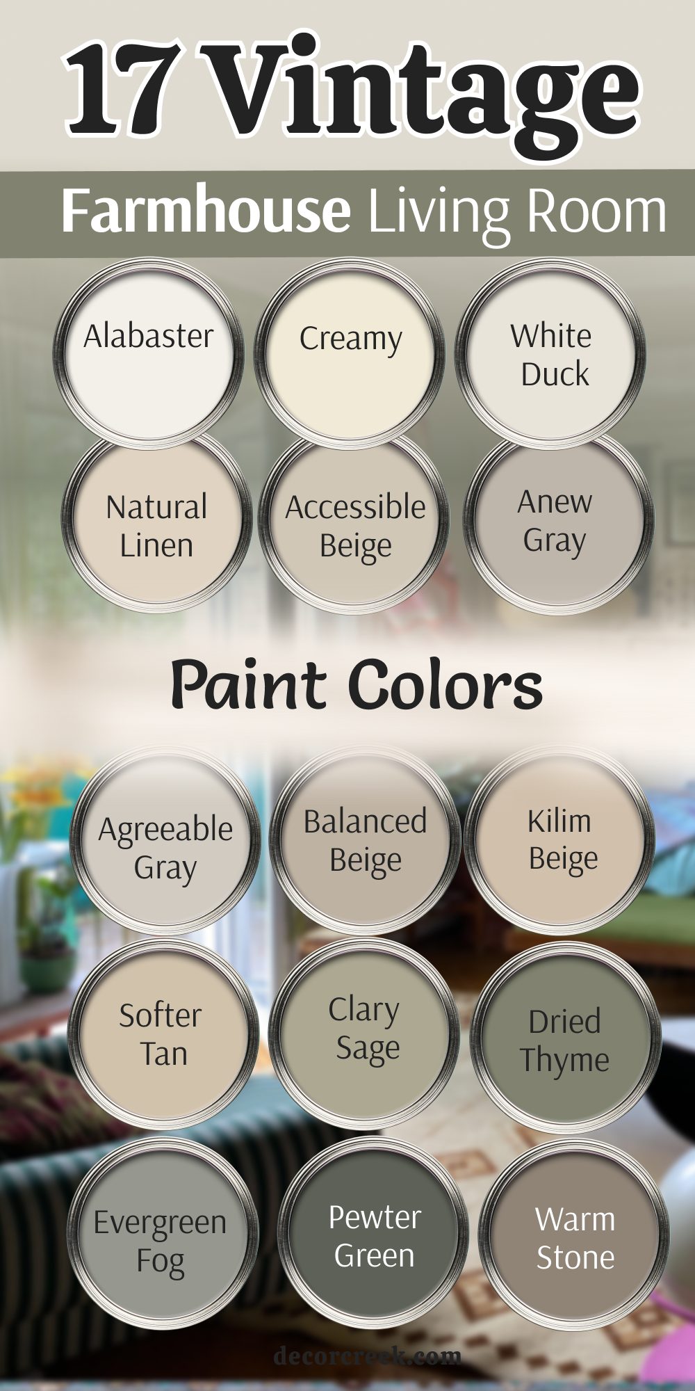
Choosing the right color for your living room is about much more than just following a trend; it is about creating a feeling that lasts for years. Throughout my work, I have seen how a well-chosen vintage shade can turn a cold, empty space into a warm and welcoming sanctuary.
Whether you choose the deep, intellectual mood of Vintage Vogue or the soft, airy comfort of Natural Linen, you are making a choice to honor the past while building your future. These 37 colors are my absolute favorites because they have stood the test of time and continue to make people feel truly at home.
I always remind my clients that the color is only half of the story—the finish is just as important. For a vintage living room, I usually recommend a matte or eggshell finish. These low-shine options are excellent at hiding small bumps or imperfections on older walls, making them look soft and velvety like a piece of antique fabric. When light hits a matte wall, it diffuses softly, creating a sophisticated look that feels much more authentic than modern, shiny paints.
For trim and doors, a satin finish provides just enough contrast to highlight architectural details without looking too glossy.
