Purple is a bold choice that makes people feel happy and excited when they walk into a room. Many homeowners get scared of this color because they worry it will look too bright or messy. I love using it because it brings a fun energy to any house.
Choosing the right wall shades to match it is the secret to making the whole room look beautiful. You just need a few simple tricks to find the perfect match. Let us look at how you can make your home look amazing with the right combinations.
One of my favorite ways to decorate with purple is to pair it with soft neutral colors. Warm white, creamy beige, and light gray help balance the richness of purple and keep the space feeling calm. This combination works beautifully in living rooms, bedrooms, and even entryways.
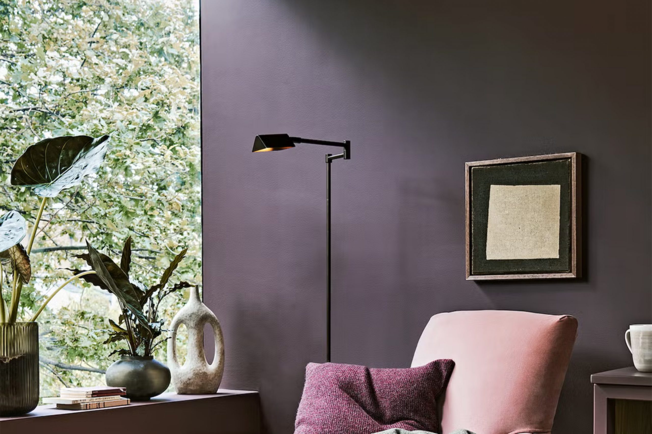
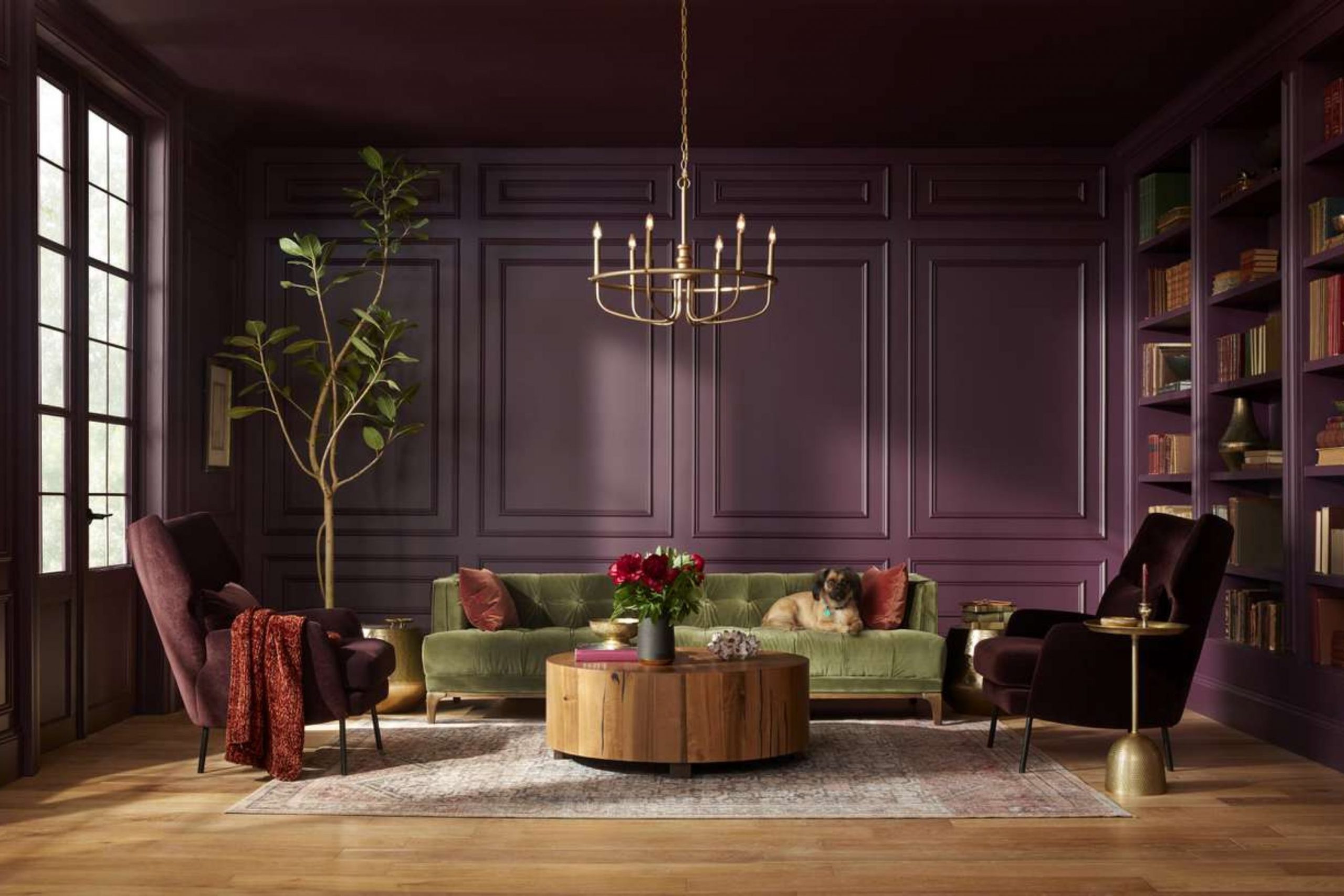
If you want a more elegant look, try matching purple with charcoal gray or deep navy.
These darker tones create a sophisticated style that feels cozy and luxurious. I often recommend adding metallic accents like gold or brass to make the room feel even more polished.
Why I Always Trust Sherwin-Williams and Benjamin Moore for the Best Paint Colors That Go With Purple
I always pick these two major brands because their paint mixes are reliable and look exactly like the small paper samples. When you mix a tricky color like purple with another shade, you need to know the paint will dry correctly. These companies use great ingredients that keep their look for many years.
Homeowners deserve excellent results that do not fade after a few months. Cheap paint often changes its look under different lamps, which ruins the design.
Trusting these brands saves you time and keeps your walls looking professional.
How I Choose the Perfect Paint Color to Pair With Purple
I start by looking at how much sunlight comes through the windows during the morning and afternoon. Darker rooms need bright companions so the walls do not make the room feel like a dark cave. You also have to think about the mood you want to create for your family.
Bright shades make a room feel awake, while darker pairs make it feel cozy for sleeping.
I always test a small patch on the wall before painting the whole area. This step ensures you love the match before spending your money.
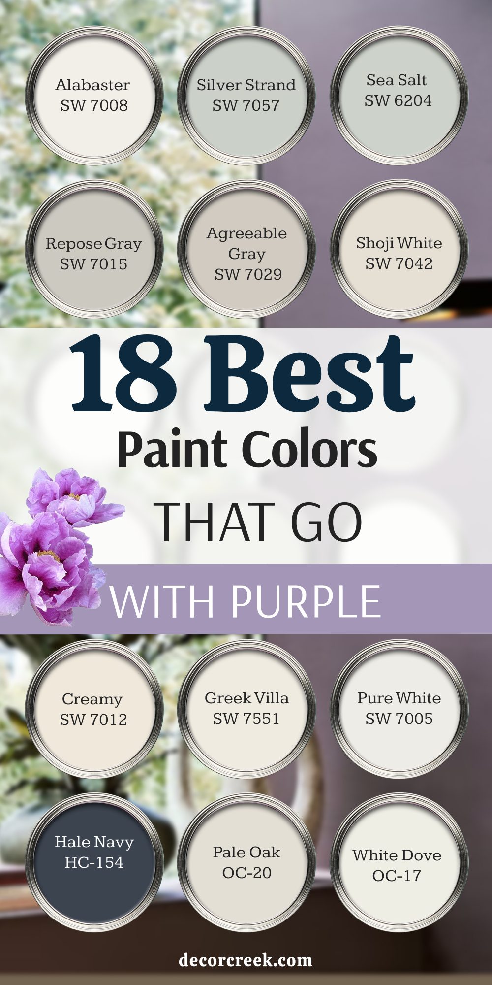
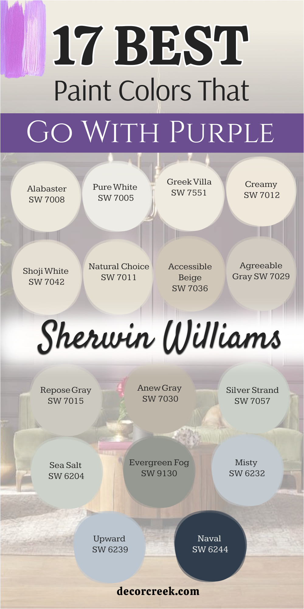
17 Top Paint Colors that go With Purple from Sherwin Williams
Alabaster SW 7008
Alabaster SW 7008 is a creamy white that feels warm and friendly on your walls. It stops bright violet from looking too harsh or cold when the sun shines on it.
You will love how it makes your favorite colorful furniture stand out. It feels like a warm hug when you walk into the room. This shade makes everything look clean without feeling like a cold doctor office.
It is my favorite choice for family areas because it makes everyone feel comfortable. You can use it on your trim or your main walls. It brings a soft glow to dark corners that need extra light. Neighbors will ask you how you made your home look so pretty.
Best used in: living rooms, kitchens, hallways, bedrooms, and farmhouse exteriors
Pairs well with: Iron Ore SW 7069, Agreeable Gray SW 7029, Natural Linen SW 9109, warm wood tones The key rule of this color for farmhouse style is to use it where you want natural light to feel kind, soft, and inviting throughout the day.

Pure White SW 7005
Pure White SW 7005 is a bright option that has a tiny drop of warmth hidden inside. It gives a sharp contrast to deep grape shades that you want people to notice.
This color makes your ceilings look higher and your rooms feel much bigger. It does not look yellow or blue even in strange lighting conditions. I use it when I want a crisp look that makes colors pop.
Your friends will notice how clean and tidy your whole house looks. It grounds bright plum tones so they do not hurt your eyes. It is an excellent choice for modern homes that need a fresh look. You will never get tired of looking at this clean shade.
Best used in: kitchens, bathrooms, trim, ceilings, and modern living rooms
Pairs well with: Black Fox SW 7020, March Wind SW 7668, Passive SW 7064, dark stained wood The key rule of this color for modern style is to use it on trim and doors to make your main wall colors stand out with crisp lines.

Greek Villa SW 7551
Greek Villa SW 7551 is a rich white that has a sunny undertone to cheer you up. It works nicely with deep eggplant shades because it softens the heavy dark feelings.
This shade makes your home feel like a fancy vacation resort every single day. It reflects light beautifully without creating any annoying glare on your walls. I recommend it for bedrooms where you want to relax after a long day.
It makes your colorful blankets and pillows look even more beautiful. Your family will love the cozy feelings it brings to your shared rooms. It is a smart pick for houses that do not get much natural sunshine. It keeps your walls looking bright and cheerful all year long.
Best used in: master bedrooms, dining rooms, entryways, and cozy reading nooks
Pairs well with: In the Navy SW 9178, Urban Bronze SW 7048, Accessible Beige SW 7036, gold hardware The key rule of this color for cozy style is to use it in rooms with large windows so the warm undertones can capture the afternoon sun.

Creamy SW 7012
Creamy SW 7012 is a soft yellowish white that reminds you of delicious vanilla ice cream. It pairs wonderfully with light lavender to create a sweet and charming room.
Children love this combination because it feels playful yet very neat and tidy. It adds a traditional look to older homes that need a fresh update. I like to use it in kitchens with dark purple accent walls.
It makes your cooking area feel bright, clean, and ready for making big family meals. Your guests will feel welcome the moment they step inside your front door. It hides small dirt marks better than most bright white paints do. It is a dependable color that never goes out of style.
Best used in: kitchens, traditional dining rooms, nurseries, and hallways
Pairs well with: Studio Mauve SW 0062, Pewter Cast SW 7673, Practical Beige SW 6100, antique brass The key rule of this color for traditional style is to couple it with warm wood furniture to create a rich, historic look.

Shoji White SW 7042
Shoji White SW 7042 is a special mix of white, beige, and a tiny bit of gray. It looks amazing next to muted plum tones because it balances the warm and cool feelings.
This shade changes slightly depending on the time of day, which keeps your room interesting. It feels very peaceful and helps you unwind when you are stressed out.
I choose it for open floor plans where rooms connect to each other. It keeps the whole house looking connected and well planned by a professional. Your artwork will look fantastic hanging against this soft background shade. It gives you the brightness of white with the cozy feel of beige. It is a secret weapon for staging homes to sell fast.
Best used in: open concept living areas, sunrooms, corridors, and exterior siding
Pairs well with: Peppercorn SW 7674, Fawn Brindle SW 7640, Pure White SW 7005, light oak flooring The key rule of this color for open layouts is to use it as a bridge between bright accent walls and darker hallway areas.

Natural Choice SW 7011
Natural Choice SW 7011 is a warm off-white that feels very grounded and earthy. It connects beautifully with organic berry shades to make a room feel connected to nature.
This color takes away the cold feeling that some modern houses have. It makes your wooden tables and chairs look rich and expensive. I use it in living rooms where families gather to watch movies and play games.
It creates a friendly backdrop that does not fight with your other decorations. Your home will feel like a safe getaway from the busy outside world. It looks great on both walls and ceilings for a soft look. You will love how easy it is to match with your current rugs.
Best used in: family rooms, dens, guest bedrooms, and cottage-style interiors
Pairs well with: Toque White SW 7003, Balanced Beige SW 7037, Raisin SW 7630, wicker accents The key rule of this color for cottage style is to pair it with natural textures like linen and wool to enhance the earthy vibe.
Accessible Beige SW 7036
Accessible Beige SW 7036 is a famous tan color that has a grayish undertone to keep it modern. It is a perfect match for dark magenta because it tones down the bright energy.
This color makes any room look high-end without spending a lot of money. It is very popular because it looks good under almost any kind of lightbulb. I use it to stage homes because buyers fall in love with it instantly.
It makes small rooms feel open and breathable instead of cramped. Your colorful accents will look intentional and smart against this neutral shade. It gives a cozy structure to your walls that feels solid and safe. You cannot go wrong with this lovely neutral option.
Best used in: entryways, home offices, basements, and rental properties
Pairs well with: Aesthetic White SW 7035, Virtual Taupe SW 7039, Cadet SW 9143, matte black fixtures The key rule of this color for staging is to use it in main hallways to create a smooth flow from the front door to the back.

Agreeable Gray SW 7029
Agreeable Gray SW 7029 is the number one paint choice for millions of homeowners across the country. It has a perfect balance of warm beige and cool gray inside it.
It loves to sit next to orchid and lilac shades in bright rooms. This color adapts to whatever furniture you already own, which saves you stress. It makes your home look modern but still feels very cozy and inviting.
I use it when clients cannot decide what color they want for their walls. It solves design arguments because everyone likes how it looks in the afternoon light. Your rooms will feel bright and ready for any season of the year. It makes purple accents look sophisticated and grown-up.
Best used in: whole-house painting, living rooms, bedrooms, and open kitchens
Pairs well with: Extra White SW 7006, Mega Greige SW 7031, Gauntlet Gray SW 7019, dark metal accents The key rule of this color for whole-house use is to use it as your main background so your purple accents can change from room to room.

Repose Gray SW 7015
Repose Gray SW 7015 is a cool gray that has a tiny touch of brown to stop it from looking blue. It looks beautiful with rich violet tones in sunny bedrooms. This color makes your walls look smooth and expensive like a high-end hotel room.
It helps you feel relaxed when you have had a long, loud day at work. I like to use it on cabinets when the walls are painted a soft plum color. It gives a fresh look that makes your kitchen feel brand new and clean.
Your family will love how bright and airy the kitchen feels in the morning. It brings out the cool tones in your stone countertops and tile floors. It is a wonderful pick for a clean lifestyle.
Best used in: kitchens, bathrooms, master suites, and laundry rooms
Pairs well with: Eider White SW 7014, Dorian Gray SW 7017, Mindful Gray SW 7016, silver hardware The key rule of this color for modern kitchens is to use it on your upper cabinets to make the room feel taller and brighter.

Anew Gray SW 7030
Anew Gray SW 7030 is a deeper gray that brings a lot of strength to your walls. It matches perfectly with deep royal purple for a rich look. This color makes big rooms feel more intimate and comfortable for long conversations.
It hides scuff marks from pets and kids very well in busy hallways. I suggest this shade for dining rooms where you want a moody atmosphere for dinner parties. It makes your lighting fixtures shine brighter against the darker background.
Your guests will feel like they are eating at a five-star restaurant. It adds a grounding weight to the bottom half of your rooms. You will love the rich character it brings to plain drywall.
Best used in: dining rooms, media rooms, long hallways, and accent walls
Pairs well with: Snowbound SW 7004, Incredible White SW 7028, Black Magic SW 6991, heavy wooden furniture The key rule of this color for dining rooms is to use warm yellow lightbulbs to bring out the hidden brown tones in the paint.
Silver Strand SW 7057
Silver Strand SW 7057 is a magical color that mixes gray, green, and blue together. It looks gorgeous next to soft lavender in quiet bathrooms. This shade makes you feel like you are at a luxury spa getting a massage.
It responds beautifully to natural light, shifting its look from morning to night. I use it when clients want a fresh feeling that is not just plain white. It makes small bathrooms feel twice as big as they actually are.
Your morning routine will feel more peaceful against this lovely cool background. It brings a crisp airiness to rooms that often feel hot or stuffy. You will feel proud to show this room to your visitors.
Best used in: bathrooms, guest rooms, laundry rooms, and coastal bedrooms
Pairs well with: High Reflective White SW 7757, Amethyst SW 6972, Slate Tile SW 7624, chrome fixtures The key rule of this color for bathrooms is to use white towels and mats to make the green-blue tones pop out clearly.
Sea Salt SW 6204
Sea Salt SW 6204 is a famous light green with a strong gray background. It looks amazing when paired with deep plum accents in sunny living areas. This color brings the feeling of a fresh ocean breeze right into your home.
It makes people feel happy and relaxed the moment they see it on walls. I love using it in sunrooms where the green outside matches the paint inside. It creates a beautiful bridge between your indoor furniture and your outdoor garden view.
Your purple flower arrangements will look incredible sitting against this wall paint. It is a cheerful option that lifts your mood on rainy winter days. Your home will feel like a bright sanctuary away from all your daily worries.
Best used in: sunrooms, kitchens, master bathrooms, and entryways
Pairs well with: Summit Gray SW 7669, Scanda SW 6529, Pure White SW 7005, natural driftwood The key rule of this color for sunrooms is to use it where it receives direct sunlight to stop the gray from looking too cool.

Evergreen Fog SW 9130
Evergreen Fog SW 9130 is a dark, rich green with a lot of gray mixed into it. It creates a stunning, bold look when placed next to muted mauve tones. This shade makes your room feel historic, important, and full of rich stories.
It works best in rooms where you want to sit down and read a good book. I use it for home offices to help people focus on their daily work tasks. It looks very handsome with dark leather chairs and brass reading lamps on desks.
Your office will look like a professional workspace that commands respect from everyone. It adds a sophisticated layer to your home that feels very deliberate and smart. You will love how cozy it feels when the sun goes down.
Best used in: home offices, libraries, accent walls, and front doors
Pairs well with: Shoji White SW 7042, Urbane Bronze SW 7048, Über Umber SW 9107, brass hardware The key rule of this color for home offices is to use it on the wall behind your computer screen to rest your eyes while working.

Misty SW 6232
Misty SW 6232 is a light, airy blue that has a lot of gray keeping it soft. It pairs beautifully with periwinkle and soft violet for a dreamy look. This color reminds you of the morning sky right before the sun comes up.
It makes small bedrooms feel open, cool, and very relaxing for deep sleep. I choose it for kids rooms because it grows up well with them over the years. It does not feel babyish, so you will not have to repaint it anytime soon.
Your children will love the calm feeling it brings to their personal play area. It looks wonderful with white painted furniture and light blue rugs on the floor. It is a simple way to bring a breath of fresh air indoors.
Best used in: kids bedrooms, nurseries, small bathrooms, and ceiling accents
Pairs well with: Extra White SW 7006, Charcoal Blue SW 2739, Upward SW 6239, light colored textiles The key rule of this color for bedrooms is to use simple white curtains to let the soft blue shade shine without distraction.

Upward SW 6239
Upward SW 6239 is a cheerful denim blue that has a silvery gray undertone. It looks fantastic when paired with deep royal purple accents in active rooms. This color makes you feel optimistic and happy when you walk into the room.
It catches the midday light beautifully, making your walls look like the clear sky. I like to use it in laundry rooms to make chores feel less like hard work. It brightens up tight spaces that do not have any windows to the outside.
Your family will enjoy spending time in a room that feels this bright and clean. It pairs nicely with silver hardware and crisp white laundry baskets on shelves. It is a bright pick that brings joy to your home.
Best used in: laundry rooms, mudrooms, boys bedrooms, and casual living areas
Pairs well with: Snowbound SW 7004, Naval SW 6244, Drift Reaching SW 9050, natural wood shelving The key rule of this color for utility rooms is to use bright LED lightbulbs to keep the blue looking crisp and energetic.

Naval SW 6244
Naval SW 6244 is a deep, dramatic navy blue that looks like the midnight sky. It makes a stunning partner for bright orchid purple when you want a rich look. This color makes your home look very expensive and styled by a high-end designer.
It gives a sense of deep comfort and safety to your large living spaces. I use it on accent walls behind large television screens to hide the black box. It makes your movie nights feel like you are sitting inside a real theater.
Your friends will be impressed by your brave and beautiful color choices for the house. It works best when you have lots of white trim to balance the darkness. It is a classic color that always feels important and strong.
Best used in: accent walls, dining rooms, media rooms, and kitchen islands
Pairs well with: Alabaster SW 7008, Cornice SW 7002, Ramie SW 6156, shiny gold decorations The key rule of this color for media rooms is to paint the surrounding trim the same color to create an immersive viewing experience.

Iron Ore SW 7069
Iron Ore SW 7069 is a charcoal black that stops just short of being pure dark black. It creates an incredible modern look when paired with deep plum or bright violet. This color adds a strong structure to your home that feels very high-fashion.
It makes your colorful artwork look like it belongs in a fancy museum downtown. I love using it on fireplace walls to make the flames look brighter and warmer. It draws the eye instantly and becomes the main talking point of your entire house.
Your home will feel cozy and protected from the busy world outside your doors. It is a bold choice that shows you have great confidence in your personal style. You will love how it changes plain rooms into special places.
Best used in: fireplaces, accent walls, interior doors, and modern exteriors
Pairs well with: Extra White SW 7006, Repose Gray SW 7015, City Loft SW 7631, leather furniture The key rule of this color for accent walls is to use it where you have plenty of lamps to create beautiful shadows at night.

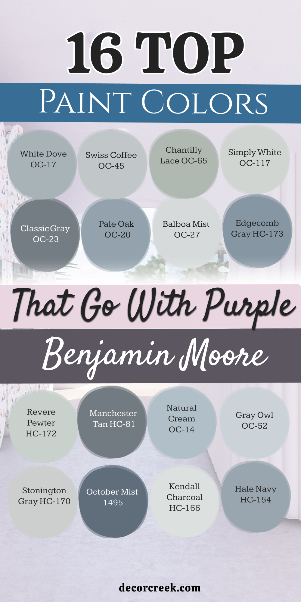
16 Top Paint Colors that go With Purple from Benjamin Moore
White Dove OC-17
White Dove OC-17 is a soft off-white that designers use more than almost any other color. It goes perfectly with any shade of purple because it never fights for attention. This shade makes your rooms feel soft and welcoming without ever looking stark or yellow.
It catches the natural light beautifully and spreads it into dark corners of your home. I use it on trim and baseboards to frame colorful walls with clean lines. Your family will love how bright and happy the rooms feel throughout the year.
It gives your home a high-quality finish that looks fresh and lasts for a very long time. It feels like a clean slate that lets your personal style shine through clearly.
Best used in: whole-house trim, kitchens, bedrooms, and dark hallways
Pairs well with: Revere Pewter HC-172, Balboa Mist OC-27, Kendall Charcoal HC-166, rich wood floors The key rule of this color for trim is to use a semi-gloss finish to make it easy to wipe clean from messy fingers.

Swiss Coffee OC-45
Swiss Coffee OC-45 is a creamy white that feels warm and comforting like a hot morning drink. It looks spectacular with deep plum tones because it adds a layer of traditional luxury. This color makes your living spaces feel cozy and safe for your family to enjoy.
It works nicely in older homes because it matches the historic character of the building. I recommend it for dining rooms where people sit and talk for hours after eating dinner. It creates a soft background that makes everyone look good under dim chandelier lighting.
Your guests will feel relaxed and pampered in your beautiful home environment. It is a dependable choice that makes spaces feel instantly lived-in and loved.
Best used in: traditional living rooms, dining rooms, entryways, and main bedrooms
Pairs well with: Chelsea Gray HC-168, Shaker Beige HC-45, Simply White OC-117, antique furniture The key rule of this color for traditional rooms is to use it on both walls and ceilings to create a seamless envelope of warmth.

Chantilly Lace OC-65
Chantilly Lace OC-65 is the cleanest, brightest white paint you can find on the market today. It has no blue or yellow undertones, making it a true neutral partner for violet. This color makes your bright purple accent walls stand out with incredible clarity and power.
It gives your home a modern look that feels fresh, clean, and totally organized. I use it in art studios and modern kitchens where clean lines are very important. It reflects every bit of light that enters the room, making dark areas feel bright again.
Your friends will wonder how your home looks so bright and perfectly clean all the time. It is a fantastic choice for people who love a minimalist lifestyle.
Best used in: modern kitchens, art studios, trim, ceilings, and contemporary homes
Pairs well with: Black HC-196, Hale Navy HC-154, Stonington Gray HC-170, modern art pieces The key rule of this color for modern spaces is to keep your floors light colored to enhance the bright look of the room.

Simply White OC-117
Simply White OC-117 is a bright white that has a tiny touch of yellow to keep it cheerful. It pairs beautifully with soft lavender to create a happy, sunny bedroom environment.
This color prevents your rooms from ever feeling cold or empty even with minimal furniture. It makes your colorful bedding and curtains look bright and exciting to the eye. I love using it in small kitchens with open shelving to make them feel larger than life.
It gives a clean look that makes your morning coffee routine feel like a special event. Your family will enjoy the bright energy it brings to the house every single morning. It is a simple answer to dark rooms that need a big boost of light.
Best used in: small kitchens, kids bedrooms, ceilings, and open shelving backdrops
Pairs well with: Silver Half Dollar 2121-40, Nightingale AF-670, White Dove OC-17, colorful accent pieces The key rule of this color for kitchens is to pair it with shiny silver knobs to create a clean, classic look.

Classic Gray OC-23
Classic Gray OC-23 is an ultra-light gray that looks like a soft mist on your walls. It is a wonderful partner for deep orchid tones because it lets the purple take center stage.
This color keeps your rooms looking modern without feeling cold like an industrial warehouse. It shifts gently between white and gray depending on how many lamps you turn on. I use it in open living areas where people want a soft alternative to plain white paint.
It makes your white trim stand out just enough to look interesting and custom-made. Your home will feel elegant and well designed without looking like you tried too hard. It is a sophisticated shade that looks great for years to complete your design.
Best used in: open concept spaces, master bedrooms, entryways, and modern offices
Pairs well with: Amherst Gray HC-167, Wrought Iron 2124-10, Chantilly Lace OC-65, light hardwood floors The key rule of this color for open spaces is to use it as a continuous wall color to tie different living zones together.

Pale Oak OC-20
Pale Oak OC-20 is a beautiful color that looks like a mix of soft tan and warm gray. It pairs elegantly with muted berry shades to create a rich, expensive looking room. This color reminds you of expensive linen fabric and high-end boutique hotels you visit on vacation.
It makes your family feel relaxed and comfortable when they gather together in the evening. I love using it in master bedrooms to create a private getaway from daily stress. It highlights the beauty of natural wood grain in your dressers and bed frames.
Your home will feel warm, upscale, and completely styled from top to bottom by an expert. It is a fantastic choice for creating a home you are proud of.
Best used in: master bedrooms, formal living rooms, cozy dens, and large corridors
Pairs well with: Chelsea Gray HC-168, Boothbay Gray HC-165, Simply White OC-117, linen textiles The key rule of this color for bedrooms is to use soft beige carpets to enhance the luxurious feeling of the space.

Balboa Mist OC-27
Balboa Mist OC-27 is a light gray paint that has a tiny touch of warm purple hidden inside it. It connects perfectly with any violet or lavender color because they share the same DNA.
This color makes your walls look soft and interesting without being too dark or heavy. It creates a smooth backdrop that makes your colorful paintings look like they belong together. I use it in guest rooms to make visitors feel like they are staying at a fancy bed and breakfast.
It catches the morning light in a way that makes the room feel airy and full of hope. Your guests will love the thoughtful look of the room you created for them. It is a smart pick for a modern home update.
Best used in: guest bedrooms, small living rooms, hallways, and home offices
Pairs well with: Kendall Charcoal HC-166, Flint AF-560, White Dove OC-17, soft purple throw blankets The key rule of this color for guest rooms is to use purple accent pillows to bring out the hidden undertone of the walls.

Edgecomb Gray HC-173
Edgecomb Gray HC-173 is a rich greige color that brings a lot of warmth to your home. It matches wonderfully with deep grape shades to create a traditional, solid feeling room.
This color makes large rooms feel cozy and connected rather than cold and empty inside. It is very forgiving with dirt, making it a great choice for families with young children. I use it in busy family rooms where everyone hangs out together on the couch.
It makes your dark wood furniture look rich, sturdy, and full of classic home character. Your family will love the grounding presence it brings to your shared living areas every day. It is a safe and beautiful choice for any traditional home layout.
Best used in: family rooms, staircases, busy entryways, and finished basements
Pairs well with: Revere Pewter HC-172, Hale Navy HC-154, White Dove OC-17, traditional rugs The key rule of this color for family rooms is to couple it with dark leather seating to create a warm look.

Revere Pewter HC-172
Revere Pewter HC-172 is the most famous muddy gray color that people love for its rich depth. It pairs perfectly with deep plum tones to create a classic look that feels very secure. This color makes your home feel substantial, strong, and beautifully built to last for generations.
It looks best in rooms that get a lot of bright natural light from big windows. I use it on kitchen cabinets when clients want a look that is different from standard white. It sets a rich tone that makes your kitchen look like an expensive custom-built cooking space.
Your friends will love the warm feeling it brings to your home during dinner parties. It is a timeless standard that never loses its special charm.
Best used in: kitchen cabinets, large living rooms, dining spaces, and historic homes
Pairs well with: Chelsea Gray HC-168, Simply White OC-117, Hale Navy HC-154, oil-rubbed bronze hardware The key rule of this color for cabinets is to use white marble countertops to create a beautiful contrast of light and dark.

Manchester Tan HC-81
Manchester Tan HC-81 is a classic beige that looks like clean sand on a beautiful sunny beach. It loves to sit next to warm violet tones to create a traditional, comforting room.
This color brings a sunny disposition into your home even when it is cloudy outside your windows. It makes your green house plants look vibrant, healthy, and full of natural life against the wall. I choose it for sunrooms and dining spaces where people want a warm, classic look.
It provides a solid backdrop that makes your family heirlooms look important and well cared for. Your home will feel like a historic estate that has been lovingly maintained for decades. It is a dependable choice for a classic style.
Best used in: sunrooms, traditional dining rooms, main hallways, and historic exteriors
Pairs well with: Bleeker Sand HC-80, Van Buren Brown HC-70, White Dove OC-17, antique gold frames The key rule of this color for traditional dining rooms is to use dark wood dining tables to ground the sandy wall color.

Natural Cream OC-14
Natural Cream OC-14 is a soft, muted neutral that sits between gray and tan with grace. It pairs beautifully with deep magenta to create a sophisticated look that feels very current.
This color gives your walls a smooth finish that makes the whole room feel well put together. It helps people slow down and enjoy being home after a busy day out in the world. I use it in modern living rooms where clients want a soft look that is not boring gray.
It coordinates beautifully with linen curtains and textured woven rugs on your floors. Your living room will look like it belongs on the cover of a home design magazine. It is a smart choice for a fresh, clean look.
Best used in: modern living rooms, master suites, cozy reading corners, and entryways
Pairs well with: Kendall Charcoal HC-166, Cloud White OC-130, Flint AF-560, textured linen fabrics The key rule of this color for modern rooms is to use matte black lamps to give the soft walls a sharp edge.

Gray Owl OC-52
Gray Owl OC-52 is a crisp light gray that has a tiny touch of cool green hidden inside. It looks gorgeous when paired with soft lavender in bright, sunny laundry rooms or kitchens.
This color makes your rooms feel clean, efficient, and ready for a busy day of family activities. It bounces daylight around the room beautifully to make small dark spaces feel open and bright. I use it on kitchen walls when the cabinets are painted a bright, crisp white color.
It creates a subtle difference that makes your kitchen look custom designed by a professional expert. Your family will enjoy the fresh energy it brings to the house every single day. It is a wonderful option for clean spaces.
Best used in: kitchens, laundry rooms, home offices, and modern bathrooms
Pairs well with: White Dove OC-17, Stonington Gray HC-170, Wrought Iron 2124-10, silver metal fixtures The key rule of this color for kitchens is to use bright white under-cabinet lights to keep the gray looking clean and crisp.

Stonington Gray HC-170
Stonington Gray HC-170 is a classic slate gray that has a cool blue undertone to it. It matches perfectly with deep royal purple to create a dramatic and beautiful living space.
This color makes your home look cool, collected, and very stylish in an architectural way. It works best in rooms with large windows that let in lots of afternoon sunshine. I recommend it for modern living rooms with high ceilings and big open walls.
It frames your views of the outside world beautifully like a dark photo frame does. Your friends will love the cool, artistic feeling of your new living room setup. It is a strong color that makes a lasting impression on your visitors.
Best used in: modern living rooms, entryways, accent walls, and home exteriors
Pairs well with: Chantilly Lace OC-65, Coventry Gray HC-169, Hale Navy HC-154, large modern artwork The key rule of this color for modern living areas is to pair it with bright white trim to keep the blue tones crisp.

October Mist 1495
October Mist 1495 is a soft sage green that looks like the leaves of a wild herb plant. It creates a stunning natural look when paired with soft mauve or plum accents. This color brings the peace of a quiet garden right into your favorite indoor rooms.
It makes your family feel connected to nature and relaxed when they are spending time together. I love using it in cozy sitting rooms where people gather to drink tea and chat. It looks beautiful with light oak furniture and woven baskets filled with soft blankets.
Your home will feel like a peaceful country cottage hidden away in the green woods. It is a lovely pick for people who love nature colors.
Best used in: sitting rooms, guest bedrooms, cozy kitchens, and cottage interiors
Pairs well with: Steam AF-15, Gloucester Sage HC-100, Natural Cream OC-14, light oak furniture The key rule of this color for cottage style is to use natural wood accents to enhance the organic look of the sage paint.

Kendall Charcoal HC-166
Kendall Charcoal HC-166 is a deep, luxurious gray that looks like dark volcanic rock. It pairs incredibly well with bright orchid purple to create a high-fashion bedroom look. This color adds a heavy layer of comfort that makes you want to snuggle under your covers.
It creates a dramatic backdrop that makes your colorful decorations shine like bright neon signs. I use it on accent walls behind beds to create a strong focal point in the room. It makes the space feel private, special, and safely tucked away from the rest of the house.
Your bedroom will look like a high-end designer showroom that values rich, deep color choices. It is a bold color that rewards your bravery with style.
Best used in: master bedroom accent walls, media rooms, powder rooms, and front doors
Pairs well with: White Dove OC-17, Balboa Mist OC-27, Revere Pewter HC-172, bright accent lighting The key rule of this color for master bedrooms is to use crisp white sheets to create a shocking contrast against the dark wall.

Hale Navy HC-154
Hale Navy HC-154 is a deeply loved navy blue that has a strong beautiful gray foundation paint base. It looks spectacular when you match it with soft lavender or deep royal purple accents.
This color brings a rich historic feeling into your home that feels very grand and solid. It acts like a beautiful neutral color that works with almost any bright shade you put near it. I love using it on kitchen islands to create a beautiful anchor point in the room.
It makes your white countertops look bright, clean, and ready for family baking projects together. Your guests will love the classic designer look of your cooking space.
Best used in: kitchen islands, accent walls, front doors, and boys bedrooms
Pairs well with: White Dove OC-17, Classic Gray OC-23, Revere Pewter HC-172, brass fixtures The key rule of this color for kitchen islands is to use shiny brass handles to create a classic look against the dark blue.
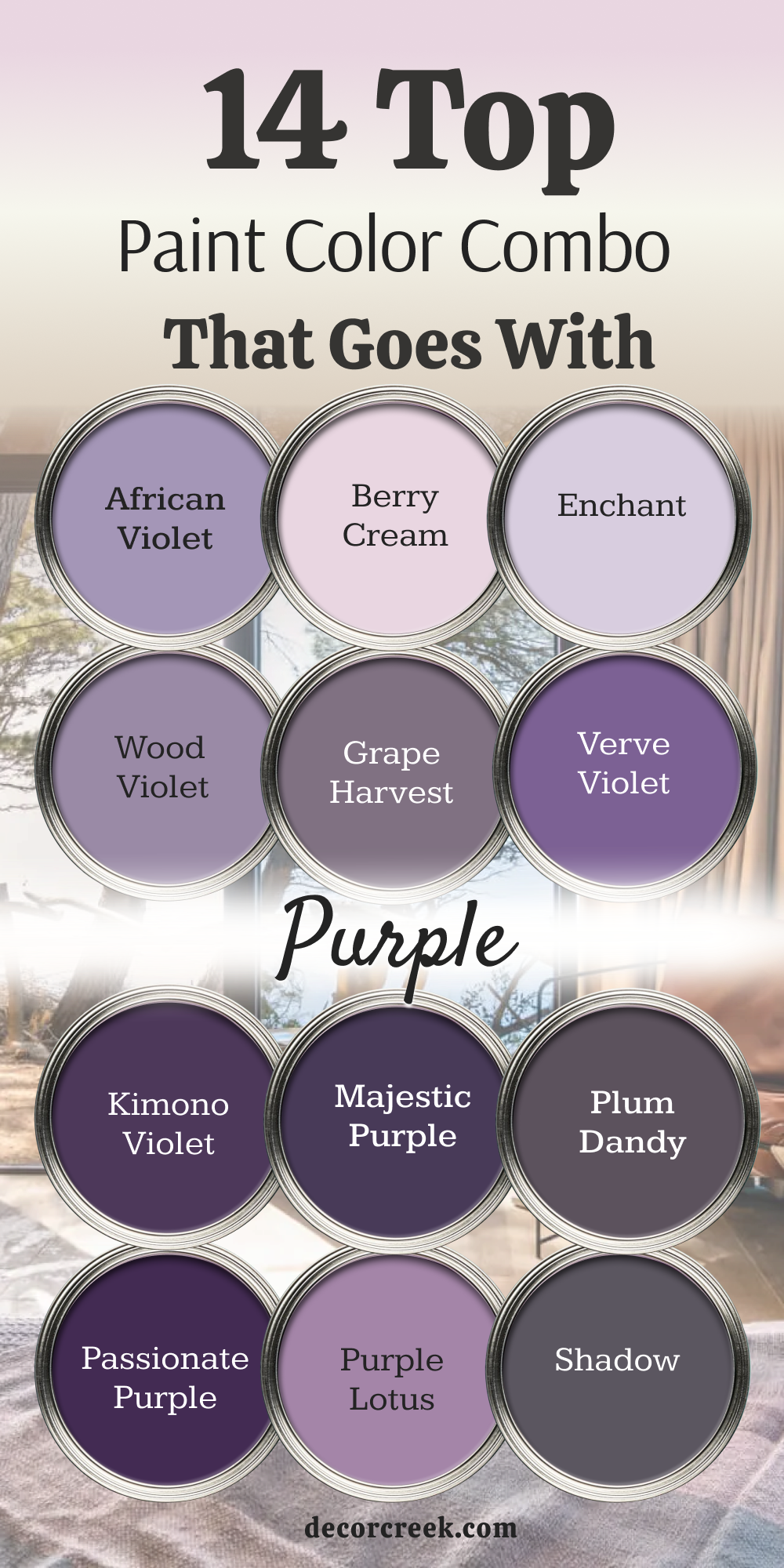
14 Top Paint Color Combo that goes With Purple
African Violet SW 6982 + Alabaster SW 7008
African Violet SW 6982 is a playful purple that brings a lot of fun into a room. Pairing it with Alabaster SW 7008 keeps the room looking neat and structured instead of wild.
This combination makes you feel happy and full of creative ideas when you walk inside. I like using this duo in children playrooms or craft spaces where inspiration is needed.
The creamy white walls stop the bright purple from making your eyes feel tired after playing. Your kids will love having a space that feels both colorful and cozy at the same time. It is a smart way to use bright colors without losing control of your design.
Best used in: kids playrooms, craft rooms, home studios, and bright laundry rooms
Pairs well with: Pure White SW 7005, light wood tones, colorful storage bins, silver hardware The key rule of this color combo for creative spaces is to keep the bright purple on one main wall and use white on the rest.
Berry Cream SW 9075 + Pure White SW 7005
Berry Cream SW 9075 is a sweet pinkish purple that looks like a delicious fruit dessert. Matching it with Pure White SW 7005 gives it a clean finish that looks very modern.
This pair makes small bathrooms look like beautiful candy shops full of bright surprises. I choose it for young girls bedrooms because it feels magical and special to them.
The bright white paint keeps the pink tones looking clean and sharp near the windows. Your daughter will feel like a princess living in her own custom-styled bedroom suite. It is a cheerful choice that puts a big smile on everyone face.
Best used in: girls bedrooms, small powder rooms, walk-in closets, and bakery shops
Pairs well with: Alabaster SW 7008, gray carpets, gold mirrors, white painted furniture The key rule of this color combo for bedrooms is to use white furniture to keep the sweet color looking neat and tidy.
Enchant SW 6555 + Agreeable Gray SW 7029
Enchant SW 6555 is a soft whimsical purple that feels like a fairy tale come true. Putting it next to Agreeable Gray SW 7029 makes it look sophisticated and grown-up for main rooms.
This combination creates a beautiful balance that feels very modern and thoughtful. I use it in guest bedrooms to create a welcoming look that surprises your visitors pleasantly.
The gray paint grounds the purple so your husband or guests will love it too. Your home will look like a high-end designer planned the colors with great care. It is a wonderful way to enjoy purple in a mature, stylish way.
Best used in: guest bedrooms, formal sitting rooms, entryways, and home offices
Pairs well with: Extra White SW 7006, dark stained wood, silver lamps, purple flower vases The key rule of this color combo for guest areas is to use gray on three walls and the soft purple on the headboard wall.
Wood Violet SW 6557 + Repose Gray SW 7015
Wood Violet SW 6557 is a rich medium purple that reminds you of spring flowers in the woods. Pairing it with Repose Gray SW 7015 creates a cool look that feels very fresh.
This duo works beautifully in sunny bedrooms where you want to sleep late on weekends. The cool gray paint balances the deep purple tones so the room never feels hot.
I suggest it for teenagers who want a colorful room that still looks mature and clean. Your teen will love showing off their stylish space to all their school friends. It looks fantastic with modern black metal bed frames and gray blankets.
Best used in: teen bedrooms, modern living rooms, creative workspaces, and basements
Pairs well with: Eider White SW 7014, matte black fixtures, gray patterned rugs, white trim The key rule of this color combo for teen rooms is to use sharp black accents to give the purple a modern edge.
Grape Harvest SW 6285 + Accessible Beige SW 7036
Grape Harvest SW 6285 is a deep cozy purple that feels like a warm glass of wine. Combining it with Accessible Beige SW 7036 creates a rich traditional look for dining spaces.
This pair makes your home feel wealthy, established, and full of classic comfort for guests. I love using it in formal dining rooms where families gather for holiday meals together.
The warm beige paint keeps the deep grape color from feeling too heavy or dark at night. Your dinner parties will feel like special events that people remember for a long time. It adds a beautiful layer of history and style to plain modern houses.
Best used in: formal dining rooms, cozy dens, library nooks, and master suites
Pairs well with: Alabaster SW 7008, dark oak tables, brass chandeliers, oil paintings The key rule of this color combo for dining rooms is to use shiny brass hardware to make the grape color look rich.
Verve Violet SW 6979 + Greek Villa SW 7551
Verve Violet SW 6979 is a shocking bright purple that demands your full attention instantly. Pairing it with Greek Villa SW 7551 softens the heavy punch so it feels welcome in your home.
This duo creates a high-energy look that makes you feel excited and ready for the day. I use it on front doors to give houses a fun personality that stands out on the street.
The warm white trim keeps the bright entrance looking friendly instead of scary to neighbors. Your house will become the most famous and loved home on the entire block. It is a brave choice that brings lots of joy to your daily life.
Best used in: front doors, accent walls, creative offices, and powder rooms
Pairs well with: Pure White SW 7005, green garden plants, black metal address numbers, outdoor lanterns The key rule of this color combo for front doors is to use a high-gloss finish on the purple paint for maximum shine.
Kimono Violet SW 6839 + Sea Salt SW 6204
Kimono Violet SW 6839 is an exotic purple that feels very artistic and special. Mixing it with Sea Salt SW 6204 creates an unexpected beachy look that is very unique.
This combination makes your home feel like an artist cottage near the beautiful ocean shores. I recommend it for sunrooms where you keep lots of green tropical plants on shelves.
The gray-green walls look beautiful next to the rich purple flower pots and cushions. Your family will love relaxing in a space that feels so full of life and color. It is a fantastic way to show off your personal creativity to your guests.
Best used in: sunrooms, artistic living spaces, craft rooms, and garden sheds
Pairs well with: High Reflective White SW 7757, wicker furniture, colorful rugs, natural wood The key rule of this color combo for sunrooms is to use natural fiber rugs to connect the green and purple tones together.
Majestic Purple SW 6545 + Evergreen Fog SW 9130
Majestic Purple SW 6545 is a royal shade that looks like the robes of an ancient king. Putting it next to Evergreen Fog SW 9130 creates a historic look full of rich character.
This pair makes your home library or study feel like a secret room in an old castle. I use it for clients who love classic books, dark wood, and cozy winter nights by the fire.
The dark green paint adds an earthy balance to the rich purple walls. Your home office will look like a serious place where important decisions are made every day. It gives a wonderful sense of importance and luxury to your personal living space.
Best used in: home libraries, executive offices, moody dens, and fireplace rooms
Pairs well with: Shoji White SW 7042, dark leather chairs, gold desk lamps, old books The key rule of this color combo for libraries is to use warm yellow lightbulbs to make the royal colors look rich and cozy.
Plum Dandy SW 6284 + Iron Ore SW 7069
Plum Dandy SW 6284 is a dark smoky purple that feels very mysterious and high-fashion. Pairing it with Iron Ore SW 7069 creates an incredible modern look for media rooms.
This duo makes your movie nights feel like you are sitting inside a real Hollywood theater downtown. I love using this mix on the wall where you hang your large television screen.
The charcoal black paint blends with the screen while the plum paint adds a rich warmth. Your friends will be amazed by how cool and professional your entertainment room looks. It is a top-tier choice for people who love modern style and luxury finishes.
Best used in: media rooms, home theaters, dark accent walls, and modern bedrooms
Pairs well with: Pure White SW 7005, modern black furniture, gray velvet pillows, LED strip lighting The key rule of this color combo for media rooms is to paint the ceiling dark to stop light from bouncing around the room.
Passionate Purple SW 6981 + Naval SW 6244
Passionate Purple SW 6981 is a deep intense color that feels full of romance and drama. Matching it with Naval SW 6244 creates a bold midnight look that is very handsome.
This combination works wonderfully in small powder rooms where you want to shock your guests with style. I choose it for tiny spaces because bold colors make them feel like special jewel boxes hidden in the house.
The deep navy blue paint grounds the room while the purple adds a fun splash of color. Your visitors will talk about your beautiful bathroom long after they leave your party. It is a clever way to make a big impact in a small space.
Best used in: powder rooms, small entryways, accent walls, and ceiling recesses
Pairs well with: Alabaster SW 7008, shiny gold mirrors, white sinks, crystal light fixtures The key rule of this color combo for powder rooms is to use a large gold mirror to bounce light around the dark walls.
Purple Lotus 2072-30 + White Dove OC-17
Purple Lotus 2072-30 is a soft pretty purple that reminds you of beautiful spring flowers. Pairing it with White Dove OC-17 creates a clean fresh look for family bedrooms.
This combination makes you feel happy and relaxed when you wake up in the morning sunshine. I use it in girls rooms or guest spaces that need a gentle touch of color. The soft white trim frames the purple walls beautifully like a clean picture mat.
Your family will love the peaceful and sweet feelings this pair brings to the home. It is an easy way to use purple without making the room look too loud or busy.
Best used in: girls bedrooms, guest spaces, laundry areas, and country kitchens
Pairs well with: Revere Pewter HC-172, white wooden beds, floral bedding, light pink accents The key rule of this color combo for bedrooms is to use simple floral fabrics to tie the purple and white together nicely.
Shadow 2117-30 + Pale Oak OC-20
Shadow 2117-30 is a dark moody purple that was once picked as the color of the year. Combining it with Pale Oak OC-20 creates a luxurious look for formal master suites.
This pair makes your bedroom feel like a high-end spa where you can escape from the world. I love using the dark purple on the wall behind the bed to create a cozy sleeping zone.
The warm greige paint on the other walls keeps the room feeling bright enough during the daytime. Your bedroom will look like a professional designer spent weeks picking out the perfect shades for you. It is a beautiful investment in your daily peace and personal comfort.
Best used in: master bedroom suites, formal living rooms, upscale dens, and hotel-style rooms
Pairs well with: White Dove OC-17, gray silk curtains, plush white carpets, silver bedside lamps The key rule of this color combo for master suites is to use white silk curtains to add a touch of luxury against the dark walls.
French Violet 1427 + Gray Owl OC-52
French Violet 1427 is a bright classic purple that feels very European and artistic. Matching it with Gray Owl OC-52 gives it a crisp modern edge that looks very clean.
This duo works beautifully in creative kitchens or sunny dining nooks near windows. I suggest it for people who want a happy colorful kitchen that stands out from the crowd.
The light gray walls stop the violet from looking too loud when you are cooking breakfast. Your kitchen will feel like a bright joyful place where cooking meals is always fun for the family. It is a fresh look that brings a lot of personality into your daily routine.
Best used in: kitchens, dining nooks, craft spaces, and cheerful entryways
Pairs well with: Chantilly Lace OC-65, white cabinets, stainless steel appliances, colorful dishes The key rule of this color combo for kitchens is to keep your cabinets white so the violet wall stays the star of the show.
Mystic Grape 2071-30 + Hale Navy HC-154
Mystical Grape 2071-30 is a rich dark purple that has a lot of gray smoke inside it. Pairing it with Hale Navy HC-154 creates a masculine look for modern home offices.\
This combination makes your workspace feel serious, professional, and very stylish for business meetings. I use it for clients who want a dark handsome room where they can focus on big projects.
The deep navy blue paint pairs naturally with the smoky grape tones on the walls. Your office will look like a high-end executive suite in a big city skyscraper building. It is a fantastic choice for creating a powerful and beautiful work environment at home.
Best used in: home offices, executive studies, media rooms, and gentleman dens
Pairs well with: Simply White OC-117, dark walnut desks, leather office chairs, silver desk organizers The key rule of this color combo for offices is to use a large light colored rug to keep your feet feeling cozy on the floor.
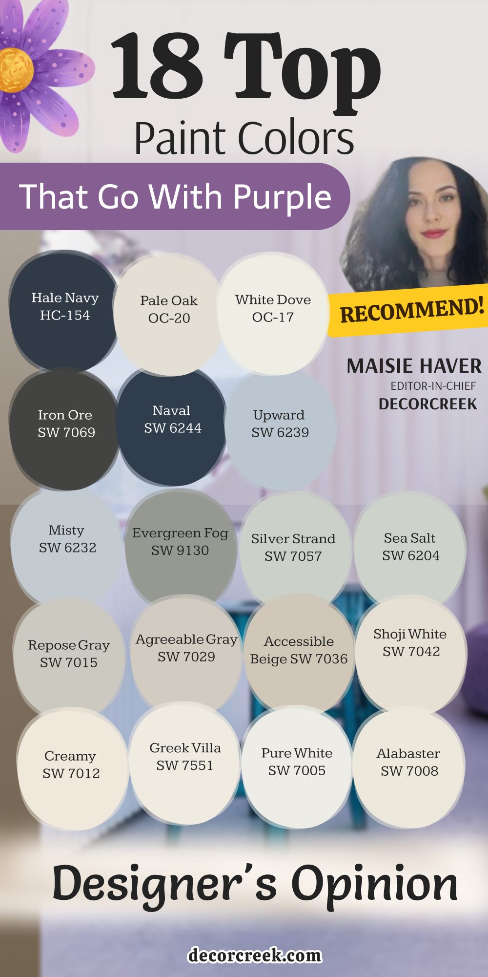
18 Top Paint Colors that go With Purple | Designer’s Opinion
Alabaster SW 7008
Alabaster SW 7008 is my absolute favorite white to use whenever purple is in the design plan. It has a beautiful creamy base that takes away the cold feeling from bright violet light.
This color makes your home feel welcoming and friendly to everyone who visits your family. I always use it on trim when the main walls are painted a soft plum color. It provides a soft frame that makes the purple look deliberate and professional.
Your rooms will feel bright and airy without ever looking like a cold sterile hospital ward. It is a dependable choice that keeps your home feeling cozy and loved through the years.
Best used in: living rooms, kitchens, hallways, bedrooms, and farmhouse exteriors
Pairs well with: Iron Ore SW 7069, Agreeable Gray SW 7029, Natural Linen SW 9109, warm wood tones The key rule of this color for farmhouse style is to use it where you want natural light to feel kind, soft, and inviting throughout the day.
Pure White SW 7005
Pure White SW 7005 is the color I choose when a client wants a clean modern look in their house. It provides a sharp beautiful contrast against deep rich grape tones on accent walls.
This shade makes your ceilings look higher and your small rooms feel twice as big as before. It stays clean and bright without ever turning yellow in dark corners where sunlight does not reach.
I recommend it for kitchen cabinets when you have a purple back wall behind your stove. Your kitchen will look like a fresh modern cooking space from a television show. It is a smart choice that makes your colorful decorations pop out beautifully.
Best used in: kitchens, bathrooms, trim, ceilings, and modern living rooms
Pairs well with: Black Fox SW 7020, March Wind SW 7668, Passive SW 7064, dark stained wood The key rule of this color for modern style is to use it on trim and doors to make your main wall colors stand out with crisp lines.
Greek Villa SW 7551
Greek Villa SW 7551 is a rich luxurious white that brings a sunny glow into your living spaces. It works wonderfully with dark eggplant shades because it balances the deep heavy feelings perfectly.
This color makes your home feel like a fancy vacation house where you can relax all day long. It reflects the afternoon sun beautifully without creating any sharp glare on your living room walls.
I love using it in master bedrooms to create a peaceful sanctuary for tired parents. It makes your colorful pillows and blankets look even more beautiful and expensive. Your family will love the cozy warm feelings it brings to your shared home areas.
Best used in: master bedrooms, dining rooms, entryways, and cozy reading nooks
Pairs well with: In the Navy SW 9178, Urban Bronze SW 7048, Accessible Beige SW 7036, gold hardware The key rule of this color for cozy style is to use it in rooms with large windows so the warm undertones can capture the afternoon sun.
Creamy SW 7012
Creamy SW 7012 is a classic yellowish white that reminds you of sweet vanilla cream desserts. It pairs beautifully with light lavender to create a charming traditional room for your family.
Children love this color mix because it feels happy, friendly, and very safe for playing games. It adds a lovely historic look to older homes that need a soft beautiful update on walls.
I like to use it in traditional dining rooms with dark purple accent decorations. It makes your eating area feel warm, clean, and ready for big holiday dinners together. Your guests will feel loved and welcome the moment they sit down at your table.
Best used in: kitchens, traditional dining rooms, nurseries, and hallways
Pairs well with: Studio Mauve SW 0062, Pewter Cast SW 7673, Practical Beige SW 6100, antique brass The key rule of this color for traditional style is to couple it with warm wood furniture to create a rich, historic look.
Shoji White SW 7042
Shoji White SW 7042 is a very special neutral that sits perfectly between white and warm beige. It looks incredible next to muted plum colors because it balances the warm and cool tones nicely.
This color changes its look depending on the time of day, which keeps your home interesting to watch. It helps people feel relaxed and comfortable when they are sitting together in the evening.
I choose it for large open living spaces where rooms connect to each other smoothly. It keeps the whole house looking unified and planned out by an interior designer expert. Your artwork will look fantastic hanging against this soft beautiful wall background paint.
Best used in: open concept living areas, sunrooms, corridors, and exterior siding
Pairs well with: Peppercorn SW 7674, Fawn Brindle SW 7640, Pure White SW 7005, light oak flooring The key rule of this color for open layouts is to use it as a bridge between bright accent walls and darker hallway areas.
Accessible Beige SW 7036
Accessible Beige SW 7036 is a legendary tan color that has a modern gray undertone inside it. It is a perfect match for dark magenta because it tones down the loud bright energy easily.
This shade makes any plain room look upscale and expensive without spending a lot of money. It is extremely popular because it looks great under both natural sunlight and yellow lightbulbs.
I use it constantly to stage homes for sale because buyers fall in love with it immediately. It makes small cramped rooms feel open, breathable, and very ready to move into. Your purple accent furniture will look smart and intentional against this neutral paint.
Best used in: entryways, home offices, basements, and rental properties
Pairs well with: Aesthetic White SW 7035, Virtual Taupe SW 7039, Cadet SW 9143, matte black fixtures The key rule of this color for staging is to use it in main hallways to create a smooth flow from the front door to the back.
Agreeable Gray SW 7029
Agreeable Gray SW 7029 is the most popular neutral paint across the entire country for good reason. It has a perfect balance of warm beige and cool gray hidden inside the paint mixture.
It loves to sit next to orchid and lavender tones in bright sunny living rooms. This color adapts beautifully to whatever furniture you already own, which saves you layout stress.
It makes your house look modern but still keeps it feeling very cozy and family-friendly. I use it when clients are confused about what color choice to make for walls. It creates a beautiful backdrop that makes your purple pillows look sophisticated and very grown-up.
Best used in: whole-house painting, living rooms, bedrooms, and open kitchens
Pairs well with: Extra White SW 7006, Mega Greige SW 7031, Gauntlet Gray SW 7019, dark metal accents The key rule of this color for whole-house use is to use it as your main background so your purple accents can change from room to room.
Repose Gray SW 7015
Repose Gray SW 7015 is a beautiful cool gray that has a tiny touch of brown to keep it warm. It looks spectacular with rich violet colors in sunny master bedroom suites.
This color makes your walls look smooth, professional, and expensive like a luxury hotel room. It helps your mind relax after a very long and loud day at work or school. I love using it on bathroom cabinets when the walls are painted a soft plum shade.
It gives a fresh clean look that makes your morning routine feel peaceful and organized. Your family will love how bright and airy the whole bathroom feels in the daytime.
Best used in: kitchens, bathrooms, master suites, and laundry rooms
Pairs well with: Eider White SW 7014, Dorian Gray SW 7017, Mindful Gray SW 7016, silver hardware The key rule of this color for modern kitchens is to use it on your upper cabinets to make the room feel taller and brighter.
Sea Salt SW 6204
Sea Salt SW 6204 is a famous light green with a strong beautiful gray background paint mixture. It looks amazing when you pair it with deep plum accents in active family living areas.
This color brings the fresh feeling of an ocean beach right into your landlocked home. It makes people feel happy and totally relaxed the moment they see it on your walls.
I love using it in open sunrooms where you keep your green house plants on display. It creates a beautiful connection between your indoor furniture and the green trees outside your windows. Your purple flower pots will look incredible sitting against this beautiful sage-like paint.
Best used in: sunrooms, kitchens, master bathrooms, and entryways
Pairs well with: Summit Gray SW 7669, Scanda SW 6529, Pure White SW 7005, natural driftwood The key rule of this color for sunrooms is to use it where it receives direct sunlight to stop the gray from looking too cool.
Silver Strand SW 7057
Silver Strand SW 7057 is a magical paint that changes between gray, green, and blue all day long. It looks gorgeous next to soft lavender in quiet master bathrooms and laundry areas.
This shade makes you feel like you are relaxing at a luxury health spa getting a massage. It responds beautifully to your lighting fixtures, shifting its look from morning light to evening lamps.
I use it when homeowners want a clean fresh feeling that is not just plain white walls. It makes small dark bathrooms feel twice as big and bright as they actually are. Your family will love the peaceful look it brings to the house.
Best used in: bathrooms, guest rooms, laundry rooms, and coastal bedrooms
Pairs well with: High Reflective White SW 7757, Amethyst SW 6972, Slate Tile SW 7624, chrome fixtures The key rule of this color for bathrooms is to use white towels and mats to make the green-blue tones pop out clearly.
Evergreen Fog SW 9130
Evergreen Fog SW 9130 is a deep dark green that has a lot of gray mixed into the formula. It creates a stunning beautiful look when placed next to soft muted mauve paint tones.
This shade makes your room feel historic, important, and full of rich classic stories to tell. It works best in quiet rooms where you want to sit down and read books by lamplight.
I use it for home offices to help people focus on their computer work tasks easily. It looks very handsome with dark leather office chairs and shiny brass reading lamps on desks. Your office will look like a professional workspace that commands respect.
Best used in: home offices, libraries, accent walls, and front doors
Pairs well with: Shoji White SW 7042, Urbane Bronze SW 7048, Über Umber SW 9107, brass hardware The key rule of this color for home offices is to use it on the wall behind your computer screen to rest your eyes while working.
Misty SW 6232
Misty SW 6232 is a light beautiful blue that has a lot of gray keeping it soft and friendly. It pairs perfectly with periwinkle and soft violet tones for a dreamy bedroom look.
This color reminds you of the soft morning sky right before the bright sun comes up. It makes small kids bedrooms feel open, cool, and very relaxing for deep healthy sleep.
I choose it for nursery rooms because it grows up well with your children over the years. It does not feel babyish, so you will not have to repaint it anytime soon. Your children will love the peaceful feeling it brings to their playroom.
Best used in: kids bedrooms, nurseries, small bathrooms, and ceiling accents
Pairs well with: Extra White SW 7006, Charcoal Blue SW 2739, Upward SW 6239, light colored textiles The key rule of this color for bedrooms is to use simple white curtains to let the soft blue shade shine without distraction.
Upward SW 6239
Upward SW 6239 is a cheerful denim blue that has a silvery gray undertone hidden inside. It looks fantastic when you pair it with deep royal purple accents in active family spaces.
This color makes you feel optimistic, happy, and full of good energy when you walk inside. It catches the bright midday sun beautifully, making your walls look like the open clear sky.
I like to use it in small laundry rooms to make chores feel less like boring work. It brightens up tight mudrooms that do not have any big windows to the outside world. Your family will enjoy the clean fresh energy it brings to the house.
Best used in: laundry rooms, mudrooms, boys bedrooms, and casual living areas
Pairs well with: Snowbound SW 7004, Naval SW 6244, Drift Reaching SW 9050, natural wood shelving The key rule of this color for utility rooms is to use bright LED lightbulbs to keep the blue looking crisp and energetic.
Naval SW 6244
Naval SW 6244 is a deep dramatic navy blue that looks exactly like the midnight sky. It makes a stunning beautiful partner for bright orchid purple when you want a rich look.
This color makes your house look very expensive, high-end, and styled by a professional staging expert. It gives a sense of deep comfort and safety to your large open living spaces.
I use it on accent walls behind large television screens to hide the black frame. It makes your family movie nights feel like you are sitting inside a real luxury theater. Your friends will be impressed by your brave beautiful color choices for the house.
Best used in: accent walls, dining rooms, media rooms, and kitchen islands
Pairs well with: Alabaster SW 7008, Cornice SW 7002, Ramie SW 6156, shiny gold decorations The key rule of this color for media rooms is to paint the surrounding trim the same color to create an immersive viewing experience.
Iron Ore SW 7069
Iron Ore SW 7069 is a rich charcoal black that stops just short of being pure dark black paint. It creates an incredible modern look when you pair it with deep plum or bright violet.
This color adds a strong structure to your home layout that feels very high-fashion and cool. It makes your colorful artwork look like it belongs in a fancy museum gallery downtown.
I love using it on fireplace stone walls to make the orange flames look warmer and brighter. It draws the eye instantly and becomes the main talking point of your entire house design. Your home will feel cozy, protected, and full of personal style confidence.
Best used in: fireplaces, accent walls, interior doors, and modern exteriors
Pairs well with: Extra White SW 7006, Repose Gray SW 7015, City Loft SW 7631, leather furniture The key rule of this color for accent walls is to use it where you have plenty of lamps to create beautiful shadows at night.
White Dove OC-17
White Dove OC-17 is the ultimate classic off-white paint that I recommend for almost every home project. It pairs beautifully with any shade of purple because it never tries to steal the show.
This color makes your rooms feel soft, clean, and welcoming without ever looking bright or yellow. It catches the natural light from your windows and spreads it into dark hallway areas easily.
I use it on baseboards and trim to frame purple walls with clean professional lines. Your family will love how bright and happy the rooms feel throughout the year. It gives your home a high-quality finish that looks fresh for decades.
Best used in: whole-house trim, kitchens, bedrooms, and dark hallways
Pairs well with: Revere Pewter HC-172, Balboa Mist OC-27, Kendall Charcoal HC-166, rich wood floors The key rule of this color for trim is to use a semi-gloss finish to make it easy to wipe clean from messy fingers.
Pale Oak OC-20
Pale Oak OC-20 is a gorgeous paint choice that looks like a blend of warm tan and soft gray. It pairs elegantly with muted berry tones to create a rich expensive looking room for you.
This color reminds you of expensive linen fabrics and luxury boutique hotels you visit on vacation. It makes your family feel relaxed and totally comfortable when they gather together in the evening.
I love using it in master bedrooms to create a private getaway from daily life stress. It highlights the natural wood grain beauty in your dressers and bed frames perfectly. Your home will feel warm, upscale, and completely finished.
Best used in: master bedrooms, formal living rooms, cozy dens, and large corridors
Pairs well with: Chelsea Gray HC-168, Boothbay Gray HC-165, Simply White OC-117, linen textiles The key rule of this color for bedrooms is to use soft beige carpets to enhance the luxurious feeling of the space.
Hale Navy HC-154
Hale Navy HC-154 is a deeply loved navy blue that has a strong beautiful gray foundation paint base. It looks spectacular when you match it with soft lavender or deep royal purple accents.
This color brings a rich historic feeling into your home that feels very grand and solid. It acts like a beautiful neutral color that works with almost any bright shade you put near it.
I love using it on kitchen islands to create a beautiful anchor point in the room. It makes your white countertops look bright, clean, and ready for family baking projects together. Your guests will love the classic designer look of your cooking space.
Best used in: kitchen islands, accent walls, front doors, and boys bedrooms
Pairs well with: White Dove OC-17, Classic Gray OC-23, Revere Pewter HC-172, brass fixtures The key rule of this color for kitchen islands is to use shiny brass handles to create a classic look against the dark blue.
Choosing the right partner color for purple does not have to be a scary chore for you. Many people feel worried about mixing such a bold shade, but you can easily find a perfect match.
When you pick a dependable paint from Sherwin-Williams or Benjamin Moore, you are halfway to success right away. These trusted brands make it easy to get the exact look you want without any guesswork.
Trust your feelings and look at how the sunlight changes the paint on your walls during the day. It is fun to watch the colors shift from morning light to evening lamps. You can easily make your home look beautiful, cozy, and full of your personal style joy. Your friends will be so impressed by how smart and pretty your house looks.
Happy painting to you as you build a special house that makes your family smile every single day.