Honey oak cabinets are a staple in many homes, but they often get a bad reputation for looking dated or too orange. I have spent years helping homeowners fall in love with their kitchens again by simply changing the paint on the walls. Choosing the right shade can make those wood tones look intentional and high-end rather than old-fashioned. My goal is to show you how to pick colors that make your woodwork shine.
You do not need a full renovation to make your house look like a professional staged it. Many people feel frustrated when they move into a house with older wooden features that seem to dominate every room. I want to prove that you can keep your original cabinets and still have a kitchen that looks like it belongs in a magazine.
By focusing on the walls, you can balance the warmth of the oak and create a look that feels completely fresh.
You will be amazed at how much a simple can of paint can change your daily life.
It is all about finding the right partner for that specific wood grain so the whole room feels cohesive. Your home should be a place where you feel proud to host guests and spend time with family.
Let me guide you through the process of selecting a palette that turns a dated kitchen into a modern masterpiece.
Why I Always Trust Sherwin-Williams and Benjamin Moore for Paint Colors That Work with Honey Oak Cabinets
I rely on Sherwin-Williams and Benjamin Moore because their paint formulas have the most reliable pigments for tricky wood tones. These two brands offer a huge variety of neutrals that can handle the warm yellow and orange undertones found in oak. I know that when I pick a fan deck from these companies, the color on the wall will actually match the chip I liked in the store. Their durability is also a huge plus for high-traffic areas like kitchens where cabinets take a beating.
Using quality paint ensures that the finish looks smooth and professional every single time. I have tested many different brands over the years, and these two consistently provide the best coverage and color depth. You want a paint that stays true to its tone even when it is sitting next to very bright orange wood. Cheaper paints often lack the complex pigments needed to neutralize the warmth of the oak.
When you invest in high-quality paint, you are saving yourself from the headache of a room that looks different every time the sun moves. These companies also provide excellent tools like large peel-and-stick samples to make your job much easier. I always tell my clients that the foundation of a good design starts with the best materials available. Professional-grade paint makes a huge difference in how the light bounces around your kitchen.
You deserve a finish that lasts for years without fading or chipping under normal use.
How I Choose the Perfect Paint Color to Match Honey Oak Cabinets
I start by looking at the specific grain and orange level of the wood in the room. If the cabinets are very bright orange, I usually look for greens or blues to provide a nice contrast. I also pay close attention to the lighting in the room because shadows can change how a color looks next to wood. Sampling is the most important step in my process to avoid a costly mistake. I always suggest painting a large board and moving it around the room at different times of the day.
This helps me see if the paint makes the wood look better or if it makes the orange stand out too much. You should never pick a color based on how it looks in the store under bright fluorescent bulbs. Natural light from your windows will bring out hidden undertones in the paint that you might not notice at first. I like to see how the color behaves on a cloudy day versus a bright, sunny afternoon.
It is also important to consider the color of your countertops and floors before making a final choice.
Everything in the kitchen needs to work together to create a balanced and pretty environment. I look for shades that ground the room and provide a sense of order among all the wood grain. Taking your time with this step will ensure that you are happy with the results for a very long time. I often try out three or four different shades on different walls to be absolutely sure.
My method helps eliminate the guesswork so you can proceed with confidence. A well-chosen color will make the orange in your cabinets feel like a warm, intentional glow.
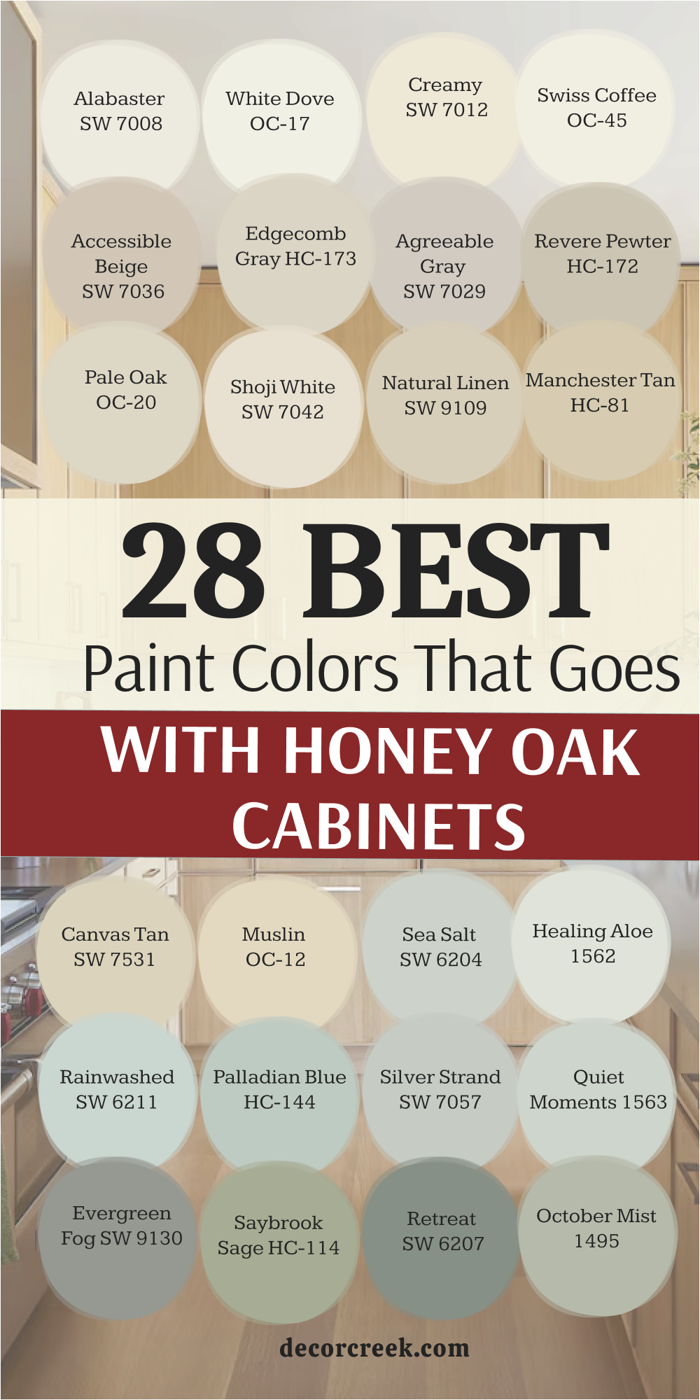
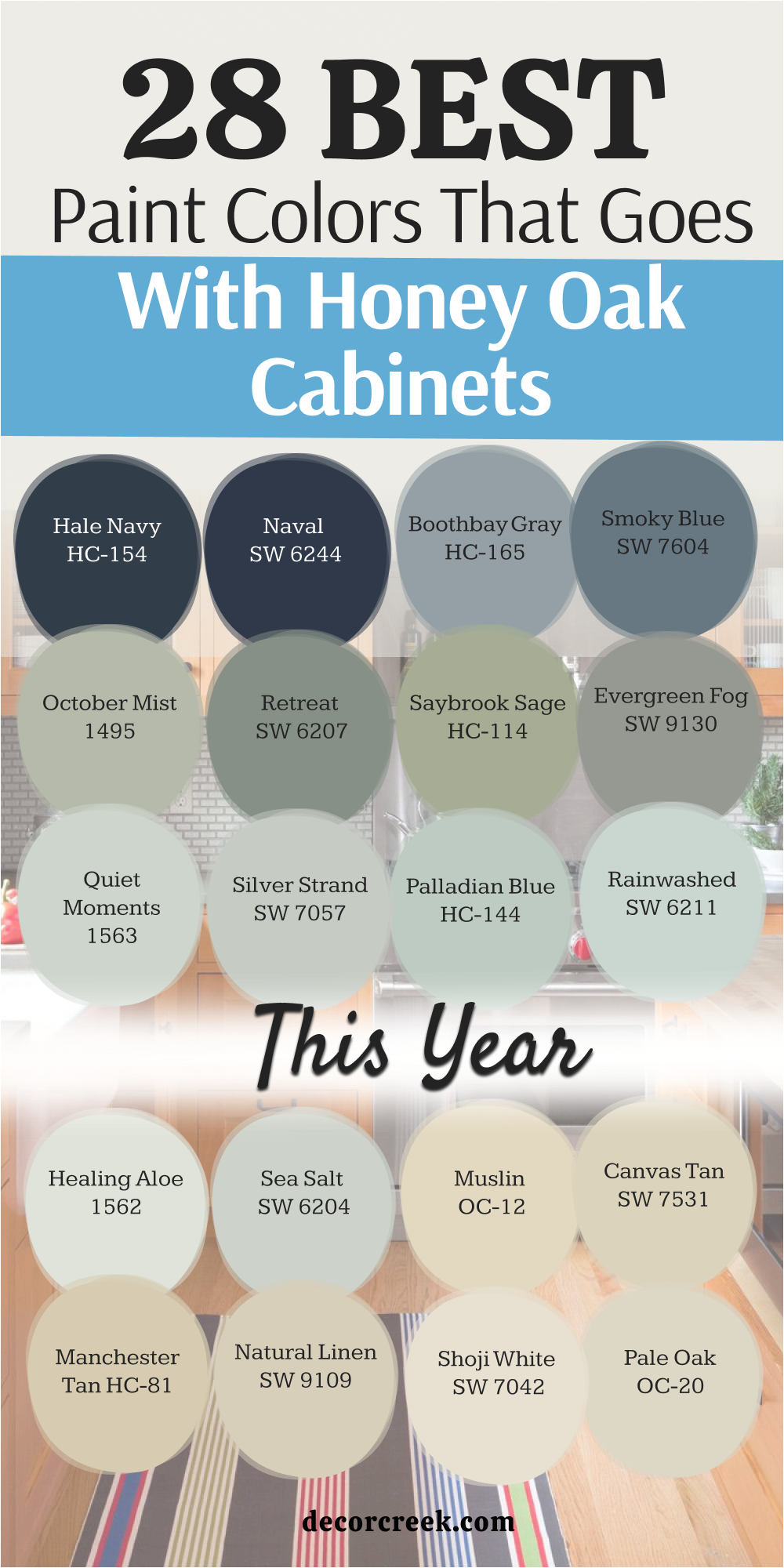
28 Best Paint Colors That Goes With Honey Oak Cabinets This Year
Alabaster SW 7008
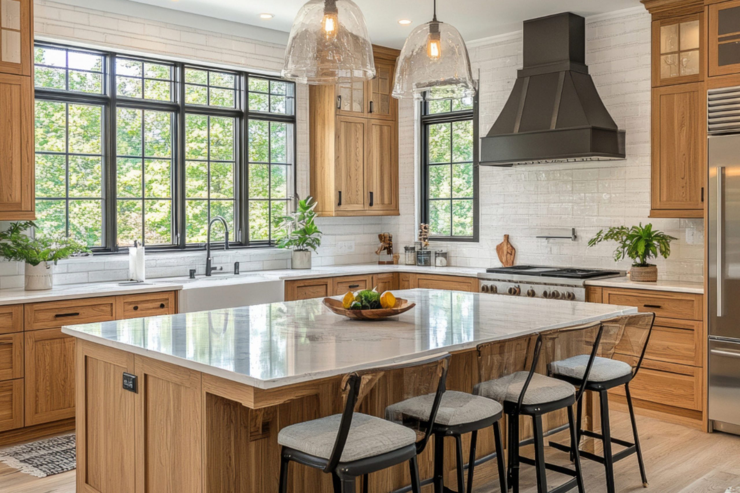
Alabaster SW 7008 provides a creamy foundation that softens the heavy look of oak. This white is a favorite for many of my staging projects because it feels cozy. It has enough yellow in it to blend with the wood rather than fighting against it.
I find that it makes a kitchen feel much brighter without looking cold or like a hospital. People choose this shade when they want a clean look that still feels very welcoming to guests. The balance of this color is perfect for keeping the warmth of the wood alive.
It hides imperfections on older walls while making the cabinets look fresh. This pick is a safe bet for any homeowner who feels stuck with their current layout. I love how it handles both natural light and artificial bulbs in a room.
Best used in: living rooms, kitchens, hallways, bedrooms, and farmhouse exteriors
Pairs well with: Iron Ore SW 7069, Agreeable Gray SW 7029, Natural Linen SW 9109, warm wood tones The key rule of this color for farmhouse style is to use it where you want natural light to feel kind, soft, and inviting throughout the day.
🎨 Check out the complete guide to this color right HERE 👈

White Dove OC-17
White Dove OC-17 is a light shade that has a tiny bit of gray in the base. This color works wonders because it cleans up the look of a room instantly. I use it often when the honey oak feels a bit too busy or loud. It acts like a quiet backdrop that lets the natural beauty of the wood grain show through.
Homeowners like it because it does not turn blue or green in weird lighting. It makes a small kitchen feel much larger than it actually is. You can trust this shade to work in rooms that do not get much sun.
The soft finish makes the orange tones in the cabinets feel much more modern. I think it is one of the most reliable whites on the market today. It creates a crisp look that stays stylish for many years.
Best used in: kitchens, trim, doors, and open floor plans
Pairs well with: Revere Pewter HC-172, Hale Navy HC-154, Balboa Mist OC-27, dark bronze hardware The key rule of this color for farmhouse style is to use it where you want natural light to feel kind, soft, and inviting throughout the day.
🎨 Check out the complete guide to this color right HERE 👈

Creamy SW 7012
Creamy SW 7012 is exactly what the name suggests because it feels like rich silk on the walls. This paint is wonderful for rooms where you want a very traditional and warm feeling. I notice that it matches the yellow tones in honey oak perfectly so nothing clashes.
It is not too bright, so it does not make the wood look dark by comparison. Many families choose this for their main living areas to create a friendly atmosphere. It feels very soft under warm light bulbs in the evening.
I like to use it when the floor is also a warm wood tone. It helps the whole room feel like one big, connected part of the house. This color is a classic choice that never fails to please my clients. It brings a sense of comfort to a kitchen that needs a little extra love.
Best used in: bedrooms, dining rooms, and kitchens with lots of wood
Pairs well with: Urbane Bronze SW 7048, Latte SW 6108, Van Dyke Brown SW 7041, gold accents The key rule of this color for farmhouse style is to use it where you want natural light to feel kind, soft, and inviting throughout the day.
🎨 Check out the complete guide to this color right HERE 👈

Swiss Coffee OC-45
Swiss Coffee OC-45 is a popular choice for designers who want a sophisticated look. This color has a very slight warmth that prevents it from looking like plain primer. I find that it makes honey oak look expensive and well-kept.
It reflects light beautifully, which helps brighten up dark corners of a kitchen. Many people love how it looks with black hardware on the cabinets. It is a very versatile white that adapts to the furniture you already own.
I often use it in homes that have a lot of natural textures like wool or linen. It creates a smooth transition from the walls to the wooden cabinetry. This shade is perfect if you want a bright room that still feels lived-in. It is a soft white that feels very high-end.
Best used in: living rooms, hallways, and kitchens with natural light
Pairs well with: Black Beauty 2128-10, Gray Owl OC-52, Edgecomb Gray HC-173, brass fixtures The key rule of this color for farmhouse style is to use it where you want natural light to feel kind, soft, and inviting throughout the day.
🎨 Check out the complete guide to this color right HERE 👈

Accessible Beige SW 7036
Accessible Beige SW 7036 is a go-to for me when a client wants a bit more color than white. This beige has a gray undertone that keeps it from looking like old sand. It looks amazing next to honey oak because it balances the orange with its neutral base.
I think it is one of the best colors for making a house feel updated. It is dark enough to provide contrast but light enough to keep things airy. Many buyers prefer this color when they are looking for a new home.
It hides scuffs and dirt well, which is great for busy families with kids. The way it works with the wood grain is very pleasing to the eye. I always recommend this for open-concept areas that need a single, cohesive color.
Best used in: family rooms, entryways, and large kitchens
Pairs well with: Alabaster SW 7008, Urban Bronze SW 7048, Cadet SW 9143, wood floors The key rule of this color for farmhouse style is to use it where you want natural light to feel kind, soft, and inviting throughout the day.
🎨 Check out the complete guide to this color right HERE 👈

Edgecomb Gray HC-173
Edgecomb Gray HC-173 is often called a greige because it sits between gray and beige. This color is a master at making honey oak cabinets look much more contemporary. I love how it changes slightly depending on the light, staying fresh all day long.
It is a very light-hearted color that does not feel heavy or muddy. Most people find that it makes their wood cabinets look like they were a deliberate design choice. It is soft enough to use in every room of the house for a unified look.
I suggest this for anyone who is afraid of gray looking too cold or blue. It brings out the tan bits in the oak grain instead of the orange ones. This is a top pick for staging homes to sell quickly. It feels very fresh and clean in any light.
Best used in: bedrooms, kitchens, and bathrooms
Pairs well with: White Dove OC-17, Revere Pewter HC-172, Hale Navy HC-154, stone tiles The key rule of this color for farmhouse style is to use it where you want natural light to feel kind, soft, and inviting throughout the day.
🎨 Check out the complete guide to this color right HERE 👈

Agreeable Gray SW 7029
Agreeable Gray SW 7029 is the most popular paint color for a very good reason. This shade works with almost any wood tone, including the orange in honey oak. It has just enough warmth to avoid feeling like cold concrete on your walls.
I use it to tone down the brightness of oak cabinets in sunny kitchens. It makes the wood look richer and more like a custom feature. Homeowners love it because it matches almost any rug or furniture they buy.
It is a very safe choice that still looks very modern and stylish. I find that it helps bridge the gap between old wood and new appliances. This color is the perfect middle ground for a home update. It creates a balanced look that is very easy to live with.
Best used in: entire homes, kitchens, and hallways
Pairs well with: Extra White SW 7006, Mega Greige SW 7031, Sea Salt SW 6204, black accents The key rule of this color for farmhouse style is to use it where you want natural light to feel kind, soft, and inviting throughout the day.
🎨 Check out the complete guide to this color right HERE 👈

Revere Pewter HC-172
Revere Pewter HC-172 is a classic color that has stood the test of time. This deeper greige provides a strong contrast against honey oak cabinets. I like how it grounds the room and makes it feel sturdy and high-quality.
It is a great choice if your kitchen has a lot of windows and natural light. The color feels very organic and earthy, which complements the wood perfectly. Many of my clients feel that it makes their kitchen look more expensive.
It works well with both stainless steel and black appliances. I think it is the perfect shade for creating a cozy and welcoming kitchen. It has a bit more personality than the lighter whites and beiges. This color is a workhorse that looks good in almost any situation.
Best used in: kitchens, dining rooms, and laundry rooms
Pairs well with: White Dove OC-17, Chelsea Gray HC-168, Fog Mist OC-31, dark wood The key rule of this color for farmhouse style is to use it where you want natural light to feel kind, soft, and inviting throughout the day.
🎨 Check out the complete guide to this color right HERE 👈

Pale Oak OC-20
Pale Oak OC-20 is a very light and airy color that feels like a breath of fresh air. This shade is barely there, which is great for small rooms that feel cramped. I use it to make honey oak cabinets feel less bulky and heavy in a kitchen.
It has a very elegant look that reminds me of a high-end spa. Many people choose this when they want a clean look but hate stark white walls. It picks up the lighter tones in the oak and highlights them beautifully.
I find that it makes the wood grain look more delicate and pretty. It is a fantastic choice for a soft and gentle kitchen design. You can use it in large amounts without it ever feeling like too much. It is a very polite color that stays in the background.
Best used in: bathrooms, bedrooms, and small kitchens
Pairs well with: Chantilly Lace OC-65, Gray Owl OC-52, Boothbay Gray HC-165, silver hardware The key rule of this color for farmhouse style is to use it where you want natural light to feel kind, soft, and inviting throughout the day.
🎨 Check out the complete guide to this color right HERE 👈

Shoji White SW 7042
Shoji White SW 7042 is a warm white that leans slightly toward a very light beige. This color is perfect for honey oak because it mimics the natural warmth of the wood. I think it makes a room feel very peaceful and well-organized.
It is not a cold white, so it does not make the oak look too orange by contrast. Many homeowners like how it creates a soft glow in the room during the afternoon. It is a great choice for a kitchen that is the heart of the home.
I use it often in houses that have a mix of different wood types. It acts as a bridge that brings all the different elements together. This shade is very forgiving and easy to paint over older colors. It makes any room feel like a cozy retreat.
Best used in: living rooms, kitchens, and open floor plans
Pairs well with: Urban Bronze SW 7048, Pure White SW 7005, Greige tones, natural baskets The key rule of this color for farmhouse style is to use it where you want natural light to feel kind, soft, and inviting throughout the day.
🎨 Check out the complete guide to this color right HERE 👈

Natural Linen SW 9109
Natural Linen SW 9109 is a warm, sandy color that feels very organic and real. This paint works with honey oak by leaning into the warm tones instead of fighting them. I find that it creates a very cohesive and intentional look in a kitchen.
It makes the space feel very grounded and connected to nature. People who like a traditional or rustic style often fall in love with this color. It is a great choice for kitchens with stone or tile floors that have tan bits.
I use it to create a room that feels very steady and reliable. It is a deeper neutral that adds a lot of character to the walls. The way it sits next to oak is very harmonious and easy on the eyes. It is a wonderful color for a busy family home.
Best used in: kitchens, mudrooms, and hallways
Pairs well with: Alabaster SW 7008, Divine White SW 6105, Foothills SW 7514, bronze The key rule of this color for farmhouse style is to use it where you want natural light to feel kind, soft, and inviting throughout the day.
🎨 Check out the complete guide to this color right HERE 👈

Manchester Tan HC-81
Manchester Tan HC-81 is a sophisticated beige that does not have any hidden pink or green. This color is a great partner for honey oak because it stays very true to its neutral base. I like how it makes a kitchen feel solid and very well-designed.
It is a light-medium shade that provides a nice amount of depth to the walls. Many of my clients choose this when they want a traditional look that still feels updated. It works beautifully with natural light and looks great next to wooden cabinets.
I think it is one of the best tan colors for preventing wood from looking too orange. It feels very classic and high-end without being flashy. This shade is a safe and beautiful choice for any room with oak features. It provides a warm backdrop for all your kitchen activities.
Best used in: dining rooms, kitchens, and entryways
Pairs well with: White Dove OC-17, Bleeker Beige HC-80, Wickham Gray HC-171, black metal The key rule of this color for farmhouse style is to use it where you want natural light to feel kind, soft, and inviting throughout the day.
🎨 Check out the complete guide to this color right HERE 👈

Canvas Tan SW 7531
Canvas Tan SW 7531 is a light, khaki-like color that feels very fresh and clean. This shade works well with honey oak because it has a similar level of warmth. I find that it helps the cabinets blend into the wall a little bit more.
This is helpful if you feel like your cabinets are too dominant in the room. It creates a very smooth and soft look that is very easy to live with daily. Many people like how it pairs with white trim and dark accents.
It is a great neutral for anyone who wants to avoid gray but doesn’t want yellow. I use it to make a kitchen feel more balanced and less cluttered visually. It is a very versatile color that works in many different lighting situations. This paint is a great way to modernize a kitchen without a lot of work.
Best used in: kitchens, living rooms, and laundry rooms
Pairs well with: Alabaster SW 7008, Shoji White SW 7042, Iron Ore SW 7069, blue accents The key rule of this color for farmhouse style is to use it where you want natural light to feel kind, soft, and inviting throughout the day.
🎨 Check out the complete guide to this color right HERE 👈

Muslin OC-12
Muslin OC-12 is a warm and inviting neutral that feels like a cozy blanket. This color is perfect for honey oak cabinets because it shares the same friendly energy. I love how it makes a kitchen feel like the most important room in the house.
It is a deeper white that has enough body to stand up to heavy wood grain. Many of my clients appreciate how it hides dust and fingerprints on the walls. It creates a very soft and gentle look that is perfect for a family home.
I find that it looks especially good in kitchens with plenty of windows. The warmth of the paint brings out the best parts of the oak wood. It is a very traditional choice that still feels very fresh today. This shade makes any room feel much more comfortable.
Best used in: kitchens, bedrooms, and breakfast nooks
Pairs well with: Simply White OC-117, Woodmont Cream 204, Shaker Beige HC-45, green plants The key rule of this color for farmhouse style is to use it where you want natural light to feel kind, soft, and inviting throughout the day.
🎨 Check out the complete guide to this color right HERE 👈

Sea Salt SW 6204
Sea Salt SW 6204 is a beautiful mix of green, blue, and gray that looks amazing with oak. This color is a secret weapon for cooling down the orange tones in honey oak cabinets. I find that it makes a kitchen feel very light and refreshing like a beach house.
It is a soft shade that adds a splash of color without being too loud. Many people are surprised at how well a green-blue works with wooden cabinets. It creates a high-contrast look that feels very modern and intentional.
I use it when a client wants their kitchen to feel more energetic and bright. It is a very popular choice for bathrooms and kitchens alike. This color brings a bit of nature inside and looks great with white trim. It is a fun way to update a room with lots of wood.
Best used in: bathrooms, kitchens, and laundry rooms
Pairs well with: Alabaster SW 7008, Summit Gray SW 7669, Kilim Beige SW 6106, white quartz The key rule of this color for farmhouse style is to use it where you want natural light to feel kind, soft, and inviting throughout the day.
🎨 Check out the complete guide to this color right HERE 👈

Healing Aloe 1562
Healing Aloe 1562 is a very light green that has a lot of gray in it. This color is a fantastic choice for honey oak because green is opposite to orange on the color wheel. I use this to neutralize the wood and make it look much more updated.
It is a very soft and pretty shade that does not feel like a bright crayon. Many homeowners find that it makes their kitchen feel much more relaxed. It works well with white appliances or modern stainless steel.
I love how it looks when the sun hits it in the morning. It is a great way to add a bit of personality to a room without taking a huge risk. This color feels very fresh and clean next to the warm wood grain. It is one of my favorite colors for a soft kitchen update.
Best used in: kitchens, bathrooms, and bedrooms
Pairs well with: White Dove OC-17, Quiet Moments 1563, Beach Glass 1564, silver accents The key rule of this color for farmhouse style is to use it where you want natural light to feel kind, soft, and inviting throughout the day.
🎨 Check out the complete guide to this color right HERE 👈

Rainwashed SW 6211
Rainwashed SW 6211 is a soft blue-green that has a bit more depth than a pastel. This color looks stunning next to honey oak because it provides a cool contrast. I find that it makes the wood look like a warm accent rather than an old feature.
It is a very cheerful color that makes people feel happy when they walk in. Many families choose this for their kitchens to make the heart of the home feel bright. It works very well with light-colored countertops and white trim.
I like to use it in rooms that get a lot of afternoon sun. The color feels very organic and reminds me of the sky or water. It is a great way to break up a lot of brown wood in a large room. This shade is a breath of fresh air for any dated kitchen.
Best used in: kitchens, sunrooms, and bathrooms
Pairs well with: Pure White SW 7005, Sea Salt SW 6204, Grays Harbor SW 6236, wicker decor The key rule of this color for farmhouse style is to use it where you want natural light to feel kind, soft, and inviting throughout the day.
🎨 Check out the complete guide to this color right HERE 👈

Palladian Blue HC-144
Palladian Blue HC-144 is a sophisticated blue that has a touch of green and gray. This color is a classic choice for making honey oak cabinets look more expensive. I love how it creates a very polished and professional look in a kitchen.
It is deep enough to provide a nice contrast but light enough to stay airy. Many of my clients feel that it makes their kitchen look like a designer planned it. It is a very elegant shade that works well with traditional furniture.
I find that it pulls the focus away from the orange in the wood and onto the walls. It is a very relaxing color to look at while you are cooking or eating. This paint is a great investment for a kitchen that needs a bit of style. It feels very high-end and curated.
Best used in: kitchens, dining rooms, and master bedrooms
Pairs well with: Simply White OC-117, Woodlawn Blue HC-147, Revere Pewter HC-172, dark floors The key rule of this color for farmhouse style is to use it where you want natural light to feel kind, soft, and inviting throughout the day.
🎨 Check out the complete guide to this color right HERE 👈

Silver Strand SW 7057
Silver Strand SW 7057 is a light gray that has very strong blue and green undertones. This color is like a mood ring because it changes throughout the day based on the light. I find it very effective at cooling down the heat of honey oak cabinets.
It makes a room feel very modern and fresh without being too dark. Many homeowners like how it looks with gray tile or stone backsplashes. It is a very crisp color that feels very clean and organized.
I use it often in staging to make a kitchen look more current for buyers. It is a great choice for anyone who wants a gray that has a bit of personality. The way it interacts with the wood grain is very interesting and stylish. This shade is a top pick for a modern kitchen refresh.
Best used in: kitchens, bathrooms, and bedrooms
Pairs well with: Extra White SW 7006, Accessible Beige SW 7036, Naval SW 6244, chrome The key rule of this color for farmhouse style is to use it where you want natural light to feel kind, soft, and inviting throughout the day.
🎨 Check out the complete guide to this color right HERE 👈
Quiet Moments 1563
Quiet Moments 1563 is a very soft mix of blue, green, and gray that feels very high-end. This color is one of my favorites for making a busy kitchen feel more organized. It works with honey oak by providing a gentle contrast that is not too sharp.
I love how it makes the wood look softer and more like a natural element. Many people choose this for their homes when they want a touch of color that is very easy to live with. It feels very sophisticated and well-balanced on the walls.
I find that it makes small kitchens feel much more open and light. It is a great choice for a room where you want to spend a lot of time. This shade is very pretty and looks great with white or light gray trim. It is a classic color that always looks professional.
Best used in: bedrooms, bathrooms, and kitchens
Pairs well with: White Dove OC-17, Healing Aloe 1562, Mount Saint Anne 1565, glass accents The key rule of this color for farmhouse style is to use it where you want natural light to feel kind, soft, and inviting throughout the day.
🎨 Check out the complete guide to this color right HERE 👈

Evergreen Fog SW 9130
Evergreen Fog SW 9130 is a mid-tone green that has a lot of gray and a bit of blue. This color is very trendy right now because it looks amazing with warm wood tones. I use it to create a very moody and stylish kitchen with honey oak.
It makes the cabinets pop in a way that feels very intentional and modern. Many homeowners love how it brings a bit of the outdoors inside their house. It is a deeper color, so it works best in rooms with a good amount of light.
I find that it makes a kitchen feel very sturdy and well-designed. It is a fantastic choice for someone who wants to make a bold statement. The green in the paint helps cancel out the orange in the wood perfectly. This color is a great way to show off your personal style.
Best used in: kitchens, dens, and accent walls
Pairs well with: Shoji White SW 7042, Urbane Bronze SW 7048, Accessible Beige SW 7036, gold hardware The key rule of this color for farmhouse style is to use it where you want natural light to feel kind, soft, and inviting throughout the day.
🎨 Check out the complete guide to this color right HERE 👈

Saybrook Sage HC-114
Saybrook Sage HC-114 is a true sage green that feels very organic and earthy. This color is a perfect match for honey oak because it highlights the natural beauty of the wood. I love how it makes a kitchen feel very grounded and traditional.
It is a medium shade that adds a lot of depth to the walls without being too dark. Many of my clients choose this when they want a classic look that feels very warm. It works beautifully with natural light and looks great next to wooden cabinets.
I think it is one of the best greens for making a home feel cozy. It provides a lovely backdrop for plants and other natural decor. This shade is a safe and beautiful choice for any kitchen with oak. It creates a very welcoming and friendly environment.
Best used in: kitchens, dining rooms, and exterior doors
Pairs well with: White Dove OC-17, Manchester Tan HC-81, Van Courtland Blue HC-145, copper The key rule of this color for farmhouse style is to use it where you want natural light to feel kind, soft, and inviting throughout the day.
🎨 Check out the complete guide to this color right HERE 👈

Retreat SW 6207
Retreat SW 6207 is a deep, dusty green that has a lot of gray in the base. This color is perfect for creating a high-contrast look with honey oak cabinets. I find that it makes the wood look much more modern and less dated.
It is a bold choice that adds a lot of character and drama to a kitchen. Many people love how it makes their white dishes and countertops stand out. It is a great color for a room where you want to create a cozy feeling.
I use it to help focus the eye on the walls and away from the floor. It is a very sophisticated shade that looks like a custom designer picked it. The cool green tones are the perfect medicine for orange wood cabinets. This color is a fantastic way to upgrade your kitchen style.
Best used in: kitchens, bedrooms, and home offices
Pairs well with: Alabaster SW 7008, Sea Salt SW 6204, Peppercorn SW 7674, leather furniture The key rule of this color for farmhouse style is to use it where you want natural light to feel kind, soft, and inviting throughout the day.
🎨 Check out the complete guide to this color right HERE 👈

October Mist 1495
October Mist 1495 is a soft, silvery-green that feels very light and modern. This color was a color of the year for a reason, as it works with so many wood types. I love how it makes honey oak cabinets look fresh and updated.
It is a very gentle shade that does not feel heavy or dark on the walls. Many homeowners find that it makes their kitchen feel much more spacious. It works well with light-colored countertops and black accents.
I like to use it when a client wants a color that is unique but still very safe. It feels very organic and reminds me of a garden in the morning. It is a great way to add a bit of life to a kitchen that feels stuck in the past. This shade is a very pretty and smart choice for any home.
Best used in: kitchens, living rooms, and bathrooms
Pairs well with: Steam AF-15, Morning Dew OC-140, Gloucester Sage HC-100, wood accents The key rule of this color for farmhouse style is to use it where you want natural light to feel kind, soft, and inviting throughout the day.
🎨 Check out the complete guide to this color right HERE 👈

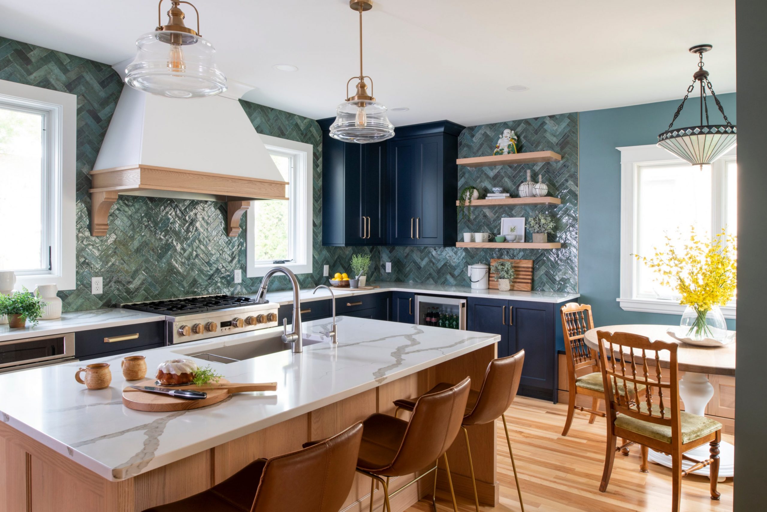
Smoky Blue SW 7604
Smoky Blue SW 7604 is a deep, dusty blue that has a lot of gray and a hint of green. This color is a power move for anyone with honey oak cabinets. I find that it provides the ultimate contrast to the orange tones in the wood.
It makes a kitchen look very high-end and very professional. Many people love how it makes the wood grain look rich and expensive. It is a darker color, so it adds a lot of mood and depth to the room.
I use it to create a focal point in a kitchen that might feel a bit boring. It looks amazing with stainless steel appliances and white trim. This color is a great way to make a big change without replacing your cabinets. It feels very modern and very stylish in any home.
Best used in: kitchens, accent walls, and dining rooms
Pairs well with: Alabaster SW 7008, On the Rocks SW 7671, Extra White SW 7006, silver hardware The key rule of this color for farmhouse style is to use it where you want natural light to feel kind, soft, and inviting throughout the day.
🎨 Check out the complete guide to this color right HERE 👈

Boothbay Gray HC-165
Boothbay Gray HC-165 is a medium blue-gray that feels very coastal and fresh. This color is a fantastic partner for honey oak because it is very cool. I love how it makes the orange in the wood look like a warm and cozy feature.
It is a very reliable color that looks good in almost any light. Many of my clients choose this for their kitchens and bathrooms to create a unified look. It feels very clean and crisp next to white trim and wooden cabinets.
I find that it makes a room feel very organized and well-kept. It is a great choice for anyone who wants a color that is visible but not too bright. This shade is a very popular and stylish choice for modernizing an older kitchen. It brings a lot of life to the walls.
Best used in: kitchens, mudrooms, and bathrooms
Pairs well with: White Dove OC-17, Revere Pewter HC-172, Hale Navy HC-154, white tile The key rule of this color for farmhouse style is to use it where you want natural light to feel kind, soft, and inviting throughout the day.
🎨 Check out the complete guide to this color right HERE 👈

Naval SW 6244
Naval SW 6244 is a classic navy blue that is very dark and very rich. This color is a bold and beautiful choice for a kitchen with honey oak. I find that it makes the wood look like a bright and sunny accent. It is a very traditional color that feels very expensive and high-quality.
Many homeowners love the drama it adds to their main living areas. It works incredibly well with gold hardware and white quartz countertops. I use it to create a room that feels very steady and established.
It is a great way to make a large kitchen feel more cozy and grounded. This color is a timeless choice that always looks great with oak wood. It creates a very strong and stylish look for any homeowner.
Best used in: kitchens, dining rooms, and exterior shutters
Pairs well with: Alabaster SW 7008, Agreeable Gray SW 7029, Goldfinch SW 6910, brass The key rule of this color for farmhouse style is to use it where you want natural light to feel kind, soft, and inviting throughout the day.
🎨 Check out the complete guide to this color right HERE 👈

Hale Navy HC-154
Hale Navy HC-154 is often called the perfect navy because it is so well-balanced. This color looks stunning next to honey oak because blue and orange are complementary colors. I love how it makes the wood cabinets pop and look very important in the room.
It is a deep and dark shade that adds a lot of weight and style to the walls. Many of my clients feel like they have a brand-new kitchen after using this paint. It works well with both light and dark floors and looks great with white trim.
I find that it makes a room feel very sophisticated and curated. It is a fantastic choice for someone who wants a bold color that will not go out of style. This shade is a real winner for updating a kitchen with a lot of wood.
Best used in: kitchens, home libraries, and accent walls
Pairs well with: White Dove OC-17, Gray Owl OC-52, Coventry Gray HC-169, stainless steel The key rule of this color for farmhouse style is to use it where you want natural light to feel kind, soft, and inviting throughout the day.
🎨 Check out the complete guide to this color right HERE 👈

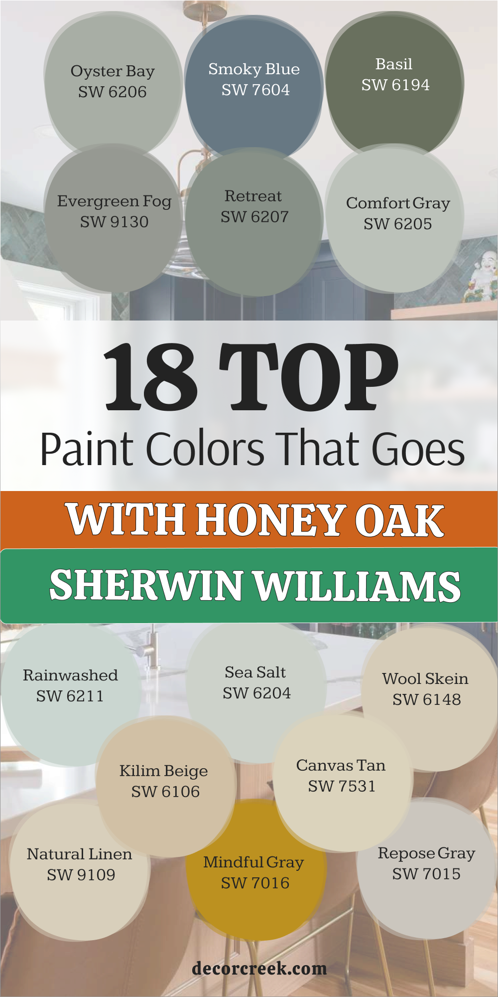
18 Paint Colors That Goes With Honey Oak From Sherwin Williams
Alabaster SW 7008
Alabaster SW 7008 is a long-time favorite of mine for updating kitchens with older wood features. This color provides a creamy foundation that softens the heavy look of oak. It has enough yellow in it to blend with the wood rather than fighting against it.
I find that it makes a kitchen feel much brighter without looking cold or like a hospital. Many people choose this shade when they want a clean look that still feels very welcoming to guests. The balance of this color is perfect for keeping the warmth of the wood alive.
It hides imperfections on older walls while making the cabinets look fresh. This pick is a safe bet for any homeowner who feels stuck with their current layout. I love how it handles both natural light and artificial bulbs in a room.
Best used in: living rooms, kitchens, hallways, bedrooms, and farmhouse exteriors
Pairs well with: Iron Ore SW 7069, Agreeable Gray SW 7029, Natural Linen SW 9109, warm wood tones The key rule of this color for farmhouse style is to use it where you want natural light to feel kind, soft, and inviting throughout the day.
🎨 Check out the complete guide to this color right HERE 👈
Creamy SW 7012
Creamy SW 7012 is exactly what the name suggests because it feels like rich silk on the walls. This paint is wonderful for rooms where you want a very traditional and warm feeling. I notice that it matches the yellow tones in honey oak perfectly so nothing clashes.
It is not too bright, so it does not make the wood look dark by comparison. Many families choose this for their main living areas to create a friendly atmosphere. It feels very soft under warm light bulbs in the evening.
I like to use it when the floor is also a warm wood tone. It helps the whole room feel like one big, connected part of the house. This color is a classic choice that never fails to please my clients. It brings a sense of comfort to a kitchen that needs a little extra love.
Best used in: bedrooms, dining rooms, and kitchens with lots of wood
Pairs well with: Urbane Bronze SW 7048, Latte SW 6108, Van Dyke Brown SW 7041, gold accents The key rule of this color for farmhouse style is to use it where you want natural light to feel kind, soft, and inviting throughout the day.
🎨 Check out the complete guide to this color right HERE 👈
Accessible Beige SW 7036
Accessible Beige SW 7036 is a go-to for me when a client wants a bit more color than white. This beige has a gray undertone that keeps it from looking like old sand on your walls. It looks amazing next to honey oak because it balances the orange with its neutral base.
I think it is one of the best colors for making a house feel updated. It is dark enough to provide contrast but light enough to keep things airy. Many buyers prefer this color when they are looking for a new home.
It hides scuffs and dirt well, which is great for busy families with kids. The way it works with the wood grain is very pleasing to the eye. I always recommend this for open-concept areas that need a single, cohesive color.
Best used in: family rooms, entryways, and large kitchens
Pairs well with: Alabaster SW 7008, Urban Bronze SW 7048, Cadet SW 9143, wood floors The key rule of this color for farmhouse style is to use it where you want natural light to feel kind, soft, and inviting throughout the day.
🎨 Check out the complete guide to this color right HERE 👈
Agreeable Gray SW 7029
Agreeable Gray SW 7029 is a popular choice for a very good reason when dealing with oak. This shade works with almost any wood tone, including the orange in honey oak cabinets. It has just enough warmth to avoid feeling like cold concrete on your walls.
I use it to tone down the brightness of oak cabinets in sunny kitchens. It makes the wood look richer and more like a custom feature in the room. Homeowners love it because it matches almost any rug or furniture they buy.
It is a very safe choice that still looks very modern and stylish. I find that it helps bridge the gap between old wood and new appliances. This color is the perfect middle ground for a home update. It creates a balanced look that is very easy to live with every day.
Best used in: entire homes, kitchens, and hallways
Pairs well with: Extra White SW 7006, Mega Greige SW 7031, Sea Salt SW 6204, black accents The key rule of this color for farmhouse style is to use it where you want natural light to feel kind, soft, and inviting throughout the day.
🎨 Check out the complete guide to this color right HERE 👈
Repose Gray SW 7015
Repose Gray SW 7015 is a slightly cooler gray that still manages to look great with wood. This color is perfect for those who want to get away from beige entirely. I find that it makes the orange in honey oak stand out in a very artistic way.
It is a very crisp shade that makes a kitchen look very clean and sharp. Many people like how it looks with white trim and dark wood floors. It has a tiny bit of blue and green hidden inside that comes out in the light.
I use it to give a room a more professional and staged appearance for my clients. It is deep enough to make the cabinets look like they were a smart design choice. This color is a modern classic for anyone wanting a fresh look. It provides a beautiful backdrop for stainless steel appliances.
Best used in: kitchens, living rooms, and laundry rooms
Pairs well with: Eider White SW 7014, Pavilion Gray SW 7667, Naval SW 6244, silver The key rule of this color for farmhouse style is to use it where you want natural light to feel kind, soft, and inviting throughout the day.
🎨 Check out the complete guide to this color right HERE 👈

Mindful Gray SW 7016
Mindful Gray SW 7016 is a step darker than many other neutrals and offers a lot of depth. This color is fantastic if you have a large kitchen with a lot of oak. It provides a strong contrast that makes the wood grain look very rich and high-end.
I love how it grounds the room and makes it feel very sturdy and well-built. Many of my clients feel that it makes their kitchen look more expensive and custom. It works well with both natural light and brighter indoor light fixtures.
I think it is the perfect shade for creating a cozy and welcoming kitchen vibe. It has a bit more personality than the lighter whites and beiges in the collection. This color is a workhorse that looks good in almost any situation you can imagine. It makes the orange in the cabinets look very balanced.
Best used in: kitchens, dining rooms, and home offices
Pairs well with: Repose Gray SW 7015, Snowbound SW 7004, Black Magic SW 6991, wood trim The key rule of this color for farmhouse style is to use it where you want natural light to feel kind, soft, and inviting throughout the day.
🎨 Check out the complete guide to this color right HERE 👈

Natural Linen SW 9109
Natural Linen SW 9109 is a warm, sandy color that feels very organic and real to me. This paint works with honey oak by leaning into the warm tones instead of fighting them. I find that it creates a very cohesive and intentional look in a kitchen area.
It makes the room feel very grounded and connected to natural materials. People who like a traditional or rustic style often fall in love with this color quickly. It is a great choice for kitchens with stone or tile floors that have tan bits.
I use it to create a room that feels very steady and reliable for a family. It is a deeper neutral that adds a lot of character to the walls. The way it sits next to oak is very harmonious and easy on the eyes. It is a wonderful color for a busy and active home.
Best used in: kitchens, mudrooms, and hallways
Pairs well with: Alabaster SW 7008, Divine White SW 6105, Foothills SW 7514, bronze The key rule of this color for farmhouse style is to use it where you want natural light to feel kind, soft, and inviting throughout the day.
🎨 Check out the complete guide to this color right HERE 👈
Canvas Tan SW 7531
Canvas Tan SW 7531 is a light, khaki-like color that feels very fresh and clean in any light. This shade works well with honey oak because it has a similar level of warmth. I find that it helps the cabinets blend into the wall a little bit more.
This is helpful if you feel like your cabinets are too dominant in the room. It creates a very smooth and soft look that is very easy to live with. Many people like how it pairs with white trim and dark accents on the doors.
It is a great neutral for anyone who wants to avoid gray but does not want yellow. I use it to make a kitchen feel more balanced and less cluttered visually. It is a very versatile color that works in many different lighting situations at home. This paint is a great way to modernize a kitchen without extra work.
Best used in: kitchens, living rooms, and laundry rooms
Pairs well with: Alabaster SW 7008, Shoji White SW 7042, Iron Ore SW 7069, blue accents The key rule of this color for farmhouse style is to use it where you want natural light to feel kind, soft, and inviting throughout the day.
🎨 Check out the complete guide to this color right HERE 👈
Kilim Beige SW 6106
Kilim Beige SW 6106 is a very warm and reliable beige that has been around for years. This color is perfect for honey oak because it embraces the warmth of the wood. I think it makes a room feel very friendly and open to guests.
It is not a cold shade, so it does not make the wood look like an accident. Many homeowners like how it creates a soft glow in the room during the day. It is a great choice for a kitchen that is the busy heart of the home.
I use it often in houses that have a mix of different warm wood types. It acts as a bridge that brings all the different furniture pieces together. This shade is very forgiving and easy to paint over older or darker colors. It makes any room feel like a cozy and warm retreat.
Best used in: living rooms, kitchens, and large entryways
Pairs well with: Latte SW 6108, Divine White SW 6105, Storm Cloud SW 6249, dark rugs The key rule of this color for farmhouse style is to use it where you want natural light to feel kind, soft, and inviting throughout the day.
🎨 Check out the complete guide to this color right HERE 👈
Wool Skein SW 6148
Wool Skein SW 6148 is a beautiful tan that has a tiny hint of green in the base. This color is a secret weapon for honey oak because green is a great contrast for orange. I find that it makes the wood look much more natural and less like a dated finish.
It is a very soft and pretty shade that does not feel like a bright color. Many homeowners find that it makes their kitchen feel much more relaxed and steady. It works well with white appliances or modern stainless steel in a kitchen.
I love how it looks when the sun hits it through the window in the morning. It is a great way to add a bit of personality to a room. This color feels very fresh and clean next to the warm wood grain of oak. It is one of my favorite colors for a gentle and easy kitchen update.
Best used in: kitchens, bedrooms, and dining areas
Pairs well with: Shoji White SW 7042, Universal Khaki SW 6150, Basil SW 6194, white trim The key rule of this color for farmhouse style is to use it where you want natural light to feel kind, soft, and inviting throughout the day.
🎨 Check out the complete guide to this color right HERE 👈

Sea Salt SW 6204
Sea Salt SW 6204 is a beautiful mix of green, blue, and gray that looks amazing with oak. This color is a favorite for cooling down the orange tones in honey oak cabinets. I find that it makes a kitchen feel very light and refreshing like a beach house.
It is a soft shade that adds a splash of color without being too loud. Many people are surprised at how well a green-blue works with wooden cabinets. It creates a high-contrast look that feels very modern and intentional in a home.
I use it when a client wants their kitchen to feel more energetic and bright. It is a very popular choice for bathrooms and kitchens alike for a fresh feel. This color brings a bit of nature inside and looks great with white trim. It is a fun way to update a room with lots of wood.
Best used in: bathrooms, kitchens, and laundry rooms
Pairs well with: Alabaster SW 7008, Summit Gray SW 7669, Kilim Beige SW 6106, white quartz The key rule of this color for farmhouse style is to use it where you want natural light to feel kind, soft, and inviting throughout the day.
🎨 Check out the complete guide to this color right HERE 👈
Rainwashed SW 6211
Rainwashed SW 6211 is a soft blue-green that has a bit more depth than a light pastel. This color looks stunning next to honey oak because it provides a cool contrast. I find that it makes the wood look like a warm accent rather than an old feature.
It is a very cheerful color that makes people feel happy when they walk in. Many families choose this for their kitchens to make the room feel very bright. It works very well with light-colored countertops and white trim in a kitchen.
I like to use it in rooms that get a lot of afternoon sun through windows. The color feels very organic and reminds me of the sky or clean water. It is a great way to break up a lot of brown wood in a large room. This shade is a breath of fresh air for any dated kitchen.
Best used in: kitchens, sunrooms, and bathrooms
Pairs well with: Pure White SW 7005, Sea Salt SW 6204, Grays Harbor SW 6236, wicker decor The key rule of this color for farmhouse style is to use it where you want natural light to feel kind, soft, and inviting throughout the day.
🎨 Check out the complete guide to this color right HERE 👈
Comfort Gray SW 6205
Comfort Gray SW 6205 is a medium green-gray that feels very sophisticated and high-end. This color is a fantastic choice for honey oak because it is cool and steady. I love how it makes the orange in the wood look like a warm and cozy feature.
It is a very reliable color that looks good in almost any light in the house. Many of my clients choose this for their kitchens and bathrooms to create a unified look. It feels very clean and crisp next to white trim and wooden cabinets.
I find that it makes a room feel very organized and well-kept for a family. It is a great choice for anyone who wants a color that is visible but not too bright. This shade is a very popular and stylish choice for modernizing an older kitchen. It brings a lot of life to the walls.
Best used in: kitchens, bedrooms, and home offices
Pairs well with: Alabaster SW 7008, Sea Salt SW 6204, Oyster Bay SW 6206, dark wood The key rule of this color for farmhouse style is to use it where you want natural light to feel kind, soft, and inviting throughout the day.
🎨 Check out the complete guide to this color right HERE 👈

Retreat SW 6207
Retreat SW 6207 is a deep, dusty green that has a lot of gray in the base. This color is perfect for creating a high-contrast look with honey oak cabinets. I find that it makes the wood look much more modern and less dated.
It is a bold choice that adds a lot of character and drama to a kitchen area. Many people love how it makes their white dishes and countertops stand out clearly. It is a great color for a room where you want to create a cozy feeling.
I use it to help focus the eye on the walls and away from a dated floor. It is a very sophisticated shade that looks like a custom designer picked it out. The cool green tones are the perfect medicine for orange wood cabinets. This color is a fantastic way to upgrade your kitchen style.
Best used in: kitchens, bedrooms, and home offices
Pairs well with: Alabaster SW 7008, Sea Salt SW 6204, Peppercorn SW 7674, leather furniture The key rule of this color for farmhouse style is to use it where you want natural light to feel kind, soft, and inviting throughout the day.
🎨 Check out the complete guide to this color right HERE 👈
Evergreen Fog SW 9130
Evergreen Fog SW 9130 is a mid-tone green that has a lot of gray and a bit of blue. This color is very trendy right now because it looks amazing with warm wood tones. I use it to create a very moody and stylish kitchen with honey oak features.
It makes the cabinets pop in a way that feels very intentional and modern. Many homeowners love how it brings a bit of the outdoors inside their house. It is a deeper color, so it works best in rooms with a good amount of light.
I find that it makes a kitchen feel very sturdy and well-designed for a family. It is a fantastic choice for someone who wants to make a bold statement. The green in the paint helps cancel out the orange in the wood perfectly. This color is a great way to show off your personal style.
Best used in: kitchens, dens, and accent walls
Pairs well with: Shoji White SW 7042, Urbane Bronze SW 7048, Accessible Beige SW 7036, gold hardware The key rule of this color for farmhouse style is to use it where you want natural light to feel kind, soft, and inviting throughout the day.
🎨 Check out the complete guide to this color right HERE 👈
Basil SW 6194
Basil SW 6194 is a deep and rich green that feels very organic and earthy. This color is a perfect match for honey oak because it highlights the natural beauty of the wood grain. I love how it makes a kitchen feel very grounded and traditional for a family.
It is a darker shade that adds a lot of depth to the walls without being too bright. Many of my clients choose this when they want a classic look that feels very warm. It works beautifully with natural light and looks great next to wooden cabinets.
I think it is one of the best dark greens for making a home feel cozy. It provides a lovely backdrop for plants and other natural decor pieces. This shade is a safe and beautiful choice for any kitchen with oak. It creates a very welcoming and friendly environment for guests.
Best used in: kitchens, dining rooms, and library areas
Pairs well with: Creamy SW 7012, Wool Skein SW 6148, Foothills SW 7514, copper The key rule of this color for farmhouse style is to use it where you want natural light to feel kind, soft, and inviting throughout the day.
🎨 Check out the complete guide to this color right HERE 👈
Smoky Blue SW 7604
Smoky Blue SW 7604 is a deep, dusty blue that has a lot of gray and a hint of green. This color is a power move for anyone with honey oak cabinets in their home. I find that it provides the ultimate contrast to the orange tones in the wood.
It makes a kitchen look very high-end and very professional for my clients. Many people love how it makes the wood grain look rich and expensive. It is a darker color, so it adds a lot of mood and depth to the room.
I use it to create a focal point in a kitchen that might feel a bit boring. It looks amazing with stainless steel appliances and white trim on the walls. This color is a great way to make a big change without replacing your cabinets. It feels very modern and very stylish in any home.
Best used in: kitchens, accent walls, and dining rooms
Pairs well with: Alabaster SW 7008, On the Rocks SW 7671, Extra White SW 7006, silver hardware The key rule of this color for farmhouse style is to use it where you want natural light to feel kind, soft, and inviting throughout the day.
🎨 Check out the complete guide to this color right HERE 👈
Oyster Bay SW 6206
Oyster Bay SW 6206 is a sophisticated green-gray that has a very cool feeling. This color is a great choice for making honey oak cabinets look more expensive and modern. I love how it creates a very polished and professional look in a kitchen area.
It is deep enough to provide a nice contrast but light enough to stay airy and fresh. Many of my clients feel that it makes their kitchen look like a designer planned it. It is a very elegant shade that works well with traditional furniture and decor.
I find that it pulls the focus away from the orange in the wood and onto the walls. It is a very relaxing color to look at while you are cooking or eating with family. This paint is a great investment for a kitchen that needs a bit of style. It feels very high-end and curated.
Best used in: kitchens, bathrooms, and laundry rooms
Pairs well with: Sea Salt SW 6204, Comfort Gray SW 6205, Pure White SW 7005, dark tile The key rule of this color for farmhouse style is to use it where you want natural light to feel kind, soft, and inviting throughout the day.
🎨 Check out the complete guide to this color right HERE 👈

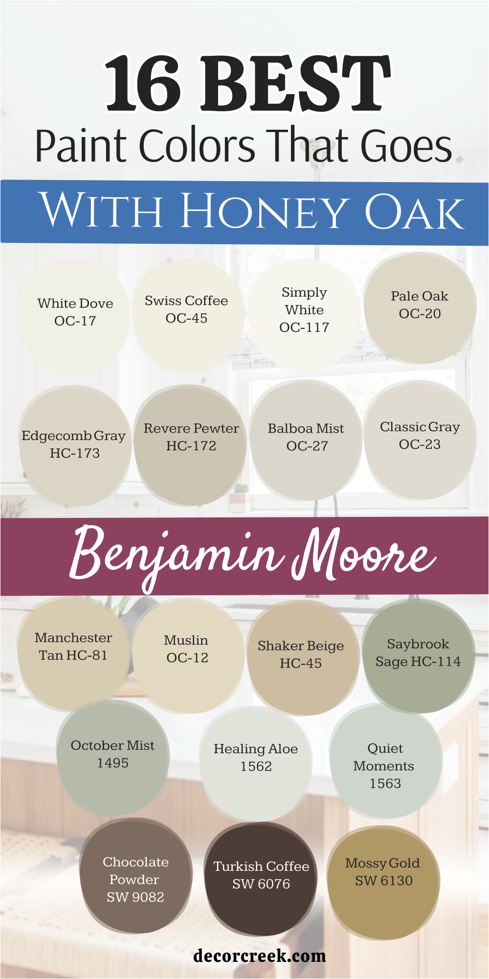
16 Paint Colors That Goes With Honey Oak From Benjamin Moore
White Dove OC-17
White Dove OC-17 is a light shade that has a tiny bit of gray in the base. This color works wonders because it cleans up the look of a room instantly. I use it often when the honey oak feels a bit too busy or loud.
It acts like a quiet backdrop that lets the natural beauty of the wood grain show through. Homeowners like it because it does not turn blue or green in weird lighting. It makes a small kitchen feel much larger than it actually is.
You can trust this shade to work in rooms that do not get much sun. The soft finish makes the orange tones in the cabinets feel much more modern. I think it is one of the most reliable whites on the market today. It creates a crisp look that stays stylish for many years.
Best used in: kitchens, trim, doors, and open floor plans
Pairs well with: Revere Pewter HC-172, Hale Navy HC-154, Balboa Mist OC-27, dark bronze hardware The key rule of this color for farmhouse style is to use it where you want natural light to feel kind, soft, and inviting throughout the day.
🎨 Check out the complete guide to this color right HERE 👈
Swiss Coffee OC-45
Swiss Coffee OC-45 is a popular choice for designers who want a sophisticated look. This color has a very slight warmth that prevents it from looking like plain primer. I find that it makes honey oak look expensive and well-kept.
It reflects light beautifully, which helps brighten up dark corners of a kitchen. Many people love how it looks with black hardware on the cabinets. It is a very versatile white that adapts to the furniture you already own.
I often use it in homes that have a lot of natural textures like wool or linen. It creates a smooth transition from the walls to the wooden cabinetry. This shade is perfect if you want a bright room that still feels lived-in. It is a soft white that feels very high-end.
Best used in: living rooms, hallways, and kitchens with natural light
Pairs well with: Black Beauty 2128-10, Gray Owl OC-52, Edgecomb Gray HC-173, brass fixtures The key rule of this color for farmhouse style is to use it where you want natural light to feel kind, soft, and inviting throughout the day.
🎨 Check out the complete guide to this color right HERE 👈
Simply White OC-117
Simply White OC-117 is a crisp and clean option that brings a lot of energy to a room. This color has just a hint of warmth to keep it from feeling like ice. I love how it makes honey oak cabinets look sharp and high-contrast.
It is an excellent choice for ceilings and trim as well as main walls. Many homeowners appreciate how it makes a kitchen feel brand new and very tidy. It works perfectly with modern light fixtures and colorful decor.
I find that it helps the wood look less yellow and more like a warm gold. This is a great pick for people who love a very bright and sunny environment. It makes every corner of the house feel very awake.
Best used in: kitchens, trim, ceilings, and small dark rooms
Pairs well with: Hale Navy HC-154, Silver Gray 2131-60, Dove Wing OC-18, colorful accents The key rule of this color for farmhouse style is to use it where you want natural light to feel kind, soft, and inviting throughout the day.
🎨 Check out the complete guide to this color right HERE 👈

Pale Oak OC-20
Pale Oak OC-20 is a very light and airy color that feels like a breath of fresh air. This shade is barely there, which is great for small rooms that feel cramped. I use it to make honey oak cabinets feel less bulky and heavy in a kitchen.
It has a very elegant look that reminds me of a high-end spa. Many people choose this when they want a clean look but hate stark white walls. It picks up the lighter tones in the oak and highlights them beautifully.
I find that it makes the wood grain look more delicate and pretty. It is a fantastic choice for a soft and gentle kitchen design. You can use it in large amounts without it ever feeling like too much. It is a very polite color that stays in the background.
Best used in: bathrooms, bedrooms, and small kitchens
Pairs well with: Chantilly Lace OC-65, Gray Owl OC-52, Boothbay Gray HC-165, silver hardware The key rule of this color for farmhouse style is to use it where you want natural light to feel kind, soft, and inviting throughout the day.
🎨 Check out the complete guide to this color right HERE 👈
Edgecomb Gray HC-173
Edgecomb Gray HC-173 is often called a greige because it sits between gray and beige. This color is a master at making honey oak cabinets look much more contemporary. I love how it changes slightly depending on the light, staying fresh all day long.
It is a very light-hearted color that does not feel heavy or muddy. Most people find that it makes their wood cabinets look like they were a deliberate design choice. It is soft enough to use in every room of the house for a unified look.
I suggest this for anyone who is afraid of gray looking too cold or blue. It brings out the tan bits in the oak grain instead of the orange ones. This is a top pick for staging homes to sell quickly. It feels very fresh and clean in any light.
Best used in: bedrooms, kitchens, and bathrooms
Pairs well with: White Dove OC-17, Revere Pewter HC-172, Hale Navy HC-154, stone tiles The key rule of this color for farmhouse style is to use it where you want natural light to feel kind, soft, and inviting throughout the day.
🎨 Check out the complete guide to this color right HERE 👈
Revere Pewter HC-172
Revere Pewter HC-172 is a classic color that has stood the test of time. This deeper greige provides a strong contrast against honey oak cabinets. I like how it grounds the room and makes it feel sturdy and high-quality.
It is a great choice if your kitchen has a lot of windows and natural light. The color feels very organic and earthy, which complements the wood perfectly. Many of my clients feel that it makes their kitchen look more expensive.
It works well with both stainless steel and black appliances. I think it is the perfect shade for creating a cozy and welcoming kitchen. It has a bit more personality than the lighter whites and beiges. This color is a workhorse that looks good in almost any situation.
Best used in: kitchens, dining rooms, and laundry rooms
Pairs well with: White Dove OC-17, Chelsea Gray HC-168, Fog Mist OC-31, dark wood The key rule of this color for farmhouse style is to use it where you want natural light to feel kind, soft, and inviting throughout the day.
🎨 Check out the complete guide to this color right HERE 👈
Balboa Mist OC-27
Balboa Mist OC-27 is a very light gray that has a warm heart. This color is perfect for honey oak because it looks very clean without being cold. I find that it creates a very soft and pretty look in a kitchen area.
It is a very reliable shade for people who want a neutral that feels modern. Many homeowners love how it hides the orange glow of old wood cabinets. It works beautifully in open floor plans where light changes from room to room.
I use it to make a house look professionally staged and ready for guests. It has a very high-end feel that makes a kitchen look very expensive. This shade is perfect for creating a bright and airy home. It is a very gentle color that everyone seems to love.
Best used in: living rooms, kitchens, and bedrooms
Pairs well with: Simply White OC-117, Revere Pewter HC-172, Chelsea Gray HC-168, black accents The key rule of this color for farmhouse style is to use it where you want natural light to feel kind, soft, and inviting throughout the day.
🎨 Check out the complete guide to this color right HERE 👈

Classic Gray OC-23
Classic Gray OC-23 is a very pale and sophisticated gray that looks almost white. This color is amazing for honey oak because it provides a very soft contrast. I love how it makes a room feel very light and very expensive.
It is a great choice for kitchens that feel a bit dark or outdated. Many of my clients choose this for their main living areas to create a unified look. It works beautifully with natural light and looks great next to wooden cabinets.
I think it is one of the best colors for making a small kitchen feel much bigger. It is a very polite color that does not demand too much attention. This shade is a safe and beautiful choice for any homeowner. It provides a crisp backdrop for all your family memories.
Best used in: entire homes, kitchens, and bathrooms
Pairs well with: White Dove OC-17, Stone 2112-40, Hale Navy HC-154, marble The key rule of this color for farmhouse style is to use it where you want natural light to feel kind, soft, and inviting throughout the day.
🎨 Check out the complete guide to this color right HERE 👈

Manchester Tan HC-81
Manchester Tan HC-81 is a sophisticated beige that does not have any hidden pink or green. This color is a great partner for honey oak because it stays very true to its neutral base. I like how it makes a kitchen feel solid and very well-designed.
It is a light-medium shade that provides a nice amount of depth to the walls. Many of my clients choose this when they want a traditional look that still feels updated. It works beautifully with natural light and looks great next to wooden cabinets.
I think it is one of the best tan colors for preventing wood from looking too orange. It feels very classic and high-end without being flashy. This shade is a safe and beautiful choice for any room with oak features. It provides a warm backdrop for all your kitchen activities.
Best used in: dining rooms, kitchens, and entryways
Pairs well with: White Dove OC-17, Bleeker Beige HC-80, Wickham Gray HC-171, black metal The key rule of this color for farmhouse style is to use it where you want natural light to feel kind, soft, and inviting throughout the day.
🎨 Check out the complete guide to this color right HERE 👈
Muslin OC-12
Muslin OC-12 is a warm and inviting neutral that feels like a cozy blanket. This color is perfect for honey oak cabinets because it shares the same friendly energy. I love how it makes a kitchen feel like the most important room in the house.
It is a deeper white that has enough body to stand up to heavy wood grain. Many of my clients appreciate how it hides dust and fingerprints on the walls. It creates a very soft and gentle look that is perfect for a family home.
I find that it looks especially good in kitchens with plenty of windows. The warmth of the paint brings out the best parts of the oak wood. It is a very traditional choice that still feels very fresh today. This shade makes any room feel much more comfortable.
Best used in: kitchens, bedrooms, and breakfast nooks
Pairs well with: Simply White OC-117, Woodmont Cream 204, Shaker Beige HC-45, green plants The key rule of this color for farmhouse style is to use it where you want natural light to feel kind, soft, and inviting throughout the day.
🎨 Check out the complete guide to this color right HERE 👈
Shaker Beige HC-45
Shaker Beige HC-45 is a medium-toned beige that feels very earthy and solid. This color works with honey oak by embracing the warmth of the wood. I find that it creates a very traditional and cozy look in a kitchen.
It is a great choice for homes that have a lot of historical character. Many homeowners love how it makes their wood cabinets feel like a part of the walls. It is a very deep neutral that adds a lot of personality to a room.
I use it to create a feeling of stability and warmth for my clients. It works well with dark wood floors and brass hardware. This shade is a classic choice for people who love a very warm home. It makes a large kitchen feel very connected and friendly.
Best used in: kitchens, dining rooms, and family rooms
Pairs well with: White Dove OC-17, Manchester Tan HC-81, Van Deusen Blue HC-156, leather The key rule of this color for farmhouse style is to use it where you want natural light to feel kind, soft, and inviting throughout the day.
🎨 Check out the complete guide to this color right HERE 👈

Saybrook Sage HC-114
Saybrook Sage HC-114 is a true sage green that feels very organic and earthy. This color is a perfect match for honey oak because it highlights the natural beauty of the wood. I love how it makes a kitchen feel very grounded and traditional.
It is a medium shade that adds a lot of depth to the walls without being too dark. Many of my clients choose this when they want a classic look that feels very warm. It works beautifully with natural light and looks great next to wooden cabinets.
I think it is one of the best greens for making a home feel cozy. It provides a lovely backdrop for plants and other natural decor. This shade is a safe and beautiful choice for any kitchen with oak. It creates a very welcoming and friendly environment.
Best used in: kitchens, dining rooms, and exterior doors
Pairs well with: White Dove OC-17, Manchester Tan HC-81, Van Courtland Blue HC-145, copper The key rule of this color for farmhouse style is to use it where you want natural light to feel kind, soft, and inviting throughout the day.
🎨 Check out the complete guide to this color right HERE 👈
October Mist 1495
October Mist 1495 is a soft, silvery-green that feels very light and modern. This color was a color of the year for a reason, as it works with so many wood types. I love how it makes honey oak cabinets look fresh and updated.
It is a very gentle shade that does not feel heavy or dark on the walls. Many homeowners find that it makes their kitchen feel much more spacious. It works well with light-colored countertops and black accents.
I like to use it when a client wants a color that is unique but still very safe. It feels very organic and reminds me of a garden in the morning. It is a great way to add a bit of life to a kitchen that feels stuck in the past. This shade is a very pretty and smart choice for any home.
Best used in: kitchens, living rooms, and bathrooms
Pairs well with: Steam AF-15, Morning Dew OC-140, Gloucester Sage HC-100, wood accents The key rule of this color for farmhouse style is to use it where you want natural light to feel kind, soft, and inviting throughout the day.
🎨 Check out the complete guide to this color right HERE 👈
Healing Aloe 1562
Healing Aloe 1562 is a very light green that has a lot of gray in it. This color is a fantastic choice for honey oak because green is opposite to orange on the color wheel. I use this to neutralize the wood and make it look much more updated.
It is a very soft and pretty shade that does not feel like a bright crayon. Many homeowners find that it makes their kitchen feel much more relaxed. It works well with white appliances or modern stainless steel.
I love how it looks when the sun hits it in the morning. It is a great way to add a bit of personality to a room without taking a huge risk. This color feels very fresh and clean next to the warm wood grain. It is one of my favorite colors for a soft kitchen update.
Best used in: kitchens, bathrooms, and bedrooms
Pairs well with: White Dove OC-17, Quiet Moments 1563, Beach Glass 1564, silver accents The key rule of this color for farmhouse style is to use it where you want natural light to feel kind, soft, and inviting throughout the day.
🎨 Check out the complete guide to this color right HERE 👈
Quiet Moments 1563
Quiet Moments 1563 is a very soft mix of blue, green, and gray that feels very high-end. This color is one of my favorites for making a busy kitchen feel more organized. It works with honey oak by providing a gentle contrast that is not too sharp.
I love how it makes the wood look softer and more like a natural element. Many people choose this for their homes when they want a touch of color that is very easy to live with. It feels very sophisticated and well-balanced on the walls.
I find that it makes small kitchens feel much more open and light. It is a great choice for a room where you want to spend a lot of time. This shade is very pretty and looks great with white or light gray trim. It is a classic color that always looks professional.
Best used in: bedrooms, bathrooms, and kitchens
Pairs well with: White Dove OC-17, Healing Aloe 1562, Mount Saint Anne 1565, glass accents The key rule of this color for farmhouse style is to use it where you want natural light to feel kind, soft, and inviting throughout the day.
🎨 Check out the complete guide to this color right HERE 👈
Boothbay Gray HC-165
Boothbay Gray HC-165 is a medium blue-gray that feels very coastal and fresh. This color is a fantastic partner for honey oak because it is very cool. I love how it makes the orange in the wood look like a warm and cozy feature.
It is a very reliable color that looks good in almost any light. Many of my clients choose this for their kitchens and bathrooms to create a unified look. It feels very clean and crisp next to white trim and wooden cabinets.
I find that it makes a room feel very organized and well-kept. It is a great choice for anyone who wants a color that is visible but not too bright. This shade is a very popular and stylish choice for modernizing an older kitchen. It brings a lot of life to the walls.
Best used in: kitchens, mudrooms, and bathrooms
Pairs well with: White Dove OC-17, Revere Pewter HC-172, Hale Navy HC-154, white tile The key rule of this color for farmhouse style is to use it where you want natural light to feel kind, soft, and inviting throughout the day.
🎨 Check out the complete guide to this color right HERE 👈
I truly believe that honey oak cabinets can look amazing with the right paint choice. You do not need to spend thousands of dollars on new wood when a simple can of paint can do the trick. My favorite part of being a designer is seeing how much happier people are in their homes after a small change. Whether you want a light and airy white or a deep and moody blue, there is a perfect shade for you. Remember to always test your samples in your own lighting before making a final decision.
Your kitchen is the heart of your home, and it deserves to look its best every day. Updating your house should be an exciting journey that makes you proud of where you live. I hope this list helps you find a color that makes your wood cabinets look like a million dollars. Taking the time to match your wall color to your cabinets will make the whole room feel finished.
You have the power to make your home a beautiful place with just a few coats of paint.
Every room in your house tells a story about who you are and how you live. Finding the right balance between your wooden furniture and the walls creates a high-end look for very little money. I love helping families realize that they can have a dream kitchen without a massive construction project.
Your cabinets are high-quality pieces of wood that just need a fresh partner on the walls to shine.
Seeing a project come together with a simple brush and a roller is the most rewarding part of my career. You deserve to wake up every morning and feel good about the kitchen where you drink your coffee.
Trusting your gut and using these expert tips will lead you to a home you truly adore.