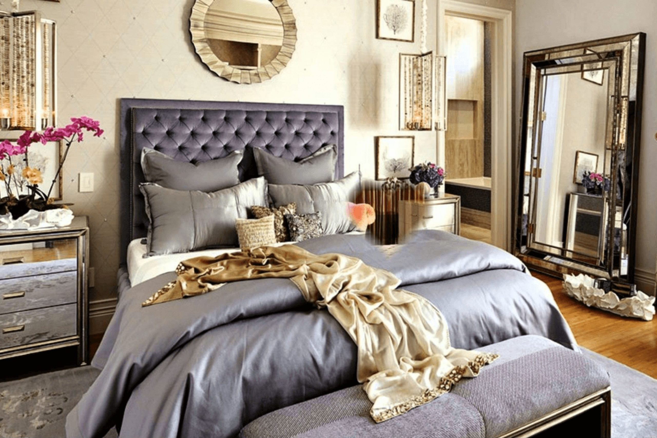
I know how much your bedroom matters to your daily life and your happiness. It is the place where you start your day with a smile and where you go to rest when you are tired from work. Choosing a paint color is about more than just a pretty look on the walls of your house.
It is about creating a feeling that makes you want to stay a little longer and enjoy the company of someone you love very much. I want to help you pick a shade that feels like a warm hug every time you walk through the door after a long day. Your bedroom should be the part of the house where you feel the most like yourself.
I believe that every couple deserves a place that feels special and private for their relationship. Taking the time to find the right color shows that you care about your home and your partner.
A good paint color can turn a boring room into a place where you make wonderful memories together.
Why I Always Trust Sherwin-Williams and Benjamin Moore for the Best Romantic Bedroom Paint Colors
I have used many different brands over the years in my staging work and my design projects. Sherwin-Williams and Benjamin Moore stand out because their colors always look exactly like the little paper samples you hold in your hand.
When you are trying to make a room feel special, you cannot have a color that looks weird when the sun goes down or when the lights are low. These brands make paint that covers well and stays beautiful for a long time without fading or peeling off. They offer a huge variety of pinks and purples that feel grown-up and stylish rather than looking like a playroom for kids.
I trust these companies because they care about the quality of the paint and the way it looks on your walls. You do not want to have to paint your room again next year because the color was not right the first time. Using high-quality paint makes the whole job easier and the final look much more expensive and high-end.
I always tell my friends and clients to stick with these two brands because they never let me down.
How I Choose the Perfect Romantic Paint Color for Any Bedroom
Picking the right shade starts with how much light you get from your windows during the middle of the day. If your room is dark, a very pale pink might just look gray and sad instead of bright and happy. I look for colors with a bit of warmth so the walls do not feel cold to the touch or look like a hospital room.
You should also think about your furniture and your favorite blankets that you use on the bed. I like to pick a color that makes your skin look healthy and glowing when you see yourself in the mirror in the morning. A good romantic color should make the whole room feel soft and quiet so you can sleep very well.
I always suggest buying a small sample can and painting a little bit on the wall before you buy the whole big gallon. You should look at the paint in the morning and again at night to see how the color changes with your lamps. A color that looks great in the store might look different in your own home with your own lights.
Take your time to think about how each shade makes you feel when you stand in the middle of the room.
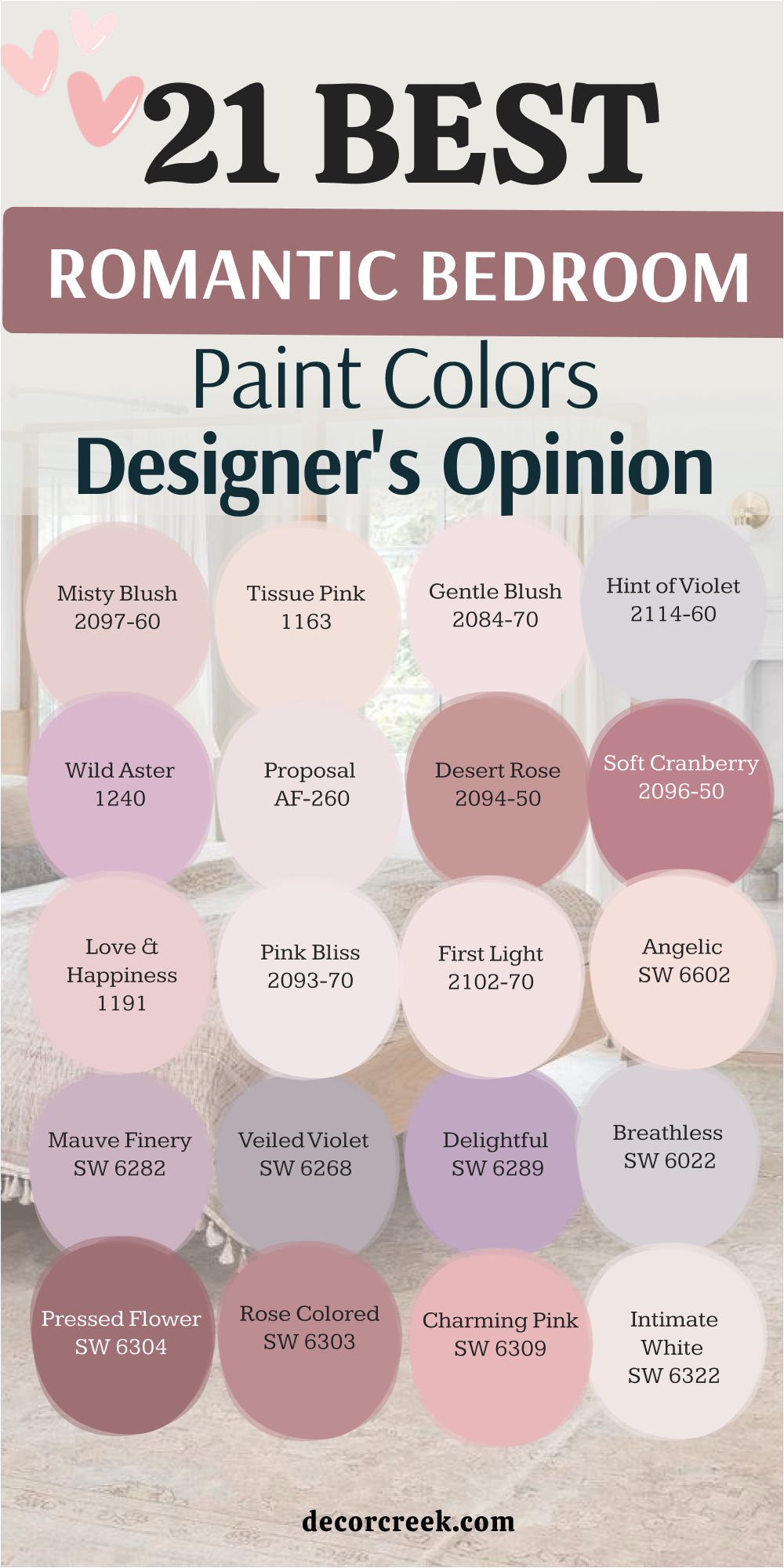
21 Best Romantic Bedroom Paint Color Designer’s Opinion
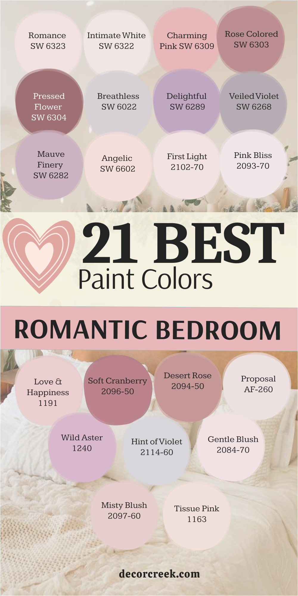
Romance SW 6323
Romance SW 6323 starts as a very soft and sweet pink that feels light as air. This color works because it has a tiny bit of orange inside it to keep it from feeling too cold. You will notice that it makes the ceiling feel higher if you use it on all four walls.
This shade is one of my favorites for small rooms that need a boost of energy. It creates a mood that is happy and lighthearted for any couple. I suggest using white curtains to keep the look clean and fresh.
You can also add some gold picture frames to make the pink pop. It is a choice that feels classic without being boring or old. This paint goes on smooth and hides small bumps on the wall quite well.
Best used in: bedrooms, nurseries, and small bathrooms
Pairs well with: Pure White SW 7005, Accessible Beige SW 7036, Silver Strand SW 7057, light oak furniture The key rule of this color for farmhouse style is to use it where you want natural light to feel kind, soft, and inviting throughout the day.
👉 Read the full guide for this color HERE 👈
Intimate White SW 6322
Intimate White SW 6322 provides a glow that is almost like a candle is lit in the room. This color is not a true white because it has a very heavy dose of pink hidden in the mix. It looks very sophisticated when paired with dark wood furniture or a black metal bed frame.
You will find that it changes throughout the day as the sun moves across the sky. I love how it makes white bedding look even brighter and cleaner than before. This is a great pick if you are scared of using too much color on your walls.
It gives you the feeling of a pink room without being too loud or bright. Many people choose this for guest rooms because it feels very welcoming to visitors. The finish is creamy and looks high-end even if you are on a budget.
Best used in: master suites, guest rooms, and dressing areas
Pairs well with: Alabaster SW 7008, Urbane Bronze SW 7048, Sea Salt SW 6204, dark mahogany The key rule of this color for farmhouse style is to use it where you want natural light to feel kind, soft, and inviting throughout the day.
👉 Read the full guide for this color HERE 👈
Charming Pink SW 6309
Charming Pink SW 6309 brings a lot of personality and fun into a sleeping area. This shade is a bit deeper than a pastel, so it feels very intentional and bold. You might want to use this on a single wall behind your headboard to create a focal point.
It reminds me of spring flowers blooming in a garden during the early morning. This color looks amazing when you have plenty of indoor plants with green leaves. I think it works best with light gray rugs to balance out the warmth of the pink.
You should consider using dimmable lights to make this color feel even more cozy at night. It is a very cheerful choice that helps you wake up with a smile on your face. Using it in a room with tall windows allows the color to show off its true depth.
Best used in: accent walls, bedrooms, and creative studios
Pairs well with: Snowbound SW 7004, Repose Gray SW 7015, Mindful Gray SW 7016, navy blue accents The key rule of this color for farmhouse style is to use it where you want natural light to feel kind, soft, and inviting throughout the day.
👉 Read the full guide for this color HERE 👈
Rose Colored SW 6303
Rose Colored SW 6303 has a dusty quality that makes it feel very vintage and expensive. This is a darker pink that feels very safe and grounded for a large master bedroom. You can use this to make a big room feel smaller and more private for you and your partner.
It pairs beautifully with brass lamps and mirrors that have ornate frames. I often recommend this for homes that have older architecture and tall baseboards. This color does not feel like a child’s room because it has a bit of brown underneath.
It creates a sense of history and comfort that is hard to find with lighter shades. You will enjoy how the shadows fall on this paint during the evening hours. It is a solid choice for anyone who wants a room that feels like a hidden retreat.
Best used in: large bedrooms, dining rooms, and cozy dens
Pairs well with: Extra White SW 7006, Dorian Gray SW 7017, Black Magic SW 6991, antique gold The key rule of this color for farmhouse style is to use it where you want natural light to feel kind, soft, and inviting throughout the day.
👉 Read the full guide for this color HERE 👈
Pressed Flower SW 6304
Pressed Flower SW 6304 is a rich and deep shade that feels very dramatic and moody. This color is perfect if you want your bedroom to feel like a high-end hotel suite. It has a lot of red in it, which is known to represent passion and strong feelings.
You should pair it with very light floors or a large white rug to keep things balanced. I love using this color in rooms that have a lot of natural wood accents. It makes a statement without being too bright or distracting to the eye.
This is the kind of color that looks better the more you look at it. You will feel very pampered when you are surrounded by such a deep and lovely tone. It works well for staging because it looks great in photos and catches the eye.
Best used in: master bedrooms, formal areas, and powder rooms
Pairs well with: High Reflective White SW 7757, Agreeable Gray SW 7029, Tricorn Black SW 6258, walnut wood The key rule of this color for farmhouse style is to use it where you want natural light to feel kind, soft, and inviting throughout the day.
👉 Read the full guide for this color HERE 👈
Breathless SW 6022
Breathless SW 6022 is a very light purple that almost looks like a soft gray in some lights. This color is great for people who want a romantic feel but do not like the color pink. It feels very airy and helps you breathe deeper when you enter the room to relax.
You can use it with silver or chrome hardware to keep the look very modern. I think it looks best when you have white trim around the windows and doors. This shade is very light, so it makes any small room feel much larger than it really is.
You will love how it stays looking fresh even after several years on the walls. It is a very smart choice for a home that has a lot of natural sunlight. This color provides a very peaceful backdrop for your most comfortable pillows and blankets.
Best used in: bedrooms, bathrooms, and laundry rooms
Pairs well with: Eider White SW 7014, Peppercorn SW 7674, On the Rocks SW 7671, cool marble The key rule of this color for farmhouse style is to use it where you want natural light to feel kind, soft, and inviting throughout the day.
👉 Read the full guide for this color HERE 👈
Delightful SW 6289
Delightful SW 6289 lives up to its name by bringing a sense of joy to your personal area. This is a medium-toned purple that feels very regal and special for a couple. You might find that it looks best when you use soft yellow lighting in your lamps.
It has enough color to stand out but it is not so dark that it feels heavy. I suggest using this with light wood furniture to keep the room feeling bright. This shade reminds me of a sunset just before the stars come out in the sky.
It is a wonderful choice if you want to move away from neutrals like beige or gray. You will find that it coordinates well with many different types of fabric and patterns. This paint is easy to clean and holds its color very well over time.
Best used in: bedrooms, playrooms, and creative offices
Pairs well with: Greek Villa SW 7551, Colonnade Gray SW 7641, Iron Ore SW 7069, light pine The key rule of this color for farmhouse style is to use it where you want natural light to feel kind, soft, and inviting throughout the day.
👉 Read the full guide for this color HERE 👈
Veiled Violet SW 6268
Veiled Violet SW 6268 is a muted purple that feels very earthy and natural for a home. This color is perfect for someone who wants a romantic look that feels a bit more mature. It has a lot of gray in it, which helps it blend in with other colors in your house.
You can use this in a room with lots of linen fabrics and woven baskets. I think it looks very high-end when you paint the trim the same color as the walls. This creates a seamless look that is very popular in modern interior design today.
You will appreciate how this color masks dust and fingerprints better than very light shades. It provides a soft background that lets your artwork and photos be the stars. This is a very reliable color that works in almost any kind of lighting situation.
Best used in: bedrooms, hallways, and home offices
Pairs well with: Westhighland White SW 7566, Mega Greige SW 7031, Gauntlet Gray SW 7019, wicker textures The key rule of this color for farmhouse style is to use it where you want natural light to feel kind, soft, and inviting throughout the day.
👉 Read the full guide for this color HERE 👈
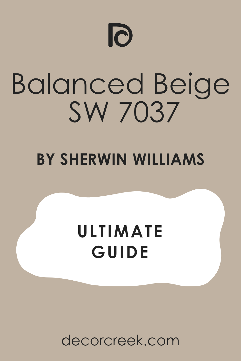
Mauve Finery SW 6282
Mauve Finery SW 6282 is a classic choice for a bedroom that needs a touch of elegance. This color sits right between pink and purple, giving you the best of both worlds. You will find that it makes a room feel very soft and gentle for sleeping.
I like to use this with cream-colored furniture instead of stark white. It helps the room feel a bit warmer and more lived-in for a family. This shade is very popular for staging because it appeals to many different tastes.
It looks very pretty when the morning light hits the walls through thin curtains. You should consider adding some velvet pillows to the bed to match this rich tone. It is a very durable paint that stands up to the wear and tear of daily life.
Best used in: master bedrooms, guest suites, and sitting rooms
Pairs well with: Shoji White SW 7042, Anew Gray SW 7030, Balanced Beige SW 7037, velvet fabrics The key rule of this color for farmhouse style is to use it where you want natural light to feel kind, soft, and inviting throughout the day.
👉 Read the full guide for this color HERE 👈
Angelic SW 6602
Angelic SW 6602 is a very pale peach-pink that feels like a warm summer morning. This color is very light and helps to bounce light all around the bedroom. You will notice that it makes the walls feel like they are glowing from within.
I recommend this for rooms that do not get much sun during the day. It helps to keep the mood high and the energy positive in your home. This shade is very easy to live with because it is not too demanding on the eyes.
You can pair it with light blues or greens for a very natural and pretty look. It feels very fresh and clean, making your bedroom feel like a new start every day. This is a great color for anyone who wants a tiny bit of sweetness in their decor.
Best used in: nurseries, bedrooms, and small kitchens
Pairs well with: Pure White SW 7005, Sea Salt SW 6204, Rainwashed SW 6211, light ash wood The key rule of this color for farmhouse style is to use it where you want natural light to feel kind, soft, and inviting throughout the day.
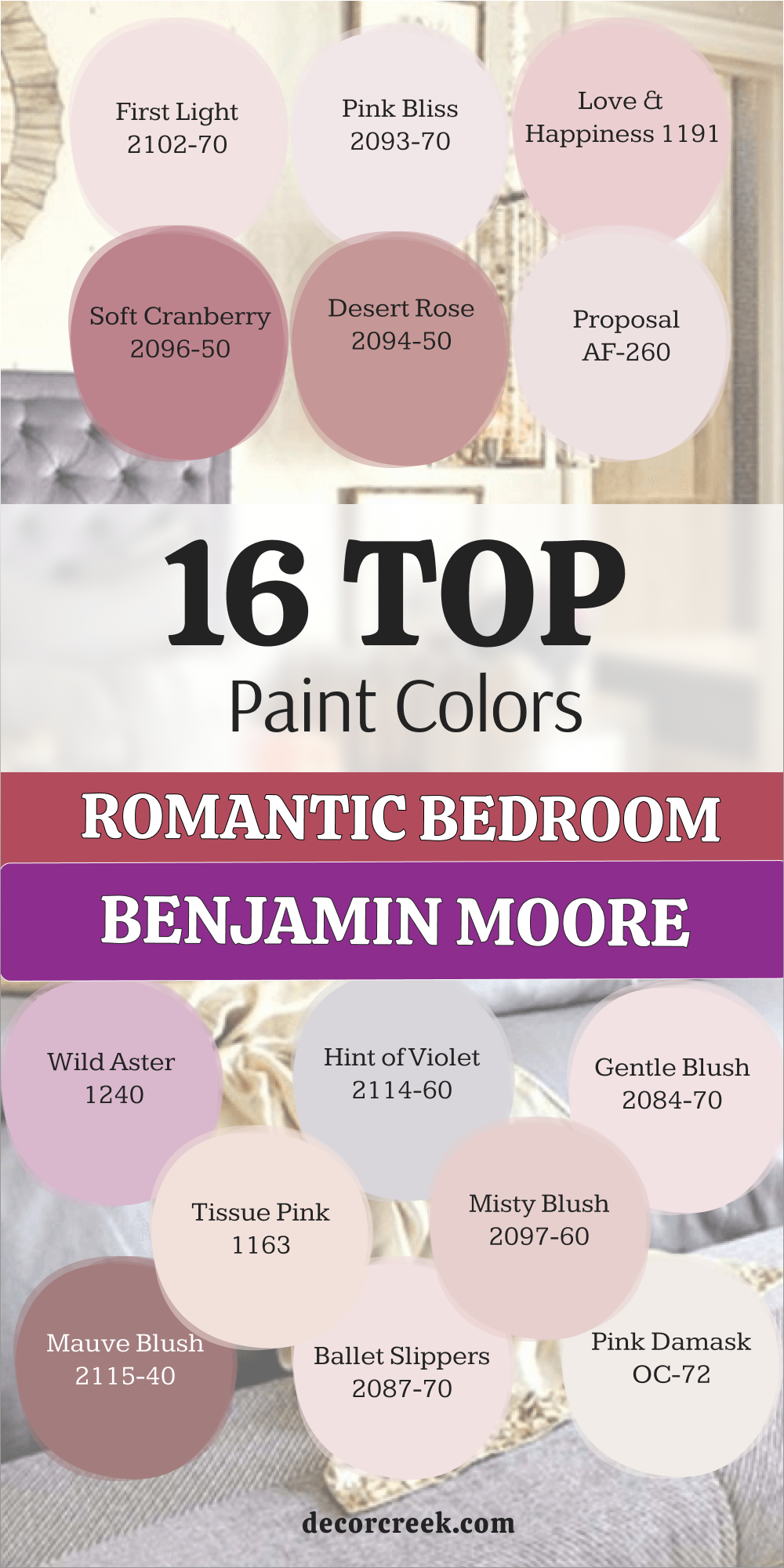
First Light 2102-70
First Light 2102-70 is a very famous color that people love for its refreshing feel. This pink is very modern and does not look like a candy shop at all. You will find that it works perfectly as a neutral background for your furniture.
I love using this in rooms with large windows and lots of natural light. It feels very sophisticated when you add some black accents or a dark rug. This color was designed to make people feel happy and hopeful when they see it.
You can use it on the ceiling to add a surprise bit of color to the room. It is a very high-quality paint that goes on easily with a brush or a roller. This shade is a great way to show off your style without being too flashy.
Best used in: bedrooms, living rooms, and entries
Pairs well with: White Heron OC-57, Gray Owl OC-52, Black 2132-10, modern art The key rule of this color for farmhouse style is to use it where you want natural light to feel kind, soft, and inviting throughout the day.
👉 Read the full guide for this color HERE 👈

Pink Bliss 2093-70
Pink Bliss 2093-70 is as light as a whisper on your bedroom walls. This color is so soft that you might miss the pink if you only look at it quickly. You will see the color best when it is placed next to bright white trim.
I think this is the perfect color for a bedroom that needs to feel very quiet. It helps to lower your stress after a long day of work or taking care of kids. You can use this in a room with lots of white furniture for a very clean look.
This shade is very popular for people who like the minimalist style of decorating. It provides just enough warmth to keep the room from feeling like an office. You will enjoy how easy it is to match your clothes and bedding to this pale tone.
Best used in: bedrooms, nurseries, and ceilings
Pairs well with: Chantilly Lace OC-65, Revere Pewter HC-172, Stonington Gray HC-170, white linen The key rule of this color for farmhouse style is to use it where you want natural light to feel kind, soft, and inviting throughout the day.
👉 Read the full guide for this color HERE 👈
Love & Happiness 1191
Love & Happiness 1191 is a mid-tone pink that feels very balanced and steady. This color has enough depth to make the walls look rich and full of life. You will find that it creates a very cozy feeling in a room with a fireplace.
I like to use this with dark brown wood and soft gold accents for a classic look. It is a color that feels very romantic in a traditional and sweet way. You can use it to create a space that feels very personal and private for a couple.
This shade is very good at making a room feel warm even in the middle of winter. You should try using it with floral patterns to bring out its natural beauty. It is a very sturdy paint that keeps its shine for a long time.
Best used in: master bedrooms, dining rooms, and cozy corners
Pairs well with: Simply White OC-117, Edgecomb Gray HC-173, Hale Navy HC-154, dark oak The key rule of this color for farmhouse style is to use it where you want natural light to feel kind, soft, and inviting throughout the day.
Soft Cranberry 2094-40
Soft Cranberry 2094-40 is a deep and passionate red-pink that makes a big impact. This color is for people who are not afraid to show their bold side in the bedroom. You will find that it creates a very intimate and warm environment for sleeping.
I suggest using this with cream or tan colors to keep the room from feeling too dark. It looks very expensive and high-end when paired with heavy velvet curtains. This shade is perfect for creating a room that feels like a special getaway from the world.
You can use it to highlight a beautiful bed or a large window area. This paint has a lot of pigment, so the color looks very deep and solid on the wall. It is a great choice for staging a home that needs a bit of drama and style.
Best used in: master bedrooms, accent walls, and formal rooms
Pairs well with: Swiss Coffee OC-45, Shaker Beige HC-45, Manchester Tan HC-81, brass fixtures The key rule of this color for farmhouse style is to use it where you want natural light to feel kind, soft, and inviting throughout the day.
👉 Read the full guide for this color HERE 👈
Desert Rose 2094-50
Desert Rose 2094-50 has a warm and earthy feel that reminds me of the Southwest. This color is a mix of pink and brown that feels very natural and steady. You will love how it makes the room feel grounded and very comfortable for relaxing.
I like to use this with natural materials like jute rugs and wooden beams. It is a color that feels very sophisticated and grown-up for a primary bedroom. You can use it to create a space that feels very much like a part of nature.
This shade looks wonderful with terracotta pots and green plants in the corner. You will find that it is very easy on the eyes and helps you feel more at peace. It is a very popular choice for people who want a unique and warm look.
Best used in: bedrooms, living rooms, and home offices
Pairs well with: White Dove OC-17, Pashmina AF-100, Chelsea Gray HC-168, natural wood The key rule of this color for farmhouse style is to use it where you want natural light to feel kind, soft, and inviting throughout the day.
Proposal AF-260
Proposal AF-260 is a very light and airy pink that feels very romantic and fresh. This color is part of a special collection that is designed to look good in any light. You will find that it never looks too yellow or too blue on your bedroom walls.
I recommend this for a room where you want to feel lighthearted and very happy. It works well with modern furniture that has clean lines and simple shapes. This shade is very good for making a small room feel much more open and bright.
You can use it with light gray or white bedding for a very soft and pretty look. It is a very high-quality paint that is easy to apply and dries very quickly. This color is a very safe bet if you want a beautiful pink that everyone will love.
Best used in: bedrooms, guest rooms, and hallways
Pairs well with: Steam AF-15, Thunder AF-685, Metropolitan AF-690, silver accents The key rule of this color for farmhouse style is to use it where you want natural light to feel kind, soft, and inviting throughout the day.
👉 Read the full guide for this color HERE 👈
Wild Aster 1240
Wild Aster 1240 is a pretty purple-pink that feels very energetic and full of life. This color is inspired by nature and looks like a beautiful flower in full bloom. You will find that it adds a lot of character to a bedroom that feels a bit plain.
I like to use this with white furniture to make the purple color really stand out. It is a great choice for a creative person who wants their home to reflect their style. This shade is very bright but still feels soft enough for a place where you sleep.
You can use it to create a very cheerful and romantic mood for a couple. It looks very nice when you have a lot of books or art on the walls to match. This paint is very durable and easy to wipe down if it gets a bit dirty.
Best used in: bedrooms, craft rooms, and powder rooms
Pairs well with: Cloud White OC-130, Stardust 2108-40, Silver Satin OC-26, colorful rugs The key rule of this color for farmhouse style is to use it where you want natural light to feel kind, soft, and inviting throughout the day.
Hint of Violet 2114-60
Hint of Violet 2114-60 is a very cool and light purple that feels very modern and sleek. This color is almost like a gray with a secret purple soul hiding inside it. You will love how it makes your bedroom feel very calm and very organized.
I suggest using this with dark gray or black furniture for a very stylish look. It is a great color for people who do not want a typical pink or red bedroom. This shade feels very fresh and helps you feel more awake in the early morning.
You can use it with shiny metal accents to make the room feel very high-end. It is a very reliable color that looks good even in rooms with very little light. You will find that it coordinates well with many different colors of wood floors.
Best used in: bedrooms, bathrooms, and modern living areas
Pairs well with: Decorator’s White OC-149, Coventry Gray HC-169, Wrought Iron 2124-10, chrome The key rule of this color for farmhouse style is to use it where you want natural light to feel kind, soft, and inviting throughout the day.
👉 Read the full guide for this color HERE 👈
Gentle Blush 2084-70
Gentle Blush 2084-70 is a very soft and creamy pink that feels like a warm hug. This color is very light and helps to make a room feel very friendly and open. You will find that it works perfectly for a bedroom that needs a little bit of color.
I recommend this for a home that has a lot of white or light-colored furniture. It is a color that feels very sweet and very romantic in a simple way. You can use it to create a space that feels very safe and very comfortable for you.
This shade is very popular because it is so easy to live with every single day. You will enjoy how it looks with soft white curtains and plenty of fluffy pillows. It is a very high-quality paint that gives a smooth and even finish to your walls.
Best used in: bedrooms, nurseries, and laundry rooms
Pairs well with: Super White OC-152, Pale Oak OC-20, Classic Gray OC-23, soft fabrics The key rule of this color for farmhouse style is to use it where you want natural light to feel kind, soft, and inviting throughout the day.
Tissue Pink 1163
Tissue Pink 1163 is a classic pink that feels very light and very airy for a bedroom. This color has been around for a long time because it just works so well in homes. You will see that it has a tiny bit of peach in it to keep the walls feeling warm.
I like to use this with traditional furniture and old-fashioned floral prints. It is a color that feels very romantic and very nostalgic for many people. You can use it to create a room that feels like a peaceful garden in the spring.
This shade is very good at making a dark room feel much brighter and more cheerful. You should try using it with white trim to make the pink color look very crisp. It is a very sturdy paint that lasts for many years without losing its beauty.
Best used in: bedrooms, dining rooms, and small hallways
Pairs well with: White Heron OC-57, Van Courtland Blue HC-145, Wickham Gray HC-171, antique wood The key rule of this color for farmhouse style is to use it where you want natural light to feel kind, soft, and inviting throughout the day.
Misty Blush 2097-60
Misty Blush 2097-60 is a soft and dusty pink that feels very elegant and very quiet. This color is perfect for a master bedroom where you want to feel very pampered. You will find that it has a gray undertone that keeps the pink from being too loud.
I suggest using this with dark wood floors and large white rugs for a great look. It is a color that feels very sophisticated and very modern for a couple today. You can use it to create a space that feels very private and very special for you.
This shade looks wonderful with soft lighting and plenty of candles in the room. You will love how it makes the whole room feel like a soft and pretty dream. It is a very high-quality paint that provides excellent coverage on any wall surface.
Best used in: master bedrooms, guest suites, and sitting areas
Pairs well with: Simply White OC-117, Gray Huskie 1473, Kendall Charcoal HC-166, dark walnut The key rule of this color for farmhouse style is to use it where you want natural light to feel kind, soft, and inviting throughout the day.
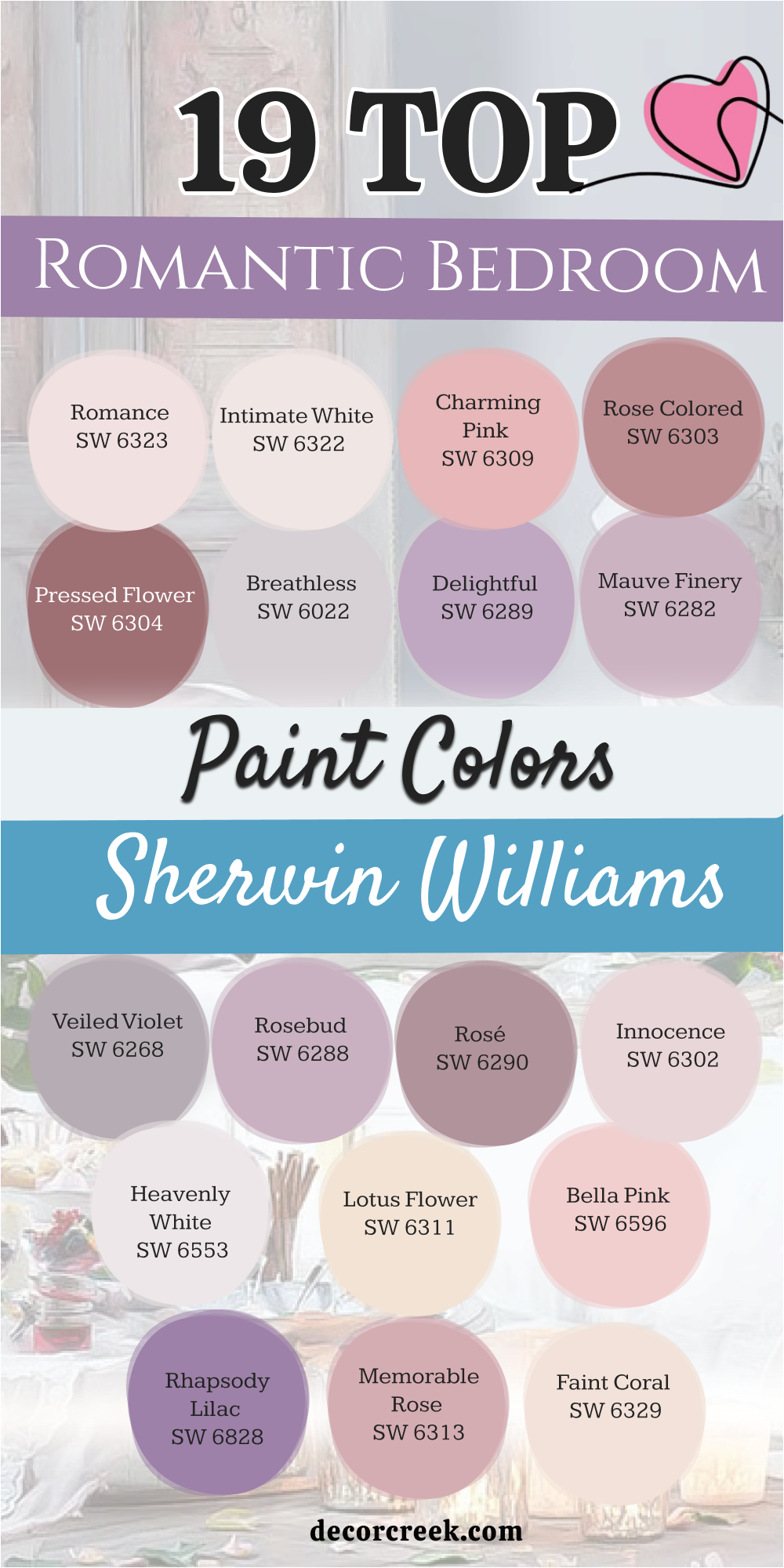
19 Top Romantic Bedroom Paint Colors from Sherwin Williams
Romance SW 6323
Romance SW 6323 starts as a very soft and sweet pink that feels light as air. This color works because it has a tiny bit of orange inside it to keep it from feeling too cold. You will notice that it makes the ceiling feel higher if you use it on all four walls.
This shade is one of my favorites for small rooms that need a boost of energy. It creates a mood that is happy and lighthearted for any couple. I suggest using white curtains to keep the look clean and fresh.
You can also add some gold picture frames to make the pink pop. It is a choice that feels classic without being boring or old. This paint goes on smooth and hides small bumps on the wall quite well.
Best used in: bedrooms, nurseries, and small bathrooms
Pairs well with: Pure White SW 7005, Accessible Beige SW 7036, Silver Strand SW 7057, light oak furniture The key rule of this color for farmhouse style is to use it where you want natural light to feel kind, soft, and inviting throughout the day.
👉 Read the full guide for this color HERE 👈
Intimate White SW 6322
Intimate White SW 6322 provides a glow that is almost like a candle is lit in the room. This color is not a true white because it has a very heavy dose of pink hidden in the mix. It looks very sophisticated when paired with dark wood furniture or a black metal bed frame.
You will find that it changes throughout the day as the sun moves across the sky. I love how it makes white bedding look even brighter and cleaner than before. This is a great pick if you are scared of using too much color on your walls.
It gives you the feeling of a pink room without being too loud or bright. Many people choose this for guest rooms because it feels very welcoming to visitors. The finish is creamy and looks high-end even if you are on a budget.
Best used in: master suites, guest rooms, and dressing areas
Pairs well with: Alabaster SW 7008, Urbane Bronze SW 7048, Sea Salt SW 6204, dark mahogany The key rule of this color for farmhouse style is to use it where you want natural light to feel kind, soft, and inviting throughout the day.
👉 Read the full guide for this color HERE 👈
Charming Pink SW 6309
Charming Pink SW 6309 brings a lot of personality and fun into a sleeping area. This shade is a bit deeper than a pastel, so it feels very intentional and bold. You might want to use this on a single wall behind your headboard to create a focal point.
It reminds me of spring flowers blooming in a garden during the early morning. This color looks amazing when you have plenty of indoor plants with green leaves. I think it works best with light gray rugs to balance out the warmth of the pink.
You should consider using dimmable lights to make this color feel even more cozy at night. It is a very cheerful choice that helps you wake up with a smile on your face. Using it in a room with tall windows allows the color to show off its true depth.
Best used in: accent walls, bedrooms, and creative studios
Pairs well with: Snowbound SW 7004, Repose Gray SW 7015, Mindful Gray SW 7016, navy blue accents The key rule of this color for farmhouse style is to use it where you want natural light to feel kind, soft, and inviting throughout the day.
👉 Read the full guide for this color HERE 👈
Rose Colored SW 6303
Rose Colored SW 6303 has a dusty quality that makes it feel very vintage and expensive. This is a darker pink that feels very safe and grounded for a large master bedroom. You can use this to make a big room feel smaller and more private for you and your partner.
It pairs beautifully with brass lamps and mirrors that have ornate frames. I often recommend this for homes that have older architecture and tall baseboards. This color does not feel like a child’s room because it has a bit of brown underneath.
It creates a sense of history and comfort that is hard to find with lighter shades. You will enjoy how the shadows fall on this paint during the evening hours. It is a solid choice for anyone who wants a room that feels like a hidden retreat.
Best used in: large bedrooms, dining rooms, and cozy dens
Pairs well with: Extra White SW 7006, Dorian Gray SW 7017, Black Magic SW 6991, antique gold The key rule of this color for farmhouse style is to use it where you want natural light to feel kind, soft, and inviting throughout the day.
👉 Read the full guide for this color HERE 👈
Pressed Flower SW 6304
Pressed Flower SW 6304 is a rich and deep shade that feels very dramatic and moody. This color is perfect if you want your bedroom to feel like a high-end hotel suite. It has a lot of red in it, which is known to represent passion and strong feelings.
You should pair it with very light floors or a large white rug to keep things balanced. I love using this color in rooms that have a lot of natural wood accents. It makes a statement without being too bright or distracting to the eye.
This is the kind of color that looks better the more you look at it. You will feel very pampered when you are surrounded by such a deep and lovely tone. It works well for staging because it looks great in photos and catches the eye.
Best used in: master bedrooms, formal areas, and powder rooms
Pairs well with: High Reflective White SW 7757, Agreeable Gray SW 7029, Tricorn Black SW 6258, walnut wood The key rule of this color for farmhouse style is to use it where you want natural light to feel kind, soft, and inviting throughout the day.
👉 Read the full guide for this color HERE 👈
Breathless SW 6022
Breathless SW 6022 is a very light purple that almost looks like a soft gray in some lights. This color is great for people who want a romantic feel but do not like the color pink. It feels very airy and helps you breathe deeper when you enter the room to relax.
You can use it with silver or chrome hardware to keep the look very modern. I think it looks best when you have white trim around the windows and doors. This shade is very light, so it makes any small room feel much larger than it really is.
You will love how it stays looking fresh even after several years on the walls. It is a very smart choice for a home that has a lot of natural sunlight. This color provides a very peaceful backdrop for your most comfortable pillows and blankets.
Best used in: bedrooms, bathrooms, and laundry rooms
Pairs well with: Eider White SW 7014, Peppercorn SW 7674, On the Rocks SW 7671, cool marble The key rule of this color for farmhouse style is to use it where you want natural light to feel kind, soft, and inviting throughout the day.
👉 Read the full guide for this color HERE 👈
Delightful SW 6289
Delightful SW 6289 lives up to its name by bringing a sense of joy to your personal area. This is a medium-toned purple that feels very regal and special for a couple. You might find that it looks best when you use soft yellow lighting in your lamps.
It has enough color to stand out but it is not so dark that it feels heavy. I suggest using this with light wood furniture to keep the room feeling bright. This shade reminds me of a sunset just before the stars come out in the sky.
It is a wonderful choice if you want to move away from neutrals like beige or gray. You will find that it coordinates well with many different types of fabric and patterns. This paint is easy to clean and holds its color very well over time.
Best used in: bedrooms, playrooms, and creative offices
Pairs well with: Greek Villa SW 7551, Colonnade Gray SW 7641, Iron Ore SW 7069, light pine The key rule of this color for farmhouse style is to use it where you want natural light to feel kind, soft, and inviting throughout the day.
👉 Read the full guide for this color HERE 👈
Mauve Finery SW 6282
Mauve Finery SW 6282 is a classic choice for a bedroom that needs a touch of elegance. This color sits right between pink and purple, giving you the best of both worlds. You will find that it makes a room feel very soft and gentle for sleeping.
I like to use this with cream-colored furniture instead of stark white. It helps the room feel a bit warmer and more lived-in for a family. This shade is very popular for staging because it appeals to many different tastes.
It looks very pretty when the morning light hits the walls through thin curtains. You should consider adding some velvet pillows to the bed to match this rich tone. It is a very durable paint that stands up to the wear and tear of daily life.
Best used in: master bedrooms, guest suites, and sitting rooms
Pairs well with: Shoji White SW 7042, Anew Gray SW 7030, Balanced Beige SW 7037, velvet fabrics The key rule of this color for farmhouse style is to use it where you want natural light to feel kind, soft, and inviting throughout the day.
👉 Read the full guide for this color HERE 👈
Veiled Violet SW 6268
Veiled Violet SW 6268 is a muted purple that feels very earthy and natural for a home. This color is perfect for someone who wants a romantic look that feels a bit more mature. It has a lot of gray in it, which helps it blend in with other colors in your house.
You can use this in a room with lots of linen fabrics and woven baskets. I think it looks very high-end when you paint the trim the same color as the walls. This creates a seamless look that is very popular in modern interior design today.
You will appreciate how this color masks dust and fingerprints better than very light shades. It provides a soft background that lets your artwork and photos be the stars. This is a very reliable color that works in almost any kind of lighting situation.
Best used in: bedrooms, hallways, and home offices
Pairs well with: Westhighland White SW 7566, Mega Greige SW 7031, Gauntlet Gray SW 7019, wicker textures The key rule of this color for farmhouse style is to use it where you want natural light to feel kind, soft, and inviting throughout the day.
👉 Read the full guide for this color HERE 👈
Rosebud SW 6288
Rosebud SW 6288 is a medium-light purple that feels very balanced and steady. This color has enough depth to make the walls look rich and full of life. You will find that it creates a very cozy feeling in a room with a fireplace.
I like to use this with dark brown wood and soft gold accents for a classic look. It is a color that feels very romantic in a traditional and sweet way. You can use it to create a space that feels very personal and private for a couple.
This shade is very good at making a room feel warm even in the middle of winter. You should try using it with floral patterns to bring out its natural beauty. It is a very sturdy paint that keeps its shine for a long time.
Best used in: bedrooms, dining rooms, and cozy corners
Pairs well with: Alabaster SW 7008, Mindful Gray SW 7016, Naval SW 6244, warm wood tones The key rule of this color for farmhouse style is to use it where you want natural light to feel kind, soft, and inviting throughout the day.
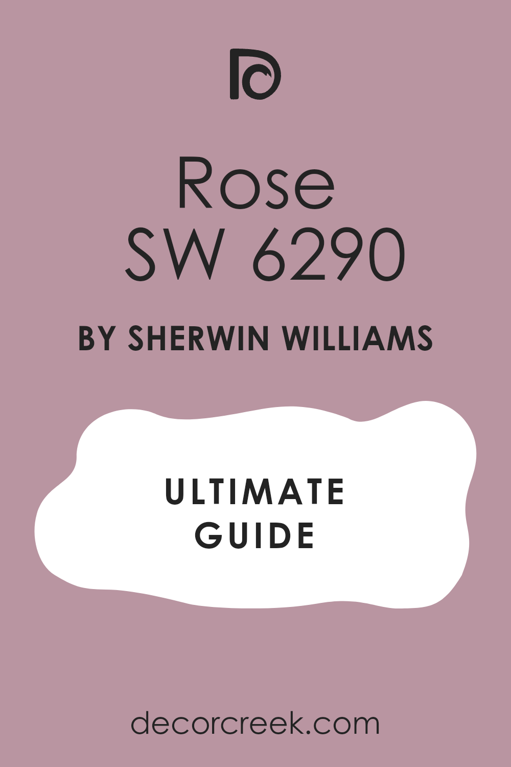
Rosé SW 6290
Rosé SW 6290 is a dusty and deep pink that feels very grown-up and expensive. This color has a lot of brown hidden inside it which keeps it from looking too bright or loud. You will notice that it creates a very safe and warm feeling when you are laying in bed.
I think it looks very high-end when you use it with dark wood furniture and gold lamps. This shade is one of my favorite picks for a large master bedroom that needs to feel more private. It reminds me of a beautiful sunset at the end of a long and happy day.
You can use it on all four walls to create a very cozy look that feels like a hug. This paint covers very well and makes the walls look smooth and perfect. It is a very smart choice for anyone who wants a romantic room that feels very steady.
Best used in: master bedrooms, dining rooms, and cozy dens
Pairs well with: Alabaster SW 7008, Urban Bronze SW 7048, Agreeable Gray SW 7029, dark walnut The key rule of this color for farmhouse style is to use it where you want natural light to feel kind, soft, and inviting throughout the day.
👉 Read the full guide for this color HERE 👈
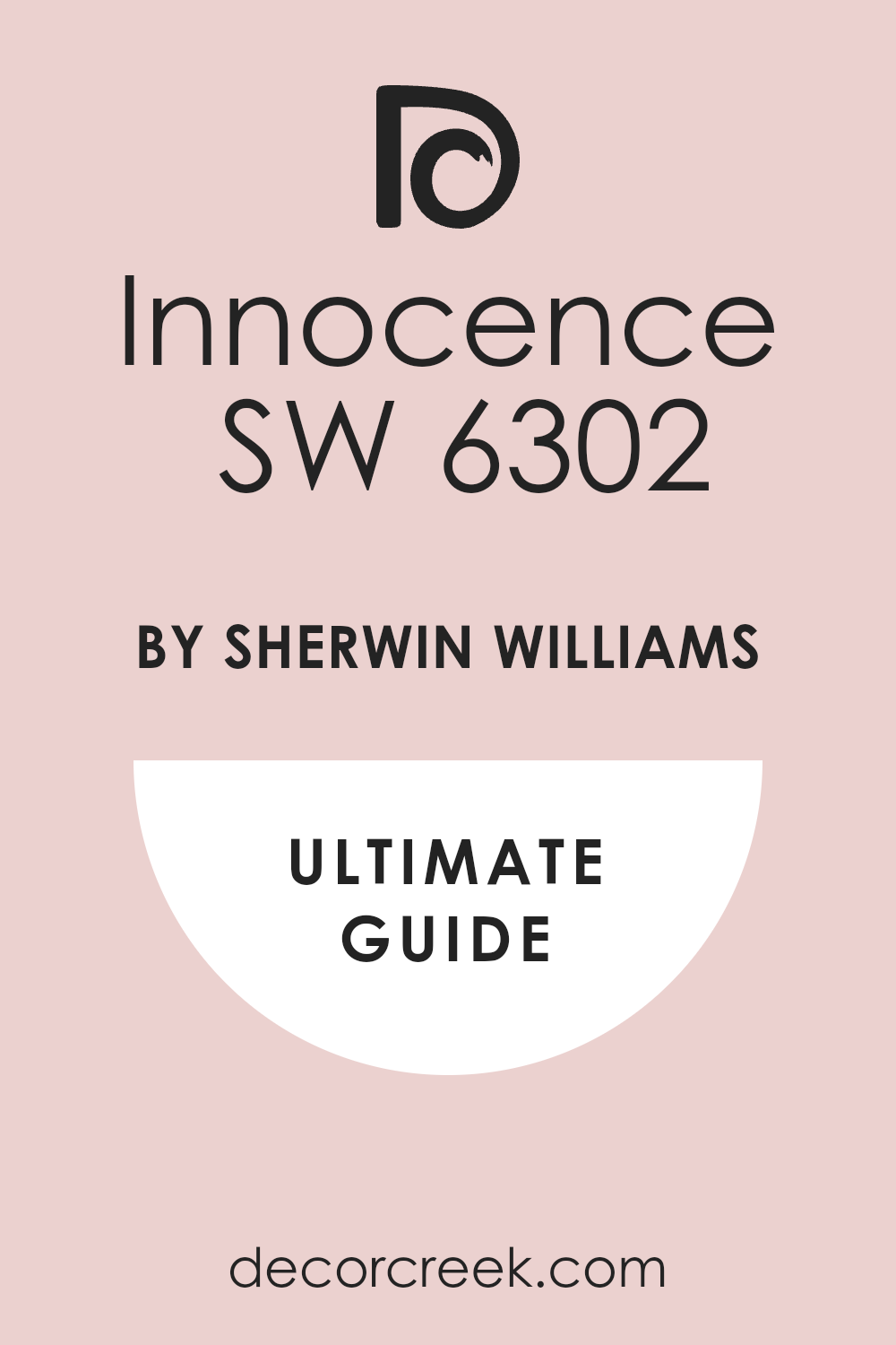
Innocence SW 6302
Innocence SW 6302 is a very light and airy pink that feels as soft as a cloud. This color is great because it has a tiny bit of gray that keeps it looking very modern. You will find that it makes a small bedroom feel much bigger and much more open.
I love to use this with white linen curtains and light gray rugs for a fresh look. It creates a mood that is very peaceful and very sweet for a young couple. You should consider using this if you want a room that feels very clean and very bright.
This shade looks amazing when the morning sun hits the walls through the window. It is a very easy color to live with because it never feels like it is too much. You can pair it with silver accents to make the room feel a bit more sleek.
Best used in: bedrooms, nurseries, and guest rooms
Pairs well with: Pure White SW 7005, Repose Gray SW 7015, Silver Strand SW 7057, light oak The key rule of this color for farmhouse style is to use it where you want natural light to feel kind, soft, and inviting throughout the day.
👉 Read the full guide for this color HERE 👈
Heavenly White SW 6553
Heavenly White SW 6553 is a very pale purple that almost looks like a soft white. This color is perfect for people who want just a tiny hint of color on their walls. You will see the purple tone best when you put it next to a bright white bed frame.
I think it looks very sophisticated and very light for a modern bedroom. It helps to bounce the light around the room so you feel more awake in the morning. This shade is a wonderful way to add a romantic feel without using any pink at all.
You can use it with cool gray blankets to keep the room feeling very fresh. It is a very high-quality paint that makes your walls look very clean and very new. This color provides a very quiet background for your favorite photos and artwork.
Best used in: bedrooms, bathrooms, and laundry rooms
Pairs well with: Extra White SW 7006, Peppercorn SW 7674, On the Rocks SW 7671, cool marble The key rule of this color for farmhouse style is to use it where you want natural light to feel kind, soft, and inviting throughout the day.
Lotus Flower SW 6310
Lotus Flower SW 6310 is a warm peach-pink that feels very friendly and very inviting. This color has a lot of yellow in it which makes the room feel like it is full of sun. You will enjoy how it makes your skin look healthy and glowing when you look in the mirror.
I recommend this for rooms that face the north and do not get much natural light. It helps to keep the energy high and the mood very happy in your personal space. This shade reminds me of a blooming garden in the middle of a warm summer day.
You can pair it with green plants and natural wood for a very pretty look. It is a very cheerful choice that makes your bedroom feel like a very happy place. This paint is very durable and holds its beautiful color for a long time.
Best used in: bedrooms, kitchens, and sunrooms
Pairs well with: Snowbound SW 7004, Sea Salt SW 6204, Rainwashed SW 6211, light pine The key rule of this color for farmhouse style is to use it where you want natural light to feel kind, soft, and inviting throughout the day.
👉 Read the full guide for this color HERE 👈
Bella Pink SW 6596
Bella Pink SW 6596 is a very sweet and traditional pink that feels very romantic. This color is quite bright so it brings a lot of fun and life into the room. You might want to use this on an accent wall to create a very pretty focal point.
I think it looks best when you have white furniture and very light-colored floors. It reminds me of the pink flowers you see on a birthday cake or in a spring bouquet. This color works well if you want a room that feels very feminine and very soft.
You should use dim lights at night to make this pink feel even more cozy and warm. It is a very popular choice for people who love the look of a classic pink bedroom. Using it in a room with tall windows helps the color look its very best.
Best used in: accent walls, bedrooms, and creative studios
Pairs well with: High Reflective White SW 7757, Dorian Gray SW 7017, Navy Blue, gold accents The key rule of this color for farmhouse style is to use it where you want natural light to feel kind, soft, and inviting throughout the day.
Rhapsody Lilac SW 6828
Rhapsody Lilac SW 6828 is a bold and royal purple that feels very special and very regal. This color is for people who want their bedroom to make a big statement. You will find that it creates a very dramatic and very rich environment for sleeping.
I suggest using this with cream-colored bedding to keep the room from feeling too dark. It looks very expensive when you add some velvet pillows or a plush purple rug. This shade is perfect for creating a room that feels like a hidden palace for a couple.
You can use it to highlight a beautiful headboard or a large window area in the room. This paint has a lot of pigment so the color looks very deep and very solid. It is a great choice for staging a home that needs a bit of magic and style.
Best used in: master bedrooms, accent walls, and formal rooms
Pairs well with: Greek Villa SW 7551, Colonnade Gray SW 7641, Iron Ore SW 7069, brass fixtures The key rule of this color for farmhouse style is to use it where you want natural light to feel kind, soft, and inviting throughout the day.
👉 Read the full guide for this color HERE 👈
Memorable Rose SW 6313
Memorable Rose SW 6313 is a mid-tone pink that feels very steady and very balanced. This color has enough depth to make the walls look very rich and full of life. You will find that it creates a very cozy feeling in a room with a lot of blankets.
I like to use this with dark brown wood and soft gold accents for a classic look. It is a color that feels very romantic in a very traditional and sweet way. You can use it to create a space that feels very personal and very private for you.
This shade is very good at making a room feel warm even on a cold winter day. You should try using it with floral patterns to show off its natural and pretty beauty. It is a very sturdy paint that keeps its shine for a very long time.
Best used in: master bedrooms, dining rooms, and cozy corners
Pairs well with: Alabaster SW 7008, Mindful Gray SW 7016, Naval SW 6244, warm wood tones The key rule of this color for farmhouse style is to use it where you want natural light to feel kind, soft, and inviting throughout the day.
Faint Coral SW 6329
Faint Coral SW 6329 is a very light and warm pink that feels very fresh and very happy. This color is almost like a neutral because it is so soft and easy on the eyes. You will find that it works perfectly as a background for all of your favorite furniture.
I love using this in rooms with large windows and a lot of natural light from the sun. It feels very sophisticated when you add some black accents or a dark wood bed frame. This color was designed to make people feel lighthearted and hopeful when they see it.
You can use it on the ceiling to add a surprise bit of color to the bedroom. It is a very high-quality paint that goes on very easily with a brush or a roller. This shade is a great way to show your style without being too loud.
Best used in: bedrooms, living rooms, and entryways
Pairs well with: Pure White SW 7005, Accessible Beige SW 7036, Urbane Bronze SW 7048, modern art The key rule of this color for farmhouse style is to use it where you want natural light to feel kind, soft, and inviting throughout the day.
👉 Read the full guide for this color HERE 👈
Angelic SW 6602
Angelic SW 6602 is a very pale peach-pink that feels like a warm summer morning. This color is very light and helps to bounce light all around your bedroom walls. You will notice that it makes the room feel like it is glowing from the inside.
I recommend this for rooms that do not get much sun during the busy day. It helps to keep the mood very high and the energy very positive in your home. This shade is very easy to live with because it is not too demanding on your eyes.
You can pair it with light blues or greens for a very natural and very pretty look. It feels very fresh and very clean which makes your bedroom feel like a new start. This is a great color for anyone who wants a tiny bit of sweetness in their home.
Best used in: nurseries, bedrooms, and small kitchens
Pairs well with: Pure White SW 7005, Sea Salt SW 6204, Rainwashed SW 6211, light ash wood The key rule of this color for farmhouse style is to use it where you want natural light to feel kind, soft, and inviting throughout the day.
16 Top Romantic Bedroom Paint Colors from Benjamin Moore
First Light 2102-70
First Light 2102-70 is a very famous color that people love for its refreshing feel. This pink is very modern and does not look like a candy shop at all. You will find that it works perfectly as a neutral background for your furniture.
I love using this in rooms with large windows and lots of natural light. It feels very sophisticated when you add some black accents or a dark rug. This color was designed to make people feel happy and hopeful when they see it.
You can use it on the ceiling to add a surprise bit of color to the room. It is a very high-quality paint that goes on easily with a brush or a roller. This shade is a great way to show off your style without being too flashy. 10. First Light 2102-70 looks beautiful when you use it in a room with white trim and light floors.
Best used in: bedrooms, living rooms, and entries
Pairs well with: White Heron OC-57, Gray Owl OC-52, Black 2132-10, modern art The key rule of this color for farmhouse style is to use it where you want natural light to feel kind, soft, and inviting throughout the day.
👉 Read the full guide for this color HERE 👈
Pink Bliss 2093-70
Pink Bliss 2093-70 is as light as a whisper on your bedroom walls. This color is so soft that you might miss the pink if you only look at it quickly. You will see the color best when it is placed next to bright white trim.
I think this is the perfect color for a bedroom that needs to feel very quiet. It helps to lower your stress after a long day of work or taking care of kids. You can use this in a room with lots of white furniture for a very clean look.
This shade is very popular for people who like the minimalist style of decorating. It provides just enough warmth to keep the room from feeling like an office. You will enjoy how easy it is to match your clothes and bedding to this pale tone. Pink Bliss 2093-70 makes the whole room feel like a soft and pretty dream for you and your partner.
Best used in: bedrooms, nurseries, and ceilings
Pairs well with: Chantilly Lace OC-65, Revere Pewter HC-172, Stonington Gray HC-170, white linen The key rule of this color for farmhouse style is to use it where you want natural light to feel kind, soft, and inviting throughout the day.
👉 Read the full guide for this color HERE 👈
Love & Happiness 1191
Love & Happiness 1191 is a mid-tone pink that feels very balanced and steady. This color has enough depth to make the walls look rich and full of life. You will find that it creates a very cozy feeling in a room with a fireplace.
I like to use this with dark brown wood and soft gold accents for a classic look. It is a color that feels very romantic in a traditional and sweet way. You can use it to create a space that feels very personal and private for a couple.
This shade is very good at making a room feel warm even in the middle of winter. You should try using it with floral patterns to bring out its natural beauty. It is a very sturdy paint that keeps its shine for a long time. Love & Happiness 1191 is the kind of color that makes you want to stay in bed just a little longer.
Best used in: master bedrooms, dining rooms, and cozy corners
Pairs well with: Simply White OC-117, Edgecomb Gray HC-173, Hale Navy HC-154, dark oak The key rule of this color for farmhouse style is to use it where you want natural light to feel kind, soft, and inviting throughout the day.
Soft Cranberry 2094-40
Soft Cranberry 2094-40 is a deep and passionate red-pink that makes a big impact. This color is for people who are not afraid to show their bold side in the bedroom. You will find that it creates a very intimate and warm environment for sleeping.
I suggest using this with cream or tan colors to keep the room from feeling too dark. It looks very expensive and high-end when paired with heavy velvet curtains. This shade is perfect for creating a room that feels like a special getaway from the world.
You can use it to highlight a beautiful bed or a large window area. This paint has a lot of pigment, so the color looks very deep and solid on the wall. It is a great choice for staging a home that needs a bit of drama and style. Soft Cranberry 2096-50 creates a mood that is full of energy and strong feelings.
Best used in: master bedrooms, accent walls, and formal rooms
Pairs well with: Swiss Coffee OC-45, Shaker Beige HC-45, Manchester Tan HC-81, brass fixtures The key rule of this color for farmhouse style is to use it where you want natural light to feel kind, soft, and inviting throughout the day.
👉 Read the full guide for this color HERE 👈
Desert Rose 2094-50
Desert Rose 2094-50 has a warm and earthy feel that reminds me of the Southwest. This color is a mix of pink and brown that feels very natural and steady. You will love how it makes the room feel grounded and very comfortable for relaxing.
I like to use this with natural materials like jute rugs and wooden beams. It is a color that feels very sophisticated and grown-up for a primary bedroom. You can use it to create a space that feels very much like a part of nature.
This shade looks wonderful with terracotta pots and green plants in the corner. You will find that it is very easy on the eyes and helps you feel more at peace. It is a very popular choice for people who want a unique and warm look. Desert Rose 2094-50 works perfectly in rooms that have lots of sunlight during the day.
Best used in: bedrooms, living rooms, and home offices
Pairs well with: White Dove OC-17, Pashmina AF-100, Chelsea Gray HC-168, natural wood The key rule of this color for farmhouse style is to use it where you want natural light to feel kind, soft, and inviting throughout the day
Proposal AF-260
Proposal AF-260 is a very light and airy pink that feels very romantic and fresh. This color is part of a special collection that is designed to look good in any light. You will find that it never looks too yellow or too blue on your bedroom walls.
I recommend this for a room where you want to feel lighthearted and very happy. It works well with modern furniture that has clean lines and simple shapes. This shade is very good for making a small room feel much more open and bright.
You can use it with light gray or white bedding for a very soft and pretty look. It is a very high-quality paint that is easy to apply and dries very quickly. This color is a very safe bet if you want a beautiful pink that everyone will love. Proposal AF-260 provides a soft background that lets your decorations shine.
Best used in: bedrooms, guest rooms, and hallways
Pairs well with: Steam AF-15, Thunder AF-685, Metropolitan AF-690, silver accents The key rule of this color for farmhouse style is to use it where you want natural light to feel kind, soft, and inviting throughout the day.
👉 Read the full guide for this color HERE 👈
Wild Aster 1240
Wild Aster 1240 is a pretty purple-pink that feels very energetic and full of life. This color is inspired by nature and looks like a beautiful flower in full bloom. You will find that it adds a lot of character to a bedroom that feels a bit plain.
I like to use this with white furniture to make the purple color really stand out. It is a great choice for a creative person who wants their home to reflect their style. This shade is very bright but still feels soft enough for a place where you sleep.
You can use it to create a very cheerful and romantic mood for a couple. It looks very nice when you have a lot of books or art on the walls to match. This paint is very durable and easy to wipe down if it gets a bit dirty. Wild Aster 1240 brings a touch of the outdoors into your personal area.
Best used in: bedrooms, craft rooms, and powder rooms
Pairs well with: Cloud White OC-130, Stardust 2108-40, Silver Satin OC-26, colorful rugs The key rule of this color for farmhouse style is to use it where you want natural light to feel kind, soft, and inviting throughout the day.
Hint of Violet 2114-60
Hint of Violet 2114-60 is a very cool and light purple that feels very modern and sleek. This color is almost like a gray with a secret purple soul hiding inside it. You will love how it makes your bedroom feel very calm and very organized.
I suggest using this with dark gray or black furniture for a very stylish look. It is a great color for people who do not want a typical pink or red bedroom. This shade feels very fresh and helps you feel more awake in the early morning.
You can use it with shiny metal accents to make the room feel very high-end. It is a very reliable color that looks good even in rooms with very little light. You will find that it coordinates well with many different colors of wood floors. Hint of Violet 2114-60 is a smart choice for a bedroom that needs to feel very tidy.
Best used in: bedrooms, bathrooms, and modern living areas
Pairs well with: Decorator’s White OC-149, Coventry Gray HC-169, Wrought Iron 2124-10, chrome The key rule of this color for farmhouse style is to use it where you want natural light to feel kind, soft, and inviting throughout the day.
👉 Read the full guide for this color HERE 👈
Gentle Blush 2084-70
Gentle Blush 2084-70 is a very soft and creamy pink that feels like a warm hug. This color is very light and helps to make a room feel very friendly and open. You will find that it works perfectly for a bedroom that needs a little bit of color.
I recommend this for a home that has a lot of white or light-colored furniture. It is a color that feels very sweet and very romantic in a simple way. You can use it to create a space that feels very safe and very comfortable for you.
This shade is very popular because it is so easy to live with every single day. You will enjoy how it looks with soft white curtains and plenty of fluffy pillows. It is a very high-quality paint that gives a smooth and even finish to your walls. Gentle Blush 2084-70 makes the morning sun look even more beautiful on your skin.
Best used in: bedrooms, nurseries, and laundry rooms
Pairs well with: Super White OC-152, Pale Oak OC-20, Classic Gray OC-23, soft fabrics The key rule of this color for farmhouse style is to use it where you want natural light to feel kind, soft, and inviting throughout the day.
Tissue Pink 1163
Tissue Pink 1163 is a classic pink that feels very light and very airy for a bedroom. This color has been around for a long time because it just works so well in homes. You will see that it has a tiny bit of peach in it to keep the walls feeling warm.
I like to use this with traditional furniture and old-fashioned floral prints. It is a color that feels very romantic and very nostalgic for many people. You can use it to create a room that feels like a peaceful garden in the spring.
This shade is very good at making a dark room feel much brighter and more cheerful. You should try using it with white trim to make the pink color look very crisp. It is a very sturdy paint that lasts for many years without losing its beauty. Tissue Pink 1163 is a wonderful way to bring a classic and sweet feeling to your house.
Best used in: bedrooms, dining rooms, and small hallways
Pairs well with: White Heron OC-57, Van Courtland Blue HC-145, Wickham Gray HC-171, antique wood The key rule of this color for farmhouse style is to use it where you want natural light to feel kind, soft, and inviting throughout the day.
Misty Blush 2097-60
Misty Blush 2097-60 is a soft and dusty pink that feels very elegant and very quiet. This color is perfect for a master bedroom where you want to feel very pampered. You will find that it has a gray undertone that keeps the pink from being too loud.
I suggest using this with dark wood floors and large white rugs for a great look. It is a color that feels very sophisticated and very modern for a couple today. You can use it to create a space that feels very private and very special for you.
This shade looks wonderful with soft lighting and plenty of candles in the room. You will love how it makes the whole room feel like a soft and pretty dream. It is a very high-quality paint that provides excellent coverage on any wall surface. Misty Blush 2097-60 is a favorite for people who want a room that feels very high-end.
Best used in: master bedrooms, guest suites, and sitting areas
Pairs well with: Simply White OC-117, Gray Huskie 1473, Kendall Charcoal HC-166, dark walnut The key rule of this color for farmhouse style is to use it where you want natural light to feel kind, soft, and inviting throughout the day.
Mauve Blush 2115-40
Mauve Blush 2115-40 is a deeper shade that sits between purple and pink for a rich look. This color is very good at making a large room feel more intimate and warm for you. You will find that it hides shadows very well and looks great in the evening light.
I love using this with cream-colored bedding and soft beige rugs to balance the color. It is a very romantic choice that feels much more grown-up than a typical pastel pink. You can use it to create a cozy reading nook in the corner of your bedroom.
This paint is thick and goes on the wall very smoothly with just two coats. You will appreciate how it makes your furniture look more expensive and stylish. It is a great choice if you want your bedroom to feel like a fancy hotel room. Mauve Blush 2115-40 creates a sense of luxury that is very easy to achieve.
Best used in: master bedrooms, sitting rooms, and accent walls
Pairs well with: Swiss Coffee OC-45, Revere Pewter HC-172, Chelsea Gray HC-168, cream linens The key rule of this color for farmhouse style is to use it where you want natural light to feel kind, soft, and inviting throughout the day.
👉 Read the full guide for this color HERE 👈
Ballet Slippers 1331
Ballet Slippers 1331 is a very dainty and light pink that feels as soft as silk. This color is very pale so it acts almost like a neutral in your bedroom. You will notice that it adds a tiny bit of warmth without making the walls look too bright.
I recommend this for people who want a romantic feel but have a lot of dark furniture. It helps to brighten up the wood and make the room feel much more inviting. This shade is very popular for staging because it makes everyone feel very welcome and happy.
You can use it with light blue or green pillows for a very natural and pretty look. It is a very high-quality paint that stays looking fresh and clean for a long time. Ballet Slippers 2087-70 is a perfect choice for a peaceful and sweet personal area.
Best used in: bedrooms, guest rooms, and hallways
Pairs well with: White Dove OC-17, Sea Salt SW 6204, Rainwashed SW 6211, light oak The key rule of this color for farmhouse style is to use it where you want natural light to feel kind, soft, and inviting throughout the day.
Pink Damask OC-72
Pink Damask OC-72 is a very light white with just a tiny drop of pink hidden inside. This color is perfect for people who are scared of using real colors on their walls. You will find that it makes the room look very clean and very bright all day long.
I love how it looks when you have plenty of white trim and light-colored floors. It provides a very soft background that lets your artwork and photos stand out. This shade is very sophisticated and works well in homes with a very modern style.
You can use it in a small room to make the walls feel like they are moving back. It is a very easy color to match with any kind of bedding or curtain you choose. Pink Damask OC-72 is a very smart way to add a romantic feeling to a minimalist home.
Best used in: small bedrooms, bathrooms, and modern living rooms
Pairs well with: Chantilly Lace OC-65, Gray Owl OC-52, Hale Navy HC-154, silver accents The key rule of this color for farmhouse style is to use it where you want natural light to feel kind, soft, and inviting throughout the day.
Spring Lilac 1388
Spring Lilac 1388 is a very pretty and light purple that feels very fresh and very happy. This color is inspired by the first flowers that bloom after a long and cold winter. You will find that it adds a lot of personality to a room that feels a bit boring.
I like to use this with white furniture to make the lilac color look very crisp. It is a great choice for a person who wants a bedroom that feels very romantic and unique. This shade is bright enough to notice but still soft enough for a place where you sleep.
You can use it to create a very cheerful mood for you and your partner. It looks very nice when you have soft yellow light from lamps in the evening. Spring Lilac 1388 brings a sense of joy and new life into your personal home area.
Best used in: bedrooms, laundry rooms, and creative offices
Pairs well with: Simply White OC-117, Stardust 2108-40, Silver Satin OC-26, floral prints The key rule of this color for farmhouse style is to use it where you want natural light to feel kind, soft, and inviting throughout the day.
Rose Quartz 2002-30
Rose Quartz 2002-30 is a very soft and glowing pink that feels very light and very airy. This color is named after a beautiful stone that many people associate with love and peace. You will see that it has a very clean look that makes the room feel very fresh.
I recommend this for a master bedroom that gets plenty of light from large windows. It is a color that feels very romantic and very modern in a simple and pretty way. You can use it to create a space that feels very special and very safe for you.
This shade is very popular because it is so easy to match with light gray or white furniture. You will enjoy how it makes the morning sun look even more beautiful on your walls. Rose Quartz 2002-70 is a wonderful way to bring a sense of beauty to your house.
Best used in: primary bedrooms, nurseries, and dressing rooms
Pairs well with: Super White OC-152, Pashmina AF-100, Metropolitan AF-690, soft fabrics The key rule of this color for farmhouse style is to use it where you want natural light to feel kind, soft, and inviting throughout the day.
Selecting the right color is about finding what makes you feel the most at home.
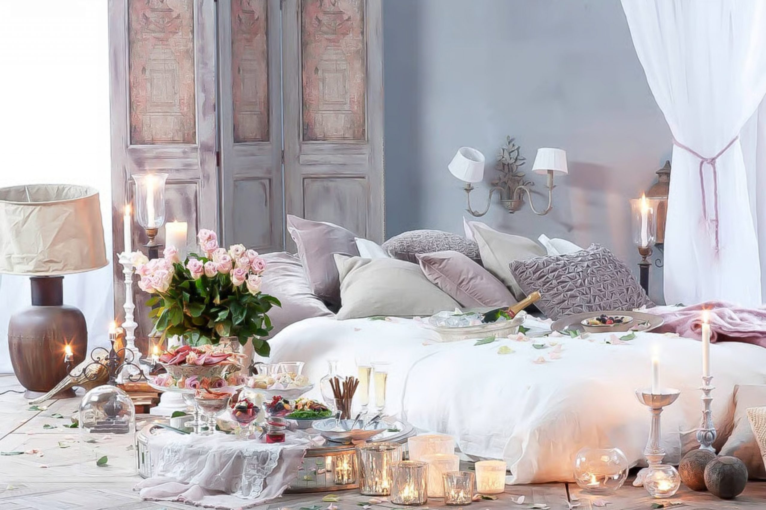
I have seen how a fresh coat of paint can change the way a couple feels about their house. It makes the whole building feel new and full of hope again. You deserve a place that feels like a true getaway from the busy world outside where everything is loud and fast.
This part of your house should be where you go to hide from stress and noise.
Trust your heart when you look at these samples and pick the one that makes you smile. Your first choice is usually the best because it comes from your feelings and your gut. A romantic bedroom is not just about the color, but about the love you share inside those walls every single night.
It is about the way you look at each other and the way you feel safe together. I hope this list helps you find the perfect shade for your own beautiful home. Choosing a paint color is a big step toward making your life feel more special and full of joy every single day.