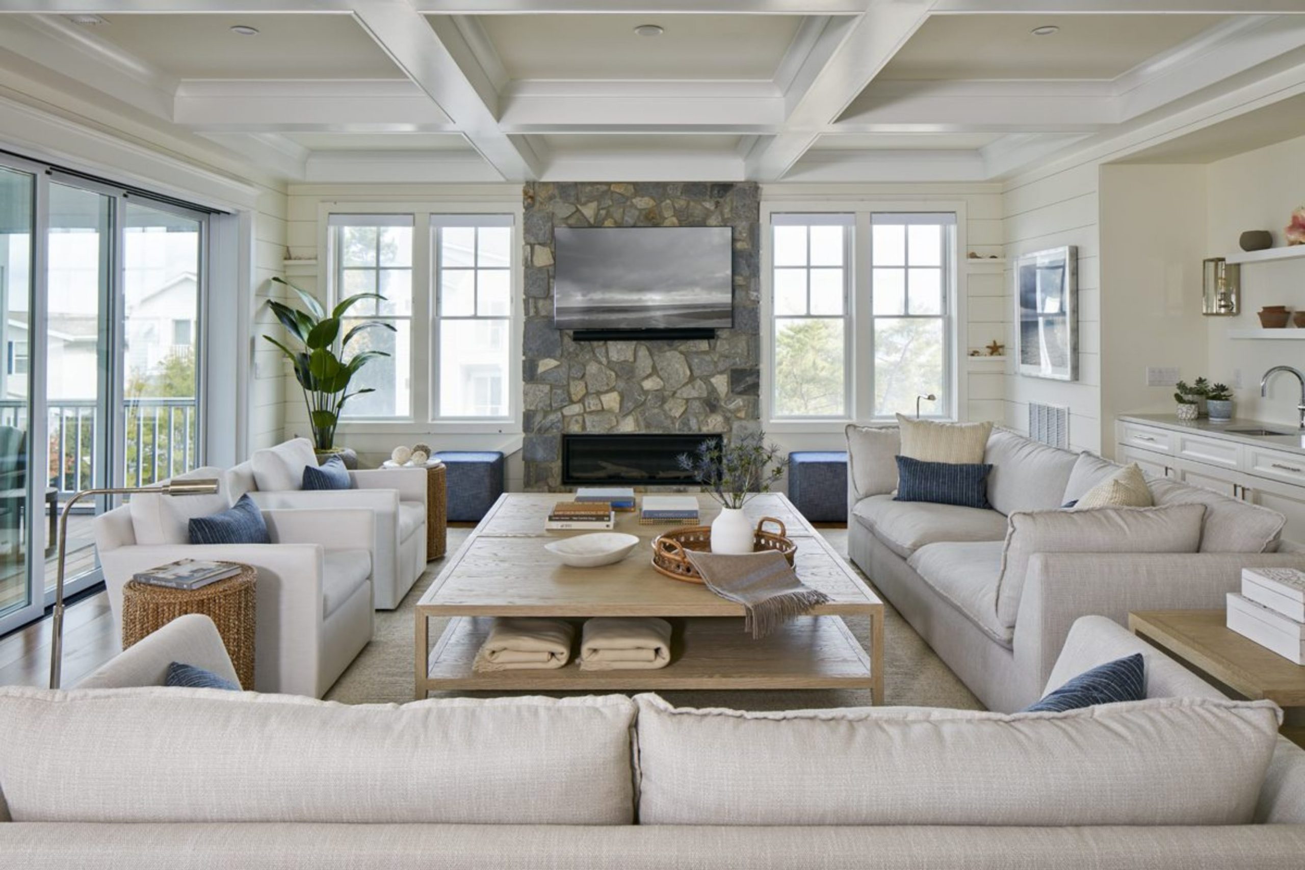
Finding the right look for a house near the water is all about catching that light and breezy feeling. I spend my days watching how sunlight moves across walls, how it shifts from morning to evening, and how each shade can change the mood of a space. It’s not just about color—it’s about the feeling you get the moment you walk in. A beach house should feel like a soft exhale, like you’ve stepped away from the noise of everyday life.
I always pay attention to how natural light reflects off surfaces, how it warms up soft tones, and how it makes cool shades feel calm instead of cold.
The goal is to create a space that feels open, relaxed, and full of air. You should feel lighter just being there, like the space itself is helping you slow down.
You want colors that remind you of the sand, the sky, and the water without being too bright or overwhelming.
Think of soft driftwood tones, gentle whites, pale blues, and muted greens—colors that feel sun-washed and easy on the eyes. My job is to guide you toward that perfect balance, where everything feels natural and effortless, so your home feels like a peaceful retreat you never want to leave.
In the end, it’s about creating a place that feels like a permanent vacation—where every corner reflects calm, comfort, and the simple beauty of life by the water.

Why I Always Trust Sherwin-Williams and Benjamin Moore for the Best Coastal Beach House Paint Colors
I have painted hundreds of rooms, and I keep coming back to these two brands because their quality is the best. Sherwin-Williams has a great way of making colors look rich even when they are very light.
Benjamin Moore has a special way of mixing pigments that makes their blues and greens look very natural. When you use these paints, they cover the walls well and stay looking good for a long time.
I know that if I pick a color from their fans, it will look exactly how I want it to on your walls. Relying on these brands takes the guesswork out of my design work.
How I Choose the Perfect Coastal Shade for Any Beach House
I start by looking at which way the windows face because the sun changes how paint looks all day long. If a room gets lots of bright light, I pick a shade with a little bit of gray to keep it from looking too wild. For darker rooms, I choose a warmer white or a light blue to wake the room up.
I also think about the floors and the furniture you already have in your home. You want everything to match like pieces of a puzzle. My goal is to make sure every room feels connected to the beauty of the outdoors.
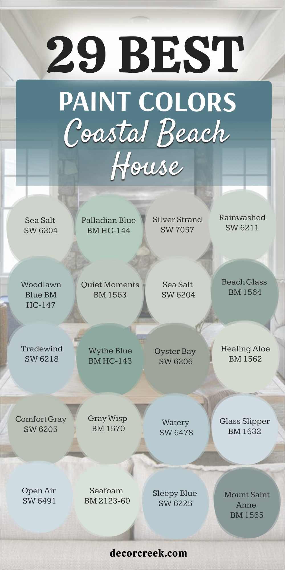
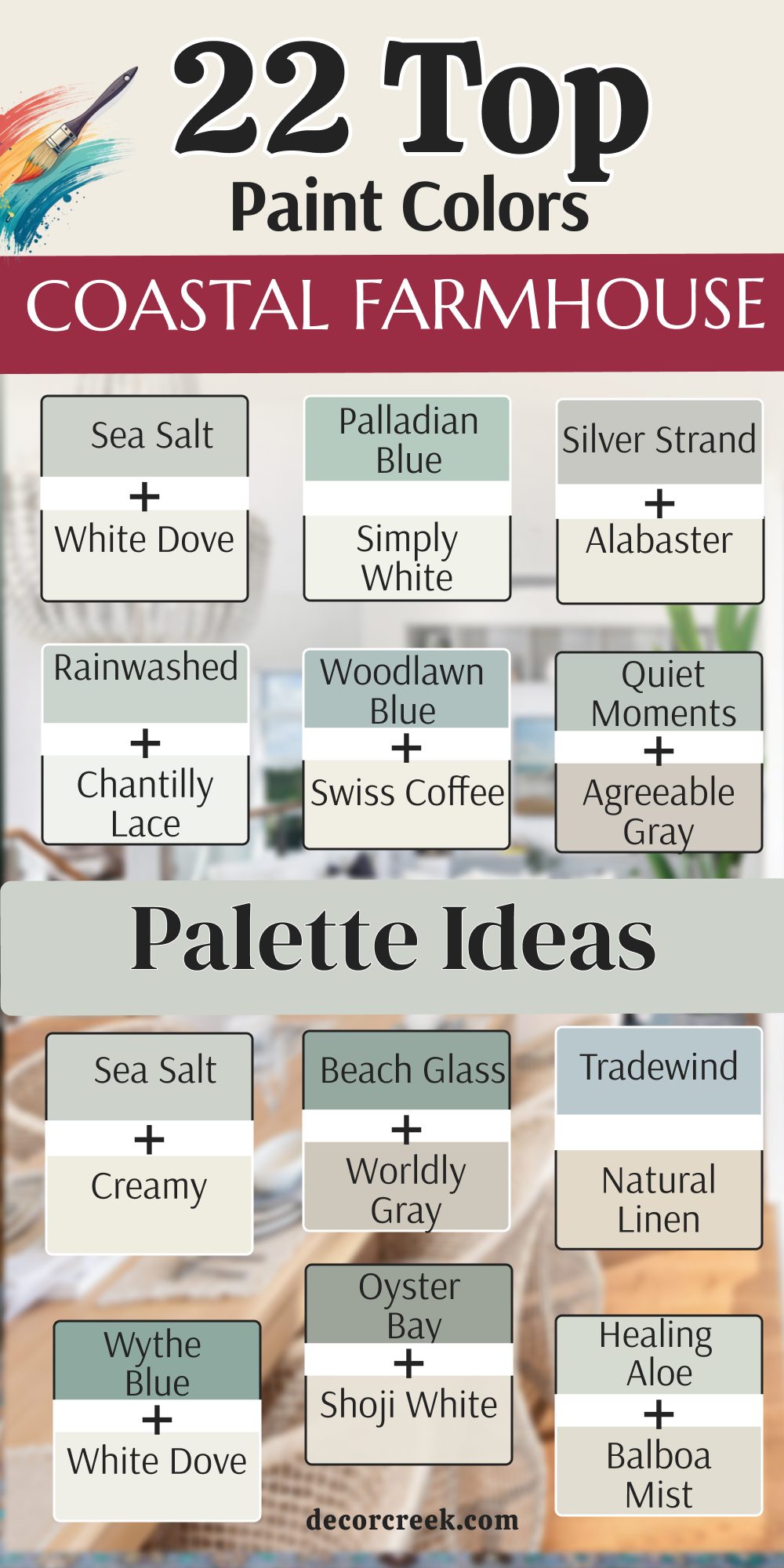
22 Coastal Farmhouse Paint Color Palette Ideas
Sea Salt SW 6204 + White Dove BM OC-17
Sea Salt SW 6204 + White Dove BM OC-17 is a favorite because it changes from green to blue depending on the time of day.

This combination looks like the shallow water right where the waves hit the sand. It makes a room feel light and airy without being a boring white.
Many of my clients choose this because it feels fresh and clean. You will love how it looks with light wood floors and white trim.
The paint has enough gray in it to keep it looking sophisticated. It is a true staple for any home near the ocean.
I often use it in bathrooms to make them feel like a private spa. The creamy white trim makes the wall color pop in a way that feels very expensive.
You can use this in a kitchen to make morning coffee feel like a trip to the shore. It stays looking great even when the weather outside is gray and rainy.
Best used in: living rooms, kitchens, bathrooms, and bedrooms
Pairs well with: Summit Gray SW 7669, Heron Plume SW 6070, natural wood tones The key rule of this color for farmhouse style is to use it where you want natural light to feel kind, soft, and inviting throughout the day.

Palladian Blue BM HC-144 + Simply White BM OC-117
Palladian Blue BM HC-144 + Simply White BM OC-117 is a classic choice for a reason.

This blue has a touch of green that makes it feel very organic and soft. It reminds me of a clear summer sky over a quiet bay.
I like to use it in bedrooms because it helps people feel relaxed before they go to sleep. The color is deep enough to show up against white baseboards but light enough to stay cheery.
It works perfectly with wicker furniture and natural rugs. You can put this in a laundry room to make chores feel a little bit better.
It brings a sense of peace to any corner of the house. Everyone who sees it asks for the name because it is so pretty.
The crisp white trim keeps the blue from looking too dark in small areas. You will feel like you are outside even when you are sitting in your living room.
Best used in: bedrooms, dining rooms, laundry rooms, and entryways
Pairs well with: Woodmont Cream BM 204, Revere Pewter BM HC-172, silver fixtures The key rule of this color for farmhouse style is to use it where you want natural light to feel kind, soft, and inviting throughout the day.

Silver Strand SW 7057 + Alabaster SW 7008
Silver Strand SW 7057 + Alabaster SW 7008 is the color I pick when I want a gray that feels like water.
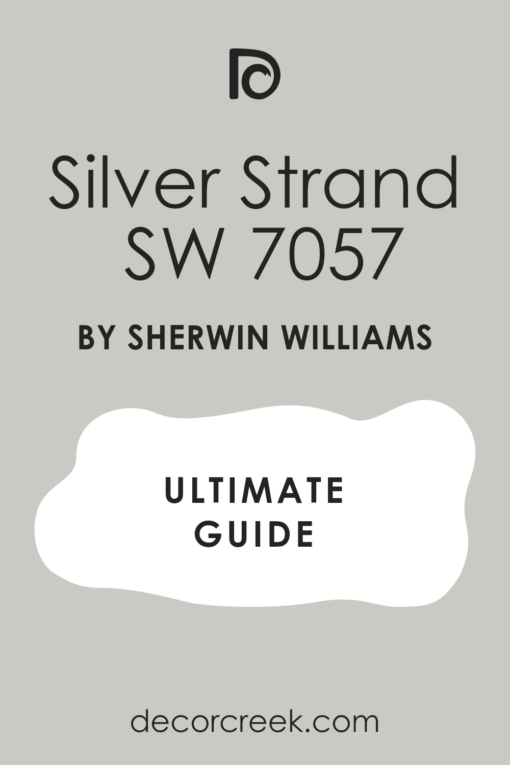
It has heavy blue and green undertones that come out when the sun shines. This shade looks very expensive and high-end on a large wall.
It is great for an open floor plan because it flows well into other rooms. You won’t feel like the color is too heavy or dark even on a cloudy day.
I use it to create a background that lets your artwork and photos stand out. It feels like a cool breeze on a hot afternoon.
This is a very smart choice for a modern beach cottage. It keeps things looking updated and fresh for years.
The warm white trim helps the gray feel very friendly and not at all cold. You will love the way the walls change from gray to blue-green as the sun moves.
Best used in: open living areas, kitchens, master suites, and hallways
Pairs well with: Naval SW 6244, Dorian Gray SW 7017, black metal accents The key rule of this color for farmhouse style is to use it where you want natural light to feel kind, soft, and inviting throughout the day.

Rainwashed SW 6211 + Chantilly Lace BM OC-65
Rainwashed SW 6211 + Chantilly Lace BM OC-65 is a light and happy color that makes people smile.

It is more green than blue which helps it feel very grounded and earthy. I love putting this in a kitchen with white cabinets for a look that never gets old.
It feels like a garden after a light spring shower. The color is saturated enough to be noticed but light enough to feel open.
It pairs beautifully with dark metal hardware or brass fixtures. You can use it on a front door to give your guests a warm welcome.
It makes a small room feel much bigger than it really is. This is a go-to for anyone who wants a bit of cheer.
The very bright white trim makes the walls look like a clear morning sky. You will enjoy how clean and sharp everything looks with this palette.
Best used in: kitchens, breakfast nooks, mudrooms, and front doors
Pairs well with: Grays Harbor SW 6236, Extra White SW 7006, dark bronze The key rule of this color for farmhouse style is to use it where you want natural light to feel kind, soft, and inviting throughout the day.

Woodlawn Blue BM HC-147 + Swiss Coffee BM OC-45
Woodlawn Blue BM HC-147 + Swiss Coffee BM OC-45 is a soft blue that feels very traditional and safe.
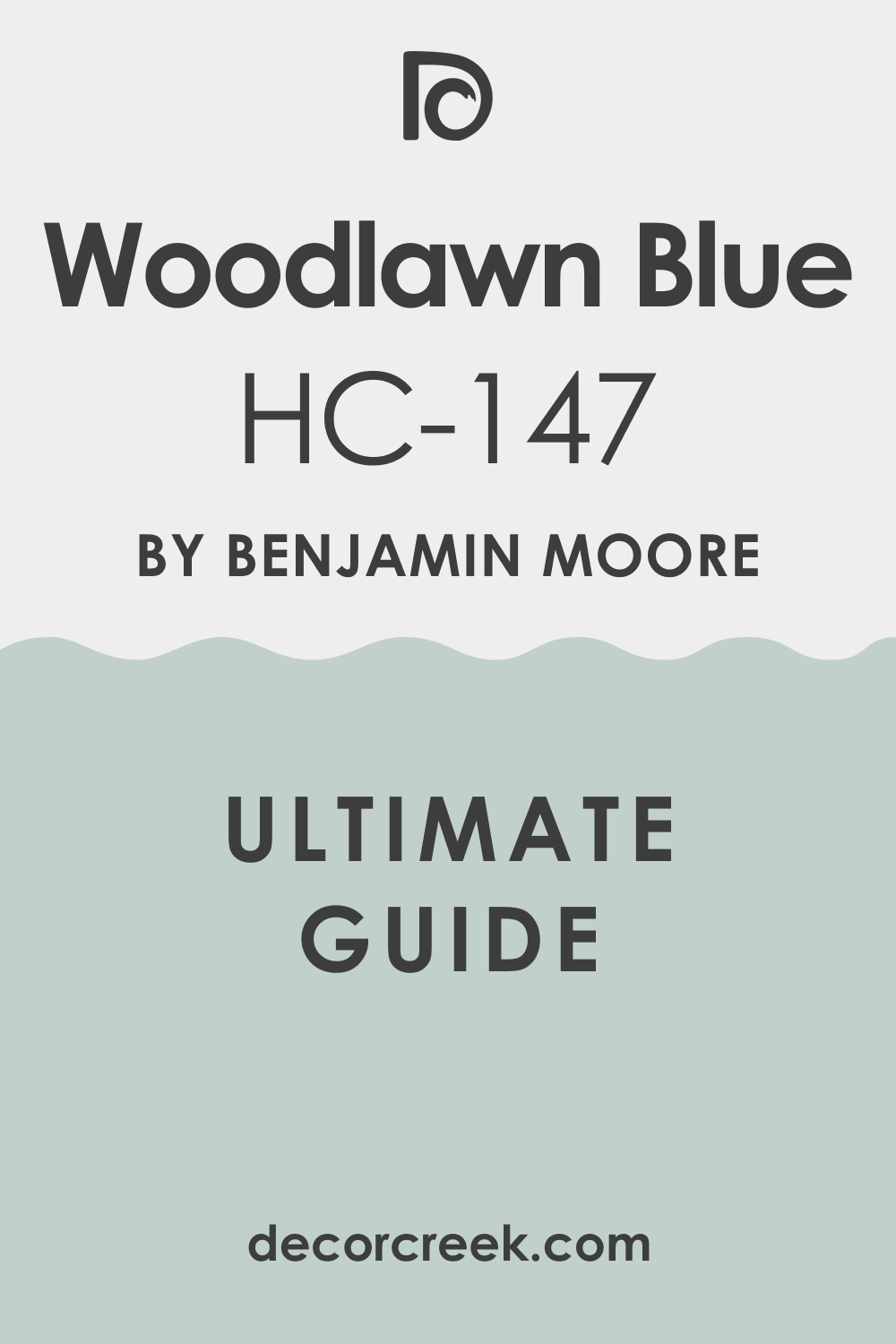
It has a tiny bit of gray that prevents it from looking like a nursery. I use this when a homeowner wants a coastal look that feels very stable and solid.
It looks amazing next to dark wood furniture or antique pieces. The color reminds me of the sea on a very still and quiet morning.
It is light enough to use on a ceiling if you want to be creative. Many people find this shade very comforting and easy to live with.
It does not demand too much attention but supports the whole room. It is a very reliable choice for any beach house.
The warm white trim makes the blue feel like a part of a cozy cottage. You will want to stay in bed all day when your room is painted this way.
Best used in: ceilings, bedrooms, guest rooms, and sunrooms
Pairs well with: Hale Navy BM HC-154, Shaker Beige BM HC-45, antique gold The key rule of this color for farmhouse style is to use it where you want natural light to feel kind, soft, and inviting throughout the day.

Quiet Moments BM 1563 + Agreeable Gray SW 7029
Quiet Moments BM 1563 + Agreeable Gray SW 7029 is a mixture of blue, green, and gray that looks different in every house.

I call it a chameleon color because it adapts to the things around it. It feels very sophisticated and grown-up for a beachy home.
I like to use it in a home office because it helps with focus. The color is very soft and does not hurt your eyes even in bright light.
It looks like the smooth stones you find on the shore. You will notice it makes white trim pop and look very crisp.
It is a great way to add color without it being too loud. This is a top pick for a primary bedroom.
The neutral trim keeps the whole room feeling balanced and very steady. You will love how this color helps you feel ready for a nap.
Best used in: home offices, bedrooms, bathrooms, and cozy nooks
Pairs well with: Cloud White BM OC-130, Wrought Iron BM 2124-10, linen fabrics The key rule of this color for farmhouse style is to use it where you want natural light to feel kind, soft, and inviting throughout the day.

Sea Salt SW 6204 + Creamy SW 7012
Sea Salt SW 6204 + Creamy SW 7012 uses a warmer white to show a different side of a popular shade.
This combination feels very rich and cozy instead of just being cool and airy. When you put it next to a warm white the green in the paint really starts to show.
It feels like sea foam resting on a sandy beach. I use this for a living room where you want to curl up with a book.
The warmth of the trim makes the cool wall color feel very inviting. It is a balance that works in almost any climate.
You get the benefit of a cool color with the feeling of a warm home. This is great for homes that have lots of beige or tan furniture.
It makes the whole house feel like it was designed by a pro. You will find that your guests never want to leave this room.
Best used in: living rooms, nurseries, guest baths, and porches
Pairs well with: Sea Mariner SW 9640, Kilim Beige SW 6106, rattan decor The key rule of this color for farmhouse style is to use it where you want natural light to feel kind, soft, and inviting throughout the day.

Beach Glass BM 1564 + Worldly Gray SW 7043
Beach Glass BM 1564 + Worldly Gray SW 7043 is a darker version of some of the other blues we have looked at.

It has a bit more depth and weight which makes it great for larger rooms. I love how it looks in a dining room where you want a bit of drama.
It reminds me of the glass pieces polished by the waves over time. The color is very rich and makes a house feel very sturdy.
It works well with gray-toned wood floors that are popular right now. You can use it as an accent wall if you are afraid to paint the whole room.
It brings a lot of character to a new house that needs some soul. The soft gray trim keeps it from feeling too heavy or dark.
It makes the room feel very cozy when the sun goes down and you turn on the lamps. You will feel very proud to show this room to your friends.
Best used in: dining rooms, accent walls, exterior shutters, and basements
Pairs well with: Black Beauty BM 2128-10, Steam BM AF-15, stone accents The key rule of this color for farmhouse style is to use it where you want natural light to feel kind, soft, and inviting throughout the day.
Tradewind SW 6218 + Natural Linen SW 9109
Tradewind SW 6218 + Natural Linen SW 9109 is a very clear and light blue that feels like a sunny day.

It does not have as much green or gray as some other beach colors. I use this when a room feels a bit sad and needs some energy.
It looks wonderful in a child’s room or a playroom. The color makes me think of sailing on a boat with big white sails.
It pairs nicely with tan colors that look like beach sand. You will find that it makes your home feel very open.
It is a very friendly shade that everyone seems to like. The linen-colored trim makes the blue feel very natural and grounded.
You will love how this color wakes you up in the morning. It makes even a small laundry room feel like a place where you want to spend time.
Best used in: playrooms, laundry rooms, kids’ bedrooms, and kitchens
Pairs well with: Rainstorm SW 6230, Extra White SW 7006, jute rugs The key rule of this color for farmhouse style is to use it where you want natural light to feel kind, soft, and inviting throughout the day.

Wythe Blue BM HC-143 + White Dove BM OC-17
Wythe Blue BM HC-143 + White Dove BM OC-17 is a deep teal-leaning blue that has a lot of history.

It is part of a historical collection so it feels very classic and high-end. I like to use this for kitchen islands to give the room some weight.
It looks stunning when paired with gold or brass handles and lights. The color is bold enough to make a statement but still fits the theme.
It reminds me of the water in a deep harbor. You can use it on a porch ceiling for a fun surprise.
It is a very confident color for a homeowner who knows what they like. The creamy white trim keeps it looking soft and not too harsh.
You will find that it adds a lot of value to the look of your house. It makes your front door look like it belongs in a magazine.
Best used in: kitchen islands, front doors, vanities, and porch ceilings
Pairs well with: Coventry Gray BM HC-169, Van Deusen Blue BM HC-156, brass The key rule of this color for farmhouse style is to use it where you want natural light to feel kind, soft, and inviting throughout the day.
Oyster Bay SW 6206 + Shoji White SW 7042
Oyster Bay SW 6206 + Shoji White SW 7042 is a cool green color that has a lot of slate gray hidden inside it.

This shade is much deeper than a mint green and feels very grounded and mature. I love using it in a dining room because it looks very elegant under low light.
It reminds me of the dark shells found along the rocky parts of the coast. The color changes quite a bit depending on if the sun is out or if it is raining.
You will see more of the green tones during a bright afternoon. It makes white furniture look very expensive and clean.
This is a great pick if you want a color that has a lot of personality. It stays looking fresh even in a house with lots of kids and pets.
The soft white trim keeps the moody green from feeling too heavy. You will find that this palette adds a lot of strength to your home design.
Every time you walk into the room you will feel like you are at a high-end seaside resort.
Best used in: dining rooms, master bedrooms, cabinetry, and home libraries
Pairs well with: Sea Salt SW 6204, Urban Bronze SW 7048, black metal accents The key rule of this color for farmhouse style is to use it where you want natural light to feel kind, soft, and inviting throughout the day.

Healing Aloe BM 1562 + Balboa Mist BM OC-27
Healing Aloe BM 1562 + Balboa Mist BM OC-27 is a very light green that feels almost like a neutral because it is so soft.

This color is perfect for a small guest room that needs to feel more open and airy. I find that it works very well with light oak floors and natural linen fabrics.
It is a very peaceful shade that never feels like it is trying too hard. You might notice it looks like a very pale sea glass found on the beach.
It provides just enough tint to make your white trim stand out. I often suggest this for people who are afraid of using real color on their walls.
It is very hard to go wrong with this choice in a sunny home. It keeps the energy in the house feeling light and easy.
The light gray trim helps to anchor the green so it does not look too minty. You will love how this palette makes your morning feel very quiet and calm.
It is a wonderful way to bring a little bit of nature into a nursery or a bathroom.
Best used in: small bedrooms, bathrooms, nurseries, and laundry rooms
Pairs well with: White Dove BM OC-17, Gray Owl BM OC-52, light wood tones The key rule of this color for farmhouse style is to use it where you want natural light to feel kind, soft, and inviting throughout the day.

Comfort Gray SW 6205 + Greek Villa SW 7551
Comfort Gray SW 6205 + Greek Villa SW 7551 is a medium-toned color that sits right between green and blue.

This shade has enough weight to make a large living room feel very cozy and connected. I love how it looks when paired with warm wood beams on a ceiling.
It feels like the color of the ocean on a day when the water is a bit choppy. The gray tones keep it from looking too bright or tropical.
You will find that it hides fingerprints and scuffs very well in high-traffic areas. It is a very popular choice for exterior siding on a beach cottage too.
This color makes a house feel very solid and well-protected from the elements. It is a classic choice that people never seem to tire of.
The warm white trim makes the wall color feel very friendly and soft. You will enjoy how this combination makes your entryway look very professional.
It is a great base for a house that uses lots of navy blue and white accents.
Best used in: living rooms, home exteriors, entryways, and kitchens
Pairs well with: Sea Salt SW 6204, Pussywillow SW 7643, warm wood furniture The key rule of this color for farmhouse style is to use it where you want natural light to feel kind, soft, and inviting throughout the day.

Gray Wisp BM 1570 + Collingwood BM OC-28
Gray Wisp BM 1570 + Collingwood BM OC-28 is a very light and airy shade that leans heavily into its green roots.
This color is almost identical to a famous blue-green shade but feels a bit more like a mist. I like to use it in kitchens where there is a lot of white marble or quartz.
It brings a very soft and organic feeling to a room with lots of hard surfaces. The color is very light and will not make your house feel dark even in winter.
It reminds me of the grass growing on the sand dunes near the water. You will love how it makes your indoor plants look even greener.
It is a very smart choice for an open floor plan. This paint makes every room feel like it belongs with the next one.
The neutral gray trim makes the walls look like a fresh breeze is blowing through the house. You will feel very refreshed every time you walk into your kitchen.
It is a high-end look that makes your home feel very expensive and well-planned.
Best used in: kitchens, open concept areas, sunrooms, and primary baths
Pairs well with: Chantilly Lace BM OC-65, Simply White BM OC-117, silver hardware The key rule of this color for farmhouse style is to use it where you want natural light to feel kind, soft, and inviting throughout the day.

Watery SW 6478 + Pure White SW 7005
Watery SW 6478 + Pure White SW 7005 is a true light blue that has a very clear and crisp feeling to it.
This color is a bit more saturated than a gray-blue which makes it feel very energetic. I love putting this in a guest bathroom to give it a pop of coastal fun.
It looks wonderful with white subway tile and chrome fixtures. The color is very bright and makes a room feel like it is filled with sunshine.
It reminds me of a swimming pool or a clear lagoon in the islands. You should use this if you want your home to feel very vacation-ready.
It works well with striped rugs and nautical decorations. Your guests will feel like they are at a resort when they see this color.
The bright white trim makes the blue look very clean and never muddy. You will enjoy how this palette wakes up a dark mudroom or a small laundry space.
It is a happy color that brings a smile to your face every single day.
Best used in: bathrooms, kids’ rooms, pool houses, and mudrooms
Pairs well with: Naval SW 6244, In the Navy SW 9178, nautical decor The key rule of this color for farmhouse style is to use it where you want natural light to feel kind, soft, and inviting throughout the day.

Glass Slipper BM 1632 + Pale Oak BM OC-20
Glass Slipper BM 1632 + Pale Oak BM OC-20 is a very pale and icy blue that feels very clean.

This color has a tiny bit of gray that keeps it from looking too much like a baby boy’s room. I like to use it in rooms that get a lot of afternoon heat because it feels very cool.
It looks beautiful with silver or brushed nickel hardware on the doors. The color is so light that it can almost pass for a white in some lighting.
It reminds me of the very top of a wave before it crashes down. You will find it very easy to match with different types of furniture.
It is a very sophisticated way to add a blue tint to your home. This shade is a great choice for a very modern beach house look.
The soft greige trim keeps the icy blue feeling very warm and cozy at night. You will love how this combination makes your bedroom feel like a quiet sanctuary.
Best used in: bedrooms, ceilings, hallways, and living rooms
Pairs well with: White Dove BM OC-17, Hale Navy BM HC-154, silver accents The key rule of this color for farmhouse style is to use it where you want natural light to feel kind, soft, and inviting throughout the day.

Open Air SW 6491 + Agreeable Gray SW 7029
Open Air SW 6491 + Agreeable Gray SW 7029 is a soft blue that has a little bit of a purple undertone.

This makes the color feel very unique and special compared to other common blues. I love using this on the ceiling of a porch to keep the bugs away and look like the sky.
It is a very light and breezy shade that makes a room feel very tall. The color is very pretty in a bedroom where you want a bit of a romantic feel.
It reminds me of the sky right before the sun goes down over the ocean. You will notice that it looks very different as the light moves across the room.
It is a very cheerful color that makes people feel happy and light. The neutral trim grounds the blue and keeps it looking very professional.
You will love how this color adds a secret bit of personality to your favorite spaces. It looks amazing with white curtains and very light gray furniture.
Best used in: porch ceilings, bedrooms, nurseries, and laundry rooms
Pairs well with: Extra White SW 7006, Snowbound SW 7004, soft gray textiles The key rule of this color for farmhouse style is to use it where you want natural light to feel kind, soft, and inviting throughout the day.
Seafoam BM 2123-60 + Edgecomb Gray BM HC-173
Seafoam BM 2123-60 + Edgecomb Gray BM HC-173 is a light and minty green that feels very vintage and charming.
This color is great for a cottage-style beach house with lots of character. I like to use it in a kitchen with open shelving and wooden counters.
It feels very nostalgic and reminds me of old beach houses from many years ago. The color is very bright and helps a dark room feel much more alive.
It works well with colorful accents like yellow or coral. You can use it on a piece of furniture like a dresser for a fun pop of color.
It is a very friendly shade that makes a house feel very lived-in and loved. The warm gray trim helps the minty green feel very soft and not too loud.
You will enjoy the cheerful energy this palette brings to a small guest room. It makes every morning feel like a fresh start by the sea.
Best used in: kitchens, cottages, furniture, and guest rooms
Pairs well with: Simply White BM OC-117, Revere Pewter BM HC-172, warm wood The key rule of this color for farmhouse style is to use it where you want natural light to feel kind, soft, and inviting throughout the day.

Sleepy Blue SW 6225 + Creamy SW 7012
Sleepy Blue SW 6225 + Creamy SW 7012 is a medium-light blue that feels very stable and honest.
This color has a good balance of blue and gray so it doesn’t look too bright. I use this when I want a room to feel very traditional and orderly.
It looks great in a home office or a study where you need to get work done. The color reminds me of a pair of well-worn denim jeans.
It is very easy to look at for a long time without getting tired of it. You will find that it matches well with navy blue accents and dark wood.
It is a very safe choice for a main living area if you love blue. It makes a house feel very grounded and peaceful for the whole family.
The warm white trim makes the blue feel very soft and welcoming for your guests. You will love the classic feeling this palette brings to your home.
Best used in: home offices, bedrooms, living rooms, and shutters
Pairs well with: Naval SW 6244, Alabaster SW 7008, dark wood floors The key rule of this color for farmhouse style is to use it where you want natural light to feel kind, soft, and inviting throughout the day.
Mount Saint Anne BM 1565 + Revere Pewter BM HC-172
Mount Saint Anne BM 1565 + Revere Pewter BM HC-172 is a deep and smoky blue-green that feels very high-end.

This color is darker than most beachy colors which gives it a lot of strength. I love using it on the walls of a small den or a library to make it feel very cozy.
It looks very handsome with leather chairs and brass lamps. The color reminds me of the deep ocean water far away from the shore.
It is a very bold choice that makes a house look very well-designed. You can use it on your kitchen island to make it a focal point of the room.
It handles shadows very well and stays looking rich all day. This is a great color for someone who wants a bit of drama in their design.
The warm greige trim keeps the deep color from feeling too cold or dark. You will feel very proud of the sophisticated look this brings to your home.
Best used in: dens, libraries, kitchen islands, and accent walls
Pairs well with: White Dove BM OC-17, Woodmont Cream BM 204, brass fixtures The key rule of this color for farmhouse style is to use it where you want natural light to feel kind, soft, and inviting throughout the day.

Tidewater SW 6477 + Natural Linen SW 9109
Tidewater SW 6477 + Natural Linen SW 9109 is a bright and light aqua palette that feels like a tropical sea on a clear day.

This color is for the homeowner who wants to feel the beach vibe every single time they walk into a room. It reminds me of the Caribbean water where the sand meets the deep blue.
I love using this in a bathroom with lots of white towels because it looks so crisp. It is very energetic and makes you feel awake and happy in the morning.
The sandy neutral trim grounds the energetic blue walls so they do not feel too wild. It looks great with light wood floors and natural rugs made of jute or seagrass.
You will find it very cheering in a laundry room or a mudroom where chores happen. It is a very classic coastal look that never goes out of style for a beach house.
The blue-green mix is very balanced and looks very clean under any kind of light. It makes a dark hallway feel much brighter as soon as the paint is dry.
You will love how this combination brings the fun and sun of the ocean right inside your home.
Best used in: bathrooms, laundry rooms, mudrooms, and kids’ rooms
Pairs well with: Pure White SW 7005, Rain SW 7639, light wood tones The key rule of this color for farmhouse style is to use it where you want natural light to feel kind, soft, and inviting throughout the day.
Breath of Fresh Air BM 806 + Classic Gray BM OC-23
Breath of Fresh Air BM 806 + Classic Gray BM OC-23 is a very light and weightless combination that lives up to its name.

This color is very clear and does not have much gray or green hiding inside it. I use this in rooms where you want to feel the breeze coming in from the window.
It looks beautiful in a sunroom with lots of glass and green plants. The color reminds me of a cloudless sky on a perfect spring morning.
It is very soft and helps to make a small ceiling feel like it is floating higher. You will love how it makes your white furniture look even brighter and cleaner.
The very pale gray trim keeps the blue walls looking crisp and professional. It is a very happy shade that brings a lot of light into a dark corner.
This is a perfect choice for a nursery or a relaxing bedroom where you want to sleep well. It makes the whole house feel like it is light and airy.
You will feel very peaceful whenever you spend time in a room painted with this palette.
Best used in: sunrooms, bedrooms, nurseries, and ceilings
Pairs well with: Simply White BM OC-117, Hale Navy BM HC-154, silver accents The key rule of this color for farmhouse style is to use it where you want natural light to feel kind, soft, and inviting throughout the day.

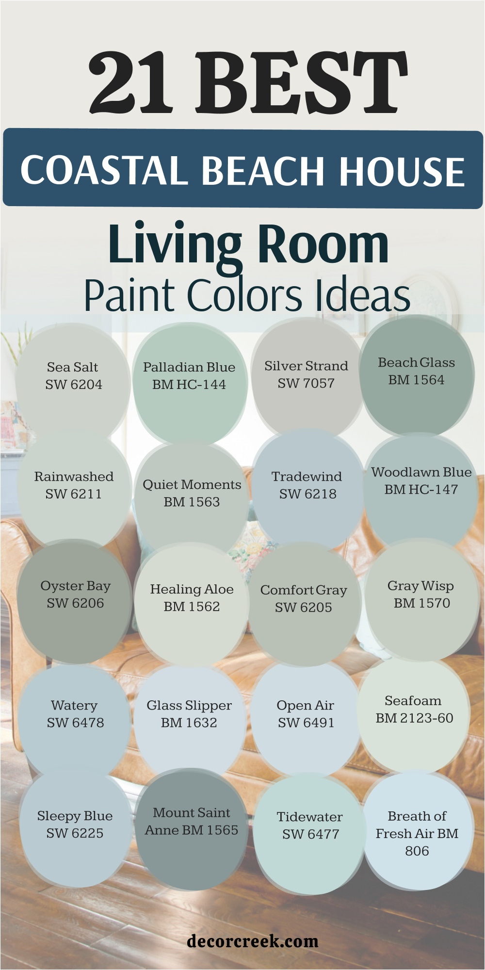
21 Coastal Beach House Living Room Paint Color Ideas
Sea Salt SW 6204
Sea Salt SW 6204 is a favorite because it changes from green to blue depending on how the sun hits the walls.
This color looks like the shallow water right where the waves hit the sand on a quiet beach. It makes a living room feel light and airy without being a boring white.
Many of my clients choose this because it feels very fresh and clean for a family space. You will love how it looks with light wood floors and white shiplap.
The paint has enough gray in it to keep it looking very sophisticated and mature. It is a true staple for any home that sits near the salty ocean air.
I often use it as a main color because it acts like a neutral but still has personality. It makes your home feel like a permanent summer vacation every day.
You will notice that it hides dust very well which is great for a busy house. It stays looking great even when the weather outside is gray and rainy.
This is the most popular color I suggest for a reason.
Best used in: living rooms, kitchens, bathrooms, and bedrooms
Pairs well with: White Dove BM OC-17, Summit Gray SW 7669, Heron Plume SW 6070 The key rule of this color for farmhouse style is to use it where you want natural light to feel kind, soft, and inviting throughout the day.
🎨 Check out the complete guide to this color right HERE 👈
Palladian Blue BM HC-144
Palladian Blue BM HC-144 is a classic choice for a living room because it is so relaxing.
This blue has a touch of green that makes it feel very organic and soft on the eyes. It reminds me of a clear summer sky over a quiet bay at noon.
I like to use it in rooms where families gather because it keeps the mood very calm. The color is deep enough to show up against white trim but stays very cheery.
It works perfectly with wicker furniture and natural rugs that have a beachy feel. You will find that it brings a sense of peace to any corner of the house.
Everyone who sees it asks for the name because it is so pretty and inviting. It is a very friendly color that makes your home feel welcoming to everyone.
You can use it in a room with lots of windows to bring the outdoors inside. It looks stunning when the afternoon sun glows across the walls.
This color is a great way to add life to a house that feels a bit tired.
Best used in: living rooms, bedrooms, dining rooms, and entryways
Pairs well with: Simply White BM OC-117, Woodmont Cream BM 204, Revere Pewter BM HC-172 The key rule of this color for farmhouse style is to use it where you want natural light to feel kind, soft, and inviting throughout the day.
🎨 Check out the complete guide to this color right HERE 👈
Silver Strand SW 7057
Silver Strand SW 7057 is the color I pick when I want a gray that feels like the water.
It has heavy blue and green undertones that come out when the bright sun shines inside. This shade looks very expensive and high-end on a large living room wall.
It is great for an open floor plan because it flows well into the kitchen and hallways. You won’t feel like the color is too heavy even on a cloudy day.
I use it to create a background that lets your artwork and family photos stand out. It feels like a cool breeze on a hot afternoon by the sea.
This is a very smart choice for a modern beach cottage that needs to feel updated. It keeps things looking fresh and clean for many years.
The gray base keeps the blue from feeling too much like a child’s bedroom. You will love how the walls change color as the light moves through the house.
It is a very steady and beautiful shade for a main living area.
Best used in: living rooms, kitchens, master suites, and hallways
Pairs well with: Alabaster SW 7008, Naval SW 6244, Dorian Gray SW 7017 The key rule of this color for farmhouse style is to use it where you want natural light to feel kind, soft, and inviting throughout the day.
🎨 Check out the complete guide to this color right HERE 👈
Beach Glass BM 1564
Beach Glass BM 1564 is a darker version of the ocean blues that brings a lot of soul to a room.
It has a bit more depth and weight which makes it great for very large living spaces. I love how it looks in a room where you want a bit of drama and style.
It reminds me of the glass pieces polished by the salt waves over a long time. The color is very rich and makes a house feel very sturdy and well-built.
It works well with gray-toned wood floors that are very popular right now. You can use it as an accent wall if you want to test the color first.
It brings a lot of character to a new house that needs to feel more comfortable. The green undertone keeps it feeling very natural and not at all like a bright blue.
It is a very confident color that stands out in a crowd of lighter shades. You will feel very proud to show off your living room with this choice.
Best used in: living rooms, dining rooms, accent walls, and exteriors
Pairs well with: Worldly Gray SW 7043, Black Beauty BM 2128, Steam BM AF-15 The key rule of this color for farmhouse style is to use it where you want natural light to feel kind, soft, and inviting throughout the day.
🎨 Check out the complete guide to this color right HERE 👈
Rainwashed SW 6211
Rainwashed SW 6211 is a light and happy color that makes people smile as soon as they walk in.
It is more green than blue which helps it feel very grounded and connected to nature. I love putting this in a living room to create a look that never gets old.
It feels like a garden after a light spring shower has just finished. The color is saturated enough to be noticed but light enough to feel very open.
It pairs beautifully with dark metal hardware or bright brass lamps. You will notice it makes a small living area feel much bigger than it really is.
This is a go-to for anyone who wants a bit of cheer in their main room. The color reminds me of a fresh morning by the coast before the crowds arrive.
It works well with white cabinets and light wood furniture pieces. You will enjoy how clean and bright your house feels with this on the walls.
It is a very positive color for a happy home.
Best used in: living rooms, kitchens, breakfast nooks, and mudrooms
Pairs well with: Chantilly Lace BM OC-65, Grays Harbor SW 6236, Extra White SW 7006 The key rule of this color for farmhouse style is to use it where you want natural light to feel kind, soft, and inviting throughout the day.
🎨 Check out the complete guide to this color right HERE 👈
Quiet Moments BM 1563
Quiet Moments BM 1563 is a mixture of blue, green, and gray that looks different in every living room.
I call it a chameleon color because it adapts to the furniture and light around it. It feels very sophisticated and grown-up for a beachy home design.
I like to use it in rooms where you want to relax and talk with friends. The color is very soft and does not hurt your eyes even in the brightest afternoon sun.
It looks like the smooth stones you find on the shore after a storm. You will notice it makes white trim and ceilings look very crisp and clean.
It is a great way to add color without it being too loud for your guests. The shade feels very expensive and well-planned by a professional.
You will love how this color helps the whole room feel very balanced and steady. It is a top pick for a primary living area.
Best used in: living rooms, bedrooms, home offices, and bathrooms
Pairs well with: Agreeable Gray SW 7029, Cloud White BM OC-130, Wrought Iron BM 2124 The key rule of this color for farmhouse style is to use it where you want natural light to feel kind, soft, and inviting throughout the day.
🎨 Check out the complete guide to this color right HERE 👈
Tradewind SW 6218
Tradewind SW 6218 is a very clear and light blue that feels like a beautiful sunny day.
It does not have as much green or gray as some of the other coastal colors we use. I use this when a living room feels a bit sad and needs some fresh energy.
It looks wonderful in an open space that needs to feel very light and bright. The color makes me think of sailing on a boat with big white sails.
It pairs nicely with tan colors and rugs that look like warm beach sand. You will find that it makes your entire home feel very open and large.
It is a very friendly shade that everyone seems to like as soon as they see it. The blue is very bright but still feels light enough for a common area.
It helps a low ceiling feel like it is much higher than it really is. This is a great choice for a fun and happy house.
Best used in: living rooms, playrooms, laundry rooms, and kitchens
Pairs well with: Natural Linen SW 9109, Extra White SW 7006, Rainstorm SW 6230 The key rule of this color for farmhouse style is to use it where you want natural light to feel kind, soft, and inviting throughout the day.
🎨 Check out the complete guide to this color right HERE 👈
Woodlawn Blue BM HC-147
Woodlawn Blue BM HC-147 is a soft blue that feels very traditional and safe for a living room.
It has a tiny bit of gray that prevents it from looking like a nursery or a kids’ room. I use this when a homeowner wants a coastal look that feels very stable.
It looks amazing next to dark wood furniture or antique pieces you have collected. The color reminds me of the sea on a very still and quiet morning.
It is light enough to use in a room that does not get a lot of natural light. Many people find this shade very comforting and easy to live with for a long time.
It does not demand too much attention but supports the whole design of the room. It is a very reliable choice for any beach house or cottage.
The blue feels very pure and crisp against a warm white trim or fireplace. You will feel very at home in a room painted with this classic shade.
Best used in: living rooms, bedrooms, ceilings, and guest rooms
Pairs well with: Swiss Coffee BM OC-45, Hale Navy BM HC-154, Shaker Beige BM HC-45 The key rule of this color for farmhouse style is to use it where you want natural light to feel kind, soft, and inviting throughout the day.
🎨 Check out the complete guide to this color right HERE 👈
Oyster Bay SW 6206
Oyster Bay SW 6206 is a cool green color that has a lot of slate gray hidden inside it.
This shade is much deeper than a mint green and feels very grounded and mature for a living room. I love using it in a space where you want to feel a bit more elegant and serious.
It reminds me of the dark shells found along the rocky parts of the coast on a cloudy day. The color changes quite a bit depending on if the sun is out or if the sky is overcast.
You will see more of the green tones during a bright afternoon in your main seating area. It makes white furniture and slipcovers look very expensive and clean.
This is a great pick if you want a living room with a lot of personality and soul. It stays looking fresh even in a busy house where people are always coming and going.
The gray in the paint keeps it from looking too bright in a room with large windows. You will love how this color adds a sense of strength and history to your home.
It is a very sophisticated choice for a modern coastal farmhouse.
Best used in: living rooms, dining rooms, master bedrooms, and cabinetry
Pairs well with: Shoji White SW 7042, Sea Salt SW 6204, Urban Bronze SW 7048 The key rule of this color for farmhouse style is to use it where you want natural light to feel kind, soft, and inviting throughout the day.
🎨 Check out the complete guide to this color right HERE 👈
Healing Aloe BM 1562
Healing Aloe BM 1562 is a very light green that feels almost like a neutral because it is so soft.
This color is perfect for a small living room that needs to feel much more open and airy. I find that it works very well with light oak floors and natural wood furniture.
It is a very peaceful shade that never feels like it is trying too hard to be noticed. You might notice it looks like a very pale piece of sea glass found in the sand.
It provides just enough tint to make your white trim and baseboards stand out. I often suggest this for people who want to move away from plain white walls.
It is very hard to go wrong with this choice in a sunny house with lots of windows. It keeps the energy in the living room feeling light and very easy.
The color is so light that it works as a perfect background for any style of artwork. You will love how it makes your home feel like a quiet place to hide from the world.
It is a wonderful way to bring a little bit of the outdoors inside.
Best used in: living rooms, small bedrooms, bathrooms, and nurseries
Pairs well with: Balboa Mist BM OC-27, White Dove BM OC-17, Gray Owl BM OC-52 The key rule of this color for farmhouse style is to use it where you want natural light to feel kind, soft, and inviting throughout the day.
🎨 Check out the complete guide to this color right HERE 👈
Comfort Gray SW 6205
Comfort Gray SW 6205 is a medium-toned color that sits right between green and blue.
This shade has enough weight to make a large living room feel very cozy and safe. I love how it looks when paired with warm wood beams or a brick fireplace.
It feels like the color of the ocean on a day when the water is deep and moving. The gray tones keep it from looking too bright or like a tropical beach.
You will find that it hides scuffs and fingerprints very well in a house with kids. It is a very popular choice because it looks good in almost any kind of light.
This color makes a house feel very solid and well-built for the long term. It is a classic choice that people stay happy with for many years.
The color works well with both silver and gold lamps in a formal seating area. You will enjoy the steady and relaxing feeling it brings to your family time.
It is a very reliable color for anyone who wants a beautiful coastal home.
Best used in: living rooms, home exteriors, entryways, and kitchens
Pairs well with: Greek Villa SW 7551, Sea Salt SW 6204, Pussywillow SW 7643 The key rule of this color for farmhouse style is to use it where you want natural light to feel kind, soft, and inviting throughout the day.
🎨 Check out the complete guide to this color right HERE 👈
Gray Wisp BM 1570
Gray Wisp BM 1570 is a very light shade that leans heavily into its soft green roots.
This color is very similar to other famous blue-greens but it feels a bit more like a mist. I like to use it in living rooms that open up into a white kitchen.
It brings a very soft and organic feeling to a house with an open floor plan. The color is very light and will not make your home feel dark on a winter day.
It reminds me of the sea grass growing on the dunes right by the water. You will love how it makes your indoor plants and flowers look very bright.
It is a very smart choice for a room where you want to feel refreshed and clean. This paint makes every part of the house feel like it belongs together.
The green tones are very cooling when the summer sun is hitting the windows. You will feel like you have a fresh breeze inside your house all the time.
It is a high-end look that makes your living room feel very special.
Best used in: living rooms, kitchens, sunrooms, and primary baths
Pairs well with: Collingwood BM OC-28, Chantilly Lace BM OC-65, Simply White BM OC-117 The key rule of this color for farmhouse style is to use it where you want natural light to feel kind, soft, and inviting throughout the day.
Watery SW 6478
Watery SW 6478 is a true light blue that has a very clear and crisp feeling on the walls.
This color is a bit more saturated than a gray-blue which makes a living room feel energetic. I love putting this in a space where you want a big pop of coastal fun.
It looks wonderful with white furniture and shiny silver accents or lamps. The color is very bright and makes a room feel like it is always noon outside.
It reminds me of a clear lagoon or a swimming pool on a very hot day. You should use this if you want your home to feel like you are on a vacation.
It works great with striped pillows and nautical decorations like anchors or ropes. Your friends will feel very happy when they come over to visit you.
The blue is very clean and does not look muddy or dark in the corners. You will enjoy how this color wakes up your house and makes it feel alive.
It is a favorite for people who love the bright side of the beach.
Best used in: living rooms, bathrooms, kids’ rooms, and pool houses
Pairs well with: Pure White SW 7005, Naval SW 6244, In the Navy SW 9178 The key rule of this color for farmhouse style is to use it where you want natural light to feel kind, soft, and inviting throughout the day.
🎨 Check out the complete guide to this color right HERE 👈
Glass Slipper BM 1632
Glass Slipper BM 1632 is a very pale and icy blue that feels very clean and fresh.
This color has a tiny bit of gray that keeps it from looking like a baby’s nursery. I like to use it in living rooms that get a lot of direct afternoon heat.
It looks beautiful with silver or brushed nickel hardware and glass coffee tables. The color is so light that it can almost pass for white in very bright sun.
It reminds me of the very top of a wave just as it turns into foam. You will find it very easy to match with any color of furniture you own.
It is a very sophisticated way to add a hint of blue to your main living space. This shade is a great choice for a modern and clean beach house look.
The cool tones help you feel fresh and relaxed as soon as you sit down. You will love how this color makes your house feel very light and weightless.
Best used in: living rooms, bedrooms, ceilings, and hallways
Pairs well with: Pale Oak BM OC-20, White Dove BM OC-17, Hale Navy BM HC-154 The key rule of this color for farmhouse style is to use it where you want natural light to feel kind, soft, and inviting throughout the day.
🎨 Check out the complete guide to this color right HERE 👈
Open Air SW 6491
Open Air SW 6491 is a soft blue that has a little bit of a purple undertone to it.
This makes the color feel very unique and special compared to other blues you see. I love using this in a living room with very high ceilings to make it feel airy.
It is a very light and breezy shade that makes any room feel much taller than it is. The color is very pretty and gives a room a soft and romantic feeling.
It reminds me of the sky right before the sun starts to set over the ocean. You will notice that the color looks different as the shadows move in the evening.
It is a very cheerful color that makes people feel happy and light inside. It pairs perfectly with very light gray rugs and white linen curtains.
The purple hint makes the walls look very soft and smooth like velvet. You will love having a color that your neighbors don’t have in their homes.
Best used in: living rooms, porch ceilings, bedrooms, and nurseries
Pairs well with: Agreeable Gray SW 7029, Extra White SW 7006, Snowbound SW 7004 The key rule of this color for farmhouse style is to use it where you want natural light to feel kind, soft, and inviting throughout the day.
🎨 Check out the complete guide to this color right HERE 👈
Seafoam BM 2123-60
Seafoam BM 2123-60 is a light and minty green that feels very charming and sweet.
This color is great for a living room in a house that has a lot of cottage character. I like to use it in rooms with white painted wooden walls or shiplap.
It feels very nostalgic and reminds me of beach houses from a long time ago. The color is very bright and helps a dark room feel much more energetic.
It works well with colorful pillows in shades like coral, pink, or bright yellow. You can use it to create a room that feels very fun and full of life.
It is a very friendly shade that makes every guest feel like they can kick off their shoes. This is a great choice for someone who truly loves having color on the walls.
The green is very fresh and looks amazing with white furniture and light rugs. You will enjoy how this color makes your home feel like a happy cottage.
Best used in: living rooms, kitchens, cottages, and guest rooms
Pairs well with: Edgecomb Gray BM HC-173, Simply White BM OC-117, Revere Pewter BM HC-172 The key rule of this color for farmhouse style is to use it where you want natural light to feel kind, soft, and inviting throughout the day.
Sleepy Blue SW 6225
Sleepy Blue SW 6225 is a medium-light blue that feels very stable and traditional.
This color has a good balance of blue and gray so it stays looking very professional. I use this when I want a living room to feel very classic and calm.
It looks great in a house where you have lots of books and family treasures. The color reminds me of a pair of favorite blue jeans that you love to wear.
It is very easy to look at for a long time and you will not get tired of it. You will find that it matches perfectly with navy blue and cream accents.
It is a very safe choice for a main living area where you spend most of your time. It makes a house feel very grounded and peaceful for everyone who lives there.
The blue is strong enough to not be washed out even in very bright noon light. You will love the steady and quiet feeling this color brings to your home.
Best used in: living rooms, home offices, bedrooms, and shutters
Pairs well with: Creamy SW 7012, Naval SW 6244, Alabaster SW 7008 The key rule of this color for farmhouse style is to use it where you want natural light to feel kind, soft, and inviting throughout the day.
🎨 Check out the complete guide to this color right HERE 👈
Mount Saint Anne BM 1565
Mount Saint Anne BM 1565 is a deep and smoky blue-green that feels very expensive.
This color is darker than most other coastal colors which gives it a lot of strength. I love using it in a living room or a den to make it feel very high-end.
It looks very handsome with big leather chairs and bright brass floor lamps. The color reminds me of the deep ocean water far away from the sandy shore.
It is a very bold choice that makes your house look like it was professionally designed. You can use it as a focal point behind your TV or a fireplace.
It handles shadows very well and stays looking rich and colorful all day long. This is a great color for someone who wants their home to have a lot of drama.
The gray in the paint keeps the blue from looking too bright or like a toy. You will feel very proud of the sophisticated look this brings to your house.
Best used in: living rooms, dens, libraries, and kitchen islands
Pairs well with: Revere Pewter BM HC-172, White Dove BM OC-17, Woodmont Cream BM 204 The key rule of this color for farmhouse style is to use it where you want natural light to feel kind, soft, and inviting throughout the day.
🎨 Check out the complete guide to this color right HERE 👈
Tidewater SW 6477
Tidewater SW 6477 is a bright and light aqua that feels like a tropical sea in the sun.
This color is for the homeowner who wants to feel the beach vibe every single day. I love using this in a living room that connects to a porch or a deck.
It is very energetic and makes you feel awake and positive as soon as you see it. The color reminds me of the Caribbean water on a very clear and warm day.
It looks great with light sand-colored floors and natural rugs made of seagrass. You will find it very cheering in a house that needs more light and color.
It is a very classic coastal color that never goes out of style for a beach home. The blue-green mix is very balanced and looks very clean on the walls.
It makes a dark room feel much brighter and more alive as soon as you paint it. You will love how this color brings the fun of the ocean inside.
Best used in: living rooms, bathrooms, laundry rooms, and mudrooms
Pairs well with: Natural Linen SW 9109, Pure White SW 7005, Rain SW 7639 The key rule of this color for farmhouse style is to use it where you want natural light to feel kind, soft, and inviting throughout the day.
🎨 Check out the complete guide to this color right HERE 👈
Breath of Fresh Air BM 806
Breath of Fresh Air BM 806 is a very light and airy blue that lives up to its name perfectly.
This color is very clear and does not have much gray or green hiding inside it. I use this in living rooms where you want to feel the breeze from the window.
It looks beautiful in a sunroom or a living area with lots of glass and plants. The color reminds me of a cloudless sky on a perfect spring morning at the beach.
It is very soft and helps to make a small ceiling feel like it is much higher. You will love how it makes your white furniture and curtains look even brighter.
It is a very happy shade that brings a lot of light into any dark corner of your home. This is a perfect choice for a relaxing room where you like to read.
It makes the whole house feel like it is floating on a light and fluffy cloud. You will feel very peaceful and relaxed every time you sit in this room.
Best used in: living rooms, sunrooms, bedrooms, and ceilings
Pairs well with: Classic Gray BM OC-23, Simply White BM OC-117, Hale Navy BM HC-154 The key rule of this color for farmhouse style is to use it where you want natural light to feel kind, soft, and inviting throughout the day.
🎨 Check out the complete guide to this color right HERE 👈
Wythe Blue BM HC-143
Wythe Blue BM HC-143 is a deep teal-leaning blue that has a lot of history and class.
It is part of a historical collection so it feels very traditional and high-end for a home. I like to use this for a living room accent wall or a built-in bookshelf.
It looks stunning when paired with gold or brass lamps and picture frames. The color is bold enough to make a big statement but still fits the beach theme.
It reminds me of the dark and beautiful water in a deep harbor at sunset. You can use it in a room with lots of white to create a great contrast.
It is a very confident color for a homeowner who wants a house with a lot of style. The teal tones make it feel very tropical and fun for a coastal home.
You will find that it adds a lot of character and value to the look of your house. It is a perfect color to welcome your friends into your beautiful living room.
Best used in: living rooms, kitchen islands, front doors, and vanities
Pairs well with: White Dove BM OC-17, Coventry Gray BM HC-169, Van Deusen Blue BM HC-156 The key rule of this color for farmhouse style is to use it where you want natural light to feel kind, soft, and inviting throughout the day.
🎨 Check out the complete guide to this color right HERE 👈
22 Coastal Beach House Warm and Cozy Neutrals
White Dove BM OC-17
White Dove BM OC-17 is a soft white that feels very warm without ever looking yellow on the walls.
This color is a favorite for living room walls because it makes the whole house feel clean and bright. I find that it works perfectly with natural wood floors and large windows.
It has a tiny hint of gray that keeps it looking modern and very fresh. You will notice it creates a very soft background for your favorite beach house art.
It is very hard to go wrong with this shade because it looks good in any light. Many of my clients use it on both the walls and the trim for a seamless look.
It reminds me of the soft white clouds on a sunny day at the shore. You will love how it makes your colorful pillows and rugs stand out.
It is a very professional choice that makes a house feel very expensive and light. This is a top pick for a main color in an open floor plan.
Every morning will feel bright and happy in a room painted with this shade.
Best used in: living rooms, kitchens, hallways, and bedrooms
Pairs well with: Sea Salt SW 6204, Revere Pewter BM HC-172, dark wood tones The key rule of this color for farmhouse style is to use it where you want natural light to feel kind, soft, and inviting throughout the day.
🎨 Check out the complete guide to this color right HERE 👈
Alabaster SW 7008
Alabaster SW 7008 is a warm white that feels very cozy and inviting for a family home.
This color is not too bright or stark which makes it very easy to live with every day. I love putting this in a bedroom to make the room feel like a soft hug.
It has a creamy base that hides the coldness of a room with few windows. You will find that it matches beautifully with tan rugs and wooden furniture.
It reminds me of the white sand on a very warm afternoon. The color is very balanced and does not change much as the sun moves.
It is a very steady choice for someone who wants a home that feels very grounded. You can use it on the outside of your house for a classic beachy look.
The warmth in the paint makes every guest feel comfortable as soon as they walk in. It is a very reliable neutral that stays in style for many years.
You will enjoy how it makes your home feel like a peaceful place to rest.
Best used in: living rooms, bedrooms, kitchens, and house exteriors
Pairs well with: Silver Strand SW 7057, Agreeable Gray SW 7029, Iron Ore SW 7069 The key rule of this color for farmhouse style is to use it where you want natural light to feel kind, soft, and inviting throughout the day.
🎨 Check out the complete guide to this color right HERE 👈
Swiss Coffee BM OC-45
Swiss Coffee BM OC-45 is a rich and creamy white that feels very traditional and solid.
This color has a lot of warmth which makes it perfect for a cottage-style living room. I like to use it when there is a lot of antique wood or brick in the house.
It is a very soft shade that does not feel cold even on a cloudy winter day. You will notice it makes your white linens and fabrics look very bright.
It reminds me of the foam on top of a wave hitting the beach. The color is very high-end and is used by many designers for luxury homes.
It provides a very cozy feeling that helps people relax in the evening. You can use it in a dining room to make it feel very formal and elegant.
It works great with gold accents and brass lamps for a very pretty look. You will love the way this color brings a sense of history to your house.
It is a very comforting and safe choice for any coastal interior.
Best used in: living rooms, dining rooms, kitchens, and master suites
Pairs well with: Woodlawn Blue BM HC-147, Hale Navy BM HC-154, antique gold The key rule of this color for farmhouse style is to use it where you want natural light to feel kind, soft, and inviting throughout the day.
🎨 Check out the complete guide to this color right HERE 👈
Creamy SW 7012
Creamy SW 7012 is a very soft and warm neutral that has a hint of yellow in the base.
This color is perfect for a room that feels a bit chilly and needs more life. I love how it looks when paired with light blue accents or blue-green walls.
It feels very traditional and works well with dark wood floors and heavy rugs. The color is very forgiving and helps to hide small bumps on old walls.
It reminds me of the warm sun hitting the sand on a summer morning. You will find it creates a very welcoming and friendly feeling in an entryway.
It is a great choice for a kitchen where you want a very cozy and bright mood. The warmth in the paint makes white cabinets look very crisp and clean.
You will enjoy the way this color makes your house feel like a happy place. It is a very reliable and stable shade for any room in your beach house.
Many people love this color because it feels very natural and easy.
Best used in: kitchens, entryways, living rooms, and guest baths
Pairs well with: Sea Salt SW 6204, Sleepy Blue SW 6225, tan leather The key rule of this color for farmhouse style is to use it where you want natural light to feel kind, soft, and inviting throughout the day.
🎨 Check out the complete guide to this color right HERE 👈
Pale Oak BM OC-20
Pale Oak BM OC-20 is a very light greige that feels very sophisticated and modern.
This color changes from a soft gray to a warm tan depending on the time of day. I like to use it in an open floor plan to keep the whole house looking connected.
It is a very quiet shade that stays in the background and lets your furniture shine. You will find that it looks very expensive when paired with white trim.
It reminds me of a piece of driftwood found on the shore after a storm. The color is very popular because it is not too warm and not too cold.
It is a very smart choice for a primary bedroom where you want a clean look. You can use it in a hallway to make it feel very wide and airy.
The light tones help the house feel very fresh and updated for today. You will love how this color makes your home feel like a professional designer was there.
It is a very versatile choice for any style of coastal home.
Best used in: open living areas, bedrooms, hallways, and kitchens
Pairs well with: Glass Slipper BM 1632, Chelsea Gray BM HC-168, white oak The key rule of this color for farmhouse style is to use it where you want natural light to feel kind, soft, and inviting throughout the day.
🎨 Check out the complete guide to this color right HERE 👈
Accessible Beige SW 7036
Accessible Beige SW 7036 is a very popular tan that has a little bit of gray in the mix.
This color is the perfect neutral because it matches almost every piece of furniture. I use this when a homeowner wants a warm look that does not feel old-fashioned.
It looks great in a large living room with high ceilings and lots of light. The color reminds me of a sandy path leading down to the ocean water.
It is very easy to look at and makes a house feel very steady and grounded. You will find it hides dirt very well which is great for families with pets.
It works perfectly with navy blue pillows and light gray rugs for a beachy feel. You can use it as a main wall color for the entire first floor of your house.
It is a very safe and friendly shade that everyone seems to like right away. You will enjoy how it makes your home feel very solid and well-built.
This is a go-to choice for a classic and clean coastal look.
Best used in: living rooms, entryways, hallways, and kitchens
Pairs well with: Alabaster SW 7008, Urban Bronze SW 7048, navy blue accents The key rule of this color for farmhouse style is to use it where you want natural light to feel kind, soft, and inviting throughout the day.
🎨 Check out the complete guide to this color right HERE 👈

Edgecomb Gray BM HC-173
Edgecomb Gray BM HC-173 is a soft greige that feels very organic and natural on the walls.
This color is a bit warmer than a standard gray which makes it very cozy for a home. I love how it looks when the sun glows through the windows in the afternoon.
It is a very flexible shade that looks good with both white and wood furniture. The color reminds me of dry grass on a hill near the beach.
It is a very high-end choice that makes a room feel very professional and finished. You will notice it creates a very calm mood for a guest bedroom or a den.
It does not demand your attention but makes everything else in the room look better. You can use it in a house with a lot of natural stone or brick.
It is a very reliable color that does not change much in different lights. You will love how it makes your home feel like a very quiet retreat.
This is a favorite for people who want a neutral with a lot of style.
Best used in: living rooms, guest bedrooms, dens, and hallways
Pairs well with: Seafoam BM 2123-60, Simply White BM OC-117, dark gray The key rule of this color for farmhouse style is to use it where you want natural light to feel kind, soft, and inviting throughout the day.
🎨 Check out the complete guide to this color right HERE 👈
Natural Linen SW 9109
Natural Linen SW 9109 is a warm and sandy tan that feels like a summer day at the shore.
This color is very bright for a tan and helps a room feel very airy and large. I like to use it in a sunroom or a kitchen to keep the mood very positive.
It looks wonderful with light blue accents and white painted furniture pieces. The color reminds me of a new linen shirt or a fresh beach towel.
It is a very friendly shade that makes a house feel very open to everyone. You will find it is a great choice for a house that gets lots of natural light.
It creates a very natural background that feels connected to the outdoors. You can use it in a laundry room to make the space feel fresh and clean.
The light tones help a small room look much bigger than it really is. You will enjoy the happy and light energy this color brings to your home.
It is a classic choice for anyone who loves the colors of the sand.
Best used in: kitchens, sunrooms, laundry rooms, and living rooms
Pairs well with: Tradewind SW 6218, Tidewater SW 6477, white trim The key rule of this color for farmhouse style is to use it where you want natural light to feel kind, soft, and inviting throughout the day.
🎨 Check out the complete guide to this color right HERE 👈
Balboa Mist BM OC-27
Balboa Mist BM OC-27 is a very light gray that has a tiny hint of purple in the base.
This color feels very fresh and clean without being cold or stark in a room. I love using this in a primary bathroom to create a look like a fancy spa.
It is a very sophisticated shade that changes softly as the sun goes down. You will notice it makes your silver fixtures and mirrors look very bright.
It reminds me of the mist over the ocean early in the morning. The color is very light and helps a small area feel much more open.
It works perfectly with white trim and very light wood floors in a modern home. You can use it in a nursery for a very quiet and peaceful mood.
It is a very smart choice for a homeowner who wants a gray that is different. You will love how this color adds a secret bit of personality to your house.
It keeps the house looking updated and very professional.
Best used in: bathrooms, nurseries, bedrooms, and small hallways
Pairs well with: Healing Aloe BM 1562, Quiet Moments BM 1563, silver hardware The key rule of this color for farmhouse style is to use it where you want natural light to feel kind, soft, and inviting throughout the day.
🎨 Check out the complete guide to this color right HERE 👈
Shoji White SW 7042
Shoji White SW 7042 is a very deep and warm white that feels almost like a light cream.
This color is perfect for a house with lots of windows because it does not look too bright. I like to use it on the walls of a large living area to keep it feeling cozy.
It looks amazing with black metal accents and dark gray furniture pieces. The color reminds me of a warm white shell found on a rocky beach.
It is a very steady shade that makes a home feel very well-built and safe. You will find it hides shadows well in the corners of a large room.
It is a very modern take on a warm neutral for a coastal farmhouse. You can use it on your kitchen cabinets for a look that is soft and inviting.
The warmth in the paint makes every room feel like a comfortable place to sit. You will enjoy the way this color brings a sense of balance to your home.
It is a favorite for designers who want a white with a lot of weight.
Best used in: living rooms, kitchen cabinets, entryways, and master suites
Pairs well with: Oyster Bay SW 6206, Urban Bronze SW 7048, dark gray floors The key rule of this color for farmhouse style is to use it where you want natural light to feel kind, soft, and inviting throughout the day.
🎨 Check out the complete guide to this color right HERE 👈
Classic Gray BM OC-23
Classic Gray BM OC-23 is a very light and airy gray that feels like a breath of fresh air.
This color is so light that it often looks like an off-white in a very sunny room. I use this when a homeowner wants a very clean look that is not too warm.
It looks beautiful with very dark wood floors and white area rugs. The color reminds me of the sky on a perfect spring day at the coast.
It is a very quiet shade that helps a busy room feel much more organized. You will notice it makes your green plants and flowers look very bright.
It is a very professional choice for a modern beach house with lots of light. You can use it in a dining room to make it feel very open and fresh.
The cool tones help the house feel very updated and ready for guests. You will love how this color makes your whole home feel light and weightless.
It is a very reliable choice for anyone who loves a clean and simple look.
Best used in: dining rooms, living rooms, bedrooms, and hallways
Pairs well with: Breath of Fresh Air BM 806, Hale Navy BM HC-154, black metal The key rule of this color for farmhouse style is to use it where you want natural light to feel kind, soft, and inviting throughout the day.
🎨 Check out the complete guide to this color right HERE 👈
Agreeable Gray SW 7029
Agreeable Gray SW 7029 is a famous neutral that perfectly balances between being a gray and a beige.
This color is my top recommendation for a main living room because it matches everything so easily. I find that it makes any house feel very put together and professional.
It has a warm undertone that prevents it from looking cold or blue on a cloudy day. You will notice it provides a very soft background for your furniture and pillows.
It reminds me of a stack of smooth pebbles on a sunny day at the beach. The color is very flexible and works in both old cottages and new houses.
It is a very smart choice if you want to sell your home because everyone likes it. You can use it on every wall to make the whole house feel much larger.
It looks very crisp and clean when you put it next to bright white trim. You will love the steady and quiet energy this color brings to your family spaces.
It is a very reliable choice for a comfortable coastal lifestyle.
Best used in: living rooms, hallways, open floor plans, and entryways
Pairs well with: Alabaster SW 7008, Sea Salt SW 6204, Mega Greige SW 7031 The key rule of this color for farmhouse style is to use it where you want natural light to feel kind, soft, and inviting throughout the day.
🎨 Check out the complete guide to this color right HERE 👈
Collingwood BM OC-28
Collingwood BM OC-28 is a light gray that has a very warm and welcoming heart.
This color is perfect for a living room where you want to sit and talk with friends for hours. I like to use it in houses that have a lot of natural stone or tile floors.
It is a very sophisticated shade that stays looking high-end in any kind of light. You will notice it helps your colorful artwork look very sharp on the wall.
It reminds me of the mist rolling in from the water on a quiet morning. The color is very soft and does not feel harsh on your eyes even in bright sun.
It is a very popular choice for a master bedroom where you want a modern feel. You can use it in a kitchen to make it feel very clean and very updated.
The warm gray tones help to ground a large room and make it feel more cozy. You will feel very proud of the way this color makes your home look.
It is a very beautiful choice for a classic and clean beach house.
Best used in: bedrooms, living rooms, kitchens, and hallways
Pairs well with: Gray Wisp BM 1570, White Dove BM OC-17, Chelsea Gray BM HC-168 The key rule of this color for farmhouse style is to use it where you want natural light to feel kind, soft, and inviting throughout the day.
🎨 Check out the complete guide to this color right HERE 👈
Worldly Gray SW 7043
Worldly Gray SW 7043 is a medium-light gray that has a strong sense of warmth in its base.
This color is a bit deeper than some other neutrals which gives it a lot of character. I love using it in a dining room to make the space feel very solid and rich.
It looks amazing with dark metal lamps and light-colored wooden furniture pieces. The color reminds me of a stormy sky over the ocean right before the rain.
It is a very versatile shade that hides fingerprints and marks very well. You will find it is a great choice for a house with lots of children and pets.
It helps a very large room feel more connected and less empty. You can use it as a main color if you have lots of big windows to provide light.
The warm tones make your white trim look very bright and very clean. You will enjoy the very stable and quiet mood this color creates for your home.
It is a very smart pick for a busy and active family lifestyle.
Best used in: living rooms, dining rooms, mudrooms, and entryways
Pairs well with: Shoji White SW 7042, Beach Glass BM 1564, Urban Bronze SW 7048 The key rule of this color for farmhouse style is to use it where you want natural light to feel kind, soft, and inviting throughout the day.
🎨 Check out the complete guide to this color right HERE 👈
Revere Pewter BM HC-172
Revere Pewter BM HC-172 is a legendary color that is known for being the perfect mix of gray and tan.
This color is very rich and brings a lot of high-end style to any room it is painted in. I like to use it in open floor plans where it can flow from room to room.
It has a way of making a house feel very established and very well-designed. You will notice it looks very different as the light changes from morning to night.
It reminds me of the old stones found in the gardens of coastal cottages. The color is deep enough to provide contrast against white doors and baseboards.
It is a very popular choice for a large kitchen with white cabinets. You can use it in a basement to make it feel more like a part of the house.
The warm greige tones make every piece of furniture look like it belongs. You will love how this color adds a sense of history and quality to your walls.
It is a very reliable color for someone who wants the best for their home.
Best used in: kitchens, open floor plans, living rooms, and bedrooms
Pairs well with: Mount Saint Anne BM 1565, White Dove BM OC-17, Edgecomb Gray BM HC-173 The key rule of this color for farmhouse style is to use it where you want natural light to feel kind, soft, and inviting throughout the day.
🎨 Check out the complete guide to this color right HERE 👈
Gossamer Veil SW 9165
Gossamer Veil SW 9165 is a light and airy gray that feels like a soft veil on the walls.
This color is very quiet and stays in the background so you can enjoy your view. I love putting this in a guest bedroom to make it feel like a fancy hotel room.
It is a very clean shade that does not have any weird colors hiding inside it. You will find it matches perfectly with gray or white furniture and rugs.
It reminds me of the light fog that hangs over the water in the early fall. The color is very sophisticated and makes a small house feel much more open.
It is a very smart choice for a homeowner who wants a very modern beach look. You can use it in a nursery for a very peaceful and quiet energy.
The light tones help the sun bounce around the room and make it feel bright. You will enjoy how this color makes your house feel very fresh and updated.
It is a very beautiful and easy choice for any coastal interior design.
Best used in: bedrooms, nurseries, living rooms, and laundry rooms
Pairs well with: Alabaster SW 7008, Naval SW 6244, Pure White SW 7005 The key rule of this color for farmhouse style is to use it where you want natural light to feel kind, soft, and inviting throughout the day.
🎨 Check out the complete guide to this color right HERE 👈
Seapearl BM OC-19
Seapearl BM OC-19 is a very light and creamy white that has a tiny touch of gray.
This color is perfect for a house where you want white walls that do not feel too cold. I like to use it in kitchens with white marble and gray tile backsplashes.
It is a very elegant shade that makes every room feel very clean and polished. You will notice it makes your white trim look very sharp and professional.
It reminds me of the inside of a polished shell you find on the beach. The color is very high-end and looks great in both modern and old homes.
It provides a very soft and friendly background for your family life. You can use it in a bathroom to make it feel very open and very airy.
It works great with chrome or nickel fixtures for a very pretty and clean look. You will love the way this color makes your home feel like a quiet sanctuary.
It is a very comforting and safe choice for anyone who loves light rooms.
Best used in: kitchens, bathrooms, living rooms, and hallways
Pairs well with: Breath of Fresh Air BM 806, Hale Navy BM HC-154, Simply White BM OC-117 The key rule of this color for farmhouse style is to use it where you want natural light to feel kind, soft, and inviting throughout the day.
🎨 Check out the complete guide to this color right HERE 👈

Drift of Mist SW 9166
Drift of Mist SW 9166 is a very pale gray that feels very light and weightless on the walls.
This color is a great alternative to white if you want just a tiny bit of color. I use this when a homeowner wants a house that feels very bright and very modern.
It looks beautiful with dark wood floors and very light gray rugs and furniture. The color reminds me of a thin cloud passing in front of the sun at the beach.
It is a very quiet shade that helps a room feel very open and very large. You will notice it makes your colorful artwork and photos look very bright.
It is a very professional choice for a house that has lots of windows and light. You can use it in a hallway to make the space feel very clean and wide.
The cool gray tones help the house feel very updated and ready for family fun. You will love how this color makes your whole home feel like a fresh start.
It is a very reliable choice for anyone who loves a simple and clean style.
Best used in: hallways, living rooms, bedrooms, and kitchens
Pairs well with: White Heron BM OC-57, Naval SW 6244, Extra White SW 7006 The key rule of this color for farmhouse style is to use it where you want natural light to feel kind, soft, and inviting throughout the day.
🎨 Check out the complete guide to this color right HERE 👈

Navajo White BM OC-95
Navajo White BM OC-95 is a deep, creamy neutral that feels like a warm blanket for your walls.
This color is much richer than a standard off-white and works beautifully in large, open living areas that need to feel less empty. I find it creates a very cozy atmosphere in a home with lots of natural wood and stone textures.
It reminds me of the color of sun-bleached driftwood and dry beach grass. The yellow and tan undertones make it feel very sunny, even on a cloudy day.
You will see it creates a wonderful contrast with crisp white trim and dark metal accents. It is a very forgiving color that hides small imperfections on older walls.
This is a great choice if you want your home to feel traditional and very welcoming. Every time you walk into the room, it will feel like it is glowing with soft, natural warmth.
Best used in: living rooms, hallways, large kitchens, and entryways
Pairs well with: Simply White BM OC-117, Wythe Blue BM HC-143, dark wood The key rule of this color for farmhouse style is to use it where you want natural light to feel kind, soft, and inviting throughout the day.
🎨 Check out the complete guide to this color right HERE 👈
Canvas Tan SW 7531
Canvas Tan SW 7531 is a clean, sandy neutral that sits perfectly between yellow and gray.
This color is the ultimate beach house neutral because it looks exactly like wet sand at the shore. I love using it in hallways and bedrooms because it feels very grounded and quiet.
It has just enough color to pop against white baseboards but remains light enough to keep a small space feeling open. You will find that it matches beautifully with blue and green coastal accents.
It is a very steady shade that does not change much as the light moves throughout the house. It makes your home feel very solid and well-protected from the bright sun outside.
This is a smart pick if you want a warm look that still feels very modern and fresh. It creates a very professional background for a calm and organized life.
Best used in: bedrooms, hallways, laundry rooms, and exteriors
Pairs well with: Tidewater SW 6477, Alabaster SW 7008, navy blue The key rule of this color for farmhouse style is to use it where you want natural light to feel kind, soft, and inviting throughout the day.
🎨 Check out the complete guide to this color right HERE 👈

Feather Down BM OC-6
Feather Down BM OC-6 is a very soft and light greige that feels incredibly light and airy.
This color is a favorite for people who want a neutral that is more interesting than white but lighter than tan. I find it works perfectly in a primary suite where you want to feel a sense of luxury and peace.
It has a very subtle warmth that keeps it from ever feeling cold or stark. You will notice it makes your linens and fabrics look very high-end and clean.
It reminds me of the soft feathers of a sea bird or the color of a pale seashell. It is a very quiet shade that stays in the background and allows your furniture to be the star.
It is a very sophisticated choice for a modern coastal home. You will love how it makes your morning feel very quiet and refreshed as the light hits the walls.
Best used in: bedrooms, living rooms, nurseries, and dining rooms
Pairs well with: Mount Saint Anne BM 1565, White Dove BM OC-17, light oak The key rule of this color for farmhouse style is to use it where you want natural light to feel kind, soft, and inviting throughout the day.
Neutral Ground SW 7568
Neutral Ground SW 7568 is a versatile, light beige that has a very clean and crisp heart.
This color is fantastic for kitchens and main living areas because it feels very updated and classic at the same time. I love how it balances warm wood tones with cool metal fixtures.
It provides a very friendly and open feeling to a house with an open floor plan. You will find that it makes any room look larger and more filled with light.
It reminds me of a sandy path leading up to a beach cottage. The color is very balanced and works well in houses that get a lot of direct afternoon sun.
It is a very reliable choice for anyone who wants a home that feels both stylish and very comfortable. It stays looking fresh for years and never goes out of style.
Best used in: open concept areas, kitchens, living rooms, and guest rooms
Pairs well with: Pure White SW 7005, Sea Salt SW 6204, dark bronze hardware The key rule of this color for farmhouse style is to use it where you want natural light to feel kind, soft, and inviting throughout the day.
🎨 Check out the complete guide to this color right HERE 👈

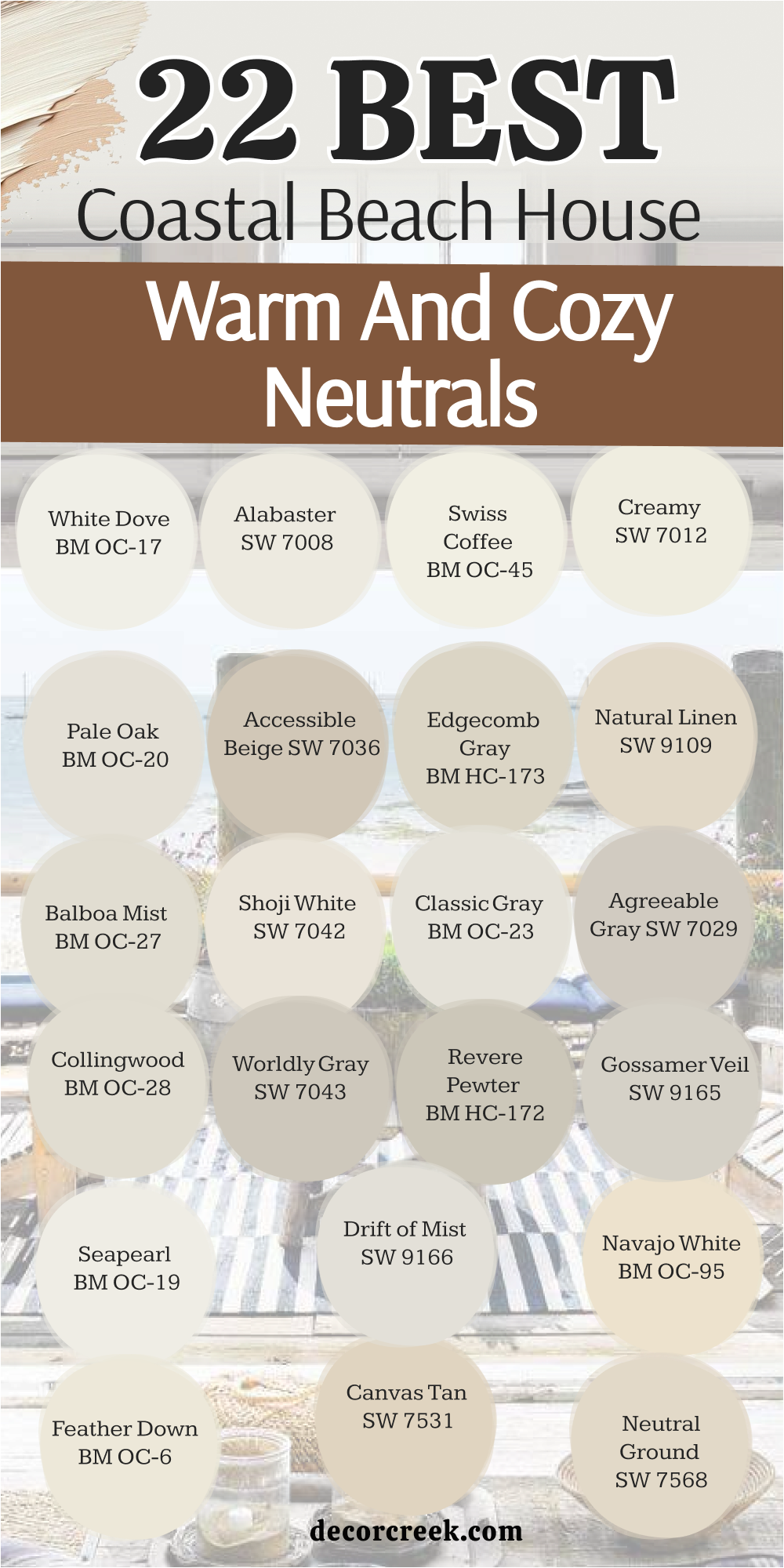
29 Coastal Beach House Proven Palettes from the Designer
Sea Salt SW 6204 + White Dove BM OC-17
Sea Salt SW 6204 + White Dove BM OC-17 is the gold standard for coastal design because it perfectly captures the spirit of the ocean.
Sea Salt is a chameleon that shifts between green, blue, and gray depending on the time of day. I love using this in a living room because it feels so incredibly fresh and clean.
The White Dove trim adds a creamy warmth that keeps the cool wall color feeling very cozy. It reminds me of the shallow water near the sand on a quiet morning.
You will find it very relaxing to sit in a room painted with this palette after a long day. It makes a home feel like a permanent summer getaway.
Best used in: living rooms, kitchens, and master bathrooms
Pairs well with: natural wood, light gray rugs, and linen fabrics
Palladian Blue BM HC-144 + Simply White BM OC-117
Palladian Blue BM HC-144 + Simply White BM OC-117 is a cheerful and bright combination that feels like a sunny day at the bay.
This blue has a soft green undertone that makes it feel very organic and natural. I find it works beautifully in a dining room where you want to have happy conversations.
The Simply White trim is very crisp and helps the wall color pop with extra energy. It reminds me of a clear summer sky over a white sand beach.
It is a very welcoming palette that makes every guest feel like they are on a vacation. You will love the bright and airy mood it brings to your favorite spaces.
Best used in: dining rooms, entryways, and guest bedrooms
Pairs well with: wicker furniture, bright brass, and coral accents
Silver Strand SW 7057 + Alabaster SW 7008
Silver Strand SW 7057 + Alabaster SW 7008 is a sophisticated and modern look for a high-end beach house.
Silver Strand is a cool gray with heavy blue-green tones that feel very expensive on the walls. I love using this in a home office or a primary suite to create a quiet, focused mood.
The Alabaster trim adds a soft, warm white that prevents the gray from feeling too cold. it reminds me of the mist over the water right before a storm clears.
It is a very smart choice for a modern farmhouse that needs to feel calm and well-designed. You will enjoy how the colors change softly as the evening shadows come in.
Best used in: home offices, master suites, and hallways
Pairs well with: navy blue, charcoal gray, and silver hardware
Beach Glass BM 1564 + Classic Gray BM OC-23
Beach Glass BM 1564 + Classic Gray BM OC-23 is a deeper, more soulful palette that adds a lot of character to a room.
Beach Glass has a lot of gray and green in it, making it feel very grounded and strong. I like to use this on an accent wall or in a large den to make it feel extra cozy.
The Classic Gray trim is very light and helps the darker walls look very crisp. It reminds me of the smoothed glass pieces found along the shore after many years.
It is a very confident color choice that shows off your personal style. You will love how it makes your white furniture and artwork stand out.
Best used in: dens, accent walls, and home libraries
Pairs well with: dark wood floors, white marble, and brass lamps
Rainwashed SW 6211 + Chantilly Lace BM OC-65
Rainwashed SW 6211 + Chantilly Lace BM OC-65 is a light and happy palette that feels like a fresh garden by the sea.
Rainwashed is more green than blue, giving it a very natural and energetic feeling. I love putting this in a breakfast nook or a laundry room to make chores feel a little lighter.
The Chantilly Lace trim is a very pure, clean white that makes the green look extra sharp. It reminds me of the world after a light spring rain shower.
It is a very positive combination that makes a small room feel much bigger and more alive. You will find it brings a smile to your face every time you walk by.
Best used in: kitchens, breakfast nooks, and laundry rooms
Pairs well with: light wood, silver hardware, and green plants
Quiet Moments BM 1563 + Balboa Mist BM OC-27
Quiet Moments BM 1563 + Balboa Mist BM OC-27 is a very soft and romantic palette that feels like a quiet sanctuary.
Quiet Moments is a gentle mix of blue and gray that is incredibly easy on the eyes. I find it is the perfect choice for a master bedroom where you want to sleep peacefully.
The Balboa Mist trim adds a tiny bit of warmth that makes the cool walls feel very comfortable. It reminds me of the smooth stones found at the water’s edge.
It is a very sophisticated and quiet palette that never goes out of style. You will love the balanced and steady energy it brings to your private spaces.
Best used in: master bedrooms, nurseries, and bathrooms
Pairs well with: soft gray textiles, white linen, and silver accents
Tradewind SW 6218 + Natural Linen SW 9109
Tradewind SW 6218 + Natural Linen SW 9109 is a classic coastal look that feels like sailing on the open ocean.
Tradewind is a very clear and light blue that feels very energetic and airy. I love using this in a living room with high ceilings to make it feel even more open.
The Natural Linen trim adds a warm, sandy contrast that grounds the bright blue walls. It reminds me of white sails against a clear blue sky.
It is a very friendly and welcoming combination for a family home. You will love how it makes your house feel large, bright, and full of fresh air.
Best used in: living rooms, kids’ rooms, and sunrooms
Pairs well with: jute rugs, navy blue accents, and white furniture
Woodlawn Blue BM HC-147 + Swiss Coffee BM OC-45
Woodlawn Blue BM HC-147 + Swiss Coffee BM OC-45 is a traditional and safe palette that feels very solid and honest.
Woodlawn Blue is a soft blue with a touch of gray that feels very stable and traditional. I find it works perfectly in a house with lots of antique treasures and books.
The Swiss Coffee trim adds a rich, creamy white that makes the blue feel very cozy. It reminds me of a quiet morning at a historic beach cottage.
It is a very reliable choice for anyone who wants a home that feels established and well-loved. You will enjoy the comforting and classic mood it creates.
Best used in: living rooms, guest bedrooms, and home offices
Pairs well with: dark wood furniture, antique gold, and cream textiles
Oyster Bay SW 6206 + Shoji White SW 7042
Oyster Bay SW 6206 + Shoji White SW 7042 is a moody and elegant palette for a sophisticated coastal look.
Oyster Bay is a deep green-gray that feels very grounded and mature. I love using this in a dining room because it looks so beautiful under evening light.
The Shoji White trim provides a warm, deep white that prevents the dark walls from feeling too heavy. It reminds me of rocky cliffs along a stormy coast.
It is a very bold and stylish choice that makes your home stand out. You will feel very proud of the high-end and designer look this brings to your space.
Best used in: dining rooms, cabinetry, and home libraries
Pairs well with: black metal, urban bronze, and white marble
Healing Aloe BM 1562 + Pale Oak BM OC-20
Healing Aloe BM 1562 + Pale Oak BM OC-20 is a light and breezy combination that is almost a neutral.
Healing Aloe is a very pale green that feels like a breath of fresh air on the walls. I like to use this in small rooms that need to feel much more open and bright.
The Pale Oak trim adds a soft, warm greige that keeps the palette feeling modern and clean. It reminds me of sea glass found hidden in the sand.
It is a very peaceful and quiet look that works in almost any home. You will love how it makes your morning feel light and your evenings feel calm.
Best used in: nurseries, small guest rooms, and bathrooms
Pairs well with: light oak floors, natural linen, and soft gray
Comfort Gray SW 6205 + Greek Villa SW 7551
Comfort Gray SW 6205 + Greek Villa SW 7551 is a steady and strong palette that feels very protective and cozy.
Comfort Gray is a medium blue-green that has enough weight to feel very grounded in a large room. I love how it handles the bright sun without looking too light.
The Greek Villa trim is a sunny, warm white that keeps the walls from feeling too moody. It reminds me of deep ocean water on a clear afternoon.
It is a very popular choice for families because it hides marks well and feels very sturdy. You will enjoy the peaceful and solid energy it brings to your home.
Best used in: living rooms, entryways, and kitchen islands
Pairs well with: warm wood beams, copper accents, and tan rugs
Gray Wisp BM 1570 + Collingwood BM OC-28
Gray Wisp BM 1570 + Collingwood BM OC-28 is a light and organic palette that feels connected to nature.
Gray Wisp is a soft, misty green that feels very refreshing and clean. I love putting this in a sunroom where it can highlight the view of the outdoors.
The Collingwood trim adds a warm gray heart that makes the green walls look very professional. It reminds me of the beach grass in the early morning fog.
It is a very smart and updated choice for a coastal farmhouse. You will love how it makes your home feel like a quiet retreat from the busy world.
Best used in: sunrooms, kitchens, and open floor plans
Pairs well with: silver hardware, white cabinetry, and light wood
Watery SW 6478 + Pure White SW 7005
Watery SW 6478 + Pure White SW 7005 is a fun and energetic palette for a true beach vacation feel.
Watery is a bright, clear blue that feels very happy and full of life. I love using this in a guest bath or a pool house to give it a pop of coastal energy.
The Pure White trim is very crisp and makes the blue walls look extra bright and clean. It reminds me of a swimming pool or a tropical lagoon.
It is a very cheerful choice that brings a smile to everyone’s face. You will love how it wakes up a dark corner and makes your home feel vacation-ready.
Best used in: bathrooms, kids’ rooms, and laundry rooms
Pairs well with: navy blue, nautical decor, and chrome fixtures
Glass Slipper BM 1632 + Edgecomb Gray BM HC-173
Glass Slipper BM 1632 + Edgecomb Gray BM HC-173 is an icy and sophisticated look that feels very refined.
Glass Slipper is a very pale blue with a touch of gray that feels very clean and cool. I find it works beautifully in rooms that get a lot of afternoon heat.
The Edgecomb Gray trim adds a warm, organic contrast that keeps the icy blue from feeling cold. It reminds me of the foam on the very top of a wave.
It is a very elegant way to add color to your home while keeping it looking light. You will love the refreshing and designer feel this brings to your rooms.
Best used in: bedrooms, ceilings, and formal living areas
Pairs well with: white dove trim, silver lamps, and cool gray rugs
Open Air SW 6491 + Agreeable Gray SW 7029
Open Air SW 6491 + Agreeable Gray SW 7029 is a unique and pretty palette with a soft, romantic touch.
Open Air is a light blue with a tiny hint of purple that makes it feel very special and airy. I love using this on a porch ceiling or in a nursery for a soft look.
The Agreeable Gray trim is the perfect neutral to ground the light walls and make them feel professional. It reminds me of the sky at sunset over the water.
It is a very cheerful and light combination that makes people feel happy. You will love how it adds a secret bit of personality to your favorite spaces.
Best used in: porch ceilings, nurseries, and laundry rooms
Pairs well with: white linen, soft gray textiles, and green plants
Seafoam BM 2123-60 + Revere Pewter BM HC-172
Seafoam BM 2123-60 + Revere Pewter BM HC-172 is a nostalgic and charming palette for a cottage-style home.
Seafoam is a light and minty green that feels very vintage and friendly. I love using this in a kitchen with open shelving to create a very lived-in look.
The Revere Pewter trim adds a rich, high-end greige that keeps the minty green looking sophisticated. It reminds me of old beach houses from many years ago.
It is a very cheerful choice that brings a lot of energy to a small space. You will enjoy the warm and happy mood this palette creates for your family.
Best used in: kitchens, cottages, and guest rooms
Pairs well with: warm wood, antique brass, and colorful accents
Sleepy Blue SW 6225 + Creamy SW 7012
Sleepy Blue SW 6225 + Creamy SW 7012 is a stable and traditional look that feels very comforting and safe.
Sleepy Blue is a medium blue with enough gray to keep it looking professional and calm. I find it works great in a home office where you need to feel steady.
The Creamy trim adds a sunny warmth that makes the blue walls feel very welcoming. It reminds me of a favorite pair of well-worn blue jeans.
It is a very safe and reliable choice for anyone who loves blue. You will love the steady and quiet energy this combination brings to your daily life.
Best used in: home offices, bedrooms, and living rooms
Pairs well with: Alabaster SW 7008, navy blue, and tan leather
Mount Saint Anne BM 1565 + Feather Down BM OC-6
Mount Saint Anne BM 1565 + Feather Down BM OC-6 is a deep and smoky palette that adds a sense of luxury.
Mount Saint Anne is a dark blue-green that feels very strong and soulful. I love using this in a small den or library to make the room feel extra cozy and private.
The Feather Down trim is a very light greige that provides a soft contrast to the dark walls. It reminds me of the deep water far away from the sandy shore.
It is a very bold and designer choice that shows a lot of confidence. You will feel very proud of the rich and sophisticated look this brings to your home.
Best used in: dens, libraries, and kitchen islands
Pairs well with: brass fixtures, leather chairs, and dark wood
Tidewater SW 6477 + Canvas Tan SW 7531
Tidewater SW 6477 + Canvas Tan SW 7531 is a bright and tropical look that feels like a day at the islands.
Tidewater is a light aqua blue that is very energetic and happy. I find it works perfectly in a mudroom or a kids’ bathroom to keep the energy high.
The Canvas Tan trim adds a sandy, neutral ground that makes the aqua look very professional. It reminds me of the Caribbean sea where the water hits the sand.
It is a very classic coastal look that never goes out of style. You will love how it makes your home feel bright, airy, and always ready for the sun.
Best used in: mudrooms, bathrooms, and kids’ rooms
Pairs well with: Pure White SW 7005, light wood, and jute rugs
Breath of Fresh Air BM 806 + Seapearl BM OC-19
Breath of Fresh Air BM 806 + Seapearl BM OC-19 is a light and weightless combination for a truly airy home.
Breath of Fresh Air is a very clear and light blue that lives up to its name perfectly. I love putting this in a sunroom to make the whole house feel more open.
The Seapearl trim is a very light, creamy white that keeps the blue walls looking crisp and fresh. It reminds me of a cloudless sky on a perfect spring morning.
It is a very peaceful and happy palette that brings a lot of light inside. You will find it makes your morning feel refreshed and full of hope.
Best used in: sunrooms, nurseries, and bedrooms
Pairs well with: white linen, silver accents, and light gray
Wythe Blue BM HC-143 + Navajo White BM OC-95
Wythe Blue BM HC-143 + Navajo White BM OC-95 is a rich and traditional coastal look with a touch of history.
Wythe Blue is a deep teal-leaning blue that feels very high-end and sophisticated. I like to use this on an accent wall or a front door to make a statement.
The Navajo White trim adds a deep, warm cream that keeps the teal walls feeling very cozy. It reminds me of the water in a quiet, deep harbor at sunset.
It is a very confident choice for a homeowner who wants a lot of style. You will love the rich and welcoming mood this palette creates for your guests.
Best used in: front doors, kitchen islands, and accent walls
Pairs well with: gold hardware, dark wood, and white marble
Drift of Mist SW 9166 + White Heron BM OC-57
Drift of Mist SW 9166 + White Heron BM OC-57 is a very light and modern gray look that feels very clean.
Drift of Mist is a very pale gray that acts almost like a white with a tiny bit of color. I find it works great in an open floor plan to keep everything looking large.
The White Heron trim is a cool, crisp white that makes the gray look very updated. It reminds me of a light fog over the water in the early morning.
It is a very smart choice for a modern beach house that needs to feel refreshed. You will love how it makes your colorful art and furniture stand out.
Best used in: open concept areas, hallways, and modern living rooms
Pairs well with: black metal, navy blue, and cool gray
Sand Dollar SW 6099 + Linen White BM OC-146
Sand Dollar SW 6099 + Linen White BM OC-146 is a warm and sandy palette that feels like a cozy cottage.

Sand Dollar is a light, sunny tan that feels very friendly and welcoming. I love using this in a guest bedroom to make visitors feel at home right away.
The Linen White trim adds a creamy, traditional warmth that keeps the tan walls looking bright. It reminds me of walking through the sand on a warm afternoon.
It is a very reliable and cozy choice for any coastal home. You will enjoy the happy and grounded energy it brings to your daily life.
Best used in: guest bedrooms, hallways, and kitchens
Pairs well with: light blue accents, wicker furniture, and warm wood

Rain SW 7639 + Simply White BM OC-117
Rain SW 7639 + Simply White BM OC-117 is a medium blue look that feels very steady and peaceful.
Rain is a soft blue with enough gray to keep it from looking too bright in a large room. I like to use this in a living area where you want a sense of calm and order.
The Simply White trim is very crisp and helps the blue walls look very clean and sharp. It reminds me of the ocean on a day when the sky is a bit overcast.
It is a very popular choice because it feels very professional and high-end. You will love the relaxing and steady mood this palette creates for your family.
Best used in: living rooms, bedrooms, and entryways
Pairs well with: natural linen, silver hardware, and gray textiles
Aesthetic White SW 7035 + Pale Oak BM OC-20
Aesthetic White SW 7035 + Pale Oak BM OC-20 is a very light and modern neutral look.

Aesthetic White is an off-white with a touch of gray and beige that feels very soft. I love putting this on the walls of a kitchen to make it feel very updated.
The Pale Oak trim adds just enough contrast to make the walls look professional and designer. It reminds me of the soft colors of a driftwood log.
It is a very smart choice for a homeowner who wants a very clean and simple look. You will love how it makes your whole house feel light, open, and airy.
Best used in: kitchens, bathrooms, and hallways
Pairs well with: white oak, silver fixtures, and black accents
Windy Sky 1639 + White Dove BM OC-17
Windy Sky 1639 + White Dove BM OC-17 is a light, clear blue that feels very breezy and fresh.
Windy Sky is a true blue that doesn’t have much gray, making it feel very cheerful. I love using this in a nursery or a small bedroom to keep the mood light.
The White Dove trim adds a soft warmth that keeps the blue walls from feeling too cold. It reminds me of the sky on a perfect day at the beach.
It is a very happy and positive palette that brings a lot of life to a room. You will find it makes your home feel very open and always ready for spring.
Best used in: nurseries, kids’ rooms, and sunrooms
Pairs well with: light gray, white linen, and silver hardware
Horizon BM 1478 + Alabaster SW 7008
Horizon BM 1478 + Alabaster SW 7008 is an icy gray and warm white mix that feels very sophisticated.
Horizon is a very light gray with a cool undertone that feels very clean and updated. I like to use this in a master bathroom to create a spa-like feeling.
The Alabaster trim adds a creamy warmth that balances the cool gray perfectly. It reminds me of the horizon line where the sky meets the water.
It is a very elegant and high-end choice for a modern coastal home. You will love the refreshing and designer mood it brings to your private spaces.
Best used in: bathrooms, bedrooms, and laundry rooms
Pairs well with: chrome fixtures, white marble, and navy blue
Spare White SW 6203 + Classic Gray BM OC-23
Spare White SW 6203 + Classic Gray BM OC-23 is a very light and modern palette that acts as a perfect background.
Spare White is a cool white with a tiny hint of gray that feels very fresh. I find it works great in an entryway where you want to make a bright first impression.
The Classic Gray trim provides a soft, warm neutral ground that keeps the look professional. It reminds me of the very first light of morning at the coast.
It is a very smart choice for anyone who loves a clean and simple lifestyle. You will love how it makes your entire home feel large and filled with fresh light.
Best used in: entryways, hallways, and open floor plans
Pairs well with: black metal, natural wood, and gray rugs
Harbour Haze 2136-60 + Swiss Coffee BM OC-45
Harbour Haze 2136-60 + Swiss Coffee BM OC-45 is a soft and romantic blue that feels very cozy.
Harbor Haze is a very light blue with a touch of gray and green, making it feel very organic. I love putting this in a guest bedroom to make it feel very welcoming.
The Swiss Coffee trim adds a rich, traditional warmth that makes the blue feel extra soft. It reminds me of the mist over a quiet harbor at dawn.
It is a very gentle and pretty palette that everyone seems to like. You will enjoy the peaceful and happy energy it brings to your home every day.
Best used in: guest bedrooms, bathrooms, and nurseries
Pairs well with: antique brass, cream textiles, and white furniture
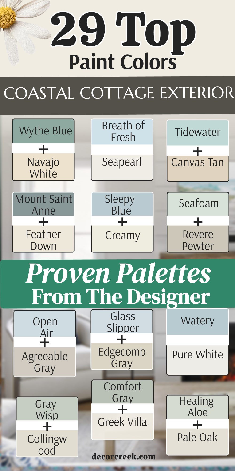
Choosing the right paint for a coastal home is about more than just picking a color you like; it is about capturing a specific feeling of light, air, and peace. After years of working with these palettes, I have seen how the right combination can turn a standard room into a personal sanctuary that feels like a permanent vacation. Creating this atmosphere requires a deep understanding of how pigment and light interact within a space.
In coastal design, the sun is your most important collaborator. Many of the most beloved shades in this style are true chameleons—they respond to the moving sun, shifting gracefully between green, blue, and gray throughout the day. When selecting your paint, always remember that a shade that looks perfect in a bright, south-facing living room might feel a bit chilly or flat in a north-facing bedroom.
You must account for the direction of the light to ensure the walls maintain their intended glow from morning until sunset.
The most successful coastal homes find a perfect balance between the cool tones of the water and the warm tones of the sand.
This is why it is often best to pair cool, watery wall colors with warmer, creamy trim. This intentional contrast prevents the room from feeling too icy or clinical, ensuring the environment remains cozy and inviting for family and guests.
By blending these opposing temperatures, you mirror the natural landscape of the shore, grounding the airy heights of the sky with the earthy stability of the beach.