I have spent years helping people fix up their houses to sell or just to enjoy. Finding the right paint is often the hardest part for any homeowner. Most people want a home that feels warm but also looks very clean. It can be hard to pick from so many different cans of paint at the store.
I make it my job to take that stress away from you. You deserve to have a house that looks like a professional designed it. These colors help your home feel put together without you having to try too hard. Once the paint is on the wall, everything else in the room starts to look better too.
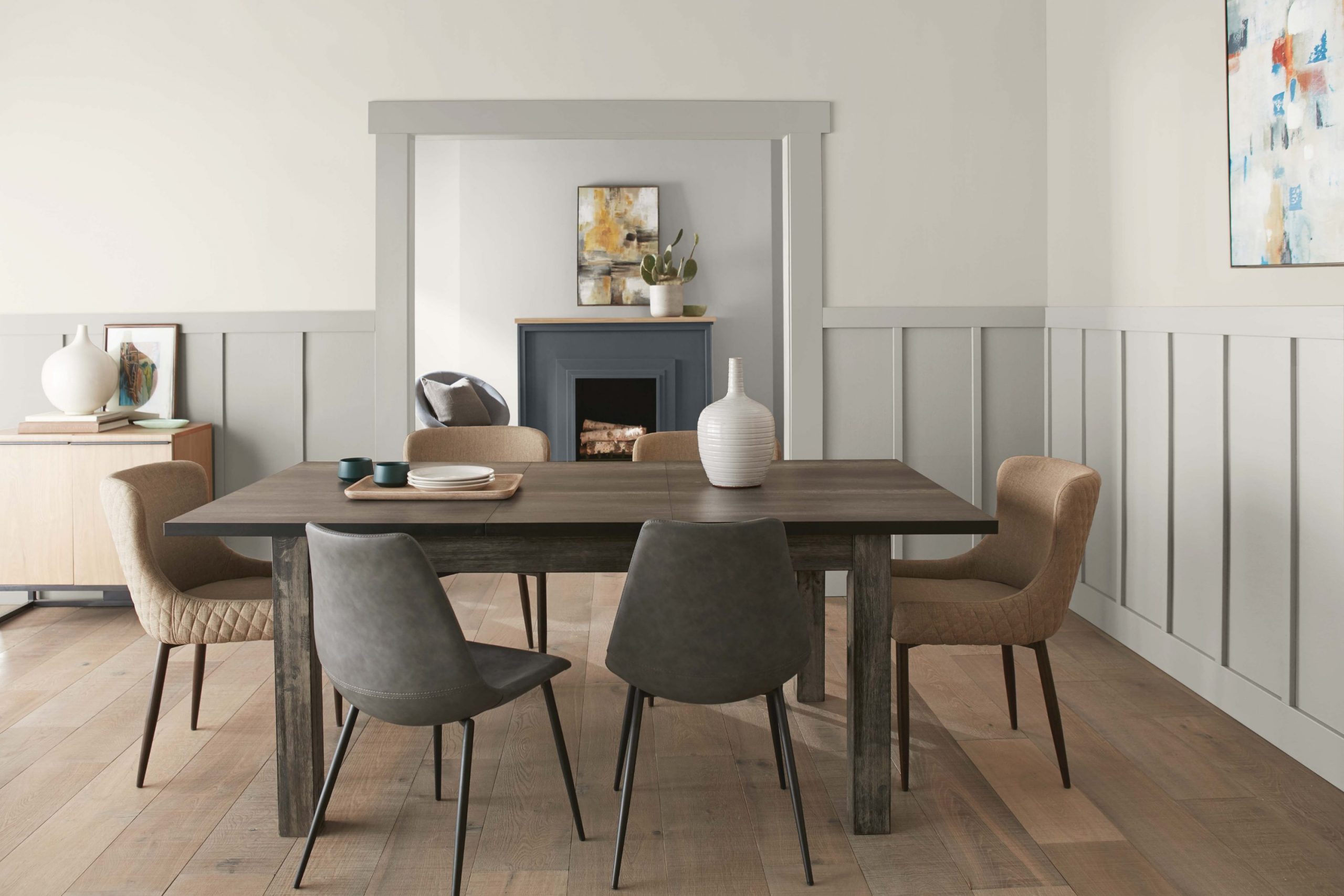
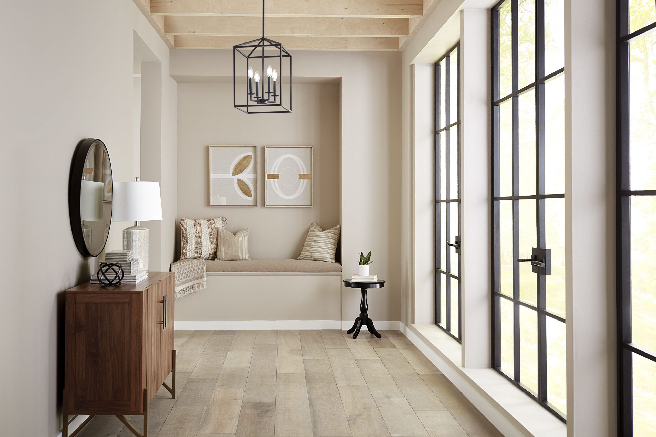
Creamy mushroom colors are the secret weapon I use for almost every project. These shades sit right between brown and gray, so they never look too cold or too yellow. They make any house feel like a cozy hug the moment you walk through the front door. You will notice how the walls seem to glow when the sun hits them just right.
It is a very soft look that works for a big family house or a small apartment.
These paints are the best way to make a room feel expensive and fresh at the same time. I always keep these colors at the top of my list for my favorite clients.
Why Creamy Mushroom Paint Colors Feel So Easy to Live With
Mushroom colors work so well because they change based on the light in your house. They act like a neutral backdrop that lets your furniture and art look their very best. You do not have to worry about your couch clashing with these soft earthy tones.
It feels like the walls and the floor are finally talking to each other in a nice way. You can change your pillows or rugs later and the paint will still look great. This makes it very simple to update your style whenever you feel like trying something new. These shades are very forgiving and hide the small messes of daily life very well.
Many people find that bright white is too harsh and dark brown is too heavy for a small room. A creamy mushroom shade gives you the best of both worlds without any of the stress. It creates a friendly mood that makes guests want to stay a little bit longer. You will feel proud to show off your home to your friends and family now. It is a smart way to make your rooms feel bigger and more open for everyone.
You get a clean look that still feels like a real home where people actually live. It is the perfect choice for creating a happy and welcoming feeling in every corner.
How I Choose the Right Creamy Mushroom Shade for Any Room
I always start by looking at the windows to see how much sun comes inside. If a room gets a lot of natural light, I can pick a slightly darker mushroom color. For darker hallways, I stick to the lightest creamy shades to keep things feeling open. You want to make sure the paint does not look too dark when the sun goes down.
Light can change the way a color feels from one hour to the next. I spend a lot of time watching how the shadows move across the walls in the afternoon. This helps me find the exact shade that will make you feel the most happy.
I also look at the floor colors before I buy any cans of paint for a client. You want a color that shares the same warmth as your wood or carpet. Testing a small patch on the wall is the only way to be sure it looks right in your specific house. I usually paint a few big squares in different spots to see how they look together. It is important to check the color next to your cabinets and your favorite furniture pieces. You want to be sure that the whole room feels like it belongs together as one piece.
Taking these extra steps ensures that you will love the final result for a very long time.
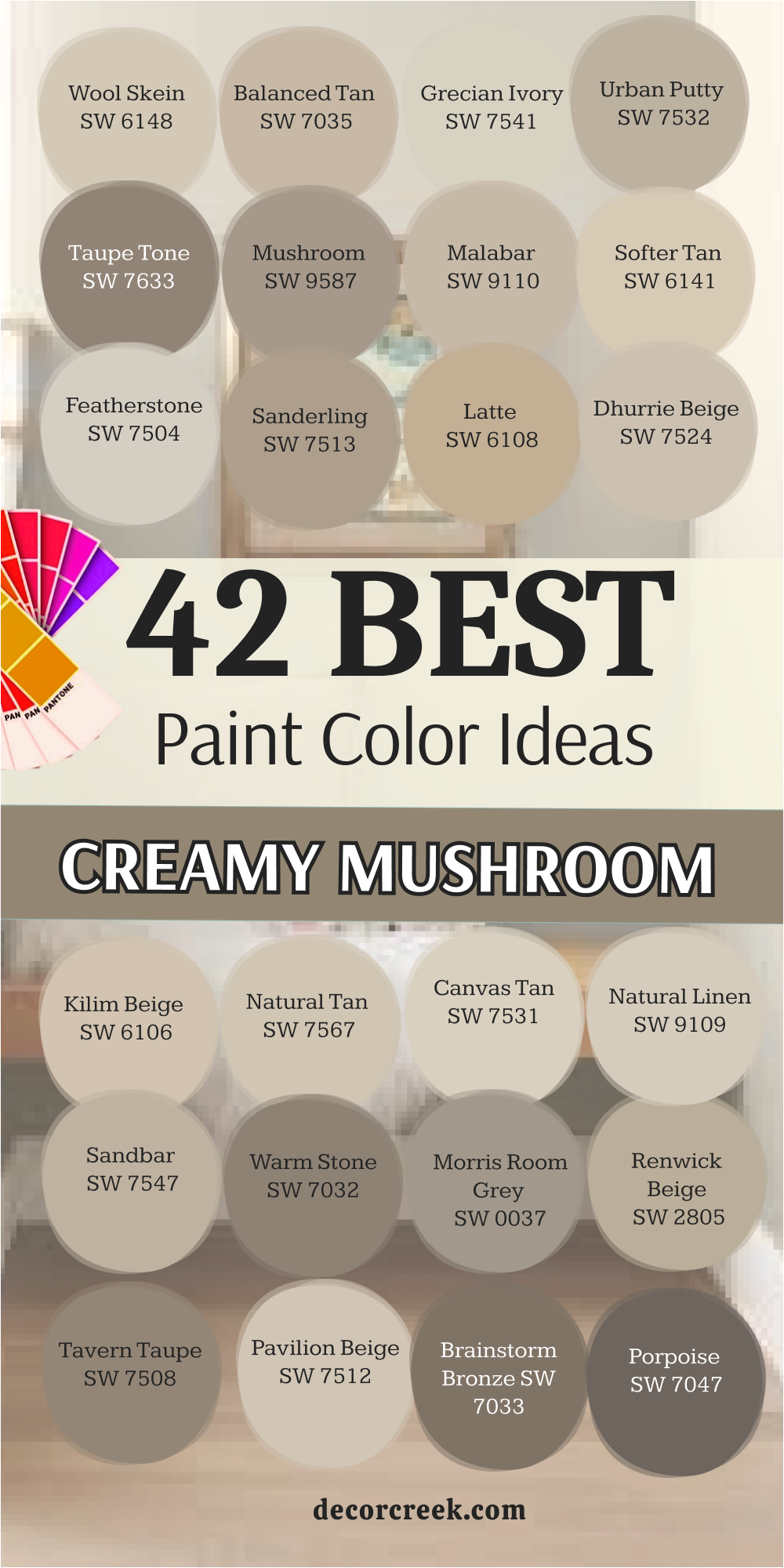
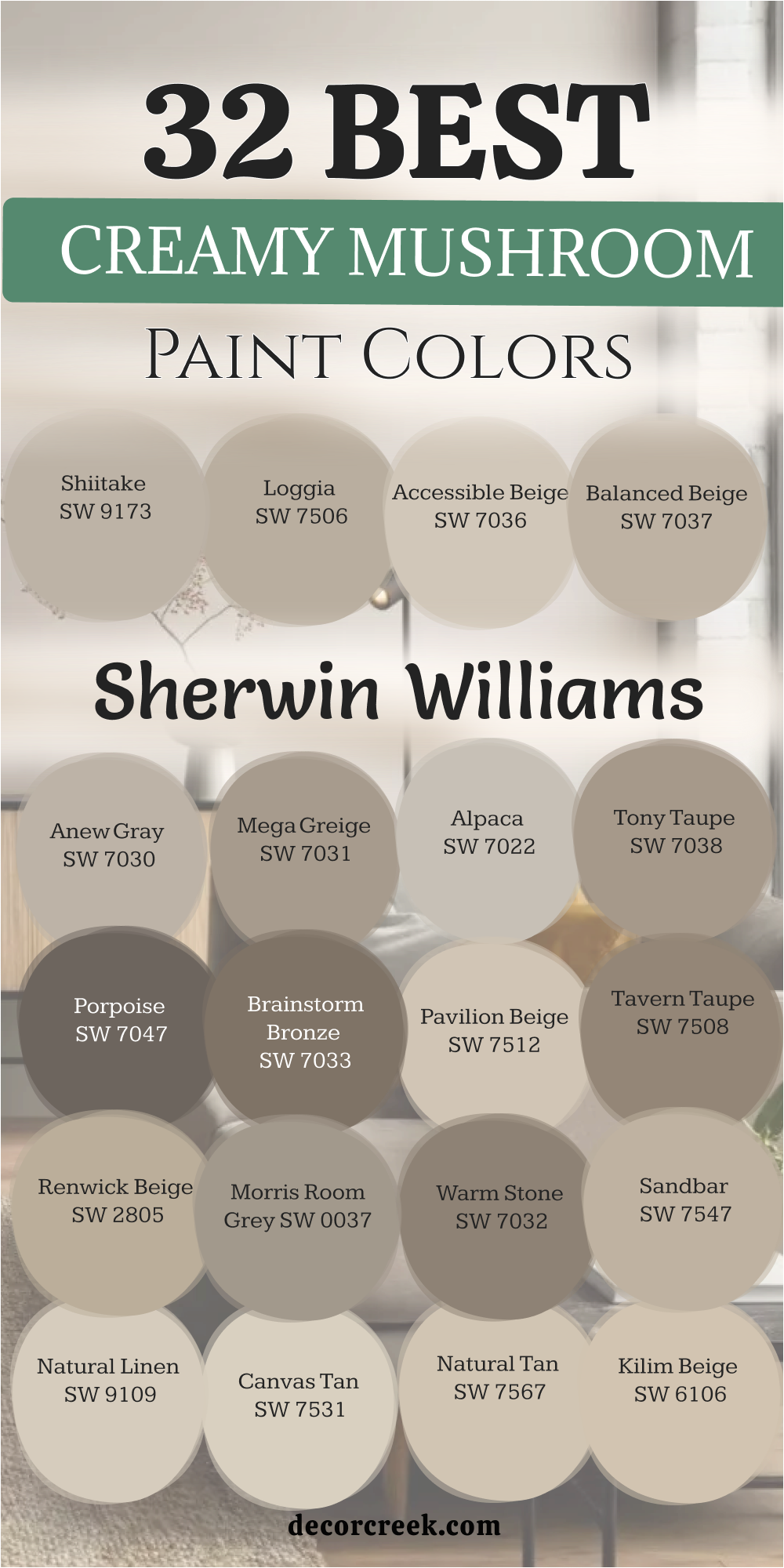
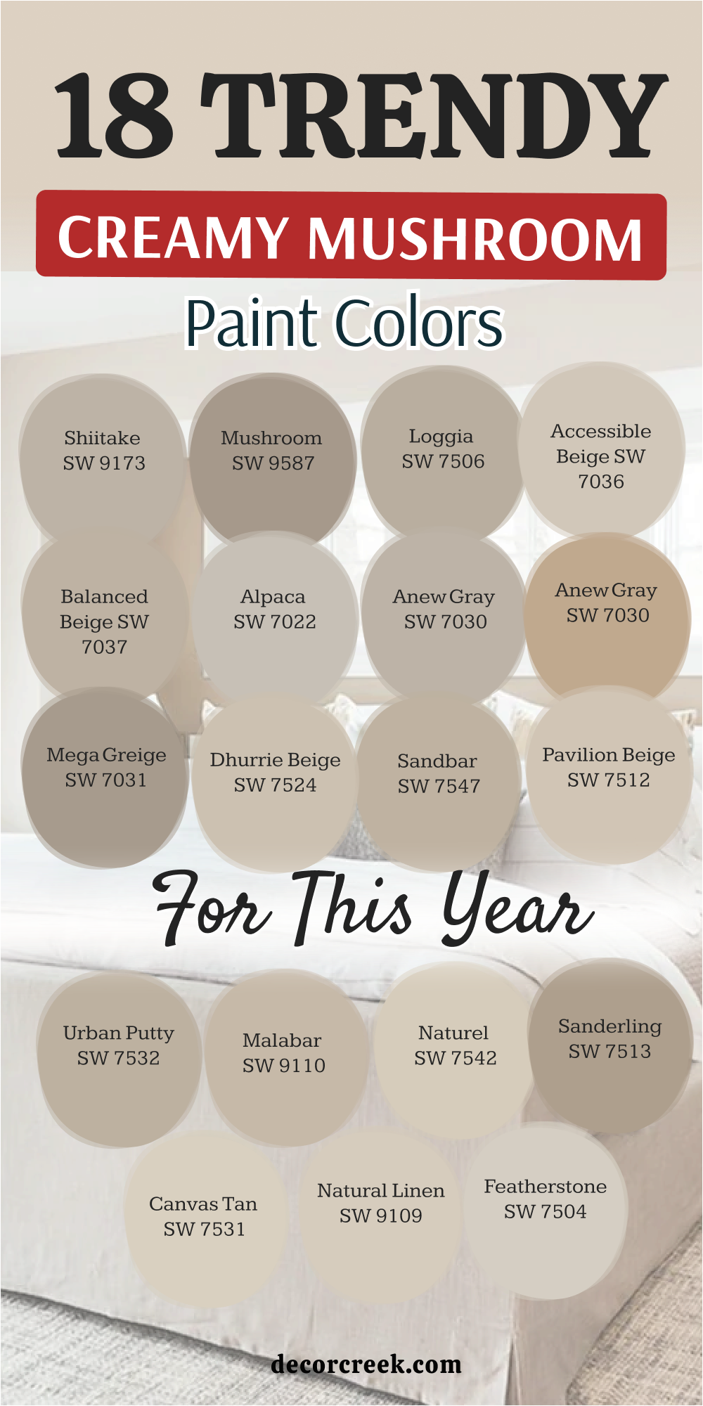
32 Best Creamy Mushroom Paint Colors From Sherwin Williams
Shiitake SW 9173
Shiitake SW 9173 is a medium-toned beige that has just enough gray to keep it from looking like sand. This color fills a room with a steady warmth that feels very grounded and solid. I love how it makes white trim pop without creating a high contrast that hurts your eyes.
It is the kind of shade that works in a bedroom where you want to feel tucked in at night. You will notice that it hides small scuffs and marks better than very light colors do. Many families choose this for high-traffic areas because it stays looking fresh for a long time.
It provides a perfect middle ground for someone who cannot decide between tan and gray. This paint makes your wooden furniture look expensive and well-cared for in any light. It is a reliable choice for a main living area that needs a bit of personality.
Best used in: kitchens, living rooms, and master bedrooms
Pairs well with: Pure White SW 7005, Naval SW 6244, and dark oak flooring The key rule of this color for farmhouse style is to use it where you want natural light to feel kind, soft, and inviting throughout the day.
🎨 Check out the complete guide to this color right HERE 👈

Loggia SW 7506
Loggia SW 7506 leans toward a classic taupe that feels very sophisticated on a large wall. This color has a rich depth that helps a big room feel much more intimate and private. I often suggest this for home offices because it helps you focus without being boring.
It looks beautiful when the afternoon sun hits it and brings out the creamy undertones. You can use this in a bathroom to make it feel like a fancy hotel or a spa. It handles shadows very well and does not turn muddy when the lights are low.
This shade is a favorite for people who want a traditional look that still feels modern. It creates a smooth flow from one room to the next when used in hallways. You will find that it matches almost any metal finish from gold to black.
Best used in: dining rooms, home offices, and entryways
Pairs well with: Alabaster SW 7008, Urbane Bronze SW 7048, and brass fixtures The key rule of this color for farmhouse style is to use it where you want natural light to feel kind, soft, and inviting throughout the day.
🎨 Check out the complete guide to this color right HERE 👈

Accessible Beige SW 7036
Accessible Beige SW 7036 is one of the most popular colors for a very good reason. This shade has a tiny bit of gray that keeps the beige from looking like old yellow paper. I find that it makes small rooms feel bigger because it reflects light so evenly.
It is a safe bet for someone who is painting their whole house a single color to sell it. The color stays true to its name by being easy for anyone to like at first glance. It acts as a perfect stage for colorful pillows or bright rugs in a living room.
You can trust this color to look good even if your light bulbs are a bit warm. It is the ultimate neutral for a busy home with kids and pets. Many builders use this as their standard color because it never fails to look clean.
Best used in: open floor plans, hallways, and kitchens
Pairs well with: Dover White SW 6385, Sea Salt SW 6204, and light wood The key rule of this color for farmhouse style is to use it where you want natural light to feel kind, soft, and inviting throughout the day.
🎨 Check out the complete guide to this color right HERE 👈

Balanced Beige SW 7037
Balanced Beige SW 7037 is a step darker and warmer than the lighter beige options on the list. This color provides a cozy feeling that reminds me of a warm latte on a cold morning. It is deep enough to make white window frames stand out beautifully against the wall.
I like to use this in basements because it adds a sense of warmth to a chilly area. It does not feel too dark even if you do not have many windows in the room. This shade is great for hiding imperfections on older walls that are not perfectly smooth.
It creates a sense of balance in a house that has a lot of different wood tones. You will enjoy how it makes your home feel finished and decorated with very little effort. It is a hardworking color that looks great in any season of the year.
Best used in: basements, family rooms, and mudrooms
Pairs well with: Snowbound SW 7004, French Roast SW 6069, and stone accents The key rule of this color for farmhouse style is to use it where you want natural light to feel kind, soft, and inviting throughout the day.
🎨 Check out the complete guide to this color right HERE 👈

Anew Gray SW 7030
Anew Gray SW 7030 is the perfect bridge for people who are scared of gray being too blue. This color has a mushroom warmth that makes it feel much friendlier than a standard stone gray. I use it when a client wants a modern look that still feels like a real home.
It changes slightly throughout the day as the sun moves across the sky. In the morning it looks a bit crisp and in the evening it turns much warmer. This shade works wonders in a kitchen with white cabinets and dark granite counters.
It gives a room a polished look that feels very intentional and well-designed. You can put this in a nursery for a look that grows with the child over time. It is a versatile choice that never feels out of place in a modern house.
Best used in: kitchens, nurseries, and laundry rooms
Pairs well with: Extra White SW 7006, Black Magic SW 6991, and marble The key rule of this color for farmhouse style is to use it where you want natural light to feel kind, soft, and inviting throughout the day.
🎨 Check out the complete guide to this color right HERE 👈
Mega Greige SW 7031
Mega Greige SW 7031 is a heavy-hitter when you want a wall color with a lot of presence. This shade is a true mix of gray and beige with a strong mushroom lean. I think it looks best in rooms with high ceilings where it can really stretch out.
It provides a dramatic backdrop for a gallery wall full of family photos. You will notice that it makes light-colored furniture look much brighter and cleaner. It is a great choice for an accent wall if you are afraid to go too dark.
This color feels very sturdy and can handle the wear and tear of a busy hallway. It brings a sense of order to a room that might have too many different colors. Many people love how it looks on the outside of a house as a trim color.
Best used in: living rooms, exteriors, and large bedrooms
Pairs well with: Westhighland White SW 7566, Iron Ore SW 7069, and linen fabrics The key rule of this color for farmhouse style is to use it where you want natural light to feel kind, soft, and inviting throughout the day.
🎨 Check out the complete guide to this color right HERE 👈
Alpaca SW 7022
Alpaca SW 7022 is a soft and fuzzy sort of color that feels very light on the walls. This shade has a hint of violet in some lights which makes it feel very special. I suggest this for bedrooms where you want to wake up feeling refreshed and happy.
It is a very light mushroom color that almost acts like an off-white in bright sun. You will love how it softens the edges of a room and makes everything look smoother. It is a great choice for a small guest room that needs to feel welcoming.
This color works well with silver or chrome hardware in a bathroom or kitchen. It is a gentle shade that does not demand too much attention from your eyes. You can use it as a base for a very soft and light decorating style.
Best used in: bedrooms, bathrooms, and small offices
Pairs well with: High Reflective White SW 7757, Tricorn Black SW 6258, and wool rugs The key rule of this color for farmhouse style is to use it where you want natural light to feel kind, soft, and inviting throughout the day.
🎨 Check out the complete guide to this color right HERE 👈
Tony Taupe SW 7038
Tony Taupe SW 7038 is a classic mushroom shade that feels very grounded and earthy. This color has a bit more brown in it which makes it feel very traditional. I like to use this on kitchen islands to create a focal point in a white kitchen.
It looks very handsome when paired with dark wood floors and white crown molding. You will find that this color makes a room feel very cozy and protected from the world. It is a popular choice for exteriors because it blends in so well with nature.
This shade does not look dusty or dirty even though it is a darker beige. It provides a rich look that makes a house feel more expensive than it is. You can trust this color to stay in style for many years to come.
Best used in: kitchen islands, exteriors, and dining rooms
Pairs well with: Shoji White SW 7042, Peppercorn SW 7674, and brick The key rule of this color for farmhouse style is to use it where you want natural light to feel kind, soft, and inviting throughout the day.
🎨 Check out the complete guide to this color right HERE 👈
Porpoise SW 7047
Porpoise SW 7047 is a very dark and moody mushroom color that looks amazing on cabinets. This shade is almost like a dark chocolate mixed with a bit of gray stone. I love using this for a cozy den or a media room where you watch movies.
It creates a very dramatic look that makes the walls seem to disappear into the background. You should use this if you want to make a big statement in a small powder room. It works perfectly as a contrast color against very light wood or white tile.
This color feels very modern and high-end when used in the right way. It is a great choice for the front door of a light-colored house. You will find that it adds a lot of depth to any project you are working on.
Best used in: cabinets, accent walls, and front doors
Pairs well with: Eider White SW 7014, Repose Gray SW 7015, and copper The key rule of this color for farmhouse style is to use it where you want natural light to feel kind, soft, and inviting throughout the day.
🎨 Check out the complete guide to this color right HERE 👈

Brainstorm Bronze SW 7033
Brainstorm Bronze SW 7033 is a deep and warm mushroom color that feels very organic. This shade has a lot of green and brown hidden inside the gray base. I find that it looks best in a room with a lot of plants and natural textures.
It makes a library or a reading nook feel very quiet and tucked away. You can use this on the exterior of a home to make it blend into a wooded lot. It is a bold choice that pays off by making your home look very unique.
This color hides dirt and dust extremely well which is great for a back entry. It creates a very strong look that feels both old-fashioned and very current. You will love the way it changes as the sun sets in the evening.
Best used in: studies, exteriors, and mudrooms
Pairs well with: Greek Villa SW 7551, Black Fox SW 7020, and leather The key rule of this color for farmhouse style is to use it where you want natural light to feel kind, soft, and inviting throughout the day.
🎨 Check out the complete guide to this color right HERE 👈

Pavilion Beige SW 7512
Pavilion Beige SW 7512 is a soft and light mushroom shade that feels very crisp on the walls. This color has a slightly cool undertone that keeps a room from feeling too yellow or heavy. I like to use this in guest bedrooms where you want a very clean and fresh look for visitors.
It reflects light beautifully and makes a small area feel much more open than it really is. You will notice that it works perfectly with white linens and light-colored wood floors. It is a very safe choice for someone who wants a neutral home without using plain white.
This shade creates a smooth transition between rooms when used in a long hallway. Many people find that it makes their black picture frames look very sharp and modern. It is a reliable color that stays looking bright even on a very cloudy day.
Best used in: guest bedrooms, hallways, and small bathrooms
Pairs well with: Extra White SW 7006, Urban Bronze SW 7048, and light oak tones The key rule of this color for farmhouse style is to use it where you want natural light to feel kind, soft, and inviting throughout the day.
🎨 Check out the complete guide to this color right HERE 👈
Tavern Taupe SW 7508
Tavern Taupe SW 7508 is a rich and deep mushroom color that feels very solid and traditional. This shade has a lot of brown in it which gives a room a very sturdy and grounded feeling. I suggest using this in a study or a library where you want to feel tucked away.
It looks very expensive when you pair it with thick white crown molding and dark rugs. You can use this on an accent wall to add some depth to a room with very high ceilings. It does not turn purple or blue even when the sun goes down in the evening.
This color is great for hiding small marks in a home with busy pets or growing kids. It provides a warm backdrop that makes your colorful books and art really stand out. You will find that it makes a large room feel much more intimate and comfortable.
Best used in: studies, dining rooms, and accent walls
Pairs well with: Alabaster SW 7008, Naval SW 6244, and leather furniture The key rule of this color for farmhouse style is to use it where you want natural light to feel kind, soft, and inviting throughout the day.
🎨 Check out the complete guide to this color right HERE 👈
Renwick Beige SW 2805
Renwick Beige SW 2805 is a classic mushroom color that comes from a very old and famous collection. This shade has a historical feel that makes a new house look like it has a story. I love how it sits on the wall with a creamy depth that is very hard to find.
It is a medium-toned beige that feels very organic and like something you would find in nature. You should use this if you have a lot of antique furniture or older rugs in your home. It creates a very soft and friendly mood that makes everyone feel right at home immediately.
This color works well in a kitchen with cream-colored cabinets and stone countertops. It is a timeless choice that does not follow trends but always looks very good. You will enjoy how it brings a sense of peace to a very busy family room.
Best used in: kitchens, historic homes, and family rooms
Pairs well with: Westhighland White SW 7566, Rookwood Dark Green SW 2816, and stone The key rule of this color for farmhouse style is to use it where you want natural light to feel kind, soft, and inviting throughout the day.
🎨 Check out the complete guide to this color right HERE 👈
Morris Room Grey SW 0037
Morris Room Grey SW 0037 is a very popular mushroom shade that leans heavily into the gray side. This color is part of a special collection that focuses on colors used in old beautiful mansions. I find that it makes a modern living room feel very high-end and very well-thought-out.
It has a bit of a stone look that feels very cool and refreshing during a hot summer. You can use this in a master bathroom to make it feel like a very fancy and clean spa. It handles bright natural light very well without washing out or disappearing on the wall.
This shade is a great partner for dark metal accents like black iron or oil-rubbed bronze. It gives a room a very structured look that feels organized and very tidy. You will love how it makes your white towels and sheets look much brighter.
Best used in: bathrooms, modern living rooms, and master suites
Pairs well with: Pure White SW 7005, Iron Ore SW 7069, and slate tile The key rule of this color for farmhouse style is to use it where you want natural light to feel kind, soft, and inviting throughout the day.
🎨 Check out the complete guide to this color right HERE 👈
Warm Stone SW 7032
Warm Stone SW 7032 is a darker mushroom color that feels very cozy and wrapped in warmth. This shade is perfect for creating a focal point in a room that feels too large or empty. I like to use this behind a bed to make the sleeping area feel very private and safe.
It has a rich earthy tone that reminds me of river rocks and natural clay. You will find that it looks amazing when the light from a fireplace hits the walls. It is a bold choice that makes a house feel very sturdy and well-built from the inside.
This color hides shadows very well and stays looking deep and interesting all night long. It is a great choice for a theater room or a place where you go to relax. You can trust this color to add a lot of character to a plain rectangular room.
Best used in: bedrooms, media rooms, and accent walls
Pairs well with: Shoji White SW 7042, Black Magic SW 6991, and warm wood The key rule of this color for farmhouse style is to use it where you want natural light to feel kind, soft, and inviting throughout the day.
🎨 Check out the complete guide to this color right HERE 👈

Sandbar SW 7547
Sandbar SW 7547 is a medium mushroom shade that looks just like wet sand on a beautiful beach. This color is very easy on the eyes and does not have any distracting or bright undertones. I suggest this for people who want a beachy feel without using any blue or green paint.
It works wonders in a mudroom where you want a color that can handle a little bit of dirt. You will love how it makes your white trim look very clean and very freshly painted. It is a very balanced color that stays in the background and lets your furniture be the star.
This shade feels very natural and helps a home feel connected to the outdoors. It is a great choice for an entryway because it feels very welcoming to guests. You will find that it is very easy to match with any kind of rug or carpet.
Best used in: entryways, mudrooms, and open living areas
Pairs well with: High Reflective White SW 7757, Sea Salt SW 6204, and jute rugs The key rule of this color for farmhouse style is to use it where you want natural light to feel kind, soft, and inviting throughout the day.
🎨 Check out the complete guide to this color right HERE 👈
Natural Linen SW 9109
Natural Linen SW 9109 is a very light and creamy mushroom color that feels like a soft fabric. This shade is perfect for making a room feel bright and sunny even if it has small windows. I use this a lot for staging houses because almost every buyer likes this soft and light look.
It has a tiny bit of yellow that makes the room feel warm like a sunny afternoon. You can use this in a laundry room to make the chore of washing clothes feel a bit nicer. It looks very beautiful with white cabinets and light marble or quartz countertops in a kitchen.
This color is a great way to make a dark hallway feel much wider and more open. It is a very gentle shade that does not tire out your eyes after a long day. You will enjoy how it makes your home feel very airy and very light.
Best used in: kitchens, laundry rooms, and dark hallways
Pairs well with: Alabaster SW 7008, Peppercorn SW 7674, and linen textures The key rule of this color for farmhouse style is to use it where you want natural light to feel kind, soft, and inviting throughout the day.
🎨 Check out the complete guide to this color right HERE 👈

Canvas Tan SW 7531
Canvas Tan SW 7531 is a very clean and simple mushroom color that feels very modern and fresh. This shade has a bit of a gray base that keeps it from looking like a typical yellow tan. I like to use this in a home office because it feels very organized and helps you stay focused.
It provides a very neutral background for a wall of shelves filled with colorful books and objects. You will notice that it looks very good with both silver and gold metal accents in a room. It is a very flexible color that changes its mood depending on what you put next to it.
This shade is light enough to use in a very small bathroom without making it feel cramped. It gives a room a very professional and polished look that is very easy to maintain. You can count on this color to make your house look very updated and stylish.
Best used in: home offices, small bathrooms, and bedrooms
Pairs well with: Snowbound SW 7004, Naval SW 6244, and walnut wood The key rule of this color for farmhouse style is to use it where you want natural light to feel kind, soft, and inviting throughout the day.
🎨 Check out the complete guide to this color right HERE 👈

Natural Tan SW 7567
Natural Tan SW 7567 is a very friendly mushroom color that feels very warm and very inviting. This shade has a soft glow to it that makes a living room feel like the heart of the home. I suggest this for families who spend a lot of time together in one big main room.
It looks very good with green plants and other natural elements like stone or wood. You will love how it makes a room feel very cozy and comfortable for a movie night. It is a very forgiving color that hides small marks and fingerprints from little hands.
This shade stays looking very consistent even as the light in the room changes during the day. It provides a very soft and pretty look that makes everyone feel relaxed and happy. You will find that it is one of the easiest colors to live with for a long time.
Best used in: family rooms, playrooms, and sunrooms
Pairs well with: Creamy SW 7012, Evergreen Fog SW 9130, and tan leather The key rule of this color for farmhouse style is to use it where you want natural light to feel kind, soft, and inviting throughout the day.
🎨 Check out the complete guide to this color right HERE 👈
Kilim Beige SW 6106
Kilim Beige SW 6106 is a very famous mushroom color that has been a favorite for many years. This shade is a bit deeper and warmer than many other beige colors on the market today. I find that it looks best in a house with a lot of traditional furniture and warm wood floors.
It creates a very rich and full look that makes a room feel very complete and finished. You can use this in a dining room to make dinner parties feel more formal and special. It has a bit of a red undertone that makes the room feel very cozy and very warm.
This color is a great choice for an exterior if you want your house to look very classic. It provides a very steady and reliable look that you will not get tired of seeing every day. You will love how it makes your home feel like a very solid and safe place.
Best used in: dining rooms, exteriors, and traditional living rooms
Pairs well with: Divine White SW 6105, Latte SW 6108, and dark mahogany The key rule of this color for farmhouse style is to use it where you want natural light to feel kind, soft, and inviting throughout the day.
🎨 Check out the complete guide to this color right HERE 👈
Dhurrie Beige SW 7524
Dhurrie Beige SW 7524 is a very soft and sandy mushroom color that reminds me of natural woven rugs. This shade has a nice balance of gray and tan that keeps it looking very fresh in any light. I love using this in a guest room because it makes the whole room feel very clean and light.
It provides a great background for colorful pillows or a bright bedspread. You will find that it makes white window frames look very sharp and crisp against the wall. It is a very easy color for anyone to like because it is so gentle on the eyes.
This shade works well in a hallway because it helps the narrow area feel a bit wider. It gives your home a very organized and tidy look that is very simple to maintain. You can count on this color to make your house look very updated and modern.
Best used in: guest rooms, hallways, and small offices
Pairs well with: Pure White SW 7005, Iron Ore SW 7069, and light oak wood The key rule of this color for farmhouse style is to use it where you want natural light to feel kind, soft, and inviting throughout the day.
🎨 Check out the complete guide to this color right HERE 👈
Latte SW 6108
Latte SW 6108 is a rich and warm mushroom color that feels like a big cup of coffee with milk. This shade has a lot of golden warmth that makes a large living room feel very cozy. I suggest this for homes with high ceilings that might otherwise feel a bit cold or empty.
It looks very handsome when paired with dark brown leather chairs and wood floors. You can use this in a dining room to create a very inviting place for family meals. It stays looking very warm even on dark winter days when there is not much sun.
This color hides scuffs and marks very well which makes it great for homes with kids. It provides a very traditional and solid look that makes a house feel very sturdy. You will enjoy how it brings a sense of comfort to your favorite sitting area.
Best used in: living rooms, dining rooms, and family rooms
Pairs well with: Kilim Beige SW 6106, Hopsack SW 6109, and dark wood The key rule of this color for farmhouse style is to use it where you want natural light to feel kind, soft, and inviting throughout the day.
🎨 Check out the complete guide to this color right HERE 👈
Sanderling SW 7513
Sanderling SW 7513 is a medium mushroom color that has a very earthy and natural feeling. This shade looks like the feathers of a small bird or the smooth bark of a tree. I like to use this on the outside of a house to help it blend in with the yard.
It is a very grounded color that makes a room feel very safe and very quiet. You will notice that it looks great with stone accents and black metal light fixtures. It is deep enough to provide a nice contrast against light-colored furniture and rugs.
This shade does not turn yellow or blue even when the light in the room changes. It creates a very professional look in a home office or a study area. You can trust this color to stay in style for a very long time without looking old.
Best used in: exteriors, home offices, and mudrooms
Pairs well with: Alabaster SW 7008, Urbane Bronze SW 7048, and stone tiles The key rule of this color for farmhouse style is to use it where you want natural light to feel kind, soft, and inviting throughout the day.
🎨 Check out the complete guide to this color right HERE 👈
Featherstone SW 7504
Featherstone SW 7504 is a light and airy mushroom shade that feels very soft and very light. This color has a gray base that keeps it looking very modern and very cool on the wall. I recommend this for bedrooms where you want to have a very peaceful place to sleep.
It reflects a lot of light which helps a dark room feel much more open and bright. You will love how it makes your white bedding look very crisp and very clean. It is a very subtle shade that stays in the background and does not demand any attention.
This color works perfectly in a small bathroom with white tile and silver faucets. It gives the whole house a very light and flowing feeling from one room to the next. You will find that it is one of the most versatile colors for a modern home.
Best used in: bedrooms, bathrooms, and small kitchens
Pairs well with: Extra White SW 7006, Naval SW 6244, and light gray fabrics The key rule of this color for farmhouse style is to use it where you want natural light to feel kind, soft, and inviting throughout the day.
Softer Tan SW 6141
Softer Tan SW 6141 is a very warm and creamy mushroom color that feels like a sunny day. This shade has a yellow undertone that makes any room feel much more cheerful and bright. I use this in kitchens because it makes the heart of the home feel very welcoming.
It looks very beautiful with white cabinets and warm wood countertops or floors. You will find that it makes small spaces feel much more friendly and less cramped. It is a very traditional color that works well in older homes with a lot of character.
This shade provides a soft glow that makes everyone look good in the light of the room. It is a great choice for a nursery or a child’s room because it is so gentle. You can count on this color to make your home feel very happy and full of life.
Best used in: kitchens, nurseries, and sunrooms
Pairs well with: Alabaster SW 7008, Rainwashed SW 6211, and honey oak The key rule of this color for farmhouse style is to use it where you want natural light to feel kind, soft, and inviting throughout the day.
🎨 Check out the complete guide to this color right HERE 👈
Malabar SW 9110
Malabar SW 9110 is a medium-light mushroom shade that feels very sophisticated and very smooth. This color has a perfect mix of beige and gray that looks very high-end on a large wall. I like to use this in living rooms where you want a look that is both modern and cozy.
It provides a very rich backdrop for your favorite art pieces and family photos. You will notice that it handles shadows very well and does not look muddy in dark corners. It is a very clean color that makes your home feel very well-cared for and tidy.
This shade works great with black metal accents and natural wood furniture. It gives a room a very balanced feeling that is very easy to live with every day. You will love how it makes your house feel like a very stylish and comfortable place.
Best used in: living rooms, master suites, and entryways
Pairs well with: Snowbound SW 7004, Tricorn Black SW 6258, and linen rugs The key rule of this color for farmhouse style is to use it where you want natural light to feel kind, soft, and inviting throughout the day.
🎨 Check out the complete guide to this color right HERE 👈
Mushroom SW 9587
Mushroom SW 9587 is a true representation of the earthy color that gives this whole group its name. This shade is a medium-toned brown-gray that feels very organic and very connected to nature.
I suggest using this for kitchen cabinets or a kitchen island to add some personality. It looks amazing with white quartz counters and brass handles or light fixtures. You will find that it makes a room feel very grounded and very solid in its design.
It is deep enough to hide everyday messes while still looking very pretty and light. This color works wonders in a mudroom or a laundry room where you want a sturdy look. It provides a very unique look that stands out from the usual plain gray or beige. You can trust this color to add a lot of style and depth to your home project.
Best used in: kitchen cabinets, mudrooms, and accent furniture
Pairs well with: High Reflective White SW 7757, Peppercorn SW 7674, and brass The key rule of this color for farmhouse style is to use it where you want natural light to feel kind, soft, and inviting throughout the day.
🎨 Check out the complete guide to this color right HERE 👈
Taupe Tone SW 7633
Taupe Tone SW 7633 is a deep and moody mushroom color that feels very rich and very full. This shade has a lot of gray in it which gives it a very modern and stone-like look. I love using this on the outside of a house to make it look very expensive and well-designed.
It also works great for a cozy media room where you want the walls to feel dark and close. You will notice that it makes light wood floors and white trim look very bright and clean. It is a bold choice that adds a lot of drama to a room without being too dark.
This color is great for hiding imperfections on old walls that have some bumps or marks. It provides a very strong and handsome look that makes a big statement in any room. You will enjoy how it makes your home feel very high-end and very special.
Best used in: exteriors, media rooms, and accent walls
Pairs well with: Eider White SW 7014, Repose Gray SW 7015, and slate stone The key rule of this color for farmhouse style is to use it where you want natural light to feel kind, soft, and inviting throughout the day.
🎨 Check out the complete guide to this color right HERE 👈
Urban Putty SW 7532
Urban Putty SW 7532 is a medium mushroom color that feels very industrial and very modern. This shade has a bit of a green undertone that makes it look like natural clay or cement. I like to use this in a home office or a creative studio to give it a unique feel.
It looks very good with metal furniture and modern art pieces on the wall. You will find that it makes a room feel very quiet and very focused for working. It is a very clean color that does not look like old-fashioned beige at all.
This shade works great in a bathroom with white tile and black faucets or hardware. It gives a room a very organized and sharp look that is very easy to keep clean. You can count on this color to make your house look very updated and very cool.
Best used in: home offices, bathrooms, and modern kitchens
Pairs well with: Shoji White SW 7042, Black Magic SW 6991, and concrete The key rule of this color for farmhouse style is to use it where you want natural light to feel kind, soft, and inviting throughout the day.
Grecian Ivory SW 7541
Grecian Ivory SW 7541 is a very light mushroom shade that feels almost like a soft off-white. This color has a tiny bit of green and gray that keeps it looking very fresh and very airy. I recommend this for small kitchens where you want the walls to feel like they are moving back.
It reflects a lot of light and makes the whole room feel much brighter and more open. You will love how it makes your white cabinets look very clean without being too stark. It is a very gentle color that works well in a nursery or a small guest room.
This shade provides a very soft background that lets your colorful decorations be the main focus. It is a great choice for a house that does not get a lot of sun during the day. You will find that it makes your home feel very light and very peaceful.
Best used in: kitchens, nurseries, and small bedrooms
Pairs well with: Pure White SW 7005, Sea Salt SW 6204, and light wood The key rule of this color for farmhouse style is to use it where you want natural light to feel kind, soft, and inviting throughout the day.
🎨 Check out the complete guide to this color right HERE 👈
Balanced Tan SW 7037
Balanced Tan SW 7037 is a medium mushroom color that is very easy to use in any room. This shade is a true neutral that does not lean too far toward gray or too far toward yellow. I suggest this for people who are painting a whole floor of their house one single color.
It looks very good with all types of wood floors and many different styles of furniture. You will find that it makes a room feel very complete and very well-designed without much effort. It is deep enough to make white trim stand out but light enough to keep the room feeling open.
This color is a very safe bet if you are not sure what shade of beige to pick. It provides a very steady and reliable look that will stay in style for many years. You will enjoy how it makes your house feel very warm and very comfortable.
Best used in: open floor plans, hallways, and family rooms
Pairs well with: Alabaster SW 7008, Urbane Bronze SW 7048, and warm textiles The key rule of this color for farmhouse style is to use it where you want natural light to feel kind, soft, and inviting throughout the day.
Wool Skein SW 6148
Wool Skein SW 6148 is a light mushroom shade that feels like a piece of soft natural yarn. This color has a bit of warmth that makes a room feel very cozy like a warm sweater. I like to use this in dining rooms where you want a soft and inviting place to eat.
It looks very beautiful with white wainscoting and dark wood tables or chairs. You will love how it makes your colorful napkins and dishes stand out during a meal. It is a very clean color that stays looking fresh even in a room with a lot of use.
This shade works great in a master bedroom to create a very soft and relaxing mood. It gives the whole room a very natural and earthy feel that is very easy to like. You can trust this color to make your home feel very light and very welcoming.
Best used in: dining rooms, bedrooms, and entryways
Pairs well with: Dover White SW 6385, Naval SW 6244, and woven baskets The key rule of this color for farmhouse style is to use it where you want natural light to feel kind, soft, and inviting throughout the day.
🎨 Check out the complete guide to this color right HERE 👈

18 Trendy Creamy Mushroom Paint Colors For This Year
Shiitake SW 9173
Shiitake SW 9173 is a medium-toned beige that has just enough gray to keep it from looking like sand. This color fills a room with a steady warmth that feels very grounded and solid. I love how it makes white trim pop without creating a high contrast that hurts your eyes.
It is the kind of shade that works in a bedroom where you want to feel tucked in at night. You will notice that it hides small scuffs and marks better than very light colors do. Many families choose this for high-traffic areas because it stays looking fresh for a long time.
It provides a perfect middle ground for someone who cannot decide between tan and gray. This paint makes your wooden furniture look expensive and well-cared for in any light. It is a reliable choice for a main living area that needs a bit of personality.
Best used in: kitchens, living rooms, and master bedrooms
Pairs well with: Pure White SW 7005, Naval SW 6244, and dark oak flooring The key rule of this color for farmhouse style is to use it where you want natural light to feel kind, soft, and inviting throughout the day.
🎨 Check out the complete guide to this color right HERE 👈
Mushroom SW 9587
Mushroom SW 9587 is a true representation of the earthy color that gives this whole group its name. This shade is a medium-toned brown-gray that feels very organic and very connected to nature.
I suggest using this for kitchen cabinets or a kitchen island to add some personality. It looks amazing with white quartz counters and brass handles or light fixtures. You will find that it makes a room feel very grounded and very solid in its design.
It is deep enough to hide everyday messes while still looking very pretty and light. This color works wonders in a mudroom or a laundry room where you want a sturdy look. It provides a very unique look that stands out from the usual plain gray or beige. You can trust this color to add a lot of style and depth to your home project.
Best used in: kitchen cabinets, mudrooms, and accent furniture
Pairs well with: High Reflective White SW 7757, Peppercorn SW 7674, and brass The key rule of this color for farmhouse style is to use it where you want natural light to feel kind, soft, and inviting throughout the day.
🎨 Check out the complete guide to this color right HERE 👈
Loggia SW 7506
Loggia SW 7506 leans toward a classic taupe that feels very sophisticated on a large wall. This color has a rich depth that helps a big room feel much more intimate and private. I often suggest this for home offices because it helps you focus without being boring.
It looks beautiful when the afternoon sun hits it and brings out the creamy undertones. You can use this in a bathroom to make it feel like a fancy hotel or a spa. It handles shadows very well and does not turn muddy when the lights are low.
This shade is a favorite for people who want a traditional look that still feels modern. It creates a smooth flow from one room to the next when used in hallways. You will find that it matches almost any metal finish from gold to black.
Best used in: dining rooms, home offices, and entryways
Pairs well with: Alabaster SW 7008, Urbane Bronze SW 7048, and brass fixtures The key rule of this color for farmhouse style is to use it where you want natural light to feel kind, soft, and inviting throughout the day.
🎨 Check out the complete guide to this color right HERE 👈
Accessible Beige SW 7036
Accessible Beige SW 7036 is one of the most popular colors for a very good reason. This shade has a tiny bit of gray that keeps the beige from looking like old yellow paper. I find that it makes small rooms feel bigger because it reflects light so evenly.
It is a safe bet for someone who is painting their whole house a single color to sell it. The color stays true to its name by being easy for anyone to like at first glance. It acts as a perfect stage for colorful pillows or bright rugs in a living room.
You can trust this color to look good even if your light bulbs are a bit warm. It is the ultimate neutral for a busy home with kids and pets. Many builders use this as their standard color because it never fails to look clean.
Best used in: open floor plans, hallways, and kitchens
Pairs well with: Dover White SW 6385, Sea Salt SW 6204, and light wood The key rule of this color for farmhouse style is to use it where you want natural light to feel kind, soft, and inviting throughout the day.
🎨 Check out the complete guide to this color right HERE 👈
Balanced Beige SW 7037
Balanced Beige SW 7037 is a step darker and warmer than the lighter beige options on the list. This color provides a cozy feeling that reminds me of a warm latte on a cold morning. It is deep enough to make white window frames stand out beautifully against the wall.
I like to use this in basements because it adds a sense of warmth to a chilly area. It does not feel too dark even if you do not have many windows in the room. This shade is great for hiding imperfections on older walls that are not perfectly smooth.
It creates a sense of balance in a house that has a lot of different wood tones. You will enjoy how it makes your home feel finished and decorated with very little effort. It is a hardworking color that looks great in any season of the year.
Best used in: basements, family rooms, and mudrooms
Pairs well with: Snowbound SW 7004, French Roast SW 6069, and stone accents The key rule of this color for farmhouse style is to use it where you want natural light to feel kind, soft, and inviting throughout the day.
🎨 Check out the complete guide to this color right HERE 👈
Alpaca SW 7022
Alpaca SW 7022 is a soft and fuzzy sort of color that feels very light on the walls. This shade has a hint of violet in some lights which makes it feel very special. I suggest this for bedrooms where you want to wake up feeling refreshed and happy.
It is a very light mushroom color that almost acts like an off-white in bright sun. You will love how it softens the edges of a room and makes everything look smoother. It is a great choice for a small guest room that needs to feel welcoming.
This color works well with silver or chrome hardware in a bathroom or kitchen. It is a gentle shade that does not demand too much attention from your eyes. You can use it as a base for a very soft and light decorating style.
Best used in: bedrooms, bathrooms, and small offices
Pairs well with: High Reflective White SW 7757, Tricorn Black SW 6258, and wool rugs The key rule of this color for farmhouse style is to use it where you want natural light to feel kind, soft, and inviting throughout the day.
🎨 Check out the complete guide to this color right HERE 👈
Anew Gray SW 7030
Anew Gray SW 7030 is the perfect bridge for people who are scared of gray being too blue. This color has a mushroom warmth that makes it feel much friendlier than a standard stone gray. I use it when a client wants a modern look that still feels like a real home.
It changes slightly throughout the day as the sun moves across the sky. In the morning it looks a bit crisp and in the evening it turns much warmer. This shade works wonders in a kitchen with white cabinets and dark granite counters.
It gives a room a polished look that feels very intentional and well-designed. You can put this in a nursery for a look that grows with the child over time. It is a versatile choice that never feels out of place in a modern house.
Best used in: kitchens, nurseries, and laundry rooms
Pairs well with: Extra White SW 7006, Black Magic SW 6991, and marble The key rule of this color for farmhouse style is to use it where you want natural light to feel kind, soft, and inviting throughout the day.
🎨 Check out the complete guide to this color right HERE 👈
Mega Greige SW 7031
Mega Greige SW 7031 is a heavy-hitter when you want a wall color with a lot of presence. This shade is a true mix of gray and beige with a strong mushroom lean. I think it looks best in rooms with high ceilings where it can really stretch out.
It provides a dramatic backdrop for a gallery wall full of family photos. You will notice that it makes light-colored furniture look much brighter and cleaner. It is a great choice for an accent wall if you are afraid to go too dark.
This color feels very sturdy and can handle the wear and tear of a busy hallway. It brings a sense of order to a room that might have too many different colors. Many people love how it looks on the outside of a house as a trim color.
Best used in: living rooms, exteriors, and large bedrooms
Pairs well with: Westhighland White SW 7566, Iron Ore SW 7069, and linen fabrics The key rule of this color for farmhouse style is to use it where you want natural light to feel kind, soft, and inviting throughout the day.
🎨 Check out the complete guide to this color right HERE 👈
Dhurrie Beige SW 7524
Dhurrie Beige SW 7524 is a very soft and sandy mushroom color that reminds me of natural woven rugs. This shade has a nice balance of gray and tan that keeps it looking very fresh in any light. I love using this in a guest room because it makes the whole room feel very clean and light.
It provides a great background for colorful pillows or a bright bedspread. You will find that it makes white window frames look very sharp and crisp against the wall. It is a very easy color for anyone to like because it is so gentle on the eyes.
This shade works well in a hallway because it helps the narrow area feel a bit wider. It gives your home a very organized and tidy look that is very simple to maintain. You can count on this color to make your house look very updated and modern.
Best used in: guest rooms, hallways, and small offices
Pairs well with: Pure White SW 7005, Iron Ore SW 7069, and light oak wood The key rule of this color for farmhouse style is to use it where you want natural light to feel kind, soft, and inviting throughout the day.
🎨 Check out the complete guide to this color right HERE 👈
Sandbar SW 7547
Sandbar SW 7547 is a medium mushroom shade that looks just like wet sand on a beautiful beach. This color is very easy on the eyes and does not have any distracting or bright undertones. I suggest this for people who want a beachy feel without using any blue or green paint.
It works wonders in a mudroom where you want a color that can handle a little bit of dirt. You will love how it makes your white trim look very clean and very freshly painted. It is a very balanced color that stays in the background and lets your furniture be the star.
This shade feels very natural and helps a home feel connected to the outdoors. It is a great choice for an entryway because it feels very welcoming to guests. You will find that it is very easy to match with any kind of rug or carpet.
Best used in: entryways, mudrooms, and open living areas
Pairs well with: High Reflective White SW 7757, Sea Salt SW 6204, and jute rugs The key rule of this color for farmhouse style is to use it where you want natural light to feel kind, soft, and inviting throughout the day.
🎨 Check out the complete guide to this color right HERE 👈
Pavilion Beige SW 7512
Pavilion Beige SW 7512 is a soft and light mushroom shade that feels very crisp on the walls. This color has a slightly cool undertone that keeps a room from feeling too yellow or heavy. I like to use this in guest bedrooms where you want a very clean and fresh look for visitors.
It reflects light beautifully and makes a small area feel much more open than it really is. You will notice that it works perfectly with white linens and light-colored wood floors. It is a very safe choice for someone who wants a neutral home without using plain white.
This shade creates a smooth transition between rooms when used in a long hallway. Many people find that it makes their black picture frames look very sharp and modern. It is a reliable color that stays looking bright even on a very cloudy day.
Best used in: guest bedrooms, hallways, and small bathrooms
Pairs well with: Extra White SW 7006, Urban Bronze SW 7048, and light oak tones The key rule of this color for farmhouse style is to use it where you want natural light to feel kind, soft, and inviting throughout the day.
🎨 Check out the complete guide to this color right HERE 👈
Urban Putty SW 7532
Urban Putty SW 7532 is a medium mushroom color that feels very industrial and very modern. This shade has a bit of a green undertone that makes it look like natural clay or cement. I like to use this in a home office or a creative studio to give it a unique feel.
It looks very good with metal furniture and modern art pieces on the wall. You will find that it makes a room feel very quiet and very focused for working. It is a very clean color that does not look like old-fashioned beige at all.
This shade works great in a bathroom with white tile and black faucets or hardware. It gives a room a very organized and sharp look that is very easy to keep clean. You can count on this color to make your house look very updated and very cool.
Best used in: home offices, bathrooms, and modern kitchens
Pairs well with: Shoji White SW 7042, Black Magic SW 6991, and concrete The key rule of this color for farmhouse style is to use it where you want natural light to feel kind, soft, and inviting throughout the day.
Malabar SW 9110
Malabar SW 9110 is a medium-light mushroom shade that feels very sophisticated and very smooth. This color has a perfect mix of beige and gray that looks very high-end on a large wall. I like to use this in living rooms where you want a look that is both modern and cozy.
It provides a very rich backdrop for your favorite art pieces and family photos. You will notice that it handles shadows very well and does not look muddy in dark corners. It is a very clean color that makes your home feel very well-cared for and tidy.
This shade works great with black metal accents and natural wood furniture. It gives a room a very balanced feeling that is very easy to live with every day. You will love how it makes your house feel like a very stylish and comfortable place.
Best used in: living rooms, master suites, and entryways
Pairs well with: Snowbound SW 7004, Tricorn Black SW 6258, and linen rugs The key rule of this color for farmhouse style is to use it where you want natural light to feel kind, soft, and inviting throughout the day.
🎨 Check out the complete guide to this color right HERE 👈
Naturel SW 7542
Naturel SW 7542 is a very light and airy mushroom shade that feels like a breath of fresh air. This color has a yellow undertone that makes it feel like sunshine is always in the room. I recommend this for kitchens that do not get a lot of natural light during the day.
It creates a cheerful mood that helps you start your morning with a smile. You will find that it pairs beautifully with light oak or pine furniture. It is a very clean color that does not look muddy in the corners of a room.
This shade is perfect for a laundry room where you want things to look bright. It makes white appliances look intentional rather than just plain. You can use this as a soft background for a very colorful room design.
Best used in: kitchens, laundry rooms, and sunrooms
Pairs well with: Creamy SW 7012, Pointed Leaf SW 6436, and light pine The key rule of this color for farmhouse style is to use it where you want natural light to feel kind, soft, and inviting throughout the day.
Sanderling SW 7513
Sanderling SW 7513 is a medium mushroom color that has a very earthy and natural feeling. This shade looks like the feathers of a small bird or the smooth bark of a tree. I like to use this on the outside of a house to help it blend in with the yard.
It is a very grounded color that makes a room feel very safe and very quiet. You will notice that it looks great with stone accents and black metal light fixtures. It is deep enough to provide a nice contrast against light-colored furniture and rugs.
This shade does not turn yellow or blue even when the light in the room changes. It creates a very professional look in a home office or a study area. You can trust this color to stay in style for a very long time without looking old.
Best used in: exteriors, home offices, and mudrooms
Pairs well with: Alabaster SW 7008, Urbane Bronze SW 7048, and stone tiles The key rule of this color for farmhouse style is to use it where you want natural light to feel kind, soft, and inviting throughout the day.
🎨 Check out the complete guide to this color right HERE 👈
Canvas Tan SW 7531
Canvas Tan SW 7531 is a very clean and simple mushroom color that feels very modern and fresh. This shade has a bit of a gray base that keeps it from looking like a typical yellow tan. I like to use this in a home office because it feels very organized and helps you stay focused.
It provides a very neutral background for a wall of shelves filled with colorful books and objects. You will notice that it looks very good with both silver and gold metal accents in a room. It is a very flexible color that changes its mood depending on what you put next to it.
This shade is light enough to use in a very small bathroom without making it feel cramped. It gives a room a very professional and polished look that is very easy to maintain. You can count on this color to make your house look very updated and stylish.
Best used in: home offices, small bathrooms, and bedrooms
Pairs well with: Snowbound SW 7004, Naval SW 6244, and walnut wood The key rule of this color for farmhouse style is to use it where you want natural light to feel kind, soft, and inviting throughout the day.
🎨 Check out the complete guide to this color right HERE 👈
Natural Linen SW 9109
Natural Linen SW 9109 is a very light and creamy mushroom color that feels like a soft fabric. This shade is perfect for making a room feel bright and sunny even if it has small windows. I use this a lot for staging houses because almost every buyer likes this soft and light look.
It has a tiny bit of yellow that makes the room feel warm like a sunny afternoon. You can use this in a laundry room to make the chore of washing clothes feel a bit nicer. It looks very beautiful with white cabinets and light marble or quartz countertops in a kitchen.
This color is a great way to make a dark hallway feel much wider and more open. It is a very gentle shade that does not tire out your eyes after a long day. You will enjoy how it makes your home feel very airy and very light.
Best used in: kitchens, laundry rooms, and dark hallways
Pairs well with: Alabaster SW 7008, Peppercorn SW 7674, and linen textures The key rule of this color for farmhouse style is to use it where you want natural light to feel kind, soft, and inviting throughout the day.
🎨 Check out the complete guide to this color right HERE 👈
Featherstone SW 9518
Featherstone SW 9518 is a light and airy mushroom shade that feels very soft and very light. This color has a gray base that keeps it looking very modern and very cool on the wall. I recommend this for bedrooms where you want to have a very peaceful place to sleep.
It reflects a lot of light which helps a dark room feel much more open and bright. You will love how it makes your white bedding look very crisp and very clean. It is a very subtle shade that stays in the background and does not demand any attention.
This color works perfectly in a small bathroom with white tile and silver faucets. It gives the whole house a very light and flowing feeling from one room to the next. You will find that it is one of the most versatile colors for a modern home.
Best used in: bedrooms, bathrooms, and small kitchens
Pairs well with: Extra White SW 7006, Naval SW 6244, and light gray fabrics The key rule of this color for farmhouse style is to use it where you want natural light to feel kind, soft, and inviting throughout the day.
🎨 Check out the complete guide to this color right HERE 👈
19 Best Mushroom Paint Colors from Benjamin Moore
Mt. Rushmore Rock AC-39
Mt. Rushmore Rock AC-39 is a very solid and earthy mushroom color that feels like real stone. This shade has a lot of gray in it which makes it look very modern and very cool. I like to use this on the outside of a house to give it a very strong look.
It provides a great background for green bushes and colorful flowers in your front yard. You will notice that it makes white trim look very sharp and very clean. It is deep enough to hide dirt from the rain while still looking very pretty.
This color works well in a basement where you want the walls to feel very sturdy. It gives the room a very quiet feeling that is great for a workshop or a gym. You can count on this color to make your house look very updated and high-end.
Best used in: exteriors, basements, and home gyms
Pairs well with: Simply White OC-117, Kendall Charcoal HC-166, and natural stone The key rule of this color for farmhouse style is to use it where you want natural light to feel kind, soft, and inviting throughout the day.
Plymouth Rock 1543
Plymouth Rock 1543 is a medium mushroom shade that feels very warm and very traditional. This color has a bit of brown that makes a room feel very cozy like an old library. I suggest using this in a dining room to make the eating area feel very private.
It looks very handsome with dark wood tables and gold picture frames on the wall. You will find that it stays looking very rich even when the lights are turned down low. It is a very reliable color that does not change its look very much during the day.
This shade hides small marks very well which is great for a busy family home. It provides a very soft and friendly look that makes guests feel very welcome. You will enjoy how it makes your favorite sitting chair look very inviting and comfortable.
Best used in: dining rooms, entryways, and traditional living rooms
Pairs well with: Cloud White OC-130, Hale Navy HC-154, and gold accents The key rule of this color for farmhouse style is to use it where you want natural light to feel kind, soft, and inviting throughout the day.
Pashmina AF-100
Pashmina AF-100 is a sophisticated mushroom color that feels like a very expensive cashmere sweater. This shade has a perfect balance of warmth and coolness that works in any house. I love how it looks in a master suite where you want to feel totally relaxed.
It is a very smooth color that does not have any harsh or bright notes. You can use this in a large living room to make it feel more cohesive and together. It looks wonderful with gold frames and velvet fabrics for a touch of luxury in your home.
This color is a favorite for designers because it always looks high-end and very professional. It manages to be interesting without taking over the whole room or feeling too loud. You will notice that it makes your skin tone look very good in the bathroom mirror.
Best used in: bedrooms, living rooms, and upscale bathrooms
Pairs well with: Chantilly Lace OC-65, Black Beauty 2128-10, and marble The key rule of this color for farmhouse style is to use it where you want natural light to feel kind, soft, and inviting throughout the day.
🎨 Check out the complete guide to this color right HERE 👈

Bleeker Beige HC-80
Bleeker Beige HC-80 is a very classic mushroom color that has been popular for a very long time. This shade has a soft tan look that feels very natural and very easy to live with. I find that it works wonders in a kitchen with cream-colored cabinets and warm wood floors.
It creates a very friendly mood that makes the kitchen feel like the heart of the house. You will love how it makes your white dishes and colorful fruit bowls look very bright. It is a very steady color that does not look yellow even in the bright morning sun.
This shade provides a very clean look that is very easy to match with your furniture. It is a great choice for a hallway because it makes the walk feel very warm. You can count on this color to make your home feel very solid and safe.
Best used in: kitchens, hallways, and traditional living areas
Pairs well with: White Dove OC-17, Van Courtland Blue HC-145, and warm wood The key rule of this color for farmhouse style is to use it where you want natural light to feel kind, soft, and inviting throughout the day.
🎨 Check out the complete guide to this color right HERE 👈
Smokey Taupe 983
Smokey Taupe 983 is a medium mushroom color that feels very soft and a little bit moody. This shade has a hint of gray smoke that makes it look very modern and very cool. I like to use this in a guest bathroom to make it feel like a very clean spa.
It looks very beautiful with white tile and silver faucets that shine in the light. You will find that it hides shadows very well and stays looking deep all night long. It is a very cozy choice for a small bedroom where you want to feel tucked in.
This color gives your home a very organized and tidy look that is very easy to maintain. It works great with black metal accents like towel racks or mirror frames on the wall. You will love how it makes your white towels look very bright and very fresh.
Best used in: bathrooms, small bedrooms, and modern offices
Pairs well with: Decorator’s White CC-20, Chelsea Gray HC-168, and silver fixtures The key rule of this color for farmhouse style is to use it where you want natural light to feel kind, soft, and inviting throughout the day.
🎨 Check out the complete guide to this color right HERE 👈
Natural Cream OC-14
Natural Cream OC-14 is a very light mushroom shade that feels like a soft bowl of vanilla ice cream. This color is perfect for making a dark room feel much more open and much more sunny. I use this a lot when I am staging a house to sell it to a new family.
It has a tiny bit of gray that keeps it from looking too yellow or too old-fashioned. You can use this in a laundry room to make the chore of washing clothes feel nicer. It looks very beautiful with white cabinets and light marble countertops in a modern kitchen.
This color is a great way to make a narrow hallway feel much wider than it is. It is a very gentle shade that does not tire out your eyes after a long day. You will enjoy how it makes your home feel very airy and light.
Best used in: kitchens, dark hallways, and open living rooms
Pairs well with: Simply White OC-117, Revere Pewter HC-172, and linen fabrics The key rule of this color for farmhouse style is to use it where you want natural light to feel kind, soft, and inviting throughout the day.
🎨 Check out the complete guide to this color right HERE 👈

Gray Huskie 1473
Gray Huskie 1473 is a medium mushroom color that leans much more into the gray side of the mix. This shade has a very clean and stone-like look that feels very fresh on a large wall. I find that it makes a modern living room feel very high-end and very well-thought-out today.
It provides a very sharp backdrop for a large TV or a wall of colorful family photos. You will notice that it makes light wood floors look very bright and very clean in the sun. It is a great choice for a home office because it feels very professional and very steady.
This color stays looking very consistent even as the light in the room changes during the day. It gives the whole room a very structured look that feels organized and very tidy. You will love how it makes your white furniture look very modern and very sharp.
Best used in: home offices, modern living rooms, and master bedrooms
Pairs well with: Super White OC-152, Wrought Iron 2124-10, and slate The key rule of this color for farmhouse style is to use it where you want natural light to feel kind, soft, and inviting throughout the day.
Coventry Gray HC-169
Coventry Gray HC-169 is a very popular mushroom color that has a lot of gray and a tiny bit of blue. This shade feels very cool and very refreshing like a walk on a cloudy day at the beach. I recommend this for bedrooms where you want to wake up feeling very calm and very happy.
It reflects light in a very pretty way that makes the walls look very smooth and clean. You will love how it makes your white bedding and soft rugs look very bright and new. It is a very subtle shade that stays in the background and does not demand any attention.
This color works perfectly in a small bathroom with white tile and silver faucets or handles. It gives the whole house a very light and flowing feeling from one room to the next. You will find that it is one of the most versatile gray colors for a home.
Best used in: bedrooms, bathrooms, and modern kitchens
Pairs well with: White Heron OC-57, Stonington Gray HC-170, and silver The key rule of this color for farmhouse style is to use it where you want natural light to feel kind, soft, and inviting throughout the day.
🎨 Check out the complete guide to this color right HERE 👈

Quincy Tan HC-25
Quincy Tan HC-25 is a warm mushroom color that feels very rich and very full of life. This shade has a golden look to it that makes a dining room feel very special for meals. I like to use this in a house with a lot of traditional wood trim and old-fashioned furniture.
It creates a very warm and inviting place for friends to come over and talk for hours. You will find that it makes your home feel very solid and very well-built from the inside out. It hides small marks and fingerprints very well which is great for a home with growing kids.
This color provides a very traditional look that makes a house feel very sturdy and safe. It stays looking very warm even on dark winter days when there is not much sun outside. You will enjoy how it brings a sense of comfort to your favorite living area.
Best used in: dining rooms, entryways, and traditional family rooms
Pairs well with: Swiss Coffee OC-45, Black Forest Green PM-12, and mahogany The key rule of this color for farmhouse style is to use it where you want natural light to feel kind, soft, and inviting throughout the day.
Gloucester Sage HC-100
Gloucester Sage HC-100 is a deep mushroom color that has a lot of green and gray hidden inside it. This shade feels very organic and looks like a walk through a deep and quiet forest. I love using this for kitchen cabinets to make the room look very unique and very stylish.
It looks amazing with white stone counters and gold handles or light fixtures on the wall. You will find that it makes a room feel very grounded and very solid in its design today. It is deep enough to hide everyday messes while still looking very pretty and very high-end.
This color works wonders in a mudroom or a laundry room where you want a sturdy look. It provides a very strong look that stands out from the usual plain gray or beige. You can trust this color to add a lot of character to your home.
Best used in: kitchen cabinets, exteriors, and accent walls
Pairs well with: Creamy White OC-7, Iron Mountain 2134-30, and brass The key rule of this color for farmhouse style is to use it where you want natural light to feel kind, soft, and inviting throughout the day.
🎨 Check out the complete guide to this color right HERE 👈
Stone Hearth CC-490
Stone Hearth CC-490 is a rich and creamy mushroom color that feels very solid and very reliable. This shade has a bit of a gray base that makes it look like a smooth stone you would find in a creek. I like to use this in entryways because it feels very welcoming to anyone who walks inside.
It looks very beautiful with white trim and dark floors that make the walls stand out. You will love how it makes your home feel very finished and very well-decorated. It is a great choice for hiding small dust and marks in high-traffic areas of the house.
This color stays looking very warm even when the sun is not shining through the windows. It provides a very steady and comfortable look that you will enjoy for many years. You will find that it is a very popular choice for many home designers.
Best used in: entryways, hallways, and living rooms
Pairs well with: Chantilly Lace OC-65, Chelsea Gray HC-168, and slate stone The key rule of this color for farmhouse style is to use it where you want natural light to feel kind, soft, and inviting throughout the day.
Edgecomb Gray HC-173
Edgecomb Gray HC-173 is a light and creamy mushroom color that is a classic for living areas. This shade is often called a greige because it sits right between gray and beige perfectly. I find that it makes a living room feel much more open and friendly for guests.
It is light enough to use on the ceiling if you want a very soft look for the whole room. You will love how it changes from a warm tan to a cool gray as the day goes on. It is a great choice for houses with an open floor plan because it goes with everything you own.
This color makes your colorful throw pillows and blankets really stand out against the wall. It feels very fresh and clean without being as cold as a pure white or a pure gray. You can count on this color to make your home feel very modern and updated.
Best used in: living rooms, hallways, and open concepts
Pairs well with: White Dove OC-17, Revere Pewter HC-172, and navy blue The key rule of this color for farmhouse style is to use it where you want natural light to feel kind, soft, and inviting throughout the day.
🎨 Check out the complete guide to this color right HERE 👈

Shaker Beige HC-45
Shaker Beige HC-45 is a warm and traditional mushroom color that feels very friendly and very inviting. This shade has a golden look to it that makes a room feel like a sunny afternoon. I suggest this for kitchens and breakfast nooks where you want a very cheerful mood for the morning.
It looks very good with warm wood cabinets and natural stone floors in a classic home. You will find that it makes the room feel very cozy and very comfortable for long family talks. It is a very sturdy color that handles the daily use of a busy kitchen with very little trouble.
This shade provides a very soft and pretty look that makes everyone feel right at home. It stays looking very bright even when there are not many windows in the room. You will enjoy how it brings a sense of happiness to your house.
Best used in: kitchens, breakfast nooks, and mudrooms
Pairs well with: Simply White OC-117, Van Deusen Blue HC-156, and honey oak The key rule of this color for farmhouse style is to use it where you want natural light to feel kind, soft, and inviting throughout the day.
🎨 Check out the complete guide to this color right HERE 👈

Chelsea Gray HC-168
Chelsea Gray HC-168 is a deep and moody mushroom color that feels very modern and very sophisticated. This shade has a lot of gray that makes it look like dark stone or deep shadows in a forest. I love using this for an accent wall in a bedroom to create a very quiet place to sleep.
It looks very handsome with light-colored furniture and white bedding that really pops against it. You will notice that it makes a room feel very high-end and very well-designed today. It is a bold choice that adds a lot of personality to a room without being too loud.
This color is great for hiding marks on a wall in a room that gets a lot of use. It provides a very strong and handsome look that makes a big statement in any home project. You will enjoy how it makes your house feel very special and very stylish.
Best used in: accent walls, cabinets, and master bedrooms
Pairs well with: Edgecomb Gray HC-173, Revere Pewter HC-172, and silver The key rule of this color for farmhouse style is to use it where you want natural light to feel kind, soft, and inviting throughout the day.
🎨 Check out the complete guide to this color right HERE 👈

Wild Mushroom CC-336
Wild Mushroom CC-336 is a true representation of the earthy and organic color that people love. This shade has a bit of brown and a bit of gray that looks like the soil in a healthy garden. I like to use this in a mudroom or a laundry room to give the room a very natural look.
It works very well with woven baskets and other natural textures like jute or wool rugs. You will find that it makes a room feel very grounded and very solid in its style. It is deep enough to hide a little bit of dirt while still looking very pretty on the wall.
This color gives your home a very unique look that feels very connected to the world outside. It provides a very warm background that makes your green plants look very bright and very healthy. You can trust this color to add a lot of depth to your project.
Best used in: mudrooms, laundry rooms, and kitchens
Pairs well with: Cloud White OC-130, Sage Wisdom 408, and wicker The key rule of this color for farmhouse style is to use it where you want natural light to feel kind, soft, and inviting throughout the day.
🎨 Check out the complete guide to this color right HERE 👈
Revere Pewter HC-172
Revere Pewter HC-172 is a very famous mushroom color that many people call the perfect paint. This shade has a mix of gray and tan that works in almost any room in any house. I find that it makes a large living room feel very balanced and very easy to live in.
It is deep enough to see the color on the wall but light enough to keep things airy. You will love how it changes its look as you move from a sunny room to a darker one. It is a very safe choice for someone who wants a modern home that still feels very warm.
This color looks very good with dark wood floors and white crown molding in a big house. It gives the whole room a very polished look that feels very professional and very neat. You can count on this color to look good for a very long time.
Best used in: whole house color, living rooms, and kitchens
Pairs well with: White Dove OC-17, Chelsea Gray HC-168, and dark walnut The key rule of this color for farmhouse style is to use it where you want natural light to feel kind, soft, and inviting throughout the day.
🎨 Check out the complete guide to this color right HERE 👈

Pale Oak OC-20
Pale Oak OC-20 is a very light and creamy mushroom color that feels like a soft morning light. This shade is very gentle and makes any room feel much more open and much more peaceful. I use this a lot for bedrooms where you want a very light look that is not a stark white.
It has a tiny bit of warmth that keeps the room from feeling too cold or too gray. You will love how it makes your white window frames look very clean and very fresh on the wall. It is a very subtle shade that stays in the background and lets your furniture be the main star.
This color works perfectly in a small nursery where you want a very soft and happy mood. It gives the house a very light and flowing feeling that is very easy to like and maintain. You will find that it makes your home feel very airy and light.
Best used in: bedrooms, nurseries, and small living areas
Pairs well with: Chantilly Lace OC-65, Gray Owl OC-52, and light wood The key rule of this color for farmhouse style is to use it where you want natural light to feel kind, soft, and inviting throughout the day.
🎨 Check out the complete guide to this color right HERE 👈

Grant Beige HC-83
Grant Beige HC-83 is a medium mushroom color that feels very steady and very professional. This shade has a bit of a green undertone that makes it look like a piece of soft clay. I like to use this in home offices because it feels very organized and helps you stay focused.
It provides a very neutral background for a wall of shelves filled with colorful books and art. You will find that it looks very good with both silver and gold metal accents in a room. It is a very flexible color that changes its mood depending on the light in your specific house.
This shade is deep enough to make a large room feel finished but light enough to be friendly. It gives your home a very polished look that is very easy to live with every single day. You can count on this color to make your house look very updated and stylish.
Best used in: home offices, living rooms, and entryways
Pairs well with: Simply White OC-117, Bennington Gray HC-82, and brass The key rule of this color for farmhouse style is to use it where you want natural light to feel kind, soft, and inviting throughout the day.
🎨 Check out the complete guide to this color right HERE 👈

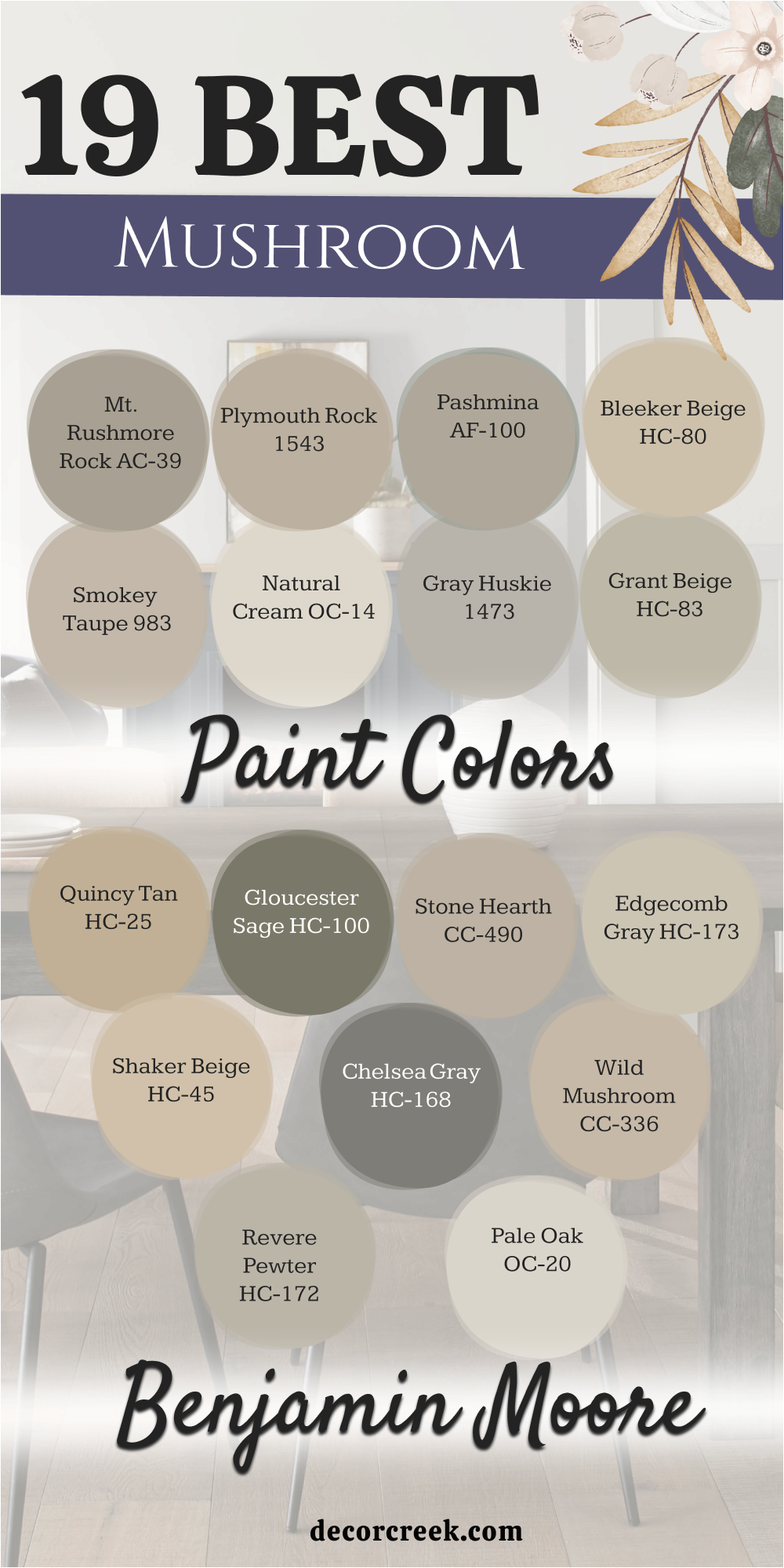
12 Top Mushroom Paint Colors For Your Living room
Shiitake SW 9173
Shiitake SW 9173 is a medium-toned beige that has just enough gray to keep it from looking like sand. This color fills a living room with a steady warmth that feels very grounded and solid. I love how it makes white trim pop without creating a high contrast that hurts your eyes.
It is the kind of shade that works in a large room where you want to feel tucked in at night. You will notice that it hides small scuffs and marks better than very light colors do. Many families choose this for high-traffic areas because it stays looking fresh for a long time.
It provides a perfect middle ground for someone who cannot decide between tan and gray. This paint makes your wooden coffee table look expensive and well-cared for in any light. It is a reliable choice for a main living area that needs a bit of personality.
Best used in: living rooms, kitchens, and master bedrooms
Pairs well with: Pure White SW 7005, Naval SW 6244, and dark oak flooring The key rule of this color for farmhouse style is to use it where you want natural light to feel kind, soft, and inviting throughout the day.
🎨 Check out the complete guide to this color right HERE 👈
Mushroom SW 9587
Mushroom SW 9587 is a true representation of the earthy color that gives this whole group its name. This shade is a medium-toned brown-gray that feels very organic and very connected to nature.
I suggest using this for a living room accent wall or a built-in bookshelf to add some personality. It looks amazing with white quartz fireplace surrounds and brass lamps or light fixtures. You will find that it makes a room feel very grounded and very solid in its design.
It is deep enough to hide everyday messes while still looking very pretty and light. This color works wonders in a home where you want a sturdy and reliable look. It provides a very unique look that stands out from the usual plain gray or beige. You can trust this color to add a lot of style and depth to your home project.
Best used in: living rooms, kitchen cabinets, and mudrooms
Pairs well with: High Reflective White SW 7757, Peppercorn SW 7674, and brass The key rule of this color for farmhouse style is to use it where you want natural light to feel kind, soft, and inviting throughout the day.
🎨 Check out the complete guide to this color right HERE 👈
Loggia SW 7506
Loggia SW 7506 leans toward a classic taupe that feels very sophisticated on a large living room wall. This color has a rich depth that helps a big room feel much more intimate and private. I often suggest this for rooms where you host guests because it helps the conversation feel cozy.
It looks beautiful when the afternoon sun hits it and brings out the creamy undertones. You can use this with white crown molding to make your home feel like a fancy hotel. It handles shadows very well and does not turn muddy when the lights are low.
This shade is a favorite for people who want a traditional look that still feels modern. It creates a smooth flow from the front door into the heart of the house. You will find that it matches almost any metal finish from gold to black.
Best used in: living rooms, dining rooms, and entryways
Pairs well with: Alabaster SW 7008, Urbane Bronze SW 7048, and brass fixtures The key rule of this color for farmhouse style is to use it where you want natural light to feel kind, soft, and inviting throughout the day.
🎨 Check out the complete guide to this color right HERE 👈
Mega Greige SW 7031
Mega Greige SW 7031 is a heavy-hitter when you want a wall color with a lot of presence. This shade is a true mix of gray and beige with a strong mushroom lean. I think it looks best in living rooms with high ceilings where it can really stretch out.
It provides a dramatic backdrop for a gallery wall full of family photos and art. You will notice that it makes light-colored furniture look much brighter and cleaner. It is a great choice for a main wall if you are afraid to go too dark.
This color feels very sturdy and can handle the wear and tear of a busy family. It brings a sense of order to a room that might have too many different furniture colors. Many people love how it looks when paired with very dark wood floors.
Best used in: living rooms, exteriors, and large bedrooms
Pairs well with: Westhighland White SW 7566, Iron Ore SW 7069, and linen fabrics The key rule of this color for farmhouse style is to use it where you want natural light to feel kind, soft, and inviting throughout the day.
🎨 Check out the complete guide to this color right HERE 👈
Alpaca SW 7022
Alpaca SW 7022 is a soft and fuzzy sort of color that feels very light in a sunny living room. This shade has a hint of violet in some lights which makes it feel very special and unique. I suggest this for rooms where you want to relax and feel totally refreshed.
It is a very light mushroom color that almost acts like an off-white in bright sun. You will love how it softens the edges of a room and makes everything look smoother. It is a great choice for a small house that needs to feel welcoming and open.
This color works well with silver or chrome hardware on your lamps and furniture. It is a gentle shade that does not demand too much attention from your eyes. You can use it as a base for a very soft and light decorating style.
Best used in: living rooms, bedrooms, and bathrooms
Pairs well with: High Reflective White SW 7757, Tricorn Black SW 6258, and wool rugs The key rule of this color for farmhouse style is to use it where you want natural light to feel kind, soft, and inviting throughout the day.
🎨 Check out the complete guide to this color right HERE 👈
Balanced Beige SW 7037
Balanced Beige SW 7037 is a step darker and warmer than the lighter beige options on the list. This color provides a cozy feeling that reminds me of sitting by a fireplace on a cold morning. It is deep enough to make white window frames stand out beautifully against the wall.
I like to use this in living rooms because it adds a sense of warmth to the whole house. It does not feel too dark even if you do not have many windows in the room. This shade is great for hiding imperfections on older walls that are not perfectly smooth.
It creates a sense of balance in a house that has a lot of different wood tones. You will enjoy how it makes your home feel finished and decorated with very little effort. It is a hardworking color that looks great in any season of the year.
Best used in: living rooms, basements, and family rooms
Pairs well with: Snowbound SW 7004, French Roast SW 6069, and stone accents The key rule of this color for farmhouse style is to use it where you want natural light to feel kind, soft, and inviting throughout the day.
🎨 Check out the complete guide to this color right HERE 👈
Accessible Beige SW 7036
Accessible Beige SW 7036 is one of the most popular colors for a very good reason today. This shade has a tiny bit of gray that keeps the beige from looking like old yellow paper. I find that it makes small living rooms feel bigger because it reflects light so evenly.
It is a safe bet for someone who is painting their whole house to make it look new. The color stays true to its name by being easy for anyone to like at first glance. It acts as a perfect stage for colorful pillows or bright rugs in a busy room.
You can trust this color to look good even if your light bulbs are a bit warm. It is the ultimate neutral for a home with kids and dogs running around. Many builders use this as their standard color because it never fails to look clean.
Best used in: living rooms, open floor plans, and kitchens
Pairs well with: Dover White SW 6385, Sea Salt SW 6204, and light wood The key rule of this color for farmhouse style is to use it where you want natural light to feel kind, soft, and inviting throughout the day.
🎨 Check out the complete guide to this color right HERE 👈
Pashmina AF-100
Pashmina AF-100 is a sophisticated mushroom color that feels like a very expensive wool blanket. This shade has a perfect balance of warmth and coolness that works in any living room. I love how it looks in a home where you want to feel totally relaxed and happy.
It is a very smooth color that does not have any harsh or bright notes. You can use this in a large room to make it feel more cohesive and put together. It looks wonderful with gold frames and velvet fabrics for a touch of luxury.
This color is a favorite for designers because it always looks high-end and professional. It manages to be interesting without taking over the whole room or feeling too heavy. You will notice that it makes your furniture look very stylish in the light.
Best used in: living rooms, bedrooms, and upscale bathrooms
Pairs well with: Chantilly Lace OC-65, Black Beauty 2128-10, and marble The key rule of this color for farmhouse style is to use it where you want natural light to feel kind, soft, and inviting throughout the day.
🎨 Check out the complete guide to this color right HERE 👈
Edgecomb Gray HC-173
Edgecomb Gray HC-173 is a light and creamy mushroom color that is a classic for main living areas. This shade is often called a greige because it sits right between gray and beige. I find that it makes a living room feel much more open and friendly for guests.
It is light enough to use on the ceiling if you want a very soft look. You will love how it changes from a warm tan to a cool gray as the day goes on. It is a great choice for houses with an open floor plan because it goes with everything.
This color makes your colorful throw pillows and blankets really stand out. It feels very fresh and clean without being as cold as a pure gray. You can count on this color to make your home feel very modern and updated.
Best used in: living rooms, hallways, and open concepts
Pairs well with: White Dove OC-17, Revere Pewter HC-172, and navy blue The key rule of this color for farmhouse style is to use it where you want natural light to feel kind, soft, and inviting throughout the day.
🎨 Check out the complete guide to this color right HERE 👈
Natural Cream OC-14
Natural Cream OC-14 is a very light mushroom shade that feels like a soft bowl of vanilla ice cream. This color is perfect for making a dark living room feel much more open and sunny. I use this a lot when I am helping someone stage their house for a quick sale.
It has a tiny bit of gray that keeps it from looking too yellow or too old. You can use this in a room with dark furniture to keep the vibe light and happy. It looks very beautiful with white fireplace mantels and light wood floors.
This color is a great way to make a smaller home feel much larger than it is. It is a very gentle shade that does not tire out your eyes after a long day. You will enjoy how it makes your home feel very airy and light.
Best used in: living rooms, kitchens, and dark hallways
Pairs well with: Simply White OC-117, Revere Pewter HC-172, and linen fabrics The key rule of this color for farmhouse style is to use it where you want natural light to feel kind, soft, and inviting throughout the day.
🎨 Check out the complete guide to this color right HERE 👈
Stone Hearth CC-490
Stone Hearth CC-490 is a rich and creamy mushroom color that feels very solid and very reliable. This shade has a bit of a gray base that makes it look like a smooth stone from a river. I like to use this in living rooms because it feels very welcoming to anyone who visits.
It looks very beautiful with white trim and dark floors that make the walls stand out. You will love how it makes your home feel very finished and very well-decorated. It is a great choice for hiding small dust and marks in high-traffic areas.
This color stays looking very warm even when the sun is not shining through the windows. It provides a very steady and comfortable look that you will enjoy for many years. You will find that it is a very popular choice for many home designers.
Best used in: living rooms, entryways, and hallways
Pairs well with: Chantilly Lace OC-65, Chelsea Gray HC-168, and slate stone The key rule of this color for farmhouse style is to use it where you want natural light to feel kind, soft, and inviting throughout the day.
Plymouth Rock 1543
Plymouth Rock 1543 is a medium mushroom shade that feels very warm and very traditional today. This color has a bit of brown that makes a living room feel very cozy like an old library. I suggest using this in a room where you like to sit and read or talk with friends.
It looks very handsome with dark wood tables and gold picture frames on the wall. You will find that it stays looking very rich even when the lights are turned down low. It is a very reliable color that does not change its look very much during the day.
This shade hides small marks very well which is great for a busy family home. It provides a very soft and friendly look that makes guests feel very welcome. You will enjoy how it makes your favorite sitting chair look very inviting and comfortable.
Best used in: living rooms, dining rooms, and entryways
Pairs well with: Cloud White OC-130, Hale Navy HC-154, and gold accents The key rule of this color for farmhouse style is to use it where you want natural light to feel kind, soft, and inviting throughout the day.
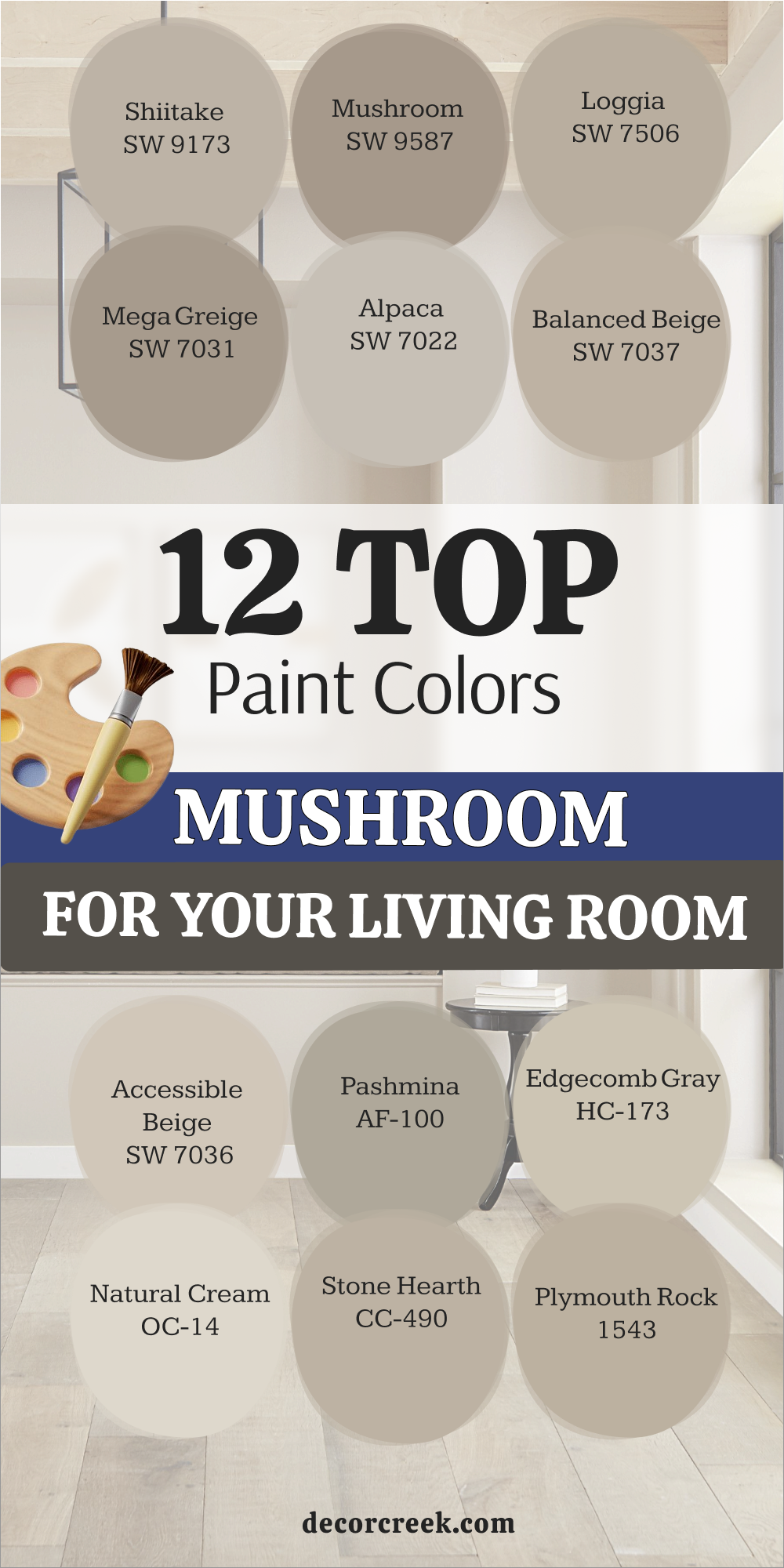
Picking a paint color should be a fun part of making your house a home. These creamy mushroom shades are great because they are hard to get wrong. They bring a touch of nature inside and make every room feel a bit more comfortable. You will find that these colors work well with almost any furniture you already own.
They create a soft look that stays pretty for a long time without needing much work.
Remember to always buy a small sample and paint a large square on your wall first. Watch how the color looks in the morning and again right before you go to bed. Once you find the one that makes you smile, you will know your project is a success. It is important to see how the paint changes when you turn on your lamps at night.
Taking this extra step helps you feel very sure about your choice before you paint the whole room. This way you can relax and enjoy your beautiful new walls without any worries.