Choosing the perfect outdoor paint color for your house is undoubtedly one of the most impactful decisions you’ll make for your home’s aesthetic. It is much more than just applying a protective coat of paint; it is the single most important first impression your home makes on the world, and a significant reflection of your personal taste and style.
For the year 2026, I’m observing a beautiful trend that features a wonderful mix of tried-and-true classics, which offer inherent stability, alongside some richer, moodier shades that bring drama and sophistication. I’m here to personally guide you through my absolute favorite exterior paint colors, sharing the specific, high-performing shades I recommend to clients every single day as a professional home designer and stager.
Making the right color choice directly affects your home’s curb appeal and, crucially, its perceived value, so it’s essential that we get this right. Trust me completely, the thoughtful time you spend finding the right hue for your home will pay off immensely every time you pull into your driveway.
This decision is both an emotional investment in your daily happiness and a practical investment in the longevity of your property.

Why I Always Trust Sherwin-Williams and Benjamin Moore for Outdoor Paints
When it comes to painting a house exterior, the quality of the paint product itself needs to be just as high-performing and robust as the beautiful color you ultimately choose. My absolute and unwavering preference, year after successful year, remains with Sherwin-Williams and Benjamin Moore. I am not loyal to them simply because they offer the most beautiful and on-trend colors, although they certainly do.
I fundamentally rely on them because their products are consistently durable, meticulously formulated to stand up to all the punishing kinds of weather Mother Nature throws at a house, which is an absolute non-negotiable requirement for an exterior finish. Exterior paint must successfully resist fading from the harsh UV rays of the sun, cracking from cold winters and rapid temperature changes, and mildew growth from damp conditions.
Sherwin-Williams and Benjamin Moore consistently deliver superior adhesion, coverage, and flexibility, meaning fewer coats are needed to achieve a rich, deep finish and the surface lasts significantly longer without fail. I’ve personally seen their paints hold up beautifully on countless properties, year after year, offering the kind of dependable reliability I need to stake my professional reputation on.
Using a premium product upfront prevents the expensive, time-consuming, and frustrating problem of peeling or fading paint just a couple of years down the line. It’s a foundational investment in your home’s long-term protection, structural integrity, and enduring beauty.
How I Choose the Right Exterior Shade to Highlight a Home’s Character
Selecting the correct exterior color is a careful, nuanced balancing act; it is far more complex than just picking the shade you like best off a small chip. I always begin this process by meticulously considering the fixed elements of the home—these are the permanent parts that will not be painted over. These elements critically include the roof color, any existing stone or brick foundations, and the inherent tones of the permanent landscaping.
These fixed elements all carry existing undertones that must work harmoniously and cohesively with your chosen paint color. For instance, a roof with a strong, warm brown tone will unfortunately clash harshly with a cool, blue-based gray wall color. Next, I look closely at the architectural style of the house.
A modern farmhouse typically looks its best in crisp, high-contrast whites or blacks, whereas a colonial or historic home often suits a more traditional, historic, and muted color palette. The geographical setting is also key and often overlooked. Is your home sheltered and surrounded by lush, green trees and shadow, or is it exposed in a sunny, arid environment?
The natural light in your specific area dramatically affects how the color is perceived, often appearing much lighter or cooler outdoors than it reads on a small swatch inside. Finally, consider the neighborhood context. You absolutely want your home to stand out beautifully and be memorable, but you never want it to stick out awkwardly.
Choosing a color that respectfully complements the homes surrounding yours creates a cohesive, welcoming, and appealing streetscape for everyone. This entire thoughtful and structured process ensures the final color choice feels perfectly tailored, historically appropriate, and structurally harmonious to the house itself.
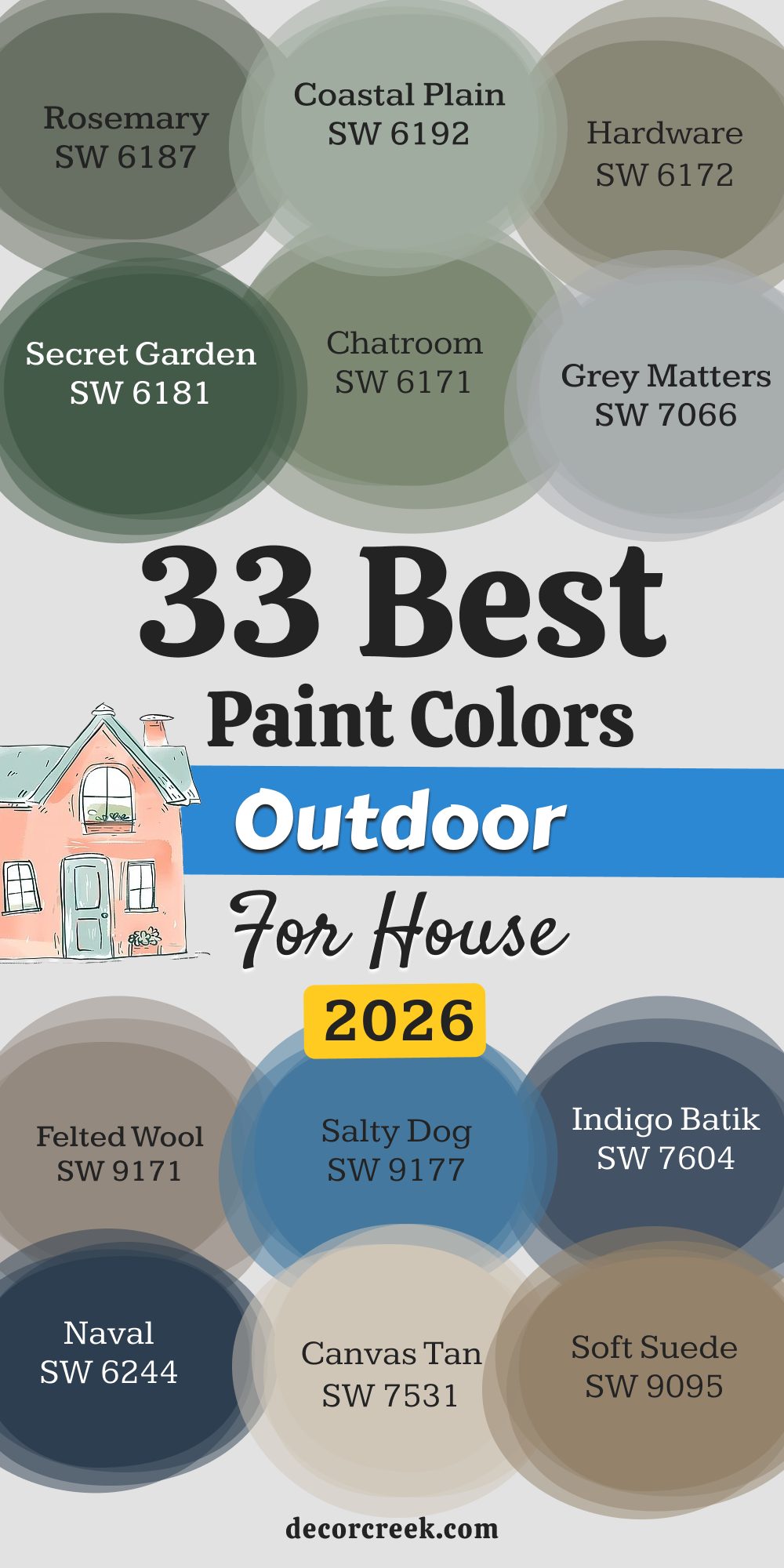
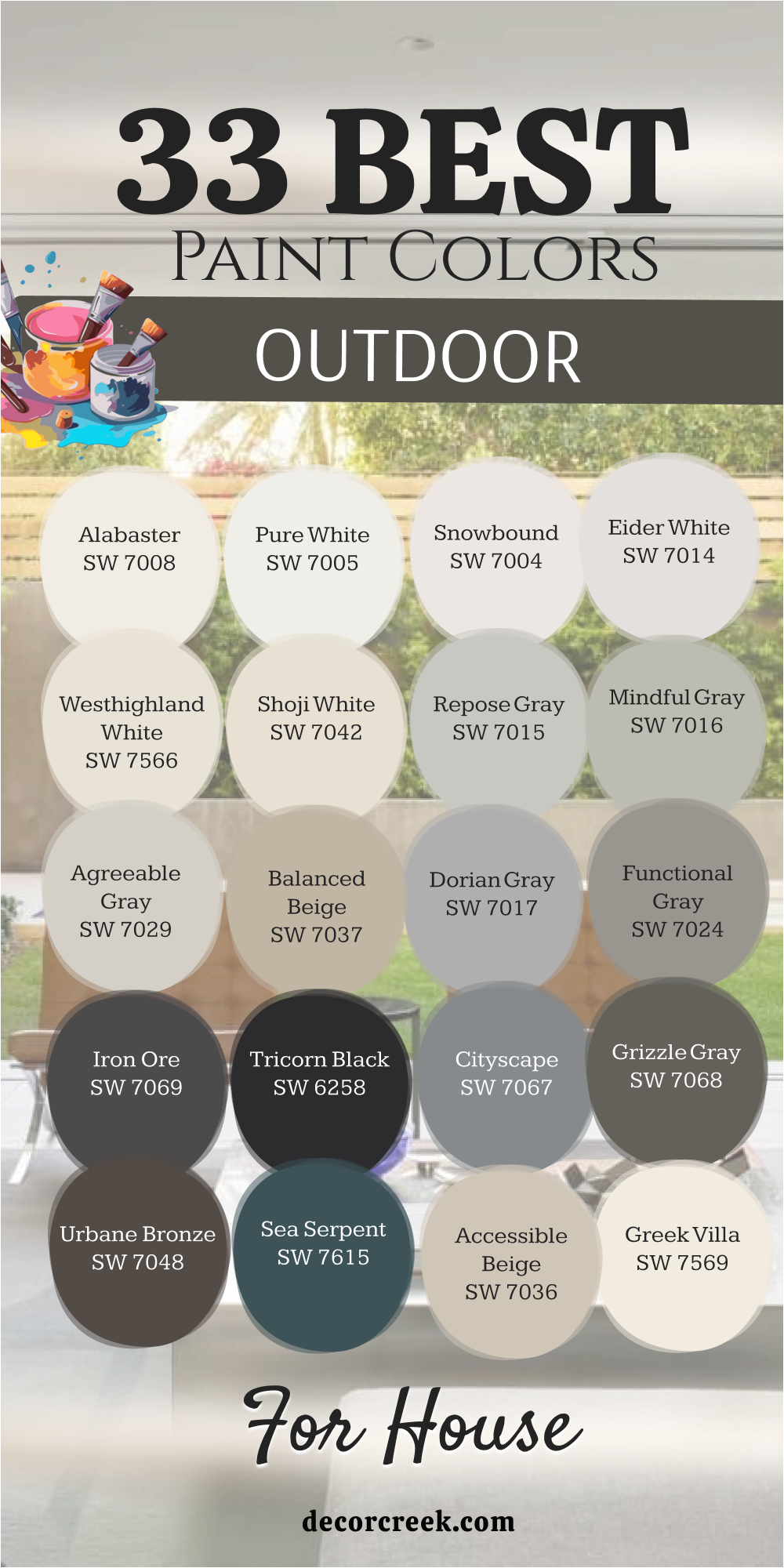
33 Best Outdoor Paint Colors For House
Alabaster SW 7008
Alabaster is a creamy white that feels soft and inviting on an exterior. It avoids the stark, sterile look that some bright whites can have, especially in direct sunlight. This shade has a lovely warmth to it, which makes it pair beautifully with natural wood accents and rich greens. Alabaster is a very popular choice for modern farmhouse styles because it feels classic yet fresh.
Its slight off-white quality keeps it from feeling cold, creating a welcoming facade. I often recommend it for homes with dark gray or black roofs, as the contrast is stunning and crisp. It works well in both sunny and overcast climates because it manages to hold onto its warmth.
The color truly shines when used on siding with a dark contrast trim, perhaps a deep charcoal or iron ore color. This paint color is a consistent favorite because it brings a gentle sophistication to any architectural style. It offers a beautiful, illuminated backdrop that highlights landscaping and architectural details gracefully.

Pure White SW 7005
Pure White is a clean, bright white that is very close to a true neutral white without harsh blue undertones. It’s perfect if you want a crisp, defined look for your home’s exterior that makes trim pop. This color reads exceptionally bright, especially under intense natural light, so be prepared for a strong visual impact.
Pure White is my go-to for traditional homes where I want to emphasize architectural molding and details with a clean finish. It pairs beautifully with virtually any accent color, from deep navy blues to bright minty greens. I’ve found it works especially well in tropical or very sunny climates where you want a paint color to reflect heat.
When used as a main body color, it gives the house a fresh, updated appearance that appeals to buyers. Consider using Pure White for porch columns and railings to create a stunning, well-maintained curb appeal. The color is uncomplicated and provides an immediate sense of lightness and purity to the entire structure.
🎨 Check out the complete guide to this color right HERE 👈

Snowbound SW 7004
Snowbound is a cool-toned white that has a very slight gray or sometimes a pinkish undertone, depending on the light. It’s not a pure, stark white, but it’s much brighter than an off-white, offering a refined look. This paint is a wonderful choice for homeowners who want a white that feels current and contemporary.
In bright sun, the color will soften the harsh light, preventing a blinding white effect. Snowbound is fantastic when paired with cool gray stone or a blue-gray roof since its undertones harmonize nicely. I often suggest it for modern or craftsman-style homes where a bit of sophistication in the white is desired.
Be sure to sample this one carefully as the undertones can be surprising without seeing it on a large board outside. It creates a serene backdrop that allows your landscaping and flower beds to truly stand out with vibrant color. The slight cool quality gives it a more formal and structured feel compared to warmer whites.

Eider White SW 7014
Eider White is a soft, light greige that acts like a white, offering a bit more depth than a standard off-white. This color has noticeable cool undertones, leaning slightly toward purple or gray depending on the light conditions outside. It’s an excellent option for those who want a white house but are worried about the maintenance or glare of a very bright color.
Eider White works particularly well on homes with older, warmer fixed elements like brick, as it helps to neutralize those tones. It provides a beautiful contrast to deep charcoal trim or black window frames for a very chic look.
I often recommend it for coastal or lakeside properties where the cool air and watery light will emphasize its subtle grayness. It feels quiet and reserved, giving the home a grounded, sophisticated presence. This color manages to feel classic and current at the same time, making it a reliable choice for many styles. It’s a wonderful choice to bring a sense of gentle stability to the exterior.
🎨 Check out the complete guide to this color right HERE 👈

Westhighland White SW 7566
Westhighland White is a very creamy, slightly yellowed off-white that brings significant warmth to an exterior. It has a beautiful depth that prevents it from looking dingy or too light in bright sunlight. This paint color works wonderfully on traditional homes, especially those with colonial or Victorian architecture, where a historical, softer white is desired.
It pairs beautifully with brick or stone that has orange, pink, or red undertones, pulling those warm colors forward. Westhighland White has a welcoming and historic feel that makes a house feel instantly charming and cozy.
I’ve used it often in heavily wooded areas where it provides a necessary brightness without clashing with the green surroundings. When you see it on a house, it gives the appearance of soft sunlight always hitting the walls. It’s a comfortable, classic choice that never goes out of style and offers a gentle illumination to the entire structure.
🎨 Check out the complete guide to this color right HERE 👈
Shoji White SW 7042
Shoji White is a very popular, sophisticated off-white with distinct warm, beige undertones. It’s much richer than a typical white, often reading as a pale, creamy greige on a home’s exterior. This is the ideal choice if you want the lightness of white but with a serious commitment to warmth and richness.
Shoji White pairs exceptionally well with copper accents, earthy brown fixed elements, and even a natural cedar roof. It maintains its color beautifully, avoiding the washed-out look that true whites can sometimes get on sunny days. I recommend this shade for homes with Tuscan, Mediterranean, or southwestern architectural elements where an earthy palette is expected.
It provides a wonderful, subtle contrast to pure white trim, making the white trim appear even brighter. This paint gives the home a grounded, established feeling that is both elegant and inviting. The depth of color ensures that it reads as a solid, intentional color choice and not just a faded white.

Repose Gray SW 7015
Repose Gray is a true greige, a perfect mix of gray and beige, with a slight tendency to lean cool in strong light. It is one of the most versatile and popular exterior paint colors because it manages to suit almost any home style. The color provides a beautiful, neutral background that allows landscaping and architectural details to take center stage.
Repose Gray works exceptionally well with dark accent colors like charcoal, black, or deep navy on the trim or shutters. I’ve used it successfully on everything from coastal cottages to traditional brick homes that needed a modern update. On a sunny day, it will look lighter and more gray, while on an overcast day, its beige undertones will appear more prominent.
It is a fantastic option for creating a sophisticated, high-end look without feeling too stark or overly dramatic. This particular shade provides a beautiful, consistent base that makes coordination with other outdoor elements very easy. It’s a reliable shade that adds instant curb appeal without much risk.
🎨 Check out the complete guide to this color right HERE 👈

Mindful Gray SW 7016
Mindful Gray is a mid-tone greige that is a shade darker than Repose Gray, offering a more saturated and grounded look. It has a nice balance of gray and beige, but tends to read slightly more gray overall than Repose, especially in bright sunlight. This paint color is wonderful for homes that are surrounded by a lot of trees, as the deeper shade prevents it from looking muddy in the shadows.
Mindful Gray is an excellent choice for a body color with a crisp white trim for a traditional, yet updated, appearance. I often recommend it for homes with darker stone or brick accents, as it connects nicely with those richer tones.
It holds its own without being too dark, offering a strong, substantial look to the exterior structure. It’s a sophisticated neutral that gives the house a well-established and serious presence. The depth of the color makes it a favorite for creating contrast with brightly colored front doors or decorative elements.

Agreeable Gray SW 7029
Agreeable Gray is a warm greige that leans slightly more beige than gray, making it incredibly welcoming and soft. This is a lighter shade than Mindful Gray, and it is arguably one of the most popular neutral paint colors available. It is called “Agreeable” for a reason—it works well with nearly every fixed element and environmental setting.
Agreeable Gray is a fantastic main body color for almost any style of home, from ranch to colonial, providing a comforting, classic feel. In strong sun, it will lighten up significantly, sometimes reading as a warm off-white. I often pair this color with deep, warm brown accents or a black roof to keep the look grounded and sophisticated.
It provides a beautiful, muted backdrop that complements bright landscaping and colorful gardens wonderfully. This particular shade is a reliable choice for staging, as its warm neutrality appeals to the widest range of potential buyers. It gives off a quiet confidence that is perfect for a well-loved family home.

Balanced Beige SW 7037
Balanced Beige is a beautiful, true medium beige with subtle gray undertones that keep it from looking too yellow or gold. This color is perfect for those who want a warm, earth-toned home but still desire a modern feel. It’s much richer than a light tan, giving the home a substantial, grounded appearance that feels very established.
Balanced Beige is an excellent choice for homes with natural wood trim, cedar shingles, or stone in earthy tones. It works well in sunny environments, as it holds its color without fading to white, offering a consistent look all day long.
I recommend it for Craftsman and bungalow-style homes where warmth and connection to nature are key architectural features. This shade is perfect for homeowners who prefer a classic, earthy palette over the current trends of cool grays. It provides a welcoming, cozy exterior that feels instantly like home when you see it from the street.
🎨 Check out the complete guide to this color right HERE 👈

Dorian Gray SW 7017
Dorian Gray is a true mid-tone gray that has minimal, very subtle blue or purple undertones, keeping it firmly in the neutral gray family. This color is rich and saturated, offering a stately and solid appearance to any home’s exterior. It is an excellent choice if you want a classic, cool gray look without the heaviness of a very dark charcoal.
Dorian Gray pairs wonderfully with crisp white trim to create a traditional, high-contrast look that is very appealing. I often suggest it for brick homes where the brick is painted over, giving the structure a cohesive, modern update.
It works well in all light conditions, maintaining its mid-tone value without washing out in the sun or becoming too dark in the shade. This paint color is a sophisticated choice that speaks of structure and permanence in a quiet, refined way. It offers a wonderful foundation for brightly colored front doors, such as a sunny yellow or a vibrant red.
🎨 Check out the complete guide to this color right HERE 👈

Functional Gray SW 7024
Functional Gray is a mid-tone greige that leans slightly more gray than beige, making it a wonderful transition color between the warm and cool palettes. It is a shade darker than Dorian Gray, giving the house a more substantial and grounded feeling. This color is perfect for adding a sense of weight and importance to a home without resorting to a deep, dark color.
Functional Gray looks beautiful with white or cream trim for a lovely, contrasting look that defines the architectural details. I recommend it particularly for homes with a lot of natural landscaping, as its neutral base connects nicely with the earth and greenery.
It’s a very versatile color that suits many architectural styles, from traditional two-story homes to contemporary ranches. The color truly works well when you want a gray that has enough warmth to feel welcoming rather than cold or aloof. It’s a reliable, sturdy choice that offers a sophisticated backdrop for any outdoor setting.
🎨 Check out the complete guide to this color right HERE 👈
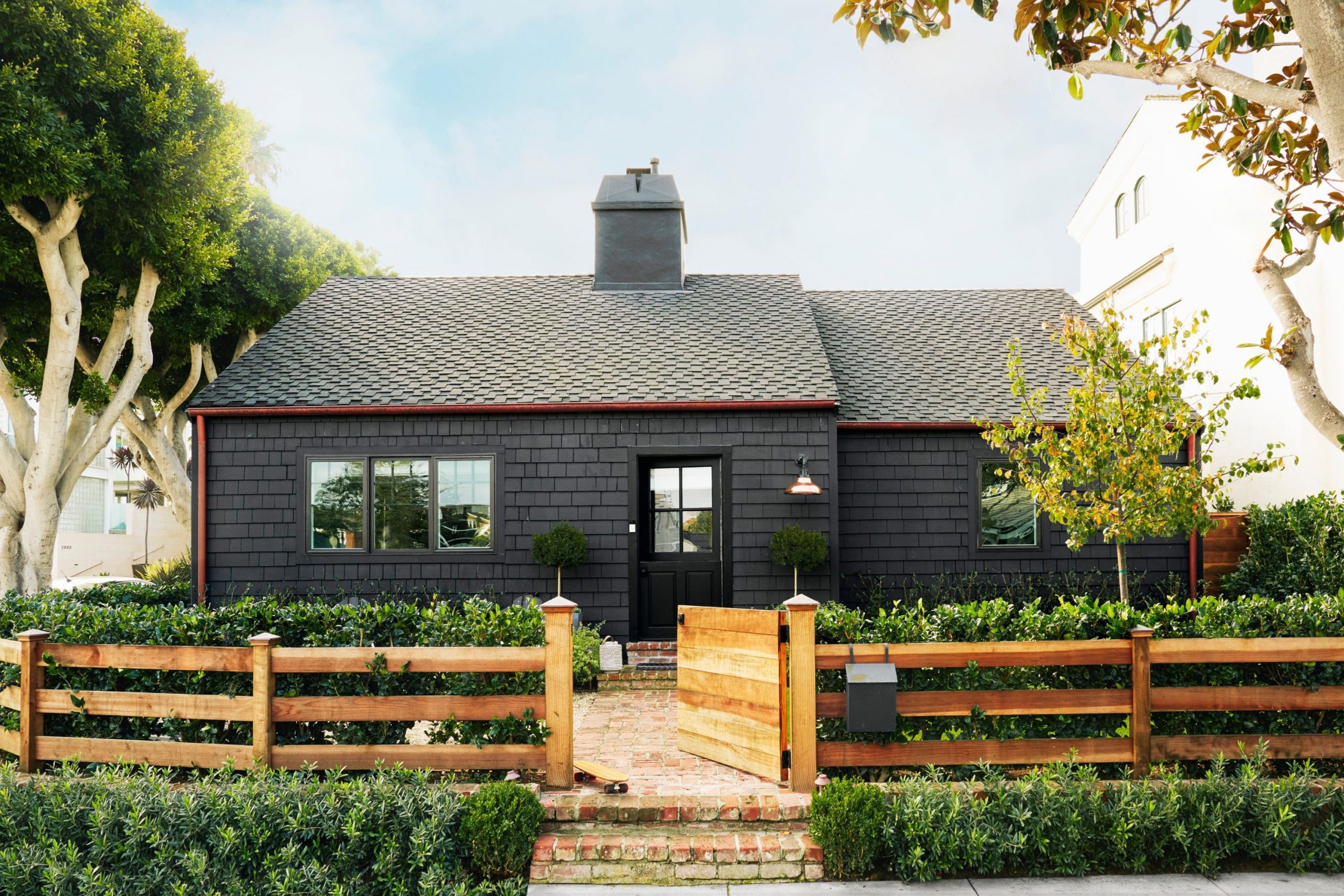
Iron Ore SW 7069
Iron Ore is a deeply saturated, almost-black charcoal that is incredibly popular for exterior accents and main body colors. This shade is one of my favorites for creating dramatic contrast against white trim or for painting a modern home’s entire exterior. It’s not quite a true black, but rather a very dark, moody gray that reads as black in many lights, offering a softer edge than true black.
Iron Ore is a stunning choice for shutters, garage doors, and front doors, providing incredible depth and definition. I love using it on board and batten siding for modern farmhouses, giving them a contemporary, graphic punch.
It pairs beautifully with natural wood elements like cedar or teak, creating a rich, sophisticated palette. This color is a bold commitment, but it pays off with massive curb appeal and a very high-end appearance. It works well in sunny areas where the darkness absorbs the light and prevents a washed-out look.

Tricorn Black SW 6258
Tricorn Black is a very pure, saturated black that has virtually no discernible undertones of blue, brown, or green. This is the color you choose when you want a truly dramatic, striking, and modern statement for your home’s exterior. It absorbs light wonderfully, creating deep shadows and emphasizing the surrounding natural elements.
Tricorn Black is often used for a bold trim color against a bright white or for a full exterior color on very contemporary architecture. I love using it for window frames, gutters, and downspouts, as it makes them disappear and highlights the body color.
It is a fantastic choice for a dramatic, high-gloss front door that welcomes guests with a serious, fashionable punch. Be prepared for this color to get hot in direct sunlight, which is something to consider in very warm climates. This paint color is the definition of classic chic and provides an unparalleled level of sophistication and graphic contrast.

Cityscape SW 7067
Cityscape is a saturated, mid-to-dark gray with strong, cool blue undertones that give it a very structured and metropolitan feel. This is a perfect choice if you are looking for a true gray that has a bit more personality than a simple neutral. The blue in Cityscape becomes more apparent on a sunny day, giving the house a beautiful, refreshing color.
Cityscape works exceptionally well with stark white trim for a sharp, clean coastal or traditional look. I often recommend it for homes with a classic New England or seaside architectural style, as it feels very appropriate.
It’s a versatile color that can be sophisticated and traditional or sleek and contemporary depending on the other colors it’s paired with. This paint color provides a substantial, grounded feeling to the house without feeling too heavy or intimidating. It’s a solid, reliable dark neutral that adds a serious level of polish to the home’s presentation.
🎨 Check out the complete guide to this color right HERE 👈
Grizzle Gray SW 7068
Grizzle Gray is a very dark, heavily saturated charcoal gray with distinct brown or green undertones that soften its darkness. It is an excellent alternative to black if you want a dark, dramatic color but with a bit more depth and earthiness. Grizzle Gray is a stunning body color for Craftsman or rustic-style homes, as its subtle undertones connect nicely with nature.
I often use it as an accent color for shutters or garage doors, especially when the main body color is a warm white or light greige. It provides a beautiful, grounded contrast that is less harsh than a true black.
In the evening or on a cloudy day, it will look almost black, offering a very moody and high-impact look. This paint color is a wonderful choice for creating a striking, high-contrast palette that feels sophisticated and organic at the same time. It’s a very popular color for a strong, defined exterior that demands attention in a good way.
🎨 Check out the complete guide to this color right HERE 👈

Urbane Bronze SW 7048
Urbane Bronze is a deep, complex shade that reads as a dark bronze, a deep brown-gray, or even a muted black, depending on the light. It was a Sherwin-Williams Color of the Year for a reason—it’s incredibly versatile and adds instant warmth and drama. This color is perfect for adding weight and depth to an exterior, giving a home a well-established, luxury feel.
Urbane Bronze pairs beautifully with natural wood, copper accents, and light, creamy white trim like Alabaster. I often recommend it for contemporary homes or as an accent for window frames and doors for a subtle, high-end look.
It has a beautiful, earthy quality that connects a home to its surroundings in a sophisticated manner. This paint color is a wonderful choice if you want a dark home but find true black or charcoal too stark or cold. It offers a substantial, grounded appearance that is both modern and incredibly warm and inviting.

Sea Serpent SW 7615
Sea Serpent is a deep, rich teal or blue-green shade that is dark and sophisticated, almost acting as a neutral. It offers a wonderful alternative to traditional navy or black for homeowners looking for a pop of unexpected color. This color is a fantastic choice for a coastal home, a traditional cottage, or as a high-impact front door color.
Sea Serpent pairs beautifully with crisp white trim, as the contrast makes the deep color truly stand out and shine. I’ve used it often on homes with natural stone accents where the deep blue-green pulls out the natural colors in the stone.
It’s dark enough that it provides a very serious, grounded look but the blue-green adds a welcome vibrancy. This paint color is perfect for those who want a colorful home exterior but are looking for a mature, highly saturated option. It provides a striking, memorable look that feels elegant and slightly mysterious from the street.
🎨 Check out the complete guide to this color right HERE 👈
Accessible Beige SW 7036
Accessible Beige is a very popular, light neutral greige that leans distinctly toward the beige side, making it one of the warmest neutrals. It is an excellent choice for a body color if you want a warm, inviting facade without the yellowing risk of a cream. Accessible Beige works well in bright light, holding its color beautifully without washing out to a plain white or blinding off-white.
I often recommend this shade for homes with red brick or brown stone, as it effortlessly ties in those warm fixed elements. It’s a versatile color that suits many architectural styles, especially those where a traditional, cozy feel is desired.
This paint color provides a soft, illuminated backdrop that feels welcoming and easy on the eyes. It is a fantastic option for staging homes because its warm neutrality has very broad appeal to potential buyers. It gives the home a grounded, classic look that feels both light and substantial at the same time.

Greek Villa SW 7551
Greek Villa is a gorgeous, warm off-white that has a definite creamy quality without tipping into yellow, making it incredibly versatile. It offers more depth than a pure white, which helps it to feel rich and luxurious on an exterior.
This color is a great option for homeowners who desire a white house but need a shade that softens the harsh effects of direct sunlight. Greek Villa pairs beautifully with both light and dark trim, acting as a stunning backdrop for any accent color. I often use it for siding on Mediterranean or stucco homes because of its inherent warmth and depth.
It provides a clean, well-maintained look that always feels current and sophisticated on any style home. This paint color gives off a beautifully illuminated appearance, making the house feel airy and open. It’s a reliable, elegant white that provides a welcoming, bright foundation for all your landscaping and exterior decor.
🎨 Check out the complete guide to this color right HERE 👈

Grecian Ivory SW 7541
Grecian Ivory is a subtle greige that is very light, leaning slightly toward the beige side with a soft, warm gray undertone. It’s a delicate shade that reads as a light off-white in bright sun but reveals its true complexity in the shade.
This color is perfect for a homeowner who wants a white house but needs a color with just enough depth to create visual interest. Grecian Ivory pairs well with earthy tones, natural wood, and dark, grounded accent colors like bronze or black. I often recommend it for homes with a traditional style where a soft, historic color palette is desired.
It provides a wonderful, gentle contrast to pure white trim, making the trim appear crisp and clean. This paint color gives the exterior a refined, quiet elegance that is not overly dramatic but consistently beautiful. It offers a warm, inviting foundation that creates a sense of peaceful stability around the structure.
Soft Suede SW 9577
Soft Suede is a deep, saturated tan or light brown that has a richness and warmth, keeping it from looking muddy or dull. This color offers a wonderful, earthy alternative to the popular gray and greige neutrals for a deeply grounded look. It is perfect for a home surrounded by natural elements, as it connects beautifully with soil, trees, and stone.
Soft Suede pairs well with creamy white trim for a warm contrast or with a slightly darker brown for a cohesive, natural look. I often recommend it for ranch or bungalow styles that want to emphasize their organic, low-profile connection to the land.
It holds its own in bright sunlight and provides a comforting, established presence to the home’s exterior. This paint color is a sophisticated choice for someone who values tradition and wants an exterior that feels timeless and deeply connected to nature. It gives the house a cozy, welcoming feel that is both sturdy and gentle.
🎨 Check out the complete guide to this color right HERE 👈
Canvas Tan SW 7531
Canvas Tan is a lovely, medium-toned tan or light brown with a good balance of warmth and neutrality, preventing any harsh yellowing. This color is a wonderful classic choice for an exterior, offering a comforting and substantial presence on the street. It works beautifully with homes that have red brick or stone accents, as it easily ties in those traditional warm elements.
Canvas Tan pairs exceptionally well with creamy white trim, creating a gentle contrast that defines the home’s architectural lines. I often suggest it for homes with traditional or historical architecture where a softer, earthy palette is expected.
It provides a warm, inviting atmosphere that makes a house feel instantly like a well-loved family home. This paint color has a reliable, enduring quality that ensures your home will look stylish and appealing for many years. It’s a perfect neutral that offers warmth without being overly aggressive or dated in its appearance.
🎨 Check out the complete guide to this color right HERE 👈

Naval SW 6244
Naval is a deep, rich navy blue that is classic, sophisticated, and has been consistently popular for years, and for good reason. It offers a beautiful, saturated color that is dark enough to feel grounded but vibrant enough to be interesting.
Naval is a stunning main body color for a coastal cottage, a traditional colonial, or a modern farmhouse with a twist. I often recommend it for shutters, front doors, or trim to add a dramatic, nautical punch to a lighter home. It pairs perfectly with bright white trim, as the contrast is incredibly sharp and visually appealing.
This paint color truly shines in bright sunlight, where its deep blue hue is illuminated beautifully and looks incredibly rich. It is a fantastic choice for making a powerful, memorable first impression with a sophisticated and deeply saturated color. It gives the home an established, confident presence that feels both traditional and current.
🎨 Check out the complete guide to this color right HERE 👈

Indigo Batik SW 7602
Indigo Batik is a slightly dustier, less pure navy blue than Naval, offering a touch more gray that keeps it grounded and moody. It is a rich, saturated color that provides the depth and sophistication of a dark blue without feeling overly formal.
This color works beautifully as a main body color for traditional homes where you want a color with significant presence and personality. Indigo Batik pairs wonderfully with a creamy off-white trim, softening the contrast compared to a stark white. I often recommend it for homes in natural settings, as its slightly muted quality connects nicely with organic surroundings.
It holds its own in all light conditions, appearing rich and full of color even on overcast days. This paint color is an excellent choice for a homeowner who loves blue but prefers a shade with a more historic and complex feel. It creates an aura of quiet strength and elegance around the house.
🎨 Check out the complete guide to this color right HERE 👈

Salty Dog SW 9177
Salty Dog is a vibrant, mid-tone true blue that is reminiscent of a clear summer sky or a classic coastal color. This shade is perfect for homeowners who want a noticeable, cheerful pop of color that is still sophisticated and appealing.
It is a wonderful main body color for a beach house, a playful cottage, or a home with a relaxed, vacation-like feel. Salty Dog pairs beautifully with bright white trim to create a crisp, high-energy contrast that feels instantly happy and inviting.
I often use it on front doors or shutters for a smaller burst of color on a white or gray house. It truly comes alive in bright sunlight, looking incredibly saturated and joyous on the exterior. This paint color is a fantastic option for making a high-impact, memorable statement that feels cheerful and full of life. It gives the home a lighthearted, refreshing presence that is impossible to ignore.
🎨 Check out the complete guide to this color right HERE 👈
Felted Wool SW 9171
Felted Wool is a dark, warm gray that is rich in brown and even subtle green undertones, making it a very earthy and complex neutral. This color is perfect for adding significant weight and substance to a home without resorting to an obvious black or charcoal.
Felted Wool is a wonderful choice for Craftsman or rustic-style homes, as its depth and warmth connect beautifully with natural surroundings. I often recommend it for homes with a lot of exposed wood or stone accents, as it acts as a perfect grounding element.
It pairs well with a creamy off-white trim to create a sophisticated, moderate contrast that feels very high-end. This paint color is a reliable option for a homeowner who wants a darker exterior that feels organic and welcoming rather than stark or cool. It provides a solid, established presence that feels both contemporary and deeply traditional at the same time.
🎨 Check out the complete guide to this color right HERE 👈
Grey Matters SW 7066
Grey Matters is a clean, classic mid-tone gray that leans slightly cool with a faint blue undertone that appears in certain light. This shade is a wonderful choice for a homeowner who wants a simple, pure gray without the complex undertones of greige or charcoal. It provides a sophisticated, modern backdrop that looks crisp and well-maintained on any style of home.
Grey Matters pairs exceptionally well with bright white trim for a sharp, defined contrast that highlights architectural details. I often use it on homes that need a contemporary update, as the clean gray immediately modernizes the look.
It holds its own in bright sunlight and provides a cool, structured appearance on a home’s exterior. This paint color is an excellent neutral that gives the house a serious, tailored presence that feels very composed and clean. It’s a versatile gray that serves as a beautiful foundation for any contrasting color you might choose.
🎨 Check out the complete guide to this color right HERE 👈
Chatroom SW 6171
Chatroom is a muted, deep olive-green or sage green that is earthy and sophisticated, offering a rich organic feel. This color is an excellent choice for a homeowner who loves green but wants a highly saturated, historic-feeling shade.
Chatroom works beautifully on traditional homes, especially those with natural settings or historic architecture, providing a quiet, established presence. I often pair it with creamy off-white trim and natural wood accents to enhance its organic, earthy quality. It is dark enough to feel substantial and grounded but still reveals its deep green hue beautifully in the sunlight.
This paint color is a wonderful option for creating a home that feels instantly connected to nature and full of quiet charm. It gives the exterior a cozy, protective atmosphere that feels very inviting and well-loved. It is a subtle but powerful color that offers a beautiful alternative to the usual neutrals.
🎨 Check out the complete guide to this color right HERE 👈
Secret Garden SW 6181
Secret Garden is a deep, lush forest green that is rich and highly saturated, making a statement without being overly bright. This color is perfect for adding a serious pop of color that still feels traditional and grounded in nature. Secret Garden works wonderfully on homes nestled in wooded areas, as it blends beautifully with the surrounding greenery.
I often recommend it for shutters, doors, or accent siding for a dramatic, high-impact contrast against a light main body color. It pairs beautifully with natural wood elements and creamy white or even pale yellow trim.
It holds its deep color well in sunlight, appearing very rich and full of life on the exterior. This paint color is a wonderful choice for creating a home that feels charming, classic, and slightly mysterious in a wonderful way. It gives the house a welcoming yet refined presence that feels very tailored and distinguished.
Hardware SW 6172
Hardware is a gorgeous, mid-tone army green or deep khaki that has strong gray and brown undertones, making it an incredibly complex neutral. This color is perfect for a homeowner who wants an earthy, grounded feel but prefers a shade with more complexity than a simple beige or tan.
Hardware works beautifully on Craftsman and bungalow homes, where its organic color complements the architectural style. I often pair it with natural wood accents and dark bronze or black trim for a sophisticated, masculine look.
It offers a substantial, weighty appearance to the home, making it feel well-established and sturdy on the land. This paint color is an excellent choice for creating an exterior that feels instantly organic and connected to its natural surroundings. It provides a quiet, thoughtful backdrop that allows your landscaping and architectural details to shine brightly.
Coastal Plain SW 6192
Coastal Plain is a soft, mid-tone sage green that has noticeable gray and blue undertones, giving it a muted, peaceful quality. This color is perfect for a homeowner who wants a subtle color that feels very organic and relaxing without being too bright or aggressive.
Coastal Plain is a fantastic main body color for a beach house or a home in a natural, wooded setting where a soothing palette is desired. I often pair it with a bright, crisp white trim to create a fresh, clean contrast that is instantly appealing.
It holds its color well in bright sunlight, appearing slightly softer and more ethereal on the exterior. This paint color is a reliable option for creating a welcoming, airy atmosphere that feels perfectly suited for a relaxed lifestyle. It gives the house a gentle, comforting presence that is both sophisticated and incredibly inviting to all who approach.
Rosemary SW 6187
Rosemary is a deep, earthy green with strong gray undertones that gives it a wonderfully sophisticated and muted feel. This color is perfect for adding a rich, natural depth to a home without being as dark as a true forest green. Rosemary works beautifully on traditional or historic homes, providing a sense of established charm and quiet elegance.
I often pair it with creamy white trim and deep, rich wood accents to enhance its organic, subtle character. It holds its color well, maintaining its depth and warmth even on very sunny days.
This paint color is an excellent choice for a homeowner who wants a color that is unique but still feels utterly classic and grounded. It gives the house a substantial, welcoming appearance that feels perfectly tailored to its setting and surroundings. It’s a wonderful alternative to blue or gray for a sophisticated, saturated neutral.

22 Best Outdoor Paint Colors For House From Sherwin Williams
Creamy SW 7012
Creamy is a rich, warm off-white that has a significant beige undertone, making it feel very soft and inviting. It’s a wonderful alternative to stark white, offering a more historic and comforting feel to the exterior. Creamy works beautifully on traditional homes, especially those with brick or stone that has warm, earthy undertones.
I often pair it with darker accent colors like deep bronze or black to create a sophisticated, grounded palette. This color holds its warmth even in direct sunlight, avoiding the washed-out look that bright whites can often have. It’s a reliable choice for a homeowner who wants a white house but needs the color to feel cozy and established.
Creamy provides a subtle yet rich backdrop that complements surrounding landscaping beautifully. The paint color offers a gentle illumination to the entire facade, making the home feel instantly approachable. It has a depth that makes it a more interesting white than a simple bright option. This shade is a testament to the fact that white can still feel very grounded and earthy.
🎨 Check out the complete guide to this color right HERE 👈

Pearly White SW 7009
Pearly White is a beautiful off-white that has a definite warmth to it but remains very light and airy, avoiding a creamy yellowness. It’s a great choice for a subtle white that has just enough pigment to look soft against dark trim. Pearly White works wonderfully on modern farmhouses and traditional homes alike, providing a crisp but gentle backdrop.
I often recommend it for homes where you want a white body but need it to harmonize with warmer-toned fixed elements. The color reads as a clean, bright white in full sun but retains its subtle warmth in the shade.
It’s a versatile option that pairs well with both cool grays and warm browns for accents. This paint color offers a very clean and well-maintained appearance to the house’s exterior. It is a beautiful foundation that makes architectural details and trim stand out gracefully. This is a very safe and sophisticated white that I use often for staging homes.
🎨 Check out the complete guide to this color right HERE 👈
Ivory Lace SW 7013
Ivory Lace is a very warm, light off-white that has distinct yellow-beige undertones, giving it a rich, vintage quality. It’s perfect for a homeowner who desires a slightly more historic or classic white that feels substantial and inviting.
Ivory Lace works beautifully on homes with older, traditional architecture, especially those with intricate trim work. I often pair it with deep, muted colors like historic greens or deep reds for a very traditional, established look. The color holds its rich, warm tone in the sunlight, preventing it from washing out to a plain white.
It provides a comforting and familiar presence that makes the house feel instantly grounded and well-loved. This paint color is a wonderful choice for creating a cozy, welcoming exterior that feels perfectly in sync with its surroundings. It has an enduring quality that feels both classic and beautifully maintained on the exterior.
🎨 Check out the complete guide to this color right HERE 👈
Whitetail SW 7103
Whitetail is a creamy, warm off-white that is very light but has just enough yellow-beige in it to keep it from feeling cold. It is a fantastic choice for a crisp-looking house that still feels welcoming and not too stark or modern.
Whitetail works wonderfully on traditional and colonial-style homes, providing a clean yet historic color palette. I often pair it with a deep, dramatic trim color like Iron Ore or Urbane Bronze for a striking, high-contrast effect.
The color maintains its brightness and warmth in all lights, which is a major benefit for an exterior. It’s a versatile white that appeals to many tastes and looks fantastic against natural stone or brick. This paint color offers a fresh, updated appearance while still maintaining a classic and comforting quality. It is a sophisticated white that provides a great sense of purity and lightness to the home.
Natural Tan SW 7567
Natural Tan is a light, genuine tan that has a perfect balance of warmth without excessive yellow or pink undertones. It’s an excellent neutral body color for a homeowner who wants a traditional, grounded, earth-toned exterior. Natural Tan works beautifully on ranch, bungalow, and craftsman styles, connecting the house to the natural landscape.
I often pair it with deep brown or black accents and creamy white trim for a warm, sophisticated contrast. The color holds up well in direct sunlight, providing a consistent, soothing backdrop for the surrounding yard.
It’s a reliable shade that gives the house a sturdy, established appearance that feels welcoming and low-key. This paint color is a wonderful option for creating an exterior that feels instantly organic and perfectly in harmony with its surroundings. It offers a gentle, natural illumination to the facade without feeling overly dramatic or bright.
Nomadic Desert SW 6107
Nomadic Desert is a medium-toned, warm beige or tan that offers a rich, saturated earth tone for an exterior. This color is perfect for a homeowner who wants a substantial, grounded color that feels traditional and established.
Nomadic Desert works beautifully on stucco or Mediterranean-style homes, as its color palette feels very appropriate for those styles. I often pair it with creamy white trim and natural wood accents to enhance its inherent warmth and depth. The color provides a beautiful, consistent presence that makes a house feel sturdy and well-rooted in its setting.
It’s a wonderful choice for creating an exterior that feels instantly warm, inviting, and connected to the landscape. This paint color offers a sophisticated, earthy alternative to the popular grays and whites of the current trends. It gives the home a cozy, protective atmosphere that is both elegant and approachable.
🎨 Check out the complete guide to this color right HERE 👈

Virtual Taupe SW 7039
Virtual Taupe is a warm, mid-tone greige that leans slightly more toward the brown/beige side than the gray, creating a very complex neutral. It’s a great choice for a homeowner who wants the sophistication of gray but the warmth and comfort of a traditional beige.
Virtual Taupe works beautifully on homes with warm fixed elements like red brick or brown stone, as it ties those colors together nicely. I often pair it with deep, rich brown trim for a cohesive, natural look or a crisp white for a more defined contrast.
The color provides a substantial, grounded appearance that makes the house feel well-established and serious. It’s a reliable shade that offers a perfect balance between trend and tradition for a stunning exterior. This paint color is a wonderful backdrop for vibrant landscaping and colorful flower beds to truly stand out.
🎨 Check out the complete guide to this color right HERE 👈
Anew Gray SW 7030
Anew Gray is a light greige that is very well-balanced, sitting almost perfectly between the gray and beige families, leaning slightly warm. It is a gorgeous, soft neutral that provides a sophisticated yet welcoming look to any home’s exterior.
Anew Gray works wonderfully on almost all architectural styles, from ranch to two-story colonial, making it a very versatile choice. I often pair it with a bright white trim to create a clean, modern contrast that highlights the home’s details.
The color holds its warmth even in bright sunlight, preventing it from appearing too cool or stark on the exterior. It’s a fantastic choice for staging homes because its warm neutrality appeals to a very broad audience of potential buyers. This paint color offers a gentle, illuminated foundation that feels both current and incredibly classic and easy on the eye.
Worldly Gray SW 7043
Worldly Gray is a soft, mid-tone greige that leans slightly more toward the gray side than Anew Gray, offering a touch more coolness. It’s a beautiful neutral that provides a perfect level of saturation, offering a defined look without being too dark or heavy.
Worldly Gray works wonderfully on homes surrounded by greenery, as the slight coolness contrasts nicely with the warmth of the natural environment. I often pair it with a stark white trim for a crisp, tailored look that feels very clean and modern.
The color provides a great sense of weight and importance to a home without feeling overly dramatic or intimidating. It’s a reliable shade that gives the house a sophisticated, well-maintained appearance that is both current and classic. This paint color is an excellent choice for a homeowner who wants a gray that feels warm and inviting rather than cold or aloof on the exterior.
🎨 Check out the complete guide to this color right HERE 👈
Colonnade Gray SW 7641
Colonnade Gray is a classic mid-tone gray that is a touch lighter than Dorian Gray, offering a bright but still substantial presence. This color is a true gray that has very subtle cool undertones, keeping it firmly in the neutral and sophisticated palette.
Colonnade Gray works beautifully on traditional homes that need a contemporary update, instantly modernizing the exterior. I often pair it with a crisp white trim and a deep, dark accent color like Tricorn Black for a sharp, high-contrast effect.
The color provides a refined, structured appearance that makes the home feel tailored and well-composed. It’s a versatile gray that looks excellent in all lights, maintaining its clear mid-tone value without washing out. This paint color is a wonderful choice for a homeowner who wants a genuine gray that provides a perfect balance of light and dark. It gives the house a very polished and elegant presence on the street.
Gale Force SW 7605
Gale Force is a deep, moody teal or blue-green that is highly saturated and makes a powerful, sophisticated statement. It’s a beautiful, dark color that offers a wonderful alternative to black or deep navy for a rich, dramatic exterior.
Gale Force works wonderfully on coastal cottages, historic homes, or as a strong accent on a white or light gray house. I often pair it with creamy white trim to maximize the contrast and highlight its complex color. The color provides a mysterious and elegant atmosphere that feels established and full of quiet personality.
It’s dark enough to feel grounded and substantial but the blue-green adds a vibrant depth that prevents it from feeling too heavy. This paint color is an excellent choice for a homeowner who wants a unique, highly saturated color that still feels very classic and high-end. It gives the home a striking, memorable presence that feels both traditional and very current.
🎨 Check out the complete guide to this color right HERE 👈
Cyberspace SW 7076
Cyberspace is a very deep, almost-black charcoal with a hint of dark blue or navy undertone, making it a subtle and sophisticated dark color. It’s an excellent choice for creating high drama and contrast, providing a bold, modern look for any home. Cyberspace works beautifully as a main body color for modern or contemporary architecture, making a strong, graphic statement.
I often use it for trim or shutters against a bright white or light gray to add depth and definition. The color provides a serious, grounded presence that feels very composed and high-end.
It’s dark enough to look almost black in certain light, offering a softer alternative to a true pure black paint. This paint color is a reliable option for a homeowner who wants a dark exterior that feels nuanced and sophisticated rather than stark. It gives the home an established, confident appearance that demands attention in a very refined manner.
🎨 Check out the complete guide to this color right HERE 👈

Blue Peacock SW 0064
Blue Peacock is a vibrant, deep jewel-toned blue-green that is full of saturation and energy, making a joyful, colorful statement. It’s a wonderful color for a homeowner who wants a bold, cheerful exterior that still maintains a level of sophistication. Blue Peacock works beautifully on homes with a cottage, coastal, or traditional style that needs a strong pop of color.
I often pair it with crisp white trim to maximize the vibrant contrast and let the color truly shine. The color is bright enough to feel happy and inviting but deep enough to feel substantial and well-rooted. It provides a unique and memorable presence that feels full of personality and charm from the street.
This paint color is a fantastic choice for an accent color on a front door or shutters for a smaller, high-impact burst of color. It gives the house a lighthearted, refreshing atmosphere that feels instantly welcoming and cheerful.
Mount Etna SW 7625
Mount Etna is a deep, highly saturated blue-gray with a distinct green undertone, giving it a complex, moody, and sophisticated feel. It’s an excellent choice for a homeowner who loves dark colors but wants a shade that offers more visual interest than a simple charcoal.
Mount Etna works beautifully on traditional homes, providing a historic and established presence with a rich, unique color. I often pair it with creamy white trim for a warm contrast or with natural wood elements to enhance its organic feel.
The color is dark enough to feel grounded and substantial but the undertones keep it from feeling too heavy or intimidating. It provides a mysterious and elegant atmosphere that feels very tailored and distinguished on the exterior. This paint color is a reliable option for creating a striking, high-end look that is both traditional and very current.
Rock Bottom SW 7062
Rock Bottom is a very deep, highly saturated brown-black with strong green undertones, making it a complex, earthy dark color. It’s an excellent choice for a homeowner who wants an almost-black color that still feels organic and connected to the landscape.
Rock Bottom works beautifully on Craftsman and rustic-style homes, as its deep color complements natural wood and stone accents. I often use it for trim, garage doors, or a front door to provide a rich, grounded contrast to a lighter main body color.
The color provides a substantial, weighty appearance that makes the house feel well-established and sturdy on the land. It’s a fantastic choice for creating a striking, high-contrast look that feels both contemporary and deeply earthy. This paint color is a sophisticated alternative to true black, offering a bit more warmth and natural depth on the exterior.
🎨 Check out the complete guide to this color right HERE 👈
Thunderous SW 6201
Thunderous is a deep, saturated, moody blue that has strong gray undertones, making it a very grounded and sophisticated shade. It’s a wonderful alternative to traditional navy, offering a more muted and complex deep blue that feels very current.
Thunderous works beautifully on traditional and colonial homes, providing a historic, tailored, and very rich exterior color. I often pair it with a crisp, bright white trim to create a stunning, classic high-contrast effect. The color is dark enough to feel substantial and serious but the blue keeps it from feeling overly heavy or stark.
It provides a mysterious and elegant atmosphere that feels very composed and established on the street. This paint color is a reliable option for creating a sophisticated, high-end look that is both traditional and very appealing. It gives the home a confident, serene presence that is impossible to ignore.
Cast Iron SW 6202
Cast Iron is a very deep, almost-black charcoal with subtle hints of brown and green undertones, giving it a rich, organic darkness. It’s an excellent choice for a homeowner who wants a dramatic, dark exterior but needs the color to feel warm and connected to nature.
Cast Iron works beautifully on modern farmhouse and craftsman styles, providing a deep, sophisticated grounding color. I often use it as an accent color for window frames and doors against a light body color for a sharp, defined look.
The color provides a substantial, weighty appearance that makes the house feel well-established and serious on the land. It’s a fantastic choice for creating a high-impact, bold look that is both contemporary and incredibly warm. This paint color is a reliable dark neutral that offers a perfect balance between drama and organic sophistication.
🎨 Check out the complete guide to this color right HERE 👈
Jasper SW 6216
Jasper is a deep, muted sage or moss green that is highly saturated and rich in earthy, brown undertones. It’s a wonderful color for a homeowner who loves green but wants a highly sophisticated, established shade that feels organic.
Jasper works beautifully on traditional homes, providing a quiet, historic elegance that is perfectly at home in a natural setting. I often pair it with creamy off-white trim and natural wood accents to enhance its organic, warm quality.
The color is dark enough to feel grounded and substantial but still reveals its complex green hue beautifully in the sunlight. It provides a comforting and protective atmosphere that feels very inviting and well-loved on the exterior. This paint color is an excellent choice for creating a home that feels instantly connected to nature with a subtle, yet powerful color choice.
Dried Thyme SW 6186
Dried Thyme is a beautiful, mid-tone sage green that has a perfect balance of gray and green, making it a soft, sophisticated neutral. It’s a great choice for a homeowner who wants a touch of color that feels incredibly organic and soothing on the exterior.
Dried Thyme works wonderfully on cottage and traditional homes, providing a gentle, welcoming atmosphere that feels very classic. I often pair it with a crisp white trim for a fresh, clean contrast or with natural wood for a more earthy look.
The color provides a quiet, refined elegance that is not overly dramatic but consistently appealing in all light. It’s a reliable shade that gives the house a gentle, comforting presence that feels both current and very well-established. This paint color is a wonderful alternative to the popular grays for a subtle, earthy color choice.
🎨 Check out the complete guide to this color right HERE 👈

Escape Gray SW 6185
Escape Gray is a very light, delicate sage green-gray that reads as a sophisticated neutral, often appearing as a warm light gray. It’s perfect for a homeowner who wants a touch of subtle color that is incredibly airy and soft on the exterior.
Escape Gray works beautifully on modern farmhouses and traditional homes alike, providing a quiet, refined backdrop. I often pair it with a very bright white trim to maximize the subtle color contrast and define the architectural lines.
The color is light enough to feel airy and open but has enough saturation to provide visual interest and depth. It’s a fantastic choice for creating a home that feels instantly peaceful and well-maintained on the street. This paint color offers a gentle, almost ethereal appearance that feels both current and beautifully classic in its simplicity.
🎨 Check out the complete guide to this color right HERE 👈
Olympus White SW 6253
Olympus White is a very cool-toned white that has a distinct, soft gray-blue undertone, making it a clean, refreshing neutral. It’s an excellent choice for a homeowner who wants a white house but needs a shade that feels crisp and slightly sophisticated, avoiding warm tones.
Olympus White works beautifully on coastal or lakeside properties, as its cool undertones harmonize with the watery light and air. I often pair it with deep, cool gray or navy trim for a clean, coastal-inspired contrast that is very tailored.
The color reads as a clean, bright white in full sun but reveals its subtle coolness in the shade. It’s a reliable shade that gives the house a very neat, structured, and well-maintained appearance. This paint color offers a cool, refreshing backdrop that feels instantly contemporary and effortlessly chic on the exterior.
Pavestone SW 7642
Pavestone is a deep, warm gray that is rich with brown and subtle green undertones, giving it a complex, highly organic feel. It’s a fantastic choice for a homeowner who wants a dark, grounded exterior but needs the color to feel inviting and earthy rather than cold.
Pavestone works beautifully on craftsman and rustic-style homes, as its deep, organic color connects nicely with natural materials. I often pair it with creamy white trim for a moderate contrast or with natural wood to enhance its inherent warmth.
The color provides a substantial, weighty appearance that makes the house feel well-established and serious on the land. It’s a reliable shade that offers a perfect balance between drama and organic sophistication for a stunning exterior. This paint color gives the home a cozy, protective atmosphere that feels both elegant and deeply welcoming.
🎨 Check out the complete guide to this color right HERE 👈

18 Best Outdoor Paint Colors For House By Benjamin Moore
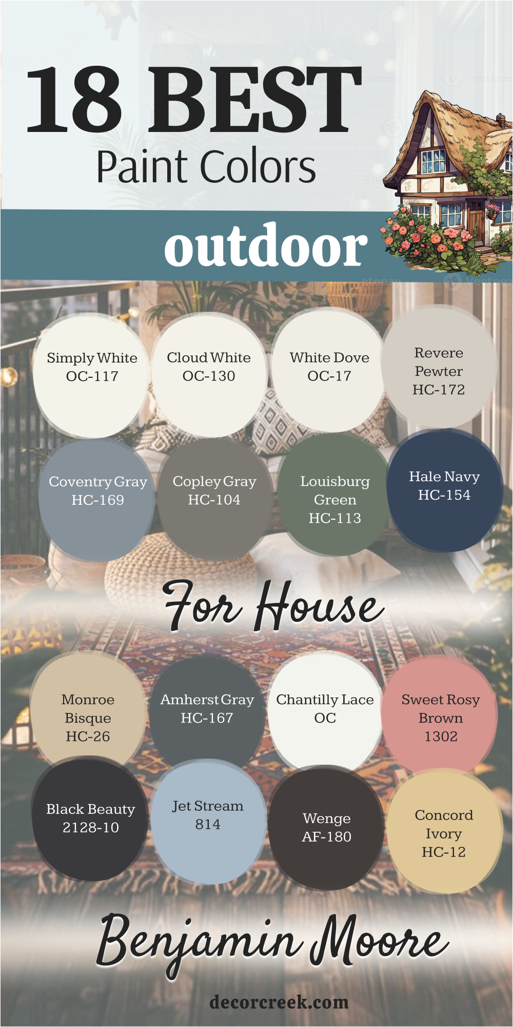
Simply White OC-117
Simply White is a crisp, bright white that has a touch of yellow in its base, giving it a beautiful, subtle warmth that prevents it from looking stark. It is one of Benjamin Moore’s most popular whites, and it’s a brilliant choice for an exterior because it reflects light so beautifully.
Simply White works wonderfully on all home styles, offering a clean, contemporary, and well-maintained look. I often pair it with deep, rich accent colors like Hale Navy or Black Beauty for a sharp, sophisticated contrast. The color maintains its brightness in all lights, making a house feel airy, open, and incredibly fresh from the street.
It’s a reliable white that appeals to a wide range of tastes, making it an excellent choice for maximizing curb appeal. This paint color gives a home a pure, illuminated presence that feels instantly welcoming and well-cared for. It’s a fantastic foundation that makes all other colors and details pop wonderfully.
🎨 Check out the complete guide to this color right HERE 👈

Cloud White OC-130
Cloud White is a soft, creamy white that has noticeable yellow and red oxide undertones, giving it a beautiful, comforting warmth. It’s a wonderful choice for a homeowner who wants a white that feels historic, soft, and avoids any starkness or coldness.
Cloud White works beautifully on traditional, colonial, and Victorian-style homes, providing a classic, established look. I often pair it with historic colors like deep sage greens or muted blues for a sophisticated, traditional palette. The color holds its rich, warm tone in the sunlight, providing a consistent, gentle presence on the exterior.
It’s a reliable shade that makes a house feel instantly inviting and well-rooted in its setting and surroundings. This paint color offers a beautiful, subtle illumination that feels both comforting and elegant. It is a fantastic white for homes that have warmer fixed elements, as it effortlessly ties those elements together.
🎨 Check out the complete guide to this color right HERE 👈

White Dove OC-17
White Dove is a beautiful, classic off-white that is soft and creamy, with a subtle gray undertone that keeps it from looking too yellow. It is a highly popular and versatile choice, offering a perfect balance between a crisp white and a soft, warm cream.
White Dove works beautifully on virtually every style of home, providing a sophisticated, tailored, and very clean look. I often pair it with both light and dark accent colors, as it has a natural ability to harmonize with any palette.
The color provides a sense of depth that prevents it from washing out in the sun, maintaining its soft hue all day. It’s an excellent white for staging homes, as its soft neutrality has incredibly broad appeal to potential buyers. This paint color gives the home a refined, quiet elegance that feels instantly welcoming and structurally defined. It’s a perfect choice for a sophisticated, enduring white exterior.

Revere Pewter HC-172
Revere Pewter is a classic, mid-tone greige that is incredibly balanced, sitting perfectly between gray and beige, with a slight warm lean. It is arguably one of the most famous and versatile neutral colors, and it translates beautifully to the exterior.
Revere Pewter works wonderfully on traditional homes, providing a grounded, established look that feels classic and never goes out of style. I often pair it with a crisp white trim and a deep, dark accent color like Amherst Gray for a sophisticated contrast.
The color holds its complexity in all lights, avoiding the risk of looking too yellow in the sun or too cold in the shade. It’s a reliable shade that gives the house a substantial, serious, and very well-maintained appearance. This paint color is a fantastic neutral that serves as a perfect backdrop for vibrant landscaping and colorful front doors.

Coventry Gray HC-169
Coventry Gray is a true mid-tone, classic gray that has clear, cool blue undertones, giving it a crisp, tailored, and very sophisticated feel. It’s a wonderful choice for a homeowner who wants a true, classic gray that reads as serious and structural on the exterior.
Coventry Gray works beautifully on traditional homes, especially those with colonial or federal-style architecture, providing a timeless look. I often pair it with a stark, bright white trim to create a stunning, high-contrast effect that defines the architectural details.
The color holds its cool, structured hue in all lights, making a house feel very composed and elegant from the street. It’s a reliable shade that gives the home a refined, established presence that is both traditional and very current. This paint color is a sophisticated neutral that acts as a perfect foundation for colorful outdoor décor.

Copley Gray HC-104
Copley Gray is a deep, saturated, warm gray that has distinct green or mossy undertones, giving it a rich, organic, and complex feel. It’s an excellent choice for a homeowner who wants a dark, grounded neutral that feels more natural and earthy than a pure charcoal.
Copley Gray works beautifully on Craftsman and historic-style homes, as its organic color connects nicely with natural wood and stone. I often pair it with a creamy white trim and natural wood accents to enhance its inherent warmth and depth.
The color provides a substantial, weighty appearance that makes the house feel well-established and sturdy on the land. It’s a fantastic choice for creating a high-impact look that is both sophisticated and deeply connected to its surroundings. This paint color offers a dark, moody alternative that feels organic and incredibly welcoming.
🎨 Check out the complete guide to this color right HERE 👈
Louisburg Green HC-113
Louisburg Green is a deep, historic, muted sage green that is heavily saturated with gray undertones, making it a very elegant and sophisticated shade. It’s a wonderful color for a homeowner who wants a deep color that feels organic and classic without being overly bright or dramatic.
Louisburg Green works beautifully on traditional and historic homes, providing a sense of established charm and quiet elegance. I often pair it with creamy white trim and dark wood accents to enhance its organic, subtle character.
The color holds its depth and warmth well in all light conditions, appearing rich and full of life on the exterior. It’s a fantastic choice for creating a home that feels instantly connected to nature with a thoughtful, sophisticated color choice. This paint color gives the house a substantial, welcoming appearance that feels perfectly tailored to its setting.
Hale Navy HC-154
Hale Navy is a true, classic deep navy blue that is rich, sophisticated, and has a timeless quality that never fades from popularity. It is one of Benjamin Moore’s most popular colors, and it’s a wonderful choice for a high-impact, elegant exterior.
Hale Navy works beautifully as a main body color for coastal, traditional, or even modern homes, providing a bold, tailored look. I often pair it with a crisp, bright white trim to create a stunning, nautical high-contrast effect that is visually appealing.
The color is dark enough to feel grounded and serious but the blue keeps it from feeling overly heavy or stark. It provides a confident, sophisticated presence that feels both traditional and incredibly current. This paint color is an excellent choice for creating a strong, memorable first impression that is both classic and highly fashionable.

Monroe Bisque HC-26
Monroe Bisque is a soft, mid-tone tan or beige that is rich in warmth and has a beautiful, comforting, golden undertone. It’s a wonderful choice for a homeowner who wants a warm, earth-toned home that still feels current and never yellow or dated.
Monroe Bisque works beautifully on traditional, stucco, or Mediterranean-style homes, providing a classic, established look. I often pair it with creamy white trim and dark brown accents for a warm, sophisticated, and cohesive palette.
The color holds its rich, warm tone in the sunlight, providing a consistent, gentle presence on the exterior. It’s a reliable shade that makes a house feel instantly inviting and well-rooted in its setting. This paint color offers a beautiful, subtle warmth that feels both comforting and elegant on the exterior. It is a fantastic choice for a home surrounded by natural, earthy elements.
Amherst Gray HC-167
Amherst Gray is a deep, heavily saturated, classic charcoal gray that has subtle green or brown undertones, giving it a rich complexity. It’s an excellent choice for a homeowner who wants a dark, moody exterior that feels grounded, sophisticated, and full of depth. Amherst Gray works beautifully on traditional homes, providing a substantial, tailored, and very high-end appearance.
I often pair it with a bright white trim for a dramatic, defined contrast that highlights the architectural details. The color is dark enough to feel serious and established but the subtle undertones keep it from feeling too stark or cold.
It provides a powerful, confident presence that feels both traditional and incredibly modern and chic. This paint color is a reliable option for creating a striking, memorable look that is both classic and very appealing.

Chantilly Lace OC-65
Chantilly Lace is a pure, bright, pristine white that is remarkably clean with almost no noticeable undertones of yellow, blue, or gray. It is the perfect choice for a homeowner who wants the absolute crispest, cleanest white possible on their exterior.
Chantilly Lace works wonderfully on modern and contemporary homes, providing a sharp, tailored, and sophisticated look. I often pair it with deep, dramatic colors like Black Beauty or Hale Navy for the most striking high-contrast effect. The color reflects light brilliantly, making a house feel airy, open, and incredibly fresh from the street.
It’s a reliable white that provides a strong sense of purity and lightness to the home’s structure. This paint color is a fantastic foundation that makes all surrounding colors, especially landscaping, pop with incredible vibrancy. It is the epitome of a true, uncomplicated, brilliant white for the exterior.

Sweet Rosy Brown 1302
Sweet Rosy Brown is a soft, muted pink-beige or dusty rose color that is unexpected and uniquely charming on an exterior. It’s a subtle yet distinct color choice for a homeowner who wants a gentle warmth with a touch of historic or vintage flair.
Sweet Rosy Brown works beautifully on cottage, traditional, or southwestern-style homes, providing a warm, inviting presence. I often pair it with creamy white trim and natural wood elements to enhance its soft, earthy quality.
The color holds its subtle hue beautifully in the sun, creating a consistent, gentle atmosphere on the exterior. It’s a charming choice that gives the house a unique, soft, and well-loved appearance on the street. This paint color offers a very sophisticated and unexpected alternative to the usual neutrals for a truly memorable exterior.
Black Beauty 2128-10
Black Beauty is a deep, rich, saturated black that has subtle warm, brown undertones, preventing it from feeling stark or cold. It is an excellent choice for a homeowner who wants a truly dramatic, striking, and modern statement for their home’s exterior.
Black Beauty works beautifully on modern architecture, trim, or as a powerful accent on shutters and doors. I often pair it with a crisp, bright white like Chantilly Lace for the ultimate high-contrast, graphic effect.
The color absorbs light wonderfully, creating deep shadows and giving the house a serious, tailored, high-end appearance. It’s a bold commitment that pays off with massive curb appeal and a sophisticated, contemporary feel. This paint color is the definition of classic chic, providing an unparalleled level of structure and drama to the exterior.
🎨 Check out the complete guide to this color right HERE 👈
Jet Stream 814
Jet Stream is a light, airy, very soft blue that has a significant gray undertone, making it a sophisticated and peaceful color. It’s a wonderful choice for a homeowner who wants a hint of refreshing color that is subtle and not overly bright or aggressive.
Jet Stream works beautifully on coastal, cottage, or traditional homes, providing a relaxed, welcoming atmosphere. I often pair it with a crisp white trim to maximize the gentle contrast and enhance its light, airy quality.
The color holds its subtle blue-gray hue beautifully in the sun, creating a consistent, serene presence on the exterior. It’s a reliable shade that gives the house a clean, fresh, and beautifully composed appearance on the street. This paint color offers a gentle, refreshing alternative to the usual neutrals for a soft, sophisticated color choice.
Wenge AF-180
Wenge is an extremely deep, rich, saturated brown that borders on black, offering a complex, very dark, and highly sophisticated neutral. It’s an excellent choice for a homeowner who wants a dark, grounded exterior but needs the color to feel warm and organic.
Wenge works beautifully on modern or Asian-inspired architecture, as well as an accent on traditional homes for a high-end look. I often pair it with light, creamy white trim and natural wood elements to enhance its inherent warmth and depth.
The color provides a substantial, weighty appearance that makes the house feel well-established and serious on the land. It’s a fantastic choice for creating a high-impact, bold look that is both contemporary and incredibly warm. This paint color offers a dark, dramatic alternative that feels organic and deeply luxurious on the exterior.
🎨 Check out the complete guide to this color right HERE 👈
Concord Ivory HC-12
Concord Ivory is a rich, historic, deep yellow that has a muted, antique quality with strong brown undertones, making it sophisticated and complex. It’s a wonderful choice for a homeowner who wants a classic, vibrant color that still feels historic and well-rooted in tradition.
Concord Ivory works beautifully on traditional, colonial, or historic homes, providing a cheerful yet established presence. I often pair it with crisp white trim and a deep, muted accent color like Louisburg Green for a very traditional, sophisticated palette.
The color holds its rich, golden hue beautifully in the sun, creating a consistent, inviting presence on the exterior. It’s a reliable shade that gives the house a distinct, welcoming, and well-loved appearance on the street. This paint color is a fantastic choice for a homeowner who wants a colorful exterior that feels timeless and classic.
Polo Blue 2062-10
Polo Blue is a vibrant, saturated, classic mid-tone blue that is clean and slightly bright, offering a cheerful and sophisticated nautical feel. It’s a wonderful color for a homeowner who wants a noticeable, happy blue that is still tailored and very appealing.
Polo Blue works beautifully on coastal, cottage, or traditional homes, providing a lively, welcoming atmosphere. I often pair it with a bright, crisp white trim to create a stunning, high-contrast effect that is visually appealing.
The color is bright enough to feel happy and inviting but deep enough to feel substantial and well-rooted. It provides a unique and memorable presence that feels full of life and charm from the street. This paint color is a fantastic option for a main body color or a high-impact front door to make a clean, confident statement.
🎨 Check out the complete guide to this color right HERE 👈
Charcoal Slate HC-178
Charcoal Slate is a deep, dark, saturated gray that has a slight coolness and a noticeable blue undertone, giving it a tailored and elegant feel. It’s an excellent choice for a homeowner who wants a dark, moody exterior that feels grounded, sophisticated, and highly structural.
Charcoal Slate works beautifully on traditional and modern homes, providing a substantial, very high-end appearance. I often pair it with a crisp white trim for a dramatic, defined contrast that highlights the architectural details.
The color is dark enough to feel serious and established but the blue undertone keeps it from feeling too stark or industrial. It provides a powerful, confident presence that feels both traditional and incredibly current and chic. This paint color is a reliable option for creating a striking, memorable look that is both classic and very appealing.
🎨 Check out the complete guide to this color right HERE 👈
33 Best Outdoor Paint Colors For House To Try This Year
Simply White OC-117
Simply White is a perfect bright white, providing a crisp, clean foundation that makes an exterior feel fresh and updated. It has a tiny whisper of yellow in its base, ensuring it avoids the cold, stark look that can sometimes happen in bright sunlight. Simply White works on every style of architecture, from colonial to modern, offering a reliably chic appearance.
I often use it on trim and columns to create a sharp contrast against darker body colors like navy or charcoal. The color is incredibly reflective, which helps the house appear larger and more illuminated from the street.
It’s a versatile and reliable choice that never goes out of style and always looks meticulously maintained. Simply White is a fantastic option for homes that need a clean slate and a strong sense of purity. It ensures that landscaping and surrounding greenery truly stand out with vibrant color. The enduring popularity of this shade is a testament to its uncomplicated elegance.
🎨 Check out the complete guide to this color right HERE 👈
White Dove OC-17
White Dove is a creamy, soft white that offers a perfect balance between a pure white and a cozy off-white, making it very popular. It has a subtle hint of gray, which prevents it from leaning too yellow, giving it a sophisticated, nuanced appearance.
White Dove is my go-to white for traditional homes where a warm, established feel is desired, pairing beautifully with natural wood. I often recommend it for siding because it has a gentle depth that still reads as white but avoids feeling blinding in the sun.
The color holds its softness in all lights, which makes it feel inviting and less stark than a cleaner white. It’s a fantastic staging color, as its neutrality appeals to almost everyone looking for a classic white exterior. White Dove gives a home an elegant, refined look that is welcoming and perfectly composed. This shade is a true workhorse, versatile enough for trim, body, or even porch ceilings.
Cloud White OC-130
Cloud White is a creamy, warmer white that leans slightly toward the yellow end of the spectrum, providing a very historic and soft look. It is an excellent choice for a homeowner who wants a white house but needs a shade that feels substantial, cozy, and never cold.
Cloud White works beautifully on older homes, especially those with traditional or classic architectural detailing that benefits from a softer color. I often pair it with deep, muted colors for accents, creating a traditional palette that feels established and authentic.
The color holds its rich warmth even under harsh sunlight, providing a consistent, gentle presence on the exterior. It’s a reliable white that makes a house feel instantly inviting and well-rooted in its setting. Cloud White gives a beautiful, subtle illumination that feels both comforting and historically appropriate for many styles. This paint color is perfect for tying together warmer fixed elements like orange-red brick or brown roof shingles.
🎨 Check out the complete guide to this color right HERE 👈
Chantilly Lace OC-65
Chantilly Lace is a pristine, bright, ultra-clean white that is famous for having virtually no noticeable undertones of any color. It is the perfect choice for a homeowner who desires the sharpest, most contemporary, and structurally defined white possible.
Chantilly Lace works wonderfully on modern, minimalist, and very graphic architectural styles where a stark contrast is desired. I often pair it with true black or deep charcoal accents to create the ultimate high-contrast, visually stunning exterior.
The color reflects light intensely, which helps emphasize the angularity and structure of modern architecture. It’s a very bold white that provides a strong sense of purity and dramatic lightness to the home’s structure. Chantilly Lace is a fantastic foundation that makes all other colors and surrounding elements pop with incredible definition. This shade is the ultimate choice for a high-impact, tailored, and very current white exterior.
Swiss Coffee OC-45
Swiss Coffee is a delicate, warm off-white that has a slight creaminess and a touch of barely-there beige undertone, making it incredibly soft. It’s a beautiful choice for a homeowner who wants a white house but needs a shade that feels cozy and perfectly neutral, avoiding coldness. Swiss Coffee works wonderfully on traditional homes and as a softening element on more modern architecture.
I often recommend it for siding because it has a gentle depth that reads as white but feels inviting and well-established. The color holds its soft hue beautifully in the sun, creating a consistent, welcoming presence on the exterior.
It’s a reliable shade that gives the house a quiet, gentle elegance that is both classic and highly appealing. Swiss Coffee is a perfect choice for creating a home that feels instantly approachable and effortlessly sophisticated from the street.

Revere Pewter HC-172
Revere Pewter is a classic, perfectly balanced mid-tone greige, a favorite that sits between gray and beige, with a reassuring warmth. It is one of the most famous and universally loved neutral colors, translating flawlessly to the exterior of nearly any home.
Revere Pewter works beautifully on traditional and transitional homes, providing a grounded, established, and perennially stylish look. I often pair it with a crisp white trim and a deep, dark accent color like Amherst Gray for a timeless, sophisticated contrast. The color holds its complexity beautifully in all lights, consistently offering a rich and nuanced hue.
It’s a reliable shade that gives the house a substantial, serious, and very well-composed appearance. Revere Pewter is a fantastic foundation that serves as the perfect backdrop for colorful front doors and vibrant landscaping. This enduring shade is a true testament to the power of a perfectly balanced neutral.
Balboa Mist OC-27
Balboa Mist is a very light, airy greige that is incredibly soft, reading almost as a warm off-white in bright light. It has a beautiful balance, leaning slightly toward the gray side but retaining enough beige to feel cozy and inviting. Balboa Mist works wonderfully on homes that need a light, sophisticated neutral that feels current but not stark or cold.
I often pair it with a bright white trim to maximize the subtle color contrast and enhance its refined, delicate quality. The color is light enough to feel airy and open but has enough depth to prevent it from washing out in the sun.
It’s a fantastic choice for creating a home that feels instantly peaceful, well-maintained, and perfectly composed. Balboa Mist gives the house a gentle, illuminated appearance that feels both current and incredibly classic in its simplicity.

Gray Owl OC-52
Gray Owl is a light, very clean gray that has distinct, refreshing blue and sometimes green undertones, giving it a bright, coastal feel. It is a wonderful choice for a homeowner who wants a genuine gray that is light, sophisticated, and incredibly clean on the exterior.
Gray Owl works beautifully on coastal, craftsman, or modern farmhouse styles, providing a light, airy, and very current look. I often pair it with a bright white trim and a deep navy or black accent for a sharp, tailored, high-contrast effect.
The color reads as a soft, clean gray in all lights, making a house feel crisp and well-maintained from the street. It’s a reliable shade that gives the home a refined, gentle presence that is both contemporary and elegantly composed. Gray Owl is a perfect choice for a soft, sophisticated gray exterior that feels light and refreshing.
🎨 Check out the complete guide to this color right HERE 👈

Rockport Gray HC-105
Rockport Gray is a mid-tone, classic gray that has clear, warm brown or taupe undertones, making it a sophisticated and earthy greige. It’s a wonderful choice for a homeowner who wants a true gray that feels warm, grounded, and substantial on the exterior.
Rockport Gray works beautifully on traditional, colonial, and craftsman-style homes, providing a historic, established, and serious look. I often pair it with a creamy white trim and deep, rich brown accents for a warm, sophisticated, and cohesive palette.
The color holds its depth and complexity in all lights, consistently offering a rich and nuanced hue. It’s a reliable shade that gives the house a sturdy, well-rooted, and very well-composed appearance on the land. Rockport Gray is a fantastic neutral that serves as a perfect, grounded backdrop for any outdoor setting.
Copley Gray HC-104
Copley Gray is a deep, saturated, warm gray that has distinct green or mossy undertones, giving it a rich, organic, and highly complex feel. It’s an excellent choice for a homeowner who wants a dark, grounded neutral that feels more natural and earthy than a pure charcoal.
Copley Gray works beautifully on Craftsman and historic-style homes, as its organic color connects nicely with natural wood and stone. I often pair it with a creamy white trim and natural wood accents to enhance its inherent warmth and depth.
The color provides a substantial, weighty appearance that makes the house feel well-established and sturdy on the land. It’s a fantastic choice for creating a high-impact look that is both sophisticated and deeply connected to its surroundings. Copley Gray offers a dark, moody alternative that feels organic and incredibly welcoming on the exterior.
🎨 Check out the complete guide to this color right HERE 👈
Sag Harbor Gray HC-95
Sag Harbor Gray is a beautiful, complex mid-tone gray that is rich in deep, muted green undertones, giving it a historic and organic feel. It is a classic color that provides a sense of established charm and quiet sophistication to any exterior.
Sag Harbor Gray works wonderfully on traditional and colonial homes, blending beautifully with natural, wooded environments. I often pair it with a crisp, creamy white trim and natural wood doors for a cohesive, classic palette.
The color holds its rich, complex hue in all lights, consistently offering a nuanced and interesting appearance. It’s a reliable shade that gives the house a grounded, well-loved, and very well-composed presence on the street. Sag Harbor Gray is a wonderful alternative to a simple gray, providing a subtle, sophisticated pop of historic color.
Edgecomb Gray HC-173
Edgecomb Gray is a light, airy greige that is incredibly balanced, leaning slightly toward the beige side while maintaining a clear gray presence. It is a highly versatile and popular neutral, offering a soft, welcoming look without any starkness or coldness.
Edgecomb Gray works wonderfully on all home styles, providing a subtle yet rich backdrop that feels modern and current. I often pair it with a crisp white trim and a deep, dark accent color for a beautiful, classic contrast.
The color holds its warmth even in bright sunlight, preventing it from appearing too cool or washed out on the exterior. It’s a reliable shade that gives the house a gentle, inviting presence that is both current and incredibly appealing. Edgecomb Gray is a fantastic neutral that serves as a perfect, subtle foundation for vibrant landscaping.

Coventry Gray HC-169
Coventry Gray is a true mid-tone, classic gray that has clear, cool blue undertones, giving it a crisp, tailored, and very sophisticated feel. It’s a wonderful choice for a homeowner who wants a true, classic gray that reads as serious and structural on the exterior.
Coventry Gray works beautifully on traditional homes, especially those with colonial or federal-style architecture, providing a timeless look. I often pair it with a stark, bright white trim to create a stunning, high-contrast effect that defines the architectural details.
The color holds its cool, structured hue in all lights, making a house feel very composed and elegant from the street. It’s a reliable shade that gives the home a refined, established presence that is both traditional and very current. Coventry Gray is a sophisticated neutral that acts as a perfect foundation for colorful outdoor decor.
Amherst Gray HC-167
Amherst Gray is a deep, heavily saturated, classic charcoal gray that has subtle green or brown undertones, giving it a rich complexity. It’s an excellent choice for a homeowner who wants a dark, moody exterior that feels grounded, sophisticated, and full of depth.
Amherst Gray works beautifully on traditional homes, providing a substantial, tailored, and very high-end appearance. I often pair it with a bright white trim for a dramatic, defined contrast that highlights the architectural details.
The color is dark enough to feel serious and established but the subtle undertones keep it from feeling too stark or cold. It provides a powerful, confident presence that feels both traditional and incredibly modern and chic. Amherst Gray is a reliable option for creating a striking, memorable look that is both classic and very appealing.
Kendall Charcoal HC-166
Kendall Charcoal is a deep, saturated, true charcoal gray that has a slight green undertone, making it a rich, complex, and highly sophisticated dark neutral. It is one of Benjamin Moore’s most popular dark colors, providing drama without being a true black.
Kendall Charcoal works beautifully on all styles of homes, offering a grounded, established, and very high-end look. I often pair it with a bright white trim for a sharp, tailored contrast that makes the dark color truly shine on the exterior.
The color holds its deep, substantial hue in all lights, consistently offering a powerful and elegant presence. It’s a reliable shade that gives the house a serious, confident, and very well-composed appearance. Kendall Charcoal is a fantastic choice for a dramatic, sophisticated exterior that demands attention in a very refined way.

Hale Navy HC-154
Hale Navy is a true, classic deep navy blue that is rich, sophisticated, and has a timeless quality that never fades from popularity. It is one of Benjamin Moore’s most popular colors, and it’s a wonderful choice for a high-impact, elegant exterior.
Hale Navy works beautifully as a main body color for coastal, traditional, or even modern homes, providing a bold, tailored look. I often pair it with a crisp, bright white trim to create a stunning, nautical high-contrast effect that is visually appealing.
The color is dark enough to feel grounded and serious but the blue keeps it from feeling overly heavy or stark. It provides a confident, sophisticated presence that feels both traditional and incredibly current. Hale Navy is an excellent choice for creating a strong, memorable first impression that is both classic and highly fashionable.
Polo Blue 2062-10
Polo Blue is a vibrant, saturated, classic mid-tone blue that is clean and slightly bright, offering a cheerful and sophisticated nautical feel. It’s a wonderful color for a homeowner who wants a noticeable, happy blue that is still tailored and very appealing.
Polo Blue works beautifully on coastal, cottage, or traditional homes, providing a lively, welcoming atmosphere. I often pair it with a bright, crisp white trim to create a stunning, high-contrast effect that is visually appealing.
The color is bright enough to feel happy and inviting but deep enough to feel substantial and well-rooted. It provides a unique and memorable presence that feels full of life and charm from the street. Polo Blue is a fantastic option for a main body color or a high-impact front door to make a clean, confident statement.
🎨 Check out the complete guide to this color right HERE 👈
Deep Royal 2061-10
Deep Royal is a brilliant, highly saturated, true royal blue that is vibrant and incredibly bold, making a joyful, striking statement. It’s a wonderful color for a homeowner who wants a vibrant pop of color that feels high-energy and perfectly tailored.
Deep Royal works beautifully on cottage or traditional homes, providing a lively, welcoming, and very memorable presence. I often pair it with a crisp white trim and a black accent to ground its vibrancy and give it a sophisticated edge.
The color is bright enough to feel happy and inviting but the depth of the hue keeps it from feeling childish. It provides a unique and memorable presence that feels full of life and charm from the street. Deep Royal is a fantastic option for an accent color on a front door or shutters for a high-impact burst of color.
🎨 Check out the complete guide to this color right HERE 👈
Black Beauty 2128-10
Black Beauty is a deep, rich, saturated black that has subtle warm, brown undertones, preventing it from feeling stark or cold. It is an excellent choice for a homeowner who wants a truly dramatic, striking, and modern statement for their home’s exterior.
Black Beauty works beautifully on modern architecture, trim, or as a powerful accent on shutters and doors. I often pair it with a crisp, bright white like Chantilly Lace for the ultimate high-contrast, graphic effect.
The color absorbs light wonderfully, creating deep shadows and giving the house a serious, tailored, high-end appearance. It’s a bold commitment that pays off with massive curb appeal and a sophisticated, contemporary feel. Black Beauty is the definition of classic chic, providing an unparalleled level of structure and drama to the exterior.
🎨 Check out the complete guide to this color right HERE 👈
Wrought Iron 2124-10
Wrought Iron is a very deep, almost-black charcoal with a hint of dark blue or navy undertone, making it a subtle and sophisticated dark color. It’s an excellent choice for creating high drama and contrast, providing a bold, modern look for any home.
Wrought Iron works beautifully as a main body color for modern or contemporary architecture, making a strong, graphic statement. I often use it for trim or shutters against a bright white or light gray to add depth and definition.
The color provides a serious, grounded presence that feels very composed and high-end. It’s dark enough to look almost black in certain light, offering a softer alternative to a true pure black paint. Wrought Iron is a reliable option for a homeowner who wants a dark exterior that feels nuanced and sophisticated rather than stark.

Knoxville Gray HC-160
Knoxville Gray is a deep, complex blue-green-gray that is rich in saturation, offering a historic, moody, and sophisticated feel. It is a wonderful color for a homeowner who wants a dark color that is unique but still feels utterly classic and established.
Knoxville Gray works beautifully on traditional homes, providing a sense of quiet elegance and historic charm. I often pair it with creamy white trim and natural wood accents to enhance its organic, subtle character.
The color holds its depth and warmth well in all light conditions, appearing rich and full of life on the exterior. It’s a fantastic choice for creating a home that feels substantial, welcoming, and perfectly tailored to its setting. Knoxville Gray is a wonderful alternative to blue or gray for a sophisticated, saturated neutral.
Stratton Blue HC-142
Stratton Blue is a beautiful, mid-tone deep teal or blue-green that is highly saturated, offering a rich and sophisticated pop of color. It is a wonderful choice for a homeowner who wants a refreshing color that is still traditional and incredibly appealing on the exterior.
Stratton Blue works beautifully on coastal, cottage, or traditional homes, providing a lively, welcoming atmosphere. I often pair it with a crisp white trim and a black accent to ground its vibrancy and give it a tailored look.
The color holds its rich, complex hue beautifully in the sun, creating a consistent, serene presence on the exterior. It’s a reliable shade that gives the house a fresh, well-composed appearance that feels both current and very classic.
Templeton Gray HC-161
Templeton Gray is a deep, highly saturated, historic green-gray that is rich in muted color, offering a sophisticated and moody neutral. It’s an excellent choice for a homeowner who wants a dark, grounded neutral that feels organic, historic, and incredibly complex.
Templeton Gray works beautifully on traditional homes, providing a substantial, tailored, and very high-end appearance. I often pair it with a creamy white trim and natural wood accents to enhance its inherent warmth and depth.
The color holds its deep, substantial hue in all lights, consistently offering a powerful and elegant presence. It’s a reliable shade that gives the house a serious, confident, and very well-composed appearance on the street. Templeton Gray is a fantastic choice for a dramatic, sophisticated exterior that has a wonderful, muted color.
Saybrook Sage HC-114
Saybrook Sage is a classic, mid-tone sage green that has a perfect balance of gray and green, making it a soft, sophisticated neutral. It’s a great choice for a homeowner who wants a touch of color that feels incredibly organic and soothing on the exterior.
Saybrook Sage works wonderfully on cottage and traditional homes, providing a gentle, welcoming atmosphere that feels very classic. I often pair it with a crisp white trim for a fresh, clean contrast or with natural wood for a more earthy look.
The color provides a quiet, refined elegance that is not overly dramatic but consistently appealing in all light. It’s a reliable shade that gives the house a gentle, comforting presence that feels both current and very well-established. Saybrook Sage is a wonderful alternative to the popular grays for a subtle, earthy color choice.

Nantucket Gray HC-111
Nantucket Gray is a very complex, beautiful historic green-gray that is highly saturated and rich in earthy undertones. It’s an excellent choice for a homeowner who wants a deep color that is unique but still feels utterly classic and grounded in tradition.
Nantucket Gray works beautifully on traditional homes, providing a sense of quiet elegance and historic charm. I often pair it with creamy white trim and natural wood accents to enhance its organic, subtle character.
The color holds its depth and warmth well in all light conditions, appearing rich and full of life on the exterior. It’s a fantastic choice for creating a home that feels substantial, welcoming, and perfectly tailored to its setting. Nantucket Gray is a wonderful alternative to blue or gray for a sophisticated, saturated neutral.
🎨 Check out the complete guide to this color right HERE 👈
Louisburg Green HC-113
Louisburg Green is a deep, historic, muted sage green that is heavily saturated with gray undertones, making it a very elegant and sophisticated shade. It’s a wonderful color for a homeowner who wants a deep color that feels organic and classic without being overly bright or dramatic.
Louisburg Green works beautifully on traditional and historic homes, providing a sense of established charm and quiet elegance. I often pair it with creamy white trim and dark wood accents to enhance its organic, subtle character.
The color holds its depth and warmth well in all light conditions, appearing rich and full of life on the exterior. It’s a fantastic choice for creating a home that feels instantly connected to nature with a thoughtful, sophisticated color choice. Louisburg Green gives the house a substantial, welcoming appearance that feels perfectly tailored to its setting.
Gloucester Sage HC-100
Gloucester Sage is a deep, rich, classic olive or moss green that is saturated and full of earthy, warm brown undertones. It’s a wonderful color for a homeowner who wants a deep, sophisticated green that feels traditional, established, and grounded.
Gloucester Sage works beautifully on craftsman and historic-style homes, as its rich, organic color connects nicely with natural materials. I often pair it with creamy white trim for a warm contrast or with deep, rich brown accents for a cohesive, earthy palette.
The color holds its depth and warmth well in all light conditions, consistently offering a rich and nuanced hue. It’s a reliable shade that gives the house a substantial, well-rooted, and very well-composed appearance on the land. Gloucester Sage is a fantastic foundation that serves as the perfect backdrop for colorful outdoor settings.
Fairview Taupe HC-85
Fairview Taupe is a deep, saturated, warm taupe or brown-gray that is incredibly rich with red and green undertones, making it a complex neutral. It’s an excellent choice for a homeowner who wants a dark, grounded exterior that feels organic, historic, and incredibly complex.
Fairview Taupe works beautifully on traditional homes, providing a substantial, tailored, and very high-end appearance. I often pair it with a creamy white trim and natural wood accents to enhance its inherent warmth and depth.
The color holds its deep, substantial hue in all lights, consistently offering a powerful and elegant presence. It’s a reliable shade that gives the house a serious, confident, and very well-composed appearance on the street. Fairview Taupe is a fantastic choice for a dramatic, sophisticated exterior that has a wonderful, muted color.
Quincy Tan HC-25
Quincy Tan is a soft, mid-tone tan or beige that has a beautiful, comforting warmth with subtle gold undertones, making it feel very established. It’s a wonderful choice for a homeowner who wants a warm, earth-toned home that still feels classic and never yellow or dated.
Quincy Tan works beautifully on traditional, stucco, or craftsman-style homes, providing a classic, established look. I often pair it with creamy white trim and dark brown accents for a warm, sophisticated, and cohesive palette.
The color holds its rich, warm tone in the sunlight, providing a consistent, gentle presence on the exterior. It’s a reliable shade that makes a house feel instantly inviting and well-rooted in its setting. Quincy Tan offers a beautiful, subtle warmth that feels both comforting and elegant on the exterior.
Monroe Bisque HC-26
Monroe Bisque is a soft, mid-tone tan or beige that is rich in warmth and has a beautiful, comforting, golden undertone. It’s a wonderful choice for a homeowner who wants a warm, earth-toned home that still feels current and never yellow or dated.
Monroe Bisque works beautifully on traditional, stucco, or Mediterranean-style homes, providing a classic, established look. I often pair it with creamy white trim and dark brown accents for a warm, sophisticated, and cohesive palette.
The color holds its rich, warm tone in the sunlight, providing a consistent, gentle presence on the exterior. It’s a reliable shade that makes a house feel instantly inviting and well-rooted in its setting. Monroe Bisque offers a beautiful, subtle warmth that feels both comforting and elegant on the exterior.
Muslin OC-12
Muslin is a delicate, warm off-white that has a definite creaminess and a touch of barely-there taupe undertone, making it incredibly soft. It’s a beautiful choice for a homeowner who wants a white house but needs a shade that feels cozy and perfectly neutral, avoiding coldness.
Muslin works wonderfully on traditional homes and as a softening element on more modern architecture. I often recommend it for siding because it has a gentle depth that reads as white but feels inviting and well-established.
The color holds its soft hue beautifully in the sun, creating a consistent, welcoming presence on the exterior. It’s a reliable shade that gives the house a quiet, gentle elegance that is both classic and highly appealing. Muslin is a perfect choice for creating a home that feels instantly approachable and effortlessly sophisticated from the street.
🎨 Check out the complete guide to this color right HERE 👈

Bleeker Beige HC-80
Bleeker Beige is a mid-tone, classic, saturated tan or beige that has a beautiful, grounded warmth with subtle gray undertones. It’s a wonderful choice for a homeowner who wants a warm, earth-toned home that feels traditional, established, and substantial.
Bleeker Beige works beautifully on traditional, craftsman, or colonial homes, providing a classic, well-rooted look. I often pair it with creamy white trim and deep, rich brown accents for a warm, sophisticated, and cohesive palette.
The color holds its rich, warm tone in the sunlight, providing a consistent, gentle presence on the exterior. It’s a reliable shade that makes a house feel instantly inviting and well-rooted in its setting. Bleeker Beige offers a beautiful, subtle warmth that feels both comforting and elegant on the exterior.
Stone Hearth 984
Stone Hearth is a beautiful, mid-tone greige that is heavily saturated, rich with warm brown and subtle gray undertones. It is an excellent choice for a homeowner who wants a warm, earthy neutral that feels substantial, grounded, and incredibly sophisticated.
Stone Hearth works beautifully on traditional homes, providing a strong sense of establishment and quiet elegance. I often pair it with a crisp white trim and deep, dark accent colors for a defined, tailored contrast.
The color holds its depth and complexity beautifully in all lights, consistently offering a rich and nuanced hue. It’s a reliable shade that gives the house a sturdy, well-rooted, and very well-composed appearance on the land. Stone Hearth is a fantastic foundation that serves as the perfect backdrop for vibrant outdoor settings.
🎨 Check out the complete guide to this color right HERE 👈
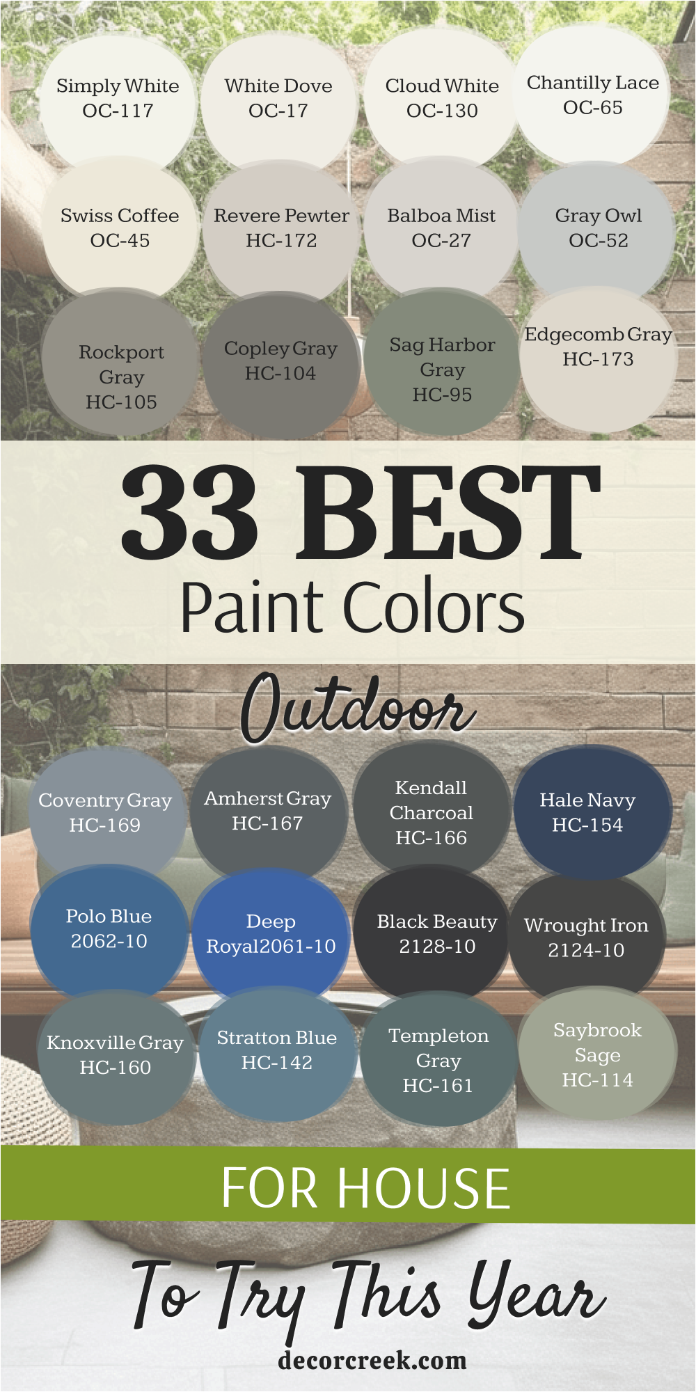
My Final Thoughts on Choosing Outdoor Paint Colors for 2026
The specific colors I’ve meticulously laid out for 2026 collectively form a truly fantastic and versatile palette, expertly blending comforting, grounding neutrals with some moodier, richer, and more dramatic shades that are trending upward. It is absolutely vital to remember that selecting paint for your home’s exterior is fundamentally different from choosing a color for a small, controlled interior bedroom; the relentless power of the sun, shadow patterns, and ambient light affect everything about how the color appears.
The sheer, overwhelming amount of natural light outside will inevitably make any chosen color appear significantly lighter, and often cooler, than it ever does on a small paint swatch or even a sample viewed inside your house.
Therefore, my firm professional directive is this: Always, always buy a sample can of your top contenders and paint a large board—I recommend at least two feet by two feet—and position it against your home to observe it critically at various times of the day. The color you are completely in love with at bright noon might look unexpectedly washed out, too stark, or even reveal surprising undertones at sunset or on a cloudy day.
You must also pay extremely close attention to how your chosen color successfully interacts with all the fixed elements of your house: the shade of your roof, the specific undertones in your brickwork, and the color of any permanent stone or hardscaping.
A chromatic clash or disharmony here is incredibly difficult, expensive, and frustrating to ignore once the entire house is painted.
Finally, take a moment to deeply consider the long-term personality and mood you genuinely want your house to project.
Do you want it to feel established, deeply traditional, and utterly reliable, or do you want it to make a fresh, unequivocally modern statement?
Your paint color is arguably the most powerful tool available for definitively setting and defining your home’s character and aesthetic. Trust your gut instincts, follow these sampling protocols, and recognize that a thoughtful, well-researched color choice is one of the single best, most cost-effective investments you can make in your home’s curb appeal and overall perceived value.