The construction or deep remodeling of your dream house is, without a doubt, one of the most exciting, deeply personal, and highly significant projects you will ever undertake. It’s not just about erecting walls; it’s about materializing your vision for living.
As a seasoned home interior designer and staging expert, I can confidently assert that choosing the right paint colors is perhaps the single most important, defining design decision you will make throughout the entire project. Color is far more than mere surface coating; it is the silent architect of mood that fundamentally shapes the emotional landscape of your home.
It is the color palette that dictates the energy level and sense of clarity you feel when you wake up in the morning, as well as the depth of relaxation and comfort that washes over you when you settle in for the evening. If the foundational color scheme is incorrectly chosen, the entire house can feel discordant, unsettled, or simply “wrong” for habitation. Ultimately, this can undermine the entire homeownership experience.
My main and priority goal in this guide is to share my tried-and-true, professionally vetted list of the best, most reliable paint colors to ensure your home feels precisely the way you envisioned—a true sanctuary that consistently delights you, both inside and out.
I have meticulously and thoroughly compiled a highly practical, curated list of shades sourced from my absolute favorite brands—these are colors that have consistently worked wonders in my clients’ homes, transforming them into flawlessly finished, sophisticated spaces fully ready for years of joyful, intentional, and beautiful living.
Why I Always Trust Sherwin-Williams and Benjamin Moore for Dream Home Color Palettes
When it comes to selecting paint, the quality and integrity of the formula make all the difference, which is why I consistently, without exception, recommend Sherwin-Williams and Benjamin Moore. These companies haven’t just manufactured paint; they have perfected their pigments and complex formulas, ensuring that the resulting colors are deep, rich, saturated, and truly built to last.
Using poor quality paint can often lead to a color that looks muddy, thin, or lacks depth, and worse, the shade you see on a small chip might not accurately represent the color that ultimately dries on your walls. With Sherwin-Williams and Benjamin Moore, I know I am investing in unparalleled consistency, reliable coverage, and long-term durability.
Their colors are engineered to perform beautifully across a spectrum of different lighting conditions—an absolutely essential factor for creating a cohesive, pleasant, and flowing look throughout your entire home. Furthermore, relying on their expertly curated and organized collections makes it significantly easier for me to seamlessly mix and match complementary shades, allowing me to build comprehensive, whole-house palettes that feel intentional, sophisticated, and perfectly cohesive.
For me, they don’t just offer paint; they represent the highest industry standard necessary for achieving a truly finished, professional, and lasting dream house aesthetic.
How I Choose the Perfect Paint Color Palettes for a Dream House
Selecting paint colors is far from a random or hurried task; it is a careful, layered balancing act that weighs three critical factors: the ambient light, the existing fixed architectural elements, and the precise emotional effect you aim to achieve. The first thing I always analyze is the lighting exposure. Is the room north-facing, meaning it receives cool, soft, and indirect light throughout the day?
Or is it south-facing, typically flooded with warm, intense, and bright light? The very same color can undergo a dramatic visual shift depending on the sun’s direction and intensity, and I adjust my recommendations accordingly to counteract or enhance these effects. Next, I thoroughly consider the fixed elements—those permanent, unchanging materials already present in the home, such as built-in flooring, kitchen countertops, cabinetry, or stone fireplaces.
The chosen paint color must harmonize with the often-subtle undertones (be they pink, yellow, blue, or gray) of these permanent materials. Finally, I engage in deep conversations with my clients about the emotional atmosphere they desire for their home. Do they crave a bright, expansive, and airy feeling that lifts the spirits, or something much cozier, moody, and more grounded? Paint colors are an incredibly powerful, non-verbal tool for setting a mood.
I always narrow down my initial selection to a handful of my top options and then strongly recommend that clients sample them directly on the walls in large swatches. Seeing the color in the actual room environment, at various times of the day and under both natural and artificial light, is the only way to be absolutely certain of the choice. This careful, methodical, and layered selection process ensures the final, customized palette is absolutely perfect for that specific, unique dream house.
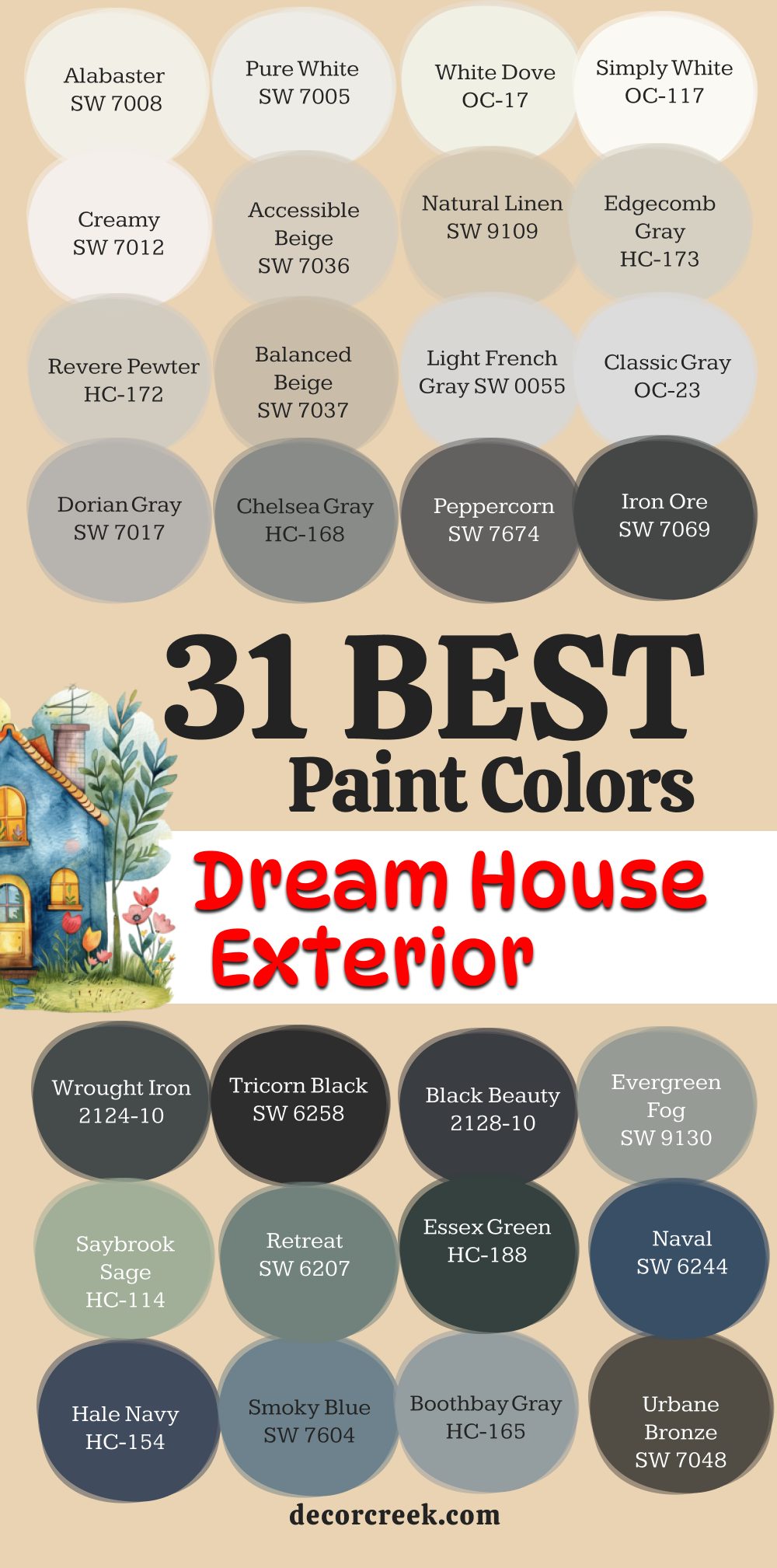
31 Best Paint Colors For The Dream House Exterior
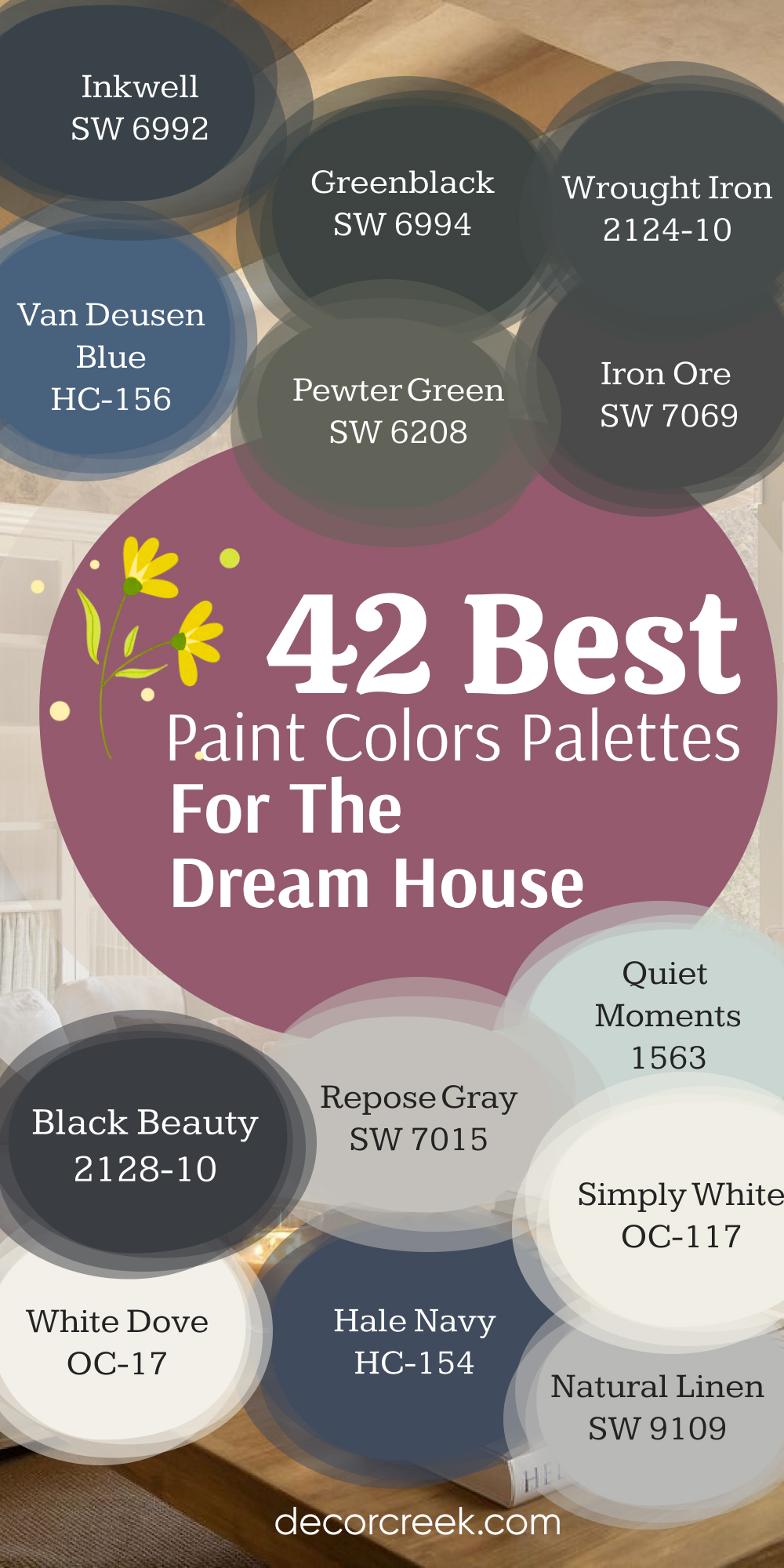
Alabaster SW 7008
Alabaster is the perfect soft, creamy white that feels welcoming and never stark on an exterior. Alabaster has a gentle warmth, making it feel inviting without looking yellow in bright sunlight. Alabaster is a fantastic choice for homes where the owner wants a classic, cozy farmhouse or cottage appeal. Alabaster pairs beautifully with natural wood accents and dark bronze gutters or fixtures.
Alabaster is a popular shade because it maintains its integrity across different climates and architectural styles. Alabaster works well as a primary body color or as a trim color against a darker main shade. Alabaster is often chosen for its incredible light reflectance, making the house seem a little larger.
Alabaster is a safe, tried-and-true white that consistently provides high-end curb appeal. Alabaster is a brilliant option for highlighting beautiful stone or brickwork. Alabaster offers a gorgeous contrast with deep green or charcoal-colored shutters and doors.
👉 Read the full guide for this color HERE 👈

Pure White SW 7005
Pure White is a crisp, clean white that is very close to a true neutral, perfect for a contemporary or modern exterior. Pure White is a fantastic option when you want a high-contrast trim against a darker body color. Pure White lacks the strong yellow or gray undertones that can sometimes plague other white paints. Pure White reads as very bright and clean, making it a favorite for coastal homes and beach houses.
Pure White is one of the brightest whites from Sherwin-Williams that I frequently use on exterior projects. Pure White is excellent for making architectural details pop out from the main facade of the house. Pure White is a brilliant base color if you plan on having colorful landscaping or a vibrant front door.
Pure White is highly versatile and works with virtually any accent color you can imagine. Pure White is a reliable choice for achieving that freshly painted, polished look for your dream home. Pure White holds its true white integrity even under the intense direct sun.
👉 Read the full guide for this color HERE 👈

White Dove OC-17
White Dove is a creamy, highly popular white from Benjamin Moore that has just enough warmth to feel soft and luxurious on a house exterior. White Dove is a gorgeous color for traditional homes, giving them an aged, classic appearance that is never dingy. White Dove has a slight hint of gray, which prevents it from looking too yellow on sunny days.
White Dove is a brilliant choice for shingle-style or craftsman homes where you want a historical feel. White Dove pairs exceptionally well with deep grays, charcoal, and natural cedar shake roofing. White Dove looks fantastic as a trim color against dark brick or natural stone siding. White Dove is one of those colors that many designers choose for its elegant and sophisticated feel.
White Dove is a wonderful color for highlighting exterior architectural details like window casings and columns. White Dove is a go-to for many of my clients who desire a sophisticated yet comforting white. White Dove is known for being beautiful in both bright sun and cloudy conditions.
👉 Read the full guide for this color HERE 👈

Simply White OC-117
Simply White is Benjamin Moore’s incredibly popular white that has a slight yellow undertone, giving it a bright, sunny quality without being garish. Simply White is a wonderful choice for creating a cheerful and inviting exterior that always looks clean and well-maintained. Simply White is a little brighter than White Dove and works well for homes that need a lift in their appearance.
Simply White is a gorgeous color for trim, contrasting sharply with deep jewel tones on the body of the house. Simply White works very well on homes that have a lot of mature trees or shade, as it helps reflect what little light there is. Simply White is a particularly good match for modern farmhouse styles where clean lines are a key design feature.
Simply White is one of those colors that feels happy and vibrant all year round, even in winter. Simply White looks fresh and crisp when paired with a classic black front door and black light fixtures. Simply White is a designer favorite for creating a bright, welcoming appearance with excellent curb appeal. Simply White maintains its clean look without appearing too sterile or cold, a key factor for exterior white paints.
👉 Read the full guide for this color HERE 👈

Creamy SW 7012
Creamy is a warm, butter-colored white that is perfect if you want your exterior to feel soft, historical, and deeply inviting. Creamy has strong yellow and slight beige undertones, giving it a depth that stark whites lack. Creamy is a fantastic color choice for older, traditional homes that benefit from a warm, rich tone.
Creamy works wonderfully with dark wood trim or natural stone accents that have golden or red tones. Creamy is not a stark white; it’s a color that makes the house look soft and approachable from the street. Creamy is one of the more historical-feeling whites from Sherwin-Williams, often used in classical and colonial designs.
Creamy is beautiful when used on houses in heavily wooded areas where bright white might look too harsh. Creamy creates a cozy look that is particularly appealing for a family dream home. Creamy pairs very well with deep greens or rich burgundy colors for a traditional accent look. Creamy offers a lovely glow on the exterior, especially in the late afternoon sun.
👉 Read the full guide for this color HERE 👈

Accessible Beige SW 7036
Accessible Beige is a fantastic light neutral that sits perfectly between gray and beige, making it a true greige that is incredibly versatile for an exterior. Accessible Beige is a wonderful color choice for homeowners who want a neutral that is neither too cold (like many grays) nor too warm (like true beige). Accessible Beige looks sophisticated and tailored on many styles of homes, from traditional to modern ranch.
Accessible Beige is a great color if you have existing roof tiles or stone that has both gray and beige tones you need to harmonize. Accessible Beige looks particularly beautiful when paired with a crisp white trim like Pure White for a slight, clean contrast. Accessible Beige is one of the most popular exterior colors from Sherwin-Williams for a reason: it’s perfectly balanced.
Accessible Beige is highly recommended for its ability to look rich and grounded without ever appearing dark or heavy. Accessible Beige offers a neutral backdrop that lets landscaping and architectural details take center stage. Accessible Beige is an excellent choice for a house that needs a touch of modern sophistication but still wants to feel welcoming. Accessible Beige holds its color well in all different kinds of lighting conditions, maintaining its greige identity.
👉 Read the full guide for this color HERE 👈

Natural Linen SW 9109
Natural Linen is a warm, sandy-toned beige that brings a beautiful, earthy richness to a home’s exterior. Natural Linen feels sophisticated and grounded, reminding me of expensive woven textures and natural fibers. Natural Linen is a great choice for traditional homes or Mediterranean and stucco-style houses where a warm neutral is required.
Natural Linen has a lovely golden undertone that prevents it from looking dingy or too cool in the shade. Natural Linen pairs beautifully with dark brown trim or a deep bronze color for metal accents like railings and light fixtures. Natural Linen is highly recommended for homeowners who want a warm, inviting facade without committing to a darker color.
Natural Linen gives a subtle richness that feels much more custom and high-end than a basic builder’s beige. Natural Linen is a beautiful option for homes with a lot of natural wood elements that you want the paint to complement. Natural Linen looks gorgeous when accented with deep olive green shutters or a rich navy blue door. Natural Linen is a warm and dependable neutral that makes a house feel substantial and welcoming.
👉 Read the full guide for this color HERE 👈

Edgecomb Gray HC-173
Edgecomb Gray is a highly versatile Benjamin Moore greige that reads as a warm, cozy gray with a hint of beige, making it perfect for both traditional and modern exteriors. Edgecomb Gray is popular because it has just the right amount of saturation to offer contrast without feeling heavy on a large facade. Edgecomb Gray is a fantastic neutral if you have existing brick or stone with red undertones that you need to neutralize.
Edgecomb Gray looks particularly chic when paired with a pure white trim like Chantilly Lace or Simply White for a classic look. Edgecomb Gray is one of the most reliable greiges and a favorite among designers for creating a refined, tailored look. Edgecomb Gray is a beautiful choice for craftsman bungalows or traditional colonial-style homes.
Edgecomb Gray is highly recommended because it holds its warm gray identity without turning purple or blue in certain lights. Edgecomb Gray works well in areas that experience all types of weather, always looking sophisticated and inviting. Edgecomb Gray is a gorgeous backdrop that lets a vibrant garden or landscaping truly stand out against the house. Edgecomb Gray feels soft and approachable, offering a lovely sense of quiet luxury on the exterior.
👉 Read the full guide for this color HERE 👈

Revere Pewter HC-172
Revere Pewter is a classic Benjamin Moore color, a mid-toned greige that is slightly darker than Edgecomb Gray, providing a substantial, grounded feeling on an exterior. Revere Pewter is a beautiful choice for a traditional home where you want the house to feel anchored to its setting. Revere Pewter has a strong enough presence that it looks great even on large, two-story homes.
Revere Pewter is a fantastic option if you want a color that will hide a little dirt and wear and tear more easily than a lighter color. Revere Pewter looks very sophisticated when paired with a pure white trim and deep black accents on doors or railings. Revere Pewter works well on homes that have extensive stonework, as its greige tones harmonize with a variety of materials.
Revere Pewter is a reliable neutral that never feels trendy, giving the house a timeless and enduring appearance. Revere Pewter has enough depth to look fantastic in both sunny and overcast weather conditions throughout the year. Revere Pewter is highly recommended for its ability to look rich, customized, and tailored on any architectural style. Revere Pewter is a gorgeous choice for homes with a lot of wood and natural elements around them.
👉 Read the full guide for this color HERE 👈

Balanced Beige SW 7037
Balanced Beige is a warm, medium-toned beige that has enough depth to provide a grounded look without being too dark for a home exterior. Balanced Beige is an excellent choice for a homeowner who prefers a definitively warm color palette over the cooler grays. Balanced Beige works beautifully with dark brown or bronze metal accents, creating a rich and classic aesthetic.
Balanced Beige is highly recommended for stucco homes or those in warmer climates where a sun-drenched, earthy tone is desired. Balanced Beige has lovely taupe undertones that prevent it from looking overly yellow or pink on the walls. Balanced Beige pairs wonderfully with a crisp white trim like Alabaster to offer a clean break between the two colors.
Balanced Beige is a dependable color that provides a sense of solidity and tradition to the architectural design. Balanced Beige is a great color to use on a house that has surrounding landscaping with deep greens or vibrant florals. Balanced Beige is a sophisticated neutral that gives the house a welcoming and established appearance. Balanced Beige is popular because it feels both cozy and luxurious on the home’s facade.
👉 Read the full guide for this color HERE 👈

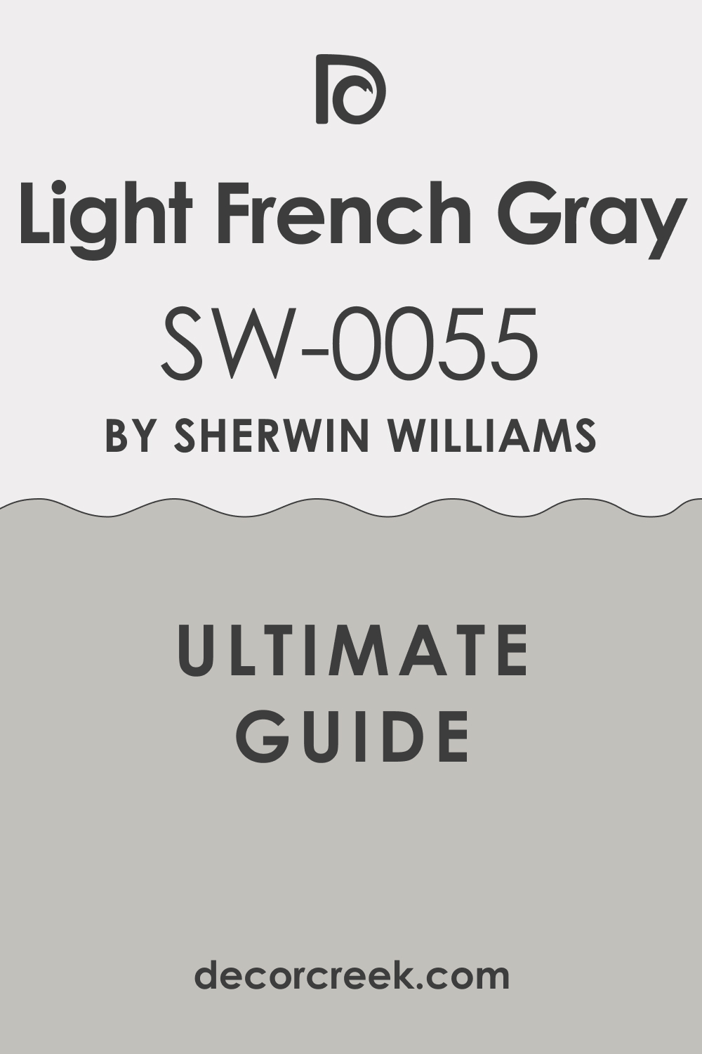
Light French Gray SW 0055
Light French Gray is a clear, bright mid-toned gray that provides a sleek, modern, and sophisticated look for a home exterior. Light French Gray has minimal distracting undertones, making it a very true and clean gray on the walls. Light French Gray is a beautiful choice for contemporary homes, mid-century ranches, or even updated colonial styles.
Light French Gray looks incredibly sharp and defined when contrasted with a stark white trim like Pure White or Extra White. Light French Gray is a great choice if you want the main body color of the house to feel structured and tailored. Light French Gray is highly recommended for homeowners who prefer a cool, crisp palette over warmer beige tones.
Light French Gray is a wonderful backdrop for bright, colorful flowers and green landscaping elements. Light French Gray looks particularly chic when paired with a vibrant red or turquoise front door for a pop of color. Light French Gray is a popular choice for giving a tired exterior a fresh, high-end, and customized appearance. Light French Gray offers a substantial, weighty color without feeling too heavy or making the house look smaller.
👉 Read the full guide for this color HERE 👈
Classic Gray OC-23
Classic Gray is one of the lightest, most ethereal grays from Benjamin Moore, often reading as an off-white with just a kiss of gray on the exterior. Classic Gray is a perfect choice when you want a light, airy feeling but don’t want the starkness of a true white paint. Classic Gray has subtle warm undertones, keeping it from feeling icy or cold on the walls, which is important for curb appeal.
Classic Gray is a fantastic option for historic homes where a very light, almost white color is traditional. Classic Gray looks lovely when contrasted with a deep, dramatic color on the shutters, such as Hale Navy or Iron Ore. Classic Gray is highly recommended because it reflects light beautifully, helping the house look cheerful and pristine.
Classic Gray works well on homes with complex architecture, as its lightness doesn’t obscure the various lines and features. Classic Gray is a gorgeous neutral that allows the focus to remain on the beautiful landscaping and the architecture itself. Classic Gray is a favorite for designers creating a refined and understated elegant look for a house facade. Classic Gray offers just enough color to keep the exterior from blending into a snowy or bright white surrounding.
👉 Read the full guide for this color HERE 👈

Dorian Gray SW 7017
Dorian Gray is a solid, medium-dark gray that has a perfect blend of cool and warm tones, making it feel grounded and serious on an exterior. Dorian Gray is an excellent choice for a homeowner who wants a gray that offers drama and presence without feeling overwhelmingly dark. Dorian Gray is a fantastic color for craftsman, bungalow, or colonial homes where a more substantial color is desired.
Dorian Gray pairs beautifully with a crisp white trim like Pure White to create a very classic and sophisticated contrast. Dorian Gray is highly recommended because it holds up well against harsh sunlight, maintaining its rich depth of color. Dorian Gray works wonderfully with natural wood accents, such as cedar columns or a wooden front door.
Dorian Gray is a dependable, high-quality gray that provides a sense of established luxury to the home’s facade. Dorian Gray is a great color to choose if you have a lot of lush, deep green trees or shrubs around the house. Dorian Gray looks very tailored and customized, giving the home a bespoke feel that elevates its curb appeal. Dorian Gray is a gorgeous shade that feels balanced and never looks too blue or too green on the exterior.
👉 Read the full guide for this color HERE 👈

Chelsea Gray HC-168
Chelsea Gray is a very popular, deep, and rich Benjamin Moore gray that makes a powerful, sophisticated statement on a home’s exterior. Chelsea Gray is an excellent choice for a homeowner who wants a dark body color that is more approachable than a true charcoal or black. Chelsea Gray has lovely warm undertones, which prevent it from looking cold or sterile, especially on a cloudy day.
Chelsea Gray works beautifully on modern farmhouse, colonial, and traditional homes, giving them a very high-end appearance. Chelsea Gray looks incredibly striking when paired with a bright, clean white trim and a deep red or yellow accent door. Chelsea Gray is highly recommended for its ability to hide imperfections and look substantial and permanent.
Chelsea Gray is a fantastic color to use if you have a lot of white railing or porch details that you want to stand out dramatically. Chelsea Gray is a dependable color that adds a sense of tradition and established luxury to any dream house. Chelsea Gray is a gorgeous backdrop for any kind of natural stone or dark-colored brick that is part of the facade. Chelsea Gray offers a dramatic yet sophisticated curb appeal that is highly desirable.
👉 Read the full guide for this color HERE 👈

Peppercorn SW 7674
Peppercorn is a dark, saturated charcoal gray that is just a step away from black, making it a bold and contemporary choice for an exterior. Peppercorn is perfect for modern homes, giving them a sharp, defined, and architecturally striking appearance. Peppercorn has a slight warm, earthy undertone, which prevents it from feeling too cold or stark on a large facade.
Peppercorn looks incredibly sleek when paired with black windows and minimal, light-colored wood accents. Peppercorn is a fantastic option for a homeowner who is not afraid of using a dramatic, darker color to make a strong statement. Peppercorn is highly recommended because it provides incredible contrast when used as a trim or accent color against a light-colored body.
Peppercorn is a brilliant choice for highlighting modern metal architecture or black wrought iron railings. Peppercorn gives the home a tailored, high-fashion appearance that is both current and sophisticated. Peppercorn works well as a grounding color for homes that are on large, open properties with a lot of bright sunlight. Peppercorn offers a deep, moody, and undeniably luxurious look to the dream house exterior.
👉 Read the full guide for this color HERE 👈

Iron Ore SW 7069
Iron Ore is a deep, near-black charcoal color that reads as a softened black, offering a contemporary and dramatic look without the harshness of Tricorn Black. Iron Ore is a beautiful choice for modern, Scandinavian-inspired, or minimal-style homes where strong definition is desired. Iron Ore has a subtle gray undertone that gives it a slight dusty quality, making it feel more refined than a pure black.
Iron Ore looks incredible when paired with natural wood finishes like cedar, teak, or white oak. Iron Ore is highly recommended as a bold main body color or a stunning, grounding trim color for a white house. Iron Ore works wonderfully on homes in wooded areas, allowing the house to blend beautifully with the natural shadows and trees.
Iron Ore is a fantastic choice for window sashes and doors where you want a substantial, grounding frame. Iron Ore gives the home a chic, bespoke, and very high-end appearance that makes a strong statement. Iron Ore is a popular color for creating a dramatic, sophisticated contrast with bright, vibrant landscaping. Iron Ore offers a gorgeous, moody aesthetic that feels intentional and luxurious.
👉 Read the full guide for this color HERE 👈

Wrought Iron 2124-10
Wrought Iron is a deep, rich, nearly-black color from Benjamin Moore that has a soft, historical feel to it, unlike a stark modern black. Wrought Iron is a beautiful choice for traditional or colonial homes where a classic, deep accent color is needed for shutters or doors. Wrought Iron has a very slight blue-gray undertone, which makes it feel less harsh and more integrated into a natural setting.
Wrought Iron is a fantastic color for trim on homes painted in light grays or creamy whites like White Dove. Wrought Iron is highly recommended for its ability to look strong and grounded without appearing flat or lifeless on a sunny facade. Wrought Iron works well for gates, railings, and metalwork, truly living up to its historic name.
Wrought Iron provides a perfect contrast color that helps architectural elements stand out beautifully from the body of the house. Wrought Iron is a dependable, sophisticated dark neutral that gives a house an air of established luxury. Wrought Iron is a popular choice for homeowners who want a classic black look with a little more depth and complexity. Wrought Iron offers a dramatic and very tailored look to any part of the dream house exterior.
👉 Read the full guide for this color HERE 👈

Tricorn Black SW 6258
Tricorn Black is a clean, true, and saturated black that has virtually no distracting undertones, making it the perfect choice for a bold, modern exterior. Tricorn Black is a fantastic color for creating a dramatic, sharp contrast when paired with a pure white trim like Pure White. Tricorn Black works beautifully on modern, contemporary, or minimalist architecture where a strong, defined color is essential.
Tricorn Black is highly recommended for homeowners who want to make a powerful, uncompromising statement with their home’s appearance. Tricorn Black is an excellent choice for trim, window frames, and doors on a lighter house to provide crisp, clean definition. Tricorn Black looks incredibly chic when used on a whole house exterior, giving it a high-fashion, custom-designed feel.
Tricorn Black is a wonderful backdrop for bright, colorful gardens and lush, green landscaping. Tricorn Black is one of the most popular blacks for both exterior and interior use due to its purity and depth. Tricorn Black works well for both siding and accent features like garage doors or covered porch ceilings. Tricorn Black offers a striking and absolutely sophisticated look that is undeniably luxurious.
👉 Read the full guide for this color HERE 👈

Black Beauty 2128-10
Black Beauty is a very deep, rich black from Benjamin Moore that has a slightly soft, inviting quality compared to a stark, pure black. Black Beauty is a beautiful choice for homes that have a lot of natural wood or stone accents that benefit from a grounded black pairing. Black Beauty has a charcoal-like depth that keeps it from looking flat, giving it a sophisticated presence on the exterior.
Black Beauty is a fantastic color for traditional homes where a softer, historical black for shutters and doors is desired. Black Beauty looks gorgeous when paired with creamy or warm white body colors for a very rich and elegant contrast. Black Beauty is highly recommended for homeowners who want the drama of black but need a shade that feels a little less modern or severe.
Black Beauty works beautifully on homes in wooded or natural settings, allowing the house to blend with the natural darkness. Black Beauty is a dependable, classic dark color that gives a home a sense of substantial and enduring quality. Black Beauty is a great choice for providing depth and definition to architectural features on the home’s facade. Black Beauty offers a moody and refined aesthetic that always feels intentional and well-designed.
👉 Read the full guide for this color HERE 👈
Evergreen Fog SW 9130
Evergreen Fog is a beautiful, muted, mid-toned green that has definite gray undertones, making it feel grounded and sophisticated on a home exterior. Evergreen Fog is Sherwin-Williams’ 2022 Color of the Year, and it remains a popular choice for its earthy, calming quality. Evergreen Fog is a fantastic color for craftsman, bungalow, or nature-inspired homes where a connection to the outdoors is desired.
Evergreen Fog looks incredible when paired with a warm white trim like Alabaster or Pure White for a slight, clean contrast. Evergreen Fog is highly recommended for homes in wooded or natural settings, as it complements the surrounding landscape beautifully. Evergreen Fog is a great choice if you want a color that feels distinct but still acts as a beautiful, refined neutral.
Evergreen Fog works well with natural stone accents that have both warm and cool tones, harmonizing the materials. Evergreen Fog is a gorgeous, sophisticated green that is not too bright, giving the home an elegant, established appearance. Evergreen Fog is a perfect color to bring a touch of the natural world and a customized, designer feel to the facade. Evergreen Fog offers a deep, rich color that never feels overwhelming or out of place in a residential setting.
👉 Read the full guide for this color HERE 👈

Saybrook Sage HC-114
Saybrook Sage is a classic Benjamin Moore color, a beautiful, muted green with clear gray undertones, giving it a historic and refined feel on an exterior. Saybrook Sage is an excellent choice for traditional, coastal, or colonial-style homes that benefit from a rich yet understated color. Saybrook Sage has a depth that looks fantastic in bright sunlight, holding its color without washing out.
Saybrook Sage pairs beautifully with a creamy white trim like White Dove to create a classic, charming color scheme. Saybrook Sage is highly recommended for homeowners who want to introduce color but prefer an elegant, muted, and sophisticated tone. Saybrook Sage is a great color to use on houses that have brick or stone with warm, earthy undertones that need a cool balance.
Saybrook Sage works wonderfully on houses with lush, green landscaping, allowing the house to feel integrated into its garden setting. Saybrook Sage is a dependable, historical green that feels high-quality and established on the facade. Saybrook Sage is a perfect choice for adding a touch of tailored color that remains neutral and appealing for years. Saybrook Sage offers a lovely, soft hue that is universally pleasing and always looks custom-designed.
👉 Read the full guide for this color HERE 👈

Retreat SW 6207
Retreat is a deep, moody, and very rich green-gray that offers a dramatic and sophisticated statement for a home’s exterior. Retreat is a fantastic color for craftsman or traditional homes where a more substantial, grounded color is desired. Retreat has a definite cool green undertone that is perfect for blending a house into a setting with mature trees and dense foliage.
Retreat looks incredibly striking when paired with a crisp white trim and natural wood front door accents. Retreat is highly recommended for homeowners who want a darker, moodier look but prefer green over a dark gray or black. Retreat works wonderfully as an accent color for shutters and doors against a light body color like Alabaster or Pure White.
Retreat is a dependable, complex color that looks beautiful in all lighting, from bright sun to an overcast day. Retreat is a great choice for creating a high-end, custom-designed feel that is both dramatic and inviting. Retreat is a popular color for coastal homes where a deep, sea-inspired hue is a welcome aesthetic choice. Retreat offers a powerful sense of personality and depth to the overall curb appeal of the dream house.
👉 Read the full guide for this color HERE 👈

Essex Green HC-188
Essex Green is a deep, dark, traditional hunter green that is almost black, providing a powerful, classic, and elegant statement on an exterior. Essex Green is a beautiful choice for traditional, colonial, or Victorian homes where a historic, saturated accent color is needed. Essex Green has enough blue undertone to keep it from looking yellow and enough black base to make it feel grounded and serious.
Essex Green looks incredibly sophisticated when used for shutters and doors against a creamy white or light gray body color. Essex Green is highly recommended for its ability to create a deep, rich contrast that is very tailored and luxurious. Essex Green works wonderfully in natural settings, blending perfectly with deep green lawns, trees, and hedges.
Essex Green is a fantastic choice for a dramatic, high-end trim color on a brick home that has red or orange undertones. Essex Green is a dependable color that adds a sense of history, permanence, and established elegance to the facade. Essex Green is one of those classic shades that never goes out of style, always looking refined and chic. Essex Green offers a powerful, custom-quality color that feels rooted in traditional design.
👉 Read the full guide for this color HERE 👈

Naval SW 6244
Naval is a deep, saturated, true navy blue that is very nearly black, making it a sophisticated and popular choice for a dramatic exterior color. Naval is a fantastic color for a modern farmhouse, a coastal cottage, or a traditional home seeking a bold update. Naval has a great depth of color that feels rich and velvety, particularly on siding and shingles.
Naval looks incredibly crisp and classic when paired with a bright white trim like Pure White or Alabaster. Naval is highly recommended for homeowners who want to introduce a rich color that still feels classic and widely appealing. Naval is an excellent choice for a front door color against a white or light gray house, offering a powerful focal point.
Naval works wonderfully in sunny climates, as its deep saturation prevents it from looking washed out in the bright light. Naval is a dependable, sophisticated blue that adds a tailored, nautical-inspired quality to any architectural style. Naval is a great color to use if you have existing stone or brick with cool gray or blue undertones you want to highlight. Naval offers a dramatic, custom-designer look that always feels intentional and luxurious.
👉 Read the full guide for this color HERE 👈

Hale Navy HC-154
Hale Navy is a timeless, deeply saturated navy blue from Benjamin Moore that has a sophisticated, historic, and universally loved appeal for home exteriors. Hale Navy is a beautiful choice for traditional, colonial, or craftsman homes where a rich, enduring accent color is desired. Hale Navy has just a tiny hint of gray, which prevents it from looking overly bright or stark, giving it a refined quality.
Hale Navy looks incredibly chic and tailored when paired with a creamy white trim like White Dove or Simply White. Hale Navy is highly recommended for its incredible versatility, looking perfect on a front door, shutters, or the whole house body. Hale Navy works wonderfully to modernize a traditional home without making the change feel too drastic or out of character.
Hale Navy is a dependable, classic color that is strong enough to stand up to any lighting condition, always appearing rich and full. Hale Navy is a fantastic choice for coastal homes, offering a nautical feeling that is both elegant and deeply rooted in tradition. Hale Navy is a popular color for designers because it provides a powerful, rich color that acts almost as a dramatic neutral. Hale Navy offers a stunning and highly customized look that is always refined and inviting.
👉 Read the full guide for this color HERE 👈

Smoky Blue SW 7604
Smoky Blue is a beautiful, mid-toned blue that has a significant amount of gray in it, making it feel grounded, sophisticated, and wonderfully muted on an exterior. Smoky Blue is a fantastic color for a coastal home, a traditional cottage, or a ranch house looking for a fresh, updated color. Smoky Blue has a slight greenish undertone that gives it a complex, sea-inspired quality, making it feel organic and inviting.
Smoky Blue looks gorgeous when paired with a creamy white trim and natural wood elements for a soft, beachy aesthetic. Smoky Blue is highly recommended for homeowners who love blue but want a shade that feels less primary and more refined or tailored. Smoky Blue works wonderfully in conjunction with white stone or light-colored brick, harmonizing the different materials.
Smoky Blue is a great choice for providing a subtle pop of color that remains sophisticated and highly complementary to landscaping. Smoky Blue is a dependable shade that adds a sense of lightness and airy appeal to the home’s facade. Smoky Blue is a popular color because it provides a rich color saturation that still acts as an appealing neutral backdrop. Smoky Blue offers a lovely, sea-inspired hue that brings a custom-designed feel to the dream house.
👉 Read the full guide for this color HERE 👈

Boothbay Gray HC-165
Boothbay Gray is a beautiful, soft, light-to-mid-toned blue-gray from Benjamin Moore that is incredibly versatile and soothing on a home exterior. Boothbay Gray is a fantastic choice for coastal homes, traditional cottages, or homes where a gentle, atmospheric color is desired. Boothbay Gray has a strong blue undertone that is softened by the gray, making it feel refined and not too bright.
Boothbay Gray looks incredibly pretty when paired with a bright white trim like Simply White for a classic, light-hearted aesthetic. Boothbay Gray is highly recommended for its ability to look different throughout the day, shifting from a light gray to a soft blue. Boothbay Gray works wonderfully with natural elements like stone, cedar shingles, and deep green landscaping.
Boothbay Gray is a great choice for homeowners who want a light color that still offers a clear distinction from white or beige. Boothbay Gray is a dependable color that adds a sense of refined coastal charm and tailored sophistication to the facade. Boothbay Gray is a popular choice for designers seeking a sophisticated color that feels airy and light on a large surface. Boothbay Gray offers a beautiful, muted hue that is universally appealing and truly customized.
👉 Read the full guide for this color HERE 👈

Urbane Bronze SW 7048
Urbane Bronze is a deep, rich, and moody bronze-brown with a distinct gray undertone, offering a dramatic, earthy, and sophisticated exterior color. Urbane Bronze is Sherwin-Williams’ 2021 Color of the Year, and it remains a key color for modern, high-end homes. Urbane Bronze is a fantastic color for modern farmhouse, craftsman, or contemporary architecture where a grounding, substantial color is needed.
Urbane Bronze looks incredibly chic when paired with black window frames and minimal, natural wood accents for a bespoke feel. Urbane Bronze is highly recommended for homeowners who want a dark exterior but prefer a complex, earthy brown to a straight black or charcoal. Urbane Bronze works wonderfully as an accent color for doors and trim against a light body color like Shoji White.
Urbane Bronze is a dependable color that beautifully complements natural elements like stone, dark brick, and lush landscaping. Urbane Bronze is a great choice for creating a grounded, tailored look that feels incredibly custom and luxurious on the facade. Urbane Bronze is a popular color because it is a deep neutral that brings warmth and a sense of permanence to the house. Urbane Bronze offers a powerful, earthy aesthetic that is both dramatic and inviting.
👉 Read the full guide for this color HERE 👈
Kendall Charcoal HC-166
Kendall Charcoal is a deep, complex, and richly saturated charcoal gray from Benjamin Moore that offers a powerful, handsome statement on an exterior. Kendall Charcoal is a fantastic color for traditional homes, craftsman bungalows, or modern structures where a deep, substantial color is desired.
Kendall Charcoal has a slight green undertone that makes it feel earthy and grounded, preventing it from looking cold or purely industrial. Kendall Charcoal looks incredibly sophisticated when paired with a crisp white trim like White Dove or Simply White for a strong contrast. Kendall Charcoal is highly recommended for its ability to look rich and velvety on siding, giving the house a high-end, tailored appearance.
Kendall Charcoal works wonderfully with natural wood or stone elements, harmonizing beautifully with their various undertones. Kendall Charcoal is a dependable, high-quality gray that is strong enough to anchor a large house on an open property. Kendall Charcoal is a great choice for homeowners who want a dark gray that feels established, enduring, and historically appropriate. Kendall Charcoal is a popular color for designers because it offers incredible depth and a luxurious, custom-designed feel. Kendall Charcoal offers a strong, moody aesthetic that is both dramatic and wonderfully refined.
👉 Read the full guide for this color HERE 👈

Taupe Tone SW 7633
Taupe Tone is a rich, true taupe color, sitting perfectly between gray and brown, offering a warm, earthy, and sophisticated neutral for a home exterior. Taupe Tone is a fantastic color for traditional, stucco, or mediterranean-style homes where a grounded, natural color is needed.
Taupe Tone has a lovely depth of color that makes it feel substantial without being overly dark or heavy on the facade. Taupe Tone looks beautiful when paired with a warm white trim like Creamy or Alabaster for a soft, complementary contrast. Taupe Tone is highly recommended for homes in warm climates or those with landscaping that features many brown or reddish-gold elements. Taupe Tone works wonderfully with dark bronze light fixtures, black wrought iron railings, and natural wooden doors.
Taupe Tone is a dependable, high-quality neutral that provides a sense of established luxury and enduring appeal. Taupe Tone is a great choice for homeowners who want a warm exterior color but prefer the complexity of taupe to a simple beige. Taupe Tone is a popular color because it is a rich, versatile neutral that feels highly custom and beautifully tailored. Taupe Tone offers an earthy, sophisticated hue that always looks intentional and inviting.
👉 Read the full guide for this color HERE 👈
Pashmina AF-100
Pashmina is a beautiful, warm, mid-toned taupe from Benjamin Moore that is rich, earthy, and has a grounded, natural quality for a home exterior. Pashmina is a fantastic color for traditional homes, bungalows, or any house where a warm, sophisticated neutral is desired. Pashmina has a great depth of color that feels substantial and permanent on the facade, anchoring the structure to the landscape.
Pashmina looks gorgeous when paired with a creamy white trim like White Dove for a soft, elegant, and harmonious contrast. Pashmina is highly recommended for homeowners who want a neutral that feels richer and more customized than a standard beige or gray. Pashmina works wonderfully with natural elements like stacked stone, dark wood, and copper accents on the exterior.
Pashmina is a dependable, high-quality color that provides a sense of established luxury and enduring appeal. Pashmina is a great choice for houses with a lot of mature trees or shade, as it holds its color without looking muddy. Pashmina is a popular color because it is a rich, versatile neutral that feels incredibly soft, like its namesake textile. Pashmina offers an elegant, warm hue that always looks curated and inviting.
👉 Read the full guide for this color HERE 👈

27 Best Paint Colors For The Dream House Exterior
Snowbound SW 7004
Snowbound is a clean, bright white that has a subtle, almost unnoticeable cool undertone of a very pale greige, making it a beautiful modern white for exteriors. Snowbound is a fantastic choice for trim, ceilings, and doors to create a crisp and clean contrast against a colored wall. Snowbound works beautifully in homes with a lot of natural light, holding its integrity without glaring or looking too stark.
Snowbound is a great white to use on all walls in a house where the owner wants a cohesive, airy, and contemporary feel. Snowbound is highly recommended for open-concept living areas where a bright, seamless transition between rooms is desired. Snowbound is a dependable white that pairs well with both warm and cool wall colors, making it highly versatile.
Snowbound is a great option for creating a gallery-like backdrop that allows furniture and art to take center stage. Snowbound looks particularly sharp when used on shiplap or beadboard details for a clean farmhouse style. Snowbound is a popular choice for designers because it is a true white that offers just a whisper of softness. Snowbound offers a beautiful, light-filled backdrop that makes any room feel fresh and inviting.
👉 Read the full guide for this color HERE 👈

Greek Villa SW 7551
Greek Villa is a gorgeous, creamy, off-white that has a subtle beige and yellow undertone, giving it a soft, warm, and comforting quality for exterior walls. Greek Villa is a fantastic choice for homes where a bright white feels too cold, and a homeowner wants a gentle, inviting glow. Greek Villa works beautifully in rooms that have less natural light, helping to make the room feel warmer and brighter without being stark.
Greek Villa is a great option for all-over walls in traditional, transitional, or cozy-feeling homes. Greek Villa is highly recommended for bedrooms and living rooms where a soft, relaxing atmosphere is paramount to the design. Greek Villa is a dependable off-white that pairs wonderfully with warmer colors and natural wood furnishings.
Greek Villa is a fantastic choice for trim and doors in a traditional home to provide a soft contrast against a deeper wall color. Greek Villa looks particularly beautiful in a kitchen where you want the cabinets to feel classic and slightly aged. Greek Villa is a popular choice for designers seeking a warm white that feels substantial and customized. Greek Villa offers a beautiful, comforting hue that feels deeply inviting and welcoming inside the home.
👉 Read the full guide for this color HERE 👈

Chantilly Lace OC-65
Chantilly Lace is Benjamin Moore’s purest, cleanest, and brightest white, with virtually no visible undertones, making it a perfect, crisp choice for modern exterior. Chantilly Lace is a fantastic choice for trim, ceilings, and doors when you want the absolute sharpest, cleanest contrast against any wall color.
Chantilly Lace works beautifully in contemporary homes or art-filled spaces where a neutral, bright canvas is essential. Chantilly Lace is a great white to use on all walls in a house where the owner wants a high-contrast, airy, and very minimal aesthetic. Chantilly Lace is highly recommended for maximizing light reflection in rooms that might feel a little dark or north-facing. Chantilly Lace is a dependable white that works seamlessly with all colors, from pastels to deep jewel tones.
Chantilly Lace is a great option for creating a fresh, gallery-like backdrop that highlights architecture and design elements. Chantilly Lace looks particularly stunning when used in conjunction with black metal accents or deep black window frames. Chantilly Lace is a popular choice for designers because it is the ultimate crisp and pure white. Chantilly Lace offers a beautiful, brilliant backdrop that makes any exterior feel fresh and sophisticated.
👉 Read the full guide for this color HERE 👈

White Heron OC-57
White Heron OC-57 is a gorgeous, soft, warm white from Benjamin Moore that has a creamy, subtle yellow-beige undertone, making it feel gentle and historical on exterior walls. White Heron OC-57 is a fantastic choice for traditional homes where a stark white feels too harsh and a cozy, inviting white is preferred. White Heron OC-57 works beautifully for trim, ceilings, and walls in older homes where historical detail is important to preserve.
White Heron OC-57 is a great option for an all-over wall color in a house where the homeowner desires a warm, enveloping, and classic feel. White Heron OC-57 is highly recommended for bedrooms and family rooms where comfort and a soft light quality are the main goals. White Heron OC-57 is a dependable off-white that pairs wonderfully with traditional wood furniture and antique pieces.
White Heron OC-57 is a fantastic choice for kitchen cabinets where a soft, non-clinical white is desired for a classic look. White Heron OC-57 looks particularly beautiful when contrasted with a deep, moody wall color like Hale Navy or Saybrook Sage. White Heron OC-57 is a popular choice for designers seeking a gentle white that feels luxurious and deeply comforting. White Heron OC-57 offers a beautiful, warm hue that makes any exterior feel elegant and welcoming.
👉 Read the full guide for this color HERE 👈
Swiss Coffee OC-45
Swiss Coffee is a beloved, creamy off-white from Benjamin Moore that has a noticeable warm, light beige undertone, creating a beautiful soft richness on exterior walls. Swiss Coffee is a fantastic choice for homeowners who want a white that feels truly inviting, warm, and sophisticated without any yellow intensity. Swiss Coffee works beautifully in large, open-concept spaces, wrapping the room in a soft, gentle warmth that feels cohesive.
Swiss Coffee is a great option for an all-over wall color in houses where a cozy, high-end, and quiet aesthetic is desired. Swiss Coffee is highly recommended for its versatility, working perfectly on walls, trim, and kitchen cabinets for a uniform look. Swiss Coffee is a dependable off-white that pairs wonderfully with natural wood tones, leather, and warm-toned fabrics.
Swiss Coffee is a fantastic choice for a designer who needs a warm neutral that still reads as a beautiful, high-quality white. Swiss Coffee looks particularly stunning when contrasted with deep black or iron accents for a touch of modern drama. Swiss Coffee is a popular choice for designers because it is a perfect blend of white’s freshness and beige’s warmth. Swiss Coffee offers a beautiful, custom-quality hue that feels luxurious and effortlessly chic.
👉 Read the full guide for this color HERE 👈

Shoji White SW 7042
Shoji White is a unique, creamy off-white from Sherwin-Williams that has a warm, beautiful greige undertone, making it feel richly complex and incredibly sophisticated on exterior walls. Shoji White is a fantastic choice for homeowners who want a white that never feels stark, but instead feels deeply textured and grounded. Shoji White works beautifully as an all-over wall color in houses where a soft, layered, and slightly warmer neutral backdrop is desired.
Shoji White is a great option for rooms with abundant natural light, as the slight depth keeps it from washing out in the sun. Shoji White is highly recommended for traditional, bohemian, or wabi-sabi-inspired homes where natural, quiet colors are paramount. Shoji White is a dependable off-white that pairs wonderfully with warm metals, woven textures, and soft linen fabrics.
Shoji White is a fantastic choice for trim and cabinets when the homeowner wants a soft contrast against a darker, earthier wall color. Shoji White looks particularly beautiful when accented with a deep green or a rich charcoal color for a contemporary touch. Shoji White is a popular choice for designers seeking a warm white with a surprising depth and customized appeal. Shoji White offers a beautiful, nuanced hue that feels incredibly welcoming and refined inside the home.
👉 Read the full guide for this color HERE 👈

Neutral Ground SW 7568
Neutral Ground SW 7568 is a light, earthy, mid-toned beige that has a gorgeous depth and warmth, offering a soft and sophisticated neutral for exterior walls. Neutral Ground SW 7568 is a fantastic choice for homeowners who want a warm, inviting color that feels more substantial and less yellow than a traditional builder’s beige.
Neutral Ground SW 7568 works beautifully in traditional and transitional homes, wrapping the rooms in a cozy and established warmth. Neutral Ground SW 7568 is a great option for all-over wall color in homes where a soft, grounded, and comforting aesthetic is desired. Neutral Ground SW 7568 is highly recommended for living rooms, dining rooms, and hallways where you want a traditional, yet updated, neutral backdrop.
Neutral Ground SW 7568 is a dependable beige that pairs wonderfully with dark wood furniture, rich leather, and metallic gold or brass accents. Neutral Ground SW 7568 is a fantastic choice for providing a rich backdrop that allows brighter, colorful art and textiles to stand out. Neutral Ground SW 7568 looks particularly beautiful when contrasted with a bright, crisp white trim like Pure White for a fresh edge. Neutral Ground SW 7568 is a popular choice for designers seeking a warm neutral that feels high-quality and beautifully textured.Neutral Ground SW 7568 offers a beautiful, enduring hue that makes any exterior feel anchored and inviting.
👉 Read the full guide for this color HERE 👈

Anew Gray SW 7030
Anew Gray is a perfect mid-toned greige that has a balance of warm brown and cool gray undertones, making it a highly versatile and sophisticated choice for exteriors. Anew Gray is a fantastic choice for homeowners who want a neutral that is neither too cold (pure gray) nor too warm (pure beige). Anew Gray works beautifully in almost any room, adapting well to different lighting conditions and different times of the day.
Anew Gray is a great option for an all-over wall color, creating a cohesive, grounded, and tailored look throughout the house. Anew Gray is highly recommended for living areas, offices, and bedrooms where a comforting yet refined neutral is paramount. Anew Gray is a dependable color that pairs wonderfully with both cool-toned and warm-toned furniture and accessories.
Anew Gray is a fantastic choice for providing a rich backdrop that lets artwork and colorful decor shine without competing. Anew Gray looks particularly beautiful when accented with a warm white trim like Alabaster for a soft, complementary contrast. Anew Gray is a popular choice for designers seeking a perfect greige that feels truly balanced and high-end. Anew Gray offers a beautiful, grounded hue that makes any exterior feel sophisticated and intentionally designed.
👉 Read the full guide for this color HERE 👈
Pale Oak OC-20
Pale Oak is an incredibly popular, light and airy greige from Benjamin Moore that has definite warm, creamy undertones, often reading as a warm off-white in bright light. Pale Oak is a fantastic choice for homeowners who want a color that feels light and bright but still offers more depth and sophistication than a stark white. Pale Oak works beautifully as an all-over wall color, wrapping a house in a soft, gentle warmth that feels cohesive and customized.
Pale Oak is a great option for rooms that receive both north and south light, as it adapts gracefully without turning blue or yellow. Pale Oak is highly recommended for living areas, master bedrooms, and kitchens where an elegant, soft, and inviting atmosphere is desired. Pale Oak is a dependable color that pairs wonderfully with natural wood floors, light stone countertops, and linen textures.
Pale Oak is a fantastic choice for providing a high-end, designer backdrop that makes furnishings and decor look expensive and curated. Pale Oak looks particularly beautiful when contrasted with a crisp white trim like Chantilly Lace for a fresh, clean edge. Pale Oak is a popular choice for designers because it is a perfect soft neutral that is rarely distracting. Pale Oak offers a beautiful, ethereal hue that feels effortlessly sophisticated and welcoming.
👉 Read the full guide for this color HERE 👈

Balboa Mist OC-27
Balboa Mist is a light, lovely greige from Benjamin Moore that has subtle warm, pinkish-purple undertones, giving it a unique softness and sophisticated complexity on exterior walls. Balboa Mist is a fantastic choice for homeowners who want a light neutral that feels incredibly soft, airy, and a little more complex than a standard gray. Balboa Mist works beautifully in bedrooms and bathrooms where a gentle, atmospheric, and refined color is highly desirable.
Balboa Mist is a great option for an all-over wall color in a house where the aesthetic is modern, light-filled, and quietly luxurious. Balboa Mist is highly recommended for its ability to look different throughout the day, shifting from a light gray to a warmer, softer tone. Balboa Mist is a dependable color that pairs wonderfully with cool-toned marbles, light wood floors, and deep navy or charcoal accents.
Balboa Mist is a fantastic choice for creating a gentle, sophisticated backdrop that allows layered textures and soft furnishings to shine. Balboa Mist looks particularly beautiful when contrasted with a pure white trim like Chantilly Lace for a very clean, crisp effect. Balboa Mist is a popular choice for designers seeking a complex neutral that feels ethereal and highly customized. Balboa Mist offers a beautiful, atmospheric hue that makes any exterior feel refined and utterly soft.
👉 Read the full guide for this color HERE 👈

Light French Gray SW 0055
Light French Gray SW 0055 is a classic, mid-toned gray from Sherwin-Williams that has a lovely warm, greige undertone, making it feel grounded, substantial, and incredibly versatile for exterior walls. Light French Gray SW 0055 is a fantastic choice for homeowners who want a gray that doesn’t feel cold or purely cool, but instead has a comfortable, quiet richness.
Light French Gray works beautifully in living rooms, dining rooms, and offices where a refined, tailored, and serious neutral is desired. Light French Gray is a great option for an all-over wall color, creating a cohesive, sophisticated flow through the main living areas of the house. Light French Gray is highly recommended for its ability to look substantial and present without making a room feel dark or heavy. Light French Gray SW 0055 is a dependable gray that pairs wonderfully with both cool blue accents and warm wooden furniture and flooring.
Light French Gray is a fantastic choice for providing a sophisticated backdrop that lets bright, colorful artwork or textiles stand out dramatically. Light French Gray SW 0055 looks particularly beautiful when contrasted with a crisp white trim like Pure White for a very clean, defined edge. Light French Gray is a popular choice for designers seeking a reliable, warm gray that feels high-quality and intentional. Light French Gray SW 0055 offers a beautiful, balanced hue that makes any exterior feel custom-designed and perfectly grounded.
👉 Read the full guide for this color HERE 👈
Mindful Gray SW 7016
Mindful Gray is a mid-toned, solid gray from Sherwin-Williams that has a noticeable greige undertone, making it one of the most popular, balanced, and versatile neutrals for home exteriors. Mindful Gray is a fantastic choice for homeowners who want a true, defined gray color that still has enough warmth to feel inviting and soft.
Mindful Gray works beautifully in any room of the house, adapting well to different light sources and different times of the day. Mindful Gray is a great option for an all-over wall color, providing a consistent, sophisticated, and tailored neutral base throughout the house. Mindful Gray is highly recommended for busy areas like hallways and family rooms where you want a beautiful color that also provides a subtle sense of permanence.
Mindful Gray is a dependable color that pairs wonderfully with almost all other shades, making it easy to decorate a room around. Mindful Gray is a fantastic choice for providing a rich backdrop that allows layered textures and bold accent colors to truly shine. Mindful Gray looks particularly beautiful when contrasted with a clean white trim like Snowbound or Pure White for a sharp, defined look. Mindful Gray is a popular choice for designers seeking a mid-toned gray that feels completely balanced and intentionally designed. Mindful Gray offers a beautiful, grounding hue that makes any exterior feel customized and incredibly refined.
👉 Read the full guide for this color HERE 👈

Repose Gray SW 7015
Repose Gray is a favorite, light-to-mid-toned gray from Sherwin-Williams that has a sophisticated greige undertone and a slight hint of green, making it feel complex and deeply appealing. Repose Gray is a fantastic choice for homeowners who want a true gray that never feels blue or cold, but instead feels soft, inviting, and layered. Repose Gray works beautifully in living areas, kitchens, and bedrooms, offering a high-end, quiet aesthetic that is widely loved.
Repose Gray is a great option for an all-over wall color, providing a subtle, sophisticated color that flows beautifully from room to room. Repose Gray is highly recommended for its ability to look different in changing light, always providing a nuanced and interesting color on the walls. Repose Gray is a dependable color that pairs wonderfully with both warm and cool wood tones, marble, and soft fabric textures.
Repose Gray is a fantastic choice for providing a refined backdrop that lets various shades of white and natural elements truly pop. Repose Gray looks particularly beautiful when contrasted with a warm white trim like Alabaster for a classic, gentle contrast. Repose Gray is a popular choice for designers seeking the perfect balance between a cool gray and a warm beige. Repose Gray offers a beautiful, atmospheric hue that makes any exterior feel custom-designed and effortlessly sophisticated.
👉 Read the full guide for this color HERE 👈

Silver Strand SW 7057
Silver Strand is a beautiful, light, ethereal shade of green-gray from Sherwin-Williams that reads as a muted, barely-there color, perfect for a soft, coastal feel. Silver Strand is a fantastic choice for homeowners who want a whisper of color that isn’t white or beige, but feels refreshing and light. Silver Strand works beautifully in bedrooms, sunrooms, and bathrooms where a gentle, spa-like, and airy atmosphere is desired.
Silver Strand is a great option for an all-over wall color in a house where the aesthetic is light-filled, natural, and quietly elegant. Silver Strand is highly recommended for its ability to reflect light beautifully, helping a room feel larger and more open than it is. Silver Strand is a dependable color that pairs wonderfully with light wood, woven baskets, and linen furniture for a relaxed look.
Silver Strand is a fantastic choice for providing a soft, atmospheric backdrop that feels gentle and incredibly welcoming. Silver Strand looks particularly beautiful when contrasted with a clean white trim like Pure White for a very crisp, refined edge. Silver Strand is a popular choice for designers seeking a light color that offers complexity without being visually busy. Silver Strand offers a beautiful, muted hue that feels incredibly soft, custom, and wonderfully calming.
👉 Read the full guide for this color HERE 👈

Stonington Gray HC-170
Stonington Gray is a classic, light-to-mid-toned gray from Benjamin Moore that has a noticeable blue undertone, making it a cool, crisp, and very refined choice for exterior walls. Stonington Gray is a fantastic choice for homeowners who want a true, sophisticated cool gray that feels clean and tailored without being too cold. Stonington Gray works beautifully in living rooms, dining rooms, and offices where a clean, serious, and architecturally focused color is desired.
Stonington Gray is a great option for an all-over wall color, providing a consistent, tailored, and very high-end neutral base throughout the house. Stonington Gray is highly recommended for its ability to look consistently crisp and tailored, especially when paired with strong architectural details. Stonington Gray is a dependable color that pairs wonderfully with white marble, chrome or silver metals, and dark navy or black accents.
Stonington Gray is a fantastic choice for providing a sophisticated backdrop that makes vibrant art or rich jewel-toned furniture pop dramatically. Stonington Gray looks particularly beautiful when contrasted with a pure white trim like Chantilly Lace for a very sharp, defined line. Stonington Gray is a popular choice for designers seeking a reliable, classic cool gray that always looks high-quality and intentional. Stonington Gray offers a beautiful, crisp hue that makes any exterior feel tailored and wonderfully refined.
👉 Read the full guide for this color HERE 👈

Coventry Gray HC-169
Coventry Gray is a solid, mid-toned gray from Benjamin Moore that has a noticeable blue undertone, offering a sophisticated, classic, and grounded color for exterior walls. Coventry Gray is a fantastic choice for homeowners who want a true, defined cool gray that feels rich and substantial without making a room feel too dark. Coventry Gray works beautifully in living rooms, dining rooms, and libraries where a tailored, established, and serious atmosphere is desired.
Coventry Gray is a great option for an accent wall or built-in cabinetry, providing depth and a sophisticated focal point in a room. Coventry Gray is highly recommended for its ability to look substantial and present, perfectly anchoring a room with its rich color saturation. Coventry Gray is a dependable color that pairs wonderfully with white marble, traditional wood furniture, and deep leather textures.
Coventry Gray is a fantastic choice for providing a rich backdrop that lets metallic accents and colorful fabrics truly shine. Coventry Gray looks particularly beautiful when contrasted with a pure white trim like Simply White for a classic, defined, and sharp contrast. Coventry Gray is a popular choice for designers seeking a mid-toned gray that feels timeless, rich, and intentionally designed. Coventry Gray offers a beautiful, grounded hue that makes any exterior feel custom-built and wonderfully sophisticated.
👉 Read the full guide for this color HERE 👈

Gauntlet Gray SW 7019
Gauntlet Gray is a deep, moody, and highly saturated charcoal gray from Sherwin-Williams that offers a dramatic, rich, and sophisticated statement for exterior walls. Gauntlet Gray is a fantastic choice for accent walls, cabinetry, or smaller rooms like a powder room or den where a powerful color is desired. Gauntlet Gray has a noticeable warm, brown undertone, which prevents it from feeling cold or purely black, giving it a rich complexity.
Gauntlet Gray works beautifully in a modern setting when paired with black metal, white marble, and clean, architectural furniture. Gauntlet Gray is highly recommended for homeowners who are not afraid of using a deep, dramatic color to create a cozy and intimate atmosphere. Gauntlet Gray is a dependable color that pairs wonderfully with gold or brass accents, allowing the metallic sheen to truly pop against the depth.
Gauntlet Gray is a fantastic choice for an office or library where a serious, tailored, and sophisticated feeling is paramount to the design. Gauntlet Gray looks particularly beautiful when contrasted with a bright white trim like Pure White for a very sharp, dramatic, and high-end effect. Gauntlet Gray is a popular choice for designers seeking a deep neutral that feels custom-designed and utterly luxurious. Gauntlet Gray offers a beautiful, grounded hue that makes any exterior feel moody, refined, and deeply intentional.
👉 Read the full guide for this color HERE 👈
Revere Pewter HC-172
Revere Pewter is a solid, mid-to-dark toned greige from Benjamin Moore that has a strong warm-brown undertone, offering a cozy, grounded, and rich neutral for exterior walls.Revere Pewter is a fantastic choice for homeowners who want a color that is substantial and warm, making a room feel enveloped and deeply comfortable. Revere Pewter works beautifully in living rooms, dining rooms, and bedrooms where a classic, established, and welcoming atmosphere is desired.
Revere Pewter is a great option for an accent wall or lower wainscoting, providing depth and a sense of traditional architecture. Revere Pewter is highly recommended for its ability to feel substantial without being overwhelming, acting as a rich neutral backdrop. Revere Pewter is a dependable color that pairs wonderfully with natural wood furniture, deep leather seating, and classic bronze or oil-rubbed bronze accents.
Revere Pewter is a fantastic choice for providing a sophisticated backdrop that allows warm, earthy fabrics and traditional artwork to shine. Revere Pewter looks particularly beautiful when contrasted with a soft white trim like White Dove for an elegant, gentle, and classic contrast. Revere Pewter is a popular choice for designers seeking a warm, rich neutral that feels completely enduring and highly customized. Revere Pewter offers a beautiful, grounded hue that makes any exterior feel tailored and wonderfully inviting.
👉 Read the full guide for this color HERE 👈
Sea Salt SW 6204
Sea Salt is a very popular, light and airy green-blue-gray from Sherwin-Williams that reads as a delicate, coastal-inspired color, perfect for a soothing atmosphere. Sea Salt is a fantastic choice for homeowners who want a light, beautiful color that is gentle, refreshing, and reminiscent of a spa.
Sea Salt works beautifully in bedrooms, bathrooms, and laundry rooms where a fresh, watery, and clean feeling is highly desired. Sea Salt is a great option for an all-over wall color in a house where the aesthetic is light, airy, and quietly coastal or nature-inspired. Sea Salt is highly recommended for its ability to shift color slightly in different light, sometimes appearing more green and sometimes more blue. Sea Salt is a dependable color that pairs wonderfully with bright white trim, light wood floors, and silver or chrome metallic accents.
Sea Salt is a fantastic choice for providing a gentle, atmospheric backdrop that feels soft, clean, and incredibly welcoming. Sea Salt looks particularly beautiful when contrasted with a clean white trim like Pure White for a very crisp, coastal, and refined edge. Sea Salt is a popular choice for designers seeking a light color that offers both a subtle color wash and a sense of refined elegance. Sea Salt offers a beautiful, muted hue that feels incredibly soft, customized, and wonderfully refreshing.
👉 Read the full guide for this color HERE 👈

Soft Fern SW 2144
Soft Fern is a bright, cheerful, mid-toned green that has a distinctly earthy, slightly yellow undertone, making it feel organic, fresh, and deeply natural on exterior walls. Soft Fern is a fantastic choice for sunrooms, breakfast nooks, or bedrooms where a homeowner wants to introduce a vibrant, natural green.
Soft Fern works beautifully in traditional or farmhouse settings, giving a room a distinctly historical and comforting feeling. Soft Fern is a great option for an accent wall in a white-walled room, providing a powerful, fresh focal point that is not too bold. Soft Fern is highly recommended for its ability to bring the freshness of the outdoors inside, making any room feel alive and revitalized. Soft Fern is a dependable color that pairs wonderfully with natural wood tones, wicker furniture, and white or cream-colored upholstery.
Soft Fern is a fantastic choice for providing a rich backdrop that lets warm, traditional patterns and artwork truly shine. Soft Fern looks particularly beautiful when contrasted with a creamy white trim like Greek Villa for a gentle, traditional, and welcoming contrast. Soft Fern is a popular choice for designers seeking a saturated green that feels authentically natural and deeply inviting. Soft Fern offers a beautiful, restorative hue that feels both comforting and wonderfully fresh.
October Mist 1495
October Mist is a stunning, muted, mid-toned green from Benjamin Moore with a soft gray undertone, offering a sophisticated, earthy, and refined color for exterior walls. October Mist is Benjamin Moore’s 2022 Color of the Year, and it remains a key color for its ability to act as a soft, nature-inspired neutral.
October Mist works beautifully in living areas, offices, and bedrooms where a grounding, sophisticated, and slightly atmospheric color is desired. October Mist is a great option for an all-over wall color, providing a cohesive, quiet, and very high-end neutral base throughout the house. October Mist is highly recommended for its ability to look rich and contemporary while still feeling gentle and easy to live with. October Mist is a dependable color that pairs wonderfully with natural wood furniture, woven textures, and soft, linen upholstery.
October Mist is a fantastic choice for providing a refined backdrop that lets various shades of white and earthy accent colors truly pop. October Mist looks particularly beautiful when contrasted with a crisp white trim like Chantilly Lace for a very clean, modern, and defined edge. October Mist is a popular choice for designers seeking a nature-inspired neutral that feels completely balanced and intentionally designed. October Mist offers a beautiful, sophisticated hue that makes any exterior feel customized and effortlessly fresh.
👉 Read the full guide for this color HERE 👈

Quiet Moments 1563
Quiet Moments is a gorgeous, soft, light blue-green-gray from Benjamin Moore that reads as a delicate, watery hue, perfect for a gentle, spa-like atmosphere in a home exterior . Quiet Moments is a fantastic choice for bedrooms, bathrooms, and nurseries where a gentle, soothing, and atmospheric color is highly desired. Quiet Moments works beautifully in any room where you want a very light wash of color that feels restful and incredibly refreshing.
Quiet Moments is a great option for an all-over wall color in a house where the aesthetic is light, airy, and quietly elegant and coastal. Quiet Moments is highly recommended for its ability to reflect light beautifully, helping a room feel larger and more open and inviting. Quiet Moments is a dependable color that pairs wonderfully with bright white trim, light-colored stone, and silver or chrome metallic fixtures.
Quiet Moments is a fantastic choice for providing a gentle, atmospheric backdrop that feels soft, clean, and incredibly welcoming. Quiet Moments looks particularly beautiful when contrasted with a pure white trim like Simply White for a very crisp, clean, and refined edge. Quiet Moments is a popular choice for designers seeking a light color that offers a beautiful, nuanced wash of color. Quiet Moments offers a beautiful, muted hue that feels incredibly soft, customized, and wonderfully peaceful.
👉 Read the full guide for this color HERE 👈

Mount Saint Anne HC-117
Mount Saint Anne is a deep, moody, and sophisticated blue-gray from Benjamin Moore that offers a rich, atmospheric, and highly tailored statement for exterior walls. Mount Saint Anne is a fantastic choice for accent walls, dining rooms, or home libraries where a powerful, rich color is needed to create a focal point. Mount Saint Anne has a distinct gray undertone that keeps the color from feeling too vibrant, giving it a sophisticated, dusty quality.
Mount Saint Anne works beautifully in traditional or transitional settings when paired with dark wood furniture and classic bronze or gold accents. Mount Saint Anne is highly recommended for homeowners who want to use a rich color to create an intimate, sophisticated, and memorable atmosphere. Mount Saint Anne is a dependable color that pairs wonderfully with creamy white trim, allowing the contrast to emphasize the depth of the blue.
Mount Saint Anne is a fantastic choice for providing a rich backdrop that lets artwork, particularly pieces with yellow or orange tones, truly shine. Mount Saint Anne looks particularly beautiful when contrasted with a soft white trim like White Dove for a classic, elegant, and tailored effect. Mount Saint Anne is a popular choice for designers seeking a deep, complex blue-gray that feels custom-designed and utterly luxurious. Mount Saint Anne offers a beautiful, grounded hue that makes any exterior feel moody, refined, and deeply intentional.
Van Deusen Blue HC-156
Van Deusen Blue is a classic, deeply saturated navy blue from Benjamin Moore that has a clean, rich, and historically enduring appeal for exterior walls. Van Deusen Blue is a fantastic choice for accent walls, cabinetry, or smaller rooms like a powder room or den where a bold, powerful color is desired. Van Deusen Blue has virtually no gray or black undertone, making it a pure, vibrant, and stunning navy that commands attention.
Van Deusen Blue works beautifully in a traditional study, a modern dining room, or a dramatic entryway for a high-impact statement. Van Deusen Blue is highly recommended for homeowners who want to introduce a powerful, classic color that feels both tailored and incredibly sophisticated. Van Deusen Blue is a dependable color that pairs wonderfully with gold or brass hardware, allowing the metallic sheen to beautifully contrast the deep blue.
Van Deusen Blue is a fantastic choice for kitchen islands or built-in bookshelves, providing a dramatic focal point in a white kitchen. Van Deusen Blue looks particularly beautiful when contrasted with a pure white trim like Chantilly Lace for a very sharp, crisp, and high-end effect. Van Deusen Blue is a popular choice for designers seeking a deep, true navy that feels custom-designed and utterly luxurious. Van Deusen Blue offers a beautiful, powerful hue that makes any exterior feel tailored, rich, and deeply intentional.
👉 Read the full guide for this color HERE 👈

Stormy Monday SW 6236
Stormy Monday is a complex, moody, and mid-toned blue-gray from Sherwin-Williams that has a definite depth, offering a sophisticated, atmospheric color for exterior walls. Stormy Monday is a fantastic choice for homeowners who want a blue that is heavily neutralized by gray, giving it a mature and grounded quality. Stormy Monday works beautifully in living rooms, dining rooms, and bedrooms where a thoughtful, refined, and slightly dramatic color is desired.
Stormy Monday is a great option for an all-over wall color, providing a cohesive, quiet, and very high-end neutral base that is still a clear color. Stormy Monday is highly recommended for its ability to look rich and atmospheric, creating a cozy and intentional feeling in any room. Stormy Monday is a dependable color that pairs wonderfully with both light and dark wood furniture, as well as woven and textured fabrics.
Stormy Monday is a fantastic choice for providing a sophisticated backdrop that lets natural elements and soft white accents truly stand out. Stormy Monday looks particularly beautiful when contrasted with a crisp white trim like Snowbound for a very clean, modern, and defined edge. Stormy Monday is a popular choice for designers seeking a balanced blue-gray that feels complex, high-quality, and intentional. Stormy Monday offers a beautiful, grounded hue that makes any exterior feel customized and effortlessly refined.
Porpoise SW 7047
Porpoise is a solid, mid-to-dark toned greige from Sherwin-Williams that has a dominant warm, brown undertone, offering a rich, earthy, and grounded neutral for exterior walls. Porpoise is a fantastic choice for homeowners who want a color that is substantial, warm, and makes a room feel enveloped and deeply comfortable. Porpoise works beautifully in living rooms, dining rooms, and bedrooms where a classic, established, and welcoming atmosphere is desired.
Porpoise is a great option for an accent wall or built-in cabinetry, providing depth and a sense of traditional architecture. Porpoise is highly recommended for its ability to look substantial and present, perfectly anchoring a room with its rich color saturation. Porpoise is a dependable color that pairs wonderfully with dark wood furniture, rich leather seating, and antique bronze or brass accents.
Porpoise is a fantastic choice for providing a sophisticated backdrop that allows warm, earthy fabrics and traditional artwork to shine. Porpoise looks particularly beautiful when contrasted with a soft white trim like Shoji White for an elegant, gentle, and classic contrast. Porpoise is a popular choice for designers seeking a warm, rich neutral that feels completely enduring and highly customized. Porpoise offers a beautiful, grounded hue that makes any exterior feel tailored and wonderfully inviting.
👉 Read the full guide for this color HERE 👈

Studio Clay SW 9172
Studio Clay is a gorgeous, warm, and earthy mid-toned terracotta-brown from Sherwin-Williams that offers a rich, organic, and sophisticated statement for exterior walls. Studio Clay is a fantastic choice for accent walls, offices, or powder rooms where a homeowner wants to introduce a rich, nature-inspired, and powerful color. Studio Clay has a depth that feels substantial and permanent, bringing the warmth of natural clay and earthenware into the home.
Studio Clay works beautifully in bohemian, transitional, or traditional settings when paired with woven textures, light wood, and brass accents. Studio Clay is highly recommended for homeowners who want to use a rich color to create an intimate, artistic, and memorable atmosphere. Studio Clay is a dependable color that pairs wonderfully with a creamy white trim, allowing the contrast to emphasize the warmth of the color.
Studio Clay is a fantastic choice for providing a rich backdrop that lets simple, architectural lighting and minimal decor truly shine. Studio Clay looks particularly beautiful when contrasted with a neutral like Canvas Tan for a sophisticated, layered, and earthy feel. Studio Clay is a popular choice for designers seeking a deep, complex earth tone that feels custom-designed and utterly luxurious. Studio Clay offers a beautiful, grounded hue that makes any exterior feel moody, artistic, and deeply intentional.
👉 Read the full guide for this color HERE 👈
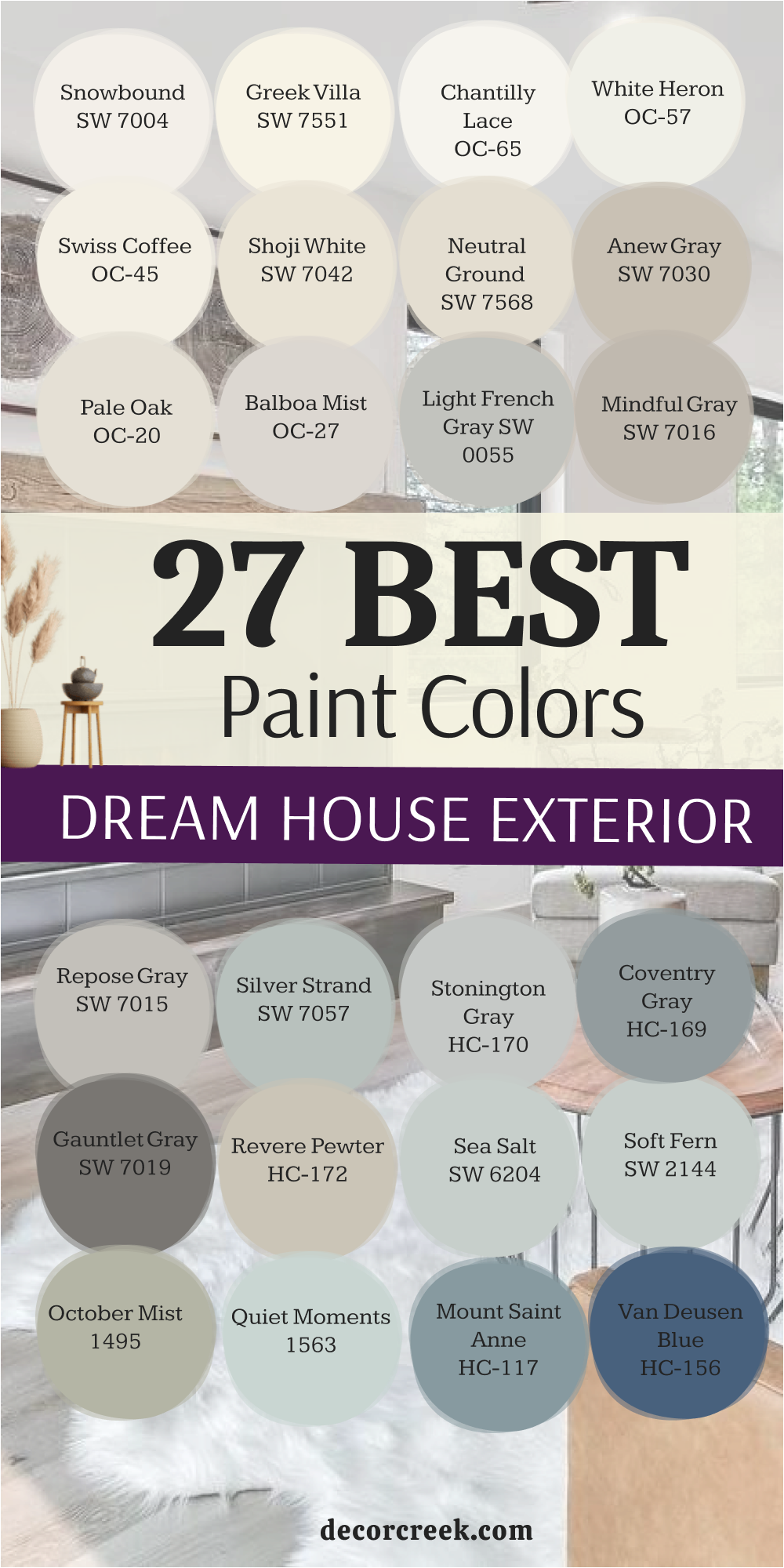
33 Best Paint Colors For The Dream House From Sherwin Williams
Alabaster SW 7008
Alabaster is the perfect soft, creamy white that feels incredibly inviting and warm on interior walls, never appearing stark or cold. Alabaster has a gentle warmth, making it an excellent all-over house white for a cohesive and unified aesthetic. Alabaster is a fantastic choice for homeowners who want a bright look but prefer the depth and softness of an off-white over a pure white.
Alabaster pairs beautifully with natural wood accents and rustic or traditional furniture, enhancing the cozy feel. Alabaster is a popular shade because it maintains its integrity across different rooms and lighting conditions in a home. Alabaster works well as a main wall color or as a trim color against a darker or more saturated shade.
Alabaster is often chosen for its incredible light reflectance, making rooms feel airy and subtly larger. Alabaster is a safe, reliable white that consistently provides a refined, high-end, and customized appearance. Alabaster offers a gorgeous contrast with deep green, charcoal, or navy blue painted cabinetry and doors. Alabaster is a very dependable, truly luxurious white that sets a welcoming tone throughout the house.
👉 Read the full guide for this color HERE 👈
Pure White — SW 7005
Pure White is a crisp, clean white that is very close to a true neutral, making it the perfect choice for high-contrast trim and a modern aesthetic. Pure White is a fantastic option when you want a sharp, defined contrast against a dark wall color or a brightly colored piece of art.
Pure White lacks the strong yellow or gray undertones that can sometimes distract from other colors in a room. Pure White reads as very bright and clean, making it a favorite for modern and contemporary home interiors.
Pure White is one of the brightest whites from Sherwin-Williams that I frequently use on trim, ceilings, and doors.
Pure White is excellent for making architectural details like crown molding and baseboards pop out with definition.
Pure White is a brilliant base color if you plan on having vibrant furniture, rugs, or a colorful gallery wall. Pure White is highly versatile and works with virtually any wall color you can imagine, from pastels to deep tones. Pure White is a reliable choice for achieving that freshly painted, polished, and tailored look for your dream home. Pure White holds its true white integrity even in rooms with heavy shade or low light conditions.
👉 Read the full guide for this color HERE 👈
Westhighland White — SW 7566
Westhighland White is a warm, slightly butter-colored off-white that has a definite yellow-cream undertone, giving it a rich and gentle glow on interior walls. Westhighland White is a fantastic choice for homes where a cozier, more historical white is desired, moving away from stark modern tones.
Westhighland White works beautifully in older homes or traditional spaces that benefit from a rich, aged, and comforting white. Westhighland White is a great option for kitchens and bathrooms where you want the cabinets to feel classic and slightly warm.
Westhighland White is highly recommended for bedrooms and living rooms where a soft, inviting, and enveloping atmosphere is paramount. Westhighland White is a dependable off-white that pairs wonderfully with dark wood furniture and traditional-style decor.
Westhighland White is a fantastic choice for trim in a traditional room to provide a gentle, soft contrast against a darker wall color.
Westhighland White looks particularly beautiful when contrasted with a deep red or true navy blue accent color. Westhighland White is a popular choice for designers seeking a rich white that feels luxurious and deeply comforting. Westhighland White offers a beautiful, warm hue that makes any interior feel elegant and wonderfully welcoming.
👉 Read the full guide for this color HERE 👈
White Duck — SW 7010
White Duck is a soft, warm off-white that has a definite light beige undertone, making it a beautiful, sophisticated, and earthy neutral for interior walls. White Duck is a fantastic choice for homeowners who want a white that never feels cold, but instead feels deeply welcoming and natural.
White Duck works beautifully as an all-over wall color in houses where a soft, grounded, and quiet aesthetic is desired throughout. White Duck is a great option for rooms with a lot of natural light, as the slight depth keeps it from washing out in the sun’s glare.
White Duck is highly recommended for traditional, transitional, or nature-inspired homes where earthy, quiet colors are paramount. White Duck is a dependable off-white that pairs wonderfully with warm wood finishes, linen textures, and soft metallic gold accents.
White Duck is a fantastic choice for trim and doors when the homeowner wants a soft, low-contrast look against a warm wall color.
White Duck looks particularly beautiful when contrasted with a deep charcoal or a rich olive green accent color. White Duck is a popular choice for designers seeking a warm white with a surprising depth and customized appeal. White Duck offers a beautiful, nuanced hue that feels incredibly welcoming and wonderfully refined inside the home.
👉 Read the full guide for this color HERE 👈
White Flour — SW 7102
White Flour is a clean, bright off-white that has a subtle, barely-there yellow undertone, giving it a fresh, gentle warmth that is perfect for interiors. White Flour is a fantastic choice for homeowners who want a white that feels light and bright but still offers a hint of softness and warmth.
White Flour works beautifully as an all-over wall color, creating a cohesive, cheerful, and airy flow throughout the house.
White Flour is a great option for rooms with minimal light, helping to brighten the room without the starkness of a pure white.
White Flour is highly recommended for kitchens and living areas where a fresh, clean, and inviting atmosphere is desired. White Flour is a dependable white that pairs wonderfully with pastel colors, light wood, and silver or chrome metallic accents.
White Flour is a fantastic choice for trim and ceilings when a homeowner wants a clean look that doesn’t feel aggressively pure white.
White Flour looks particularly beautiful when contrasted with a vibrant color like a seafoam green or a light aqua blue. White Flour is a popular choice for designers seeking a very light white that offers a beautiful, gentle warmth. White Flour offers a beautiful, light-filled backdrop that makes any room feel fresh and effortlessly elegant.
👉 Read the full guide for this color HERE 👈
Eider White — SW 7014
Eider White is a soft, very light white that has a definite gray-violet undertone, making it a sophisticated, cool, and nuanced choice for interior walls. Eider White is a fantastic choice for homeowners who want a white that feels cool, airy, and slightly atmospheric, avoiding any yellow or creamy tones.
Eider White works beautifully as an all-over wall color in houses where a clean, contemporary, and quiet aesthetic is desired.
Eider White is a great option for rooms with a lot of natural light, holding its cool integrity without washing out completely. Eider White is highly recommended for modern or minimalist settings where a refined, airy, and tailored backdrop is paramount.
Eider White is a dependable white that pairs wonderfully with cool-toned marbles, chrome accents, and deep gray or black furniture.
Eider White is a fantastic choice for trim and ceilings when a homeowner wants a subtle, slightly gray-white contrast against a darker wall color. Eider White looks particularly beautiful when contrasted with a deep navy or a true black for a sharp, contemporary look. Eider White is a popular choice for designers seeking a cool white with an intriguing, complex undertone. Eider White offers a beautiful, airy hue that makes any interior feel refined, customized, and utterly peaceful.
👉 Read the full guide for this color HERE 👈

Natural Choice — SW 7011
Natural Choice is a lovely, warm, off-white that has a subtle, earthy beige undertone, making it a gentle, highly versatile, and soft neutral for interior walls. Natural Choice is a fantastic choice for homeowners who want a white that feels inherently warm and soft, avoiding any stark or cold qualities.
Natural Choice works beautifully as an all-over wall color, wrapping the house in a soft, gentle glow that feels instantly welcoming.
Natural Choice is a great option for rooms with less natural light, helping to make the room feel warmer and brighter without being overtly white. Natural Choice is highly recommended for living rooms, hallways, and bedrooms where an inviting, cozy, and established atmosphere is desired.
Natural Choice is a dependable off-white that pairs wonderfully with traditional wood furniture, earth-toned fabrics, and natural woven accessories.
Natural Choice is a fantastic choice for trim and ceilings in a room where a soft, harmonious contrast with a warmer wall color is preferred. Natural Choice looks particularly beautiful when contrasted with a rich olive green or a deep burgundy accent color. Natural Choice is a popular choice for designers seeking a warm white that feels substantial, customized, and effortlessly elegant. Natural Choice offers a beautiful, comforting hue that feels deeply inviting and wonderfully refined inside the home.
👉 Read the full guide for this color HERE 👈

Kilim Beige — SW 6106
Kilim Beige is a classic, mid-toned, rich beige that has a warm, beautiful pink-orange undertone, offering a deeply inviting and established neutral for interior walls. Kilim Beige is a fantastic choice for homeowners who want a traditional, comforting color that feels richer and more substantial than a light, modern neutral.
Kilim Beige works beautifully in living rooms, dining rooms, and traditional libraries where a warm, established, and cozy atmosphere is desired.
Kilim Beige is a great option for an all-over wall color, creating a cohesive, grounded, and very traditional feel throughout the house. Kilim Beige is highly recommended for its ability to create a deep, enveloping warmth that works particularly well with dark wood furniture.
Kilim Beige is a dependable beige that pairs wonderfully with traditional patterns, rich textures, and classic bronze or gold metallic accents.
Kilim Beige is a fantastic choice for providing a rich backdrop that lets colorful art, particularly pieces with blue or green, truly stand out. Kilim Beige looks particularly beautiful when contrasted with a crisp white trim like Pure White for a fresh, defined, and classic edge. Kilim Beige is a popular choice for designers seeking a warm, rich neutral that feels completely enduring and traditionally elegant. Kilim Beige offers a beautiful, grounded hue that makes any interior feel tailored and wonderfully welcoming.
👉 Read the full guide for this color HERE 👈

Shiitake — SW 9173
Shiitake is a gorgeous, light-to-mid-toned mushroom gray-beige that has a lovely warm, earthy undertone, offering a sophisticated, organic neutral for interior walls. Shiitake is a fantastic choice for homeowners who want a color that feels natural, grounded, and a little more complex than a standard light beige or gray.
Shiitake works beautifully in modern farmhouse, transitional, or bohemian-style homes, wrapping the room in a quiet, tailored warmth.
Shiitake is a great option for an all-over wall color, creating a consistent, sophisticated, and softly modern flow throughout the house. Shiitake is highly recommended for its ability to look rich and contemporary while still feeling gentle and easy to live with. Shiitake is a dependable neutral that pairs wonderfully with natural wood finishes, woven textures, and soft linen or cotton fabrics.
Shiitake is a fantastic choice for providing a refined backdrop that lets various shades of white and earthy accent colors truly pop.
Shiitake looks particularly beautiful when contrasted with a warm white trim like Shoji White for a gentle, cohesive, and refined contrast. Shiitake is a popular choice for designers seeking an earthy neutral that feels completely balanced and intentionally designed. Shiitake offers a beautiful, sophisticated hue that makes any interior feel customized and effortlessly natural.
👉 Read the full guide for this color HERE 👈

Gossamer Veil — SW 9165
Gossamer Veil is a light, ethereal greige that is very close to an off-white, with a subtle, warm gray undertone, making it a beautiful, sophisticated neutral for interior walls. Gossamer Veil is a fantastic choice for homeowners who want a color that feels light and airy but still offers more depth and complexity than a stark white.
Gossamer Veil works beautifully as an all-over wall color, wrapping a house in a soft, gentle warmth that feels cohesive and customized.
Gossamer Veil is a great option for rooms that receive strong natural light, as the slight depth keeps it from washing out completely. Gossamer Veil is highly recommended for living areas, master bedrooms, and kitchens where an elegant, soft, and inviting atmosphere is desired. Gossamer Veil is a dependable color that pairs wonderfully with light wood floors, white countertops, and linen textures.
Gossamer Veil is a fantastic choice for providing a high-end, designer backdrop that makes furnishings and decor look expensive and curated.
Gossamer Veil looks particularly beautiful when contrasted with a clean white trim like Pure White for a fresh, crisp, and defined edge. Gossamer Veil is a popular choice for designers because it is a perfect soft neutral that is rarely distracting or visually heavy. Gossamer Veil offers a beautiful, airy hue that feels effortlessly sophisticated and wonderfully welcoming.
👉 Read the full guide for this color HERE 👈
Drift of Mist — SW 9166
Drift of Mist is an incredibly light, pale gray-greige that reads almost as an off-white, with a subtle, soft gray undertone, making it a highly sophisticated neutral for interiors. Drift of Mist is a fantastic choice for homeowners who want a wall color that is barely there, offering a refined, modern, and very light aesthetic.
Drift of Mist works beautifully as an all-over wall color, creating a cohesive, clean, and ethereal flow throughout the house.
Drift of Mist is a great option for rooms where a light-filled, airy, and very minimal backdrop is desired to showcase furniture and art. Drift of Mist is highly recommended for its ability to adapt gracefully to different light, never turning overly blue or yellow on the walls. Drift of Mist is a dependable color that pairs wonderfully with cool-toned marbles, silver metals, and clean, architectural furniture. Drift of Mist is a fantastic choice for trim and doors when a homeowner wants a very subtle, low-contrast, and soft white look.
Drift of Mist looks particularly beautiful when contrasted with a deep charcoal or a true black for a very modern, sharp, and intentional effect.
Drift of Mist is a popular choice for designers seeking a very pale neutral that feels incredibly complex and custom-designed. Drift of Mist offers a beautiful, airy hue that makes any interior feel refined, minimalist, and wonderfully peaceful.
👉 Read the full guide for this color HERE 👈

Crushed Ice — SW 7647
Crushed Ice is a very light, bright gray that has a definite subtle blue undertone, making it a cool, crisp, and refreshing neutral for interior walls. Crushed Ice is a fantastic choice for homeowners who want a cool gray that feels clean and modern, without being too dark or overwhelming on the walls.
Crushed Ice works beautifully in living rooms, offices, and bathrooms where a clean, sharp, and tailored feeling is highly desired.
Crushed Ice is a great option for an all-over wall color, providing a consistent, airy, and very contemporary neutral base throughout the house. Crushed Ice is highly recommended for its ability to look consistently crisp and tailored, especially in rooms with a lot of natural light. Crushed Ice is a dependable color that pairs wonderfully with white trim, chrome fixtures, and cool-toned art and textiles.
Crushed Ice is a fantastic choice for providing a sophisticated backdrop that makes pops of bright color or rich wood tones truly stand out.
Crushed Ice looks particularly beautiful when contrasted with a pure white trim like Pure White for a very sharp, defined, and modern edge. Crushed Ice is a popular choice for designers seeking a very light gray that feels high-quality and wonderfully intentional. Crushed Ice offers a beautiful, crisp hue that makes any interior feel tailored and incredibly refreshing.
👉 Read the full guide for this color HERE 👈
Worldly Gray — SW 7043
Worldly Gray is a popular, light-to-mid-toned greige from Sherwin-Williams that has a perfect blend of warm brown and cool gray undertones, making it incredibly versatile for interiors. Worldly Gray is a fantastic choice for homeowners who want a balanced neutral that is neither too cold nor too warm, but perfectly grounded.
Worldly Gray works beautifully in almost any room, adapting gracefully to different lighting conditions and different times of the day.
Worldly Gray is a great option for an all-over wall color, creating a cohesive, sophisticated, and tailored look throughout the house. Worldly Gray is highly recommended for living areas, offices, and bedrooms where a comforting yet refined neutral is paramount.
Worldly Gray is a dependable color that pairs wonderfully with both cool-toned and warm-toned furniture and accessories. Worldly Gray is a fantastic choice for providing a rich backdrop that lets artwork and colorful decor shine without competing for attention.
Worldly Gray looks particularly beautiful when accented with a crisp white trim like Snowbound for a clean, sophisticated, and welcoming contrast. Worldly Gray is a popular choice for designers seeking a perfect greige that feels truly balanced and high-end. Worldly Gray offers a beautiful, grounded hue that makes any interior feel sophisticated and intentionally designed.
👉 Read the full guide for this color HERE 👈
Amazing Gray — SW 7044
Amazing Gray is a solid, mid-toned greige from Sherwin-Williams that has a definite warm, brown undertone, offering a rich, comforting, and incredibly grounded neutral for interior walls. Amazing Gray is a fantastic choice for homeowners who want a color that is substantial, warm, and makes a room feel enveloped and deeply cozy.
Amazing Gray works beautifully in living rooms, dining rooms, and bedrooms where a classic, established, and welcoming atmosphere is desired.
Amazing Gray is a great option for an all-over wall color, providing a cohesive, substantial, and very traditional feel throughout the house. Amazing Gray is highly recommended for its ability to look rich and velvety on the walls, perfectly anchoring a room with its deep color.
Amazing Gray is a dependable color that pairs wonderfully with dark wood furniture, traditional fabrics, and classic gold or bronze accents.
Amazing Gray is a fantastic choice for providing a sophisticated backdrop that allows warm, earthy fabrics and traditional artwork to shine. Amazing Gray looks particularly beautiful when contrasted with a soft white trim like Alabaster for an elegant, gentle, and classic contrast. Amazing Gray is a popular choice for designers seeking a warm, rich neutral that feels completely enduring and highly customized. Amazing Gray offers a beautiful, grounded hue that makes any interior feel tailored and wonderfully inviting.
👉 Read the full guide for this color HERE 👈
Useful Gray — SW 7050
Useful Gray is a light-to-mid-toned greige that has a slight but discernible green undertone, making it a unique, earthy, and sophisticated neutral for interior walls. Useful Gray is a fantastic choice for homeowners who want a color that is grounded and soft, with a subtle touch of natural color complexity.
Useful Gray works beautifully in sunrooms, offices, and kitchens where a clean, thoughtful, and inviting atmosphere is desired.
Useful Gray is a great option for an all-over wall color, creating a consistent, sophisticated, and subtly colored base throughout the house. Useful Gray is highly recommended for its ability to look rich and customized while still feeling gentle and easy to decorate around. Useful Gray is a dependable neutral that pairs wonderfully with natural wood, rattan, and fabrics with earthy, muted colors. Useful Gray is a fantastic choice for providing a refined backdrop that lets white furniture and vibrant green houseplants truly stand out.
Useful Gray looks particularly beautiful when contrasted with a crisp white trim like Pure White for a clean, sharp, and inviting edge.
Useful Gray is a popular choice for designers seeking a subtle, complex neutral that feels custom-designed and high-quality. Useful Gray offers a beautiful, balanced hue that makes any interior feel sophisticated and wonderfully natural.
👉 Read the full guide for this color HERE 👈
Functional Gray — SW 7024
Functional Gray is a solid, mid-toned gray-greige that has a strong, definite brown undertone, offering a rich, earthy, and highly grounded neutral for interior walls. Functional Gray is a fantastic choice for homeowners who want a color that is substantial, warm, and makes a room feel thoroughly enveloped and deeply cozy.
Functional Gray works beautifully in living rooms, dining rooms, and bedrooms where a classic, established, and welcoming atmosphere is desired.
Functional Gray is a great option for an all-over wall color, providing a cohesive, substantial, and very traditional feel throughout the house. Functional Gray is highly recommended for its ability to look rich and velvety on the walls, perfectly anchoring a room with its deep color saturation.
Functional Gray is a dependable color that pairs wonderfully with dark wood furniture, rich leather seating, and classic bronze or gold metallic accents.
Functional Gray is a fantastic choice for providing a sophisticated backdrop that allows warm, earthy fabrics and traditional artwork to shine. Functional Gray looks particularly beautiful when contrasted with a soft white trim like Alabaster for an elegant, gentle, and classic contrast. Functional Gray is a popular choice for designers seeking a warm, rich neutral that feels completely enduring and highly customized. Functional Gray offers a beautiful, grounded hue that makes any interior feel tailored and wonderfully inviting.
👉 Read the full guide for this color HERE 👈
Skyline Steel — SW 1015
Skyline Steel is a light, clean, and classic mid-toned gray that has a very subtle, cool blue undertone, making it a crisp and refined neutral for interior walls. Skyline Steel is a fantastic choice for homeowners who want a true, sophisticated cool gray that feels clean and modern without being overly dark.
Skyline Steel works beautifully in living rooms, offices, and bathrooms where a clean, sharp, and tailored feeling is highly desired. Skyline Steel is a great option for an all-over wall color, providing a consistent, airy, and very contemporary neutral base throughout the house.
Skyline Steel is highly recommended for its ability to look consistently crisp and tailored, especially when paired with strong architectural details. Skyline Steel is a dependable color that pairs wonderfully with white trim, silver metals, and cool-toned art and textiles.
Skyline Steel is a fantastic choice for providing a sophisticated backdrop that makes pops of bright color or rich wood tones truly stand out.
Skyline Steel looks particularly beautiful when contrasted with a pure white trim like Pure White for a very sharp, defined, and modern edge. Skyline Steel is a popular choice for designers seeking a reliable, classic cool gray that always looks high-quality and intentional. Skyline Steel offers a beautiful, crisp hue that makes any interior feel tailored and incredibly refreshing.
👉 Read the full guide for this color HERE 👈
Network Gray — SW 7073
Network Gray is a solid, mid-toned gray that has a subtle, definite blue undertone, offering a sophisticated, classic, and grounded color for interior walls. Network Gray is a fantastic choice for homeowners who want a true, defined cool gray that feels rich and tailored without making a room feel too heavy.
Network Gray works beautifully in living rooms, dining rooms, and offices where a tailored, established, and serious atmosphere is desired.
Network Gray is a great option for an accent wall or built-in cabinetry, providing depth and a sophisticated focal point in a room. Network Gray is highly recommended for its ability to look substantial and present, perfectly anchoring a room with its rich color saturation. Network Gray is a dependable color that pairs wonderfully with white marble, traditional wood furniture, and metallic silver or chrome accents.
Network Gray is a fantastic choice for providing a rich backdrop that lets metallic accents and colorful fabrics truly shine.
Network Gray looks particularly beautiful when contrasted with a soft white trim like Snowbound for a classic, defined, and sharp contrast. Network Gray is a popular choice for designers seeking a mid-toned gray that feels timeless, rich, and intentionally designed. Network Gray offers a beautiful, grounded hue that makes any interior feel custom-built and wonderfully sophisticated.
👉 Read the full guide for this color HERE 👈
Anonymous — SW 7046
Anonymous is a deep, rich, and heavily muted olive green-brown that offers a dramatic, earthy, and sophisticated statement for interior walls. Anonymous is a fantastic choice for accent walls, cabinetry, or smaller rooms like a powder room or den where a powerful, grounded color is desired.
Anonymous has a depth that feels substantial and permanent, bringing the richness of the natural world into the home.
Anonymous works beautifully in traditional or transitional settings when paired with dark wood furniture and woven textures. Anonymous is highly recommended for homeowners who want to use a rich color to create an intimate, sophisticated, and highly memorable atmosphere. Anonymous is a dependable color that pairs wonderfully with a creamy white trim, allowing the contrast to emphasize the depth of the earth tone.
Anonymous is a fantastic choice for providing a rich backdrop that lets artwork, particularly pieces with warm, bright colors, truly shine.
Anonymous looks particularly beautiful when contrasted with a light greige like Shoji White for a sophisticated, layered, and beautiful effect. Anonymous is a popular choice for designers seeking a deep, complex earth tone that feels custom-designed and utterly luxurious. Anonymous offers a beautiful, grounded hue that makes any interior feel moody, refined, and deeply intentional.
👉 Read the full guide for this color HERE 👈

Cyberspace — SW 7076
Cyberspace is a very deep, saturated, near-black navy blue that offers a dramatic, modern, and highly sophisticated statement for interior walls. Cyberspace is a fantastic choice for accent walls, built-in bookshelves, or cabinetry where a powerful, grounding, and striking color is desired.
Cyberspace has a definite blue undertone that keeps it from being a flat black, giving it a rich, velvety complexity on the walls.
Cyberspace works beautifully in a modern study, a dramatic dining room, or a contemporary entryway for a high-impact focal point. Cyberspace is highly recommended for homeowners who want to introduce a powerful, almost-black color that feels tailored and incredibly current. Cyberspace is a dependable color that pairs wonderfully with gold or brass hardware, allowing the metallic sheen to beautifully contrast the deep color. Cyberspace is a fantastic choice for creating a dramatic backdrop that makes lighter furniture and colorful accessories truly pop.
Cyberspace looks particularly beautiful when contrasted with a pure white trim like Pure White for a very sharp, crisp, and high-end effect.
Cyberspace is a popular choice for designers seeking a deep, rich, almost-black blue that feels custom-designed and utterly luxurious. Cyberspace offers a beautiful, powerful hue that makes any interior feel tailored, rich, and deeply intentional.
👉 Read the full guide for this color HERE 👈

Inkwell — SW 6992
Inkwell is a deep, saturated, true navy blue that is very nearly black, offering a powerful, sophisticated, and moody statement for interior walls. Inkwell is a fantastic choice for accent walls, cabinetry, or smaller, intimate rooms where a dark, rich, and grounding color is desired.
Inkwell has a subtle warmth that keeps it from feeling cold, giving it a velvety and deep quality on the walls.
Inkwell works beautifully in a traditional library, a contemporary bedroom, or a dramatic powder room for a high-end feel.
Inkwell is highly recommended for homeowners who want to introduce a powerful color that feels classic, tailored, and universally appealing. Inkwell is a dependable color that pairs wonderfully with bright white trim, allowing the contrast to emphasize the depth of the dark blue.
Inkwell is a fantastic choice for built-in media centers or feature walls, creating a focused and sophisticated visual anchor.
Inkwell looks particularly beautiful when contrasted with natural wood tones and crisp white or light gray upholstery. Inkwell is a popular choice for designers seeking a true, deep navy that feels custom-designed and wonderfully luxurious. Inkwell offers a beautiful, powerful hue that makes any interior feel tailored, rich, and deeply intentional.
👉 Read the full guide for this color HERE 👈
Black Fox — SW 7020
Black Fox is a deep, complex, and heavily saturated black-brown that offers a dramatic, earthy, and incredibly sophisticated statement for interior walls. Black Fox is a fantastic choice for accent walls, cabinetry, or smaller rooms where a powerful, grounded, and rich color is desired.
Black Fox has a clear brown undertone that keeps it from being a stark, flat black, giving it a luxurious, velvety complexity. Black Fox works beautifully in a modern setting when paired with light wood, white marble, and clean, architectural furniture.
Black Fox is highly recommended for homeowners who want to use a rich, dark color to create a cozy, intimate, and memorable atmosphere. Black Fox is a dependable color that pairs wonderfully with gold or brass accents, allowing the metallic sheen to truly pop against the depth of color.
Black Fox is a fantastic choice for an office or library where a serious, tailored, and sophisticated feeling is paramount to the design.
Black Fox looks particularly beautiful when contrasted with a bright white trim like Pure White for a very sharp, dramatic, and high-end effect. Black Fox is a popular choice for designers seeking a deep neutral that feels custom-designed and utterly luxurious. Black Fox offers a beautiful, grounded hue that makes any interior feel moody, refined, and deeply intentional.
👉 Read the full guide for this color HERE 👈

Greenblack — SW 6994
Greenblack is a very deep, complex, and heavily saturated black that has a noticeable green undertone, offering a dramatic, earthy, and sophisticated statement for interior walls. Greenblack is a fantastic choice for accent walls, built-in bookshelves, or cabinetry where a powerful, nature-inspired, and striking color is desired.
Greenblack has a depth that feels substantial and permanent, bringing a moody, organic richness into the home. Greenblack works beautifully in a traditional study, a contemporary dining room, or a dramatic powder room for a high-impact focal point.
Greenblack is highly recommended for homeowners who want to introduce a powerful, almost-black color that feels tailored and incredibly current with an earthy edge. Greenblack is a dependable color that pairs wonderfully with creamy white trim, allowing the contrast to emphasize the depth of the green.
Greenblack is a fantastic choice for creating a dramatic backdrop that makes lighter furniture and colorful accessories truly pop.
Greenblack looks particularly beautiful when contrasted with natural wood tones and soft, neutral upholstery. Greenblack is a popular choice for designers seeking a deep, rich, complex black that feels custom-designed and utterly luxurious. Greenblack offers a beautiful, powerful hue that makes any interior feel tailored, rich, and deeply intentional.
👉 Read the full guide for this color HERE 👈
Ripe Olive — SW 6209
Ripe Olive is a deep, moody, and richly saturated olive green with a brown-gray undertone, offering a traditional, earthy, and sophisticated statement for interior walls. Ripe Olive is a fantastic choice for accent walls, offices, or dens where a powerful, grounding, and nature-inspired color is desired.
Ripe Olive has a depth that feels substantial and permanent, bringing the richness of a mature forest into the home.
Ripe Olive works beautifully in traditional or transitional settings when paired with dark wood furniture and woven textures. Ripe Olive is highly recommended for homeowners who want to use a rich color to create an intimate, sophisticated, and highly memorable atmosphere. Ripe Olive is a dependable color that pairs wonderfully with a creamy white trim, allowing the contrast to emphasize the depth of the green. Ripe Olive is a fantastic choice for providing a rich backdrop that lets artwork, particularly pieces with yellow or orange tones, truly shine. Ripe Olive looks particularly beautiful when contrasted with a light greige like Shoji White for a sophisticated, layered, and beautiful effect.
Ripe Olive is a popular choice for designers seeking a deep, complex earth tone that feels custom-designed and utterly luxurious.
Ripe Olive offers a beautiful, grounded hue that makes any interior feel moody, refined, and deeply intentional.
👉 Read the full guide for this color HERE 👈

Clary Sage — SW 6178
Clary Sage is a beautiful, muted, mid-toned green that has definite gray and earthy undertones, making it feel grounded, soft, and naturally sophisticated on interior walls. Clary Sage is a fantastic choice for bedrooms, living rooms, or kitchens where a homeowner wants to introduce a gentle, sophisticated, nature-inspired green.
Clary Sage works beautifully in craftsman, traditional, or transitional settings, giving a room a distinctly comforting and high-end feel.
Clary Sage is a great option for an all-over wall color, providing a subtle, sophisticated color that flows beautifully from room to room. Clary Sage is highly recommended for its ability to look rich and contemporary while still feeling gentle and incredibly easy to live with. Clary Sage is a dependable neutral that pairs wonderfully with natural wood furniture, linen upholstery, and soft metallic accents. Clary Sage is a fantastic choice for providing a refined backdrop that lets various shades of white and natural elements truly pop.
Clary Sage looks particularly beautiful when contrasted with a warm white trim like Alabaster for a gentle, cohesive, and welcoming contrast.
Clary Sage is a popular choice for designers seeking an earthy neutral that feels completely balanced and intentionally designed. Clary Sage offers a beautiful, sophisticated hue that makes any interior feel customized and effortlessly natural.
👉 Read the full guide for this color HERE 👈

Svelte Sage — SW 6164
Svelte Sage is a beautiful, mid-toned, slightly darker green that has strong gray and earthy undertones, offering a grounded, traditional, and highly sophisticated color for interior walls. Svelte Sage is a fantastic choice for living rooms, dining rooms, or offices where a homeowner wants to introduce a substantial, yet muted, nature-inspired green.
Svelte Sage works beautifully in traditional or transitional settings, giving a room a distinctly established and rich, tailored feeling.
Svelte Sage is a great option for an all-over wall color, providing a cohesive, sophisticated color that feels deeply intentional throughout the house. Svelte Sage is highly recommended for its ability to look rich and contemporary while still feeling gentle and incredibly easy to live with. Svelte Sage is a dependable neutral that pairs wonderfully with dark wood furniture, rich leather, and classic bronze or gold metallic accents. Svelte Sage is a fantastic choice for providing a refined backdrop that lets traditional patterns and white trim truly pop with a sophisticated contrast.
Svelte Sage looks particularly beautiful when contrasted with a creamy white trim like Greek Villa for a gentle, cohesive, and welcoming contrast. Svelte Sage is a popular choice for designers seeking a deep, sophisticated green that feels completely balanced and intentionally designed. Svelte Sage offers a beautiful, grounded hue that makes any interior feel customized and effortlessly natural.
👉 Read the full guide for this color HERE 👈
Rainwashed — SW 6211
Rainwashed is a beautiful, light, airy blue-green-gray that reads as a delicate, coastal-inspired color, perfect for a soothing, refreshing atmosphere in a home interior. Rainwashed is a fantastic choice for bedrooms, bathrooms, and sunrooms where a gentle, spa-like, and watery feeling is highly desired.
Rainwashed works beautifully in any room where you want a very light wash of color that feels restful and incredibly refreshing.
Rainwashed is a great option for an all-over wall color in a house where the aesthetic is light, airy, and quietly elegant and coastal. Rainwashed is highly recommended for its ability to shift color slightly in different light, sometimes appearing more green and sometimes more blue. Rainwashed is a dependable color that pairs wonderfully with bright white trim, light wood floors, and silver or chrome metallic accents. Rainwashed is a fantastic choice for providing a gentle, atmospheric backdrop that feels soft, clean, and incredibly welcoming.
Rainwashed looks particularly beautiful when contrasted with a clean white trim like Pure White for a very crisp, coastal, and refined edge.
Rainwashed is a popular choice for designers seeking a light color that offers both a subtle color wash and a sense of refined elegance. Rainwashed offers a beautiful, muted hue that feels incredibly soft, customized, and wonderfully peaceful.
👉 Read the full guide for this color HERE 👈

Tradewind — SW 6218
Tradewind is a gorgeous, light-to-mid-toned blue that has a definite gray-green undertone, making it a sophisticated, muted, and beautifully refreshing color for interior walls. Tradewind is a fantastic choice for bedrooms, living areas, or offices where a homeowner wants a true blue that feels soft, grounded, and quiet.
Tradewind works beautifully in coastal, transitional, or traditional settings, giving a room a distinctly serene and high-end feel.
Tradewind is a great option for an all-over wall color, providing a consistent, sophisticated color that flows beautifully from room to room. Tradewind is highly recommended for its ability to look rich and contemporary while still feeling gentle and easy to live with. Tradewind is a dependable color that pairs wonderfully with natural wood furniture, soft linen upholstery, and white or cream-colored accents. Tradewind is a fantastic choice for providing a refined backdrop that lets various shades of white and earthy accent colors truly pop.
Tradewind looks particularly beautiful when contrasted with a crisp white trim like Snowbound for a clean, sharp, and welcoming contrast.
Tradewind is a popular choice for designers seeking a soft blue that feels completely balanced and intentionally designed. Tradewind offers a beautiful, sophisticated hue that makes any interior feel customized and effortlessly refreshing.
👉 Read the full guide for this color HERE 👈

Samovar Silver — SW 6233
Samovar Silver is a light, clean, and classic mid-toned gray that has a very subtle, cool blue undertone, making it a crisp and refined neutral for interior walls. Samovar Silver is a fantastic choice for homeowners who want a true, sophisticated cool gray that feels clean and modern without being overly dark.
Samovar Silver works beautifully in living rooms, offices, and bathrooms where a clean, sharp, and tailored feeling is highly desired.
Samovar Silver is a great option for an all-over wall color, providing a consistent, airy, and very contemporary neutral base throughout the house. Samovar Silver is highly recommended for its ability to look consistently crisp and tailored, especially when paired with strong architectural details. Samovar Silver is a dependable color that pairs wonderfully with white trim, silver metals, and cool-toned art and textiles. Samovar Silver is a fantastic choice for providing a sophisticated backdrop that makes pops of bright color or rich wood tones truly stand out.
Samovar Silver looks particularly beautiful when contrasted with a pure white trim like Pure White for a very sharp, defined, and modern edge.
Samovar Silver is a popular choice for designers seeking a reliable, classic cool gray that always looks high-quality and intentional. Samovar Silver offers a beautiful, crisp hue that makes any interior feel tailored and incredibly refreshing.
👉 Read the full guide for this color HERE 👈
Mineral Deposit — SW 7652
Mineral Deposit is a solid, mid-to-dark toned green-gray that has a distinct, beautiful green undertone, offering a rich, earthy, and sophisticated color for interior walls. Mineral Deposit is a fantastic choice for living rooms, offices, or bedrooms where a homeowner wants to introduce a substantial, yet muted, nature-inspired green-gray.
Mineral Deposit works beautifully in transitional or traditional settings, giving a room a distinctly established and rich, tailored feeling.
Mineral Deposit is a great option for an accent wall or built-in cabinetry, providing depth and a sophisticated focal point in a room. Mineral Deposit is highly recommended for its ability to look rich and contemporary while still feeling incredibly easy to live with. Mineral Deposit is a dependable neutral that pairs wonderfully with dark wood furniture, leather, and classic bronze or gold metallic accents. Mineral Deposit is a fantastic choice for providing a refined backdrop that lets traditional patterns and creamy white trim truly pop with a sophisticated contrast.
Mineral Deposit looks particularly beautiful when contrasted with a warm white trim like Alabaster for a gentle, cohesive, and welcoming contrast.
Mineral Deposit is a popular choice for designers seeking a deep, sophisticated green-gray that feels completely balanced and intentionally designed. Mineral Deposit offers a beautiful, grounded hue that makes any interior feel customized and effortlessly natural.
👉 Read the full guide for this color HERE 👈
Slate Tile — SW 7624
Slate Tile is a solid, mid-to-dark toned gray that has a definite blue undertone, offering a sophisticated, classic, and grounded color for interior walls. Slate Tile is a fantastic choice for homeowners who want a true, defined cool gray that feels rich and tailored without making a room feel too heavy.
Slate Tile works beautifully in living rooms, dining rooms, and offices where a tailored, established, and serious atmosphere is desired.
Slate Tile is a great option for an accent wall or built-in cabinetry, providing depth and a sophisticated focal point in a room. Slate Tile is highly recommended for its ability to look substantial and present, perfectly anchoring a room with its rich color saturation. Slate Tile is a dependable color that pairs wonderfully with white marble, traditional wood furniture, and metallic silver or chrome accents.
Slate Tile is a fantastic choice for providing a rich backdrop that lets metallic accents and colorful fabrics truly shine.
Slate Tile looks particularly beautiful when contrasted with a soft white trim like Snowbound for a classic, defined, and sharp contrast. Slate Tile is a popular choice for designers seeking a mid-toned gray that feels timeless, rich, and intentionally designed. Slate Tile offers a beautiful, grounded hue that makes any interior feel custom-built and wonderfully sophisticated.
👉 Read the full guide for this color HERE 👈

Illusive Green — SW 9164
Illusive Green is a soft, light, atmospheric green-gray that reads as a delicate, muted color, perfect for a subtle, sophisticated hint of nature on interior walls. Illusive Green is a fantastic choice for homeowners who want a whisper of color that feels gentle, refreshing, and incredibly light.
Illusive Green works beautifully in bedrooms, sunrooms, and bathrooms where a gentle, spa-like, and airy atmosphere is desired.
Illusive Green is a great option for an all-over wall color in a house where the aesthetic is light-filled, natural, and quietly elegant. Illusive Green is highly recommended for its ability to reflect light beautifully, helping a room feel larger and more open and inviting. Illusive Green is a dependable color that pairs wonderfully with light wood, woven baskets, and linen furniture for a relaxed look. Illusive Green is a fantastic choice for providing a soft, atmospheric backdrop that feels gentle and incredibly welcoming.
Illusive Green looks particularly beautiful when contrasted with a clean white trim like Pure White for a very crisp, refined edge.
Illusive Green is a popular choice for designers seeking a light color that offers complexity without being visually busy. Illusive Green offers a beautiful, muted hue that feels incredibly soft, custom, and wonderfully peaceful.
👉 Read the full guide for this color HERE 👈
Pewter Green — SW 6208
Pewter Green is a deep, rich, and heavily saturated olive green with a strong gray undertone, offering a dramatic, earthy, and sophisticated statement for interior walls. Pewter Green is a fantastic choice for accent walls, cabinetry, or smaller rooms like a powder room or den where a powerful, grounding, and nature-inspired color is desired.
Pewter Green has a depth that feels substantial and permanent, bringing the richness of a mature forest into the home.
Pewter Green works beautifully in traditional or transitional settings when paired with dark wood furniture and woven textures. Pewter Green is highly recommended for homeowners who want to use a rich color to create an intimate, sophisticated, and highly memorable atmosphere. Pewter Green is a dependable color that pairs wonderfully with a creamy white trim, allowing the contrast to emphasize the depth of the green. Pewter Green is a fantastic choice for providing a rich backdrop that lets artwork, particularly pieces with yellow or orange tones, truly shine.
Pewter Green looks particularly beautiful when contrasted with a light greige like Shoji White for a sophisticated, layered, and beautiful effect.
Pewter Green is a popular choice for designers seeking a deep, complex earth tone that feels custom-designed and utterly luxurious. Pewter Green offers a beautiful, grounded hue that makes any interior feel moody, refined, and deeply intentional.
👉 Read the full guide for this color HERE 👈

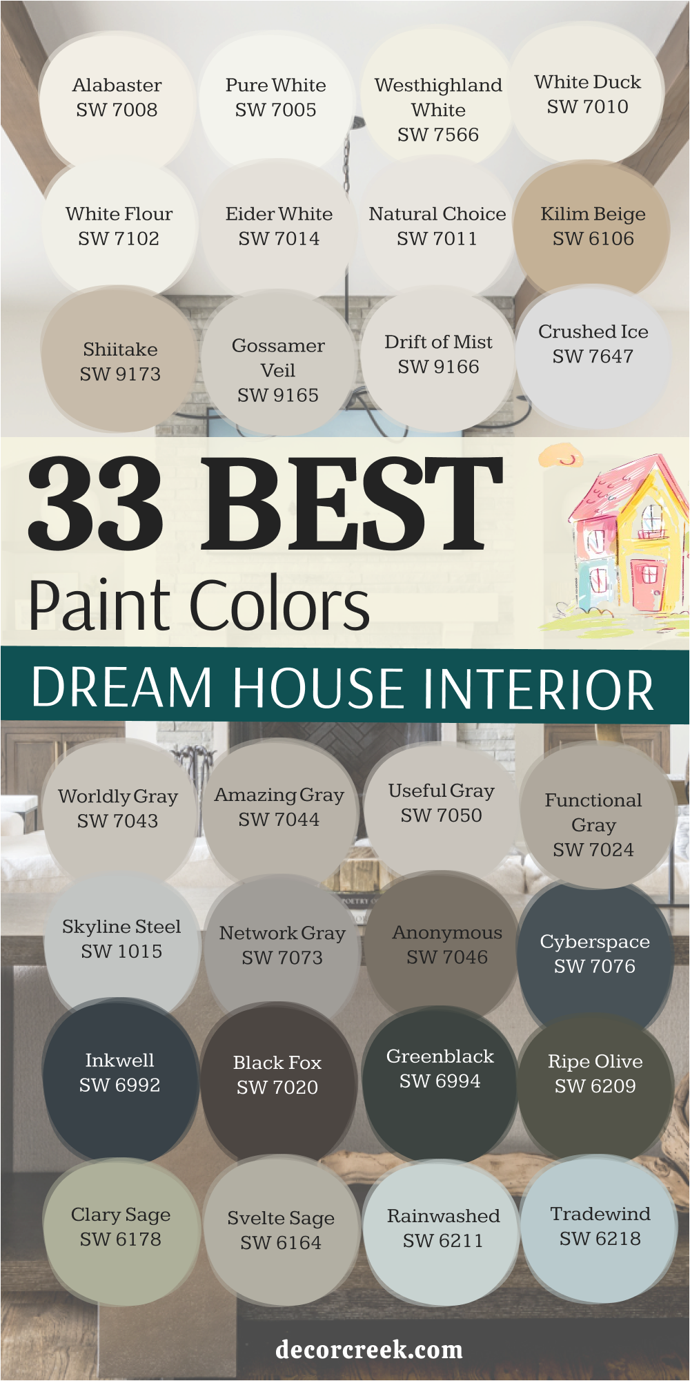
17 Trendy Paint Colors For The Dream House In 2026
Drift of Mist — SW 9166
Drift of Mist is an incredibly light, pale gray-greige that reads almost as an off-white, making it a perfect, refined neutral for achieving a light, modern aesthetic in 2026. Drift of Mist is a fantastic choice for homeowners who want a wall color that is barely there, providing a subtle, sophisticated, and very light backdrop.
Drift of Mist works beautifully as an all-over wall color, creating a cohesive, clean, and ethereal flow throughout a contemporary home.
Drift of Mist is a great option for showcasing furniture and artwork with its light-filled, airy, and very minimal background. Drift of Mist is highly recommended for its adaptability to different lighting, maintaining its soft neutral appearance without turning overly blue or yellow. Drift of Mist is a dependable color that pairs wonderfully with cool-toned marbles, silver metals, and clean-lined, architectural furniture. Drift of Mist is a fantastic choice for trim and doors when a homeowner wants a very subtle, low-contrast, and soft white look. Drift of Mist looks particularly beautiful when contrasted with a deep charcoal or a true black for a very modern, sharp, and intentional effect. Drift of Mist is a popular choice for designers seeking a very pale neutral that feels incredibly complex and custom-designed for a modern feel. Drift of Mist offers a beautiful, airy hue that feels refined, minimalist, and wonderfully current for 2026.
👉 Read the full guide for this color HERE 👈
White Duck — SW 7010
White Duck is a soft, warm off-white that has a definite light beige undertone, making it a beautiful, earthy, and sophisticated neutral that remains highly popular for 2026. White Duck is a fantastic choice for homeowners who want a white that never feels cold, but instead feels deeply welcoming and natural.
White Duck works beautifully as an all-over wall color in houses where a soft, grounded, and quiet aesthetic is desired throughout.
White Duck is a great option for rooms with a lot of natural light, as the slight depth keeps it from washing out in the sun’s glare. White Duck is highly recommended for traditional, transitional, or nature-inspired homes where earthy, quiet colors are paramount. White Duck is a dependable off-white that pairs wonderfully with warm wood finishes, linen textures, and soft metallic gold accents. White Duck is a fantastic choice for trim and doors when the homeowner wants a soft, low-contrast look against a warm wall color. White Duck looks particularly beautiful when contrasted with a deep charcoal or a rich olive green accent color. White Duck is a popular choice for designers seeking a warm white with a surprising depth and customized appeal for contemporary comfort. White Duck offers a beautiful, nuanced hue that feels incredibly welcoming and wonderfully refined for the current aesthetic.
👉 Read the full guide for this color HERE 👈
Natural Linen — SW 9109
Natural Linen is a warm, sandy-toned beige that brings a beautiful, earthy richness, making it a key trending neutral for grounded, nature-inspired homes in 2026. Natural Linen feels sophisticated and grounded, reminding me of expensive woven textures and natural fibers for a quiet luxury look.
Natural Linen is a great choice for traditional homes or transitional styles where a warm, rich neutral color is required.
Natural Linen has a lovely golden undertone that prevents it from looking dingy or too cool in the shade. Natural Linen pairs beautifully with dark brown trim or a deep bronze color for metal accents like railings and light fixtures. Natural Linen is highly recommended for homeowners who want a warm, inviting facade without committing to a darker color. Natural Linen gives a subtle richness that feels much more custom and high-end than a basic builder’s beige. Natural Linen is a beautiful option for homes with a lot of natural wood elements that you want the paint to complement. Natural Linen looks gorgeous when accented with deep olive green shutters or a rich navy blue door. Natural Linen is a warm and dependable neutral that makes a house feel substantial and welcoming, perfect for the modern era.
👉 Read the full guide for this color HERE 👈
Shiitake — SW 9173
Shiitake is a gorgeous, light-to-mid-toned mushroom gray-beige that has a lovely warm, earthy undertone, positioning it as a sophisticated, trending organic neutral for 2026 interiors. Shiitake is a fantastic choice for homeowners who want a color that feels natural, grounded, and a little more complex than a standard light beige or gray.
Shiitake works beautifully in modern farmhouse, transitional, or bohemian-style homes, wrapping the room in a quiet, tailored warmth.
Shiitake is a great option for an all-over wall color, creating a consistent, sophisticated, and softly modern flow throughout the house. Shiitake is highly recommended for its ability to look rich and contemporary while still feeling gentle and easy to live with. Shiitake is a dependable neutral that pairs wonderfully with natural wood finishes, woven textures, and soft linen or cotton fabrics. Shiitake is a fantastic choice for providing a refined backdrop that lets various shades of white and earthy accent colors truly pop. Shiitake looks particularly beautiful when contrasted with a warm white trim like Shoji White for a gentle, cohesive, and refined contrast. Shiitake is a popular choice for designers seeking an earthy neutral that feels completely balanced and intentionally designed for current trends. Shiitake offers a beautiful, sophisticated hue that makes any interior feel customized and effortlessly natural.
👉 Read the full guide for this color HERE 👈
Accessible Beige — SW 7036
Accessible Beige is a fantastic light neutral that sits perfectly between gray and beige, making it a true greige that is incredibly versatile and remains a strong choice for 2026. Accessible Beige is a wonderful color choice for homeowners who want a neutral that is neither too cold (like many grays) nor too warm (like true beige).
Accessible Beige looks sophisticated and tailored on many styles of homes, from traditional to modern ranch.
Accessible Beige is a great color if you have existing roof tiles or stone that has both gray and beige tones you need to harmonize. Accessible Beige looks particularly beautiful when paired with a crisp white trim like Pure White for a slight, clean contrast. Accessible Beige is one of the most popular exterior colors from Sherwin-Williams for a reason: it’s perfectly balanced. Accessible Beige is highly recommended for its ability to look rich and grounded without ever appearing dark or heavy. Accessible Beige offers a neutral backdrop that lets landscaping and architectural details take center stage. Accessible Beige is an excellent choice for a house that needs a touch of modern sophistication but still wants to feel welcoming. Accessible Beige holds its color well in all different kinds of lighting conditions, maintaining its greige identity, which is key for current design.
👉 Read the full guide for this color HERE 👈
Pale Oak — OC-20
Pale Oak is an incredibly popular, light and airy greige that remains a key trending color for 2026, often reading as a warm off-white in bright interior light. Pale Oak is a fantastic choice for homeowners who want a color that feels light and bright but still offers more depth and sophistication than a stark white.
Pale Oak works beautifully as an all-over wall color, wrapping a house in a soft, gentle warmth that feels cohesive and customized. Pale Oak is a great option for rooms that receive both north and south light, as it adapts gracefully without turning blue or yellow.
Pale Oak is highly recommended for living areas, master bedrooms, and kitchens where an elegant, soft, and inviting atmosphere is desired. Pale Oak is a dependable color that pairs wonderfully with natural wood floors, light stone countertops, and linen textures. Pale Oak is a fantastic choice for providing a high-end, designer backdrop that makes furnishings and decor look expensive and curated. Pale Oak looks particularly beautiful when contrasted with a crisp white trim like Chantilly Lace for a fresh, clean edge. Pale Oak is a popular choice for designers because it is a perfect soft neutral that is rarely distracting, ideal for the current quiet luxury trend. Pale Oak offers a beautiful, ethereal hue that feels effortlessly sophisticated and wonderfully welcoming.
👉 Read the full guide for this color HERE 👈
Gossamer Veil — SW 9165
Gossamer Veil is a light, ethereal greige that is very close to an off-white, with a subtle, warm gray undertone, making it a beautiful, sophisticated neutral that is currently in high demand. Gossamer Veil is a fantastic choice for homeowners who want a color that feels light and airy but still offers more depth and complexity than a stark white.
Gossamer Veil works beautifully as an all-over wall color, wrapping a house in a soft, gentle warmth that feels cohesive and customized.
Gossamer Veil is a great option for rooms that receive strong natural light, as the slight depth keeps it from washing out completely. Gossamer Veil is highly recommended for living areas, master bedrooms, and kitchens where an elegant, soft, and inviting atmosphere is desired. Gossamer Veil is a dependable color that pairs wonderfully with light wood floors, white countertops, and linen textures. Gossamer Veil is a fantastic choice for providing a high-end, designer backdrop that makes furnishings and decor look expensive and curated. Gossamer Veil looks particularly beautiful when contrasted with a clean white trim like Pure White for a fresh, crisp, and defined edge. Gossamer Veil is a popular choice for designers because it is a perfect soft neutral that is rarely distracting or visually heavy, meeting modern tastes. Gossamer Veil offers a beautiful, airy hue that feels effortlessly sophisticated and wonderfully welcoming, right on trend for 2026.
👉 Read the full guide for this color HERE 👈
Worldly Gray — SW 7043
Worldly Gray is a popular, light-to-mid-toned greige that has a perfect blend of warm brown and cool gray undertones, making it an incredibly versatile and enduring neutral for 2026. Worldly Gray is a fantastic choice for homeowners who want a balanced neutral that is neither too cold nor too warm, but perfectly grounded.
Worldly Gray works beautifully in almost any room, adapting gracefully to different lighting conditions and different times of the day.
Worldly Gray is a great option for an all-over wall color, creating a cohesive, sophisticated, and tailored look throughout the house. Worldly Gray is highly recommended for living areas, offices, and bedrooms where a comforting yet refined neutral is paramount. Worldly Gray is a dependable color that pairs wonderfully with both cool-toned and warm-toned furniture and accessories. Worldly Gray is a fantastic choice for providing a rich backdrop that lets artwork and colorful decor shine without competing for attention. Worldly Gray looks particularly beautiful when accented with a crisp white trim like Snowbound for a clean, sophisticated, and welcoming contrast. Worldly Gray is a popular choice for designers seeking a perfect greige that feels truly balanced and high-end, maintaining its appeal year after year. Worldly Gray offers a beautiful, grounded hue that makes any interior feel sophisticated and intentionally designed.
👉 Read the full guide for this color HERE 👈
Evergreen Fog — SW 9130
Evergreen Fog is a beautiful, muted, mid-toned green that has definite gray undertones, making it a grounded and highly sophisticated color that is very much on trend for 2026. Evergreen Fog is Sherwin-Williams’ 2022 Color of the Year, and it remains a popular choice for its earthy, sophisticated quality.
Evergreen Fog is a fantastic color for craftsman, bungalow, or nature-inspired homes where a connection to the outdoors is desired.
Evergreen Fog looks incredible when paired with a warm white trim like Alabaster or Pure White for a slight, clean contrast. Evergreen Fog is highly recommended for homes in wooded or natural settings, as it complements the surrounding landscape beautifully. Evergreen Fog is a great choice if you want a color that feels distinct but still acts as a beautiful, refined neutral. Evergreen Fog works well with natural stone accents that have both warm and cool tones, harmonizing the materials. Evergreen Fog is a gorgeous, sophisticated green that is not too bright, giving the home an elegant, established appearance. Evergreen Fog is a perfect color to bring a touch of the natural world and a customized, designer feel to the facade. Evergreen Fog offers a deep, rich color that never feels out of place, embodying the current desire for muted color.
👉 Read the full guide for this color HERE 👈
Clary Sage — SW 6178
Clary Sage is a beautiful, muted, mid-toned green that has definite gray and earthy undertones, making it a grounded, soft, and naturally sophisticated color that continues to trend upward. Clary Sage is a fantastic choice for bedrooms, living rooms, or kitchens where a homeowner wants to introduce a gentle, sophisticated, nature-inspired green.
Clary Sage works beautifully in craftsman, traditional, or transitional settings, giving a room a distinctly comforting and high-end feel.
Clary Sage is a great option for an all-over wall color, providing a subtle, sophisticated color that flows beautifully from room to room. Clary Sage is highly recommended for its ability to look rich and contemporary while still feeling gentle and incredibly easy to live with. Clary Sage is a dependable neutral that pairs wonderfully with natural wood furniture, linen upholstery, and soft metallic accents. Clary Sage is a fantastic choice for providing a refined backdrop that lets various shades of white and natural elements truly pop.
Clary Sage looks particularly beautiful when contrasted with a warm white trim like Alabaster for a gentle, cohesive, and welcoming contrast.
Clary Sage is a popular choice for designers seeking an earthy neutral that feels completely balanced and intentionally designed for a quiet, refined home. Clary Sage offers a beautiful, sophisticated hue that makes any interior feel customized and effortlessly natural.
👉 Read the full guide for this color HERE 👈
Pewter Green — SW 6208
Pewter Green is a deep, rich, and heavily saturated olive green with a strong gray undertone, offering a dramatic, earthy, and sophisticated statement that is highly sought after for 2026 interiors. Pewter Green is a fantastic choice for accent walls, cabinetry, or smaller rooms like a powder room or den where a powerful, grounding, and nature-inspired color is desired.
Pewter Green has a depth that feels substantial and permanent, bringing the richness of a mature forest into the home.
Pewter Green works beautifully in traditional or transitional settings when paired with dark wood furniture and woven textures. Pewter Green is highly recommended for homeowners who want to use a rich color to create an intimate, sophisticated, and highly memorable atmosphere. Pewter Green is a dependable color that pairs wonderfully with a creamy white trim, allowing the contrast to emphasize the depth of the green. Pewter Green is a fantastic choice for providing a rich backdrop that lets artwork, particularly pieces with yellow or orange tones, truly shine.
Pewter Green looks particularly beautiful when contrasted with a light greige like Shoji White for a sophisticated, layered, and beautiful effect.
Pewter Green is a popular choice for designers seeking a deep, complex earth tone that feels custom-designed and utterly luxurious, meeting the desire for moody colors. Pewter Green offers a beautiful, grounded hue that makes any interior feel moody, refined, and deeply intentional.
👉 Read the full guide for this color HERE 👈
Quietude — SW 6212
Quietude is a beautiful, light-to-mid-toned blue-green-gray that reads as a delicate, coastal-inspired color, perfect for a soothing, refreshing atmosphere that remains a popular trend. Quietude is a fantastic choice for bedrooms, bathrooms, and sunrooms where a gentle, spa-like, and watery feeling is highly desired.
Quietude works beautifully in any room where you want a very light wash of color that feels restful and incredibly refreshing.
Quietude is a great option for an all-over wall color in a house where the aesthetic is light, airy, and quietly elegant and coastal. Quietude is highly recommended for its ability to shift color slightly in different light, sometimes appearing more green and sometimes more blue. Quietude is a dependable color that pairs wonderfully with bright white trim, light wood floors, and silver or chrome metallic accents.
Quietude is a fantastic choice for providing a gentle, atmospheric backdrop that feels soft, clean, and incredibly welcoming.
Quietude looks particularly beautiful when contrasted with a clean white trim like Pure White for a very crisp, coastal, and refined edge. Quietude is a popular choice for designers seeking a light color that offers both a subtle color wash and a sense of refined elegance and tranquility. Quietude offers a beautiful, muted hue that feels incredibly soft, customized, and wonderfully peaceful.
👉 Read the full guide for this color HERE 👈
Mineral Deposit — SW 7652
Mineral Deposit is a solid, mid-to-dark toned green-gray that has a distinct, beautiful green undertone, offering a rich, earthy, and sophisticated color that is a top trend for 2026. Mineral Deposit is a fantastic choice for living rooms, offices, or bedrooms where a homeowner wants to introduce a substantial, yet muted, nature-inspired green-gray.
Mineral Deposit works beautifully in transitional or traditional settings, giving a room a distinctly established and rich, tailored feeling.
Mineral Deposit is a great option for an accent wall or built-in cabinetry, providing depth and a sophisticated focal point in a room. Mineral Deposit is highly recommended for its ability to look rich and contemporary while still feeling incredibly easy to live with. Mineral Deposit is a dependable neutral that pairs wonderfully with dark wood furniture, leather, and classic bronze or gold metallic accents. Mineral Deposit is a fantastic choice for providing a refined backdrop that lets traditional patterns and creamy white trim truly pop with a sophisticated contrast.
Mineral Deposit looks particularly beautiful when contrasted with a warm white trim like Alabaster for a gentle, cohesive, and welcoming contrast.
Mineral Deposit is a popular choice for designers seeking a deep, sophisticated green-gray that feels completely balanced and intentionally designed for current aesthetics. Mineral Deposit offers a beautiful, grounded hue that makes any interior feel customized and effortlessly natural.
👉 Read the full guide for this color HERE 👈
Urbane Bronze — SW 7048
Urbane Bronze is a deep, rich, and moody bronze-brown with a distinct gray undertone, offering a dramatic, earthy, and sophisticated color that remains a trending favorite for 2026. Urbane Bronze is Sherwin-Williams’ 2021 Color of the Year, and it remains a key color for modern, high-end, and grounded design.
Urbane Bronze is a fantastic color for modern farmhouse, craftsman, or contemporary architecture where a grounding, substantial color is needed.
Urbane Bronze looks incredibly chic when paired with black window frames and minimal, natural wood accents for a bespoke feel. Urbane Bronze is highly recommended for homeowners who want a dark exterior but prefer a complex, earthy brown to a straight black or charcoal. Urbane Bronze works wonderfully as an accent color for doors and trim against a light body color like Shoji White.
Urbane Bronze is a dependable color that beautifully complements natural elements like stone, dark brick, and lush landscaping.
Urbane Bronze is a great choice for creating a grounded, tailored look that feels incredibly custom and luxurious on the facade. Urbane Bronze is a popular color because it is a deep neutral that brings warmth and a sense of permanence to the house, perfectly fitting the current trends.
👉 Read the full guide for this color HERE 👈

Iron Ore — SW 7069
Iron Ore is a deep, near-black charcoal color that reads as a softened black, offering a contemporary and dramatic look that is a key trending color for 2026. Iron Ore is a beautiful choice for modern, Scandinavian-inspired, or minimal-style homes where strong definition is desired.
Iron Ore has a subtle gray undertone that gives it a slight dusty quality, making it feel more refined than a pure black.
Iron Ore looks incredible when paired with natural wood finishes like cedar, teak, or white oak. Iron Ore is highly recommended as a bold main body color or a stunning, grounding trim color for a white house. Iron Ore works wonderfully on homes in wooded areas, allowing the house to blend beautifully with the natural shadows and trees.
Iron Ore is a fantastic choice for window sashes and doors where you want a substantial, grounding frame.
Iron Ore gives the home a chic, bespoke, and very high-end appearance that makes a strong statement. Iron Ore is a popular color for creating a dramatic, sophisticated contrast with bright, vibrant landscaping, perfect for modern curb appeal.
👉 Read the full guide for this color HERE 👈
Inkwell — SW 6992
Inkwell is a deep, saturated, true navy blue that is very nearly black, offering a powerful, sophisticated, and moody statement that is consistently on trend for 2026 interiors. Inkwell is a fantastic choice for accent walls, cabinetry, or smaller, intimate rooms where a dark, rich, and grounding color is desired.
Inkwell has a subtle warmth that keeps it from feeling cold, giving it a velvety and deep quality on the walls. Inkwell works beautifully in a traditional library, a contemporary bedroom, or a dramatic powder room for a high-end feel.
Inkwell is highly recommended for homeowners who want to introduce a powerful color that feels classic, tailored, and universally appealing. Inkwell is a dependable color that pairs wonderfully with bright white trim, allowing the contrast to emphasize the depth of the dark blue. Inkwell is a fantastic choice for built-in media centers or feature walls, creating a focused and sophisticated visual anchor. Inkwell looks particularly beautiful when contrasted with natural wood tones and crisp white or light gray upholstery. Inkwell is a popular choice for designers seeking a true, deep navy that feels custom-designed and wonderfully luxurious for a dramatic mood. Inkwell offers a beautiful, powerful hue that makes any interior feel tailored, rich, and deeply intentional.
👉 Read the full guide for this color HERE 👈
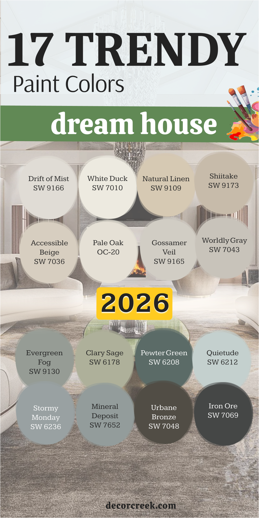
Final Thoughts on Choosing Paint Color Palettes for the Dream House
Selecting the perfect paint palette for your dream house, spanning both the interior walls and the exterior facade, is more than just an aesthetic choice; it is about creating an enduring, lasting feeling that will sustain you for years to come.
I have shared my absolute favorite, most reliable, and time-tested colors because I know they perform beautifully across a wide variety of settings, lighting conditions, and architectural styles.
Always remember that the color of your home is the very first thing you and your guests experience. It instantly impacts your daily mood, serves as the essential backdrop that complements your furnishings and artwork, and most importantly, it defines your home’s curb appeal and lasting value.
My professional suggestion is to always begin by truly considering the deep-seated mood you want to evoke: do you crave a feeling of lightness, airiness, and openness, or are you drawn toward something more grounded, cozy, and enveloping?
This foundational choice will inform every subsequent decision you make.
The next crucial step is the physical verification: Hold a large, physical sample of your top color choices directly against your fixed architectural elements—the flooring, the stone accents, the countertops, and the backsplash. This step is critical to ensure that their underlying undertones (be they warm, cool, gray, or beige) harmonize flawlessly.
Never, ever rush this part of the process; it is the most important safeguard against costly mistakes. Investing a small amount of time and money into purchasing and applying large swatches of sample colors on your walls will save you tremendous frustration, time, and expense later on
. The colors from Sherwin-Williams and Benjamin Moore on this exclusive list are my professional go-to shades because they offer unmatched depth, reliable consistency, and a refined, sophisticated quality that truly finishes a home with a professional polish.