When I think about the outside of a home, I think about more than just curb appeal — I think about how it feels before you even walk through the door. The right paint color can set the mood long before a single word is spoken. It can make a house feel warm, proud, welcoming, or quietly confident. To me, color is emotion—it shapes the way we see and remember a home.
A soft neutral can make old brick glow with new life, while a bold shade can give shutters or doors a striking charm that draws your eye instantly. Even the smallest change in tone can shift the entire personality of a house.
Choosing the perfect exterior color isn’t just about following trends—it’s about telling a story about the people who live there. Some homes feel calm and natural; others shine with energy and bold character. I’ve learned that the best color fits not only the home’s shape and size but also the heart of the people inside it. The right paint can make a cozy cottage feel like a retreat or give a modern house the clean strength it deserves.
Over the years, I’ve come back to certain shades again and again—colors that stand strong through rain, snow, and summer sunlight. These hues never lose their balance or beauty, no matter where they’re used.
That’s why I’ve gathered my favorite exterior paint colors that I know will look stunning, thoughtful, and inviting in 2026. They aren’t just shades on a wall—they’re the feeling of coming home.
Why I Trust Sherwin-Williams and Benjamin Moore for Exterior Paints
After years of helping families refresh and redesign their homes, I’ve learned which paint brands I can rely on completely. Sherwin-Williams and Benjamin Moore have proven themselves time and time again. Their paints hold up beautifully through every kind of weather—bright sun, heavy rain, snow, and wind.
They don’t chip or fade, even after years of outdoor exposure. I’ve watched their finishes stay strong and clean while other brands lose their charm. When I recommend them, I know I’m giving homeowners something that lasts.
But what truly makes these brands special is their color quality. Every shade feels rich, natural, and balanced. Sherwin-Williams and Benjamin Moore don’t just make paint—they create colors that react with light in the most flattering way.
Their whites stay crisp without turning yellow, their grays never look dull, and their blues and greens shift softly with the daylight.
I’ve seen how their colors highlight wood textures, make brick look warmer, and turn simple siding into something elegant. Even years later, the colors look fresh and refined. That’s the kind of trust only experience can build, and that’s why I return to these two brands for every exterior project I take on.
How I Choose the Right Outside House Color
Picking the right exterior color is like reading the story of a home. It starts with its setting—the light, the landscape, and the materials it’s made from. I always step back and watch how the sunlight moves around the house throughout the day. The color of the roof, the tone of the brick or stone, and even the trees nearby all change how a shade appears. A color that looks bright in the morning can turn softer by afternoon and warmer at sunset. I think that’s what makes designing exteriors so rewarding—it’s about creating something that lives beautifully with light.
For homes surrounded by trees, I often choose a slightly warmer white or beige to balance the cool shade. In open, sunny areas, cooler tones keep the house looking calm and fresh.
I also pay close attention to the trim and accents—sometimes a subtle contrast between the main body and the trim can completely redefine the shape of a home. Testing colors outside is always essential. I paint large sample boards and move them around the house to see how each one reacts through different times of day.
The perfect exterior color doesn’t compete with its surroundings—it connects with them. It should look just as welcoming in the golden light of morning as it does under a cloudy evening sky.
My goal is always the same: to make every home feel balanced, full of warmth, and naturally beautiful. The right shade doesn’t just protect the walls—it adds personality, history, and pride to the place people call home.
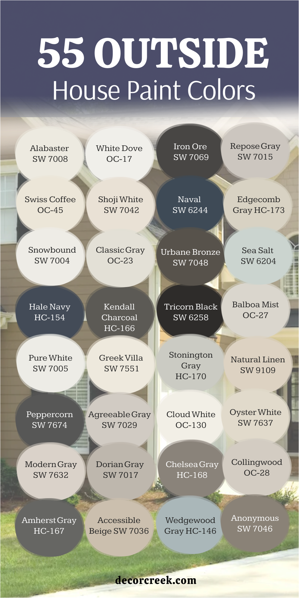
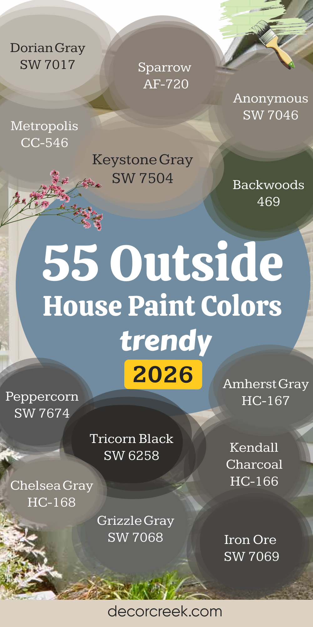
55 Outside House Paint Colors Trendy in 2026
Alabaster SW 7008
Alabaster is one of those colors that always makes a home feel loved. It’s a creamy white that carries both warmth and light, never looking dull or harsh. I’ve used it on so many exteriors where owners wanted brightness without that “stark white” feeling. Alabaster reflects the sun softly, making the house glow from morning to evening.
It feels clean but lived-in, like a home that welcomes you every time you walk up the path. I often pair it with dark shutters, soft beige trim, or even natural wood tones—it brings them all together beautifully. What I love most is how it works across different styles—modern, traditional, farmhouse, or cottage.
It doesn’t fight for attention, yet it always stands out in its own calm way.
Even under cloudy skies, it keeps its warmth, so homes never look flat. Alabaster is the kind of color that helps people fall in love with their house again, every time they pull into the driveway.
🎨 Check out the complete guide to this color right HERE 👈

White Dove OC-17
White Dove feels familiar, soft, and graceful. It’s the kind of white that never shouts—it simply brightens and smooths every surface. On exteriors, it gives a gentle glow that flat whites can’t match. I use it often for older homes because it adds new life without changing their personality. It’s warm enough to look cozy beside brick or stone, yet fresh enough to work beautifully with black windows or navy shutters.
The tone shifts gently through the day—creamy in the morning light, smooth and neutral at sunset. That’s what makes it such a forgiving and reliable shade.
White Dove looks amazing when paired with dark roofs or contrasting trim, creating that balanced, classic feel. It’s also a shade homeowners love because it stays beautiful through every season. No matter how many years pass, this color never feels dated. It always feels clean, welcoming, and well cared for.
🎨 Check out the complete guide to this color right HERE 👈

Iron Ore SW 7069
Iron Ore brings quiet confidence to a home’s exterior. It’s not just dark gray—it’s a beautiful charcoal that feels solid, strong, and refined. I’ve used it on homes that needed personality and presence without bright colors. Against white trim, Iron Ore looks sharp and sophisticated. With wood or brick, it feels grounded and natural.
The richness of this shade gives even simple architecture a sense of purpose. It absorbs light in a way that makes surfaces look smoother and more elegant.
When evening comes, porch lights and lanterns glow softly against it, creating the perfect warm contrast. It’s especially stunning for modern farmhouses and contemporary styles, but it can also give older homes a fresh update. Iron Ore is bold but never loud—it makes a statement with quiet strength.
Every time I see it finished on a house, I can’t help but smile.
🎨 Check out the complete guide to this color right HERE 👈

Repose Gray SW 7015
Repose Gray is what I call a “friendly gray.” It fits anywhere, with anyone, and always looks inviting. It has the right mix of warmth and coolness, which makes it easy to pair with both white trim and natural materials. I’ve used it on everything from new builds to century-old homes, and it always feels balanced. In sunlight, it looks soft and airy; in shade, it gains a quiet depth that keeps it interesting.
Repose Gray is especially beautiful next to greenery—it enhances landscaping instead of competing with it. When paired with darker shutters or doors, it creates a classic, polished look.
I love how this color adapts; it feels cozy in the winter and clean in the summer. It’s one of those dependable shades that homeowners never regret choosing. It truly makes every home feel calm, cared for, and complete.
🎨 Check out the complete guide to this color right HERE 👈

Swiss Coffee OC-45
Swiss Coffee adds warmth in the most graceful way. It’s a creamy white with just enough beige to feel comforting but never heavy. I use it often for homes that get a lot of direct sunlight because it holds its beauty without glare. It softens strong light while keeping the brightness that people love. It’s perfect for brick homes, stucco, or siding that needs a touch of warmth.
When paired with dark brown or black accents, Swiss Coffee looks especially charming—it creates contrast that feels natural and timeless.
I’ve also used it with deep green shutters for a cottage feel, and it’s just beautiful. This shade carries a quiet glow that changes with the day, giving the home a soft, lived-in personality. Swiss Coffee makes even the simplest exterior look graceful and cared for. It’s a color that feels gentle, familiar, and easy to love.
🎨 Check out the complete guide to this color right HERE 👈

Shoji White SW 7042
Shoji White is one of those shades that can change the whole feeling of a house. It’s a creamy off-white with a hint of greige that brings warmth and comfort to any exterior. I often choose it for homes that sit in shaded areas or surrounded by trees, where it keeps the house from looking cold. The color pairs effortlessly with natural wood tones, bronze accents, or soft gray trim.
Shoji White feels both modern and classic—it looks stunning on farmhouses and coastal homes alike. In bright sunlight, it reads fresh and balanced; in low light, it feels cozy and calm.
I’ve found it especially beautiful against stone or brick because it highlights texture without overpowering it. Shoji White gives homes an approachable charm, something quiet but full of life. It’s that color that looks even better year after year.
🎨 Check out the complete guide to this color right HERE 👈

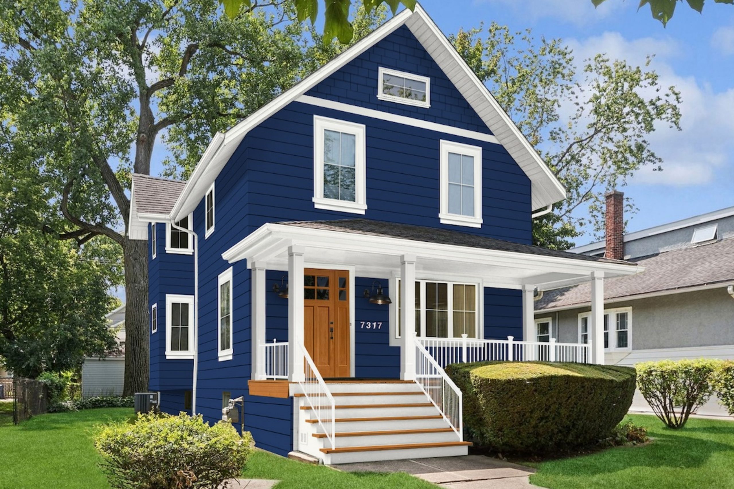
Naval SW 6244
Naval is that perfect navy that feels bold yet endlessly classic. It brings richness to a home and looks incredible with crisp white trim. I’ve used it for whole exteriors and accent details, and it always makes a strong impression. It has a deep, grounded tone that holds beautifully in sunlight, never turning dull or too dark.
When paired with brass lighting, stonework, or wood doors, it feels refined and timeless. Naval is perfect for homeowners who want something dramatic but still traditional.
It’s powerful yet easy to live with—something about it just feels right. I especially love it on coastal homes or any property that needs a touch of distinction. Even in the rain, this shade keeps its quiet glow. It’s a color that adds pride and presence to every exterior.
🎨 Check out the complete guide to this color right HERE 👈

Edgecomb Gray HC-173
Edgecomb Gray has a softness that makes every home feel welcoming. It’s a warm gray with creamy undertones that shift gently through the day. In the morning, it feels fresh and airy; by evening, it turns slightly warmer and cozier. I often recommend it for homes that need a neutral that won’t look flat or cold.
It’s beautiful next to stone, brick, or natural siding. Edgecomb Gray pairs wonderfully with crisp white trim, black accents, or muted greens.
It’s a color that quietly adapts to its surroundings, making the whole exterior feel balanced. I’ve seen it bring unity to mixed materials—wood, stone, metal—without effort. Edgecomb Gray has that simple beauty that always feels natural. It’s a dependable shade that makes a home look complete without trying too hard.
🎨 Check out the complete guide to this color right HERE 👈

Snowbound SW 7004
Snowbound feels clean and easy, like a breath of fresh air. It’s a cool white that looks sharp and modern without feeling sterile. I love using it for contemporary homes, especially those with black windows or dark roofs—it creates a stunning contrast. Snowbound brightens shaded facades and reflects sunlight beautifully.
On homes with brick or wood details, it adds a soft, balanced backdrop.
It stays true to its color no matter the time of day, never turning yellow or blue. This shade works perfectly for trim, full siding, or even shutters when used against darker tones. It gives homes a polished, finished look that feels intentional. Snowbound is a great choice for anyone who wants that crisp, effortless curb appeal that never fades.
🎨 Check out the complete guide to this color right HERE 👈

Classic Gray OC-23
Classic Gray feels calm, warm, and steady all at once. It’s that light gray that adds softness without losing brightness. I use it on homes that need a gentle, neutral tone that still feels alive. It pairs beautifully with dark trim, wood doors, or soft beige accents. Classic Gray brings out the textures of siding and stone in such a natural way—it’s like it was meant to be there.
The tone changes just enough with the light to keep it interesting, never flat. It feels airy in sunshine and grounded at dusk.
It’s ideal for homeowners who want something timeless and flexible. Classic Gray gives exteriors a sense of comfort and quiet charm that’s easy to live with. Every time I use it, it feels like the right choice.
🎨 Check out the complete guide to this color right HERE 👈

Urbane Bronze SW 7048
Urbane Bronze feels like quiet confidence in color form. It’s a deep gray-brown that adds instant character and grounding to a home. I often reach for it when a house needs strength without harshness—it makes exteriors feel secure and timeless. In the morning sun, it reveals warm brown undertones; by evening, it looks like rich metal brushed with light.
I love pairing Urbane Bronze with creamy white trim or warm wood doors—it creates balance between natural and refined.
It looks especially beautiful on modern farmhouses and homes with clean lines. The color also handles weather beautifully, staying rich through bright summers and cold winters. Urbane Bronze has a rare mix of elegance and simplicity—it feels powerful but never heavy. Every time I finish a home in this shade, the owner says the same thing: “It just feels right.” That’s when I know it’s perfect.
🎨 Check out the complete guide to this color right HERE 👈

Sea Salt SW 6204
Sea Salt is one of those colors that instantly feels easy and gentle. It’s a soft mix of green and gray that changes throughout the day, sometimes reading cool and sometimes warm. I love using it on homes surrounded by greenery because it blends so naturally with the landscape. It brings a fresh, coastal feel without being too beachy.
When paired with white trim or natural wood, it feels relaxed and inviting. Sea Salt also looks lovely on shutters and doors, giving just a hint of color without overwhelming the rest of the house.
It’s that perfect balance between subtle and interesting. I’ve noticed it makes homes feel calm from the street view, creating a sense of comfort before you even step inside. For anyone who loves soft tones with personality, Sea Salt always delivers a touch of serenity and style.
🎨 Check out the complete guide to this color right HERE 👈

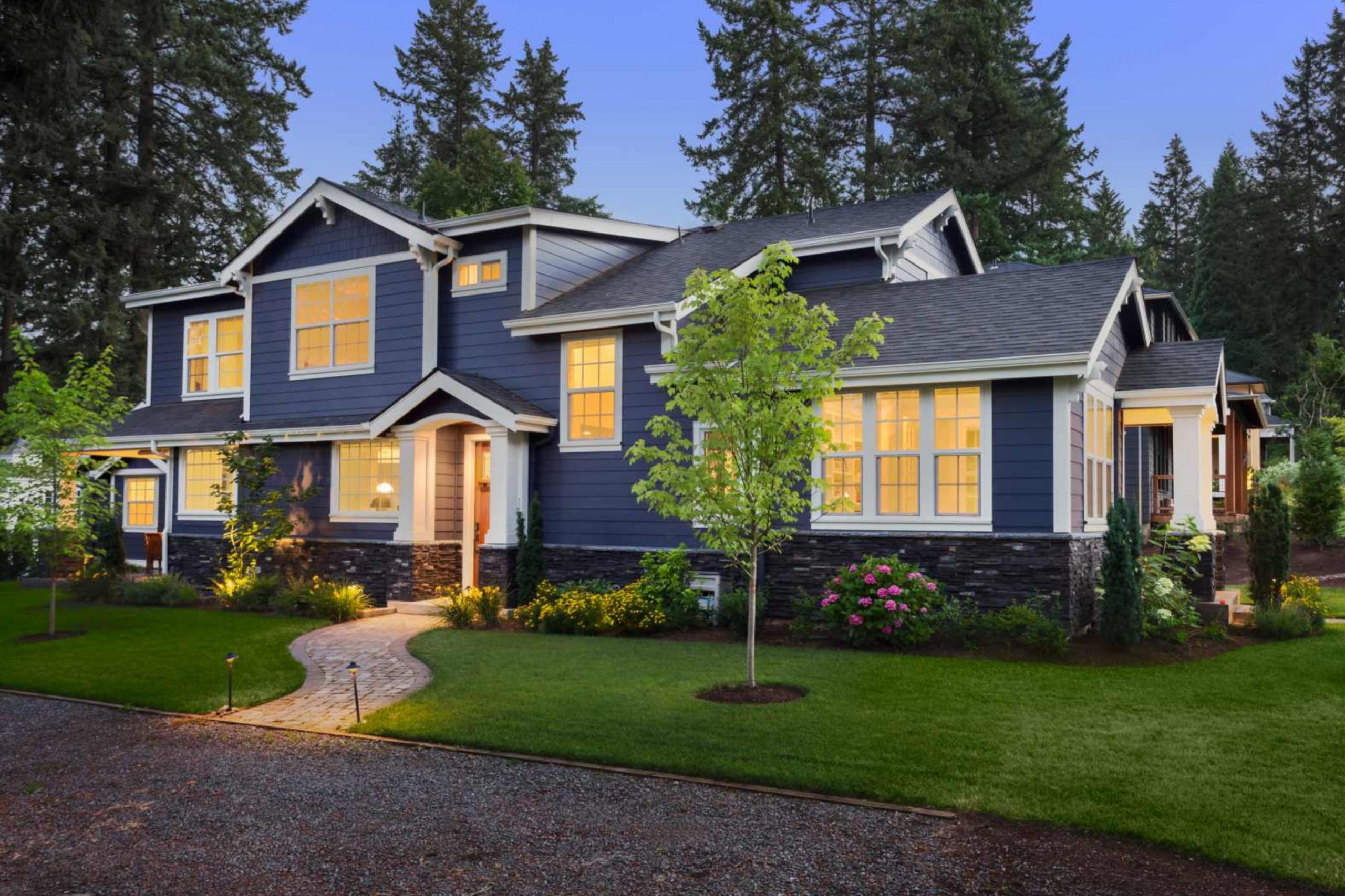
Hale Navy HC-154
Hale Navy adds a sense of confidence and classic charm to any home. It’s a deep navy that feels both modern and timeless. I love how it carries a rich depth in the shade and brightens slightly when sunlight hits it. It looks elegant paired with white trim, gold fixtures, or warm wooden doors.
I’ve used Hale Navy on everything from historic homes to sleek new builds, and it always holds its beauty.
It’s especially lovely on coastal homes where it echoes the tones of the sea and sky. What makes this blue special is its balance—it’s dark enough to make a statement but soft enough to stay inviting. It’s a true designer’s favorite for good reason. Hale Navy never feels trendy—it’s the kind of color that looks just as stylish ten years later.
🎨 Check out the complete guide to this color right HERE 👈

Kendall Charcoal HC-166
Kendall Charcoal is deep, dramatic, and sophisticated without ever feeling cold. It’s one of those perfect dark grays that can completely redefine a home’s exterior. The richness of this shade pairs beautifully with white trim or creamy stonework, creating a bold but balanced look.
I often recommend it for homeowners who want depth without black—it’s that “in-between” that feels polished and timeless.
In sunlight, Kendall Charcoal takes on a soft, velvety sheen; in shade, it becomes deep and grounded. It looks amazing on colonial or craftsman homes where structure and form matter. The best part is how well it handles weather—it always looks freshly painted.
Kendall Charcoal brings quiet strength to a home, a feeling of permanence and style. It’s one of those shades that never disappoints.
🎨 Check out the complete guide to this color right HERE 👈

Tricorn Black SW 6258
Tricorn Black is bold, smart, and endlessly classic. It’s a true black—deep, rich, and full of impact. I use it often for trim, doors, or shutters when a home needs sharp definition. But it’s also breathtaking as a full exterior color when paired with light stone or natural wood. In sunlight, it gleams softly; at night, it looks dramatic and sophisticated.
Tricorn Black gives modern homes a strong presence and turns traditional houses into statement pieces.
It’s one of those shades that highlights every architectural detail without distraction. Paired with crisp white trim or warm brass fixtures, it becomes unforgettable. The beauty of Tricorn Black is how timeless it feels—it’s bold but always in good taste. It gives homes that “finished” look, like they’ve found their true personality.
🎨 Check out the complete guide to this color right HERE 👈

Balboa Mist OC-27
Balboa Mist is that rare neutral that feels gentle and elegant at the same time. It’s a warm greige that fits perfectly between beige and gray, adapting to every type of light. I love using it for homes that need softness and balance. On exteriors, it brings a quiet glow that looks natural and fresh. It pairs beautifully with darker shutters, black windows, or stone foundations.
Balboa Mist never looks too light or too muddy—it’s always smooth and refined. It’s one of those colors that photographs beautifully but looks even better in person.
I often tell clients it’s like a soft blanket for the home—it wraps everything together. No matter the style, from modern to farmhouse, Balboa Mist makes every house feel welcoming and complete.
🎨 Check out the complete guide to this color right HERE 👈

Pure White SW 7005
Pure White brings simplicity and grace to a home’s exterior. It’s clean but not stark, bright but not blinding. It has just a touch of warmth, making it easy to pair with both cool and warm tones. I love using it on siding with black trim or natural wood accents—it creates that magazine-worthy contrast everyone loves.
Pure White stays crisp through every season, even under strong sunlight. It’s perfect for homes that want that fresh, bright look without feeling sterile.
It also works beautifully on trim and porches, giving everything a neat, polished edge. There’s something about Pure White that makes a home look cared for and loved.
It’s one of my most-used shades because it always delivers a perfect finish that feels effortless.
🎨 Check out the complete guide to this color right HERE 👈

Greek Villa SW 7551
Greek Villa reminds me of sunlight reflected on soft fabric—it’s warm, creamy, and gentle. I love how it gives homes a golden, welcoming glow without being too yellow. It’s stunning on stucco, siding, or even brick, adding lightness that feels comfortable. I often use it for homes surrounded by trees where light is limited—it brings brightness that feels natural.
Greek Villa works perfectly with darker trim or bronze hardware, balancing modern and traditional elements. It looks just as good in a small cottage as it does on a large estate.
What makes it so special is its ability to make every texture—wood, metal, or stone—look richer. Greek Villa doesn’t just coat a home; it completes it with warmth. It’s a color that quietly says “home” in every way.
🎨 Check out the complete guide to this color right HERE 👈

Stonington Gray HC-170
Stonington Gray is that steady, balanced gray every designer trusts. It has a soft blue undertone that keeps it fresh but not cold. I use it often for homes near the water or those surrounded by open light—it holds beautifully against bright skies. Paired with white trim, it feels crisp and modern; with black shutters, it turns classic and bold.
Stonington Gray highlights details without overpowering them. It’s an easy choice for homeowners who want something calm, elegant, and adaptable.
The shade also pairs beautifully with stone, metal, and natural wood. It never feels trendy, just quietly confident. Every time I see it on a home, it reminds me why grays are such timeless favorites—they let everything else shine.
🎨 Check out the complete guide to this color right HERE 👈

Natural Linen SW 9109
Natural Linen gives a house that soft, sunlit warmth everyone loves. It’s a beige with a gentle gray undertone, which makes it adaptable to many materials. I often suggest it for homes that need a touch of color but still want that airy, neutral charm. It looks beautiful with white trim, black fixtures, or brown roofs.
Natural Linen also blends wonderfully with landscaping—it complements greenery instead of competing with it.
In sunlight, it glows softly; in shade, it stays cozy and calm. I love how it works for both modern builds and traditional designs. It’s one of those “safe” colors that still feels full of personality. Every time I use it, the home instantly feels softer, warmer, and more complete.
🎨 Check out the complete guide to this color right HERE 👈

Peppercorn SW 7674
Peppercorn is dramatic in the best way possible. It’s a moody charcoal that instantly adds structure and confidence to any home exterior. I love using it when I want the house to stand out quietly, not shout for attention. It’s dark but full of depth, and its soft undertone keeps it from feeling too heavy. In sunlight, it reveals a silvery smoothness; in shade, it settles into a deep, grounded tone.
Peppercorn pairs beautifully with crisp whites, rich browns, and even warm taupes. It makes details like trim, windows, and doors look sharp and elegant.
I often suggest it to homeowners who want a modern look that still feels timeless. The best part is how well it holds its color through rain or shine—it never fades or dulls. Peppercorn makes every home look intentional, finished, and full of quiet power.
🎨 Check out the complete guide to this color right HERE 👈

Agreeable Gray SW 7029
Agreeable Gray is exactly what its name promises—easy to love and even easier to live with. It’s a warm gray that blends perfectly with nearly any accent color. I often choose it for homes where the owners want something fresh and neutral but not cold. It looks lovely beside white trim, black fixtures, and earthy materials like stone or brick.
In sunlight, it glows softly, picking up a faint warmth that feels comforting. In shade, it holds a steady, clean tone that never turns dull.
I’ve used Agreeable Gray on everything from cozy cottages to larger suburban homes, and it always feels right. It adapts beautifully to the environment, matching both modern and traditional styles. This color brings harmony to any design, helping the entire exterior feel balanced. It’s my go-to shade when I want something that feels timeless and genuinely welcoming.
🎨 Check out the complete guide to this color right HERE 👈

Cloud White OC-130
Cloud White brings an airy elegance that’s perfect for exteriors. It’s one of those whites that look creamy without being yellow and bright without feeling sharp. I use it often on traditional homes with warm stone or brick—it brings out the natural tones beautifully. Cloud White reflects light softly, giving a house that inviting glow people notice from the street.
It pairs easily with black, gray, or even sage accents. I love it for trim, porches, and shutters, too—it’s incredibly flexible.
It’s especially stunning on homes surrounded by trees because it never looks too stark against greenery. Cloud White feels peaceful but strong, simple but refined. It’s a color that never tries too hard yet always delivers grace and brightness. When clients can’t decide on a white, I always suggest Cloud White—it just never disappoints.
🎨 Check out the complete guide to this color right HERE 👈

Oyster White SW 7637
Oyster White feels like soft sunlight on a neutral wall—it’s warm, creamy, and beautifully balanced. I often use it for homes where the owners want brightness with a touch of comfort. It sits between white and beige, which makes it perfect for siding, stucco, or even shutters. In the morning, it looks gentle and fresh; in the afternoon, it warms up just enough to feel cozy.
I love pairing Oyster White with natural stone or dark metal accents. It makes homes feel open and grounded at the same time.
It’s one of those shades that looks equally stunning on a small cottage or a large modern farmhouse. Even under cloudy skies, Oyster White keeps its charm. It feels friendly, stable, and effortlessly stylish—the kind of color you notice because it feels good, not because it’s trying to impress.
🎨 Check out the complete guide to this color right HERE 👈

Modern Gray SW 7632
Modern Gray brings balance wherever it goes. It’s a light, warm gray that feels soft but still structured. I often use it for homes that need a neutral tone with a bit of personality. It pairs beautifully with whites, charcoals, or earthy browns, making it easy to coordinate the rest of the exterior. Under sunlight, it reveals subtle beige undertones that add warmth; in the shade, it stays clean and refined.
Modern Gray works well on smooth siding, brick, and even stucco—it adapts to every texture. It’s an approachable, easy-to-love color that makes a home look cared for and cohesive.
I especially love how it complements both natural and modern materials. Modern Gray gives homes that effortless sense of harmony that never goes out of style. It’s simple, graceful, and completely dependable.
🎨 Check out the complete guide to this color right HERE 👈

Dorian Gray SW 7017
Dorian Gray brings quiet strength to a home’s exterior. It’s a medium-toned gray that feels grounded and timeless. I often reach for it when I want a house to feel steady and elegant without leaning too dark. It sits perfectly between cool and warm, so it matches both black and bronze accents beautifully. In sunlight, it has a soft sheen that feels rich and refined; in shadow, it takes on a cozy, grounded mood.
I love pairing it with crisp white trim or even darker shutters for contrast. Dorian Gray also looks wonderful next to natural stone—it pulls everything together into one seamless look.
It’s the kind of color that looks as good in ten years as it does today. Every home I’ve painted in Dorian Gray feels effortlessly balanced and perfectly finished.
🎨 Check out the complete guide to this color right HERE 👈

Chelsea Gray HC-168
Chelsea Gray has the kind of confidence that makes a home look instantly elegant. It’s a mid-to-dark gray with a soft brown undertone, which gives it warmth and personality. I love using it on traditional homes with white trim—it creates a balanced contrast that feels timeless. On modern exteriors, Chelsea Gray feels bold but never severe. It holds its tone through all types of light, staying steady and sophisticated. The color pairs beautifully with stone paths, black hardware, and wooden details. I often suggest it for homeowners who want a statement shade that still feels natural. It’s especially striking in the fall when surrounded by warm foliage. Chelsea Gray adds depth, structure, and quiet charm to every exterior. It’s one of those “forever” colors that always feels right.
🎨 Check out the complete guide to this color right HERE 👈

Collingwood OC-28
Collingwood is soft, creamy, and full of warmth. It’s a greige tone that sits perfectly between gray and beige, giving exteriors a gentle glow. I often use it on homes that need lightness but not pure white brightness. It pairs beautifully with both dark trim and natural stone. What I love most is how Collingwood changes with light—it feels fresh during the day and warm as the sun sets. It looks especially lovely on homes with wide porches and warm landscaping tones. Collingwood brings comfort to modern designs and freshness to older architecture. It feels dependable, clean, and balanced in every way. Whenever a client says they want something “simple but beautiful,” this is the color I show them.
🎨 Check out the complete guide to this color right HERE 👈

Amherst Gray HC-167
Amherst Gray has that perfect, stormy depth that adds a serious touch of style to any home. It’s a true medium-dark gray, bold but not overpowering. I love how it pairs with crisp white trim or even warm wood doors. It works beautifully on both classic and modern homes. In sunlight, it feels structured and clean; in shade, it becomes rich and moody.
Amherst Gray is a favorite for exteriors because it stays balanced—never too blue, too brown, or too flat. It’s timeless and versatile, making every detail stand out clearly.
It also hides weather marks well, which homeowners love. Amherst Gray makes homes feel strong and confident, a little more elevated without feeling forced.
🎨 Check out the complete guide to this color right HERE 👈

Accessible Beige SW 7036
Accessible Beige is one of my favorite go-to neutrals for exterior walls. It’s soft, earthy, and full of life. The color carries warmth, but just enough gray to keep it grounded and modern. I’ve used it on homes surrounded by greenery—it reflects the light beautifully and blends effortlessly with the environment. It pairs wonderfully with black shutters, white trim, or even wood garage doors.
In bright sunlight, it looks creamy and inviting; at sunset, it takes on a quiet golden tone that feels comforting. Accessible Beige never looks too plain—it has depth and texture that feels refined.
It’s perfect for homeowners who want that welcoming, lived-in look. Every time I use it, the house ends up looking calm, elegant, and just right.
🎨 Check out the complete guide to this color right HERE 👈

Wedgewood Gray HC-146
Wedgewood Gray always feels peaceful and balanced, the kind of color that fits perfectly into nature. It’s a soft blue-gray with a touch of green, and it reminds me of cool mornings after rain. I often use it for homes that want a calm yet confident look. Wedgewood Gray looks beautiful beside white trim or paired with darker navy shutters for a layered feel.
It works wonderfully with natural stone and aged brick, giving both a fresh accent. This color catches the light in a way that keeps it alive all day long—cooler in the shade and gently glowing in the sun.
I especially love it for coastal-style homes or properties surrounded by trees. Wedgewood Gray feels polished without trying, and it always brings out the best in a home’s architecture. It’s an easy favorite for homeowners who want color that feels natural but special.
🎨 Check out the complete guide to this color right HERE 👈
Anonymous SW 7046
Anonymous is a quiet, earthy gray with a hint of taupe that gives it warmth and personality. It’s perfect for homes that need something natural and steady without being too dark. I often pair it with crisp white trim or wooden accents—it creates a grounded, inviting feeling. In sunlight, it shows off its rich undertone, while in shade, it deepens beautifully.
Anonymous works well with both modern and traditional styles, especially homes with stone or metal details. I love using it as a main body color and then highlighting it with lighter shutters.
It feels confident yet calm, a steady color that blends perfectly with its surroundings. This shade also looks lovely against greenery, making landscaping pop in a natural way. Anonymous gives homes that “well-rooted” feeling, like they’ve always belonged right where they stand.
🎨 Check out the complete guide to this color right HERE 👈

Perfect Greige SW 6073
Perfect Greige truly earns its name. It’s that flawless mix of gray and beige that feels balanced, warm, and welcoming. I often choose it when a home needs something neutral but still full of character. Perfect Greige adapts easily to all styles—farmhouses, brick colonials, or modern designs—it always fits.
he color pairs beautifully with soft white trim, black shutters, or deep brown doors. In sunlight, it looks creamy and light; in the evening, it takes on a cozy depth.
What I love most is how forgiving this shade is—it never looks too cool or too warm. It brings harmony between surrounding materials like stone, siding, and roof color. Perfect Greige gives a home that natural sophistication that feels relaxed and comfortable. It’s a color that quietly connects every element of the exterior without needing attention.
🎨 Check out the complete guide to this color right HERE 👈
Coventry Gray HC-169
Coventry Gray feels crisp and composed, like a clear sky before a storm. It’s a cool gray with a faint blue touch, making it ideal for homes that need freshness and light. I love using it when a homeowner wants something classic that still feels modern. It pairs beautifully with white trim and black windows for a timeless combination. Coventry Gray also looks stunning next to stone or brick, pulling out their natural textures. The best thing about this shade is its stability—it keeps its tone through any season. In sunlight, it feels airy and open; under cloudy skies, it holds a soft strength. It gives homes a calm elegance without ever looking flat.
Coventry Gray has that clean, polished energy that instantly makes an exterior feel pulled together and thoughtfully designed.
🎨 Check out the complete guide to this color right HERE 👈

Retreat SW 6207
Retreat feels like nature’s calm wrapped around a home. It’s a soft green-gray that works beautifully on exteriors surrounded by trees or open fields. I often choose it for homeowners who want color but prefer something subtle and grounding. In bright sunlight, it has a hint of sage; in shade, it leans more gray and sophisticated. It pairs perfectly with warm white trim, black accents, or wood details.
Retreat helps homes blend naturally into their surroundings while still feeling stylish. It’s a shade that feels confident without being loud.
I love how it gives depth to siding and pairs easily with stone foundations or natural walkways. Retreat is peaceful, dependable, and endlessly flattering—it gives homes a quiet voice that says, “I belong here.”
🎨 Check out the complete guide to this color right HERE 👈
Deep Royal 2061-10
Deep Royal is a striking navy with a touch of drama and polish. It’s a strong choice for homeowners who want their exterior to feel bold but classic. I’ve used it on everything from coastal cottages to elegant city homes, and it always feels refined. When sunlight hits, it reveals hints of sapphire and midnight, giving the home beautiful dimension.
Deep Royal pairs perfectly with bright white trim or soft gray stonework. It also looks amazing with brass lights and wooden doors, bringing warmth to its cooler undertone.
This color has presence—it feels elegant but full of personality. Even on cloudy days, it never looks dull. Deep Royal gives homes that crisp, confident finish that makes passersby stop and admire. It’s timeless, smart, and quietly powerful.
Canvas Tan SW 7531
Canvas Tan brings comfort and light to every exterior it touches. It’s a soft, creamy beige that feels warm but never yellow. I love using it on homes that need a gentle lift without looking washed out. This shade works perfectly with white or dark trim, and it complements natural stone, red brick, and wooden doors beautifully. Canvas Tan has an easy warmth that looks cozy under sunlight and soft under cloudy skies.
It’s especially lovely for homes in open landscapes—it reflects the environment gracefully. The color has a timeless charm that feels friendly and refined at once.
I often pair it with muted greens or grays for a layered, organic palette. Canvas Tan brings that perfect balance of comfort and elegance that homeowners always respond to.
🎨 Check out the complete guide to this color right HERE 👈

Copley Gray HC-104
Copley Gray feels calm and strong, the kind of color that gives a home quiet dignity. It’s a medium gray with a soft brown undertone that brings warmth to traditional exteriors. I often recommend it for homes with stone paths or brick foundations—it ties everything together beautifully. In sunlight, it feels fresh and stable; in the shade, it deepens to a warm, comforting tone.
Copley Gray looks beautiful beside creamy trim, black shutters, or even green landscaping. It has just the right balance of earthiness and refinement.
It’s also one of those shades that never feels heavy, even on larger homes. Every time I see it finished, I’m reminded how timeless it is. Copley Gray makes homes look confident and classic without trying too hard.
🎨 Check out the complete guide to this color right HERE 👈
Mindful Gray SW 7016
Mindful Gray always feels like balance to me—it sits perfectly between warm and cool. This medium gray works with nearly any accent, from crisp white trim to dark bronze details. I’ve used it on homes of all shapes and ages, and it never feels out of place. In bright light, it looks soft and modern; in shade, it deepens into a richer tone.
Mindful Gray complements brick, stone, and natural siding beautifully, tying different materials together. It’s reliable but never boring—there’s a quiet sophistication in it.
I love how Mindful Gray gives exteriors a polished, intentional look without being flashy. It’s perfect for homeowners who want gray without coldness and warmth without beige. Every time I finish a home in this shade, it feels grounded and complete.
🎨 Check out the complete guide to this color right HERE 👈

Amherst Green HC-133
Amherst Green has a depth that makes any exterior feel grounded and confident. It’s a dark, earthy green with just enough gray to stay elegant. I love using it on homes surrounded by trees or open landscapes—it blends beautifully with nature while still standing out. Paired with crisp white trim, Amherst Green feels stately and strong.
With brass hardware or wood doors, it gains a rustic charm. It’s especially striking on traditional and colonial-style homes, adding a timeless richness that’s never too bold. The color stays steady under sunlight, holding its deep character year-round.
Amherst Green gives homes that old-world elegance many people look for—it feels solid, classic, and quietly bold. Every time I see it on a finished exterior, it feels both fresh and enduring.
Charcoal Slate HC-178
Charcoal Slate brings a refined and commanding touch to any exterior. It’s a bold, dark navy that looks stunning against white or cream trim. I use it for homeowners who want color with substance—it’s powerful but polished. In bright light, Charcoal Slate reveals subtle blue undertones that sparkle gently; in shade, it becomes rich and dramatic. It’s a beautiful alternative to black for those who want contrast but a little more life. This color looks striking on front doors, shutters, or even the full body of a home. It complements wood tones and brass fixtures perfectly.
Westcott Navy feels timeless, clean, and full of character. It’s a color that makes every exterior feel strong yet graceful, like a tailored suit for your home.
🎨 Check out the complete guide to this color right HERE 👈
Loggia SW 7506
Loggia feels warm and comforting, like soft sunlight on a late afternoon. It’s a medium beige with a touch of gray, which keeps it sophisticated and easy to match. I love using it on homes that need depth but still want that natural, lived-in feeling. It pairs beautifully with white trim, dark shutters, or even warm wood garage doors.
In sunlight, it glows gently; in shadow, it holds a cozy tone that feels like home. Loggia looks stunning on larger exteriors where light plays across different surfaces—it gives a consistent, even finish that feels calm.
It also blends wonderfully with natural landscapes, stone paths, and greenery. Loggia makes homes feel warm, solid, and perfectly settled into their surroundings. It’s one of those understated shades that quietly wins everyone’s heart.
🎨 Check out the complete guide to this color right HERE 👈

Neutral Ground SW 7568
Neutral Ground is that perfect soft beige-gray that always feels comfortable and steady. It’s gentle but not flat, making homes look polished and inviting. I love using it for exteriors that need warmth without leaning too golden or too cool. It looks beautiful next to white trim, stone details, and even black windows. In full sunlight, it lightens into a creamy tone, and in the shade, it takes on a cozy depth.
I often pair Neutral Ground with wood or bronze accents for a grounded, natural look. It’s a shade that blends into its surroundings gracefully, helping the home feel connected to the landscape.
This color adds balance and peace—like a quiet pause in a busy neighborhood. It’s easy to live with, easy to love, and it makes every exterior look thoughtfully finished.
🎨 Check out the complete guide to this color right HERE 👈

Van Deusen Blue HC-156
Van Deusen Blue brings life and character to exteriors. It’s a deep, rich blue with a gray undertone that keeps it grounded. I love how it adds color without feeling loud or flashy. Paired with crisp white trim or natural wood accents, it looks effortlessly elegant. In bright daylight, it feels lively and sophisticated; in shade, it settles into a luxurious navy.
It’s perfect for coastal homes or traditional styles that need a modern edge. Van Deusen Blue also works beautifully on front doors—it’s friendly and welcoming but full of personality.
It holds its depth in every season, looking polished from dawn to dusk. This shade always draws compliments because it feels confident and timeless. It’s a color I can trust on any style of home.
🎨 Check out the complete guide to this color right HERE 👈

Hale Navy HC-154
Hale Navy is one of those colors that simply never goes out of style. It’s deep and rich, with a velvety finish that looks gorgeous on both large and small exteriors. I love how it instantly makes white trim pop while still feeling balanced and classic. The tone shifts gently through the day, glowing in the morning light and deepening beautifully in the evening.
It pairs wonderfully with stonework, natural wood, or even pale gray roofs. Hale Navy adds structure and elegance to any home—it’s like a well-tailored outfit that always fits.
I’ve used it countless times for both modern and traditional designs, and it never disappoints. It’s bold but easy to live with, confident but never loud. A true designer favorite for a reason.
🎨 Check out the complete guide to this color right HERE 👈
Sea Haze 2137-50
Sea Haze is a soft gray-green that feels fresh and natural. It reminds me of a misty morning by the ocean—peaceful, cool, and timeless. I love using it for homes that need a touch of color while staying neutral and calm. It blends beautifully with surrounding trees, stone paths, and white trim. The tone shifts with light, sometimes reading more gray, sometimes more green. Sea Haze is one of those colors that looks effortlessly elegant without standing out too much. It’s especially lovely on beach cottages or homes surrounded by gardens. It gives a sense of airiness and ease that feels personal and warm. When the sunlight fades, it still holds its quiet charm. Sea Haze feels honest, graceful, and perfectly at home outdoors.
🎨 Check out the complete guide to this color right HERE 👈
Simply White OC-117
Simply White is that perfect, bright white that feels fresh and full of light. It’s clean but not cold, warm but not creamy—it sits right in the sweet spot. I often use it on homes that need clarity and brightness. It makes every detail—from trim to railings—stand out in the best way. Paired with black shutters, it feels bold; with soft beige or gray, it feels classic.
Simply White reflects sunlight beautifully, giving a home a glow that lasts from morning to evening. It’s one of those colors that looks elegant on every architectural style. It also makes other shades pop, so it’s a great partner for doors and accents. Simply White always brings that “just painted” feeling that lasts through the seasons.
🎨 Check out the complete guide to this color right HERE 👈

Distant Gray OC-68
Distant Gray is crisp, bright, and endlessly fresh. It’s a true white with a cool base that gives homes a clean, airy look. I love using it when I want a home to feel modern and open. It works beautifully on siding, stucco, or even fences, giving everything a polished, finished appearance. Distant Gray pairs perfectly with black or navy accents for contrast, or with light woods for a natural touch.
The tone stays consistent through every kind of weather, always looking smooth and even. It’s the kind of white that makes a home feel new, even years later. Distant Gray is perfect for homeowners who want simplicity and clarity—it’s easy, bright, and beautifully confident.
🎨 Check out the complete guide to this color right HERE 👈
Aesthetic White SW 7035
Aesthetic White feels graceful and soft, like a gentle breeze across a home’s exterior. It’s a light greige that balances warmth and freshness perfectly. I love using it for homes that want a hint of color but prefer to stay neutral. It pairs effortlessly with darker trim or natural wood doors, creating a look that feels both current and timeless. Aesthetic White looks elegant on stucco and smooth siding alike—it gives every texture a soft touch.
It has just enough warmth to keep it from looking cold, but still feels clean and refined. It’s one of those shades that always looks custom, like it was made just for that house. When the sun hits it, the home almost glows—it’s a truly beautiful color for everyday living.
🎨 Check out the complete guide to this color right HERE 👈
Amherst Blue HC-153
Amherst Blue feels strong and elegant at once. It’s a rich, slate blue that holds its depth beautifully in every kind of light. I love using it for exteriors that need color with presence but not too much intensity. Amherst Blue pairs perfectly with creamy whites, pale grays, or even natural wood tones.
It’s a wonderful shade for traditional homes, coastal designs, or any exterior that needs a sophisticated edge.
In the sunlight, it has a soft gleam; in the evening, it deepens into a peaceful dusk tone. It also complements stonework and brick in the most effortless way. Amherst Blue feels calm yet confident—it’s a color that adds charm without demanding attention. It gives homes a sense of timeless character, the kind of beauty that never fades with trends or seasons.
Classic Gray OC-23
Classic Gray is one of my go-to colors for homes that need quiet refinement. It’s a pale gray with a soft beige undertone that keeps it warm and inviting. I often use it on homes that want a touch of sophistication without feeling too modern. It pairs beautifully with white trim, navy shutters, or black accents. The tone changes gently through the day, bringing out subtle depth in sunlight and softness in shade.
Classic Gray works with every material—stone, wood, brick, or siding—and always feels perfectly balanced. It’s that kind of neutral that never fades into the background but also never steals attention. Classic Gray gives homes a sense of calm confidence that lasts for years. It’s one of those shades that feels natural, elegant, and complete.
🎨 Check out the complete guide to this color right HERE 👈
Greek Villa SW 7551
Greek Villa reminds me of sunlit mornings and the glow of freshly painted walls. It’s a creamy white that feels pure and graceful, yet full of warmth. I love it for homes that need brightness but still want a gentle, welcoming look. It pairs beautifully with dark trim, bronze fixtures, or natural wood shutters. Greek Villa shines on stucco, wood, or brick—it gives texture a soft elegance that looks effortless.
In bright daylight, it feels airy and clean; in the evening, it warms into a gentle glow. This color always makes exteriors look polished but comfortable. It’s the perfect choice for homes that want charm and lightness without feeling sterile.
Greek Villa feels like the sunshine that stays long after the day ends.
🎨 Check out the complete guide to this color right HERE 👈
White Dove OC-17
White Dove is one of those rare shades that fits every kind of home. It’s a creamy white with a whisper of warmth that keeps it feeling soft and familiar. I’ve used it on cottages, colonials, and modern houses alike—it always works. White Dove makes trim pop and siding glow, bringing balance to every design. It looks especially beautiful with black or navy accents, but also pairs seamlessly with earthy tones.
The color stays true through every season, keeping homes fresh year after year. It’s also gentle in the way it catches the light, never glaring, always even.
White Dove feels timeless and calm, but never dull. It’s the color that makes any exterior feel inviting and cared for, like home should.
🎨 Check out the complete guide to this color right HERE 👈
Snowbound SW 7004
Snowbound is crisp, modern, and endlessly versatile. It’s a bright white with a subtle gray undertone that keeps it from feeling too stark. I love using it for exteriors where simplicity and freshness matter. It pairs wonderfully with black windows, navy shutters, or natural wood beams. Snowbound reflects sunlight beautifully, giving a home a clean, even finish that lasts.
On cloudy days, it keeps its brightness, making the whole exterior look awake and clear. It’s a favorite for modern farmhouses and contemporary designs because it adds structure without heaviness.
Snowbound has that “newly built” look even years later—it stays bright and perfect with very little effort. It’s a true modern classic, simple and striking all at once.
🎨 Check out the complete guide to this color right HERE 👈
Natural Cream OC-14
Natural Cream is the kind of color that wraps a home in warmth. It’s a light beige with a touch of gray, giving it softness and balance. I often choose it for exteriors that need a welcoming, sun-kissed glow. It pairs beautifully with white trim, dark shutters, or muted greens. In the morning light, it feels gentle and clean; in the evening, it deepens into a cozy, warm tone.
Natural Cream complements every texture—wood, stucco, or brick—and helps homes feel grounded but bright. It’s a color that makes a space look lived in, loved, and timeless.
I especially love how it changes through the seasons—it feels warm in winter and fresh in summer. Natural Cream is simple beauty, the kind that makes a house look like it’s smiling back at you.
🎨 Check out the complete guide to this color right HERE 👈

Neutral Ground SW 7568
Neutral Ground feels perfectly balanced between beige and gray. It’s one of those soft, steady neutrals that makes every exterior look peaceful and complete. I love it for homes where the architecture needs a backdrop that feels natural and easy. Neutral Ground pairs beautifully with darker roofs, white trim, and stone details. In sunlight, it lightens into a warm cream; in shade, it feels rich and grounded.
It never looks flat, and that’s what makes it so dependable. This color works beautifully on homes that sit close to nature, blending with greenery and wood tones.
It’s classic and welcoming, the kind of shade that always earns compliments. Neutral Ground quietly pulls everything together with grace and warmth.
🎨 Check out the complete guide to this color right HERE 👈
Amherst Green HC-133
Amherst Green has the kind of depth that brings instant sophistication to a home. It’s a rich green with gray undertones that feels bold but never harsh. I love using it on homes surrounded by trees or open fields—it blends with nature but still stands strong. Amherst Green pairs perfectly with cream or white trim, as well as dark bronze details. It gives homes an earthy confidence, the kind that feels timeless.
In the sunlight, it glows softly; in the shade, it looks deep and elegant. This shade works best on exteriors with texture—brick, siding, or board and batten—where it adds beautiful depth.
Amherst Green feels mature and classic, the kind of color that will always stay in style.
Van Deusen Blue HC-156
Van Deusen Blue gives homes a lively yet polished look. It’s a deep blue with a slight gray touch that keeps it sophisticated. I love pairing it with white trim and brass hardware—it gives just the right amount of contrast. In sunlight, it feels energetic and full; in the evening, it deepens into a quiet, rich navy. Van Deusen Blue is one of those colors that looks fantastic year-round.
In summer, it feels crisp and coastal; in winter, it brings warmth against snow and gray skies. It also looks incredible on shutters, front doors, or full exteriors that need a confident tone.
Van Deusen Blue makes homes feel cared for, confident, and beautifully complete.
🎨 Check out the complete guide to this color right HERE 👈
Wedgewood Gray HC-146
Wedgewood Gray has that gentle, breezy feel that always makes exteriors look fresh and inviting. It’s a light blue-gray with a whisper of green, creating a soft, natural look. I love using it for homes that sit near water or in open countryside—it echoes nature in such a beautiful way. Wedgewood Gray works perfectly with white trim and navy or charcoal accents.
It looks cool and airy in sunlight, and cozy in shade. It’s a color that makes a home feel easy to love from the street. Wedgewood Gray also photographs beautifully—it’s one of those colors that feels alive, never dull. It’s timeless, natural, and always makes a lasting impression.
🎨 Check out the complete guide to this color right HERE 👈
Hale Navy HC-154
Hale Navy closes the list on a high note—it’s rich, bold, and forever classic. This deep navy makes any home look confident and enduring. It works with nearly every trim color: crisp white, soft cream, or even light gray. Hale Navy has depth that shifts with the light, giving exteriors a layered, textured appearance. It’s especially striking when paired with brass hardware or wood doors.
The tone never fades or feels too dark—it’s perfectly balanced. I love it on both traditional and modern homes; it carries itself beautifully in every style. Hale Navy feels like strength wrapped in color, giving homes a sense of grace that lasts through time. It’s the definition of classic done right.
🎨 Check out the complete guide to this color right HERE 👈
54 Best Outside Home Paint Color Ideas
These next colors are some of my personal favorites for creating exteriors that feel full of life, texture, and warmth. Each one brings a different mood — from gentle neutrals to deep, confident shades that completely shape the way a home feels from the street. I’ve chosen colors that I’ve trusted over time — real shades that stay beautiful through every season.
Navajo White OC-95
Navajo White feels soft, sunlit, and welcoming. It’s a creamy off-white with just enough warmth to make a home glow in the evening light. I love using it for older homes that need a touch of brightness without losing their charm. It works beautifully with terracotta roofs, natural wood, or dark trim. This shade makes details like shutters and doors stand out while keeping everything cohesive.
In full sunlight, it feels cheerful and bright; under shade, it takes on a cozy warmth that’s easy to love. Navajo White gives exteriors that “freshly painted” look all year long.
It’s perfect for anyone who wants a home that feels both elegant and approachable.
🎨 Check out the complete guide to this color right HERE 👈
Seapearl OC-19
Seapearl has that perfect natural glow that feels balanced and refined. It’s a warm white with a subtle gray undertone that keeps it sophisticated. I often use it on coastal-style homes or properties surrounded by stone and greenery. Seapearl reflects light softly, making homes appear bright but never harsh. It pairs beautifully with black shutters, gray roofing, and warm wood accents.
The color feels timeless — fresh enough for modern builds but classic for older architecture too. It’s one of those whites that adapts to everything around it. Seapearl makes any exterior feel clean, elegant, and full of light, like it’s quietly shining.
🎨 Check out the complete guide to this color right HERE 👈

Chantilly Lace OC-65
Chantilly Lace is crisp, bright, and always striking. It’s one of the purest whites you can choose, perfect for homeowners who want clarity and contrast. I love using it with black trim or navy shutters for a bold look that still feels classic. It makes a home’s architectural lines pop beautifully. In sunlight, it sparkles; in shadow, it looks smooth and refined.
Chantilly Lace gives a home that magazine-worthy finish without feeling cold. It’s a designer’s favorite because it stays true in every kind of light. This color is clean, confident, and timeless — a true modern classic that never loses its freshness.
🎨 Check out the complete guide to this color right HERE 👈

Linen White OC-146
Linen White feels soft and lived-in, like sun-warmed fabric on a quiet morning. It’s a warm white with a creamy undertone that adds comfort and charm. I often use it on traditional homes or cottages where the goal is to create a gentle, welcoming look. Linen White pairs beautifully with muted greens, dark bronze accents, or wood details.
In sunlight, it glows with a golden warmth that makes the whole home look cared for. It’s also wonderful on trim and porches for a soft, classic touch. Linen White never feels too bright — it always lands in that perfect middle ground of comfort and elegance.
🎨 Check out the complete guide to this color right HERE 👈
Simply White OC-117
Simply White is fresh, clean, and full of energy. It’s that perfect neutral white that makes homes feel open and new. I love it for its flexibility — it works with both warm and cool tones, so it’s easy to pair with almost any roof or accent color. On exteriors, it brings brightness without glare. It’s also a great choice for trim, making windows and doors stand out beautifully.
Simply White reflects sunlight in a way that feels crisp and modern. I often pair it with deep grays, blues, or greens for a balanced look. It’s a color that always feels hopeful, happy, and just right for any season.
🎨 Check out the complete guide to this color right HERE 👈
Indian River 985
Indian River brings depth and texture to an exterior without feeling too dark. It’s a mid-tone gray with warm brown undertones that add comfort and sophistication. I love using it on homes with stone or wood features — it ties everything together effortlessly. The color changes softly with the light, staying balanced and calm.
Indian River works beautifully with white trim, soft beiges, or even muted greens. It’s especially lovely on older homes that need a fresh update while keeping their traditional charm.
This shade has a quiet strength that never fades. Indian River gives a home presence, confidence, and an easy, natural grace.
Wind’s Breath OC-24
Wind’s Breath feels natural and airy, like a gentle breeze across warm sand. It’s a light greige that works perfectly for exteriors that need a soft neutral base. I love how it looks beside white trim or darker shutters — it creates quiet contrast that feels peaceful. The color has a faint pink-beige warmth that makes homes feel cozy without losing brightness.
In full light, it looks crisp and clean; in the shade, it feels calm and settled. Wind’s Breath gives homes a timeless elegance, especially when paired with natural materials like stone or brick.
It’s one of those subtle shades that always looks thoughtful and refined.
🎨 Check out the complete guide to this color right HERE 👈
Muslin OC-12
Muslin is soft, creamy, and comforting. It’s a light beige that always feels inviting without being too yellow. I love using it for homes that want that sun-warmed, natural charm. Muslin pairs beautifully with white trim and dark window frames, bringing balance and texture.
It looks especially stunning on traditional and farmhouse-style exteriors.
In sunlight, it glows softly; in the evening, it deepens into a soothing tone that feels peaceful and elegant. This color makes homes look cozy but never heavy. It’s timeless, practical, and loved by every homeowner I’ve used it for.
🎨 Check out the complete guide to this color right HERE 👈

Pale Oak OC-20
Pale Oak is one of those perfect neutrals that instantly makes a home feel calm and composed. It’s a soft greige that works in any light and complements every texture. I often choose it for homes with mixed materials — brick, wood, and stone — because it ties them all together beautifully. Pale Oak has a touch of warmth, but it stays modern and fresh.
With white trim, it feels crisp; with darker details, it feels cozy. It’s a balanced, dependable shade that works across all architectural styles. Pale Oak gives exteriors a sense of quiet grace that lasts for years.
🎨 Check out the complete guide to this color right HERE 👈

Natural Wicker OC-1
Natural Wicker is warm, earthy, and full of charm. It’s a classic tan that feels grounded and approachable, perfect for exteriors that need character and comfort. I often use it on traditional homes or cottages where a gentle, timeless look is key. Natural Wicker pairs wonderfully with crisp white trim and dark roofs. In the sun, it glows with a soft honey warmth; in the shade, it feels rich and natural.
It also complements landscaping beautifully — greenery looks brighter and more vibrant next to it.
Natural Wicker makes a home feel rooted and complete, like it’s been there for generations.
🎨 Check out the complete guide to this color right HERE 👈
Pashmina AF-100
Pashmina feels like soft comfort wrapped in color. It’s a warm greige with a calm undertone that makes every home feel grounded. I love using it on exteriors that need warmth without feeling beige or plain. It sits perfectly between brown and gray, making it versatile for any style — modern, farmhouse, or traditional. In sunlight, Pashmina glows softly; in shade, it deepens into a cozy, natural tone.
It pairs beautifully with white trim, black doors, or wood accents. This shade brings quiet sophistication that works with every season and landscape.
Pashmina makes homes feel safe, warm, and truly lived in. It’s a color that looks effortlessly elegant and never goes out of style.
🎨 Check out the complete guide to this color right HERE 👈

River Reflections 1552
River Reflections feels peaceful and balanced, like water at sunset. It’s a cool gray with a touch of blue that adds freshness and depth to any exterior. I love using it for homes surrounded by greenery — it reflects nature in such a calming way. In bright sunlight, it feels open and airy; in shade, it takes on a gentle, moody character.
River Reflections pairs beautifully with white trim or dark navy accents. It’s perfect for coastal homes or anyone who loves a soft, coastal-inspired palette.
The tone always feels clean but personal. River Reflections has that quiet sparkle that makes homes look cared for and timeless.
🎨 Check out the complete guide to this color right HERE 👈
Thunder AF-685
Thunder is smooth, reliable, and confident — a gray that always feels balanced. It’s neither too warm nor too cool, which makes it incredibly easy to pair with other colors. I love using it for exteriors that need a modern touch without losing warmth. It’s perfect next to white trim, stone pathways, or wooden porches. Thunder handles light beautifully, holding its tone steady throughout the day.
It gives a home structure and harmony, creating that designer-finished look that feels effortless. The color works equally well for contemporary homes and traditional ones. It’s timeless, practical, and easy to love — the kind of shade that never disappoints.

Storm AF-700
Storm feels bold, polished, and timeless all at once. It’s a deep gray with cool undertones that make exteriors feel sleek and strong. I love using it when a home needs definition and presence without turning too dark. It pairs beautifully with bright white trim or pale gray accents. Storm also works perfectly beside natural materials like stone or wood, adding a sophisticated balance.
In sunlight, it softens; in shade, it holds a rich depth that feels classic. It’s a designer favorite because it’s both strong and approachable. Storm makes any home look sharp, intentional, and gracefully modern.
🎨 Check out the complete guide to this color right HERE 👈
Metropolis CC-546
Metropolis feels elegant and smooth, like brushed steel with a touch of warmth. It’s a mid-to-dark gray that gives homes a sense of stability and sophistication. I often use it for city exteriors or modern homes that need a cool, confident tone. It pairs beautifully with crisp white trim or warm bronze details. Metropolis stays rich and steady through changing light, never losing its refined balance.
It looks especially stunning with black window frames and minimalist landscaping. This color makes a home look structured but welcoming — polished, not pretentious. Metropolis is sleek, timeless, and easy to admire.
🎨 Check out the complete guide to this color right HERE 👈

Gray Owl OC-52
Gray Owl feels fresh, balanced, and always right. It’s a soft gray with a faint green-blue undertone, giving homes an open, airy look. I often use it for homes that need brightness without leaning white. Gray Owl reflects light in the most flattering way, keeping exteriors looking lively and clean. It pairs beautifully with white trim, navy accents, or even natural stone.
The color adapts beautifully to different environments — coastal, suburban, or rural — and always feels natural.
It’s a calm, versatile gray that makes every home look thoughtfully designed. Gray Owl is simple yet full of charm.
🎨 Check out the complete guide to this color right HERE 👈

Silver Chain 1472
Silver Chain is one of those grays that feels soft and natural. It’s light, cool, and full of quiet charm. I love using it for homes that want brightness without pure white. It looks especially elegant beside black or charcoal trim, giving subtle contrast. Silver Chain holds its tone beautifully, never too blue or too flat.
It’s perfect for coastal houses, modern cottages, or any home that wants a light gray that still feels warm enough to live with.
In the sun, it glows with a silver sheen; in shadow, it feels smooth and cool. Silver Chain gives homes that gentle, relaxed beauty that’s easy on the eyes.
🎨 Check out the complete guide to this color right HERE 👈

Wickham Gray HC-171
Wickham Gray is graceful and cool, like early morning light on water. It’s a soft, airy gray with a whisper of blue, perfect for homes that want a touch of serenity and brightness. I love using it with crisp white trim and black accents for a clean, timeless look. Wickham Gray brightens shaded exteriors and feels refreshing on sunny ones.
It’s a wonderful choice for homes near the coast or surrounded by greenery. The color stays elegant through every season, always looking smooth and steady.
Wickham Gray adds quiet beauty and simplicity, giving homes a sense of peaceful order that feels timeless.
🎨 Check out the complete guide to this color right HERE 👈

Amazon Green 2136-30
Amazon Green feels rich, natural, and full of energy. It’s a deep green with gray undertones that makes exteriors feel connected to the landscape. I often use it for homes surrounded by trees, where it fits beautifully into the scenery. In sunlight, it glows softly; in shade, it feels calm and grounded. Amazon Green looks incredible with crisp white trim, black hardware, or even golden-bronze accents.
It’s a strong, steady shade that adds warmth and character without being too dark. I love how it feels both traditional and fresh.
This color has personality — it makes homes look alive but never loud. Amazon Green gives exteriors a timeless, natural beauty.
🎨 Check out the complete guide to this color right HERE 👈

Boothbay Gray HC-165
Boothbay Gray feels tailored and stylish, a cool gray with a blue undertone that always looks refined. It’s one of those shades that gives a home presence without feeling too bold. I love using it on exteriors with white trim and dark metal details — the contrast feels crisp and smart. Boothbay Gray pairs perfectly with stone walkways, wood accents, or black shutters.
In sunlight, it feels airy; in shade, it gains quiet depth. This color works especially well on coastal and transitional homes where balance is key.
Boothbay Gray is dependable, elegant, and beautifully polished — the perfect middle ground between color and calm.
🎨 Check out the complete guide to this color right HERE 👈

Fusion AF-675
Fusion has a cozy, warm-gray personality that makes any home feel calm and steady. It’s subtle, soft, and always flattering. I often use it on homes that need a neutral with just a hint of richness. Fusion pairs wonderfully with white trim, tan roofing, and dark shutters. It handles sunlight gracefully, shifting between cool and warm tones depending on the hour.
The result is always elegant — never too dark, never too bright. This shade has a way of making homes look welcoming without effort.
It’s that perfect “comfortable gray” that makes a house feel lived in and loved.
Brewster Gray HC-162
Brewster Gray feels calm and steady, like the quiet color of the sky before sunrise. It’s a soft blue-gray that adds both charm and composure to a home. I love using it when a homeowner wants something light but still full of personality. In bright sunlight, it shines with a clean, airy tone; in shade, it deepens into a beautiful soft slate.
Brewster Gray pairs perfectly with white trim, black windows, and warm wood accents. It’s a natural choice for coastal homes, but it also feels right on classic cottages and suburban houses.
This color gives exteriors a polished, relaxed energy that feels comfortable all year long. Brewster Gray always looks thoughtful and timeless, the kind of color that makes a home feel like it belongs right where it is.
🎨 Check out the complete guide to this color right HERE 👈
Gentleman’s Gray 2062-20
Gentleman’s Gray is rich, bold, and full of quiet confidence. It’s not a true gray at all — it’s a deep blue-gray that feels both elegant and dramatic. I love how it transforms a home instantly, giving it presence and poise. In sunlight, the blue undertones shine through, adding a cool sophistication; in shadow, it becomes a strong, inky navy that feels refined and classic.
Gentleman’s Gray pairs beautifully with crisp white trim or brass fixtures. It’s stunning on front doors, shutters, or even full exteriors for those who want a statement color that still feels tasteful. Every time I see a home finished in this shade, it feels powerful but calm, like it knows exactly who it is.
🎨 Check out the complete guide to this color right HERE 👈

Mysterious AF-565
Mysterious feels deep and dramatic, but also smooth and welcoming. It’s a navy with hints of gray and black, giving it beautiful depth. I love using it for homes that want boldness with a timeless feel. In sunlight, it reveals its blue undertone; in shade, it feels velvety and rich. Mysterious pairs perfectly with white or light beige trim for contrast.
It’s a shade that adds charm to older homes and sleekness to modern ones. I often pair it with warm wood accents to bring balance.
This color never fades into the background — it brings quiet confidence and makes every home feel sophisticated. It’s bold but comfortable, dramatic but easy to live with. Mysterious turns exteriors into works of art.
🎨 Check out the complete guide to this color right HERE 👈
Deep River 1582
Deep River feels like strength and peace all at once. It’s a medium-dark gray with soft blue undertones that give homes an elegant structure. I love using it when I want a deep tone that doesn’t overpower the architecture. In sunlight, it looks balanced and smooth; in the shade, it feels cool and calm. Deep River pairs beautifully with white trim or light gray stonework.
It’s perfect for modern exteriors or traditional homes that want a contemporary edge. The color’s depth gives homes quiet confidence — it’s the kind of shade that stands the test of time. Deep River feels both grounded and graceful, a perfect choice for homeowners who love sophistication without fuss.
🎨 Check out the complete guide to this color right HERE 👈
Polo Blue 2062-10
Polo Blue is classic and commanding. It’s a dark navy that adds polish and character to every home it touches. I often use it for exteriors that need richness and charm but still want something approachable. Polo Blue pairs beautifully with white or cream trim for contrast, and it looks striking against stone or brick.
In daylight, it shows off its deep blue base; at dusk, it turns nearly black, adding a sense of mystery. It’s one of those shades that feels luxurious but easy to live with.
I love how it gives homes a calm, collected presence — strong but never overdone. Polo Blue always makes an exterior feel intentional, complete, and full of style.
🎨 Check out the complete guide to this color right HERE 👈

Backwoods 469
Backwoods is earthy and confident, a deep green that feels sophisticated but inviting. It’s the perfect shade for homes that need strength and balance. I often choose it for houses surrounded by natural landscapes or wooded lots — it blends seamlessly with the outdoors. In bright light, Backwoods reveals a soft olive tone; in shade, it becomes rich and moody. It pairs beautifully with warm white trim or natural wood accents.
The color gives homes a sense of permanence, like they’ve always belonged exactly where they are. Backwoods feels dependable, cozy, and full of quiet charm. It’s one of those shades that feels personal, like it’s made just for the home it’s on.
🎨 Check out the complete guide to this color right HERE 👈
November Skies 2128-50
November Skies feels like a quiet morning before winter — soft, cool, and still. It’s a medium blue-gray that brings a clean, modern feel to any home. I love how it works with both white trim and darker accents, always keeping a calm balance. The tone shifts gently in the light — bluer in the sun, more gray in shadow. It’s especially beautiful on homes with large windows or open porches, where natural light can show off its range.
November Skies pairs perfectly with stone paths and silver fixtures. It’s a simple, peaceful color that makes every exterior feel neat, steady, and elegant.
🎨 Check out the complete guide to this color right HERE 👈

Essex Green HC-188
Essex Green is bold, dark, and full of personality. It’s a deep forest green that brings sophistication and drama to any home. I love using it on exteriors that need structure and grounding. Paired with crisp white or light stonework, it looks clean and classic. In the sun, it shows its rich green tone; in shade, it leans toward black, adding mystery and depth.
Essex Green gives homes an old-world elegance, especially when paired with brass fixtures or wooden doors.
It’s perfect for colonial and traditional homes that want a color that lasts through time. Every time I use it, I’m reminded of how powerful simple, deep colors can be. Essex Green never fades from style — it always feels rich and inviting.
🎨 Check out the complete guide to this color right HERE 👈

Boothbay Blue 1638
Boothbay Blue feels cozy, soft, and endlessly elegant. It’s a blue-gray with a touch of warmth, perfect for homes that need character and calm. I love how it balances between airy and grounded — bright enough for open daylight but strong enough to hold up under shade. Boothbay Blue looks beautiful with white trim and natural materials like brick or cedar.
It works on modern cottages, coastal homes, and classic builds alike. It’s one of those rare blues that always feels friendly, never too cold. Boothbay Blue adds an understated sophistication that makes homes look inviting and well cared for.
Black Forest Green HC-187
Black Forest Green feels like the meeting of night and nature. It’s a nearly black green that gives exteriors a strong, classic presence. I love it because it looks dramatic but not harsh. In the light, the green undertone glows faintly; in shadow, it feels deep and mysterious. It pairs perfectly with warm white trim or soft beige accents. I often use it for doors, shutters, or full siding on homes that need bold contrast.
Black Forest Green has a timeless charm that makes every surface feel more intentional. It feels stately but still approachable, grounded yet elegant. It’s one of those colors that makes a home look proud of itself — and rightfully so.
🎨 Check out the complete guide to this color right HERE 👈
Silver Marlin 2139-50
Silver Marlin is soft, graceful, and effortlessly balanced. It’s a pale gray-blue that adds a refreshing touch without being too colorful. I love using it for homes that need brightness and a sense of calm. In full light, it feels airy; in the shade, it deepens slightly, giving gentle contrast. Silver Marlin pairs wonderfully with white trim, charcoal accents, and natural wood details.
It’s perfect for coastal designs or homes that want a gentle, elegant exterior. This color always feels clean and uplifting, the kind of shade that makes a home shine quietly in every season.
🎨 Check out the complete guide to this color right HERE 👈
Regent Green 2136-20
Regent Green feels deep, regal, and quietly powerful. It’s a dark green with just a touch of blue, giving it depth and sophistication. I love how it makes homes look elegant without being flashy. In sunlight, it reveals a soft marine glow; in shade, it becomes mysterious and refined. Regent Green pairs beautifully with white trim, warm wood doors, or even copper lighting. It’s especially lovely on traditional or colonial-style exteriors, where its richness feels right at home.
This color holds its strength year-round, never fading or losing its balance. Regent Green gives a house a stately, timeless character that feels both strong and comforting. It’s a designer favorite because it carries quiet authority without ever feeling heavy.
🎨 Check out the complete guide to this color right HERE 👈
Sea Glass 1564
Sea Glass feels light, soothing, and natural — like a reflection of the ocean on a calm day. It’s a pale green-blue that brings freshness and charm to any home exterior. I love pairing it with crisp white trim and black shutters for a crisp, timeless look. Sea Glass looks especially beautiful on coastal homes or places surrounded by trees and sky.
The tone shifts with the light, sometimes more blue, sometimes more green, always calm. It makes a house look alive and easy to love.
Sea Glass adds a sense of balance — fresh, peaceful, and full of life.
Nightfall 1596
Nightfall feels smooth, modern, and full of grace. It’s a deep charcoal-gray with a soft blue undertone that gives homes elegance and depth. I often use it for exteriors that need drama but also balance. In sunlight, it feels rich and cool; in the evening, it settles into a velvety darkness that feels calm and complete. Nightfall pairs perfectly with crisp white trim, stone paths, or black hardware.
It works especially well on modern homes or traditional designs that need a touch of sophistication. The best thing about Nightfall is its dependability — it always looks polished, even after years of weather. It’s stylish, confident, and endlessly classic.
🎨 Check out the complete guide to this color right HERE 👈
Healing Aloe 1562
Healing Aloe feels like a breath of fresh air for a home’s exterior. It’s a gentle mix of soft green and pale gray that instantly adds a feeling of calm and freshness. I love how it shifts through the light—brighter and cleaner in the morning, soft and muted at dusk. Healing Aloe pairs beautifully with white trim and natural wood accents. It’s a perfect choice for cottages, bungalows, or modern homes surrounded by greenery.
This shade blends beautifully with nature while still standing out just enough to feel special. It brings the quiet energy of a morning breeze—refreshing, smooth, and full of light.
Healing Aloe makes every home feel like a peaceful retreat without losing its warmth and charm.
Hollingsworth Green HC-141
Hollingsworth Green has a graceful personality—soft, balanced, and full of charm. It’s a muted green with a hint of gray, giving it an earthy yet elegant feel. I love how it looks on homes that sit near gardens or shaded lots; it picks up surrounding colors beautifully. In the sun, it glows softly; in the shade, it deepens into a quiet, restful tone. Hollingsworth Green pairs wonderfully with crisp white trim, stone walkways, or black shutters. It has the kind of calm beauty that always feels welcoming and timeless. This shade brings just enough color to make a home stand out without feeling bold. Hollingsworth Green is a designer’s secret for creating warmth and grace outdoors.
🎨 Check out the complete guide to this color right HERE 👈
Saybrook Sage HC-114
Saybrook Sage is earthy, grounded, and effortlessly classic. It’s that perfect sage green that looks right in every season. I love how it connects a home to its surroundings—trees, lawns, and gardens all look richer beside it. In sunlight, it feels fresh and natural; in shade, it becomes soft and cozy. Saybrook Sage pairs beautifully with creamy trim, warm wood, or black accents. It’s especially lovely on farmhouses and cottages that need a timeless, natural color. This shade brings a sense of peace and belonging, like it’s always been part of the landscape. Saybrook Sage gives homes a relaxed charm that never fades with time.
🎨 Check out the complete guide to this color right HERE 👈

Creekside Green 2141-40
Creekside Green feels calm, natural, and deeply connected to the outdoors. It’s a muted green-gray that captures the feeling of moss, stone, and still water. I love how it gives homes a soft presence without overpowering them. Creekside Green looks beautiful with white trim or dark bronze details—it’s subtle but full of personality. In sunlight, it feels clean and fresh; in the shade, it becomes cozy and restful. It works especially well on homes surrounded by trees or open landscapes. Creekside Green feels timeless, the kind of color that makes a home look like it belongs right where it is. It’s elegant in its quietness and always feels perfectly balanced.
🎨 Check out the complete guide to this color right HERE 👈
Tate Olive HC-112
Tate Olive is rich, earthy, and full of depth. It’s a dark olive tone that feels classic and strong without being too bold. I love using it for exteriors that need character and warmth. It looks amazing with white or cream trim, and pairs beautifully with brass fixtures and wooden doors. Tate Olive feels grounded and mature—perfect for historic homes or properties with lots of texture.
In bright light, it reveals its golden-green undertone; in shade, it deepens to a handsome, natural tone. It’s one of those colors that always feels stylish, no matter the decade.
Tate Olive adds warmth, substance, and timeless appeal to every home.
🎨 Check out the complete guide to this color right HERE 👈
Texas Sage 1503
Texas Sage brings a relaxed, earthy charm to any home. It’s a soft, dusty green with a gray base that feels welcoming and natural. I love how it works on homes in sunny climates—it never looks washed out, even in strong light. Texas Sage pairs beautifully with creamy trim, clay roofs, and natural stone details. It’s the kind of color that gives homes a gentle personality without trying too hard. In the shade, it deepens into a cool, balanced tone that feels calm and organic. Texas Sage makes homes blend gracefully with their surroundings, whether in open countryside or suburban streets. It’s quietly beautiful, practical, and full of life.
🎨 Check out the complete guide to this color right HERE 👈
Herbal Escape 1487
Herbal Escape feels earthy and comforting, like a soft walk through the woods. It’s a muted medium green with warm undertones, giving homes a cozy yet natural vibe. I love pairing it with beige or cream trim and wooden doors for a layered, organic look. Herbal Escape works beautifully on cottages, ranch homes, or any place that feels close to nature. In sunlight, it looks soft and fresh; in shadow, it becomes rich and soothing.
This color makes exteriors feel balanced and approachable.
Herbal Escape gives every home a gentle energy that feels rooted and real—it’s the kind of shade that never feels forced.
🎨 Check out the complete guide to this color right HERE 👈
Briarwood HC-175
Briarwood feels timeless and grounded. It’s a taupe-gray shade with soft warmth, perfect for homeowners who want elegance without fuss. I love using it for exteriors that need structure and calm. It looks beautiful with crisp white trim, dark shutters, or natural stone. In the sun, it lightens slightly, showing a soft beige undertone; in shade, it turns deeper and more inviting.
Briarwood fits any style—classic, rustic, or contemporary. It brings a feeling of quiet luxury that’s easy to live with.
The best part is how adaptable it is—Briarwood makes every home feel complete, steady, and welcoming from the very first glance.
🎨 Check out the complete guide to this color right HERE 👈
Stone Hearth CC-490
Stone Hearth has a natural elegance that feels warm and sophisticated. It’s a balanced greige that brings texture and comfort to any exterior. I love pairing it with white trim or black hardware—it creates a soft but striking contrast. Stone Hearth looks especially beautiful on homes with stone accents or wood siding. In sunlight, it has a golden glow; in the shade, it feels deeper and cozier.
This color carries a natural warmth that fits every season. It’s refined without being formal, making any home feel more inviting.
Stone Hearth is one of those reliable neutrals I turn to again and again—it always feels timeless and complete.
Smokey Taupe 983
Smokey Taupe feels like the color of comfort. It’s a rich, warm greige that gives any home a soft, grounded presence. I love how it manages to look both classic and modern, depending on the materials around it. In sunlight, it reveals a cozy beige undertone; in the shade, it leans toward soft gray. Smokey Taupe pairs beautifully with white trim, black hardware, or natural stone.
It’s perfect for traditional homes and newer builds alike. This color makes a home feel warm, welcoming, and quietly elegant.
Smokey Taupe never tries to impress—it simply fits in with grace. It’s one of those colors that always feels like home.
🎨 Check out the complete guide to this color right HERE 👈
Kingsport Gray HC-86
Kingsport Gray feels refined and dependable. It’s a warm, medium gray with just a touch of brown that keeps it feeling natural. I love using it on exteriors that need depth but still want to feel open. It pairs wonderfully with white trim, dark shutters, or wood accents. Kingsport Gray gives homes a steady, mature look without heaviness. In sunlight, it has a soft sheen that feels sophisticated; in shade, it deepens into a grounded neutral that blends beautifully with landscaping. It’s perfect for homes surrounded by nature or stonework. Kingsport Gray feels timeless, smart, and perfectly balanced—a color that’s always right.
🎨 Check out the complete guide to this color right HERE 👈
Sparrow AF-720
Sparrow is rich, earthy, and full of warmth. It’s a deep brown-gray that brings strength and comfort to a home’s exterior. I love how it anchors a design, making every detail—windows, doors, and trim—feel sharper and more intentional. Sparrow pairs beautifully with white, cream, or taupe accents. In sunlight, it shows its brown warmth; in the shade, it feels steady and elegant.
It’s especially beautiful on homes with natural wood features or stone foundations. Sparrow feels familiar and classic, like something that’s always been part of the landscape.
It’s a reliable choice for those who want richness without darkness.
🎨 Check out the complete guide to this color right HERE 👈
Pigeon Gray 2133-50
Pigeon Gray feels gentle and balanced, like fog rolling over the morning hills. It’s a soft blue-gray with a peaceful, natural presence. I love how it works with both warm and cool materials—it blends perfectly with white trim, natural wood, or dark metal. Pigeon Gray has that rare quality of looking airy but never flat. In sunlight, it feels open and clean; in shadow, it takes on a cozy softness.
It’s ideal for coastal or classic homes where you want just a whisper of color. Pigeon Gray makes homes look calm, charming, and beautifully composed. It’s the kind of color that never loses its quiet appeal.
🎨 Check out the complete guide to this color right HERE 👈
Midnight Oil 1631
Midnight Oil feels bold, modern, and deeply elegant. It’s a dark charcoal that edges just slightly toward blue, giving it a sense of drama without harshness. I love how it adds confidence and structure to a home. It looks incredible with white or beige trim and absolutely stunning with brass or copper lighting. In sunlight, it gleams softly; in the evening, it becomes a velvety dark tone that feels luxurious.
Midnight Oil works beautifully for contemporary homes, but it’s also striking on older architecture that needs a fresh touch.
It’s one of those colors that always gets noticed, but in the best way—sophisticated, rich, and perfectly balanced.
🎨 Check out the complete guide to this color right HERE 👈
Natural Wicker OC-1
Natural Wicker is cozy, warm, and timeless. It’s a soft beige that feels like sunshine resting on wood and stone. I love using it on homes that need warmth without losing brightness. It pairs perfectly with white trim and dark doors, creating contrast that feels gentle and lived-in. In sunlight, it glows softly; in shade, it feels calm and grounded.
Natural Wicker works well across different architectural styles—from classic colonials to beach cottages.
It’s that rare color that adds personality while staying versatile. Every time I see it on a home, it feels cheerful, familiar, and full of quiet charm.
🎨 Check out the complete guide to this color right HERE 👈
Indian River 985
Indian River feels steady and refined, a medium gray with just a touch of warmth. It’s one of those neutrals that gives homes structure without stealing attention. I love pairing it with white trim, black accents, and green landscaping—it brings everything into balance. In sunlight, it feels light and welcoming; in shade, it deepens to a calm, sophisticated tone.
Indian River fits both traditional and modern designs with ease. It gives exteriors a feeling of permanence and confidence.
This color always looks like it belongs—it’s elegant, reliable, and quietly graceful.
🎨 Check out the complete guide to this color right HERE 👈
Pashmina AF-100
Pashmina feels smooth and gentle, like soft linen against warm wood. It’s a balanced greige that works beautifully on every kind of home. I often recommend it when someone wants warmth without too much color. Pashmina pairs perfectly with white trim, dark roofs, and natural materials. In sunlight, it feels bright and open; in shade, it takes on a soft taupe richness.
The color never feels dated or flat—it always has quiet life in it. Pashmina makes homes feel calm and complete, adding depth and elegance that lasts through the seasons.
🎨 Check out the complete guide to this color right HERE 👈
Thunder AF-685
Thunder feels sophisticated and modern, a gray that carries quiet strength. It’s perfectly balanced—not too warm, not too cool—which makes it one of the easiest shades to love. I often use it for exteriors that need depth without darkness. Thunder pairs beautifully with bright white trim, wood details, and stone foundations. It holds its tone in every kind of light, always steady and smooth.
The color gives a home definition and charm, the kind that looks well designed but effortless. Thunder is practical, timeless, and always makes a home look confident and finished.
🎨 Check out the complete guide to this color right HERE 👈
Storm AF-700
Storm closes this list like the calm after the rain—deep, cool, and perfectly composed. It’s a dark gray with soft blue undertones that bring elegance and sophistication to any exterior. I love how it adds weight to a design while still feeling modern. Storm pairs beautifully with crisp white trim or warm beige accents. It looks stunning on wood siding, stucco, or brick, holding its depth through all kinds of light. The best thing about Storm is its endurance—it stays rich and fresh for years. It gives homes a grounded, timeless beauty that never fades.
🎨 Check out the complete guide to this color right HERE 👈
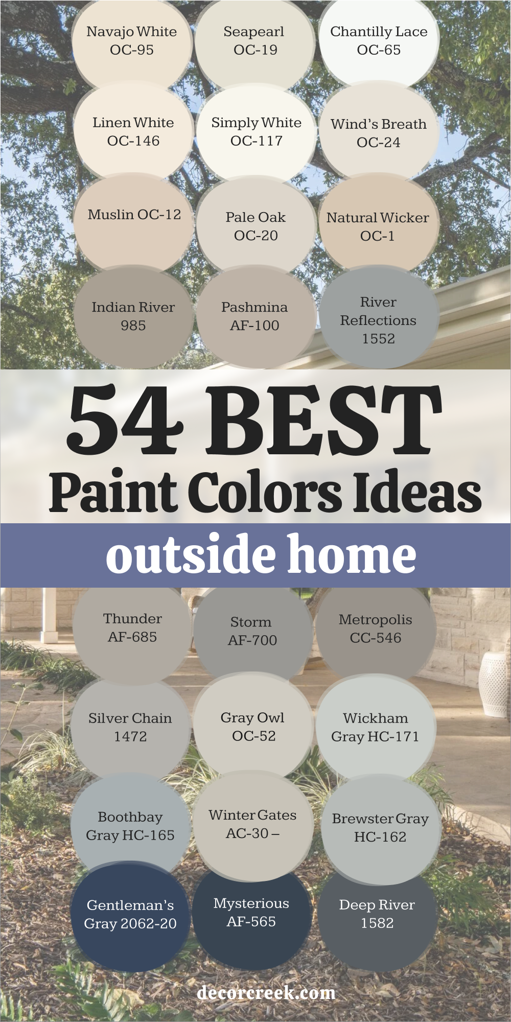
54 Outside Paint Colors Home Exteriors
These shades are the kind I return to again and again when designing exteriors that feel balanced, confident, and full of warmth. Some are light and airy; others bring depth and character. Each color has its own story and works beautifully in outdoor light. Whether you want a soft, neutral backdrop or something richer, these colors can help a house feel welcoming, polished, and timeless.
Alabaster SW 7008
Alabaster is a warm, creamy white that brings light and softness to any exterior. It feels fresh but never sharp, creating a natural glow in both sunlight and shade. I love using it on homes that need brightness with warmth—it never feels sterile or flat. Alabaster pairs beautifully with black windows, wood accents, or bronze fixtures. It’s one of those whites that looks gentle but confident at the same time. Even under cloudy skies, it keeps its warmth, making every home look welcoming. It’s perfect for farmhouses, traditional builds, and modern exteriors alike. Alabaster gives homes that “freshly painted” feeling that lasts for years.
🎨 Check out the complete guide to this color right HERE 👈
White Dove OC-17
White Dove is that soft, trusted white that feels like home. It carries a creamy undertone that keeps it warm and timeless. I love using it when a homeowner wants something bright but not stark. White Dove works beautifully with black trim, navy shutters, or stone paths. It adapts beautifully to every kind of light—crisp in the morning and soft by sunset. This shade fits every style, from modern farmhouses to coastal cottages. It always feels cared for, graceful, and calm. White Dove is one of those colors that makes a home shine in every season.
🎨 Check out the complete guide to this color right HERE 👈
Shoji White SW 7042
Shoji White feels calm and earthy. It’s an off-white with a greige undertone that keeps it grounded and natural. I love using it for exteriors surrounded by trees or gardens—it feels like it belongs in nature. Shoji White looks stunning with warm wood tones, bronze lights, and soft gray trim. It’s perfect for homeowners who want warmth without creaminess. In sunlight, it’s bright and balanced; in shade, it deepens beautifully. Shoji White gives homes an inviting glow that feels both modern and timeless. It’s a gentle, confident color that works everywhere.
🎨 Check out the complete guide to this color right HERE 👈
Seapearl OC-19
Seapearl has an easy charm that makes homes feel soft and polished. It’s a warm white with a touch of gray, perfect for creating exteriors that look classic and fresh. I love pairing it with black shutters or warm beige trim—it works equally well with both. In bright light, it feels airy; in shadow, it takes on a quiet depth that feels cozy. Seapearl looks beautiful on both smooth and textured surfaces, from wood siding to stucco. It’s a designer favorite for creating that “perfect neutral” look outside. Seapearl always feels timeless, clean, and graceful.
🎨 Check out the complete guide to this color right HERE 👈
Greek Villa SW 7551
Greek Villa is soft, warm, and sunlit. It feels bright without being too white, and the gentle undertone makes it incredibly inviting. I love how it reflects natural light—it adds glow to shaded homes and balance to open ones. Greek Villa pairs beautifully with dark trim, wooden accents, or brick details. It’s ideal for exteriors that want warmth with a clean finish. The shade feels like daylight captured on a wall—fresh, natural, and full of life. Greek Villa gives homes that welcoming softness that never goes out of style.
🎨 Check out the complete guide to this color right HERE 👈
Swiss Coffee OC-45
Swiss Coffee feels cozy and bright all at once. It’s a creamy off-white with warmth that flatters every kind of light. I often use it on homes that need brightness but still want that soft, inviting touch. Swiss Coffee pairs perfectly with dark doors or black window frames for contrast. It looks especially beautiful on traditional homes or exteriors with stonework. In sunlight, it glows softly; under clouds, it holds its warmth. This shade always makes a home feel lived in and loved. It’s the perfect “friendly white” that’s never too sharp or too soft.
🎨 Check out the complete guide to this color right HERE 👈
Simply White OC-117
Simply White is clean, bright, and endlessly reliable. It brings clarity to exteriors without feeling too stark. I love how it reflects natural light—it makes every corner of a home look crisp and well cared for. Simply White pairs beautifully with navy, black, or beige accents. It’s one of my go-to choices when I want a house to feel modern and open. In every season, it stays true and luminous. This color gives homes a polished, graceful look that never fades. Simply White always feels like a fresh start.
🎨 Check out the complete guide to this color right HERE 👈
Creamy SW 7012
Creamy feels warm, easy, and full of charm. It’s a buttery off-white that makes homes feel friendly and comfortable. I love using it for cottages, farmhouses, or classic family homes—it adds instant warmth and personality. Creamy pairs beautifully with tan roofs, black shutters, or deep green doors. In sunlight, it has a gentle golden touch; in shade, it stays soft and balanced. This shade brings comfort and familiarity while still looking fresh. Creamy is one of those colors that always makes people smile when they see it—it feels like home in every sense.
🎨 Check out the complete guide to this color right HERE 👈

Wind’s Breath OC-24
Wind’s Breath feels calm and natural, a soft greige that always looks relaxed and elegant. I love using it for exteriors that need warmth without yellow tones. It pairs beautifully with white trim or darker shutters for balance. Wind’s Breath fits any style—modern, coastal, or traditional—and adapts beautifully to every type of light. In sunlight, it glows softly; in the shade, it feels cozy and composed. It’s the kind of neutral that quietly enhances everything around it. Wind’s Breath always feels easy, effortless, and beautifully timeless.
🎨 Check out the complete guide to this color right HERE 👈
Oyster White SW 7637
Oyster White is warm and sophisticated, a blend of cream, gray, and beige that feels balanced and classic. I love how it softens modern exteriors while brightening traditional ones. It pairs wonderfully with black trim, stone details, and wood accents. In sunlight, it’s bright and creamy; in shadow, it becomes calm and cozy. Oyster White feels both elegant and approachable—it’s the kind of shade that looks beautiful on every surface. This color gives homes a timeless charm that feels familiar and fresh all at once.
🎨 Check out the complete guide to this color right HERE 👈
Natural Linen SW 9109
Natural Linen is that perfect mix of warmth and calm. It’s a beige with a soft gray undertone that feels grounded and classic. I love how it wraps a home in gentle color without ever feeling dull. In sunlight, it glows softly, showing a hint of cream; in shade, it turns into a cozy neutral that feels welcoming. Natural Linen looks beautiful beside white trim, black windows, or even warm wood tones. It’s one of those colors that makes a house feel finished and comfortable at the same time. I often choose it for homes that want lightness with a natural touch. It blends with stone, siding, and brick effortlessly, giving exteriors a smooth and balanced look. Natural Linen feels timeless—it’s quiet, confident, and easy to love.
🎨 Check out the complete guide to this color right HERE 👈
Muslin OC-12
Muslin feels easy and warm, like soft sunlight on a calm morning. It’s a light beige that carries a gentle, natural warmth perfect for home exteriors. I love pairing it with white trim and dark shutters—it’s a look that always feels welcoming. Muslin has just enough color to bring depth without ever feeling heavy. It’s especially lovely on homes surrounded by greenery or natural wood details. In sunlight, it glows like warm linen; in shade, it takes on a quiet, creamy tone.
It’s a forgiving, versatile shade that never feels dated. Muslin adds comfort and familiarity while keeping exteriors fresh and clean.
Canvas Tan SW 7531
Canvas Tan is one of my favorite “happy neutrals.” It’s warm, natural, and endlessly adaptable. I often use it on homes that need a soft, earthy base color that still feels light. Canvas Tan pairs beautifully with crisp white trim or black windows for contrast. In bright sunlight, it feels golden and cheerful; in the shade, it becomes cozy and grounded. It works beautifully on everything from stucco to wood siding.
This color makes a home look timeless, polished, and approachable. Canvas Tan adds warmth without heaviness and keeps its charm through every season. It’s simple, balanced, and full of personality.
🎨 Check out the complete guide to this color right HERE 👈
Natural Wicker OC-1
Natural Wicker feels like quiet sunshine—it’s warm, creamy, and endlessly comforting. It’s a true beige that pairs beautifully with white trim, dark roofs, or soft gray shutters. I love using it for homes that want a neutral tone that still feels full of life. Natural Wicker looks wonderful on traditional and coastal-style houses, giving them that “lived-in elegance.” It glows beautifully in sunlight, reflecting warmth without glare.
In the evening, it turns soft and soothing. This color always feels friendly, never too serious, and that’s what makes it special.
Natural Wicker is timeless, dependable, and perfect for exteriors that want both comfort and charm.
Accessible Beige SW 7036
Accessible Beige feels warm, balanced, and quietly elegant. It’s a soft greige that leans slightly beige but carries enough gray to stay modern. I love using it for homes that need something flexible and classic. Accessible Beige pairs beautifully with black trim, white shutters, or stone details. In sunlight, it feels airy and open; in shade, it becomes cozy and smooth. It’s a color that connects all the elements of a home—roof, siding, and landscape—into a unified, graceful look. Accessible Beige never feels plain; it feels thoughtful and calm. It’s a timeless favorite for exteriors that need harmony and heart.
🎨 Check out the complete guide to this color right HERE 👈
Manchester Tan HC-81
Manchester Tan feels inviting and natural. It’s a warm beige with a soft golden undertone that instantly brightens a home. I love using it for classic exteriors that need warmth and a sense of comfort. It pairs beautifully with white trim, black shutters, and red brick paths. In sunlight, Manchester Tan feels cheerful; in shade, it deepens just enough to add charm. This color makes exteriors look established, like they’ve always been part of their surroundings.
It’s perfect for traditional or farmhouse designs. Manchester Tan brings a sense of warmth and welcome that lasts year after year.
🎨 Check out the complete guide to this color right HERE 👈

Balanced Beige SW 7037
Balanced Beige lives up to its name—it’s perfectly in the middle of warm and cool. It’s that reliable neutral that feels elegant and homey all at once. I love using it when a home needs color with depth but not darkness. Balanced Beige works beautifully with white trim, gray roofs, or natural wood accents. In sunlight, it feels smooth and soft; in shade, it gains a rich warmth. It’s an adaptable shade that never feels out of place.
Whether the architecture is modern or traditional, Balanced Beige gives homes structure, calm, and quiet confidence.
🎨 Check out the complete guide to this color right HERE 👈

Pashmina AF-100
Pashmina feels like warmth and softness combined. It’s a beautiful greige with subtle richness that fits perfectly on exteriors. I often recommend it for homes that need a color that feels both refined and cozy. Pashmina pairs wonderfully with bright white trim and dark bronze accents. It looks steady and graceful in all kinds of light—bright or shaded. This shade brings a quiet beauty to homes, giving them balance and poise.
Pashmina never feels trendy; it’s timeless, always fitting right in with its surroundings. It’s one of those neutrals that feels thoughtful and full of personality.
🎨 Check out the complete guide to this color right HERE 👈
Loggia SW 7506
Loggia feels warm, classic, and full of comfort. It’s a medium beige with a touch of gray, making it soft and adaptable. I love using it for homes that want coziness with a hint of sophistication. Loggia pairs beautifully with white trim, dark shutters, or even natural wood garage doors. In sunlight, it glows with a subtle golden warmth; in shade, it feels rich and steady. It’s perfect for larger homes that need consistency across surfaces.
This shade always feels friendly, grounded, and complete. Loggia brings quiet beauty to every home it touches.
🎨 Check out the complete guide to this color right HERE 👈
Stone Hearth CC-490
Stone Hearth feels effortlessly elegant. It’s a light greige that brings depth and warmth without ever feeling heavy. I often use it for homes that want that “custom-built” feel—polished but still welcoming. Stone Hearth pairs perfectly with crisp white trim or dark metal fixtures. In sunlight, it reveals a soft warmth; in shade, it settles into a cozy, even tone. It works beautifully on any exterior finish, from brick to stucco.
This color makes every home look graceful, calm, and well-balanced. Stone Hearth always feels timeless, the kind of shade that stays beautiful no matter how styles change.
Perfect Greige SW 6073
Perfect Greige truly lives up to its name. It’s that rare, balanced mix of gray and beige that feels calm and comfortable on every exterior. I love how it adapts—it looks cool and modern next to black accents but feels warm and classic beside white trim or natural wood. In sunlight, Perfect Greige glows softly, bringing out a slight warmth that makes homes look inviting. In shade, it turns smooth and grounded.
It’s a color that holds together different materials—brick, siding, stone—with ease. Perfect Greige feels like a quiet foundation for the rest of your home’s story. It’s steady, timeless, and always feels “just right.”
🎨 Check out the complete guide to this color right HERE 👈
Smokey Taupe 983
Smokey Taupe is soft, elegant, and endlessly comforting. It sits perfectly between gray and brown, giving exteriors a refined but natural feel. I love pairing it with bright white trim or black windows—it gives such beautiful contrast. Smokey Taupe feels warm in the sunlight, and in shade, it takes on a cozy, grounded tone. It’s perfect for homeowners who want a welcoming, timeless exterior that still feels polished.
The color works beautifully across textures—brick, stucco, or wood siding. Smokey Taupe brings structure without stiffness, warmth without heaviness. It’s an easy favorite for creating harmony and calm curb appeal.
🎨 Check out the complete guide to this color right HERE 👈
Repose Gray SW 7015
Repose Gray is one of those perfect, easy colors that fits anywhere. It’s a soft gray with a hint of warmth that makes homes feel balanced and calm. I often use it when clients want something neutral but with personality. In sunlight, Repose Gray feels fresh and open; in shade, it deepens slightly, adding quiet strength. It pairs beautifully with white trim, dark shutters, or wood details.
The color works across every style—from coastal to craftsman—and never feels out of place. Repose Gray gives homes that “put together” look that still feels relaxed. It’s dependable, timeless, and always elegant.
🎨 Check out the complete guide to this color right HERE 👈
Edgecomb Gray HC-173
Edgecomb Gray feels soft, natural, and perfectly in-between. It’s a warm gray that shifts with the light, sometimes looking creamy, sometimes cool and smooth. I love using it on homes that need warmth without leaning beige. Edgecomb Gray works wonderfully with white trim, stone pathways, and even dark bronze fixtures. It’s one of those colors that looks as beautiful on a cottage as it does on a modern home.
In sunlight, it feels light and airy; in shade, it becomes cozy and calm. Edgecomb Gray gives exteriors a timeless charm that feels effortless. It’s simple, flexible, and full of quiet character.
🎨 Check out the complete guide to this color right HERE 👈
Collingwood OC-28
Collingwood feels calm and refined, like a soft blanket of color across a home. It’s a warm greige that glows gently in the sunlight. I love using it for exteriors that need warmth but still want a clean, sophisticated look. Collingwood pairs beautifully with white trim, black windows, or natural stone details. It’s especially pretty in changing light—it never feels dull or flat.
The tone has a soft warmth that makes homes feel cared for and lived in. Collingwood gives that sense of effortless comfort that every home needs. It’s versatile, timeless, and quietly confident.
🎨 Check out the complete guide to this color right HERE 👈
Mindful Gray SW 7016
Mindful Gray brings balance and depth to any exterior. It’s a medium gray that leans just warm enough to feel comfortable. I love using it on homes where simplicity and structure are the goals. It looks amazing with crisp white trim and black accents—it’s classic without being boring. Mindful Gray shifts beautifully in the light, feeling bright in the morning and rich at dusk. It’s also one of those colors that hides dust and wear, which homeowners always appreciate.
Mindful Gray makes a house feel both relaxed and refined. It’s calm, grounded, and quietly stylish.
🎨 Check out the complete guide to this color right HERE 👈
Revere Pewter HC-172
Revere Pewter is one of those colors that feels familiar and timeless the moment you see it. It’s a greige that balances warmth and coolness perfectly, adapting to every kind of home. I love how it glows gently in sunlight and stays cozy in shade. Revere Pewter pairs beautifully with black shutters, white trim, or natural materials like wood and stone. It’s one of those shades that just feels right—never too much, never too little.
The color adds comfort, elegance, and balance to any exterior. Revere Pewter is a classic because it works beautifully every single time.
🎨 Check out the complete guide to this color right HERE 👈

Dorian Gray SW 7017
Dorian Gray feels solid, smooth, and graceful. It’s a medium gray that adds structure to an exterior without being too dark. I love using it for homes that need depth and elegance but still want a friendly feel. In sunlight, it feels open and calm; in shade, it settles into a rich, even tone. Dorian Gray looks beautiful with white trim, black shutters, or warm stone details. It’s a dependable choice that always feels polished and put together.
Dorian Gray gives homes that quiet confidence every homeowner wants—it’s stylish, timeless, and strong.
🎨 Check out the complete guide to this color right HERE 👈
Metropolis CC-546
Metropolis brings sophistication and strength to any home. It’s a dark gray with subtle brown undertones that make it feel warm and inviting. I love pairing it with lighter trim or stone accents—it creates contrast that feels natural and elegant. Metropolis works perfectly on modern or traditional exteriors alike. In the sunlight, it has a slight sheen that highlights architectural lines beautifully.
In shadow, it holds a deep, calm tone that adds richness and texture. This shade gives homes a sense of maturity and stability. Metropolis always looks thoughtful and grounded—it’s bold in a quiet way.
Sparrow AF-720
Sparrow feels earthy, classic, and completely dependable. It’s a deep taupe-gray that brings weight and balance to exteriors. I love using it on larger homes or ones with tall architecture—it gives the structure visual warmth without overpowering it. Sparrow pairs beautifully with cream trim, wood doors, and natural stone pathways. In sunlight, it shows its brown warmth; in shade, it becomes smooth and sophisticated.
It’s one of those colors that makes a house look stately but never uninviting. Sparrow has a timeless elegance that feels personal and strong—it’s a color that speaks quietly but confidently.
Keystone Gray SW 7504
Keystone Gray feels solid, steady, and full of quiet strength. It’s a medium-to-dark greige that gives homes structure and presence. I love using it on exteriors that need a bold base color without turning too dark. Keystone Gray pairs beautifully with white trim, wood garage doors, and natural stonework. In sunlight, it feels warm and earthy; in shade, it becomes calm and sophisticated.
The tone never feels flat—it always has depth and movement. This color works perfectly for modern homes and traditional builds alike. Keystone Gray gives homes confidence, making them look polished and welcoming at the same time. It’s a designer’s go-to for lasting curb appeal.
🎨 Check out the complete guide to this color right HERE 👈
Anonymous SW 7046
Anonymous feels grounded and elegant, a deep gray with brown undertones that adds richness without heaviness. I love using it for exteriors that need depth and warmth but still want a natural touch. It pairs beautifully with crisp white trim or dark bronze accents. In bright light, Anonymous shows its earthy side; in shadow, it becomes smooth and moody. It looks especially beautiful with wood or stone features, creating harmony and sophistication.
This color never shouts—it whispers confidence. Anonymous makes homes feel settled and graceful, perfect for anyone who loves a timeless, quietly strong look.
🎨 Check out the complete guide to this color right HERE 👈
Dovetail SW 7018
Dovetail feels classic and composed. It’s a deep gray with a soft brown undertone, making it perfect for exteriors that need richness and balance. I love how it stands out against white trim or black accents—it adds beautiful contrast without feeling harsh. Dovetail looks especially elegant on homes with layered textures like stone, wood, or brick. In sunlight, it feels structured and smooth; in shade, it deepens into a luxurious, velvety tone.
This color brings calm strength and quiet sophistication to any home. Dovetail gives exteriors that designer-finished look that feels effortless yet refined.
🎨 Check out the complete guide to this color right HERE 👈

Urbane Bronze SW 7048
Urbane Bronze is deep, earthy, and full of character. It’s a dark brown-gray that adds instant sophistication to exteriors. I love how it works with both modern and rustic designs—it can look sleek or warm, depending on the details. Urbane Bronze pairs beautifully with white trim, wood beams, or even soft green landscaping. In sunlight, it reveals its bronze warmth; at dusk, it feels bold and dramatic. This shade brings personality without flashiness. Urbane Bronze has been one of my favorites for years because it makes every home look timeless and confident. It feels strong, natural, and deeply elegant.
🎨 Check out the complete guide to this color right HERE 👈
Peppercorn SW 7674
Peppercorn feels moody and modern. It’s a deep charcoal gray with a slight softness that keeps it approachable. I love using it on homes where contrast is key—especially with crisp white trim or light stone. In sunlight, Peppercorn feels rich and architectural; in shade, it becomes dark and sleek. It’s perfect for homeowners who want something bold but not black. The color’s depth gives a home instant sophistication, adding texture and tone.
Peppercorn feels like quiet confidence—it doesn’t need attention to stand out. It’s striking, modern, and full of subtle strength.
🎨 Check out the complete guide to this color right HERE 👈
Grizzle Gray SW 7068
Grizzle Gray feels balanced, earthy, and refined. It’s a deep gray with green undertones that make it feel natural and calm. I love using it on homes surrounded by trees or stone—it blends beautifully with the landscape. Grizzle Gray pairs perfectly with white or beige trim, and it looks stunning with wooden doors and black hardware. In the sunlight, it shows its green tint; in shade, it feels deep and steady.
This color brings depth without darkness and elegance without formality. Grizzle Gray gives homes that comfortable, designer-finished look that lasts for years.
🎨 Check out the complete guide to this color right HERE 👈

Chelsea Gray HC-168
Chelsea Gray feels strong, structured, and timeless. It’s a rich gray that works beautifully on exteriors that need boldness and warmth together. I love how it looks beside white trim and black doors—it’s classic but never dull. In sunlight, Chelsea Gray reveals a hint of warmth; in shade, it becomes elegant and moody. It’s perfect for homes with clean lines and defined architecture. The color makes details pop without stealing the show.
Chelsea Gray brings a sense of balance and poise that makes a house look designed with intention. It’s modern, classic, and endlessly stylish.
🎨 Check out the complete guide to this color right HERE 👈
Amherst Gray HC-167
Amherst Gray feels calm and composed, a mid-dark gray that leans toward warm. I love how it feels dependable and stylish at the same time. It pairs beautifully with white trim, gray roofing, and natural stone. In the sunlight, Amherst Gray opens up, showing a soft depth; in shade, it feels cozy and rich. It’s one of those shades that works equally well on large and small homes. Amherst Gray brings a sense of timeless balance and understated strength.
It’s perfect for anyone who wants a color that feels classic yet fresh every year.
🎨 Check out the complete guide to this color right HERE 👈
Kendall Charcoal HC-166
Kendall Charcoal feels bold, confident, and classic. It’s a dark gray with a touch of warmth that keeps it inviting. I love how it defines architecture—it highlights trim, windows, and doors beautifully. In sunlight, Kendall Charcoal feels strong and structured; in shade, it deepens into a luxurious tone that feels grounded. This color pairs perfectly with crisp white, beige, or warm wood accents. It’s ideal for homeowners who want a strong, lasting impression.
Kendall Charcoal gives homes elegance and depth, creating curb appeal that never fades. It’s timeless sophistication in a single shade.
🎨 Check out the complete guide to this color right HERE 👈
Iron Ore SW 7069
Iron Ore feels powerful and modern. It’s a charcoal-black that adds drama without harshness. I love how it gives homes that designer edge while still feeling warm and welcoming. Iron Ore pairs beautifully with white trim, light stone, or natural wood. In sunlight, it has a soft sheen that feels smooth and elegant; in shadow, it turns deep and moody. It’s perfect for exteriors that want impact and style.
This color makes any home look grounded, bold, and beautifully finished. Iron Ore is the kind of shade that quietly steals your attention every time you see it.
🎨 Check out the complete guide to this color right HERE 👈
Tricorn Black SW 6258
Tricorn Black is pure confidence in a color. It’s a true black—strong, sharp, and elegant without a hint of blue or brown. I love using it on exteriors where bold contrast makes the design shine. Tricorn Black looks stunning on trim, shutters, and doors, especially paired with crisp whites or soft grays. On modern homes, it adds sleek sophistication; on traditional ones, it feels timeless and classic.
In sunlight, it gleams with quiet power; in shadow, it feels rich and velvety. This color gives any home instant polish and structure. Tricorn Black is for homeowners who love simple beauty done with strength—it’s modern, clean, and endlessly chic.
🎨 Check out the complete guide to this color right HERE 👈
Sea Salt SW 6204
Sea Salt feels gentle and refreshing, like ocean air on a soft morning. It’s a muted green-gray that carries a calm, natural charm. I love using it for homes surrounded by greenery—it blends with nature instead of fighting it. Sea Salt pairs beautifully with white trim and warm wood accents. In sunlight, it feels airy and coastal; in shade, it turns soft and cool. It’s perfect for cottages, coastal homes, or anyone wanting a light color with warmth and personality.
Sea Salt brings quiet freshness and makes a house feel instantly welcoming. It’s subtle but unforgettable, a color that never feels forced.
🎨 Check out the complete guide to this color right HERE 👈
Silver Marlin 2139-50
Silver Marlin is graceful and relaxed. It’s a misty blue-gray that adds a gentle touch of color to any exterior. I love how it feels both modern and classic—it never goes out of style. Silver Marlin pairs perfectly with crisp white trim or dark navy shutters. In sunlight, it feels fresh and open; in the shade, it becomes calm and layered. The color captures that “fresh air” feeling that makes exteriors look clean and inviting.
Silver Marlin works beautifully on coastal, farmhouse, and transitional homes. It’s one of those shades that gives off quiet confidence—soft, smooth, and timeless.
Retreat SW 6207
Retreat feels grounded, natural, and easy to live with. It’s a muted green-gray that adds warmth and calm to a home’s exterior. I love using it for houses that need character without boldness. Retreat looks especially lovely paired with creamy whites, bronze fixtures, and dark trim. In sunlight, it leans toward sage; in shade, it becomes earthy and rich. This color works perfectly with stone, wood, or black accents.
It’s a favorite for homes that want to feel both cozy and sophisticated. Retreat gives off quiet beauty—it never tries to stand out but always ends up looking memorable.
🎨 Check out the complete guide to this color right HERE 👈
Boothbay Gray HC-165
Boothbay Gray feels refined and peaceful. It’s a soft gray with blue undertones that brings a sense of calm elegance to exteriors. I love pairing it with white trim and natural stone—it’s a combination that feels effortlessly balanced. Boothbay Gray shines in daylight, where it looks cool and airy; in the shade, it turns smooth and cozy. It’s especially perfect for coastal-style homes or houses surrounded by greenery.
The color has a timeless, graceful quality that makes every surface look clean and cared for. Boothbay Gray always feels fresh yet classic—it’s the kind of color that never goes out of style.
🎨 Check out the complete guide to this color right HERE 👈
Evergreen Fog SW 9130
Evergreen Fog feels earthy, balanced, and beautifully natural. It’s a soft green-gray with warmth that brings exteriors to life. I love how it changes with the light—sometimes green, sometimes gray, always calm and inviting. Evergreen Fog looks incredible with warm white trim and natural wood tones. It’s perfect for craftsman homes, cottages, or any design that connects to nature.
This color makes a home feel grounded but still modern. In sunlight, it has a fresh, organic brightness; at dusk, it becomes soft and soothing. Evergreen Fog is nature’s calm captured on a wall—quietly strong and always graceful.
🎨 Check out the complete guide to this color right HERE 👈

Saybrook Sage HC-114
Saybrook Sage feels comfortable and classic. It’s a muted green that gives exteriors a relaxed charm. I love how it works with stone paths, white trim, and soft wood details—it’s as if the color was made for the outdoors. In bright light, Saybrook Sage feels clean and lively; in the shade, it deepens into a rich, natural tone. It brings warmth to cool architecture and balance to strong lines. This shade always looks timeless and inviting.
Saybrook Sage makes homes look like they’ve grown into their surroundings—peaceful, established, and full of character.
🎨 Check out the complete guide to this color right HERE 👈
Backwoods 469
Backwoods feels deep, natural, and quietly confident. It’s a dark green with a hint of brown that adds elegance and depth to exteriors. I love using it on homes surrounded by trees or stone—it blends beautifully with the landscape. In sunlight, Backwoods reveals its green richness; in shade, it feels warm and earthy. It pairs perfectly with cream or white trim and looks stunning with brass fixtures.
This shade gives homes a cozy, forest-inspired beauty that feels grounded and timeless. Backwoods is the perfect blend of nature and sophistication—it feels strong yet soft, classic yet modern.
🎨 Check out the complete guide to this color right HERE 👈
Black Forest Green HC-187
Black Forest Green feels bold, mysterious, and endlessly refined. It’s a deep green that borders on black, full of richness and depth. I love how it creates contrast with light trim or stone—it gives a home instant drama. In the sunlight, it reveals a soft green glow; in shade, it becomes dark and striking. Black Forest Green is perfect for traditional homes or modern builds that want presence and elegance.
It’s a shade that holds attention quietly, like a whisper with weight. This color always looks intentional, making homes feel stately but approachable.
🎨 Check out the complete guide to this color right HERE 👈
Naval SW 6244
Naval feels strong, calm, and deeply elegant. It’s a rich navy that adds sophistication and structure to a home’s exterior. I love pairing it with crisp white trim and brass or bronze accents. In sunlight, Naval shows its beautiful blue depth; in the evening, it feels velvety and timeless. This shade works across styles—from modern coastal homes to classic colonials. It’s the kind of color that feels confident without shouting.
Naval brings instant polish, giving homes a grounded yet uplifting energy. It’s bold, balanced, and always beautiful.
🎨 Check out the complete guide to this color right HERE 👈
Hale Navy HC-154
Hale Navy is rich, classic, and full of depth. It’s the kind of color that turns a simple home into something memorable. I love how its navy base feels timeless, yet still crisp and modern. In sunlight, Hale Navy reveals a bold blue character; in shade, it becomes deep and almost black. It pairs beautifully with bright white trim, brass hardware, or wood accents. This shade gives homes confidence—it’s not loud, just perfectly balanced.
Hale Navy works for all styles, from coastal to colonial. Every time I use it, the house ends up looking stronger, sharper, and beautifully complete.
🎨 Check out the complete guide to this color right HERE 👈
Alabaster SW 7008
Alabaster is warm, soft, and glowing—one of those whites that feels alive in the sunlight. I love how it can make a home feel bright and gentle at the same time. It’s not stark or cold; instead, it brings warmth that flatters any design. Alabaster pairs beautifully with black trim, gray roofs, or natural wood beams. It’s ideal for farmhouse-style exteriors or modern builds that want an inviting touch.
In every season, Alabaster keeps its glow. It’s a shade that doesn’t demand attention—it simply radiates calm confidence and charm.
🎨 Check out the complete guide to this color right HERE 👈
Greek Villa SW 7551
Greek Villa feels like sunshine captured in color. It’s a creamy white that adds light and softness to a home’s exterior. I love using it when I want warmth without yellow tones. In the morning light, it feels open and airy; at sunset, it glows softly. Greek Villa pairs perfectly with dark accents or natural wood. It’s timeless and elegant, working just as well on coastal cottages as on classic homes.
This shade brings a cheerful calmness that never fades. Greek Villa always feels easy, graceful, and endlessly welcoming.
🎨 Check out the complete guide to this color right HERE 👈
White Dove OC-17
White Dove is gentle, dependable, and truly beloved. It’s a white that feels balanced—neither too bright nor too muted. I love how it wraps a home in light without ever feeling cold. In sunlight, it looks pure and clean; in shade, it feels creamy and soft. White Dove pairs effortlessly with almost every exterior accent—stone, brick, wood, or metal. It’s a color that brings harmony, no matter where it’s used.
White Dove gives homes a quiet beauty that lasts for years. It’s the shade I reach for when I want timeless simplicity that feels like home.
🎨 Check out the complete guide to this color right HERE 👈
Snowbound SW 7004
Snowbound is pure and polished, a white with just enough softness to feel warm. I love using it on exteriors where clarity and balance matter most. It pairs perfectly with black doors, metal fixtures, or light gray shutters. In sunlight, it feels bright but never harsh; in shade, it stays smooth and gentle. Snowbound adds structure and order to modern homes and a graceful finish to traditional ones.
It’s a crisp, clean color that makes a home look freshly painted all year long. Snowbound has that perfect mix of charm and precision—it’s quiet confidence in a can.
🎨 Check out the complete guide to this color right HERE 👈
Classic Gray OC-23
Classic Gray feels soft and graceful, the kind of color that blends into its surroundings beautifully. It’s a light gray with a warm undertone, making it easy to pair with other shades. I love using it for homes that want subtlety and elegance. In sunlight, it appears bright and airy; in the shade, it deepens into a calm, inviting tone. Classic Gray pairs beautifully with white trim, black accents, or natural materials.
It’s flexible, timeless, and never feels too much. This shade makes a home feel clean, open, and comfortable—an understated beauty that never fades.
🎨 Check out the complete guide to this color right HERE 👈
Natural Cream OC-14
Natural Cream feels cozy, creamy, and perfectly balanced. It’s a soft neutral that glows with warmth but still feels light and breathable. I love using it on homes where I want a comforting, natural look. Natural Cream works beautifully with darker shutters or wood details, adding contrast while keeping everything inviting. In bright light, it feels airy and happy; in shade, it turns rich and smooth.
It’s one of those colors that instantly feels familiar—like it’s been part of the landscape for years. Natural Cream makes homes look lived in, loved, and effortlessly charming.
🎨 Check out the complete guide to this color right HERE 👈
Distant Gray OC-68
Distant Gray feels crisp, modern, and full of clarity. It’s one of the cleanest whites I use, perfect for homeowners who love simplicity. It reflects light beautifully, giving exteriors a clear, open feel. I love pairing it with black trim or soft beige accents for balance. Distant Gray stays consistent through all types of light—bright and clean in the day, smooth and calm at dusk. It’s ideal for contemporary homes or spaces that need a touch of minimalist beauty.
Distant Gray gives exteriors a fresh, confident finish that feels clean and timeless.
🎨 Check out the complete guide to this color right HERE 👈
Aesthetic White SW 7035
Aesthetic White is quiet, comforting, and so easy to love. It’s a warm off-white with a whisper of gray, making it perfect for creating soft, inviting exteriors. I love how it works with almost any material—brick, stone, or siding. In sunlight, it glows with a gentle warmth; in shade, it feels smooth and elegant. Aesthetic White pairs beautifully with black windows and wooden doors. It has that “lived-in elegance” that feels both clean and cozy.
This color gives homes warmth without heaviness and charm without effort. Aesthetic White is always a graceful choice.
🎨 Check out the complete guide to this color right HERE 👈
Amherst Blue HC-153
Amherst Blue feels bold, classic, and full of life. It’s a deep, muted blue with a timeless character that suits nearly every architectural style. I love how it brings energy while staying sophisticated. Amherst Blue pairs perfectly with white trim or natural stone. In sunlight, it brightens with a rich ocean tone; in shade, it deepens into a dramatic slate blue. It’s perfect for homeowners who want color with depth and presence.
Amherst Blue always feels strong and serene, a color that gives homes charm and confidence in equal measure.
🎨 Check out the complete guide to this color right HERE 👈
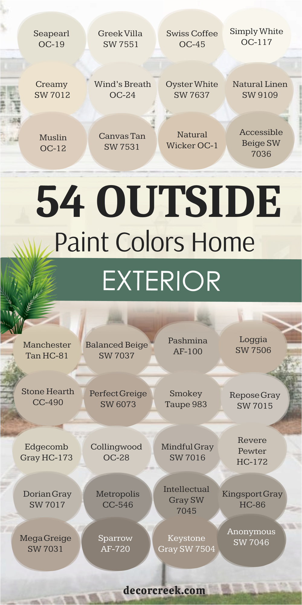
My Last Word on Choosing Outside House Paint Colors
When I help clients choose exterior colors, I always remind them that paint isn’t just a surface—it’s the feeling your home gives you every time you see it. Color sets the tone before you even open the door. It can make a home feel warm and welcoming, bold and confident, or soft and peaceful. That’s why I never pick a shade just because it’s trendy. I study how light hits the house throughout the day, how the landscape frames it, and how the color will feel in different seasons.
A shade that glows in morning sun might look entirely different at sunset, and that shift is part of its beauty. I always lean toward colors that carry a natural rhythm—tones that still feel right under winter skies and through summer brightness.
Soft whites, earthy taupes, and deep greens have a way of blending with life rather than fighting against it. They make the home belong to its surroundings.
The best paint color should feel personal. It should match the mood you want to come home to every day—peaceful, strong, or full of light.
A good color lasts longer than any design trend because it speaks to emotion, not just style. I believe your home’s exterior should make you proud from the curb, comforted when you walk inside, and grounded in every season. That’s the real power of paint—it doesn’t just change walls; it shapes how home feels, looks, and welcomes the world around it.