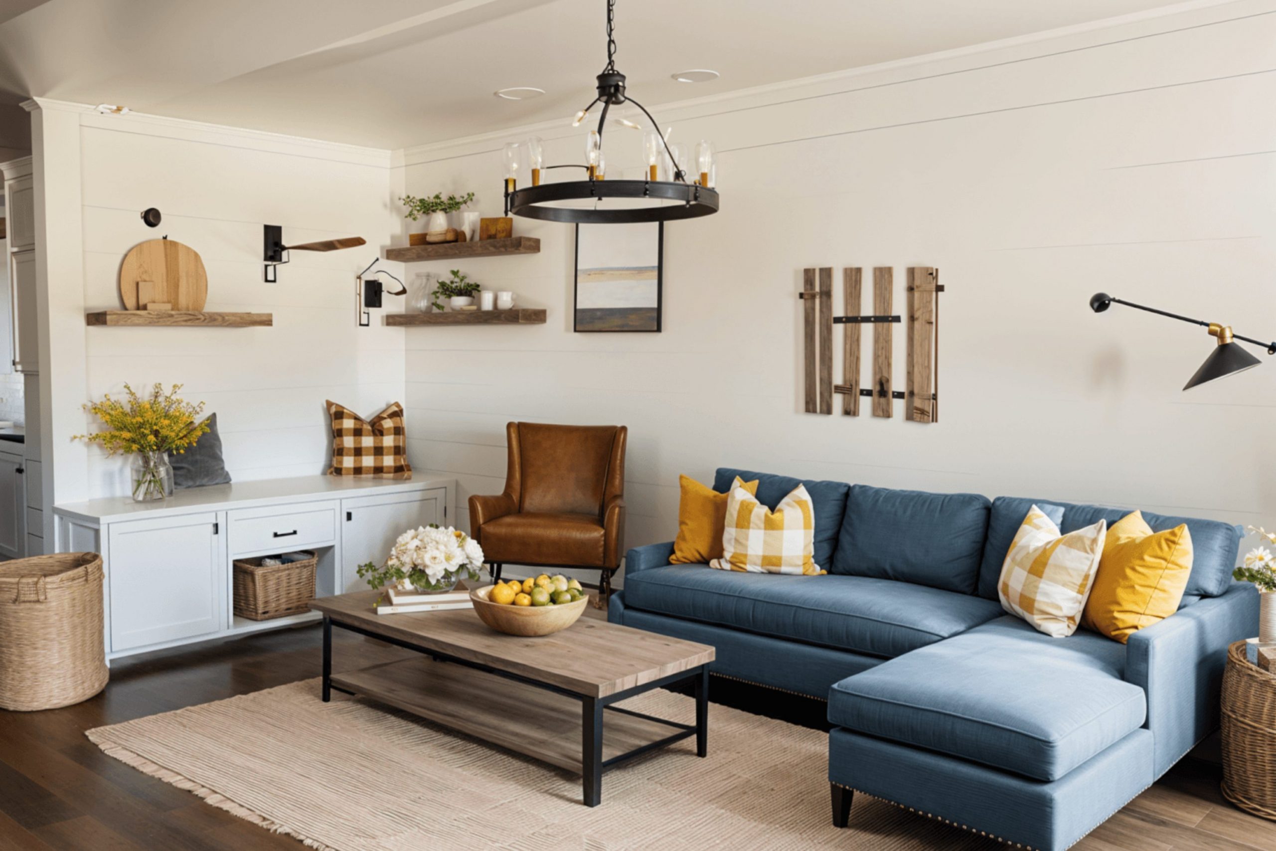
Finding the right look for your home can feel like a big puzzle. Most people want their house to feel like a big hug when they walk through the front door. You want a home that looks clean but still feels lived-in and friendly.
That is why I love the farmhouse look so much. It uses colors that make every room feel sunny and bright. I have spent years helping families pick the right shades to make their houses feel special.
Getting the paint right is the most important step in decorating. If the walls look too cold, the whole house feels like an office. If the walls are too dark, the house can feel small and gloomy. I want to show you how to pick shades that make your furniture look amazing. These colors work well with old wood and comfy pillows.
Let us look at the best choices to make your home the coziest place on the block.
Why I Always Trust Sherwin-Williams and Benjamin Moore for the Best Farmhouse Paint Colors
I always tell my clients to stick with brands that know how to make colors look real on the wall. Sherwin-Williams has a way of making whites that do not look like a hospital room. Their paints go on thick and smooth which makes the job much easier for anyone.
Benjamin Moore is famous for having shades that change beautifully when the sun moves across the sky. I trust these companies because their paint lasts a long time even with kids and pets running around.
When you buy cheap paint, the color often looks different once it dries. These two brands spend a lot of money making sure the color in the can matches the little paper sample. I need to know exactly how a room will turn out before we even start. Using these paints means I do not have to worry about weird blue or pink tones popping up unexpectedly.
They have the best selection for that classic rustic feeling we all love. Quality paint makes the walls look rich and velvety instead of flat and dull.
How I Choose the Perfect Farmhouse Paint Color for Any Room
Picking a color starts with looking at your windows and how much sun comes inside. If a room faces north, the light is usually blue and cold. I pick a very warm color for those spots to keep things feeling cheerful.
For rooms with big windows and lots of sun, I might pick something a little more neutral. I always paint a big square on the wall before I decide on the final choice. You have to see how the paint looks at night when you turn your lamps on.
I also think about the floors and the kitchen cabinets already in the house. You want the wall color to get along with the wood tones of your furniture. If you have dark wood, a light creamy color makes that wood stand out beautifully. I try to create a flow so that moving from one room to another feels natural. It is like picking out an outfit where everything needs to match just right. My goal is to make your home feel balanced and happy for everyone who visits.
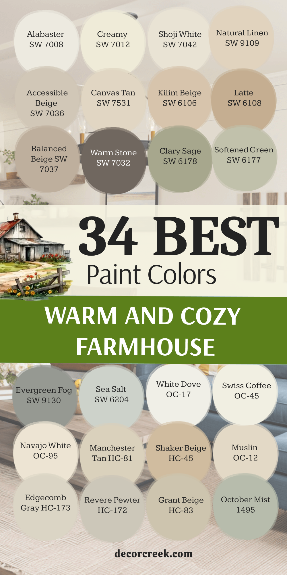
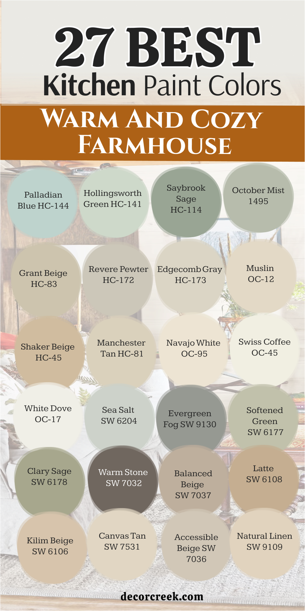
27 Warm and Cozy Farmhouse Kitchen Paint Colors
Alabaster SW 7008
Alabaster SW 7008 is a beautiful white that feels very soft and kind on the walls of a living room. This color is the best choice when you want a room to look bright but still feel very friendly for guests.
I like how it makes a house feel very clean without ever looking like a cold hospital room. It has a tiny bit of warmth that helps it get along with all kinds of wooden floors. Many people use this to make their family rooms look much bigger and more full of light.
You will notice that it creates a very smooth background for your favorite family photos and paintings. It is a very reliable shade that stays looking fresh throughout the whole day. This paint makes the evening light look very golden and pretty when you turn on your lamps. It is a very popular pick for a classic farmhouse look that everyone enjoys.
Best used in: living rooms, kitchens, hallways, bedrooms, and farmhouse exteriors
Pairs well with: Iron Ore SW 7069, Agreeable Gray SW 7029, Natural Linen SW 9109, warm wood tones The key rule of this color for farmhouse style is to use it where you want natural light to feel kind, soft, and inviting throughout the day.
🎨 Check out the complete guide to this color right HERE 👈

Creamy SW 7012
Creamy SW 7012 is a rich and thick white that feels like a big bowl of warm milk. This color is much warmer than a standard white and it brings a lot of glow to your main living area. I love to suggest this for homes that want a very snug and traditional feeling.
It works perfectly with big soft rugs and comfy pillows on the sofa. This shade fills the room with a sense of sunshine even when the weather is gray outside. You can pair it with dark brown furniture to make the whole room look very expensive and solid.
It is a great choice if you have a lot of white trim that you want to stand out. This paint makes the living room feel like the perfect place for a long nap. Families love it because it feels more welcoming than a stark or bright white.
Best used in: living rooms, bedrooms, entryways, and trim
Pairs well with: Urbane Bronze SW 7048, Latigo Ivory SW 7116, various wood stains The key rule of this color for farmhouse style is to use it where you want natural light to feel kind, soft, and inviting throughout the day.
🎨 Check out the complete guide to this color right HERE 👈

White Dove OC-17
White Dove OC-17 is a very soft white that I use all the time for a very good reason. This paint has a tiny bit of gray in it which keeps it from looking too yellow or bright. I find that it is the perfect choice for living room walls when you want a very fresh look.
It makes the room feel very gentle and helps everyone feel very relaxed after a long day. This color works well with any kind of furniture or colorful decorations you already own. You will love how it makes your green plants and wood details look very vibrant and healthy.
It is a very classic choice that will always look good in a farmhouse. This shade makes the light move around the room in a very pretty and even way. It is a very smart pick for a house that wants to feel very light and airy.
Best used in: walls, trim, ceilings, and kitchen cabinets
Pairs well with: Revere Pewter HC-172, Balboa Mist OC-27, Hale Navy HC-154 The key rule of this color for farmhouse style is to use it where you want natural light to feel kind, soft, and inviting throughout the day.
🎨 Check out the complete guide to this color right HERE 👈

Swiss Coffee OC-45
Swiss Coffee OC-45 is a warm and creamy white that feels very cozy and very much lived-in. This color is a favorite for many famous designers because it makes a room feel so comfortable. I like to use it on living room walls to give the area a very soft and glowing appearance.
It is not a cold white so it makes the house feel very friendly and very warm. This shade looks great with old wood tables and vintage items you find at antique shops. It makes the room feel very bright without being too hard on the eyes when the sun is out.
You will notice that it creates a very smooth and soft look on the walls of your home. It is a great choice if you want your living room to feel very inviting to all your guests. This color makes every corner of the room look very soft and very sunny.
Best used in: living rooms, kitchens, bedrooms, and trim
Pairs well with: Fossil AF-65, Edgecomb Gray HC-173, various wood tones The key rule of this color for farmhouse style is to use it where you want natural light to feel kind, soft, and inviting throughout the day.
🎨 Check out the complete guide to this color right HERE 👈

Shoji White SW 7042
Shoji White SW 7042 is a unique shade that sits right between a white and a very light tan. This color is perfect for people who are afraid of their walls looking too yellow or too gray. It has a very soft look that reminds me of natural linen cloth or soft paper.
I find that it works perfectly in living rooms with stone fireplaces or big wooden beams. It pulls the colors from the stones and makes everything look like it belongs together naturally. This paint looks very high-end and very expensive once you see it on all the walls.
It provides a nice background for colorful pillows or a big blue sofa in the room. You will love how it changes slightly as the sun moves across the sky in the evening. It is a very smart pick for a large room that needs to feel very cozy.
Best used in: open floor plans, kitchens, living rooms, and entryways
Pairs well with: Pure White SW 7005, Peppercorn SW 7674, Fawn Brindle SW 7640 The key rule of this color for farmhouse style is to use it where you want natural light to feel kind, soft, and inviting throughout the day.
🎨 Check out the complete guide to this color right HERE 👈

Natural Linen SW 9109
Natural Linen SW 9109 is a beautiful tan that makes a living room feel grounded and very sturdy. This color reminds me of a sandy beach or a piece of old parchment paper from a book. It is a wonderful choice if you want a room that feels very natural and very earthy.
I love how it looks when you put it next to white trim or white window frames. It brings a sense of history to a house even if the house was built very recently. This shade is dark enough to show off all the pretty details in your furniture and rugs.
It feels very cozy and makes the living room feel like the true heart of the home. You will find that it hides dust and fingerprints much better than very light whites do. It is a very practical choice for busy families who have kids and pets.
Best used in: living rooms, dining rooms, bedrooms, and cozy dens
Pairs well with: Alabaster SW 7008, Divine White SW 6105, Foothills SW 7514 The key rule of this color for farmhouse style is to use it where you want natural light to feel kind, soft, and inviting throughout the day.
🎨 Check out the complete guide to this color right HERE 👈

Accessible Beige SW 7036
Accessible Beige SW 7036 is one of the most famous colors because it goes with almost every style. This color is not a boring tan because it has a little bit of gray hidden inside it. I use this when a homeowner wants a neutral color that feels very updated and very fresh.
It looks amazing against white curtains and dark wood floors in a farmhouse living room. The color is light enough to keep the room bright but dark enough to have its own personality. It creates a very soft look that is easy on the eyes when you are relaxing at night.
Many people pick this for staging houses because everyone seems to like how it looks right away. It makes a living room feel very professional but still very comfortable for a big family.
Best used in: kitchens, hallways, living rooms, and whole-house painting
Pairs well with: Alabaster SW 7008, Cadet SW 9143, Sanderling SW 7513 The key rule of this color for farmhouse style is to use it where you want natural light to feel kind, soft, and inviting throughout the day.
🎨 Check out the complete guide to this color right HERE 👈

Edgecomb Gray HC-173
Edgecomb Gray HC-173 is a beautiful mix of gray and beige that many people like to call greige. This color is very popular because it is the perfect middle ground for any room in your house. I love it in living rooms because it looks very modern but still feels very warm and friendly.
It works well with both light-colored furniture and dark wood details at the same time. This shade is very soft and makes the walls look very smooth and very clean for guests. You will notice that it looks a bit more gray in the morning and more tan at night.
It is a very flexible color that works with almost any kind of farmhouse decorations you choose. Many people use this for their whole house to make every room match perfectly and feel balanced. This color makes the living room feel very updated and very stylish.
Best used in: open floor plans, kitchens, living rooms, and bedrooms
Pairs well with: White Dove OC-17, Revere Pewter HC-172, Hale Navy HC-154 The key rule of this color for farmhouse style is to use it where you want natural light to feel kind, soft, and inviting throughout the day.
🎨 Check out the complete guide to this color right HERE 👈

Revere Pewter HC-172
Revere Pewter HC-172 is a legendary color that has been a top choice for farmhouse style for years. This is a deeper greige that has a lot of personality and looks very rich on the walls. I find that it makes a living room feel very sturdy and very well-designed for a family.
It looks amazing when you have thick white trim around the windows and a nice fireplace. This shade provides a very solid background for any kind of art or photos you want to hang. It is dark enough to make the room feel very cozy but light enough to stay bright.
You will love how it brings out the details in your wooden furniture and your soft rugs. It is a very safe and popular choice for a classic farmhouse look that lasts a long time. This color makes your home feel very expensive and very carefully planned out.
Best used in: kitchens, living rooms, entryways, and kitchen cabinets
Pairs well with: White Dove OC-17, Chelsea Gray HC-168, Fog Mist OC-31 The key rule of this color for farmhouse style is to use it where you want natural light to feel kind, soft, and inviting throughout the day.
🎨 Check out the complete guide to this color right HERE 👈

Balanced Beige SW 7037
Balanced Beige SW 7037 is a perfect mix of a warm tan and a cool gray for your home. This color is great for living rooms that have modern furniture and metal light fixtures. It bridges the gap between old-fashioned charm and new technology very well.
I find that it looks very steady and does not change too much in different kinds of light. It provides a very smooth background for any kind of colorful decorations you want to add. The color feels very grounded and helps a busy living room feel a bit more orderly and neat.
It is a wonderful choice if you want something other than white but still want it to look light. Many people love how it feels sophisticated without being cold or distant from the family. This color makes your living room feel very strong and very comfortable.
Best used in: kitchens, living rooms, bedrooms, and exteriors
Pairs well with: Alabaster SW 7008, Virtual Taupe SW 7039, Mousy SW 9544 The key rule of this color for farmhouse style is to use it where you want natural light to feel kind, soft, and inviting throughout the day.
🎨 Check out the complete guide to this color right HERE 👈
Canvas Tan SW 7531
Canvas Tan SW 7531 is a light and airy color that feels like a crisp morning in the countryside. This paint does not have any pink or orange tones which makes it very easy to use in any house. I like to suggest this for living rooms that have a lot of dark wood furniture or heavy rugs.
It acts like a bright light that opens up the area and makes it feel much larger. You can use it on the walls to make your ceiling feel very tall and very white. It is a very clean color that makes your living room feel tidy and organized for guests.
The shade works well with both silver and gold lamps and picture frames on the wall. It is a very safe choice if you are not sure which direction to go with your farmhouse style. This color makes the whole room feel very fresh and very ready for a family gathering.
Best used in: small kitchens, dark hallways, living rooms, and bedrooms
Pairs well with: Windfresh White SW 7628, Grays Harbor SW 6236, Wood stains The key rule of this color for farmhouse style is to use it where you want natural light to feel kind, soft, and inviting throughout the day.
🎨 Check out the complete guide to this color right HERE 👈

Manchester Tan HC-81
Manchester Tan HC-81 is a very clean beige that does not have any weird colors hiding inside it. This color is very steady and looks the same in almost every kind of lighting in your home. I suggest this for living rooms where you want a neutral look that feels very solid and strong.
It looks very professional and keeps the room feeling very organized and neat for your family. This shade provides a great background for green plants and black metal frames on the shelves. It is a very light tan so it will not make your living room feel small or dark.
You will find that it hides small marks and dust very well on the walls over time. It is a very smart choice for a house with kids and a lot of daily activity. This color makes the room feel very balanced and very easy to live in every day.
Best used in: kitchens, living rooms, hallways, and exteriors
Pairs well with: White Dove OC-17, Bleeker Beige HC-80, Wickham Gray HC-171 The key rule of this color for farmhouse style is to use it where you want natural light to feel kind, soft, and inviting throughout the day.
🎨 Check out the complete guide to this color right HERE 👈

Shaker Beige HC-45
Shaker Beige HC-45 is a medium tan that feels very warm and very traditional in a farmhouse. This color has a bit more depth than a light beige and shows up very well on the walls. I like to use it in living rooms that have a lot of white trim to create a nice look.
It makes the room feel very grounded and very cozy for family movie nights or reading books. This shade reminds me of natural materials like clay and sand from the big outdoors. It works very well with traditional farmhouse furniture and big comfy chairs with soft blankets.
You will like how it brings a sense of strength to the main living area of your house. It is a very reliable color that makes the house feel very finished and very complete. This paint creates a very rich and velvety look on your living room walls for years.
Best used in: dining rooms, kitchens, living rooms, and dens
Pairs well with: Navajo White OC-95, Simply White OC-117, Revere Pewter HC-172 The key rule of this color for farmhouse style is to use it where you want natural light to feel kind, soft, and inviting throughout the day.
🎨 Check out the complete guide to this color right HERE 👈

Muslin OC-12
Muslin OC-12 is a light and soft tan that feels like a piece of natural cotton cloth. This color is very gentle and makes a living room feel very light and very airy. I often pick this for people who want a warm room that still feels very bright and sunny.
It is a very simple color that does not try to be the star of the show. This shade lets your furniture and your family photos take the main stage in the room. It looks very pretty when the sun hits it in the middle of the afternoon through the windows.
You will find that it makes the room feel very soft and very friendly for everyone who visits. It is a great choice for a living room where you spend a lot of time talking and resting. This color makes the whole house feel very light and very full of life.
Best used in: kitchens, living rooms, hallways, and small rooms
Pairs well with: White Dove OC-17, Wood Grain, Chelsea Gray HC-168 The key rule of this color for farmhouse style is to use it where you want natural light to feel kind, soft, and inviting throughout the day.
🎨 Check out the complete guide to this color right HERE 👈

Grant Beige HC-83
Grant Beige HC-83 is a soft and sandy tan that feels very natural and very cool on the walls. This color does not have the heavy yellow tones that some other tans might have in certain light. I like to use it in living rooms that have a lot of gray stone or silver metal details.
It keeps the room feeling very balanced and very easy on the eyes when you are relaxing. This shade reminds me of dry grass or a stone path in a quiet country garden. It is a very quiet color that makes the living room feel very orderly and very neat.
You will see that it works beautifully with light wood floors and white accents around the house. It is a great pick for a farmhouse that wants a very clean and simple look for the family. This color makes the walls feel very soft and very high-quality for your home.
Best used in: kitchens, living rooms, hallways, and exteriors
Pairs well with: White Dove OC-17, Swiss Coffee OC-45, Bennington Gray HC-82 The key rule of this color for farmhouse style is to use it where you want natural light to feel kind, soft, and inviting throughout the day.
🎨 Check out the complete guide to this color right HERE 👈

Kilim Beige SW 6106
Kilim Beige SW 6106 is a warm and deep tan that feels very traditional and solid on the walls. This color has been a favorite for a long time because it feels very sun-kissed and happy. I think it looks best in large living rooms with high ceilings and lots of big wood beams.
It creates a very rich look that makes the house feel like a grand old country estate. You will notice that it looks great with red or blue rugs on the floor near the sofa. It is a very welcoming color that makes guests want to stay and chat for a long time.
The warmth in this paint makes the living room feel like it is always full of life and love. It is a strong color that can handle a lot of big furniture and heavy decorations easily. This shade makes the whole room feel very warm and very sturdy for your family.
Best used in: large kitchens, family rooms, entryways, and exteriors
Pairs well with: Divine White SW 6105, Latte SW 6108, Storm Cloud SW 6249 The key rule of this color for farmhouse style is to use it where you want natural light to feel kind, soft, and inviting throughout the day.
🎨 Check out the complete guide to this color right HERE 👈
Latte SW 6108
Latte SW 6108 is a darker tan that looks just like a warm coffee drink with a lot of milk. This color is perfect for a living room where you want a very cozy and snug feeling for everyone. I often use this on walls to create a warm background for white furniture or light curtains.
It looks very handsome when paired with white trim and dark wood tables in the room. This shade brings a lot of depth to the walls and makes the room feel very important and grand. It is a great choice for a farmhouse that wants to feel a bit more formal and elegant for guests.
You will like how it makes white picture frames and colorful books pop out on the shelves. It is a very hearty color that feels like a warm blanket for your walls on a cold day.
Best used in: dining areas, living rooms, kitchens, and studies
Pairs well with: Kilim Beige SW 6106, Divine White SW 6105, Hopsack SW 6109 The key rule of this color for farmhouse style is to use it where you want natural light to feel kind, soft, and inviting throughout the day.
🎨 Check out the complete guide to this color right HERE 👈
Clary Sage SW 6178
Clary Sage SW 6178 is a soft green that looks like it came straight from a quiet herb garden. This color makes a living room feel very peaceful and connected to the beautiful outdoors. I love using it on the walls to give the room a very natural and earthy look for the family.
It is not too bright so it acts almost like a neutral color in your farmhouse. You will see how well it works with wooden furniture and white pillows on the couch. This shade brings a bit of color without making the room feel too busy or loud for the eyes.
It looks very handsome when you use it alongside dark metal lamps or bronze handles. Many families pick this because it feels fresh and lively every single morning when the sun comes up. It is a great way to bring a bit of nature inside your living room walls.
Best used in: living rooms, laundry rooms, bedrooms, and cabinets
Pairs well with: Alabaster SW 7008, Dover White SW 6385, Sagebrush SW 7531, dark wood The key rule of this color for farmhouse style is to use it where you want natural light to feel kind, soft, and inviting throughout the day.
🎨 Check out the complete guide to this color right HERE 👈

Saybrook Sage HC-114
Saybrook Sage HC-114 is a classic green that has a lot of gray and blue mixed in it. This color feels very traditional and looks great in a farmhouse living room with a lot of light. I find that it brings a lot of history and character to a room even if the house is new.
It looks very handsome when paired with creamy white walls and light wood floors in the house. This shade is very soft and does not feel too loud or heavy in the main room. You will like how it makes the living room feel like a very solid and cozy space for the family.
It is a great color for showing off vintage art and wooden bowls on the coffee table. Many people choose this for their shutters because it looks so good from the street too. This color makes the house feel very connected to the green world outside.
Best used in: kitchen cabinets, living rooms, exteriors, and bedrooms
Pairs well with: White Dove OC-17, Navajo White OC-95, Revere Pewter HC-172 The key rule of this color for farmhouse style is to use it where you want natural light to feel kind, soft, and inviting throughout the day.
🎨 Check out the complete guide to this color right HERE 👈

Softened Green SW 6177
Softened Green SW 6177 is a very light and airy version of a classic sage for your walls. This paint is perfect for people who want just a tiny hint of color in their living room. I find that it makes a room feel very cool and comfortable during the hot summer months.
It goes beautifully with white trim and light oak floors in a modern farmhouse. The color is very gentle and does not grab too much attention for itself when you are resting. You can use it in a small living room to make the area feel much bigger and more open.
It reminds me of the soft underside of a leaf in the fresh springtime. This shade is a wonderful choice for a home that needs a little bit of personality and light. It creates a very soft look that everyone in the family will enjoy for a long time.
Best used in: living rooms, bathrooms, bedrooms, and sunrooms
Pairs well with: Creamy SW 7012, Clary Sage SW 6178, Alabaster SW 7008 The key rule of this color for farmhouse style is to use it where you want natural light to feel kind, soft, and inviting throughout the day.
🎨 Check out the complete guide to this color right HERE 👈

October Mist 1495
October Mist 1495 is a very soft and silver-green that feels like a quiet and calm morning. This color is very pretty and unique for a farmhouse living room wall. I love it for the main room to give the area a very fresh and natural feeling for guests.
It looks very modern but still has that old-fashioned charm that we all love so much. This shade works great with white furniture and dark black metal lamps in the room. It brings a sense of the garden inside the house without being too bright or loud.
You will feel very relaxed and happy when you are resting in a room this color. It is a wonderful choice for people who want something different but still very soft for the family. This color makes your living room feel like a very peaceful and special place to spend time.
Best used in: living rooms, bedrooms, bathrooms, and accent walls
Pairs well with: Steam AF-15, Gloucester Sage HC-100, Collector’s Item AF-45 The key rule of this color for farmhouse style is to use it where you want natural light to feel kind, soft, and inviting throughout the day.
🎨 Check out the complete guide to this color right HERE 👈

Evergreen Fog SW 9130
Evergreen Fog SW 9130 is a deep green that has a lot of gray and blue mixed in the paint. This color is very popular right now because it looks very sophisticated and rich on the walls. I like to use it on an accent wall to make the living room feel very special.
It feels very moody and cozy especially when the evening lights are turned on low for a movie. This shade works perfectly with gold or brass frames and light-colored sofa fabrics in the house. It gives a room a very sturdy and high-quality feeling that lasts for many years.
You will love how it makes your wood furniture look very bright and very clean in contrast. It is a bold choice that still feels very much like a classic farmhouse style for everyone. This color makes any room feel like a very special place to hang out with your family.
Best used in: kitchen islands, living rooms, bedrooms, and exteriors
Pairs well with: Shoji White SW 7042, Accessible Beige SW 7036, Uber Vibe SW 9591 The key rule of this color for farmhouse style is to use it where you want natural light to feel kind, soft, and inviting throughout the day.
🎨 Check out the complete guide to this color right HERE 👈

Sea Salt SW 6204
Sea Salt SW 6204 is a magic color that changes from green to blue depending on the sunlight. This is one of the most famous colors for creating a very light and breezy feeling in a home. I love it in living rooms because it makes the whole house feel very clean and very crisp.
It looks amazing next to white trim and light gray furniture or soft blue rugs. This shade is very light so it keeps the living room feeling open and full of air for the family. You will notice that it looks different in the morning than it does at night when you have lamps on.
It is a very happy color that brings a smile to your face when you enter the room. Many people use it to make their home feel like a relaxing vacation spot by the water. It is a very safe choice that almost everyone loves immediately.
Best used in: living rooms, bathrooms, laundry rooms, and bedrooms
Pairs well with: Summit Gray SW 7669, Fleur de Sel SW 7666, Alabaster SW 7008 The key rule of this color for farmhouse style is to use it where you want natural light to feel kind, soft, and inviting throughout the day.
🎨 Check out the complete guide to this color right HERE 👈

Palladian Blue HC-144
Palladian Blue HC-144 is a soft blue-green that feels like a clear sky or pretty water in a stream. This color is very popular for farmhouses because it is so soft and inviting for the family. I find that it makes a living room feel very airy and very full of light during the day.
It looks beautiful next to white furniture and dark wood details in the main room area. This shade is very gentle and helps everyone feel very relaxed and at home when they visit. You will notice how it makes the living room feel like a very cool and happy place to rest.
It is a great way to add a bit of color while keeping things very soft and light for the eyes. Many people use this in their bedrooms to help them feel more peaceful at night too. This color makes your farmhouse feel very fresh and very beautiful.
Best used in: living rooms, bedrooms, bathrooms, and ceilings
Pairs well with: White Dove OC-17, Woodlawn Blue HC-147, Revere Pewter HC-172 The key rule of this color for farmhouse style is to use it where you want natural light to feel kind, soft, and inviting throughout the day.
🎨 Check out the complete guide to this color right HERE 👈

Hollingsworth Green HC-141
Hollingsworth Green HC-141 is a very light and minty green that feels very fresh on the walls. This color is perfect for a living room that needs a bit of a bright and happy lift. I love how it looks with white curtains and shiny silver lamps in a modern farmhouse.
It makes the room feel very clean and very full of energy every single morning. This shade is very soft so it does not feel like too much color on the walls for the family. You can use it in a small living room to make it feel more open and sunny for guests.
It reminds me of a fresh spring day when the grass is just starting to grow outside. This is a great choice for a home that wants to feel very cheerful and light for everyone. This color makes every afternoon feel like a very special and happy time.
Best used in: living rooms, bathrooms, laundry rooms, and bedrooms
Pairs well with: White Dove OC-17, Simply White OC-117, Gray Owl OC-52 The key rule of this color for farmhouse style is to use it where you want natural light to feel kind, soft, and inviting throughout the day.
🎨 Check out the complete guide to this color right HERE 👈
Warm Stone SW 7032
Warm Stone SW 7032 is a darker gray that still feels very soft and friendly on the walls. This is a bold choice for a living room but it looks amazing when you have white furniture. I like to use it to ground the room and make it feel more substantial and strong.
It looks very beautiful when you have light-colored floors to balance the dark walls in the house. This color reminds me of smooth rocks found in a creek bed near a farmhouse. It adds a bit of drama to the house without being too loud or too bright for the eyes.
You will find that it makes green plants look very vibrant and healthy against the gray. It is a great color for someone who wants their farmhouse to look a bit more modern and stylish. This color makes the living room feel very cozy and very safe.
Best used in: living rooms, lower cabinets, accent walls, and exteriors
Pairs well with: Alabaster SW 7008, Shoji White SW 7042, Urban Bronze SW 7048 The key rule of this color for farmhouse style is to use it where you want natural light to feel kind, soft, and inviting throughout the day.
🎨 Check out the complete guide to this color right HERE 👈

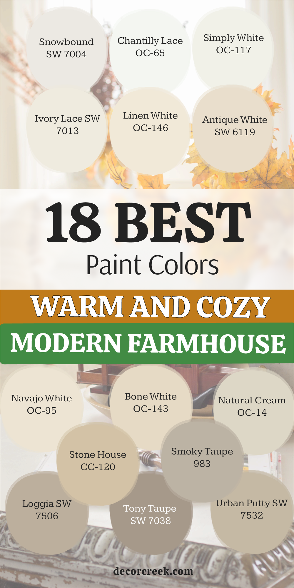
18 Warm and Cozy Modern Farmhouse Paint Colors
Snowbound SW 7004
Snowbound SW 7004 is a crisp white that has a very tiny hint of gray to keep it soft. This color is the perfect choice for a modern home that needs to look very clean and sharp. I find that it looks amazing on both walls and trim to create a very seamless look.
It does not turn yellow in the sun which makes it a very reliable pick for big rooms. You will love how it makes your black metal light fixtures stand out with a lot of style. This shade feels very fresh and helps every piece of furniture look like it is brand new.
It creates a very bright background that still feels very friendly for a family to live in. Many people use this to make their hallways look much wider and more open to the light. It is a very smart choice for a house that wants to feel very updated and very cool.
Best used in: living rooms, bedrooms, trim, and modern kitchens
Pairs well with: Iron Ore SW 7069, Colonnade Gray SW 7641, Silver Strand SW 7057 The key rule of this color for farmhouse style is to use it where you want natural light to feel kind, soft, and inviting throughout the day.
🎨 Check out the complete guide to this color right HERE 👈

Chantilly Lace OC-65
Chantilly Lace OC-65 is often called the cleanest white because it has almost no hidden tones at all. This paint makes a room feel very bright and full of energy as soon as you walk inside. I like to use it in modern farmhouses that have a lot of big windows and natural light.
It acts like a mirror that bounces the sunshine into every dark corner of the house. You can pair it with very light wood floors to create a look that feels very airy. This color is a favorite for designers who want a very high-quality and professional finish on the walls.
It makes your colorful art and books look very bright and very important on the shelves. You will notice that it makes the whole house feel very tidy and very well-kept for guests. It is a very beautiful choice for a home that wants to feel very light and very simple.
Best used in: trim, doors, modern living rooms, and ceilings
Pairs well with: Gray Owl OC-52, Revere Pewter HC-172, Hale Navy HC-154 The key rule of this color for farmhouse style is to use it where you want natural light to feel kind, soft, and inviting throughout the day.
🎨 Check out the complete guide to this color right HERE 👈

Simply White OC-117
Simply White OC-117 is a very famous white that has just enough warmth to feel very comfortable. This color is a top pick for modern farmhouse walls because it never feels too cold or blue. I love how it makes a room feel very sunny even on days when the clouds are very thick.
It works beautifully on kitchen cabinets if you want a look that is very fresh and very crisp. This shade looks great with warm wood beams and rustic metal details around the house. You will feel very happy in a room that uses this color because it feels so light.
It is a very classic choice that works well in every single room of your home. This paint makes the light in your house look very soft and very inviting for the family. It is a very safe and beautiful choice for any project you have in mind.
Best used in: whole-house walls, kitchen cabinets, trim, and ceilings
Pairs well with: Silver Song 1557, Casabella AF-420, various natural wood tones The key rule of this color for farmhouse style is to use it where you want natural light to feel kind, soft, and inviting throughout the day.
🎨 Check out the complete guide to this color right HERE 👈

Ivory Lace SW 7013
Ivory Lace SW 7013 is a very soft and delicate creamy white that feels very pretty on the walls. This color has a bit more warmth than a standard white but it still looks very bright. I find that it is a wonderful choice for bedrooms or cozy living rooms in a farmhouse.
It makes the walls look very smooth and gives the room a very gentle and kind feeling. You can use it with white trim to show off the very soft difference between the two colors. This shade reminds me of soft lace or a vintage dress that has been kept very well.
It works beautifully with light brown furniture and soft green plants on the windowsills. You will love how it makes the room feel very cozy without making it feel small or dark. It is a very sweet color that makes your home feel very warm and very loved.
Best used in: bedrooms, living rooms, nurseries, and bathrooms
Pairs well with: Alabaster SW 7008, Urbane Bronze SW 7048, light wood stains The key rule of this color for farmhouse style is to use it where you want natural light to feel kind, soft, and inviting throughout the day.
🎨 Check out the complete guide to this color right HERE 👈

Linen White OC-146
Linen White OC-146 is a classic off-white that feels very traditional and very sturdy for a family. This color has a lot of warmth and reminds me of natural fabric that has been sun-bleached. I love using it in modern farmhouses to give the walls a bit of history and character.
It looks very handsome when you have dark wood floors and big white rugs in the room. This shade makes the light feel very golden and very soft throughout the whole afternoon. You will find that it is a very relaxing color to look at when you are resting at home.
It works well in large rooms where a pure white might feel a little bit too empty. This paint creates a very rich and thick look that makes the house feel very high-quality. It is a great choice for a home that wants to feel very cozy and very traditional.
Best used in: living rooms, bedrooms, entryways, and farmhouse exteriors
Pairs well with: Simply White OC-117, Revere Pewter HC-172, dark walnut wood The key rule of this color for farmhouse style is to use it where you want natural light to feel kind, soft, and inviting throughout the day.
🎨 Check out the complete guide to this color right HERE 👈

Antique White SW 6119
Antique White SW 6119 is a deep and warm creamy color that feels very elegant and very old-fashioned. This paint has a lot of yellow in it which makes the room feel very sun-kissed and happy. I like to use it in houses that want to feel very classic and very grounded in the past.
It looks very beautiful when paired with dark furniture and colorful vintage rugs on the floor. This shade makes the living room feel like a very safe and snug place to spend time. You will notice that it hides small marks and dust very well because it is not a bright white.
It is a great choice for a farmhouse kitchen or a dining area where you want a rich look. This color makes the house feel like it has been there for a very long time in a good way. It brings a lot of heart and a lot of warmth to any room you choose to paint.
Best used in: kitchens, dining rooms, hallways, and trim
Pairs well with: Kilim Beige SW 6106, Svelte Sage SW 6164, Alabaster SW 7008 The key rule of this color for farmhouse style is to use it where you want natural light to feel kind, soft, and inviting throughout the day.
🎨 Check out the complete guide to this color right HERE 👈

Navajo White OC-95
Navajo White OC-95 is a strong creamy tan that feels very traditional and very warm on the walls. This color is a favorite for people who want a home that feels very solid and very comfortable. I find that it looks best in rooms with a lot of natural wood and rustic decorations.
It makes the walls look very soft and gives the whole house a very friendly appearance. This shade is dark enough to show off white window frames and white doors very clearly. You will love how it makes your favorite blankets and pillows look even more cozy and inviting.
It is a very reliable color that has been popular in farmhouses for many many years. This paint makes the room feel very bright but also very snug at the very same time. It is a great pick for a home that wants to feel very classic and very traditional.
Best used in: kitchens, hallways, living rooms, and large entryways
Pairs well with: White Dove OC-17, Simply White OC-117, Wrought Iron 2124-10 The key rule of this color for farmhouse style is to use it where you want natural light to feel kind, soft, and inviting throughout the day.
🎨 Check out the complete guide to this color right HERE 👈
Bone White OC-143
Bone White OC-143 is a very natural and earthy white that feels very steady on the walls. This color has a hint of gray and tan that makes it look like smooth stones or old clay. I love to suggest this for modern farmhouses that use a lot of natural stone in their design.
It helps the walls match the fireplace or the kitchen counters in a very pretty way. This shade is very soft and does not change too much when the lighting in the room moves. You will find that it creates a very peaceful background for all of your family activities.
It is a very sophisticated color that makes the house feel very expensive and very well-made. Many families pick this because it feels more interesting than a plain white paint choice. This color makes every room feel very balanced and very easy to live in every day.
Best used in: living rooms, kitchens, bedrooms, and exteriors
Pairs well with: White Dove OC-17, Gray Owl OC-52, dark wood tones The key rule of this color for farmhouse style is to use it where you want natural light to feel kind, soft, and inviting throughout the day.
🎨 Check out the complete guide to this color right HERE 👈

Natural Cream OC-14
Natural Cream OC-14 is a perfect mix of a light gray and a warm beige for your home walls. This color is very popular because it feels very updated and very fresh in a modern farmhouse. I find that it works beautifully in open floor plans where one room leads into another.
It keeps the whole house looking very organized and very much in style for the family. This shade is light enough to keep things bright but has enough color to feel very cozy. You will love how it looks with white trim and dark metal accents like door handles.
It provides a very smooth and clean look that everyone in the family will enjoy looking at. Many designers use this color to make a house feel very professional and very carefully planned. It is a great choice for a home that wants to feel very modern and very comfortable.
Best used in: whole-house walls, living rooms, kitchens, and bedrooms
Pairs well with: White Dove OC-17, Chantilly Lace OC-65, Revere Pewter HC-172 The key rule of this color for farmhouse style is to use it where you want natural light to feel kind, soft, and inviting throughout the day.
🎨 Check out the complete guide to this color right HERE 👈

Stone House CC-120
Stone House CC-120 is a medium tan that feels very grounded and very sturdy on your walls. This color reminds me of a warm cottage or a house made of natural stone in the country. I like to use it in living rooms or dens where you want a very snug and private feeling.
It makes the room feel very safe and very warm for anyone who is resting inside. This shade works very well with dark wood furniture and big leather chairs in a farmhouse. It is a very rich color that brings a lot of depth and a lot of personality to the house.
You will notice that it looks very handsome when the sun shines on it through the windows. It is a very traditional choice that makes the house feel very finished and very complete. This paint makes the walls look very velvety and very high-quality for your family.
Best used in: living rooms, studies, dining rooms, and exteriors
Pairs well with: White Dove OC-17, Simply White OC-117, Manchester Tan HC-81 The key rule of this color for farmhouse style is to use it where you want natural light to feel kind, soft, and inviting throughout the day.
Smoky Taupe 983
Smoky Taupe 983 is a beautiful color that has a lot of gray and a lot of warmth at once. This color is perfect for people who want a modern look that still feels very soft and kind. I find that it looks amazing in bedrooms where you want to feel very relaxed and very sleepy.
It has a tiny bit of a purple or pink tone that makes the walls look very interesting. This shade works great with white bedding and light wood nightstands in a farmhouse style. You will love how it makes the room feel very quiet and very peaceful after a busy day.
It is a very stylish color that makes your home feel very updated and very special. Many people use this in their living rooms to create a look that is very cozy and very sweet. This color makes every corner of the room feel very soft and very pretty for the eyes.
Best used in: bedrooms, living rooms, bathrooms, and cozy corners
Pairs well with: White Dove OC-17, Revere Pewter HC-172, Simply White OC-117 The key rule of this color for farmhouse style is to use it where you want natural light to feel kind, soft, and inviting throughout the day.
🎨 Check out the complete guide to this color right HERE 👈

Loggia SW 7506
Loggia SW 7506 is a warm greige that feels very solid and very sophisticated on the walls. This color is a great middle ground if you cannot decide between a gray or a tan. I love how it makes a modern farmhouse feel very grounded and very well-designed for a family.
It looks very handsome when you have light-colored furniture and dark metal lamps in the room. This shade is dark enough to feel very cozy but light enough to stay very friendly. You will find that it hides small marks and fingerprints very well in busy parts of the house.
It is a very popular choice for people who want their home to feel very professional and clean. This paint creates a very smooth and even background for all of your favorite art pieces. It is a very reliable color that looks good in almost every kind of lighting you have.
Best used in: living rooms, hallways, kitchens, and exteriors
Pairs well with: Alabaster SW 7008, Shoji White SW 7042, Urbane Bronze SW 7048 The key rule of this color for farmhouse style is to use it where you want natural light to feel kind, soft, and inviting throughout the day.
🎨 Check out the complete guide to this color right HERE 👈

Tony Taupe SW 7038
Tony Taupe SW 7038 is a deeper tan that has a lot of gray mixed in to keep it feeling modern. This color is perfect for an accent wall or a cozy den where you want to feel very snug. I find that it looks very strong and very sturdy on the walls of a farmhouse.
It works beautifully with white trim and light wood floors to create a nice contrast in the room. This shade brings a sense of importance and a sense of history to any room you paint. You will love how it makes your light-colored pillows and blankets pop out in a pretty way.
It is a very rich color that makes the house feel very expensive and very carefully planned. Many families pick this for their exterior paint because it looks very classic and very clean. This color makes the whole room feel very warm and very safe for everyone.
Best used in: accent walls, dens, exteriors, and dining rooms
Pairs well with: Alabaster SW 7008, Accessible Beige SW 7036, Pure White SW 7005 The key rule of this color for farmhouse style is to use it where you want natural light to feel kind, soft, and inviting throughout the day.
🎨 Check out the complete guide to this color right HERE 👈

Urban Putty SW 7532
Urban Putty SW 7532 is a unique neutral color that feels very earthy and very natural. This paint has a hint of green and gray that makes it look like natural clay or soft mud. I love to suggest this for houses that want to feel very connected to the outdoors and the land.
It works perfectly with wooden beams and stone fireplaces in a modern farmhouse living room. This shade is very soft and does not grab too much attention away from your decorations. You will see that it creates a very peaceful and quiet look on the walls for your family.
It is a very smart choice for a house that wants to feel very balanced and very calm. This color makes the room feel very grounded and very comfortable for anyone who visits. It is a very high-quality shade that looks great for a long time without fading.
Best used in: living rooms, kitchens, exteriors, and entryways
Pairs well with: Alabaster SW 7008, Shoji White SW 7042, Timber Wolf SW 7042 The key rule of this color for farmhouse style is to use it where you want natural light to feel kind, soft, and inviting throughout the day.
Dried Thyme SW 6186
Dried Thyme SW 6186 is a deep and dusty green that looks just like the herb in a garden. This color is a bold choice that looks absolutely amazing on kitchen cabinets or a mudroom. I find that it brings a lot of nature and a lot of life into a modern farmhouse.
It feels very sophisticated and very rich when you pair it with gold or brass handles. This shade is dark enough to feel very cozy and very private in a small room or a study. You will love how it makes white trim and white walls look very bright and very clean.
It is a very stylish color that makes your home feel very updated and very unique for guests. Many people use this on their front doors to create a very welcoming look for friends. This color makes every room feel very special and very much full of heart.
Best used in: cabinets, mudrooms, accent walls, and exteriors
Pairs well with: Alabaster SW 7008, Shoji White SW 7042, Creamy SW 7012 The key rule of this color for farmhouse style is to use it where you want natural light to feel kind, soft, and inviting throughout the day.
🎨 Check out the complete guide to this color right HERE 👈

Retreat SW 6207
Retreat SW 6207 is a beautiful blue-green that has a lot of gray mixed in to keep it soft. This color is perfect for creating a room that feels like a quiet place to hide away and rest. I love using it in bedrooms or bathrooms to give the area a very natural and cool feeling.
It looks very handsome with light wood furniture and soft white curtains in a farmhouse. This shade is very gentle and helps everyone feel very relaxed after a very busy day at work. You will notice how it makes the room feel very airy and very full of peace for the family.
It is a great way to add a bit of color while keeping things very professional and clean. Many families pick this for their exterior shutters because it looks so pretty and fresh. This color makes your home feel very beautiful and very connected to the sky.
Best used in: bedrooms, bathrooms, accent walls, and exteriors
Pairs well with: Sea Salt SW 6204, Alabaster SW 7008, Spare White SW 6203 The key rule of this color for farmhouse style is to use it where you want natural light to feel kind, soft, and inviting throughout the day.
🎨 Check out the complete guide to this color right HERE 👈

Desert Twilight 2137-40
Desert Twilight 2137-40 is a deep and mysterious color that is a mix of gray and brown and green. This paint is perfect for people who want a very unique and very rich look on their walls. I find that it looks amazing in a dining room where you want to have a very cozy dinner.
It feels very moody and very sophisticated when the lights are turned down low at night. This shade works perfectly with light wood tables and white dishes to create a nice look. You will love how it makes your green plants and gold decorations stand out in the room.
It is a bold choice that makes your farmhouse feel very updated and very high-end for guests. This color brings a sense of drama and a sense of strength to any room you choose. It is a very beautiful choice for a home that wants to feel very special.
Best used in: dining rooms, accent walls, exteriors, and studies
Pairs well with: White Dove OC-17, Revere Pewter HC-172, Simply White OC-117 The key rule of this color for farmhouse style is to use it where you want natural light to feel kind, soft, and inviting throughout the day.
Woodlawn Blue HC-147
Woodlawn Blue HC-147 is a soft and happy blue that feels like a clear summer day in the country. This color is very popular for ceilings and bathrooms in a classic or modern farmhouse. I find that it makes a room feel very light and very full of fresh air for the family.
It looks beautiful next to white cabinets and light gray furniture in a living area. This shade is very gentle and helps everyone feel very cheerful and very relaxed at home. You will notice how it makes the room feel very cool and very pretty for the eyes.
It is a great way to add a bit of happy color while keeping things very soft and light. Many people use this in their laundry rooms to make doing chores feel a bit more fun. This color makes your farmhouse feel very fresh and very beautiful for everyone.
Best used in: bathrooms, bedrooms, laundry rooms, and ceilings
Pairs well with: White Dove OC-17, Palladian Blue HC-144, Revere Pewter HC-172 The key rule of this color for farmhouse style is to use it where you want natural light to feel kind, soft, and inviting throughout the day.
🎨 Check out the complete guide to this color right HERE 👈

19 Warm and Cozy Farmhouse Exterior Paint Colors
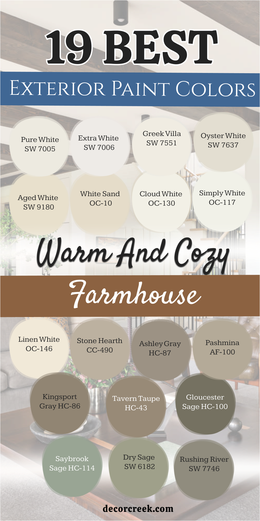
Pure White SW 7005
Pure White SW 7005 is a very bright and clean color that looks amazing on the outside of a house. This paint is not too cold because it has a tiny drop of warmth hidden inside it. I love using it for the main body of a farmhouse to make it stand out against green grass.
It looks very sharp and fresh when the sun hits the walls in the morning. You will see that it makes your black shutters and wooden doors look very high-end and neat. This shade is famous for being very reliable because it does not turn blue or yellow outside.
It gives the whole property a very tidy and well-kept feeling for anyone driving by. Many people choose this because it feels very classic and never goes out of style. It makes the house look like a very happy and bright place to live.
Best used in: farmhouse exteriors, trim, front doors, and fences
Pairs well with: Black Magic SW 6991, Tricorn Black SW 6258, Revere Pewter HC-172, natural cedar The key rule of this color for farmhouse style is to use it where you want natural light to feel kind, soft, and inviting throughout the day.
🎨 Check out the complete guide to this color right HERE 👈

Extra White SW 7006
Extra White SW 7006 is a very crisp and very bright shade that looks like a fresh sheet of paper. This color is perfect for people who want their farmhouse to look very modern and very clean. I find that it works best for the trim and the porch railings to make them pop.
It is a very strong white that stays looking bright even when the sky is a bit gray. You can use it on the whole house if you want a look that is very bold and very sun-kissed. This shade makes your green bushes and colorful flowers look very vibrant and healthy against the walls.
It is a very popular choice for a new farmhouse that wants to feel very updated and very professional. You will love how it makes the house feel very big and very full of light. It stays looking very fresh and very tidy for many years on the exterior.
Best used in: exterior trim, porch columns, shutters, and modern farmhouse siding
Pairs well with: Iron Ore SW 7069, Gray Shingle SW 7667, Peppercorn SW 7674 The key rule of this color for farmhouse style is to use it where you want natural light to feel kind, soft, and inviting throughout the day.
🎨 Check out the complete guide to this color right HERE 👈

Greek Villa SW 7551
Greek Villa SW 7551 is a very soft and creamy white that feels very sun-drenched and very warm. This color is a favorite for farmhouse exteriors because it feels very welcoming from the street. I like how it looks under the shade of big trees because it never feels too dark or gloomy.
It has a bit of a yellow glow that makes the house feel very friendly and very cozy. This shade works beautifully with bronze outdoor lights and dark brown wooden front doors. You will find that it makes the house look very solid and very traditional for a family.
It is a wonderful choice for people who want a white house that feels very soft and very kind. Many neighbors will stop to ask about this color because it looks so pretty in the natural light. It makes the whole property feel very warm and very full of heart.
Best used in: exterior siding, trim, entryways, and garages
Pairs well with: Urban Bronze SW 7048, Alabaster SW 7008, Walnut wood stains The key rule of this color for farmhouse style is to use it where you want natural light to feel kind, soft, and inviting throughout the day.
🎨 Check out the complete guide to this color right HERE 👈

Oyster White SW 7637
Oyster White SW 7637 is a unique light gray-beige that feels very soft and very sophisticated outside. This color is perfect for a farmhouse because it looks very natural and very earthy on the walls. I love to suggest this for houses that have a lot of stone or brick details on the porch.
It pulls the colors from the earth and makes the house look like it belongs in the garden. This shade is very light but it has enough color to show off white trim around the windows. You will love how it hides dust and dirt much better than a pure white paint would.
It is a very stylish choice that makes the home feel very expensive and very carefully planned. This color makes the house look very sturdy and very safe for the whole family. It creates a very smooth and soft look that stays beautiful in all kinds of weather.
Best used in: exterior siding, trim, brick painting, and porches
Pairs well with: Sea Salt SW 6204, Gray Area SW 7052, White Duck SW 7010 The key rule of this color for farmhouse style is to use it where you want natural light to feel kind, soft, and inviting throughout the day.
🎨 Check out the complete guide to this color right HERE 👈
Aged White SW 9180
Aged White SW 9180 is a deep and warm cream that feels very traditional and very much full of history. This color looks like a house that has been loved and cared for over many long years. I find that it is a great choice for a rustic farmhouse that has a lot of old-fashioned charm.
It makes the exterior walls look very soft and very sun-kissed during the long summer days. This shade works very well with dark green shutters and heavy black metal hardware on the doors. You will like how it makes the house feel very cozy and very snug even before you walk inside.
It is a very rich color that brings a lot of warmth and a lot of personality to the property. Many families pick this because it feels more interesting and more solid than a plain white. This paint makes the house look very grand and very traditional for everyone.
Best used in: exterior siding, trim, outbuildings, and traditional farmhouses
Pairs well with: Black Magic SW 6991, Clary Sage SW 6178, Dark wood tones The key rule of this color for farmhouse style is to use it where you want natural light to feel kind, soft, and inviting throughout the day.
🎨 Check out the complete guide to this color right HERE 👈
White Sand OC-10
White Sand OC-10 is a beautiful and light tan that looks just like a quiet beach under the sun. This color is a wonderful choice for a farmhouse exterior because it feels very natural and very soft. I like how it provides a warm background for white trim and dark gray roofs on a house.
It makes the house feel very grounded and very much at peace with the land around it. This shade is dark enough to have some personality but light enough to stay very bright and happy. You will notice that it looks very handsome when paired with natural wood porch ceilings and stone paths.
It is a very smart choice for a house that wants to feel very classic and very high-quality. This color makes the exterior look very tidy and very professional for the whole family. It is a very reliable shade that stays looking fresh and clean for a very long time.
Best used in: exterior siding, brick, porches, and entryways
Pairs well with: White Dove OC-17, Revere Pewter HC-172, Hale Navy HC-154 The key rule of this color for farmhouse style is to use it where you want natural light to feel kind, soft, and inviting throughout the day.
Cloud White OC-130
Cloud White OC-130 is a very soft and very airy white that feels like a light mist in the morning. This color is perfect for a farmhouse that wants to look very gentle and very pretty from the street. I love to use it on the siding to give the house a very clean and very fresh appearance.
It has just enough warmth to keep the house from looking too cold or too blue in the shade. This shade works beautifully with light gray roofs and soft green plants in the garden beds. You will find that it makes the house feel very light and very full of life every day.
It is a very popular choice for people who want a classic white house that feels very friendly. This paint makes the light bounce around the porch in a very soft and very inviting way. It is a very beautiful choice for any family home in the country.
Best used in: exterior siding, trim, ceilings, and porch railings
Pairs well with: Gray Owl OC-52, Simply White OC-117, various wood stains The key rule of this color for farmhouse style is to use it where you want natural light to feel kind, soft, and inviting throughout the day.
🎨 Check out the complete guide to this color right HERE 👈

Simply White OC-117
Simply White OC-117 is a legendary white that looks absolutely stunning on the outside of a farmhouse. This color has a tiny bit of warmth that makes the house feel very cozy and very sun-drenched. I find that it is a top pick for modern farmhouses that want a very bright and very clean look.
It looks amazing when you have big windows and black metal trim on the outside of the house. This shade makes the home feel very fresh and helps it stand out as the prettiest house on the block. You will love how it makes your front door and your porch furniture look very vibrant and neat.
It is a very safe and very popular choice because it always looks so good in natural sunlight. This paint makes the house look very tidy and very well-planned for the family. It is a very classic color that will always stay in style for your home exterior.
Best used in: farmhouse siding, trim, front doors, and columns
Pairs well with: Silver Song 1557, Casabella AF-420, Black metal accents The key rule of this color for farmhouse style is to use it where you want natural light to feel kind, soft, and inviting throughout the day.
🎨 Check out the complete guide to this color right HERE 👈
Linen White OC-146
Linen White OC-146 is a warm and creamy off-white that feels very sturdy and very traditional. This color is a wonderful choice for an exterior because it looks very rich and very high-quality. I like using it to give a farmhouse a sense of history and a sense of belonging on the land.
It looks very handsome with dark walnut wood details and a classic black or gray roof. This shade makes the light feel very soft and very golden when the sun starts to set in the evening. You will find that it is a very relaxing color to see when you are driving home after a busy day.
It works well on large houses where a very bright white might feel a little bit too much for the eyes. This paint creates a very smooth and thick look that makes the house feel very expensive. It is a great choice for a family home that wants to feel very cozy.
Best used in: exterior siding, trim, garages, and large farmhouses
Pairs well with: Simply White OC-117, Revere Pewter HC-172, dark wood stains The key rule of this color for farmhouse style is to use it where you want natural light to feel kind, soft, and inviting throughout the day.
🎨 Check out the complete guide to this color right HERE 👈
Stone Hearth CC-490
Stone Hearth CC-490 is a medium taupe that feels very grounded and very strong on the outside walls. This color reminds me of natural stone and old fences that have been part of the land for years. I like to use it for the main body of the house to create a very warm and solid look.
It makes the farmhouse feel very safe and very snug against the wind and the rain. This shade works very well with white trim and black shutters to create a very classic appearance. You will notice that it looks very handsome when the sun shines on the textured siding of the house.
It is a very traditional choice that makes the property feel very finished and very complete for the family. This paint makes the walls look very velvety and very high-quality in the bright outdoor light. It is a very reliable color that everyone in the neighborhood will enjoy looking at.
Best used in: exterior siding, brick, trim, and porches
Pairs well with: White Dove OC-17, Simply White OC-117, Manchester Tan HC-81 The key rule of this color for farmhouse style is to use it where you want natural light to feel kind, soft, and inviting throughout the day.
Ashley Gray HC-87
Ashley Gray HC-87 is a rich and deep greige that feels very sophisticated and very modern outside. This color is perfect for someone who wants their farmhouse to have a very strong and stylish look. I find that it looks amazing when you use it with very bright white trim around the windows.
It creates a beautiful contrast that makes the house look very clean and very well-designed for guests. This shade is dark enough to feel very cozy but light enough to stay very friendly and open. You will love how it brings out the details in your porch stone and your wooden front doors.
It is a very popular choice for people who want a home that feels very professional and very sturdy. This paint provides a very smooth background for your green bushes and colorful flower pots. It is a very high-quality color that makes your home feel very special.
Best used in: exterior siding, accent gables, trim, and front doors
Pairs well with: White Dove OC-17, Revere Pewter HC-172, black metal lamps The key rule of this color for farmhouse style is to use it where you want natural light to feel kind, soft, and inviting throughout the day.
Pashmina AF-100
Pashmina AF-100 is a soft and muddy greige that feels very natural and very warm on the exterior. This color is part of a special collection because it looks so good in almost any kind of outdoor light. I love how it makes a modern farmhouse feel very grounded and very much a part of the nature around it.
It looks very handsome with dark bronze lights and light-colored stone paths in the garden. This shade is very soft and does not grab too much attention away from the beauty of the house. You will see that it creates a very peaceful and quiet look on the walls for your family.
It is a very smart choice for a house that wants to feel very balanced and very tidy from the street. This color makes the whole home look very expensive and very carefully planned for everyone to enjoy.
Best used in: exterior siding, trim, entryways, and porches
Pairs well with: Chantilly Lace OC-65, Revere Pewter HC-172, dark wood The key rule of this color for farmhouse style is to use it where you want natural light to feel kind, soft, and inviting throughout the day.
🎨 Check out the complete guide to this color right HERE 👈

Kingsport Gray HC-86
Kingsport Gray HC-86 is a deep and earthy gray-brown that feels very solid and very powerful. This color is perfect for an exterior siding choice because it looks like natural earth and stones. I find that it brings a lot of history and a lot of strength to a farmhouse property.
It looks very handsome when paired with white trim and natural wood porch columns in the house. This shade is dark enough to feel very cozy and very private for your family life. You will like how it makes the house feel like a very sturdy and safe place to spend your time.
It is a great color for showing off bright green plants and colorful flowers in the front yard. Many people choose this because it hides dirt and dust very well on the outside walls. This color makes your home look very grand and very well-made for the long term.
Best used in: exterior siding, trim, accent areas, and garages
Pairs well with: White Dove OC-17, Simply White OC-117, Woodlawn Blue HC-147 The key rule of this color for farmhouse style is to use it where you want natural light to feel kind, soft, and inviting throughout the day.
🎨 Check out the complete guide to this color right HERE 👈

Tavern Taupe HC-43
Tavern Taupe HC-43 is a warm and medium brown that feels very traditional and very snug. This color reminds me of old country inns and warm wooden barns on a farm. I like to use it for the exterior to give the house a very rich and very deep appearance for guests.
It makes the property feel very welcoming and very full of life during the whole year. This shade works beautifully with creamy white trim and dark metal details on the roof. You will find that it makes the house look very solid and very high-quality from the driveway.
It is a great choice if you want a look that is not white but still feels very bright and happy. This paint creates a very velvety and soft look that everyone in the family will like. It is a very reliable color that makes the home feel very cozy and very much loved.
Best used in: exterior siding, trim, porches, and outbuildings
Pairs well with: White Dove OC-17, Navajo White OC-95, natural wood stains The key rule of this color for farmhouse style is to use it where you want natural light to feel kind, soft, and inviting throughout the day.
Gloucester Sage HC-100
Gloucester Sage HC-100 is a deep and dark green that has a lot of gray mixed inside the paint. This color is a very bold and very beautiful choice for a farmhouse exterior siding or trim. I find that it brings a sense of the deep forest and the green garden right onto the house walls.
It looks very sophisticated and very rich when you use it with bright white window frames. This shade is dark enough to feel very private and very sturdy against the outdoor weather. You will love how it makes your wood porch and your colorful plants look very vibrant and clean.
It is a very stylish color that makes your home feel very updated and very unique in your neighborhood. Many families pick this because it looks so classic and so strong for a country home. This color makes the whole house feel very special and very full of natural heart.
Best used in: exterior siding, trim, shutters, and front doors
Pairs well with: White Dove OC-17, Saybrook Sage HC-114, copper metal accents The key rule of this color for farmhouse style is to use it where you want natural light to feel kind, soft, and inviting throughout the day.
🎨 Check out the complete guide to this color right HERE 👈

Saybrook Sage HC-114
Saybrook Sage HC-114 is a soft and traditional green that looks like a quiet herb garden in the spring. This color is very popular for farmhouses because it feels so natural and so inviting for friends. I find that it makes the exterior of a house feel very airy and very full of light during the day.
It looks beautiful next to white trim and dark wood doors on the front of the home. This shade is very gentle and helps the house blend in with the trees and the grass around it. You will notice how it makes the property feel like a very cool and happy place to live.
It is a great way to add color to the exterior while keeping things very soft and very professional. Many people use this for their siding because it feels so peaceful and so pretty for everyone. This color makes your farmhouse look very fresh and very beautiful for your family.
Best used in: exterior siding, trim, shutters, and porches
Pairs well with: White Dove OC-17, Revere Pewter HC-172, natural cedar wood The key rule of this color for farmhouse style is to use it where you want natural light to feel kind, soft, and inviting throughout the day.
🎨 Check out the complete guide to this color right HERE 👈
Dry Sage SW 6182
Dry Sage SW 6182 is a medium green that has a lot of gray and tan mixed in to keep it soft. This color is perfect for an exterior that needs to look very natural and very grounded in the earth. I love using it on the siding to give the house a very quiet and very earthy look for the family.
It is not too bright so it acts almost like a neutral color for your farmhouse property. You will see how well it works with wooden porches and white trim around the windows. This shade brings a bit of color without making the house feel too loud or busy for the neighbors.
It looks very handsome when you use it alongside dark metal lights or bronze door handles. Many families pick this because it feels fresh and lively every single day of the year. It is a great way to bring the feeling of nature to your exterior walls.
Best used in: exterior siding, trim, garages, and sheds
Pairs well with: Alabaster SW 7008, Shoji White SW 7042, Urbane Bronze SW 7048 The key rule of this color for farmhouse style is to use it where you want natural light to feel kind, soft, and inviting throughout the day.
Rushing River SW 7746
Rushing River SW 7746 is a deep gray-green that feels very strong and very steady on the outside. This color reminds me of smooth stones in a fast stream near a big farmhouse in the country. I like to use it for the exterior to create a look that is very solid and very well-designed.
It makes the house feel very safe and very snug against the bright sun and the rain. This shade works very well with white trim and dark wood details to create a nice look for guests. You will notice that it looks very handsome when you have light-colored stone on the porch or the chimney.
It is a very smart choice for a house that wants to feel very modern and very high-quality. This paint creates a very rich and velvety look that everyone in the family will enjoy for a long time. It is a very high-quality color that makes your home feel very special.
Best used in: exterior siding, trim, accent gables, and porches
Pairs well with: Alabaster SW 7008, Shoji White SW 7042, natural wood tones The key rule of this color for farmhouse style is to use it where you want natural light to feel kind, soft, and inviting throughout the day.
🎨 Check out the complete guide to this color right HERE 👈
Van Deusen Blue HC-156
Van Deusen Blue HC-156 is a deep and classic navy blue that looks very grand on a farmhouse exterior. This color is perfect for an accent or a front door if you want a very brave and pretty look. I find that it brings a lot of history and a lot of character to a house when you see it from the street.
It looks very handsome when paired with bright white trim and natural wood porch railings. This shade is dark enough to feel very cozy and very private for your family life at home. You will like how it makes the house feel like a very solid and safe place to spend your time.
It is a great color for showing off white flowers and green bushes in the front garden beds. Many people choose this because it feels so timeless and so powerful for a large home. This color makes the house look very fresh and very beautiful for everyone.
Best used in: exterior siding, front doors, shutters, and accent areas
Pairs well with: White Dove OC-17, Simply White OC-117, Revere Pewter HC-172 The key rule of this color for farmhouse style is to use it where you want natural light to feel kind, soft, and inviting throughout the day.
🎨 Check out the complete guide to this color right HERE 👈

My Final Thoughts about 34 Warm and Cozy Farmhouse Paint Colors
Choosing the right paint is all about how you want your family to feel when they are at home. These colors are all meant to make your house a place where people can relax and be themselves. Whether you pick a light white or a deep green, these shades will bring a lot of heart to your house.
Don’t be afraid to try samples and see how the light moves in your own rooms. Your home is your special place and it should look exactly the way you dreamed it would.
I hope this list helps you find the perfect shade for your next big project. Painting is the fastest way to make a big difference in how your house looks and feels. Take your time and enjoy the process of making your home more beautiful. Remember that the best color is the one that makes you smile when you walk into the room.
Good luck with your painting and I know your farmhouse will look absolutely wonderful.